

Peony painting has a way of making even a quick afternoon feel like an occasion, and that is exactly why it belongs on your easel today. Loose layered petals, soft opaque color and a light background do most of the romance for you, so you do not need years of practice to end up with something that looks like it belongs on a bedroom wall.
Below you will find 29 ideas that start with peonies in every mood (bursting open, in a crystal vase, scattered across a bed) before drifting into ranunculus, camellias, dahlias and other garden blooms styled the same dreamy way. Each one is sized for a single sitting, so scroll, pick whatever is calling to you, and get some paint on canvas.
Using these images: free for personal projects such as printing, coloring, cards, journals and gifts. Handmade items that include them may be sold up to 30 pieces per design. More than that is commercial use and is not permitted, and neither is selling or sharing the images themselves or passing them off as your own. Please ask before any other use.
Start the whole list with a fluffy pink peony bursting open, because it teaches the one skill every other idea here leans on: painting petals in loose, confident clusters instead of outlines. Block in a soft round shape in a mid-tone pink first, then build the center with smaller overlapping petal strokes using a flat or filbert brush loaded with blush and a touch of white.
Work from the center outward, darkening the inner petals with a little cadmium red light mixed into the pink so the bloom reads as cupped and full. The common mistake is making every petal the same size and value, which flattens the flower, so vary your pressure and let some strokes merge while others stay separate.
If your brush feels too stiff for soft petal edges, a damp sponge dabbed lightly over wet paint can soften hard lines in seconds. Keep the background pale and uncluttered so the peony stays the star of the canvas.
Today’s tip: paint the center petals first while your brush still has the richest color loaded, saving the palest mixes for the outer petals.
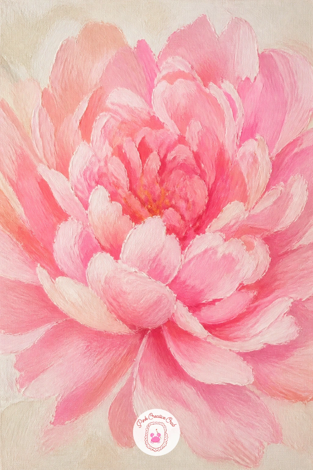
Palette: Quinacridone Pink,Cadmium Red Light,Titanium White,Sap Green
Once you can build one bloom, try grouping a few in peonies in a crystal vase on a dresser, which adds the gentle challenge of painting glass without it stealing attention from the flowers. Sketch the vase shape loosely in pencil, then paint the peonies first in soft pinks and creams before touching the glass at all.
For the crystal, use thin, watered-down greys and whites in vertical strokes, leaving streaks of bare canvas or background color showing through to suggest facets catching light. This is where eye level matters: paint the vase opening as a narrow ellipse if you are looking slightly down at the dresser, which immediately makes the whole scene feel grounded rather than floating.
The dresser surface only needs a few soft reflections in pale grey beneath the vase to read as polished wood. If glass intimidates you, swap it for a simple ceramic jug instead and skip the facet strokes entirely.
Today’s tip: paint the vase last, after the flowers, so you can judge exactly how much glass detail the composition actually needs.
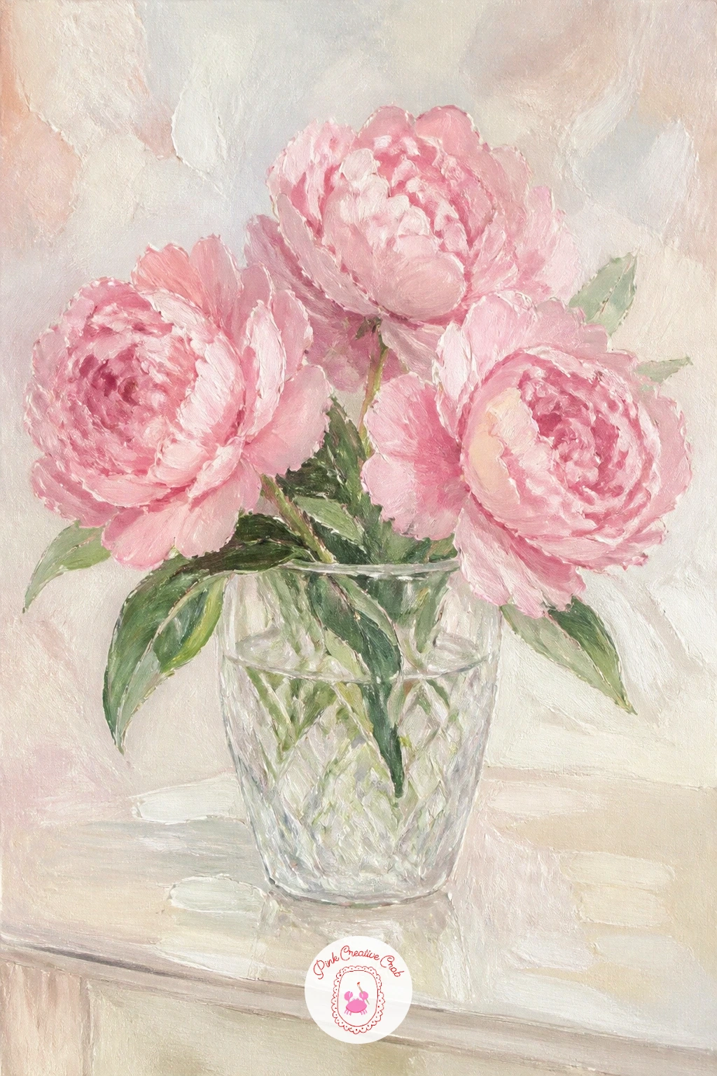
Palette: Titanium White,Payne’s Grey,Blush Pink,Naples Yellow
Look at a real glass vase under a lamp before you paint one. Notice how reflections break into short, uneven streaks rather than one smooth highlight, and your glass will look far more convincing.
Move from vases to something that feels fresh from the florist with a peony bouquet wrapped in brown paper, a lovely subject for beginner acrylic flower painting because the paper cone simplifies the whole lower half of the canvas. Paint the brown paper first as one big loose triangular shape in burnt sienna with darker folds suggested by a few confident diagonal strokes.
Once that is dry to the touch, build three or four peony heads nestled at the top in blush and coral, letting some petals overlap the paper edge so the bouquet feels tucked in rather than pasted on. The mistake to watch for is painting the paper too smooth and flat, which makes it look like cardboard instead of crumpled kraft paper.
Add a few dry-brush streaks of a slightly lighter brown across the folds to catch the light. No brown paint on hand? Mix a little orange into black for a convincing kraft tone.
Today’s tip: crease the paper shape with two or three diagonal lines before you add any flowers, so the bouquet has somewhere to sit.
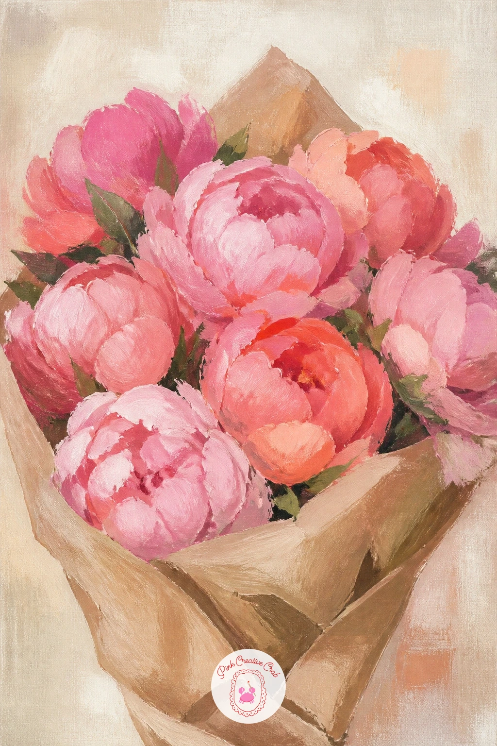
Palette: Burnt Sienna,Coral,Titanium White,Sap Green
For something more playful, try a girl hiding her face behind peonies, where the flowers do the work of a portrait without any difficult facial features to paint. Block in a simple oval of warm skin tone for the sliver of face still visible, then build a generous cluster of peony blooms covering the rest, overlapping them so they read as one soft mass held in two hands.
Paint the visible hands in loose, simplified shapes rather than detailed fingers, since too much precision there competes with the flowers. The usual slip-up is making the peonies so tidy they look stiff against a relaxed pose, so keep petal edges loose and let a stray bloom or two drift outside the main cluster.
Hair can be a few broad strokes in a warm brown, softened at the edges with a dry brush. If faces feel daunting, crop the composition so only an eye and the top of the head peek over the flowers.
Today’s tip: paint the peonies slightly larger than feels natural. Oversized blooms read as romantic rather than odd.
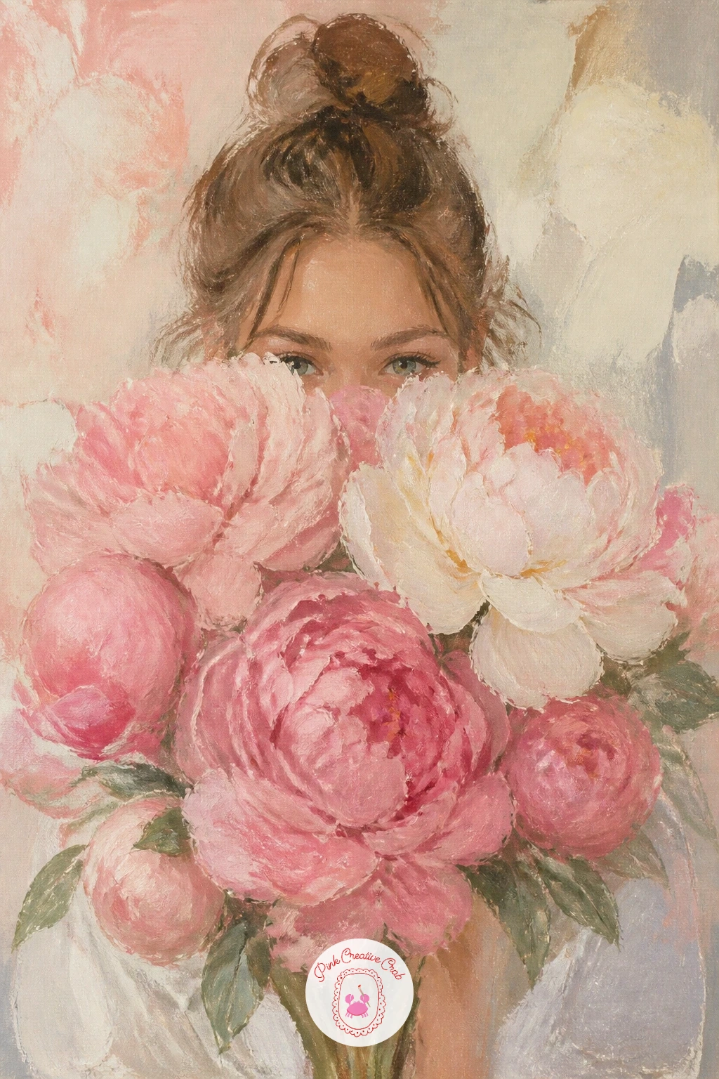
Palette: Blush Pink,Raw Sienna,Titanium White,Burnt Umber
Give yourself a still life with a bit of structure next, with a peony on a stack of hat boxes, a composition that teaches simple stacked shapes before you commit to the flower. Paint the boxes first as two or three flattened ovals and rounded rectangles in soft sage, cream and dusty pink, keeping the perspective gentle by making each box slightly narrower than the one below it.
Let the paint dry, then set a single full peony on top, its stem resting along the edge of the top box as though just placed there. The common error is making the boxes perfectly symmetrical and stiff, so nudge each one slightly off-center for a more natural stack.
A thin ribbon line in a contrasting color around one box adds a nice decorative touch without extra effort. No hat boxes to reference? A stack of round gift boxes or even books works the same way.
Today’s tip: paint a soft shadow beneath the whole stack before adding the peony, so the boxes feel grounded rather than floating.
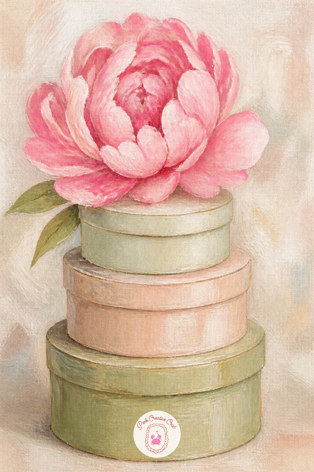
Palette: Sage Green,Dusty Pink,Cream,Titanium White
Slow the pace down with a peony bud just opening, a quieter subject that rewards careful looking over bold brushwork. Begin with a tight oval shape in a deeper pink than you would use for a full bloom, since a bud holds its color more concentrated before it opens.
Add just two or three petal tips peeling back at the top, painted with small, deliberate strokes rather than the loose sweeps you would use on a mature flower. This is where comparing sizes helps: hold your brush up to measure the bud against the stem below it, since a bud painted too large next to a thin stem looks unbalanced immediately.
The sepals, those small green leaf-like shapes cupping the bud, deserve a little attention too, painted in sage with a touch of grey. If your bud ends up looking like a plain ball, go back in with a dry brush and a slightly darker pink to carve in two or three petal seams.
Today’s tip: keep the color saturated and tight here. A bud reads as young and fresh precisely because it has not opened into soft, pale tones yet.
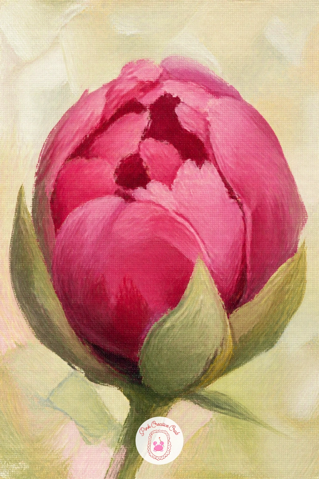
Palette: Alizarin Crimson,Blush Pink,Sage Green,Payne’s Grey
Bring in a different peony variety with coral charm peonies in a jug, chosen because their warm coral-to-cream gradient is one of the prettiest color studies you can paint. Build each bloom from the center out, starting with a deep coral core and gradually lightening the mix toward the outer petals until they fade almost to cream, blending while the paint is still wet so the transition stays soft.
The jug itself can stay simple, a rounded shape in a muted terracotta or white, painted after the flowers so it does not compete with that coral gradient. The mistake here is mixing one flat coral and using it everywhere, which loses the whole point of this variety’s charm, so mix at least three values from deep coral to pale peach before you start.
A few loose green leaves tucked around the stems break up the warm palette nicely. If coral paint is not in your kit, mix cadmium red with a little yellow and white to get there.
Today’s tip: let the center of each bloom stay the most saturated color on the canvas, since that is what makes the gradient read as glowing rather than muddy.
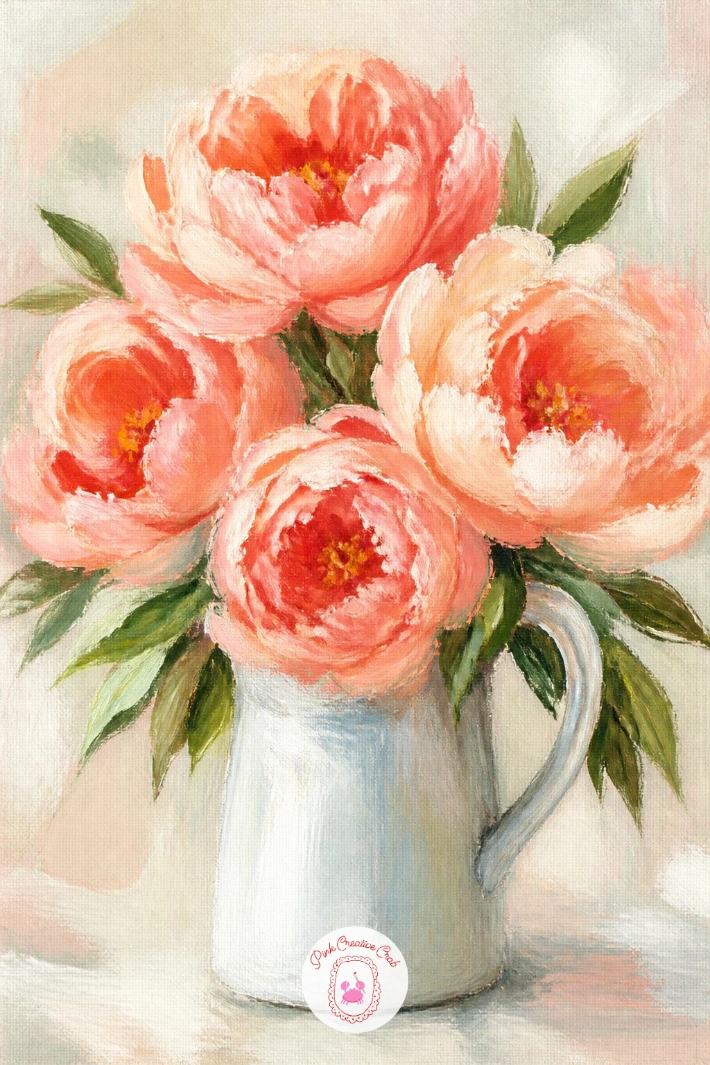
Palette: Coral,Pale Peach,Terracotta,Sap Green
Widen the view for a peony field at golden hour, a small landscape that leans on warm light rather than individual flower detail. Lay down a warm gradient background first, blending yellow-orange near an implied horizon line up into soft pink higher on the canvas, since golden hour light always sits low and warm.
Once that is dry, suggest a field of peonies with loose dabs and dashes of pink and cream, larger and more defined in the foreground and smaller, looser, and cooler in tone toward the back to create depth. The common trap is painting every flower in the field with the same size and clarity, which flattens the whole scene, so let the back third dissolve into soft color blobs.
A few dark green stem lines scattered through the lower third ground the flowers in soil. If blending a smooth gradient feels tricky, work wet-into-wet with a large soft brush rather than trying to layer it dry.
Today’s tip: add one or two slightly taller, more detailed peonies in the foreground to give the eye a clear place to land first.
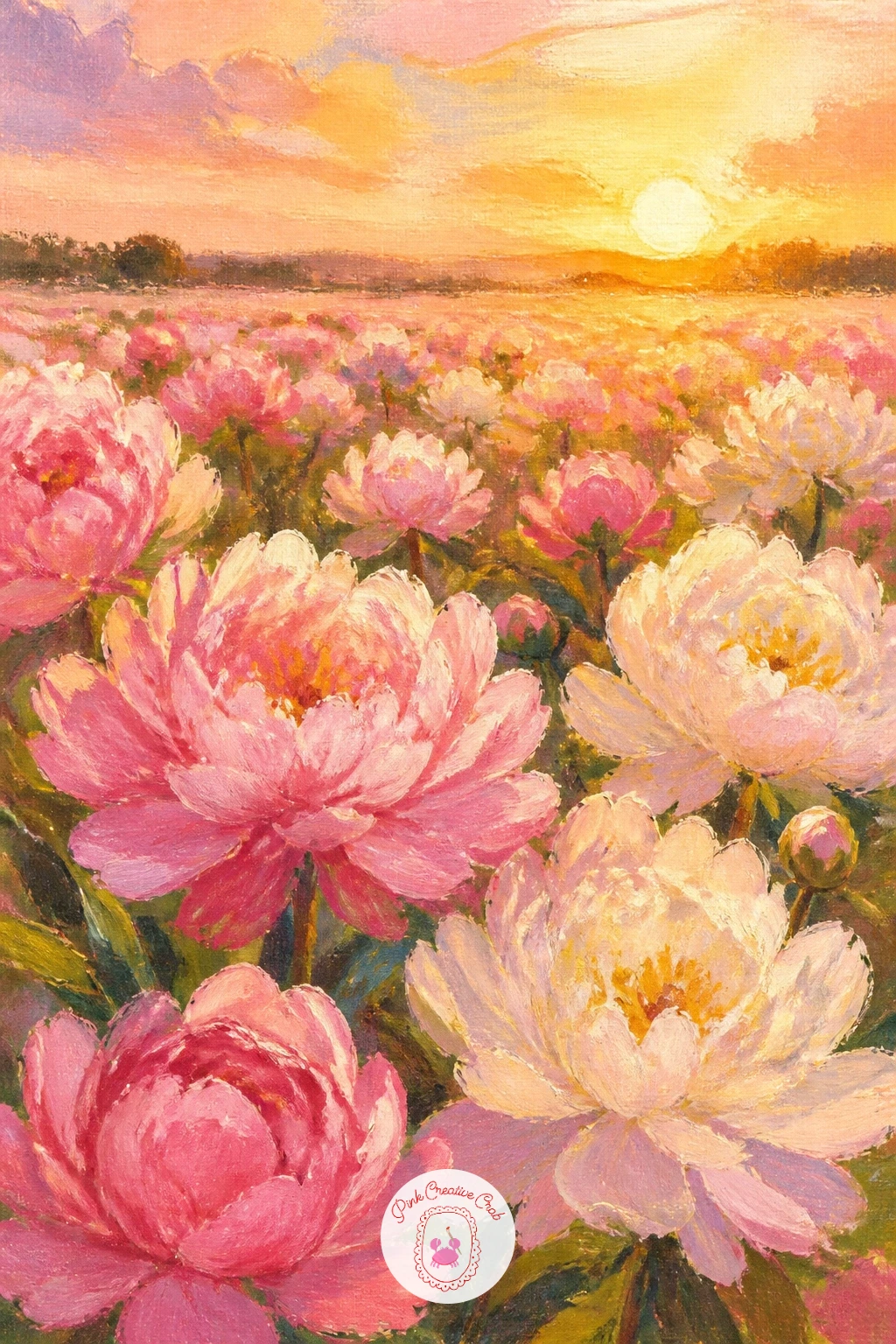
Palette: Cadmium Orange,Blush Pink,Naples Yellow,Sap Green
Shift to a cooler palette with a white peony with a bee, which is really a lesson in painting white petals using shadow instead of white paint alone. Block in the bloom shape with a very pale warm grey rather than pure white, then reserve your actual titanium white for just the brightest petal tips catching the light.
Build the shadowed folds between petals with soft lavender-grey mixes, since white flowers almost always carry cool shadow tones rather than warm ones. The bee comes last and small, just an oval body in black and gold with two quick translucent wing strokes, placed low on the bloom as though it just landed.
The usual mistake is painting the whole flower in flat white, which makes it look paper-thin instead of full and dimensional. If the bee feels too fiddly, a simple dark dot with two tiny wing flecks reads perfectly well from a distance.
Today’s tip: paint the shadows between petals before you add any bright white highlights, so you always know how much contrast you actually need.
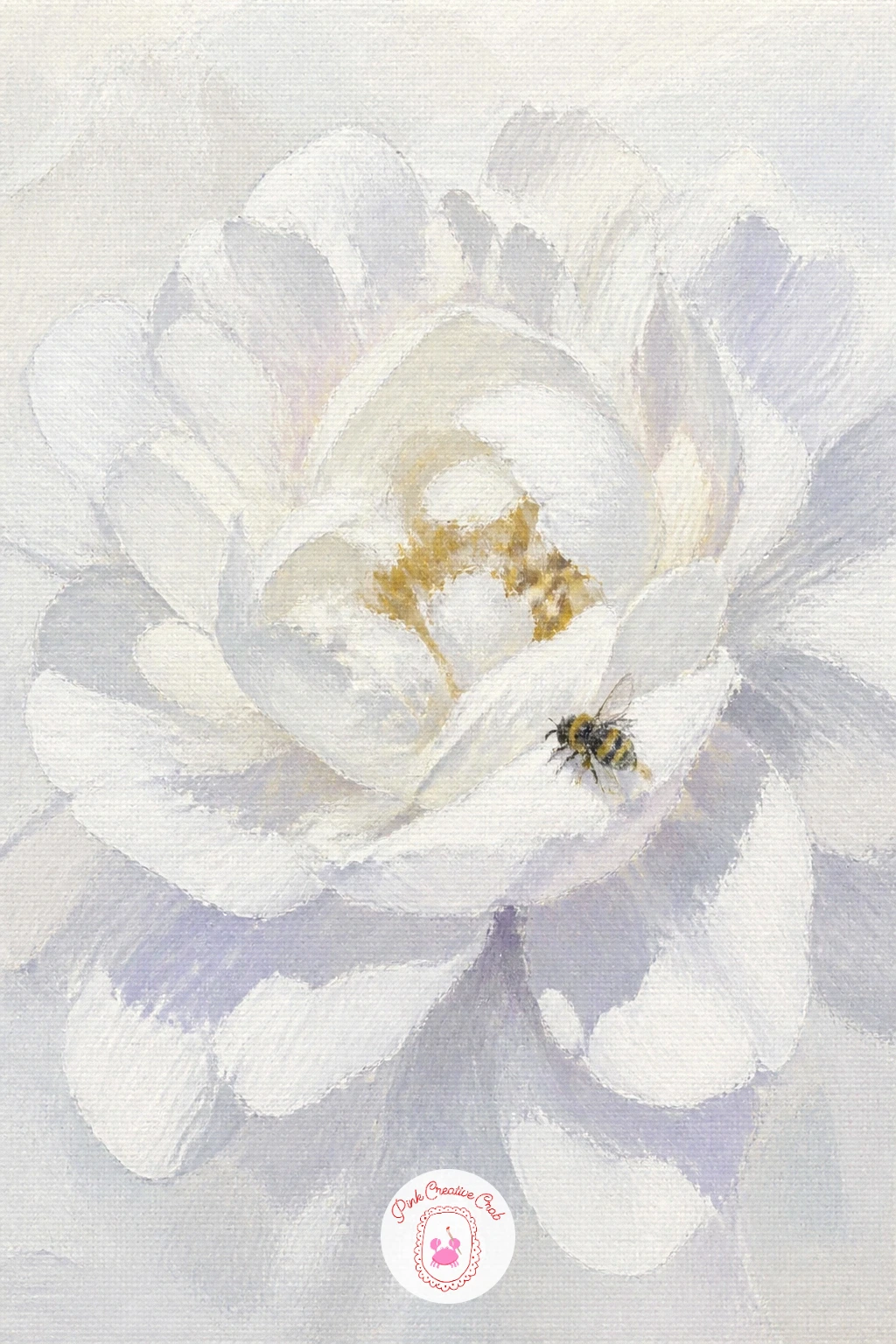
Palette: Titanium White,Payne’s Grey,Lavender Grey,Cadmium Yellow
For something dreamier, paint peonies scattered across a bed, where soft white linen and loose petals work together as one gentle composition. Start with the bed itself, laying in broad folds of cream and pale grey fabric using a large flat brush, letting the folds curve gently rather than running in straight lines.
Once the linen is blocked in, scatter three or four full peonies and a handful of loose single petals across the surface, varying their angles so none face the same direction. The common pitfall is making the fabric too busy with folds, which fights with the flowers, so keep most of the linen smooth and save the fold detail for just a few spots near the blooms.
Soft cast shadows beneath each flower in pale grey-violet anchor them to the bed rather than letting them float. If linen folds feel hard to get right, simplify the bed to one broad pale shape and let the flowers carry the whole scene.
Today’s tip: scatter a few loose petals away from the main flowers to make the arrangement feel natural rather than staged.
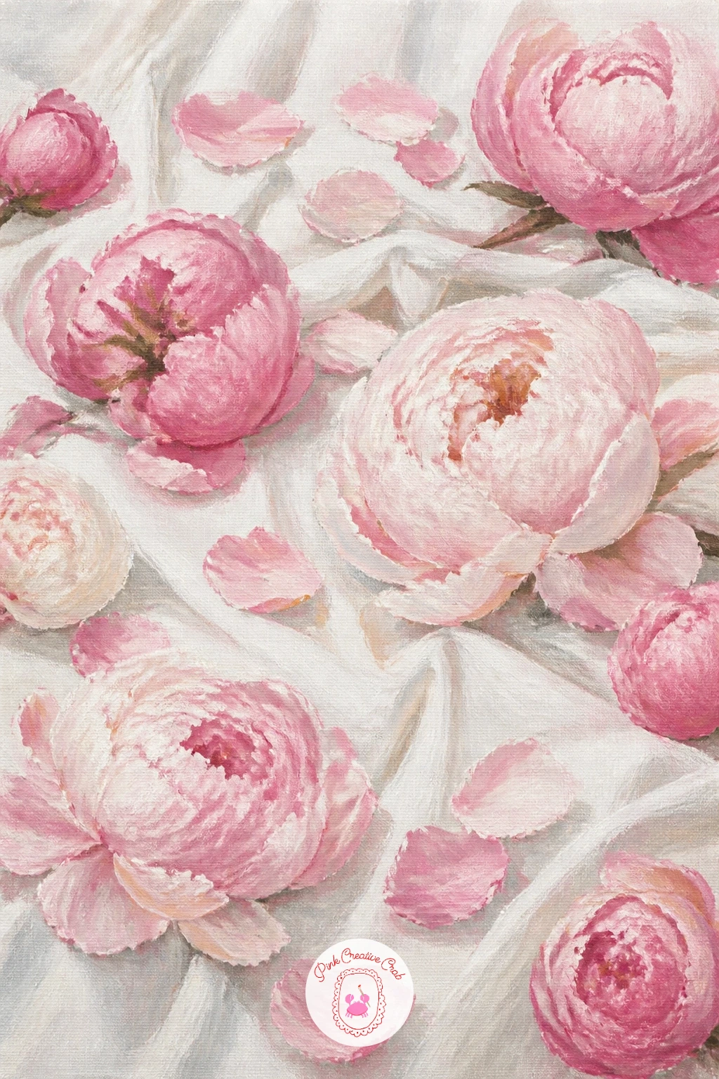
Palette: Titanium White,Cream,Blush Pink,Lavender Grey
Step outdoors for a peony bush in a walled garden, a small landscape where the wall gives you an easy way to frame the flowers. Paint the wall first as a simple textured rectangle in warm grey or terracotta, using a dry brush dragged lightly across the surface to suggest aged brick or stone without painting individual bricks.
Against that, build a full, rounded peony bush using layered dabs of pink, green and cream, working from the back of the shrub forward so the front blooms sit slightly brighter and more detailed than those behind. Eye level matters here: keep the wall’s top edge roughly level across the canvas, which keeps the whole garden feeling stable and believable.
A narrow strip of path or soil at the base grounds the bush in its setting. If brick texture feels fussy, a flat wash of warm stone color reads just as well from a normal viewing distance.
Today’s tip: vary the greens in the foliage with both warm and cool mixes, since a single flat green behind the flowers flattens the whole scene.
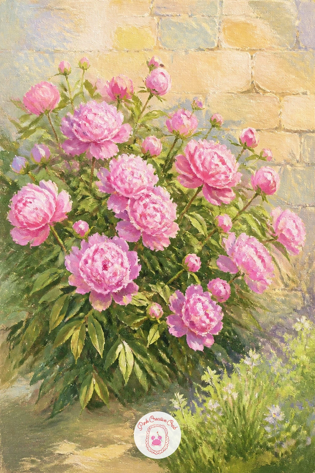
Palette: Terracotta,Sap Green,Blush Pink,Cream
Bring a figure back into the mix with a girl in a sun hat at a peony farm, a scene that pairs a simple figure with rows of flowers stretching behind her. Paint the figure first as simplified shapes: a straw hat as a flattened oval with a shallow brim, a loose dress in one soft color block, and arms simply suggested rather than detailed.
Once she is blocked in, build rows of peonies around and behind her using the same field technique from earlier, keeping blooms near her larger and more detailed while the rest soften into the distance. The usual mistake is making the figure too detailed against a loose floral background, which looks jarring, so keep her painted with the same loose confidence as the flowers.
A warm, pale sky above ties the whole scene together. If a full figure feels like too much today, crop the canvas to just her shoulders, hat and the flowers she is holding.
Today’s tip: paint the hat brim casting a soft shadow across her face rather than detailing her features, which keeps the mood dreamy rather than portrait-like.
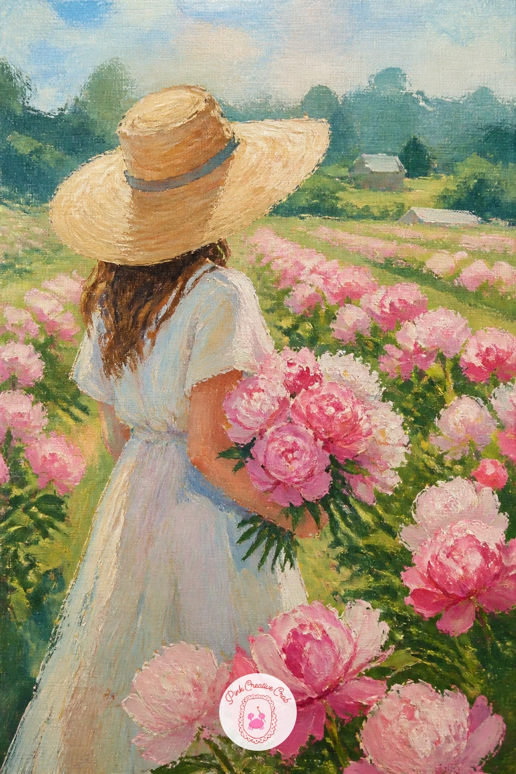
Palette: Naples Yellow,Blush Pink,Sap Green,Burnt Sienna
Moving past peonies now, try ranunculus in a low bowl, where the tightly layered petals of this bloom ask for a slightly different brush technique than the looser peony. Paint the bowl first as a simple wide shape in cream or pale sage, then build each ranunculus head from a small central spiral of tight petal strokes that gradually loosen and widen as they move outward.
This layered build is the whole trick: start with a tiny coil of color in the center and keep adding slightly larger curved strokes around it rather than painting the outer petals first. The common error is making the center too big too soon, which leaves no room for that satisfying tight spiral, so keep your first marks small.
Cluster four or five heads low in the bowl with a few stems peeking over the rim. A round-tip brush gives the tightest control for this spiral center if your flat brush feels clumsy.
Today’s tip: use at least two shades of the same color per bloom, since the spiral pattern only reads clearly when the center is slightly darker than the outer petals.
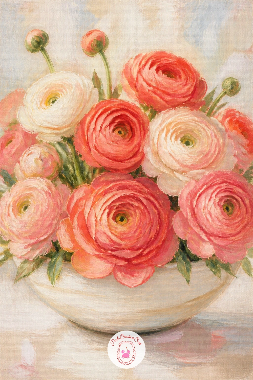
Palette: Coral,Cream,Sage Green,Blush Pink
For something small and charming, paint camellias floating in a teacup, a tabletop still life you can finish quickly since both subjects are compact. Paint the teacup first as a simple rounded shape with a thin ellipse for the rim and a small curved handle, keeping the china plain white or pale blue so it does not compete with the flower.
Float one or two camellia blooms on the water’s surface inside the cup, painting each flower as a tight rosette of smooth, overlapping petals in rich pink or white, flatter and more compact than a peony’s ruffled shape. The tricky part is the water line, so use a thin horizontal shadow just beneath each floating bloom to suggest it is resting on the surface rather than stuck to the rim.
A single dark glossy leaf tucked beside the blooms adds contrast. No teacup handy to reference? A shallow glass bowl works just as well and simplifies the ellipse.
Today’s tip: keep camellia petals smooth and rounded rather than ruffled, since that smoothness is what separates them visually from the peonies elsewhere in this list.
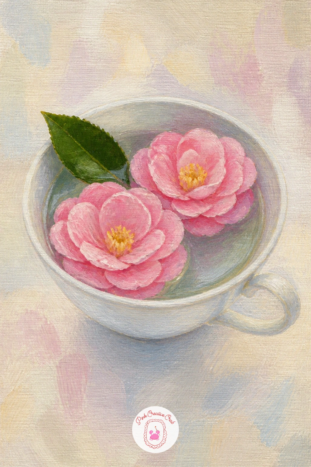
Palette: Alizarin Crimson,Titanium White,Payne’s Grey,Dark Green
For a more involved painting, try tree peonies in a Chinese garden, which combines large dramatic blooms with a simple garden setting hinted at behind them. Begin with a soft, atmospheric background wash in pale green and grey, suggesting distant foliage and perhaps the curved edge of a garden structure with just a few loose shapes, nothing detailed.
Tree peonies carry noticeably larger, more ruffled petals than garden peonies, so build each bloom bigger than you might expect, with deep maroon or rich pink centers fading to paler edges across more individual petal layers. The common mistake is treating these like ordinary peonies and painting them too small, which loses their dramatic scale, so let one or two blooms dominate most of the canvas.
Dark woody stems and a few large leaves ground the flowers in a shrub rather than a bouquet. If the background feels overwhelming, reduce it to a single soft wash of color and let the blooms carry the whole piece.
Today’s tip: push the value contrast inside each bloom further than usual, since tree peonies read as dramatic partly through their deeper shadow tones.
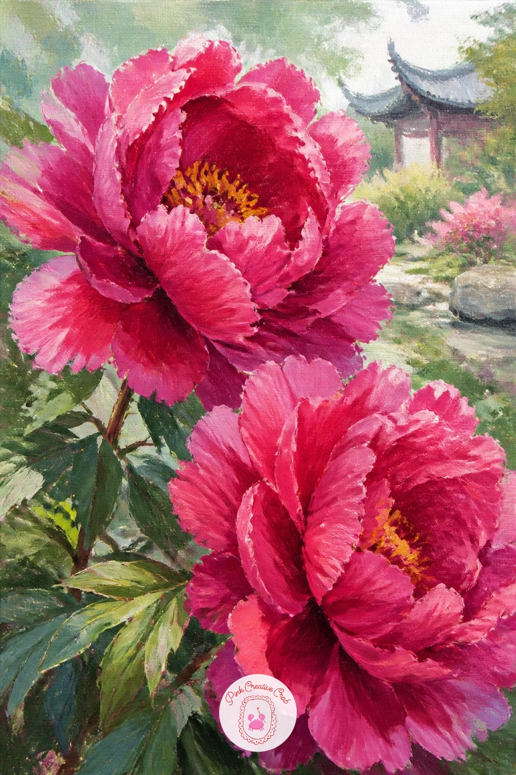
Palette: Deep Maroon,Magenta,Sage Green,Cream
Switch to a more delicate bloom with a lisianthus bouquet, chosen for its thin, almost tissue-like petals that paint beautifully with a light touch and diluted color. Thin your acrylic with a little water or medium so it moves more like a wash, then build each ruffled bloom with soft, overlapping petal strokes that stay loose and slightly transparent rather than fully opaque.
Cluster several stems together at varying heights, since lisianthus naturally grows with multiple blooms per stem in different stages of opening. The common slip here is painting every petal with full, thick coverage, which loses that delicate tissue-paper quality, so let some strokes stay thin enough to show the canvas color through.
Fine, wiry stems in a soft green tie the bouquet together at the base. If your acrylic feels too thick to thin convincingly, a touch of glazing medium keeps the color workable longer.
Today’s tip: vary bloom sizes noticeably within the same bouquet, since lisianthus stems carry both fully open flowers and smaller buds together.
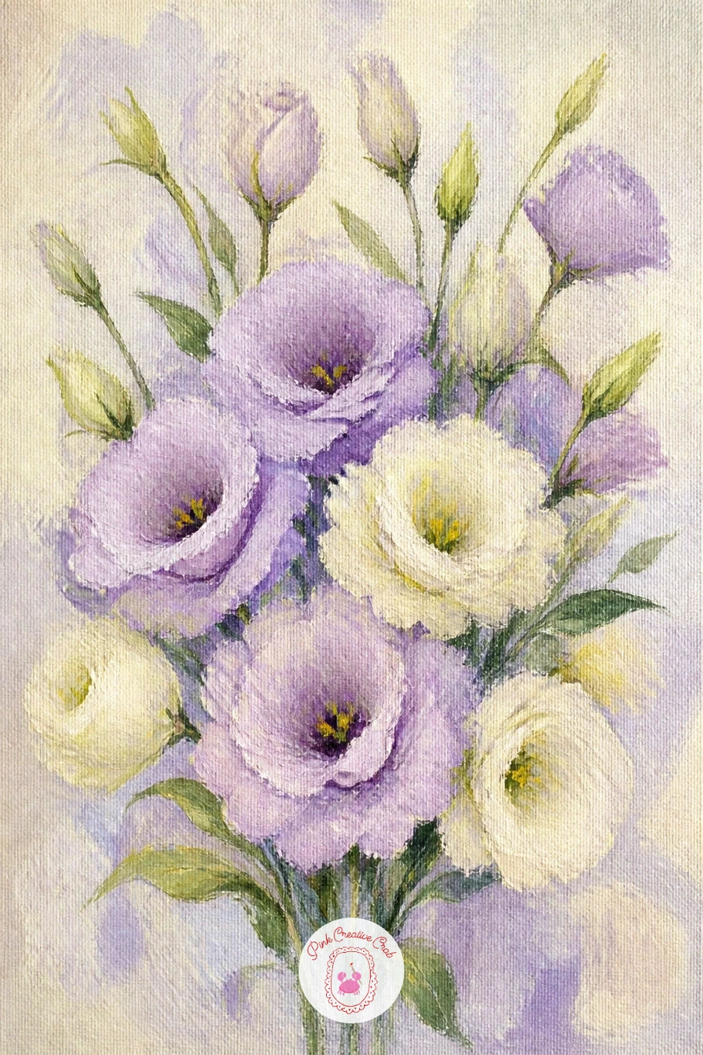
Palette: Lavender Grey,Cream,Blush Pink,Sap Green
Bring the scene indoors again with gardenias on a nightstand, a quiet still life built around the gardenia’s dense, waxy white petals and glossy dark leaves. Paint the nightstand surface first as a simple warm wood tone, then build each gardenia bloom from a tight central whorl of petals that spiral outward into looser, more open outer petals, similar in logic to the ranunculus but smoother and less tightly coiled.
Keep your white paint slightly warmed with a touch of yellow ochre rather than using it straight from the tube, since pure white petals against a pale background can look flat and chalky. The common mistake is skipping the deep glossy leaves, which are what make gardenias instantly recognizable, so paint two or three in a near-black green with a single confident highlight stroke down the center of each.
A small glass of water or a lamp’s soft glow nearby rounds out the bedside mood. If the nightstand feels unnecessary, simplify it to just a flat shelf edge below the flowers.
Today’s tip: warm your whites slightly with ochre so the gardenia petals glow rather than looking stark against the background.
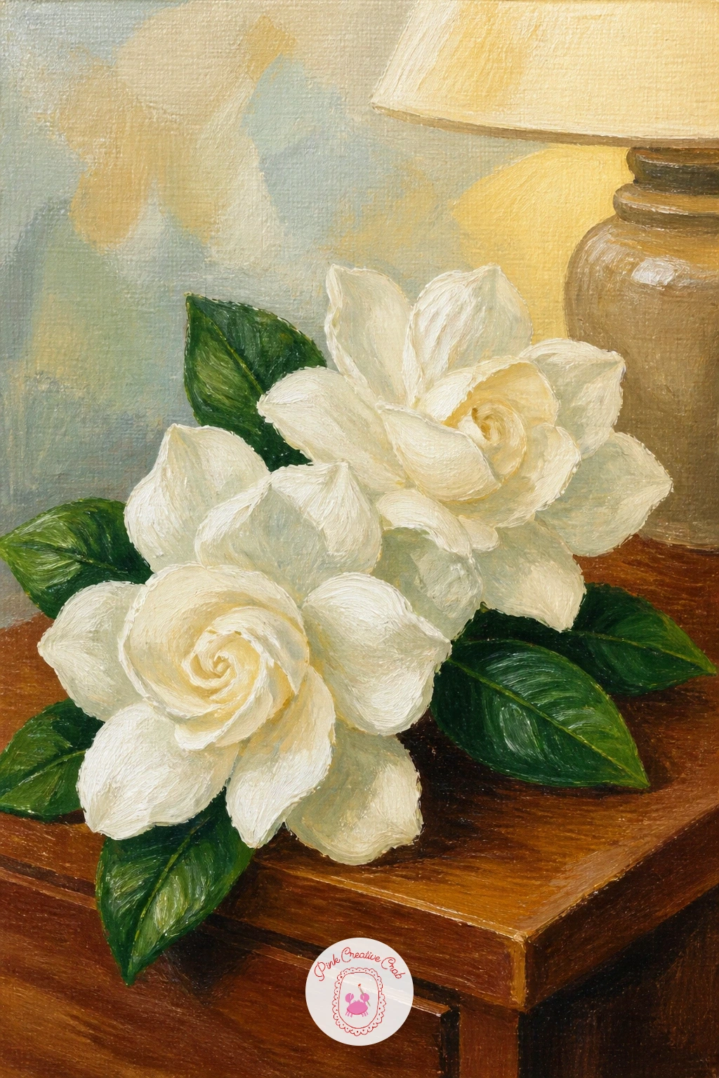
Palette: Titanium White,Yellow Ochre,Dark Green,Burnt Sienna
For a painting that leans into pure color study, try cafe au lait dahlias in a vase, prized for their warm, muted blush-to-caramel tones unlike almost any other flower on this list. Build each bloom with many small, curved petal strokes radiating from the center, since dahlias of this variety carry dozens of narrow petals rather than a few broad ones.
Mix a range of warm neutrals from pale cream through dusty caramel before you start, since the whole appeal of this bloom is subtle value shift rather than strong color contrast. The common mistake is reaching for pure white or pure brown, both of which look harsh against this flower’s soft, muddied warmth, so always mix a touch of pink or yellow ochre into your neutrals first.
A simple ceramic vase in a matching warm tone keeps the whole painting cohesive. If the many small petals feel tedious, a smaller round brush actually speeds this up by holding a cleaner curved stroke.
Today’s tip: step back from the canvas often while mixing neutrals, since cafe au lait tones are easy to accidentally push too pink or too grey up close.
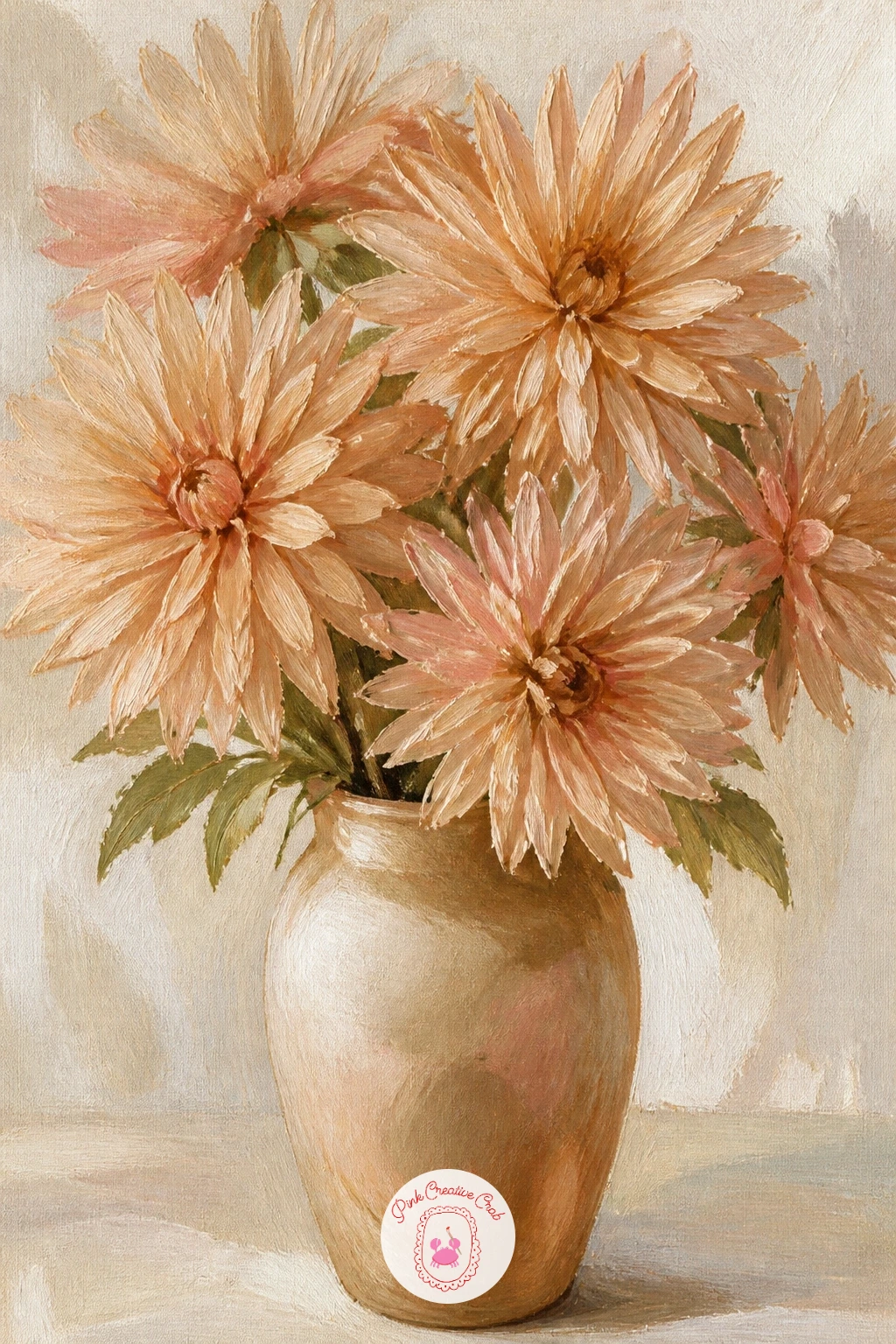
Palette: Cafe Au Lait,Dusty Pink,Yellow Ochre,Cream
Return to a landscape view with a field of ranunculus, using the same depth trick from the earlier peony field but with this bloom’s tighter, more compact shape. Lay in a soft gradient sky and ground first, then scatter loose dabs of color across the lower two-thirds, keeping dabs small and rounded since ranunculus heads sit more compact and ball-shaped than open peonies.
Vary the palette across the field with pinks, corals, creams and the occasional deep red, since ranunculus fields are typically planted in mixed colors rather than a single shade. The usual trap is spacing every dab evenly across the canvas, which looks artificial, so cluster some flowers together and leave small gaps of green between groups.
A narrow dirt path or row line running diagonally through the field adds a simple sense of distance. If the small compact dabs feel tedious to paint individually, a round brush dipped and dabbed rather than stroked covers ground faster.
Today’s tip: use at least four different flower colors across the field, since that variety is what makes a ranunculus field instantly different from a single-color peony field.
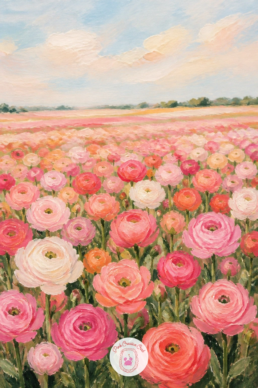
Palette: Coral,Alizarin Crimson,Cream,Sap Green
Add a weather element with a camellia shrub after rain, which brings in water droplets as a small textural challenge on top of the smooth camellia petals and glossy leaves already covered earlier. Paint the shrub first in full, using the smooth rosette technique from the teacup idea but scaled up across several blooms nestled among dark, glossy foliage.
Once the paint is dry, add raindrops with tiny dots of white paint, each followed by an even tinier dark dot just below it to suggest a shadow, which is what actually sells the illusion of a wet droplet rather than a fleck of paint. The common mistake is adding too many droplets evenly across the whole canvas, which looks more like snow than rain, so cluster them on just a few leaves and petal edges.
Deepen the greens slightly compared to a dry shrub, since wet foliage reads darker and glossier. A fine liner brush or even the end of a brush handle dipped in paint works well for the smallest droplet dots.
Today’s tip: paint every droplet’s tiny shadow dot slightly below and to one side, since a shadow centered directly under the droplet looks flat rather than three-dimensional.
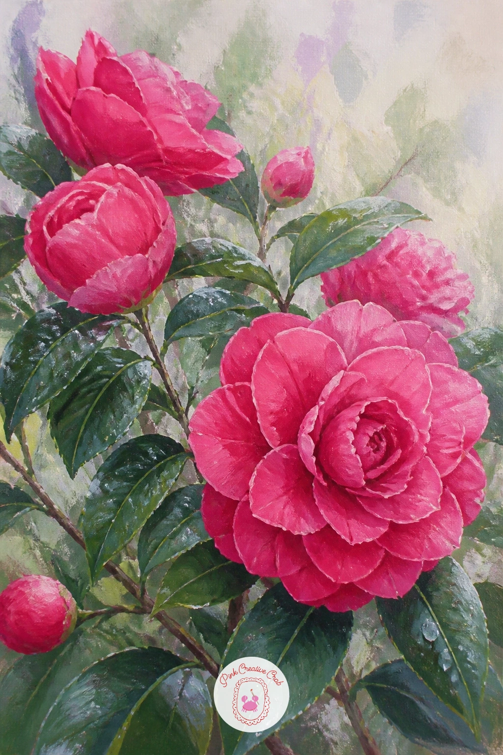
Palette: Alizarin Crimson,Dark Green,Titanium White,Payne’s Grey
Narrow the focus for a gardenia corsage on a wrist, a close, intimate composition that pairs one bloom with a small portion of skin and perhaps a ribbon. Paint the wrist and hand first as simplified, softly shaded shapes in warm skin tones, keeping fingers loose rather than detailed since the flower should hold most of the attention.
Build the gardenia using the same spiral-whorl technique from the nightstand idea, slightly smaller in scale here, with a thin satin ribbon looping beneath it in a soft pastel tone. The common error is over-rendering the hand with visible knuckles and nails, which pulls focus from the flower, so keep the skin smooth and let a few soft shadow strokes suggest form instead.
A short length of ribbon trailing off the edge of the canvas adds movement. If a hand feels too difficult today, crop even closer so only the wrist and corsage show.
Today’s tip: keep the ribbon’s folds soft and few, just two or three loops, so it reads as satin rather than stiff paper.
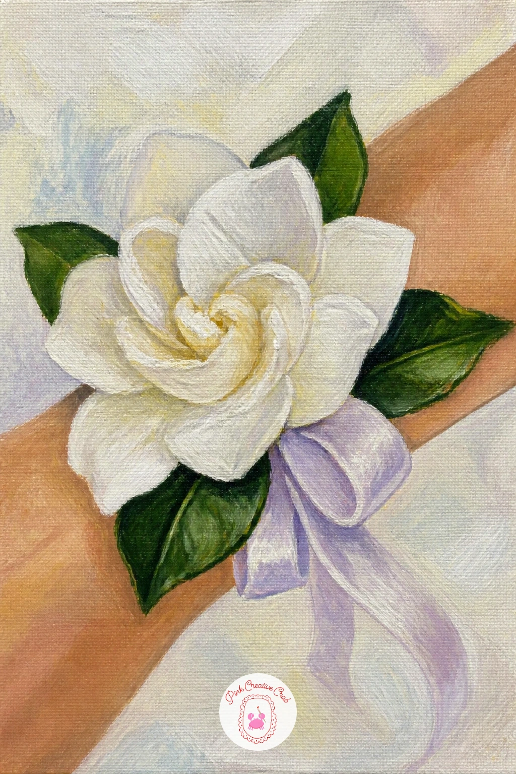
Palette: Titanium White,Yellow Ochre,Dark Green,Blush Pink
Combine everything so far into a bridal bouquet of garden blooms, mixing peonies, ranunculus and lisianthus together the way a real bridal bouquet would, held loosely at the base with trailing ribbon. Build the bouquet from the back forward, placing the largest peonies slightly lower and toward the center, then tucking smaller ranunculus and lisianthus blooms around and above them so the whole shape reads as one rounded cluster rather than scattered flowers.
Vary the palette gently within the same romantic family of blush, cream and sage so the mixed bouquet feels cohesive rather than chaotic. The common mistake with multi-flower bouquets is giving every bloom equal size and detail, which is overwhelming, so let two or three peonies lead while the smaller flowers stay slightly looser and less detailed.
Trailing ribbon in a soft satin tone winds down from the base, painted with just two or three graceful curves. If painting three flower types feels like too much today, limit the bouquet to peonies and ranunculus only.
Today’s tip: group flowers in odd numbers within the cluster, since bouquets built on threes and fives read as more natural than even pairings.
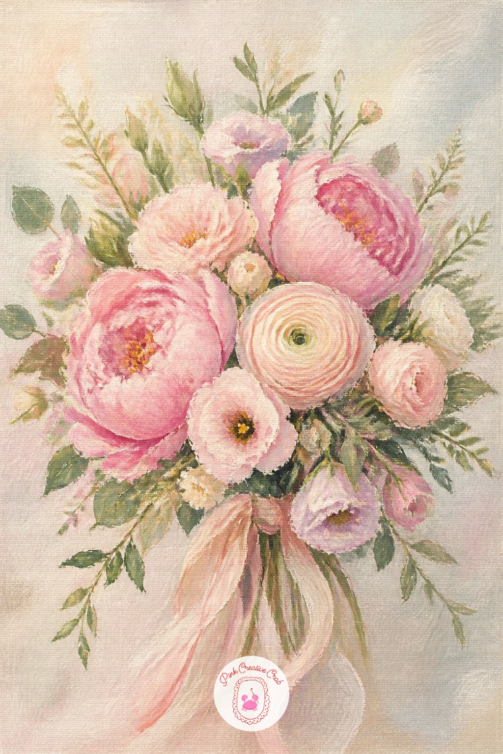
Palette: Blush Pink,Cream,Coral,Sage Green
Shift from the finished bouquet to a florist bucket of romantic blooms, a slightly looser, more market-fresh version packed with mixed stems standing tall in water. Paint the bucket first as a simple galvanized or ceramic cylinder, using a few vertical dry-brush streaks in grey to suggest metal sheen if you choose galvanized, or a flat color if ceramic feels easier.
Fill the bucket generously with upright stems of peonies, ranunculus and dahlias at varying heights, painting the tallest stems first so you know how much space remains for the shorter ones around them. The common trap is making the bucket too small for the number of blooms you want, so sketch the bucket’s width generously before adding a single flower.
Loose green foliage filling gaps between blooms keeps the bucket from looking sparse. If a market bucket feels too utilitarian, swap it for a simple terracotta pot instead.
Today’s tip: let a few stems lean at slightly different angles rather than standing perfectly upright, since real cut flowers in a bucket never line up.
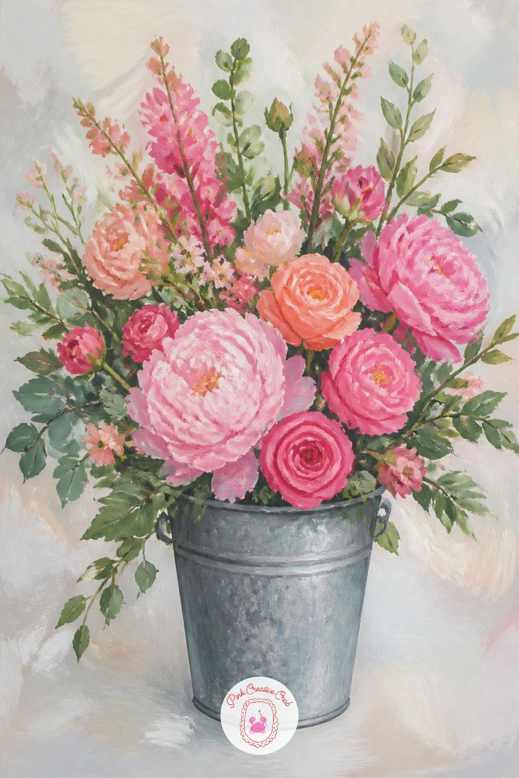
Palette: Payne’s Grey,Blush Pink,Coral,Sap Green
Keep the loose, gathered feeling going with a straw hat brimming with blooms, where the hat’s round brim becomes a natural vessel cradling a small harvest of flowers. Paint the hat first as a simple oval crown and wide curved brim in warm straw tones, using short diagonal dry-brush strokes across the brim to suggest woven texture without painting individual strands.
Once the hat is dry, fill the brim and crown with a loose pile of mixed blooms, letting some spill slightly over the brim’s edge so the composition feels abundant rather than neatly arranged. The common mistake is painting the straw texture so busy it competes with the flowers, so keep the weave strokes light and let the eye settle on the blooms instead.
A few stems trailing over the hat’s edge add a relaxed, just-gathered feel. If the woven texture feels fiddly, a flat wash of straw color with just a few darker lines reads just as convincingly from a distance.
Today’s tip: paint the brim’s shadow side a noticeably deeper straw tone to give the hat real dimension under its pile of flowers.
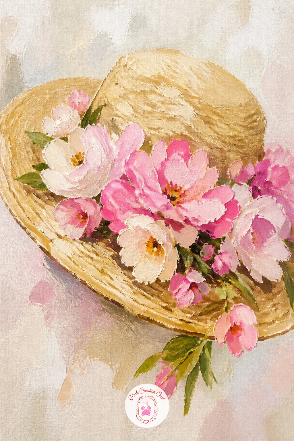
Palette: Naples Yellow,Burnt Sienna,Blush Pink,Sage Green
Slow right down for a stack of letters tied with a bloom, a small sentimental still life that pairs paper and ribbon with a single flower. Paint the stack of envelopes first as simple layered rectangles in cream and pale blue, offsetting each one slightly so the stack reads as uneven and well-loved rather than a crisp, new pile.
A thin ribbon wraps around the stack, painted in two or three confident curved strokes in a soft color, with a single small bloom like a ranunculus or lisianthus tucked beneath the knot. The common slip is making the ribbon too stiff and straight, which looks more like a gift wrap than a tied keepsake, so let it curve naturally around the paper’s edges.
A little soft shadow beneath the whole stack grounds it on whatever surface it rests on. If a full stack feels like too much detail today, simplify to just two envelopes and the ribbon.
Today’s tip: age the envelope edges with a thin line of warm grey, which instantly makes the paper feel like kept correspondence rather than fresh stationery.
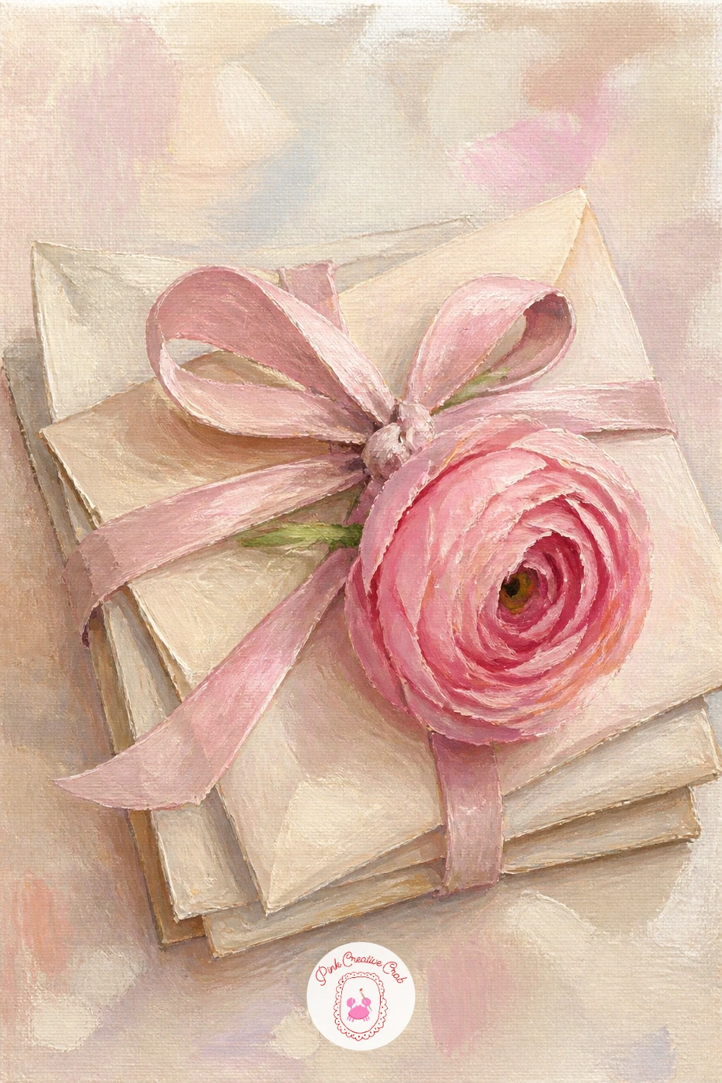
Palette: Cream,Dusty Blue,Blush Pink,Payne’s Grey
Build a wider scene with a dinner table runner of blooms and candles, a gentle still life stretching horizontally across the canvas that pairs flowers with soft candlelight. Paint the table surface and runner fabric first in muted neutrals, then place two or three candles at varying heights along the runner, since uneven candle heights read as more natural and romantic than a perfectly matched row.
Tuck loose blooms, a mix of peonies and ranunculus work well, between and around the candle bases, letting some stems and petals rest directly on the runner fabric. The common mistake is painting candle flames too large and bright, which overwhelms the softer flower colors nearby, so keep each flame small with just a touch of warm yellow at its base fading to nothing at the tip.
Soft warm light spreading from each candle onto the nearby petals ties the whole scene together. If multiple candles feel like too much, a single pillar candle among the flowers carries the same mood.
Today’s tip: paint a soft warm glow radiating a short distance from each flame onto the nearest petals, which sells the candlelight far better than the flame itself.
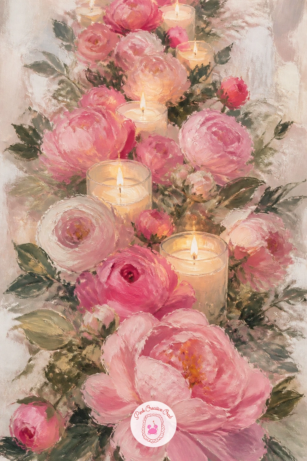
Palette: Naples Yellow,Blush Pink,Sage Green,Cream
Bring the peonies back for a flower crown of peonies and ranunculus, a circular composition that is a satisfying change of pace after so many straightforward bouquets. Sketch a simple ring shape lightly in pencil first to guide your flower placement, then build blooms around the circle working in one direction so stems and leaves naturally overlap like a real woven crown.
Alternate peonies and ranunculus around the ring for visual rhythm, keeping the peonies slightly larger and the ranunculus as smaller accents between them. The common trap with circular compositions is letting the ring go lopsided as you work around it, so step back and check the overall shape every few flowers rather than only at the end.
A few trailing ribbons or loose greenery extending from the bottom of the crown break the perfect circle in a pretty way. If keeping the ring even feels tricky, lightly trace a dinner plate for the guide circle instead of drawing freehand.
Today’s tip: leave small gaps of green stem visible between some blooms rather than packing every inch solid, since those gaps are what make a crown look woven rather than solid and heavy.
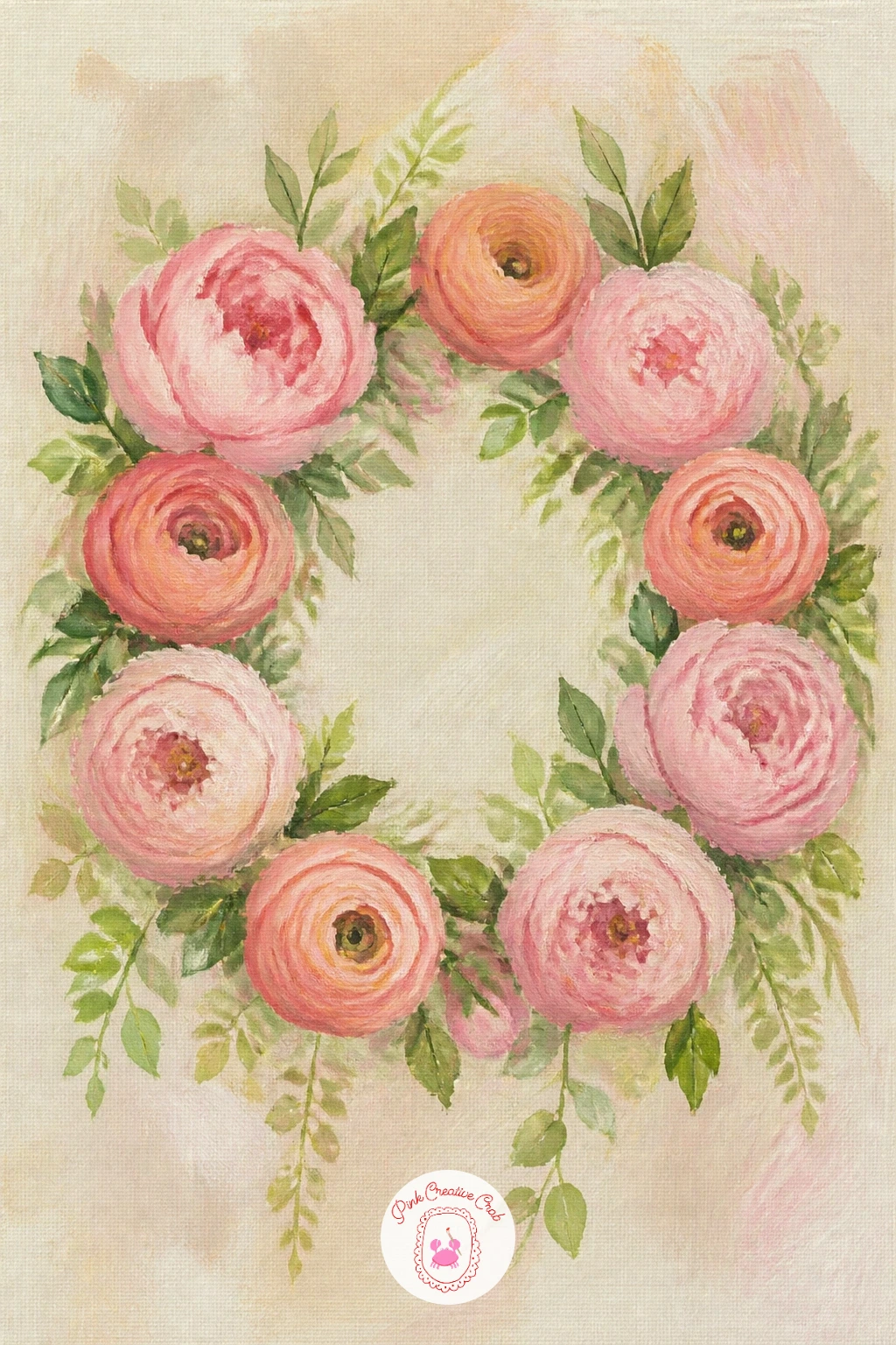
You Will Need
- dinner plate or round object to trace the guide circle
Palette: Blush Pink,Coral,Sage Green,Cream
For the most ambitious piece on this list, paint a Paris balcony overflowing with blooms, combining simple architecture with the cascading flower boxes this scene is known for. Block in the wrought iron railing first using thin, curling dark lines against a pale building facade, keeping the ironwork pattern loose and repetitive rather than copying an intricate real design exactly.
Once the railing is in place, build a flower box beneath it overflowing with mixed blooms in blush, coral and cream, letting some stems and petals spill down over the railing’s edge for that lush, cascading look. The common mistake is making the ironwork so detailed it outcompetes the flowers, so keep the railing as simple dark linework and let the blooms carry the color and texture.
A soft, pale building wall behind everything, perhaps with one shuttered window, completes the scene without extra fuss. If wrought iron feels too tricky to draw freehand, a few confident curved lines repeated in a simple pattern reads convincingly from a normal viewing distance.
Today’s tip: let flowers spill noticeably below the railing line, since that cascade is what makes a balcony scene feel romantic rather than just a flower box on a shelf.
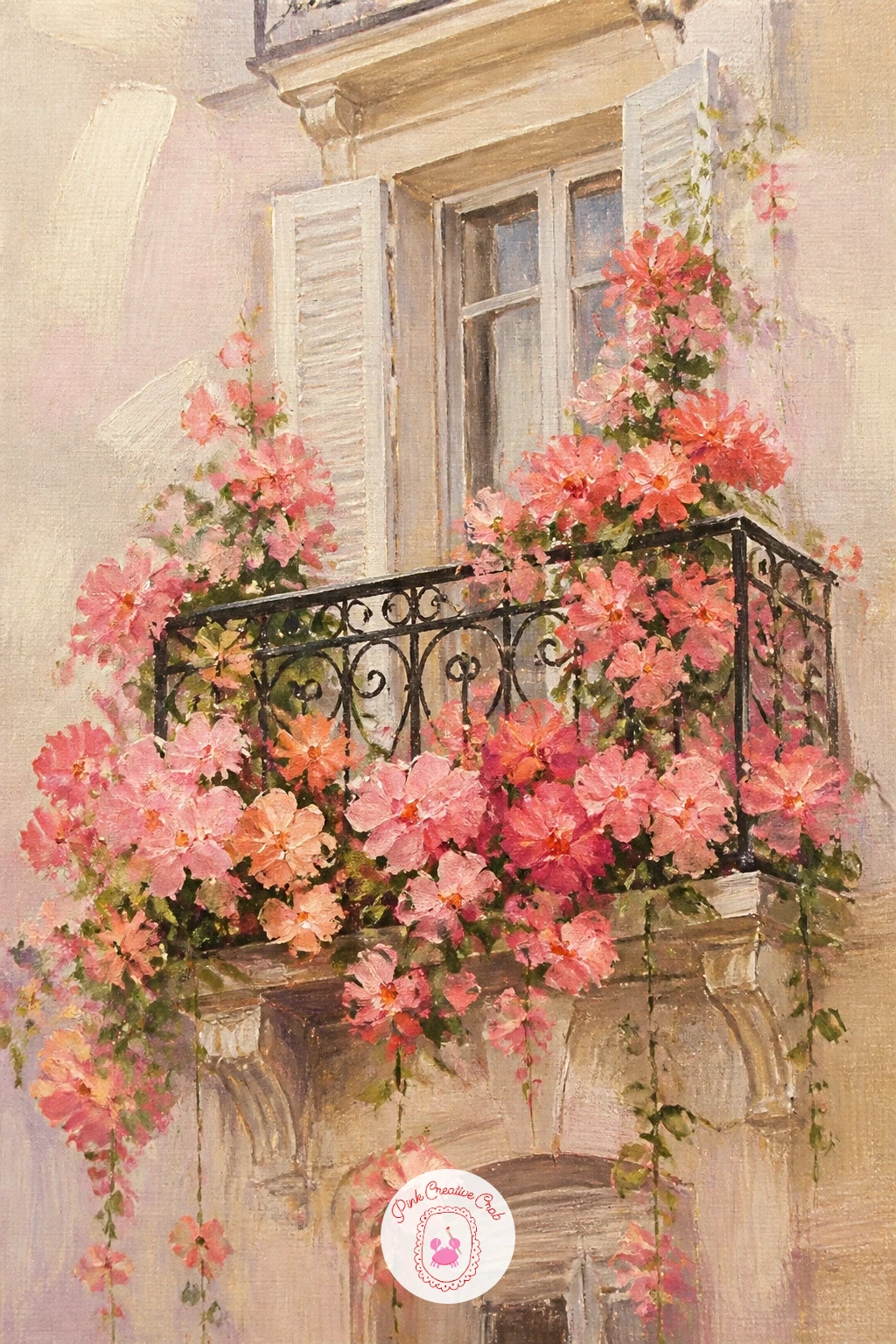
Palette: Payne’s Grey,Cream,Blush Pink,Coral
Look at reference photos of real wrought iron balconies before painting the railing freehand. Even one quick look helps you keep the curls believable without copying every detail.
Close the list with a vintage teapot used as a vase, a charming cottagecore still life that pairs a characterful object with a loose, informal flower arrangement. Paint the teapot first, giving it a rounded body, curved spout and simple handle, then add a faded floral or striped pattern with just a few small brushstrokes rather than trying to paint a busy, detailed design across the whole surface.
Once the teapot is dry, tuck a loose mix of blooms into the opening where the lid would normally sit, letting stems lean at relaxed angles rather than standing stiffly upright. The common mistake is painting the teapot pattern too crisp and modern, which fights the vintage feel, so soften the pattern edges and mute its colors slightly compared to the fresh flowers.
A worn, slightly uneven glaze finish on the ceramic, suggested with a few soft highlight strokes, adds age and charm. If a patterned teapot feels like too much, a plain cream teapot still reads as vintage with the right soft color.
Today’s tip: mute the teapot’s colors slightly below the flowers’ brightness, so the blooms stay the clear focus of the painting even though the vessel has plenty of character.
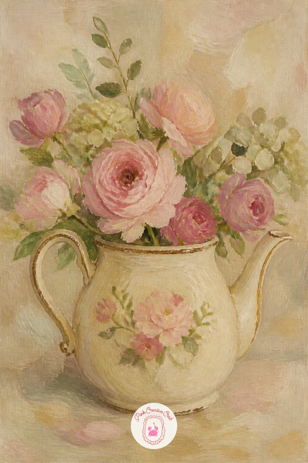
Palette: Cream,Dusty Blue,Blush Pink,Sage Green
What to Do Next
Pick whichever bloom pulled at you most while scrolling, whether that is the fluffy pink peony bursting open or the quieter camellia in a teacup, and set up on a stretched canvas or heavy board before you lose the urge. Keep your palette limited to blush, coral, cream and sage so everything you paint today already feels like part of the same romantic set.
Frequently Asked Questions
What paint works best for peony painting?
Acrylic paint works best for peony painting because it dries fast and layers in opaque, soft-edged strokes that suit the flower’s ruffled petals. Build petals from the center out, keeping edges loose with a flat or filbert brush.
How do you paint peony petals so they look soft and layered?
Vary the size and value of each petal stroke rather than repeating one uniform shape. Soften edges with a damp brush or sponge while the paint is still wet, and darken the center petals slightly for a cupped, full look.
What colors do I need for a realistic peony?
Start with a blush or quinacridone pink, titanium white, and a touch of cadmium red for the deeper center petals. Add sap green for stems and leaves, and a little yellow ochre to warm up any pale or white blooms.
Is peony painting hard for a beginner?
No, peony painting suits beginners well because petals are forgiving loose shapes rather than precise lines. Working from a mid-tone base and adding darker and lighter petal strokes on top covers most early mistakes.
How long does one peony painting take to finish?
A single bloom or small still life usually takes thirty to sixty minutes once the canvas is prepped. Larger scenes with figures or landscapes, like a peony field, take closer to an hour with drying time between layers.
Have any thoughts?
Share your reaction or leave a quick response — we’d love to hear what you think!
-
 0
-
0
-
0
-
0
-
0
-
0


