

Tulip painting gives you everything spring flower art promises: clean shapes, bold color and a subject that forgives a wobbly line because tulips are a little wonky in real life too. Acrylic suits them perfectly, since the paint goes on flat and opaque and lets you build a whole field or a single bloom in a few confident layers.
Below you will find 33 tulip scenes, from a quick jug of parrot tulips to a windmill field at sunset, each one built around a home, a person, a pet or a landscape so the flowers always have somewhere to belong. Work through them in order if you like, starting simple and building up to the busier scenes, or just scroll until one grabs you.
Using these images: free for personal projects such as printing, coloring, cards, journals and gifts. Handmade items that include them may be sold up to 30 pieces per design. More than that is commercial use and is not permitted, and neither is selling or sharing the images themselves or passing them off as your own. Please ask before any other use.
Start big and simple: block in a pale sky with a flat brush, then a thin strip of windmill-dotted horizon, before any tulips go down. Working sky first keeps the colors from muddying later, since tulip reds and pinks stay cleaner against dry paint than wet.
Paint the windmill as a few dark triangles and a cross of thin lines, kept small and loose near the horizon. For the field, lay one solid band of green first, then drag short dashes of red, pink and yellow across it in stripes that get smaller as they near the windmill.
The common mistake here is making every tulip the same size, which flattens the distance. Keep the front row chunky and the back rows thin dashes, almost a blur, and the field will read as rolling into the distance on its own.
If you want a quick comparison trick: hold your brush at arm’s length against the windmill to check it is no taller than about one third of the sky height, which keeps the whole scene feeling open and spacious. One tip for today: paint the stripes before any windmill detail, so you are not fighting to keep lines straight around wet grass.
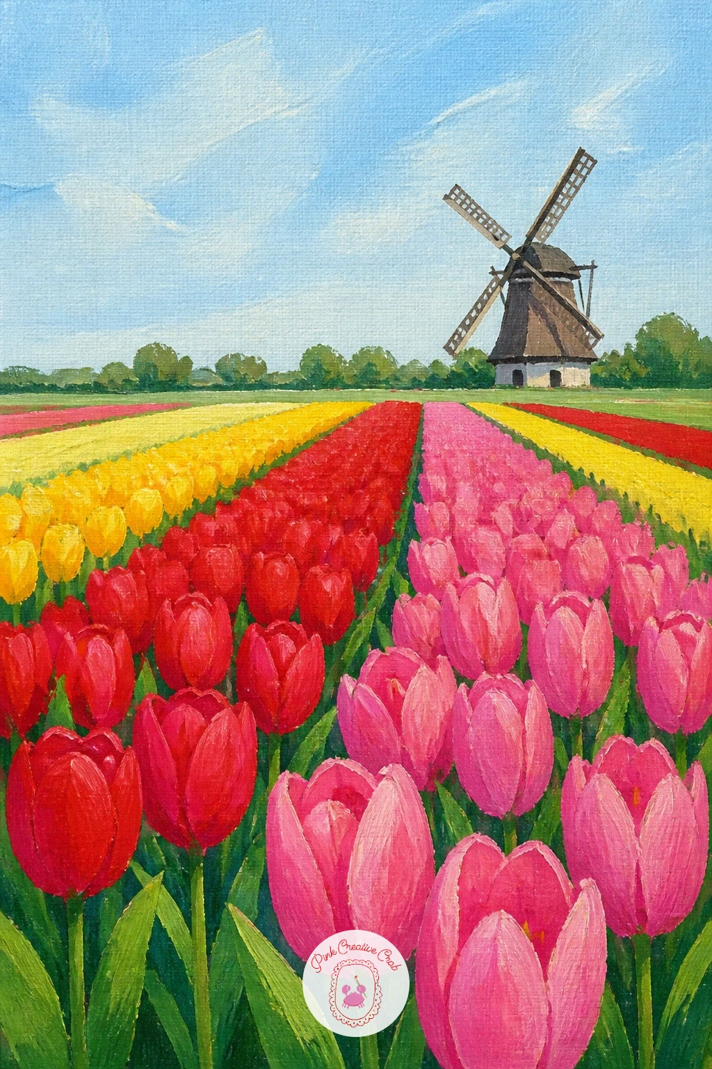
Palette: Cadmium Red,Hansa Yellow,Sap Green,Sky Blue
Girl in a yellow raincoat among tulips works well as a next step once a plain field feels easy, since now you are balancing a person against a busy background. Sketch her in pencil first, keeping the raincoat as one simple rounded shape and the tulips as a loose band around her knees, never crowding her face.
Paint the raincoat solid and bright first, since that bold yellow shape is what the whole picture leans on, then build the tulip field around her in smaller strokes once it is dry. Keep her face simple, a few soft dabs rather than detailed features, which suits this cheerful flat style far better than a realistic portrait would.
The figure tends to go wrong when she ends up too large or too central, flattening the field behind her. Place her slightly off to one side, with more tulips on the opposite side, and the whole composition breathes better.
If portraits of any kind make you nervous, you might enjoy the looser approach in this sketchbook portrait guide before coming back to try her in paint. One tip for today: paint her boots a muted color, not black, so they do not pull all the attention to the bottom of the frame.
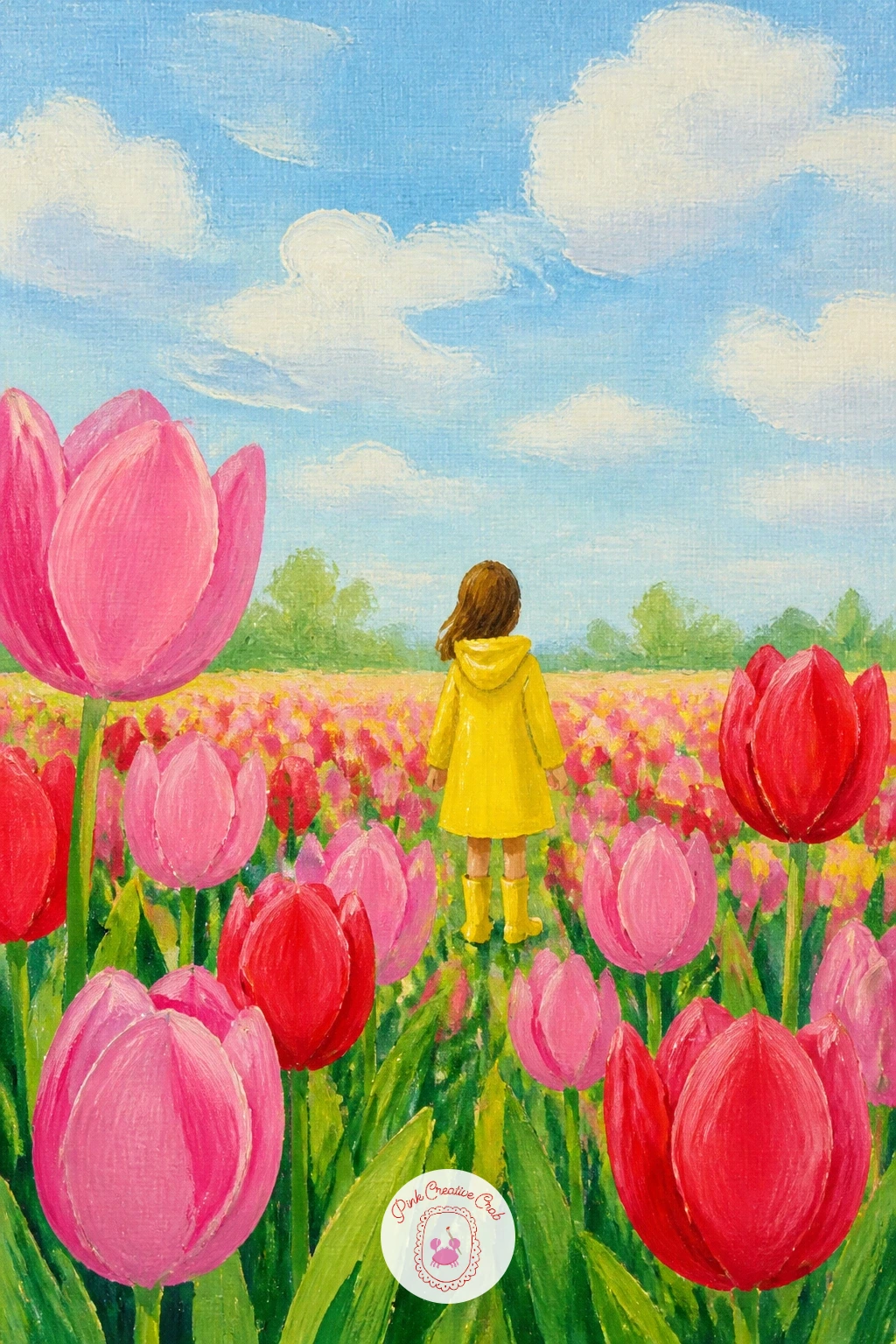
Palette: Cadmium Yellow,Tulip Pink,Sap Green,Raw Umber
Parrot tulips bring their own drama with ruffled, feathered petal edges, so a plain jug is the perfect quiet base to paint them against. Draw the jug shape first with a few simple pencil lines, then the stems, before adding the flower heads so the proportions stay believable.
Block each petal in flat color first, pink or orange-red, then once dry, load a smaller brush with a darker shade and drag short jagged strokes along the petal edges to suggest the ruffle. Resist outlining every frill with one continuous line, since parrot tulips read better as rough, broken marks than as neat scallops.
If the petals start to look like plain tulips with a messy edge, step back and add two or three bolder streaks of a second color right through the petal, which is the real signature of this variety. A dry, barely loaded brush works best for that streaky texture.
No jug on hand to reference? A mug or small vase photo works just as well, since the point is a simple rounded container that does not compete with the ruffled blooms. One tip for today: leave the jug’s highlight as bare canvas rather than painting white over color.
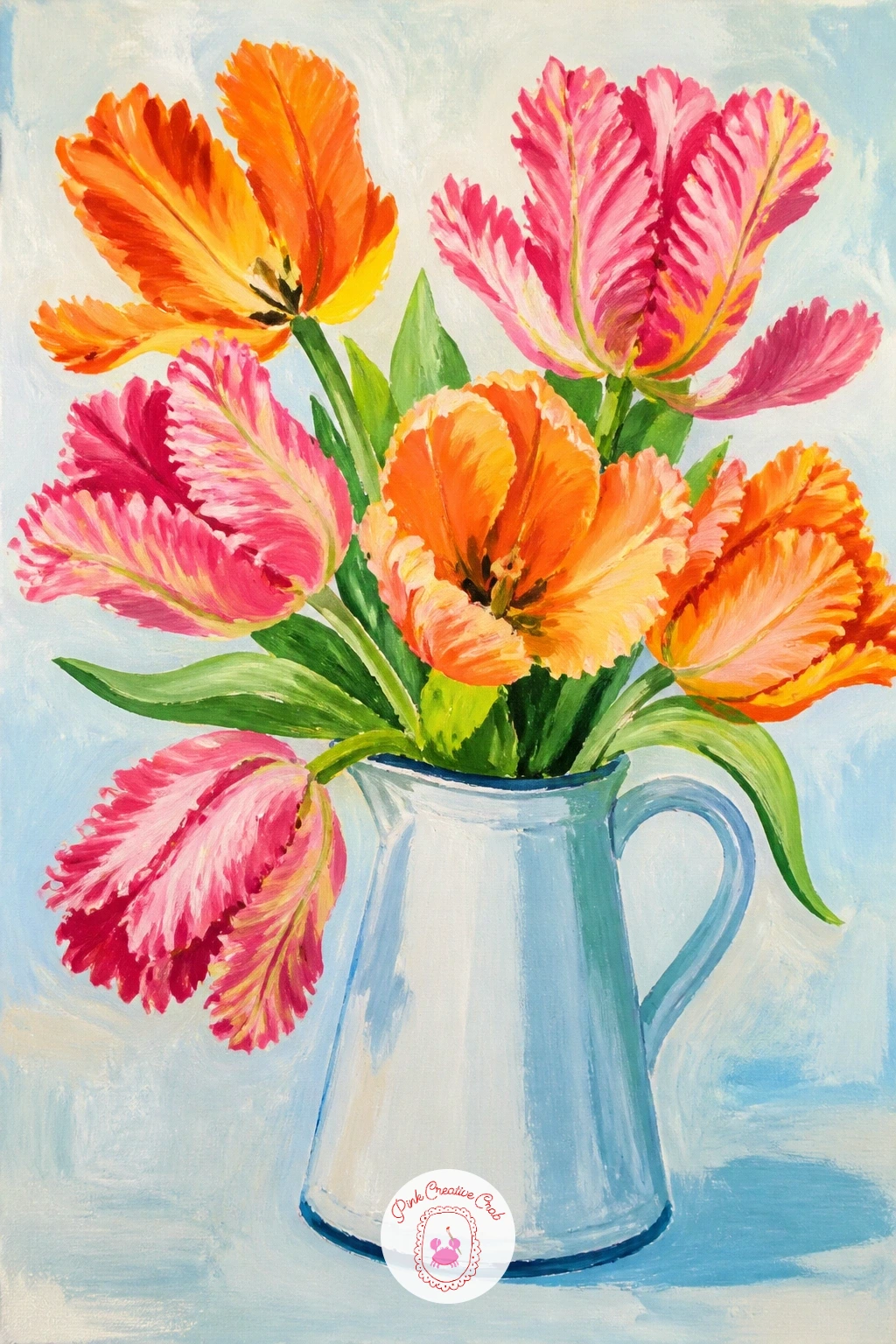
Palette: Tulip Pink,Cadmium Orange,Titanium White,Payne’s Grey
A dry brush dragged lightly across a dried petal edge gives that feathered parrot tulip look far better than a fine liner line.
Move from a single jug to a bustling little scene with tulips wrapped in paper at a flower stall, which adds the fun challenge of painting crinkled paper alongside soft petals. Block in the paper cone shape first in a flat cream or kraft brown, since that large mid-tone shape anchors the whole composition before any flowers go on top.
Paint the tulip heads poking out the top in loose clusters of red, pink and yellow, overlapping them so no single bloom sits alone. Once the paper layer is dry, add a few angled lines in a slightly darker brown to suggest the folds and creases, keeping them diagonal rather than straight up and down.
This scene often goes flat when the paper and the stall background are too similar in tone. Paint the background a touch darker or cooler than the paper cone so the bouquet pops forward.
If a whole flower stall feels like too much for one sitting, crop in tight on just the wrapped bunch and skip the stall setting entirely. One tip for today: add one single stray tulip head poking out sideways from the bunch, which makes the wrap look genuinely full rather than arranged.
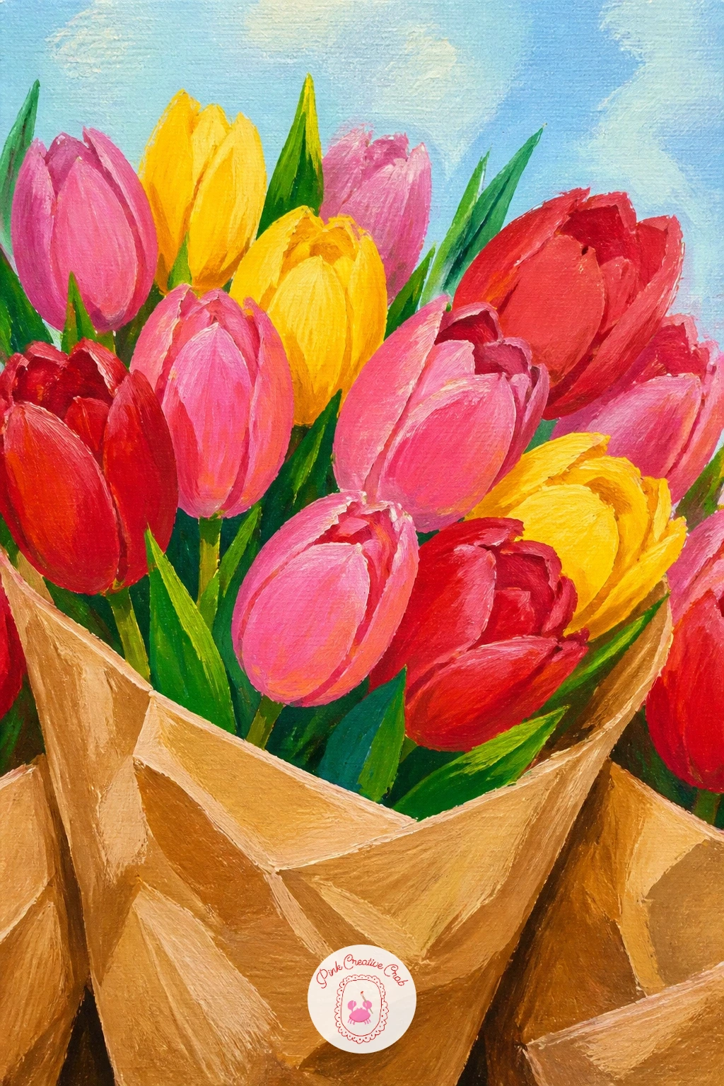
Palette: Raw Sienna,Tulip Pink,Cadmium Red,Hansa Yellow
Tulips drooping elegantly in a glass vase is a favorite subject because the curved stems do most of the work for you. Sketch the vase lightly, then draw each stem as a gentle curve rather than a straight line, since real tulips bend toward the light within a day or two in water, which is exactly the graceful look you want here.
Painting glass is simpler than it looks: block the vase in a very pale blue-grey, then drop a few strokes of pure white and a touch of the background color into it while still wet, which reads instantly as transparent glass. Paint the petals next, letting a few heads droop low over the rim.
The curves can turn stiff if every stem bends the same amount. Vary the angle of each one, with at least one almost straight and one dramatically curved, and the whole arrangement feels more natural.
If glass feels tricky today, swap in a plain ceramic jug instead and keep the focus on those drooping stems. One tip for today: paint the stems visible through the water a slightly greener, blurrier version of their color above the waterline.
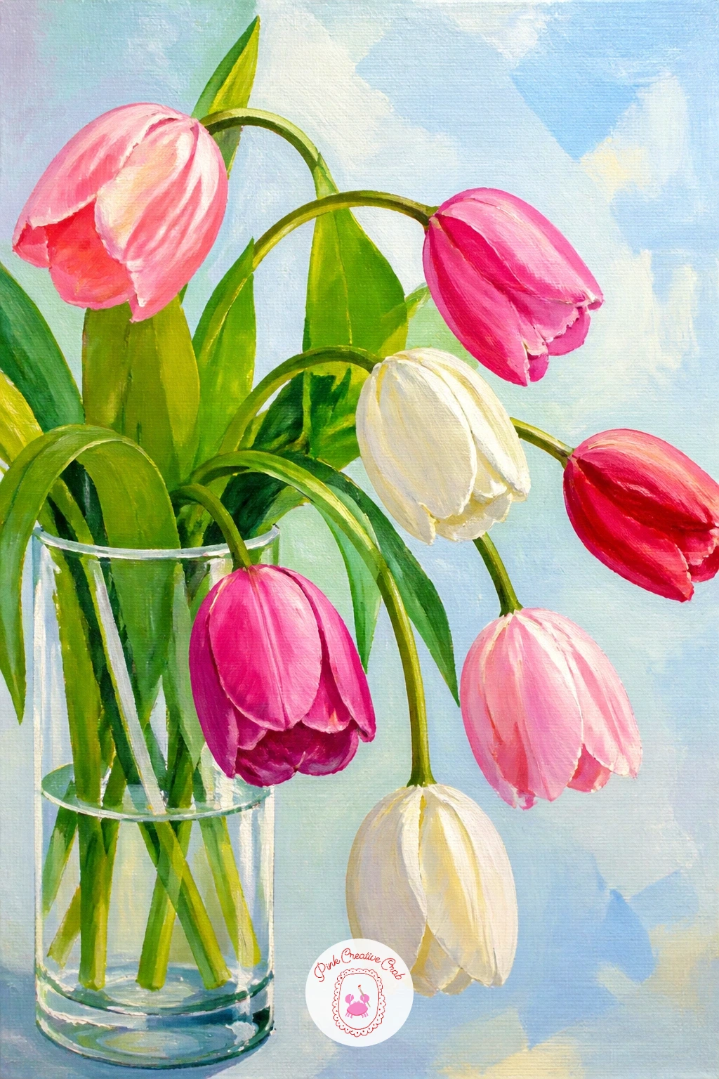
Palette: Tulip Pink,Sap Green,Titanium White,Payne’s Grey
Striped Rembrandt tulips, with their flame-like streaks of color, reward a two-layer approach rather than trying to paint the pattern all at once. Block each petal in its base color first, usually a soft white or pale yellow, and let it dry completely before touching the streaks.
Once dry, load a fine round brush with red or deep pink and paint the streaks as flame shapes running from the base of the petal upward, narrowing as they go. Vary the width and length of each streak across the different petals, since no two ever match exactly in real tulips.
The streaks tend to look pasted-on if they all point the same direction. Let a few curve slightly to follow the petal’s own curve, which ties the pattern to the form rather than sitting on top of it.
If you want a bolder result, this flower pairs beautifully with ideas in acrylic painting flowers for more petal texture tricks. One tip for today: paint the streaks while slightly thinning the red with water, so it feathers softly into the white rather than sitting as a hard line.
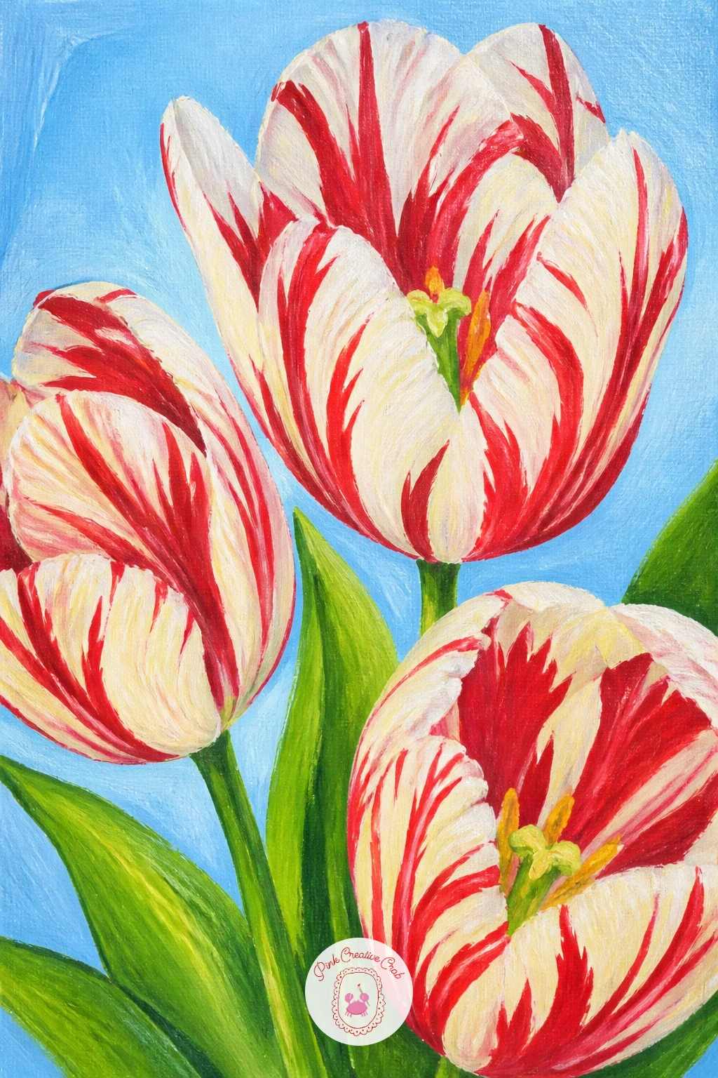
Palette: Titanium White,Cadmium Red,Hansa Yellow,Sap Green
Tulips planted in wooden clogs gives you a quirky, cheerful subject that leans hard into the Dutch theme without needing an entire landscape. Draw the clog shape first, a simple rounded boot form, and keep it slightly tilted rather than sitting perfectly flat, which makes it look more like a planter and less like a shoe diagram.
Paint the clog a warm solid tan or mustard first, then once dry, add one or two darker strokes along its curved underside to give it weight. Build the tulips growing up out of the opening in a tight cluster, stems overlapping, leaves tucked between them.
This scene can look stiff if the clog sits dead center with the tulips evenly spaced above it. Push the clog slightly off to one side and let a few tulip heads lean outward past its edges, which makes the whole arrangement feel like it is spilling over naturally.
No wooden clog reference handy? A simple garden boot or watering can shape works just as well for the planter. One tip for today: add a thin dark line where the clog meets the ground to ground it, otherwise it can look like it is floating.
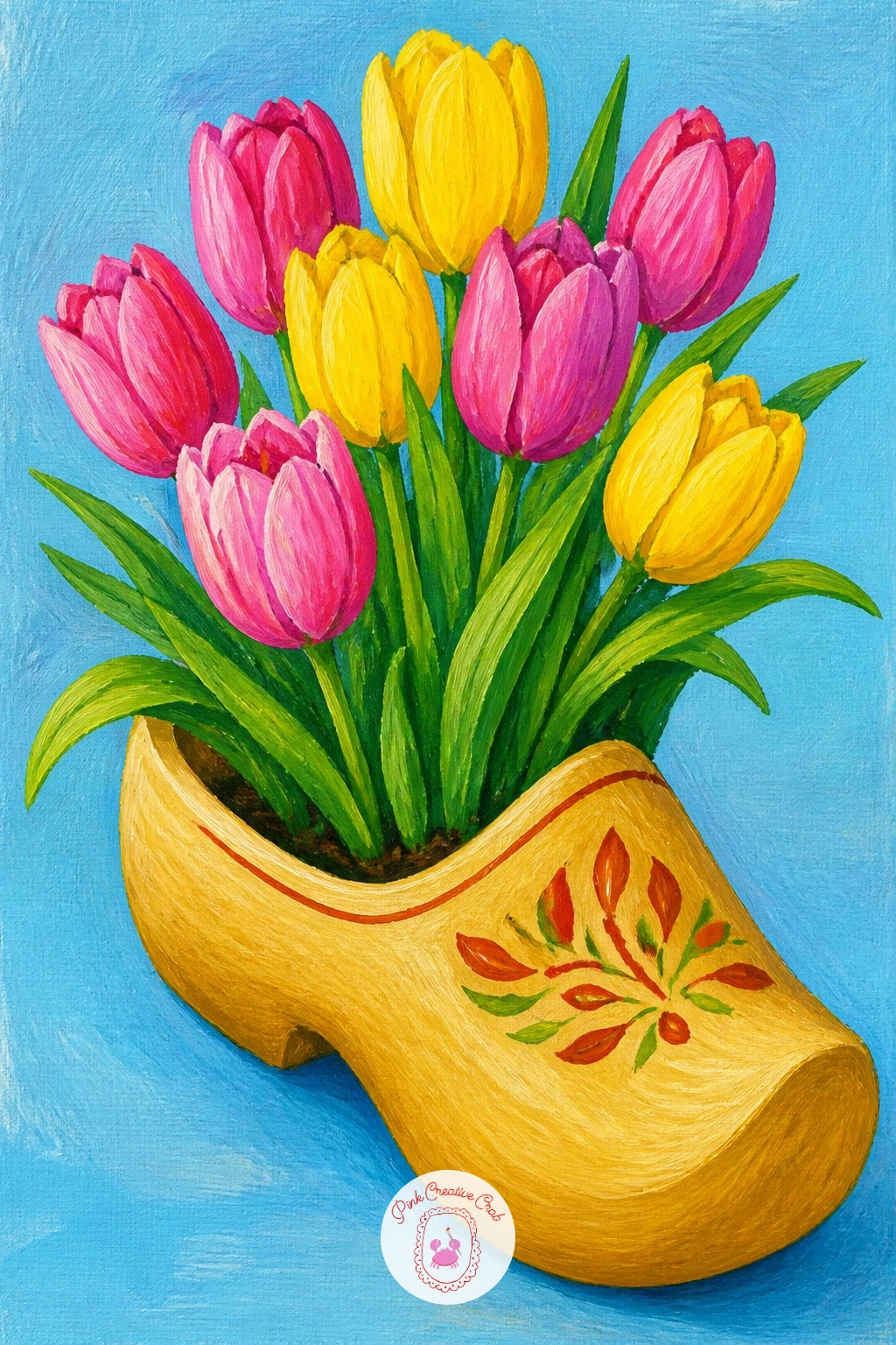
Palette: Raw Sienna,Tulip Pink,Hansa Yellow,Sap Green
Zoom right in for this one: a tulip bud with raindrops is a quiet, close study that works beautifully as a smaller canvas. Paint the bud first as one solid closed shape, since tulip buds stay tightly furled rather than open, with just a hint of the inner petal color peeking at the top seam.
Once the petal color is dry, mix a little white with water for the raindrops and dot them on as small rounded highlights, each with a tiny darker shadow just beneath to give them weight. Keep them irregular in size, never a neat scattered grid.
Raindrops often end up looking like plain white dots rather than water. The trick is adding one single bright white fleck inside each drop, off to one side, which is the actual highlight that makes an eye read it as glass-clear water sitting on a surface.
If you have one, a white gel pen laid over the dry paint gives crisp little highlight dots faster than trying to paint them with a brush. One tip for today: let a couple of drops run slightly down the petal with a thin trailing line, rather than making every one a perfect sphere.
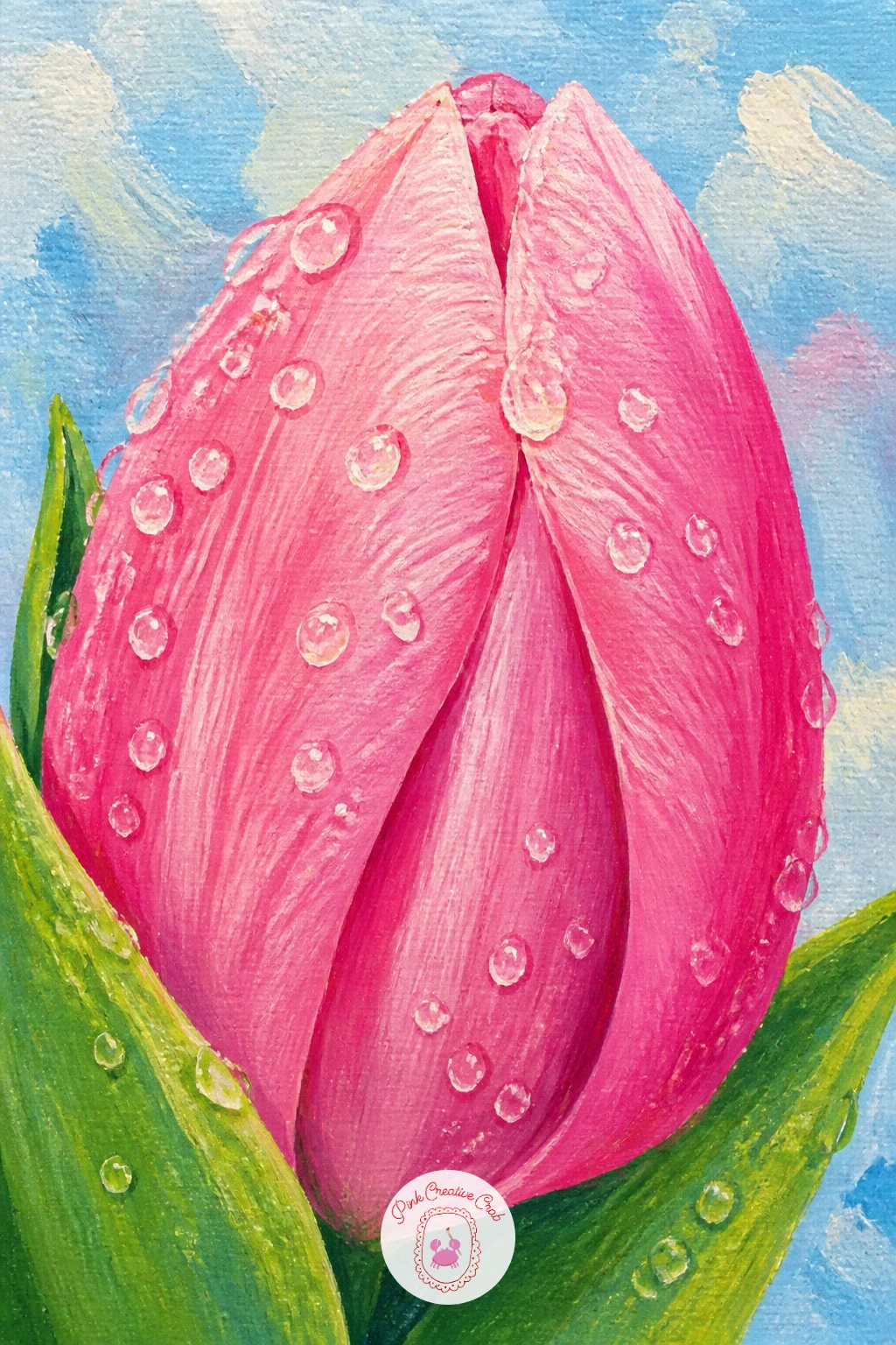
You Will Need
- white gel pen (optional)
Palette: Tulip Pink,Sap Green,Titanium White,Payne’s Grey
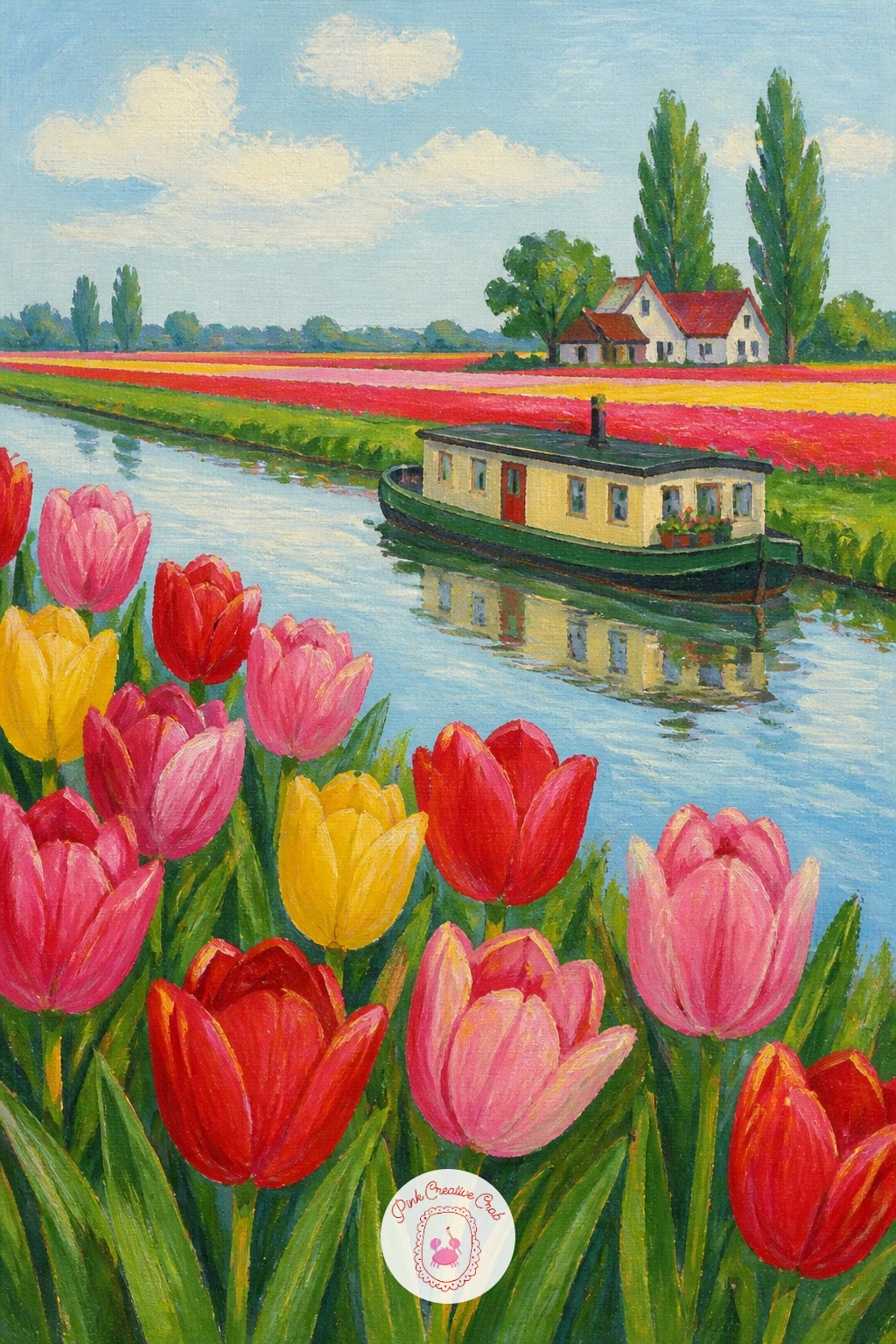
Bring the field back but add water this time: a tulip field along a canal with a houseboat lets you practice reflections alongside those bold color stripes. Paint the sky and water first as two flat bands, keeping the water a slightly darker, greyer version of the sky color, before any tulips or boat go in.
Add the houseboat as a simple rectangular cabin shape sitting low on the waterline, with a few window dots and a thin chimney line. Paint the tulip stripes along the near bank, keeping them tallest and brightest closest to the viewer.
Reflections are the easy win here and the easy trap: paint a soft, slightly blurred mirror of the houseboat directly below it in the water using a dry, barely-loaded brush, dragged downward once. A sharp, detailed reflection looks wrong; a loose smudge looks right.
If a boat feels fiddly today, a simple canal bridge shape works as a stand-in and is easier to get proportion-right. One tip for today: keep the canal narrow, no more than a third of the canvas width, so the tulip field still dominates the scene.
Palette: Sky Blue,Payne’s Grey,Cadmium Red,Sap Green
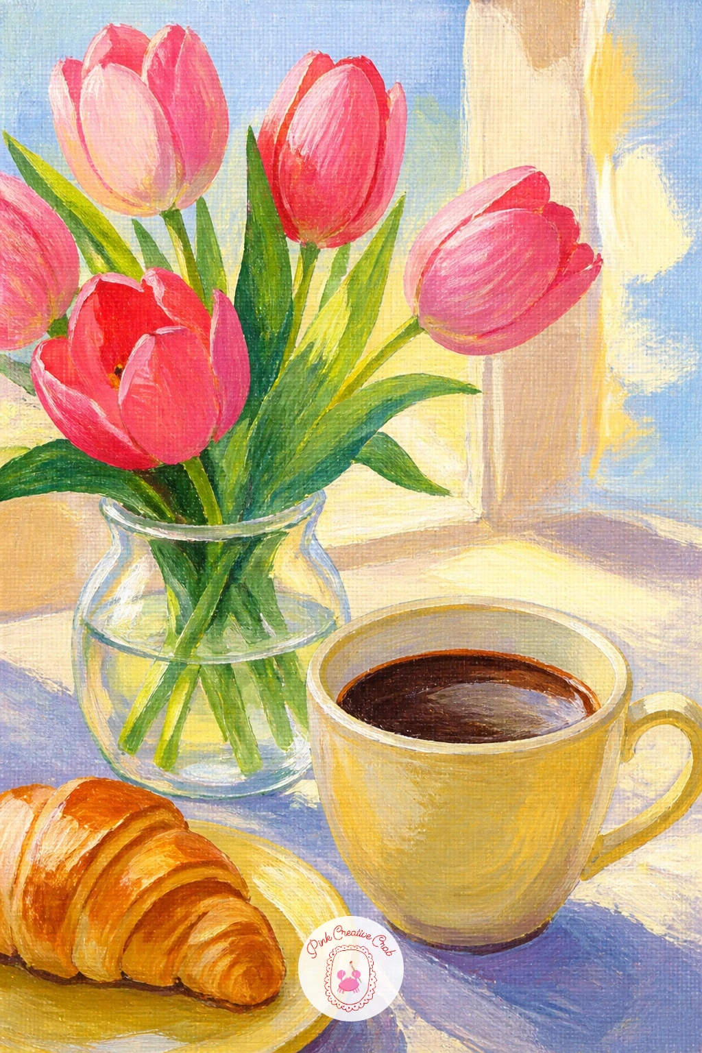
Tulips on a breakfast table with coffee turns the flowers into part of an everyday still life, which makes for a relaxed, homely painting. Start with the table surface as one flat mid-tone, then place the coffee cup and the vase of tulips as simple overlapping shapes, keeping the cup smaller than the flowers so they stay the hero.
Paint the coffee cup next: a solid white or cream body, a darker ellipse for the coffee inside, and one thin curved handle. Build the tulips above and behind it in loose, bright color, letting a petal or two slightly overlap the cup’s rim for depth.
Steam is the detail that sells a hot drink, and it is also where this scene most often goes wrong, with steam painted too thick and solid. Use a dry brush with barely any paint to drag two or three faint curling wisps upward, almost transparent.
If coffee is not your thing, a teapot works just as well in this same cozy composition. One tip for today: add one small accessory, a spoon or a folded napkin, to make the table feel lived-in rather than staged.
Palette: Tulip Pink,Raw Umber,Titanium White,Hansa Yellow
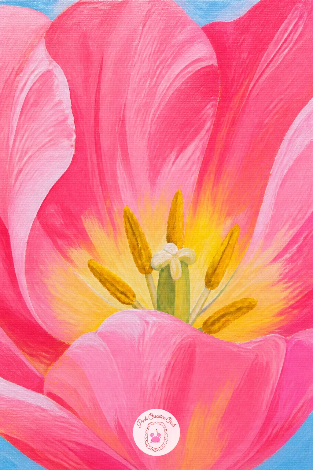
Strip everything back for a pink tulip close-up, letting one single bloom fill the whole canvas with nothing else competing for attention. Sketch just the outer petal outline large and simple, cropping the edges of the frame so the flower feels bigger than the canvas itself.
Block the base petal color in flat first, then while that layer is dry, mix a slightly deeper pink and paint soft shadow shapes where petals overlap each other, following the natural curve of each fold. Finish with a touch of white or pale yellow blended into the petal centers for warmth.
This close-up only works if the petal shapes stay soft and rounded rather than sharp and pointed, since overly sharp edges make tulip petals look more like tropical flowers. Soften any hard edge with a slightly damp clean brush while the paint is still workable.
If you enjoy this scale of flower study, browse more close-cropped bloom ideas in oil painting flowers for comparison, even working in a different medium. One tip for today: leave the very center of the flower slightly darker and less detailed, which draws the eye straight to the brighter outer petals first.
Palette: Tulip Pink,Titanium White,Hansa Yellow,Payne’s Grey
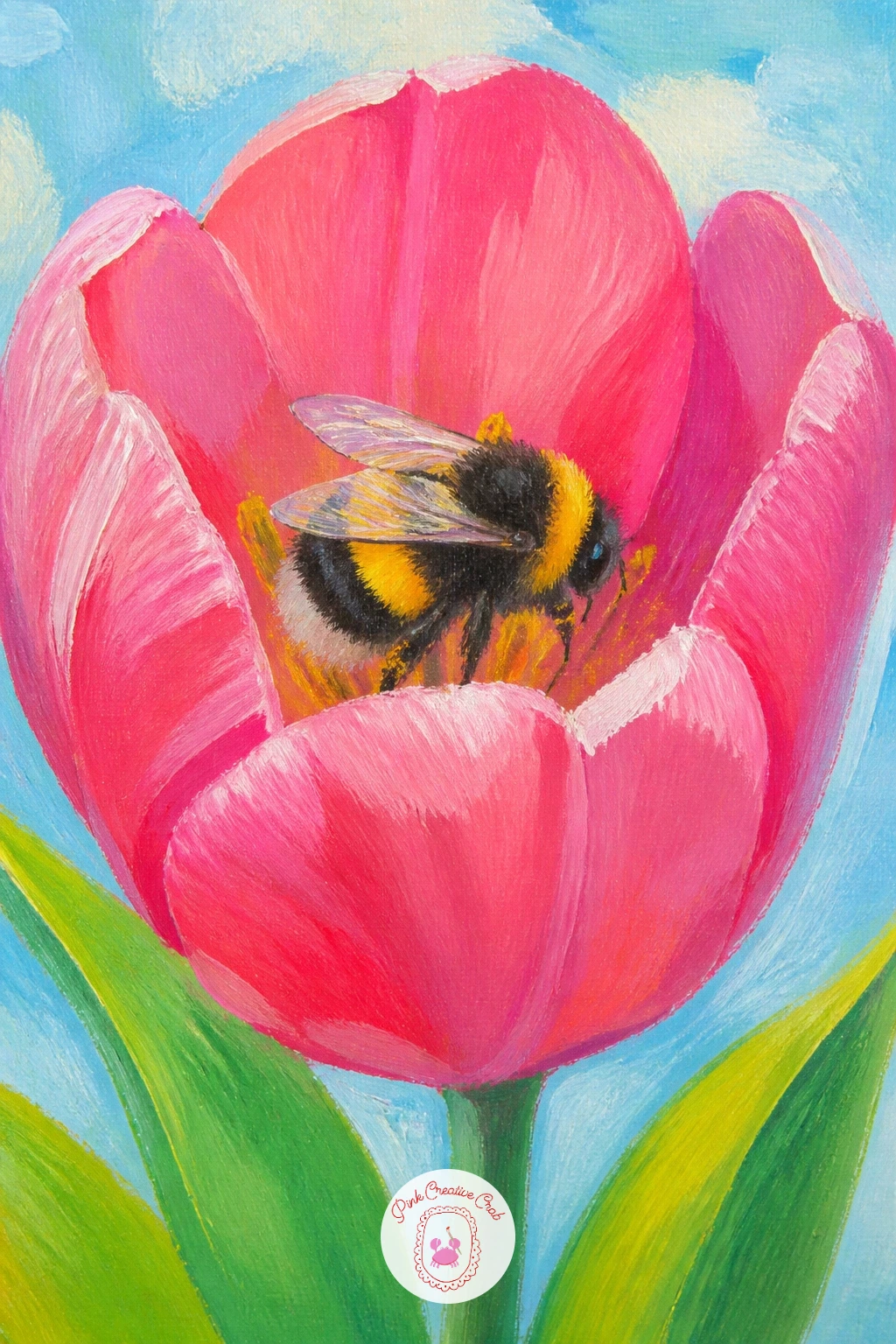
Add a tiny visitor this time: a bumblebee in a tulip gives the whole piece a little story and a fun small detail to finish on. Paint the tulip first exactly as a normal bloom, open wide at the top so there is clearly room for a bee to sit inside it, and let it dry fully before adding anything on top.
Build the bee last as a small oval body in black and yellow stripes, with two simple rounded wing shapes in pale grey added with a light, almost dry brush so they look slightly see-through. Tuck the bee low inside the petal so it looks like it has actually landed there.
The eye-catching part of any bee is its wing placement, and getting the light wrong here is the easy mistake: if your light source comes from the upper left, the wings should catch a bright highlight on that same side, with a soft shadow falling just beneath the body onto the petal.
If painting a bee this small feels fiddly, a fine liner pen over dry acrylic gives you crisper stripes than a tiny brush can manage. One tip for today: two tiny dots of white for the eyes make the bee instantly readable from across a room.
You Will Need
- fine liner pen (optional)
Palette: Tulip Pink,Ivory Black,Hansa Yellow,Titanium White
Tulips in the window of an Amsterdam house brings in a little architecture, which sounds daunting but stays simple if you treat the building as flat rectangles. Paint the house facade first as one solid color block, tall and narrow, then add the window as a lighter rectangle set into it before anything else goes on.
Place a small vase or window box of tulips sitting right on the windowsill, painted bright against the darker window interior behind it, which is what makes the flowers pop forward. A thin dark line along the window frame edges ties the whole shape together.
Dutch gables are the detail everyone wants to add and the detail that most often throws the proportions off. Keep the stepped roofline small and simple at the very top of the canvas, no more than a fifth of the total height, so it reads as a hint of place rather than a whole architectural study.
If gabled rooflines feel like too much today, a plain flat-topped window in any ordinary house front tells the same story. One tip for today: paint the window glass a touch darker than the sky, which instantly makes it feel like an interior rather than a hole in the wall.
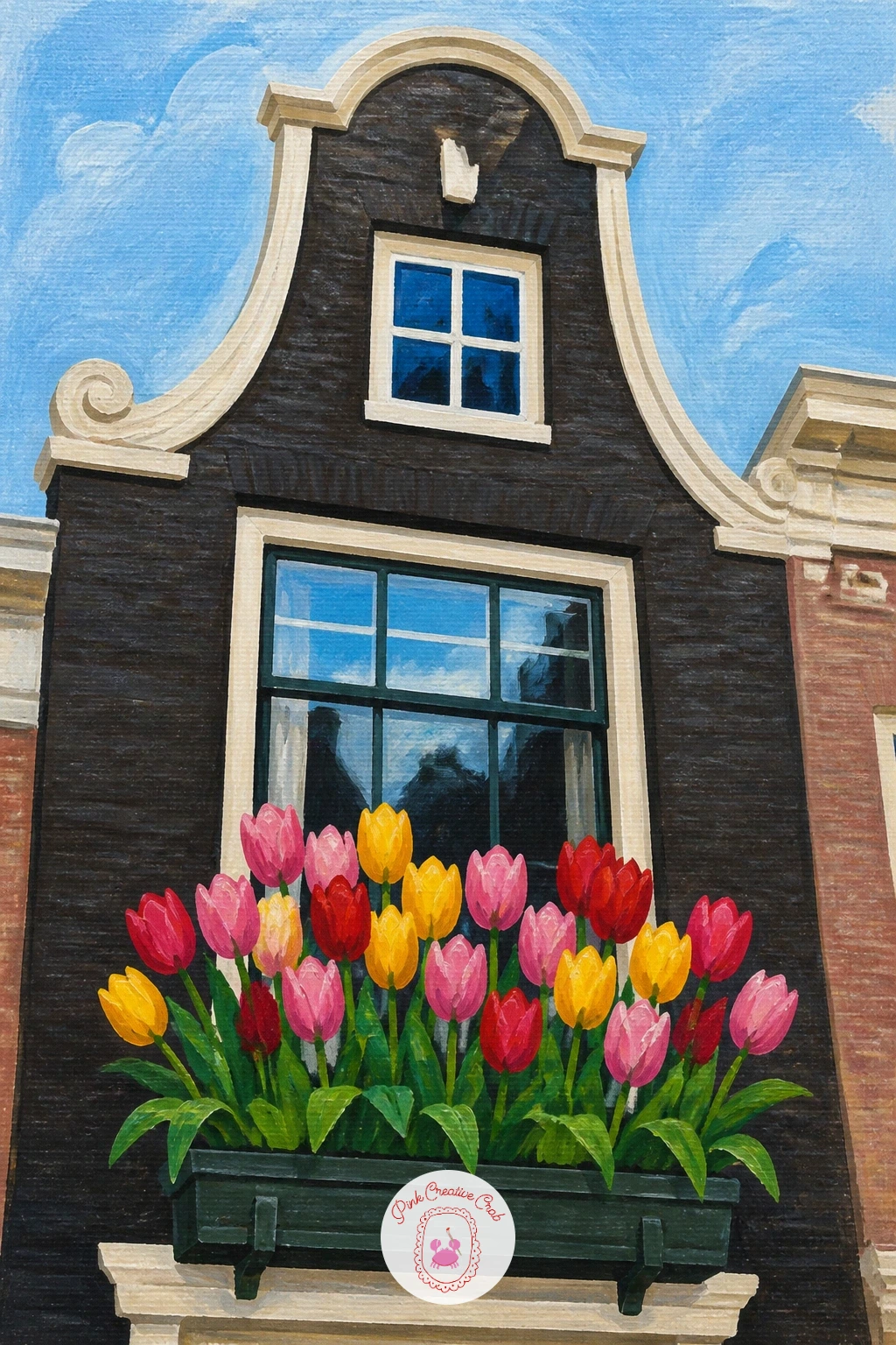
Palette: Raw Sienna,Payne’s Grey,Tulip Pink,Sky Blue
Double peony tulips, with their ruffled, many-layered petals, ask for a slightly different build than a standard tulip bloom. Sketch the overall flower shape as a full round puff rather than the usual cup, since these varieties open flat and full like a peony, which is exactly where the name comes from.
Build the petals in layers from the back outward: paint the furthest petals first in a mid-tone pink, let them dry, then add a ring of slightly lighter petals on top, and finish with the brightest, smallest petals right at the center. Each layer should slightly overlap the one before it.
These blooms collapse into a flat blob if every petal is the same size and tone. Keep the outer petals noticeably larger and darker than the tight cluster near the center, and the layered, full look appears almost on its own.
If you have one, a palette knife dragged lightly through wet paint on the outer petals adds a nice ruffled texture without extra brushwork. One tip for today: leave small gaps of the background color visible between petal layers rather than painting one continuous mass.
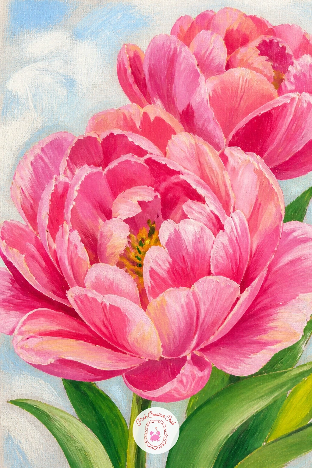
You Will Need
- palette knife (optional)
Palette: Tulip Pink,Titanium White,Cadmium Red,Sap Green
Tulips in a wooden crate suits a slightly wider, more rustic composition, perfect for a market or garden center mood. Paint the crate first as a simple open box shape, with a few horizontal slats suggested by thin darker lines over a base wood color, keeping the front panel the most detailed part.
Fill the crate with tulip stems cut shorter than a vase arrangement would have them, heads sitting just above or right at the rim, packed closer together than a loose bouquet. Vary the colors across the crate in small clusters rather than one even mix throughout.
Wood grain is easy to overdo here, turning a simple crate into a busy pattern that fights the flowers. Three or four confident diagonal strokes in a slightly darker tone are enough to suggest grain; resist adding more.
If a crate feels too angular to draw confidently, a round woven basket is an easy and forgiving swap that holds tulips just as naturally. One tip for today: let two or three tulip heads droop slightly over the crate’s edge so the arrangement does not look too neatly boxed in.
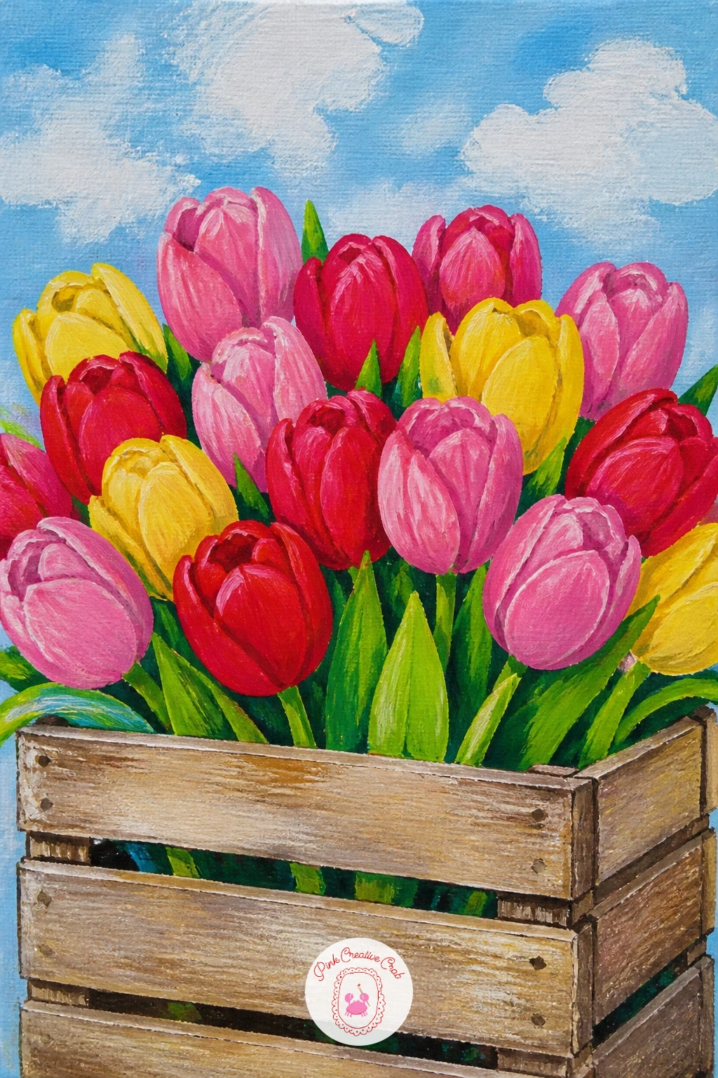
Palette: Raw Sienna,Cadmium Red,Hansa Yellow,Sap Green
Tulips in a pot on a fire escape gives you a nice bit of urban contrast against all those soft Dutch fields, with hard metal lines against soft petals. Paint the fire escape railing first as a simple grid of dark diagonal and horizontal lines, kept loose rather than ruler-straight, since a slightly uneven grid actually looks more like real ironwork.
Place a terracotta pot sitting on the platform, painted in warm orange-brown with a darker band near the rim for shadow, then build the tulips growing up out of it in a tight, upright cluster. Keep the background behind the railing simple, a flat wall color or soft sky, so the ironwork grid does not get lost.
The scene reads as cluttered if the railing grid is painted with the same dark value as the shadows in the pot. Keep the railing lines crisp and a touch darker than everything else, which lets the eye separate the hard metal from the soft plant easily.
No fire escape to reference? A simple window ledge railing or balcony rail works the same way. One tip for today: let one tulip stem lean slightly through a gap in the railing bars for a nice bit of overlap and depth.
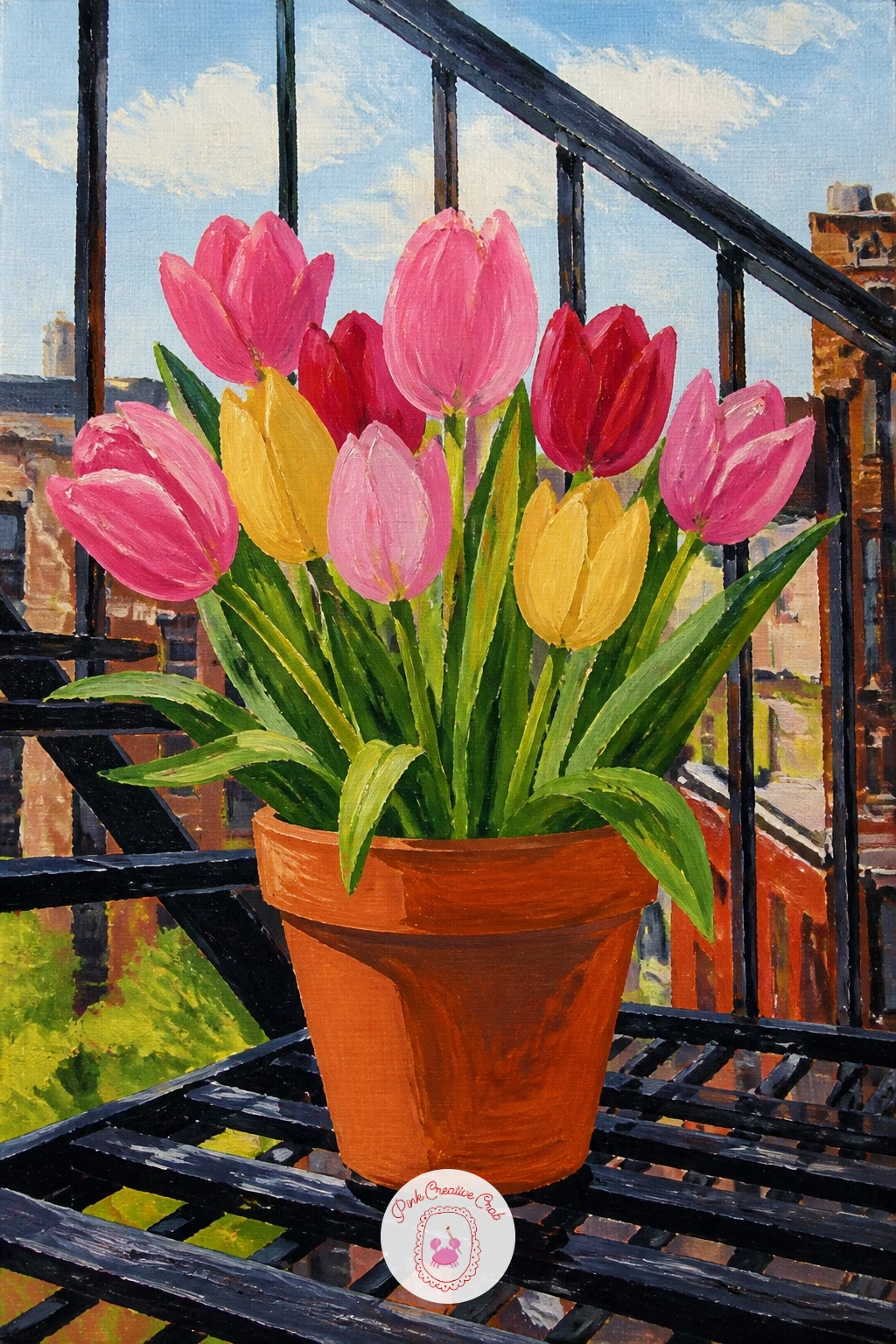
Palette: Raw Sienna,Payne’s Grey,Tulip Pink,Sap Green
Return to a figure for this one: a girl picking tulips in a field lets you capture motion rather than a standing pose, which keeps the whole painting feeling more alive. Sketch her bent slightly at the waist, one arm reaching down toward the flowers, which is a far more dynamic line than a straight standing figure.
Block her dress or coat in one bold flat color first, since that solid shape anchors her against the busy striped field, then add the tulips around her feet and hands in loose dabs, letting a few stems bunch in her reaching hand. Keep her face turned down or away, which is easier to paint convincingly than a front-facing expression.
Bent poses often come out stiff if the arm and the back form a straight diagonal line with no break. Add a slight bend at the elbow and a curve through the spine, and the pose reads as natural movement rather than a rigid pose.
If figures still feel tricky, start with just her silhouette as one dark flat shape against the bright field, skipping facial features entirely. One tip for today: paint her hand holding the tulips last, as a simple rounded shape, so it does not get overworked trying to add fingers.
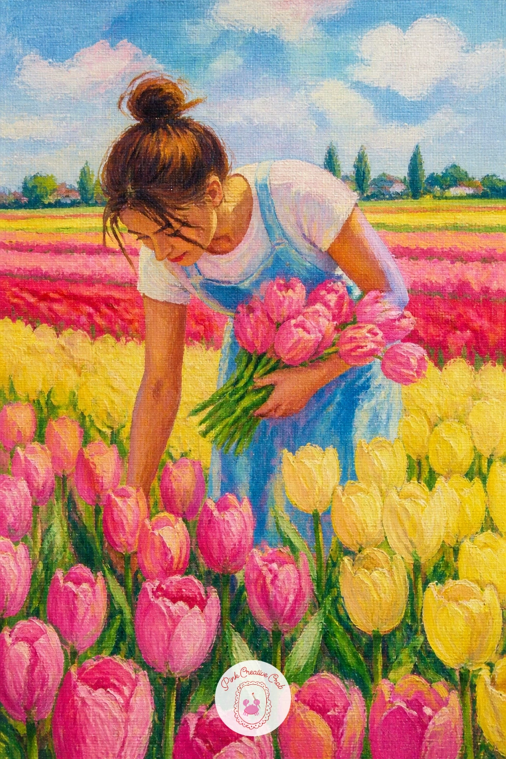
Palette: Tulip Pink,Sap Green,Raw Umber,Hansa Yellow
Tulips on a tablecloth with a teapot builds a cozy still life around a patterned surface, which is a nice change of pace after plain backgrounds. Paint the tablecloth first with a simple repeated pattern, small dots or thin stripes, kept loose and quick so it reads as fabric rather than a precise print.
Once that is dry, add the teapot as a rounded body with a curved spout and handle, painted in one or two flat tones with a highlight stripe down the side to suggest its shine. Build the tulips in a low vase beside it, keeping the arrangement shorter than the teapot’s height so the two elements feel balanced.
Patterned tablecloths can easily overwhelm the flowers if the pattern is too dense or too high contrast. Keep the cloth’s pattern a soft, muted version of your palette, never as bright as the tulips themselves, so the eye still lands on the flowers first.
If a full teapot feels fiddly, a simple teacup and saucer does the same cozy job with far less drawing. One tip for today: let the tablecloth pattern fade out slightly near the edges of the canvas, suggesting it continues beyond the frame.
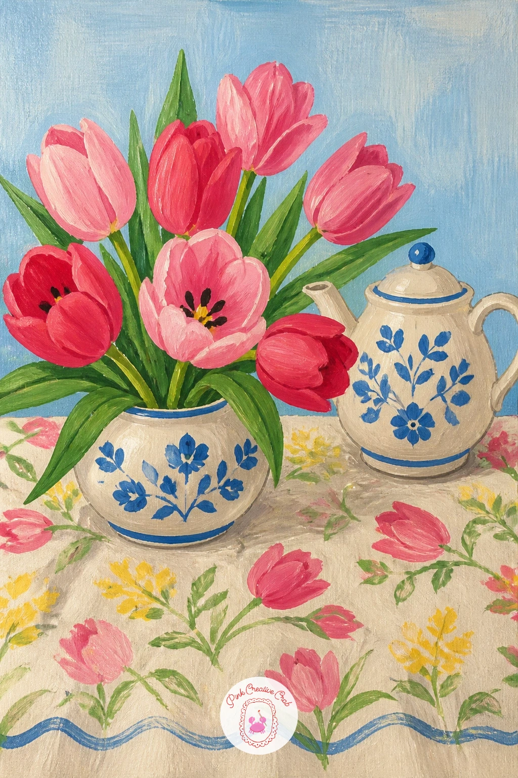
Palette: Tulip Pink,Sky Blue,Titanium White,Raw Umber
White tulips in a minimalist vase strips the whole scene down to shape and shadow, which makes it a lovely calm contrast to the busier colorful pieces on this list. Paint the vase first as one simple cylinder or tapered shape in a flat neutral, then build the tulips in white, relying almost entirely on shadow to define each petal rather than color.
Mix a very pale grey, barely a shade off white, and use it to paint the shadow folds between petals once the base white layer is dry. The contrast between pure white and that pale grey is subtle, so work slowly and check the canvas from a distance as you go.
White flowers vanish into a white background if there is nothing to separate them. Paint a soft mid-tone background, a pale sage or warm grey, so the white petals have something to stand out against.
If pure white feels flat and lifeless on canvas, warm it slightly with a touch of yellow or pink mixed in rather than using it straight from the tube. One tip for today: keep the stems and leaves the only strong green note in the whole piece, letting them carry all the color.
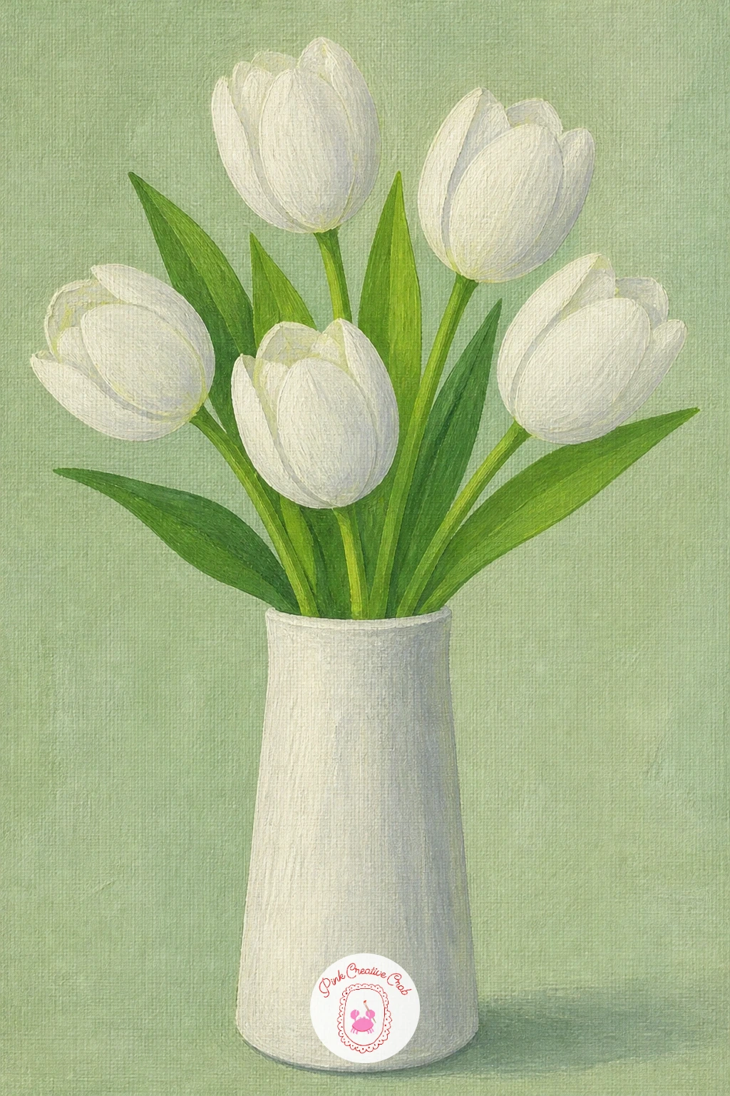
Palette: Titanium White,Payne’s Grey,Sap Green,Raw Sienna
Tulip field at sunset turns the eye-level landscape rules on their head, since now the light source sits low and behind the whole scene. Paint the sky first with broad horizontal bands of orange, pink and pale yellow blending into each other while still wet, which gives that soft glowing sunset gradient without hard edges.
Once the sky is dry, paint the tulip stripes as darker silhouetted shapes rather than their usual bright colors, since backlit flowers lose most of their local color and read mainly as dark, warm-edged forms against the glowing sky. A thin rim of warm light along the top edge of each tulip row sells the backlighting.
The scene loses all its drama if the tulips are painted as bright as they would be in daylight. Keep them noticeably darker and warmer in tone than a daytime field, almost silhouette-dark near the horizon, lightening slightly toward the foreground.
If you enjoy this kind of glowing sky, the techniques carry over well into easy landscape painting for beginners for other field and sky subjects. One tip for today: paint the sun itself as one simple pale circle low on the horizon, with a soft, unblended edge to suggest glow.
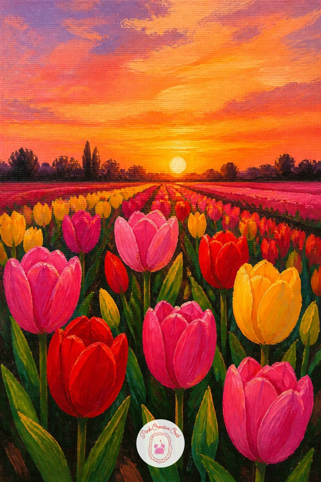
Palette: Cadmium Orange,Tulip Pink,Payne’s Grey,Hansa Yellow
Hand holding a single red tulip is a close, intimate subject that puts a little figure drawing to work without needing a whole body. Sketch the hand first as a simple soft shape, fingers gently curled around the lower stem, keeping proportions loose rather than anatomically exact since a slightly simplified hand suits this flat style better than a highly detailed one.
Paint the skin tone in flat first, then add just one or two soft shadow strokes between the fingers and along the knuckles to give it form. Build the tulip rising up from the hand last, bold red against the simpler hand and background, since it should remain the clear focal point.
Hands often go wrong when every finger is drawn the same length and thickness. Compare the middle finger to the width of the palm as a rough one-to-one guide, and let the thumb sit noticeably shorter and set further back than the other fingers.
If hands feel genuinely difficult today, crop the composition to show just the fingertips and the stem, cutting the wrist off the frame entirely. One tip for today: keep the background plain and pale, so nothing competes with the red tulip against the hand.
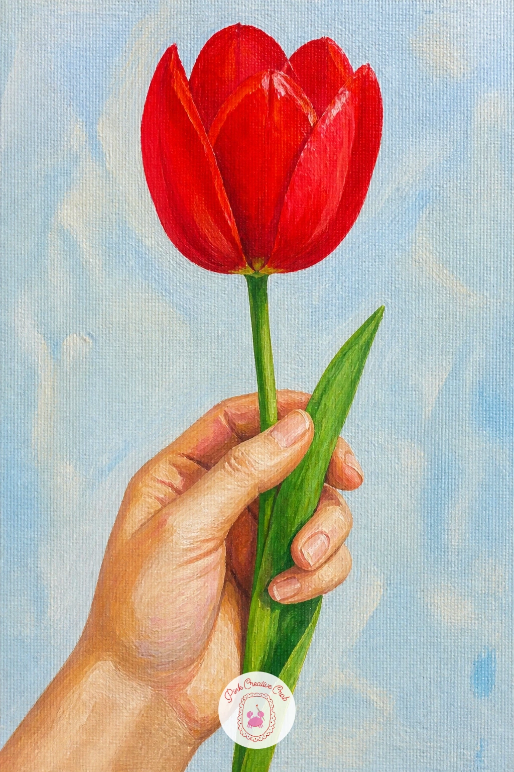
Palette: Cadmium Red,Raw Sienna,Titanium White,Sap Green
Tulips scattered on a bed makes for a soft, romantic composition built almost entirely from fabric folds and loose petals. Paint the bedding first as broad flat shapes of a pale color, then add a few soft shadow lines along the folds to suggest the texture of sheets or a quilt, keeping everything gentle and rounded.
Scatter the tulip heads across the surface in a loose, uneven cluster, some lying flat on their sides and others resting at an angle, never in a neat row. Vary the colors across the scattered blooms so no two sit right next to an identical shade.
Flowers lying flat can look stiff and pasted-on if every petal faces the viewer directly. Turn a few heads sideways or slightly away, showing the rounder back of the bloom instead of the open face, for a much more convincing scattered look.
If bedding folds feel tricky to paint convincingly, a plain pale tablecloth or blanket laid flat works just as well as the surface. One tip for today: let a stem or two trail loosely off the edge of the frame, which makes the whole scatter feel more candid and less arranged.
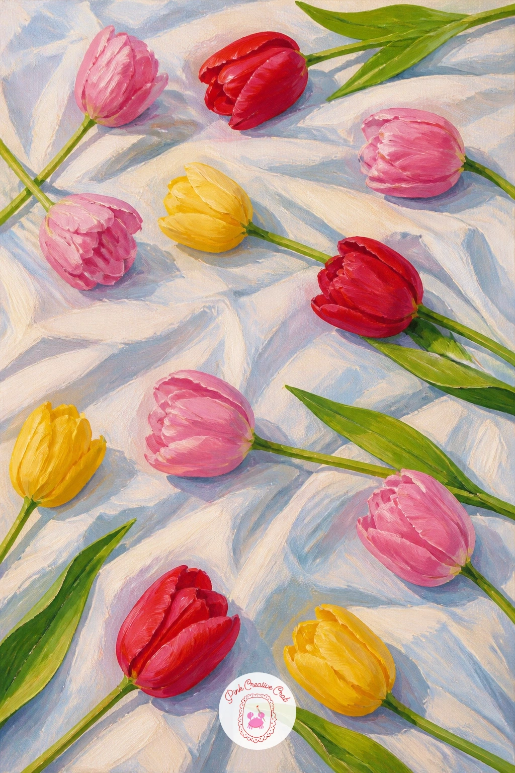
Palette: Tulip Pink,Titanium White,Cadmium Red,Sap Green
Tulip garden with a fountain adds a formal structure to the landscape genre, with beds of tulips arranged in neat rings or rows around a central water feature. Paint the fountain first as a simple stacked shape, a round base, a narrower stem, and a basin on top, kept pale stone grey against the greenery.
Build the tulip beds in curved bands radiating out from the fountain, alternating colors by section rather than mixing them randomly, which gives that formal garden pattern look. Keep the beds smaller and more tightly packed near the fountain, opening up looser toward the edges of the canvas.
Water is the trickiest part of this scene, and a common mistake is painting it as solid flat blue with no movement suggested. Add a few short white curved strokes near the top of the basin to suggest water catching the light as it falls, keeping the rest of the basin a calm darker blue.
If a fountain feels too architectural for today, a simple round pond or birdbath gives the same central focal point with far less structure to draw. One tip for today: curve the tulip rows slightly rather than keeping them perfectly circular, which looks more natural from this angle.
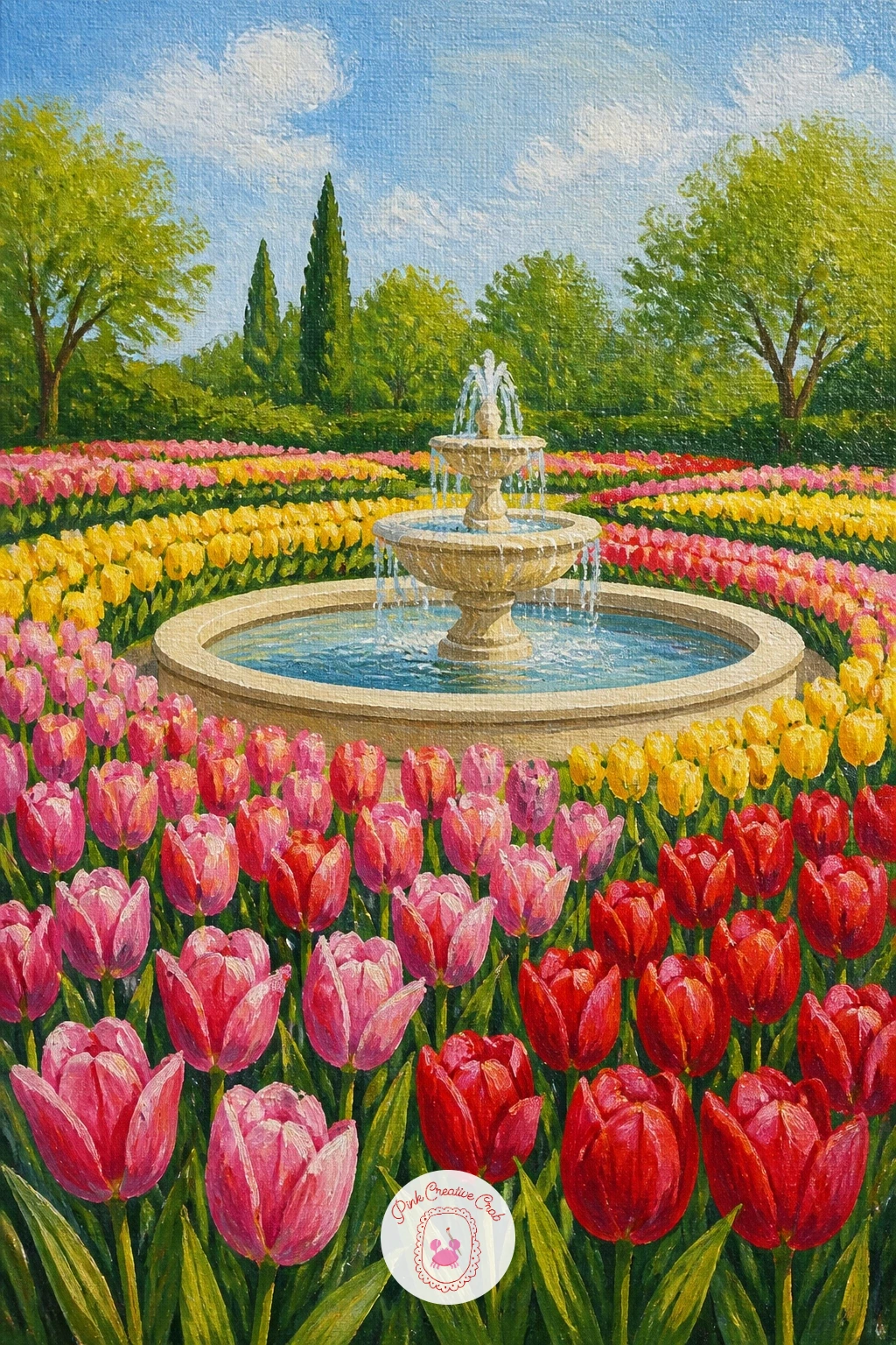
Palette: Payne’s Grey,Sky Blue,Tulip Pink,Sap Green
Tulips in an enamel watering can gives you a charming cottage-style still life with a bit of shine to practice. Paint the can’s body first as a flat mid-tone, white or pale blue enamel, then add a darker curved line along one edge to suggest its rounded metal form before any chips or highlights.
Once dry, dab a few small spots of a darker, worn-looking tone along the rim and handle to suggest old enamel chipping, which gives the can far more charm than a perfectly smooth surface. Build the tulips rising from the spout opening in a loose upright bunch.
Enamel reads as flat plastic rather than metal if it has no highlight at all. Add one single bright streak of white or very pale blue down the most rounded part of the can’s body, which instantly suggests that shiny enamel surface catching light.
If an enamel can is not available to reference, any simple metal pail or jug gives the same shiny-rounded-surface practice. One tip for today: let a couple of tulip leaves droop over the can’s handle for a nice natural bit of overlap.
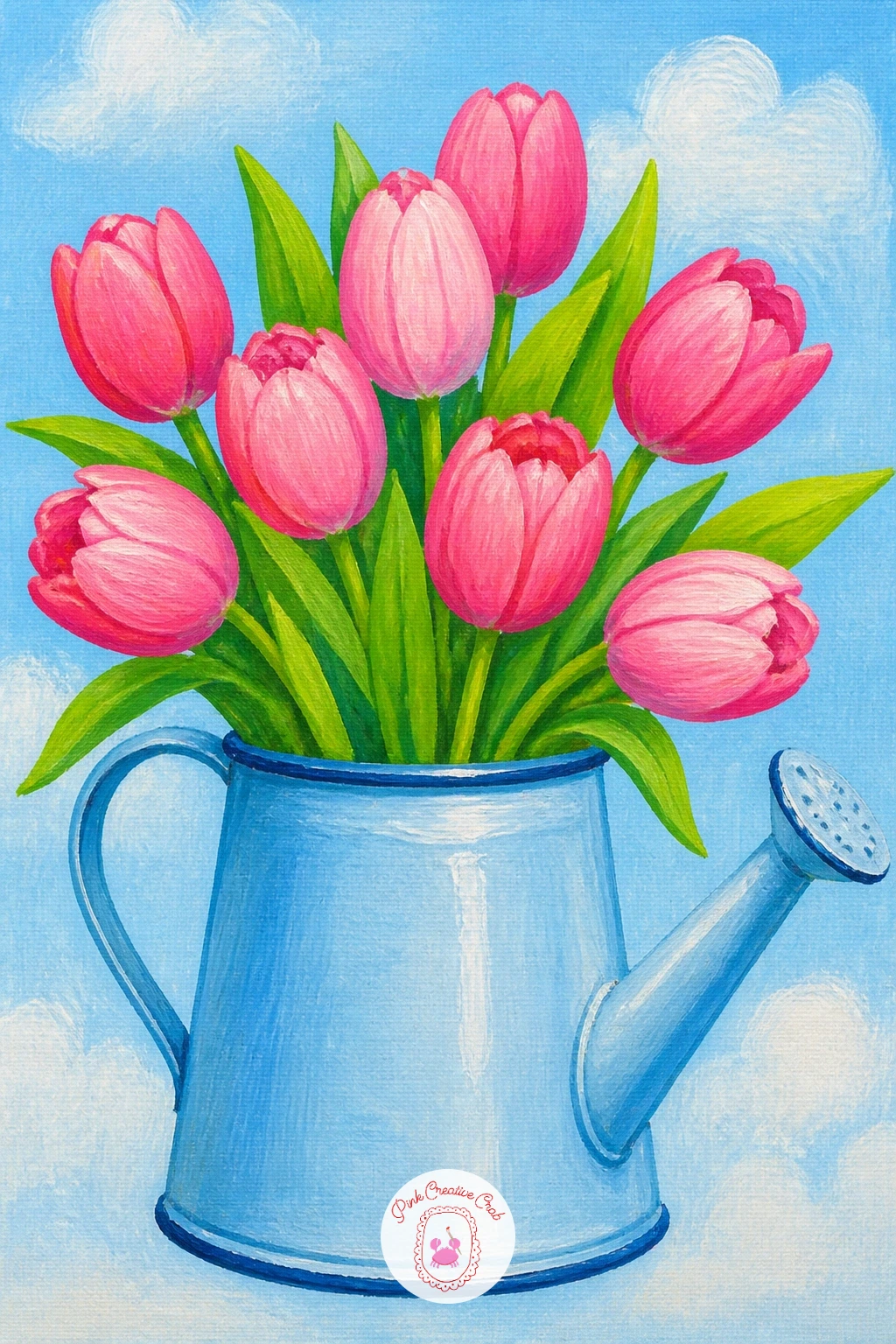
Palette: Sky Blue,Titanium White,Tulip Pink,Sap Green
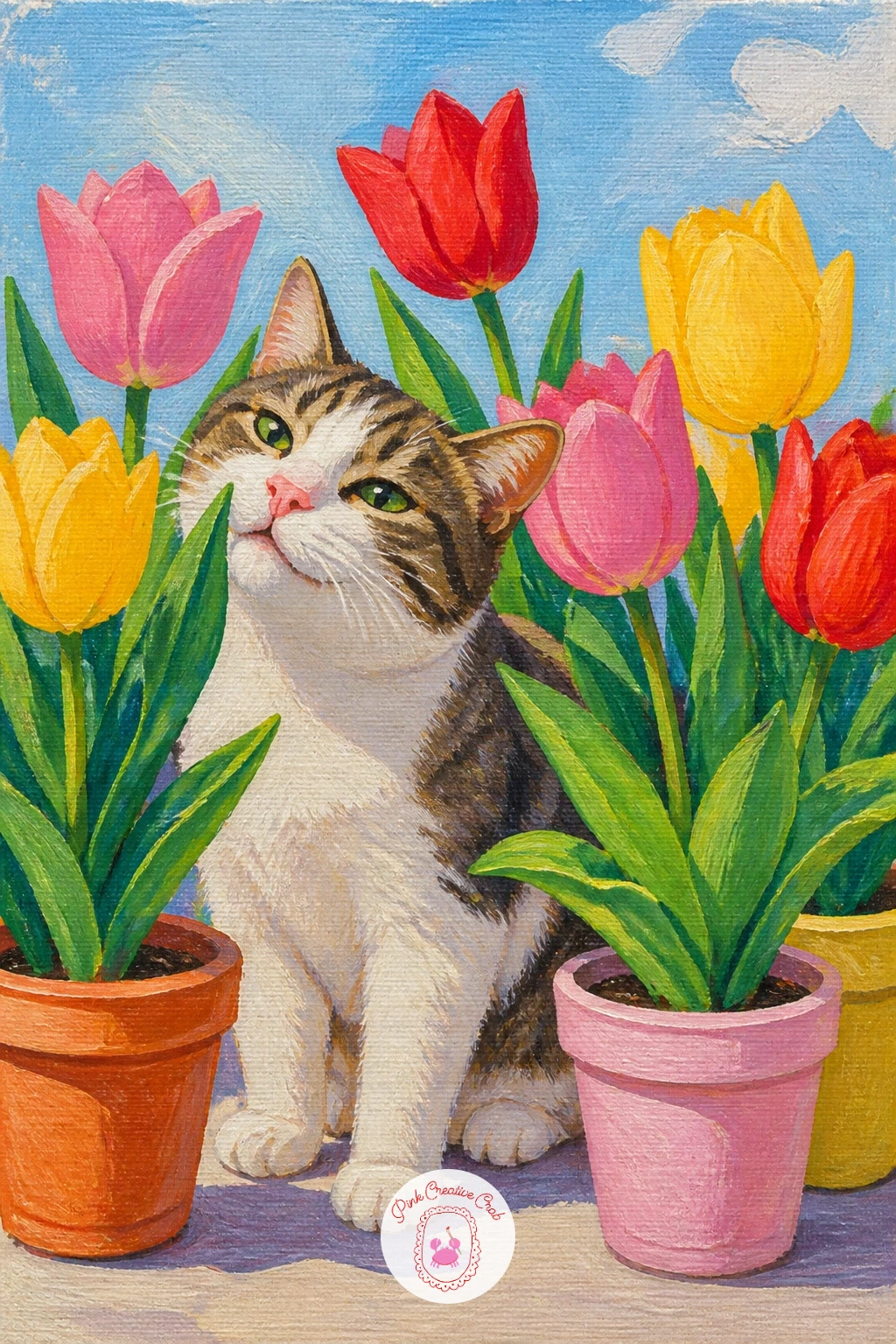
Cat among potted tulips brings in a pet for a bit of personality, sitting or weaving between a few pots rather than posed stiffly in the center. Sketch the cat’s body first as a simple rounded sitting shape, since a curled or seated pose is far easier to get right than a running or jumping one.
Paint the cat in one solid base color first, then add a few darker strokes along its back and tail to suggest fur direction without painting individual hairs. Build the tulip pots around it afterward, letting one or two leaves brush against the cat’s body for a sense of it actually being among the plants rather than just placed beside them.
Cats often end up looking flat and cut-out if there is no shadow underneath them. A simple soft grey oval shadow beneath the paws grounds the whole animal convincingly onto the surface it is sitting on.
If your own cat is a different color entirely, paint from that instead, since any coat color works in this same simple pose and setup. One tip for today: paint the eyes as two simple almond shapes with a tiny white highlight dot, which brings a surprising amount of life to a simple flat cat shape.
Palette: Raw Umber,Titanium White,Tulip Pink,Sap Green
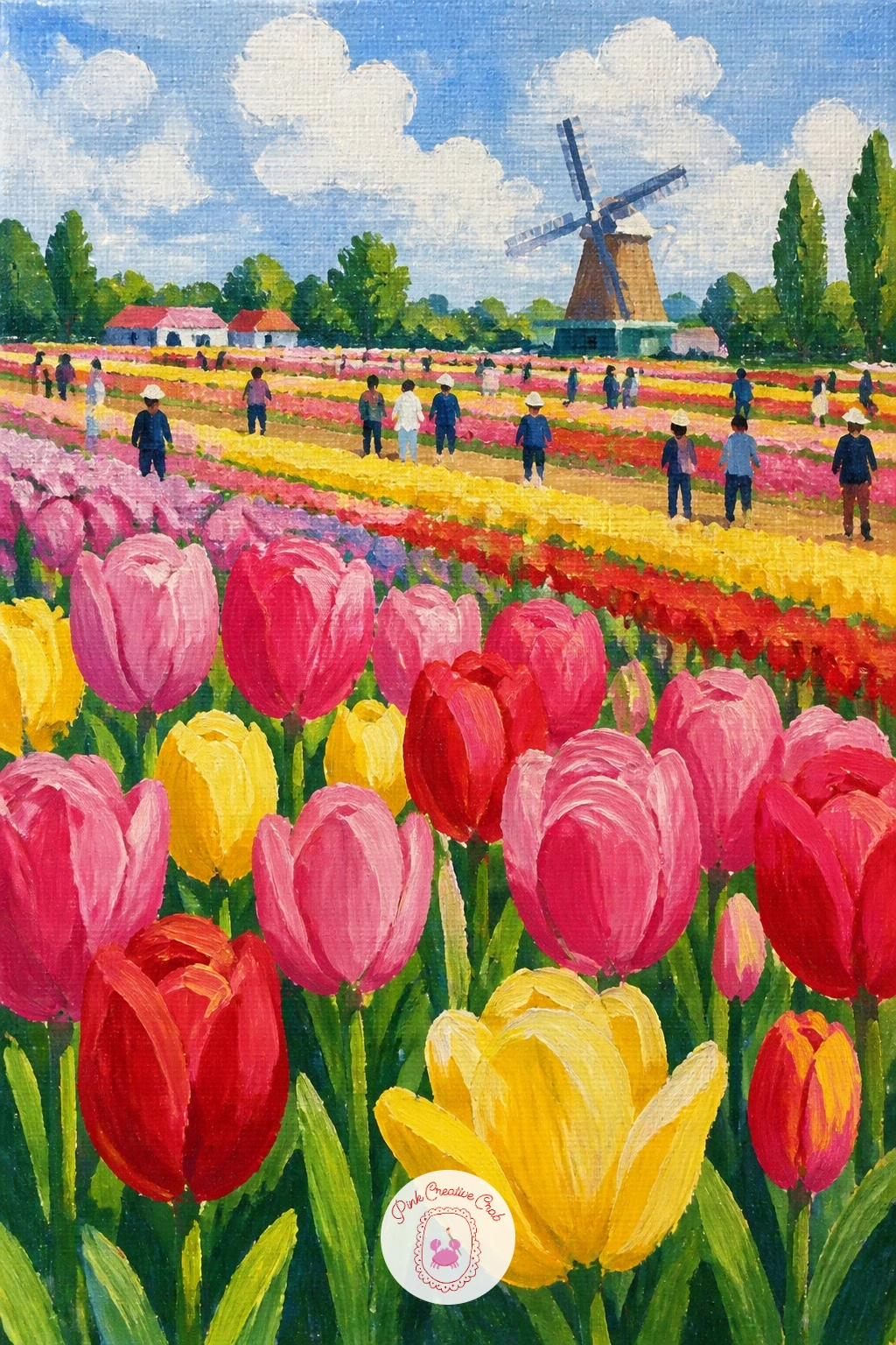
Tulip festival crowd is the busiest scene on this list, so the real skill is keeping it simple rather than painting every visitor in detail. Paint the tulip field first as your full background, since the crowd sits on top of it, then add people as small simple silhouettes, no bigger than a thumbprint each, scattered in loose clusters rather than a straight line.
Vary the silhouettes just slightly: a few standing, one or two bending to look closer at the flowers, a child shape slightly shorter than the adults nearby. Keep every figure a flat, simple shape with barely any color detail, since from this distance real visitors read as soft colored blobs, not individuals.
The whole scene turns busy and chaotic if too much detail goes into the people. Resist painting faces or clothing patterns entirely; a flat colored shape for the body and a small round head is all this distance needs.
If a full crowd feels overwhelming today, paint just three or four figures and leave more open field around them. One tip for today: make the figures closest to the viewer slightly larger and more defined, and every figure further back smaller and softer, which instantly creates depth.
Palette: Sap Green,Tulip Pink,Raw Umber,Sky Blue
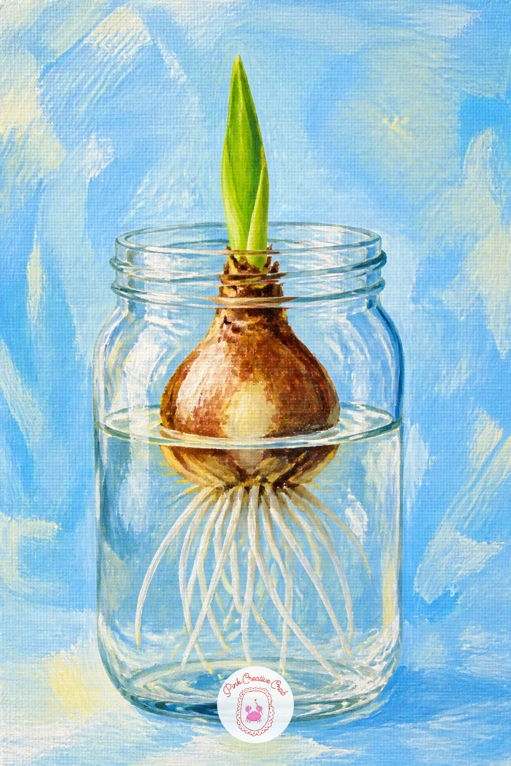
Tulip bulb sprouting in a jar shows the plant at its very start, which makes for a sweet, unusual still life after so many full blooms. Paint the jar first as a simple clear glass shape, using pale blue-grey with a few white highlight streaks to suggest transparency, then add the bulb sitting inside or just above the water line.
Build the bulb as a rounded onion-like shape in warm cream and brown tones, with thin white roots trailing down into the water below it. A single green shoot rises from the top, painted as one confident curved stroke rather than a stiff straight line.
Roots are the trickiest part, since too many thick lines turn them into a tangled mess rather than delicate threads. Thin the paint with water and use the very tip of a fine brush for just a few wispy lines, letting some fade out before reaching the jar’s edge.
If glass feels difficult to paint convincingly, a plain terracotta pot with soil works just as well and skips the transparency challenge entirely. One tip for today: keep the water line visible as a thin horizontal highlight inside the jar, which instantly sells the glass container.
Palette: Raw Sienna,Sap Green,Titanium White,Sky Blue
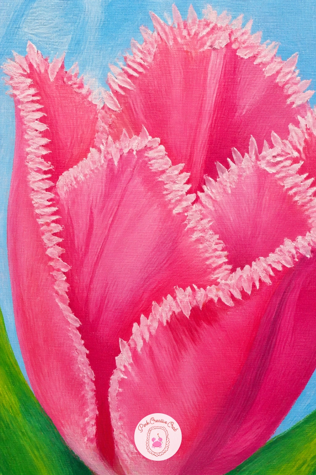
Fringed tulip close-up focuses on one of the more unusual tulip varieties, with tiny crystal-like fringes along every petal edge. Paint the base petal shape flat first in your chosen color, keeping the overall outline simple and rounded, since all the character in this bloom comes from the edges, not the main shape.
Once that base layer is fully dry, switch to a very fine brush or a toothpick dipped in slightly thinned paint and add tiny short flicks all along the petal edge, like little eyelashes pointing outward. Keep them close together but irregular in length, since perfectly even fringing looks mechanical rather than natural.
This detail turns into a solid messy line if the fringe marks are too close together or too thick. Space them out slightly and use a lighter touch than feels natural, since a delicate, barely-there fringe reads better than a heavy one.
If a fine brush feels too clumsy for this, a cocktail stick or the wrong end of a thin brush dipped in paint gives a surprisingly fine, controllable line. One tip for today: fringe just the top two thirds of each petal edge, leaving the base smooth, which looks more natural than fringing the entire outline.
You Will Need
- cocktail stick (optional, for fine fringe marks)
Palette: Tulip Pink,Titanium White,Cadmium Red,Sap Green
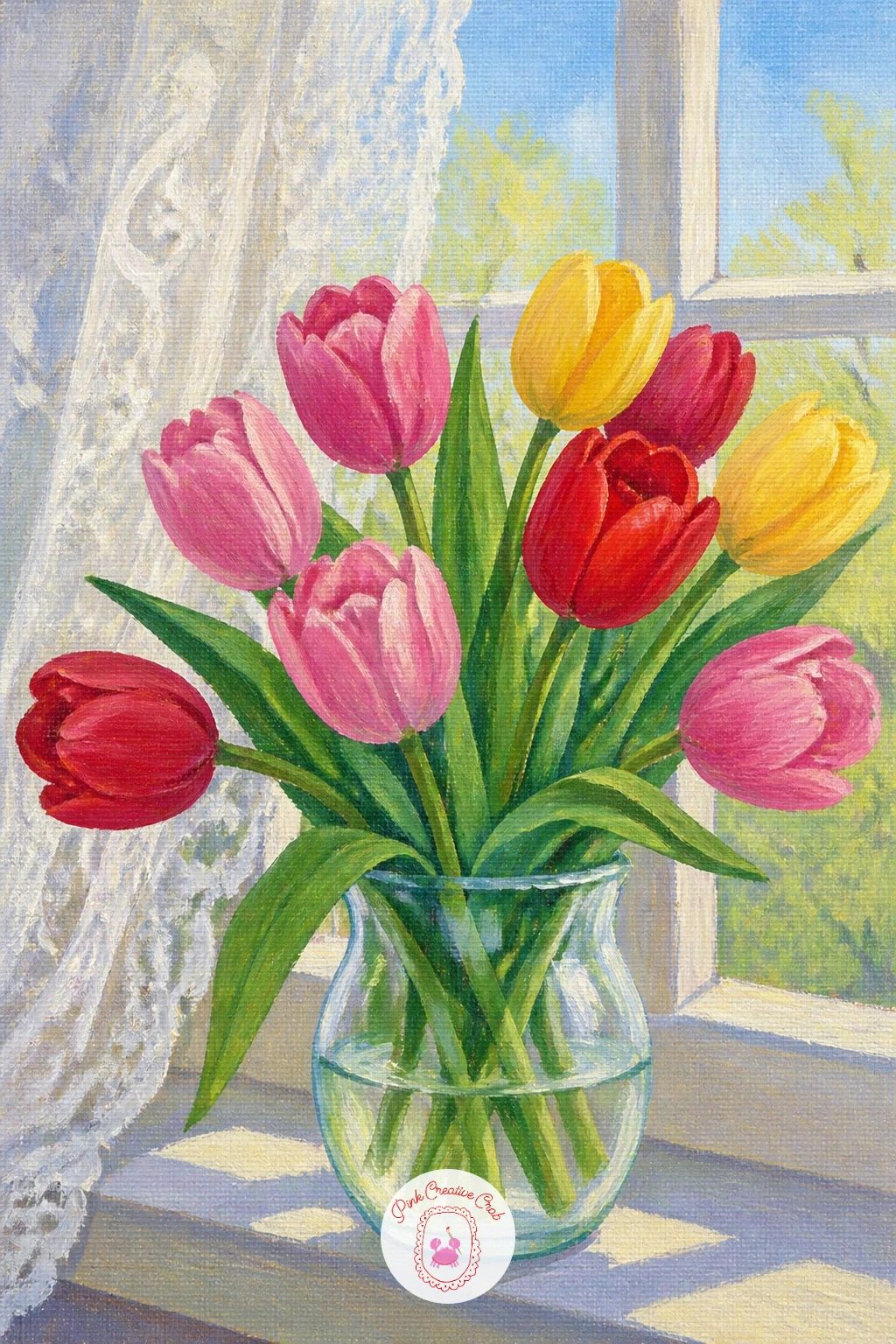
Tulips on a windowsill with lace curtains brings a soft cottage charm into this list, mixing hard glass and stone against delicate fabric. Paint the windowsill and window frame first as simple flat shapes, then the vase of tulips sitting on the sill, before touching the curtain at all, so the flowers stay the clear focal point.
For the lace, once the window background is dry, mix a very pale, almost transparent white and use a dry, barely loaded brush to dab a loose, open pattern over one side of the window, letting plenty of the background show through. Real lace curtains read as texture and light, not as a solid fabric shape.
The curtain overwhelms the whole painting if it is painted too solid and opaque. Keep it as the faintest suggestion of pattern, thinner and paler than you think it should be, so the tulips on the sill clearly read as the main subject.
If lace feels fussy to paint today, a plain sheer curtain with just a few soft vertical folds gives a similar cozy window feeling. One tip for today: let a little daylight glow show through gaps in the lace pattern, brighter than the curtain itself.
Palette: Titanium White,Tulip Pink,Sky Blue,Sap Green
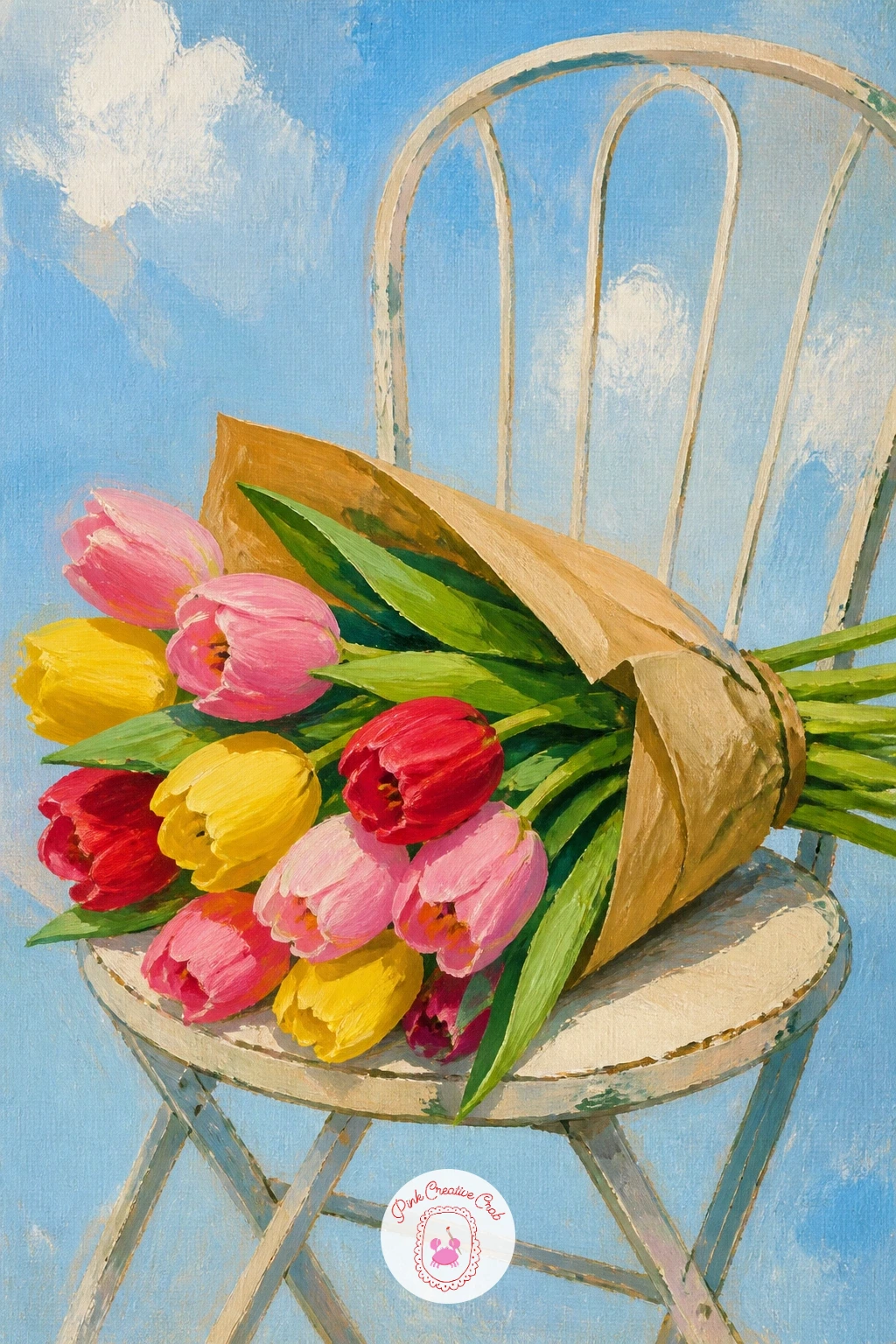
Tulip bouquet on a cafe chair is a lovely candid composition, as though someone set their flowers down for just a moment. Paint the chair first, a simple bistro-style chair with thin curved metal or wooden lines, keeping the structure loose and sketchy rather than perfectly straight, which suits the casual mood of the scene.
Once the chair is dry, build the bouquet resting across the seat, wrapped loosely in paper or string, with a few stems and leaves trailing off the edge of the seat toward the ground. Keep the bouquet larger than the chair’s seat itself, slightly overflowing it.
Thin chair legs are the part most likely to go wrong, often ending up too thick or uneven in width. Paint them with one single confident stroke per leg rather than going back over them repeatedly, which keeps them looking light and spindly rather than clumsy.
If a full cafe setting feels like too much, crop in tight on just the seat and the bouquet, letting the rest of the chair fall outside the frame. One tip for today: add a small round cafe table leg or shadow just visible at the edge of the canvas to hint at the wider setting.
Palette: Raw Umber,Tulip Pink,Cadmium Red,Sap Green
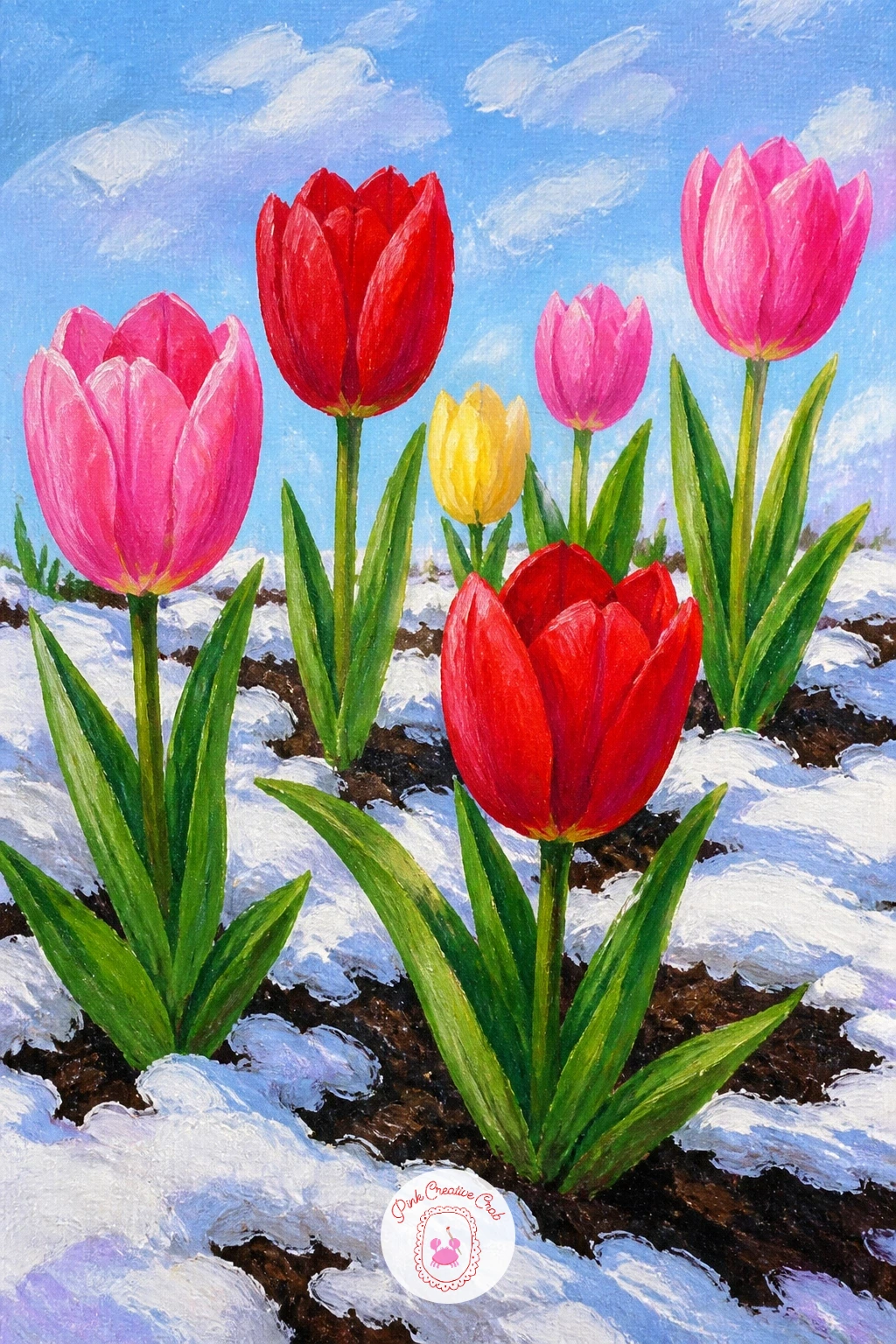
Tulips in a late spring snow plays with an unexpected contrast, bright blooms pushing up through a dusting of late snow, which makes for a striking, slightly unusual painting. Paint the ground first as a mix of pale snow patches and visible dark soil or grass between them, keeping the snow uneven rather than a flat solid white blanket.
Build the tulips rising up through the gaps in the snow, painted at full bright saturation so they contrast strongly against the muted, cool ground around them. A few tulip heads can lean slightly, as though still pushing against the cold, which adds a nice sense of struggle and resilience to the scene.
The snow reads as flat and lifeless if it has no shadow variation at all. Mix a touch of blue or grey into your white for the shadowed sides of each snow patch, keeping the lit tops closer to pure white.
If you enjoy this unexpected seasonal mix, there are more cold-weather color ideas in winter oil painting ideas worth a look. One tip for today: keep the snow patches smaller and more scattered near the tulips themselves, since the ground nearest new growth often clears first.
Palette: Titanium White,Payne’s Grey,Cadmium Red,Sap Green
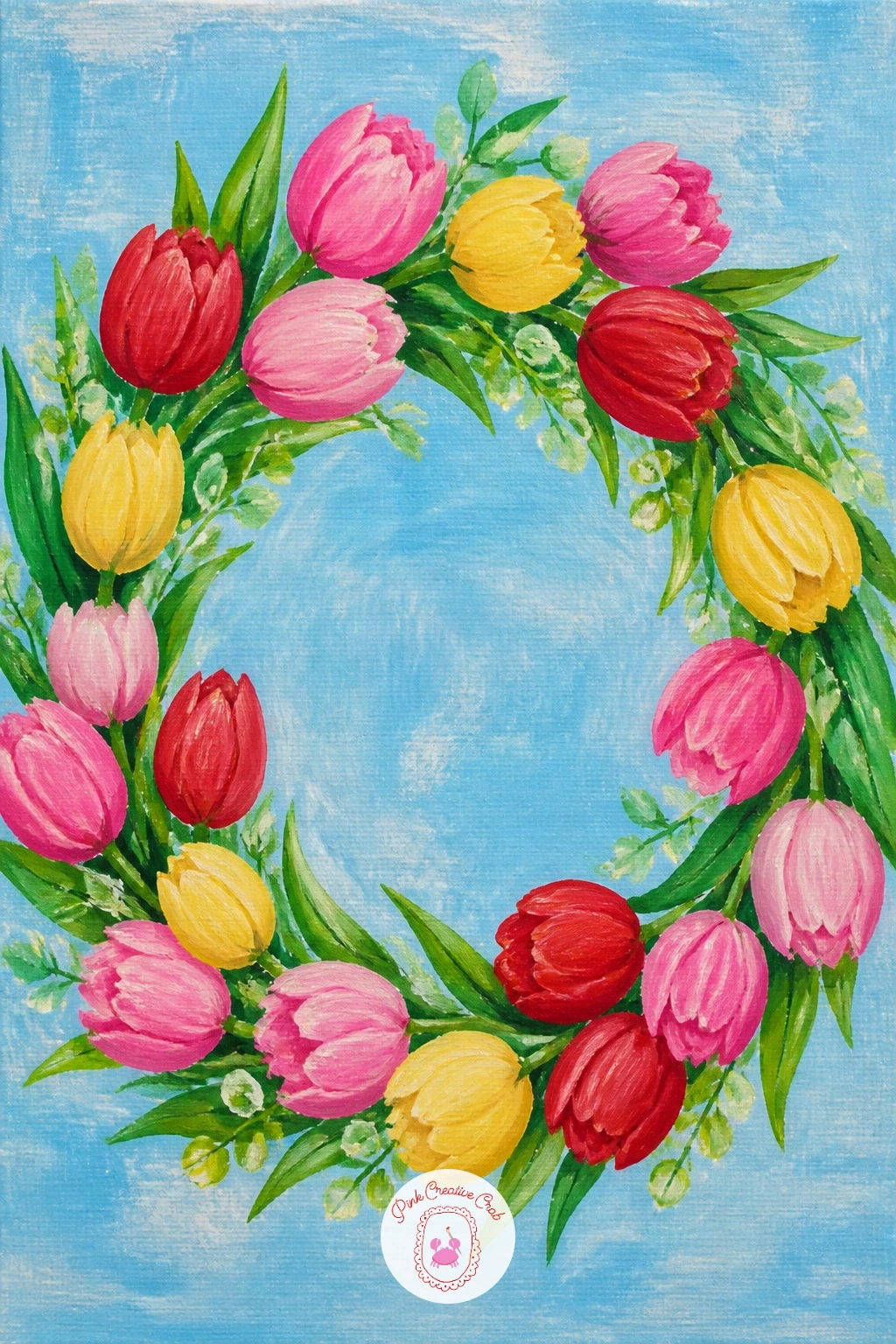
Tulip wreath makes a lovely decorative close to the arrangement subjects, built as a full ring rather than an upright bouquet. Sketch a simple circle guide first, lightly in pencil, then build the greenery base around it as one continuous curved band before adding a single tulip head.
Work the tulip heads around the ring in small overlapping clusters, keeping the colors balanced on opposite sides of the circle so no single section looks heavier than the rest. Vary the angle of each bloom slightly, some facing fully outward, others turned at a gentle angle, which keeps the ring from looking too uniform and mechanical.
Wreaths often end up lopsided if you work all the way around in one direction without checking balance. Step back every few blooms and compare the left and right sides of the ring, adjusting color and density as you go rather than only at the end.
If a perfect circle feels hard to judge by eye, lightly trace around a plate or bowl for the guide before erasing it once the greenery covers the line. One tip for today: leave the center of the wreath empty and let the background show through, since a filled-in center looks more like a solid mass than a ring.
You Will Need
- plate or bowl to trace a circle guide
Palette: Sap Green,Tulip Pink,Cadmium Red,Hansa Yellow
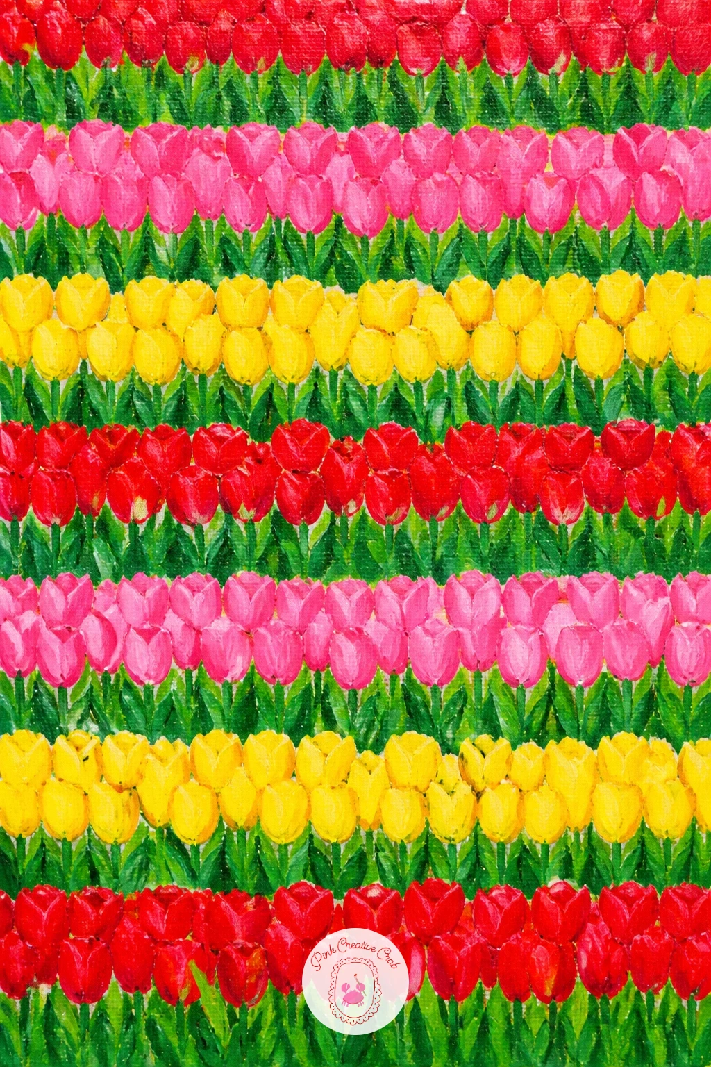
Finish with the most graphic subject on the list: tulip fields seen from above in stripes, painted as though looking straight down from a plane, which turns the whole landscape into pure pattern and color. Skip any sky or horizon entirely here and let flat bands of color fill the canvas edge to edge from the very first strokes.
Paint each stripe as one flat solid color block first, alternating red, pink, yellow and green in a rhythm that pleases you, then once dry, add a few subtle darker lines running along the length of each stripe to suggest the rows of individual plants without painting each one.
From this height, perspective works backward from how you would expect: stripes nearer the top of the canvas should be painted slightly thinner than those at the bottom, since they represent fields further away even in this flattened aerial view. Skipping that size change makes the whole pattern feel static rather than like a real distant view.
If straight stripes feel hard to keep even by eye, lay down strips of painter’s tape as a guide before painting each band, peeling it away once dry. One tip for today: let one or two stripes run at a very slightly different angle than the rest, since real tulip fields are rarely perfectly aligned.
You Will Need
- painter’s tape (optional, for straight stripes)
Palette: Cadmium Red,Tulip Pink,Hansa Yellow,Sap Green
What to Do Next
Pick whichever tulip scene is pulling at you most, prime up a canvas board, and work the background in first before any flowers go down. Start with one of the simpler ideas near the top of the list if this is a new subject for you, and let the bolder, busier scenes wait for a second or third sitting.
Frequently Asked Questions
What is the best acrylic paint for tulip painting?
Any student or artist grade acrylic set works well, as long as it includes a true red, a warm pink, a bright yellow and a fresh green, since tulip painting leans on bold, clean, opaque color more than subtle blending.
How do you paint tulip petals so they look smooth and clean?
Block each petal in one flat, fully opaque layer first, let it dry completely, then add shadow or streak details on top rather than trying to blend everything while the base layer is still wet.
What colors mix to make a good tulip pink?
Mix a true red with white, adding it gradually until you reach the shade you want, then warm it slightly with a touch of yellow or cool it with a touch of blue depending on the variety you are painting.
Do I need to draw tulips before painting them in acrylic?
A light pencil sketch helps, especially for scenes with a person, building or landscape, but single close-up blooms can often be painted directly with a brush once you feel comfortable with the basic cup shape.
How can I make a tulip field painting look less flat?
Vary the size of the tulips so the ones nearest the viewer are larger and more detailed, and the ones further back are smaller, thinner dashes of color, which creates the sense of distance a flat field lacks.
Have any thoughts?
Share your reaction or leave a quick response — we’d love to hear what you think!
-
 0
-
0
-
0
-
0
-
0
-
0


