

Kitchen watercolor art is the kind of painting that earns its spot on the wall the day you finish it, because every scene already looks like something you would hang up: a steaming kettle, a bowl of lemons, a cat under the breakfast table. There is no blank backdrop to invent here, just a counter, a window or a tray, which makes these quick to plan and satisfying to paint in one sitting.
Below you will find 33 kitchen scenes and styled still lifes, from a five-minute jam jar to a full breakfast nook with a cat curled on the bench. They all share the same palette of butter yellow, cherry red, sage and cream, with ink linework and little gingham or stripe details, so pick a few and they will hang together as a set.
Using these images: free for personal projects such as printing, coloring, cards, journals and gifts. Handmade items that include them may be sold up to 30 pieces per design. More than that is commercial use and is not permitted, and neither is selling or sharing the images themselves or passing them off as your own. Please ask before any other use.
Start with the stand mixer, since its rounded body is the most forgiving shape to get right on the first try. Pencil a simple curved silhouette: a tall head, a rounded belly, a flat base, then ink the outline once you are happy with the proportions and let the pencil disappear underneath.
Keep the bowl of cherries beside it small and loose, just a stack of red-brown circles with a few curved green stems in ink. Paint the mixer first in a flat wash of cream or sage, lift a strip of clean paper down one side with a damp brush for the shine, then drop in cherry red for the fruit while the mixer dries.
If the mixer body looks lopsided, measure it against itself before you ink: the head should be roughly half the height of the whole shape. This keeps the proportions convincing even if your curves are not perfectly even.
Tip for today: paint the mixer’s shadow in a thin grey-blue stripe under the base, it grounds the whole object on the page instantly.
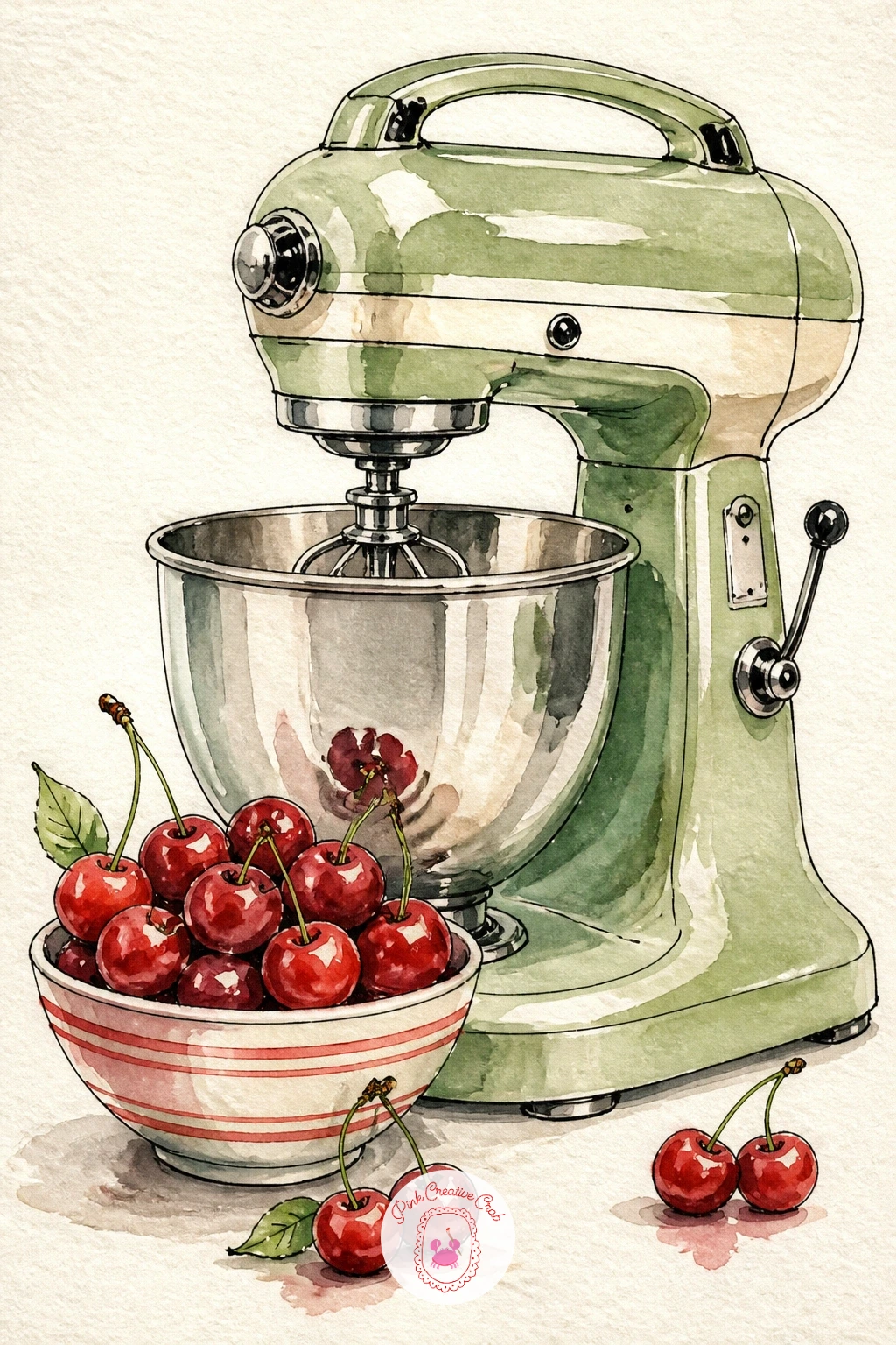
Palette: Cherry Red,Sage Green,Cream,Payne’s Grey
Copper pots give you a chance to practice repeating a shape with small variations, so draw three or four pot silhouettes of different sizes hanging from a thin ink rail at the top of the page. Keep the hooks and handles simple loops, nothing fussy.
Work from the top down: ink the rail and hooks first, then paint each pot in a warm orange-brown wash while leaving a pale streak untouched down one side for shine. Drop a touch of burnt sienna into the shadow side while the wash is still damp so the color pools naturally.
Think about where the light comes from before you paint, usually from one side in a kitchen window, and keep every pot’s highlight on that same side. This one small consistency is what makes a row of separate pots read as one believable scene.
If copper paint feels tricky, swap in a plain burnt orange and add a thin cream highlight stripe instead of trying to mix true metallic tones.
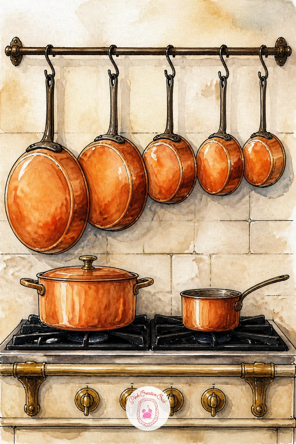
Palette: Burnt Sienna,Burnt Orange,Cream,Payne’s Grey
The kettle scene leans on steam, so plan your light source first: if it comes from a window on the left, the steam should look brightest there and the hob shadow falls to the right. Sketch a rounded kettle body with a simple spout and handle, then ink it before adding any color.
Paint the kettle in a flat cherry red or cream wash, then use a nearly dry brush loaded with just water to lift soft curved lines above the spout for steam, working while the background is still slightly damp so the edges blur. Add a small blue-grey flame ring under the kettle with a few quick dashes of ink.
The steam is where this idea usually goes wrong, since too much water turns it into a blob. Keep your steam brush almost dry and pull it upward in two or three light strokes rather than scrubbing.
Tip for today: paint the steam last of all, after everything else is fully dry, so it stays soft and does not bleed into the kettle shape.
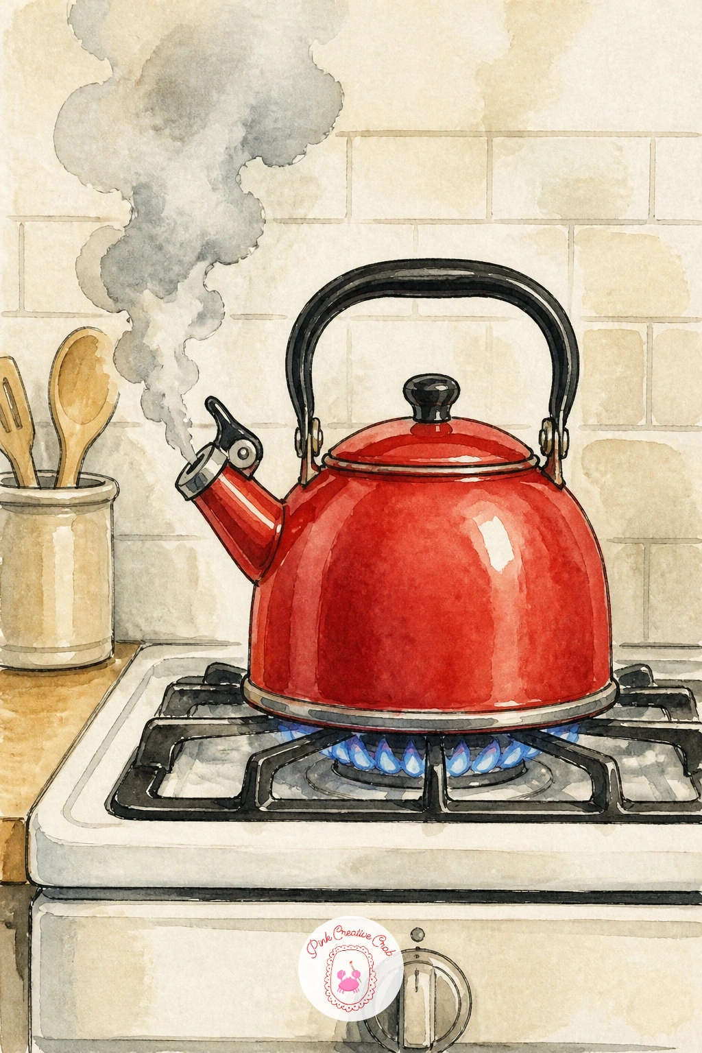
Palette: Cherry Red,Payne’s Grey,Butter Yellow,Cream
A pantry shelf is really just a row of simple jar shapes, so this is a good one for practicing repetition with variety. Draw a single horizontal shelf line in ink, then three or four jars of different heights sitting on it, each with a slightly different lid.
Paint the contents first while the jars are still just pencil, using sage for dried herbs, butter yellow for grains, cherry red for a jam-like preserve, then ink the jar outlines over the top once the washes are dry so the glass reads as transparent. Add tiny painted labels with a thin brush and a squiggle of ink for handwriting.
Vary the jar heights and the fill levels so none of them look identical, that small amount of asymmetry is what makes a shelf feel real rather than stamped. If straight ink lines for the shelf feel shaky, rule a faint pencil guide first and ink over it slowly.
Tip for today: leave a thin white gap between the jar outline and its colored contents, it reads instantly as glass catching the light.
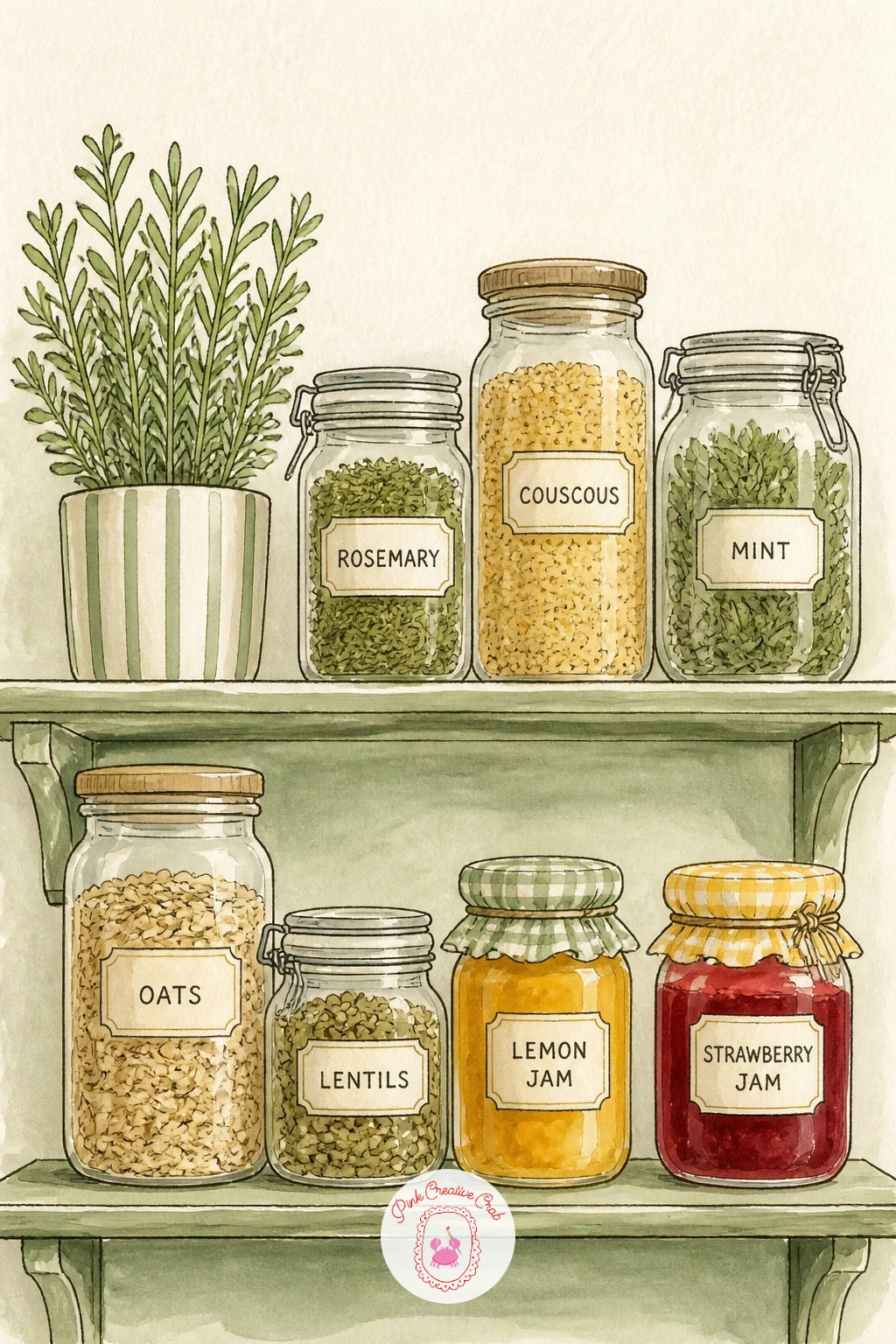
Palette: Sage Green,Butter Yellow,Cherry Red,Cream
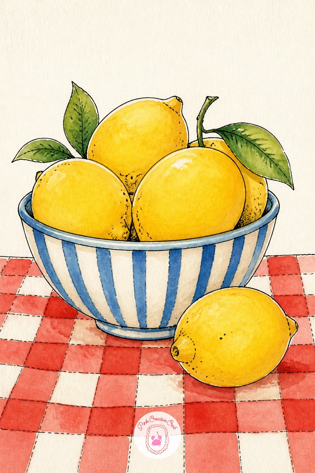
Lemons are a classic for a reason, their rounded shape forgives an uneven brushstroke better than almost anything else. Paint a loose circle of overlapping lemon shapes in butter yellow first, leaving small white gaps between them, then ink a simple oval bowl around the pile once the fruit is dry.
For the tablecloth, draw a light pencil grid first, then paint every other square in cherry red with a fine brush, letting the white paper stay bare for the rest, this is far faster than it looks and never needs a ruler if your pencil grid is even.
Keep the lemon highlights by painting around a small untouched circle on each fruit rather than trying to lift paint afterward. If your checks wobble, call it a hand-painted gingham rather than a stripe, it suits this loose style anyway.
Tip for today: add a tiny green stem and leaf to just one or two lemons, it breaks up the repetition and makes the bowl feel freshly picked. This same loose fruit approach works beautifully across easy watercolor fruit paintings if you want to keep practicing citrus and berries afterward.
Palette: Butter Yellow,Cherry Red,Sage Green,Cream
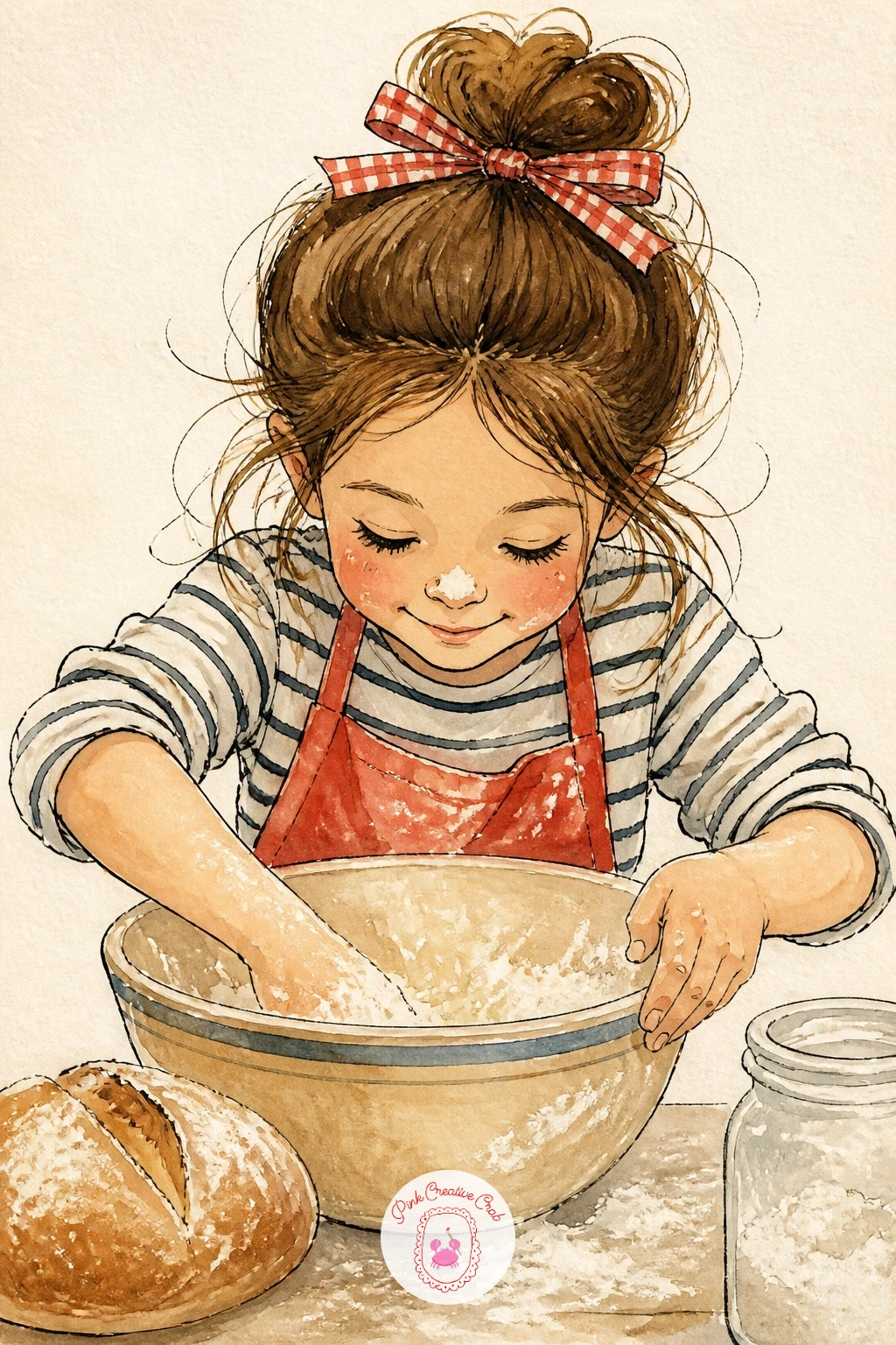
Bring a figure into the kitchen with this one, kept simple: a girl from the shoulders up, leaning over a bowl, apron strap visible. Block in her hair and apron shape first in flat washes, cherry red for the apron reads well against cream skin tones, then ink her face with just a few marks, two dot eyes, a small curved mouth, nothing more detailed than that.
Add the flour last with a dry, stiff brush almost out of paint, tapping it lightly across her nose and the counter in front of her for a dusty texture. This dry-brush spatter is the trick that sells the whole scene, so test it on scrap paper first until the brush is dry enough to spatter rather than drip.
If faces feel intimidating, turn her head slightly away or keep her looking down at the bowl, which hides proportion mistakes naturally.
Swap the apron for any color that matches your kitchen palette, sage works just as well as cherry red here.
You Will Need
- dry stiff brush for flour spatter
Palette: Cherry Red,Cream,Burnt Sienna,Payne’s Grey
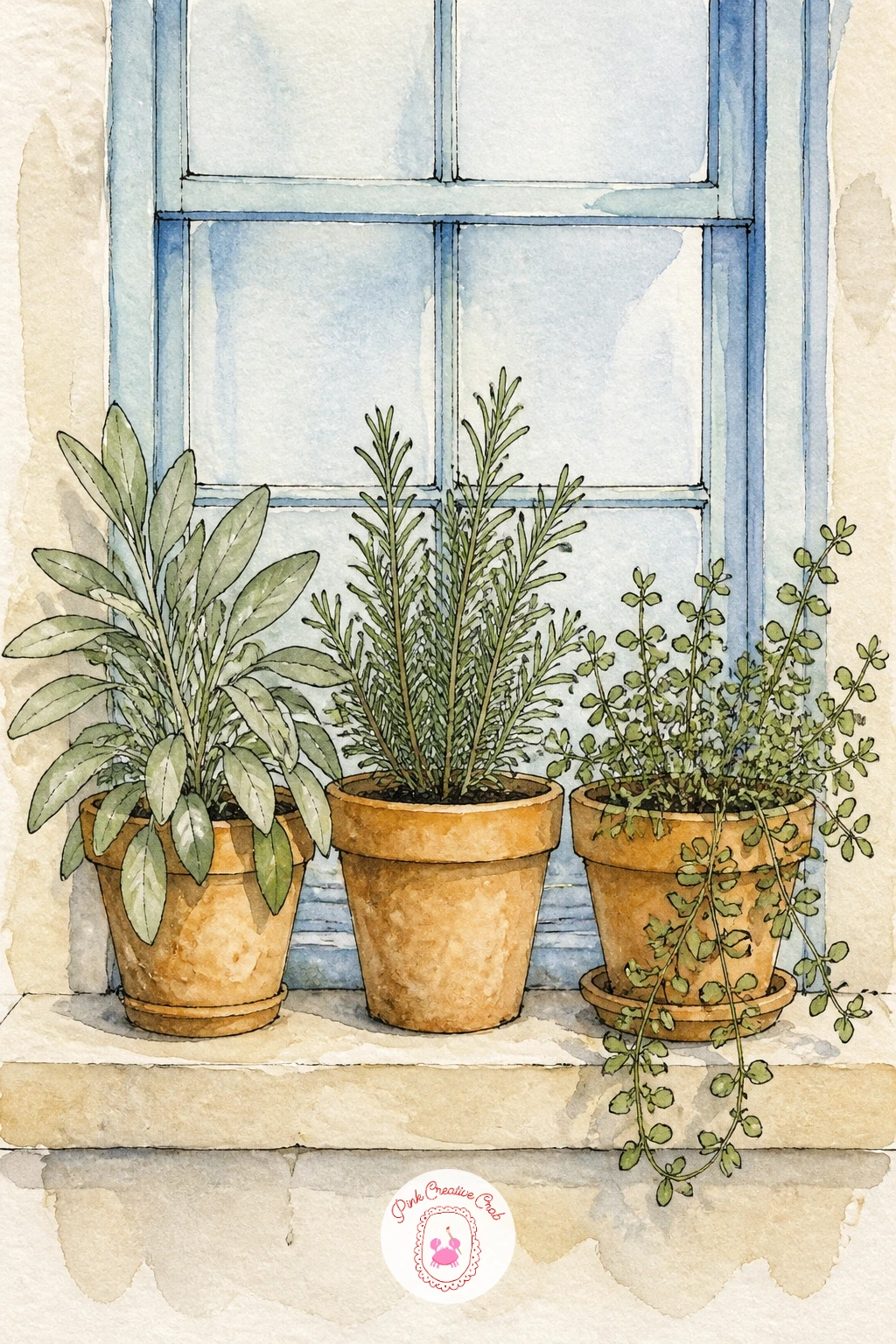
Move to a window sill lined with three small terracotta pots of herbs, a lovely subject for practicing light since the window behind them is the brightest part of the whole painting. Paint the window pane first in a very pale blue-grey wash so it stays softer than everything in front of it, then let it dry completely.
Paint the terracotta pots in burnt orange, add a thin cream rim at the top of each, then build the herbs with small quick dabs of a round brush in two greens, sage for basil, a darker green for rosemary, so the varieties read as different even without labels.
Keep the window glass paler than the pots and leaves in front of it at every stage, this contrast is what pushes the sill forward and the window back. If terracotta mixing feels fussy, a plain burnt orange from the tube works fine on its own.
Tip for today: ink a thin cross in the window pane last, it instantly reads as a windowpane without any extra painting.
Palette: Burnt Orange,Sage Green,Cream,Payne’s Grey
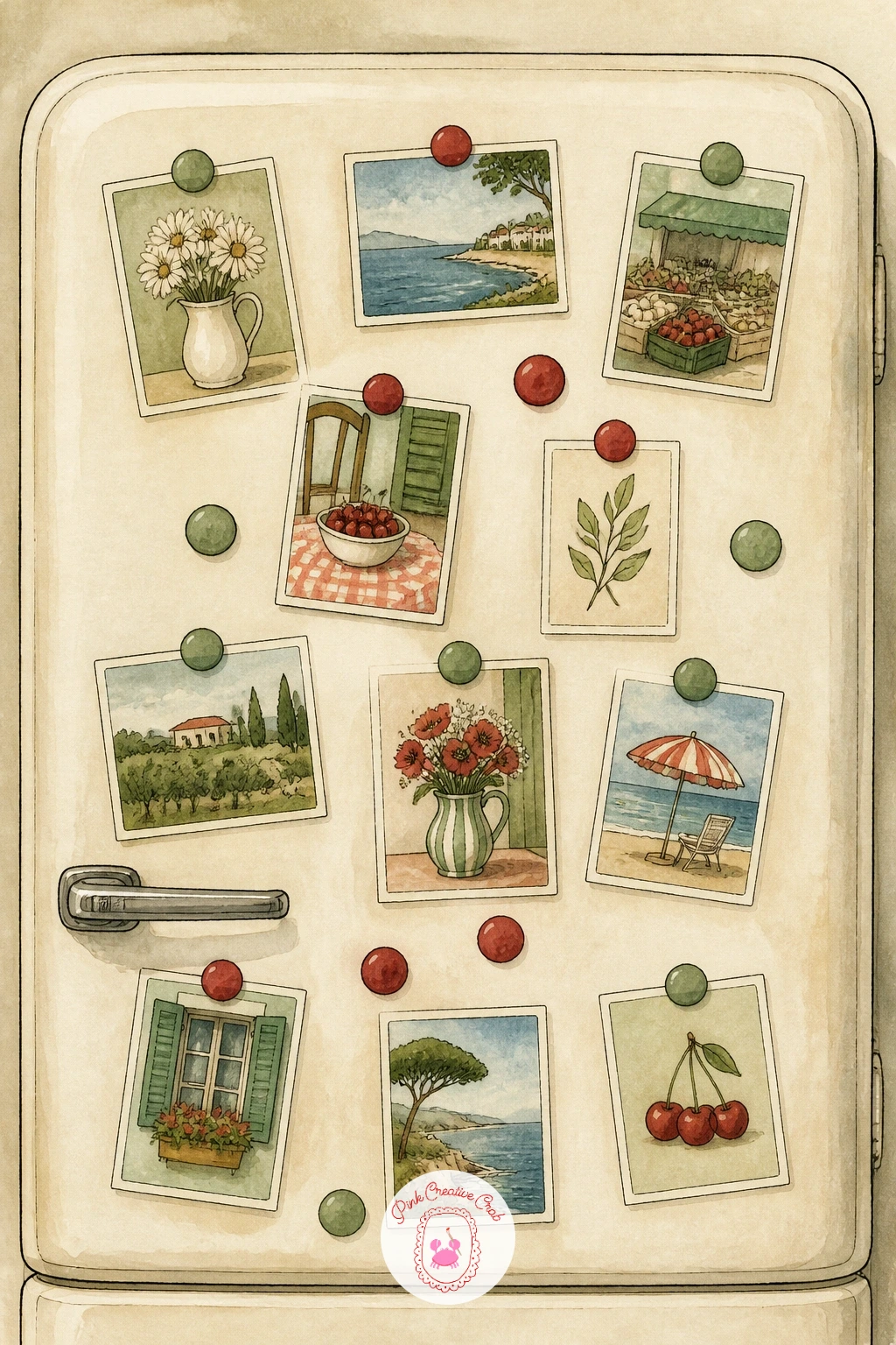
Give the fridge door its own personality with a scatter of tiny painted postcards and magnets. Paint a large flat cream or white rectangle for the fridge first, let it dry fully, then add five or six small rectangles across it in different muted colors to stand in for postcards, each one just a flat wash with a thin ink border.
Scale matters here: keep every postcard small, no wider than a thumbnail on your page, and scatter them at slightly different angles rather than lining them up, which keeps the door feeling lived-in rather than catalogued. Add a few tiny circular magnets in cherry red or sage between them with a single dot of ink.
If the fridge front looks too blank, add a thin grey shadow line down one edge to suggest the door seam and give it some dimension.
Try this again later with a different color story, pastel postcards for a softer print or deeper jewel tones for a bolder one.
Palette: Cream,Sage Green,Cherry Red,Payne’s Grey
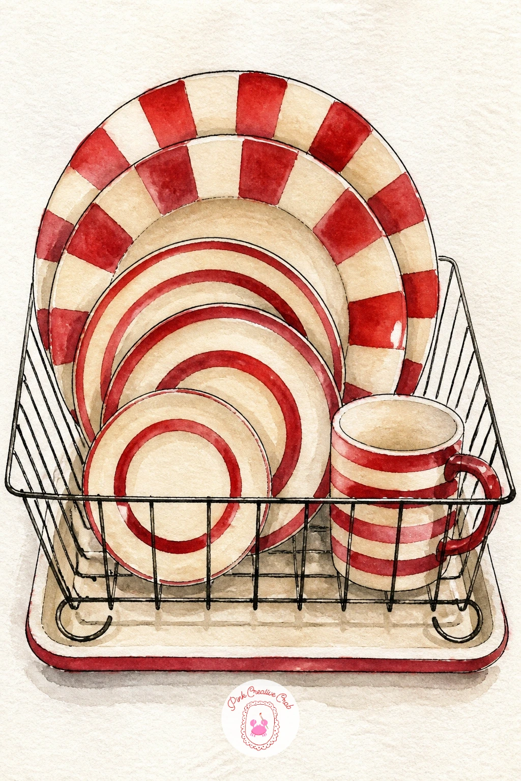
A dish rack is mostly straight lines, so this is a good moment to slow down with ink rather than pencil first. Draw the wire rack as a simple grid of thin vertical lines, then stand two or three plates inside it, overlapping slightly, each a basic circle seen edge-on as a tall oval.
Paint the stripes on each plate before inking the rack over the top, alternating cherry red and cream bands with a steady hand, letting each stripe dry before painting the one beside it so they do not bleed together. Add one striped mug tucked beside the plates for variety.
If the wire rack lines wobble, that is fine, wavy wire reads as hand-drawn charm rather than a mistake in this loose style. Straight rulers actually look out of place here.
Tip for today: leave tiny unpainted gaps where the plates overlap the wire rack, it keeps the layers readable at a glance.
Palette: Cherry Red,Cream,Sage Green,Payne’s Grey
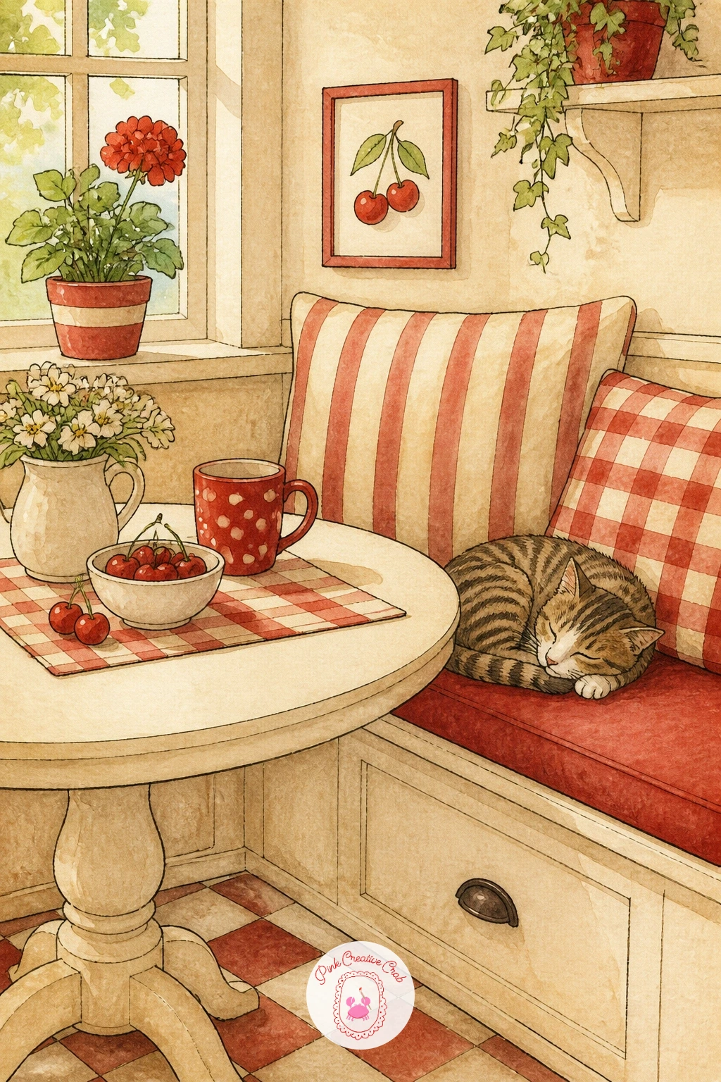
Build a small cozy scene here: a corner bench, a round table, a cup, and a cat curled beneath it. Start with the table and bench in a simple flat perspective, straight lines only, then paint the cat last as a soft oval body with a curled tail, using burnt sienna or cream depending on the coat you want.
Keep the cat’s face minimal, two small ink triangle ears, a dot nose, closed eyes if it is sleeping, this avoids the trickiest part of painting any animal. Add one striped cushion on the bench in cherry red and cream to tie it to the rest of the kitchen palette.
If the whole scene feels crowded, drop the table down to just a corner of it peeking in from one side rather than the whole shape, which also makes the cat the clear focus.
Swap the cat for a small dog curled the same way if that suits your own kitchen better, the same soft oval shape works for either.
Palette: Burnt Sienna,Cream,Cherry Red,Payne’s Grey
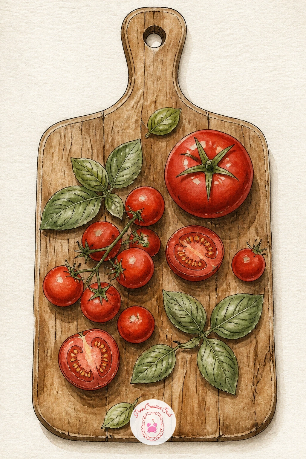
Measure before you paint this one: sketch a wooden board as a simple rounded rectangle, then place three or four tomato circles on it using the board’s width as your guide, no tomato wider than a third of the board, which keeps the proportions sitting right from the start.
Paint the board first in a warm tan wash with a few darker wood-grain lines once dry, then add the tomatoes in cherry red, leaving a small white highlight circle on each, and finish with loose sage basil leaves tucked between them, painted as simple pointed ovals in two or three quick strokes.
Ink the tomato stems and leaf veins last, after everything is dry, so the fine lines sit crisp on top rather than bleeding into wet paint.
If basil leaves look too stiff, paint them with the side of the brush rather than the tip, it gives a softer, more natural edge straight away.
Palette: Cherry Red,Sage Green,Burnt Sienna,Cream
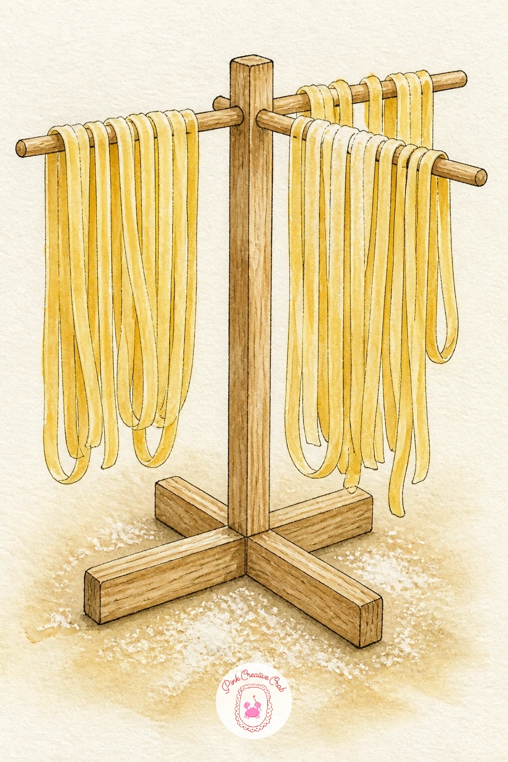
A pasta rack is a fun exercise in repeating curves, since drying pasta hangs in soft draped loops rather than straight lines. Ink the wooden rack frame first as a simple ladder shape, then paint each strand of pasta as a loose curved line in butter yellow, letting several hang at slightly different lengths.
Work top to bottom so your hand never drags over wet paint, and keep the pasta color pale, a light wash is more convincing than a solid one since fresh pasta is matte and soft-toned. Add a dusting of flour at the base with a dry-brush spatter technique, the same light tap of an almost-dry brush used elsewhere in this list.
If the hanging strands look too stiff, draw them with a slight wobble on purpose, pasta never hangs in a perfectly straight line.
Tip for today: vary the spacing between strands rather than lining them up evenly, it reads far more like a real drying rack.
You Will Need
- dry stiff brush for flour spatter
Palette: Butter Yellow,Burnt Sienna,Cream,Payne’s Grey
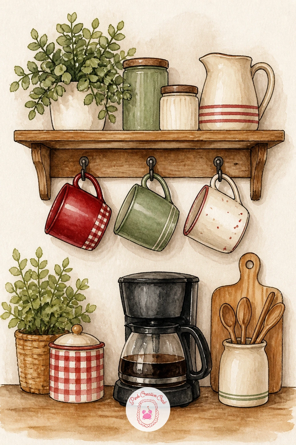
Think about eye level before you start this one: if you draw the hooks and mugs slightly from below, looking up at a shelf, the mugs will show more of their undersides and less of their rims, which reads as a cozier, more intimate angle than a straight-on view.
Ink a thin shelf with three or four small hooks, then paint each mug hanging by its handle, varying the colors across cherry red, sage and cream so they feel collected rather than matched. Add a small coffee pot or French press standing on the counter below for scale.
Keep the handles simple single-stroke loops in ink, fussing over them makes the whole shelf feel stiffer than it should. If hooks feel tricky to draw small, enlarge them slightly, a slightly oversized hook reads as charming rather than wrong in this style.
Tip for today: paint one mug half in shadow to suggest the shelf has real depth, it lifts the whole corner off the page.
Palette: Cherry Red,Sage Green,Cream,Burnt Sienna
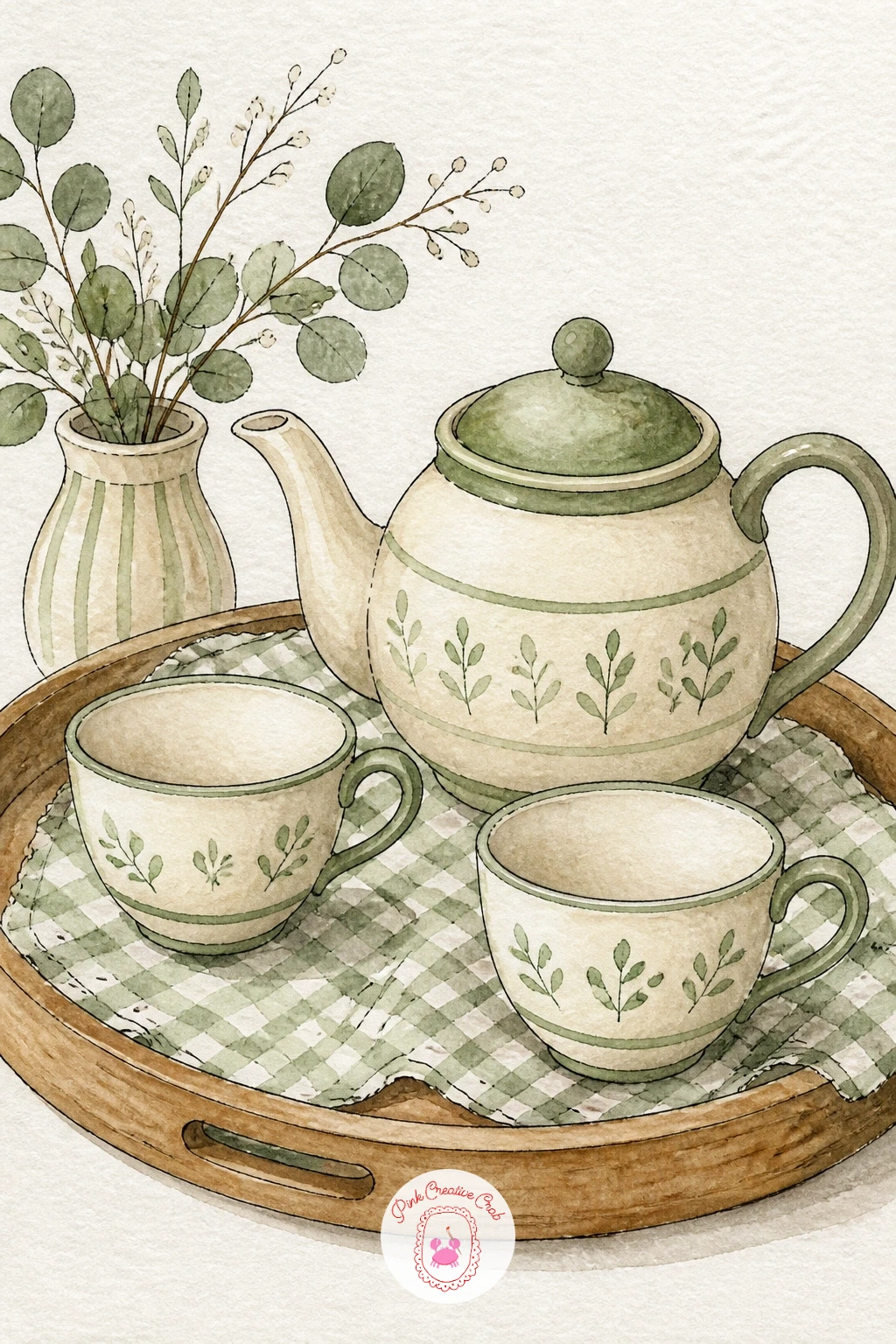
A teapot and two cups on a tray makes a lovely compact still life, and it is a good chance to try the ten-minute version first. For a quick study, paint the teapot and cups as flat colored shapes with ink outlines only, no shading, finished in well under fifteen minutes.
For a fuller forty-minute version, add a second, deeper wash of the same color once the first layer dries to build gentle shadow on one side of the teapot, plus a thin gingham pattern on the tray cloth beneath everything using tiny ink crosses. Paint the tray itself last in a flat warm wood tone so it sits clearly behind the china.
If the teapot spout looks awkward, draw it shorter than feels natural, a stubby spout almost always reads better than a long thin one at this scale.
Swap the gingham tray cloth for plain cream if patterns feel fiddly today, the scene still works perfectly well without it. If you enjoy painting china and table settings like this, the soft palettes in tea party journal pages are worth a look too.
Palette: Cream,Cherry Red,Sage Green,Burnt Sienna
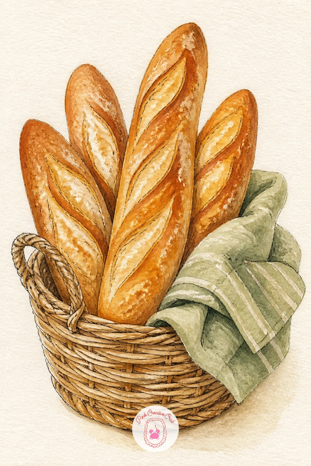
Baguettes are forgiving because their imperfections are the whole point, so do not aim for straight lines here. Paint each loaf as a long tapered shape in a warm golden-brown wash, then while it is still slightly damp, drag a few diagonal scoring lines across it with a slightly drier brush in a deeper burnt sienna.
Build the basket underneath with a simple woven texture: paint a flat tan base shape first, then once dry, ink a loose crosshatch of short diagonal lines over it to suggest the weave without drawing every strand. Tuck a cloth napkin in sage or cream peeking from one side of the basket.
If the bread looks too smooth, that scoring texture is the fix, drag the brush rather than dab it, and let some lines break and stop short for a more natural crust.
Tip for today: leave the top ridge of each baguette as the brightest highlight, untouched paper does this better than any white paint.
Palette: Burnt Sienna,Butter Yellow,Sage Green,Cream
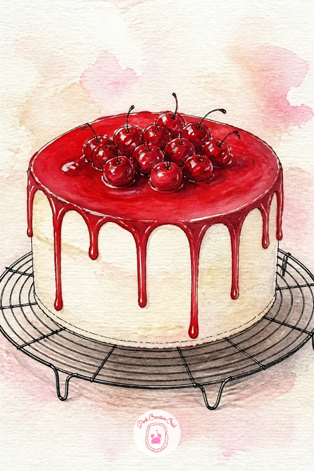
Set the cake on a simple wire rack, which gives you a chance to practice painting a subject from a slightly raised eye level, looking down just enough to see the top of the cake and a sliver of the rack beneath it. This angle makes the cake feel like the clear hero of the scene.
Paint the cake body first in cream, then once dry, add a drippy icing layer in cherry red or butter yellow across the top, letting a few drips run down the sides in loose, uneven lines, more drip means more charm here. Ink the wire rack underneath last as a simple grid of thin curved lines.
If the icing drips look too neat, add two or three that run further than the rest, real icing never drips evenly and the irregularity sells the texture.
Once this version feels easy, try it again as a layered cake with a thin ink line marking each layer, or swap the icing color to match whatever kitchen palette you are building toward.
Palette: Cream,Cherry Red,Butter Yellow,Payne’s Grey
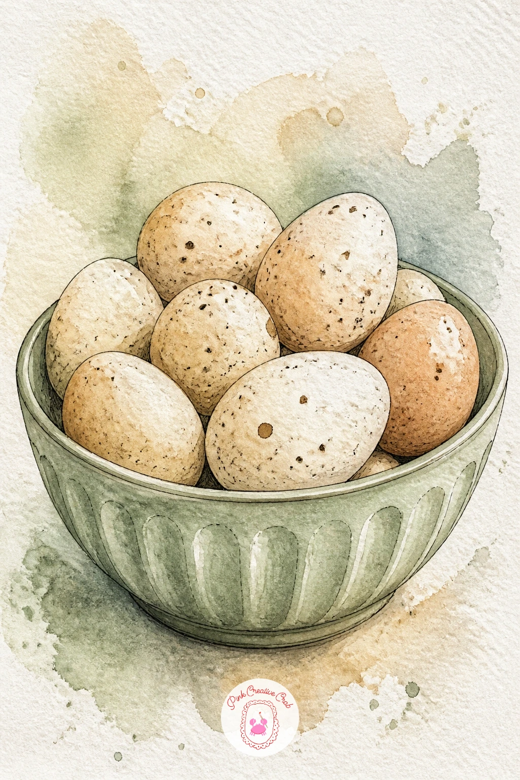
Eggs sound simple but the shading is where this one usually goes wrong, so think about light direction before you paint. Decide where the window light falls, then keep every egg’s shadow on the same side, a thin curved stroke of grey-brown under and to one side of each egg.
Paint the eggs first in a very pale cream wash, leave them to dry fully, then drop in soft speckled dots with a nearly dry brush in burnt sienna for a freckled farm-egg look. Add the bowl last as a simple curved shape in sage, with the eggs overlapping its rim slightly to anchor them in place.
If the shadows end up on different sides of different eggs, the whole bowl stops looking believable, so it helps to pencil a tiny arrow in the corner of your page as a light-direction reminder before you start painting.
Tip for today: keep one egg a slightly different cream tone from the rest, real eggs are never identical and that small variation does a lot of work.
Palette: Cream,Burnt Sienna,Sage Green,Payne’s Grey
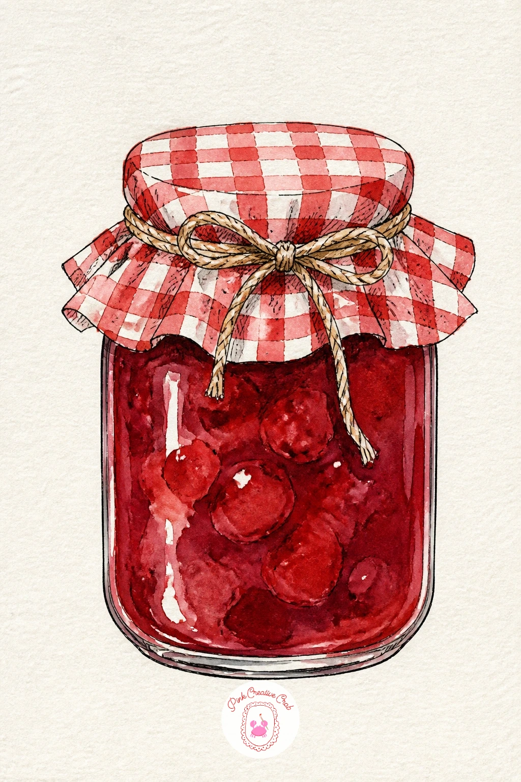
Keep this one small and quick, a single jam jar is one of the fastest kitchen subjects on this whole list. Paint the glass jar as a simple rounded rectangle shape in a very pale wash, leaving a vertical highlight strip untouched, then fill the lower half with a rich cherry red for the jam, letting the color sit slightly uneven near the rim.
Paint the gingham lid fabric last using the same small ink-cross grid trick as the tablecloth idea earlier, in cherry red or sage over a cream base, tied at the jar’s neck with a simple curved ink line for the string.
If the glass looks flat, add one more thin vertical highlight on the opposite side in a slightly darker tone of the jam color showing through, glass almost always has two light edges, not one.
Swap the jam color for butter yellow to suggest honey or lemon curd instead, the same steps apply exactly.
Palette: Cherry Red,Cream,Sage Green,Payne’s Grey
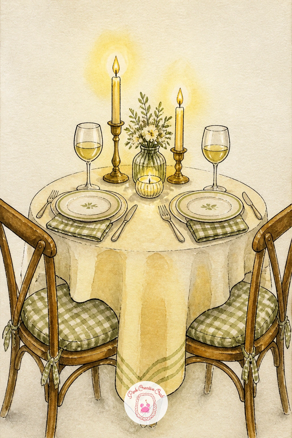
This scene asks you to think about light source twice, since the candles themselves are a light within the painting. Paint the table setting first in flat daylight tones, plates, glasses and cutlery in simple shapes, then add the candles last with a warm glow painted as a soft butter yellow halo around each flame rather than a hard-edged shape.
Keep the two place settings slightly different from each other, one glass taller than the other, one plate with a different small pattern, which makes the scene feel set for real people rather than copied and pasted. Ink the cutlery as simple thin double lines rather than detailed fork tines.
If the candle glow looks too solid, soften its edge by touching a clean damp brush to the outer rim of the yellow wash while it is still wet, pulling it gently outward.
Tip for today: add one small detail only one of the two settings has, a napkin, a flower, it tells a tiny story without any extra painting.
Palette: Butter Yellow,Cream,Cherry Red,Payne’s Grey
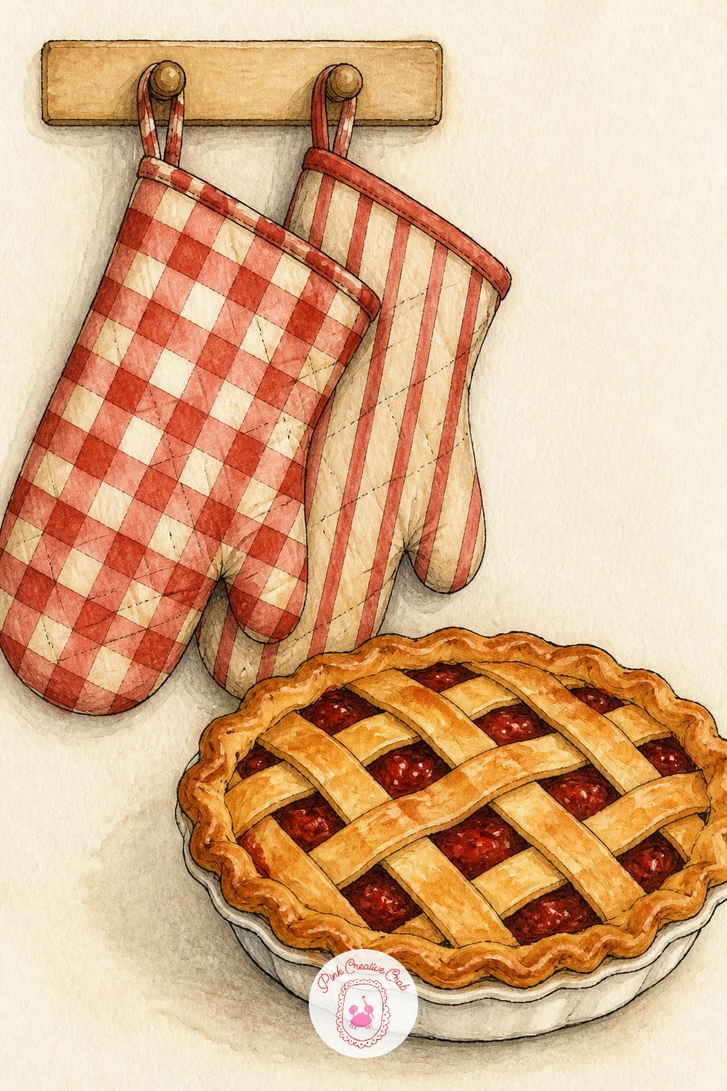
A pie fresh from the oven pairs naturally with a pair of hanging oven mitts, and this combination is a nice exercise in varying texture across one small scene. Paint the pie first, a simple golden circle with a lattice top made of thin crossed ink lines over a warm wash, letting a little cherry red filling peek through the gaps.
Paint the oven mitts in cherry red or sage as two simple mitten shapes hanging from a hook above or beside the pie, with a thin quilted texture added using small dashed ink lines once the fabric color is dry.
If the lattice top looks too even, skip one or two crossings on purpose, a slightly imperfect lattice looks more handmade than a mathematically perfect grid.
Swap the pie filling color to butter yellow for a lemon pie instead, the lattice and crust steps stay exactly the same.
Palette: Butter Yellow,Cherry Red,Sage Green,Burnt Sienna
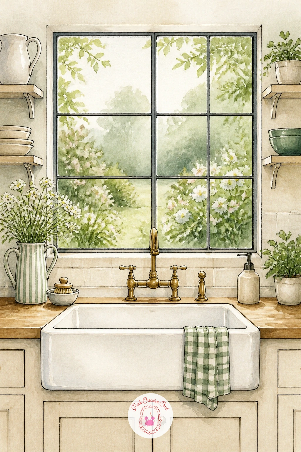
Here the window view matters more than the sink itself, so set up your eye level at standing height looking slightly down and out, which lets you show both the sink basin and a soft garden beyond the glass. Paint the garden view first in loose, blurry washes of sage and butter yellow, kept deliberately out of focus since it sits furthest back.
Once that layer is dry, paint the window frame and sill in crisp ink lines over the top, then add the sink itself in cream with a simple faucet shape, keeping its edges sharper than the garden to push it forward in the scene.
If the garden view pulls too much attention, mute its colors further, a hazy background always reads as farther away than a bright, detailed one.
Tip for today: add one small vase of flowers on the windowsill, it bridges the indoor sink and the outdoor view nicely. For more ideas on painting soft, dreamy garden backdrops like this one, the scenes in cottagecore cottage paintings are a good next stop.
Palette: Sage Green,Butter Yellow,Cream,Payne’s Grey
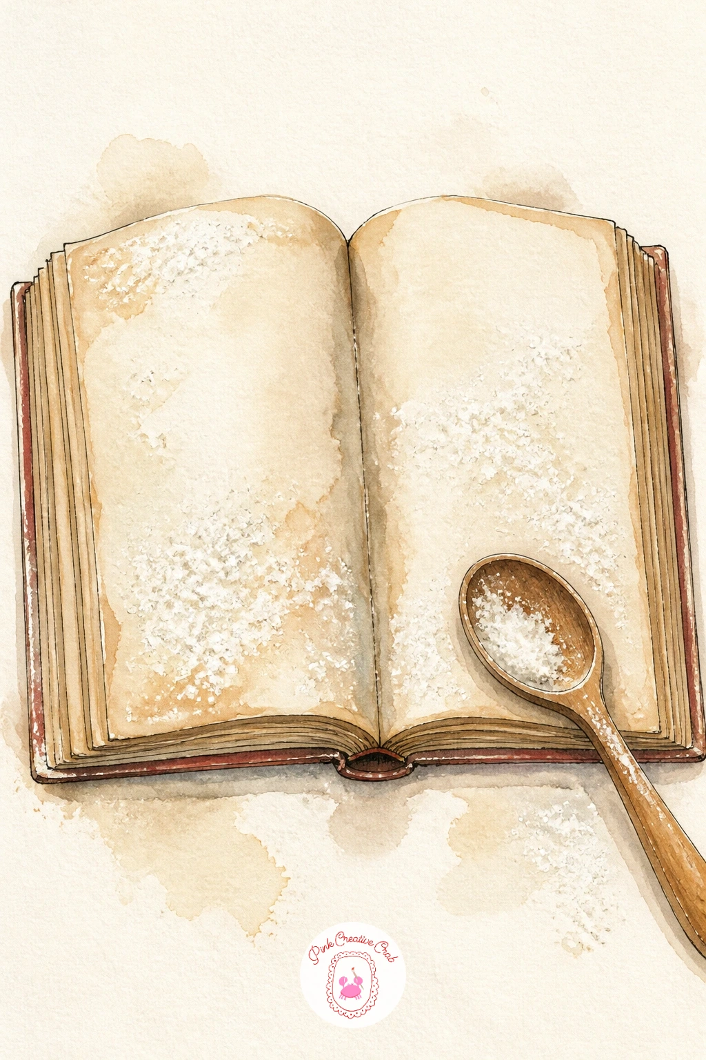
An open cookbook is mostly about perspective, since the two pages need to appear to fold away from the viewer rather than lying flat. Draw the book as two trapezoid shapes meeting at a slightly curved spine, narrower at the top and bottom than in the middle, which creates the illusion of pages curving open.
Paint the pages in a pale cream wash, add a few wavy ink lines to suggest handwritten or printed text without writing actual words, then finish with the same dry-brush flour spatter used in earlier ideas, dusted lightly across the open pages and the table beside it.
If the book looks flat no matter what you try, add a thin grey shadow line right along the spine, that single dark line does more to suggest the fold than any amount of extra shape adjustment.
Tip for today: tuck a wooden spoon or a measuring cup half in frame beside the book, it grounds the scene as a real baking moment rather than a floating book.
You Will Need
- dry stiff brush for flour spatter
Palette: Cream,Burnt Sienna,Payne’s Grey,Sage Green
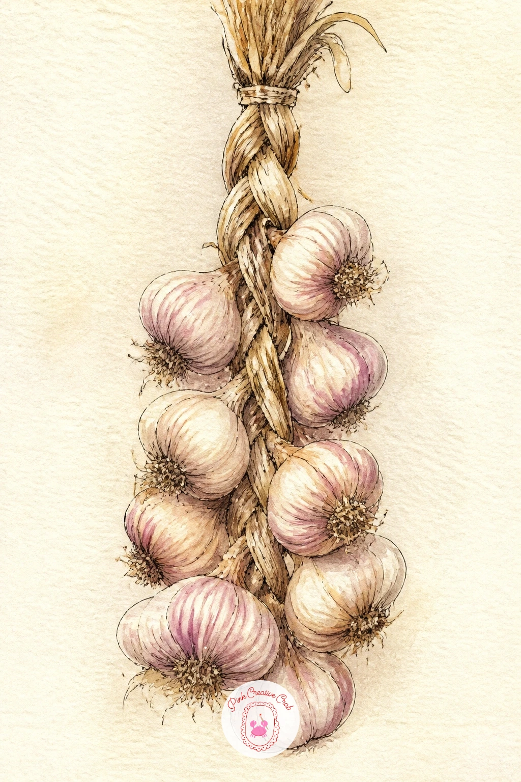
A garlic braid rewards a steady hand with repeating shapes, so plan the structure before you paint: a thick woven stem at the top, then a long cluster of individual garlic bulbs hanging down, each one a small rounded shape with a few thin papery lines in ink.
Paint the braid base in a pale cream-pink wash all at once, then once fully dry, go back in with a fine brush and a slightly deeper tone to separate each bulb from its neighbor, leaving thin white gaps between them so they do not blur into one shape. Ink a few curved lines inside each bulb to suggest the papery skin.
If the bulbs start looking too uniform, vary two or three in size and tilt, garlic bulbs are never perfectly matched and that irregularity is what makes the braid convincing.
Swap the hanging braid for a loose pile of bulbs on a counter if hanging shapes feel tricky, the painting technique for each bulb stays identical.
Palette: Cream,Burnt Sienna,Sage Green,Payne’s Grey
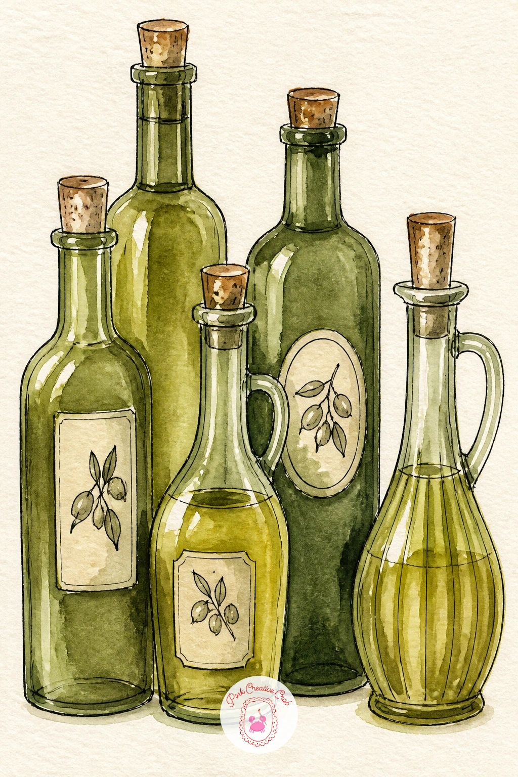
Glass bottles are a great quick study in highlights, so look at how light actually passes through a bottle before you start: it usually creates one bright vertical streak and one softer reflected strip on the opposite edge. Paint two or three bottles of slightly different heights in a warm olive-green wash, leaving both of those streaks untouched from the very first layer.
Once the bottles are dry, add a simple round label on one with a thin ink border and a tiny painted sprig inside it, and paint a thin cork or metal cap shape at the top of each bottle in burnt sienna or grey.
If the bottles look opaque rather than like glass, the fix is almost always more white space left in that initial wash, resist the urge to fill every bit of the bottle shape with color.
Tip for today: group the bottles at slightly different heights and overlap them a little, a perfectly even row looks far more like clip art than a styled counter.
Palette: Sage Green,Burnt Sienna,Cream,Payne’s Grey
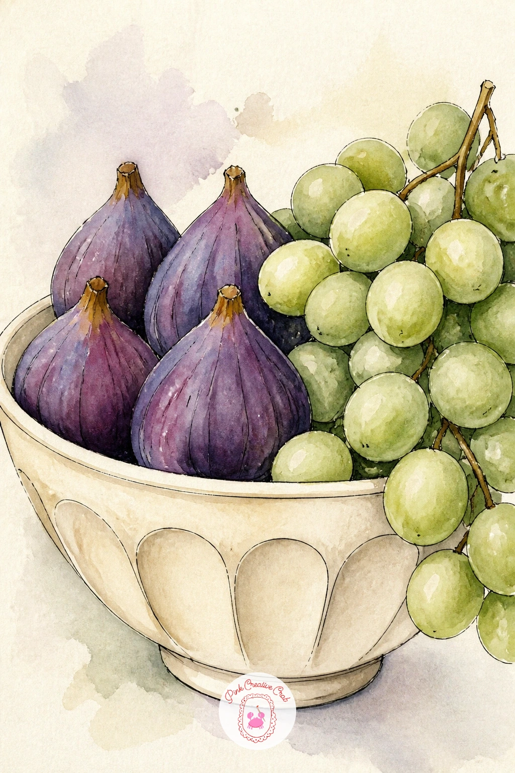
Figs and grapes give you two very different textures to play with side by side, so build them in that order: figs first, since their shape is simpler. Paint each fig as a rounded teardrop in deep cherry red-purple, then while still damp, touch a tiny bit of butter yellow into the center to suggest the open flesh.
For the grapes, paint a cluster of small overlapping circles in sage or deep purple, leaving tiny white gaps between each grape so they read as separate round forms rather than one blob. Finish with a simple curved bowl shape in cream underneath both, inked once everything else is dry.
If the grape cluster looks flat, deepen the color on just the grapes near the center of the bunch, where they would naturally sit in more shadow, and keep the outer grapes paler.
Vary this next time with a different fruit mix, plums and blackberries work with the same circle-and-teardrop approach.
Palette: Cherry Red,Sage Green,Butter Yellow,Cream
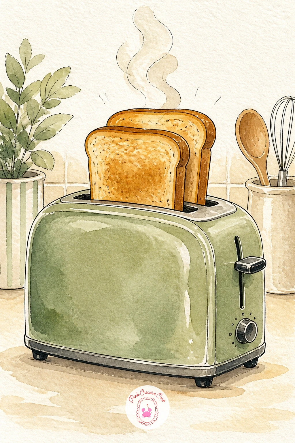
A toaster is a fun, slightly playful subject, and it works well as the ten-minute quick version in this list. For a fast study, paint the toaster body as one flat cream or sage rectangle with rounded corners and two simple slots, add two bread slices popping up in golden brown, done.
For a fuller forty-minute version, add a thin chrome highlight down one side of the toaster body with a reserved strip of white paper, then paint a small crumb tray detail at the base and a tiny steam curl rising from the toast using the same dry, light steam technique from the kettle idea earlier.
If the toaster looks too boxy, round the corners more than feels natural, toasters are almost always softer and rounder than a true rectangle.
Tip for today: add a few small dark dots of ink across the toast surface for a toasted texture, it is a tiny detail that reads immediately as bread rather than a plain shape.
Palette: Sage Green,Burnt Sienna,Cream,Payne’s Grey
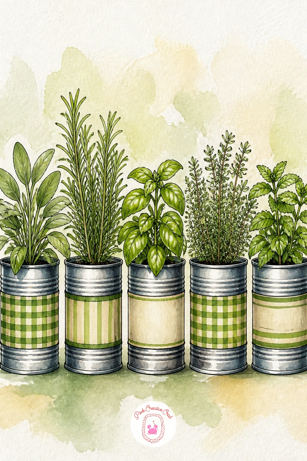
Three or four tin cans lined up as planters make a nice variation on the window sill idea from earlier, this time with a focus on the metal texture rather than terracotta. Paint each can as a simple cylinder in a cool grey, leaving a bright vertical highlight strip down one side to suggest the shine of metal.
Once dry, add a thin painted label band around the middle of each can in cream or cherry red, then build the herbs on top with quick overlapping dabs of two different greens, keeping each can’s herb variety slightly different in shape so the row reads as mixed rather than repeated.
If the tin cans look flat rather than round, that metal highlight is doing the real work, make sure it stays a clean strip of untouched or very pale paper rather than getting painted over by accident.
Swap the tin cans for small terracotta pots if you would rather repeat the window sill palette instead, the herb-painting steps stay the same either way.
Palette: Payne’s Grey,Sage Green,Cream,Cherry Red
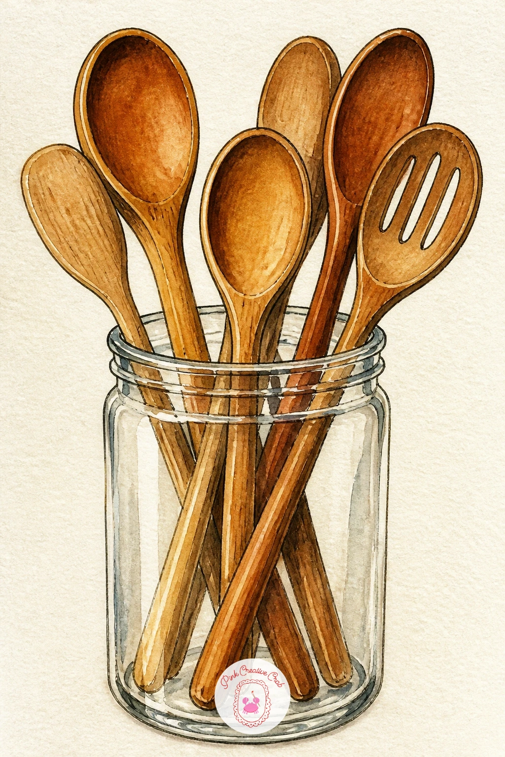
A jar of wooden spoons and utensils is a quiet, easy subject that still teaches a useful skill: painting several thin vertical shapes without them blurring into one mass. Paint the jar first as a simple cylinder in pale cream or clear glass tones, then once dry, paint each utensil handle individually in burnt sienna, letting them cross and overlap at slightly different heights.
Leave a small gap of untouched paper between overlapping handles wherever they cross, this single habit is what keeps a cluster of thin objects readable instead of turning into a tangle. Add one or two spoons with a rounded bowl shape at the top peeking above the jar rim for variety.
If the handles still look tangled once painted, go back in with a fine ink line along just one edge of each handle, the added outline separates them instantly.
Tip for today: tilt two or three handles at slightly different angles rather than keeping them all upright, it looks far more natural sitting in a jar.
Palette: Cream,Burnt Sienna,Sage Green,Payne’s Grey
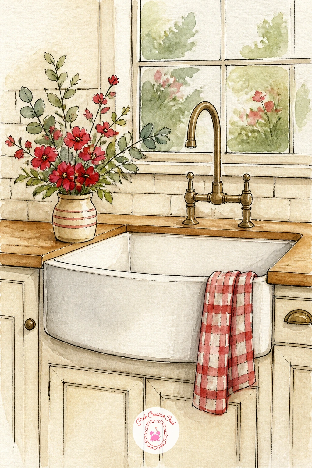
This farmhouse sink takes the apron-front style, a deep rectangular basin with a visible curved front panel, which is worth sketching carefully since its proportions carry the whole painting. Measure the basin width against its height before inking, a true farmhouse sink is usually wider than it is tall.
Paint the sink in a flat cream wash with a thin grey shadow along its lower edge, then add a simple faucet in burnt sienna or grey above it. Finish with a small vase or jug of loose flowers set on the counter beside the basin, painted as quick dabs of cherry red and sage with a few thin green ink stems.
If the basin looks too shallow, deepen the shadow along its inside curve, a stronger shadow there reads immediately as more depth without changing the outline at all.
Swap the flowers for a stack of clean folded dish towels if florals are not your thing today, the sink technique stays exactly the same.
Palette: Cream,Cherry Red,Sage Green,Payne’s Grey
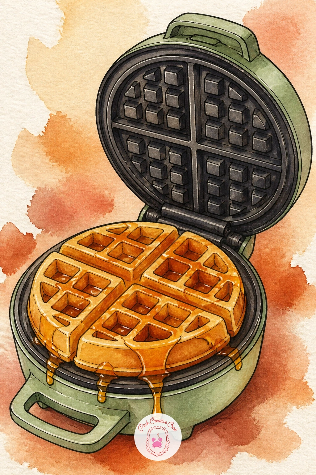
The waffle grid pattern is the main challenge here, and the trick is working from large shapes down to small marks rather than the other way around. Paint the waffle itself first as one solid golden-brown circle, let it dry fully, then use a fine brush loaded with a slightly deeper brown to paint a simple crosshatch grid over the top.
Keep the waffle iron body behind it simple, a rounded hinged shape in sage or cream with two handles, painted and inked before you tackle the grid detail so you are not juggling too much wet paint at once. Add a drizzle of syrup over the top waffle in a thin glossy line of burnt sienna with a tiny white highlight left along its edge.
If the grid lines smudge into the waffle color, you are painting them too soon, wait until the base wash is completely dry before adding a single grid mark.
Tip for today: let the syrup drip off one edge of the waffle rather than staying perfectly inside its shape, that small overflow makes it look genuinely poured.
Palette: Burnt Sienna,Butter Yellow,Sage Green,Cream
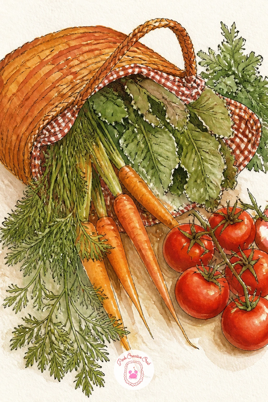
A woven market bag spilling with vegetables is a lovely way to pull several shapes into one busy, happy scene, so plan it loosely before you paint: a soft rounded bag shape with three or four vegetables peeking over the top and one or two tumbled out beside it on the counter.
Paint the bag first in a warm tan with a simple woven texture of short diagonal ink lines, then build the vegetables in quick confident shapes, a carrot as an orange teardrop with green fronds, a bundle of greens in sage, a round tomato or two in cherry red, each painted wet-into-wet so the colors stay soft and loose.
If the whole pile starts to look cluttered, group the vegetables into two or three overlapping clusters rather than scattering them evenly, clusters read as more natural and are easier to balance visually.
Tip for today: let one vegetable tumble just outside the bag onto the counter, it adds movement and stops the whole shape feeling too contained.
Palette: Burnt Sienna,Cherry Red,Sage Green,Cream
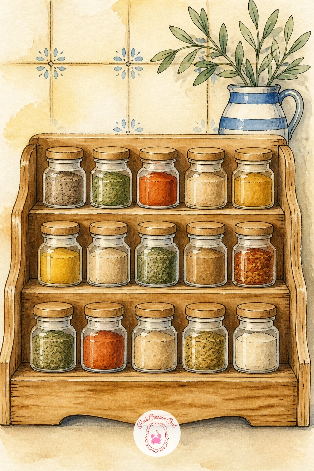
This spice rack is the more detailed cousin of the earlier pantry shelf, so push a little further here with small color variety. Ink a simple two or three tier wooden rack first, then paint a row of small matching jars along each tier, each filled with a different spice color, deep red paprika, burnt orange turmeric, sage dried herbs.
Keep every jar the same size and shape this time, since the uniformity of matching jars is actually part of what makes a spice rack look styled and intentional, unlike the varied heights of the pantry shelf idea. Add a tiny painted label circle on each lid in a contrasting color once the jars are dry.
If the rows start looking monotonous, break the pattern with one taller jar standing at the end of a row, a small variation like this stops a grid from feeling too rigid.
Swap the wooden rack for a simple floating shelf if a tiered rack feels like too much structure to draw today.
Palette: Burnt Orange,Cherry Red,Sage Green,Cream
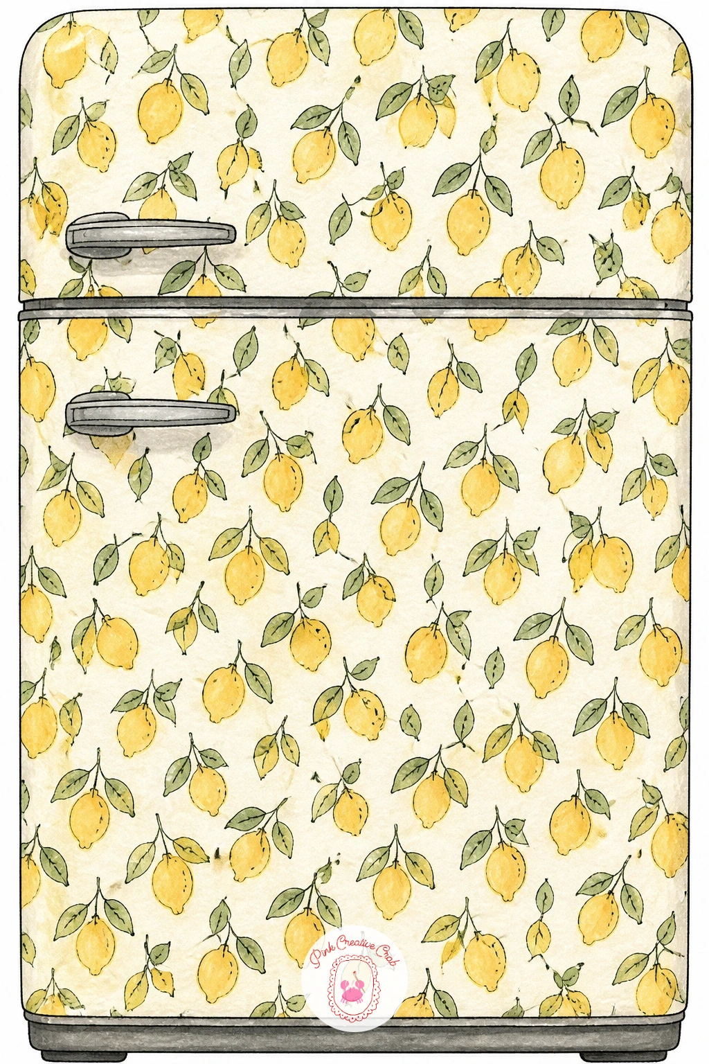
Close the list out with a fridge styled almost like wallpaper, a simple large door covered edge to edge with a repeating lemon print, which is a satisfying way to practice pattern-making on a big confident shape. Paint the fridge outline first as one large flat rectangle, rounded at the corners, and let it dry completely.
Build the lemon pattern with a light pencil grid of evenly spaced dots, then paint a small lemon shape at each dot in butter yellow with a tiny sage leaf beside it, working in diagonal rows so your hand moves naturally across the page without smudging finished lemons.
If the pattern starts looking too stiff and even, rotate a few lemons slightly off-axis as you go, a touch of irregularity keeps a repeated print feeling hand-painted rather than printed by machine.
Tip for today: finish with a thin silver or grey ink handle down one side of the fridge, it is the one detail that reads instantly as a fridge rather than a random patterned rectangle. If you enjoyed building a repeat pattern like this, the food motifs in easy watercolor food ideas make a nice next sketchbook project.
Palette: Butter Yellow,Sage Green,Cream,Payne’s Grey
What to Do Next
Pick one idea that matches the mood of your own kitchen, tape a sheet of cold press paper to your table, and work through the steps for that single scene today. Once it dries, it is ready to frame, and the next idea on this list is waiting whenever you want to build out the set.
Frequently Asked Questions
What paper works best for kitchen watercolor art prints?
Cold press watercolor paper around 140lb works best for kitchen scenes like these. It handles washes and ink linework without buckling, and its slight texture suits the loose, modern style of these kitchen prints well.
Do I need to draw the scene in pencil first?
Yes, a light pencil sketch first keeps proportions like a mixer, teapot or sink in check before you commit to ink. Keep the pencil lines faint so they disappear under the watercolor and ink layers.
How do I stop my ink lines from smudging into wet paint?
Always let your watercolor wash dry completely before adding ink details on top. Waiting even five extra minutes prevents the fine liner from bleeding into damp color and keeps your outlines crisp.
Can I paint these kitchen scenes without a limited color palette?
You can use any colors you like, but sticking to butter yellow, cherry red, sage and cream throughout the series is what makes several kitchen paintings hang together as a matching set on one wall.
What is the easiest kitchen watercolor art idea to start with?
A single jam jar or a bowl of lemons makes the easiest starting point. Both use simple rounded shapes and one or two colors, so you can finish either in under twenty minutes.
Have any thoughts?
Share your reaction or leave a quick response — we’d love to hear what you think!
-
 0
-
0
-
0
-
0
-
0
-
0


