

A starfish drawing is one of those small, satisfying projects that rewards you fast: five rounded arms, a bit of texture, and you already have something worth pinning to the fridge. This list keeps that feeling going for twenty seven pages, starting with starfish in all kinds of little moods and situations, then wandering into the rest of the tide pool, crabs, snails, urchins and all.
Every idea below is sized for colored pencils and a single sitting, with warm, storybook colors and a light paper background so your characters stay the star of the page. Work through them in order if you like building confidence as you go, or jump straight to the one that is calling to you from the beach in your memory.
Using these images: free for personal projects such as printing, coloring, cards, journals and gifts. Handmade items that include them may be sold up to 30 pieces per design. More than that is commercial use and is not permitted, and neither is selling or sharing the images themselves or passing them off as your own. Please ask before any other use.
Start the whole set with a starfish on a sandy rock, since it teaches the one shape every other idea leans on. Sketch a rounded five point star with soft, lumpy arms rather than sharp points, then draw the rock underneath as a simple dome with a flat sandy top.
Lay in the starfish first in warm coral or terracotta, then add the rock in grey brown and the sand in pale ochre, working light to dark so you can still lift color if an arm goes crooked.
If this is your first time drawing a starfish, compare the length of each arm against the one across from it before you commit to outlines, since mismatched arms are the most common slip. Keep texture simple with small dots and short flicks of pencil rather than a solid fill.
No terracotta pencil on hand, a mix of orange and burnt sienna gets you there just as well.
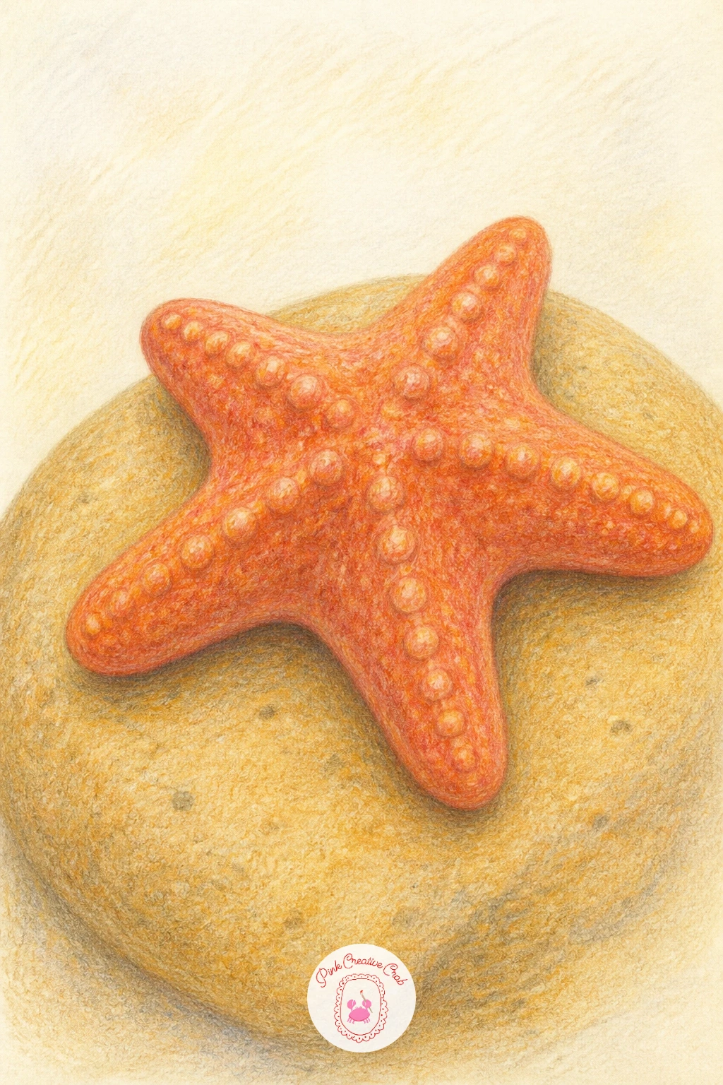
Palette: Terracotta,Burnt Sienna,Pale Ochre,Warm Grey
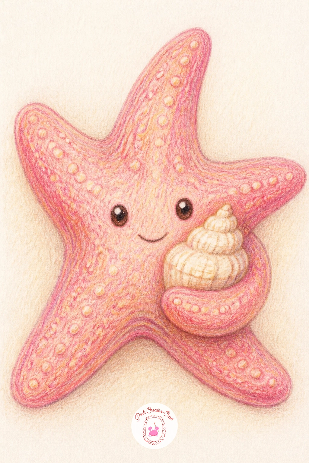
Give your starfish something to hold and the page turns into a tiny story. Draw the starfish body first, slightly turned so two arms curl forward, then tuck a small scallop or spiral shell into the curl of one arm.
Work the starfish in soft pink and coral, then switch to cream and peach for the shell so it reads as a separate, lighter object against the body. Shade the underside of the shell a touch darker to settle it into the starfish’s grip rather than letting it float.
The curled arm is where beginners tend to flatten the shape, so check that the arm still tapers to a rounded tip even as it bends, not a straight line with a kink in it. If pink pencils feel too loud, a dusty rose keeps the same sweetness with less punch.
Finish with a few white gel pen dots on the shell ridges for a bit of sparkle.
You Will Need
- white gel pen
Palette: Dusty Rose,Coral,Cream,Peach
Move from props to costume with a starfish wearing a tiny sun hat, perched jauntily over two of its upper arms. Draw the body first in a relaxed, slightly asymmetrical pose, then add the hat as a simple cone with a wide curved brim, tilted a little for charm.
Color the starfish in warm coral or orange red, then give the hat a contrasting pastel, straw yellow works nicely, with a thin ribbon band in a deeper shade. Keep the brim’s underside slightly shaded so the hat reads as sitting above the body rather than stuck flat onto it.
Eyes and a small curved mouth are what make this one feel alive, so place them low on the body, like a face peeking out from under the brim, and keep the line simple rather than fussy. Swap the ribbon color freely, a seashell pink or seafoam green both work.
Draw this one for any beach lover who likes a dash of personality on her wall.
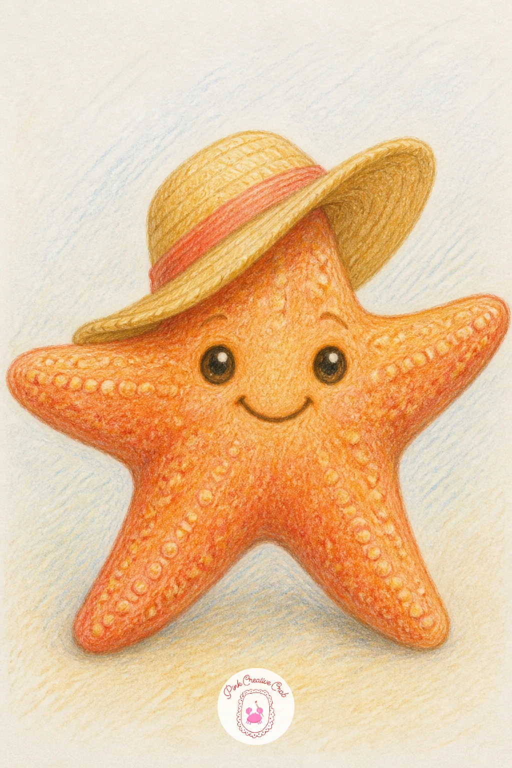
Palette: Coral Orange,Straw Yellow,Seafoam Green,Cream
Look at real straw hats for the brim curve, the edge dips slightly in the middle and lifts at the sides rather than sitting perfectly flat.
Build your first little scene with a starfish settled among sea anemones, since this is where eye level starts to matter. Decide if you are looking straight down into the pool, which keeps everything round and flat, or from the side, which lets the anemone tentacles fan upward toward the water’s surface.
Sketch the starfish low and central, then ring it with two or three anemones drawn as soft rounded clusters of short, wavy lines radiating out from a center point. Work the starfish in coral first, then build the anemones in layers of pink and violet, darkest at the base where the tentacles meet the rock.
Tentacles are easy to overdo, so stop before the cluster looks like a scribble, aim for enough lines to suggest softness, not every single one drawn in. If violet feels too cool against the coral, a dusty magenta keeps the contrast warmer.
Add a pale blue green wash of color around the base for the tide pool water and you are done.
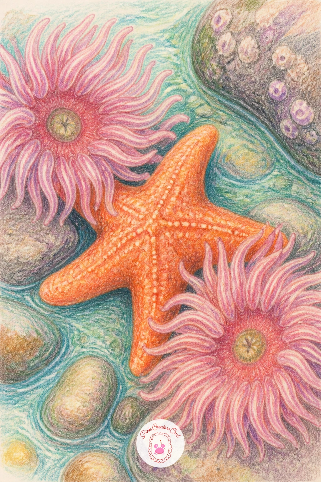
Palette: Coral,Dusty Magenta,Violet,Pale Aqua
After the busier tide pool, simplify with a pink sea star resting on a branch of coral, a cleaner composition built on light and shadow. Choose where the light comes from, usually from above and slightly to one side, and keep every shadow consistent with that, under the star’s arms and along the shaded side of the coral branch.
Draw the sea star first in a clear bubblegum pink, then build the coral underneath in layered coral orange and white, leaving the lit edges pale and the undersides deeper. A touch of dusty rose shading where the star’s arms meet the coral grounds the whole piece.
If the coral branch starts looking like a flat shape rather than something with form, go back in with a darker pink along one side only, never both, to keep the light direction believable. Regular coral pencil works if bubblegum pink is not in your set, just lighten your pressure.
Keep the background bare so the pink stays the brightest thing on the page.
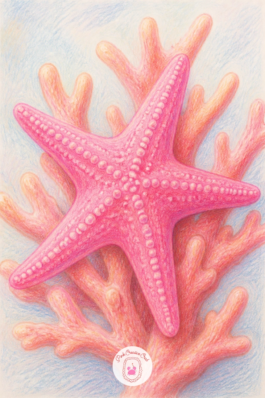
Palette: Bubblegum Pink,Coral Orange,Dusty Rose,White Highlight
From a single star stretch into a starfish family on the shore, one large and two or three smaller ones close together, which is really a lesson in proportion. Draw the biggest starfish first and use its size as your ruler, each smaller one should measure roughly half to two thirds across, never shrunk at random.
Color the large starfish in a deeper coral and the small ones a shade lighter or pinker, which helps them read as a family rather than a random pile. Overlap one small arm slightly behind the big starfish’s body to tie the group together instead of leaving them scattered.
Spacing is where this one can go wrong, too far apart and they lose the family feeling, too close and the arms turn into a tangle, so leave a small gap of bare sand between each one. If you only have one coral pencil, vary the family by pressure alone, lighter touch for the little ones.
A thin line of wet looking sand beneath them finishes the scene without extra work.
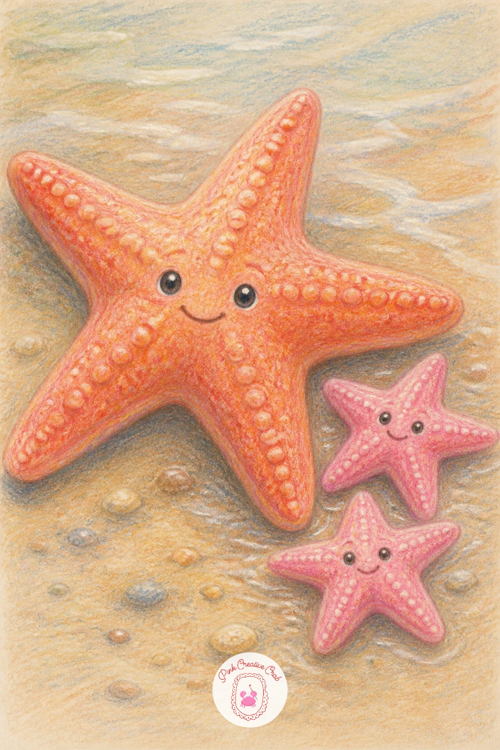
Palette: Deep Coral,Light Coral,Sand Beige,Warm Grey
Bring in a bit of nostalgia with a starfish sitting inside a child’s sand bucket, handle and all. Draw the bucket first as a simple trapezoid, wider at the top, with a thin curved handle arcing above it, then nestle the starfish so its arms drape slightly over the rim.
Color the bucket in a bright primary, red or yellow both feel right for this, then work the starfish in coral so it pops against the plastic. A bit of wet sand shading at the very bottom of the bucket suggests it was just scooped up from the shore.
The quick ten minute version keeps the bucket plain and the starfish simple, just outline and two tones of color. Give it forty minutes instead and you can add a painted stripe pattern around the bucket rim and a soft cast shadow underneath where it sits on the sand.
One concrete tip for today: draw the handle last, it is easier to get its curve right once the bucket body already anchors the page.
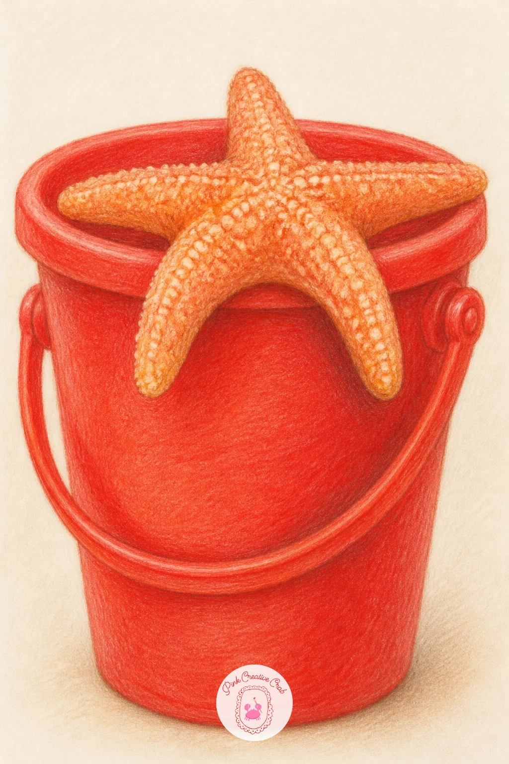
Palette: Bright Red,Sunshine Yellow,Coral,Sand Beige
Give the page a bit of dialogue with a starfish and a crab sitting face to face, mid conversation. Draw the starfish first, angled slightly toward the crab, then build the crab from a rounded oval body with two raised claws and small bent legs, facing the starfish in return.
Color the starfish in warm coral and the crab in a contrasting red orange, keeping the claws a shade lighter so they stand out against the body. Simple dot eyes and a small curved line for each mouth, turned toward each other, is what sells the conversation, so place them with care before you commit to pencil.
Crab legs are the fiddly part, so draw them as short, bent segments rather than long straight lines, which keeps the crab looking sturdy instead of spindly. If red orange feels too strong, a muted brick red softens the crab without losing the warmth.
Leave plenty of bare sand between them so the two characters stay the clear focus.
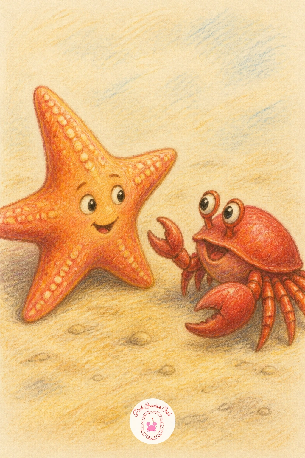
Palette: Coral,Brick Red,Sand Beige,Warm Grey
Keep the beach mood going with a starfish lounging on a striped beach towel, a nice chance to practice pattern without much risk. Draw the towel first as a simple rectangle seen at a slight angle, then add evenly spaced stripes before placing the starfish on top, half sunk into the fabric folds.
Color the stripes in two alternating shades, coral and cream works well against the surrounding sand, then layer the starfish in a slightly different coral so it still reads as separate from the pattern beneath it. A few soft fold lines where the towel bunches under the starfish’s weight add believability.
Striped patterns tend to drift uneven across a page, so lightly pencil in guide marks for each stripe before inking in color, and erase them once you are confident. For a quick ten minute version skip the folds entirely and keep the towel flat, the forty minute version adds the folds and a small sandy footprint nearby.
Try a seafoam and white stripe combo next time for a cooler palette.
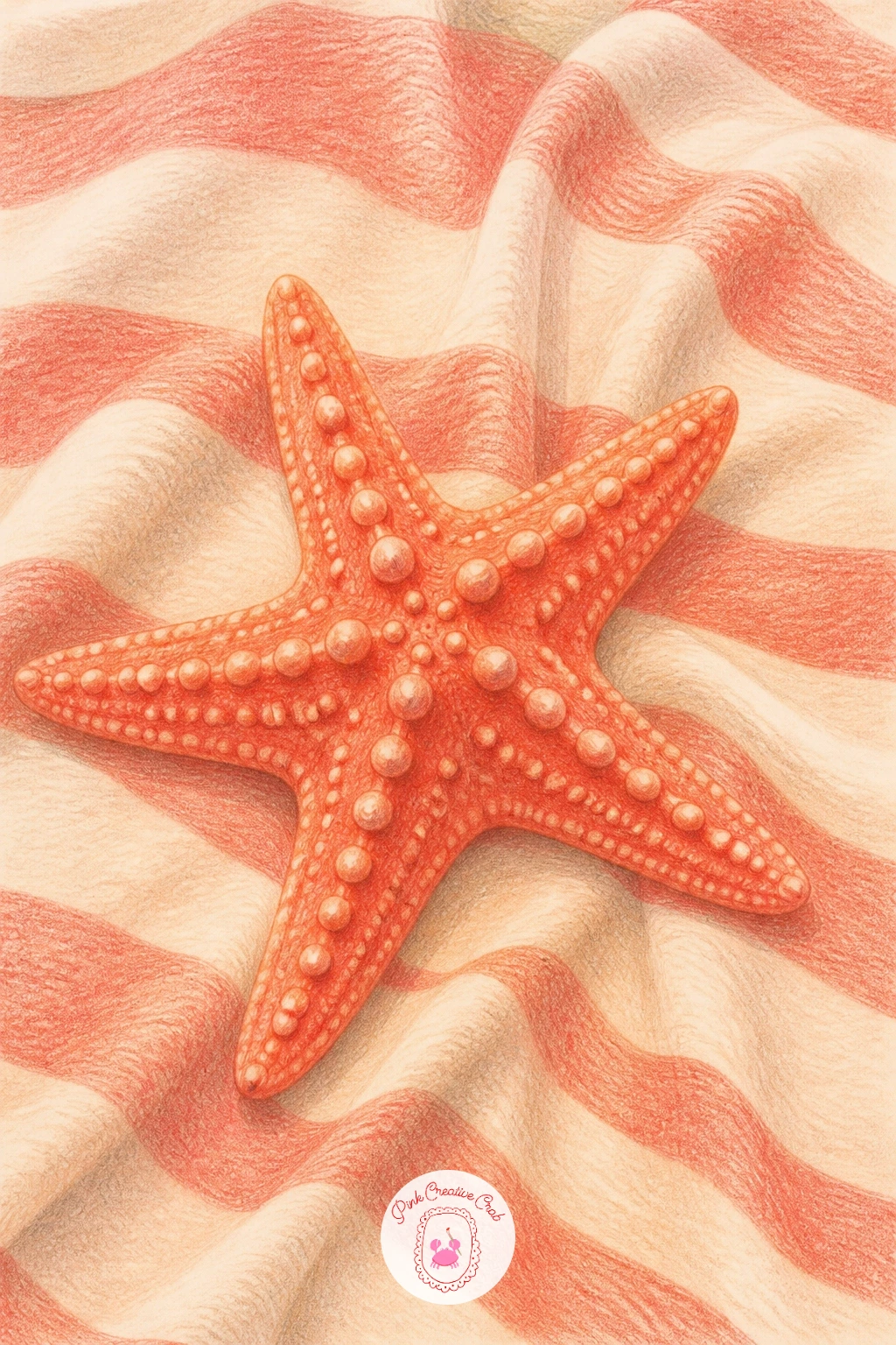
Palette: Coral,Cream,Seafoam Green,Sand Beige
Tuck a starfish into the doorway of a small sandcastle for a scene with a bit of architecture in it. Build the sandcastle first from simple stacked shapes, a few cylinders and cones for towers, then draw the starfish peeking from the arched doorway at the base, arms spread as if waving.
Shade the sandcastle in warm sand tones, darker at the base and lighter at the tower tops where the sun catches it, then color the starfish in coral so it stands apart from the surrounding sand. A scattering of small shells at the castle’s base adds charm without much extra effort.
Towers are where symmetry slips, so measure the width of one tower against its neighbor with your pencil held at arm’s length before you shade either one, that keeps the castle from leaning. If stacking shapes feels tricky, simplify to one tower and a single wall instead of a full fortress.
Finish the doorway shadow a touch darker than the rest so the starfish reads as tucked inside, not painted on top.
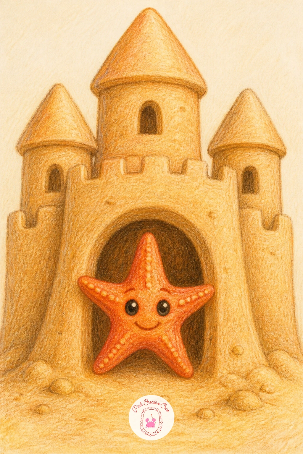
Palette: Sand Beige,Warm Grey,Coral,Cream
Give your starfish a ride with this one, perched flat along the length of a small surfboard as if catching a wave. Draw the surfboard first as a long rounded oval with a pointed nose, then lay the starfish across the middle, arms spread to grip the edges.
Color the board in a cheerful pastel, mint or soft yellow both suit a beach mood, with a simple racing stripe down the center, then work the starfish in coral on top so it sits clearly above the board’s surface. A faint curved line of white water beneath the board suggests movement without needing a full wave.
The board’s point is easy to draw too sharp or too blunt, so round the very tip slightly rather than letting it come to a hard corner, real surfboards curve gently even at the nose. No mint pencil, a pale seafoam or even soft blue does the same job.
Try tilting the board diagonally next time for a livelier, more dynamic composition.
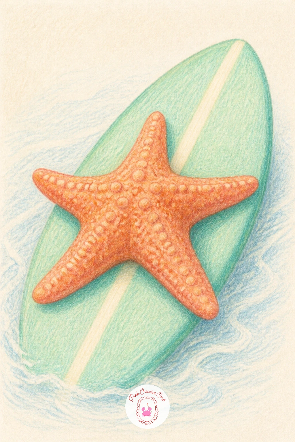
Palette: Mint Green,Coral,Pale Blue,Cream
Shift the mood with a starfish resting in the dappled shade beneath a wooden pier, your first real study in cast shadow. Sketch a few simple vertical pier posts first, then draw the starfish on the sand between them, and decide early where the sunlight breaks through so the shadow stripes fall in one consistent direction across the whole scene.
Color the posts in weathered grey brown, then lay thin diagonal shadow stripes across the sand and over part of the starfish itself using a soft grey pencil, keeping the stripes evenly spaced. The starfish stays coral underneath the shadow, just slightly muted where the stripe crosses it, rather than changing color entirely.
Shadows that go every which way are the fastest way to confuse this scene, so draw a few faint guide lines first to keep every stripe parallel. If grey feels flat, a touch of blue mixed in gives the shade a cooler, more convincing feel.
Keep the sand beyond the posts sunlit and bright for contrast.
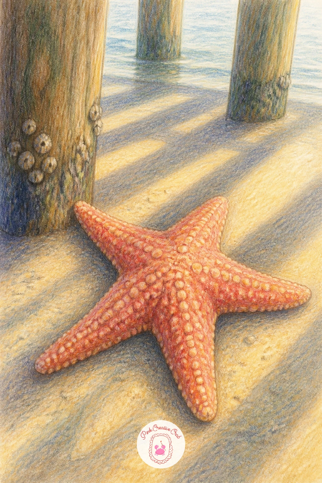
Palette: Weathered Grey,Coral,Sand Beige,Shadow Blue Grey
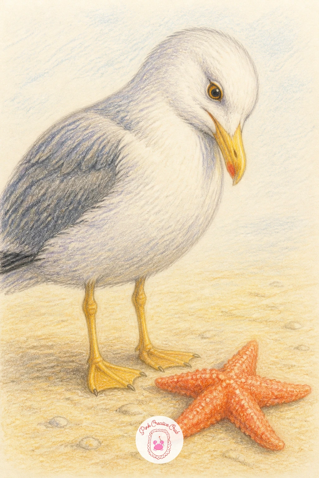
Add a little tension with a seagull eyeing a starfish from nearby, a scene built on gesture and glance. Draw the starfish first, then place the gull to one side, standing with its head turned and beak angled down toward the starfish rather than straight ahead, since that turn is what tells the whole story.
Color the gull in soft grey and white with a touch of yellow at the beak, then keep the starfish in its usual coral, slightly smaller in the frame so it reads as the thing being watched. A simple round black dot eye angled toward the starfish does most of the storytelling work.
If the gull ends up looking like it is staring blankly ahead, check the eye placement against the direction of the beak, both need to point the same way for the glance to land convincingly. Swap the grey for a warmer taupe if your palette runs cool.
Give the gull one leg lifted slightly for a sense of motion, as if it is about to step closer.
Palette: Soft Grey,White,Mellow Yellow,Coral
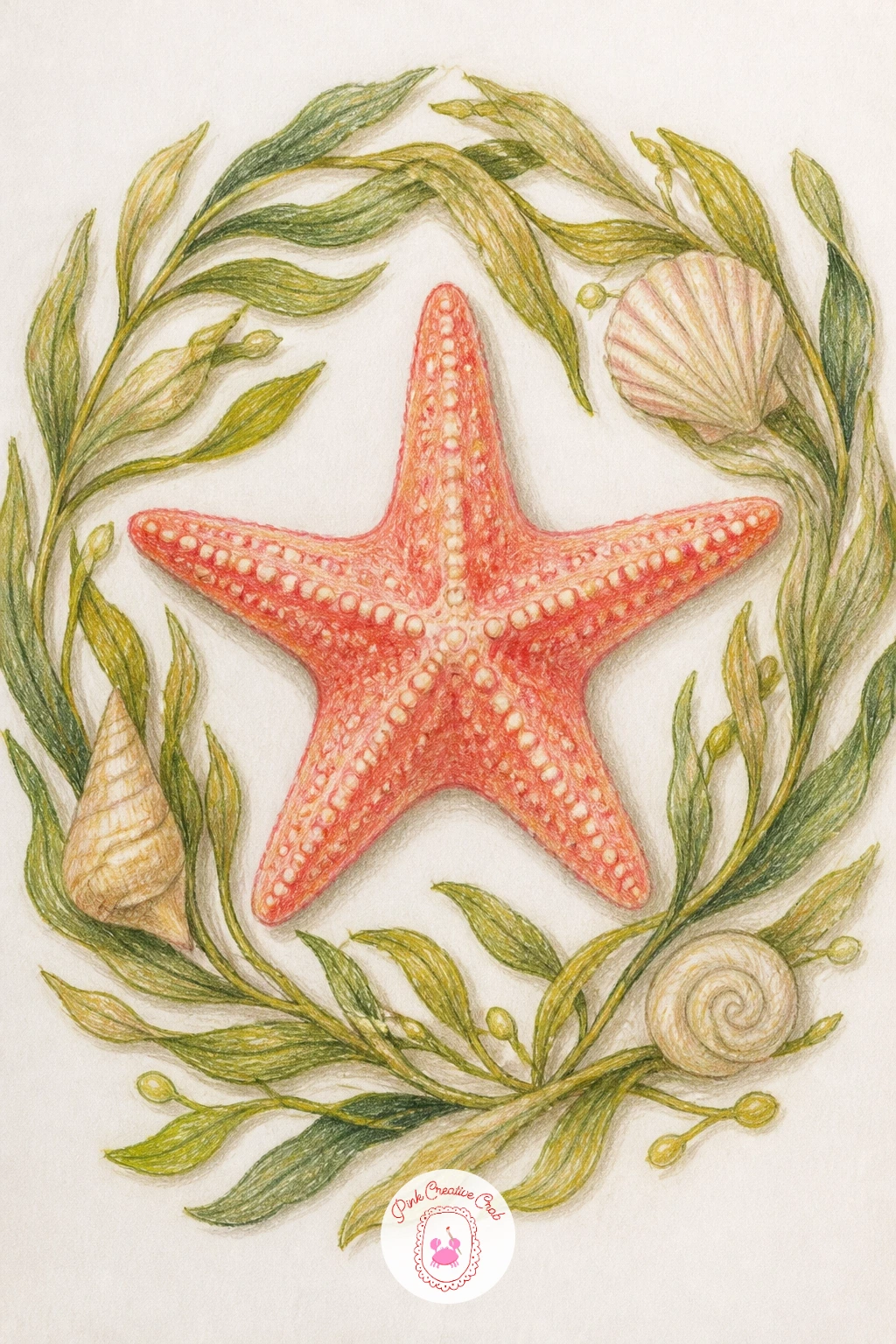
Turn the starfish into the centerpiece of a small wreath made from loops of seaweed and a few shells, a nice one for anyone who likes a decorative, finished look. Draw the starfish large and centered first, then circle it with a loose ring of ribbon like seaweed strands, varying their curve so the ring feels organic rather than a stiff circle.
Color the starfish in coral as your focal point, then build the seaweed ring in olive and seafoam greens, layering a few strands darker than others for depth. Tuck two or three small shells into the ring at different points to break up the green and echo the starfish’s warm tone.
Wreaths often end up lopsided, so lightly sketch a full circle guide first and keep the seaweed strands roughly equal in thickness as they travel around it. If olive green is not in your set, a mossy yellow green works just as well.
This one makes a lovely standalone piece for a beach themed wall.
Palette: Coral,Olive Green,Seafoam Green,Cream
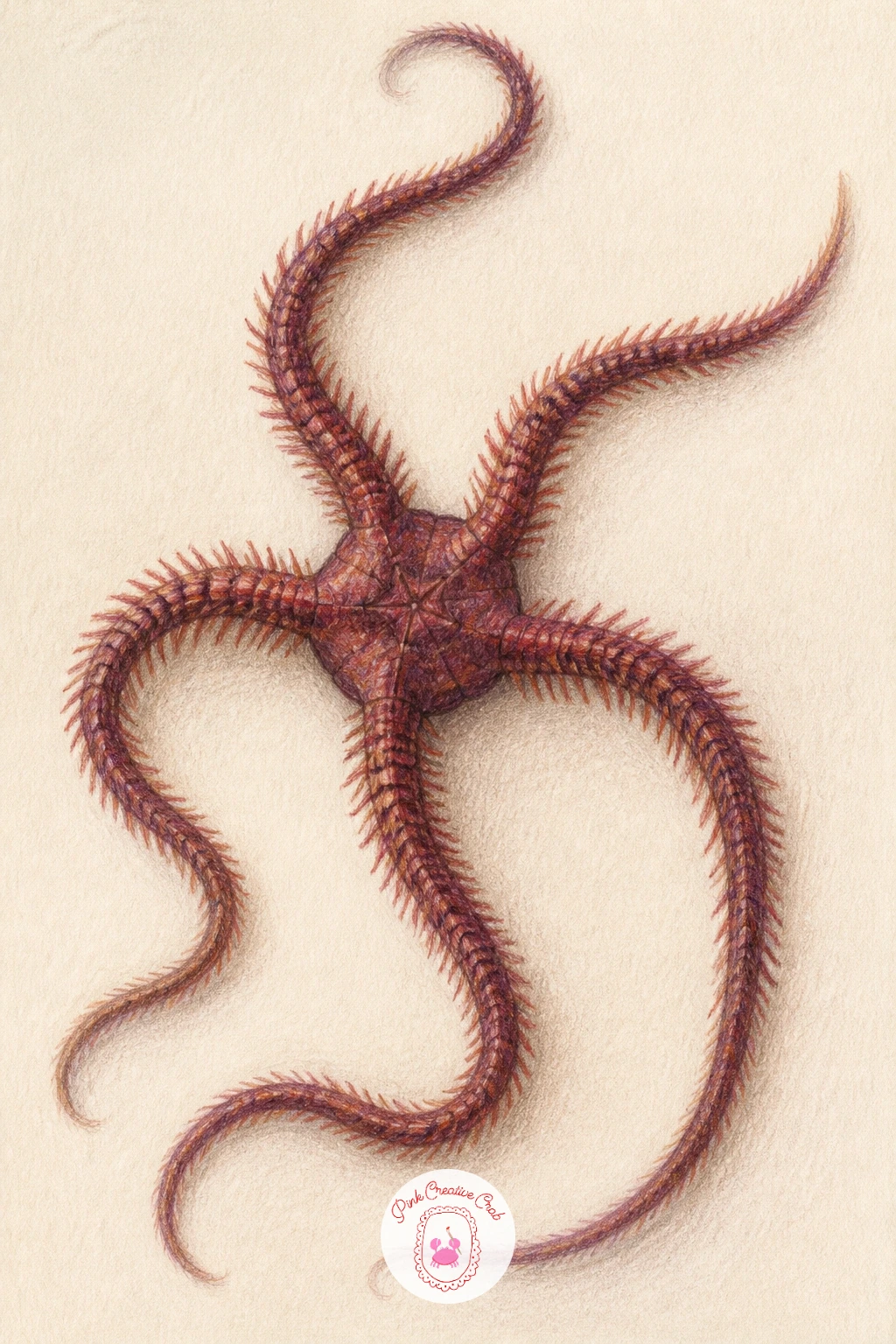
Step away from the classic five arm starfish with a brittle star, whose longer, thinner, snake like arms make a striking change of pace. Draw the small central disc first, then let each arm trail out in a gentle curve, longer and thinner than a regular starfish’s arms, with none of them running perfectly straight.
Color the disc in a deeper warm brown or burgundy, then lighten slightly as you move out along each arm, since brittle stars often fade a touch toward their tips. Fine, short cross hatch marks along each arm suggest the tiny plates of its skin without needing to draw every segment.
Arms that all curve the same way read as stiff and repeated, so vary the curve direction, some bending left, some right, so the creature looks like it is mid movement. If burgundy is not available, a deep red brown mixed with a touch of grey gets close.
Keep the background plain so the arm pattern stays the clear focus of the page.
Palette: Burgundy,Warm Brown,Sand Beige,Deep Red Brown
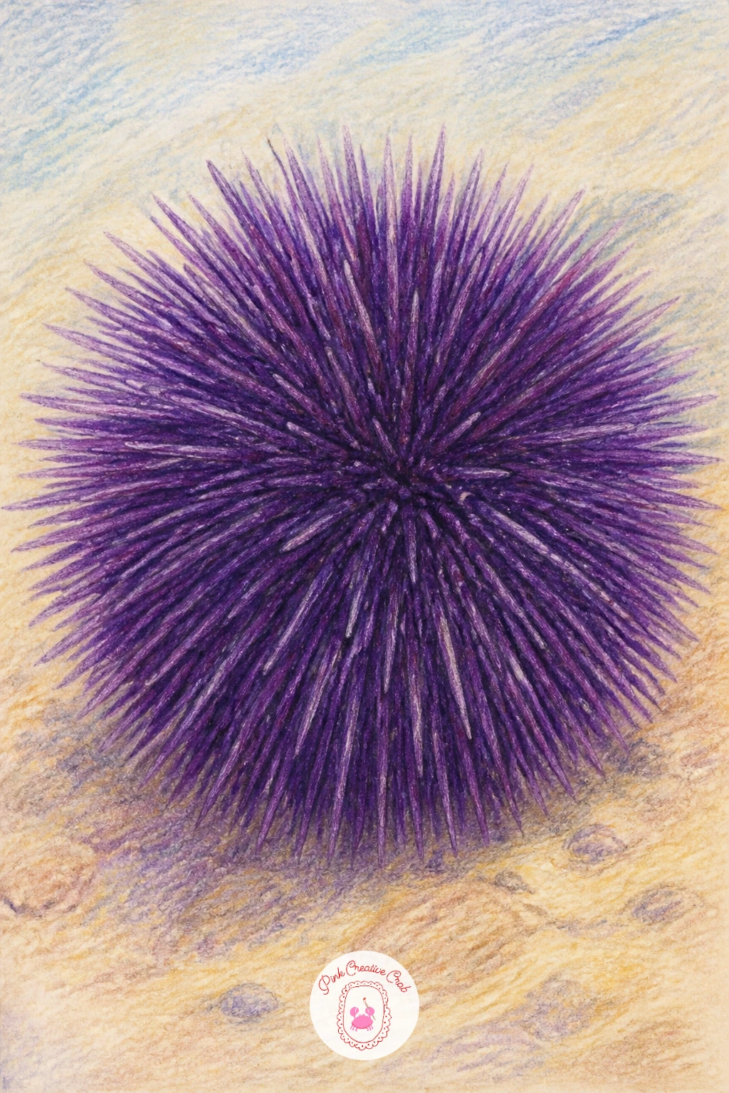
Follow the brittle star with a sea urchin, a round, spiny subject that is really an exercise in edges. Draw a simple circle first for the body, then cover it with short straight spines radiating outward from the center, keeping them fine and slightly uneven in length rather than ruler straight.
Color the base in deep purple or near black, then add the spines in a slightly lighter violet so they stand apart from the body beneath, working from the center outward in small confident strokes. The trick here is pressure, light and quick near the tips, firmer near the base, which gives each spine a natural taper.
Urchins easily turn into a solid spiky blob if every spine gets the same treatment, so leave small gaps of bare paper between some of the spines to let the round body peek through. No deep purple on hand, navy blue mixed with a touch of burgundy makes a convincing substitute.
Add one or two pale dots of highlight along the top for a hint of wet shine.
Palette: Deep Purple,Violet,Sand Beige,White Highlight
Bring in a bit of story with a hermit crab caught mid move between two shells, one it is leaving and one it is about to climb into. Draw the crab’s body and legs first, peeking halfway out of its old shell, then place the new shell just ahead of it, slightly larger and empty looking, with a gap between the two that shows the crab actually mid transit.
Color the crab in a soft tan or orange red, then give the old shell a worn, dusty finish and the new shell a cleaner, more polished look so the two read as different in condition, not just position. Small claw marks gripping the rim of the old shell help sell the motion.
Quick ten minute version: skip the second shell and just show the crab stepping out. Give it forty minutes and you can add both shells, a trail of tiny footprints in the sand, and a bit of texture detail on each shell’s ridges.
Vary the story next time by having the crab halfway into the new shell instead of still leaving the old one.
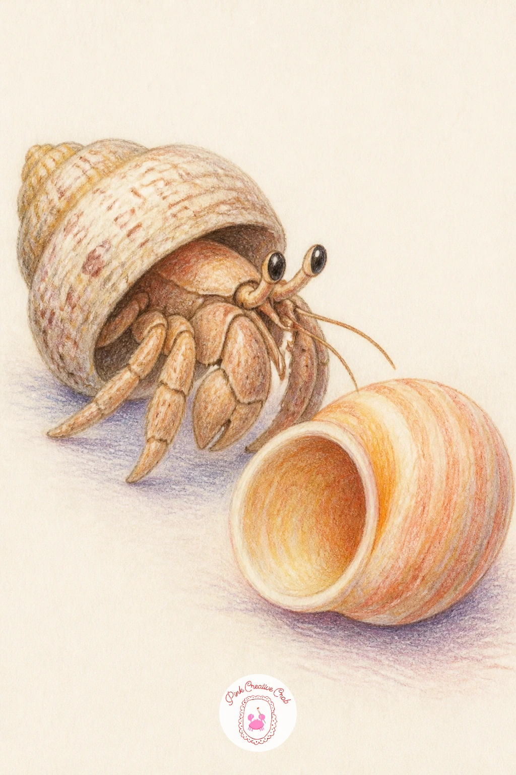
Palette: Tan,Rust Orange,Dusty Grey,Cream
Slow the pace down with a sea snail resting on a rock, a simple subject built almost entirely around one spiral. Draw the shell’s spiral first, starting at the center and working outward in one continuous curved line, then add the small rounded body peeking from the opening at the base.
Color the shell in warm banded stripes, cream alternating with a soft brown or rust, following the spiral’s curve rather than cutting straight across it, then shade the rock beneath in cool grey to set the warm shell apart. A pair of small stalk eyes on the snail’s head adds personality without much extra work.
If the spiral comes out lopsided, lightly sketch a small dot at the very center first and let every loop grow outward from that same point, that keeps the whole shell balanced. Swap the rust for ochre if you want a sunnier feeling shell.
Leave the rock’s top edge lighter than its underside to suggest it catches the sun.
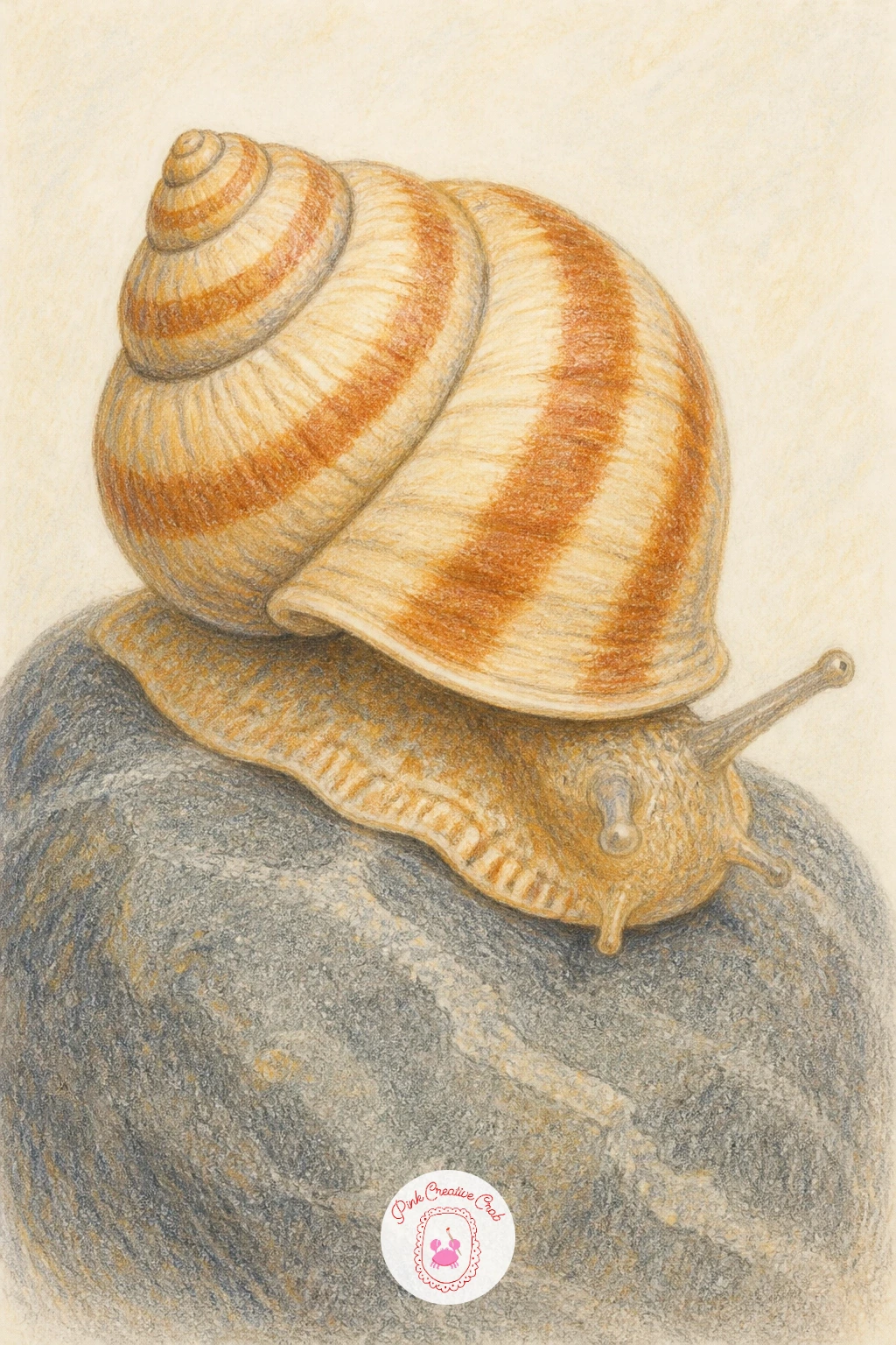
Palette: Cream,Rust Brown,Cool Grey,Ochre
After the slow snail, bring some playfulness back with a little octopus half hidden in a tide pool, only a couple of curled arms and one watchful eye showing above the rocks. Draw the rocks first as a loose, uneven pile, then tuck the octopus behind them, letting just two or three arms curl visibly over the edge along with the top of its head and one large eye.
Color the octopus in a soft rosy purple or dusty red, since real octopuses can shift color but a warm shade keeps it friendly here, then shade the rocks in cool grey to make the octopus pop forward. The curled arm tips are where texture matters most, a few small rounded suction marks along the underside of each visible arm sell the whole creature.
Showing too much octopus flattens the sense of hiding, so resist drawing the whole body, three or four arms and a peeking eye is plenty. No dusty red on hand, mauve or a muted pink works just as well.
Keep the water around the pool a pale, barely there blue so the octopus stays the warmest thing in the scene.
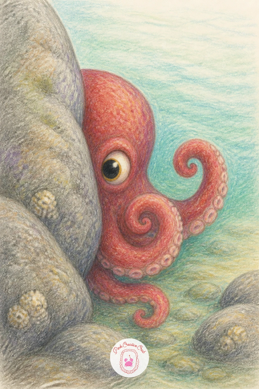
Palette: Dusty Red,Mauve,Cool Grey,Pale Aqua
Give your page a bit of elegance with a seahorse curling its tail around a single strand of seaweed. Draw the seahorse’s S curved body first, head tilted slightly upward, then wrap the tip of its tail around the seaweed strand so the two shapes lock together rather than just touching.
Color the seahorse in soft gold or warm coral with fine ridged texture lines running down its back, then let the seaweed trail upward in olive green, thinner at the top than the base for a natural taper. Small dot like bumps along the seahorse’s spine, drawn lightly, give it that recognizable bumpy ridge without overworking the detail.
The tail curl is the trickiest part of this subject, so draw it as a spiral starting wide and tightening inward, the same logic as drawing a snail shell, rather than trying to bend a straight line into a hook. If gold feels too bright, a warm mustard softens the effect nicely.
This pairing of seahorse and seaweed also makes a sweet standalone piece if you want to frame just the two shapes together.
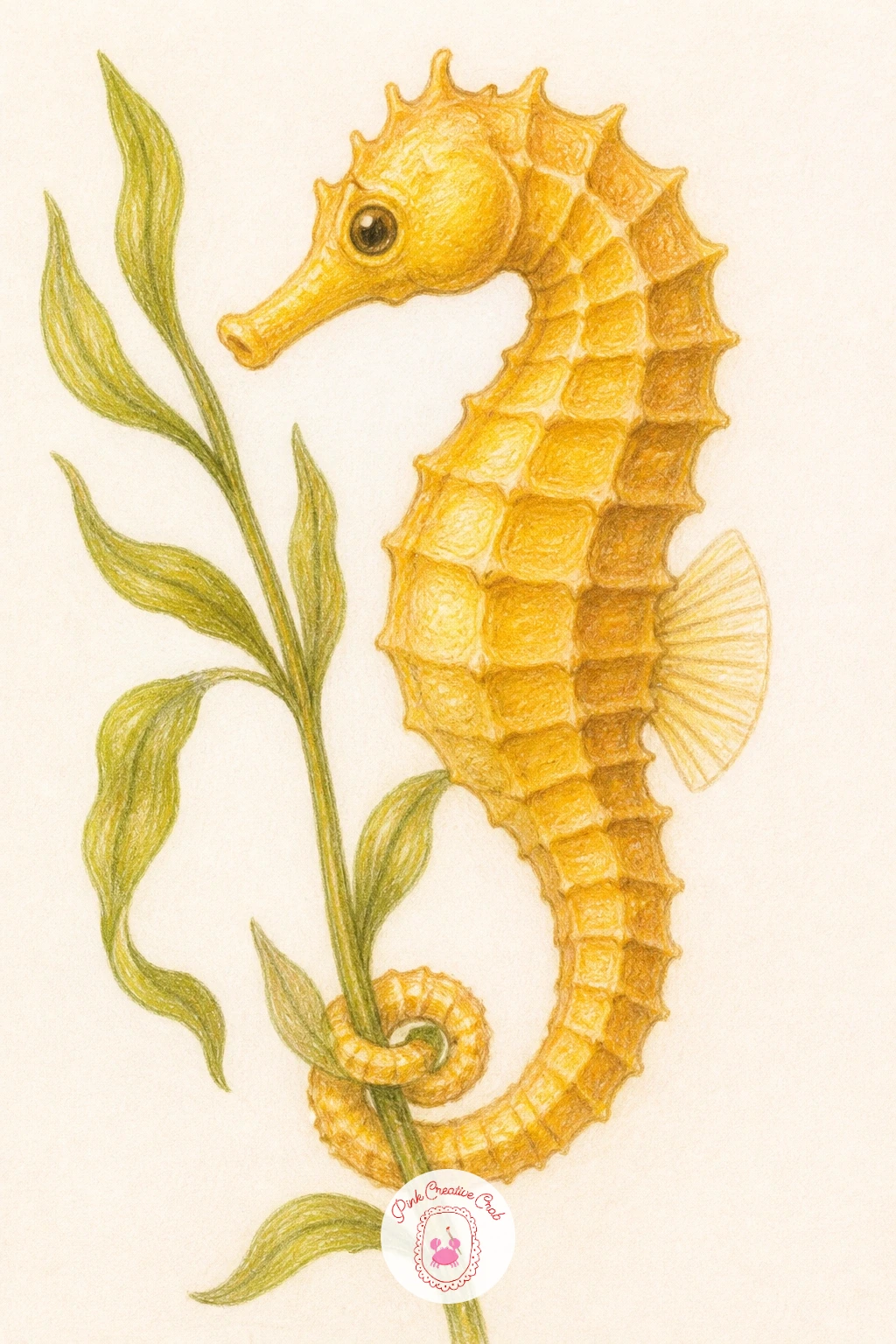
Palette: Warm Gold,Coral,Olive Green,Mustard
Look at a real seahorse photo for the head angle, it tilts forward and down like a tiny horse grazing, which is what makes the pose instantly recognizable.
Simplify again with a sand dollar, a flat round subject that is mostly about surface pattern rather than form. Draw a clean circle first, then lightly mark the five petal shaped pattern that radiates from the center, a detail real sand dollars share with their starfish relatives.
Color the base in a pale bleached cream or soft tan, then shade the petal pattern just a touch darker using short, even strokes that follow the curve of each petal rather than cutting across it. A thin darker ring right at the very edge grounds the whole shape and keeps it from looking like it is floating.
The petal pattern often ends up uneven, so lightly sketch all five shapes before committing to color, checking that each one is roughly the same size as you go. If pale tan looks too plain on its own, a faint grey wash along one side gives it a hint of rounded form.
Group two or three different sizes together next time for a nice beach collection composition.
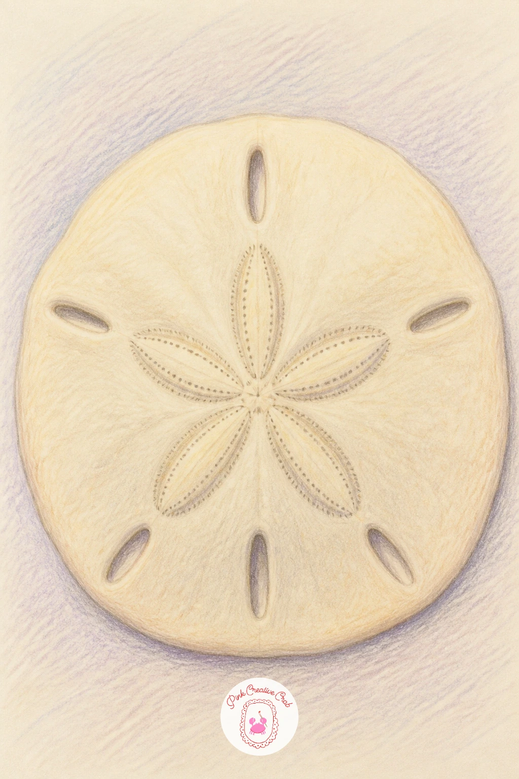
Palette: Bleached Cream,Soft Tan,Pale Grey,Warm Beige
Bring a bit of humor in with a blenny fish peeking out from a small hole in the rocks, just its face and a pair of expressive eyes showing. Draw the rock face first with one dark, slightly irregular hole, then fit the blenny’s head into the opening, eyes large and round, mouth turned up in a tiny smile.
Color the rock in cool grey brown, shading the inside of the hole almost black so the blenny’s face has somewhere dark to emerge from, then bring the blenny itself to life in warm olive or mottled brown with pale spots scattered across its head. Big expressive eyes are what carry this whole drawing, so spend extra care there, a small white highlight dot in each eye makes it look alert and curious.
If the hole ends up reading as flat and grey rather than a real opening, darken just the inner edge nearest the fish and leave the outer rim lighter, that contrast creates the sense of depth. Swap olive for a warmer rust if you want a sunnier looking blenny.
Keep the rest of the rock simple so the face stays the whole point of the page.
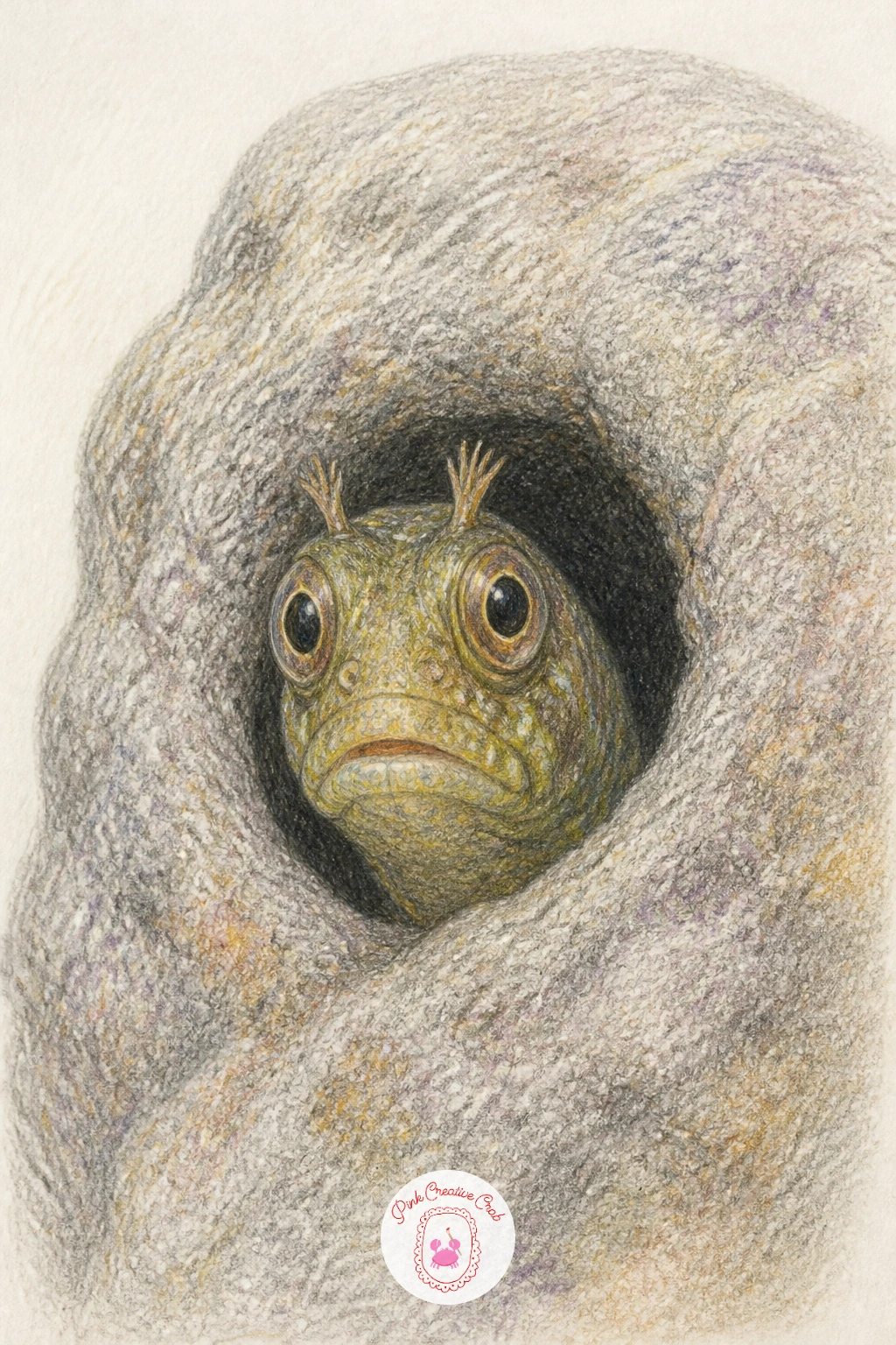
Palette: Cool Grey Brown,Olive Brown,Near Black,White Highlight
Add some delicate detail with a translucent shrimp drifting through a shallow tide pool, a nice change after the rounder, heavier subjects so far. Draw the curved body first, thin and slightly bent at the middle, then add the fine legs and long antennae trailing behind, kept light and wispy rather than thick.
Color the body in the palest pink or soft grey, barely there, since shrimp read as almost see through, then add a touch of deeper pink along the back ridge and at the joints to suggest form without losing that translucent feeling. The water around it stays a very pale aqua wash so the shrimp’s pale color still shows up against it.
Overworking the legs is the easiest way to lose the delicate quality here, so keep them few and fine, four or five light lines rather than a dozen. If pale pink feels too faint to see on your paper, a very light coral keeps the same airy effect with a touch more warmth.
This one looks lovely paired on a page with the sea urchin or sand dollar for a little tide pool collection.
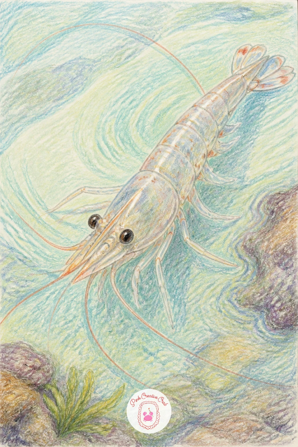
Palette: Pale Pink,Soft Grey,Pale Aqua,Light Coral
Keep things gentle with a sea cucumber, a soft, lumpy, elongated subject that is forgiving for anyone still building confidence with organic shapes. Draw a long rounded tube first, slightly uneven along its length rather than perfectly smooth, then add a few soft ridges running lengthwise to suggest its bumpy, leathery skin.
Color the body in a deep olive or muted brown, then shade the underside darker where it meets the sand, keeping the top lit a touch lighter where the light catches the ridges. Small dark speckles scattered unevenly across the surface add texture without needing fine detail work.
Since this shape has so little going on structurally, the biggest risk is a flat, lifeless fill, so vary your pencil pressure as you shade, firmer in the shadowed dips between ridges, lighter on the raised parts. If olive feels dull on its own, warm it slightly with a touch of ochre blended in.
This is an easy one to return to for practicing blending, since the simple shape leaves more attention free for the shading itself.
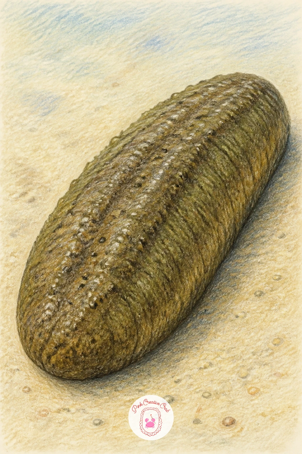
Palette: Deep Olive,Muted Brown,Ochre,Sand Beige
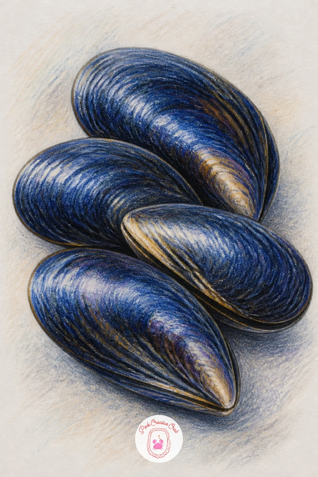
Build a small cluster of mussels next, shells overlapping in a tight group rather than drawn one at a time, which makes this a nice lesson in grouping shapes. Draw three or four elongated teardrop shapes first, overlapping their edges so some shells sit slightly in front of others, rather than lining them up neatly side by side.
Color each shell in deep blue black or near navy, then add a thin band of pale blue grey along the hinge edge of each one where real mussel shells often show a lighter stripe. Vary the darkness slightly between shells so the cluster reads as several individuals rather than one solid blob.
Overlap is what makes this cluster convincing, so make sure at least one shell’s edge is drawn right over the top of another, erasing the hidden line underneath, rather than leaving every shell fully outlined and separate. If navy is not in your set, a very deep teal gets close to the same mood.
A faint damp sheen, a few pale diagonal highlight strokes, finishes the wet look nicely.
Palette: Deep Navy,Deep Teal,Pale Blue Grey,White Highlight
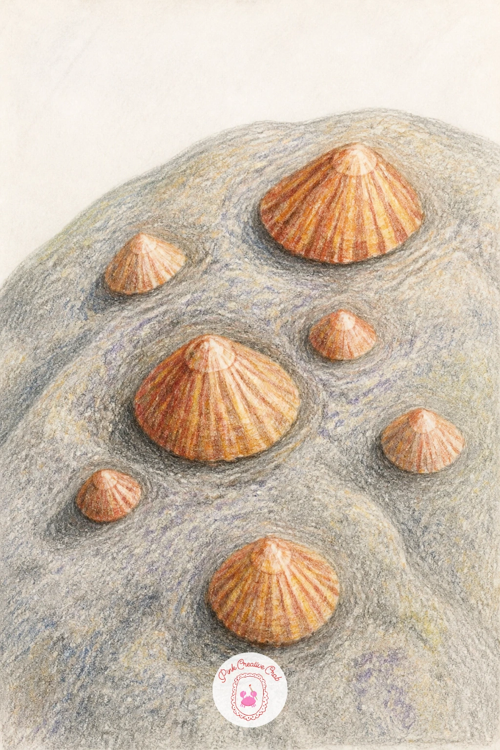
Scatter a few limpets across a rock for a quiet, textural subject that works well as a smaller addition to a page. Draw the rock first as an uneven, rounded mass, then place three or four cone shaped limpets across its surface at different sizes and angles, never in a tidy row.
Color the rock in cool grey with patches of brown where it catches less light, then give each limpet a ridged cone shape in a warmer tan or terracotta, slightly darker at the base where it meets the rock. Fine radiating lines from the tip of each cone to its base suggest the ridged shell pattern without much extra effort.
Limpets drawn too uniform in size end up looking like stamped copies, so vary their scale and the tilt of each cone noticeably, some upright, some leaning. Swap terracotta for a soft rust if that is what your set has on hand.
Pair this one with the mussel cluster or sea snail for a satisfying little rock pool trio on the same page.
Palette: Cool Grey,Terracotta,Brown,Rust
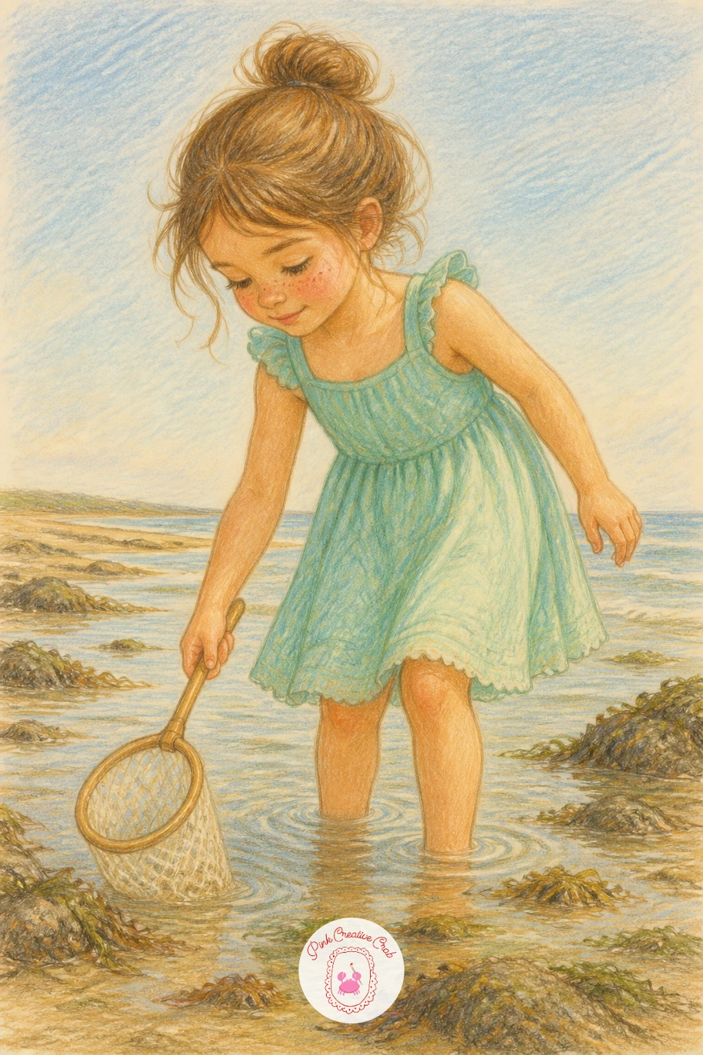
Close the set with a girl wading at low tide, small net in hand, since she pulls every creature from the earlier ideas into one gentle scene. Draw her simply, a loose sundress, bare feet, one hand holding the net dipped toward the sand, and keep her pose relaxed rather than mid action, as if she just paused to look.
Color her dress in a soft faded hue, seafoam or pale yellow both feel right against sand and sky, then build the beach around her in warm sand and pale blue, leaving plenty of open paper for that light, airy storybook feeling. A hint of one small creature near her feet, a starfish or a shell, ties this final piece back to the rest of the set.
Figures often go wrong at the joints, so check that her elbow bends roughly where her hand holding the net would naturally reach, rather than stretching the arm unnaturally long. If you would rather skip the figure altogether, her net and a scattering of shells on the sand makes a lovely stand in composition.
Start with her the next time you want a whole beach art afternoon rather than just one creature: for more figures at this easy level, look at girl pencil drawing ideas for beginners, and for more small ocean scenes to pair alongside her, try easy watercolor ocean scenes.
Palette: Seafoam Green,Pale Yellow,Sand Beige,Pale Blue
What to Do Next
Pick one idea that caught your eye, the starfish on a sandy rock if you want an easy start, or the girl with a net if you are ready for a fuller scene, and set yourself up with a smooth sheet of paper and your warmest coral pencils. The rest of the tide pool will still be there waiting for your next sitting.
Frequently Asked Questions
What is the easiest way to draw a starfish that looks right?
Draw a rounded five point star with soft, slightly uneven arms rather than sharp points, then compare each arm’s length against the one opposite it before adding color, since mismatched arms are the most common mistake.
What colored pencils work best for a starfish drawing?
Warm corals, terracottas and soft pinks capture most starfish well, blended in light layers rather than one heavy fill. A kneaded eraser lifts out soft highlights along the raised ridges of each arm.
How do I keep tide pool scenes from looking too crowded?
Limit each scene to one main creature and one or two supporting details, like a rock or a few anemones, and leave generous bare paper around them so the main subject stays the clear focus.
Do I need special paper for colored pencil beach drawings?
A smooth, light toned paper works best since it lets colors blend evenly without catching on texture. Heavier drawing paper or bristol paper holds up well to several layers of pencil without pilling.
What is a good first idea if I have never drawn sea creatures before?
Start with the starfish on a sandy rock, since its simple rounded star shape and basic shading teaches the skills you will reuse in every other idea on this list.
Have any thoughts?
Share your reaction or leave a quick response — we’d love to hear what you think!
-
 0
-
0
-
0
-
0
-
0
-
0


