Table of Contents
If you’ve ever stared at a blank watercolor page wondering how artists create those dreamy, flowing skies, we’ve got wonderful news—you’re about to discover it’s far easier than you think! We’ll show you twenty approachable techniques that transform simple washes of paint into stunning sunsets, soft clouds, and atmospheric scenes. Whether you’re brand new to watercolors or looking to expand your skills, these methods will help you capture the sky’s magic.
Wet-on-Wet Grandient Sky for Beginners
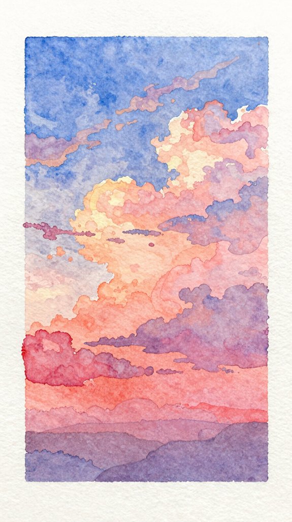
When you’re just starting with watercolors, wet-on-wet technique creates the most magical skies with almost no effort! We’ll show you how to paint vibrant color gradients that flow together beautifully.
First, wet your paper completely with clean water using a wide brush. Next, drop your lightest color at the top while the paper’s still shiny. Then add your darker color near the bottom, letting both colors meet naturally in the middle.
The secret to effortless watercolor blending is working on wet paper while it’s still beautifully shiny and receptive.
The wet surface does the blending work for you! Watch as the pigments drift and merge, creating a perfectly blended horizon line without harsh edges. For best results, use 140 lb cold press paper minimum to prevent buckling when wet.
Tilt your paper gently to encourage the colors to flow together. This simple technique gives you stunning results every single time, making it perfect for building your watercolor confidence.
Simple Blue Sky With Fluffy White Clouds
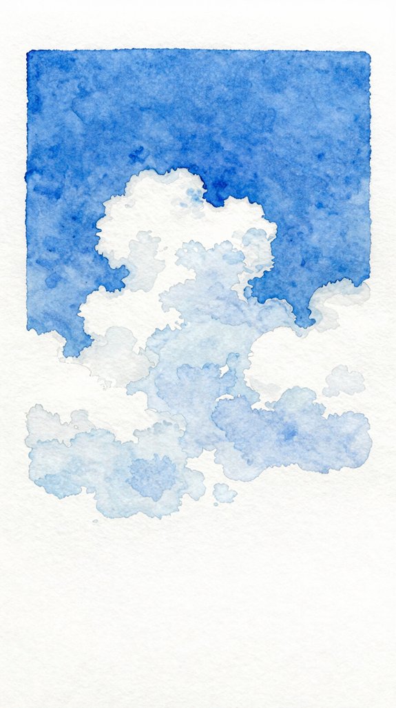
While wet-on-wet skies look dreamy, you’ll need a different approach to paint those perfect puffy clouds against blue sky. We’ll use the “negative painting” technique, where you paint around the clouds instead of painting them directly.
Start by lightly sketching cloud shapes with pencil. Mix a medium blue wash, then carefully paint around your cloud outlines using airy brushstrokes. Leave the cloud areas completely white! This creates instant contrast. Remember, preserving paper white is one of the key techniques that gives watercolor paintings their distinctive luminosity.
For dimension, add a tiny bit of gray to your blue and gently brush along the cloud bottoms. This suggests shadow and makes puffy clouds look three-dimensional.
The secret is working while your blue sky stays slightly damp. Blend those edges where sky meets cloud for a softer, more natural look. Practice controlling your brush to maintain those crisp cloud tops!
Golden Hour Sunset in Three Colors
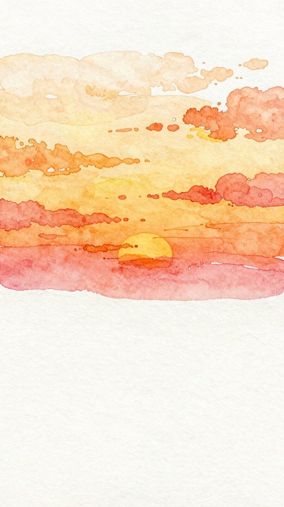
Golden hour sunsets are surprisingly easy when you limit yourself to just three warm colors. We’ll use yellow, orange, and pink to create stunning atmospheric lighting effects that capture that magical pre-dusk glow.
Three warm colors—yellow, orange, and pink—are all you need to capture that magical golden hour glow in your sunset paintings.
Start with wet paper and apply yellow at the horizon line. While it’s still damp, add orange just above, letting the colors merge naturally. This creates beautiful gradated color shifts without harsh lines.
Finally, brush pink across the top third of your sky. The colors will flow together, mimicking how real sunlight scatters through the atmosphere.
Work quickly while everything’s wet – that’s when the magic happens! If colors blend too much, just let one section dry before adding the next. For the most luminous results, stick to warm versions of primary colors since mixing warm with warm produces the cleanest, most vibrant blends. You’ll achieve that dreamy golden hour look we’re after.
Moody Storm Clouds Using Gray Tones
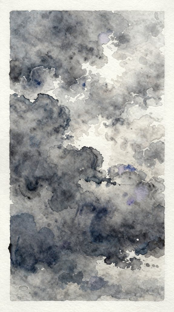
Storm clouds demand a different approach than sunny skies – we’ll work with layers to build dramatic depth. Mix Payne’s gray with ultramarine blue for those brooding dark tones at the cloud’s base. Start with a wet wash across your paper, then drop in concentrated pigment where you want shadow. Let it spread naturally – watercolor creates better moody atmospheric effects when you don’t overmanage it!
Work quickly while the paper’s damp, adding darker values to the bottom of each cloud formation. This creates that heavy, weighted look storm clouds have. Leave white spaces for light breaking through; it’s what makes the darkness feel even more dramatic. Blend edges softly with a clean, damp brush.
Layer additional gray tones once dry to intensify the storm’s power. This chiaroscuro technique of emphasizing extreme contrasts between light and dark creates the dramatic mood that makes storm paintings so captivating.
Cotton Candy Pink and Purple Twilight Sky
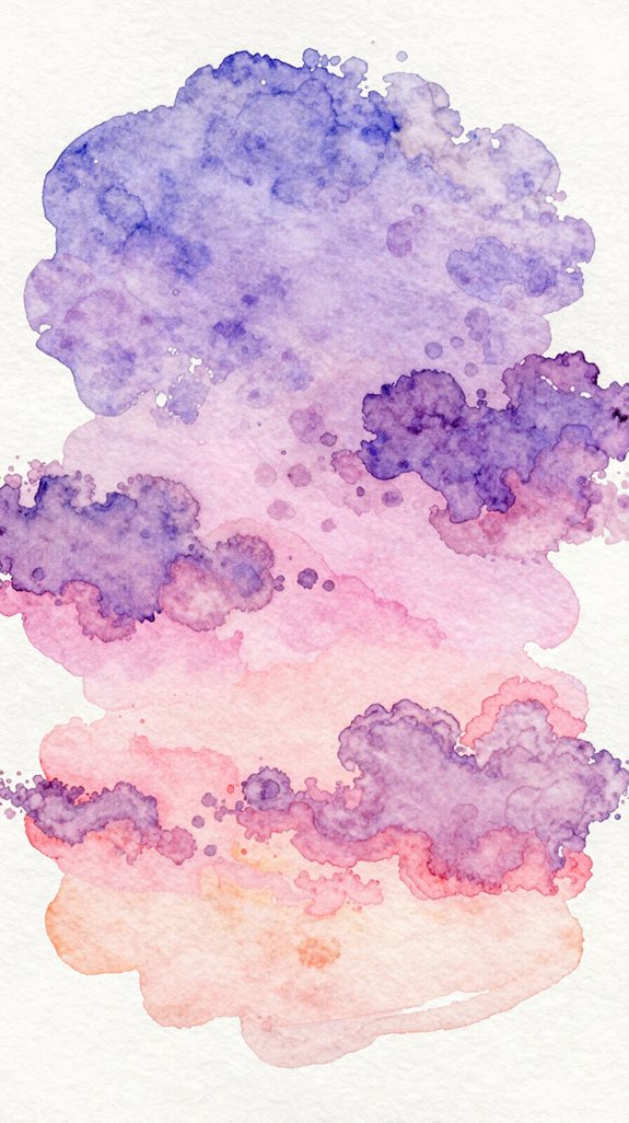
Twilight skies offer some of the most forgiving color combinations for beginners – those soft pinks and purples blend beautifully on their own! Start by wetting your paper completely with clean water. Drop diluted pink paint across the top half, then add purple underneath. Let the colors merge naturally to create that romantic twilight glow.
The key is working quickly while everything’s wet. Tilt your paper gently to encourage the pigments to flow together. Don’t overwork it – those serene pastel hues happen when you trust the water to do the mixing!
For extra dimension, add a slightly darker purple along the bottom edge. This creates depth and makes your sky feel limitless. Practice this technique repeatedly; you’ll discover new color variations each time. These painted pages make beautiful additions to junk journals, where layering handmade artwork creates one-of-a-kind keepsakes.
Ocean Sunrise With Reflected Light
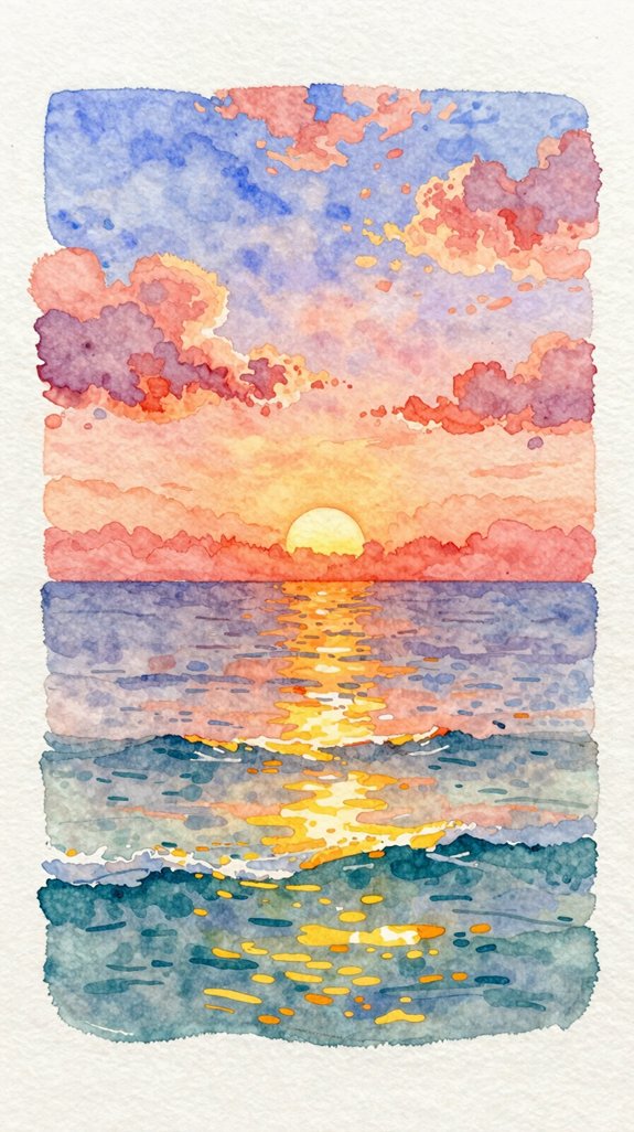
When painting an ocean sunrise, we’re capturing two skies at once – one above and its shimmering reflection below! Start by wetting your paper completely to create smooth ambient ocean lighting. Apply warm yellows and oranges at the horizon line, letting them bleed naturally.
Ocean sunrises present a beautiful challenge: painting two mirrored skies where warm horizon colors blend seamlessly into their watery reflection below.
Add cooler blues and purples above, working quickly while everything’s wet.
Now here’s the exciting part – flip your painting upside down mentally! Paint the water’s reflection using the same colors, but make them slightly darker and more muted. Add horizontal strokes to suggest gentle waves breaking up the serene sunrise reflections. Keep your brush movements loose and flowing.
Let the paint dry partially, then use a damp brush to lift out highlights where sunlight hits the water. This technique creates those magical dancing light patterns! To enhance the realism of your sunrise, remember that the foreground should have strong contrast while the distant horizon maintains softer, lower contrast values.
Minimalist Watercolor Sky in Five Minutes
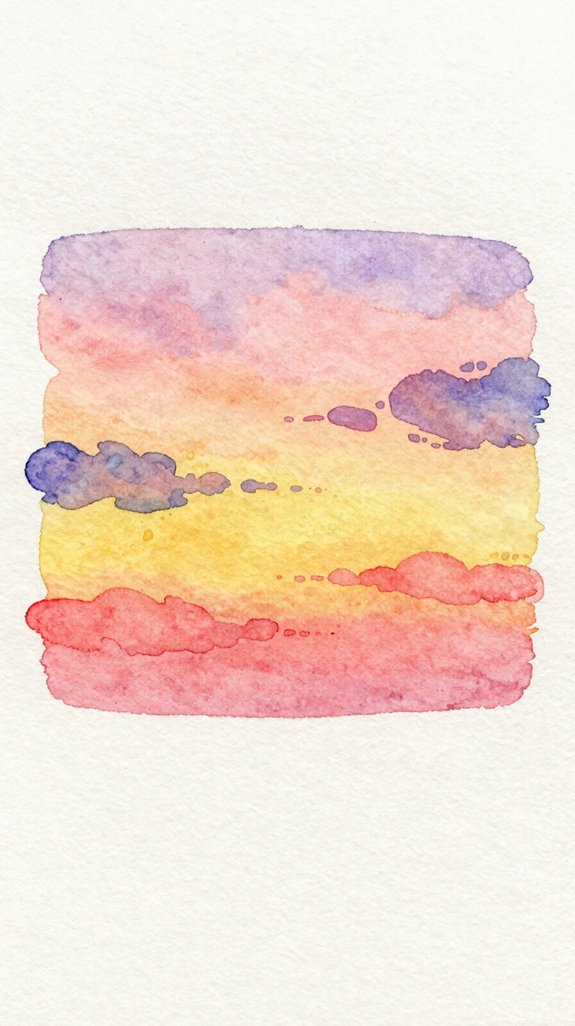
Sometimes the most beautiful skies come together in just five minutes! We’ll create a minimalist sky composition that’s perfect when you’re short on time but crave something stunning.
Start by wetting your paper completely with clean water. This lets colors spread freely! While it’s still damp, load your brush with a single sky color—perhaps cerulean blue or soft lavender. Touch the brush to the top third of your paper and watch the pigment bloom naturally downward.
This quick watercolor sky technique relies on gravity and water doing the work. Don’t overthink it! Let the paint flow and fade organically toward the horizon. Add one wispy cloud if desired, using a damp, clean brush to lift pigment. If you want to add subtle details or depth to your minimalist sky, consider experimenting with multiple mediums like graphite for fine cloud outlines.
Step back and admire your innovation. Simple doesn’t mean boring—it means elegant.
Layered Sunset Clouds With Depth and Dimension
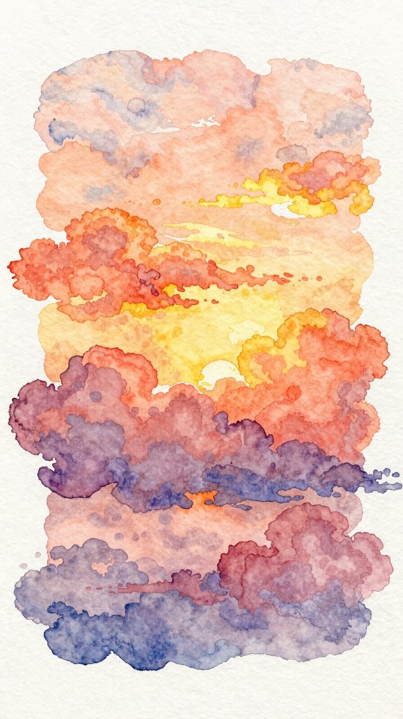
How do we transform a flat sky into clouds that practically leap off the page? We’ll build dimensional layered clouds using a simple wet-on-dry technique that creates stunning depth and contrast effects.
Start with your lightest cloud layer first, painting soft peachy-pink shapes. Let this dry completely—patience here prevents muddy colors!
Next, mix a slightly darker orange tone and paint additional clouds overlapping the first layer. This creates dimension (the appearance of different distances).
For your darkest layer, use deep purple or gray along the cloud bottoms. This shadow color makes clouds look three-dimensional and weighty. Apply it while the second layer is slightly damp for soft blending. This technique relies on watercolor’s transparency and layering properties to build luminous effects where each wash interacts with the one beneath it.
The secret? Each progressive layer should be darker and smaller, building that incredible depth and contrast effects that catch every viewer’s eye!
Clear Morning Sky With Soft Color Transitions
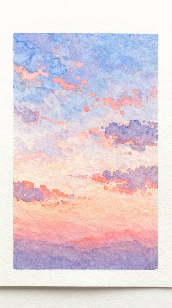
While dramatic sunsets showcase bold contrasts, morning skies offer a gentler challenge—capturing those delicate color shifts from warm horizon tones to cool overhead blues. We’ll create soft pastel progressions that capture dawn’s peaceful glow.
Start with a damp paper surface using clean water. Apply pale yellow near the bottom, letting it spread naturally. While still wet, add a touch of pink or peach just above—this creates ethereal atmospheric effects as colors blend.
Next, introduce light blue at the top, working downward until it meets your warm tones. Understanding effective use of light and shadow helps you determine where to place your warmest and coolest tones for maximum visual impact.
The key is keeping everything light and translucent. Use more water than pigment to achieve those delicate morning hues. Let gravity do the mixing work, tilting your paper slightly. This gentle approach captures dawn’s serene, luminous quality beautifully!
Dramatic Fire Sky Using Bold Oranges and Reds
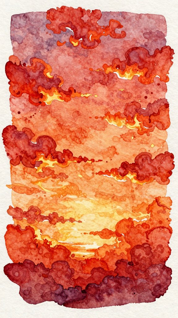
When sunset ignites the sky in blazing colors, we need bolder techniques to capture that fiery intensity. Start with wet paper, then layer cadmium orange and scarlet directly onto your surface. Let these hues bleed together naturally, creating dramatic contrasts that mirror a real fire sky. Don’t worry about perfection—wild, unpredictable edges make sunsets feel alive!
To build a cohesive color scheme, follow these steps:
- Add crimson near the horizon, letting it push upward into orange
- Drop in touches of golden yellow where light feels strongest
- Blend burgundy at the top, creating depth and richness
We’re aiming for bold energy here. Let colors collide and mix on the paper itself. This glazing technique allows you to build translucent layers that add luminous depth to your sunset. This technique creates authentic sunset magic!
Misty Dawn Sky With Gentle Blending
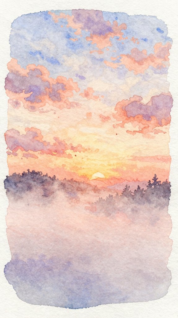
Unlike those fiery sunsets, dawn skies whisper rather than shout. We’ll create atmospheric mist using lots of water and minimal pigment. Start by wetting your entire paper with clean water—this creates the foundation for ethereal blending.
Dawn skies require patience and restraint—wet your paper completely, then let pale pigments whisper across the surface with minimal interference.
While the paper’s still damp, touch pale blue to the top edge. Let it drift downward naturally. Add a hint of pink or peach near the horizon, working quickly before anything dries. The colors should kiss and merge without hard lines.
Here’s the secret: tilt your board slightly to encourage the paint to flow! This movement mimics real morning fog.
Don’t overwork it. Resist adding more paint once you’ve started blending. Too much fussing destroys that soft, dreamy quality we’re after. Let the water do the heavy lifting.
Night Sky Gradient From Dusk to Dark
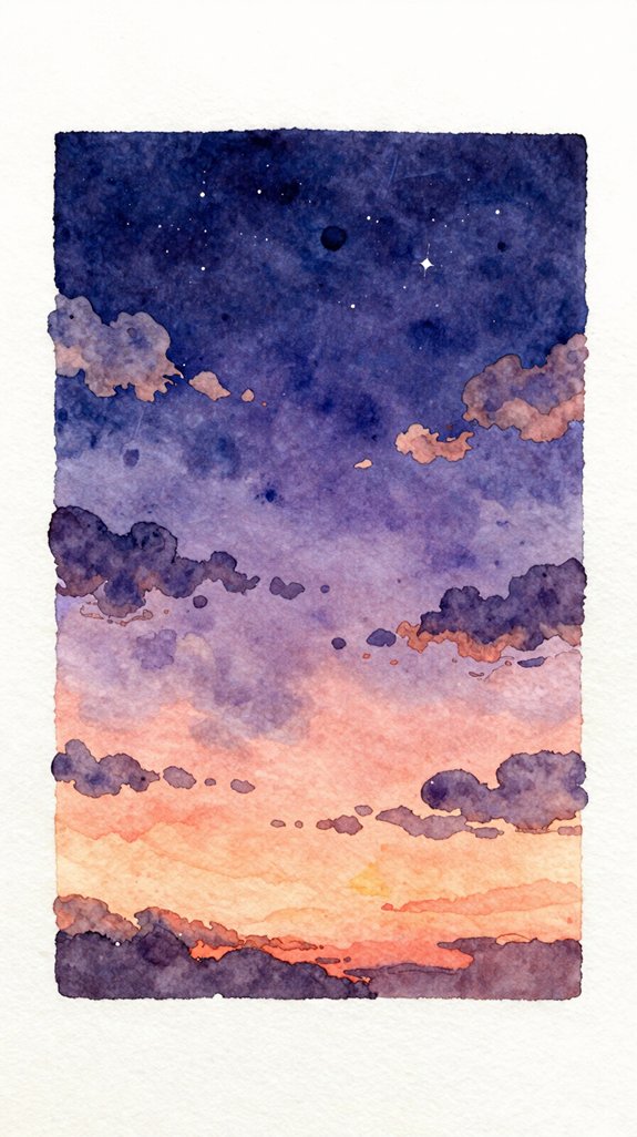
As the day fades completely, we’re ready to paint those deeper, moodier tones of nightfall. We’ll create a stunning indigo to navy gradient that captures the mysterious beauty of evening. Start with wet paper, then apply indigo at the horizon line. Work quickly upward, adding navy blue as you go. Let the colors merge naturally for that soft shift.
Add misty atmospheric effects by lifting paint with a damp brush near the horizon—this creates depth and distance.
To evoke the magic of twilight:
- Layer transparent washes to build richness without losing that glowing quality
- Leave tiny white spots unpainted to suggest distant stars emerging
- Blend edges softly where sky meets darkness, creating mystery and wonder
This technique opens exciting possibilities for dramatic nighttime scenes!
Wispy Cirrus Clouds Against Blue Skies
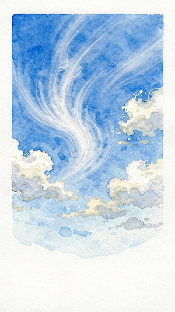
Cirrus clouds float high in the atmosphere, creating those delicate, feathery streaks we’ll paint today. Start with a smooth blue wash across your paper to establish vast expansive skies.
While it’s still damp, load your brush with diluted white paint. Use quick, light strokes to create floating wispy clouds that stretch horizontally. Don’t overthink it—cirrus clouds look windswept and irregular! Lift your brush at the end of each stroke for that tapered effect. The wet paper will soften the edges naturally, making them appear distant.
Add a touch more pigment to some areas for depth. Recall, less is more here. These clouds sit miles above us, so they should look thin and transparent. Practice your strokes on scrap paper first 🙂
Desert Sunset With Warm Earth Tones
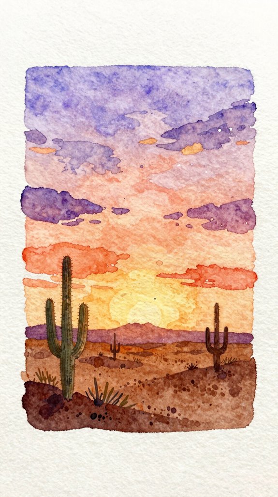
Desert sunsets showcase nature’s warmest palette, blending oranges, reds, and purples into breathtaking horizontal bands. We’ll layer these warm earth tones to capture that desert landscape magic you’ve been dreaming about!
Start with a wet paper base, then drop in your warmest yellows near the horizon. While it’s still damp, add orange above it—the colors will merge naturally. Finally, introduce deep purple or burnt sienna at the top. The key is working quickly before the paper dries, letting gravity do the blending work for you.
Create emotional impact by:
- Adding a dark silhouette of a saguaro cactus for dramatic contrast
- Letting colors puddle and blend unpredictably—embrace those happy accidents!
- Using deeper purples in shadows to suggest cooling evening air
This technique builds confidence in wet-on-wet methods beautifully.
Rain-Threatening Gray Clouds With Silver Linings
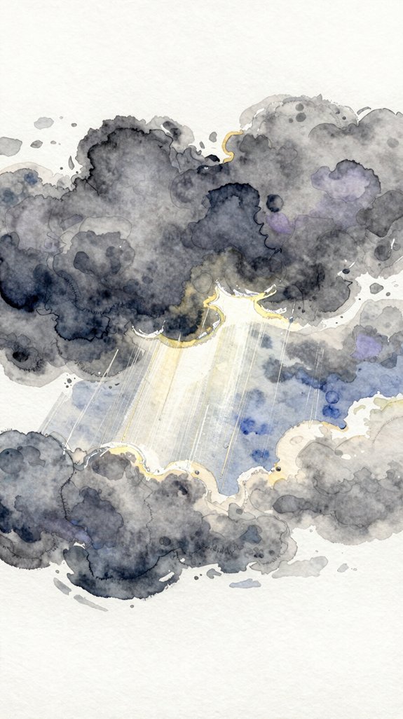
Storm clouds possess a moody drama that’s surprisingly simple to paint once you understand how to layer grays effectively. Start with a wet-on-wet base using diluted Payne’s gray across your paper. While it’s still damp, drop in darker concentrations to create depth—this layered light and shadow technique builds realistic volume.
Here’s the secret: leave white paper along cloud edges for those brilliant silver linings! The contrast makes your storm clouds pop with energy.
Mix your grays from complementary colors rather than using black. Try combining burnt sienna with ultramarine blue for rich, natural tones. These atmospheric perspective studies teach you that distant clouds appear lighter and less detailed than foreground ones.
Let each layer dry completely before adding the next. This prevents muddy colors and maintains that dramatic stormy atmosphere we’re after!
Tropical Sky With Vibrant Sunset Colors
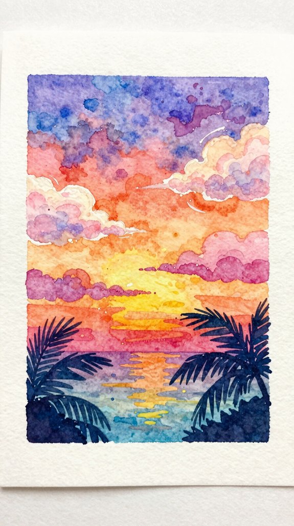
Nothing beats the explosive color combinations you’ll find in a tropical sunset—brilliant oranges, hot pinks, and deep purples blend together in pure magic. We’ll capture these tropical sunset hues by layering wet paint on wet paper, which means applying fresh color to damp areas. This technique creates vivid color gradients that blend naturally!
Start with yellow at the horizon line, then add orange while it’s still wet. Next, brush in pink above the orange, letting the colors merge. Finally, add purple at the top.
Here’s what makes this approach special:
- Bold color shifts create dramatic depth and movement
- Layered pigments capture the atmosphere’s natural glow
- Spontaneous blending produces unexpected, beautiful surprises
Let those tropical sunset hues flow freely across your paper!
Winter Sky Using Cool Blues and Grays
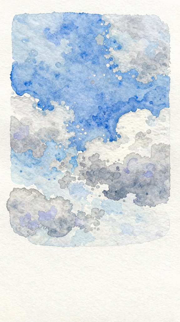
While tropical skies burst with warmth, winter skies whisper a completely different story—one painted in soft blues, silvery grays, and hints of lavender. We’ll create a cool toned winter landscape that captures that crisp, quiet beauty.
Start by wetting your paper completely with clean water. This helps colors blend smoothly! Drop diluted Payne’s gray at the top, then add cerulean blue below it. Watch the soft blue color gradients form naturally as pigments merge together.
Let your brush dance lightly across damp paper, adding gentle streaks of purple-gray for distant clouds. Don’t overwork it—winter skies look best when they’re soft and understated.
The key? Less pigment creates that pale, ethereal quality we’re after. Think misty mornings and snow-filled air 🙂
Streaky Watercolor Clouds for Dynamic Skies
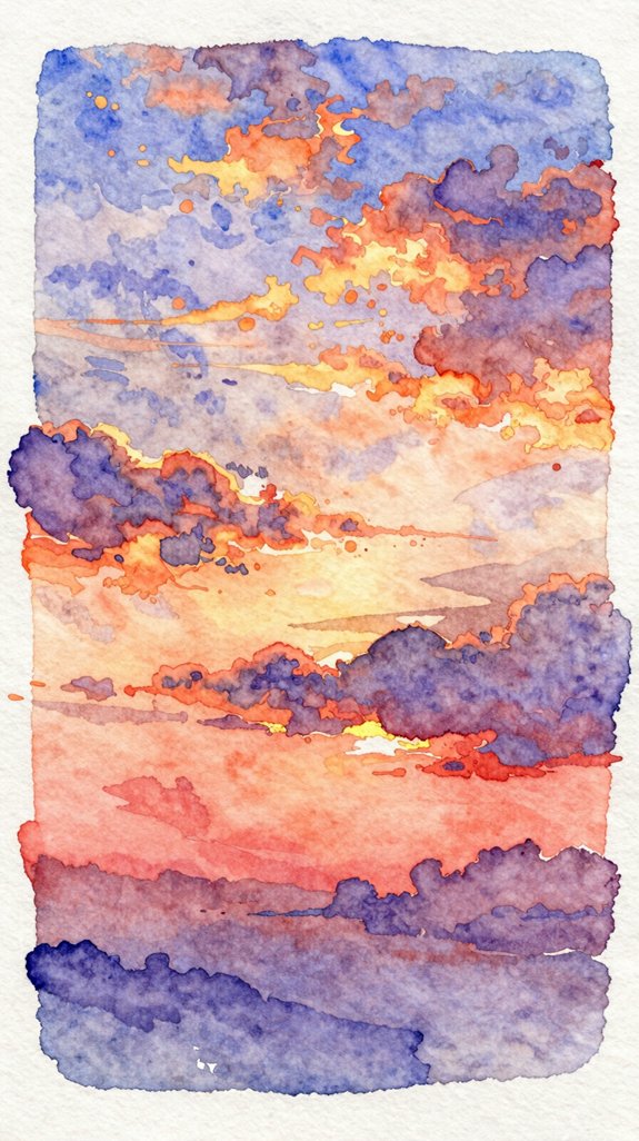
When you want to add drama and movement to your sky paintings, streaky clouds become your best friend. These flowing brush strokes create abstract cloud formations that capture wind and energy. Load your brush with diluted paint, then sweep it horizontally across damp paper. The wetness lets colors blend and spread naturally, creating soft edges that look realistic.
Work quickly while the paper’s still moist. Pull your brush in long, confident motions—don’t stop midway! This technique builds exciting, dynamic skies that draw viewers in.
Emotional elements to include:
- Wispy trails that suggest gentle breezes or powerful winds
- Light peeking through cloud breaks, creating hopeful moments
- Dramatic dark streaks contrasting with bright areas
Practice these flowing brush strokes until they feel natural. You’ll soon create skies that practically move!
Moonlit Evening Sky With Subtle Purples
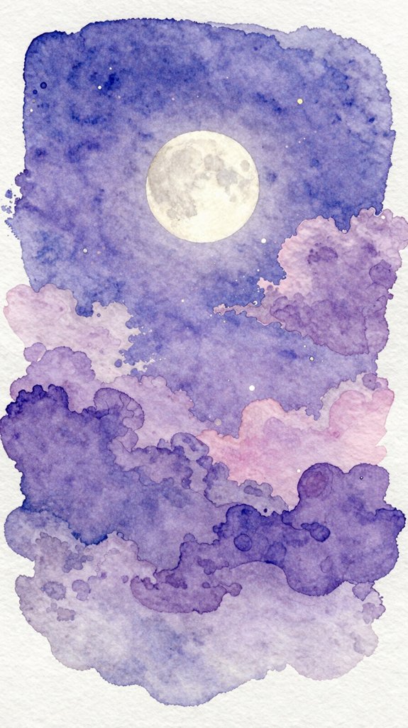
After mastering those energetic cloud movements, let’s explore the calm beauty of nighttime. We’ll create atmospheric depth by layering transparent washes of purple and blue.
Start with a clean, damp sheet of watercolor paper. Mix a pale violet using ultramarine blue and a touch of alizarin crimson. Apply this wash across your sky, working quickly while the paper’s wet. This creates that soft, dreamy glow!
Speed is essential when working wet-on-wet—hesitation creates hard edges that destroy the ethereal quality of twilight atmospheres.
Now add midnight hues near the top. Blend Payne’s gray with your purple mix, letting it flow naturally into the lighter tones below. Don’t overthink it—nighttime skies are forgiving.
Leave a small circular area lighter for your moon. Once dry, deepen the shadows around it using diluted indigo. This contrast makes your moon appear luminous and creates stunning depth. Innovation happens when you trust the water!
Abstract Colorful Sky for Creative Expression
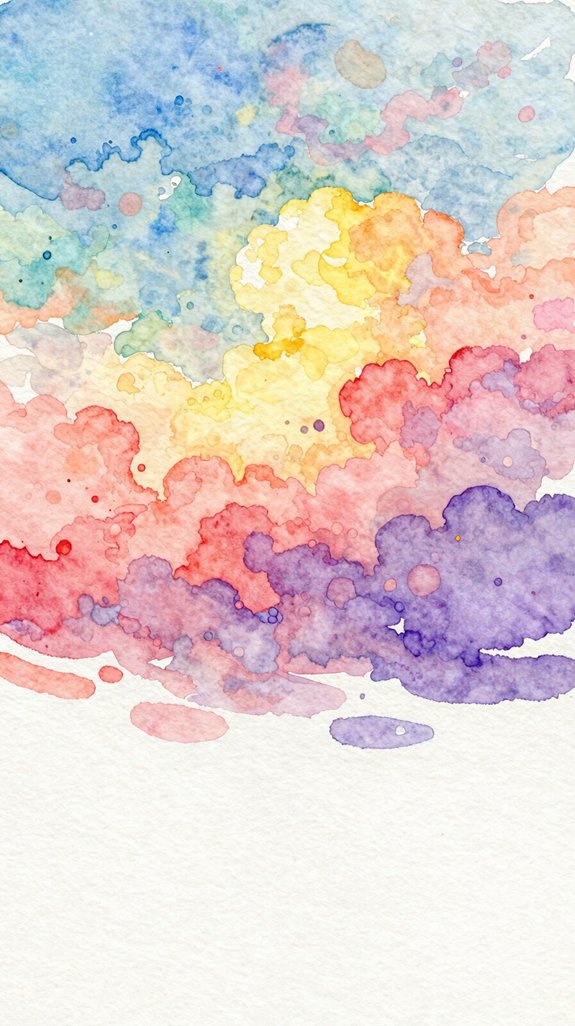
Since abstract skies follow no rules, this technique lets you experiment with bold color combinations that don’t exist in nature! We’ll create expressive abstract effects by layering unexpected colors like magenta, turquoise, and lime green together. Start with wet paper, then drop colors randomly across your surface. Let them blend naturally, tilting your board to guide the flow.
Add textured layering techniques by sprinkling salt while wet, creating unique patterns!
Try these approaches to evoke powerful feelings:
- Layer warm oranges over cool blues to create visual tension and energy
- Use dramatic contrasts between light and dark values for emotional depth
- Let colors bleed together freely, representing freedom and spontaneity
Don’t overthink this process—trust your instincts and enjoy the creative journey 🙂
Frequently Asked Questions
What Type of Watercolor Paper Works Best for Painting Skies?
We recommend cotton rag watercolor paper for stunning sky paintings. It absorbs pigments beautifully and allows seamless wet-on-wet blending. While hot pressed watercolor paper offers smoothness, cold-pressed textures create more dynamic, atmospheric cloud effects.
How Do I Fix Watercolor Mistakes When Painting Clouds or Skies?
We’ll rescue sky mistakes by blotting excess paint with a clean tissue or sponge. For stubborn errors, we’ll employ the lift-off technique, gently rewetting areas and carefully absorbing unwanted pigment before it permanently sets.
Which Watercolor Brushes Are Recommended for Creating Sky Effects?
We’ll want both round brushes for detailed cloud formations and soft edges, plus flat brushes for sweeping gradient washes across expansive skies. These two brush types give us maximum creative control and versatility.
How Long Should I Wait Between Layers When Painting Skies?
Think of patience as your secret ingredient! We recommend 10-15 minutes drying time between layers for crisp edges, though wet in wet techniques let you work immediately, creating those innovative, dreamy sky blends you’re after.
Can I Use Masking Fluid to Preserve White Clouds in Watercolor?
Yes, we can definitely use masking fluid to preserve white clouds! It protects the white paper from paint, letting us create brilliant cloud formations while freely applying washes across our skies without worry.
Conclusion
We’ve explored twenty stunning watercolor sky techniques together, from simple gradients to dramatic storm clouds. Now it’s time to grab your brushes and start painting! Don’t worry if your first attempts aren’t Instagram-perfect—watercolor skies take practice. Mix your colors, experiment with wet-on-wet methods, and watch the magic happen on your paper. Each sky you paint builds your skills and confidence. Keep your palette ready, and let’s create beautiful atmospheric art together! 🎨
Have any thoughts?
Share your reaction or leave a quick response — we’d love to hear what you think!
-
 0
0
-
0
-
0
-
0
-
0
-
0


