Heart painting gets so much better once the heart stops standing alone in the middle of the page and starts hiding inside a scene: a wreath on a door, a swirl of foam on a latte, a shape pressed into snow by a mitten. That is the whole idea behind this list. Every single one of the 29 ideas below tucks a heart into something you would actually paint anyway, a breakfast tray, a garden gate, a frozen pond, so the Valentine feeling sneaks in sideways instead of shouting from the center of the paper.
You will find flat, matte gouache shapes throughout, the kind with crisp clean edges and a modern print look, built in cherry red, blush pink and warm cream with a touch of chocolate brown. Scroll through, pick whichever scene makes you smile fastest, and get your gouache out. Every one of these fits into a single sitting, phone-scrolling included.
Using these images: free for personal projects such as printing, coloring, cards, journals and gifts. Handmade items that include them may be sold up to 30 pieces per design. More than that is commercial use and is not permitted, and neither is selling or sharing the images themselves or passing them off as your own. Please ask before any other use.
Start with the easiest shape in this whole list: a heart-shaped wreath of dried roses hanging on a cottage door. Pencil a light heart outline first, then stop thinking of it as a heart and start thinking of it as a ring of small overlapping circles for the rose heads, bulkier at the two top lobes and tapering to the point at the bottom.
Block the door in flat cream or soft chocolate brown gouache first and let it dry completely, then paint the wreath shapes on top in blush pink and dusty rose with a dry brown for stems. Add a cherry red ribbon bow at the top where the two lobes meet, since a wreath without a hanging point always looks like it is floating rather than hung.
If your roses start to blur into a pink smudge, drop in a few darker pink dots once the base layer is dry to separate one bloom from the next. No dried roses on hand to reference? A handful of small ranunculus or peonies gives the same rounded, layered look.
Keep your pencil heart loose and uneven rather than geometric, real wreaths are never perfectly symmetrical and that is what makes them charming.
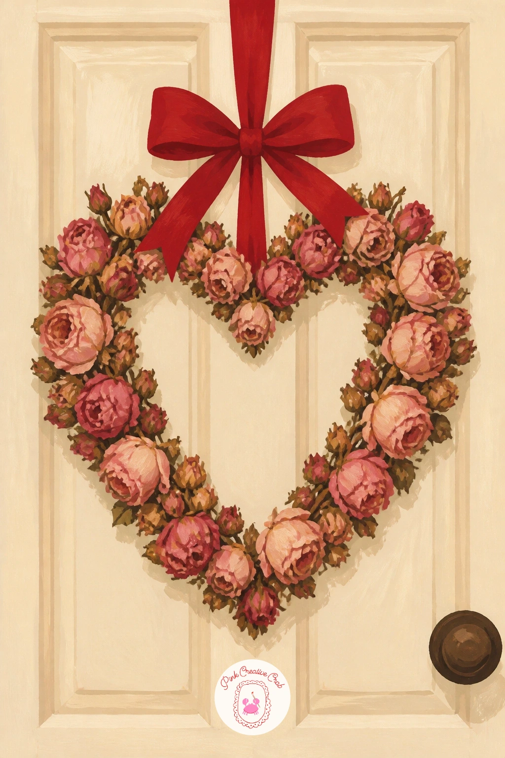
Palette: Dusty Rose,Cherry Red,Chocolate Brown,Cream
Move from flowers to foam with a barista pouring a latte art heart beside a snowy cafe window. Paint the cup and saucer first in flat cream and chocolate brown, then the coffee surface in a warm toasted brown, leaving it to dry before you touch the foam.
Drop the heart shape in thinned white gouache right into the center of the cup, working from the top two lobes down to the point in one confident stroke so the edge stays soft rather than scratchy. This is the trickiest moment in the whole piece: too much water and the heart bleeds into the brown, so keep your white gouache just a little thicker than your usual wash.
Paint the window behind in soft grey blue with a scatter of white gouache dots for falling snow, and a blurred cherry red awning edge to hint at the cafe outside. If your foam heart comes out lopsided, a thin brown outline brush stroke around it can tidy the shape without starting over.
For speed, skip the window entirely and just paint the cup large and close, which still reads as a complete little scene. Readers chasing more gouache warm-up ideas might enjoy this gouache painting ideas for beginners list for easy practice pieces before tackling trickier foam work.
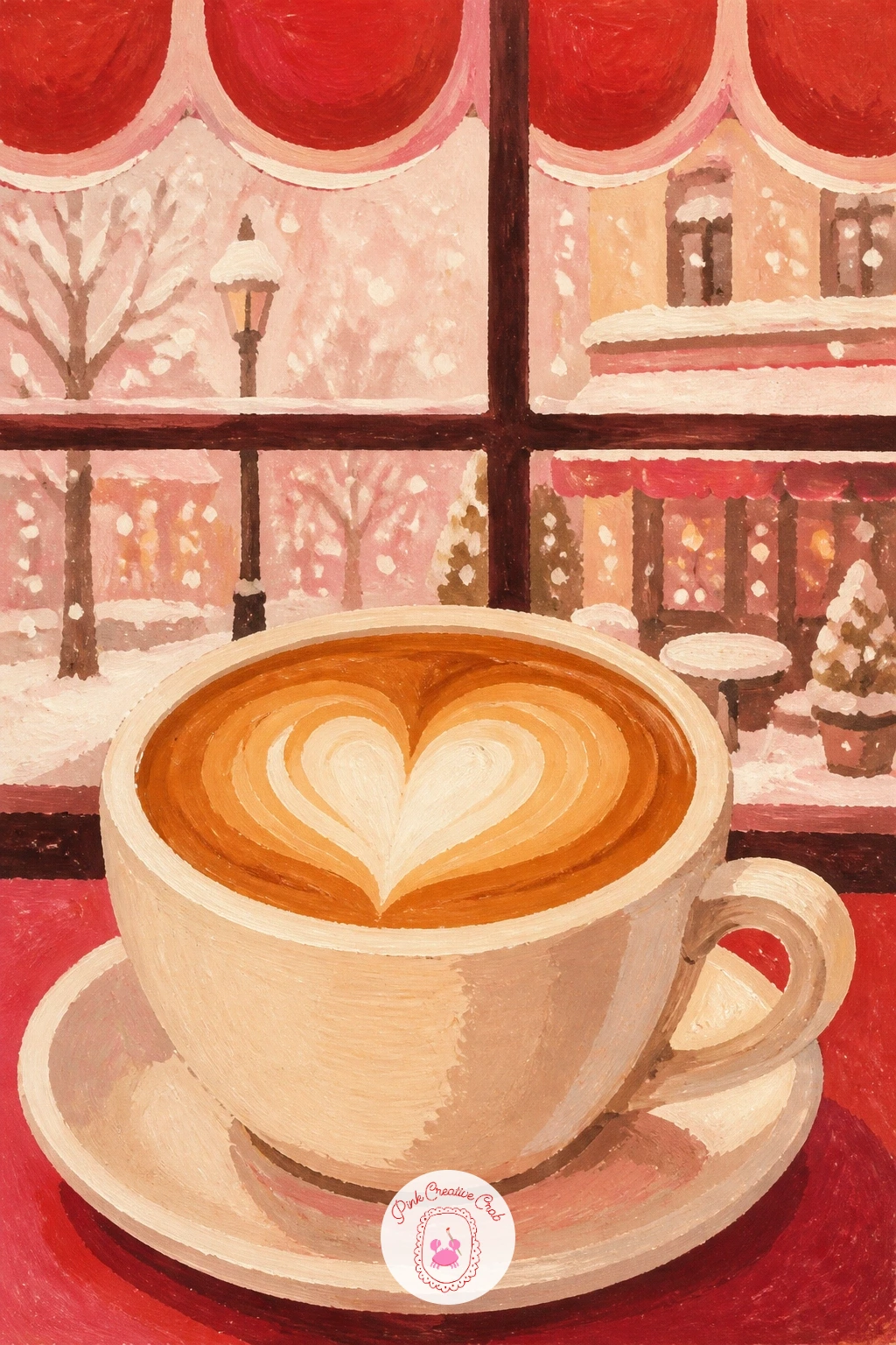
Palette: Toasted Brown,Cream White,Soft Grey Blue,Cherry Red
Look at real latte art photos before you paint, the heart foam always sits slightly off-center in the cup, never dead middle, and that small shift reads as more natural on paper.
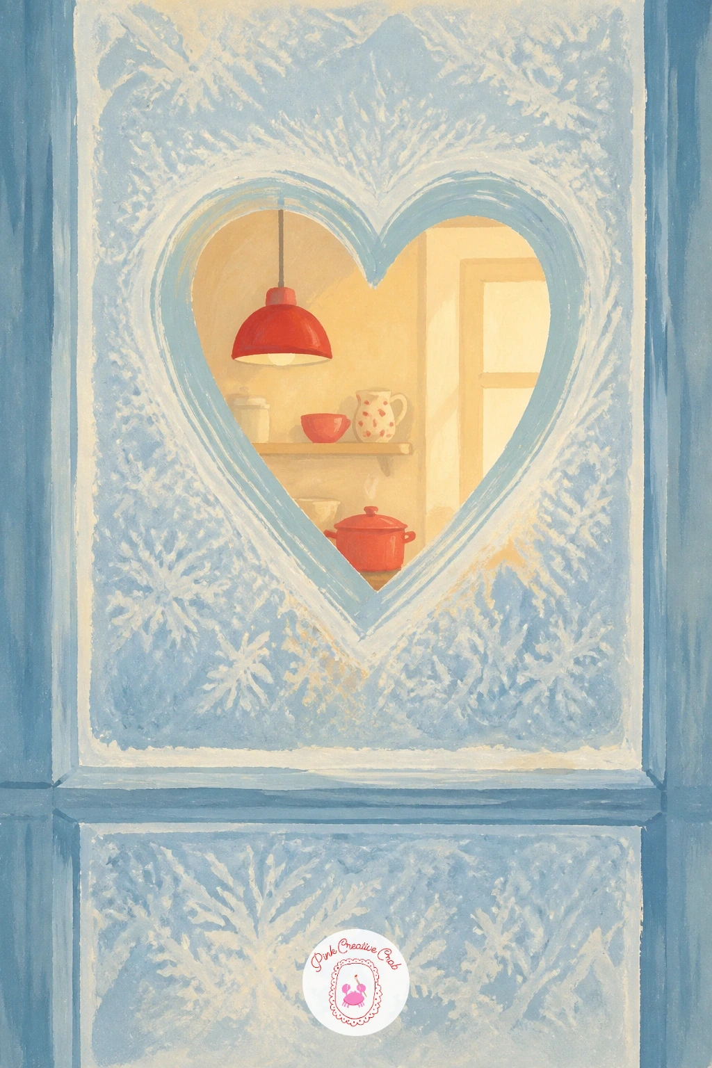
Following the cafe scene, try a heart drawn with one finger on a frosty kitchen window, a quieter indoor moment with almost no detail needed. Paint the window pane first in a flat pale blue grey, then lift a heart shape out of the wet paint with a damp cloth or the flat edge of a stick to reveal the cream paper underneath.
This idea leans on a lifting trick rather than more paint: work the frost layer on while still slightly damp, since dry gouache will not lift cleanly and you will end up scratching at the surface instead. Keep the lifted heart edge a little rough and uneven, a real finger-drawn heart in frost is never crisp.
Add a single smudge of a fingertip mark at the bottom point of the heart where the hand pulled away, and a blurred warm kitchen interior just visible through the clear part of the glass. If lifting feels too fiddly, mask the heart shape with tape before painting the frost layer, then peel it away once dry for a cleaner edge.
Keep the window frame simple, a plain chocolate brown rectangle is enough to anchor the whole scene.
You Will Need
- masking tape for the heart shape (optional)
Palette: Frost Blue,Chocolate Brown,Cream,Soft Yellow
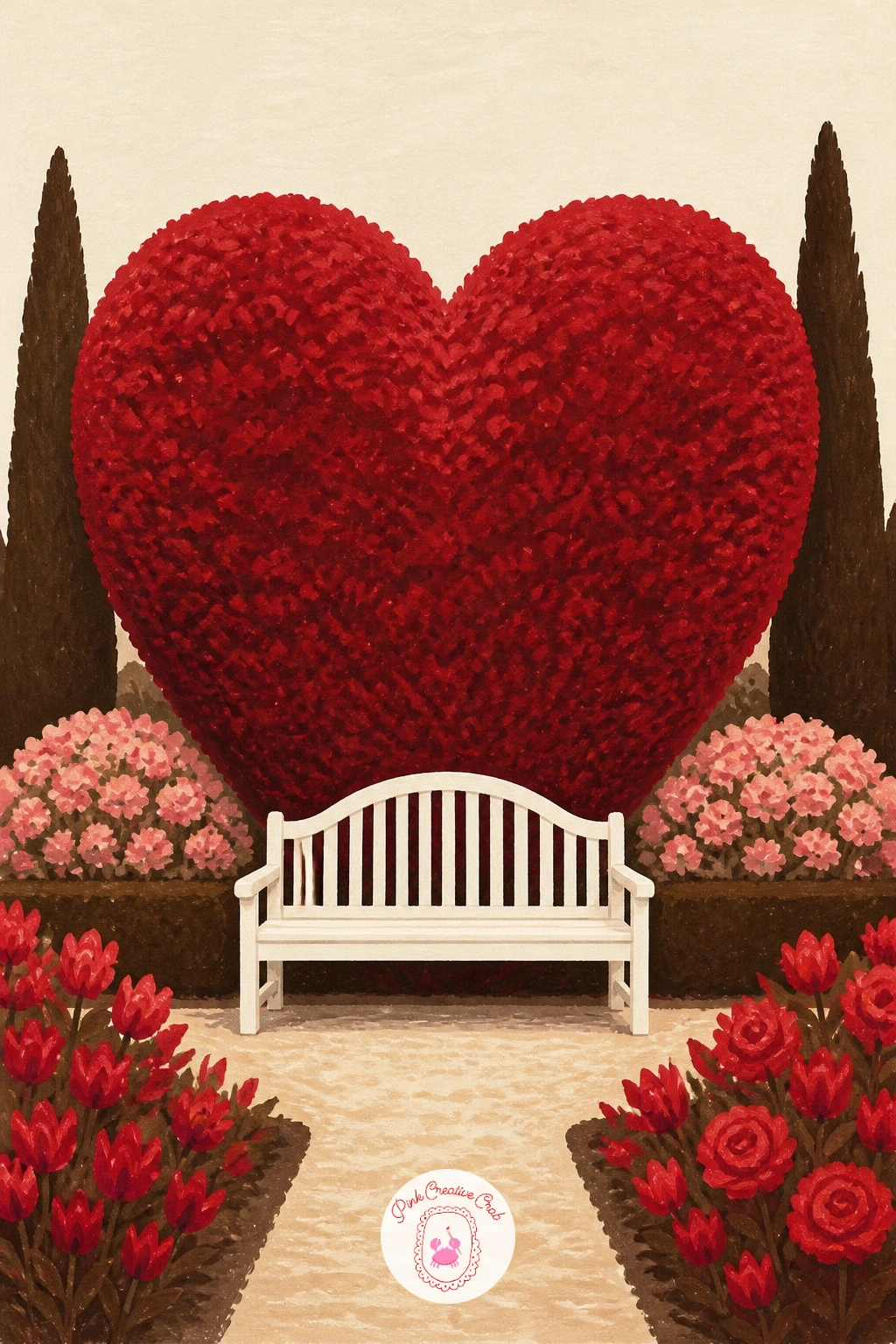
Step outside next for a heart-shaped hedge in a formal garden with a white bench tucked in front of it. Since this piece relies entirely on getting the hedge shape right, sketch the heart lightly first and check it against a real heart sticker or a traced coin outline before committing to paint, a lopsided hedge reads as a mistake far more than a lopsided rose ever would.
Block the hedge in a deep sage or olive green, then add texture with small dabbed brush marks around the outer edge rather than a flat fill, which gives the clipped leafy look real hedges have. Paint the bench last in crisp white with a few grey shadow strokes underneath so it sits on the ground rather than floating.
Gravel path and pale sky in soft cream finish the background without competing with the hedge shape. If your dabbed texture starts to look too busy, step back and add three or four slightly darker green dabs in the hedge’s shadow side only, which calms the whole surface down instantly.
Keep the bench small and the hedge large, the hedge is the heart of the piece and should fill most of the page.
Palette: Sage Green,Olive Green,White,Cream
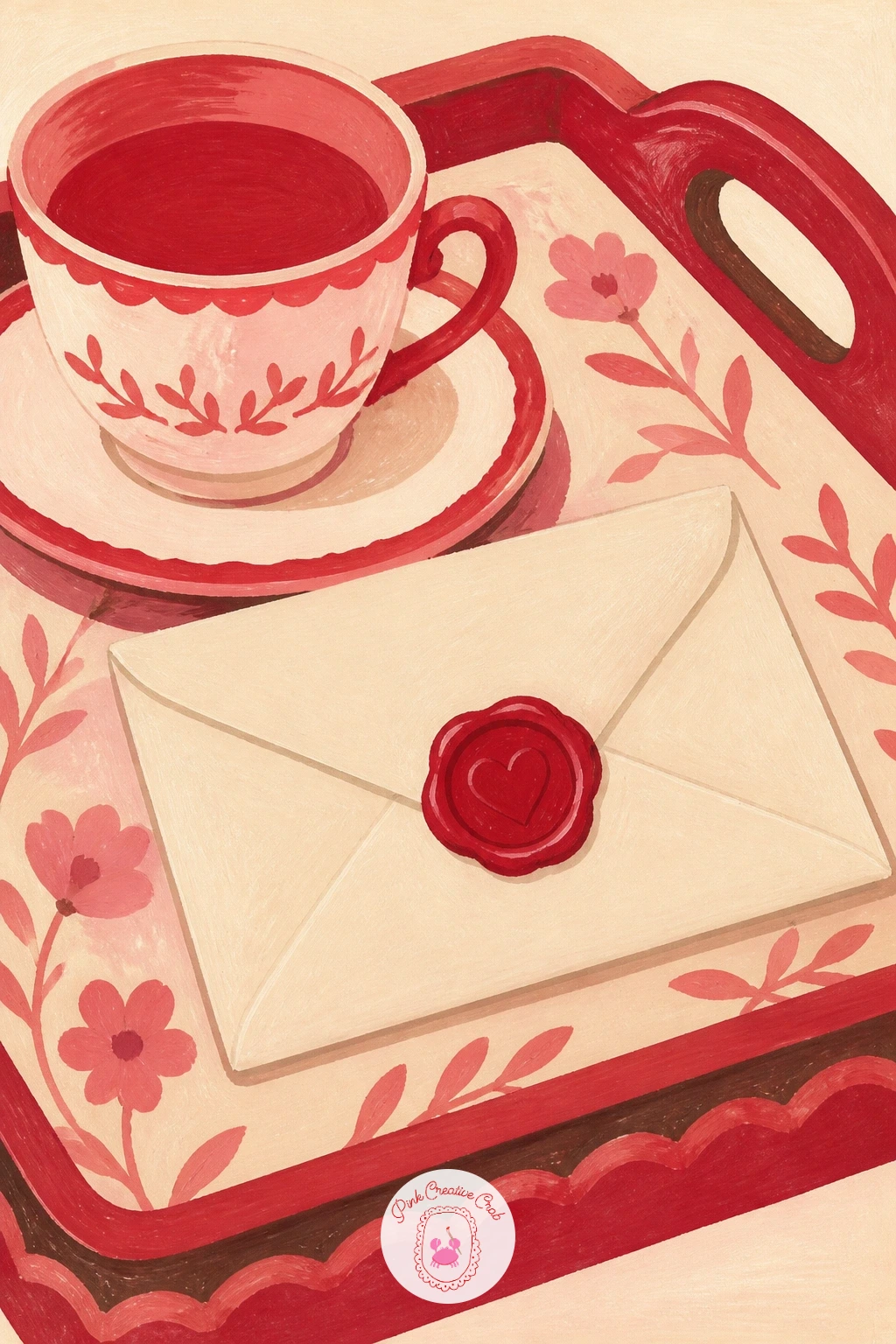
Bring the scale right down with a love letter sealed with a red wax heart resting on a breakfast tray. Paint the tray and a folded napkin first in flat cream and soft brown, then the envelope on top in a slightly warmer cream so the two tones separate clearly.
The wax seal is the star here: paint it as a raised, slightly irregular red blob rather than a flat circle, using a second darker cherry red at its lower edge to suggest the dripped wax catching shadow. A heart is pressed into the center of the seal, so leave a thin cream line in the shape of a heart right in the middle of the red blob before it dries, or scratch it in gently with the brush handle once the paint has set up but is still tacky.
A teacup, a small sprig of greenery and a folded napkin corner round out the tray without overcrowding it. If the wax seal looks flat, a tiny white gouache highlight dot at its top edge instantly reads as glossy wax rather than a painted sticker.
Keep the envelope paper slightly off-white rather than pure white, warm paper always photographs better than stark white in a cream-toned piece like this.
You Will Need
- brush handle or toothpick for scratching the wax detail
Palette: Cherry Red,Dark Cherry,Warm Cream,Chocolate Brown
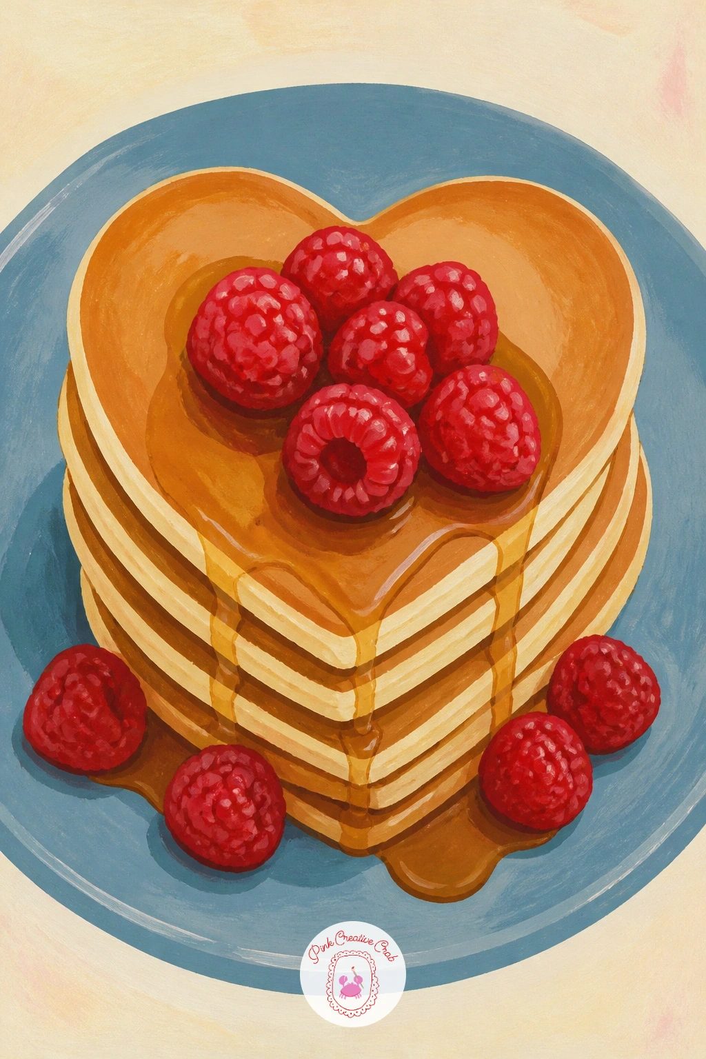
Head into the kitchen for heart-shaped pancakes stacked with raspberries on a blue plate, a cheerful food scene that rewards getting the stack right. Paint the plate first as a flat ellipse in a dusty blue, then build the pancake stack from the bottom up, each heart slightly smaller and shifted than the one below so the stack reads as three-dimensional rather than flat cutouts glued together.
Shade the underside of each pancake heart with a thin golden brown line where it meets the one beneath, which does more to sell the stack than any amount of detail on the pancake surface itself. Raspberries go on last as small clustered red dots with tiny cream highlight flecks, piled loosely rather than arranged in a neat row.
A drizzle of syrup painted as a thin glossy brown line pooling at the plate edge finishes the scene. If your pancake hearts come out too perfectly symmetrical, nudge one side slightly wider than the other, homemade pancakes are never geometrically precise and the wobble makes the painting warmer.
No raspberries in your reference? Strawberry halves sit just as happily on top and keep the same red and cream color story.
Palette: Golden Brown,Dusty Blue,Cherry Red,Cream
Cool the palette down with a heart pressed into snow by a mitten resting on a garden wall. The whole scene hinges on contrast, so paint the snow first as a broad flat cream white field across the wall, then press a slightly darker blue grey heart shape into it where the mitten has flattened the surface.
Give that pressed heart a soft, slightly uneven edge rather than a clean outline, since snow compressed by wool never leaves a crisp line. The red mitten sits just beside or on top of the heart, its cuff painted in a slightly darker red than its palm so the shape reads as fabric rather than a flat red oval.
A stone wall ledge below the snow in warm grey brown grounds the whole piece. If the pressed heart disappears into the white snow around it, deepen its shadow side with one more pass of blue grey gouache rather than outlining it in a hard dark line, which would flatten the soft snowy feel.
Try the quick version in ten minutes by painting just the snow and the heart impression, then add the mitten and wall texture only if you have time for the forty-minute version.
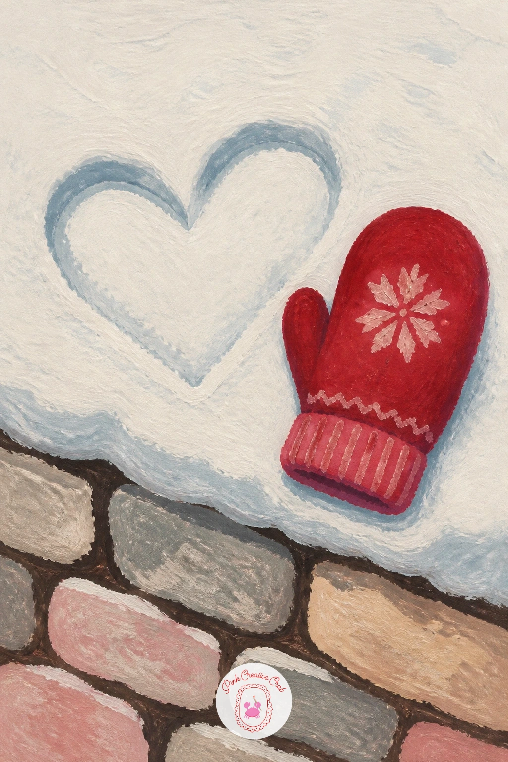
Palette: Cream White,Blue Grey,Cherry Red,Warm Grey
Warm things back up with a heart-shaped rug in a sunny pink bedroom with a sleeping cat curled on top. Paint the floor and wall in flat blush pink and warm cream first, then drop the rug heart on top in a slightly deeper pink so it reads as a separate layer rather than floor pattern.
Check your heart shape against the room before you paint the cat, since a rug viewed from above needs a slightly flattened, wider heart than one seen upright on a door. The sleeping cat goes on last, a simple curled oval shape in soft grey or warm orange with no more than a tucked tail and two folded ears needed to read clearly.
Sunlight falling across one corner of the rug in a pale warm yellow wash adds atmosphere without extra detail. If the cat ends up looking stiff, round every edge of its curled body a little more than feels natural, sleeping cats are all soft curves with no sharp angles anywhere.
No cat handy for reference? A small sleeping dog curls into the same rounded shape just as well.
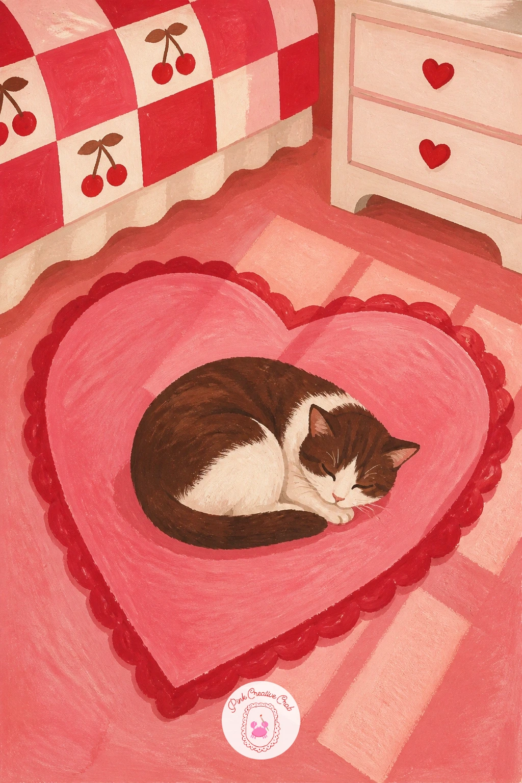
Palette: Blush Pink,Deep Pink,Warm Orange,Cream
Return outdoors for a heart cut into the wooden shutter of a cottage in snow, a classic cutout shape that depends entirely on what shows through it. Paint the shutter as a flat chocolate brown rectangle first, then cut a heart shape out of it in a warm glowing yellow, since the light from inside the cottage is what the heart is really showing off.
Keep the cut edges of the heart perfectly crisp, this is one of the few places in the whole list where a hard clean edge is exactly right rather than something to soften. Snow piled along the top of the shutter and window ledge in flat cream white finishes the cold half of the scene, while the warm yellow glow does all the emotional work.
If the yellow glow looks flat against the brown shutter, add one thin warmer orange line just inside the heart’s edge to suggest candlelight flickering behind the cut wood.
Try this one small and repeated: a single shutter with its glowing heart makes a strong, simple focal point for a quick Valentine piece.
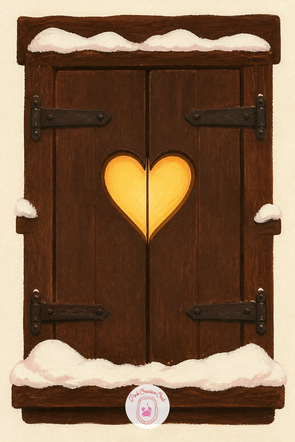
Palette: Chocolate Brown,Warm Yellow,Cream White,Orange
Soften the mood with a heart of rose petals scattered loosely on a picnic blanket. Paint the blanket first as a flat checked or striped pattern in cream and cherry red, then scatter individual petal shapes on top in varied pinks, arranging them roughly into a heart without ever letting any single petal sit in a perfectly predictable spot.
Vary the petal sizes and tilt each one slightly differently, a heart made of real scattered petals always has gaps and overlaps rather than tidy rows. Work from the outer edge of the heart inward so the overall shape stays readable even once you add density toward the center.
A woven picnic basket corner or a glass of lemonade at the blanket’s edge adds a sense of place without stealing focus from the petals. If the petals start blurring into one pink mass, let the first layer dry completely before adding a few darker pink petals on top for separation.
Working from your own garden flowers instead of roses? Loose peony or tulip petals scatter into the same soft heart shape beautifully.
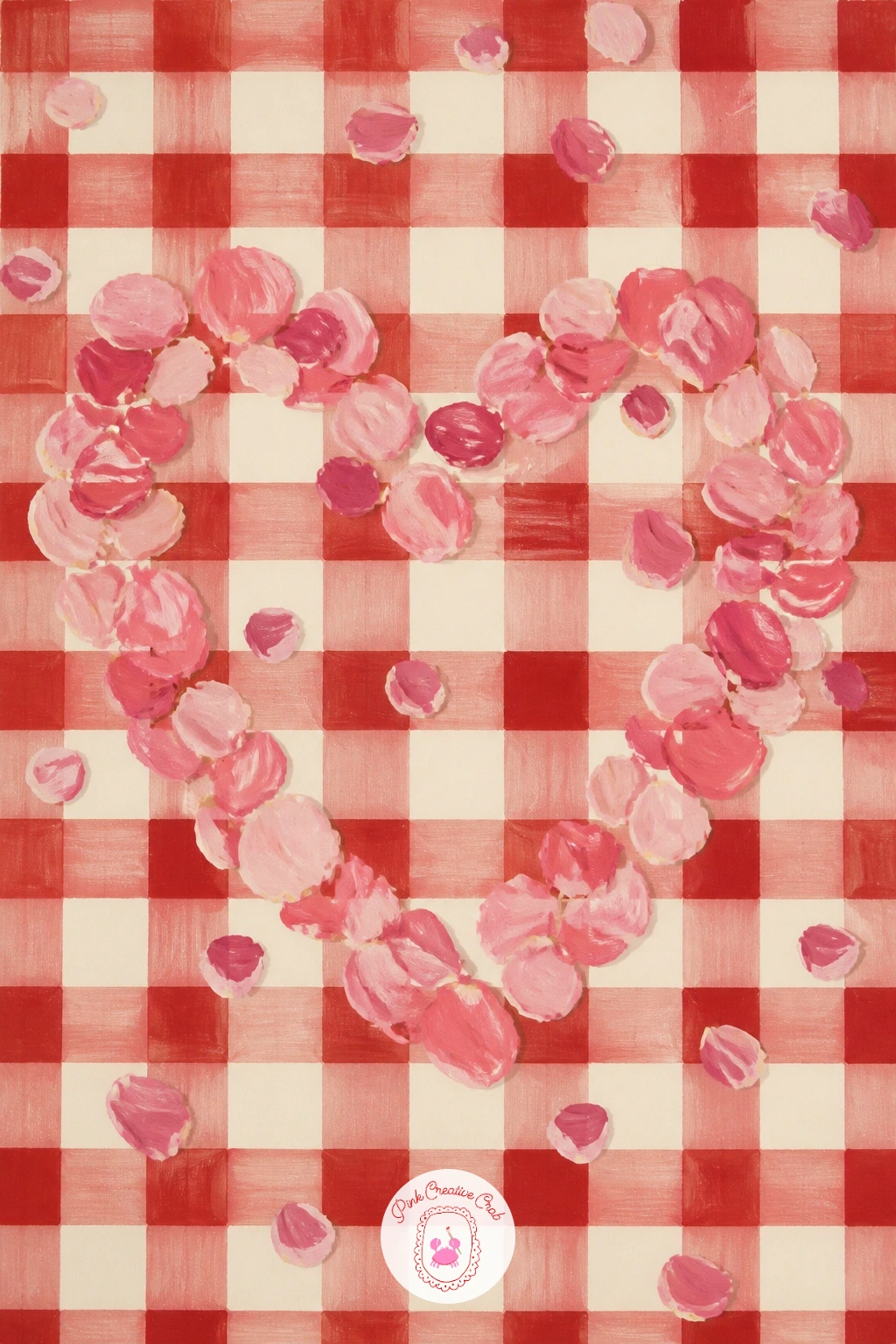
Palette: Blush Pink,Deep Pink,Cherry Red,Cream
Add a little motion with a heart-shaped balloon tied to a bicycle basket on a cobbled street. Block the bicycle in first as a simple flat shape in cream or soft brown, keeping the frame lines thin and confident rather than fussy, then paint the woven basket in warm tan with a few curved lines to suggest its texture.
The balloon is the focal point, so give it real size and a glossy highlight, a single white gouache streak near its top left where the light catches the surface instantly reads as shiny rather than flat. The ribbon tying it to the basket should curve gently rather than hang perfectly straight, which keeps the whole scene feeling light and breezy.
Cobblestones underneath as loose rounded grey shapes and a blurred street scene behind finish the background. If the bicycle frame looks wobbly, paint it last on top of the finished background in one confident continuous brush stroke rather than building it piece by piece.
Keep the balloon large in the frame, it is doing the emotional work of the whole painting and deserves the most space.
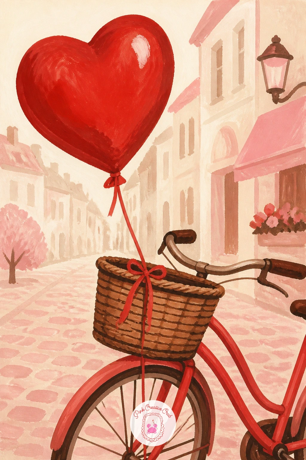
Palette: Cherry Red,Warm Tan,Grey,Cream
Head to the coast for a heart traced in wet sand as a wave rolls in to meet it. Paint the sand first as a flat warm beige field, then trace the heart as a shallow groove using a slightly darker wet-look brown, following one single continuous line rather than building the shape from separate strokes.
Eye level matters here: keep your horizon line low and close to the top of the page so the sand and the incoming wave fill most of the frame, which makes the heart feel close and personal rather than viewed from a distance. The wave itself is a simple curved white foam edge creeping toward the heart’s lower point, about to wash part of it away.
A scatter of small shells or a single gull print nearby adds a believable beach detail without extra work. If the wave edge looks too hard, soften it with a slightly damp brush right where the foam meets the sand so the two blend rather than sitting in separate flat shapes.
No beach reference on hand? A damp patio or a sandbox at a park gives you the same wet sand texture to study.
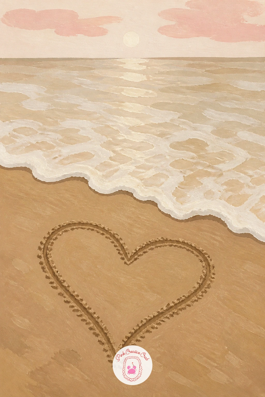
Palette: Warm Beige,Wet Brown,White Foam,Soft Blue
Bring the scale down again for a heart-shaped locket open in a velvet box beside a frosty window. Paint the box first in a deep rich color like plum or chocolate brown, keeping the inner lining a contrasting cream or blush so the locket sitting inside reads clearly against it.
The locket itself needs a believable hinge: paint the two heart halves slightly open like a book, one side a touch smaller than the other since a real opened locket never sits perfectly symmetrical. A thin gold line along the locket’s edge, added once the base color has dried, suggests the metal rim catching light.
Frost on the window behind, painted as a soft pale blue haze at the edges of the pane, keeps the background quiet so the locket stays the clear focal point. If the gold edge looks too heavy, thin your gouache further and apply it in one quick confident pass rather than going back over it twice.
Fans of small jewelry-box scenes might also enjoy browsing these vintage love stickers for more lace and locket inspiration to mix into a page.
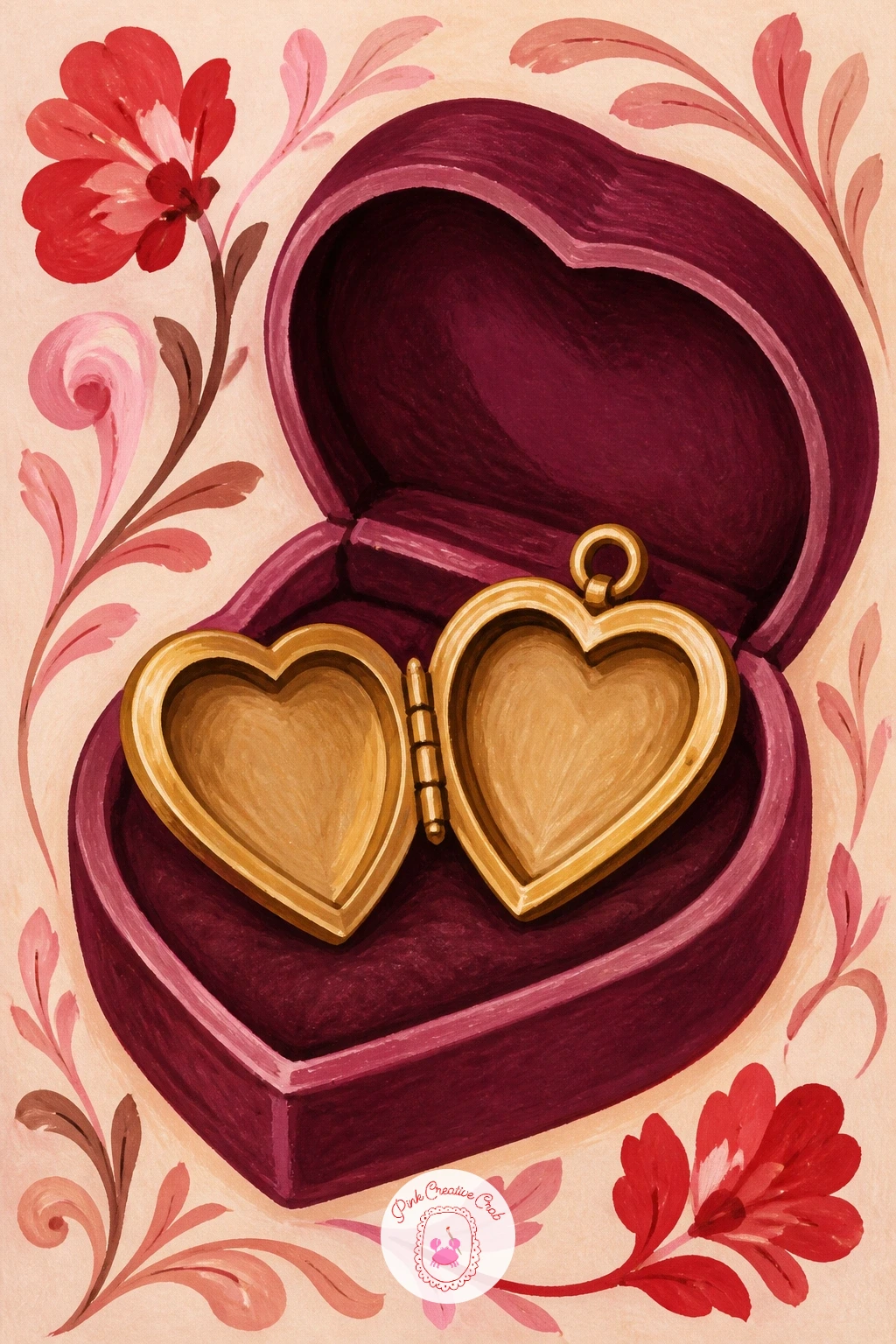
Palette: Plum,Gold,Blush Pink,Frost Blue
Lighten the mood with a heart-shaped pizza topped with tiny pepperoni hearts on a kitchen table. Paint the pizza base as one confident heart shape in warm golden brown, then the cheese layer in a slightly lighter yellow with a loose, bubbly uneven edge rather than a flat smooth fill, since real melted cheese never sits flat.
The pepperoni pieces are the fun part: paint each one as a tiny heart rather than a circle, scattered unevenly across the surface with a few overlapping at the edges. Keep them small and a touch irregular, perfectly uniform pepperoni hearts start to look like stickers instead of food.
A wooden table surface and a sprinkle of dried herb flecks in green finish the scene. If the cheese layer looks too flat against the crust, add a few small darker golden spots where the cheese has browned slightly in the oven, which instantly adds realism.
Short on patience for tiny hearts? Scatter a few regular pepperoni circles among the heart-shaped ones, the mix still reads as playful and sweet.
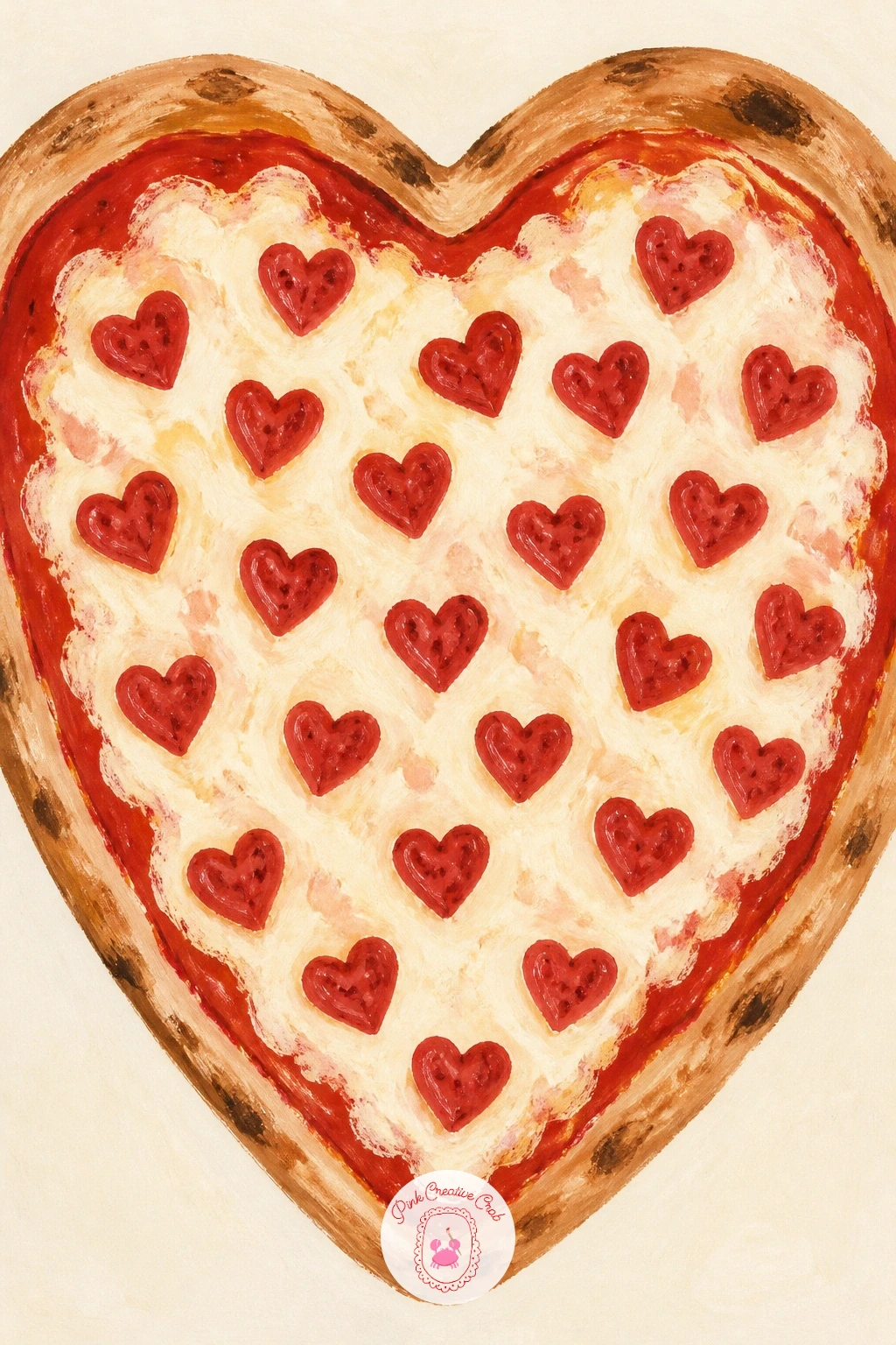
Palette: Golden Brown,Cheese Yellow,Cherry Red,Herb Green
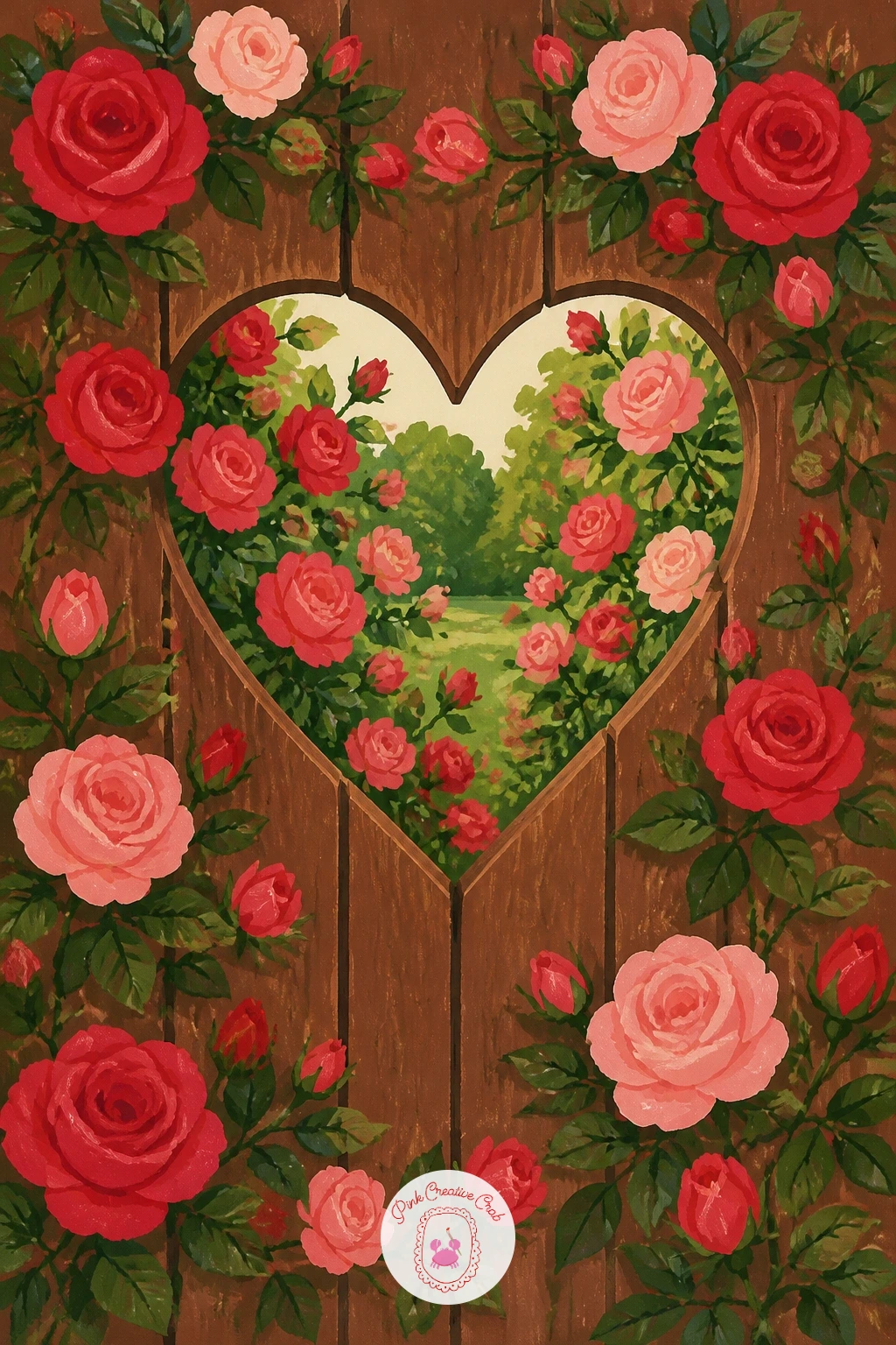
Step back into the garden for a heart-shaped hole cut into a garden gate with roses climbing through it. Paint the gate as a flat chocolate brown panel first, cutting the heart hole out in whatever color sits behind it, a soft garden green or a warm sky tone depending on how deep you want the scene to feel.
Roses climbing through the hole and around its edges go on last, a mix of leafy green vines and small pink rose clusters that partly overlap the heart’s outline so it feels grown into rather than simply painted beside. Let a few rose stems cross in front of the gate’s edge too, which ties the flowers and the gate together as one scene rather than two separate layers.
If the heart hole looks too flat and graphic, add a thin darker brown shadow line just inside its cut edge where the gate’s thickness would naturally cast a shadow.
For a quicker ten-minute version, paint just the gate and the glimpse of garden through the hole, then save the climbing roses for a slower session when you have more time to enjoy the small overlapping petal shapes.
Palette: Chocolate Brown,Garden Green,Blush Pink,Soft Sky
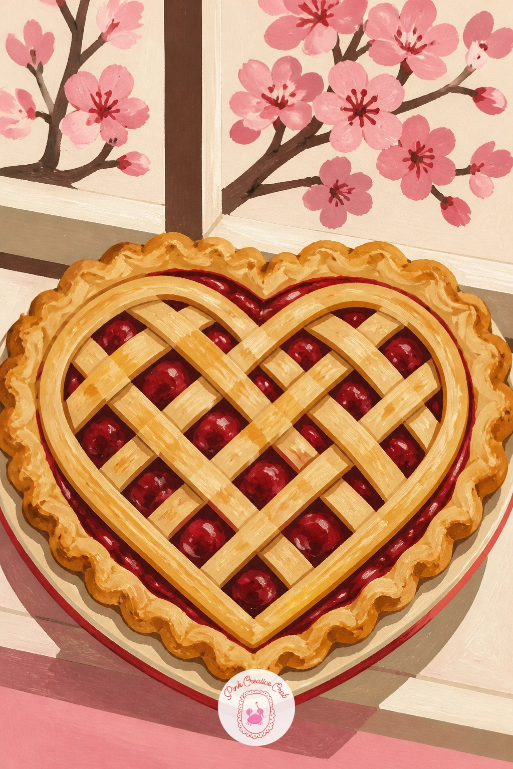
Head back into the kitchen for a cherry pie with a lattice heart cooling on a windowsill. Paint the pie dish first as a flat cream ceramic shape, then the pie filling peeking through as deep cherry red before the lattice goes on top, since the red needs to show through the gaps once the strips are painted.
Lay the lattice strips in warm golden brown, each one slightly uneven in width and spacing, crossing in a simple over-under pattern that naturally forms a heart shape where the strips are arranged closer together toward the center. This is easier than it sounds if you lightly pencil the heart outline first and just work your lattice strips to follow it.
A dusting of white gouache flecks for sugar on top and a checked cloth beneath the dish finish the cozy scene. If your lattice heart loses its shape once the strips are in, darken the gaps between strips with a touch more cherry red to make the pattern pop back out clearly.
No pie reference handy? Any fruit pie with a visible lattice top works, the same crisscross trick carries the heart shape regardless of the filling.
Palette: Cherry Red,Golden Brown,Cream,Soft Blue
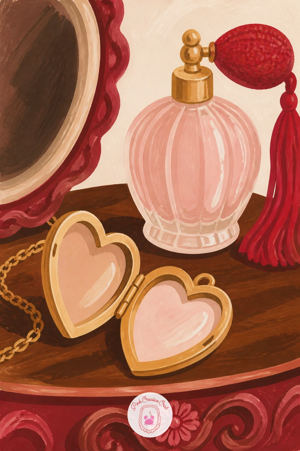
Return to a quieter indoor still life with an open heart locket on a dressing table beside a pink perfume bottle. Paint the tabletop surface first in warm wood tones, then the perfume bottle as a simple geometric glass shape in blush pink with one sharp white gouache highlight down its side to suggest glass catching light.
The locket sits open beside it, smaller in scale than the bottle so your eye settles on the perfume first and discovers the heart second, which gives the piece a nice sense of discovery. Keep the locket’s gold chain looped loosely rather than laid in a straight line, a coiled chain reads as more natural and catches the eye better too.
A small mirror or hairbrush glimpsed at the table’s edge rounds out the scene without crowding it. If the glass bottle looks flat, add one more thin white highlight near its cap, glass almost always needs at least two separate light catches to read convincingly.
Swap the perfume bottle for a small vase of flowers if you would rather paint something organic beside the locket.
Palette: Blush Pink,Gold,Warm Wood,White
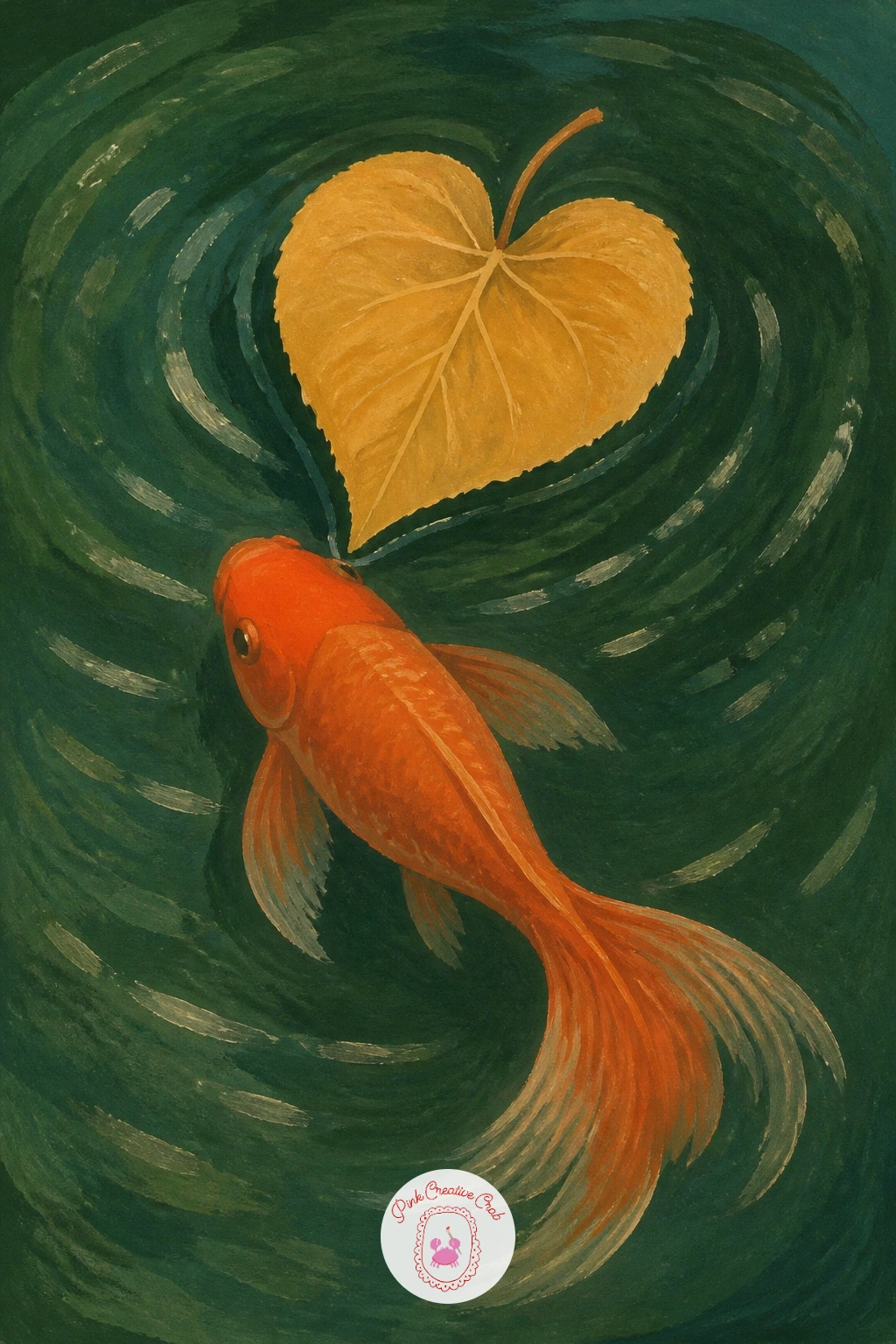
Move outdoors to water for a heart-shaped leaf floating on a garden pond above a goldfish. Paint the pond surface first as a flat deep green with a few lighter ripple strokes, then the floating leaf in a warm golden or soft green sitting right on top of the water, its edges slightly curled to show it is floating rather than painted flat onto the surface.
Place the goldfish just beneath the leaf, partly obscured by the water’s surface tone so it reads as under the water rather than floating on top of it. A thin lighter green ripple ring around both leaf and fish helps tie the two together as one glance rather than two separate objects.
Lily pads or a hint of pond reeds at the edges finish the scene without pulling focus from the heart-shaped leaf itself. If the goldfish looks too sharp against the water, soften its outline slightly with a dry brush pass in the pond green, which pushes it believably beneath the surface.
No real heart-shaped leaf to reference? A caladium or redbud leaf both have that natural heart shape built right in.
Palette: Deep Pond Green,Golden Leaf,Orange Fish,Light Green
Keep the garden theme going with heart-shaped stepping stones leading to a little garden shed. Since this piece depends on believable spacing, lay out your stones first in light pencil, each one a little smaller and closer together as they recede toward the shed, which is the simplest way to suggest distance without any real perspective drawing.
Paint the stones in warm grey or soft terracotta, each with a slightly different tone so they read as individual stones rather than one repeated stamp. The shed waits at the end of the path in chocolate brown with a small cherry red door, a nice echo of the stone shapes leading up to it.
Grass or gravel filling the gaps between stones in flat green or warm beige ties the path together. If the stones start looking too evenly spaced and mechanical, nudge a couple of them slightly off the straight line, real garden paths always wander a little.
Readers who enjoy painting small garden corners might like browsing this folk art painting roundup for more charming outdoor scenes built from simple flat shapes.
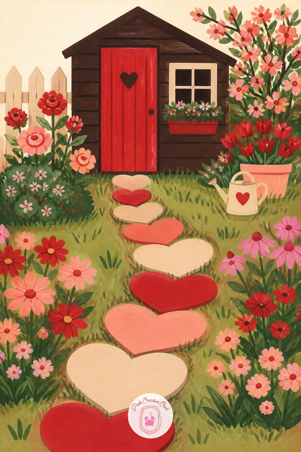
Palette: Warm Grey,Terracotta,Chocolate Brown,Garden Green
Lift the whole scene into the sky with a heart-shaped cloud drifting above a red hot air balloon. Eye level sits low here, close to the bottom of the page, so both the balloon and the cloud above it get plenty of open sky to drift through, which is what makes a sky scene feel spacious rather than cramped.
Paint the sky first as a soft gradient from pale blue near the top to warm cream near the horizon, then the balloon as a simple striped red and cream dome with a small basket hanging beneath on thin rope lines. The heart cloud goes in last, its edges kept soft and uneven with a dry brush dabbing motion rather than a hard outline, since clouds are never crisp shapes.
If the cloud’s heart shape reads too much like a cartoon, pull a few wispy strands off its lower point trailing into the sky, which breaks up the symmetry just enough to feel like a real cloud formation.
Once this one works, try it again with the balloon tiny and far off and the heart cloud filling most of the sky, a nice way to vary the composition next time.
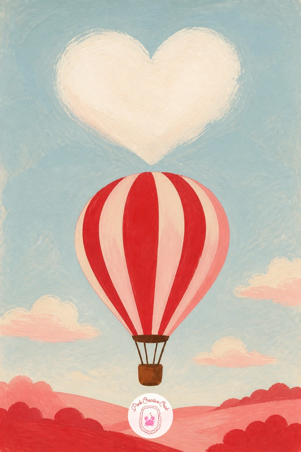
Palette: Pale Sky Blue,Cherry Red,Cream,White Cloud
Bring the temperature right down with a heart-shaped trail carved by ice skates into a frozen pond. Paint the ice surface first as a flat pale blue grey field, then scratch or paint the skate trail in thin white gouache lines following a heart shape, working the line in one continuous loop the way a real skater’s blade would carve it.
Vary the pressure of your line as you go, thinner and lighter along the straighter sides of the heart and slightly heavier where the blade would dig in around the curves at the top, which gives the trail believable weight rather than a flat uniform stroke. A few loose figure-eight scratches trailing off from the heart’s point suggest the skater continuing on past the shape.
Bare winter trees along the pond’s edge in chocolate brown and soft grey finish the scene simply. If the white trail disappears against the pale ice, deepen the ice tone very slightly first so the white line has enough contrast to read clearly.
No skates handy for reference? A single bird’s trail of footprints in snow carves a similar winding line if you would rather draw that instead.
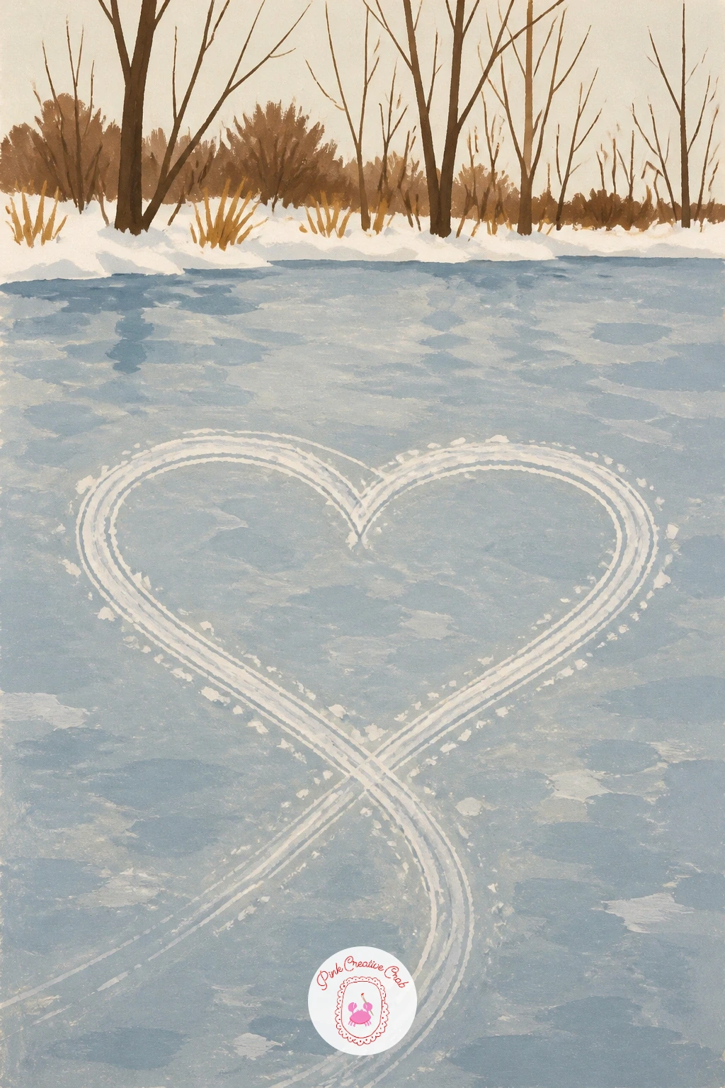
Palette: Pale Ice Blue,White,Chocolate Brown,Soft Grey
Warm things back up at dusk with a heart made of tea lights arranged across a balcony table. Paint the darkening sky and table surface first in deep plum and soft grey, giving the whole scene a quiet evening base to glow against.
Each tea light is a small simple shape, a pale cream circle for the wax with a tiny warm orange flame flicker on top, repeated in a loose heart arrangement across the table rather than a perfectly even row. Paint the glow around each flame last, in a soft wash of warm yellow fading quickly into the dark table tone, which is what actually sells the candlelit feeling more than the flames themselves.
A blurred city or garden view beyond the balcony railing in deep blue adds atmosphere without detail. If the glow washes look too hard-edged against the dark background, go back over each one with a slightly damp clean brush to feather the edge while the paint is still workable.
Try the quick ten-minute version with just five or six tea lights, then add more and build out the balcony view for the longer sitting.
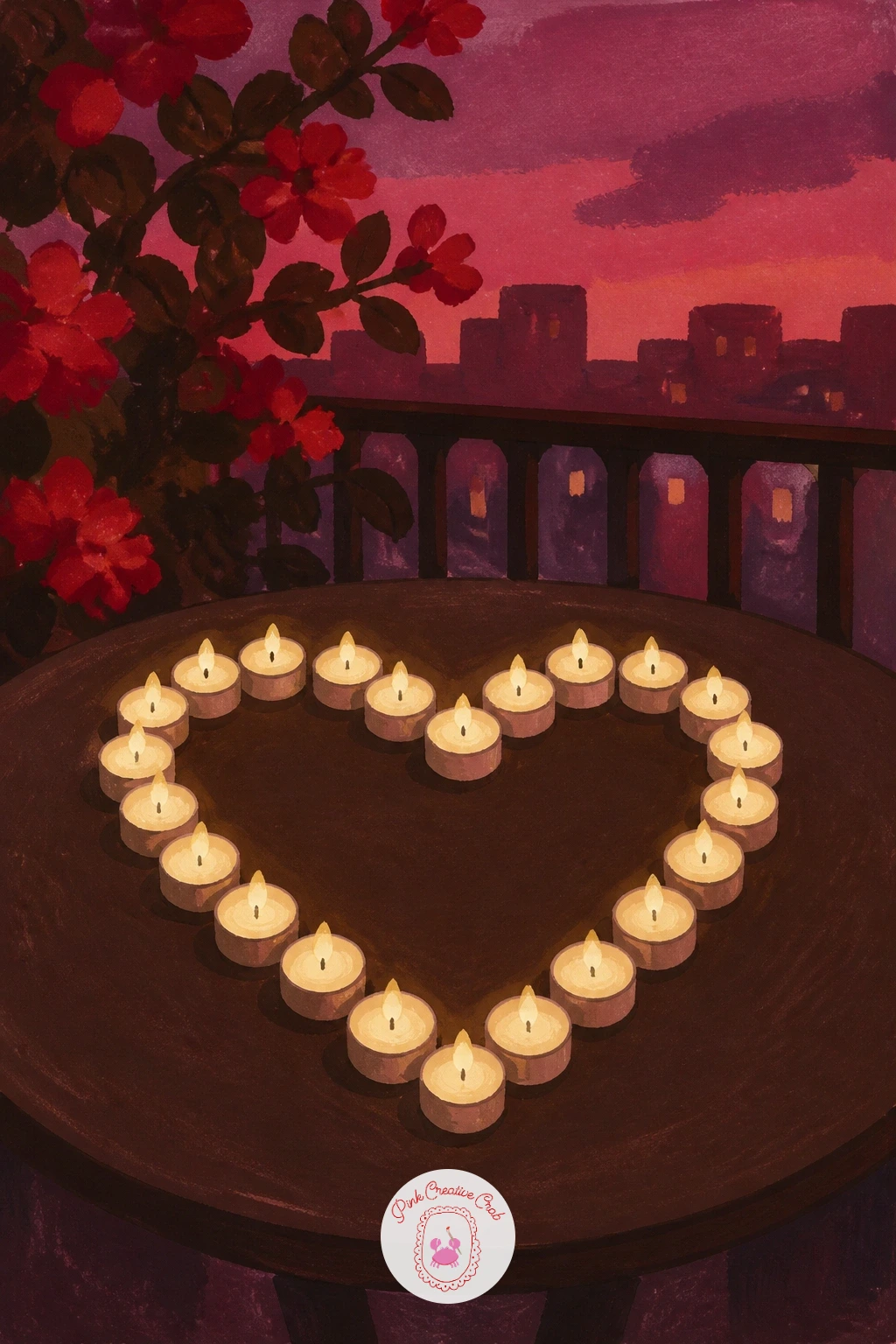
Palette: Deep Plum,Warm Yellow,Cream Wax,Deep Blue
Add a little mischief with an open heart-shaped chocolate box resting on a quilt with a curious cat sniffing at it. Paint the box itself first, a flat cherry red heart shape with its lid tilted open beside it, then the chocolates inside as small rounded bumps in varied browns, each with a tiny different surface pattern so no two look identical.
The cat comes next, paused mid-sniff with one paw lifted and ears forward, a pose that reads instantly as curious without needing any facial detail beyond simple dot eyes. Keep the cat’s body shape soft and rounded rather than angular, which fits the cozy quilted setting better than a sleek sharp outline would.
A patchwork quilt beneath both the box and the cat, painted as a few simple flat colored squares, ties the whole scene together. If the chocolates start to look too uniform, vary their size slightly and let a couple overlap their neighbors, a real box of chocolates is never perfectly ordered.
No cat in the house? A small curious dog nose just reaching toward the box works just as sweetly.

Palette: Cherry Red,Chocolate Brown,Cream,Soft Grey
Move into a hallway scene with a heart-shaped mirror hanging above a hook holding a red coat. The mirror frame goes on first in warm gold or chocolate brown, its heart shape kept slightly rounded rather than sharply pointed, which suits a mirror’s soft decorative feel better than a crisp graphic heart would.
Inside the mirror, a pale soft reflection in cream and grey suggests the hallway without needing real detail, a mirror reflection only needs to feel believable at a glance, not painted in full. The red coat hanging on the hook below becomes the real color anchor of the piece, so give it a confident flat shape with one or two fold lines to suggest the fabric’s weight rather than overworking the texture.
A small runner rug or a pair of boots at the hallway’s base finishes the scene. If the mirror frame looks stiff, round its inner edge slightly more than the outer edge, which gives the heart a gentler, more antique feel overall.
Looking for more cozy indoor scenes to pair this with in a sketchbook spread? This sketchbook inspiration list has plenty of everyday corners worth painting.
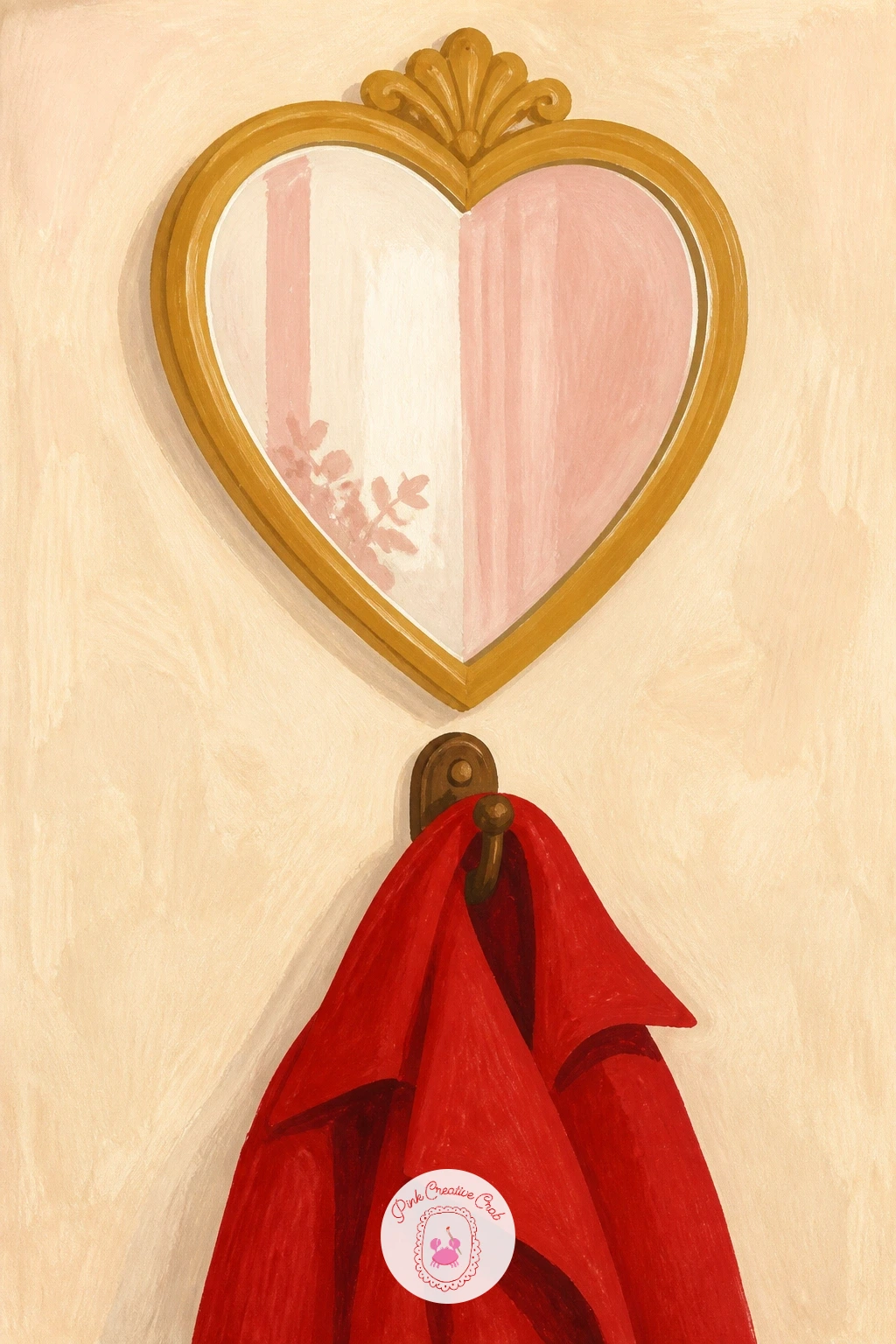
Palette: Gold,Cherry Red,Cream,Soft Grey
Zoom in close for a heart-shaped sugar cube dropping into a pink teacup, a tiny moment with a lot of charm packed into a small frame. Paint the teacup and its warm tea first, the tea surface slightly glossy with one or two soft ripple lines near the center where the cup has just been stirred.
The sugar cube itself is the whole story, so give it real presence: a crisp white heart shape caught mid-fall just above the tea’s surface, with a small splash ring painted below it in lighter tea tone to suggest the moment of impact is about to happen. Keep the cube’s edges sharp and clean against the softer, looser tea surface, that contrast is what makes the moment feel frozen in time.
A saucer and a small spoon resting beside the cup round out the scene simply. If the falling cube looks static, add one or two thin diagonal white streak marks just above it to suggest motion as it drops.
Prefer a slower sitting? Add a lace doily or a slice of lemon beside the saucer for the forty-minute version.
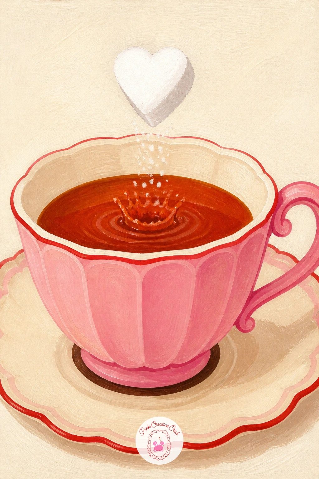
Palette: White Sugar,Tea Brown,Blush Pink,Cream
Settle into a simple still life with a heart-shaped bowl of cherries resting on a marble cafe table. Paint the marble surface first with loose grey veining strokes over a pale cream base, letting the veins wander unevenly since real marble never repeats a pattern.
The bowl itself is painted as a flat heart shape in soft cream or pale pink, then filled with cherries piled generously over its rim, each cherry a simple round shape with a small curved stem and a tiny white highlight dot to catch the light. Let two or three cherries tumble just over the bowl’s edge onto the table, which keeps the arrangement from looking too stiffly contained.
A folded napkin or small espresso cup at the table’s edge adds context without distraction. If the marble veining starts looking too busy, simplify it to two or three confident grey lines rather than a dense tangled network, less is more with marble texture in a flat style like this.
No cherries on hand to study? Cherry tomatoes give you the same round shape and glossy highlight to practice with.
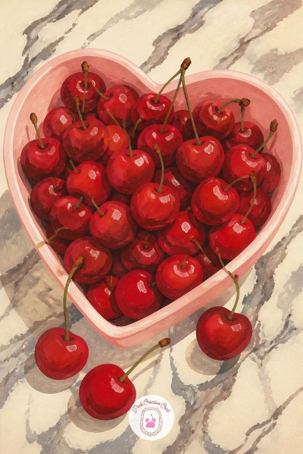
Palette: Cherry Red,Pale Pink,Marble Grey,Cream
Carry the quiet mood to the shore with a heart-shaped pebble found during a windy winter beach walk. Paint the pebble first as a smooth, simply rounded heart shape in soft grey with one or two darker grey flecks for natural stone texture, keeping the surface matte rather than glossy since pebbles have a dry, weathered finish.
Set the pebble resting in a scatter of smaller ordinary stones so it stands out as the one worth noticing, a nice way to echo the whole idea of this list: the heart hiding among everyday things rather than announcing itself. Wind-blown sand and a distant grey sea in soft horizontal strokes behind the stones finish the setting with very little extra effort.
If the heart pebble gets lost among the other stones, give it just one shade lighter grey than its neighbors so the eye catches it first without the shape needing to shout.
Try this one in gouache straight onto toned grey paper rather than white or cream, which suits the muted winter beach mood particularly well and saves you from painting the whole sky and sand base layer.
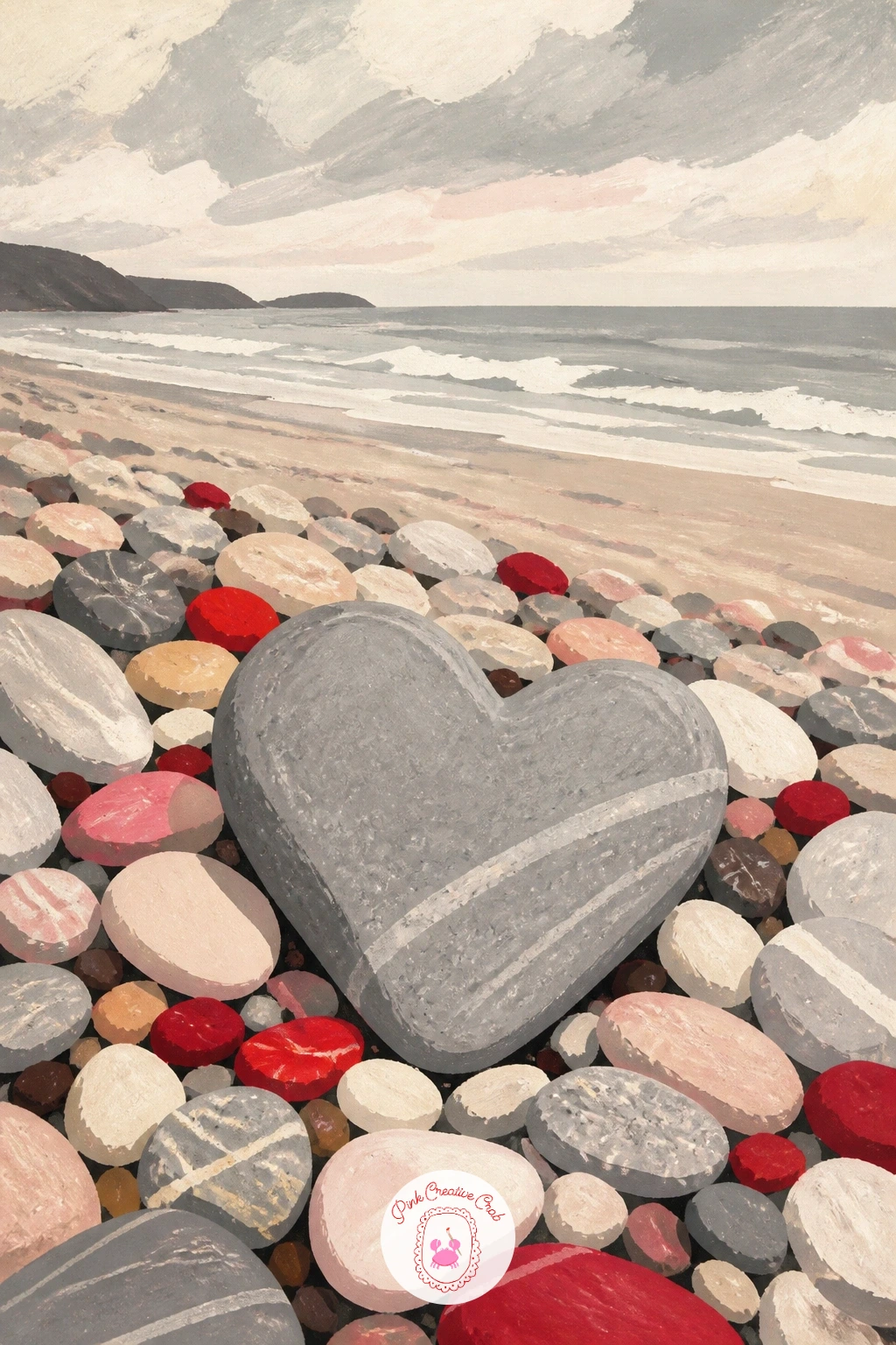
Palette: Light Grey,Dark Grey,Sea Blue Grey,Sand Beige
Return to the kitchen one more time for a heart-shaped waffle topped with strawberries and cream on a tray. Paint the waffle base first in warm golden brown, working a grid of small darker brown squares over the surface to suggest the waffle iron’s pattern, following the heart outline rather than painting a full square waffle and cutting it down after.
A soft swirl of whipped cream goes on next in cream white with a looser, more textured brush stroke than the flat waffle beneath it, since cream should look airy and slightly uneven compared to the crisp waffle grid. Strawberry halves scattered over the top, each a simple red triangle shape with tiny cream seed dots, finish the piece with plenty of color contrast.
A dusting of white gouache flecks for powdered sugar and a light drizzle line of syrup round things out. If the waffle grid looks too mechanical, let a few of the lines break or fade slightly near the heart’s edges, exactly where a real waffle iron would not quite reach.
Short on time? Skip the grid pattern entirely and paint the waffle as a flat golden heart, the cream and strawberries still carry the whole scene.
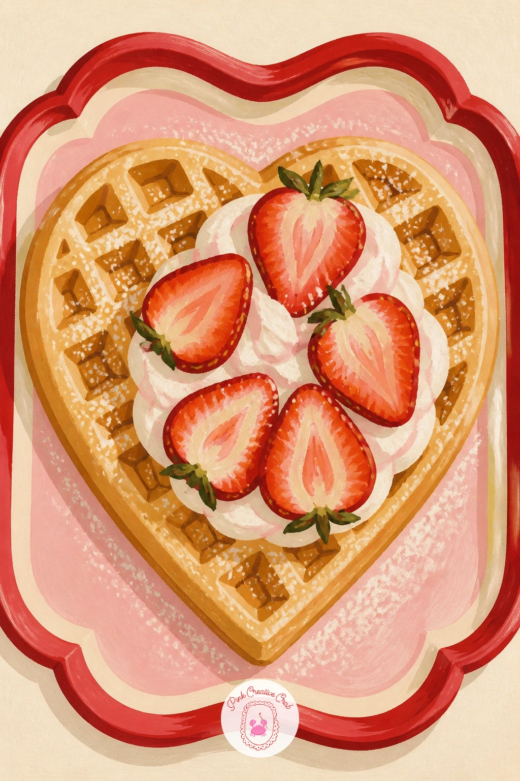
Palette: Golden Brown,Cream White,Cherry Red,Soft Yellow
Close the list where it began, outdoors in the cold, with a heart pressed into a snowbank by a pair of red mittens. Paint the snowbank first as a broad soft cream white mound with gentle shadow curves in pale blue grey to give it real volume rather than a flat sheet.
Press the heart impression into the snow much the way the earlier mitten-and-wall idea worked, but here give the shape more size and let it sit lower in the bank with deeper blue grey shadow pooling inside it, since a heart pressed into a tall mound of snow sits deeper and catches more shadow than one pressed into a thin layer on a wall ledge. The pair of red mittens rests just beside the heart rather than inside it this time, one slightly overlapping the other as though just set down.
A few loose snowflakes falling around the whole scene in small white gouache dots finish the mood. If the snowbank looks flat, add one confident darker blue grey shadow along its base where it meets the ground, which anchors the whole mound convincingly.
Once this one feels comfortable, vary it next time with a single footprint trail leading away from the mittens instead, a nice way to suggest someone has just walked off, leaving the heart behind.

Palette: Cream White,Blue Grey,Cherry Red,Dark Blue Grey
What to Do Next
Pick whichever scene pulled you in first, mix your cherry red and blush pink, and get the big flat shapes down before any detail. A heart hidden inside a pancake stack or a snowy window is far more forgiving than a lone heart on a blank page, so just start, and let the rest of the painting grow around it.
Frequently Asked Questions
What gouache colors do I need for heart painting scenes like these?
A tight palette works best: cherry red, blush pink, warm cream and chocolate brown cover nearly every idea here. Add a soft blue grey for snow and water scenes, and white for highlights and lifting.
How do I keep a painted heart shape from looking lopsided?
Sketch the heart lightly in pencil first and check both sides against each other before adding paint. Tracing a coin or a heart sticker for the top curves keeps the proportions even on the first try.
Can I paint these heart painting ideas without gouache?
Yes, acrylic or watercolor both work with small adjustments to drying time and opacity. Gouache gives the flattest, most matte finish, but acrylic gives similar crisp edges if thinned slightly less than usual.
Why does my heart shape keep looking too graphic and flat?
Flat can be the goal in this style, but adding one shadow tone along one edge of the heart gives it just enough depth to feel painted rather than stamped, without losing the clean modern look.
How long does one of these heart painting ideas take to finish?
Most finish in thirty to forty five minutes once the paint is mixed. Simpler scenes like the frosty window heart or the sugar cube drop take closer to fifteen minutes for a quick version.
Have any thoughts?
Share your reaction or leave a quick response — we’d love to hear what you think!
-
 0
-
0
-
0
-
0
-
0
-
0


