

That blank first page of a brand new sketchbook can feel bigger than it should. These first page of sketchbook ideas give you a soft landing: something small, personal and finishable, so the next page feels easy to start. No pressure to make a masterwork, just a friendly opening act done in fineliner, a few markers and a little watercolor.
Below you will find 34 pages, from quick pen tests to a little map of your town, arranged from the quickest warm-ups to the ones that take a bit more time. Pick whichever one matches your mood today, grab your pens, and let this book begin with something that actually feels like you.
Using these images: free for personal projects such as printing, coloring, cards, journals and gifts. Handmade items that include them may be sold up to 30 pieces per design. More than that is commercial use and is not permitted, and neither is selling or sharing the images themselves or passing them off as your own. Please ask before any other use.
Start with an about me page, the kind that opens a sketchbook the way a introduction opens a letter to yourself. Sketch a simple head and shoulders in pencil first, keeping the shapes loose: an oval face, rounded shoulders, hair blocked in as one shape rather than strand by strand. Go over the lines you like in fineliner once the proportions feel right, then erase the pencil.
Add a few words around the portrait in your own handwriting: favorite color, current mood, today’s date. This is where beginners often tighten up trying to get a likeness exactly right, so aim for a friendly resemblance rather than a perfect copy, a few freckles and your real hair color will do the job.
Watercolor the skin and hair in thin, single layers so the fineliner stays crisp on top. If you do not have watercolor yet, light marker shading works just as well for this first page.
One concrete tip: draw the eyes a little bigger and higher than feels natural, it reads as friendlier on paper than true proportions do.
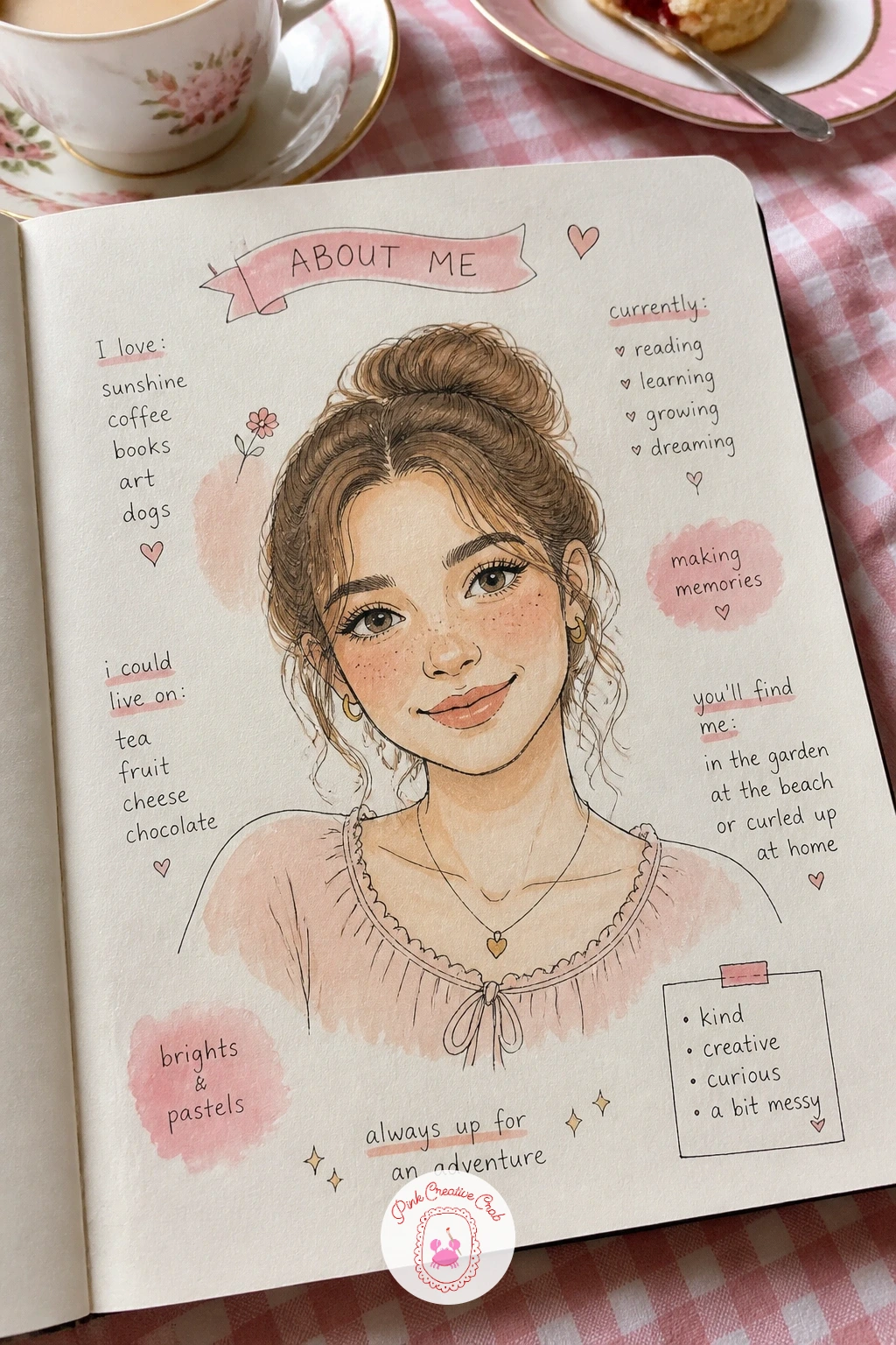
Palette: Raw Sienna,Burnt Umber,Rose Pink,Soft Peach
Follow your portrait with a this book belongs to page, the classic opener that marks the sketchbook as yours before anything else goes in. Draw a simple rectangular or arched frame in fineliner first, leaving plenty of space inside for your name. Keep the frame symmetrical by measuring the margins with your finger or a scrap of paper rather than eyeballing both sides.
Letter your name in the center in a relaxed hand, bubble letters or simple cursive both work fine at this level. Fill the border of the frame with tiny repeating motifs: dots, leaves, hearts or little flowers, whichever matches your mood.
Watercolor the frame in one pale wash first, then add a second deeper color only along the inner edge for a little depth. If the wash buckles the paper, a slightly damp brush and thin paint fixes most of that.
If you only have ten minutes, skip the border pattern and just outline the frame and name; add the little motifs later when you have more time.
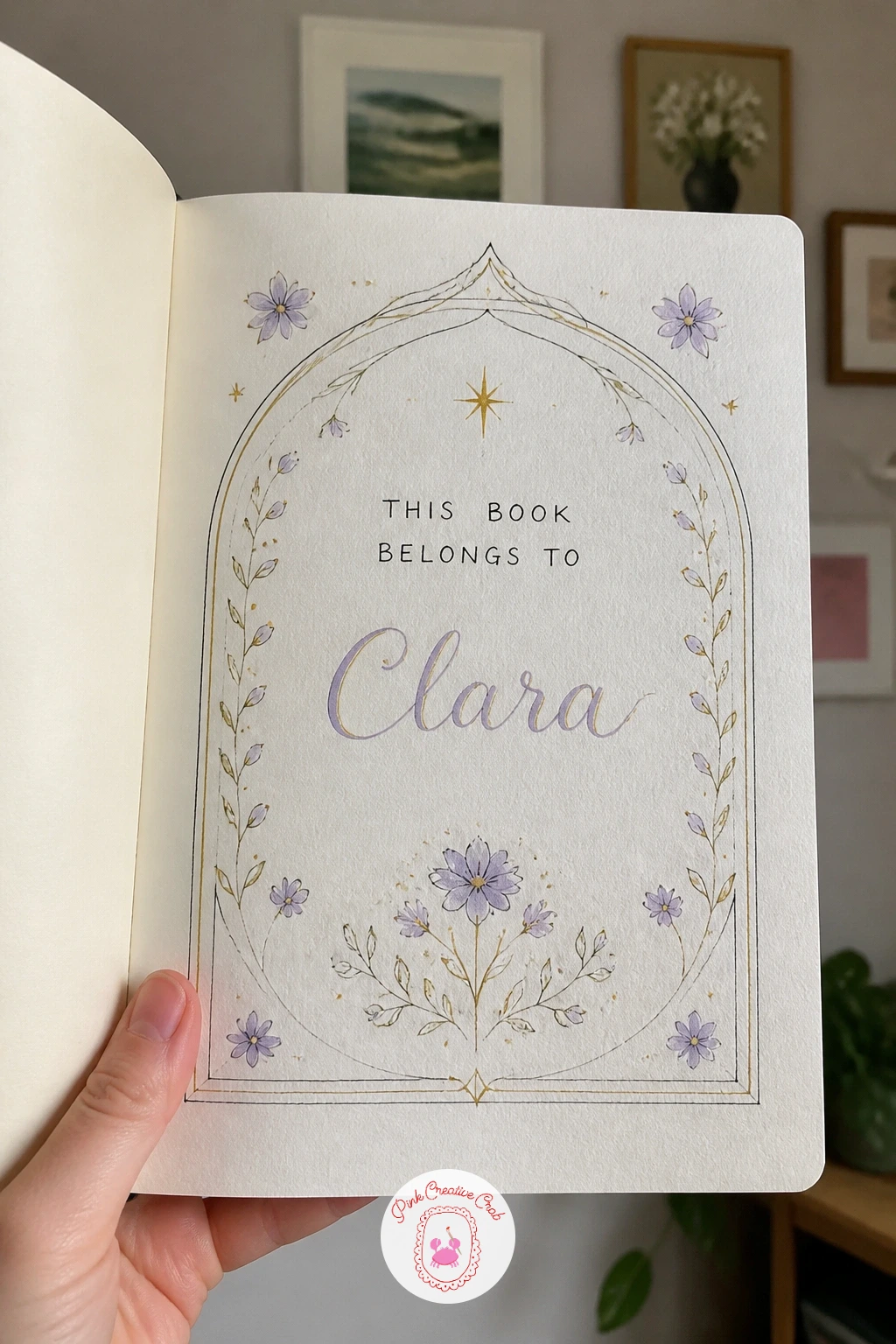
Palette: Dusty Lavender,Soft Gold,Pale Mint
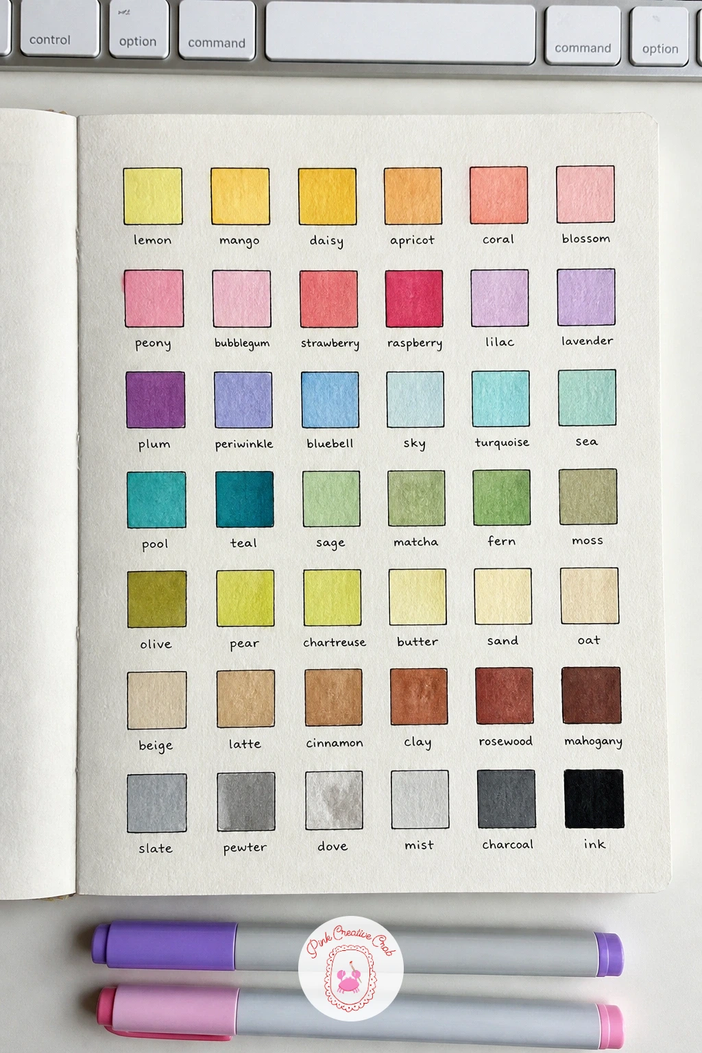
Give your new paints a proper introduction with a color swatch test page, one of the most useful first pages you can make. Draw a simple grid of small squares or circles in pencil, evenly spaced, then outline each one in fineliner. Fill each shape with one color from your set, working left to right in the order the colors sit in your palette or marker case.
Label each swatch underneath in tiny handwriting with the color name, this becomes a real reference you will flip back to for months. Where two colors look identical on paper but have different names, note that too, it saves confusion later.
Let each swatch dry before labeling so the ink does not bleed into wet paint; if your paper is thin, test on a scrap first to see how much the colors bleed through.
Try layering a second coat over half of each swatch to also show how the color deepens, useful information for every page that follows.
You Will Need
- ruler for the grid
Palette: Cadmium Yellow,Coral Red,Cerulean Blue,Sap Green
Turn your goals into a page of goals drawn as a path, a winding road sketched from the bottom of the page to the top. Pencil in a curving line first, wide enough to write along, then go over it in fineliner with simple scenery either side: small hills, a tree or two, a signpost.
Keep the path’s curves gentle and spaced evenly rather than cramming too many bends in, this is the one spot a quick symmetry check helps: step back and see if the path leans more to one side than the other before you ink it permanently.
Write one goal at each bend or milestone along the path, starting small near the bottom and bigger near the top. Watercolor the hills in soft greens and the sky in a pale wash, keeping the path itself white or very light so your words stay readable.
A quick version uses just three goals and a short path; a longer sitting lets you add small drawings, a tiny house or flag, at each stopping point.
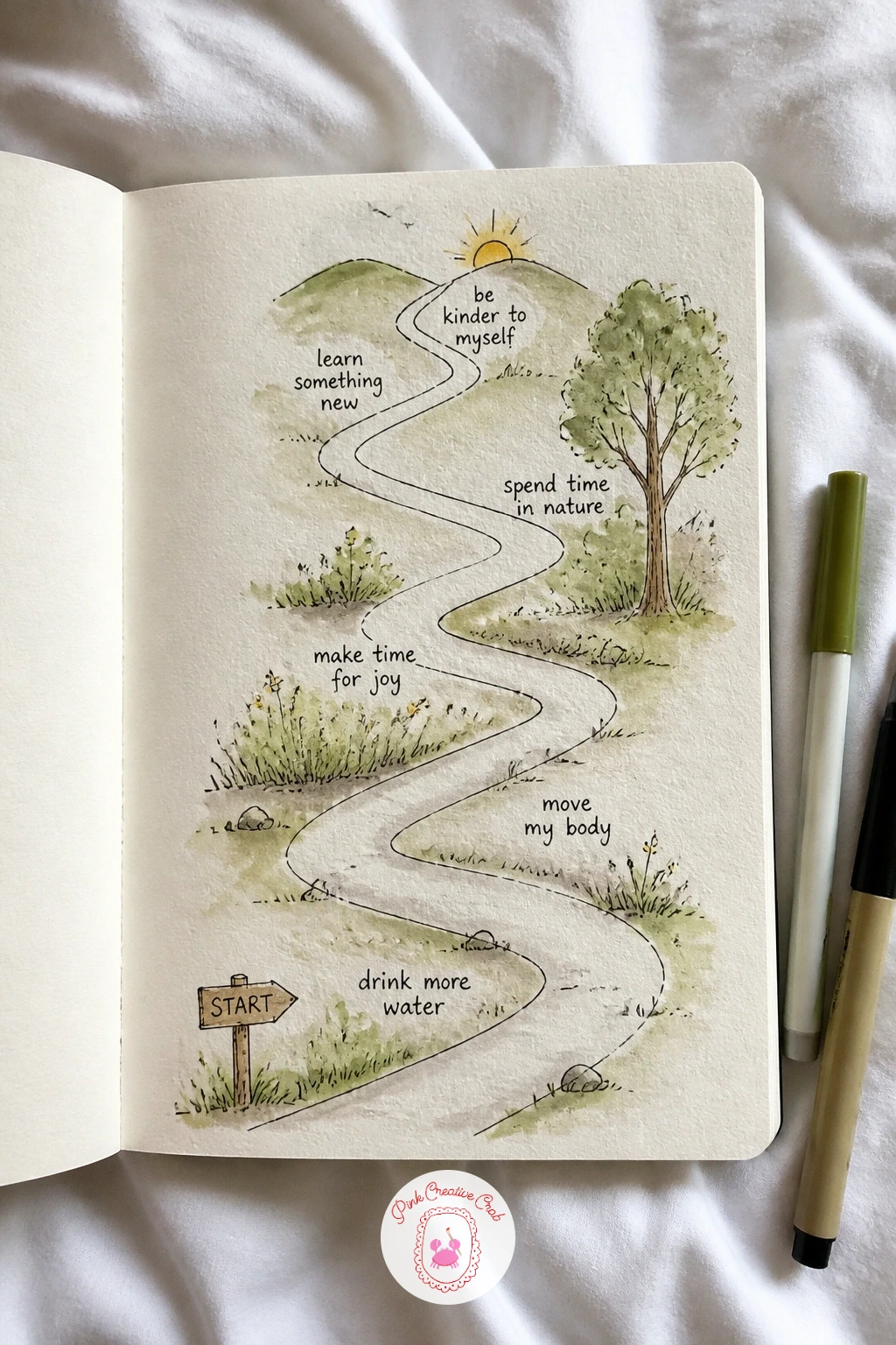
Palette: Sap Green,Sky Blue,Sandy Tan
A welcome page with a door opening makes a lovely greeting for a sketchbook, as if the book itself is inviting you in. Draw a simple rectangular door frame first, then a door drawn ajar at an angle rather than flat on, which is the detail that sells the whole idea. A door opened too wide looks like a doorway with no door, so keep the gap narrow, just enough to suggest it swinging.
Add a small scene glimpsed through the gap: a hint of garden, a light, or simply the word “welcome” lettered inside. Outline everything in fineliner once the pencil feels right, keeping the door panel lines straight with a ruler if your hand wavers.
Watercolor the door in one warm color and the glimpse beyond in something cooler, the contrast reads as light spilling out. If a ruler feels fussy for a loose sketchbook page, drawing the door freehand slightly wonky is charming too, perfection is not the point here.
One tip: add a tiny doormat or a potted plant beside the door, it grounds the whole page instantly.
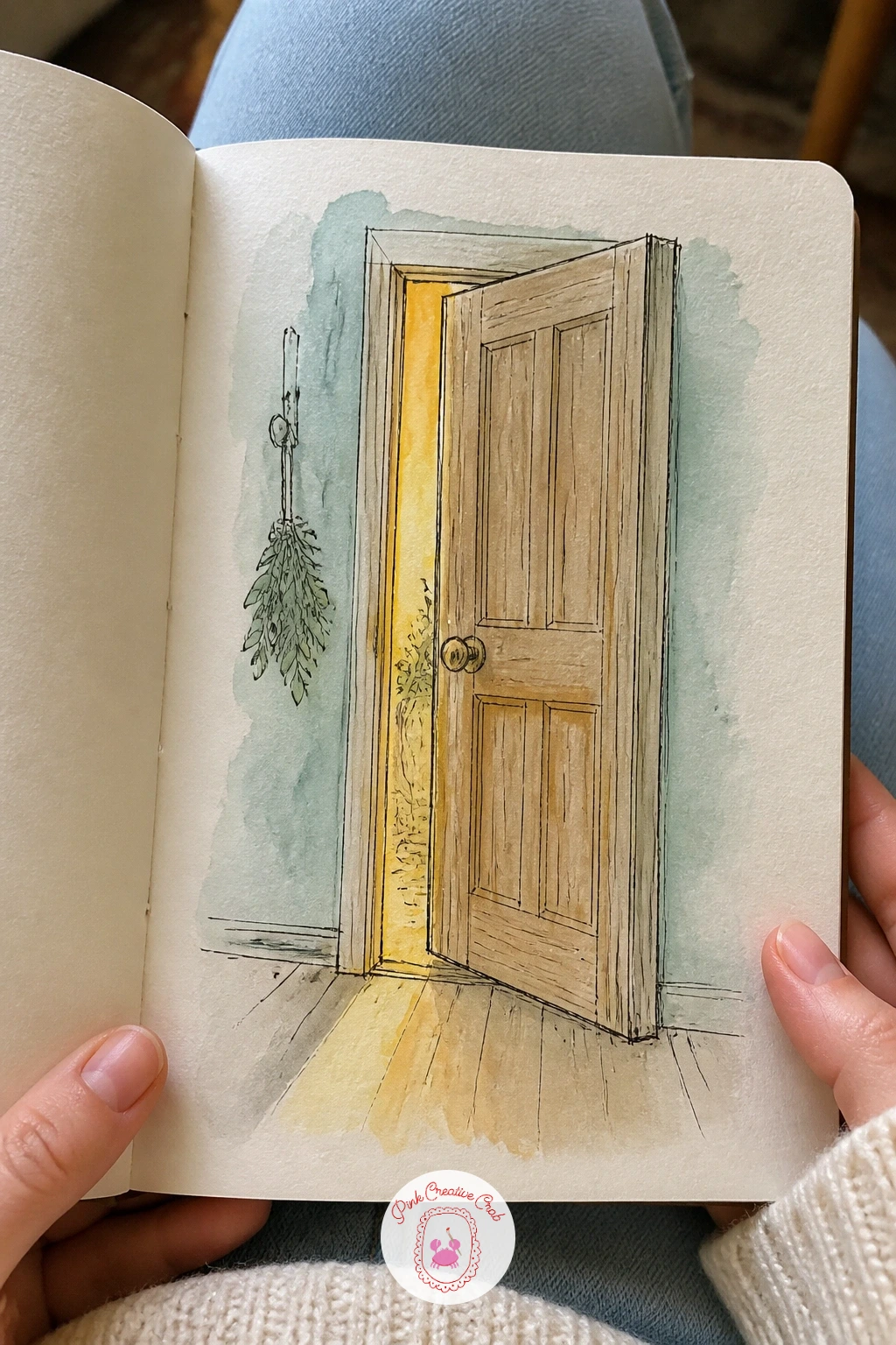
Palette: Honey Gold,Soft Teal,Cream
Fill a page of favorite things once the welcome page sets the mood, a cheerful collection of small objects that say something about you. Sketch five or six items scattered across the page in pencil first: a mug, a book, a flower, headphones, whatever feels true, leaving breathing room between each one so the page does not feel crowded.
Ink each object in fineliner, working one at a time rather than outlining everything before adding any detail, it keeps the page feeling fresh rather than overworked. If an object comes out lopsided, a few extra confident lines around it usually blend the mistake into the style rather than fixing it outright.
Color each item in its true color with a light watercolor wash, saving the smallest object for a bold marker accent so one thing pops. Swap watercolor for colored pencil if you prefer tighter control over small shapes like a necklace or a pair of glasses.
Group the objects loosely by color rather than by type, it makes the whole page read more like a pleasing collage.
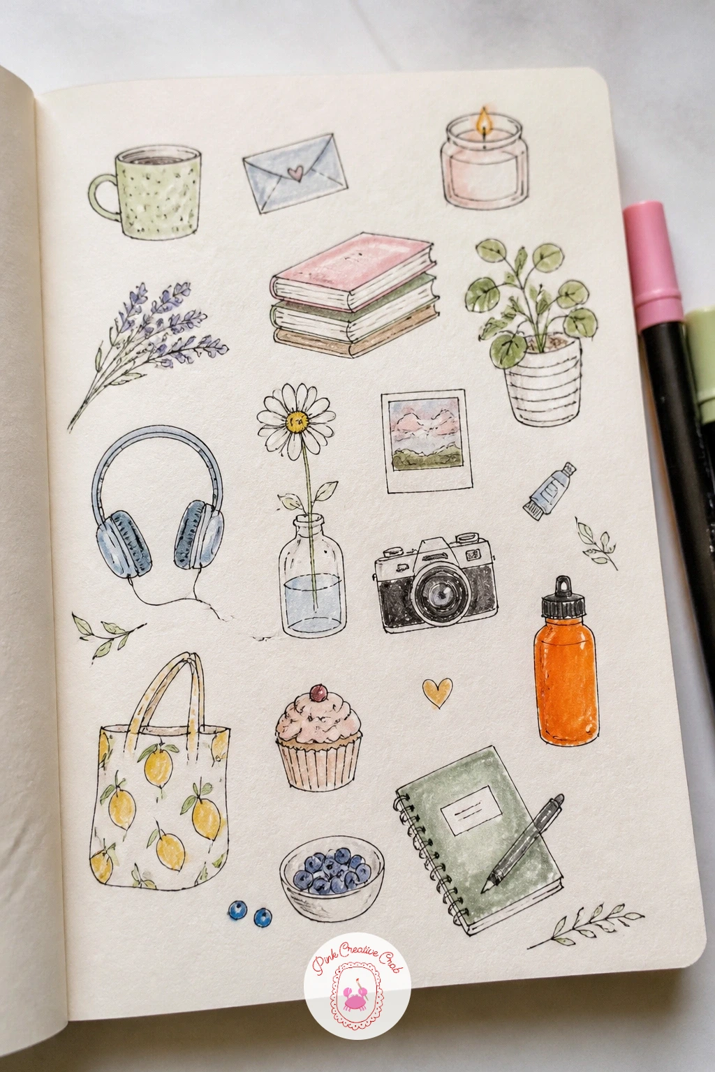
Palette: Rose Pink,Butter Yellow,Lilac,Mint Green
If you share your home with a cat, a self portrait with a cat makes a warmer opening page than a solo portrait alone. Sketch yourself first in a simple seated pose, pencil in loose shapes for the body before adding the face, then add the cat curled in your lap or against your shoulder, whichever pose you actually sit in together.
Where this idea usually goes wrong is scale: a cat drawn too small looks like a toy, so compare the cat’s head size to your own hand in the drawing before inking, it should feel close to that. Ink the figure first in fineliner, then the cat, using shorter choppy lines for its fur texture versus smoother lines for your clothing.
Watercolor your clothing in one flat color and the cat in its real coloring, leaving small white gaps unpainted along the cat’s back for a furry highlight. No cat at home? A favorite stuffed animal or a neighborhood cat you admire works just as well here.
Keep the cat’s eyes as two simple almond shapes, it reads as content and sleepy rather than startled.
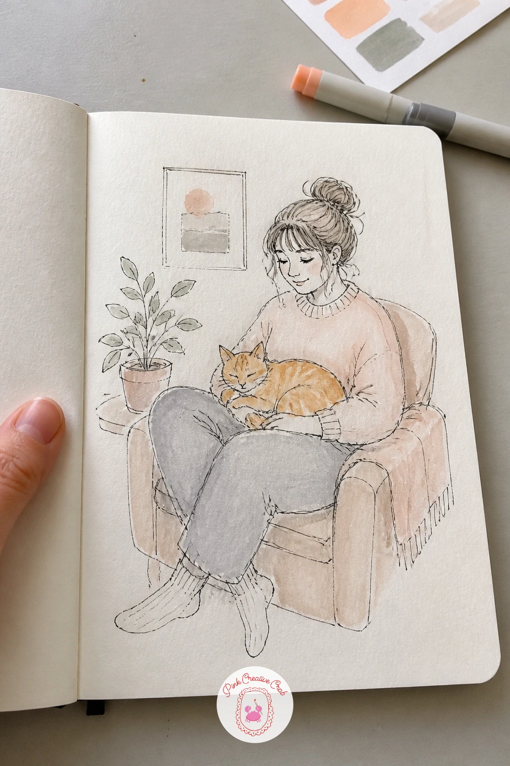
Palette: Warm Grey,Burnt Orange,Soft Peach
Every new pen deserves a pen test page before it goes near a real drawing, and this page can look just as charming as any other. Draw a loose grid of small boxes in pencil, then fill each one with a different doodle: a star, a wavy line, a tiny flower, a cross hatch pattern, testing a different pen or nib in each box.
This is the natural place for a ten minute versus forty minute split: the quick version is just scribbled lines and dots to check ink flow, while the longer sitting turns each test box into a tiny finished doodle worth keeping. Either way works as a genuine first page.
Label each box with the pen name in small letters underneath so you remember which pen made which mark later, this becomes surprisingly useful once you own more than a few. If a pen bleeds or skips, note that directly under the swatch instead of starting over.
Add one swatch of watercolor over a few of the ink tests too, it shows you instantly which pens are waterproof and which ones smear.
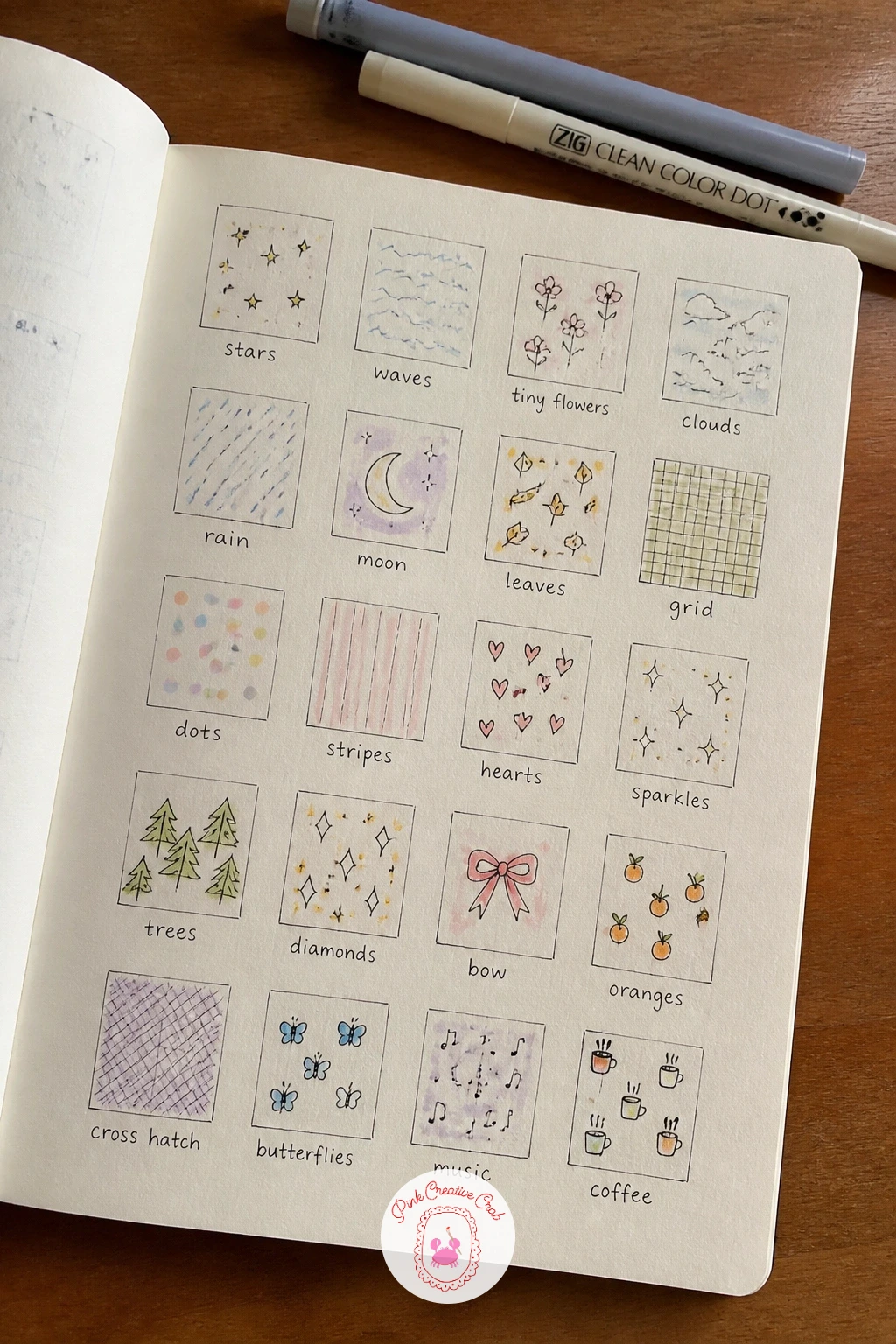
Palette: Charcoal Grey,Coral,Sky Blue
Keep this page near the front of the book permanently, it becomes a handy pen reference you will actually reopen every time you buy a new one.
A quote page with flowers gives the sketchbook a line to return to on harder days. Pencil your chosen words first in light guideline rows so the lettering stays level across the page, then ink the letters in fineliner, varying the thickness by going over main strokes twice for a bolder look.
Surround the words with a loose wreath of flowers rather than a tidy border, small five petal blooms and simple leaf shapes are forgiving to repeat around an awkward page edge. Where this idea usually goes wrong is cramming too many words onto one line, so if your quote is long, break it across three or four shorter lines instead of one.
Watercolor the flowers in two or three repeating colors so the wreath feels unified rather than busy, leaving the lettering itself black and white for contrast. No quote in mind yet? A single word like “begin” or “breathe” works beautifully here too.
Keep the leaves a single consistent green across the whole wreath, it is the detail that makes scattered flowers read as one design.
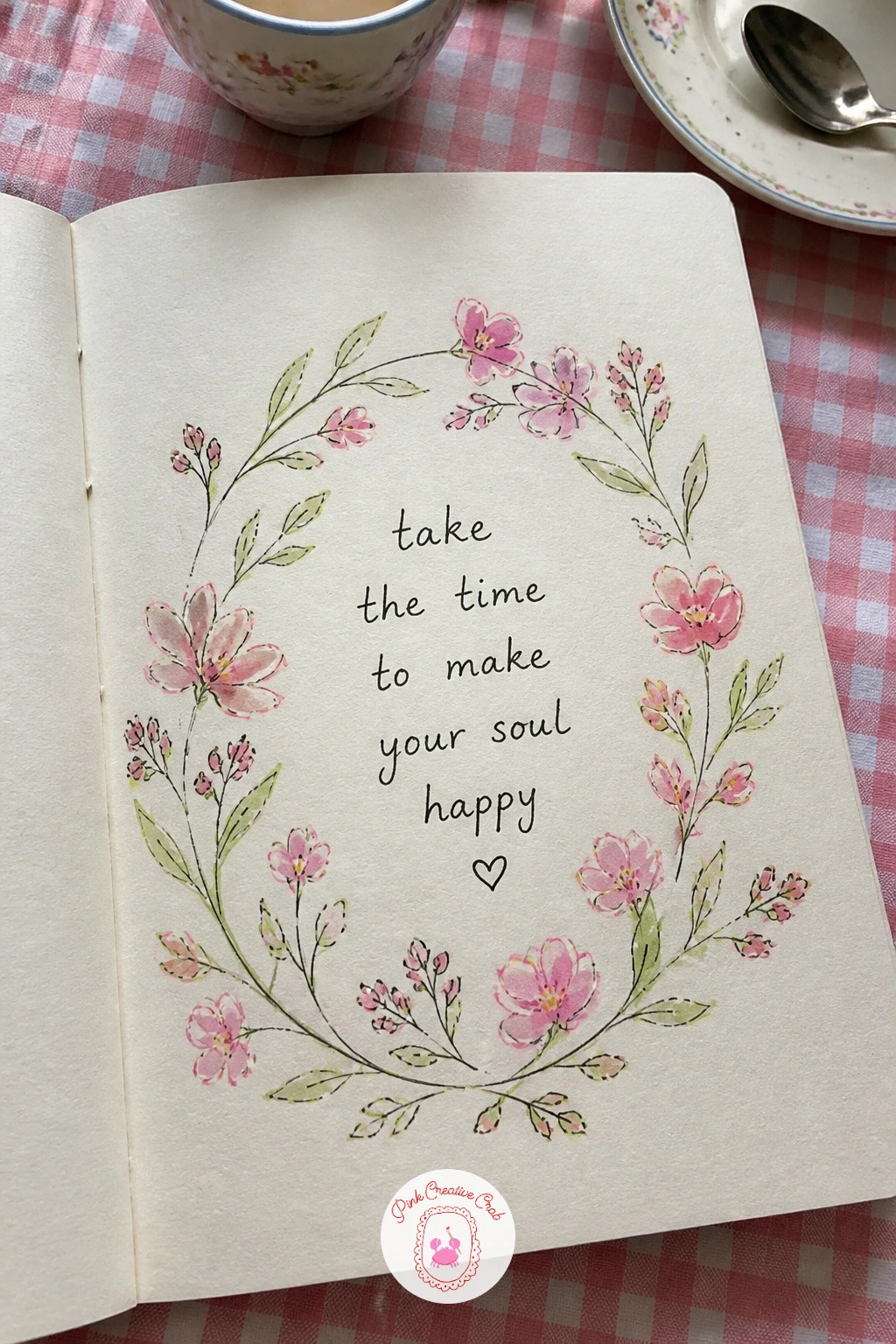
Palette: Rose Pink,Sap Green,Soft Gold
Build a mood board of colors to set the emotional tone for everything that follows in the book. Tear or sketch a handful of irregular shapes across the page, overlapping loosely like paper scraps, rather than a neat grid this time, it should feel more like a collage than a chart.
Fill each shape with a different color that matches the mood you want this sketchbook to carry: calm blues and greens, or warm cheerful oranges and pinks, whichever pulls you in right now. Layer two colors directly next to each other where the shapes touch to see how they sit together before committing to a full palette elsewhere in the book.
Add a few small torn-paper-style edges in fineliner along each shape’s border to reinforce the collage feeling, uneven zigzag lines work better here than straight ones. If your watercolors run low on a color you love, a marker scribbled loosely underneath a thin wash gets you close enough.
Revisit this page later and circle whichever colors you actually used most, it tells you a lot about your real preferences.
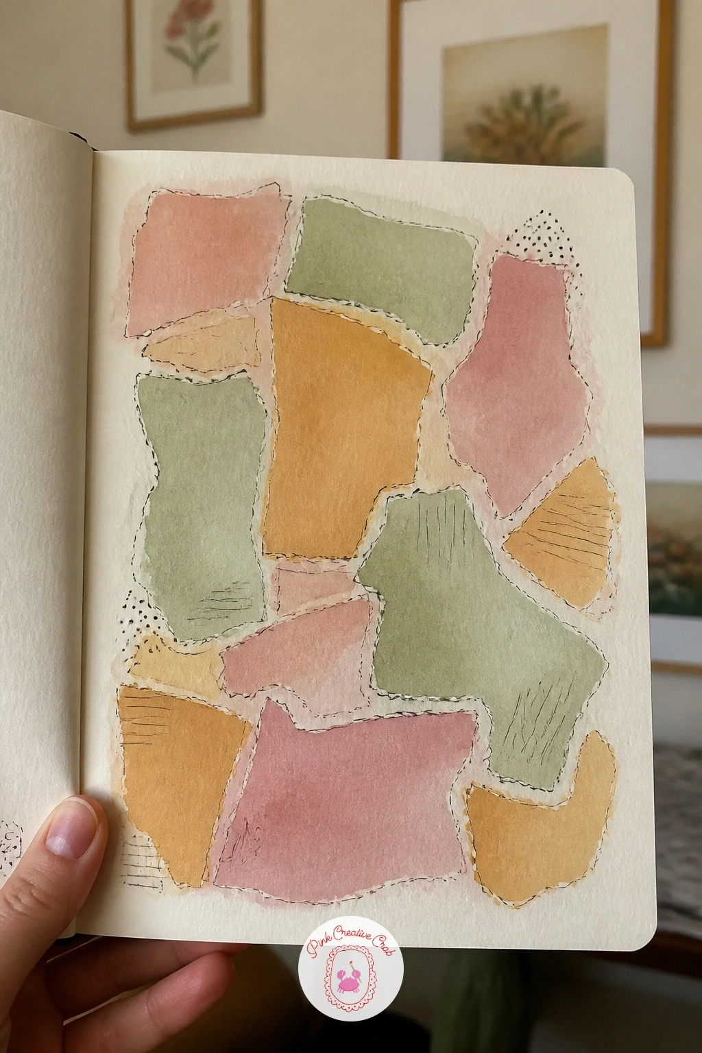
Palette: Dusty Rose,Ochre,Sage Green,Denim Blue
Follow the mood board with a page of what I love drawing, a small gallery of the subjects you reach for again and again. Sketch four or five tiny scenes across the page in pencil: a flower, a cup, a cat, a landscape, each one small enough to finish in just a few minutes. Think of it as a sampler rather than one finished drawing.
Ink each miniature in fineliner before moving to the next, keeping the linework loose and quick rather than labored, since the charm here comes from variety, not polish. If one small drawing goes wrong, simply draw a neat box around it like a stamp or label, it turns a mistake into part of the design.
Watercolor each miniature lightly, letting the colors differ from one to the next so the page reads as a patchwork of interests. Colored pencil works just as well if watercolor feels slow for this many small shapes.
Leave a little space to add more tiny drawings later, this page tends to grow new favorites over the months.
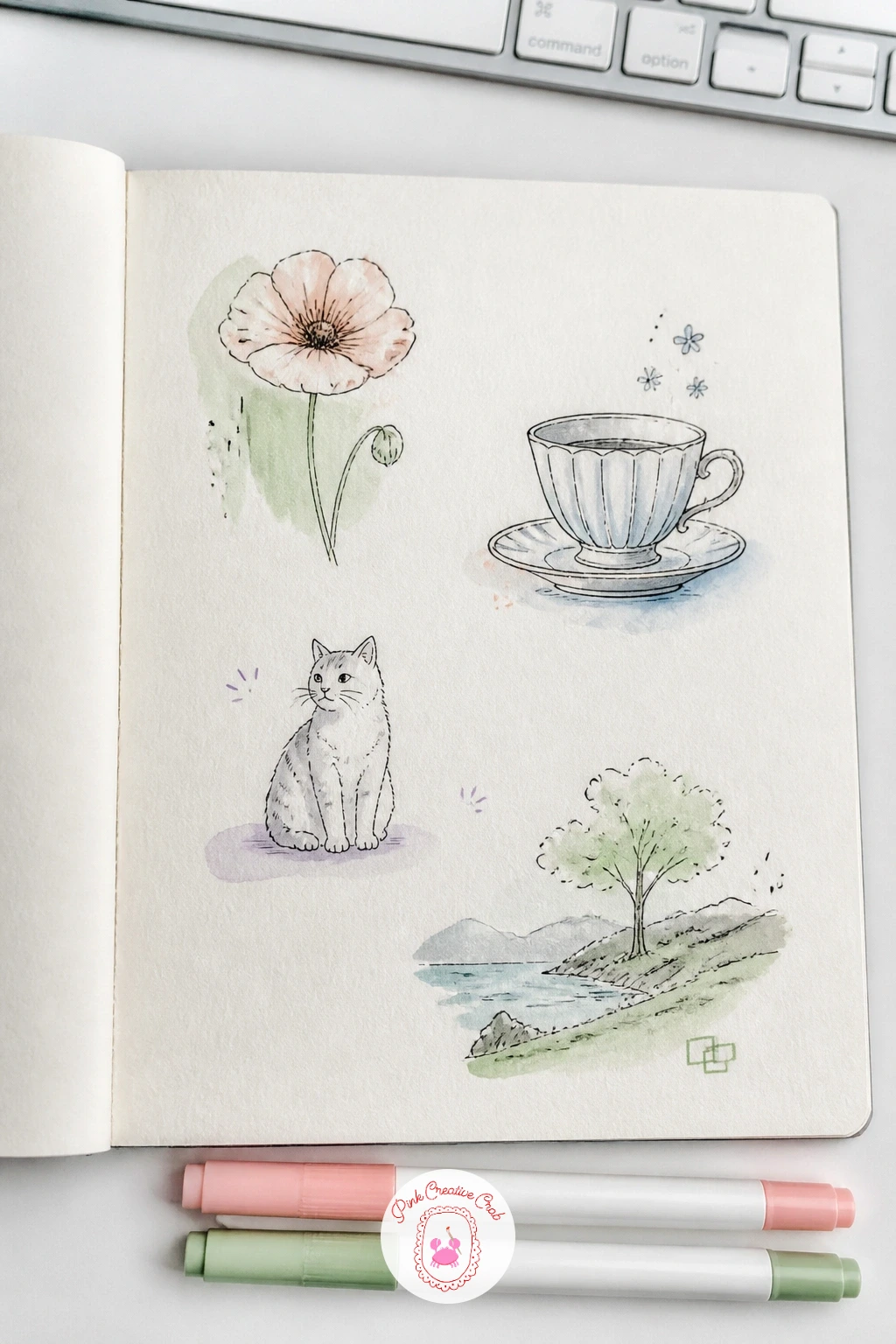
Palette: Coral,Sap Green,Soft Blue,Lilac
Sketch a map of the year ahead as a small imaginary landscape standing in for the months to come. Divide the page loosely into twelve small regions with winding borders, like a fantasy map, rather than a straight grid, and label each region with a month. Keep the regions roughly similar in size by lightly sketching a faint pencil grid underneath first, then drawing the wobbly borders on top of it.
Add a tiny symbol in each region for something you are looking forward to that month: a snowflake, a flower, a suitcase, a birthday cake. Ink the borders and symbols in fineliner, then add a compass rose or small title like “this year” in one corner for a finishing touch.
Watercolor each region in a color that matches its season, cool blues toward winter months and warm yellows toward summer, which gives the whole map a visual rhythm even before anyone reads the labels.
One concrete tip: leave one region blank and unlabeled, it gives you somewhere to add a surprise later in the year.
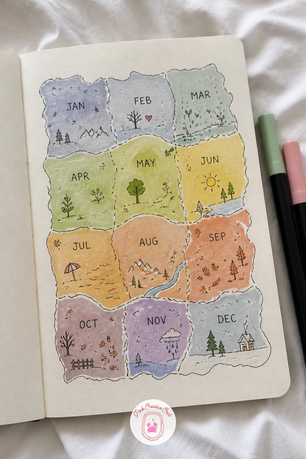
Palette: Winter Blue,Spring Green,Summer Yellow,Autumn Orange
A hello page with a big drawn word makes a confident, simple opener when you want something fast. Sketch the word “hello” large across the page in pencil first, blocking each letter as a bubble shape rather than a thin line, this is the easiest lettering style to fill with color evenly.
Check the letter spacing before inking by stepping back or holding the page at arm’s length, uneven gaps between letters are the most common issue here and are easy to fix at pencil stage. Outline the bubble letters in fineliner once you are happy, then fill the background around the word with small doodles: dots, stars, little leaves, whatever suits your mood.
Watercolor each letter a different color from a cheerful palette, or paint them all one color and let the background doodles carry the variety instead. If bubble letters feel tricky, plain thick marker lettering is a perfectly good swap and takes half the time.
Keep the background doodles small and evenly spread so the big word stays the clear focus of the page.
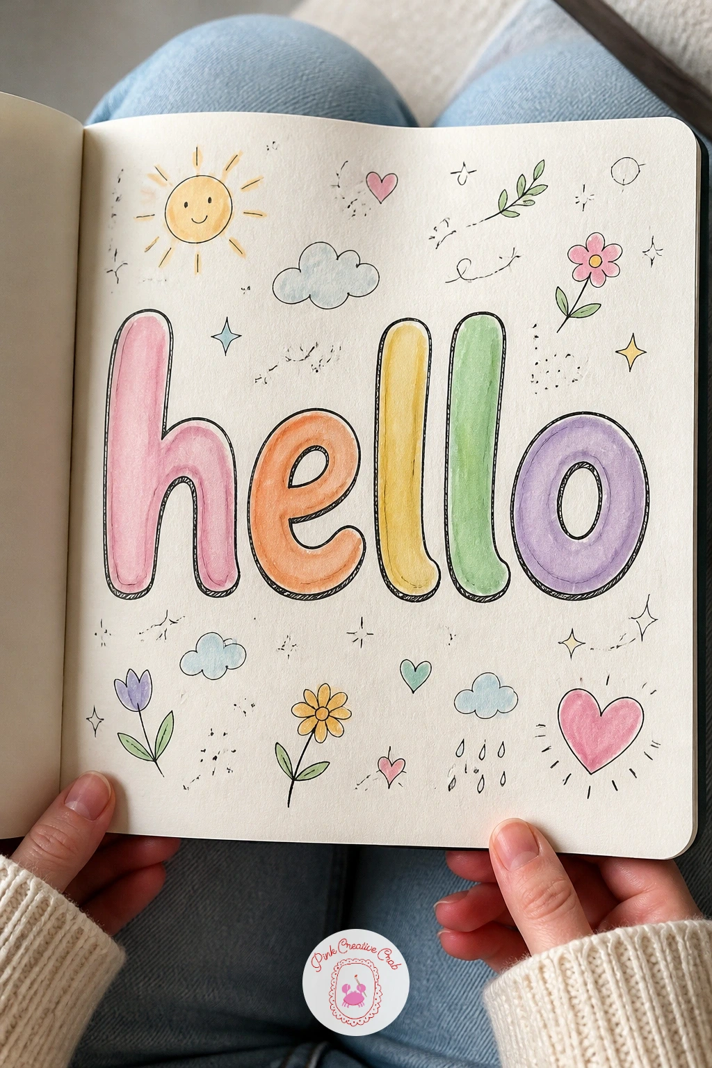
Palette: Coral,Butter Yellow,Sky Blue,Rose Pink
Mark the actual day you began with a page of coffee and the date, a small diary-style entry rather than a big illustration. Draw a simple mug from a slightly angled view, steam rising in a few curved fineliner lines, and the date written beside it in your own handwriting, large enough to notice when you flip back later.
Where this idea usually goes wrong is drawing the mug too narrow, which makes it look like a vase rather than a cup, so widen the opening more than feels natural and it will read correctly. Add a small saucer or a coaster underneath for the mug to sit on, grounding it on the page.
Watercolor the mug in one solid color and leave a crisp white highlight unpainted along one edge where the light would catch it. If coffee is not your drink, swap in tea, cocoa or juice, the same simple shape works for any cup.
Jot one honest line about how you feel starting this book, right next to the date, it is a nice thing to read again months from now.
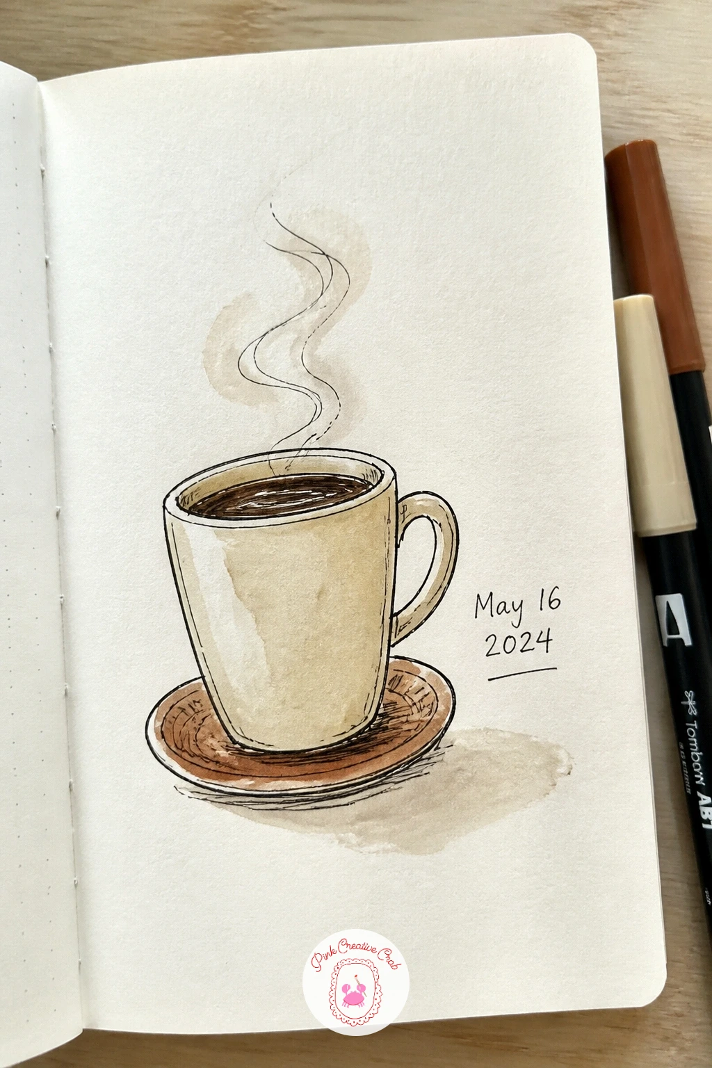
Palette: Coffee Brown,Cream,Terracotta
Give a full page of my pets to every animal in your household, a natural follow up if the cat portrait already won you over. Sketch each pet in a simple characteristic pose: curled asleep, sitting alert, mid stretch, keeping each drawing small enough to finish in a few minutes rather than attempting one large detailed portrait.
Compare the relative sizes of your pets to each other before inking, a dog drawn the same size as a hamster looks like a mistake rather than a style choice, so sketch the smallest pet first and size the others against it. Ink each animal in fineliner with quick short strokes for fur texture, saving long smooth lines for sleek-coated pets.
Watercolor each animal in its real coloring, leaving small unpainted highlights along the back and ears for a soft furry look. If you have no pets of your own, a childhood pet from memory or a friend’s dog works just as well for this page.
Add each pet’s name in small handwriting beneath its drawing to finish the page.
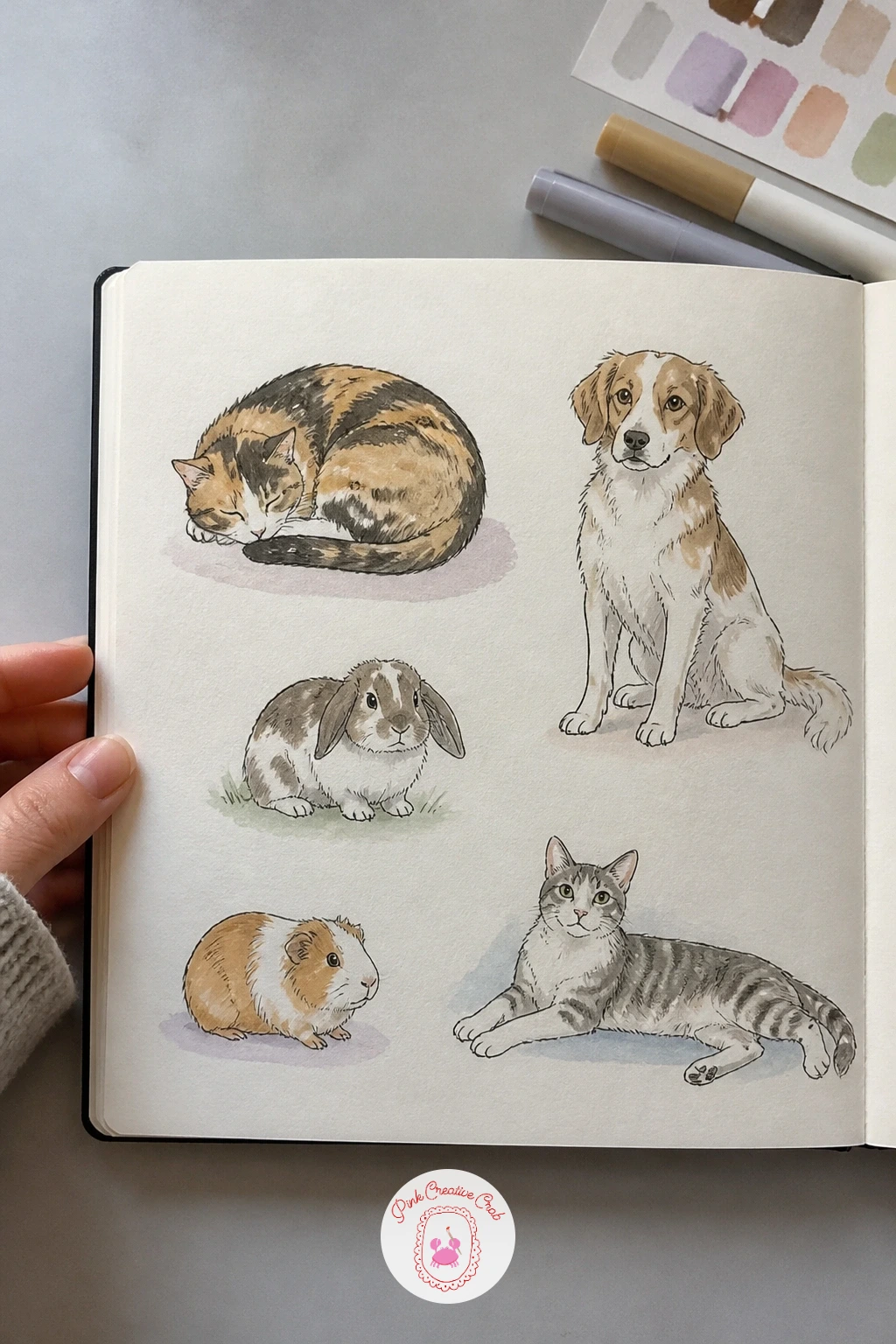
Palette: Warm Grey,Burnt Orange,Soft Brown
For more animal pages once this one is finished, this collection of cute animal sketching ideas for beginners keeps the same relaxed, forgiving approach.
Draw a page with pressed flowers if you want something quieter and more botanical as your opener. Rather than actually pressing real flowers, sketch them as if pressed: flattened petals, slightly overlapping, laid out in a loose arrangement across the page in pencil first. Flattened shapes are more forgiving than three-dimensional blooms, which makes this a gentle choice if florals usually intimidate you.
Ink the outline of each flower and leaf in fineliner with thin, delicate lines rather than bold ones, pressed botanicals read as fragile on paper. Where beginners often struggle is making every petal identical, so vary the sizes slightly and let a few overlap naturally, it looks more like a real pressed specimen.
Watercolor each flower in pale, slightly faded tones rather than saturated color, true to how pressed flowers actually look, and leave the background paper white around them. If you prefer bolder color, keep just one flower in full saturation as a focal point and fade the rest.
Label each flower’s name in small handwriting beside it, like a specimen page in an old field guide.
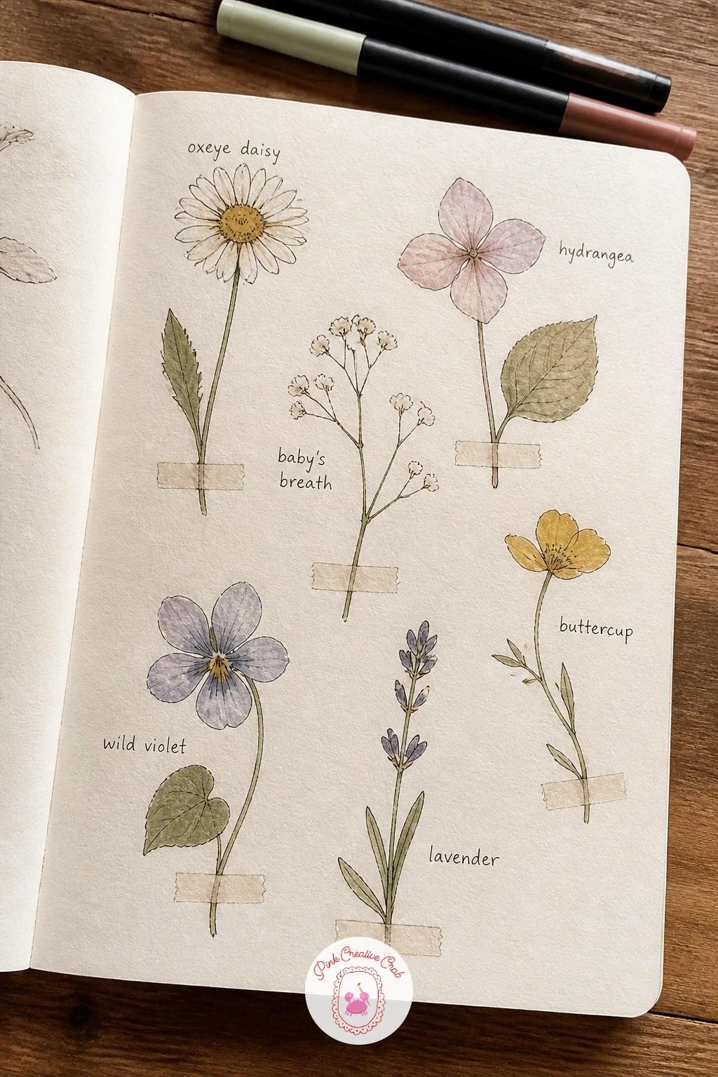
Palette: Faded Lavender,Dusty Pink,Sage Green
Document a page of my art supplies early on, it doubles as both a fun drawing exercise and a record of what you own right now. Arrange your actual pencils, brushes and paints on the desk in front of you, then sketch them from observation, overlapping a few items for a natural still life feel rather than lining them up stiffly.
Eye level matters here: looking down at the supplies from directly above flattens them into simple shapes, which is the easier angle for a first attempt, while a side-on view shows more of each object’s length and takes more care with proportion. Pick whichever matches your confidence today.
Ink each object in fineliner, then watercolor the handles and caps in their true colors, leaving metal clips or brush ferrules as a light grey wash. If your supplies are still arriving or incomplete, draw the ones you have plus a couple you are hoping to add later, labeled as a small wish list.
Keep the arrangement a little overlapping and casual rather than a tidy flat lay, it feels more like a true desk moment.
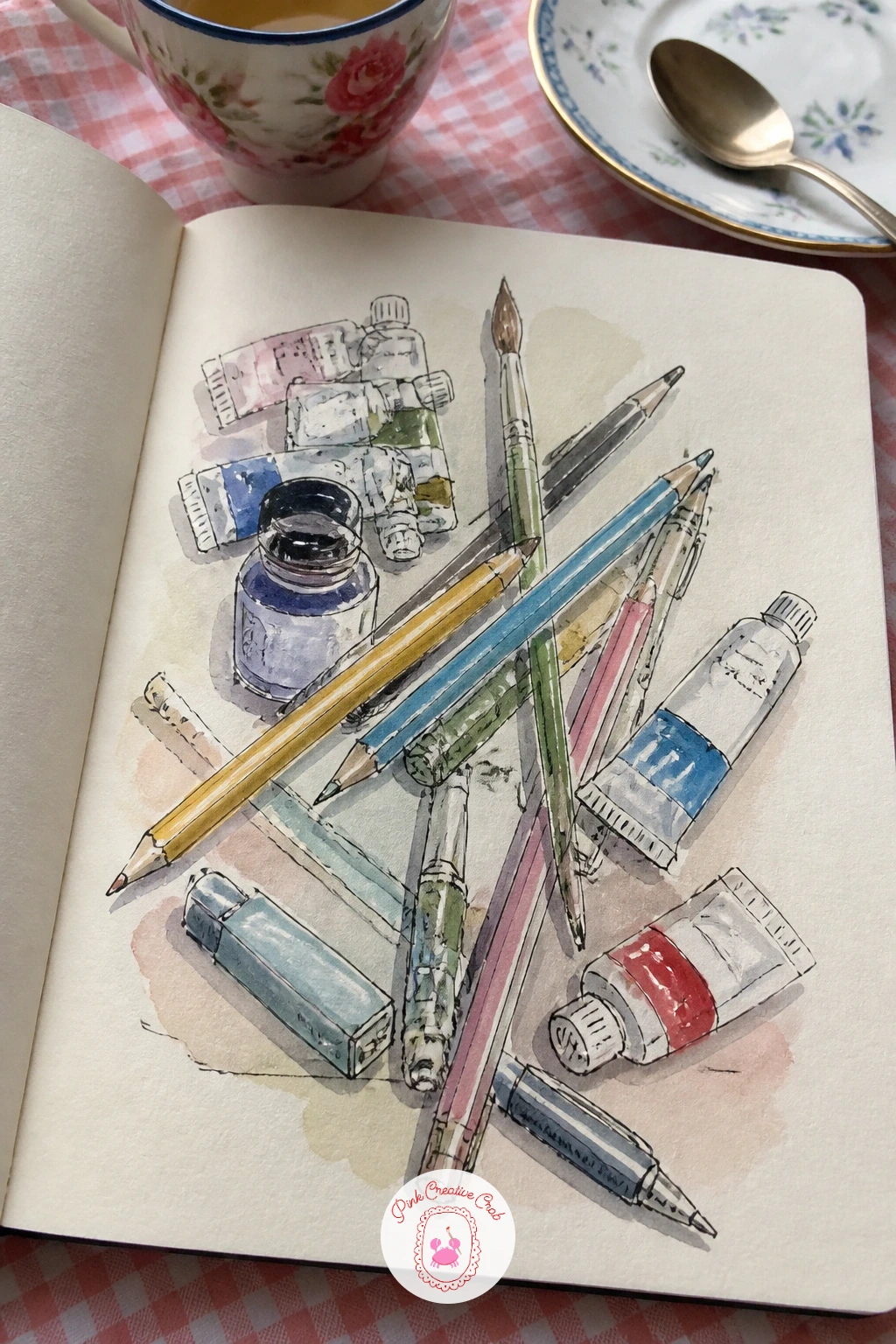
Palette: Charcoal Grey,Coral,Sap Green,Soft Blue
Give yourself a page of small warmups before anything else, a loose scattering of quick shapes and marks rather than one subject. Fill the page with a dozen tiny exercises: circles, spirals, cross hatching, a few quick leaves, straight line practice, each one taking under a minute so the whole page stays playful rather than precious.
The quick ten minute version is exactly this, a page of unconnected marks with no pressure to make anything pretty. Given forty minutes instead, turn a few of the stronger warmups into tiny finished doodles, a spiral that becomes a snail, a few lines that become a simple leaf, building the page in layers as your hand loosens up.
Vary your pen pressure across the exercises, pressing harder for bold thick marks and lighter for delicate ones, it is good practice and makes the page visually interesting on its own. No fineliner yet? A regular ballpoint pen does this exercise just as well.
Keep this page completely unpolished on purpose, it sets a tone of permission for the rest of the sketchbook.
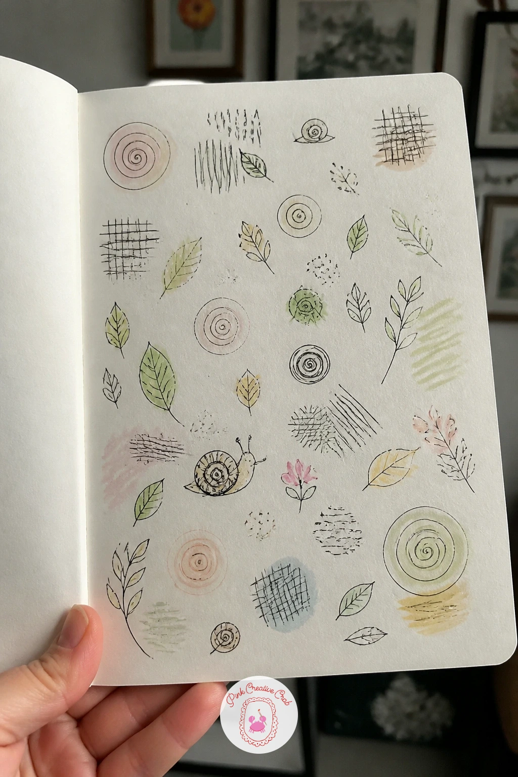
Palette: Charcoal Grey,Coral,Soft Blue
Draw a page with a window looking into the book as a quiet visual metaphor for beginning. Sketch a simple window frame, divided into four panes with a central cross bar, taking up most of the page. Keep the frame’s verticals and horizontals straight by using the edge of a ruler or the spine of another book pressed against the paper.
Through the window glass, draw a small scene suggesting what is ahead: a path, a garden, a sunrise, anything that feels like a beginning. Ink the window frame with slightly heavier lines than the scene inside it, the contrast in line weight is what makes the glass read as a separate layer from the view beyond.
Watercolor the view inside the panes in soft, slightly blurred color to suggest glass, while keeping the frame itself crisp white or a plain wood tone. If straight lines are tricky freehand, a torn strip of paper makes an easy improvised ruler.
Add a small windowsill detail, a plant or a candle, along the bottom edge to finish the page.
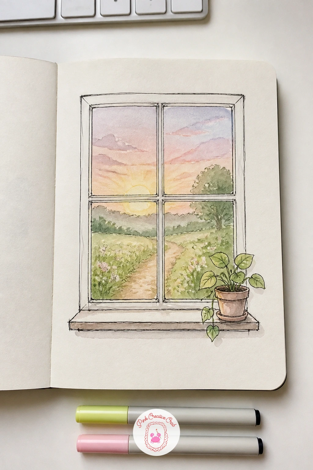
You Will Need
- ruler or straight edge
Palette: Sky Blue,Warm Wood Brown,Sap Green
A page of favorite foods makes an easy, appetizing follow up once the window page is done. Sketch four or five small food items scattered across the page: a slice of cake, a bowl of noodles, a piece of fruit, a cup of tea, each drawn small and simple rather than overly detailed.
Compare each food item’s size against a common object you draw well, like your coffee mug from earlier in the book, to keep the scale believable across the page. Ink each item in fineliner, then watercolor it in its true color, letting a little white paper show through as texture or steam where it suits the food.
Where beginners most often go wrong here is overworking the shading on a single item, so use dry brush strokes with very little water loaded on the brush for things like toast or baked goods, it gives a rough textured look without extra fuss. Colored pencil is a good swap if watercolor pools too much on smaller shapes.
Group the foods loosely by meal or by color to keep the composition feeling natural rather than scattered at random.
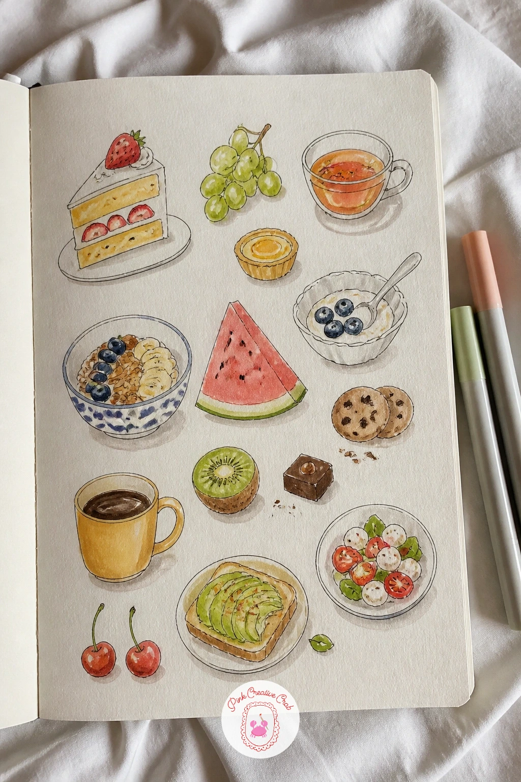
Palette: Terracotta,Butter Yellow,Sap Green,Cherry Red
Fill a page of travel dreams next, a small collage of places you would love to visit someday. Sketch a handful of tiny icons across the page: a mountain, a palm tree, a small landmark, a suitcase, each one simplified down to its most recognizable shape rather than drawn in full detail.
Where this idea can go wrong is picking landmarks that are too complex to simplify in a few lines, so choose the most iconic silhouette of each place, a single tower shape or a simple mountain outline reads clearly even at a tiny size. Ink each icon in fineliner, then arrange them loosely across the page connected by a thin dotted line, like a travel route.
Watercolor each icon in colors that suit its real setting, warm sandy tones for deserts, cool blues for coastlines. If you are unsure which places to include, flip through travel photos or postcards for reference rather than inventing an landmark from memory.
Leave one blank space on the route marked with a question mark, for the destination you have not decided on yet.
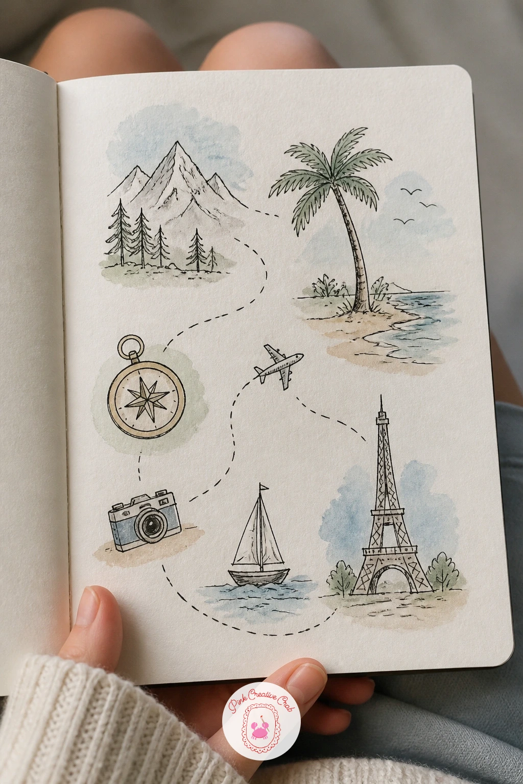
Palette: Ocean Blue,Sandy Tan,Palm Green
If travel themes appeal, the loose carnival energy in colorful sketchbook ideas from the circus, the carousel and the night fair is a fun next page to try.
Sketch a page with a growing plant as a quiet, hopeful image for a new book. Draw a small pot at the base of the page first, then build the plant upward from it, a simple stem with a few leaves branching off at alternating heights rather than symmetrically opposite each other, which looks more natural.
Light matters here: decide where an imaginary light source sits, usually above and to one side, then leave that side of each leaf a shade lighter in your watercolor wash and the opposite edge slightly deeper. This small shift gives the leaves real form without any extra linework.
Ink the stem and leaf outlines in fineliner first, keeping leaf edges slightly uneven rather than perfectly smooth, real leaves rarely are. Watercolor the pot in a solid warm color and the leaves in two or three greens varied by the light direction you chose.
No real plant for reference? A simple pothos or succulent shape, searched quickly online, gives you an easy leaf form to copy.
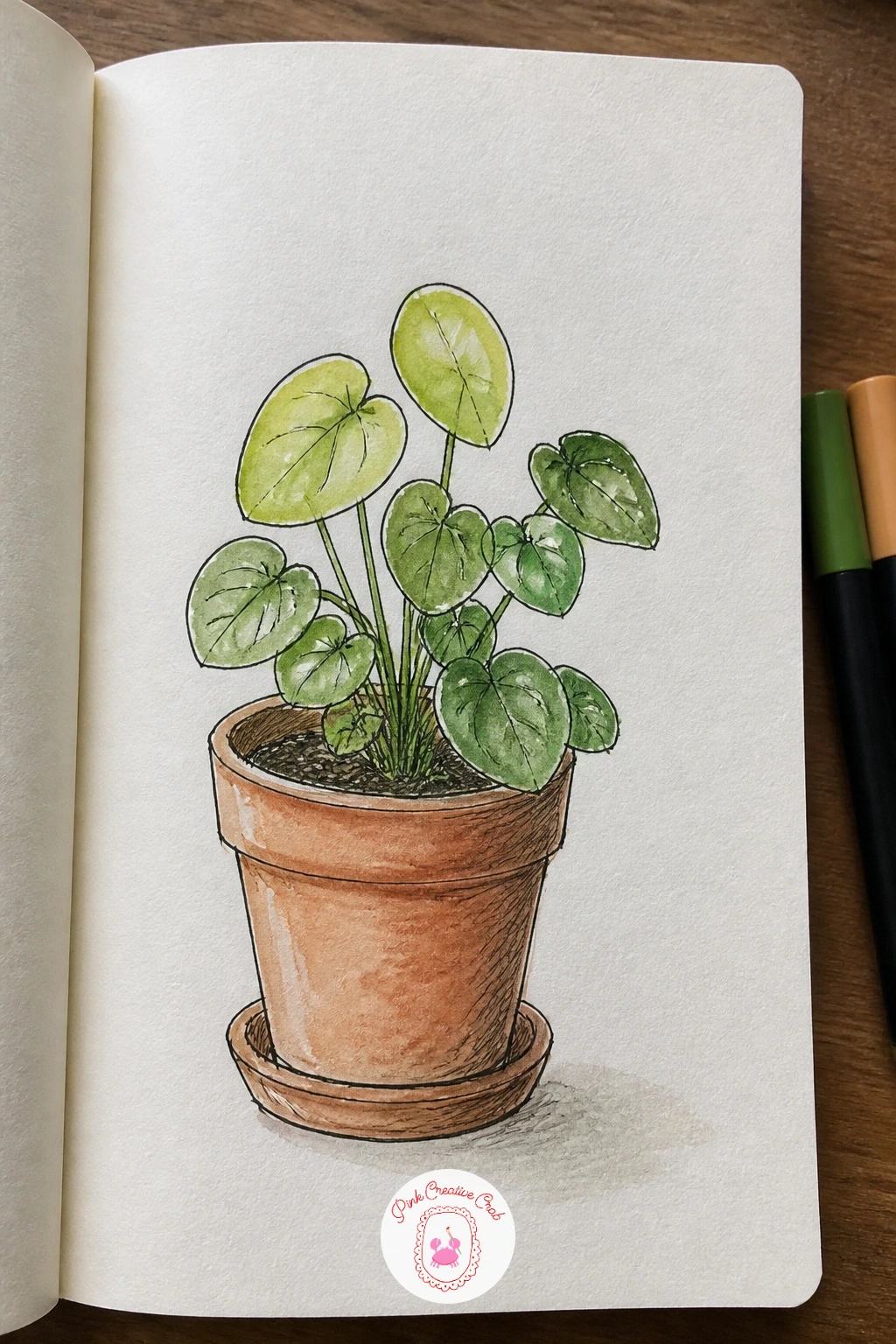
Palette: Terracotta,Sap Green,Olive Green
Sketch a page of my room to capture where this sketchbook actually lives day to day. Sit where you usually draw and sketch the view in front of you: a desk, a window, a shelf, simplifying the furniture into basic rectangles and ovals before adding any detail.
Choose a single eye level and stick to it across the whole page, usually seated height looking slightly across the room rather than down, since mixing eye levels is the most common reason a room sketch looks tilted or wrong. Lightly sketch a horizon line in pencil at that eye level to keep every piece of furniture’s top and bottom edges consistent with it.
Ink the furniture outlines in fineliner, then watercolor the room in a few flat, simple colors rather than trying to capture every pattern or texture on the walls. If your actual room feels too cluttered to draw clearly, simplify it, draw the room as you wish it looked rather than exactly as it is.
Add one small personal object on the desk, a mug or a plant, to anchor the sketch as truly yours.
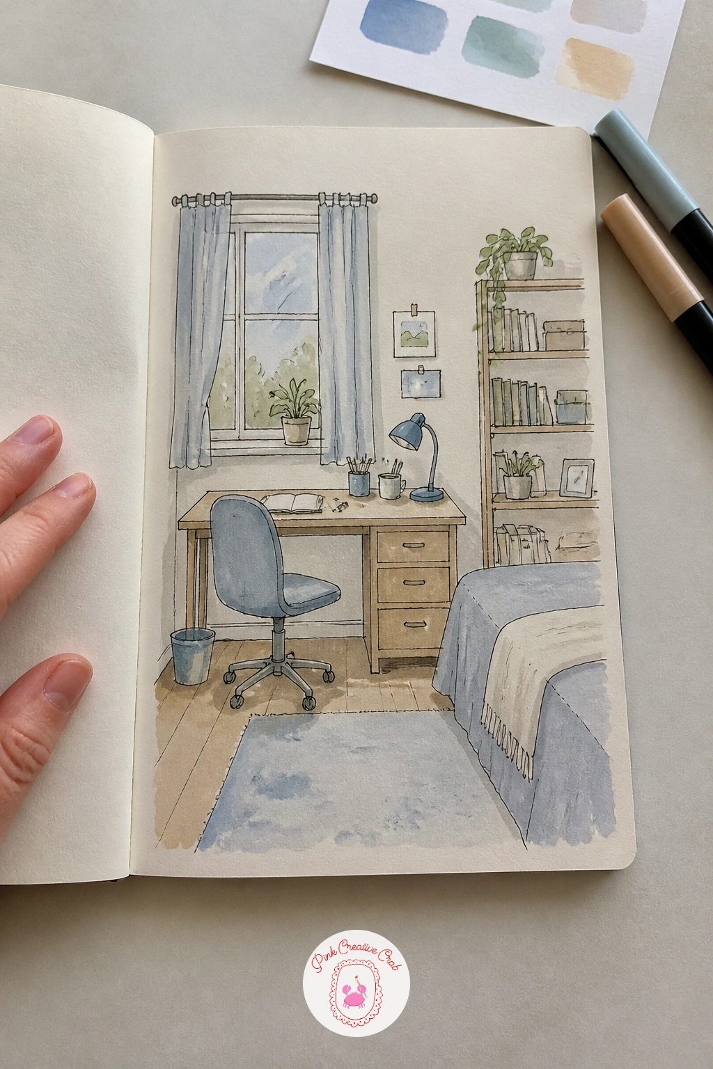
Palette: Warm Wood Brown,Soft Blue,Cream
If you enjoy sketching interiors, interior design sketchbook ideas for rooms you want to live in has more spaces worth drawing this way.
Trace a page with handprints for something playful and personal that takes almost no drawing skill at all. Place your hand flat on the page and trace lightly around it in pencil, then lift your hand and go over the outline in fineliner, adding tiny details inside the shape instead of leaving it blank: a small flower on each fingertip, a word written across the palm, a tiny scene.
Trace both hands at slightly different angles rather than identical, it keeps the page feeling natural rather than stamped. Where this can look flat is if every finger is colored the same solid block, so vary the watercolor across each finger, warmer tones on some, cooler on others.
Watercolor the hand outlines in a light wash and keep the small details inside each finger as the main point of color interest. If tracing your own hand feels awkward to reach around, a child’s handprint or a partner’s works just as well for this page.
Date the page underneath the prints, it becomes a sweet marker of exactly when the sketchbook began.
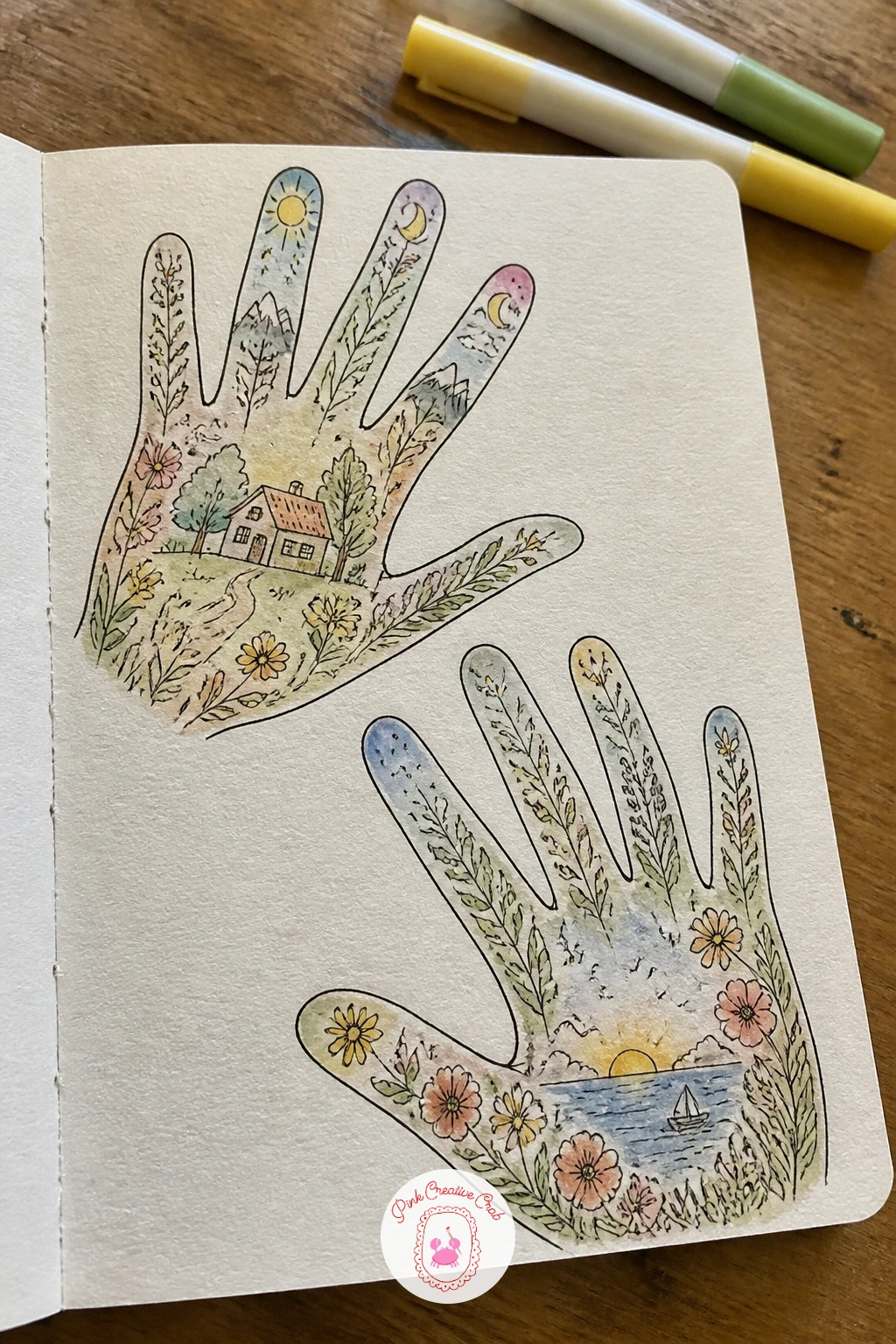
Palette: Rose Pink,Butter Yellow,Sky Blue
Scatter a page of mini doodles across the paper for a loose, cheerful filler page that needs no plan at all. Draw a dozen or more tiny unrelated doodles wherever there is space: a star, a cloud, a flower, a smiling sun, a cup, letting them bump against each other rather than lining up in any order.
Work the whole page in one pass of fineliner first, doodle to doodle, rather than finishing one completely before starting the next, it keeps the energy consistent across the page. Fill any larger gaps that appear with smaller doodles once the first round is done, little dots or dashes work fine as filler too.
Watercolor roughly half the doodles in quick single colors and leave the rest as plain black and white line, the mix of colored and uncolored shapes is what keeps a page like this feeling lively rather than overworked. If you are short on ideas, flip through earlier pages in this list and doodle a tiny version of each.
Keep every doodle under an inch so the page stays full without feeling crowded.
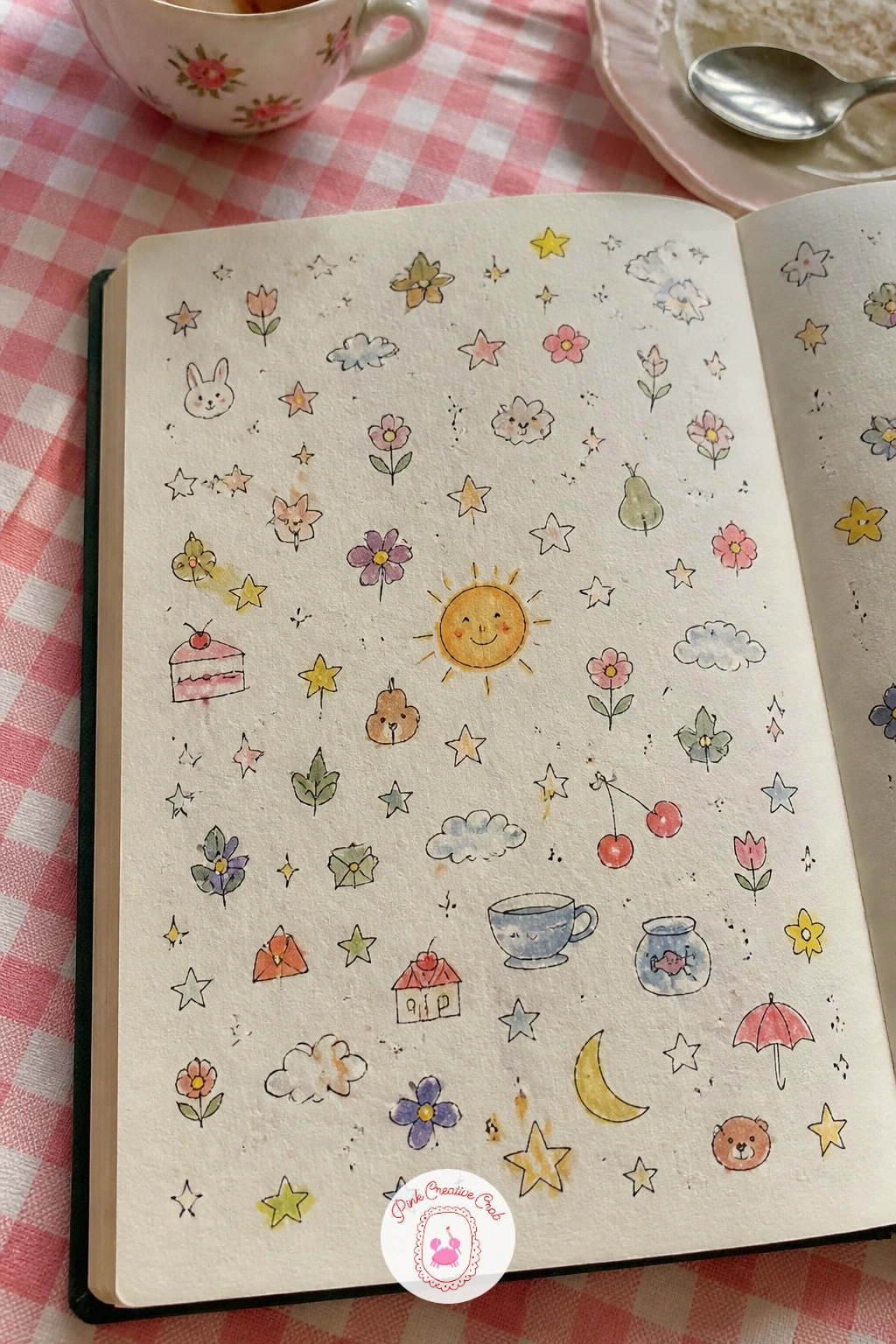
Palette: Coral,Sky Blue,Butter Yellow,Mint Green
For a whole article of this looser doodle style, watercolor doodles for loose, happy sketchbook pages is worth a look.
Write a page with a promise to myself for something quieter and more private among the livelier pages around it. Keep the design simple: a short handwritten sentence in the center of the page, surrounded by a plain border rather than a busy illustration, letting the words carry the page.
Sketch light pencil guidelines first so the sentence sits level and centered, then ink the words in fineliner, pressing a little heavier on the key word in the sentence to give it emphasis without changing the pen. A thin double-ruled border around the whole page, drawn freehand rather than with a ruler for a softer feel, finishes the frame.
Watercolor just the border or just a single small motif in one corner, a star, a tiny flower, a leaf, rather than coloring the whole page, letting the empty space around the words breathe. If lettering by hand feels intimidating, write the promise in pencil first and trace it slowly in ink rather than freehanding it directly.
Revisit this page occasionally through the year, it tends to mean more the second time you read it.
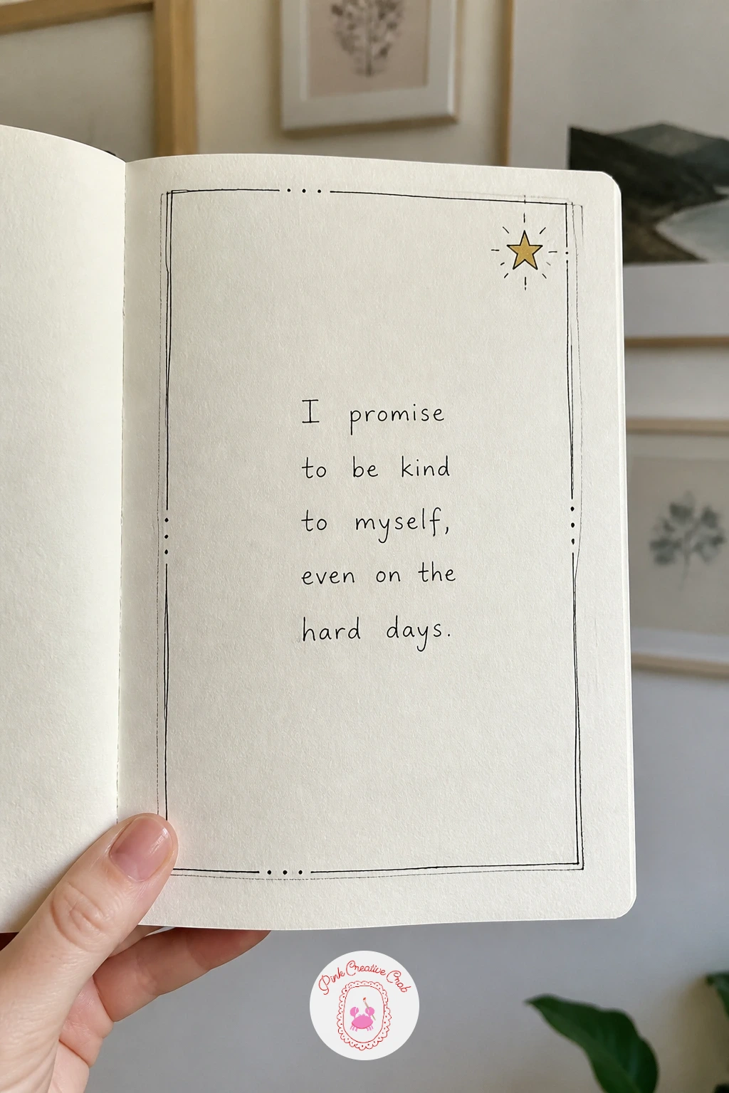
Palette: Dusty Lavender,Soft Gold
Draw a page of season symbols once the quieter promise page is behind you, back to something visual and busy. Divide the page loosely into four sections, one per season, and fill each with two or three small symbols: a snowflake and mitten for winter, a blossom and umbrella for spring, a sun and ice cream for summer, a leaf and pumpkin for autumn.
Keep the symbols within each section roughly the same size as each other so no one season looks more important, a quick visual comparison before inking catches any symbol drawn noticeably larger or smaller than its neighbors. Ink each section in fineliner, then watercolor each in a palette that matches its season: pale blue and white for winter, soft pastels for spring, warm brights for summer, deep oranges for autumn.
Leave thin white gaps between the four sections rather than drawing hard dividing lines, it keeps the page feeling like one connected wheel of the year rather than four separate boxes. If a whole page feels like too much today, three symbols per season is plenty.
This page pairs nicely with the map of the year ahead earlier in the book.
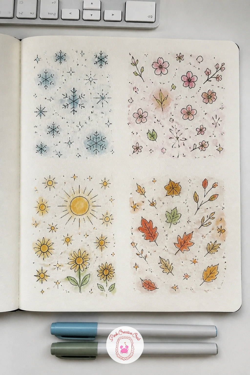
Palette: Winter Blue,Spring Pink,Summer Yellow,Autumn Orange
If autumn imagery especially appeals, autumn sketchbook ideas from apple orchards and muddy walks has a whole set built around that one season alone.
Letter your name in big letters and flowers for a page that feels like a signature piece early in the book. Sketch your name large across the page in pencil using simple block or bubble letters, leaving generous space around each letter for flowers to grow into later.
Vary the letter height very slightly if you want a hand lettered feel rather than a perfectly mechanical one, a tiny bit of rise and fall between letters actually looks more intentional than dead straight text. Ink the letters in fineliner once you are happy with the pencil layout, then draw small flowers and leaves trailing from the top and bottom of a few key letters, as though vines are growing through your name.
Watercolor the letters in one solid color and the flowers in two or three accent colors, keeping the flower palette separate from the letter color so both stay readable against each other. If bubble letters feel difficult, plain thick marker letters with flowers added around the outside work just as well.
Keep the flowers concentrated at the start and end of the name rather than scattered evenly, it frames the word nicely.
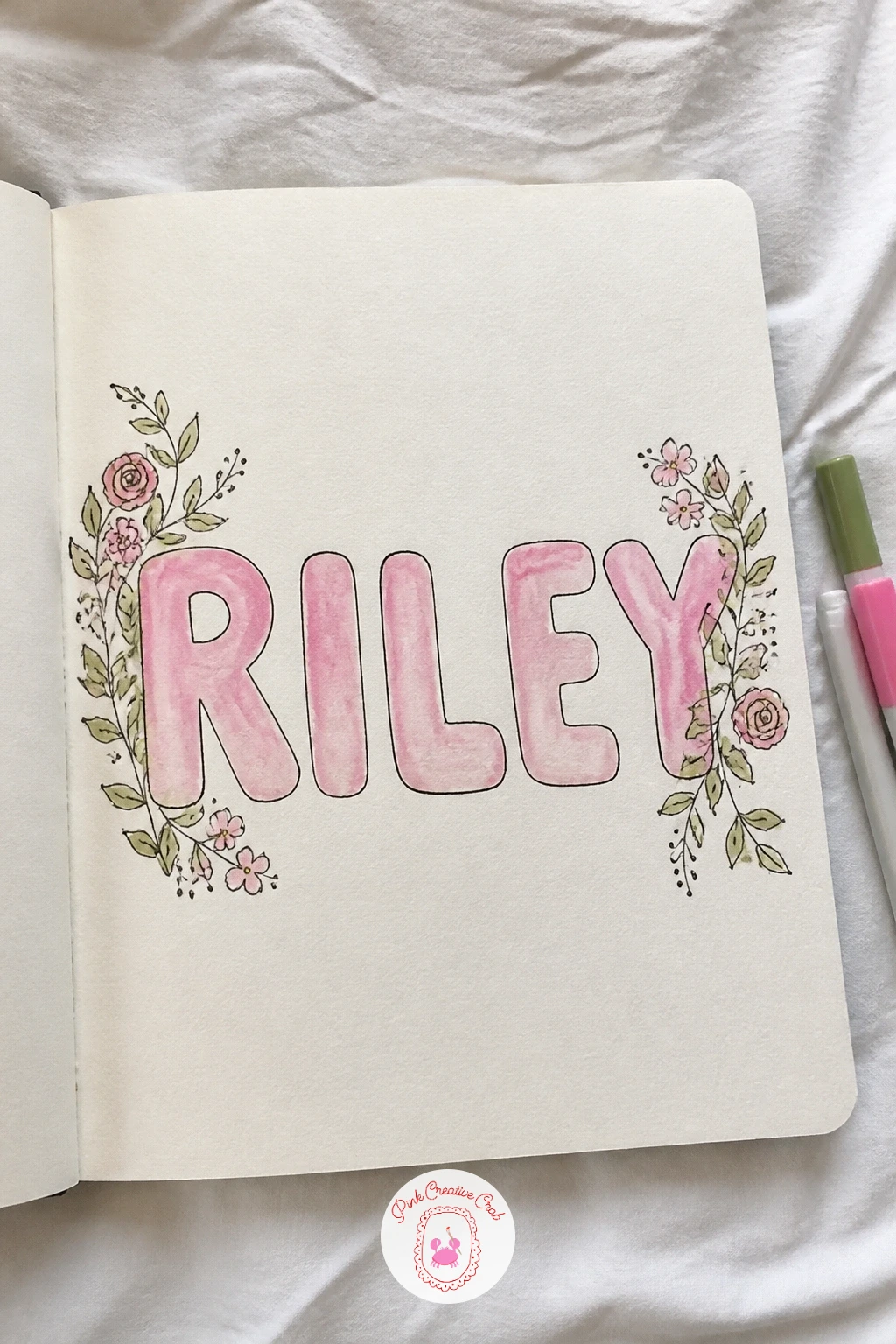
Palette: Dusty Rose,Sap Green,Soft Gold
Arrange a page of colors I love in circles once the lettering page is finished, a simpler companion to the earlier swatch grid. Draw a scattering of circles across the page in varied sizes, some overlapping slightly, using a coin, cap or anything round to trace a few for clean edges if freehand circles wobble too much.
Fill each circle with one favorite color, working from largest to smallest so the composition balances naturally as you go. Where overlapping circles meet, let the colors blend slightly wet into wet for a soft transition rather than a hard line, this is the one hands-on trick worth practicing here, since a clean color blend between two circles looks far more intentional than two flat colors touching abruptly.
Ink a thin outline around each circle in fineliner once the paint is fully dry, to sharpen the edges back up after the soft blending. If a round object is not handy for tracing, freehand circles drawn slightly imperfect are completely in keeping with a relaxed sketchbook page.
Leave one or two circles empty, just outlined, as a reminder that favorite colors can still change.
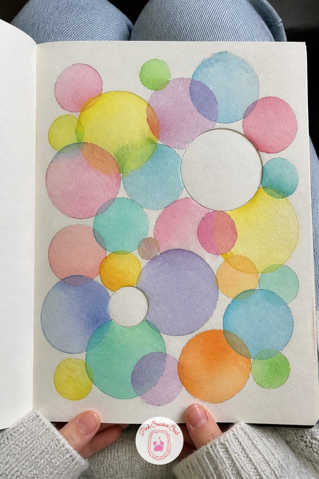
You Will Need
- coin or cap for tracing circles
Palette: Coral,Soft Blue,Lilac,Mint Green
Draw a page with a ticket to start the journey as a small, symbolic send-off for the whole sketchbook. Sketch a simple ticket shape, a rectangle with a perforated edge suggested by a row of small scallops or dashes along one side, taking up a good portion of the page. Keep the ticket’s proportions close to a real one, wider than it is tall, so it reads instantly as a ticket rather than just a labeled box.
Fill the ticket with small printed-style details in fineliner: a destination line reading something like “new beginnings,” a seat number, today’s date, mimicking the layout of a real boarding pass or train ticket. Lettering it in a mix of print and small caps makes it feel more authentic than one uniform handwriting style throughout.
Watercolor the ticket in one or two flat colors, keeping the text areas white or very pale so the lettering stays legible over the color. If scalloped perforation edges feel fiddly, a simple dashed line along the tear edge reads just as clearly.
Tuck a tiny drawn stamp or seal in one corner to finish the design.
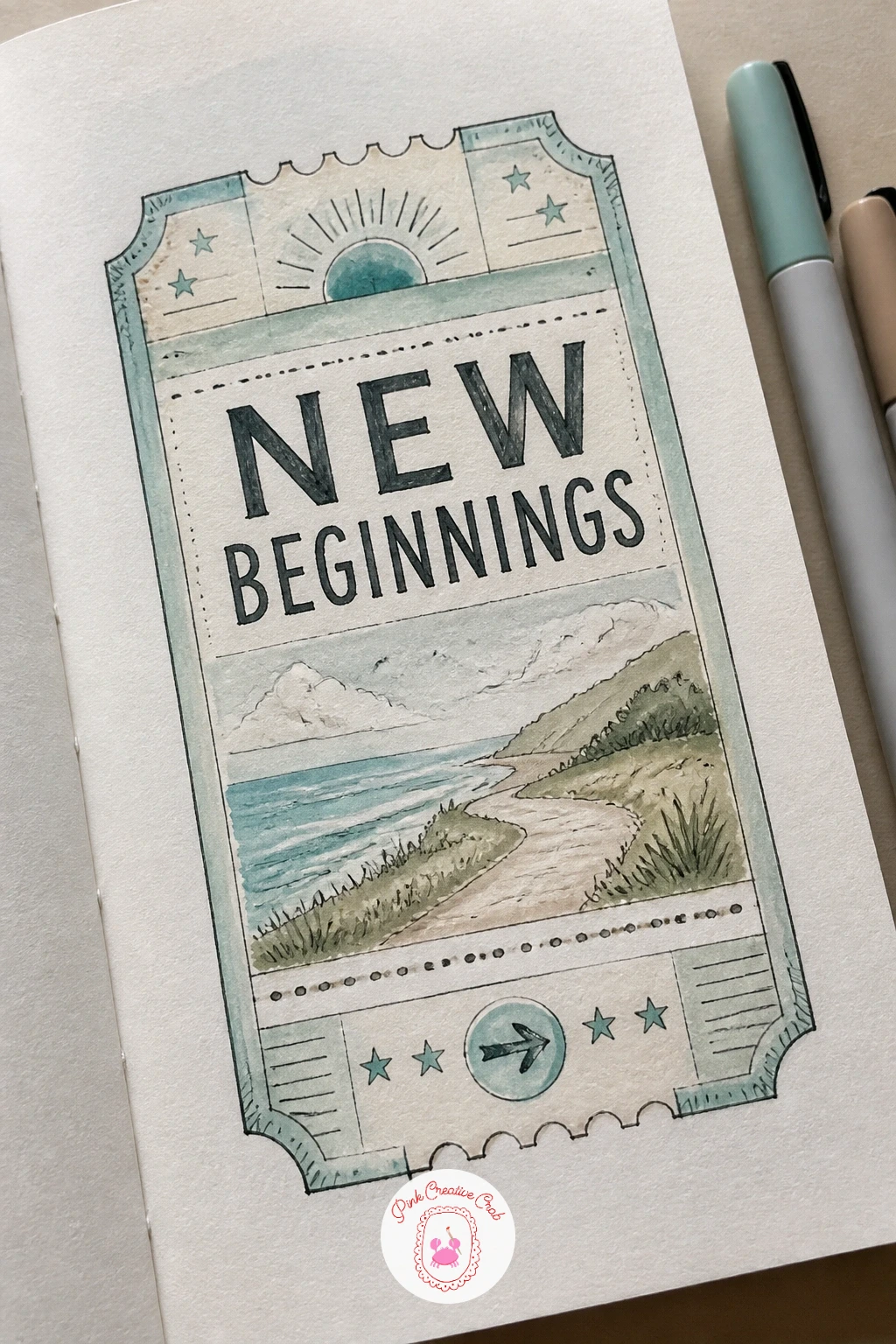
Palette: Soft Teal,Cream,Coral
Sketch a little map of my town for a personal, specific page that no one else could draw the same way. Pick four or five places that matter to you, your home, a favorite coffee shop, a park, and arrange them loosely across the page connected by simple curving roads, rather than aiming for geographic accuracy.
Draw each building as a simplified shape, a rectangle with a triangle roof is enough, and keep every building roughly the same scale relative to the roads so the map stays readable rather than some buildings looming over the streets. Ink the roads and buildings in fineliner, adding tiny labels beside each location in small handwriting.
Watercolor the buildings in a few cheerful flat colors and the roads in a pale grey or tan, leaving green space for parks and blue for any water nearby. If your town feels hard to simplify, focus on just your own neighborhood or street instead of the whole place.
Mark your own home with a small star or heart so it stands out from the other locations.
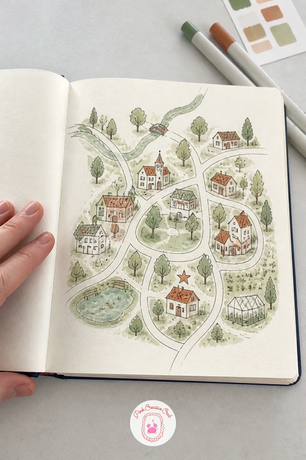
Palette: Terracotta,Sage Green,Soft Blue,Warm Grey
Write a page of three wishes in stars as a small hopeful page near the end of the book’s opening run. Draw three stars of varying sizes across the page in pencil first, five-pointed and slightly irregular rather than perfectly geometric, which keeps them looking hand drawn rather than stamped.
Write one wish inside or beside each star, starting with the smallest, most immediate wish by the smallest star and building to the biggest hope beside the largest star, a simple but effective way to use scale meaningfully on the page. Ink the star outlines in fineliner, then surround them loosely with small dots and tiny sparkle marks to suggest a night sky without drawing a full scene.
Watercolor each star in a different warm color, yellow, gold, soft orange, and leave the background paper white or add the faintest wash of deep blue if you want a true night sky feel. If three wishes feel like too much pressure to choose, one wish drawn large in a single big star works just as well.
Keep the handwriting inside each star small enough to leave breathing room around the points.
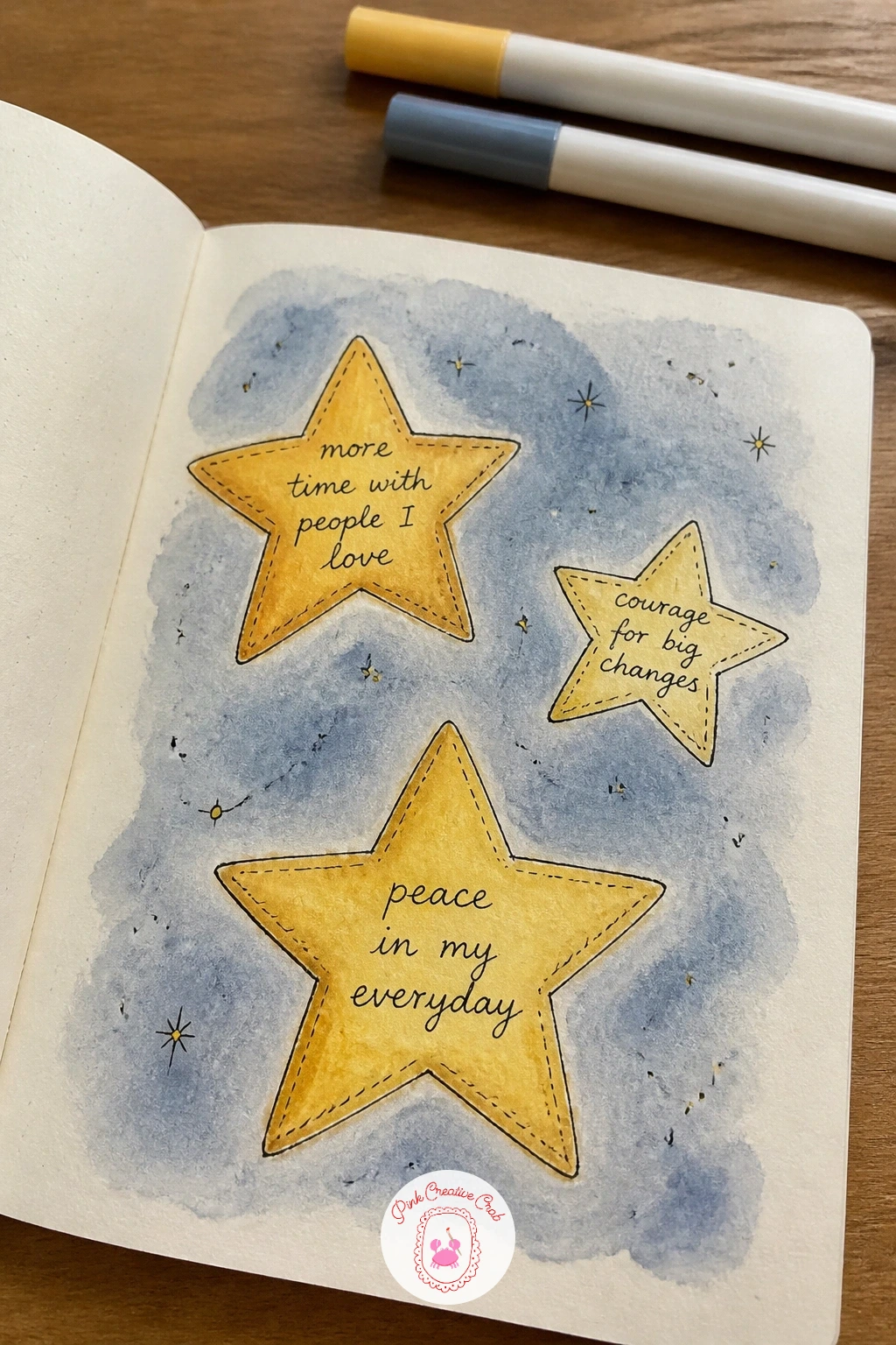
Palette: Soft Gold,Butter Yellow,Deep Blue
Return to the doorway idea once more with a page with a welcome mat and a door, a companion to the earlier opening door page but framed from ground level this time. Draw a simple closed door centered on the page, then a welcome mat at its base, lettered with a short greeting, giving the whole composition a grounded, front-step feeling.
Keep the door’s eye level low on the page, as if you are standing right at the step looking slightly up, which naturally makes the mat appear wider at the front edge than the back, the one perspective cue this page needs. Ink the door, frame and mat in fineliner, adding a small doorbell, house number or potted plant beside the step for extra personality.
Watercolor the door in a cheerful solid color and the mat in a contrasting neutral, leaving the lettering on the mat unpainted so it stays crisp. If perspective feels tricky, a flat front-on view of both door and mat is a perfectly good simpler version.
Finish with a small shadow line under the mat to settle it onto the ground.
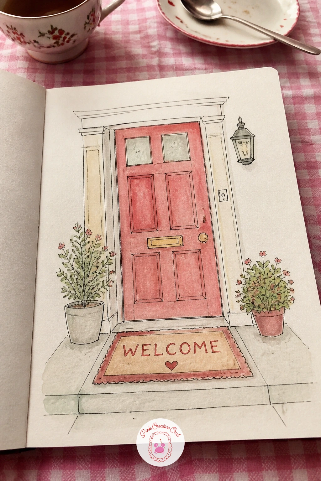
Palette: Cherry Red,Warm Wood Brown,Cream
Close your opening run of pages with a page of favorite songs drawn as records, a musical keepsake to finish the first stretch of the sketchbook. Trace a round object, a cup, a lid, a coin, several times across the page in pencil to get clean vinyl record circles, then add a smaller circle at the center of each for the label.
Vary the look of each record once this one works for you: next time, try drawing a few records tilted at an angle rather than flat on, or stack two slightly overlapping, for more visual variety across a page with several songs. Ink the grooves as a few thin concentric circles around each record and letter the song title or artist name on the small center label.
Watercolor each label in a different color so the records read as a distinct little collection rather than repeats of the same object, keeping the black vinyl area as plain fineliner crosshatching or a light grey wash. If round tracing objects are not on hand, a compass or even a careful freehand circle works fine at this size.
List five or six songs, enough to fill the page without crowding the labels.
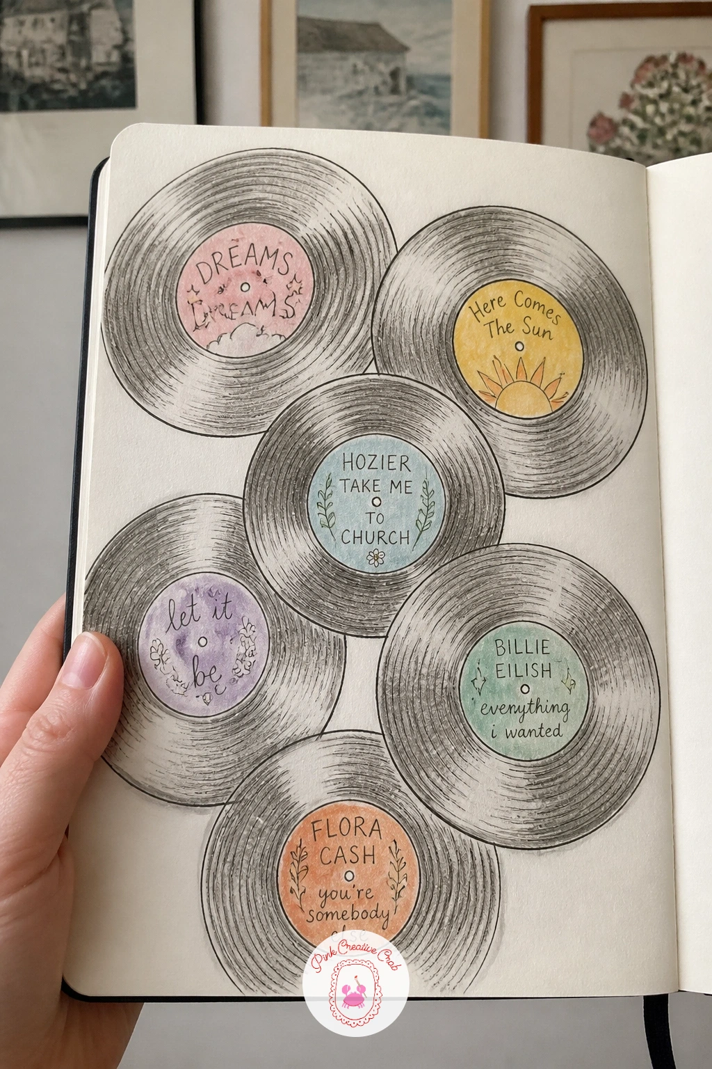
You Will Need
- coin, cup or lid for tracing circles
Palette: Charcoal Grey,Coral,Mint Green,Butter Yellow
What to Do Next
Pick whichever of these first page of sketchbook ideas matches how much time you have today, grab a fineliner and your new book, and just begin. One finished page, however loose or small, is all it takes to turn a blank sketchbook into one that is already yours.
Frequently Asked Questions
What is the best way to start a new sketchbook without feeling pressure to make it perfect?
Start with a small, low stakes page like a pen test or a swatch chart rather than a portrait or a big scene. Treating the first page as practice, not a performance, takes most of the pressure off immediately.
What supplies do I need for these first page of sketchbook ideas?
A black fineliner, a basic watercolor set and a few markers cover every idea in this list. A mixed media sketchbook that can handle a little wet paint without buckling too much is worth having from the start.
Should the first page of a sketchbook be a drawing or a list?
Either works well, and many of these ideas combine both. A small drawing paired with a short handwritten line, like a goal path or a promise page, tends to feel more personal than text or image alone.
What if I mess up the very first page of a new sketchbook?
Keep going rather than tearing it out, a slightly imperfect first page sets an honest tone for the whole book. Most mistakes can be folded into the design with an extra line, a small box around it, or a patch of color.
How long should a first sketchbook page take to finish?
Most of these pages take between ten and forty minutes depending on how much detail you add. Pick a quicker idea like mini doodles on a short lunch break, or a slower one like the room sketch when you have a full evening free.
Have any thoughts?
Share your reaction or leave a quick response — we’d love to hear what you think!
-
 0
-
0
-
0
-
0
-
0
-
0


