Valentines day card ideas get a lot more interesting once you put the gouache out instead of reaching for a store card. These 32 pictures skip the hearts-and-cupids clutter and lean into small, modern still lifes: a flower cart under a striped awning, a bowl of cherries with two spoons, a pair of teacups waiting to be filled. No lettering needed anywhere, the picture carries the whole message.
Work through them in order and you will move from the simplest shapes to busier little scenes, each one sized to fit a card front and finish in a single sitting. Flat colour, crisp edges and a cream background hold the whole set together, so pick whichever one matches the person you are painting for and get started.
Using these images: free for personal projects such as printing, coloring, cards, journals and gifts. Handmade items that include them may be sold up to 30 pieces per design. More than that is commercial use and is not permitted, and neither is selling or sharing the images themselves or passing them off as your own. Please ask before any other use.
Start with the tray itself: block in a simple rectangle in cream or soft brown gouache, flat and even, then let it dry before adding anything on top. This keeps the edges crisp instead of muddy where the tray meets the blanket underneath.
Paint the two teacups as simple ovals on short stems, one slightly smaller than the other so they do not read as twins, then add the teapot as a rounded shape with a curved spout. Drop in the pink tulips last with a few confident petal strokes, no outlining first, gouache forgives a fast loose shape better than a careful slow one.
If the tray looks flat once it is dry, add one thin shadow line along its front edge in a darker cream to lift it off the blanket. If you do not have pink gouache mixed, warm up white with a touch of red until it sits between coral and blush.
Keep the blanket pattern simple, two or three stripes is plenty for a card this size.
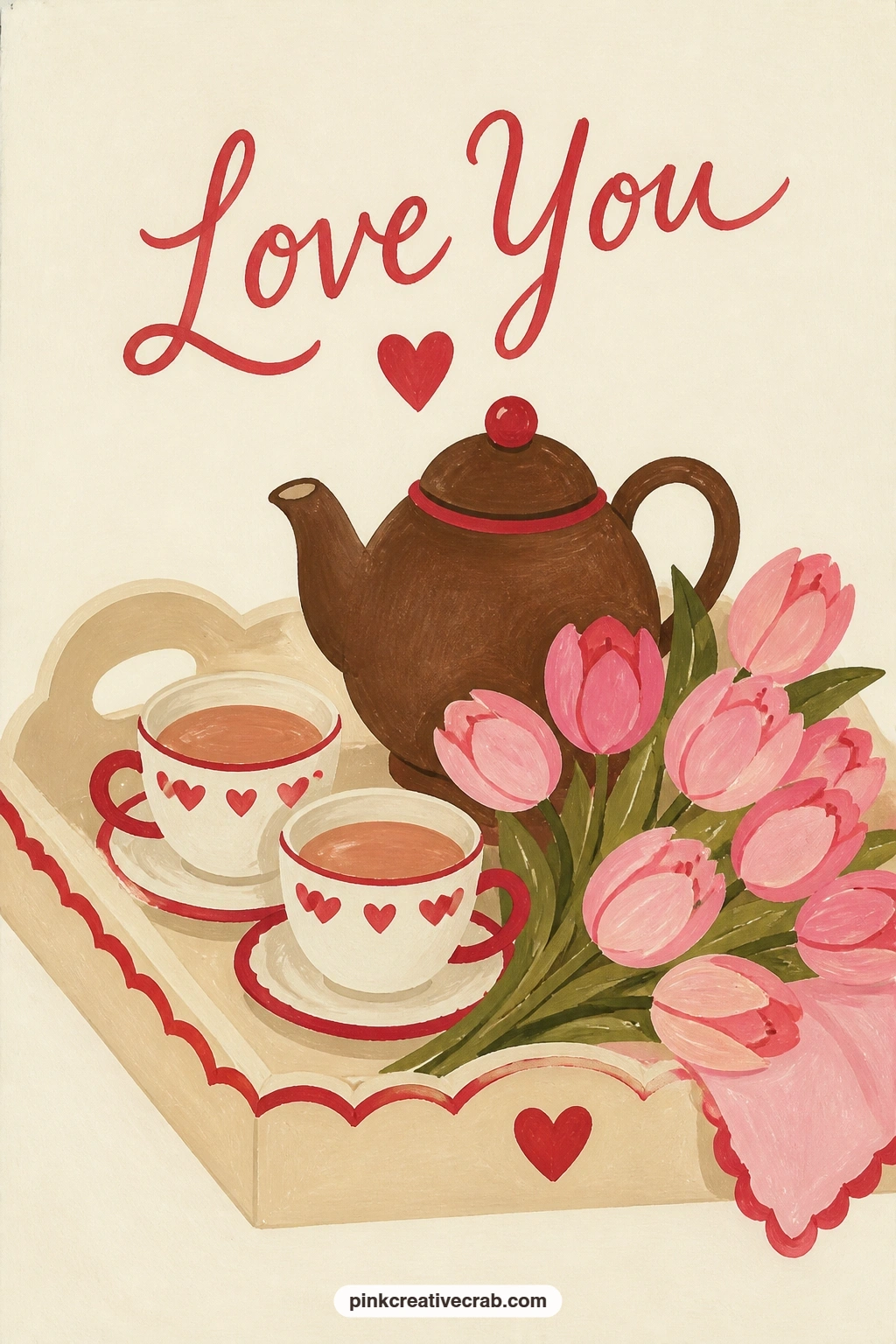
Palette: Blush Pink,Cream,Chocolate Brown,Soft White
Move from the bedroom tray to the street with a flower cart, a subject that leans on one proportion trick: make the awning twice as wide as the cart below it, so the stripes read as shelter rather than a hat. Pencil that width ratio in lightly before you touch paint.
Block the cart body in chocolate brown, then paint the awning stripes in cherry red and cream with a flat brush held on its edge for straight lines. Fill the buckets with rounds of pink tulip tops, working from the back bucket forward so the nearer flowers overlap and sit in front.
If the stripes wobble, a ruler-guided pencil line under the paint saves it every time. No striped awning reference handy, a plain cherry red canopy with a cream scalloped edge reads just as well.
For more cart and stall layouts, the market scene painting ideas are worth a look, and the flower shop drawing list has more florist setups too.
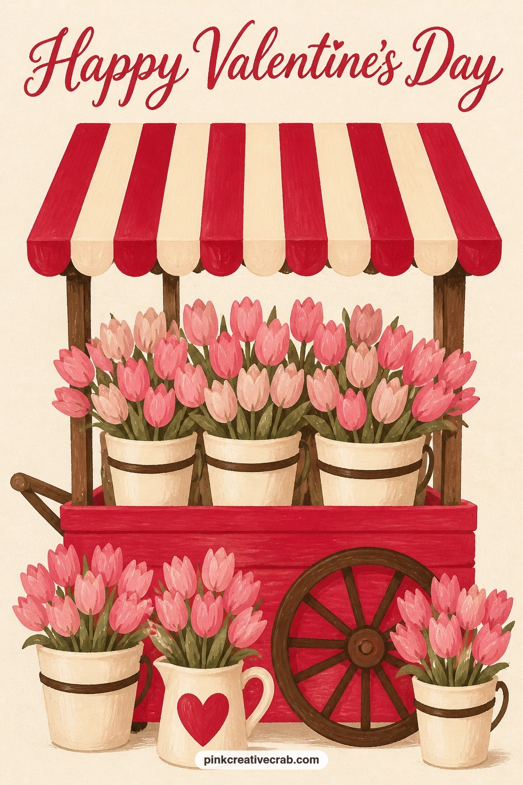
Palette: Cherry Red,Cream,Chocolate Brown,Blush Pink
Cherries are the easiest shape in this whole list, so use this one to get comfortable with flat gouache before the busier scenes ahead. Paint the bowl first as a simple curved shape, let it dry, then pile in cherry circles that overlap rather than sit in a tidy row.
Eye level matters here: sit the bowl low in the frame and look slightly down into it, so you paint the tops of the cherries rather than their sides, and the tablecloth light source comes from one corner to throw a single soft shadow under the bowl.
Add the two spoons as thin silver ovals crossing at an angle, laid loosely rather than parallel. If the cherries look flat once dry, one small cream highlight dot on each catches the light and brings the whole bowl to life.
Linen folds in the cloth can be two or three curved pencil lines under thin cream paint, nothing more detailed is needed.
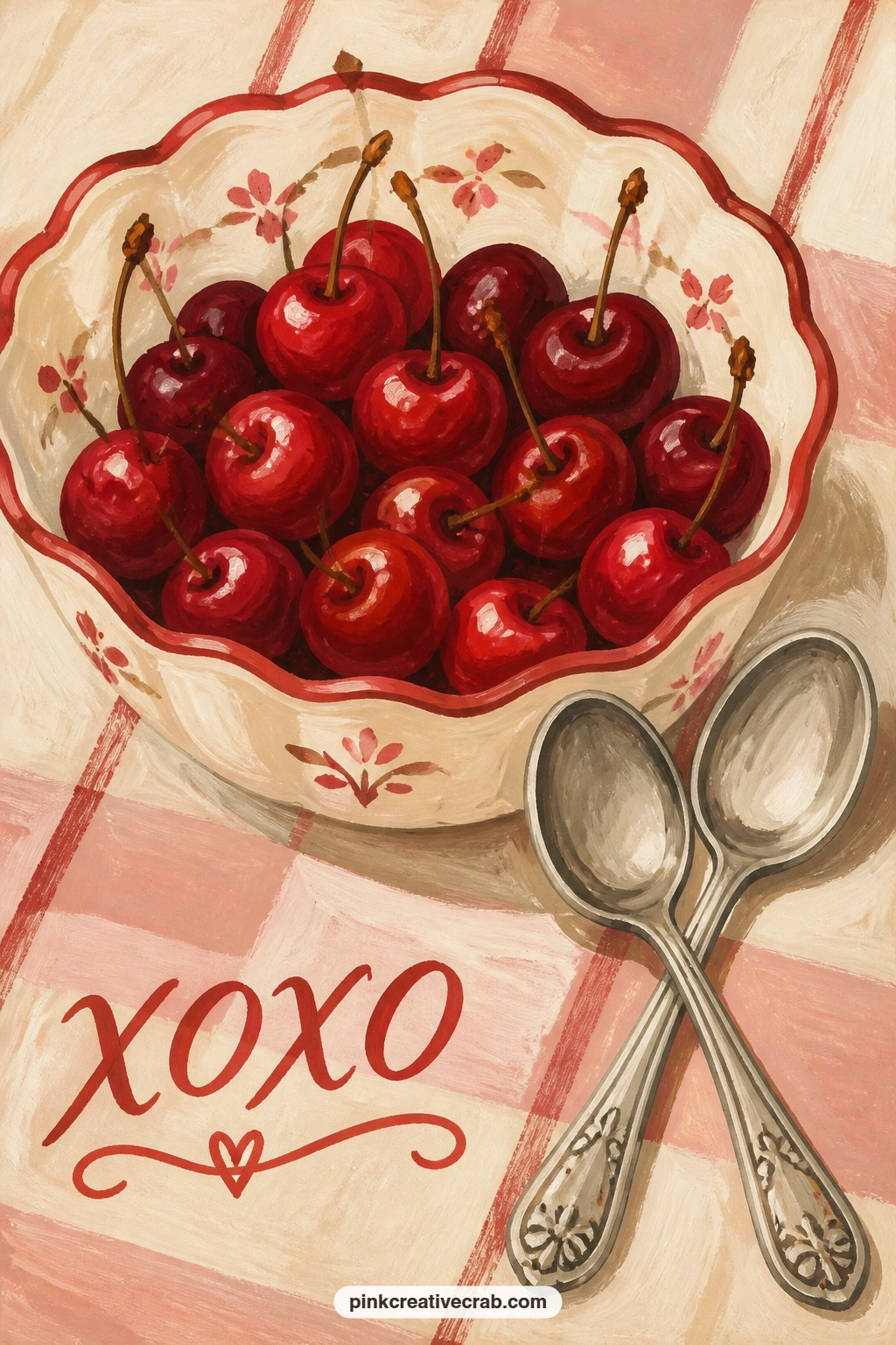
Palette: Cherry Red,Cream,Soft White,Chocolate Brown
Look at real cherries in pairs for reference, they almost never sit perfectly round, one side always flattens slightly where it touches its neighbor.
After the open bowl of cherries, tuck something away instead: a love letter sealed with red wax, just peeking from a coat pocket hanging on a hook. Paint the coat first as one big flat shape in chocolate brown or cream, keeping the outline simple with no fabric folds beyond one or two curved shadow lines.
Add the hook as a small dark curve, then the envelope corner poking from the pocket in cream with the red wax seal as one confident round dot, slightly raised with a tiny highlight. This is where gouache mistakes usually happen, too much detail on the seal makes it look like a blot rather than wax.
Keep the seal to three brushstrokes: the base circle, a darker crescent shadow underneath it, and one pale dot of light. No red gouache for the wax, a mix of cherry red and a touch of brown gets the deep waxy tone closer than pure red does.
Leave plenty of cream background around the coat so the pocket detail stays the focus.

Palette: Chocolate Brown,Cherry Red,Cream,Soft White
Carry the cherry motif into something smaller and more playful: a pair of cherries hanging by their stems from the handle of a pink teacup. Paint the cup first, a simple rounded shape with a thin handle loop left unpainted against the cream background until the cup itself is dry.
For the quick ten-minute version, two cherry circles and two curved stems looped over the handle are enough to finish the card. Give it forty minutes instead and you can add a thin gold or cream rim line around the cup edge, a soft shadow beneath it, and a second tonal pink inside the cup for depth.
The handle is the fiddly part, paint it slightly thicker than it looks in your head, a too-thin handle snaps visually against the solid cup body. If pink gouache runs low, a wash of red thinned heavily with white stands in fine.
Keep the cherries slightly darker than the cup so they read as sitting in front of it, not blending in.
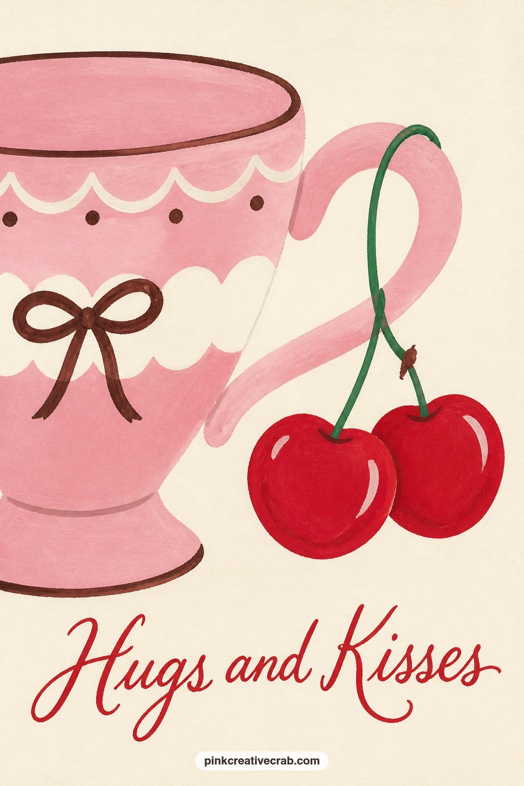
Palette: Blush Pink,Cherry Red,Cream,Chocolate Brown
Slice a strawberry in half and the inside almost always shows a natural heart shape, so this idea leans entirely on getting that cut face right. Paint the outer strawberry skin first in cherry red with small cream seed dots dotted on while the paint is still slightly wet, so they sit softly rather than floating on top.
Where it goes wrong is the inside: beginners paint it one flat red, but a real cut strawberry shows a pale cream core with a thin red heart-shaped ring around it. Paint the core first, let it dry, then paint that ring shape on top once the base is set.
Set the two halves on a small blue plate for contrast, blue being the only cool color in the whole set and it makes the red pop harder. No blue plate at hand to look at, any small round plate shape in a flat pastel works, the contrast matters more than the exact color.
Finish with one soft shadow under the plate to ground it on the table.
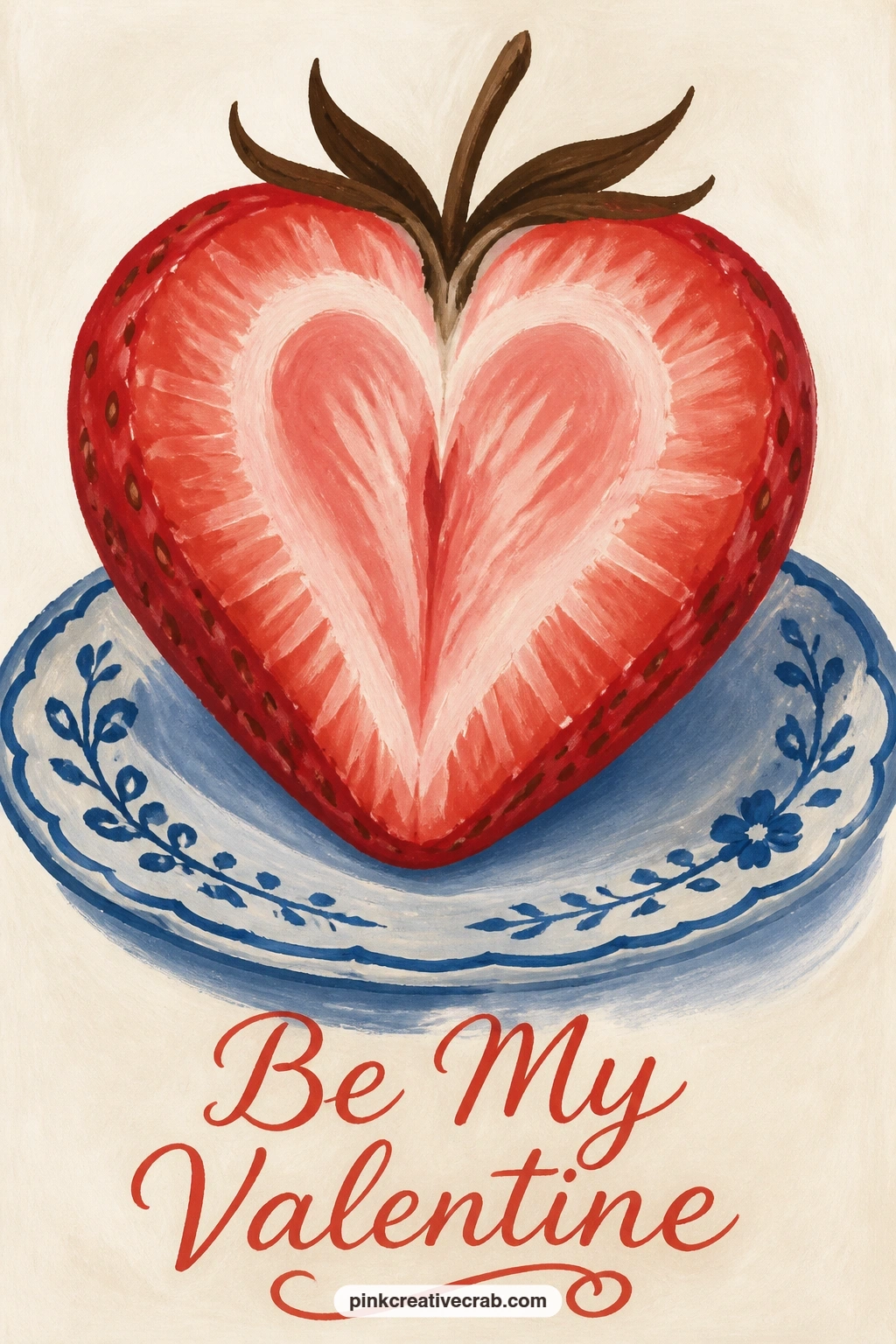
Palette: Cherry Red,Cream,Soft White,Dusty Blue
Move outdoors again for a red mailbox with a bunch of roses tucked under its raised flag. Block the mailbox as one solid rounded rectangle in cherry red, keeping the curve at the top smooth and even, then paint the flag separately as a small flat triangle once the box itself is dry.
Roses are the trickiest shape in this list so far: paint each one as a tight spiral of two or three curved strokes rather than trying to draw individual petals, gouache holds a loose spiral shape far better than fussy outlines. Tuck the stems under the flag last, overlapping the mailbox edge slightly so they look wedged in rather than floating beside it.
If the roses start looking like cabbages, stop adding strokes, three curves per rose is the ceiling for a flat graphic style like this one. No red gouache mixed for the box, a deep coral works as a near match and keeps the roses reading as the brighter red in the scene.
Leave the background completely plain so the mailbox silhouette stays strong.
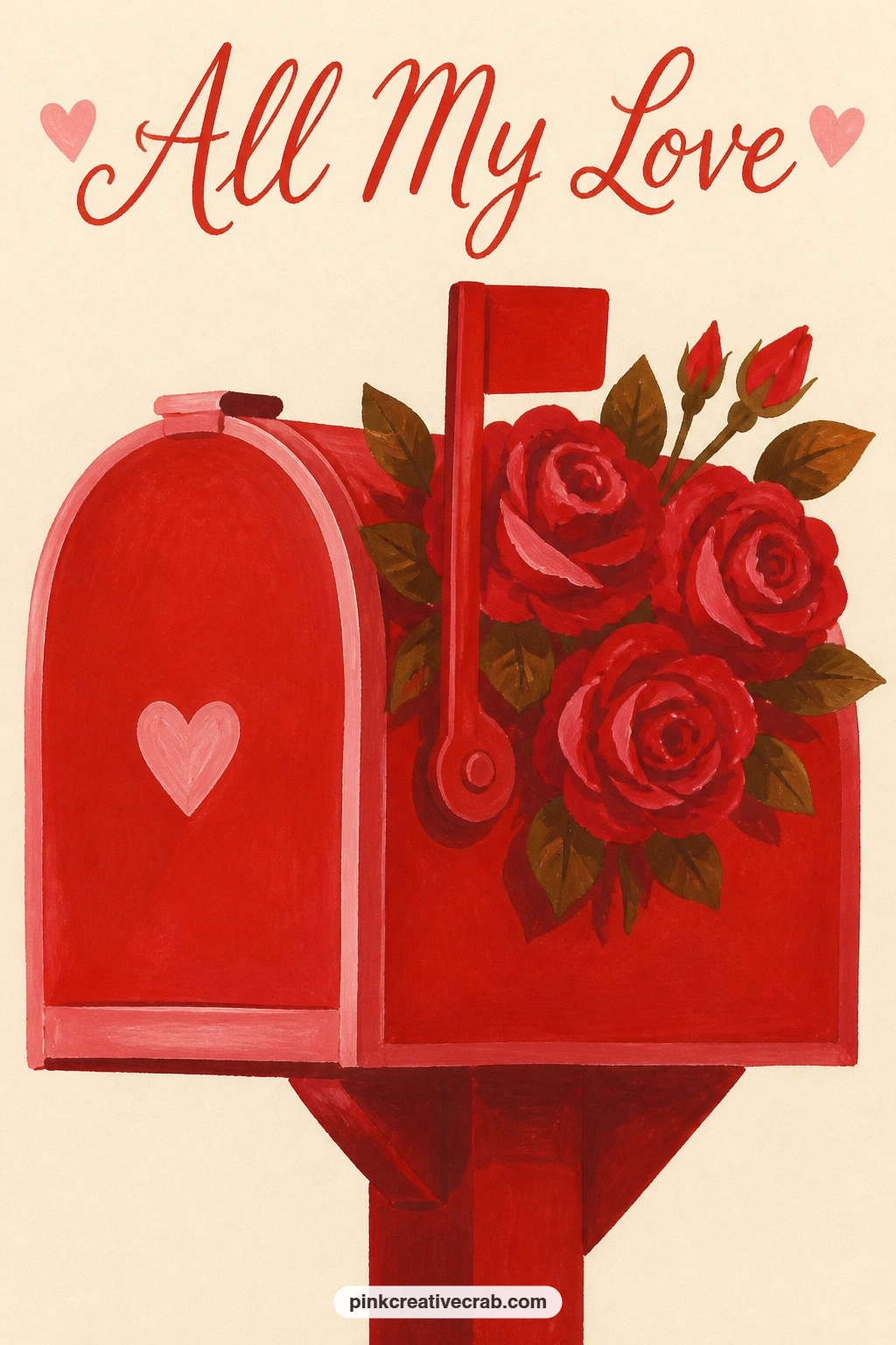
Palette: Cherry Red,Chocolate Brown,Blush Pink,Cream
After the mailbox, head back indoors for a pink teapot caught mid-pour into two heart-shaped cups. Paint the teapot body first as a rounded form with a curved spout and handle, then leave a thin white gap between the spout tip and the cup below it for the pouring stream.
The heart-shaped cups are the one place a measuring trick helps: draw each cup as a simple heart outline first, then round off the bottom point slightly so it reads as a vessel rather than a flat heart sticker. Paint the tea stream as one thin curved line in a warm amber or brown, slightly wavy rather than dead straight, which sells the motion better.
If the pour looks static, add two or three tiny dots below the stream like rising steam, that small gesture finishes the action. No heart-shaped cup reference, round cups with one small heart painted on the side work just as well for this card.
Keep the teapot’s pink a shade darker than the cups so the eye separates the two shapes instantly.
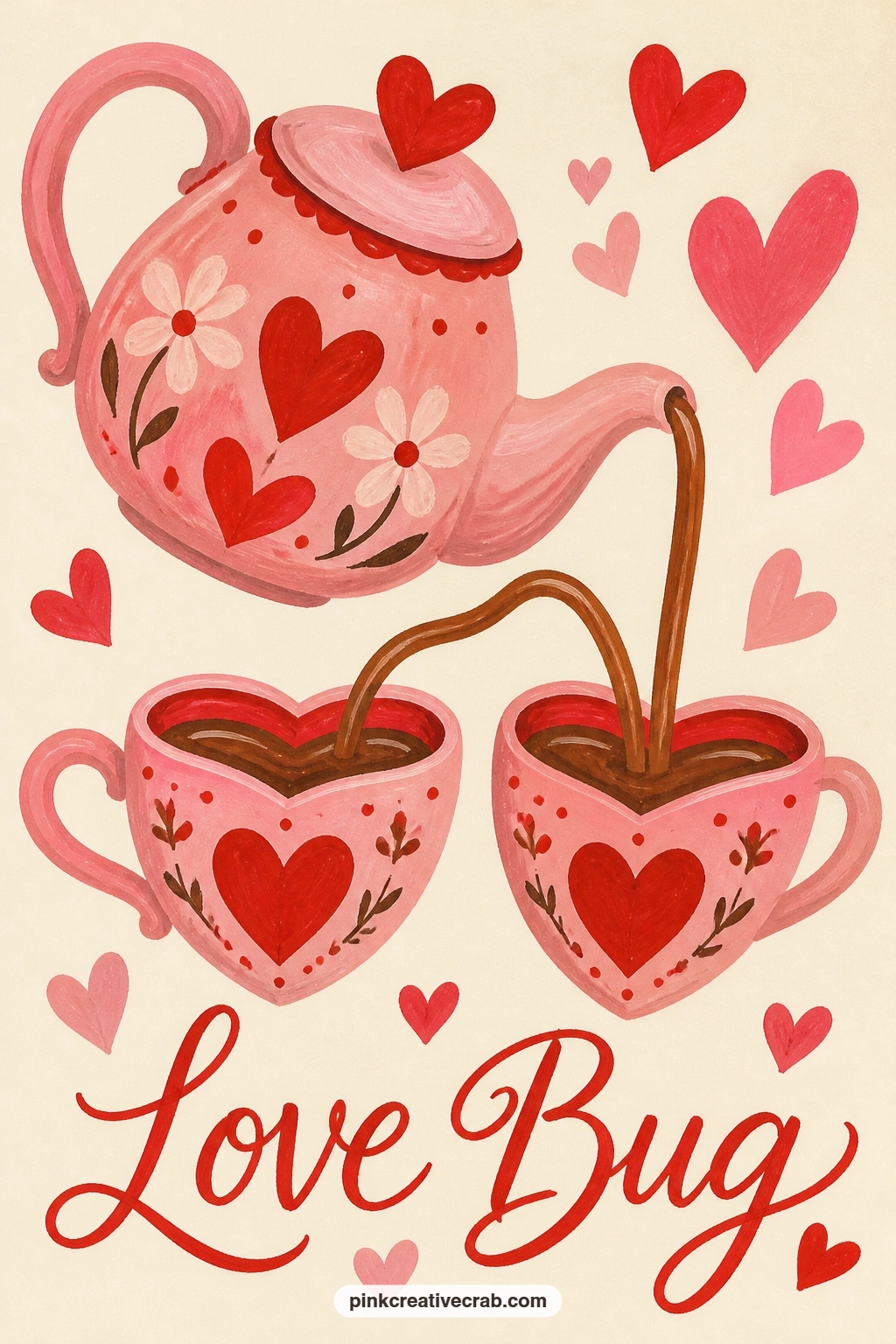
Palette: Blush Pink,Chocolate Brown,Cream,Cherry Red
Set a glass jar of red tulips at the center of a table laid for two, which means this card carries more small objects than the ones before it, so plan the layout before paint touches paper. Pencil in the jar, two plates and two cups loosely first, checking that the jar sits roughly centered with one setting on either side.
Paint the jar last after the tulips, leaving its glass as mostly the cream background color with just two or three thin vertical highlight lines to suggest glass. The tulips go in first as simple closed-cup shapes on straight stems, three or four is plenty for a jar this size.
If the table setting starts feeling crowded, drop one of the two cups and let a single cup imply the other place is just out of frame, a trick that keeps the composition breathing. No red gouache for the tulips, cherry red mixed with a touch of brown gives a deeper, less candy-like tone that suits this palette better anyway.
Finish with one thin shadow line under the jar to seat it on the table.
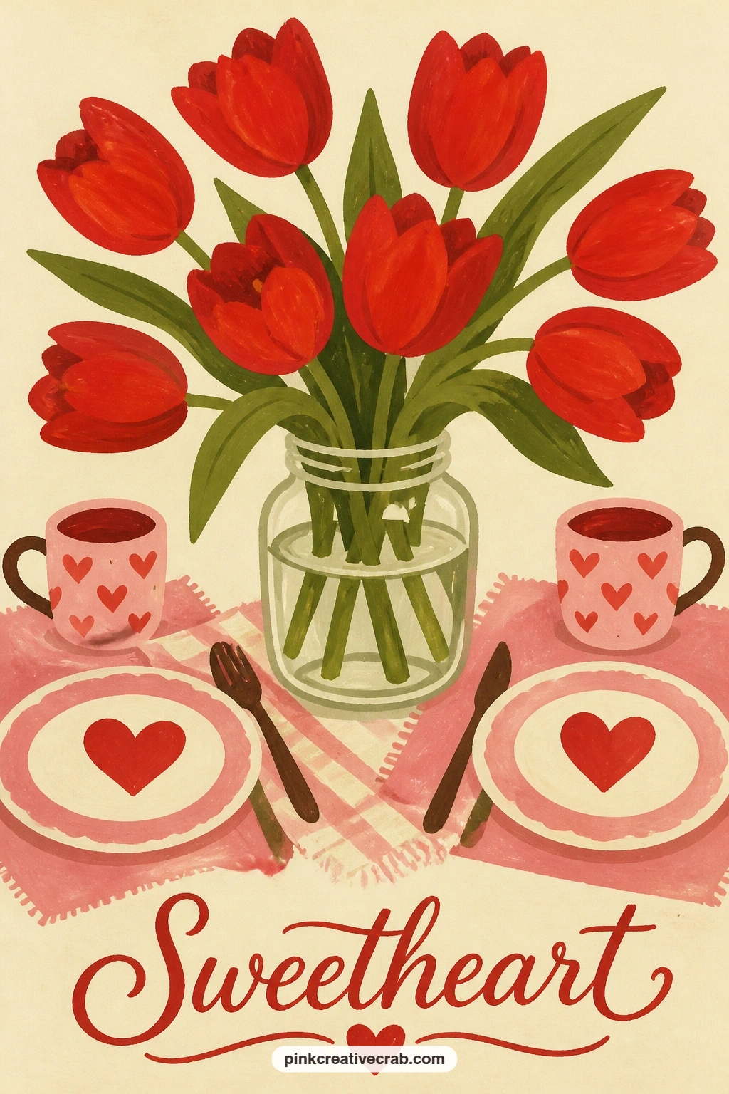
Palette: Cherry Red,Cream,Chocolate Brown,Soft White
Fold the love letter idea into something quieter: a blank sheet folded into a paper boat, floating alone on a park pond. Paint the water first as one flat mid-tone blue-green with two or three darker curved lines for ripples, letting that dry completely before the boat goes on top.
The paper boat itself is just two triangles and a rectangle base, painted in cream with one thin fold line in a slightly darker cream to show the paper crease. Set it slightly off-center in the pond rather than dead middle, which gives the water around it room to feel open and calm.
If the ripples make the water look busy, paint fewer, longer lines rather than many short ones, calm water reads better with restraint. No pond reference handy, a plain still blue rectangle with the boat centered works fine without any ripple detail at all.
One small reflection smudge under the boat in a slightly darker tone anchors it onto the water.
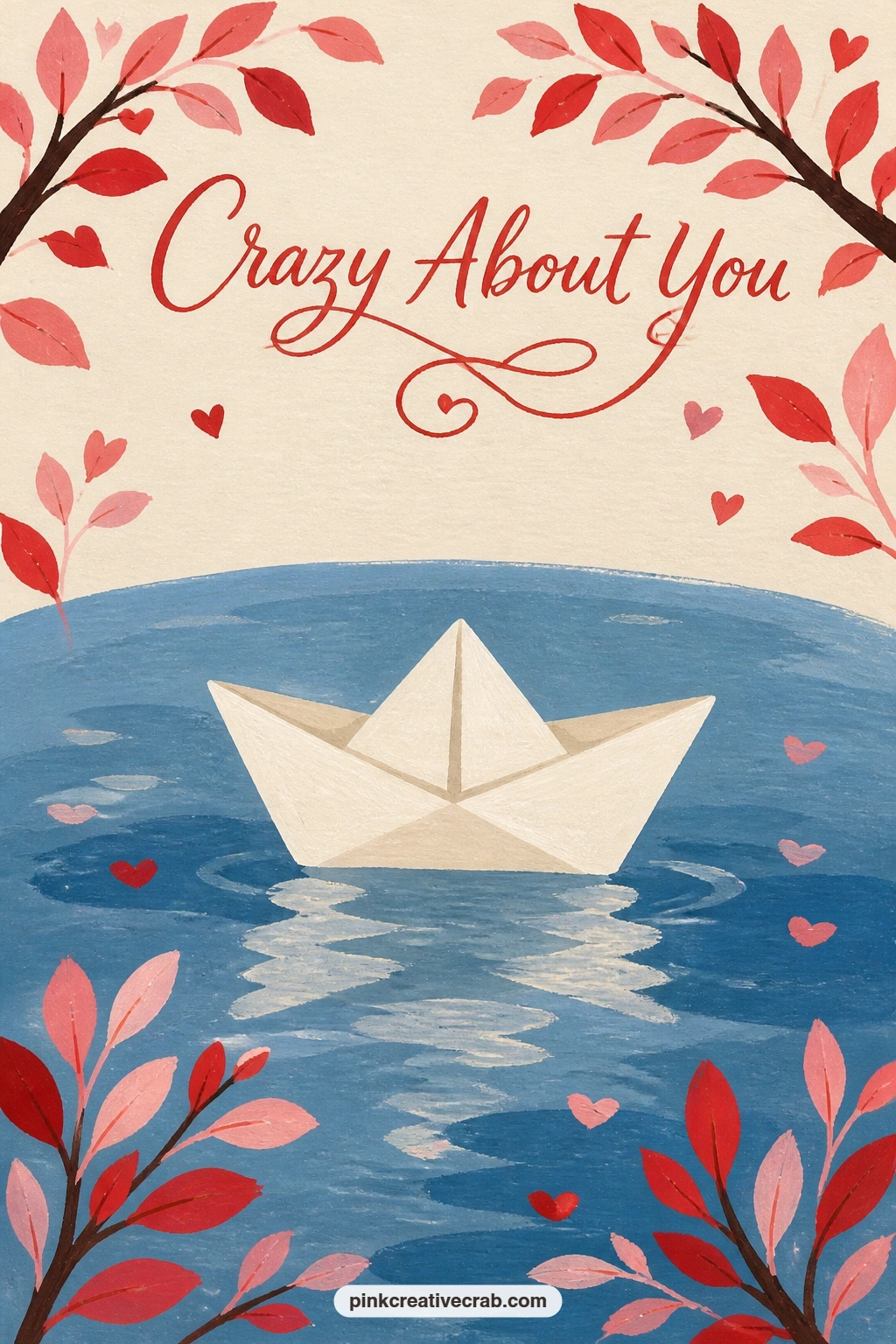
Palette: Dusty Blue,Cream,Chocolate Brown,Soft White
Swap the pond for a bicycle leaned against a pink wall, a basket of cherries balanced on its seat. Paint the wall as a flat pink background first, then the bicycle frame on top in thin chocolate brown lines, kept simple with no gears or spokes beyond a basic circle for each wheel.
The basket sits where the seat would be, painted as a woven oval shape in cream with a few short diagonal strokes to suggest texture without drawing every strand. Pile the cherries into it the same way as the earlier cherry bowl idea, overlapping circles rather than a neat row, spilling slightly over one edge of the basket.
Wheels are where proportion slips fastest: hold your brush at arm’s length against the reference or your mental image to check both wheels read the same size before committing to paint. No pink wall to reference, a plain cream wall with one pink painted panel behind the bike reads just as fresh.
Keep the whole bicycle in flat brown with no shading, letting the cherries carry all the color.
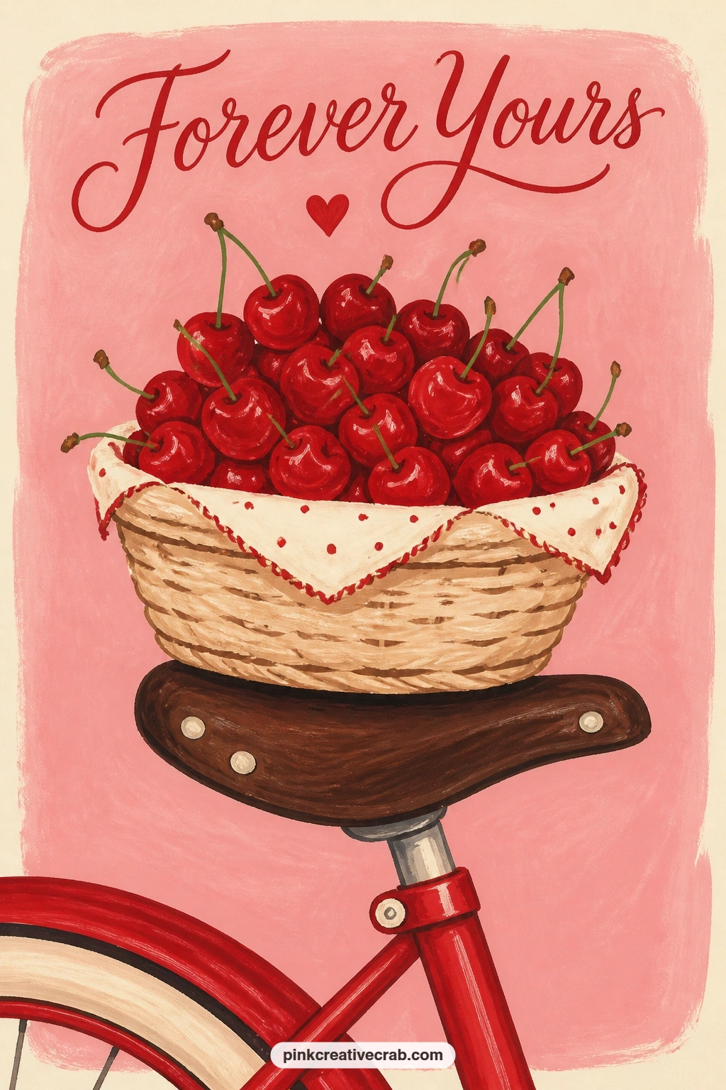
Palette: Blush Pink,Chocolate Brown,Cherry Red,Cream
Lean two ice cream cones together against each other on a cafe counter, a composition that lives or dies on the edge where the two scoops touch. Paint the cones first as simple triangles in cream with thin crosshatch lines for the waffle texture, then add the scoops on top once the cones are dry.
Here is the texture trick worth slowing down for: load the brush lightly and dab rather than stroke for the scoop surface, which breaks the edge just enough to read as soft ice cream rather than a smooth painted ball. Lean the two cones at a slight angle toward each other so the scoops nearly kiss at the top.
If the scoops come out too smooth and plastic-looking, go back in with a dry, almost paint-starved brush and dab a few lighter and darker patches across the surface. No two flavors in mind, one pink strawberry scoop and one cream vanilla scoop makes the clearest contrast for this palette.
Finish with a thin counter line under both cones to ground them.

Palette: Blush Pink,Cream,Chocolate Brown,Cherry Red
Shift to a single rose pushed through the handle of a blue front door, a card that works entirely on color contrast between the cool door and the warm flower. Paint the door first as one large flat blue rectangle filling most of the frame, with the handle as a simple dark oval or curved bar.
Add the rose last, using that same loose spiral stroke from the mailbox idea, two or three curves is enough, with a couple of green leaf shapes tucked behind the stem where it threads through the handle. Keep the stem slightly bent rather than ruler-straight, a straight stem through a handle looks stiff and unnatural.
If the door feels too flat and empty, add one thin darker blue panel line down the middle to suggest paneling without drawing a full door frame. No strong blue gouache mixed, a muted teal works as a softer stand-in and still contrasts well against cherry red.
Let the door fill almost the whole card so the rose reads as a small, deliberate detail against it.
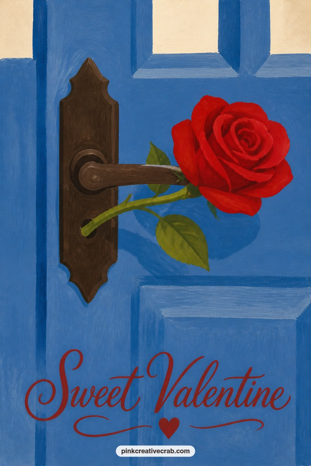
Palette: Dusty Blue,Cherry Red,Chocolate Brown,Cream
Open a heart-shaped box of chocolates and set it on a pink velvet sofa, a card with enough small shapes inside it to practice fast, confident repetition. Paint the sofa as one soft pink rounded shape first and let it dry fully, since any chocolate smudge landing on wet pink muddies instantly.
Paint the box lid as a heart outline in cream or white, then fill the inside with small rounded chocolate shapes in two tones, chocolate brown and a slightly darker brown, placed in loose rows rather than a perfect grid. A grid of chocolates reads stiff and printed, a slightly uneven scatter reads hand-finished and warmer.
If the velvet sofa looks flat, two or three soft curved shadow lines along its cushion seams lift it without any real shading work. No velvet texture needed at all, a plain flat pink shape reads as upholstery just fine at this scale.
Finish with one tiny cream highlight dot on two or three chocolates to catch the light.
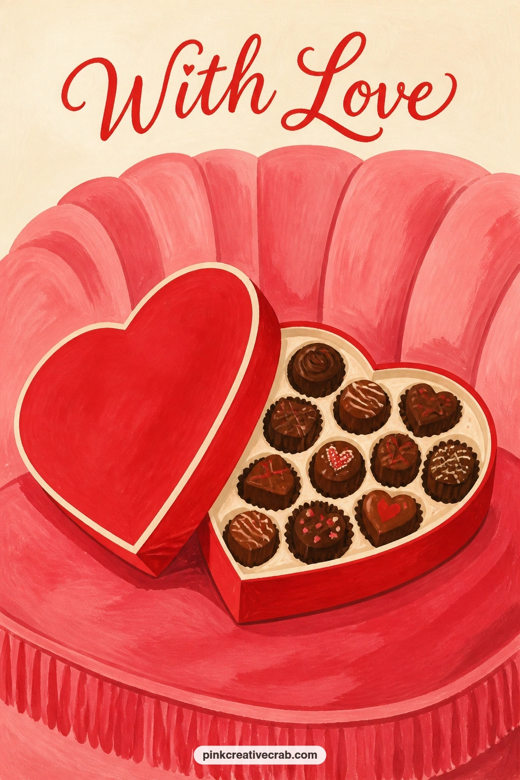
Palette: Blush Pink,Chocolate Brown,Cream,Cherry Red
Set a pair of red heels on the floor next to a loose bouquet of peonies, pairing a hard graphic shape against soft rounded ones. Paint the heels first as simple curved silhouettes, cherry red with one thin cream line for the heel’s edge highlight, kept flat with no stitching or texture detail.
Peonies are built from the same loose spiral trick as the roses earlier, but looser and rounder, three or four overlapping spirals per bloom instead of two. Pile several blooms together loosely rather than arranging them neatly, peonies always look best a little tousled rather than composed.
If the wooden floor behind them feels empty, two or three long horizontal plank lines in a warm tan are enough, resist adding wood grain detail at this scale. No pink peony mix ready, blush pink straight from the tube softened with a touch of cream gets close enough for a flat graphic style.
Keep the heels smaller in the frame than the bouquet so the flowers stay the clear focus.
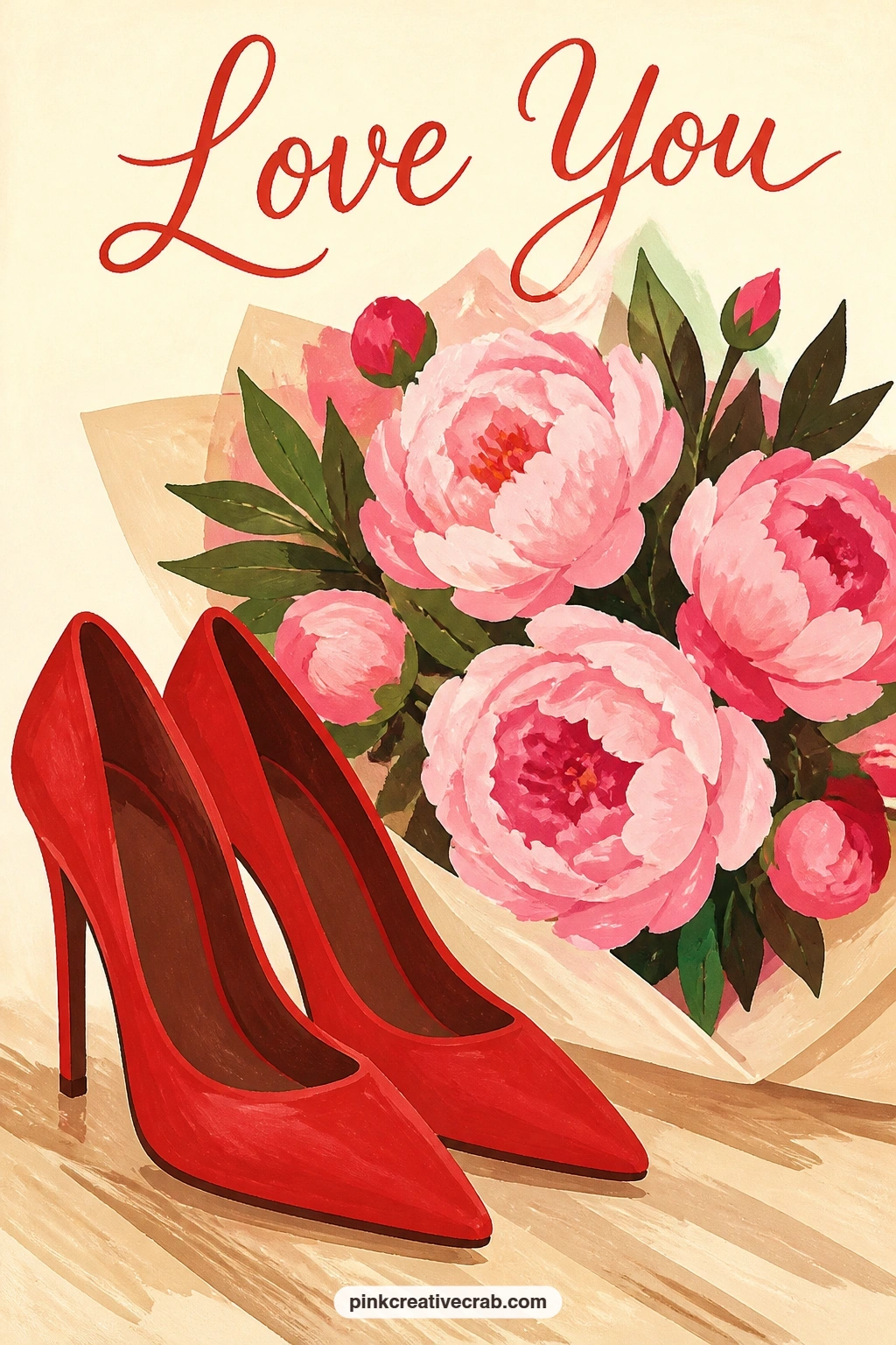
Palette: Cherry Red,Blush Pink,Chocolate Brown,Cream
Bring a cherry blossom branch into the picture, arched in a vase beside two small coffee cups. Paint the branch first as a single thin curved brown line, then build the blossoms along it with small dabs of blush pink using the tip of a round brush rather than painting each petal.
Hold the brush loosely and let the dabs vary slightly in size and spacing along the branch, perfectly even blossoms look stamped rather than grown. Paint the two coffee cups afterward as simple cylinders with small handle loops, placed lower in the frame so the branch has room to arch above them.
If the blossoms clump too thickly in one spot, leave gaps of bare branch between clusters, cherry blossom always shows some open branch between the flowers. No vase in view, the branch can simply lean against the edge of the frame as if resting on the table itself.
For more blossom branch arrangements, the cherry blossom junk journal pages are a good next stop.
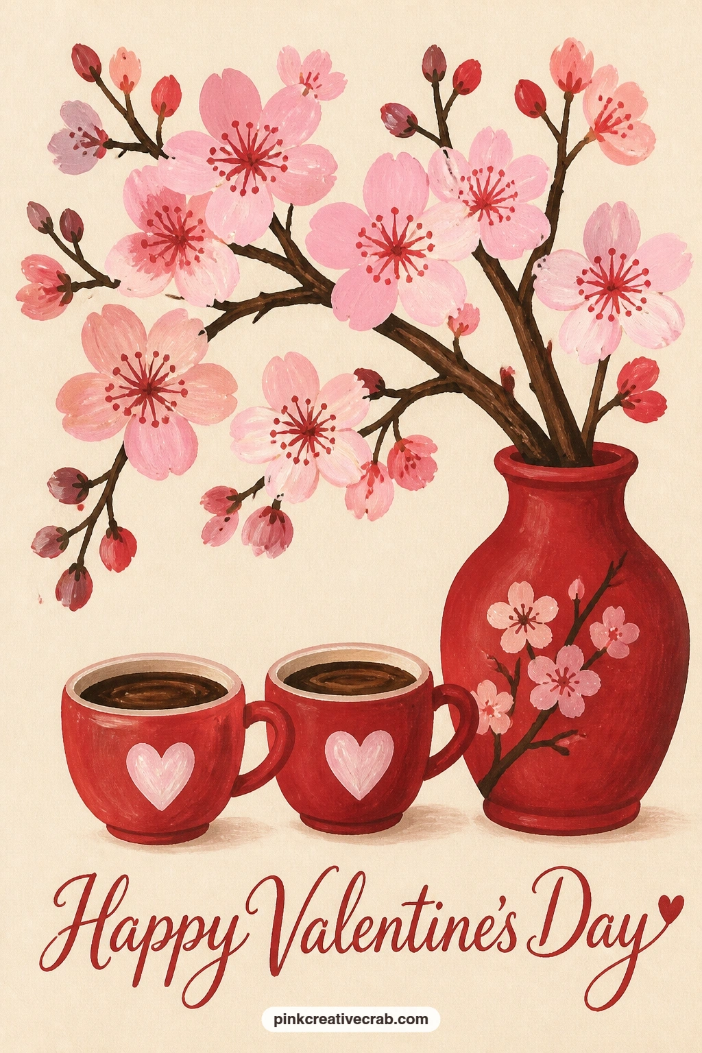
Palette: Blush Pink,Chocolate Brown,Cream,Soft White
Tuck a red wax-sealed envelope into a bouquet of white anemones, a quiet contrast between a graphic envelope shape and soft rounded petals. Paint the anemone petals first as flat white or pale cream ovals arranged loosely around a dark center dot, three or four blooms is enough for a card this size.
Work the wax-sealed envelope the same way as the coat pocket idea earlier: a cream rectangle, a round cherry red seal with a crescent shadow underneath, tucked so it overlaps the lower petals rather than sitting fully separate from them. That overlap is what sells the envelope as part of the bouquet rather than floating beside it.
If the anemone centers look flat, a tiny ring of darker dots around each black center suggests stamens without painting each one individually. No white anemones to reference, any simple round white flower with a dark center button reads the same way.
Keep the green stems minimal, two or three thin lines is all this composition needs.
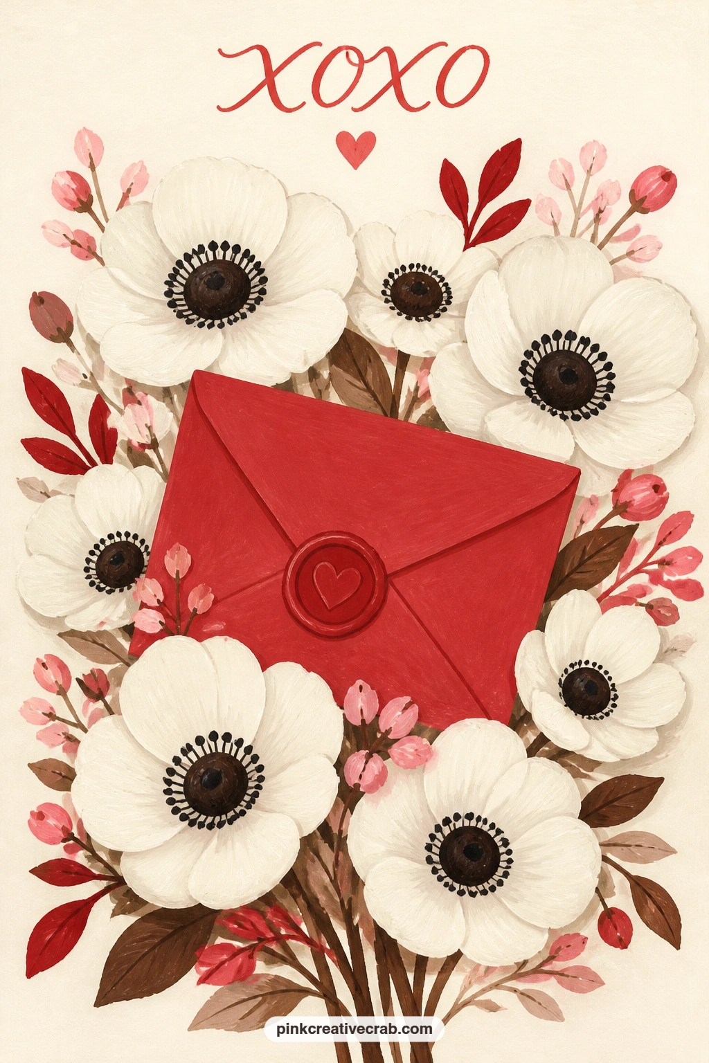
Palette: Soft White,Cherry Red,Chocolate Brown,Cream
Pack a picnic basket for two and set it under a blossoming tree, with a bowl of cherries open on the blanket beside it. This is the busiest composition so far, so block the big shapes first: the tree canopy as one soft rounded mass, the blanket as a flat rectangle, the basket as a simple domed shape on top of it.
Paint the blossom canopy with the same loose dabbing technique from the branch idea, keeping most of the dabs toward the outer edge of the canopy shape and leaving the center a touch sparser so it does not read as a solid pink ball. Add the cherry bowl and basket last, since they are the smallest shapes and easiest to lose if painted too early under bigger washes.
If the whole scene feels crowded, drop the bowl of cherries and let the basket alone carry the picnic idea, simplifying is always safer than cramming more in. No tree to paint from life, a simple rounded canopy shape works fine without any branch structure showing through it.
Finish with one soft shadow beneath the basket and blanket to ground the whole scene.
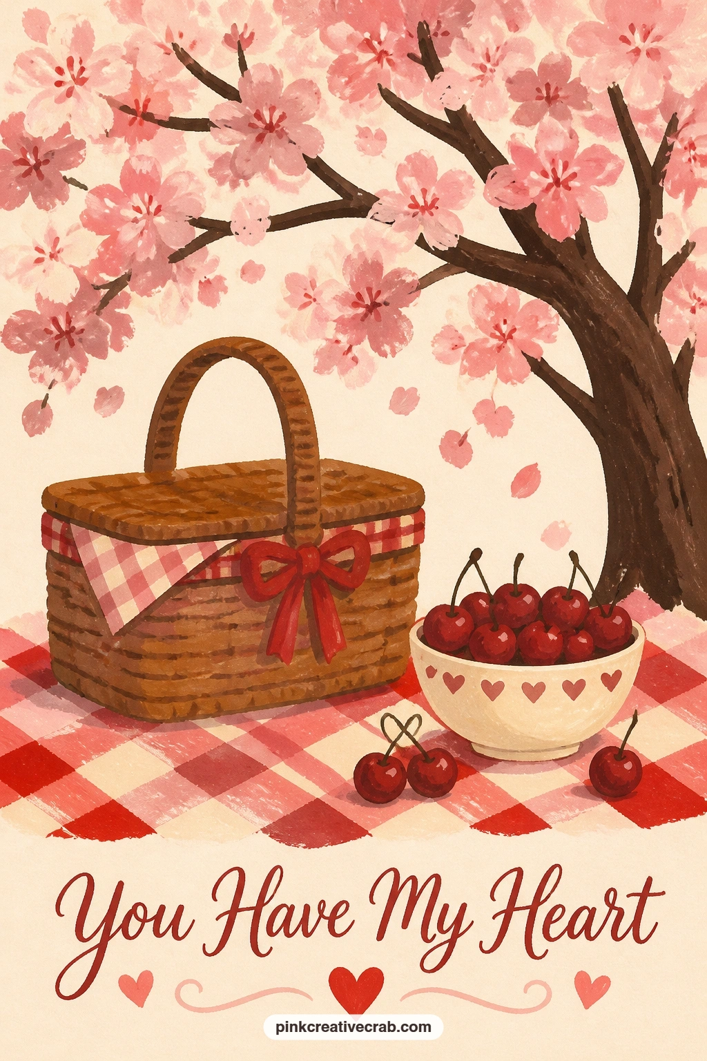
Palette: Blush Pink,Chocolate Brown,Cherry Red,Cream
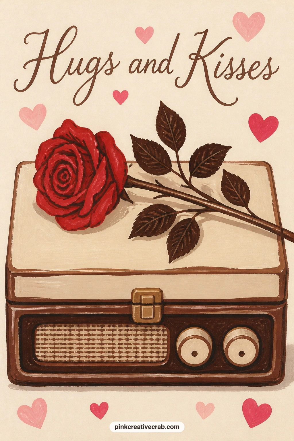
Rest a single red rose on the closed lid of a vintage record player, a card built mostly from straight lines against one soft curved flower. Paint the record player body first as a flat rectangle in chocolate brown or cream, then add the turntable circle and tonearm as simple geometric shapes on top.
Perspective matters here: look at the record player slightly from above, which lets you show the turntable as a full circle rather than a flattened oval, a small shift that makes the whole object read correctly. Add the rose last, resting diagonally across one corner of the lid using the same loose spiral stroke as earlier roses.
If the turntable circle looks lopsided, turn your paper and trace around a coin or small lid for a clean edge before filling it in. No record player to look at directly, a plain rectangular box shape with one circle on top reads as the same object at this scale.
Keep the rose the only warm color in an otherwise brown and cream scene so it stays the clear focal point.
You Will Need
- small coin or lid to trace the turntable circle
Palette: Chocolate Brown,Cream,Cherry Red,Soft White
Cut a heart shape from a slice of toast and fill it with jam, a small kitchen still life that works entirely on one clean cutout edge. Paint the toast slice first as a rounded square in warm golden brown, slightly darker along the crust edge where it toasted more.
Paint the heart cutout as a flat cherry red shape set into the toast, with the edge where red meets brown kept crisp and slightly raised, since a soft blurry edge there reads as spilled jam rather than a clean cut. Add two or three small jam highlight dots in a brighter red to suggest the glossy surface.
If the toast surface looks too smooth and flat, dab a few small irregular darker brown spots across it for texture, toast is never perfectly even in color. No golden brown gouache mixed, yellow ochre warmed slightly with a touch of red gets close enough.
Set it on a small plate with one thin shadow line to finish the composition.
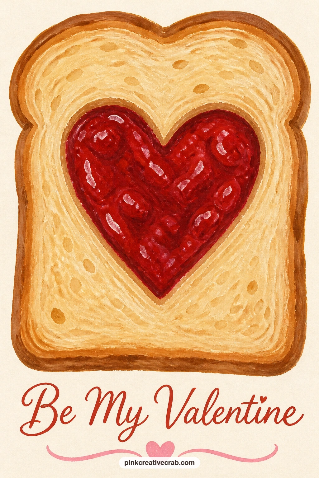
Palette: Chocolate Brown,Cherry Red,Cream,Soft White
Face two cherry red armchairs toward each other beside a tall window, a quiet interior scene built from large simple shapes. Paint the window first as a tall rectangle with a soft pale blue or cream glow behind it, then the two armchairs as rounded box shapes facing inward at a slight angle.
The quick ten-minute version stops there: two flat red chairs, one window, done. Given forty minutes, add a small round side table between them with two tiny teacups, and one thin curved shadow line along each chair’s seat cushion to suggest the upholstery curve without full shading.
If the chairs feel too stiff and boxy, round off their corners more than feels natural, armchairs are softer shapes than they first appear in a sketch. No window light to reference, a plain pale rectangle behind the chairs reads as daylight well enough.
Keep both chairs the exact same red so they read as a matched pair rather than two different pieces of furniture.
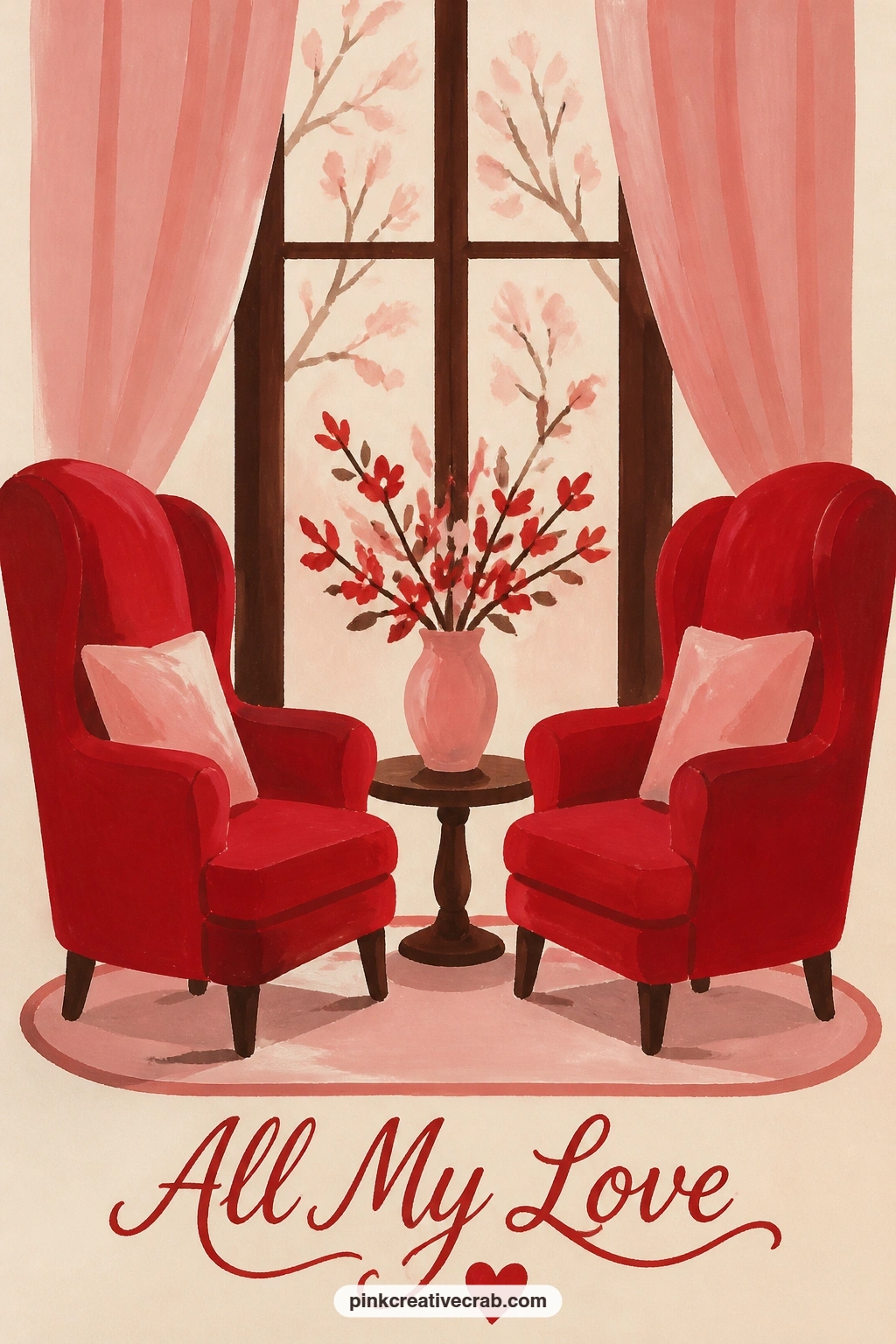
Palette: Cherry Red,Cream,Chocolate Brown,Dusty Blue
Cover a pink cake topped with cherries under a glass dome, a subject that leans on one trick for painting glass convincingly. Paint the cake first as a simple layered shape in blush pink with a slightly darker pink shadow line between layers, then add two or three cherries on top using the same bowl-of-cherries technique from earlier in this list.
For the glass dome, resist the urge to paint it solid: leave most of the area as untouched cream background and add only two or three thin curved highlight lines and one soft shadow arc along the dome’s edge, that restraint is what reads as glass rather than a painted bubble. Add a thin dark line at the base where the dome meets its plate to ground it.
If the dome looks too heavy, scrape back some wet paint with a dry brush or a bit of damp tissue to lighten an area instead of repainting it thinner. No glass dome in sight, a simple round plate with the cake exposed works fine without the dome entirely.
Keep the cherries the brightest color in the whole piece so they pop through the glass.
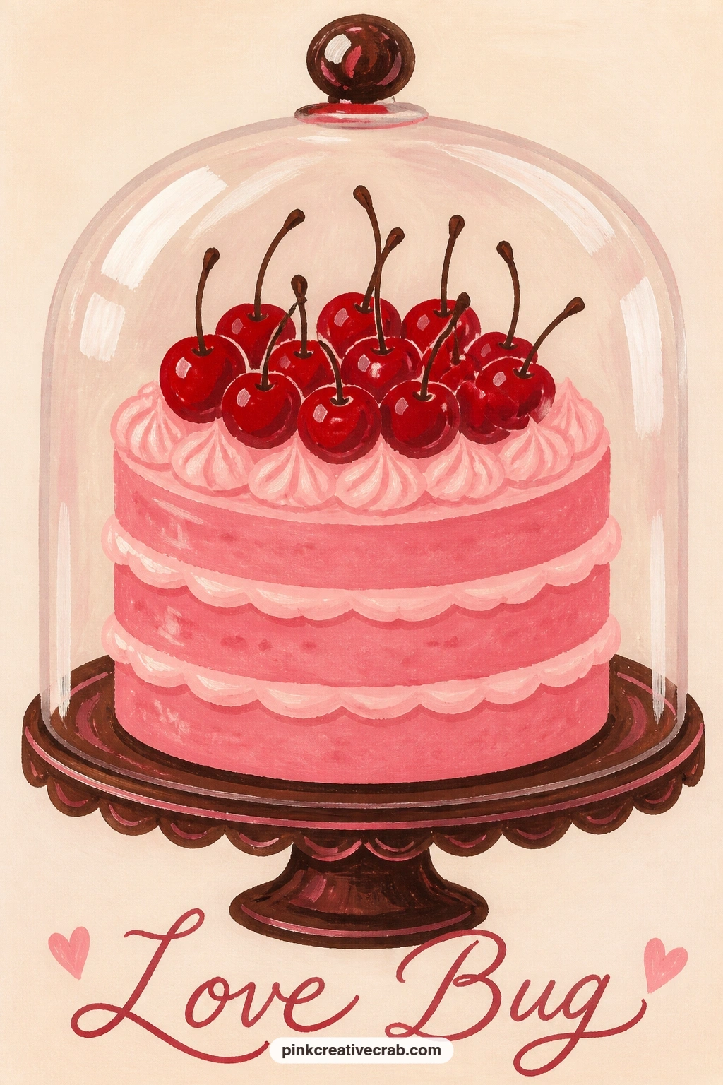
Palette: Blush Pink,Cherry Red,Cream,Soft White
Return to the flower stall from earlier in this list, but now under a red umbrella in the rain, a composition where the umbrella’s curve is the trick worth getting right. Paint the umbrella canopy as a single smooth dome shape first, checking that both sides curve down evenly by comparing the left half against the right before adding the ribs.
Add thin dark umbrella rib lines radiating from the center point, then the flower stall tucked beneath it in cherry red buckets of flowers, smaller and simpler than the earlier flower cart since the umbrella is now the main shape. A few short diagonal cream lines scattered across the background suggest rain without painting individual drops in detail.
If the umbrella dome looks lopsided, fold your paper in half to check the curve matches on both sides before committing to paint. No red gouache free for the umbrella, a deep plum or maroon reads as a close cousin and still contrasts against the cream rain streaks.
Keep the rain lines sparse, five or six scattered strokes says more than a sky full of them.
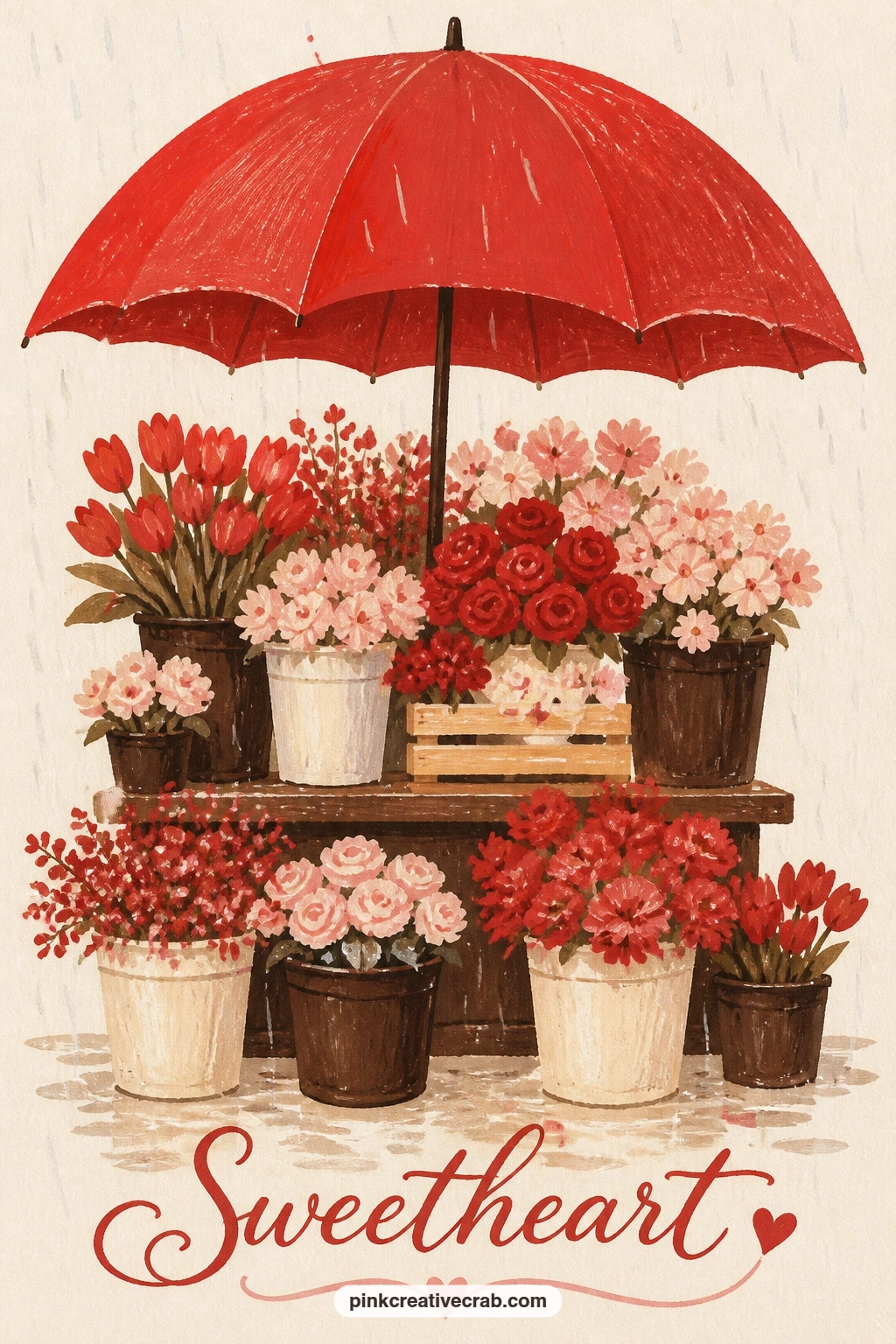
Palette: Cherry Red,Chocolate Brown,Blush Pink,Cream
Pare everything back for a single tulip standing in a milk bottle on a doorstep at dawn, the simplest composition in this whole list and a good one to end a session on if you are low on time. Paint the bottle first as a tall narrow cylinder in pale cream or soft white glass tones, with one thin vertical highlight line down its side.
The quick version stops at the tulip and bottle alone on plain cream. The forty-minute version adds a soft pale pink or lavender wash across the upper half of the background to suggest early dawn light, blended while still slightly damp so it fades gently rather than stopping in a hard line.
If the tulip looks stiff, tilt its stem a few degrees off vertical and let the closed cup-shaped bloom lean slightly with it, a perfectly straight tulip looks like a diagram rather than a flower. No lavender gouache for the dawn wash, a touch of blush pink mixed into white works as a gentler stand-in.
One thin shadow beneath the bottle finishes the doorstep setting.
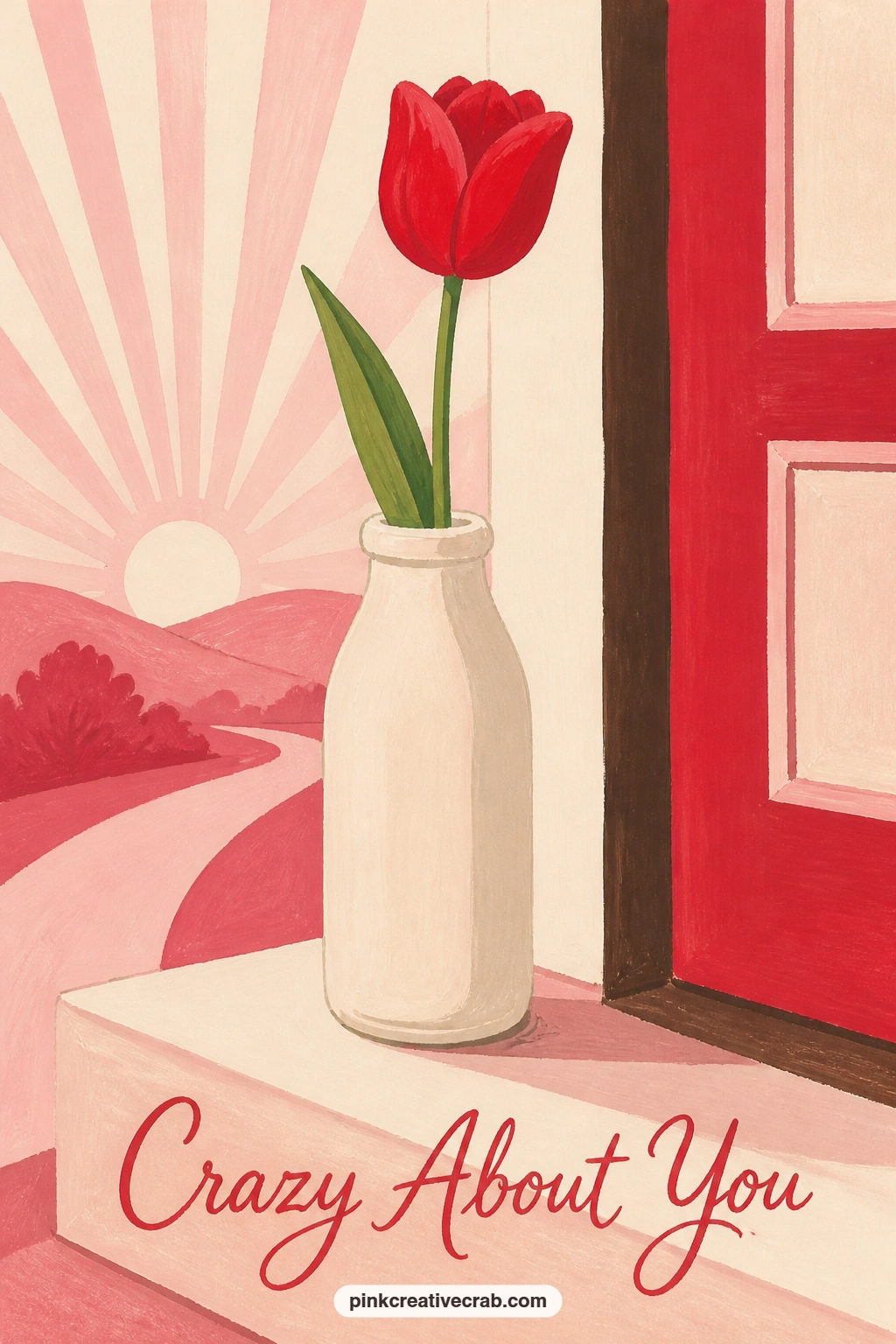
Palette: Cherry Red,Cream,Blush Pink,Soft White
Set a jar of pink peonies on a kitchen windowsill, letting daylight shape the whole small scene. Paint the window frame first as a simple light rectangle behind the jar, then block the jar itself in pale cream glass tones before the peonies go in on top.
Light source placement does the real work here: decide the light comes from one side of the window, then paint the peonies on that side slightly brighter and the opposite side of each bloom a touch deeper in tone, using the same loose spiral strokes from earlier peony and rose ideas. That one shift in tone across the bouquet makes the whole jar feel lit rather than flat.
If the peonies start blending into one pink mass, vary two or three blooms toward a deeper rose tone so the eye can separate individual flowers. No real peonies to study, any rounded multi-petal flower shape built from overlapping spirals reads the same way at this scale.
For more flower arranging ideas on a sill or in a vase, the easy watercolor flower for beginners list has useful starting shapes too.
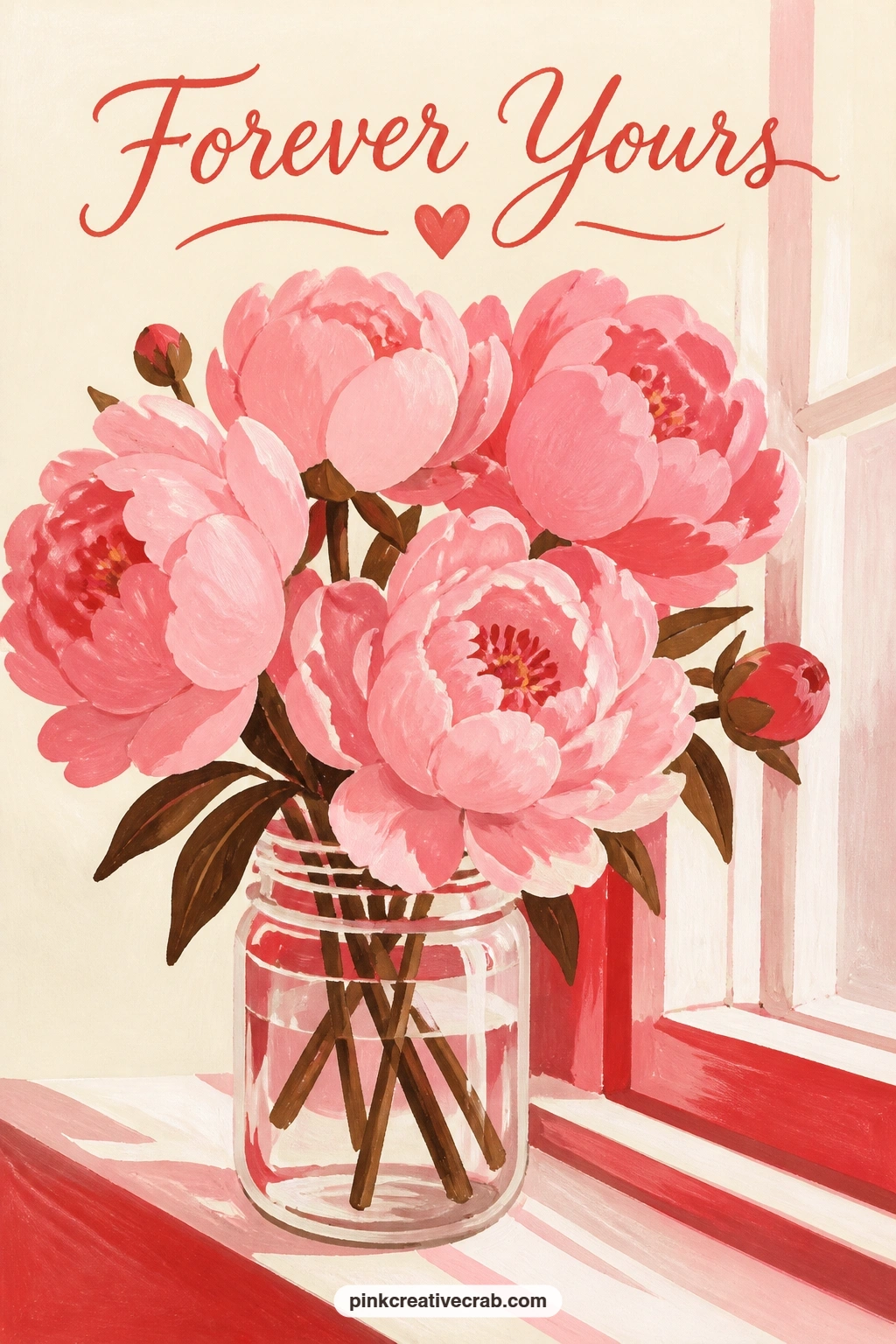
Palette: Blush Pink,Cream,Chocolate Brown,Soft White
Warm things up with two mugs of hot chocolate on a windowsill, each topped with a small heart-shaped marshmallow. Paint the mugs first as simple rounded cylinders, one in cream and one in blush pink so they read as a matched but not identical pair, then fill the tops with a flat chocolate brown disc for the drink itself.
The hands-on trick here is the marshmallow: paint each one as a flat cream heart shape sitting half-submerged in the brown disc, then drag a dry, barely loaded brush lightly across its edge to soften where marshmallow meets chocolate, rather than leaving a hard painted line between the two. That one dry-brush pass does more for realism than careful blending with a wet brush.
If the steam above the mugs feels necessary, two or three thin pale curved lines rising from each mug are enough, more than that starts looking like smoke. No cream gouache mixed for the marshmallows, straight white softened with a touch of the mug’s own color blends them into the scene.
Keep the windowsill behind them as one plain flat strip so the mugs stay the clear subject.
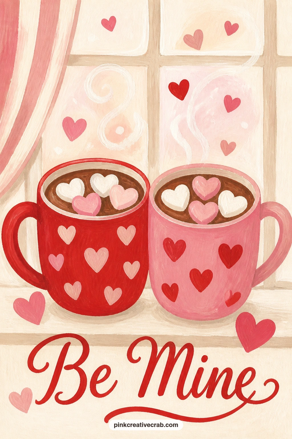
Palette: Chocolate Brown,Blush Pink,Cream,Soft White
Let a love letter fold into a paper plane and land on a desk beside a small pink lamp, a card with more energy than the earlier still, folded letter on the pond. Paint the desk surface first as a flat warm cream strip across the lower third, then the lamp as a simple rounded base and shade shape in blush pink.
The paper plane is built from three or four flat angular shapes in cream or white, kept crisp and geometric rather than softened, since a paper plane reads through its sharp folds. Angle it diagonally across the frame as if it has just landed, rather than sitting perfectly parallel to the desk edge, which keeps the motion feeling fresh.
If the plane’s folds look confused, simplify to the classic dart shape with one center fold line and two wing creases, more folds than that gets fussy fast at this size. No pink lamp to reference, a simple cream lamp shape with one blush pink shade panel reads the same way.
One small motion line trailing behind the plane’s tail finishes the sense of arrival.

Palette: Cream,Blush Pink,Chocolate Brown,Soft White
Pair a pink teacup with cherries and a few lemon slices on a blue cloth, a still life built on contrast between warm fruit and a cool background. Paint the blue cloth first as a flat background shape across the whole card, letting it dry completely before any fruit or cup goes on top of it.
Paint the teacup next, then scatter two or three cherries and a lemon half or two around its base, overlapping the cup slightly so the arrangement feels gathered rather than lined up in a row. Lemon slices get a simple trick: paint the yellow flesh first, then add thin white segment lines radiating from the center once that base is dry, rather than trying to paint each segment as a separate shape.
If the blue cloth fights with the cherry red for attention, mute the blue slightly with a touch of cream mixed in, a softer dusty blue lets the warm fruit colors lead. No lemons on hand to reference, a couple more cherries in their place keeps the same warm-cool balance in the composition.
Finish with one soft cast shadow linking the cup and fruit together on the cloth.
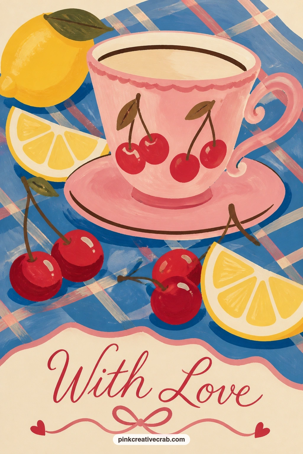
Palette: Dusty Blue,Blush Pink,Cherry Red,Cream
Place a florist’s bucket of red roses outside a blue shop door, a card that combines the rose spiral trick with the cool-warm contrast from the earlier blue door card. Paint the door and surrounding wall first as large flat shapes, blue door against a cream or soft brown wall, then add the metal bucket in front of it as a simple tapered cylinder.
Fill the bucket with rose heads using the familiar loose spiral stroke, packing them a little more densely than the single mailbox rose since a florist’s bucket reads as abundant rather than sparse. Vary two or three roses slightly darker or lighter than the rest so the bunch does not read as one flat block of red.
If the bucket looks like it is floating, add a short cast shadow beneath it onto the ground, anchoring it against the wall and door behind. No blue door gouache ready, a deep teal or navy both work as the cool anchor color this composition needs.
Keep the wall texture minimal, one flat color is enough behind such a busy bucket of roses.
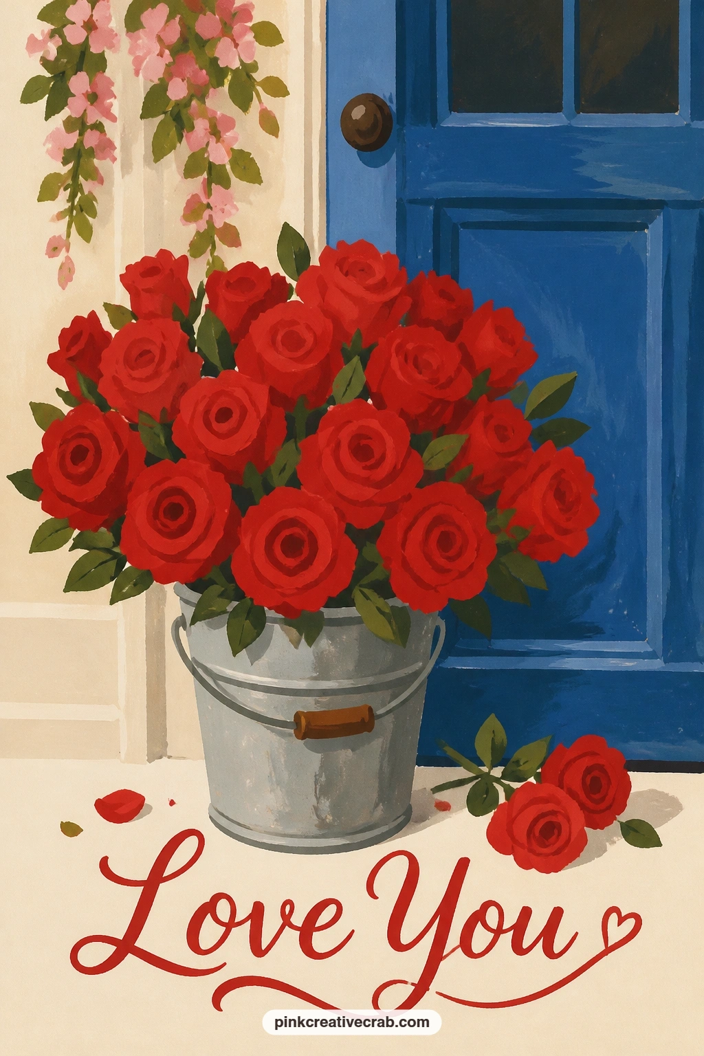
Palette: Dusty Blue,Cherry Red,Chocolate Brown,Cream
For more shop-front and bucket arrangements like this one, see the flower shop drawing ideas, which cover several florist door setups.
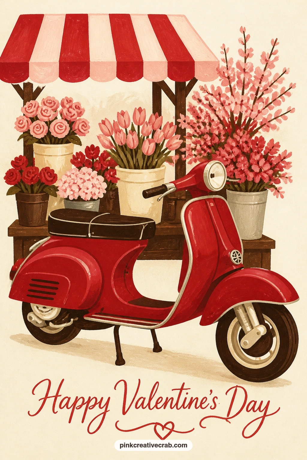
Park a cherry red vintage scooter beside a flower stall, the most mechanical shape in this whole list, so slow down on the body panels before adding any flowers. Paint the scooter’s body as one rounded, slightly curved silhouette in cherry red, checking that the front and back halves balance each other in size before the paint goes down.
Add the wheels as two simple circles, the handlebar as a thin curved line, and a small round headlight circle, keeping every mechanical detail reduced to its simplest shape rather than drawn literally. Tuck the flower stall in behind or beside it using buckets of pink and red blooms painted with the same spiral strokes used throughout this list.
If the scooter looks lopsided, trace around a small round object for both wheels so they match exactly, mismatched wheel sizes are the fastest way to throw the whole drawing off balance. No cherry red gouache mixed strong enough, layering a thin second coat once the first is dry deepens it without muddying the shape.
Keep the scooter larger in the frame than the stall so it stays the clear subject of the card.
You Will Need
- small round object to trace matching wheels
Palette: Cherry Red,Chocolate Brown,Blush Pink,Cream
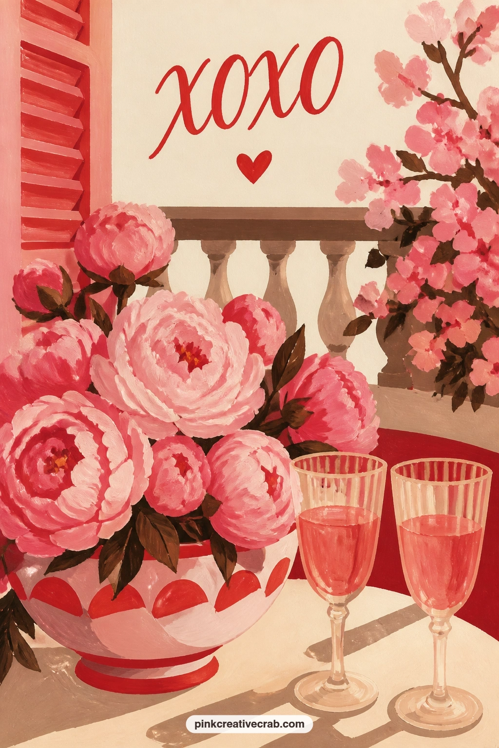
Set a bowl of pink peonies beside two glasses on a sunny balcony, a bright outdoor still life to balance the indoor scenes earlier in this list. Paint the balcony rail or floor first as a simple flat shape establishing the setting, then the peony bowl using the familiar loose spiral strokes, three or four blooms overlapping loosely in the bowl.
Place the two glasses beside the bowl, painted as simple tapered shapes with a thin highlight line down one side of each to suggest glass without full reflection detail. One swap worth knowing, if a second glass feels like too much detail for the time you have, a single glass plus the bowl of peonies still reads as a complete little scene.
If the sunlight feels missing, warm the whole background with a pale yellow-cream wash rather than leaving it pure white, that single warm tone does most of the work of suggesting sun. No real balcony to reference, a plain flat railing shape along the bottom edge of the card is enough to place the scene outdoors.
Finish with one soft shadow beneath the bowl and glasses to seat them in the light.
Palette: Blush Pink,Cream,Chocolate Brown,Soft White
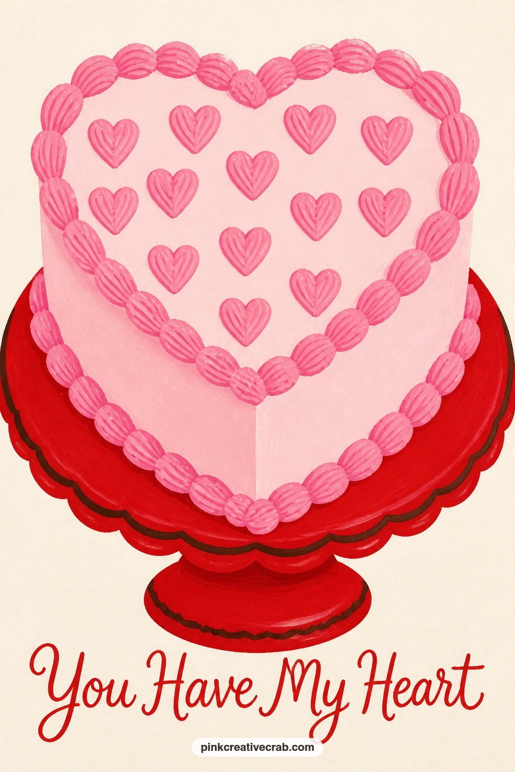
Close the list on a sweetheart cake topped with piped pink hearts, sitting on its own cake stand. Paint the cake body first as a simple cylinder in cream or soft white frosting tones, then the stand beneath it as a thin pedestal shape, letting both dry fully before any piping detail goes on top.
Vary it next time by changing what tops the cake: swap the piped hearts for a ring of whole cherries, a scatter of small painted flowers, or a single bold stripe of cherry red around the base, the same simple cylinder shape carries any of those finishes equally well. For this version, paint each piped heart as one small confident dot-and-point shape using the tip of a fine brush, spacing them evenly around the top edge rather than scattering them randomly.
If the piped hearts start looking uneven, paint them freehand rather than measuring each one, a little natural variation actually reads as more convincingly piped than a perfectly even row. No fine brush on hand for small detail, the rounded tip of a cocktail stick dipped in paint makes a clean small heart dot too.
Keep the cake stand simple, one thin pedestal line is all it needs to read clearly.
You Will Need
- cocktail stick for fine piped detail
Palette: Cream,Blush Pink,Cherry Red,Soft White
What to Do Next
Pick whichever idea matches the person you are painting for, from a quick single tulip in a milk bottle to the busier flower cart or cherry blossom picnic, and start with a pencil sketch of the big shapes on a cut card blank before the gouache goes down.
Frequently Asked Questions
What gouache colors do I need for valentines day card ideas like these?
Cherry red, blush pink, cream and chocolate brown cover almost every idea here. Add soft white for highlights and one dusty blue for contrast pieces like the mailbox roses or the blue door scenes.
What paper works best for a painted valentine card front?
A heavier cold press watercolor paper, around 140 pound, holds gouache without warping. Cut or fold it to card size first so the composition fits the frame before you start painting.
How do I keep gouache edges crisp instead of fuzzy on a small card?
Let each shape dry fully before painting the next one beside or over it. Working wet into wet is what blurs edges, so block big shapes first and add small details only once the base layers are dry.
Can I skip lettering completely and still make it read as a valentine card?
Yes, every idea in this list relies on the picture alone. A sealed letter, a cherry bowl with two spoons or a pair of teacups all say the occasion without a single written word.
What if I only have craft acrylic paint instead of gouache?
Craft acrylic can stand in for gouache on these cards since both dry matte and opaque. Thin it slightly less than you would for canvas work, so it keeps the same flat, crisp coverage gouache gives.
Have any thoughts?
Share your reaction or leave a quick response — we’d love to hear what you think!
-
 0
-
0
-
0
-
0
-
0
-
0


