

Book illustration gives you the best of both worlds: a story to tell and a page to fill with watercolor. Every scene below puts a book at the center, a bench in the snow, a window seat, a sled stacked with library books, so the composition is already half done before you pick up a brush.
Work through these in order and you will move from a quiet open book to a full room with people, pets and lamplight. Each one fits on a single sheet and can be finished in one sitting, so pick whichever catches your eye and start painting.
Using these images: free for personal projects such as printing, coloring, cards, journals and gifts. Handmade items that include them may be sold up to 30 pieces per design. More than that is commercial use and is not permitted, and neither is selling or sharing the images themselves or passing them off as your own. Please ask before any other use.
Start with the ladder, since it gives you the one straight line the whole library leans on. Draw it lightly in pencil first, angled against a tall shelf, then build the shelves around it with a ruler-assisted ink line so the verticals stay honest even in a loose painting.
Lay a pale cream wash over the paper first and let it dry completely before you ink the shelf lines, otherwise the ink will bleed into fuzzy shapes instead of crisp uprights. Paint the spines in quick strokes of burgundy, green and ochre, varying the heights so the shelf reads as full rather than a repeated pattern.
If this is your first time drawing a ladder in perspective, keep the top narrower than the bottom and the rungs slightly curved, which sells the angle without any formal perspective lines. Add a window at the back with icy blue glass and a few snow flecks for scale.
Finish with a dry brush dragged lightly over the shelf fronts to suggest dust and age, a small touch that does more for the mood than another coat of paint.
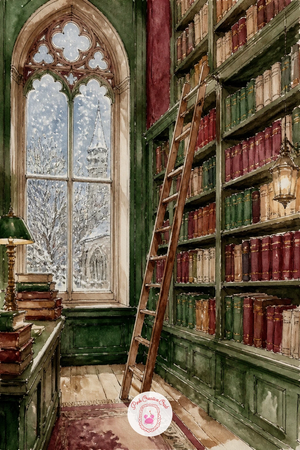
Palette: Burnt Sienna,Sap Green,Burgundy,Cream
Painting a book left open on a snowy park bench works because the subject is small and the background does almost all the storytelling. Sketch the bench in a simple three-quarter view, then place the open book slightly off center on the seat so the composition does not feel too symmetrical.
Paint the snow first as a pale blue-grey wash over the whole lower half, then lift out small patches with a dry paper towel while it is still damp to leave soft snow drifts. Once dry, paint the bench in burgundy or weathered green and leave the book pages as bare white paper with only a few grey ink lines for text.
The place this goes wrong is painting the snow too flat; keep your brush strokes varied and let some blue pool at the edges of the bench slats for shadow. If you do not have a fine liner, a sharp pencil works for the thin text lines on the pages.
Finish by flicking a little white gouache or a dry toothbrush spatter across the scene for falling snow.
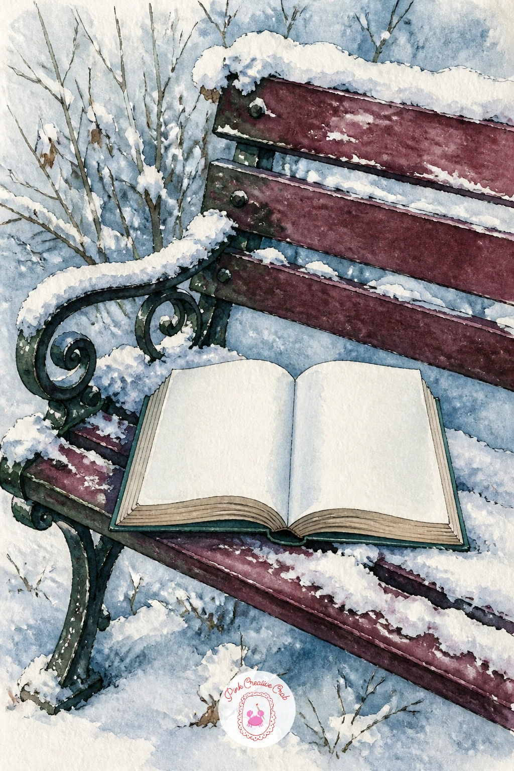
You Will Need
- white gouache or a toothbrush for snow spatter
Palette: Payne’s Grey,Icy Blue,Burgundy,White
A girl reading on a window seat gives you a lovely excuse to paint snow falling outside glass, which is really just controlled splatter against a cool wash. Block in her seated shape first with a mid-tone wash, knees drawn up, book held loosely, then paint the window frame around her in thin ink lines once the figure is dry.
Work the outdoor snow scene behind the glass in icy blue and soft grey, kept looser and paler than anything inside the room, which pushes it convincingly into the distance. Her cushion and blanket can carry the warm colors, burgundy or ochre, so the whole painting contrasts warm interior against cool exterior.
If proportions worry you, measure her seated height against the window frame height before you commit to ink, since a window seat scene lives or dies on whether she fits naturally into the alcove. A photo of yourself sitting cross-legged works as a quick reference if you do not have a model.
End with a single warm lamp glow painted in soft yellow near her shoulder for a cozy focal point.
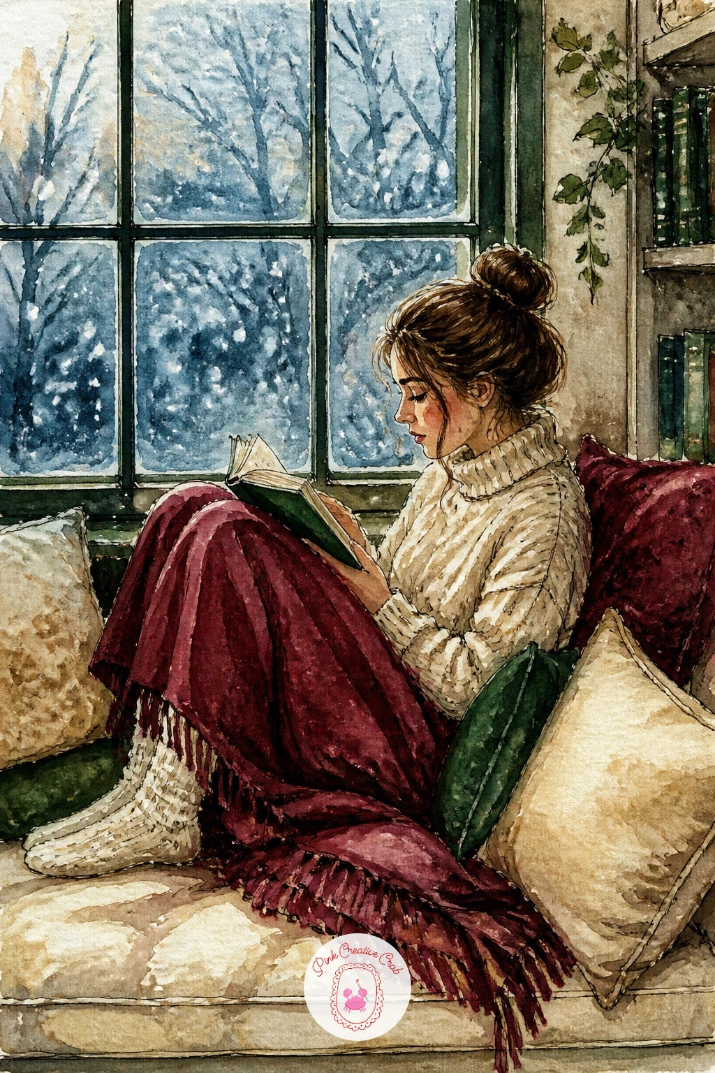
Palette: Icy Blue,Ochre,Burgundy,Payne’s Grey
Following the window seat, try something with more motion: a stack of library books tied with string, riding on a sled through snow. Draw the sled first in a simple side view, then stack three or four rectangular books on top, angled very slightly so the pile does not look perfectly square.
Paint the string last in ink, a single looping line that wraps the stack and gives the whole pile a sense of having just been tied. Vary the book cover colors across burgundy, green and cream so the stack reads as a mixed load rather than a single block of color.
The quick version takes about ten minutes: sled, stack, string, done, with snow suggested by bare paper. The forty-minute version adds a snowy path behind the sled with faint footprints or sled tracks dragging off the edge of the page, giving the scene somewhere to have come from and somewhere to go.
If you want one concrete tip for today, paint the string in a contrasting pale ink line rather than black, so it does not visually cut the stack in two.
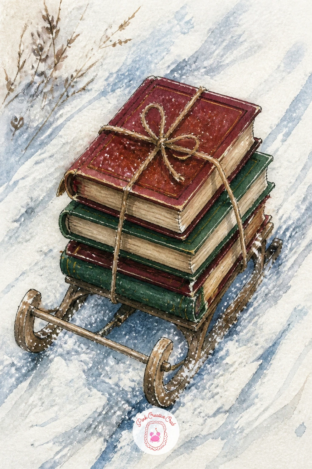
Palette: Burgundy,Sap Green,Cream,Payne’s Grey
Move indoors to a bookshop doorway with a cat sitting among the stacked books, a scene that rewards a confident dry brush more than careful detail. Start with the doorway arch and a loose pile of books along its edge, then place the cat last so you can judge exactly how much space it needs.
Paint the cat in two or three flat washes, a base coat, a shadow side, then a few ink whisker lines, and resist outlining the whole animal or it will look stiff. The books around it can be looser still, quick rectangles of color with the titles only implied by a scribble of ink.
This is a good scene to practice edges on: use a dry brush dragged along the cat’s fur line so it breaks up softly into the surrounding paper rather than sitting as a hard silhouette. If animal anatomy gives you trouble, reference any cat sitting photo and just copy the pose, not the detail. The cat sketchbook ideas collection has more poses if you want to practice this cat separately first.
Finish with snow dusted along the top of the doorframe for a cold-outside, warm-inside contrast.
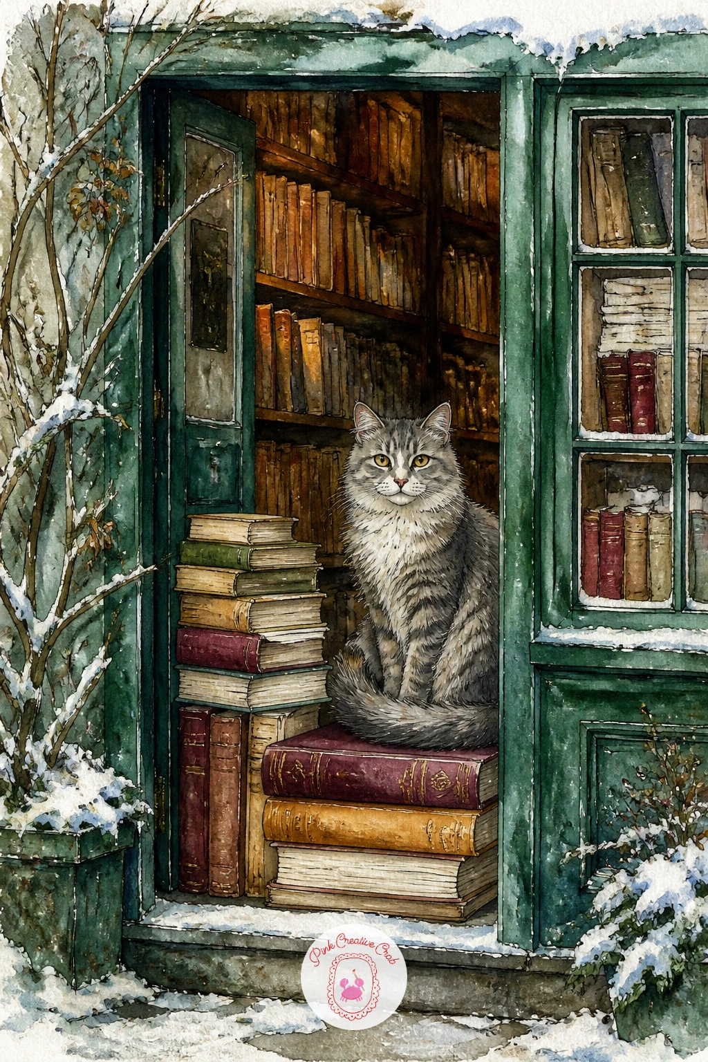
Palette: Burgundy,Burnt Sienna,Payne’s Grey,White
A book propped on a pillow in a bed piled with quilts is a close-up, cozy subject that works beautifully as a smaller painting. Build the pillow and quilts first in soft overlapping washes, letting burgundy, cream and green blend wet into wet at the edges so the fabric feels soft rather than flat.
Once that base layer is fully dry, paint the book sitting slightly tilted against the pillow, its pages catching a little shadow underneath where it leans. Keep the quilt patterns simple, a few stripes or checks in ink rather than a fully rendered pattern, since too much detail will fight the book for attention.
The eye level here sits close and slightly above the bed, almost as if you are about to pick the book back up, so tilt the pillow and quilt folds toward that angle rather than painting them flat-on. Light from a bedside lamp can come from one side, warming that edge of the quilt while the far side stays cooler and greyer.
If you only have one wash color for the quilts, add texture instead with varied brush pressure, since pattern is optional but texture carries the coziness.
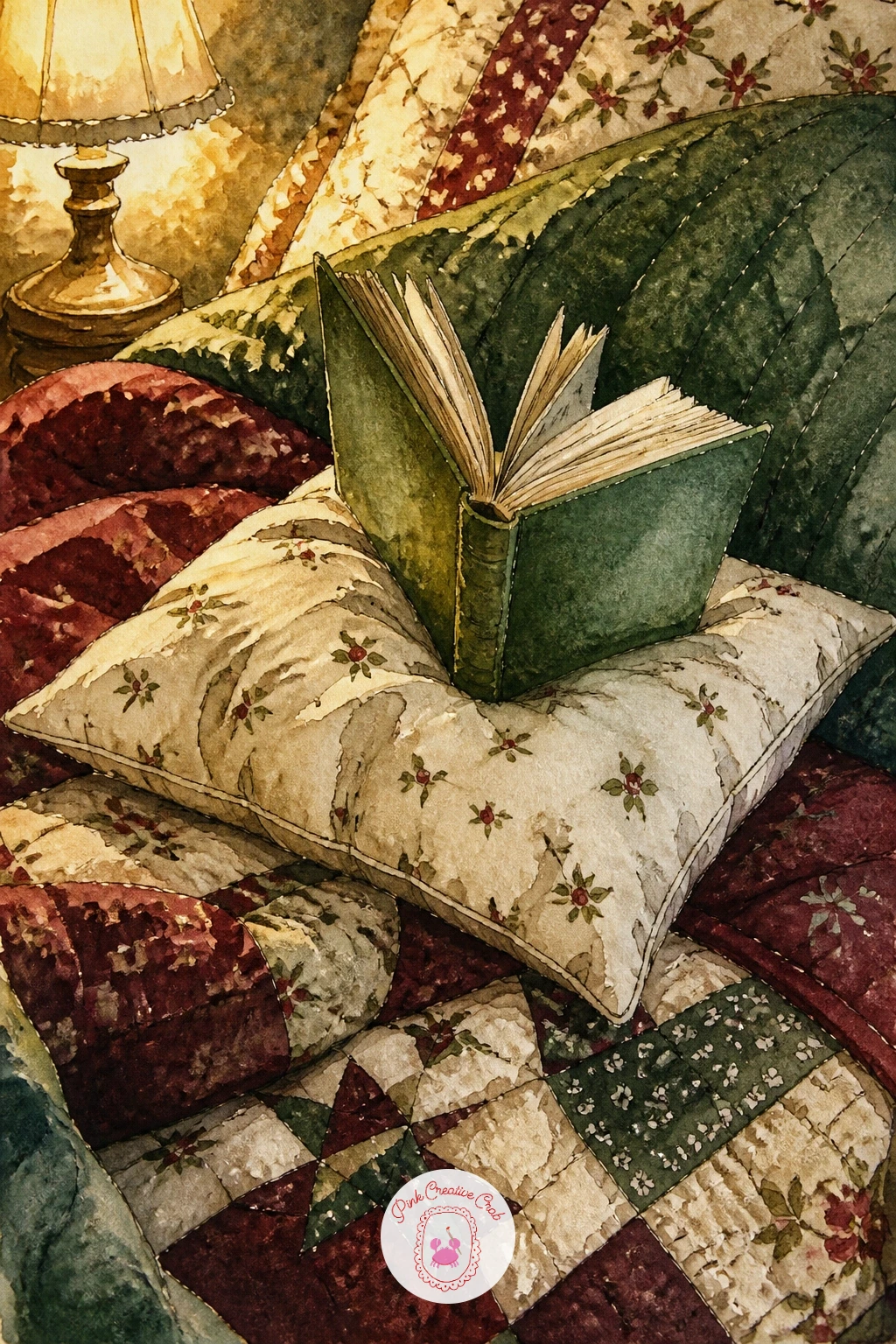
Palette: Burgundy,Cream,Sap Green,Payne’s Grey
Try this scene again later with a cat curled at the foot of the bed instead of empty quilt, which only changes one small shape but shifts the whole mood.
A reading nook tucked under the stairs with a lamp and cushions gives you an architectural puzzle worth solving before you paint a single wash. Pencil in the diagonal stair line first, since everything else, the cushions, the lamp, the little shelf, has to fit under that slope without looking squeezed.
Paint the stair structure in flat ochre or warm wood tones, then build the cushion pile in overlapping burgundy and green washes once the wood is dry, letting the cushions bulge slightly past the edge of the under-stair opening for a lived-in feel. The lamp gets painted last, a small warm glow of yellow with a soft halo around it rather than a hard-edged shape.
Light source matters most here: let the lamp be the only warm light in the scene, which means everything further from it, the stair treads above, the far cushion, should sit slightly cooler and greyer. This single decision does more to make the nook feel cozy than any amount of extra detail.
One tip for today: paint the lamp glow before you paint anything around it in ink, since ink lines drawn over a soft wash glow look crisper and more intentional.
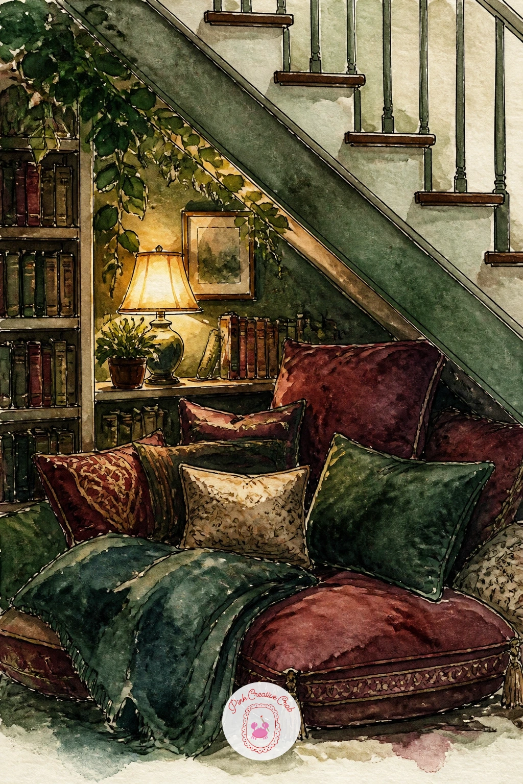
Palette: Burgundy,Ochre,Sap Green,Payne’s Grey
Give yourself a figure in motion next: a librarian pushing a cart of books past frosty windows. Sketch the cart first as a simple rectangle on wheels, then add the librarian walking beside it in a loose, gestural pose, weight shifted onto one leg as if mid-step.
Paint the figure in a single flat color for the coat or cardigan, burgundy or deep green works well, and keep the face barely suggested, a few ink dots and a line, since this scene is about the whole moment rather than a portrait. The frosty windows behind can be painted with a dry brush dragged sideways in pale blue-white for a frosted glass texture, which is far easier than trying to paint individual frost patterns.
If the figure’s proportions feel off, measure head height against total body height before inking; roughly seven to seven and a half head-heights reads as a natural adult figure. A stick figure study first on scrap paper saves a lot of frustration on the good sheet.
Finish with a stack of book spines on the cart painted in quick varied colors, not individually detailed, just enough rhythm to read as “books.”
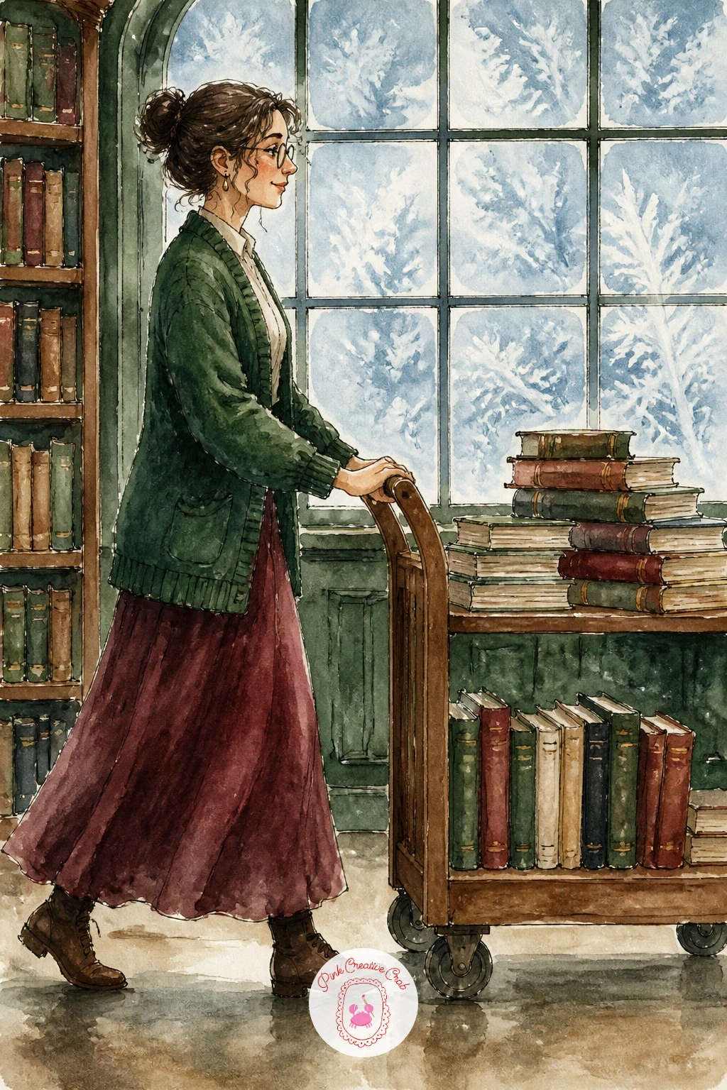
Palette: Burgundy,Sap Green,Icy Blue,Payne’s Grey
After a moving figure, slow things back down with a dog asleep, its head resting on an open book. Draw the open book first as two flat pages meeting at a soft spine curve, then build the dog’s head and front paws on top, letting the far edge of the book disappear slightly under its fur.
Paint the dog’s coat in loose layered washes, a base color then a darker shadow wash around the ears and muzzle while the paper is still slightly damp, which softens the edges the way real fur falls. Keep the book pages bright white or pale cream so the dog’s warmer coat color stands out clearly against them.
This is a good subject for practicing texture with a dry brush: once the base coat is dry, drag a nearly-dry brush loaded with a darker shade across the fur direction to suggest individual hairs without drawing each one. If you are working from a photo, choose one with soft, even light so the shadows stay simple.
A folded blanket corner tucked under the book adds coziness without much extra work, just one more flat wash and a fold line in ink.
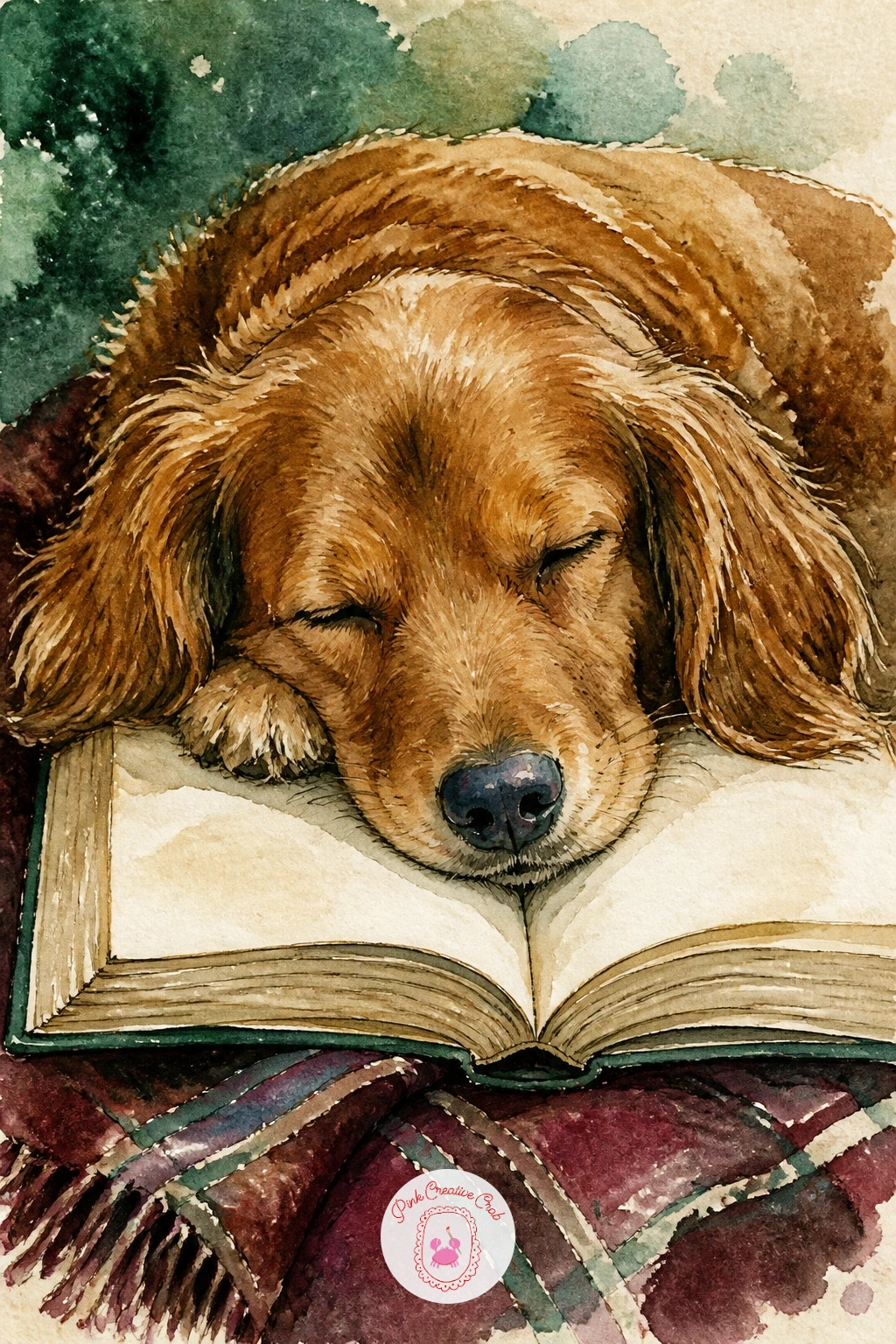
Palette: Burnt Sienna,Payne’s Grey,Cream,Burgundy
A book club around a table with tea and cake is the most people-heavy scene on this list, so simplify early and keep every figure loose. Block in the table shape first, then place three or four seated figures around it as simple rounded shapes, varying their poses, one leaning forward, one with a cup raised, so the group reads as a real conversation.
Paint the tablecloth and teacups in quick flat washes before tackling the figures, since a finished tabletop gives you a color anchor for everything sitting on it. Keep faces minimal, a hint of a nose and mouth at most, and let clothing colors vary across burgundy, green and cream to keep the group visually separated.
The place this scene usually goes wrong is cramming too many figures in; four is plenty for a single page, and each one needs breathing room or the whole table reads as a tangle. If you are unsure how to space figures, sketch them in pencil first and erase to adjust before any ink goes down.
A slice of cake and a teapot painted in the center pulls the whole composition together as a focal point.
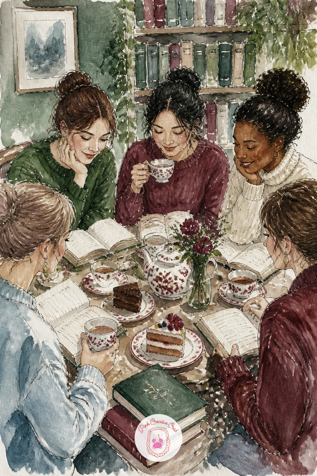
Palette: Burgundy,Sap Green,Cream,Ochre
A little free library box in the snow with a robin perched on top is a compact scene that leans heavily on your red accent. Paint the box itself first in weathered green or faded cream, a simple house shape with a glass-fronted door, then let it dry fully before adding the robin so its red breast stays crisp against the box color.
Build the snow around the base with soft blue-grey washes and let the white paper do most of the work for the drifts themselves. The robin needs only a few confident shapes, a round body, a small head, a single ink line for the legs, since overworking a small bird quickly kills its charm.
If red birds already feel familiar to you, the detail work here is really in the snow texture rather than the bird: try lifting color with a damp brush right after painting to create soft snow mounds along the box roof. For a deeper look at painting red birds well, the cardinal drawing ideas cover similar proportion and color tricks.
Finish with a few book spines just visible through the glass door for the detail that makes the box read clearly as a library.
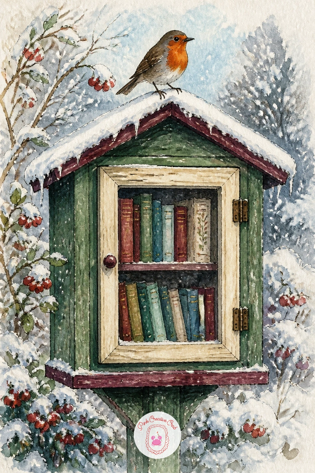
Palette: Sap Green,Burgundy,Icy Blue,Cream
Shift into a warmer, messier scene with a cookbook open on a kitchen stand, flour scattered everywhere around it. Paint the stand and open book first in clean flat washes, then once dry, flick and dab white gouache across the surrounding counter for flour, which reads far better than trying to paint flour as an actual wash.
Keep the cookbook pages simple, a recipe title and a few lines of text suggested in ink rather than written out, with maybe one small illustration of a dish painted loosely in a corner. A rolling pin or a mixing bowl nearby adds context without much extra effort, just a shape and a shadow.
The quick ten-minute version is the stand, the book and a light flour dusting. The forty-minute version adds the full counter scene around it, jars, a window with winter light, a wooden spoon resting against the bowl, which turns a single object into a full kitchen moment.
If you do not have white gouache for the flour, a white gel pen works just as well for the scattered flecks.
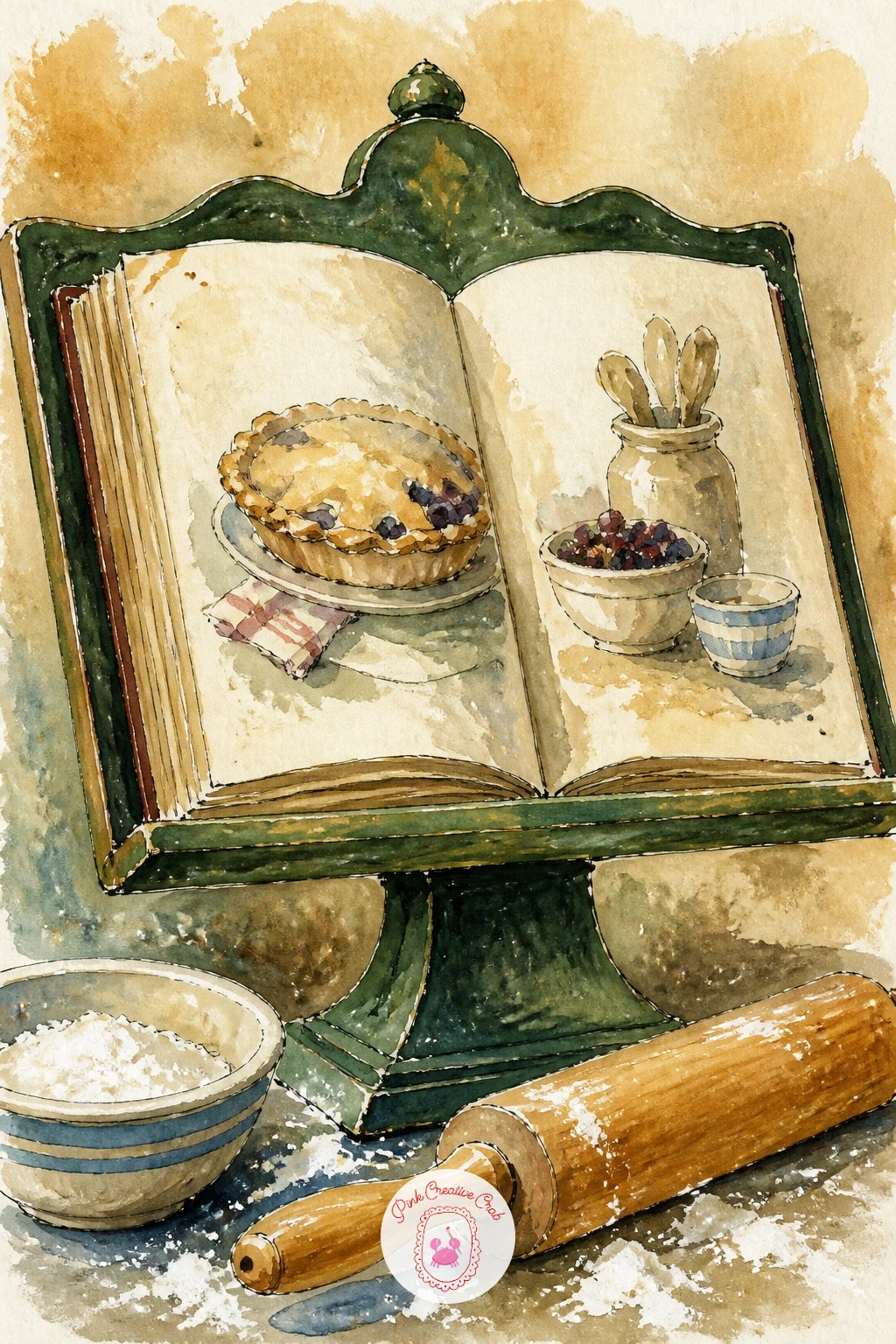
You Will Need
- white gouache or a white gel pen for flour flecks
Palette: Ochre,Burnt Sienna,Cream,White
Painting a girl reading on a train with her bag beside her means working out a window first, since the glow or blur beyond it sets the whole mood. Sketch the train seat and window shape, then paint the view outside in soft, slightly smeared blue-grey washes while the paper is still damp, suggesting motion without any real detail.
The figure comes next, seated, book held up close, bag tucked against her leg or on the seat beside her, painted in a single warm color so she stands out clearly against the cooler window light. Keep her face mostly turned down toward the book, which simplifies the features to almost nothing and keeps the focus on the reading itself.
Comparing proportions matters here: measure the seat back height against her seated height before committing to ink, since train interiors are cramped and figures drawn too large will look like they do not fit the space. If you are working without a photo reference, sitting in front of a mirror with a book works surprisingly well.
A single luggage tag or a cup of coffee on the fold-down tray adds a nice small detail without extra complexity.
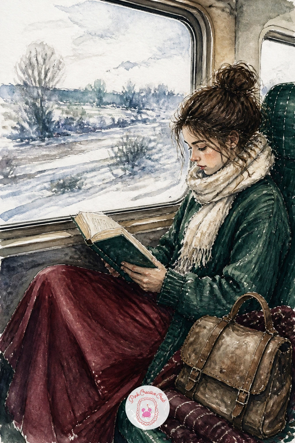
Palette: Icy Blue,Burgundy,Payne’s Grey,Cream
A grandmother reading to two children by the fire asks for warmth above everything else, so start by laying a soft orange-red wash for the firelight glow and let it dry before anything else goes in. Build the three figures next, grandmother seated with the book, two children leaned in close, all painted slightly backlit by that fire glow so their outer edges catch warm light and their faces stay a touch softer.
Keep the children’s poses different from each other, one sitting, one maybe lying across a rug, so the group does not feel like a repeated shape. The fireplace itself can stay loose, a dark opening with a few flame shapes flicked in with orange and yellow rather than carefully rendered logs.
If you want one hands-on texture trick here, lift a little color out of the fire’s center with a damp brush once the wash has mostly dried, which creates a soft glowing core instead of a flat orange blob.
A rug, a basket of yarn or a sleeping cat nearby rounds the scene out without asking you to add another full figure.
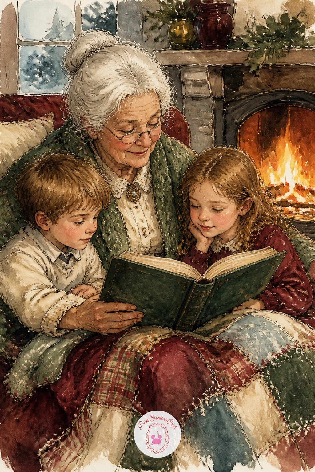
Palette: Burnt Sienna,Ochre,Burgundy,Payne’s Grey
A pile of books used as a side table with a lamp on top is a small still life that rewards careful stacking more than careful painting. Draw the stack first as a series of slightly uneven rectangles, each one a touch smaller or wider than the last, since a perfectly even stack looks stiff and unconvincing.
Paint each book spine in a different flat color, burgundy, green, cream, letting a thin strip of white paper show between each one for the page edges. The lamp sits on top last, painted with a warm glow radiating softly into the surrounding wash rather than a hard-edged lampshade shape.
Comparing the width of the lamp base against the width of the top book keeps the whole stack feeling structurally sound rather than top-heavy or precarious. A small side detail, a teacup or a pair of reading glasses resting against the stack, adds life without competing with the lamp for attention.
If you want this scene a little looser, try it again later with the stack tilted slightly rather than perfectly upright, which gives it more personality on a second attempt.

Palette: Burgundy,Sap Green,Cream,Ochre
A reader wrapped in a blanket inside a hanging chair gives you a curved shape to build the whole composition around. Start with the chair’s rounded silhouette, a simple oval or teardrop, then nest the figure inside it, knees drawn up, blanket draped loosely over one side so it spills slightly past the chair’s edge.
Paint the blanket in a textured wash, burgundy or cream, letting the color pool unevenly so it reads as soft fabric rather than a flat shape. The chair frame or ropes can be added last in thin ink lines, since they need to sit clearly on top of the softer washes beneath.
If this is your first time drawing a hanging chair, look at how the ropes or chain pull the top of the chair toward a single point above, which helps the whole thing read as suspended rather than floating. A window or a plant beside the chair gives the scene a sense of place without much extra painting.
One concrete tip: let the blanket be the brightest, warmest color in the painting, since it is doing the job of pulling the eye straight to the reader.
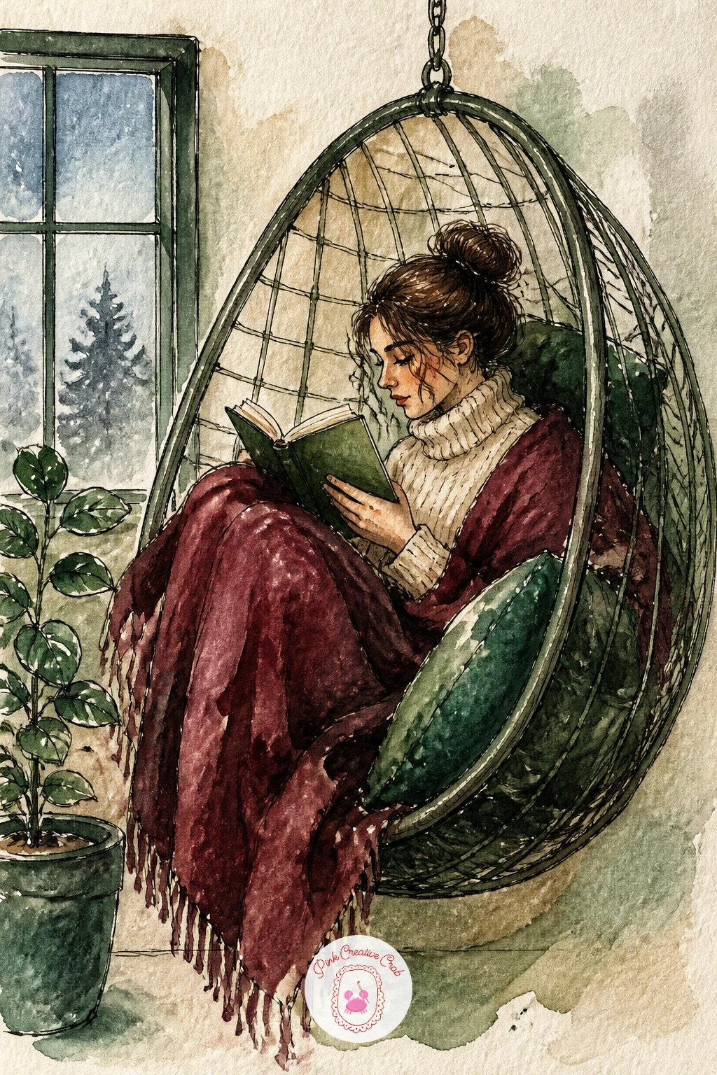
Palette: Burgundy,Cream,Sap Green,Payne’s Grey
A bookshop window display with the snowy street reflected is really two paintings stacked in one: the display itself and a ghostly reflection over the top of it. Paint the display first, books arranged on a tiered stand, maybe a small sign or a string of lights, in clear, fairly saturated color since this layer needs to read through the reflection later.
Once that is fully dry, mix a very pale, slightly bluish wash and paint a loose reflected version of the street, bare branches, a lamp post, over the top of the display, keeping it soft and slightly transparent so the books still show through. This layering is the trickiest part of the scene, so keep the reflection wash thin; you can always add a touch more, but you cannot easily remove too much.
The frame of the window itself, painted last in ink along the very edge of the page, helps separate “inside the shop” from “street outside” even though both occupy the same painted space.
If layering worries you, practice the reflection technique on a scrap piece of the same paper first before committing to the real page.
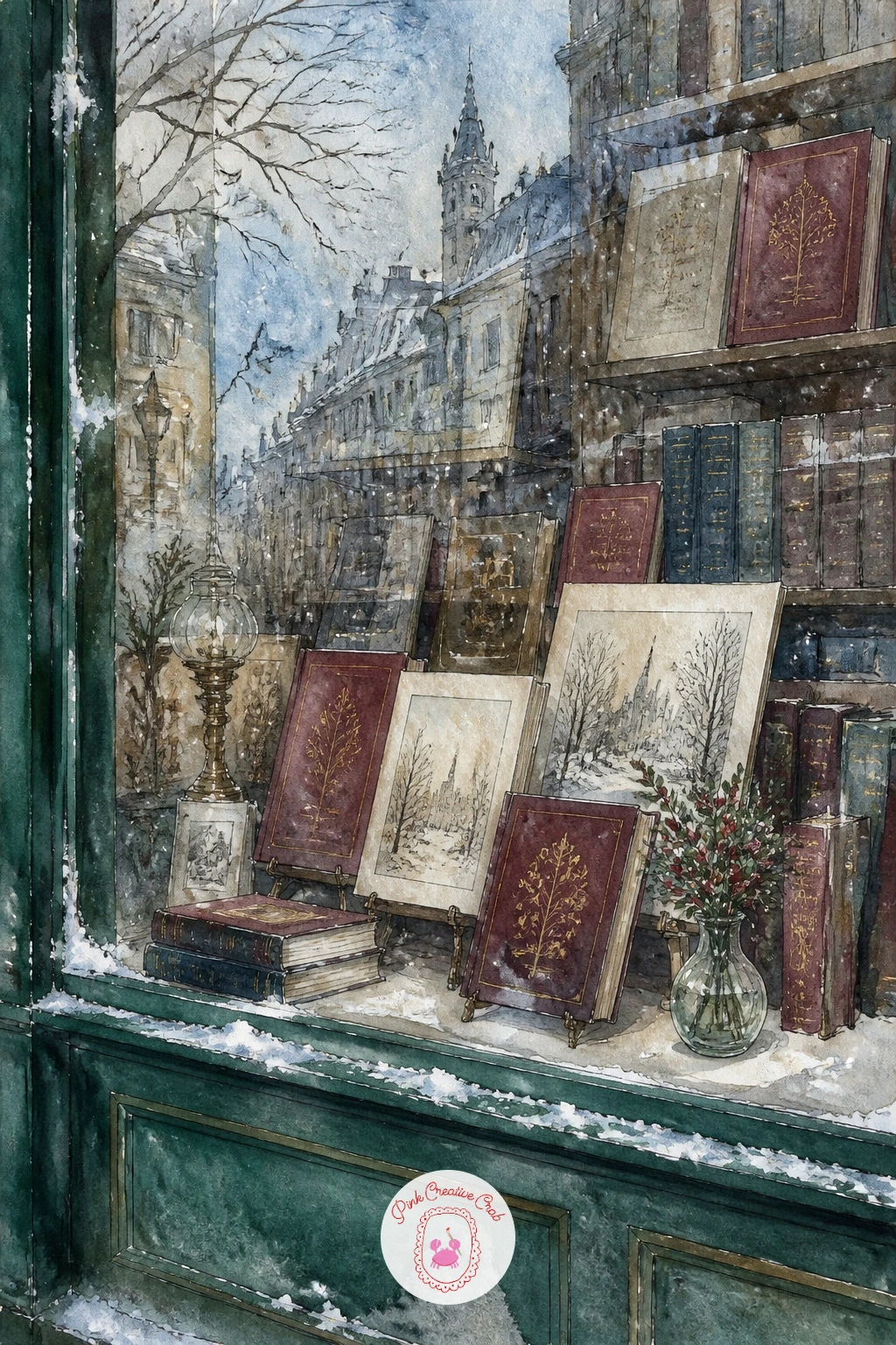
Palette: Burgundy,Icy Blue,Cream,Payne’s Grey
A pressed snowdrop falling out of an old book is a quiet, small subject that suits a close, almost still-life approach. Paint the open book first in warm aged tones, slightly yellowed pages rather than bright white, since a truly old book never reads as crisp cream.
The snowdrop itself gets painted with the lightest touch you can manage, a thin green stem and a few white petal shapes left mostly as bare paper with just a hint of pale green shadow at the base. Position it mid-fall between the pages, a small gap of white space around it, so it reads clearly as dropping rather than stuck to the page.
The place this goes wrong is overworking the flower; a pressed flower is flat and faded, not fresh and dimensional, so resist the urge to shade it heavily. A single thin ink line for the stem is often all it needs.
If you do not have a fine liner for that stem line, a sharpened pencil gives a softer, equally convincing line for something this delicate.
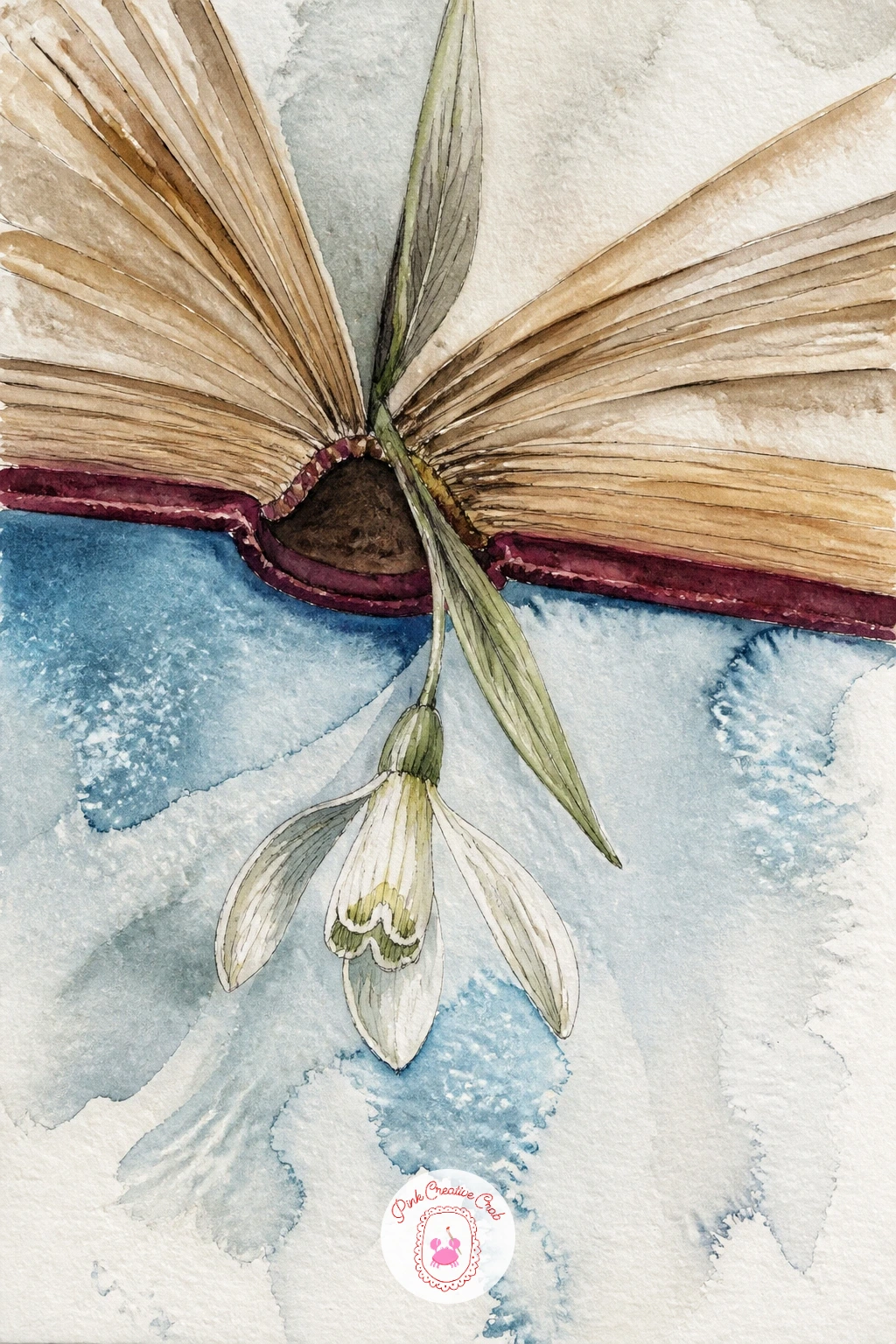
Palette: Cream,Sap Green,Ochre,White
A child reading with a flashlight under a blanket tent turns light source into the whole point of the painting. Build the tent shape first, a draped blanket over a simple frame, in a mid-tone color, then paint the child inside holding the flashlight close to the book.
Everything near the flashlight gets painted brightest, almost white-yellow, and everything further away, the edges of the blanket, the outside of the tent, stays progressively darker and cooler. This single light-and-shadow decision is what makes a blanket tent feel like a secret hideout rather than just a child under fabric.
Keep the blanket’s outer folds loose and a little uneven, since a tent made from furniture and bedsheets is never perfectly smooth, and that imperfection is part of the charm. A few stuffed toys or a second book peeking out from under the blanket edge adds a nice detail without extra figures.
One tip for today: paint the darkest shadows first while your brush still has rich pigment, then build up toward the bright flashlight glow last, which keeps the light looking genuinely bright by contrast.
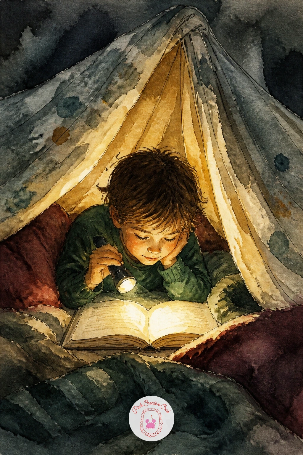
Palette: Ochre,Payne’s Grey,Burgundy,Cream
Take the story outside again with a book and a thermos tucked into a backpack on a snowy hike. Paint the backpack first, resting against a rock or log, in a weathered outdoor color, then let the book and thermos spill slightly out of the top opening so the whole thing feels just set down rather than posed.
The snowy ground and background trees can stay very loose, a pale blue-grey wash with a few dark green tree shapes dabbed in with a nearly dry brush. Keep detail concentrated on the backpack and its contents since that is where the story actually lives.
Varying this scene later is easy: try it again with the backpack open on a summer trail instead of snow, swapping the thermos for a water bottle, which reuses the same composition in a completely different season. For now, keep the cold palette and let the thermos lid gleam with a tiny unpainted highlight.
If you do not have a specific green for the pine trees, mix blue and yellow slightly on the dark side rather than buying a new tube.
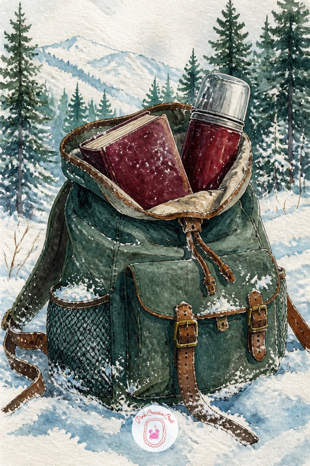
Palette: Sap Green,Burnt Sienna,Icy Blue,Payne’s Grey
A parcel of new books on a doormat beside snow boots is a small entryway scene full of everyday detail. Paint the torn-open parcel first, brown paper peeled back to reveal a stack of books inside, then add the snow boots standing just beside it, still a little wet-looking at the base.
Keep the doormat texture simple, a few ink lines suggesting woven fiber rather than a fully rendered pattern, since too much texture here competes with the parcel for attention. A trail of melting snow tracked in from the boots toward the door adds a nice narrative touch without much extra painting.
If you are unsure how to paint wet boot leather, leave small unpainted highlights where the light would catch the curve of the boot, then paint a darker wash around those spots rather than trying to paint the shine itself.
One concrete tip: paint the torn brown paper with uneven edges, since a cleanly cut rectangle reads as a box, not a parcel that has just been opened.
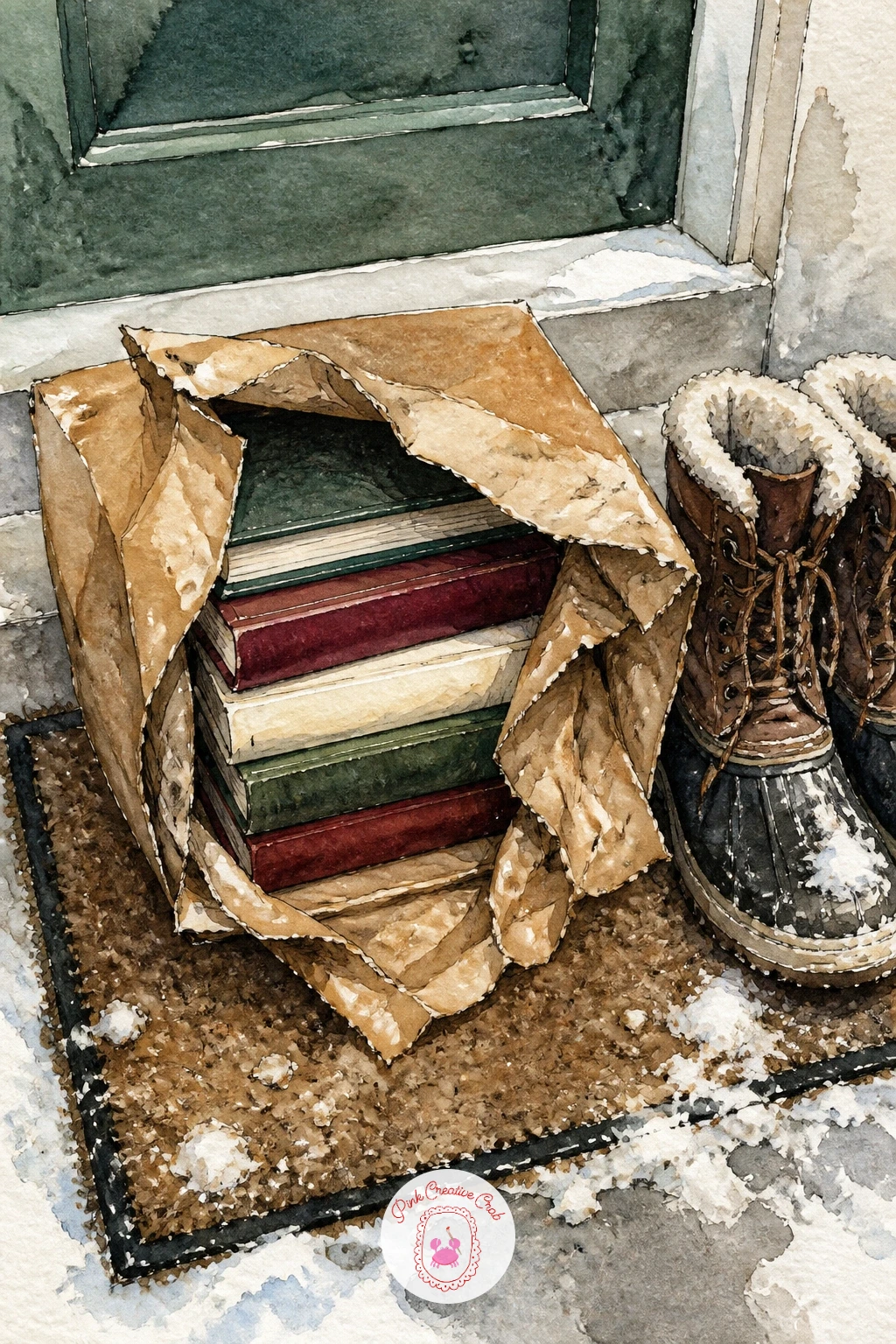
Palette: Burnt Sienna,Burgundy,Payne’s Grey,Cream
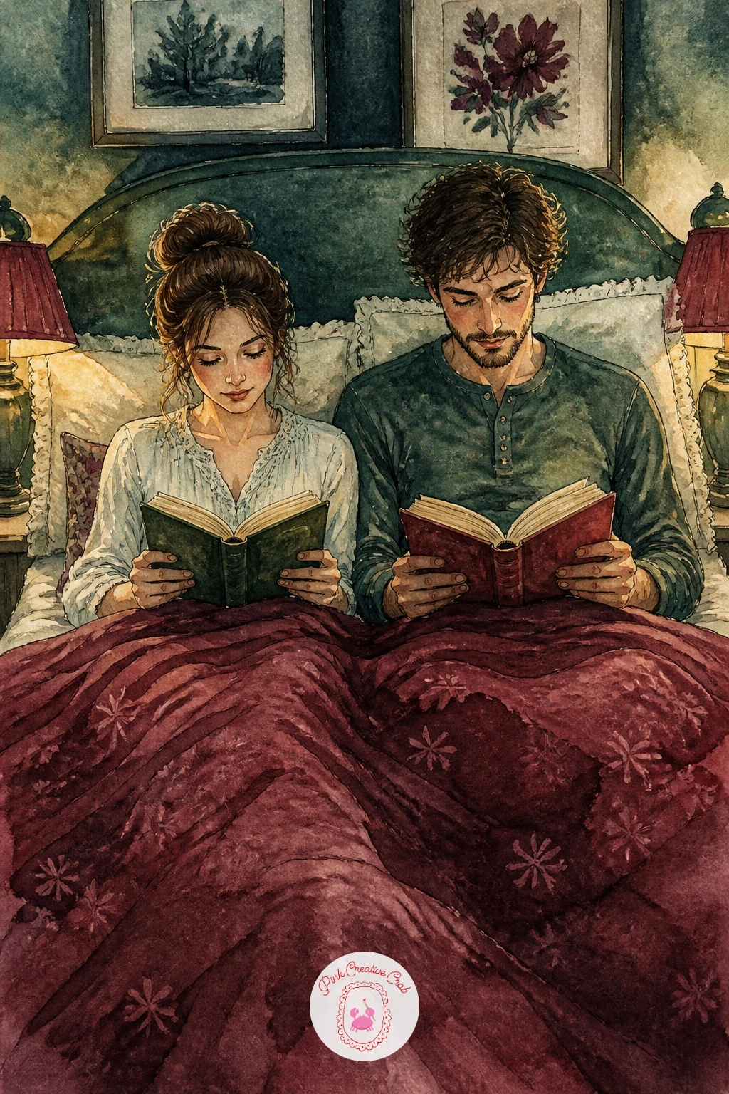
A couple reading in bed with matching reading lamps asks you to balance two figures without letting either one dominate. Sketch both figures first, propped against pillows side by side, each holding their own book, and keep their poses similar but not identical, one leaning slightly more than the other.
Paint the two lamps as matching warm glows on either side of the bed, which visually frames the whole composition and gives you a reason for light to hit both faces evenly. The quilt between them can carry most of the color interest, a rich burgundy or patterned cream, since the figures themselves stay fairly simple.
Measuring one figure’s proportions against the other as you sketch keeps the pair looking like a matched couple rather than two mismatched sizes accidentally placed side by side. If you are new to painting two figures together, block both in fully with pencil before inking either one, so you can adjust the spacing between them.
Finish with a nightstand detail on each side, a glass of water, reading glasses, to round out the sense of two separate little worlds sharing one bed.
Palette: Burgundy,Ochre,Cream,Payne’s Grey
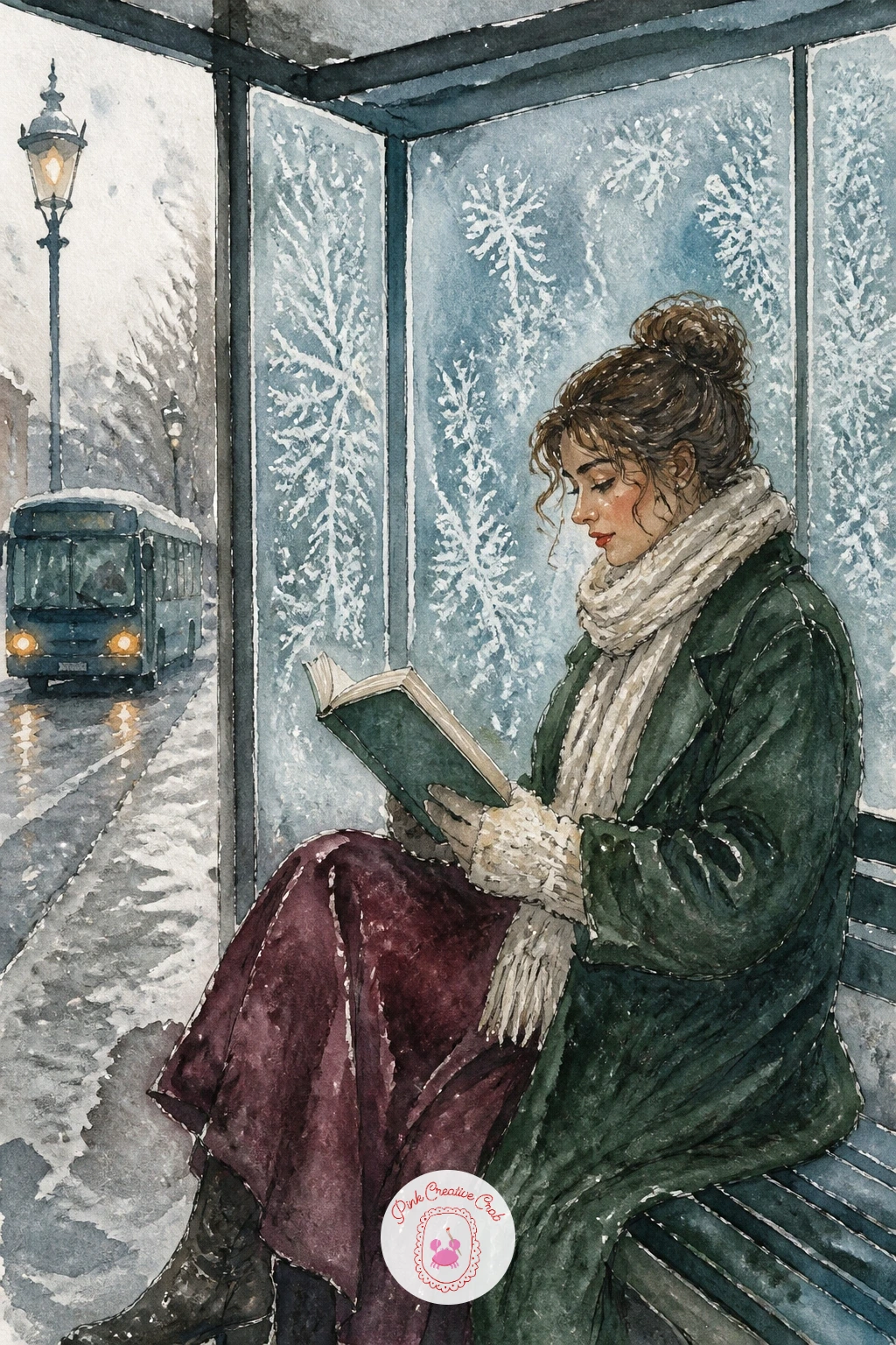
A woman reading at a frosty bus stop pairs a still figure against a cold, slightly grimy urban background. Paint the bus stop shelter first, a simple glass and metal frame, with a frosted texture dry-brushed across the lower panels in pale blue-white.
The figure stands or sits just inside the shelter, bundled in a coat, book held up close to her face, painted in a single warm coat color that stands out clearly against the cold grey surroundings. Keep her breath implied rather than drawn, a tiny puff of pale wash near her mouth is enough without overworking it.
The eye level here sits roughly at her shoulder height, slightly lower than usual, which makes the shelter structure loom a little above her and reinforces the sense of waiting in the cold. A bus timetable sign or a street lamp behind her adds urban context without much extra detail work.
If frosted glass texture feels tricky, practice the dry brush technique on scrap paper first until the brush is dry enough to catch only the paper’s texture rather than laying a flat wash.
Palette: Payne’s Grey,Burgundy,Icy Blue,Cream
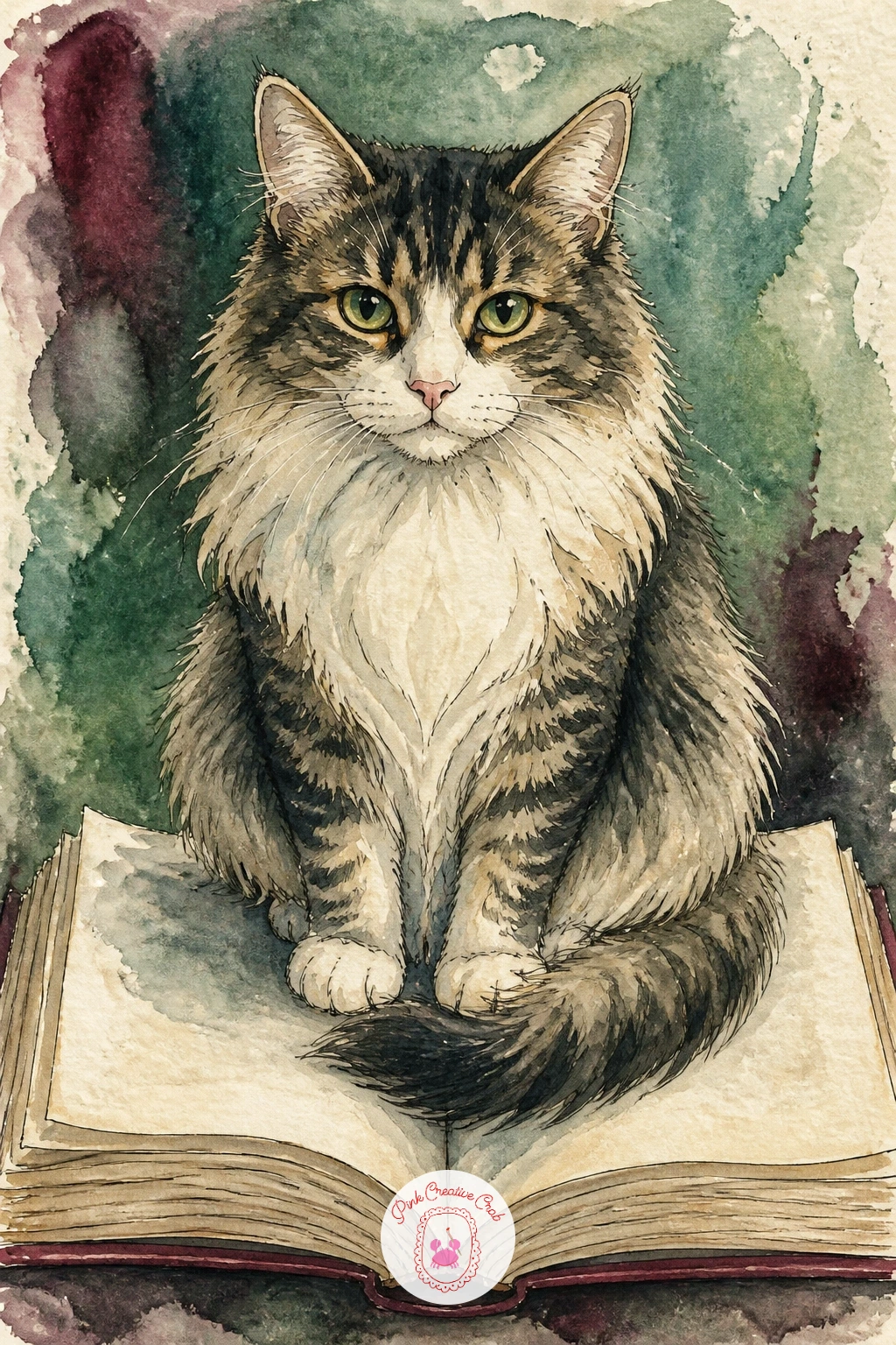
A cat sitting on an open book someone is trying to read is a small comedy of frustration worth capturing in loose washes. Paint the open book first, pages slightly curved upward at the edges as if held open by hands just out of frame, then place the cat squarely in the center of the pages.
Build the cat in two flat washes with a few ink whisker lines, keeping its pose relaxed and a little smug, tail curled around its own body. The hands trying to hold the book can appear at the very edges of the page, just fingertips, which tells the whole story without needing a full figure.
The place this scene usually goes wrong is making the cat too stiff; let one paw dangle slightly off the edge of a page for a looser, more natural pose. If you want a second version later, try the same idea with the cat’s tail draped across the text instead of the whole body sitting on it.
A single concrete tip: leave a thin strip of white page visible around the cat’s silhouette so it reads as sitting on top of the paper rather than blending into it.
Palette: Burnt Sienna,Payne’s Grey,Cream,White
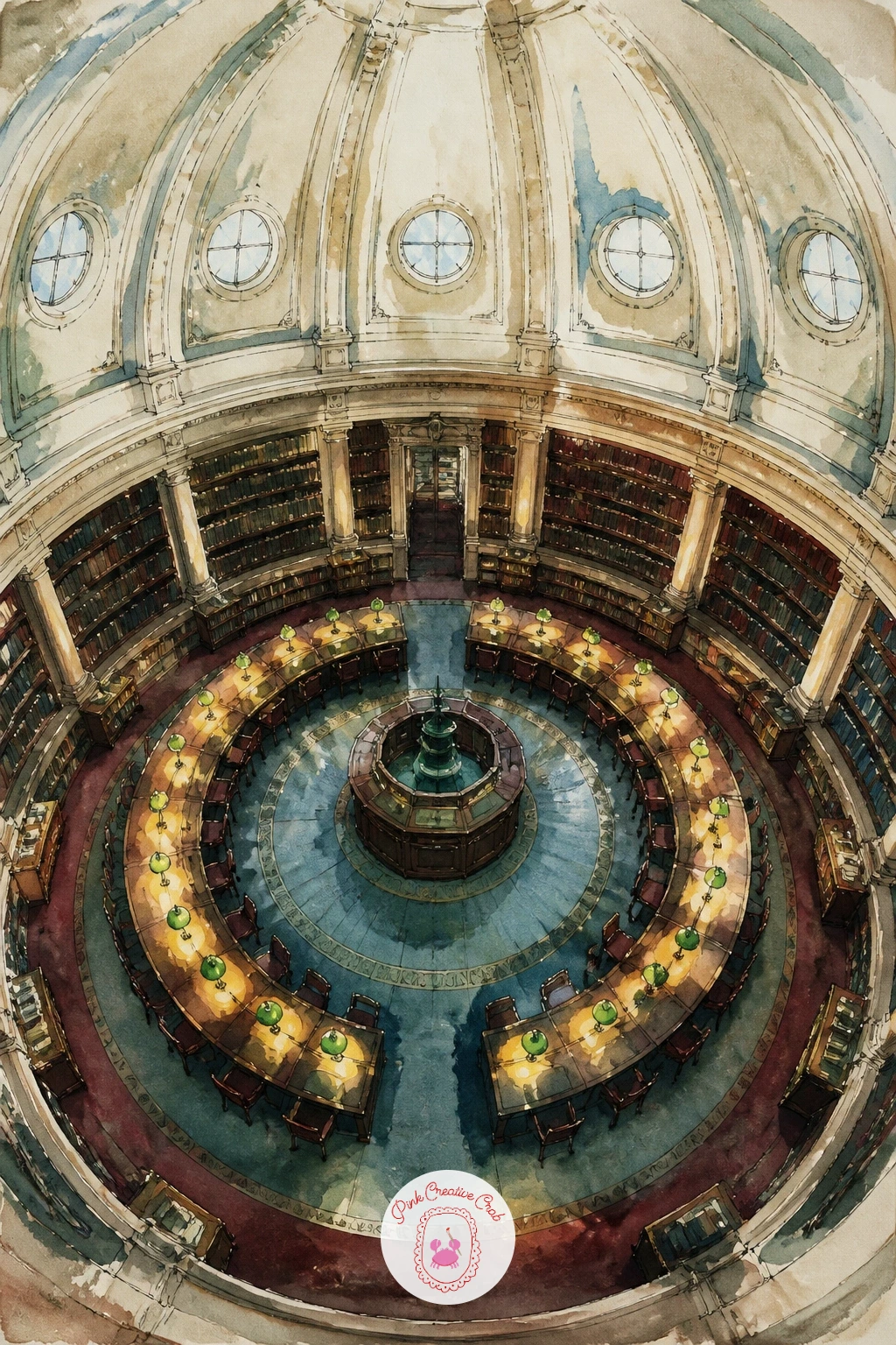
A round library reading room with green lamps is one of the more architecturally demanding scenes here, so take the curve slowly. Sketch the room as a wide ellipse seen from a slightly raised angle, with a ring of desks or tables following that curve, and a few green banker’s lamps spaced evenly around it.
Paint the lamps first since their glow sets the whole color mood, a warm yellow bulb inside a classic green glass shade, repeated at intervals around the curved room. The surrounding shelves or balcony level above can be suggested loosely, since the eye will follow the curve and the lamps far more than it studies the architecture in detail.
If drawing an ellipse convincingly feels difficult, trace a plate or a round lid lightly for the room’s outer curve before adding any of the desks or lamps on top of it. Keep the ceiling very simple or left as plain cream, so it does not compete with the ring of green lamps below.
Finish with a few tiny seated readers scattered around the curve, painted as simple dark shapes, to give the room scale.
You Will Need
- a plate or lid to trace the room’s curve
Palette: Sap Green,Ochre,Cream,Payne’s Grey
A vintage bookstore with a spiral staircase and snowy windows pushes the architecture even further, so build it in clear stages rather than all at once. Draw the staircase first as a tight upward spiral, simplified into a repeating curved shape rather than individually rendered steps, since too much detail there will eat the whole painting.
Surround it with shelves rising on either side, painted in quick vertical strokes of varied spine colors, then add the snowy window at the top or side of the scene last, once the interior colors are established and you can judge how much cool light to let in.
Comparing the staircase’s width at the bottom against its width higher up keeps the spiral feeling like it is genuinely receding upward rather than just a flat decorative curve. A small reading figure near the base of the stairs gives the whole tall space a sense of scale. The cozy library and bookshop illustrations are worth a look for more ways to handle tall shelving like this.
If the full spiral staircase feels like too much today, simplify it to just the lower two turns visible and let the rest disappear off the top of the page.
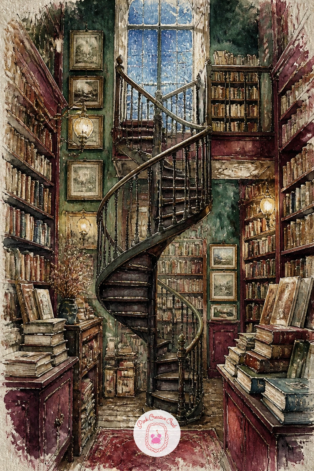
Palette: Burgundy,Sap Green,Icy Blue,Cream
A hand holding a paperback beside a coffee on a cafe table is a close, personal angle that works well after all the wider room scenes. Paint the hand first in a simple, relaxed pose, fingers loosely curled around the book’s spine, since hands read more naturally when drawn a little loose rather than overly precise.
The coffee cup sits just beside it, painted with a small rising steam line suggested in a few curved pencil or ink strokes, and the cafe table surface can stay minimal, just enough wood grain or marble texture to ground the scene. The watercolor European cafe scenes cover more ways to handle that tabletop setting if you want to build the whole cafe around this moment.
If hands give you trouble, simplify to three visible fingers and a thumb rather than trying to draw every knuckle, which almost always looks more natural on paper than an anatomically exact attempt.
One concrete tip: leave the steam above the coffee as bare white paper with just a faint grey edge, since painting steam as a solid shape kills the effect instantly.
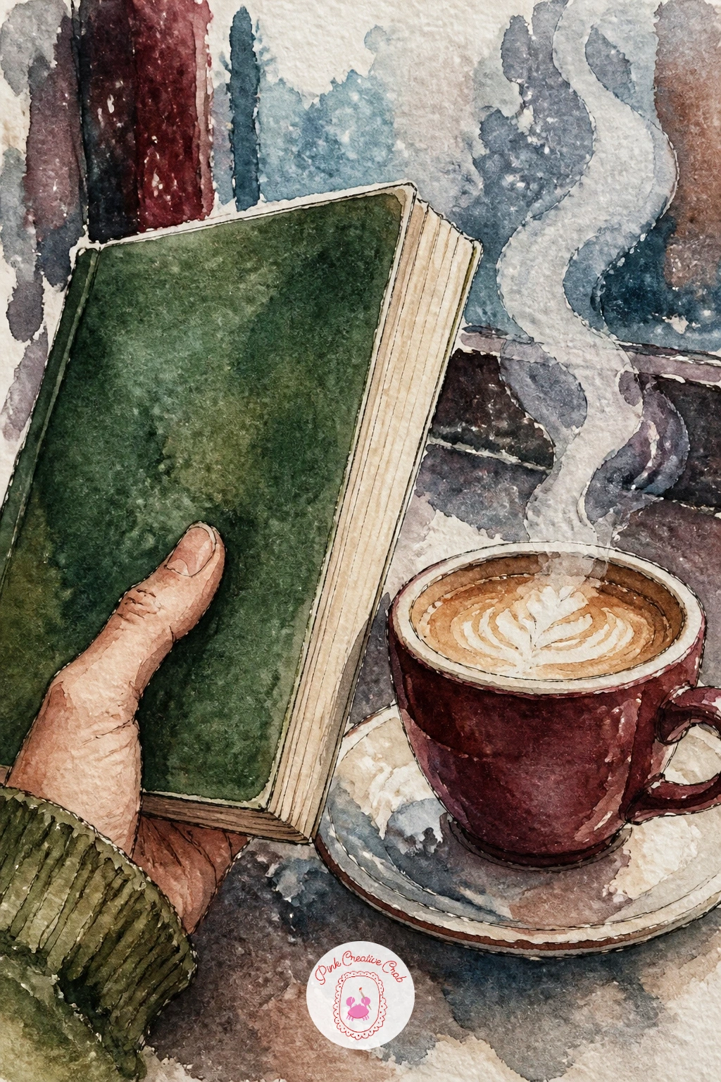
Palette: Burnt Sienna,Burgundy,Cream,Payne’s Grey
A fort of stacked books built by kids on a snow day brings motion and mess back into the mix. Build the fort structure first, books stacked in a rough wall shape with gaps for a doorway, then add one or two children peeking out from inside or climbing over the top.
Keep the book stack intentionally uneven, some fallen slightly sideways, one or two lying open on the floor nearby, since a fort built by children should look sturdy but not tidy. Paint the kids in quick, simple shapes, more gesture than detail, with bright clothing colors that stand out against the more muted book spines.
The quick version in ten minutes is just the fort itself with no figures, which still works as a charming still life. The forty-minute version adds the children, a scattering of extra books on the floor, and maybe a blanket roof draped over the top for a proper fort silhouette.
If you do not have many colors mixed for book spines, reuse the same three or four across the whole stack; repetition here actually reads as a cohesive personal book collection.

Palette: Burgundy,Sap Green,Ochre,Cream
An open poetry book with a pressed fern on the page returns to a quieter, close-up subject after the busy fort scene. Paint the open book in warm aged tones again, slightly curved pages meeting at a soft central spine, then leave a careful gap in your wash where the fern will sit so you are not painting over it later.
The fern itself should be painted with a very light touch, a central stem with small paired leaflets branching off, kept pale and slightly translucent since pressed ferns lose most of their color over time. A thin ink line for the central stem, added once the pale green wash is dry, holds the whole shape together without heaviness.
If you want to vary this idea later, try pressing a different leaf shape, a maple leaf or a single rose petal, in the same composition, since the book setup stays identical and only the pressed botanical changes.
One tip for today: keep a slight shadow line where the fern meets the page, a thin grey-green edge, which is what actually convinces the eye that it is lying flat against paper rather than floating.
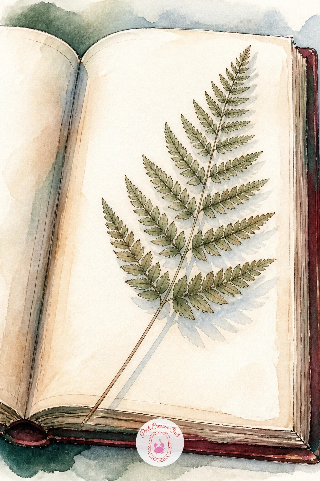
Palette: Cream,Sap Green,Ochre,Payne’s Grey
A girl browsing a secondhand book cart on a snowy sidewalk brings the street back into focus after the quiet botanical scene before it. Paint the cart first, wooden crates or shelves on wheels loaded with books, in a weathered mix of burgundy and green, then add the girl standing beside it, one hand reaching toward a spine, bag over her shoulder.
Keep the sidewalk and street behind her loose and pale, snow-covered pavement in a soft blue-grey wash with maybe one other shopfront suggested faintly in the distance. Her coat color should be the warmest, brightest note in the scene so she reads clearly as the focal point against the cooler street.
Comparing her height against the cart’s height as you sketch keeps the proportions believable, since a cart that is too tall or too short next to her will read as oddly scaled no matter how well the rest of the painting goes. If full-figure proportions feel tricky, a simple stick-figure underlay first, at about seven head-heights for an adult, solves most of the problem before ink.
Finish with a few falling snowflakes flicked across the whole scene to unify the cart, the girl and the street into one cold, lively moment.
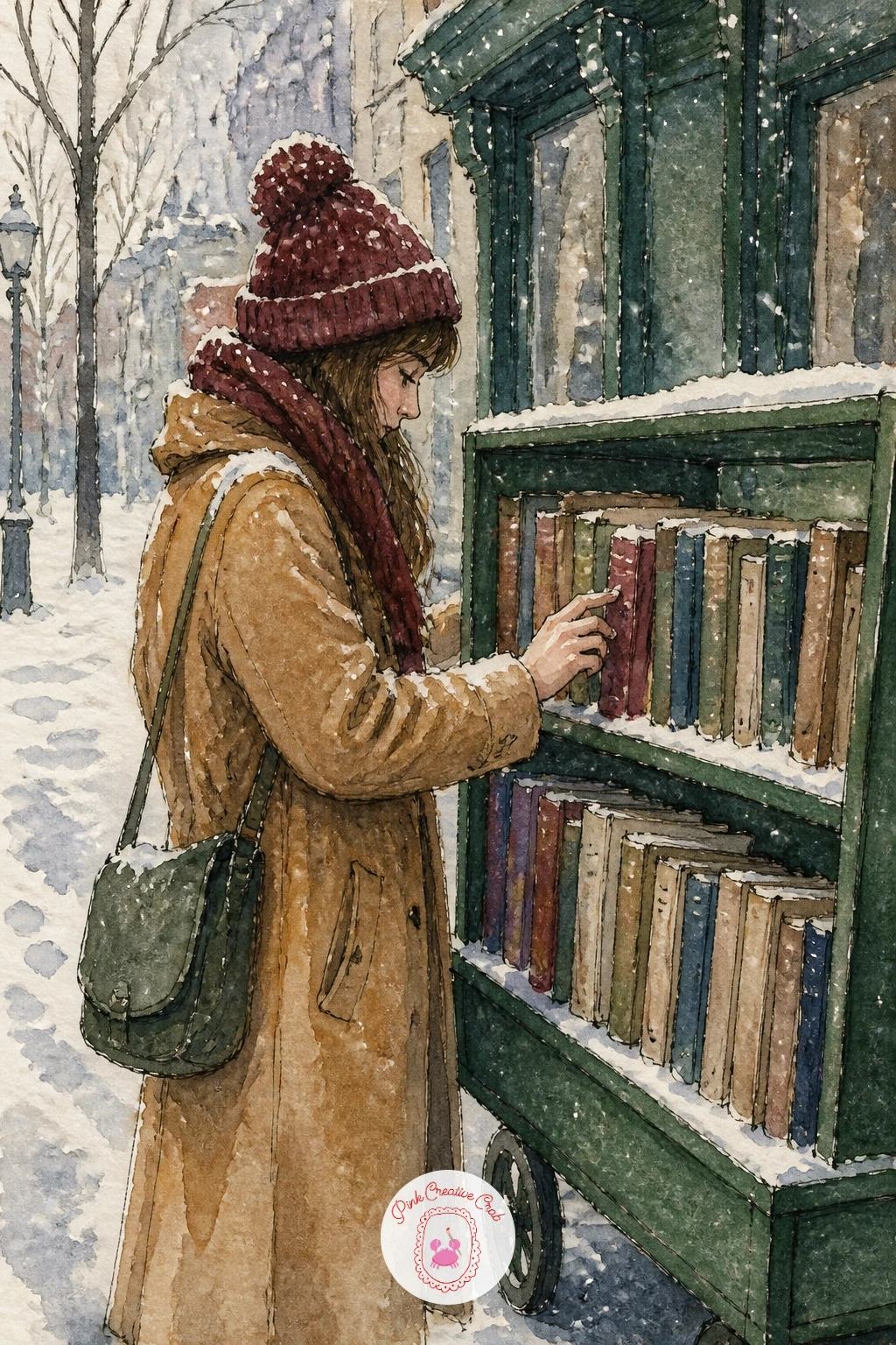
Palette: Burgundy,Sap Green,Icy Blue,Payne’s Grey
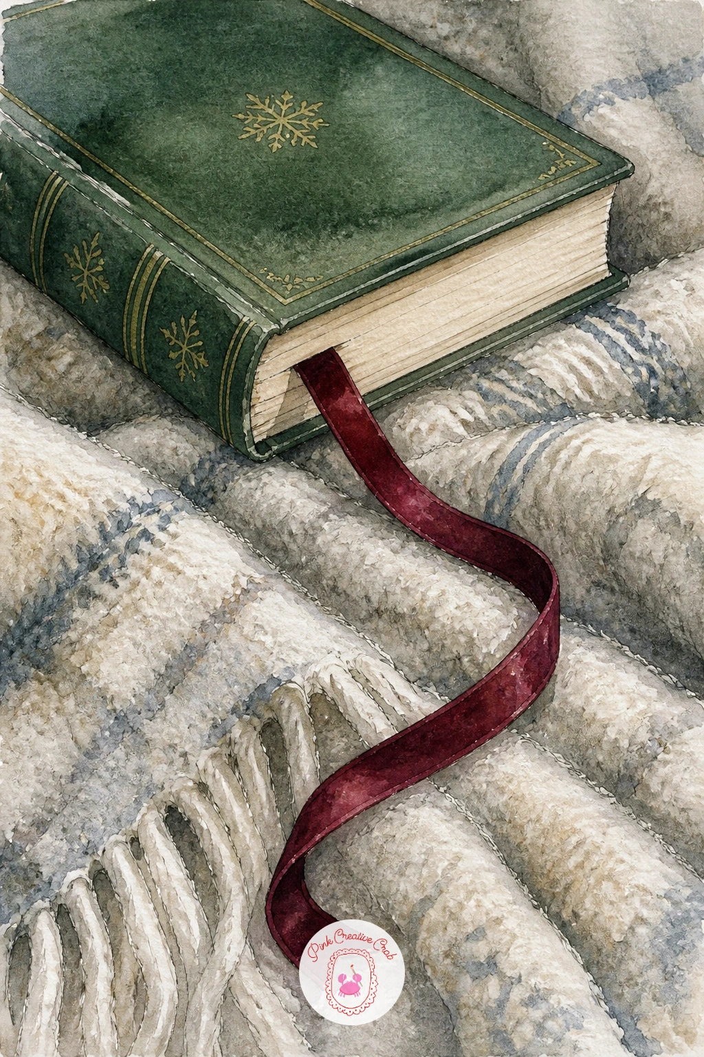
Close the whole set with something small and calm: a ribbon bookmark trailing from a book resting on a wool blanket. Paint the blanket first as a textured wash, letting burgundy or cream pool slightly unevenly so the wool surface feels soft rather than flat, then let it dry fully before adding the book on top.
The book sits closed or just slightly open, painted in simple flat color, with the ribbon bookmark trailing out from between its pages in a loose curve down onto the blanket. Paint the ribbon last in a single confident stroke of color, since a hesitant, overworked ribbon line loses all its gracefulness.
If you want one hands-on texture trick for the whole piece, lift a little color out of the blanket wash with a dry brush once it is mostly dry, creating soft lighter streaks that read as wool fibers catching the light. This is a gentle, forgiving scene to end on, and a good one to revisit anytime you want a quick, satisfying painting rather than a long project.
A single concrete tip: let the ribbon color be the only bright, saturated note in an otherwise soft, muted scene, which makes it the clear focal point without any extra effort.
Palette: Burgundy,Cream,Sap Green,Ochre
What to Do Next
Pick one scene that matches how much time you actually have today, a book on a bench for a quick study or the round reading room if you want a longer afternoon project, and start with a light pencil sketch on cold press paper before any color goes down.
Frequently Asked Questions
What paper works best for winter book illustration scenes in watercolor?
Cold press watercolor paper around 140lb works best, since its texture holds washes for snow and fabric while staying smooth enough for fine ink linework on shelves, windows and pages.
Should I draw the book or the background first?
Draw the book first in most of these scenes, since it anchors the composition, then build the surrounding room, bench or street around it once its size and angle feel right on the page.
How do I keep snow looking soft instead of chalky?
Paint the base snow as a thin blue-grey wash and lift color out with a damp brush or paper towel while it is still wet, rather than painting snow as solid white shapes on top.
What is the easiest book illustration idea to start with?
A single open book on a bench or pillow is easiest, since it needs only two or three washes and a few ink lines, with no figures or architecture to manage yet.
How do I add ink accents without them bleeding into the watercolor?
Let every wash dry completely before adding fine liner details, since ink dragged over damp paper will feather and blur instead of giving the crisp lines these scenes need.
Have any thoughts?
Share your reaction or leave a quick response — we’d love to hear what you think!
-
 0
-
0
-
0
-
0
-
0
-
0


