

A pear drawing is one of the kindest places to start with colored pencils. The shape is forgiving, the colors are warm and uncomplicated, and a single fruit on white paper can carry a whole little mood without much fuss.
Below you will find twenty seven of them, moving from a single pear with one curling leaf all the way to orchard baskets, poached pears on a plate, and small kitchen stories. Pick whichever one catches your eye on your phone right now and you can have it finished before the light changes.
Using these images: free for personal projects such as printing, coloring, cards, journals and gifts. Handmade items that include them may be sold up to 30 pieces per design. More than that is commercial use and is not permitted, and neither is selling or sharing the images themselves or passing them off as your own. Please ask before any other use.
Start the whole list with the simplest version: one ripe pear, one small leaf curling off its stem. Sketch the pear as two stacked circles, a smaller one on top, then join them into one soft outline and erase the guide lines before you pick up color.
Lay a pale yellow green base over the whole fruit, then build a second layer of golden yellow down the sunny side and a deeper olive or brown green near the stem end, where pears always go darkest. The leaf gets two tones of green with a pale vein left as bare paper.
Most pear drawings go wrong at the stem: keep it short, slightly bent, and darker brown than you think, or it reads as a stick instead of fruit. If you only own a basic twelve pencil set, mix your greens by layering yellow under a light green rather than hunting for the exact shade.
Measure the pear’s width against its height before you commit to color: most pears are about as wide as they are tall at the base, narrowing steadily toward the stem, and checking that early saves a lopsided fruit later.
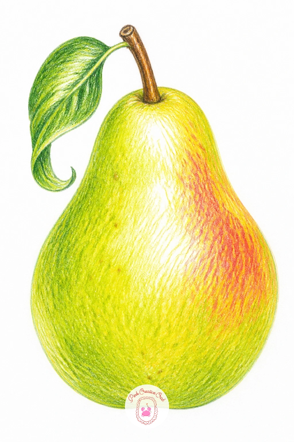
Palette: Apple Green,Golden Yellow,Olive Green,Burnt Umber
Once the whole pear feels comfortable, try it cut in half so you can show the core. Draw the outer curve first, then slice it with a slightly wavy vertical line down the center before you add the inner shapes: the pale flesh, the small star shaped core, and a couple of dark brown seeds.
Color the skin side exactly as you did the whole pear, but switch to cream and pale yellow for the cut flesh, using short strokes that fan out from the core like the pear’s actual grain. Leave thin lines of bare white paper between strokes so the flesh looks juicy rather than flat.
The core is where this one usually falls apart: keep it small and slightly off center, never a neat perfect star, and the seeds no bigger than a grain of rice. If your cream pencil looks too white against the paper, warm it with a faint pass of pale pink first.
Finish with one firm tip: outline the cut edge in a thin line of light brown to separate skin from flesh, it does more to sell the slice than any amount of shading.
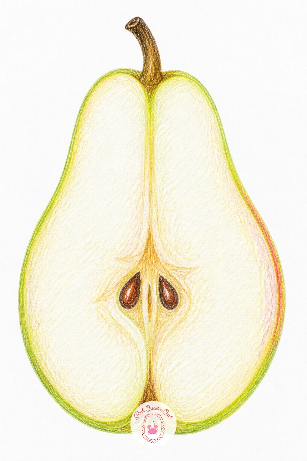
Palette: Cream,Pale Yellow,Light Brown,Dark Brown
Group three pears together and the drawing becomes a small still life. Start with a wide oval for the bowl’s rim, then draw each pear overlapping slightly, varying their heights and the angle each stem leans so none of them repeat.
Color the bowl in a cool blue, letting the white paper show through as a highlight strip along its rim, then work the pears in your usual greens and yellows, keeping the ones further back slightly paler and less detailed than the pear in front.
Overlapping fruit is where beginners often lose the sense of which pear sits where: draw the front pear completely first, then let the back pears’ outlines stop exactly where they meet it, never cross through.
If you want this finished quickly, give it ten minutes with flat color and simple shading; a forty minute version adds a soft blue cast shadow under the bowl and faint reflected blue light along the lower curve of the nearest pear, borrowed straight from the bowl beside it.
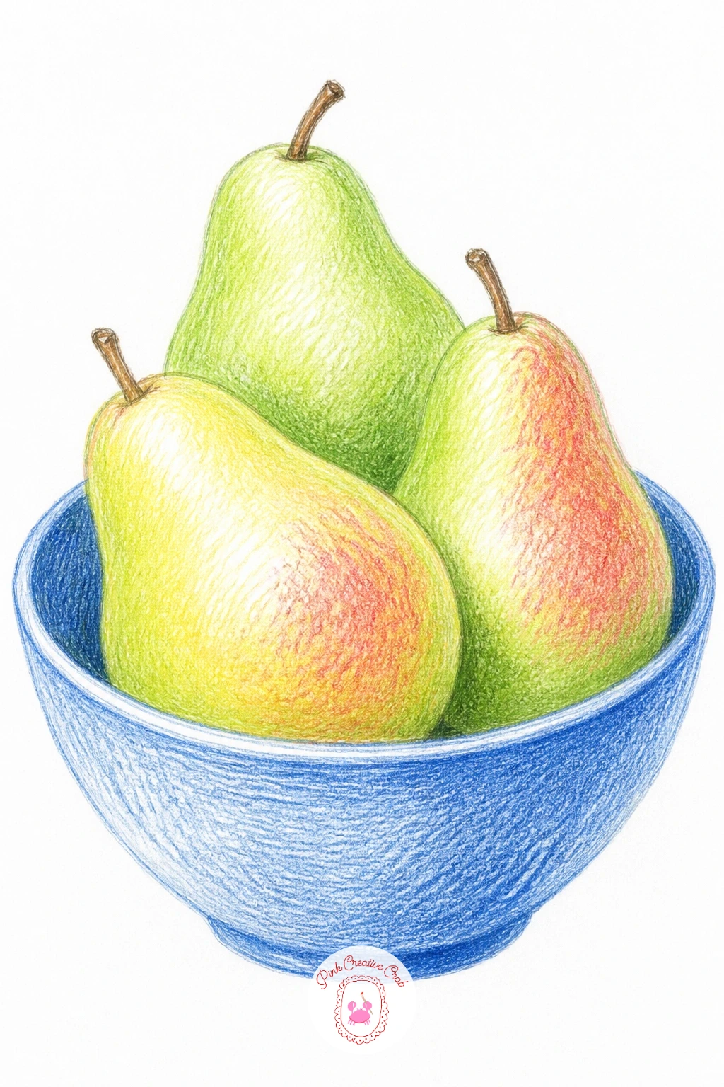
Palette: Cobalt Blue,Apple Green,Golden Yellow,Soft Grey
Move from the bowl outdoors with a branch bending under the weight of three or four pears. Draw the branch first as a simple curved line with a gentle sag in the middle, then hang the pears from short stems along its length, letting the biggest one pull the branch lowest.
Work the bark in warm greys and browns with short rough strokes before adding the pears in your usual palette, then tuck in a few leaves last so they sit naturally among the fruit rather than floating separately.
The branch itself often ends up too straight and stiff: add a slight curve and a couple of small knots or texture marks along its length so it reads as real wood under real weight.
Try the still life drawing ideas approach here too, arranging the pears at different heights along the branch so the whole composition has rhythm rather than a straight row.
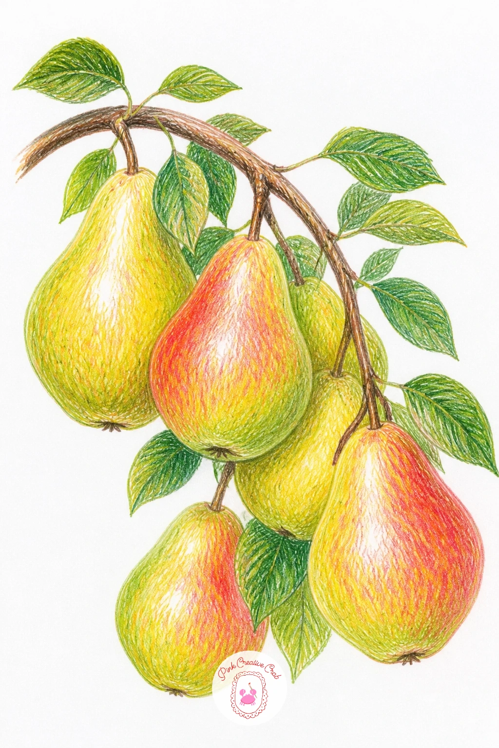
Palette: Warm Grey,Burnt Umber,Apple Green,Golden Yellow
Bring the pears into the kitchen with a classic dessert: two whole poached pears, deep red from a wine bath, sitting on a plain white plate. Draw each pear in its full teardrop shape with the stem left on, since poached pears are traditionally served whole.
Instead of green, build the skin in layers of deep red, burgundy and a touch of purple, pressing harder near the base where the wine pools darkest and lighter near the top where the pear was less submerged. A thin ring of red syrup around the base of each pear on the plate sells the whole scene.
The common mistake is making the red flat and solid, which loses the sense of translucent skin over pale flesh underneath: leave tiny flecks of the lighter under color showing through your red layers instead of covering it completely.
No deep red pencil in your set is no problem, layer pink under burgundy instead and the warmth still comes through.
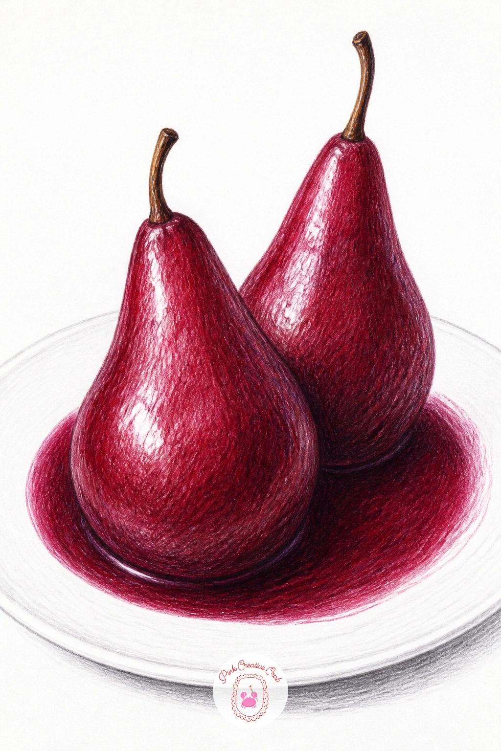
Palette: Burgundy,Deep Purple,Pink,Cream
Keep the kitchen mood going with a pear tart, its slices fanned out across a golden pastry base. Draw the tart’s round or oval outline first, then mark out the fan of pear slices radiating from one edge, each slice a thin curved wedge slightly overlapping the last.
Color the pastry in warm gold and light brown with a dry, scratchy stroke to suggest its flaky edge, then work each pear slice in pale yellow green with a thin darker green line along its outer curve where the skin remains. A light golden glaze line along the top of the slices adds the final shine.
Fanned slices can easily end up all the same size and angle, which looks printed rather than baked: vary each slice’s width and tilt it very slightly differently from its neighbors.
If pastry textures intimidate you, the dry brush trick works here too, just with pencil: use the side of an almost blunt tip and a light hand for a crumbly, uneven edge instead of a hard clean line.
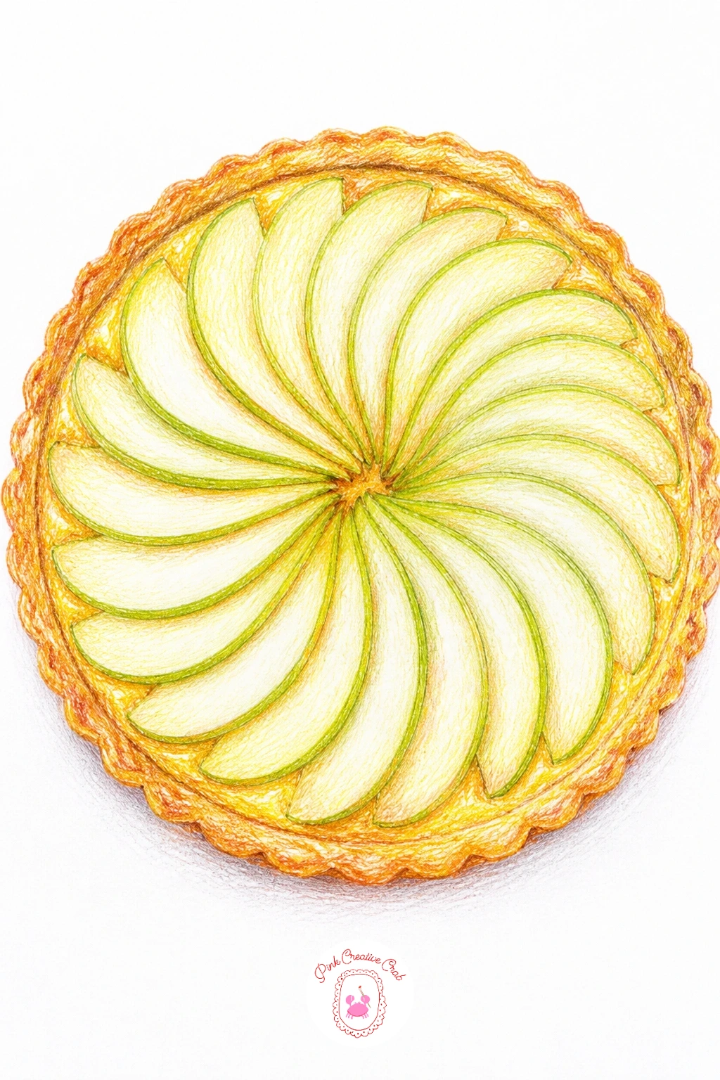
Palette: Golden Yellow,Light Brown,Apple Green,Olive Green
Give a single pear a small story by setting it on top of a stack of old books. Draw the books first as three or four rectangles of varying width stacked slightly off center, then place the pear sitting in the dip where the top book’s cover doesn’t quite sit flat.
Color the books in muted colors, a faded red, a dusty blue, a cream spine, with thin pencil lines suggesting worn edges and a title or two left as empty space rather than actual lettering. Build the pear in your usual palette on top, keeping its shadow falling clearly onto the book cover beneath it.
Books in a stack often end up perfectly straight and parallel, which looks stiff: let each one sit at a very slightly different angle, as real stacked books always do.
Think about your light source before you shade: if it comes from the upper left, the pear’s shadow falls to the lower right across the book cover, and the top edge of each book catches a thin strip of highlight on that same side.
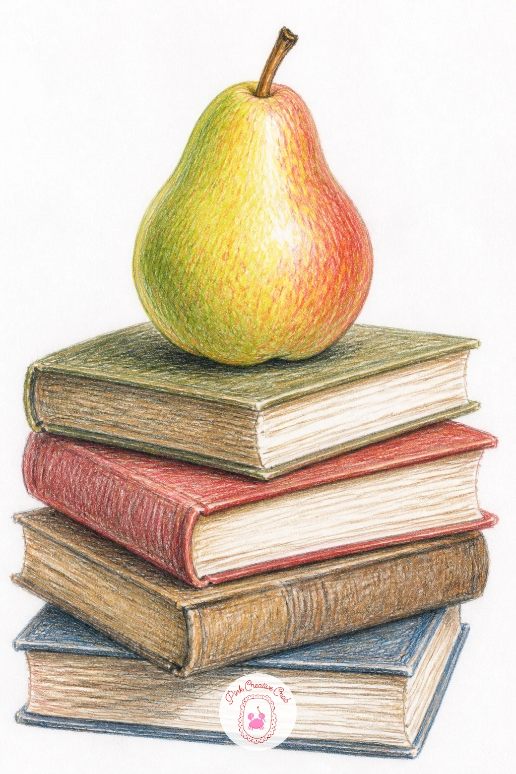
Palette: Faded Red,Dusty Blue,Cream,Apple Green
Add a little humor with a pear that has a bite taken out of it and a tiny worm peeking from the hole. Draw the pear’s outline first, then cut the bite as a rounded scoop missing from one side, showing a flat pale cross section inside where the teeth marks would be.
Color the pear as usual, then work the exposed flesh in cream with the faintest ring of light green just under the skin. The worm sits small and curled in the very center of the bite, a simple pale green or cream curve with two tiny dot eyes, nothing more complicated than that.
Keep the worm genuinely tiny: a worm drawn too large turns this from charming into unpleasant, so aim for something no longer than the width of the bite itself.
Quick version, ten minutes: flat color and a simple worm. Forty minute version: add fine scratchy texture lines radiating from the bite to suggest the torn skin, and a faint brown ring where the flesh has just begun to brown at the edge.
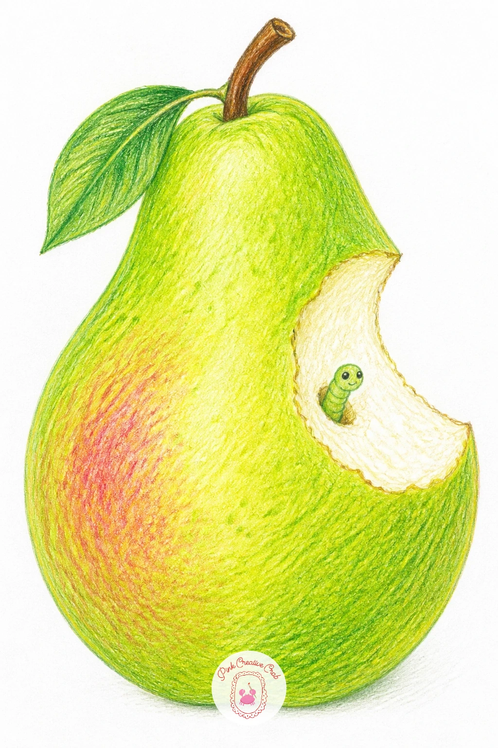
Palette: Apple Green,Cream,Pale Green,Light Brown
Step back for a wider scene: a whole pear tree covered in spring blossom, with only a hint of green leaf showing between the flowers. Block in the tree’s trunk and main branches first in brown, then scatter small five petal blossom clusters along the branches rather than trying to draw every twig.
Color the blossoms mostly white, using the bare paper itself as the petal, with just a touch of pale pink pencil at the base of each flower and a tiny yellow dot center. Add a soft wash of pale green leaves peeking between clusters so the tree doesn’t look bare underneath.
Painting every single blossom in detail is how this one runs out of steam: draw a dozen or so clearly in the foreground, then suggest the rest further back as soft pale pink smudges with far less definition.
If blossom trees interest you beyond pears, the ideas in magnolia drawing use the same clustered petal approach and are worth a look for more branch compositions.
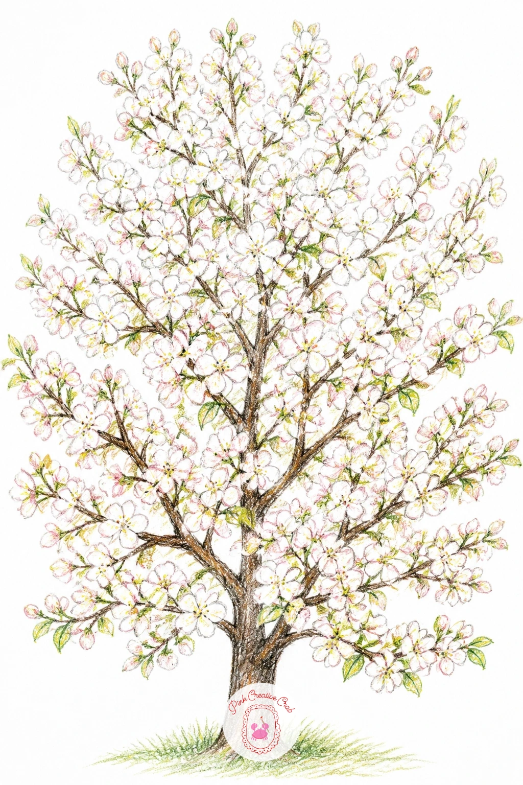
Palette: Burnt Umber,Blush Pink,Pale Green,Soft Yellow
Carry the orchard setting further with a wicker basket full of pears sitting on the grass between the trees. Draw the basket first using short curved strokes crossing each other to suggest woven texture, then fill its top with four or five pears peeking over the rim at different heights.
Color the basket in warm tan and brown, letting the weave pattern show as alternating light and dark strokes rather than one flat color, then build the pears on top in your usual greens and golds. A simple suggestion of grass and a blurred tree trunk or two behind keeps the orchard setting without demanding a full landscape.
Woven baskets often turn into a solid brown blob: keep your strokes short, slightly curved, and running in alternating directions row by row, which is what actually reads as basket weave from a normal reading distance.
Measure the basket against the pears before you color: the basket’s rim should sit roughly level with the widest part of the pears peeking over it, or the whole arrangement looks like the fruit is floating above an empty container.
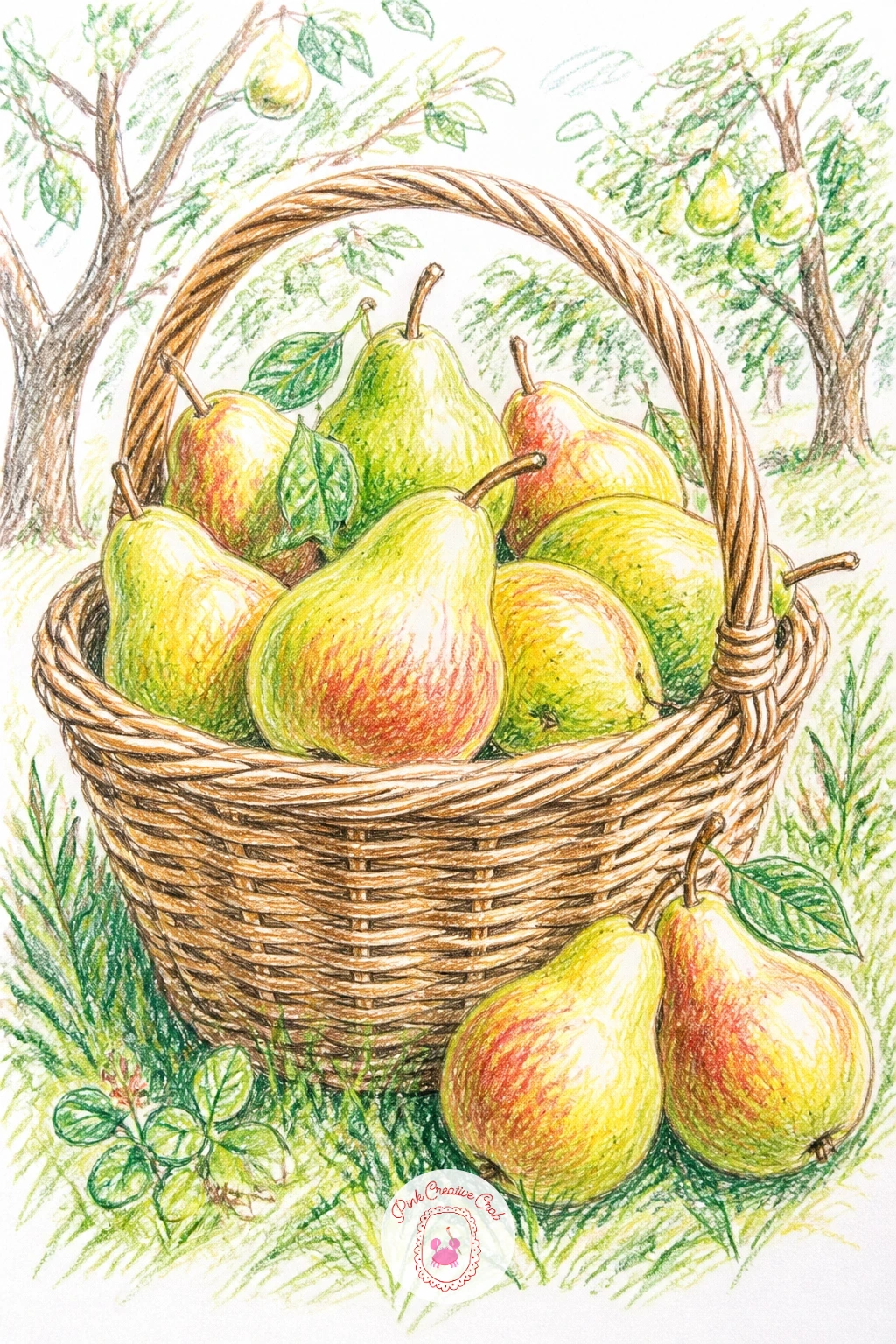
Palette: Warm Tan,Burnt Umber,Apple Green,Golden Yellow
Pair a pear with cheese and walnuts for a small kitchen still life. Draw a wide wooden board shape first, then place a whole pear toward one side, a wedge of cheese beside it, and two or three walnuts scattered in the gap between.
Color the board in warm brown with visible grain lines running the length of the wood, then work the cheese in pale yellow with small darker dots if it’s the holey kind, and the walnuts in mottled light and dark brown, their shells never perfectly smooth. The pear sits on top in your usual palette, its cast shadow falling across the board’s grain.
Walnuts drawn too smooth and round lose their character entirely: add small irregular ridges and dimples across each shell with a sharp pencil point, working in short broken lines rather than one continuous outline.
If walnuts feel fiddly at first, start with just one instead of three, since a single well rendered walnut does more for the drawing than several rushed ones.
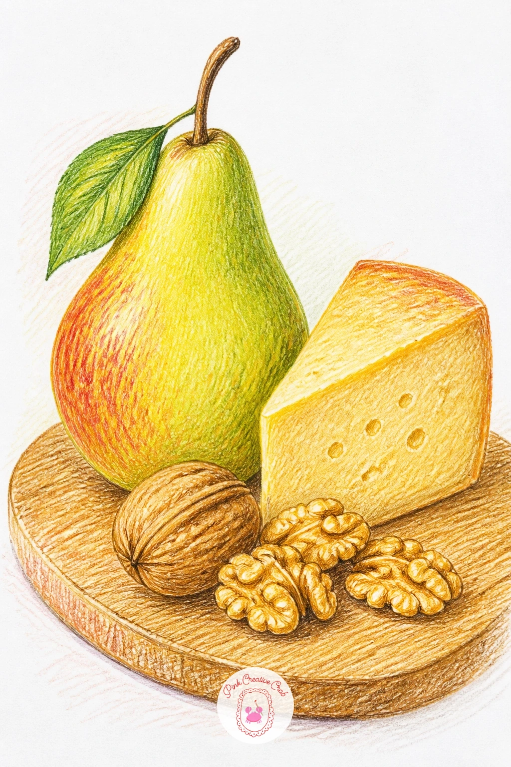
Palette: Burnt Umber,Pale Yellow,Apple Green,Light Brown
Try a quieter composition: a single pear tucked halfway into a plain brown paper bag, its top crumpled open. Draw the bag first as a soft rectangular shape with an irregular crumpled top edge, then let the pear’s rounded top poke out above the fold, the rest implied as hidden inside.
Color the bag in warm kraft brown, using slightly darker brown creases radiating from each fold and a few lighter highlight strips where the paper catches light, then finish the visible part of the pear in your usual greens and golds.
Paper bags often come out looking stiff and smooth like cardboard: soften the edges with short broken strokes along every fold line and avoid any perfectly straight edge anywhere on the bag.
This is a good one for a dull light source, since a paper bag’s folds read clearly even under flat even lighting, which makes it a forgiving choice if you are still learning to judge shadow direction.
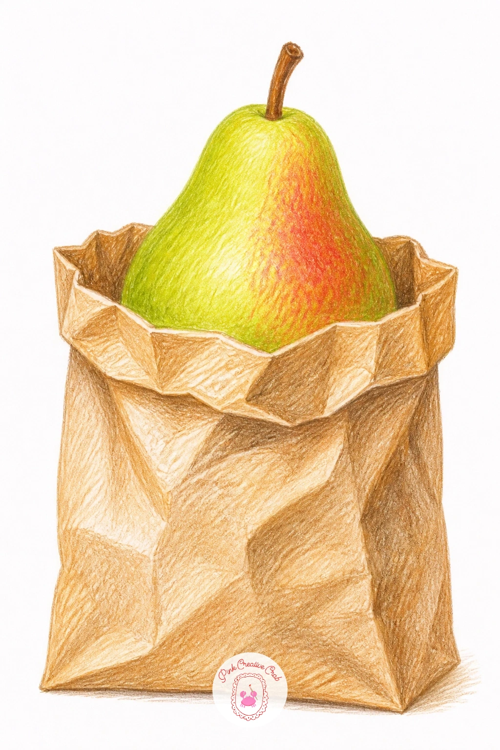
Palette: Kraft Brown,Dark Brown,Apple Green,Golden Yellow
Build a small harvest scene with two or three pears, each half wrapped in thin tissue paper, sitting inside a wooden crate. Draw the crate’s slatted sides first with simple parallel lines, then nestle the pears inside, each one with a loose twist of tissue covering part of its lower half.
Color the crate in warm wood tones with visible grain, then work the tissue in the palest grey or cream, using very light pencil pressure and letting plenty of white paper show through so it reads as thin and papery rather than solid. The exposed tops of the pears get your usual green to gold treatment.
Tissue paper drawn too heavily just looks like fabric: keep your pressure light, your lines loose and slightly wrinkled, and leave gaps of bare paper between folds rather than shading the whole wrap evenly.
Once this one works, try it again with the crate half empty and only one wrapped pear left inside, which tells a slightly different little story with the same technique.
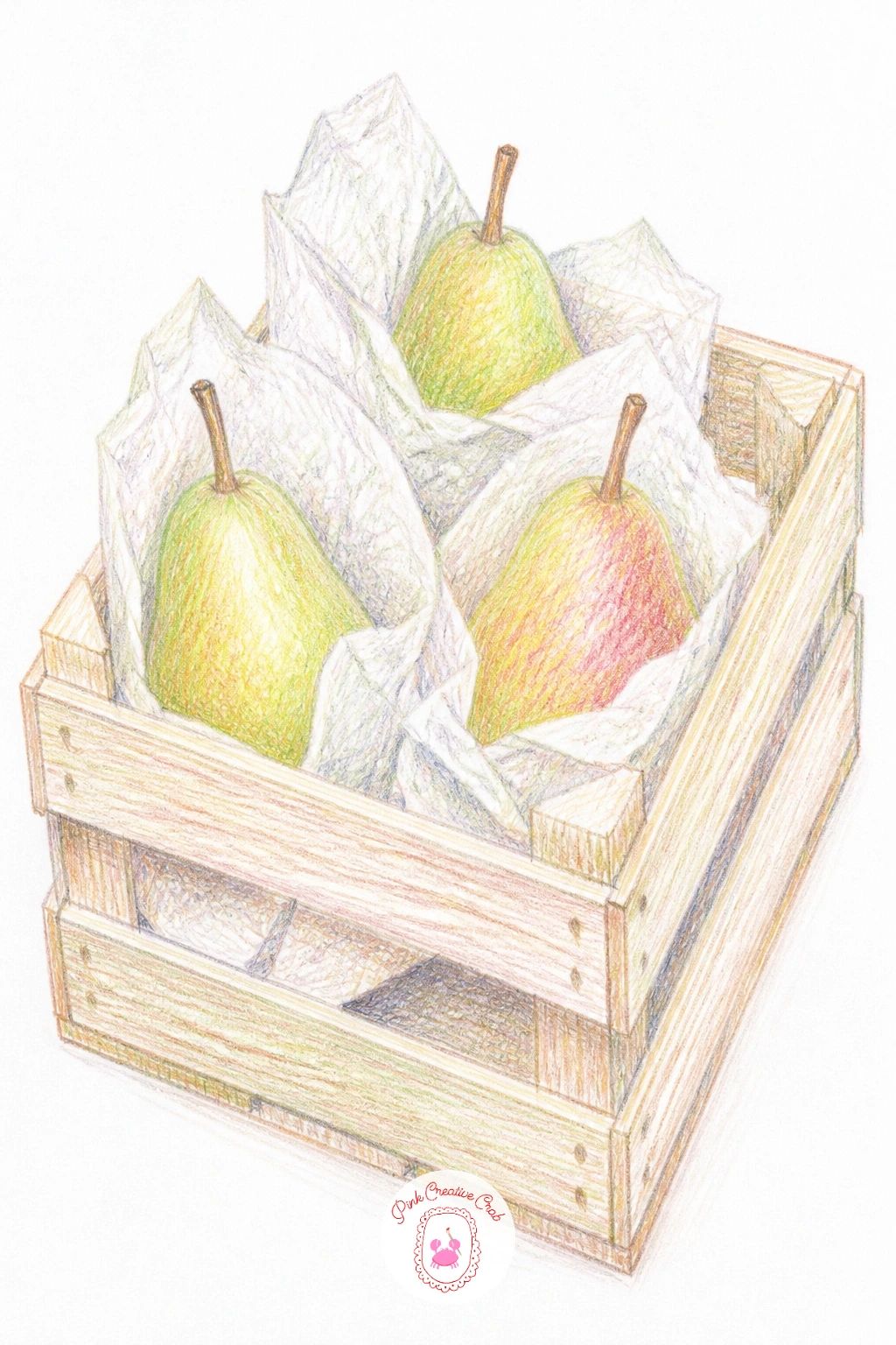
Palette: Light Grey,Burnt Umber,Apple Green,Golden Yellow
Move indoors to the pantry with a glass jar of pear jam, a spoon resting against its side. Draw the jar’s outline first as a simple cylinder with a slightly narrower neck, then fill the lower two thirds with jam color and leave the upper section as clear glass with a visible rim and lid.
Color the jam in warm amber and gold with tiny flecks of darker brown pencil scattered through it to suggest bits of fruit, then add the glass highlights last as thin vertical strips of bare white paper left untouched along the jar’s curve. The spoon leans against the jar in plain silver grey with one bright highlight line down its bowl.
Glass is the trickiest part here: resist the urge to shade it evenly, since real glass reads through contrast, a few sharp white highlight strips against darker grey shadow shapes, rather than one smooth gradient.
No label needed, but if you want one, leave it blank or with a scribble instead of real words, since legible text pulls attention away from the jam itself.
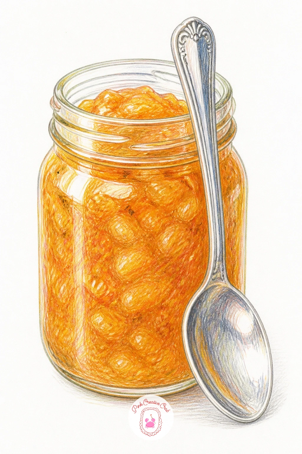
Palette: Amber,Golden Brown,Silver Grey,White
Set a single pear on a windowsill with strong light falling across it from one side. Draw the pear and a simple suggestion of the sill’s edge beneath it, keeping everything else outside the window loose or left blank so the fruit stays the focus.
Build the lit side of the pear in pale warm yellow with very little pressure, almost letting white paper carry the brightest point, then push the shaded side progressively darker through green and olive into a deep shadow where it meets the sill. The cast shadow on the sill itself should be long and fall clearly away from the light source.
Eye level matters more here than usual: if you place the window and sill slightly below your eye line, you see more of the sill’s flat top and the pear reads as sitting rather than floating against the glass.
If direct sunlight light effects feel difficult to judge, look at any photo of fruit near a bright window for reference, since the pattern of one sharp highlight and one long soft shadow repeats in almost every example.
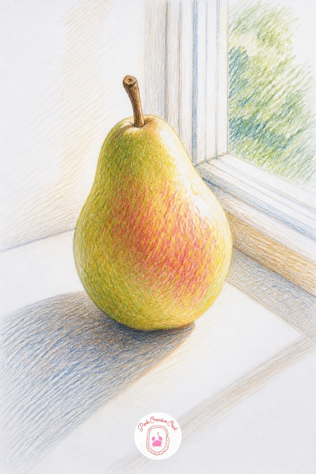
Palette: Pale Yellow,Apple Green,Olive Green,Warm Grey
Try a different shape and texture with an Asian pear, rounder than a European pear and still wrapped in its stretchy foam net from the shop. Draw the pear first as a near perfect circle rather than the usual teardrop, then overlay a loose diamond grid pattern across its surface to suggest the net.
Color the pear’s visible skin in warm tan and gold with small darker speckles scattered across it, since Asian pears have a distinct dotted texture, then draw the net itself in pale pink or white, keeping the grid lines thin, slightly wavy and loose rather than perfectly ruled.
A net drawn too rigid looks like graph paper instead of foam: let the diamond shapes vary slightly in size and let a couple of lines break or blur where the net stretches over the pear’s widest point.
If pale pink foam netting isn’t in your pencil set, a very light grey works just as well and still reads clearly against the gold pear underneath.
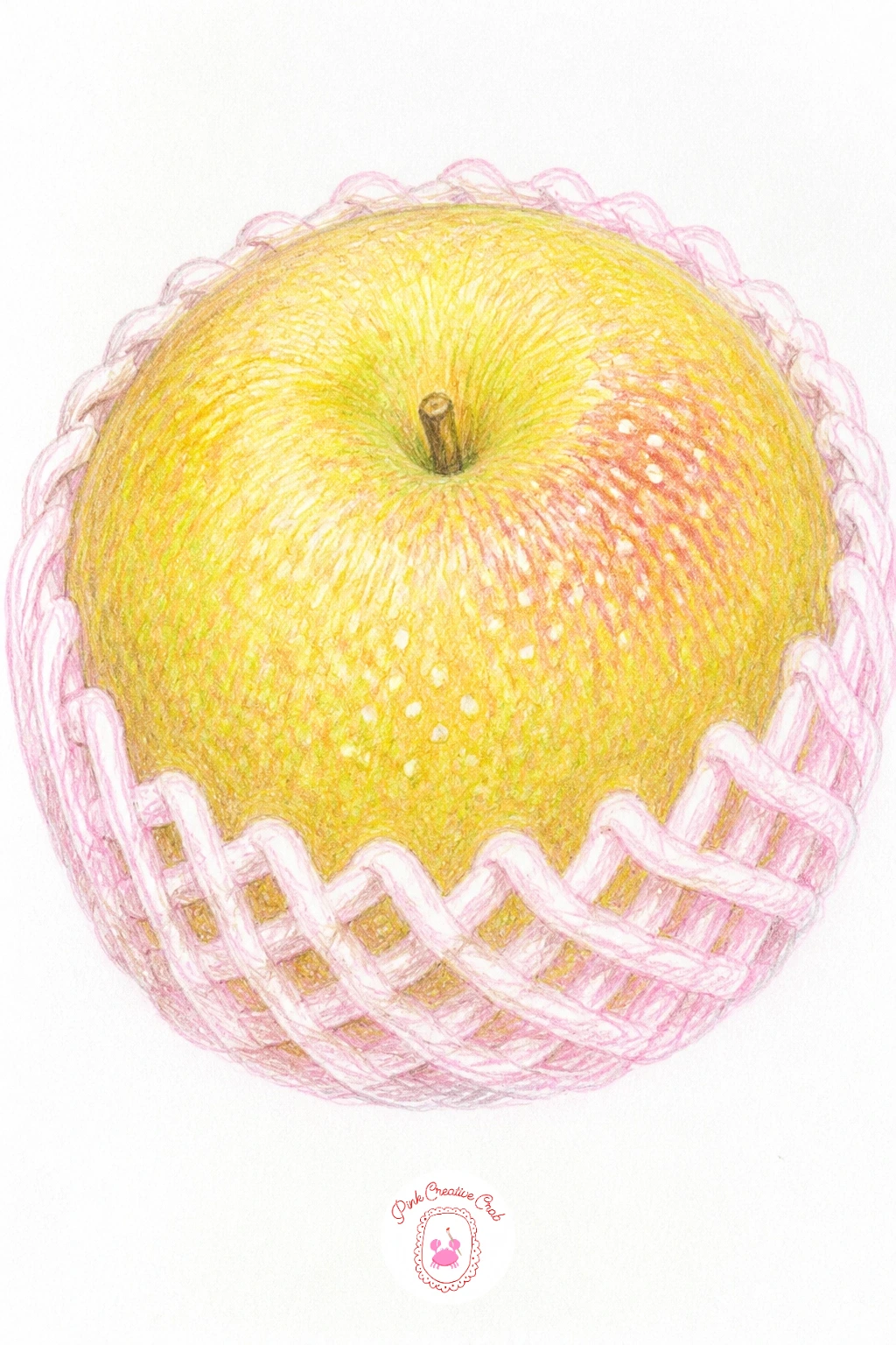
Palette: Warm Tan,Golden Brown,Blush Pink,Dark Brown
Focus on texture with a Bosc pear, known for its rough speckled brown skin, resting beside a simple kitchen knife. Draw the pear’s elongated shape first, slightly more tapered than other pear varieties, then lay a kitchen knife flat beside it, blade catching a thin highlight.
Build the pear’s base color in warm cinnamon brown, then scatter small irregular dots and flecks of darker brown across the surface using a sharp pencil point, working in clusters rather than evenly, since real pear speckling is never uniform. The knife stays simple: cool grey blade, dark wooden or plastic handle, one bright highlight line along the cutting edge.
Overdoing the speckles turns a pear into a leopard print: step back often as you add dots and stop well before you think you’re done, since pencil marks always read darker once the whole piece is finished.
A dry brush style dabbing motion with the pencil tip, barely touching the paper, gives a rougher, more broken speckle than a firm dot every time.
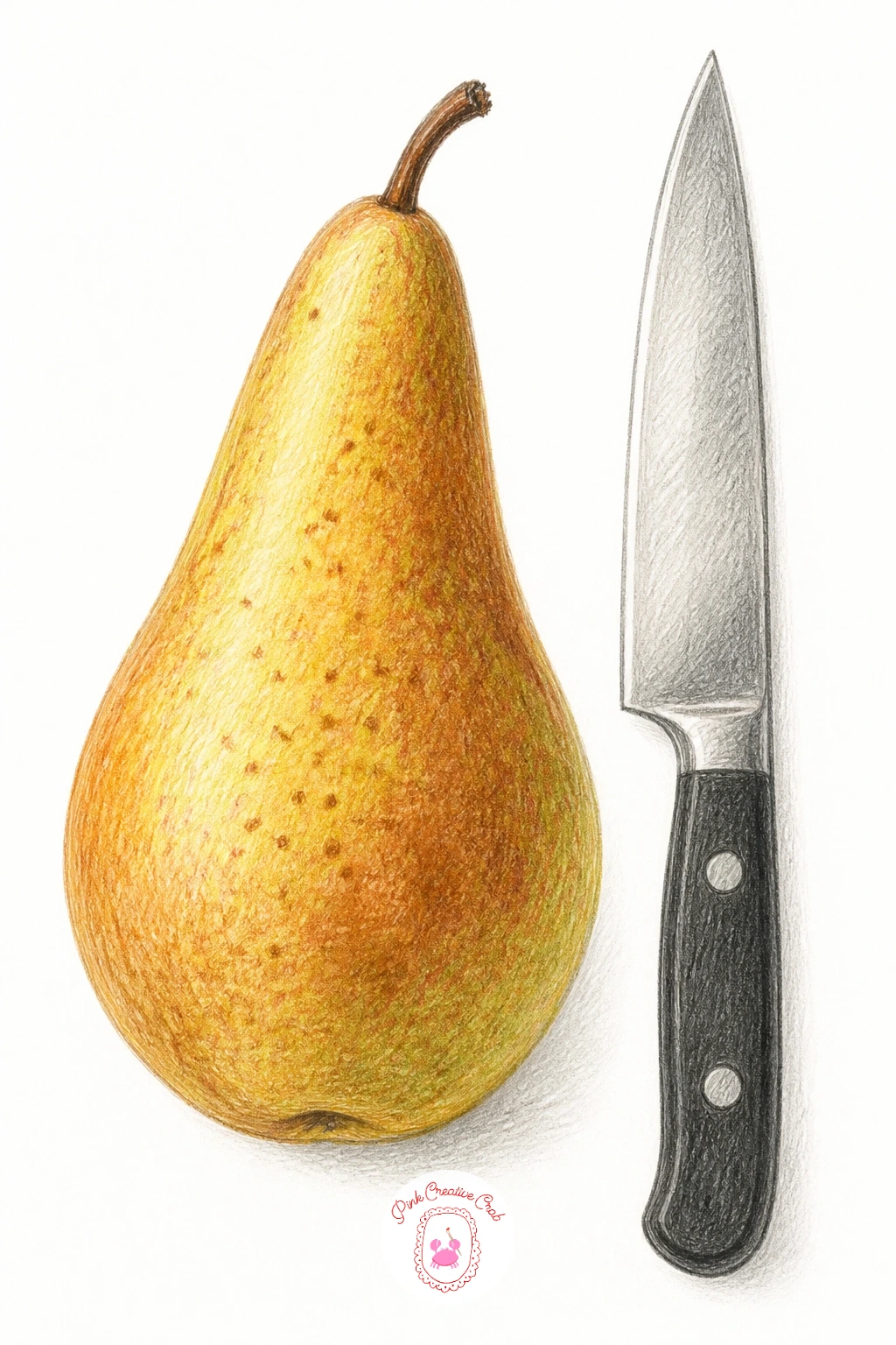
Palette: Cinnamon Brown,Dark Brown,Cool Grey,Golden Brown
Pair a decorative glass bottle shaped like a pear with one or two real pears beside it, an easy way to practice glass and fruit in the same piece. Draw the bottle’s smooth pear silhouette first, then place a real pear touching or slightly overlapping it so the comparison reads clearly.
Color the real pear normally, then treat the glass bottle very differently: a faint tint of green or amber across most of its surface, interrupted by sharp white highlight shapes left as bare paper and one or two darker reflected shadow patches borrowed from whatever sits nearby.
Confusing glass with solid fruit is the easy trap here: keep the bottle’s color much flatter and cooler overall, with higher contrast highlights, while the real pear keeps its soft gradual shading from light to dark.
No decorative bottle on hand for reference, any tall glass vessel works for practicing the same highlight and reflection pattern, just adjust the outline to a pear silhouette afterward.
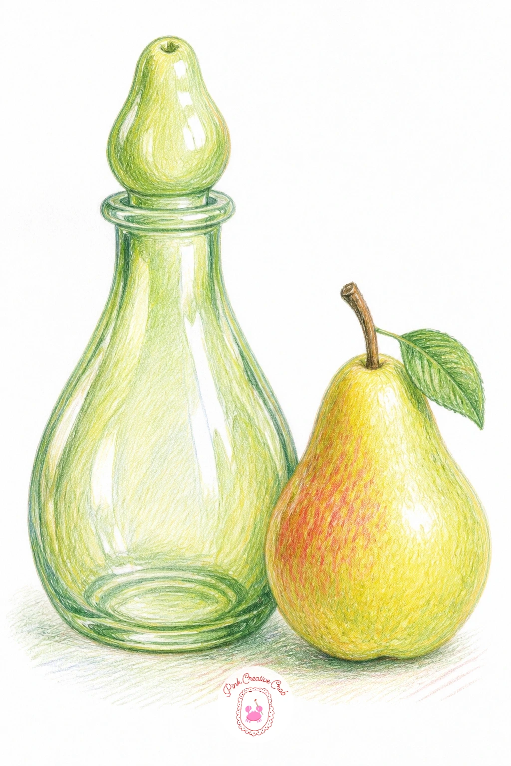
Palette: Pale Green,Amber,Apple Green,White
Return to the orchard in a quieter season: a bare winter tree with one single pear still clinging to a high branch. Draw the trunk and branches first in cool brown and grey, bare of leaves, with thin twigs branching off the main limbs in irregular patterns.
Color the tree in muted winter tones, greys and browns with no green at all, then place the one remaining pear in full warm color, its brightness doing all the emotional work against the bare branches around it. A pale wash of winter sky or a few scattered snow dots behind the tree finishes the mood without much extra effort.
Bare branches drawn too evenly look like a fan rather than a tree: let branches fork unevenly, some thick and short, others thin and long, and never let two branches cross at exactly the same angle twice.
Once you like this one, try the same tree again in autumn instead, swapping the single pear for a scatter of fallen leaves at the base, which reuses the same branch structure for a completely different mood.
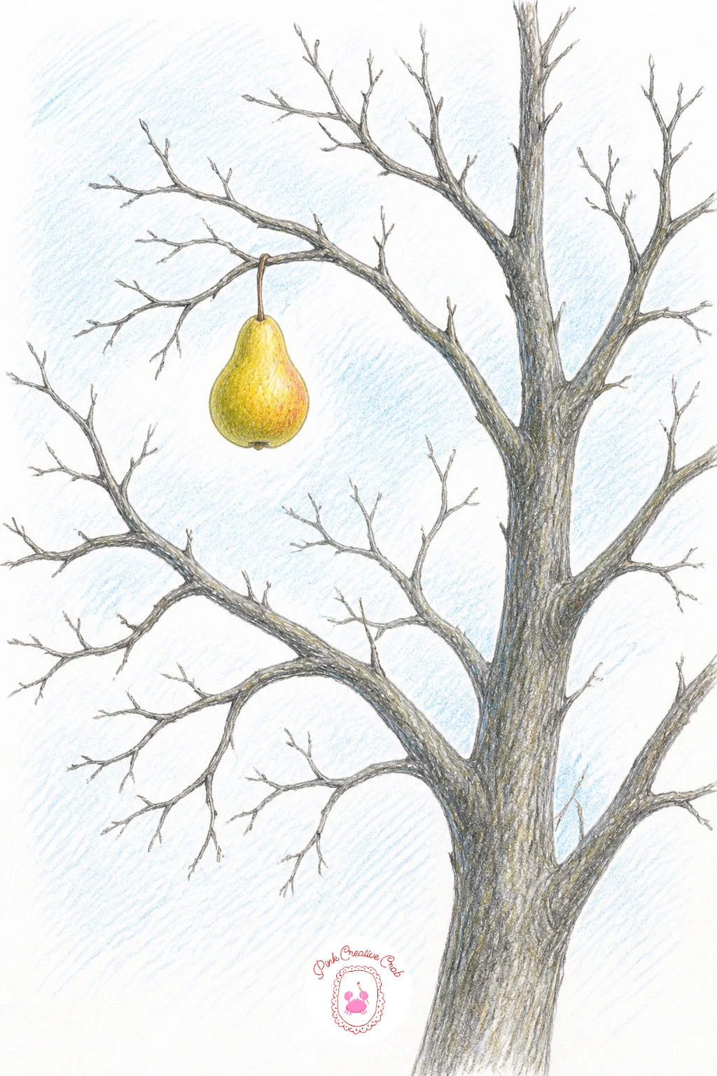
Palette: Cool Grey,Burnt Umber,Golden Yellow,Pale Blue
Build a fuller classic still life with two pears, a small bunch of grapes and a simple jug grouped together. Draw the jug first since it anchors the composition, then add the pears leaning against its base and the grapes spilling slightly to one side, their cluster made of small overlapping circles rather than individual perfect grapes.
Color the jug in a plain muted tone, cream or soft blue, then work the pears as usual and the grapes in deep purple or green with a single bright highlight dot left bare on each one facing the light. Keep the whole grouping tight, objects touching or overlapping, rather than spaced out evenly across the page.
Grape clusters often turn into a solid purple blob: vary the size of individual grapes slightly, leave thin gaps of bare paper between some of them, and add only a few stems showing through.
For more grouped object ideas like this one, the still life drawing ideas list has further arrangements worth trying with the same jug and fruit approach.
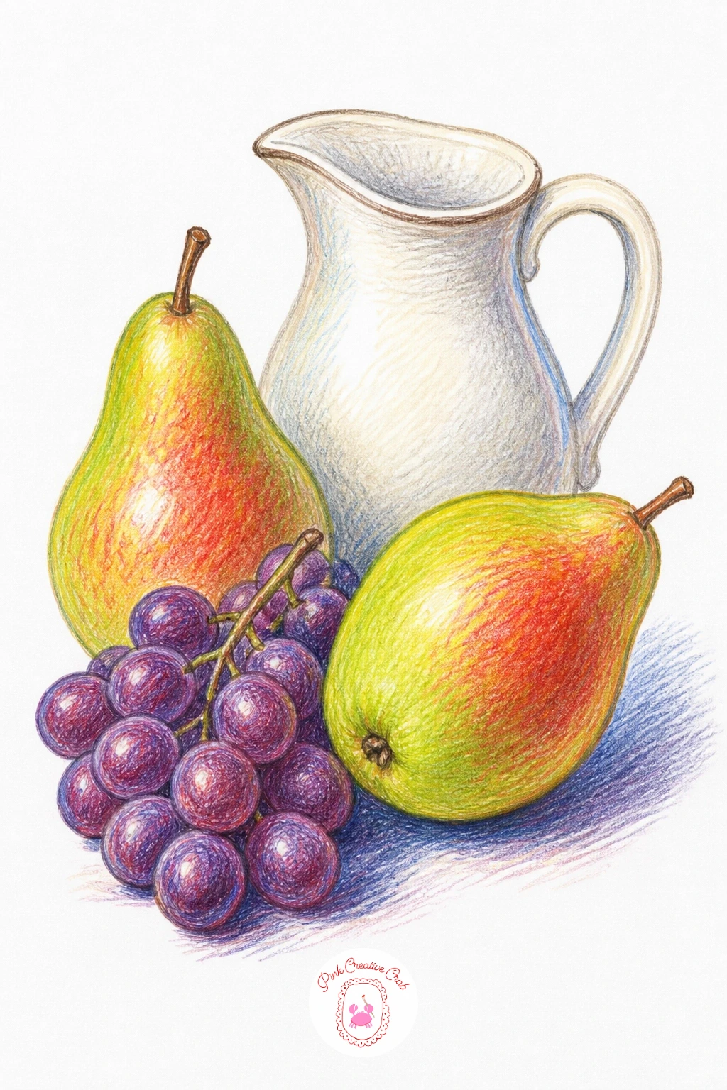
Palette: Cream,Deep Purple,Apple Green,Golden Yellow
Bring in a small story with a pear tucked into an open lunchbox beside a sandwich or a napkin. Draw the lunchbox first as a simple open rectangle shape, its lid propped at an angle, then fit the pear inside alongside one or two other simple shapes like a folded napkin or a small sandwich triangle.
Color the lunchbox in a bright friendly color, since this is a cheerful everyday scene rather than a formal still life, then work the pear in your usual palette, making sure its color pops clearly against the box’s interior. Keep the other lunchbox contents simple and flat colored so the pear stays the clear focus.
A common slip here is making the lunchbox too deep, which swallows the pear visually: keep the box fairly shallow and let the pear and other items sit close to the open top edge where the light reaches them.
If you want this finished fast, ten minutes covers flat colors and a simple outline; the forty minute version adds a bit of interior shadow along the lunchbox walls to give it real depth.
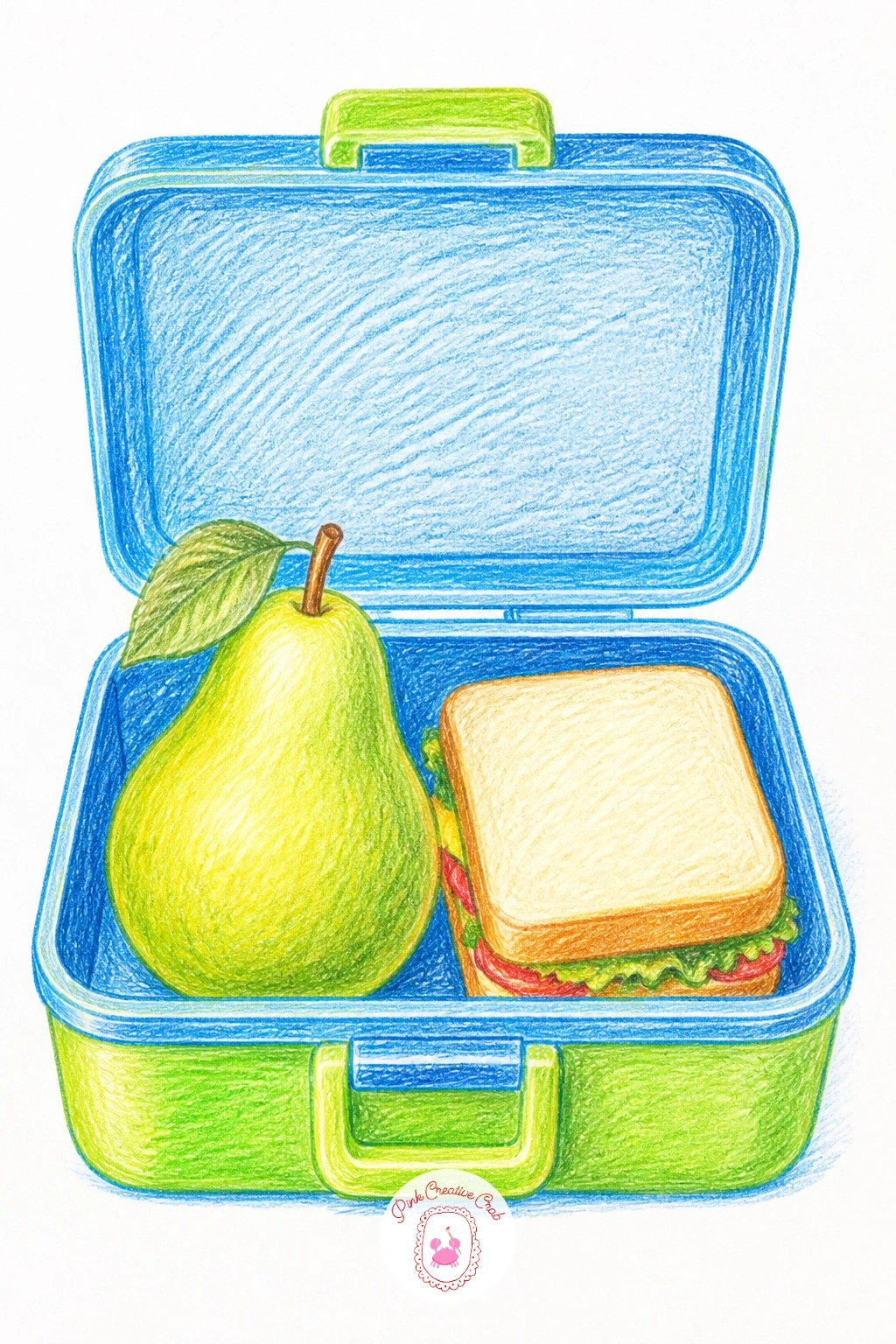
Palette: Bright Red,Apple Green,Golden Yellow,Cream
Move to breakfast with thin pear slices fanned across a piece of toast, honey drizzled over the top. Draw the toast as a simple rounded square first, its edges slightly uneven like real bread, then lay the pear slices in an overlapping fan across most of its surface.
Color the toast in warm golden brown with small dark dots for toasted texture, then work each thin pear slice in pale green and yellow, leaving a touch of the slice’s outer skin edge in deeper green. Drizzle the honey last in thin curving lines of warm amber, using a very light touch so earlier colors show through underneath.
Honey drizzle drawn too thick just looks like a solid blob on top: keep the lines thin, uneven, and slightly broken, following gravity in loose zigzags rather than perfect parallel stripes.
No amber pencil handy, a pale orange layered thinly over yellow gives nearly the same honeyed glow.
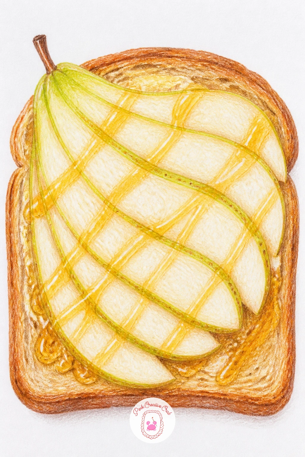
Palette: Golden Brown,Pale Green,Amber,Pale Yellow
Add a small animal moment with a little bird pecking at a pear still hanging on its branch. Draw the branch and pear first as before, then perch a small round bodied bird right beside the fruit, its beak touching the skin where it has pecked a tiny hole.
Color the pear as usual with the small peck mark shown as a tiny patch of exposed pale flesh, then give the bird simple flat color blocks, a warm brown body, a paler belly, with just a few fine line strokes for wing feathers rather than drawing every one individually.
Birds often end up too detailed compared to the simpler pear beside them, which throws off the whole balance: keep the bird’s shapes just as simple as the fruit, a rounded body, a small head, a few confident lines for the tail.
If garden birds interest you beyond this one scene, hummingbird painting has more ideas for small birds in gardens worth a look, even in a different medium.
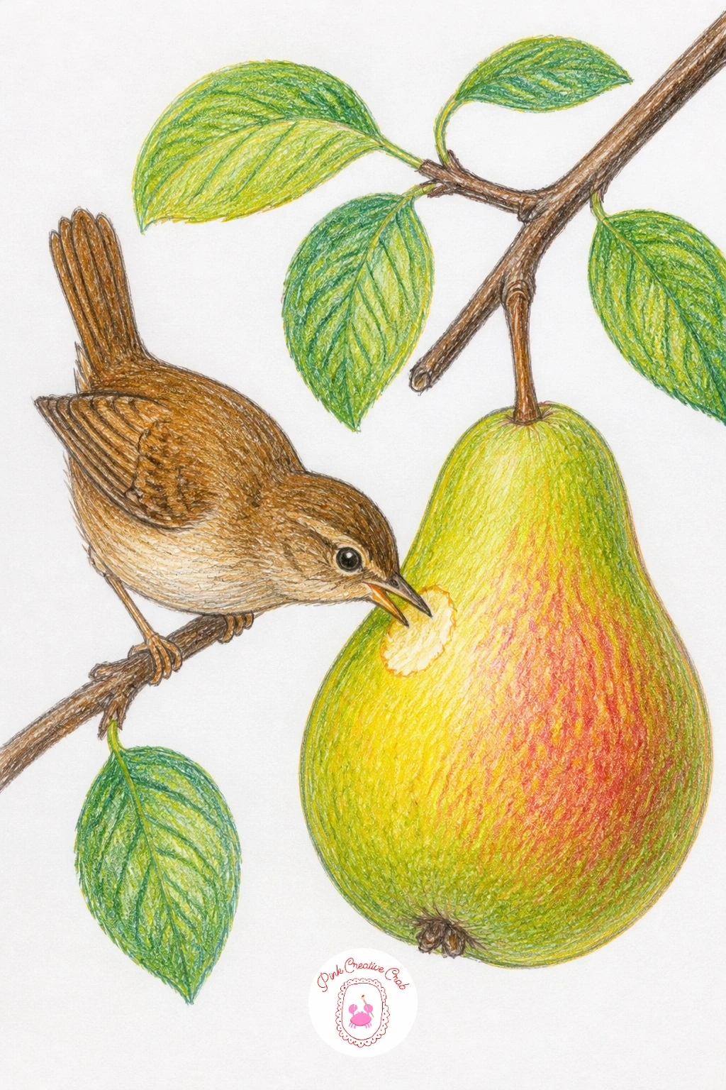
Palette: Apple Green,Golden Yellow,Warm Brown,Cream
Give a single pear a weather story with raindrops falling around it while it still hangs on its branch. Draw the pear and branch as usual, then add a scatter of thin diagonal lines across the background to suggest falling rain, keeping them light and evenly spaced rather than dense.
Color the pear slightly cooler than usual, mixing a touch of blue grey into your greens to suggest the dim wet light, then add a few small round highlight droplets sitting right on the pear’s surface, left as bare paper ringed with a thin darker outline to show they sit above the skin.
Rain drawn too heavy turns the whole piece grey and muddy: keep the diagonal rain lines sparse and very light in pressure, and let most of the background stay plain white paper doing the work instead.
Look at the light differently here, rain scenes usually read as overcast with no single strong highlight, so soften all your pear’s shading into gentler, more even gradients than on a sunny piece.
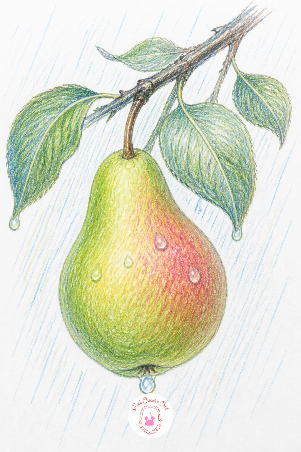
Palette: Blue Grey,Olive Green,Apple Green,Burnt Umber
Keep this one simple and satisfying: one green pear and one red pear standing side by side, nothing else on the page. Draw both pears at the same size and roughly the same pose so the only real difference between them is color, letting that contrast carry the whole piece.
Build the green pear in your usual fresh green and gold layers, then switch entirely for the red one, working blush pink through to a deeper rose red, keeping its highlight and shading pattern otherwise identical to its neighbor.
Matching two pears exactly in shape while differing only in color is trickier than it sounds: sketch both outlines from the same reference pear or the same simple template, then color them separately so proportion stays identical and only the palette changes.
Once this pair works well, try it again with three pears instead of two, adding a yellow one between the green and red, which only needs a palette shift and nothing new technically.
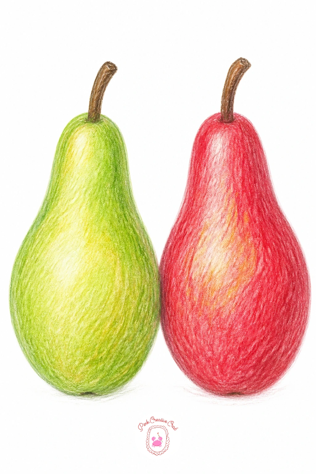
Palette: Apple Green,Golden Yellow,Rose Red,Blush Pink
Capture harvest time with several pears floating in a bucket of water, as they often are when freshly washed. Draw the bucket first as a simple wide cylinder, then add a water line partway up, with three or four pears bobbing at the surface, some fully visible, others partly submerged below the waterline.
Color the pears above the water normally, then shift to a cooler, slightly muted version of the same colors for the submerged portions, adding a few horizontal ripple lines across the water’s surface in pale blue grey to show movement around each floating pear.
The waterline is where this one succeeds or fails: keep it as one continuous subtly wavy line across the whole bucket, with every pear’s submerged color shift happening at exactly that same level, or the water won’t read as one connected surface.
If bucket textures feel like too much at once, a simple galvanized metal bucket in plain grey with a few vertical highlight lines is far easier than anything patterned or rusted.
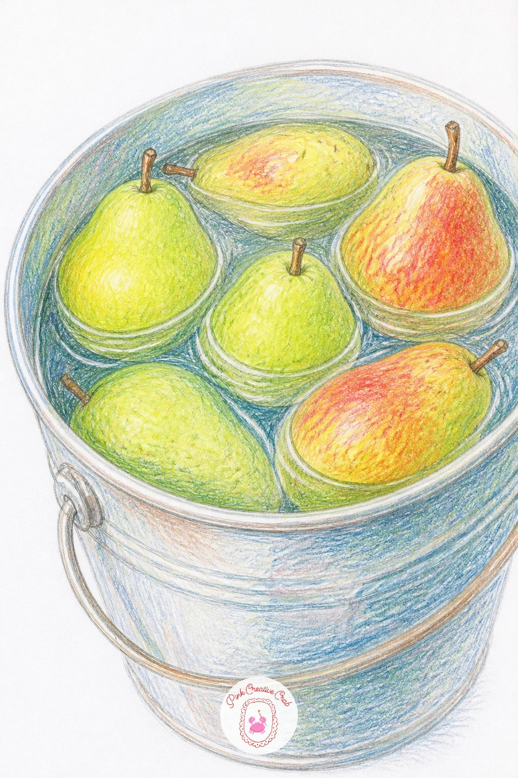
Palette: Pale Blue Grey,Apple Green,Golden Yellow,Metal Grey
Close the list with a pear cake, one slice already cut and pulled slightly away to show the inside. Draw the round cake first, its top studded with a few thin pear slices arranged in a simple pattern, then mark the cut slice as a clean wedge separated from the rest, laid flat on its side nearby.
Color the cake’s crumb in warm golden brown with tiny darker flecks for texture, then work the pear slices baked into the top in a slightly deeper, more muted green and gold than a fresh raw pear, since baking dulls their brightness. The separated slice shows the same crumb and pear pattern from its cut side.
A cake top drawn with pear slices all facing the same direction looks mechanical: vary the angle of each slice slightly and let a couple overlap, the way they naturally settle while baking.
For more dessert drawing practice beyond fruit, chocolate drawing covers similar techniques for crumb texture and glossy toppings that transfer well to any baked good.
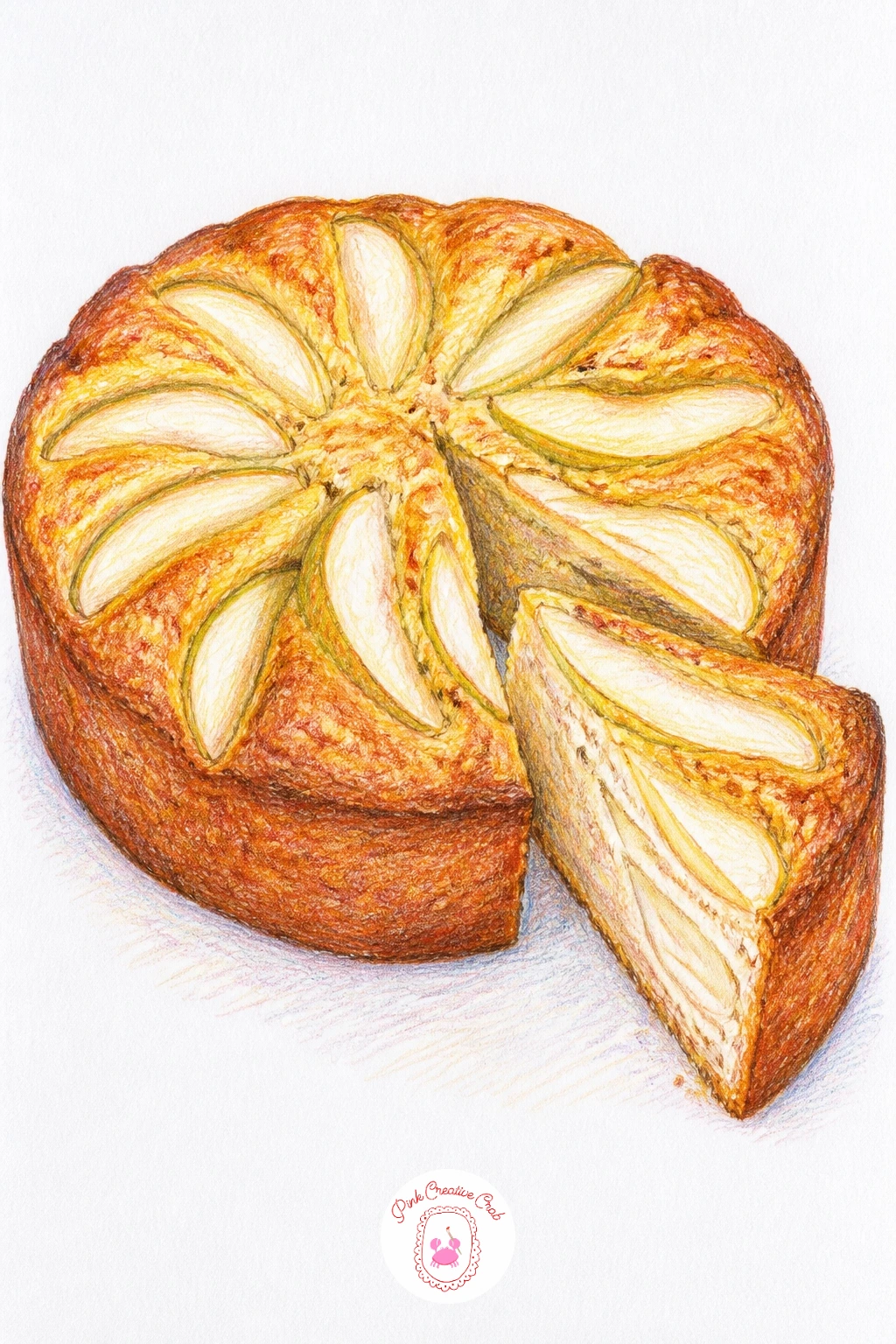
Palette: Golden Brown,Olive Green,Cream,Dark Brown
What to Do Next
Pick one pear that matches how much time you actually have today, a single fruit on white paper if it is ten minutes, a small orchard basket if it is forty. Grab smooth paper, start with light pencil guidelines, and build your colors up gradually from pale to dark.
Frequently Asked Questions
What colored pencils work best for a pear drawing?
A set with several greens, a golden yellow and a warm brown covers most pears. Layering two or three pencils together gets closer to a real pear’s color than relying on one single matching shade.
How do you make a pear look rounded instead of flat?
Leave the lightest area as bare white paper and build darker layers gradually toward the shaded edge. Pears also darken noticeably near the stem, which adds roundness without extra blending work.
Why does my pear drawing look lopsided?
Most pears are about as wide as they are tall at the base, narrowing toward a short bent stem. Checking that proportion with a quick measurement before adding color prevents an uneven, stretched shape.
How long does a pear drawing take at this level?
A simple single pear takes about ten to fifteen minutes once the shape and base colors are settled. Scenes with a basket, branch or still life grouping run closer to thirty or forty minutes with shading.
What if I don’t have the exact pear color in my pencil set?
Layer the colors you do have instead of searching for an exact match. Yellow under green, or pink under brown, builds a convincing pear tone from almost any basic pencil set.
Have any thoughts?
Share your reaction or leave a quick response — we’d love to hear what you think!
-
 0
-
0
-
0
-
0
-
0
-
0


