Table of Contents
We’ve gathered fifteen watercolor flowers that’ll build your confidence from your very first brushstroke to a full bouquet. Each flower teaches you a specific technique—wet-on-wet blending, lifting, layering—that you’ll use again and again. We’re starting with simple five-petal blooms that forgive wobbly lines, then moving toward slightly more complex flowers that look impressive but still hide mistakes beautifully. Let’s see which one you’ll paint first.
Simple Five-Petal Blossoms for Your First Watercolor Flower
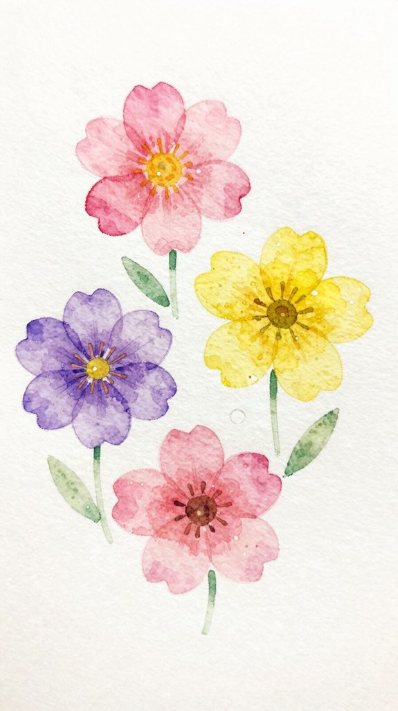
Before you tackle complex roses or detailed lilies, let’s master the simple five-petal blossom. This basic shape forms the foundation of many flowers and helps you practice mixing colors on paper.
Start by loading your brush with diluted paint. Touch the tip to your paper, press down gently, then lift. That’s one petal! Space four more petals around a center point, leaving small gaps between each one.
While the petals are still wet, drop in a darker shade at the base. This technique, called wet-on-wet, creates beautiful natural blending. The colors will flow together automatically. For best results, apply your darker shade while the paper is at the shiny wet stage, when you see a uniform sheen without pooling.
Practice this same flower multiple times across your page. You’ll build confidence and create an impressive floral composition. Each blossom teaches you brush control and color behavior!
Loose Lavender Stems Using Basic Brush Strokes
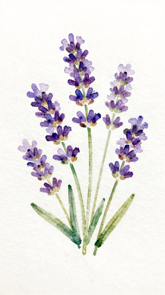
Lavender might look complicated with its tiny clustered blooms, but we’ll simplify it into just a few easy strokes. Start by painting a thin green stem using your brush tip.
Now here’s the fun part! Load your brush with diluted purple, then tap it gently along the stem’s top portion. These quick taps create the flower clusters—no detailed painting needed.
The beauty of lavender lies in flowing brushwork that captures its natural, airy quality. Don’t worry about perfection; lavender naturally grows in loose, irregular patterns. Let some taps overlap while others stand alone. Add water to your purple between taps to create softened edges and natural color variation. This technique mimics how real lavender fades from deep purple to pale violet! This is a perfect example of wet-on-wet techniques creating those soft, atmospheric effects that make watercolor so expressive. Practice this tapping motion on scrap paper first.
Easy Watercolor Daisies With Wet-on-Wet Centers
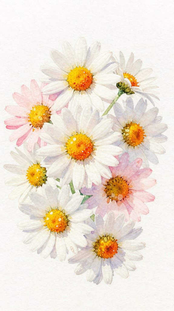
Daisies offer a perfect introduction to wet-on-wet painting, where we add color to still-wet paper for soft, blended effects. We’ll create spontaneous petal shapes that feel fresh and natural, not rigid or perfect.
Start by painting the daisy center with clean water, forming a small circle. While it’s wet, drop in yellow paint, then add a touch of orange. Watch the vibrant color blending happen automatically – that’s the magic of wet-on-wet! The colors will spread and mix on their own.
Let the center dry completely before adding petals. Paint simple white or pale petals radiating outward, using quick brushstrokes from the center. Keep each petal loose and uneven – real daisies aren’t identical! This spontaneity creates character and charm in your painting. If you want to add graphite sketching guidelines before painting, remember that graphite erasability makes it easy to remove any visible pencil lines once your watercolor dries.
Abstract Poppies That Hide Beginner Mistakes
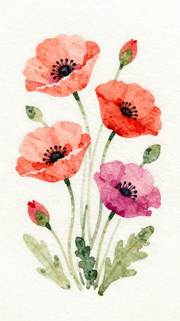
Since poppies naturally have ruffled, irregular petals, they’re incredibly forgiving flowers for beginners to paint. Their loose, organic shapes mean your creative composition doesn’t need perfect symmetry. In fact, balanced asymmetry (where elements feel equal without matching exactly) makes poppies look more natural!
Here’s why abstract poppies work brilliantly for learning:
- Wobbly edges look intentional – uneven lines appear artistic rather than incorrect
- Color bleeds add character – when colors run together, they create depth and dimension
- No two poppies match – nature’s variety means every flower you paint is “correct”
- Dark centers anchor your design – a bold middle point draws eyes away from petal imperfections
Let your brush dance freely across the paper, embracing happy accidents as features rather than mistakes. This forgiving approach to watercolor flowers also translates beautifully to junk journaling, where imperfection and personal expression are celebrated rather than avoided.
Cherry Blossoms Using the Lifting Technique
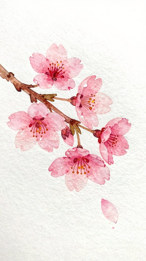
Cherry blossoms seem delicate and complex, but they’re actually perfect for practicing the lifting technique – a method where you remove wet paint to create lighter areas.
Start by painting loose pink circles for your petals. While the paint’s still wet, blot the centers with a clean, damp paper towel. This creates natural highlights! The varied petal shapes emerge when you lift at different angles and pressures.
Next, try layered color application by adding a second wash once the first dries. Paint darker pink along the petal edges, then lift again in the centers. This builds dimension. This process of building lighter centers and darker edges mirrors how artists use gradation and form shadows to create realistic depth in any medium.
The beauty of this technique? There’s no wrong way to lift paint. Each blossom becomes unique, and those “imperfect” shapes actually look more realistic than uniform ones!
Simple Tulips With Clean, Confident Strokes
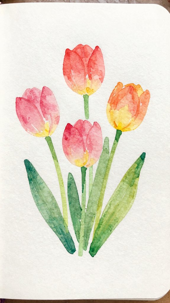
While cherry blossoms taught us the softer side of watercolor, tulips are all about bold, sweeping strokes. These elegant flowers help you develop confident brush control through simple, decisive movements.
Tulips demand confidence—each bold stroke builds the decisive brush control that transforms hesitant painting into purposeful artistry.
Here’s how to paint them:
- Load your brush fully with pigment – we need enough paint for one complete petal stroke
- Start at the base and pull upward in a curved motion, lifting pressure as you reach the tip
- Vary each petal’s width slightly by adjusting how hard you press down
- Overlap petals while the paint is still wet to create natural blending
The beauty lies in those varied petal shapes – no two tulips look identical! Press firmly for wide petals, lighten up for narrow ones. Each stroke teaches your hand to move with purpose and control. This exercise is perfect for improving observational skills as you study how real tulip petals curve and overlap in nature.
Watercolor Sunflowers With Layered Petals
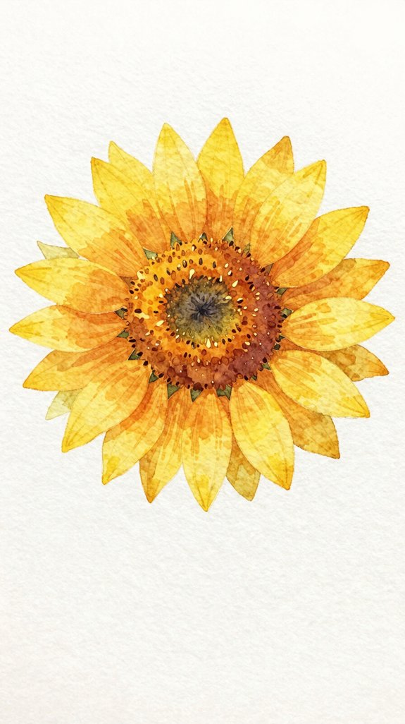
Because sunflowers have so many petals radiating from the center, they’re perfect for practicing layering techniques. We’ll start with the back petals using diluted yellow, painting quick strokes outward from where the center will be. Let these dry completely—this prevents colors from bleeding together.
Next, we’ll add front petals with richer yellow, overlapping the first layer. This creates depth and dimension! Notice how layered petal techniques make your flower look three-dimensional instead of flat.
For the center, mix burnt sienna with a touch of black, dabbing it in a circle. While it’s still wet, drop in darker brown around the edges for texture.
Finally, add orange touches to some petal bases for balanced color compositions. This warmth makes your sunflower glow convincingly. The luminous effects that watercolor creates through transparent washes make sunflowers particularly striking since the white paper shines through your yellow pigments.
Delicate Forget-Me-Nots for Practicing Small Details
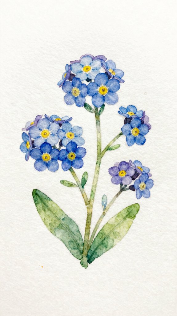
After mastering larger blooms, we’ll shift our focus to tiny forget-me-nots—perfect for building control with small brushstrokes.
These delicate flowers challenge us to create detailed shapes while maintaining soft edges. Use a fine-tipped brush (size 0 or 1) for precision work.
Here’s our approach:
- Paint five tiny blue dots in a circle formation—these become your petals
- Gently pull each dot outward with a damp brush to soften the edges
- Add a yellow center dot while the blue is still slightly wet for natural blending
- Create clusters of 3-5 flowers at varying angles for realistic groupings
We’ll work wet-on-dry for crisp petal shapes, then soften with clean water. This technique trains your hand for miniature work while exploring color intensity! As you develop your skills, consider using artist grade materials for richer pigmentation and better color payoff in your detailed floral studies.
Loose Roses Without Complicated Anatomy
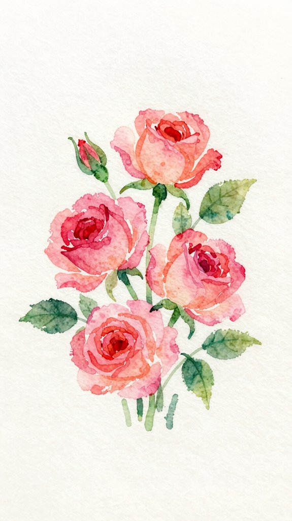
Roses intimidate many beginners, but we’ll paint them using a loose, impressionistic style that skips the complex petal-by-petal approach. Start with a small circle of concentrated pigment for the center, then add curved C-strokes around it. These loose, flowing brushstrokes create expressive petal shapes without worrying about botanical accuracy!
Let the water do the work—tilt your paper slightly so colors blend naturally. Add darker values (that means deeper color) on one side for dimension. The key is keeping your hand relaxed and moving quickly, which prevents stiff, overworked flowers. If you pause too long, the paint dries and looks forced. When mixing your rose pinks and reds, remember that warm and cool colors react differently, so choose pigments with similar temperatures to keep your petals vibrant rather than muddy.
We’re capturing the essence of a rose, not photographing it. This technique celebrates happy accidents and spontaneous beauty!
Hydrangea Clusters Using the Salt Texture Method
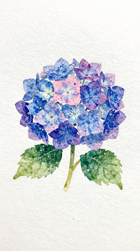
Hydrangeas offer the perfect opportunity to learn a fun watercolor trick using ordinary table salt! We’ll create realistic flower clusters by sprinkling salt onto wet paint, which absorbs the water and creates beautiful texture.
Here’s how to master this technique:
- Paint loose clusters of purple or blue circles, keeping the paper quite wet
- Sprinkle salt immediately while the paint is still glossy and damp
- Experiment with varied salt application techniques – try coarse sea salt for bigger patterns, fine table salt for delicate textures
- Wait patiently for complete drying (15-20 minutes) before brushing salt away
Controlling paint flow for desired effects takes practice. Too dry? The salt won’t work. Too wet? Your colors will blur together completely. We’re aiming for that sweet spot where paint glistens! Understanding how different mark-making creates textural effects will help you predict how salt interacts with your paint at various wetness levels.
Single-Stroke Wildflowers for Quick Practice
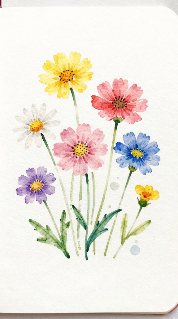
While complex flowers can feel overwhelming, single-stroke wildflowers let’s build confidence through simple, repeating motions. These loose, abstract strokes create charming quick floral sketches in minutes!
Single-stroke wildflowers transform intimidating floral painting into approachable art through simple, repeating brushwork that builds confidence while creating charming sketches in minutes.
Load your brush with diluted paint, then press and lift in one fluid motion. This creates a single petal. Repeat around a center point, varying the pressure slightly. The petals won’t look identical, and that’s perfect—wildflowers are naturally imperfect.
Try different stroke directions: vertical for lavender stalks, curved for daisies, or scattered for forget-me-nots. Don’t overthink placement; let your brush dance across the paper 🙂
Practice these gestures repeatedly until they feel natural. We’re training muscle memory here, not creating masterpieces. Speed actually helps—quick movements produce fresher, more energetic marks than careful, hesitant ones.
Watercolor Magnolias With Gradient Petals
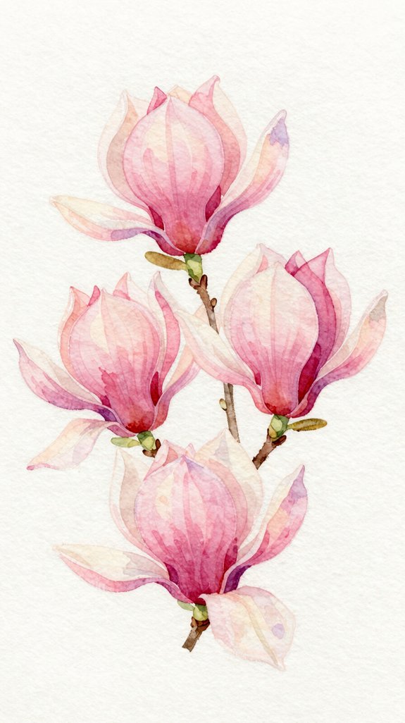
Magnolias offer the perfect next challenge because their large, elegant petals showcase beautiful color shifts without requiring intricate details. We’ll master gradient color mixing while layering translucent petals to create depth.
Here’s our approach:
- Load your brush with water and a light pink, then touch the tip into deeper purple for instant gradient color mixing
- Paint each petal with a single stroke, letting the colors blend naturally on the paper
- Add second petals once the first layer dries, creating dimension through layering translucent petals
- Darken petal bases with concentrated pigment to show where petals overlap and create realistic shadows
Start with three petals, let them dry completely, then add two more behind them. This layering technique transforms flat shapes into dimensional flowers!
Easy Cosmos Flowers With Translucent Layers
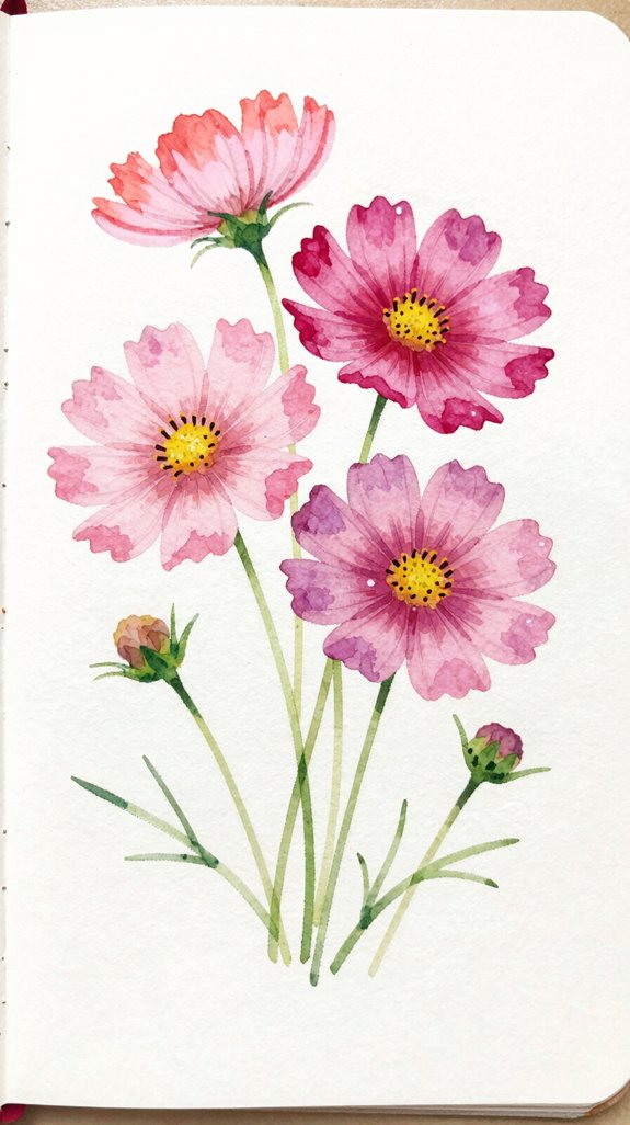
After building your confidence with magnolia petals, you’re ready to paint cosmos flowers—nature’s tissue-paper blooms that practically paint themselves!
We’ll master translucent washes to capture their delicate appearance. Start with very watery pink paint, then touch your brush to damp paper. The color spreads naturally, creating that see-through quality cosmos petals have.
While the first layer’s still wet, add a slightly darker pink near the petal’s base. This wet-on-wet method (adding paint to wet paint) lets colors merge beautifully without harsh lines. That’s your core blending technique right there!
Let it dry completely before adding a second translucent wash over certain petals. This layering builds depth while maintaining transparency—exactly what makes cosmos look so ethereal and dimensional. You’re creating professional-looking flowers with beginner-friendly methods!
Simple Botanical Leaves to Complement Your Blooms
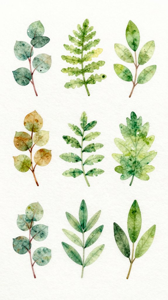
What’s a gorgeous flower without leaves to set it off? Let’s explore simple leaf compositions that’ll make your blooms pop! We’ll use fading leaf techniques to create depth and realism.
Here are four essential leaf painting methods:
- Basic pointed leaves – Load your brush with green, then paint from stem outward in one smooth stroke
- Round leaves – Start with a circular shape, then add a stem while the paint’s still wet
- Veined leaves – Paint the leaf first, let it dry slightly, then draw a center vein with darker green
- Gradient leaves – Mix yellow-green and dark green, letting colors blend naturally on your paper
Practice these techniques separately before adding them to your flowers. You’ll develop muscle memory quickly!
Combining Multiple Flowers Into Your First Watercolor Bouquet
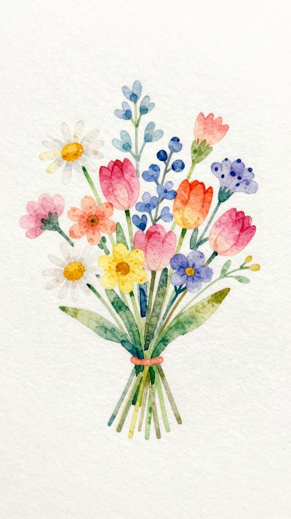
Now that you’ve mastered individual flowers and leaves, you’re ready to arrange them into a complete bouquet! Start by sketching a loose circle or oval—this creates your bouquet’s basic shape.
We’ll build layered floral arrangements by painting background flowers first, using lighter colors. Let these dry completely before adding foreground blooms with richer, darker tones. This creates depth!
For blended bouquet compositions, overlap petals slightly where flowers meet. This connects everything naturally. Add leaves between blooms to fill gaps and guide the viewer’s eye around your painting.
Work from light to dark, layer by layer. Don’t rush—let each section dry before adding the next. This prevents muddy colors and keeps your bouquet fresh-looking.
Frequently Asked Questions
What Basic Watercolor Supplies Do I Need to Start Painting Flowers?
We’ll need quality watercolor paints, a few round brush types in various sizes, cold-press paper, and water containers. Mastering paint consistency is vital—we’ll experiment with wet-on-wet techniques to create stunning, contemporary floral effects.
How Do I Choose the Right Paper Weight for Watercolor Flowers?
We’ll select 140lb cold-press paper for ideal water absorption. This weight prevents buckling while you’re exploring paper texture selection and mastering appropriate sizing techniques. It’s versatile enough for experimenting with innovative layering methods and botanical details.
What’s the Best Way to Mix Watercolor Paints for Natural Flower Colors?
We’ll achieve natural flower colors by mixing complementary colors in small amounts to create depth and subtle variations. Let’s experiment with the wet on wet technique, blending pigments directly on paper for organic, flowing shifts.
How Long Should I Wait Between Layers When Painting Watercolor Flowers?
We’d wait 5-15 minutes between layers—though 73% of artists prefer testing dryness by touch. For innovative effects, we’ll explore wet on wet technique alongside layering transparencies, creating luminous petals that capture light beautifully.
How Do I Fix Common Watercolor Mistakes Like Blooms or Muddy Colors?
We’ll embrace blooms as happy accidents or lift wet paint with tissue. To prevent muddy colors, we’re controlling paint consistency with proper water ratios and avoiding overworking the paper through minimal brushstrokes.
Conclusion
We’ve covered nine beautiful flowers you can paint today, each one building your confidence and skills. Recall, watercolor is forgiving—it’s like making friends with water and pigment on paper! Start with simple blooms, practice those basic strokes, and don’t worry about perfection. Each brushstroke teaches you something new. Grab your paints, pick your favorite flower from our list, and create something wonderful. You’ve totally got this! 🎨
Have any thoughts?
Share your reaction or leave a quick response — we’d love to hear what you think!
-
 0
0
-
0
-
0
-
0
-
0
-
0


