

Sketchbook pages built around one small theme are the most satisfying kind to fill, because a page of teacups or tiny mushrooms never asks for one big finished drawing, just a handful of friendly little ones sitting together. Each idea below gives you a full page: a loose grid or scattered layout of small studies that reads as a set the moment you add the last line of ink.
Work through them in any order, though the early ones warm up your hand before the busier pages ask for more patience. Every page uses the same easy kit: a fineliner for the line work, a little watercolor or marker for color, and the cream paper already in your sketchbook.
Using these images: free for personal projects such as printing, coloring, cards, journals and gifts. Handmade items that include them may be sold up to 30 pieces per design. More than that is commercial use and is not permitted, and neither is selling or sharing the images themselves or passing them off as your own. Please ask before any other use.
Breakfast foods make the gentlest page to open a sketchbook with, because toast, a soft boiled egg and a mug of coffee are all made of simple rounded shapes you already know how to draw. Start with pencil ovals and rectangles spread loosely across the page, leaving air between each one, then go over the keepers in fineliner once the arrangement feels balanced.
Add watercolor last: a butter yellow wash on toast, a pale pink on bacon, a soft brown wash in the coffee cup. If a shape goes wrong, a cream sketchbook forgives it easily, just let the ink dry and paint a napkin or crumb over the stray line.
If this is your first time filling a page like this, draw everything in pencil first and only ink the five or six foods you actually like, erasing the rest before you commit. Swap watercolor for a soft pastel marker if paint feels like too much today.
Keep the page friendly by varying the size of each food slightly, so nothing feels stamped from a template.
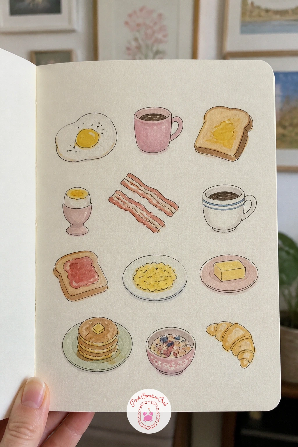
Palette: Butter Yellow,Soft Pink,Warm Brown,Cream
Teacups bring in your first real test of proportion, since a cup that leans too tall or too wide loses its charm fast. Measure each cup against its own handle before you ink: the body should roughly equal the width of the saucer, and the handle sits about a third of the way down the side, not at the rim.
Pencil six or eight cup shapes loosely around the page first, checking that measurement on each one, then ink the outlines and the little pattern details, a line of flowers here, a stripe there. Watercolor the patterns in sage, sky blue and soft pink, keeping most of the cup white so the pattern reads clearly.
If a cup looks lopsided after inking, turn it into a stout little teapot instead, nobody will notice the rescue. No watercolor on hand, colored pencil gives the same light touch without the drying time.
Label a couple of cups faintly in pencil with the country they remind you of, it adds charm without needing real accuracy.
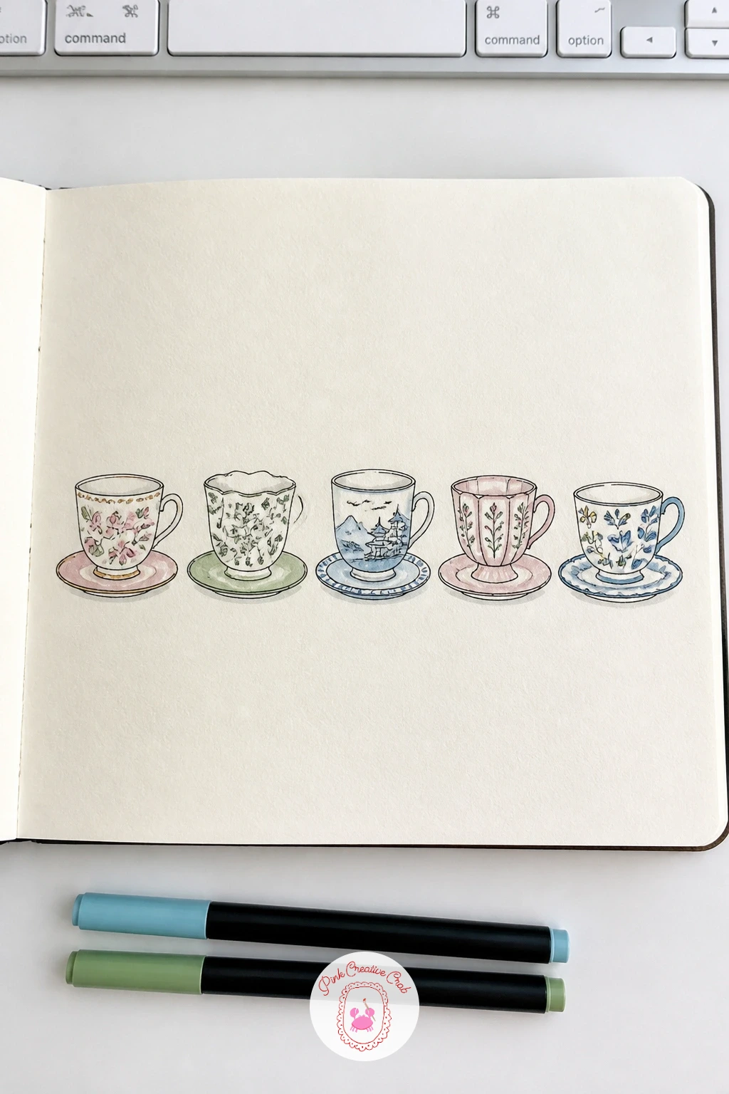
Palette: Sage Green,Sky Blue,Soft Pink,Cream
Houseplants carry the page into perspective and light, since every pot sits on an implied shelf line and every leaf catches light from one direction. Decide early where the light comes from, usually the top left works naturally, and leave that side of each leaf and pot a touch paler.
Draw the pots first in pencil along a loose baseline, varying their shapes: a round terracotta pot, a tall ceramic one, a low bowl. Ink the pots and the plant stems, then build each plant from simple leaf shapes repeated a few times rather than one complicated silhouette.
Watercolor in sage and a deeper green, leaving the lit edge of each leaf unpainted so the white paper does the work of shine. If the greens start looking identical, mix in a little butter yellow for the sunnier plants and skip it for the shade lovers.
This page pairs well with other plant studies, so if you enjoy it, the botanical sketchbook ideas give you more pages built the same way.
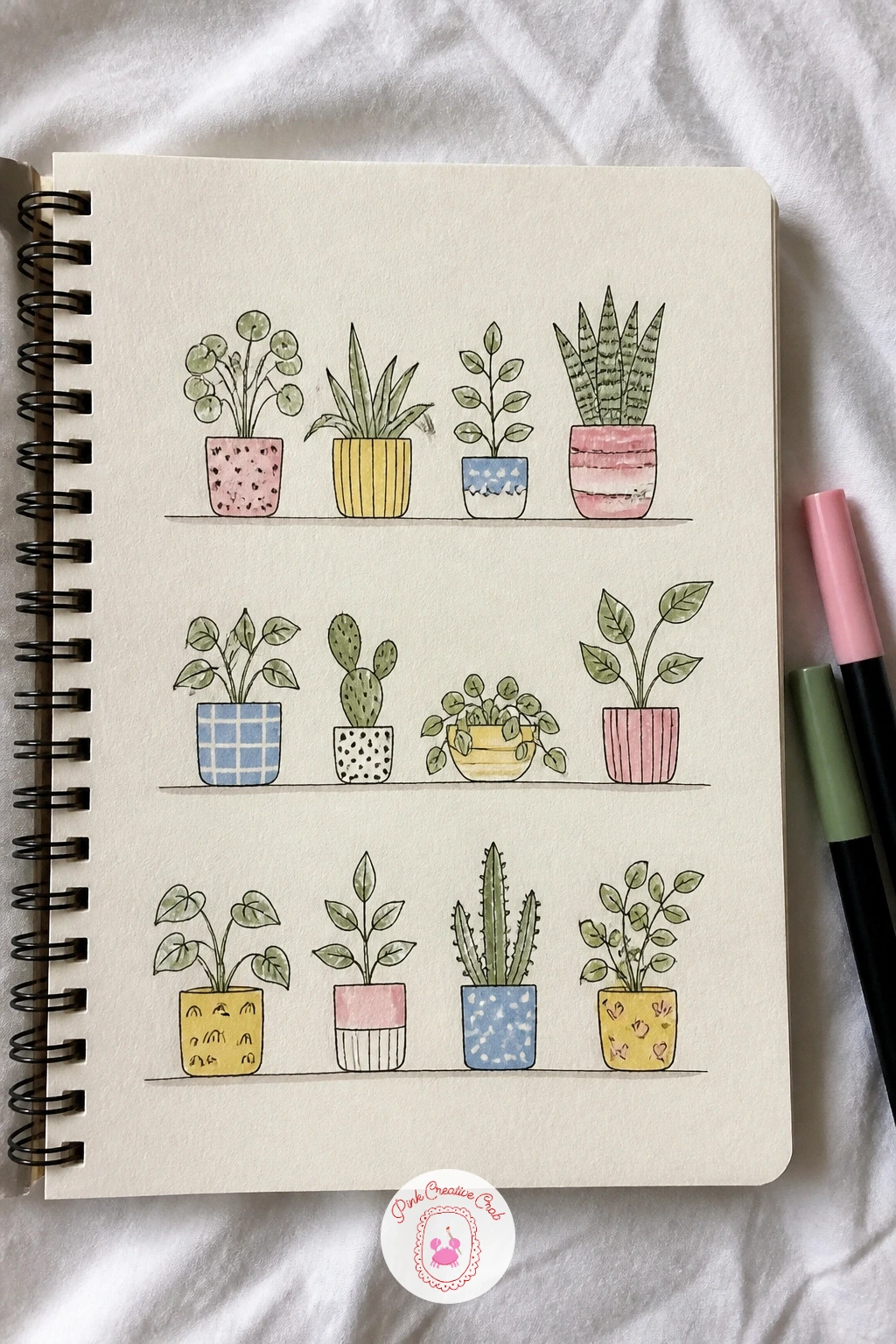
Palette: Sage Green,Terracotta,Butter Yellow,Deep Green
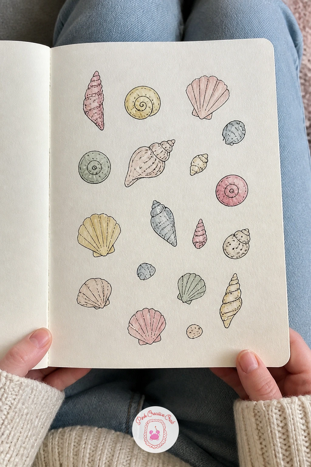
Shells reward a light hand with dry brush, since the real texture of a shell is a scatter of fine ridges rather than a solid shape. Pencil a loose scatter of shell outlines across the page, spirals, fans and little cones, keeping them small enough that detail stays manageable.
Ink the outer edge of each shell first, then add the ridge lines with a drier brush loaded with less water, dragging it lightly over the watercolor wash once it has dried slightly so the texture stays broken rather than smooth. Soft pink, cream and a pale grey cover most shells well.
If a shell ends up looking flat, a kneaded eraser can lift a highlight back out of a dried wash, giving it a little shine along one edge. No watercolor to hand, a white gel pen does the same lifting trick over colored pencil.
Scatter the shells at different angles rather than lining them up, it reads far more like a real beach find.
You Will Need
- white gel pen
- kneaded eraser
Palette: Soft Pink,Warm Grey,Cream,Sky Blue
Cats doing small ordinary things, stretching, washing a paw, curling into a loaf, give you a page with built in variety without needing a different animal each time. Draw the quick version first: six loose cat silhouettes in ten minutes, simple ovals for the body and a rounded triangle for the head, each caught mid action.
For the forty minute version, go back in and add the small details that give each cat personality: half closed eyes, a flicked tail, whiskers drawn with one confident fineliner stroke each rather than many short ones. Watercolor the fur in soft grey, warm orange or cream, leaving the belly paler on every cat.
If a pose looks stiff, loosen the spine line first in pencil, cats bend more than you expect through the middle of the back. Marker works as a quick swap for watercolor if you want the page done in one sitting.
Once this page works, try the same approach with the cute sketchbook ideas for more animals caught mid task.
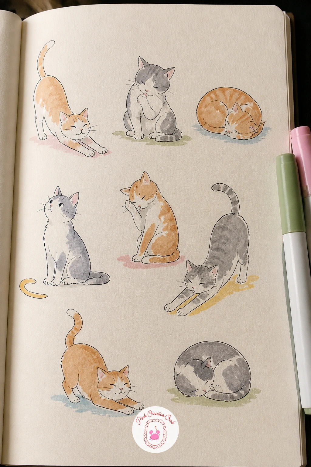
Palette: Warm Orange,Soft Grey,Cream,Charcoal
Look at a cat mid stretch for reference if you can, the curved back and splayed front paws are easy to get wrong from memory alone.
Tourists taking photos give the page its first real people, and the trick with tiny figures is proportion: keep heads to about one sixth of the total body height so they read as adults rather than children. Sketch each figure as a simple stick frame first, then build the rounded body shapes around it.
Draw a camera raised to one face, a phone held up by another, a third figure pointing at something off the page, all small and loosely drawn rather than detailed. Ink the outlines, keeping clothing simple, a sun hat here, a striped shirt there.
Watercolor lightly in sky blue, soft pink and butter yellow for clothing, leaving skin tones as a pale wash or the bare cream paper if that feels easier. If a figure looks awkward, cropping it at the waist behind a suitcase or railing hides a lot of trouble.
Keep every figure facing a slightly different direction so the page feels like a busy little scene rather than a row of the same pose.
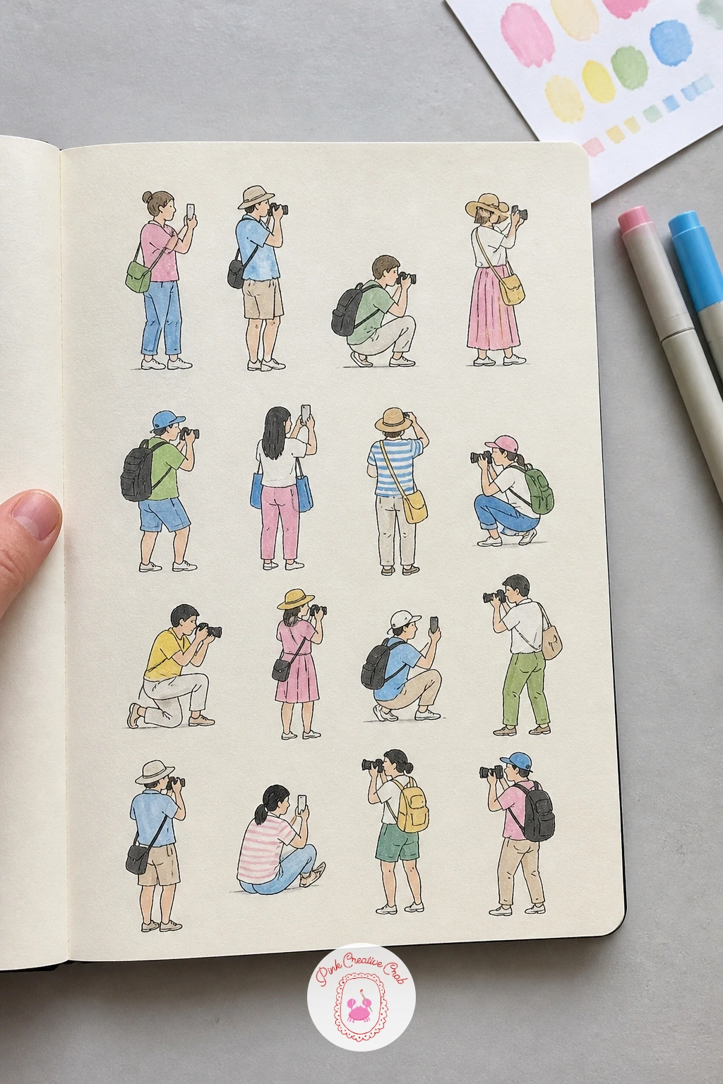
Palette: Sky Blue,Soft Pink,Butter Yellow,Cream
Pastries ask for the same patience a real bakery counter does, since a croissant’s charm sits entirely in its layered curves. Pencil the basic crescent shape first, then add two or three curved lines across it to suggest the folds before you ever pick up ink.
Work the page left to right: croissant, pain au chocolat, a fluted tart, a macaron stack, keeping each one roughly the same size so the page feels like a proper display case. Ink the outlines and the fold lines, then watercolor in warm golden brown with a touch of butter yellow for the glazed tops.
If the folds start looking like scribbles, step back and simplify, three clean curved lines always read better than six messy ones. No watercolor handy, a warm brown colored pencil built up in light layers gives the same glazed look.
Add a thin pencil shelf line under the row to ground the whole page like a bakery display.
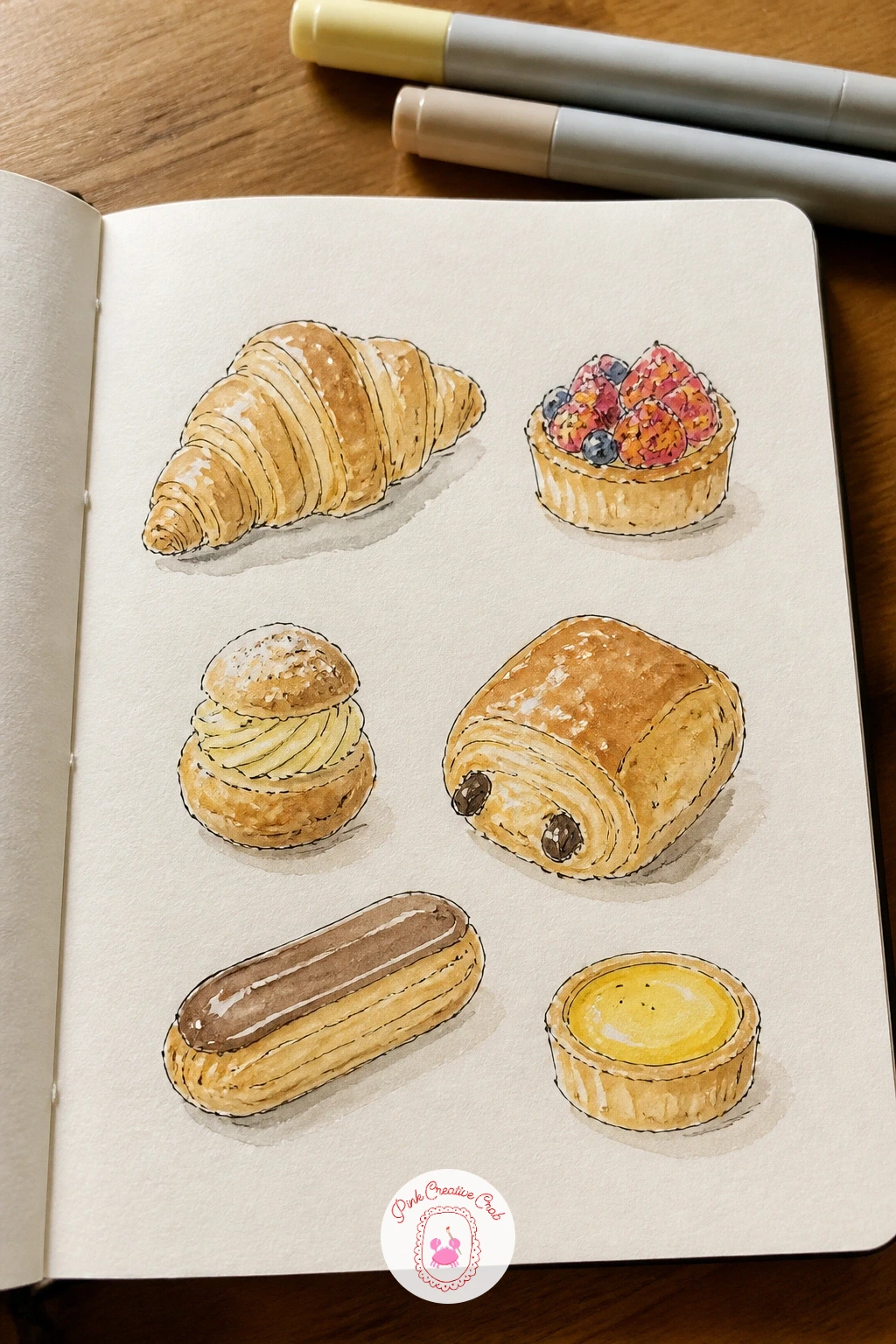
Palette: Golden Brown,Butter Yellow,Warm Pink,Cream
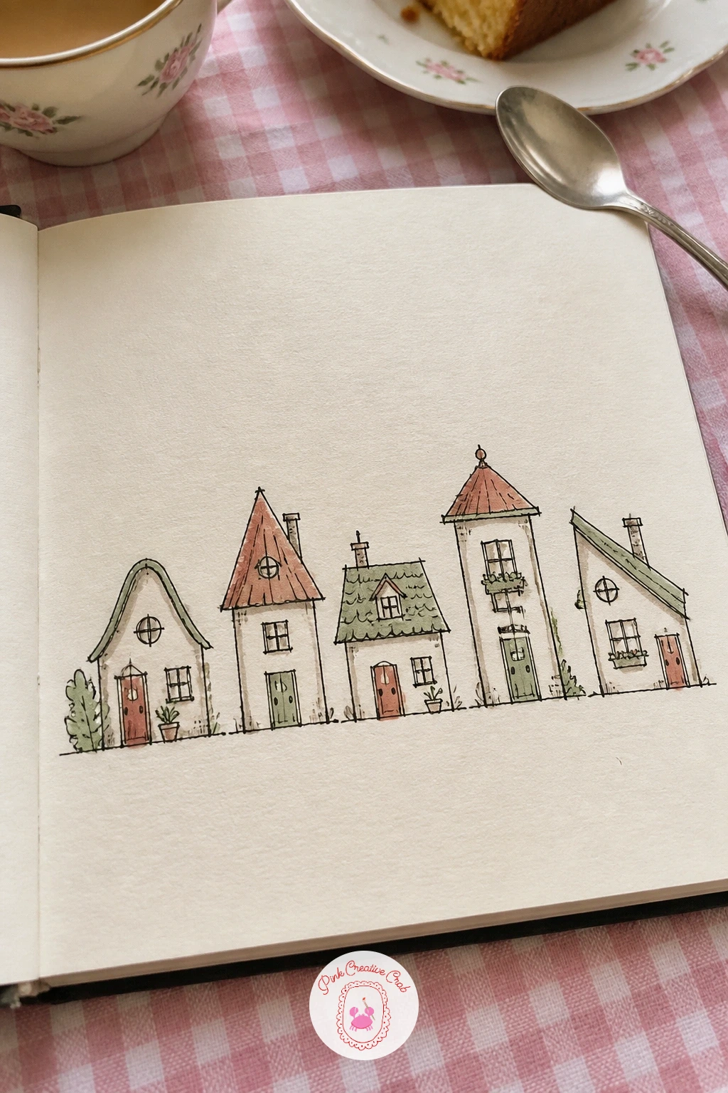
Tiny houses bring perspective and light back in, since even a simple house shape needs one consistent light source to feel solid rather than flat. Pick a side for the sun, then shade the roof and the far wall of every house slightly darker than the wall facing the light.
Pencil six or so house outlines scattered loosely across the page, varying the roof shapes, pitched, flat, a little turret, so the row does not repeat itself. Ink the walls and windows, then watercolor the roofs in warm brick tones and the walls in cream, sage or sky blue.
If a roof line wobbles, a ruler saves it instantly for the straight edges, then go back to freehand for the chimney and any curved details. For more of this exact kind of page, the mini sketchbook ideas collection is built entirely around little houses.
Add one tiny window light in yellow on just one or two houses, it makes the whole row feel lived in.
You Will Need
- ruler
Palette: Brick Red,Sage Green,Sky Blue,Cream
Fruit slices turn the page into a lesson in dry brush and clean edges, since the appeal of a lemon or kiwi slice lives entirely in its crisp inner pattern. Pencil a circle for each fruit, then divide it lightly into segments or seeds before inking the outer rind and inner lines separately.
Watercolor the flesh first in a wet wash, lemon yellow, watermelon pink, kiwi green, then once it dries slightly, come back with a drier brush to pull in the segment lines so they stay crisp rather than bleeding into the wash. Paint the rind last in a contrasting color.
If the wet wash bleeds past the pencil guide, let it dry completely and ink firm new outlines over the top, nobody will see the ghost of the first attempt. Marker gives a cleaner segment line than watercolor if your brush control is still new.
Vary the slice angles, some whole circles, some cut in half, so the page does not read as the same shape six times.
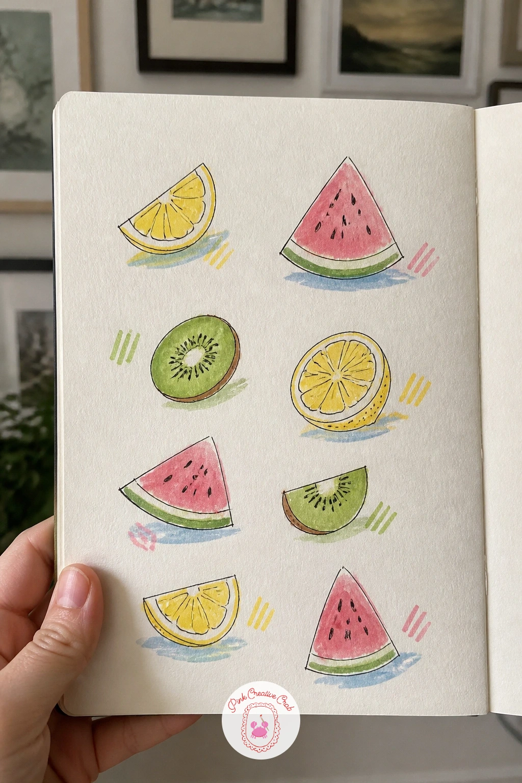
Palette: Lemon Yellow,Watermelon Pink,Kiwi Green,Cream
Hedgehogs in hats are a forgiving next step after fruit, since the spiky body hides most proportion mistakes under texture. Draw a simple teardrop body shape in pencil, then ink a scribbled texture of short lines over the back for spikes before adding a tiny hat shape on top of the head.
Vary the hats across the page, a woolly bobble hat, a little beret, a sun hat with a brim, so each hedgehog gets its own character despite sharing the same body shape. Watercolor the spikes in warm brown and the hats in sage, pink or sky blue.
If the spike texture looks too even, press harder with the fineliner in some patches and lighter in others, real texture is never perfectly regular. Colored pencil can stand in for the spike texture if your fineliner feels too heavy today.
Give one hedgehog a tiny scarf too, small added props make the page feel more like a story than a study sheet.
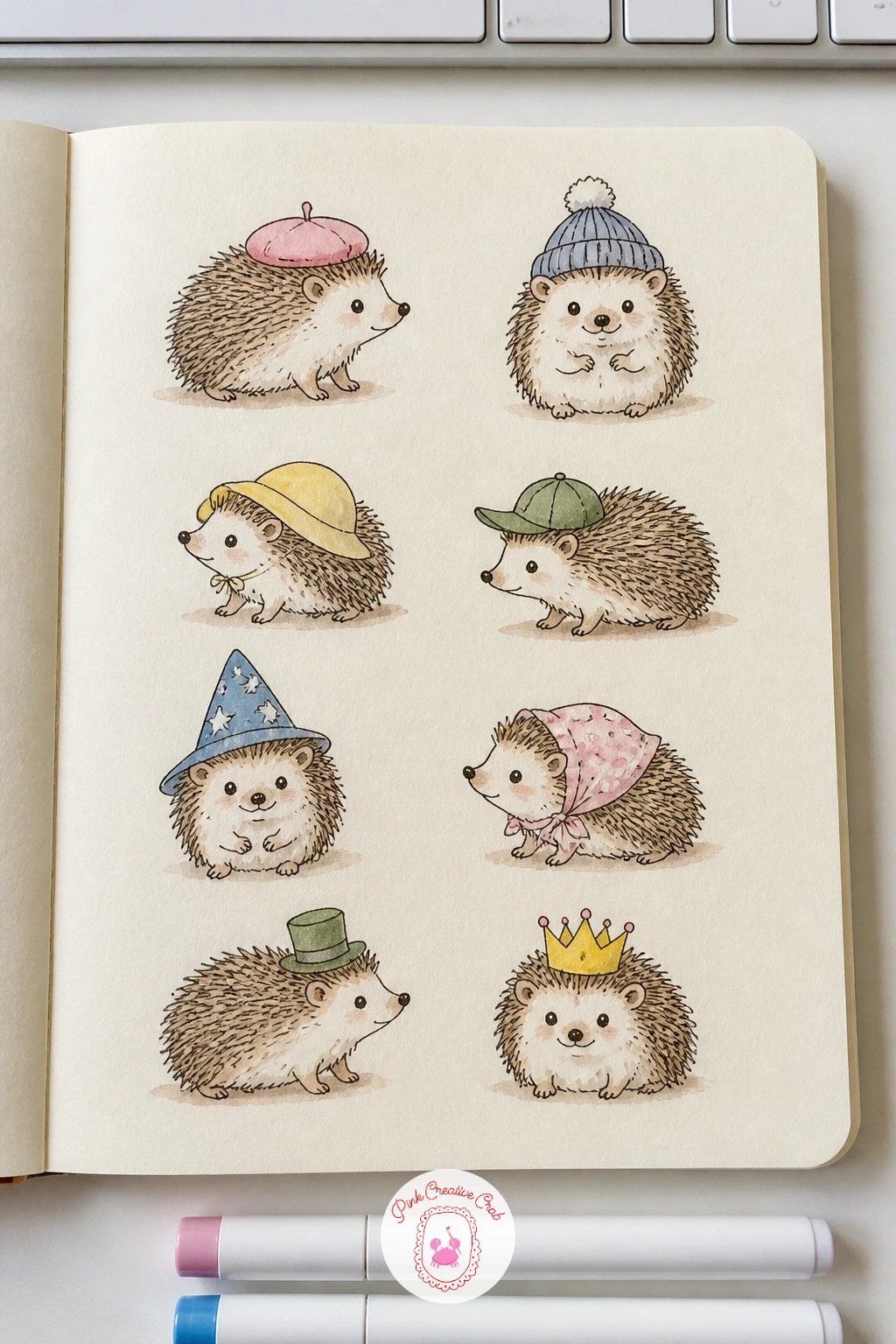
Palette: Warm Brown,Sage Green,Soft Pink,Cream
Mushrooms with labels add a little naturalist feel to the page, since this time proportion matters in the simplest way: the cap should sit noticeably wider than the stem, or the mushroom reads as a lollipop instead. Pencil the cap as a dome or flat disc first, then add the thinner stem underneath, checking that width relationship before inking.
Draw five or six varieties, a tall slender one, a squat round one, a cluster of small ones growing together, then ink the gill lines under each cap with short strokes fanning out from the stem. Watercolor the caps in warm red, brown and cream, keeping stems pale.
Letter a small handwritten label under each one in pencil first, a made up name is perfectly fine here, then ink it lightly once you are happy with the spacing. If a cap shape goes wrong, a wider brim almost always fixes it, mushrooms are forgiving that way.
Keep the labels small and consistent in size so the page still reads as one tidy study sheet.
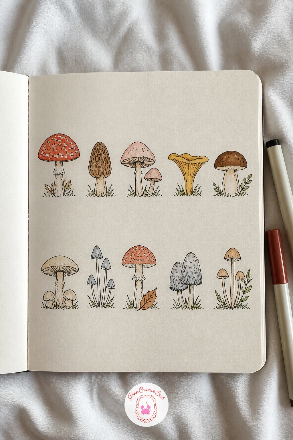
Palette: Brick Red,Warm Brown,Cream,Sage Green
Desserts in glasses move the page into glass and light, since a clear glass needs a thin unpainted edge left along one side to read as transparent rather than solid. Pencil each glass shape first, parfait, sundae, trifle, keeping the glass outline simple and slightly tapered.
Ink the glass outline lightly, then watercolor the layers inside in bands, a cream custard layer, a berry red layer, a chocolate brown layer, working light to dark so the colors stay distinct rather than muddying together. Leave that thin strip along one edge of the glass untouched by paint.
If the layers blur into each other, let each one dry fully before painting the next, patience here saves the whole glass. No glass shape to copy, trace around the base of an actual drinking glass in pencil for a clean curve.
Top one or two desserts with a tiny whipped cream swirl and a cherry, small finishing touches sell the whole page.
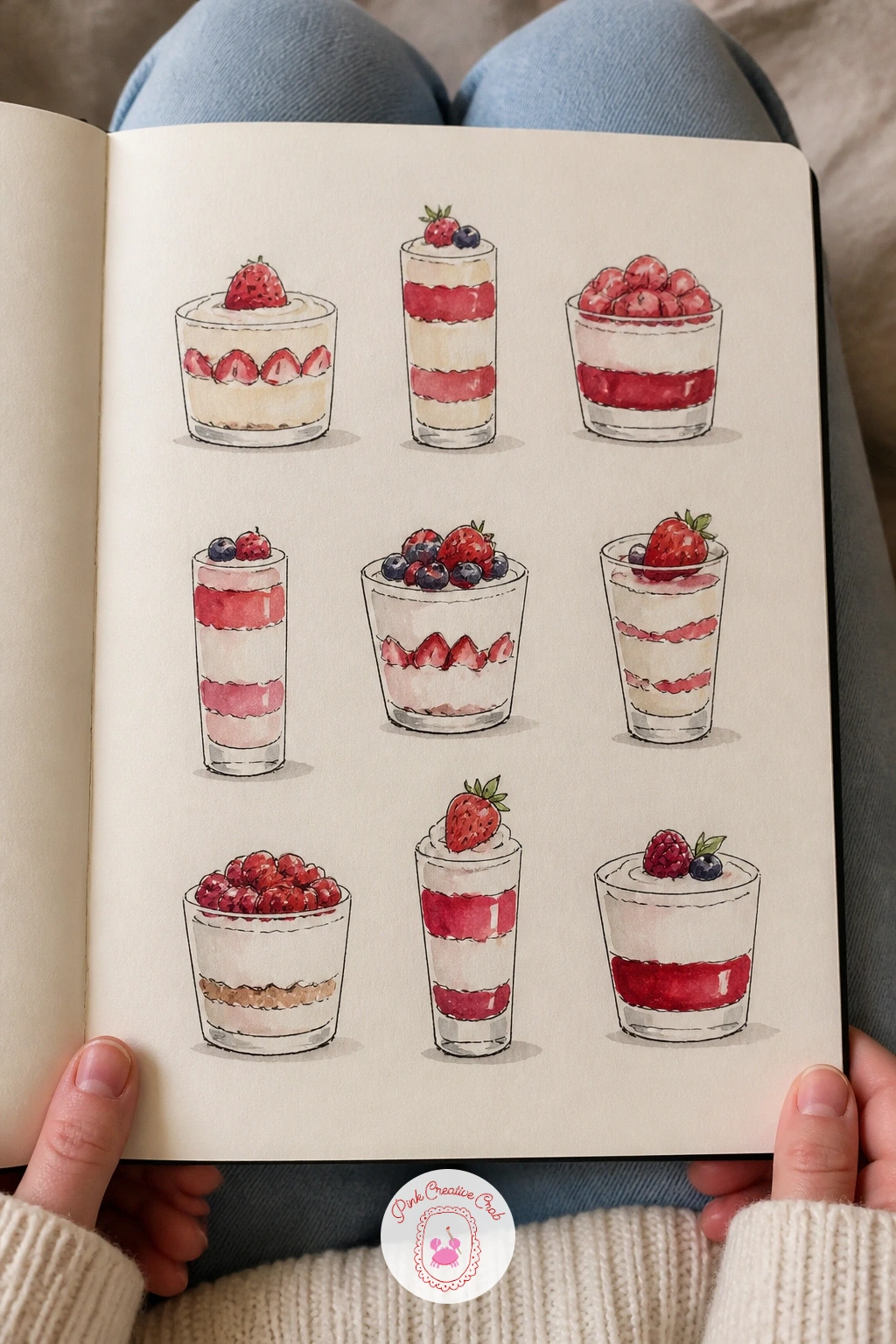
You Will Need
- small glass or cup to trace
Palette: Cream,Berry Red,Chocolate Brown,Sky Blue
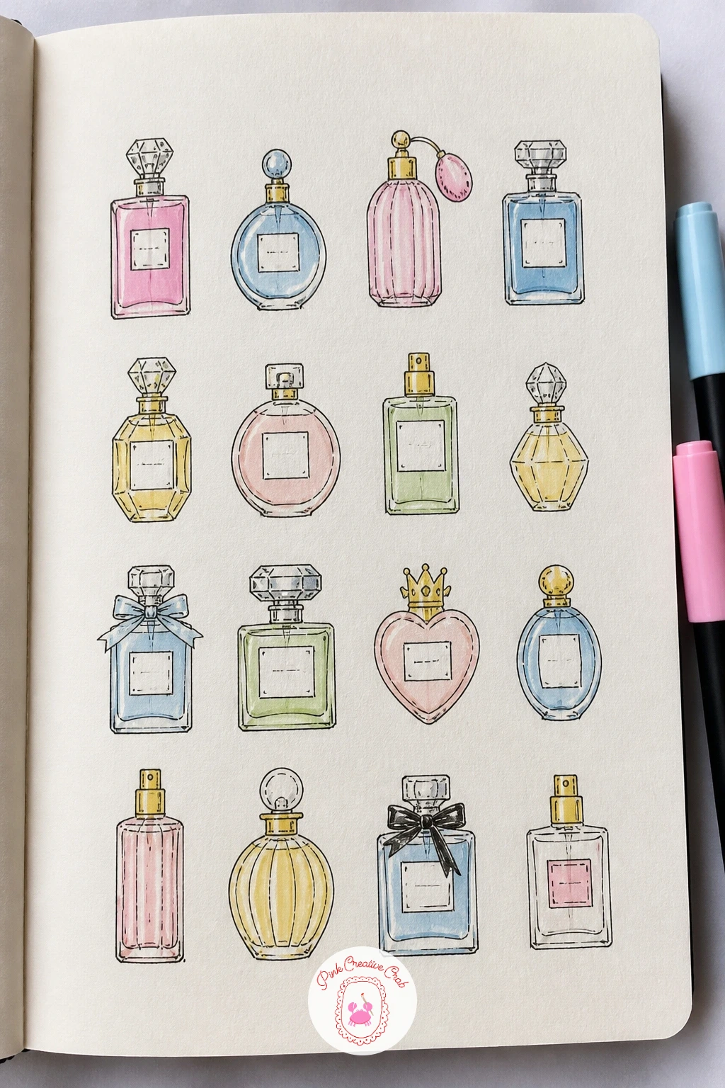
Perfume bottles bring back the measuring eye, since a bottle only looks right when the cap width lines up sensibly against the body width. Hold your pencil up to a bottle shape as you sketch it, or simply compare one drawn shape to the next, to keep the proportions consistent across the row.
Draw a mix of shapes, a tall slender bottle, a round squat one, a faceted vintage style bottle, then ink the outlines along with a simple label shape on the front of each. Watercolor in soft pink, sky blue and a pale gold, leaving the cap a different tone from the body.
If a bottle looks lopsided, a ruler for just the straight sides keeps it steady while you still draw the curved shoulder freehand. Marker works well for the label color if you want a flatter, more graphic finish than watercolor gives.
Add a tiny label detail, a scribbled brand mark or a small flower, to make each bottle feel individually chosen.
You Will Need
- ruler
Palette: Soft Pink,Sky Blue,Pale Gold,Cream
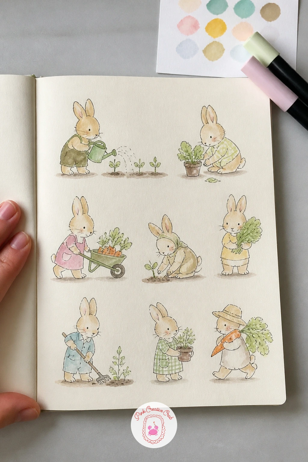
Bunnies doing garden jobs bring action back onto the page, and the easiest way to make a pose read clearly is to decide the job before you draw a single line: watering a plant, carrying a carrot, pushing a tiny wheelbarrow. Sketch the quick version in ten minutes, a simple oval body and rounded ears, caught mid task with one clear prop each.
For the forty minute version, add small details that sell the action, a bent elbow holding the watering can, dirt smudges on the paws, a sun hat tipped back. Watercolor the fur in warm cream or soft grey, keeping the props in sage green and brick tones.
If a pose looks static, tilt the ears or the tail in the direction of movement, it instantly adds energy. Colored pencil can replace watercolor for the fur if you want finer control over the shading.
Give each bunny a different garden tool so the page reads as a whole busy afternoon rather than six repeats.
Palette: Cream,Sage Green,Brick Red,Soft Grey
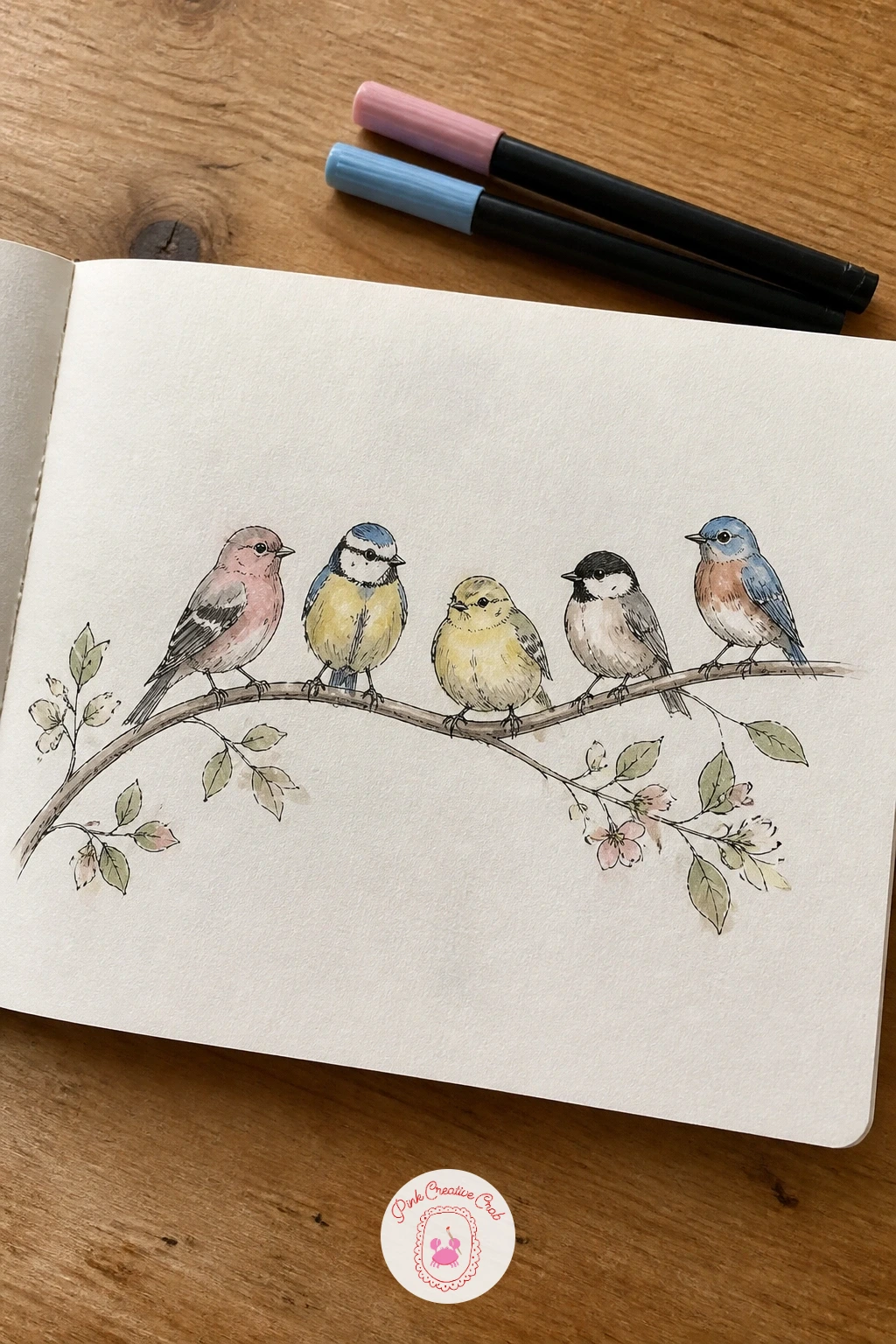
Birds on branches ask for a light hand with the fineliner, since feathers read best as a few confident strokes rather than many tense little scratches. Pencil the body as a simple rounded oval with a smaller head circle overlapping it, then add the branch as one continuous curved line running across the page.
Perch four or five birds along the branch at different points, facing different directions, then ink the outlines and add feather texture with short strokes that follow the curve of the wing. Watercolor in soft blue, warm brown and a touch of rust for the chest.
If the feather strokes start looking stiff, loosen your wrist and let the lines curve slightly rather than keeping them straight, real feathers are never perfectly uniform. No watercolor to hand, a soft pencil shading built up in layers gives a similarly gentle finish.
Leave one bird mid flight just off the branch, it breaks up the row and adds a little motion to the page.
Palette: Sky Blue,Warm Brown,Rust,Cream
A quick look at photos of garden birds helps with beak shape, a surprising amount of a bird’s character sits in how long and pointed the beak is.
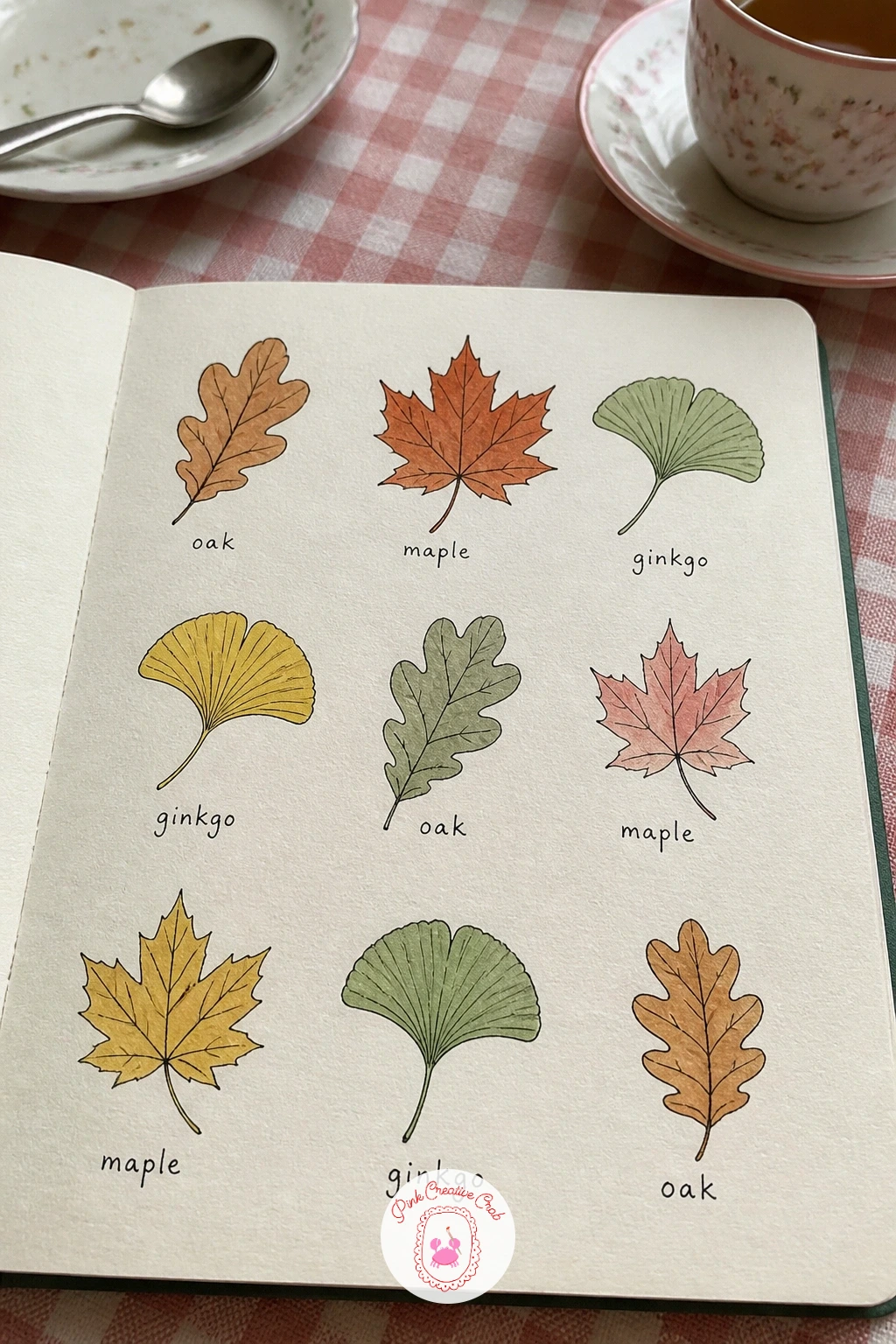
Autumn leaves with names turn the page into a little field guide, and the one trick that keeps every leaf recognisable is the vein pattern, so draw the central vein first in pencil, then branch the side veins off it before you ever shape the outer edge. Oak, maple, birch and ginkgo all have a distinct enough outline to draw from this center line out.
Ink the outline and veins once the shape sits right, then watercolor in a mix of warm orange, rust and a fading sage green, blending two colors wet into wet on a few leaves for that real autumn mottling. Label each leaf in small pencil lettering underneath, inked once you are happy with it.
If a leaf shape feels too symmetrical, nudge one side slightly larger than the other, real leaves are rarely even. Marker can replace the wet blending with quick layered strokes if watercolor feels slow today.
Scatter the leaves at different angles across the page rather than lining them all upright.
Palette: Rust Orange,Warm Red,Sage Green,Butter Yellow
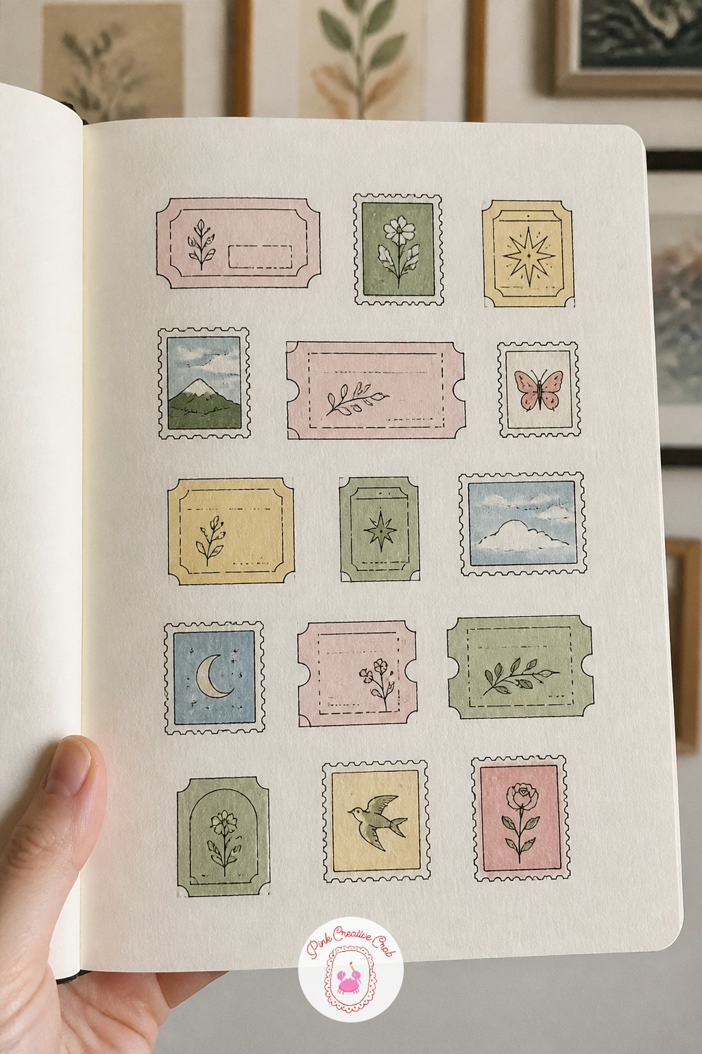
Vintage tickets and stamps give the page a collage feel without any actual cutting or pasting, built entirely from drawn rectangles. Rule out a handful of rectangle and square outlines across the page in pencil first, varying the sizes, then ink the borders, some plain, some with a scalloped or perforated edge drawn as small bumps along the sides.
Fill each one with a tiny scene or pattern, a little stamp with a bird or flower inside, a ticket stub with a torn edge and faint lettering. Watercolor in muted sage, dusty pink and pale gold, keeping the washes thin so the page still reads as paper rather than solid color.
If the perforated edge looks uneven, draw the bumps with a small circle template or just the cap of a pen pressed lightly for a guide mark. No ruler handy, a straight edge of your sketchbook cover works for the borders.
Add a faint postmark circle stamped over one or two tickets for extra charm.
You Will Need
- ruler
- small circle template or coin
Palette: Dusty Pink,Sage Green,Pale Gold,Cream
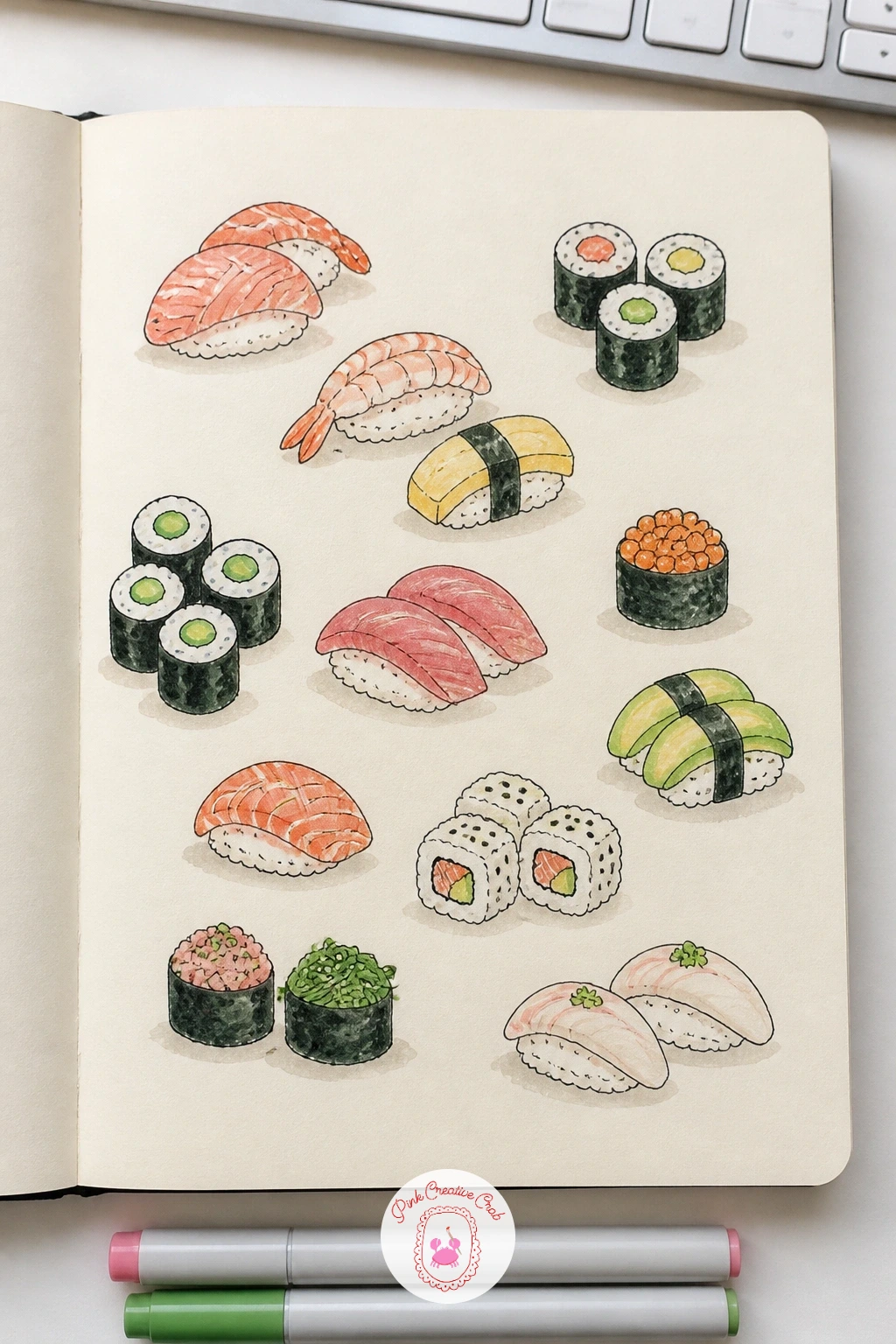
Sushi pieces are a neat exercise in clean geometric shapes, since a nigiri or maki roll is really just a rounded rectangle sitting on an oval of rice. Pencil the rice base first, slightly irregular rather than a perfect oval, then add the topping shape on top, a pink salmon slice, a dark nori wrap, an orange roe scatter.
Ink the outlines once the shapes sit well, keeping the rice texture as a few small dots rather than a fully rendered grain pattern. Watercolor the toppings in salmon pink, deep nori green black and a touch of orange, leaving the rice itself nearly white with just a pale grey shadow underneath.
If the rice shape looks too neat, press a slightly textured brush stroke along one edge, real rice is never a smooth oval. Colored pencil can handle the roe dots cleanly if watercolor dots keep running together.
Group three or four pieces per cluster across the page rather than one long row, it reads more like a real plate.
Palette: Salmon Pink,Nori Green,Orange Roe,Cream
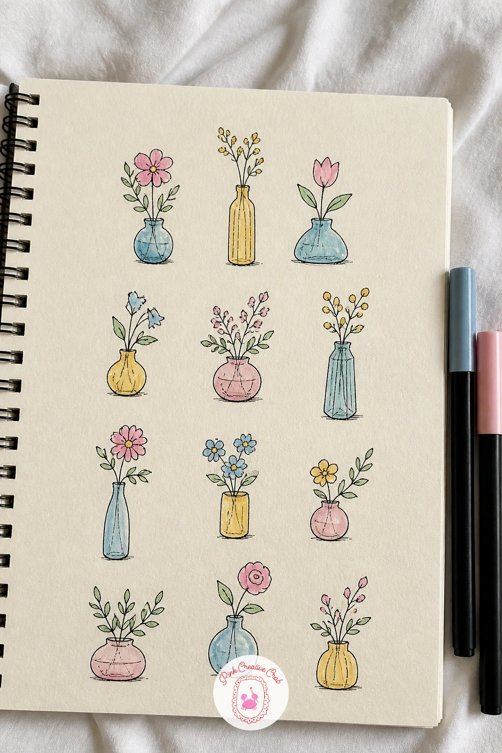
Flowers in tiny vases bring back the eye level question, since a vase drawn from slightly above shows an oval rim, while one drawn straight on shows just a flat line across the top. Pick one eye level for the whole page and keep every vase consistent, it ties the collection together even with different flowers in each one.
Draw the vase shapes first, small and simple, round, square, a narrow bud vase, then build loose flower shapes above each one, a daisy, a tulip, a sprig of something wild. Ink the outlines, then watercolor the flowers in soft pink, sky blue and butter yellow, keeping the vases in a pale neutral so the flowers stay the focus.
If a flower looks too stiff, soften the petal edges with a damp brush right after painting so the color blurs slightly outward. No watercolor on hand, colored pencil layered lightly gives a similar soft petal edge.
Vary the vase heights slightly across the row so the tops of the flowers create a gentle uneven skyline rather than a straight line.
Palette: Soft Pink,Sky Blue,Butter Yellow,Sage Green
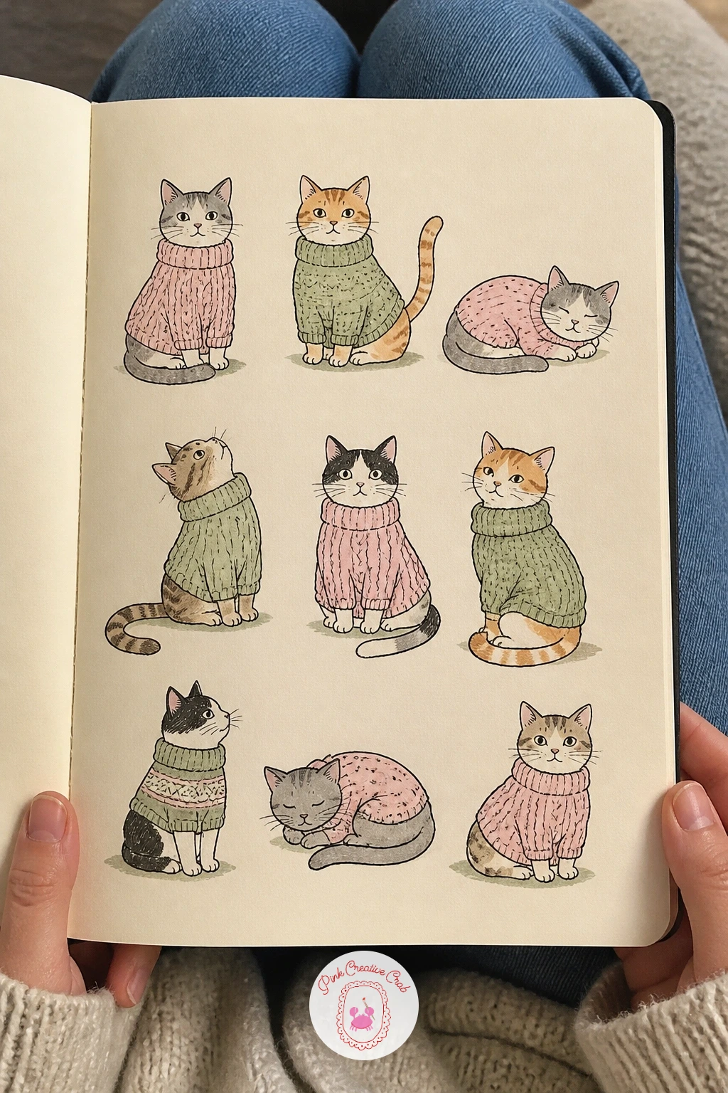
Cats in cozy sweaters follow naturally from the first cat page, except this time the texture trick sits in the sweater rather than the fur. Draw the cat body first, simple and round, then ink a knit pattern over the sweater area using small repeated V shapes or a simple ribbed line pattern, pressing a little harder in places to vary the texture.
Leave the head, paws and tail as plain fur, inked with the soft scribble texture from before, so the sweater reads as a distinct material against the cat underneath. Watercolor the sweaters in sage, dusty pink and butter yellow, keeping the fur in warm cream or grey.
If the knit pattern looks too busy, simplify to just two rows of texture at the collar and hem, the eye fills in the rest. Marker gives a bolder, more graphic knit line than fineliner if you want the sweaters to stand out more.
Give one cat a scarf instead of a full sweater, it breaks the repetition nicely across the page.
Palette: Sage Green,Dusty Pink,Butter Yellow,Cream
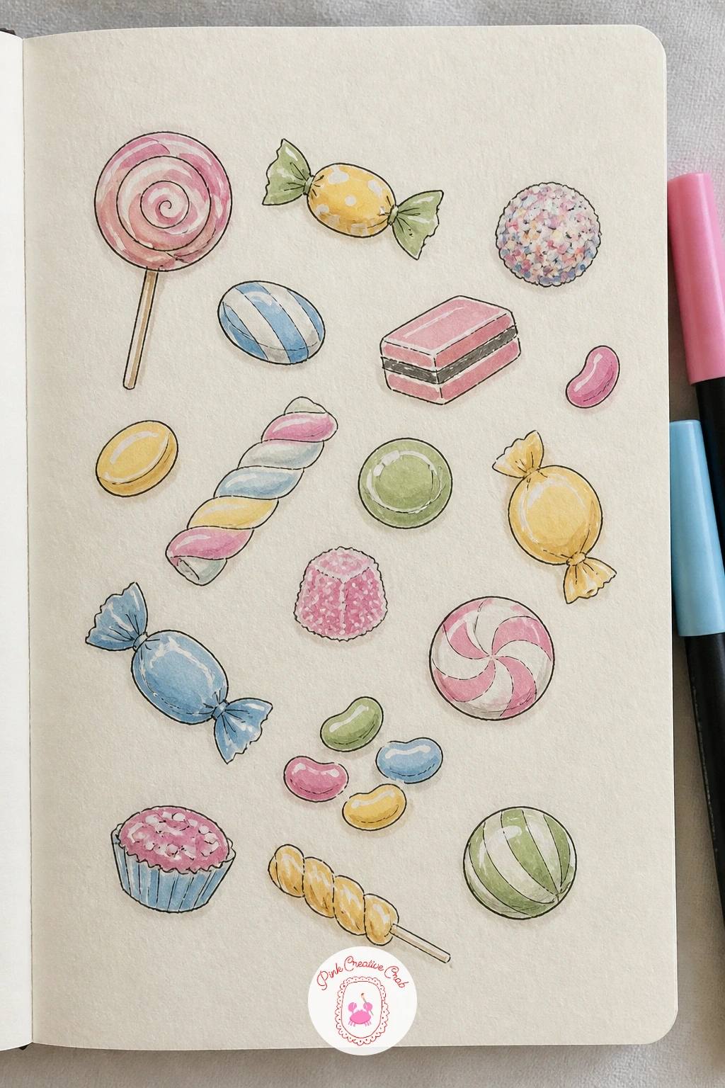
Candy and sweets let the page get playful with shine, since a boiled sweet or lollipop needs just one small white highlight left unpainted to read as glossy rather than matte. Pencil a mix of simple shapes, a spiral lollipop, a wrapped toffee with twisted ends, a scatter of jellybeans, keeping each one small and rounded.
Ink the outlines, including the twist lines on wrapped candies, then watercolor in bright but soft tones, pink, sky blue, butter yellow, leaving a small circle or crescent of bare paper on each piece for the shine.
If the colors look too flat without that highlight, go back in with a white gel pen once the paint is fully dry and add a tiny dot or line of shine directly on top. No gel pen on hand, simply leave that highlight area unpainted from the start and it reads just as well.
Vary the candy sizes across the page so the smaller jellybeans and larger lollipops create a natural rhythm.
You Will Need
- white gel pen
Palette: Soft Pink,Sky Blue,Butter Yellow,Cream
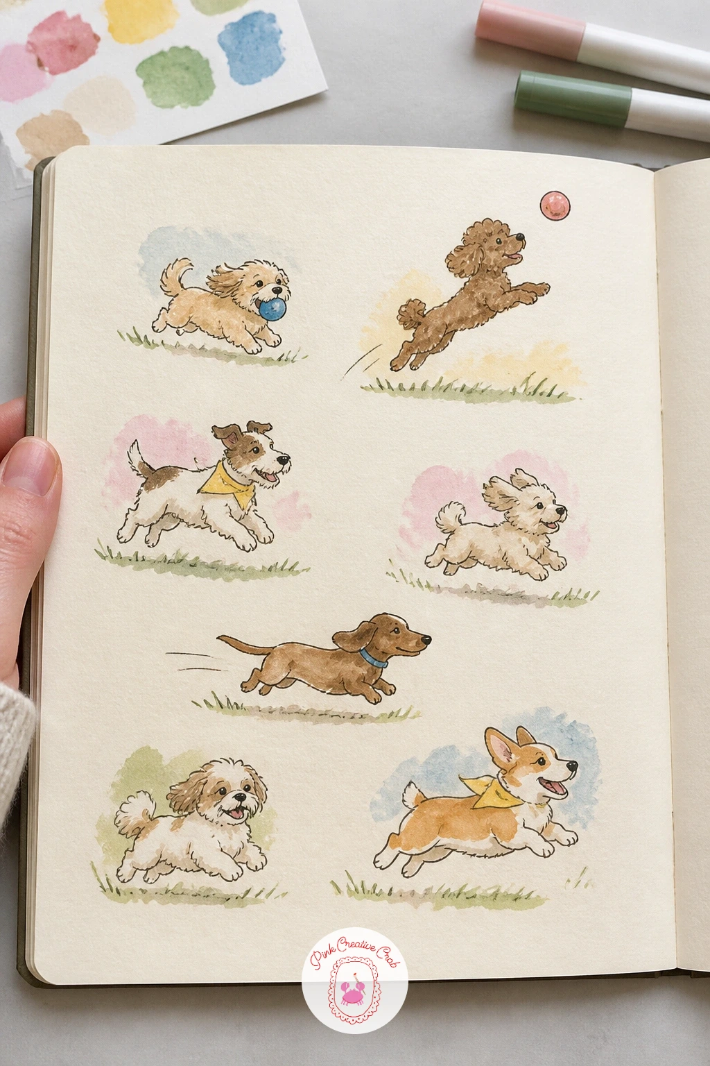
Dogs at the park push the action idea further, since this page works best when every dog does something slightly different, fetching a ball, sniffing the ground, mid air over a jump. Sketch the quick ten minute version first, simple oval bodies with the action suggested through the angle of the legs and tail alone.
For the forty minute version, go back and add breed character to a couple of them, floppy ears on one, a curled tail on another, a patch of color over one eye. Watercolor the fur in warm brown, cream and soft grey, keeping a ball or stick prop in a contrasting brick red or sky blue.
If a running pose looks frozen rather than moving, angle the legs further apart than feels natural, exaggeration reads as motion on the page. Colored pencil can replace watercolor fur shading for finer control over short haired breeds.
Add one dog sitting calmly among the busier ones, the contrast makes the active poses feel even livelier.
Palette: Warm Brown,Cream,Soft Grey,Brick Red
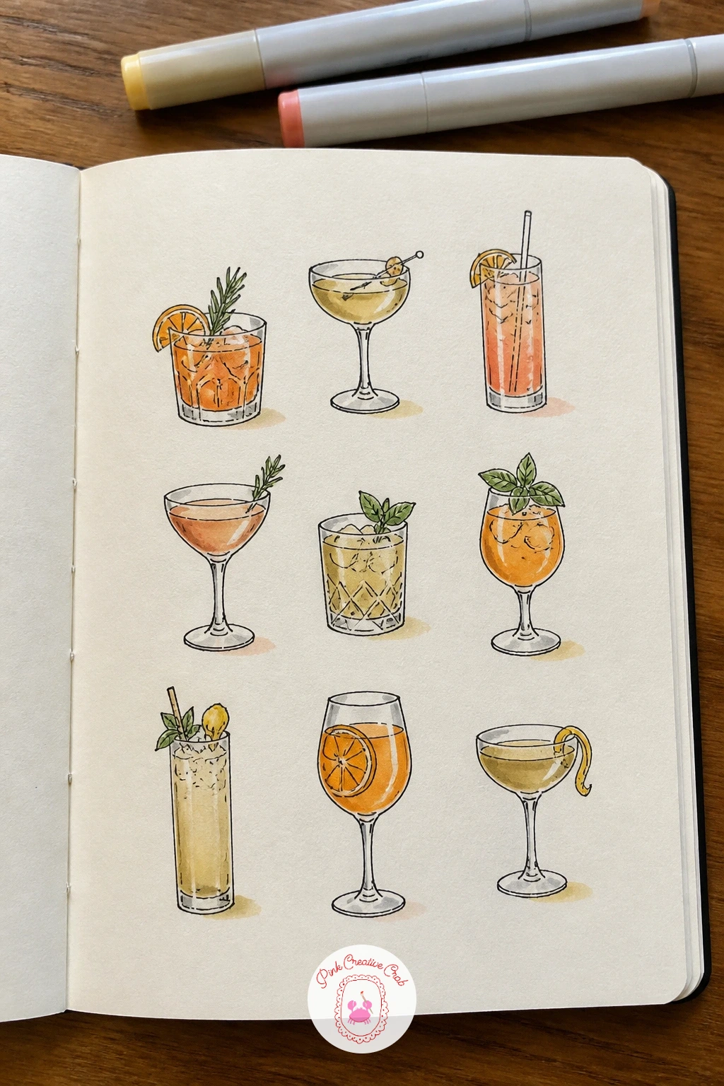
Cocktails bring glass and light back into focus, and the detail that sells a cocktail drawing is the garnish, so plan that before anything else, a lime wedge on the rim, a cherry on a stick, a mint sprig tucked to one side. Pencil the glass shape first, martini, highball, coupe, keeping the outline simple and leaving that thin unpainted strip along one edge for shine.
Ink the glass and garnish outlines, then watercolor the drink itself in layered washes if it has more than one color, orange and pink for a sunset style drink, pale gold for something simpler. Add ice cubes as small clear squares with just a faint grey shadow line.
If the liquid color looks muddy, rinse the brush fully between colors and let each layer dry before adding the next, cocktails are not forgiving of rushed wet blending. Marker gives a quicker, flatter color fill if watercolor layering feels fiddly today.
Vary the glass shapes across the page so it reads as a proper little drinks menu rather than one glass repeated.
Palette: Sunset Orange,Pale Gold,Soft Pink,Sage Green
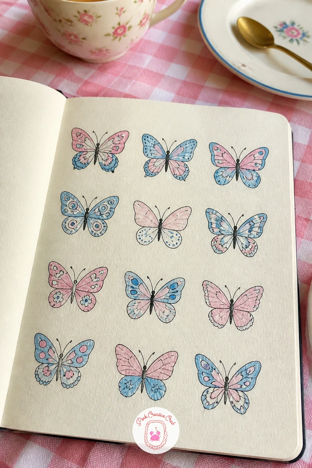
Butterflies with patterns give you a proportion check built right into the subject, since both wings on each butterfly need to mirror each other closely or the whole thing looks lopsided. Fold a scrap of paper in half to check your pencil sketch against its own mirror image, or simply compare the top wing shape to the bottom one as you draw.
Pencil the body as a simple line down the center first, then build both wing pairs out from it symmetrically before inking. Watercolor the patterns in sky blue, soft pink and butter yellow, painting one wing and then copying the same pattern onto its mirrored partner while the reference is still fresh in mind.
If the symmetry still feels off after inking, a small pattern addition on the weaker wing, one more dot or stripe, often balances it out again rather than needing a full redraw. No watercolor on hand, marker holds a crisp pattern edge better for this kind of repeated detail anyway.
Vary the wing shapes across the page, rounded, pointed, scalloped, so each butterfly still feels distinct despite the shared symmetry rule.
Palette: Sky Blue,Soft Pink,Butter Yellow,Charcoal
Ducks in rain boots are a cheerful excuse to draw puddles and reflections, since the main light and perspective decision here is where the puddle sits and how much of the duck reflects back up out of it. Draw the duck body first, a simple rounded shape with a flat bill, then add tiny rain boots on the feet, one leg forward to suggest a little splashing walk.
Ink the duck and boots, then paint a pale blue grey puddle shape beneath, adding a loose mirrored smudge of the duck’s color just under the surface to suggest reflection without drawing a full second duck. Watercolor the ducks in soft yellow or white with butter yellow bills, and the boots in bright sky blue or pink.
If the reflection smudge looks too solid, soften it immediately with a clean damp brush while still wet so it blurs into the puddle naturally. Colored pencil can suggest the reflection with light diagonal hatching instead of a wash.
Give one duck an open umbrella too small for comfort, it adds a nice bit of humor to the row.
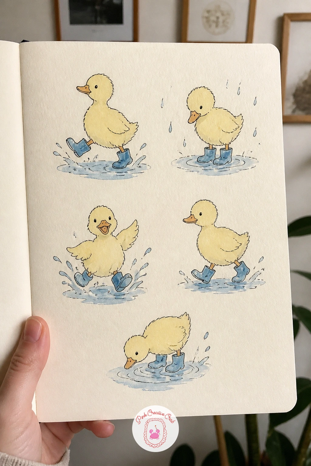
Palette: Butter Yellow,Sky Blue,Soft Pink,Pale Grey
Insects drawn kindly means softening the usual sharp, spiky look into something rounder and friendlier, a ladybug, a bee, a snail, a gentle beetle, each with slightly oversized eyes and rounded edges rather than realistic detail. Pencil each body as two or three overlapping circles, then ink the outline with smooth, confident curves instead of jagged lines.
Watercolor in warm red, butter yellow and sage green, keeping the colors soft rather than saturated so nothing looks alarming or harsh. Add two small simple dot eyes on each insect, it does more than anything else to make them feel approachable.
If a bug ends up looking too realistic or sharp, round off the legs and antennae with soft curved lines rather than straight spikes, that single change softens the whole drawing. Marker gives a cleaner rounded line than fineliner if your pen keeps catching on the paper.
Keep the scale small and consistent across the page so the insects feel like a matched little set rather than mismatched specimens.
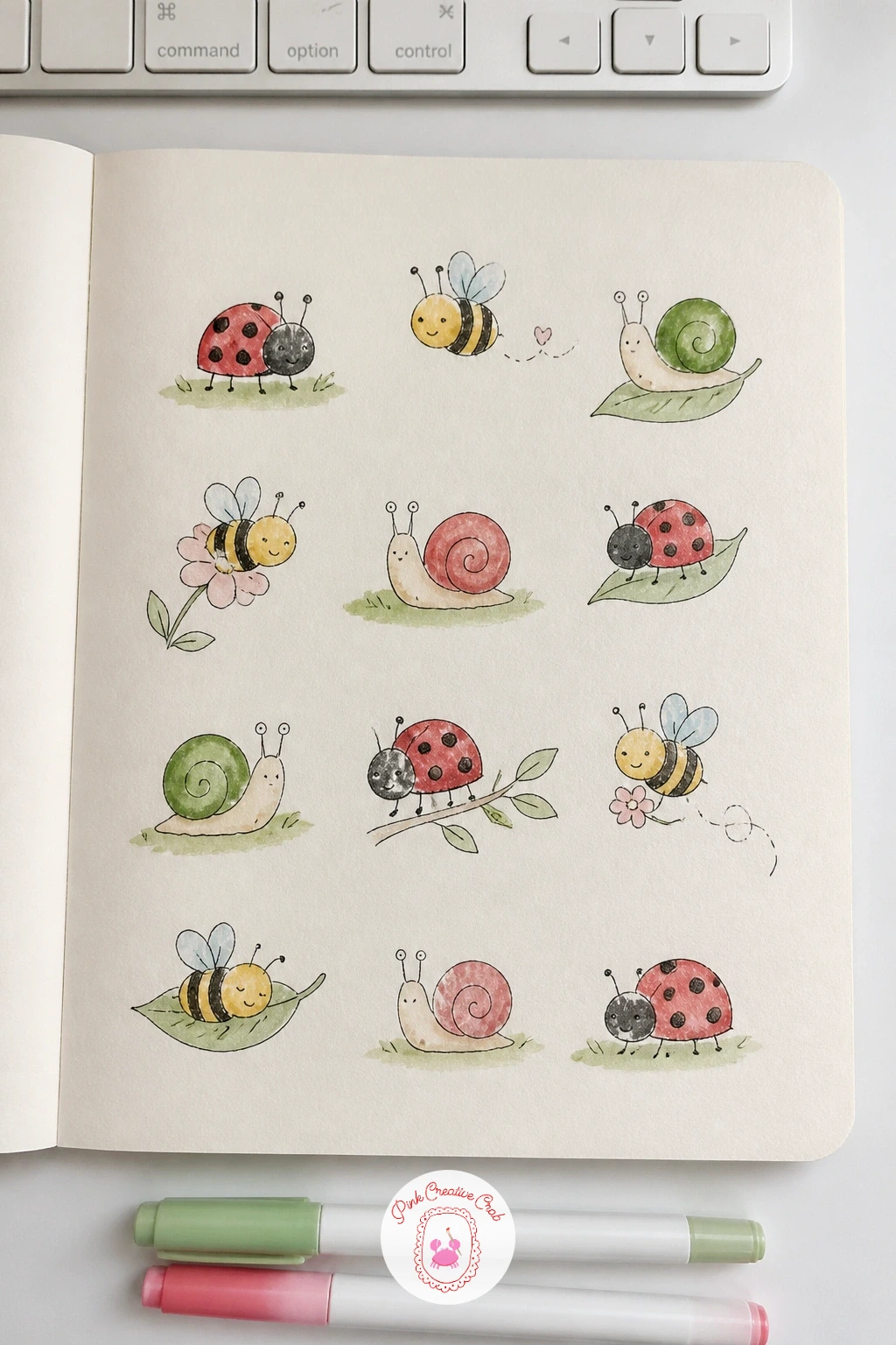
Palette: Warm Red,Butter Yellow,Sage Green,Cream
Bread loaves bring texture back to the front, since the appeal of a crusty loaf sits in its surface, not its outline. Pencil a simple rounded or oblong loaf shape first, then ink the main outline followed by a scatter of short curved slashes across the top to suggest the bakery score marks and crust texture.
Watercolor in warm golden brown, letting the color pool slightly darker in the slash marks and lighter across the rounded top where light would naturally catch it. Dry brush a little extra texture over the crust once the base wash has dried, dragging a nearly dry brush lightly across the surface.
If the loaf looks too smooth even after dry brushing, scratch a few fine lines into the dried paint with the tip of a craft knife or the back of a pin, it lifts tiny flecks of color and reads as real crust. No dry brush technique yet, colored pencil hatching over the dried wash gives a similar broken texture.
Vary the loaf shapes across the page, a round boule, a long baguette, a braided loaf, so the texture work stays interesting rather than repetitive.
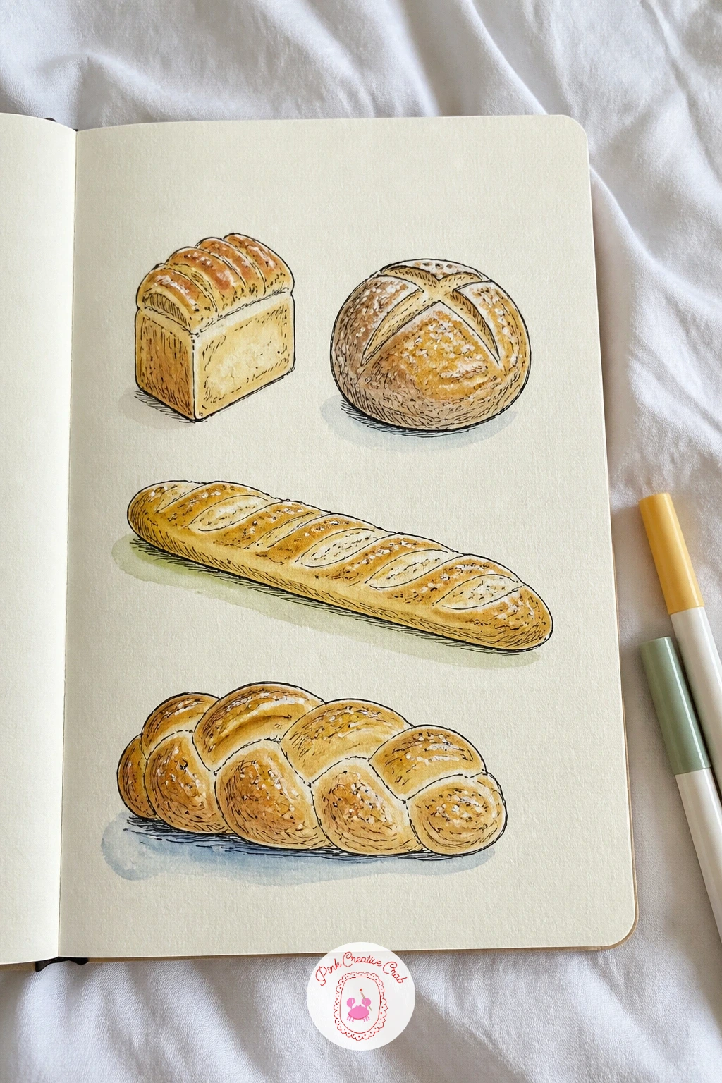
You Will Need
- craft knife or pin for scratching texture (optional)
Palette: Golden Brown,Warm Brown,Cream,Butter Yellow
Frogs in tiny hats let you revisit perspective and light from a fresh, lower angle, since drawing a frog from slightly below, as if you are kneeling at pond level, makes the body look rounder and more charming than a straight side view. Pencil the frog body as one large rounded shape with the eyes sitting on top as two small bumps, then add a tiny hat perched between them.
Ink the outline and the eye bumps, then watercolor the body in sage green or a soft muted olive, leaving the belly paler and the eyes nearly white with just a small dark pupil dot. Vary the hats, a tiny top hat, a flat cap, a flower crown, across the row.
If the frog looks too flat from this angle, add a curved shadow line along the lower edge of the body where it would meet the lily pad or rock beneath it, that single line gives it weight. Colored pencil can replace watercolor for the shading if you want more control over the gradient.
Sit each frog on a tiny different surface, a lily pad, a smooth stone, a mushroom cap, to keep the row visually varied.
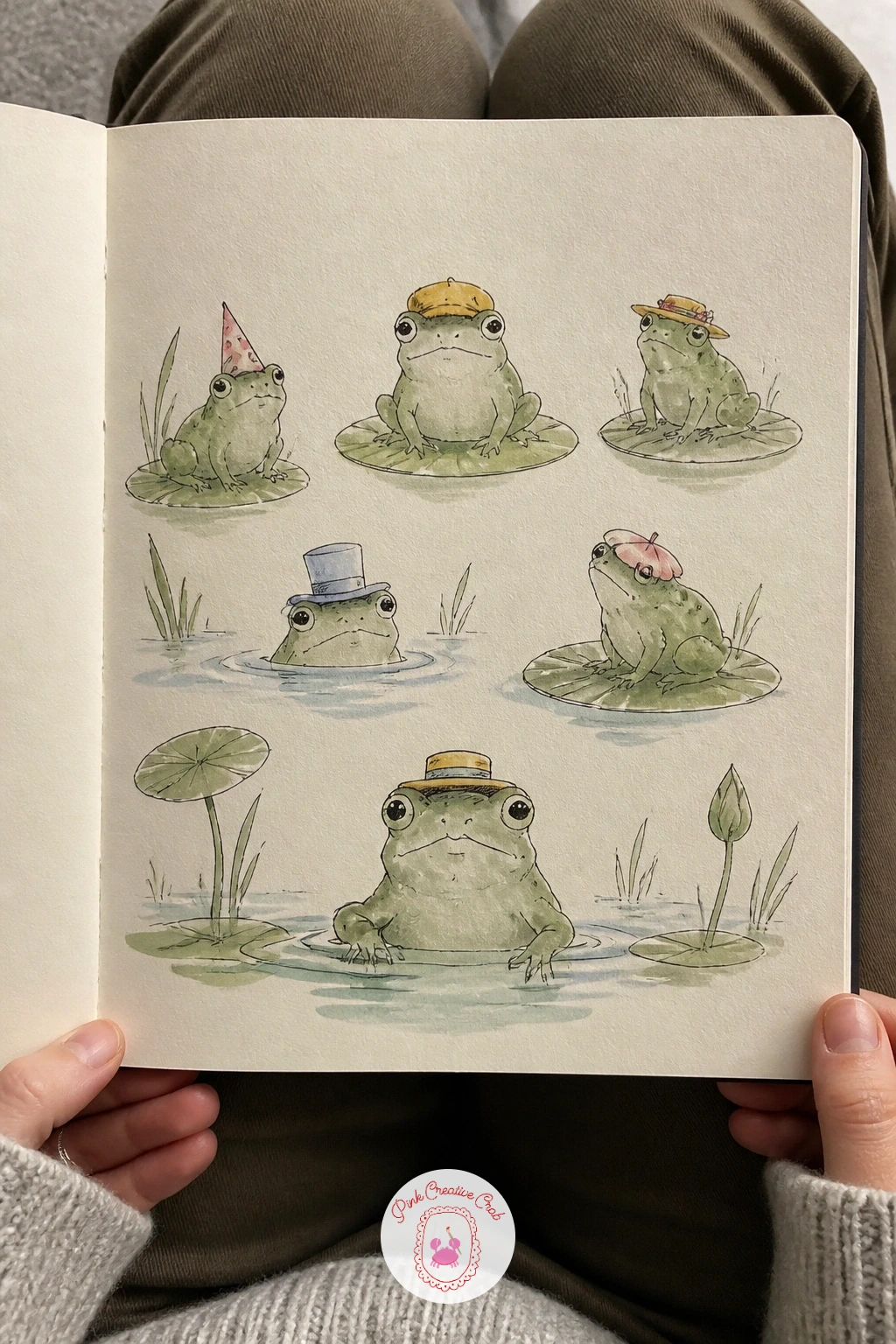
Palette: Sage Green,Olive,Butter Yellow,Cream
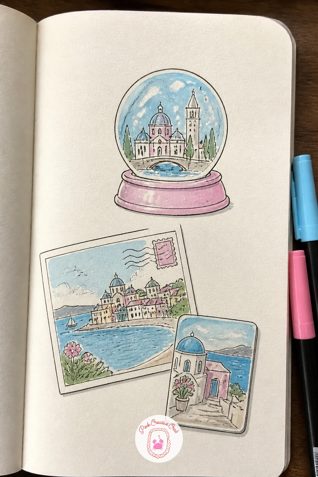
Travel souvenirs make a nice late page because it pulls together shapes you have already practiced, a tiny teacup, a little house, a postcard, into one imagined collection. Pencil a loose scatter of souvenir shapes, a snow globe, a fridge magnet, a small flag, a postcard with a corner lifted as if taped down, keeping each one simple.
Ink the outlines, including a simple scene inside the snow globe and a few lines of faint pretend handwriting on the postcard. Watercolor in a mix from your page so far, sky blue, soft pink, sage, whatever colors feel cheerful together, since this page works best as a loose, happy jumble rather than a strict grid.
If the page starts feeling cluttered, group the souvenirs into two or three loose clusters with a little white space between them rather than spreading everything evenly, it reads calmer that way. No watercolor left, this page also works entirely in colored pencil for a softer, more controlled finish.
For more pages built around travel and collected little objects, the cool sketchbook pages ideas take a similar collected approach with a different theme.
Palette: Sky Blue,Soft Pink,Sage Green,Pale Gold
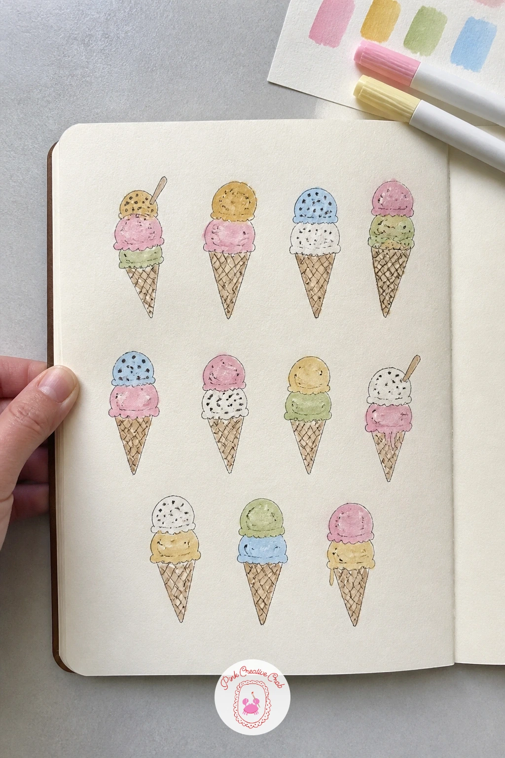
Ice cream cones are an easy, happy page to return to after something as detail heavy as souvenirs, built from just two repeating shapes: a triangle cone and a rounded scoop or two stacked on top. Pencil the cone first with a light crosshatch pattern for the waffle texture, then add one or two scoops above it, slightly overlapping so they feel stacked rather than floating.
Ink the cone’s waffle lines and the scoop outlines, keeping the scoop edges a little wobbly and soft rather than perfectly round, melting slightly at the bottom edge. Watercolor the scoops in soft pink, pale gold and sky blue for a mint shade, and the cone in warm golden brown.
If the scoops look too stiff, round off any sharp corners with the brush while the paint is still wet so the edge softens naturally into a melt. Marker gives a punchier, more graphic scoop color if you want this page bolder than the rest.
Add a tiny drip running down one or two cones, it is a small detail that makes the whole page feel sunnier.
Palette: Soft Pink,Pale Gold,Sky Blue,Golden Brown
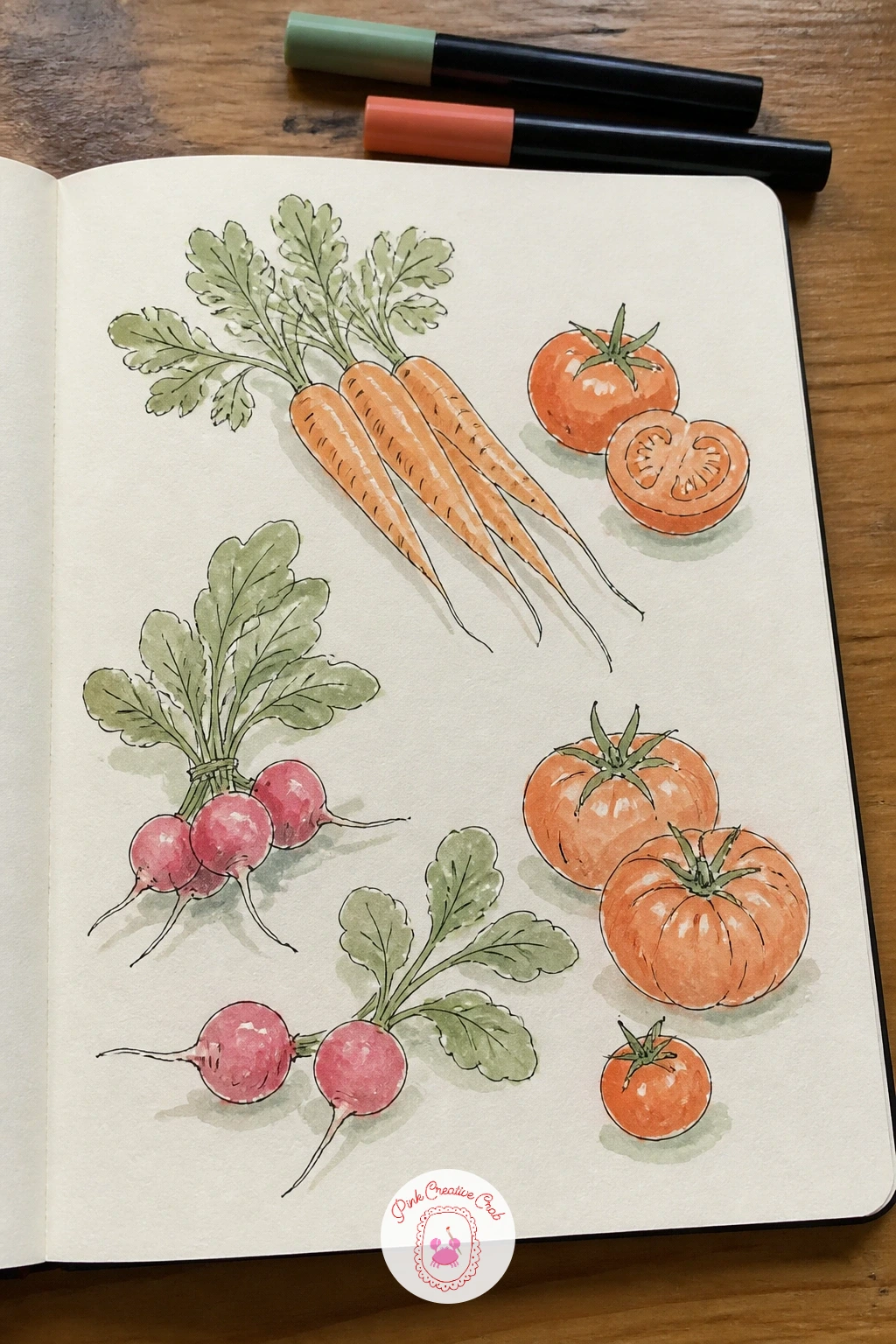
Vegetables from the market close out the food themed pages with a nice range of shapes, carrots, tomatoes, a bunch of radishes, a head of leafy greens, which makes this a good page for practicing variety within one wash session. Pencil each vegetable loosely, keeping the carrot and radish tops as simple feathery pencil marks rather than fully drawn leaves.
Ink the outlines, then watercolor in a cheerful mix, orange carrots, red tomatoes, sage green leafy tops, working wet into wet on the tomatoes so the color pools naturally toward the base for a rounder look. Leave a small highlight unpainted on each rounded vegetable.
If the leafy tops look too heavy once inked, lighten them by erasing some of the pencil lines before painting, so only a loose suggestion of leaves remains under a soft green wash. Colored pencil layered in short strokes gives a similar leafy texture without needing to control a wet wash.
Tie a few vegetables together with a loose string shape, like a market bunch, to break up the row into smaller, more natural groupings.
Palette: Carrot Orange,Tomato Red,Sage Green,Cream
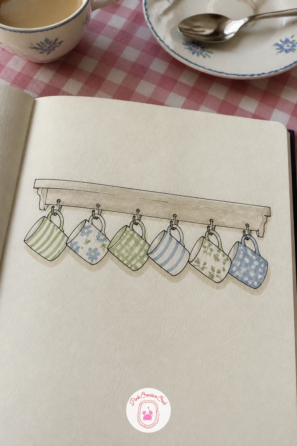
Mugs on hooks make a calm closing page, built around one simple trick for next time: once you can draw one mug confidently, you can vary the whole set just by changing the handle shape, the height, or the pattern, without needing new skills at all. Pencil a row of small hooks along a horizontal line first, then hang a mug shape from each one, varying heights slightly so the row has a gentle rhythm.
Ink the mugs and hooks, adding a simple pattern to two or three, stripes, polka dots, a tiny heart, then watercolor in sage, sky blue, soft pink and butter yellow so the whole row pulls together the palette you have used across the sketchbook. Leave one or two mugs plain cream so the patterned ones stand out.
If the hooks look flimsy, thicken the line slightly where it meets the shelf board above, a little more weight there reads as sturdier metal. No ruler for the shelf line, the edge of an index card makes a steady enough guide.
Once this page works, try swapping the mugs for teacups or small vases next time, the same hook and shelf layout carries almost any small hanging object.
Palette: Sage Green,Sky Blue,Soft Pink,Butter Yellow
What to Do Next
Pick one theme that genuinely makes you smile today, breakfast foods or hedgehogs in hats are both forgiving starting points, and open to a fresh page in your sketchbook rather than waiting for the perfect one. Pencil the loose layout first, then let the fineliner and a little watercolor carry the rest.
Frequently Asked Questions
What paper works best for sketchbook pages like these?
A sketchbook with slightly heavier cream or watercolor paper works best, since it holds light washes without buckling. Mixed media or watercolor sketchbooks around 140 pound weight handle fineliner and paint together comfortably.
Do I need to plan the layout before drawing each sketchbook page?
A loose pencil plan helps, even just light dots marking where each small drawing will sit. Planning spacing first keeps the page from feeling cramped on one side and empty on the other.
What if my small drawings come out different sizes on the page?
Slight size variation actually looks natural and collected, so do not erase and restart over it. Only fix a drawing if the size difference is large enough to throw off the whole row’s balance.
Can I use only pencil if I do not have watercolor or markers?
Yes, every page in this list works in pencil or colored pencil alone, just with softer, more gradual color. Build tone in light layers rather than pressing hard once, since that keeps the page looking fresh rather than heavy.
How long does one themed sketchbook page usually take?
Most of these pages take between thirty minutes and an hour depending on how many small drawings you include. Starting with the quick, simple version of each subject and adding detail afterward keeps the session manageable.
Have any thoughts?
Share your reaction or leave a quick response — we’d love to hear what you think!
-
 0
-
0
-
0
-
0
-
0
-
0


