

Watercolor strawberries are one of those subjects that reward you the moment the paint hits the page. The shapes are forgiving, the colors are generous, and every little scene below turns into something you would actually want to pin, frame or tuck into a card.
Below you will find twenty nine strawberry vignettes, from a simple bowl on gingham cloth all the way to a dolls’ tea party, each one built to finish today with the paints already in your box. Scroll at your own pace, pick whichever one makes you want to reach for a brush right now, and start there.
Using these images: free for personal projects such as printing, coloring, cards, journals and gifts. Handmade items that include them may be sold up to 30 pieces per design. More than that is commercial use and is not permitted, and neither is selling or sharing the images themselves or passing them off as your own. Please ask before any other use.
Start with the gingham cloth, since it sets the mood for the whole page. Pencil a loose grid of squares, then paint every other square pale pink or red with a flat brush, letting some lines stay white for the crossing threads.
Once the cloth is dry, drop in a simple round bowl shape in pale grey, then pile overlapping strawberry shapes inside it: ovals with a slight point at the tip, wider at the shoulder. If the gingham lines wobble, a ruler-drawn pencil grid before you paint keeps them honest, which matters most for a subject built on repeating pattern.
Paint the berries in two washes, cadmium red first, then a deeper red dropped into the shadow side while still damp. Add tiny yellow seed dots with the tip of the brush once dry, and a few dark green sepals on top.
If gingham feels fussy, swap it for plain cream paper with a painted stripe border instead, and finish today’s version with just one careful shadow under the bowl to ground it.
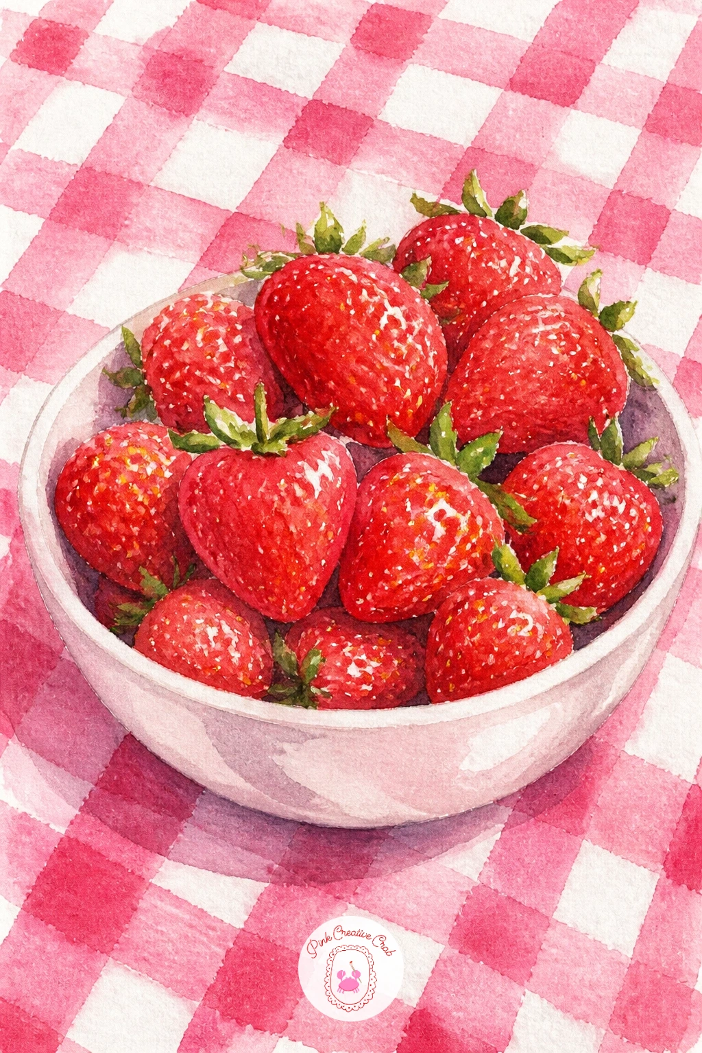
Palette: Cadmium Red,Alizarin Crimson,Sap Green,Pale Pink
Following on from the bowl, this slice takes the same red you just mixed and puts it to work on a plate. Block in the biscuit layers first with a dry, warm yellow ochre wash, leaving the brush fairly dry so the texture reads as crumb rather than smooth cake.
Let that dry completely before you paint the whipped cream, since wet layers touching will turn your cream pink and muddy. Use a cool grey-white shadow mix only in the folds of the cream, keeping the lit side as bare paper.
Measure the slice against the plate before you commit to ink: the cake should sit lower and narrower than the plate’s rim on both sides, or the whole thing reads as floating. Pile a few halved strawberries on top, seeds dotted in once dry, and a thin drip of juice running down one side of the cream.
If your plate is throwing the proportions off, paint the slice first and add the plate outline around it last, sized to fit what you already have.
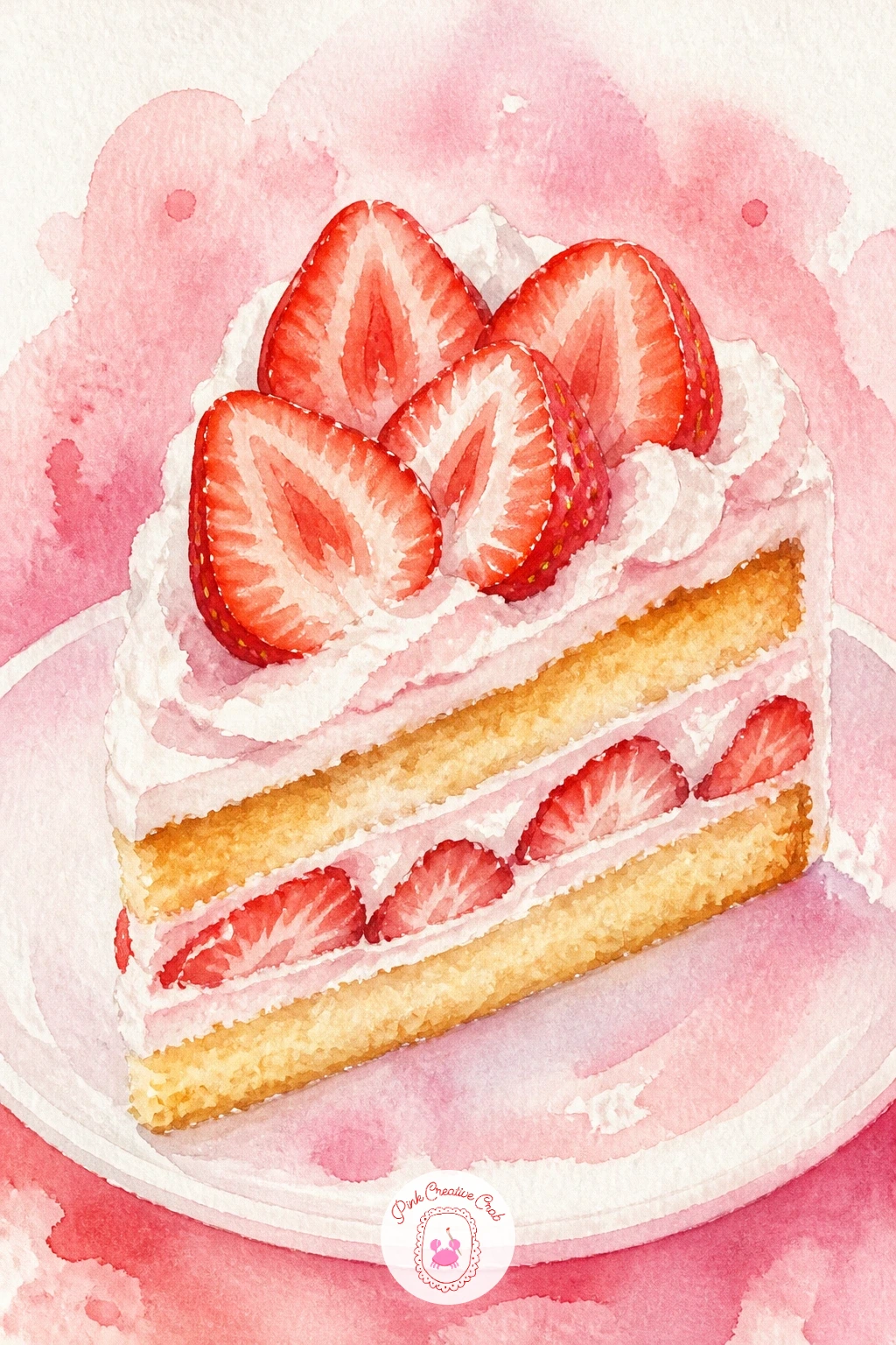
Palette: Yellow Ochre,Titanium White,Cadmium Red,Payne’s Grey
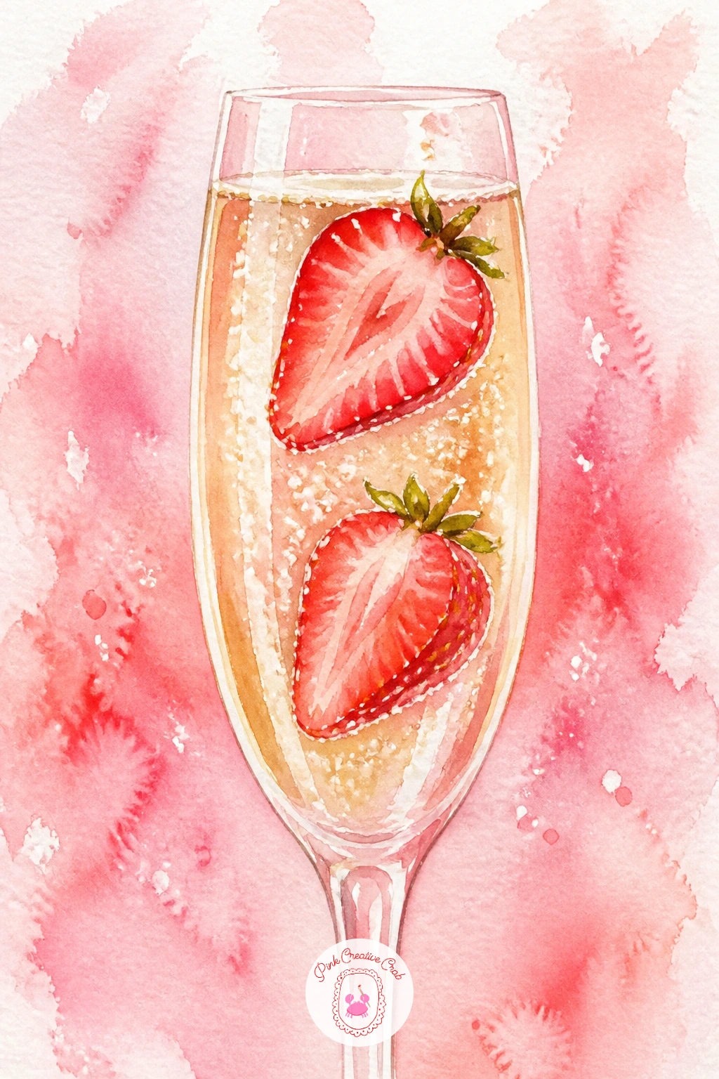
Move from dessert to drink with this one, a tall flute catching the light. Paint the glass itself in the palest grey-blue, leaving two or three vertical strips of bare white paper for the glass shine, then drop a warm straw yellow wash inside for the champagne.
Let the glass dry fully before adding strawberries sliced in half and dropped into the liquid, since a wet glass will bleed their red straight into your yellow. Paint the visible seed pattern on the cut faces with tiny dots once everything else is dry, and a thin curved line of white gel pen for the fizz rising past them.
The eye level sits low here, right at the base of the flute, which is what makes the bubbles feel like they are drifting upward past your eye rather than looked down on. Keep the light source coming from one side so the glass throws one soft shadow, not two.
No gel pen on hand: a fine dry brush dipped in white gouache does the same fizzy trick.
You Will Need
- white gel pen or white gouache for bubbles
Palette: Naples Yellow,Payne’s Grey,Cadmium Red,Sap Green
After the glassware, it is a relief to paint something as forgiving as a woven basket. Lay down the basket shape first in a warm brown, then drag a dry brush sideways across it while still slightly damp to suggest the weave, rather than painting every strand.
Once the basket is dry, pile strawberries over the rim so some tumble just over the edge, which gives the whole composition somewhere for the eye to land. Paint each berry in two reds as before, then tuck in a few pale green leaves between them before the reds are bone dry so the edges soften slightly where leaf meets fruit.
If the basket weave is intimidating, a plain round wicker shape with three or four curved lines across it reads perfectly well at this size, nobody is counting the strands.
Finish with a handle arching over the top, painted last so it sits cleanly over the dried berries underneath, and a cast shadow beneath the basket to seat it on the page.
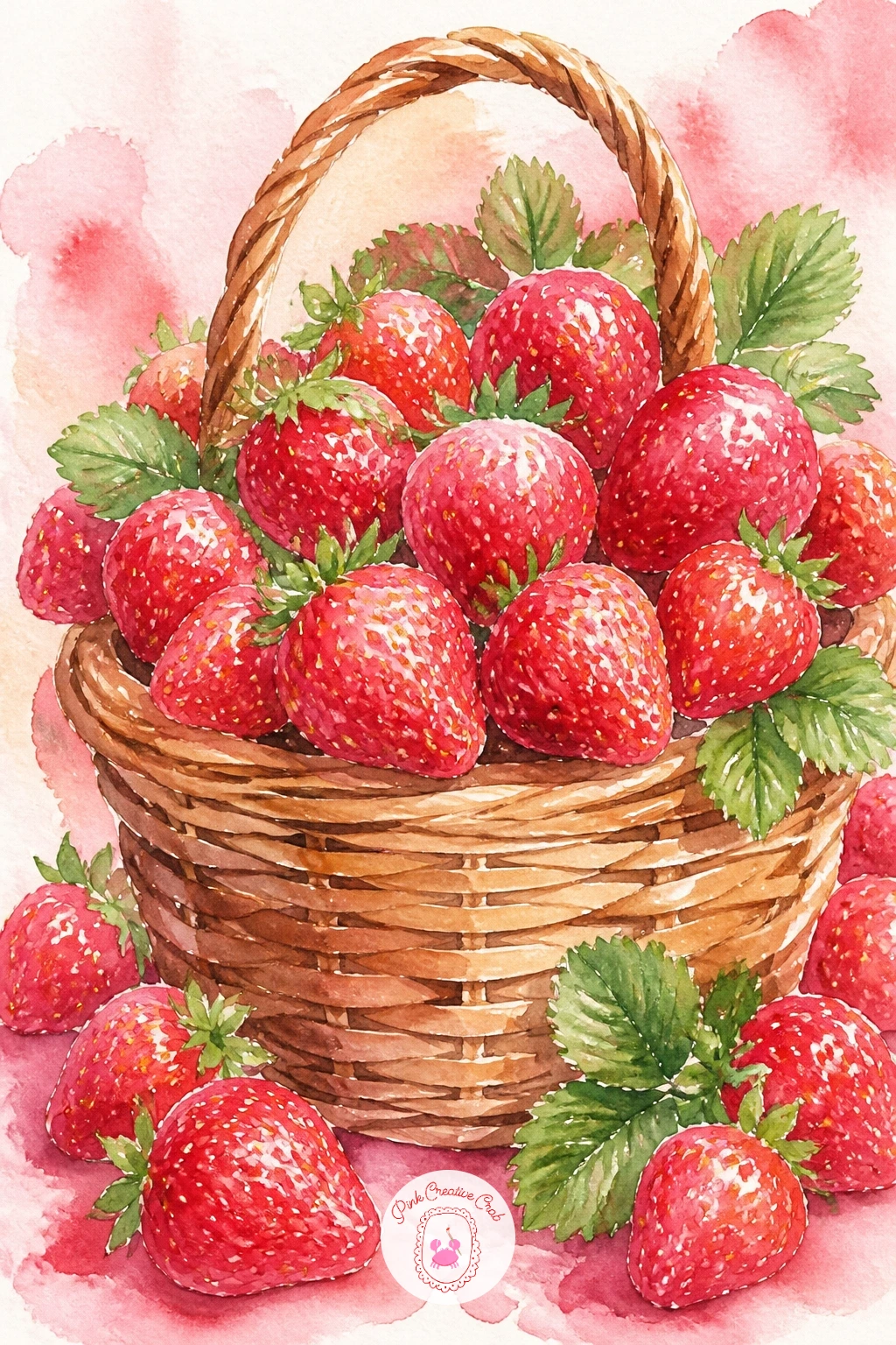
Palette: Burnt Sienna,Cadmium Red,Sap Green,Yellow Ochre
Look at a real woven basket or a photo before you start, just to see how the light catches the ridges, it saves guessing at the texture from memory.
Carry the pink mood into a tall glass for this one. Paint the glass outline in pale grey, then fill it with a soft pink wash that goes slightly deeper toward the bottom, since milkshake always settles darker where it is thickest.
Leave a ring of bare white paper at the very top for the whipped cream swirl, and paint that cream with the same grey-white shadow trick from the shortcake slice: shadow only in the folds, light left as paper. Drop in a cherry on top once the cream is dry, a small red circle with a thin dark stem.
The straw goes in last and it is the part people rush: paint it as two parallel lines with the color slightly darker where it disappears into the pink liquid, which is the one trick that makes a straw look like it is actually in the glass rather than floating in front of it.
No pink in your set: mix it fresh from red and white, or red thinned right down with water.
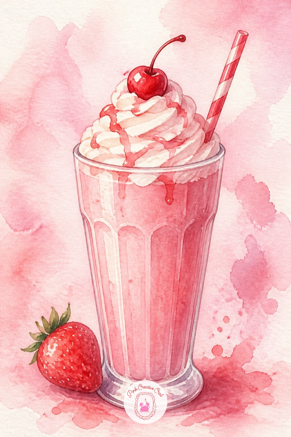
Palette: Pale Pink,Cadmium Red,Titanium White,Payne’s Grey
This one brings a figure into the mix, so keep her simple. Block in her dress shape first as one soft pink wash, let it dry, then add the tiny strawberry print over the top with a fine brush once you are sure the base color will not bleed into the dots.
Keep her face mostly suggested, a soft oval with the barest hint of features, since a loose summery scene like this one loses its charm the moment a face gets too tight or too detailed. Sit her on a gingham blanket with a basket beside her, painted the same way as the earlier basket idea, to tie the page together.
Compare her head size to her seated height before you ink anything: roughly one head to three seated heights keeps a relaxed, unposed look rather than something stiff.
If figures make you nervous, paint her from behind instead, sun hat and dress only, no face to worry about at all.
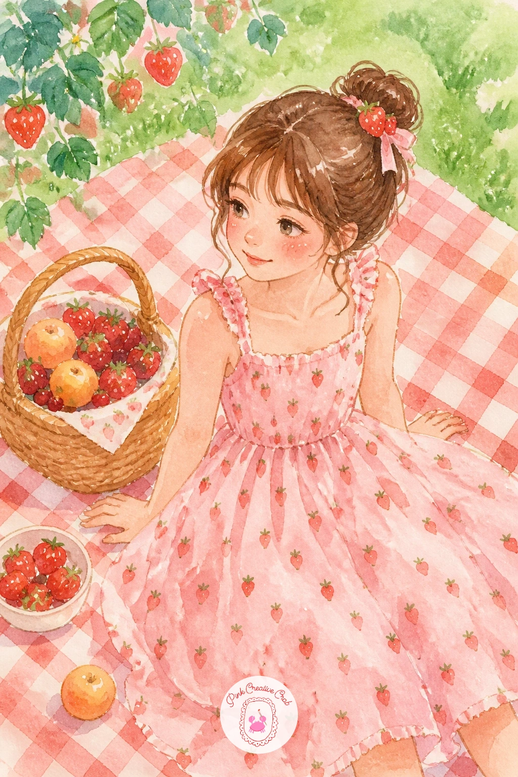
Palette: Pale Pink,Cadmium Red,Sap Green,Burnt Sienna
Slow down for this one, since a tart rewards a bit more patience than a slice of cake. Paint the pastry shell first in a warm golden wash, then let it dry fully before adding the pale yellow custard filling, which should sit just inside the pastry edge with a thin rim of crust still showing.
Arrange whole and halved strawberries over the custard in a ring, overlapping slightly, painted in the usual two-red method, then once everything is dry, add a thin glossy glaze line along the top edge of each berry with a touch of white gouache or a gel pen.
The quick ten minute version stops right there, a tart with berries and shine. The forty minute version adds a brushed border of pastry crimping around the edge and a few loose mint leaves tucked between the berries, which lifts it from simple to genuinely pretty.
Keep the custard wash thin, a heavy hand here turns it muddy rather than silky.
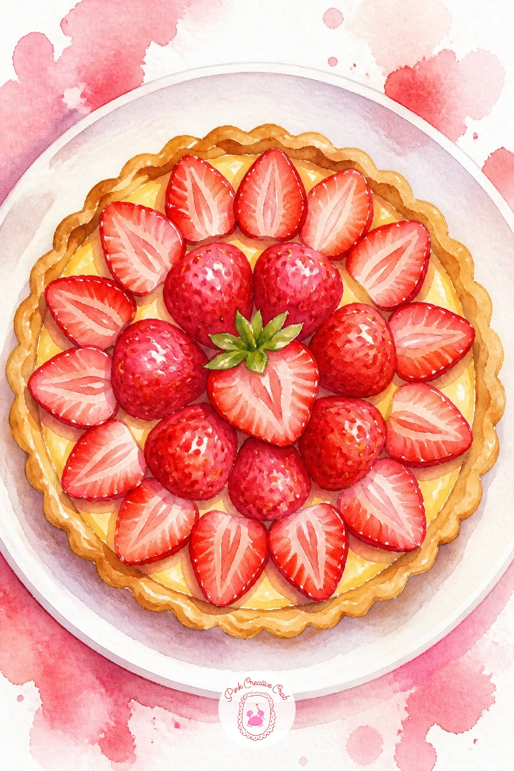
You Will Need
- white gel pen or gouache for the glaze shine
Palette: Yellow Ochre,Naples Yellow,Cadmium Red,Sap Green
Zoom right out for this landscape moment, which is the most involved scene on this list so give it the most room on your page. Start with the sky and distant tree line first, kept soft and loose, then work forward to rows of low green plants dotted with tiny red marks for berries.
Your eye level sits low here too, somewhere around a third up the page, which lets the rows recede toward a horizon rather than looking flat. Keep the pickers themselves very simple, just a few small figures bent over the rows or carrying a basket, no more than a loose dab of color for clothing and a tiny oval for a sun hat.
If the rows start looking too neat and ruler-straight, loosen your wrist and let them curve slightly, a field is never perfectly tidy and the imperfection reads as more alive.
Keep figures small and few, this scene is about the field, not a crowd portrait, and easy watercolor landscapes are worth a look if you want more practice with this kind of open, receding space.
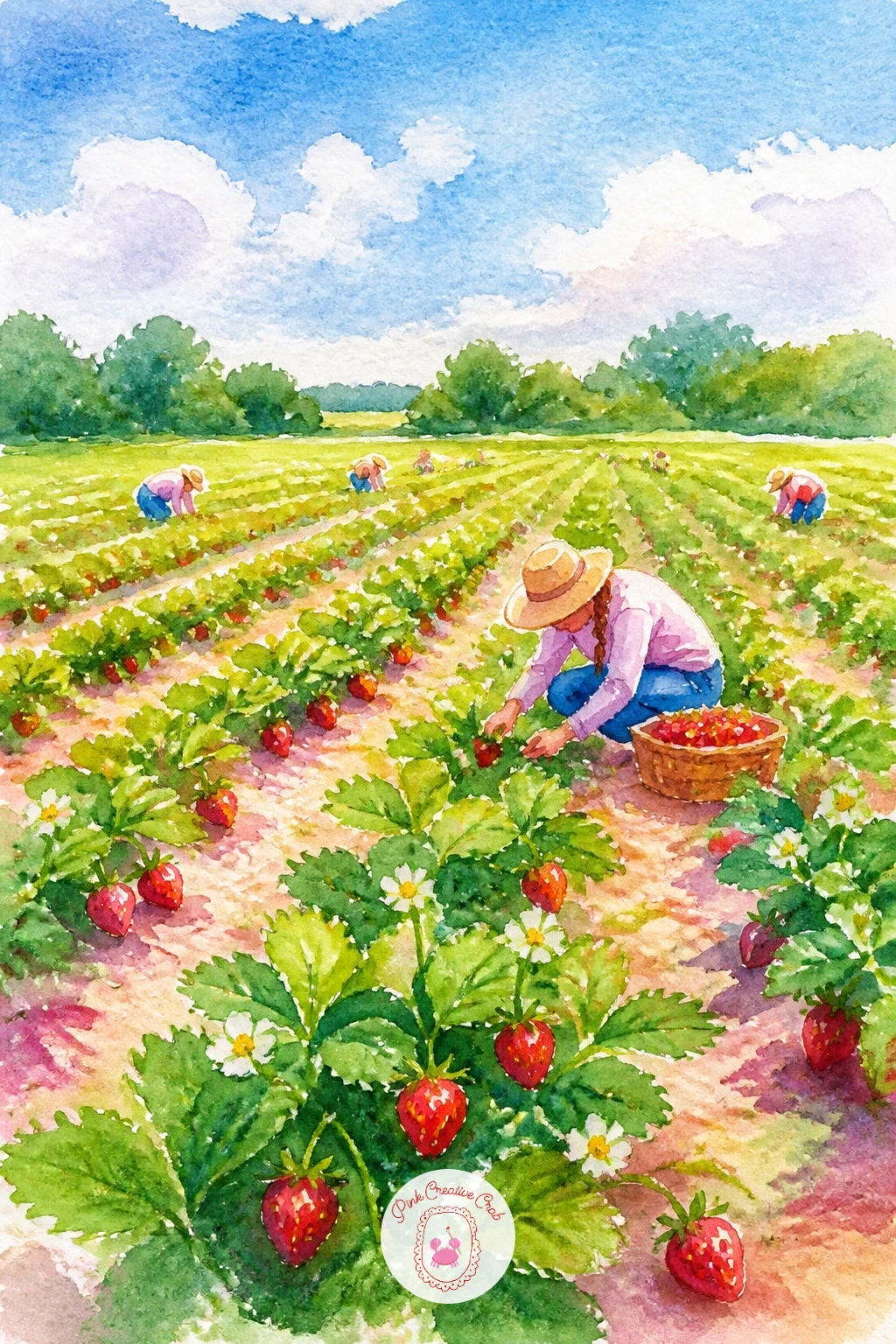
Palette: Sap Green,Cadmium Red,Cerulean Blue,Burnt Sienna
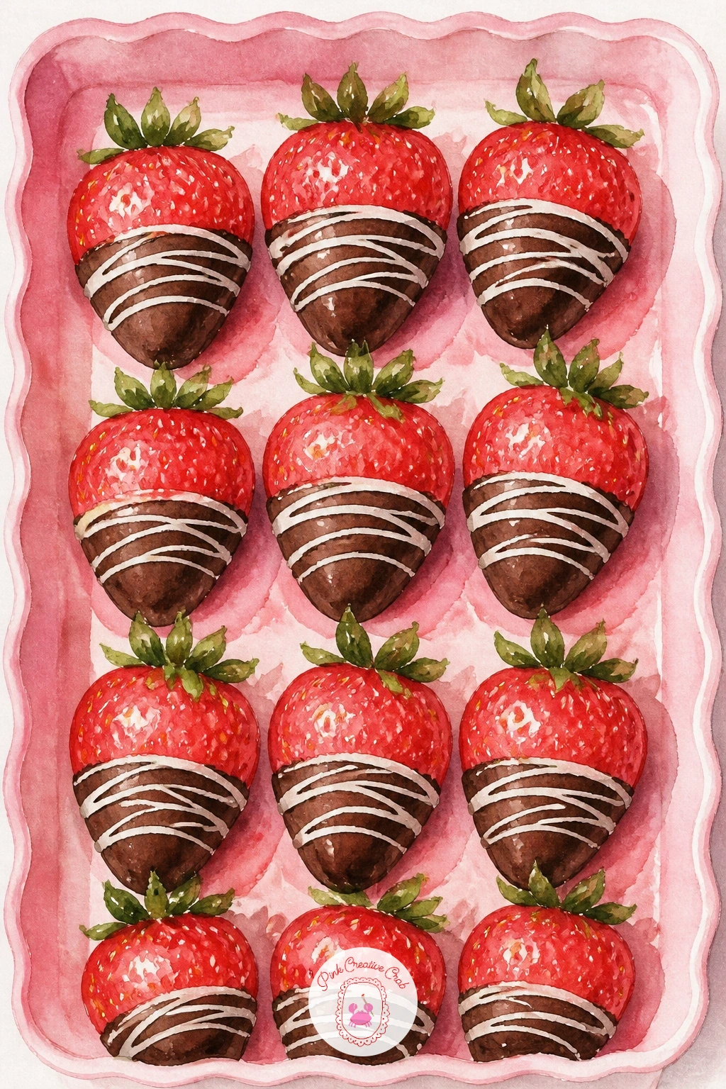
After a field, it is satisfying to come back indoors for something small and shiny. Paint the red strawberry tip first and let it dry completely, since the chocolate dip has to sit cleanly on top without the two colors bleeding together into brown-pink mud.
Mix a dark warm brown for the chocolate and paint it as a confident single stroke dipped over the top third of each berry, with one edge left slightly rough and drippy rather than a perfectly straight line, which is what actual melted chocolate looks like.
Once dry, flick tiny white gouache specks across a few of the berries for a drizzle effect, and dot one small white highlight on the glossiest curve of the chocolate so it reads as glossy rather than matte.
Arrange several on a plain tray or plate rather than scattered loose, which keeps this quick version tidy if you only have ten minutes to spare today.
You Will Need
- white gouache or acrylic for drizzle
Palette: Cadmium Red,Burnt Umber,Titanium White,Sap Green
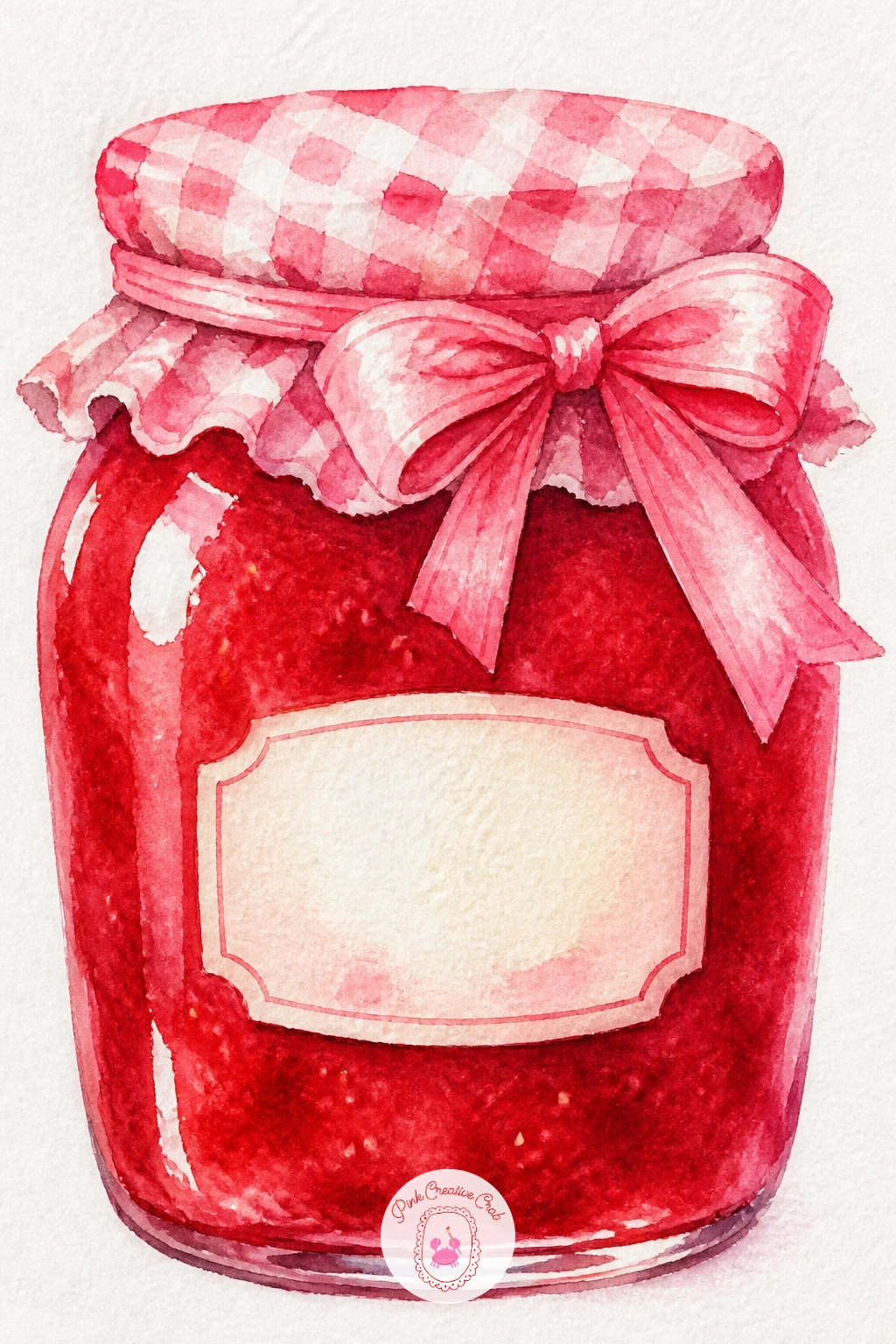
This one is a nice calm breather after the shine of chocolate. Paint the jar as a simple rounded rectangle, leaving the glass mostly bare paper with just a cool grey shadow along one edge, then fill the lower two thirds with a deep red jam wash, slightly uneven so it reads as thick preserve rather than flat color.
Let that dry, then add a paper label shape on the front in cream, with a tiny hand-drawn berry sketched on it if you like, and a ribbon bow tied around the neck in whatever color suits your palette, pink or red both work.
The edge where jam meets glass is where this goes wrong most often: keep that line slightly soft rather than razor sharp, since real jam clings and drips a touch against the glass.
If ribbon bows feel fiddly to paint, a simple strip of fabric tied in a single loose knot reads just as sweetly and takes half the time.
Palette: Cadmium Red,Payne’s Grey,Pale Pink,Yellow Ochre
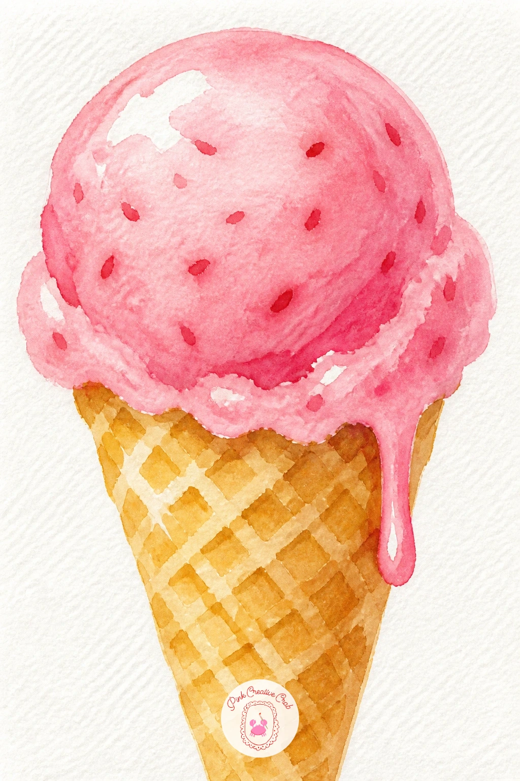
Keep the momentum going with something quick and cheerful. Paint the cone first in a warm golden wash, then once dry, add the waffle crosshatch pattern with a fine brush in a slightly darker brown, just a few lines rather than covering the whole surface.
The ice cream scoop goes on top in soft pink, built from two or three rounded bumps rather than one smooth dome, since real scooped ice cream always has that slightly lumpy, melting edge. Leave the top of each bump as bare white paper for shine.
Compare the scoop width to the cone opening before you commit, the scoop should sit a touch wider than the cone mouth or it looks like it is about to slide straight through.
Drip a thin trickle of pink down one side of the cone for a melting touch, and if you want a second flavor, a cream colored scoop stacked above the pink one gives it a two scoop look with barely any extra effort.
Palette: Pale Pink,Yellow Ochre,Burnt Sienna,Titanium White
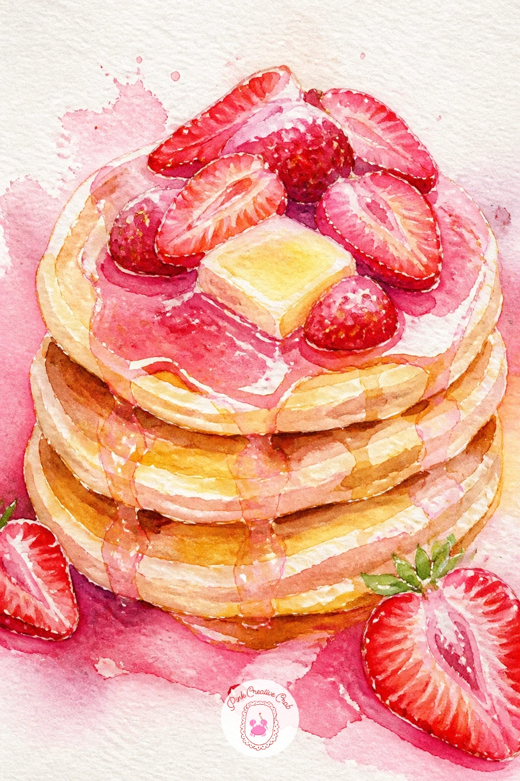
Breakfast comes next, a stack that is mostly about getting the layers right. Paint each pancake as a flattened oval, slightly darker at the edges where it browned in the pan, and stack three or four slightly offset so each one peeks out from under the next.
Let the stack dry fully before adding a pat of butter on top, painted as a small pale yellow square with a soft puddle of melted butter running down one side in a thin golden wash. Pile sliced strawberries over the top and down the sides once that is dry too, their juice bleeding slightly pink into the top pancake for a realistic soaked look.
A light drizzle of syrup in warm amber ties it together, painted last in thin trailing lines that pool slightly at the base of the stack.
If the stack keeps looking flat, darken the thin shadow line where each pancake meets the one below it, that single line does most of the work of making it look stacked rather than drawn flat.
Palette: Yellow Ochre,Burnt Sienna,Cadmium Red,Naples Yellow
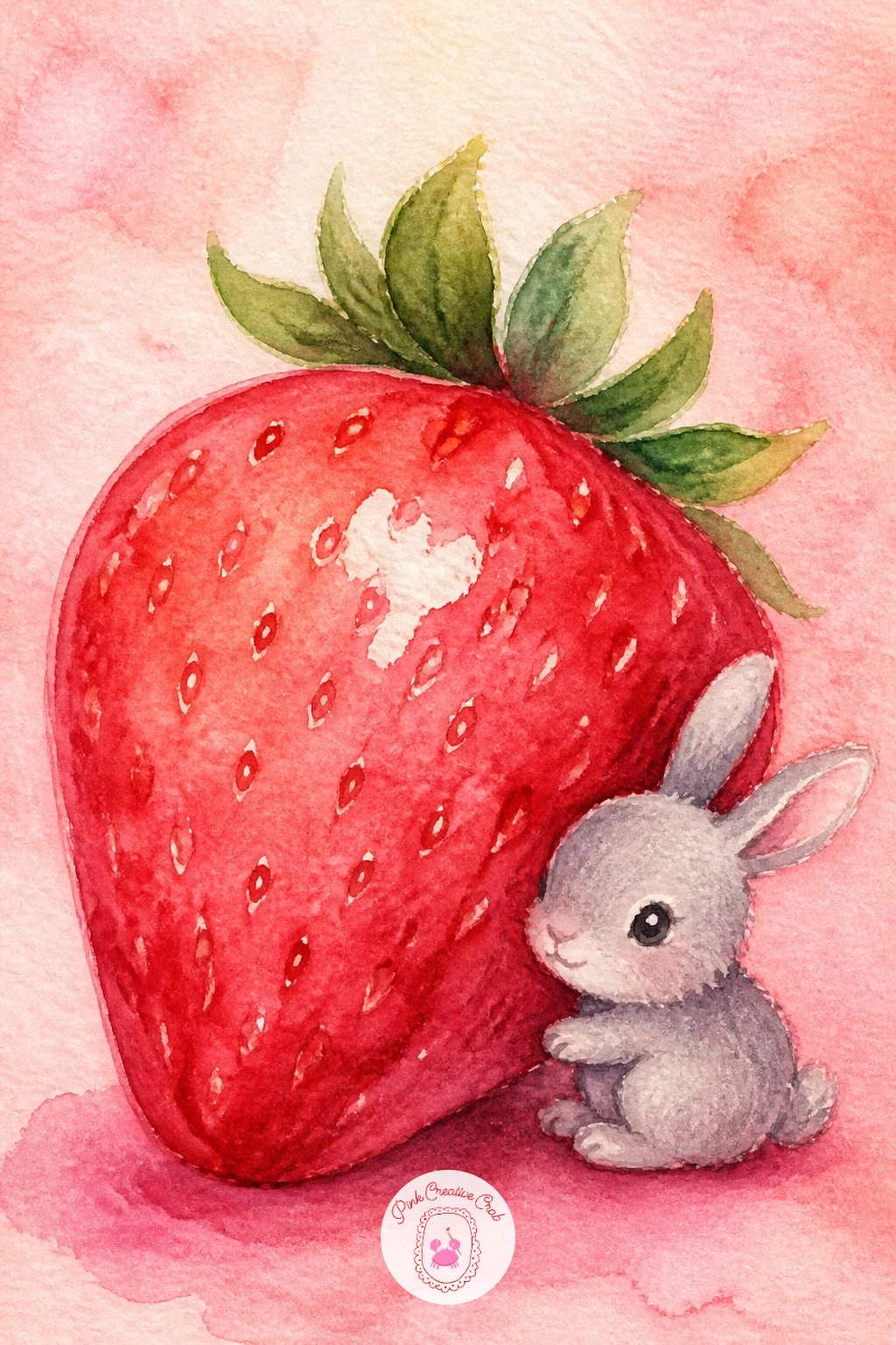
Switch to something small and charming here, just one berry and one tiny creature. Paint the strawberry first, oversized compared to the bunny so the scale reads as playful rather than realistic, then let it dry completely before adding the bunny sitting or leaning against it.
Keep the bunny extremely simple: an oval body, two long ears, a tiny triangle nose, painted in soft grey or cream with no more detail than that. A beginner should feel free to skip fur texture entirely and let the shape alone carry the charm.
Light the whole scene from one side consistently, so both the berry and the bunny throw their shadow the same direction, which is what makes two separately painted shapes feel like they belong in the same little world together.
Finish with a scattering of tiny seed dots on the berry and one small white highlight on the bunny’s eye, the kind of detail that takes seconds but makes the whole pairing feel finished and loved.
Palette: Cadmium Red,Payne’s Grey,Sap Green,Titanium White
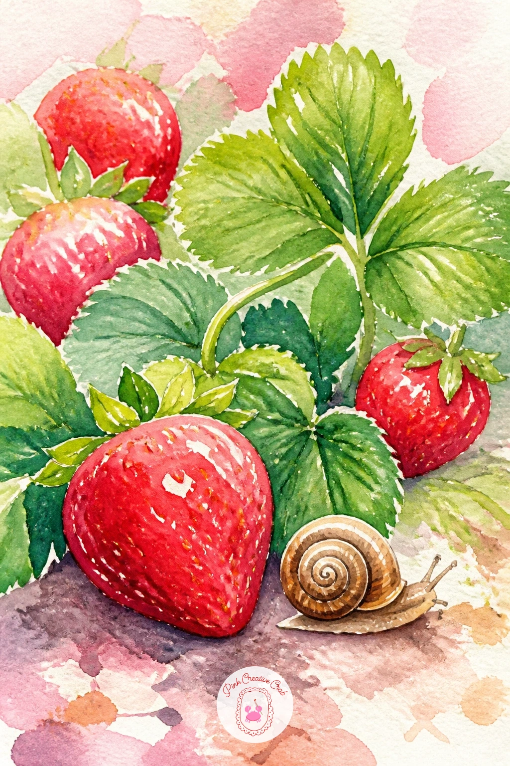
Following the bunny, bring in another small garden creature for this ground level scene. Paint a low patch of green leaves first, loose and overlapping, then tuck two or three strawberries peeking out between them at different angles, some half hidden under a leaf.
The snail goes in last, painted small enough that it reads as part of the patch rather than the main subject: a simple spiral shell in warm brown, a curved grey body beneath it, two thin antennae. Keep its shell shine as one small dot of bare paper.
If the leaves start looking like one green blob, vary your green mix slightly between each one, a touch more yellow in some, a touch more blue in others, so the patch reads as many separate leaves rather than a single green mass.
A ten minute version keeps it to one berry and the snail; the forty minute version fills more of the page with leaves and adds two or three more berries scattered through at different ripening stages, some still pale and green.
Palette: Sap Green,Cadmium Red,Burnt Sienna,Payne’s Grey
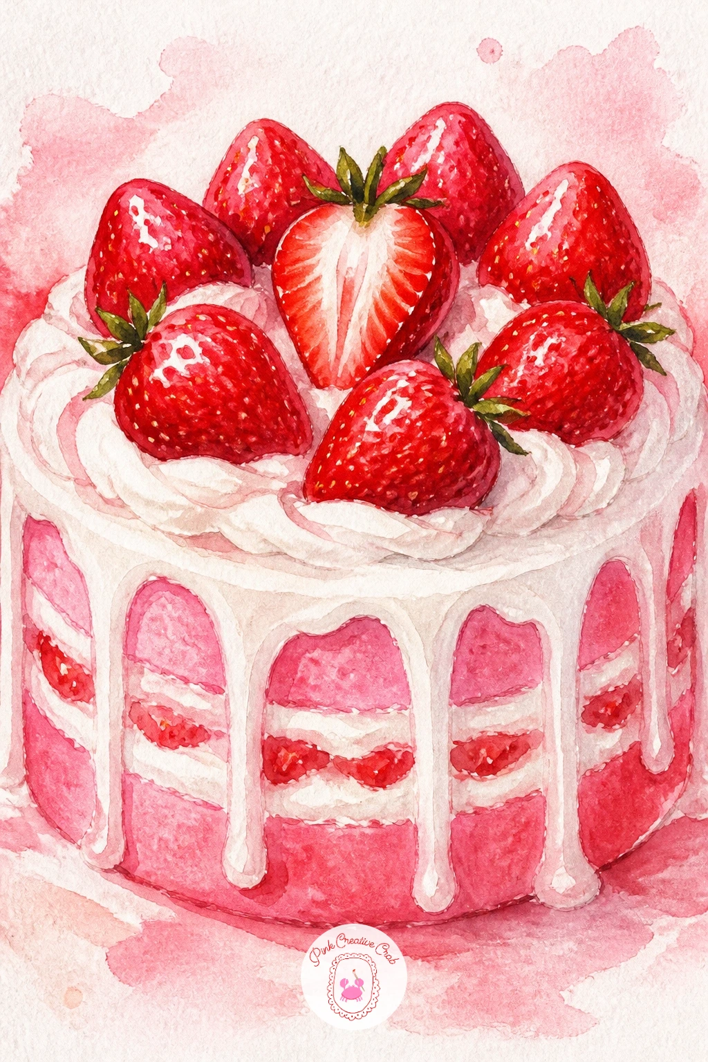
Scale back up for a full cake after the small garden scenes. Paint the cake as two or three stacked layers, each one a soft pink sponge color, with a thin darker line between each layer to suggest the filling peeking out at the edge.
Cover the top and sides loosely in whipped cream using the same shadow-only technique from earlier, letting the cream drip slightly down the sides in a few uneven trails rather than one neat line all the way around, which is what a real iced cake does.
Crown it with whole strawberries around the top edge and one halved berry laid in the center to show the red flesh and seeds, painted once the cream is fully dry so the red stays crisp rather than bleeding pink into the white.
If the layers look too even and stiff, nudge one slightly off center before you paint the cream over it, a cake that leans just a touch always looks more homemade and charming.
Palette: Pale Pink,Titanium White,Cadmium Red,Payne’s Grey
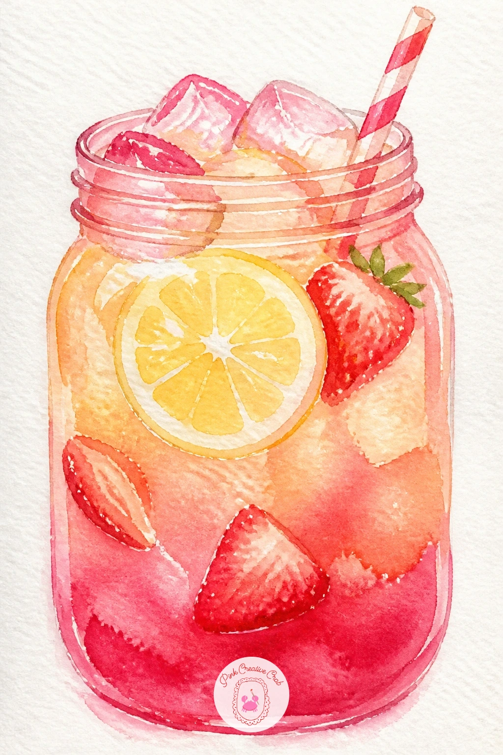
Cool things down with a mason jar drink next. Paint the jar shape first, leaving the ridged glass texture as a few faint vertical lines of slightly darker wash rather than painting every ridge, then fill it with a layered wash: pale yellow lemonade at the top shading into a deeper pink toward the bottom, where the strawberry puree always settles.
Drop in a few ice cube shapes as simple pale blue-grey rectangles with one white highlight corner each, and a lemon slice pressed against the inside of the glass, painted as a half circle with thin radiating segment lines.
A striped paper straw leans out one side, and the mouth of the jar gets a thin metal lid rim in grey. If the two drink colors blend into mud instead of staying layered, let the yellow dry completely before you touch in the pink at the base.
No mason jar reference handy, any simple cylinder shape with a slightly wider mouth reads as a jar just fine.
Palette: Naples Yellow,Pale Pink,Cadmium Red,Payne’s Grey
For more cool summer drinks and treats to pair with this one, the summer watercolor food and drinks list has plenty of companions.
Keep the breakfast theme alive with something a bit more delicate. Paint the crepe itself in one thin, pale golden wash, folded into quarters or rolled into a loose tube, with the folds shown only through slightly darker shadow lines rather than hard outlines.
Spoon strawberries and cream out from the open side once the crepe base is dry, letting a little pink juice bleed onto the plate beneath, which sells the idea of a filling spilling out rather than sitting separately beside it.
A dusting of powdered sugar goes on last as tiny flicked white dots across the top, best done with a dry brush loaded lightly and tapped rather than painted stroke by stroke.
The crepe’s edge is where beginners tend to overwork it: keep that outer line soft and slightly uneven, a crisp hard edge makes a delicate folded crepe look like a stiff taco instead.
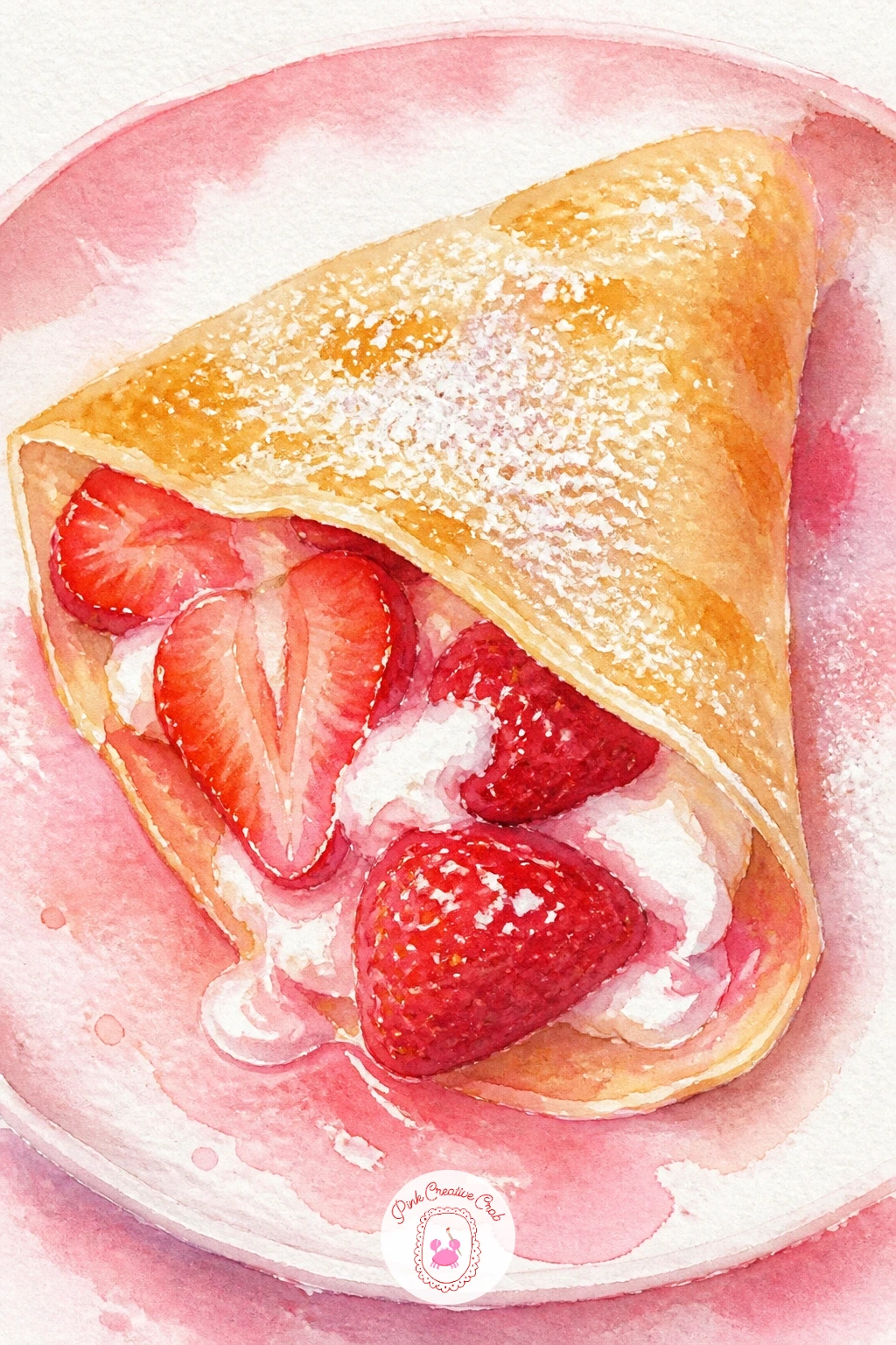
Palette: Naples Yellow,Cadmium Red,Titanium White,Payne’s Grey
Bring in a still life moment with this potted plant. Paint the terracotta pot first in a warm orange-brown, leaving one vertical strip of lighter highlight down the side facing your light source, since terracotta always catches a soft sheen.
Once the pot is dry, build the plant upward from the soil line: a cluster of leaves first in varied greens, then a few runners trailing over the pot’s edge with small berries hanging from them, some still green and unripe, others fully red.
Keep the light consistent across the whole piece, the same side of the pot and the same side of each leaf catching the brightest highlight, which is what makes a plant and its container read as one lit scene rather than two separate paintings pushed together.
If the leaves crowd together into a green mass, leave a few thin slivers of bare white paper between clusters, those tiny gaps do more for readability than any amount of extra detail.
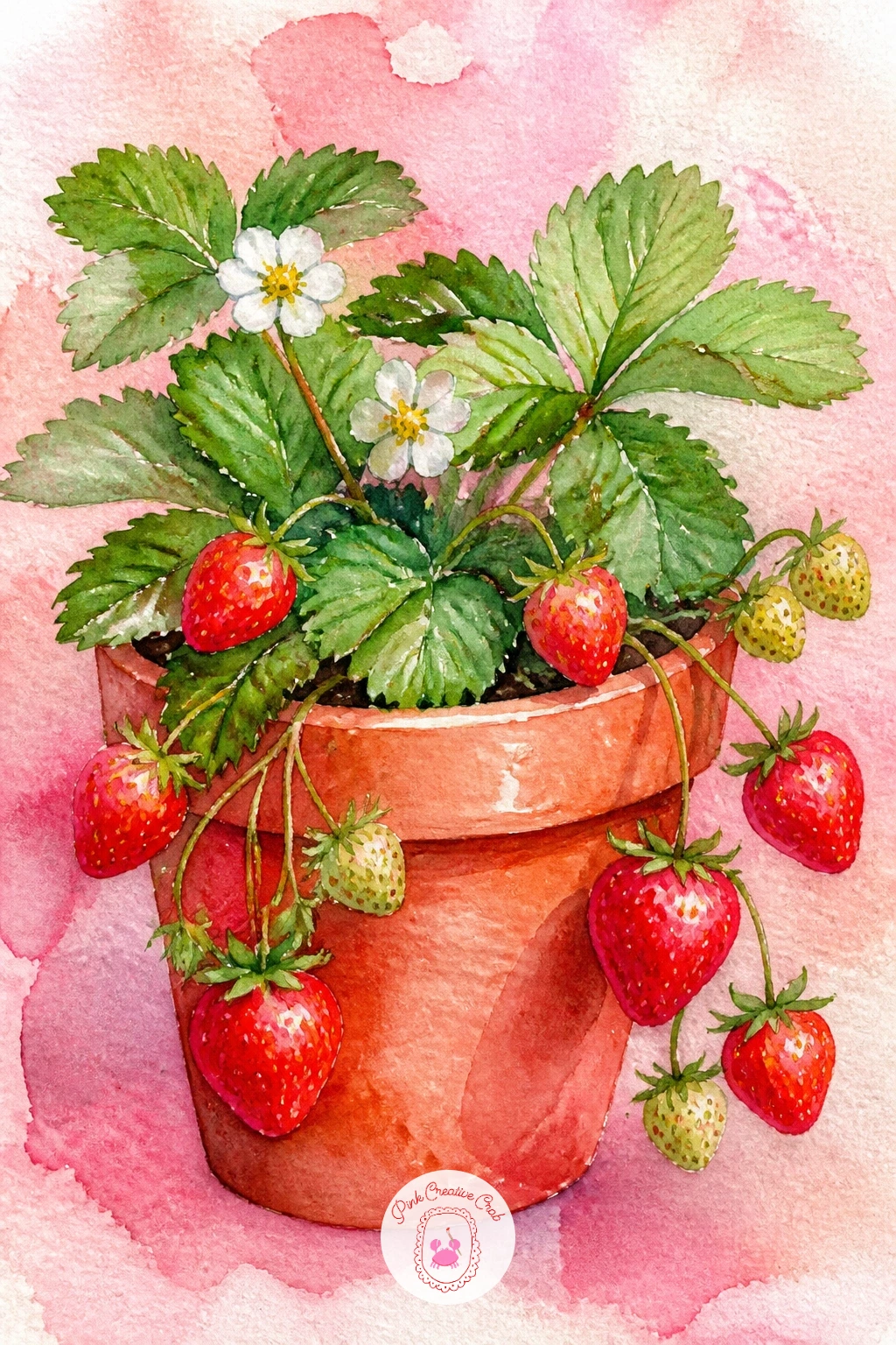
Palette: Burnt Sienna,Sap Green,Cadmium Red,Yellow Ochre
Move into something bright and modern after the terracotta pot. Paint the bowl’s smoothie base as one even, deep pink wash filling most of the bowl, kept slightly glossy by working wet in wet so the surface looks smooth rather than textured.
Once that base is fully dry, arrange the toppings in loose rows or clusters rather than scattered at random: sliced strawberries along one side, a scoop of granola in warm brown dots along another, a few blueberries and a scatter of coconut flakes finishing the rest.
This is the kind of subject where a ten minute version covers just the pink base and strawberry slices, while the forty minute version adds every extra topping in careful little rows, which is worth doing once and then varying endlessly: swap toppings, swap the base to mango yellow or green matcha, same bowl every time.
Keep the bowl’s rim as a thin unpainted or pale ring, that one line of contrast is what separates the smoothie from the dish holding it.
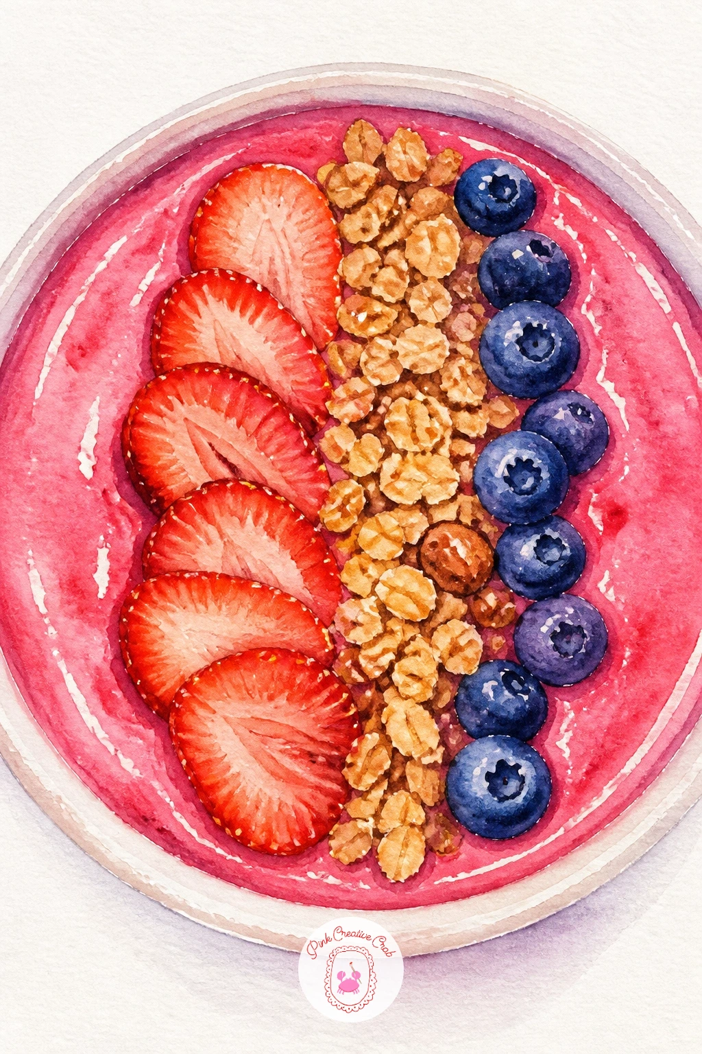
Palette: Cadmium Red,Sap Green,Burnt Sienna,Titanium White
Shift to something small and soft for this one. Paint each mochi as a rounded, slightly flattened sphere in the palest pink, using very little pigment so the wash stays soft and powdery rather than saturated, since mochi skin is matte, not glossy.
Leave a small gap at the top of each one unpainted or barely tinted, a visual cue for the dusting of rice flour mochi is traditionally rolled in, then once dry, tap in that dusting with a nearly dry brush of white gouache.
Arrange two or three together on a small plate rather than just one alone, varying their size slightly so they read as handmade rather than machine identical. A thin crease line where the mochi dough folds closed at the top of each one, painted in a slightly deeper pink, is the detail that sells the whole thing as mochi rather than a plain ball.
No gouache on hand for dusting, a soft pencil scribbled lightly over dry paint gives a similar powdery look.
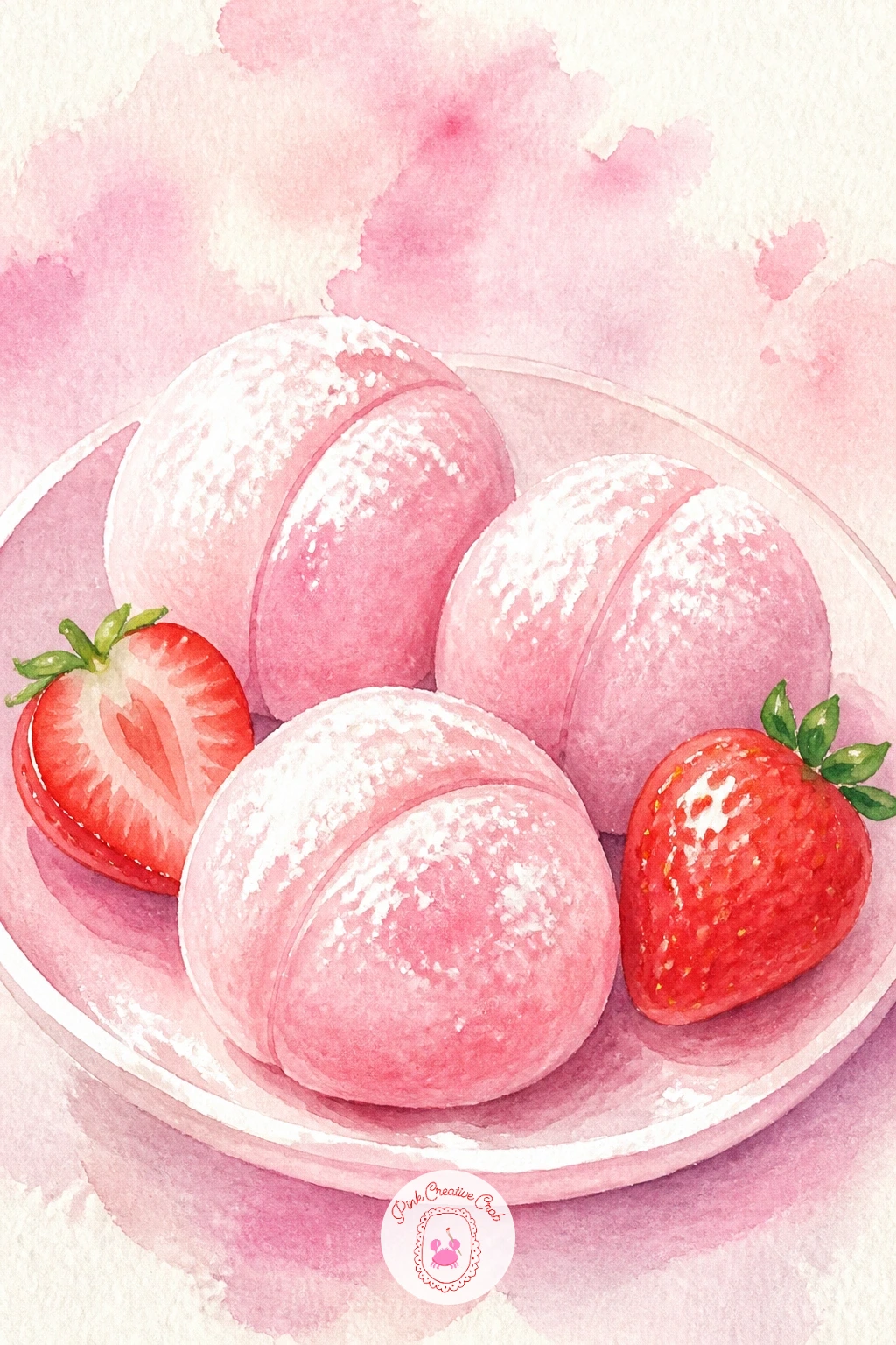
You Will Need
- white gouache for the rice flour dusting
Palette: Pale Pink,Titanium White,Cadmium Red,Sap Green
Strip everything back for this one, which is really about the berries themselves with almost nothing else competing for attention. Arrange four or five whole strawberries directly on bare white paper, some standing upright, one or two lying on their side to vary the silhouette.
Build each berry in the same two-wash method as always, but spend a little extra time here lifting color back out with a clean damp brush right after the first wash, dabbing gently at the spot where the light hits hardest to pull pigment away and leave a soft glow rather than a flat highlight.
A sprig of mint tucked beside the berries, painted in two or three leaf shapes with a thin stem, is the only other element, and its cool green is what makes the reds look even warmer and juicier by contrast.
Keep the cast shadows beneath the berries soft grey and slightly blue rather than brown, which keeps the whole plate feeling clean and bright.
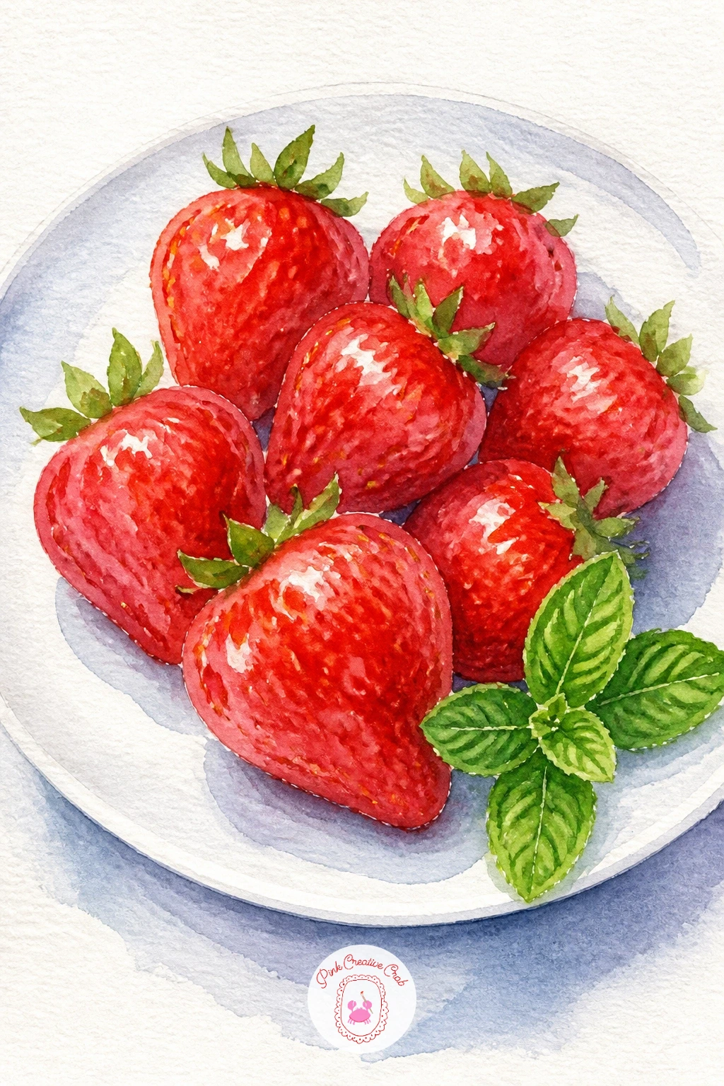
Palette: Cadmium Red,Alizarin Crimson,Sap Green,Cerulean Blue
The watercolor fruit tutorial lessons are worth a look if you want more practice lifting highlights on rounded fruit like this.
Carry the simplicity forward into a bakery favorite. Paint the scone as a rough triangular wedge, kept slightly uneven and craggy rather than a smooth geometric shape, since a hand baked scone never has perfectly straight sides.
Use a dry brush for most of the scone’s surface so the texture reads as crumbly, saving a smooth wet wash only for the very top where a light glaze might catch the shine. Once dry, add a generous dollop of clotted cream to one side, painted with the same shadow-only method as the whipped cream ideas earlier, and a spoonful of strawberry jam glistening beside it.
A few whole strawberries rest beside the scone on the plate, smaller in scale than the bowl idea at the top of this list so the scone stays the hero of the piece.
If the scone’s crumb texture looks too smooth after drying, go back in dry brush style with a slightly darker tone once everything else is finished, it is far easier to add texture late than to fix an overworked wash.
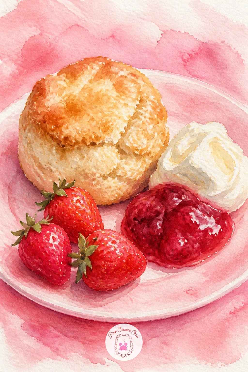
Palette: Yellow Ochre,Titanium White,Cadmium Red,Burnt Sienna
This is the most ambitious dessert on the list, so give the meringue base the attention it deserves. Paint the pavlova shell with a dry brush in broken, uneven strokes of warm white and pale cream, leaving plenty of bare paper showing through for the crisp, cracked meringue texture.
Once dry, pile soft whipped cream on top using the familiar shadow-only technique, then crown the whole thing with a generous scatter of whole and sliced strawberries, some glazed-looking with a touch of white highlight, tumbling slightly over the cream’s edge rather than sitting in a neat ring.
Eye level here sits close to the pavlova itself, almost level with the table, which flattens the background and lets the dessert fill most of the frame the way it would in a close up photo.
A quick version keeps the meringue texture loose and the berries to just three or four; the fuller version adds a drizzle of passionfruit or berry syrup trailing down one side for extra shine.
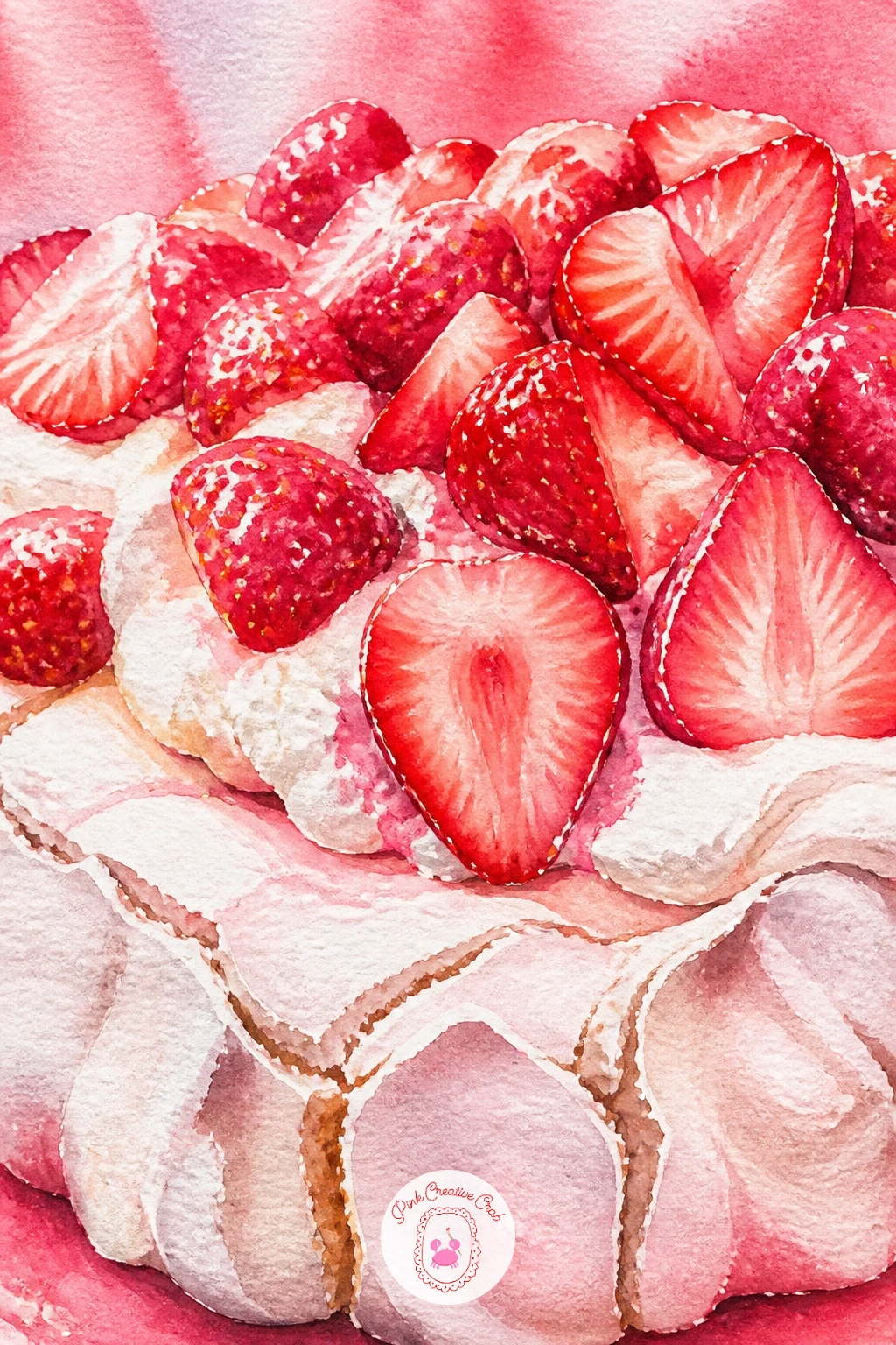
Palette: Titanium White,Naples Yellow,Cadmium Red,Sap Green
Shift gears into tableware for this one. Paint a simple teacup and saucer shape first in soft white with a thin grey shadow line defining the rim and handle, then once dry, add the strawberry print pattern in small repeating clusters around the cup’s body.
Keep each printed strawberry tiny and simplified, barely more than a red teardrop with a green dot above it, repeated at a steady rhythm rather than drawn individually different each time, since a believable fabric or china print relies on repetition, not variety.
A thin gold or pale yellow line painted around the rim and the base of the cup, added last once everything else is dry, gives it that finished china look in just one extra stroke.
If the tiny repeated berries start looking uneven, lightly pencil a few guide dots around the cup first before you commit to paint, spacing them evenly before any color goes down.
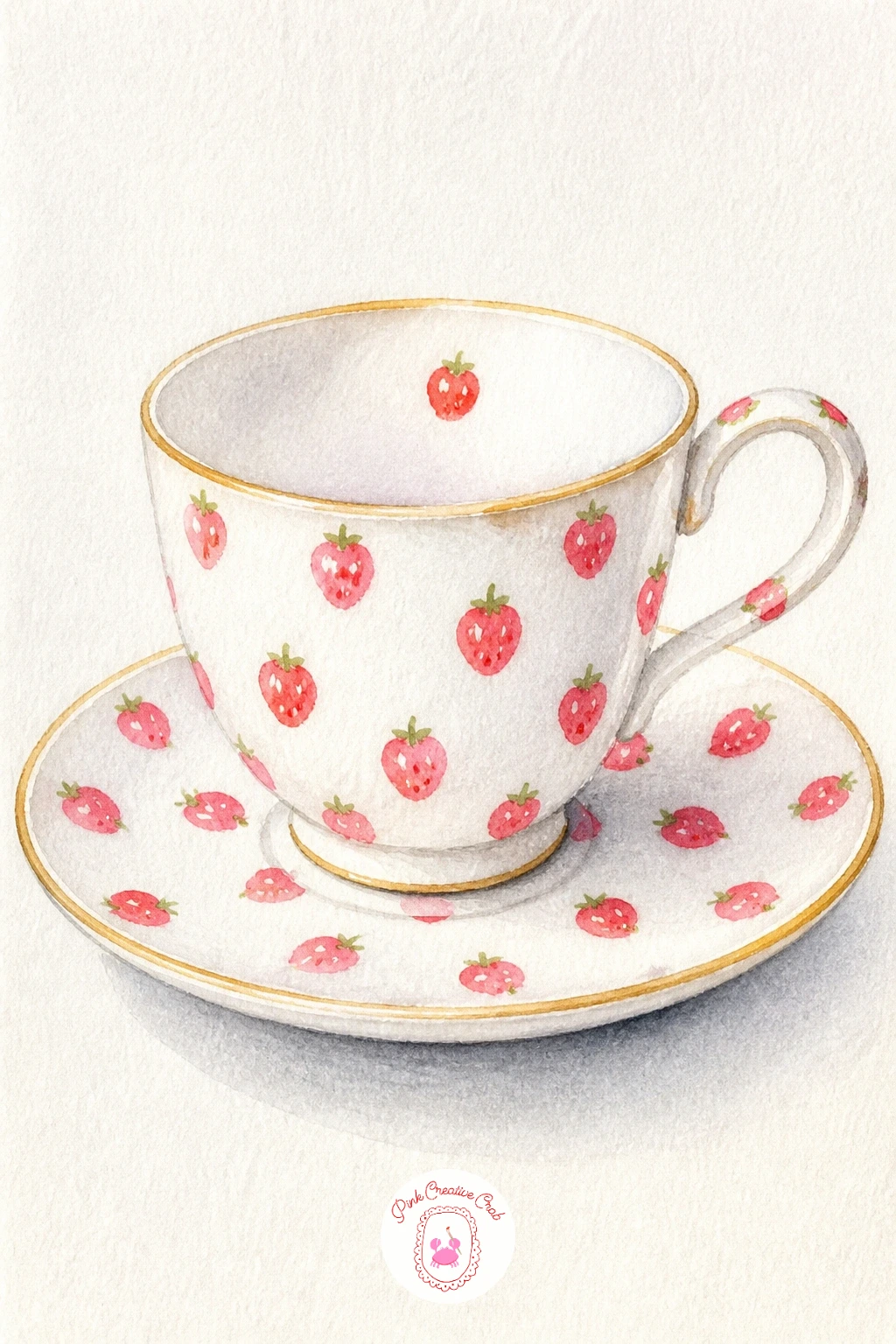
Palette: Titanium White,Cadmium Red,Sap Green,Yellow Ochre
Bring back the cocktail glass for a frozen version this time. Paint the wide-mouthed glass first in pale grey-pink, then fill it with a textured icy pink slush, achieved by dabbing the wet wash with a crumpled tissue while it is still damp to lift uneven patches of color and suggest crushed ice.
A rim of coarse sugar goes around the glass edge, painted as tiny irregular white dots once the glass itself is dry, and a wedge of fresh strawberry or lime perched on the rim finishes the top.
If you do not have a tissue handy for texture lifting, a dry, slightly stiff brush scrubbed lightly across the damp wash gives a similar broken, icy effect.
Keep the glass stem thin and the base simple, a cocktail glass reads instantly from its silhouette alone, so there is no need to overwork the lower half of the painting.
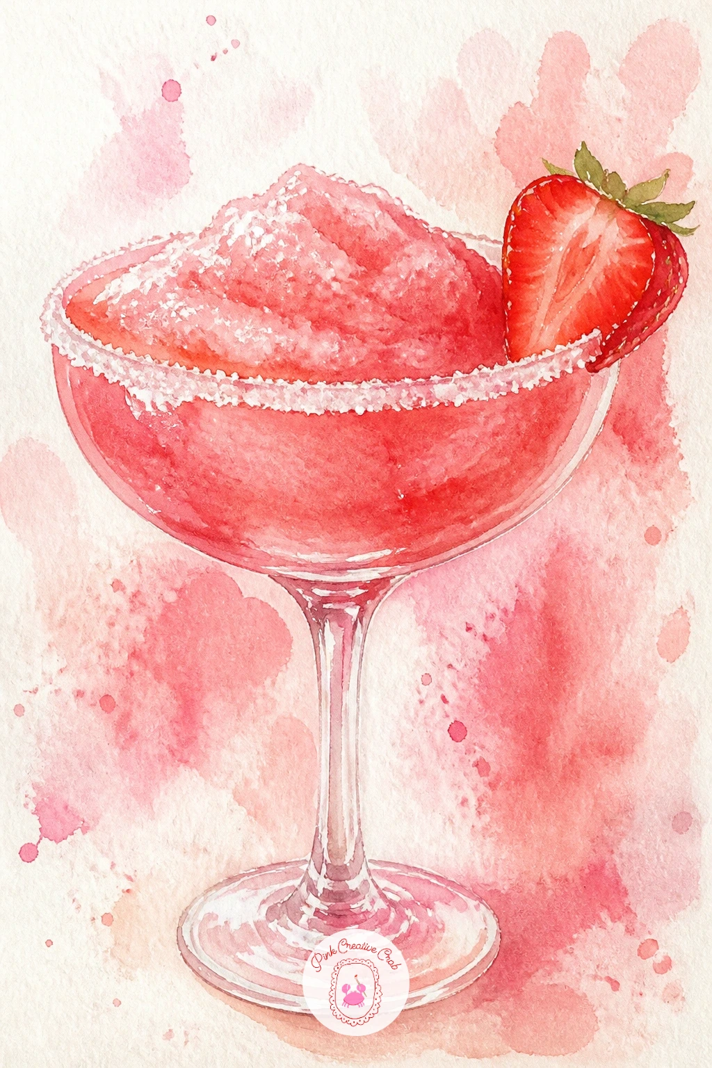
You Will Need
- tissue or paper towel for lifting texture
Palette: Pale Pink,Cadmium Red,Payne’s Grey,Titanium White
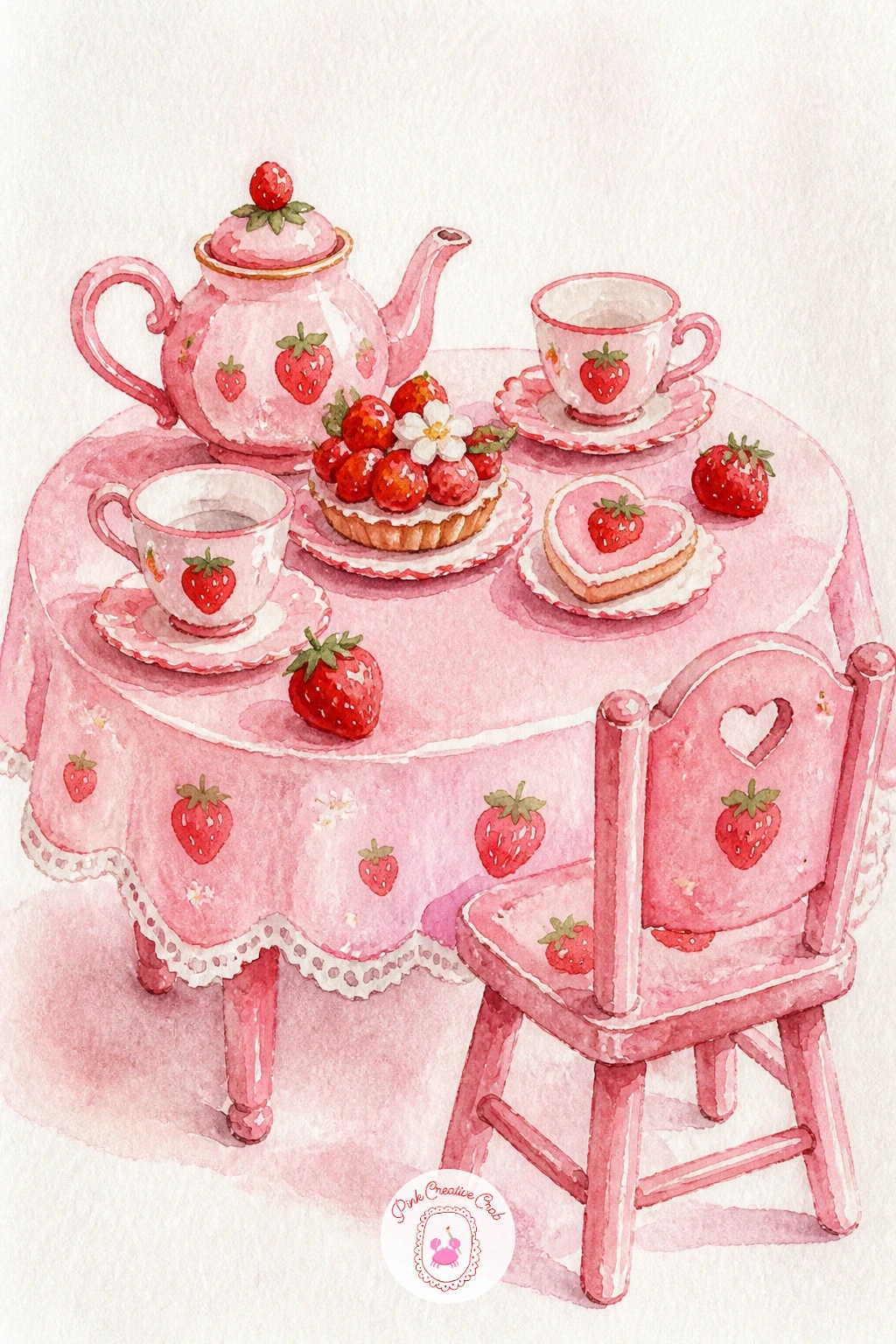
Scale everything down for this whimsical little scene. Paint a tiny table first, barely more than a flat oval top and two thin legs, then arrange miniature teacups, a small teapot and a plate of berry sized treats across its surface, every object shrunk down to a fraction of its usual size.
Give each dollhouse sized item just one or two brushstrokes rather than full detail, since the charm of this scene comes from suggestion at a tiny scale, not from rendering every miniature object with the same care as a full sized one.
One or two tiny chairs pulled up to the table, left empty or with the barest suggestion of a doll seated in one, finishes the mood without demanding a full figure.
If the miniature scale feels fiddly, work slightly larger than you think you need to and simply crop the final composition tighter afterward, it is easier to paint small shapes with confidence than to force tiny, cramped brushwork.
Palette: Pale Pink,Cadmium Red,Titanium White,Yellow Ochre
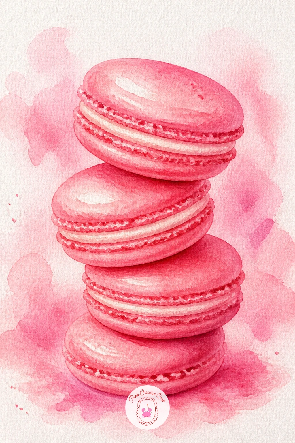
Return to something crisp and confident after the softness of the dollhouse scene. Paint each macaron shell as two rounded discs, pink on top and bottom, separated by a thin cream or jam filling line in the middle, kept slightly glossy by working the wash wet and even rather than textured.
The famous macaron “foot”, that slightly ruffled ridge where the shell meets the filling, is painted last with a fine brush in small repeated bumps around the edge, and it is the detail most people skip, so including it is what makes these read instantly as macarons rather than plain cookies.
Stack two or three at a slight lean against each other rather than lining them up flat, which gives the small pile some life and a believable sense of weight.
If the pink shells look too flat, a touch of deeper pink worked wet into the lower edge of each disc while still damp adds just enough roundness without any extra steps.
Palette: Pale Pink,Cadmium Red,Titanium White,Naples Yellow
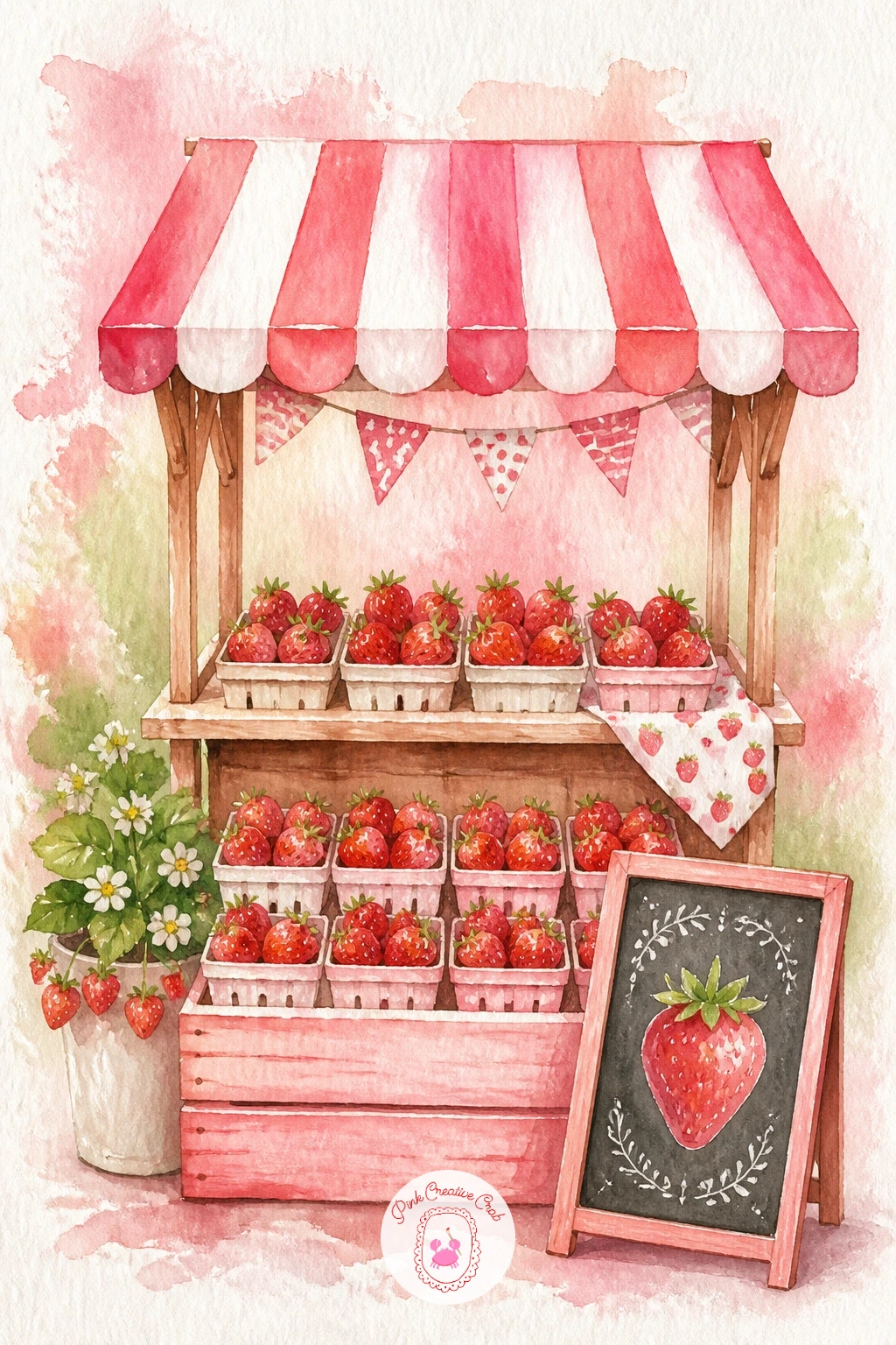
Build a small scene for this one rather than a single object. Sketch a simple wooden stall frame first, just a few angled lines for the structure, then fill its shelves or crates with rows of strawberry punnets, each one no more than a cluster of small red dots inside a pale wooden box shape.
Keep the stall itself loose and suggested rather than architecturally precise, a striped awning overhead painted in two alternating colors adds charm without any real drawing skill required, just alternating stripes of a flat brush dragged sideways.
A small chalkboard sign leaning against the stall, painted as a plain dark rectangle with the barest suggestion of white scribbled price marks rather than actual readable text, finishes the scene without demanding any lettering work.
If the rows of punnets start blurring together, vary the red dot density slightly from crate to crate, some fuller, some with just a few berries left, which reads as a stall that has been selling all morning.
Palette: Burnt Sienna,Cadmium Red,Yellow Ochre,Payne’s Grey
If little scenes like this one appeal to you, the watercolor inspo list has more small vignette ideas worth trying next.
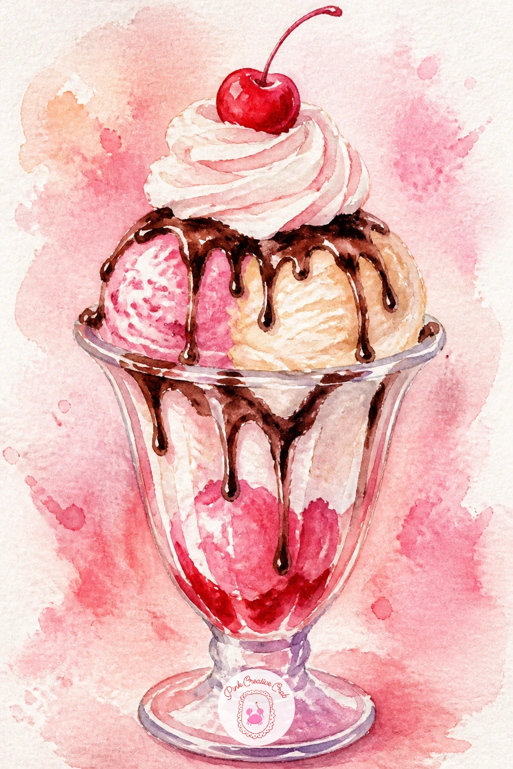
Close the list with the most indulgent one of all, a tall glass sundae stacked with everything that has come before. Paint the glass first in pale grey with vertical white highlight strips, then build the sundae upward in layers, alternating scoops of pink and cream colored ice cream the same way you shaped the single cone earlier in this list.
Once each scoop layer is fully dry, drizzle warm chocolate or strawberry sauce down the sides in thin trailing lines that pool slightly where they meet the glass, and pile a generous swirl of whipped cream on top using the familiar shadow-only method.
A single cherry crowns the very top, a small red sphere with a thin curling stem and one bright highlight dot, placed dead center so it anchors the whole stacked composition.
Vary this one next time by swapping the flavors entirely, a chocolate or lemon sundae built the exact same way, same glass, same layered method, completely different palette.
Palette: Pale Pink,Titanium White,Burnt Sienna,Cadmium Red
What to Do Next
Pick whichever scene matched your mood as you scrolled, whether that is the simple bowl on gingham or the full stacked sundae, and set up on cold press paper with your reds, pinks and greens already mixed before you start. One sitting is all any of these need.
Frequently Asked Questions
What is the easiest way to paint watercolor strawberries for a beginner?
Start with a two-wash method: a light cadmium red base, then a deeper red dropped into the shadow side while still damp. Add yellow seed dots and a green sepal once fully dry, and the shape alone will read as a strawberry.
How do you stop strawberry reds from turning muddy in watercolor?
Let each layer dry completely before adding the next, especially where red meets cream, chocolate or pastry. Wet layers touching is the most common cause of muddy pink-brown colors across every idea on this list.
What paper works best for watercolor strawberries?
Cold press watercolor paper around 140lb handles the wet in wet washes and dry brush texture these ideas rely on without buckling. A smoother hot press paper works too but holds less texture for crumbly or crushed details.
How do you get glossy highlights on painted strawberries?
Leave small shapes of bare white paper where the light hits hardest instead of painting over the whole berry. A dot of white gouache or gel pen added once everything is dry sharpens that shine even further.
Can these strawberry ideas be painted without a full watercolor set?
Yes, most need only a handful of colors: a red, a pink, a green and a warm brown or ochre cover nearly every idea here. Mix pink from red and white, or thin red down with extra water, if you do not have it premixed.
Have any thoughts?
Share your reaction or leave a quick response — we’d love to hear what you think!
-
 0
-
0
-
0
-
0
-
0
-
0


