

A watercolor angel is the kind of subject that lets you paint something soft, pretty and a little grand without needing a model or a fussy setup. Round cherub cheeks, trailing ribbons, a smudge of gold leaf paint on a halo: this is Renaissance art loosened up, painted wet-in-wet on cheap paper instead of plaster ceilings, and it photographs beautifully for a feed full of blush pink and pastel blue.
Below you will find 31 different cherub and angel scenes, from a sleepy cherub on a cloud to an angel keeping watch over a sleeping child, each one sized to finish in one sitting. Start wherever your eye lands first and work through the list as your confidence grows.
Using these images: free for personal projects such as printing, coloring, cards, journals and gifts. Handmade items that include them may be sold up to 30 pieces per design. More than that is commercial use and is not permitted, and neither is selling or sharing the images themselves or passing them off as your own. Please ask before any other use.
Start the whole list with the gentlest subject on it: a cherub curled up asleep on a cloud, round cheek pressed into a puffy pillow of white. Pencil a loose oval for the head, a simple curled body, and one soft cloud shape underneath before any paint goes down, so the proportions sit right from the start.
Paint the cloud first in pale grey-blue, wet-in-wet, letting the edges stay soft and undefined. While that dries, mix a warm pink-beige for the skin and drop it onto damp paper so cheeks blush naturally rather than looking drawn on. Add hair and closed eyes last with a fine brush, once everything underneath is fully dry.
The common slip here is a face that reads as adult: keep the head large compared to the body and the features small and close together, which is what gives a cherub its baby softness. If your pink paint looks chalky, thin it more with water rather than adding white.
Finish with a whisper of gold around the cloud’s top edge using a fine brush, just a suggestion of light rather than a solid line.
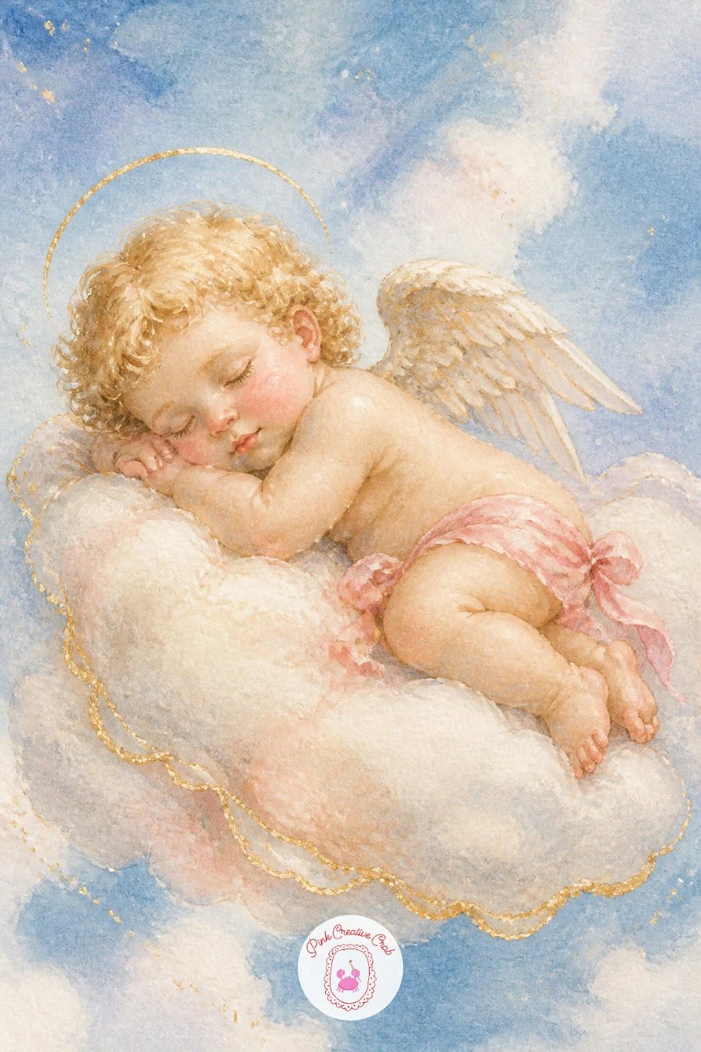
Palette: Payne’s Grey,Shell Pink,Naples Yellow,Titanium White
Following on from a sleeping cherub, give the next one some mischief: a small cherub mid-draw, bow bent, arrow nocked and ready. Sketch the bow as a simple curved line first and measure the arrow against the cherub’s own arm span, since an arrow longer than the arm will look wrong no matter how well the face turns out.
Block in the body and wings in thin washes, then paint the bow in a warm wood brown once the skin tone is dry underneath, so the two colors stay separate and clean. The string is a single confident pencil-thin line in dark brown or black, added last with a liner brush.
If the pose feels stiff, round out the elbow and loosen the wrist rather than straightening every line, since real tension in a bow comes from a slight curve throughout the arm.
Try painting one feather at a time on the wing with a dry brush dragged lightly over dry paper, which gives texture without having to draw each barb by hand.
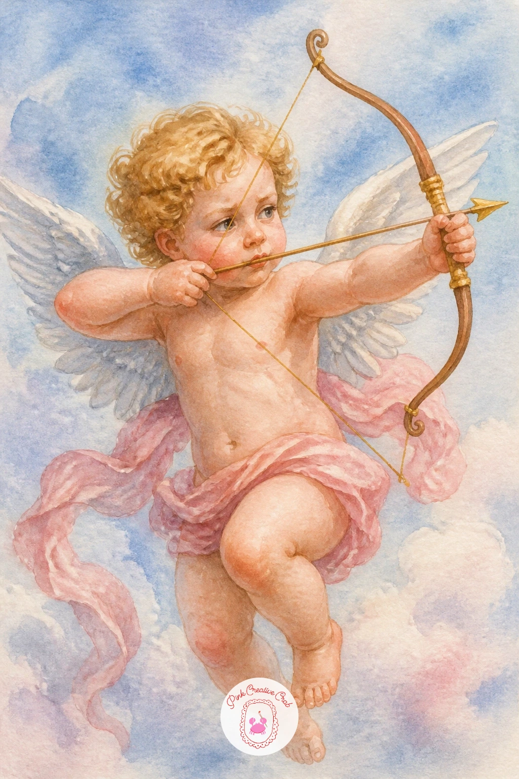
Palette: Shell Pink,Burnt Sienna,Payne’s Grey,Naples Yellow
Where one cherub needs careful proportion, two cherubs need careful placement, so this scene works well right after the bow and arrow: a pair of cherubs floating on either side, holding a long ribbon banner stretched between them. Lightly pencil the ribbon’s curve first, an S shape rippling across the page, then place a cherub at each end so the ribbon reads as something they are actually holding rather than a shape floating nearby.
Paint both cherubs in the same light wash first to keep their skin tones matching, then let each dry before adding the ribbon in a soft blush or dusty blue so the colors do not bleed into the bodies. Keep the two faces simple and similar, since this is a scene about the ribbon’s movement, not two detailed portraits.
A banner that looks flat usually needs more fold: paint a slightly darker tone where the ribbon twists over itself, which reads instantly as a fold in watercolor.
This is a lovely spot to leave the ribbon blank for hand lettering later, a name or a date, if you want this piece to double as a keepsake.
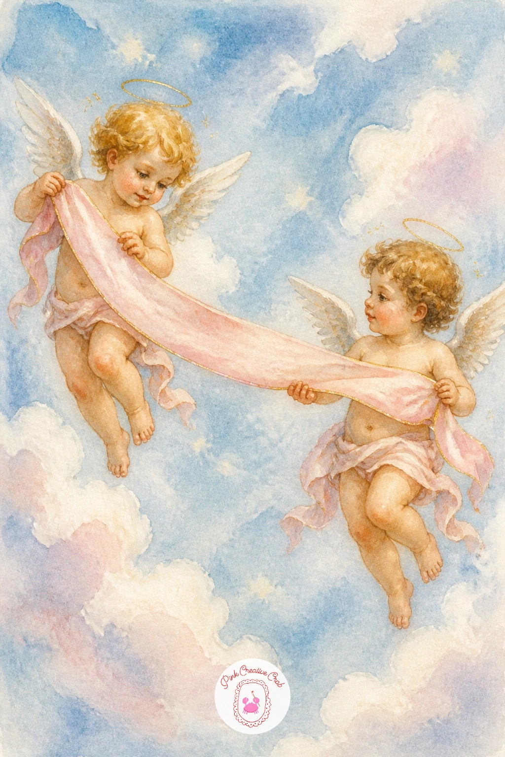
Palette: Shell Pink,Cerulean Blue,Naples Yellow,Payne’s Grey
Leave a section of the ribbon unpainted if you plan to add a name or date later in pen, since clean white paper takes ink far better than paint.
Move from ribbons to music with a cherub cradling a small harp against one shoulder, fingers resting on the strings. Measure the harp against the cherub’s torso before you paint anything: it should sit roughly as tall as the body itself, which keeps it readable as an instrument rather than a random triangle.
Paint the cherub first in your usual soft wash, then once dry, add the harp’s frame in a warm gold-brown. The strings are the trickiest part: use a ruling pen or the very tip of a fine brush loaded with pale grey, pulling straight lines in one motion rather than several short strokes, which keeps them from wobbling.
If the strings come out uneven, a few gaps actually read as realistic, since no harp shows every string with total clarity at this scale.
For a quicker version, skip the strings altogether and simply suggest the harp’s shape with two gold curved lines, which still reads clearly from a normal viewing distance.
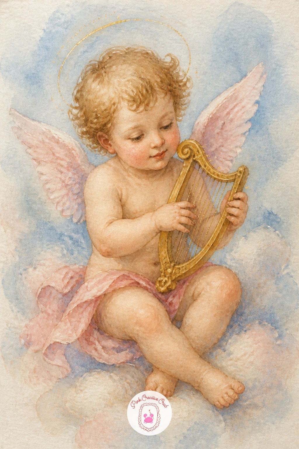
You Will Need
- ruling pen or fine liner brush
Palette: Shell Pink,Raw Umber,Naples Yellow,Payne’s Grey
After a quiet instrumental scene, bring a little humor back with a cherub peeking over the top of a cloud, only the eyes and the curve of a forehead showing. This one works on the rule of the eye level: paint the cloud’s top edge low on the page and place the cherub’s eyes just above it, so the viewer reads the gesture of hiding immediately.
Paint the cloud first in a pale wash, leaving the area where the head will sit slightly lighter so the skin tone reads clearly against it once added. Bring the cherub’s hands up gripping the cloud edge, just two small shapes, to reinforce the peeking pose without needing a full body.
If the face looks too serious, round the eyebrows and widen the eyes slightly, since curiosity in a cherub face comes mostly from the brow, not the mouth.
Try this one small and square for a mini canvas or gift tag, since the cropped composition suits a tight frame better than a full scene would.
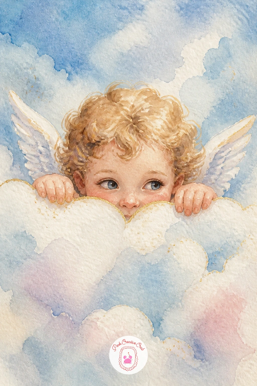
Palette: Payne’s Grey,Shell Pink,Titanium White,Naples Yellow
Shift from playful to romantic with a cherub holding an armful of roses, perfect if you also enjoy florals: for technique on the blooms themselves, borrow ideas from simple watercolor flowers ideas and bring that same loose rose shape into this scene.
Paint the cherub first and let it dry fully, since roses dropped onto wet cherub skin will bleed pink into pink and muddy the whole piece. Build each rose from a tight spiral of petals in two tones of pink, darker toward the center, then add a few loose green leaves to break up the solid pink mass.
If the bouquet looks like a blob, vary the size of each rose and let a few stems show below the blooms, which gives the eye somewhere to rest between flowers.
Swap the roses for peonies or ranunculus if you prefer a looser, more textured bloom, since the technique for painting a cherub’s arms around any armful of flowers stays the same.
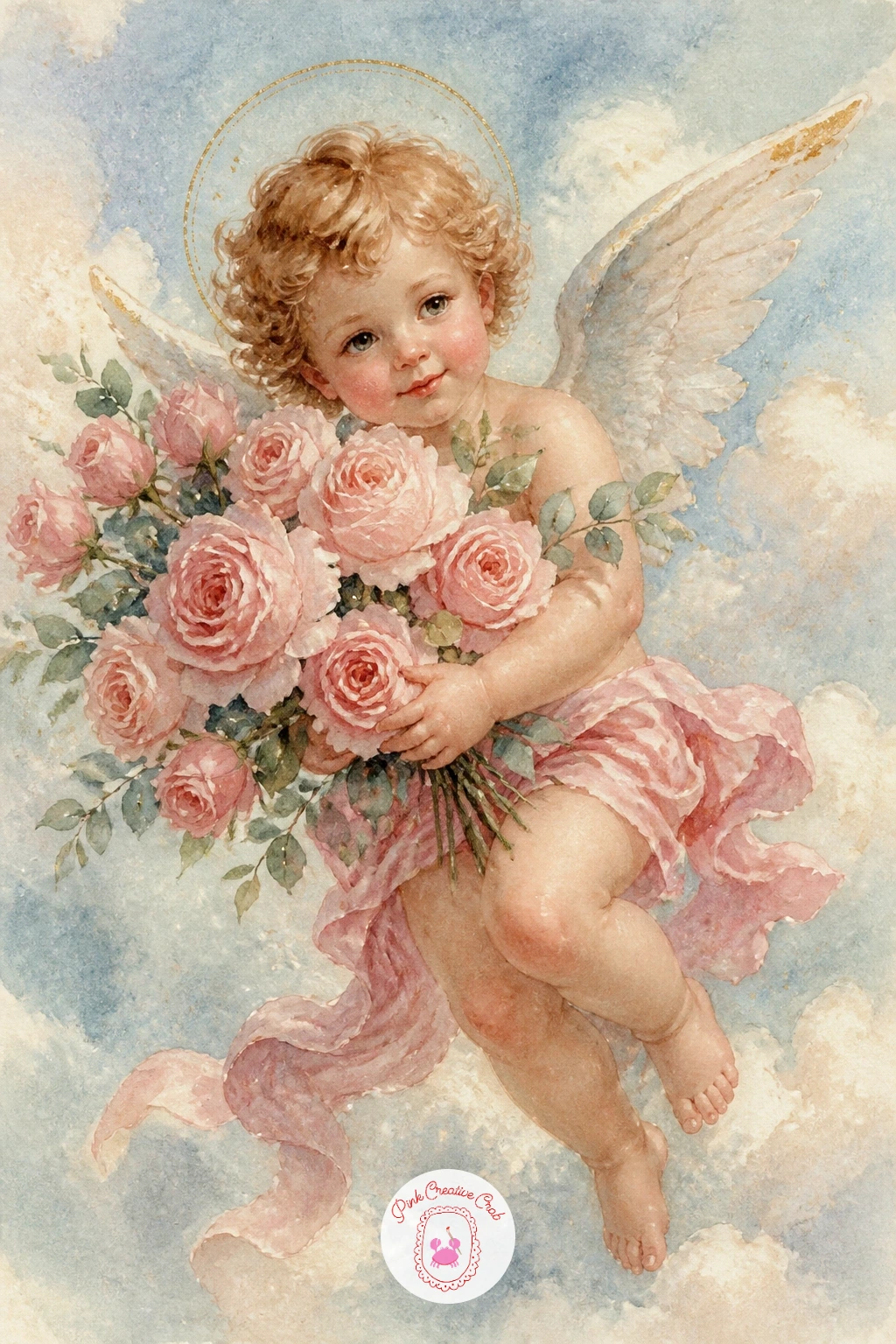
Palette: Shell Pink,Permanent Rose,Sap Green,Naples Yellow
Step up from cherub scenes to a full angel shown from the side, wings fully spread and feathered in careful layers. Working in profile changes the whole approach: light now comes from one clear side, so decide before you paint whether the sun sits to the left or right, and keep every shadow consistent with that choice.
Paint the face and robe first in flat washes, then build the wing in layers, starting with the long primary feathers closest to the body and working outward, each new feather slightly overlapping the last. Shade the underside of the wing darker where it would naturally fall away from the light, which gives the whole shape real volume instead of looking like a flat fan.
Overworking the feathers is the easiest way to lose the softness here: stop after two or three layers of wash, since more than that starts to look stiff and plucked rather than feathered.
One concrete tip for today: paint the wing wet-in-wet for its base color, then add individual feather lines only once that base is bone dry.
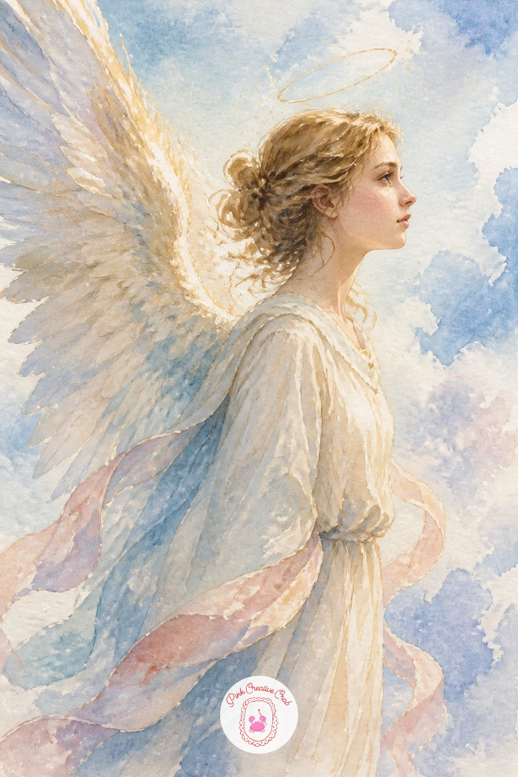
Palette: Titanium White,Payne’s Grey,Shell Pink,Naples Yellow
Bring the energy back up after the quiet profile angel with a cherub cheeks puffed out, blowing a small golden trumpet. Puffed cheeks are the detail that sells this pose: paint the cheek area slightly rounder and fuller than usual, with a touch more pink right at the apex of the curve.
Paint the cherub first, leave the mouth area a touch lighter to suggest the pursed lips, then add the trumpet once dry in a warm gold, keeping the bell shape wide and the mouthpiece narrow. A thin white gel pen highlight along the top edge of the trumpet after everything is dry makes the metal read instantly.
If the trumpet looks flat, shade one side slightly darker gold, since even a small instrument needs a shadow side to look three-dimensional.
For a quicker ten-minute version, skip the puffed cheeks and paint the trumpet raised but the face at rest, which still reads clearly as a cherub about to play.
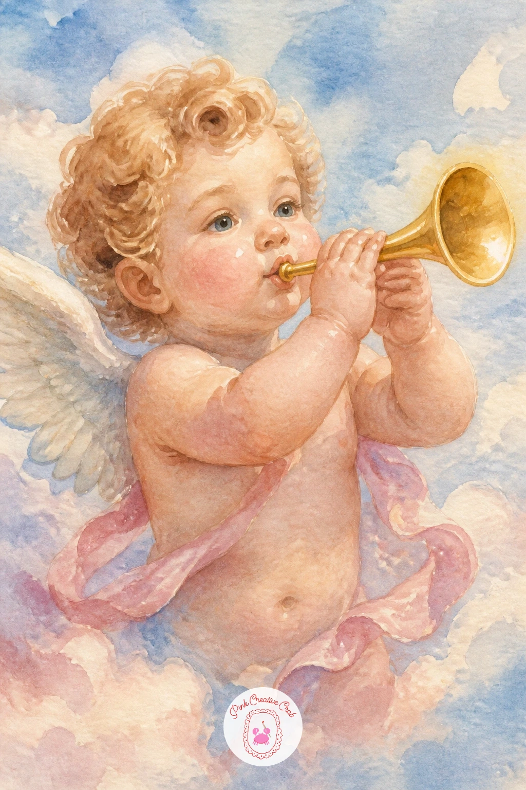
You Will Need
- white gel pen
Palette: Shell Pink,Naples Yellow,Gold Ochre,Payne’s Grey
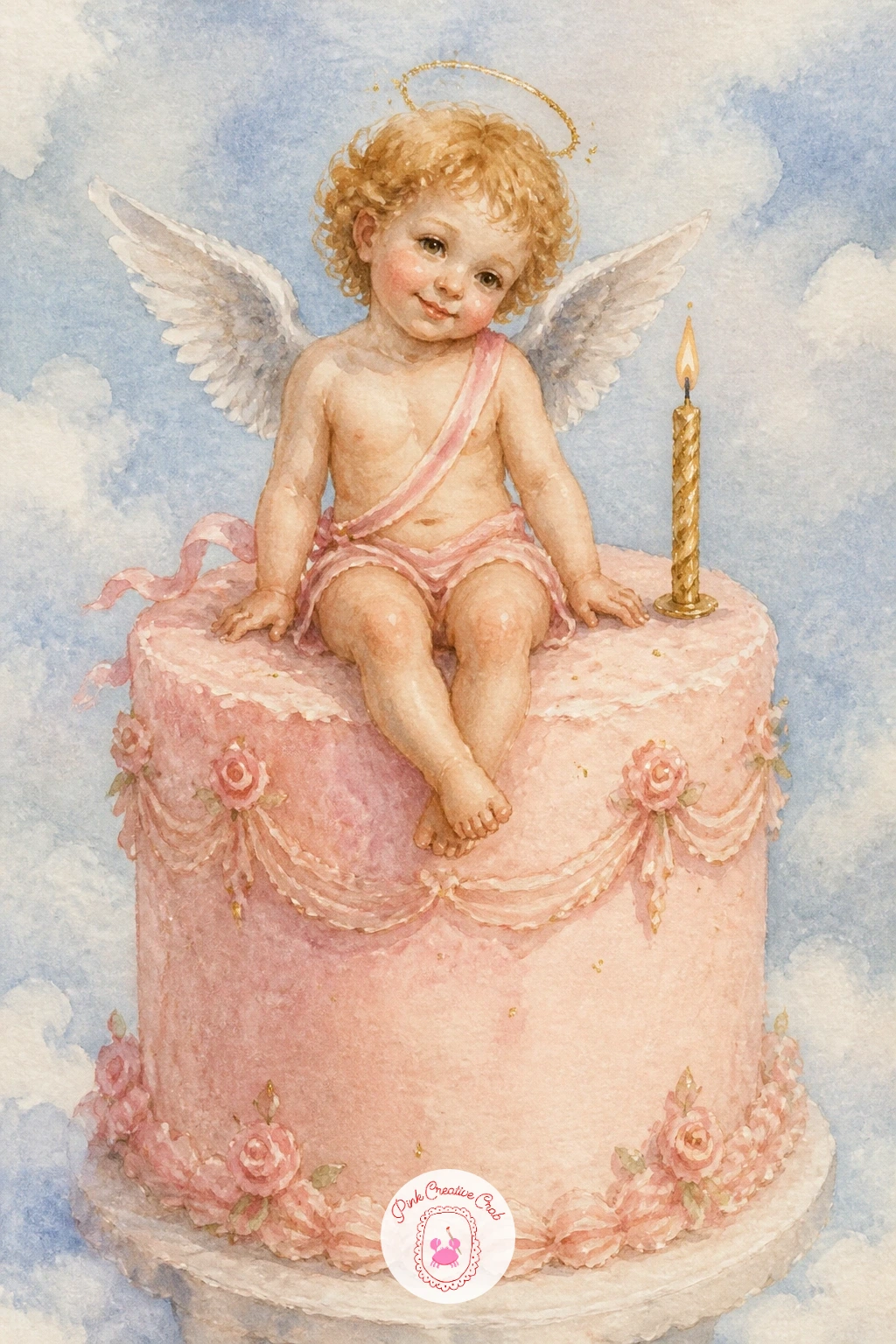
Carry that celebratory mood into a scene that suits a birthday or anniversary card: a tiny cherub perched on top of a frosted cake, legs dangling over the edge of the icing. Paint the cake first, since it sets the color palette the cherub needs to sit against, a soft pastel pink or blue frosting with a few simple swirl lines in a slightly darker tone.
Once the cake is dry, add the cherub sitting on top, keeping the body small compared to the cake so the scale reads as a decoration rather than a giant on a tiny dessert. A single candle beside the cherub, painted last in a thin gold line with a dot of orange flame, finishes the scene.
If the cake looks stiff, soften the icing edges with a damp brush right after painting, letting the color bleed slightly rather than stopping in a hard line.
Try this one as a greeting card front with space left below for a handwritten message, which turns the whole piece into something you can actually send.
Palette: Shell Pink,Cerulean Blue,Gold Ochre,Payne’s Grey
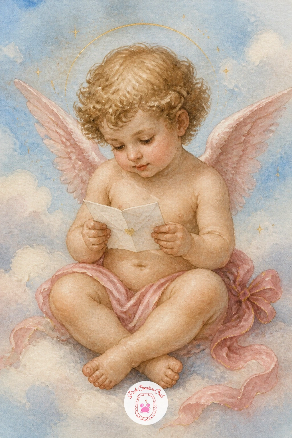
Slow back down with a quieter scene: a cherub seated cross-legged, holding a folded letter up to read, wings relaxed behind. Tilt the head slightly downward toward the letter rather than painting it facing fully forward, since a lowered gaze is what makes a figure look genuinely absorbed in reading.
Paint the cherub and letter in one sitting, leaving the paper itself nearly white with just a pale grey shadow where it folds. A few thin wavy lines in grey suggest handwriting without needing to write actual words, which keeps the letter looking delicate rather than cluttered.
If the letter looks stiff and flat, crease it slightly off-center and shade one corner darker, since real paper never folds in a perfectly even line.
This pairs beautifully with the ribbon-carrying cherubs earlier in this list if you want a matching set for a gallery wall, same palette, same gentle mood.
Palette: Shell Pink,Payne’s Grey,Naples Yellow,Titanium White
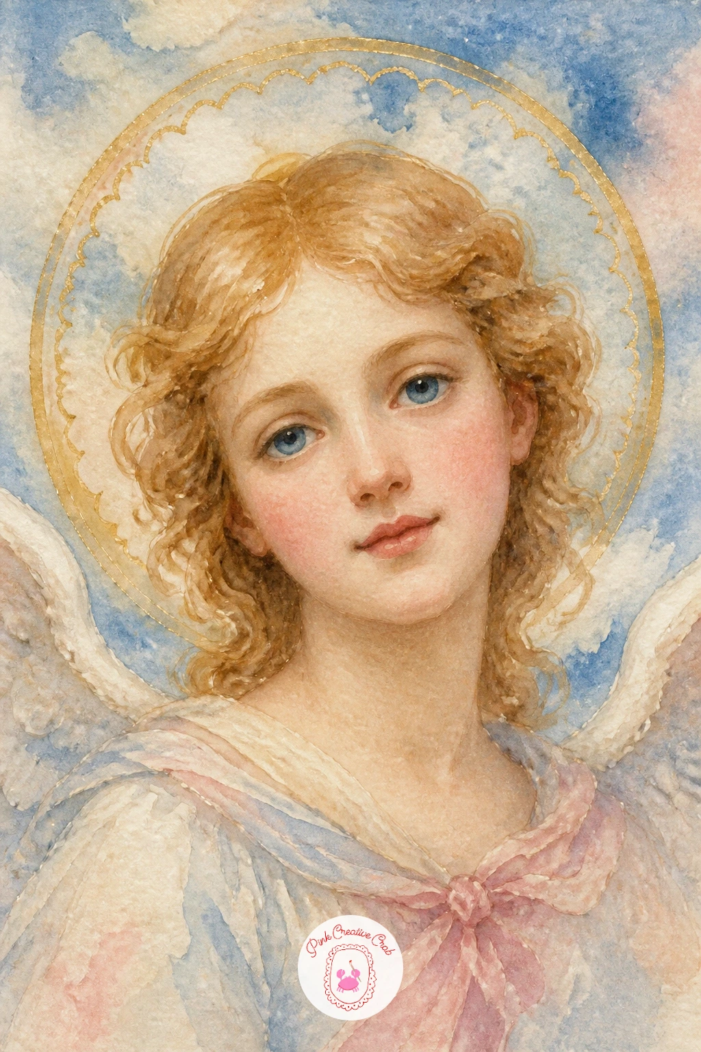
Bring the gold element forward as the main subject now: an angel’s face framed by a full round halo, painted almost like a portrait. Paint the halo first in a thin pencil circle, then lay the face and features inside it before adding any gold, since painting gold over wet skin tones will muddy both colors.
Once the face is completely dry, paint the halo ring in gold gouache or a metallic gold paint pen, keeping the line slightly uneven by hand rather than using a compass, which keeps it feeling painted rather than stamped.
If the gold looks dull once dry, a second thin coat usually brings back the shine, since metallic paints often need two light layers rather than one heavy one to look properly luminous.
For more ideas on painting that pale sky background behind a halo portrait, the techniques in easy watercolor skies, sunset and clouds ideas apply just as well here.
You Will Need
- gold paint pen or gold gouache
Palette: Shell Pink,Gold Ochre,Cerulean Blue,Payne’s Grey
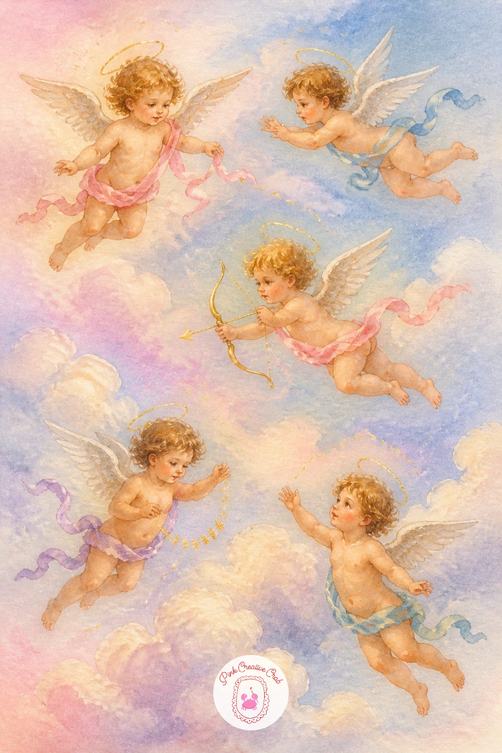
Widen the view after that close portrait into a full sky scene scattered with several small cherubs drifting among soft clouds. Plan the composition before any paint touches the page: pencil three or four small circles across the paper at different heights, since cherubs placed in a loose diagonal line read far more naturally than ones evenly spaced like a grid.
Paint the sky background first in one wash, blending pink into blue across the page while it is still wet, then let it dry completely before adding the cherubs on top, kept small and simple since detail at this scale gets lost fast. A thin cloud shape under each cherub anchors it in the sky rather than letting it float with nothing beneath.
If the sky looks streaky, more water and a bigger brush almost always solves it, since pastel sky washes need generous wetness to blend smoothly.
Next time, try this same layout with just two cherubs and far more detail on each, trading the scattered feel for a more intimate pairing.
Palette: Shell Pink,Cerulean Blue,Naples Yellow,Titanium White
Bring the scale back down to one small, simple subject: a cherub holding a plump heart shape in both hands, perfect for a Valentine card or small gift tag. Draw the heart first as two overlapping circles narrowing to a point, which gives it a rounder, more natural curve than starting from a single symmetrical outline.
Paint the heart in a saturated red or deep rose before touching the cherub, letting it dry completely so no color bleeds onto the surrounding skin tones. Keep the cherub’s hands simple, just enough shape to suggest fingers cupped around the heart rather than full detailed hands.
If the red looks too flat, drop a touch of darker red or burgundy into one corner while the first wash is still slightly damp, which gives the heart gentle shading without extra brushwork later.
This is one of the simplest scenes on the whole list, a good one to start with if cherub faces still feel intimidating.

Palette: Alizarin Crimson,Shell Pink,Naples Yellow,Payne’s Grey
Move outdoors for the next scene: a stone cherub fountain standing in a garden, water trickling from a small urn it holds. Unlike the floating cherubs painted so far, this one needs to look carved from stone, so mix a cooler grey-green rather than warm skin tones, and keep the whole figure flatter and more uniform in color.
Paint the fountain’s stone body first, then add the surrounding garden greenery in loose dabs of varied green, letting some leaves overlap the fountain’s edges so it sits believably within the space. The water itself is just a few thin vertical white lines left unpainted, with a pale blue wash around them to suggest movement.
If the stone looks too smooth and plastic, dab a dry brush loaded with dark grey along one side for texture, mimicking weathered stone rather than painted skin.
Swap the garden for a simple ivy wall behind the fountain if full greenery feels like too much for one sitting.
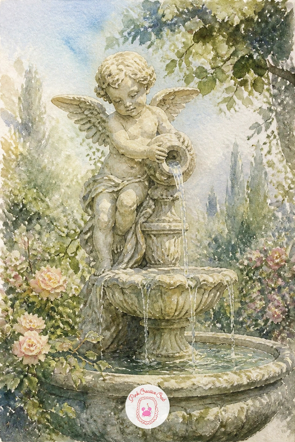
Palette: Payne’s Grey,Sap Green,Sage Green,Titanium White
Return to a close, intimate scene after the garden fountain: a cherub holding up a small oval mirror, gazing into it. Paint the mirror’s glass as a flat pale grey-blue wash first, then add a thin gold rim once it dries, which keeps the reflective surface looking clean rather than muddied by the frame color.
Once both the cherub and mirror are dry, add one or two faint curved lines inside the mirror in a slightly lighter tone, just enough to suggest a reflection without painting a second full face, which tends to look cluttered at this size.
If the cherub’s expression looks blank, angle the eyes slightly toward the glass rather than straight ahead, since where a figure looks changes the whole read of a pose.
For a bolder version, make the mirror the largest shape in the piece and the cherub smaller behind it, flipping which element carries the most visual weight.
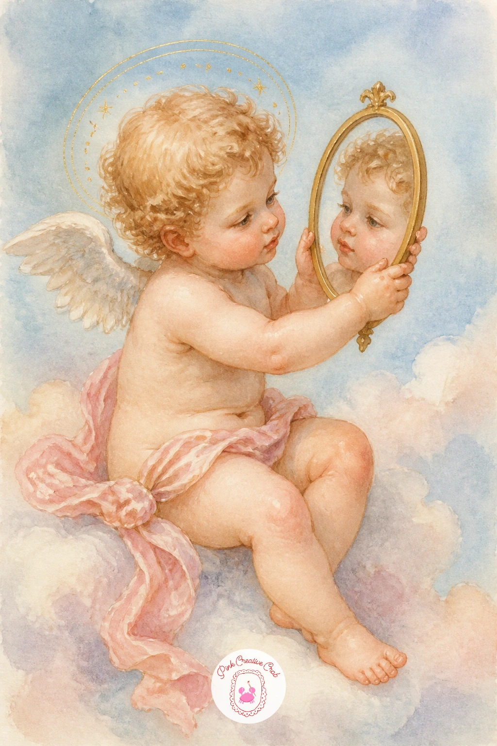
Palette: Shell Pink,Cerulean Blue,Gold Ochre,Payne’s Grey
Shift the whole mood toward warm lamplight with an angel cupping a single lit candle in both hands. This is the scene to practice light direction properly: the candle becomes your only light source, so paint a warm glow radiating outward from the flame in soft peachy yellow, and keep every other color in the piece slightly cooler and dimmer the further it sits from that glow.
Paint the robe and face first in your usual cool tones, then once dry, go back over the areas nearest the candle with a thin warm yellow glaze, which pulls those spots forward and sells the light source instantly. The flame itself is a tiny teardrop of orange with a touch of white at its base.
If the glow looks patchy, a soft round brush and very light pressure for that glaze layer keeps the edges gentle rather than streaky.
For sky and light practice beyond this one scene, browse dreamy watercolor pencil sky drawings for more ways to handle warm light against a cool background.
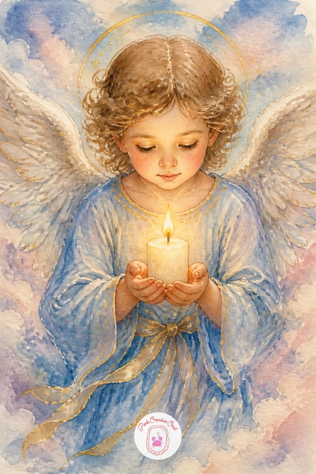
Palette: Payne’s Grey,Naples Yellow,Burnt Orange,Shell Pink
Lighten the mood again with something more whimsical: a cherub perched sidesaddle on the back of a gliding swan. Paint the swan’s body first in clean white paper, shading only the underside and the curve of the neck in pale grey-blue, since too much shadow on a swan quickly turns the white feathers muddy.
Once the swan is dry, add the cherub sitting on its back, keeping the cherub’s legs tucked rather than dangling, which reads more convincingly as actually riding rather than simply sitting nearby. A small gold crown or ribbon around the swan’s neck ties the two subjects together as one scene.
If the swan’s neck looks stiff, redraw the curve as a gentle S rather than a single bend, since swans rarely hold their necks in a straight line.
Try a pair of these side by side on a long canvas for a more decorative, symmetrical arrangement if one alone feels too simple.
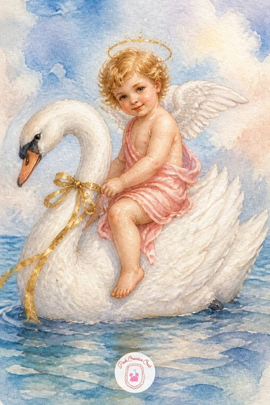
Palette: Titanium White,Payne’s Grey,Shell Pink,Gold Ochre
Keep the bird theme going with a gentler pairing: a cherub standing with two doves resting on an outstretched arm. Paint the doves first in soft grey-white, since their pale color needs to go down before the cherub’s skin tone so the two shapes stay distinct rather than blending into one blob of pale paint.
Once the doves are dry, add the cherub around them, letting one wing tip overlap a dove’s tail feathers for a sense of closeness between the figures. Keep the doves’ eyes as single tiny dark dots, added last with a fine brush, since too much detail on such a small shape quickly looks busy.
If the doves look flat, a touch of pale blue-grey shading along their lower edge gives them enough roundness to read as birds rather than paper cutouts.
If your first time painting birds feels shaky, start with just one dove resting on the cherub’s shoulder rather than two in flight, which is a far simpler shape to control.
Palette: Titanium White,Payne’s Grey,Shell Pink,Naples Yellow
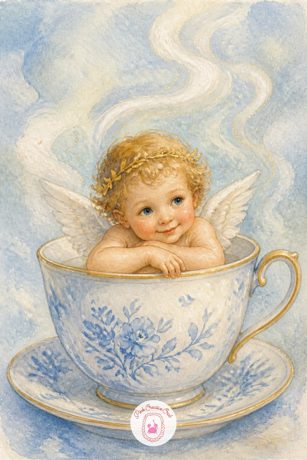
Scale right down for a playful, cozy subject: a tiny cherub sitting inside an oversized teacup as though it were a bathtub, steam curling above. Paint the teacup first, a simple round cup with a thin gold rim, then let it dry before adding the cherub so the two shapes stay crisp against each other.
The steam is the detail that sells the whole scene: use very pale grey-blue and a nearly dry brush, dragging upward in loose wavy strokes above the cup, which reads as rising warmth far better than a solid painted shape would.
If the cherub looks too large for the cup, shrink the whole figure rather than enlarging the cup, since a cherub genuinely small enough to bathe in a teacup is what makes this idea charming rather than confusing.
This one pairs nicely with other cozy little scenes, and if you enjoy small domestic subjects like this, the food-themed ideas in easy watercolor food ideas use a similar light, playful touch.
Palette: Shell Pink,Cerulean Blue,Gold Ochre,Payne’s Grey
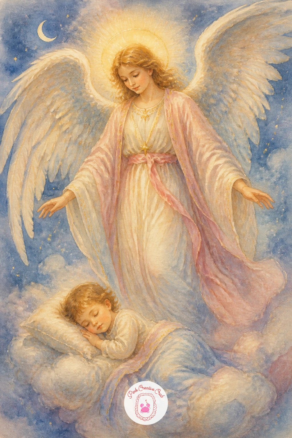
Bring a tender, more traditional scene into the mix: a full-sized angel standing watch beside a sleeping child, wings spread protectively overhead. Keep the two figures at very different scales, the angel tall and still, the child small and curled, since that size contrast is what makes the guarding gesture read clearly.
Paint the child first in simple soft tones, then build the angel around and above, letting the wingtips arch over the child’s form without fully covering it, so the protective gesture stays visible rather than hidden. A faint warm glow around the angel’s head, painted last in thin yellow, suggests quiet holiness without needing a drawn halo.
If the composition feels crowded, give the angel more open space above and around the wings, since this scene needs breathing room to feel calm rather than busy.
This is one of the more involved pieces on this list, a good one to save for when you have a full uninterrupted hour rather than a quick sitting.
Palette: Shell Pink,Payne’s Grey,Naples Yellow,Titanium White
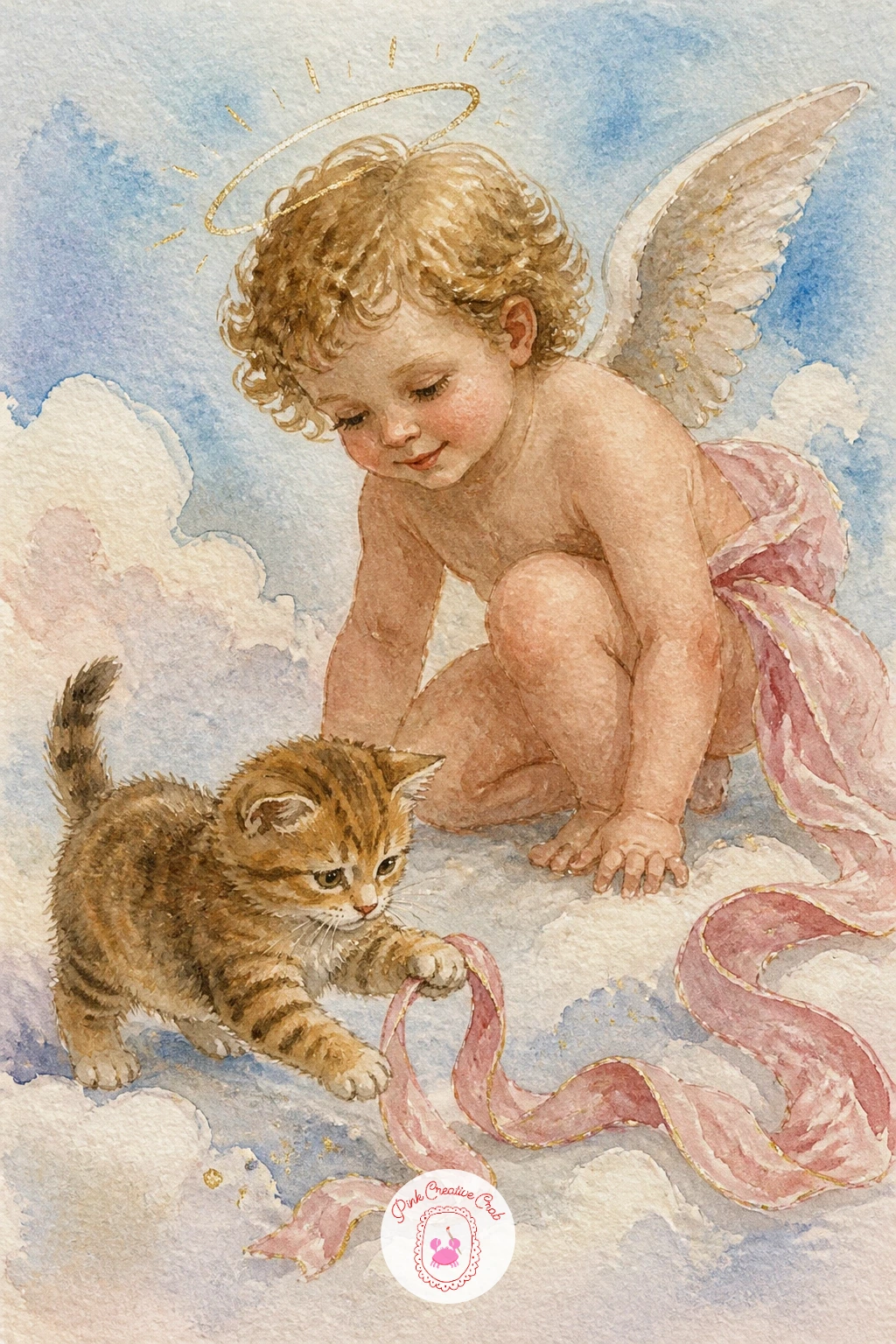
Lighten things again after that quieter scene with a cherub reaching out to play with a small cat batting at a loose ribbon. Paint the cat first in simple soft grey or warm tabby tones, keeping the pose mid-pounce with one paw raised, since a static sitting cat reads far less playful than one caught mid-motion.
Once the cat is dry, add the cherub crouched beside it, one hand trailing a ribbon just out of the cat’s reach, which creates a clear visual story between the two figures without needing any other detail. Keep both subjects at a similar scale so neither overwhelms the other.
If the cat’s pose looks stiff, round out the back more and lower the front half slightly, since a crouching pounce curves the whole spine rather than staying straight.
If you enjoy painting cats on their own, the ideas in cat watercolor ideas cover plenty more poses worth trying.
Palette: Shell Pink,Raw Umber,Payne’s Grey,Naples Yellow
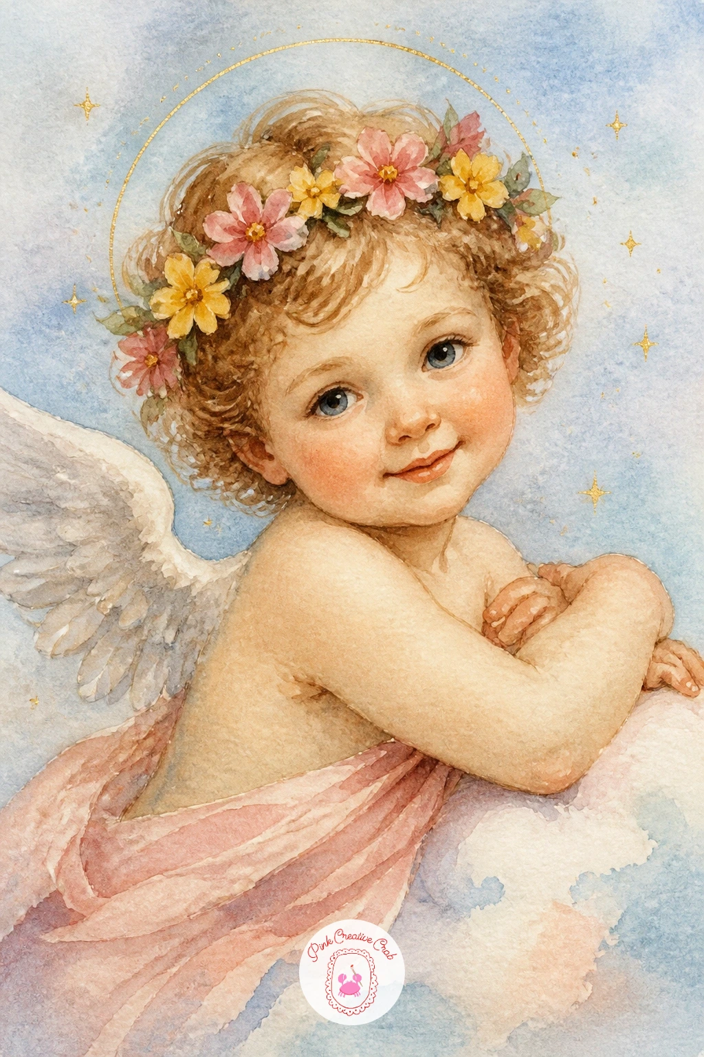
Bring the floral theme back with a cherub wearing a small crown of mixed flowers, a softer cousin to the rose bouquet painted earlier in this list. Paint the face and hair first, leaving the top of the head slightly lighter where the crown will sit, then add small individual flowers once dry, each just a few petal strokes rather than a fully detailed bloom.
Vary the flower colors across the crown, two or three shades of pink and one soft yellow, rather than painting every bloom the same color, which keeps the crown looking gathered from a real garden rather than uniform and artificial.
If the crown looks too heavy, add one or two small green leaves between the flowers to break up the solid color and let the hair show through in places.
For a quicker version, paint just three flowers spaced around the head rather than a full ring, which still reads clearly as a crown from a normal viewing distance.
Palette: Shell Pink,Permanent Rose,Naples Yellow,Sap Green
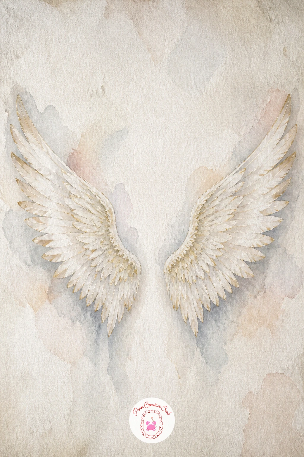
Try a different kind of composition now: a single pair of large angel wings as though painted directly onto a plain wall, the kind of mural scene popular for photo backdrops. Paint the wall behind first in a flat pale wash, slightly textured with a dry brush to suggest plaster, then let it dry completely before adding the wings on top.
Build the wings in layered feather strokes from the top down, keeping the two wings symmetrical by lightly sketching both in pencil before any paint touches the page, since this composition lives or dies on the wings matching each other.
If the wall looks too flat, a faint shadow painted beneath the lower feather tips grounds the wings against the surface rather than letting them float.
Once this one works, try varying it next time with a single smaller wing tucked into a corner instead of a full symmetrical pair, for a more candid, cropped feel.
Palette: Titanium White,Payne’s Grey,Shell Pink,Gold Ochre
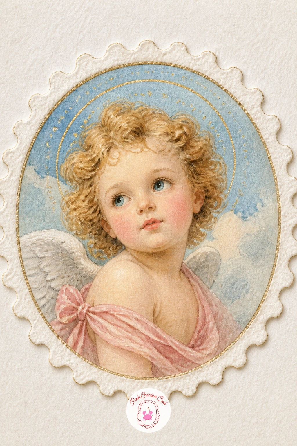
Scale down again for a charming miniature: a cherub painted inside a small round frame, styled like an old postage stamp complete with a perforated-looking border. Paint the circular frame first with a compass or a small plate traced in pencil, then fill it with a simple cherub face and shoulders, kept tight and cropped since a stamp shows only a small portion of any figure.
The scalloped stamp edge is painted last in white gouache or simply left as the white of the paper, a row of small even bumps traced around the outer rectangle once the circular portrait inside is fully dry.
If the circle looks uneven, a plate or a jar lid traced in pencil gives a far cleaner edge than freehand, and nobody will know you used one.
This idea works beautifully scaled down even further as a small tag or label, so consider painting several at once if you want a little collection.
You Will Need
- plate or jar lid to trace a circle
Palette: Shell Pink,Cerulean Blue,Titanium White,Payne’s Grey
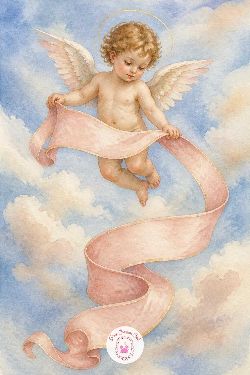
Return to ribbons once more, this time with a single cherub unfurling a long banner below its feet rather than passing it between two figures as earlier. Paint the cherub first, floating with both arms extended downward, then add the banner streaming from its hands in a loose wave that curves once or twice along its length for a sense of movement.
Leave a flat, slightly straightened section in the middle of the banner’s curve if you want to add lettering later, since a banner that curves everywhere offers nowhere flat enough to write on cleanly.
If the banner looks stiff, soften the fold shadows with a damp brush right after painting rather than painting hard lines, which keeps the fabric reading as light and airy.
This is a natural subject for the sky techniques covered in easy watercolor skies, sunset and clouds ideas, since the background behind the banner benefits from the same soft blended approach.
Palette: Shell Pink,Cerulean Blue,Naples Yellow,Payne’s Grey
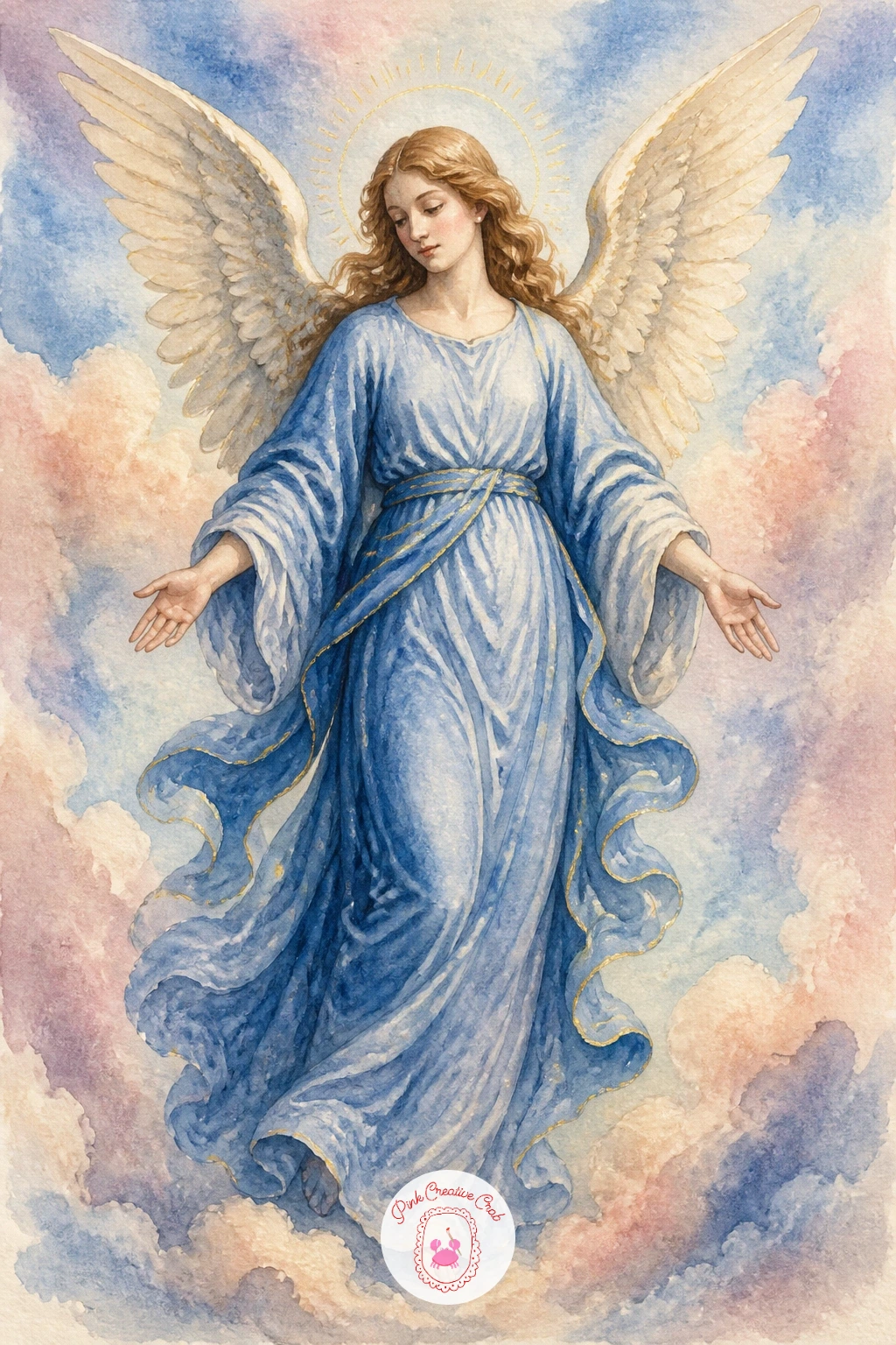
Return to a full angel figure, this time dressed in a flowing blue robe reminiscent of classic Renaissance altarpiece paintings. Paint the robe wet-in-wet across the whole shape first, letting darker blue pool naturally into the folds rather than painting each fold as a separate stroke, which gives it that classic soft drape.
Once the robe is dry, go back in with a slightly darker blue in a dry brush to sharpen just the deepest folds near the waist and where the fabric gathers, since adding this detail only after the base is dry keeps the whole robe from looking muddy.
If the blue looks too flat and even, mix a second, cooler blue for just the shadow folds rather than only using a darker value of the same color, since real fabric shifts in hue as well as darkness.
Swap the robe color for a soft blush pink or ivory if blue does not suit your palette elsewhere on the page, the folding technique stays identical either way.
Palette: Cerulean Blue,Indigo,Shell Pink,Gold Ochre
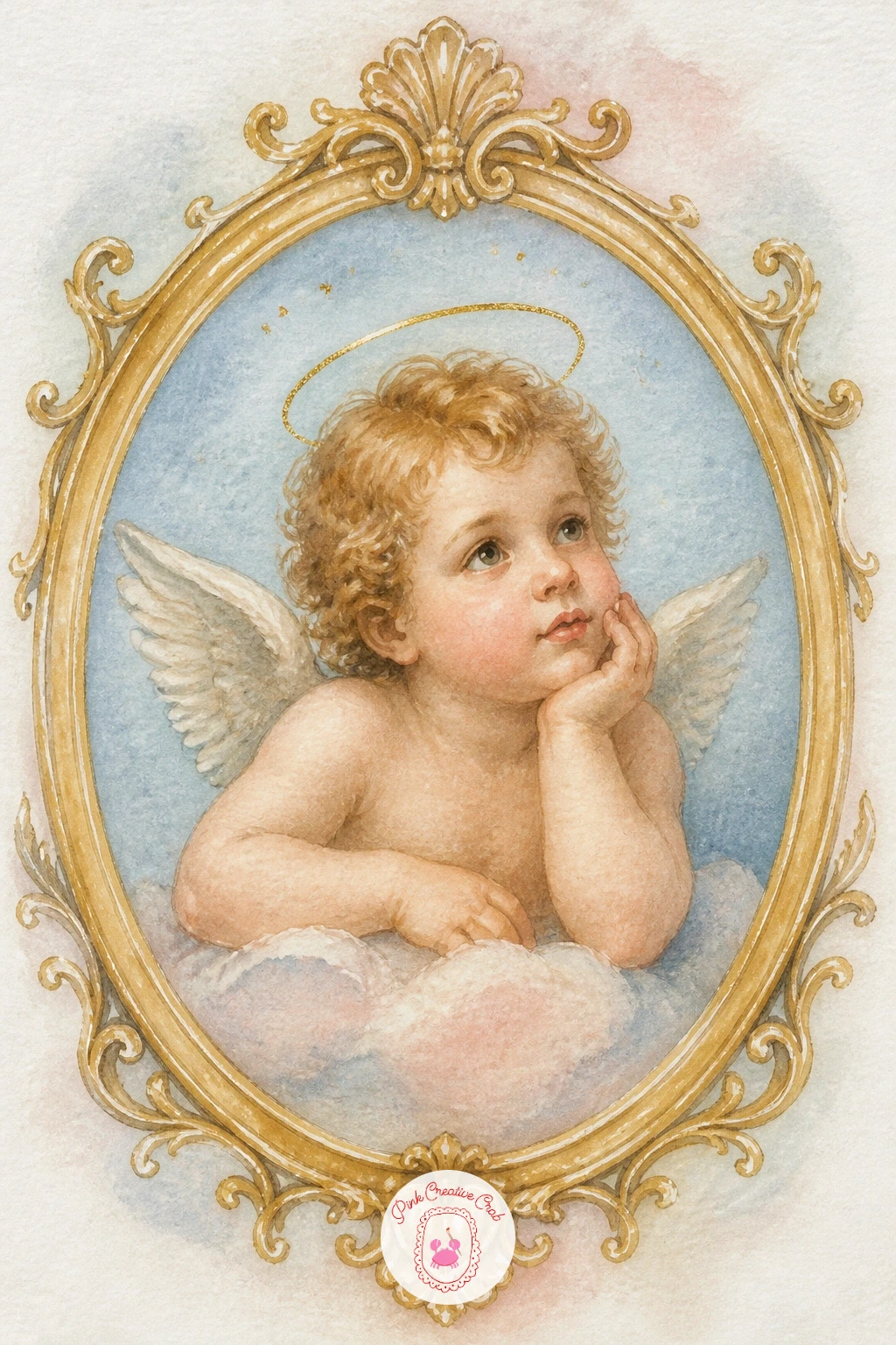
Treat this next piece like a tiny museum portrait: a cherub painted inside an ornate oval gold frame, borders curling at the edges like carved plaster. Paint the cherub portrait first, centered and fully finished, then let it dry completely before adding the frame around it, since gold paint dragged over wet skin tones will streak badly.
Build the frame in a warm gold, starting with a simple oval outline, then adding a second thinner gold line just inside and outside it for depth, plus a few small curling flourish marks at the top and bottom to suggest carved detail without overworking the whole border.
If the frame looks flat, add one thin line of brown shadow just along the inner edge of the gold, which gives the illusion of the frame sitting slightly raised from the background.
This idea works beautifully as a set of three or four hung together, each with a different cherub pose from elsewhere on this list but the same frame style throughout.
You Will Need
- gold paint pen or gold gouache
Palette: Shell Pink,Gold Ochre,Raw Umber,Cerulean Blue
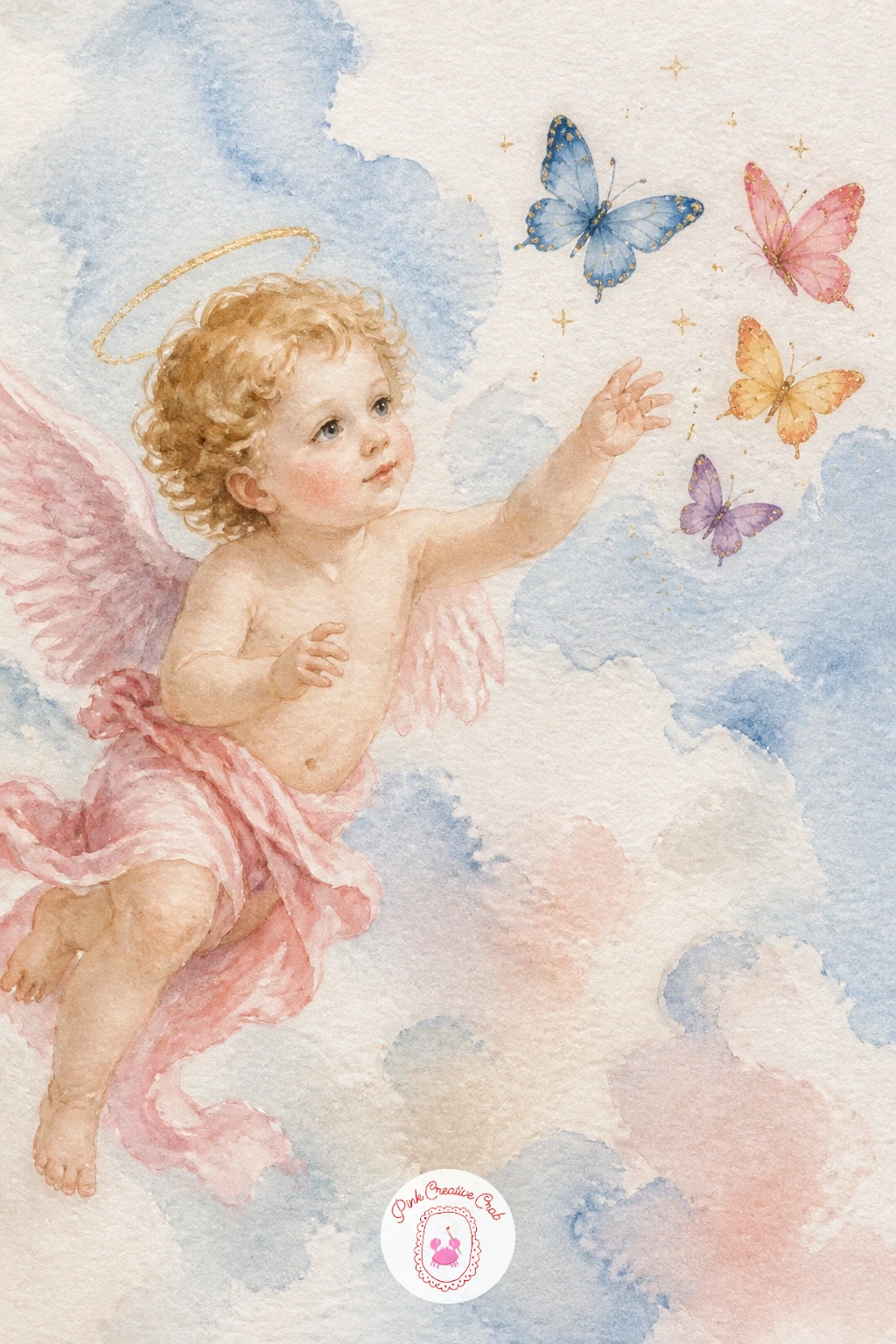
Lighten the mood with a cherub reaching toward a small cluster of butterflies fluttering nearby. Paint the butterflies first in two or three varied colors, simple symmetrical wing shapes built from two curved strokes each, since painting them before the cherub lets their color choices guide the rest of the palette rather than the other way around.
Once the butterflies are dry, add the cherub reaching toward them with fingers just slightly spread, which suggests gentle reaching rather than grasping. Keep at least one butterfly slightly out of reach, higher or further than the hand can stretch, for a sense of motion rather than a static group.
If the wings look lifeless, a single thin dark line down the center of each wing and a few small dots give just enough pattern to read as a butterfly without heavy detail work.
For more wing pattern ideas to borrow from, the designs in butterfly coloring pages offer plenty of variety to study before you paint.
Palette: Shell Pink,Cerulean Blue,Naples Yellow,Payne’s Grey
Bring a small still-life touch into the mix with a cherub holding a stem of cherries up toward its mouth, cheeks round with the bite. Paint the cherries first, two or three glossy red circles with a single tiny white highlight left unpainted on each, since that one bright spot is what makes them look wet and shiny rather than flat.
Once the cherries are dry, add the cherub around them, keeping the stem as one simple curved brown line connecting the fruit to the hand. A faint red smudge at the corner of the mouth suggests juice and adds a nice playful detail once everything else is dry.
If the cherries look dull, deepen the shadow side of each one with a touch of darker red or a hint of purple while the first wash is still slightly damp.
Swap cherries for grapes or strawberries if you prefer, the glossy highlight trick works the same way on any small round fruit.
Palette: Alizarin Crimson,Shell Pink,Sap Green,Payne’s Grey
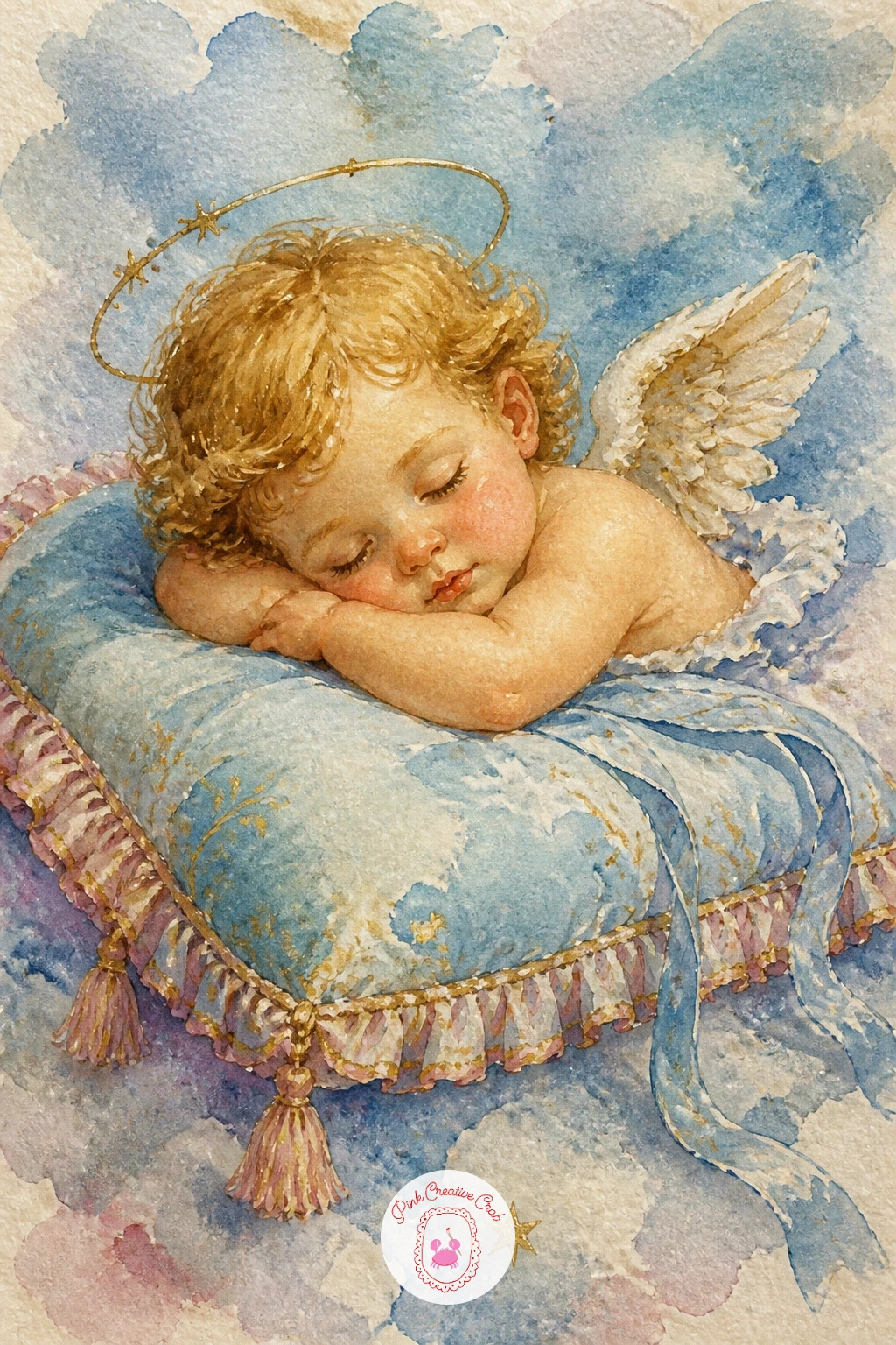
Return to something quiet and restful near the end of the list: a cherub asleep on a plump decorative pillow rather than a cloud, trimmed with a thin ruffled edge. Paint the pillow first in a soft solid color, leaving the ruffled trim as a slightly scalloped unpainted edge that you fill in afterward with a lighter shade once the base is dry.
Add the sleeping cherub on top, keeping the pose relaxed and slightly sunk into the pillow’s surface, with one arm tucked under the head for a natural restful feel. A thin tassel at each corner of the pillow, just a few quick brushstrokes, finishes the decorative look.
If the pillow looks flat, shade gently around where the cherub’s weight presses into it, which grounds the figure convincingly into the soft surface beneath.
This is a gentle, forgiving subject if you want a calm finish after some of the busier scenes earlier in this list.
Palette: Shell Pink,Cerulean Blue,Naples Yellow,Titanium White
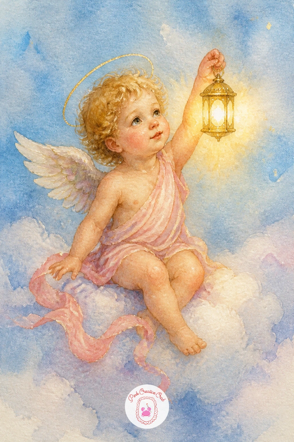
Close the list with a warm, quiet image to match the candle-lit angel from earlier: a small cherub holding up a tiny lantern, light spilling out through its glass panes. Paint the cherub first in cool, slightly dim tones, since the lantern will provide the warmth and you need the surrounding area to read as darker by comparison.
Once dry, paint the lantern itself in a simple warm yellow glow inside a thin grey frame, then glaze a soft circle of warm light around it on the paper, slightly stronger near the lantern and fading outward, which ties the whole scene together with one clear light source.
If the glow looks too hard-edged, soften it immediately with a clean damp brush before the glaze dries, pulling the warm color gently outward into the surrounding cool tones.
As a final new-sitting idea once this version works, try the same scene at dusk with a pale crescent moon added above, which only needs one extra small shape to shift the whole mood.
Palette: Payne’s Grey,Naples Yellow,Shell Pink,Burnt Orange
What to Do Next
Pick one idea that matches the mood you are in today, gather a half sheet of cold press paper, and keep the palette limited to two or three colors plus gold so the whole set feels like it belongs together once you work through more of the list.
Frequently Asked Questions
What paper works best for a watercolor angel painting?
Cold press watercolor paper around 140 pounds works best, since its slight texture holds soft washes for skin and clouds without buckling. Smoother hot press paper suits tighter detail work like faces and gold frame borders if you prefer crisper lines.
How do you paint realistic cherub skin tones in watercolor?
Mix a pale pink-beige base and drop it onto damp paper so the color spreads softly, then add a touch more pink at the cheeks and a cooler grey shadow under the chin. Avoid adding white paint, since thinning with water keeps the tone luminous rather than chalky.
What is the easiest way to paint angel wings in watercolor?
Paint the wing’s overall shape in one soft wash first and let it dry fully, then add individual feather lines with a dry brush once the base color is set. Working from the body outward, overlapping each new feather slightly, keeps the whole wing looking layered rather than flat.
How do you add gold accents to a watercolor angel painting?
Gold gouache or a metallic gold paint pen both work well, applied only after the surrounding watercolor is completely dry so the metallic finish stays clean. A second thin coat usually brings out more shine than one heavier layer.
Can a beginner paint these cherub and angel ideas without drawing experience?
Yes, since most of these scenes rely on simple rounded shapes for the face and body rather than detailed anatomy. Starting with the simpler ideas on this list, like a cherub with a heart or a cherub sleeping on a cloud, builds confidence before tackling a full angel figure.
Have any thoughts?
Share your reaction or leave a quick response — we’d love to hear what you think!
-
 0
-
0
-
0
-
0
-
0
-
0


