Realistic hand drawing turns one of the hardest parts of the body into the most satisfying thing you can practice, because hands are everywhere and every pose tells its own small story. A cup held by its handle, a fist caught in hard light, two fingertips almost touching: each one is a full study in graphite, built from the same bones and tendons wearing a different gesture each time.
Below you will find 33 poses, ordered from simple open shapes to more layered gestures with props and a second hand in the frame. Work through them with a soft pencil and a kneaded eraser, and you will start to see the knuckles, creases and nails that make a hand look alive instead of rubbery.
Using these images: free for personal projects such as printing, coloring, cards, journals and gifts. Handmade items that include them may be sold up to 30 pieces per design. More than that is commercial use and is not permitted, and neither is selling or sharing the images themselves or passing them off as your own. Please ask before any other use.
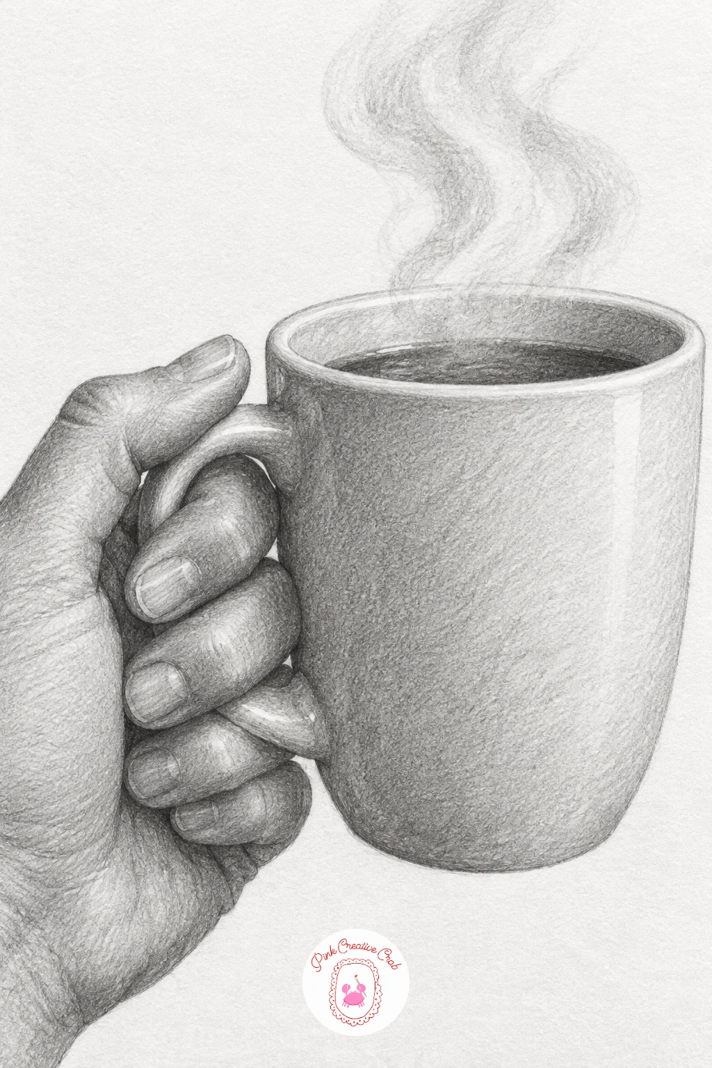
Start the whole set with a hand holding a steaming cup by its handle, since it uses just one hand and one simple prop to get your eye used to how fingers curl around a round object. Block in the cup as an oval and cylinder first, then loop the fingers around the handle before you touch the knuckles.
Shade the cup’s shadow side first with a 2B pencil, then move to the hand and keep your pencil strokes following the direction each finger segment travels. The steam is the easy part: a few soft, broken lines lifted lightly with a kneaded eraser so they read as vapor, not smoke.
The mistake beginners make here is drawing fingers as straight sausages with no bend. Look at where each knuckle actually sits and leave a small gap of lighter tone at each joint crease so the finger reads as jointed, not solid.
If you do not have a mug handy, grip your own actual cup for thirty seconds and glance down at how your fingers sit before you draw.
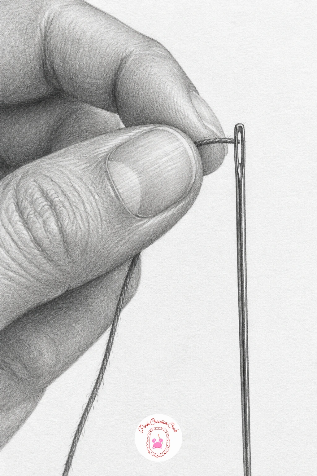
Threading a needle asks for more precision than the cup did, because now you are drawing two tiny objects between two fingertips and the whole pose depends on getting that gap right. Measure the needle’s eye against the width of the thumb pad before you draw either, so the scale does not drift as you work.
Draw the needle and thread first in faint pencil, then build the thumb and index finger pinching around them, leaving a sliver of white paper between fingertip and needle so they do not look glued together. Shade the fingertips last with small circular strokes to show the soft compressed skin where they pinch.
This pose goes wrong when the thread looks like a straight wire. Give it one gentle curve and a slightly frayed tip with a few broken lines instead of one continuous stroke.
Work on a smaller scale sketch first if the fine detail feels fiddly, then scale up once the proportions sit right.
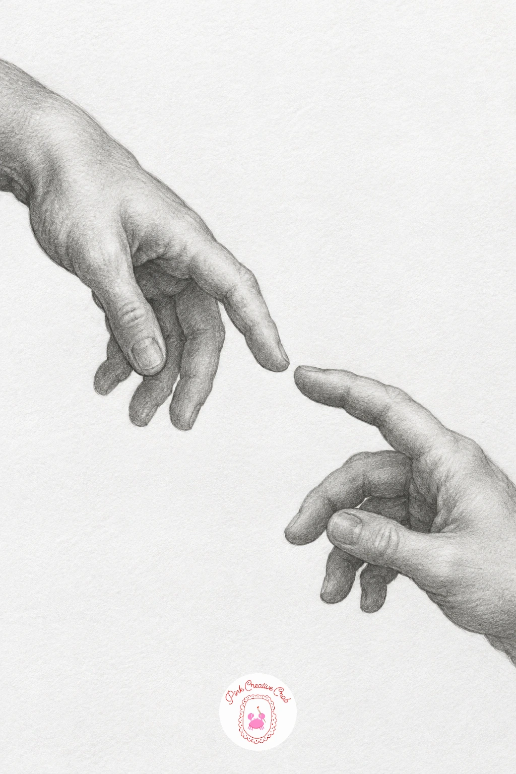
Two hands with fingertips just touching moves you into a pair of hands for the first time, so measure before you shade: hold your pencil up to compare the length of one hand against the other to check they are roughly the same scale unless you want one closer to the viewer.
Draw both hands as simple mitten shapes first, angle the fingers toward each other, then refine the fingertips last so the point of contact stays the sharpest, most detailed part of the drawing. Shade the hand further from the light source slightly darker overall to separate the two in space.
The common error is making the touching fingertips overlap or merge. Leave a hairline of white paper between them even if they look like they are touching, since that gap is what reads as contact rather than collision.
If drawing both hands from life feels hard, photograph your own hands reaching toward a mirror and work from that reference instead.
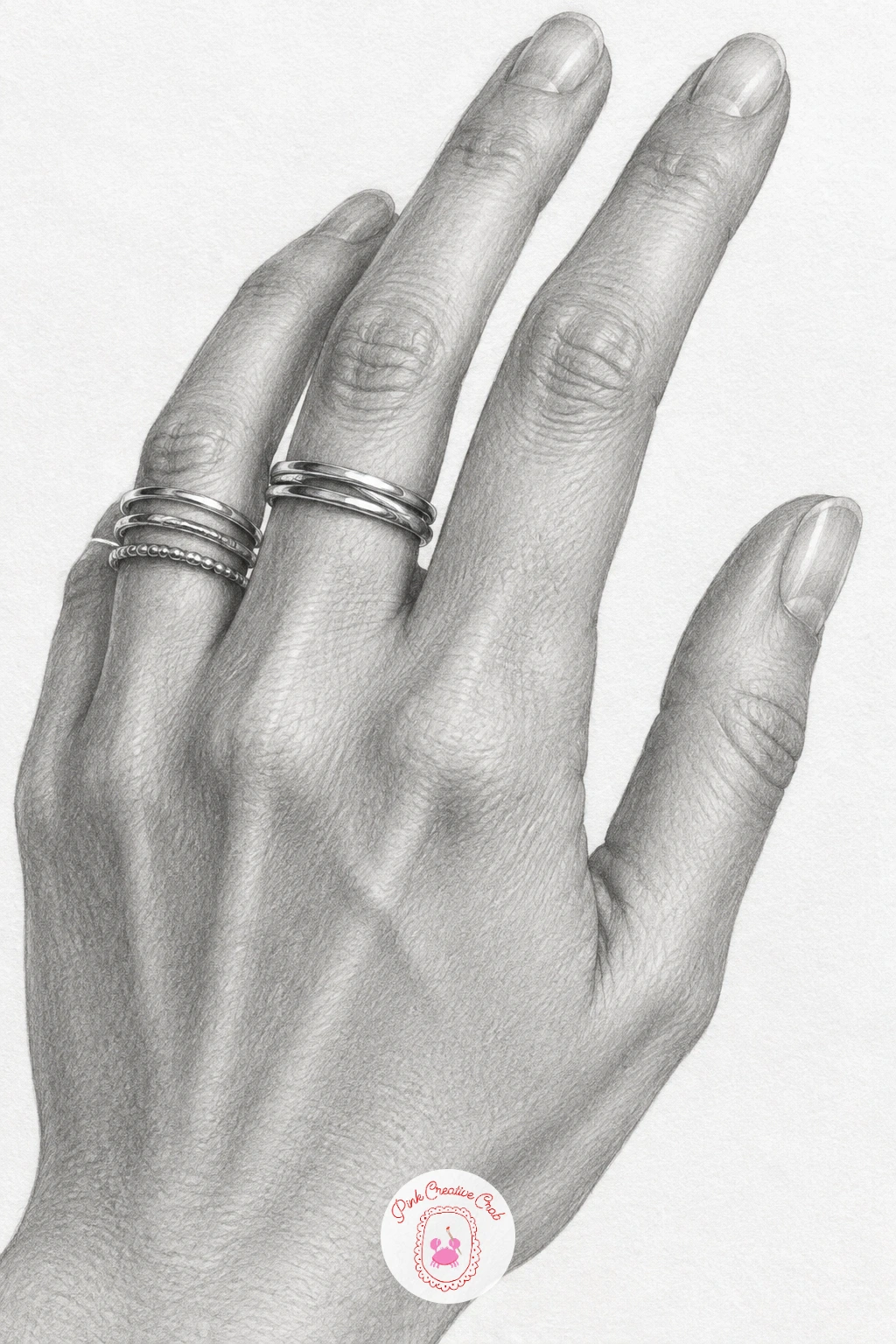
Stacked rings bring metal into the mix, which bridges nicely from the quiet contact of the last pose into something with more sparkle and detail. Draw the hand and fingers completely first, fully shaded, before you add a single ring, since rings sit on top of skin and need the finger’s form finished underneath them.
Each ring is just a thin ellipse wrapped around the cylinder of the finger, so draw it following the finger’s curve rather than as a flat circle. For the metal shine, leave small untouched white highlights on the band and surround them with your darkest graphite right beside the highlight for contrast.
Rings go flat when every band gets the same tone. Vary the pressure between rings so one looks slightly duller or more tarnished than its neighbor, which sells the idea of stacked, separate pieces rather than one fused shape.
A white gel pen can punch in a final sharp highlight if your eraser lift looks too soft.
You Will Need
- white gel pen for highlights
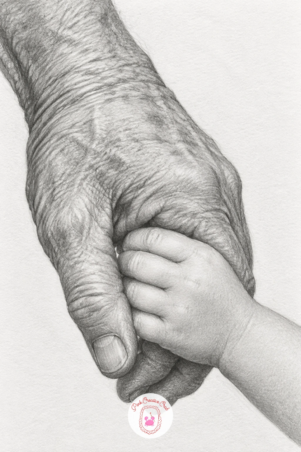
This pairing carries real contrast in scale and skin, with a weathered adult hand wrapped gently around a small smooth one, and that contrast is exactly what makes it worth drawing. Rough in the two hand shapes first, sizing the child’s hand at roughly half the length of the adult’s, before any shading begins.
Shade the adult hand with visible vein lines, looser skin at the knuckles and deeper creases, using a slightly textured, broken stroke. Keep the child’s hand smooth and rounded with almost no visible joints, just soft gradual shading and a small dimple at each knuckle.
The pose falls apart if both hands get the same skin treatment. Deliberately draw one rougher and one softer so the age gap reads even without any faces in the picture.
If you enjoy drawing tender gestures like this one, the hug drawing ideas page has more poses built around closeness and contact.
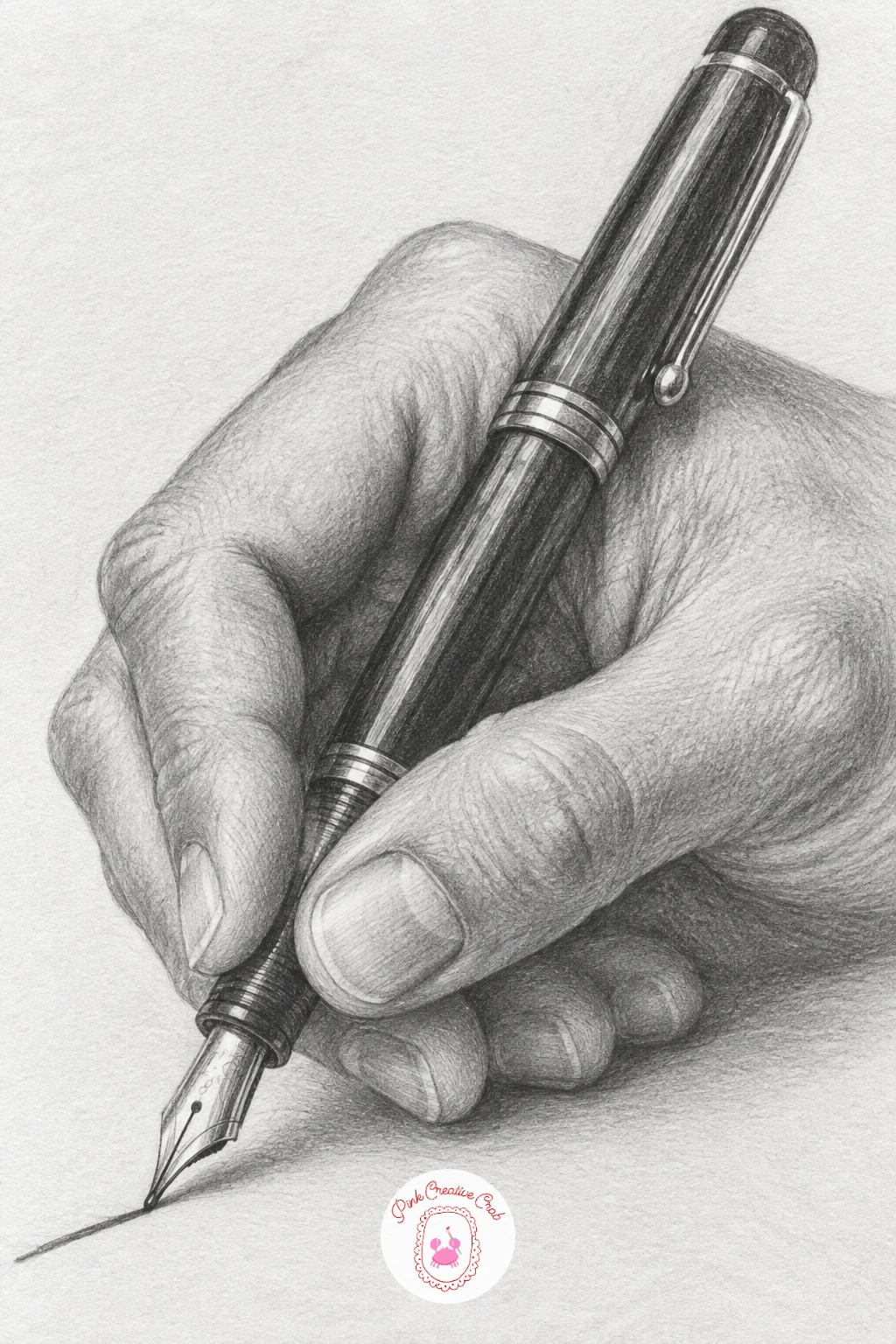
From one kind of tenderness to a quieter everyday moment, a hand writing with a fountain pen asks you to get the pen grip believable, since a wrong grip is the first thing anyone notices. Study how your own hand holds a pen between thumb, index and middle finger before you draw a single line.
Build the hand loosely first in the writing position, then add the pen last so it sits correctly inside the fingers rather than floating beside them. Shade the side of the hand resting on the paper slightly darker, since that contact point always catches a bit of shadow.
Avoid drawing the fingers rigid and straight around the pen. Real grips have a slight bend in every joint, so soften each segment with a small curve.
No fountain pen at hand? Any pen or pencil grip works the same way for reference.
Cradling a baby bird calls for your gentlest touch yet, since the whole point of the pose is a hand curved into a soft cup shape that looks careful rather than gripping. Draw the palm first as a shallow bowl, fingers barely closing around the sides, before placing the bird so its shape nestles naturally into that curve.
Shade the palm with very light, even strokes to keep it reading as relaxed, then switch to a finer pencil for the bird’s downy feathers using short flicking strokes rather than one smooth tone. Keep the bird’s eye as a tiny dark dot surrounded by the lightest value in the whole drawing for contrast.
This pose reads as aggressive if the fingers close too tightly around the bird. Leave visible gaps of white paper between fingers and feathers so the hold looks protective, not trapping.
Reference a photo of any small bird, even a sparrow, since the feather texture technique is the same across species.
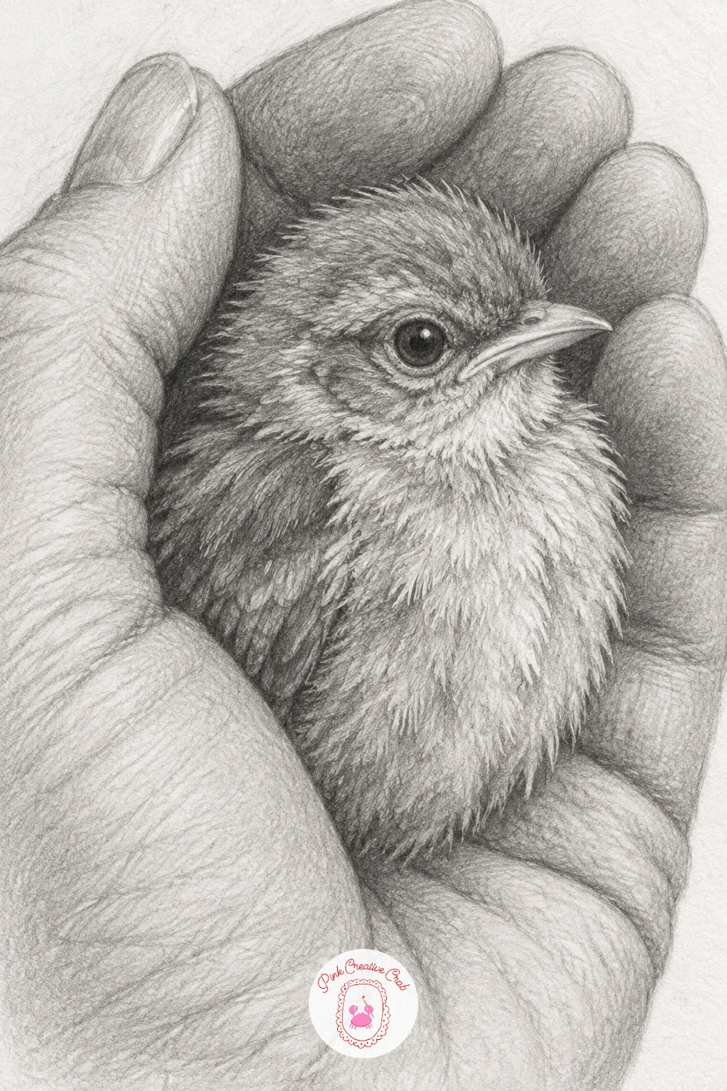
Try a dry brush technique with a very worn pencil tip for the downy feathers, it gives a broken, soft texture that reads as fluff rather than solid fur.
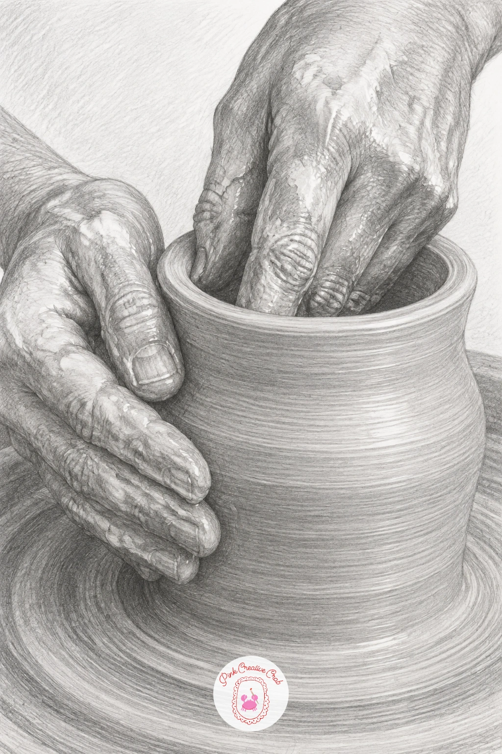
Moving to both hands working together, shaping clay on a pottery wheel means drawing the wet sheen and the pressure marks fingers leave as they pull the clay upward. Sketch the vessel’s basic cylinder shape first, then wrap both hands around it at the point where they are actively shaping, one hand usually higher than the other.
Shade the clay with smooth, wet-looking gradients and leave narrow horizontal highlight bands where the spinning motion would catch light. Shade the hands with slightly rougher strokes than the clay, since fingers pressed into wet clay should look firmer and drier by comparison.
The easy mistake is making the clay perfectly symmetrical, which looks stiff. Let the rim wobble very slightly, since a hand-thrown pot is never a perfect cylinder.
If you enjoy drawing vessels and tableware, the teapot drawing lessons cover similar curved forms in more depth.
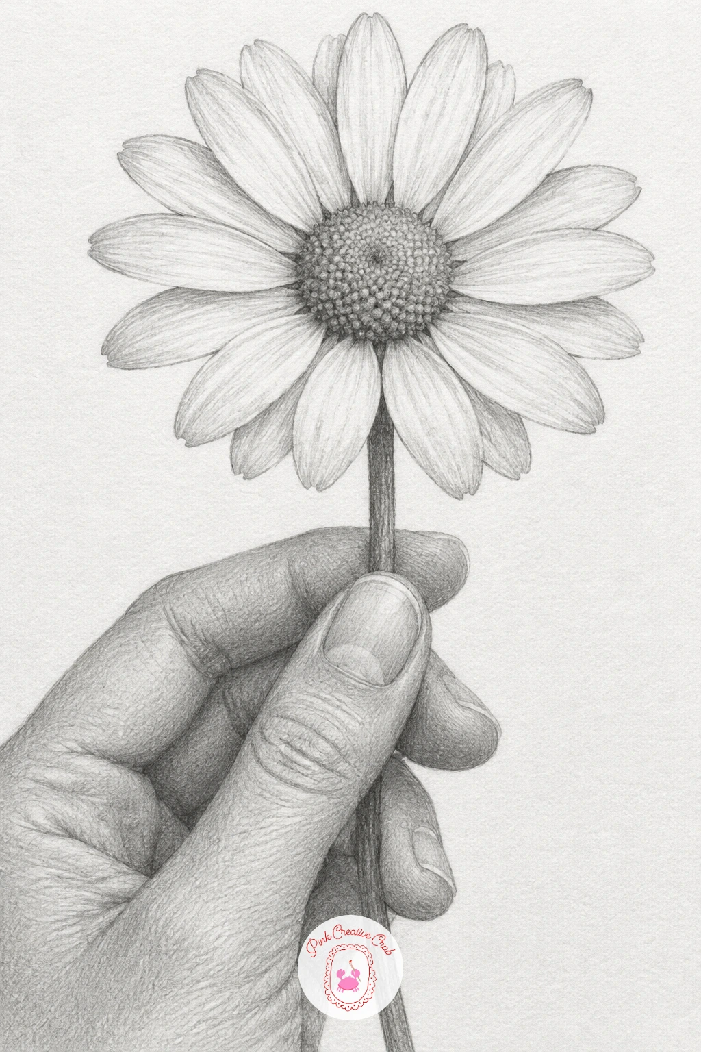
After the wet, heavy clay pose, a single daisy held by the stem is a lighter break, with thin fingers pinching a slender stem and petals that need a careful, patient touch. Draw the stem first as one continuous light line through the fingers, then build the flower head at the top before refining the hand.
Shade each petal with one gradient stroke from base to tip rather than outlining it, which keeps petals looking soft instead of cut from paper. Keep the fingers pinching the stem fairly loose in pressure and light in tone, since a daisy stem needs almost no grip strength to hold.
If the petals start looking identical and stiff, vary their angle slightly, some tilted toward the viewer and some turned away, so the flower head reads as three dimensional.
A fine liner pencil like an HB or 2H works well for the thin stem line if your softer pencil keeps smudging it.
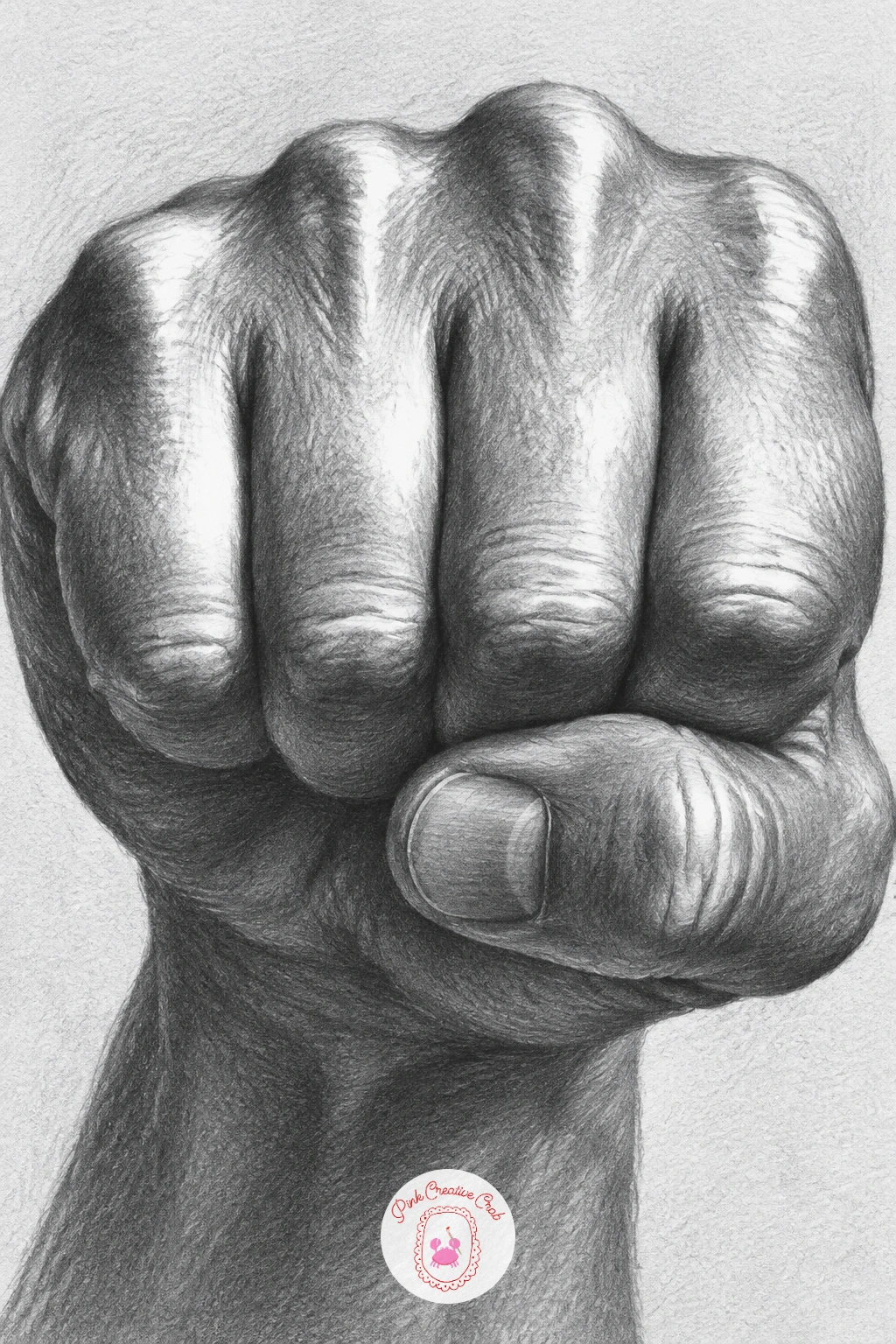
Now shift into a harder gesture: a clenched fist under sharp light is where perspective and light direction take over the drawing, since one strong light source is what makes the knuckles pop. Decide where your light comes from before you draw a single shadow, then keep every highlight and shadow in the drawing consistent with that one direction.
Block the fist as a rounded box shape first, then carve the four knuckle bumps along the top edge, each catching a sharp highlight on the side nearest the light and a hard shadow on the opposite side. Push your darkest graphite into the gaps between fingers, since those creases almost always fall into shadow regardless of light angle.
Fists look soft and wrong when the knuckle highlights are too gradual. Use a harder pencil like a 2H for the brightest highlight edges to keep them crisp against the darker 4B shadows around them.
Study your own fist in a lamp’s light for two minutes before you start, it is the fastest way to see where the light actually falls.
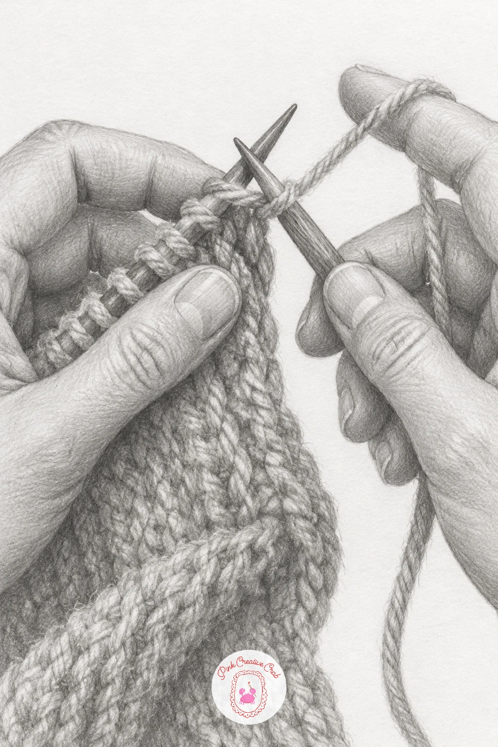
Knitting brings both hands back together around a more complicated prop, two needles and a loose trail of yarn, so work slowly and build the needles as simple straight lines before any yarn loops go in. Position both hands first, one holding each needle, with the working needle tip pointing into the stitches on the other.
Shade the yarn in soft, rounded loops using a slightly fuzzy stroke to suggest wool texture, then keep the needles themselves smooth and reflective with a thin white highlight running down each one. Draw the fingers gripping the needles with a relaxed curl rather than a tight fist, since knitting is a light, repetitive grip.
Yarn tangles easily on paper if you draw every strand with the same weight. Vary the thickness slightly and let a few loops overlap loosely rather than lining them up in neat rows.
Start with just a few stitches on the needle rather than a full row, it is enough to tell the story and far easier to finish well.
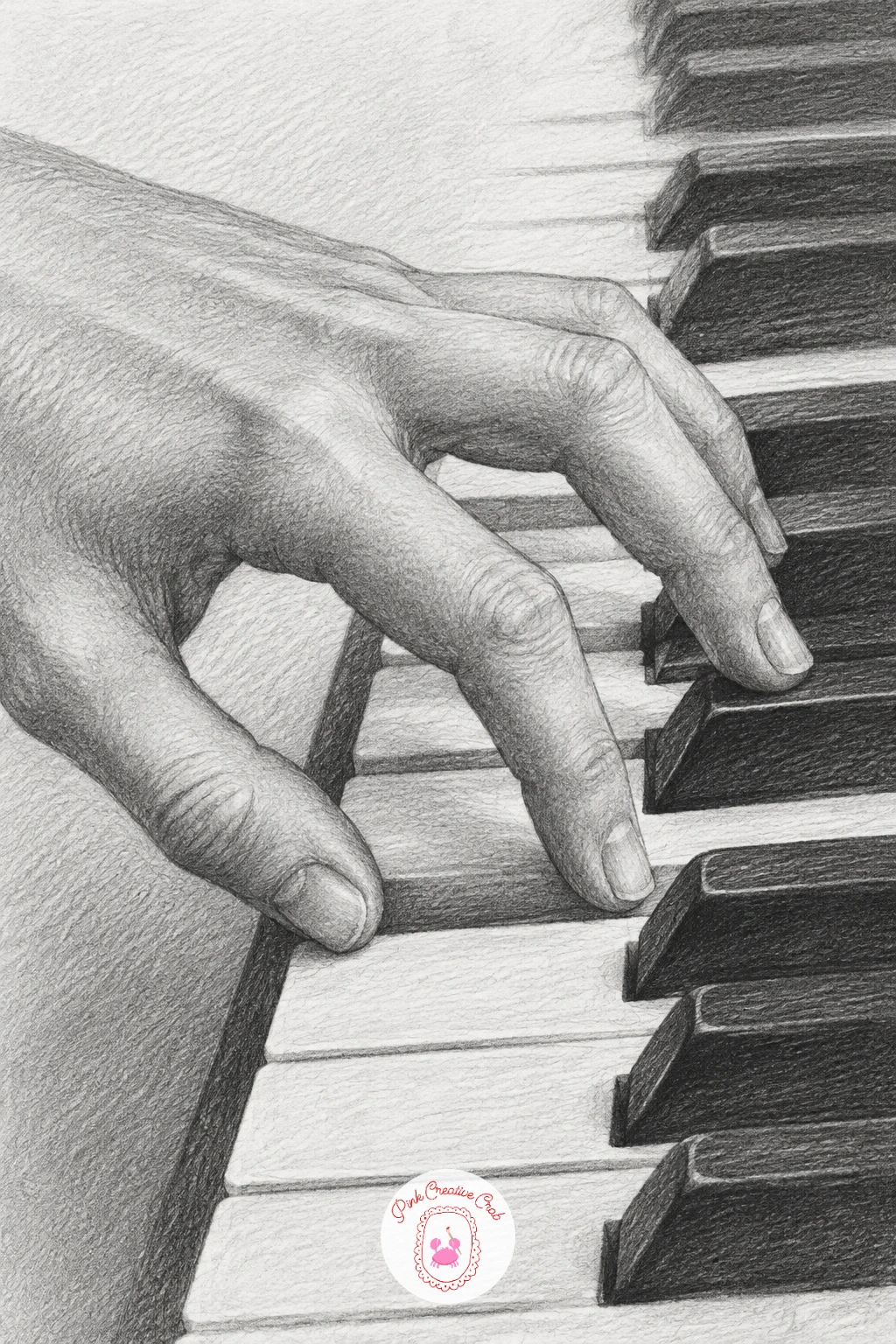
Piano keys give you a strong structural background against which the hand’s arch really stands out, so draw the row of keys first using a ruler for straight edges, then place the hand’s shape over them afterward. Keep the wrist slightly raised and the fingers curved downward onto the keys, since a flat, straight hand never looks like it is actually playing.
Shade the black keys as solid, deep tones and leave the white keys nearly untouched paper with just a thin grey line separating each one. Shade the fingers with attention to the slight shadow each fingertip casts onto the key just beneath it, which is what anchors the hand convincingly onto the keyboard.
The pose looks off if every finger presses a key with equal pressure in the drawing. Let one or two fingers hover just above the keys, barely touching, to suggest motion rather than a static press.
If a ruler is not handy, fold a strip of paper into even sections and trace along the folds for evenly spaced keys.
You Will Need
- ruler for straight key lines
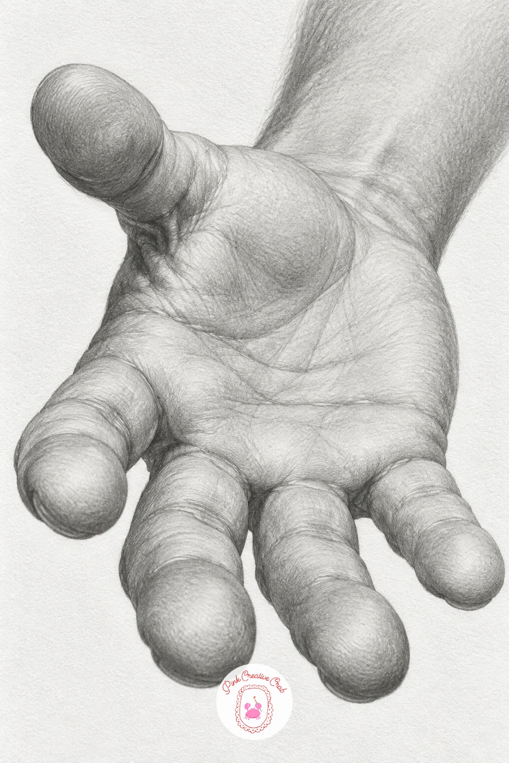
An open palm reaching toward the viewer is a good proportion check, since foreshortening makes the palm look larger and the fingers shorter than you expect, and getting that relationship right is the whole challenge here. Measure the palm’s width against a finger’s length in your reference, it is usually wider than any single finger is long when the hand points straight at you.
Build the palm as a flattened oval closest to the viewer, then let the fingers curve away and shrink slightly as they recede, shading them a touch lighter than the palm to push them back in space. Keep the heel of the hand and the base of the thumb as the most solidly shaded area, since that is the part closest to the eye.
This pose often ends up looking flat when every finger is drawn the same length. Shorten the pinky noticeably and let the foreshortened fingers overlap each other slightly at the base.
Hold your own hand out at arm’s length and close one eye to see the foreshortening clearly before you draw.
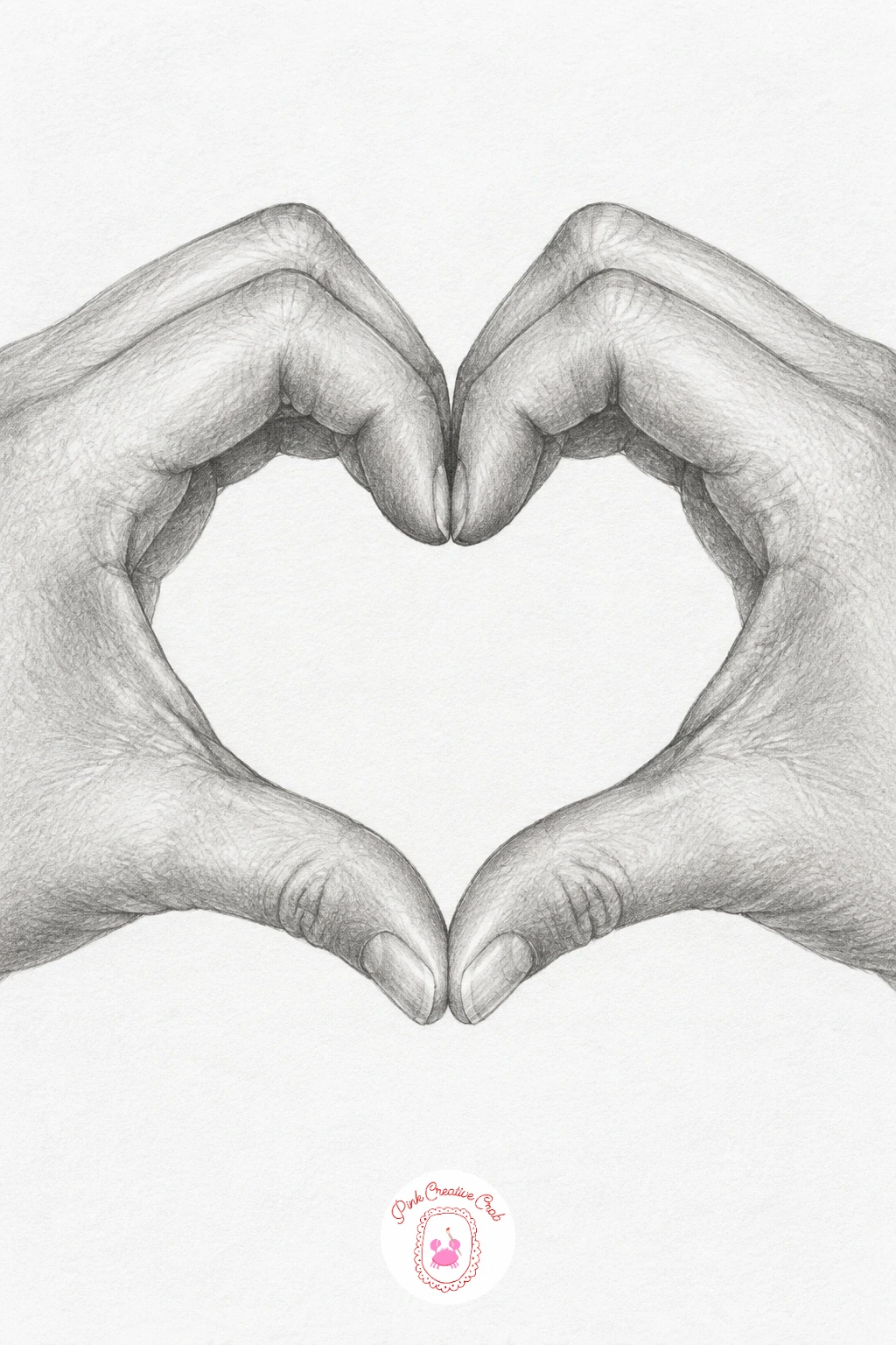
Two hands forming a heart shape depends entirely on symmetry, so sketch a light vertical guideline down the center of the page first and build each hand as a mirror image of the other around it. Curl the fingers of each hand so the fingertips meet at the top point of the heart and the thumbs cross near the bottom point.
Shade both hands with matching tone and pressure so neither side looks heavier, which is what keeps the symmetry convincing once the guideline is erased. Pay attention to the small gap or overlap where the thumbs cross, since that junction is the part viewers look at first.
If one hand ends up noticeably bigger than the other, measure both against your guideline again before shading goes in, it is much easier to fix at the line stage than after tone is added.
If symmetrical poses like this one appeal to you, the couple doodle ideas page has more small gestures built around two people.
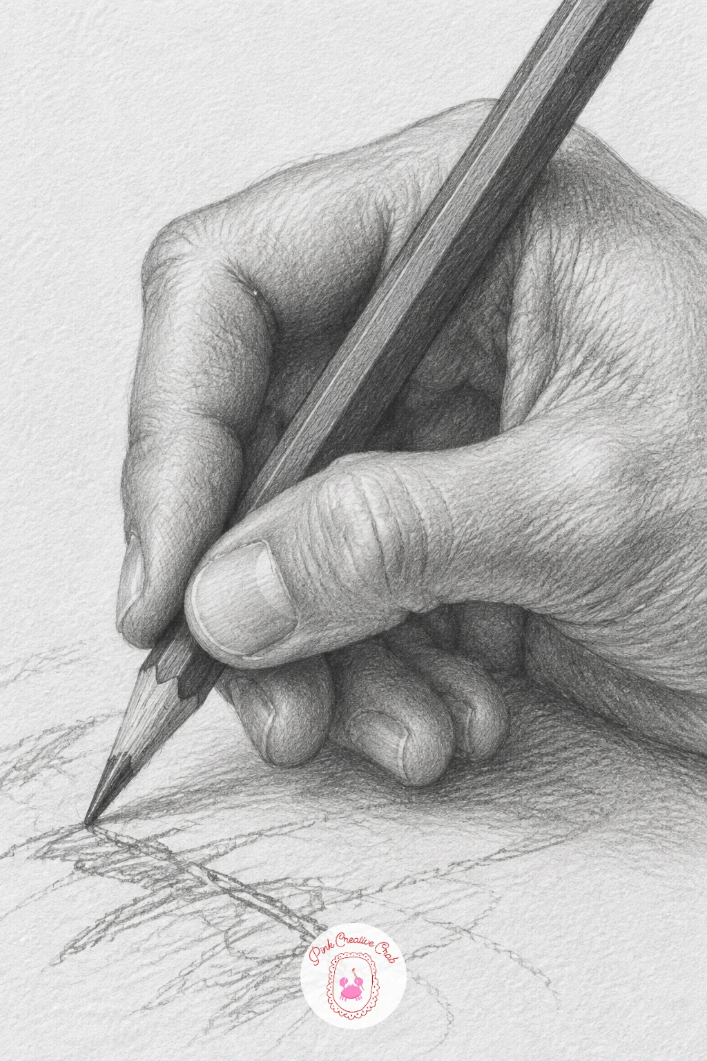
Drawing a hand holding a pencil mid-sketch is a nice bit of self-reference, and it works well in ten minutes if you keep it to the hand, pencil and a sliver of the drawing underneath. Build the tripod grip first, thumb and index finger pinching near the tip with the middle finger supporting from below, then add the rest of the hand around that core.
In the quick version, shade the hand with broad, simple tones and leave the sketch underneath as a few loose suggestion lines. Given forty minutes, add finer skin texture to the knuckles and a bit of visible graphite smudge on the side of the hand where a left or right-handed artist would naturally drag across fresh pencil lines.
The grip looks wrong most often when the pencil sits too high in the hand, away from the fingertips. Keep the tip close to where thumb and index finger pinch, just like your own hand actually holds a pencil.
Check your own grip in a mirror for thirty seconds, it settles more proportion questions than any reference photo.
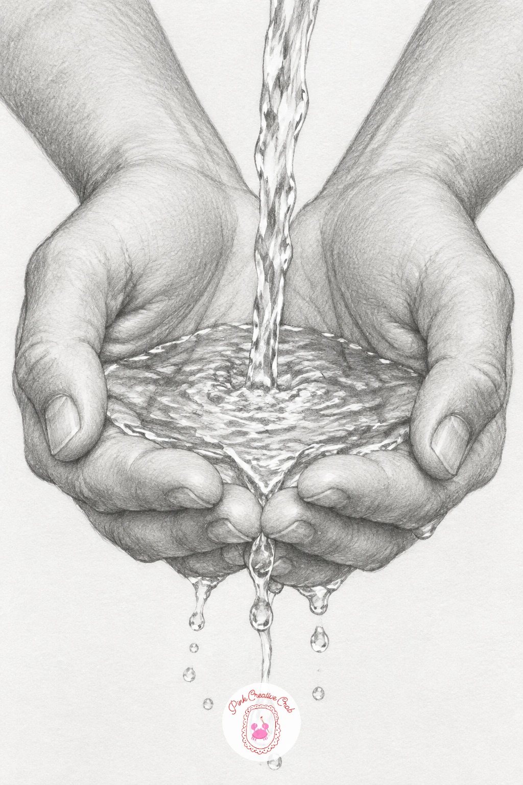
Cupped hands catching water bring a transparent, moving element into a graphite drawing, which sounds tricky but comes down to leaving the right areas untouched. Draw both hands first, pressed together at the sides and heels to form the bowl shape, before adding a single drop of water anywhere.
Shade the water as a thin, mostly white shape with just a few curved grey lines suggesting its surface and a darker pool where it gathers deepest in the palm. Let a couple of individual droplets fall below the hands, each drawn as a tiny teardrop with one bright highlight and one dark underside.
Water reads as solid and wrong when it is shaded too evenly. Keep most of it as bare white paper and use grey only at the edges and where it curves, since water is defined more by what light does to it than by its own tone.
Practice a few lone water droplets on scrap paper first, that highlight and shadow pairing is the whole trick.
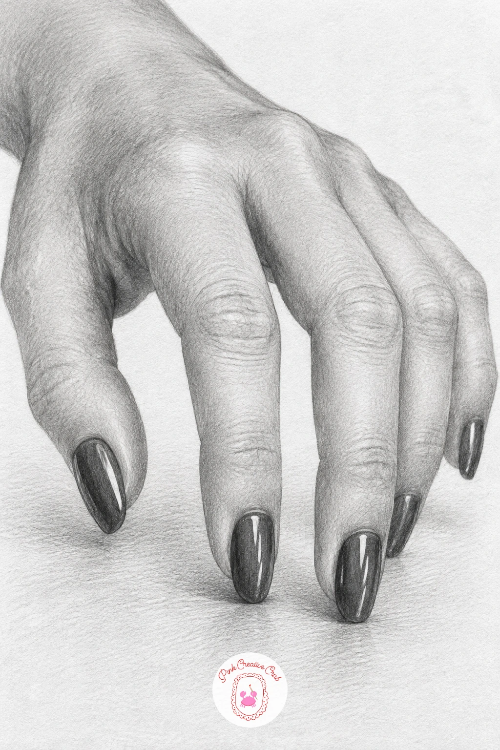
A hand with painted nails tapping a table is really about edges, since the nails need a crisp, glossy edge against softer surrounding skin and the fingertips need to look like they are caught mid-motion. Draw the hand resting with fingers slightly raised at different heights, as if caught at different points of a tapping motion, before adding any nail detail.
Leave the nails as the lightest, cleanest shapes on the hand, bordered by a slightly darker cuticle line, then use a kneaded eraser to pull out one sharp highlight on each nail to suggest a glossy finish. Shade the table surface beneath with a few soft reflected tones mirroring the fingertips faintly, which grounds the hand onto the surface.
If every finger looks the same height, the tapping motion disappears. Stagger them clearly, with one or two fingers lifted higher than the rest to suggest the moment just before they land.
A soft putty eraser works just as well as a kneaded one for pulling those nail highlights.
You Will Need
- kneaded eraser for nail highlights
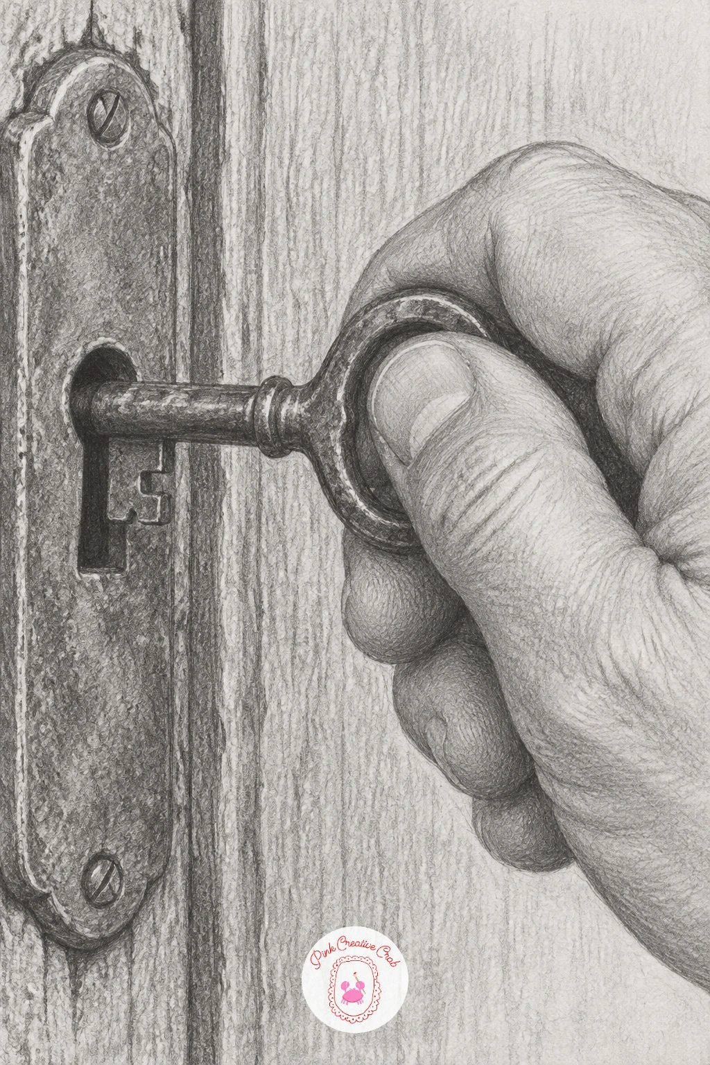
An old door key under a gripping hand is a good texture exercise, since the metal’s age and the hand’s grip pressure both need to read clearly in the same small area. Draw the key first as a simple shaft and bow shape with a few worn notches, then wrap the thumb and fingers around the bow where it actually turns.
Shade the key with a mottled, uneven tone rather than a smooth gradient, dabbing a slightly textured stroke across it to suggest old tarnished metal, then keep the hand’s shading smooth by comparison so the two materials read differently. Add a touch of shadow where the key meets the lock plate if you include it, even just a hint of a keyhole edge.
If the key looks brand new and shiny, it loses its story. Scatter a few tiny dark flecks across the metal using the tip of a sharp pencil to suggest rust or age.
No key available to reference? Any old hinge or tool with worn metal gives the same texture to study.
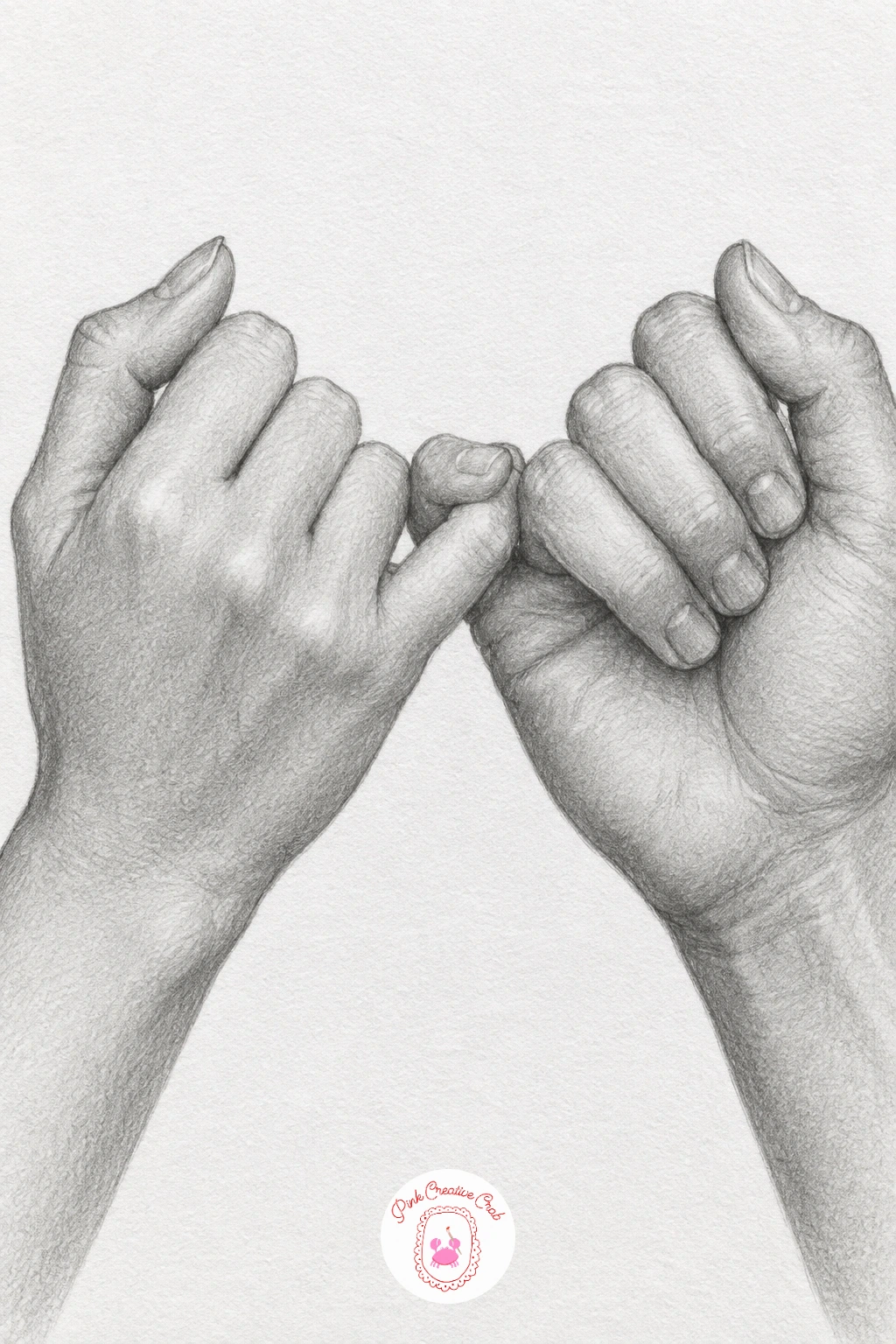
A pinky promise is a small, specific hook between two hands, so the whole drawing rests on getting that single interlocked pinky finger right before anything else. Draw both hands roughly first, then isolate the two pinky fingers and build them hooking around each other with a visible gap of white paper showing where one curls over the other.
Shade each hand with a slightly different value, since one hand is usually a touch closer to the viewer and should read a shade darker or more detailed than the other. Keep the rest of each hand’s fingers loosely curled rather than fully closed, which keeps the gesture looking relaxed and friendly rather than tense.
This pose often fails when the pinkies look like they are simply touching side by side instead of hooked. Curve one pinky’s tip visibly over and under the other so the hook reads clearly even at a glance.
If you like small gestures of connection like this one, the BFF drawing ideas page has more poses built around friendship.
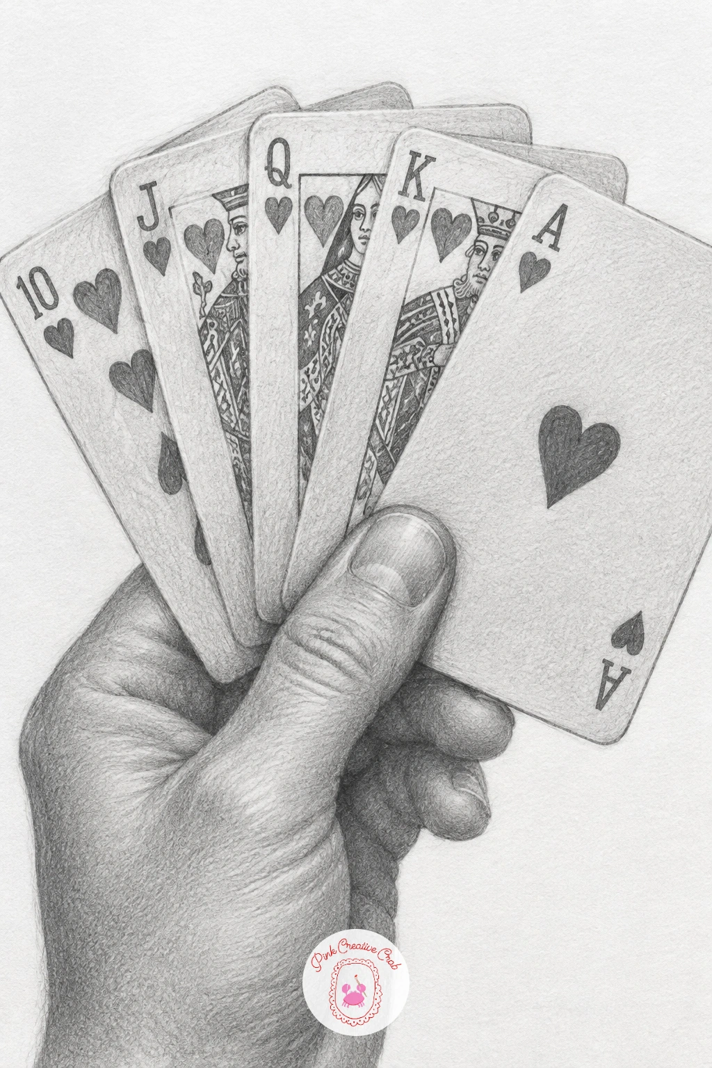
Fanning out playing cards is a satisfying next step because the cards themselves are simple rectangles, but overlapping them correctly in the hand’s grip takes a bit of planning. Draw the back card first as a full rectangle, then layer each additional card slightly rotated and offset in front of it, overlapping by about a third each time.
Shade the hand gripping the cards from underneath with a firm, steady tone, since a card fan needs real pressure to hold its shape, then keep each card’s edge crisp with a ruler or careful freehand line so the fan reads as rigid cardstock rather than floppy paper. Add a hint of pattern or a single suit symbol on the visible corner of each card if you want detail, but a plain back edge works fine too.
The fan collapses visually if the cards are spaced too evenly or too far apart. Vary the overlap slightly between cards, since a real hand-held fan is never perfectly even.
Five or six cards is plenty, more than that and the fan becomes hard to read clearly at this size.
You Will Need
- ruler for card edges
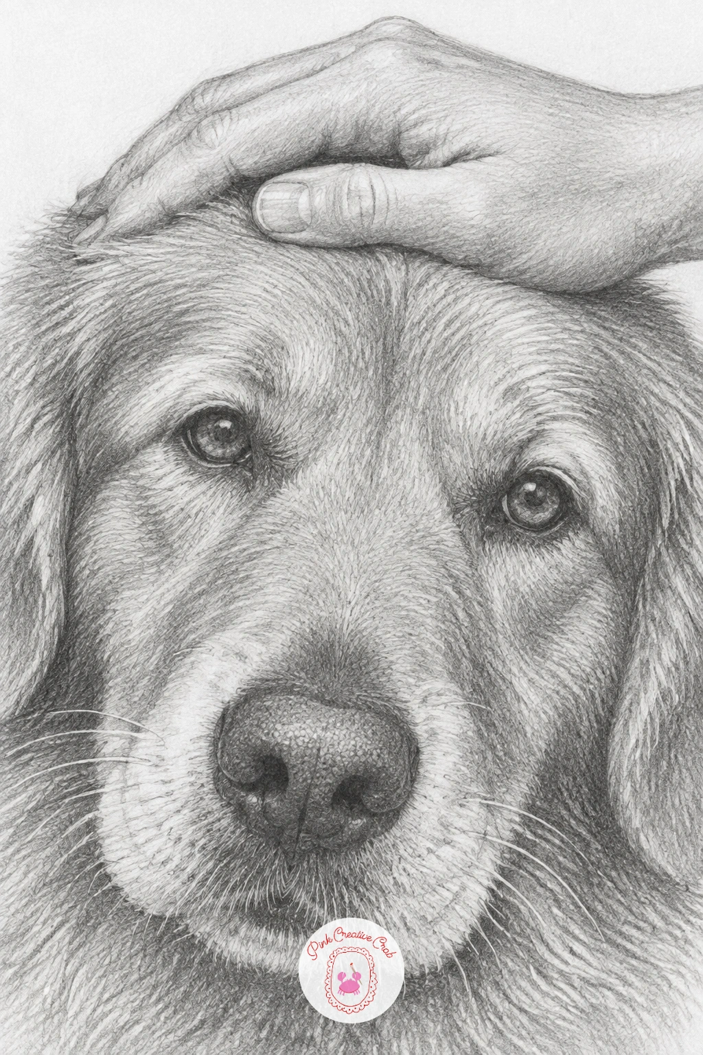
A hand resting on a dog’s head shifts the texture challenge toward fur, which behaves very differently from skin and needs its own stroke direction. Draw the hand first in a relaxed, flat position, fingers slightly spread and resting rather than gripping, then build the dog’s head shape beneath and around it.
Shade the fur with short, directional strokes that follow the way hair grows on a dog’s head, generally outward from the crown, and keep the hand’s skin shading smooth and simple by contrast so the two textures stay distinct. Leave a few lighter strands of fur poking up between the fingers to show contact rather than the hand floating above the fur.
If the fur and skin end up looking the same texture, go back over the fur with a sharper pencil point in tighter, shorter strokes while keeping the hand’s strokes longer and softer.
If dogs are a favorite subject, the dog pencil drawing ideas page has more poses to pair with this one.
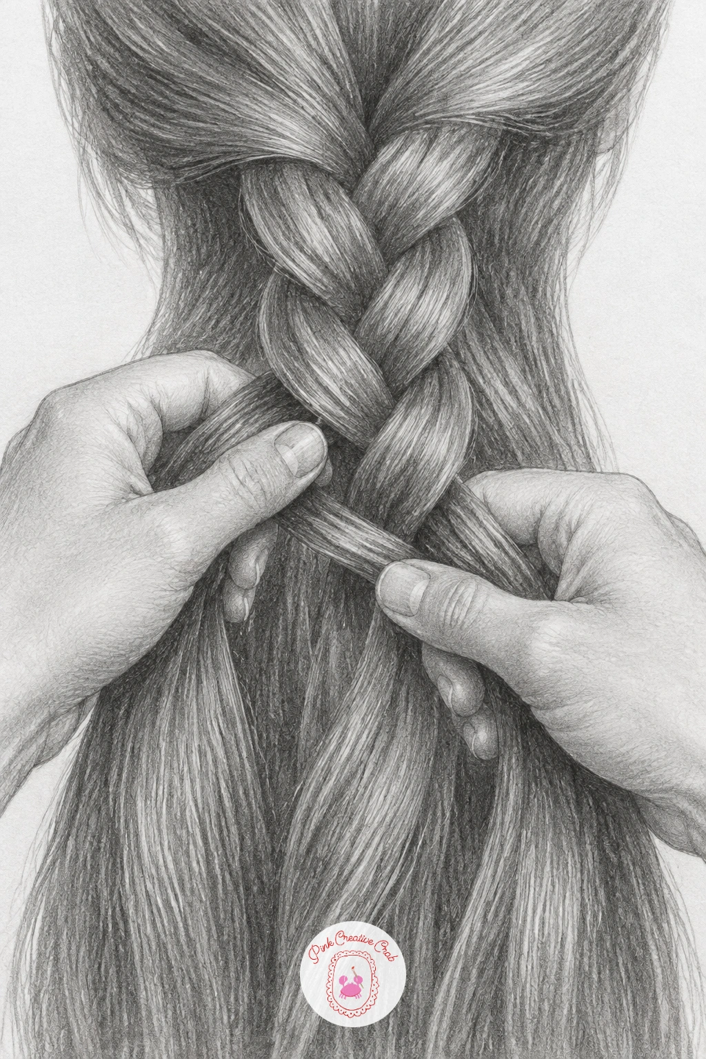
Braiding long hair is one of the more involved poses in this set, with both hands weaving three sections of hair over and under each other, so plan the braid’s pattern lightly in pencil before committing to any shading. Draw the three hair sections first as flowing ribbon shapes crossing over one another, then place both hands gripping at the point where the next cross happens.
Shade the hair with long, smooth strokes that follow each section’s flow, keeping the crossing points slightly darker where one section passes over and under another to show depth. Shade the hands more simply than the hair, since too much competing detail in both areas makes the drawing feel busy.
Braids look flat when every strand is shaded with identical pressure. Vary the tone between the three sections slightly so the over-under weave stays readable even from a distance.
Working from a photo of a half-finished braid rather than a fully done one makes the structure much easier to understand and draw.
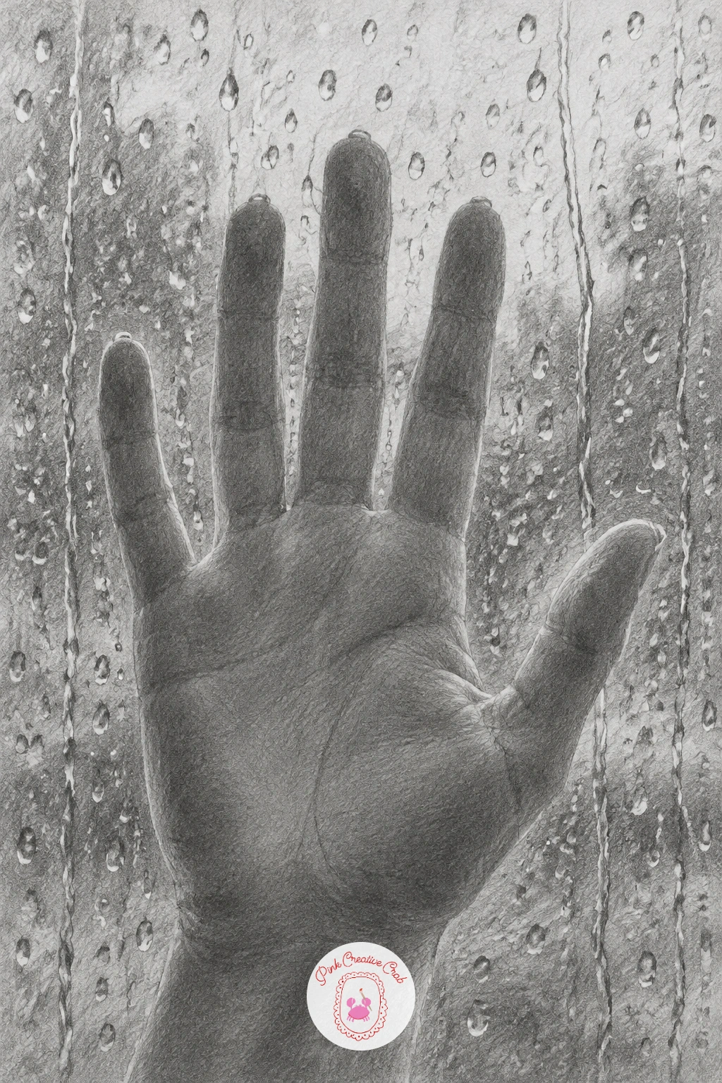
A hand pressed against a rainy window is a quiet, moody pose that leans heavily on where the light sits behind the glass, since that decides whether the hand reads as a silhouette or a lit shape with water droplets catching highlights. Decide if the light comes from behind the glass or in front before you draw a single raindrop, then keep every highlight consistent with that choice.
Draw the hand pressed flat first, fingers slightly splayed and the palm faintly lighter where it makes contact with the glass, then add raindrops as small vertical streaks and round beads scattered unevenly across the surface. Shade the glass itself with a very faint, even grey tone to suggest its surface without competing with the hand.
Rain looks static if every droplet is the same size and evenly spaced. Cluster some drops together and leave some bare glass between others, with a few drops trailing a short streak downward to suggest gravity.
A soft window reflection scene pairs naturally with the window view painting ideas if you want to try the same mood in color next.
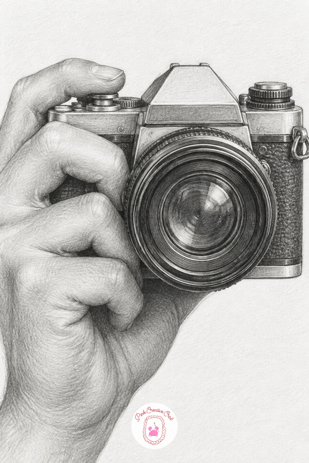
A film camera gives you a hard mechanical object to balance against the soft organic hand, and the two surfaces should look clearly different by the time you finish. Block the camera body as a simple box with a cylindrical lens first, then wrap the fingers around the grip side and place the index finger resting near the shutter button.
Shade the camera with crisp, even tones and sharp edges along its metal and plastic parts, using a ruler if needed for the straight body lines, then shade the hand with its usual soft, rounded gradients so the contrast between hard object and soft skin is obvious. Add one bright highlight on the lens glass to suggest its curved, reflective surface.
The camera looks lifeless if every surface gets the same flat grey. Vary the tone between the metal top plate, the textured grip and the glass lens so each material reads distinctly.
Any small boxy object with a lens or dial works as a stand-in reference if a camera is not within reach.
You Will Need
- ruler for camera body edges
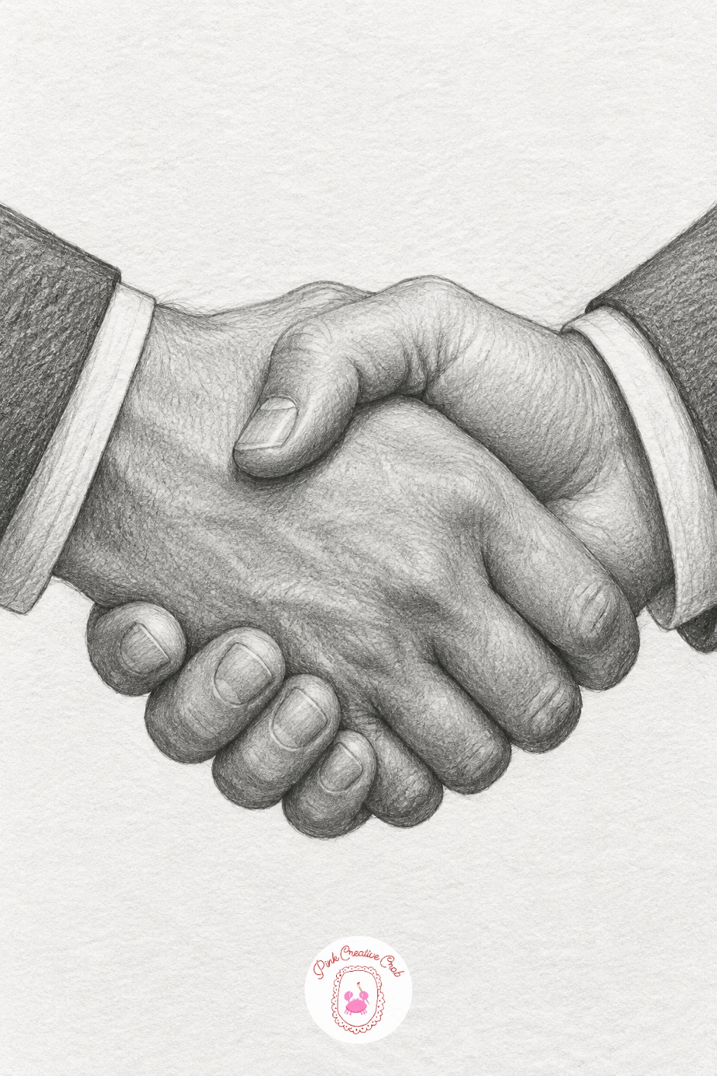
A firm handshake between two people is a compact study in overlapping forms, since both hands interlock at the same point and need to read as gripping rather than just touching. Draw one hand’s shape first, then build the second hand wrapping around and into it, checking that the fingers of each hand actually curl around the opposite hand’s palm rather than floating beside it.
Shade the grip point itself as the darkest, most compressed area of the drawing, since that is where skin folds and presses hardest against the other hand. Keep the forearms, if you include them, angled slightly toward each other to suggest the forward motion of two people meeting.
Handshakes often look stiff when both hands are drawn at identical angles. Tilt one wrist very slightly more than the other, since a real handshake is never perfectly symmetrical.
Shake hands with yourself, one hand gripping the other, and glance down at the shapes before you draw, it settles the overlap questions fast.
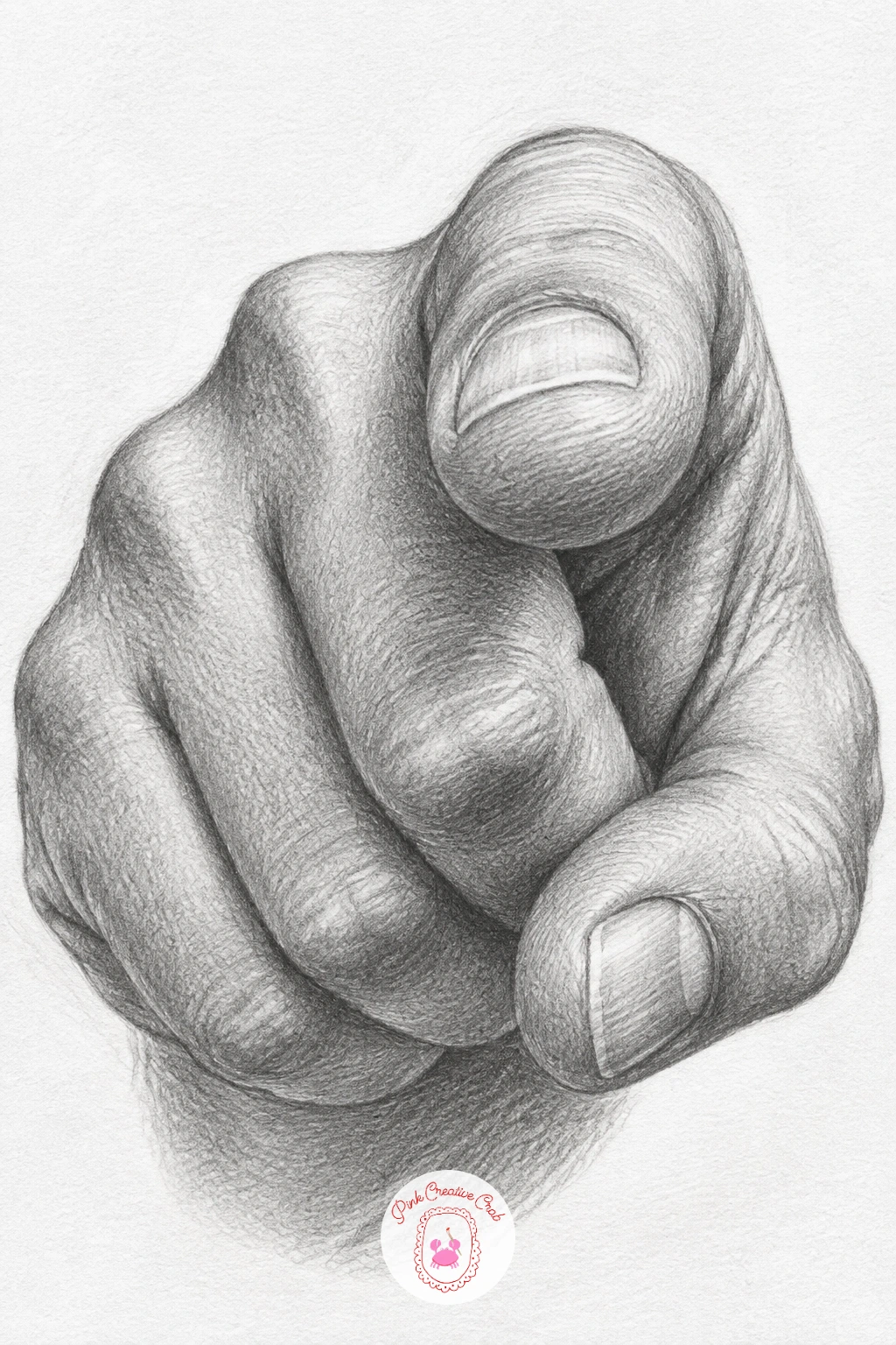
A pointing hand looks simple but is a real test of foreshortening, since the index finger aimed toward the viewer shortens dramatically compared to a finger drawn in profile. Measure the pointing finger’s visible length against the width of the knuckle at its base, it will look surprisingly short and wide if the angle is aimed at the viewer.
Draw the curled fingers of the fist first, since they anchor the hand’s overall size, then add the extended pointing finger last, checking its foreshortened length against your measurement before you shade it. Shade the pointing finger’s tip slightly darker at the very end to push it forward in space toward the viewer.
This pose looks wrong most often when the pointing finger is drawn at full, uncompressed length. Trust the shorter measurement even if it feels too stubby while you are drawing it, the illusion holds once the rest of the hand is shaded.
Point your own finger at a mirror and compare what you see to a finger held sideways, the length difference is the whole lesson.
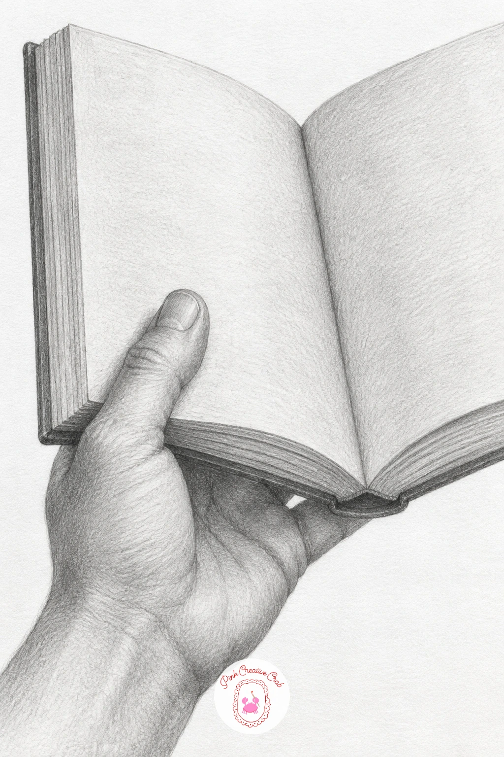
Holding an open book brings back a calm, still pose after a few more active ones, with the hand’s job simply to support the weight of the pages from beneath while the thumb rests lightly on the paper. Draw the book first as two angled rectangles meeting at the spine, then add the hand cradling it from underneath, thumb resting on the near page.
Shade the pages with mostly bare white paper and just a few faint curved lines suggesting the page’s gentle bow where it is held open, then shade the hand underneath a touch darker since it sits in the book’s own shadow. Add a few short horizontal lines on the page to suggest text without writing actual letters.
Pages look stiff and flat when drawn as perfectly straight rectangles. Let the open pages curve very slightly upward near the spine, since paper never lies perfectly flat when a hand holds it open.
If quiet, cozy scenes like this one appeal to you, the sketchbook inspiration ideas page has more everyday moments to draw next.
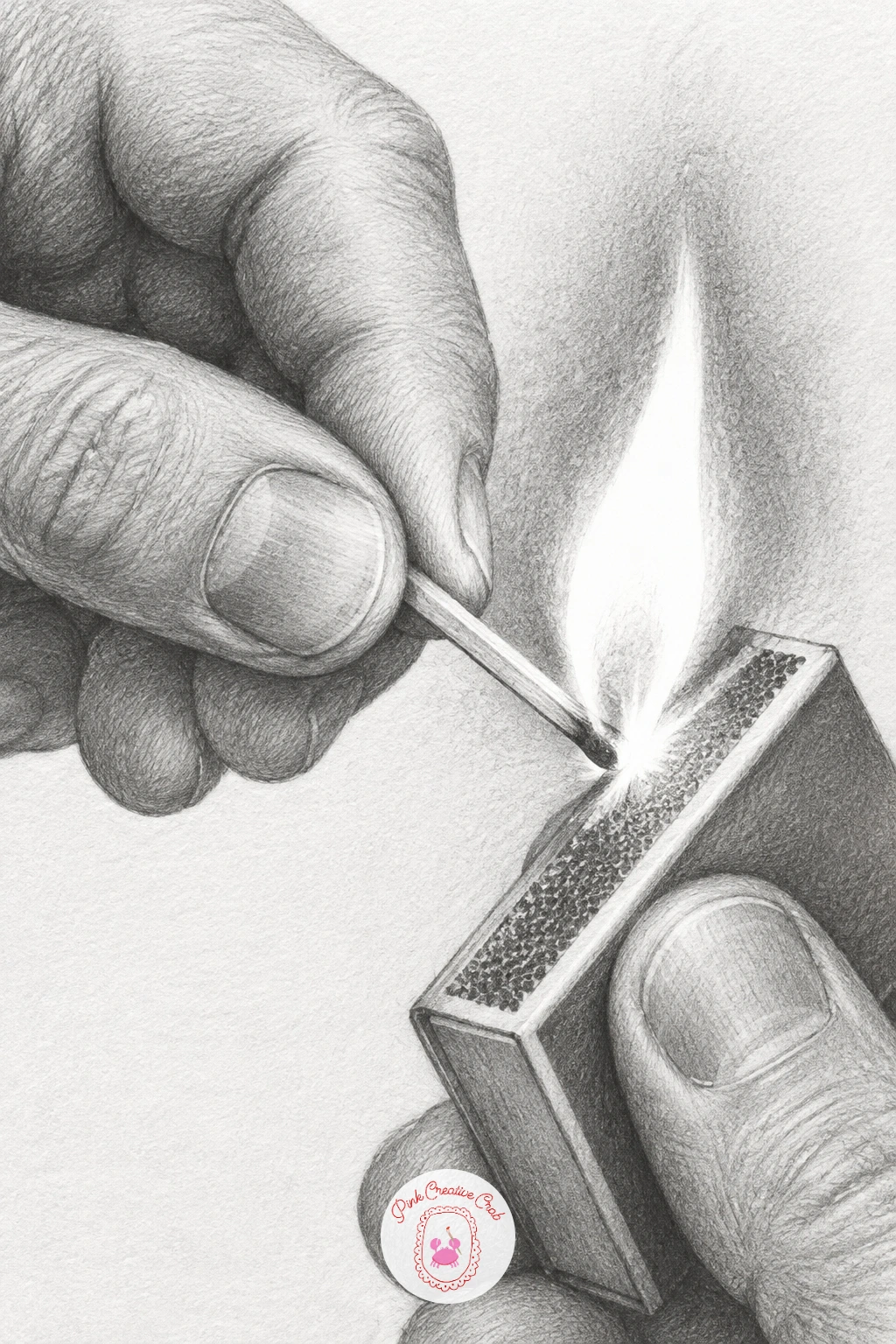
Striking a match is a small action with a big payoff, since the single point of flame becomes the brightest spot in an otherwise mid-toned drawing. Draw the hand gripping the matchbox in one position and the match itself mid-strike in the other, with the matchstick’s tip angled against the rough strike strip.
Shade the whole hand and matchbox in a fairly even mid-grey tone first, then save the match’s flame for last, leaving the very center of it as untouched white paper surrounded by a tight ring of your darkest graphite for contrast. A few tiny flicked lines near the flame suggest sparks catching.
The flame loses its glow if it gets outlined instead of built from contrast. Resist drawing a hard line around the flame shape, let the sudden jump from dark to white do the work of making it glow.
Light an actual match somewhere safe and watch the first second of the flame if you want a true reference for that shape.
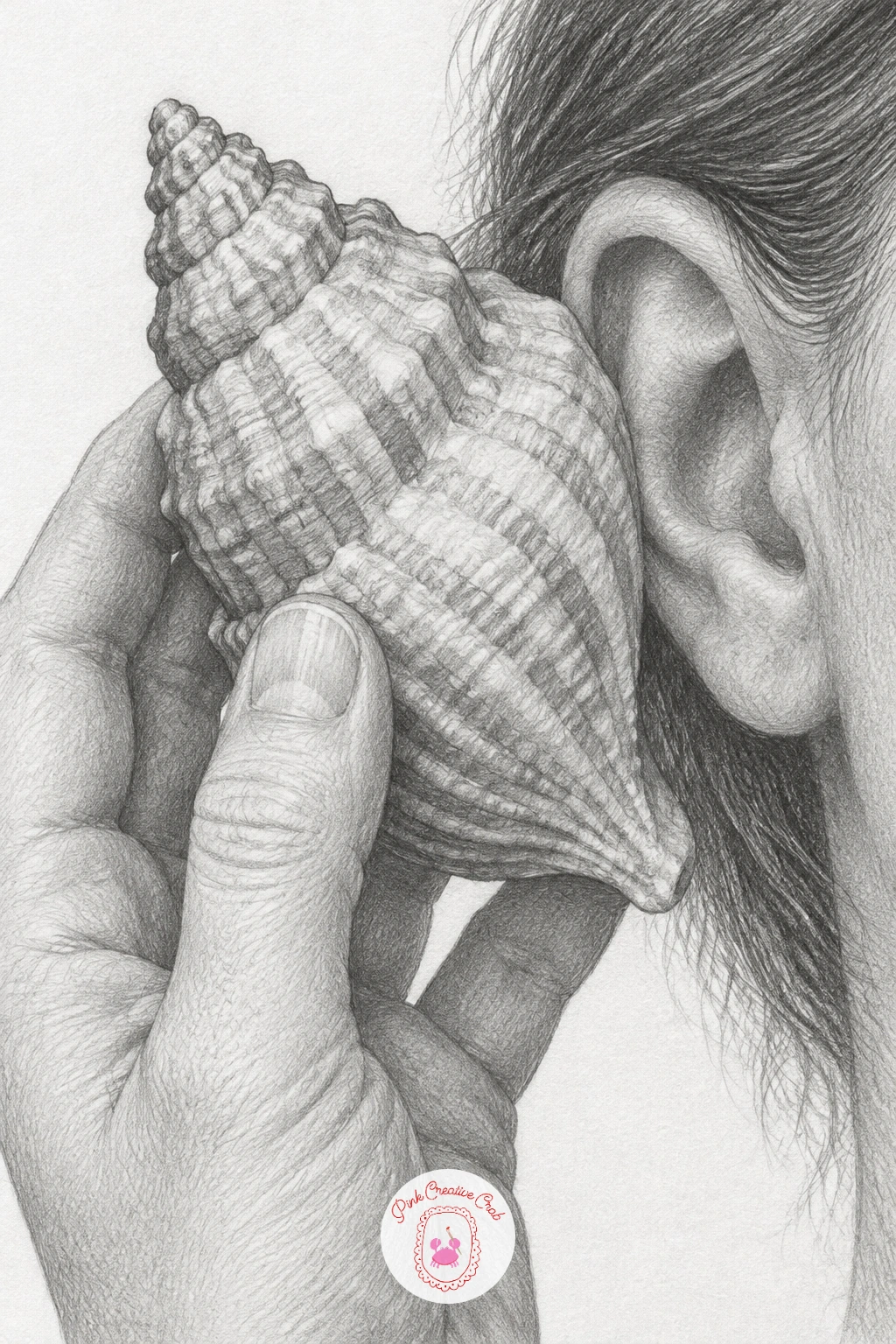
A seashell held to an ear is a nice contrast of textures again, the shell’s ridged, swirling surface against the hand’s smoother skin, so plan the shell’s spiral pattern lightly before committing to any heavy shading. Draw the shell’s basic cone and spiral shape first, then wrap the fingers around it as though holding it steady near where an ear would be.
Shade the shell’s ridges with a series of curved, repeating strokes that follow the spiral, darker in the grooves and lighter on each raised ridge, while keeping the hand’s shading smooth and simple by comparison. A tiny bit of the shell’s pale pink interior, even in graphite, can be suggested with the lightest possible grey against the darker exterior ridges.
The shell looks flat if the spiral pattern is drawn too evenly. Let the ridges get tighter and closer together toward the shell’s point, since that is how a real spiral naturally behaves.
Collect or reference any ridged shell, scallop shells work just as well as spiral ones for this texture practice.
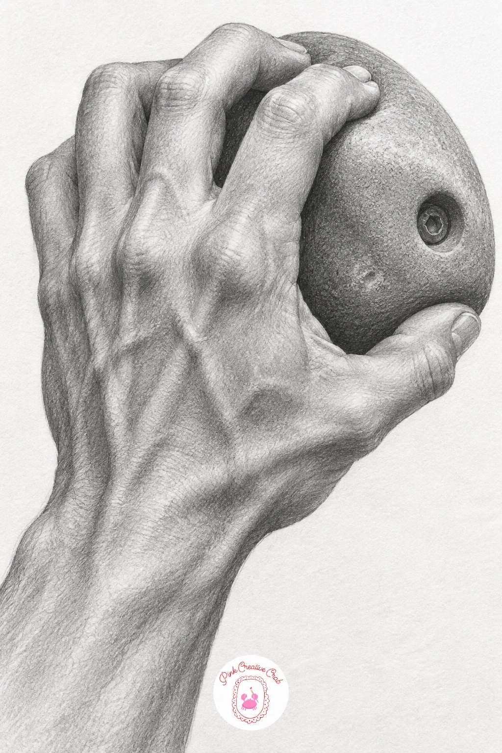
Gripping a climbing hold is one of the more muscular poses in the set, with tendons and strain visible across the back of the hand as it bears real weight. Draw the hold itself first as an irregular rounded lump, then build the fingers curling tightly over its edge, knuckles raised and tendons pulled taut beneath the skin.
Shade the tendons as subtle raised lines running from each knuckle back toward the wrist, slightly lighter than the surrounding skin since tension pulls skin tighter and catches more light. Keep the fingertips, where most of the gripping pressure sits, as the most compressed and darkest shaded part of the hand.
This pose looks limp if the tendons are left out entirely. Even a few faint lines suggesting them under the skin makes the difference between a hand resting and a hand actually bearing weight.
Grip the edge of a table or shelf yourself and look at the back of your own hand, the tendon pattern will be obvious immediately.
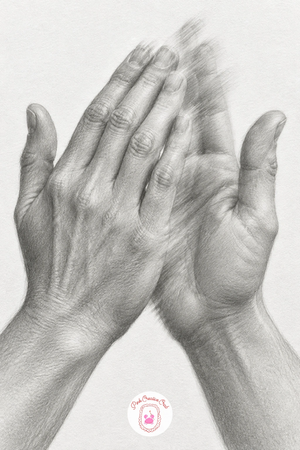
Clapping hands in mid motion is one of the trickiest poses here because you are suggesting movement with a still medium, so a bit of deliberate blur does real work. Draw both hands first in the moment just before full contact, palms angled toward each other with a small gap still visible between them.
Shade most of both hands with normal crisp detail, then soften the very edges of the palms and fingers nearest the point of near-contact with a blending stump, letting those edges go slightly fuzzy to suggest speed. Keep the edges furthest from the clap point sharp and clear so the contrast between still and moving areas reads clearly.
If every edge in the drawing is equally sharp, the motion disappears entirely. Commit to blurring only the clap point itself and nothing else, which keeps the illusion controlled rather than just making the whole drawing look smudged.
Clap your own hands slowly in front of a mirror and pause partway through to study the exact gap and angle.
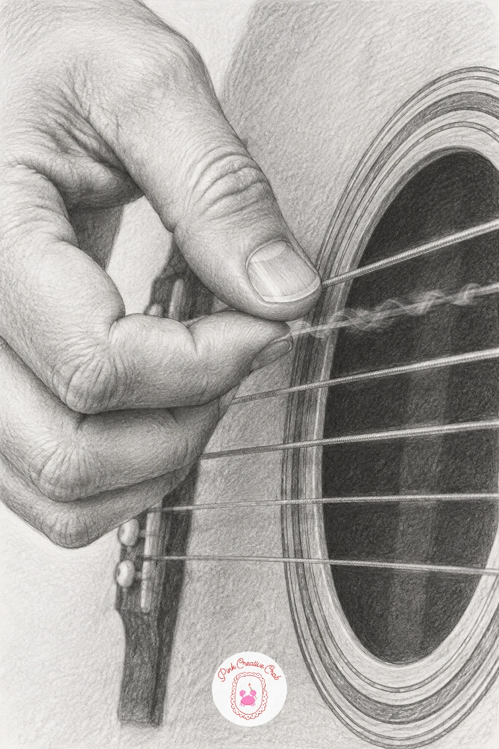
Plucking guitar strings asks for a light, precise touch, since fingers near strings need to look barely in contact rather than gripping anything. Draw a few strings first as straight, evenly spaced lines across the frame, then place the fingers hovering just above or lightly touching one string each, fingertips angled slightly differently to suggest different notes being played.
Shade the fingers with normal soft gradients, then add a tiny blur or double line on the one string actually being plucked to suggest vibration, while keeping the other strings as crisp, still lines. Leave small gaps of white paper where each fingertip meets a string so the contact stays light rather than heavy.
Strings look dead and flat if none of them show any sense of movement. Picking just one string to blur slightly is enough, do not blur them all or the vibration idea gets lost entirely.
A ruler helps keep the strings perfectly parallel and evenly spaced before any hand detail goes in.
You Will Need
- ruler for string spacing
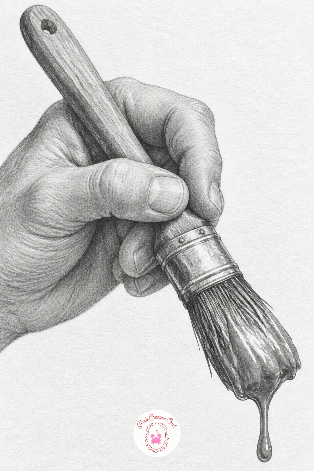
Finish the set on a brush loaded with paint, a fitting last pose since it nods back to drawing itself while asking you to render a wet, dripping tip in pure graphite. Draw the brush handle and ferrule first as simple cylinders, then build the hand’s grip around the handle in a relaxed, angled hold rather than a tight fist.
Shade the bristles at the tip as a cluster of soft, slightly irregular strokes fanning outward, darker where they are more saturated with paint and lighter where the bristles separate near the very point. A single small highlight on the wet bristle tip and perhaps one drip caught mid-fall sells the idea of fresh paint even without any actual color.
The brush tip looks dry and stiff if every bristle is drawn as a separate crisp line. Let several bristles merge into soft clumps with only a few individual strokes breaking free, which reads as wet far better than tidy separation.
If graphite still life studies like this one interest you, the fruit basket drawing ideas page offers more object studies at a similar level.
What to Do Next
Pick one pose that matches a prop or object you actually have nearby, since drawing from life beats working from memory every time. Start on a clean sheet of bristol paper, block in the basic shapes lightly before any shading, and let the hand earn its detail gradually rather than rushing straight to the knuckles.
Frequently Asked Questions
What pencils work best for realistic hand drawing?
A range from 2H to 6B covers most hand drawings well. Use harder pencils like 2H or HB for light construction lines and crisp highlights, and softer pencils like 2B to 6B for deep shadows between fingers and under knuckles.
How do you keep hand proportions accurate?
Measure the palm against the middle finger first, since the middle finger is usually close to the same length as the palm itself. Use that single comparison to check every other finger before you commit to shading.
Why do my drawn hands look stiff or flat?
Stiff hands usually come from straight, sausage-like fingers with no joint creases. Add a slightly lighter band of tone at each knuckle crease and bend every finger segment just a little, even in a relaxed pose.
Should I draw from photos or from my own hand in a mirror?
Both work well, and switching between them helps. A mirror lets you check real creases and tendons instantly, while photos let you hold a tricky pose steady for as long as the drawing takes.
How long should a realistic hand drawing take at this level?
Most single-hand poses in this list take thirty to sixty minutes once you include shading. Simpler poses with one hand and no prop finish faster, while two-hand poses with objects need the extra time for overlap and texture.
Have any thoughts?
Share your reaction or leave a quick response — we’d love to hear what you think!
-
 0
-
0
-
0
-
0
-
0
-
0


