

Cherry blossom painting is one of those subjects that makes gouache feel like the right tool for the job: flat, matte pinks that sit clean against cream paper, no fuss, no blending marathons. Every scene below tucks the blossoms into a small moment instead of floating a lone branch on the page, so you get a story as well as a flower.
Scroll through and pick whatever matches your mood today, a sleepy cat under falling petals or a torii gate half hidden in bloom. Each idea gives you the order to paint in, the spot where it usually goes wrong, and one tip to carry into the next picture.
Using these images: free for personal projects such as printing, coloring, cards, journals and gifts. Handmade items that include them may be sold up to 30 pieces per design. More than that is commercial use and is not permitted, and neither is selling or sharing the images themselves or passing them off as your own. Please ask before any other use.
Start with the cyclist, since the whole scene balances around that one dark, simple shape. Block in the bicycle and rider as flat silhouettes first, a basket shape at the front, then build the arch of blossoming branches above and around them second, so the pink canopy reads as a frame rather than a background.
Use a mid pink for the main mass of blossoms and a deeper rose for shadow clusters, keeping each petal cluster as a soft blob rather than individual petals. If this is your first time painting a figure in motion, keep the cyclist’s pose simple: one leg up, one down, and let the wicker basket carry the charm instead of a detailed face.
The usual snag is making the arch too thin, so the bike looks like it is riding past a hedge instead of under a canopy. Fix it by letting branches reach from both sides of the page and overlap generously above the rider. If you don’t have a fine brush for the bicycle spokes, a sharpened cotton swab dipped in dark gouache works almost as well.
One concrete tip for today: paint the branches last, over the dried blossom shapes, so the dark lines sit crisp on top instead of smudging into wet pink.
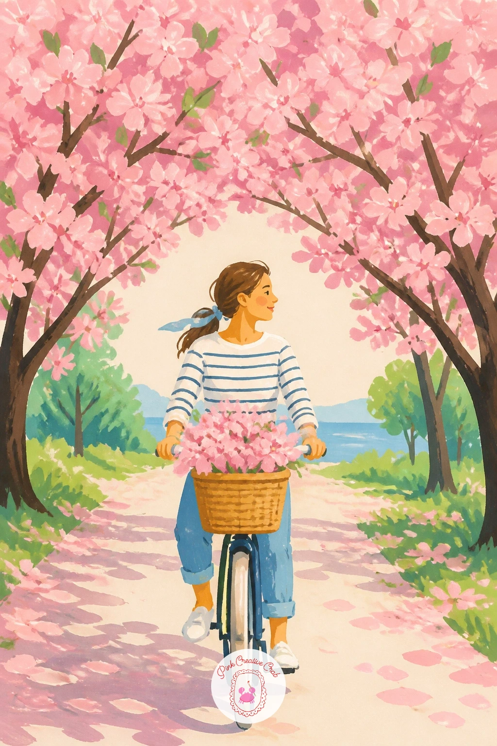
Palette: Opera Pink,Rose Madder,Payne’s Grey,Sap Green
Measuring makes or breaks this one, so before mixing any paint, mark the gate’s height against the width of the page: a torii gate reads as tall and narrow, roughly one third of the page width but reaching close to the top. Paint the red uprights and crossbeams first as flat shapes, leaving the cream paper showing through as sky between the gaps.
Once the gate is dry, add the blossoming branches crossing in front of it, letting at least one branch cut across the top beam so the gate looks tucked behind the blooms rather than standing beside them. Keep the red a warm vermilion rather than a true red, since that is the shade most associated with temple gates.
Beginners often paint the gate too small, lost in a sea of pink. Keep it bold and close to the front of the page, and let the blossoms frame rather than swallow it. No cadmium red on hand, a mix of magenta and orange gouache gets close enough.
Finish with a few loose petals drifting down past the gate for today’s one tip: scatter them unevenly, never in a straight line, so the fall feels like wind rather than pattern.
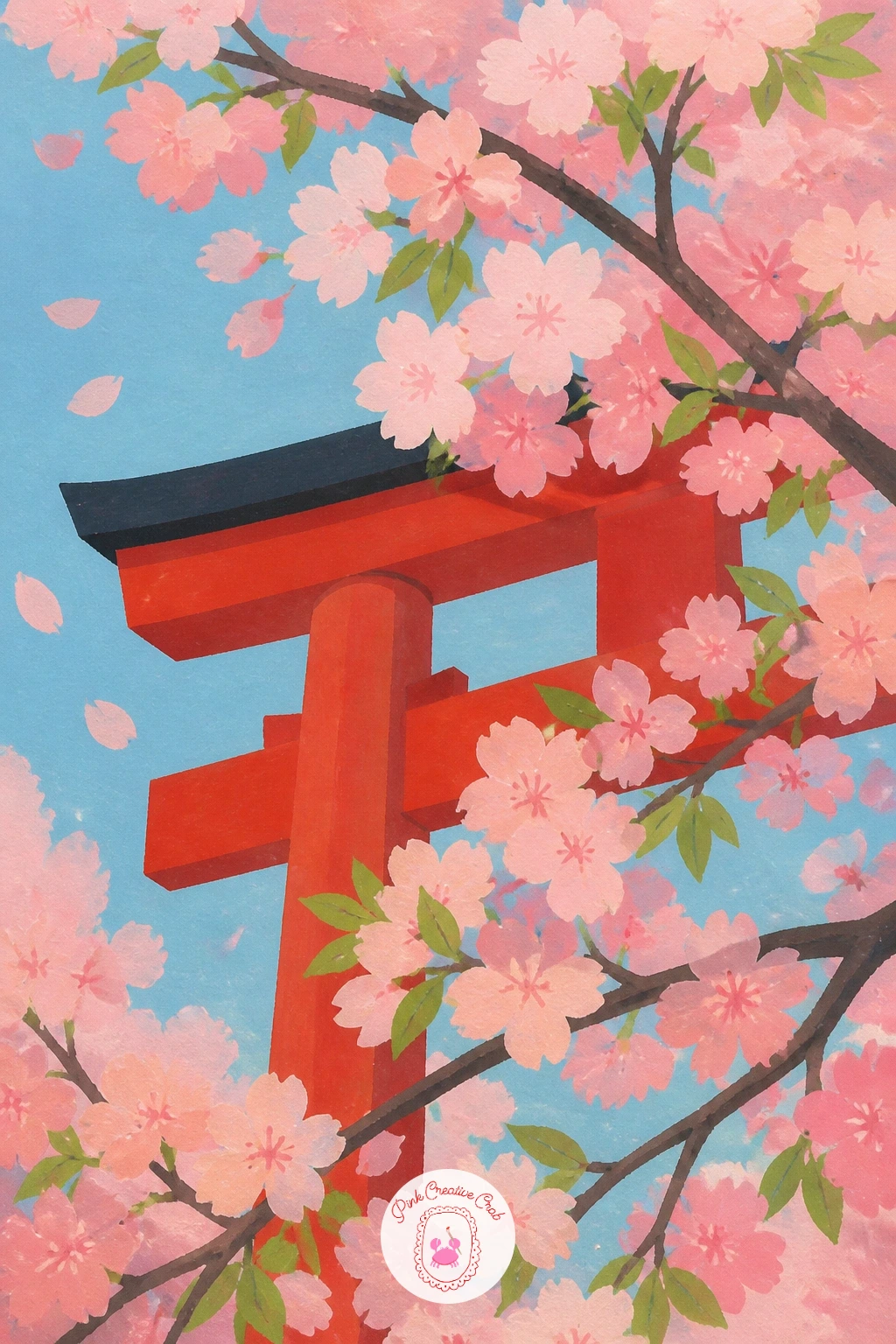
Palette: Vermilion,Blossom Pink,Sky Blue,Ivory Cream
Picnic scenes work best built from the ground up, so lay down the blanket first as a simple patterned rectangle, checks or stripes in two flat colours, angled slightly for perspective rather than drawn flat-on. The blooming tree above comes next, its canopy spreading wide enough to shade the whole blanket.
Paint the mochi as a cluster of small pale domes with a blush of pink at their centers, a few scattered on a plate shape rather than lined up neatly. Eye level matters here: sit low, as if you are seated on the grass yourself, so the tree trunk rises steeply and the branches spread wide overhead rather than floating flat.
The common mistake is making the blanket look like it is floating above the grass. Ground it with a soft green shadow along its lower edge before adding any pattern. No checked fabric reference handy, a simple cream and dusty pink stripe reads just as well for this scene.
For today’s tip, paint a few fallen petals resting directly on the blanket pattern, since that single detail ties the whole scene together more than almost anything else you add. For more ideas built around a spread blanket and basket, the picnic drawing lessons are worth a look too.
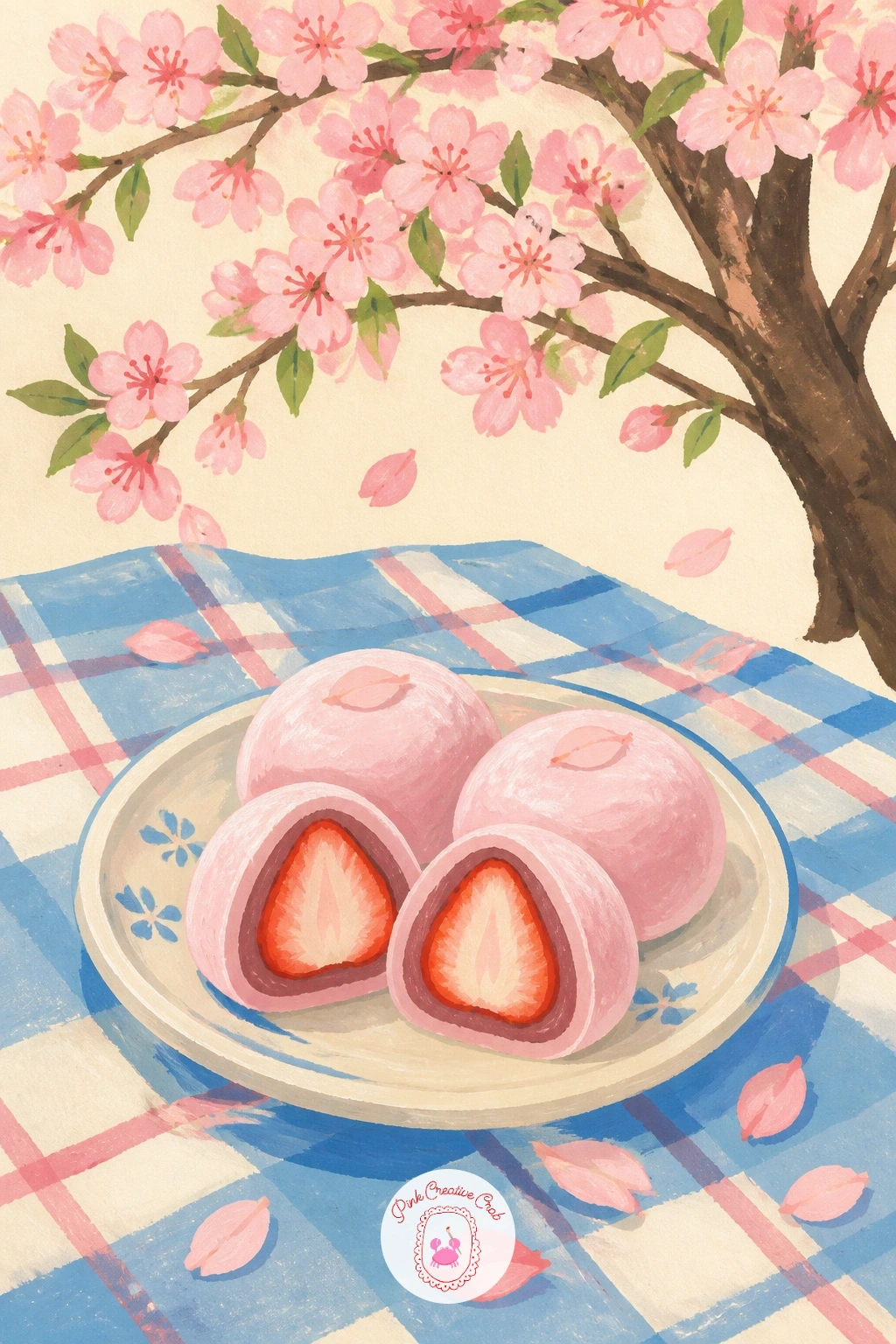
Palette: Strawberry Pink,Cream White,Leaf Green,Soft Rose
Painting a cat asleep asks for soft, rounded shapes rather than sharp edges, so block in the body as one simple loaf shape first, tail curled in, before adding the stone wall beneath it as flat grey blocks with slightly uneven edges. Keep the cat’s fur as one or two flat tones rather than individual strokes.
Work the texture trick here: once the base fur colour dries, use a dry brush loaded with barely any paint to drag a lighter tone across the cat’s back and head, which gives the suggestion of soft fur without painting every hair. A kneaded eraser pressed gently onto dry gouache can lift tiny highlights the same way if the dry brush feels too heavy handed.
The usual trouble spot is the stone wall looking too smooth and modern. Break each stone block with a slightly different shade of grey and a few uneven edges, which reads as old stone instantly. If you don’t have warm grey gouache mixed, a touch of brown into your grey base works just as well.
One tip to use today: drop two or three petals mid-landing on the cat’s back, painted slightly larger than the ones in the air, so they look closest to the viewer.
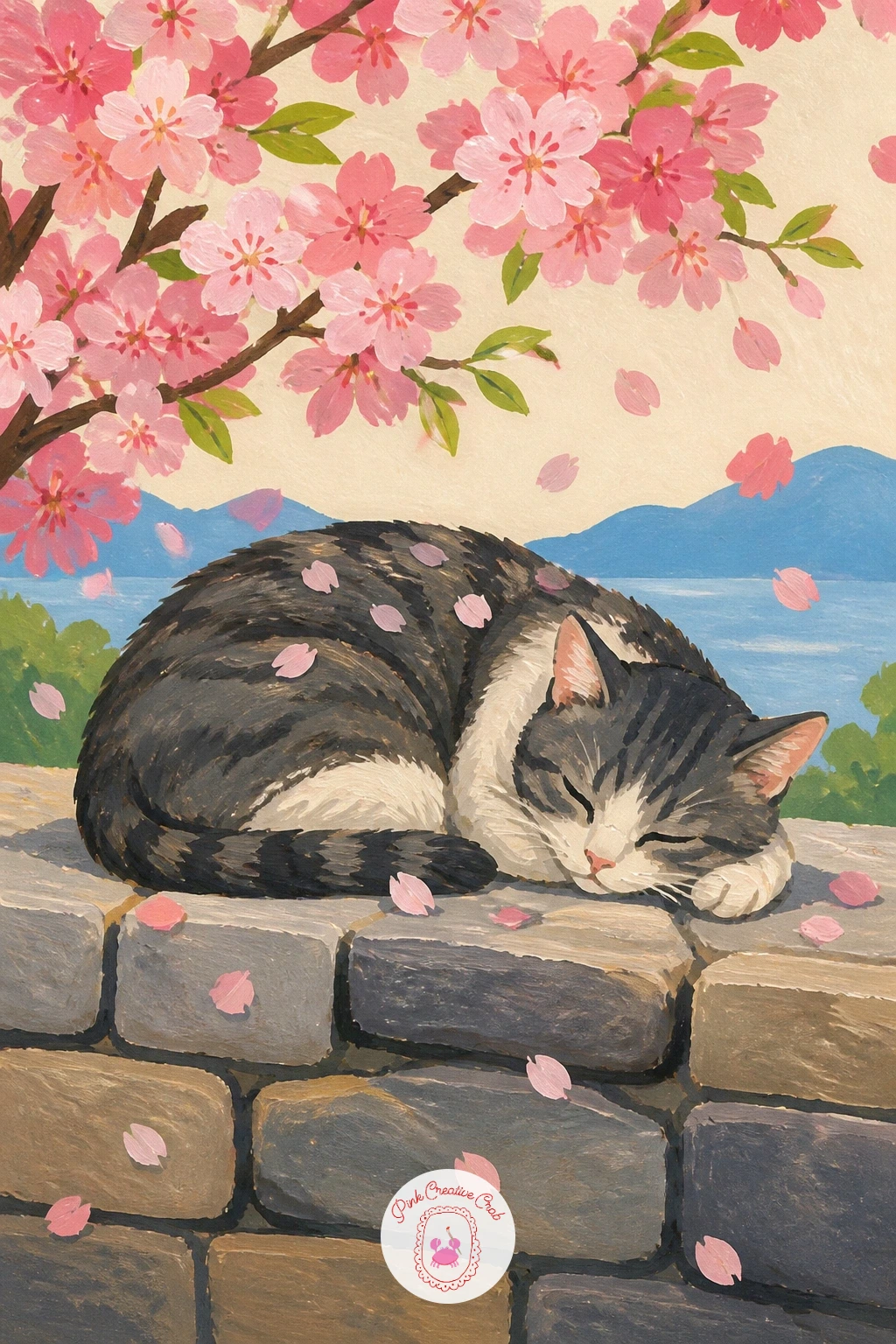
Palette: Warm Grey,Soft Ginger,Blossom Pink,Ivory
Reflections give this scene its calm feeling, so paint the water first as a flat pale blue band, then add the rowboat sitting on top before the trees lining the canal. Keep the boat’s wood tone warm and simple, a curved hull shape with one or two plank lines, nothing fussy.
Light sits high and soft in a spring scene like this, which means the shadows under the boat and along the canal’s edge stay cool and faint rather than dark and hard. Add the cherry trees along both banks leaning slightly toward the water, their blossoms reflected as soft pink smudges just below the boat, looser and less defined than the trees themselves.
A common slip is making the reflection as crisp as the trees above it, which flattens the whole scene. Keep reflected shapes blurrier and slightly darker in tone, dragged downward with a drier brush. No specific canal reference, any still pond or river photo gives you the same calm water surface to work from.
Today’s tip: leave a thin unpainted line of cream paper between the boat and its reflection, since that gap is what convinces the eye there is real water there.
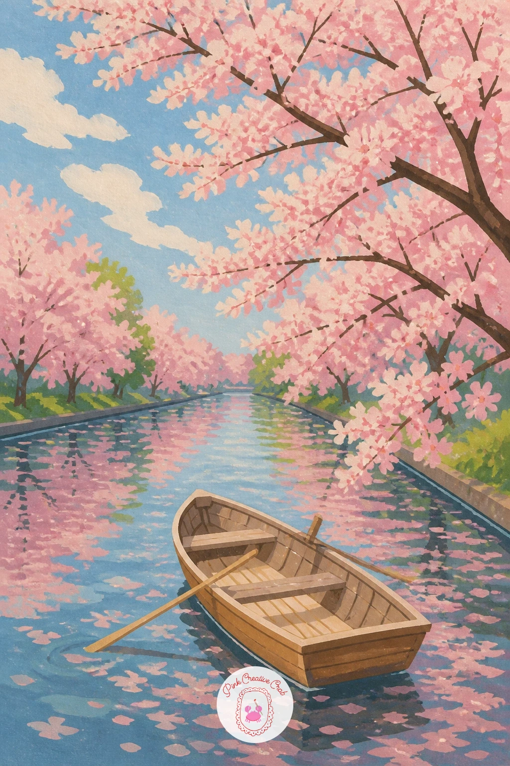
Palette: Sky Blue,Warm Wood Brown,Blossom Pink,Soft Teal
Give yourself ten minutes for a quick version of this scene: a simple standing figure holding an open umbrella, a handful of petals falling around her, nothing more. The forty-minute version adds her uniform details, a satchel over one shoulder, and a wider spread of petals caught mid-fall at different sizes to suggest depth.
Block the figure first as a few simple flat shapes, the umbrella as a clean dome shape held above her head, tilted slightly to one side as if catching the wind. Build the petal shower afterward, scattering shapes of varying size, larger near the umbrella’s edge and smaller as they drift further away.
Where this goes wrong is an umbrella that looks flat and pasted on rather than held. Paint a small shadow beneath its dome falling onto her shoulder, which grounds it in the scene instantly. No pink gouache mixed yet, warm magenta toned down with a touch of white gets you there fast.
One tip for today: keep her uniform in a single flat navy or grey, since a busy outfit competes with the petals instead of letting them be the star.
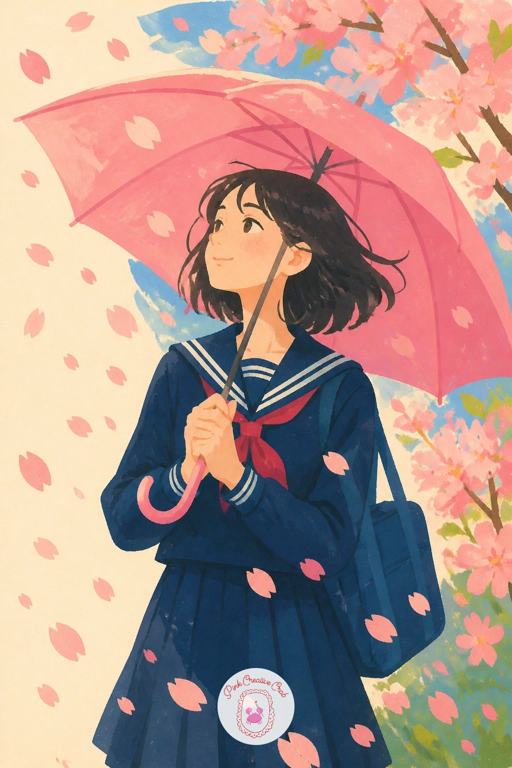
Palette: Navy Blue,Blossom Pink,Soft Grey,Cream
Still life setups like this one reward a clear sense of perspective, so decide where the eye level sits before anything else: low and close, as if you are seated at the low table yourself, which makes the veranda floorboards stretch wide and the blossom branches hang down from just above the frame’s edge.
Paint the wooden veranda floor first in warm flat planks, then the two teacups sitting close together, steam optional as a few soft curved lines rising from each. Add the blossom sprig resting beside the cups last, small and simple, three or four blossom clusters on one thin stem.
The trap here is overcrowding the veranda with detail that competes with the cups. Keep the background trees soft and blurred in tone compared to the sharp, flat cups in the foreground. No green gouache for the tea, a mix of yellow and a touch of blue gets a convincing matcha shade.
Today’s tip: paint the cups slightly different in size and angle rather than identical twins, since that small imperfection makes the whole scene feel more like a real quiet moment.
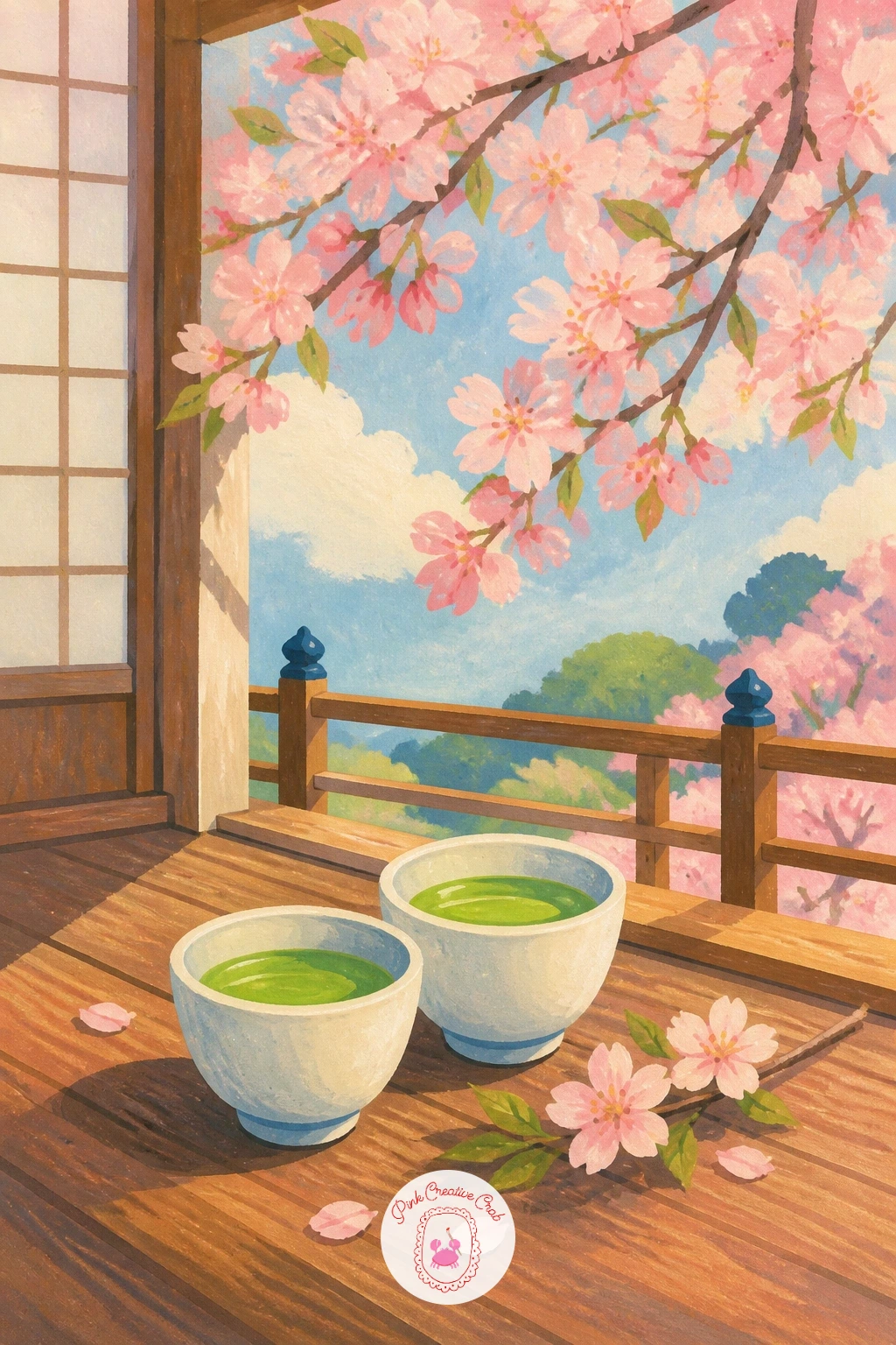
Palette: Matcha Green,Warm Wood Brown,Blossom Pink,Cream
If a plain teahouse floor feels flat, add one faint wood-grain line per plank with a dry brush, just enough to suggest texture without overworking it.
Measuring the branch against the vase keeps this whole composition steady, so hold your brush up to compare: the branch should reach roughly twice the height of the vase itself, leaning slightly rather than standing perfectly straight. Paint the vase first as a simple rounded shape with its blue pattern added in small flat strokes once the white base dries.
Build the branch next, a single curving line for the stem, then cluster the blossoms unevenly along it, denser near the top. Keep petals as soft rounded shapes rather than pointed, since cherry blossom petals read as gentle and full, not sharp.
The windowsill detail is what turns this from a simple still life into a scene, so add a thin strip of sill beneath the vase and a hint of sky blue beyond it, suggesting a window without painting the whole frame. If you don’t have a fine liner brush for the vase pattern, the tip of a round brush loaded lightly works just as well for small dots and curves.
For today’s tip, let one or two blossoms drop loose petals onto the windowsill beside the vase, which adds quiet movement to an otherwise still composition. This pairs well with other vase studies in the gouache flower painting ideas if you want to keep practicing still life setups.
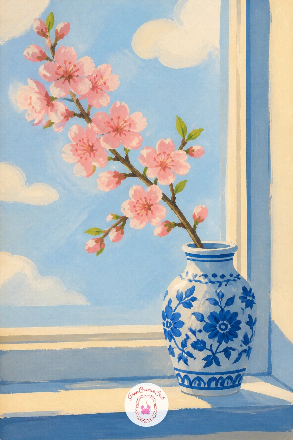
Palette: Cobalt Blue,White,Blossom Pink,Sky Blue
Bridge in from quieter still-life scenes to something busier: a tram passing beneath cherry trees along a quiet city street. Start with the street itself as a flat grey band receding slightly toward the top of the page, then add the tram as a simple boxy shape with rounded windows, painted in a single bold colour so it reads clearly against the pink canopy above.
Build the cherry trees lining the street second, letting their branches meet overhead in places to form a loose canopy the tram passes beneath. Keep the trees taller near the front of the page and slightly smaller further back, which gives the street a sense of distance without much extra work.
Where this scene often fails is a tram that looks like it is floating above the road. Paint a simple shadow beneath its wheels and a thin rail line running along the street to anchor it firmly in place. No bright yellow gouache for the tram, a warm mustard or soft red works just as well as a cheerful focal colour.
One tip for today: keep buildings along the street as flat simple blocks in muted tones, since they only need to support the scene, not compete with the blossoms above.
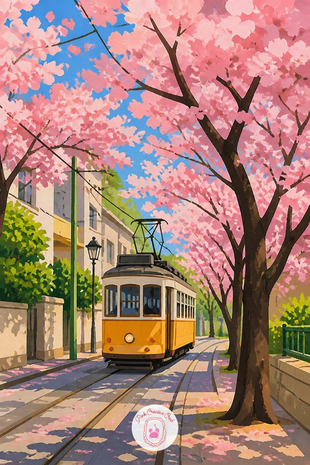
Palette: Mustard Yellow,Warm Grey,Blossom Pink,Sky Blue
Light and placement matter most for a stone lantern, so decide early where the light source sits, usually soft and overhead in a garden scene like this, which keeps shadows short and gentle rather than long and dramatic. Paint the lantern first as a simple stacked shape, a base, a body, and a small peaked roof, all in flat warm grey.
Once dry, add the moss or lichen detail in small patches of muted green near the lantern’s base, where real stone lanterns weather first. Build the blossom trees behind it afterward, kept slightly softer and less detailed than the lantern itself so the eye lands on the stone shape first.
The usual mistake is painting the lantern too smooth and new looking. A few darker grey patches and uneven edges age it instantly, along with a scattering of fallen petals resting on its roof and base. No warm grey mixed yet, a touch of brown stirred into cool grey gets a convincing weathered stone tone.
Today’s tip: let a handful of petals rest directly on the lantern’s flat roof ledge, since that small detail does more to sell the scene than a dozen floating petals in the air around it.
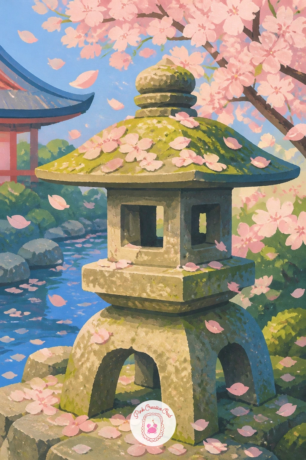
Palette: Weathered Grey,Moss Green,Blossom Pink,Soft Cream
Take the ten minute route first if time is short: a simple side-on figure in a kimono mid-step on a red wooden bridge, a few blossom branches overhanging from one side. The forty-minute version adds pattern to the kimono fabric, a railing detail on the bridge, and water visible beneath with faint reflections.
Paint the bridge first as a flat arched shape in warm red, its railings as a few simple vertical lines rather than a dense fence. Add the figure next, kept simple with a flowing kimono shape rather than defined limbs, her pose caught mid-step for a sense of movement.
Kimono pattern is where many beginners overwork the piece. Keep it to two or three small repeated motifs in a contrasting colour rather than covering the whole garment, letting the flat red of the bridge and soft pink of the blossoms carry most of the colour instead. No bright red gouache on hand, mixing vermilion with a touch of brown gives a similarly warm, slightly muted bridge tone.
One tip for today: paint the water beneath the bridge a shade darker than the sky, which keeps the whole scene from feeling washed out in a single pale palette.
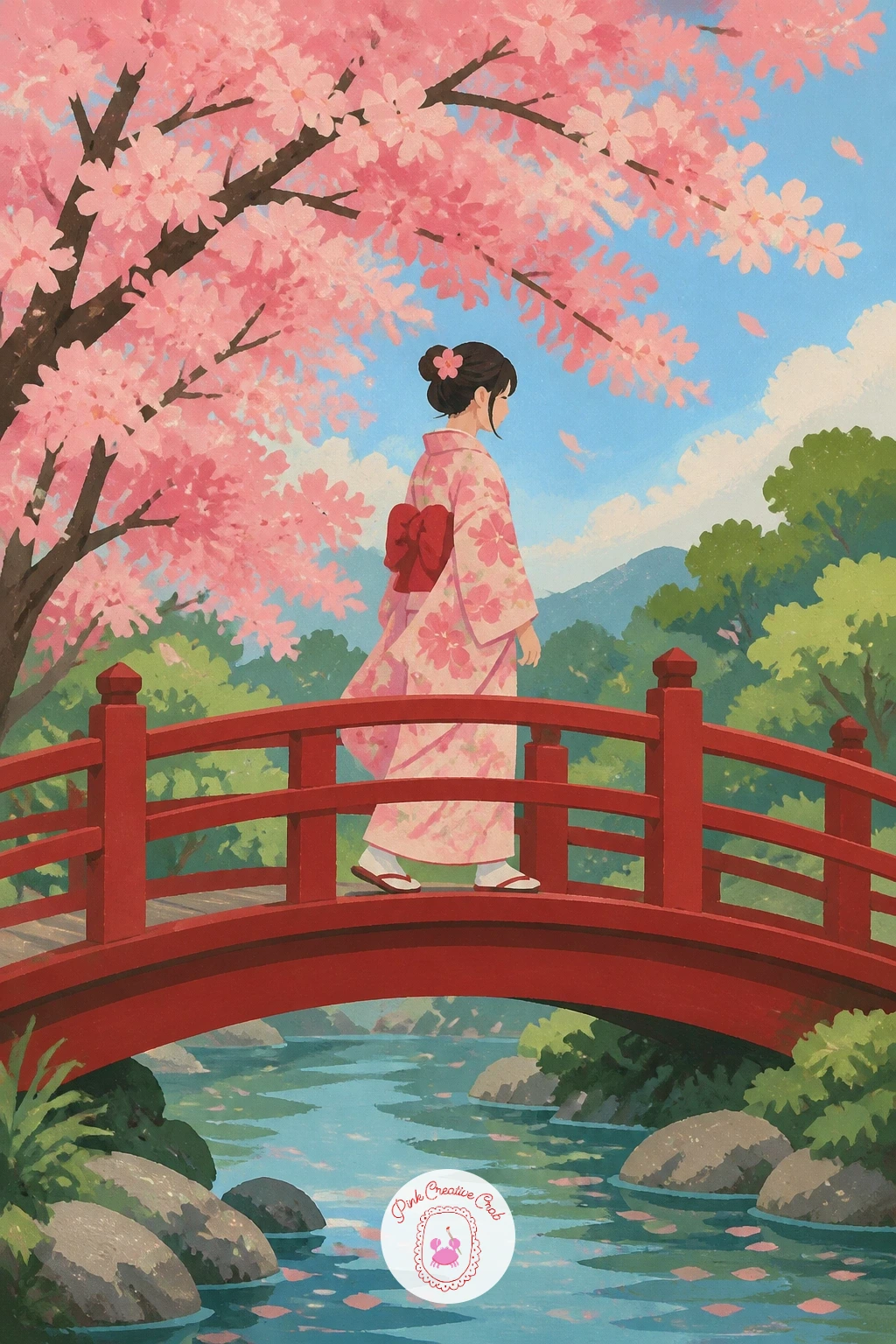
Palette: Bridge Red,Blossom Pink,Indigo,Soft Cream
Scale makes or breaks a small landscape like this, so measure the tree against the village before painting either: the old cherry tree on its hill should dominate at least half the page, its canopy wide and full, while the village below sits small and distant, rooftops no bigger than a thumbnail each.
Paint the hill and tree trunk first, a gnarled, thick trunk leaning slightly to show its age, then build the wide blossom canopy above it in soft overlapping pink clusters. Add the village last, simple rooftop shapes in muted tones scattered along the base of the hill, kept flatter and less detailed than the tree itself.
The usual error is a canopy that looks like a single flat cloud rather than a mass of blossom clusters. Break it into several overlapping rounded shapes of slightly different pink tones, which reads as foliage instead of one solid blob. No deep brown for the trunk, a mix of burnt sienna and a touch of black gets a similarly aged bark colour.
Today’s tip: add one or two tiny dark birds in flight near the tree’s canopy, a small detail that gives the whole landscape a sense of scale and quiet life.
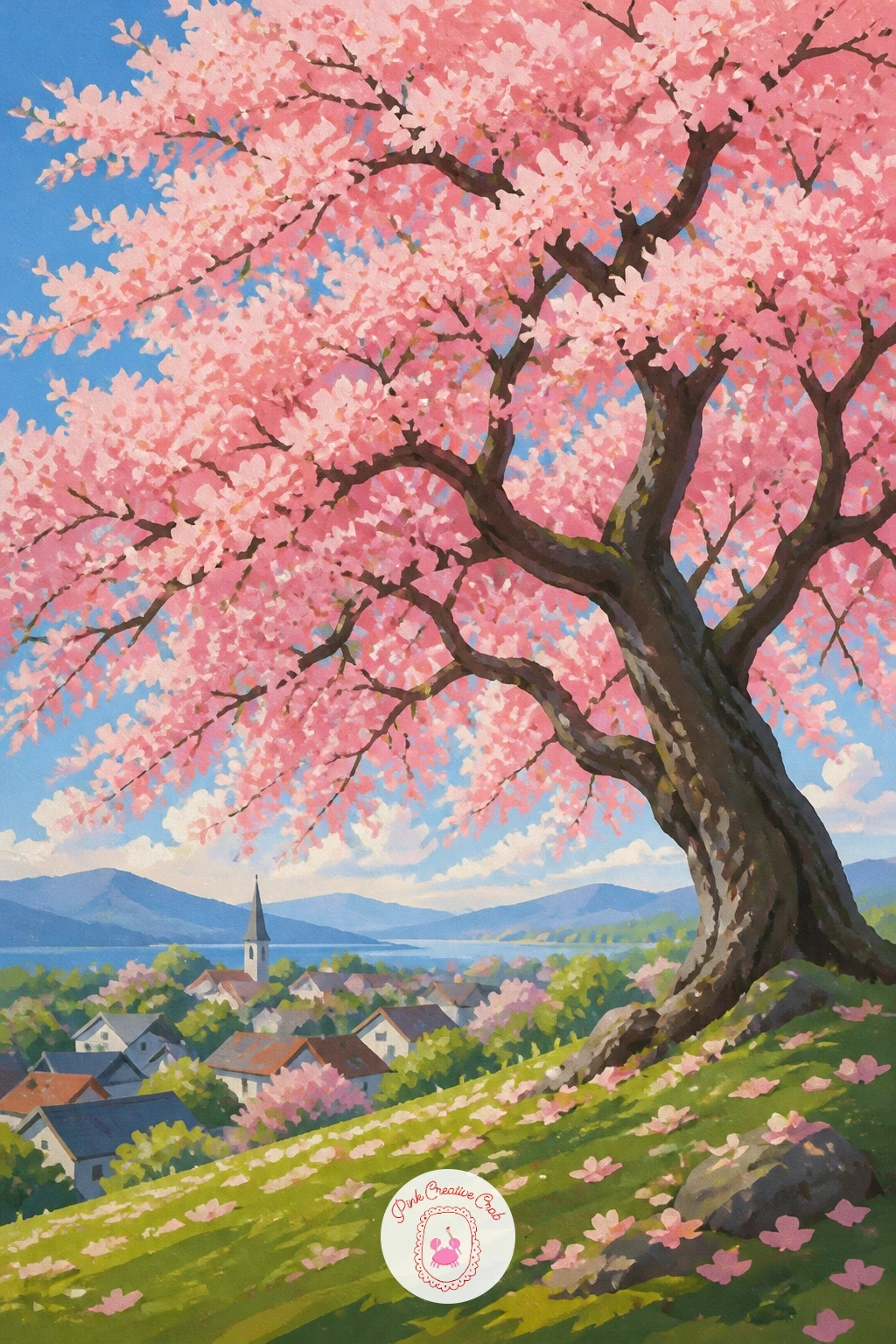
Palette: Burnt Sienna,Blossom Pink,Muted Rooftop Red,Soft Green
Build this quiet still life from the bench outward, painting the wooden slats first as a few flat horizontal shapes in warm brown, then placing the bento box on top as a simple rectangular shape with a lid slightly open to reveal a few colourful compartments inside.
Keep the food inside the bento box simple and graphic rather than detailed, small blocks of colour suggesting rice, vegetables, and a pink shape or two for pickled garnish. Add the blossom sprig resting beside the box last, a short stem with just a few blossom clusters, small enough to sit comfortably next to the box without competing with it.
Where this scene often goes wrong is an overly busy bento interior that pulls focus from the overall composition. Limit yourself to three or four colour blocks inside the box, keeping edges crisp and flat rather than textured. No wood brown mixed yet, a touch of orange stirred into brown warms it up nicely for a sunny bench scene.
One tip for today: let a single petal rest on the open lid of the bento box, which bridges the still life and the blossom theme without needing anything more elaborate.
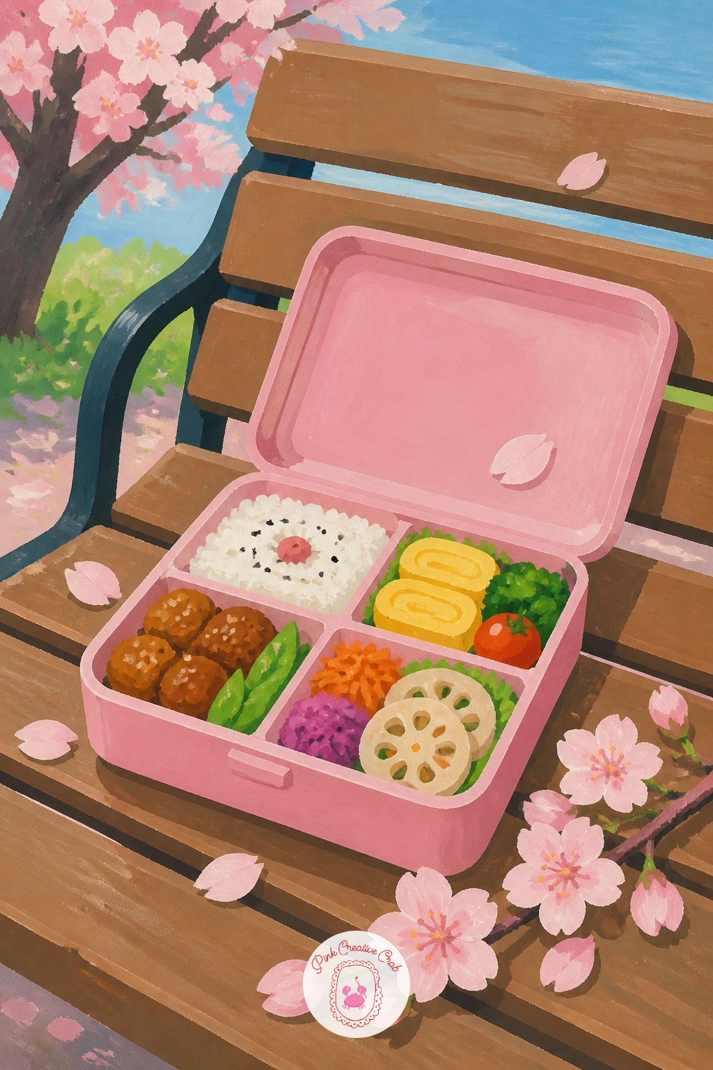
Palette: Warm Brown,Rice White,Pickled Pink,Fresh Green
Movement carries this whole scene, so sketch the dog first in a simple leaping or bounding pose, legs stretched rather than standing still, which immediately reads as chasing something. Keep the body as one or two flat colour shapes, a simple breed shape rather than a detailed coat.
Build the lawn beneath as a flat green field, slightly darker in tone where the dog’s shadow falls, then scatter petals across the grass and in the air ahead of the dog, trailing off in the direction it runs. A dry brush dragged lightly over the lawn’s edges adds a soft textured feel to the grass without painting individual blades.
The common slip here is a dog that looks static despite the running pose. Angle the ears and tail slightly backward, as if caught by the dog’s own motion, and keep its front legs further forward than its back legs. No golden gouache mixed for a golden retriever coat, a warm ochre with a touch of white gets close.
Today’s tip: paint one petal just in front of the dog’s nose, slightly larger than the others, to show exactly what it is chasing.
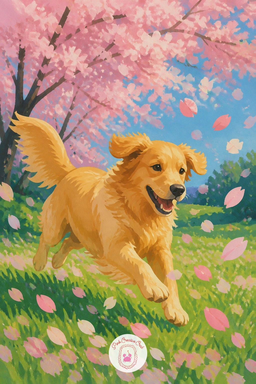
Palette: Ochre Gold,Fresh Lawn Green,Blossom Pink,Cream White
Close focus calls for close looking, so before painting, compare the bird’s body size to a single blossom cluster: a Japanese white-eye is barely bigger than two or three blossoms put together, which keeps the whole scene from feeling out of scale. Paint the blossom cluster first, a few overlapping pink shapes with pale centers, then add the small bird perched or hovering beside it.
Keep the bird’s body as a simple rounded shape in soft olive green, with a distinct pale ring around its eye, the detail that gives this species its name and its charm. Its beak reaches toward the blossom center, suggesting it is sipping nectar rather than simply perching nearby.
Beginners often paint the bird too large relative to the blossom, losing the delicate scale that makes this scene work. Keep checking proportions against the blossom cluster as you build the bird’s shape. No olive green gouache ready, mix yellow and a touch of grey into green for a similarly soft, muted tone.
One tip for today: leave the bird’s eye ring as a small dot of pure white gouache added last, since that bright touch brings the whole bird to life.
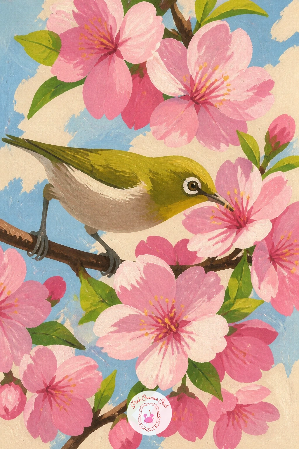
Palette: Olive Green,Blossom Pink,Pale Yellow,White
Evening light changes everything here, so decide first that the light source is low and warm, coming from the lanterns themselves rather than the sky, which stays a soft pale pink rather than bright blue. Paint the sky first as a flat gradient wash, then the two blooming trees on either side, their canopies meeting loosely in the middle.
Add the paper lanterns strung between the trees next, simple glowing ovals in warm orange or soft red, each with a thin dark line for the string connecting it to the next. Keep the glow soft by adding a faint lighter halo around each lantern rather than a hard edged circle.
The trap in an evening scene is making everything equally bright, which flattens the mood. Keep the trees and ground in cooler, more muted tones so the warm lanterns stand out as the clear light source. No orange gouache mixed, a warm yellow with a touch of red creates the same glowing lantern tone.
Today’s tip: paint a few tiny falling petals catching the lantern light in a slightly warmer pink than the rest, since that small shift in temperature makes the whole scene feel lit rather than just coloured.
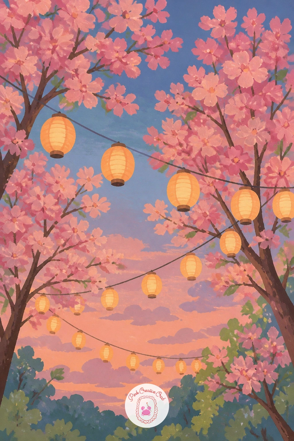
Palette: Lantern Orange,Pale Evening Pink,Muted Green,Deep Indigo
Depth is the whole trick with this one, so work back to front: the pale distant mountain first, soft blue grey with a touch of white at the peak, then the mid-distance hills in a slightly stronger green, and the blossom branches last, closest to the viewer and boldest in colour.
Keep Mount Fuji’s shape simple, a wide gentle triangle with a flattened top rather than a sharp peak, and resist adding too much detail to its slopes. The branches framing the view should feel closer and sharper than the mountain, with crisp edges on the blossoms compared to the softer, hazier mountain behind them.
Where this often goes wrong is making the mountain and branches equally sharp, which collapses the sense of distance entirely. Soften the mountain’s edges slightly with a damp brush before it fully dries, while keeping the near branches crisp and flat. No blue grey gouache mixed, a touch of violet into pale blue gives a similarly soft, distant mountain tone.
One tip for today: leave a thin strip of white or pale cream along the mountain’s peak unpainted, suggesting snow without adding any extra detail.
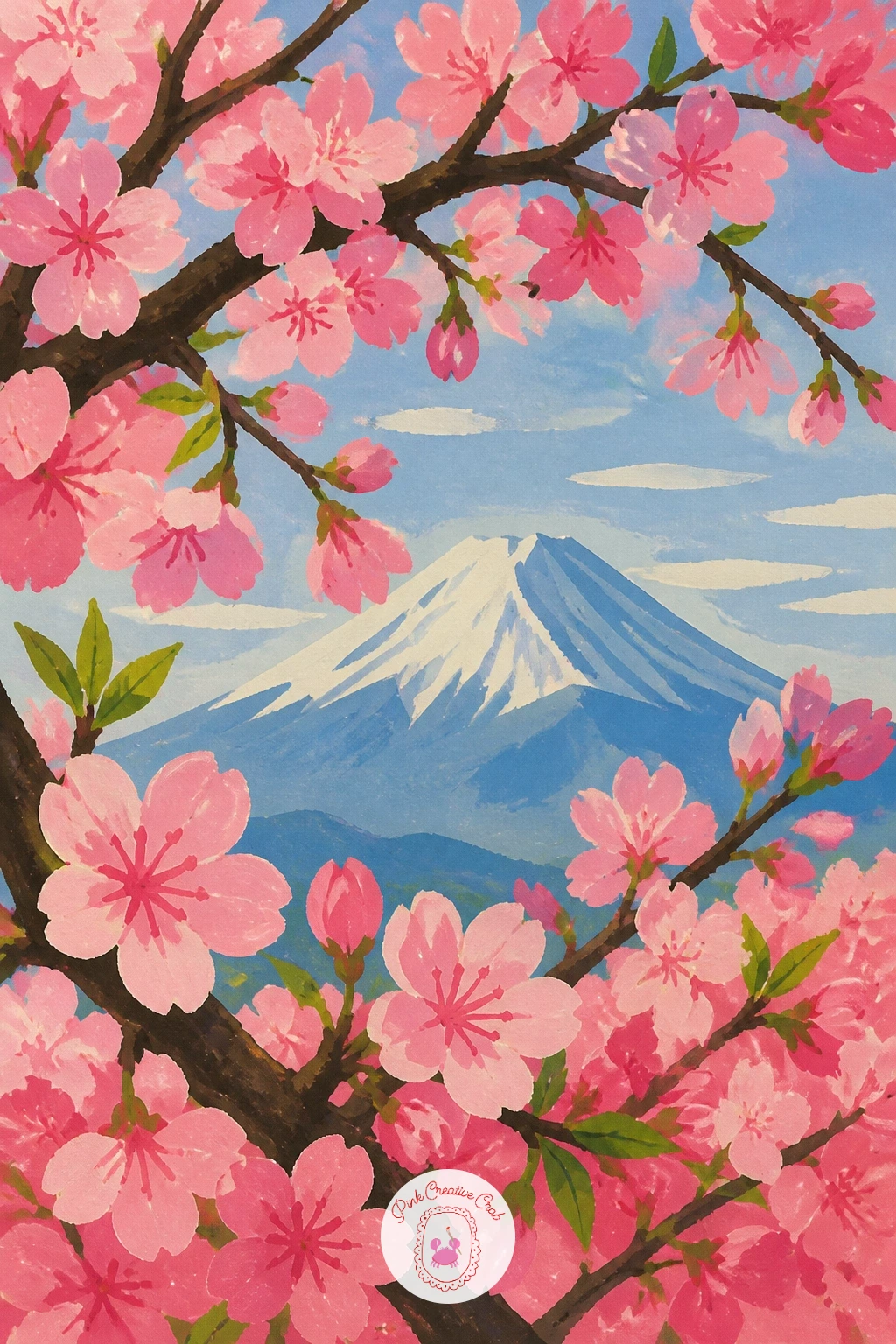
Palette: Mountain Blue Grey,Fresh Hill Green,Blossom Pink,Soft White
Give this one ten minutes for the quick version: a simple stone staircase rising diagonally across the page, scattered petals along each step, and a glimpse of red shrine structure at the top. The forty-minute version adds individual stone texture to each step and a stronger sense of depth with smaller, hazier steps near the top of the stairs.
Paint the staircase first as a series of flat grey rectangles receding upward, slightly smaller and closer together as they rise to suggest distance. Add the red shrine shape at the very top, kept simple and partially cropped by the edge of the page, before scattering petals across the steps themselves.
The common issue is steps that all look the same size, flattening the staircase instead of letting it climb. Vary the width and spacing slightly as they rise, and let the petals cluster more heavily on the lower, closer steps. No warm grey mixed, a touch of brown into cool grey keeps the stone from looking too cold.
Today’s tip: let a few petals gather in the corner where each step meets the next, since that small shadow and pile effect does most of the work in making the staircase feel real.
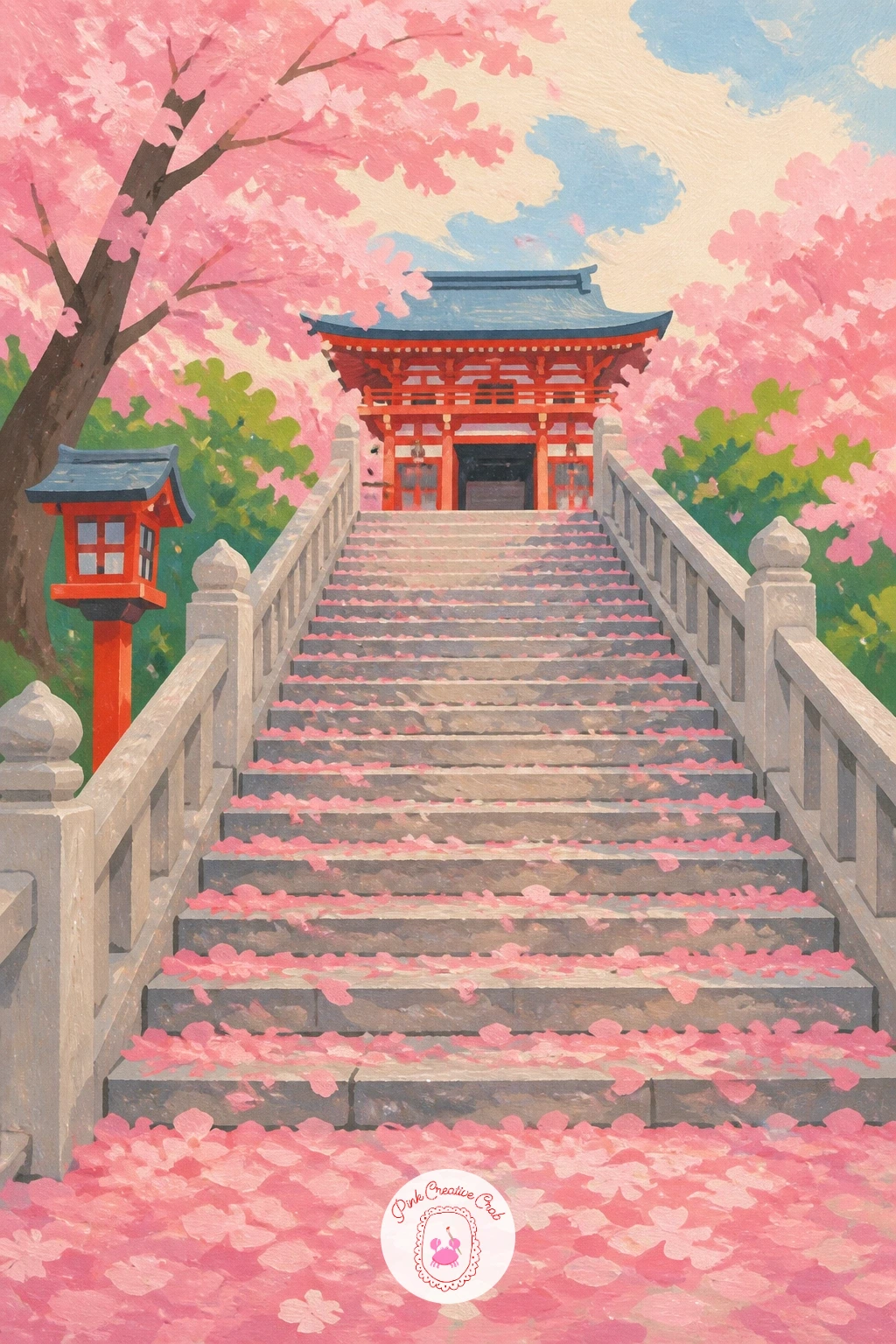
Palette: Stone Grey,Shrine Red,Blossom Pink,Soft Cream
Comparing shapes keeps the bicycle in proportion here, so measure the wheel diameter against the trunk’s width before painting either: a vintage bicycle’s wheel is usually close to the same width as a mature cherry trunk, which helps the two lean against each other convincingly. Paint the trunk first, a thick textured shape in warm brown, then lean the bicycle against it second.
Keep the bicycle’s frame simple and curved, a basket on the front if you like the look, and a slightly faded paint colour to suggest age, dusty blue or soft mint rather than anything bright or new. Build the blossoming canopy above both last, letting a few low branches dip down near the bicycle’s handlebars.
Beginners often paint the bicycle floating rather than leaning, missing the point of contact with the tree. Add a small shadow where the frame touches the trunk and let the back wheel tilt slightly, as if genuinely resting against it. No dusty blue gouache mixed, a touch of grey into blue softens any bright blue toward that vintage look.
One tip for today: scatter a few petals caught in the bicycle’s basket, a small detail that makes the whole scene feel like a moment caught in passing rather than a posed object.
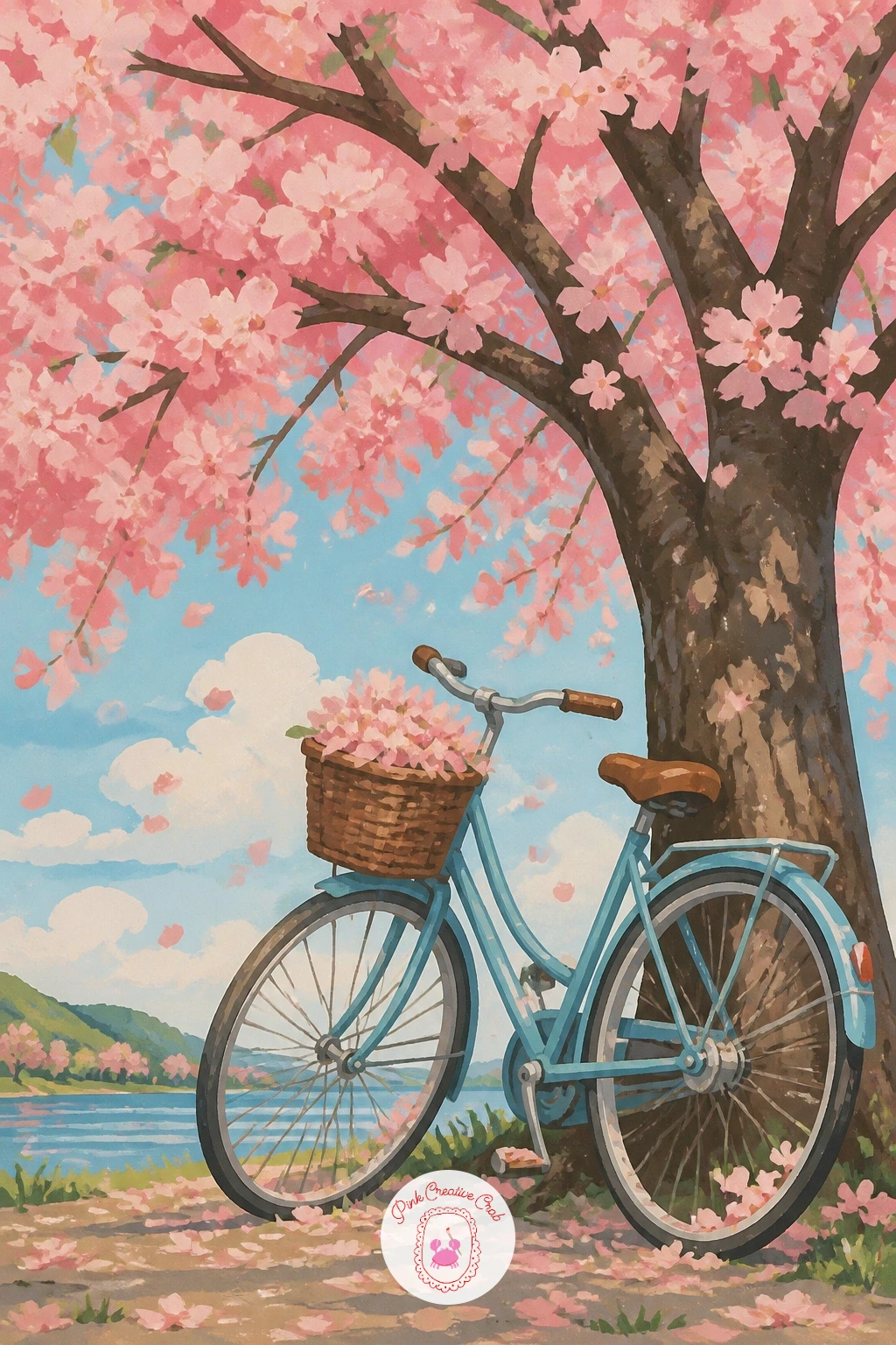
Palette: Dusty Blue,Bark Brown,Blossom Pink,Soft Cream
Grouping figures is the challenge in a hanami scene, so start with the blue picnic mats as flat rectangular shapes laid out beneath the trees, then place three or four simple seated figures on top, varied slightly in pose so none of them look identical. Keep each figure as a few flat shapes rather than detailed portraits, since the gathering as a whole is the subject, not any one person.
Build the trees above the gathering next, their canopy spreading wide enough to shade the whole group, before scattering small picnic details between the figures: a thermos, a few cups, a plate of snacks, all kept simple and small so they support the scene without pulling focus.
The usual trouble is a group that looks stiff and evenly spaced. Cluster the figures a little unevenly, some closer together and one slightly apart, which reads as a natural gathering rather than a lineup. No specific blue gouache for the mats, a muted cornflower or denim blue both work well against the pink canopy.
Today’s tip: paint one figure looking upward at the branches rather than at the group, a small gesture that draws the eye naturally up into the blossoms above.
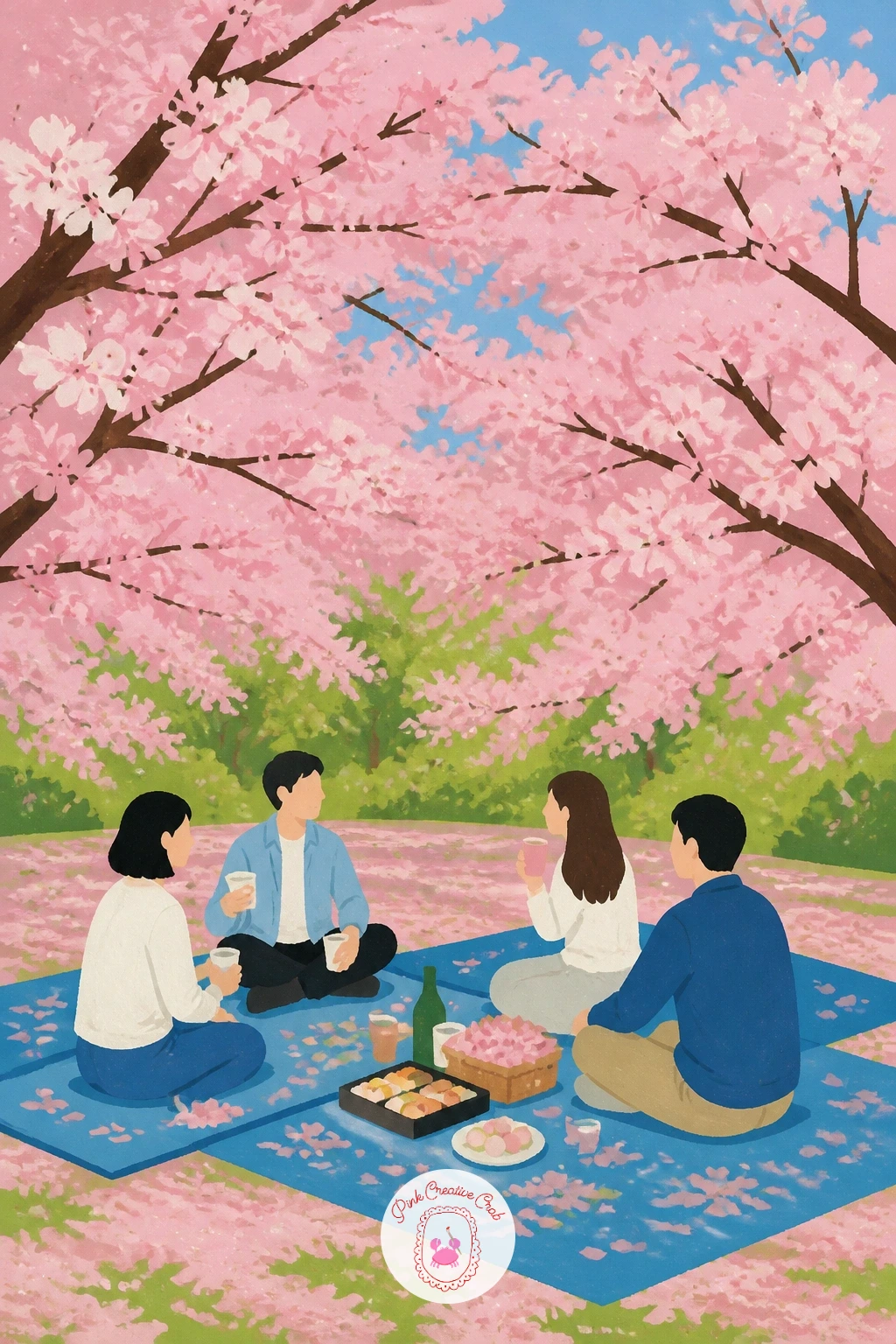
Palette: Cornflower Blue,Blossom Pink,Skin Tones Vary,Fresh Green
Ease into this landscape from the lively hanami scene with something quieter: a riverside path lined with cherry trees, their blossoms reflected in calm water alongside. Paint the water first as a flat pale band, then the path running alongside it in warm earth tones, before adding the trees lining both.
Build the trees along the path taller and more detailed, while their reflections below stay softer, slightly darker, and blurred at the edges, dragged downward with a drier brush to suggest gentle ripples rather than a mirror image. Keep the path curving gently rather than running straight, which gives the whole composition more movement.
A flat, mirror-still reflection is the common misstep, since real water rarely sits perfectly still. Add a few thin horizontal streaks across the reflected trees to suggest the faintest ripple. No specific brush for this, any flat brush dragged lightly and quickly creates the same effect.
One tip for today: let a few fallen petals float directly on the water’s surface near the path’s edge, a small detail that bridges the land and water halves of the composition.
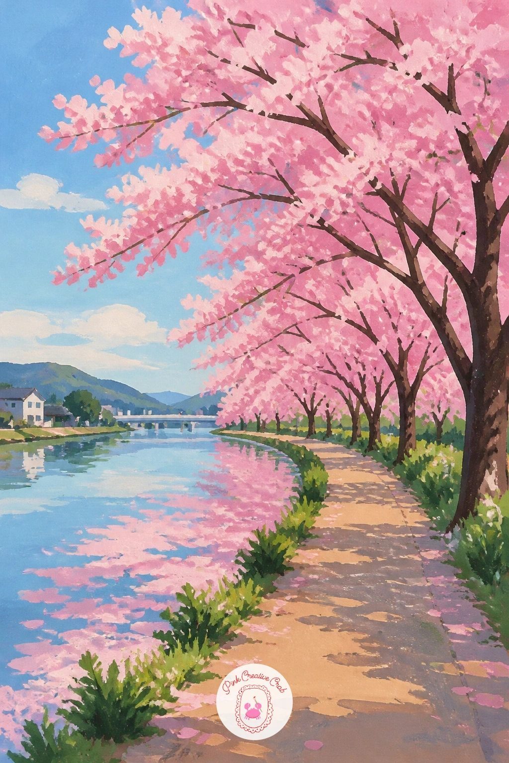
Palette: Pale Water Blue,Earth Path Brown,Blossom Pink,Fresh Green
Keep this one simple and graphic, since a single object scene relies on clean shapes rather than detail. Paint the postbox first as a bold flat red cylinder or box shape, whichever style fits your reference, then add the blossom branch hanging above it second, reaching into frame from one side rather than centered.
Let a few petals rest on top of the postbox itself and scatter a few more falling past it, which ties the branch and box together as one scene rather than two separate elements. Keep the background minimal, a soft wash of pale sky or a hint of pavement beneath, so the red and pink stay the clear focus.
The common error is centering the postbox too perfectly, which feels static. Push it slightly off to one side, letting the branch’s reach balance the composition instead. No bright red gouache on hand, mixing a touch of orange into a cooler red warms it toward that classic postbox shade.
Today’s tip: add a single petal resting right on the postbox’s lid or slot, a tiny detail that makes the whole simple scene feel like a captured moment.
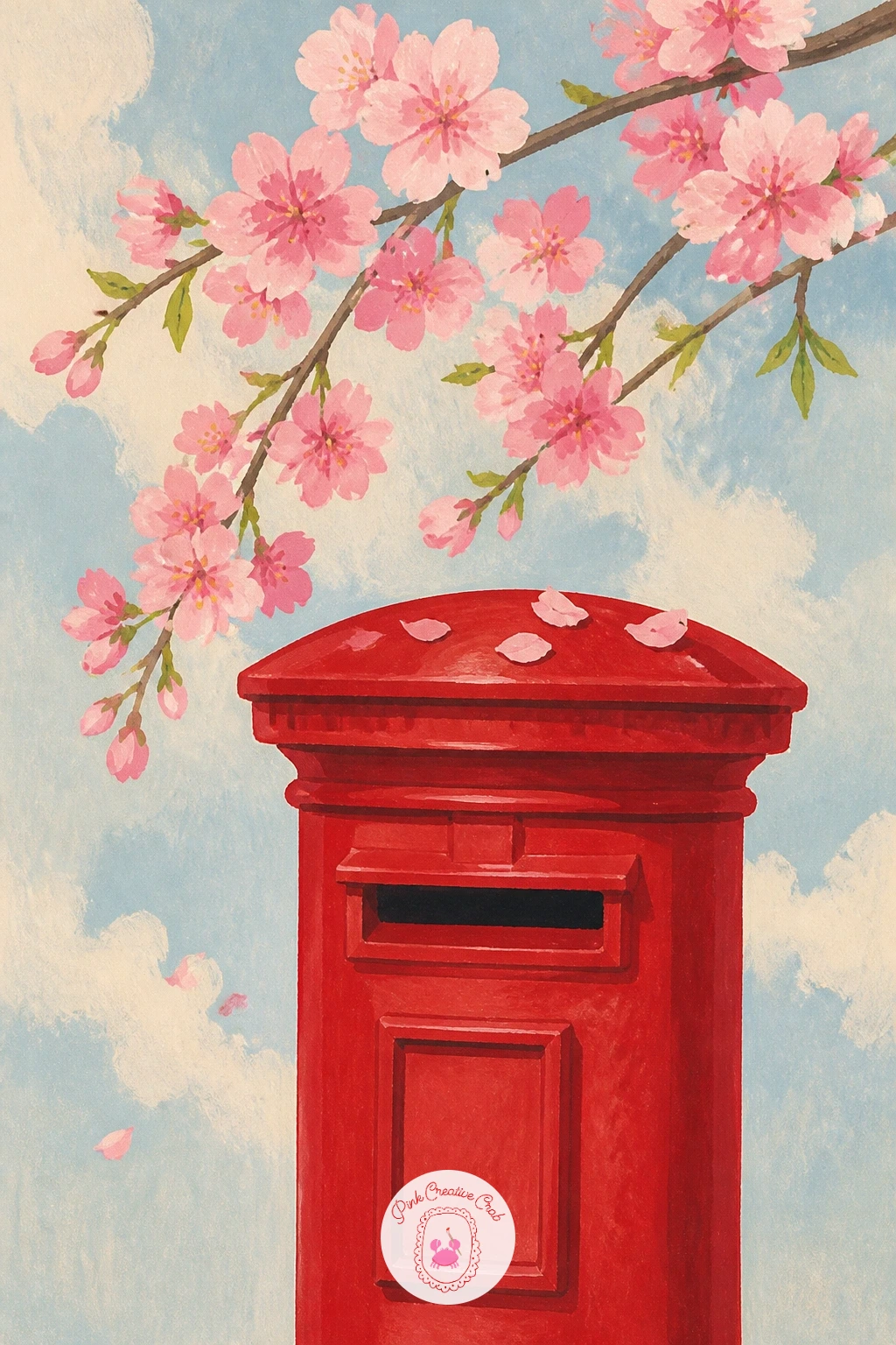
Palette: Postbox Red,Blossom Pink,Soft Sky Blue,Cream
Quiet and still, this scene rewards patience with small shapes, so paint the bench first as a simple flat structure, then the open book resting on it, its pages a soft cream wedge shape angled slightly as if caught mid-read. Keep the text itself suggested rather than written, a few faint grey lines standing in for print.
Build the blossom branch reaching into the frame from one side last, letting a petal or two already rest on the open pages while more drift down around the book. This small detail of petals landing directly where someone was reading gives the whole scene its quiet, interrupted feeling.
The common mistake is making the book’s pages too stiff and flat, losing the sense of an open, used object. A slight curve to each page and a visible spine crease helps it read as a real book rather than a closed block. No fine brush for the faint text lines, the edge of a flat brush dragged lightly creates a similar soft suggestion.
One tip for today: keep the bench itself in a muted, slightly weathered tone, since a bright new looking bench pulls focus away from the gentle book and petal detail.
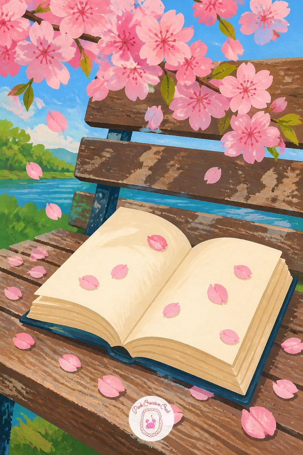
Palette: Weathered Wood,Page Cream,Blossom Pink,Soft Grey
Frame this one from the inside out, painting the window frame first as a simple flat border, then the view of blossoming trees glimpsed through the glass, kept soft and slightly hazy compared to what sits on the windowsill or table in front of it. Add the latte cup and pastry plate last, crisp and clearly detailed since they sit closest to the viewer.
Give the latte a soft pink tint in its foam or a blossom petal resting on top, tying the drink to the theme without needing anything elaborate. Keep the pastry simple, a few flat shapes suggesting a croissant or small cake, nothing that needs fine detail to read clearly.
The usual issue is a window view that feels sharper than the foreground objects, which reverses the natural focus. Keep the trees outside softened and slightly muted, while the cup and plate stay bold and well defined. No pink gouache for the latte foam, a touch of white into your blossom pink creates a soft, convincing foam tint.
Today’s tip: add a thin reflection line across the window glass itself, a small diagonal streak of white, which instantly reads as glass rather than an open view.
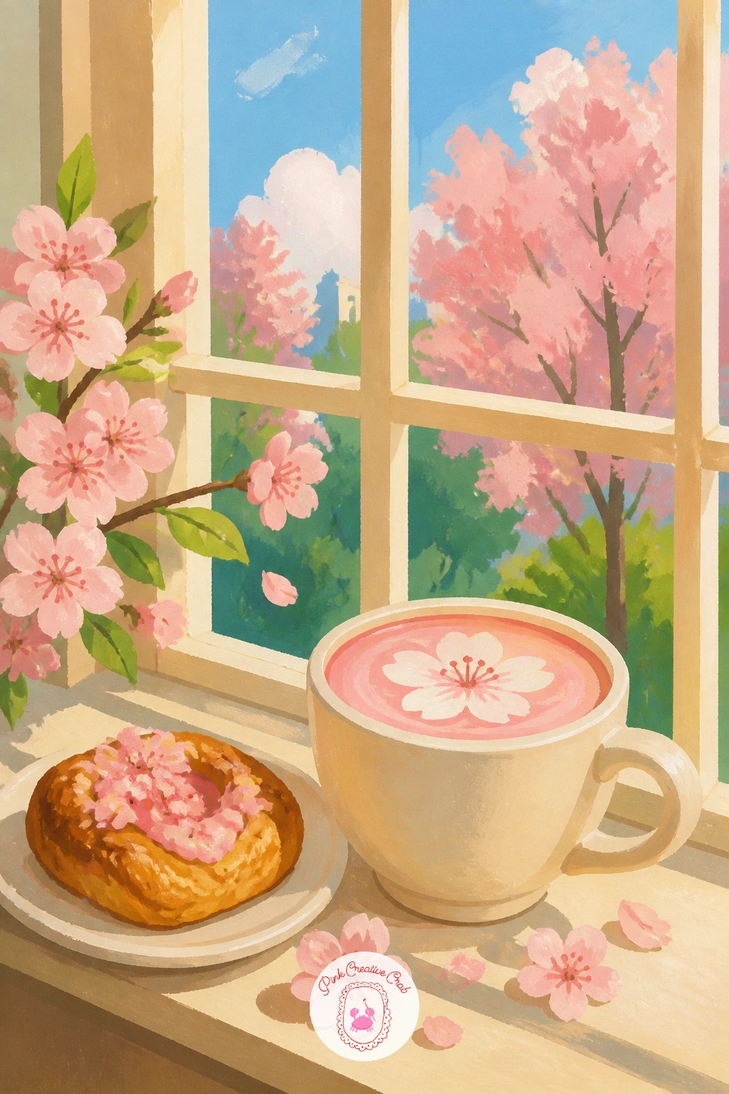
Palette: Latte Cream,Blossom Pink,Window Grey,Soft Green
Settle into a cosy cottage scene next, painting the small wooden house first as a simple flat structure, a peaked roof, a door, one or two windows, nothing overly detailed. Add the blooming tree beside its door second, taller than the house itself and leaning slightly toward it, as if sheltering the entrance.
Keep the house in warm, slightly faded tones, soft blue or weathered cream, so it sits comfortably beside the bright blossom pink without competing for attention. A small path or a few scattered petals leading to the door ties the house and tree together as one cohesive scene rather than two separate elements.
Beginners often paint the tree too small beside the house, losing its presence. Let its canopy reach well above the roofline and spread wide enough to brush against one side of the house itself. No faded blue gouache mixed, a touch of grey stirred into blue gets that same soft, weathered cottage look.
One tip for today: paint a single light glowing in one window, a tiny warm yellow square, which gives the whole quiet house scene a lived-in feeling.
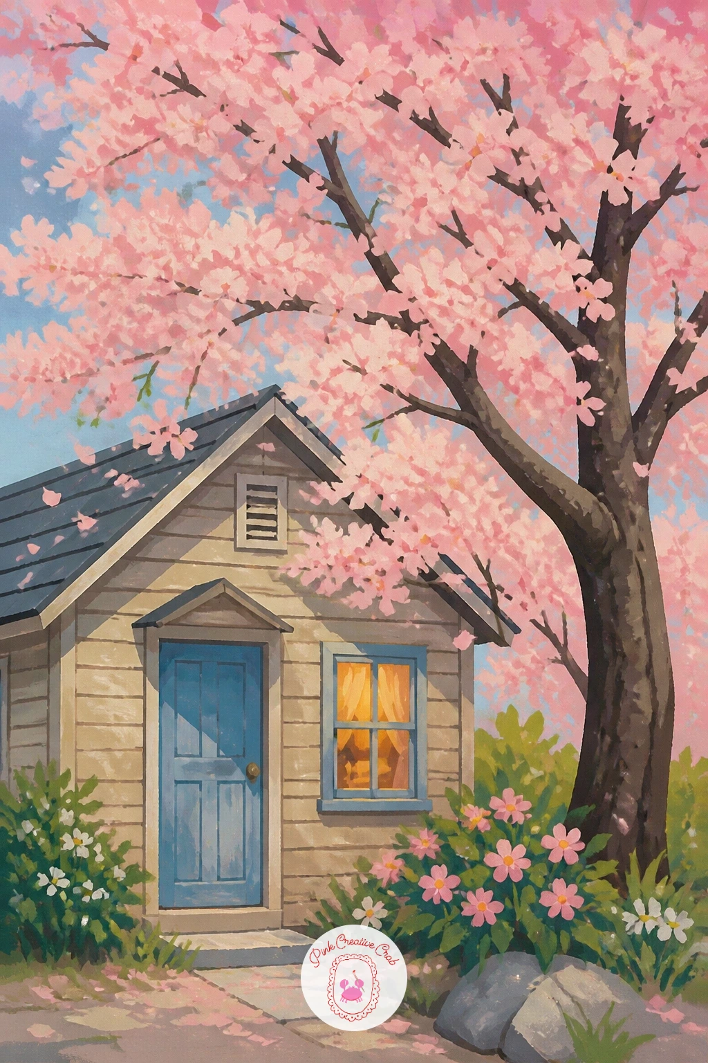
Palette: Weathered Blue,Blossom Pink,Warm Window Yellow,Soft Green
Zoom all the way in for this one, since a close-up cluster needs confident, larger shapes rather than tiny fussy detail. Paint three or four overlapping blossoms first, each with five soft rounded petals and a small cluster of stamens at the center, before adding the bumblebee second, perched or hovering near one bloom.
Keep the bee’s body simple, two or three bold stripes of black and gold, with soft blurred wing shapes rather than sharply outlined ones, which suggests motion even on a still subject. Work the stamens last with a fine brush or the tip of a round brush, small dabs of yellow at the center of each blossom.
The common slip with close-ups is petals that all look identical and flat. Vary the pink tone slightly between petals, lighter where light would naturally catch the curve, slightly deeper in the shadowed folds near the center. No fine liner brush for the stamens, a toothpick dipped in yellow gouache makes clean small dots just as well.
Today’s tip: let the bee overlap slightly onto a petal rather than sitting entirely beside it, since that small overlap makes it look properly landed rather than pasted on top.
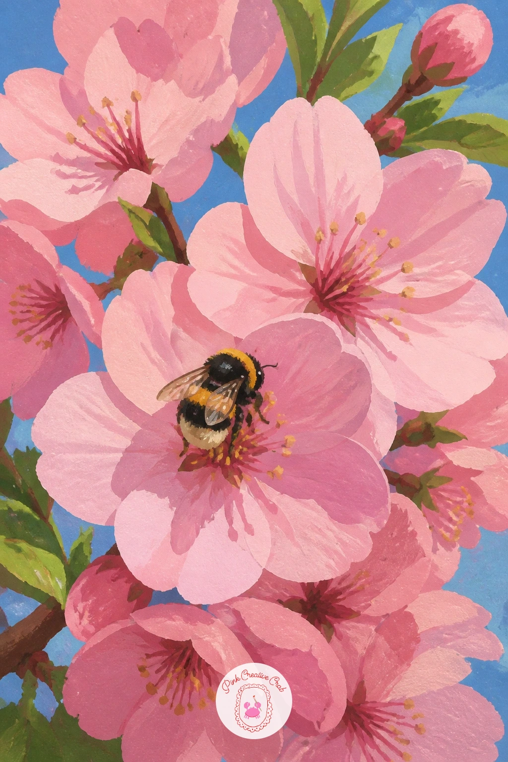
Palette: Blossom Pink,Deep Rose,Bee Gold,Soft Black
Return to a wider view with this one, a ferry crossing a lake with blossoming hills rising behind it. Paint the water first as a flat pale band, then the hills behind in layers, furthest ones softest and palest, closer ones slightly stronger in both green and pink tone to suggest the blossoms covering them.
Add the ferry on the water last, a simple boxy hull shape with a flat upper deck, kept bold and clearly defined against the softer hills behind it. A thin white wake trailing behind the ferry, just a few curved lines, suggests motion across otherwise still water.
The trap in layered landscapes like this is making every hill the same strength of colour, which flattens the distance entirely. Keep the furthest hills noticeably paler and cooler in tone, saving your boldest pink and green for the hillside closest to the water’s edge. No specific ferry reference, any simple flat-bottomed boat shape reads convincingly from a distance.
One tip for today: paint a thin strip of mist along the base of the furthest hills, a pale horizontal smudge, which pushes them back convincingly without any extra detail work.
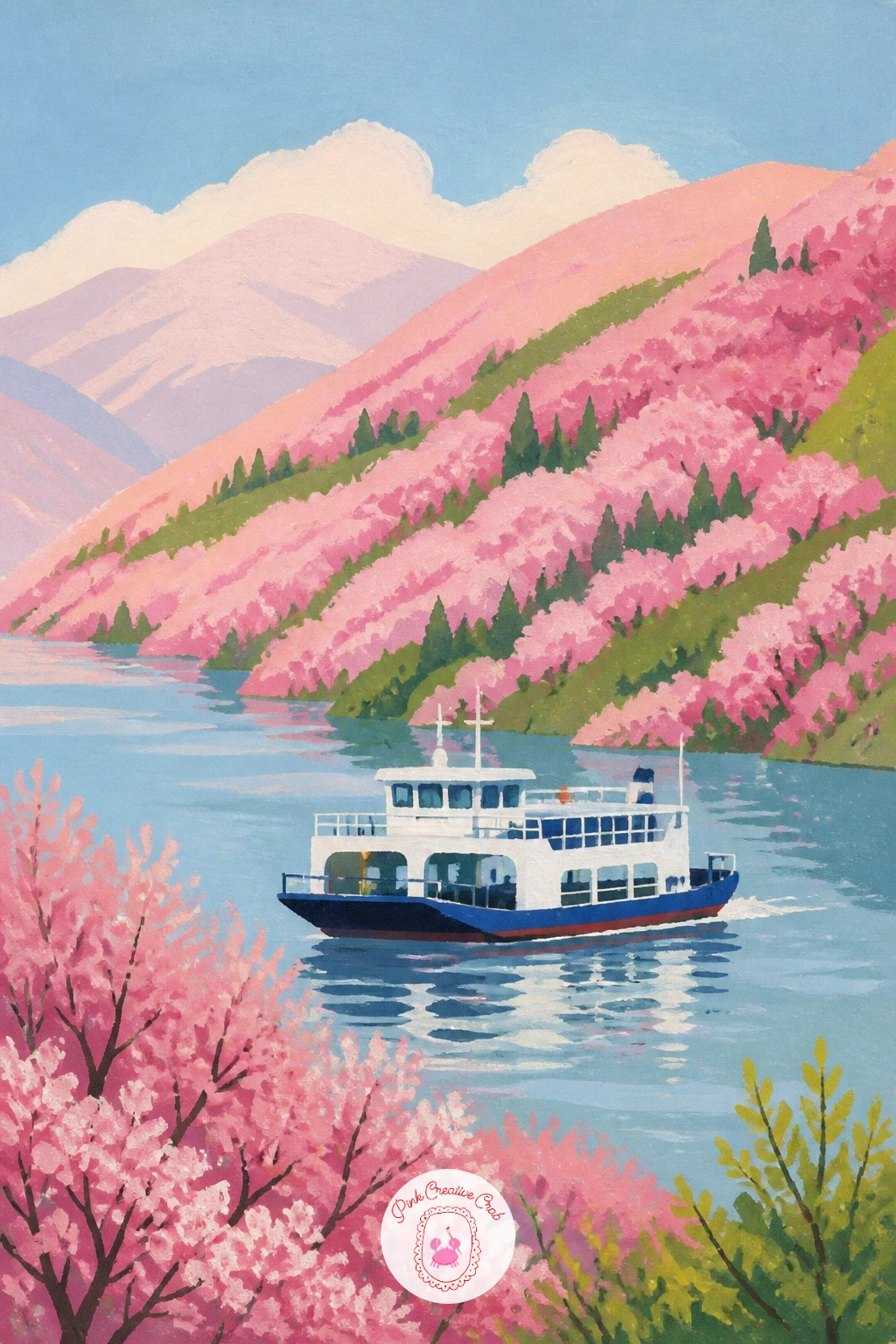
Palette: Pale Water Blue,Distant Hill Green,Blossom Pink,Ferry White
Bring the scale back down to something personal and close for this one, a child on her father’s shoulders reaching up toward a low branch. Build the father’s figure first as a simple standing shape, legs planted firmly, then add the child seated on his shoulders second, one arm stretched upward toward the blossoms above.
Keep both figures as flat, simple shapes rather than detailed portraits, letting their poses tell the story: his steady stance, her reaching arm and tilted head. Add the low-hanging branch last, positioned just slightly out of the child’s reach, which gives the moment its gentle tension and charm.
The usual issue is two figures that look like separate shapes stacked together rather than one connected pose. Overlap the child’s legs slightly around the father’s shoulders and let her weight visibly rest on him, with a small shadow where they connect. No specific skin tone mixed, build any warm tone from a base of yellow ochre and a touch of red, adjusted lighter or darker as needed.
Today’s tip: let one petal land directly on the child’s outstretched fingers, a small detail that rewards her reach without needing her to actually catch the branch.
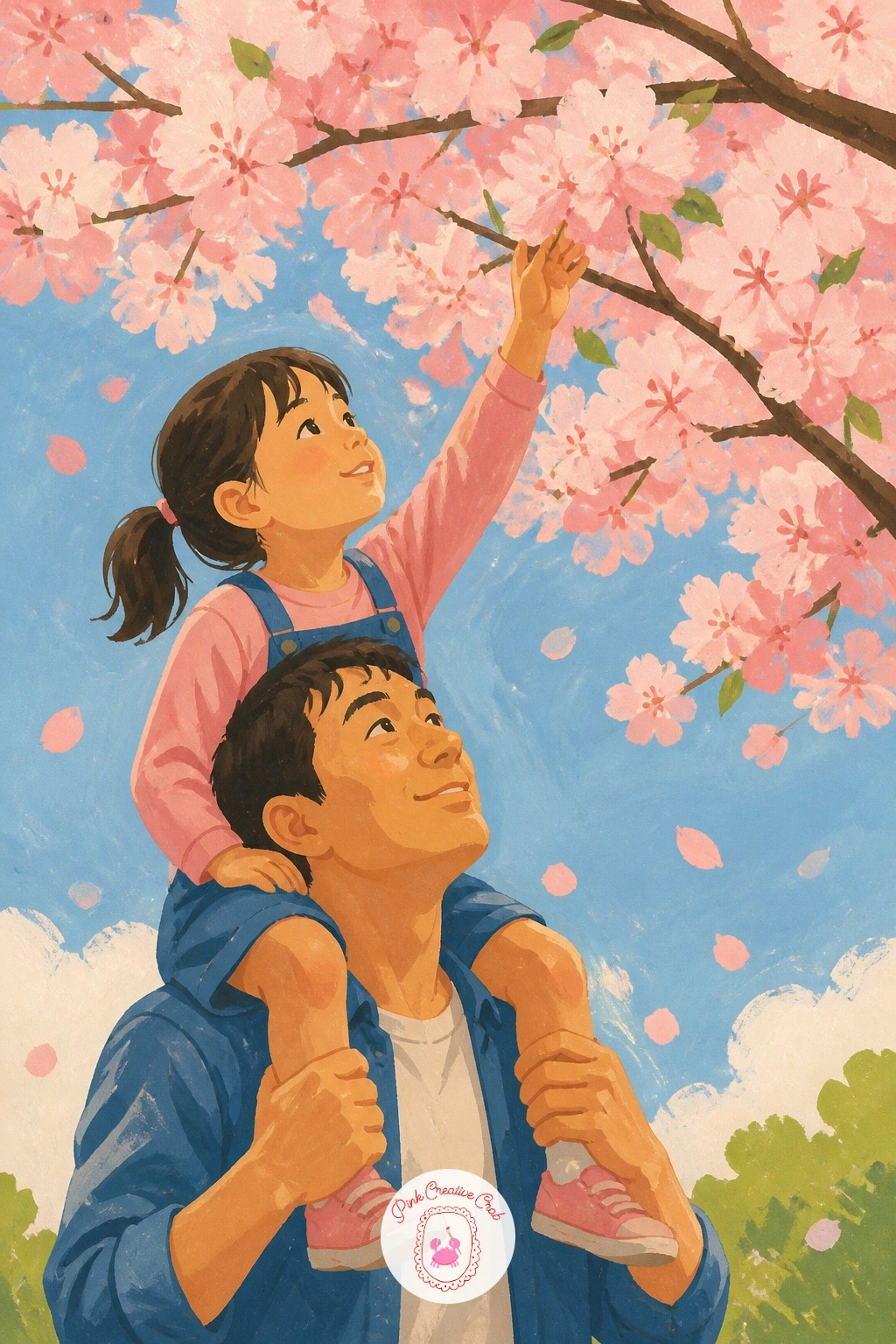
Palette: Warm Skin Tone,Blossom Pink,Denim Blue,Soft Green
Close the series on something small and still, a pair of wooden sandals left on a step scattered with fallen petals. Paint the step first as a simple flat stone or wood shape, then the sandals on top, kept slightly angled and not perfectly paired, as if just stepped out of.
Scatter petals across the step and resting on the sandals themselves last, varying their size and letting a few cluster more heavily in one corner, which suggests they have been falling for a while rather than just landing. Keep the whole palette narrow here, warm wood tones and soft pink, so the simplicity of the objects carries the scene.
The common misstep is sandals placed too symmetrically, which feels staged rather than natural. Angle one slightly more than the other and let them overlap just a touch. No specific wood tone mixed for the sandals, a simple burnt sienna with a touch of white lightens it to a believable worn wood shade.
One tip for today: leave the step’s corner shadow soft and slightly cool in tone, since a warm shadow here flattens the sense of stone or wood beneath the petals. For a completely different petal-filled mood once this one is finished, the cherry painting ideas make a fun next stop, and the gouache painting ideas for beginners are worth bookmarking too.
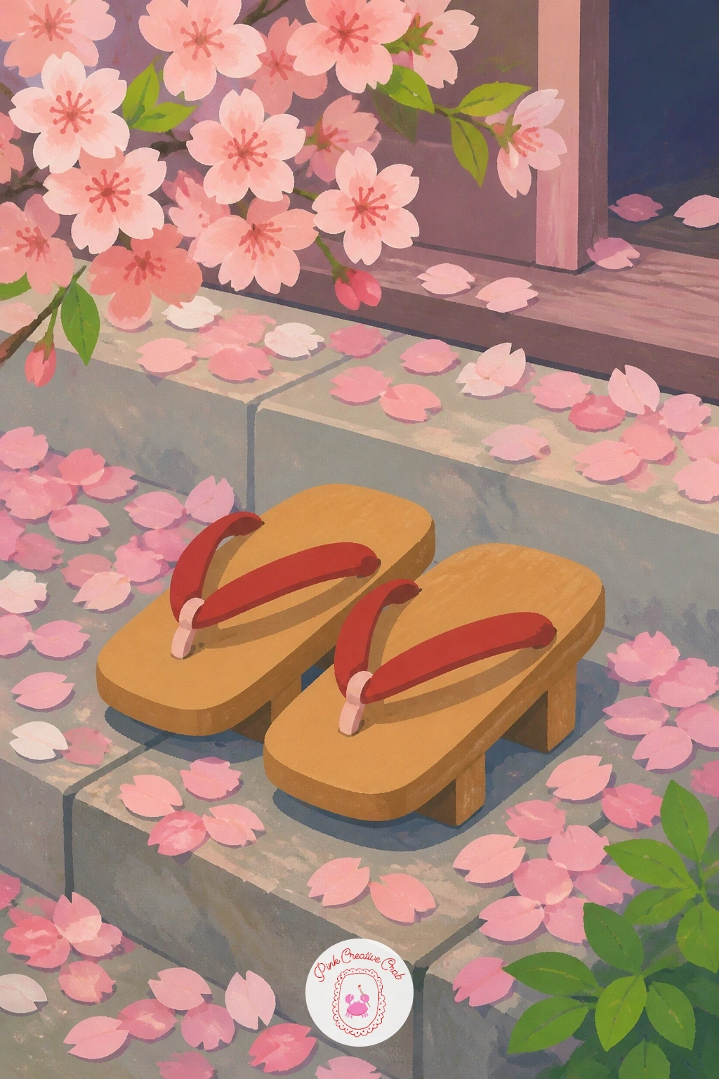
Palette: Worn Wood Tan,Blossom Pink,Cool Stone Grey,Soft Cream
What to Do Next
Pick whichever scene matches your mood today, pull out your gouache and a sheet of cold press paper, and start with the largest shape first the way each idea describes. One finished picture is plenty for one sitting, so keep the rest of this list bookmarked for the next quiet afternoon.
Frequently Asked Questions
What gouache colours do you need for cherry blossom painting?
A soft blossom pink, a deeper rose for shadow, sky blue, leaf green, and a warm grey or brown cover nearly every scene in this list. Add white for mixing lighter tints and a touch of black or Payne’s grey for deep accents like torii gates or bicycle frames.
How do you paint realistic looking cherry blossom petals in gouache?
Paint petals as soft rounded clusters rather than sharp individual shapes, varying the pink tone slightly between each cluster. Keep edges clean but not harsh, and scatter a few loose petals at different sizes nearby to suggest ones that have already fallen.
Is gouache or watercolor better for cherry blossom scenes?
Gouache suits the flat, matte, modern look used throughout this list better than watercolor, since its opaque colour sits crisp and even without heavy blending. Watercolor works too if you prefer softer, more transparent petals, just expect looser edges.
What paper works best for gouache cherry blossom paintings?
A smooth or lightly textured cold press watercolor paper handles gouache’s flat washes well without excess texture showing through. Heavier paper, around 300 gsm, also resists warping if you build up a few layers of colour in one sitting.
How do you keep a cherry blossom scene from looking too pink and flat?
Balance the pink with a sky blue background, leaf green accents, and one warm neutral like wood brown or stone grey in every scene. Varying the pink’s value, lighter and deeper tones side by side, also keeps large blossom areas from reading as one flat block.
Have any thoughts?
Share your reaction or leave a quick response — we’d love to hear what you think!
-
 0
-
0
-
0
-
0
-
0
-
0


