

Loose watercolor flowers forgive the shaky hand and reward the confident one, which is exactly why they feel so good to paint. You let a wet brush do most of the talking, drop in color, tip the paper, and watch petals bloom into soft edges you could never quite draw on purpose.
Below you will find 32 bouquets, sprigs and single blooms to work through, from a quick jar of tulips to a full wreath, each one built to finish in a single relaxed sitting with ordinary paints and a scrap of white paper.
Using these images: free for personal projects such as printing, coloring, cards, journals and gifts. Handmade items that include them may be sold up to 30 pieces per design. More than that is commercial use and is not permitted, and neither is selling or sharing the images themselves or passing them off as your own. Please ask before any other use.
Garden roses make a forgiving first subject because every petal can wobble and still read as a rose. Wet a loose cluster of circles on cold press paper, then drop blush pink and coral into the damp shapes so the colors bloom and merge on their own.
Work from the back of the bunch forward, letting the first roses dry a little before you paint the front ones in slightly stronger color, which keeps the bouquet from turning into one flat pink smudge. While everything is still damp, touch a little sap green into the gaps for leaves, letting it bleed softly into the pink.
If the petals turn muddy, you likely overworked them. Stop touching the paper once the color is down and let the water do the blending instead of your brush.
No tube of coral on hand works fine too, since a mix of pink and a touch of orange gets you there. Today, try painting the whole bunch with only two colors so the blooms stay harmonious instead of busy.
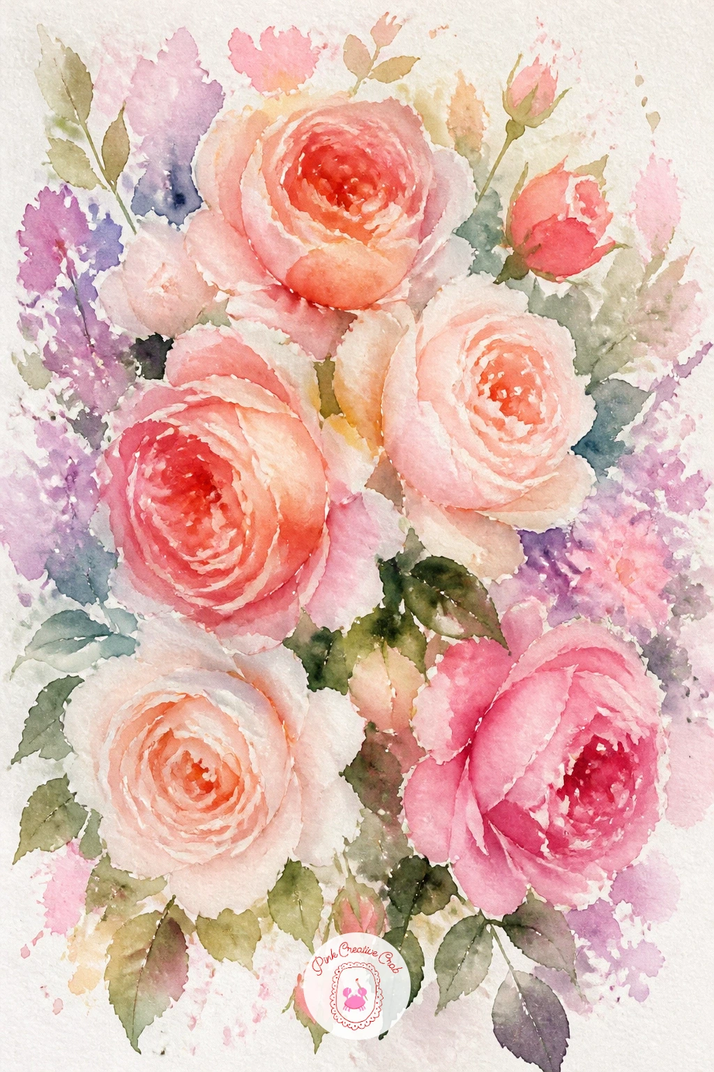
Palette: Opera Pink,Cadmium Orange,Sap Green,Permanent Rose
Peonies reward a slow, generous brush, so give this one the whole middle of your page. Start with clean water in a rounded shape slightly larger than you think the flower needs, then drop in blush and a little lilac from the center outward, letting the pigment pool and feather at the petal edges.
While the paper is still wet, press a darker pink into the very center with the tip of your brush to suggest the folded inner petals, and let it spread on its own. Add the stem and a leaf or two last, once the bloom has mostly dried, so the green does not bleed into the pink.
The usual trouble spot is an overworked center that goes muddy. If that happens, lift a little color out with a clean damp brush while it is still wet rather than adding more paint on top.
No lilac in your set, a touch of blue mixed into the pink gets a similar cool shadow. Try tilting the paper slightly after you drop the color in, so gravity pulls the pigment into soft, organic petal shapes.
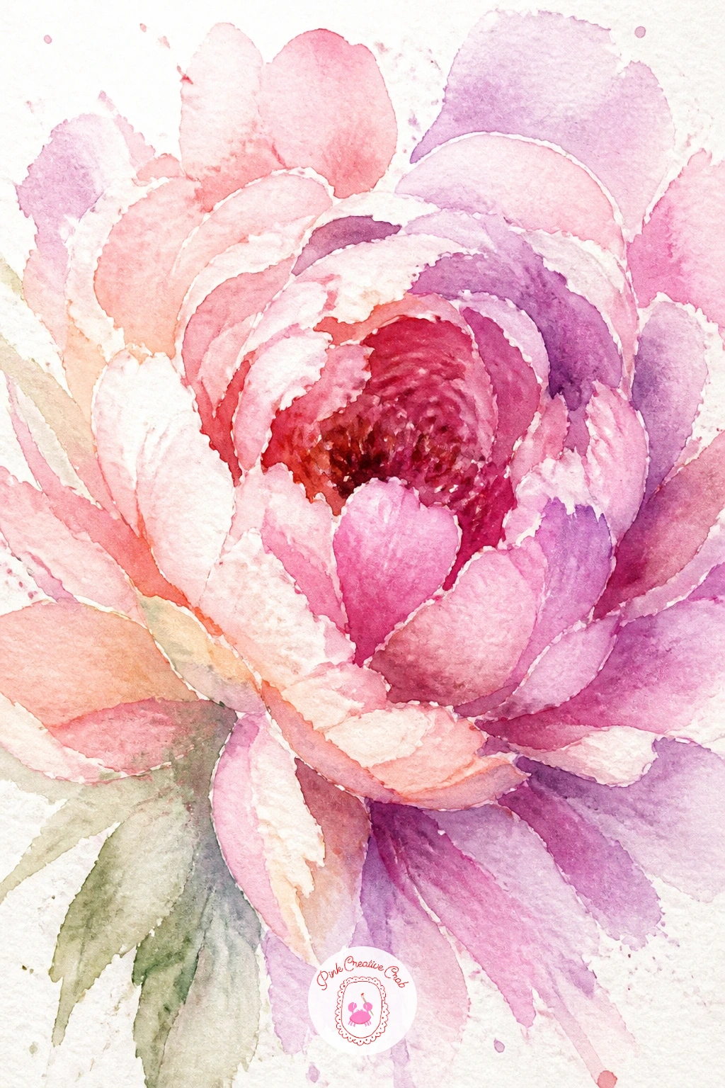
Palette: Quinacridone Rose,Lilac,Alizarin Crimson,Sap Green
Look at a real peony photo before you start, just for the way the petals ruffle toward the center, then forget it and let the water take over.
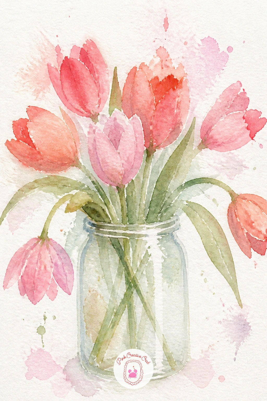
Tulips are basically simple curved teardrops, which makes them a relaxing follow-up to the peony. Paint three or four tulip shapes wet-in-wet in coral and blush, keeping the top of each shape rounded and the base narrow where it meets the stem.
Once the heads are dry, add thin green stems with a fine brush, letting them cross at slightly different angles so the bunch feels gathered rather than lined up. Paint the jar last with a pale grey-blue wash, leaving a streak of white paper unpainted down one side to suggest glass catching light.
If the jar looks flat, it is usually because that white highlight got painted over by accident. Mask it off with a scrap of tape before you wash in the glass if you want to protect it.
No masking tape, just paint around the highlight carefully with a small brush instead. For a quick ten-minute version, skip the jar altogether and let the stems trail off the bottom edge of the page.
You Will Need
- masking tape (optional)
Palette: Coral,Permanent Rose,Payne’s Grey,Sap Green
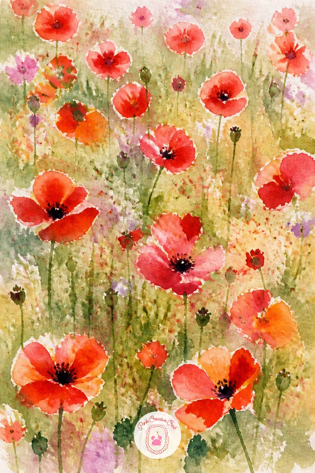
Poppies bring in red, which can feel bold after all that pink, so let it stay loose and bright. Drop a round shape of clean water for each flower head, then touch in red or orange-red while the paper is still wet so the edges bloom outward into soft, ragged petals.
Once those have dried, press a tiny dark mark into the center of each one with the tip of a round brush for the seed pod, and flick a few thin black lines outward for stamens. Scatter the poppies at different sizes and heights across a loose wash of green and gold for the field, painted first and left to dry before the flowers go on top.
Where this one goes wrong is spacing the poppies too evenly, which looks planted rather than wild. Group two or three close together and leave the rest further apart.
If you want visible light direction, paint the field wash slightly darker at the bottom of the page, as though the sun sits high and behind the flowers. No red on hand, cadmium orange alone still reads as poppies from a distance.
You Will Need
- old toothbrush for splatter
Palette: Cadmium Red,Cadmium Orange,Olive Green,Payne’s Grey
Flick a loaded toothbrush over the dry field for a scatter of tiny dots, which reads as distant poppies without painting a single extra flower.
Cosmos have thin stems and open, almost flat flower faces, so the challenge here is restraint rather than detail. Paint each bloom as four or five loose petal shapes around a small center, dropping blush or lilac wet-in-wet so the petal edges feather softly rather than staying crisp.
Measure before you commit to the stems: hold your brush up against the page and compare the stem length to the flower head, since cosmos stems are often three or four times the width of the bloom and look wrong if shortened. Paint them thin and slightly wavering with a fine brush once the flowers are dry.
The common mistake is making every flower face the same direction. Turn a few heads sideways, just an oval instead of a full circle, so the bouquet feels like it is caught mid-breeze.
No fine liner brush, the pointed tip of a round brush does the job just as well for the stems. Try this one on a tall, narrow sheet of paper if you have one, since cosmos suit a vertical format.
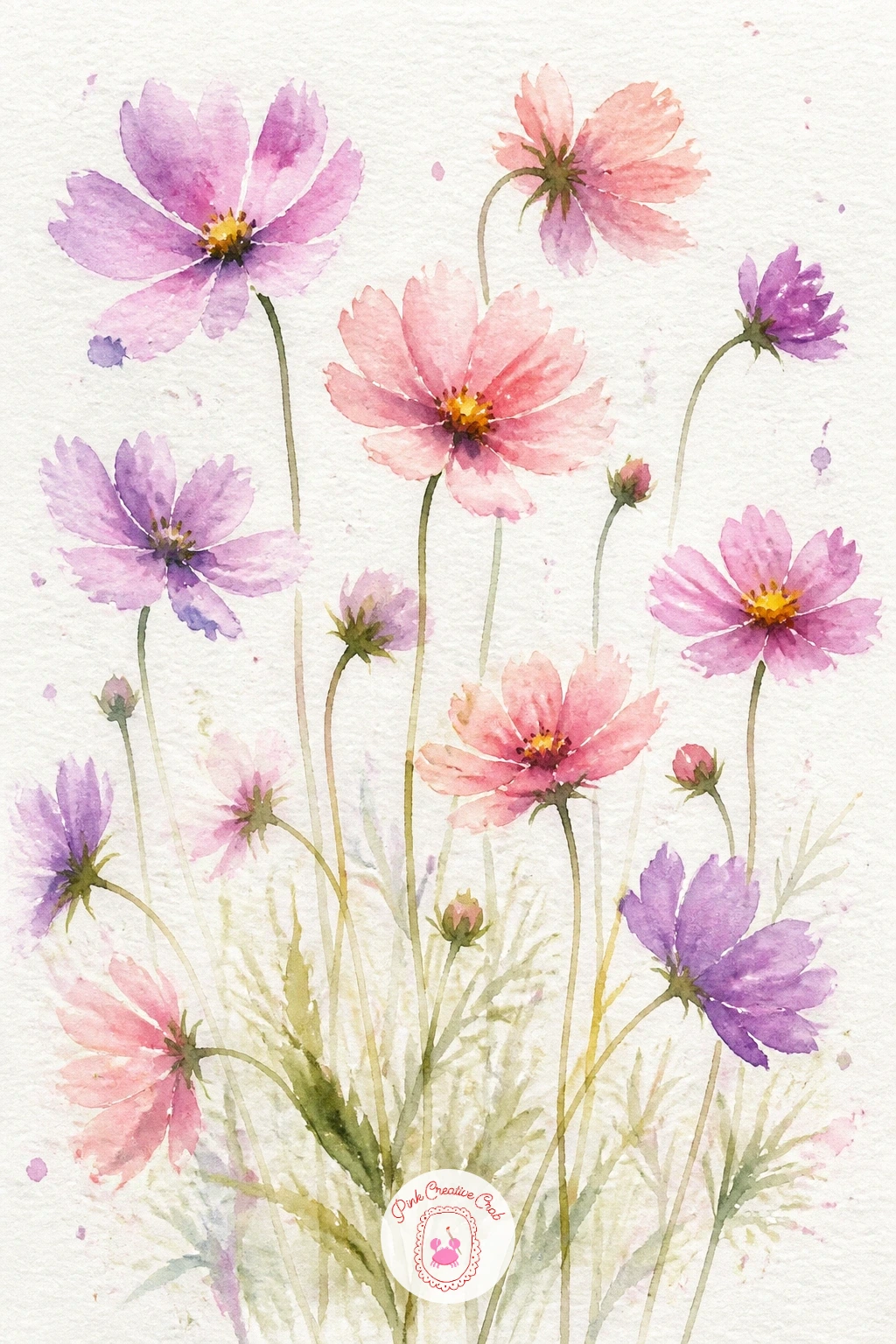
Palette: Lilac,Opera Pink,Yellow Ochre,Sap Green
Ranunculus hide dozens of tiny petals inside a rounded head, but you only need to suggest a handful of them to read as the real thing. Start with a soft round wash of coral or peach, then while it is still damp, use the tip of your brush to pull three or four curved petal strokes inward toward the center, letting them blend at the edges rather than staying separate lines.
Let that first layer dry completely before adding a second, smaller ring of petal strokes in a deeper shade near the middle, which gives the flower its layered look without painting every petal.
Going too far with those inner strokes is the easiest way to lose the looseness, so stop after six or seven marks even if it still looks sparse up close; from a distance it reads as full. If your paint keeps bleeding where you do not want it, your paper underneath was still too wet, so wait a beat longer next time.
No coral mix ready, warm pink with a touch of orange gets close enough. Once this works, try painting a whole loose bunch of three ranunculus heads at different sizes.
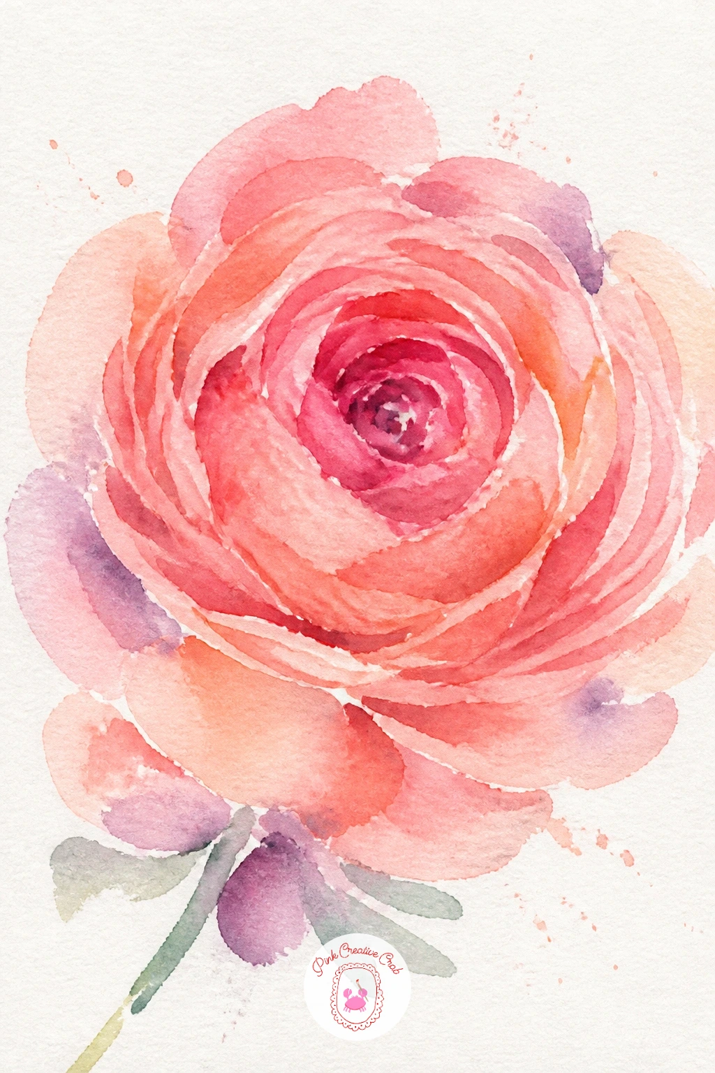
Palette: Coral,Quinacridone Rose,Yellow Ochre,Sap Green
Hydrangeas are really just a crowd of tiny four-petal flowers painted as one soft mass, which makes them surprisingly quick for how full they look. Wet a large rounded cluster shape on the paper first, then drop in lilac, blue and a touch of pink while it stays wet, letting the colors pool unevenly so no two patches match.
Once that wash is fully dry, load a small brush with a slightly darker tone and dab in loose clusters of four tiny petal marks scattered across the cluster, leaving plenty of white paper between them rather than covering the whole shape.
If the cluster looks like a solid blob instead of a flower head, you likely skipped that dry stage before adding the petal dabs, so colors ran together again. Dab, don’t swirl, and keep a paper towel nearby to blot any bleed fast.
No lilac on your palette, mix blue and pink together fresh each time for natural variation. A forty-minute version adds two or three clusters together with a few sage leaves tucked between them.
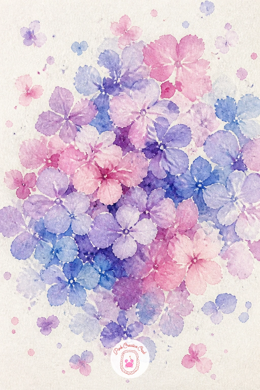
Palette: Lilac,Cerulean Blue,Opera Pink,Sap Green
Anemones get their drama from contrast, so this one is really about where the light and the dark sit against each other. Paint the petals first in white or the faintest wash of pink, wet-in-wet with soft blurred edges, and leave the very center of the flower untouched and dry.
Once the petals have dried, drop a small, strong circle of near-black or deep violet into that center with a fully loaded brush tip, letting it bleed just slightly into the surrounding petal so it does not look stuck on. From that dark center, flick a handful of thin fine lines outward for the stamens before the paint fully sets.
Too much black spreading into the petals is the main risk here, so work on paper that has dried enough to control the bleed, testing a scrap first if you are unsure. If you only have black ink, a touch of it mixed with a little blue avoids a flat, dead center.
No deep violet in your set, mix blue and red paint at full strength instead. Keep today’s tip simple: paint the dark center last, always, after everything else has dried.
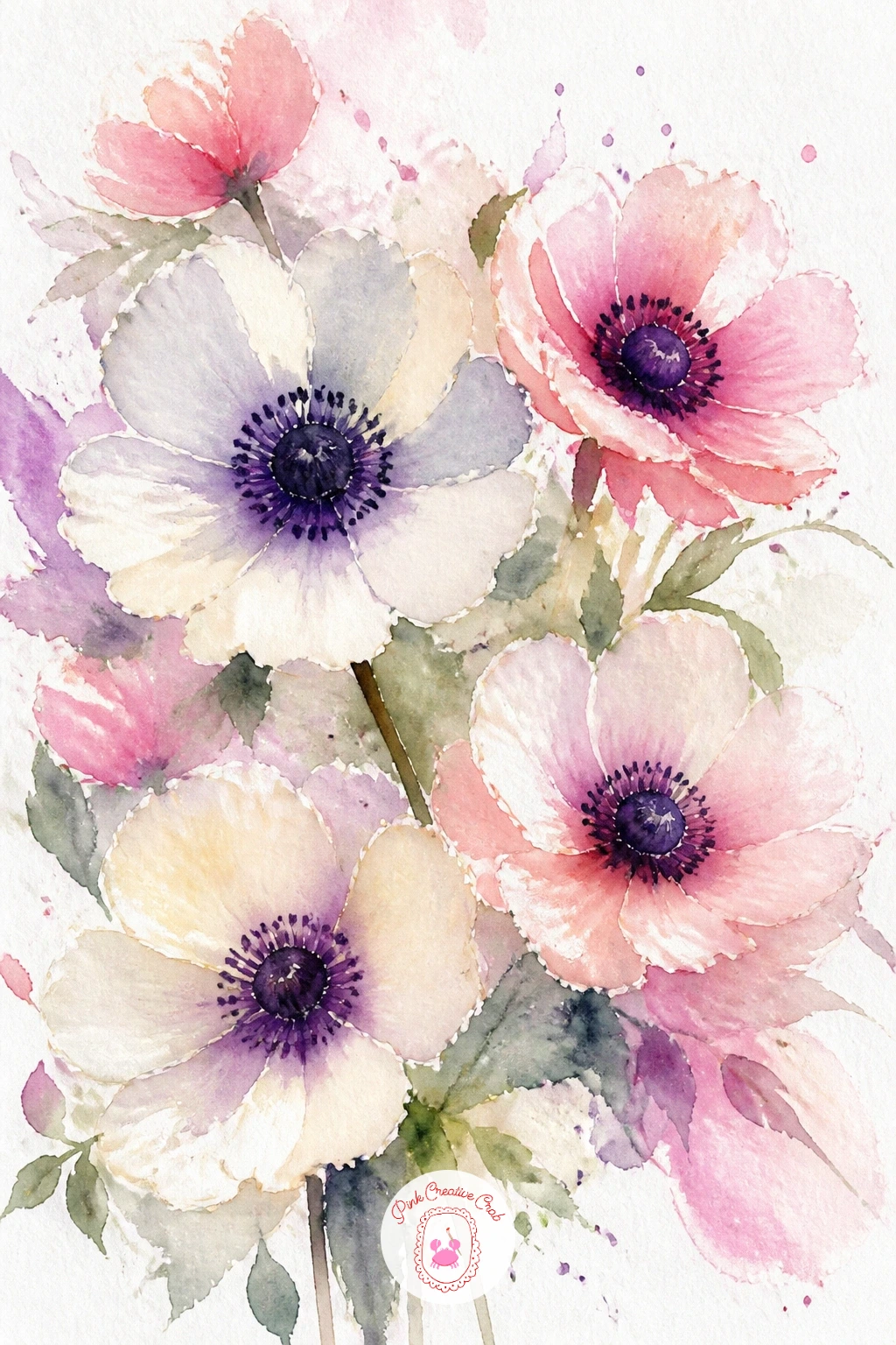
Palette: Titanium White,Opera Pink,Payne’s Grey,Dioxazine Violet
Foxgloves grow as a tall spike of small bell-shaped flowers, so think vertical and let the stem run most of the length of your page. Paint a thin curved line for the central stem first in pale green, then work up it from the bottom with small loose oval dabs in blush or lilac, each one slightly smaller than the last as you near the top.
Keep an eye on where the eye naturally lands on a tall shape like this: placing the fullest, most detailed blooms about a third of the way down the stem, rather than dead center, makes the spike feel like it is caught leaning in real light.
It is easy to make every little bell flower identical, which flattens the whole spike. Vary the tilt of each dab, some facing out, some half-hidden behind the stem.
No fine brush for the stem, the edge of a flat brush dragged lightly works too. Try grouping two or three foxglove spikes together at different heights once this single one feels comfortable.
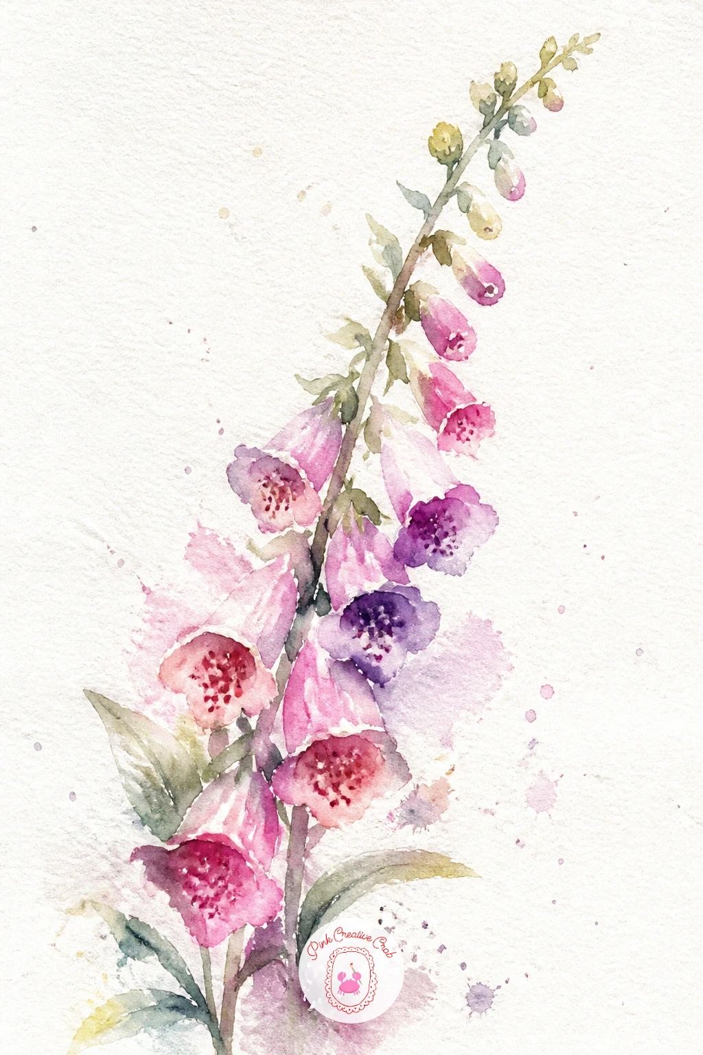
Palette: Lilac,Opera Pink,Sap Green,Yellow Ochre
Lavender is one of the fastest subjects on this list once you get the rhythm, so it is a nice reset after the taller foxglove. Paint a few thin green stems first, then load a small round brush with violet and tap it along the top third of each stem in short, repeated dashes to build the characteristic fuzzy spike.
Work from the base of each spike upward, tapping slightly smaller and lighter near the tip so the color fades out naturally rather than stopping abruptly. Let a few silvery-green leaves trail off the lower stem once the violet has dried.
Overloading the brush is the usual slip here, since too much water turns the dashes into one purple smear. Keep the brush just damp, not dripping, and reload often rather than stretching one brushful too far.
No violet in your set, mix blue and a touch of red together instead. For a quick version, paint just three sprigs loosely bundled; for a fuller page, tuck a handful together tied with a thin ribbon line at the base.
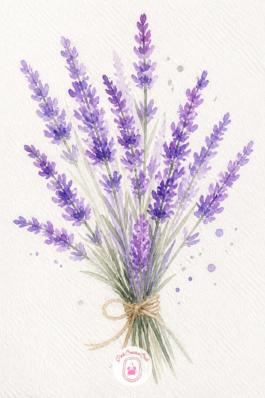
Palette: Dioxazine Violet,Lilac,Sage Green,Payne’s Grey
Sweet peas have a delicate, ruffled petal that looks complicated but is really just two or three curved strokes per flower. Paint each bloom as a loose fan shape in soft pink or lilac, letting the top edge stay a little ragged and uneven since real sweet pea petals never line up neatly.
Build the stems and curling tendrils last with a fine brush once the flowers have dried, looping the tendril lines into loose spirals that trail off the edge of a few stems, which gives the climbing look these flowers are known for.
If the flowers look stiff, the fix is usually in the petals, which need a slightly irregular edge rather than a smooth curve. Let your brush wobble a little on purpose.
No lilac to hand, a pale mix of pink and a whisper of blue gets close. Once comfortable, try scattering five or six blooms loosely up a trellis line for a fuller composition.
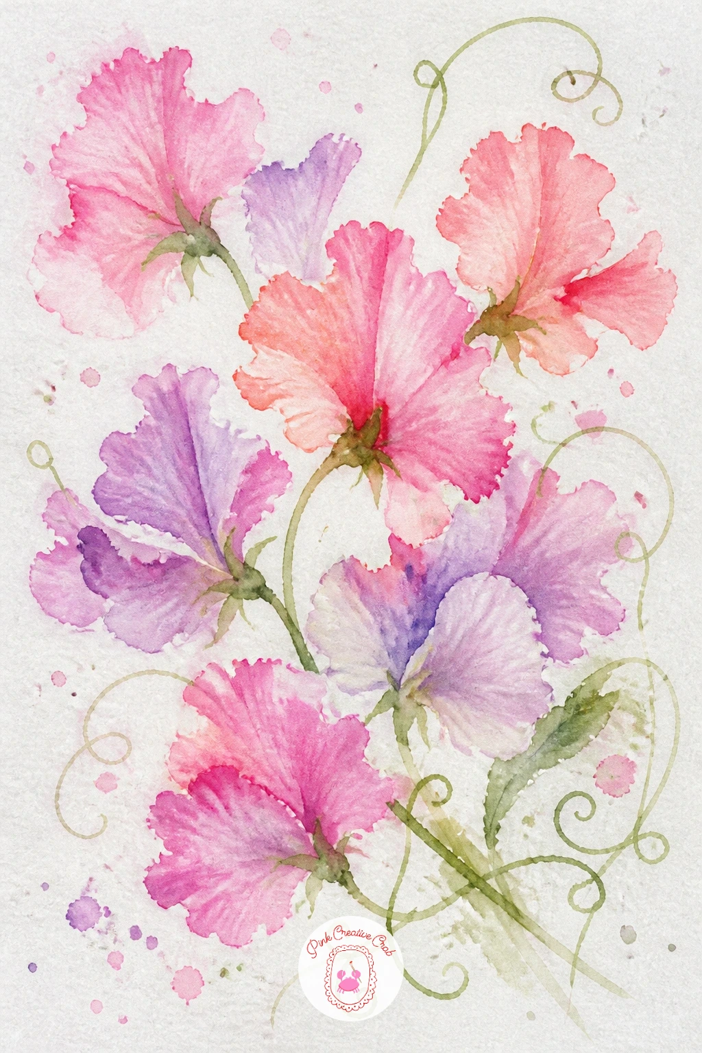
Palette: Opera Pink,Lilac,Sap Green,Titanium White
Daisies are a gentle subject to settle into after the fussier petals of the last few ideas, since a simple ring of white petals around a yellow center is all you need. Leave the petal shapes as bare white paper, painting only a faint grey-lilac shadow where one petal overlaps another, then drop a small dot of yellow ochre in the center of each.
Paint the grass they sit in with loose upward flicks of sap green and olive, working from the bottom of the page up and letting some blades cross in front of the lower daisy stems once that wash has dried.
The common misstep is adding too much detail to the petals, which makes them look stiff rather than breezy. Trust the white paper to do the petal work and keep your brush mostly for the shadows and the grass.
No grey-lilac mixed, a thinned touch of blue and brown does the same soft shadow. Today, try scattering the daisies at clearly different sizes to suggest some closer and some further away.
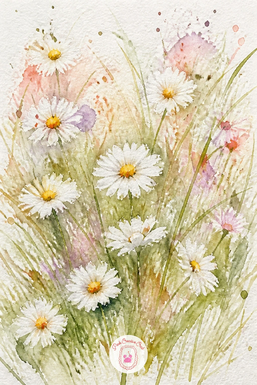
Palette: Yellow Ochre,Sap Green,Olive Green,Payne’s Grey
A wreath is really just a bouquet bent into a circle, so if the earlier rose idea went well, this one builds straight on it. Lightly pencil a faint circle as a guide, then place three or four loose roses around it in blush and coral, leaving generous gaps rather than packing the ring solid.
Fill the gaps with eucalyptus, painted as small rounded leaf pairs in sage green along thin curving stems that follow the circle’s direction, which is what makes a wreath read as a wreath rather than a scattered bunch. Let the roses dry before adding the eucalyptus so the greens stay clean and do not muddy into the pink.
A wreath that looks lopsided usually has all its roses bunched on one side. Step back and check the balance before you add the greenery, since it is much easier to fix while the ring is still mostly empty.
No pencil for the guide circle, trace around a plate or bowl very lightly instead. For more detail, tuck in a few sprigs of lavender or berries between the roses once you are happy with the base.
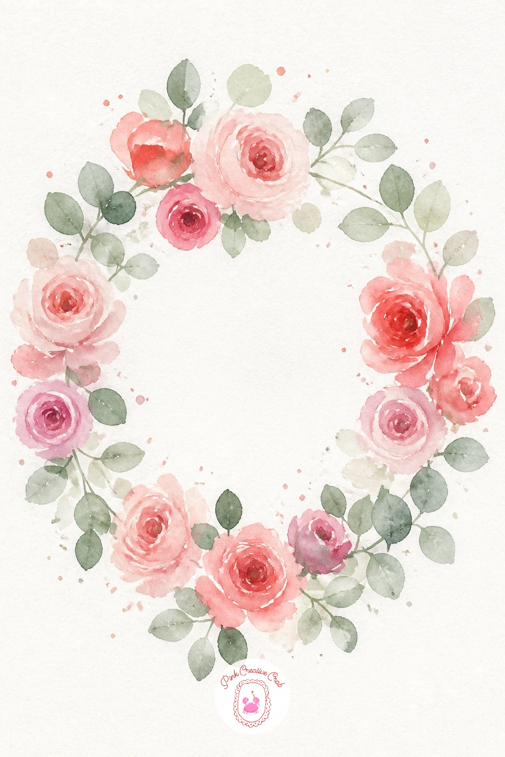
You Will Need
- plate or bowl to trace a circle
Palette: Coral,Opera Pink,Sage Green,Sap Green
This bouquet is the one place on the list to let every flower shape you have practiced so far show up together in one loose, generous mass. Build it in stages, starting with the largest blooms, two or three loose roses or poppies, placed off-center rather than dead middle.
Fill around them wet-in-wet with smaller shapes, daisy dots, lavender dashes, a scatter of tiny cosmos, working outward so the whole bouquet reads as one continuous gesture rather than separate flowers glued together. Tie it off with a loose ribbon line near the base once everything has dried.
Overcrowding is the real risk in a mixed bouquet like this, since it is tempting to keep adding flowers until the page is full. Stop while there is still visible white paper between the stems; that breathing room is what keeps it loose rather than busy.
No time for a dozen flower types, five is plenty for a convincing wildflower feel. For more inspiration on mixing shapes like this, a loose watercolor flowers gallery is worth a scroll before you start.
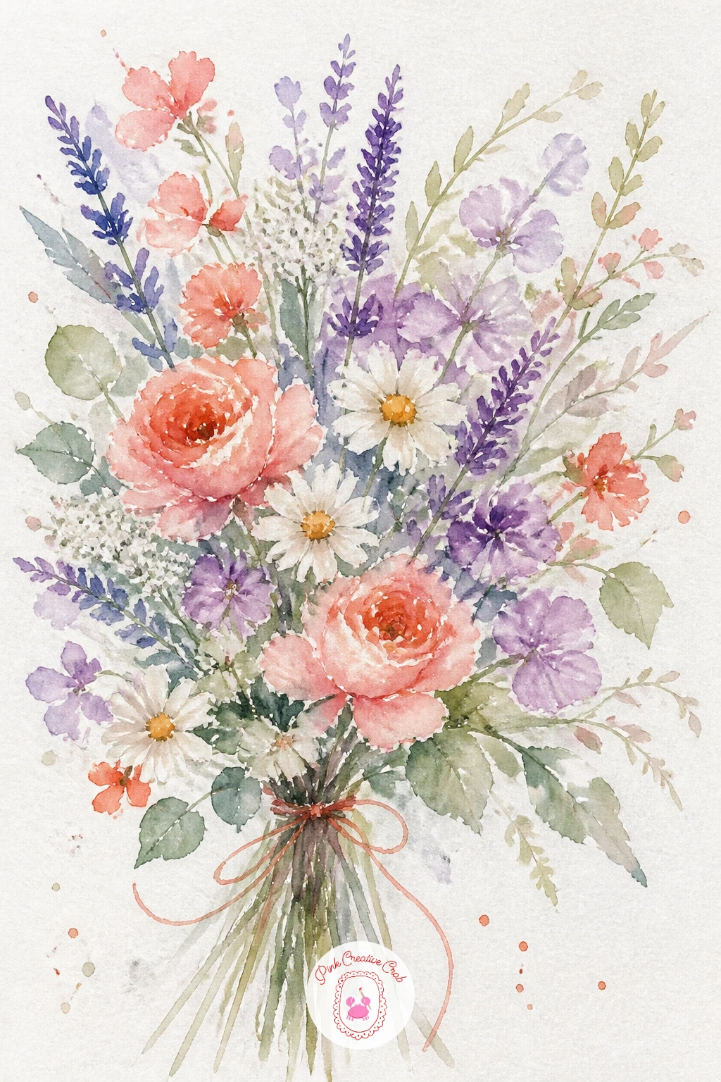
Palette: Coral,Lilac,Yellow Ochre,Sap Green
A magnolia branch earns its page by going big, so give the flowers room and keep the branch itself quite small by comparison. Paint each bloom as several broad overlapping petal shapes in blush and white, wet-in-wet, letting the petal tips stay soft while the base of the flower holds a touch more pigment where petals meet.
Think about where the light falls before you start shading the petals: with the light coming from one side, the petals facing it stay nearly white while the ones turning away get a soft grey-lilac shadow mixed in, which gives the whole branch real depth without any hard lines.
A flat magnolia usually means every petal got the same amount of shadow. Pick one light direction and stick to it across the whole branch.
No grey-lilac mix at hand, a touch of blue into the pink does the same job. Add one or two unopened buds, just a pointed oval shape, along the branch for variety.
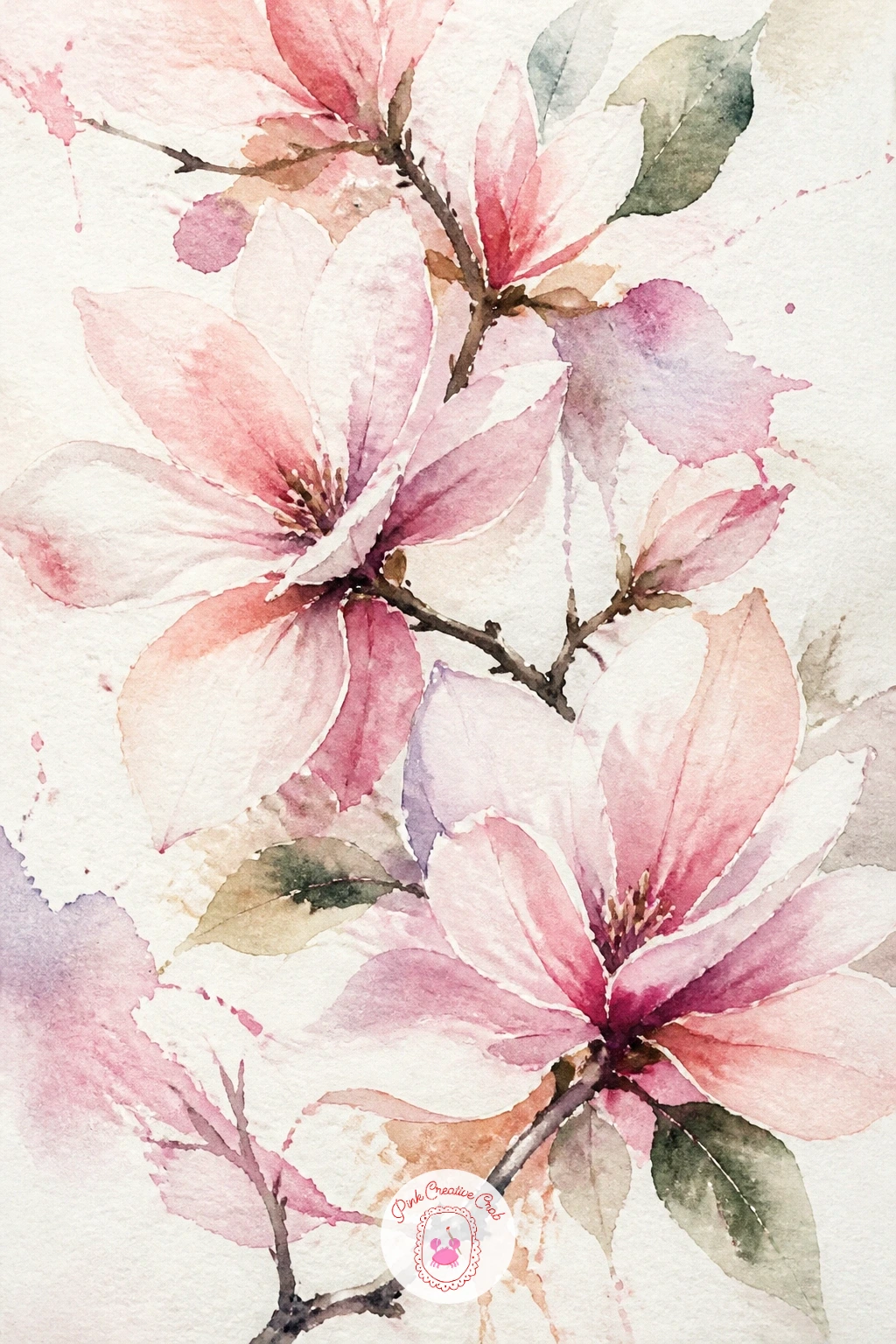
Palette: Titanium White,Opera Pink,Payne’s Grey,Burnt Umber
Cherry blossoms work best as a scatter of small, simple five-petal flowers rather than one big bloom, so this is a good one for letting your wrist stay loose. Dot clusters of tiny pink circles along a thin dark branch painted first and left to dry, then once those dots are placed, soften a few edges with a clean damp brush while still wet so some blossoms blur and others stay crisper.
That mix of soft and sharp blossoms is what keeps the branch from looking too uniform, so resist the urge to soften every single one. Leave a handful of buds as plain untouched dots for contrast.
For the quick ten-minute version, keep the branch short with a dozen blossoms. The forty-minute version extends the branch further across the page and adds a light pink wash behind it for a soft background glow, plus a few falling petals as small comma shapes drifting below.
No pink to spare for a wash background, leave it white instead and the blossoms still read clearly. Flick a tiny splatter of pale pink across the page once dry for drifting petals in the air.
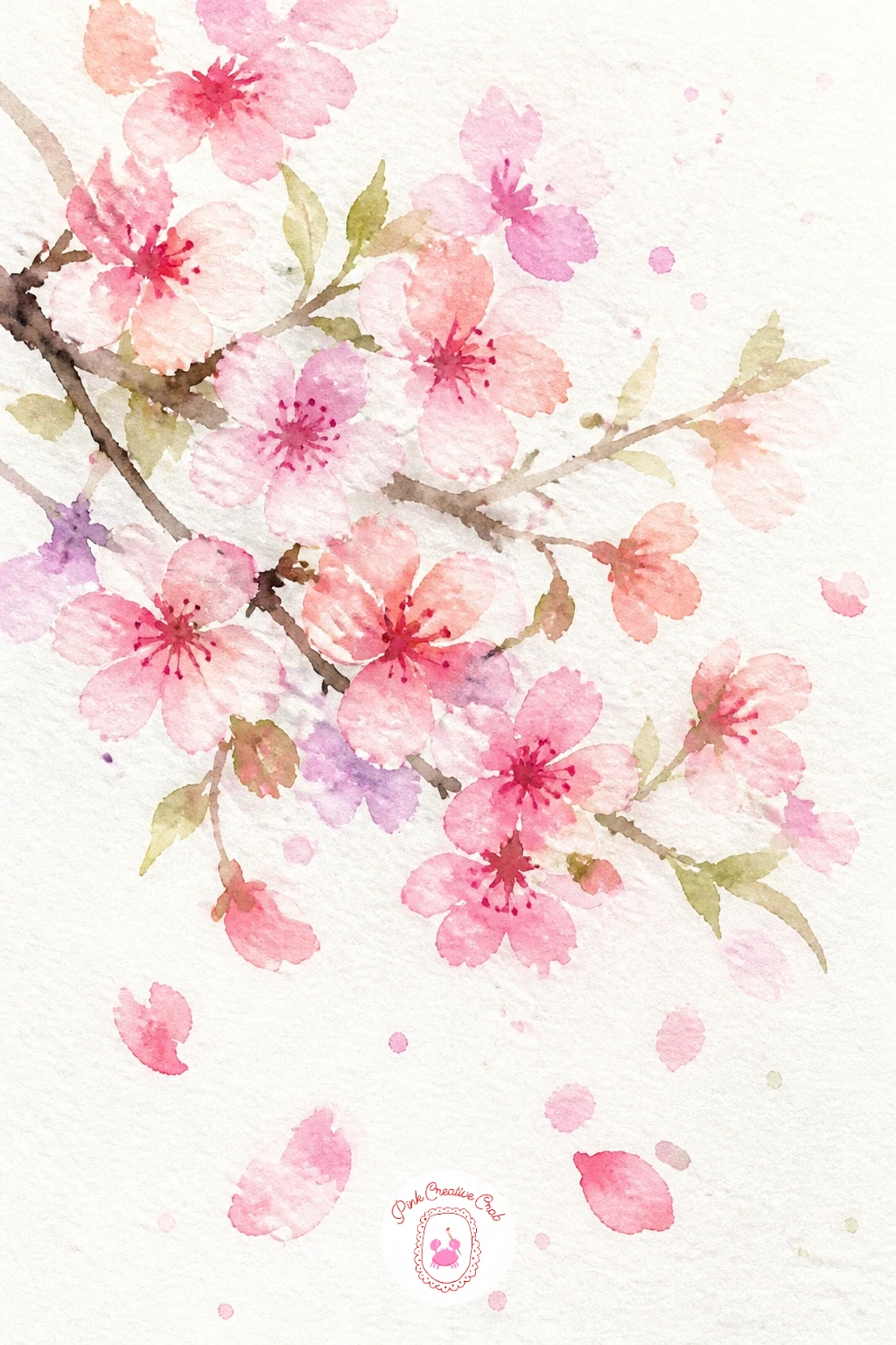
You Will Need
- old toothbrush for splatter
Palette: Opera Pink,Titanium White,Burnt Umber,Payne’s Grey
Iris flowers have a distinctive drooping lower petal and upright inner petals, so getting that silhouette roughly right matters more than any fine detail. Paint the three upright petals first in violet, standing them close together at the top of the stem, then add the three lower petals falling outward and down, slightly larger and a touch darker at the base of each.
While the lower petals are still damp, drop a small streak of yellow where each one meets the center, letting it bleed just slightly into the violet, which mimics the iris’s natural marking without any careful drawing.
If the flower looks more like a blob than an iris, check that the upright and falling petals are clearly separated by a gap of white paper rather than merged into one shape. That gap is what reads as the flower’s structure.
No violet mixed up, layer blue and a little red wet-on-wet instead of pre-mixing. Try painting two iris at slightly different stages, one fully open and one still a tight bud.
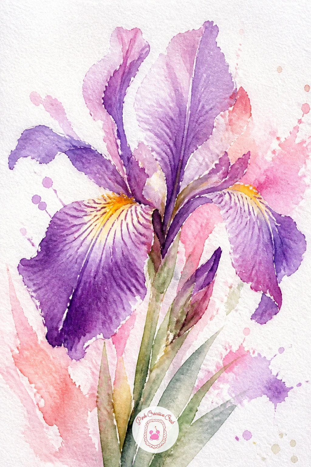
Palette: Dioxazine Violet,Ultramarine Blue,Yellow Ochre,Sap Green
Sunflowers reward confidence with the yellow, so load your brush generously and let the petals spread wide from a dark center. Paint the center first as a rough circle in burnt umber mixed with a touch of green, then while it stays wet, pull petal strokes outward from its edge in golden yellow, longer at the sides and slightly shorter at the top and bottom to echo how a real sunflower head faces slightly upward.
Speckle the still-damp center with tiny dots of dark brown and a touch of black for the seed texture, letting them blur slightly rather than staying sharp.
A flat yellow disc instead of a sunflower usually means the petals were painted too evenly in length and color. Vary both, and let a few petals overlap the center edge.
No burnt umber on your palette, a mix of orange and a little black gets a similar warm dark. For a bolder page, paint two sunflower heads at different sizes leaning toward each other.
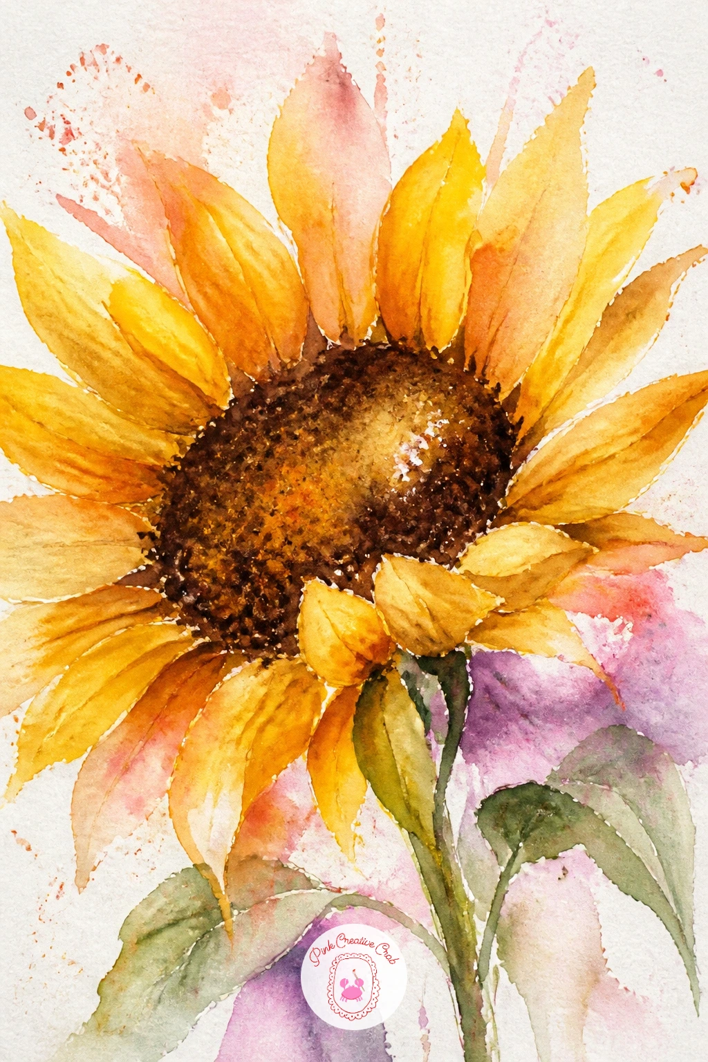
Palette: Cadmium Yellow,Burnt Umber,Sap Green,Payne’s Grey
Dahlias have more layered petals than almost anything else on this list, but the loose version only needs two or three rings suggested, not counted out petal by petal. Paint a soft round wash in coral or deep pink first, then while damp, pull a ring of curved strokes inward from the outer edge, followed by a tighter, darker ring closer to the center once that first layer has dried slightly.
A tissue or a dry brush is your friend here if any ring spreads further than you want: dab gently with a tissue to lift excess pigment and sharpen the edge back up before it dries.
Trying to paint every petal is what turns a loose dahlia stiff and overworked. Two rings of six or seven strokes each is enough; let the viewer’s eye fill in the rest.
No tissue nearby, a dry clean brush lifts color almost as well if you work quickly. Once this feels comfortable, try a dahlia in a cooler palette of wine red and plum for variety.
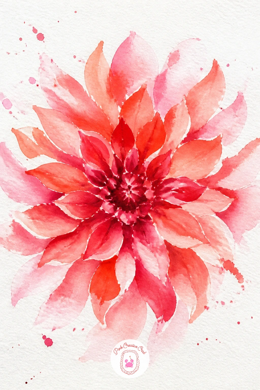
You Will Need
- tissue or paper towel for lifting
Palette: Coral,Alizarin Crimson,Quinacridone Rose,Sap Green
Lilies have long, elegant petals that curve backward, which gives you a chance to practice confident single strokes rather than lots of small marks. Paint each of the five or six petals as one sweeping brushstroke from the base outward, loading more pigment, blush or coral, at the base and letting it thin naturally toward the tip as the brush runs dry.
Once dry, add fine dark freckles with the tip of a small brush scattered across the lower half of each petal, and flick long curved stamens out from the center in a contrasting color that catches the eye.
Overloading the brush mid-stroke is what breaks the natural fade from dark to light along the petal; reload less often and let strokes run out on purpose. If petals come out too uniform, vary the pressure so some strokes are thicker than others.
No contrast color handy for the stamens, a warm brown works against almost any petal shade. Try angling the whole flower sideways in profile next time for a different silhouette.
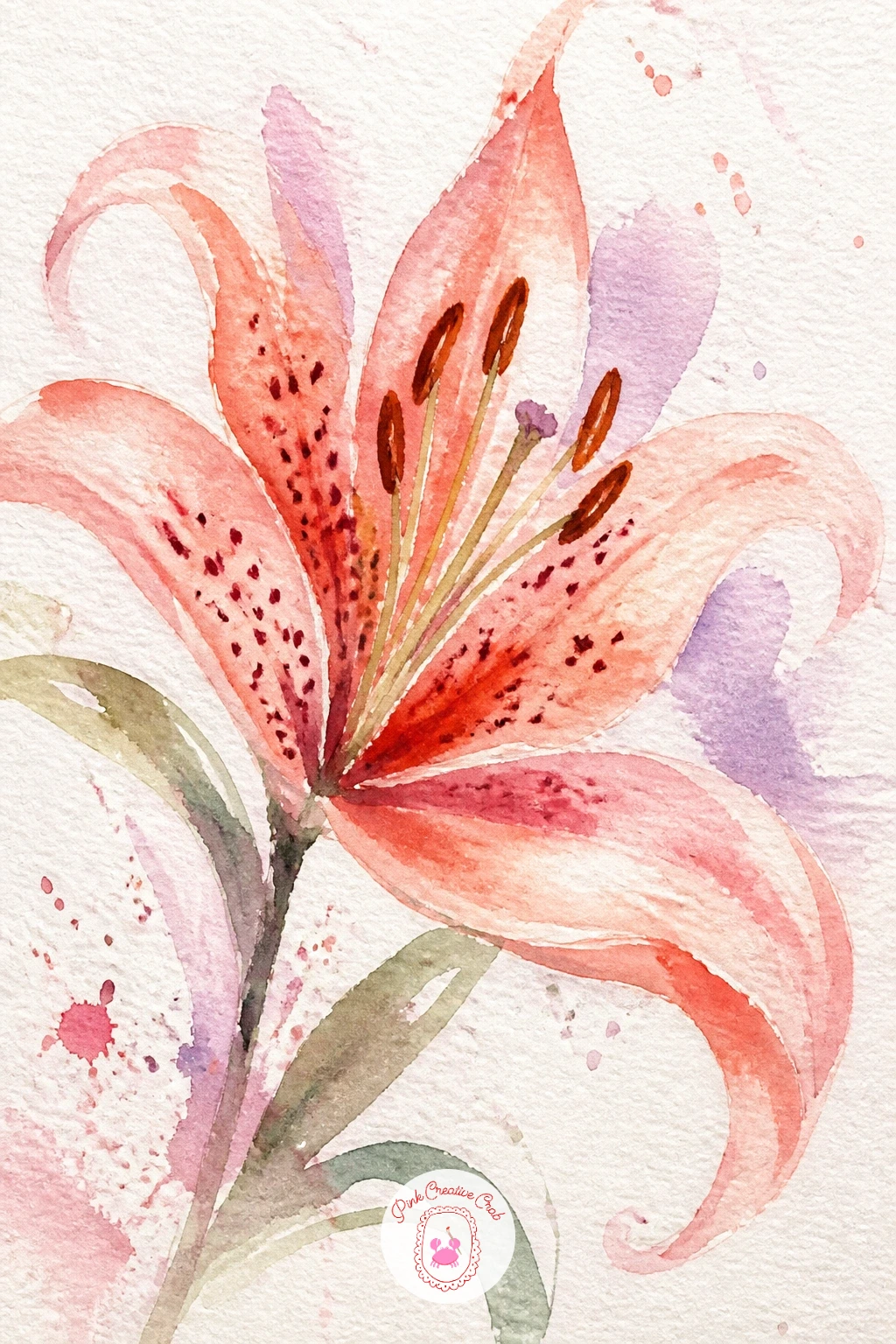
Palette: Coral,Quinacridone Rose,Burnt Sienna,Sap Green
Forget-me-nots are tiny, so this idea is really about restraint and a light touch rather than detail. Dab a loose cluster of small blue dots with the tip of a round brush, keeping the dots irregular in size and spacing rather than uniform, then while a few are still damp, touch the very center of some with a tiny dot of yellow ochre.
Build the cluster in groups of six or seven rather than one scattered field, since real forget-me-nots grow in small clumps along a stem. Add thin pale green stems linking the clusters once the blue has dried.
Painting the dots too large is the most common slip, since it starts to look like a different flower entirely. Use the very tip of a small brush and barely touch the paper.
No small round brush, the tip of a fine liner brush or even a cotton swab dipped in paint makes a passable dot. Scatter three or four clusters loosely across the page for a meadow feel rather than one tight bunch.
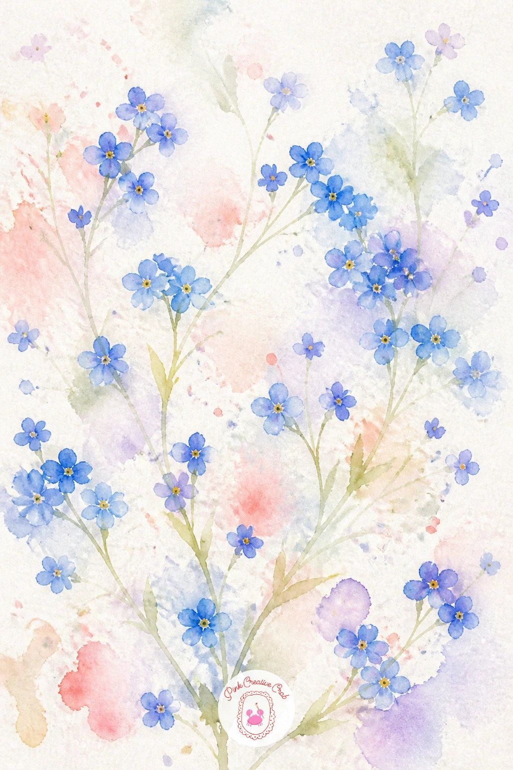
Palette: Cerulean Blue,Ultramarine Blue,Yellow Ochre,Sage Green
Camellias have a smoother, more rounded petal than most flowers on this list, which makes them a calm change of pace. Paint a full round wash in deep pink or coral first, then while wet, nudge the edges into soft scallops rather than sharp points using the side of your brush, keeping the overall shape compact and full rather than spread out.
Measure the flower against its own leaves before you commit to size: camellia blooms usually sit noticeably larger than the glossy leaves around them, so if the leaves start to overpower the flower, scale the next bloom up.
A common misstep is painting the petals too pointed, which drifts toward looking like a dahlia instead. Keep every edge rounded and the whole shape fairly tight and compact.
No deep pink pre-mixed, layer red over pink wet-on-wet for the same richness. Add one or two glossy dark green leaves behind the bloom with a single confident brushstroke each, left unpainted in the center to catch the light.
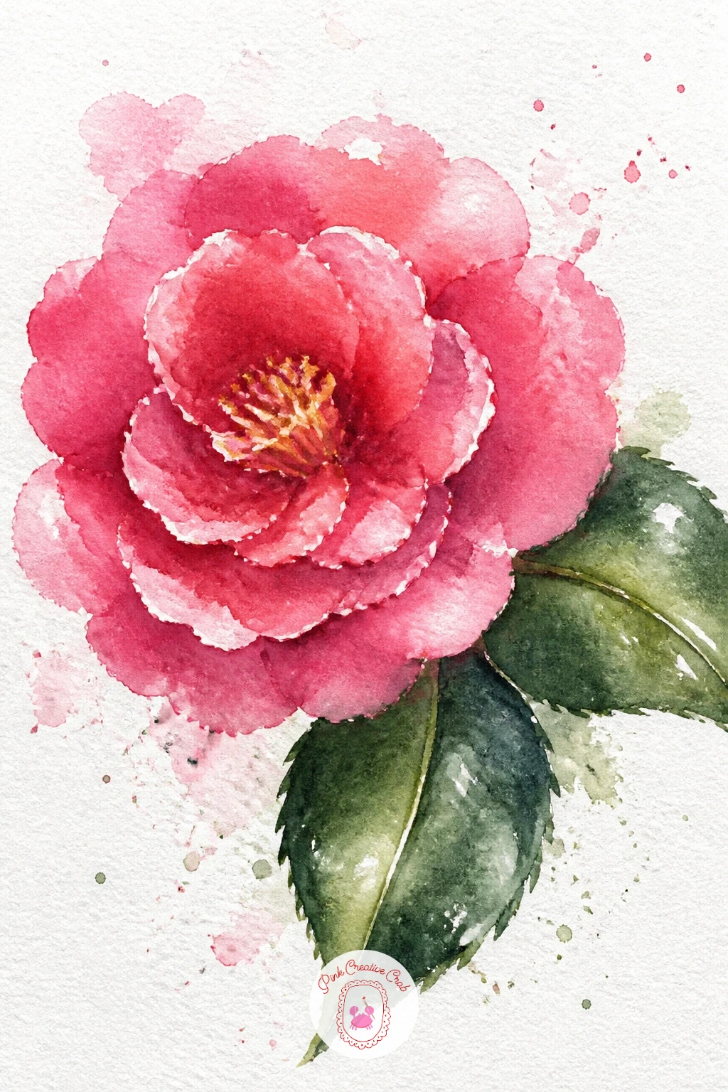
Palette: Alizarin Crimson,Quinacridone Rose,Sap Green,Titanium White
Orchids have a distinctive open shape with one larger lower petal, so sketch that asymmetry lightly in pencil before you pick up a brush if this is your first time. Paint the upper petals first in soft lilac or white, then the larger lower lip petal in a deeper shade with a few fine dark freckles dropped in while still damp.
Work down a loose, arching stem adding two or three more blooms at different stages, some fully open and one still a closed bud near the tip, which is how orchid stems actually grow and reads more naturally than identical flowers in a row.
Symmetrical, evenly spaced orchids are the giveaway of an overworked painting. Vary the angle of each flower along the stem and let one or two overlap slightly.
No pencil guide wanted, a very light dry-brush sketch in pale paint works just as well and will not show under the final color. If you enjoy this shape, the tropical watercolor flowers ideas take orchids further with bolder color.
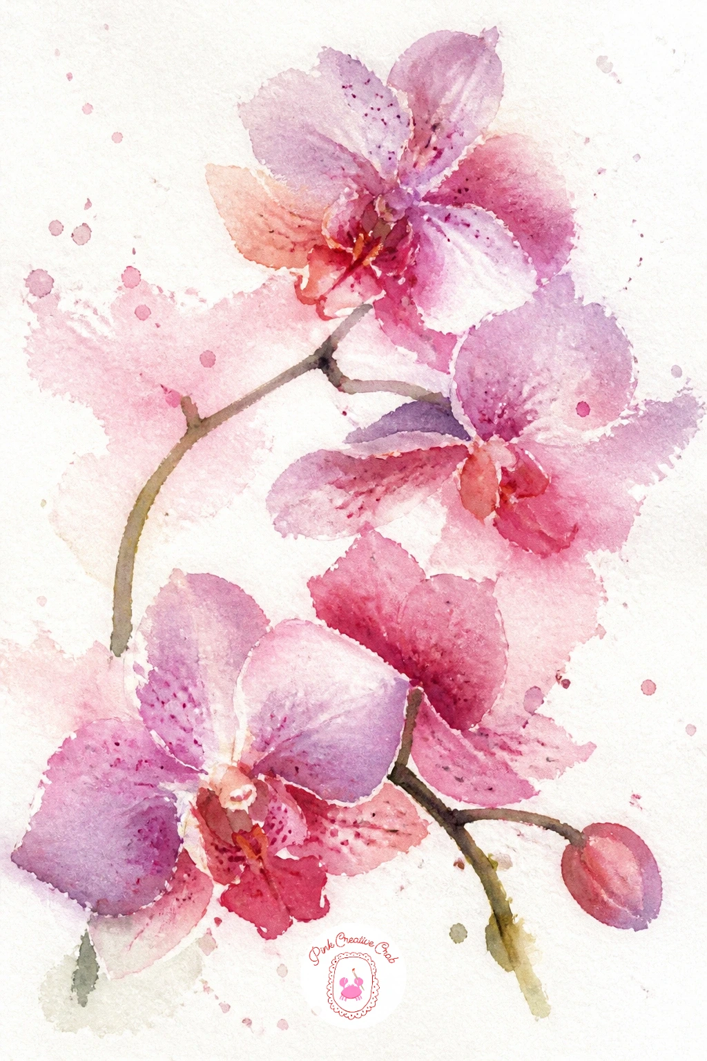
Palette: Lilac,Quinacridone Rose,Payne’s Grey,Sap Green
Zinnias have a flat, layered face that is almost architectural compared to the softer flowers earlier in this list, so let the petal strokes stay a little more structured here. Build the flower as two rings of flat, slightly pointed petal strokes radiating from a small central circle, the outer ring in a lighter shade and the inner ring in a deeper, richer tone of the same color family.
Vary the color between a few zinnia heads if you paint more than one, coral next to magenta next to a warm orange, since real zinnia beds mix shades generously and it keeps the page lively.
If the flower face looks too even and stiff, it is usually because every petal is identical. Let a few petals sit slightly shorter or tilted compared to the rest.
No magenta in the kit, mix pink and a touch of violet for a close match. Try grouping three zinnia heads at different heights for a fuller, bolder page once a single one feels comfortable.
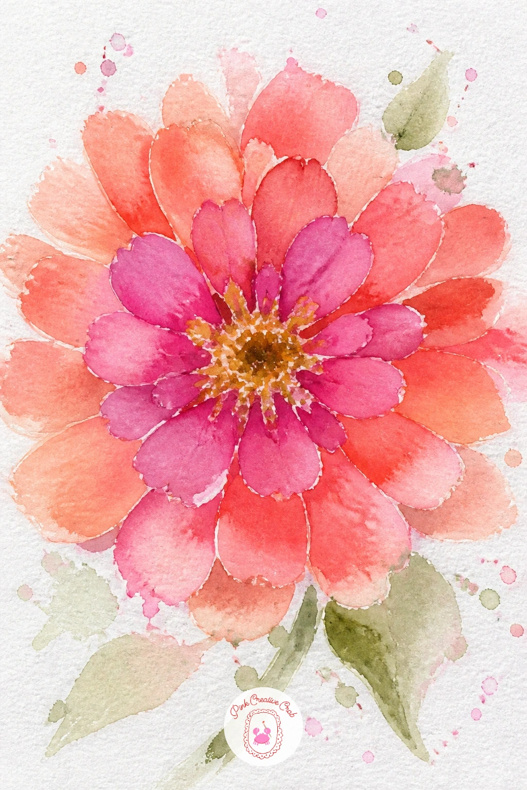
Palette: Coral,Magenta,Cadmium Orange,Sap Green
Hellebores hang their heads downward, which is the one thing to get right before anything else about this flower. Tilt your flower shape so it faces slightly down and away from the viewer, painting the five broad petals as soft overlapping cup shapes in pale green, blush or deep plum depending on the variety you fancy.
Drop a cluster of fine yellow stamens into the open center while the petals are still a touch damp, letting them blur ever so slightly rather than staying crisp pinpricks, since that softness is what reads as botanical rather than stiff.
Painting the flower face-on is the easiest way to lose the hellebore’s character entirely. Keep that downward tilt even if it feels like an awkward angle at first.
No deep plum in the palette, layer red over violet wet-on-wet instead. Add a single dark serrated leaf beneath the bloom with the edge of a flat brush dragged in short choppy strokes for contrast.
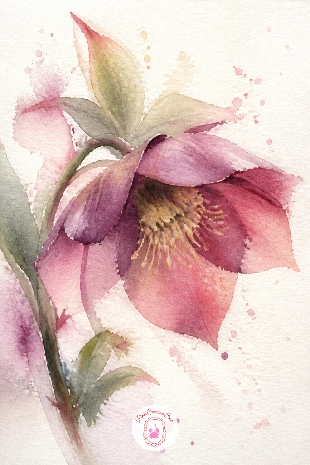
Palette: Dioxazine Violet,Opera Pink,Yellow Ochre,Sap Green
This idea asks you to paint a whole gathered bunch plus the paper it comes wrapped in, so plan the paper cone shape first in pencil before adding a single flower. Paint the wrapping as a loose triangular shape in kraft brown or a soft print, leaving the top edge uneven and slightly torn-looking rather than a straight line.
Fill the opening above it with a loose mix of three or four flower types already familiar from earlier ideas, roses, a few daisies, a sprig of greenery, painted so their stems appear to tuck down behind the top edge of the paper rather than floating separately above it.
The paper and the flowers competing for attention is the main risk, so keep the wrapping fairly simple and let the color and detail live in the blooms instead. A plain wash with one or two folded crease lines is enough.
No kraft brown mixed, burnt sienna thinned with water gets close. For a quick version, wrap just three flowers; the fuller version fills the cone generously with a mixed bunch.
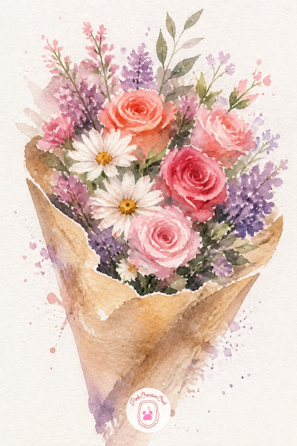
Palette: Burnt Sienna,Coral,Opera Pink,Sap Green
A flower crown asks you to repeat the wreath logic from earlier but with smaller, daintier blooms suited to being worn rather than hung. Lightly sketch a soft arc rather than a full circle, since a crown usually sits across the top of the head and does not need to close into a ring on the page.
Place three or four small flowers, daisies, tiny roses, a ranunculus, along that arc at varied sizes, with the largest bloom slightly off-center rather than dead in the middle, then fill the gaps with small leaves and a few loose baby’s breath dots using just the tip of your brush.
A crown that looks too neat and evenly spaced loses the handmade charm that makes this subject appealing. Let flowers overlap unevenly and vary their sizes more than feels natural at first.
No tiny brush for the baby’s breath dots, the end of a toothpick dipped in white gouache works in a pinch. Try adding thin trailing ribbons off each end of the arc for a softer finish.
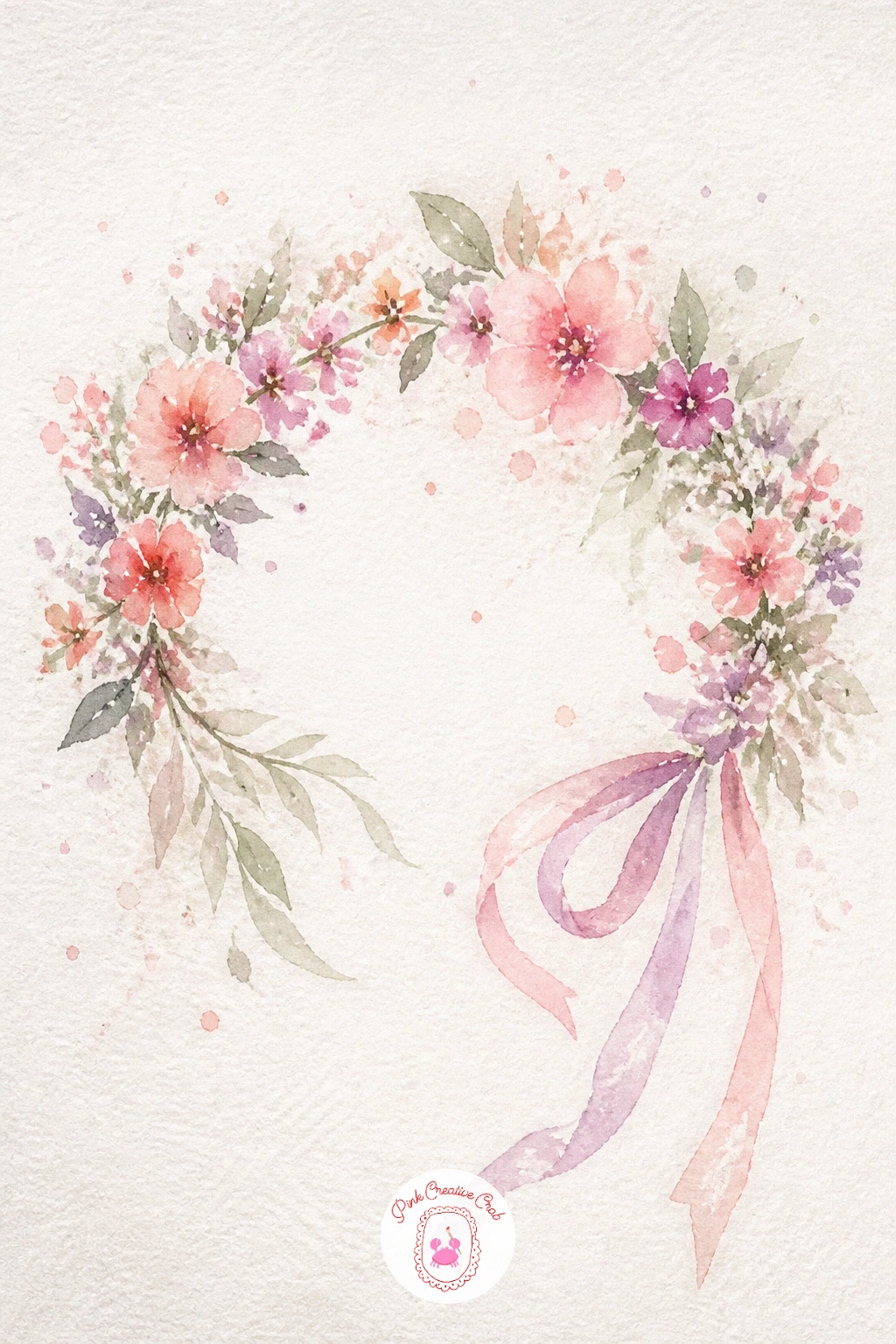
You Will Need
- white gouache or gel pen (optional)
Palette: Opera Pink,Coral,Lilac,Sap Green
A teacup bouquet works well as a smaller, cozier page after some of the larger subjects above. Paint the teacup first with a simple curved outline and a single confident shadow stroke along its lower edge, leaving the rest of the cup as bare white paper so it reads as fine china rather than a solid object.
Once the cup is dry, build a tight little bunch of flowers spilling just over its rim, two or three small roses or daisies with a sprig of greenery, keeping the whole bouquet compact since a teacup cannot hold much.
Painting the cup too large relative to the flowers is a common slip, since it starts to look like a vase instead. Keep the cup modest, just wide enough to cradle the bouquet believably.
No pale grey for the cup shadow, a thin wash of blue works just as well for that cool porcelain look. A saucer underneath, just one curved line and a thin shadow, finishes the setting if you have time.
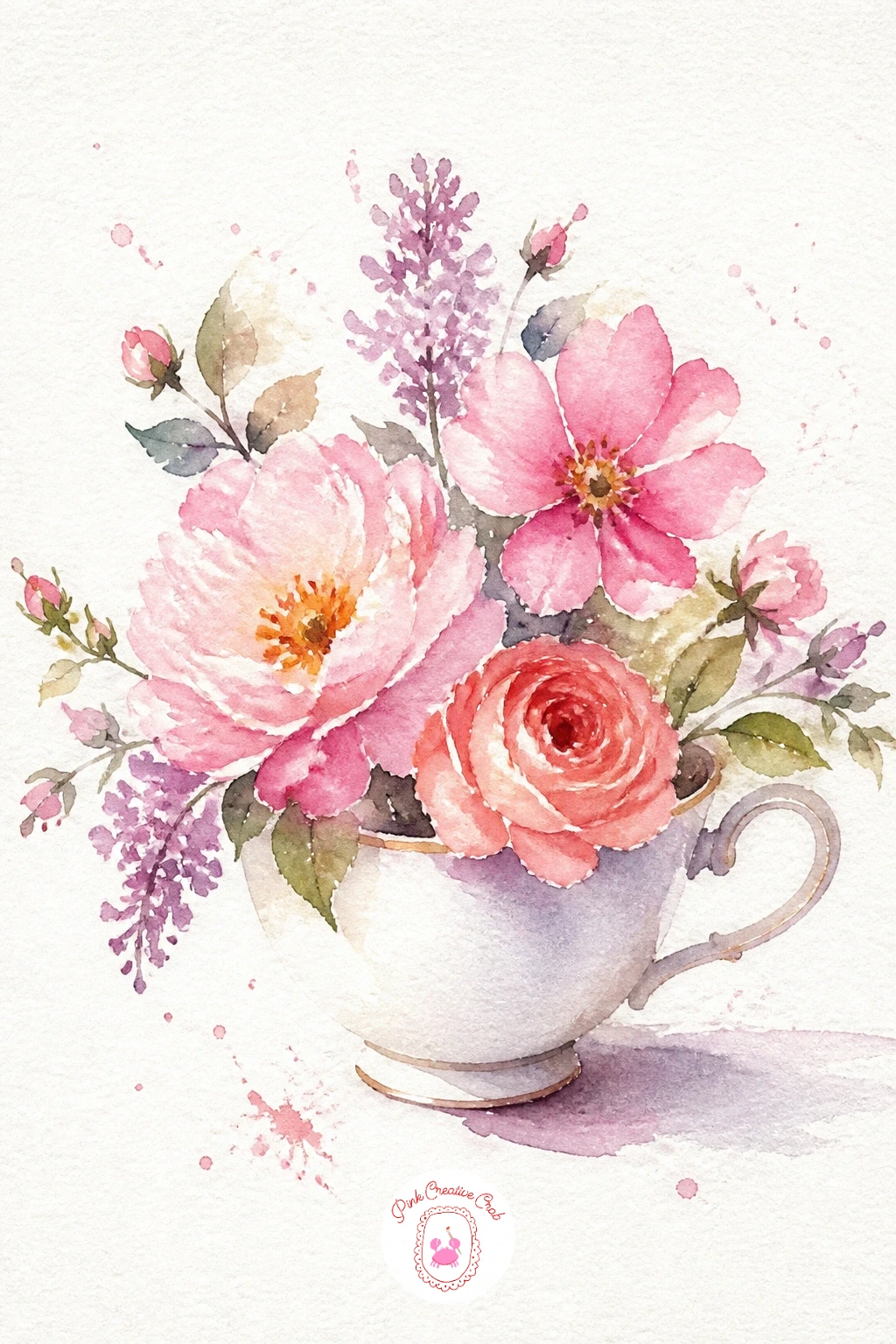
Palette: Payne’s Grey,Opera Pink,Coral,Sap Green
Framing a letter with flowers turns this into a keepsake piece, so pencil the letter lightly first in a simple, rounded font before any paint touches the page. Keep the letter itself unpainted or filled with the faintest wash, since the real color and texture belong to the flowers that wrap around its edges.
Paint a loose, uneven trail of small blooms, forget-me-nots, tiny roses, a few leaves, following the outline of the letter rather than covering it, leaving the main body of the letter shape clearly readable through the gaps.
Covering too much of the letter with flowers defeats the whole idea, so resist filling every gap. Half the letter’s edge showing clean is plenty, and often looks more intentional than a fully wrapped one.
No calligraphy pen for the letter outline, a pencil sketch under light watercolor works fine since the flowers are doing the real work. If gifting or journaling appeals to you, the junk journaling handbook has more ways to use a page like this.
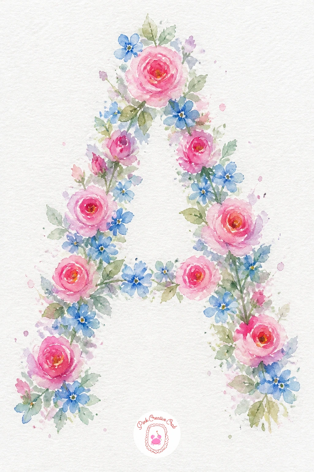
Palette: Opera Pink,Cerulean Blue,Sap Green,Yellow Ochre
Clematis climbs, so this idea is as much about the trellis line as the flower itself. Paint a few thin straight or crossed lines first in a muted brown or grey to suggest the trellis, keeping them simple and a little uneven rather than ruler-straight.
Add the flowers along and around the trellis lines as flat, open star shapes in violet or deep pink, each with five or six petals radiating from a small pale center, painted wet-in-wet so the petal edges stay soft even though the shape itself is fairly geometric.
A trellis that looks too rigid and the flowers too soft side by side can feel disconnected. Let a vine tendril, just a thin curling green line, wrap around one trellis bar to tie the two elements together visually.
No grey paint for the trellis, a thinned wash of brown or even pencil lines left visible work fine. Try climbing the vine diagonally across the page instead of straight up for a more dynamic composition.
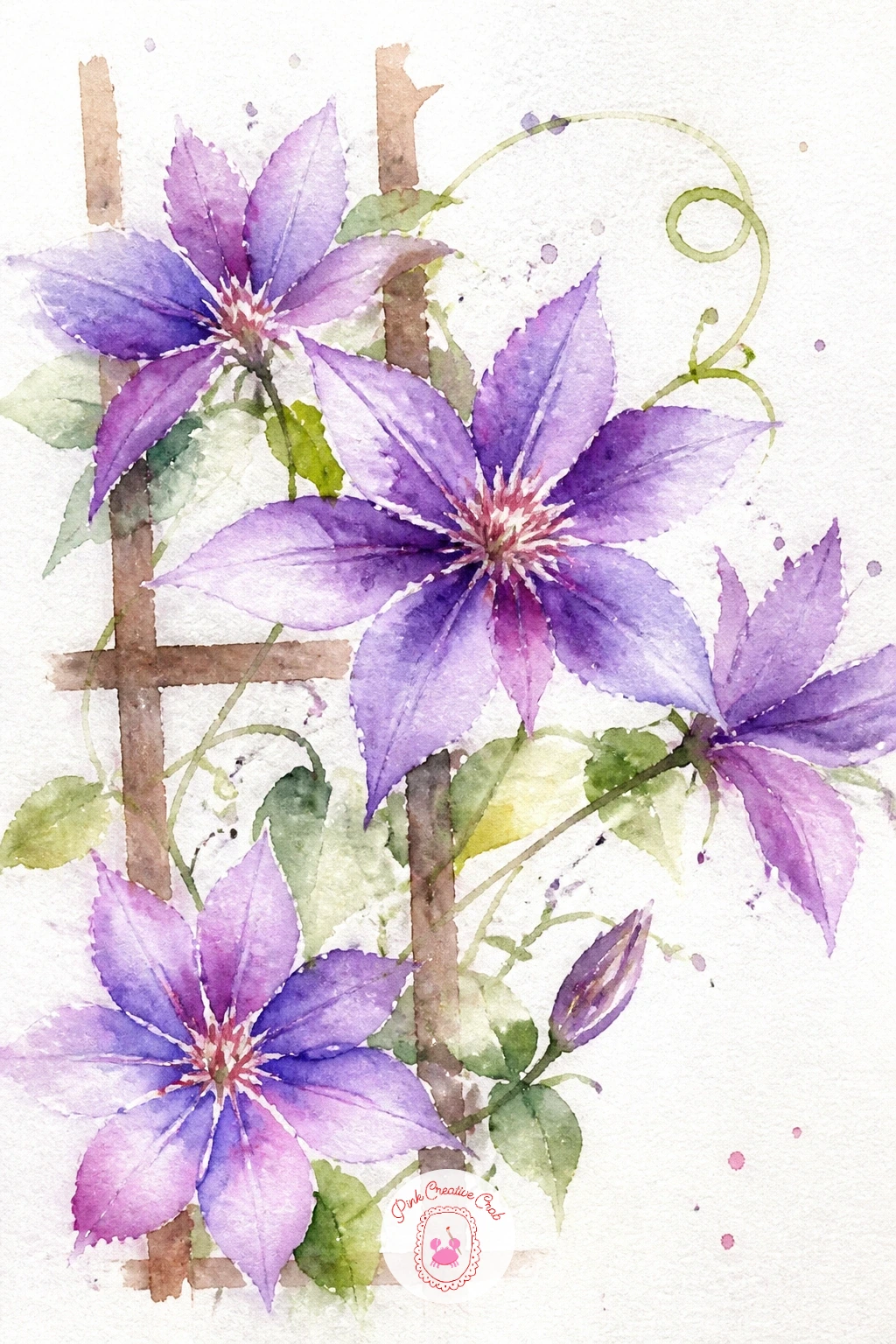
Palette: Dioxazine Violet,Quinacridone Rose,Burnt Umber,Sap Green
Bluebells droop in a gentle curve along one side of the stem, so get that lean right before worrying about anything else. Paint a slightly bowed stem first, then along its upper curve add a row of small, narrow bell shapes hanging downward, each one a simple elongated teardrop painted wet-in-wet in blue-violet.
Work from the top of the stem down, making each bell slightly larger as you near the base, since that is how bluebells actually grow, and let the color pool a touch deeper at the open mouth of each bell for a sense of depth.
Bells that point straight out instead of hanging down are the giveaway of a rushed bluebell. Take an extra second with each one to angle it downward along the stem’s curve.
No blue-violet premixed, layer blue over a touch of violet while wet instead. Group several stems together, each curving slightly differently, for a fuller woodland patch once one stem feels confident.
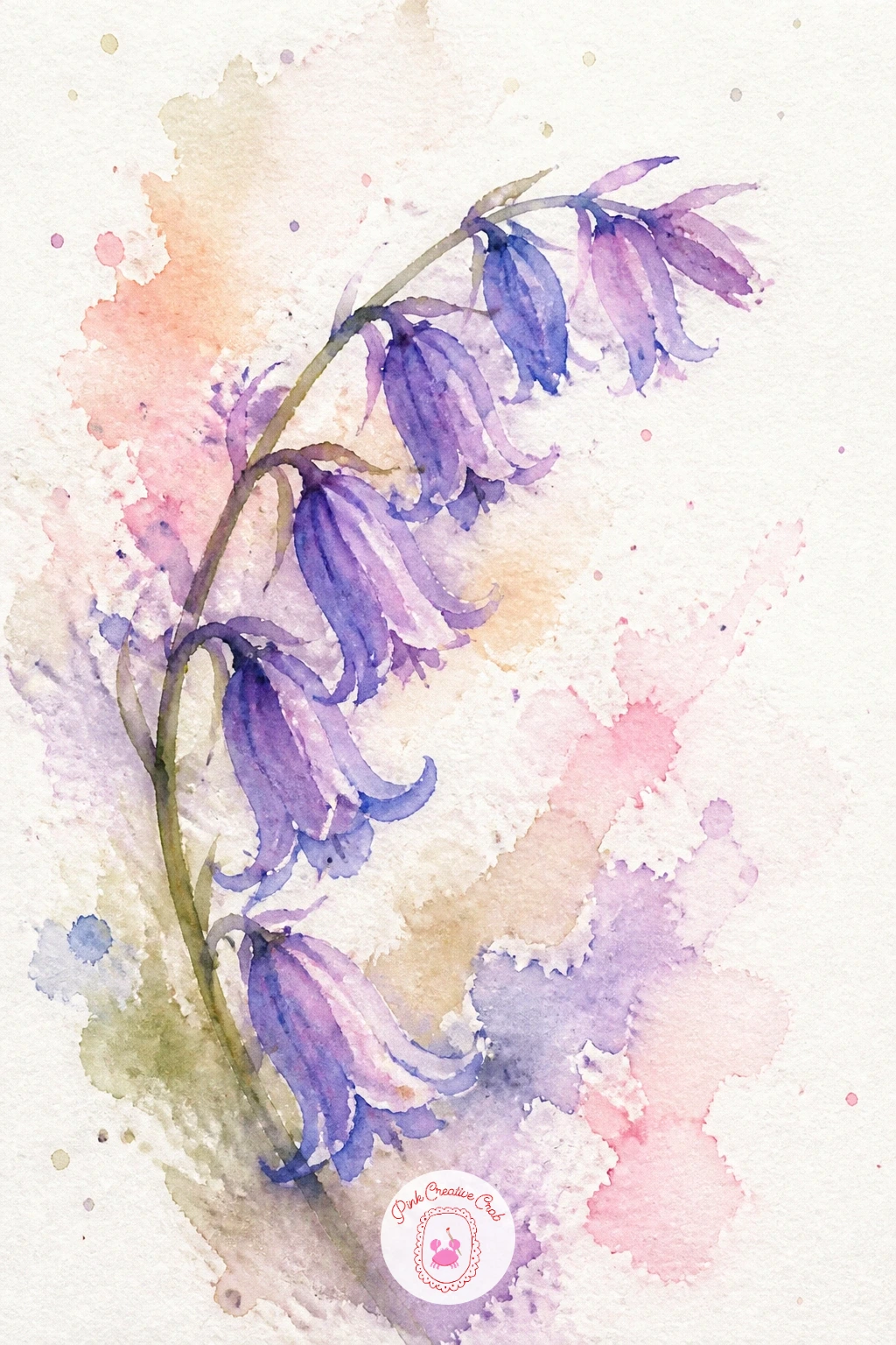
Palette: Ultramarine Blue,Dioxazine Violet,Sap Green,Cerulean Blue
Apple blossom closes out this list gently, with small five-petal flowers very like the cherry blossom but warmer and slightly larger, often tinged pink at the base. Paint a knobbly brown twig first with a few short angled branch lines, then along it place small loose five-petal blooms in white with a soft blush wash at the base of each petal where it meets the center.
Tuck a few tightly closed pink buds, just small rounded shapes, among the open blossoms, and add one or two small leaves in sage green at the twig’s joints for a touch of structure among all that white.
White flowers on white paper can vanish without enough contrast, so make sure the shadows between petals and the dark twig underneath carry enough weight to hold the composition together. A thin grey-violet shadow wash on one side of each flower helps them read clearly.
No fine brush for the twig’s small branches, the very tip of a round brush dragged lightly does the job. This is a calm note to end a session on, so take your time and let each blossom dry before the next.
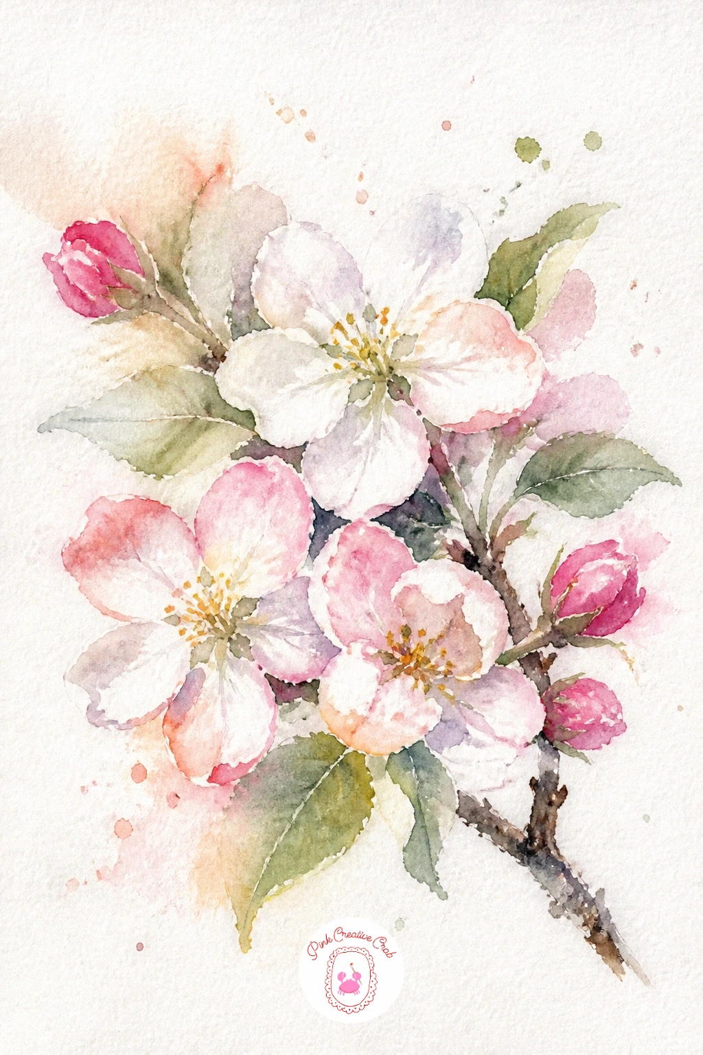
Palette: Titanium White,Opera Pink,Burnt Umber,Sage Green
What to Do Next
Pick one flower from this list that matches how much time you actually have today, a daisy or tulip for a quick page, a wreath or bouquet if you want to settle in longer, and set up on a scrap of cold press paper first to warm up your wrist before committing to the real sheet.
Frequently Asked Questions
What is the easiest way to start loose watercolor flowers if you are new to painting?
Start with wet-in-wet circles and let water do the shaping instead of your brush. Daisies, tulips and simple roses forgive wobbly edges best, so build confidence there before trying layered flowers like dahlias or orchids.
Why do loose watercolor flowers turn muddy instead of staying fresh and soft?
Muddy flowers usually come from overworking wet paint with too many brushstrokes. Drop color in, then step back and let it spread on its own; touching it repeatedly mixes colors into a dull, flat brown.
What paper works best for loose watercolor flowers?
Cold press watercolor paper at a reasonably heavy weight holds wet-in-wet washes without buckling badly. Its slight texture also helps soft edges bloom naturally, which is exactly the look this style depends on.
How do you keep petals from bleeding into each other when you do not want them to?
Let the first shape dry fully before painting right beside it, even for just a minute or two. Touching wet paint to wet paint always blends, so controlled edges need a dry pause in between.
Can loose watercolor flowers be painted without expensive paints or brushes?
Yes, a basic student-grade watercolor set and one or two round brushes cover everything on this list. The loose, forgiving style actually hides the small quirks of cheaper paint better than tight, detailed painting does.
Have any thoughts?
Share your reaction or leave a quick response — we’d love to hear what you think!
-
 0
-
0
-
0
-
0
-
0
-
0


