

A vintage car painting gives you everything a good travel poster needs: a bold shape, a punch of color, and a little story riding along with it. Nothing dates well like a chrome bumper and a round headlamp, which is exactly why these cars still feel so good to paint, whether they are parked at a beach hut or climbing an alpine pass.
Below you will find 31 scenes built for gouache and flat pastel color, each one finished in a single sitting. Work through them in order if you like, from the easiest parked car to the busier scenes with people and pets, or just scroll until one grabs you and get your brush wet.
Using these images: free for personal projects such as printing, coloring, cards, journals and gifts. Handmade items that include them may be sold up to 30 pieces per design. More than that is commercial use and is not permitted, and neither is selling or sharing the images themselves or passing them off as your own. Please ask before any other use.
Start the whole set with a mint green Beetle parked at a beach lot, because its shape is just two curves and a dome. Pencil a soft oval for the body and a smaller dome for the roof, then block in the mint with flat gouache and let it dry fully before adding darker green shadow under the wheel arches.
Keep the sand a warm cream and the sky a pale baby blue, painted in big flat shapes behind the car so nothing competes with it. The classic mistake here is a fussy, wobbly outline: paint the shape first in solid color, then go back with a thin brush to tidy the edge once it is dry, rather than trying to get it perfect in one pass.
Add chrome bumpers and a round headlamp last, in white gouache with a touch of grey, plus one bright white dot for the highlight. If you only have acrylic on hand, thin it slightly with water so it still lies flat like gouache.
Today’s tip: paint the car’s shadow on the sand before the wheels, so the car reads as sitting down rather than floating.
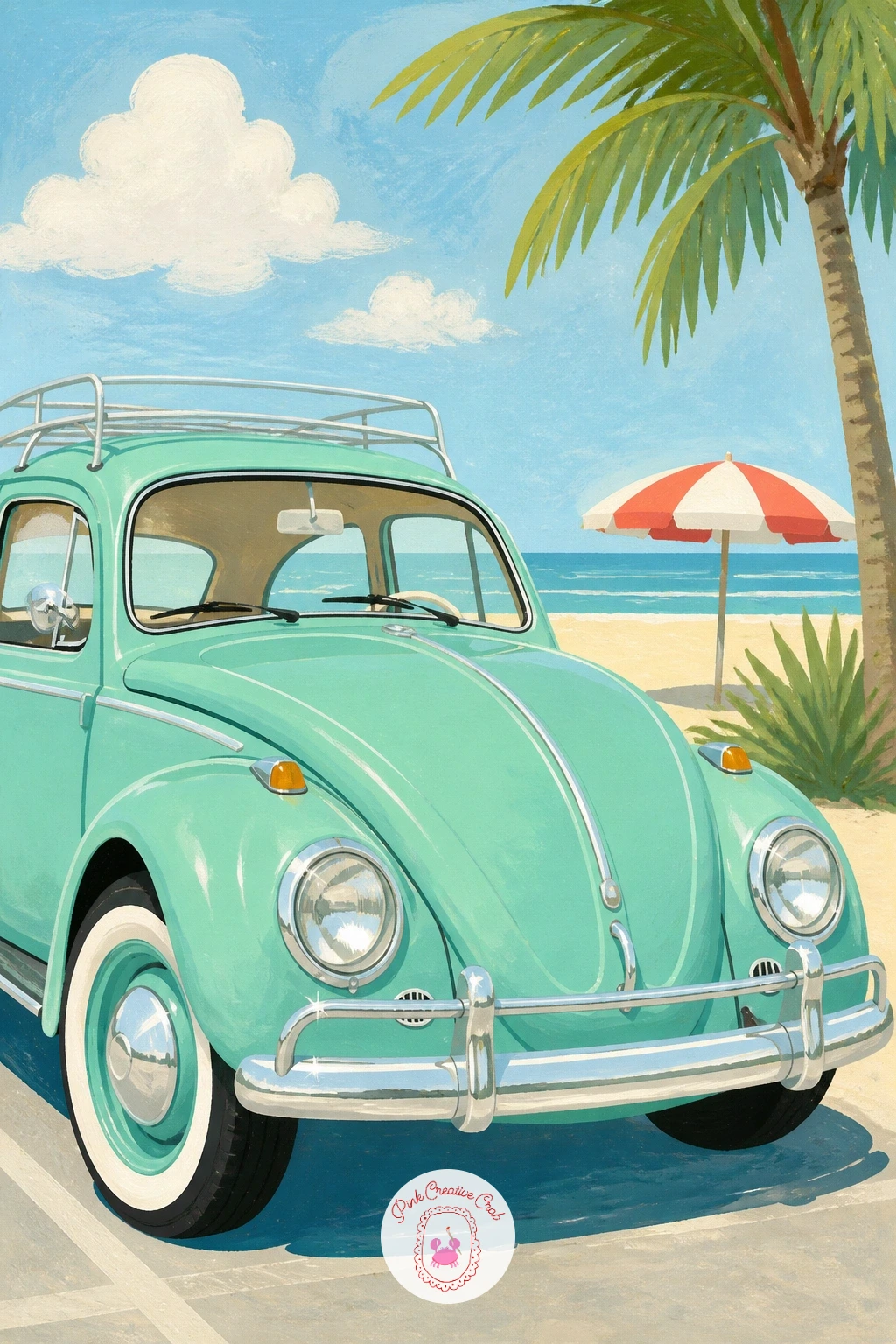
Palette: Mint Green, Cream, Baby Blue, Cherry Red
Move from a parked car to one in motion with a red convertible taking a coastal bend, scarf streaming out behind the driver. Sketch the road as a simple curved ribbon first, since getting that line right fixes the whole perspective before a single drop of paint goes down.
Compare the length of the car to the width of the road at its widest point: if the car looks longer than the road is wide, it will look like it is driving off the edge of the page. Paint the cherry red body in one flat layer, then add the white scarf as a loose flowing shape with a dry brush dragged lightly so the edge looks windblown rather than cut out.
Block the sea as a flat band of deeper blue below a paler sky, keeping the horizon line straight and level. If your gouache set has no true cherry red, mix a little white into alizarin crimson to lighten it toward poster-red.
Finish with a cream guardrail along the cliff edge to anchor the road in space.
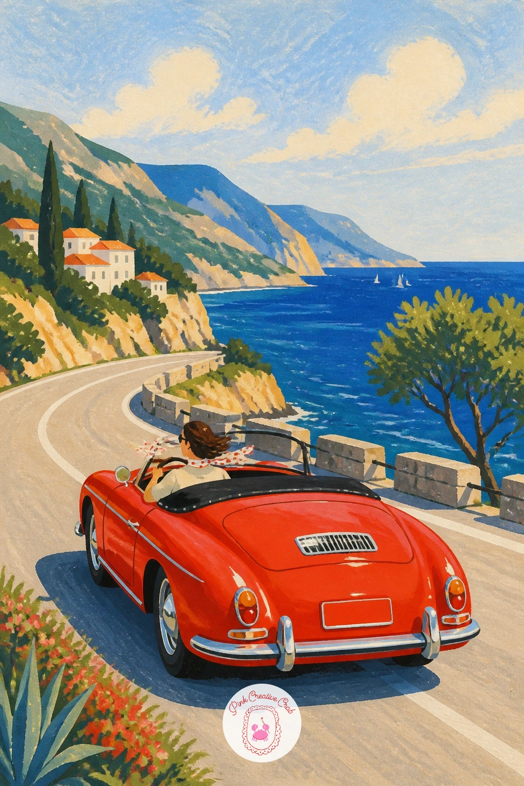
Palette: Cherry Red, Sky Blue, Deep Sea Blue, White
After a car in motion, slow things down with a cream Fiat 500 parked under a tree, a picnic basket strapped to its tiny roof rack. The Fiat’s whole charm is its roundness, so draw the body as one soft rounded rectangle with no hard corners anywhere.
Paint the body cream first, then let it dry completely before adding the basket on top in warm brown with a few curved lines of darker brown for the weave. This is where beginners rush and smear the basket into wet car paint, so wait the extra five minutes.
For texture, try a dry brush loaded with just a little tan paint dragged sideways over the basket to suggest wicker without painting every strand. A butter yellow gingham cloth peeking from the basket adds a nice accent of pattern against all that flat color.
If you don’t have a fine brush for the weave lines, the tip of a cotton swab dipped in paint works for soft dabs instead.
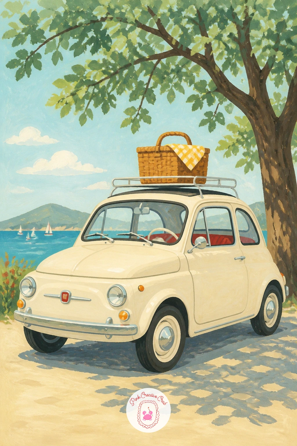
Palette: Cream, Warm Brown, Butter Yellow, Sap Green
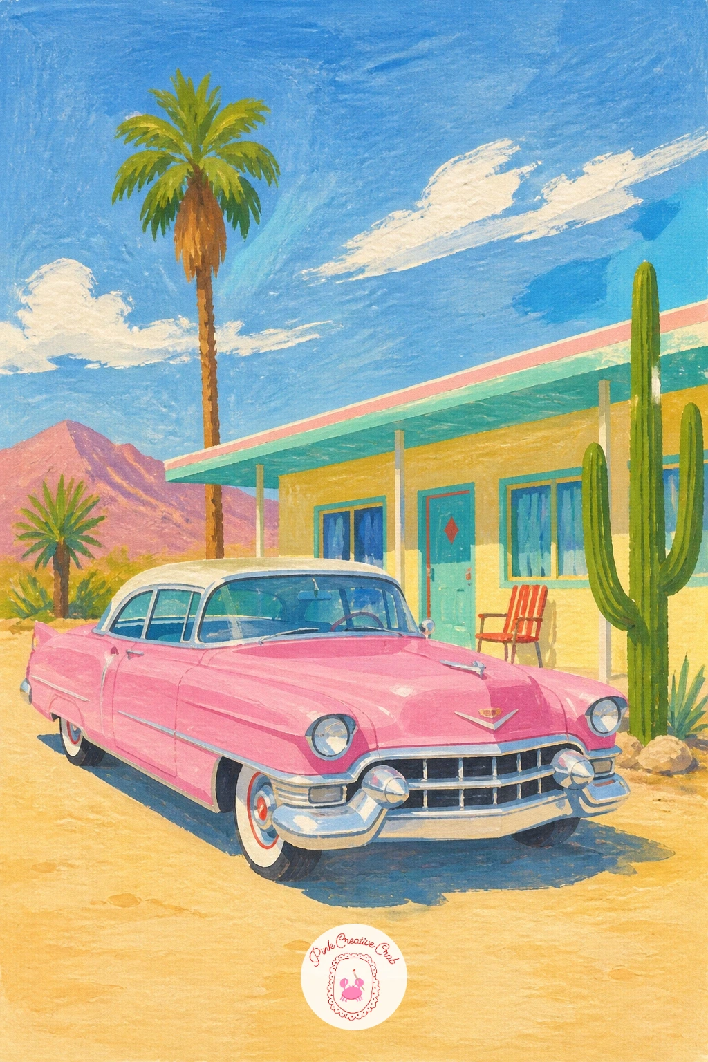
Bring in a bigger, flashier car next: a pink Cadillac with its famous tail fins, parked outside a low desert motel sign. Draw the fins as two sharp triangular shapes jutting from the rear, since getting their angle right is what makes a Cadillac read as a Cadillac rather than a generic sedan.
Where this scene usually goes wrong is the sky: a desert sunset needs to glow, so paint it as three flat horizontal bands (pale yellow low down, dusty pink in the middle, lavender at the top) before the car goes in, rather than one muddy blend. Let each band dry before the next if your paper is thin.
Paint the Cadillac itself in a bubblegum pink with a white roof, then pick out the fin edges and bumper in bright white gel pen once everything is dry. The motel sign can be a simple vertical shape in cherry red with a few white letters suggested, not spelled out in full.
Swap pink gouache for white mixed with a little red and a touch of magenta if you don’t own a ready pink.
You Will Need
- white gel pen for highlights
Palette: Bubblegum Pink, Dusty Pink Sky, Lavender, Pale Yellow
Look at real 1950s Cadillac photos for the fin shape before you sketch; the angle is sharper and longer than most people guess.
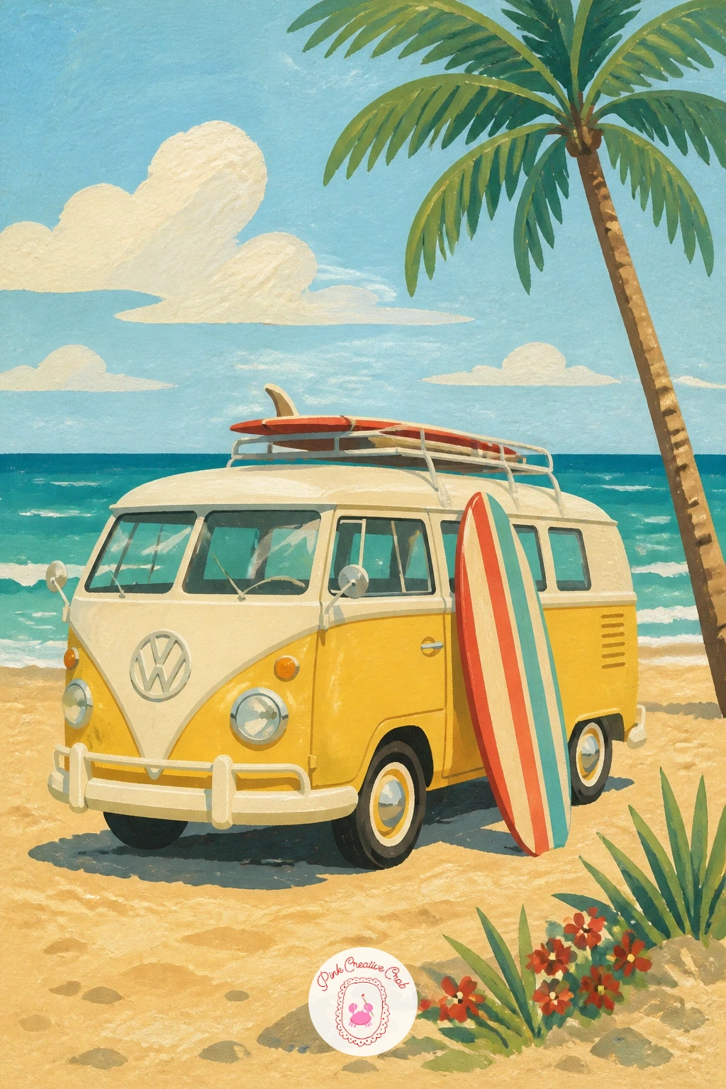
Switch gears to a boxier shape with a classic camper van parked at a surf beach, board leaning against its side. The van is really just a tall rectangle with rounded corners and a flat windshield, so block that shape in first in two-tone paint: pale top half, a bolder color like butter yellow on the bottom half, split by a simple straight line.
Paint the surfboard next to it in a contrasting stripe pattern, since a striped board against a plain van gives the whole piece its pattern interest without adding clutter elsewhere. Keep the beach behind it loose: a flat stretch of cream sand and a thin band of turquoise sea is plenty.
For speed, this scene works well as a ten-minute version with just the van and board on a plain sky; given forty minutes, add a beach towel, a cooler, and a gull or two overhead for more story. Either way, finish with a white gel pen line along the van’s roof edge to catch the light.
You Will Need
- white gel pen for highlights
Palette: Butter Yellow, Turquoise, Cream Sand, White
Take the eye level down low for a yellow 2CV driving away down a French country lane, poplar trees marching off into the distance on either side. Sitting the horizon low in the frame and making the poplars shrink as they recede is what sells the depth here, so draw the nearest tree tallest and each one after it a little shorter and closer together.
Paint the lane first as a pale dusty path narrowing to a point, then add the poplars as simple tall green ovals on thin trunks, darkest in the front and lighter toward the back to push them into the distance. The 2CV itself is a boxy, upright little shape with big round headlamps, painted in a cheerful mustard yellow once the background is dry.
If your poplars start looking like lollipops, flatten the top of each oval slightly and taper the base instead of leaving them perfectly round. A fine liner pen can tidy the thin trunks if your brush keeps wobbling.
Try this one again later heading toward the viewer instead of away, for a very different mood.
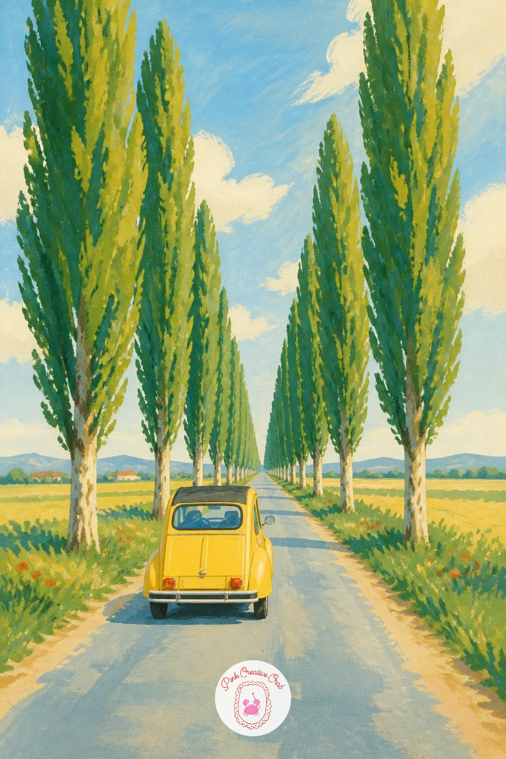
Palette: Mustard Yellow, Sap Green, Dusty Path, Sky Blue
Bring a driver into frame with a woman in a headscarf and sunglasses at the wheel of an open convertible, seen close up so her face and the dashboard fill most of the space. Since a face this close needs to hold up, simplify it: an oval head, two dark oval sunglasses lenses, a small curved line for a smile, nothing more detailed than that at this level.
Paint her headscarf in a bold pattern color like cherry red or a polka dot print, working it as one flat shape tucked under her chin before you add any folds. The dashboard behind her can stay simple, a cream curved shape with one round dial picked out in white gel pen.
The easiest way to avoid a stiff, flat portrait is to tilt her head slightly and let a few strands of hair escape the scarf at the temple. If painting a face feels daunting, borrow the approach used in these simple figure drawing lessons and keep every feature a plain shape rather than trying to shade it.
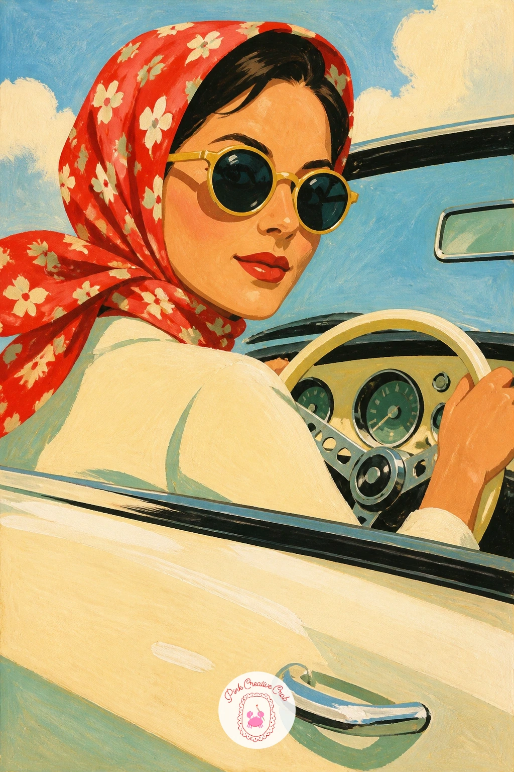
Palette: Cherry Red, Skin Tone, Cream, Black
Carry the festive mood forward with a wedding car trailing ribbons and tin cans from its bumper, parked for its big moment. A classic dark sedan shape works best here since the ribbons need a plain backdrop to stand out, so block the car body in a deep color like navy or burgundy first and let it dry hard before adding anything on top.
Paint two or three ribbon streamers as long curved white or cream shapes trailing from the rear bumper, following a gentle wave rather than a straight line so they look like they are moving in the breeze. The tin cans are just small grey ovals strung along a thin string beneath the ribbons, dotted in with a fine brush once everything else is dry.
If the ribbons look stiff, thin your white paint slightly and pull the brush in one smooth stroke rather than going back over it. A bunch of flowers tucked on the hood in cherry red and white adds a nice finishing touch without much extra work.
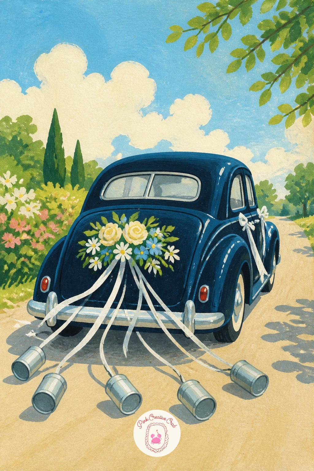
Palette: Navy, Cream, Grey, Cherry Red
Keep the trip theme going with a classic Mini so stuffed with weekend bags that a suitcase pokes out of a half-open boot. The Mini’s shape is nearly a square on wheels, which makes it one of the easiest car bodies here, so spend your care on the luggage instead: paint two or three stacked bags in contrasting flat colors like mustard, baby blue and cream, each outlined simply once dry.
Work the car body first in a punchy color such as baby blue, then the chrome trim and round headlamps in white once that layer has set. The boot lid itself can tilt up at an angle with one suitcase corner sticking out, which reads instantly as “packed for a trip” without any extra explaining.
Where people struggle is making the stacked bags look flat and separate rather than one blob: leave a thin sliver of the car’s color between each bag so your eye can tell them apart. No baby blue on hand? White mixed with a little cerulean gets you there.
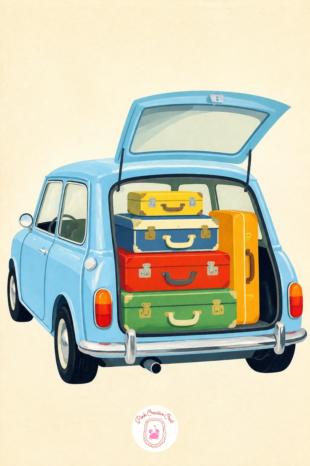
Palette: Baby Blue, Mustard Yellow, Cream, White
Give the Mini’s passenger seat to a happy dog next, head out the window of a vintage car, ears blown back by the wind. Start with the car as a simple side-on shape in any color you like, leaving the window opening as a clean gap before you paint anything else.
Build the dog from basic shapes too: an oval head, two floppy or pointed ear shapes depending on the breed, and a dot of a nose, all fitted into that window gap. The fun of this one is the ears, painted mid-flap with a slight curve backward to show the speed of the car, and a few short dry-brushed lines trailing off the tip of each ear for a windblown look.
If the dog’s head ends up too big for the window, shrink the ears rather than the whole head, since a slightly oversized head actually reads as cuter at this scale. Pastel-tone the dog’s coat (cream, honey, soft grey) so it sits happily inside the retro palette.
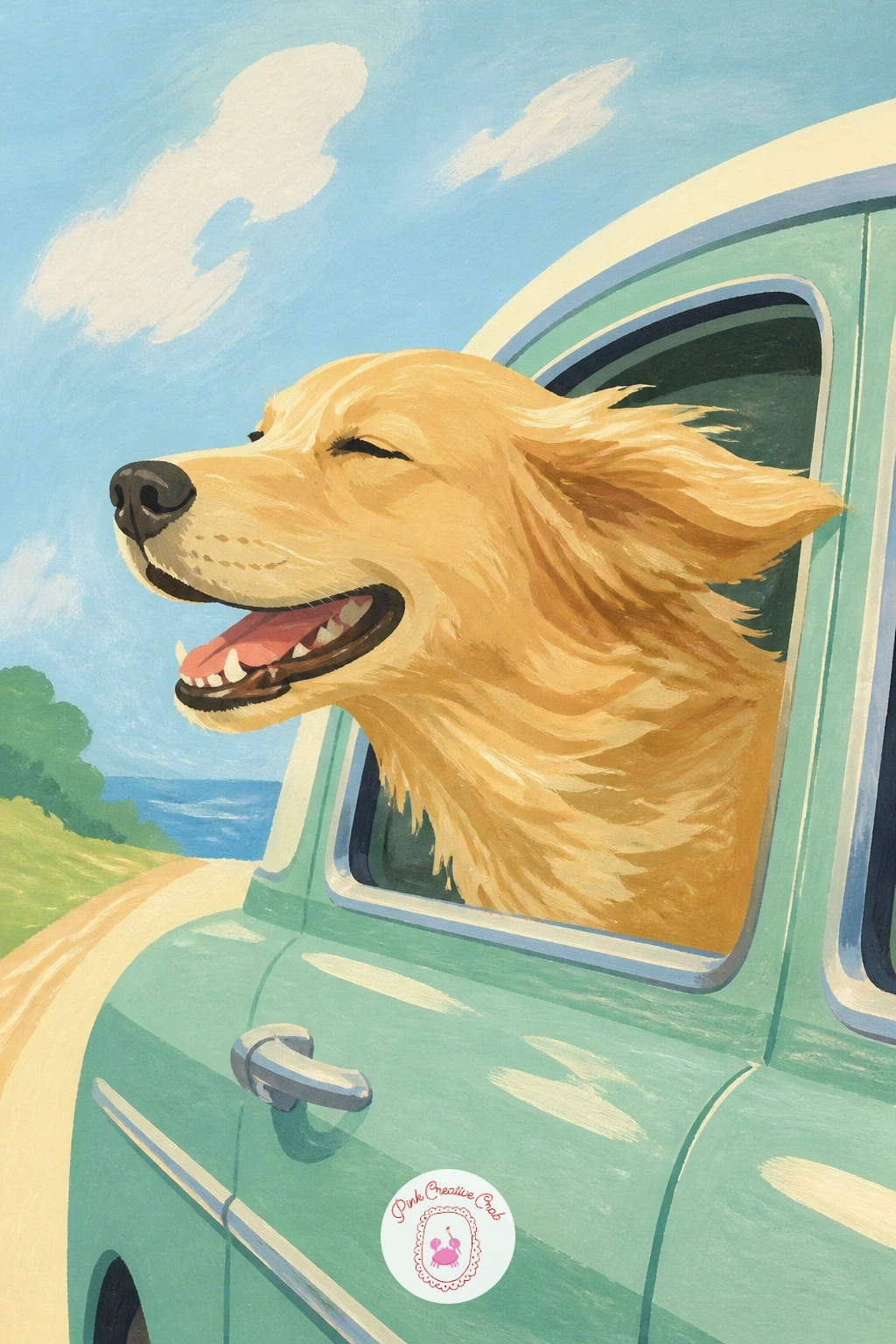
Palette: Honey Tan, Cream, Sky Blue, Black
Build a fuller scene around a vintage car stopped at an old roadside gas station, pump and sign included. Lay the composition out first in pencil: the car takes up most of the lower half, the pump stands beside it at about the height of the car’s roof, and a simple sign post rises behind both.
Painting from back to front keeps the layers clean here, so block the sky and the station’s flat-roofed building first, then the pump in a bold color like cherry red, and the car last on top of its own shadow. Getting the pump’s height right against the car is the trick that holds this one together: it should sit roughly at the driver’s window level, not towering over the car or disappearing below it.
Simple lettering on the sign (a few bold blocky letters, not a full word) adds period charm without turning into a lettering exercise. If you enjoy composing little roadside scenes like this, the layered approach in these gouache landscape ideas carries over nicely.
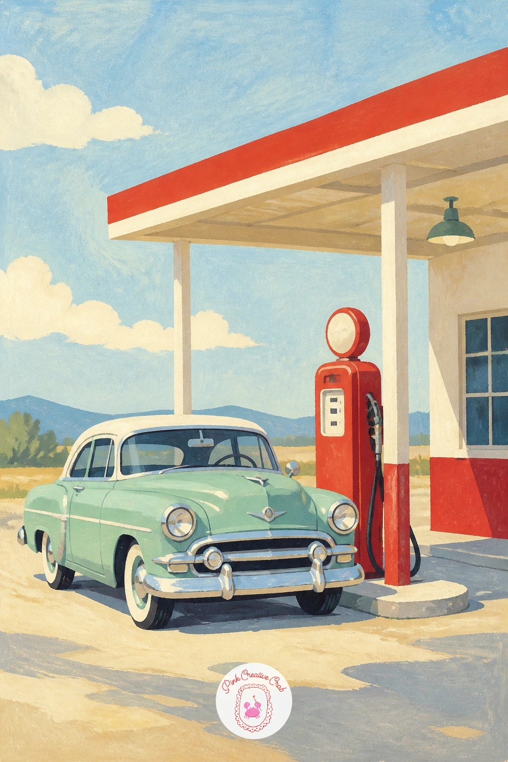
Palette: Cherry Red, Mustard Yellow, Pale Sky, Grey
Widen the view for a row of cars parked at a drive-in theater as the sun sets behind the big screen. Since the light source here is the glowing screen and the setting sun together, keep every car’s windshield catching a touch of warm orange reflection to tie the whole row to that one light.
Paint the sky first in horizontal bands from pale yellow near the horizon up into dusky purple overhead, then the screen as a simple pale rectangle on a thin stand, and the cars last, each one a slightly different pastel color so the row doesn’t read as repetitive. Overlapping the cars a little, front bumper hiding behind the next car’s rear, is what gives the row real depth instead of a flat line of shapes.
If three or four full cars feels like too much for one sitting, the ten-minute version is two cars and a screen; the fuller version adds a popcorn stand and a couple strolling between the rows. Either way, dot a few tiny white highlights on each windshield last.
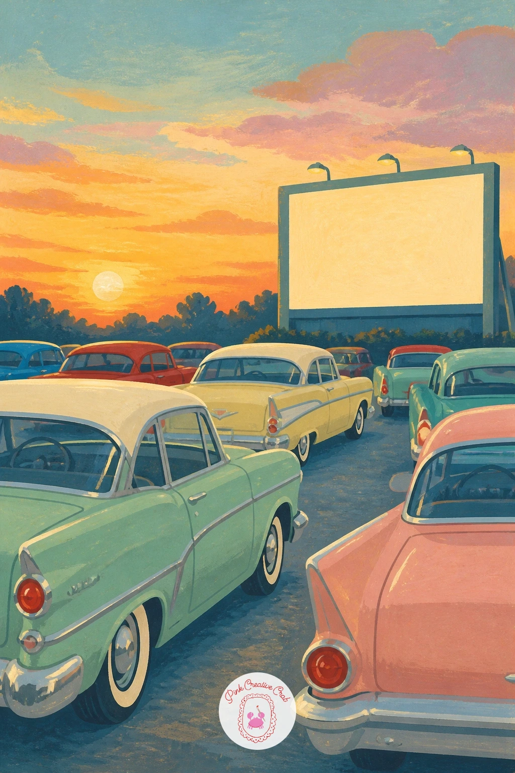
Palette: Dusky Purple, Pale Yellow, Mint Green, Baby Blue
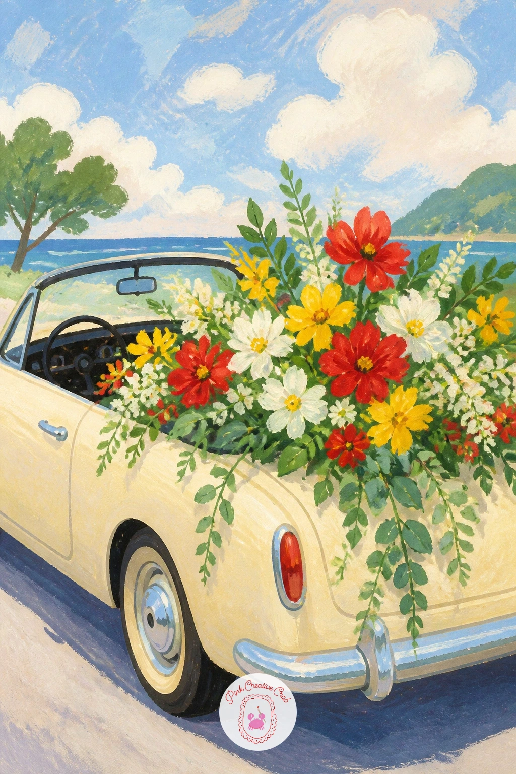
Fill a convertible’s back seat with armfuls of flowers fresh from the market, overflowing over the doors. Paint the car body first in a creamy or pastel shade and let it dry completely, since the flowers only read well against a calm, settled background color.
Build the flowers as clusters of simple round and oval blobs in three or four colors, cherry red, butter yellow, and white, grouped in loose bunches rather than spaced evenly, the way real market bouquets pile together. A few trailing green leaf shapes draped over the car door sell the overflow better than more flowers would.
The spot this goes wrong is overworking each bloom into a detailed flower; at this scale, one confident dab of color per flower reads better than five careful petals. For variety next time, try the same setup with a single flower type, like all sunflowers, for a bolder, less busy look.
Finish with a white gel pen dot in the center of a few blooms for sparkle.
You Will Need
- white gel pen for highlights
Palette: Cream, Cherry Red, Butter Yellow, Sap Green
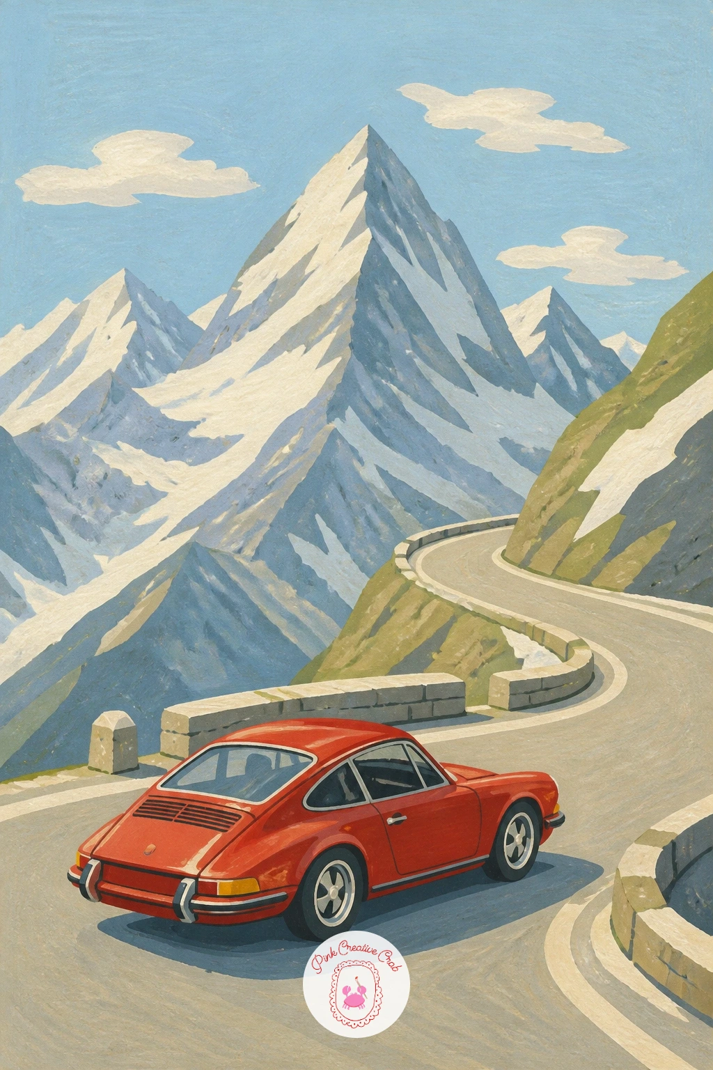
Take the scene uphill with a Porsche 911 rounding a hairpin on an alpine pass, snowy peaks rising behind it. Set the eye level low, looking slightly up at the car, since that angle is what makes a mountain road feel steep and the car feel like it’s really climbing.
Paint the mountains first in flat overlapping triangular shapes, palest furthest back and darkest closest, with simple white caps left unpainted or added in white gouache once the base color is dry. The road switches back in one bold curve across the lower third of the painting, and the 911’s rounded, low-slung shape sits right on that curve, nose pointed into the bend.
Keep the car in a single confident color such as deep red or pale silver-grey so it stands out clearly against all those mountain shapes behind it. If the mountains are crowding the car, simplify to two peaks instead of a whole range; a busy background is the easiest way to lose a small car in a big landscape.
Palette: Deep Red, Slate Grey, Pale Blue, White
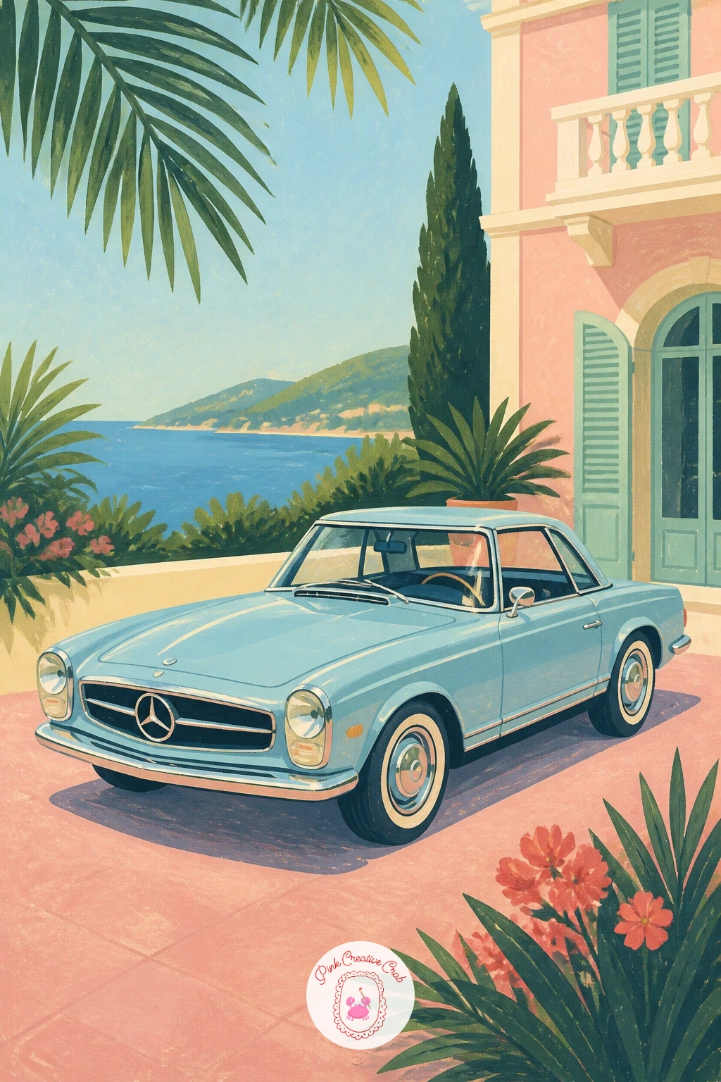
Settle into something glamorous with a Mercedes Pagoda parked in a Riviera driveway, palm leaves framing the scene. The Pagoda’s slightly curved hardtop roof is its signature feature, so take extra care there: paint the roofline as one gentle arch rather than a flat line, since that curve is what makes this particular car recognizable.
Work the driveway and a pale villa wall in behind the car first, in soft pink or cream, then add one or two palm fronds at the edges of the frame in a deep green, painted as simple pointed leaf shapes fanning from a curved trunk line. The car itself goes on last, in a pale cream or soft blue, its chrome trim picked out in white gel pen once fully dry.
If the palm leaves start looking spiky and stiff, curve each leaf shape slightly at the tip rather than leaving it straight, which softens the whole silhouette. Gravel under the wheels can be suggested with a few scattered dots rather than painted in full.
You Will Need
- white gel pen for highlights
Palette: Pale Blue, Pale Pink, Deep Green, Cream
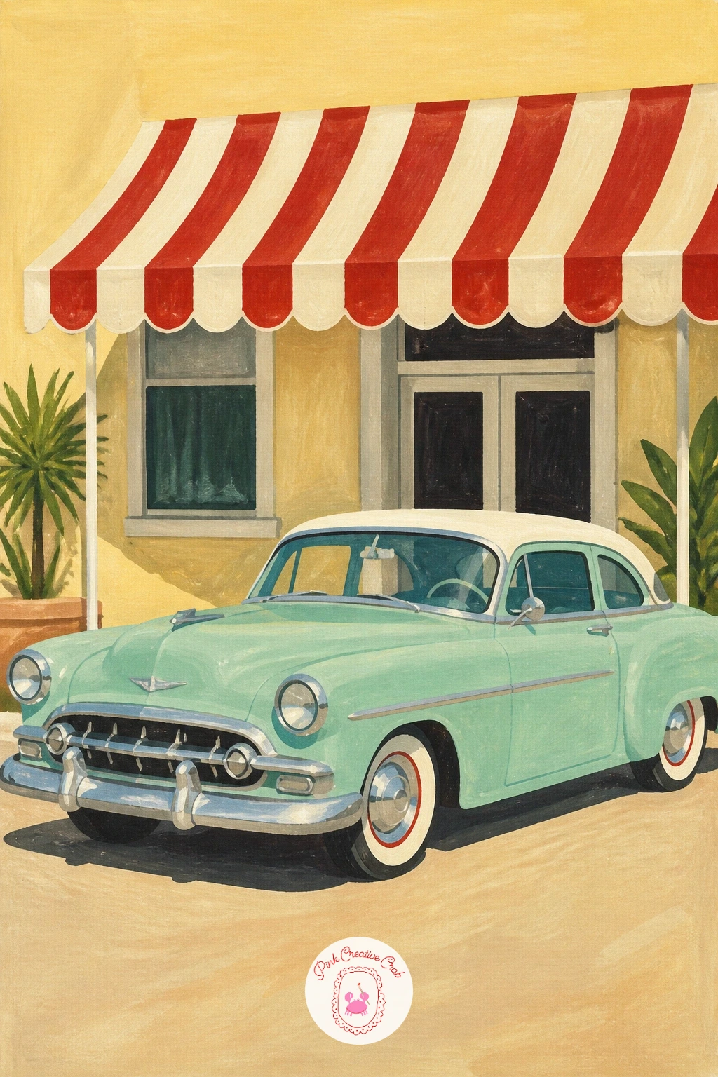
Park a vintage car beneath a striped hotel awning next, the stripes giving this one its personality. Paint the awning first as a simple fan or scallop shape in alternating cream and cherry red stripes, each stripe painted as one flat band and left to dry before the next so the colors stay crisp and don’t bleed together.
The building wall behind can be a single flat pastel color, pale yellow or soft green works well, with one or two simple windows suggested as rectangles rather than drawn in detail. The car sits parked just under the awning’s shadow, so paint a soft grey-blue shape beneath it before the car itself, which grounds it instantly under the cover.
Getting the stripes even is the main challenge: lightly pencil a few guide lines first rather than trying to eyeball evenly spaced stripes freehand. A potted topiary or two beside the entrance rounds out the scene without much extra effort.
Palette: Cherry Red, Cream, Pale Green, Soft Blue-Grey
Add some playful character with a girl in hair rollers washing a vintage car, sponge in hand and suds everywhere. Block the car’s body color first and let it dry fully, since the suds need a clean surface to sit on top of without smearing into the paint beneath.
Paint the suds as loose overlapping white and pale blue bubble shapes along the hood and fenders, using a dry brush dabbed rather than dragged so the texture stays soft and foamy rather than streaky. The girl can be a simple figure in a headscarf or rollers, bent slightly toward the car with one arm extended holding a sponge, her whole pose built from three or four basic shapes rather than careful anatomy.
If the suds end up looking like solid white blobs, soften a few edges with a damp brush right after painting them so they feather slightly into the car color. A bucket and hose nearby, painted as simple shapes in cherry red and grey, finish the story.
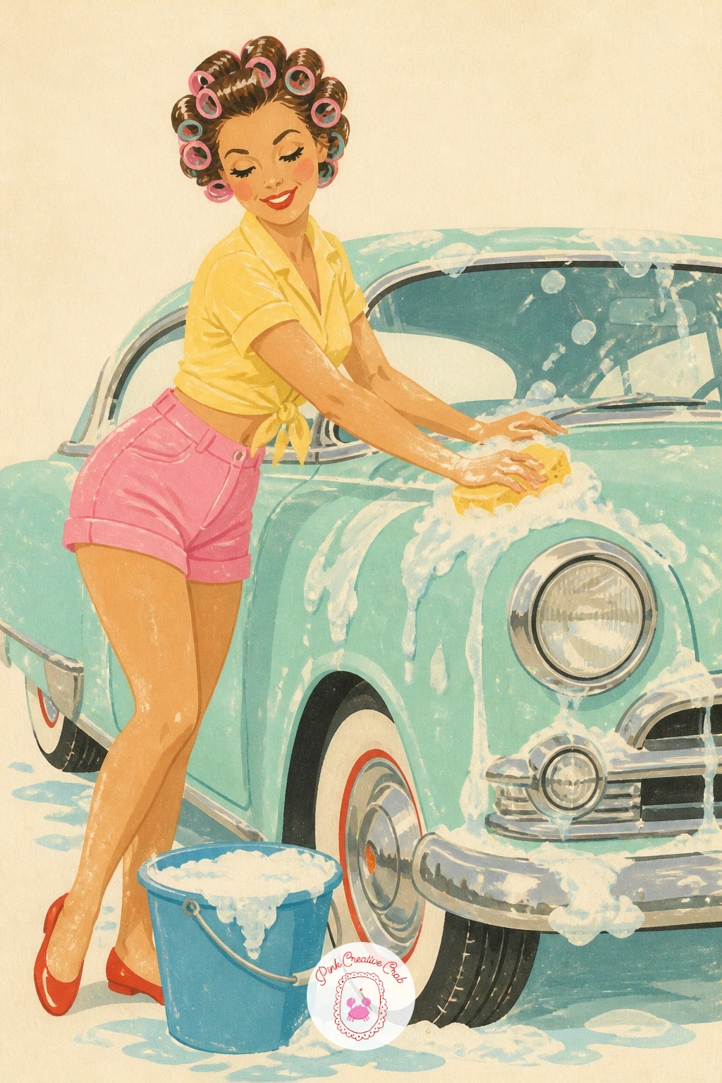
Palette: White, Pale Blue, Cherry Red, Skin Tone
Turn a mishap into a charming scene with a broken-down car pulled to the roadside, a picnic blanket spread out beside it instead of any fuss. Paint the car first, hood propped open with a simple dark triangle shape, since that single detail tells the whole story without needing smoke or tools scattered around.
Lay the picnic blanket out in a gingham pattern of alternating butter yellow and white squares, painted as a flat grid before any food or baskets go on top of it. Keeping the blanket’s pattern simple and evenly spaced matters more here than detailing every item on it, so stick to two or three shapes for food: a loaf, some fruit, a thermos.
For a quick version, skip the gingham grid and use a plain cream blanket with just a basket on it; given more time, add a couple seated figures enjoying the wait. Either way, a few flowers growing at the roadside tie the scene to its setting.
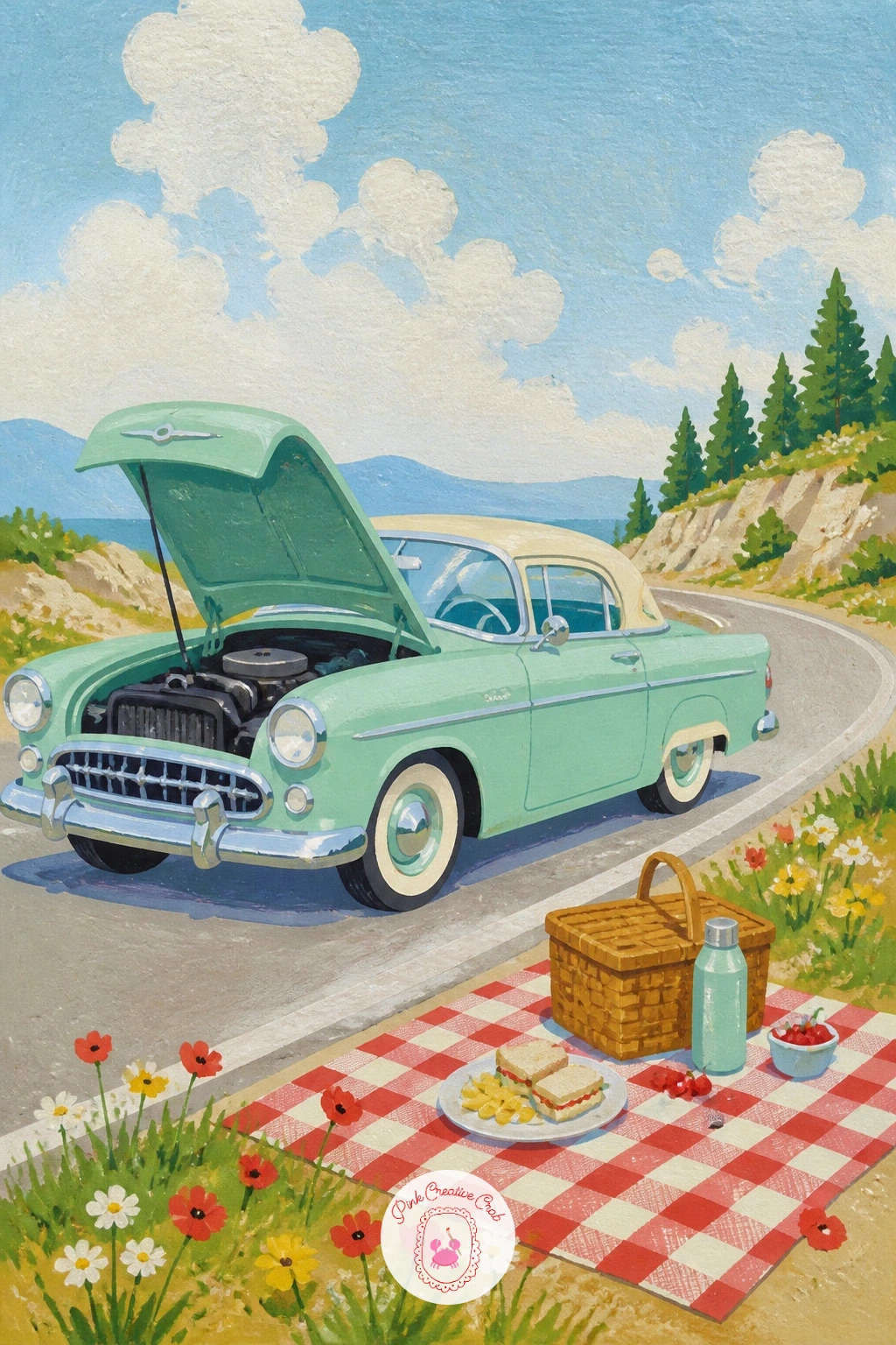
Palette: Butter Yellow, Cream, Sap Green, Cherry Red
Load a vintage pickup truck’s bed with rows of flower pots for a scene that leans more cottagecore than road trip. The pickup’s boxy cab and flat bed make it one of the simpler vehicle shapes to draw, so spend the detail budget on the pots instead: paint a row of five or six terracotta pots in slightly varying heights, each topped with a different simple flower shape.
Work the truck body first in a soft faded color like dusty blue or sage green, letting the paint chip look (a few small scratches of a lighter tone) suggest age once the base layer is dry. Terracotta pots go in next as simple trapezoid shapes, and the flowers last, kept to two or three types (daisies, geraniums, a trailing vine) so the bed doesn’t turn into visual noise.
If the pots start looking identical and flat, stagger their heights and tilt one or two very slightly so the row feels hand-arranged rather than printed. This pairs nicely with the loose floral approach in these gouache flower painting ideas.
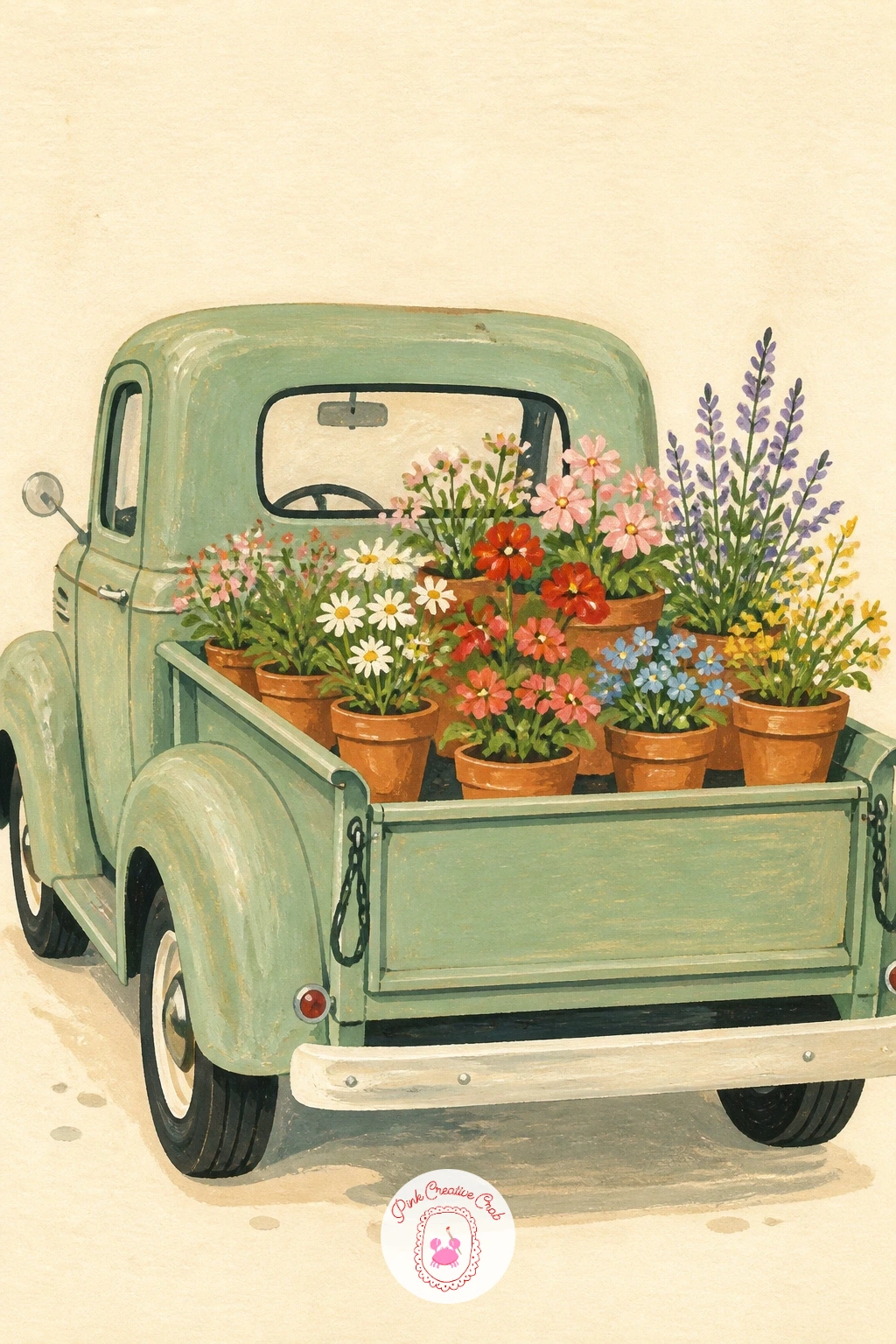
Palette: Sage Green, Terracotta, Cherry Red, Butter Yellow
Head out to the country with a vintage Land Rover parked beside a wooden farm gate, fields rolling behind it. The Land Rover’s upright, slab-sided shape is forgiving to paint, so use a ruler or the edge of a card to keep its panels straight, since this is one of the few vehicles here that actually benefits from crisp, hard-edged lines rather than a hand-drawn wobble.
Paint the fields behind in two or three flat bands of green and gold, lightest and warmest furthest away to push them back in space, then the wooden gate as a simple cross-hatch of brown lines in front of that. The Land Rover itself, usually a muted green or faded cream, goes in last, its mud-splashed lower half suggested with a few dry-brushed dots of brown along the wheel arches.
If the gate looks too neat for a working farm, knock one plank slightly off level and add a loop of rope instead of a latch. A sheepdog sitting beside the gate is an easy addition if you have a few extra minutes.
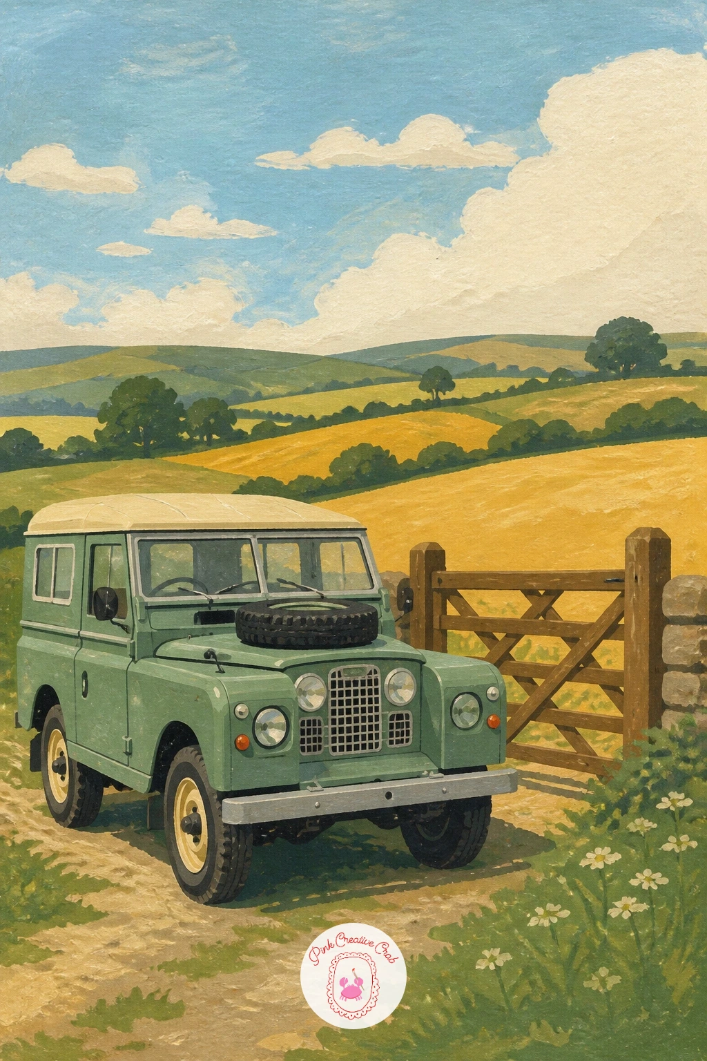
Palette: Faded Green, Gold, Warm Brown, Sky Blue
Pair a little Renault 4 with neat rows of vines for a scene that leans into pattern and repetition. Lay the vineyard out first as rows of small green humps on thin brown trunk lines, each row slightly smaller than the last as they recede toward a low horizon, which is the fastest way to fake real distance without any complicated perspective drawing.
Once the rows are dry, paint the Renault 4 parked at the near edge of the vineyard in a warm terracotta or dusty blue, its boxy shape and round headlamps kept simple against all that patterned background. The repeating vine rows do a lot of visual work on their own, so keep the car in one flat color with minimal shading to avoid competing with them.
If the rows start to look mechanical, vary the spacing slightly and let one or two vines sit a little taller than their neighbors. A stack of wooden crates beside the car is an easy way to suggest a harvest without painting any grapes individually.
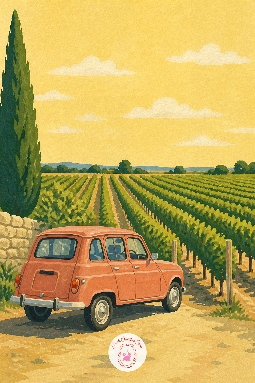
Palette: Terracotta, Sap Green, Warm Brown, Pale Gold Sky
Step back for a wider shot with a whole lineup of pastel vintage cars parked side by side at a car show. Decide on three or four cars at most, since more than that at this level turns into a crowd scene rather than a clean poster composition, and sketch them as a simple row of overlapping boxy and rounded shapes along one baseline.
Give each car a different pastel color, mint, baby blue, buttery yellow, dusty pink, so the row reads as a cheerful set rather than repeats of the same shape. Painting the furthest car first and working forward keeps the overlaps clean, since each new car only needs to cover a small sliver of the one behind it.
The common slip here is making every car face the exact same direction with identical wheels; angle one or two very slightly differently, or vary the wheel size a touch, to break up the repetition. A string of bunting overhead in alternating cherry red and white ties the whole lineup together as one event.
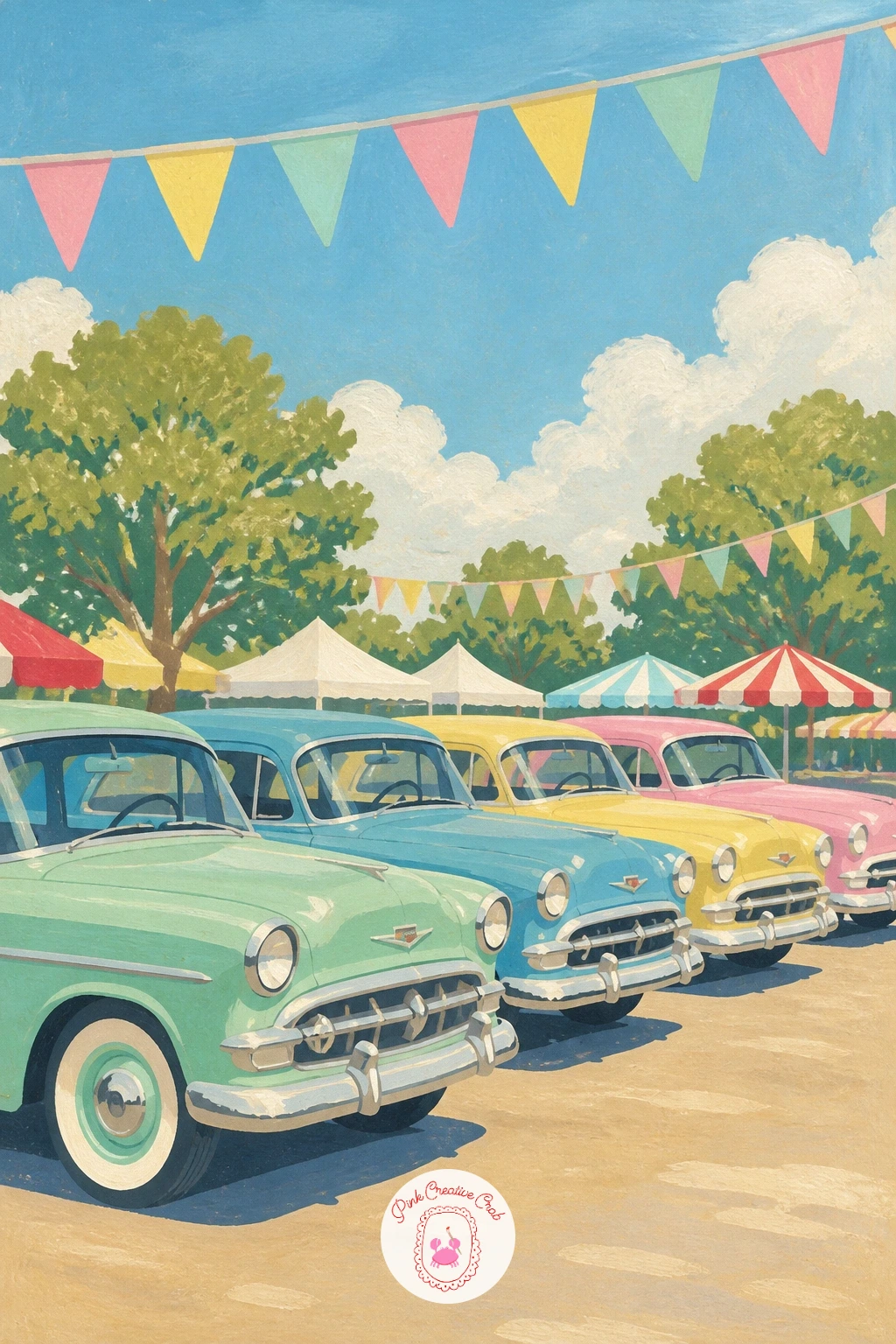
Palette: Mint Green, Baby Blue, Butter Yellow, Dusty Pink
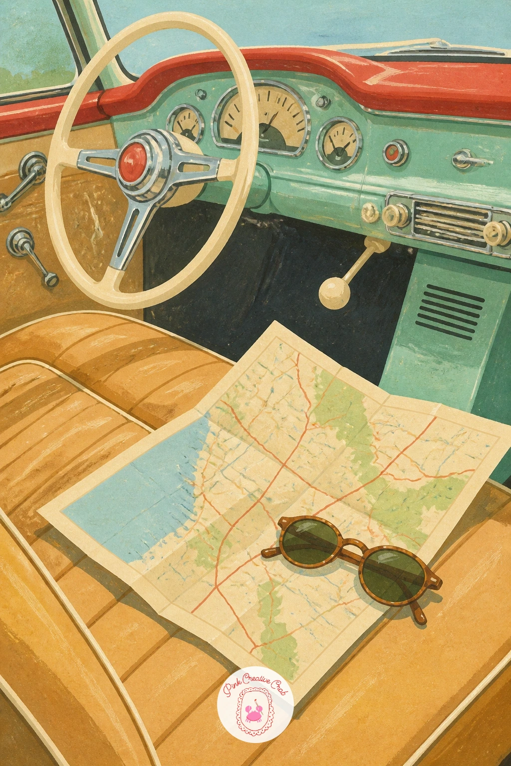
Zoom right into the dashboard for a still life of a vintage car interior, a folded map and a pair of sunglasses resting on the seat. With no whole car to draw, this one lives or dies on a convincing dashboard curve, so pencil that sweeping line first and check it against the width of the steering wheel before committing to paint.
Block the dashboard and seat in warm cream or tan leather tones, then let that dry before adding the map as a simple folded paper shape with a few thin lines suggesting roads, and the sunglasses as two dark ovals joined by a thin bridge. Keeping both objects slightly overlapping the seat’s edge, rather than floating in the middle, makes them look like they’re actually resting there.
If the leather seat looks flat, a few short dry-brush strokes of a darker tan along its folds adds just enough texture without full shading. A steering wheel rim in white gel pen finishes the chrome detail nicely.
You Will Need
- white gel pen for highlights
Palette: Tan Leather, Cream, Black, White
Bring in some romance with a couple dancing beside a parked vintage car, radio dial glowing through the open window. Place the car off to one side of the frame rather than centered, since that leaves the couple room to dance across the open space in front of it, which is really the heart of this scene.
Build both figures from simple shapes, an oval head, a triangular skirt or simple trouser shape, arms bent gently at the elbow, and keep their pose mid-turn rather than static so the dance feels like it’s actually happening. Paint the car itself in a calm color so it stays a backdrop, then add a small glowing yellow rectangle for the radio dial through the window, the one warm light source in an otherwise cool evening scene.
If the figures look stiff, round off every joint, no sharp elbows or knees, and tilt the woman’s skirt slightly to one side as if caught mid-spin. A few scattered stars in the sky above finish the mood.
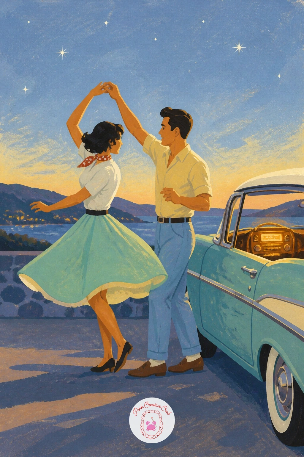
Palette: Dusky Blue, Warm Yellow, Cherry Red, Cream
Return to the packing theme with a car so loaded for a long trip that two or three suitcases are strapped directly to its roof. Draw the roof rack first as a simple grid of thin lines, then stack the suitcases on top in slightly different sizes and colors, cherry red, cream, mustard, so they read as individual pieces rather than one solid block.
The leather straps holding them down are the detail that sells this whole idea, so paint them as thin dark bands crossing over the stack at an angle, added last once every suitcase layer beneath is fully dry. Getting the strap angle consistent across both sides of the stack keeps it looking secure rather than sketchy.
If the suitcases start sliding together visually, outline each one faintly in a slightly darker tone of its own color rather than black, which keeps the separation without harsh lines. A travel sticker or two on the side of one case, just a small colored rectangle, adds instant character.
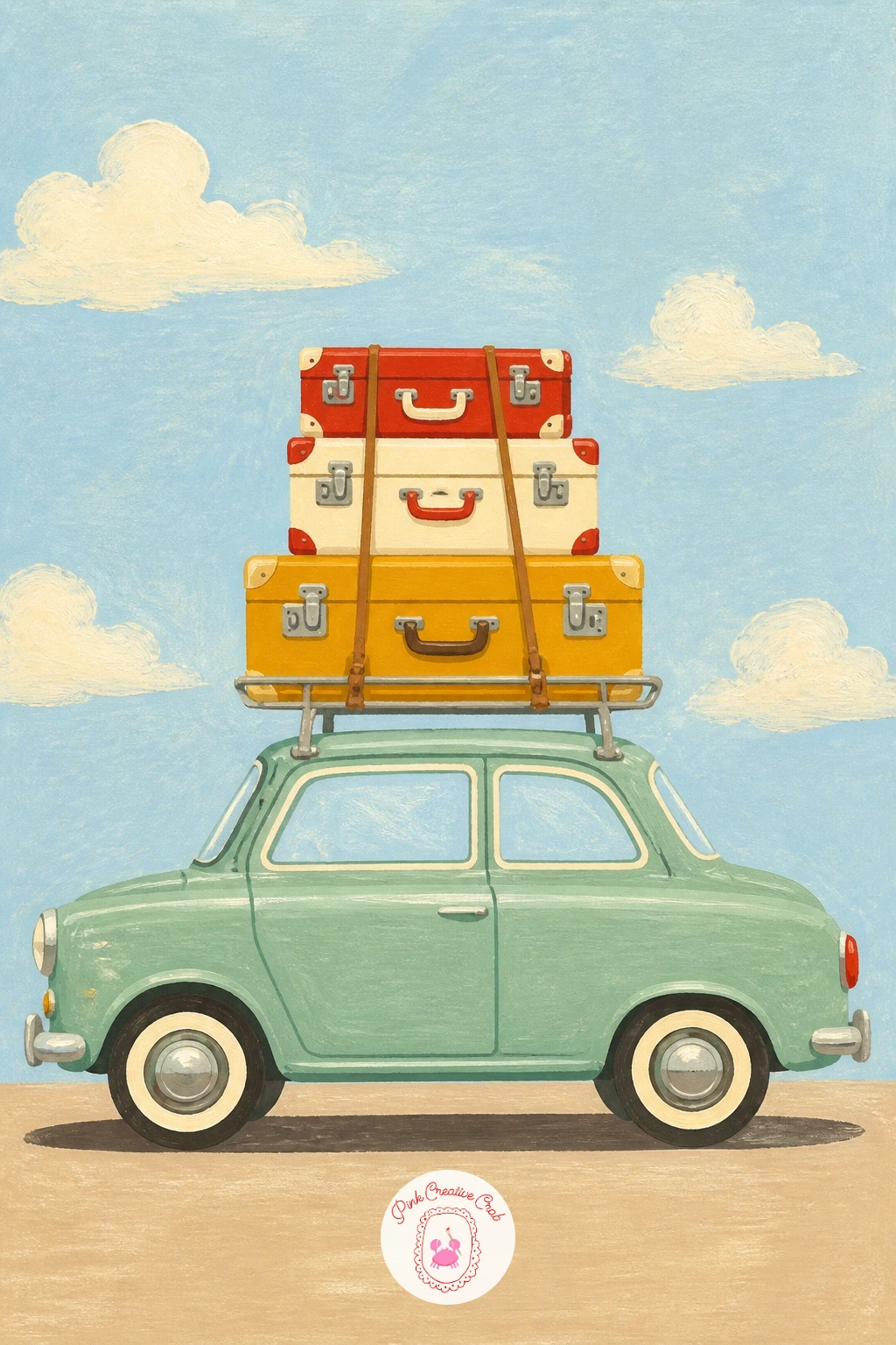
Palette: Cherry Red, Cream, Mustard Yellow, Dark Brown
Settle a girl down on the hood of a parked vintage car, map spread across her knees as she plans the next stop. Paint the car itself first as a simple, broad shape in a calm pastel color, since its hood needs to read clearly as a flat surface for her to be sitting on, not a curved blur.
Build the girl sitting cross-legged or with knees bent, leaning slightly forward over the map, which you can paint as a simple rectangle of pale paper with a few thin colored lines suggesting roads and a town or two marked with small dots. Getting her weight to look settled on the hood rather than hovering above it is mostly about that slight forward lean and a shadow painted beneath her.
If figures feel tricky, keep her in silhouette, a single flat color with no internal features, which still reads perfectly well at this scale and is far more forgiving to paint. Sunglasses pushed up into her hair is a nice small detail to finish with.
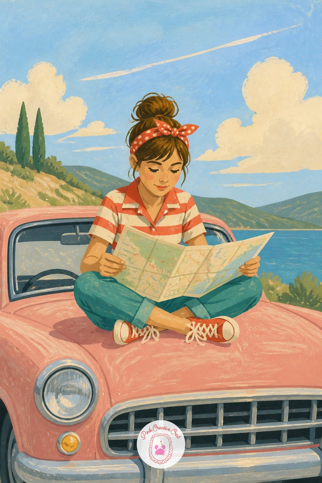
Palette: Dusty Pink, Cream, Skin Tone, Pale Blue
Change the season with a vintage car driving down a tree-lined avenue in full autumn color. Paint the trees first as a row of rounded canopy shapes along both sides of the road, using warm oranges, rusts and a little mustard yellow so the color temperature carries the whole mood before the car even goes in.
Let the road itself stay a cool, muted grey-brown to contrast against all that warm foliage, narrowing toward a soft point in the distance the same way the lane did in the earlier poplar scene, just with a richer palette this time. The car can be any color you like here, since it will stand out against the warm background regardless, though a deep green or cream reads especially well against orange leaves.
A scatter of fallen leaves along the road’s edge, just small dabbed ovals in orange and brown, grounds the whole scene in the season. If the canopies look too uniform, vary a few treetops toward yellow instead of orange for a livelier row.
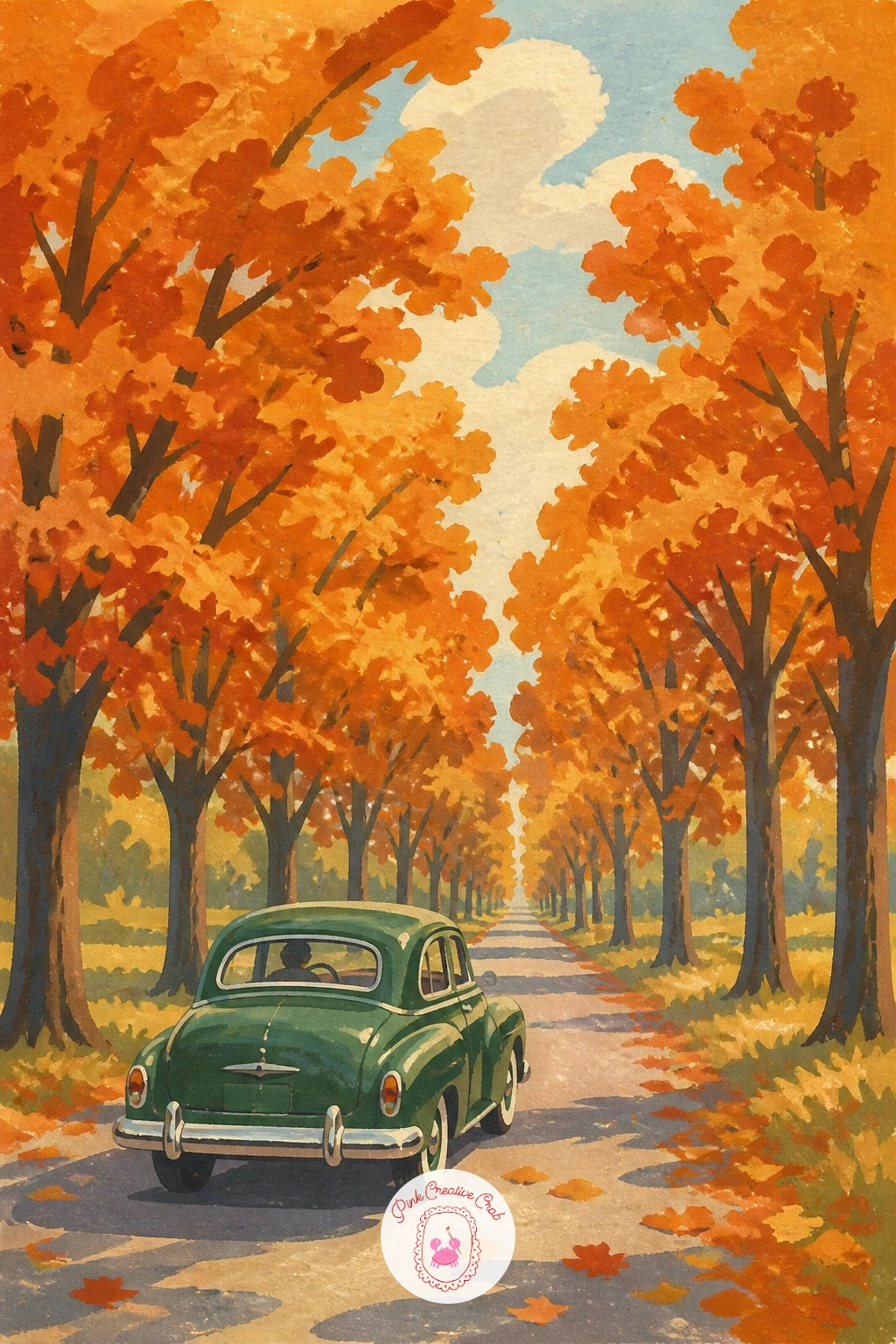
Palette: Burnt Orange, Rust, Mustard Yellow, Deep Green
Bring the trip back to the coast with a vintage car parked beside a striped beach hut, sea just visible behind. Paint the beach hut first as a simple tall rectangle with a triangular roof, striped in alternating bands of cherry red and cream, the same even-stripe technique used for the hotel awning earlier in this list, so pencil light guide lines before committing to paint.
The car parks just beside it, angled slightly toward the viewer rather than straight on, which adds a little life to an otherwise very symmetrical, upright composition. Keep the sea behind both as one flat calm band of blue, with the sand in front a warm pale cream, so the two bold vertical shapes, hut and car, have plenty of calm space to breathe in.
If the hut’s stripes bleed at the roofline, tape off the edge lightly with a scrap of paper before painting that last band. A beach ball or folded towel beside the car is an easy extra if you have a few spare minutes.
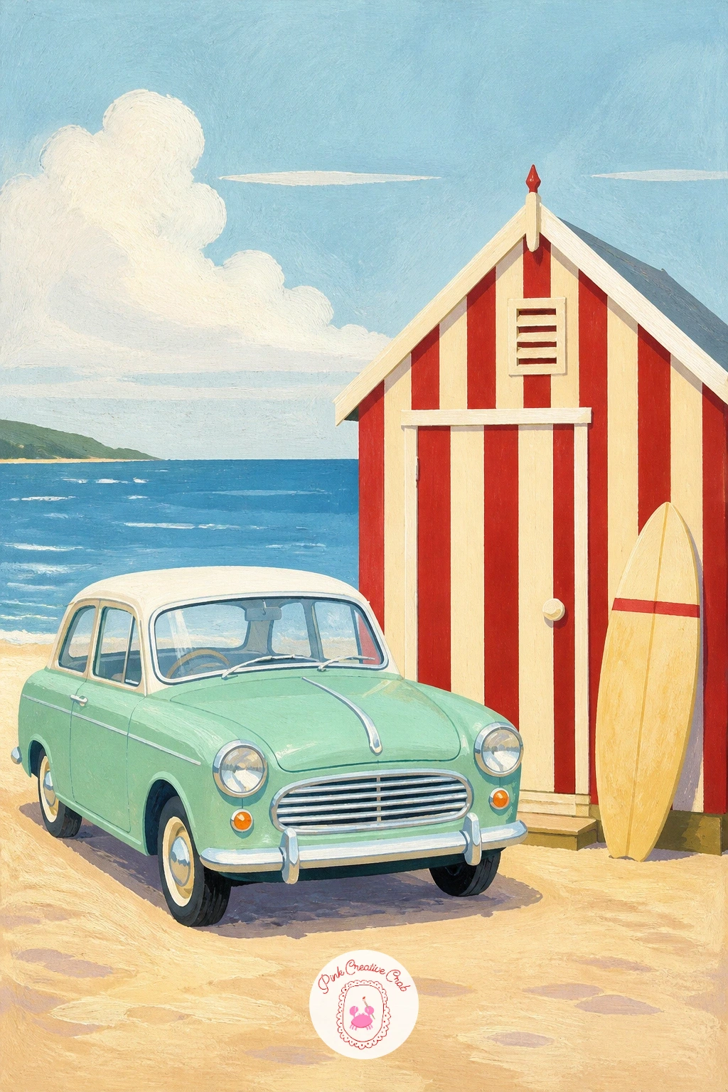
Palette: Cherry Red, Cream, Sea Blue, Sand
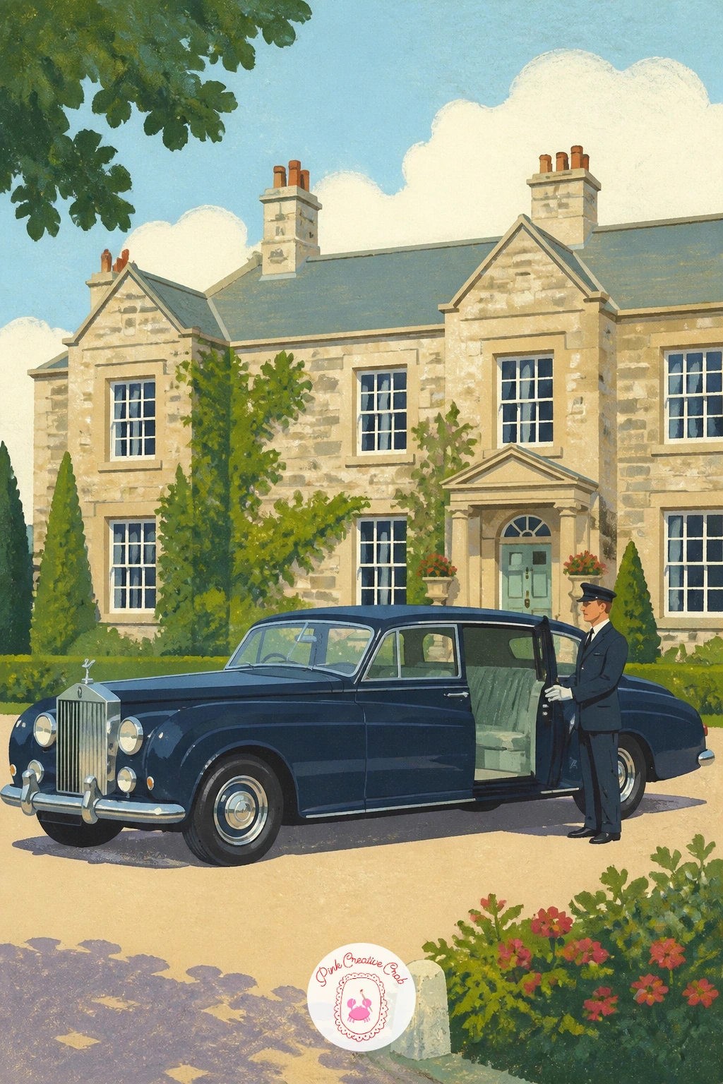
Add some old-world polish with a Rolls-Royce parked before a grand country house, a chauffeur standing stiffly by the door. The Rolls-Royce’s long, elegant body is the star here, so draw it noticeably longer and lower than the other cars in this list, with a tall, narrow radiator grille at the front that you can pick out in white gel pen once the body color is dry.
Paint the house behind it as a simple symmetrical facade, a few evenly spaced rectangular windows and a central door, in a soft stone color, so it reads as grand without needing architectural detail. The chauffeur stands beside the open rear door as a simple upright figure in a dark uniform, one arm extended toward the door in a small welcoming gesture.
If the car’s long body looks awkward, check that its length is roughly double its height, which is closer to the real proportion than most people guess. Gravel in front can be a few scattered pale dots rather than a fully painted surface.
You Will Need
- white gel pen for highlights
Palette: Deep Navy, Stone, White, Grey
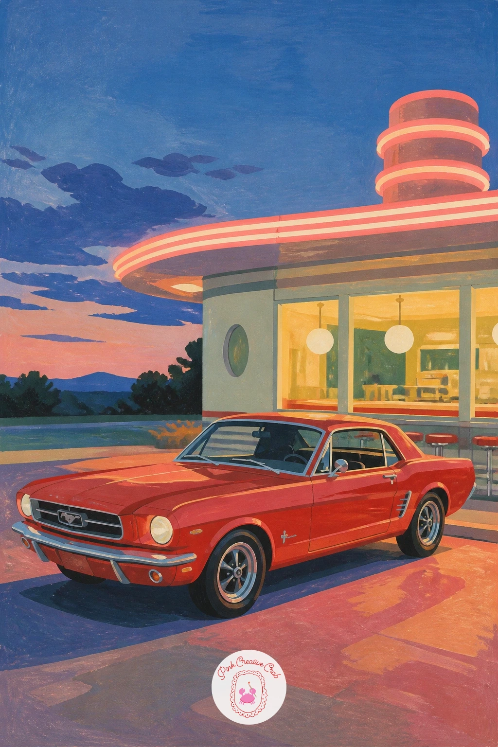
Bring the American road trip home with a Mustang parked outside a neon-lit roadside diner at dusk. Paint the diner first as a simple long low building with a strip of glowing windows, using a warm yellow-orange glow spilling out onto the pavement in front, since that warm light pooling on the ground is what makes the whole scene feel like evening rather than daytime with the lights left on by mistake.
The Mustang parks in that pool of light, its body in a bold color like cherry red or deep green, catching a touch of the diner’s warm glow along one side while the rest of the car stays in cooler dusk shadow. This two-temperature approach, warm glow on one side, cool shadow on the other, is what separates a flat, evenly lit car from one that looks lit by something specific.
A simple neon sign shape above the diner, just a rounded rectangle outline in a bright accent color, finishes the period feel. If neon colors feel tricky to mix, a touch of white added to any bright hue gives it that glowing, lit-from-within look.
Palette: Cherry Red, Warm Orange Glow, Dusky Blue, Neon Pink
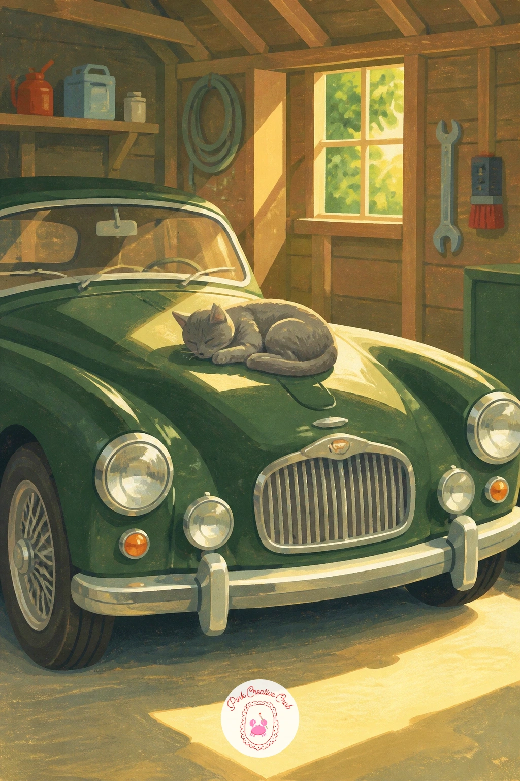
Close the set indoors with a vintage car resting in a garage, a cat curled or sitting on its bonnet in the quiet. Paint the garage interior first as a few simple flat shapes, a wooden wall, a shelf with a couple of tins or tools suggested as small rectangles, kept loose since a busy garage background will fight with the car for attention.
The car itself can sit half in shadow here, which is a nice change from the bright outdoor scenes earlier in this list: paint one side in its full color and the other side a touch darker and cooler, with a single warm shaft of light falling across the bonnet from a window just out of frame. That beam of light is exactly where the cat sits, which gives you a built-in reason for its pose and a natural highlight to paint.
Build the cat from two or three simple curved shapes, a loaf-like body and a rounded head with small triangle ears, in a color that pops gently against the car beneath it. If you’d like more animal practice, these animal painting ideas cover plenty of simple cat and pet poses to borrow from.
Palette: Deep Green, Warm Brown, Cream, Grey
What to Do Next
Pick one scene that matches the mood you’re in today, grab smooth paper and your gouache, and start with the car’s main shape before anything else goes in. Keep the first few you paint simple, mint Beetle or packed Mini are good starting points, and let the busier scenes wait until the basic car shape feels easy under your brush.
Frequently Asked Questions
What paint works best for a vintage car painting like these?
Gouache works best, since its flat, opaque finish matches the travel poster look. It dries fast, covers evenly, and lets you paint crisp shapes in layers without one color bleeding into the next.
How do I get the chrome and shiny highlights right?
Add them last, once the base paint is fully dry, using a small dash of pure white or a white gel pen. A single bright highlight on the bumper, headlamp, or windscreen reads as chrome far better than any blending.
My car shape always looks lopsided, how do I fix that?
Sketch the car’s basic body as one simple oval or rectangle before adding wheels, windows, or trim. Fixing that one shape first, and checking it against the width of the paper, keeps the proportions steady before any detail goes in.
Do I need to draw people accurately for these scenes?
No, simple flat shapes work fine at this level. A figure built from an oval head, a basic body shape, and rounded limbs reads clearly from a normal viewing distance without needing realistic anatomy.
What if I don’t have the exact pastel colors shown?
Mix them from white plus a touch of your boldest color: white and red gives pink, white and blue gives baby blue. Lightening any hue toward white is the fastest route to that soft, retro pastel feel.
Have any thoughts?
Share your reaction or leave a quick response — we’d love to hear what you think!
-
 0
-
0
-
0
-
0
-
0
-
0


