

Watercolor scenery is the fastest way to bottle a summer that lives mostly in your head, all whitewashed walls, blue shutters and sea light without ever leaving your kitchen table. Every scene below is small enough to finish today, loose enough to forgive a wobbly line, and built around the colors that make the Mediterranean look like itself.
You will find terraces, tavernas, cats asleep on boats, and a woman shopping for sandals in a sunlit lane, each one a complete little painting rather than a study. Work through them in order if you like building confidence, or jump straight to the one that matches the trip you are dreaming about.
Using these images: free for personal projects such as printing, coloring, cards, journals and gifts. Handmade items that include them may be sold up to 30 pieces per design. More than that is commercial use and is not permitted, and neither is selling or sharing the images themselves or passing them off as your own. Please ask before any other use.
Start the whole series with a Santorini terrace, since its blue domes and white walls are the shape most people picture when they hear Mediterranean summer. Sketch two or three dome shapes low on the page in pencil, keep them simple half circles sitting on boxy buildings, then mask off nothing: the white paper stays white for every wall.
Paint the domes first in a strong wash of ultramarine with a touch of cobalt, letting the blue pool slightly darker at the base of each dome for weight. Once that is dry, add a thin grey-blue shadow along one side of every building so the whites do not look flat, and drop in a loose strip of sea blue behind everything.
The place this goes wrong is painting the domes too small and timid, so make them bigger than feels natural. If you do not have cobalt, ultramarine alone with a little more water works fine.
Finish with a few dark window dots using a fine brush, and leave at least a third of the page as untouched white wall.
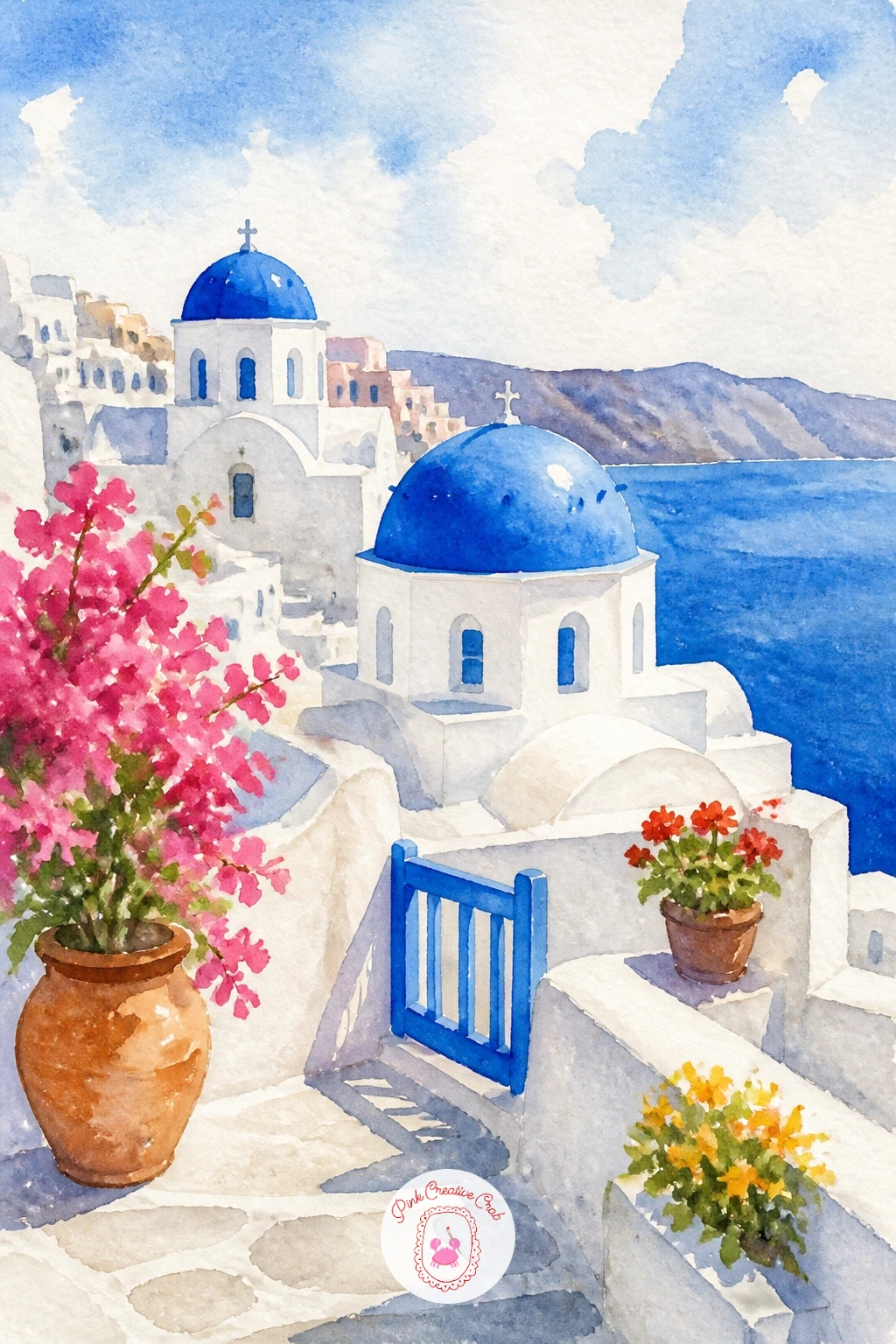
Palette: Ultramarine Blue,Cobalt Blue,Payne’s Grey,Titanium White (paper)
Following on from the domes, try a narrow white staircase climbing between two walls, with bougainvillea spilling over the top and a cat sitting halfway up. Draw the steps in a simple zigzag perspective, wider at the bottom and narrower as they climb, and pencil in a small cat shape on one step before you paint anything.
Paint the walls in pale warm grey, leaving the steps themselves as bare white paper, then drop bright pink and magenta dots and dashes along the top wall for the bougainvillea before the grey wash is fully dry so the colors bleed softly into each other.
Keep the cat simple: a sitting silhouette in burnt sienna or soft grey with two triangle ears, no detail needed beyond a tail curl. If the perspective of the stairs feels tricky, measure the width of the bottom step against the width of the top step with your thumb on the brush handle before you commit to pencil.
A fine black pen can add the cat’s whiskers once everything is dry.
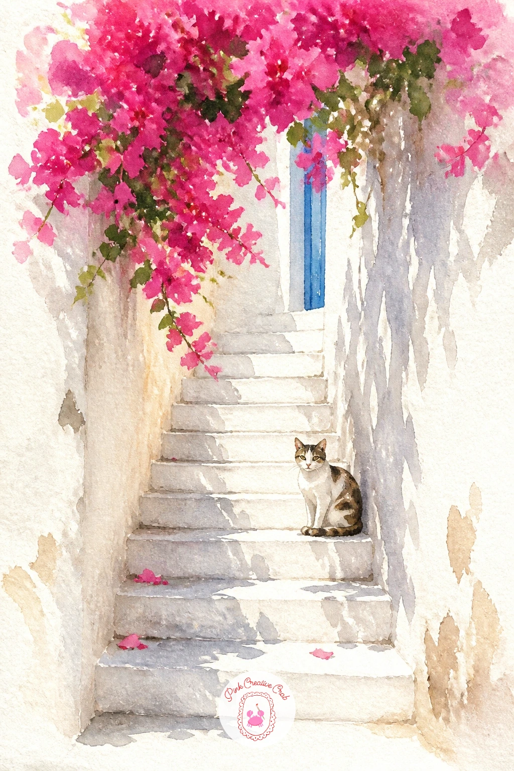
Palette: Warm Grey,Quinacridone Magenta,Bougainvillea Pink,Burnt Sienna
Look at a real staircase photo for the way shadow falls across each step, it is what sells the climb even in a loose painting.
Move from the stairs down to sea level for a Greek taverna, blue tables and chairs set right at the water’s edge under a simple awning. Block in the sea first as a flat turquoise wash across the top third of the page, then sketch the taverna’s low white building and a row of small blue chairs along the front.
Paint the building in white left as paper with a pale grey shadow line, then add the chairs and table legs in ultramarine, keeping each chair as just two or three quick strokes rather than a full drawing. A string of color for a parasol or awning stripe in yellow ochre ties the whole scene together.
This scene can look empty without a hint of life, so add two tiny seated figures in simple blocks of color, no faces needed. For the quick version, stop there; given more time, add reflections of the chairs in a puddle of wet pavement in front of the taverna.
If you want more café and seaside scenes to build confidence first, this guide to easy watercolor ocean scenes is a good companion.
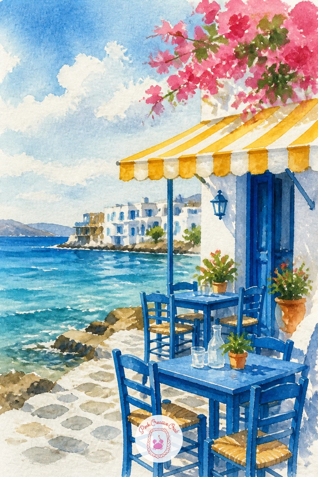
Palette: Turquoise,Ultramarine Blue,Yellow Ochre,Payne’s Grey
Give yourself a break from buildings and paint a single fishing boat floating in a turquoise bay. Pencil a simple curved hull shape sitting slightly off center, never dead middle, and a thin mast if you want one, then wash the whole bay in turquoise and cerulean before touching the boat.
Once the water is dry, paint the boat in a bright color, faded red or sky blue work well against turquoise, and add its reflection directly below as a softer, broken version of the same color using a dry brush dragged sideways. Leave a ring of lighter water around the hull to suggest a ripple.
The hull is the part that goes wrong most, since a boat painted too straight looks like it is floating in air rather than sitting in water. Tilt it very slightly and let the reflection wobble to fix that.
One concrete tip for today: paint the reflection before it feels finished, a half-dry reflection almost always reads better than a careful one.
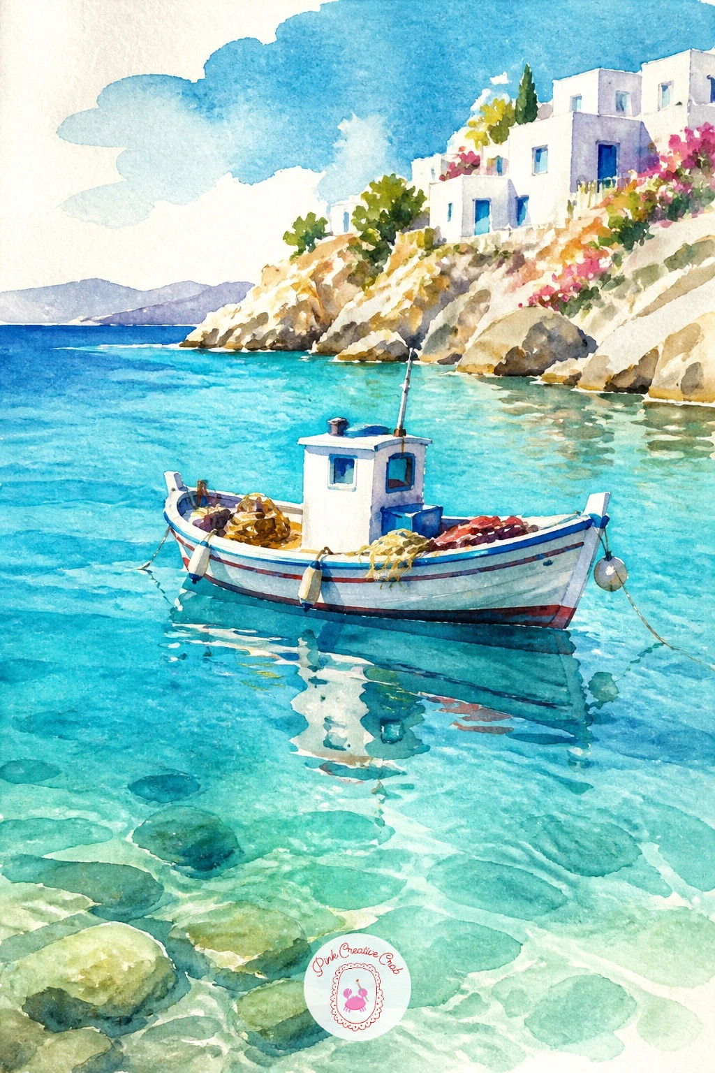
Palette: Turquoise,Cerulean Blue,Cadmium Red,Titanium White (paper)
Carry the breeze from that bay up onto a hillside for a windmill on Mykonos, the round white tower with its thatched cone roof and long wooden blades. Draw the cylinder shape first with a slight taper, add the conical roof on top, then sketch four thin sail blades radiating out at even angles like a clock face.
Paint the tower in white left as paper with a curved grey shadow down one side to show its roundness, then fill the roof in warm brown. The sail blades are the fiddly part: use a ruler or the edge of a card to keep each one straight, since hand-drawn curved blades read as broken rather than windswept.
Add a strip of blue sea in the distance behind the hill and a scrubby green slope below the windmill in sap green with touches of ochre.
If straight lines worry you, draw them lightly in pencil first and paint directly over the pencil rather than trying to freehand them in brush.
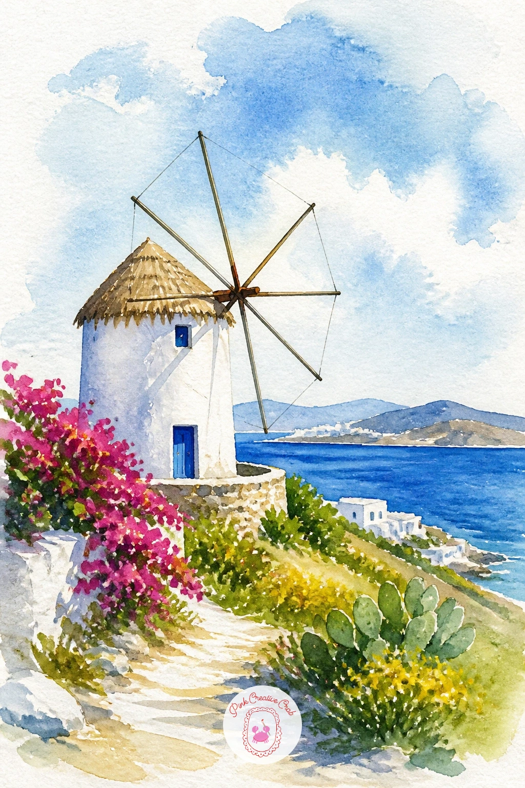
Palette: Burnt Umber,Sap Green,Cobalt Blue,Yellow Ochre
Bring a person into the landscape with a woman in a white dress walking a cliff path above the sea, seen from behind so you never have to paint a face. Block in the sea and sky first in two soft bands of blue, then sketch her as a simple standing silhouette, slightly off center and walking toward the edge of the page rather than straight out of it.
Paint her dress as bare white paper with only a pale blue-grey shadow line down one side to show its folds, her hair in a loose warm brown wash, and the cliff path in dusty pink-beige beneath her feet. Keep her whole figure to under a third of the page height so the view stays the star.
Proportion is what sells a figure like this: her head should measure roughly one eighth of her total height, so check that before you commit to ink or darker paint over the pencil.
A wide-brimmed hat sketched in with one curved line is an easy swap if a face-free figure still feels too plain.
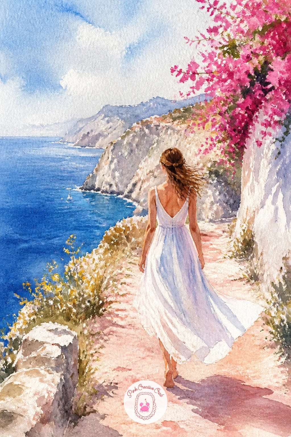
Palette: Cerulean Blue,Burnt Sienna,Dusty Pink,Titanium White (paper)
After a figure, settle into something quieter: an olive grove on a slope with the sea glinting below through the trees. Sketch a handful of simple round or oval tree canopies on thin trunks, staggered at different heights up the slope rather than lined up evenly, with a strip of blue sea visible in the gaps between them.
Paint the sea strip first so it can dry while you work on the trees, then mix a grey-green for the olive canopies using sap green cut with a touch of Payne’s grey, dabbing it on with a slightly dry brush so the texture stays broken and leafy rather than solid.
The trunks are easy to overdo: one or two quick thin lines per tree in burnt umber is enough, more than that starts to look twiggy and fussy. If grey-green is not in your set, sap green with a little raw umber mixed in gets close.
Vary this scene next time by changing the slope angle or adding a single stone farmhouse tucked among the trees.
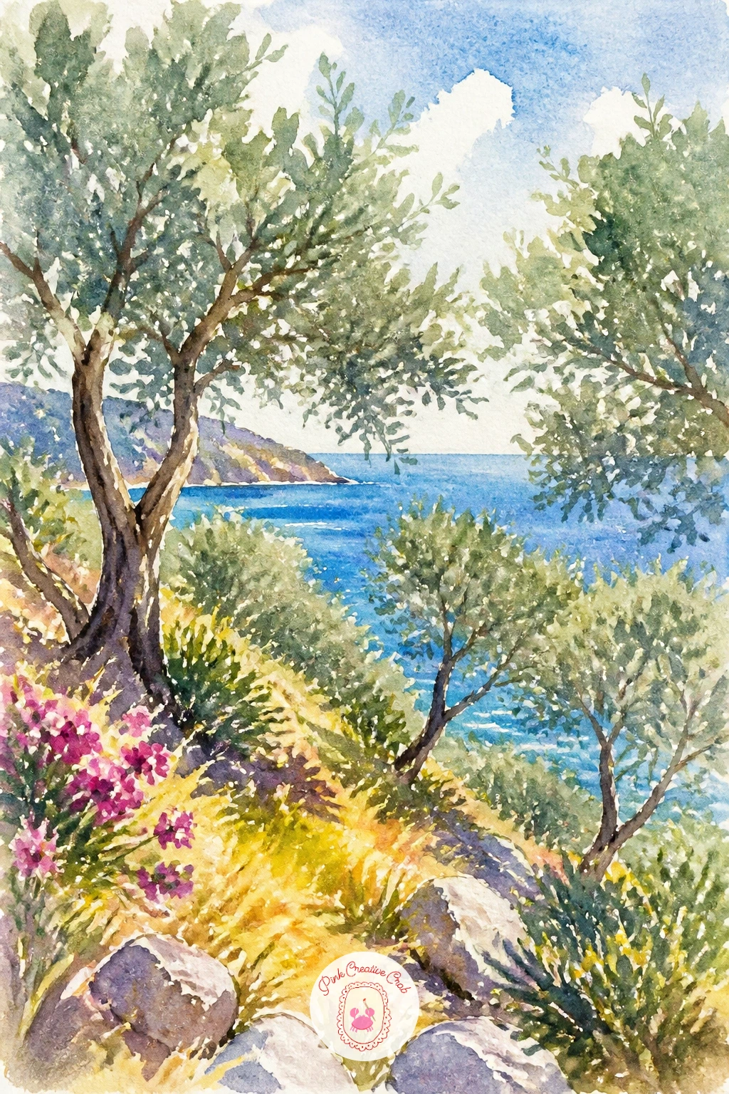
Palette: Sap Green,Payne’s Grey,Burnt Umber,Cerulean Blue
Head down to the sand for a beach scene built around a row of striped umbrellas standing in warm sunlight. Pencil three or four simple triangular umbrella shapes along a gentle curve of beach, varying their heights slightly so the row does not look like a ruled line, then wash in pale sand and bright turquoise sea behind them before adding any stripes.
Paint each umbrella top in two alternating colors, red and white or blue and white, leaving the white stripes as bare paper and only painting the colored ones. A dry brush dragged lightly over the sand in yellow ochre adds texture without turning it muddy.
Umbrellas painted too upright and identical are the usual problem, so tilt one or two slightly and vary the color combination from umbrella to umbrella.
For the ten-minute version, stop at umbrellas and sand; with more time, add a few small sunbathing figures as simple color blocks scattered along the beach, and loungers sketched in single lines.
This companion list of summer watercolor painting ideas has more beach and sun scenes if this one is your favorite kind to paint.
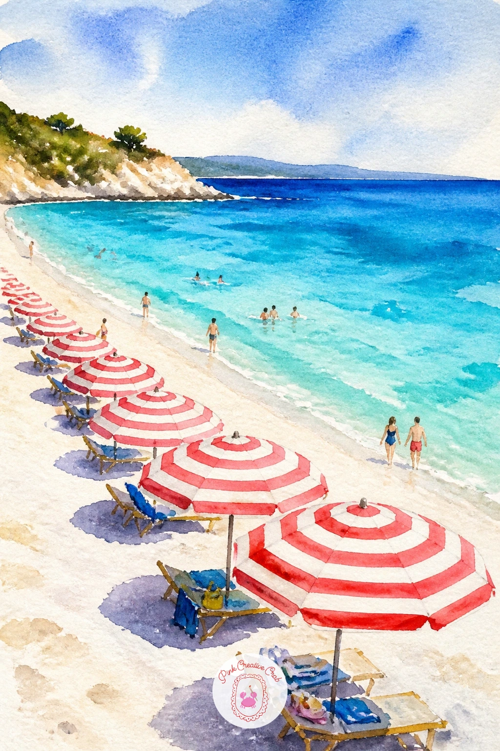
Palette: Cadmium Red,Turquoise,Yellow Ochre,Titanium White (paper)
Give the scene a character on four legs with a donkey standing on a cobbled lane between whitewashed walls. Sketch the donkey’s barrel body and legs first using simple ovals and straight lines, checking that its leg length roughly equals its body height, which is the proportion trick that keeps a donkey from reading as a dog or a horse.
Paint the donkey in warm grey-brown, leaving a lighter patch around the muzzle and belly, then add the cobbled lane beneath its feet with small loose dabs of grey and beige rather than individually drawn stones. White walls on either side stay bare paper with just a soft shadow line at the base.
A basket or small saddlebag over its back in faded red adds a lived-in touch and is an easy addition once the donkey itself feels solid.
If the legs come out too thin and wobbly, thicken them with a second pass of the same grey-brown rather than trying to erase and redraw.
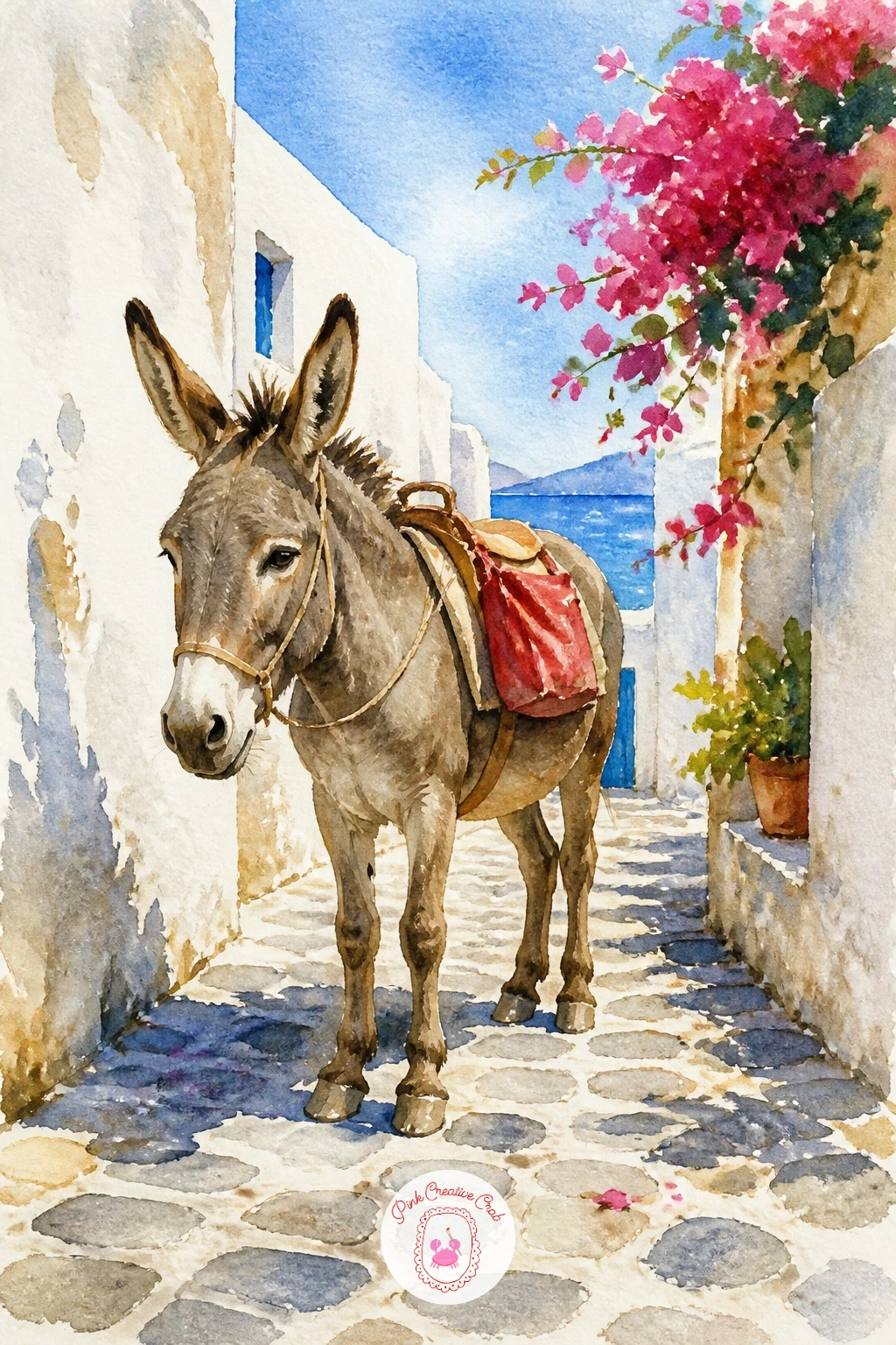
Palette: Warm Grey,Burnt Umber,Cadmium Red,Titanium White (paper)
If donkeys feel tricky, loosely study a few reference photos for the shape of the ears and the slope of the back before you pencil anything in.
Carry the warm light from that lane into a seaside chapel at sunset, its small white dome catching the last orange glow against a darkening sea. Sketch a simple boxy chapel with one small dome and a cross on top, sitting on a rocky point with the sea wrapping around it on at least two sides.
Paint the sky first in overlapping bands of orange, pink and deep blue, working wet into wet so the colors blend without hard lines, then let that dry completely before adding the chapel in bright white left as paper with a warm orange-tinted shadow on its sunset-facing side.
Light direction matters most here: since the sun is low and off to one side, every shadow on the chapel and rocks should fall the same direction, away from that glow, or the scene stops making sense.
If blending the sky evenly feels hard, work on paper already dampened with clean water first so the colors spread on their own.
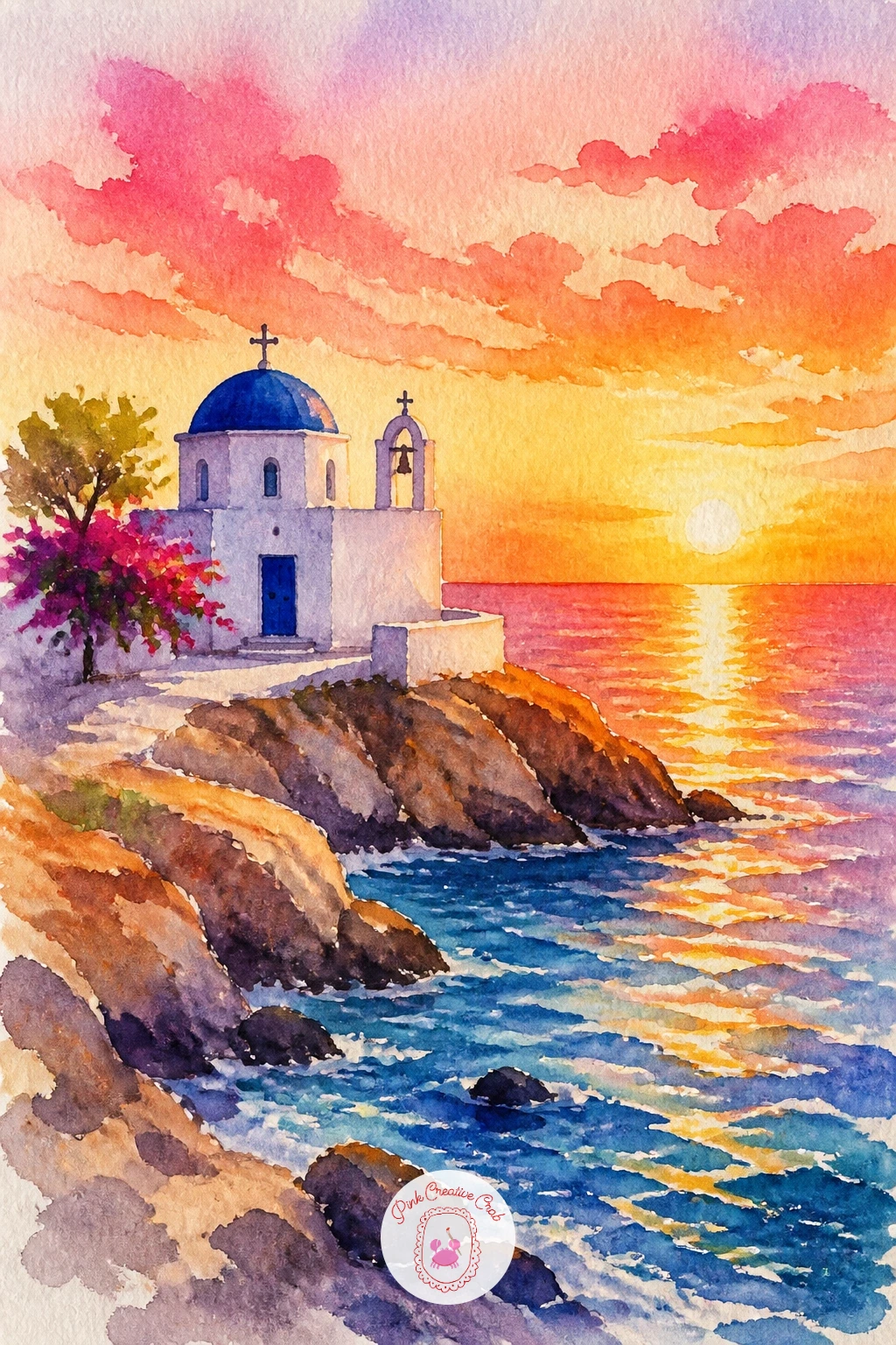
Palette: Cadmium Orange,Quinacridone Magenta,Ultramarine Blue,Titanium White (paper)
Settle the energy down with a single yacht anchored in a quiet cove, its white sail or hull resting against deep green-blue water. Sketch the cove as a rounded bay shape framed by rocky cliffs on either side, then place the yacht small and slightly off center within it rather than filling the whole bay.
Paint the cliffs first in grey-green and ochre so they can dry while you work on the water, then lay a graded wash for the cove, lighter turquoise near the yacht deepening to navy near the cliffs. The yacht itself stays mostly white paper with just a thin grey waterline and a small dark hull shadow.
Overworking the water is the most common slip here, so stop adding brushstrokes to the cove the moment it looks like water rather than trying to paint every ripple.
A swap for a plain cove: if you want more drama, add one or two small swimmers near the yacht as simple dots.
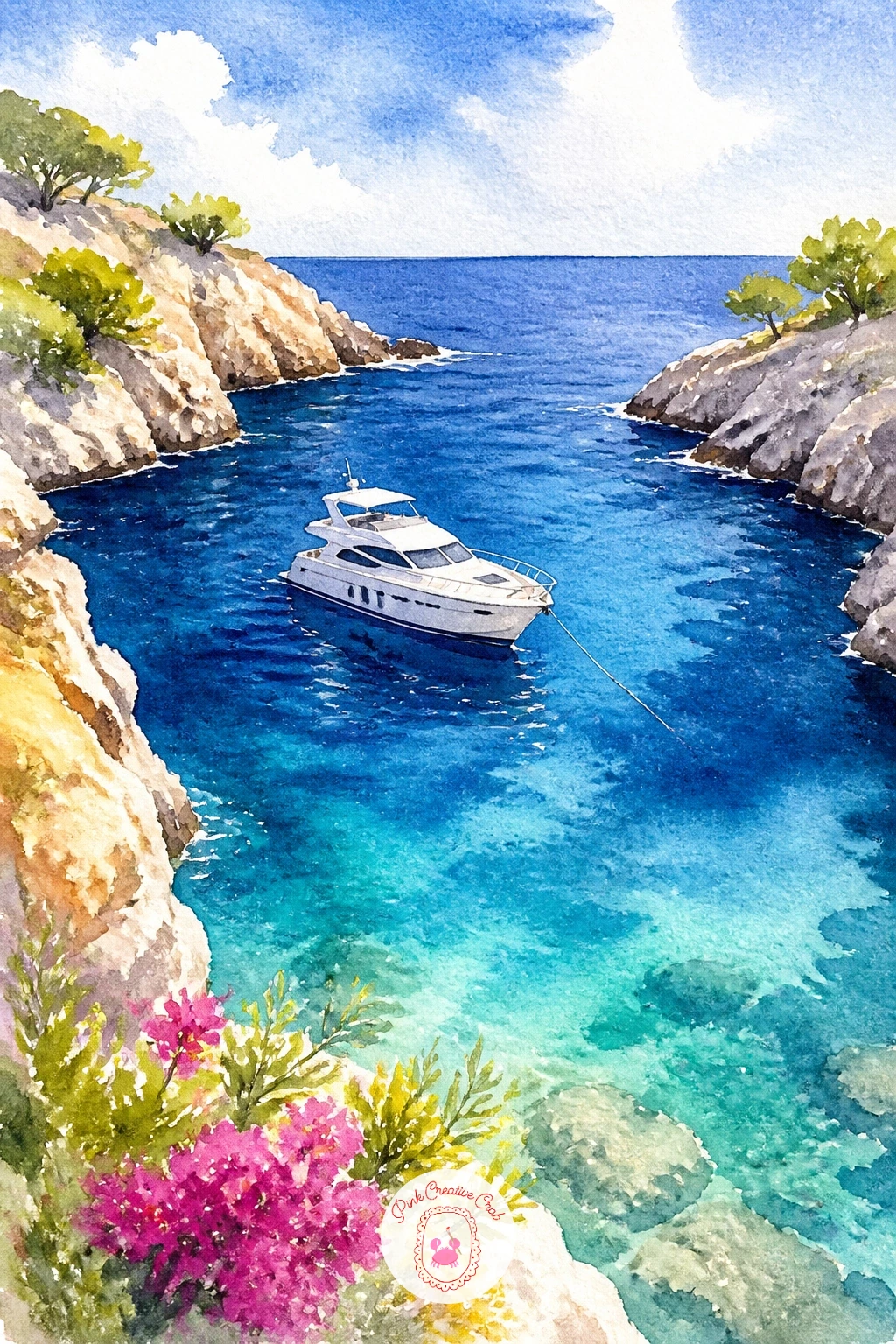
Palette: Turquoise,Prussian Blue,Sap Green,Yellow Ochre
Step inland for a market stall piled with lemons and figs, a burst of yellow and purple against a shaded awning. Sketch a loose pile of round and oval shapes for the fruit, keeping the lemons slightly larger and the figs smaller and more oval, scattered rather than lined up in rows.
Paint the lemons in bright cadmium yellow first, leaving tiny white paper highlights where the light catches each one, then the figs in a deep plum purple while the lemons are still drying so neither color bleeds into the other. A dark wooden crate or table beneath them in burnt umber grounds the whole pile.
Fruit painted too smooth and even looks like plastic, so vary the pressure of your brush and let a few lemons sit slightly darker than others. If figs are not available as a reference, oranges work as an easy swap and need only a color change.
These easy watercolor fruit paintings are a useful warm-up if fruit shapes feel new to you.
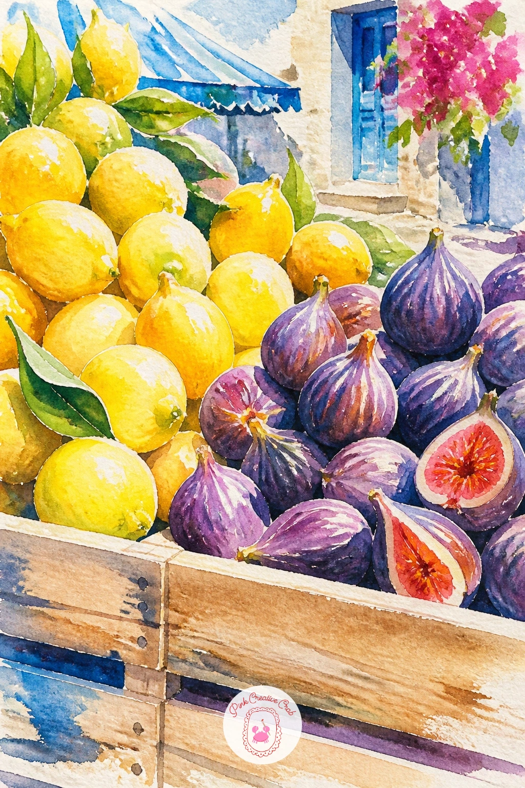
Palette: Cadmium Yellow,Quinacridone Violet,Burnt Umber,Sap Green
Bring the market basket home to a single blue door with a potted plant beside it, the kind of close-up detail that photographs beautifully in a lane of white walls. Sketch a simple rectangular door with one or two panel lines, a round pot beside it, and a small bushy plant or geranium spilling out of the pot.
Paint the door in a strong ultramarine or cerulean, leaving the wall around it as bare white paper with just a thin grey shadow at the base, then paint the pot in warm terracotta and the plant in two greens, a darker base color and a lighter one dabbed on top for leaf texture.
Keep the whole composition close and cropped, since a door filling most of the page reads as a bold graphic print rather than a timid small sketch in the corner.
If geraniums are tricky, a simple cluster of green leaves without flowers still reads perfectly well against the blue door.
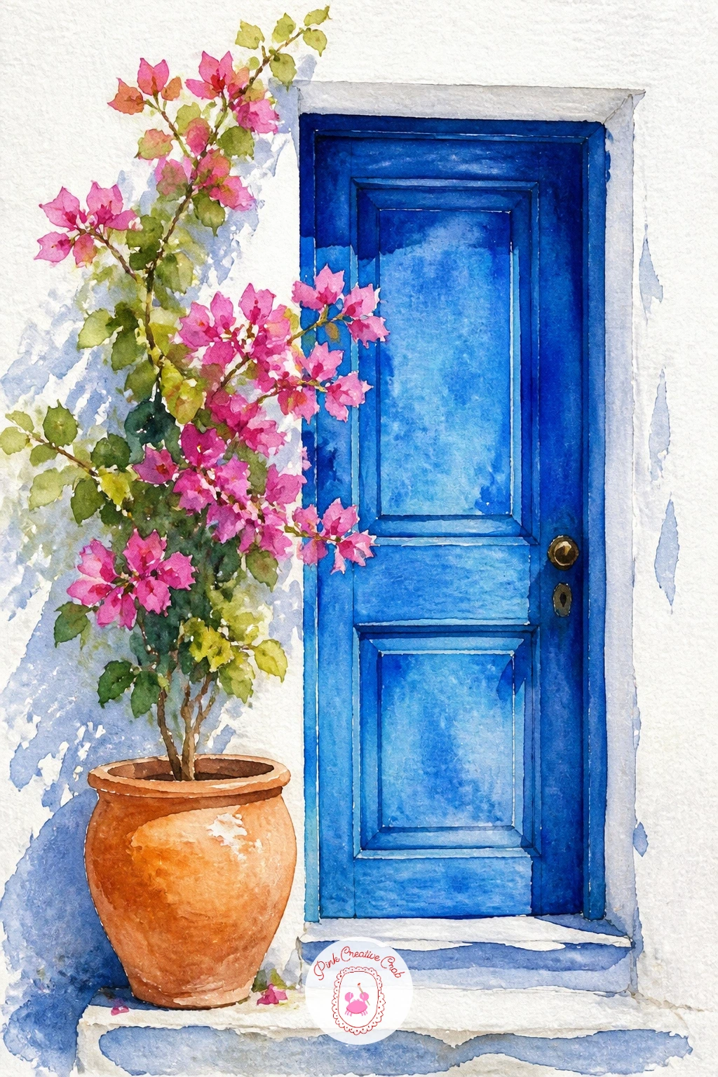
Palette: Cerulean Blue,Terracotta,Sap Green,Bougainvillea Pink
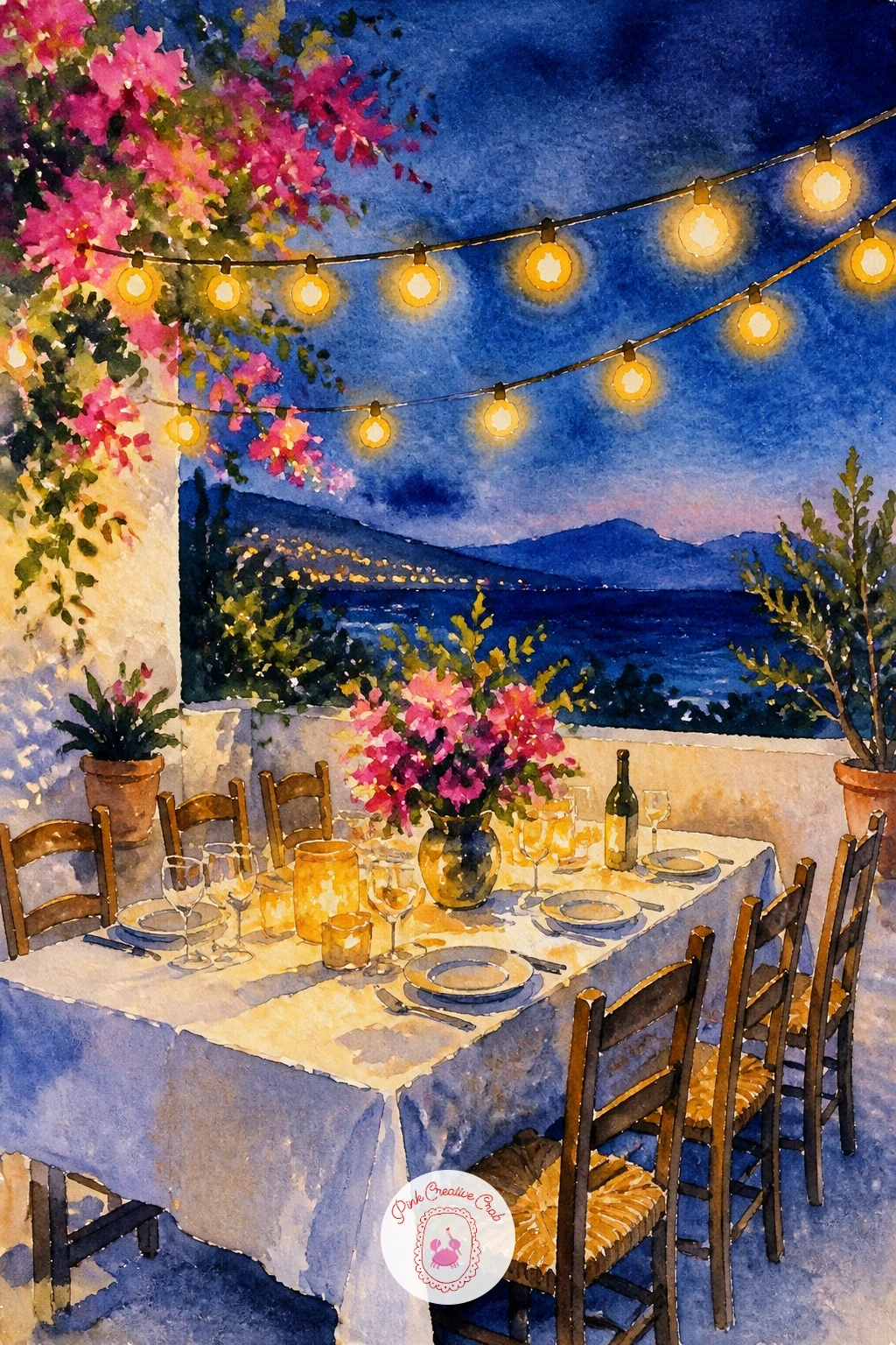
Move into evening with an outdoor dinner table strung with lights, plates and glasses glowing warm against a deepening blue sky. Sketch a simple long table from a slightly low angle, a few chairs around it, and a loose zigzag line of string lights strung above between two posts or trees.
Paint the sky first in a deep dusky blue wash, then once dry, use a white gel pen or masking fluid before painting to protect small dots where each light bulb will sit, so they stay bright against the dark sky. The table and plates stay mostly white paper with warm yellow glow washed loosely around each light.
Working from light source outward is the key here: decide where the brightest light sits, usually the middle of the table, and let everything else fade softer and bluer as it moves away from that point.
For a faster version, skip the masking fluid and simply add the light dots last with a white gel pen once the sky is completely dry.
You Will Need
- masking fluid or white gel pen
Palette: Prussian Blue,Cadmium Yellow,Warm Grey,Titanium White (paper)
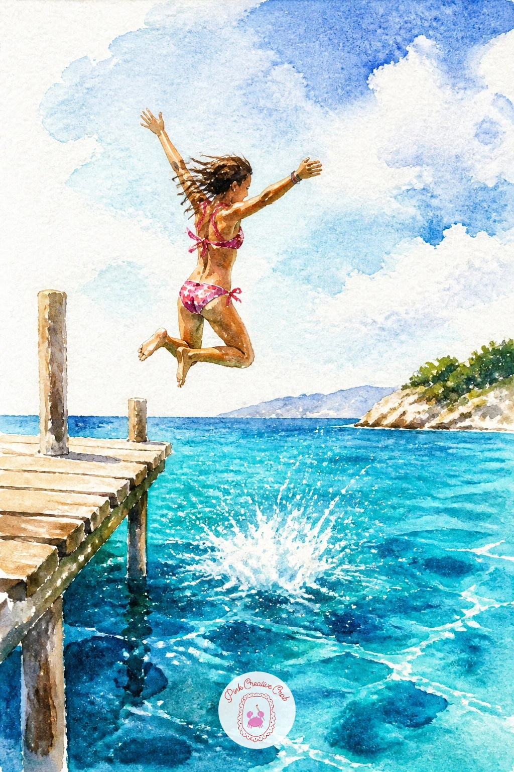
Add some motion with a girl mid-jump off a wooden pier, caught in the air above bright blue water. Sketch her in a simple dynamic pose, knees tucked or arms spread, positioned above the water line rather than touching it, with the pier extending from one edge of the page beneath her.
Paint the sea first in bands of turquoise, then her figure in quick simple color blocks, a bright swimsuit color and bare skin tone, with no detailed face needed since she is small and in motion. Splashes below her in white paper dots and a few loose spatters finish the energy.
The quick ten-minute version stops at her silhouette and a simple splash; given more time, add the pier’s wooden plank lines in burnt umber and a second small figure waiting to jump.
A toothbrush loaded with white paint, flicked gently over the water below her, makes a quick convincing spray of droplets.
You Will Need
- toothbrush for splatter
Palette: Turquoise,Cadmium Orange,Burnt Umber,Titanium White (paper)
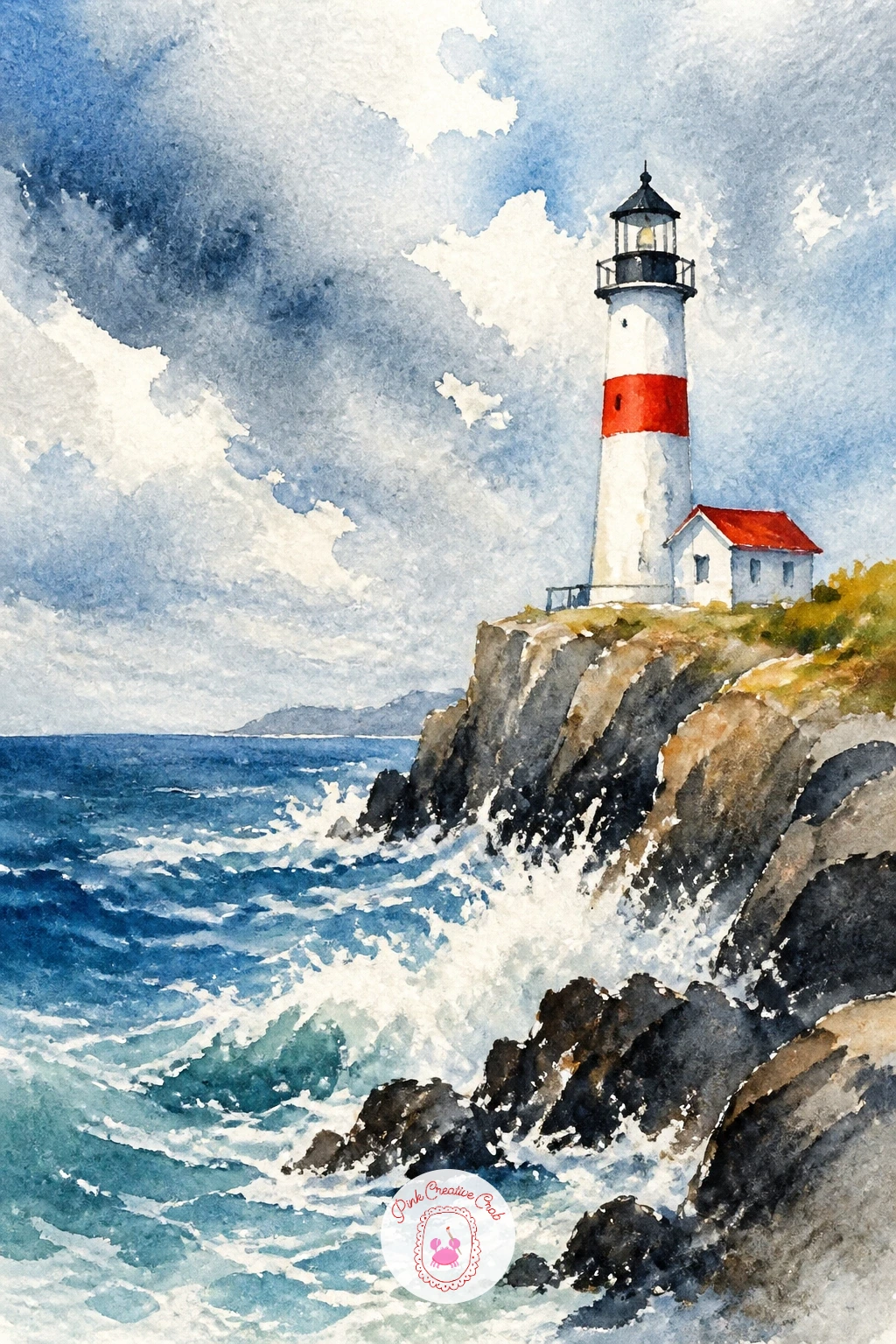
Settle back into something steadier with a lighthouse standing tall on a rocky coast, waves breaking white against the stone below it. Sketch the lighthouse as a simple tapered cylinder with a red or black stripe near the top and a small lantern room, placed off to one side on a rocky outcrop rather than dead center.
Paint the sea and sky first, a cool grey-blue for a dramatic look or bright turquoise for a sunnier one, then the lighthouse in white left as paper with its stripe added once the base coat is dry. Rocks beneath it get a mix of grey, umber and a touch of green in rough dabbed shapes, never smooth.
White spray against dark rocks is the trick worth learning here: paint the rocks and sea dark first, then lift small curved shapes of color back out with a clean damp brush or a bit of tissue while still damp, leaving pale foam shapes behind.
If lifting color feels fiddly, a white gel pen flicked along the rock edges once dry gives a similar spray effect.
Palette: Payne’s Grey,Burnt Umber,Cadmium Red,Titanium White (paper)
Return to warmth with a terrace and infinity pool overlooking the sea, the two blues blending almost into one horizon. Sketch a simple rectangular pool in the foreground with a low wall at its far edge, and the sea stretching out beyond and above that wall, with a sunbed or two along one side.
Paint the pool in a slightly brighter, more turquoise blue than the sea, and the sea itself in a deeper blue, so the two areas stay distinct even though they sit close in tone, which is the whole trick of an infinity pool scene. Let the far wall between them stay a thin pale stripe of white or warm stone color.
The pool water needs a little texture to avoid looking flat, so once the base wash is dry, add a few loose horizontal streaks of a slightly darker blue with a dry brush for the look of gentle ripples.
Striped loungers in white and a bold color, sketched as simple rectangles, finish the scene without much extra effort.
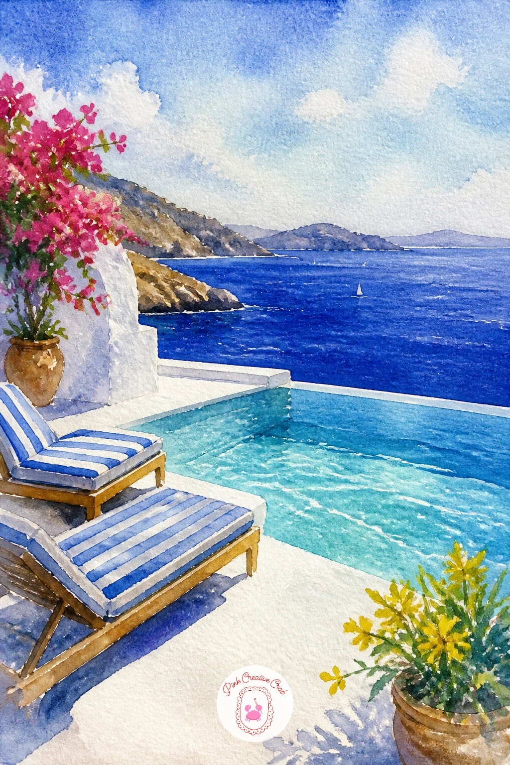
Palette: Turquoise,Prussian Blue,Warm Grey,Cadmium Orange
Take a detour into something a little more unusual with an octopus drying on a line, a common sight along Greek harbors and a fun shape to paint. Sketch a rounded head with long curling tentacles draped over a simple horizontal line, letting two or three tentacles hang lower than the others for a natural, draped look.
Paint the octopus in a warm reddish-purple, mottled by dropping a slightly darker tone into the wet wash in a few spots so it looks textured rather than flat, and keep the clothesline itself as a single thin pencil-dark line.
Curling tentacles are the part most likely to go wrong, so draw each one as a single smooth curved line in pencil before you commit to paint, rather than trying to improvise the curl with the brush directly.
If dropping in darker tone feels risky, simply paint the whole octopus in one even color and add a few dry-brush texture lines once it is dry instead.
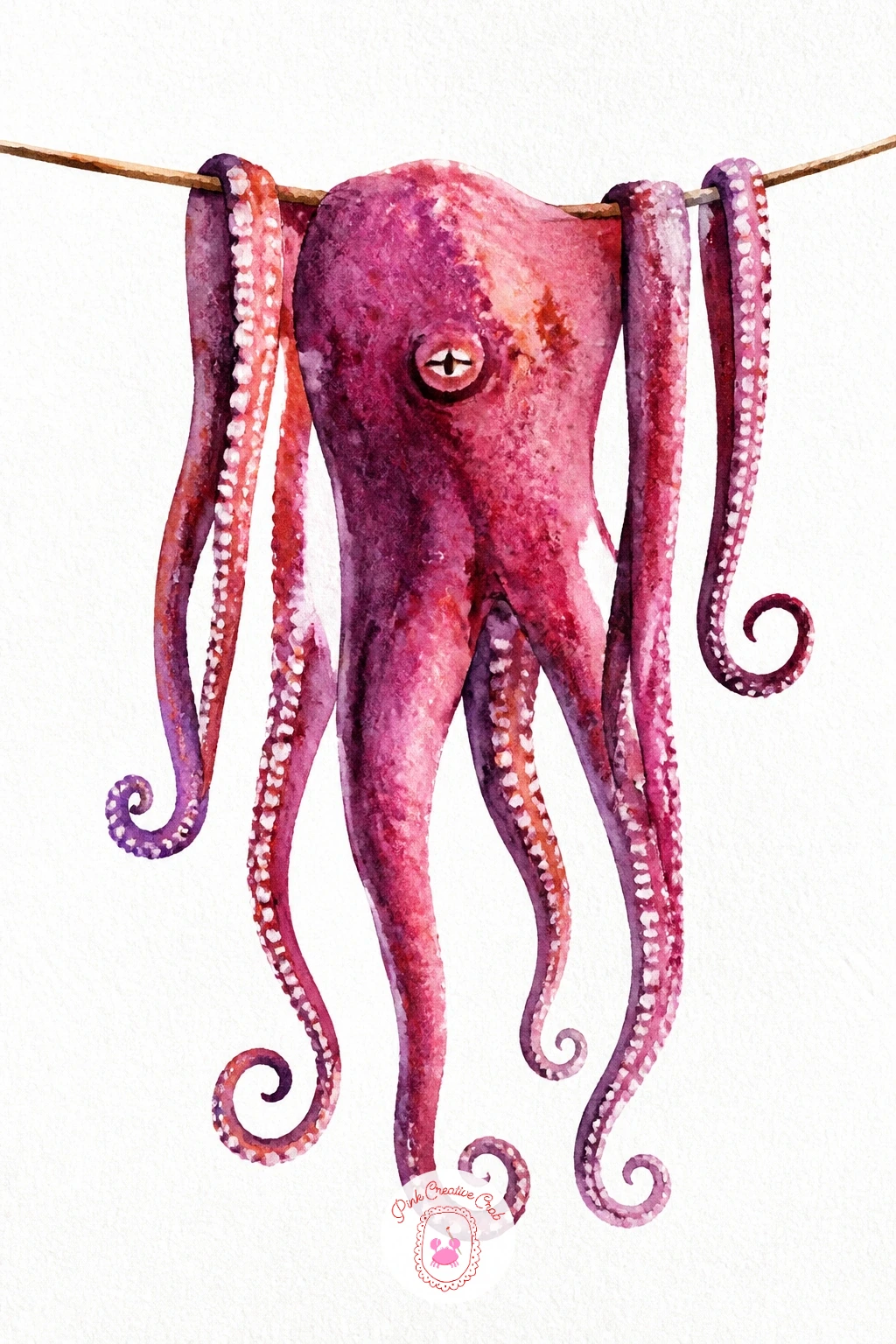
Palette: Quinacridone Magenta,Burnt Sienna,Payne’s Grey,Titanium White (paper)
Cool back down with a sea cave, its rock ceiling framing a glimpse of impossibly clear turquoise water below. Sketch the cave as a rough arch shape, darker and irregular at the top and sides, opening onto a bright patch of sea and sky visible through the mouth of the cave.
Paint the water inside the cave first in pale glowing turquoise and aqua, since this is the brightest part of the whole scene and needs to stay light, then paint the rock around it in deep blue-black and umber, working from the outer edges inward so the dark rock frames rather than swallows the glowing water.
Light behaves differently here than in an open scene: since light bounces up off clear water inside a cave, add a touch of pale turquoise reflected onto the underside of the rock near the waterline rather than leaving that area flat dark.
One tip for today: paint the glowing water area first and protect it mentally as the lightest part of the whole piece, everything else should stay darker than it by comparison.
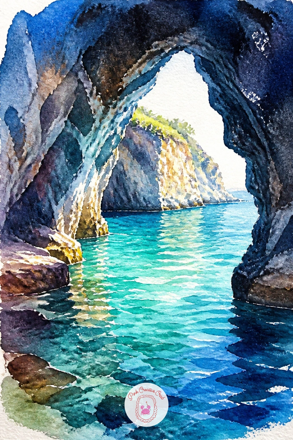
Palette: Turquoise,Prussian Blue,Payne’s Grey,Burnt Umber
Widen the view for a Croatian old town wall rising straight from the sea, stone ramparts catching warm afternoon light. Sketch a long horizontal stone wall with a few small towers or battlements along the top, sitting directly at the waterline with the sea lapping at its base.
Paint the wall in warm honey-colored stone tones, varying the color slightly block by block so it does not read as one flat slab, then the sea below in deep blue with a thin lighter band right where it meets the stone to show the water’s clarity near the wall.
Comparing the wall’s height against its length keeps this one in proportion: a long low wall reads as a fortified old town immediately, while one drawn too tall and narrow starts to look like a single tower instead.
If stone texture feels like too much detail, a few quick horizontal and vertical pencil lines sketched loosely before painting are enough to suggest blocks without drawing every one.
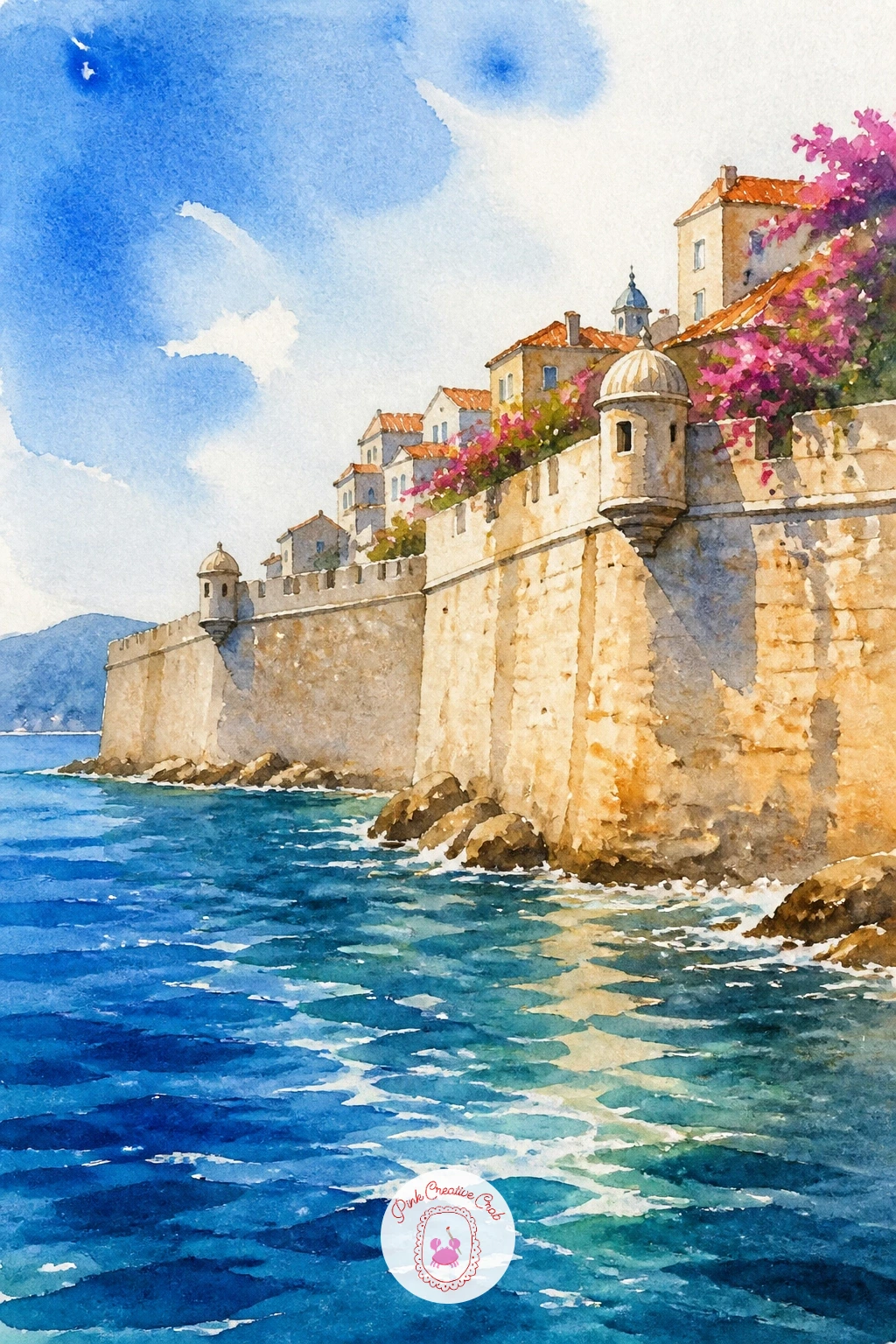
Palette: Yellow Ochre,Burnt Sienna,Ultramarine Blue,Turquoise
Soften the edges with a Mallorca cala, one of those small pine-fringed coves with impossibly clear water tucked between pale rock walls. Sketch a narrow inlet of sea framed by rocky cliffs on both sides, with a cluster of umbrella pines leaning out over the water from the top of one cliff.
Paint the water first in bright layered turquoise, lighter near the shallow sandy edges and deeper toward the center of the cove, then the cliffs in pale warm grey and the pines in deep green, painted as simple flat-topped triangular clusters rather than individual needles.
Quick version: block in water, cliffs and pine shapes and stop there for a ten-minute study. Given forty minutes, add individual trunk lines under each pine canopy and a thin stretch of pale sand at the water’s edge where the cove narrows.
If pines feel fussy, any simple green treetop shape reads as Mediterranean pine once it sits against pale cliffs and bright water.
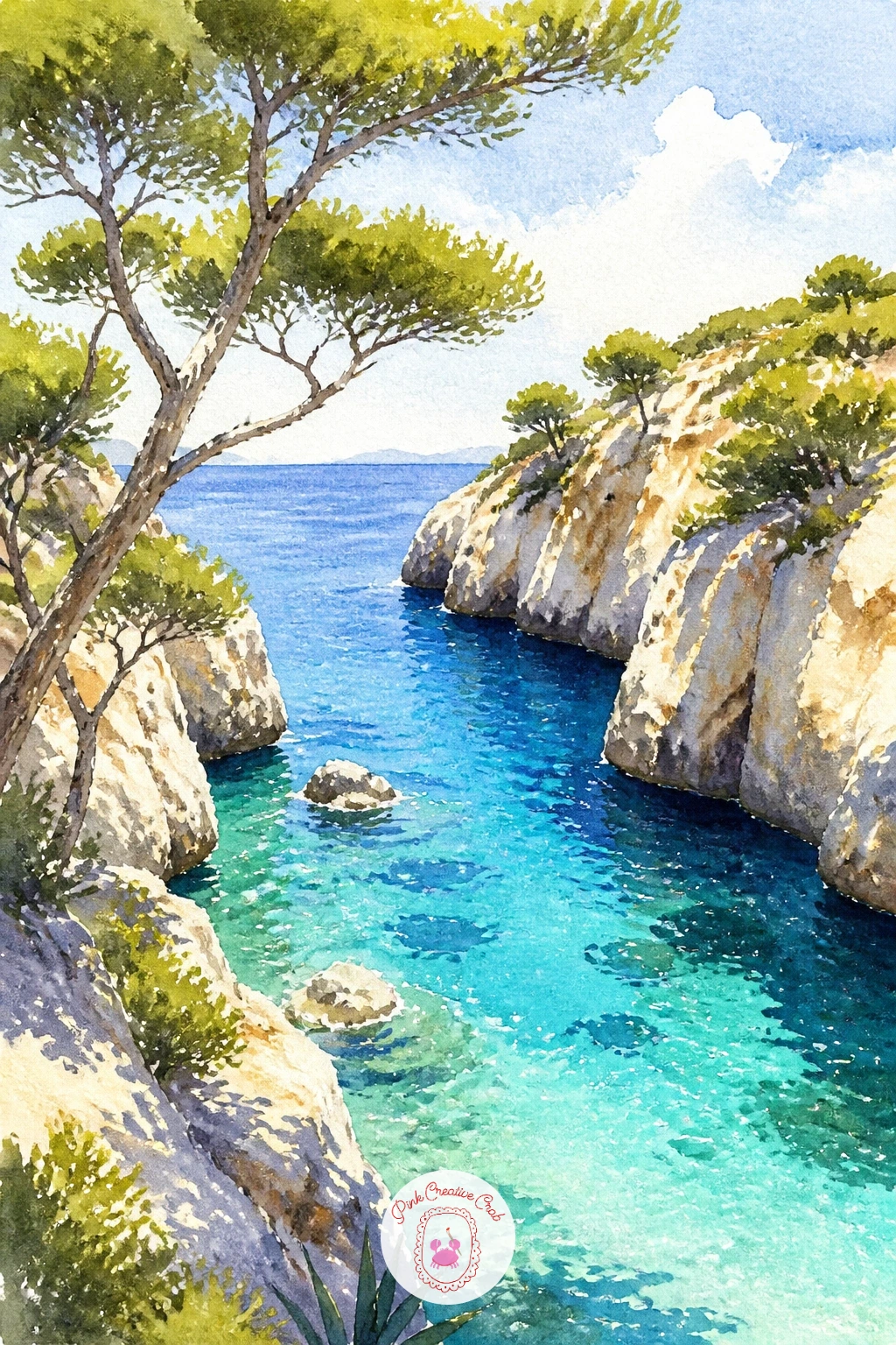
Palette: Turquoise,Cerulean Blue,Sap Green,Warm Grey
Bring people and pastel buildings into view with a Cote d’Azur promenade, a row of candy-colored facades along a palm-lined seafront. Sketch a simple row of three or four narrow buildings in varying heights along the top of the page, a line of palm trees in front of them, and the sea and a strip of promenade below.
Paint each building a different pastel shade, soft pink, pale yellow, mint, so the row reads as a lively strip of color, then the palm trees in dark green on thin trunks placed in front of the buildings once the facades are dry. The sea stays a calm band of blue at the bottom.
Buildings painted all in the same tone are the usual mistake, since the charm of this scene is in the contrast between colors sitting side by side, so push each facade color a little further apart than feels natural.
A few tiny strolling figures along the promenade, just color blocks with no faces, finish the liveliness of the scene.
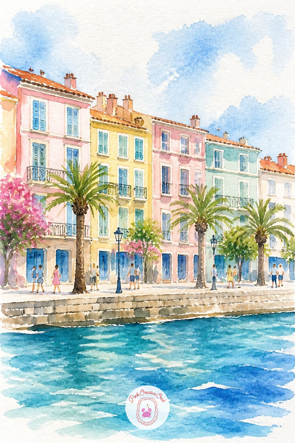
Palette: Dusty Pink,Cadmium Yellow,Mint Green,Cerulean Blue
Go wide and calm for a Turkish blue lagoon, a sheltered stretch of impossibly layered turquoise water ringed by low green hills. Sketch a simple curved lagoon shape filling most of the page, with low rounded hills along the back edge and perhaps one small boat floating for scale.
Paint the lagoon in several overlapping bands of blue and turquoise, working from the lightest shade near any sandy edges to the deepest blue in the center, letting each band blend softly into the next while still wet. The hills behind stay a simple muted green-grey so they do not compete with the water.
The eye naturally goes to the brightest, clearest part of the water, so decide where that is before you start, usually the shallow edge nearest the viewer, and keep your deepest colors away from that spot.
If blending several blue bands smoothly feels hard at first, these easy watercolor skies and clouds ideas cover the same wet-into-wet blending technique using sky instead of water.
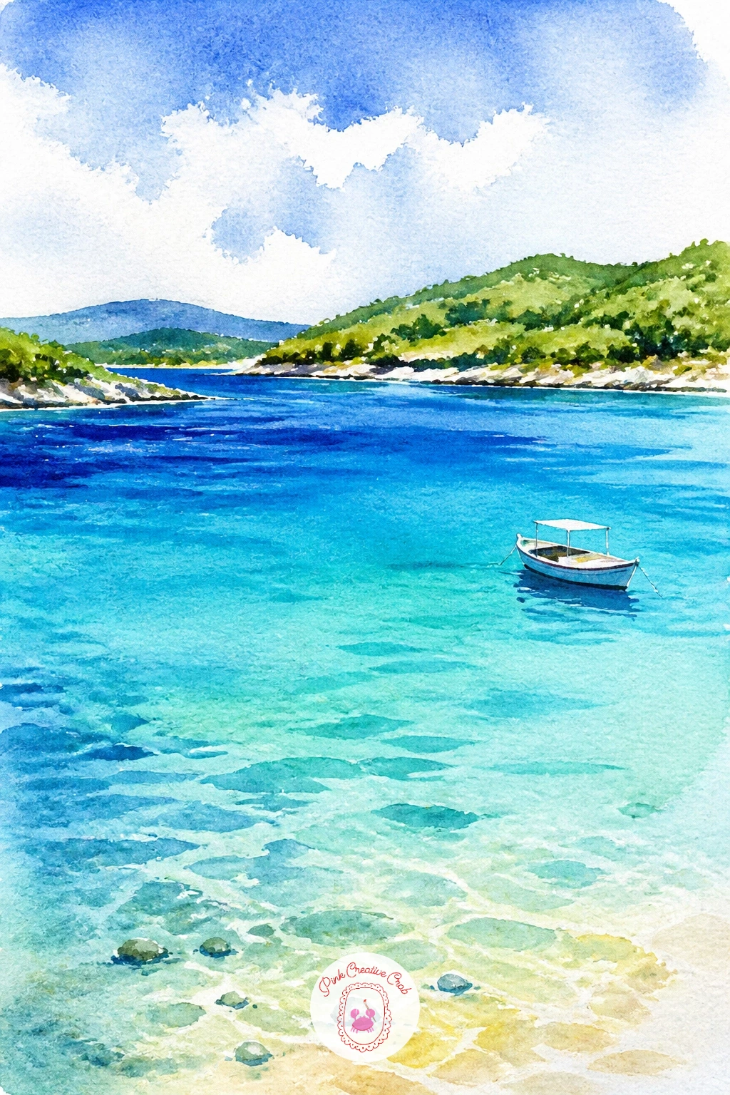
Palette: Turquoise,Cerulean Blue,Prussian Blue,Sap Green
Bring back some rooftops with a Sicilian fishing village, tall narrow houses in warm terracotta and ochre stacked above a small working harbor. Sketch a cluster of simple rectangular houses at varying heights climbing up from the water’s edge, with two or three small boats bobbing in the harbor in front of them.
Paint the houses in warm terracotta, ochre and faded pink, varying the color from building to building, then once dry add simple dark window dots and a roofline in deep red-brown. The harbor water below stays a calmer blue-green with the boats painted as small simple shapes.
Stacking the houses correctly in height order, tallest toward the back, shortest toward the water, is what makes the hillside read properly rather than looking flat, so sketch that staggered height pattern before adding any color.
If a whole village feels like too much, three houses are enough to read as a village once boats and water are added in front of them.
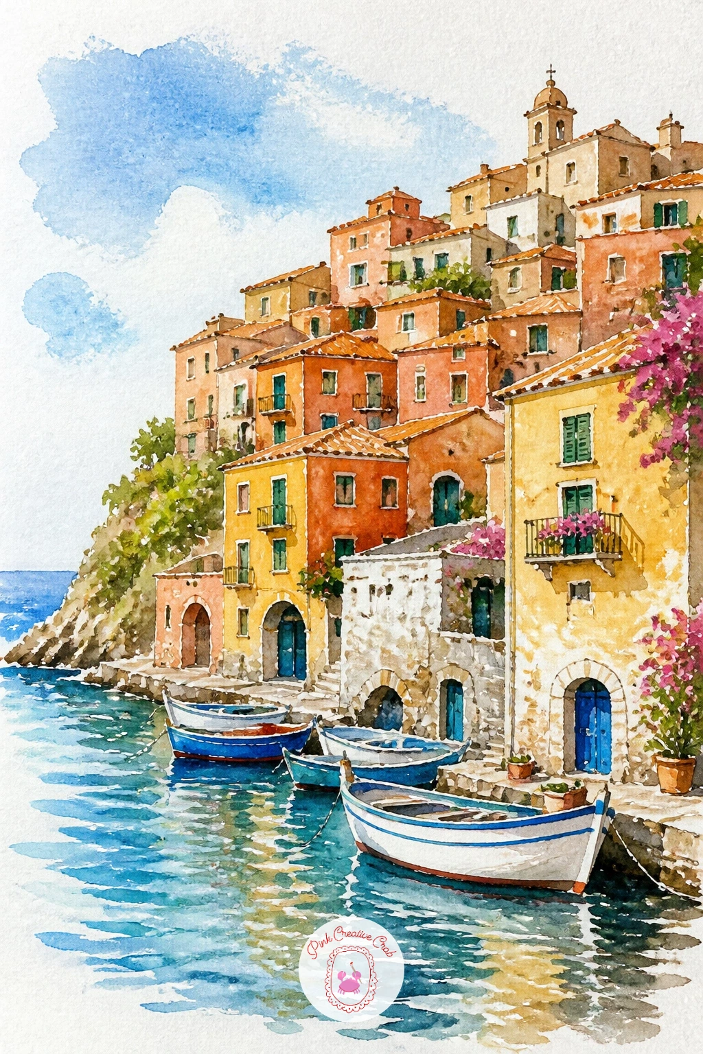
Palette: Burnt Sienna,Yellow Ochre,Dusty Pink,Turquoise
Zoom into one striking detail from that village with a Maltese balcony street, the enclosed wooden balconies painted in bold colors that Malta is known for. Sketch a narrow street with buildings close on both sides, and one or two enclosed box balconies jutting out at an upper floor in a bold color, green or deep red work well.
Paint the balcony itself first in its bold flat color with simple rectangular window divisions, then the honey-colored stone walls around it, leaving the street below in pale warm grey. Keep the street narrow and the buildings tall so the balcony has somewhere to pop against.
Edges matter most on this subject: use a dry brush with very little water to paint the balcony’s straight wooden frame lines so they stay crisp rather than bleeding into the stone wall beside them.
If a full balcony structure feels complex, a simpler version with just one bold rectangular shutter window on the wall still captures the same bright color contrast.
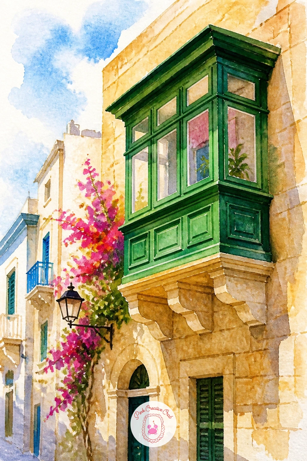
Palette: Emerald Green,Yellow Ochre,Warm Grey,Cadmium Red
Pick the pace back up with a ferry arriving at an island, its white hull cutting through blue water toward a cluster of waiting buildings on the shore. Sketch a simple long rectangular ferry shape with a flat deck line, placed in the lower half of the page, and a loose line of island buildings and hills in the distance behind it.
Paint the distant island first in soft, slightly hazy blues and warm neutrals so it recedes behind the ferry, then the ferry itself in crisp white and grey once that background is fully dry, with a few small dark windows along its side. A trailing wake behind the boat in broken white paper and light blue finishes the motion.
Distance is the trick worth remembering here: background elements always stay lighter, softer and bluer than anything in the foreground, so resist the urge to add sharp detail to the island buildings behind the boat.
If the ferry’s straight sides wobble in freehand, a ruler-guided pencil line before painting keeps it looking solid and seaworthy.
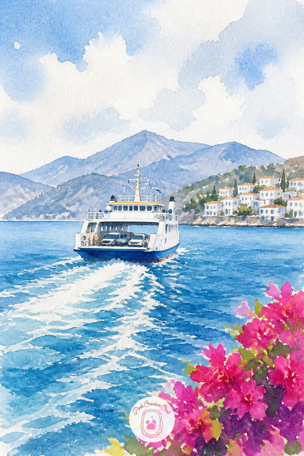
Palette: Payne’s Grey,Cerulean Blue,Warm Grey,Titanium White (paper)
Slow right down with a hammock strung between two olive trees, a quiet patch of shade with the sea just visible beyond. Sketch two simple tree trunks on either side of the page with a gently curved hammock line slung between them, sagging naturally in the middle rather than drawn flat and tight.
Paint the olive canopies above in grey-green dabbed with a slightly dry brush for texture, then the hammock itself in a soft striped pattern, cream and one accent color, leaving gaps of white paper between the woven lines rather than painting it as one solid shape. A sliver of blue sea glimpsed through the trees in the background ties it to the coast.
A hammock drawn too tight loses the relaxed feeling entirely, so make sure the curve sags down noticeably in the middle and check that both trunk heights roughly match before you paint over the pencil.
If a woven stripe pattern feels fiddly, a plain solid cream hammock with just a fringe line at each end still reads perfectly well.
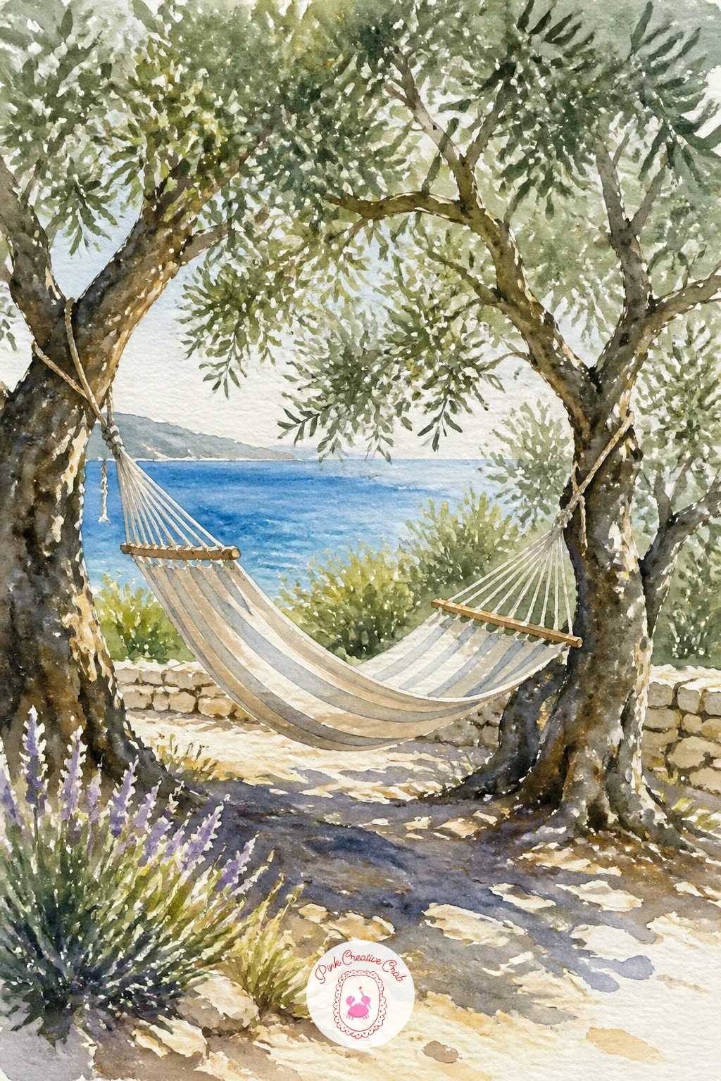
Palette: Sap Green,Payne’s Grey,Cream,Turquoise
Bring a little celebration into the mix with a beach bar, two bright cocktails sitting on a rustic wooden counter with the sea blurred behind. Sketch a simple low wooden counter across the lower third of the page, two glass shapes on top with straws and a slice of fruit, and a loose blurred strip of sea and sky filling the rest.
Paint the sea and sky background first in soft, slightly unfocused washes so it reads as out of focus behind the bar, then once dry, paint the glasses in bright color, orange or pink, leaving thin vertical streaks of white paper on each glass for the look of glass catching light.
Edges and highlights make or break glassware, so after the cocktail color is dry, use a kneaded eraser or the tip of a clean damp brush to lift a few soft highlight streaks back out along the side of each glass.
If lifting highlights feels tricky, simply leave those streaks unpainted from the start by working around them carefully with the brush tip.
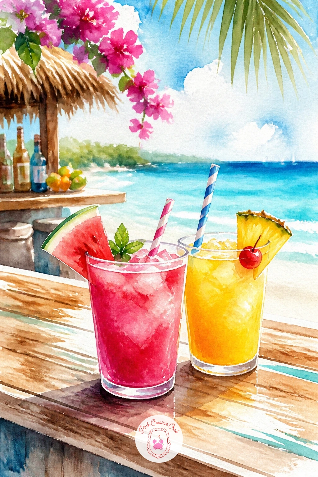
You Will Need
- kneaded eraser
Palette: Cadmium Orange,Bougainvillea Pink,Turquoise,Titanium White (paper)
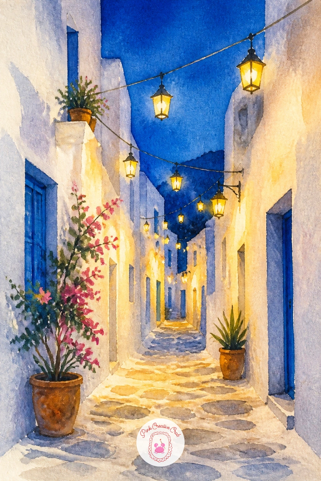
Move back into the lanes for a whitewashed alley strung with small hanging lanterns, warm light glowing against cool evening stone. Sketch a narrow alley between two tall white walls that lean slightly inward toward the top of the page, with a scatter of small round or lantern-shaped lights hanging from a wire strung between them.
Paint the walls in pale grey-blue to suggest evening shade, leaving them mostly bare paper, then use a white gel pen or masking fluid to protect each small lantern shape before washing a deep dusky blue over the upper part of the alley for the sky. Once dry, color each lantern in warm glowing yellow or orange.
The quick ten-minute version is just the alley and a few plain lantern dots; given more time, add a soft yellow glow wash around each lantern before it is fully dry so the light looks like it spreads rather than sitting as a flat shape.
If you do not have masking fluid, simply paint the lanterns last on top of the dry blue wash instead of protecting them first.
You Will Need
- masking fluid or white gel pen
Palette: Prussian Blue,Cadmium Yellow,Warm Grey,Titanium White (paper)
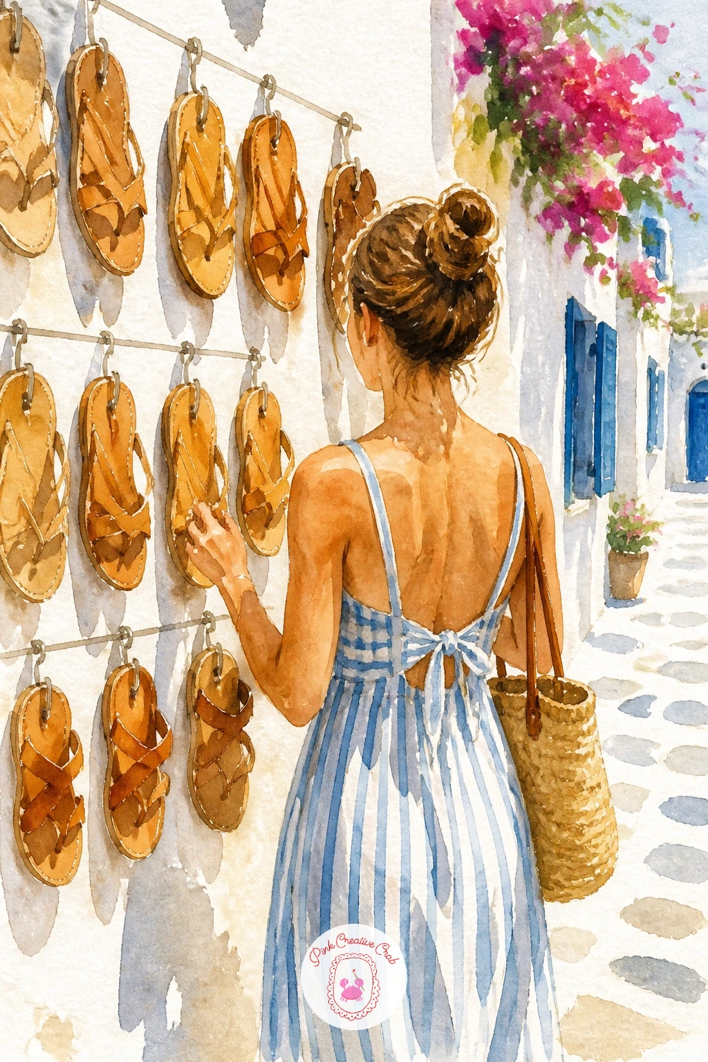
Bring the holiday back to street level with a woman browsing a small shop display of leather sandals hanging along a sunlit wall. Sketch a simple standing figure from behind or the side, facing a wall hung with several pairs of sandals shown as small simple strap shapes, with a shop awning or doorway framing the scene.
Paint her outfit in a light summer color, leaving most of her form loose and suggested rather than detailed, then the sandals in warm tan and burnt sienna, each pair just a few confident brush strokes rather than drawn straps. The wall behind stays warm white or pale yellow.
Keep her figure smaller than the display of sandals behind her, since this scene is about the shop as much as the shopper, and a figure drawn too large will crowd out the detail that makes the scene feel specific.
A woven straw bag over her arm, just an oval with a loop handle, is an easy addition that reinforces the holiday feeling without much extra effort.
Palette: Burnt Sienna,Yellow Ochre,Dusty Pink,Titanium White (paper)
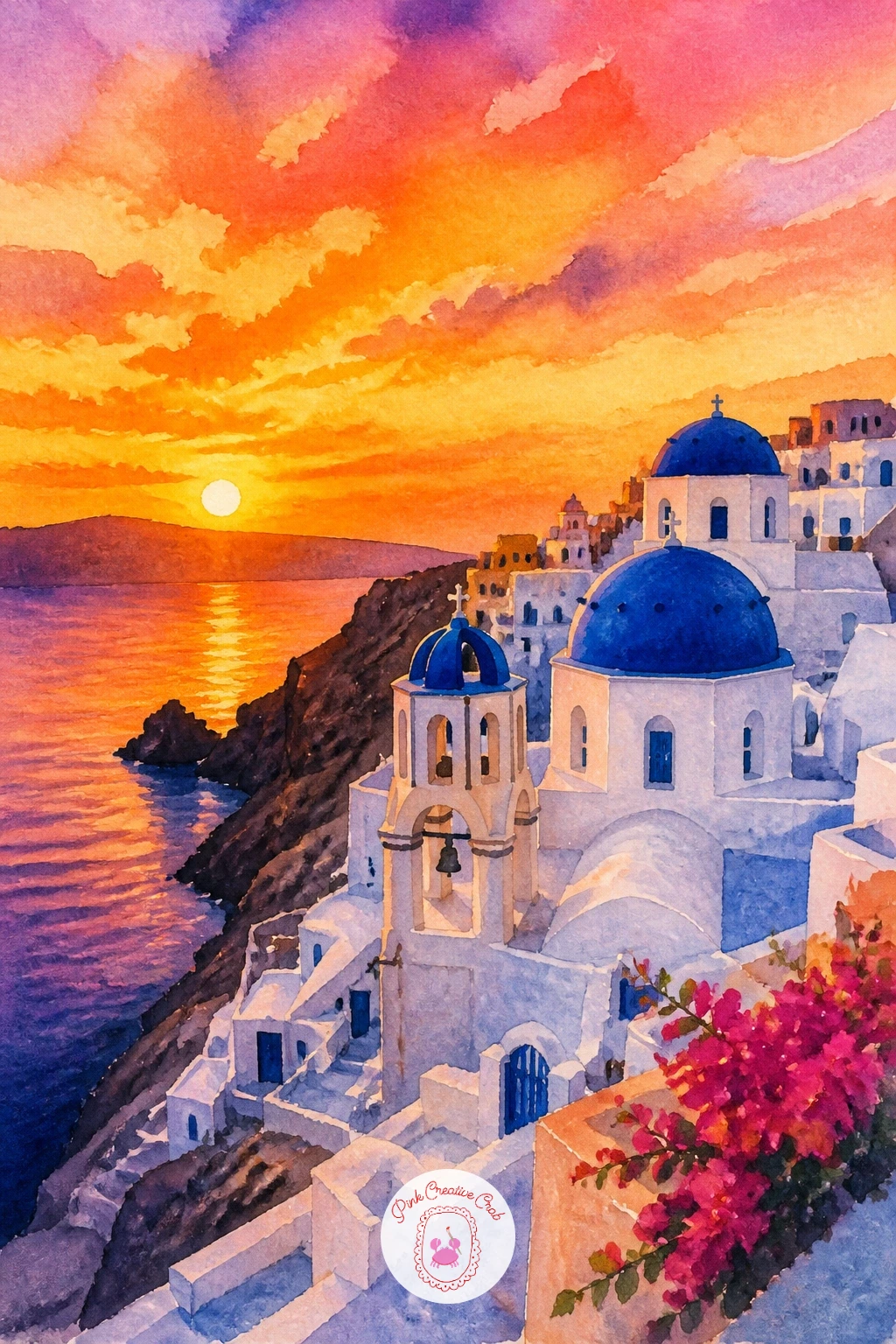
Build toward a finale with the view every Santorini photo chases: sunset over Oia, white and blue buildings stacked along the caldera edge glowing against a fiery sky. Sketch the familiar layered silhouette of domes, bell towers and cube houses along a curved clifftop, keeping shapes simple since the sky is about to do most of the work.
Paint the sky first in bold overlapping bands of orange, pink and purple, worked wet into wet so they melt into each other, and let it dry completely before touching the buildings. Paint the buildings as near-silhouettes, mostly dark blue-grey against the glowing sky, with just a few tiny warm highlights where the last light catches a wall or dome.
Painting the buildings too light is the one thing that flattens this whole scene, since the drama depends entirely on dark shapes against a bright sky, so keep that contrast bold rather than soft.
These easy watercolor skies, sunset and clouds ideas are worth a look if sunset blending like this is new to you.
Palette: Cadmium Orange,Quinacridone Magenta,Payne’s Grey,Ultramarine Blue
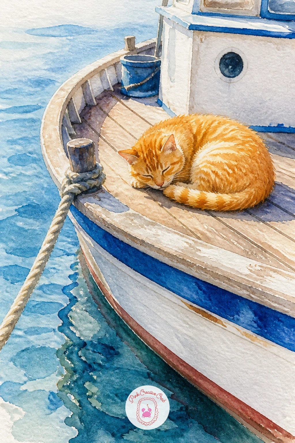
Ease off the drama with a small, calm cat curled up asleep on the deck of a moored boat. Sketch the cat first as a simple curled oval shape with ears tucked in and tail wrapped around, then the boat’s deck and a low rail or coiled rope around it, keeping the boat itself loose and secondary to the cat.
Paint the cat in warm grey or orange tabby tones, using a few quick dry-brush strokes over the main wash once it is dry to suggest fur texture along the back and tail without drawing every hair. The boat deck stays a simple warm wood tone, and a glimpse of blue water beside the hull finishes the scene.
A cat painted too perfectly round loses the relaxed, boneless look of a sleeping animal, so let the outline dip and flatten slightly where its body presses against the deck.
If you would like more practice with cat shapes and poses before tackling this one, this guide to cat watercolor ideas covers several at a similar level.
Palette: Burnt Sienna,Warm Grey,Burnt Umber,Cerulean Blue
Close the series with a vineyard sloping down toward the sea, rows of vines catching late sun above a strip of deep blue water. Sketch a series of simple diagonal rows running down the hillside, each row just a thin wavy line of small round leaf clusters, converging slightly as they recede toward the sea at the bottom of the page.
Paint the sky and sea strip first at the bottom, then the hillside above in warm golden-green, letting the color shift slightly warmer near the top of the slope where the sun hits hardest. Add the vine rows in a deeper green once the hillside base is dry, following the converging diagonal lines you sketched.
Rows that stay perfectly parallel all the way down the page lose the sense of a hillside falling away, so let them angle slightly closer together as they approach the sea at the bottom, which is the simplest way to suggest the slope without any complicated perspective drawing.
End today’s session here: a vineyard like this pairs naturally with any of the terrace or olive grove scenes earlier in this list if you want to build a small matching set.
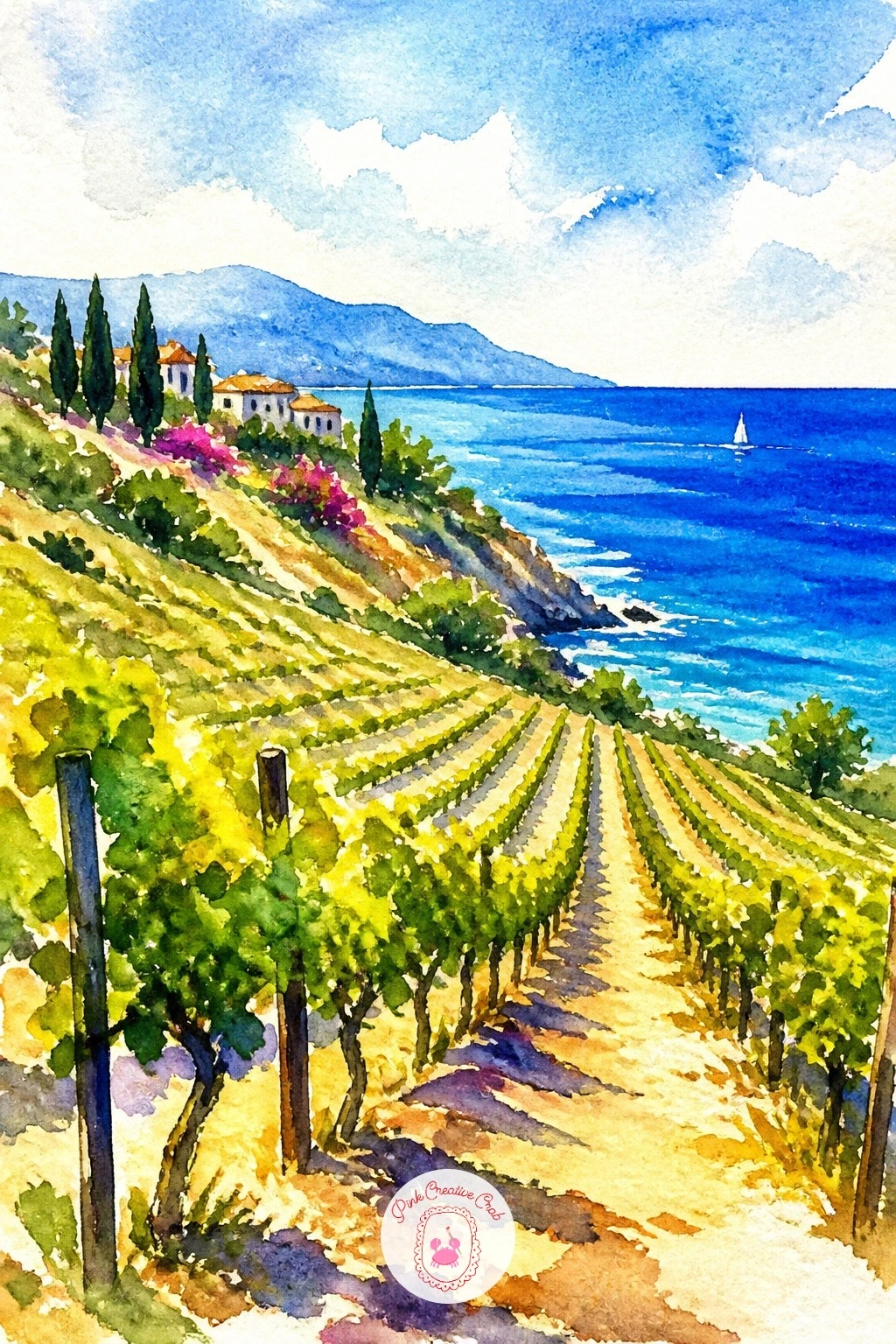
Palette: Sap Green,Yellow Ochre,Cerulean Blue,Burnt Umber
What to Do Next
Pick whichever scene matches the mood you are chasing today, pour a glass of water, and start with the background wash while the page is still fresh in your mind. A half sheet of cold press paper and twenty quiet minutes are really all any one of these needs to feel finished.
Frequently Asked Questions
What paper works best for watercolor scenery like this?
Cold press watercolor paper at 140lb or heavier works best, since it holds up to wet washes and sky blending without buckling. A paper block keeps the sheet flat while you work and dry it.
How do you keep the Mediterranean colors looking bright and not muddy?
Mix fewer colors together and let each layer dry before adding the next. Muddiness mostly comes from overworking a wash while it is still wet, so decide your color and commit rather than fussing with the brush.
What is the easiest scene on this list to start with?
The Santorini terrace with blue domes is the simplest, since it relies on bold flat shapes and bare white paper rather than blending or fine detail. It builds the confidence you need for the busier scenes later on.
Do I need special paint colors to get that Aegean blue?
No, a mix of ultramarine and a little cerulean or turquoise from a basic student set gets close enough. What matters more than exact color names is leaving the whites of the paper untouched so the blues read as bright rather than dull.
How long does one of these scenes usually take to finish?
Most of these scenes finish in thirty to forty minutes once drying time is included, and several have a quicker ten-minute version noted in the instructions. Painting in that order, background first then details, is what keeps the timing realistic.
Have any thoughts?
Share your reaction or leave a quick response — we’d love to hear what you think!
-
 0
-
0
-
0
-
0
-
0
-
0


