

If you are hunting for things to watercolor that will actually get finished today, you are in the right place. Every idea below is small, cheerful and forgiving, the kind of painting that looks charming even when your washes wobble a little, because loose and soft is exactly the look you are going for.
Scroll through and pick whatever makes you want to grab a brush right now. You will find teacups, cottages, fruit with tiny bugs on it, and skies with one sleepy moon, each one sized for a single sitting and a single sheet of paper.
Using these images: free for personal projects such as printing, coloring, cards, journals and gifts. Handmade items that include them may be sold up to 30 pieces per design. More than that is commercial use and is not permitted, and neither is selling or sharing the images themselves or passing them off as your own. Please ask before any other use.
Start simple with a teacup, the kind of shape that is really just an oval sitting on a smaller oval, with a curved handle looped off to one side. Pencil it loosely first, then paint the cup in one pale wash (a soft pink or blue works well) and leave a tiny patch of white paper near the rim for the mouse’s ears to tuck into later.
Once the cup wash is dry, drop in the mouse with a small gray-brown shape, just a curve for the back and two tiny circles for ears poking over the rim, then add a dot for the eye and a few whisker lines in pen once everything is dry.
The usual mistake here is painting the mouse while the cup is still wet, which makes the colors bleed together into mud. Wait for the cup to dry fully, even if that means pausing for a few minutes, and the mouse will sit crisply on top instead of melting into it.
If you do not have pink paint, a pale gray or yellow cup works just as sweetly, so do not let one missing color stop you from starting.
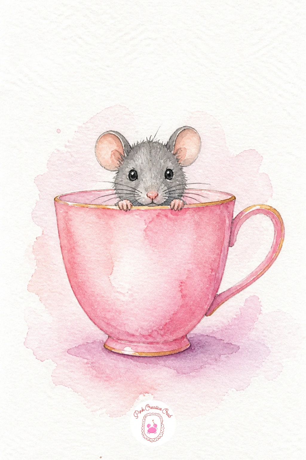
Palette: Opera Rose,Payne’s Grey,Raw Sienna
Move from a teacup to something a little wider: a sailboat floating on a flat sunset sea. Wet the whole upper half of your paper and drop in warm washes of orange, pink and a touch of violet while it is still damp, letting the colors melt into each other for that soft sunset glow.
While the sky dries, paint the water below as a slightly darker mirror of those same colors, pulling the brush in flat horizontal strokes rather than circles, which keeps the water looking calm instead of choppy.
Once both layers are dry, add the boat last: a simple dark triangle for the sail and a small curved hull, painted with a dry brush so the edges stay crisp against that soft sky. Check the eye level before you paint the boat, since keeping the horizon line low and the sail tall is what makes the scene feel peaceful rather than cramped.
If your sunset colors turn muddy, a single wash of orange alone still reads beautifully, so do not feel you need all three colors blended perfectly.
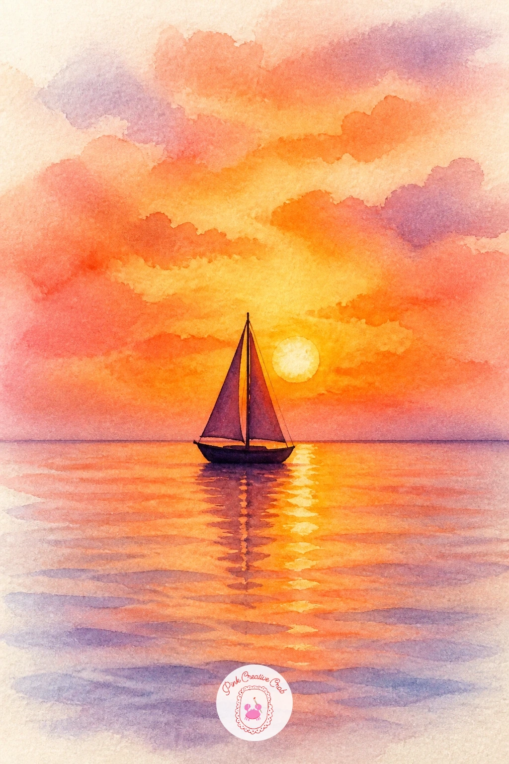
Palette: Cadmium Orange,Quinacridone Pink,Dioxazine Violet,Payne’s Grey
For an even softer sky, tilt your paper slightly while the wash is wet so the colors drift and blend on their own instead of staying in neat stripes.
Strawberries are one of the most satisfying things to watercolor because the shape is just a rounded triangle, wider at the top and tapering to a point. Paint it in a warm red wash first, leaving a few tiny white dots unpainted here and there for the seeds, then drop in a slightly darker red while the first wash is still damp so it shades naturally toward the bottom.
Once dry, paint the green leafy cap at the top with short pointed strokes fanning outward, then add the ladybird resting on one shoulder of the berry: a small red oval, a black line down the middle, and a cluster of tiny black dots.
The spot where this goes wrong is usually the seeds, which can look like scattered dirt if you add them haphazardly. Place them in loose curved rows following the strawberry’s shape, and they will read instantly as seeds instead of specks.
No red on hand? A pink-orange mix gets you a strawberry just as readable, especially paired with that same green cap.
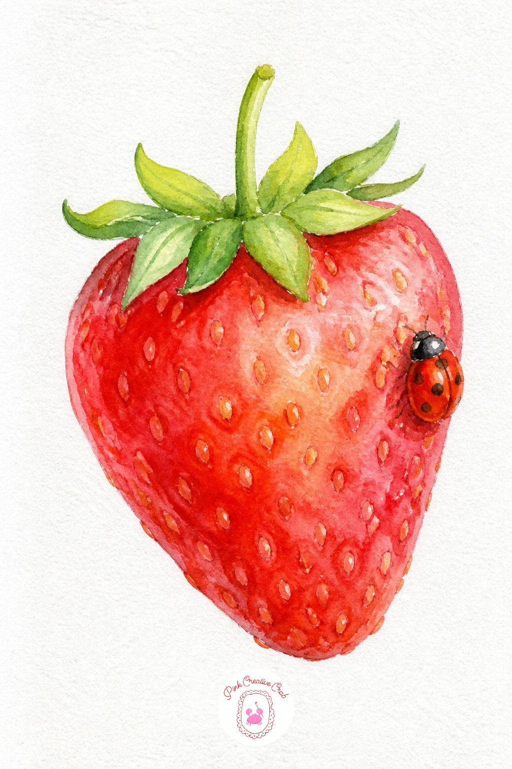
Palette: Cadmium Red,Permanent Rose,Sap Green,Ivory Black
Give yourself a little more structure with a cactus in a striped pot, which also happens to be a great subject for practicing where light falls. Decide on one side for your light source before you start, then paint the cactus body a touch lighter on that side and deeper green on the shadow side, using two or three rounded shapes stacked together rather than one plain oval.
Paint the pot next in a flat terracotta wash, then once dry, add horizontal stripes in white (left as paper) or a contrasting color, keeping the lines loosely even rather than ruler straight.
If you want a window behind it, paint a soft pale blue or lavender rectangle first and let the cactus sit in front of it once that wash is bone dry, which keeps the edges clean instead of fuzzy.
Cacti forgive uneven color better than almost anything else on this list, so if your greens blotch a little, just call it texture and keep going. For more ideas in this same forgiving, beginner-friendly spirit, browse this collection of easy watercolor flowers for beginners.
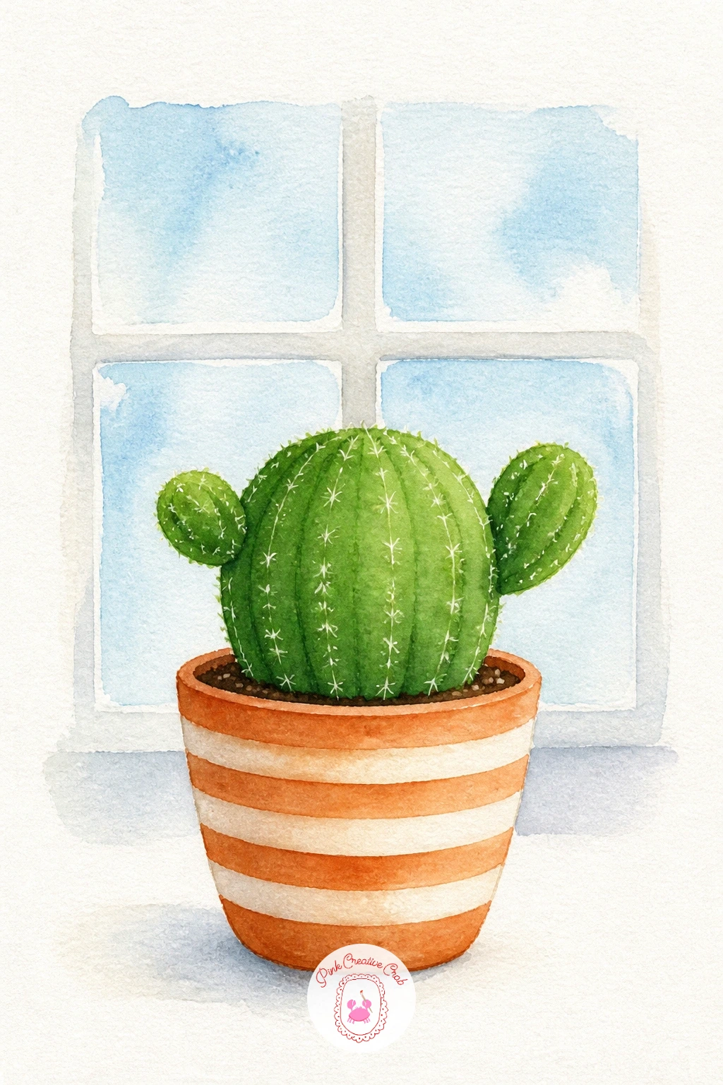
Palette: Sap Green,Hooker’s Green,Burnt Sienna,Cerulean Blue
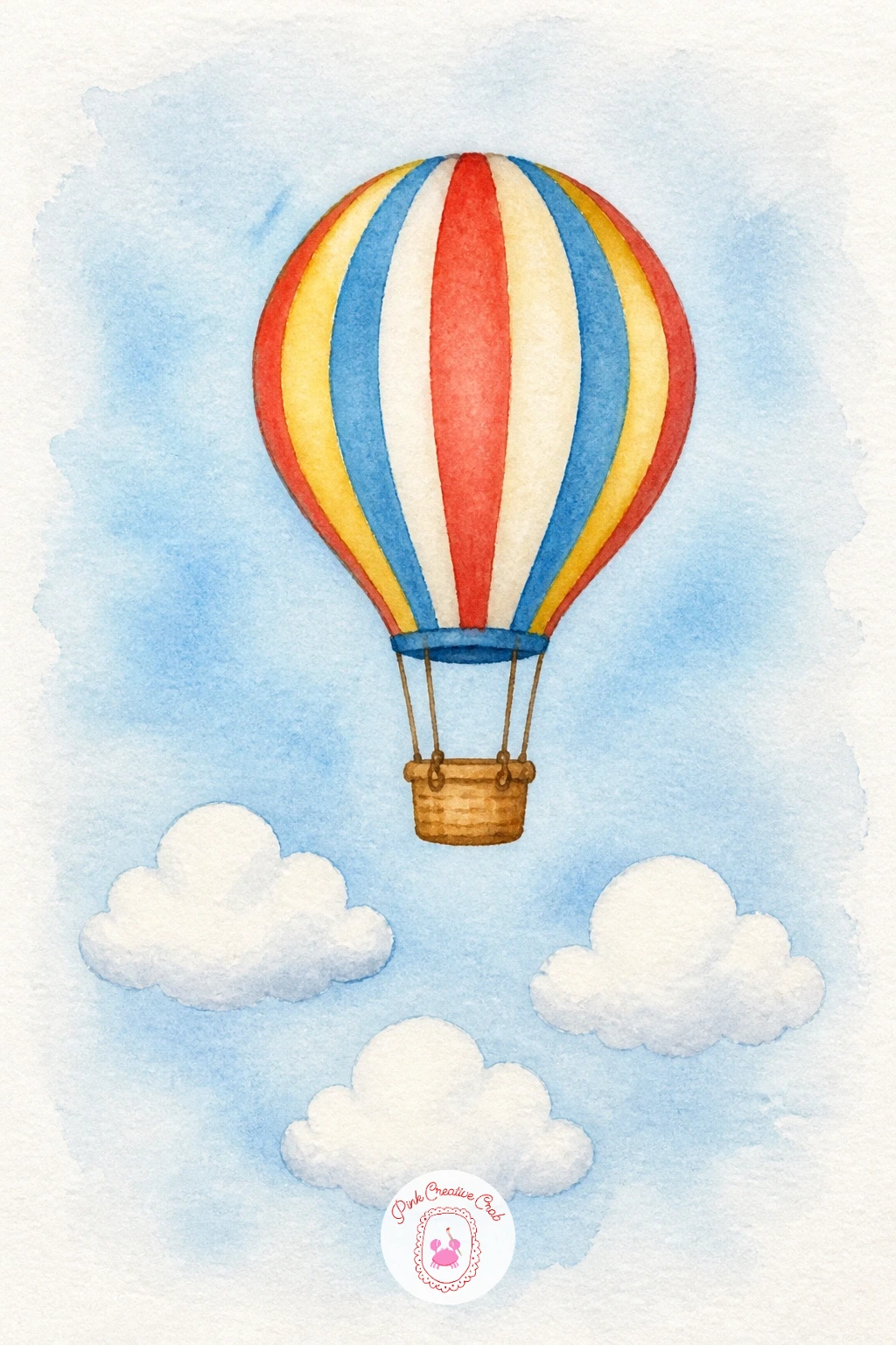
After the cactus, loosen your hand again with a hot air balloon drifting over three small clouds. Paint the balloon as a simple onion shape, dividing it into vertical panels of two or three alternating colors while the paper is still slightly damp so the colors soften into one another at the edges.
Let that dry completely before adding the thin basket lines underneath and the little basket itself, since painting them too early will pull balloon color down into your ropes.
For the clouds, use the lifting technique: paint a very pale gray-blue wash across the sky, then dab a clean damp brush or a folded paper towel onto three rounded cloud shapes to lift the color back out, leaving soft white puffs behind.
Working in ten minutes, keep it to one balloon color and simple clouds; given forty minutes, add a second balloon color panel and a faint shadow under each cloud for more depth.
You Will Need
- paper towel for lifting clouds
Palette: Cadmium Yellow,Alizarin Crimson,Cerulean Blue,Payne’s Grey
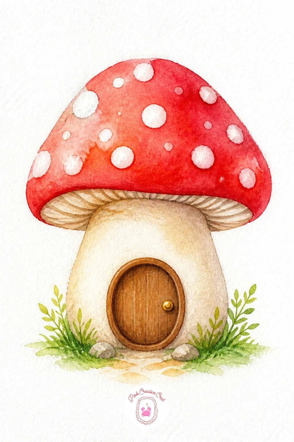
Mushroom houses are a favorite among things to watercolor because the dome shape alone does most of the work. Paint the cap in a rich red or orange wash first, then while it is still wet, flick in a scattering of white dots by lifting tiny bits of color with a damp brush tip, or simply paint around small reserved white circles from the start.
Let the cap dry fully, then paint the cream-colored stem underneath, narrower than the cap so it peeks out on both sides, and add a small round brown door with a tiny circle for a doorknob right in the center of the stem.
The easiest way to go wrong here is making the stem too wide, which flattens the whole mushroom into a blob. Keep the stem noticeably narrower than the cap’s underside and the house shape reads instantly.
If your dots smear, a few uneven light patches on the cap still look charming, so resist the urge to overwork it.
Palette: Cadmium Red,Raw Sienna,Burnt Umber,Titanium White
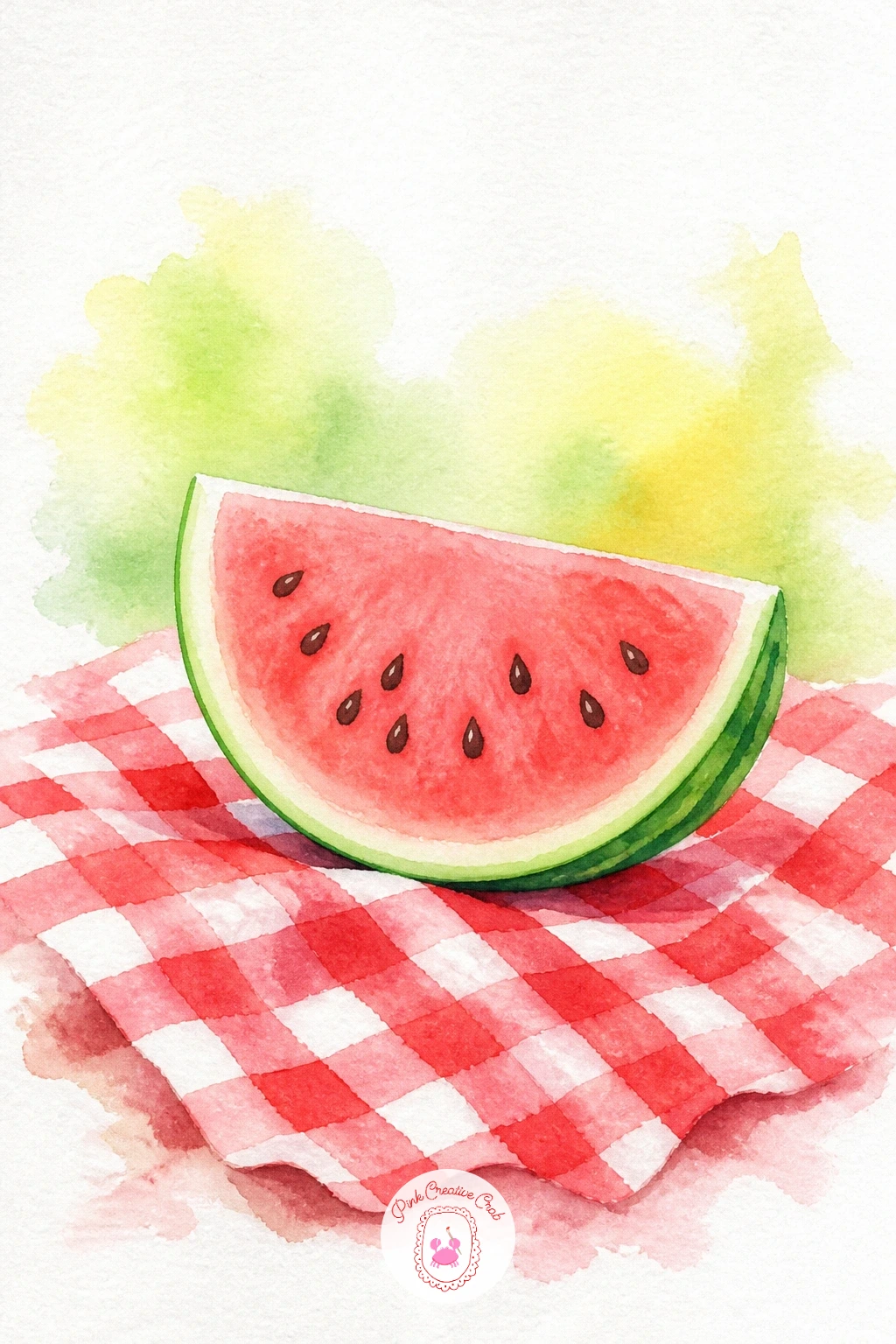
Switch gears to a watermelon slice, which is really just a triangle with a curved base and a thin green rind along the top. Paint the pink flesh first in one juicy wash, then while it is damp, drop in a few darker pink spots for seeds rather than painting hard black dots, which keeps them looking soft and watery instead of harsh.
Once dry, paint the thin white rind line (simply leave it unpainted) and the green outer rind in a single curved stroke following the same arc as the pink.
For the picnic cloth underneath, paint a loose red and white gingham pattern in a few quick squares, intentionally uneven, which actually reads more like fabric than a perfectly ruled grid would.
If gingham feels fiddly, a plain white cloth with just a few red polka dots gets the same cheerful picnic feeling in half the time.
Palette: Permanent Rose,Sap Green,Cadmium Red,Ivory Black
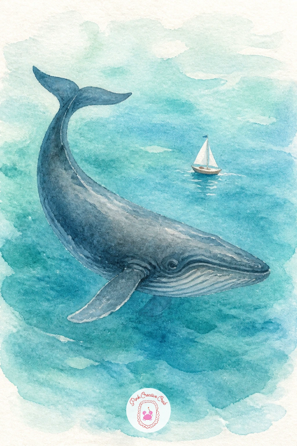
Scale up slightly with a whale curving through the water, its back breaking the surface in a smooth gray-blue arch. Paint the whale’s body in one confident curved stroke, darker along the top and fading paler toward the belly, then add the small fluke tail and the signature water spout as a few upward flicks of white space or light splatter.
Once that shape is dry, paint the water around it in horizontal strokes of blue and teal, and tuck a tiny sailboat off to one side, no taller than the whale’s spout, to give the scene a sense of scale.
Keeping that boat genuinely tiny is what sells the whale’s size, so resist making it bigger just because it feels easier to paint in detail.
If you want to practice ocean textures further, this set of easy watercolor ocean scenes is a nice next step after this one.
Palette: Payne’s Grey,Cerulean Blue,Teal Blue,Titanium White
Cottages make wonderfully cozy things to watercolor, and this one keeps it simple: a square house with a triangle roof and one bright red door right in the center. Paint the walls first in a pale cream or stone wash, then once dry, add the roof in a flat brown or slate gray, painted in one smooth stroke so the edge against the sky stays crisp.
Paint the red door next, small and centered, then add two tiny windows on either side with a thin pen line or dark paint for the frames, plus a wisp of smoke from the chimney if you like.
Doors and windows are the easiest place to lose proportion, so before you paint them, glance at the house shape and picture it divided roughly into thirds: door in the middle third keeps everything balanced without any measuring tools.
No red paint handy? A deep blue door against cream walls looks just as inviting, especially nestled near this list’s pine tree in snow for a winter pairing.

Palette: Raw Sienna,Payne’s Grey,Cadmium Red,Burnt Umber
Round things are forgiving things to watercolor, and a goldfish bowl is a perfect example. Paint the bowl outline first as a simple circle with a slightly narrower neck at the top, leaving the glass mostly white paper with just a thin curved line of pale blue along one edge to suggest the glass catching light.
Once that’s dry, paint the goldfish inside in one warm orange wash, a simple oval body with a flowing tail made of a few curved strokes, and a tiny line for the gill.
Water inside the bowl can get muddy fast if you overwork it, so lay down one pale blue-green wash around the fish and leave it alone. A few bubbles added as small unpainted circles finish the scene without any extra fuss.
Try this one again sometime with two fish instead of one, overlapping slightly, for a livelier version once the single fish feels easy.
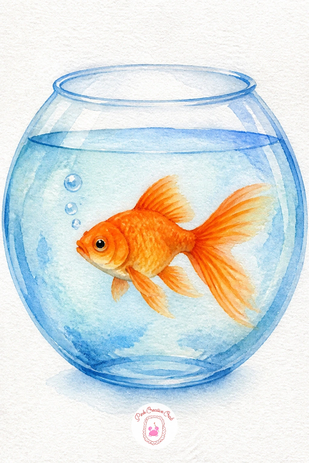
Palette: Cadmium Orange,Cerulean Blue,Viridian,Titanium White
For more fish to try once this one feels easy, this roundup of watercolor fish tutorials has plenty of next steps.
Give the snail’s shell a little personality with a tight spiral, starting from the center and winding outward in one continuous pencil line before you paint, since a spiral that trails off halfway reads as a mistake rather than a shell.
Paint the shell in warm brown and gold, adding the darker brown spiral line once the base wash has dried so it stays sharp. The snail’s body is just a simple curved gray-green line stretching out from under the shell, with two thin antennae on dots for eyes.
Underneath, paint a single large leaf in a rich green wash, veins added with a fine brush or pen once dry, and let the snail sit right along its edge as if it just arrived.
If your spiral wobbles on the first try, paint it lightly with a damp brush and no pigment first as a guide, then follow it with color.
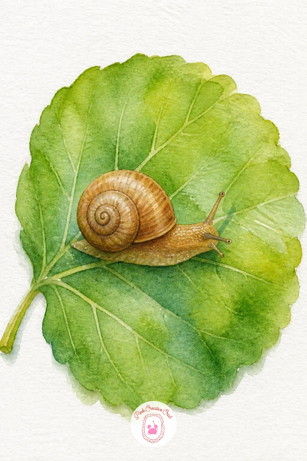
Palette: Raw Sienna,Burnt Sienna,Sap Green,Payne’s Grey
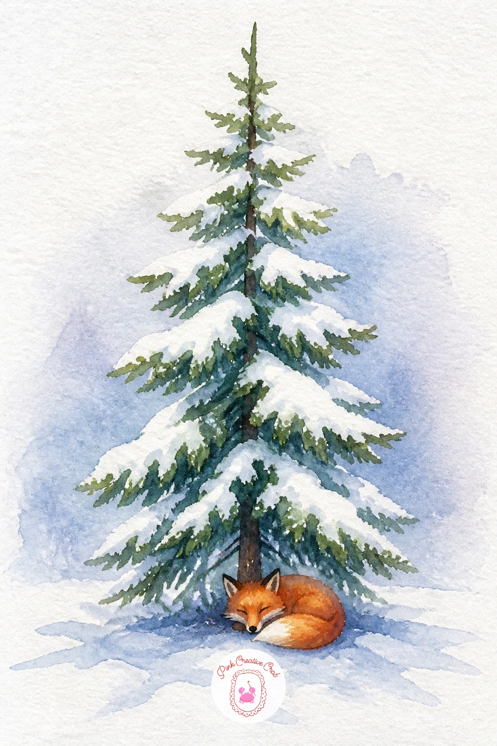
Pine trees are a satisfying break from round shapes, built from a series of stacked triangles, each one a little wider than the last as you work down the trunk. Paint them in a cool deep green, then while still slightly damp, flick a loaded brush gently over the top to splatter tiny white-ish texture, or simply leave small unpainted gaps for snow catching on the branches.
Once dry, paint the ground as a soft gray-blue shadow beneath pure white paper snow, and tuck a small sitting fox at the base of the tree, a rounded orange body with a white chest patch and a neat black-tipped tail curled around its feet.
Keep the fox noticeably smaller than the tree so the scale feels right, and paint its eye and legs last once the body wash is dry so they stay crisp.
Splatter can be messy if you are not careful, so test it on scrap paper first, and if you skip it entirely, a few soft round snow dots painted by hand work just as well.
You Will Need
- old toothbrush for splatter
Palette: Hooker’s Green,Cadmium Orange,Titanium White,Payne’s Grey
Treat yourself to a cake slice next, a simple triangle shape layered like the watermelon idea but with horizontal bands instead of diagonal ones. Paint the sponge layers first in warm cream and golden tones, then once dry, add a thin pink or brown line between each layer to suggest filling.
Paint the frosting on top as a soft wavy cloud shape in white or pale pink, leaving the paper mostly untouched for the white version, then finish with a single glossy cherry on top, a small red circle with one tiny white highlight left unpainted.
That highlight is what makes the cherry look wet and shiny rather than flat, so plan for it before you paint rather than trying to lift it out afterward.
Working quickly, two layers and plain frosting takes ten minutes; given more time, add a drizzle of darker syrup trickling down one side for extra richness.
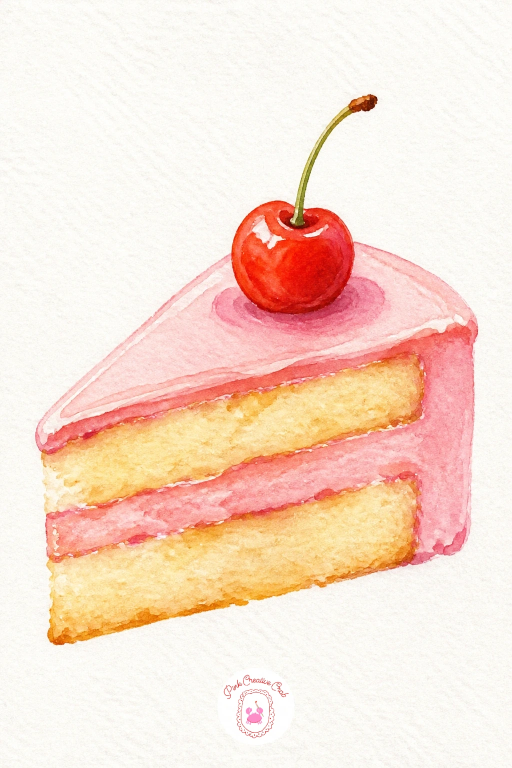
Palette: Raw Sienna,Permanent Rose,Cadmium Red,Titanium White
If sweets are your favorite subject, this set of easy watercolor food ideas has more small treats worth painting.
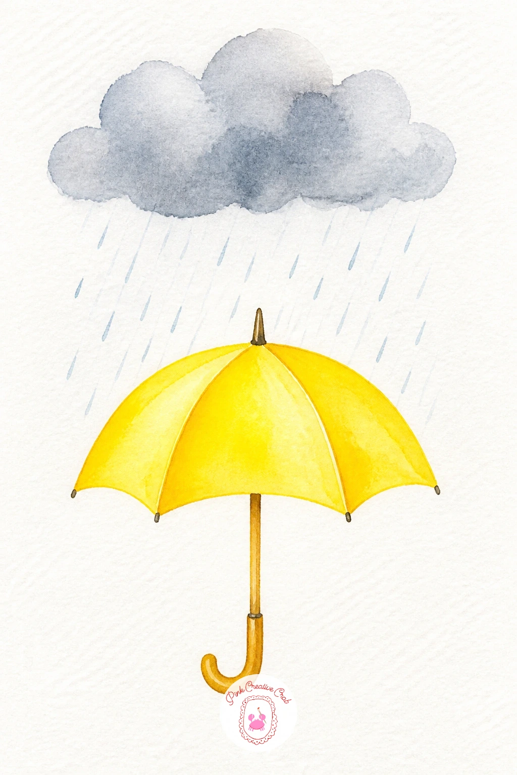
Bring in a little weather with a rain cloud and umbrella pairing, a nice chance to practice light values on a gray subject. Paint the cloud as a soft rounded gray-blue shape, keeping the top edge paler where imagined light hits it and the underside a touch darker where the rain is about to fall.
Let that dry, then add thin diagonal rain lines in pale blue-gray, all slanting the same direction, which makes them read as rain rather than random scratches.
Paint the umbrella below in cheerful yellow, a simple dome shape with a thin curved handle, positioned so a few raindrops appear to land right on top of it.
If your rain lines look too heavy, a kneaded eraser can lighten pencil guidelines before you paint, or you can simply thin the lines by painting fewer of them, spaced further apart.
Palette: Payne’s Grey,Cerulean Blue,Cadmium Yellow,Titanium White
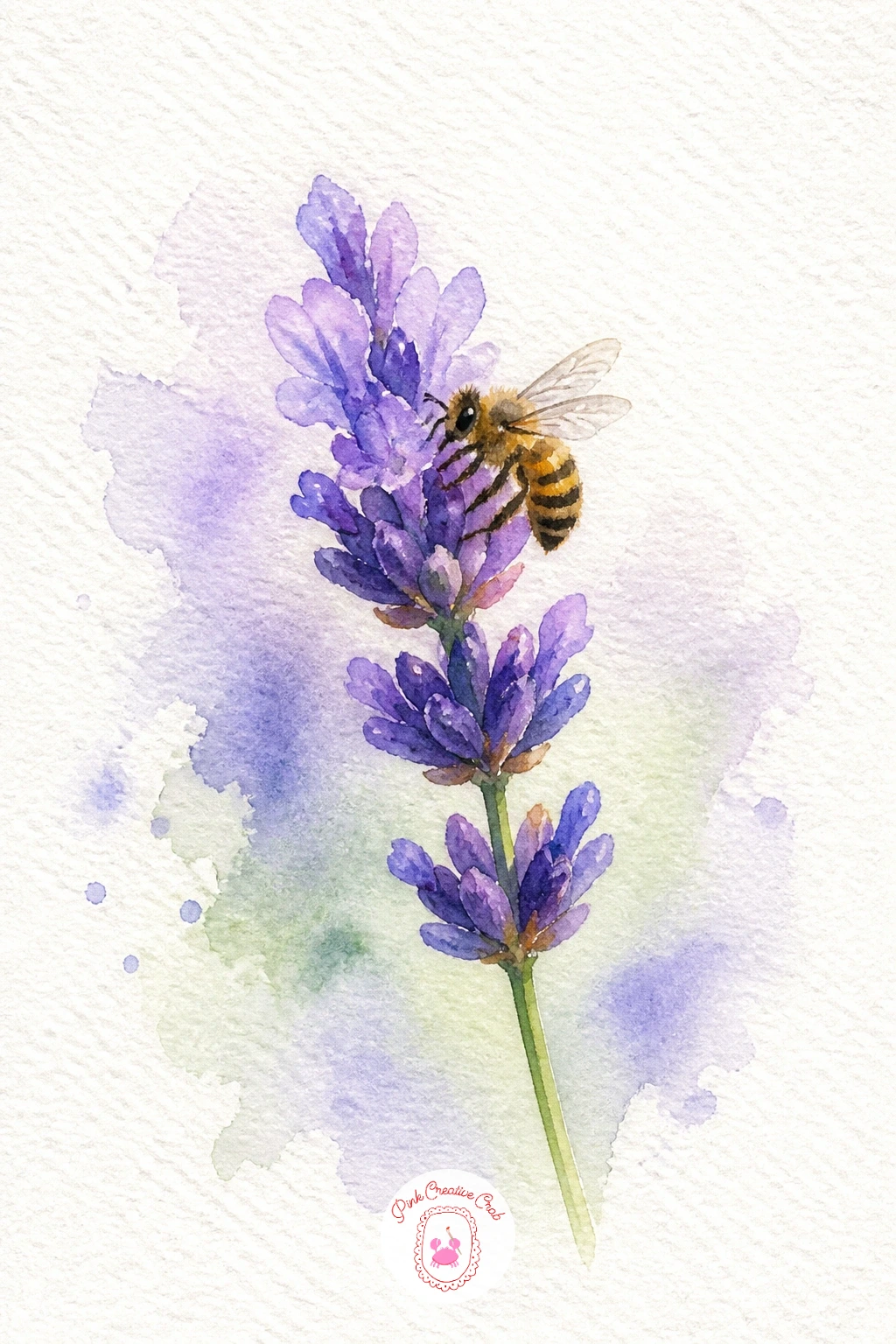
Lavender sprigs are made of small repeated shapes, so paint the stem first as one thin green line, then add the little purple buds as a cluster of tiny dashes working up toward the tip rather than trying to paint one solid purple blob.
Once the buds are dry, add a soft gray-green leaf or two along the stem, then paint the bee resting on one side: a small round black and yellow striped body, with two translucent wings suggested by just the faintest pale gray wash and a thin outline.
The wings are the trickiest part, since too much paint makes them look solid rather than see-through. Use barely any pigment, mostly water, and let the white paper do most of the work.
If stripes feel fiddly at this size, a simple fuzzy black-yellow oval with wings reads as a bee just fine from a normal viewing distance.
Palette: Dioxazine Violet,Sap Green,Cadmium Yellow,Ivory Black
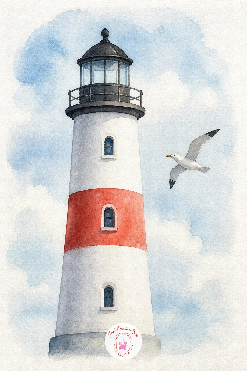
Lighthouses pull together several of the shapes you have already practiced: a tall tapering cylinder for the tower, a small cap on top, and a round red stripe wrapped partway up. Paint the white tower first by leaving most of the paper bare, then add one or two red bands and the dark lantern room at the top once dry.
Decide where the light source sits before you add shading, since a lighthouse painted with shadow only on one side instantly looks three dimensional rather than flat. Keep that same shadow side consistent on the rocky base below it.
Add a single seagull gliding nearby, just a flattened M shape in gray or white against the sky, small enough that the lighthouse clearly towers over it.
If straight tower edges are tricky freehand, lightly pencil two guide lines first and paint within them, erasing once the paint is completely dry.
Palette: Cadmium Red,Payne’s Grey,Cerulean Blue,Titanium White
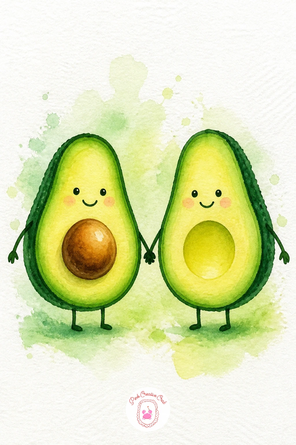
Give two avocado halves a little personality by painting them as a couple holding hands, which just means positioning them side by side with their rounded edges nearly touching and two thin arm lines connecting them. Paint each avocado half in a green and yellow gradient, pit removed from one or kept whole in the other for variety, blending the colors wet into wet for a soft inside glow.
Once dry, paint the dark avocado skin along the outer curved edge in a thin band of deep green-brown, and add simple dot eyes and a small curved line smile to each half to bring in the character.
Faces are easy to overdo at this size, so keep features tiny and simple. A single curved smile line reads as cheerful without needing eyebrows or extra detail.
Try this again later with one avocado wearing a tiny hat or scarf for a quick seasonal variation once the basic pair feels easy.
Palette: Sap Green,Cadmium Yellow,Burnt Umber,Ivory Black
Peaches sit nicely between the strawberry and the watermelon in difficulty, since the shape has that one soft dividing crease down the middle to get right. Paint the peach in a blended wash of yellow, pink and a touch of orange, letting the colors merge wet into wet, then once dry, add a single curved line for the crease using a slightly darker tone so it looks like part of the fruit rather than a scratch.
For the basket underneath, paint a simple curved shape in warm brown, then add crosshatched lines in a slightly different brown once the base is dry to suggest woven straw, keeping the lines loose rather than perfectly even.
Overworking that crease line is the most common slip, since going over it twice makes it look like a wound rather than a fold. One confident stroke, applied once the fruit is dry, is all it needs.
No basket in mind? A simple folded cloth under the peach works just as sweetly and takes less time to paint.
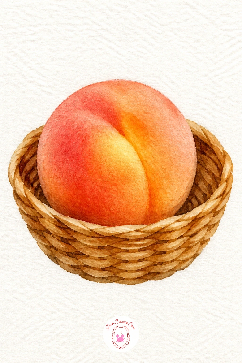
Palette: Cadmium Yellow,Permanent Rose,Burnt Sienna,Raw Sienna
For more fruit subjects after this one, this list of easy watercolor fruit paintings is worth a look.
Shells bring in a nice bit of pattern practice. Paint the shell’s basic fan shape first in a pale cream or pink wash, then once dry, add thin ridged lines radiating out from the base using a fine brush or pen, spacing them slightly unevenly since real shells are never perfectly symmetrical.
Paint the sand underneath in a warm beige wash with a few short horizontal strokes of slightly darker tan for texture, then add a small crab off to one side: a round body in dusty orange with four thin bent legs on each side and two tiny raised claws.
Claws are the easiest part to get lopsided, so paint them as simple curved pincer shapes and keep them small. Oversized claws make the crab look unbalanced rather than charming.
If pen lines on the shell feel too stiff, a fine brush loaded with thin dark paint gives the same ridges with a softer, more natural wobble.
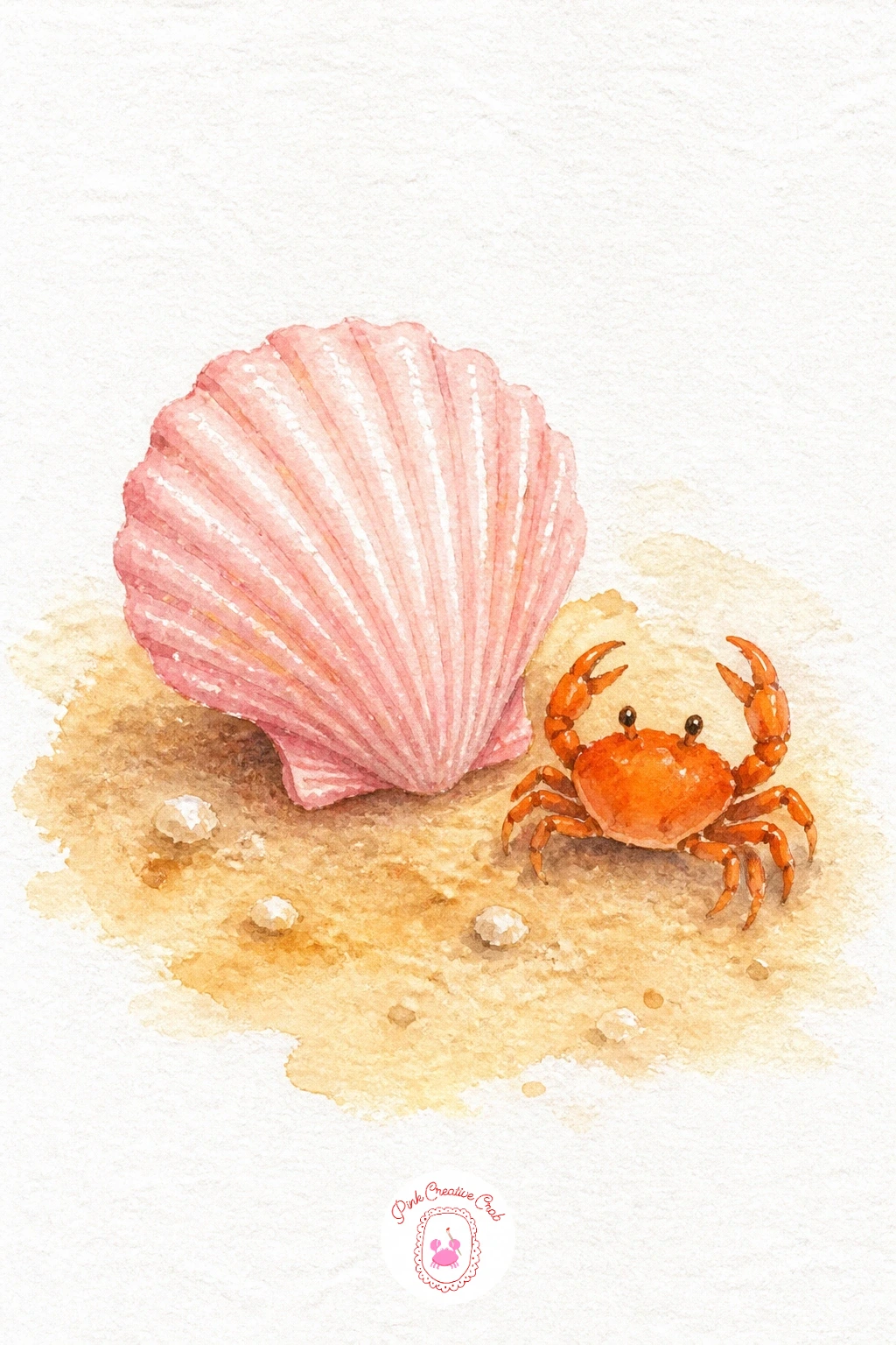
Palette: Raw Sienna,Permanent Rose,Cadmium Orange,Burnt Umber
Daisies are a great companion shape to a butterfly, since both rely on even repetition around a center point. Paint the daisy first: a small yellow circle in the middle, then white petals left as bare paper with only a thin gray-blue shadow line along one edge of each petal to give them shape, arranged evenly around the center.
Once dry, paint the butterfly perched on one petal, wings painted as two matching halves, one side then a mirrored second side, in whatever cheerful color you like with a few small spots or stripes added once the base wings are dry.
Matching the two wings is the trickiest part, so paint the first wing, glance at it, then paint the second trying to echo its size and angle rather than aiming for identical perfection, which looks stiffer anyway.
If symmetry feels hard, fold a scrap of paper in half and eyeball the butterfly against both sides before committing to the real page.
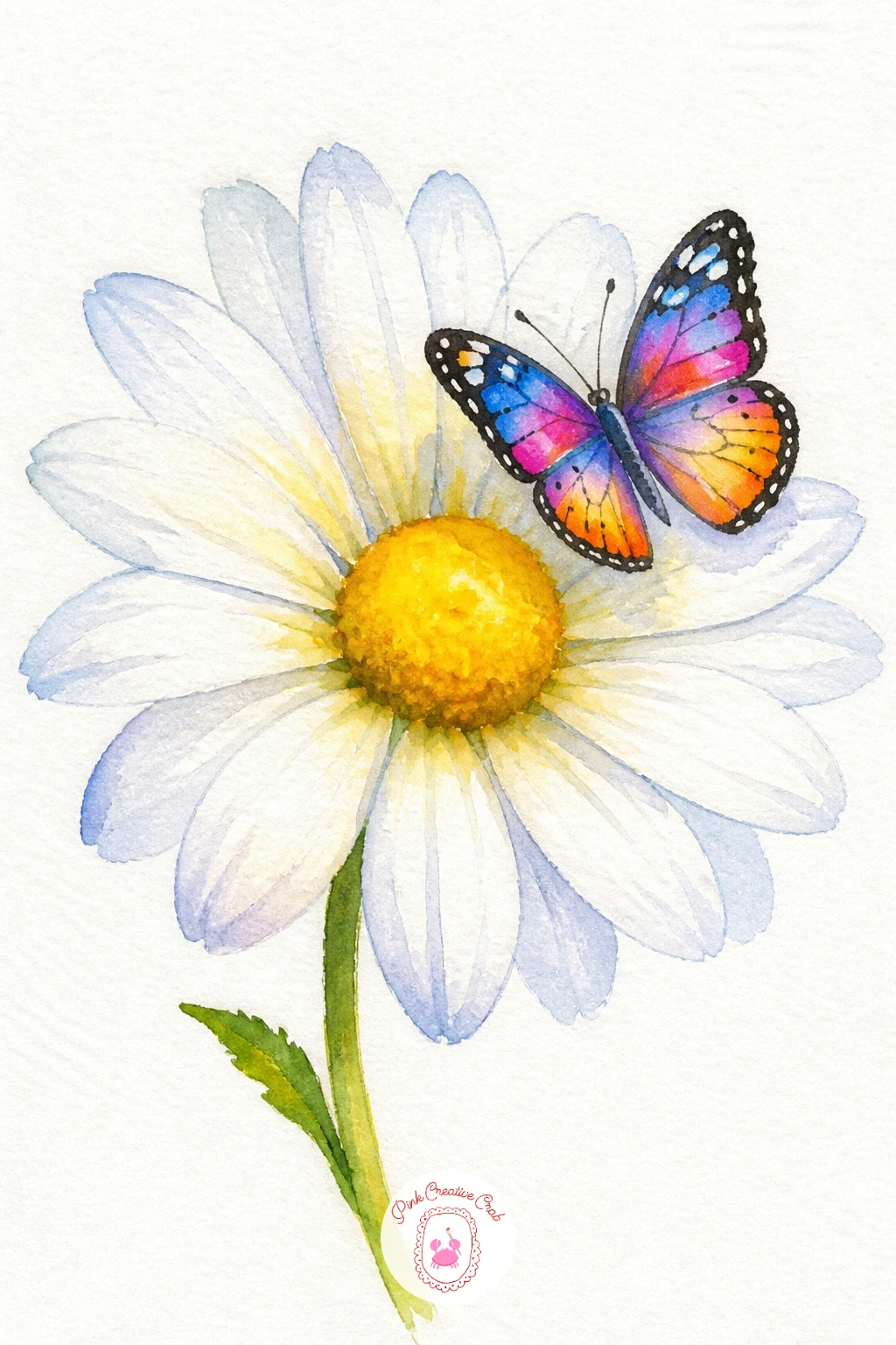
Palette: Cadmium Yellow,Titanium White,Quinacridone Pink,Cerulean Blue
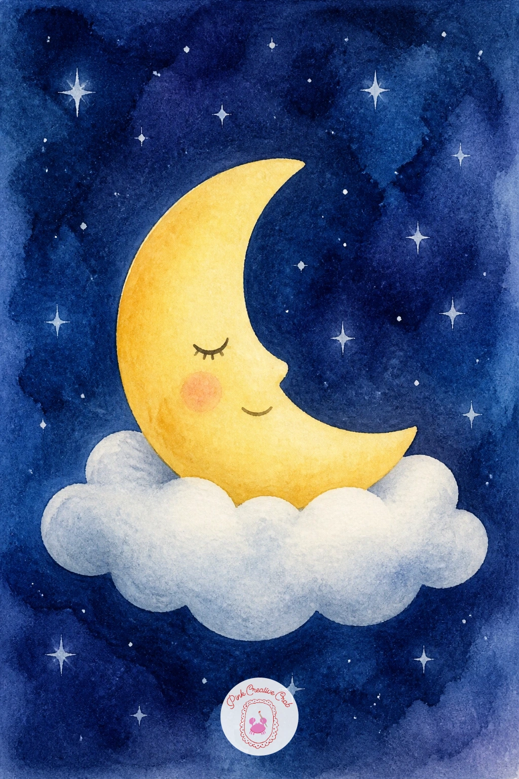
Give the sky a bedtime scene with a crescent moon resting on a cloud as if it has curled up for the night. Paint the moon first in pale yellow, a simple crescent shape with a closed sleepy eye and a small curved smile added once dry, then surround it with a soft navy or deep purple sky wash, painted around the moon shape rather than over it.
Let the sky dry completely before adding the cloud underneath, a few overlapping rounded puffs in soft white or pale gray, positioned so the moon appears to be nestled right into the top of it.
Stars scattered around the moon are easiest added last as small white dots, either left unpainted from the start or dabbed in afterward with a white gel pen once the sky is dry.
If your sky wash looks patchy, that mottled texture actually reads as night sky nicely, so there is rarely a need to fix it.
You Will Need
- white gel pen
Palette: Cadmium Yellow,Indigo,Dioxazine Violet,Titanium White
Ducks are an easy, rounded shape once you break them down: a plump oval body, a smaller round head, and a simple flat orange beak. Paint the body first in soft yellow or white, leaving the beak area unpainted, then once dry, add the orange beak and tiny dot eye, plus a few short curved strokes of gray along the wing for feather texture.
Paint the puddle underneath as a simple oval of pale blue-gray, then while it is still damp, paint a mirrored, slightly blurred reflection of the duck’s body directly below it, letting the wet paper soften those edges naturally.
That reflection is what makes the puddle convincing, so resist painting it with a hard crisp outline. A loose, slightly fuzzy echo of the duck above reads far more like water.
If you want a faster version, skip the reflection entirely and just add a few ripple lines radiating from the duck’s feet instead.
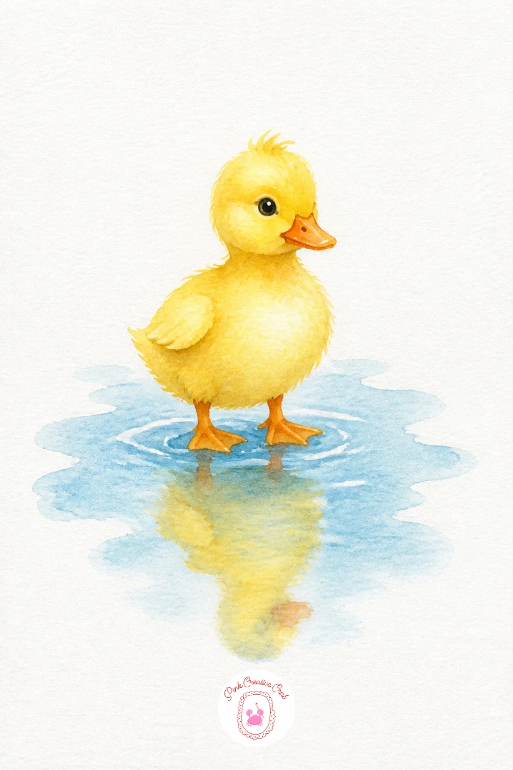
Palette: Cadmium Yellow,Cadmium Orange,Payne’s Grey,Cerulean Blue
If you enjoy painting animals this small and simple, this roundup of easy farm animal watercolor ideas has more in the same spirit.
Two cherries on a shared stem make a lovely small study in balance. Paint each cherry as a simple circle in rich red, letting the color pool slightly darker at the bottom of each one while still wet for a natural rounded look, then once dry, add two thin curved stems meeting at a single point above them.
Compare the two cherries before you commit to final sizes, since cherries painted noticeably mismatched in size read as a mistake rather than natural variation. Keep them close to the same size, with maybe one a touch smaller.
Add a tiny bird perched on the twig just above the cherries, a simple rounded body with a small pointed beak and two thin stick legs, painted in whatever color feels cheerful against the red.
If the stems look stiff, curve them slightly rather than painting them straight, which makes the whole twig feel more alive.
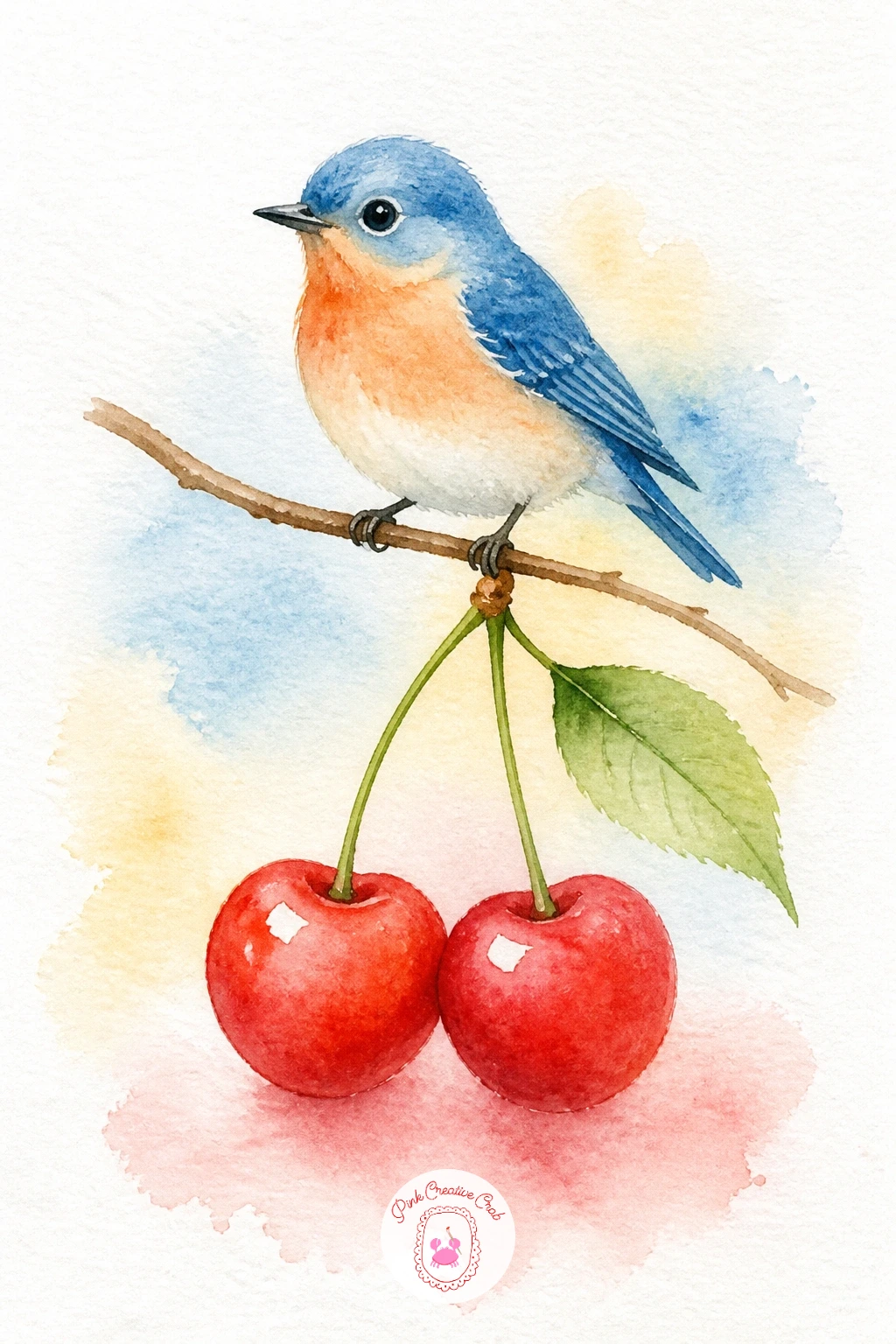
Palette: Cadmium Red,Alizarin Crimson,Burnt Umber,Cerulean Blue
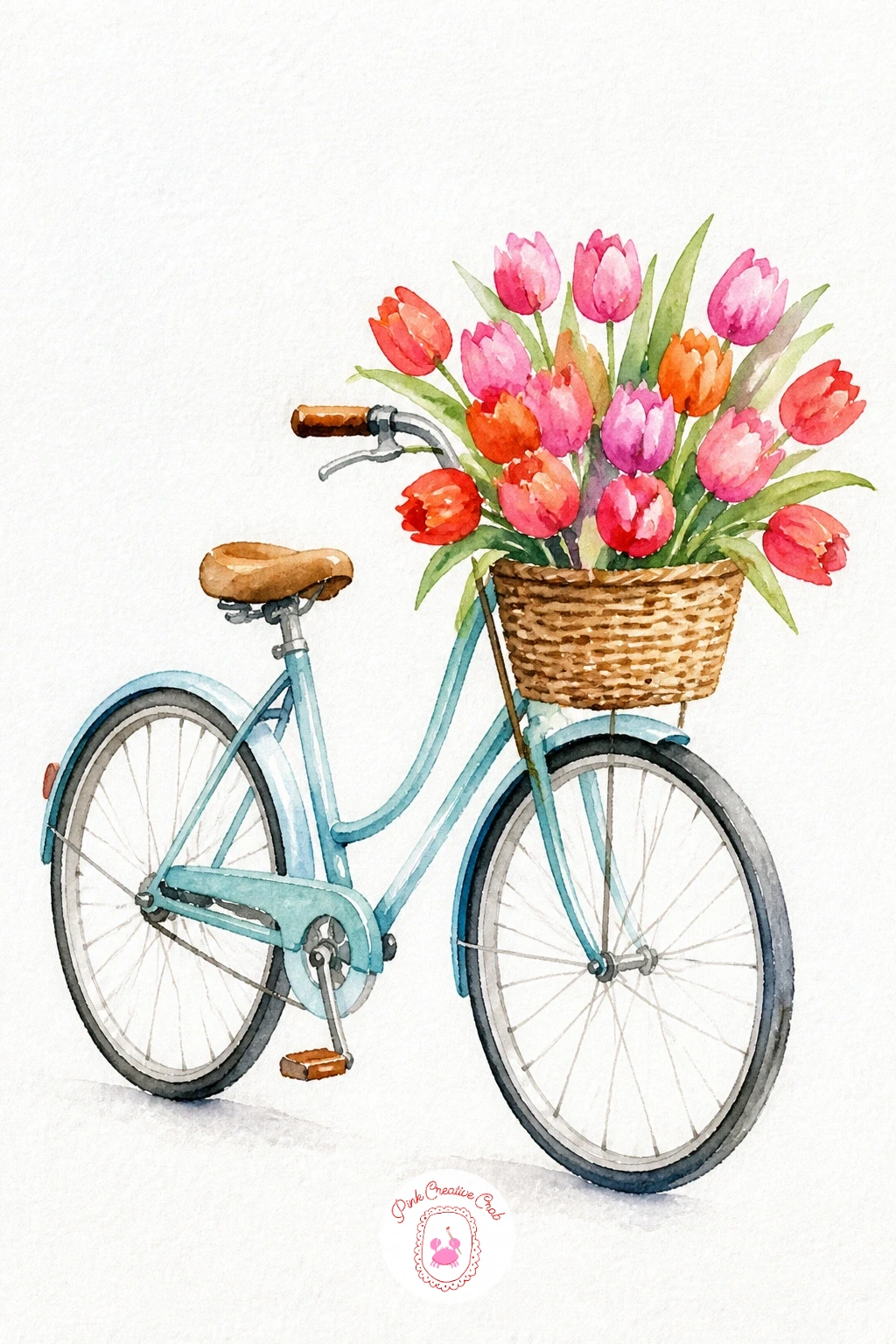
Bicycles look complicated but break down into two circles and a few connecting lines, which makes them far easier than they appear. Lightly pencil two evenly sized wheels first, checking that they match before you paint, then paint the thin frame lines connecting them in one confident color, keeping the lines loose rather than ruler straight for that hand-painted charm.
Once the frame is dry, add a small basket on the front, then fill it with a cluster of simple tulip shapes: a few curved petal cups in pink, red and orange on thin green stems, painted last so they sit crisply over the dry basket.
Wheels are the part most likely to end up lopsided, so if freehand circles worry you, trace around a small coin or cap for each one before painting inside the lines.
If a basket feels fussy, tulips simply tucked into the handlebars work just as sweetly and save you a step.
You Will Need
- small coin or cap to trace wheels
Palette: Payne’s Grey,Quinacridone Pink,Cadmium Red,Sap Green
Macarons are tiny domes stacked on top of each other, each one really just a rounded circle with a thin ruffled edge, called the foot, running around the base. Paint each macaron shell in its own soft pastel wash, pink, lavender or mint, leaving a thin white gap between each one before adding the filling line in a slightly darker shade of the same color.
Stack three or four shells once each layer is fully dry, checking that each one sits centered over the one below so the tower does not lean, then paint a simple round plate underneath in a single pale gray-blue wash.
The ruffled foot edge is the trickiest detail, so rather than painting a smooth line, use small quick dabs of a dry brush around the base of each shell, which creates that slightly textured ruffle naturally.
Working quickly, two stacked macarons in matching colors take about ten minutes; given more time, vary each shell’s color for a full pastel tower.
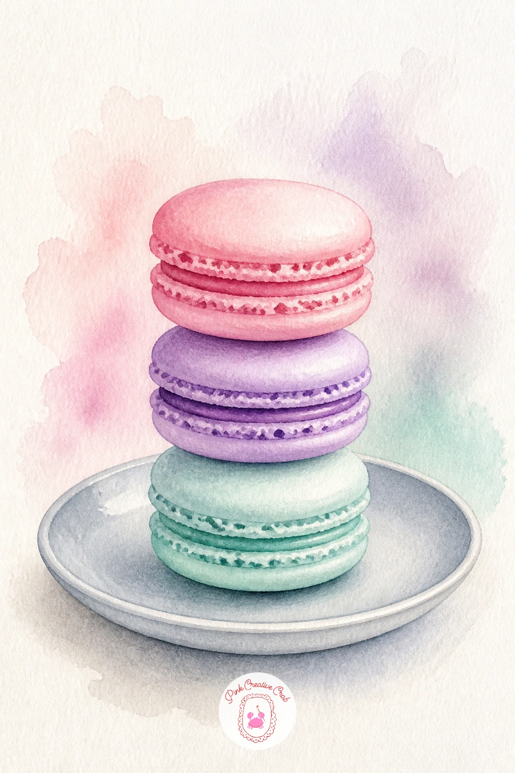
Palette: Quinacridone Pink,Dioxazine Violet,Viridian,Payne’s Grey
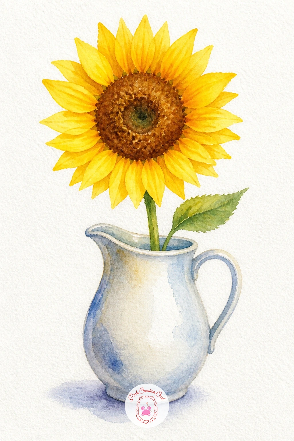
Finish the flowers on this list with a sunflower, built from a dark brown center circle surrounded by petals painted in two tones of yellow so it does not read as flat. Paint the darker yellow petals first, pointed ovals arranged evenly around the center, then once dry, layer a few lighter yellow highlight strokes along one side to suggest the light catching the petals.
Paint the center last in rich brown, dabbing in small dark dots with a nearly dry brush once it is dry for that textured seed look, then add the jug underneath in a simple rounded shape with a thin handle, painted in whatever solid color complements the yellow.
Petals pointing in too many directions can make the flower look scraggly, so keep them fanning out fairly evenly from the center, like spokes on a wheel, even if a few overlap slightly.
If yellow alone looks flat, that second darker yellow layer is worth the extra few minutes, since it is what gives the petals real shape.
Palette: Cadmium Yellow,Raw Sienna,Burnt Umber,Cerulean Blue
For more flower subjects in this same loose, beginner style, this list of simple watercolor flowers is worth browsing next.
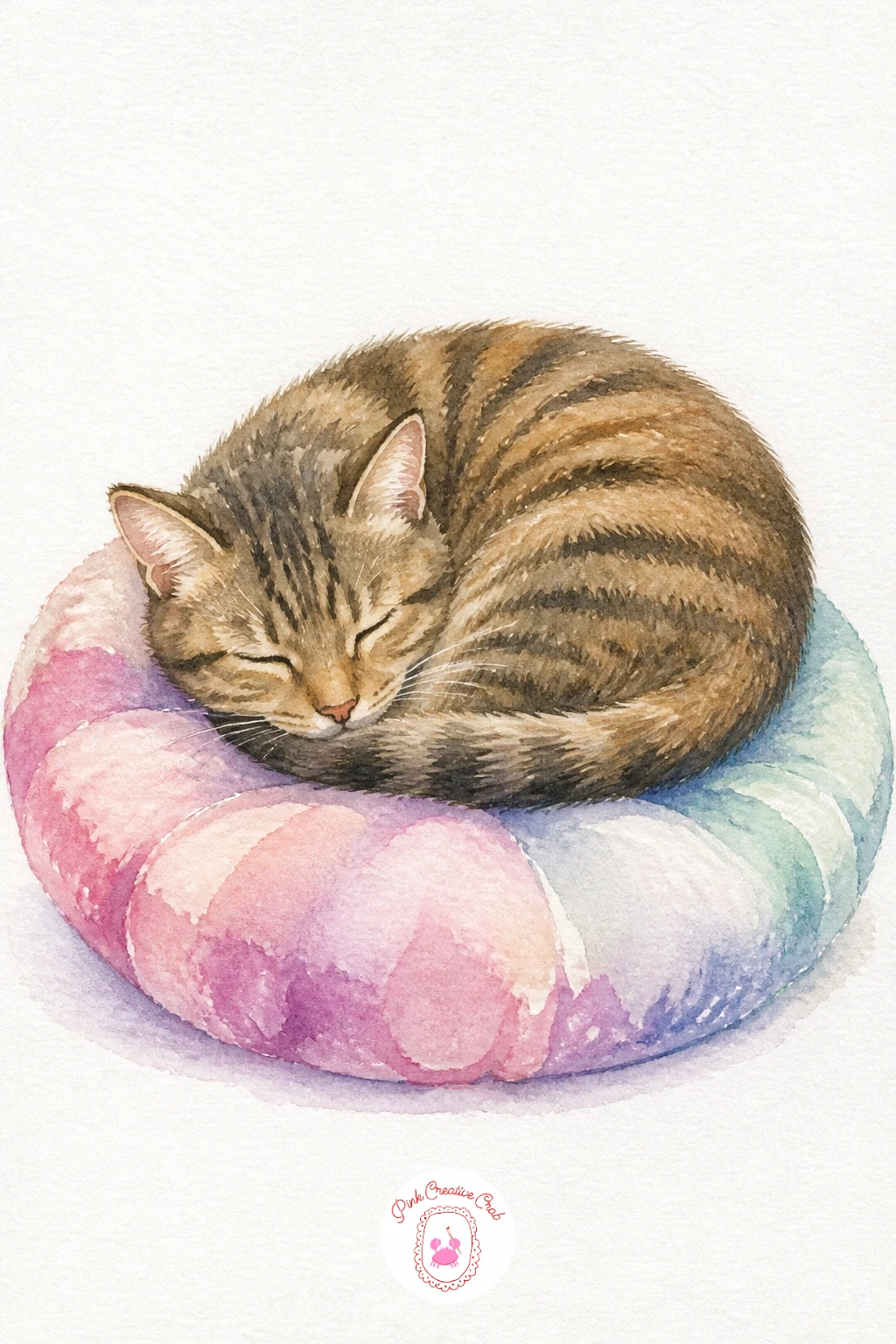
Close out the list with a cat curled asleep, the softest subject to end on. Paint the body as one continuous curved shape, tail wrapped around to meet the nose, keeping the outline rounded with no sharp angles since a sleeping cat is really just a loaf shape with ears.
Paint it in one warm gray, orange or cream wash, then while still slightly damp, add a few darker strokes along the back and tail for simple tabby stripes or patches, letting them soften into the wet base coat.
Once fully dry, add the cushion underneath in a soft contrasting color, a simple rounded square with a few short fold lines near the edges, and finish with tiny closed-eye lines and whiskers in pen.
If the stripes look too hard-edged, add them while the base coat is still damp rather than waiting, which blends them softly into the fur instead of sitting on top of it.
Palette: Raw Sienna,Burnt Umber,Payne’s Grey,Quinacridone Pink
If cats are your thing, this collection of cat watercolor ideas has plenty more poses to try after this one.
What to Do Next
Pick whichever subject made you smile first, whether that is the sleepy moon or the avocado couple, and set it up on a small sheet of cold press paper before you lose the urge. One finished painting today beats a long list of good intentions, so start wet, let it dry, and see where the next idea takes you.
Frequently Asked Questions
What is the easiest thing to watercolor for a complete beginner?
Rounded, simple shapes like a strawberry, a teacup or a sunflower are easiest, since they need only one or two washes and forgive uneven color. Start there before trying shapes with straight edges like boats or lighthouses.
How do I stop my watercolor paintings from looking muddy?
Let each layer dry fully before adding the next, especially darker details on top of a base wash. Muddiness mostly comes from mixing too many wet colors together on the same wet area instead of layering once dry.
What paper works best for these small watercolor subjects?
Cold press watercolor paper, at least 140 pound weight, handles wet washes without buckling badly. A small pad works fine for subjects this size, since you do not need a full sheet for one centered image.
Do I need expensive paints to try these ideas?
No, a basic student grade set with around twelve colors covers every idea on this list. What matters more is water control and letting layers dry, not the price of the paint.
How long does each of these watercolor ideas take to finish?
Most take between ten and forty minutes depending on how much detail you add. Simple versions with one or two washes finish fast, while added texture or extra layers stretch the time a little.
Have any thoughts?
Share your reaction or leave a quick response — we’d love to hear what you think!
-
 0
-
0
-
0
-
0
-
0
-
0


