

A paris sketchbook is my favorite kind of sketchbook to fill, because every page gets to hold a tiny story instead of just an object. A waiter setting chairs, a dog waiting by a bakery door, someone walking fast under an umbrella: little moments like these turn a page into a scene you actually remember.
Below you will find 37 of them, ordered from the quickest sketch to the ones with a bit more going on. Grab a pencil, your ink pen and a small watercolor kit, and pick whichever one makes you want to sit down right now.
Using these images: free for personal projects such as printing, coloring, cards, journals and gifts. Handmade items that include them may be sold up to 30 pieces per design. More than that is commercial use and is not permitted, and neither is selling or sharing the images themselves or passing them off as your own. Please ask before any other use.
Start your paris sketchbook with something small and everyday: a waiter dragging bistro chairs into place before the morning rush. Keep the pencil loose here, just enough to place the cafe front, the row of chairs and the figure leaning into his work.
Ink only the shapes that matter: the slant of his back, the curve of a chair back, the edge of the awning. Leave the pavement as bare cream paper and let one wash of grey sit under the table legs for shadow.
Today’s tip: draw the chairs slightly uneven, not lined up like a ruler. That small imperfection is what makes the scene feel like a real morning instead of a diagram.
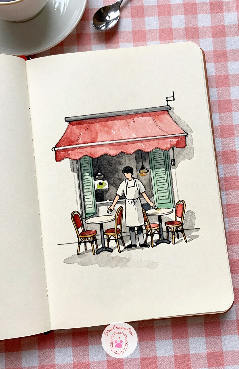
Give yourself a break from people for a moment and sketch a dog waiting patiently outside a boulangerie, leash looped over a doorknob. A 2B pencil is a good friend here, soft enough to rough in the curve of the back and the tilt of the ears without pressing hard.
Block the dog’s shape first as one soft oval body and a smaller oval head, then add legs and ears last, once the proportions already feel right. The shop window behind stays a simple rectangle with a few loaves suggested, not drawn one by one.
Keep the leash line slightly slack rather than taut, it reads as calm waiting rather than straining.
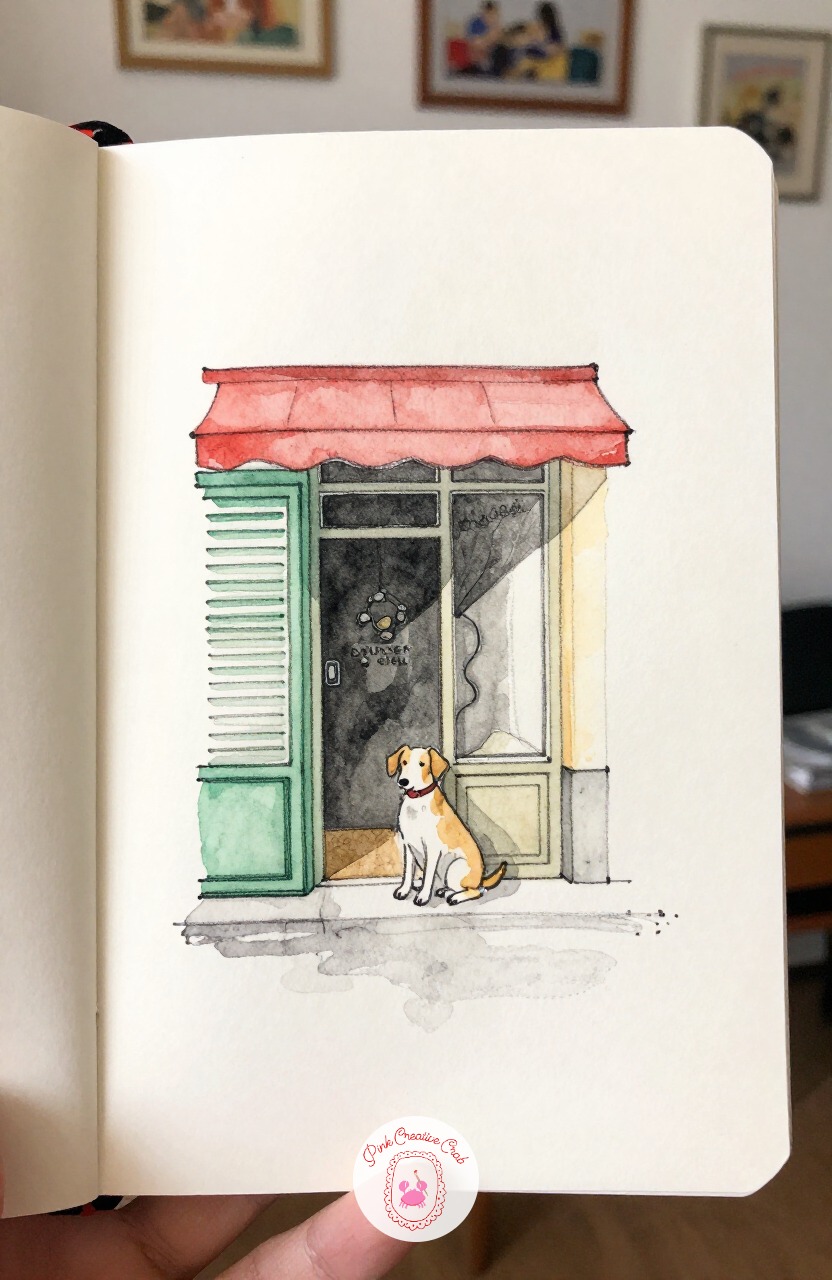
Move from the quiet doorway to the noise of a flower stall, where a woman is choosing a bunch of peonies from a bucket of them. Measure her first: most adults stand about seven and a half heads tall, so block that out lightly before anything else goes on the page.
Once her height is set, the stall table lines up roughly at hip level, and the flower buckets sit just below that line. This one measuring trick keeps her from looking too short or too tall next to the stall.
Save the pink of the peonies for last, dropped in wet, so the color blooms slightly into the cream paper around it.
If flowers are becoming a favorite subject, the flower sketchbook ideas page has more ways to paint them loose and quick.
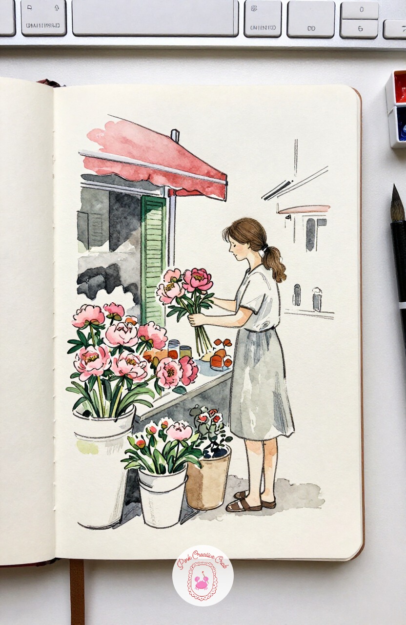
Here is a classic paris sketchbook subject, and it earns its place: a painter standing at a small easel along the river, river traffic drifting behind. Think about eye level before you draw a single line, because it decides everything.
If your eye level sits at the painter’s shoulder, the quay wall behind him slopes slightly downward to the left and right, and his easel legs angle inward toward that same horizon line. Get that one line right first and the whole scene holds together.
Light from one side means one long shadow stretching from his easel across the stone, which is worth keeping simple rather than fussed over.
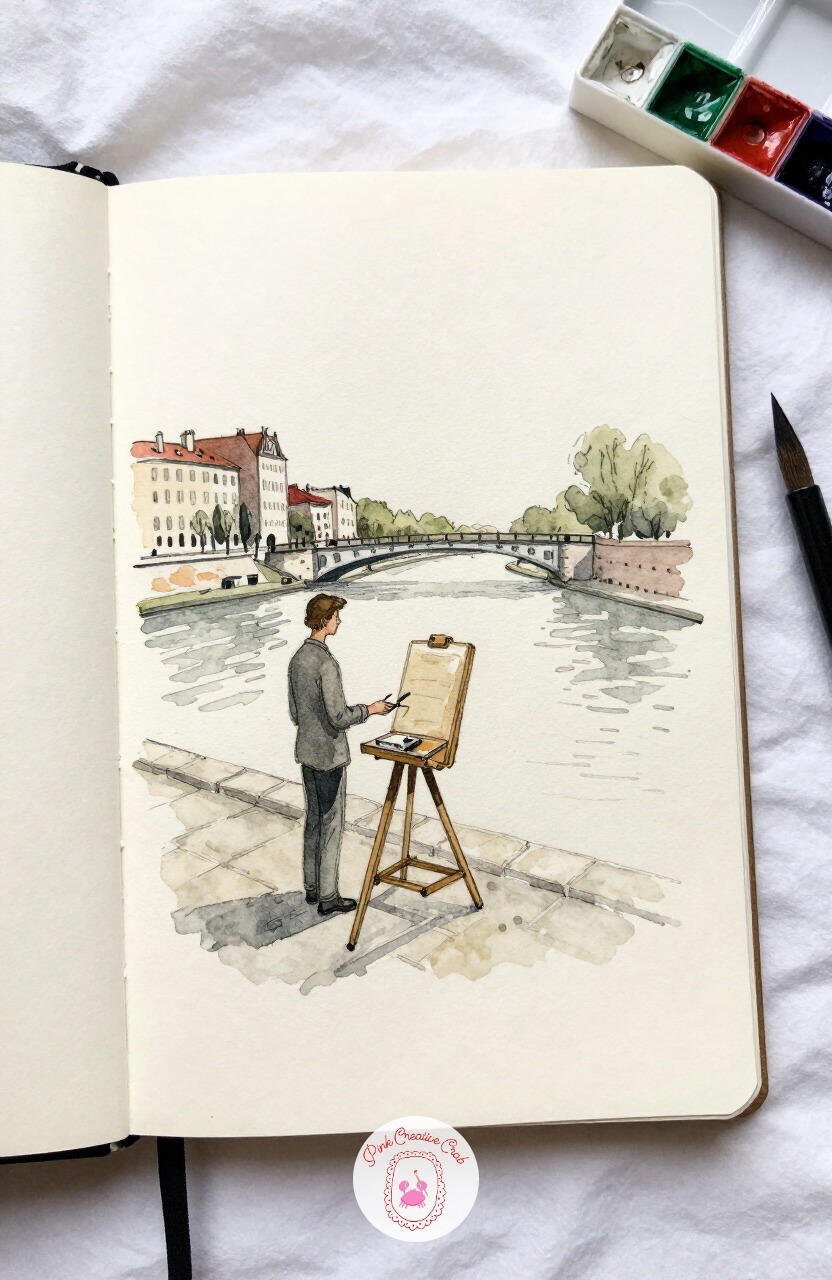
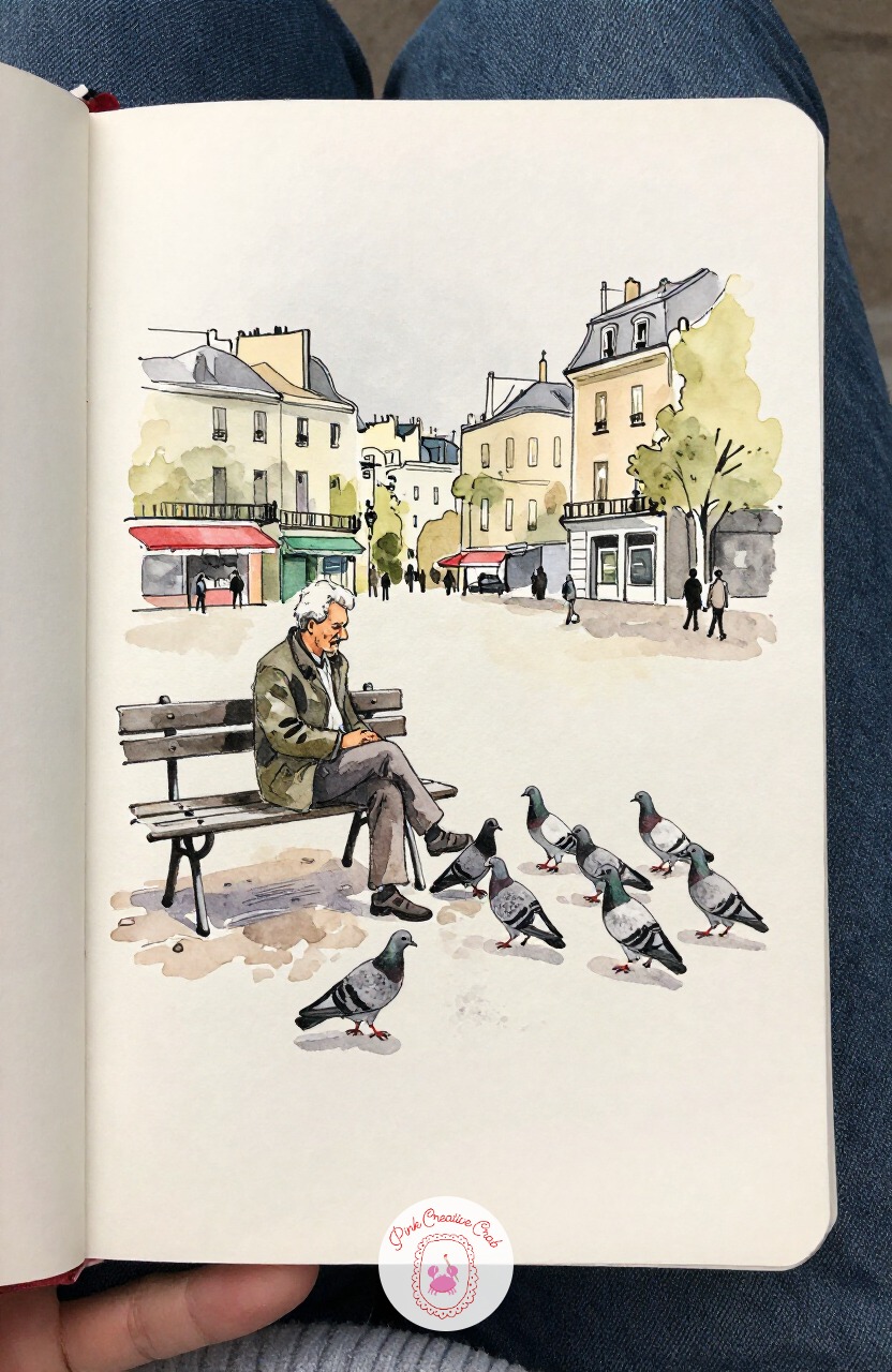
Slow the page down with an old man sitting on a bench, scattering crumbs while pigeons gather at his feet. The usual mistake here is drawing every pigeon the same size and the same distance apart, which flattens the whole scene.
Fix it by varying their size slightly, smaller near the back of the group, and letting two or three overlap each other. Halfway through, step back and check that no two birds sit in a perfect row.
Ink the man’s coat with a few confident lines rather than many small ones, and let the bench take just two strokes for its slats.
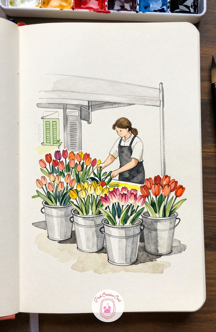
Stay near the market a little longer for a florist leaning over rows of tulip buckets, sorting stems by color. A number 6 round brush earns its keep on this one, since its point can drop in a single tulip shape in one touch, no outline needed first.
Load the brush generously so each bloom comes out as one confident dab of color, red, then a cooler pink beside it, letting them touch wet into wet. The florist herself can stay a simple ink silhouette, since the flowers are the real subject.
Keep her hands loose and unfinished, a few lines are enough to suggest sorting motion.
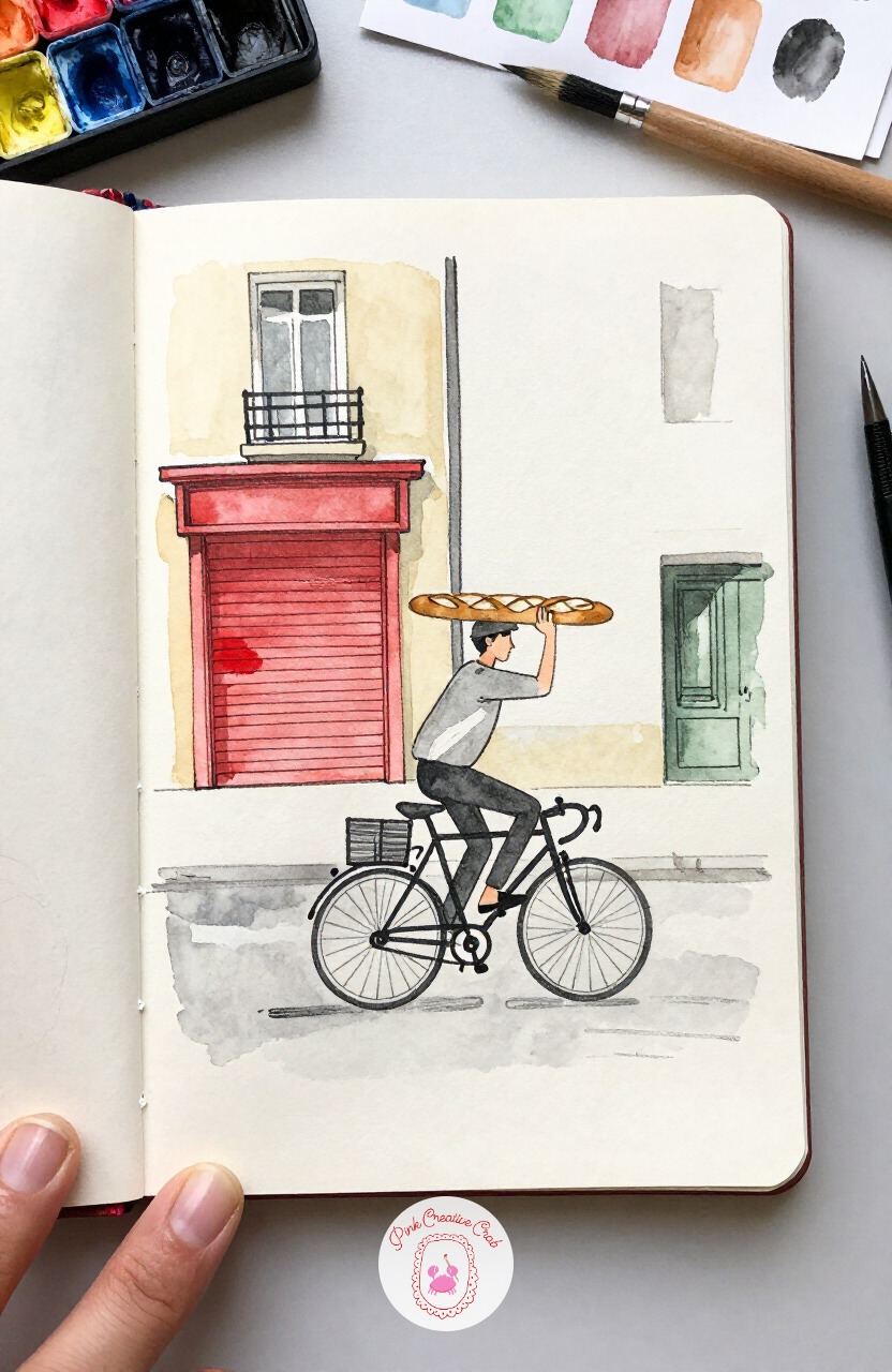
Pick up the pace with a cyclist riding one-handed, a baguette tucked under the other arm like it is nothing unusual. Ten minutes is plenty for the quick version: bike frame, rider, baguette, done, with the street left as suggestion only.
Give it forty minutes instead and you can add the cobblestones underneath as a scatter of small marks, a shutter or two in the background, and a proper cast shadow beneath the wheels. Both versions work, the longer one just has more world around the moment.
Either way, keep the baguette line diagonal, never straight across, it is what sells the motion.
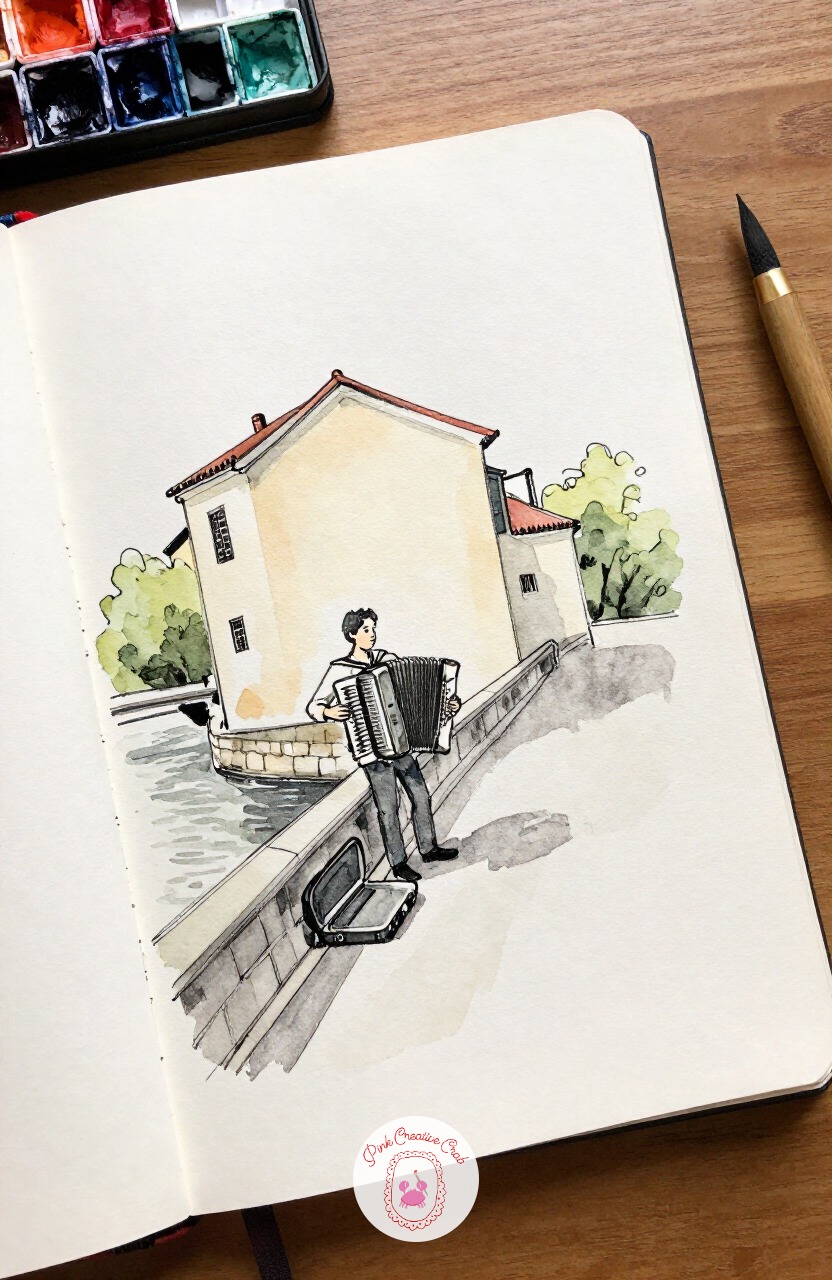
From pedaling motion to standing stillness: an accordion player planted at the corner of a bridge, case open at his feet for coins. Try this one with your pencil’s side rather than its point, laying the accordion’s folds in as soft diagonal bands of tone before any ink touches the page.
That flat pressure gives the instrument its characteristic ribbed texture without drawing each fold as a separate line. Ink only the outer edges and a few of the darkest fold shadows once the pencil groundwork is down.
A kneaded eraser can lift a highlight back out along one fold for a bit of shine.
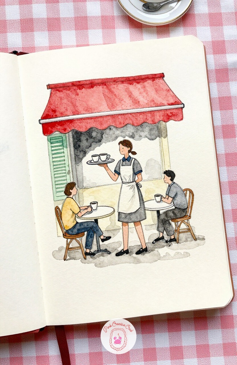
Head back to the cafe for a waitress weaving between outdoor tables with a tray held high. Picture her in three simple shapes first: an oval for the tray, a rectangle leaning slightly for her torso, and a single curved line for the arm holding it up.
Place the cups on the tray second, just small circles, and only add her apron strings, hair and the chairs around her last. Working in that order keeps the pose readable even if the details after it stay rough.
Let her apron stay plain cream paper, it is the one bright shape that should not compete with the tray.
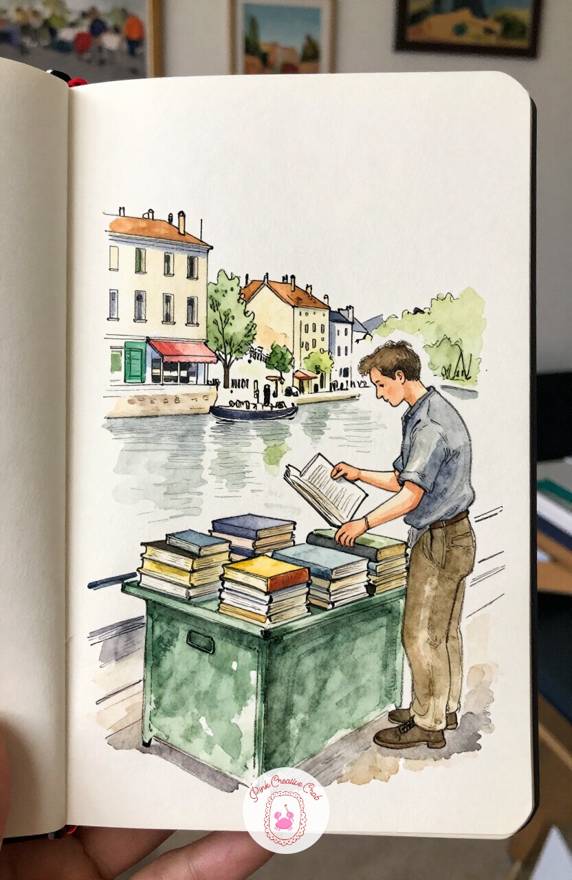
Settle by the river again, this time for a bookseller tidying stacks of old books on a green stall box. Reach for a fine 0.1 or 0.2 pen for this one, since the stacked book spines need thin, close lines to read as separate pages rather than one grey block.
Save your thicker pen, or a touch of the brush, for the bookseller’s coat and the heavier shadow under the stall lid. That contrast between fine book lines and bolder figure lines is what keeps the whole sketch from looking flat.
Wash the stall boxes in that familiar river green before anything else dries around them.
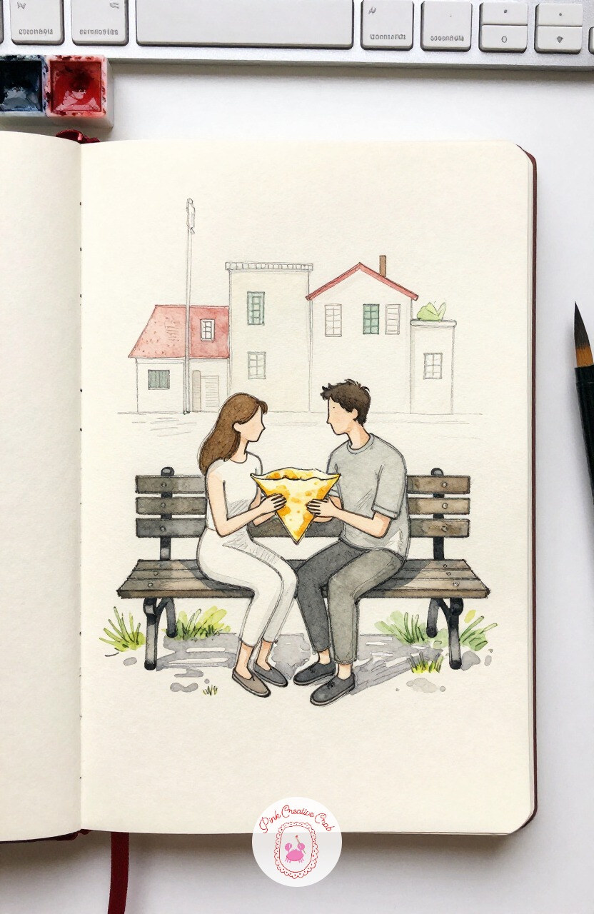
Soften the pace with a couple seated close together on a park bench, sharing one folded crepe between them. Measure their heads against each other before anything else, since two seated figures side by side are the fastest way to end up with mismatched proportions.
Check that both heads sit at roughly the same height even though their bodies lean toward each other, that single check keeps the pose believable. The crepe itself can wait until last, just a small folded triangle of warm yellow between their hands.
Leave the bench slats loose and unfinished behind them, the figures carry the scene.
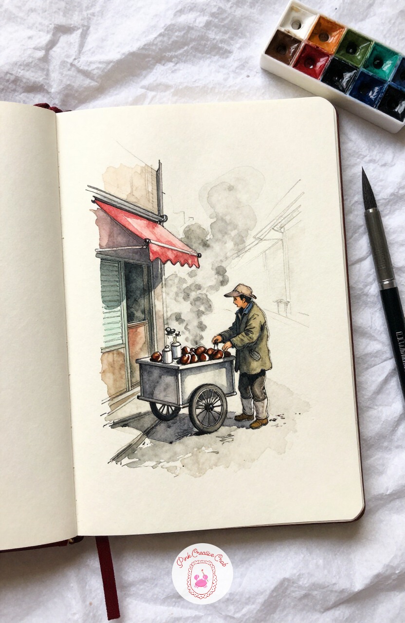
Warm things up with a chestnut seller standing beside his smoking cart on a cold corner. The steam here is the real challenge, and dry brush is the trick for it: load your brush lightly, blot most of the water out on scrap paper, then drag it upward in soft curling strokes.
That dry, broken texture reads as steam far better than a solid wash ever would. Keep the cart itself simple and dark, just enough shape to anchor the steam rising above it.
Add the seller’s scarf and hat in ink last, small shapes that do not fight with the steam for attention.
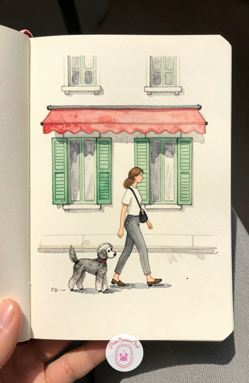
Turn toward a quieter side street where a woman walks a neatly clipped poodle past a row of green shutters. This is a nice one to think about next time you repeat it: paint it once in daylight with pale cream walls, then again at dusk with the same shutters glowing green against a deeper grey sky.
Changing only the light and background color, while keeping the woman and poodle identical, is a quick way to learn how much mood a wash alone can carry. Keep her pace brisk, a slight forward lean in the torso says more than any extra line could.
The poodle’s fur can stay a few scribbled curls rather than individual hairs.
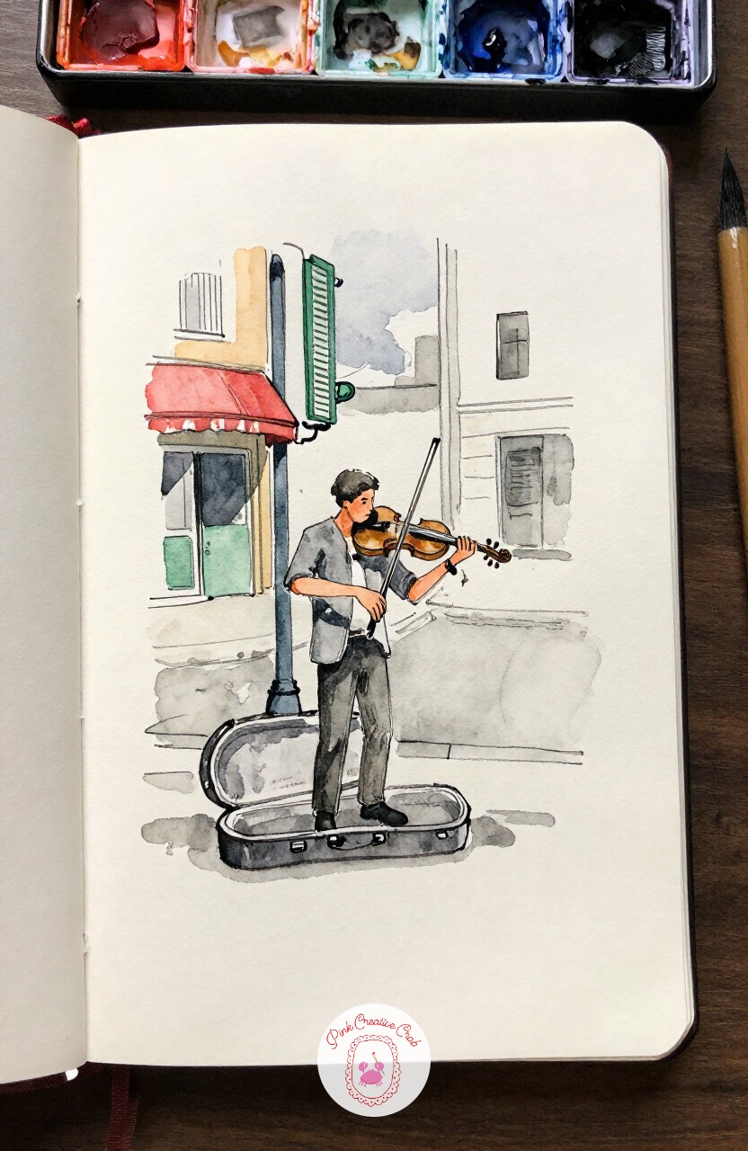
Give the ear something besides accordion music with a violinist playing just outside a metro entrance, case open at his feet. Start the first three marks here with the bow angle, then the violin’s tucked position under his chin, then the tilt of his head toward the strings, and leave his feet and the metro railing for last.
That order keeps the energy of the pose intact even if you run out of time before the background is finished. A few quick ink lines for passing feet nearby suggest a crowd without drawing one.
Keep his coat a single warm grey wash, nothing patterned to pull focus from the bow arm.
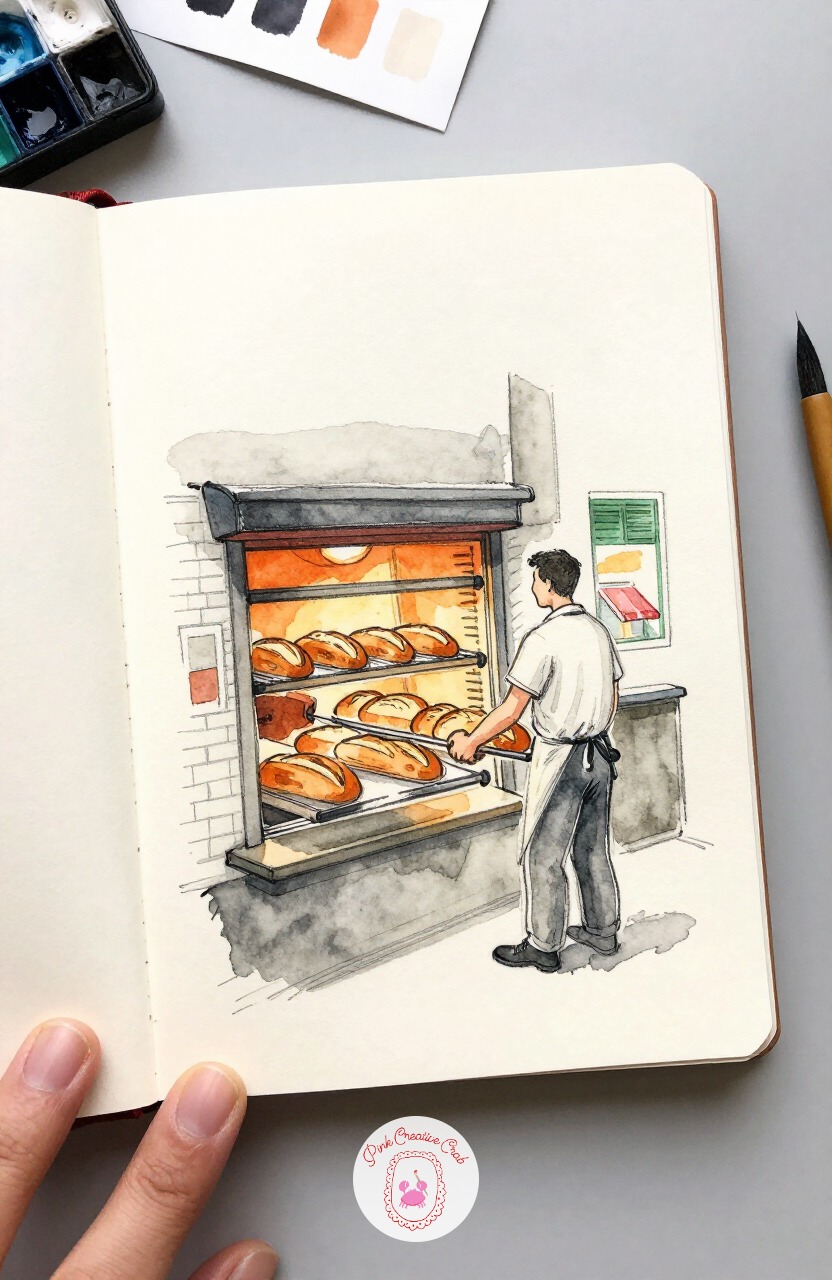
Step inside a boulangerie doorway to catch a baker sliding a long paddle of loaves from the oven. Light here comes from low and close, the oven’s glow, so shadows fall upward and outward from the baker rather than straight down.
That reversed light direction is worth sketching out first in pencil before any ink, since it changes where every highlight sits on his apron and arms. A warm orange-tinted wash near the oven opening sells the heat instantly.
Keep the loaves themselves loose ovals, just a few darker lines for the scored tops.
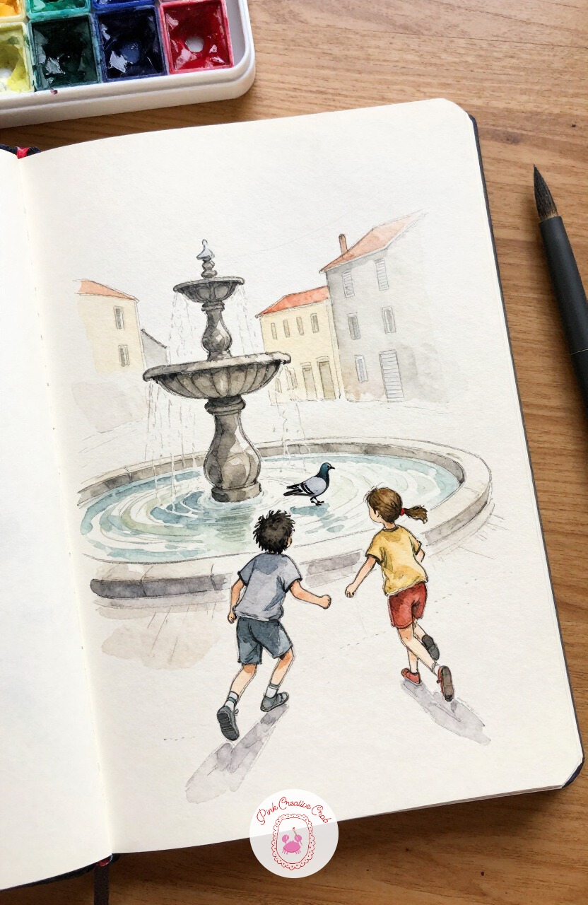
Bring some motion back with two children dashing after a startled pigeon near a stone fountain. The usual mistake with running children is stiff, straight legs that look posed rather than mid stride, so fix that by bending both knees at different angles and leaning the torso forward past the hips.
Check that halfway through, before you ink anything, since a stiff pose is far easier to loosen in pencil than after ink sets it. The fountain behind them can stay a simple curved basin with a few splash marks.
Let the pigeon’s wings blur slightly with a quick dry brush stroke to suggest its sudden flight.
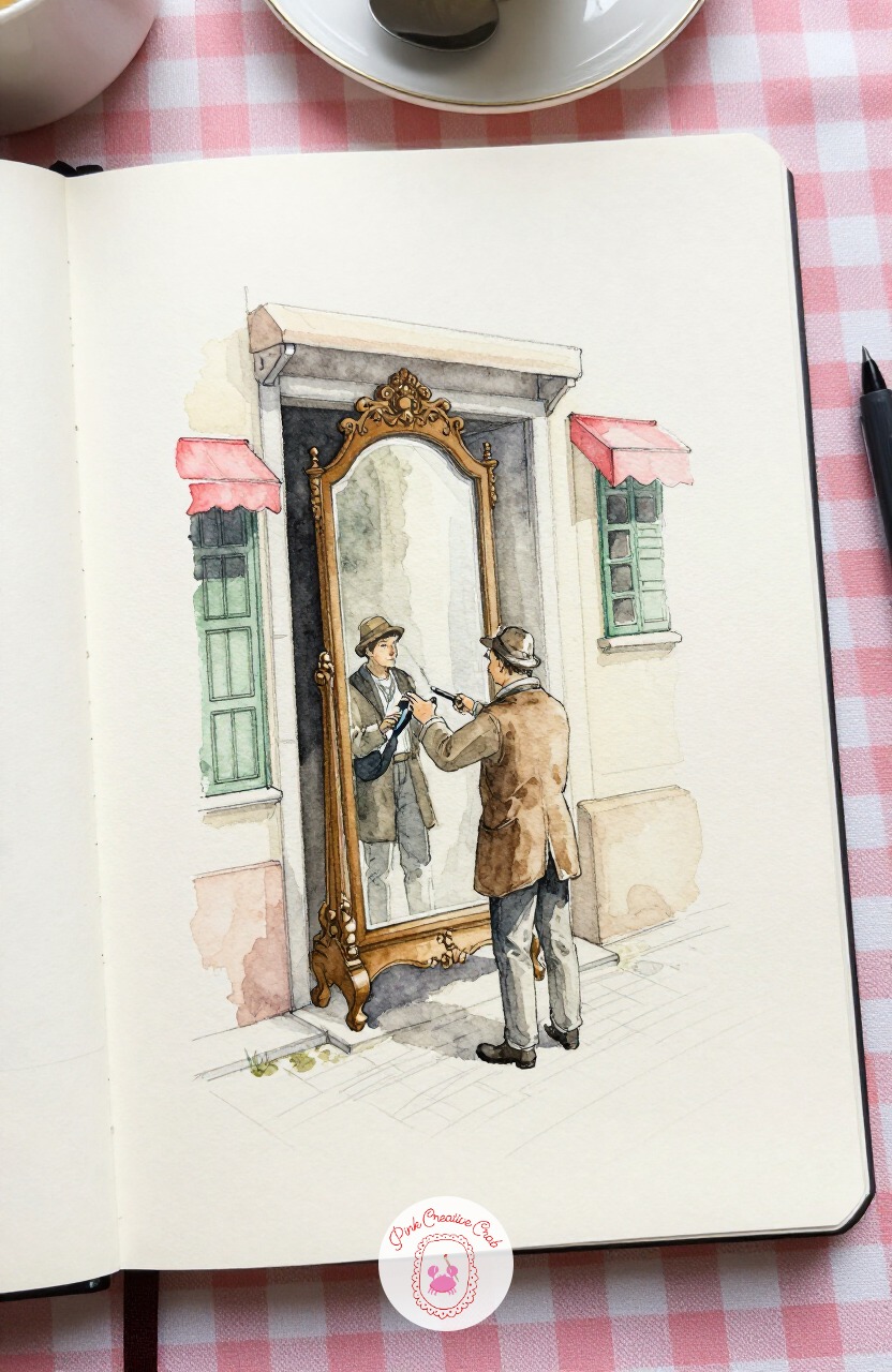
Duck into a narrow antiques shop doorway where a dealer polishes an ornate standing mirror out on display. Reflections are the fun part here, and the trick is restraint: paint the mirror’s frame in full detail, but leave the reflective surface itself almost empty, just a pale grey wash with one or two soft ghost shapes suggested inside it.
A fully detailed reflection fights with the real scene for attention, while an empty one reads as glass immediately. The dealer’s polishing cloth can be a single curved ink line catching the light.
Keep the shop interior behind him dark and vague, just enough to say indoors.
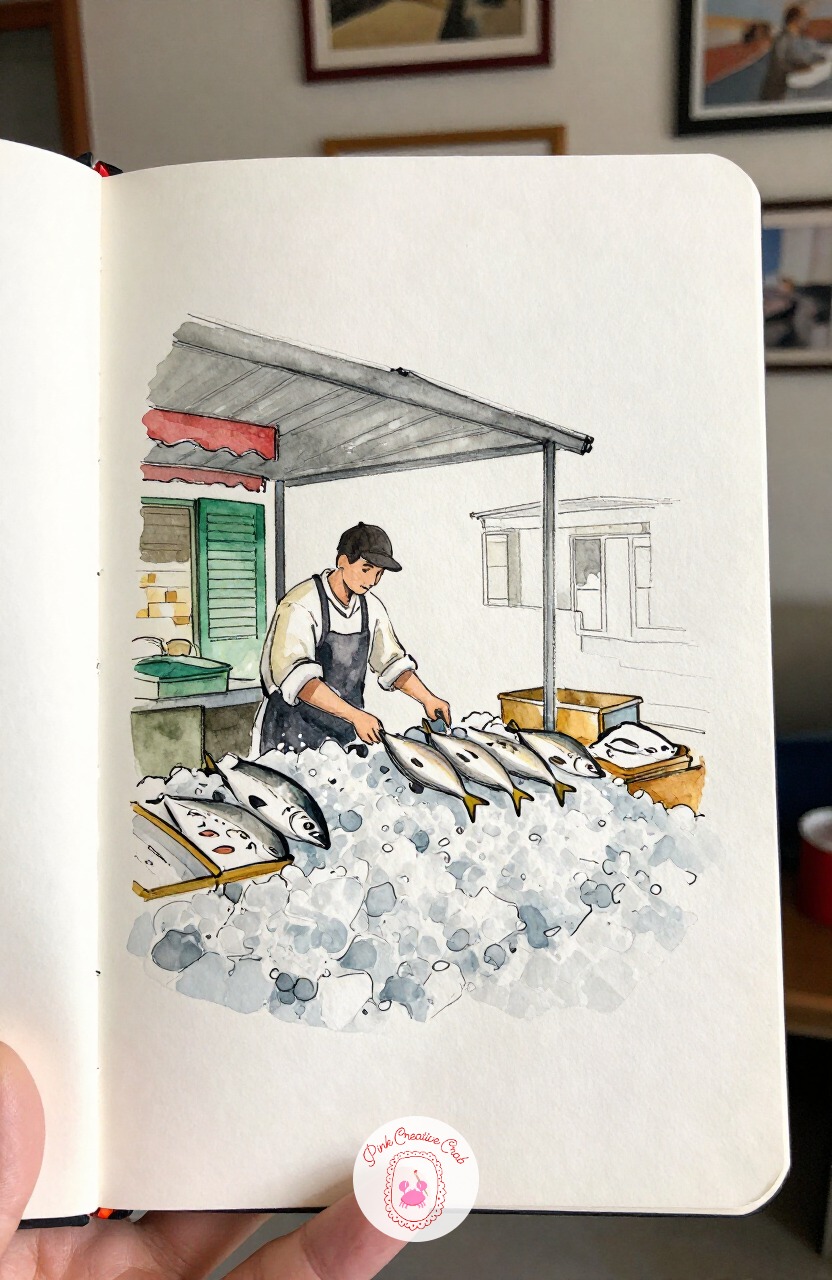
Cross to a covered market hall for a fishmonger arranging fresh catch over crushed ice at his stall. A flat wide brush is the right tool for the ice itself, since its edge can lay down quick angular strokes of pale blue grey that read as broken ice chunks far faster than a round brush could.
Save the round brush only for the fish themselves, where a soft curved stroke or two suggests each silvery body. The fishmonger’s apron stays a plain dark shape, no pattern needed against all that icy texture.
Work the ice wash wet and let a few hard edges stay, they help sell the chill.
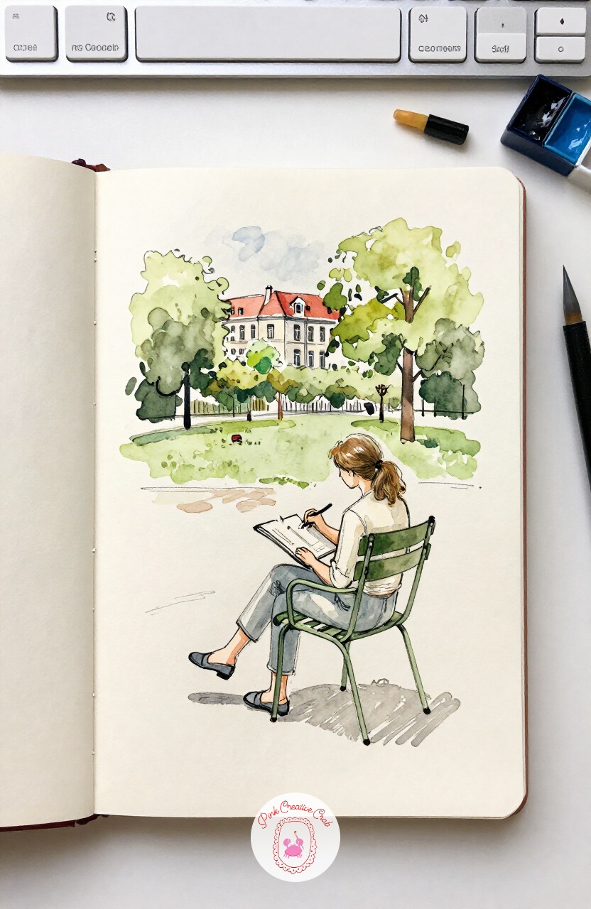
Turn the gaze inward with a fellow sketcher seated on a metal garden chair in the Tuileries, pad balanced on one knee. Proportion matters most here in the seated pose: a seated adult measures roughly five heads tall rather than the seven and a half of standing, so check that before the legs go in or they will come out too long.
Once that ratio sits right, the sketchbook on her knee and the pencil in her raised hand read naturally. Gravel paths behind her can stay a few scattered dots of warm grey, nothing more detailed.
If quick figure sketches like this one are starting to pull you in, the watercolor doodles page is full of loose, forgiving ways to keep practicing them.
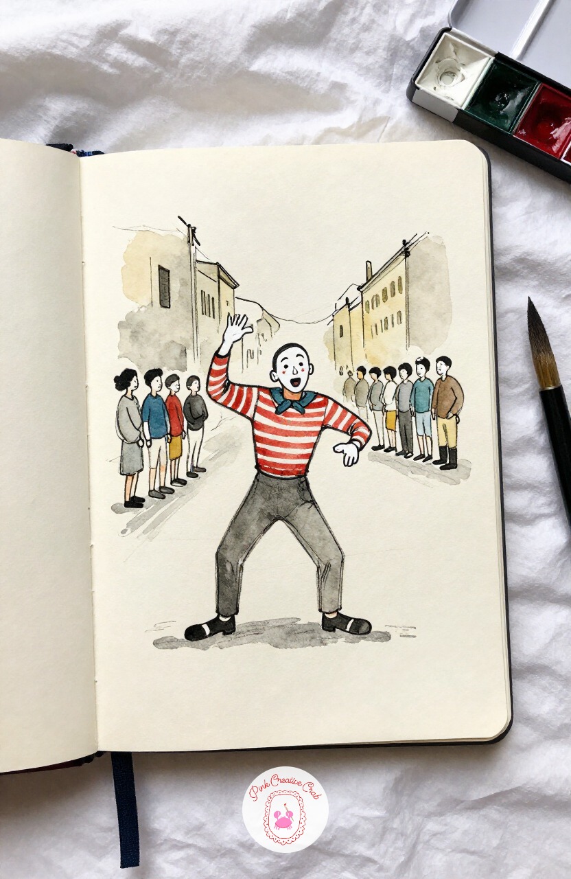
Have some fun with a street mime frozen in an exaggerated pose, white face paint catching the light. The quick ten minute version here is just the pose itself and a simple ink outline, since a mime’s whole appeal is in silhouette and gesture rather than detail.
Given forty minutes instead, add the small crowd gathered loosely nearby, each one just a few quick ink strokes, and a coin hat on the ground in front of him. Both versions can work on the same page if you want to compare them.
Keep his costume stripes simple, three or four lines at most, overdone stripes make the pose harder to read.
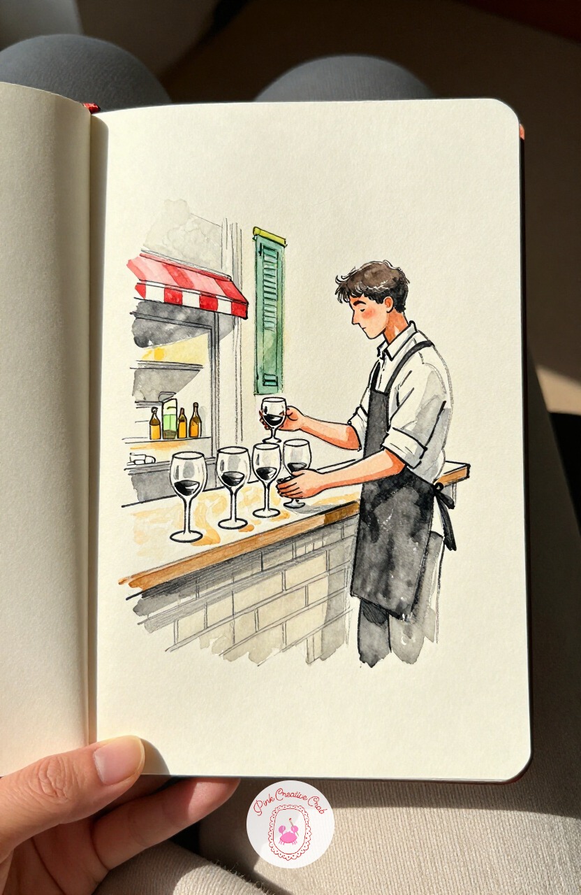
Return to the cafe counter for a waiter polishing a row of wine glasses before the evening service begins. The first three marks worth placing are the counter edge, then the row of glass stems lined along it, then the waiter’s leaning torso, with the cloth in his hand and the bottles behind him left for last.
That order keeps the composition anchored even if the background bottles stay loose and unfinished. Glass is worth a small highlight left unpainted on each one, a thin stripe of bare cream paper does the trick.
Keep the row of glasses slightly uneven in height, it looks handled rather than mass produced.
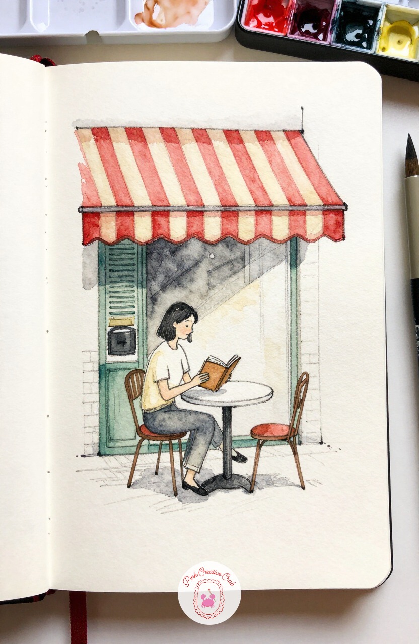
Slow right down with a woman settled at a small table under a striped awning, lost in a paperback. A soft 4B pencil works best for her, loose enough to rough in a relaxed slouch rather than a stiff upright seated pose.
Let her elbow rest heavy on the table and her head tilt down toward the book, checking that the angle of her neck matches the angle of the page she is reading. The awning stripes above her can be inked with a ruler for the straight parts, then left slightly wobbly at the hanging edge.
Wash the stripes in alternating cream and red, letting one edge bleed softly into the next.
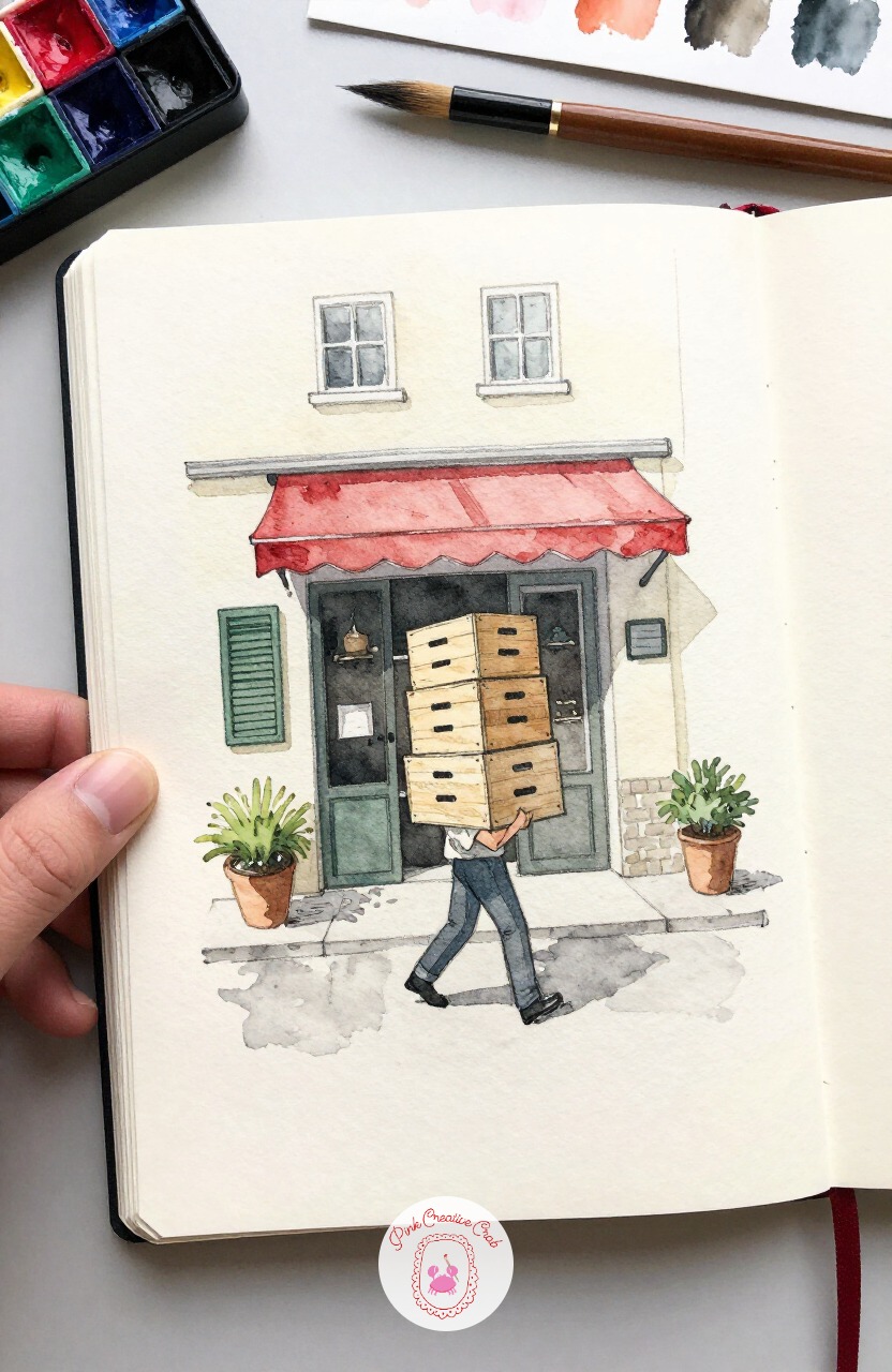
Add some weight to the page with a delivery man hauling a stack of wine crates toward a cafe’s back door. Eye level sits low and close here, almost at his waist, which means the crates stacked in his arms loom larger in the frame than his head does.
That shift in scale is what makes the load feel genuinely heavy rather than just carried. Light from above casts a short, dense shadow pooling right at his feet rather than stretching long across the street.
Keep the crates’ wood grain to just a few quick ink lines, more would slow the whole sketch down.
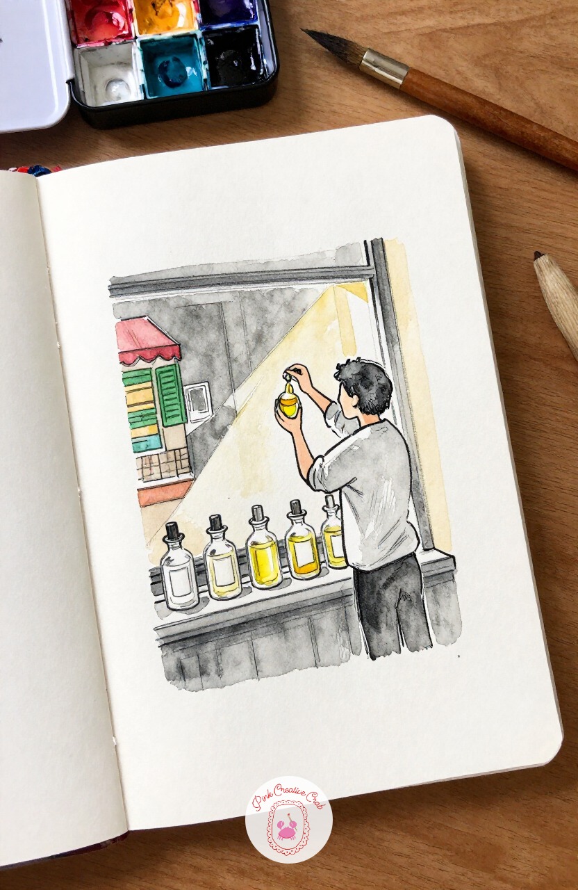
Peek into a small perfume shop window where a perfumer measures drops from tiny glass bottles. The usual mistake with glass bottles is painting them solid, which makes them look like stones rather than glass, so fix it by leaving a thin unpainted line down one side of each bottle before the wash dries.
That bare strip of cream paper is the single easiest way to suggest glass at this level. Check your bottles halfway through and add that highlight line to any you missed before moving on to the perfumer’s figure.
Her hands can stay simple, the bottles are doing the storytelling here.
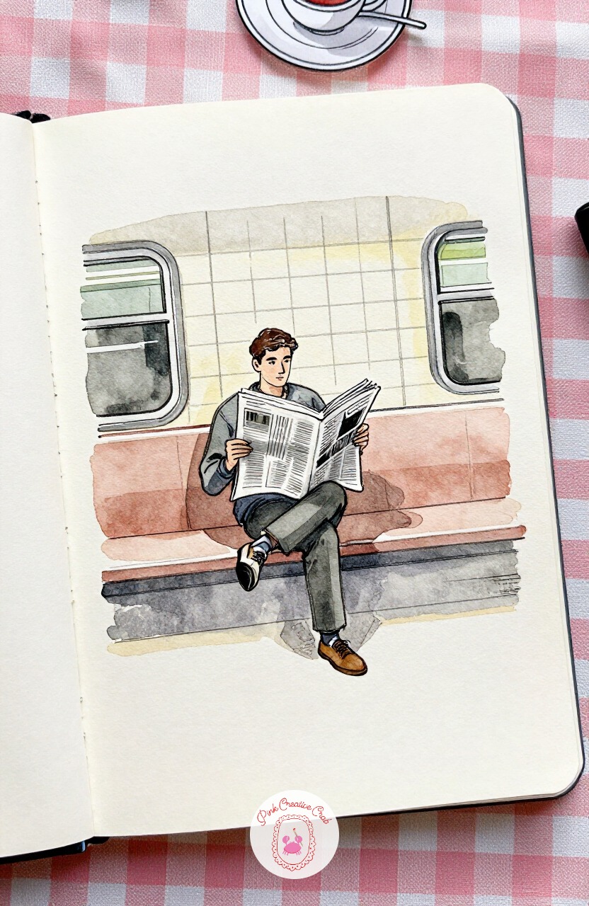
Head underground for a change of scene: a man seated on a metro platform bench, newspaper folded in half. The ten minute version is just his seated shape and the folded paper, loosely inked with a wash of grey behind for the tiled wall.
Given forty minutes, add the metro map poster behind him, a second figure waiting further down the platform, and a bit of reflected light on the tiles from unseen lamps. Either length works as a finished page on its own.
Keep the newspaper fold sharp and crisp, it is the one clean line in an otherwise soft, loose scene.
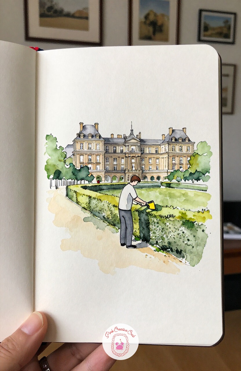
Step back outdoors for a gardener trimming a neat hedge row in a formal garden. Measure the hedge itself before the gardener: a clipped hedge usually sits just above waist height on an adult, so block that proportion in lightly before adding his bent, working posture beside it.
Get that relationship right and the whole garden setting reads correctly even with very little background detail. His shears can be two quick crossed lines, nothing more elaborate.
Leave the hedge’s green wash slightly patchy rather than flat, it suggests clipped texture without drawing every leaf.
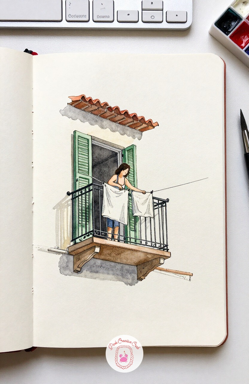
Look up for once at a woman leaning out from a small wrought iron balcony, hanging a line of washing. Eye level is low here, looking up at her, which means the balcony railing curves more sharply at its edges than it would seen straight on, and the underside of her hanging laundry catches more light than its top.
Getting that upward angle right in your first pencil lines saves a lot of correcting later. A single shutter beside her, painted in that familiar green, grounds the whole building shape.
Let the hanging clothes overlap each other slightly, a stiff row looks less convincing than a casual, slightly tangled one.
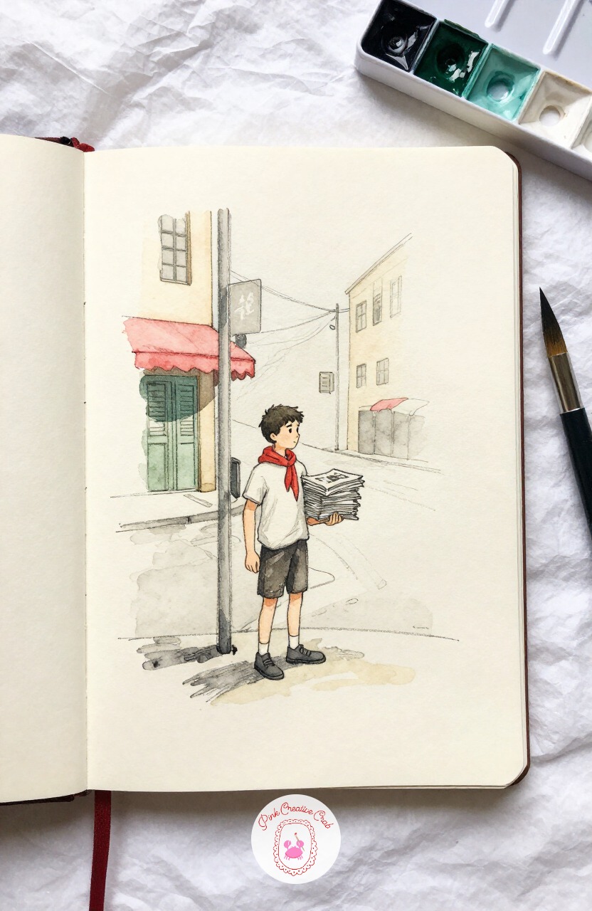
Bring back a quieter, old fashioned moment with a boy standing on a street corner, a stack of newspapers under one arm. A fine pen works well for the newspaper stack, since thin close lines read as stacked pages far better than a single filled shape would.
Keep his cap and coat in broader ink strokes by contrast, that mix of fine detail and bold shape is what keeps a simple standing figure interesting to look at. The street behind him can be almost entirely bare cream paper.
Add one small red accent, perhaps a scarf, to anchor the eye on his face first.
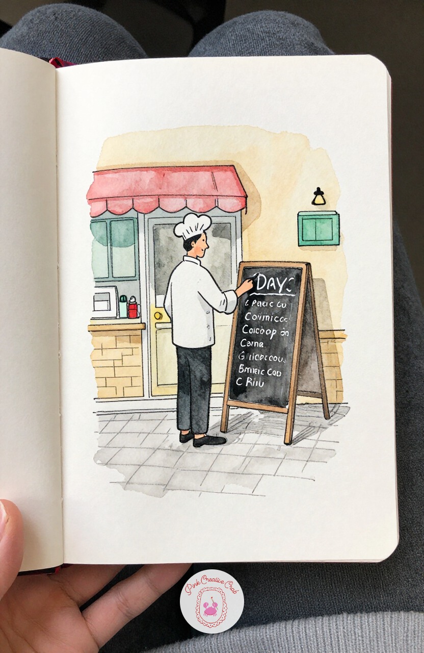
Return to the cafe once more for a chef stepping outside to chalk the day’s menu onto a small board. Start the first three marks with the chalkboard’s rectangle, then the chef’s leaning arm reaching toward it, then his apron, leaving the actual chalk letters for last since guessing at real words tends to slow a sketch down.
A few loose squiggly lines suggesting handwriting read as a menu just as well as careful lettering would at this distance. His apron can carry a single smudge of flour in pale grey.
Keep the board itself a flat, even dark wash, it should read instantly against the cream wall behind it.
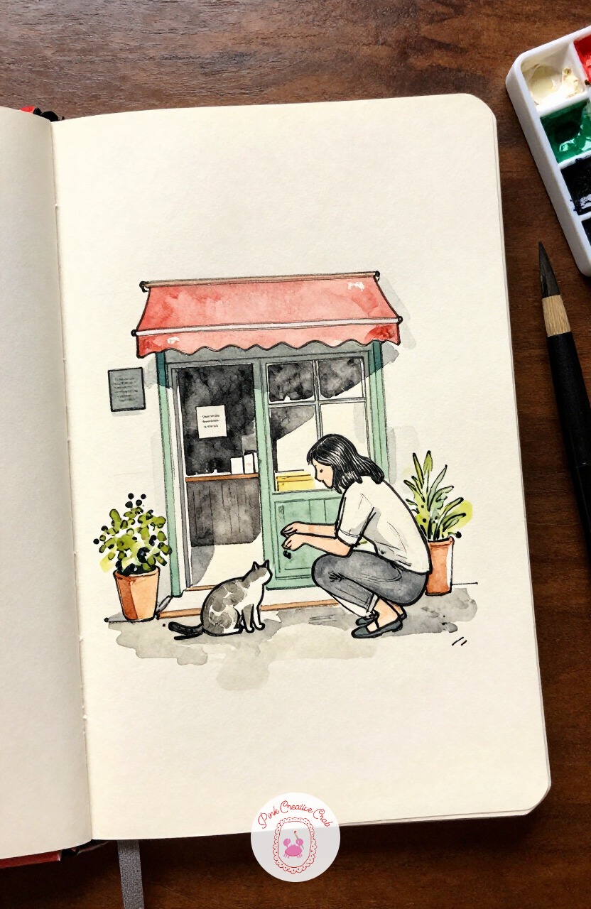
Soften things again with a woman crouched low, offering a scrap of food to a stray cat outside a bistro door. Crouching changes proportion more than most poses, since her knees rise almost to chest height and her whole frame compresses into roughly four heads tall instead of standing’s seven and a half.
Block that compressed shape in lightly first, or the pose reads as standing with bent knees rather than a true crouch. The cat itself can stay a simple arched shape, back raised slightly in curiosity.
A small dish or scrap on the ground between them finishes the story without needing more detail.
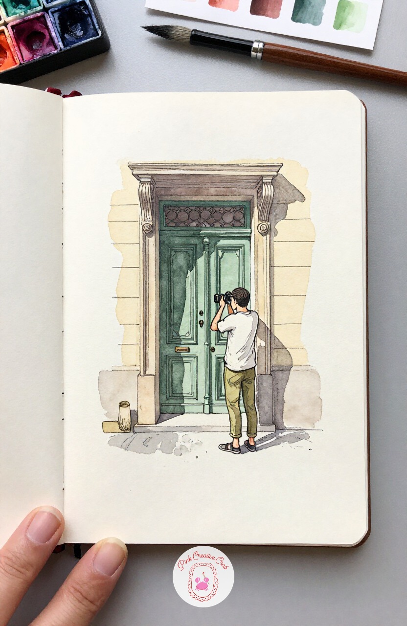
Add a bit of humor with a tourist backing into the street to fit an ornate doorway into one photograph, camera raised. The usual mistake here is making the doorway so detailed it outshines the person entirely, so fix it halfway through by simplifying the carved stone trim to three or four confident lines rather than every curl.
Check your progress at that halfway point before adding the tourist’s raised arms and camera, which should stay the most detailed part of the sketch. A green shutter beside the door adds one welcome color note.
Keep his stance slightly off balance, leaning back, it tells the whole joke on its own.
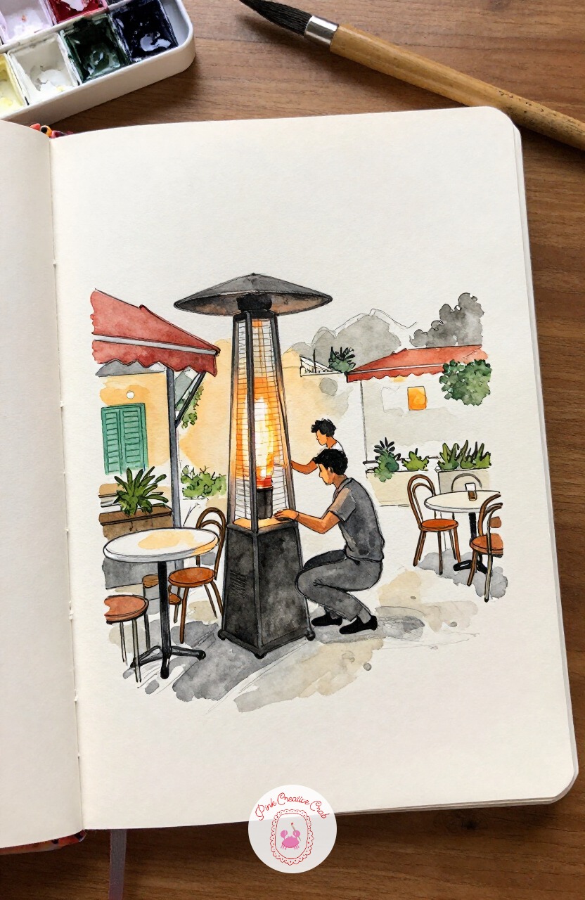
Move into evening with a waiter crouched to light a tall outdoor heater as dusk settles over the tables. Light source matters more here than almost anywhere else on this list, since the small flame becomes the brightest point in an otherwise deepening grey scene, and every shadow nearby should point away from it.
Wash the whole background in a deeper cream grey before adding that flame, so the warm orange spark truly glows by contrast when it goes in last. Table edges nearest the heater catch a touch of that warm light too.
Keep the flame itself tiny, restraint is what makes it believable.
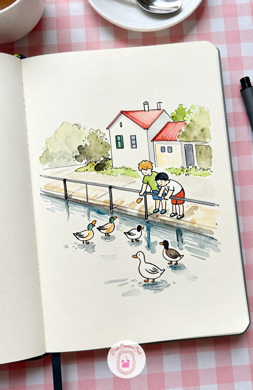
Head toward the canal for two children leaning over a railing, tossing bread to ducks below. Next time you paint this one, try moving the railing lower in the frame so more water shows, or raising it higher to focus tighter on just the children’s faces and hands.
That single compositional change, where the railing sits in the frame, turns the same simple subject into a noticeably different feeling page each time. The ducks below can stay loose white shapes with just a dark dot for an eye and a dash of orange for a beak.
Ripples around each duck are just a few curved lines, nothing more.
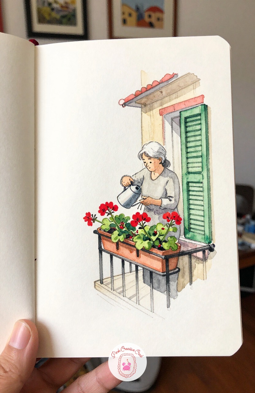
Return upward for an elderly woman tending bright red geraniums in boxes along her balcony rail. A small round brush, something near a size 4, suits the geraniums perfectly, since its point can dab in a whole cluster of petals in just a few confident touches rather than painting each flower separately.
Let the red stay concentrated and bright against the muted cream building behind it, that one strong color note is the whole point of the sketch. Her watering can be a simple curved shape with a thin line suggesting falling water.
Green shutters folded open beside her complete the balcony without extra work.
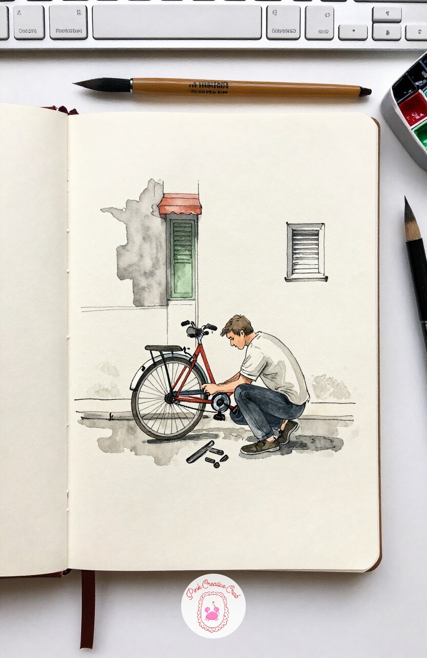
Bring in some mechanical detail with a man crouched over an upturned bicycle, tools spread on the sidewalk beside him. Proportion check here: an upturned bicycle’s wheels end up roughly level with the crouching man’s shoulders, so measure that relationship before committing to final ink lines.
Getting the bike’s scale right against his body keeps the whole awkward, interesting pose readable. The scattered tools nearby can be just a handful of small dark shapes, no need to identify each one.
Keep the bicycle’s spokes as a few crossed lines rather than a full circle of them, it is faster and reads just as well from a normal viewing distance.
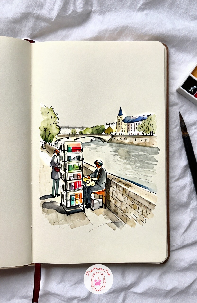
Settle near the Seine once more for a postcard vendor arranging racks along the stone river wall. The first three marks worth placing are the wall’s long horizontal line, then the vendor’s standing shape beside the rack, then the rack itself, saving the tiny suggested postcards within it for very last.
That order keeps the whole scene anchored to the riverside setting before any fiddly small detail competes for attention. A few dashes of color on the rack suggest postcards without painting each one.
If riverside European scenes like this keep calling to you, the watercolor european cafe scenes page has more to explore in that same mood.
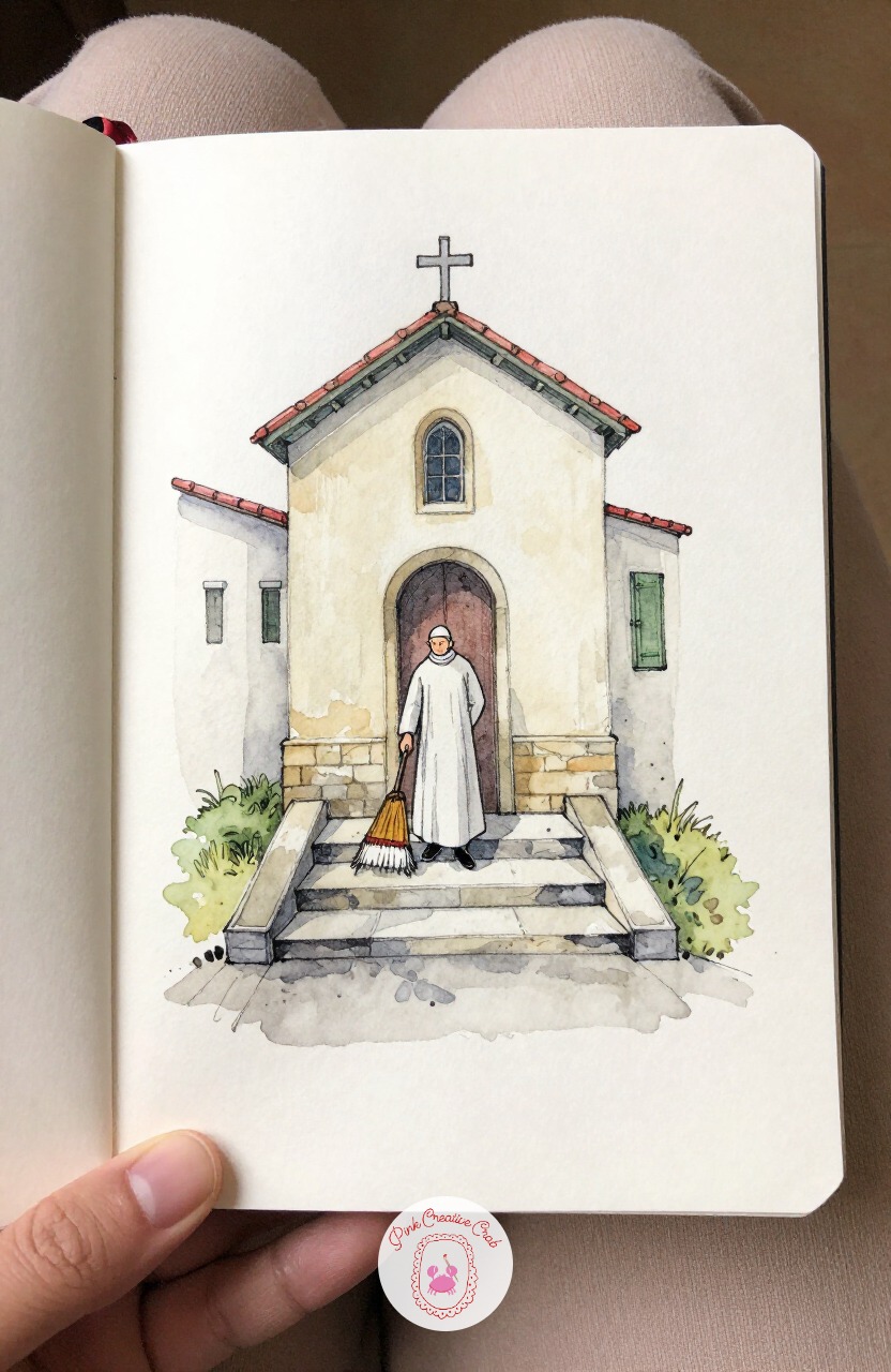
Slow the whole sketchbook down for a closing scene: a priest sweeping the worn stone steps of a small neighborhood chapel. Eye level sits low here, looking slightly up the steps toward the chapel door, which makes each stair tread stack upward and slightly overlap rather than spreading flat across the page.
That upward angle gives the small building a sense of quiet presence even in a simple sketch. Light falling from one side means the steps nearest the door sit in gentle shadow while the lower steps catch more warmth.
Keep his broom strokes as just a few curved ink lines trailing dust, nothing more elaborate.
What to Do Next
Pick whichever scene is pulling at you most, whether that is the waiter with his chairs or the old man and his pigeons, and open to a fresh page in a cold press watercolor sketchbook. Rough it in with pencil first, ink the parts that matter, and let the wash do the rest.
Frequently Asked Questions
Do I need to draw people well to start a paris sketchbook?
No, simple gestural figures work better than careful ones for this style. Focus on pose and lean rather than facial detail, a few confident lines for a figure reads as a real person far more convincingly than a stiff, overworked one.
What paper works best for ink and watercolor travel sketches?
A cold press watercolor sketchbook around 140 pound weight handles both ink and wash without buckling. It has enough texture to hold pigment nicely but stays smooth enough that a fine pen does not catch or skip.
Should I ink before or after the pencil sketch?
Always pencil first, lightly, then ink over only the lines that matter once the proportions feel right. This keeps you from committing to a pose or angle too early, and the leftover pencil marks can simply stay under the wash.
How do I keep the red and green accents from overwhelming the page?
Use them sparingly, one awning, one shutter, one scarf per scene, and let most of the page stay cream and soft grey. A single strong color note stands out far more against a quiet background than several competing ones do.
What is the fastest way to finish a scene while traveling?
Sketch the main figure and one supporting shape only, skip the background almost entirely, and add just one wash of color before moving on. A loose ten minute page captures a moment just as well as a slower one.
Have any thoughts?
Share your reaction or leave a quick response — we’d love to hear what you think!
-
 0
-
0
-
0
-
0
-
0
-
0


