A color pencil art landscape starts with one honest question: where does the light hit first? Once you answer that, the rest of the drawing follows, stroke by stroke, color by color, until a place you have never visited feels like somewhere you could walk into.
Below you will find twenty seven places to draw, from a lavender field at midday to a canal town at blue hour. Each one uses the same small set of pencils in clean fresh colors, so you can jump between them and build a whole collection of skies, fields and coastlines that all sit together nicely.
Using these images: free for personal projects such as printing, coloring, cards, journals and gifts. Handmade items that include them may be sold up to 30 pieces per design. More than that is commercial use and is not permitted, and neither is selling or sharing the images themselves or passing them off as your own. Please ask before any other use.
Start low on the page with a lavender field, the kind that rolls out flat and keeps going until it meets a little stone farmhouse near the horizon. Block the farmhouse in first, small and pale, because everything else in the drawing has to stay in scale with it.
Lay the sky in soft strokes of pale blue, then work the field in short diagonal hatching: violet and lavender in the front rows, a cooler blue violet further back. Leave thin strips of white paper between rows so the furrows read clearly instead of turning into one flat block of purple.
If the rows start looking too even, break a few lines so they wobble slightly, the way real planted rows do. Swap in any purple and blue pencil pair you own if you do not have a true lavender shade.
Measure the farmhouse against one lavender row before you commit to its size: if it is taller than three rows stacked together, it will read as too close and crowd the field.
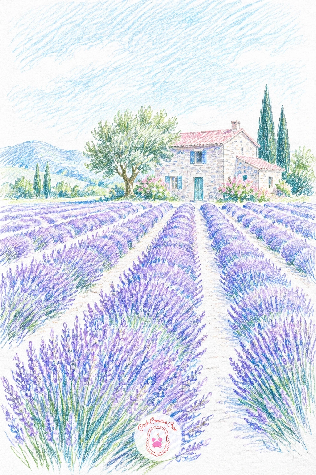
Palette: Lavender,Violet,Sky Blue,Warm Grey
Keep the horizon line low for this one, maybe a third up the page, so the pink and violet sky gets most of the room. Lay the sky first in horizontal bands, pink near the horizon fading up into violet, blending the two where they meet with light circular strokes.
Once the sky is settled, pull the same pink and violet straight down into the lake in short vertical strokes, leaving a thin broken line of bare white paper where the water catches the brightest light. Add a dark tree line along the shore last, in a cool grey violet, to anchor the glow above it.
The usual trouble spot is the water reading flat: keep your strokes vertical there, not horizontal, so it reads as reflection rather than ground. No pink pencil on hand works fine, try a warm coral red layered lightly under the violet instead.
Try this one small and loose today in under ten minutes using just two pencils, then come back to a fuller version later with three sky bands and a proper tree line reflection.
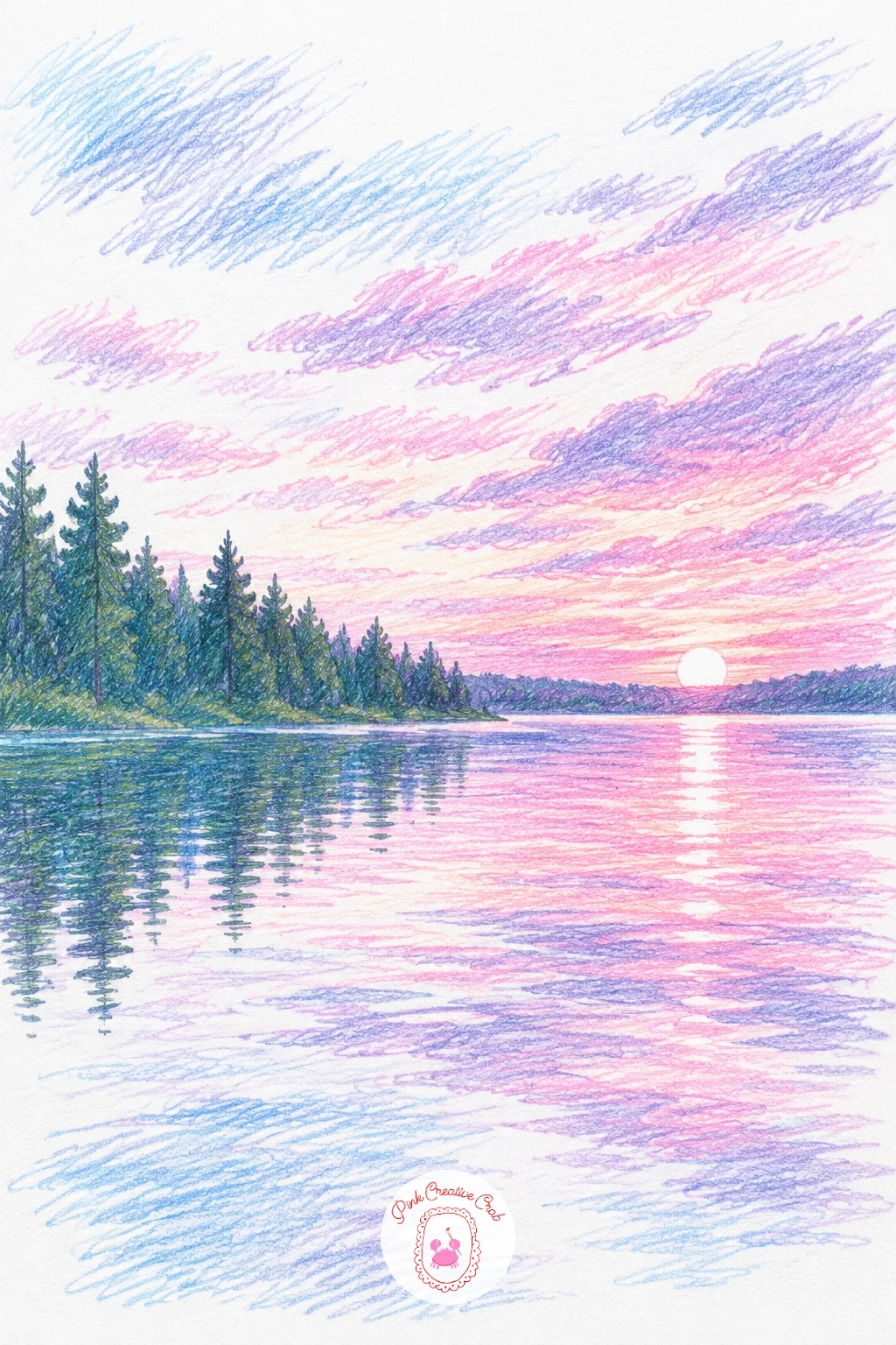
Palette: Rose Pink,Violet,Deep Plum,Soft Teal
A coastal path works best viewed from slightly above, looking down a green cliff edge toward a blue sea that fills most of the lower half of the page. Sketch the curve of the path first, a pale sandy line cutting across the green, since it gives you the perspective for everything else.
Layer the cliff grass in sage green with short upward strokes, darker toward the cliff edge and lighter where it meets the path. Then build the sea in horizontal bands of blue, deepest at the horizon and a paler turquoise near the shore, with a few white paper gaps left for foam against the rocks.
If the cliff looks flat, add one darker green shadow line right where it drops to the sea, that single line does more for the sense of height than any amount of extra shading. No sage green pencil? Mix a light olive and a cool green in the same strokes.
Keep one tip in mind today: draw the path narrower as it moves toward the horizon, that alone sells the distance.
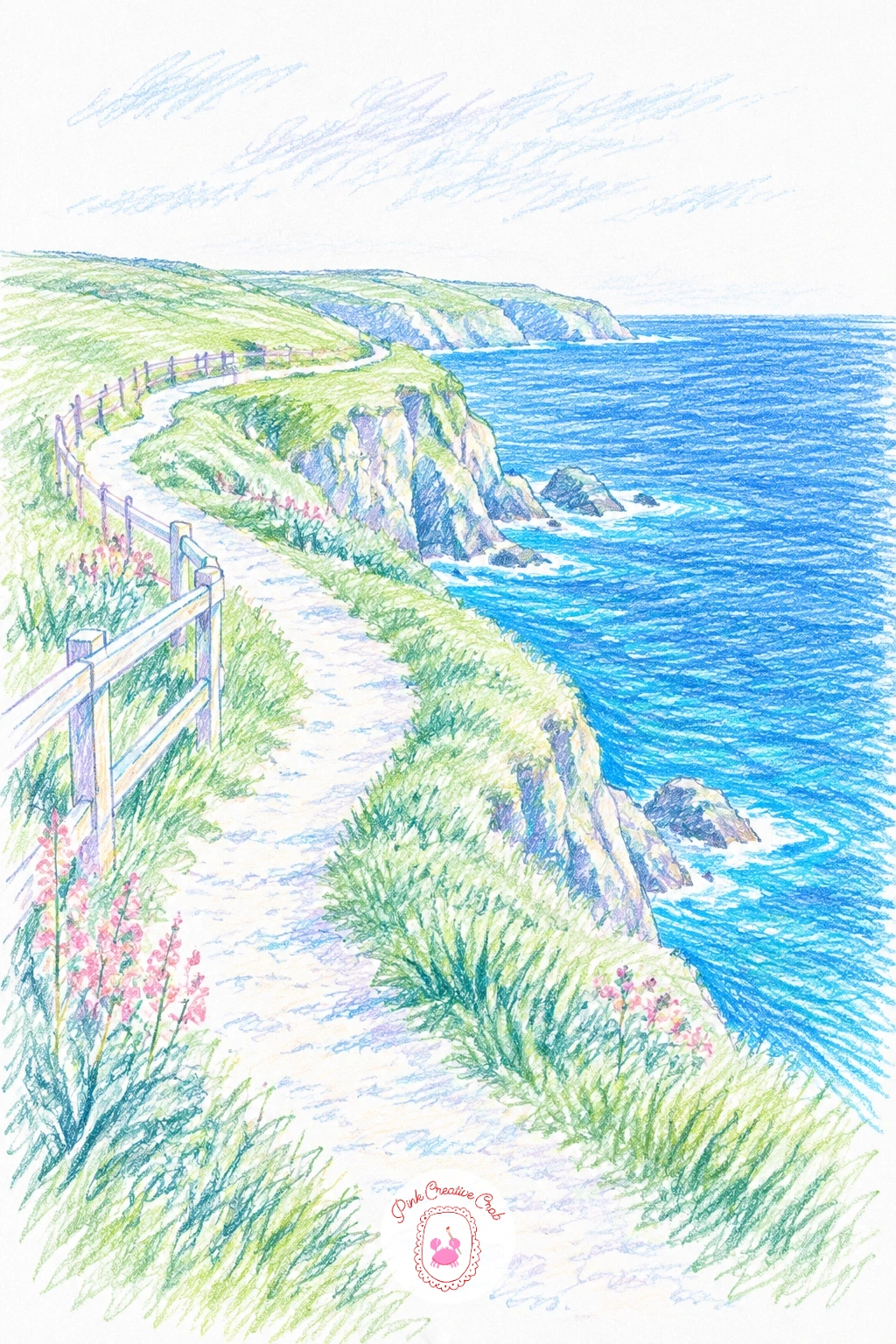
Palette: Sage Green,Deep Green,Sky Blue,Sand
Following on from the lavender field, this tulip field uses the same row trick but swaps in pink and purple blocks instead of one single color. Rule in faint pencil guidelines first, four or five rows receding toward a flat horizon, so the color blocks stay level.
Fill alternating rows in rose pink and violet with short vertical strokes, keeping each row’s color consistent rather than mixing the two within one strip. A thin line of sage green between rows reads as the walking path between the beds and breaks up the color nicely.
Rows often drift wider at the back than the front by mistake: check this by eye before you color, the back rows should look narrower, not wider. If pink and violet feel like too much contrast, swap one for a soft coral instead.
Vary this one next time by curving the rows gently instead of keeping them straight, it gives the whole field a more relaxed, hand drawn feel.
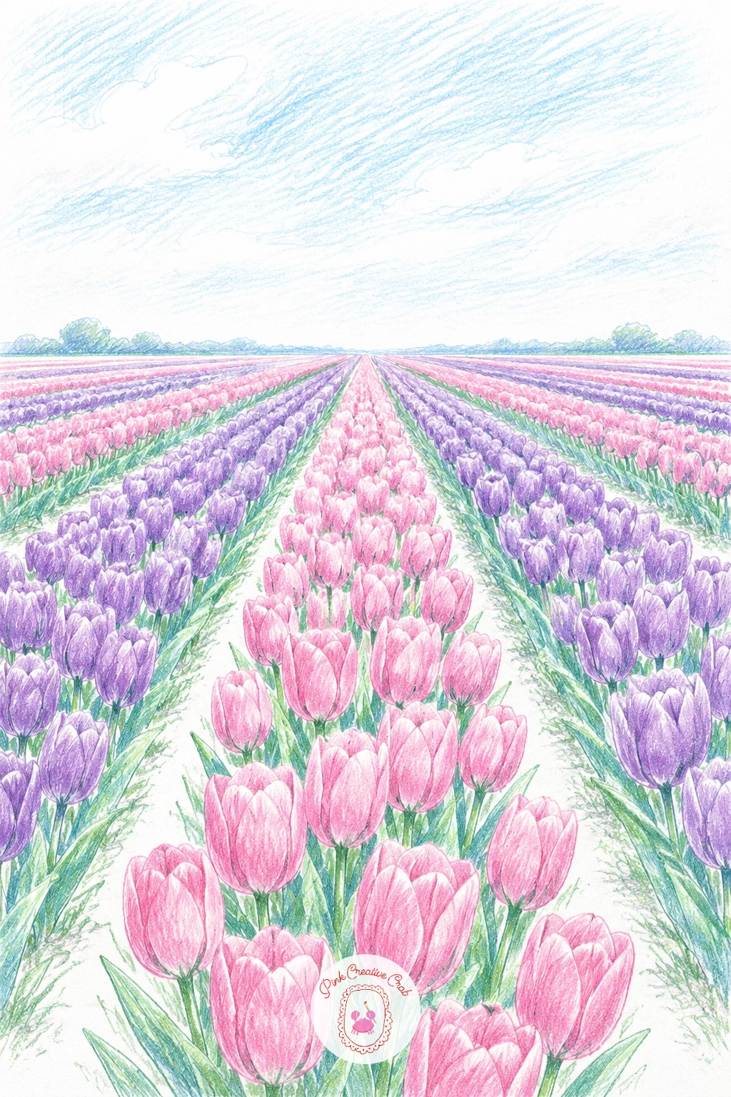
Palette: Rose Pink,Violet,Sage Green,Sky Blue
This lagoon leans on just two colors doing most of the work: a bright turquoise water and a nearly bare white sand strip. Draw the curved shoreline first, since the shape of that curve is what makes the lagoon feel tropical rather than generic.
Work the turquoise in horizontal strokes, lighter near the sand and a touch deeper further out, leaving the sand itself almost entirely untouched white paper with just a faint warm tan shadow along its edge. A line of soft teal just offshore suggests deeper water without needing any detail.
The easiest way to lose the tropical feel is over coloring the sand, resist the urge and trust the white paper to do the work. No turquoise pencil in your set, layer a light blue under a touch of green instead.
One tip for today: leave at least a third of the lagoon as untouched white paper, that bare space is what makes the water look sunlit rather than flat.
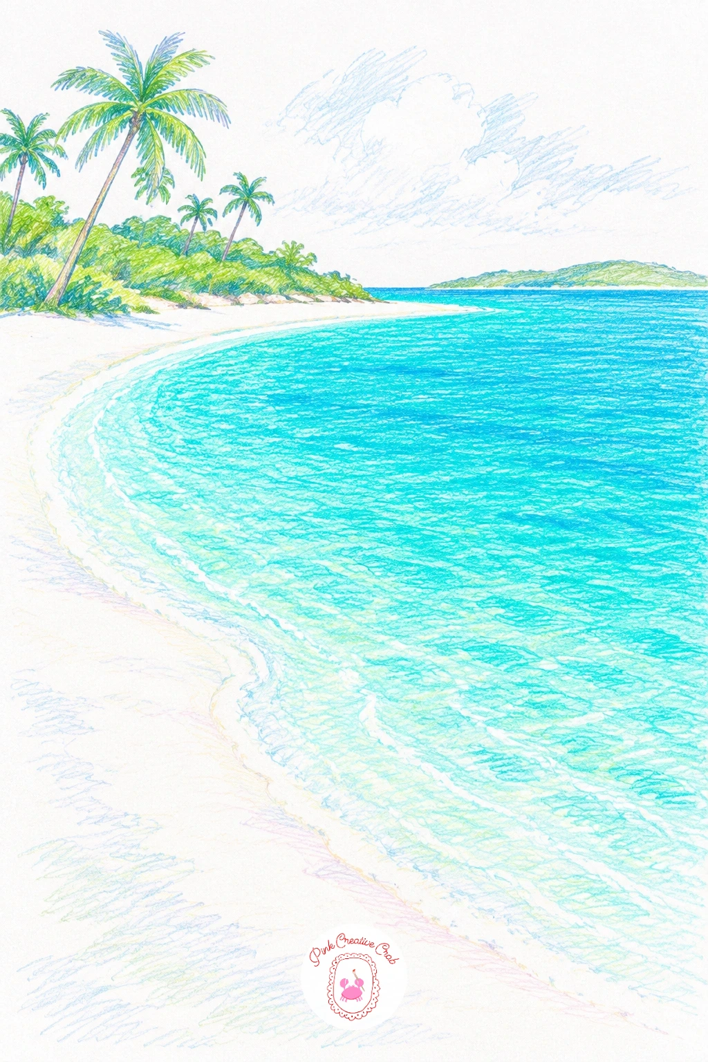
Palette: Soft Teal,Turquoise,Sand,White
Place snowy mountain peaks along the top third of the page first, since their white and pale blue grey shapes set the scale for the wildflower meadow spreading out below. Keep the peaks simple: a few angled lines, lightly shaded on one side only.
Fill the meadow in sage green hatching, then scatter small dots and dashes of pink, white and soft yellow across it for wildflowers, working loosely rather than placing each one carefully. A few taller dark green strokes near the front suggest grass blades close to the viewer.
Flowers tend to look too even when you place them in a grid pattern, so cluster some and leave gaps elsewhere instead. If you are missing a true alpine blue grey for the peaks, a light cool grey layered under pale blue works just as well.
If this is your first time drawing a meadow like this, start with the green base and add flower dots only once it is fully dry and settled, so they sit crisply on top.
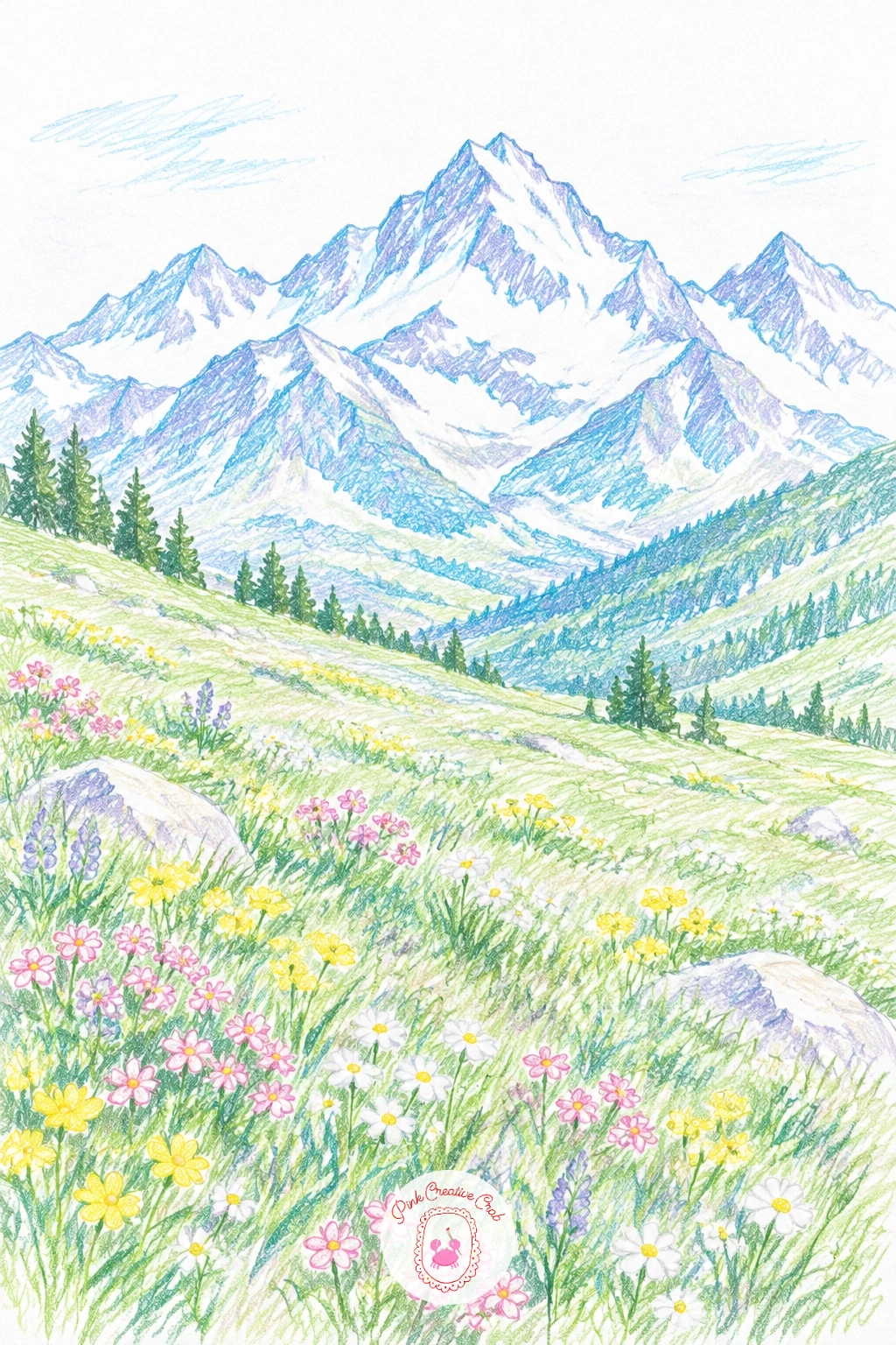
Palette: Sage Green,Rose Pink,Soft Yellow,Cool Grey
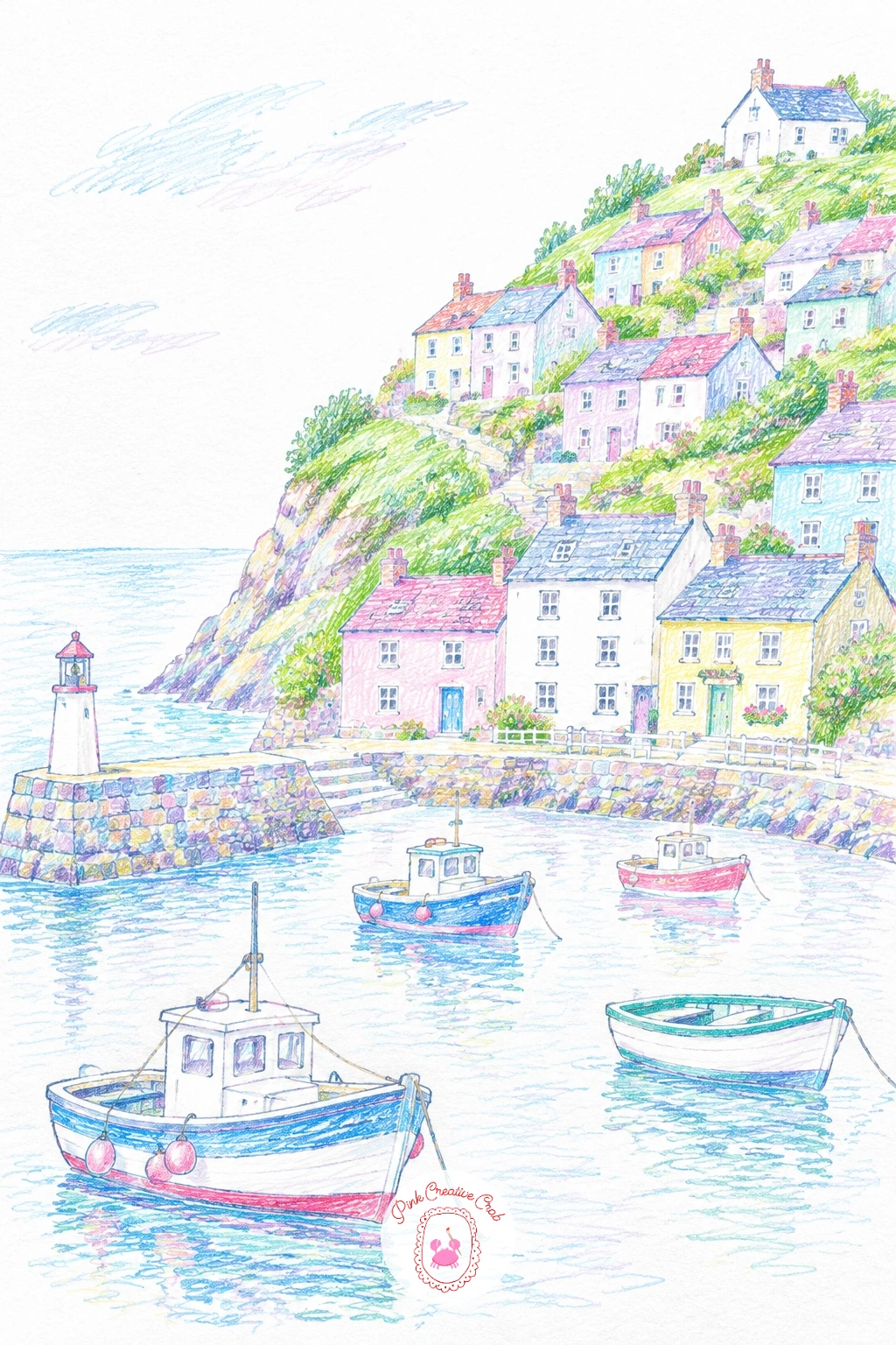
Build this one from the harbor up: draw the water and a few small boats first, then stack little pastel houses climbing the hill behind them in loose rows. Each house can be a simple rectangle with a triangle roof, no two quite the same color.
Palette: Rose Pink,Soft Yellow,Sky Blue,Warm Grey
Try drawing the roofs in one consistent terracotta tone even while the walls change color, it gives a scattered hillside village more visual order.
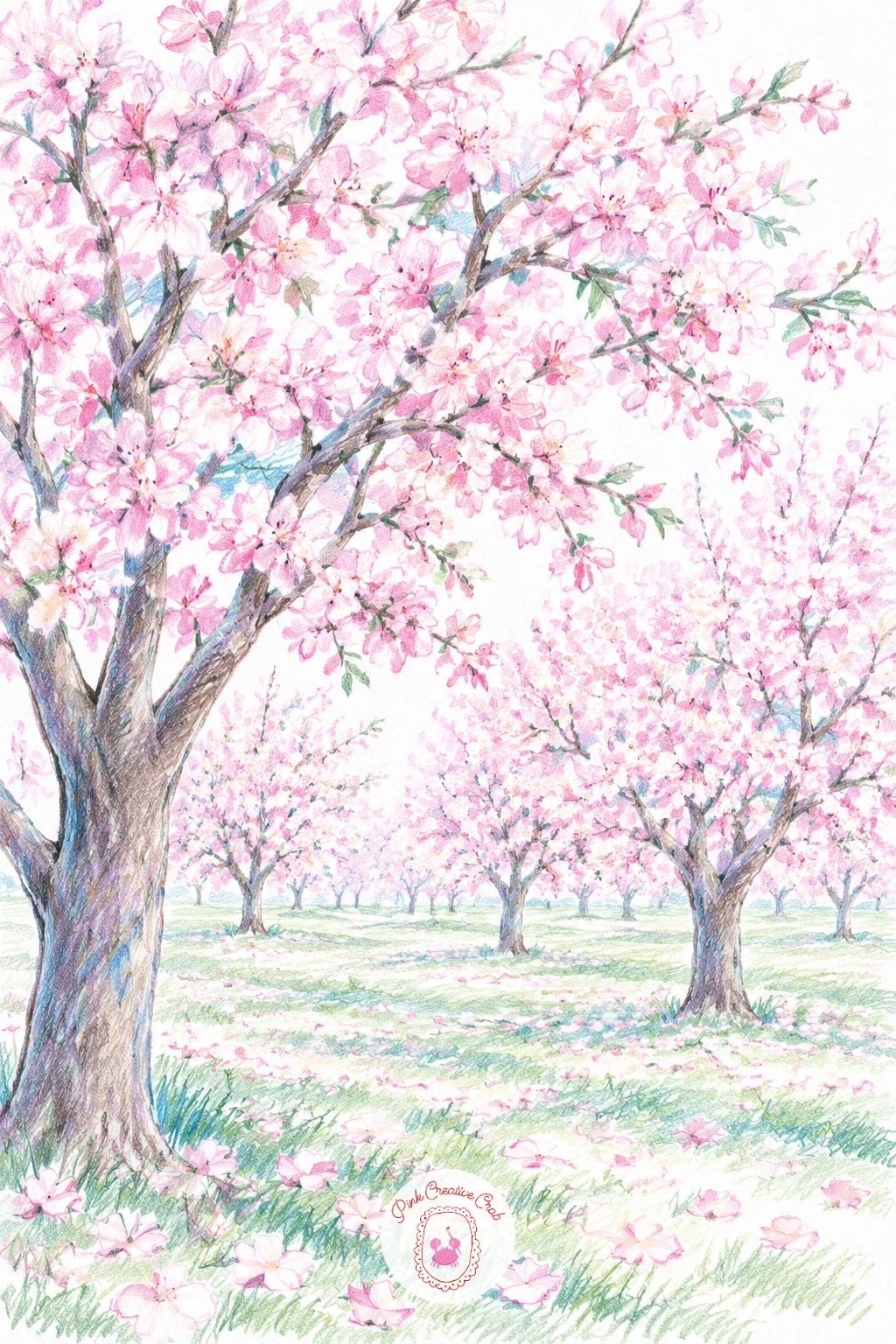
After a village full of small shapes, an orchard in blossom is a nice change of pace, since it is really just a repeated tree shape under a soft color. Sketch three or four tree trunks at slightly different heights first, then build each canopy as a loose cloud of pink dabs rather than a hard outline.
Use short circular strokes in rose pink and a lighter blush for the canopies, letting some white paper show through between dabs so the blossom looks light and airy rather than solid. Ground the trees with a strip of sage green grass and a few fallen pink petals scattered beneath them.
Trees often end up looking too uniform in size, so vary the height and canopy width of each one slightly. If pink pencils run light, add a touch of coral underneath for warmth.
Here is today’s shortcut: color the canopies before the trunks, that way the dark trunk lines sit crisply on top instead of getting lost under pink strokes.
Palette: Rose Pink,Blush,Sage Green,Warm Brown
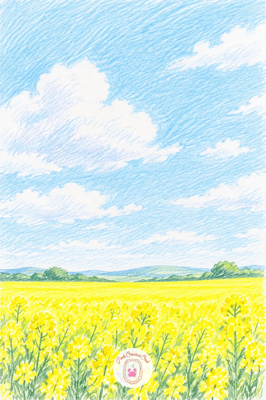
This one is almost all sky, so give the canola field only the bottom quarter of the page and let a big pale blue sky with a few soft white clouds fill the rest. Lay the sky in gently first, since it is easier to work the bright yellow field against a finished background than the other way round.
Color the field in bold soft yellow with short upward strokes to suggest individual stems, keeping the strokes denser near the front and lighter toward the horizon. A thin line of sage green along the very front edge keeps the yellow from running straight to the paper’s edge.
Yellow can look flat fast, so add a few strokes of warm gold mixed through the field for depth once the base layer is down. If your yellow feels too pale against white paper, lay a light layer twice rather than pressing hard once.
Eye level sits low here, right at the horizon line between field and sky, which is what makes the sky feel so wide and open above a small strip of color below.
Palette: Soft Yellow,Warm Gold,Sky Blue,Sage Green
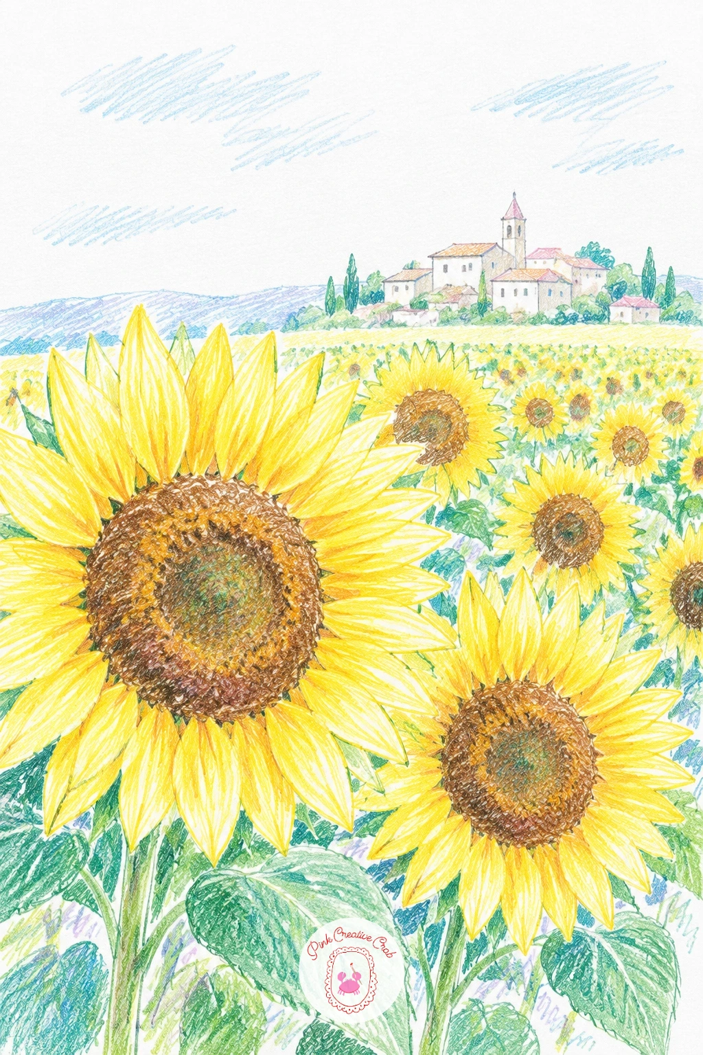
Give the sunflowers themselves more attention than the field around them here, since a handful of clearly drawn flower heads in the foreground sell the whole scene better than rows of tiny dots. Draw three or four large sunflower heads close up, each a simple circle of brown center with yellow petals radiating out.
Fill the field behind them loosely in the same soft yellow, then add a cluster of small pale houses along the horizon to suggest the edge of a village. Keep the houses tiny and simple, since they only need to read as a village silhouette, not individual buildings.
Petals often come out too even and stiff, so vary their length and angle slightly on each flower head. No warm brown for the centers, a deep burnt orange layered with a touch of grey works well too.
One concrete tip: darken the underside of each petal slightly where it meets the brown center, that small shadow is what makes a flat circle read as a round flower.
Palette: Soft Yellow,Burnt Orange,Warm Brown,Sky Blue
Build the valley first and save the rainbow for last, since it needs to sit on top of a finished sky to read clearly. Lay rolling green hills in layered sage and deep green hatching, lighter hills further back, then a soft grey blue sky above with a patch left paler where the rainbow will cross.
Draw the rainbow as a single curved band, working each color in order from red through to violet in thin arcs, pressing lightly so the sky still shows faintly through each band. Keep the arc shallow rather than a full half circle, since a gentler curve looks more natural over a valley.
The rainbow often ends up too solid and flat, so use light single layers rather than going back over each band twice. If you are short a violet or indigo pencil, let the arc fade out rather than forcing a color that is not quite right.
Try this scene small and quick today with just three rainbow bands and simple hills, then build a fuller version later with more hill layers and a full seven band arc.
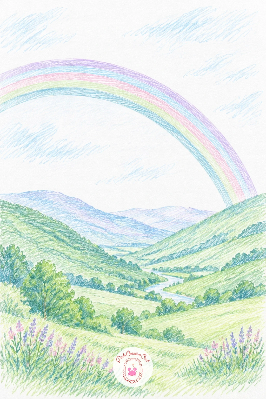
Palette: Sage Green,Deep Green,Rose Pink,Sky Blue
Trees come first in a bluebell wood, drawn as a few tall trunks with simple branching, spaced unevenly so the light has gaps to fall through. Leave diagonal bands of bare white paper between the trunks where the sunlight will shine in, before you touch any green or blue.
Fill the ground in a carpet of blue violet dashes for the bluebells, denser in the shade and lighter where the sunlight bands cross through. Add soft yellow green touches on the trunks and ground right where the light falls, which is what makes the sunlight actually read as light.
Overworking the bluebells into one solid blue mass is the easy mistake, so keep the dashes loose with flecks of white paper showing between them. Without a violet blue pencil, layer a light blue under a touch of purple.
Vary this scene next time by changing where the light falls, a single shaft down the center feels very different from scattered patches throughout the wood.
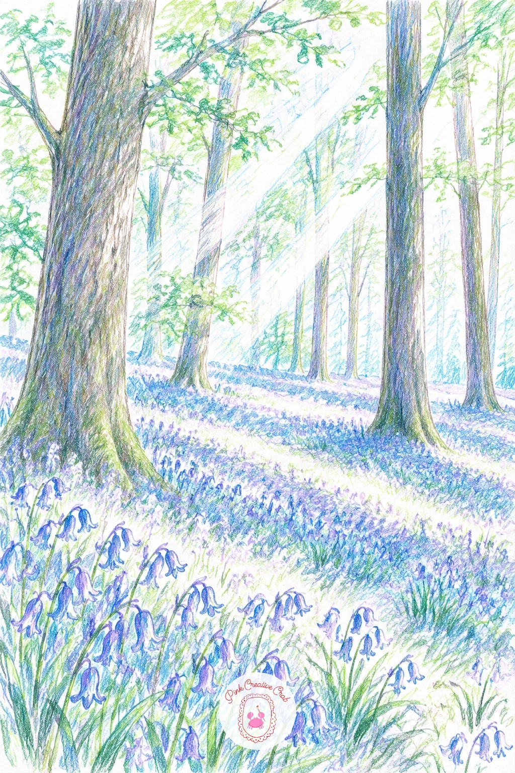
Palette: Blue Violet,Soft Yellow Green,Deep Green,Warm Brown
Light the dunes from one side only for this one, since a desert at dusk depends entirely on the contrast between a lit slope and a shaded one. Sketch two or three overlapping dune shapes first, simple curved mounds, before adding any color.
Shade the lit sides in pink and the shaded sides in lilac, blending the two softly where each dune curves over, and let the lightest ridge of each dune stay almost bare white paper to catch the last light. A pale lavender sky above with a small warm sun low on the horizon finishes the mood.
Dunes can look flat if both sides get the same pressure, so press noticeably harder on the shaded side to build real contrast. If pink and lilac feel too close in your set, swap lilac for a cool mauve instead.
Keep the light source consistent today: decide which side the sun sits on before you shade a single dune, then keep every dune lit from that same side.
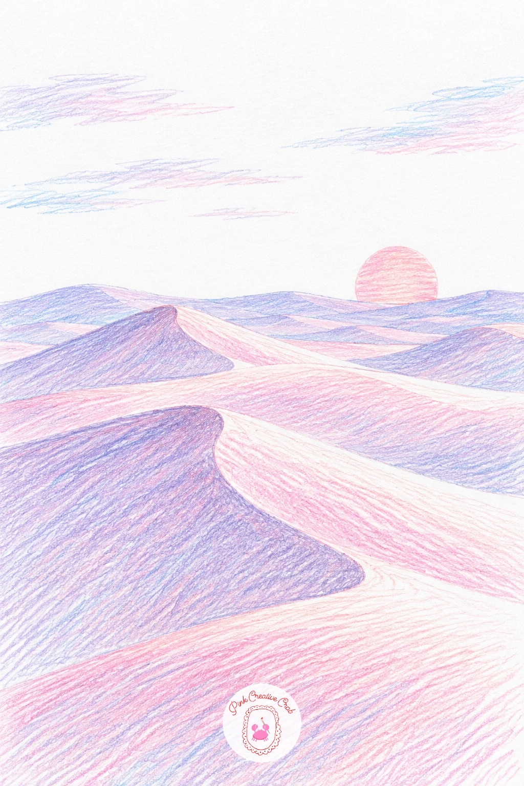
Palette: Rose Pink,Lilac,Lavender,Warm Gold
Following the dunes, this mountain pass uses the same idea of light and shade but on a steeper, more dramatic shape. Draw the road first as a thin ribbon switching back and forth up the slope, narrower with each bend as it climbs toward the pink sky.
Shade the mountains in cool grey violet, darker in the valleys between slopes and lighter where the pink evening light catches each ridge. Color the road itself a pale warm grey, almost bare in places, so it stands out clearly against the darker mountainside.
The road is the trickiest part: keep every switchback getting smaller as it rises, since equal sized bends flatten the sense of height immediately. No violet grey on hand, layer a light purple under a plain grey instead.
One tip for today: add one tiny dark dash on the road near the top, a car in the distance, it instantly gives the whole pass a sense of scale.
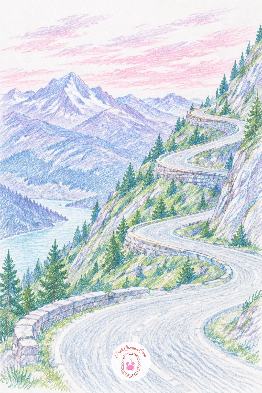
Palette: Cool Violet Grey,Rose Pink,Warm Grey,Deep Plum
Keep this sunrise quiet and flat, since a calm sea works best with almost no texture beyond a few horizontal lines. Lay the sky first in soft bands of peach, pink and pale blue, blending gently where they meet just above the horizon.
Bring the same peach and pink down into the sea in thin horizontal strokes, leaving long flat gaps of bare white paper between them so the water reads as still and glassy rather than choppy. A single small sun low on the horizon, barely more than a pale circle, finishes the light.
Too much texture in the water is the main risk here, so resist adding waves or ripples and trust flat bands of color instead. If peach is missing from your set, mix a light coral with a touch of yellow.
Ten minutes is enough for a simple two band version of this scene, while a longer sitting lets you add a third sky band and a soft reflected glow stretching toward the shore.
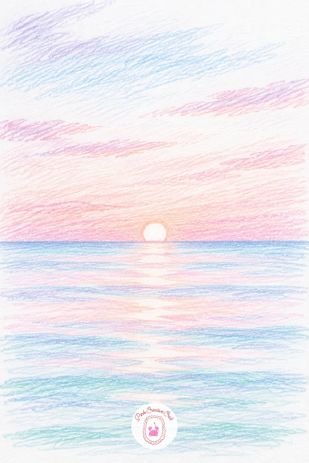
Palette: Peach,Rose Pink,Sky Blue,Soft Yellow
Base this meadow in sage green first, then scatter red poppy dots and small white daisies across it once the green is settled, working from the back of the field toward the front. Make the poppies larger and more defined in the foreground, just loose red dabs further back.
Draw each poppy as a simple cluster of four or five red petals with a tiny dark center dot, and each daisy as a small white circle ring with a yellow dot middle, left mostly as bare paper rather than fully colored. Keep both flowers irregular in placement, never in neat rows.
Flowers bunched too evenly across the page is the most common slip, so group a few together and leave other patches of the meadow plain green. Without a true poppy red, a warm scarlet works just as well.
One tip to use today: finish the green base entirely before adding any flowers, coloring over dry green gives the poppies and daisies much crisper edges than working wet into wet.
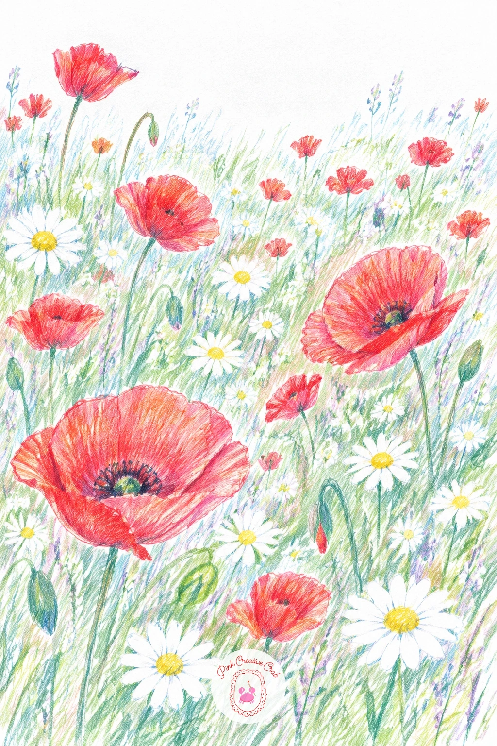
Palette: Poppy Red,Sage Green,Soft Yellow,White
This garden works as a tall, narrow composition: a path running straight back through the center with delphinium spikes rising up on either side. Draw the path first as two converging lines, since that perspective makes the whole garden feel deep rather than flat.
Build each delphinium spike in tall vertical strokes of blue, layering a deeper blue toward the base of the spike and a paler blue near the top where the flowers thin out. Fill in sage green leaves low around the stems, and a soft grey path surface down the center.
Spikes often come out the same height, which flattens the whole bed, so vary their height and lean a few slightly in different directions. If true delphinium blue is missing from your set, a strong cobalt or cornflower blue works well instead.
Try drawing just three spikes on each side today for a quick version, then build a fuller border later with more spikes layered front to back for real depth.

Palette: Cornflower Blue,Pale Blue,Sage Green,Warm Grey
Set the canyon walls at a steep angle on either side of the page, drawn in warm red brown layered hatching, before the river gets any color at all. The river itself should curve rather than run straight, since a winding shape is what makes a canyon river look carved rather than poured.
Color the river in bright turquoise with horizontal strokes following its curve, deepest in the middle and paler near the banks where it meets the canyon rock. Add a few darker brown shadow lines low on the canyon walls where they meet the water, to ground the river firmly between them.
If the canyon walls look too flat, press harder along one edge of each rock layer and lighter along the other, that single contrast gives real sense of rock strata. No warm red brown on hand, a burnt sienna or terracotta pencil does the same job.
One tip for today: let the turquoise run slightly lighter right where it bends, bends in a river usually catch more open sky and so more light.
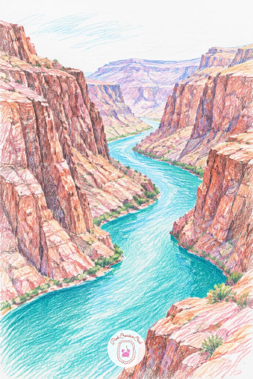
Palette: Turquoise,Terracotta,Warm Brown,Sand
Place the balloon first, large and roughly centered in the upper half of the page, before building the valley underneath it. A simple rounded balloon shape with a few vertical panel lines in alternating colors reads clearly even at this size.
Lay a soft dawn sky behind it in pale peach and blue, then build the valley below in layered green hills, keeping the hills lighter and hazier the further they sit from the balloon to suggest early morning mist. A tiny basket and a few thin lines for the ropes finish the balloon itself.
Balloons often end up looking flat and sticker like, so shade one side of the balloon slightly darker to suggest its round form catching the morning light. If you are missing a second balloon color, alternating just two pencils in the panels still reads clearly.
Keep the balloon noticeably larger than any single hill below it today, that size relationship is what sells the sense of height and distance in this scene.
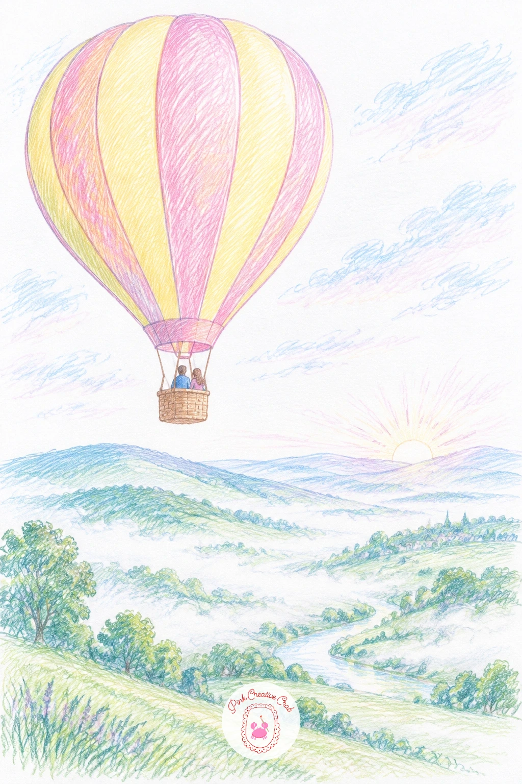
Palette: Rose Pink,Soft Yellow,Sage Green,Sky Blue
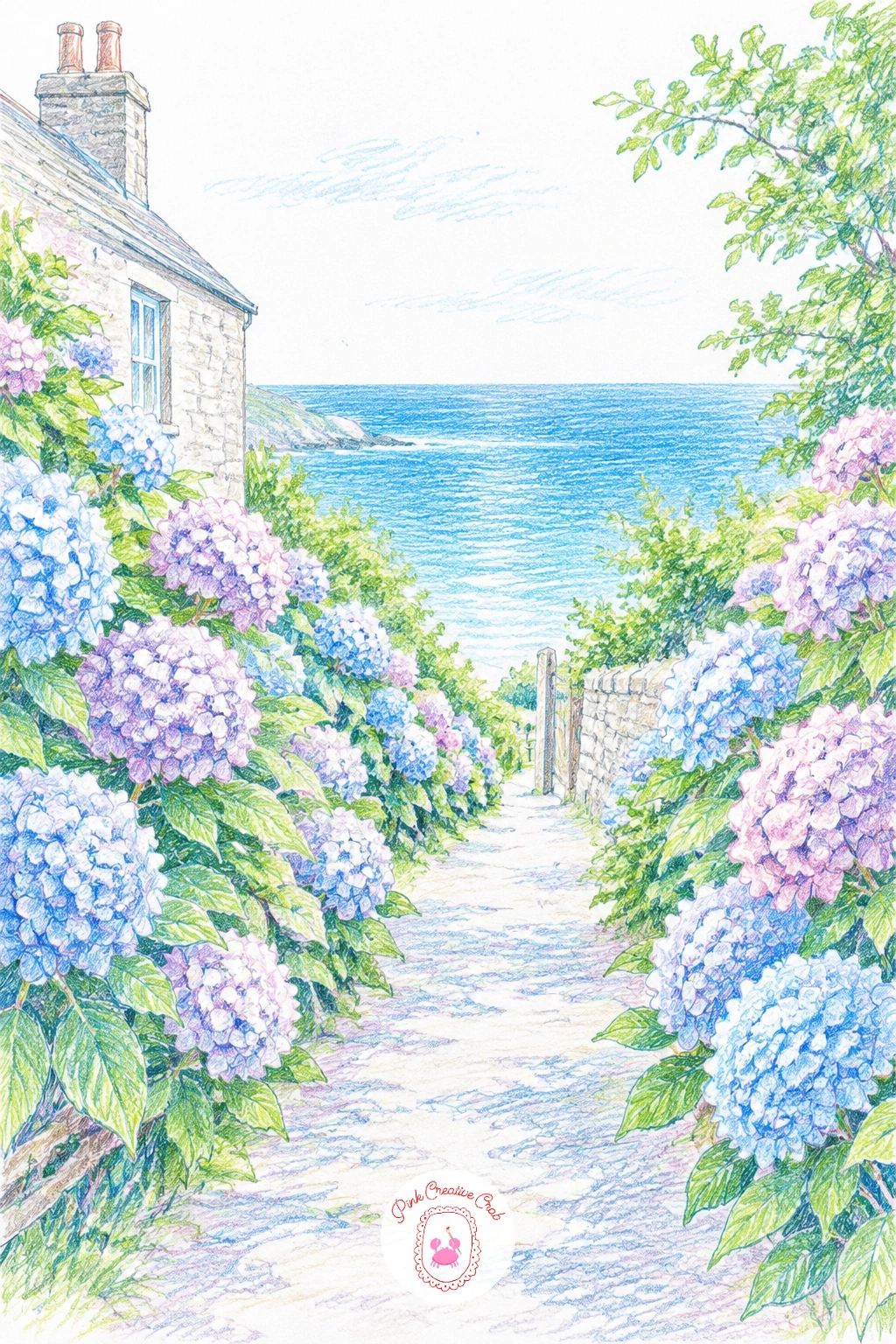
Run a path down the center of the page from top to bottom, narrowing as it goes, with hydrangea bushes banked up along both sides and a strip of blue sea just visible at the far end. Draw the bushes first as simple rounded mounds before adding any flower detail.
Color each hydrangea head in clusters of small petal dots rather than one solid shape, mixing blue, lilac and a touch of pink within the same bush for that natural shifting hydrangea color. Keep the sea at the end of the lane small and simple, just a few horizontal blue strokes.
Bushes can look like solid blobs if the petal dots are too uniform, so vary dot size and leave small gaps of green leaf showing through here and there. Without lilac on hand, a light blue violet does the same job inside the clusters.
One concrete tip: make the sea strip at the end noticeably brighter and bluer than any hydrangea, that contrast is what pulls the eye straight down the lane.
Palette: Hydrangea Blue,Lilac,Sage Green,Sky Blue
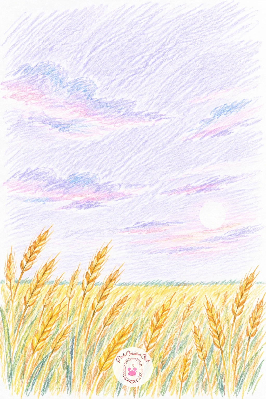
Give the sky most of the page again here, this time in soft lilac and warm peach evening tones, with the wheat field itself as a narrow golden strip along the bottom. Lay the sky bands first, since the warm gold of the wheat needs a settled lilac backdrop to really glow against.
Color the wheat in short upward strokes in warm gold and soft yellow, denser and slightly darker toward the front of the field. A few taller single stalks drawn individually right at the very front edge add scale without much extra work.
The field can look too solid if every stroke runs the same direction, so angle a few stalks slightly differently, the way real wind blown wheat leans. No lilac pencil in your set, a pale violet grey gives a similar evening feel.
If you enjoyed lavender fields earlier in this list, try this wheat field next for a warmer, golden take on the same wide open composition.
Palette: Lilac,Peach,Warm Gold,Soft Yellow
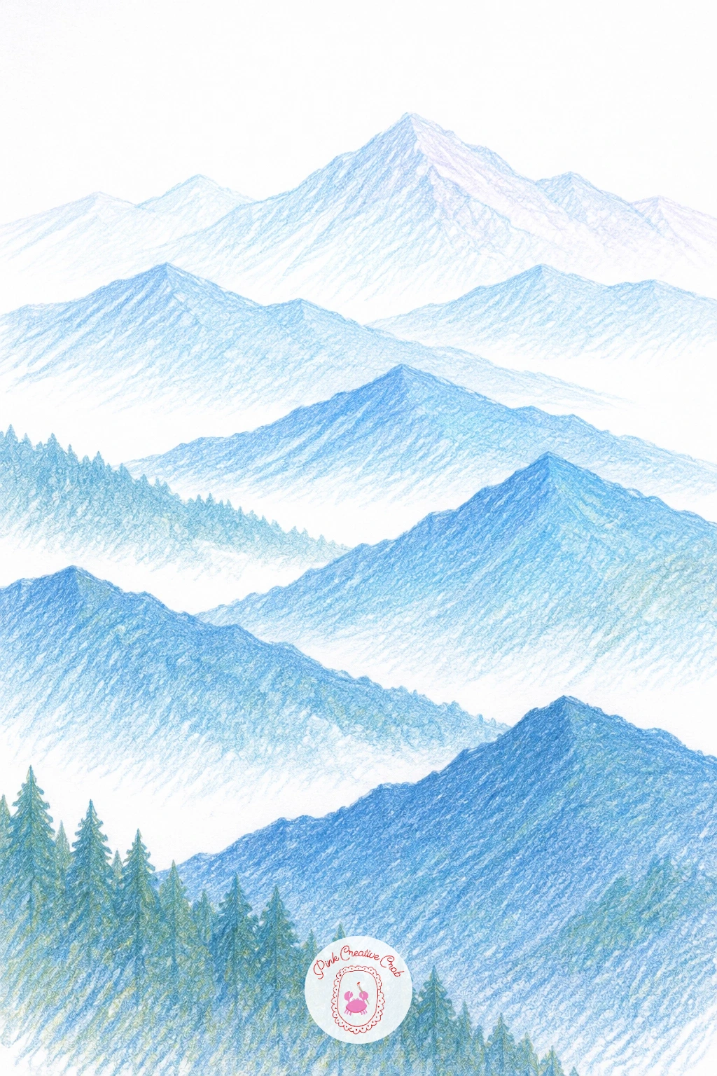
Build this range from back to front in flat overlapping triangle shapes, each layer a slightly paler blue than the one in front of it. Start with the furthest, palest mountains first, since working back to front here would mean constantly redrawing edges you have already placed.
Keep each layer simple, just a jagged top edge and flat color beneath, with no internal detail on the back layers at all. The front layer alone can take a touch of deep green along its base to ground the range and separate it clearly from the palest sky.
Layers often end up too close in tone to tell apart, so check the contrast between each one before moving to the next, there should be a clear step in value every time. If you only have one blue pencil, press lighter for the back layers and harder for the front to fake the same effect.
One tip for today: never outline these mountains in a dark line, let the color edge itself do the shaping, outlines flatten the misty effect immediately.
Palette: Pale Blue,Mid Blue,Deep Blue,Deep Green
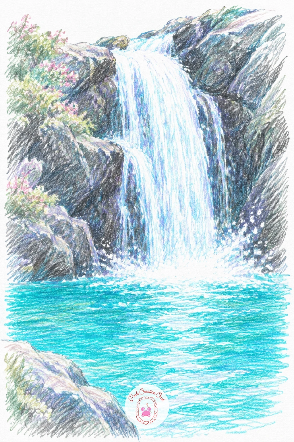
Place the waterfall itself slightly off center, falling from a gap in dark rock down into a wide turquoise pool below. Draw the falling water first as a bundle of loose vertical white paper streaks, barely touched by pencil, with just a few soft grey blue lines running down through them to suggest motion.
Work the pool in horizontal turquoise strokes radiating gently outward from the base of the fall, with small white paper gaps near the point of impact to suggest spray and foam. Dark rock on either side in warm brown grounds the whole scene and makes the pale water read clearly against it.
A kneaded eraser is useful here: press it gently into any area of the falling water that gets too dark, lifting color back out restores the bright white streaks fast. No true turquoise pencil, a teal and a light blue layered together reads just as fresh.
Keep today’s version simple with one clean fall and a plain pool, then next time add a second smaller fall beside it for a busier composition.
You Will Need
- kneaded eraser
Palette: Turquoise,Soft Teal,Warm Brown,Cool Grey
Give this lake a mirror flat surface, since a salt lake works mainly through reflection and a strange, almost pastel pink tone across the whole scene. Draw a low horizon line first, then fill the lake and sky in the same soft pink from top to bottom, broken only by a thin paler line at the horizon itself.
Leave the crusted shoreline around the edges of the lake almost entirely bare white paper, just a faint grey outline tracing its cracked, uneven border against the pink water. A single small dark shape far off, a person or a rock, gives the huge flat space a sense of scale.
The pink can look too uniform without that one scale marker, so place it slightly off center rather than dead in the middle. If pink pencils run too warm, cool the color down with a touch of light violet blended in.
One tip for today: keep the salt crust edge irregular and broken rather than a smooth curve, real salt flats crack in sharp, uneven lines.
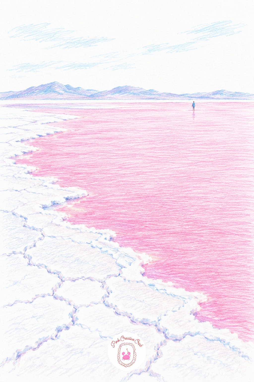
Palette: Rose Pink,Pale Pink,White,Cool Grey
Lay rolling green hills first in layered sage and deep green, then cut a winding blue stream down through the middle of the valley, curving it rather than running it straight for a far more natural look. The stream should narrow slightly as it moves into the distance.
Scatter a small flock of sheep across one hillside as simple white oval bodies with tiny dark legs and heads, grouped unevenly rather than in a neat line. Keep them small against the hills, since their size is what tells the eye how big the valley really is.
Sheep often end up looking like the same size as nearby rocks or bushes, so double check each one against a tuft of grass nearby before finishing it. No deep green pencil for shadow, layer a dark olive under the sage instead.
If you enjoyed drawing animals into this landscape, the shaggy coats and hillsides in highland cow art make a good next step for mixing animals and scenery.
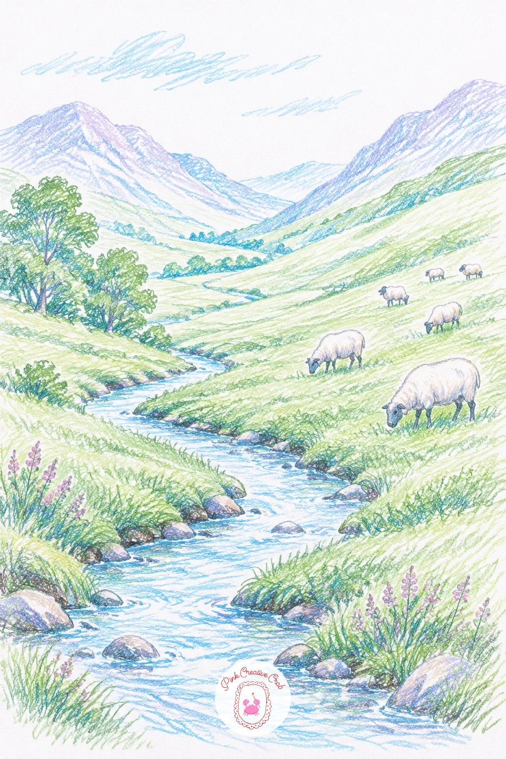
Palette: Sage Green,Deep Green,Sky Blue,White
Place a lake flat and calm along the lower half of the page, then build a bank of tall lupin spikes rising up along its near shore. Draw each lupin as a tall narrow cone shape first, since that simple outline is what makes a loose cluster of color dots read as a lupin rather than any other flower.
Fill each spike with small overlapping dots in blue, violet and a touch of pink, mixing the colors within a single spike the way real lupins shift color up their length. Reflect the same colors faintly down into the still lake water in soft vertical strokes beneath each spike.
Lupins can end up looking like solid triangles if the dots are too packed together, so leave small flecks of white paper between them throughout. Without a true lupin violet, a cornflower blue and a rose pink layered close together work just as well.
One tip for today: keep the lake reflection paler and softer than the actual flowers above it, reflections always read a touch quieter than the real thing.
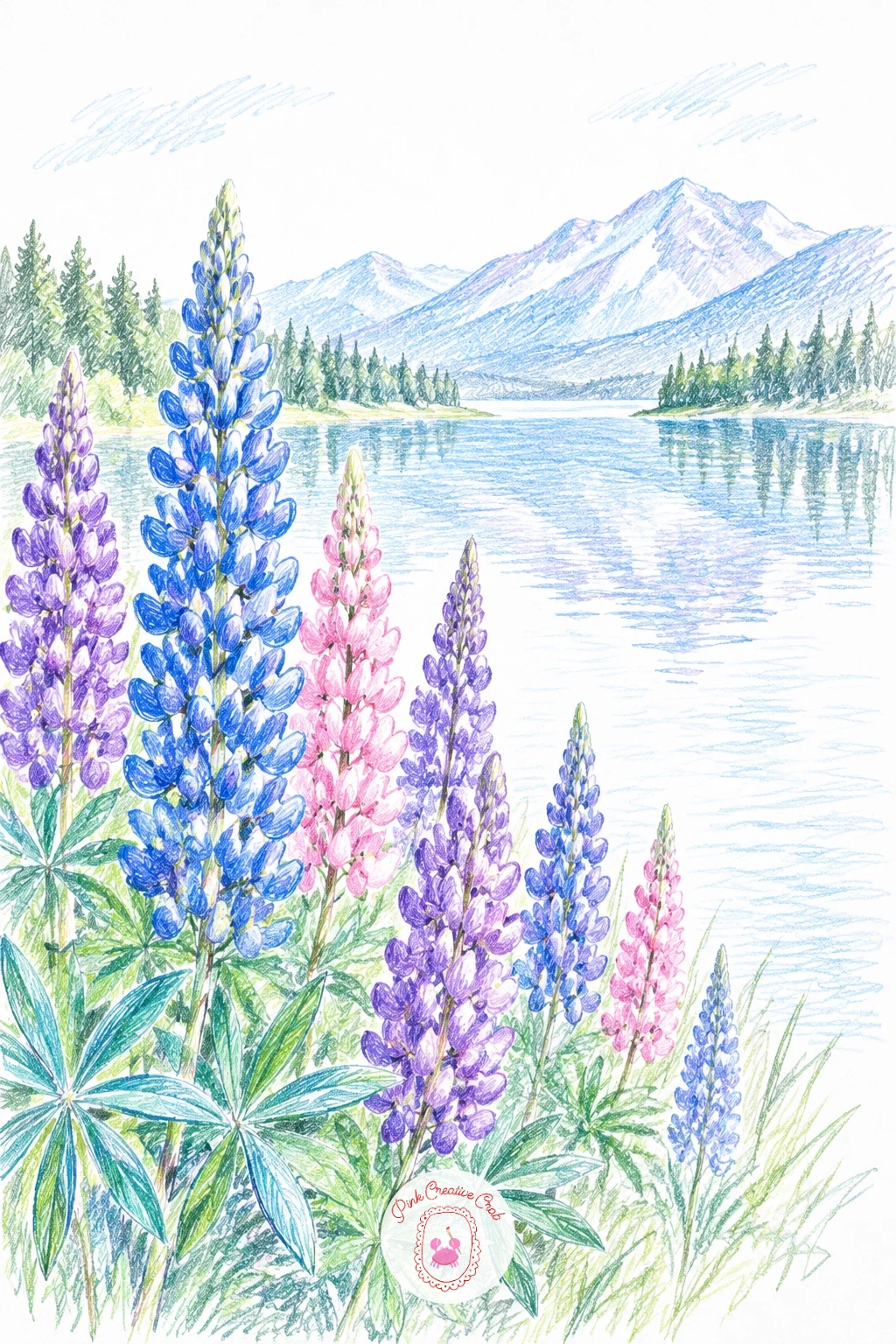
Palette: Cornflower Blue,Violet,Rose Pink,Sky Blue
Finish the collection with a row of narrow pastel houses lining a canal, drawn under a deep blue evening sky with a few windows glowing soft yellow. Draw the row of houses first as simple tall rectangles of varying width and height, since an uneven roofline is what makes a canal row look real rather than stamped.
Color each house a different pale tone, pink, yellow, soft blue and sage, then drop the same shapes and colors straight down into the canal beneath them in loose vertical strokes, slightly darker and more blurred than the houses themselves. A deep blue violet sky above, with one or two small warm lit windows, sets the blue hour mood.
Reflections that match the houses too exactly look stiff, so let the strokes in the water run a little looser and less precise than the buildings above. No deep blue violet on hand, mix a navy blue with a touch of plum.
For more help pacing out a full evening sky before adding a scene underneath it, the techniques in dreamy watercolor pencil sky drawings translate well to dry colored pencil too.
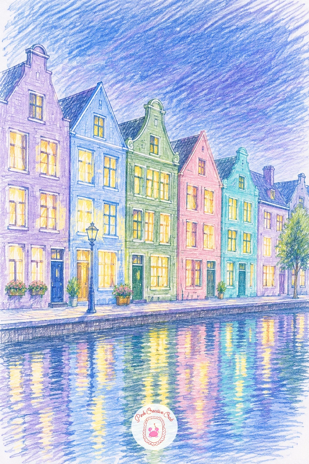
Palette: Deep Blue Violet,Rose Pink,Soft Yellow,Sage Green
What to Do Next
Pick whichever place pulls at you most today, maybe the lavender field if you want a steady, repeating pattern, or the sunset lake if you want something looser and quicker. Start on one sheet of bright white paper, lay your sky or background in first, and let the rest of the scene build up around it in layers.
Frequently Asked Questions
What paper works best for a color pencil art landscape?
Bright white, smooth to lightly toothed drawing paper works best. It keeps colors clean and lets you leave crisp white areas for sky, water highlights and sand without the paper yellowing the color underneath.
How do you keep colored pencil landscape colors from looking muddy?
Layer light strokes in the same direction rather than pressing hard or scrubbing colors together. Build color gradually, blend only two colors at a time, and leave some white paper showing to keep the whole scene feeling fresh.
Do I need a big pencil set to draw these landscapes?
No, a set of around twenty four to thirty six colors covers every idea here comfortably. A handful of blues, greens, pinks and violets does most of the work across skies, fields, water and mountains.
How do you make a colored pencil sky look soft instead of streaky?
Work in light horizontal bands and blend where two colors meet using small circular strokes rather than pressing hard in one direction. Build the color in two or three light layers instead of one heavy one.
What is the easiest landscape here for a first attempt?
The turquoise lagoon or the pastel sunrise over a calm sea are the simplest, since both rely on a few flat color bands and plenty of bare white paper rather than detailed shapes.
Have any thoughts?
Share your reaction or leave a quick response — we’d love to hear what you think!
-
 0
-
0
-
0
-
0
-
0
-
0


