Like the Impressionists who captured fleeting light on water, we’re going to explore twelve ocean scenes that’ll transform you from nervous beginner to confident painter. We’ll start with calm horizons and work toward dramatic waves, mastering the wet-on-wet technique (applying paint to damp paper) along the way. Each project builds your skills naturally, so by scene twelve, you’ll understand why certain colors glow and how foam patterns actually form.
Simple Sunset Over Calm Ocean Waters
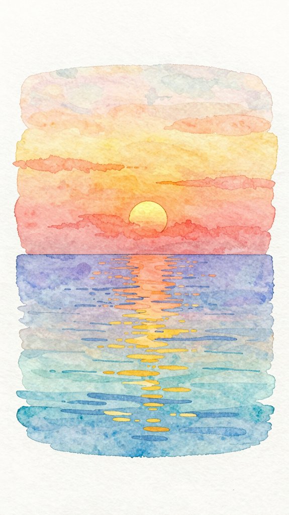
When you’re just starting with watercolors, a sunset ocean scene offers the perfect first project because it forgives mistakes and celebrates happy accidents. We’ll create a glowing horizon by blending warm colors—orange, pink, and yellow—directly on wet paper. This technique, called wet-on-wet, lets colors flow together naturally!
Start by wetting your paper with clean water using broad strokes. While it’s still damp, add your sunset colors horizontally across the top half. Let them mix on their own—don’t overwork them.
For the ocean below, use cooler blues and purples, painting horizontal strokes to suggest calm water. Remember that using little pigment and lots of water will give you those pale, delicate washes perfect for capturing the soft glow of reflected sunset light on the water’s surface. Finally, add a serene silhouette of distant land or a sailboat using dark paint. These simple shapes create wonderful contrast against your colorful sky.
Easy Gradient Sky and Sea Horizon
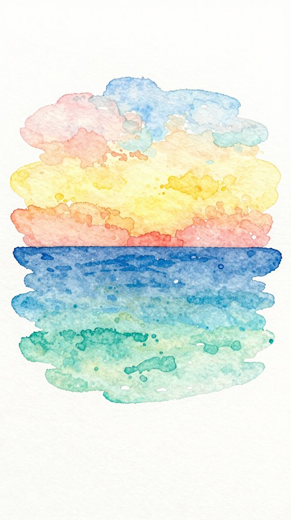
Creating smooth color shifts between sky and sea gives your painting depth and realism. We’ll master the blended color transition technique by working wet-on-wet, which means applying paint to damp paper. Start with a light wash across your entire paper using clean water. While it’s still moist, brush a pale blue at the top, gradually adding more water as you move downward. This creates that gorgeous gradient effect!
Timing matters – work quickly before the paper dries completely
Less pigment equals softer transitions – dilute your paint progressively
Horizontal strokes create natural-looking layers in both sky and water
Softening horizon line happens naturally when colors meet while wet
For best results, use 140 lb cold press paper minimum to prevent buckling when wet. We’re essentially letting the water do the blending work for us. Practice this foundation, and you’ll unveil countless ocean possibilities!
Beginner-Friendly Beach Scene With Gentle Waves
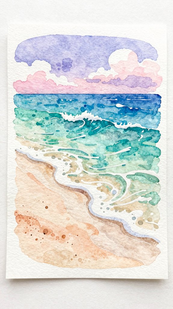
After mastering smooth gradients, we’ll build on that skill to paint our first complete beach scene. Start by creating a serene horizon line where sky meets water, using a single wet-on-wet wash. Let the blue fade lighter as it approaches the sand.
For gentle waves, paint horizontal curved lines with diluted paint, leaving white gaps to show foam. These white spaces make waves look realistic! Add a sandy shore using warm yellows and light browns.
Now here’s where we innovate: include coastal foliage reflections near the waterline by dabbing dark greens with your brush tip. This adds depth and interest. Work wet-on-dry for these details so colors stay crisp and defined. To enhance the illusion of distance, use atmospheric perspective by reducing contrast and softening details in the background water compared to the foreground shore elements.
Soft Watercolor Ocean Waves Using Wet-on-Wet Technique
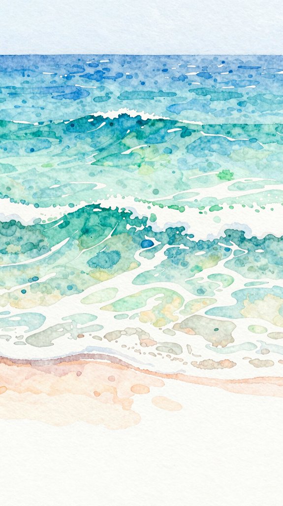
Since water constantly moves and shifts, the wet-on-wet technique captures that fluid quality perfectly. We’ll wet our paper first, then drop in colors while it’s still damp. This lets the paint spread naturally, creating those soft, dreamy waves we’re after.
Start by brushing clean water across your ocean area. While it glistens, load your brush with diluted blue and touch it to the wet surface. Watch the color bloom and spread! Adding texture comes from layering different blue shades while the paper stays moist.
- Let gravity help by tilting your paper slightly for natural flow
- Drop darker blues into lighter areas for depth
- Practice mastering fluid brush strokes with gentle, sweeping motions
- Work quickly before the paper dries completely
- Understanding effective use of light and shadow will help you create more realistic depth in your ocean waves
This technique creates beautiful, organic-looking waves effortlessly.
Minimalist Seascape With Sailboat Silhouette
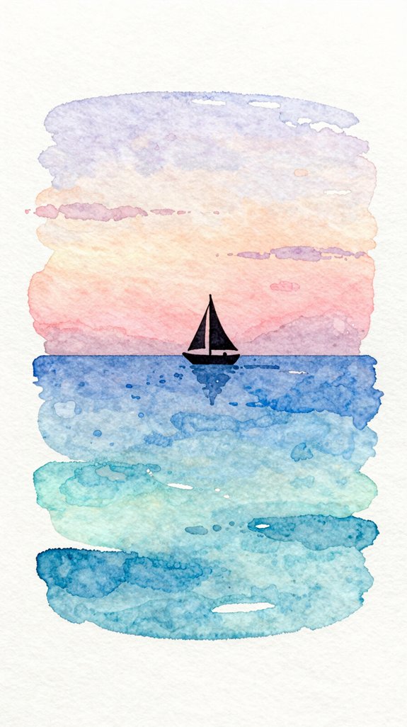
Minimalist art strips away unnecessary details, leaving only what truly matters to tell the story. We’ll create a stunning seascape using just a few elements: soft horizon gradients and a simple boat silhouette.
Start by wetting your paper with clean water. While it’s damp, apply a light blue wash at the top, then switch to warmer orange or pink near the bottom. This creates soft horizon gradients that blend naturally—no hard lines! The wet paper allows colors to flow into each other, which is a key watercolor mixing technique that produces seamless transitions. Let it dry completely.
Next, mix a darker blue or black for your simple boat silhouette. Use a small brush to paint a tiny triangle for the sail and a thin horizontal line for the hull. That’s it! The contrast between the gentle background and bold silhouette creates visual impact.
This approach proves that less really is more.
Peaceful Coastal Rocks and Tide Pools
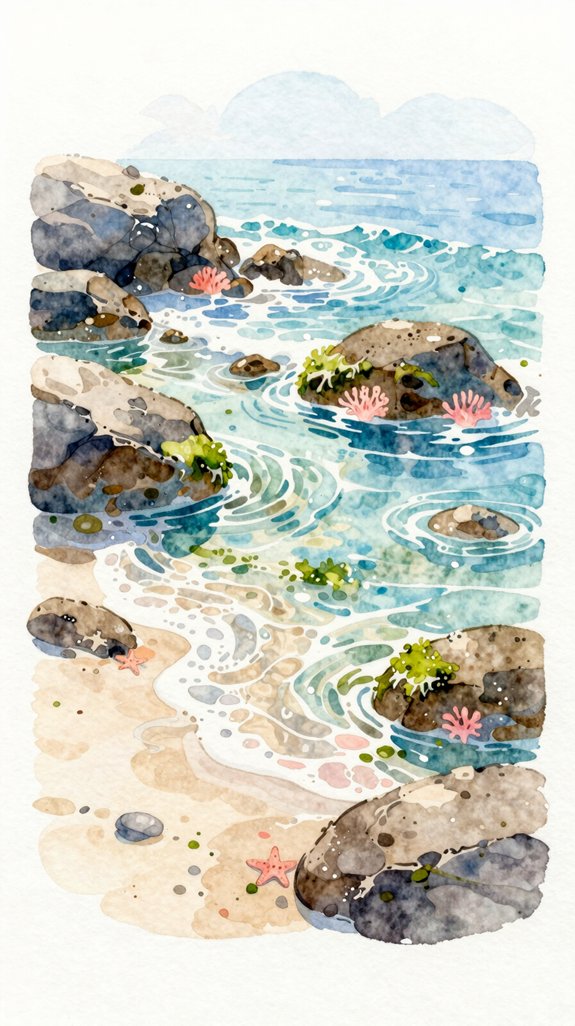
Coastal scenes come alive when you add texture and depth to rocky shorelines. We’ll create moss covered rocks using layered washes that give dimension.
Start with light gray for your base rocks, then add darker tones while the paint’s still damp. This wet-on-wet technique lets colors blend naturally! For tide pools, leave white spaces between rocks and fill them with light blue-green washes. Using glazing for translucent layers can help create the illusion of water depth in your tide pools.
- Texture variations: Mix salt into wet paint to create barnacle-like spots on rocks
- Dark crevices: Add deep shadows between stones using concentrated paint
- Moss details: Dab yellow-green on rock edges for that authentic coastal look
- Hidden tidal creatures: Suggest tiny starfish with simple orange dots
Let the layers dry completely before adding final details.
Ocean Waves Crashing on Sandy Shore
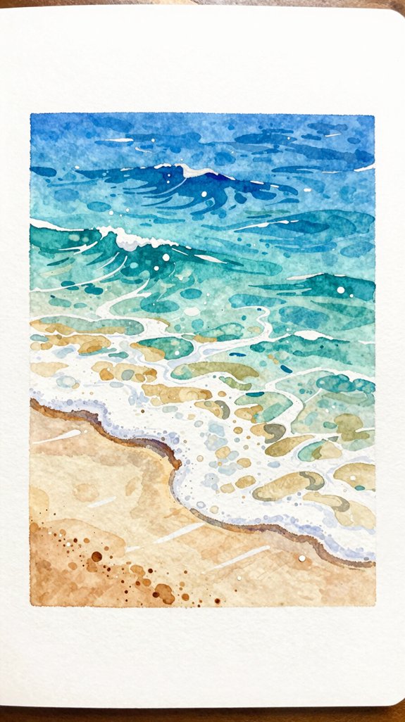
The magic of wave movement happens when you capture the foam, spray, and rolling water in action. Start by painting your sandy shore with warm yellows and light browns, leaving white paper where waves will crash.
Next, add your ocean using horizontal strokes of blue and teal. For crashing waves, lift your brush mid-stroke to create choppy whitecaps—those frothy white peaks that form when wind and water collide. Use a damp brush to soften edges where water meets sand, creating realistic foam patterns. Add darker blues underneath waves to show depth and shadow.
For spray effects, flick a wet brush gently toward your paper 🙂 If you want to add graphite pencil details for fine lines in foam or wave textures, you can layer them once your watercolor is completely dry. Finally, layer thin glazes (transparent paint washes) over dry areas to build dimension and movement.
Tranquil Tropical Waters in Turquoise and Blue
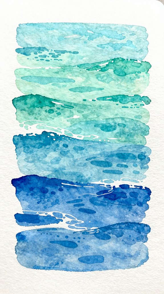
When you’re painting calm tropical waters, you’ll notice they’ve a special glow that’s different from stormy seas. These serene island vistas demand lighter, translucent layers that let white paper shine through. Start with a pale turquoise wash, keeping your brush strokes horizontal and smooth. Let each layer dry completely before adding the next one!
Tropical waters require patient layering and horizontal brushwork to capture their luminous, translucent quality on white paper.
- Light penetration: Clear water allows sunlight to reach the sandy bottom, creating that iconic glow
- Layered depth: Build gradual shifts from shallow turquoise to deeper blue
- Minimal texture: Use smooth, controlled washes instead of rough, choppy techniques
- Vibrant coral reefs: Add hints of warm colors beneath the surface for reef suggestions
Mix cerulean blue with just a touch of green for authentic tropical hues. Mastering water control is essential for achieving those smooth, luminous washes that make tropical scenes so captivating.
Dramatic Stormy Sea With Dark Clouds
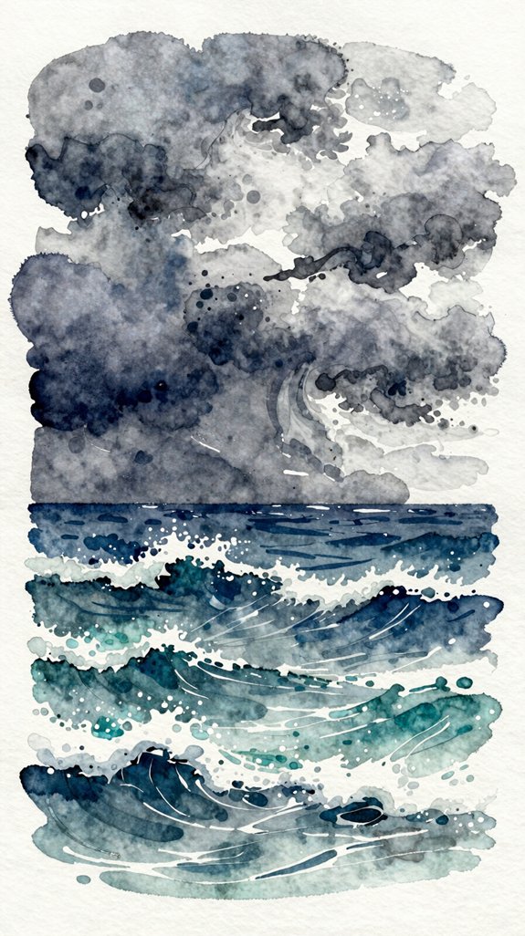
While tropical waters celebrate sunshine and clarity, stormy seas give us a chance to explore watercolor’s moody, powerful side. We’ll create drama using darker pigments like Payne’s gray and indigo mixed together.
Start with wet paper to let colors blend naturally. Paint your sky first, adding heavy clouds with concentrated pigment at the top. Leave some white spots—these become light breaking through!
For turbulent wave motion, use diagonal brushstrokes that curve and overlap. This creates movement and energy. Moody lighting effects happen when you contrast dark and light areas. Let your darkest grays sit next to bright whites where waves crest. This approach mirrors chiaroscuro technique, where dramatic contrast between light and dark creates strong three-dimensional effects and mood. Add texture by lifting paint with a dry brush or paper towel. Your stormy scene will feel alive and powerful!
Lighthouse Against an Ocean Backdrop
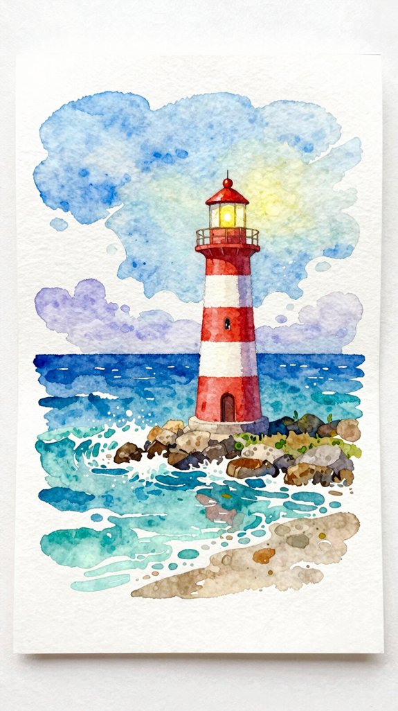
Lighthouses bring wonderful focal points to ocean paintings because they add vertical interest and tell a story.
Lighthouse placement matters for composition. Position your lighthouse off-center using the rule of thirds—this creates visual balance. Place it on rocks or a cliff to establish height drama!
Off-center lighthouse placement using the rule of thirds creates compelling visual balance and dramatic height when positioned on cliffs or rocky outcrops.
Consider these lighthouse details for depth:
- Paint the tower first in simple cylindrical shapes, adding stripes or bands afterward
- Include a bright beacon at top using masking fluid to preserve white paper
- Add surrounding rocks with rough, angular brushstrokes for texture contrast
- Suggest weathering with light gray washes—lighthouses face harsh ocean conditions
We’ll sketch lightly in pencil first, then build layers. Start with pale washes for the structure, gradually adding darker values. This technique lets us correct mistakes easily while learning. Understanding how value creates depth and mood will help you achieve realistic dimension in your lighthouse painting. Your lighthouse will anchor the entire scene beautifully!
Abstract Ocean Textures and Foam Patterns
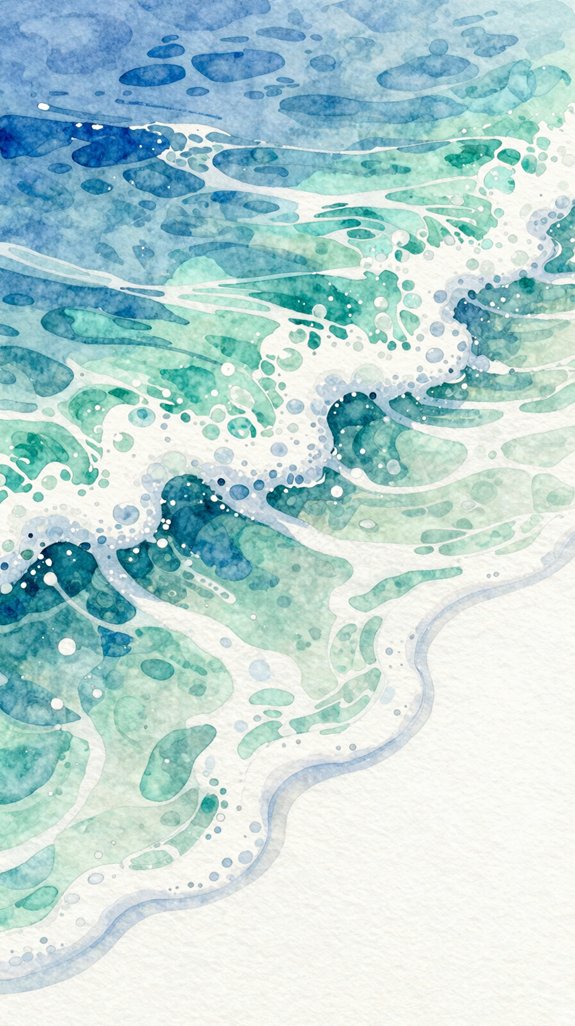
Ocean foam creates exciting opportunities to experiment with loose, expressive techniques that don’t require perfect control. We’ll use spontaneous brushstrokes to capture those bubbly, white patterns where waves break and crash.
Start by painting your ocean base in blues and greens. While it’s still damp, load a dry brush with white paint and drag it lightly across the surface. This creates flowing water textures that look natural and energized! The white catches on the paper’s texture, leaving gaps that suggest movement.
For ocean foam brushwork, tap your brush perpendicular to the paper to make irregular dots and clusters. Don’t worry about perfection—real foam is chaotic and random. Layer different whites and pale blues for depth. Let happy accidents happen; they’ll add authentic character to your seascape!
Golden Hour Reflection on Still Water
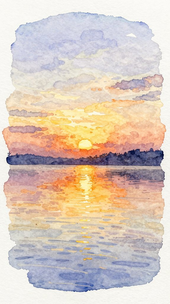
When the sun sits low on the horizon, it paints the water with warm oranges, pinks, and gold. We’ll capture this magical moment by layering translucent washes that create reflective colors dancing across our paper.
Start with pale yellow at the horizon line, then add diluted orange above it. While the paint’s still damp, drop in touches of pink—this creates that shimmering surface effect we’re after.
Here’s what makes this technique work:
- Wet paper lets colors blend naturally, mimicking how light spreads across water
- Horizontal brush strokes suggest calm, undisturbed surfaces
- Leaving white gaps between strokes creates sparkle and light reflection
- Warm colors appear stronger near the sun’s position, fading outward
Let the layers dry between applications. This builds depth and luminosity!
Frequently Asked Questions
What Type of Watercolor Paper Weight Works Best for Ocean Scenes?
We recommend 140lb (300gsm) paper for ocean scenes. It offers excellent absorbent paper qualities that prevent buckling while maintaining ideal moisture levels. You’ll find textured paper options like cold-pressed create stunning wave effects through natural pigment dispersion.
How Do I Fix Mistakes or Lift Paint From Dried Watercolor?
We’ll lift dried watercolor by reactivating dried paint with a damp brush, then blotting with tissue. For controlling paint bleeding during corrections, we keep our brush only slightly moist and work in small sections systematically.
Can I Use Masking Fluid to Preserve White Areas in Ocean Paintings?
Think of masking fluid as your creative shield. We’ll apply it to preserve brilliant whites for foam and wave highlights. The trick is using masking fluid on dry paper, then maintaining proper paper moisture when painting around it.
What Brushes Are Essential for Painting Watercolor Ocean Scenes as a Beginner?
We’ll need round brushes in sizes 6, 10, and 12 for mastering paint consistency and color blending techniques. A flat wash brush transforms how you’ll create atmospheric skies and seamless water gradients efficiently.
How Long Should I Wait Between Layers When Painting Ocean Scenes?
We’ll wait 5-10 minutes between layers for suitable moisture levels. Drying time between layers varies with humidity, but testing paper dampness guarantees we’re building translucent ocean depths without muddying colors or losing those brilliant wave effects.
Conclusion
We’ve covered endless possibilities for painting beautiful ocean scenes, from calm sunsets to dramatic storms. Each technique builds your confidence and skill with watercolor. Don’t worry if your initial attempts aren’t perfect—that’s completely normal! The ocean is forgiving because it’s always moving and changing. Grab your brushes, pick your favorite scene, and start painting. You’ll be amazed at what you create. Recollect, practice makes progress, and every brushstroke teaches you something new. Happy painting! 🎨
Have any thoughts?
Share your reaction or leave a quick response — we’d love to hear what you think!
-
 0
0
-
0
-
0
-
0
-
0
-
0


