

Apple watercolor is one of those subjects that rewards you fast: a few loose washes, a line of ink, and you already have something worth pinning to the fridge. The round shape forgives a wobbly brush, the colors mix themselves from reds, greens and a little plum purple, and every apple looks better with a bit of a story around it, a basket, a ladder, a warm pie.
Below you will find 29 ideas that start with a single apple on its stem and grow into a whole orchard: trees heavy with fruit, a girl reaching up to pick one, farm stand crates, caramel apples, and then quinces, figs, apricots and plums to round out the harvest table. Work through them in order if you like building skills, or just scroll until one grabs you and get your brush wet.
Using these images: free for personal projects such as printing, coloring, cards, journals and gifts. Handmade items that include them may be sold up to 30 pieces per design. More than that is commercial use and is not permitted, and neither is selling or sharing the images themselves or passing them off as your own. Please ask before any other use.
Start simple with a red apple still on its short stem, one leaf attached. Pencil a loose circle with a slight dent at the top, then drop in a wet wash of cadmium red and a touch of yellow at the bottom, letting the two colors bleed together on wet paper rather than mixing them on the palette first.
While that wash is still damp, touch in a darker red-brown along one side so the shadow blooms softly instead of sitting as a hard line. Let the whole apple dry completely before you add the stem and leaf in ink, or the brown will bleed into the leaf green and muddy it.
If your red looks flat, this is where proportion matters: compare the width of the apple to its height before you commit to the circle, most apples are very slightly wider than tall, not perfectly round. A kneaded eraser lifts stray pencil lines once the paint is dry.
Keep a scrap of paper beside you to test how wet your brush is before the first wash goes down, that one habit saves most beginner apples from turning into a puddle.
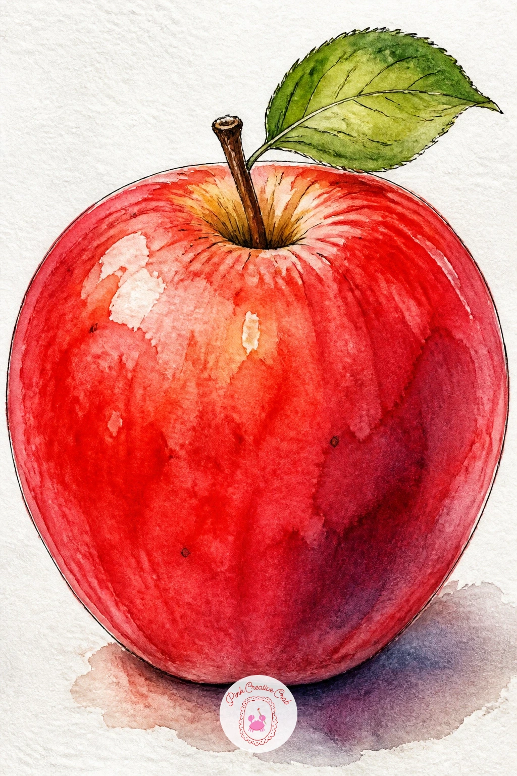
Palette: Cadmium Red,Permanent Rose,Sap Green,Burnt Sienna
Slicing the apple open gives you the five-pointed star of seeds, one of the most satisfying shapes in fruit painting. Lay a pale wash of yellow-green across the flesh first, leaving tiny white highlights untouched where the cut surface catches light, then drop a thin ring of red-brown just inside the skin edge while the wash is still wet.
Once that layer is bone dry, paint the thin skin rim in a stronger red and let it dry again before adding the seed star in ink, dark brown-black with a very fine nib. Seeds that run together into a blob are the most common mistake here, so pause and draw each one as a small separate teardrop before filling it in.
Set the cut half beside a whole apple for scale and contrast, this is an easy way to practice comparing two shapes side by side in one composition. If your fine liner bleeds on your paper, a dip pen with waterproof ink is a good swap.
Finish by flicking a few tiny ink dots near the core for texture, it reads as pulp without any extra painting.
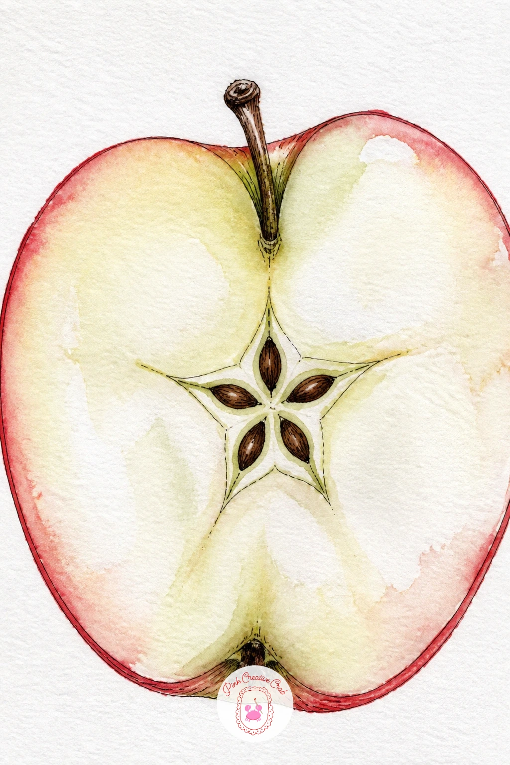
You Will Need
- fine dip pen or waterproof fineliner
Palette: Lemon Yellow,Sap Green,Burnt Sienna,Payne’s Grey
This one adds a setting: a woven basket of apples resting on a rung of a wooden orchard ladder. Block in the ladder first in a thin wash of raw umber, keeping the wood lines loose and slightly uneven since a perfectly straight ladder looks stiff in watercolor.
Paint the basket as a warm ochre weave, using short dry brush strokes dragged sideways to suggest the texture of woven cane without drawing every strand. Drop the apples in last, a cluster of reds and greens overlapping each other so some are only partly visible behind the basket rim.
Eye level matters here: if you place the horizon low in your mind, looking up slightly at the ladder, the rungs will angle more dramatically and give the whole scene a sense of height. Keep the background plain or washed in pale sky blue so the ladder and basket stay the focus.
A beginner version can skip the full ladder and show just one rung with the basket balanced on it.
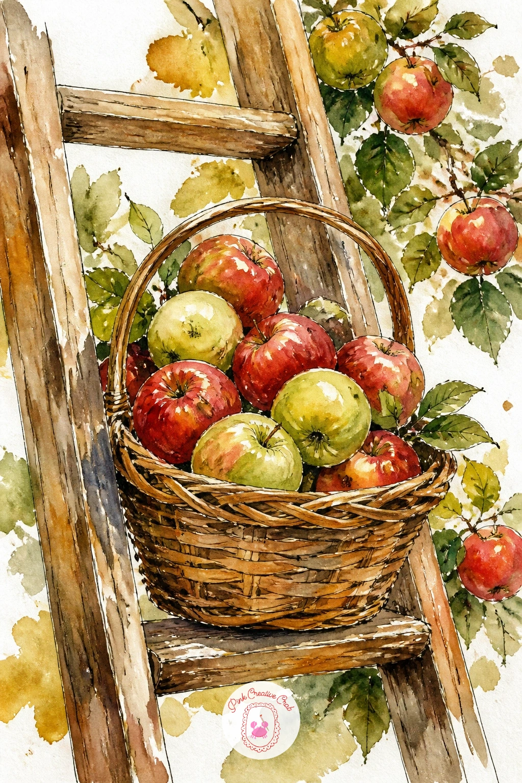
Palette: Raw Umber,Yellow Ochre,Cadmium Red,Sap Green
Apples bobbing in a tub brings in reflections and ripples, a fun texture challenge after the quieter still lifes. Paint the water first as a flat wash of pale blue-grey across the tub shape, then while it is still wet, lift a few curved lines with a damp clean brush or a paper towel to suggest ripples catching light.
Drop the apples on top once the water layer is dry, painting only the top half of each one visible above the surface, with a slightly darker, more muted version of the same red just below the waterline to suggest the submerged part refracting through water.
The edges are where this goes wrong most: a hard, crisp edge where apple meets water looks like a sticker, so soften that line with a damp brush right after you lay the color, pulling it gently into the water wash.
If you want the quick version, paint just two apples and loose ripples in ten minutes. Given more time, add the wooden tub rim and a few dry leaves floating alongside for an autumn party feel.
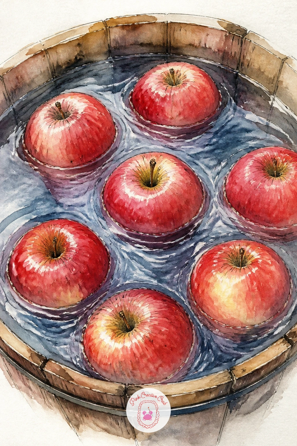
Palette: Payne’s Grey,Cerulean Blue,Cadmium Red,Sap Green
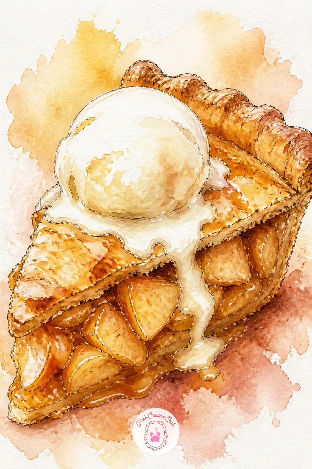
Move from orchard to kitchen with a wedge of apple pie topped with a melting scoop of cream. Start with the pastry crust in a warm golden wash, leaving the very top edge paler where it has baked lighter, then paint the visible apple filling inside as overlapping curved slices in warm orange-brown.
The cream scoop goes down wet, a pale warm white-grey shadow mix pulled into a rounded dome shape with one side left almost paper-white for the highlight. Let that dry before adding a thin ink line around the crust edge to crisp it up, since cream and crust both read better against a defined pastry outline.
If the filling looks too smooth and uniform, that is the usual mistake. Vary the tone of each apple slice slightly so the inside reads as layered fruit rather than a solid block of orange.
Finish with a dusting of tiny brown dots for cinnamon across the crust top, flicked on with an almost-dry brush. If you enjoy baked goods in paint, the bread watercolor ideas make a good companion project.
Palette: Yellow Ochre,Burnt Sienna,Cadmium Orange,Titanium White
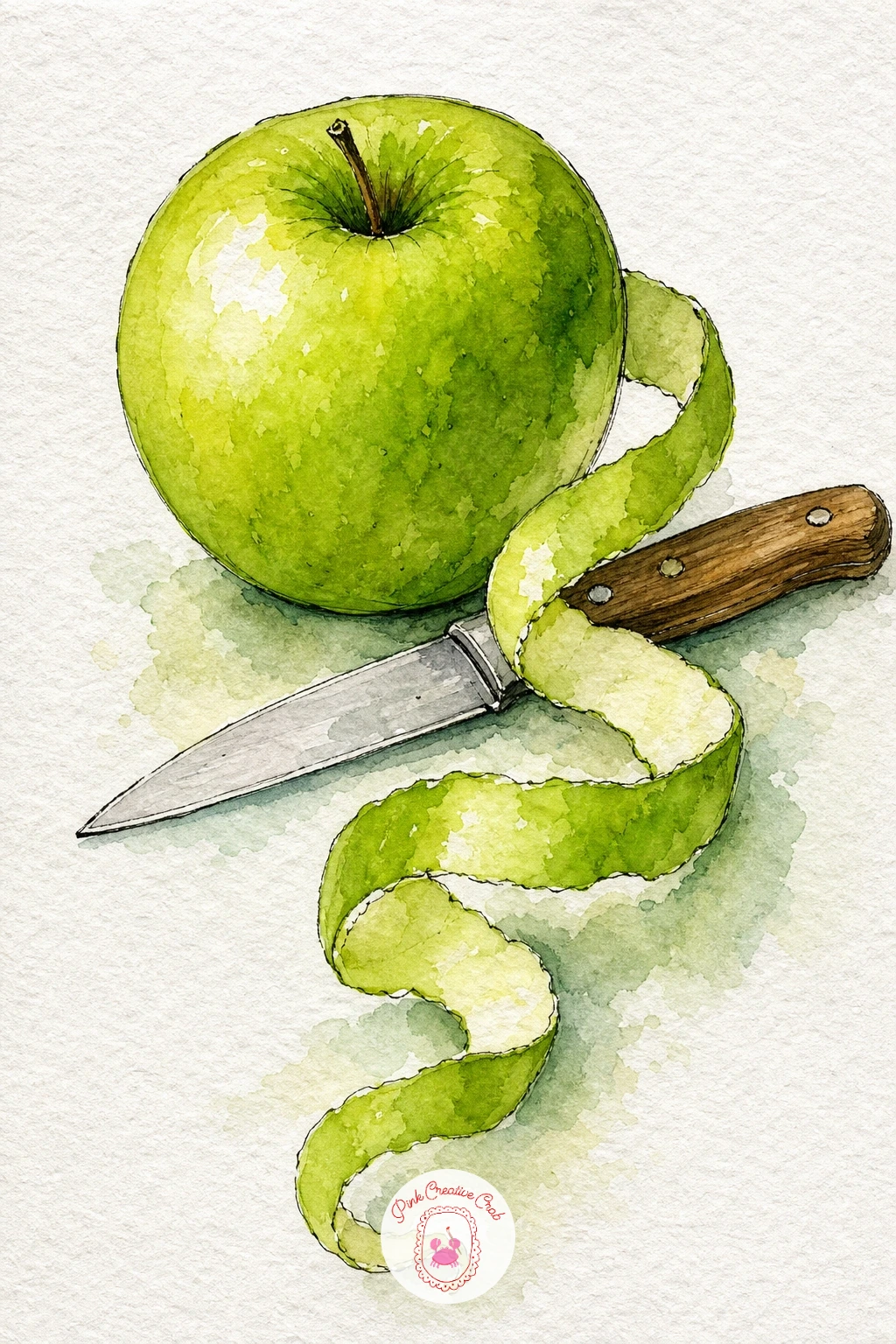
A green apple beside a paring knife with one long unbroken peel spiral is a satisfying composition because the spiral gives you a loose, curling line to play with after all the round shapes. Paint the apple first in a yellow-green wash with a cooler green shadow on one side, then let it dry fully.
The peel spiral is painted as one continuous curved ribbon in a slightly duller version of the apple green, thin at the ends and a touch wider in the middle coils, trailing off the table edge for movement. Add the knife last in cool grey with a thin ink line for the blade edge, keeping the handle warm brown.
Curling ribbons like this go wrong when they look stiff or symmetrical; vary the width and the curve radius as you paint so it reads as a real unwound peel rather than a drawn spring.
Try this one in ten minutes with just the apple and a short peel curl, or spend forty minutes adding a cutting board and a few seeds scattered beside the knife.
Palette: Sap Green,Lemon Yellow,Payne’s Grey,Burnt Sienna
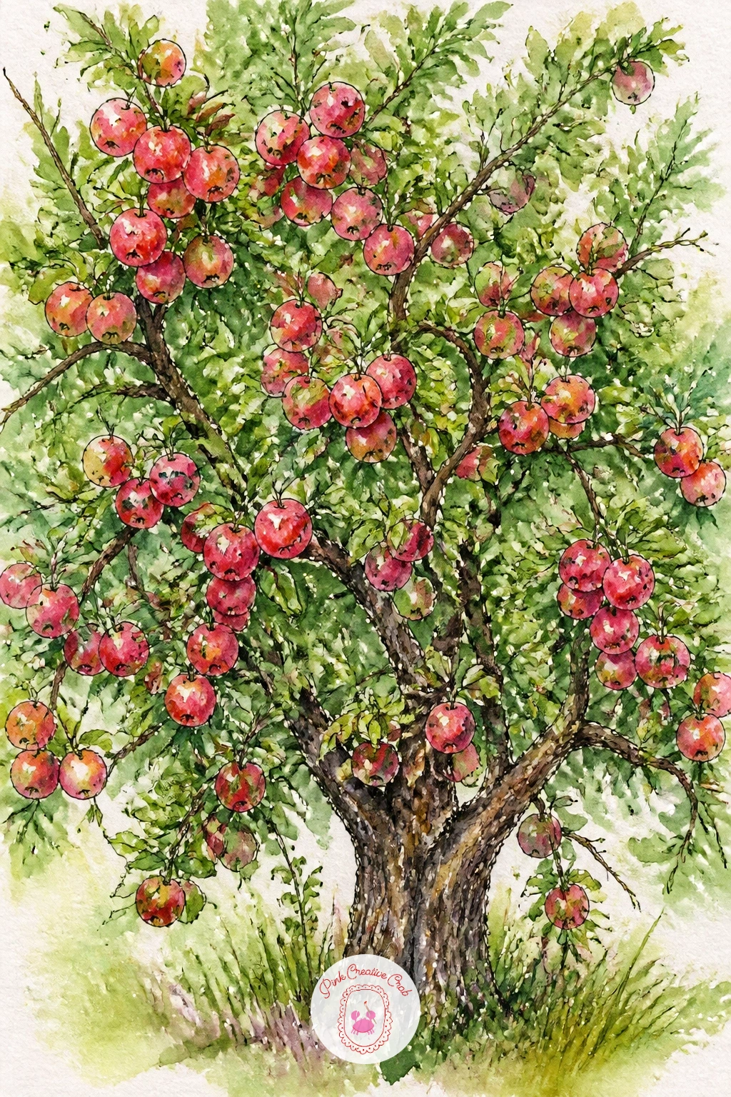
Scale up to a whole apple tree, its branches bending under the weight of fruit. Block in the canopy first as a loose, irregular cloud of green using a large round brush and plenty of water, letting some patches dry lighter and others pool darker so the foliage has natural variation rather than one flat green mass.
While the canopy is still slightly damp, dot in the apples as small circles of red and yellow-green scattered through the leaves, concentrating more near the lower branches where real fruit tends to hang heaviest from gravity. Paint the trunk and branches last in a dry brush of burnt umber once everything else has dried, so the dark bark lines stay crisp against the soft canopy.
Trees go wrong when the canopy looks like a solid green ball; break it into two or three overlapping, irregularly shaped masses instead of one perfect circle.
A beginner can paint just the top half of a young tree; a confident painter can add a ladder leaning against the trunk and a basket waiting below. For more orchard inspiration, the fall watercolor ideas cover similar golden-light scenes.
Palette: Sap Green,Hooker’s Green,Cadmium Red,Burnt Umber
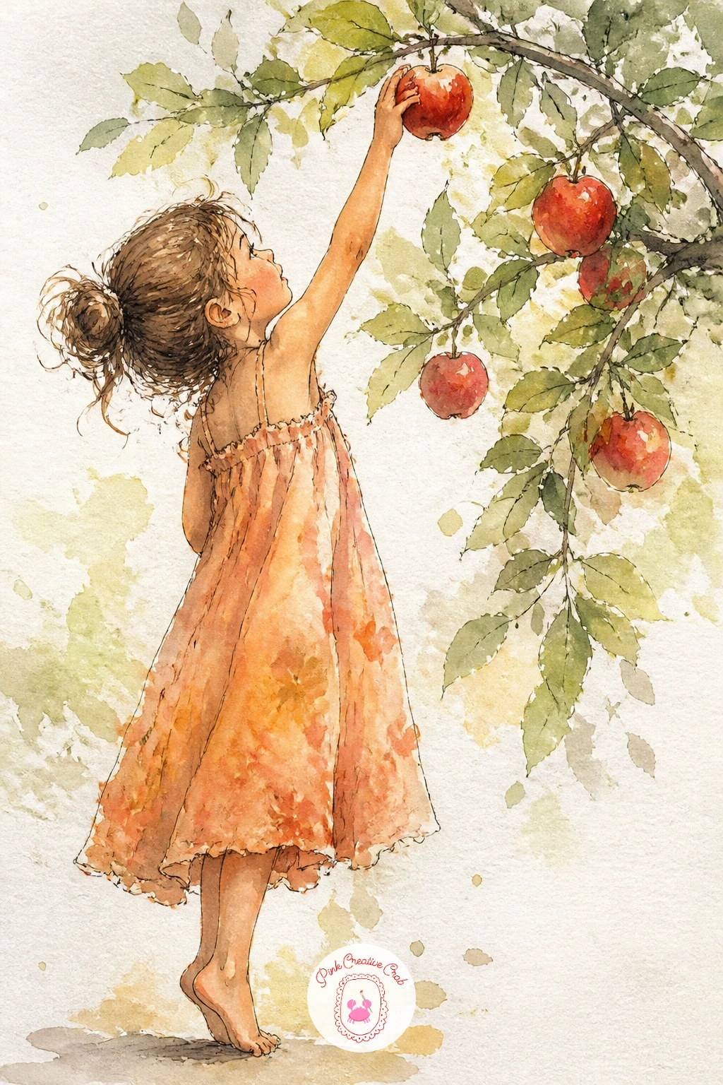
Add a figure for the first time with a girl reaching up on tiptoe to pick an apple from a low branch. Sketch her in pencil first as simple shapes, an oval head, a rectangle torso, two long limbs, keeping proportions loose rather than anatomically precise since a slightly simplified figure actually suits this loose style better.
Paint her dress or sweater in one flat wash of a warm color first, then move to skin tone, then hair, working light to dark so you never paint a pale color over a dark one. The reaching arm is the trickiest part; keep it slightly bent rather than ruler-straight, which reads as more natural movement.
Add just a hint of branch and two or three apples near her hand rather than a full tree, which keeps the focus on the gesture of reaching. If figures intimidate you, start with her from behind so you avoid painting a face at all.
Ink a few quick lines for hair strands and fingers last, once every wash is fully dry.
Palette: Cadmium Red,Yellow Ochre,Burnt Sienna,Sap Green
Paint her from behind, facing the tree, if faces feel tricky. It keeps the gesture of reaching upward as the whole story and removes the hardest part of the drawing.
A wooden crate overflowing with red, green and yellow apples at a farm stand makes a cheerful still life with built-in color variety. Paint the crate first as a simple open box shape in raw umber, leaving the inside hollow and unpainted until the apples go in.
Fill the crate with a mix of apple colors, varying the red, green and yellow so no two apples look identical, and let some overlap the crate edge so a few appear to be tumbling slightly over the side. Keep the apples toward the front larger and more detailed, with ink outlines, while the ones toward the back stay softer and less defined, which gives the pile a sense of depth without any real perspective drawing.
Overcrowding the crate until it reads as a solid blob is the usual trap; leave small gaps of white paper between some apples so each one keeps its own shape.
Swap the crate for a simple basket if a wooden box feels fiddly to draw.
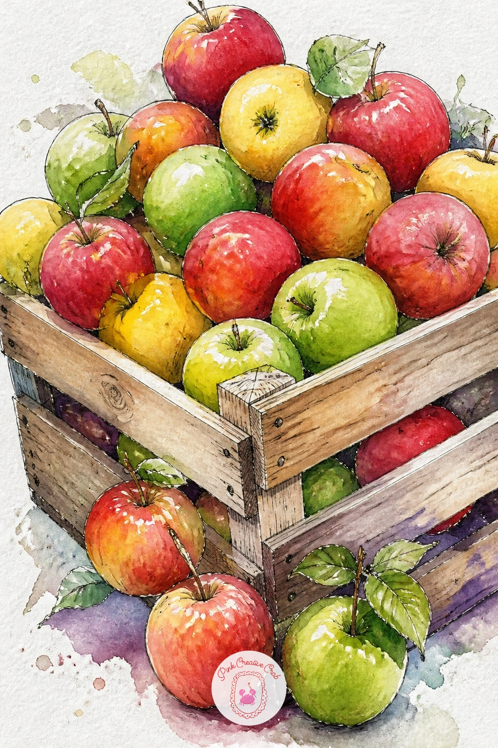
Palette: Raw Umber,Cadmium Red,Sap Green,Lemon Yellow
Caramel apples on sticks bring in a glossy highlight challenge after all the matte fruit skins so far. Paint each apple as a dark red-brown base first, since the caramel coating muddies the bright apple red you have used elsewhere, then while still damp drop in a richer caramel brown around the lower half where the coating pools thicker.
Leave a single curved streak of white paper untouched on each apple for the glossy highlight; this is the detail that sells the shine, so resist the urge to paint over it. Add the wooden stick in a thin ink line once the apple is dry, poking straight up from the top.
Flat, dull caramel is the common failure here; keep that highlight stripe crisp and maybe add a tiny second sliver of reflected light lower down for extra shine.
Arrange three or four on a simple tray or wax paper square for a quick ten-minute version, or add chopped nuts pressed into the caramel with small brown dots for a more detailed piece.
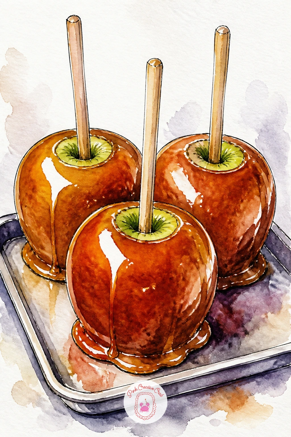
Palette: Burnt Sienna,Vandyke Brown,Cadmium Red,Titanium White
An apple resting on a stack of old books with a pencil beside it makes a quiet desk still life, perfect for a study break painting. Paint the books first, each one a different flat color, keeping the stack slightly uneven rather than perfectly aligned so it reads as well-used rather than staged.
Let the books dry fully before adding the apple on top, since a wet apple wash touching wet book color will bleed into an unwanted blend. Paint the apple in your usual red-to-green gradient, then drop a soft grey cast shadow where it meets the top book cover to ground it in place.
Add the pencil last in ink, a simple long triangle with a short dark tip, resting at an angle against the book stack. A stack that looks like it might topple is the usual giveaway of poor proportion, so compare each book’s width to the one below it before you commit to the outline.
Swap the pencil for a pair of reading glasses if you want a slightly different mood.
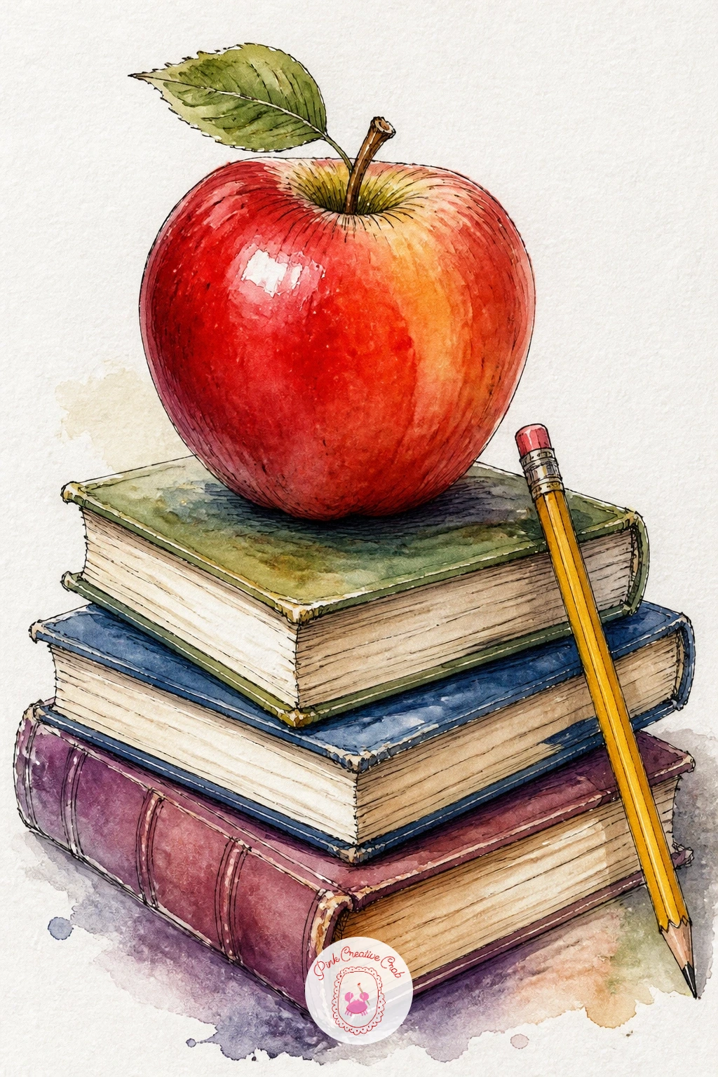
Palette: Cadmium Red,Payne’s Grey,Burnt Sienna,Sap Green
Jump back to spring with a branch of apple blossom, pale pink-white flowers against dark bark. Paint each blossom as five soft petals in a very pale pink wash, dropping a slightly stronger pink into the petal base while wet so the color pools naturally toward the center rather than sitting flat.
Leave the flower centers as small dots of white paper, adding a cluster of fine yellow-tipped stamens in ink once the petals are completely dry. The branch itself goes in last, a dry brush line of grey-brown with a few small dark knots where twigs join.
Muddy, overworked petals are the main risk with blossom; touch the brush to the paper once per petal and let the water do the blending rather than scrubbing back into it. If pink feels tricky to mix, a ready-made quinacridone rose straight from the tube works well.
For more flower-painting technique at every stage, the watercolor flowers tutorial walks through building petals from bud to full bloom.
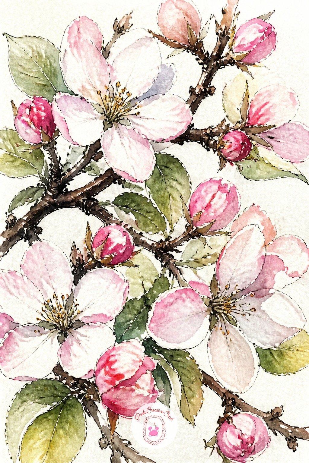
Palette: Quinacridone Rose,Titanium White,Yellow Ochre,Burnt Umber
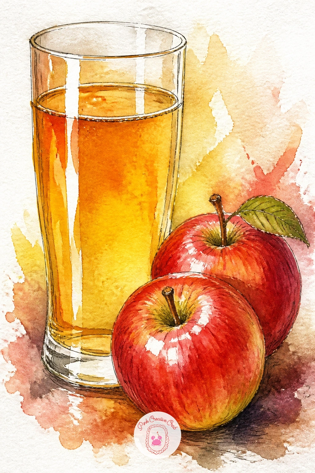
A tall glass of amber cider with a couple of apples beside it makes a nice warm-toned pairing. Paint the glass shape first with a very pale grey outline wash, leaving the rim and one vertical strip of highlight as untouched white paper, then drop the cider color inside as a warm golden-amber, darker toward the bottom where liquid pools deeper.
Let the glass dry before painting the apples beside it so their red does not creep into the amber. A thin band of foam or bubbles at the cider surface can be suggested with tiny flicks of white gouache or simply left as unpainted paper dots.
Glass often looks flat without a clear light source in mind; decide where your light comes from before you paint, then keep the highlight strip on that same side consistently down the whole glass.
If gouache is not in your kit, a sharp white gel pen does the same job for the bubble highlights once the paint is dry.
You Will Need
- white gel pen or white gouache
Palette: Yellow Ochre,Burnt Sienna,Cadmium Red,Payne’s Grey
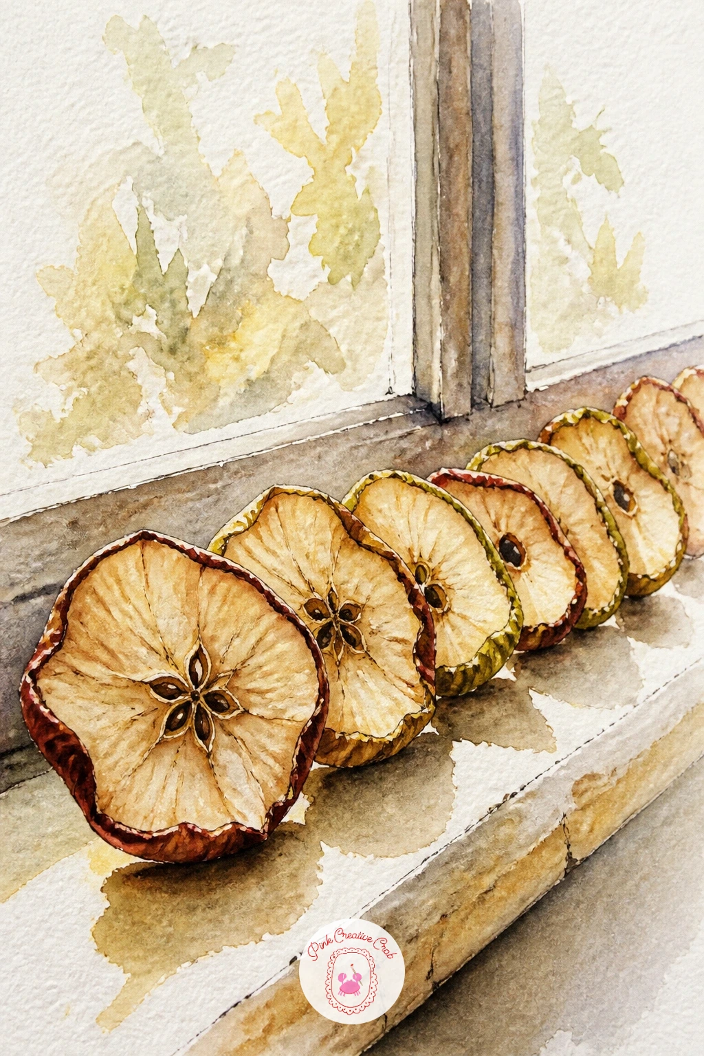
A row of apple slices drying on a sunny windowsill gives you a chance to paint fruit at a different stage, shriveled and golden rather than plump and glossy. Paint each dried slice as an uneven, slightly curled shape in warm ochre and brown, much duller and flatter than a fresh apple’s bright color.
Vary the tone across the row so some slices look more dried than others, since uniform color across every piece looks less convincing than real variation. Let the windowsill itself stay simple, a thin horizontal line of pale grey-blue with maybe a hint of glass reflection behind, so it does not compete with the fruit.
The mistake to watch for is painting dried apple the same bright red as fresh apple; mute it down with a touch of its complementary green before it goes on the paper.
Keep this one to just three or four slices for a calm, quick composition, or add a small paring knife and a bowl of fresh apples nearby to show the before and after.
Palette: Yellow Ochre,Burnt Sienna,Raw Umber,Payne’s Grey
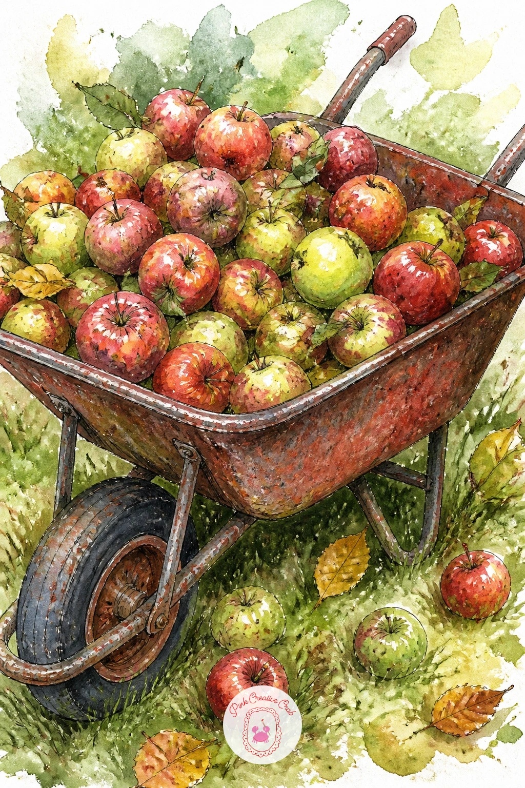
A rusty wheelbarrow piled with windfall apples, some bruised, sits well as a harvest-season scene. Paint the wheelbarrow body first in a weathered red-brown, leaving the metal wheel and handle grips for a cooler grey, and let a few streaks of darker rust show through with dry brush strokes along the lower edge.
Fill it with apples in your usual mixed reds and greens, but give two or three a small brown-grey bruise mark, a soft blotch rather than a hard spot, to suggest real windfall fruit rather than market-perfect produce. Ground the whole wheelbarrow with a cast shadow beneath the wheel so it feels like it is sitting on grass rather than floating.
A wheelbarrow that tips visually, looking like it will roll out of the painting, usually means the wheel sits too far from center; check that the wheel lines up roughly under the middle of the load before you ink the outline.
Add a few fallen leaves scattered on the ground around it for a quick seasonal touch.
Palette: Burnt Sienna,Payne’s Grey,Cadmium Red,Sap Green
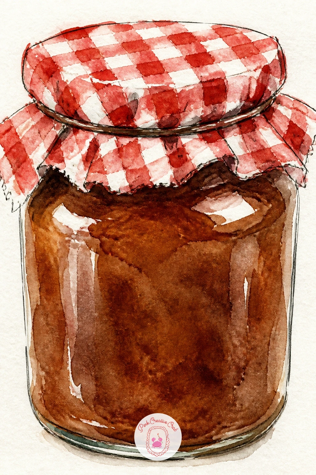
A jar of dark apple butter with a gingham fabric lid is a cozy pantry subject that leans on pattern work. Paint the jar glass first as a very pale wash with a slightly darker vertical edge for roundness, leaving the label area blank, then fill the inside with a deep warm brown for the apple butter, darker than any apple color used so far.
The gingham lid is painted as a grid of small overlapping squares in a single color, red or blue, over a cream base; paint the base cream first, let it dry, then add the checks as separate light strokes so the pattern stays crisp rather than blurring into one wash.
Gingham often turns into a muddy plaid if painted wet into wet; keep each square stroke dry and deliberate, touching the brush down once per square rather than scrubbing.
If a full gingham pattern feels fussy, simplify the lid to a plain solid fabric color with just a tied string for texture instead.
Palette: Burnt Umber,Cadmium Red,Titanium White,Payne’s Grey
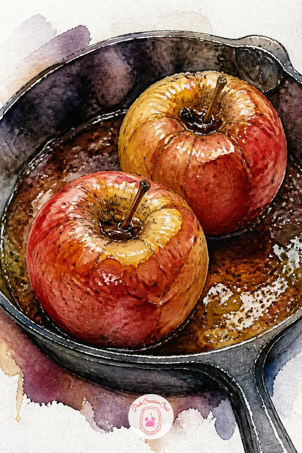
Whole baked apples glistening in a cast iron skillet bring warm oven tones into the mix. Paint the skillet first as a dark, almost black-grey circle with a lighter curved highlight along the rim to suggest its metal sheen, then let it dry before adding the apples inside.
The apples themselves go softer than fresh fruit, a deeper muted red-brown with a glossy wet-look highlight left as untouched paper or a thin streak of white gouache, since baked skin looks slack and shiny rather than taut and bright. A pool of buttery caramel sauce around the base of each apple, painted in warm gold, finishes the glossy oven look.
Flat, chalky skillet color is the common issue; keep that rim highlight curved and crisp since it is what reads as metal rather than a dark plate.
For a ten-minute version, paint just one apple in the pan; given more time, add two or three with cinnamon stick ink marks poking out of the tops.
You Will Need
- white gouache for highlights
Palette: Payne’s Grey,Burnt Sienna,Yellow Ochre,Vandyke Brown
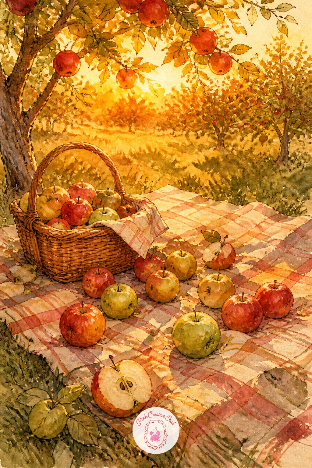
A picnic blanket spread under the trees at golden hour, apples and a basket scattered across it, pulls several earlier elements into one warm scene. Start with a wash across the whole background in warm gold and soft orange, letting it get slightly darker toward the edges of the page to suggest the low evening light.
Paint the blanket next as a simple striped or checked rectangle sitting on the grass, then add the apples, basket and maybe a cup scattered loosely across it, keeping each item fairly small since the light and mood carry this piece more than any single object.
A scene like this goes wrong if every element gets equal, sharp detail; let the background trees stay soft and underpainted while the blanket and nearest apple stay the crispest, most detailed part of the page.
Working at this time of day is really about light direction: keep every shadow falling the same way, long and warm-toned, to hold the golden hour feeling together.
Palette: Cadmium Orange,Yellow Ochre,Cadmium Red,Sap Green
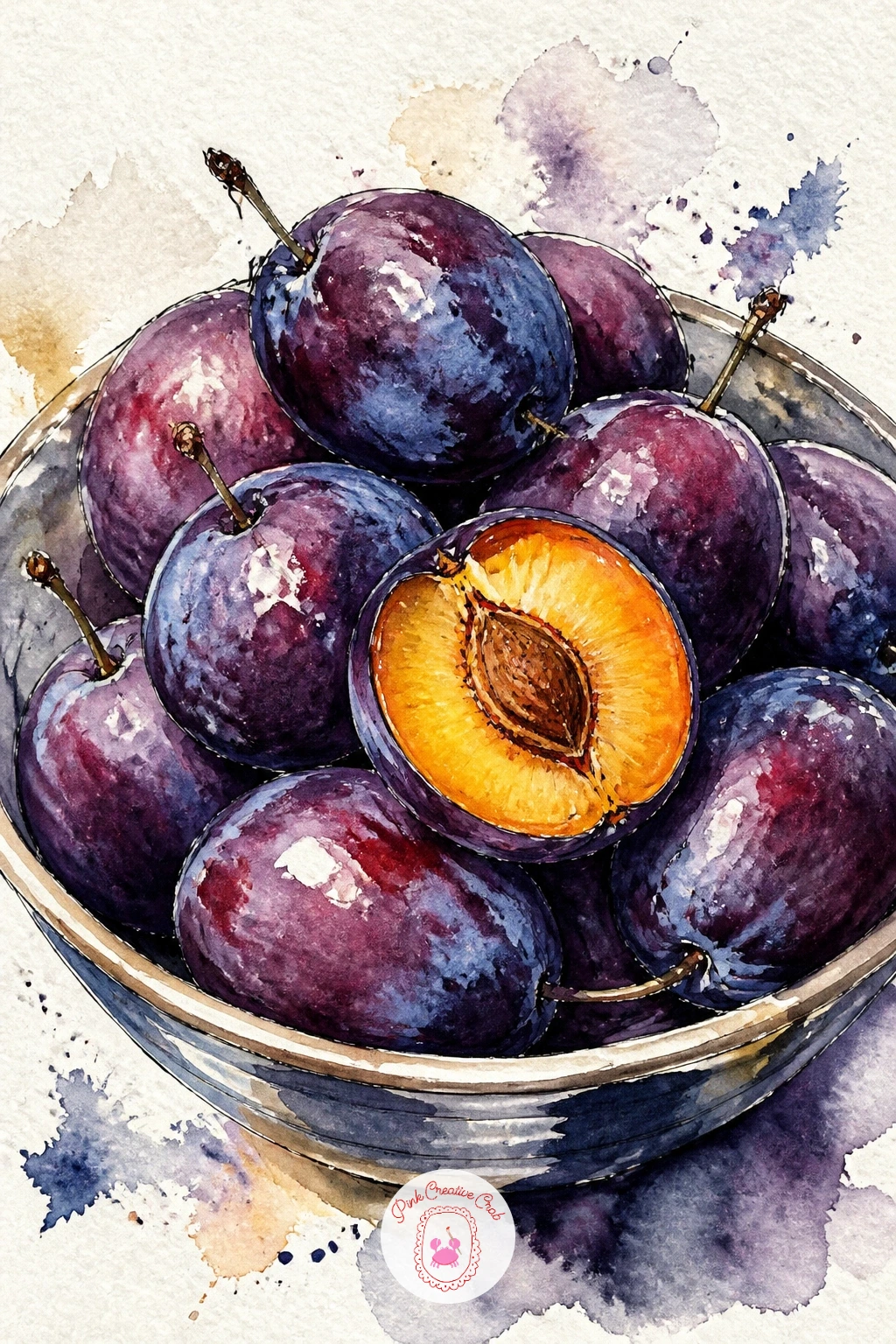
Moving into the other orchard fruit, a bowl of deep purple plums with one sliced open shows off the color shift from apple reds into cooler plum purples. Paint the whole plums first in a rich violet, dropping a touch of blue into the shadowed side while wet so the color deepens naturally rather than through a second flat layer.
Leave a small streak of pale blue-white bloom on each plum’s skin, the dusty surface coating real plums have, by simply not fully covering that patch with paint. The cut plum shows warm orange-yellow flesh with a dark pit sitting slightly off-center; paint the flesh first, let it dry, then add the pit and surrounding deep red ring in ink and a small wash.
Muddy, flat purple is the usual trouble here; mix your violet from red and blue rather than reaching for a tube purple straight, it gives more life to the color.
Nest the bowl of plums inside a simple round dish to anchor the composition.
Palette: Dioxazine Violet,Ultramarine Blue,Cadmium Orange,Vandyke Brown
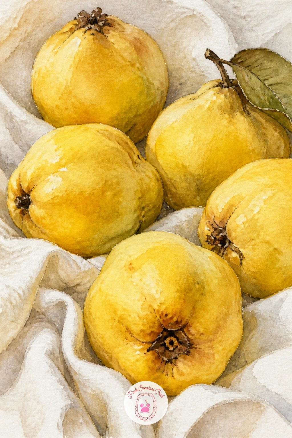
Quinces bring a soft, fuzzy golden-yellow into the lineup, very different from the smooth skin of apples and plums. Paint the quince base in a warm yellow wash first, then while still damp add patches of soft brown-grey mottling across the surface, since quince skin is naturally uneven and blotchy rather than smooth and uniform.
The fuzzy texture that coats a fresh quince can be suggested with a dry brush technique: load a flat or round brush with very little paint and drag it lightly across the dried quince surface in short strokes, which leaves a broken, textured mark rather than a solid one.
Lay the quinces on a simple linen cloth, painted as a pale warm grey with a few soft fold shadows, letting the folds run in one direction so the fabric reads as draped rather than flat.
If the mottling looks too busy, step back and leave more quince surface as clean yellow; a few confident blotches read better than many small ones.
Palette: Yellow Ochre,Raw Umber,Lemon Yellow,Payne’s Grey
A branch with a few ripe figs, one split open to show the jewel-toned inside, is one of the richer color moments in this whole list. Paint the outer fig skin first in a dusty purple-green, keeping it loose and slightly uneven since fig skin is never perfectly smooth.
The split fig is the star: paint the inner flesh as a deep pink-red gradient, then while damp, stipple in tiny dots of a darker red-violet across the center to suggest the seeds, using the tip of a small round brush rather than trying to draw each seed individually.
Overworking the seed texture into a solid dark mass is the main risk; keep the stippled dots separate and let some lighter pink show between them so the center still glows rather than reading as mud.
Add a leaf or two from the fig branch in a broad, lobed shape in deep green to frame the fruit, and paint the branch itself last in a simple dry brush brown line.
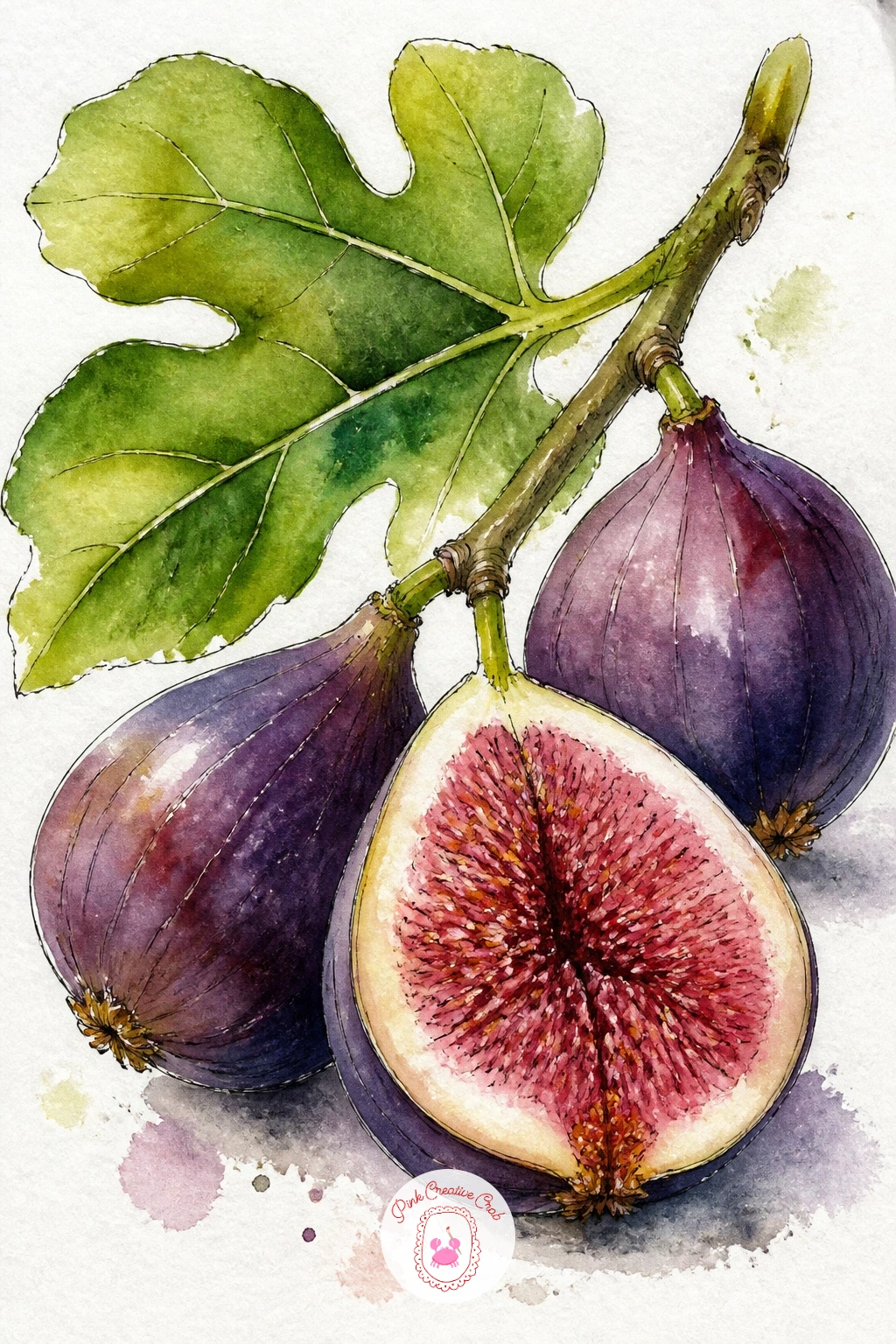
Palette: Dioxazine Violet,Permanent Rose,Hooker’s Green,Alizarin Crimson
Apricots piled in a blue ceramic bowl give you a chance to play warm orange against cool blue, a classic contrasting pairing. Paint the bowl first in a confident mid-tone blue, leaving a crisp white highlight strip along the rim, and let it dry completely before the fruit goes in so the colors stay clean and separate.
Each apricot takes a soft blush wash, warm orange-yellow with a touch of pink on the sun-facing side, and a small defined crease line down the center in a slightly darker tone to suggest the natural fruit groove. Overlap two or three apricots within the bowl so they read as a pile rather than a row of separate circles.
If the oranges and blues fight each other for attention, keep the bowl’s blue slightly greyed down and let the apricots carry the brightest color in the piece; a cooler, duller blue supports warm fruit better than a saturated one.
A single apricot resting just outside the bowl adds a nice finishing touch and breaks up the circular bowl edge.
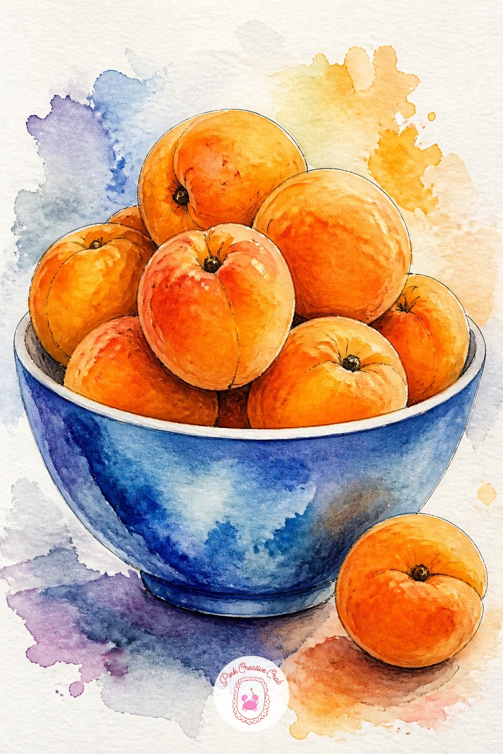
Palette: Cadmium Orange,Permanent Rose,Cerulean Blue,Titanium White
Unlike the rounder bowl of plums earlier, this idea keeps the damsons on their branch, small and oval with a powdery blue-grey bloom over deep purple skin. Paint each damson in a dark violet base first, then once dry, add a very light, almost dry scumble of pale blue-grey across part of each fruit to suggest that waxy bloom sitting on top of the color rather than mixed into it.
Keep the branch thin and wiry, painted in a single confident ink or dry brush line, with small pointed leaves in a dull green dotted along its length rather than clustered at one end.
Losing the bloom effect by making it too solid and opaque is the common issue; a light touch with a nearly dry brush, almost scrubbing rather than painting, keeps that chalky, broken texture convincing.
If you do not have a pale blue-grey mixed, a small amount of white gouache tinted with a touch of blue does the same job brushed thinly over the dried purple.
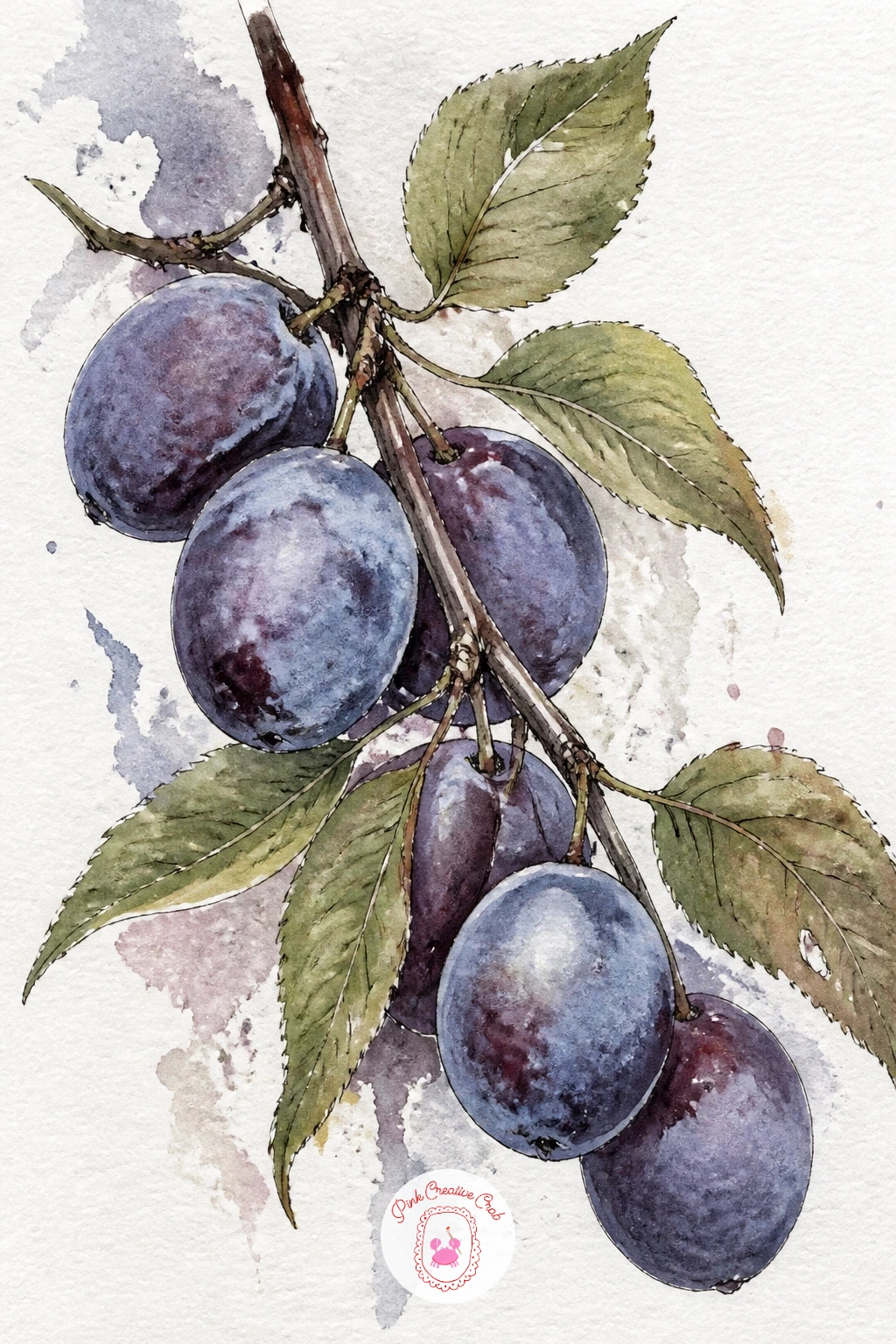
You Will Need
- white gouache for the bloom
Palette: Dioxazine Violet,Payne’s Grey,Sap Green,Titanium White
Bring the plums back to the kitchen with a plum tart, halved fruit arranged in rings over golden pastry, fresh from the oven. Paint the pastry base first in a warm honey wash, letting the edges go slightly darker and more toasted than the center, since an oven browns the rim first.
Arrange the plum halves in a simple overlapping circular pattern, each one a rich violet-red with the cut side facing up in a lighter warm tone where the pit sat. A light glaze wash of pale yellow brushed over the whole tart once everything else is dry suggests the glossy apricot-jam finish many tarts get, without needing to paint individual shine spots.
Plum tarts often go wrong when the fruit rings look too mechanically perfect; nudge a few plum halves slightly out of line and vary their sizes a touch so the tart looks handmade.
Finish with a thin ink line tracing the tart’s outer pastry edge to hold the whole shape together.
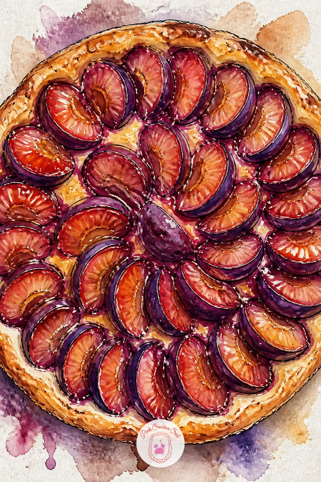
Palette: Yellow Ochre,Dioxazine Violet,Alizarin Crimson,Burnt Sienna
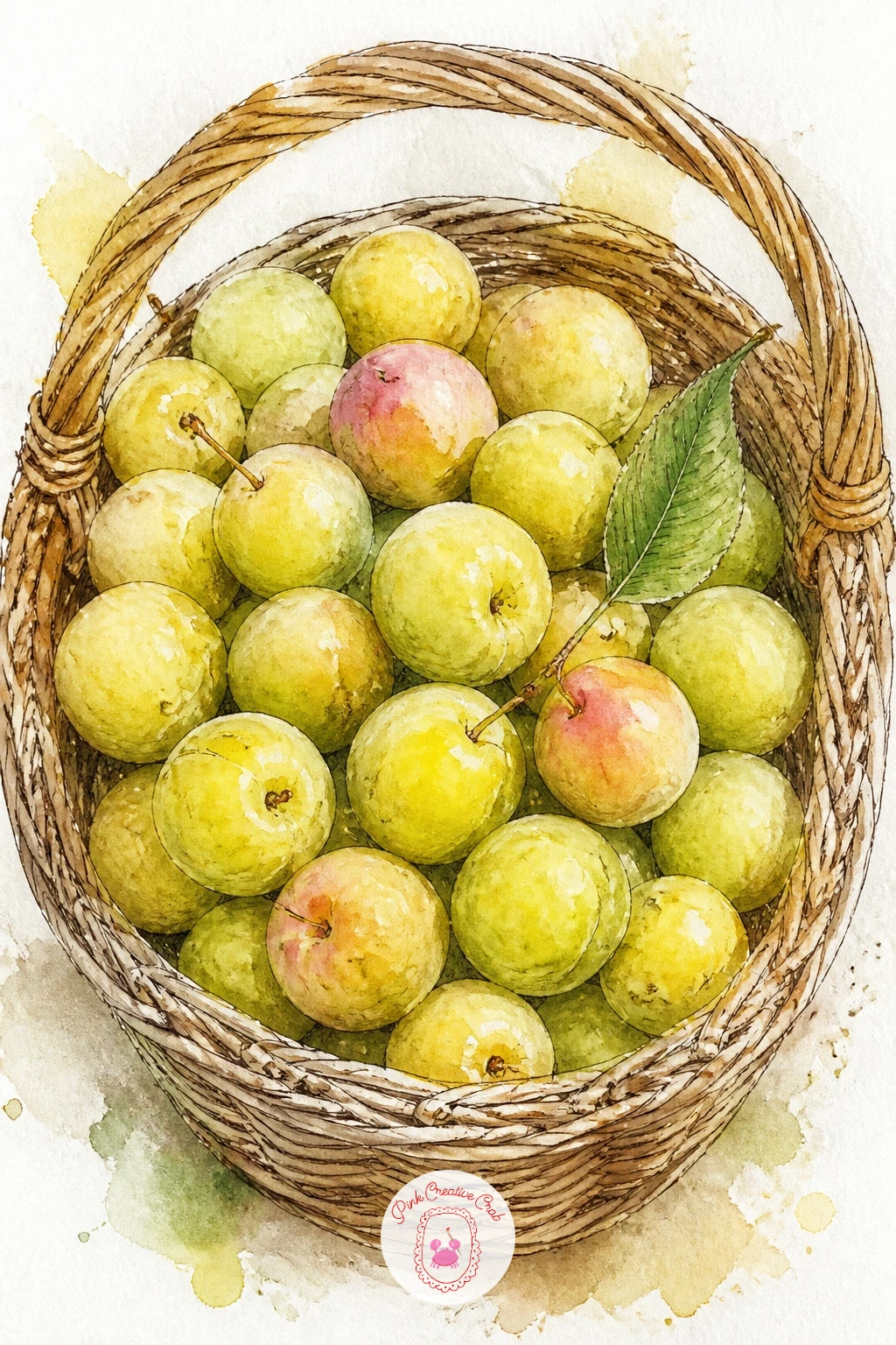
Greengages, small round plums in soft yellow-green, make a gentler color note after all the deep purples. Paint them in a pale olive-yellow base, adding a touch of pink blush on the sun-facing cheek of a few fruits while the wash is still damp, since greengages often ripen with a faint rosy flush.
Keep the basket simple this time, a loose woven texture in warm brown using the same dry brush dragging technique from the apple basket earlier in this list, so the fruit stays the clear focus. Nestle the greengages close together inside, overlapping generously since these small plums are usually picked and piled rather than arranged with space between them.
Greengages can look like unripe apples if the color leans too green; keep the base more yellow than green and let that one pink blush per fruit do the work of reading as ripe stone fruit rather than hard green apples.
A single leaf tucked into the basket rim adds a nice fresh touch without much extra effort.
Palette: Olive Green,Lemon Yellow,Permanent Rose,Raw Umber
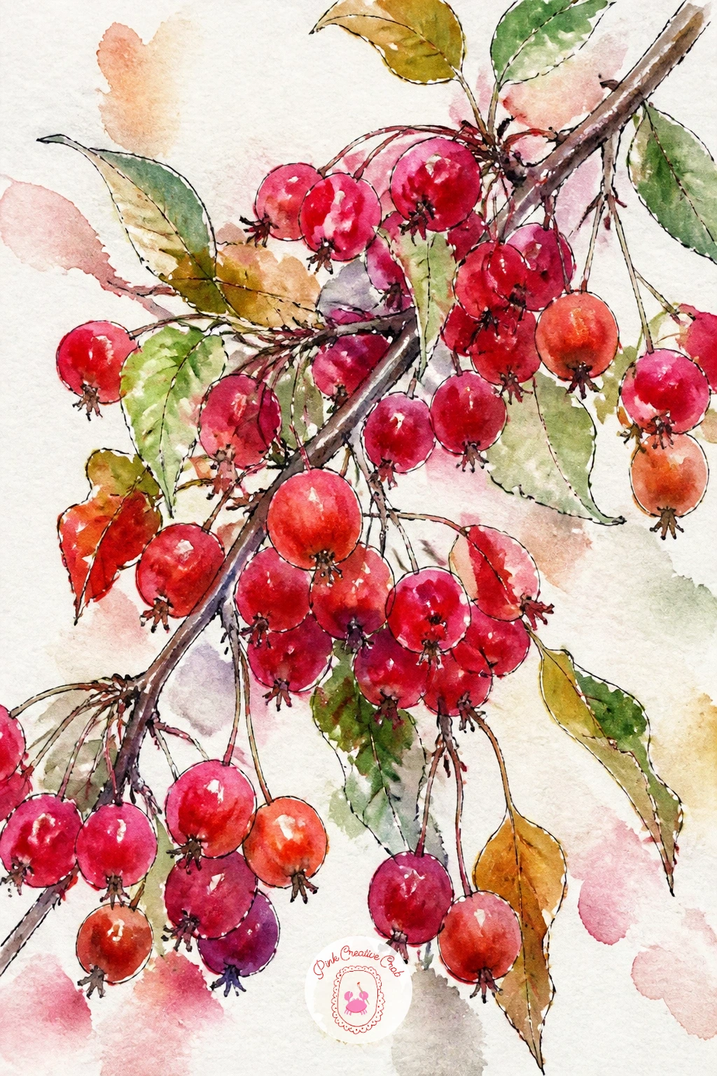
A branch of crabapples, miniature and bright red, is a quick, satisfying piece built almost entirely from small dabbed shapes. Load your brush with a strong cadmium red and touch down a series of small, slightly irregular circles along a thin ink or dry brush branch line, keeping most of them clustered rather than evenly spaced since crabapples tend to grow in small groups along a twig.
Vary the size of each little fruit slightly and let two or three overlap so the cluster does not look like a printed pattern. A tiny dark dot where each crabapple meets its short stem, added in ink once the red is dry, is enough detail to sell the whole fruit without painting individual stems for every one.
The temptation here is to make every crabapple identical in size and spacing; resist it, since the charm of this subject is its slightly chaotic, natural cluster.
This is a genuinely quick one, ten minutes is plenty for a full branch, so it is a good warm-up before tackling a longer piece on this list.
Palette: Cadmium Red,Alizarin Crimson,Sap Green,Payne’s Grey
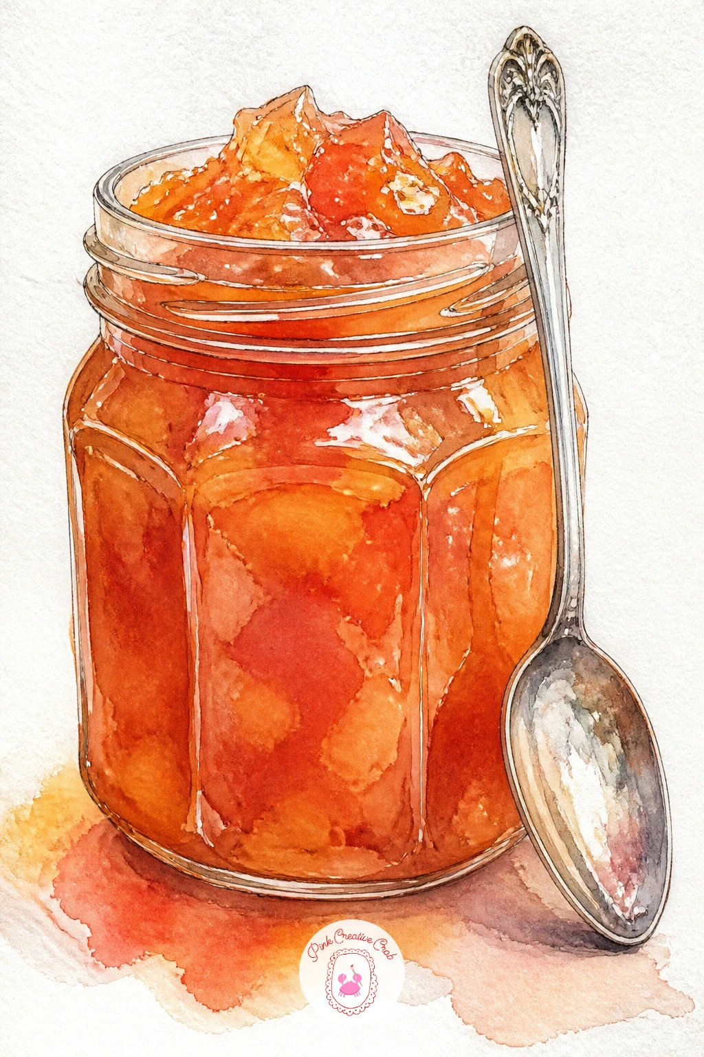
A jar of deep amber quince jam with a spoon resting against it pairs nicely with the earlier quince idea if you want to paint the fruit’s whole journey from orchard to pantry. Paint the jar glass with a pale outline wash first, then fill it with a rich, warm amber-red jam color, darker than apple butter but warmer than plum, since quince paste turns a distinctive deep coral-red when cooked.
Leave a thin vertical highlight strip down the jar for glass shine, and add a simple fabric or paper lid if you like, in a plain solid color rather than a busy pattern this time for contrast with the gingham jar earlier in the list. The spoon leans against the jar, painted in cool grey with a small bright highlight dot on the bowl of the spoon.
Flat jam color without depth is the common issue; drop a slightly darker amber into the lower part of the jar while the first wash is still damp so the color pools naturally like a real preserve.
A small torn bread slice beside the jar makes a nice addition if you want a bit more scene.
Palette: Burnt Sienna,Cadmium Red,Yellow Ochre,Payne’s Grey
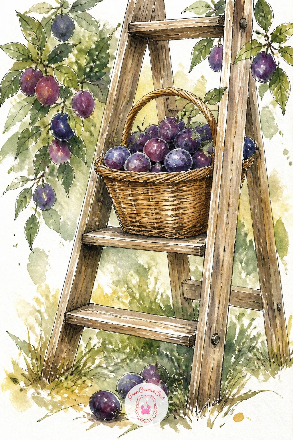
Echoing the apple ladder from earlier but with plums this time, this scene leans more on the purple palette and the feeling of late-season harvest. Build the ladder the same way as before, a loose wash of raw umber with slightly uneven rungs, then place a basket of plums balanced on one rung, the fruit spilling slightly over the basket edge.
Vary your plum purples more than you might think necessary, some leaning toward red-violet, some toward blue-violet, so the pile does not read as one flat block of purple. A few fallen plums scattered on the ground beneath the ladder extend the story and give you a chance to practice foreshortened round shapes seen from slightly above.
If the composition feels too similar to your earlier apple ladder, change the eye level this time, looking slightly down on the basket from above rather than up at the rungs, which shifts the whole mood and keeps your two ladder pieces visually distinct.
Leave the background loose and pale so the ladder and basket stay the clear subject.
Palette: Raw Umber,Dioxazine Violet,Alizarin Crimson,Sap Green
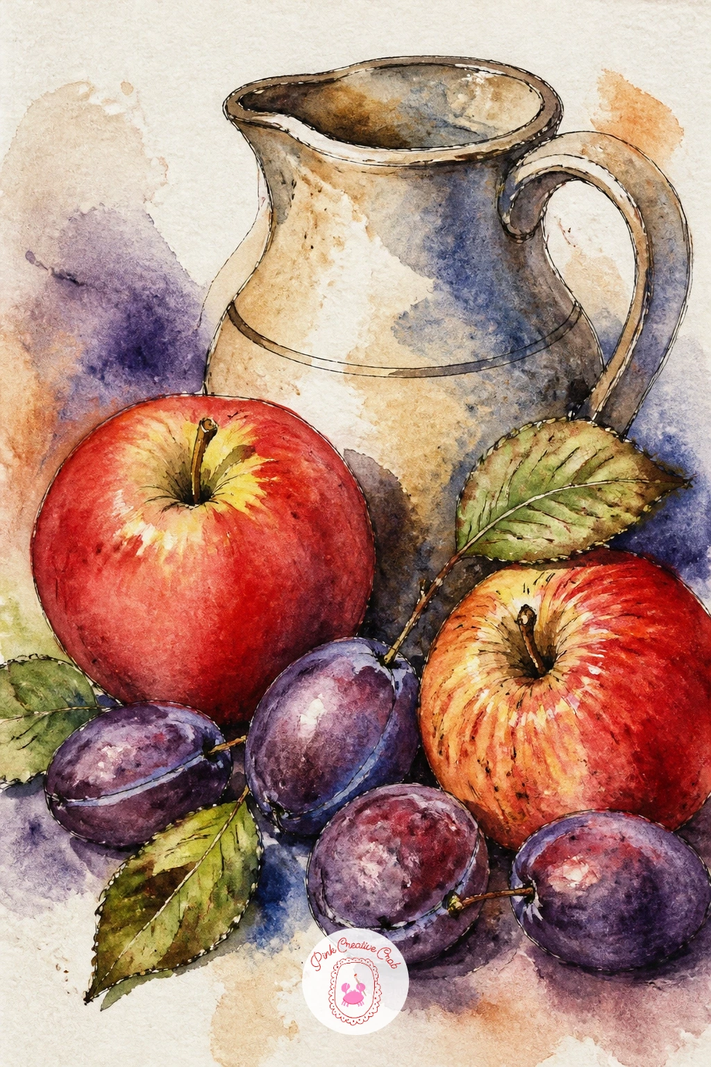
Bring the whole harvest together in a final still life: a mix of apples and plums grouped around a simple ceramic jug. Start by placing the jug first since it anchors the whole composition, painting it in a single mid-tone color with a soft shadow on one side to establish your light direction before anything else goes down.
Build the fruit around its base, overlapping apples and plums generously rather than lining them up, with the reds and greens from the apple side of this list sitting against the purples from the plum side for a full range of orchard color in one piece. Keep the fruit closest to the jug the most detailed, with crisp ink outlines, while anything toward the edges of the group stays softer and less defined.
A still life like this falls apart if every shadow points a different way; pick one light source before you start and keep every cast shadow, on jug and fruit alike, falling in that same direction.
This is a natural piece to finish the whole list on, since it uses nearly every color you have mixed for apple watercolor pieces throughout this set.
Palette: Cadmium Red,Sap Green,Dioxazine Violet,Raw Umber
What to Do Next
Pick whichever idea matches the apples in your fruit bowl right now, wet your brush, and start with the lightest color first on a sheet of cold press paper. One finished page today beats a long list of good intentions, and the plums, quinces and figs further down will still be here waiting next time you want to paint.
Frequently Asked Questions
What watercolor paper works best for apple watercolor paintings?
Cold press paper around 140lb works best for apple watercolor. Its slight texture holds wet washes without buckling too much and gives fruit skin a natural, slightly broken surface rather than a flat, plastic sheen.
How do you paint a realistic apple shade without it looking flat?
Blend two or three colors wet into wet rather than one flat red. Drop yellow at the base, red through the middle and a touch of brown-red for shadow while the paper is still damp so the tones merge on their own.
What is the easiest orchard fruit to start with for a beginner?
A whole red apple with a single leaf is the easiest starting point. Its round shape forgives wobbly brushwork, and the two-color wash from yellow to red teaches wet-into-wet blending before anything more complex.
How do you stop a fruit painting from looking muddy?
Let each layer dry fully before adding the next, especially darker details like ink seeds or pits. Most muddiness comes from painting wet over wet colors that were never meant to blend together.
Can these apple watercolor ideas be finished in one sitting?
Yes, every idea in this list is designed for one sitting. Simpler ones like a single apple or a crabapple branch take about ten minutes, while fuller scenes with figures or settings take closer to forty.
Have any thoughts?
Share your reaction or leave a quick response — we’d love to hear what you think!
-
 0
-
0
-
0
-
0
-
0
-
0


