

Sardine painting has become the kitchen art trend you cannot scroll past, and once you pick up a brush you will see why. There is something deeply satisfying about flattening a tin of fish into bold shapes, a bright outline and a label-style layout that looks like it belongs on a cafe wall. It is quick, it is cheeky, and it never asks you to get the anatomy exactly right.
Below you get 33 ideas, starting with the tins and sardines themselves before drifting out to the wider seaside table: oysters, mussels, a fishmonger in rubber boots, a seagull eyeing someone’s chips. Every one is sized for a single sitting, built in flat gouache shapes with a confident outline, so pick whichever makes you hungry first.
Using these images: free for personal projects such as printing, coloring, cards, journals and gifts. Handmade items that include them may be sold up to 30 pieces per design. More than that is commercial use and is not permitted, and neither is selling or sharing the images themselves or passing them off as your own. Please ask before any other use.
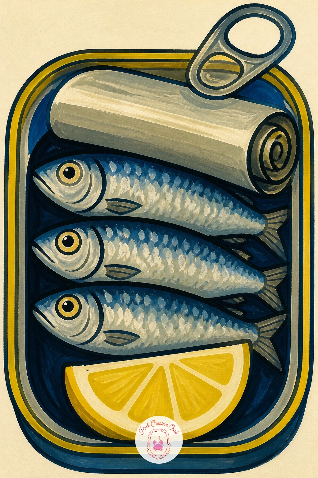
Start the whole sardine painting project with the simplest version of the subject: an open tin, peeled lid curling back, three or four fish laid shoulder to shoulder inside. Sketch the tin as a flat rectangle first, rounded corners only, then add the curled lid as a separate shape before you touch the fish.
Block in the tin in cream or pale blue gouache, let it dry, then paint the sardines as simple silver-blue ovals with a dark line down the spine and a tiny red gill mark. The lemon wedge goes in last, tucked at an angle across one corner, bright against all that cool silver.
This is where most beginners overcrowd the tin, so keep the fish to three or four and leave visible gaps of cream between them. If gouache feels unfamiliar, acrylic diluted slightly with water behaves almost the same way on paper.
Finish with a black fineliner or thin brush line around every edge once the paint is bone dry, and the whole tin will snap into focus.
Palette: Sardine Silver Blue,Lemon Yellow,Tomato Red,Cream
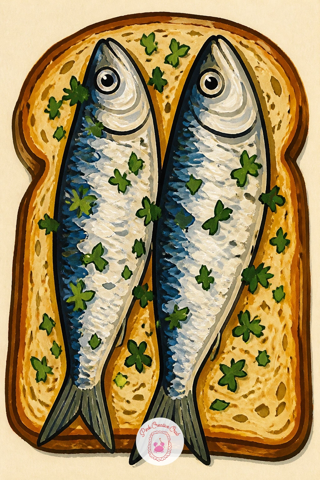
Move from the tin to the plate with sardines on toast, a loose rectangle of bread topped with two or three fish and a scatter of herb flecks. Draw the toast first as a simple trapezoid with a darker crust line, then lay the sardines diagonally across it rather than straight on, which reads far more natural.
Paint the toast in warm cream and a toasted edge of ochre, then the sardines in silver-blue with one red stripe each for the cut flesh. Dot on parsley with the tip of a round brush loaded with a darker green, flicking rather than dabbing so the herbs stay light.
The common slip here is herb dots that look painted on rather than scattered, so vary their size and spacing instead of lining them up evenly. No fresh green on hand works fine in a mossier olive instead.
Add a thin shadow line under the toast with grey-blue to lift it off the page.
Palette: Toasted Ochre,Cream,Sardine Silver Blue,Fresh Parsley Green
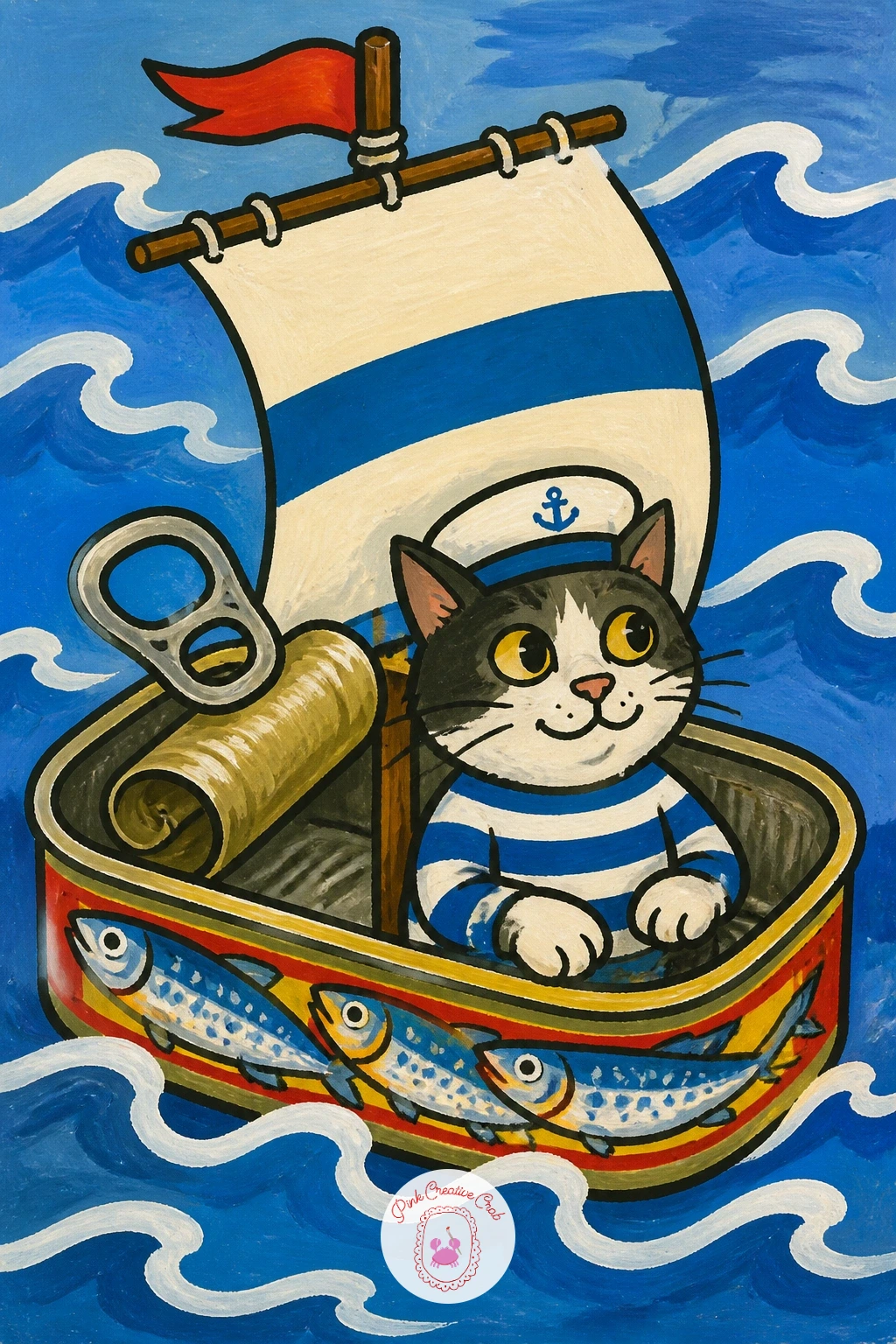
Once the straightforward tin feels comfortable, turn it into something playful: an open sardine tin floating like a tiny boat, with a cat in a sailor hat standing at the helm. Draw the tin on its side first, curved like a hull, then add the cat as a simple rounded body sitting inside, well before any wave detail.
Paint the tin hull in its usual silver-blue, the cat in cream or ginger with a navy striped hat, and a scrap of fabric on a toothpick mast for the sail. Wavy lines of blue beneath the hull suggest water without needing a whole sea.
Eye level matters here: keep the horizon line low, just behind the cat’s head, so the boat feels like it is riding toward the viewer rather than floating flat on the page. If the cat’s proportions feel tricky, simplify it to an oval body and a round head with triangle ears, which still reads clearly as a cat.
Let the light come from one side only, with a thin white gouache highlight along the top edge of the tin.
Palette: Sardine Silver Blue,Navy,Cream,Tomato Red
Try giving the cat a fishing rod instead of letting it just stand there, it adds a small story without any extra painting skill.
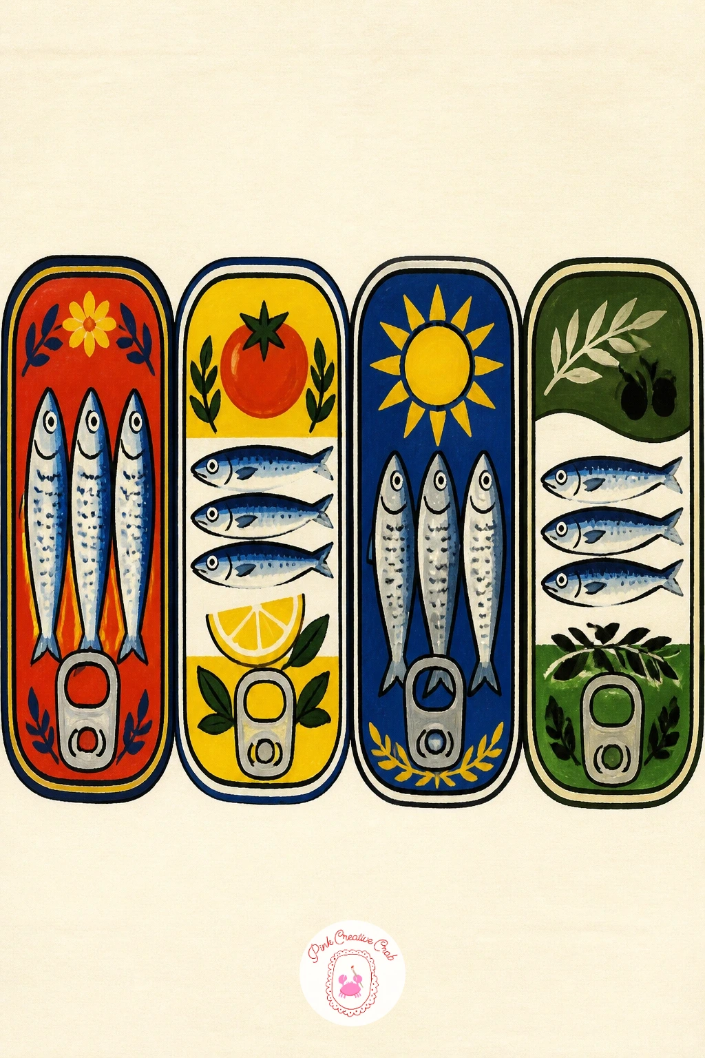
A shelf of colorful vintage sardine tins lined up side by side makes a strong kitchen piece and a good lesson in keeping a row consistent. Pencil in three or four tin outlines first, all the same basic rectangle, spaced evenly along a straight shelf line before any color goes on.
Give each tin its own color story, one in red and cream, one in mustard and navy, one in teal, so the row reads as a collection rather than repeats of the same object. Paint the labels as simple bands and dots rather than trying to write real text, which keeps the retro look intact.
Measure before you paint: hold your pencil up to the sketch and check that every tin sits at the same height and width, since a wobbly row is the one thing that breaks this idea. Swap a ruler in for the ties on your shelf line if your hand is not steady.
Finish with a dark outline on the shelf itself to ground the whole row.
Palette: Tomato Red,Mustard,Teal,Navy
Bring in a little travel atmosphere with grilled sardines on a plate at a Lisbon terrace, char marks and all, set against a hint of blue tile in the background. Start with the plate as an ellipse, add three sardines laid across it nose to tail, then only after that sketch in a sliver of patterned tile behind.
Paint the fish in a deeper, smokier blue-grey than the tinned versions, with short dark dashes for char marks along the skin. The tile pattern behind can be as simple as a few repeated diamonds in blue and white, kept loose so it does not compete with the plate.
Dry brush a nearly-empty brush loaded with dark grey across the fish skins to get that grilled, slightly rough texture without overworking it. If your tile pattern starts looking too busy, paint it as flat blocks of color with no pattern lines at all; it still reads as tile.
Add a lemon wedge and a sprig of something green for a last bright note.
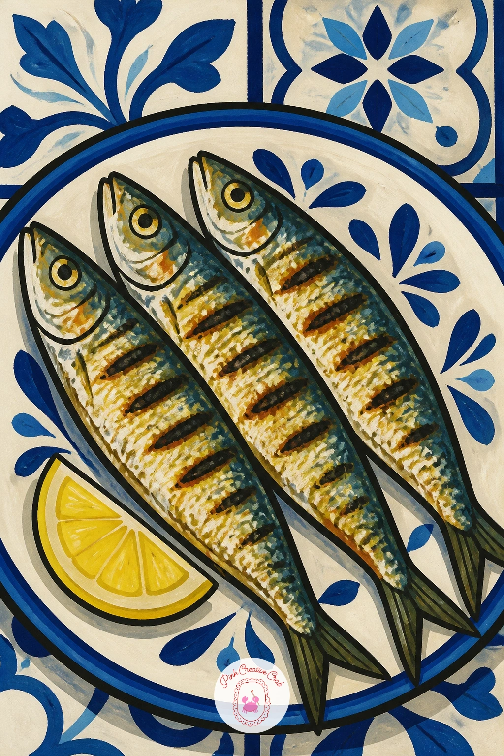
Palette: Char Grey,Sardine Silver Blue,Terracotta,Lemon Yellow
For something properly playful, paint a girl holding a sardine up to her ear like a telephone, mid conversation with no one in particular. Sketch her head and shoulders first as simple rounded shapes, then add the sardine curved against her cheek like a receiver, tail near her mouth.
Keep her features minimal: two dot eyes, a small curved mouth, simple hair shape in a flat color, so the joke of the pose carries the painting rather than detailed features. Paint the sardine in its usual silver-blue, slightly exaggerated in size so the gag reads instantly.
The quick ten minute version stops here, flat shapes and a plain background. Given forty minutes, add a patterned top or a scrap of wallpaper behind her and a little speech bubble shape left empty, which turns it into more of a scene.
One concrete tip for today: draw the sardine’s curve to match the curve of a real telephone handset, that one choice sells the whole idea.
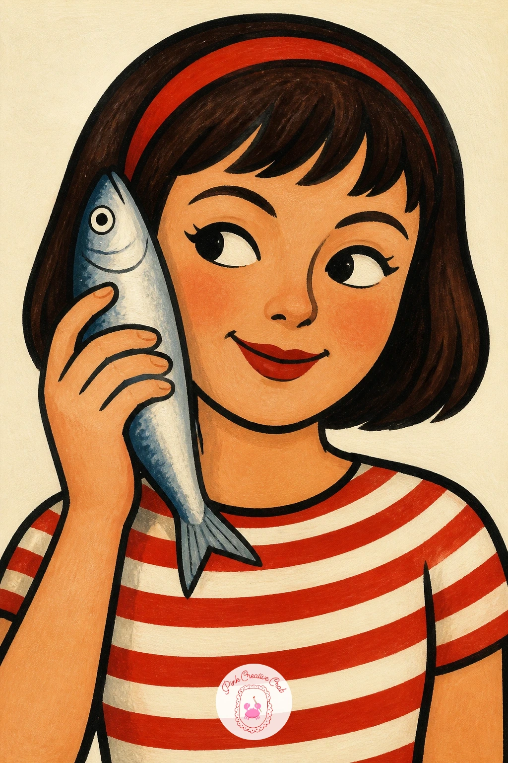
Palette: Sardine Silver Blue,Blush,Cream,Tomato Red
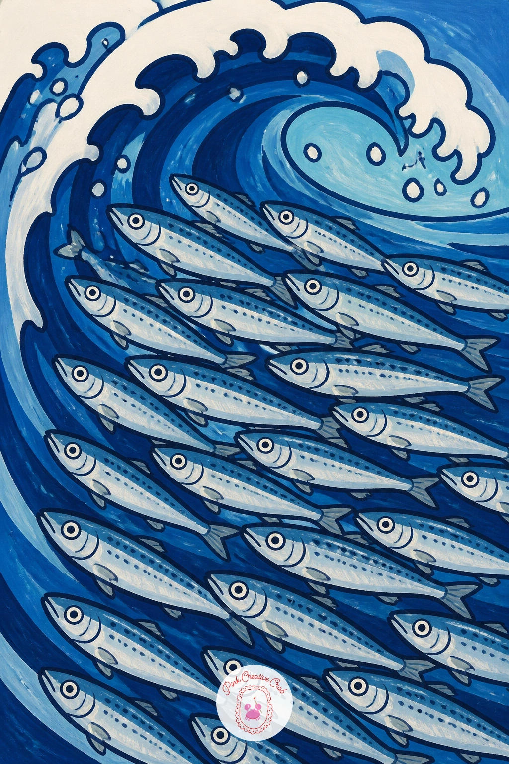
Shift from single fish to a whole school of sardines swimming inside a curling wave, a good chance to practice repeating a simple shape with variation. Paint the wave first as one large curved shape in two tones of blue, lighter at the crest, and let it dry fully before adding any fish.
Layer the sardines on top in overlapping groups, each one a simple curved oval with a dark spine line, angled slightly differently so the school feels like it is moving rather than stacked in rows. Keep the fish smaller near the back of the wave and larger near the front to suggest depth.
Light here comes from above the wave, so give the top edge of each fish a thin pale highlight and leave the underside in shadow blue, which is what makes a flat curve read as a tube of water. If a whole school feels like too much, six or seven fish is still a convincing group.
A splash of white gouache flicked along the crest finishes the motion.
You Will Need
- white gouache for splash highlights
Palette: Sardine Silver Blue,Deep Wave Blue,White,Cream
Give a single sardine a full character turn by dressing it in a striped sailor shirt, standing upright on its tail like a little mascot. Draw the fish body first in a simple upright curve, then add the shirt as a rounded band across the middle before any stripes go on.
Paint the body in silvery blue, the shirt in cream with navy stripes painted freehand rather than ruled, which keeps the look loose and hand drawn rather than stiff. A small round cap or a jaunty neckerchief adds personality without much extra work.
Stripes are the one place this goes wrong, since uneven spacing reads as sloppy rather than charming; lightly pencil in a few guide dots before you paint each stripe to keep them roughly even. A fine brush loaded thin works better than a marker for this, since it can taper at the ends.
Finish with two dot eyes and a small curved smile for full mascot charm.
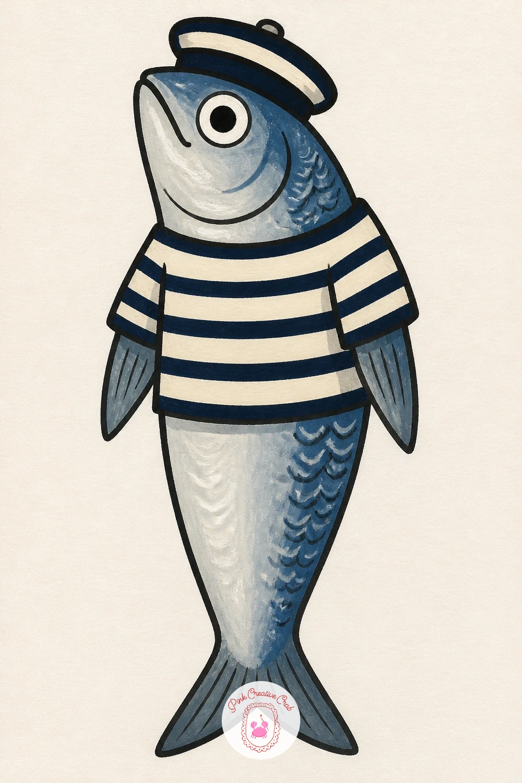
Palette: Sardine Silver Blue,Navy,Cream,Tomato Red
Widen the scene into a sardine tin picnic, an open tin beside a stack of crackers and a glass of white wine, all arranged on a cloth. Lay out the three main shapes first with loose pencil circles and rectangles, checking that the tin, crackers and glass sit at comfortable distances before any paint touches the page.
Paint the tin as before in silver-blue and cream, the crackers in warm tan with tiny dot texture, and the wine glass with a pale yellow fill and a thin outline to suggest glass rather than a solid object. A gingham or striped cloth beneath ties the whole picnic together.
Spacing is the trick with this one: group the three elements fairly close together so the eye reads them as one picnic moment rather than three separate objects floating apart. If wine glasses feel fussy to paint, a simple jam jar of lemonade does the same job with far less detail.
A few cracker crumbs scattered on the cloth add a nice lived-in touch.
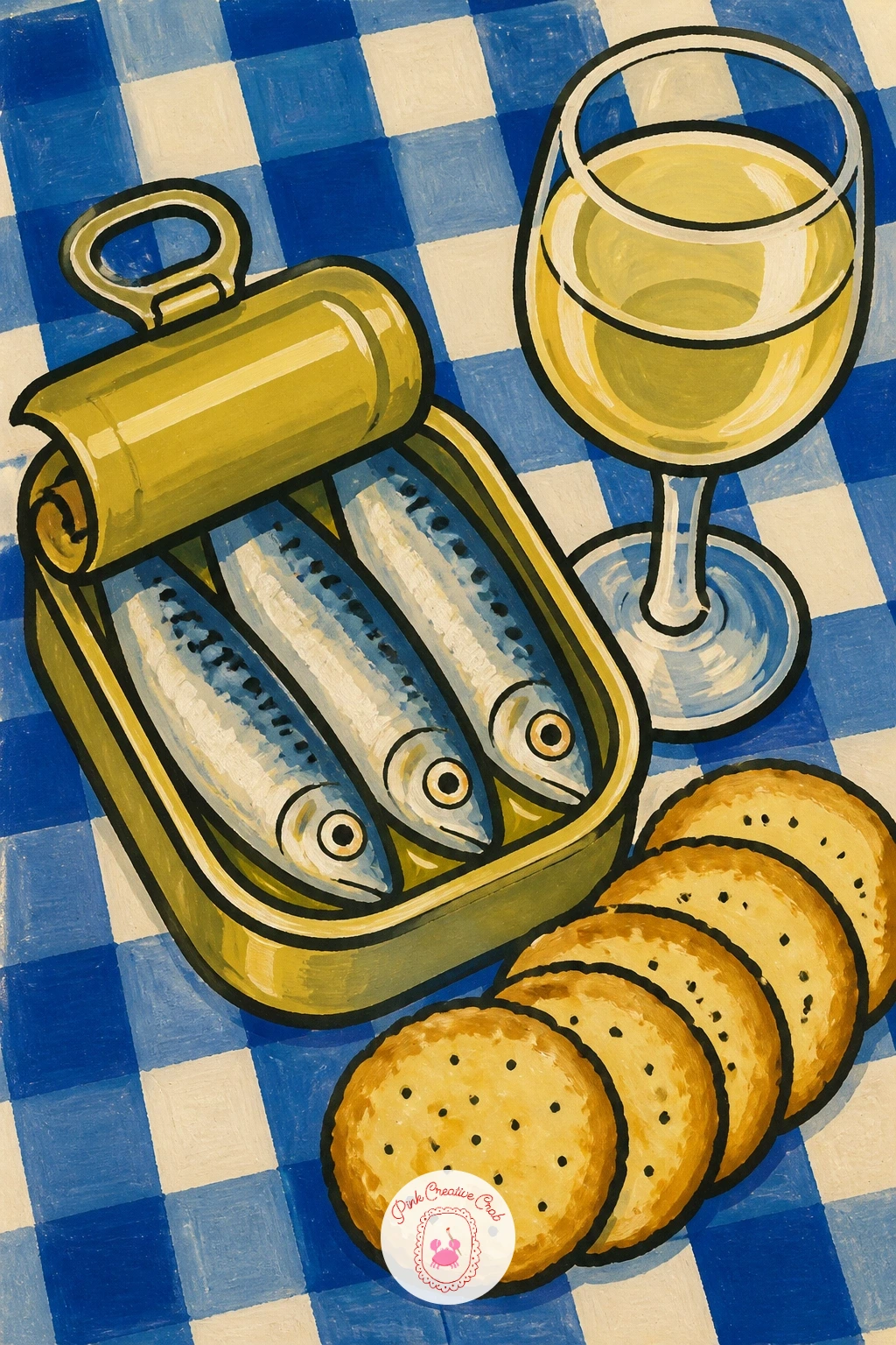
Palette: Sardine Silver Blue,Cracker Tan,Pale Yellow,Cream
For a cosy, funny subject, paint a sleeping cat with a thought bubble full of sardines drifting above its head. Draw the cat first as a simple curled oval shape with folded paws and closed eyes, since a sleeping pose needs far less anatomy than a standing one.
Paint the cat in any flat color you like, ginger or grey works nicely against the cream background, then add the thought bubble as a cloud shape made of a few overlapping circles. Inside the bubble, two or three tiny sardines in silver-blue float in a loose row.
The easiest version in ten minutes stops at one plain thought bubble. With more time, add a tiny whisker twitch line or a curled tail tip for more personality, and shade the bubble’s inside very faintly to separate it from the background.
Keep the cat’s expression peaceful with a simple closed-eye curve, that single line carries the whole mood.
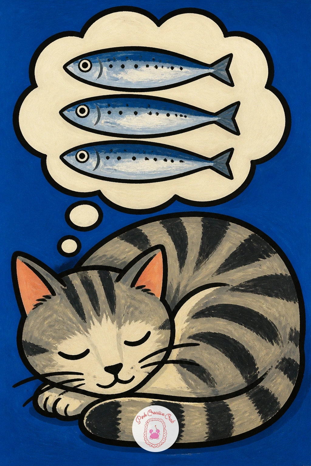
Palette: Ginger,Cream,Sardine Silver Blue,Soft Grey
Paint a ceramic plate shaped like a sardine itself, piled with olives, a fun bit of trompe l’oeil for anyone into quirky kitchen art. Draw the plate’s fish outline first, rounded body and a simple fin shape at one end, then treat the inside as a flat painted surface rather than a real fish.
Fill the plate in pale blue or cream as the ceramic glaze color, then scatter green and black olives across it as simple circles with one curved highlight each. A thin darker blue line along the plate’s rim suggests the glaze edge without extra work.
If drawing a fish-shaped plate silhouette feels tricky, trace a real plate for the basic oval first and then only reshape the outline into fins and a tail, which keeps the proportions sound. No olives on hand for reference, cherry tomatoes make an equally good stand-in shape.
A single sprig of rosemary laid across the olives finishes the plate nicely.
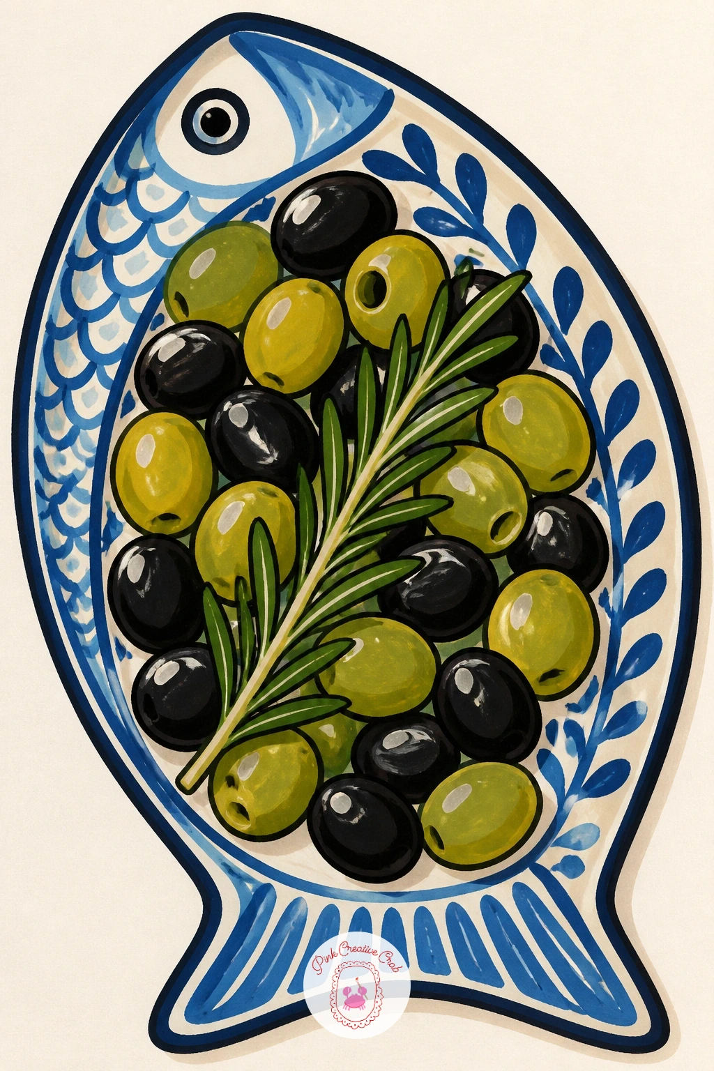
You Will Need
- plate to trace for the base oval
Palette: Pale Blue,Olive Green,Cream,Charcoal
Move the tinned fish theme onto a pizza, anchovy strips laid in a loose star pattern across a cheesy base on a checkered cloth. Paint the pizza circle first, then the cheese as an uneven cream layer, and only once that is dry add the dark anchovy strips radiating out from the center.
The checkered cloth beneath can be painted as a simple grid of red and white squares, which also gives you a good excuse to practice straight lines with a ruler if your hand needs the help. Keep the squares a little uneven on purpose, a perfectly ruled grid looks stiffer than a cloth should.
The anchovies themselves are the easiest part, just thin curved dark strips with a tiny fleck of red pepper or caper beside each one. If a full pizza circle feels daunting, crop it to a single slice instead, which fills the page just as well.
Finish with a scatter of oregano flecks in dark green over the top.
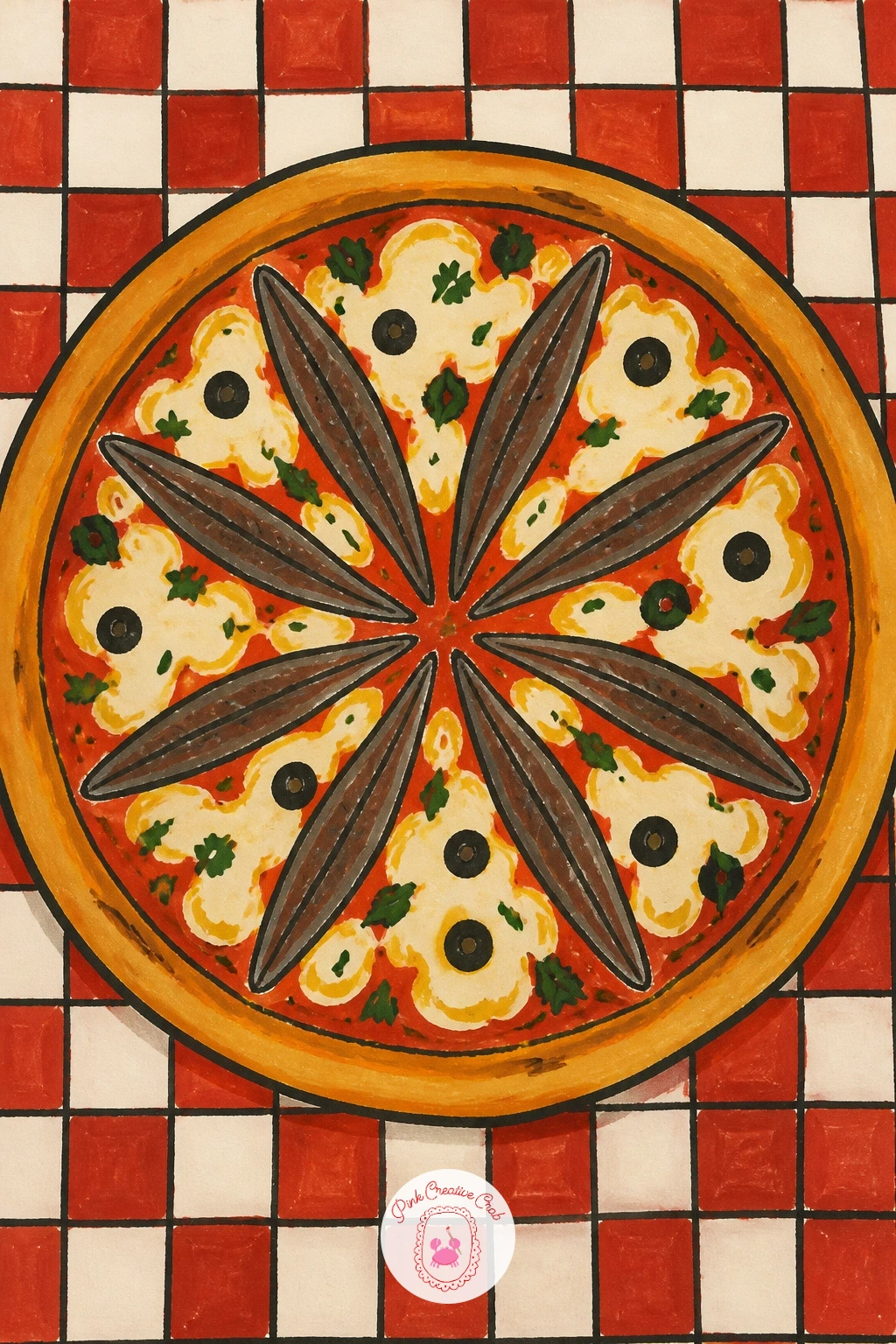
Palette: Cheese Cream,Tomato Red,Anchovy Dark,White
Give the sardine tin a cousin by painting a mackerel tin instead, taller and more oval, with its own invented vintage label. Draw the tin shape first as a simple rounded oval can, slightly taller than the sardine tins, then block in the label area as a plain colored band before adding any lettering shapes.
Paint the tin body in a muted teal or deep green, since mackerel tins often lean cooler than the bright reds of sardine branding, and keep the label simple with a bold stripe and a small fish silhouette rather than real words. A thin gold or cream line around the label edge gives it that retro printed look.
The edge of a tin is where confidence matters most: paint the outline in one steady stroke rather than several short shaky ones, since a single clean line reads far more like metal. Practice the stroke on scrap paper first if gouache feels too wet to control.
Finish with a small painted highlight catching the top curve of the lid.
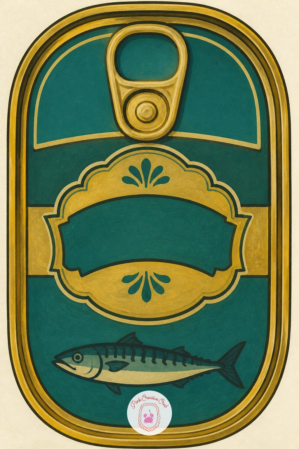
Palette: Deep Teal,Gold,Cream,Charcoal
Step the series up into a full seafood tower, shrimp, crab claws and oysters stacked over a mound of crushed ice on a tiered stand. Block in the tower’s basic shape first with two overlapping ovals for the tiers, then sketch each piece of seafood as a simple rounded shape placed loosely around the ice.
Paint the ice as jagged white and pale blue chunks, which is really just a pattern of irregular triangles, then layer the shrimp in coral pink, the crab claws in brighter red-orange, and a few oysters as simple grey-white shells tucked between them.
This subject can run busy fast, so keep each seafood element flat and simple rather than detailed, letting the variety of shapes do the visual work instead of fine texture. If a full tower feels like a lot for one sitting, paint just the top tier with four or five pieces.
A lemon wedge or two tucked into the ice adds a last bright accent.
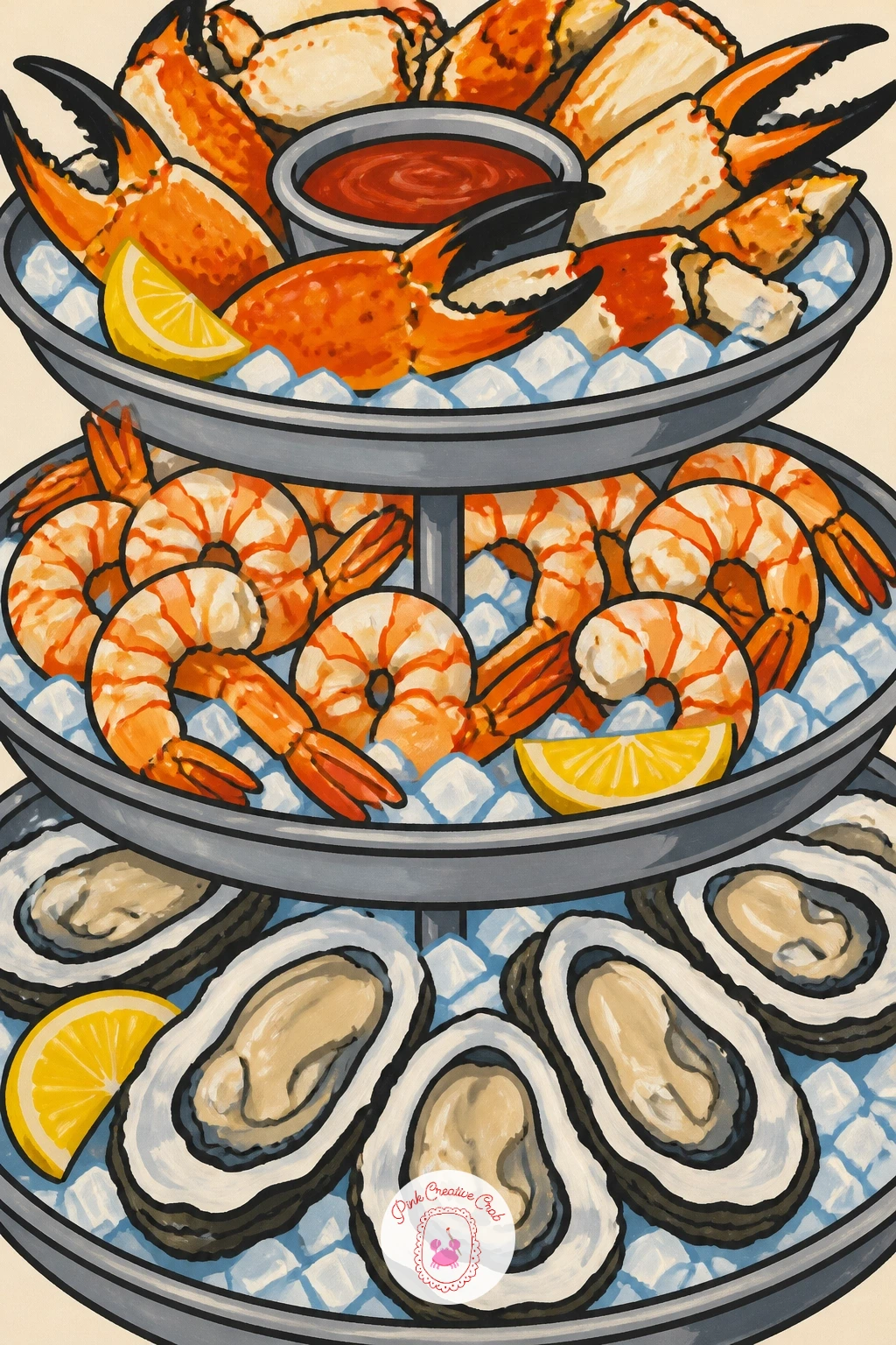
Palette: Coral Pink,Crab Red Orange,Ice White Blue,Lemon Yellow
Narrow back down to something calmer, a plate of oysters with lemon halves tucked between the shells. Draw the oyster shells first as simple fan shapes, ridged with a few curved lines, arranged in a loose circle on the plate before the lemon goes in.
Paint the shells in grey-blue with a paler cream interior where the flesh sits, then add the lemon halves in bright yellow with a few radiating segment lines. A ring of crushed ice or sea salt sketched around the shells grounds the whole plate.
The ridged texture on an oyster shell is the fun part: load a dry brush with grey and drag it lightly across the shell shape, which creates natural looking ridges without drawing every line by hand. A fan brush works even better for this if you have one.
Keep the lemon halves bright and unshaded, that contrast is what makes the plate pop.
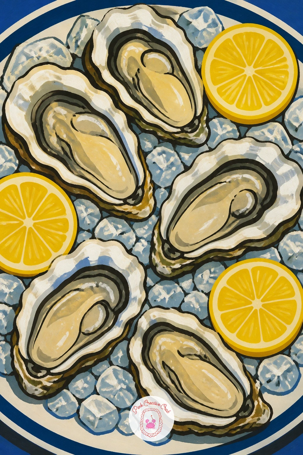
Palette: Shell Grey Blue,Cream,Lemon Yellow,Salt White
A fan brush dragged dry across the shell shapes gives instant ridge texture, try it before committing to hand-drawn lines if you own one.
Follow the oysters with a steaming bowl of mussels in white wine, shells piled up with a few open to show the orange flesh inside. Paint the bowl shape first as a simple rounded container, then fill it with overlapping dark shell shapes before adding any steam or broth detail.
Most mussels stay closed, dark blue-black ovals with a thin hinge line, while two or three open ones show a bright orange-cream interior, which gives the eye somewhere to land in all that dark shell. A few curved white lines suggest steam rising, and a scatter of herb flecks finishes the broth.
Overlapping shells convincingly just means painting the back ones first and letting the front ones cover their edges, working from the bowl’s far side forward. If pure black feels too flat, mix in a touch of blue so the shells still read as mussels rather than lumps of coal.
Finish with a thin gold rim line around the bowl for a bit of shine.
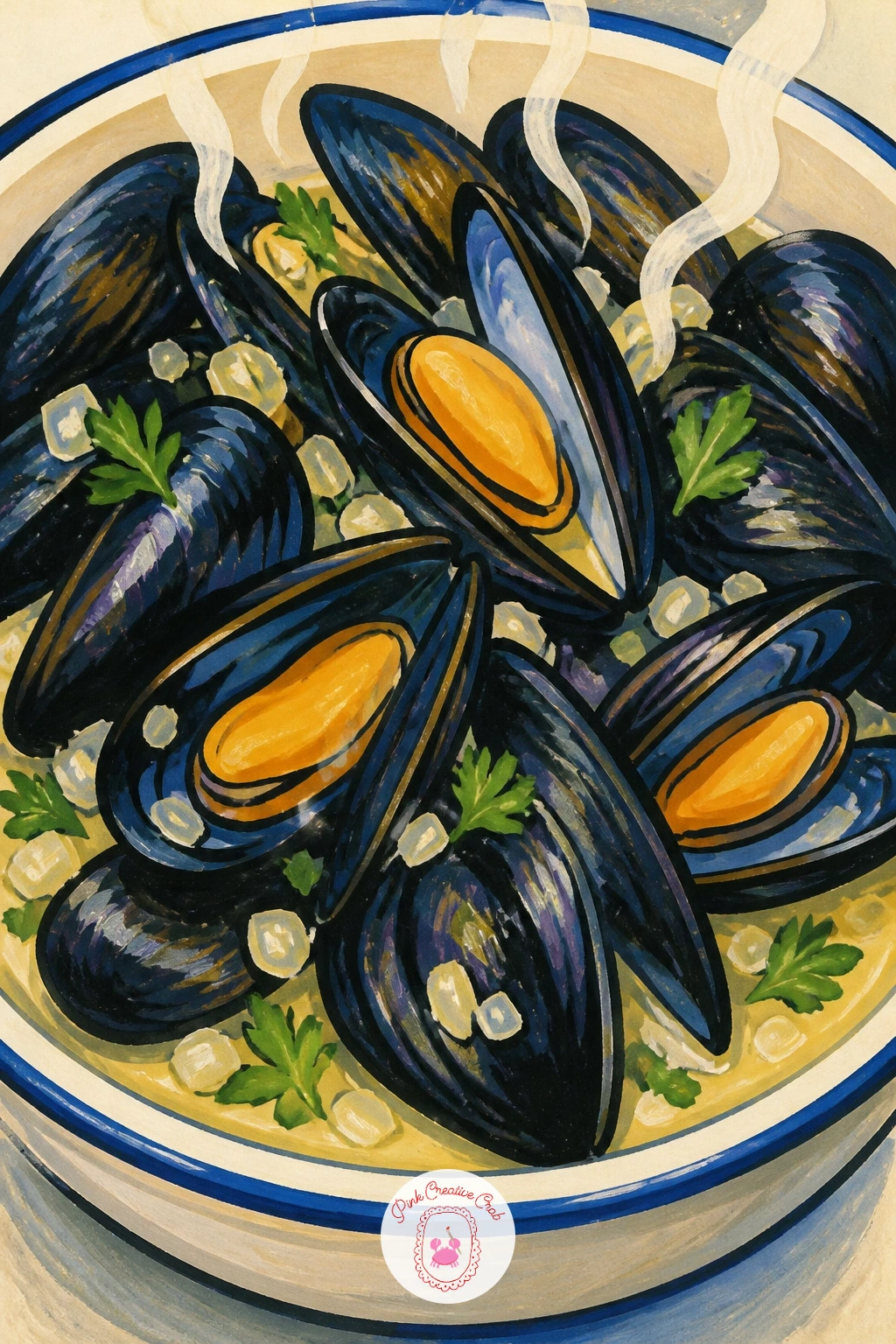
Palette: Mussel Blue Black,Orange Flesh,Broth Cream,Herb Green
Take the seafood out onto a wooden dock with a bucket of shrimp, their curled coral bodies spilling slightly over the rim. Paint the bucket first as a simple cylinder in galvanized grey or faded red, then pile the shrimp inside and slightly over the edge using small curved comma shapes.
Each shrimp is really just one curved stroke with a thin tail flick and two tiny antennae lines, so once you have the first one comfortable the rest repeat quickly. A few dock planks painted in warm brown beneath the bucket root the whole scene in its setting.
Repetition is the whole trick here: vary the curl direction and size of each shrimp slightly so the pile does not look stamped from one template. If a full bucket feels like too much repetition for one sitting, six or seven shrimp spilling from the rim is plenty.
A faint cast shadow under the bucket anchors it onto the dock.
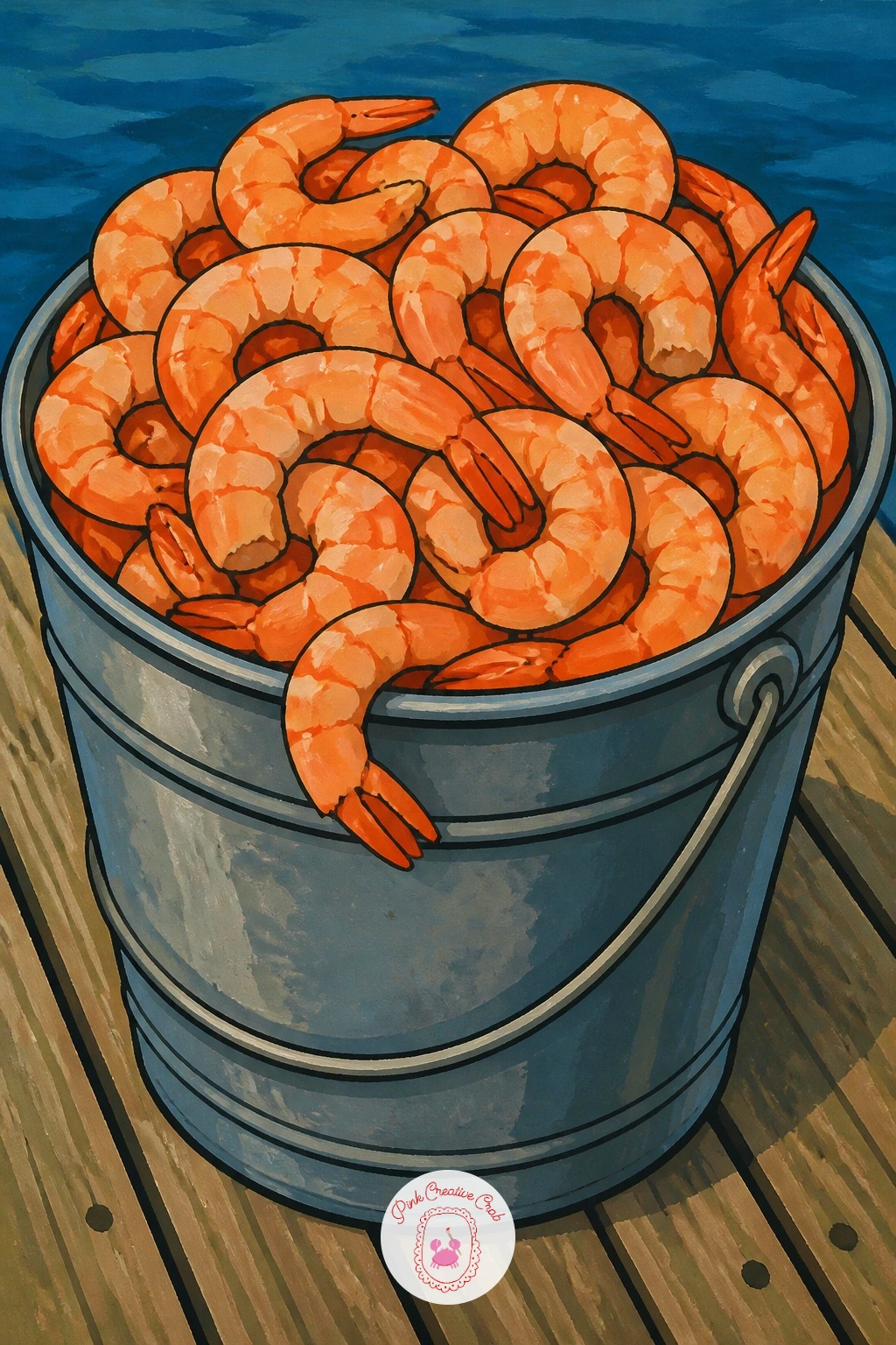
Palette: Coral Shrimp,Galvanized Grey,Dock Brown,Cream
Bring some color variety in with a tuna nicoise salad, chunks of tuna, green beans, egg wedges and olives arranged on a bold blue plate. Draw the plate first as a wide circle, then divide the surface loosely into sections for each ingredient before adding any color.
Paint the tuna chunks in soft pink-grey, the beans in bright green, the egg wedges in cream and yellow, and scatter black olives and halved cherry tomatoes between them. Keeping the blue plate as one flat bold color underneath makes every ingredient pop against it.
Arranging a salad convincingly is about grouping rather than scattering: cluster each ingredient in its own small area rather than mixing everything evenly, which is actually how a real plated salad looks. If some of these ingredients feel fiddly, simplify the egg to one wedge and the olives to three dots.
A drizzle line of dijon-yellow across the top ties the whole plate together.
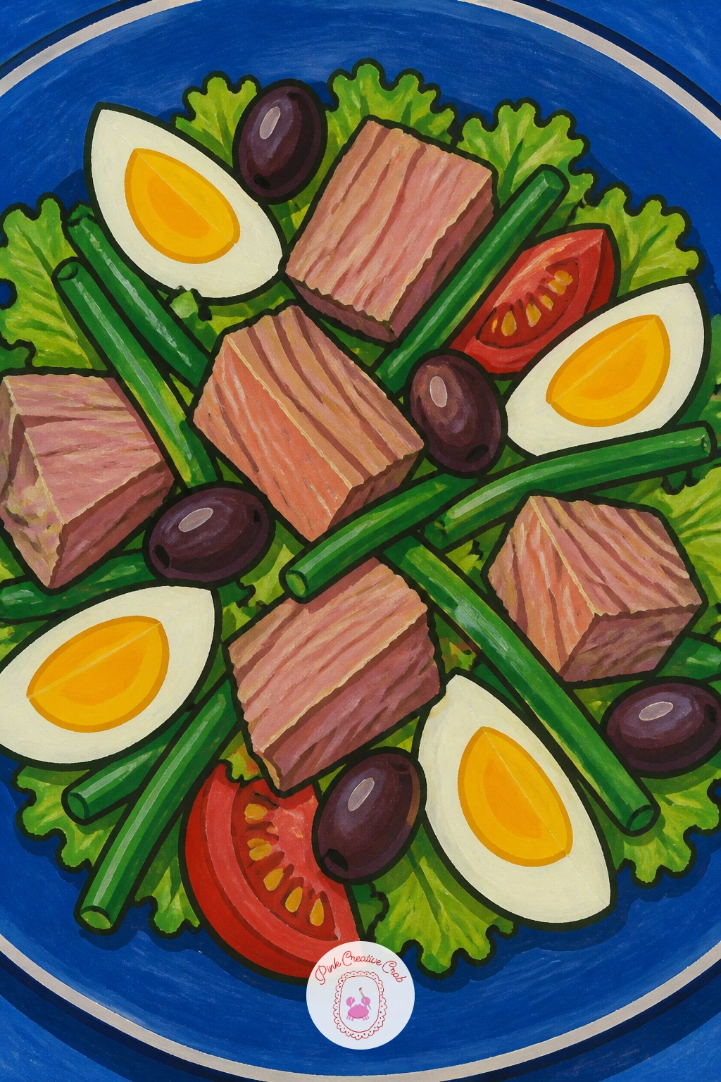
Palette: Plate Blue,Bean Green,Tuna Pink Grey,Egg Yellow
Keep things simple again with a smoked salmon bagel, cream cheese and a few capers, sitting half unwrapped in its paper. Paint the bagel’s ring shape first, then the cream cheese as a pale layer peeking from the sides, before adding the draped salmon on top.
Salmon paints well in loose overlapping ribbons of coral pink and deeper orange, laid at slightly different angles so it looks draped rather than flat. A few tiny dark capers and a sprig of dill finish the top, with the paper wrapper beneath rendered as simple creased white shapes.
The paper wrapper is the detail that sells the whole scene: a couple of angular fold lines in light grey are enough, resist the urge to render every crease. If capers are fiddly at this scale, a scatter of small dark dots reads just as well from a normal viewing distance.
Finish with a warm shadow beneath the bagel to seat it on the paper.
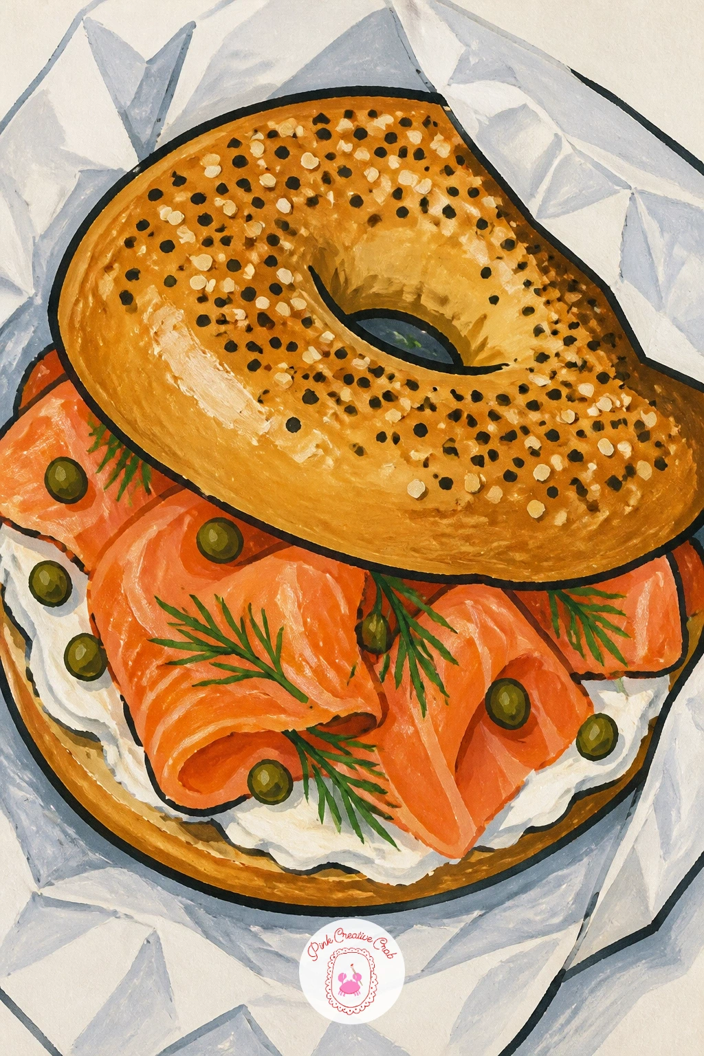
Palette: Salmon Coral,Deep Salmon Orange,Cream Cheese,Bagel Brown
Bring in a human character with a fishmonger standing in tall rubber boots, holding up a large fish for display. Build the figure from simple shapes, a rounded torso, an apron as one flat panel, boots as two solid shapes, then add the fish held out at arm’s length last.
Paint the apron in striped navy and white, the boots in bright yellow rubber, and the fish itself in silvery blue with a confident curved body. Keeping the figure’s pose simple, feet planted, one arm raised, makes the whole thing far easier to balance than a walking or bending pose.
Eye level is worth thinking about here: place the horizon low, around the figure’s knees, so the fishmonger feels tall and the fish held up against the sky reads as the clear focal point. If full figures feel daunting, crop the scene to just the boots, apron and raised hands holding the fish.
A market stall edge in the background, just a flat colored rectangle, finishes the setting without extra work.
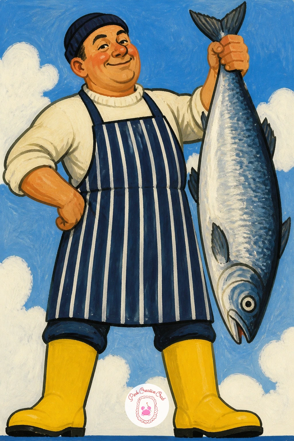
Palette: Rubber Yellow,Apron Navy,Sardine Silver Blue,Market Red
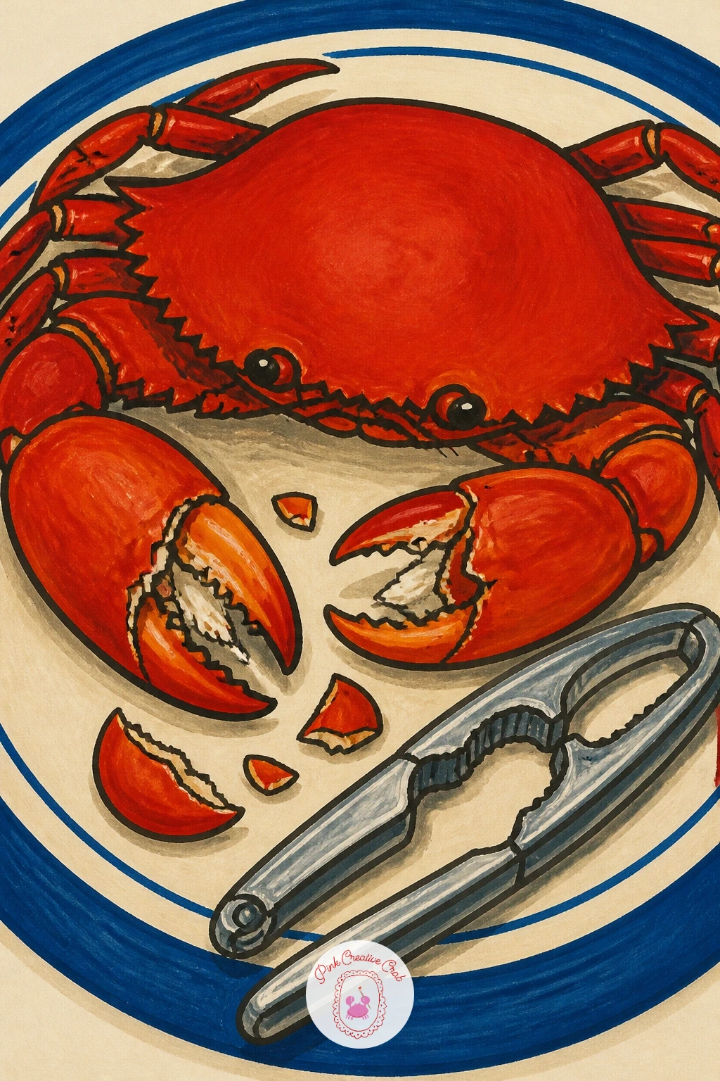
Paint a whole crab served on a plate beside its nutcracker, claws cracked open and ready to eat. Draw the crab’s body first as one rounded shell shape, then add the legs radiating outward and the two larger claws last, since they carry most of the personality.
Paint the shell in bright coral red with a slightly deeper red along the ridges, and give the nutcracker a simple metallic grey so it reads clearly against the warm crab color. A few lemon wedges and a sprig of parsley fill any empty space on the plate.
Getting crab legs to look like they belong to one body rather than a scatter of sticks is mostly about starting each leg from the same point on the shell and letting them taper evenly. If the full crab feels like a lot of legs to manage, a crab seen from above with legs tucked in is a simpler alternative.
A single cracked claw with visible white meat adds a nice focal detail.
You Will Need
- a nutcracker or small tool shape for reference
Palette: Crab Coral Red,Deep Shell Red,Metallic Grey,Lemon Yellow
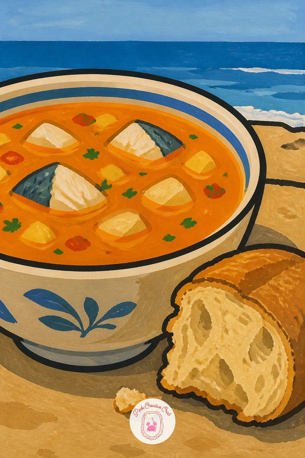
Warm things up with a bowl of fish soup and a chunk of bread on a seaside table, sea visible as a thin stripe behind. Paint the bowl and its reddish broth first, then add a few chunks of fish and a mussel shell or two peeking above the surface before the bread goes in beside it.
The broth works best as a warm tomato-orange base with darker flecks for herbs stirred through, while the bread sits beside the bowl as a torn, irregular loaf shape rather than a neat rectangle. A thin strip of blue sea and a paler sky behind the table give it a clear seaside setting without much extra painting.
Steam rising from the bowl is a nice touch and only needs two or three soft curved white lines drifting upward. If a visible sea strip feels unnecessary, a plain checked tablecloth behind works just as well for atmosphere.
Finish with a drizzle of golden oil across the broth’s surface.
Palette: Broth Tomato Orange,Bread Tan,Sea Blue,Cream
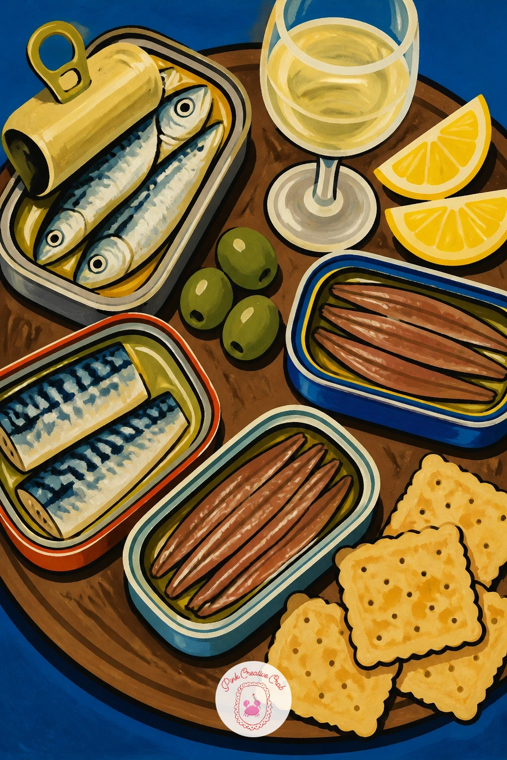
Return briefly to tins with a full tasting board, several open tins of sardines, anchovies and mackerel arranged beside crackers and a glass of wine. Lay out three or four tin shapes first at varied angles across the board, then fill in crackers and garnishes in the gaps between them.
Give each tin a distinct color scheme so the board reads as a proper spread rather than one tin repeated, and vary the fish inside: straight silver-blue sardines, thin dark anchovy fillets, chunkier mackerel pieces. A wooden board shape beneath everything, painted in warm brown, ties the whole composition together.
This is the busiest idea on the list, so work on it in building blocks: finish and fully dry one tin before starting the next, which keeps edges clean and stops colors bleeding into each other. If three tins feels like too much for one sitting, two tins plus a cracker pile is still a full composition.
A few grapes or cornichons tucked into gaps finish the spread.
Palette: Sardine Silver Blue,Anchovy Dark,Mackerel Teal,Board Brown
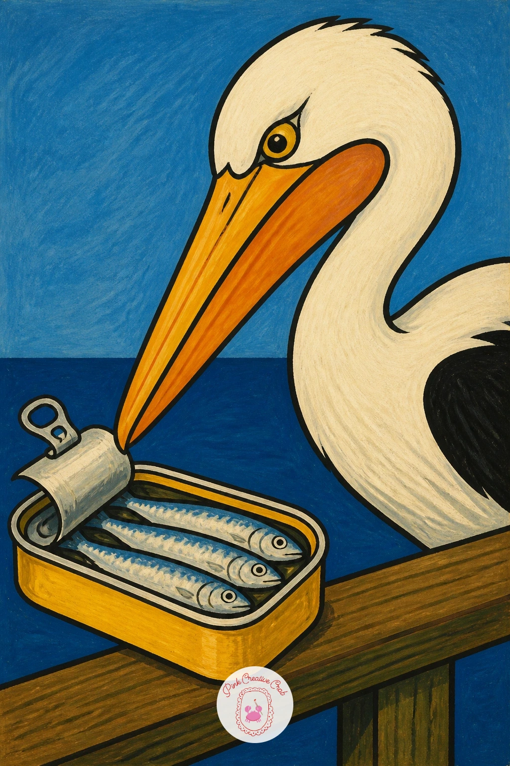
Shift the mood with a pelican craning its neck toward an open sardine tin left on a dock rail, pure cartoon mischief. Draw the pelican first as a rounded body with its distinctive long beak and pouch, angled downward toward the tin which sits slightly apart on the rail.
Paint the pelican in soft grey-white with a darker grey wing panel, keeping the beak a warm yellow-orange that contrasts against all that pale feathering. The tin stays in its familiar silver-blue and cream so it reads instantly even next to a much larger bird.
A pelican’s pouch is the character-maker here: exaggerate its droop slightly more than real life, since a slightly oversized pouch reads as funnier and still stays anatomically believable. If the beak shape feels tricky, practice it separately a few times on scrap paper before committing to the final painting.
One beady dot eye aimed straight at the tin completes the joke.
Palette: Pelican Grey White,Beak Yellow Orange,Sardine Silver Blue,Dock Brown
Keep the comic bird energy going with a seagull swooping in to steal a chip right off someone’s paper tray on the promenade. Paint the seagull mid-flight first, wings spread wide in a simple V shape, body angled downward toward the chip held loosely in its beak.
White and pale grey cover most of the bird, with black wing tips for contrast and a bright yellow-orange beak gripping one golden chip. A hint of paper chip tray beneath, just a simple white triangle shape, grounds the whole scene without needing a full promenade background.
Wings in motion are easier than they look if you paint both sides as mirrored simple triangles rather than trying to draw real feathers. If flight poses feel difficult, a seagull standing with one chip already stolen, wings folded, is a calmer alternative with the same punchline.
A scribble of motion lines behind the bird finishes the swoop.
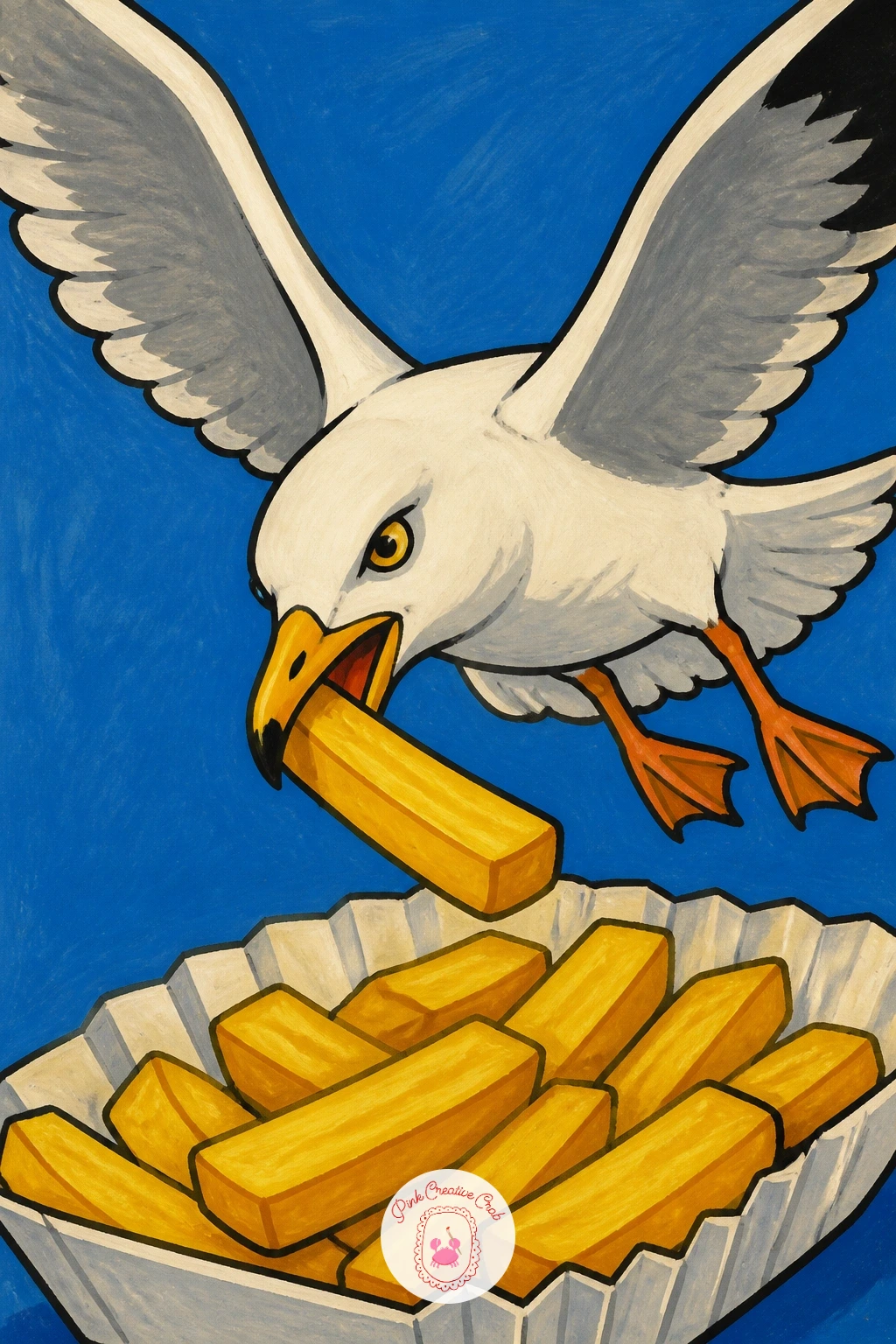
Palette: Gull White,Wingtip Black,Chip Gold,Beak Orange
Widen into a small landscape with a colorful fishing boat unloading crates of sardines at dawn, harbor water pink and gold behind it. Block in the sky and water first in soft dawn colors, then paint the boat as a simple rounded hull shape sitting on top once that background is dry.
Give the boat bright, mismatched paint, red hull, blue trim, since real fishing boats rarely match and that variety is part of the charm. A few crates stacked on the dock beside it, painted as simple cream boxes with fish shapes peeking over the edges, show the catch coming ashore.
Light placement matters most here: keep the brightest yellow near the horizon where the sun sits low, fading up into cooler pink and lavender higher in the sky, which instantly reads as dawn rather than midday. If a full harbor feels like too much, crop in tighter on just the boat and crates.
A few gulls as simple dark M shapes overhead finish the scene.
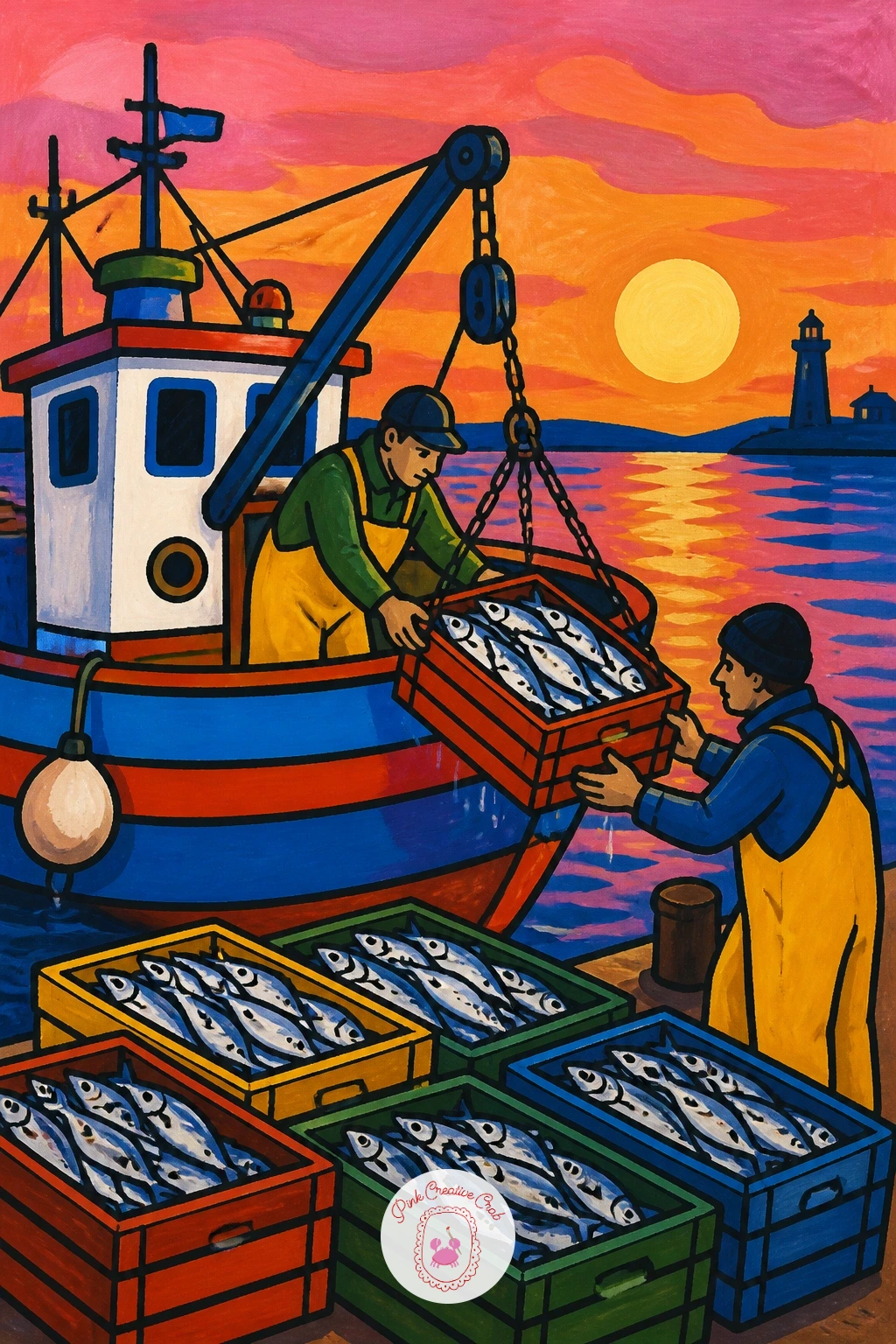
Palette: Dawn Pink,Dawn Gold,Boat Red,Harbor Blue
Follow the harbor with sardine festival bunting strung between buildings over a narrow Lisbon street, fish-shaped flags fluttering overhead. Paint the street first as two simple building facades leaning in from either side, then string a loose curved line of bunting between them before adding any individual flags.
Each bunting flag can be a tiny simple fish silhouette in alternating colors, red, yellow, blue, repeated along the string, which is really just one shape painted several times with color swapped each round. The buildings behind stay flat and simple, warm ochre and dusty pink walls with a few shuttered windows.
Getting the bunting’s sag right just means drawing the string as a gentle U curve rather than straight, since a straight line of flags looks stiff and unconvincing overhead. If a full street feels like a lot, narrow the scene to just one building corner with the bunting crossing it.
A string of lights alongside the flags adds a nice festive extra touch.
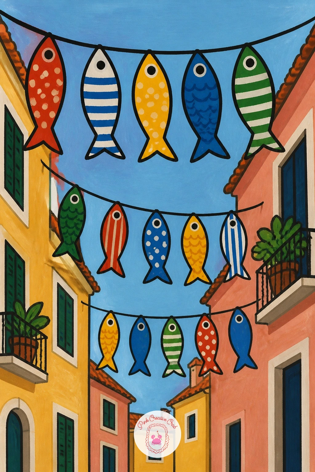
Palette: Ochre Wall,Dusty Pink Wall,Bunting Red,Bunting Blue
Zoom right in on something tiny and collectible, a few little fish-shaped soy sauce bottles grouped together like small characters. Draw each bottle as a simple fat fish outline with a flat base, varying the size slightly between them, then add the cap as a tiny triangle fin on top.
Paint one bottle in classic red with a black cap, another in clear plastic suggested with pale outline only, and a third in a bright novelty color like green or orange, so the group feels collected rather than identical. A thin dark line for the eye and gill mark on each bottle finishes the fish shape.
Scale is the whole charm of this subject, so keep the bottles small relative to the page and leave generous cream space around the group rather than filling the frame edge to edge. If painting several feels like too much repetition, two bottles side by side is just as satisfying.
A faint pencil shadow beneath each bottle keeps them sitting on a surface rather than floating.
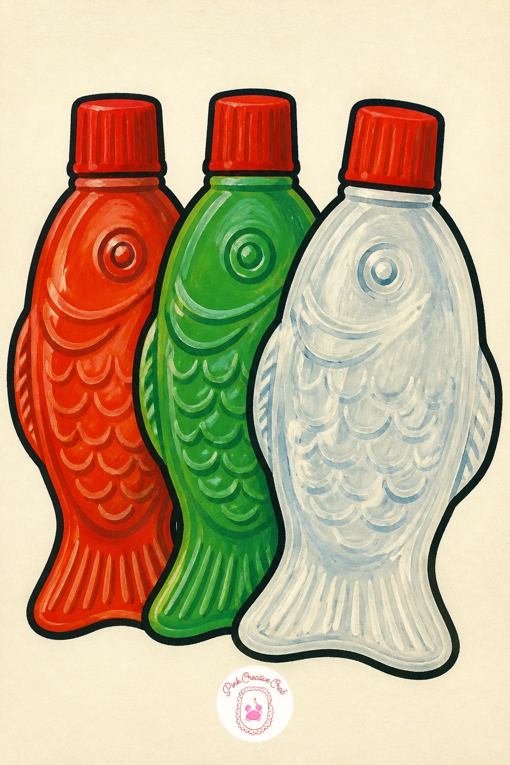
Palette: Bottle Red,Bottle Green,Cap Black,Cream
Bring the palette back to tins with a small tin of anchovies resting on a terrazzo counter, a nice chance to practice a speckled surface. Paint the tin first as a simple flat rectangle in muted gold or olive, since anchovy tins often lean more neutral than the bright sardine branding, then let it dry before starting the counter.
The terrazzo surface is just a flat pale base color with small irregular flecks of two or three colors dotted across it using the tip of a round brush. Keep the flecks random in size and spacing, since evenly spaced dots read as polka dots rather than stone.
If the terrazzo flecks start looking too uniform, turn the brush slightly between dots and vary the pressure so some marks come out larger and some barely visible. No round brush fine enough on hand, the end of a cotton swab works in a pinch for small dots.
A few dark anchovy fillets peeking from the open tin lid finish the piece.
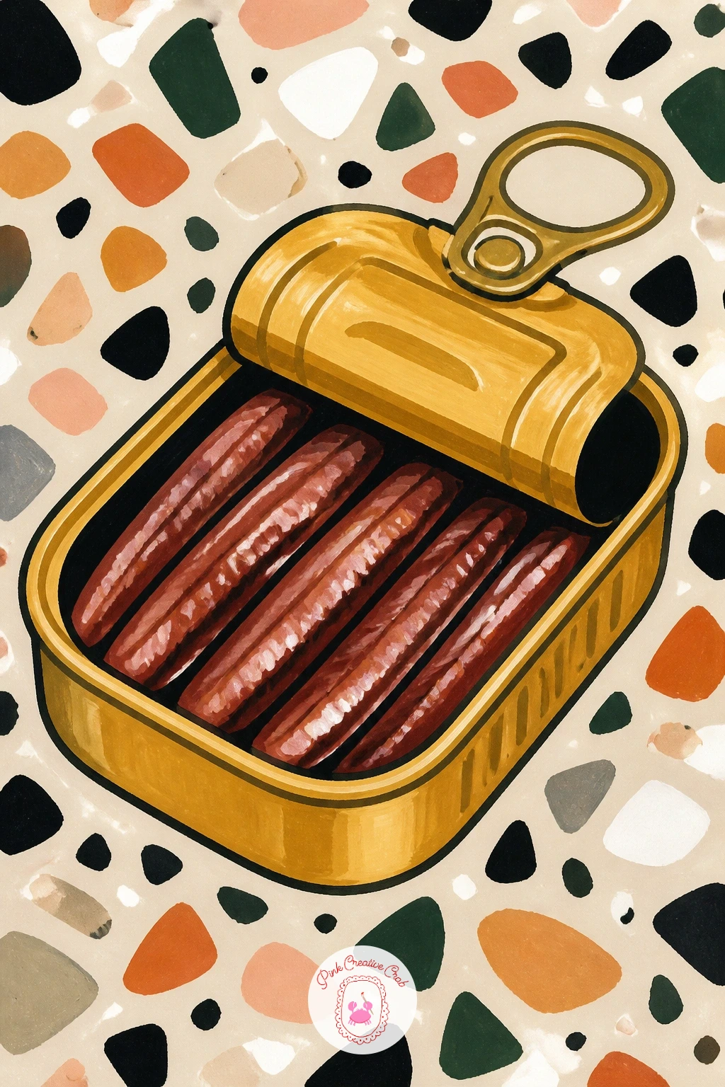
Palette: Anchovy Tin Gold,Terrazzo Cream,Fleck Grey,Fleck Red
Bring back a human figure with a girl in a wide sun hat, lifting a ring of calamari to her mouth at an outdoor table. Build her from simple shapes again, oval face under a big curved hat brim, then add her hand and the fork last, once the pose feels balanced on the page.
Paint the hat in warm straw yellow with a ribbon band, her top in a solid bright color, and the calamari rings on the plate below as simple golden circles with dark centers. Keep her expression relaxed, a small smile and closed or half-closed eyes work better than a wide open mouth mid-bite.
Hats are where proportion often slips, so check that the brim is roughly as wide as her shoulders before committing to paint, holding your pencil up at arm’s length to compare the two widths if it helps. If the figure feels like too much for today, crop the scene to just the hat, hand and fork over the plate.
A wedge of lemon beside the calamari adds the last bright note.
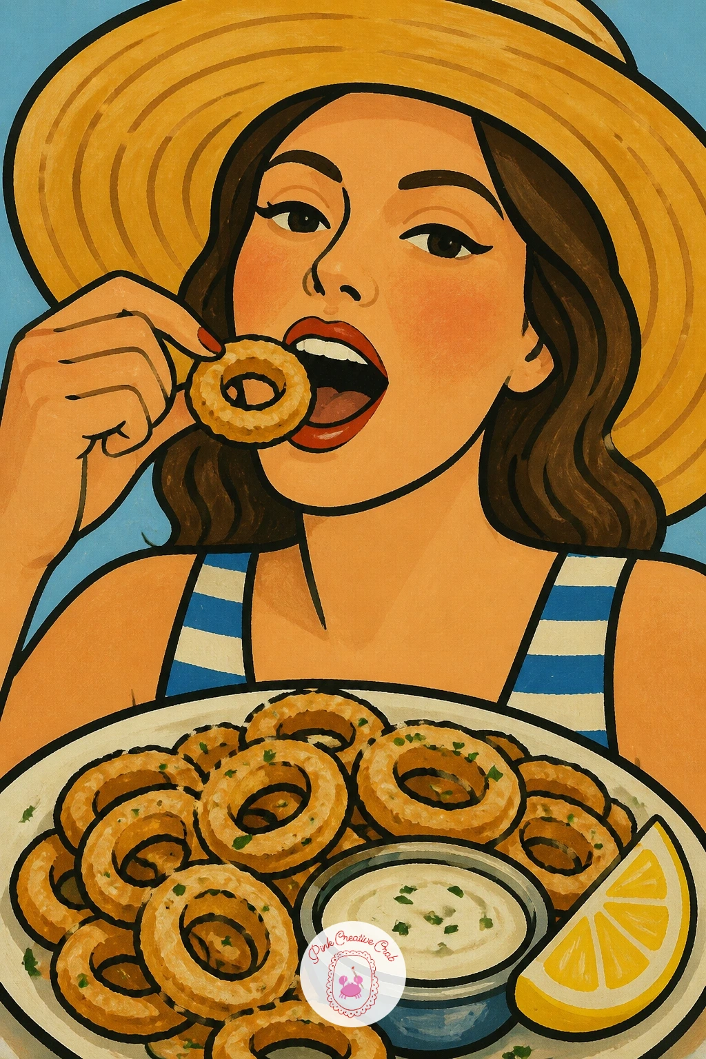
Palette: Straw Yellow,Calamari Gold,Blush,Lemon Yellow
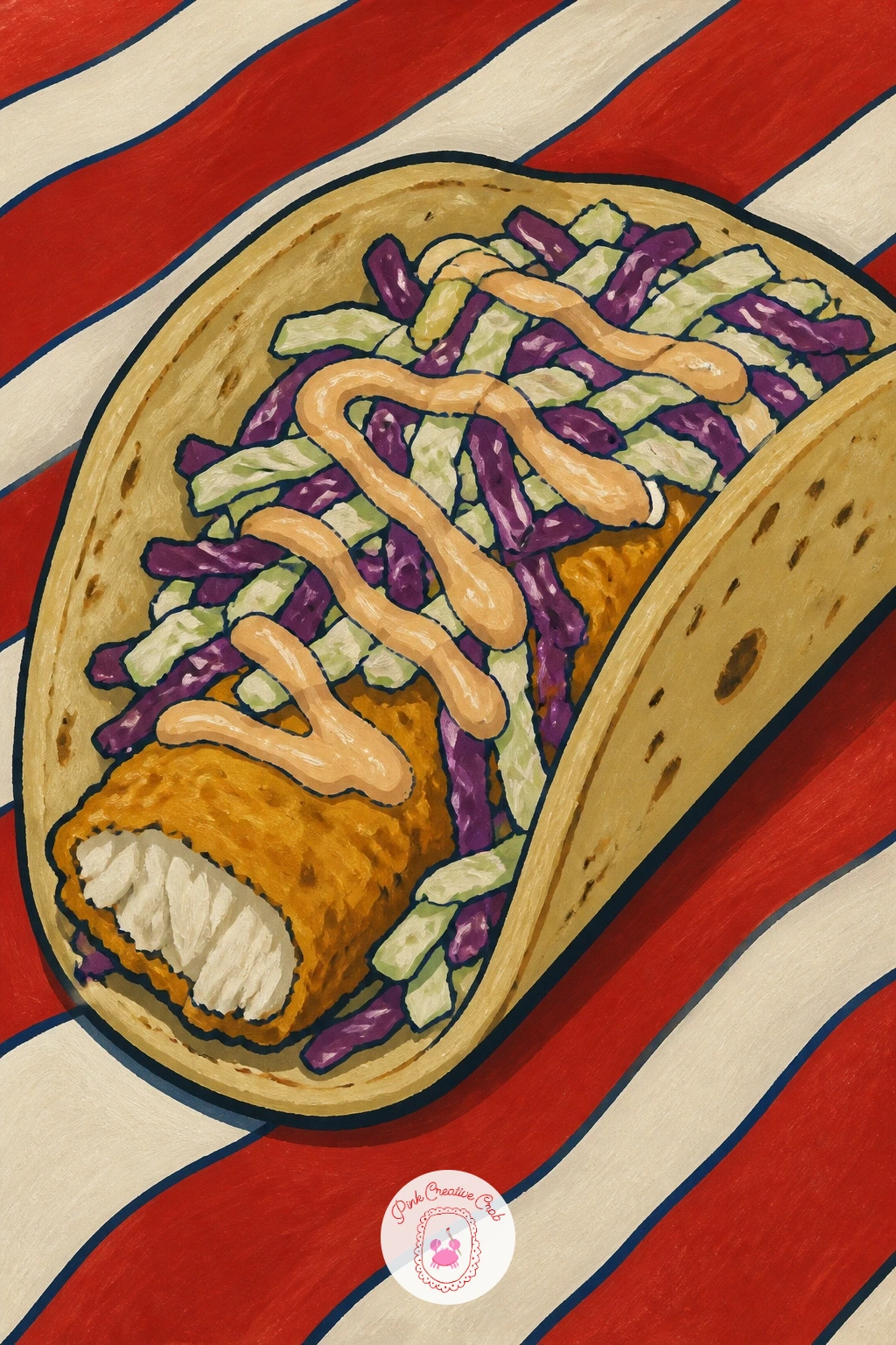
Bring the seaside food theme down to the sand with a fish taco resting on a striped beach towel. Paint the taco first, a simple curved tortilla shape wrapped around chunks of fish, shredded cabbage and a drizzle of sauce, before adding the towel pattern underneath.
Layer the fillings in order from back to front, cabbage in pale green first, then fish chunks in golden beige, then a zigzag of bright sauce on top, which keeps each layer visible rather than muddy. The beach towel beneath works well as bold stripes in two or three colors, painted with a ruler if a steady line is tricky freehand.
Getting the taco’s fold right just means curving the tortilla shape like a smile rather than a straight line, which instantly makes it look like it is holding its fillings in. If the sauce zigzag feels fussy with a brush, a fine paint marker gives a cleaner, more controlled line.
A few grains of sand dotted at the towel’s edge finish the beach setting.
You Will Need
- fine paint marker for the sauce zigzag
Palette: Tortilla Gold,Cabbage Green,Fish Beige,Towel Red
Bring the tinned fish trend into the kitchen itself with a sardine-print tea towel draped over an oven door handle. Paint the oven door first as a simple dark rectangle with a horizontal handle bar, then drape the towel over it as a soft folded shape hanging on either side.
The towel’s print is the fun part: a simple repeating pattern of small sardine silhouettes in one or two colors across a cream or pale blue background, painted freehand in a loose grid rather than measured out perfectly. Folds in the fabric can be suggested with just a few curved shadow lines where the towel bends over the handle.
If the repeating fish pattern starts to feel tedious, loosen your grip and let each fish come out slightly different in size and angle, which actually looks more like a printed textile than a stiff perfect grid. A fine brush or marker handles the small fish shapes better than a loaded round brush.
A contrast stripe or trim along the towel’s bottom edge finishes the pattern nicely.
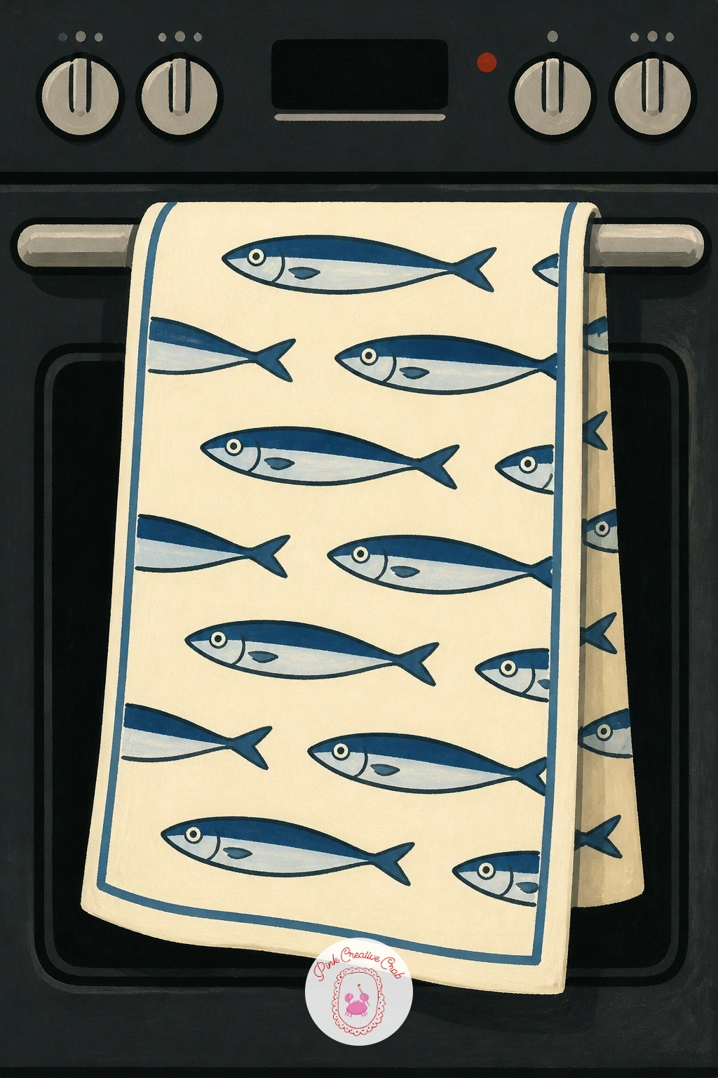
Palette: Towel Cream,Print Blue,Oven Charcoal,Trim Red
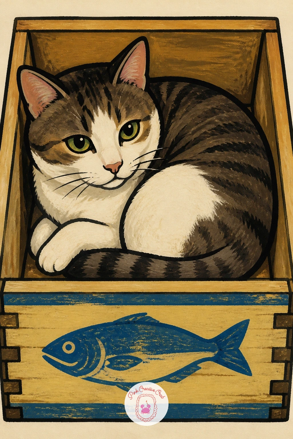
Close the whole set with a cat curled up inside an empty wooden sardine crate, perfectly content with the leftover smell. Paint the crate first as a simple open box shape with visible slat lines along the sides, then fit the cat’s curled body inside it, slightly overflowing the edges the way cats always do.
Give the crate a warm, worn wood color with a faded stenciled label mark on one side, echoing the tins from earlier in this list. The cat can be any flat color you like, with simple closed eyes and tucked paws, filling the box snugly enough that a paw or tail curls over the rim.
Fitting a round cat into a rectangular crate convincingly just means letting soft body curves overlap the crate’s straight edges rather than keeping every line separate, which is exactly how a real cat folds into too-small spaces. If stenciled lettering feels fussy, a simple fish silhouette stamp on the crate side reads just as well.
A loose scatter of straw shapes around the crate base finishes the scene.
Palette: Crate Wood Brown,Cat Grey,Cream,Straw Gold
What to Do Next
Pick whichever tin or scene makes you smile most and start there, a sheet of smooth watercolor paper and your basic gouache set is all today’s idea needs. For more painting in this loose, flat gouache style, the gouache painting ideas for beginners and easy gouache sea painting ideas make a natural next stop.
Frequently Asked Questions
What paint works best for sardine painting in this retro style?
Gouache works best, since it dries matte and opaque with flat, confident shapes that match the retro tin label look. Acrylic diluted slightly with water gives a very similar result if gouache is not available.
Do I need to paint sardines realistically for this to work?
No, this whole style leans playful and flat rather than realistic, with bold outlines and simplified shapes doing most of the work. Accuracy matters far less than confident color and a clean outline.
What is the easiest sardine painting idea to start with?
An open tin of sardines with a lemon wedge is the simplest starting point, since it uses only a few flat shapes and no figures or backgrounds. It also teaches the outline technique used throughout the rest of the list.
How do I keep the bold outlines from looking messy?
Let every painted shape dry completely before adding the outline, then draw it in one steady, unbroken stroke rather than several short ones. A fine brush or a black paint marker both work well for this step.
Can I paint these ideas on anything other than paper?
Yes, smooth illustration board, canvas panels or even wooden kitchen plaques all take gouache or acrylic well for this style. Choose a smooth surface over a heavily textured one, since fine outline work needs a steady surface to glide on.
Have any thoughts?
Share your reaction or leave a quick response — we’d love to hear what you think!
-
 0
-
0
-
0
-
0
-
0
-
0


