

Palm tree painting is the fastest way to bring that Glam Cabana, old-Hollywood-resort mood onto paper, and you do not need a trip to Palm Springs to get it. Flat gouache shapes, a candy palette and one big graphic palm do most of the work, so these scenes come together fast and look like a vintage travel poster the moment they dry.
Below you will find 36 poolside, beachside and hotel-side palm scenes, from a quick pink diving board to a full art deco street in Miami. Work through them in order if you like, easiest first, or jump straight to the one that matches your own holiday daydream.
Using these images: free for personal projects such as printing, coloring, cards, journals and gifts. Handmade items that include them may be sold up to 30 pieces per design. More than that is commercial use and is not permitted, and neither is selling or sharing the images themselves or passing them off as your own. Please ask before any other use.
Start here because this palm scene is really just two flat shapes: a wall and a shadow. Paint the wall first with a warm white or pale sand gouache, let it dry fully, then mix a flat lilac-grey shadow colour and brush in the long, bent shape of a palm trunk and a spray of leaf shadows across the wall.
Work the shadow shape in one go with a round brush so the edges stay crisp, since this subject lives or dies on clean silhouettes rather than detail. If the shadow edges go soft or fuzzy, let the wall dry completely before you try again, or switch to a fine brush and tidy the outline once it is dry.
No real palm is needed as reference here, just a photo of dappled light on a wall for the shape of the shadow. If you only have craft acrylic instead of gouache, it works the same way for this one since the whole piece is flat colour blocks.
Keep the shadow a single flat tone with no shading inside it, that flatness is what makes it read as retro poster art rather than a realistic cast shadow.
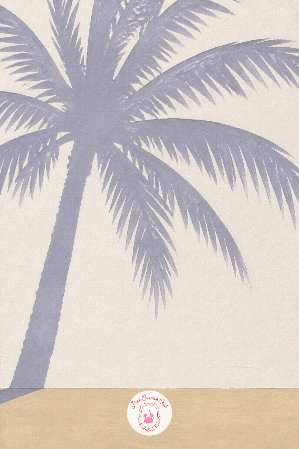
Palette: Sand,Payne’s Grey,Titanium White
Surfboard against a palm trunk is an easy, satisfying shape study once the wall shadow has you comfortable with flat silhouettes. Sketch a slim palm trunk leaning slightly, then draw a long oval surfboard propped against it, and block in the trunk in warm brown-grey gouache before painting the board as one bold flat colour, coral or turquoise.
Paint the palm head last in two overlapping greens so the fronds sit clearly over the sky, then drop in a thin painted stripe or two across the surfboard once that first colour is bone dry. The usual trip-up is painting the stripe too soon and dragging the colours together, so always wait for full dryness before adding the line.
If you only own a narrow brush, turn it on its side to lay the stripe in one steady pull rather than several shaky strokes. A plain sand-coloured background keeps the focus on the board and trunk.
Measure the board against the trunk before you paint it in: a surfboard that reads believable is usually about two thirds the height of the trunk, not taller.
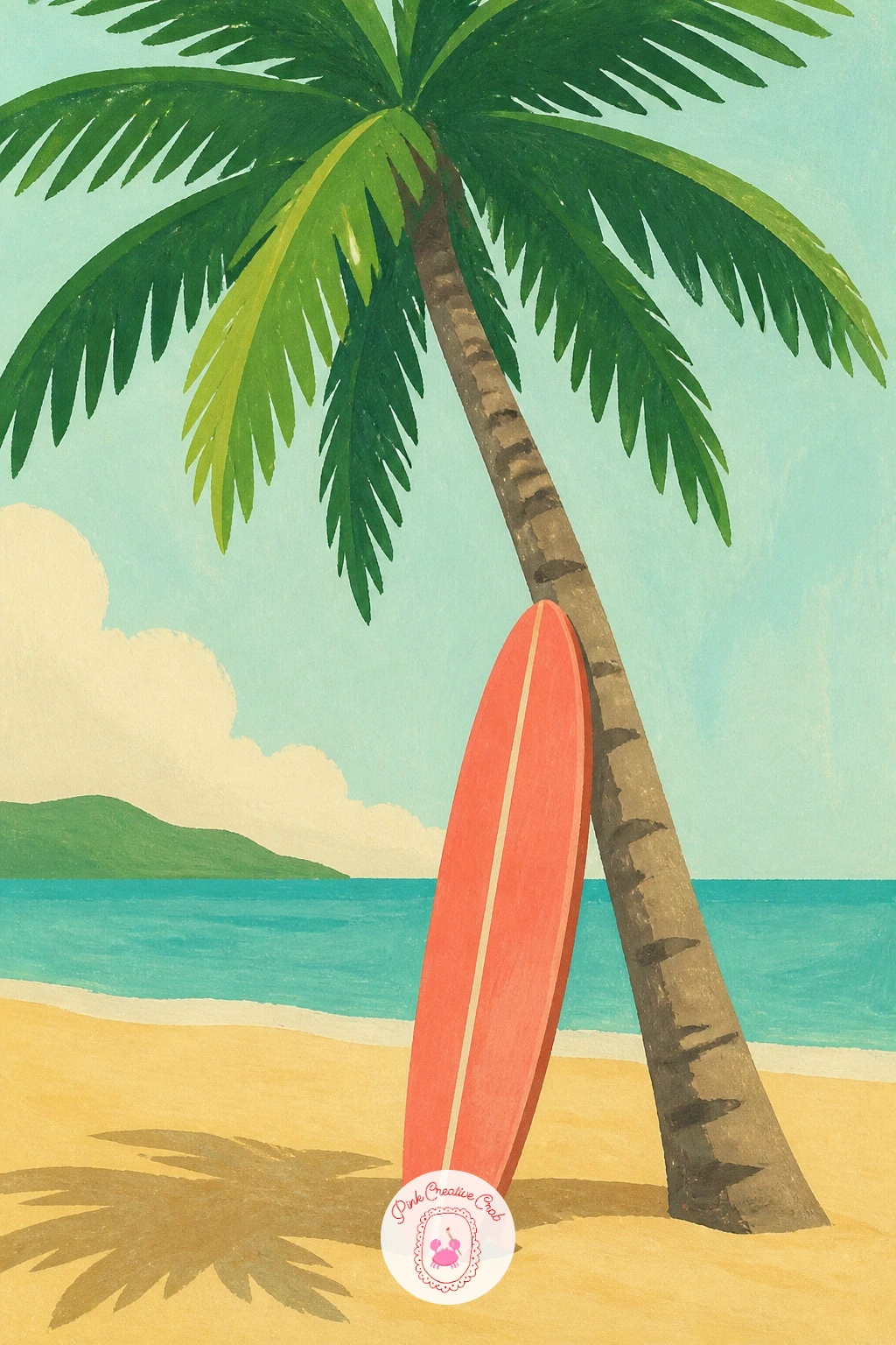
Palette: Coral Pink,Palm Green,Sand,Burnt Sienna
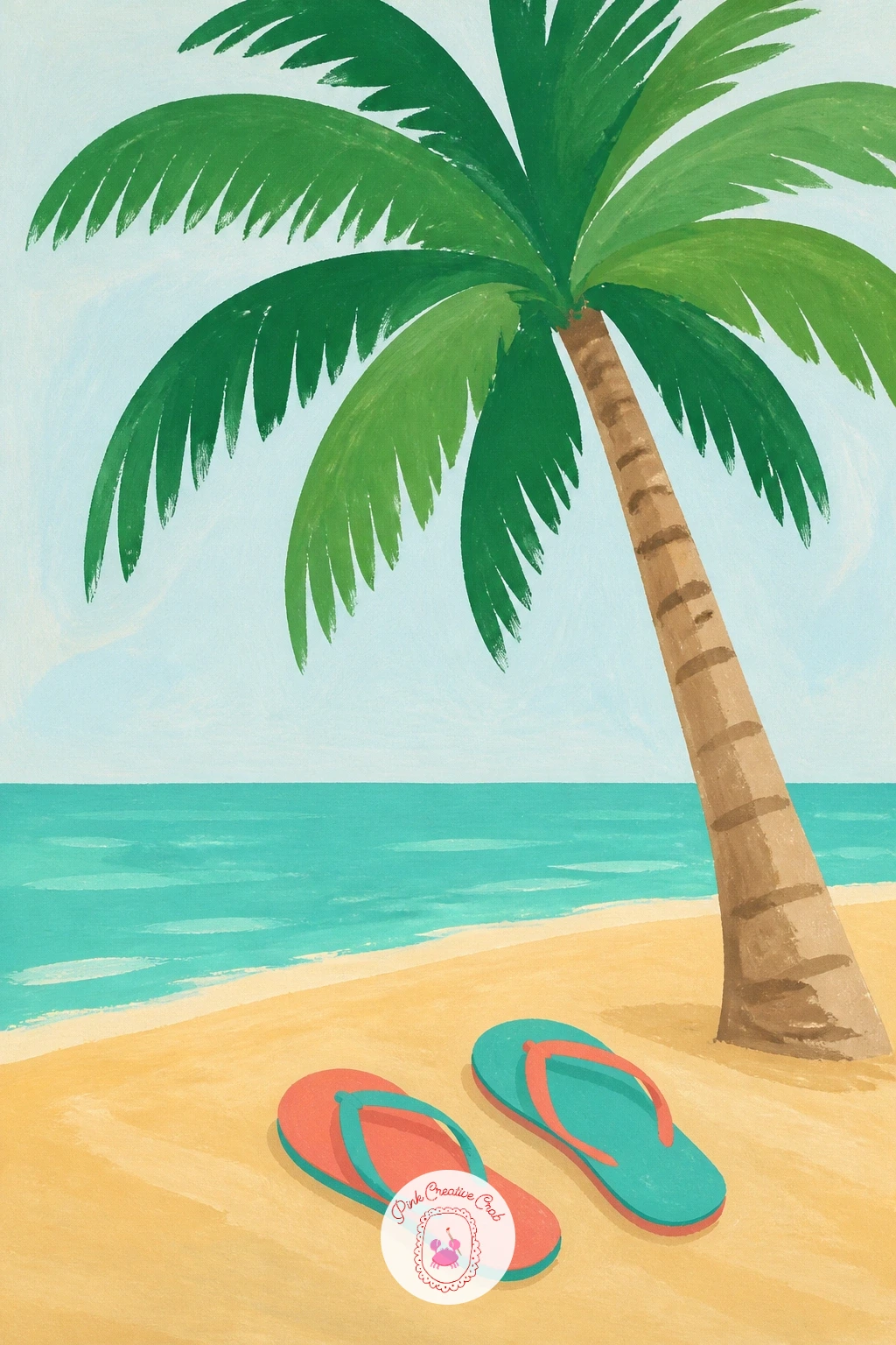
After a surfboard, try an even smaller still life: a pair of flip-flops kicked off under a palm. Paint the sand ground first in a warm flat tone, then add the two flip-flop shapes side by side at a slight angle, as if someone just stepped out of them, in a single bright coral or turquoise.
Build the palm trunk and leaves above once the sand is dry, keeping the fronds loose and overlapping so they cast a little visual shade over the shoes. The easy mistake is making both flip-flops perfectly symmetrical and stiff, so nudge one slightly askew and overlap the straps a touch for a lived-in feel.
If gouache is not to hand, acrylic paint thinned slightly with water behaves almost the same for these flat shapes. A white gel pen is handy here for picking out a thin highlight along each flip-flop strap once the paint is dry.
This is a true ten-minute palette-cleanser of a painting, and the forty-minute version simply adds a cast shadow shape under each shoe and a second, smaller palm in the background.
You Will Need
- white gel pen
Palette: Sand,Pool Turquoise,Coral Pink,Palm Green
Move from small objects to a full little scene with a hammock slung between two palms. Draw both trunks first, leaning gently toward each other, then paint the hammock as a simple curved band in a striped pattern, coral and white or turquoise and white, hanging in the gap between them.
Work the hammock’s sag before you paint the palms fully, since its curve has to match the distance and height of the two trunks or it will look like it is floating. If the curve looks too shallow or too deep, lightly pencil a few guide arcs first and pick the one that looks most relaxed before committing in paint.
Finish with the two palm crowns overlapping slightly above the hammock, and a thin painted rope line at each end to anchor it to the trunks. No hammock on hand to study, a folded striped towel draped between two books gives you the same sag to look at.
Paint the two trunks at slightly different heights and thicknesses, since matching twins read as stiff and less like a real pair of palms.
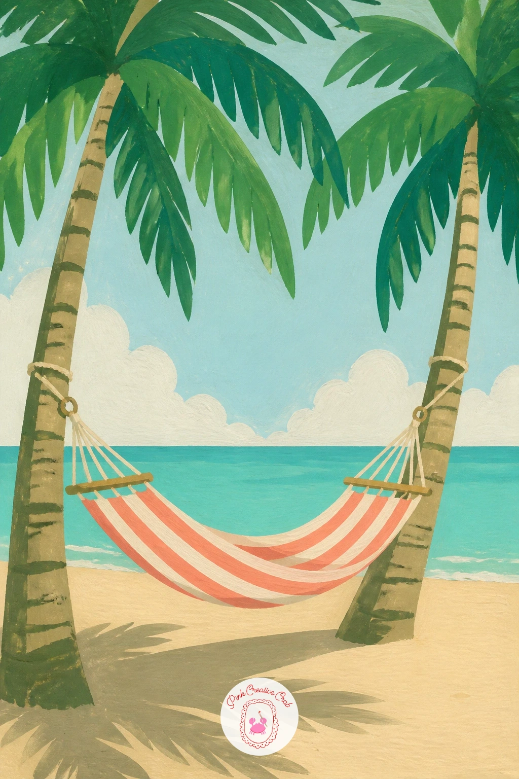
Palette: Palm Green,Coral Pink,Titanium White,Sand
Bring the Glam Cabana mood indoors with a potted palm in a terracotta pot. Paint the pot first as a simple tapered flat shape in warm terracotta, then build the palm fronds fanning upward and outward from the rim in two or three greens, overlapping so the plant feels full rather than sparse.
Place the eye level low, near the base of the pot, so the fronds rise up and spread wide above the viewer, which is what makes an indoor palm feel grand rather than potted and small. A hint of a wall colour or a strip of floor behind anchors the room without needing any furniture.
The pot is the part that goes wrong most often, usually painted too perfectly round, so flatten the far side slightly and let the near rim curve more to suggest it sits in space. If terracotta gouache is not in your set, mix a warm orange with a touch of burnt sienna and a little white.
Add one or two fronds trailing past the edge of the pot, slightly wilted, for a more lived-in houseplant feel.
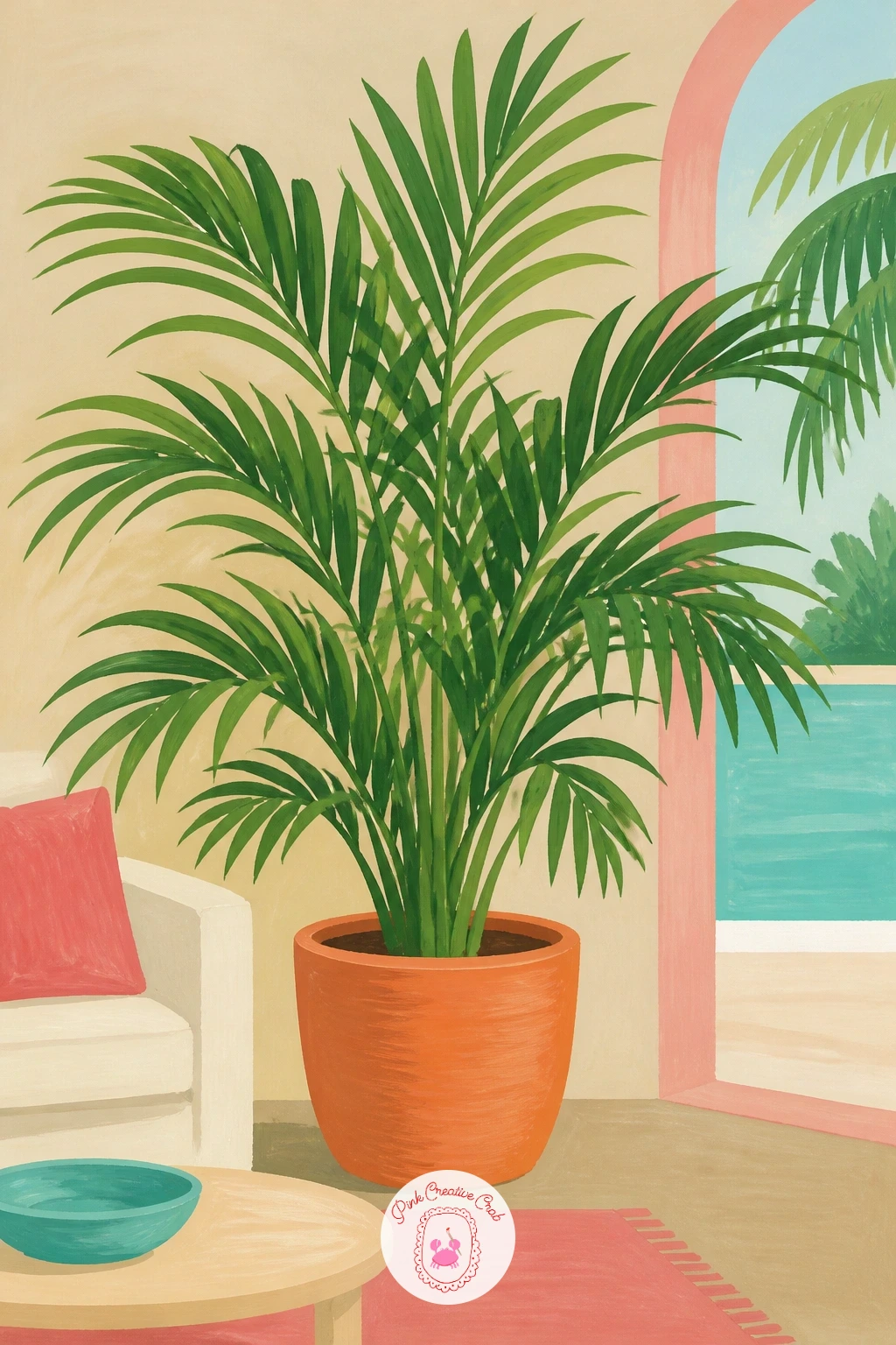
Palette: Terracotta,Palm Green,Sap Green,Sand
Zoom right in for this one and paint a single fan palm leaf lit from one side. Start with the pale fan shape of the leaf itself, then decide where the light source sits, usually upper left or upper right works best, and keep every fold and ridge on that leaf consistent with it.
Paint the shaded half of the fan in a deeper, cooler green first, then the lit half in a warmer, paler green, and add the radiating leaf ribs as thin painted lines once both halves are dry so they do not bleed into each other. The common slip is making every rib the same width, which flattens the whole leaf, so vary the pressure as you paint them, thinner toward the tips.
A fine liner brush or even a sharpened cotton bud dipped in white gouache can flick in a few bright highlight lines along the lit ribs at the end. If you do not have a fine brush, a toothpick dipped in paint makes a serviceable thin line in a pinch.
Keep the background plain and pale so the leaf’s silhouette and light stay the whole story.
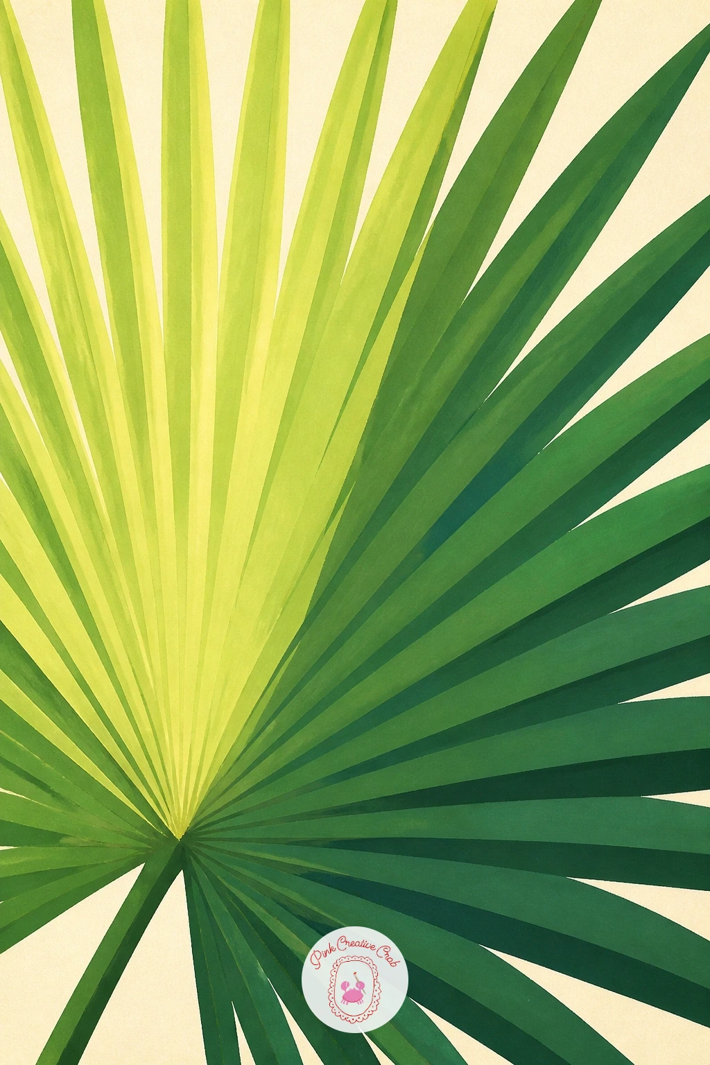
Palette: Sap Green,Palm Green,Titanium White,Sand
Try this one from a real houseplant leaf or a clear photo rather than memory, the fold pattern of a true fan palm leaf is hard to invent convincingly.
Keep the close-up habit going with a tiki mug decorated in a palm print pattern. Paint the mug’s body shape first in a flat cream or sand colour, then once dry, add a repeating pattern of small flat palm silhouettes around its belly in coral or turquoise.
Work the mug as a simple cylinder with a slightly narrower base and wider rim, and keep the palm pattern motifs small and identical so they read as print rather than individual trees. The usual issue is crowding too many palms onto the curve, so space them out with visible gaps of background colour between each one.
Finish with a thin dark outline around the mug’s rim and base to ground the shape, plus a tiny painted straw or paper umbrella poking out the top if you want a bit more charm. A real tiki mug or even a printed tropical fabric is the easiest reference for the pattern spacing.
Once this one works, try it again with the palm pattern in a single colour against a dark navy mug for a bolder, more graphic result.
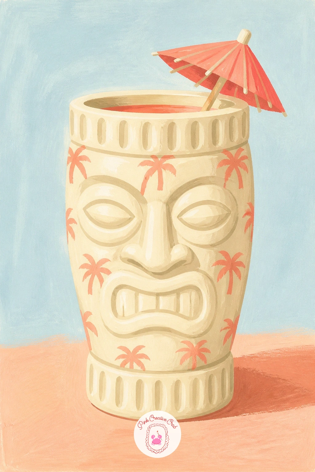
Palette: Sand,Coral Pink,Pool Turquoise,Payne’s Grey
Carry the pattern practice over into a spinning postcard stand full of tiny palm scenes. Paint the stand’s frame as a simple grid of flat wire-like lines first, then fill the pockets with small rectangular postcards, each one a miniature palm scene in two or three brushstrokes, a palm, a strip of sky, a strip of sand.
Vary the colours between postcards, one turquoise sky, one coral sunset, one sandy midday, so the stand reads as a real mix rather than copies. The trap here is painting every tiny postcard in full detail, which turns messy fast at this scale, so let each one be no more than three or four confident flat shapes.
Finish with the stand’s frame in a dark thin line over the top of the postcards to pull the grid back into focus. If a wire grid feels fiddly to paint, a loose wash of grey-brown for the frame shape works just as well as individual wires.
This is a fun one to come back to and change the postcard colours each time for an entirely different mood from the same simple stand.
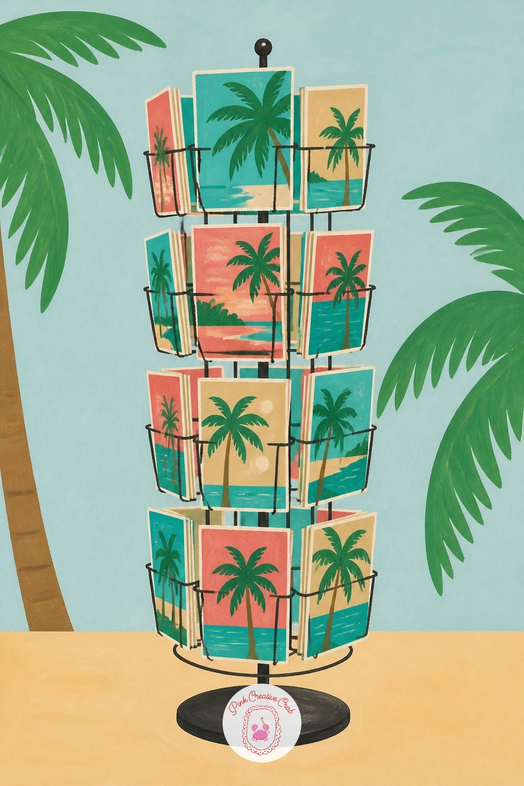
Palette: Pool Turquoise,Coral Pink,Sand,Payne’s Grey
Drop back down to the beach itself for a palm print towel laid out on the sand. Paint the sand as a warm flat base first, then lay the towel shape on top as a rectangle in perspective, tilted slightly as though viewed from above and to one side.
Here the eye level matters: look down on the towel from a standing angle rather than straight on, which makes the rectangle foreshorten into more of a trapezoid shape, and that tilt is what sells the scene as a view from a beach chair rather than a flat pattern swatch. Paint the palm print pattern across it in small repeated motifs once the towel’s base colour is dry.
Add a loose scatter of sand texture around the towel’s edges with a dry, barely loaded brush dragged lightly over the paper, which breaks up the hard edge where towel meets sand. If your brush is too wet for that dry-brush texture, blot it on scrap paper first until it drags rather than paints solidly.
Keep the print pattern simple, just a repeated palm silhouette in one accent colour, so the towel does not compete with everything else in the frame.
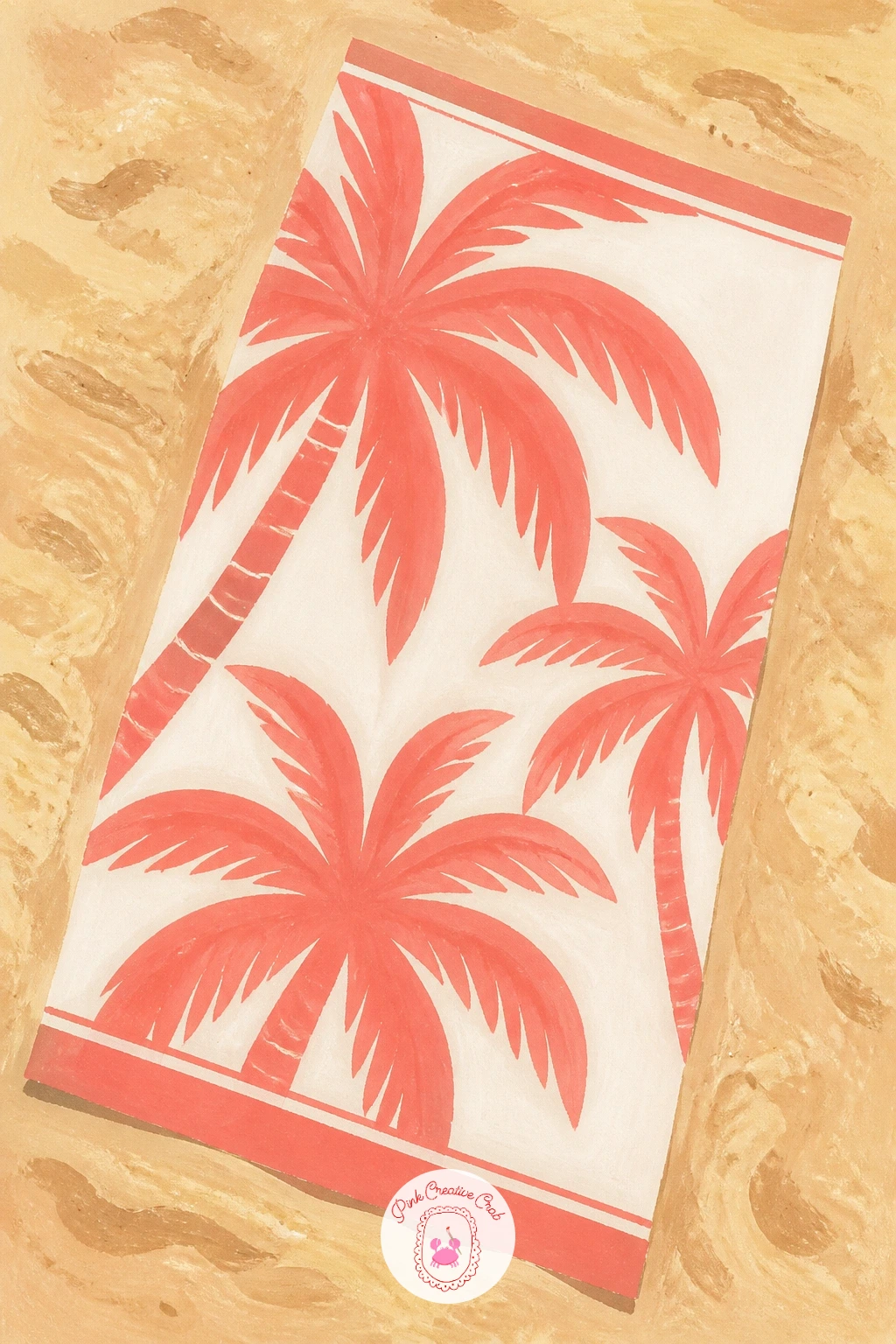
Palette: Sand,Coral Pink,Titanium White,Palm Green
Give the beach a resident with a cat curled up asleep in the cool shade a palm throws across the sand. Paint the sand and the sharp-edged shadow shape first, half sun, half shade, then nestle the sleeping cat right inside the shaded half, a simple curled oval with a tucked tail and tiny ears.
Keep the cat’s pose loose, a curled comma shape is plenty, since fussing over fur detail here fights the flat poster style. The spot that often goes wrong is the shadow boundary, painted too soft and blurry, so use a confident single stroke to define where sun ends and shade begins.
Add the palm trunk and leaves last, angled so the shadow direction actually matches where the trunk leans. No cat reference handy, any curled-up sleeping animal photo, even a dog or a cushion, gives you the same comma shape to work from.
For a quick ten-minute version, skip the palm entirely and just paint the cat in a sunbeam, then add the full palm and its shadow for the forty-minute version.
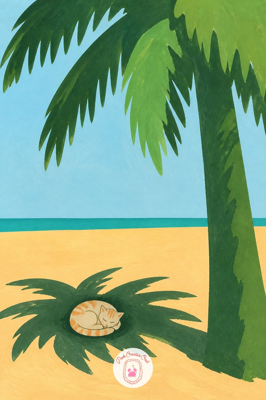
Palette: Sand,Payne’s Grey,Palm Green,Titanium White
Keep the animal energy going with a dog mid-dig beneath a palm, all four paws flinging sand. Block in the dog’s body first as a simple arched shape, haunches up, head down, front paws buried, then add a little spray of flat sand shapes flicking up behind it to show motion.
Paint the sand spray as several small separate dots and dashes rather than one blob, since that separation is what reads as flying grains rather than a smudge. The easy fix if the dog’s pose looks stiff is to tilt the whole body shape slightly off the horizontal, nothing mid-dig sits perfectly level.
Finish with the palm looming large behind, its shadow falling just short of the digging dog. If you are working from a photo of a sitting or standing dog instead, just lower the front half of the body and raise the back legs to suggest the digging crouch.
A light dry-brush flick in white gouache over the sand spray adds a last bit of sparkle and motion once everything else is dry.
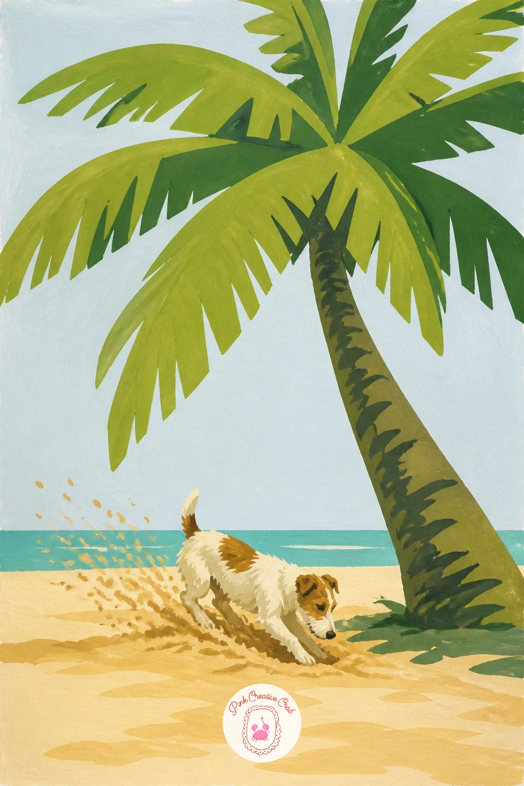
Palette: Sand,Burnt Sienna,Titanium White,Palm Green
Stay with the small-creature theme for an iguana stretched flat on a warm rock under a palm’s edge. Paint the rock shape first in a warm grey-brown, then lay the iguana along its length, a long low body, a ridged back line, and a tail that trails off the rock’s edge.
Build the body in one flat green base colour, then once dry, add the back ridge as a row of small triangular bumps in a slightly darker green running down the spine. The place this goes wrong is an iguana that ends up looking like a smooth snake, so keep those ridge bumps and the blunt head shape clearly reptilian rather than tapering it to a point.
Add the palm’s shadow falling just across part of the rock so the iguana sits half in sun, half in shade, which also helps separate its outline from the rock beneath it. No iguana photo on hand, any lizard reference gives you the same low sprawled posture and ridged spine.
Try the next one with the iguana upright on a branch instead of flat on a rock, for a different pose from the same palette.
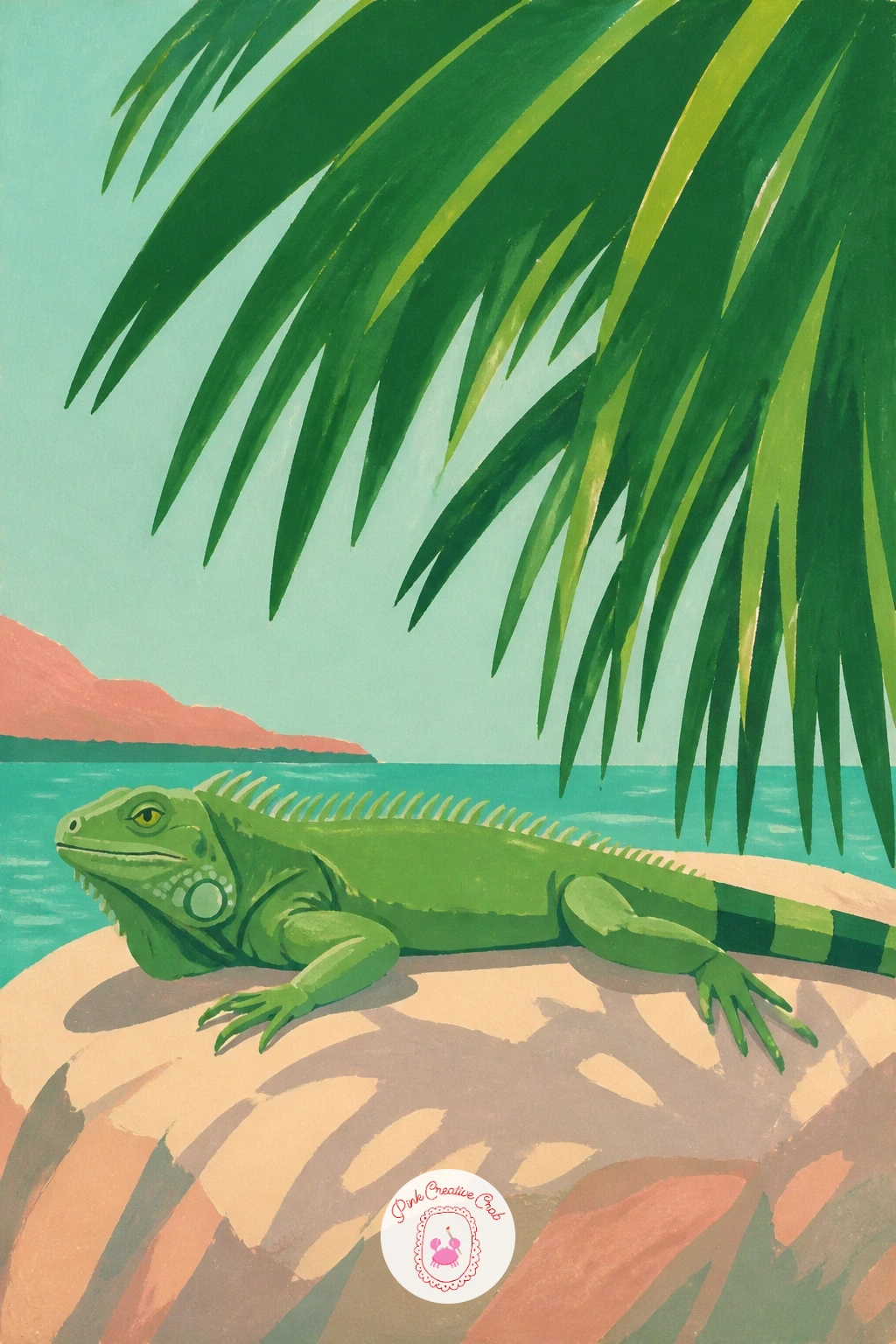
Palette: Sap Green,Palm Green,Sand,Payne’s Grey
Bring a person into the scene with a woman in a wide sun hat lounging under a palm, coconut drink in hand. Paint her simplified figure first, broad hat brim, swimsuit in one flat bright colour, and a relaxed reclining pose, before adding the coconut cup as a small rounded shape with a striped straw near her hand.
Keep her face almost featureless, a hint of a sunglasses shape or nothing at all, since in this flat poster style the hat brim and pose carry her whole mood. The spot that usually trips people up is the proportions of the reclining body, so measure her length against the hat’s width first: a reclining figure is roughly five to six hat-widths long, which stops the body coming out too short or too stretched.
Finish with the palm looming above her, its shadow pattern falling loosely across her hat and shoulders. If painting a full figure feels daunting, start with just the hat, the hand and the drink and let the rest of her trail off into the lounger shape.
A dab of white gouache for a shine on the coconut cup and a sparkle on her sunglasses finishes the scene with very little extra work.
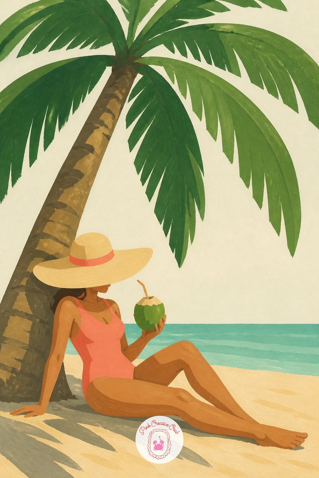
Palette: Coral Pink,Sand,Palm Green,Titanium White
Trade the lounger for a yoga mat rolled out beneath a palm for a calmer, quieter scene. Paint the mat first as a simple long rectangle in a bold flat colour, turquoise or coral, laid at a gentle angle on the sand or grass, then add the palm’s trunk rising just beside or behind it.
Decide where the morning light comes from before you paint the palm’s shadow, a low side light throws a long dramatic shadow stripe across the mat, which adds far more atmosphere than a palm with no shadow at all. Keep that shadow a single flat tone crossing the mat’s rectangle at an angle that matches the trunk’s lean.
The easy mistake is painting the mat perfectly flat and symmetrical, which looks like a swatch rather than something lying on real ground, so let one end curl very slightly or sit at a gentle diagonal. No mat to study, a folded beach towel on the floor gives the same simple rectangle and curl.
For a quieter mood next time, swap the bold mat colour for a soft sand or cream tone and let the palm’s green do the only strong colour work.
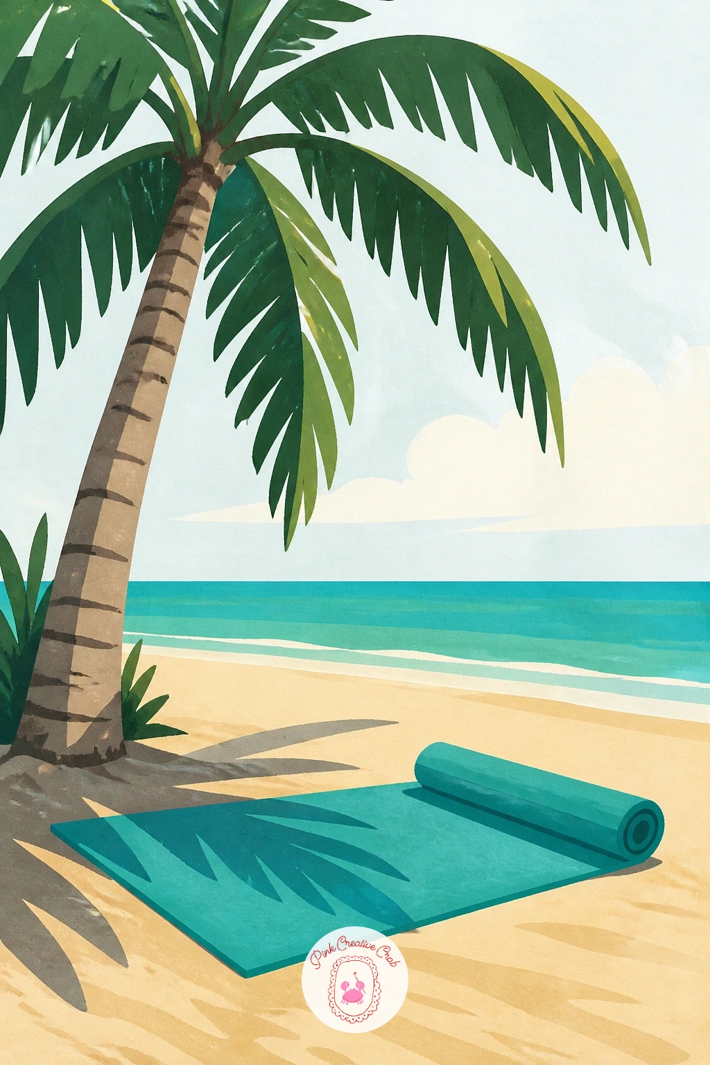
Palette: Pool Turquoise,Palm Green,Sand,Payne’s Grey
Add some motion with a figure climbing partway up a dramatically leaning palm trunk. Paint the trunk’s strong diagonal lean first, since the whole composition depends on that angle feeling confident rather than timid, then place the simplified climbing figure gripping the trunk partway up, knees bent, arms reaching.
Build the figure in a few flat shapes, no more detail than a swimsuit colour block, bent limbs and a hint of hair, and let the trunk’s texture, a few short curved pencil or brush marks, run behind and around her grip to suggest she is actually holding on rather than floating beside it. If the figure looks like she is standing rather than climbing, bend the lower leg further and angle the torso closer to the trunk.
Finish the palm’s crown of leaves bursting out above her at the top of the lean. If a dynamic climbing pose feels tricky to invent, a photo of someone on a rope climb or ladder gives you a similar bent-limb reference to adapt.
Keep the trunk’s lean exaggerated rather than subtle, a gentle curve reads as a tree swaying, a strong diagonal reads as a tree being climbed.
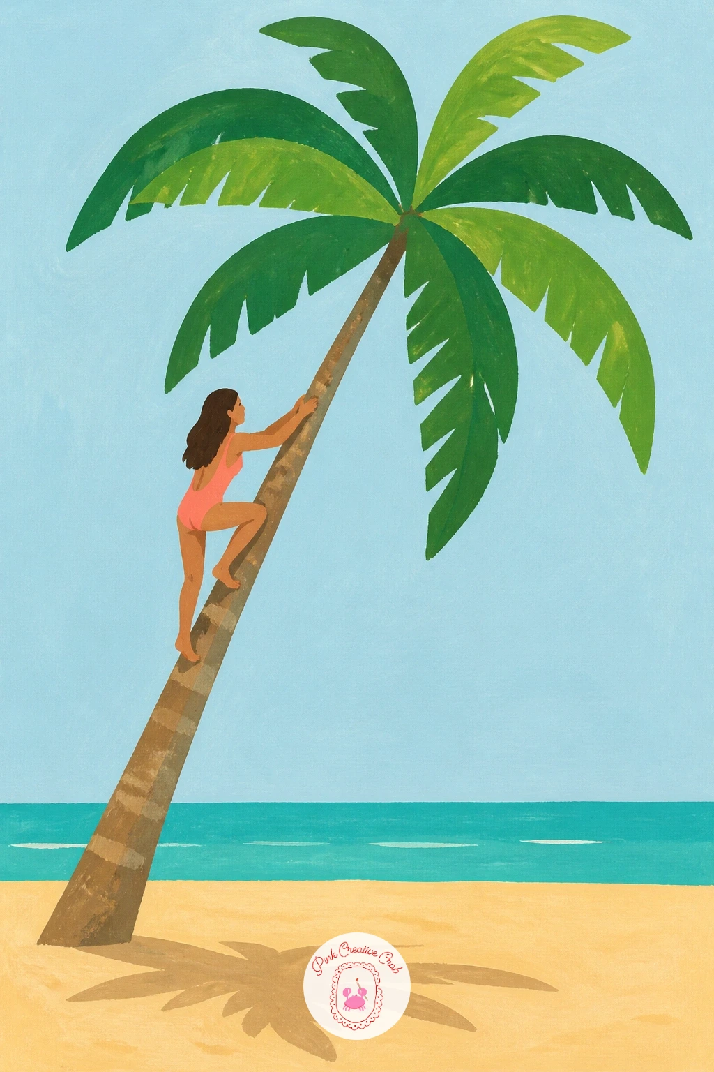
Palette: Burnt Sienna,Palm Green,Coral Pink,Sand
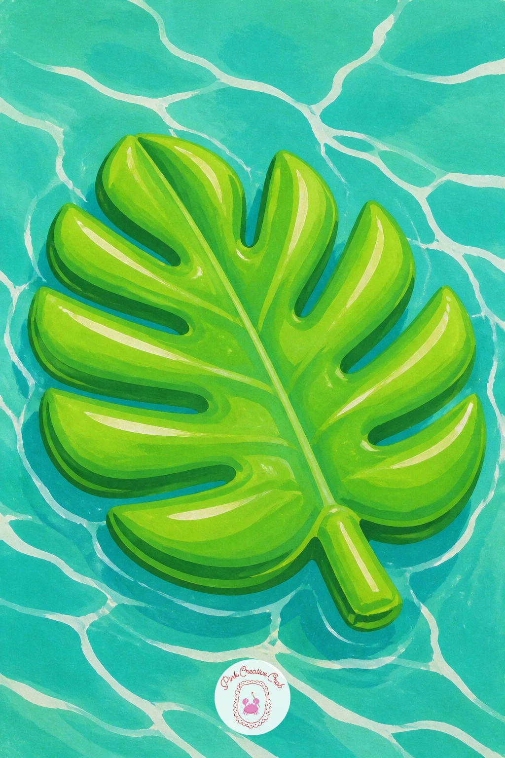
Head back to the water for a novelty pool float shaped like a giant palm leaf, drifting on turquoise water. Paint the pool’s surface first in flat turquoise with a few curved white highlight lines for ripples, then lay the leaf-shaped float on top as a wide fan shape in bright green with a few painted vein lines.
Keep the float’s outline bold and slightly puffy, since an inflatable reads differently from a real leaf, rounder edges and a visible seam line down the centre help sell the plastic, blown-up feel. The ripple highlights around the float’s edge are the part to get right: paint them as a few broken white curved strokes rather than a solid ring, so the water looks disturbed by something floating rather than drawn around it with a compass.
If white gouache feels too opaque over the turquoise, a white gel pen laid on top once the paint is fully dry gives the same crisp ripple lines. Try this one again later as a flamingo or pineapple float using the same ripple technique, once the water effect feels comfortable.
A few soft reflected green strokes just under the float help it sit convincingly on the surface rather than hover above it.
You Will Need
- white gel pen
Palette: Pool Turquoise,Sap Green,Titanium White,Palm Green
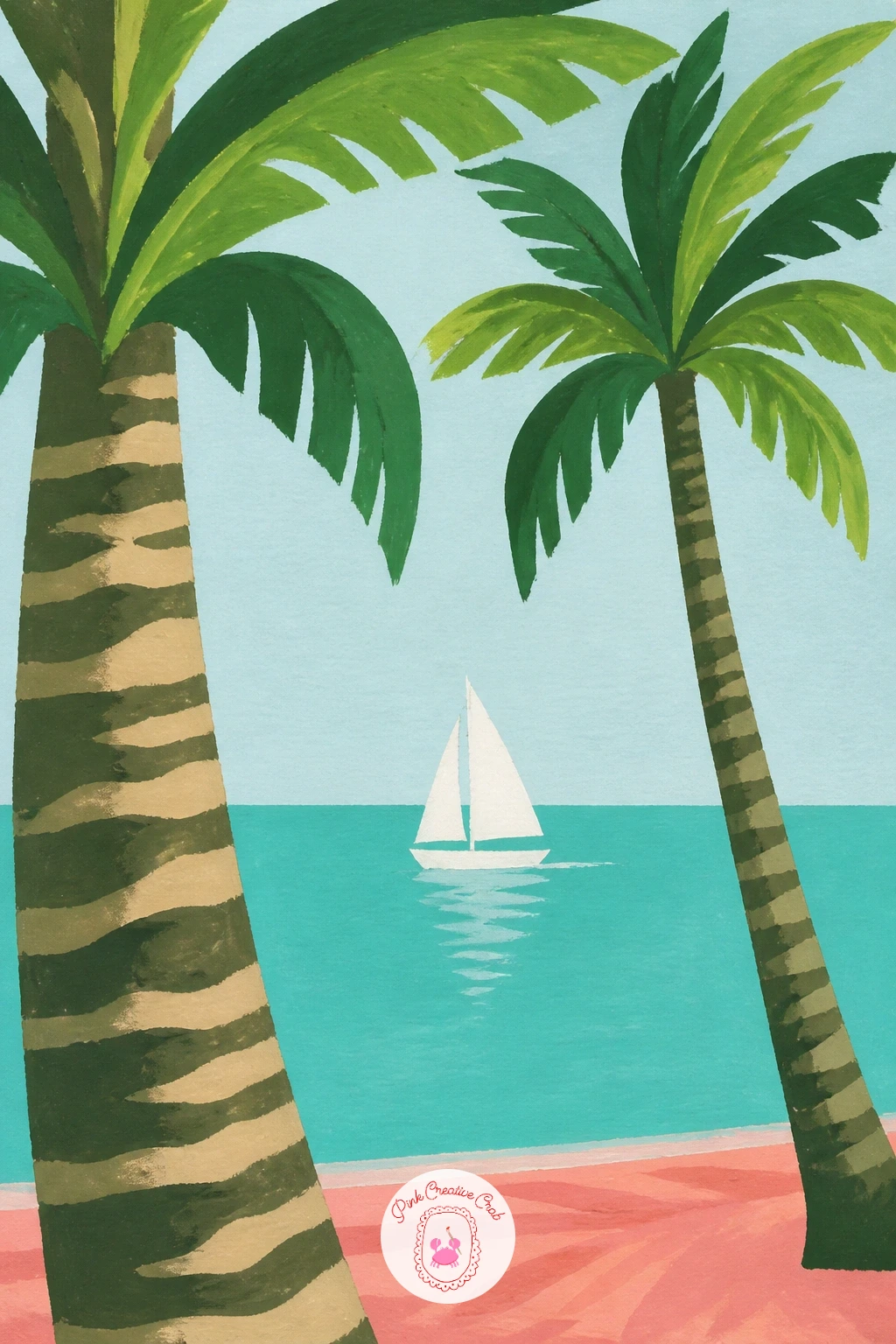
Widen the water view for a small sailboat seen passing in the gap between two palm trunks on the shore. Paint the sky and sea as two flat bands first, then add the two palm trunks framing the scene at either side, one closer and larger, one further and smaller, before placing the little sailboat in the gap between them.
Use that size difference between the two palms as your proportion check: the nearer trunk should read noticeably thicker and taller than the far one, and if they come out roughly the same size the depth of the scene collapses flat. Paint the sailboat last as a simple white triangle sail and small dark hull sitting right on the horizon line.
The spot that often goes wrong is a horizon line that wobbles, so pencil it in lightly with a ruler before you paint the sea and sky bands. No boat reference needed, a simple white triangle on a thin mast is all a stylised sailboat needs at this scale.
Add one or two gulls as tiny dark check-marks in the sky for scale and life without any extra detail work.
Palette: Pool Turquoise,Titanium White,Palm Green,Sand
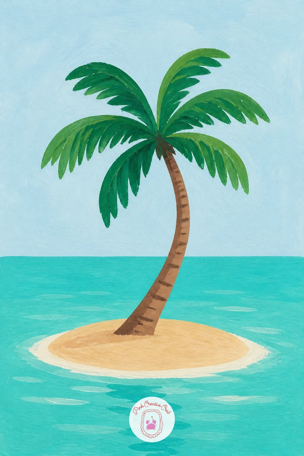
Shrink the whole scene down to a single palm growing from a tiny round island in open water, the classic desert-island postcard. Paint a simple circular or oval sand shape first, surrounded on all sides by flat turquoise water, then place one confident palm trunk rising from the centre with its crown leaning slightly to one side.
Keep the island small in relation to the water around it, since the charm of this subject is its scale: a tiny patch of sand in a big expanse of blue sells the joke better than an island that fills half the page. Ring the island’s edge with a thin pale line where sand meets sea, slightly uneven rather than a perfect circle, to avoid it reading as a painted coin.
The palm itself is the one real detail in the painting, so give its trunk a gentle curve and let two or three fronds droop lower than the rest for personality. If you want the quick ten-minute version, stop there; the forty-minute version adds a scatter of tiny shell or rock dots on the sand and a ripple or two around the island’s edge.
Palette: Pool Turquoise,Sand,Palm Green,Titanium White
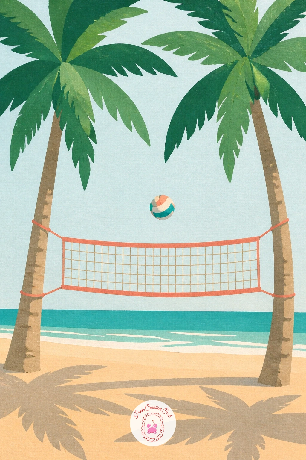
Keep the beach going with a volleyball net strung between two palm trunks, mid-game energy without needing full figures. Paint the sand ground and the two trunks first, then add the net as a simple grid of thin crossing lines stretched between them, slightly sagging in the middle the way real nets do.
Add a single ball frozen mid-air just above the net for a sense of action, painted as one small circle with a couple of curved seam lines. The net is the part that usually looks too stiff and ruler-straight, so let the top rope sag gently and keep the grid lines a little uneven rather than perfectly even, which reads as rope and mesh rather than a drawn grid.
If a full crossed-line net feels fiddly, a loose wash of pale grey in the net’s rectangle with just a few visible lines on top suggests the same mesh with far less fuss. Finish with the two palms’ shadows falling across the sand on either side of the net to tie the whole scene to one light direction.
Try it next with players’ feet and legs just entering the frame at the bottom edge for a cropped, more dynamic version.
Palette: Sand,Palm Green,Titanium White,Payne’s Grey
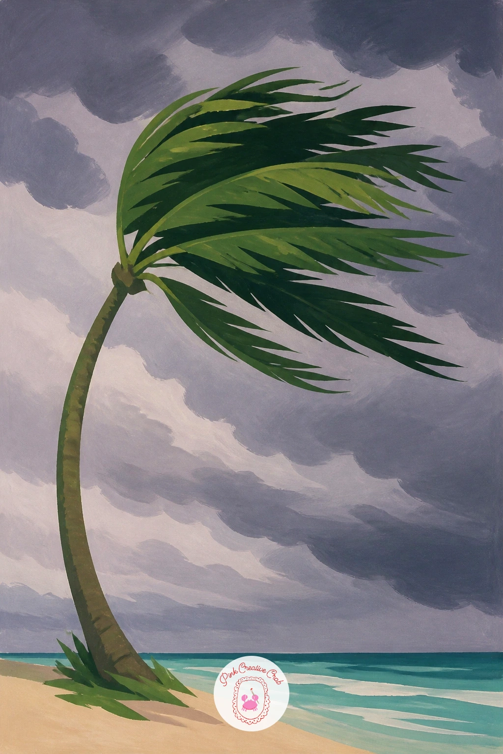
Shift the mood for a palm bent sideways by wind under a darkening summer sky. Paint the sky first in heavier, moodier tones, deep grey-lilac rolling in against a last strip of pale light near the horizon, then add the palm trunk curved hard to one side with its fronds all streaming in the same direction.
Every frond needs to sweep the same way for this to read as wind rather than just a messy palm, so pencil in a few guide arrows across the page first showing the wind’s direction before you paint a single leaf. The sand or ground below can pick up a few quick dry-brushed streaks in the same direction to suggest blowing grit.
The common fix needed here is a trunk that still looks upright despite the bent fronds, so exaggerate the curve of the trunk itself, not just the leaves, until the whole tree commits to the lean. If storm greys are not in your set, mix Payne’s grey with a touch of your coral for a warm, bruised sky colour instead of a cold one.
One stray loose frond torn free and blowing across the sky adds real drama for very little extra paint.
Palette: Payne’s Grey,Palm Green,Coral Pink,Sand
Move from storm clouds to a calmer evening for a row of palm silhouettes set against a soft lilac sunset. Paint the sky first in soft horizontal bands, pale coral low near the horizon fading up into lilac and dusky blue, blending each band into the next while the paint is still wet.
Once the sky is fully dry, paint the palm trunks and fronds as flat, dark silhouette shapes on top, varying their height and lean so the row does not look like a stencil repeated exactly. Light here sits entirely behind the palms, so there is no need to shade the trunks at all, flat dark shapes are correct and look more dramatic than shaded ones.
The sky blend is the part most likely to go wrong, drying into hard stripes instead of a soft gradient, so work quickly while the first wash is still damp and tilt the paper slightly to help the colours drift into each other. If you do not have lilac mixed, a touch of coral and Payne’s grey together makes a close substitute.
Vary this one next by keeping just one tall palm instead of a row, for a quieter, more solitary sunset mood.
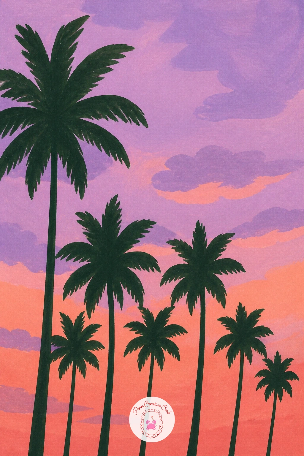
Palette: Lilac,Coral Pink,Payne’s Grey,Sand
Work this one on paper, not canvas, if you can: the wet-into-wet sky blend needs some absorbency to move smoothly before it dries.
Stretch the sunset idea into morning for a fuller palm grove catching early light. Paint the sky first in pale warm tones, soft yellow near the horizon rising into a gentle blue, then build several palm trunks at different distances, closer ones taller and darker, further ones smaller and softer in tone.
That change in size and value as the trunks recede is the whole depth trick here: keep the nearest two or three palms crisp and strongly coloured, and let anything further back go paler and slightly blurred into the morning haze. Add a thin strip of mist along the ground between the trunks with a very diluted wash of pale grey-lilac to help that distance read even more clearly.
If the grove starts to feel crowded or busy, step back and remove a trunk or two rather than adding detail to fix it, fewer, clearer trees almost always read better than many fussy ones. No grove reference to hand, three or four photos of single palms at different distances, layered in your head, is enough to compose from.
Keep every trunk leaning a slightly different direction so the grove feels like it grew naturally rather than being planted in a row.
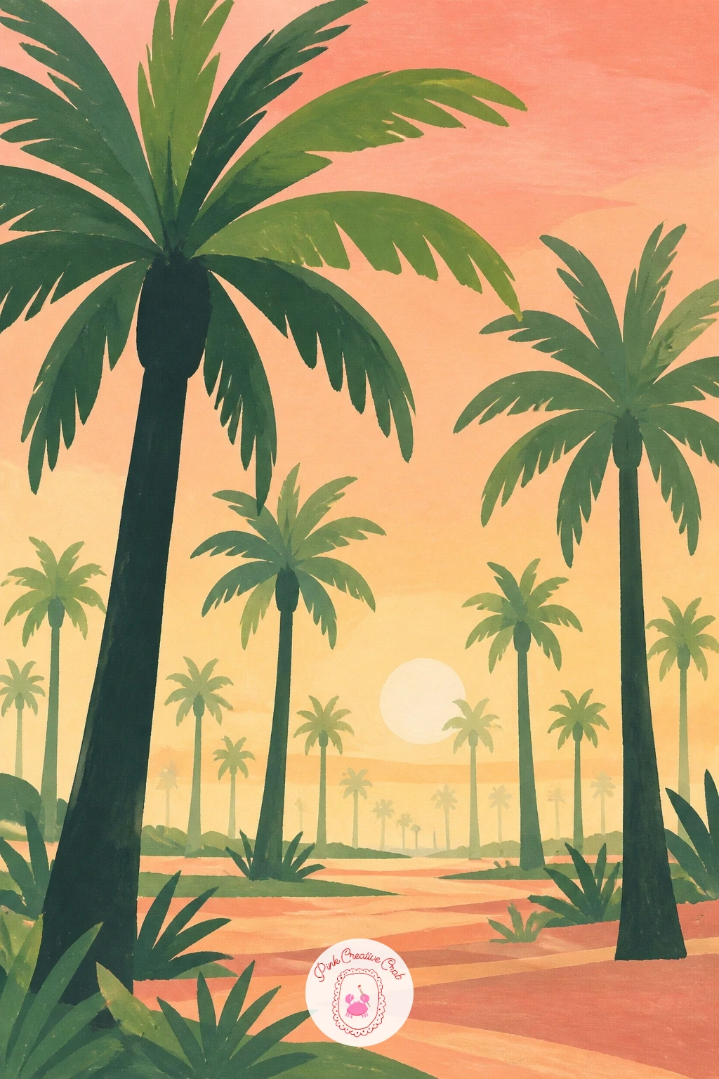
Palette: Palm Green,Sand,Lilac,Titanium White
Take the perspective lessons from the grove into a full boulevard lined with tall palms stretching into the distance. Paint the road and sky first, warm golden tones low in the sky, then set a row of palms along each side of the road, shrinking in height and getting closer together as they recede toward a vanishing point near the horizon.
That vanishing point is the key to this whole scene: pencil a single light guideline from the bottom corners of the page to one point on the horizon before you place a single trunk, then line every palm’s base up along that guide so the row feels like it genuinely recedes rather than just getting smaller at random.
Once the perspective line is set, paint the nearest palms tall and detailed, with two or three flat greens in the crown, and let the furthest ones shrink to simple dark dashes. If the row ends up looking crooked, that usually means the guideline was skipped, so it is worth the extra minute to pencil it in first.
A few warm golden highlights flicked along the tops of the nearer palm crowns finish the late afternoon light beautifully.
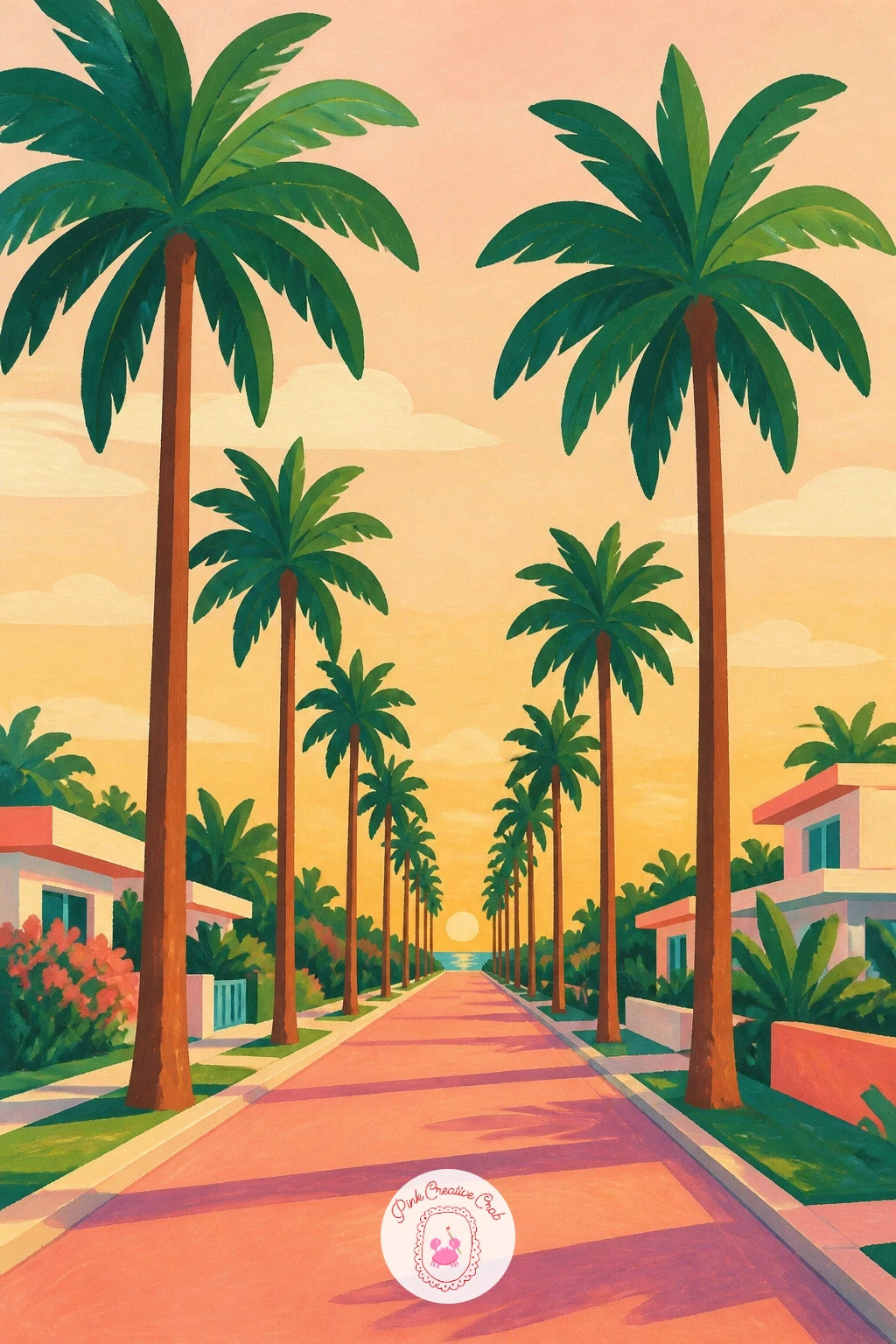
Palette: Palm Green,Coral Pink,Sand,Payne’s Grey
Keep the boulevard mood but zoom into a city corner with a couple of tall palms beside an old-style painted billboard. Paint the billboard shape first, a simple rectangle on stilts with a flat retro graphic inside it, lettering optional or left as simple blocky shapes, then add one or two palms rising just beside or behind it.
Place the palms so their crowns sit noticeably above the top of the billboard, which instantly gives a sense of how tall these city palms really grow next to the buildings around them. A strip of pale blue sky and a hint of rooftops or a street lamp along the bottom edge is plenty of city context without needing a full skyline.
The billboard graphic is the part that can overcomplicate things fast, so keep its content to two or three simple flat shapes or colour blocks rather than anything detailed. If a billboard feels like too much to invent, a simple painted stripe pattern or sunburst shape reads as vintage signage just as well.
Add a long, late-afternoon shadow from the nearest palm falling across the street to tie the whole scene together.
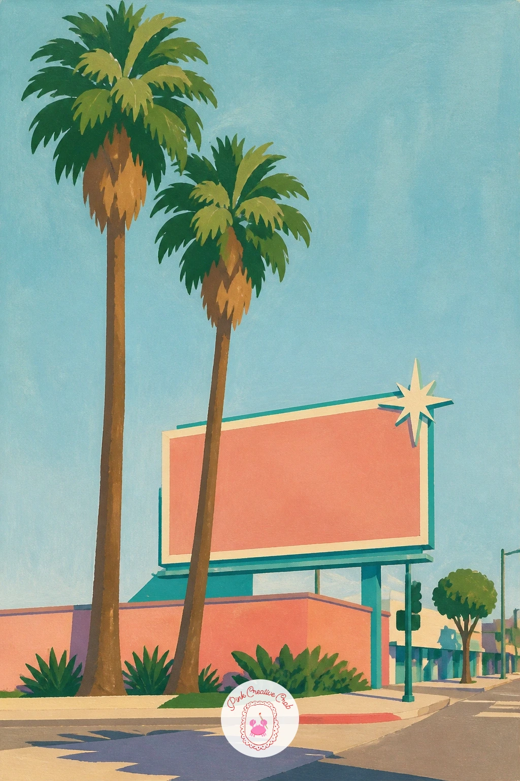
Palette: Palm Green,Coral Pink,Pool Turquoise,Sand
Carry the city feeling further with an art deco street front in soft pastel colours, palms standing in front of the buildings. Paint the building facade first as flat geometric blocks, rounded corners, thin horizontal stripe details, in soft pink, mint or butter yellow, then add two or three palms standing in front at varying heights.
Keep the building’s architecture simple and symmetrical, since real deco facades lean on clean geometry rather than fussy detail, a few portholes, a stepped roofline and a stripe or two are enough to read as the style. Paint the palms last so their green sits clearly on top of the pastel wall behind them.
The trickiest part is keeping the building’s pastel colour from looking muddy once the palm shadows cross it, so paint the building fully dry before adding any shadow shapes over it in a single clean flat tone. If pastel pinks feel tricky to mix, add white to your coral a little at a time until it lightens to a soft blush rather than staying bold.
Try the next version with a neon sign shape glowing faintly against the evening version of the same street.
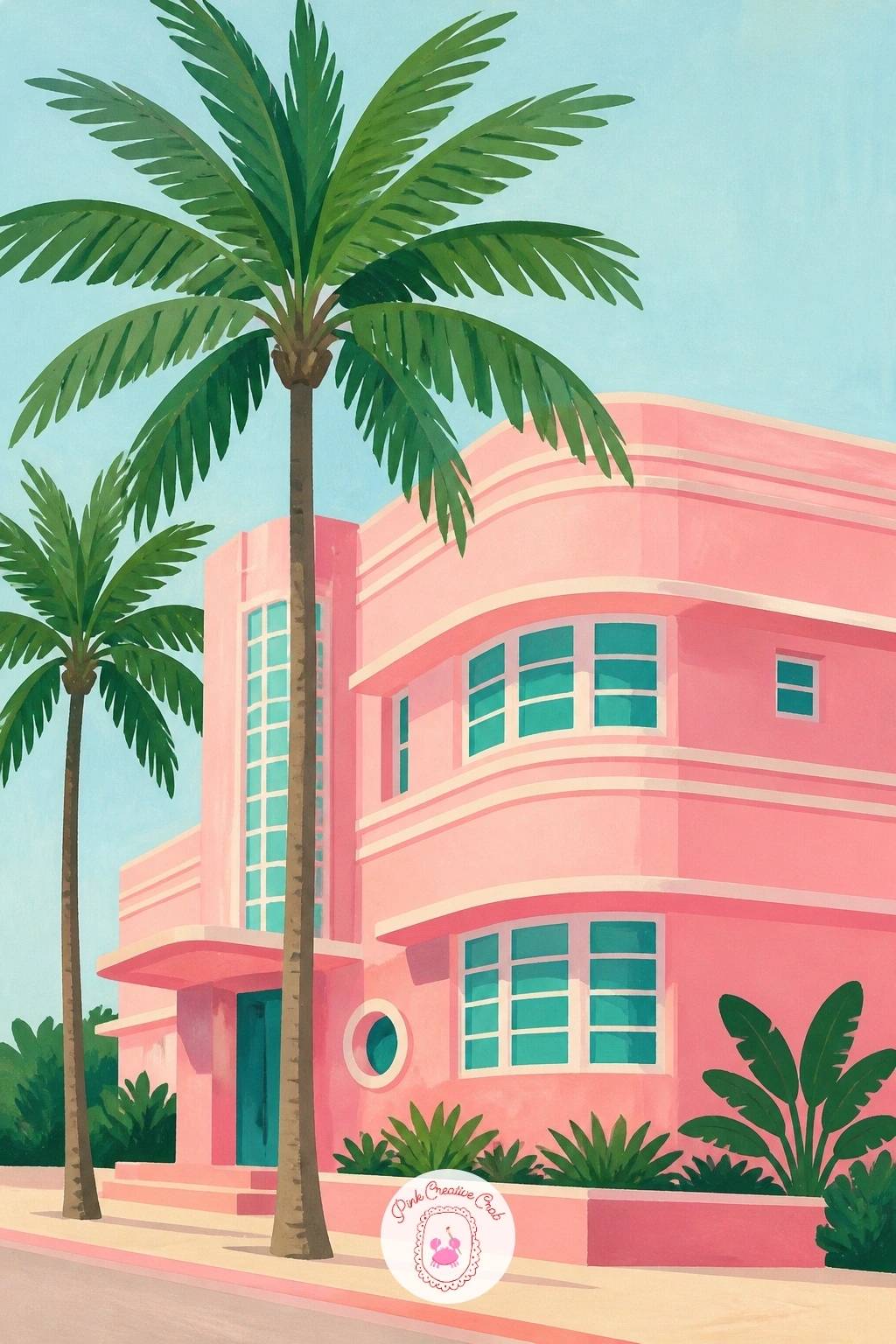
Palette: Blush Pink,Pool Turquoise,Palm Green,Sand
Scale the deco building idea up into a full pink resort hotel with palms lining the entrance. Paint the hotel’s facade first as a tall flat pink block with simple repeating window shapes, then place a row of smaller palms along the front, shorter than the building so it stays the clear focal point.
Keep the windows as simple flat rectangles in a slightly darker or lighter pink than the wall, evenly spaced rather than hand-measured loosely, since an even grid is what reads as a grand hotel rather than a cottage. A striped awning shape over the entrance in coral and white adds an easy extra touch of glamour.
The spot that often goes wrong is palms painted taller than the hotel itself, which flips the visual hierarchy and makes the building feel small, so keep every palm’s crown below the hotel’s roofline. If a full building facade feels like a lot, simplify it down to just the entrance section with its awning and a palm on either side.
A few tiny flat figures or a parked car in pastel colour along the entrance give it scale without much extra effort.
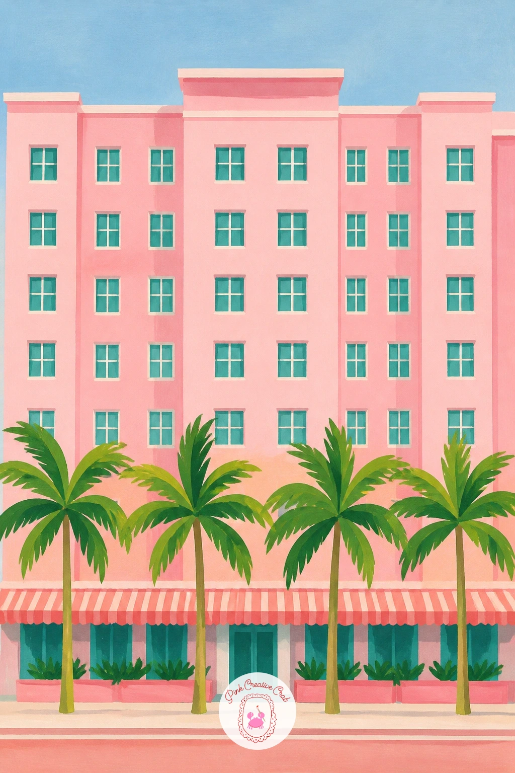
Palette: Blush Pink,Coral Pink,Palm Green,Titanium White
Keep the grand-entrance feeling but swing the view around to a driveway lined with palms leading up to a white villa in the distance. Pencil the same single vanishing point trick used for the boulevard here, running from the bottom corners of the page to a point near the villa’s door, then line up a palm on either side of the drive along that guide, shrinking as they recede.
Paint the villa itself last and small, a simple flat white block with a dark doorway and a couple of window shapes, sitting right at the vanishing point so the whole driveway visually delivers the eye straight to it. Keep the drive’s surface a flat warm grey or sand tone, with the palm shadows falling across it in alternating directions if the sun sits high overhead.
If the villa ends up looking too large or too detailed, it will compete with the palms for attention, so keep it genuinely small and simple, more suggestion than architecture. A gate or low white wall at the very front edge of the drive adds a nice sense of entering the scene.
This pairs well as a quieter companion piece to the golden hour boulevard, same technique, very different mood.
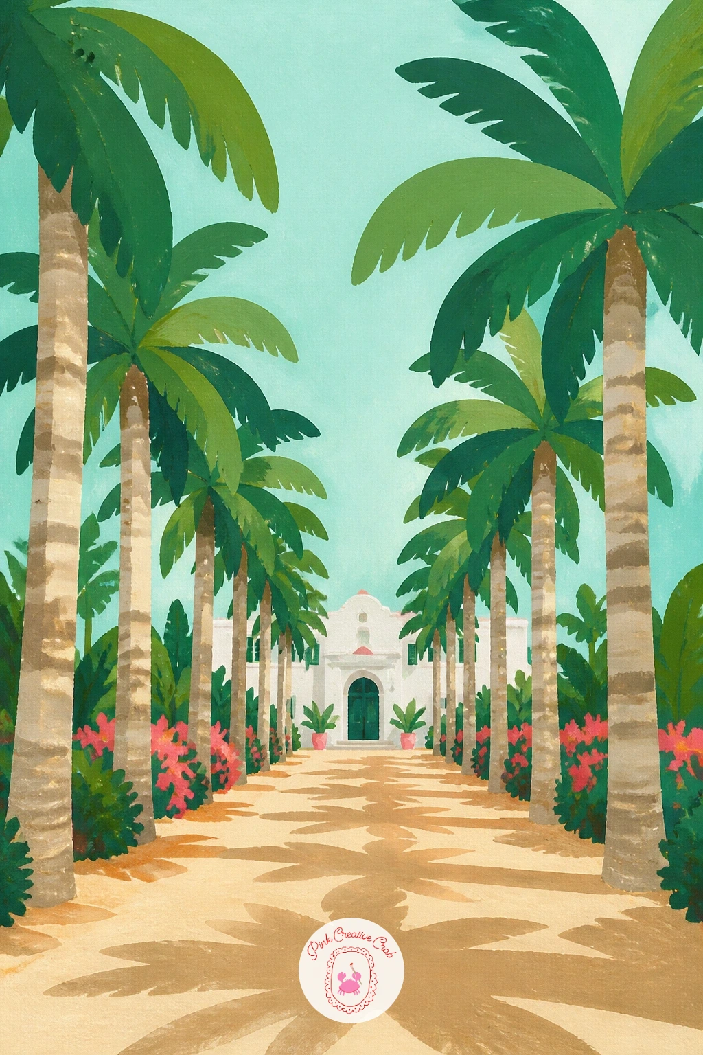
Palette: Titanium White,Palm Green,Sand,Payne’s Grey
Step through that villa’s gate into a quiet courtyard with a fountain surrounded by palms. Paint the fountain first as a simple round or scalloped basin shape in pale stone colour, with a thin spout shape rising from its centre, then add a ring of flagstones or tile pattern around its base before placing two or three palms at the courtyard’s edges.
Give the fountain’s water a few curved white highlight lines over a pale blue wash to suggest movement without painting individual droplets, the same light touch used for pool ripples elsewhere works well here. Arrange the palms unevenly around the courtyard rather than in a perfectly symmetrical ring, since real courtyard planting is rarely that tidy and the asymmetry feels more inviting.
The fountain’s basin is the part to get right proportionally: keep it wide and fairly shallow-looking rather than tall, since a too-tall fountain starts to look like a birdbath or urn instead. If a full tiled courtyard floor feels like too much detail, a flat warm terracotta ground colour with just a suggestion of a few floor lines does the job.
Add a trailing bougainvillea-style splash of pink along one courtyard wall for extra colour with very little extra painting.
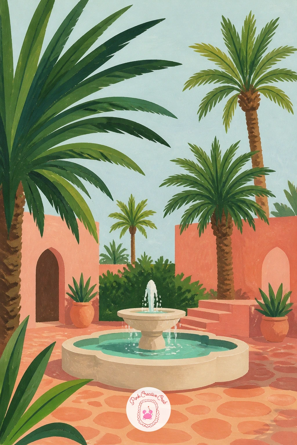
Palette: Sand,Pool Turquoise,Palm Green,Coral Pink
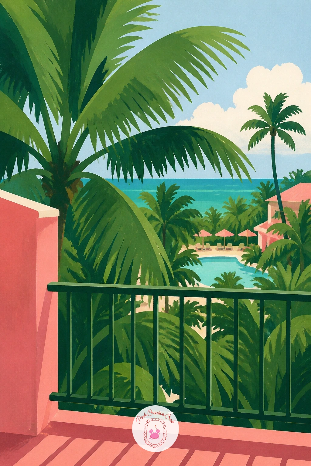
From the courtyard below, look out instead from a hotel balcony over a view full of palms. Paint the balcony’s railing or edge first as a simple foreground shape, wrought iron curves or a plain flat ledge, framing the bottom and sides of the scene, then paint the view beyond it, rooftops, palm crowns and a strip of pool or sea in the distance.
Placing the eye level here matters a great deal: set it above the palms so you are looking down over their crowns toward the horizon, which is the whole point of a balcony view and very different from every ground-level palm scene so far. A small detail on the balcony itself, a drink glass, a pair of sunglasses on the ledge, grounds the viewpoint as someone’s actual spot to sit.
The usual issue is a railing drawn too thick and fussy, which blocks too much of the lovely view behind it, so keep iron railing lines thin and spaced well apart. If wrought iron curls feel tricky, a plain flat concrete ledge across the bottom of the page does the same framing job more simply.
Let the furthest palms and rooftops go soft and pale to help the balcony’s foreground feel close and crisp by comparison.
Palette: Pool Turquoise,Palm Green,Sand,Payne’s Grey
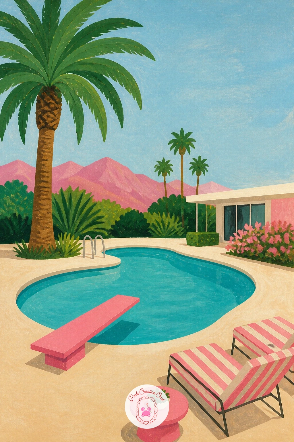
Bring the whole mood home to the pool itself, the defining Glam Cabana scene: a kidney-shaped pool with a bright pink diving board. Paint the pool’s shape first in flat turquoise with a few curved white ripple lines, then add the pink diving board extending out over the water on its simple stand, and a strip of sand-coloured poolside deck around the edge.
Keep the pool’s edge a clean curved shape, the classic kidney or amoeba outline, since that silhouette alone signals mid-century resort before anything else is even added. The diving board is the easiest part to get wrong proportionally, so measure it against the width of the pool: a board that spans roughly a third of the pool’s width looks right, any longer and it overwhelms the scene.
A couple of loungers in a contrasting stripe along the deck and a single tall palm at one end finish the composition. If mixing a confident flat turquoise feels tricky, start with a pool blue premixed from a gouache set rather than building it from scratch.
This is the one worth doing first if the whole Glam Cabana mood is new to you, since it sets the palette for everything else on this list.
Palette: Pool Turquoise,Coral Pink,Sand,Titanium White
Look at a real mid-century pool photo for the kidney-shape outline before you paint it freehand, the curve is more specific than it first looks.
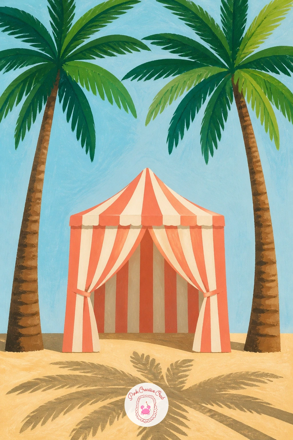
Follow the pool scene with its natural companion, a striped cabana tent set between two shading palms. Paint the cabana’s canvas shape first as a simple peaked tent form in bold alternating stripes, coral and white or turquoise and white, then add the two palms rising on either side, crowns meeting loosely above the tent’s peak.
Painting straight, even stripes freehand on a curved tent shape is the trickiest part here, so lightly pencil the stripe guidelines first, following the tent’s curve, before committing in paint, and keep a steady hand with a smaller brush rather than rushing a big one. If a ruler or straight edge helps for the lower, straighter sections of the stripes, use it.
Add a loose shadow shape cast by the two palms falling partly across the cabana’s canvas to tie light and structure together in one light direction. If actual striped gouache work feels daunting, masking fluid painted in stripe shapes before you lay the base colour lets you paint over everything and peel it back to reveal clean white stripes underneath.
Finish with a pair of beach chairs tucked just inside the cabana’s shade for a lived-in feel.
You Will Need
- masking fluid
Palette: Coral Pink,Titanium White,Palm Green,Sand
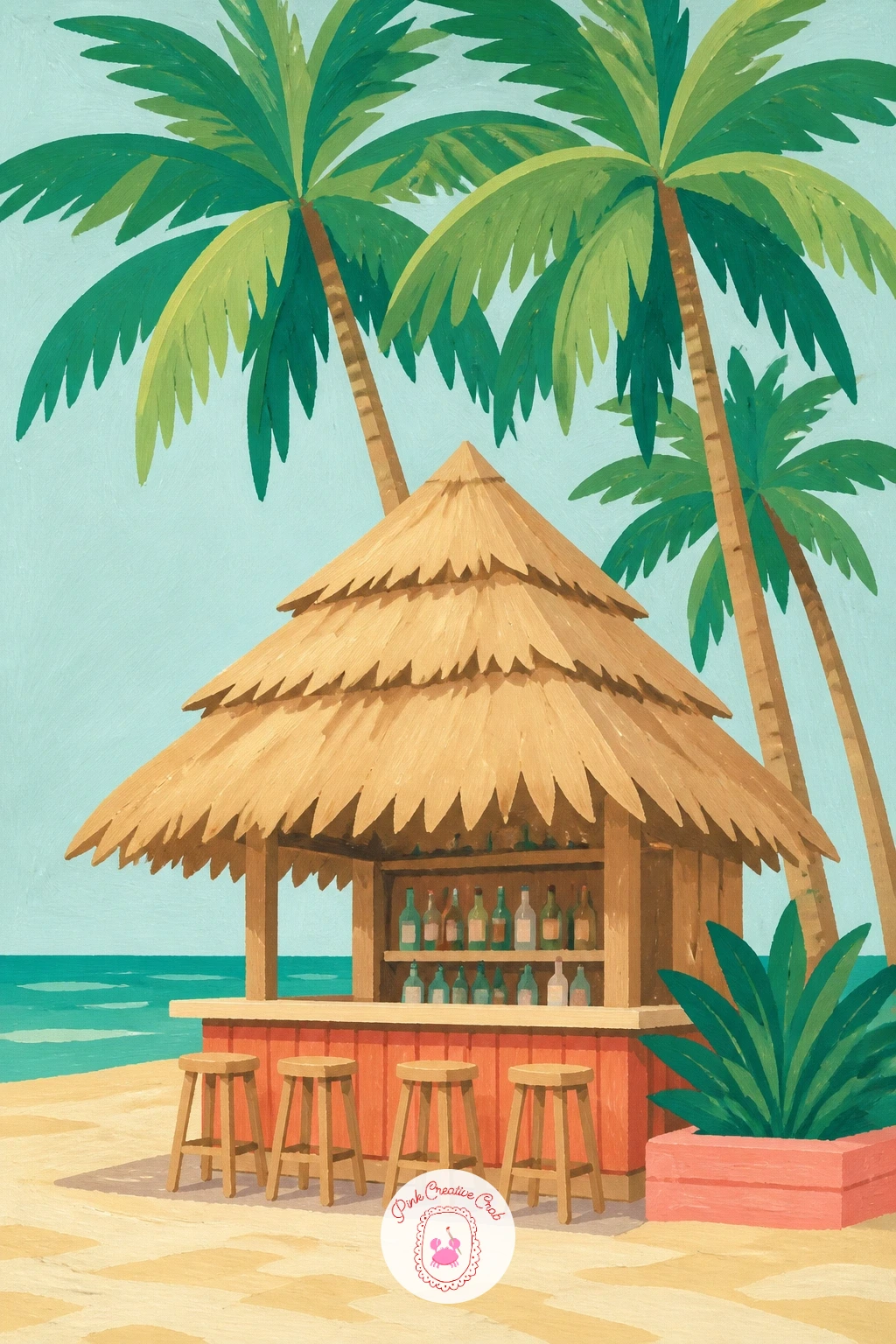
Move a few steps along the sand to a beach bar with a shaggy palm-thatched roof. Paint the bar’s simple structure first, a flat counter shape and a couple of support posts, then build the thatched roof above it from short, layered curved strokes of warm brown and tan, overlapping like real dried palm fronds rather than one solid block.
Layering those thatch strokes from the bottom edge upward, each row overlapping the one below, is the texture trick that makes the roof believable, so resist the urge to paint it as a single flat triangle of brown. A row of simple bottles or a hanging string of flags along the counter front adds character with very little extra painting time.
The roof is the part most likely to look flat and dull if rushed, so vary the brown and tan tones row by row rather than mixing one flat colour for the whole thing. If a loaded brush is making the thatch strokes too thick, a drier brush dragged lightly gives a scruffier, more convincing texture.
A tall palm or two standing just behind the bar ties it back into the wider beach scene around it.
Palette: Burnt Sienna,Sand,Palm Green,Coral Pink
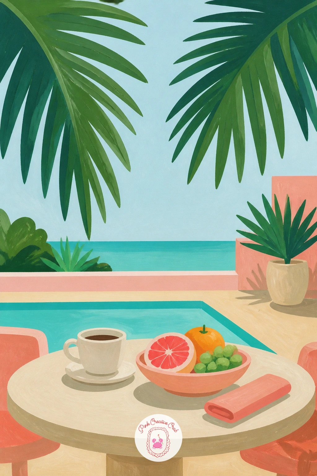
Look down for a change at a resort breakfast table seen through a loose frame of palm leaves. Paint the table setting first, a simple round table, a coffee cup, some fruit, in flat colours and basic shapes, then add one or two large palm fronds dipping into the frame from the top corners, as though seen from a shaded terrace.
Keep the fronds large and slightly overlapping the table’s edge, since the whole charm of this composition is the layered feeling of looking past the greenery rather than at an empty table. Vary the pressure on your brush along each frond so the leaflets taper naturally from thick at the stem to thin at the tip.
The table setting is the part to keep restrained, three or four simple items, a cup, a plate, a slice of fruit, read as a full breakfast scene without needing a dozen tiny objects painted in detail. If palm fronds feel fiddly to invent from memory, a single photographed leaf, flipped and resized, gives you two convincing corner fronds.
A steaming line or two above the coffee cup, just a soft curved stroke, adds warmth with almost no extra effort.
Palette: Palm Green,Sand,Coral Pink,Titanium White
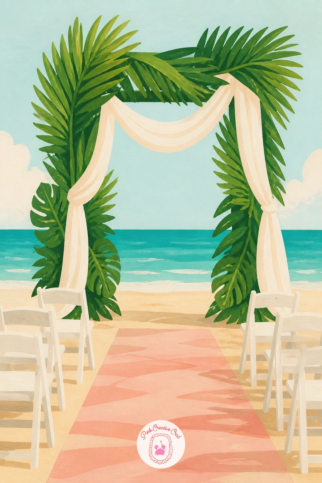
Keep the celebratory mood going with a wedding arch built from palm fronds standing on the sand. Paint the arch’s basic structure first, a simple curved or triangular frame, then layer palm fronds and a few trailing flowers along it, working from the base of the arch upward so later fronds overlap and hide the join lines of earlier ones.
That overlap order matters more here than almost anywhere else on this list: paint the lowest, largest fronds first, then layer smaller ones progressively higher and lighter so the arch reads as one lush gathered shape rather than a scatter of separate leaves. A simple strip of fabric or ribbon draped loosely across the frame adds a soft contrast to all that structured green.
The arch’s symmetry is the trickiest part, so lightly sketch its outline first with a ruler or by folding the paper in half to find the centre line before adding a single frond. If building a full arch from scratch feels like too much, narrow it down to just one side post thick with fronds, which still reads clearly as a wedding setting.
A simple aisle of sand with two rows of white chair shapes leading up to it finishes the scene easily.
Palette: Palm Green,Titanium White,Coral Pink,Sand
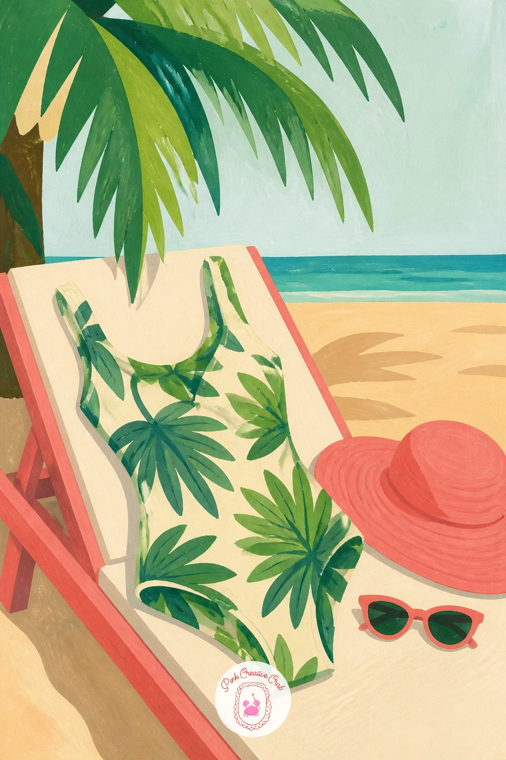
Bring the pattern work back for a palm-print swimsuit laid out on an empty sun lounger. Paint the lounger’s fabric shape first as a simple reclined rectangle with a slight curve for the backrest, then lay the folded or draped swimsuit on top, a simple curved shape, before adding the palm print pattern across it once its base colour is dry.
Keep the swimsuit’s print pattern loose and a touch irregular, since a perfectly even grid of identical palms looks more like wallpaper than draped fabric, letting some print motifs get cut off by the swimsuit’s folds helps it feel like real fabric rather than a flat sample.
The lounger itself is an easy place to lose the plot with too much structural detail, so keep its frame suggested with just two or three simple lines rather than drawing every joint and leg. If matching a true palm print pattern feels fussy, a scattering of simple leaf silhouettes in one or two sizes reads just as well as a specific repeat.
A pair of sunglasses and a floppy hat left beside the swimsuit finishes the scene as a believable just-stepped-away moment.
Palette: Coral Pink,Palm Green,Sand,Titanium White
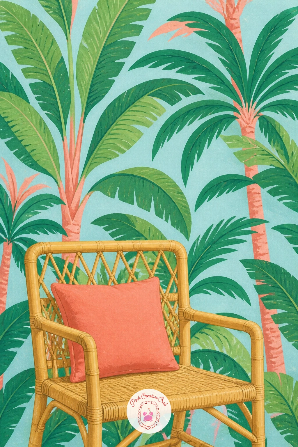
Finish the Glam Cabana sweep back indoors with a bold palm wallpaper pattern behind a bamboo chair. Paint the wallpaper’s repeating palm motif across the whole background first, keeping every motif the same size and spacing in a confident flat colour, then add the bamboo chair sitting in front of it once the pattern is completely dry.
Planning that repeat before you start saves real frustration: lightly pencil a grid of small dots across the page first, evenly spaced, and centre one palm motif over each dot so the spacing stays consistent across the whole background rather than drifting tighter or looser as you go.
The bamboo chair is the spot to bring in some texture contrast against all that flat pattern, so paint its frame with a few short confident strokes suggesting woven cane rather than outlining every strand. If keeping a wallpaper pattern perfectly even feels like a lot of pencil work, a rubber stamp or a cut sponge shape dipped in paint can repeat the same palm motif quickly and consistently.
Add a single cushion on the chair in a solid accent colour to give the eye one simple place to land against the busy pattern behind it.
Palette: Palm Green,Sand,Coral Pink,Burnt Sienna
What to Do Next
Pick one idea that matches the mood you want today, pin the reference image to keep your colours and shapes on track, and set up on smooth paper so the gouache lays down flat and clean. Start with one of the simpler scenes near the top of the list if this palette and style are new to you, then work your way toward the fuller resort scenes once the flat shapes feel comfortable.
Frequently Asked Questions
What paint works best for a retro palm tree painting?
Gouache works best because its flat, matte colour matches the poster-style look this theme wants. Acrylic paint, used fairly thick and not overblended, gives a similar flat finish if gouache is not available.
How do you paint a palm tree trunk so it does not look like a stick?
Give the trunk a gentle curve or lean rather than a straight vertical line, and vary its width slightly from base to top. A few short curved texture marks along the trunk also suggest real bark without extra detail.
What colours make a good Glam Cabana palette?
A good palette mixes palm green, pool turquoise, coral pink and warm sand against a pale sky. Keeping the whole painting to four or five flat colours is what gives it that confident retro travel-poster feel.
How do I stop my palm leaves from looking messy?
Paint each frond as one confident stroke from base to tip rather than scratching back and forth. Let the leaflets taper naturally by easing off brush pressure as you near the tip, and keep the whole crown to a handful of overlapping fronds.
Can a beginner paint these palm tree scenes without drawing experience first?
Yes, because every scene breaks down into a few flat shapes rather than realistic detail. Starting with the simpler ideas on this list, like the palm shadow or the flip-flops, builds confidence before trying a full scene with buildings or figures.
Have any thoughts?
Share your reaction or leave a quick response — we’d love to hear what you think!
-
 0
-
0
-
0
-
0
-
0
-
0


