

A watercolor boat is one of the most satisfying things you can paint in an afternoon: a few confident shapes, some wet-in-wet sky, a line of reflection in the water, and suddenly you have a whole little story on the page. Every boat below sits in its own setting, from a misty lake to a glowing night harbor, so you are never just painting a hull, you are painting a place.
Scroll through and pick whichever one makes you want to pick up a brush right now. Some are quick ten minute sketches for a coffee break, others are slower weekend pieces, but every single one is built to be finished today.
Using these images: free for personal projects such as printing, coloring, cards, journals and gifts. Handmade items that include them may be sold up to 30 pieces per design. More than that is commercial use and is not permitted, and neither is selling or sharing the images themselves or passing them off as your own. Please ask before any other use.
Start with the boat everyone pictures when they think of Mediterranean harbors: a blue and white fishing boat bobbing against turquoise water. Pencil a simple curved hull shape low on the page, leaving the white paper untouched for the stripes, then paint the sea first as a flat wash of turquoise so it dries while you work on the boat.
Mix ultramarine with a touch of cerulean for the hull’s blue bands and let the white paper do the rest of the work. The classic mistake is painting the stripes too evenly spaced; stagger the widths slightly so the boat looks hand painted rather than printed.
If this is your first time painting reflections, drag a dry brush loaded with the same blue straight down from the hull into the water wash while it is still damp, so the color blurs softly. No cerulean on hand, phthalo blue mixed with a little white gouache gives a similar bright Aegean tone.
Finish with a few dark navy dots for portholes and one today-tip: paint the water wash first and let it dry completely before adding the boat, so your colors stay crisp instead of bleeding together.
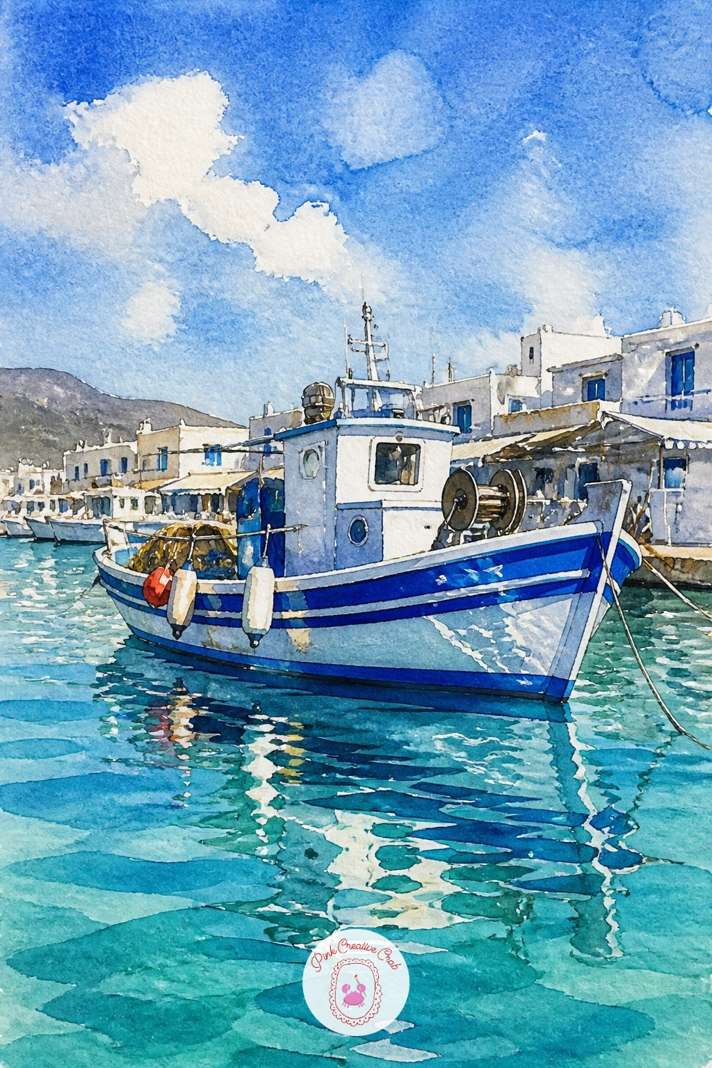
Palette: Ultramarine Blue,Cerulean Blue,Titanium White,Naples Yellow
Mood comes first with this one. Wet the whole sheet with clean water, then drop in soft gray and lilac washes for the mist, letting the colors bloom and feather into each other before anything else goes on the page.
Once that background is bone dry, paint a simple red rowboat shape low in the composition using cadmium red mixed with a touch of burnt sienna for warmth. Keep the boat small against all that atmosphere; a common mistake is making it too large and losing the quiet, misty feeling the scene depends on.
For the water, this is the moment to try lifting: while the gray wash is still slightly damp, dab a clean damp brush or a folded paper towel just below the boat to lift out a soft pale reflection line. No paper towel nearby, a dry brush pressed and lifted works almost as well.
Add a faint smudge of trees on the far shore with thinned gray-green, keeping the edges soft. One tip for today: paint everything behind the boat first, let it dry, then add the boat last so its red stays punchy against the misty gray.
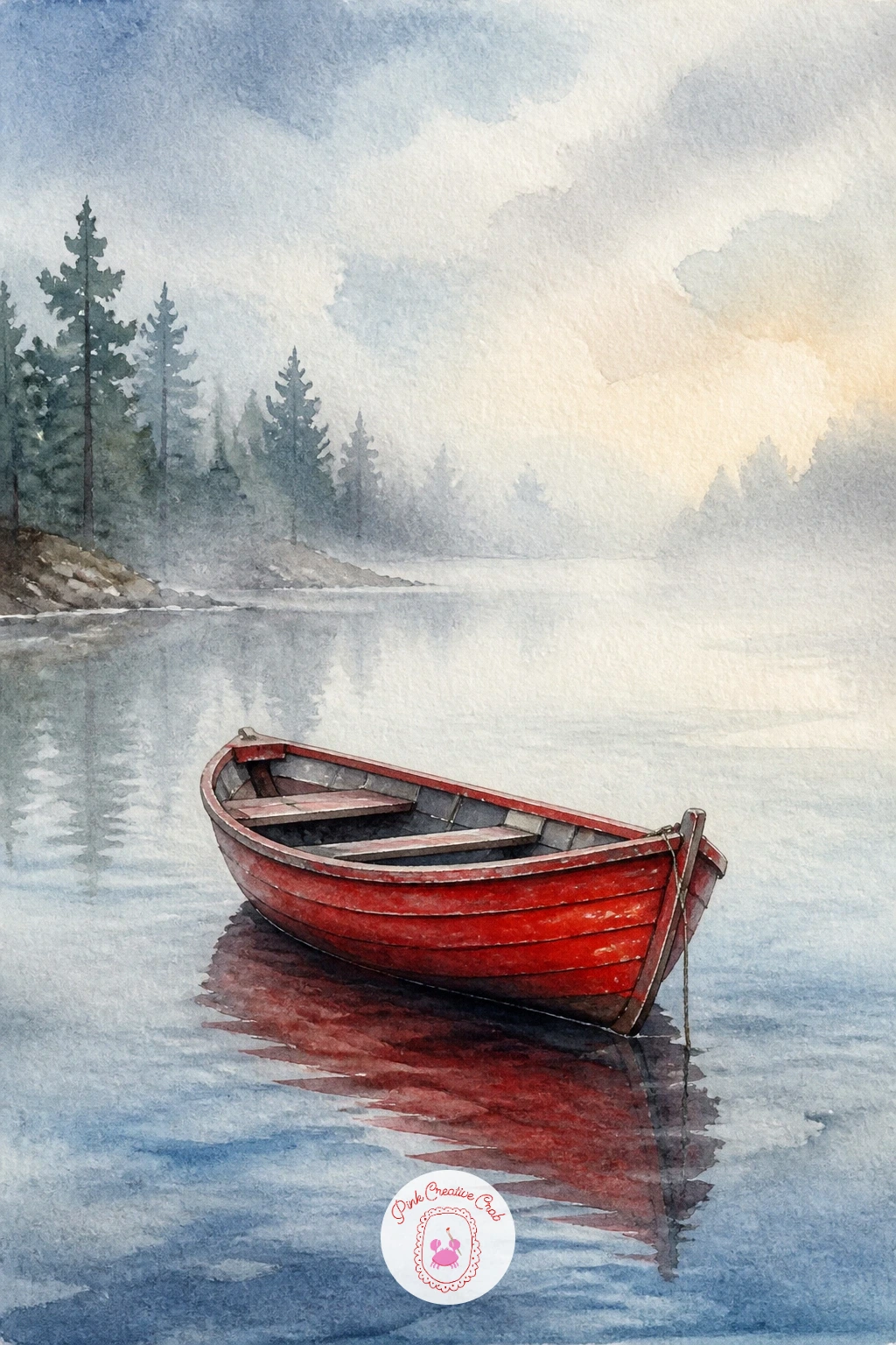
Palette: Cadmium Red,Payne’s Grey,Burnt Sienna,Lilac
Light comes from low in the sky here, so decide on your sun’s position before you touch the brush. Paint the sky first with a wet-in-wet blend of cadmium orange, rose, and a little violet near the top, keeping the brightest, palest patch exactly where the sun will sit.
Let that dry fully, then paint the sailboat as a dark silhouette: a simple triangular sail and a thin hull in near-black or deep violet, so it reads clearly against the warm sky behind it. Placing the boat slightly off center, not dead in the middle, makes the whole sunset feel more balanced.
Water goes in last as a mirrored strip of the sky colors, with a few horizontal dry-brush strokes to suggest gentle ripples breaking up the sun’s reflection. If you want more drama for a forty minute version, add streaky golden reflection lines stretching toward the viewer; the ten minute version can skip straight to a flat colored strip.
Keep the silhouette simple with no fussy rigging, just clean shapes. Today’s tip: mix your silhouette color in advance so you only need one confident brushstroke for the sail.
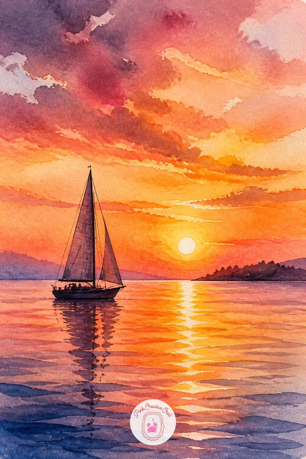
Palette: Cadmium Orange,Alizarin Crimson,Dioxazine Violet,Ivory Black
For more inspiration on painting glowing skies before you add any boat at all, browse these easy watercolor skies, sunset and cloud ideas.
Perspective carries this whole scene, so set your eye level first: a low horizontal pencil line about a third up the page keeps you looking at the gondola almost at water level, which is exactly the romantic angle a Venice scene wants. Sketch the stone bridge arching overhead and the long, curved gondola passing beneath it.
Paint the bridge in warm ochre and burnt sienna, using a darker shadow tone underneath the arch where the light cannot reach, since that contrast is what makes an arch look three-dimensional rather than flat. The gondola itself is almost always black, so mix a rich near-black from ultramarine and burnt umber rather than using paint straight from the tube, which tends to look flat and dead.
Canal water takes a mix of green and blue with loose reflected streaks of the buildings’ warm colors dragged downward. A frequent slip here is making the bridge arch too rounded like a rainbow; Venetian bridges are usually lower and flatter, so widen the curve.
No burnt umber at hand, mix Payne’s grey into your black for a similar warm darkness. Tip for today: paint the shadow under the arch first, before the stonework around it, so the darkest value anchors the whole bridge from the start.
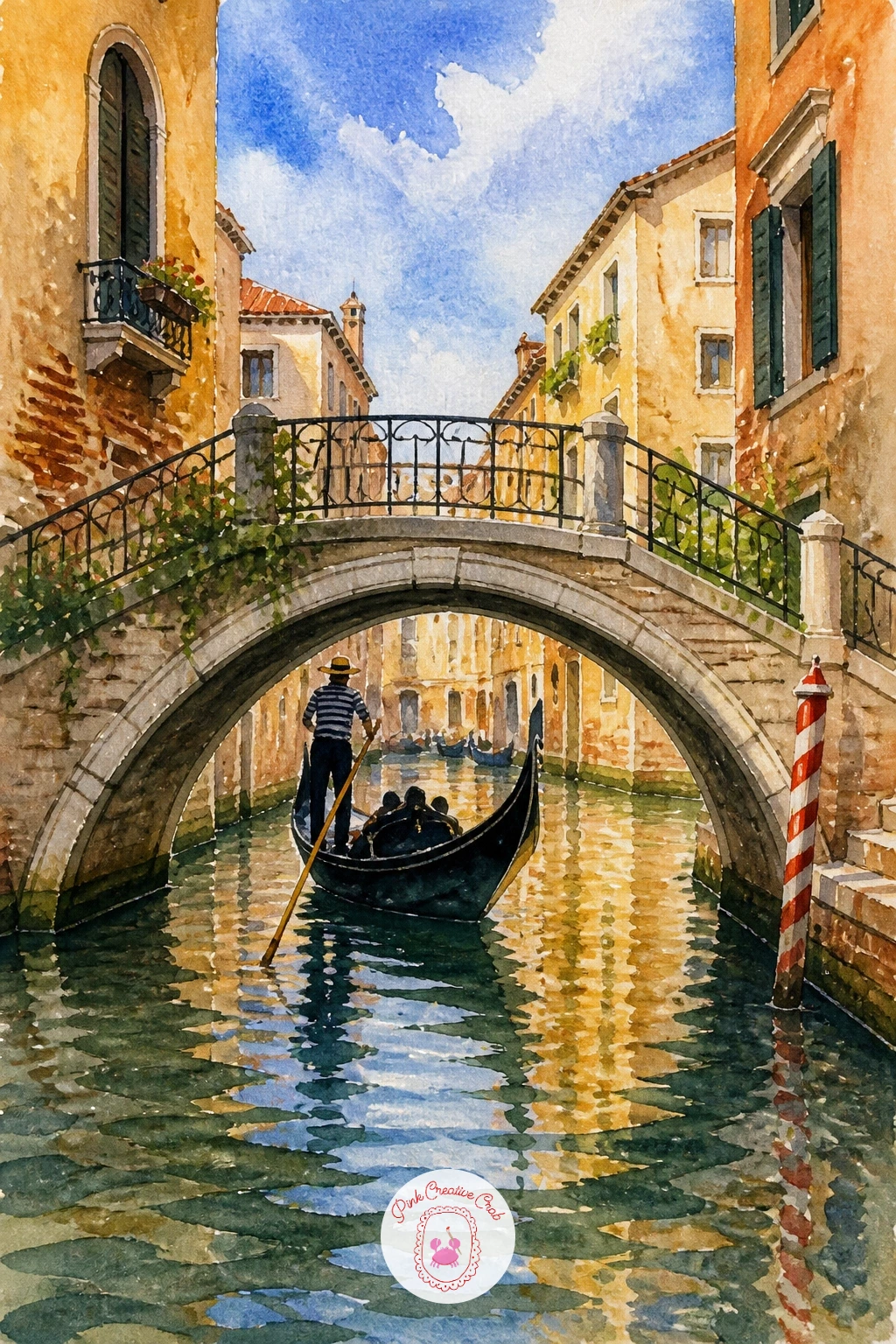
Palette: Yellow Ochre,Burnt Umber,Ultramarine Blue,Viridian Green
Narrowboats earn their charm from color, so this is where you can be bold. Paint the long rectangular hull first in a cheerful block color, forest green or deep red work beautifully, leaving the roofline as a thin strip of a contrasting shade like cream or black.
Once the hull is dry, add a row of potted flowers along the roof and deck using small dabs of cadmium red, pink, and white for blooms over simple green leaf strokes; keep these loose and dabbed rather than carefully drawn, since real canal boat flowers look a bit wild and overflowing. The easiest place to go wrong is making the hull perfectly straight and stiff, so let its edge wobble just slightly to keep the loose, hand painted feel.
Canal water stays calm and narrow, a thin horizontal band of green-blue with a soft mirrored strip of the hull’s color beneath it. If you don’t have cadmium red, any warm pink or coral works fine for the flowers.
Finish with a thin dark line along the waterline to ground the boat. Tip for today: paint the flower dabs while the roofline paint is still slightly damp so a few colors blend softly into each other.
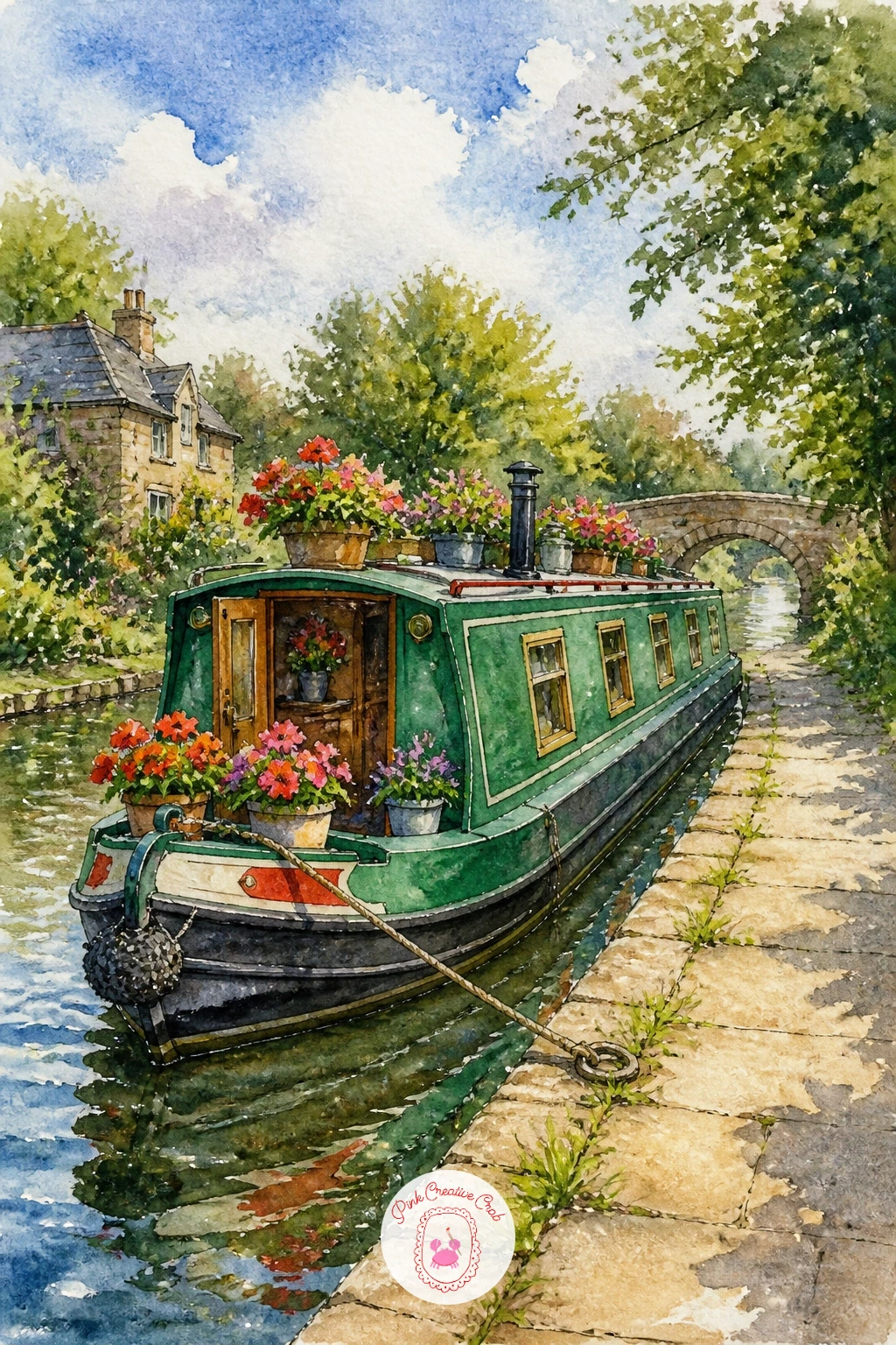
Palette: Forest Green,Cadmium Red,Cream,Sap Green
This scene needs only two shapes and one bold stripe pattern. Pencil a simple rowboat sitting directly on sand rather than water, tilted slightly to one side as if it has been pulled up and left for the day.
Paint the sand first in warm sandy yellow with touches of gray-violet for shadow beneath the hull, since that shadow shape is what will make the boat look like it is really resting on the ground rather than floating. Once dry, paint the hull in bold horizontal stripes, red and white or navy and white both read as classic beach colors, using masking fluid first along the stripe edges if you want them perfectly crisp.
A common error is painting the stripes flat across the curved hull like a flag; curve each stripe slightly to follow the boat’s rounded shape instead. No masking fluid on hand, simply paint the white stripes last over a dry base coat with opaque white gouache.
Add one or two gulls as small dark checkmarks in the sky. Today’s tip: paint the shadow under the hull before the hull itself, so you can judge exactly how dark the boat needs to be by comparison.
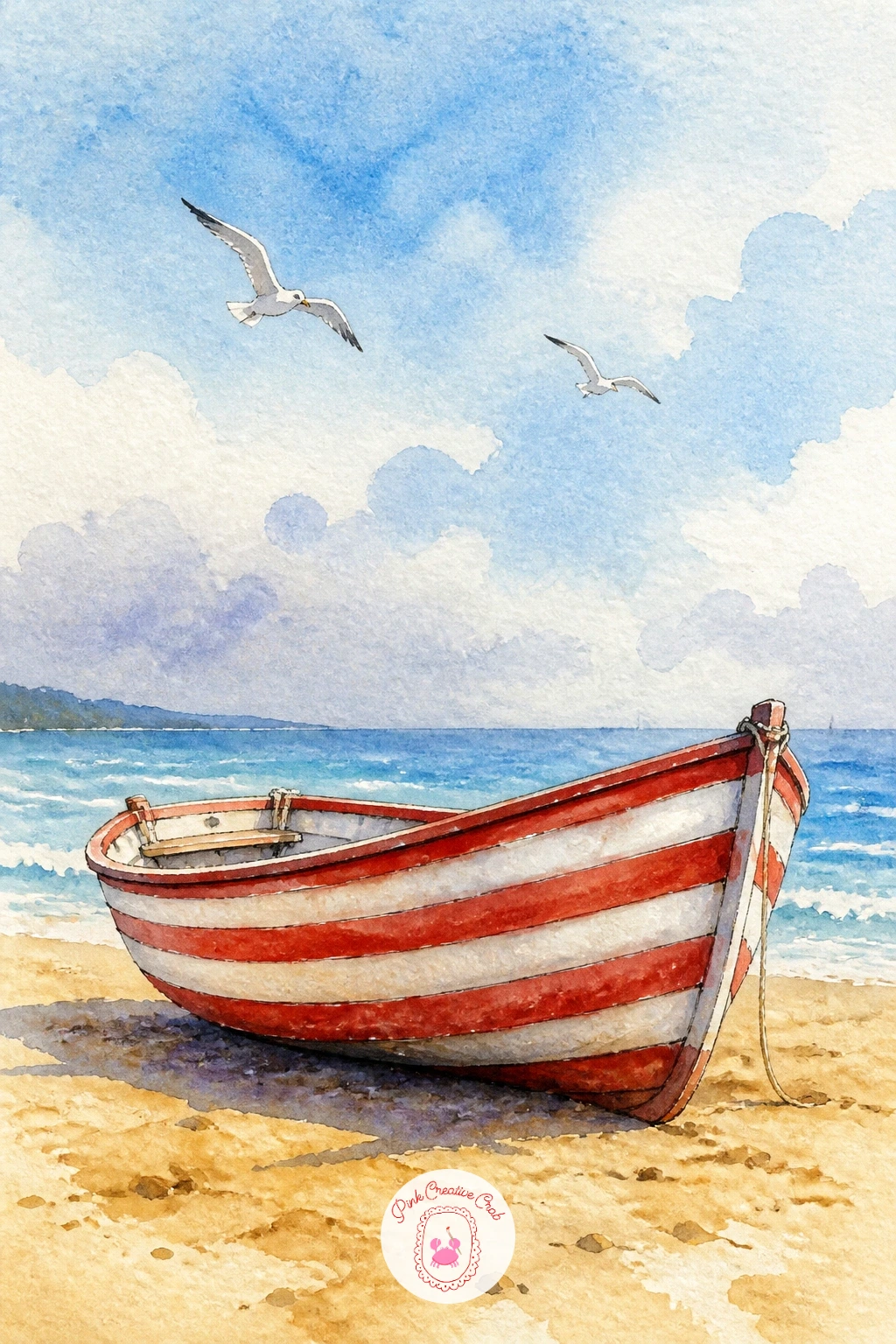
You Will Need
- masking fluid (optional)
Palette: Cadmium Red,Titanium White,Yellow Ochre,Payne’s Grey
Trade the gondola’s black for polished wood and chrome on this one. Sketch a sleek, pointed motorboat shape with a slightly raised bow, the classic Venetian taxi silhouette, and keep the waterline clean and confident since this boat’s whole charm is its sharp, glossy lines.
Paint the hull in rich mahogany brown mixed from burnt sienna and a touch of alizarin crimson, leaving small untouched paper highlights along the top edge to suggest varnished wood catching the light. The place this goes wrong is overworking the wood grain with too many lines; two or three confident dry-brush streaks say “polished wood” far better than a dozen fussy ones.
Canal water around a water taxi tends to be choppier than a quiet backstreet canal, so use short broken horizontal strokes of blue-green rather than one smooth wash. If alizarin crimson isn’t in your palette, a touch of cadmium red into burnt sienna gives a similar warm mahogany.
Add a small dark awning or canopy at the back for authenticity. Tip for today: leave your brightest highlight on the hull as bare white paper rather than painting it in afterward.
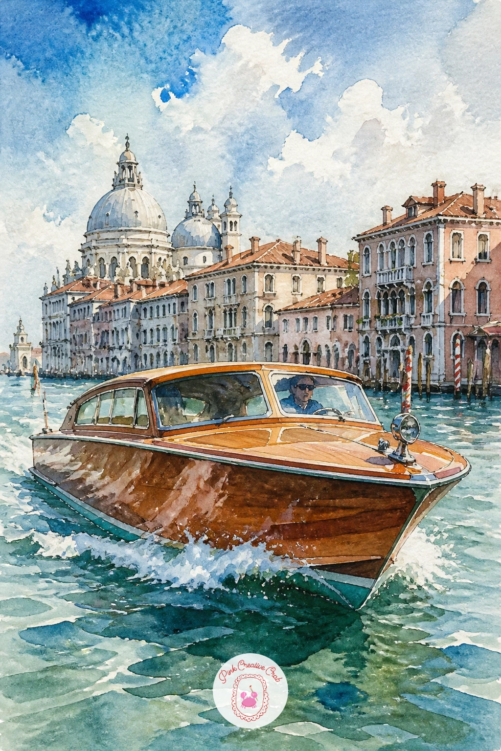
Palette: Burnt Sienna,Alizarin Crimson,Viridian Green,Ivory Black
Bring a little cottagecore warmth to the water with this leafy floating home. Paint the boat’s body as a simple flat-roofed rectangle in a soft dusty blue or faded teal, leaving window shapes as untouched white paper until the base coat dries completely.
Once dry, fill the windows with warm yellow light and add trailing plants spilling over the roofline and deck rail using loose green strokes of varying length, some long and drooping, some short and bushy, so the greenery feels alive rather than uniform. The most common mistake is making every plant the same shade of green; mix in a little yellow ochre for some leaves and a touch of blue for others to add depth.
Water beneath the houseboat can be a quiet mirror, a vertical wash of the hull’s teal dragged softly downward with a dry brush. No teal in your set, mix blue and green with a touch of gray to dull it slightly.
Finish with one or two tiny potted plants on the roof for extra charm. Today’s tip: paint the window light before the surrounding wall color fully dries, so a soft golden glow bleeds just slightly outward.
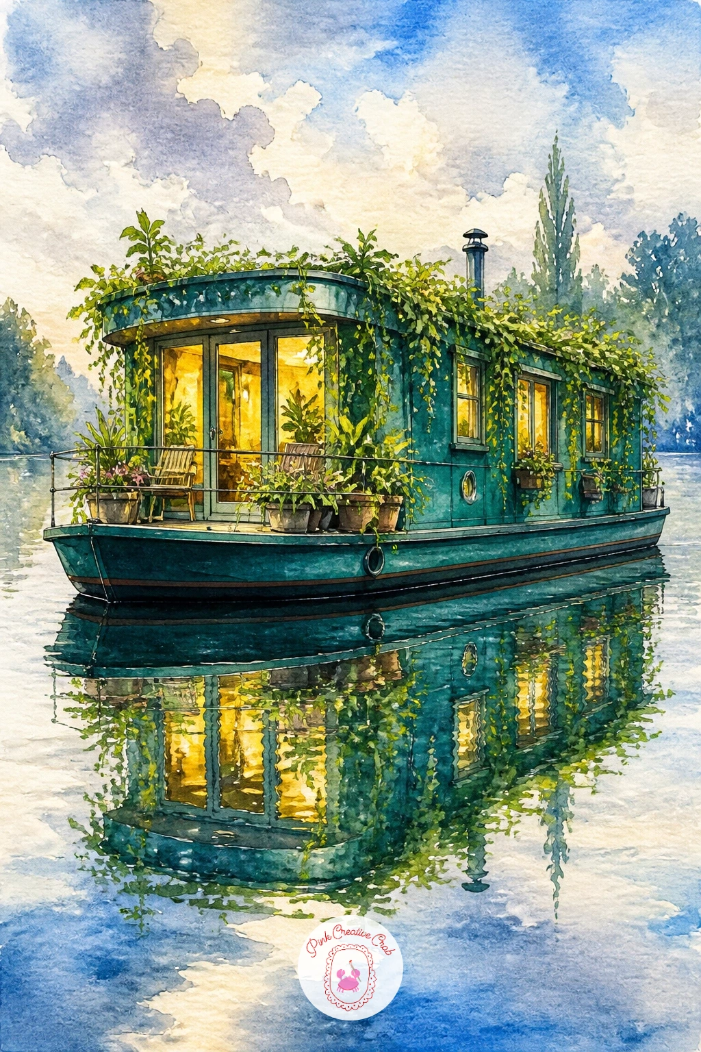
Palette: Teal,Sap Green,Yellow Ochre,Naples Yellow
If you love this cozy, plant-filled look, the cottagecore junk journal pages are full of related leafy, homey scenes worth exploring.
Give this scene a human story. Start with the rowboat shape floating gently on still water, then add a simple seated figure inside, knees drawn up slightly, a small book held in her hands; keep her proportions loose, since a few confident shapes read as a relaxed reader far better than a tightly drawn figure.
Compare her head size to the length of the boat before you paint, roughly one head-length should fit about four times along the hull, which keeps the figure from looking oversized or doll-like against the boat. Paint her dress or sweater in one warm, friendly color, like coral or mustard, so she stands out gently against the cooler water around her.
Keep her face almost featureless, just a soft curve and maybe a hint of hair color, since a detailed face can pull focus away from the peaceful mood of the whole scene. If you’d rather skip the figure’s complexity today, a sun hat resting on the boat’s seat tells almost the same story.
Finish with a few lily pads or reeds nearby. Tip for today: paint the water and boat first, let them dry, then add the figure last so her color stays crisp and unblended.
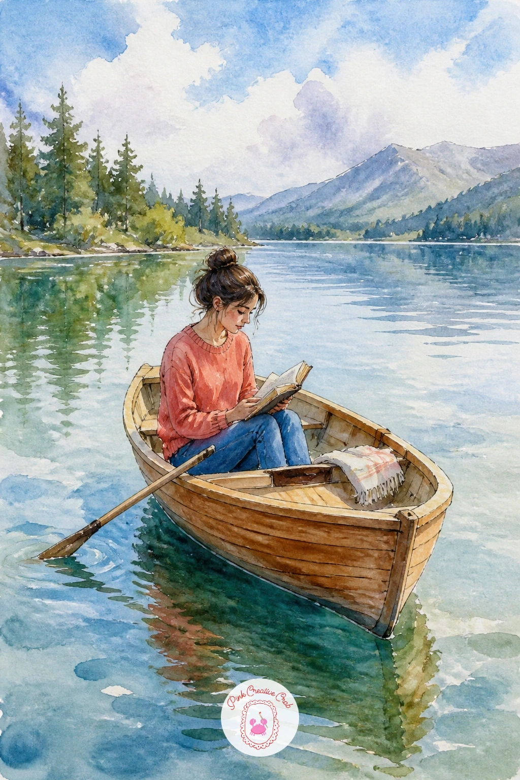
Palette: Coral,Burnt Sienna,Sap Green,Payne’s Grey
Water is the real star here, so give it the time and layering it deserves. Begin with a flat wash of bright turquoise across the lower half of the page, then while it is still damp, drop in small patches of deeper teal and touches of sandy brown near an implied shoreline to suggest shallow water over sand.
Once that dries, paint a simple white yacht shape sitting mid-distance on the water, using the dry-brush technique for its reflection: load a flat brush lightly, drag it almost dry straight down from the hull, so the reflection breaks apart into soft streaks rather than a solid mirrored block. This texture trick is what makes turquoise cove water look sun-dappled instead of flat.
A common mistake is painting the yacht too large; keep it modest so the vast, glowing water stays the real subject of the piece. No teal in your palette, mix phthalo blue with a touch of yellow for a similarly bright tropical green-blue.
Add a thin dark mast line and small furled sail. Today’s tip: keep your brush genuinely dry for the reflection strokes, since too much water there will just erase your hard work into a blur.
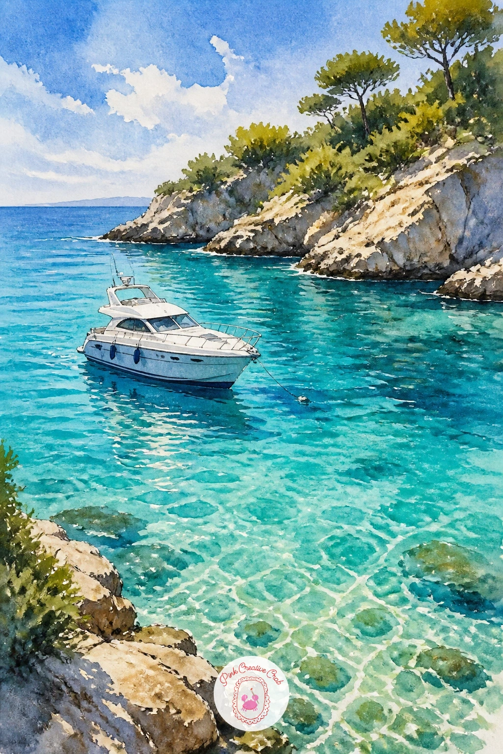
Palette: Phthalo Blue,Turquoise,Titanium White,Burnt Sienna
Scale is everything with a ferry, since it needs to feel sturdy and substantial against a wide stretch of water. Block in the hull as a simple long rectangle with a boxy upper deck, keeping the whole shape low and horizontal rather than tall, which instantly reads as “working boat” rather than “yacht.”
Paint the bay first as a broad wash in cool blue-gray, then once dry, add the ferry in white and navy with a few small dark window dots along its side; these tiny repeated marks do a lot of work suggesting passengers and portholes without any real detail. The easiest way this goes wrong is drawing the ferry too delicately, so keep every edge of the hull straight and confident with a ruler-guided pencil line if it helps.
A faint smudge of distant hills or coastline along the horizon grounds the wide bay and gives the ferry somewhere to be heading. If navy isn’t in your set, mix ultramarine with a little black for a similar deep tone.
Finish with a thin trail of white gouache or lifted paint behind the hull for its wake. Tip for today: keep the ferry’s silhouette boxy and blocky rather than curved, that stiffness is exactly what makes it look like a real working vessel.
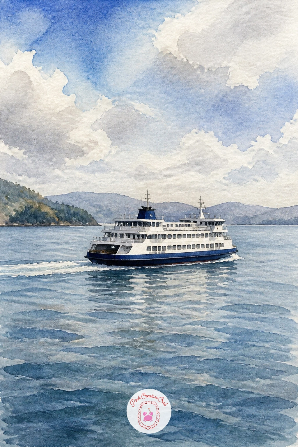
Palette: Payne’s Grey,Navy Blue,Titanium White,Cerulean Blue
Trees give this painting its personality, so build them around the canoe rather than the other way around. Start with the lake as a cool green-blue wash, then while it’s still slightly damp, drop in soft dark green reflections of tall pines along one edge so they bleed gently into the water below.
Once dry, paint a simple wooden canoe in warm red-brown resting near the shore, keeping its shape narrow and pointed at both ends, quite different from a rounder rowboat. The place this scene often falls apart is making the forest reflection too neat and solid; break it up with a few dry-brush strokes so dappled light shows through.
A single paddle resting across the canoe adds a nice narrative touch, as if someone has just stepped out onto the shore. No dark green on hand, mix Payne’s grey into sap green for a convincing shaded pine color.
Finish with a few loose dots of lily pads near the canoe. Today’s tip: paint the forest reflection before the canoe itself, so the canoe sits clearly on top of the water rather than blending into the trees behind it.
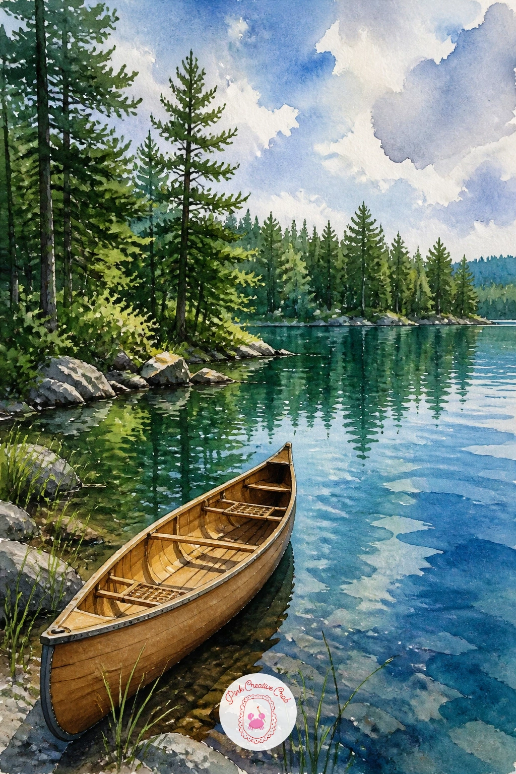
Palette: Sap Green,Payne’s Grey,Burnt Sienna,Cerulean Blue
This one is pure playful charm, perfect for a lighter afternoon at the easel. Sketch a rounded white swan body with a simple curved neck and small beak, sitting low on the water the way these pedal boats always do, slightly squat rather than elegant.
Paint the swan’s body in white with gray shadow strokes along its curves to give it form, then add a small bright accent, a red or yellow beak and perhaps a painted eye detail, since that one pop of color is what sells the toy-like charm of a park pedal boat. The easiest mistake is making the neck too long and graceful like a real swan; keep it short and a bit comical to match the pedal boat’s actual proportions.
Water around it can stay simple and bright, a cheerful blue with small ripple lines radiating outward from the hull. No gray paint mixed yet, a thinned wash of your blue works fine for soft shadow on white.
Add a couple sitting inside if you’d like more story, or leave it empty and playful. Tip for today: paint the shadow side of the swan’s neck and body first, then add the white highlights last with a touch of opaque gouache if needed.
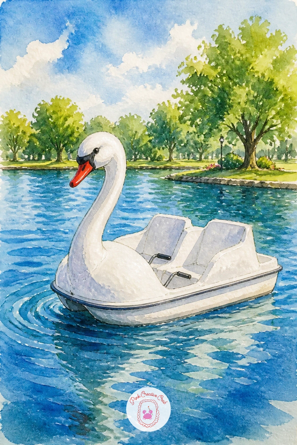
Palette: Titanium White,Payne’s Grey,Cadmium Red,Cerulean Blue
Scale down completely for this quiet, nostalgic little scene. Fold a simple paper boat shape in pencil first, three clean triangular planes, then paint it in crisp white with just a touch of gray shading along the folds so its paper structure reads clearly even at a small size.
The puddle beneath it is really the star: paint it as an irregular gray-blue shape with a soft reflected sky color inside, and use the quick ten minute version by keeping the puddle flat and simple, or spend extra time on the forty minute version adding reflections of nearby cobblestones or raindrop ripples around its edges. A frequent slip is making the puddle a perfect oval; real puddles have uneven, slightly jagged edges, so let yours wander.
A few loose cobblestone shapes or wet pavement texture around the puddle grounds the whole scene without much extra work. No gray in the mix, thin your black or Payne’s grey well with water for a soft shadow tone.
Finish with one small ripple ring near the boat’s bow. Today’s tip: paint the puddle first and let it dry fully before placing the white paper boat on top, so its edges stay crisp against the water.
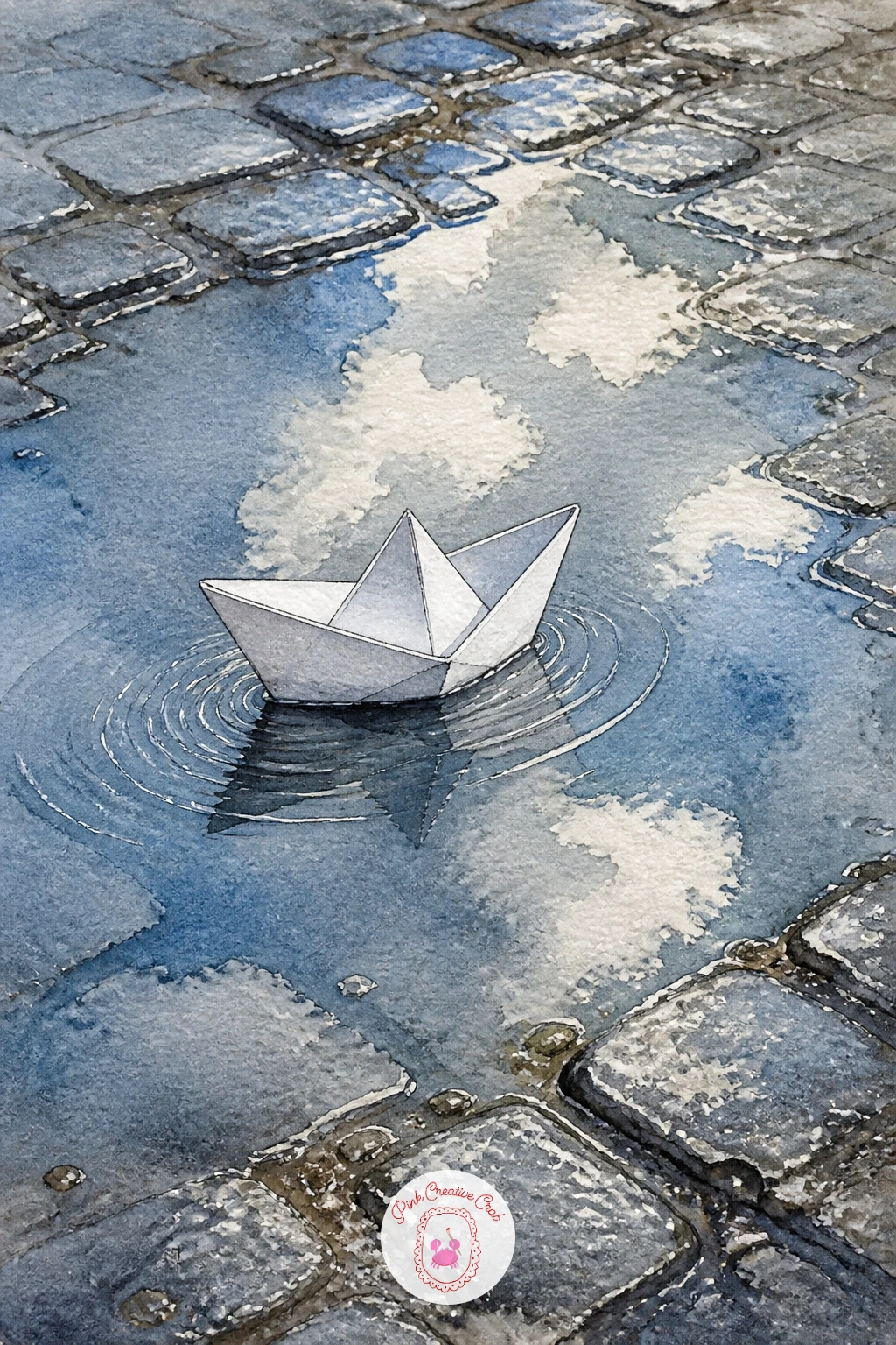
Palette: Titanium White,Payne’s Grey,Cerulean Blue,Ivory Black
Color is the whole point of a luzzu, so don’t hold back. Sketch the boat’s high, curved bow and stern first, a distinctive shape quite different from a rowboat, then block in bold bands of yellow, red, and blue along the hull, the traditional luzzu palette.
Once the base colors are dry, add the painted eye near the bow, a simple oval white shape with a dark pupil, a detail believed to watch over fishermen at sea and one of the most charming parts of painting this boat. The place this goes wrong is painting the eye too realistically; keep it stylized and flat, almost like a simple icon, to match the folk-art feel of the real boats.
Harbor water behind it can stay a simple warm turquoise with a few dry-brush reflection streaks of the bright hull colors. No true cadmium yellow on hand, any warm golden yellow works for the traditional bands.
Add one or two more luzzus small and distant behind the main one for a market harbor feel. Tip for today: paint the eye last, once everything else is completely dry, so its clean white oval doesn’t bleed into the surrounding color.
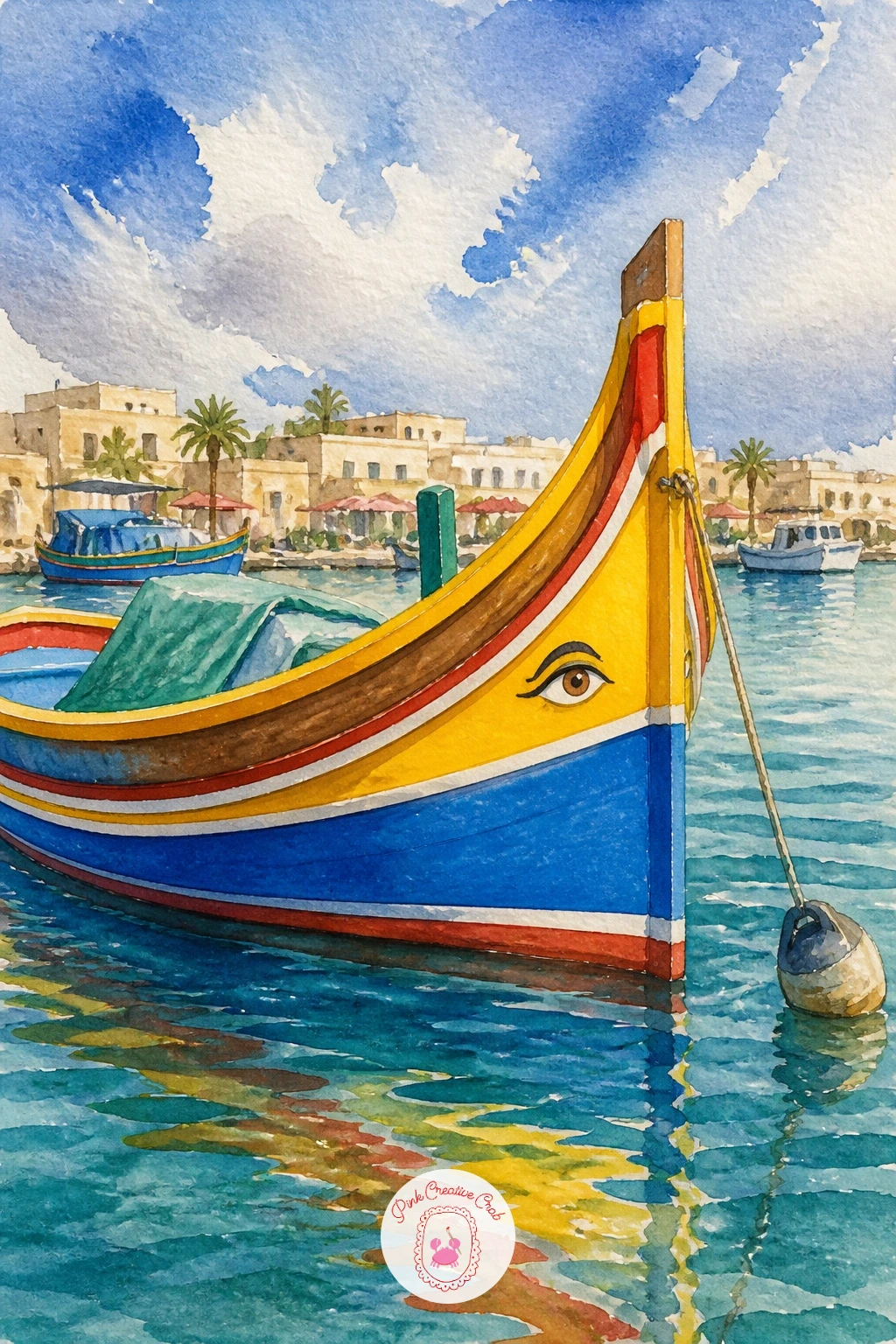
Palette: Cadmium Yellow,Cadmium Red,Ultramarine Blue,Titanium White
Movement and multiples make this scene feel alive, so think in groups of three or four small sailboats rather than one. Sketch them at slightly different angles and distances, some sails leaning as if catching wind, to suggest real motion across the water.
Paint the sky and sea first in crisp, bright blues, then add each sailboat as a simple white triangle sail with a thin colored hull beneath, varying the hull colors, red, yellow, navy, so the fleet feels festive rather than repetitive. The common mistake is lining the boats up too evenly in a row; stagger them at different distances from the viewer so the race feels like a real moment in motion.
Smaller, paler boats in the background instantly suggest distance, so keep your most saturated colors on the boat closest to the front. No navy on hand, a deep mixed blue-black works just as well for one hull.
Add a few small white flecks of sea spray near the leading boat’s bow. Today’s tip: paint the farthest boats first and work forward, saving your boldest color for the boat nearest the viewer.
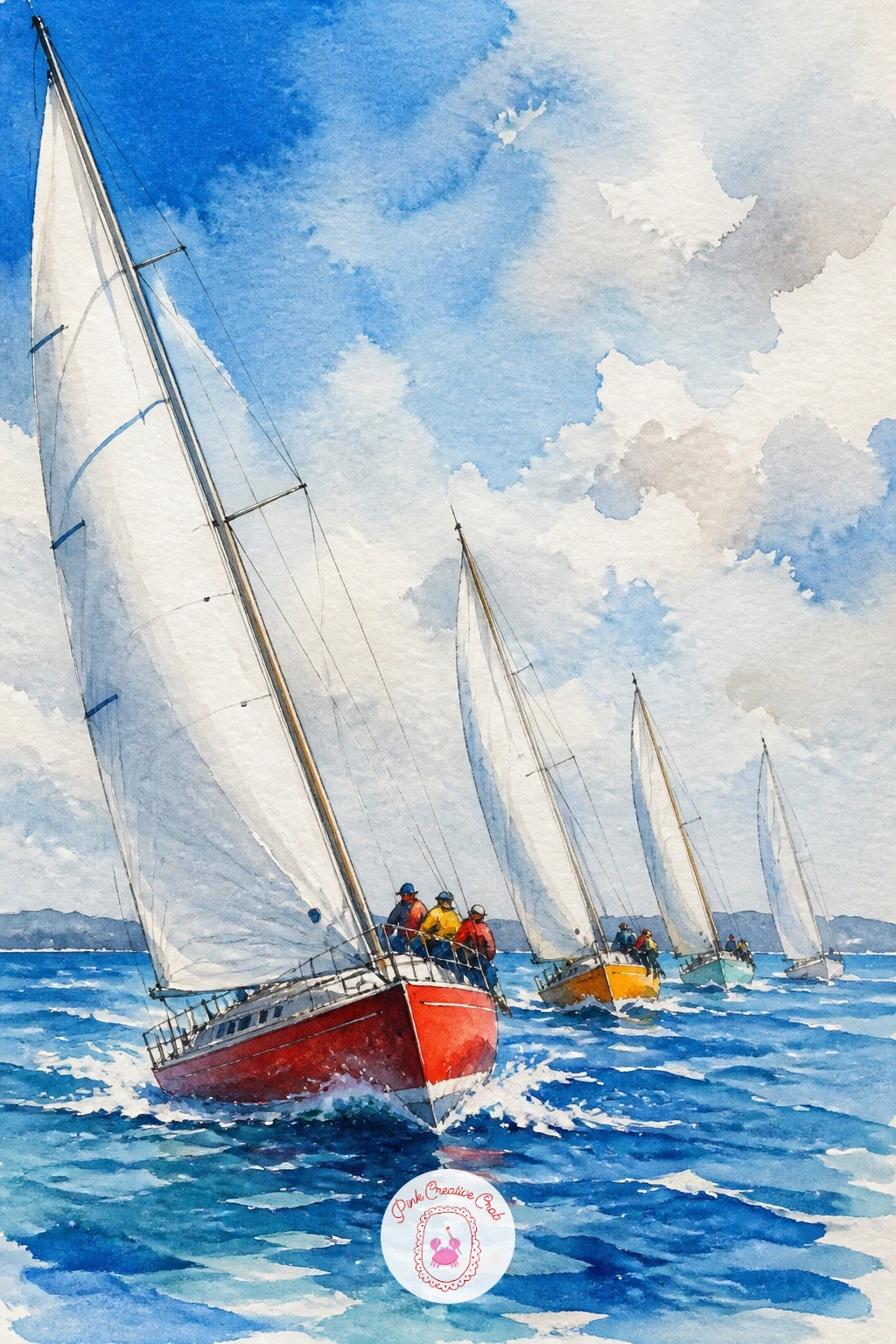
Palette: Cerulean Blue,Cadmium Red,Cadmium Yellow,Titanium White
Let the cliff set the scale for this one before you paint a single stroke. Decide how tall the rock face should be relative to the kayak, perhaps ten times its length, then sketch loosely so the kayak reads as genuinely small against dramatic coastal rock.
Paint the cliff first using a dry-brush technique for its rough, textured surface: load your brush lightly with burnt sienna and gray, then drag it sideways across slightly textured paper so the bristles catch and skip, leaving a broken, rocky texture rather than a flat wash. Once that’s dry, add the kayak as one simple elongated shape in bright orange or yellow, a color choice that also happens to make it pop clearly against the muted rock and sea around it.
The easiest mistake here is painting the cliff too smooth and soft; real cliff faces need that broken dry-brush texture to feel believable. No rough paper on hand, scrape a nearly dry brush with a fingernail lightly across the stroke to create similar texture.
Add a tiny paddle and a few gulls near the cliff top. Tip for today: paint the cliff’s shadow side noticeably darker than its sunlit side, that single contrast does most of the work making the rock feel solid.
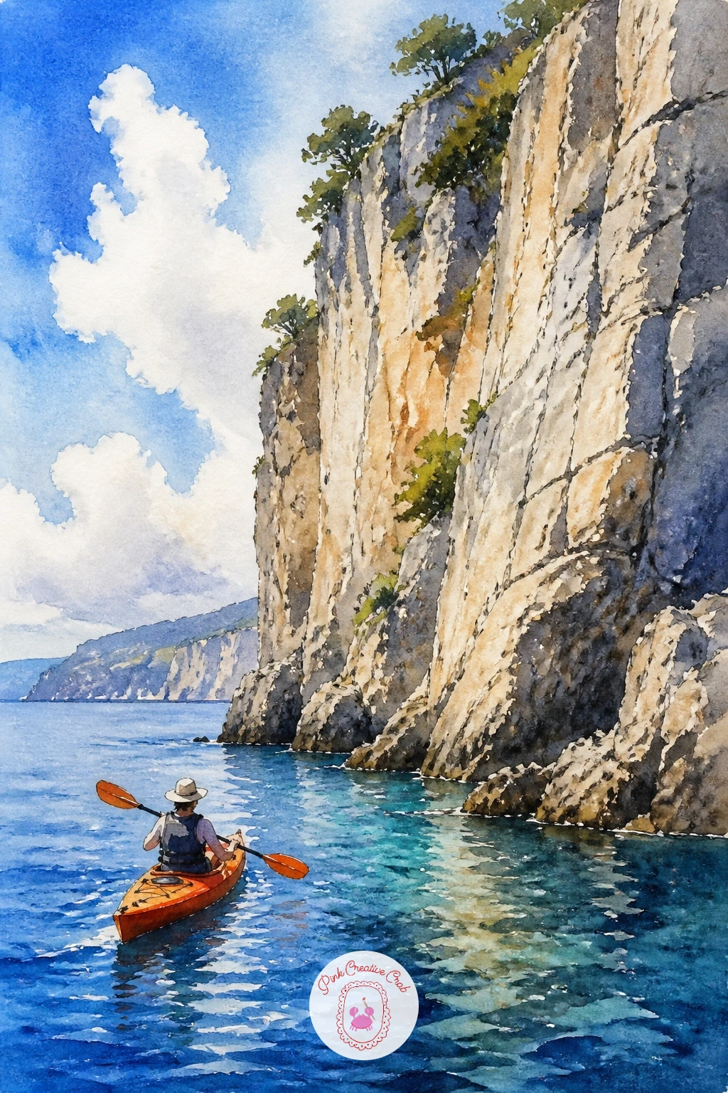
Palette: Burnt Sienna,Payne’s Grey,Cadmium Orange,Cerulean Blue
Rope and reflection carry most of the charm here. Paint a small, slightly weathered rowboat tied with a simple curved rope line to a wooden dock post, keeping the dinghy’s hull in a soft faded color, pale blue or chalky green, as if it has spent many seasons in the sun.
Build the dock post from a few vertical strokes of burnt umber with darker shadow lines on one side, then let the water beneath mirror both the post and the boat in loosely dragged vertical strokes of the same colors. The spot this often goes wrong is the rope; keep the painted line loose and slightly uneven rather than a stiff, perfectly curved line, since real rope sags and twists.
A few wooden planks of the dock extending into the foreground give the scene a sense of standing right there. No burnt umber mixed, a dark warm brown from burnt sienna and a touch of black works just as well.
Finish with small scuffed texture marks on the hull using a dry brush. Today’s tip: paint the dock post and its shadow before the rope, so you can judge exactly how the rope’s curve should hang between the two points.
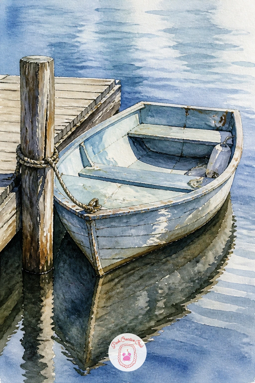
Palette: Pale Blue,Burnt Umber,Burnt Sienna,Payne’s Grey
Give this scene a clear light source before anything else, since the lighthouse beam is really the whole story. Decide whether the sun is setting behind the lighthouse or its lamp is glowing against dusk, then paint the sky accordingly, warm and fading for sunset, cooler blue-violet for a lit lamp scene.
Paint the lighthouse itself as a simple tall white cylinder with red or black bands, placed off to one side rather than dead center, which leaves room for one or two small boats heading toward shore in the foreground water. The common mistake is making the lighthouse too thin and spindly; give it a sturdy, slightly tapered shape so it reads as solid stone rather than a stick.
If painting the lamp glowing, leave a soft circle of untouched or pale yellow paper at its top and let the surrounding sky darken gradually outward from that point, a simple trick that makes light look like it’s genuinely radiating. No yellow left for the glow, a touch of white gouache dabbed in afterward works nearly as well.
Add one or two small dark boat silhouettes in the water below. Tip for today: paint the sky and water first, then add the lighthouse and boats last as crisp, confident silhouettes on top.
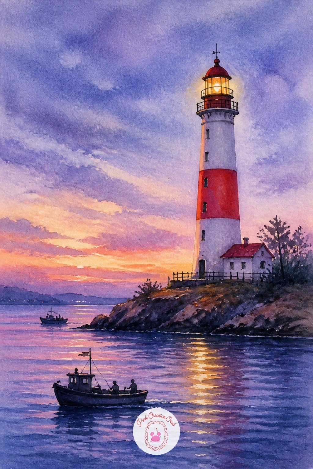
Palette: Titanium White,Cadmium Red,Dioxazine Violet,Naples Yellow
For more ideas on painting glowing light and dramatic skies behind a scene like this, the easy watercolor landscapes collection is worth a look.
This is a joyful, color-packed scene borrowed from floating flower markets. Paint a simple wide, shallow wooden boat shape first in warm brown, then fill its entire interior with loose dabs of flower color, pink, yellow, orange, purple, piled high above the boat’s edges.
Work from back to front: paint the furthest, palest flowers first, then layer brighter, more saturated dabs toward the front of the pile so the flowers feel abundant and three-dimensional rather than flat. The easiest mistake is spacing the flower dabs too evenly like polka dots; cluster them unevenly in some areas and let a little boat or green leaf show through gaps elsewhere.
Market water beneath the boat can be a simple muted green-brown, since flower market canals are rarely crystal clear. No purple in your set, mix a little red into blue for a convincing violet.
Add a thin wooden oar resting across the boat’s edge for context. Today’s tip: paint your busiest, brightest flower cluster slightly off-center rather than in the middle, so the eye has somewhere natural to land first.
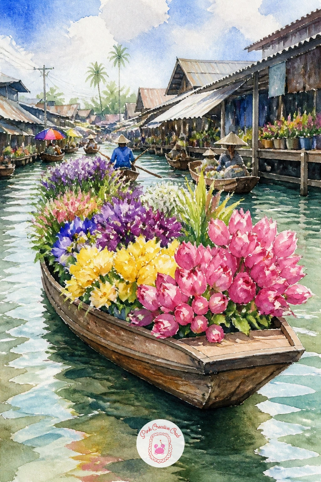
Palette: Quinacridone Pink,Cadmium Yellow,Dioxazine Violet,Burnt Sienna
For more playful floral color mixing before you start, the simple watercolor flowers ideas are a great warm-up.
The long, slender shape is the whole character of this boat, so take time getting its proportions right before adding color. Sketch a very narrow, elongated hull with a distinctive upturned, decorated bow, and a long thin engine shaft extending out behind into the water, a detail unique to this boat that’s worth getting right.
Paint the hull in bold tropical colors, turquoise, orange, or hot pink are all authentic choices, with a painted decorative stripe or garland near the bow picked out in gold or white once the base color dries. The spot this often goes wrong is making the hull too short and stubby; really stretch the proportions, since a long-tail boat is dramatically longer and narrower than a typical rowboat.
Tropical water beneath it can be a warm turquoise with small white dry-brush streaks of wake trailing behind the long engine shaft. No gold paint on hand, a warm yellow ochre mixed with a touch of white gives a similar decorative gleam.
Add a passenger or two as simple seated silhouettes for scale. Tip for today: paint the long engine shaft as one confident, unbroken brushstroke, since a shaky or interrupted line will undercut the sleek look of the whole boat.
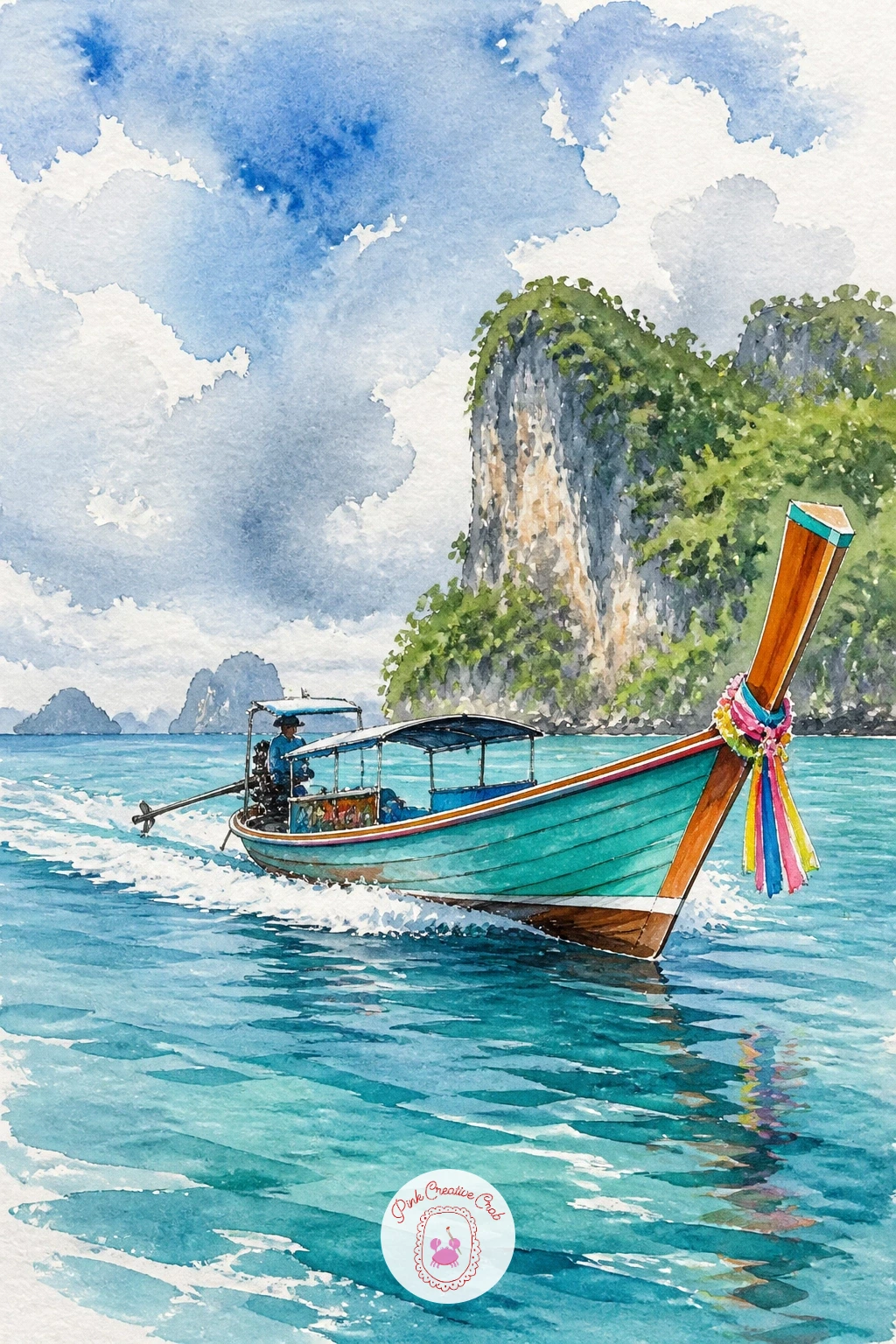
Palette: Turquoise,Cadmium Orange,Yellow Ochre,Titanium White
Sturdy and low in the water is the look to aim for here. Paint a wide, flat-bottomed hull in deep green or black, keeping the whole shape low and broad rather than tall, since real canal barges sit heavy and close to the waterline.
Once the hull base is dry, add a simple wooden cabin structure toward the stern with a small chimney, and pick out a few decorative painted details along the hull in cream or red, a traditional touch on these working boats. The common mistake is making the barge too narrow and boat-shaped in the usual sense; really widen and flatten the hull so it reads as a working vessel rather than a pleasure boat.
Canal water around a Dutch barge is often lined with tall narrow houses reflected in soft vertical color blocks behind it, which you can suggest with just a few simplified colored rectangles along the horizon. No cream paint mixed, a thinned wash of yellow ochre with white works well for the trim.
Add a small Dutch flag at the stern for a nice finishing detail. Today’s tip: paint the reflected houses behind the barge first, then add the barge itself last and slightly darker, so it clearly sits in front of its background.
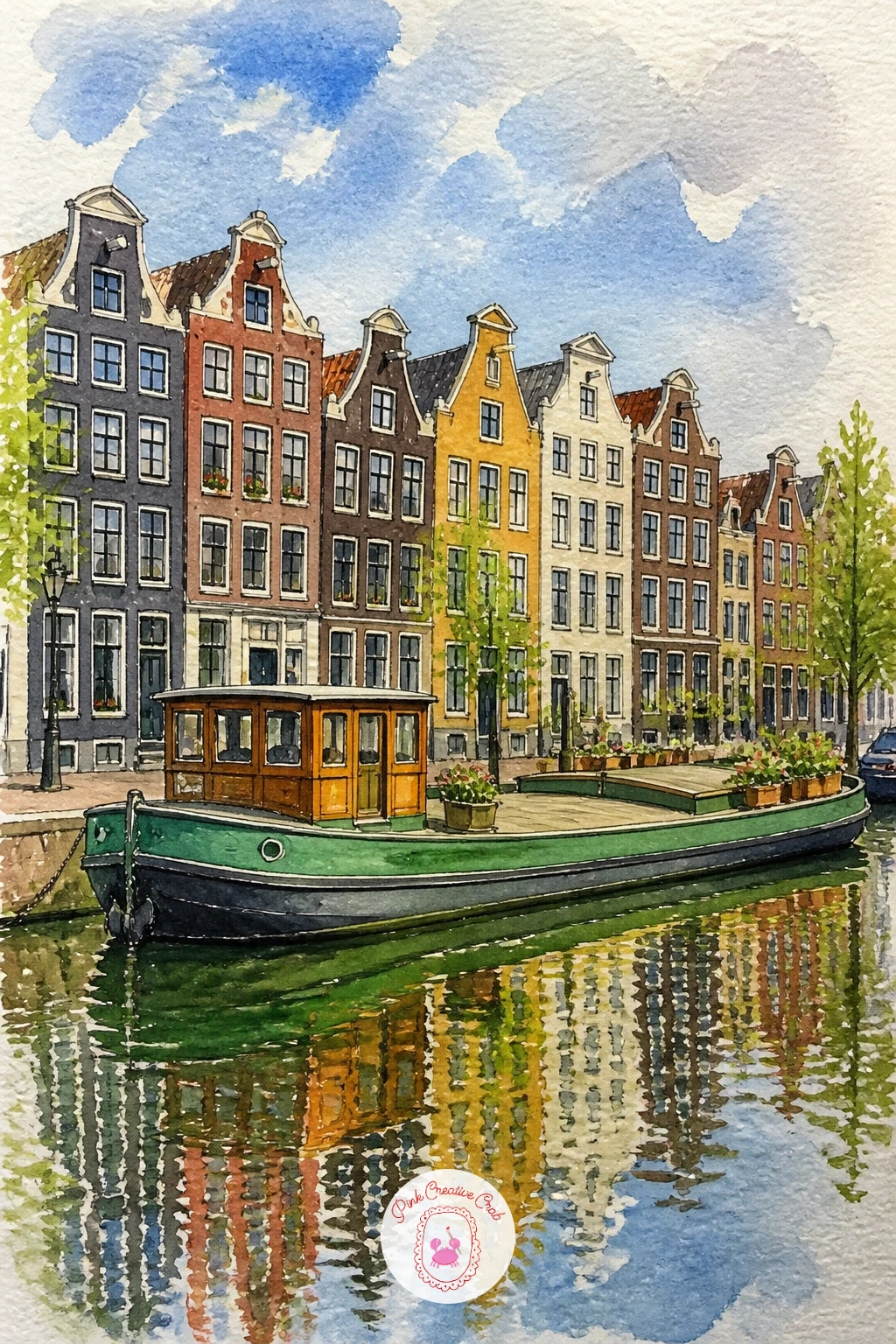
Palette: Forest Green,Burnt Sienna,Yellow Ochre,Payne’s Grey
This one is a fun change of pace, a tiny detailed painting rather than a loose scene. Paint a simple sailboat first, small and precise, with thin masts and crisp little sails, since everything here happens at a miniature scale.
Once the boat is dry, paint a clear glass bottle shape around it using very pale blue-gray with a few curved highlight lines left as bare white paper along the bottle’s rounded edges, the trick that sells the illusion of glass. The tricky part is making the glass look transparent rather than opaque; keep your bottle color extremely diluted and let the boat and its colors show clearly through the “glass” shape.
A thin cork shape at the bottle’s neck and a little sandy base inside complete the scene. If pale gray feels tricky to control, a wash of very diluted cerulean blue gives a similarly convincing glass tint.
Tip for today: paint the boat completely first and let it dry fully, then paint the bottle shape over it with a very light, transparent wash so the boat glows through clearly rather than being muddied.
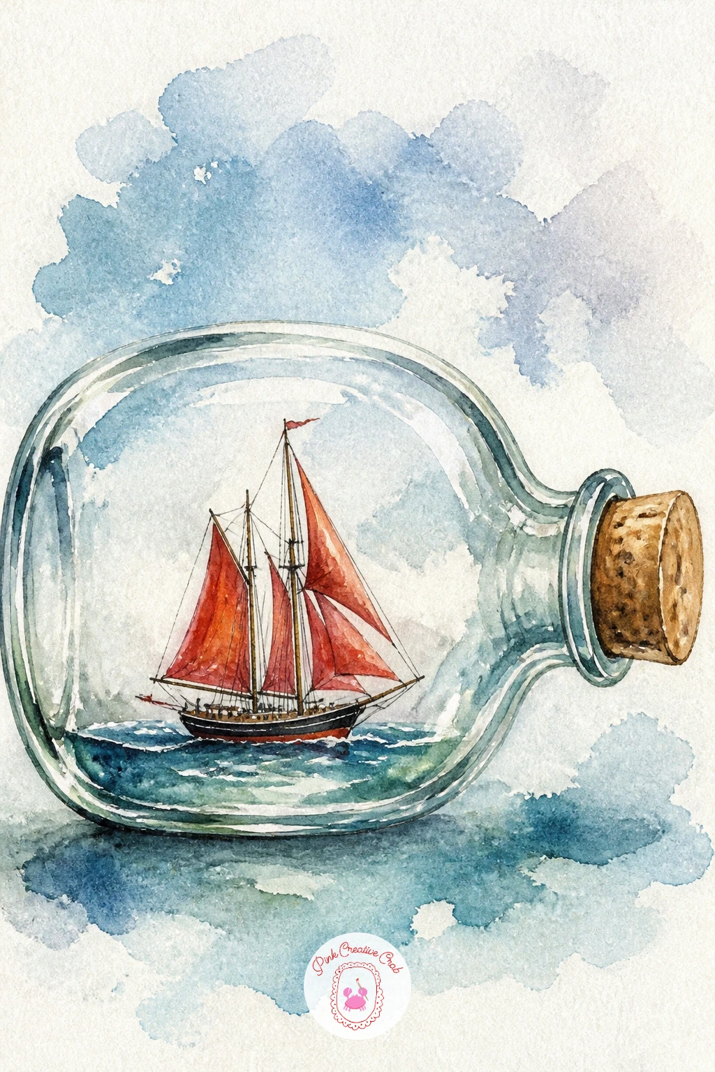
Palette: Pale Gray,Cadmium Red,Burnt Sienna,Titanium White
Story and detail both get a little room to grow here, so this is a nice forty minute project if you want to slow down. Paint the rowboat first, floating calmly, then add a simple woven picnic basket, a folded blanket draped over one seat, and perhaps a small bottle, all in soft overlapping color dabs rather than tightly drawn objects.
For the quick ten minute version, just the basket and blanket are plenty; the longer version can add a thermos, a slice of fruit, or a floating hat beside the boat for extra charm. Keep every small object loose and simplified, since too much detail in a tiny space tends to look cluttered rather than cozy.
Water beneath the boat stays calm and pale, letting all the visual interest stay up in the boat itself. No woven basket texture skills yet, a simple brown oval with a few curved lines across it reads perfectly well as a basket from a normal viewing distance.
Tip for today: group the picnic items close together on one side of the boat rather than spreading them out evenly, which keeps the composition feeling relaxed and natural.
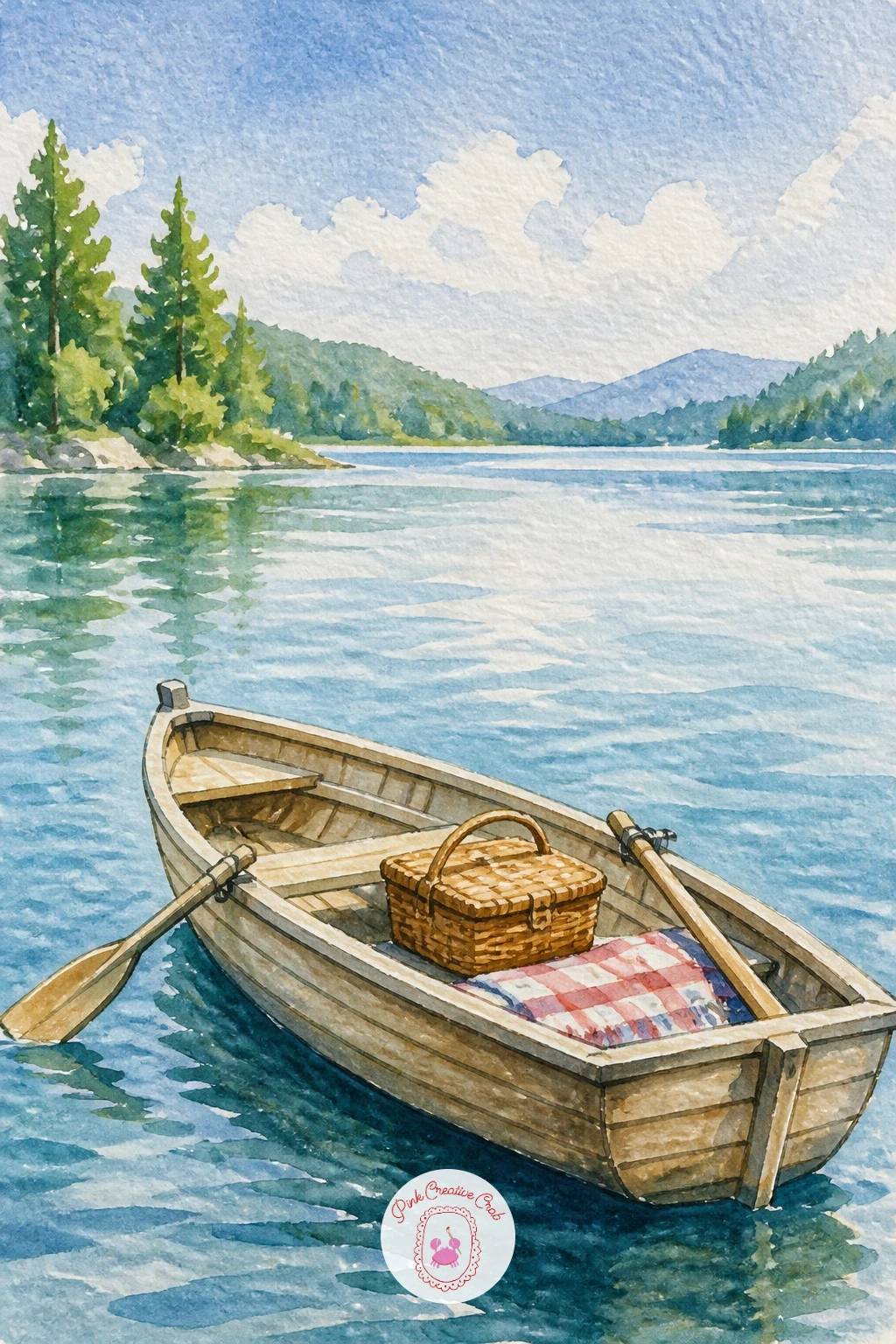
Palette: Burnt Sienna,Sap Green,Cadmium Red,Cerulean Blue
Life and motion come from the birds here as much as the boat. Paint a simple working fishing boat first, sturdy and a bit weathered, in muted blue or faded red, with a small cabin and some loosely suggested rope or net detail along the deck.
Once the boat is dry, add several gulls circling above and behind it using quick, confident brush flicks, a simple curved line that widens slightly in the middle and tapers at both ends reads instantly as a gull in flight. The mistake to avoid is painting every gull the same size and at the same distance; vary their sizes so some feel closer and some farther, which adds real depth to the sky.
Choppy water around a working fishing boat benefits from short broken brushstrokes rather than one smooth wash, suggesting movement and spray. No faded red on hand, mix cadmium red with a touch of gray to dull it convincingly.
Finish with a few white paint flecks for sea spray near the bow. Today’s tip: paint your gulls with a single loaded brushstroke rather than building each one from several lines, since a quick stroke always looks more alive than a careful outline.
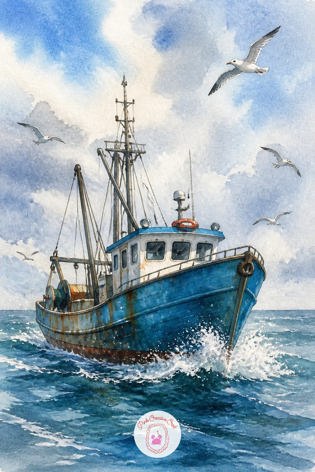
Palette: Faded Red,Payne’s Grey,Titanium White,Cerulean Blue
Pull together everything you’ve practiced so far into one busy, festive scene. Paint the canal and buildings first in warm sunlit tones, then add several gondolas and small boats scattered across the water, each one simplified to just a hull shape and a figure or two, varying their colors so the whole regatta feels lively rather than repeated.
Flags and bunting strung between buildings or on the boats themselves add festive color, quick triangular dabs of red, yellow, and green along a thin painted string line. The easiest way this scene gets overwhelming is trying to detail every single boat; keep most of them as simple loose shapes and reserve your crisper details for just one or two boats in the foreground.
Reflections from all that color need loose vertical dry-brush strokes beneath each boat, blending together into a shimmering, busy stretch of water. No bunting colors ready, three quick primary dabs, red yellow blue, repeated along a line read as festive flags from a normal viewing distance.
Tip for today: paint every boat’s reflection the moment after you paint the boat itself, while the water wash beneath is still slightly damp, for the softest blend.
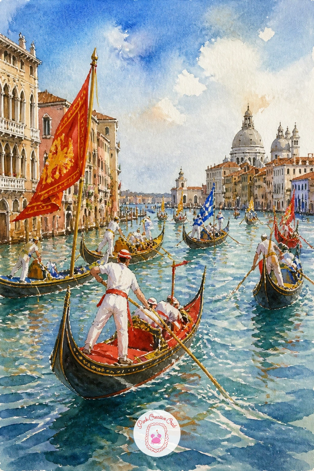
Palette: Cadmium Red,Cadmium Yellow,Ultramarine Blue,Yellow Ochre
Contrast is everything in a night scene, so commit to a genuinely dark sky before anything else. Mix a deep indigo or Payne’s grey wash for the whole background, adding a little extra pigment near the top of the page so it reads as a真正 dark night rather than dusk.
Once that’s completely dry, paint the houseboat as a simple dark silhouette with several small warm yellow windows glowing along its side, since those few bright, warm dots against all that cool darkness are what make the whole painting feel magical. The spot people often rush is the glow around each window; while the dark sky wash is still just slightly damp in a small area, dab in the yellow so it blooms softly outward, or if it’s already dry, add a thin halo of diluted yellow around each window afterward.
Water beneath the boat mirrors those same warm window lights as small reflected streaks, breaking up the dark water’s surface. No indigo in your set, a mix of ultramarine and a touch of black gives a similar deep night tone.
Today’s tip: paint every window the same warm yellow rather than mixing several different light colors, since that repetition actually makes the glow read as more convincing and unified.
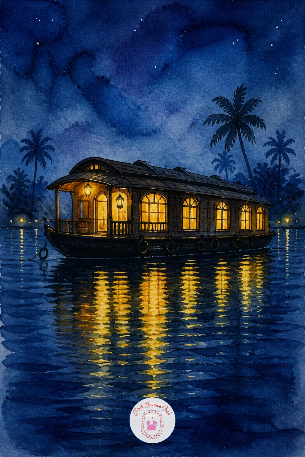
Palette: Indigo,Naples Yellow,Payne’s Grey,Ivory Black
Cool, crisp color defines this quiet fjord scene. Paint a simple red or mustard wooden boat shed sitting right at the water’s edge, its steep roofline and small door kept deliberately plain, since the charm here comes from its setting rather than any fussy architectural detail.
Behind it, add tall pale cliffs or mountains using thin, cool gray-blue washes, keeping the most distant peaks the palest so the scene reads with real depth from front to back. A small traditional rowboat or two resting beside the shed or pulled onto a narrow strip of rock ties the whole scene together and gives it scale against those big, quiet mountains.
The common mistake with fjord scenes is making the water too busy; keep it a calm, nearly flat wash of cool blue-green with just the faintest mirrored reflection of the shed’s warm color beneath it. No mustard yellow handy, yellow ochre mixed with a touch of burnt sienna makes a similar warm Scandinavian tone.
Tip for today: paint your most distant mountain layer first in the palest wash, then work forward with progressively darker, closer shapes, finishing with the shed and boats last.
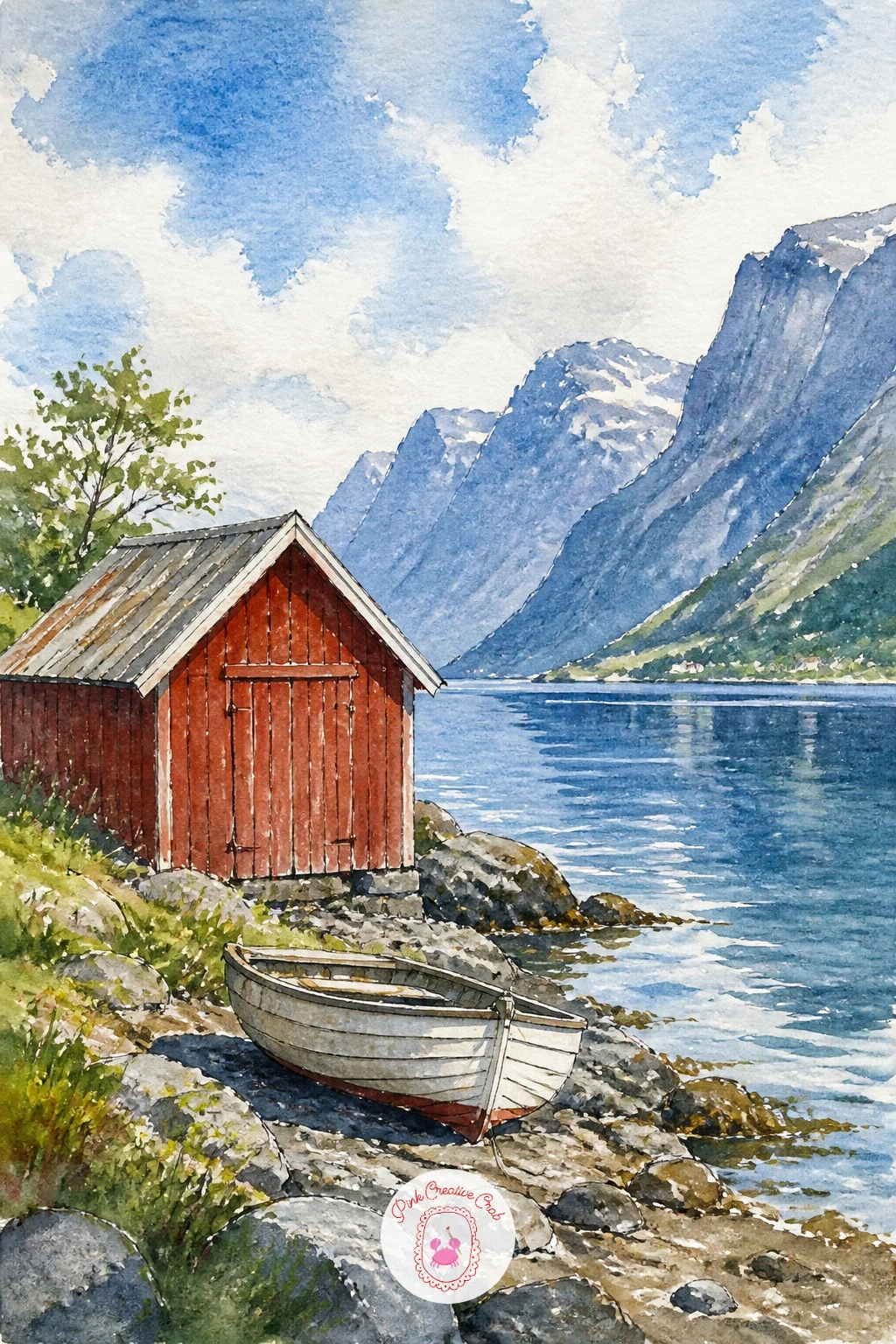
Palette: Cadmium Red,Yellow Ochre,Payne’s Grey,Cerulean Blue
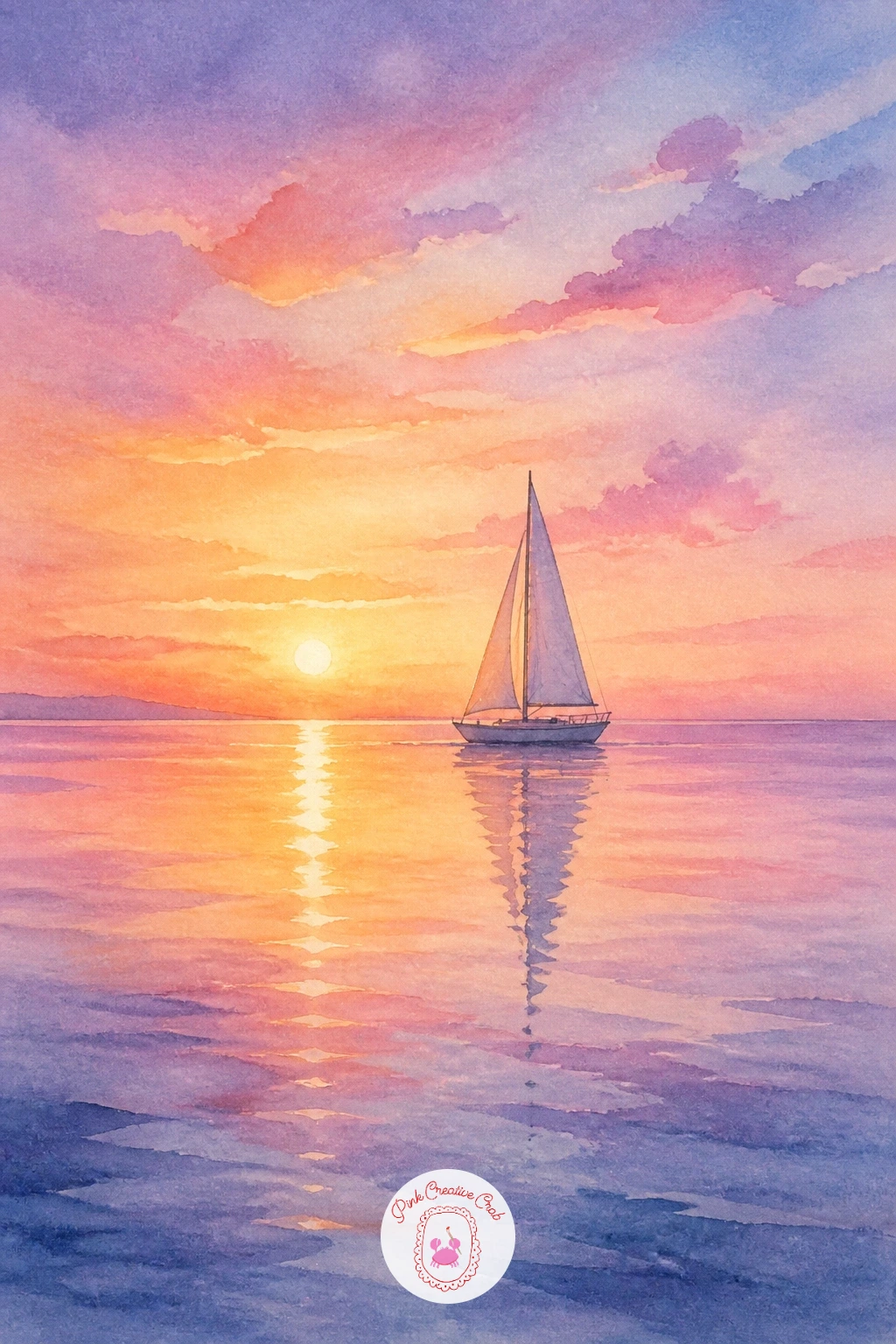
Close the collection with something quiet and soft. Paint the sky first in gentle early morning colors, pale pink, soft lavender, and a hint of pale gold near the horizon, blending them wet-in-wet so there are no hard edges anywhere in that early light.
Once fully dry, add a single small sailboat near the horizon line as a pale silhouette, softer and less contrasted than a sunset silhouette would be, since dawn light is gentler and hazier than the bold colors of dusk. The temptation here is to make the boat too dark and crisp; keep it just a few shades deeper than its surroundings so it feels like it’s emerging gently from the morning haze rather than cut sharply against it.
Water beneath mirrors the same soft pastel sky colors in a few loose horizontal strokes, with the faintest hint of the boat’s pale reflection beneath it. No lavender in your mixes, a touch of violet diluted heavily into pink creates a similar soft dawn tone.
Finish this whole collection with one calm tip: let every wash in a dawn scene stay pale and diluted, since restraint, more than any clever technique, is what makes early morning light feel believable on paper.
Palette: Pale Pink,Lavender,Naples Yellow,Payne’s Grey
What to Do Next
Pick one boat that matches your mood today, pour a glass of water for your brushes, and tape a sheet of cold press paper to your board. Start with the sky or water wash first in every single idea above, let it dry, then bring the boat in last so its color stays bright and clean against everything around it.
Frequently Asked Questions
What watercolor paper works best for painting boats and water?
A cold press paper at least 140lb works best, since its texture helps wet-in-wet skies and water blend softly while still holding crisp boat edges once dry. Smooth hot press paper makes reflections harder to control.
How do you paint a believable reflection under a boat?
Paint the boat’s color straight down into the water wash while it is still slightly damp, then break it up with a few dry-brush strokes. A dry brush dragged lightly across the reflection always looks more convincing than a smooth mirrored block.
Why does my boat painting look flat instead of three-dimensional?
Flatness usually comes from skipping shadow, so add one clear darker tone under the hull and along one side of the boat. That single contrast does most of the work of making any boat feel solid on the water.
What is the easiest boat to start with as a beginner?
A simple rowboat or small sailboat silhouette is the easiest starting point, since it needs only a curved hull shape and one or two tone values. Save detailed boats like gondolas or luzzus for once you feel confident.
How do I stop my sky and water colors from looking muddy?
Muddy color usually comes from mixing too many pigments or overworking a wet wash, so limit each sky or water area to two or three colors and let them blend on their own. Clean water and a light touch keep washes bright.
Have any thoughts?
Share your reaction or leave a quick response — we’d love to hear what you think!
-
 0
-
0
-
0
-
0
-
0
-
0


