

Christmas decor drawing is the best excuse to copy every styled vignette you have been pinning all season, from the honeycomb tree on a sideboard to the brass candelabra glowing on a mantel. These are the shots that stop your thumb on Pinterest, and painting them in gouache is faster and more forgiving than you would think: a few flat shapes, a tight little palette, and the room reads instantly.
Below are 37 of this year’s biggest holiday looks turned into paintable scenes, each one sized to finish today. Work through them in any order, keep a cat or a hand sneaking into the frame when it suits the mood, and let the burgundy and brass palette carry the whole set so your pages feel like one cohesive holiday catalogue.
Using these images: free for personal projects such as printing, coloring, cards, journals and gifts. Handmade items that include them may be sold up to 30 pieces per design. More than that is commercial use and is not permitted, and neither is selling or sharing the images themselves or passing them off as your own. Please ask before any other use.
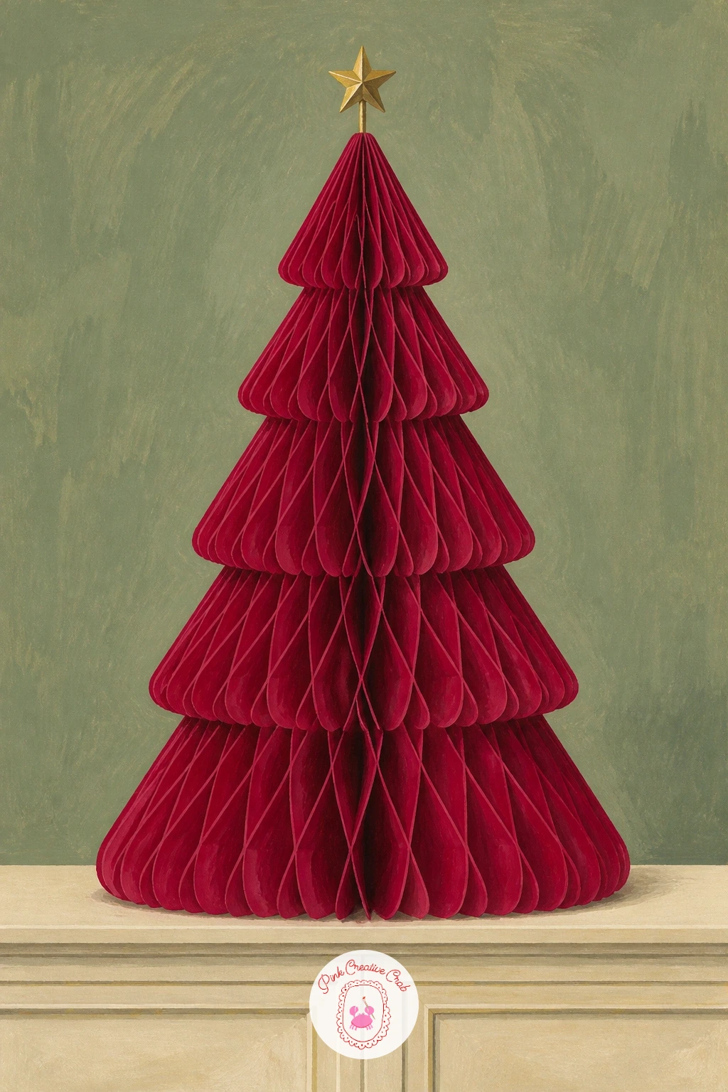
Start the whole set with the honeycomb paper tree, the shape that is everywhere in store windows this year. Pencil a tall triangle on your sideboard shape first, then slice it into four or five tiers so the honeycomb folds have somewhere to sit.
Block in the sideboard and wall in cream and sage, then paint the tree in flat berry red, leaving the tiers as separate wedges rather than one solid triangle. Where beginners go wrong is painting the honeycomb texture as fussy lines: a few short curved dashes along each tier edge read as paper folds far better than dense scribbling.
Measure the tree against the sideboard before you commit to ink: it should sit at about one and a half times the sideboard’s height, which keeps the whole vignette believable. No berry red gouache on hand, cadmium red mixed with a touch of Payne’s grey gets you there fast.
Finish with one tiny gold star or bow at the top, painted last so it stays crisp against the red.
You Will Need
- smooth gouache paper
- round brush size 6
- flat brush size 10
- graphite pencil
- ruler
Palette: Berry Red,Sage Green,Cream,Brass Gold
Try the same honeycomb shape in blush pink or forest green for a second version, since this tree trend comes in every color story this season.
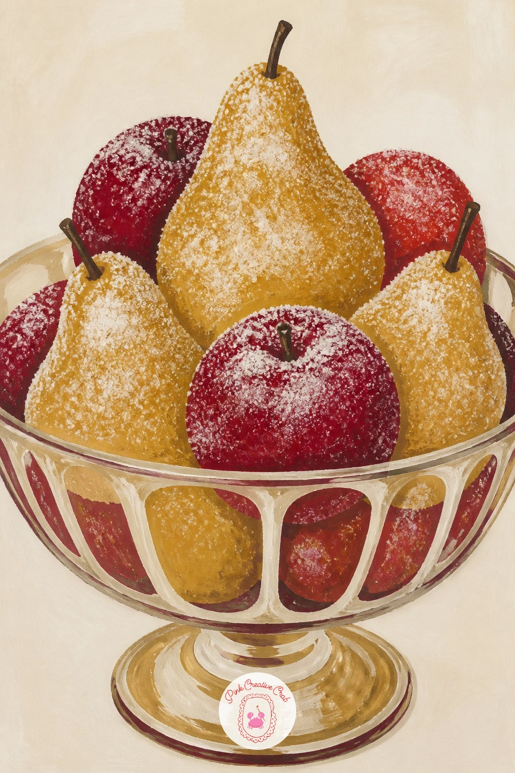
Follow the tree with something smaller and sweeter: sugared pears and apples piled in a glass bowl, the frosted-fruit look that fills so many tablescapes right now. Pencil the bowl as a simple curved vessel, then stack three or four ovals and circles inside it, overlapping so the fruit feels full rather than scattered.
Paint the fruit first in berry red and a warm ochre, then let it dry before adding the glass bowl in pale sage with a few curved highlight strokes left unpainted. Beginners often paint the sugared texture too evenly: stipple tiny dots of white gouache unevenly across the fruit, heavier near the edges, so it reads as sugar crystals rather than a flat coat.
Check your fruit sizes against the bowl rim rather than guessing: each piece of fruit should be no wider than a third of the bowl’s mouth. Out of white gouache, a thinned mix of titanium white with the tiniest touch of cream works just as well.
Keep the stippling loose, it should look sprinkled, not painted on with a ruler.
You Will Need
- round brush size 4
- old toothbrush or stiff brush for stippling
- white gouache
- smooth paper
Palette: Berry Red,Warm Ochre,Pale Sage,Titanium White
A fine white gel pen over dry gouache can add extra sugar sparkle on top of the stippling if you want the fruit to catch more light.
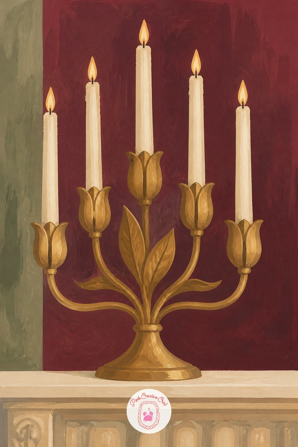
Move from the table to the mantel for the brass tulip candelabra, a shape that is replacing plain gold candlesticks in every home shop catalogue this year. Pencil the central stem first, then let five or six curved tulip-shaped arms branch upward from it, each ending in a small cup for a candle.
Paint the whole candelabra in one flat brass gold, then go back once it dries and add a second, darker gold along one side of each arm to suggest the metal catching light. This is where the extra trick for this idea comes in: decide early where your light source sits (a window to the left works well) and keep every shadow stroke on the same side, since mixed light directions are the fastest way to make metal look flat and wrong.
Paint the cream taper candles last, straight up from each cup, with a tiny flame of warm yellow and white at the very top. Short on brass gold paint, yellow ochre mixed with a touch of burnt sienna makes a convincing substitute.
Keep the candle flames small, oversized flames make the whole candelabra look like a prop rather than real brass.
You Will Need
- fine round brush size 2
- brass gold gouache
- burnt sienna gouache
- cream gouache
- graphite pencil
Palette: Brass Gold,Deep Brass,Cream,Warm Yellow
Reference a real tulip candelabra from a home decor site before you sketch, since the curve of each arm is what sells the shape, more than the brass color.
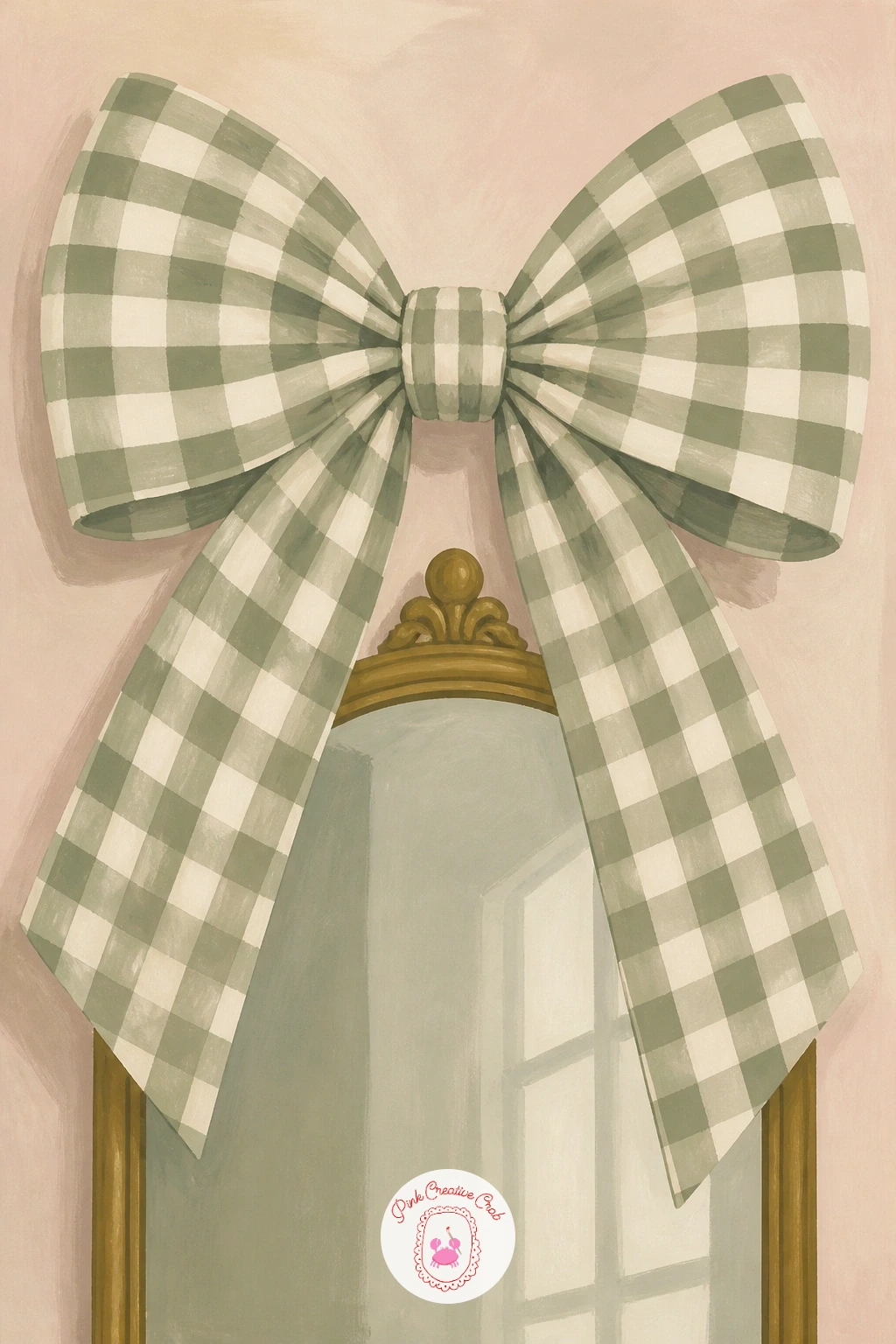
Scale right up next for the XL gingham bow, the oversized statement bow that decorators are hanging above mirrors and doorways this year instead of a wreath. Pencil the bow as two large looped triangles meeting at a center knot, with two tails hanging down, making the whole shape far bigger than a bow would ever be in real life.
Block in the bow in cream first, then paint the gingham check over it once dry: thin sage lines running one direction, then the same lines crossing the other way, leaving some squares plain cream and others a darker overlap green where the lines cross. Beginners often draw the gingham grid perfectly straight, which looks stiff on fabric: let the lines curve gently with the folds of the bow instead.
Working on a mirror frame, paint it first in a thin brass line before the bow goes in, so the mirror reads clearly behind the bow’s loops. If you only have one green on hand, mix sage with a touch of grey for the overlap squares instead of buying a second tube.
Leave the mirror’s reflection almost empty, just a hint of the wall color, so the bow stays the star of the page.
You Will Need
- ruler for light grid lines
- fine round brush
- sage gouache
- cream gouache
- brass gouache for frame
Palette: Cream,Sage Green,Overlap Green,Brass Gold
Try the same oversized bow in plaid or solid burgundy on a second page, since this trend repeats across almost every fabric pattern this season.
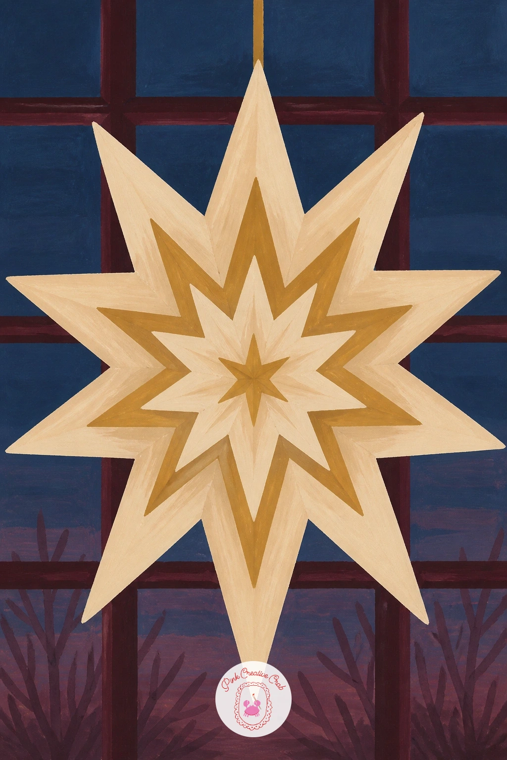
Carry the graphic shapes over to a window with the layered Scandi paper star, the folded star ornament that hangs in so many minimalist holiday windows now. Pencil a simple eight-point star shape first, then draw a second, slightly smaller star rotated behind it so the points layer and overlap.
Paint the back star in cream and the front star in a warm brass gold, keeping both flat with no shading, since the whole appeal of this ornament is its clean paper-folded look. Where it can go wrong is making the points too thin and spindly: keep each point broad near the center and only taper in the last third, closer to how real paper stars are folded.
Paint the window frame and a hint of dusk blue sky behind the star last, using a dry brush dragged lightly over the sky area so a little paper texture shows through the blue. No brass gold on hand, ochre with a touch of white lightens it to a similar warm tone.
Hang the star slightly off-center in the window pane rather than dead middle, it reads far more natural that way.
You Will Need
- dry flat brush for sky texture
- compass or round object to space star points
- brass gouache
- dusk blue gouache
Palette: Brass Gold,Cream,Dusk Blue,Soft White
Look up a real Scandi paper star online for the point spacing, since even folds are what make this ornament instantly recognizable.
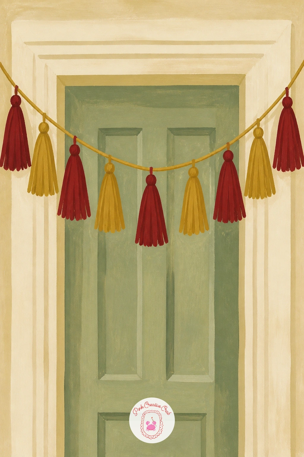
Swing from a single star to a whole tasseled garland strung across a doorway, since tassels have taken over from tinsel in a lot of this year’s trim. Pencil a gentle curved line first to map the garland’s sag, then hang six or seven tassels along it at slightly uneven spacing.
Paint each tassel as a small rounded cap over a cluster of short vertical strokes in berry red and brass gold, alternating colors along the line so the eye keeps moving. The common mistake here is painting every tassel the exact same length, which flattens the whole garland: vary the lengths slightly so some hang lower than others, the way real cord does under its own weight.
Paint the doorway frame in cream behind the garland first, before the tassels go in, so the cord’s curve reads clearly against a clean background. Without berry red on hand, a mix of alizarin crimson and a touch of brown warms it to the same family.
Add the string itself last in a thin brown line, since it is easiest to paint once every tassel is already placed.
You Will Need
- fine round brush size 2
- berry red gouache
- brass gold gouache
- thin brown liner or fine brush
Palette: Berry Red,Brass Gold,Cream,Brown
Add a tiny sprig of eucalyptus or pine in sage between a few tassels for texture, a small addition that store displays use constantly.
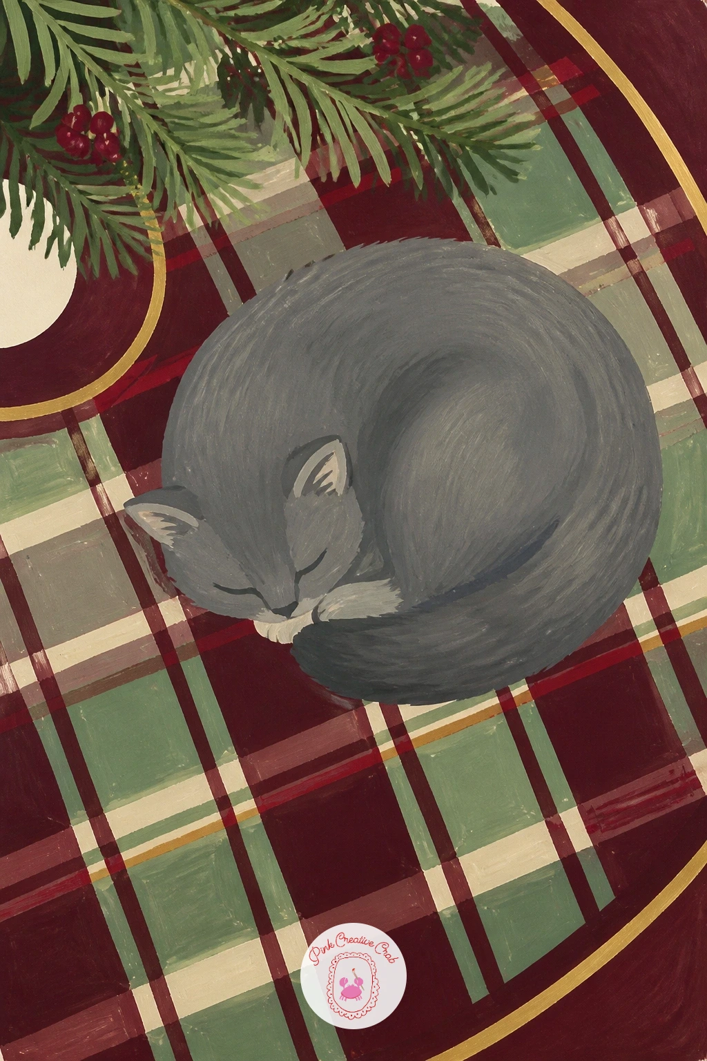
Bring a pet into the scene with a tartan tree skirt and a cat curled asleep on top, a cozy combination that softens the whole vignette. Pencil the tree skirt as a wide circle first, then sketch the cat as a simple loaf shape near one edge, tail wrapped around its body.
Paint the tartan in broad bands of burgundy and sage crossing at right angles before any fine lines go in, letting the base colors dry completely so the thin black tartan lines you add after do not bleed into the wet paint. Beginners usually paint the cat too detailed against the simple tartan: keep it as two or three flat shapes, a warm grey body and a slightly darker ear and tail tip, so it matches the flat style of everything around it.
Compare the cat’s length to the skirt’s diameter before you paint it in: the cat should take up roughly a third of the skirt’s width, small enough to read as resting on the fabric rather than looming over it.
Finish with a few pine needles poking in from the top edge of the frame to hint at the tree above.
You Will Need
- fine liner brush for tartan lines
- burgundy gouache
- sage gouache
- warm grey gouache for the cat
Palette: Burgundy,Sage Green,Warm Grey,Black
Swap the cat for a small dog curled the same way if that suits your own home better, and look at the dog drawing ideas at this guide for simple sleeping poses.
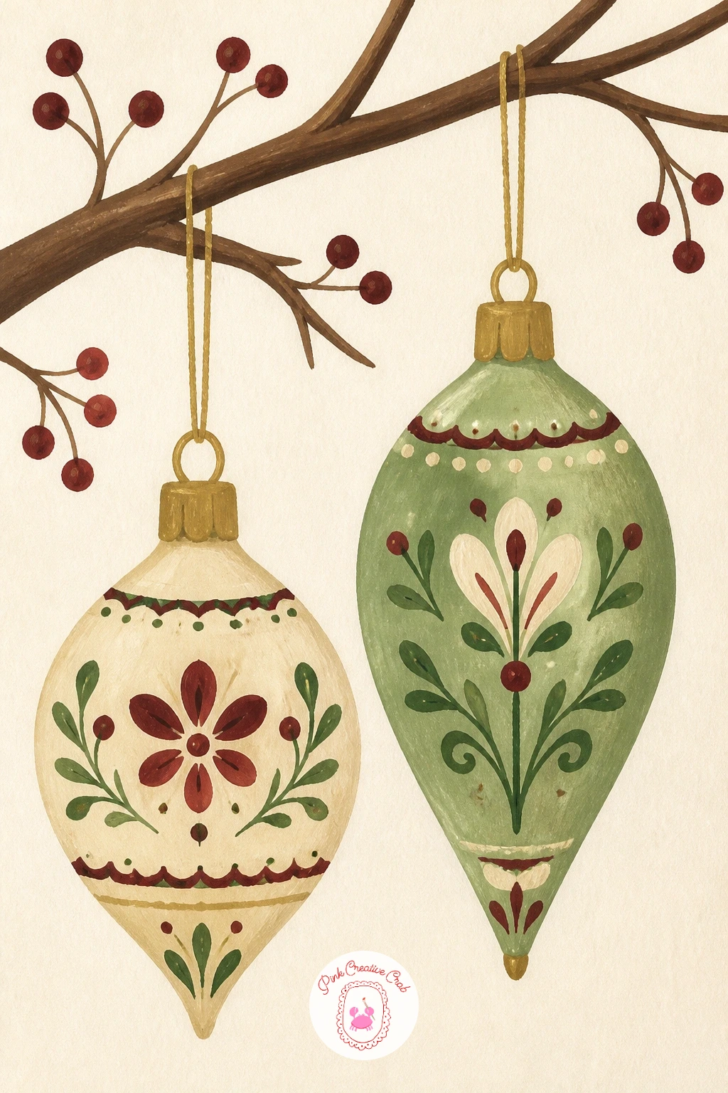
Slow down for a quieter detail next: hand-painted folk ornaments hanging from a bare branch, the kind of rustic, old-world piece that is turning up in every boutique Christmas shop this year. Pencil a simple diagonal branch across the page first, then hang two or three round ornaments from it at different heights on thin threads.
Paint each ornament as a flat cream or sage circle first, then once dry, add the folk pattern on top in small strokes: a ring of tiny dots, a few simple leaf shapes, a thin brass line around the equator. The place this goes wrong is overcrowding one ornament with too many patterns: pick one simple motif per ornament and let the others stay plainer, so the eye has somewhere to rest.
Paint the branch in a dry-brush technique, dragging a nearly dry brush of brown over the pencil line so bark texture shows through in broken streaks rather than one smooth stroke. No brass gold on hand, a thin yellow ochre line does the same job.
Hang the ornaments at different heights, never in a straight row, so the branch reads as natural rather than staged.
You Will Need
- dry brush for bark texture
- fine round brush for pattern
- brown gouache
- sage and cream gouache for ornaments
Palette: Brown,Cream,Sage Green,Brass Gold
Keep a folk motif reference nearby, like simple hearts, dots or tulips, since these patterns borrow directly from traditional painted ornament designs.
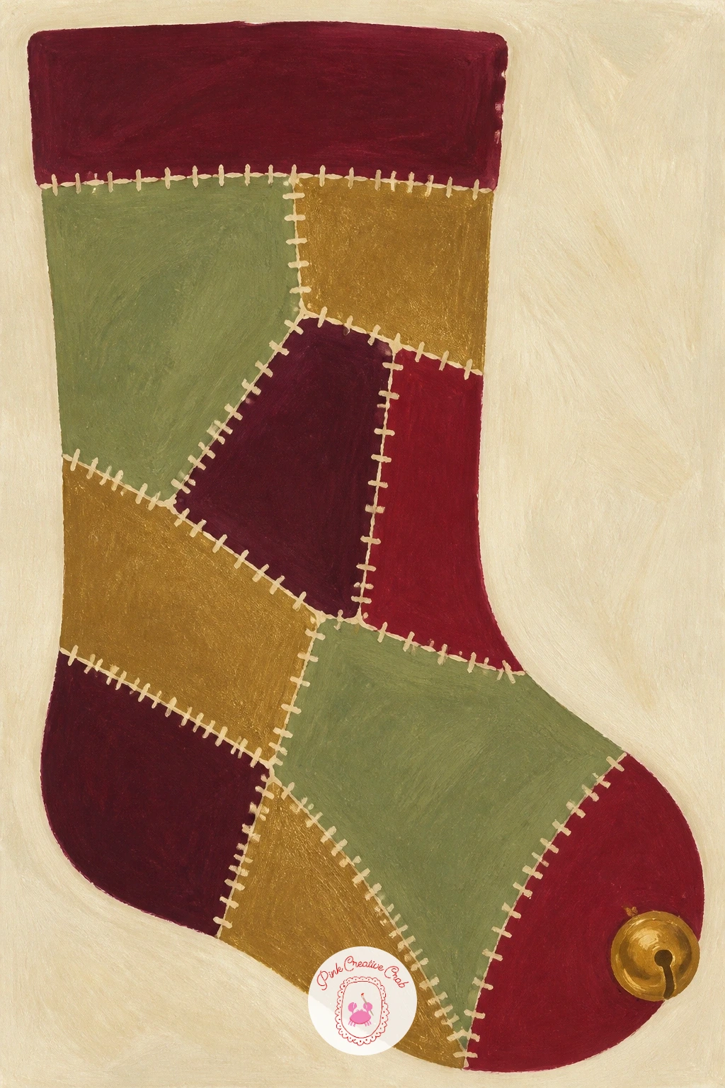
Keep the textile mood going with a velvet patchwork stocking, pieced from different jewel-toned velvet scraps the way a lot of boutique stockings are made now. Pencil the stocking’s curved outline first, then divide the inside into four or five irregular patchwork sections, like a loose jigsaw rather than neat squares.
Paint each patch a different color from your palette (burgundy, sage, deep brass, cream) and let every patch dry before painting the one next to it, so the colors stay crisp at the seams rather than bleeding together. The texture trick for this one: once everything is dry, load a dry brush with a slightly darker version of each patch color and drag it lightly in one direction across the shape, which reads instantly as velvet’s soft nap catching light.
Paint a thin cream line along every seam last, to suggest the stitching that holds the patches together. Out of several velvet colors, two tones of the same color patched together still reads as a cozy stocking.
Add a small brass bell or tassel at the toe as the final detail, painted smaller than you think it should be.
You Will Need
- dry brush for velvet texture
- fine brush for seam lines
- burgundy, sage, brass and cream gouache
Palette: Burgundy,Sage Green,Brass Gold,Cream
Hang the stocking from a painted brass hook at the top edge of the page for a finished, styled look rather than a floating stocking shape.
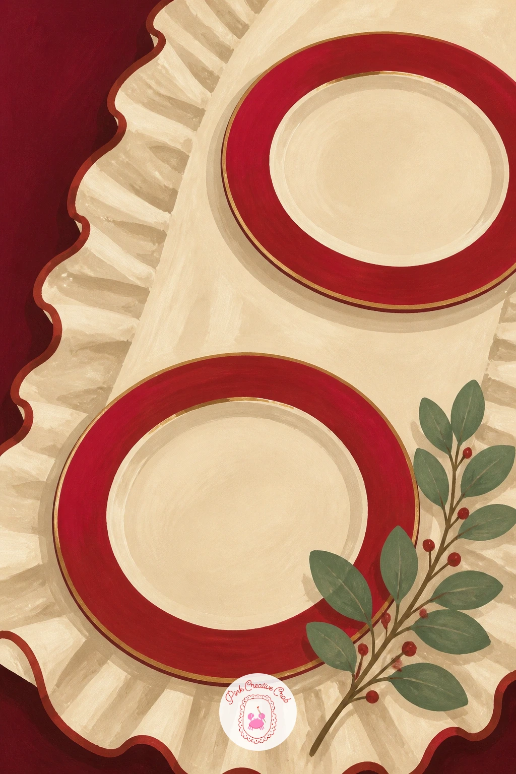
Set a table next with a ruffled table runner and a few red-rimmed plates, since ruffled linens are replacing stiff table runners in a lot of holiday tablescapes this year. Pencil a long wavy strip down the page first, giving the edges a gentle scalloped ruffle rather than a straight hem.
Paint the runner in cream with the ruffled edges shaded slightly darker where the fabric folds under itself, then add two or three plates sitting on top as simple circles with a thin red rim painted around the outer edge. Where this scene often goes wrong is painting the plates perfectly round and flat on the page: tilt them slightly into ellipses, since a plate viewed from a natural seated eye level is never a true circle.
Compare the plate width to the runner’s width before placing them: each plate should take up about a third of the runner’s width, with gaps between so the runner’s ruffle still shows.
Finish with one sprig of greenery laid across a corner of the runner, painted in loose sage strokes.
You Will Need
- round brush size 6
- cream gouache
- red gouache for plate rims
- sage gouache for greenery
Palette: Cream,Red,Sage Green,Warm Shadow
Add a single taper candle or two standing between the plates to give the table height and tie the scene to the candelabra look earlier in this list.
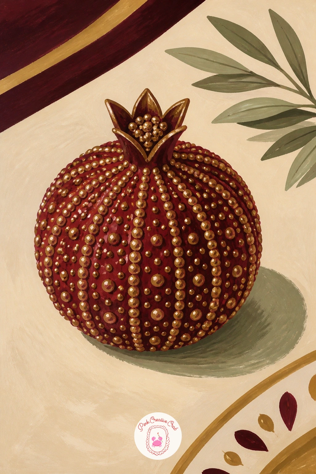
Zoom in tight on one small object next: a beaded pomegranate ornament sitting on a dinner table, a detail piece that is showing up in a lot of maximalist holiday styling this year. Pencil the pomegranate as a rounded shape with a small crown-like top, simpler than it sounds since it is really just a circle with a few short points.
Paint the body in deep berry red first, then once dry, cover it in small overlapping dots of a slightly darker red and a touch of brass gold to suggest the beaded surface, working from the top down so gravity-logical shadow builds naturally at the base. The dot spacing is where beginners rush: keep the dots closer together near the edges of the pomegranate’s curve and a little more spread in the center, which mimics how beads catch light differently across a rounded surface.
Paint the small table surface beneath it in cream with a soft grey shadow directly under the ornament. No brass gold on hand, a dry gold gel pen over the dry red dots adds the same sparkle.
Keep the whole ornament smaller than a tennis ball in scale against the table, so it reads as a precious little object rather than a prop.
You Will Need
- fine round brush for beaded dots
- deep red gouache
- brass gold gouache or gold gel pen
- cream gouache for table
Palette: Deep Berry Red,Brass Gold,Cream,Soft Grey
A gold gel pen over dry gouache adds crisp highlight dots that gouache alone cannot match, useful for any beaded ornament in this set.
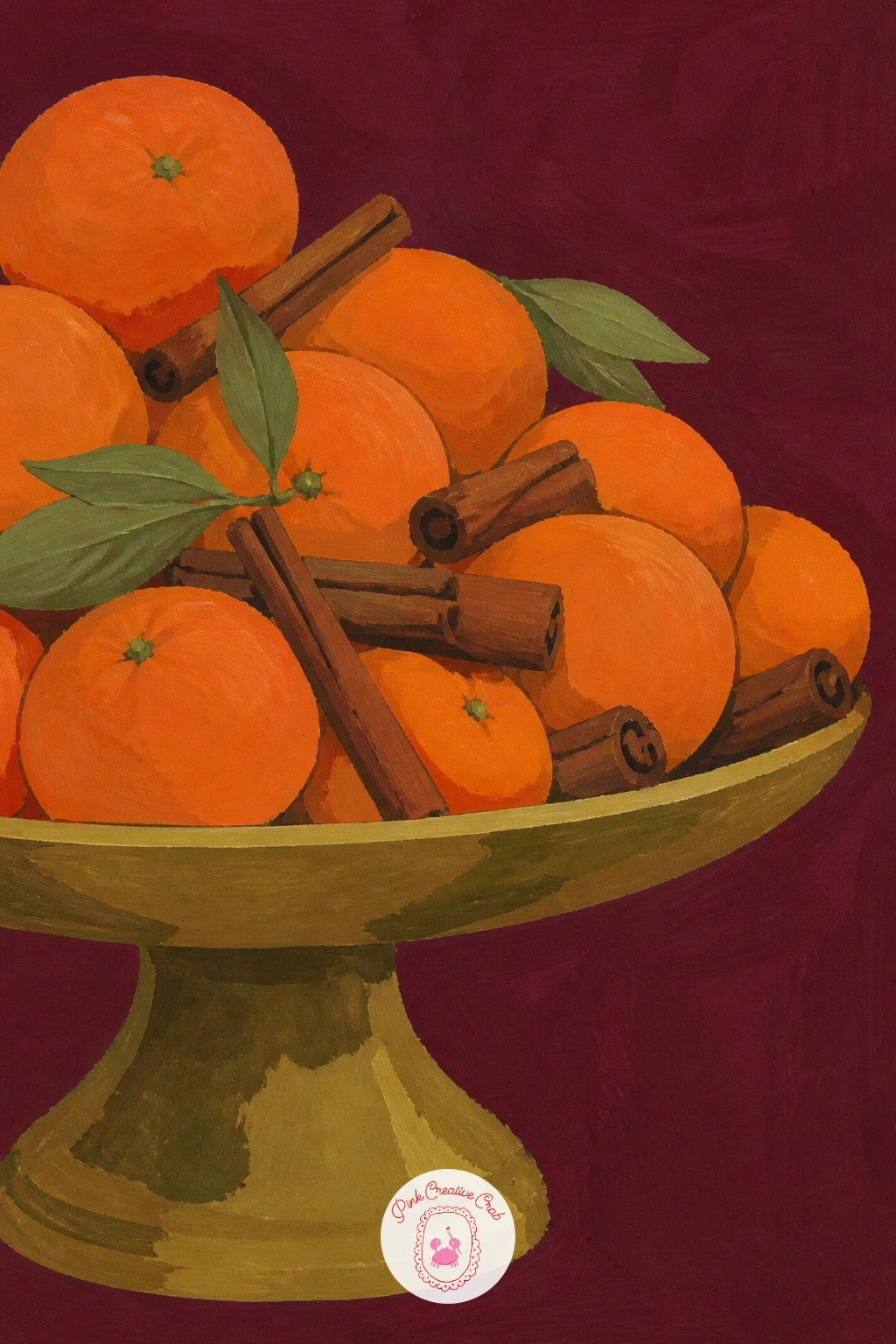
Move from one ornament to a full cake stand piled with clementines and cinnamon sticks, a styling trick that turns ordinary fruit into a holiday centerpiece. Pencil the stand first as a simple pedestal shape, then pile six or seven overlapping circles on top for the clementines, tucking a few cinnamon sticks between them at angles.
Paint the clementines in warm orange with a slightly darker orange shadow where each one overlaps its neighbor, since overlapping shadows are what sell a pile rather than a flat row of circles. The cinnamon sticks go in next as thin curled brown shapes with a lighter tan line down the center of each, painted after the fruit so they sit convincingly on top.
Paint the cake stand itself in brass gold last, with a single curved highlight stroke left unpainted along its edge to suggest shine. Out of real clementine orange, cadmium orange mixed with a touch of red gets close.
Keep the whole pile asymmetrical, with more fruit on one side than the other, so it looks freshly arranged rather than stacked by ruler.
You Will Need
- round brush size 6
- orange gouache
- brown gouache for cinnamon
- brass gouache for the stand
Palette: Warm Orange,Shadow Orange,Brown,Brass Gold
Tuck a sprig of sage or bay leaf between the fruit for a pop of green, a small trick stylists use to keep an all-orange pile from looking flat.
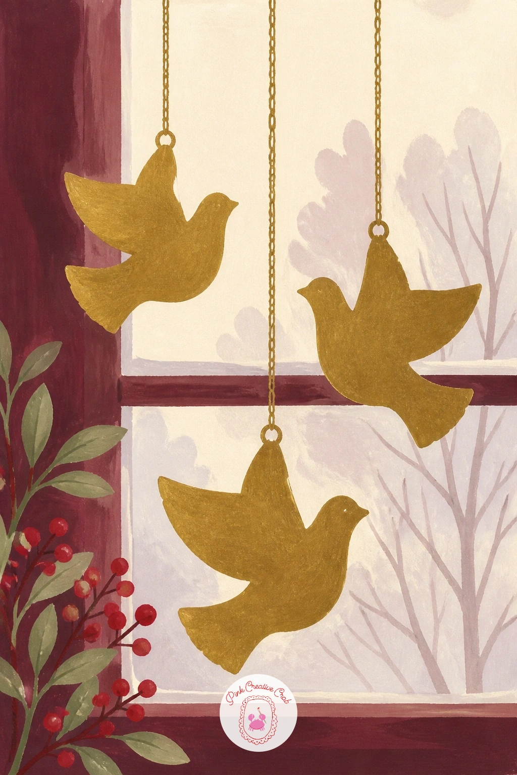
Shift to something more linear with metal dove ornaments hanging from a window, a minimalist shape that is popular in a lot of Scandi-style holiday displays now. Pencil a simple dove silhouette first, a curved body and one raised wing, then repeat it twice more at different heights on thin hanging threads.
Paint each dove in flat brass gold with no inner detail beyond the wing line, keeping the shapes as clean silhouettes rather than realistic birds, since the whole appeal of this ornament is its simple cut-metal look. Decide where your light comes from before you add any shading: a soft shadow cast on the window glass just below and to one side of each dove, in a pale grey-blue, makes them feel like they are really hanging in front of light rather than pasted flat on the page.
Paint the window frame and a hint of pale winter sky last, using a dry brush for a soft cloudy texture behind the doves. No brass gold available, a mix of ochre and a touch of white works as a stand-in.
Vary each dove’s wing angle slightly so the three together feel like a flock rather than three copies of one shape.
You Will Need
- fine round brush for silhouettes
- brass gold gouache
- pale grey-blue gouache for shadow
- dry brush for sky texture
Palette: Brass Gold,Pale Winter Sky,Grey Blue Shadow,Cream
Try hanging the doves at uneven heights rather than a straight row, which keeps the window feeling candid rather than overly staged.
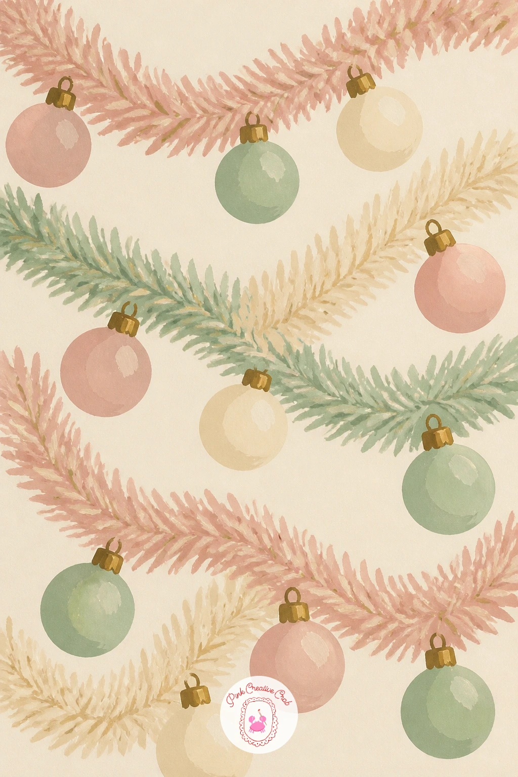
Soften the palette for a moment with a pastel tinsel bauble garland, the fluffy, candy-colored trend that is replacing classic silver tinsel in a lot of modern holiday decor. Pencil a loose looping line across the page first, then hang four or five round baubles along it at uneven intervals, each wrapped in a soft fuzzy halo.
Paint the baubles first in soft pastel tones, a dusty pink, pale mint and cream, keeping each one a flat circle, then once dry, add the tinsel halo around each with short choppy dry-brush strokes radiating outward so the fuzzy texture reads without needing hundreds of tiny lines. This is the quick version: in about ten minutes you can stop here with three baubles and a simple string. Given forty minutes, add a soft colored glow behind each bauble in a lighter wash of its own color, which makes the whole garland feel like it is lit from within.
Paint the hanging string last in a thin grey line connecting every bauble. No pastel gouache mixed yet, add white to any of your main colors until it lightens by about half.
Let a few tinsel strands droop slightly below the string’s main line for a soft, unruly look rather than a stiff garland.
You Will Need
- dry brush for tinsel texture
- dusty pink, mint and cream gouache
- thin grey liner for string
Palette: Dusty Pink,Pale Mint,Cream,Soft Grey
Try an all-pink or all-mint version next time instead of mixing three pastels, since a single soft color reads as even more modern and calm.
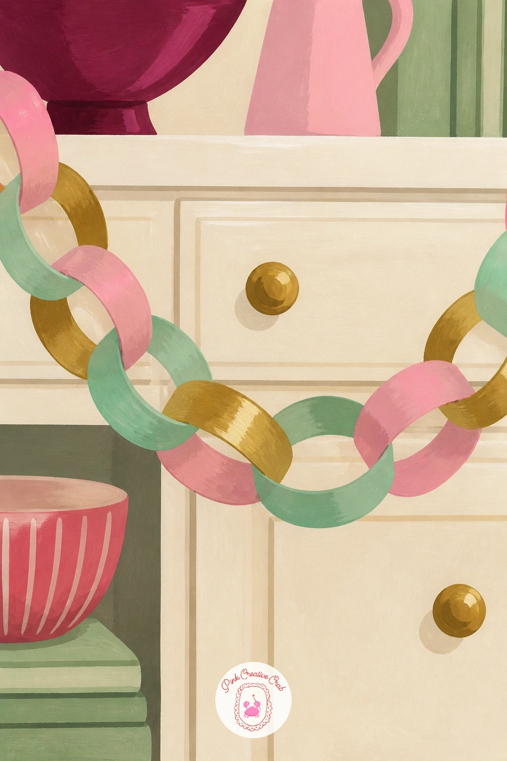
Carry that candy palette into a kitchen next with a paper chain strung across the top of a window or cabinet, a nostalgic craft-store favorite redone in a brighter, more grown-up palette this year. Pencil a gentle swag line first, then draw interlocking loop shapes along it, like a simple chain of paper rings.
Paint alternating loops in candy pink, mint and brass gold, letting each ring overlap the one before it so the chain reads as continuous rather than a row of separate ovals. Beginners often paint every loop the same flat color all the way around: leave a thin sliver of white paper showing where one loop overlaps the next, which does the job of suggesting depth without any real shading.
Paint a soft hint of a kitchen cabinet or window frame behind the chain in pale cream, kept simple and flat so the colorful chain stays the focus. Out of three bright paper-chain colors, two alternating colors still reads as a cheerful chain.
Keep the swag of the chain gentle rather than a tight zigzag, closer to how a real paper chain sags under its own weight.
You Will Need
- round brush size 4
- candy pink, mint and brass gouache
- cream gouache for background
Palette: Candy Pink,Mint,Brass Gold,Cream
Pin up a reference photo of a real paper chain before you paint, since the overlap pattern is easy to get backwards on the first try.
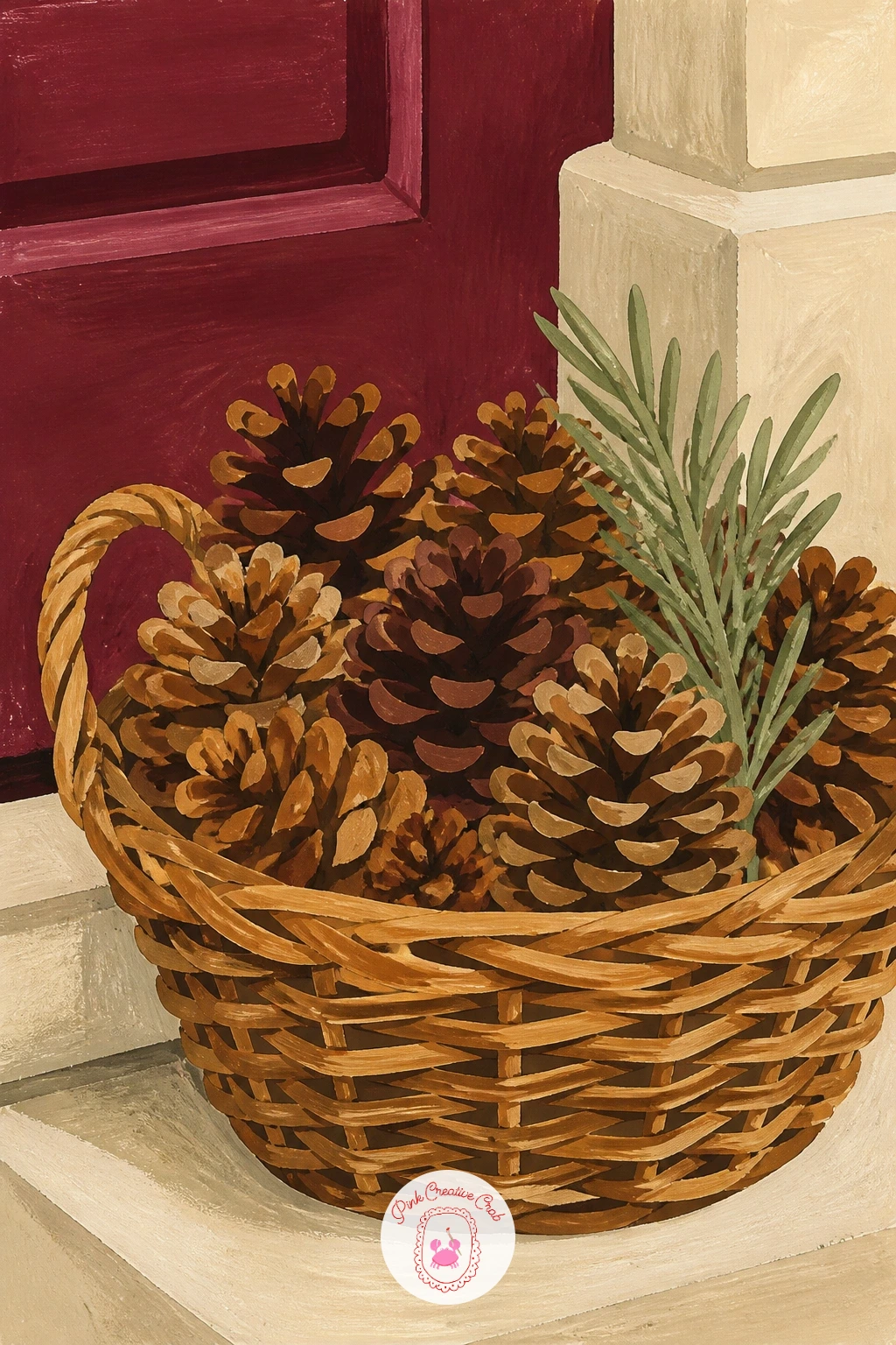
Bring in some texture from outside with a basket of pine cones by the door, a simple, natural touch that grounds a lot of the more polished looks in this list. Pencil a woven basket shape first, then pile four or five pine cones inside it, overlapping so the pile feels full rather than sparse.
Paint the basket in warm brown with thin darker lines suggesting the woven texture, then paint the pine cones in layered brown and ochre, working from the shadowed underside of the pile upward toward the lighter, highlighted tops. The edge trick for this one: once the base brown layer is dry, use a dry brush loaded with a lighter tan to flick small upward strokes across each cone, which reads instantly as the rough, scaled texture of a real pine cone without drawing every scale.
Paint the floor or doorstep beneath the basket in a soft cream shadow last. No ochre on hand, yellow mixed with a touch of brown gets the same warm tone.
Tuck one small sprig of pine between the cones for a bit of green against all that brown.
You Will Need
- dry brush for pine cone texture
- brown and ochre gouache
- cream gouache for floor shadow
Palette: Warm Brown,Ochre,Tan Highlight,Cream
Add one or two acorns or a sprig of red berries among the cones for color variety, a detail real holiday baskets almost always include.
Settle into the living room with a teddy fur cushion and a red striped throw on a sofa, the cozy textile pairing that is everywhere in holiday home catalogues this year. Pencil the sofa arm and cushion shape first, then drape the striped throw loosely over it, following its folds rather than a flat rectangle.
Paint the cushion in cream first, then once dry, stipple small soft dots and short curved strokes all over it in a slightly darker cream to suggest the bumpy texture of teddy fur, keeping the strokes short and random rather than a repeating pattern. Compare the cushion’s size to the sofa arm before you commit: a cushion that is roughly two-thirds the height of the visible sofa arm reads as a real cushion rather than a floating shape.
Paint the throw in alternating bands of red and cream, letting the stripes bend slightly where the fabric folds over the cushion’s edge instead of staying perfectly straight. Out of two throw colors, burgundy and cream stripes work just as well as red and cream.
Finish with a soft grey shadow where the cushion meets the sofa arm, to ground it in place.
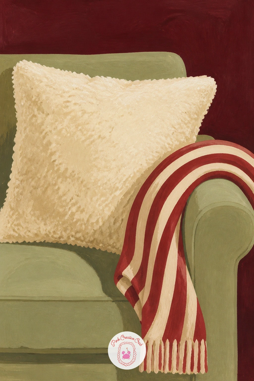
You Will Need
- round brush for stippling texture
- cream gouache
- red or burgundy gouache for stripes
- soft grey gouache
Palette: Cream,Darker Cream,Red,Soft Grey
Try the same fur texture technique on a small round cushion in a second painting, since the bumpy stipple trick works on any rounded shape.
Trade the soft textures for something sparer next: a glass vase of bare branches tied with tiny bows, a minimalist centerpiece that is popular with decorators who want less clutter this season. Pencil a simple tall vase shape first, then let three or four thin branches rise up and out of it at varied angles, crossing slightly near the base.
Paint the branches in a dry-brush technique, dragging a nearly dry brush loaded with brown along each pencil line so the mark comes out broken and twiggy rather than one smooth stroke. Tie one or two tiny bows along the branches in berry red, painted as a simple double-loop knot no bigger than a fingernail, since oversized bows on thin branches look wrong at this scale.
Paint the glass vase last in a very pale blue-grey wash, leaving a few unpainted streaks of white paper to suggest glass catching light. No brown gouache on hand, mix burnt sienna with a touch of black for a similar twiggy tone.
Keep the branches crossing at varied angles rather than a neat fan, which reads as more natural and less like a store display.
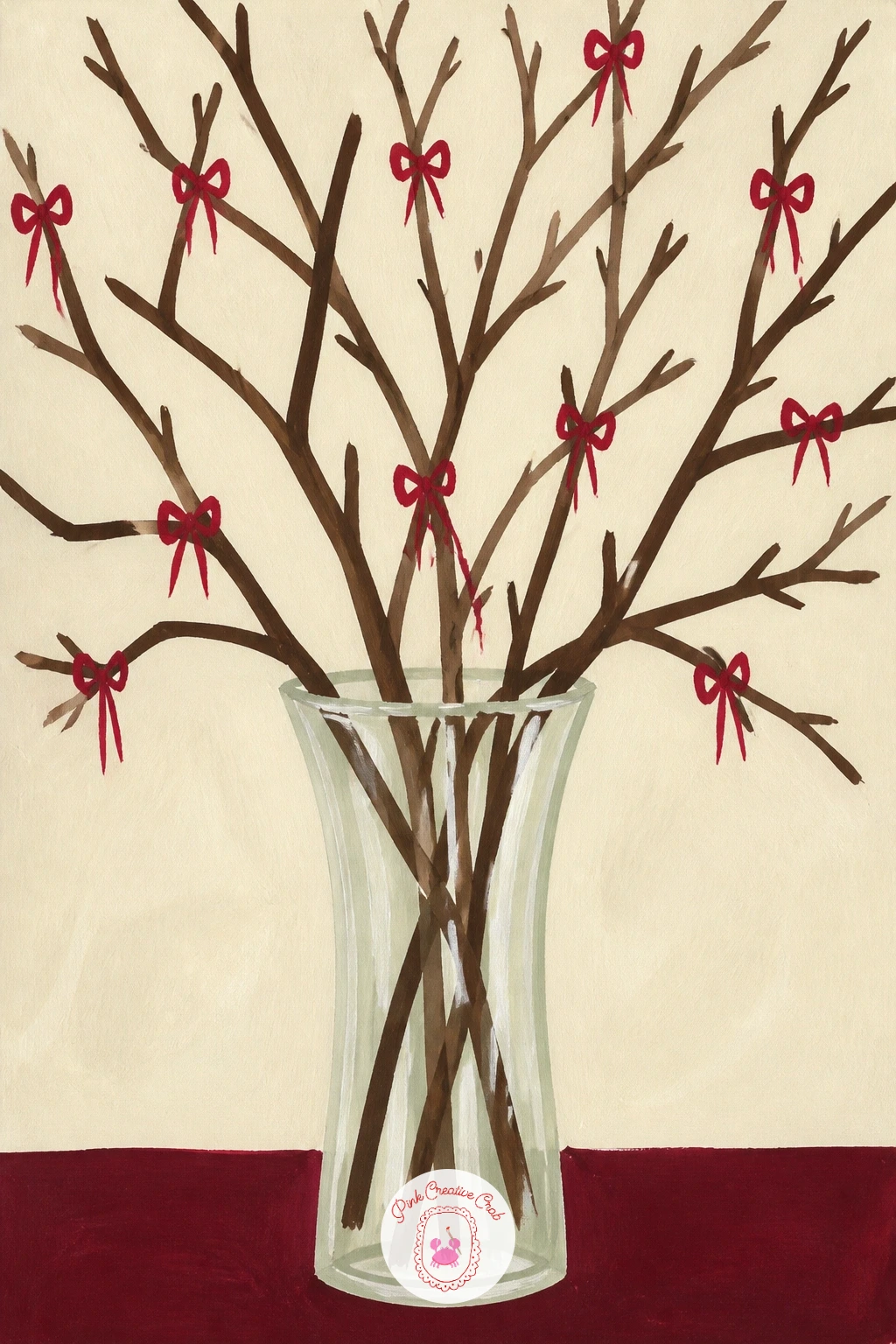
You Will Need
- dry brush for branch texture
- brown gouache
- berry red gouache for bows
- pale blue-grey gouache for glass
Palette: Brown,Berry Red,Pale Blue Grey,White
Leave more white paper showing in the vase than feels right at first, since underpainting glass is almost always more convincing than overpainting it.
Return to the mantel for a fuller scene this time: a row of brass bells strung along velvet ribbon. Pencil a gentle swag of ribbon across the page first, then hang three or four bells from it at slightly different heights, each a simple rounded shape with a small loop at the top.
Paint the bells in flat brass gold, then once dry, add one darker gold stroke down one side of each bell and one lighter highlight stroke on the other, keeping the light direction consistent across every bell so the row reads as one lit scene rather than separate objects. Paint the velvet ribbon in deep burgundy, using the same dry-brush nap trick from the stocking earlier in this list, a darker burgundy dragged lightly in one direction over the dry base color.
Paint the mantel surface beneath in cream last, with a soft shadow cast by the lowest-hanging bell. Out of brass gold, a warm yellow ochre with a touch of brown stands in well.
Keep the ribbon’s swag loose and slightly uneven, since a perfectly symmetrical swag looks stiff against the softness of velvet.
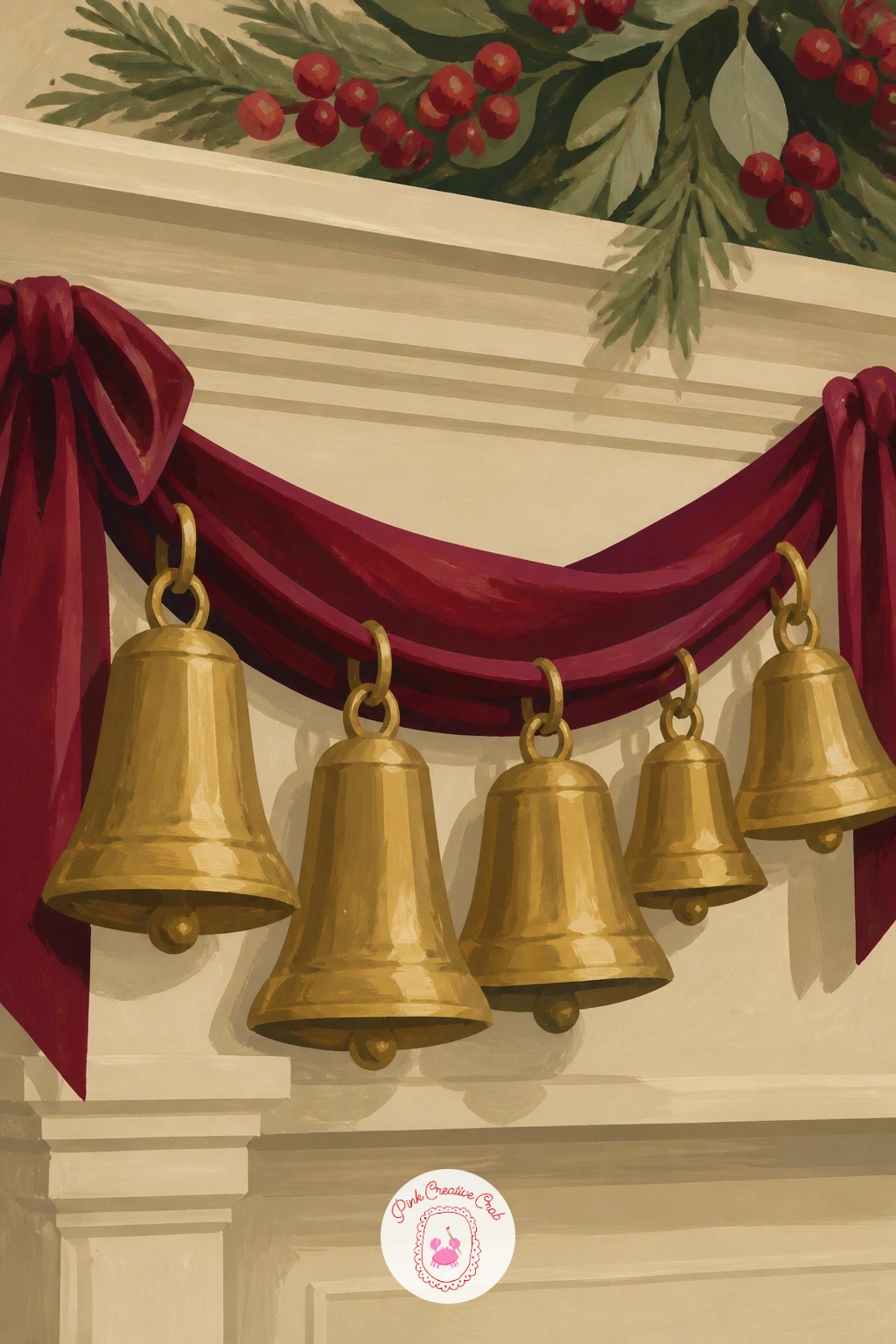
You Will Need
- fine round brush for bells
- brass gold gouache
- burgundy gouache
- dry brush for velvet texture
Palette: Brass Gold,Deep Brass,Burgundy,Cream
Add a sprig of pine tucked behind the ribbon at one end for a touch of green against all that warm gold and burgundy.
Add a little sparkle with a bar cart set up for the season, glasses and a bottle or two dressed in festive color. Pencil the cart’s simple frame first, two shelves on thin brass legs, then arrange three or four glasses and one bottle across the top shelf, varying their heights.
Paint the brass frame first in thin confident lines, then the glassware in pale washes of color, leaving bright unpainted streaks of white paper down one side of each glass to suggest glass catching light. The perspective trick here matters most: keep the cart’s shelves drawn with their back edge slightly higher and shorter than the front edge, which is what makes a flat rectangle read as a shelf seen at eye level rather than a floating box.
Paint one or two festive touches last, a sprig of greenery tucked beside the bottle or a small red ribbon around its neck. Out of a brass paint color, yellow ochre with a touch of white and brown mixes close enough.
Keep the glassware loosely painted rather than highly detailed, since a looser touch here reads as sparkling rather than stiff.
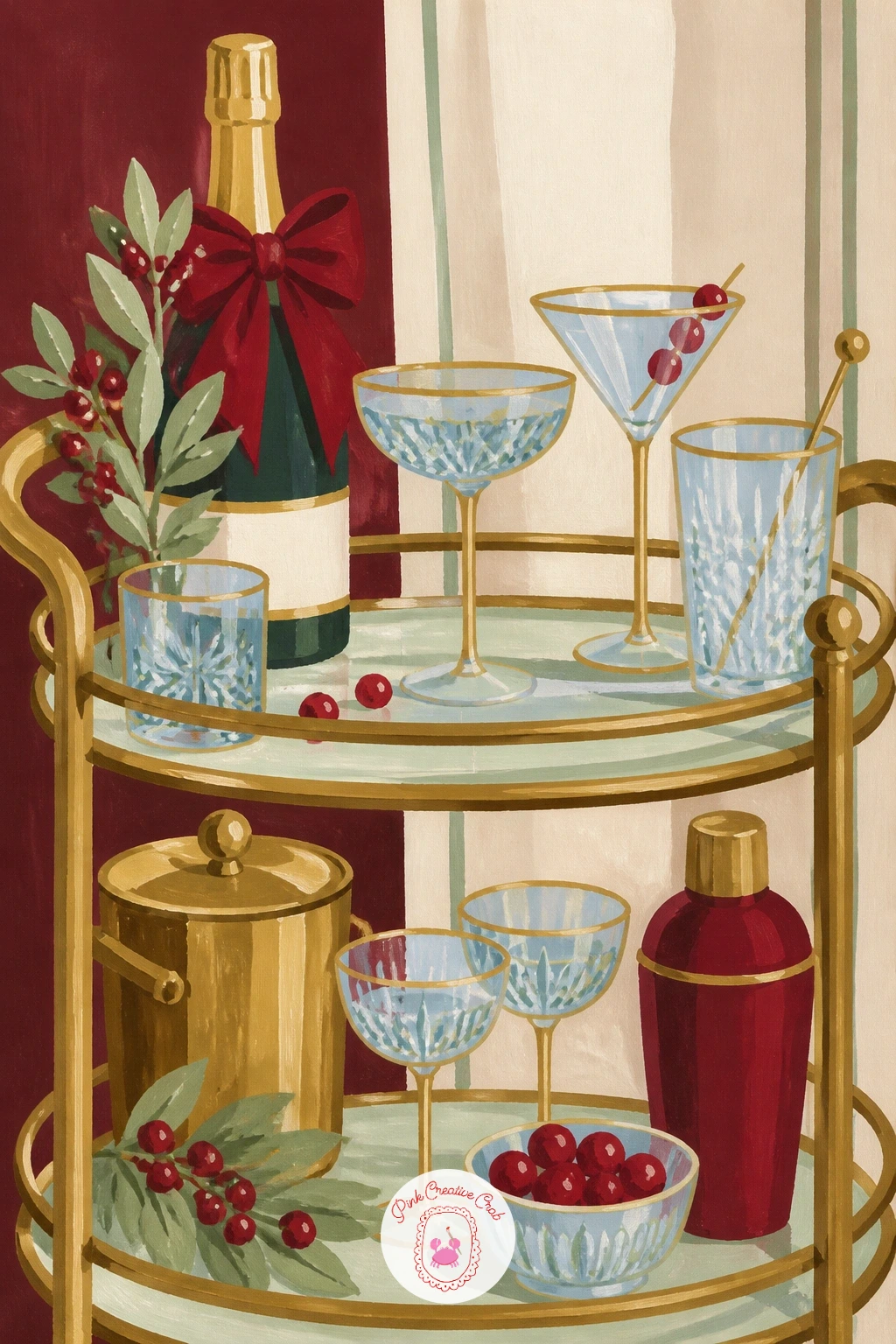
You Will Need
- ruler for cart perspective lines
- round brush for glassware
- brass gouache for frame
- pale color washes for glass
Palette: Brass Gold,Pale Blue,Berry Red,White
A single gold paint pen can add crisp rim highlights on the glassware once the gouache is fully dry, faster than trying to leave perfect white streaks.
Return to the mantel for a second stocking, this one in bold stripes finished with a single velvet bow at the cuff, a simpler cousin to the patchwork stocking earlier in this list. Pencil the stocking shape first, then mark even stripe bands down its length before any paint goes on.
Paint alternating stripes in burgundy and cream, letting each stripe follow the curve of the stocking rather than staying perfectly horizontal, since stripes on fabric always bend slightly around a form. Once dry, paint a single velvet bow at the cuff in sage or brass, using the dry-brush nap trick again, a darker shade of the same color dragged lightly over the bow shape to suggest velvet’s texture.
Check the stripe width against the stocking’s total length before you start: five or six stripes down the leg keeps the pattern readable rather than busy. Out of burgundy gouache, a deep red mixed with a touch of brown works as a near match.
Finish with a thin brass hanging loop at the top, painted last so it sits crisply over the stripes.
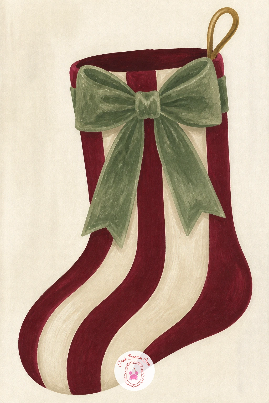
You Will Need
- ruler for stripe spacing
- burgundy and cream gouache
- sage or brass gouache for the bow
- dry brush for velvet texture
Palette: Burgundy,Cream,Sage Green,Brass Gold
Hang two or three of these stockings side by side in a wider painting if you want a fuller mantel scene instead of one single stocking.
Sit a small wooden house ornament on a shelf next, the simple carved-looking decoration that pairs well with the folk ornaments earlier in this list. Pencil a basic house shape first, a square body and a triangle roof, then add one tiny window and a door before any paint goes on.
Paint the body in warm cream and the roof in a deeper brown, keeping both shapes completely flat with no shading, since the charm of this ornament is its simple, almost toy-like construction. The detail trick is restraint: one small window painted in pale blue-grey and a thin brass door are enough, extra windows or added trim start to clutter a shape this small.
Paint the shelf beneath it in sage or cream last, with a soft shadow cast to one side to ground the house in place. Out of brown gouache for the roof, mix burnt sienna with a touch of black for the same deep tone.
Stand the house slightly off-center on its shelf rather than dead middle, next to a small sprig of greenery for scale.
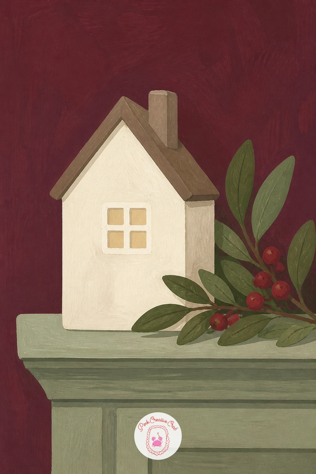
You Will Need
- fine round brush
- cream and brown gouache
- pale blue-grey gouache for the window
- sage gouache for shelf
Palette: Cream,Brown,Pale Blue Grey,Sage Green
Paint a tiny row of three houses in different sizes next time instead of one, since miniature house collections are a common styling trick on shelves.
Paint a full tree for the first time in this list, dressed in nothing but gold and cream baubles, the restrained monochrome look a lot of designers favor over a busy, multicolor tree. Pencil a simple triangular tree shape first, then scatter eight or ten small circles across it for baubles, varying their size slightly.
Paint the tree itself in sage green with short upward dry-brush strokes to suggest individual branches, then once dry, paint the baubles in alternating brass gold and cream, each with one tiny unpainted highlight dot left as bare paper. Decide on one light source before adding any highlights: keep every bauble’s bright dot on the same side (say, upper left), which is what makes a whole tree of plain circles read as lit rather than flat.
Paint a simple brass star or topper last, smaller than you expect, at the very peak. Out of brass gold, ochre mixed with a touch of white stands in well.
Leave a few branch tips completely free of baubles, since real trees are never decorated with perfectly even spacing.
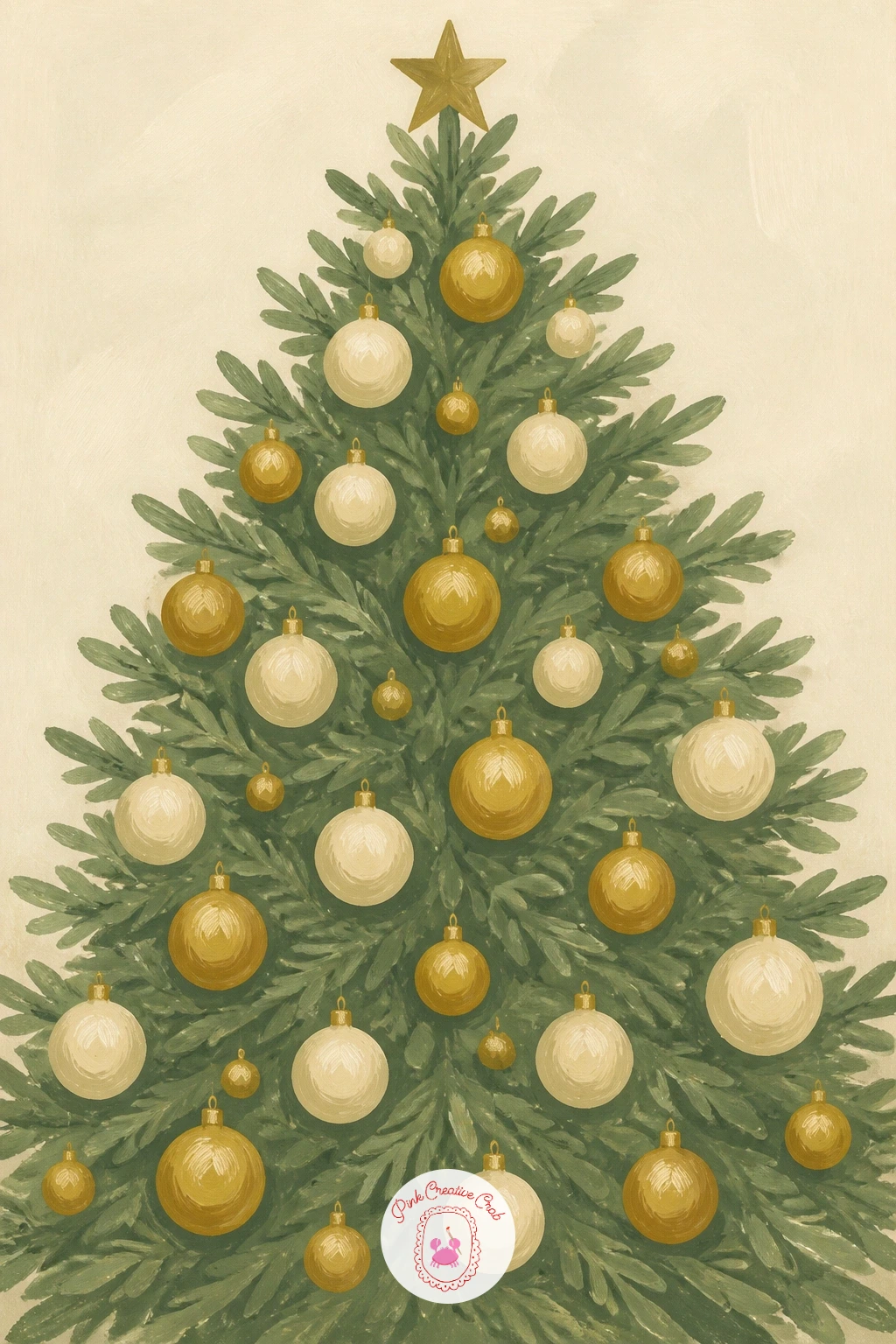
You Will Need
- dry brush for branch texture
- sage green gouache
- brass gold and cream gouache
- fine brush for highlight dots
Palette: Sage Green,Brass Gold,Cream,Deep Sage Shadow
Try an all-cream tree with only ribbon in one color for a second version, since a single-color tree is the quieter, more modern cousin of this look.
Return to the frosted fruit trend, this time strung into a full garland across a table rather than piled in a bowl, a decadent finishing touch for a holiday spread. Pencil a gentle swagging line first, then thread five or six small fruits, berries and leaves along it, overlapping slightly as they would on real garland wire.
Paint the fruits in warm red and ochre first, then once dry, add the frosted sugar texture with uneven white stippling, heavier near each fruit’s edge, the same technique used for the sugared pears and apples earlier in this list. Compare this garland’s scale to the table edge before you paint the final layout: the garland should run the full visible width of the table with a gentle dip in the middle, not a straight taut line.
Paint a few sage leaves tucked between the fruits last, in loose single strokes rather than detailed leaf shapes. Out of true red gouache, alizarin crimson stands in just as well.
Let the garland’s middle sag lower than its ends, matching real garland hung from two points.
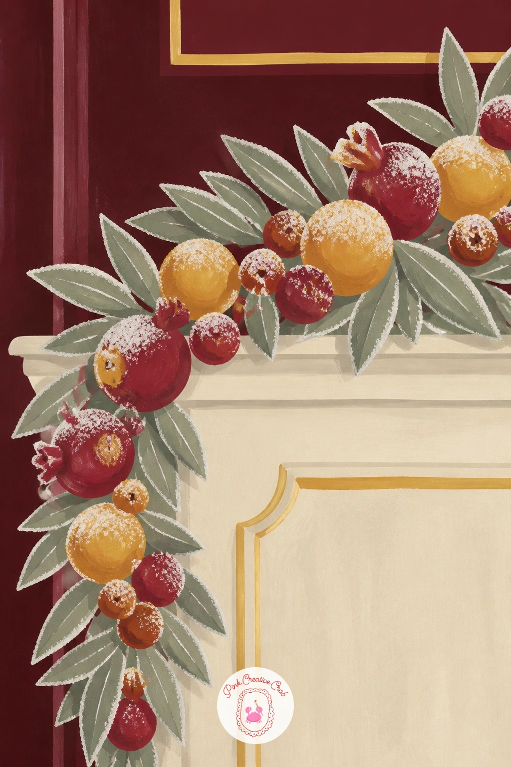
You Will Need
- round brush size 4
- red and ochre gouache
- white gouache for frosting
- sage gouache for leaves
Palette: Warm Red,Ochre,White,Sage Green
Add one or two small pine cones along the garland for textural contrast against all that smooth, frosted fruit.
Switch gears to an advent calendar made of little paper bags pinned in a grid, a handmade-looking alternative to the boxed calendars in stores this year. Pencil a simple grid of twenty-four small bag shapes first, keeping the rows even but letting the bags themselves sit at slightly different heights for a relaxed, handmade feel.
Paint the bags in alternating cream, sage and berry red, varying the color pattern so no two touching bags share a color, then fold the top of each bag down with one simple diagonal line before any numbers go on. The common misstep is painting all twenty-four numbers in identical straight digits: vary the numbers slightly in size and slant, since real hand-written advent numbers are rarely perfectly uniform.
Paint a thin string or ribbon running behind the bags last, just visible between them, to suggest how they are all hung in place. Out of three bag colors, two still reads as a cheerful calendar.
Keep the whole grid loose rather than a stiff ruler-straight arrangement, which suits the handmade mood of this piece.

You Will Need
- ruler for the initial grid
- cream, sage and berry red gouache
- fine brush or pen for numbers
Palette: Cream,Sage Green,Berry Red,Brown
If painting all twenty-four bags feels like too much for one sitting, paint a single row of six as a smaller standalone piece instead.
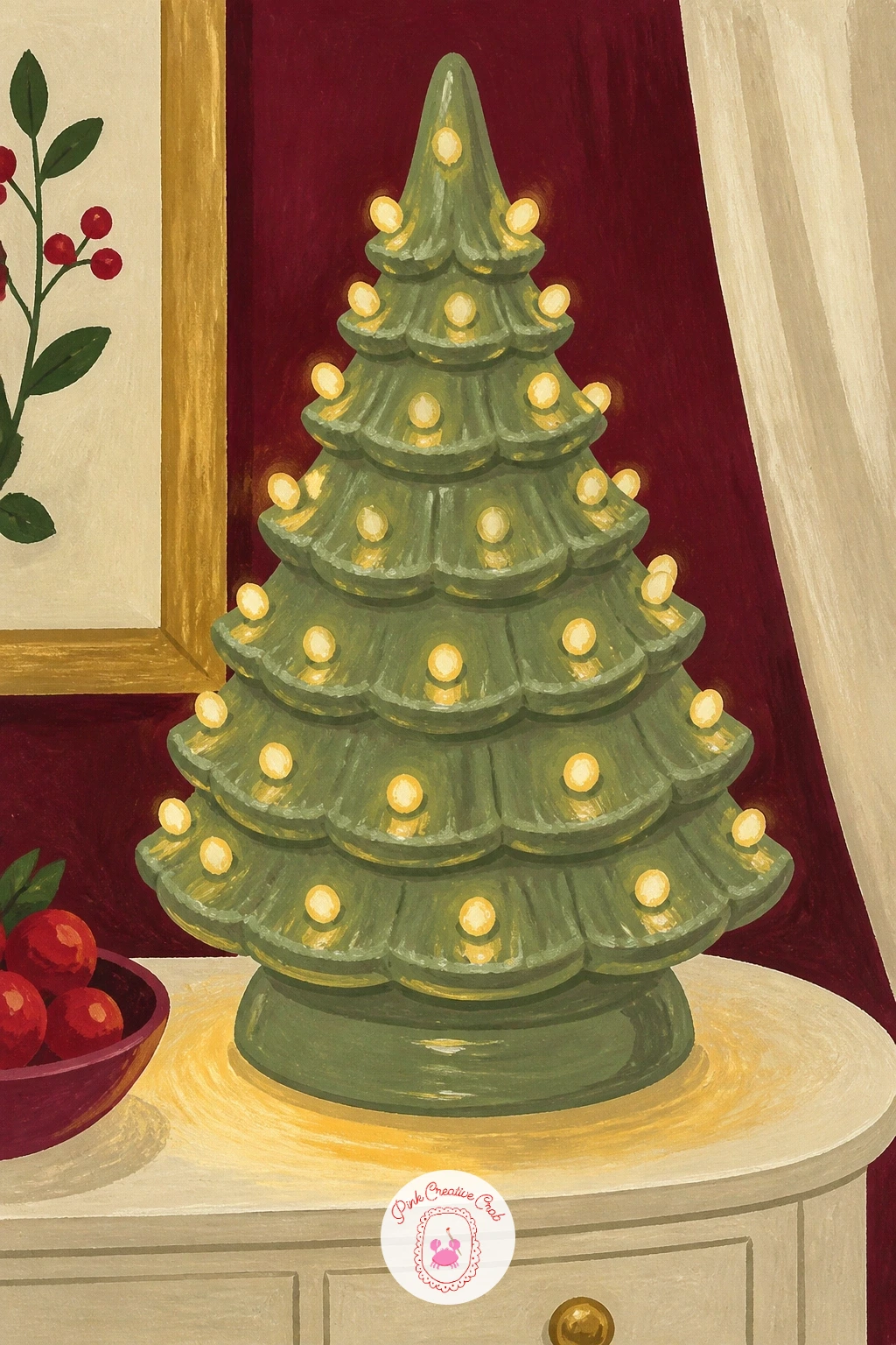
Bring back a nostalgic favorite with the ceramic Christmas tree, lit from within, glowing on a side table, a vintage shape that keeps returning to shelves every year in updated colors. Pencil a simple cone-shaped tree first, with small drilled-looking holes dotted across it for the lights to shine through.
Paint the tree body in sage green, then once dry, dot small circles of warm yellow and white at each light hole, leaving a soft halo of lighter green painted around each dot so the glow looks like it is coming from inside the ceramic rather than sitting on top. This is the quick version: ten minutes gets you the tree and its glowing dots. With forty minutes, add a soft warm glow cast onto the table surface beneath it, which sells the idea of real light in the room.
Paint the side table last in cream with that warm glow patch beneath the tree. No sage gouache mixed, any green with a touch of yellow added gets close enough.
Keep the glow dots slightly irregular in size, since uniform dots read as a printed pattern rather than real light.
You Will Need
- fine round brush for light dots
- sage green gouache
- warm yellow and white gouache
- cream gouache for table
Palette: Sage Green,Warm Yellow,White,Cream
Look at a real vintage ceramic tree online for the irregular hole spacing, which is part of what makes this shape feel charmingly handmade.
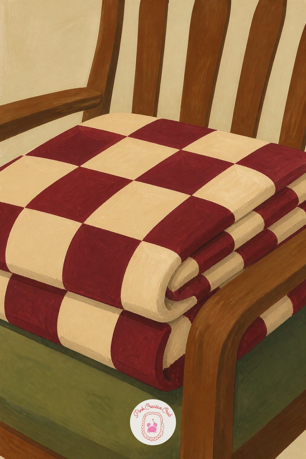
Rest for a moment on a simple checkered throw folded over the arm of a chair, a quiet textile piece that fills in the gaps between the busier vignettes in this list. Pencil a soft rectangular throw shape first, folded roughly in thirds, then mark an even checkerboard grid across the visible folds.
Paint the base color in cream first, then once dry, paint alternating squares in burgundy across the grid, letting the squares bend and compress slightly where the fabric folds over an edge, rather than staying perfectly even throughout. Beginners often keep every square the same size even across a fold: shrink the squares nearer each fold line slightly, which is how real checkered fabric behaves when it bends.
Paint the chair arm beneath the throw last, in a simple warm wood tone, with just enough showing at the edges to suggest the throw is actually draped over furniture. Out of burgundy gouache, alizarin crimson with a touch of black makes a close substitute.
Keep the fold lines soft and a little irregular, since a too-crisp fold looks pressed rather than cozy.
You Will Need
- ruler for the base grid
- cream and burgundy gouache
- warm brown gouache for the chair
Palette: Cream,Burgundy,Warm Brown,Soft Shadow
Try a smaller gingham check instead of large squares for a second version, since checkered textiles this year range from tiny to oversized.
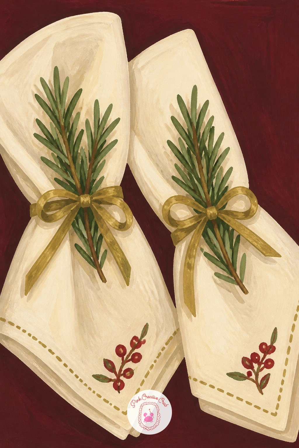
Return to the table for a quieter detail: embroidered napkins tied with a sprig of rosemary, a simple natural touch that is replacing printed napkin rings this season. Pencil two folded napkin shapes first, stacked or side by side, then tie a thin ribbon and a small rosemary sprig around the center of each.
Paint the napkins in cream, then once dry, add a small embroidered motif in one corner, a simple berry sprig or tiny star worked in just a few short stitches of berry red or sage thread color. The rosemary sprig is where the extra texture trick comes in: use the tip of a dry brush to flick tiny short needle-like strokes outward from a thin central stem, which reads as rosemary far better than trying to paint each needle individually.
Paint the ribbon tie last in a thin brass or cream line wrapped twice around the napkin’s center. Out of embroidery thread colors to reference, pick any two from your main palette and keep the stitched motif small.
Keep the embroidered detail in one corner only, rather than covering the whole napkin, so it still reads as a napkin rather than a patterned fabric swatch.
You Will Need
- fine brush for embroidery detail
- dry brush for rosemary texture
- cream gouache
- berry red or sage gouache for the motif
Palette: Cream,Berry Red,Sage Green,Brass Gold
Reference a real embroidered napkin pattern before painting the stitched motif, since even a tiny simplified version benefits from a real stitch direction.
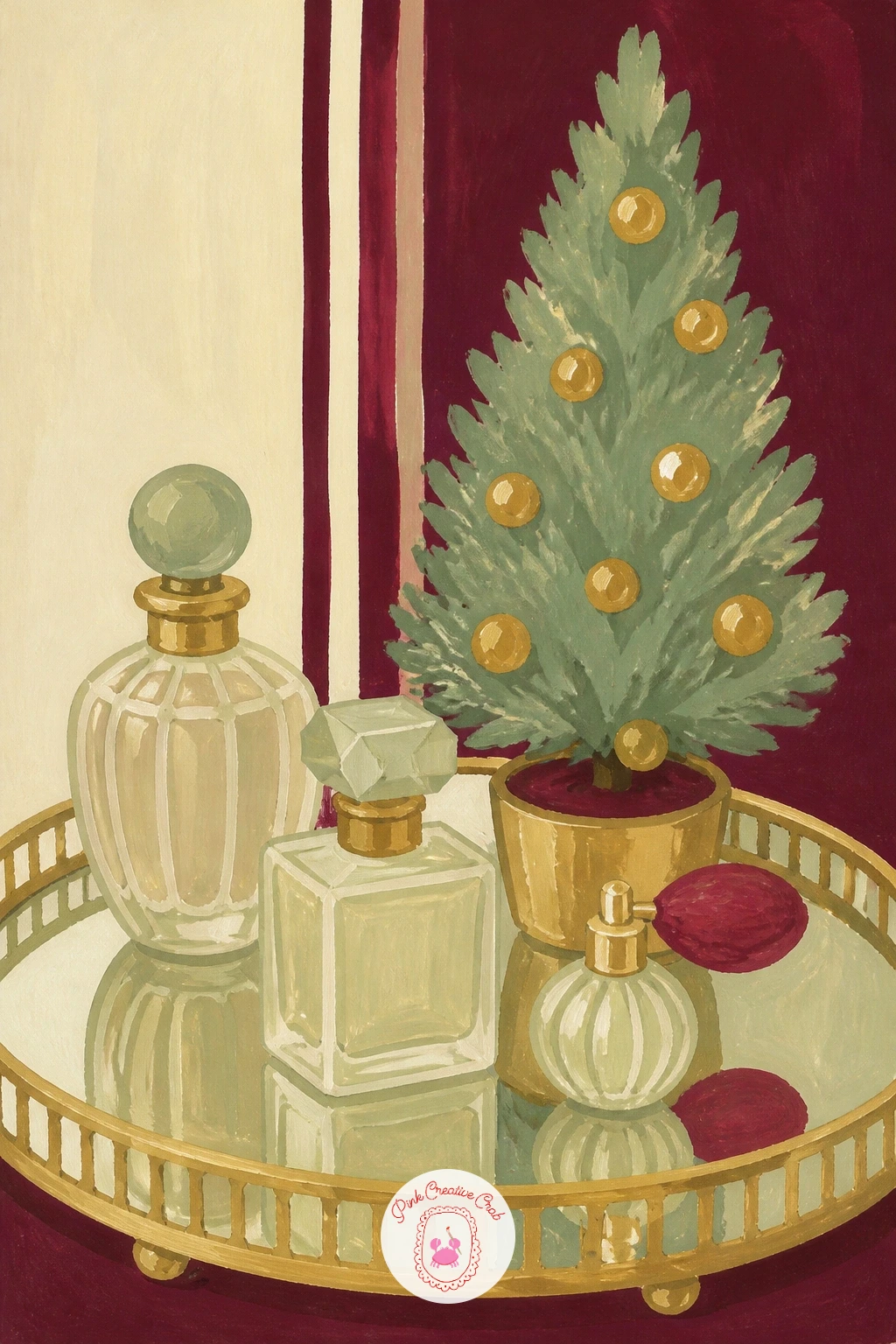
Step into the bedroom with a mirrored tray holding a few perfume bottles and a tiny tabletop tree, a vanity vignette that is popular in a lot of cozy bedroom styling content. Pencil the tray as a simple rectangle with soft reflective edges first, then arrange two or three perfume bottles of different shapes on it, along with one small potted tree.
Paint the bottles in pale washes of color with a thin unpainted streak of white paper down one side of each, exactly as with the bar cart glassware earlier in this list, since the same glass highlight trick applies to any bottle shape. Paint the mirrored tray surface in a soft grey-blue with faint, blurred reflections of the bottles painted directly beneath them, kept loose and soft-edged rather than sharply mirrored.
Paint the tiny tree in sage last, with two or three small gold dot baubles, scaled deliberately small so it reads as a miniature rather than a full-size tree shrunk down incorrectly. Out of grey-blue for the tray, mix a touch of blue into your white or cream.
Keep every reflection a blurred echo of its object rather than a precise mirror image, which is both easier to paint and more convincing.
You Will Need
- round brush for bottles
- pale color washes
- grey-blue gouache for the tray
- sage and gold gouache for the tree
Palette: Pale Blue,Grey Blue,Sage Green,Brass Gold
Keep the perfume bottle shapes simple, a rounded square and a tall cylinder are enough variety without needing to paint any labels.
Add a playful note with a tiered stand of holiday sweets set on a pink table, a dessert-table styling trend that leans brighter than the burgundy and brass elsewhere in this list. Pencil a simple two or three tier stand first, then pile small round sweets, candies and mini meringues across each level, more on the bottom tier than the top.
Paint the stand in brass gold, then the sweets in a cheerful mix of berry red, cream and soft pink, keeping each piece a simple rounded shape without too much individual detail. Compare each tier’s width to the one below it before you paint: the top tier should be roughly half the width of the bottom one, which is what makes the stand read as properly tiered rather than three same-sized plates stacked oddly.
Paint the pink tabletop last, in a soft blush wash, with a gentle shadow cast beneath the stand’s base. Out of several candy colors, two alternating tones of pink and cream still reads as a full dessert spread.
Leave a few sweets slightly overlapping the tier edges, since a too-tidy pile looks staged rather than enjoyed.
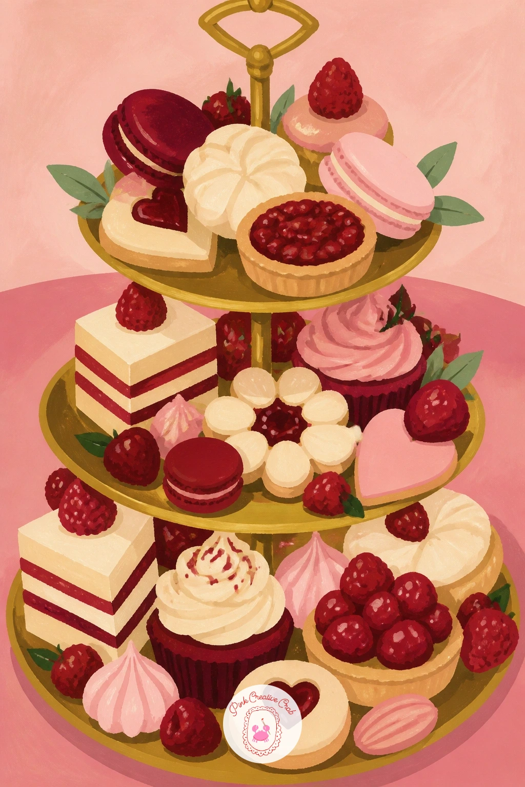
You Will Need
- round brush for small shapes
- brass gold gouache
- berry red, cream and pink gouache
- soft pink gouache for the table
Palette: Brass Gold,Berry Red,Soft Pink,Cream
Pair this pink palette with a single gold cake topper or candle for height, which keeps a wide, low stand from reading as flat.
Widen the scene into a full hallway next, with garland wound along a staircase banister, a classic holiday entrance that still anchors a lot of home tours this year. Pencil the banister as a diagonal line rising across the page first, then wind a thick garland shape along it in loose loops rather than a tight, even wrap.
Paint the garland in sage green with short dry-brush strokes for needle texture, then tuck in small berry red berries and a few brass gold bows at intervals along its length, painted after the greenery is fully dry. The perspective trick for a hallway scene: keep the banister’s diagonal consistent with a single vanishing point feel, meaning the top of the stairs sits smaller and further back than the bottom, which gives the whole hallway real depth instead of looking flat.
Paint the wall and stair treads last in cream and a soft warm shadow tone. Out of brass gold for the bows, ochre with a touch of white stands in.
Keep the garland’s loops slightly uneven in size, which reads as hand-wound rather than machine-perfect.
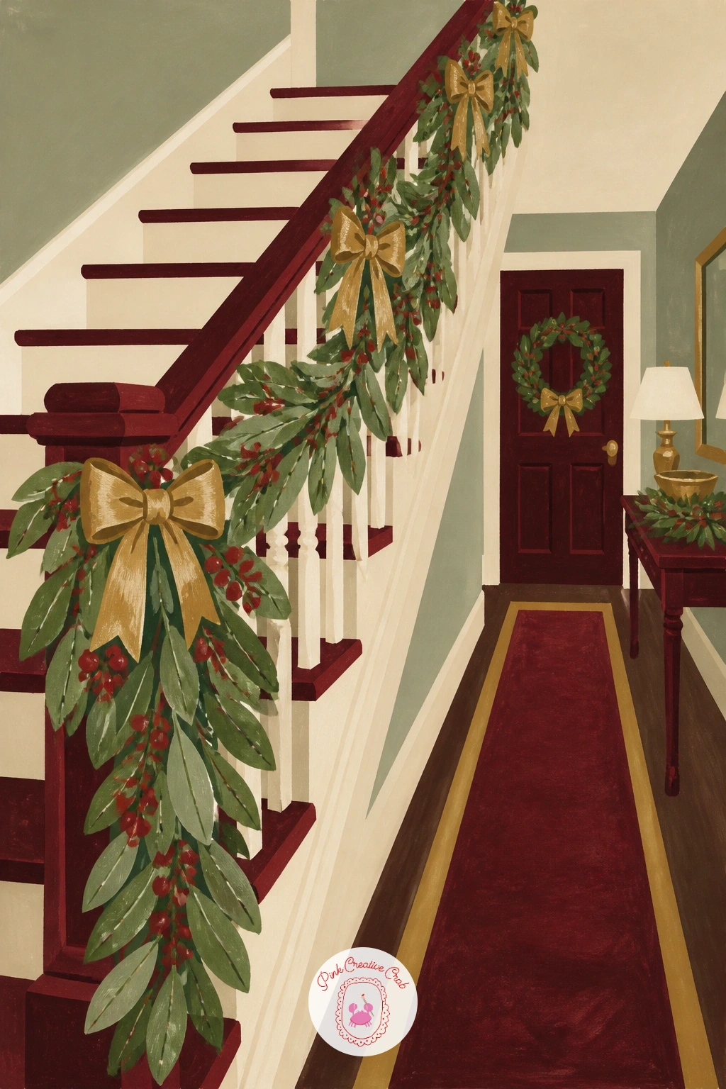
You Will Need
- ruler for the banister diagonal
- sage green gouache
- berry red and brass gouache
- cream gouache for walls
Palette: Sage Green,Berry Red,Brass Gold,Cream
If a full hallway feels like too much for one sitting, crop in tighter on just the banister’s lower third with a few steps for a simpler version.
Settle into a cozy bedroom corner next, with a tiny tabletop tree strung in fairy lights, a soft, intimate scene compared to the grander hallway before it. Pencil a small tree shape on a nightstand or shelf first, then scatter a loose, looping line across it to map where the fairy lights will sit.
Paint the tree in sage green with upward dry-brush strokes for texture, then once dry, dot small warm yellow lights along the looping line you planned, leaving a faint soft halo of lighter green painted around each dot so the lights appear to glow rather than sit flat on the branches. This is the quick version: ten minutes covers the tree and its lights alone. With forty minutes, add a soft bed or headboard shape behind it and a warm lamp glow nearby, which turns the single tree into a full cozy bedroom corner.
Paint the nightstand or shelf last in warm wood tone beneath the tree. No sage gouache mixed, green with a touch of yellow gets close.
Keep the fairy light dots small and a little irregular in spacing, never a perfectly even string.
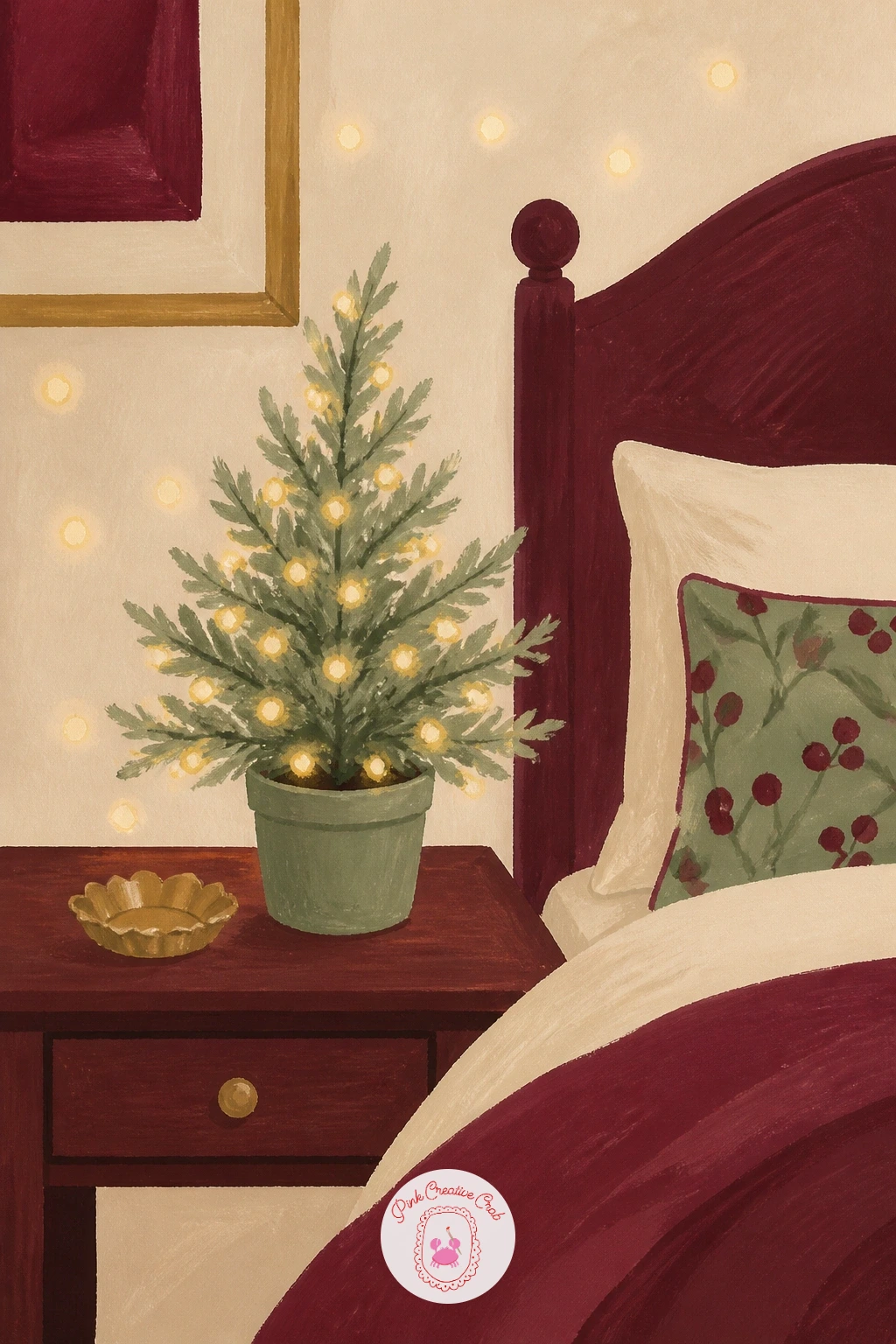
You Will Need
- fine brush for light dots
- sage green gouache
- warm yellow gouache
- warm brown gouache for furniture
Palette: Sage Green,Warm Yellow,Warm Brown,Cream
For a fuller cozy bedroom scene, see the layered interiors in this lesson, which build backgrounds in simple stages.
Simplify again with a small still life: a stack of coffee table books with one taper candle beside them, a quiet vignette that works well as a smaller, faster piece between the bigger scenes in this list. Pencil three or four stacked rectangles first, varying their width slightly, then add a single candle in a simple holder beside the stack.
Paint each book a different flat color from your palette, burgundy, sage and cream, leaving a thin unpainted line between each book to suggest where the covers meet. The proportion check here: compare the candle’s height to the book stack’s height before painting it in, since a candle roughly one and a half times the stack’s height reads as a natural, intentional pairing rather than a mismatched prop.
Paint the candle’s small flame last in warm yellow and white, with a soft glow wash around it. Out of three book colors, two still makes a convincing stack.
Keep the books slightly uneven in their stacking, with a small gap or tilt between two of them, since a too-perfect stack looks unused.
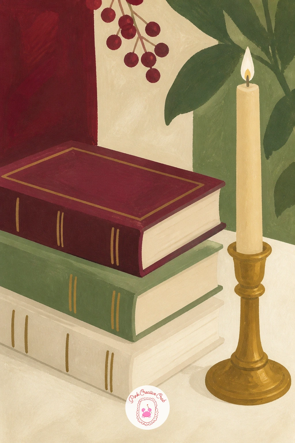
You Will Need
- round brush for flat book colors
- burgundy, sage and cream gouache
- warm yellow gouache for the candle flame
Palette: Burgundy,Sage Green,Cream,Warm Yellow
Letter a tiny title shape on one book spine with a fine white pen for extra realism, without needing to paint any readable text.
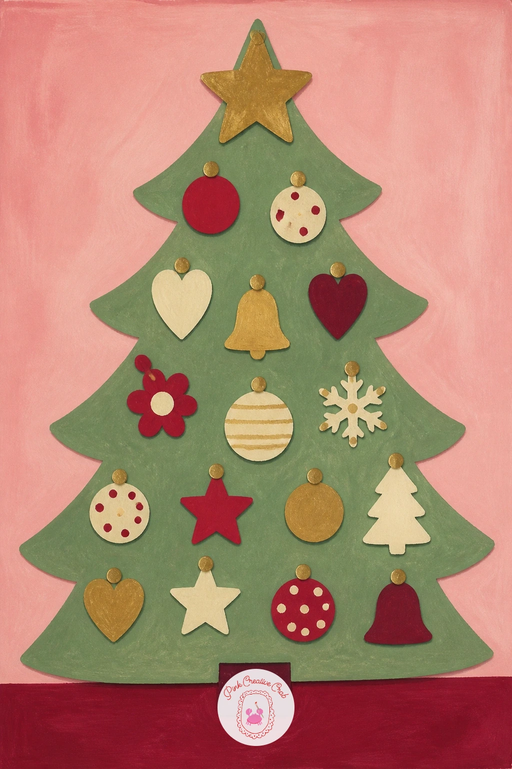
Visit a kids’ room next, decorated with a soft felt tree pinned to the wall, a safe, playful alternative to a real tree that is popular in nursery and kids’ room decor this year. Pencil a simple triangular tree shape first, flatter and more graphic than a real tree, since felt trees are usually pinned flat against a wall.
Paint the tree in sage green as one flat shape, then once dry, add a handful of small felt ornament shapes pinned onto it in berry red, cream and brass, each one a simple circle, star or heart. Beginners sometimes add too much shading to a felt tree, which fights its flat craft quality: keep every shape completely flat, with no gradients at all, so it reads honestly as felt pinned to a wall rather than a painted illustration of a real tree.
Paint the wall behind it last in a soft pastel color, pink or pale blue works well for a kids’ room mood. Out of felt-colored gouache, any bright flat color from your palette works, since felt trees come in every color scheme.
Scatter the little ornament shapes unevenly across the tree rather than in neat rows, the way a child would actually pin them.
You Will Need
- round brush for flat shapes
- sage, berry red, cream and brass gouache
- soft pastel gouache for the wall
Palette: Sage Green,Berry Red,Brass Gold,Soft Pastel Pink
Add one small child’s handprint-style shape among the ornaments for a sweet, personal touch that fits a kids’ room theme perfectly.
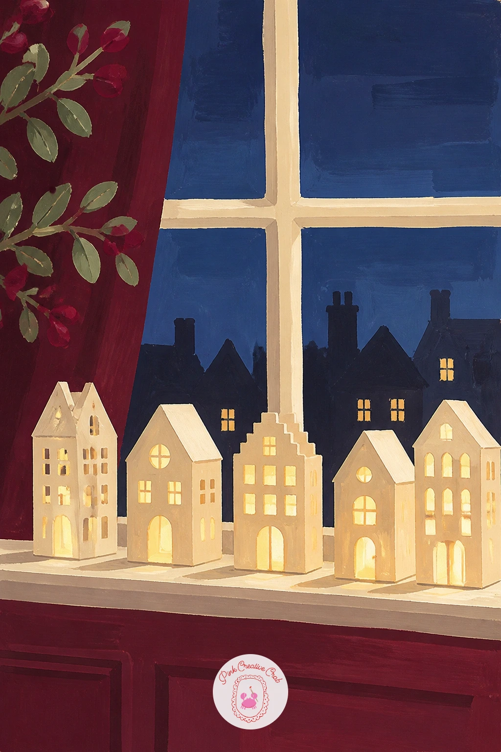
Return to the window for a row of little paper house lanterns lined along the sill, a soft glowing display that is a gentler cousin of the paper star earlier in this list. Pencil three or four simple house shapes first, a square body and triangle roof on each, lined up along a window sill with small gaps between them.
Paint each lantern’s body in cream, then once dry, paint one warm yellow glow inside each little window cut-out, with a soft halo of lighter cream painted just around the glow so it looks lit from within rather than simply colored in. Vary each lantern’s roof color slightly, sage, brass or burgundy, so the row has rhythm rather than looking like identical copies.
Paint the window sill and a hint of dusk outside last, a deep blue-grey behind the lanterns that makes their warm glow stand out by contrast. Out of several roof colors, two alternating colors across the row still works.
Keep the lanterns slightly different heights along the sill, since perfectly matched lanterns look mass-produced rather than handmade.
You Will Need
- fine brush for the glow
- cream gouache for lantern bodies
- warm yellow gouache for glow
- deep blue-grey gouache for dusk background
Palette: Cream,Warm Yellow,Deep Blue Grey,Sage Green
Paint the dusk background wet and let it dry before adding the lanterns on top, which keeps their crisp little shapes from bleeding into the dark wash.
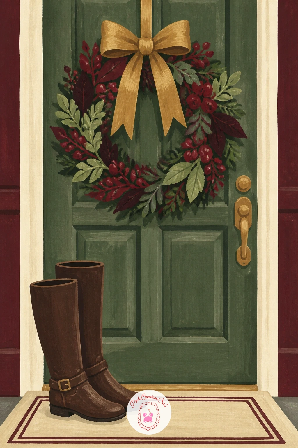
Welcome guests with an entryway scene: a pair of boots by the door and a wreath hanging above them, a cozy, lived-in combination that ties the whole holiday-at-home mood together. Pencil the door first, then a simple wreath circle centered on it, and two boots standing just below, leaning slightly against each other.
Paint the door in a warm deep color, burgundy or deep sage, then the wreath in layered sage greens with small berry red dots and a brass bow at the base, painted after the greenery dries. The scale check for this scene: the wreath’s diameter should be roughly a third of the door’s height, and the boots should stand no taller than a quarter of the door, which keeps the whole entryway in believable proportion.
Paint the boots last in warm brown, with one leaning slightly against the other rather than standing perfectly upright, since a little asymmetry reads as a real, used entryway. Out of deep sage for the door, mix sage with a touch of black for a similar depth.
Finish with a small welcome mat shape in cream beneath the boots to ground the whole scene.
You Will Need
- round brush for door and boots
- burgundy or sage gouache for the door
- layered sage gouache for the wreath
- brown gouache for boots
Palette: Deep Sage,Sage Green,Berry Red,Brown
For more entryway and doorway scenes with a similar cozy mood, the winter street ideas in this list are worth a look.
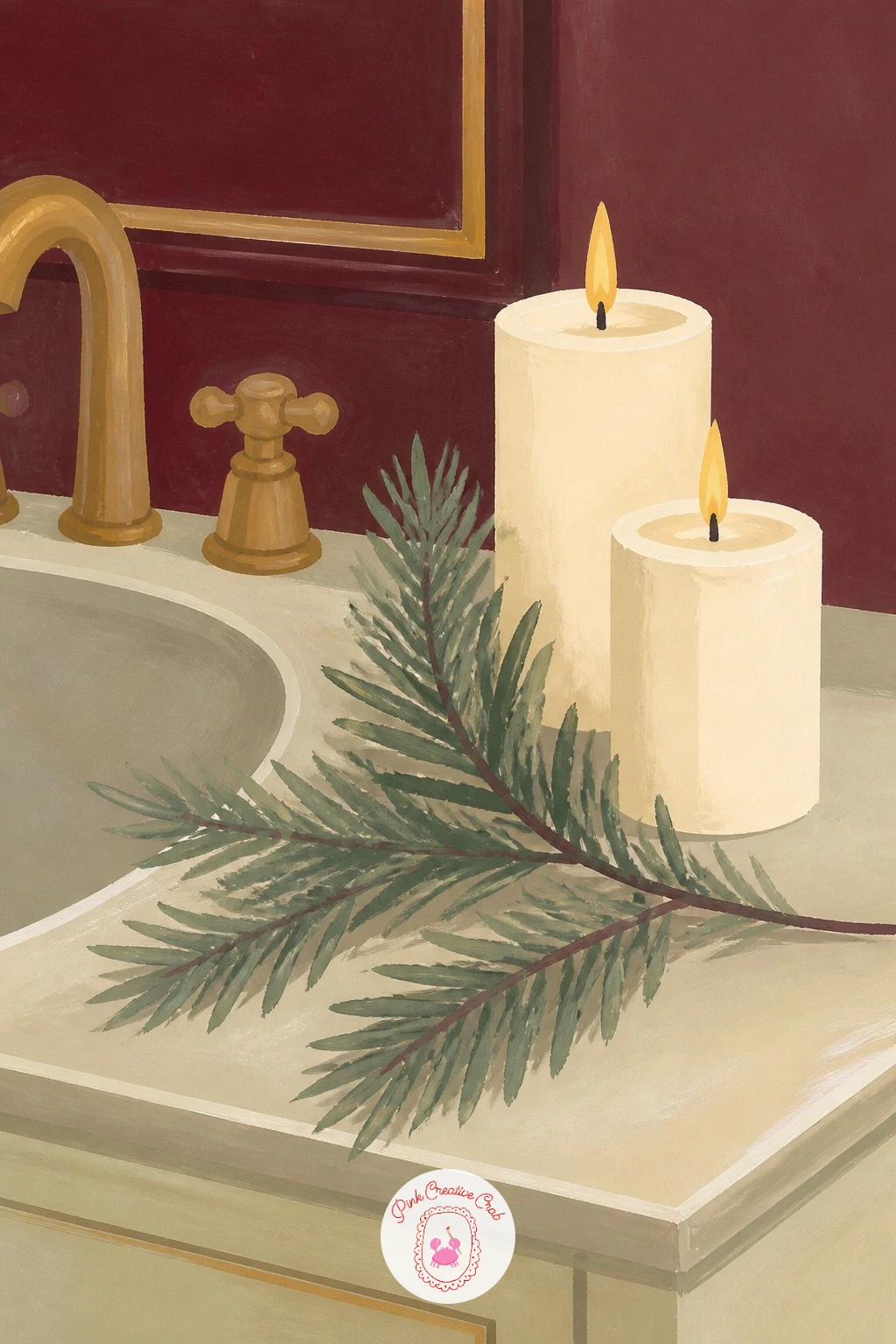
Close the room-by-room tour with a small, calm bathroom vignette: a single pine branch laid beside a few candles on the edge of a tub or vanity, a spa-like holiday touch that works as a lovely quick finish to the whole set. Pencil a simple curved branch shape first, then group two or three candles of different heights beside it.
Paint the pine branch using the same dry-brush needle technique from the folk ornament branch earlier in this list, short flicked strokes of sage radiating from a thin central stem. Paint the candles in cream and soft grey, each with a small warm flame, keeping the flames small and consistent in color since multiple mismatched flame colors can make a calm scene feel busy.
Paint the tub edge or vanity surface last in a pale neutral tone, with soft shadows cast by both the branch and the candles. Out of sage gouache for the branch, any green with a touch of grey mixed in works as a calmer substitute.
Keep the whole palette quieter here than in busier vignettes earlier in the list, letting this final scene feel like a restful close to the set.
You Will Need
- dry brush for pine texture
- sage gouache for the branch
- cream and grey gouache for candles
- warm yellow gouache for flames
Palette: Sage Green,Cream,Soft Grey,Warm Yellow
Keep this one deliberately simple and small, since a quiet closing piece balances the busier, more detailed vignettes earlier in the set nicely.
What to Do Next
Pick one idea that matches a corner of your own home right now, mix your burgundy, sage and brass gold ahead of time, and start on a single smooth sheet of gouache paper today. Once the first vignette feels comfortable, the rest of this list falls into place fast, since they all share the same palette and the same confident, flat style.
Frequently Asked Questions
What paper works best for gouache christmas decor drawing?
A smooth, heavyweight paper made for gouache or mixed media works best, since it takes flat color blocks cleanly without buckling. Cold press watercolor paper also works if it is at least the weight recommended for wet media.
How do I keep gouache colors from looking muddy together?
Let each color dry completely before painting a new one right next to it, which keeps edges crisp rather than blended. Mixing colors on a palette first, rather than layering wet paint on the page, also avoids muddy results.
Do I need real reference photos for these holiday decor scenes?
A quick look at a few home decor or Pinterest photos for each trend (bows, candelabras, garlands) helps get proportions right before you start painting. You do not need to copy any single photo exactly, since these are styled interpretations, not portraits.
Can I draw these ideas in colored pencil instead of gouache?
Yes, colored pencil can achieve a similar flat, graphic look if you layer color evenly and burnish with a light color on top to smooth texture. It will take longer to build up solid color than gouache does in a single layer.
What is the easiest idea on this list to start with?
The honeycomb paper tree, the sugared fruit bowl, and the wooden house ornament are the simplest, since each uses just a few flat shapes and one main texture trick. Save the full room scenes, like the hallway or bedroom, for once you feel warmed up.
Have any thoughts?
Share your reaction or leave a quick response — we’d love to hear what you think!
-
 0
-
0
-
0
-
0
-
0
-
0


