

Acrylic painting mountains is one of the most rewarding journeys you can take as an artist, and honestly, the drama of a well-painted peak never gets old. Whether you dream of misty alpine ridgelines, sun-scorched desert mesas, or snow-capped giants catching the last light of golden hour, acrylics are your perfect partner. They dry fast, layer beautifully, and forgive mistakes in a way that feels almost generous.
However, getting mountains to look truly convincing takes more than slapping blue paint on a canvas and calling it a day. Therefore, this guide dives deep into 24 advanced ideas — from atmospheric glazing and palette knife textures to mastering reflected light on snow. Additionally, each idea is designed to stretch your skills without overwhelming you. Because every mountain starts with a single brushstroke, and yours is going to be spectacular.
Key Takeaways
Layering thin glazes of cool blues and purples into shadowed mountain faces creates far more convincing depth than simply mixing a darker version of your base color.
Atmospheric perspective is your secret weapon — softening edges and desaturating colors on distant peaks instantly makes your mountain paintings feel vast and three-dimensional.
Palette knives aren’t just for mixing; dragging a loaded knife across a dry underpainting creates rocky ridge textures that brushes simply cannot replicate.
Table of Contents
- Glazing Cool Shadows Into Rocky Mountain Faces
- Atmospheric Perspective on Layered Distant Peaks
- Palette Knife Ridge Textures on Rugged Summits
- Painting Snow Light With Warm Reflected Undertones
- Wet-on-Wet Mist Wrapping a Mountain Base
- Stormy Drama: Acrylic Painting Mountains at Dusk
- Lost and Found Edges Along a Foggy Treeline
- Scraping Granite Cliffs With a Worn Fan Brush
- Twilight Alpenglow on Snow-Capped Peaks
- Building Foreground Rock Texture With Crumpled Plastic
- Impasto Peaks: Loading Your Brush for Maximum Impact
- Cerulean vs. Ultramarine: Choosing Your Mountain Sky
- Cascading Waterfalls Beneath a Mountain Ridge
- Color Temperature Shifts From Summit to Valley Floor
- Monochromatic Mountain Study in Raw Umber
- Negative Space Painting Through a Forest of Pines
- Acrylic Painting Mountains in Golden Hour Light
- Desert Mesa at Midday: Ochres, Siennas, and Heat
- Underpainting in Burnt Sienna for Rocky Warmth
- Reflections of Peaks in a Still Alpine Lake
- Soft Scumbling Techniques for Clouded Mountain Skies
- Dynamic Foreground Boulders Anchoring a Mountain Scene
- Moonlit Mountain Ridgeline in Deep Indigo and Silver
- Capturing the First Snow of Autumn on a High Pass
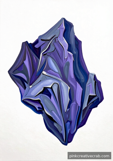
Glazing Cool Shadows Into Rocky Mountain Faces
Glazing is one of those techniques that feels like magic once you try it. Basically, you thin your acrylic paint with a glazing medium until it’s almost transparent, then layer it gently over dried paint. As a result, shadows gain incredible depth without looking muddy or flat. Cool purples, blue-grays, and soft violets work beautifully for rocky mountain faces.
The key is patience — each glaze must dry completely before adding another. However, don’t let that slow you down! Think of each layer as a quiet conversation between colors. Additionally, alternating warm and cool tones within your shadows creates that luminous, atmospheric glow that makes mountains feel truly three-dimensional.
For beginners, starting with just two or three glaze layers is plenty. Because acrylics dry quickly, you can build glazes in a single sitting. That’s genuinely exciting! Grab a quality acrylic glazing medium set to get started and watch your mountain shadows come alive.
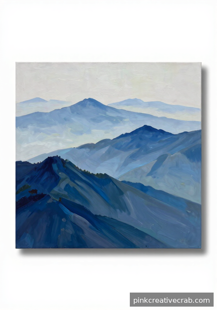
Atmospheric Perspective on Layered Distant Peaks
Atmospheric perspective is honestly one of the most satisfying tricks in painting. Essentially, distant mountains appear lighter, cooler, and less detailed than close ones. Therefore, painting multiple layered peaks creates an instant sense of incredible depth. Your viewer’s eye naturally travels back through the canvas, and that feeling is so rewarding to achieve.
Start by mixing a soft blue-gray for your furthest mountains — almost whispery in value. Meanwhile, each closer range gets progressively darker, warmer, and more detailed. Additionally, keeping edges soft on distant peaks reinforces that hazy, faraway feeling. Even subtle shifts in temperature make a huge difference, so trust the process.
For color mixing guidance, the Color Mixing Guide: Everything You Need to Know is a wonderful companion resource. Meanwhile, having the right brushes makes blending transitions effortless. A quality acrylic landscape brush set will genuinely transform how confidently you handle these soft, layered mountain ranges.
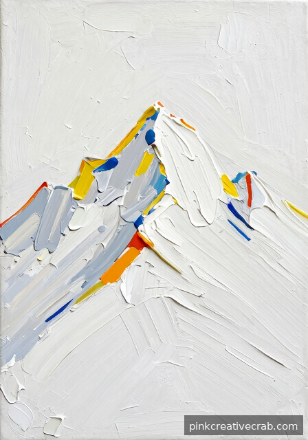
Palette Knife Ridge Textures on Rugged Summits
Picking up a palette knife instead of a brush is genuinely thrilling. Suddenly, your mountains have grit, drama, and personality! The flat edge of a palette knife lets you scrape, press, and drag thick paint across your canvas, creating textures that brushes simply cannot replicate. As a result, rocky ridge lines feel raw, physical, and wonderfully alive.
For rugged summits, load your knife generously with thick, undiluted paint. Then press firmly and pull quickly — short, decisive strokes work best. However, don’t overthink each mark! Some of the most beautiful textures happen accidentally. Additionally, mixing slightly different values on your knife before applying creates natural color variation within a single stroke.
This technique pairs beautifully with exploring broader Drawing Techniques Encyclopedia: 50+ Essential Methods for understanding mark-making more deeply. Meanwhile, investing in good tools makes everything easier and more fun. A fantastic palette knife set for acrylic painting gives you multiple shapes to experiment with freely.
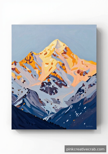
Painting Snow Light With Warm Reflected Undertones
Snow in paintings trips up so many artists because it seems like it should just be white. However, pure white snow actually looks flat and lifeless on canvas. The secret is understanding that snow picks up reflected color from everything around it — golden sunlight, pink skies, even lavender shadows. Because of this, warm undertones underneath your whites make snow genuinely glow.
Start by laying in soft warm yellows or peachy tones where light hits the snow. Then layer cooler whites and pale blues into the shadow areas. Meanwhile, leaving tiny hints of that warm undertone peeking through creates beautiful luminosity. Additionally, varying the thickness of your white paint — thin in shadows, thicker in highlights — adds wonderful texture and realism.
Understanding color relationships is absolutely essential here, and the Color Mixing Guide: Everything You Need to Know explains temperature beautifully. To get those buttery, blendable whites just right, a quality titanium white heavy body acrylic paint is a worthwhile investment you won’t regret.
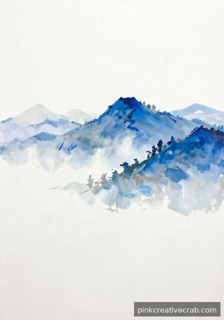
Wet-on-Wet Mist Wrapping a Mountain Base
Creating soft, dreamy mist with acrylics feels tricky at first — but you’ve totally got this! The wet-on-wet technique means applying wet paint onto a still-wet surface, allowing colors to blend softly without hard edges. Because acrylics dry quickly, working in small sections and using a stay-wet palette keeps everything beautifully workable. The result is genuinely ethereal and atmospheric.
For mountain mist, mix soft whites and light blue-grays. Then, while your mountain base is still wet, gently feather these mist tones upward from the bottom. However, use a dry, soft brush with very light pressure for the softest blends. Additionally, a tiny drop of retarder medium buys you precious extra blending time, which makes this technique much less stressful.
If you enjoy soft, blended approaches, you might also love how Watercolor Painting: The Ultimate Beginner to Advanced Guide handles atmospheric techniques — many principles transfer beautifully! Meanwhile, a quality acrylic retarder medium is an absolute game-changer for blending success.
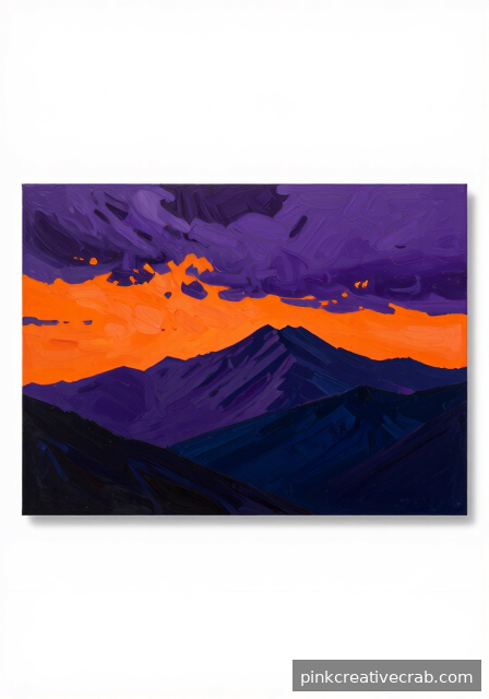
Stormy Drama: Acrylic Painting Mountains at Dusk
Stormy mountain paintings are where acrylics truly shine. The medium’s boldness and quick-drying nature let you build dramatic contrast fast. Think deep purple-blacks in churning clouds, electric oranges breaking through at the horizon, and dark silhouetted peaks cutting sharply upward. Because dusk light is so dynamic, even confident color choices won’t look overdone — lean into the drama!
Start with your darkest sky values first. Then work progressively toward those luminous horizon tones. However, don’t blend everything smoothly — keeping some edges raw and energetic makes the storm feel genuinely threatening and alive. Additionally, using a palette knife for cloud textures adds wonderful spontaneous energy that brushes alone can’t quite capture.
For broader medium comparisons that might spark your next project, Acrylic vs Watercolor vs Oil vs Gouache: Which Medium Should You Choose? is a fantastic read. Meanwhile, having the right dramatic colors ready makes everything smoother — a rich acrylic paint set for landscapes with deep earth tones and vibrant oranges is exactly what this painting deserves.
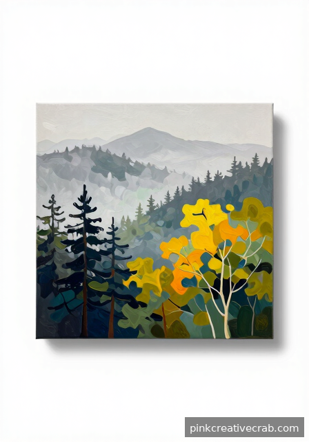
Lost and Found Edges Along a Foggy Treeline
Lost and found edges are one of those advanced concepts that genuinely transforms a painting from flat to fascinating. Essentially, some edges stay crisp and defined — these are your “found” edges — while others dissolve softly into surrounding color, becoming “lost.” Along a foggy mountain treeline, this interplay creates incredible atmosphere and visual intrigue. Your eye naturally searches for where trees fade into mist, and that mystery is deeply satisfying.
For the trees themselves, start with confident dark shapes for the closest ones. However, as you move back into fog, let edges soften dramatically. Additionally, mixing your tree color slightly lighter and cooler as trees recede reinforces atmospheric depth. Because acrylics let you overpaint easily, fixing mistakes is genuinely stress-free here.
Understanding edge quality connects beautifully to foundational art skills — Art Fundamentals: Complete Guide to Drawing & Painting Basics covers this concept wonderfully. For blending foggy treeline edges smoothly, a quality fan brush set for acrylic painting gives you fantastic control and gorgeous soft results.
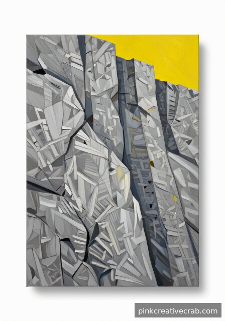
Scraping Granite Cliffs With a Worn Fan Brush
Granite cliffs look incredibly intimidating at first glance, but here’s a fun secret: a worn, splayed fan brush is practically made for this texture. Because the bristles spread out unevenly, they create those beautiful, irregular striations that granite naturally displays. Simply load your brush lightly with a dry-brush technique, then drag it sideways across your canvas with confident, sweeping strokes.
Additionally, layering several values of grey, warm tan, and cool violet really makes your cliff face come alive. Start darker at the base, however, and gradually lighten as you move upward to suggest natural light hitting the rock face. Each pass adds believable depth, so don’t overthink it — just keep building those layers confidently.
For best results, try mixing in a touch of texture medium to thicken your paint slightly. As a result, each scraped stroke holds its shape beautifully on the canvas surface. Pick up a great fan brush set for acrylic painting to get started on those stunning cliff textures today.
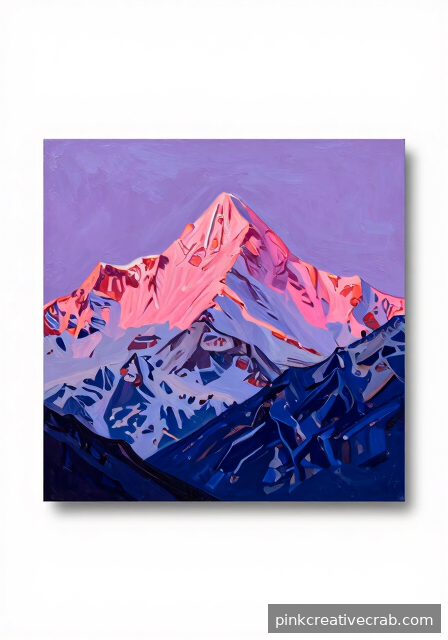
Twilight Alpenglow on Snow-Capped Peaks
Alpenglow is honestly one of nature’s most magical light shows, and capturing it in acrylics is such a rewarding challenge. That gorgeous pink-to-violet flush that washes over snowy peaks at twilight happens because low-angle sunlight scatters through the atmosphere beautifully. Therefore, your color palette here leans heavily into warm rose, soft coral, and cool lavender all working together harmoniously.
Building this effect starts with a deep blue-violet sky gradient at the top, however, gradually shifting downward into warmer pinks near the horizon line. The snow itself picks up these reflected colors, so avoid using plain white entirely. Instead, mix your whites with thin glazes of quinacridone rose or soft purple for those luminous, glowing snow surfaces.
Mastering color relationships like these becomes much easier once you understand color temperature fundamentals. For deeper guidance, the Color Mixing Guide: Everything You Need to Know is an incredible resource worth bookmarking. Meanwhile, grab some quinacridone rose acrylic paint to nail that dreamy alpenglow effect.
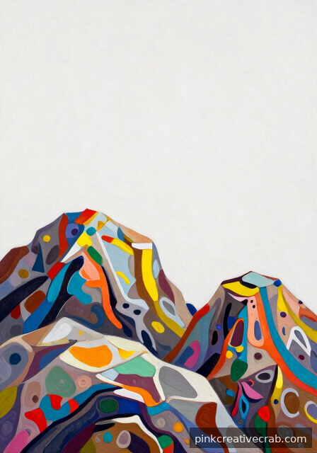
Building Foreground Rock Texture With Crumpled Plastic
Who knew your grocery bag could become your favorite art tool? Crumpled plastic wrap or a scrunched plastic bag pressed into wet acrylic paint creates the most wonderfully random, organic rock texture imaginable. Because the plastic leaves unpredictable ridges and valleys, your foreground rocks instantly gain a believable, natural complexity that no brush stroke can fully replicate.
The technique works best with slightly thicker paint consistency, so add just a tiny bit of impasto medium if needed. Press your crumpled plastic firmly into a freshly painted surface, then lift straight up rather than dragging sideways. As a result, you get gorgeous lifted peaks and pressed-in shadows that beautifully mimic real geological surfaces.
Additionally, once the texture dries, dry-brushing lighter highlight colors across the raised areas brings everything to life dramatically. This approach pairs wonderfully with the fan brush cliff-scraping technique for a complete foreground treatment. For the thickest, most satisfying textures, explore acrylic texture medium for painting — because the right medium truly makes all the difference in your results.
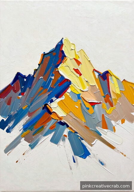
Impasto Peaks: Loading Your Brush for Maximum Impact
Impasto technique transforms mountain paintings from flat representations into truly three-dimensional experiences. Because thick, heavily loaded paint catches light and casts tiny shadows across your canvas, those mountain peaks suddenly feel sculptural and physically present. Loading your brush generously — we’re talking a satisfying, chunky amount of paint — and applying it with confident, decisive strokes is the entire secret here.
However, direction matters enormously with impasto peaks. Vertical strokes suggest towering cliff faces, while diagonal marks follow the natural slope of a mountainside convincingly. Short, choppy horizontal strokes work beautifully for rugged ridgelines at the summit. Therefore, think deliberately about your mark direction before each stroke rather than simply slapping paint down randomly.
Understanding painting fundamentals really accelerates your impasto success, so the Art Fundamentals: Complete Guide to Drawing & Painting Basics offers fantastic foundational support. Additionally, a quality heavy body acrylic paint makes all the difference in achieving that satisfying raised texture. Stock up on heavy body acrylic paint set and let those peaks practically leap off your canvas!
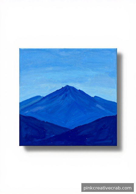
Cerulean vs. Ultramarine: Choosing Your Mountain Sky
Choosing between cerulean and ultramarine blue for your mountain sky genuinely changes the entire mood of your finished painting. Cerulean reads as lighter, airier, and warmer — perfect for bright midday summer skies above sun-drenched alpine meadows. Ultramarine, however, carries a deeper, cooler, more dramatic presence that suits stormy atmospheres, dusk lighting, and mysterious high-altitude scenes beautifully.
Interestingly, many advanced painters blend both blues strategically across their sky gradient. Because ultramarine leans slightly violet, it works wonderfully at the very top of your sky where atmospheric depth is greatest. Cerulean, meanwhile, shines near the horizon where the atmosphere thickens and warms slightly against distant mountain silhouettes.
If you’re still exploring which painting medium suits your creative style overall, the Acrylic vs Watercolor vs Oil vs Gouache: Which Medium Should You Choose? guide offers genuinely helpful perspective. Additionally, experimenting with both blues side by side before committing to your painting pays off tremendously. Therefore, treat yourself to a cerulean and ultramarine acrylic paint set and discover your personal favorite sky blue.
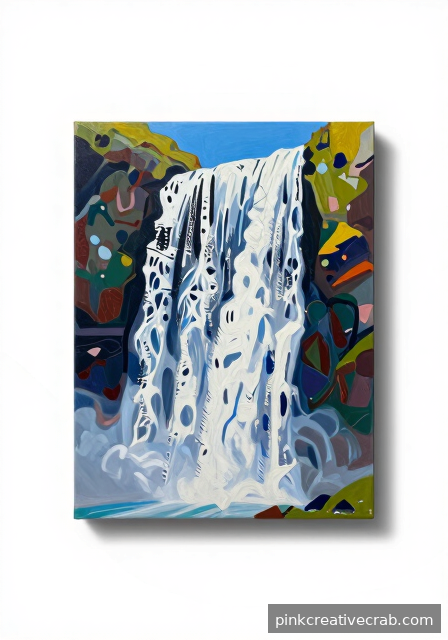
Cascading Waterfalls Beneath a Mountain Ridge
Painting moving water beneath a rugged mountain ridge is one of those subjects that looks incredibly complex but breaks down into manageable, satisfying steps. Because waterfalls follow gravity’s pull over rock faces, the key is painting your underlying rock structure first and letting the water cascade naturally over those established forms. Start with your mountain ridge and rocky cliff face completely finished before adding a single drop of water.
For the waterfall itself, think in terms of vertical movement and light. Thin, slightly opaque white glazes dragged downward with a soft flat brush suggest moving water beautifully. Additionally, where water crashes into pools below, small horizontal flicks of thick white paint create convincing foam and splash textures that really energize your composition.
The edges where water meets rock deserve special attention — soft transitions on one side and sharp edges on the other create convincing wet rock surfaces. For those who also enjoy working in other mediums, Watercolor Painting: The Ultimate Beginner to Advanced Guide explores water painting from a completely different angle. However, for acrylic waterfall magic, grab a great soft flat brush set for acrylic painting and start flowing.
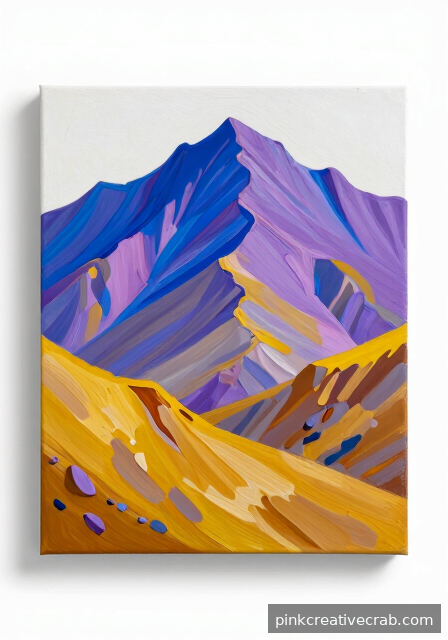
Color Temperature Shifts From Summit to Valley Floor
One of the most powerful tools advanced mountain painters use is deliberate color temperature variation from summit to valley floor. Because mountains rise into thinner, cooler atmosphere, peaks naturally appear more blue-violet and desaturated compared to warmer, richer valley colors below. Understanding and exaggerating this temperature shift is what separates truly convincing mountain paintings from flat, lifeless ones.
Therefore, paint your summit areas with colors shifted noticeably cooler — think blue-grey, violet-white, and muted teal shadows. As your eye travels down toward the valley floor, however, gradually introduce warmer yellows, golden greens, and earthy sienna tones. This temperature journey guides the viewer’s eye through your entire composition naturally and creates satisfying visual depth.
Additionally, mid-distance mountain slopes serve as the perfect transition zone between these temperature extremes, so treat them with neutral mid-temperature greens and greys. For a comprehensive understanding of how color relationships work throughout paintings, the Color Mixing Guide: Everything You Need to Know is absolutely invaluable. As a result, picking up a complete acrylic landscape color palette set gives you every temperature range you need.
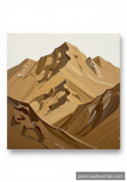
Monochromatic Mountain Study in Raw Umber
Working with just one color might sound limiting, but honestly, it’s one of the most freeing exercises you can do. Raw umber is a gorgeous, earthy brown that naturally suggests ancient rock and weathered stone. Because you’re only adjusting value — light and dark — you can focus entirely on form and composition without worrying about color mixing at all.
Start by thinning your raw umber with water for the palest, most distant peaks. Then gradually build up richer, deeper tones as you move forward in the scene. Additionally, leaving small passages of white canvas in bright areas creates beautiful contrast. This exercise teaches you to truly see light and shadow, which is a skill that improves every painting you’ll ever make.
For this study, a good set of flat and filbert brushes makes blending those warm tones effortless. Try raw umber acrylic paint set to get a quality pigment with excellent tinting strength.
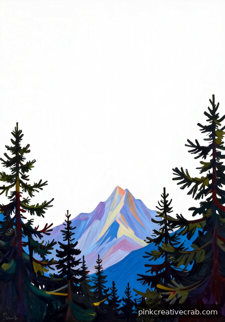
Negative Space Painting Through a Forest of Pines
Negative space painting flips your thinking in the most delightful way. Instead of painting the trees themselves, you paint the sky and light showing between and around them. As a result, the pine silhouettes emerge almost magically from the background. It feels like a puzzle, and solving it gives you such a satisfying little rush.
Begin by blocking in your mountain and sky colors first. Then, using a fine detail brush, carefully paint those background shapes peeking through the branches. However, don’t stress about perfection — slightly uneven edges actually make the forest feel more natural and alive. This technique builds incredible observation skills because you’re training your eye to see shapes differently.
For crisp, controlled edges around your pine silhouettes, a liner or rigger brush is your best friend. Consider picking up some acrylic detail brushes for fine lines to make this technique so much easier and more enjoyable.
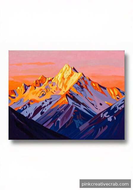
Acrylic Painting Mountains in Golden Hour Light
Golden hour is honestly nature’s greatest gift to painters. That warm, low, glowing light transforms ordinary mountains into something almost magical. Because the sun sits so low on the horizon, shadows stretch long and colors shift into gorgeous oranges, pinks, and deep purples. Even beginners can capture this stunning mood with just a little color knowledge.
Start your sky with a warm yellow near the horizon, blending upward through orange into a soft violet or cool blue. Meanwhile, your mountain peaks catch that golden warmth on one side while falling into cool, deep shadow on the other. This warm-versus-cool contrast is where the real drama lives. For deeper color mixing guidance, check out this helpful Color Mixing Guide: Everything You Need to Know.
To blend those beautiful gradient skies smoothly, a soft wide brush makes all the difference. Try acrylic blending brushes for landscape painting and watch your golden hour skies come alive beautifully.
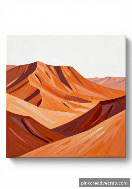
Desert Mesa at Midday: Ochres, Siennas, and Heat
Desert landscapes have such a bold, confident personality, and mesas are absolutely made for acrylic paint. Those flat-topped formations with their dramatic vertical cliffs practically beg to be painted in rich ochres, burnt siennas, and raw siennas. Additionally, the harsh midday light creates sharp, defined shadows with very little softness — which actually makes them easier to paint than you might expect.
Build your mesa in clear horizontal layers: pale sky, distant heat haze, warm middle ground, and those gorgeous richly colored cliffs up front. Because midday light is so direct, highlights are bright and shadows are deep and cool. Don’t be afraid of strong contrast here — it’s exactly what makes desert paintings feel hot and alive. This kind of structured thinking about light relates beautifully to the lessons in Art Fundamentals: Complete Guide to Drawing & Painting Basics.
A good palette of warm earth tones is essential for this subject. Stock up with acrylic earth tone paint set ochre sienna for a beautifully cohesive desert color palette.
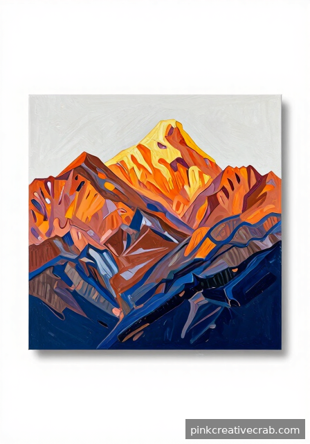
Underpainting in Burnt Sienna for Rocky Warmth
Here’s a wonderful secret that experienced painters use all the time: starting with a warm underpainting changes everything. Burnt sienna is the perfect choice because it peeks through subsequent layers, giving your rocks and mountains an inner warmth that’s almost impossible to achieve any other way. Therefore, even your cool blues and grays will feel alive rather than flat.
Thin your burnt sienna with water and cover your entire canvas loosely. Let it dry — acrylics are wonderfully fast — then begin building your mountain scene on top. However, leave some sienna showing through in shadow areas and rock textures. Those warm glimpses underneath create an incredible sense of depth and vibration. It’s one of those techniques that makes people ask how you did it.
For this approach, a large wash brush for the underpainting layer works beautifully. Grab some burnt sienna acrylic paint professional quality and give your mountain paintings that gorgeous, glowing warmth from the very beginning.
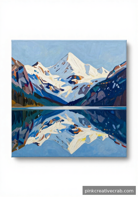
Reflections of Peaks in a Still Alpine Lake
Painting a perfect reflection sounds tricky, but it’s actually a wonderful confidence booster once you understand the logic. An absolutely still alpine lake mirrors the mountains above almost perfectly, with colors just slightly deeper and richer in the water. Because you’re essentially painting the same shapes twice, you get great value from your compositional planning.
First, complete your mountain and sky section fully. Then flip your reference mentally and paint the reflection below, keeping your brushstrokes horizontal to suggest water’s surface. Additionally, adding one or two subtle horizontal ripples near the center breaks the perfect mirror effect and makes the water feel real. The slight color richness in reflections happens because water absorbs some light — a fascinating little detail worth embracing.
For smooth, controlled horizontal strokes in your water area, fan brushes are surprisingly useful tools. Try fan brush set for acrylic painting water to create those gorgeous glassy alpine lake surfaces with beautiful ease.
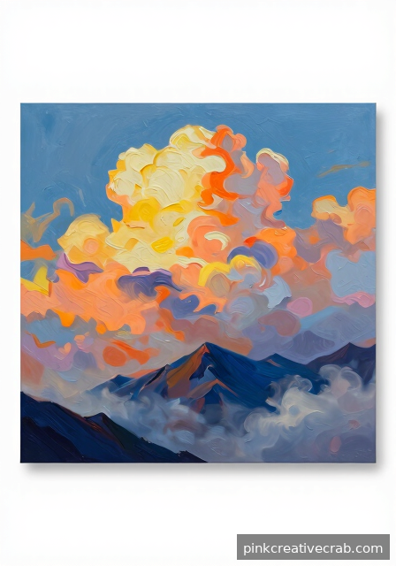
Soft Scumbling Techniques for Clouded Mountain Skies
Scumbling is one of those techniques that sounds fancy but is wonderfully simple and incredibly satisfying to do. Essentially, you drag a nearly dry brush with a small amount of paint across the surface, leaving a soft, broken, textured mark. As a result, you can build up misty clouds and atmospheric haze over mountains with beautiful subtlety. It’s perfect for those moody, cloud-filled skies that make mountain landscapes feel so dramatic.
Work over a dry base sky color, using light, circular or sweeping motions with minimal pressure. However, don’t overwork any single area — scumbling works best when it’s quick and confident. Layer several passes in slightly different values to build depth in the clouds. This technique pairs wonderfully with other mark-making methods explored in the Drawing Techniques Encyclopedia: 50+ Essential Methods.
For scumbling, stiff bristle brushes work far better than soft ones. Pick up stiff bristle brushes for acrylic texture techniques and start creating those beautifully soft, atmospheric mountain skies today.
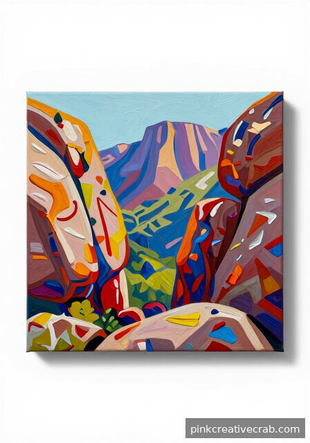
Dynamic Foreground Boulders Anchoring a Mountain Scene
Foreground boulders are one of the most powerful tools in mountain painting. They instantly create depth, pulling viewers into your scene before their eye travels up to the peaks. Additionally, boulders give you a wonderful opportunity to practice texture — something acrylics handle beautifully with palette knife work and dry brushing.
Start by blocking in large, simple shapes. Don’t worry about perfect edges yet! Meanwhile, mix warm shadow tones using burnt sienna and ultramarine blue for that rich, earthy feel. Vary the boulder sizes deliberately — larger shapes upfront, smaller ones receding — because this simple trick makes depth feel effortless.
Highlighting each boulder’s top edge with a pale yellow-white mix brings everything to life. For color mixing confidence, check out the Color Mixing Guide: Everything You Need to Know. A great palette knife set for textured boulder painting will make this technique even more enjoyable.
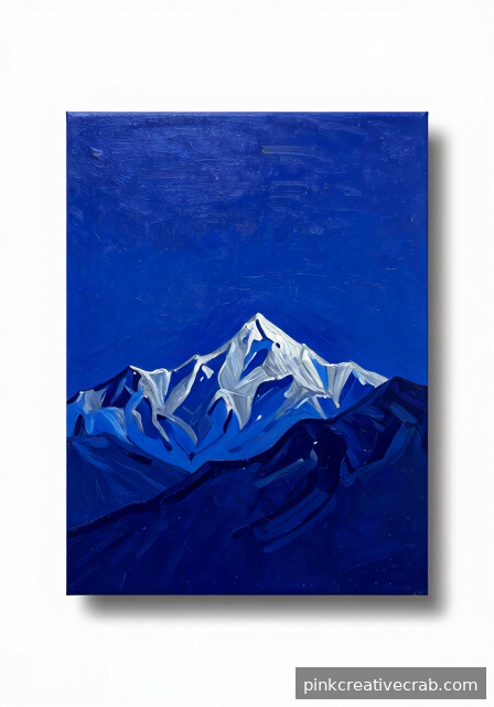
Moonlit Mountain Ridgeline in Deep Indigo and Silver
Painting a moonlit mountain scene feels magical, and honestly, it’s more approachable than you might think! Deep indigo and silver together create that dreamy, ethereal atmosphere that makes viewers stop and stare. Because acrylics dry darker, mixing slightly lighter than you think you need is a smart habit worth building early.
Begin with a rich indigo wash across the whole canvas — this unified undertone ties everything together beautifully. Layer in the ridgeline using cooler blue-purples, then add those glowing silver highlights along the peaks last. Thin, deliberate strokes work wonderfully here, so don’t rush. Additionally, a fan brush creates gorgeous soft transitions between sky and mountain.
For understanding how acrylics compare to other nightscape mediums, the guide Acrylic vs Watercolor vs Oil vs Gouache: Which Medium Should You Choose? is incredibly helpful. Meanwhile, grabbing a quality indigo and silver acrylic paint set ensures your colors stay vivid and luminous.
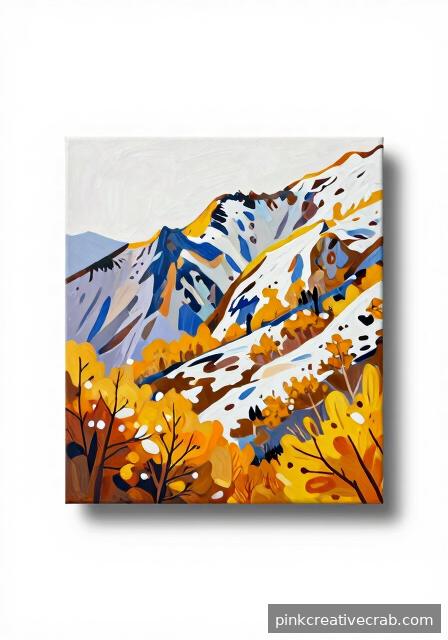
Capturing the First Snow of Autumn on a High Pass
That magical moment when autumn’s warm golds meet the first dusting of snow is genuinely one of the most rewarding subjects in mountain painting. The contrast between warm foliage below and cool, crisp snow above creates instant visual drama. Because acrylics allow you to layer quickly, you can build this temperature contrast without long drying waits.
Start warm — block in rich oranges, ochres, and russet tones across the lower slopes first. Then, allow those layers to dry before glazing cool blue-whites over the high pass area. This glazing technique softly suggests snow without losing the warmth beneath. However, resist over-blending! Keeping some edges sharp makes the snow feel fresh and convincing.
Understanding painting fundamentals really strengthens this kind of scene — Art Fundamentals: Complete Guide to Drawing & Painting Basics is a fantastic resource. For supplies, a reliable acrylic glazing medium for mountain snow painting helps achieve those beautiful transparent layers effortlessly.
Final Thoughts
You have just explored 24 powerful ways to take your acrylic painting mountains practice to a genuinely exciting new level. From the delicate whisper of atmospheric mist to the bold confidence of a palette knife summit, each technique here is a doorway into a richer, more expressive version of your art. Additionally, remember that advanced painting is not about perfection — it is about making increasingly interesting decisions with increasing intentionality.
Therefore, do not feel pressured to try everything at once. Instead, pick the one idea that made your heart beat a little faster and start there. Because the best painting you will ever make is simply the next one you begin. Celebrate every texture that surprises you, every shadow that finally feels right, and every mountain that starts to breathe on your canvas.
Most importantly, keep going. The world genuinely needs more people who look at a blank canvas and see a mountain range waiting to rise. You are one of those people, and that is something worth celebrating every single time you pick up a brush.
Frequently Asked Questions
What are the best acrylic colors for painting mountains?
For acrylic painting mountains, a strong starter palette includes Ultramarine Blue, Burnt Sienna, Titanium White, Raw Umber, and Cadmium Yellow. Additionally, Dioxazine Purple is wonderful for deep shadows. Therefore, you can mix nearly any mountain tone from these versatile pigments without overcomplicating your setup.
How do I paint realistic snow on mountain peaks with acrylics?
Realistic snow is all about warm shadows, not just white paint. Additionally, mix Titanium White with a touch of Ultramarine Blue or Lavender for shadowed areas. However, the lit snow should lean warm — try a whisper of Yellow Ochre. Because snow reflects the sky, your color choices will vary beautifully with lighting conditions.
Should I use a palette knife or a brush for mountain textures?
Both tools are genuinely useful, and therefore combining them creates the most convincing results. Palette knives excel at sharp rocky edges and rough cliff faces, while brushes handle soft atmospheric passages beautifully. For example, try building your rocky texture with a knife first, then softening the background peaks with a wide flat brush.
How do I create depth in an acrylic mountain landscape?
Atmospheric perspective is your most powerful depth tool. Additionally, distant mountains should appear lighter, cooler, and less detailed than foreground elements. Therefore, mix a little white and blue into your far peaks and soften their edges. As a result, your viewer’s eye will naturally travel deep into the painting, creating a convincing sense of vast distance.
What canvas size is best for acrylic painting mountains?
Mountains genuinely reward a bit of room to breathe. However, skill level matters more than size. For advanced painters, a 16×20 or 18×24 inch canvas allows enough space for atmospheric gradients and foreground detail. Additionally, panoramic formats like 12×36 inches are spectacular for mountain ranges. Because larger surfaces dry slower in sections, planning your workflow is important.
How long should I let each acrylic layer dry before adding the next?
Acrylics typically dry to the touch within 10 to 30 minutes, depending on thickness and humidity. However, for glazing techniques over mountain shadows, waiting until the layer is fully dry — around 20 minutes — prevents muddy mixing. Additionally, using a heat gun on a low setting speeds the process beautifully, so your creative momentum never has to stall.
Have any thoughts?
Share your reaction or leave a quick response — we’d love to hear what you think!
-
 0
0 -
0
-
0
-
0
-
0
-
0


