A semi realistic drawing sits in that lovely middle space between a comic and a photograph: the eyes stay big and soft, the skin stays smooth, but the light and shadow behave like they would on a real face. That halfway look is why these pencil portraits are so satisfying to make. You get the quiet discipline of real shading with the freedom to round a nose, enlarge an eye or soften a jaw however feels right.
Below are 27 small, finishable faces and gestures, from a shy half smile to two friends cheek to cheek. Each one works on a single sheet of bright white paper with graphite alone, no color needed, and each is sized to fill the page so every soft edge and lash gets room to breathe.
Using these images: free for personal projects such as printing, coloring, cards, journals and gifts. Handmade items that include them may be sold up to 30 pieces per design. More than that is commercial use and is not permitted, and neither is selling or sharing the images themselves or passing them off as your own. Please ask before any other use.
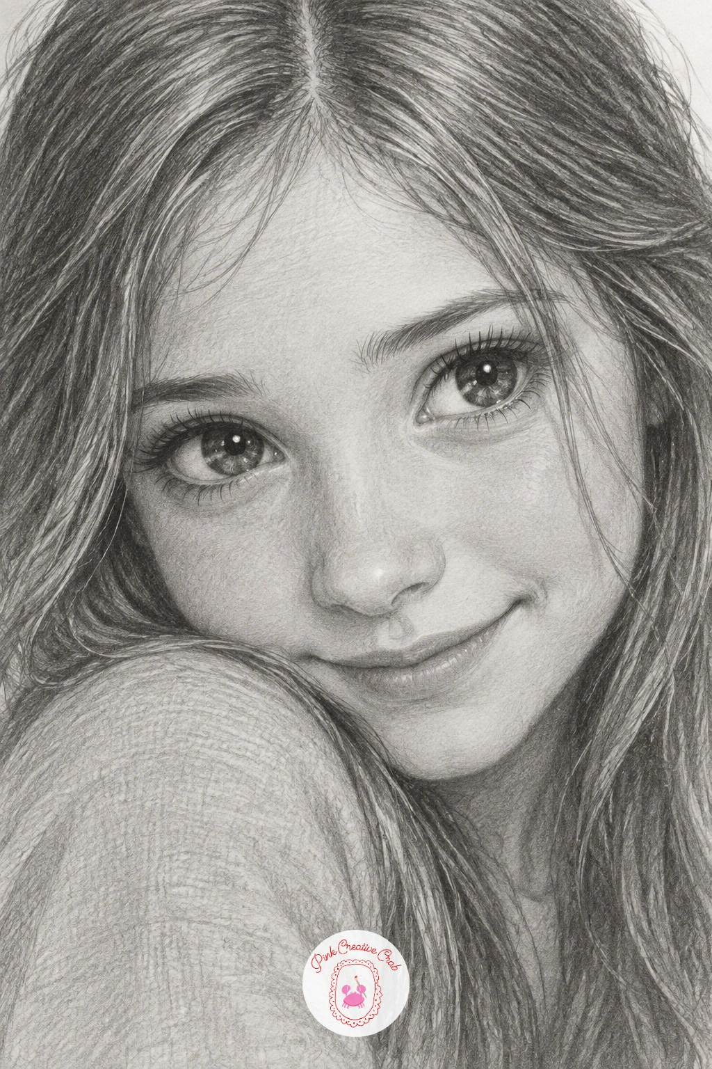
Start the easiest face in the set with a light oval and a loose cross to place the features: eyes sit on the horizontal line, the mouth about a third up from the chin. Keep the eyes slightly larger than life, this is what gives semi realistic drawing its gentle, storybook pull, and leave two small white highlights untouched in each iris from the very first pencil marks.
Work the iris in tight circular strokes from dark outer ring to a softer center, then shade the whites with the faintest grey so they never look paper-flat. Build the face in thin layers of an HB or 2B, darkest under the brow, at the nostril wings and under the lower lip, lightest across the cheeks and forehead.
The most common slip here is over-darkening the mouth so the shy smile reads as sad. Keep the lips a soft mid grey with a touch more pressure only at the corners where they curve up.
If your paper is a little toothy and grabs too much graphite, switch to a smoother bristol sheet and the soft shading will glide on far more evenly.
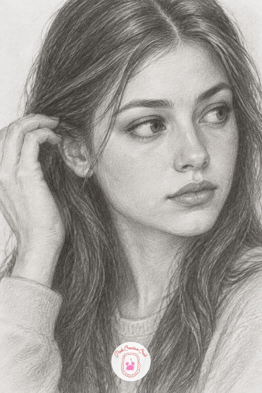
This gesture turns a flat portrait into a moment, so give the hand and the tilt of the head real attention. Sketch the head turned three quarter view with the eyes glancing sideways toward the viewer, then place the hand second, measuring it against the face: from chin to hairline should roughly equal the length of the hand from wrist to fingertip.
Draw the strand of hair being tucked as a single clean curve lifted off the ear, with the fingers just grazing it rather than gripping hard. Shade the face first in soft graphite layers, then the hand last so you can judge its size correctly against the finished features.
Hands often come out too small next to a large stylized face. If that happens, erase gently with a kneaded eraser and redraw it slightly larger rather than patching over the mistake.
A mechanical pencil in 2B works well here for the fine hair strand if you want more control than a regular pencil gives.
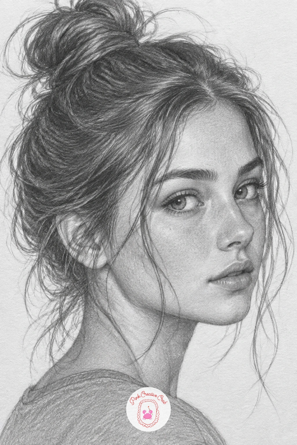
Following on from a tidy portrait, a messy bun lets the hair itself carry the mood. Block in the head shape and the bun as a soft rounded mass sitting high, then draw the main hair direction in long sweeping pencil strokes before any single strand gets added.
Shade the bun in sections, following its roundness, dark where strands overlap and light where graphite paper shows through near the top. Add loose strands around the face last, in short confident strokes rather than many timid ones, since a single clean line reads as hair far better than ten scratchy ones.
For eye level and light, imagine a soft light from the upper left: this throws a gentle shadow under the bun and down one side of the neck, which is what keeps the whole head from looking flat.
If stray strands start looking stiff, lift a little graphite with a kneaded eraser pressed and pulled away rather than rubbed, which keeps the edge soft.
Closed, laughing eyes are a wonderful change of pace since you get to draw the cheeks and mouth doing most of the expressive work. Sketch the eyes as soft curved lines with tiny crinkles at the outer corners, not flat closed lids, and open the mouth wide enough to show the shape of real laughter.
Shade the cheeks first, pushed up and rounded by the smile, before moving to the mouth and teeth, which should stay lighter than the surrounding skin so they do not jump forward too much. The eyebrows lift slightly and the whole upper face should feel pulled upward.
Where this goes wrong is in flat, symmetrical closed eyes that look asleep rather than laughing. Add a few short upward lash lines at the outer corner and a soft fold beneath the eye to fix it instantly.
If pencil strokes for teeth look too graphic, soften them with a blending stump right away so they read as shape rather than outline.
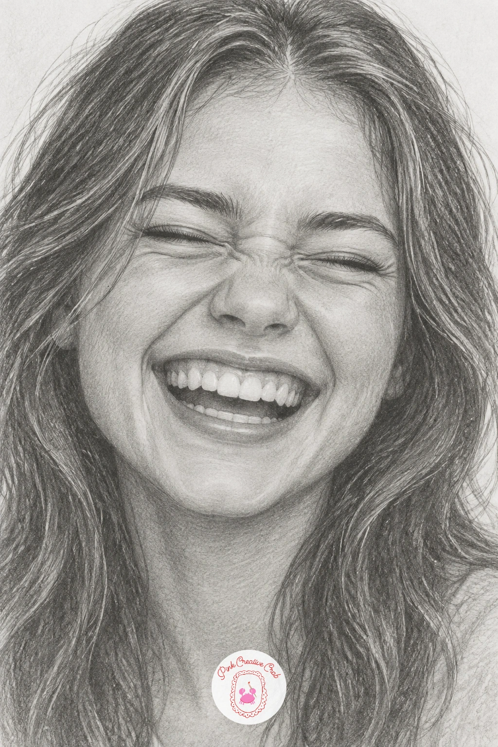
Look at a photo of a genuine laugh for reference rather than inventing the eye crinkles, since they are small and easy to get subtly wrong from memory alone.
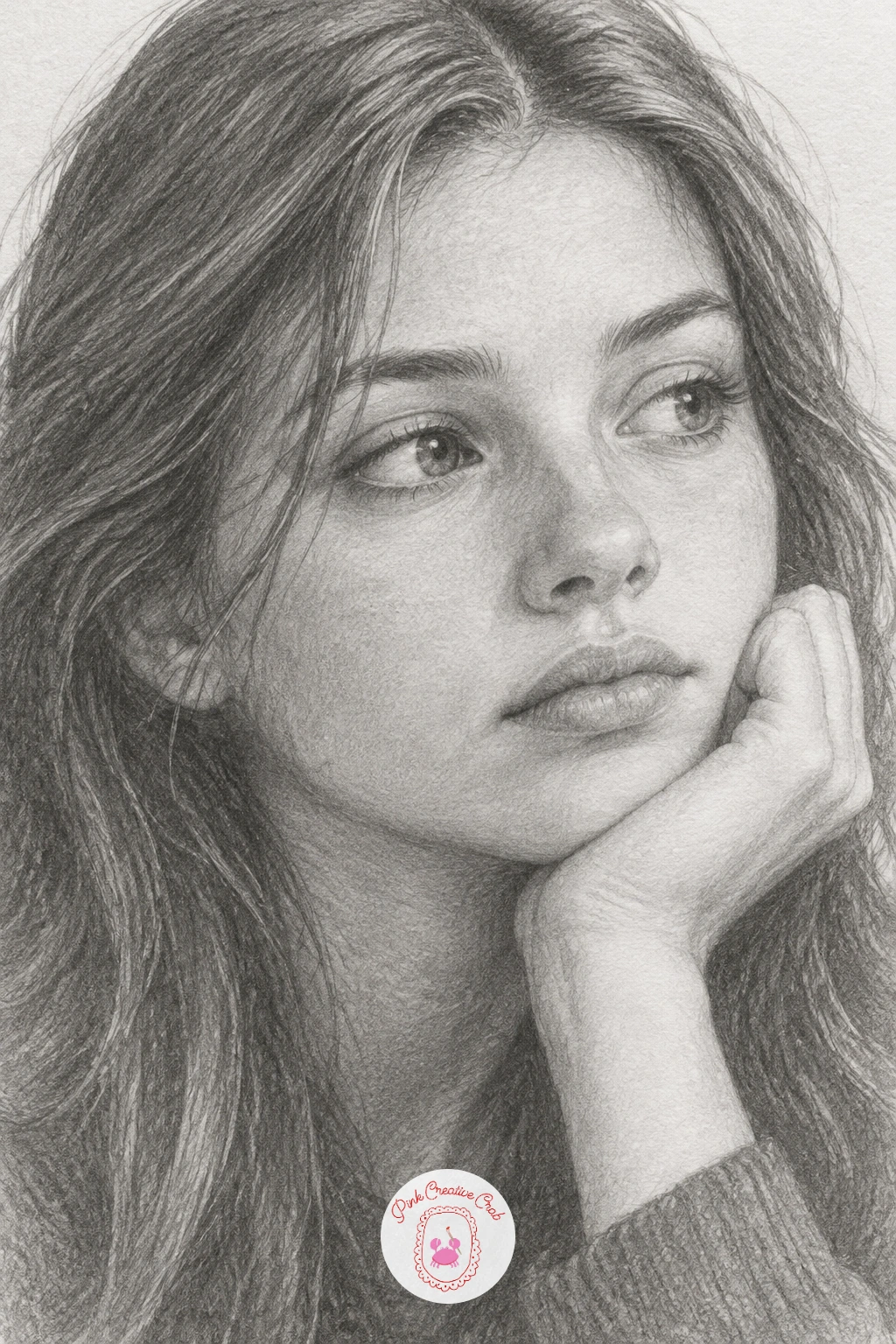
This quiet pose rewards working slowly, so set a timer if you like and give it the full session. Begin with the tilt of the head resting into the palm, letting the jaw press softly into the fingers rather than floating above them, and check that the wrist and forearm angle logically down to a surface below the frame.
Shade the face in gentle gradual layers, keeping the eyes slightly unfocused and looking just past the viewer for that lost-in-thought quality. The hand needs its own attention: draw the knuckles and finger creases lightly before shading, since skin folds are where the whole gesture convinces or falls apart.
A quick ten minute version covers just the face and resting hand loosely sketched in. The fuller forty minute version adds the sleeve, soft shadow under the jaw and a little depth in the background shading behind the shoulder.
For more help studying hands specifically, the guide to realistic hand drawing works well as a companion practice sheet before you return to this pose.
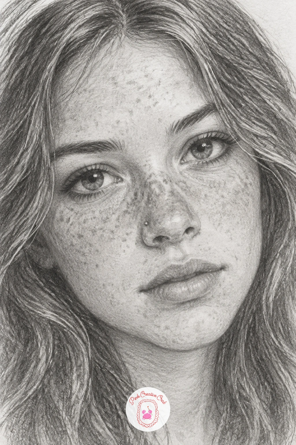
Freckles and small details like a nose stud add charm without adding difficulty, as long as you save them for last. Draw and shade the whole face first, smooth skin tones built up gently with an HB pencil, and only once the base shading feels finished do you dot in freckles with the sharp tip of a 2B, scattered unevenly across the nose and upper cheeks.
Keep the freckles varied in size and spacing rather than a neat grid, which is the detail that makes them look real instead of stamped on. The nose stud is a single tiny dot with one white highlight left untouched beside it.
The common mistake is making freckles too dark and uniform, which flattens the face instead of adding texture. If that happens, lighten the heaviest ones with a kneaded eraser dabbed gently rather than erased in a stroke.
No stud piercing in your reference photo. Just leave a small bright dot of bare paper on one nostril and it reads clearly enough on its own.
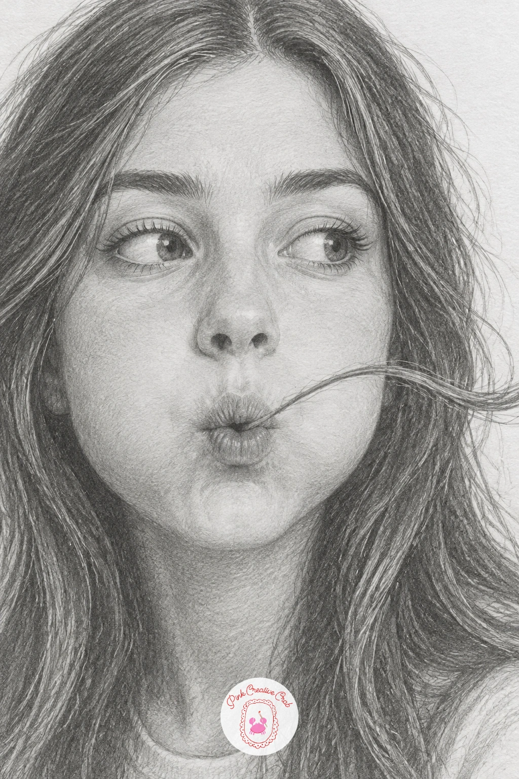
Moving from stillness into motion, this one is all about the mouth and the hair’s arc. Draw the lips pursed slightly forward, puffed just a little at the cheeks, with the eyebrows raised in mild exasperation or amusement.
The strand of hair itself should curve upward and away from the face in one clean sweeping line, drawn with a single confident pencil stroke rather than built from several shorter ones. Shade the face normally first, then add the strand last so it sits cleanly on top of the finished skin tones.
If the strand looks static instead of mid-air, curve it more sharply near the tip and leave the base near the hairline slightly thicker, the way a real strand tapers as air catches it.
A fine 2H pencil, sharpened to a point, gives the cleanest single line for the flying strand if your regular pencil feels too blunt for it.
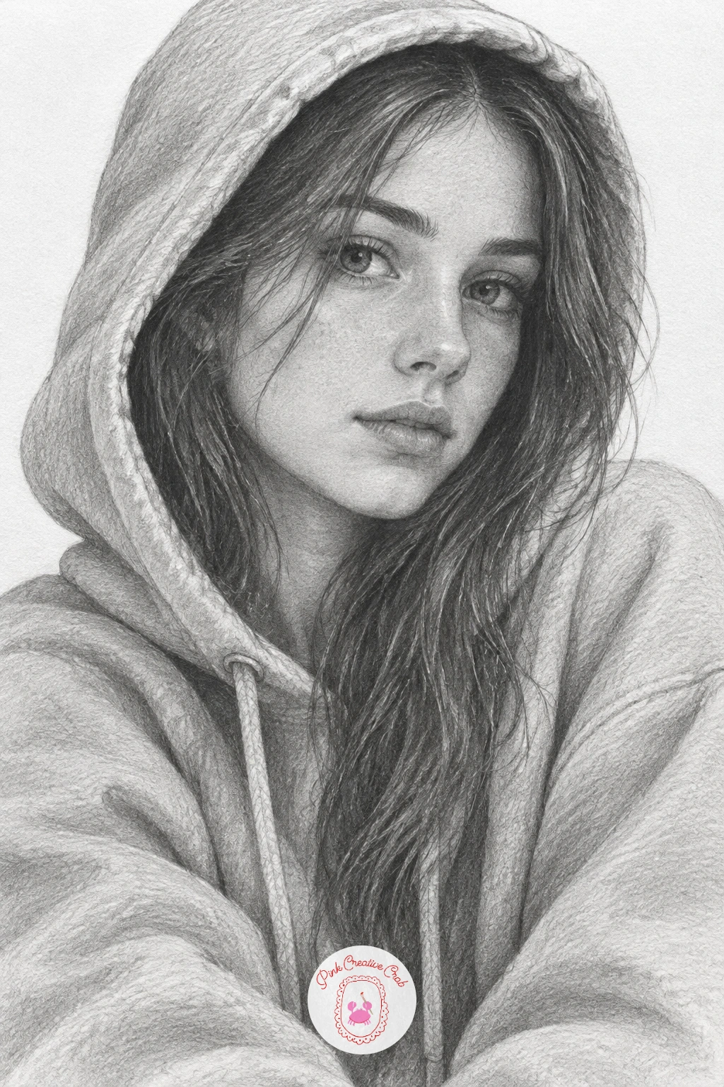
A hoodie brings in fabric folds alongside the face, which is a nice change of material to practice. Sketch the hood first as a soft rounded shape sitting just behind the head, half up rather than fully covering it, then place the face inside its frame.
Shade the fabric in broad, loose strokes with the side of the pencil, following the gentle folds where the hood meets the shoulder, and keep this shading looser and less polished than the tight, smooth shading on the face itself. That contrast between soft skin and looser fabric is what sells the whole picture.
Where beginners struggle is making the hood too stiff, like cardboard. Round every edge slightly and let a fold or two cut diagonally across the fabric rather than drawing it as flat panels.
If you want the quick version, block the hoodie in ten minutes with flat tonal shapes and no fold detail, then come back later and add the creases once you have more time.
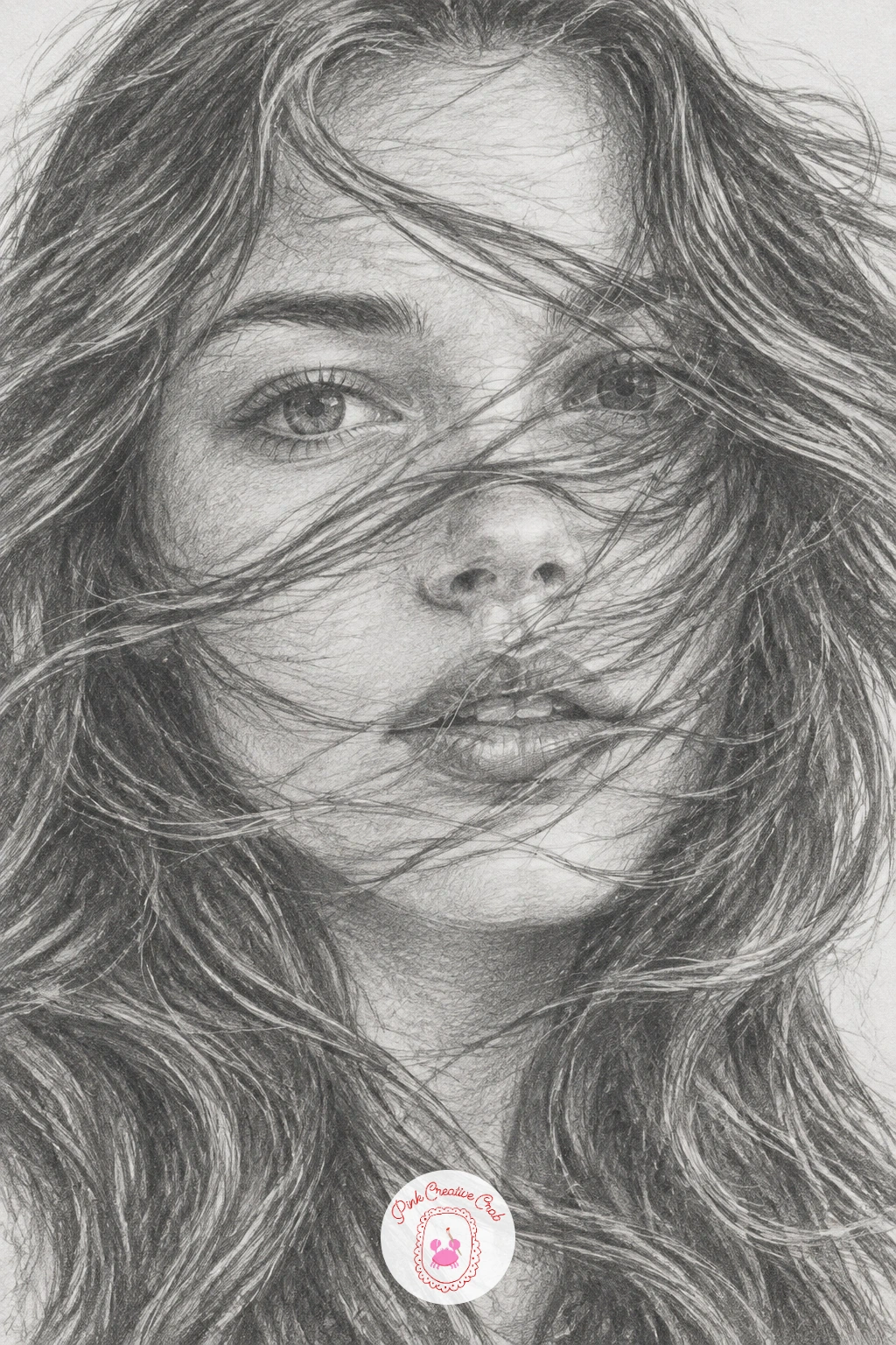
This is one of the more involved hair studies in the set, so plan the full forty minutes for it. Sketch the face first and lightly indicate where strands will cross it, leaving those areas unshaded until the hair is drawn so the strokes stay clean rather than muddy.
Draw the hair in long wavy sections working from the crown downward, each wave following a loose S curve rather than a straight diagonal. Where hair crosses the face, shade the skin on either side of the strand but leave a thin line of lighter tone for the strand itself, letting it float believably over the features.
For eye level and light here, imagine light coming from behind and slightly above, which rim-lights the edge of the blowing hair and makes it feel like it is actually moving rather than just drawn across the face.
Working on a slightly larger sheet than usual gives the long waves room to curve fully instead of cramping at the paper edge.
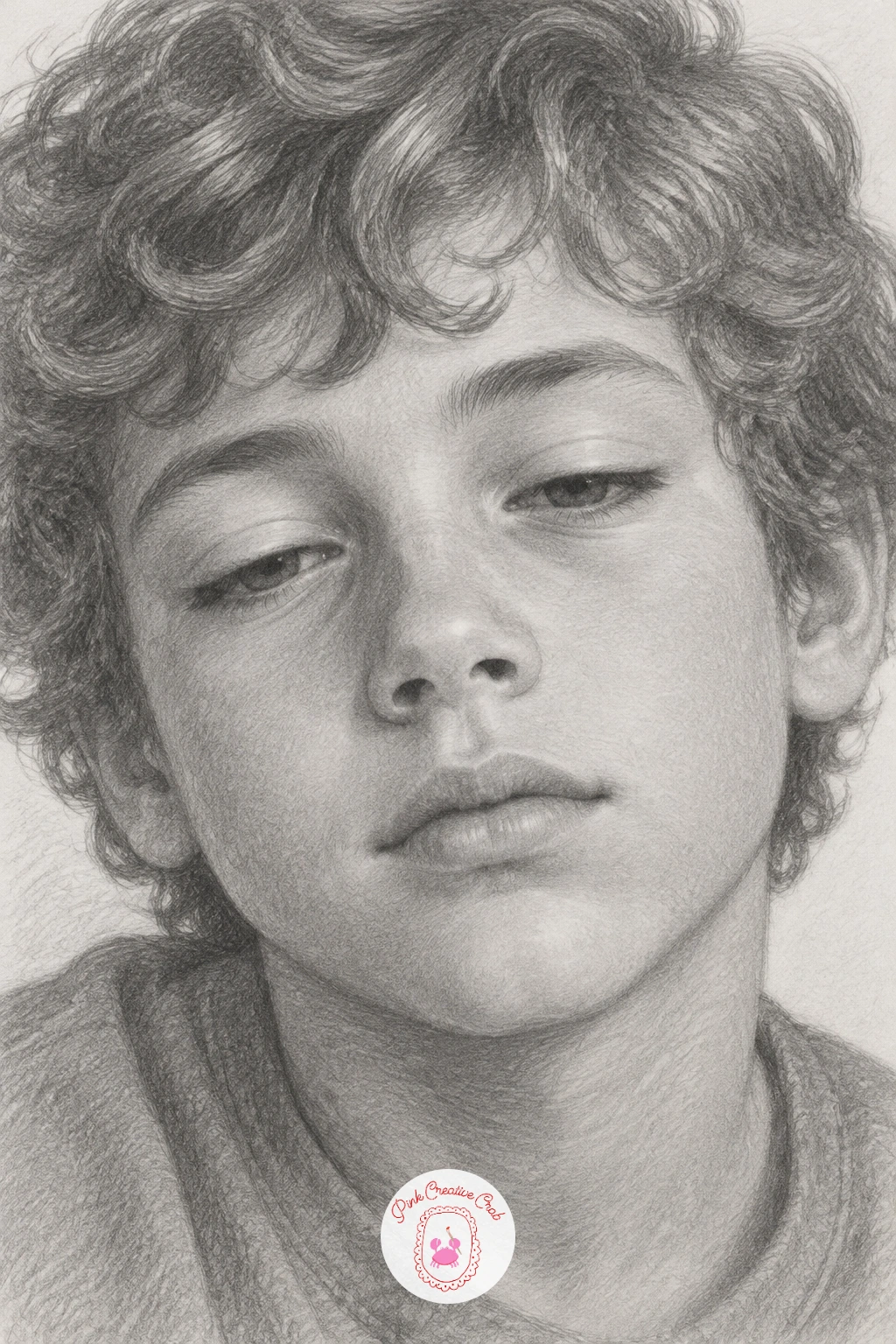
Switching to a boy’s face for variety, keep the same soft semi realistic approach: gentle shading, slightly enlarged sleepy eyes, no harsh lines. Sketch the curls as a mass of overlapping C shapes rather than individual strands, varying their size so the curls feel natural rather than uniform.
Shade the half-closed eyes with heavier lids and a soft shadow just beneath them, since sleepy eyes rely more on the lid shape and under-eye tone than on the iris itself. Build the rest of the face in the usual gentle HB layers, keeping the mouth relaxed and slightly open.
The curls are where this goes wrong most often, turning into a scribbled mess. Shade each curl’s shadow side individually with small circular strokes and leave its highlighted top edge nearly untouched to keep the curls readable as separate forms.
If pencil curls still look flat, a 4B for just the darkest curl shadows adds the depth a single HB cannot reach alone.
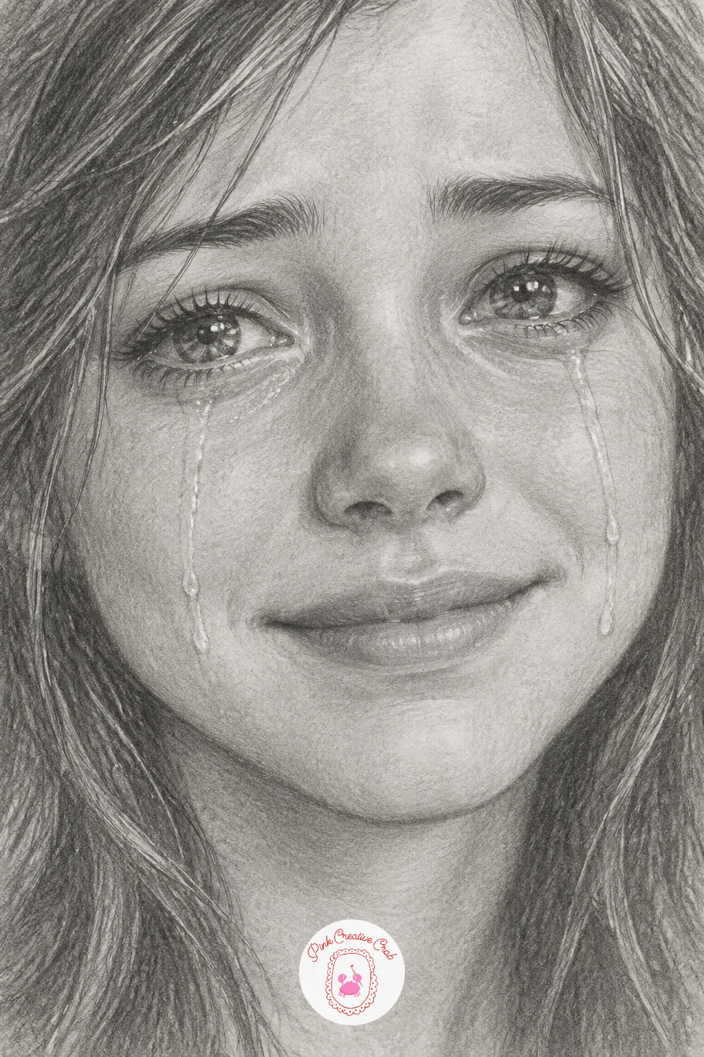
An emotional face like this rewards careful eye work above all else. Draw the eyes slightly glassy, with a brighter highlight than usual in the iris to suggest welling tears, then add one or two clean teardrop shapes tracing down the cheek, each with a tiny highlight left untouched at its curved edge.
Shade the smile gently upward at the corners even while the eyes stay heavy, since the contrast between a brave mouth and sad eyes is the whole point of the picture. Keep the smile a little tight and restrained rather than wide and open.
The common misstep is overworking the tear tracks until they look like scratches. Keep each one a single smooth curved line with soft shading just beside it, never on top of it, so the bare paper reads as the shine of the tear itself.
No glossy highlight pencil needed, a kneaded eraser pressed gently into the shaded cheek lifts a clean highlight just as well.
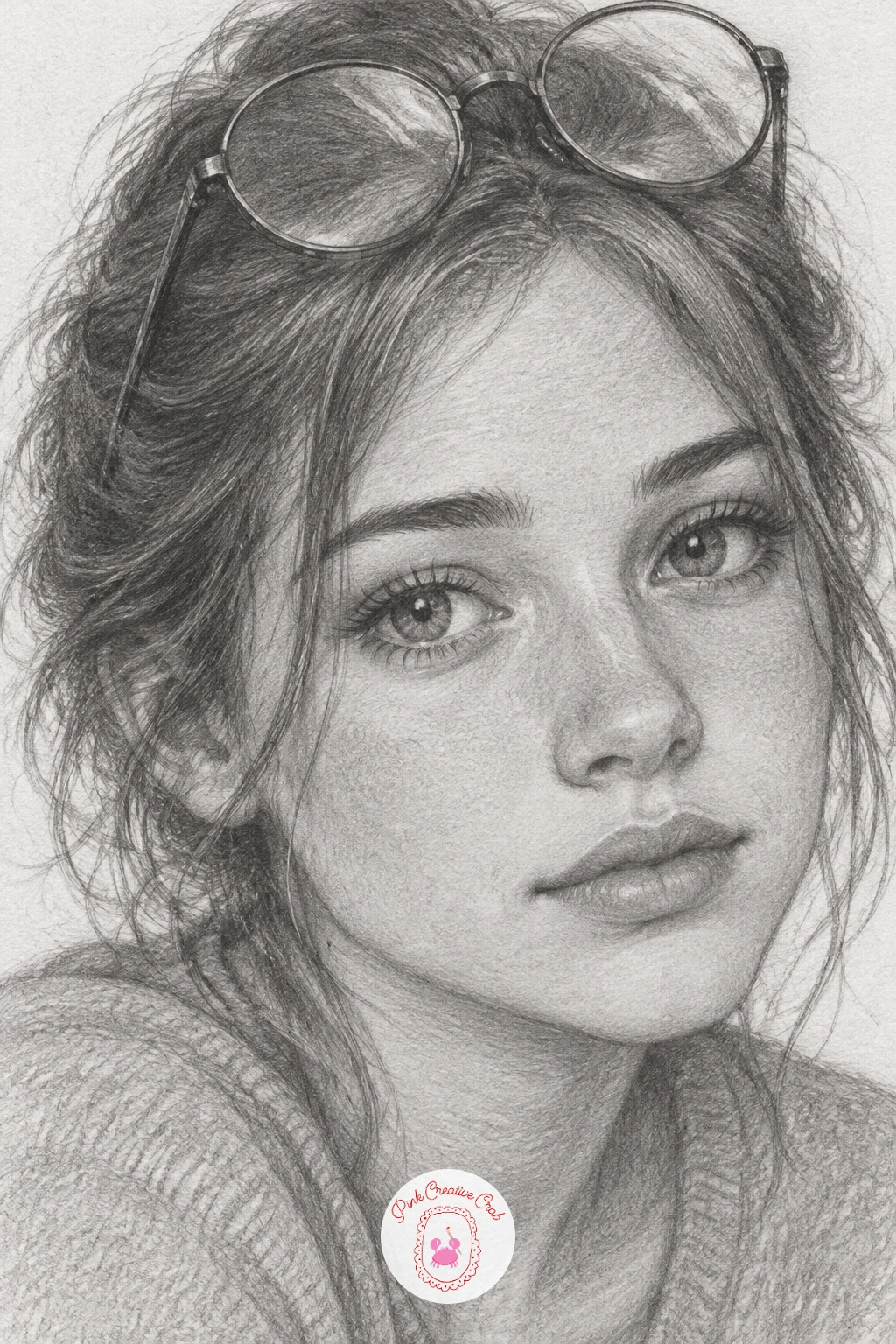
Glasses pushed up rather than worn are an easy way to add a prop without covering the eyes, so give full attention to the features instead. Sketch the round frames resting in the hair first, lightly, before the face is fully shaded, so you can judge how much hair they should press into.
Shade the face as usual, then add the glasses last in a few clean confident lines: a single highlight along the top rim and a soft shadow where the frame meets the hair are usually enough, no need to render the lenses since they are tipped away from view.
Measuring trick for this one: the width of the glasses should roughly match the width between the outer corners of the eyes, which keeps them from looking comically large or small once pushed up.
If the frames look too flat against the hair, add a little shaded gap between frame and scalp so they sit convincingly on top rather than painted onto it.
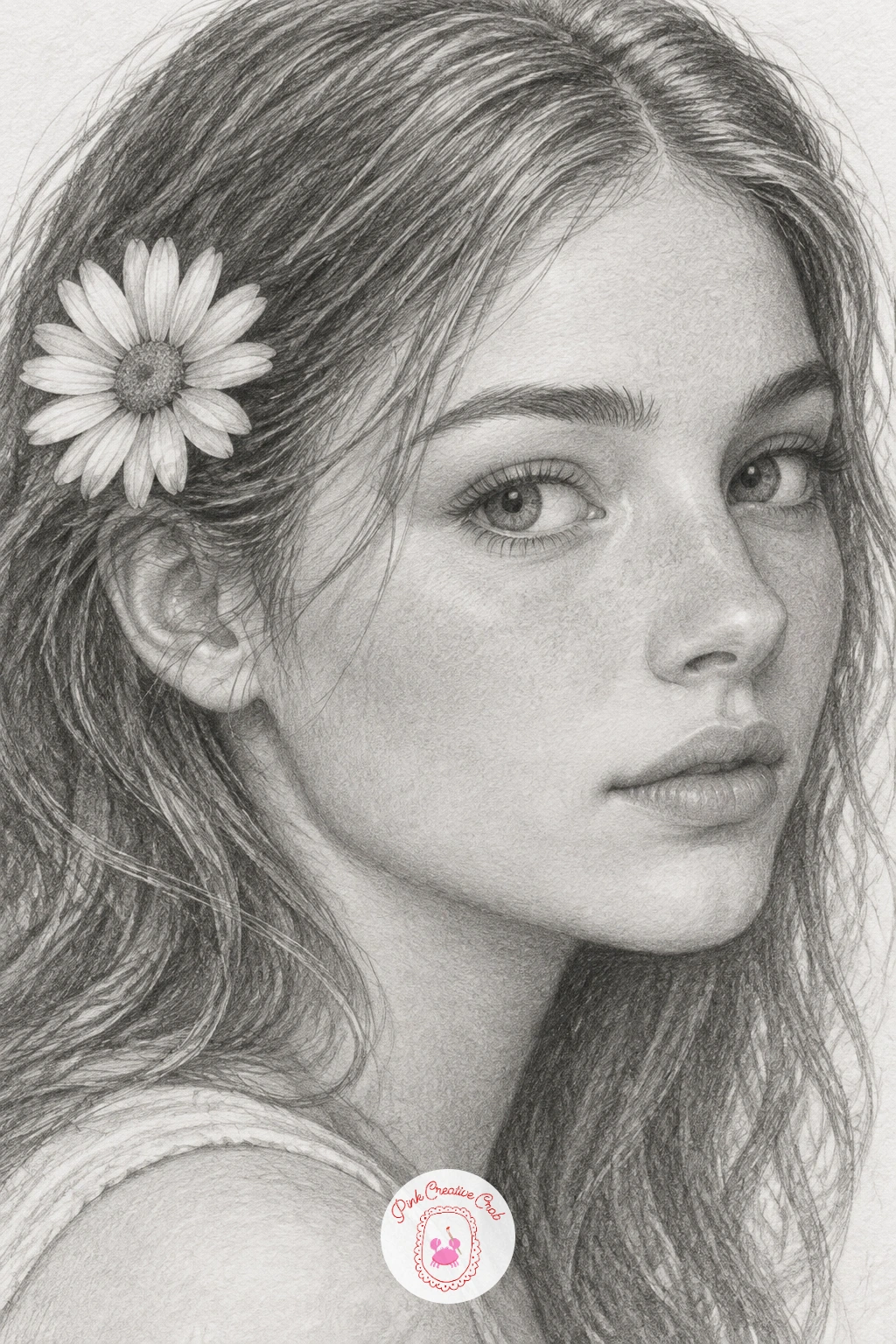
A small daisy is a lovely detail to practice after several faces in a row, since it is a simple shape that rewards a light touch. Draw the face and hair first, leaving a gap near the ear for the flower, then sketch the daisy as a central circle with five or six simple oval petals radiating outward, slightly overlapping the hair at the base.
Shade the petals with the lightest touch of the pencil, almost pure white with just a hint of grey at the base of each where it meets the center, and darken the central disc with small dotted strokes for texture.
If the flower competes too much with the face for attention, keep its shading noticeably lighter than the skin tones around it, since a bright simple flower reads clearly against softly shaded hair without needing heavy contrast.
No real daisy on hand for reference, any five petaled flower photo online works just as well for the petal shapes.
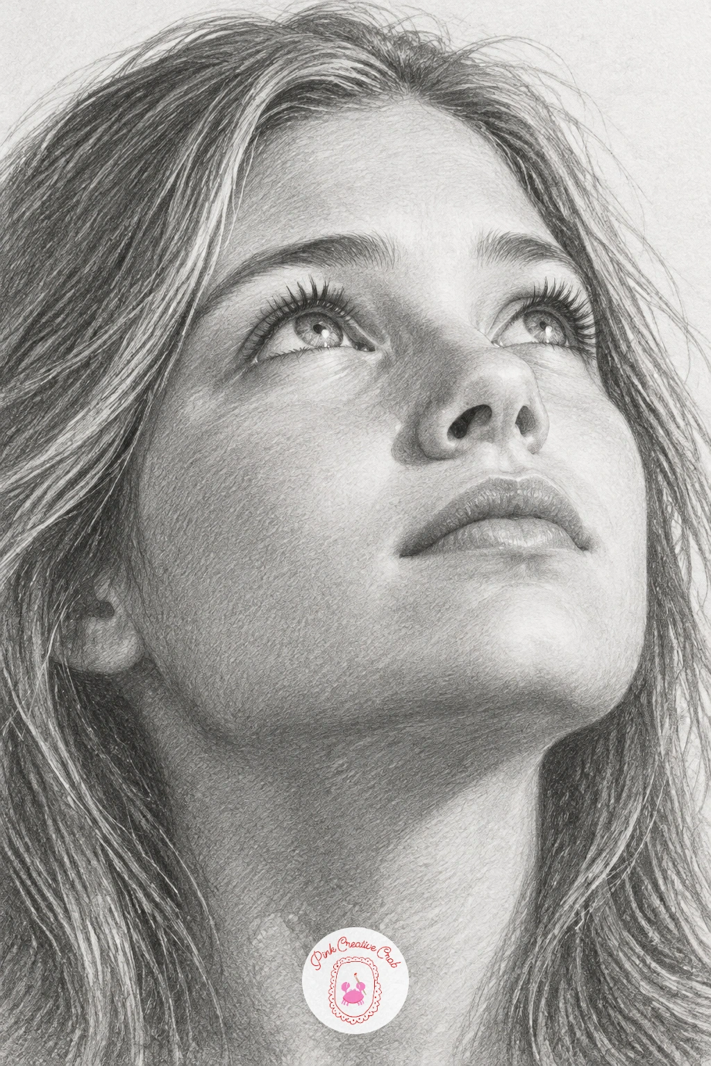
Tilt the whole head back slightly for this one so the chin lifts and the throat shows a soft curve, with the eyes looking upward and slightly toward the light source. Place the light coming from directly above or just in front, since that is what throws the catchlight believably into the upper part of each iris rather than the side.
Shade the underside of the chin and jaw a touch darker than usual, since the upturned angle means light falls differently than in a standard forward-facing portrait, and this shift in shadow is what makes the upward tilt convincing rather than just a drawn-on angle.
Leave the brightest highlight in each eye slightly higher and larger than usual to match the upward gaze, and keep the brows relaxed rather than furrowed for a softer, more open expression.
If the look reads as startled instead of calm, loosen the eyebrows and widen the mouth just slightly into a gentle rest position.
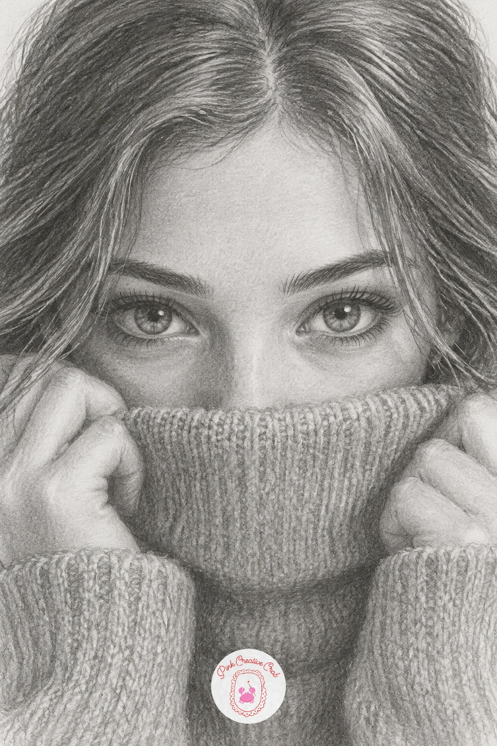
This cozy gesture hides half the lower face, which actually makes it a faster, more forgiving piece once the eyes are right. Sketch the turtleneck collar first, pulled up to just below the nose, then build the eyes extra expressive since they now carry almost the whole emotion of the drawing.
Shade the fabric in soft ribbed vertical lines rather than one flat tone, since a turtleneck’s texture comes from those subtle ridges catching slightly different light. Keep the shading on the collar a touch darker where it folds under the chin.
If this is your first time drawing fabric this close to the face, go lighter than feels natural at first. Heavy fabric shading next to delicate skin tones can make the whole face look muddy by comparison.
No ribbed knit reference handy, a few evenly spaced curved vertical lines across the collar reads convincingly enough for this level of detail.
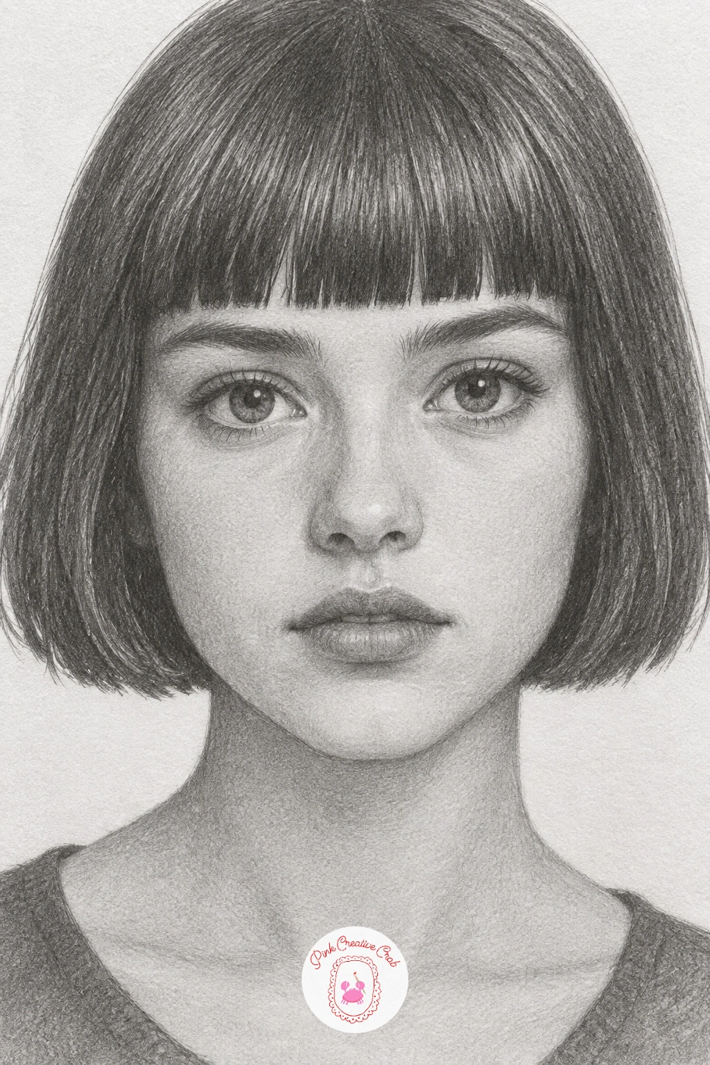
A blunt bob is a good structural exercise after looser hairstyles, since every edge here stays crisp rather than wispy. Draw the bob as a clean rounded shape hugging the jaw, with the bangs cut in a straight horizontal line just above the brows, and resist the urge to soften that edge the way you would with loose strands.
Shade the hair in smooth even layers, keeping the straight edges of the bangs and the bottom hem of the bob sharp while the interior shading stays gradual and soft, same as the skin. That contrast between crisp outline and soft interior tone is what makes a bob read as neat rather than stiff.
Measuring trick: the bangs should sit no lower than halfway down the forehead, otherwise the eyes feel crowded and the whole face looks younger than intended.
If the straight edges wobble, a light ruled guideline in pencil before shading keeps the line confident without looking mechanical once shaded over.
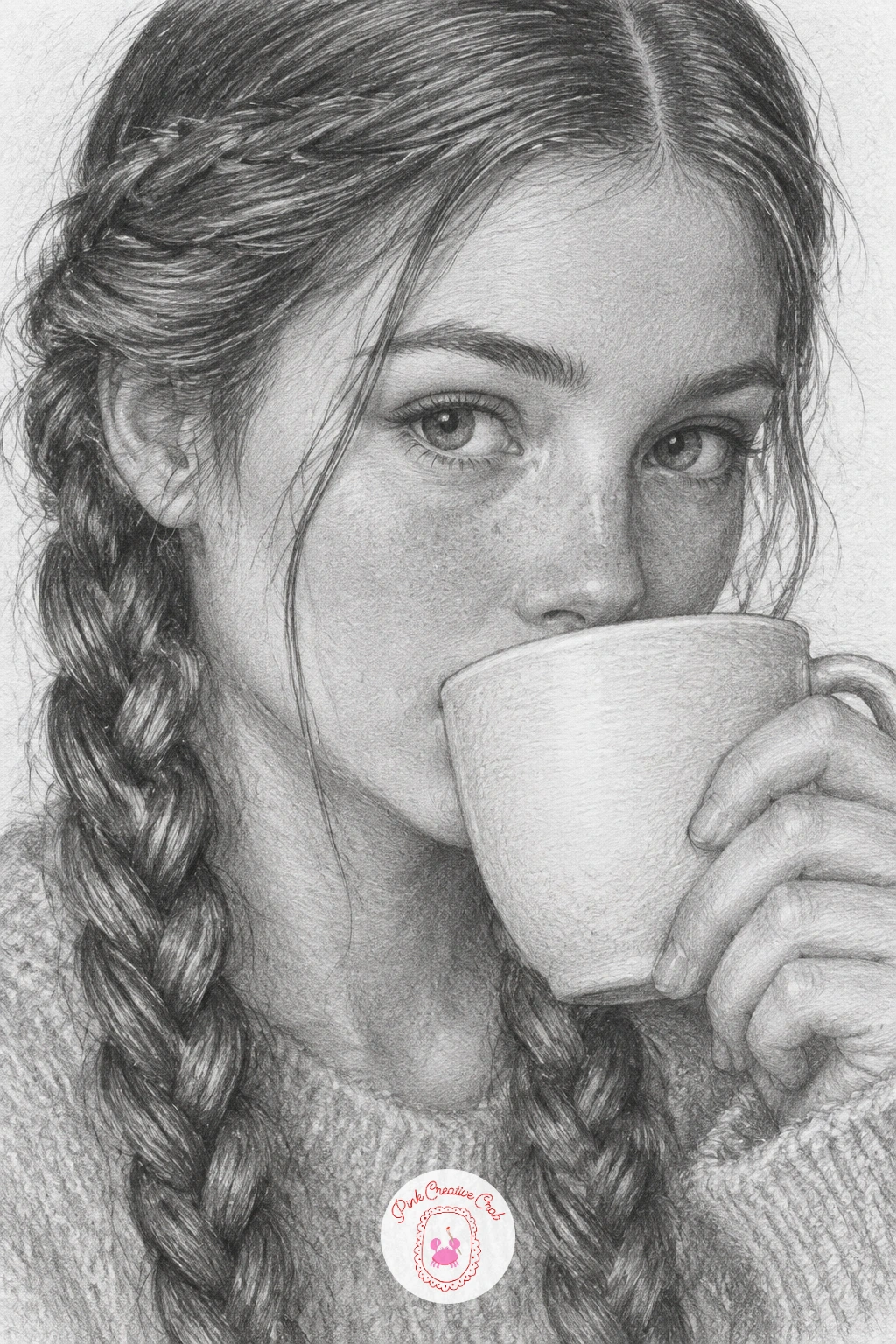
Braids add a nice rhythmic pattern, and the cup brings in a small still life element held close to the face. Sketch the braids as a simple over-under weave, three strands crossing in a repeating pattern, drawn loosely before any shading begins.
Shade each braid section individually, darkest where one strand crosses over another and lightest at the top of each raised section, which is what makes a braid look woven rather than just striped. Draw the cup last, held just at the lips, with a single curved highlight down its side to suggest a smooth ceramic or glass surface.
If the braid pattern gets confusing partway through, pause and trace the over-under sequence lightly in pencil first before committing to any shading, since fixing a woven pattern after shading is much harder than before.
No teacup reference on hand, a simple plain mug or glass works just as well and keeps the hands’ attention on the braids instead.
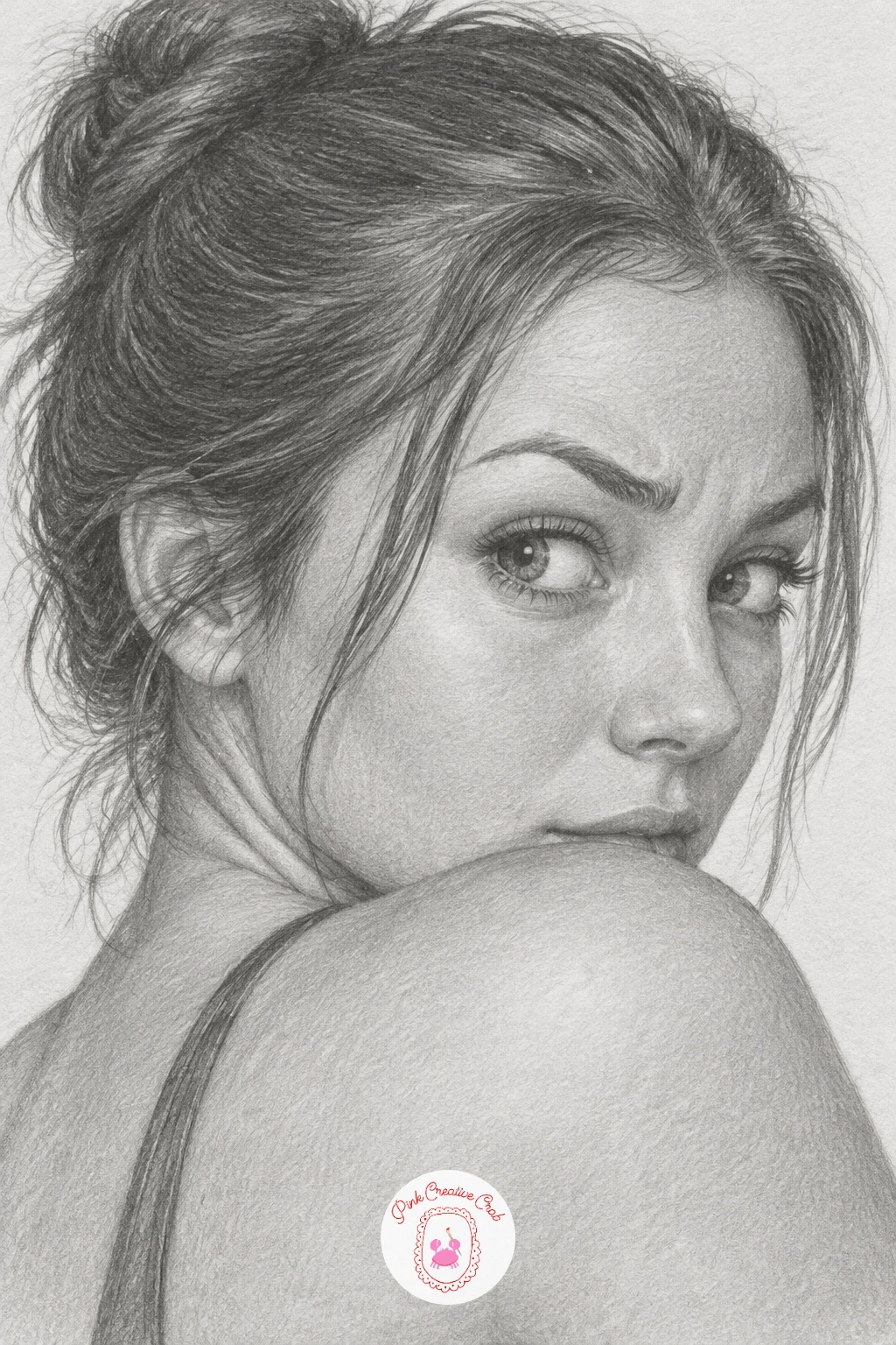
This pose is mostly about the turn of the neck and the asymmetry of a single raised brow, so spend extra time getting that imbalance right. Sketch the shoulder and back first, then the head turned back over it, checking that the neck twists believably rather than the head simply floating above a straight back.
Raise one eyebrow noticeably higher than the other and narrow that same eye very slightly, which is the small asymmetry that reads instantly as a skeptical or playful look. Shade the face as usual, then darken the shadow along the far side of the neck where it twists away from the light.
If the raised brow looks exaggerated instead of natural, lower it by a small amount and widen the mouth into the faintest smirk so the whole expression feels unified rather than a single odd feature.
A quick ten minute sketch can cover just the head and shoulder turn; the longer version adds hair detail and the full curve of the back.
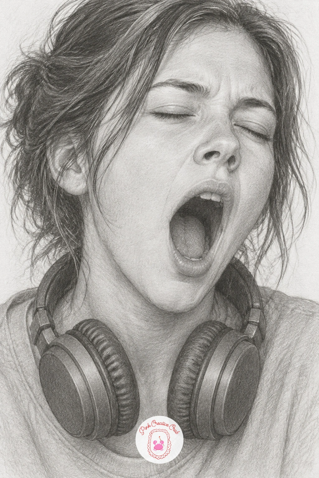
A yawn opens the mouth wider than almost any other expression here, so take extra care with the jaw. Drop the lower jaw further down than feels instinctive and widen the mouth into a rounded oval rather than a simple open rectangle, with the eyes squeezed nearly shut above it.
Shade the inside of the mouth with a soft mid grey rather than solid black, keeping some light bouncing around inside it so it does not become a flat dark hole in the middle of the face. Add the headphones around the neck last, as simple curved bands with a soft highlight along the top of each earcup.
Where this often goes wrong is a jaw that does not drop low enough, making the yawn look more like a small shout. Lower the chin a touch further than you think necessary and the exhaustion reads immediately.
If you do not want to draw headphones, a simple loose scarf around the neck works as an easy swap and needs far less detail to shade convincingly.
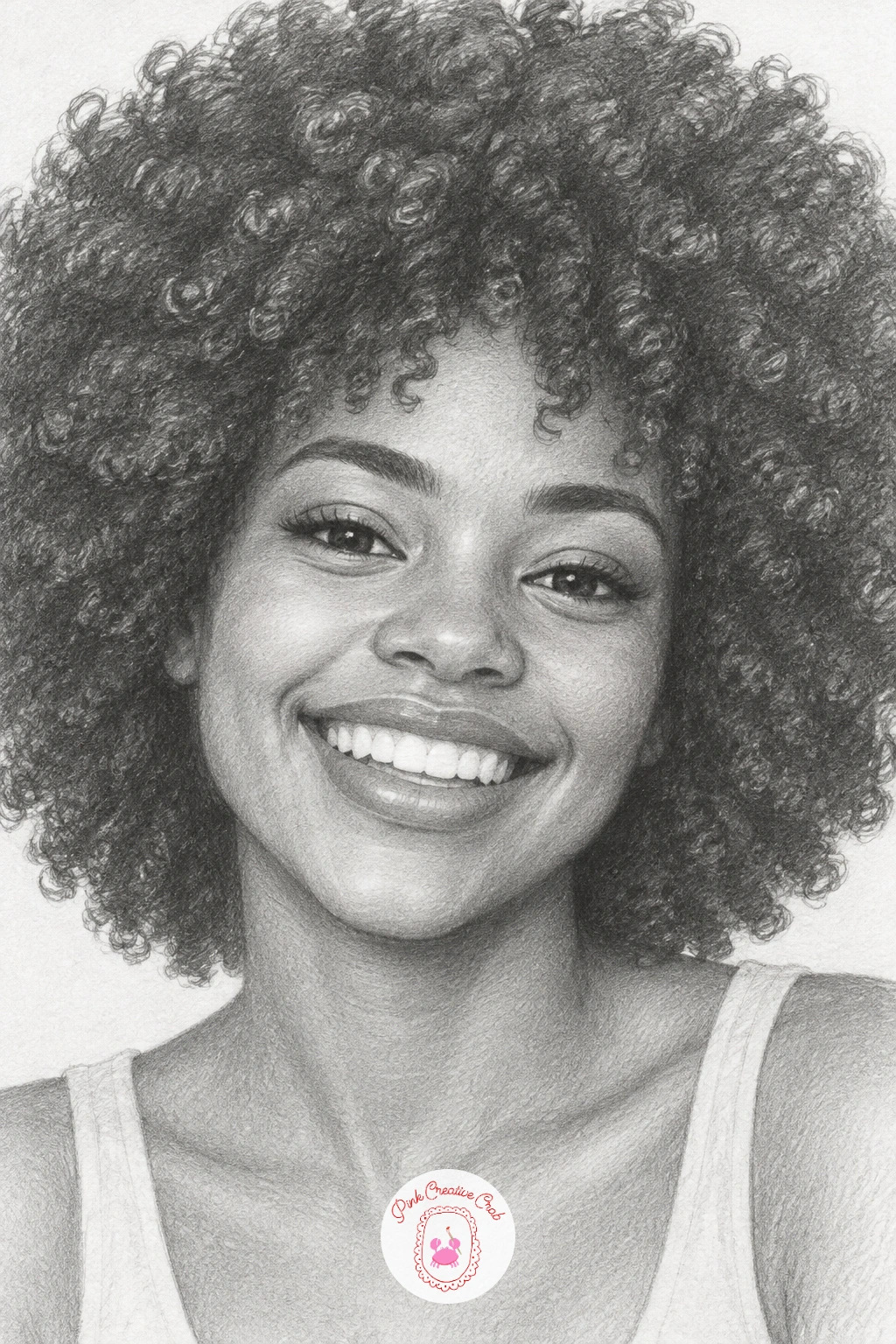
A full afro is a satisfying texture study after the tighter curls drawn earlier, since the volume here is much larger and rounder. Sketch the overall silhouette as one large soft cloud shape first, then break the interior into clusters of small overlapping curls rather than trying to draw each curl from the outer edge inward.
Shade from the inside out, keeping the deepest shadows near the scalp and the outer silhouette noticeably lighter where individual curls catch more light against the white paper. The bright grin beneath it should show a little tooth shading, kept light so it contrasts cleanly against the darker hair above.
If the afro’s edge looks too smooth and bald, leave a slightly irregular, bumpy outline rather than a clean circle, which reads far more like real curl texture.
A soft 4B or 6B pencil, used loosely at the edges, gives the fluffier texture a sharper 2B cannot manage alone.
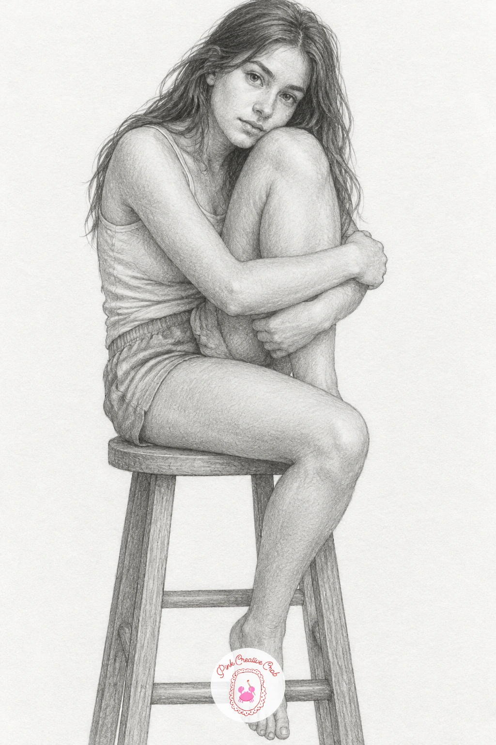
Moving into a fuller figure pose, this one asks for simple proportion checks before any shading starts. Block the whole seated figure first using light gesture lines: the stool, the bent knee pulled toward the chest, and the arms wrapped around it, measuring the head against the torso roughly as you would for any seated figure so nothing ends up too long or short.
Shade the face and exposed skin first in the usual soft graphite layers, then move outward to clothing and the stool, keeping the stool itself drawn with far less detail than the figure so attention stays on the pose.
The common proportion mistake is a knee drawn too small for the body hugging it. Check that the bent leg’s thigh is roughly as long as the figure’s forearm before finalizing any lines.
For more seated and gesture poses to build confidence with full figures, the sketchbook diary ideas are a good next practice set.
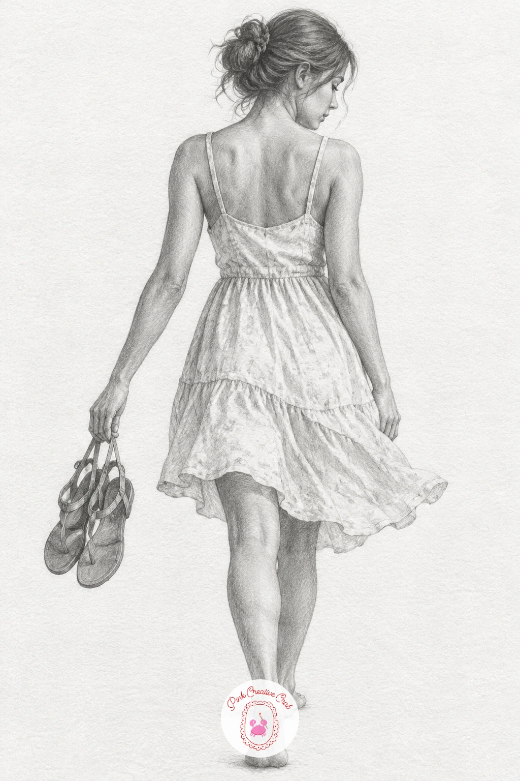
A walking figure in a light sundress brings in fabric movement and a relaxed overall gesture. Sketch the walking pose first with a simple center line through the body to check balance, one leg forward and slightly bent, the other trailing back, before adding the dress over the top.
Draw the dress hem swinging slightly with the stride, in soft curved folds rather than a straight line, and place the shoes dangling loosely from one hand with the fingers hooked through the straps rather than gripping tightly. Shade the dress lightly and loosely, saving the tightest, smoothest shading for the face and shoulders.
If the walking pose looks stiff, check that the shoulders and hips tilt in slight opposite directions, which is what real walking does and what makes a standing figure suddenly feel like it is moving.
No specific sundress reference needed, any simple shift dress shape with thin straps works for this pose.
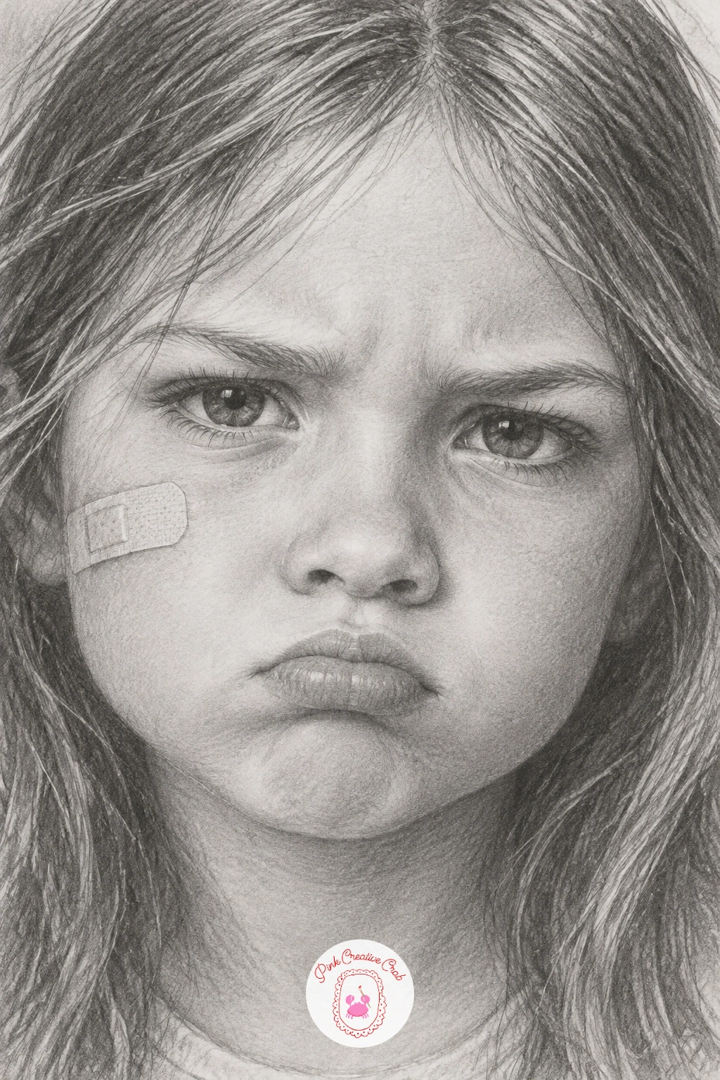
A small plaster is a nice detail to add after the fuller figure poses, bringing the focus back to the face and a strong expression. Sketch the pout first: lips pressed slightly forward and down at the corners, brows drawn together just a little, not angry, simply stubborn.
Shade the face as usual, then add the plaster on the cheek last as a simple rectangle with rounded corners, shaded just slightly darker than the skin around it with a tiny highlight along one edge to suggest its slight lift off the skin.
Keep the plaster small relative to the face, no larger than the width of the nose, since an oversized plaster reads as a costume prop rather than a believable small scrape.
If you prefer, swap the plaster for a tiny bruise or smudge of dirt instead, shaded the same simple way, for a slightly different story on the same pouting face.
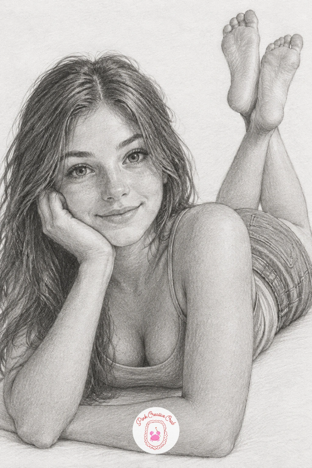
This relaxed pose is one of the more involved figure drawings here, so give it the longer session. Begin with the body lying flat on its stomach, propped up on both forearms, and sketch the legs bending up behind with the feet kicked into the air, checking that the lower legs are roughly the same length as the thighs before adding any shading.
Shade the face and arms first since they carry the expression, then the back and legs, keeping the shadow beneath the raised legs and under the chin stronger than elsewhere to ground the whole figure believably on a flat surface.
The quick ten minute version sketches just the head, shoulders and propped arms loosely. The fuller version adds the kicked up legs, folds in the clothing and a soft cast shadow stretching out from the figure.
If the pose feels flat, raise the back feet a little higher than feels natural, since a playful kicked-up angle reads much more lively than feet left low and close to the ground.
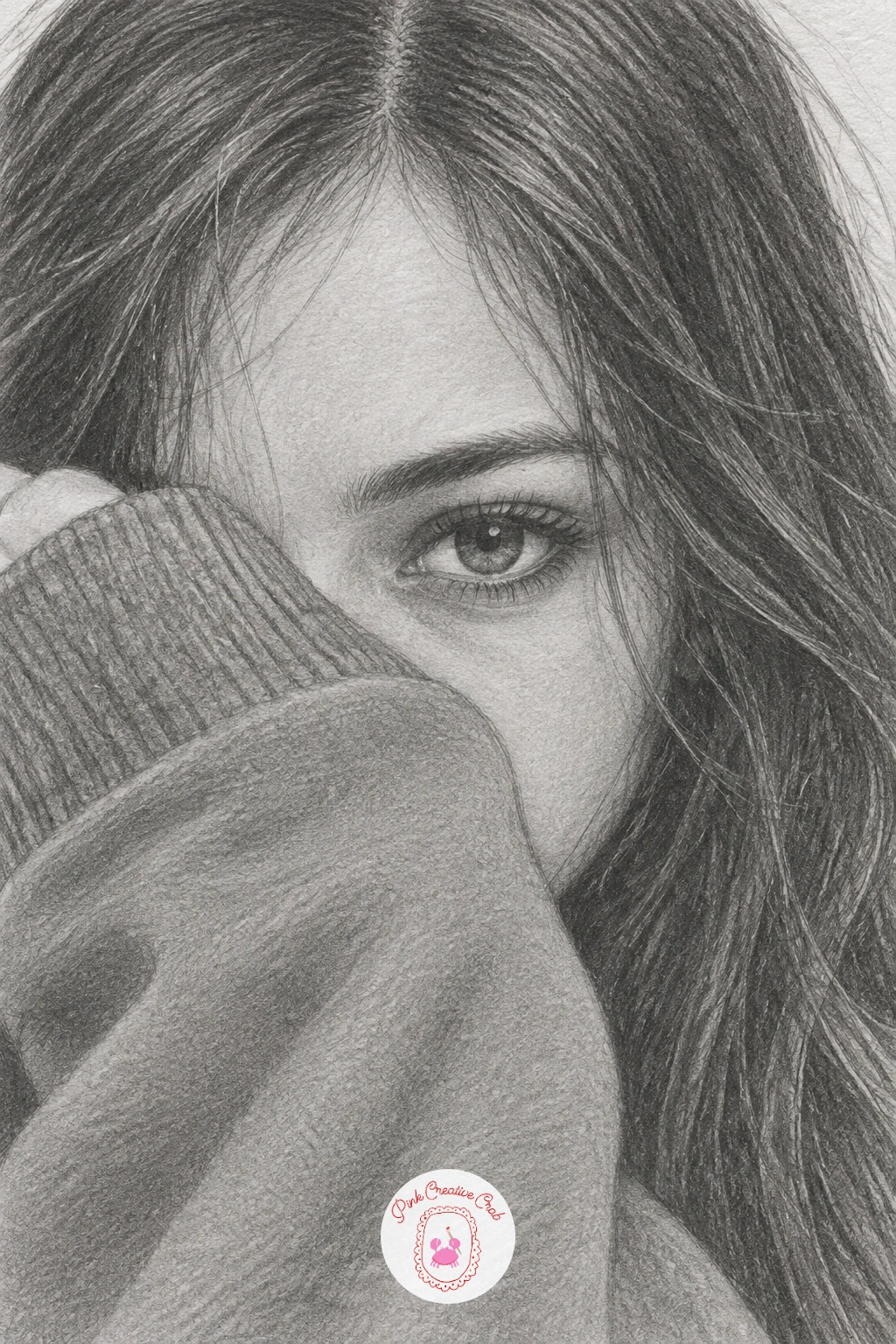
Hiding half the face is a fun compositional challenge, since one visible eye now has to do all the emotional work. Sketch the sleeve first, pulled up and over the lower half of the face, with the fabric bunched slightly where the hand grips it near the cheek, then place the single visible eye carefully, slightly wider and more expressive than you might normally draw it.
Shade the exposed eye and brow in full detail with the usual gradual graphite layers, then shade the sleeve more loosely, with soft creases radiating from where the hand holds the fabric against the cheek.
If the hidden half looks like it is simply missing rather than covered, add a soft shadow cast by the sleeve onto the visible cheek just below it, which anchors the fabric convincingly in front of the face rather than floating beside it.
No long sleeved reference on hand, any loose knit cuff pulled past the wrist and up toward the face works for this gesture.
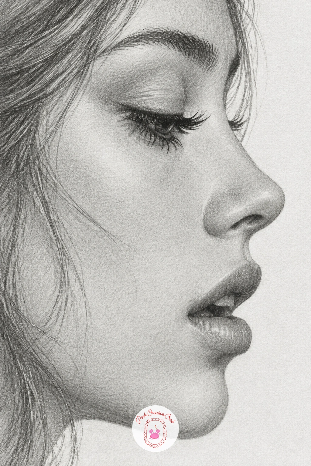
A full side profile is a different proportional puzzle from a forward-facing face, so measure carefully before shading. Mark the forehead, nose tip, lips and chin against a vertical guideline first, checking that the distance from the ear to the tip of the nose roughly equals the distance from brow to chin, which keeps a profile from stretching too long or squashing too short.
Draw the single visible eye in profile with long lashes curving outward in a clean fan, since in profile the lashes become one of the most expressive lines on the whole face. Keep the lips softly parted, with a thin dark line separating them rather than a heavy black gap.
Shade the face in the usual soft layers, paying close attention to the bridge of the nose, which needs a clean highlight running down it to keep the profile from looking flat.
If the nose looks too sharp or beak-like, round the tip slightly and soften the bridge highlight with a blending stump.
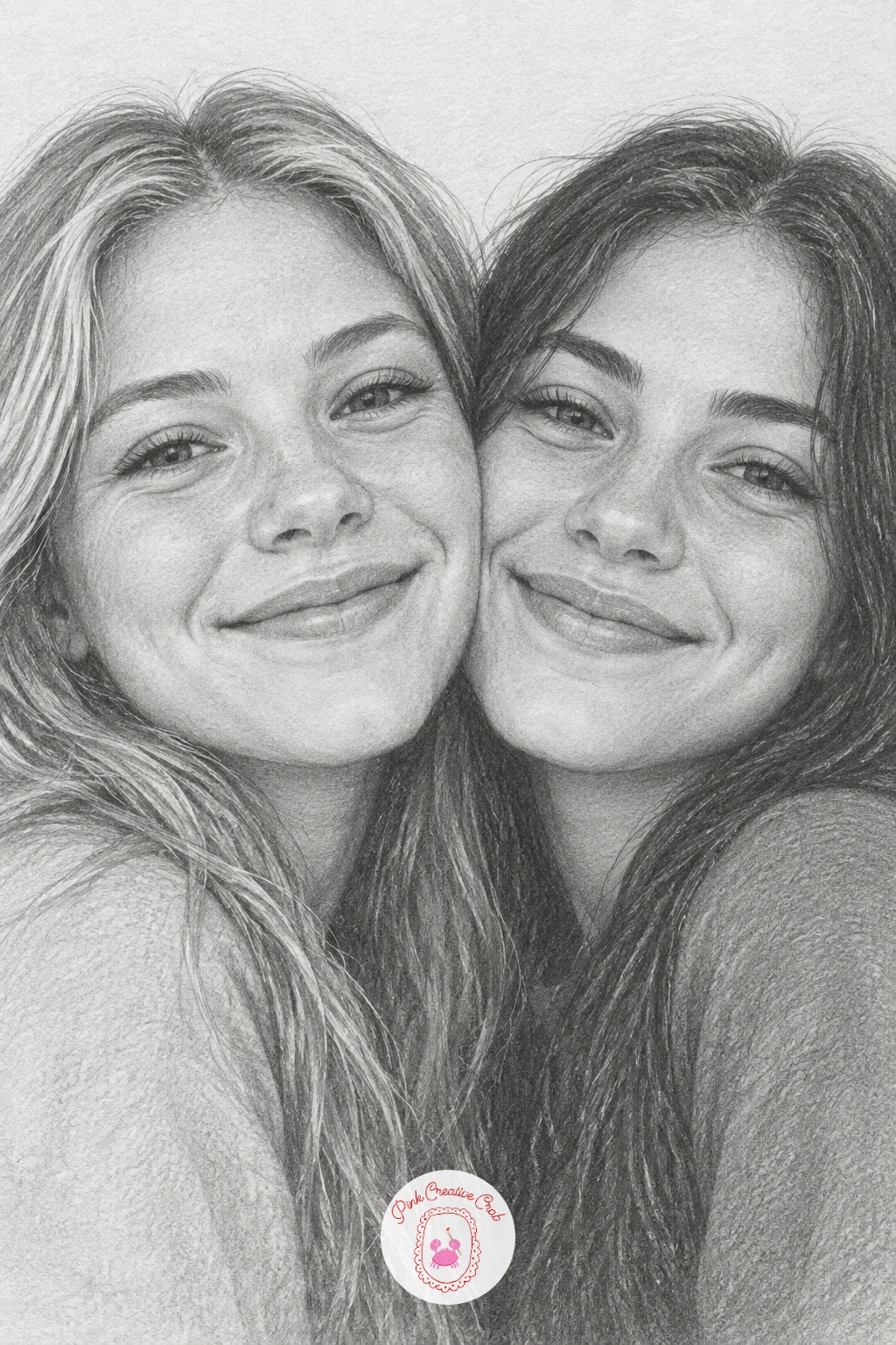
Finish the set with two faces pressed together, which means doubling every proportion check from earlier ideas at once. Sketch both heads first as simple overlapping shapes, checking that neither face is drawn noticeably larger than the other unless you want one further back, then place the features on each, keeping expressions warm and open, perhaps both smiling or one smiling while the other closes her eyes.
Shade the nearer face slightly crisper and darker in its deepest shadows, and the further face a touch softer overall, which helps the two heads read as sitting at slightly different depths rather than pasted flat side by side.
The point where the cheeks touch needs the gentlest shading of the whole piece, a soft blended shadow rather than a hard line, since a crisp line there makes the faces look stuck together instead of pressed warmly close.
For more ideas built specifically around friendship poses like this one, the BFF drawing ideas make a good next stop, and the earlier girl pencil drawing list is worth revisiting too.
What to Do Next
Pick whichever face speaks to you first, sharpen a soft pencil, and start with the light construction lines before any shading touches the paper. A smooth sheet from a bristol pad gives the gentlest base for these soft gradual tones, and once one face feels finished, the next one on the list is already waiting.
Frequently Asked Questions
What pencils work best for semi realistic drawing?
A small range from HB to 6B covers most of it, HB for light base tones, 2B and 4B for mid shadows, and 6B for the deepest darks. A blending stump and kneaded eraser round out the kit for soft gradual shading.
How do you make eyes look bigger without them looking cartoonish?
Enlarge the eye shape only slightly, keep the iris detail and eyelid shading realistic, and avoid oversimplifying the lashes. The realism in the shading is what keeps a bigger eye looking soft rather than cartoonish.
What paper is best for soft graphite shading?
A smooth bristol or hot press drawing paper gives the cleanest, most even gradual shading. Toothier papers grab graphite unevenly and make smooth skin tones harder to achieve with light pencil layers.
How long does a semi realistic pencil portrait take to finish?
A simple face at this level finishes in about thirty to forty minutes once you know the steps, with quicker ten minute versions possible for the easier poses. Fuller figure poses in the list take a bit longer.
Do I need to draw from a real photo reference?
It helps, especially for expressions like crying, laughing or yawning that are easy to get subtly wrong from memory. Any clear photo showing the right expression works, it does not need to match the exact pose.
Have any thoughts?
Share your reaction or leave a quick response — we’d love to hear what you think!
-
 0
-
0
-
0
-
0
-
0
-
0


