Pencil drawing rewards practice more than any other medium, and the quickest way to improve is to work through the four classic groups that art teachers have used for generations: still life, portraits, animals and buildings. Each group trains a different skill, still life teaches you to see form and light, portraits teach proportion, animals teach texture, and buildings teach perspective, so moving between them keeps your pencil work growing instead of stalling on one habit.
Below you will find 33 subjects pulled from all four groups, ordered so the simpler shapes come first and the more demanding perspective and likeness work comes later. Pick whichever one matches your mood today, grab a few graphite pencils and a plain sheet of white paper, and work through the steps in the text so the drawing actually finishes instead of stalling halfway.
Using these images: free for personal projects such as printing, coloring, cards, journals and gifts. Handmade items that include them may be sold up to 30 pieces per design. More than that is commercial use and is not permitted, and neither is selling or sharing the images themselves or passing them off as your own. Please ask before any other use.
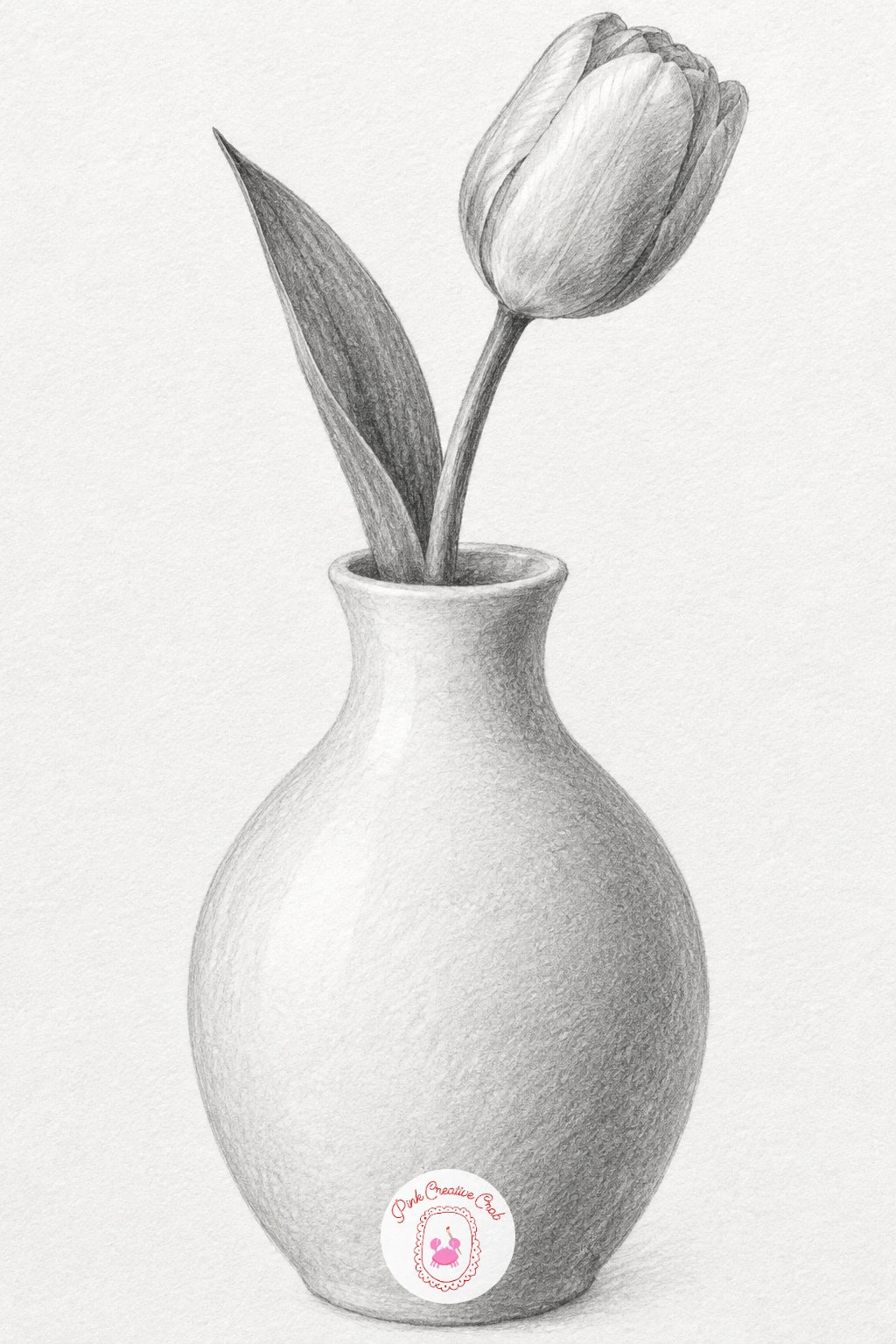
Start with the white vase and its single tulip, the gentlest still life on this list because the shapes are so simple. Draw the vase first as a light symmetrical outline, checking that both sides match by eye before you commit to the curve, then add the tulip stem bending slightly off centre so the composition does not feel stiff.
Work the shading with an HB and 2B pencil, keeping the vase almost white except for a soft grey band where it turns away from the light, since a white object only reads as white when something nearby is darker. Beginners often shade the vase evenly all over and lose the sense that it is a rounded form, so leave the lightest area pure paper and build tone gradually around it.
The tulip petals need only three or four tone values, light, mid and a touch of dark at the base where petals overlap. If you do not have a dedicated blending stump, a cotton bud smooths graphite just as well on a small area like this.
Finish by lifting a thin highlight down the vase’s widest point with a kneaded eraser, which does more to sell the roundness than any amount of extra shading.
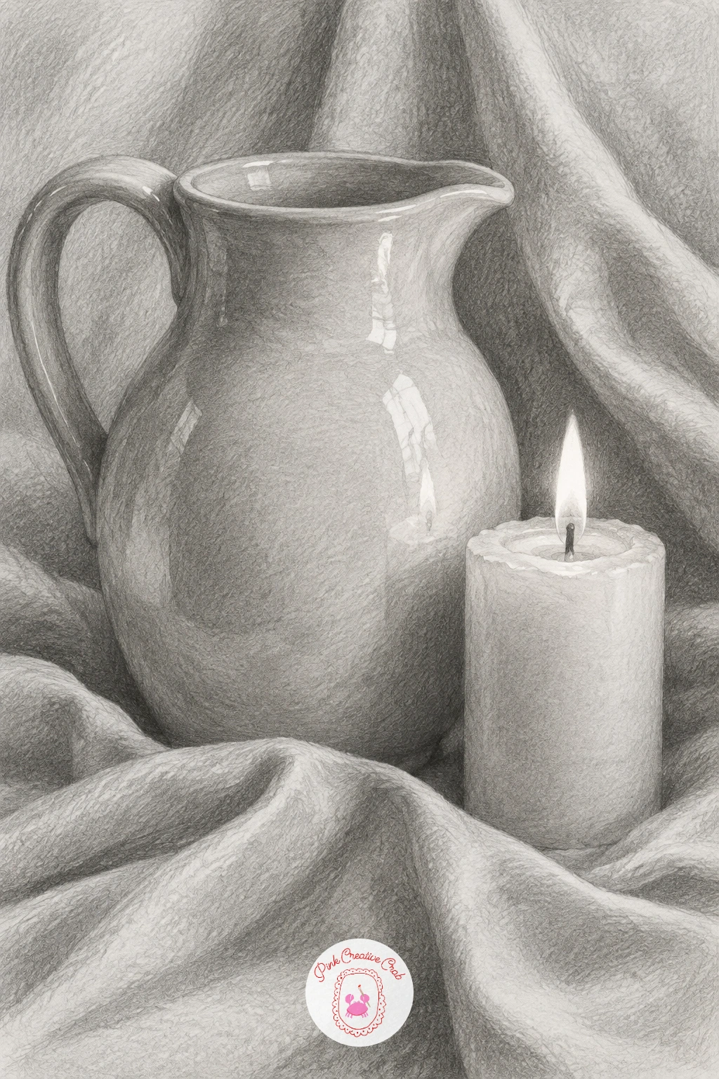
This grouping of a ceramic pitcher, a lit candle and a draped cloth is a traditional still life setup because it puts three different textures side by side: hard glossy ceramic, soft wax, and loose folded fabric. Block in the three shapes lightly first, keeping the pitcher the largest and the candle slightly behind it so the eye has somewhere to travel.
Eye level matters here. If you look down on the table, the pitcher’s rim is drawn as a full ellipse, if your eye is level with the table, that ellipse flattens almost to a line, so decide your viewpoint before you shade so the proportions stay convincing.
Shade the pitcher with smooth, even strokes in one direction to keep it glossy, then switch to shorter, varied strokes for the cloth’s folds since fabric needs to look soft and uneven in contrast. The candle’s flame stays mostly untouched paper with just a thin dark wick and a smudge of grey glow around it.
If a cloth feels too hard to draw convincingly, drape a real tea towel over a book at home and look at how the folds actually fall before you draw them from imagination.
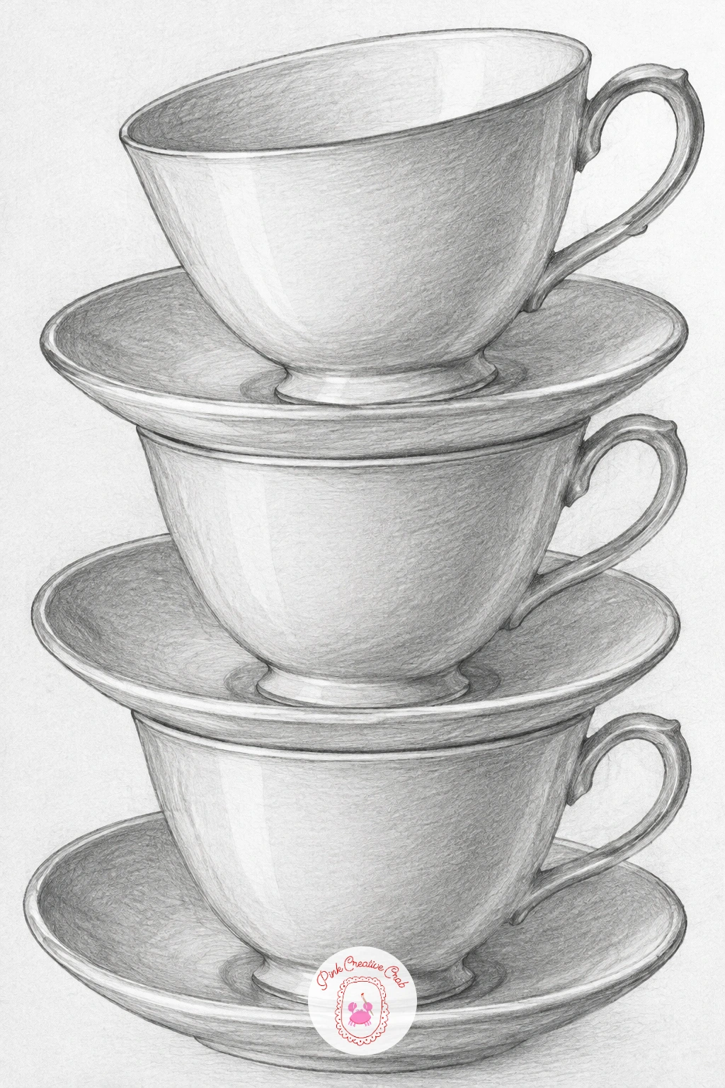
Move from one object to three with a stack of teacups balanced on their saucers, a classic exercise for drawing matching ellipses that get narrower the higher they sit on the page. Measure the width of the bottom cup against its height with your pencil held at arm’s length, then use that same ratio to keep the two cups above it in proportion rather than guessing and ending up with one too fat or too thin.
Draw all three saucers and cups as light ellipse guidelines before any shading, checking that the ellipses get flatter as they rise, since this is exactly what happens to a circle as it moves further from your eye level.
Shade each cup’s inner curve with a smooth gradient from dark to light to suggest the hollow, and leave the rim of each cup almost untouched so it reads as a thin band of white china catching the light.
For your first attempt, draw the stack slightly smaller than you think you need to, since cramped ellipses are much easier to keep consistent than large sweeping ones.
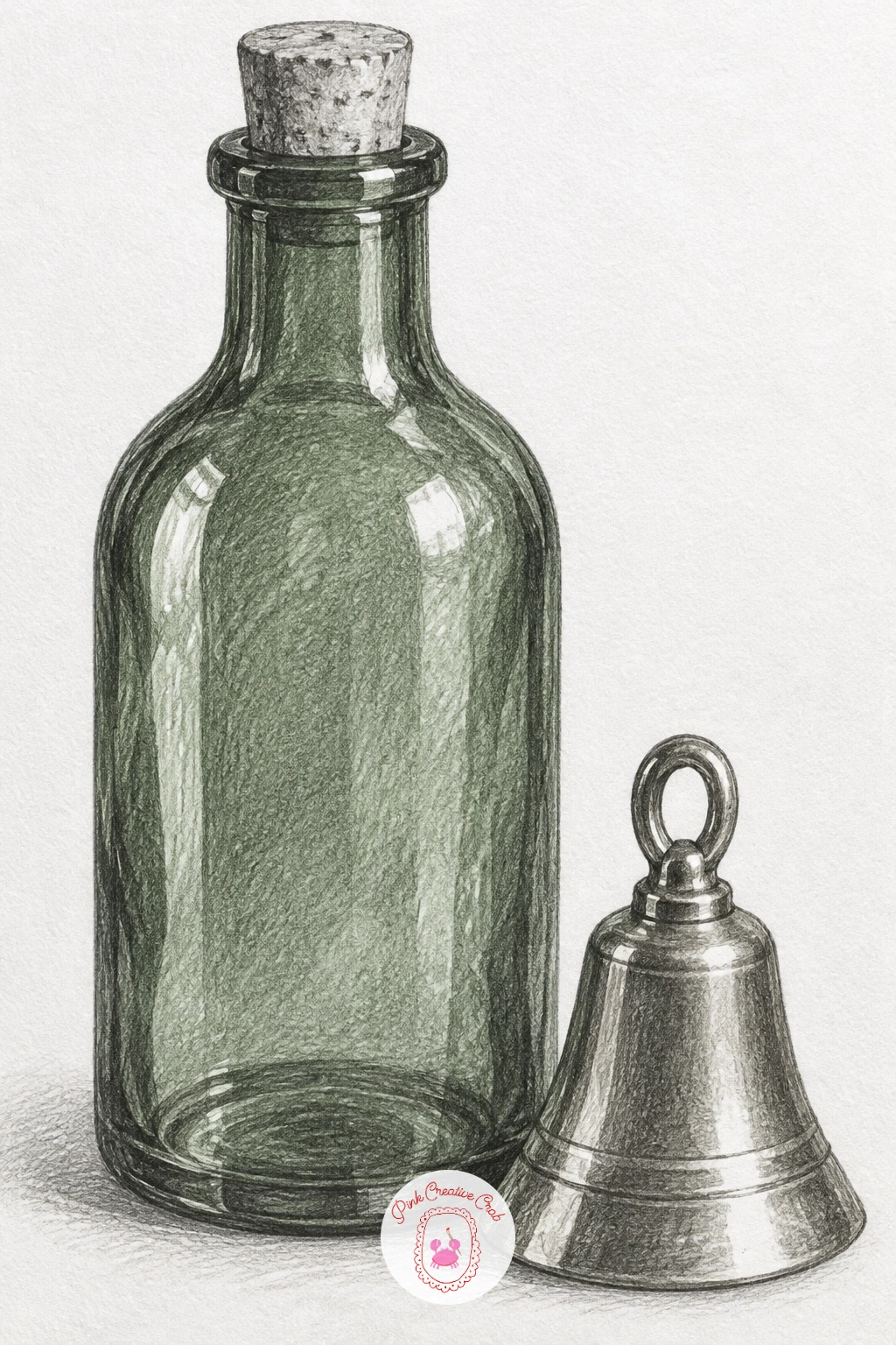
After the matte china of the teacups, a green glass bottle beside a small brass bell gives you two shiny but very different surfaces to practice side by side. Sketch the bottle’s silhouette first, a long neck narrowing into a cork, then place the bell to one side so it does not touch the bottle’s outline and confuse the shapes.
Glass and brass both rely on sharp contrast rather than gradual shading, so this is the idea in the list to practice edges and texture deliberately: use a soft 4B or 6B pencil for the darkest reflections on the bottle, then lift two or three bright highlights straight back to white paper with a kneaded eraser pressed and lifted, never rubbed side to side.
The bell takes the same approach in miniature, one crisp dark edge and one bright curved highlight is often all it needs to look metallic. Resist the urge to shade it evenly grey, which is the one mistake that flattens metal every time.
If your eraser leaves crumbs, a fresh kneaded eraser pressed into a point works better than an old flattened one.
You Will Need
- kneaded eraser for sharp highlights
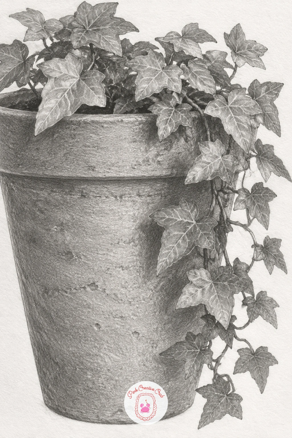
A terracotta pot with trailing ivy closes out the still life group with a mix of a hard geometric form and loose organic growth. Draw the pot as a simple tapered cylinder first, lightly marking the rim ellipse and the base ellipse so the sides stay parallel and the pot does not lean, then let the ivy vines spill over the rim and down past the pot’s edge so the composition has movement.
Shade the terracotta with warm-toned pressure in one direction to keep its surface looking dry and slightly rough, then switch tools for the ivy: a sharp pencil point for each leaf’s edge, with quick light-to-dark strokes along the centre vein.
The place this goes wrong is usually overcrowding, too many leaves drawn at the same size reads as a tangle rather than a plant. Vary leaf sizes and let a few overlap others completely so some edges simply disappear behind closer leaves.
If ivy’s trailing shape feels tricky, trace the rough path of a real houseplant vine with your finger first to get the rhythm of the curve before you draw it.
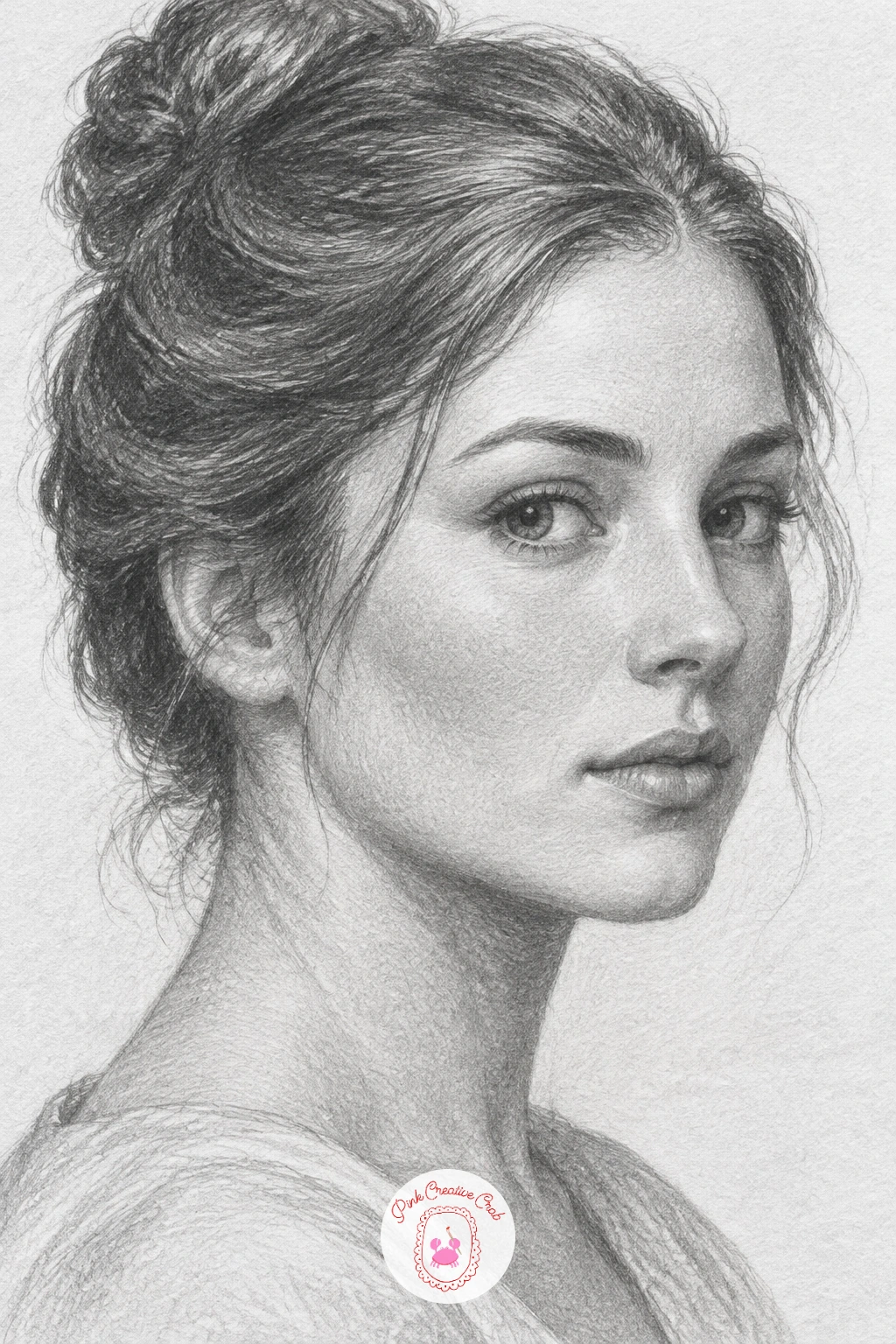
Moving into portraits, a woman drawn in three-quarter view with her hair pinned up is the gentlest introduction to faces because this angle hides some of the trickiest symmetry problems of a straight-on portrait. Lightly sketch an egg-shaped head, then divide it with the usual guideline cross, eyes sit at the halfway line, and in three-quarter view the far eye sits noticeably narrower than the near one.
Build features from large shapes to small, the eye sockets and nose bridge first, the pinned hair last, since hair drawn too early tends to pin down proportions you have not actually finalised yet. Shade in layers with a 2B for mid tones and a softer 4B only in the darkest shadow under the jaw and around the hairline.
If the likeness feels off, check the distance between the eyes against the width of one eye, that single measurement fixes more faces than any other adjustment. For practice with a younger face first, this girl pencil drawing guide works through similar proportion steps.
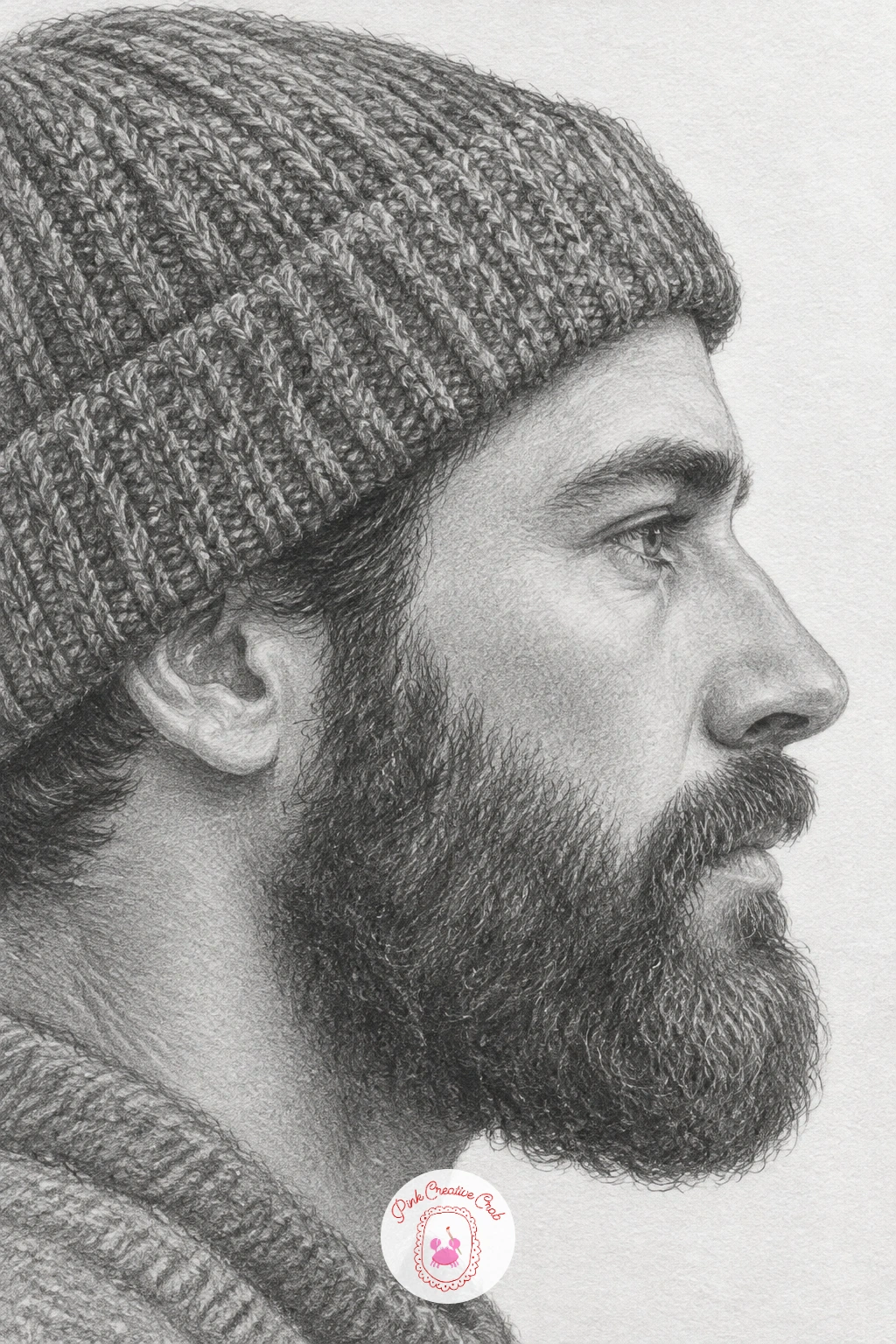
A bearded man drawn in profile wearing a knitted beanie trades the symmetry problems of a front-facing portrait for a different challenge, getting the profile line right in one continuous sweep. Draw the forehead, nose, lips and chin as one light connected curve before adding any detail, since a profile that wobbles partway through rarely recovers.
The eye level in this view sits lower on the head than most people expect, roughly at the midpoint between the top of the skull and the chin, not the top of the ear, so check that before you commit to features. Shade the beanie with directional strokes following its knit pattern, ribbed lines curving around the head, then shade the beard in short overlapping strokes rather than one smooth tone so it keeps its curl and texture.
Beginners often draw the beard as a flat dark shape, which loses all its texture, so vary your pencil pressure stroke by stroke instead. If a beanie’s ribbing feels fiddly, simplify it to three or four wide curved bands rather than many thin ones.
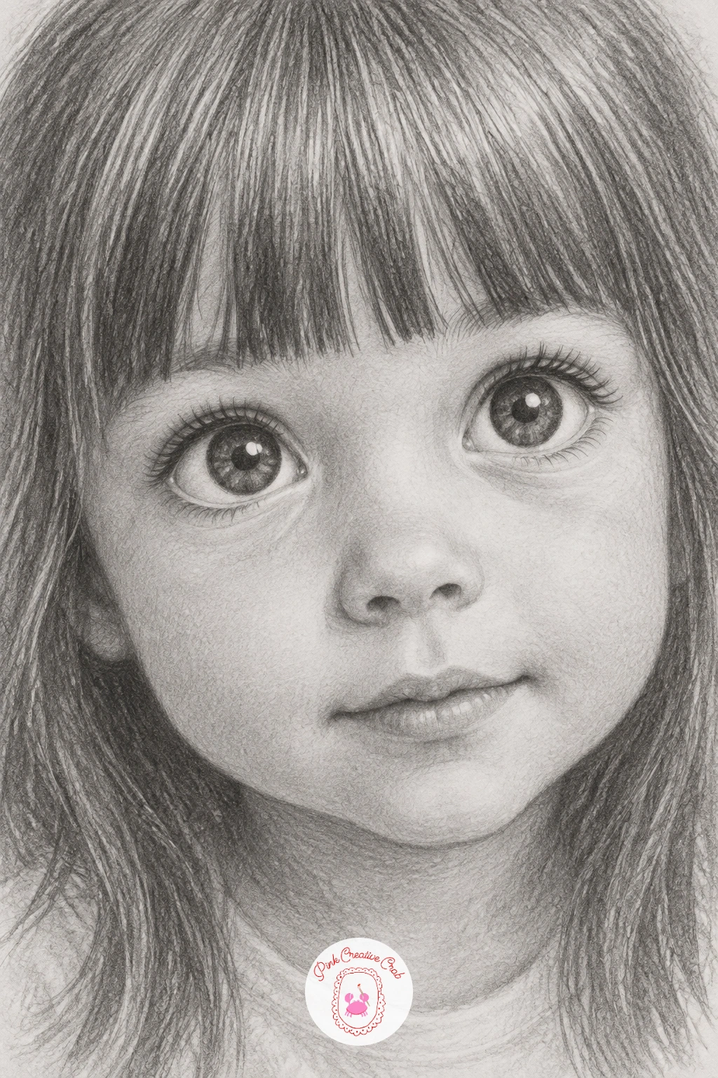
A little girl with big curious eyes and straight bangs asks for a softer, rounder head shape than an adult portrait, since children’s faces sit lower on the skull with a larger forehead and smaller features clustered closer together. Start with a rounder oval than you would for an adult, and place the eyes slightly below the head’s true halfway line to catch that childlike proportion.
The straight bangs give you a clean horizontal edge to draw before the rest of the hair, so block that line in early and let the rest of the hair fall from it. Shade the eyes with extra care, a dark ring around the iris, a bright paper-white highlight left untouched, and only a light grey across the white of the eye, since overly dark eye whites age a child’s face instantly.
Keep the shading overall lighter and softer than you would for an adult subject, children’s skin reads as smooth with almost no harsh shadow. If proportions feel off, compare the distance from the bottom of the nose to the chin against the distance from the eyebrows to the nose, on a child’s face the lower section is noticeably shorter.
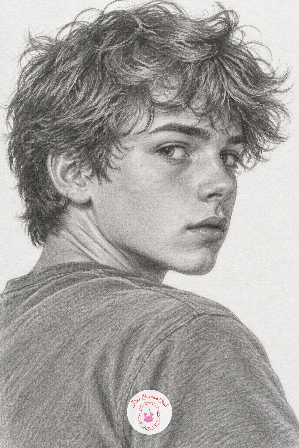
A teenage boy with messy hair looking over his shoulder brings a twist to portrait practice because the head turns away from straight-on while the eyes look back toward the viewer, which is a classic pose for adding energy to a drawing. Sketch the head and neck turned to one side first, then place the eyes looking back across that turn, the far eye will appear slightly smaller and the near eye slightly wider than usual.
Messy hair is an invitation to loosen your pencil hand, draw a few confident directional strokes for the main hair masses rather than careful individual strands, which keeps it looking tousled instead of combed. Shade the neck and jaw with attention to the turn, since a twisted pose usually creates a soft shadow along one side of the neck that helps sell the movement.
The most common mistake here is drawing both eyes looking the same direction as the nose, which flattens the whole pose, so double check the eye line follows the turn of the head, not the shoulders. A soft 2B kept on its side works well for the loose hair strokes.
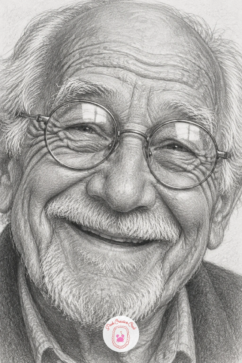
An old man with deep laugh lines and round spectacles is the most rewarding face on this list to shade, since age shows up as texture, exactly the kind of practice portrait drawing is built for. Block in the head shape and the round spectacle frames early, since glasses shift where the eyes actually read on the face and it is much easier to adjust them before the shading begins.
Build the laugh lines and wrinkles gradually with a sharp 2B, light curved strokes that follow the direction the skin actually folds, around the eyes, from the nose to the mouth corners, rather than scattered random lines. Going too dark too early is the most common trap, since wrinkles read better as a scatter of midtones than as hard black lines.
Shade the lenses of the glasses last, a thin reflected highlight across each lens sells them as glass immediately. If the spectacle frames feel fussy to draw round, lightly trace around a coin for a perfectly even circle before refining the frame by hand.
Study a few reference photos of older faces at different angles before you start, the way light sits in deep wrinkles changes a lot with the angle of the face.
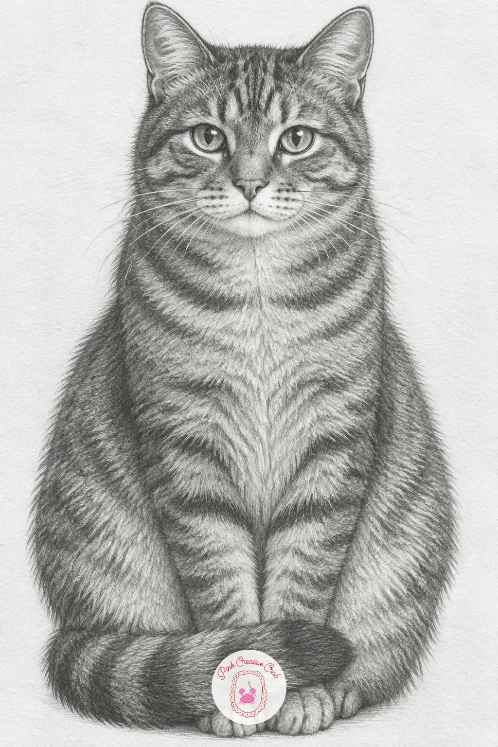
Moving into animals, a tabby cat sitting upright with its tail curled around its paws is a calm, symmetrical pose that makes a good first animal subject. Build the body as a simple rounded triangle shape, wide at the base where the cat sits, narrowing up to the head, then wrap the tail around the front paws as one continuous curved line.
Tabby markings are where this drawing earns its keep, draw the stripe pattern following the curve of the body rather than as straight lines, since stripes that ignore the form underneath will flatten the cat instantly. Use a sharp 2B for the stripe edges and soften them slightly with a blending stump so they look like fur rather than paint.
The eyes are the detail most likely to go wrong, keep the pupils vertical slits rather than round, and leave a tiny bright highlight untouched in each eye. If you want a confident change from this exact pose, this cat pencil drawing guide has several more poses to try next.
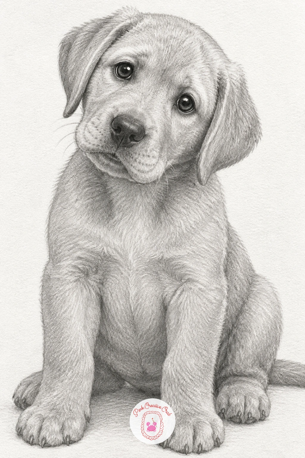
A labrador puppy sitting with its head tilted carries real charm, and the tilt itself is a useful excuse to practice eye level and expression together. Draw the head as a rounded shape set at an angle, with the ears hanging lower on the tilted side than the other, since a head tilt shifts the whole visual weight of the face toward one side.
Puppy fur is shorter and softer than an adult dog’s, so keep your pencil strokes light and short rather than long sweeping ones, building up tone gradually with an HB before switching to a 2B for the darker patches around the ears and nose. The nose and the inner corners of the eyes are the darkest points on the whole drawing, and placing those two dark anchors early helps keep the rest of the tonal range in check.
Soft round eyes with a bright catchlight give puppies their appealing look, so leave that highlight as untouched white paper rather than erasing it in afterward. For more labrador and other breed poses, see this dog pencil drawing guide.
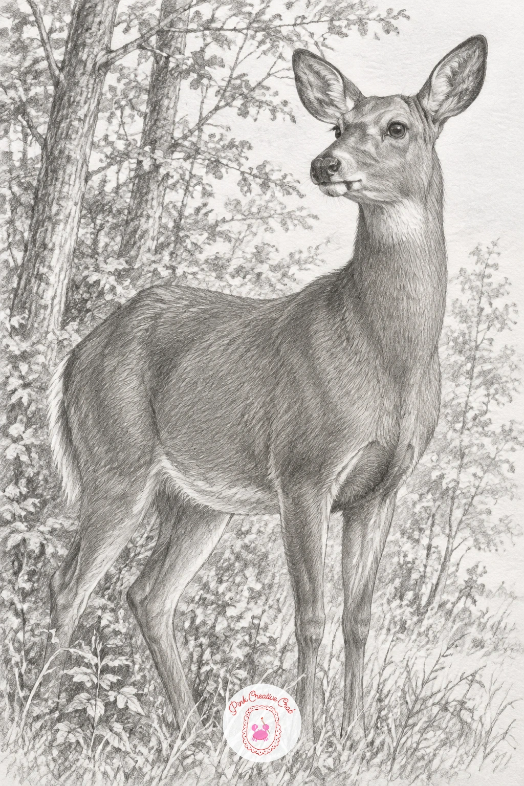
A deer standing alert at the edge of a wood introduces a longer, more athletic body than the cat or puppy, with legs that need careful proportion to avoid looking too short or too stiff. Measure the leg length against the body’s height before committing, a deer’s legs are typically taller than the body is deep, which is easy to underestimate if you draw from memory.
Place the deer slightly off centre with a suggestion of trees and undergrowth behind it kept loose and lightly shaded, so the woodland reads as a setting without competing with the animal for attention. Shade the coat with short upward strokes following the direction fur actually grows, lighter on the belly, darker along the back and legs.
The ears and the alert tilt of the head carry the “alert” feeling in this pose, so angle both ears slightly forward and keep the neck a touch raised rather than relaxed. If full antlers feel like too much detail for one sitting, a young deer without antlers is just as convincing a subject.
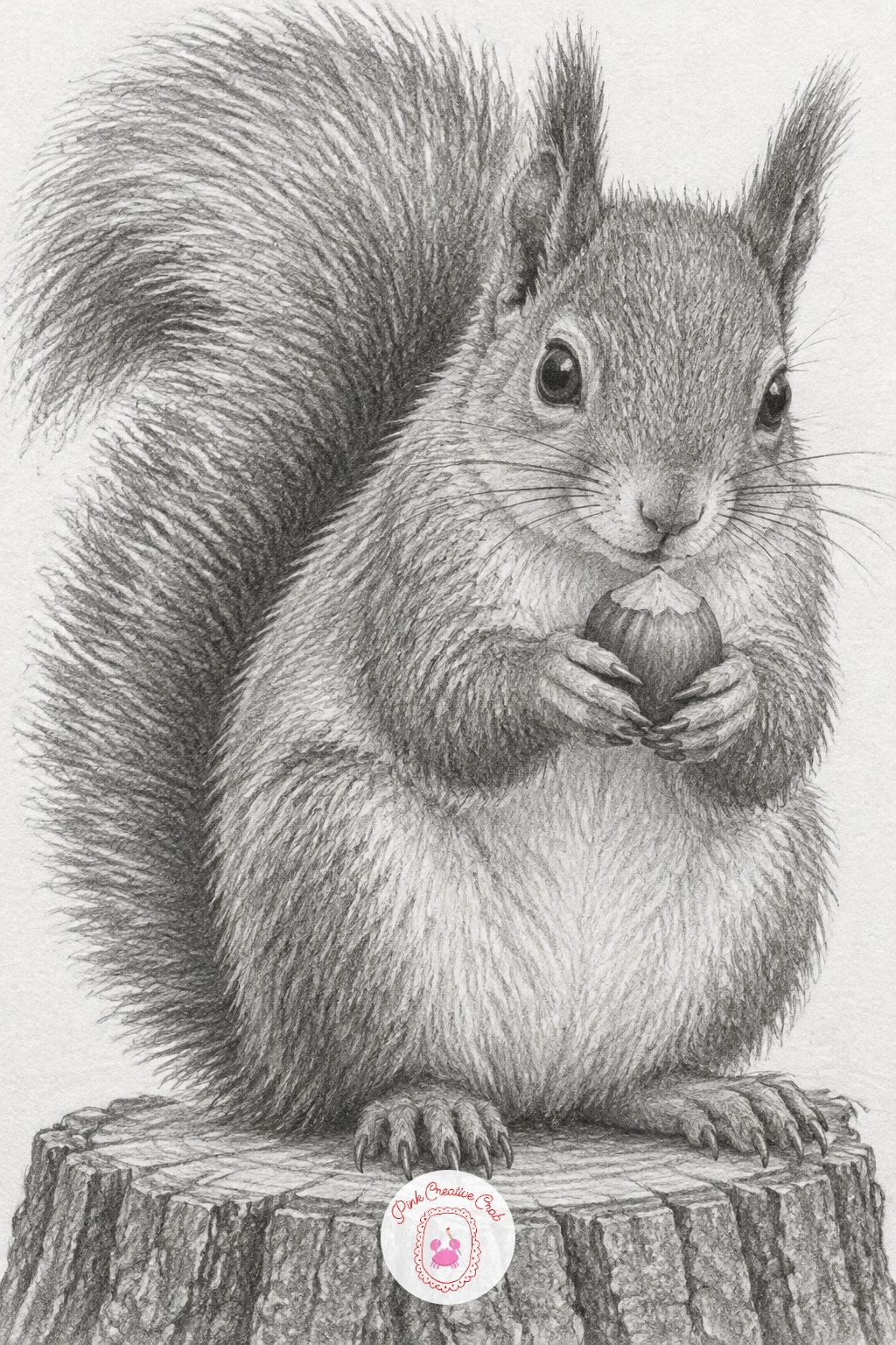
A squirrel holding a hazelnut on a tree stump gives you a small animal in an active pose, paws raised and holding an object, which is a nice step up from a simply sitting animal. Draw the body first as a compact oval with the tail as a separate large sweeping shape behind it, since a squirrel’s tail is often as big as the rest of the body and needs its own confident curve.
Place the hazelnut between the two front paws early, then build the paw shapes around it rather than drawing paws first and squeezing the nut in afterward, which tends to look pasted on. Shade the tail with long flowing strokes that fan outward, leaving some lighter gaps between strokes so it reads as fluffy rather than solid.
The tree stump underneath benefits from a completely different stroke, short scratchy marks and visible growth rings, which contrasts nicely against the soft tail and makes both textures read more clearly. If the whole pose feels ambitious, simplify the paws to simple rounded mitts rather than drawing individual claws.
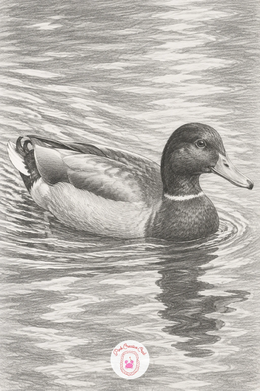
A duck gliding across a pond with ripples behind it moves animal practice toward water and reflection, a useful new texture to add to your pencil vocabulary. Draw the duck’s body as a smooth rounded shape sitting just above the waterline, then add the ripple lines trailing behind it as a V shape that widens the further it gets from the duck, since that is how water actually spreads from a moving object.
Shade the duck’s feathers with layered small strokes, slightly darker along the back and lighter on the breast, keeping the head’s darkest tone reserved for around the eye and bill. The water itself needs a much lighter touch, horizontal strokes with a soft pencil, lifting thin highlight lines with a kneaded eraser where the ripples catch light.
Reflections are the part most likely to go wrong, keep the duck’s reflection directly below it and slightly darker and less detailed than the duck itself, since reflections in moving water are always softer than the object creating them. If ripples feel difficult to place convincingly, look at a photo of any pond with a swimming bird before sketching them.
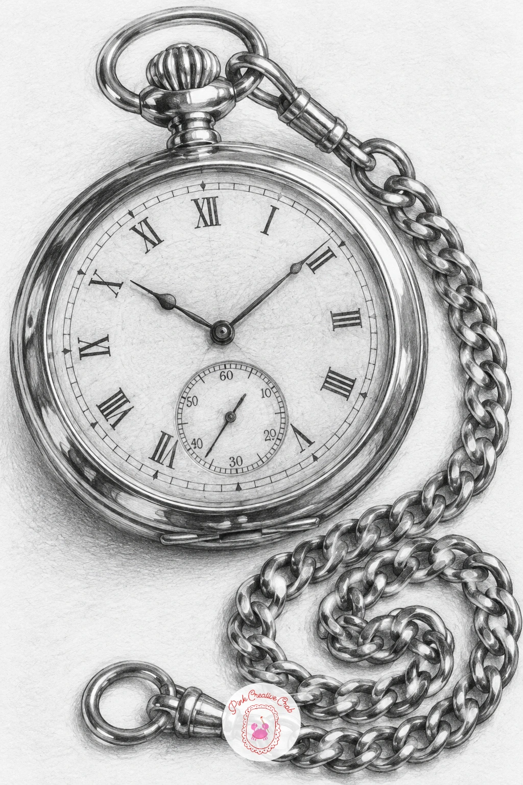
An old pocket watch with its chain coiled beside it is one of the most detailed objects on this list and a good test of patience and controlled shading. Draw the watch case as a careful circle, checking it with a coin or a circular lid traced lightly if freehand circles give you trouble, then plan the position of the numbers and hands before adding any shading at all.
Work the metal casing with smooth even tone and two or three sharp bright highlights lifted with a kneaded eraser, since reflective metal depends on contrast rather than gradual shading. The chain is the real test of patience here, each link needs its own small highlight and shadow to look three dimensional rather than flat, so work slowly link by link rather than rushing the whole chain in one pass.
The numbers and watch face benefit from a sharper, harder pencil like a 2H so the fine lines stay crisp against the softer shading around them. If the full chain feels like too much for one sitting, coil only half of it into view and let the rest trail off the edge of the page.
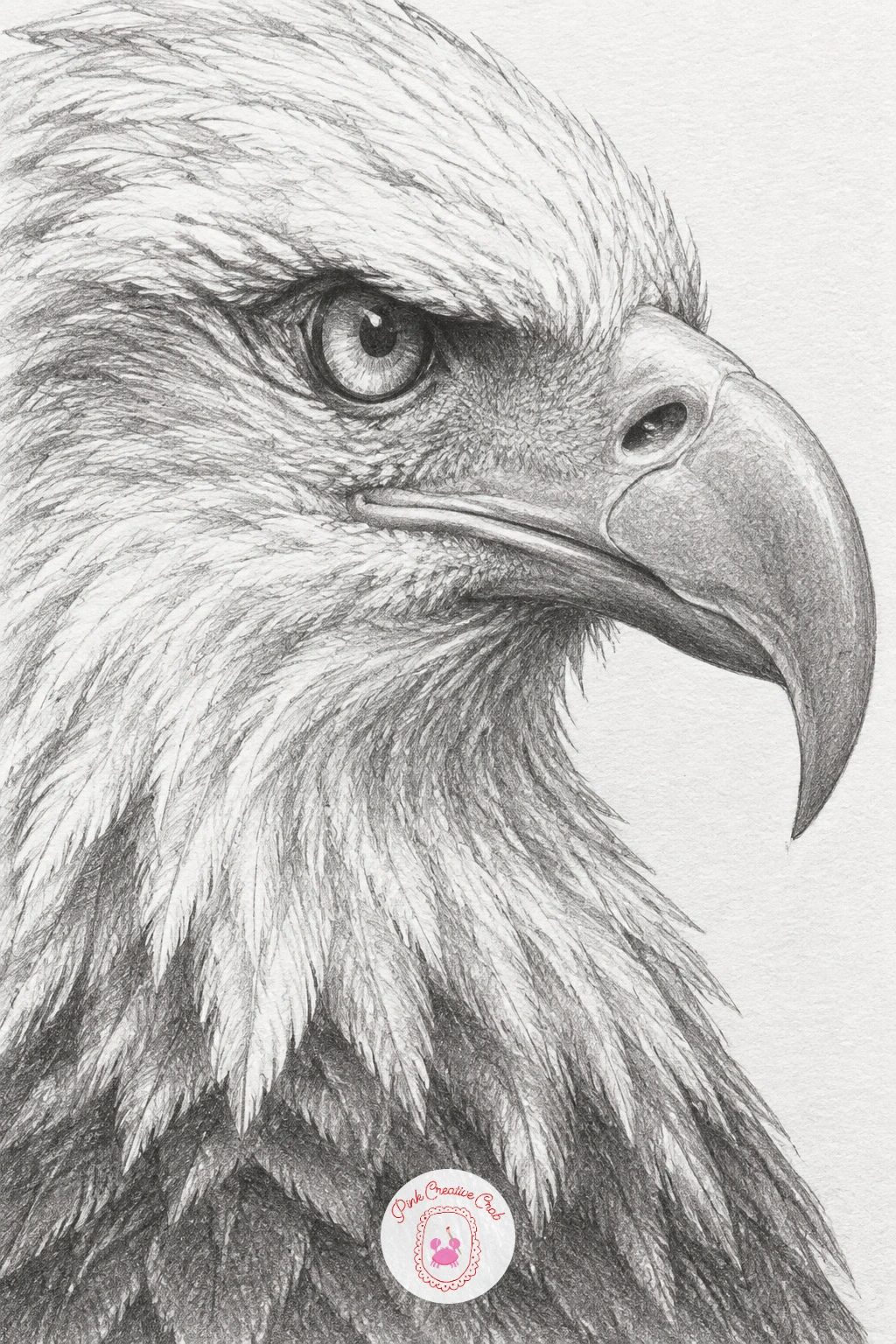
An eagle’s head in profile with a hooked beak closes the animal group with one of the more demanding subjects, since the beak’s curve and the sharp eye need to be exactly right for the whole drawing to read as convincing. Draw the skull shape first as a simple rounded block, then build the hooked beak as one continuous curve from the forehead down and under, checking the curve against itself before adding any shading so it does not wobble partway along.
The eye sits forward on the head and is surrounded by a hard ridge of feathers that catches shadow, so shade that ridge darker than the surrounding feathers to give the eye its fierce, focused look. Feather texture changes across the head, tiny tight feathers near the eye and beak, longer looser ones down the neck, so vary your stroke length accordingly rather than shading the whole head the same way.
The beak’s sharp hook is the one place worth extra care, a crisp dark line along its underside and a bright highlight along the top ridge make it look hard and sharp rather than soft. For more bird practice afterward, this bird pencil drawing guide has several gentler subjects to try.
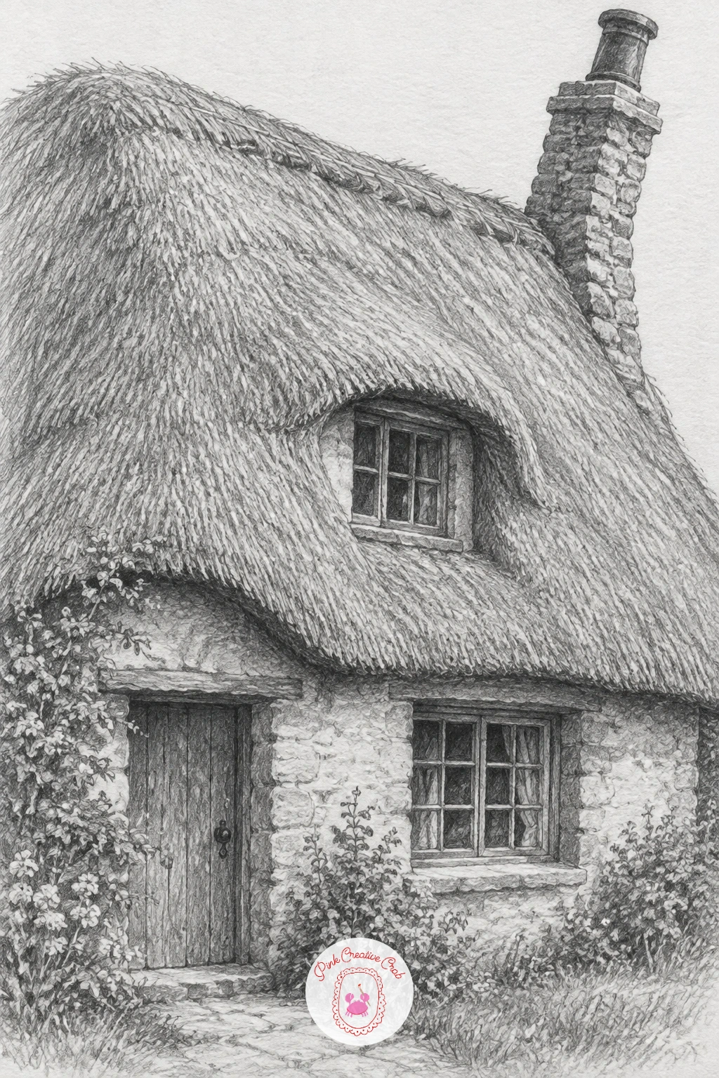
Moving into buildings, a cottage with a thatched roof and a crooked chimney is a gentle first architecture subject because its charm comes from irregularity rather than precise straight lines. Sketch the main box of the cottage first with light construction lines to keep the walls roughly square, then let the roofline and chimney lean slightly off true, since a perfectly straight chimney actually looks wrong on a cottage like this.
Thatch has its own distinct texture, layered horizontal strokes that get slightly ragged at the roof’s edge, drawn with the side of a soft pencil rather than its point for a fuzzy, textured look. Windows sit deep in thatched walls, so shade a dark band just inside each window frame to suggest that depth before adding any lighter detail like glass reflections.
The most common mistake is making the thatch too neat, which loses its appeal entirely, so vary the stroke direction and length as you go. If a crooked chimney feels like it is fighting your ruler habits, draw it freehand rather than with any straight edge.
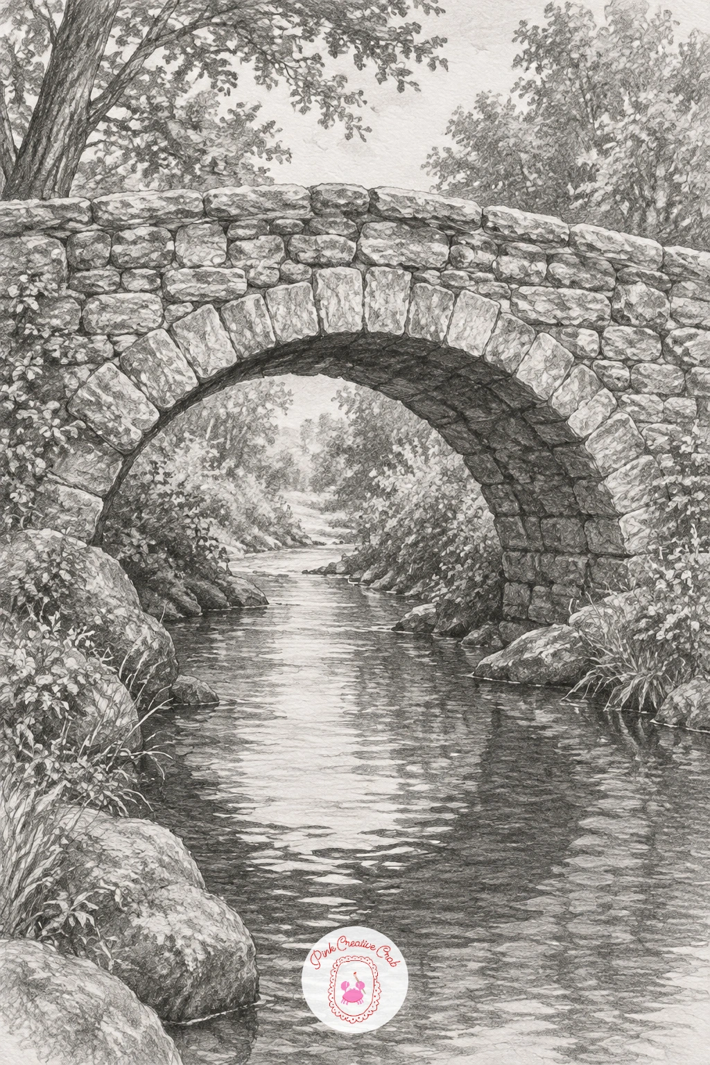
A stone bridge arching over a narrow stream introduces a true curve into an architectural subject, and getting that arch symmetrical is the whole exercise. Draw a light horizon line first, then plot the arch as a half circle using a coin or lid to guide the curve if freehand arches give you trouble, checking that both sides of the arch rise and fall at matching heights.
Individual stone blocks along the arch add believable texture, draw them as slightly irregular rectangles rather than a perfectly even grid, with a touch more shadow in the mortar lines between them. The water beneath benefits from mostly horizontal pencil strokes with the arch’s reflection drawn softer and slightly broken, since moving water never gives a perfectly clean mirror image.
The underside of the arch is the darkest part of the whole drawing, deepen that shadow with a soft 4B to really push the arch forward from the stonework around it. If the stonework feels like too much detail, simplify it to just a few key blocks near the top of the arch and let the rest fade into soft shading.
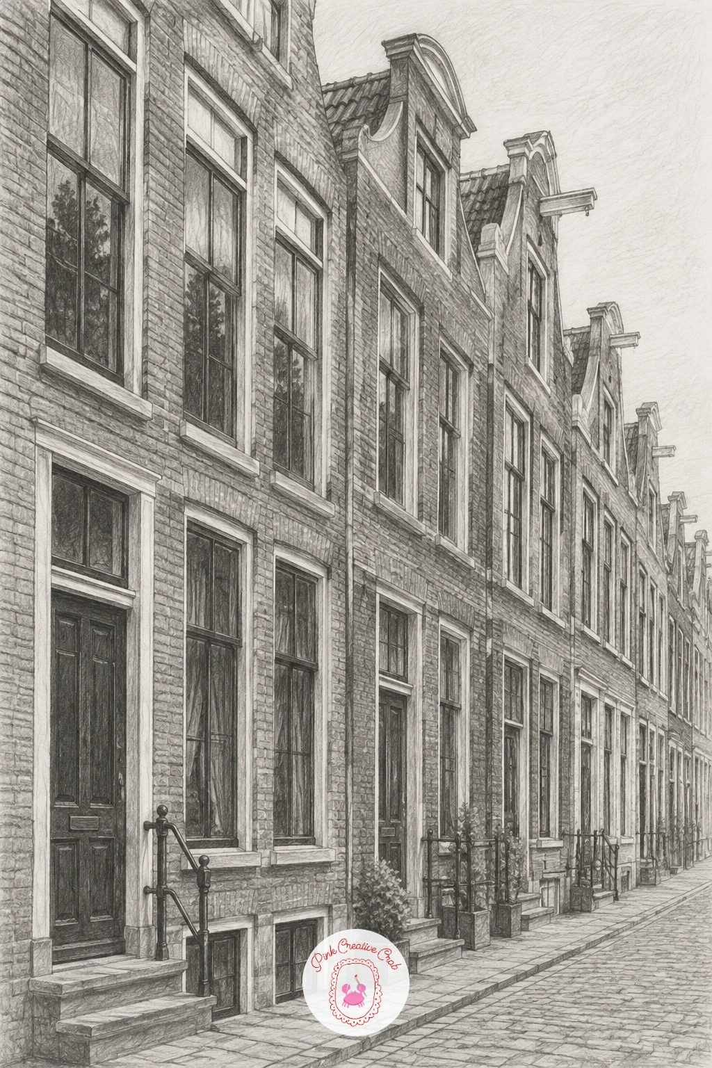
A row of narrow townhouses with tall windows is where linear perspective really starts to matter, since the rooflines and window tops all need to follow the same vanishing point to look convincing. Draw a light horizon line and a single vanishing point off to one side first, then use faint guideline rays from that point to keep every rooftop, window top and doorway sloping at a consistent angle as the row recedes.
Keep the nearest townhouse the largest and most detailed, with crisp dark window frames and visible brick or stone texture, then let the houses further down the row get progressively smaller, lighter in tone and less detailed, which mimics how distance actually softens detail.
Tall windows are the signature feature here, draw them as narrow rectangles with a dark interior and a couple of reflected highlights rather than leaving them flat white, since flat white windows read as holes rather than glass. If a full vanishing point setup feels too technical for today, narrow the row to just three houses and the perspective stays far easier to control.
A light ruler line to the vanishing point keeps rooflines honest, rub it out once the main angles are set so it does not compete with your final shading.
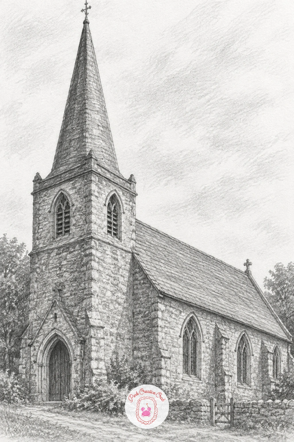
An old country church with a pointed steeple builds directly on the perspective practice from the townhouses, since the steeple’s triangular point needs to taper convincingly toward the sky. Draw the main church body as a simple rectangular block first, then build the steeple as a tall narrow triangle on top, checking that its centre line stays exactly vertical so it does not lean.
Stonework on an old church tends to be rougher than a townhouse’s smooth brick, so use scattered, uneven pencil marks rather than a neat regular pattern, with a few darker patches suggesting age and weathering. The pointed arched windows typical of a country church are a nice detail to include, drawn with a slightly curved top rather than the flat rectangles used on the townhouses, which helps the building read as older.
Shade the steeple’s shadowed side darker than the lit side to really sell its three-dimensional taper against the sky. If a full steeple feels ambitious, a simpler squared bell tower is a historically accurate substitute that is easier to keep straight.
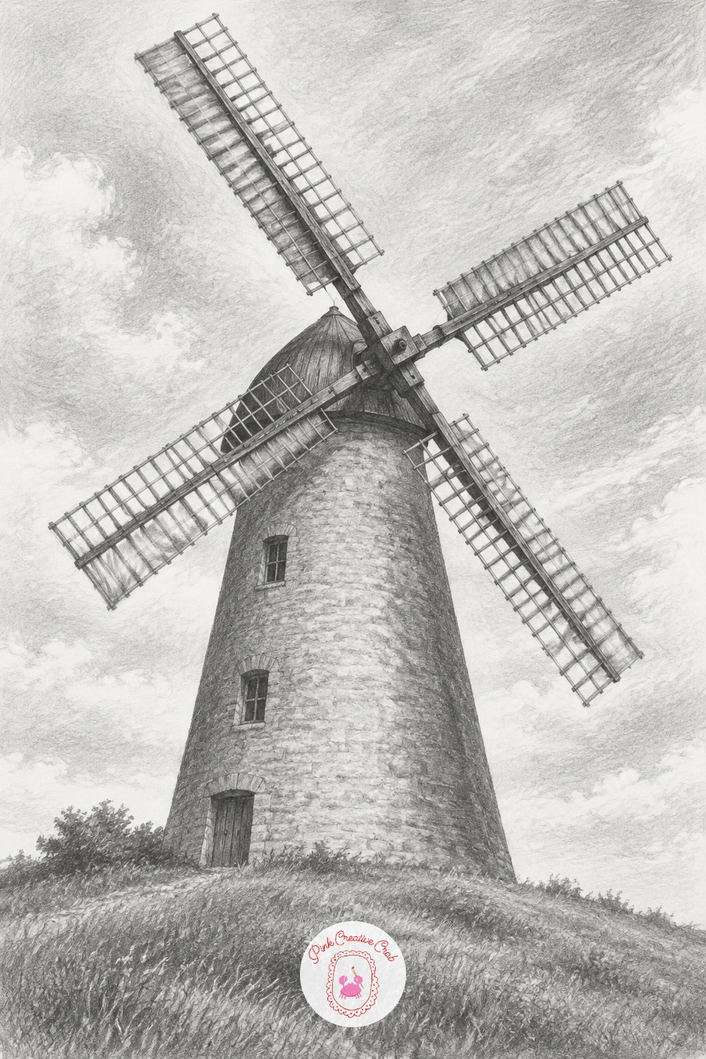
A windmill on a hill with its sails turning adds a diagonal, moving element to the building group, and the trick is making the sails feel like they are mid-motion rather than simply standing still. Draw the windmill’s tower first as a tapered cylinder, narrower at the top than the base, then set the sails at a clear diagonal angle, two sails pointing up and two down, which reads as motion far more convincingly than a perfectly upright cross shape.
Place the hill beneath the windmill with a gentle curved horizon line, and keep the grass texture loose and quick, short upward flicks of the pencil rather than careful individual blades, so it does not compete with the windmill for attention.
Shade the tower with one consistent light direction, a darker band down one side of the cylinder and a lighter band catching the light on the other, which does most of the work of making it look round rather than flat. If the sails’ diagonal angle looks static once drawn, nudge them a few more degrees off the horizontal and vertical and the sense of motion usually clicks into place.
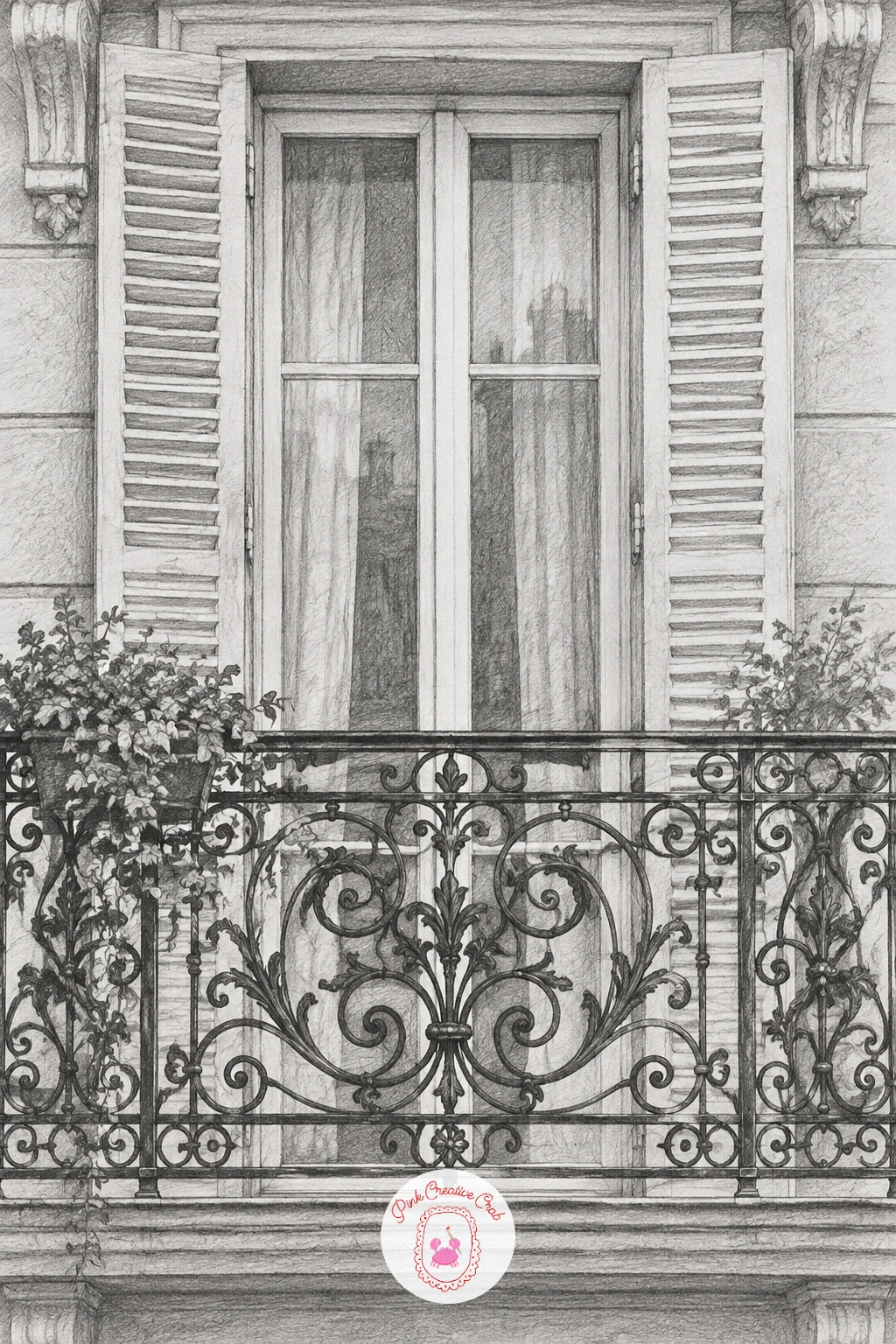
A Parisian balcony with wrought iron railings is a detailed, decorative subject that rewards patience with pattern work rather than broad shading. Draw the balcony’s structural lines first, the floor edge and the tall window or door behind it, then lightly plot the repeating scroll pattern of the ironwork before committing to any dark lines, since iron railings nearly always repeat a motif across their length.
Work the ironwork with a sharp hard pencil like a 2H for crisp curling lines, then add a touch of soft shadow just beneath each curl with a softer pencil to lift it off the flat wall behind, since flat black ironwork with no shadow looks like a sticker rather than metal.
The window or shutters behind the railing can stay much softer and less detailed, which helps the ironwork read as the clear subject of the piece rather than competing with it. If drawing a full repeating pattern feels tedious, draw one full section carefully and repeat it with lighter, quicker strokes toward the edges of the page.
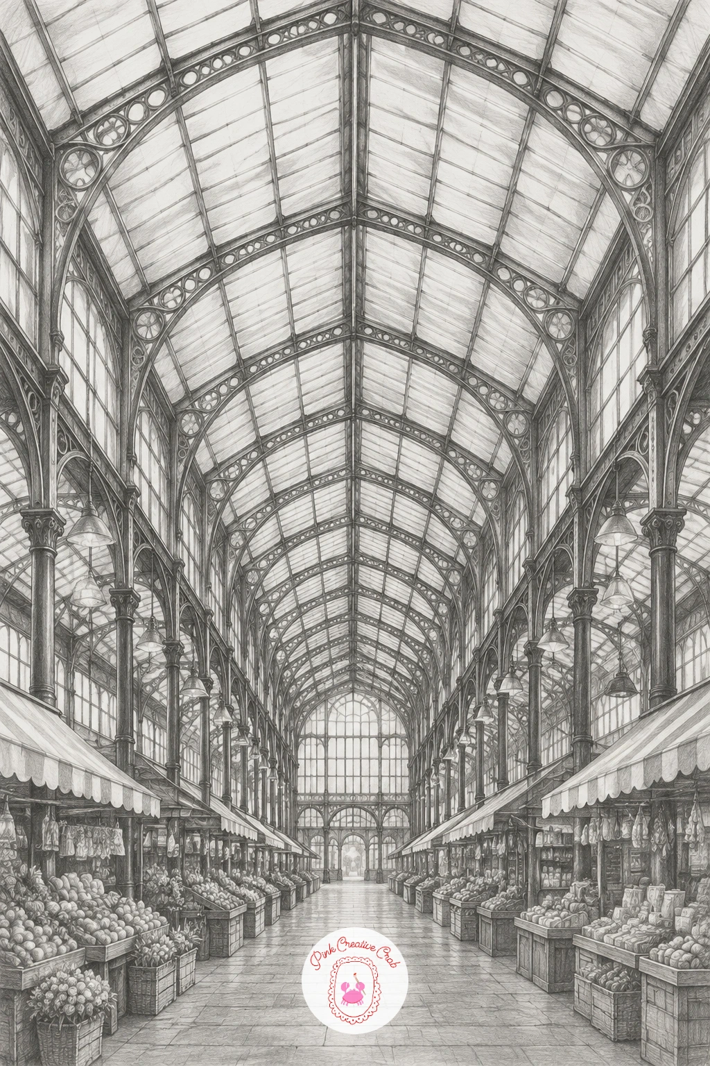
A covered market hall with iron arches pushes perspective practice further than the townhouse row, since several arches repeating into the distance need to shrink at a consistent, believable rate. Set a light horizon line and vanishing point first, then draw the nearest arch largest and most detailed, using it as a template for the size and spacing of each arch behind it as they recede toward the vanishing point.
Ironwork along the arches benefits from the same crisp hard pencil used for the balcony railings, thin confident lines for the structural ribs, with soft shading reserved for the glass panels between them to suggest the dim interior light typical of a market hall.
Keep the foreground arch’s shadow much darker than the ones receding into the distance, since aerial perspective means distant shapes naturally lose contrast as well as size. If multiple shrinking arches feel like too much geometry for one sitting, three arches is enough to read clearly as a market hall without needing a long tunnel of them.
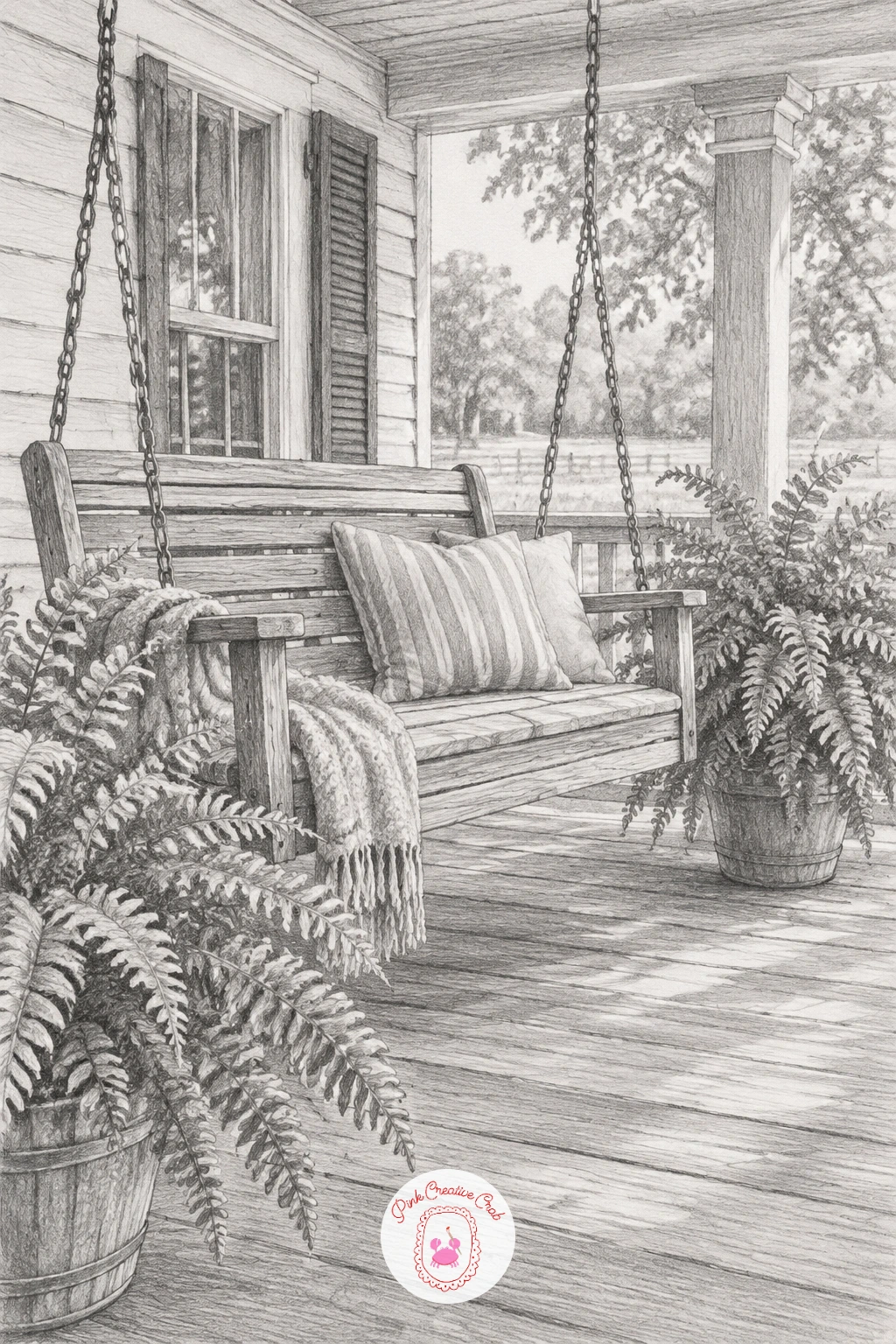
A farmhouse porch with a swing and potted ferns is a warmer, more relaxed building subject after all that strict perspective work, built mostly from simple horizontal and vertical lines rather than sharp vanishing points. Draw the porch structure first, the floor line, the roof line and the supporting posts, keeping them roughly parallel since a porch only needs gentle, approximate perspective rather than a precise vanishing point.
The swing hangs from chains or rope, drawn as two slightly curved lines rather than perfectly straight ones, since even a still swing has a small amount of natural sag. Shade the wooden boards of the porch floor with long horizontal strokes and a few darker lines at the board joins, then add the potted ferns with loose fountain-like strokes radiating from each pot’s rim.
If the whole scene feels like a lot for one sitting, the swing and one fern pot alone still read clearly as a porch, so trim the rest of the detail rather than rushing it all in. For a similarly cozy architectural mood, this village scene drawing pencil guide has more relaxed building subjects.
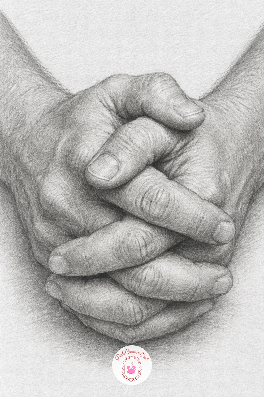
A pair of folded hands resting on a table returns to still life territory with one of the hardest subjects to get right, since hands are full of small overlapping forms that need to stay anatomically believable. Block in each hand as a simple mitten shape first, palm and fingers together as one mass, then separate the fingers with light lines only once the overall mitten shape feels balanced and the right size against the other hand.
Knuckles are the detail that sells a hand as real, so look for the small bumps and creases where each finger bends and shade a touch of shadow just below each one. The place folded hands usually go wrong is the thumbs, which get forgotten or drawn too small, so check the thumb’s length against the index finger before finalising either hand.
Shade the table’s surface with long smooth strokes and let the hands cast a soft contact shadow where they rest, which anchors them convincingly instead of letting them float above the surface.
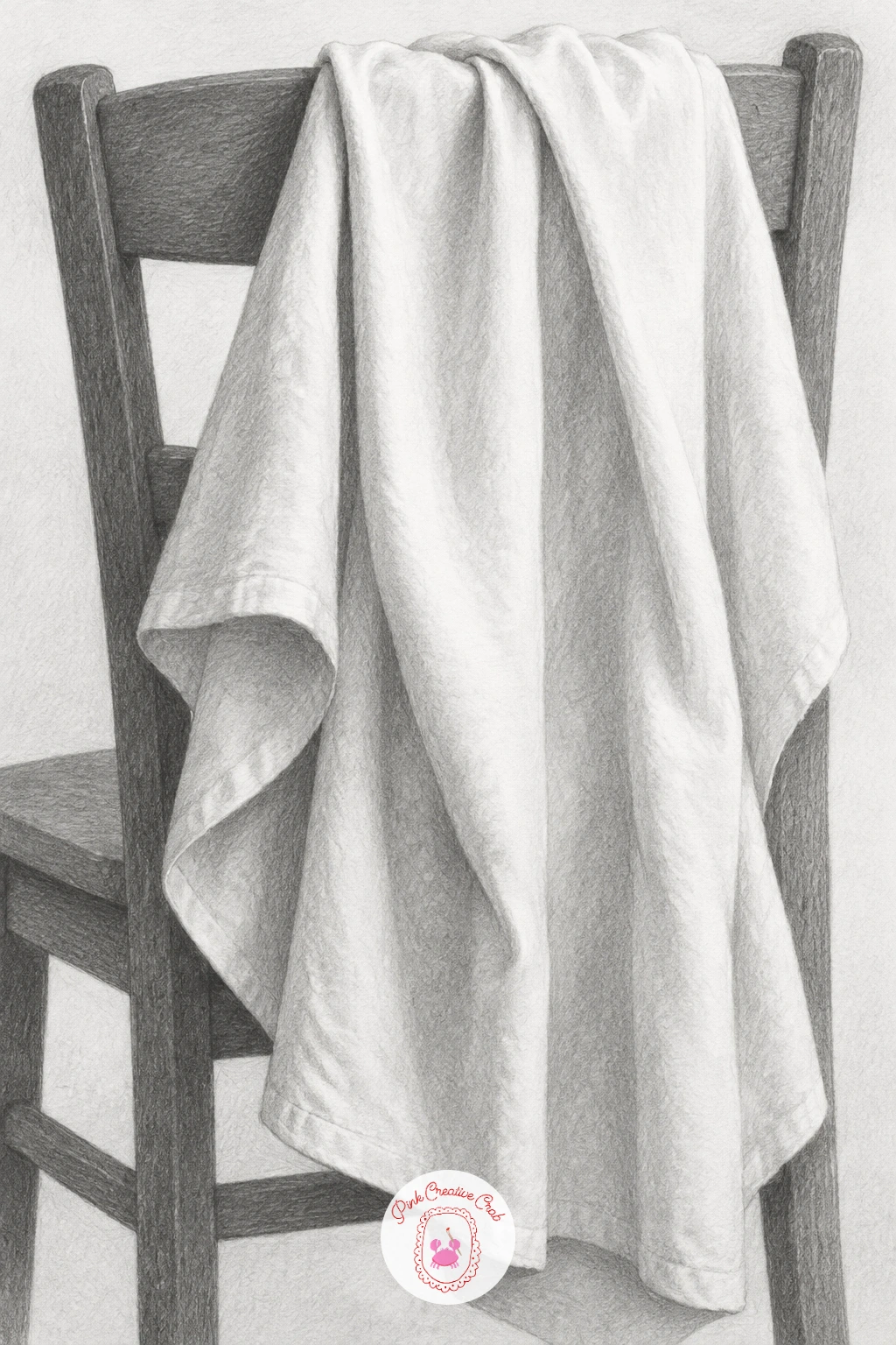
A white cloth hanging over the back of a chair is a classic drapery study, chosen because a plain white cloth shows every fold purely through shading with no pattern to hide behind. Draw the chair’s back lightly as a simple frame first, then drape the cloth over it with a few confident major folds rather than many small fussy ones, since large folds read more convincingly than a cloth covered in tiny wrinkles.
Light direction decides everything in this drawing, pick one side for your light source and keep every fold’s shadow falling consistently on the same side throughout, since inconsistent shadow direction is the fastest way to make drapery look flat and confused.
Shade from the darkest fold shadows outward with a soft pencil, then use a kneaded eraser to lift the brightest ridges of each fold back toward pure white paper, since a white cloth is defined almost entirely by this light to dark range rather than any outline. If folds feel unconvincing from imagination, drape an actual cloth over a chair at home and study it directly before drawing.
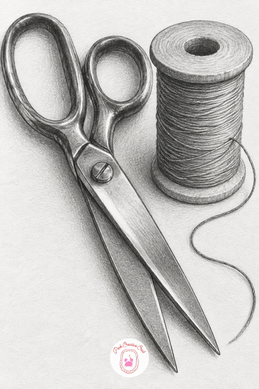
A pair of scissors and a spool of thread on a table pairs hard metal against soft wound thread, a good small still life for practicing two very different textures close together. Draw the scissors’ two blades and handles first as simple overlapping shapes, checking the pivot point where they cross since that single point determines whether the whole tool looks structurally correct.
Shade the metal blades with smooth even tone and one or two crisp lifted highlights along their length, the same approach used for the brass bell and the pocket watch earlier in this list. The thread spool asks for the opposite touch, tightly packed curved lines following the thread’s wound direction around the spool, slightly looser where a thread trails loose off the end.
The handles of the scissors, often painted or coated, can take a slightly flatter mid-tone shading than the sharp blades, which helps the two materials read as distinct from each other. If the pivot point is giving you trouble, draw it as a small dark circle first and build both blades outward from that fixed point.
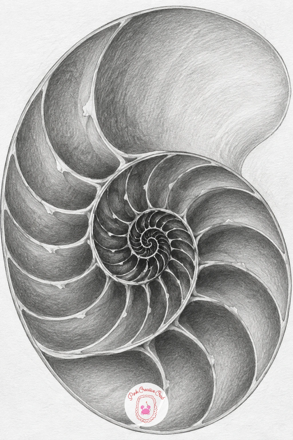
A nautilus shell cut in half to show its chambers is one of the most satisfying still life subjects for anyone who enjoys pattern and structure, since the spiral chambers follow a precise, almost mathematical growth. Lightly sketch the overall spiral shape first with one smooth continuous curve, then divide it into its internal chambers, each one slightly larger than the last as the spiral winds outward from the centre.
Here is the one measuring trick worth using: each chamber wall sits at roughly the same angle relative to the spiral’s centre, so once you place two or three chamber lines correctly, you can rotate that same angle around the spiral to keep the rest consistent rather than guessing each one freehand.
Shade the outer shell surface smooth and pale, then make the chambers themselves progressively darker toward the spiral’s centre, since the chambers curve inward and naturally catch less light the deeper they sit. If the spiral proportions feel difficult to judge, lightly draw a few guide circles of increasing size from the centre outward before connecting them into the final spiral.
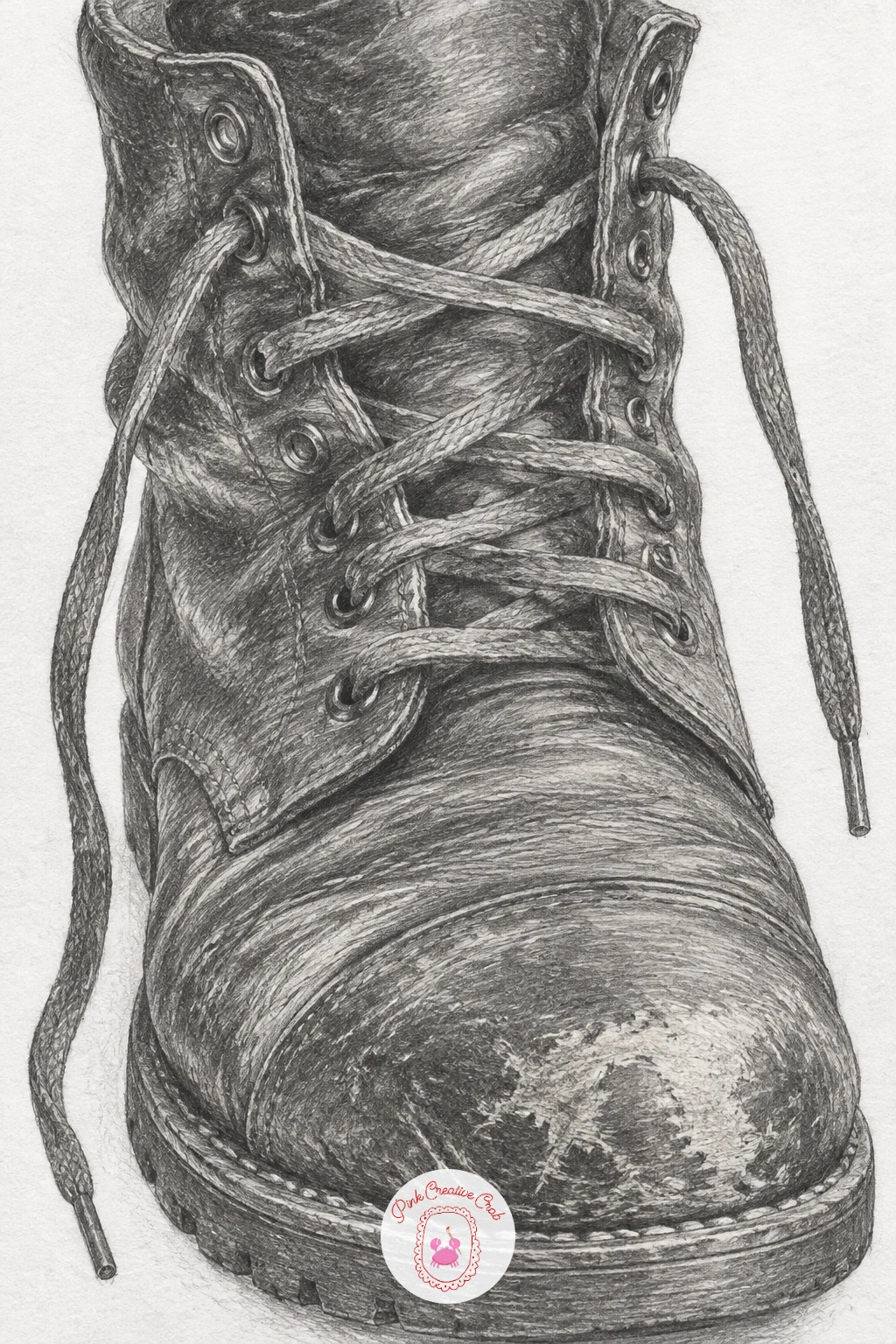
A leather boot with a scuffed toe and loose laces is a wonderful texture exercise, since worn leather needs a rougher, more varied approach than any of the smoother objects earlier in this list. Draw the boot’s overall silhouette first, checking that the ankle, foot and sole proportions look balanced against each other, then add the lace holes and lace pattern before any heavy shading begins.
Build the leather’s surface with a mix of smooth shading and scratchy, uneven marks concentrated at the scuffed toe, where a few lighter scrape marks cutting through the darker tone will suggest real wear far better than an evenly shaded boot ever could. The loose laces benefit from careful attention to overlap, draw each crossing point so one lace clearly passes over the other, since laces that ignore their own overlaps look tangled rather than loose.
Shade the sole with the darkest, flattest tone on the whole boot, since rubber soles absorb light completely unlike the leather above them. If the scuff marks feel hard to place convincingly, look at a real worn shoe before deciding where the wear naturally falls.
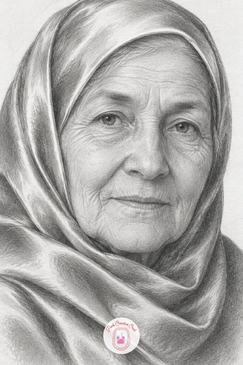
A grandmother in a silk headscarf with a calm gaze returns to portraits with a subject that combines an aged, textured face with the smooth, reflective fabric of a headscarf, a nice contrast of surfaces within one drawing. Build the head shape and the scarf’s outline together from the start, since the scarf’s fabric frames the face and changes how much of the forehead and hairline you actually need to draw.
Shade the face with the same gradual wrinkle approach used for the old man earlier, light curved strokes following the skin’s natural folds, building slowly rather than committing to dark lines too early. The silk scarf asks for a very different touch, smooth even tone with a few sharp fold lines and a soft sheen highlight where the fabric catches light, since silk’s smoothness depends on contrast just as much as glass or metal does.
The calm gaze lives almost entirely in the eyes, so keep the eyelids slightly relaxed and the eyebrows soft rather than raised, which reads as calm far more convincingly than any amount of extra shading elsewhere on the face.
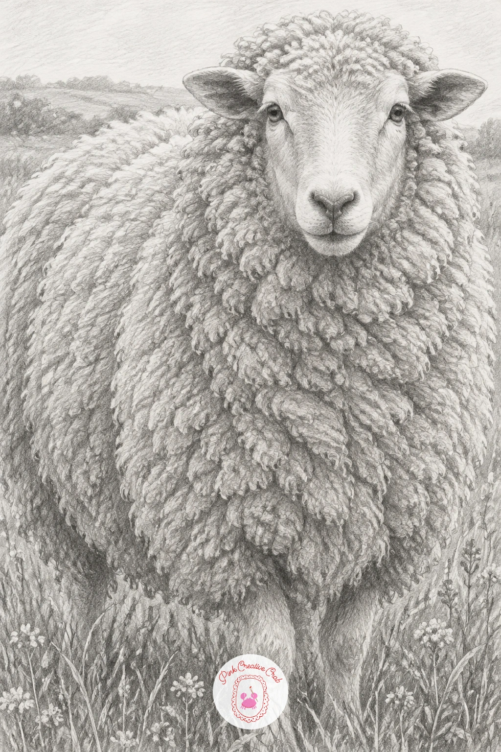
A sheep with a thick woolly coat in a meadow brings the animal group back for one final, texture-heavy subject before the last still life closes the list. Draw the sheep’s body as one large rounded mass first, since wool hides most of the underlying skeletal shape, then add the legs, face and ears as smaller, more precisely shaped details that peek out from beneath that soft wool mass.
Wool texture is built from small overlapping curved marks rather than straight lines or single long strokes, clustered closely together with occasional small gaps left as paper-white to suggest the wool’s loft and volume. The face, by contrast, is smooth and should be shaded with tighter, more controlled strokes, which creates a pleasing contrast between the fluffy body and the neat face.
The meadow beneath can stay loose and suggestive, short upward flicks of a soft pencil for grass, kept lighter in tone than the sheep so it does not pull attention away from the main subject. If the wool feels difficult to control, practice the small curved mark on scrap paper a few times before committing it to the final drawing.
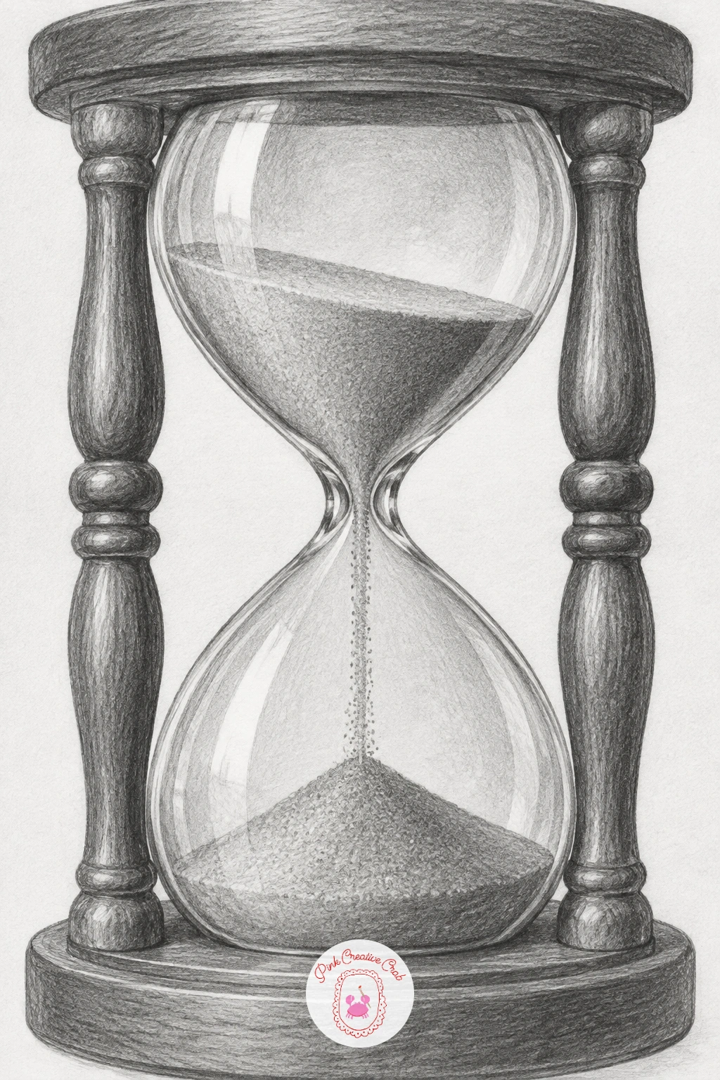
An hourglass with sand running through closes the list with a satisfying mix of glass, wood and fine granular texture, a good subject to finish on since it draws on nearly every skill practiced earlier. Draw the two glass bulbs and the connecting neck as one careful symmetrical outline first, checking that both bulbs match in size and curve before adding the wooden frame around them.
Glass depends on the same sharp highlight and dark edge contrast used for the bottle and pocket watch earlier in this list, so keep the glass shading minimal and let two or three crisp lifted highlights do most of the work of making it look transparent. The sand itself needs a completely different mark, tiny dense dots or short flicks piled into a cone shape at the bottom and a thin falling stream through the neck, left slightly looser and lighter than the glass around it.
The wooden frame’s grain runs in long vertical strokes with the occasional darker knot, which grounds the delicate glass and sand between two solid, weighty posts. If the falling sand stream looks too thick, thin it down, a convincing hourglass stream is often surprisingly narrow.
What to Do Next
Pick one idea from whichever group matches your mood today, a plain still life object if you want something calm, or a building if you are ready to test your perspective lines, and work through the steps in order rather than jumping to shading too soon. A smooth sheet of plain white paper and two or three pencils are all you need to get started right now.
Frequently Asked Questions
What pencils do I actually need for pencil drawing at a beginner level?
A small range covers everything here, an HB or 2B for most shading, a 4B or 6B for the darkest shadows, and a 2H for crisp fine lines like ironwork or watch faces. Add a kneaded eraser for lifting highlights.
Why does my shading look patchy instead of smooth?
Patchy shading usually comes from pressing too hard too soon. Build tone in several light layers rather than one heavy pass, and blend lightly with a stump or tissue only once the layers are down.
How do I keep proportions correct without a grid?
Hold your pencil at arm’s length to measure one part of the subject against another, such as eye width against eye spacing, then use that same ratio to check the rest of the drawing as you go.
Should beginners start with still life, portraits, animals or buildings?
Still life is the easiest starting group because the shapes are simple and nothing has to resemble a specific person or creature. Move to animals next, then portraits, and save buildings for when perspective feels comfortable.
How long should one pencil drawing from this list take?
Most of these subjects finish comfortably in one sitting of thirty to sixty minutes once you are used to the steps. Detailed subjects like the pocket watch or the market hall may take a little longer the first time.
Have any thoughts?
Share your reaction or leave a quick response — we’d love to hear what you think!
-
 0
-
0
-
0
-
0
-
0
-
0


