A kiss doodle is the kind of small drawing that makes someone smile the second they see it, and that is exactly why it belongs in your sketchbook today. Two heads tilted together, a tiny heart, a bit of steam curling into a loop: it only takes a few confident lines to say the whole thing.
Below you will find twenty seven of them, starting with easy people and animal pairs and working up to fussier little scenes with props and crowds of hearts. Grab a black fineliner and keep a cherry red and a lilac marker close, because every idea here leans on just those two accent colors.
Using these images: free for personal projects such as printing, coloring, cards, journals and gifts. Handmade items that include them may be sold up to 30 pieces per design. More than that is commercial use and is not permitted, and neither is selling or sharing the images themselves or passing them off as your own. Please ask before any other use.
Start here if you have never drawn two faces together before, because a forehead kiss hides the trickiest part of any kiss doodle, the mouth. Draw two simple head shapes, one slightly lower and tilted up, the other bent down so the top of its forehead meets the lower one’s brow.
Ink the lower face first: a soft jaw curve, two closed eyes drawn as gentle downward lines, maybe a small smile. Then add the big puffy pom-pom hat on the taller head, a wide curved brim and a round scribbled pom-pom on top, which is what most beginners get wrong by drawing it too neat; a pom-pom wants to be a messy loose circle of short jagged lines, not a smooth ball.
If your two heads keep ending up the same size, hold your pen at arm’s length and compare them against each other before you ink, one should read clearly smaller. Color the hat in lilac and tuck one small cherry red heart floating just above the join of their foreheads.
Keep the pom-pom scribble loose and slightly uneven, that messiness is what makes it read as soft fur instead of a plain circle.
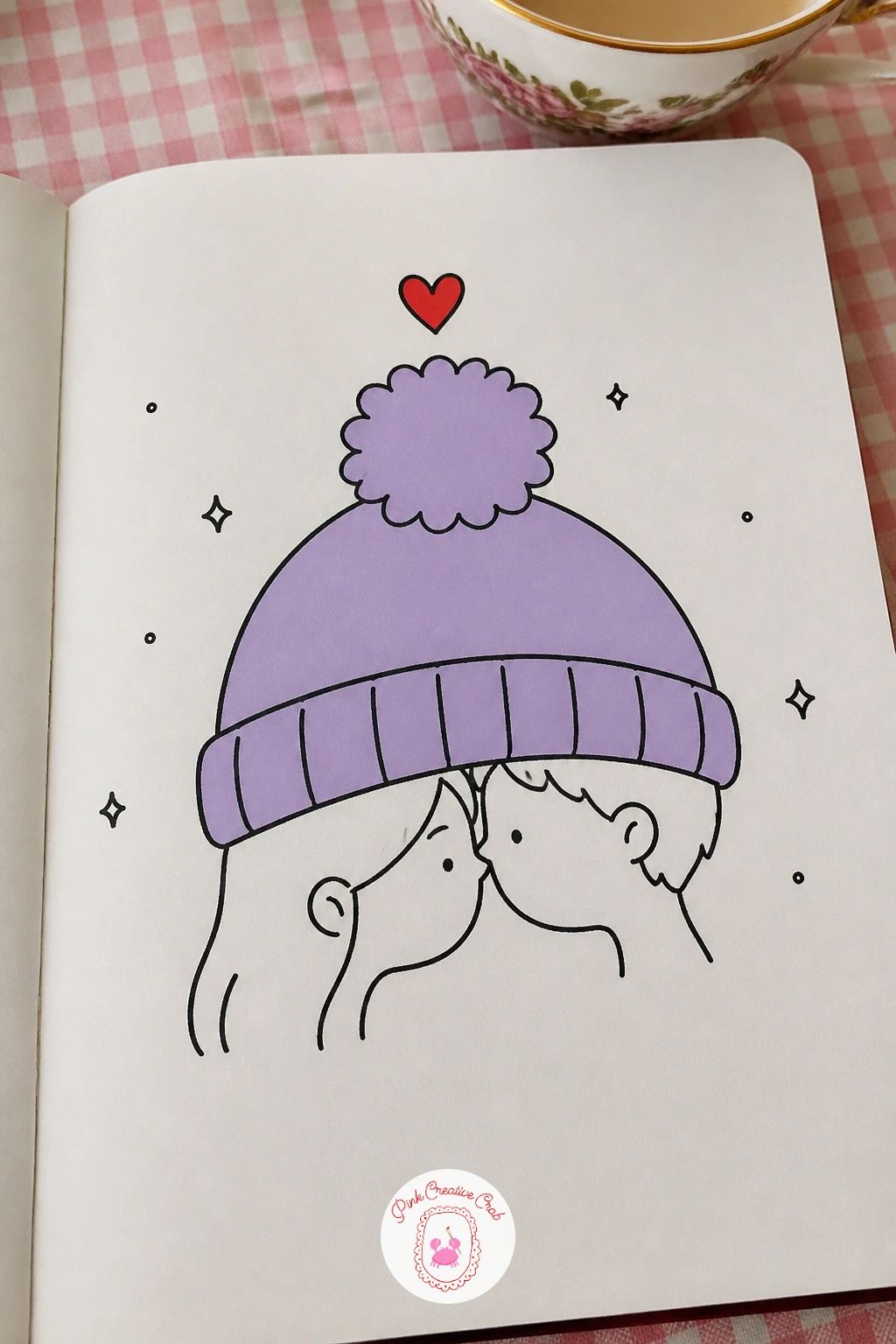
Palette: Cherry Red,Lilac,Ink Black
Once the forehead kiss feels easy, try two faces leaning in nose to nose, which asks for a bit more thought about where the eye level sits. Draw both heads at roughly the same height this time, tilted toward each other so their noses just touch at the center of the page, and keep both pairs of eyes closed to show that close-up, happy expression.
Work the fluffy hoods next, drawing the hood opening as a wavy scalloped line around each face rather than a smooth curve, since that scallop is what reads as fur trim. Fill the hood body with a few loose coils for texture instead of a flat shape.
If the two faces end up looking flat side by side, overlap the front edge of one hood slightly over the other’s shoulder, that small overlap is what puts them in the same space instead of floating apart. No lilac marker on hand: a light pencil shading works as a stand in for the fur tone.
Color one hood lilac and one left white with a thin red scarf peeking out under the chins for a bit of contrast.
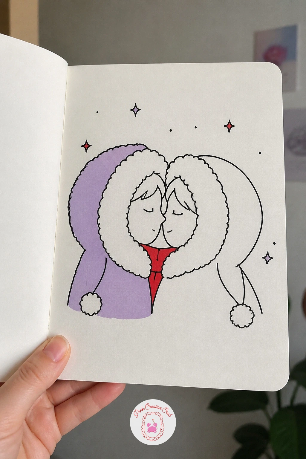
Palette: Lilac,Cherry Red,Ink Black
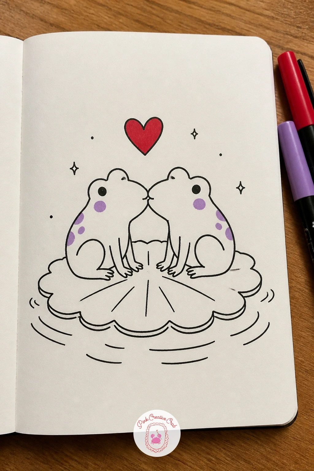
Frogs are a forgiving way to practice animal faces, since a frog head is really just a wide rounded triangle with two bulging eye circles on top. Draw one lily pad first, a simple scalloped disc, then set two small frog bodies on it facing each other, bellies low and front legs tucked like little hands.
Ink the bulging eyes as two circles sitting slightly apart on the top of each head, with the mouths meeting in a small closed line between them. Frogs are easy to overwork by cross-hatching the skin, so resist that urge and leave the bodies as flat shapes with just a few curved lines for the legs.
If the lily pad looks too stiff, add two or three small ripple lines curving out from its edge to suggest water. Color the frogs green if you have it, but if you are keeping to the cherry and lilac palette only, use lilac for the lily pad and cherry red for one tiny heart above their heads instead.
Give each frog a single curved line for a smile rather than a full mouth, it keeps the face reading as happy without crowding the small head.
Palette: Cherry Red,Lilac,Ink Black
Look at a photo of a real frog’s eye placement before you draw, the eyes sit high and wide apart on the skull, which is what gives the face its charm.
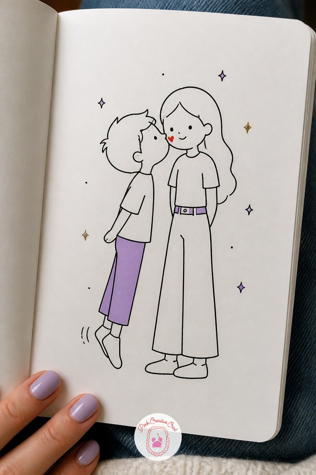
This pair is a nice chance to practice a size difference on purpose, since the whole joke of the drawing depends on getting the proportions right. Draw the taller figure first as your anchor, a full standing body, then sketch the shorter figure beside her at roughly two thirds her height, up on the balls of his feet with both heels lifted off the ground.
Ink the tall figure’s cheek and jaw first since his lips land there, then draw his body stretching upward, shoulders raised and one hand resting on her arm for balance. Beginners often make the height gap too small to read, so check it by comparing head counts: her head to his head should clearly fit more than once if you stacked them.
Little motion lines under his lifted heel sell the tiptoe stretch, two or three short curved dashes do the job. Swap a full body for just two heads and shoulders if you want a faster version, tilting hers down and his up to the same effect.
Mark the kiss spot on her cheek with one small cherry red dot or tiny heart so the eye knows exactly where the moment is happening.
Palette: Cherry Red,Lilac,Ink Black
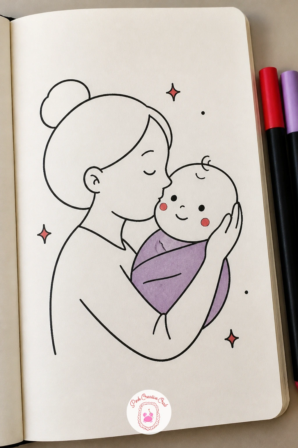
A baby’s head is almost all cheek and forehead, so draw it as a big soft circle with the features clustered low and small, that proportion alone will make it read as an infant before you add a single detail. Set mom’s head beside it at full adult size, bent down so her lips land right on the round cheek.
Ink the baby first: tiny closed eyes as short curved lines, a small nose dot, maybe one curl of hair standing up. Then build mom’s face leaning in, her eyes closed too and one hand cupping the back of the baby’s head.
The spot people usually get wrong is making the baby’s head too small in relation to mom’s hand, remember a baby’s whole head can rest easily inside two adult hands, so keep that hand generous. Add a cherry red blush mark on the cheek just under her lips, and a lilac onesie or wrap around the baby for the accent color.
If the hand cupping the head looks stiff, round every knuckle and finger tip instead of drawing straight segments, soft curves read as gentle far better than sharp lines.
Palette: Cherry Red,Lilac,Ink Black
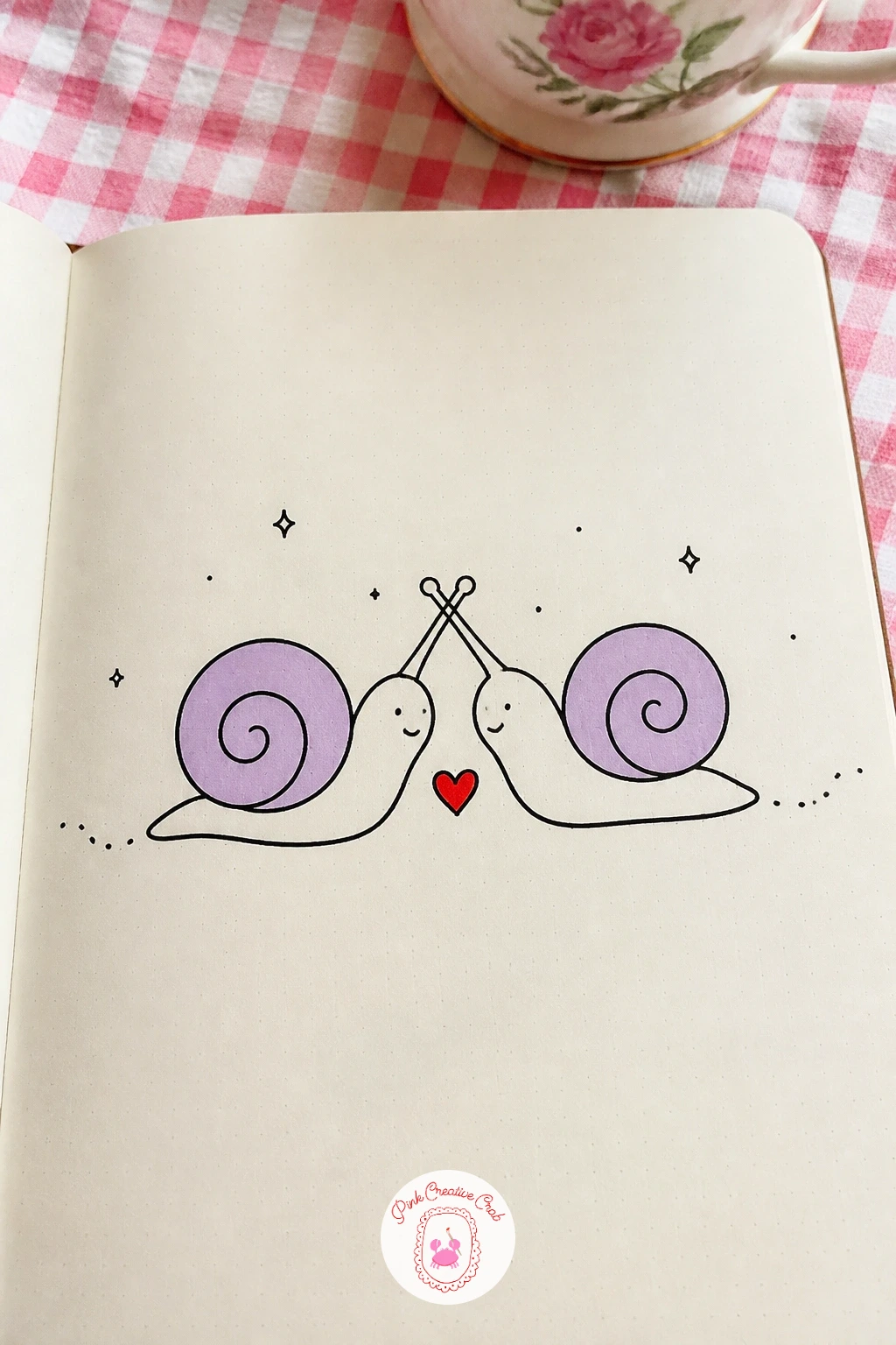
Snails give you an easy shape to build from, since the whole body is just one spiral shell and one curved foot. Draw two shells first, spaced a little apart, each spiral drawn as a single continuous curling line rather than lifting your pen partway through, which is what keeps a spiral looking smooth.
From each shell, draw the long curved body stretching out and tapering to a point, then add two antennae on each head reaching toward the other snail until the tips just touch in the middle. That antennae touch is the whole kiss, so take your time there and keep the lines soft rather than stiff and straight.
If the spirals come out lopsided, draw a light pencil guide circle first and curl your ink line inward from its edge. Color one shell lilac and one left plain, with a tiny cherry red heart sitting right where the antennae meet.
Leave a thin trail of dots behind each snail’s body, it is a small touch that instantly reads as a snail trail and fills empty space nicely.
Palette: Lilac,Cherry Red,Ink Black
Ducks are mostly a teardrop body and a flat wide bill, so once you have those two shapes down the rest is just small marks. Draw two duck bodies facing each other, necks curving up and bills meeting at the top in a small overlapping line, and keep the heads round and the bodies plump.
Here is where eye level and light matter: set a single light source coming from one side and add one small curved highlight line along the top of each back, which is enough to make the round bodies feel like they catch real light without any shading. Ink the webbed feet last as simple flat triangular shapes under the body.
A common wobble is making the bills too pointed, a duck bill is flat and rounded at the tip, almost paddle shaped, not a sharp beak. Pop two or three small cherry red hearts above their heads, varying the sizes so they feel like they are rising and fading.
If you want feathers instead of the smooth cartoon body, add a few short curved strokes along the wing edge once the outline is dry.
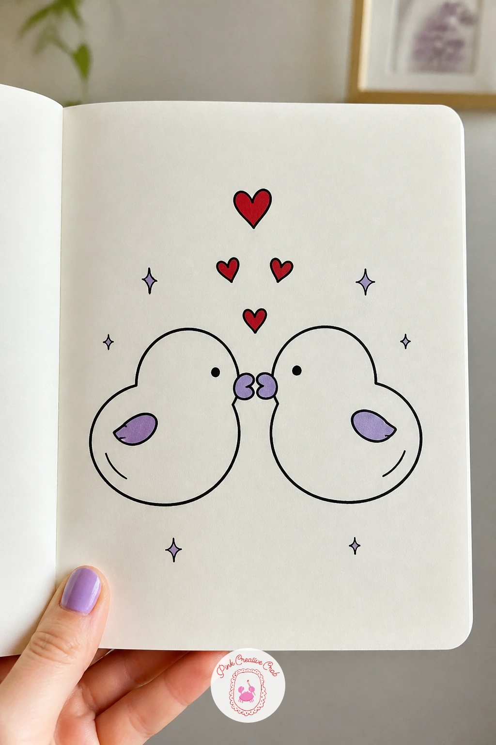
Palette: Cherry Red,Lilac,Ink Black
This one is really a lesson in drawing a lip print, which is a shape worth practicing on its own before you commit it to the final page. Sketch the receiving face first in profile or three quarter view, plain and simple, then work out the lipstick mark separately on scrap paper: two overlapping curved humps for the upper lip and one wider curve for the lower, like a slightly open heart shape.
Once that print shape feels right, ink the face, add the kissing figure leaning in from the side with lips just touching the cheek, then stamp the lip print mark in cherry red slightly below and behind where the lips actually meet, as if it has already been left there.
The mistake to watch for is drawing the print perfectly symmetrical, a real lipstick mark is a little uneven and smudged at one edge, so let one side of your red shape blur slightly. A fine felt tip in place of marker works fine for the print if your cherry red runs dry.
Add one small lilac detail, a ribbon or hair clip on the kissed figure, to keep the second accent color present without crowding the moment.
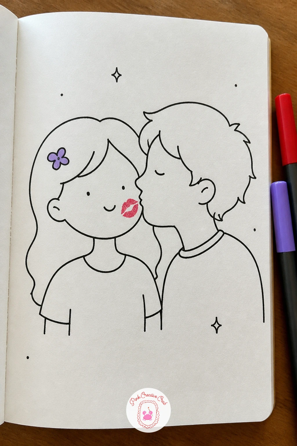
Palette: Cherry Red,Lilac,Ink Black
Now that you have a few calm kiss pairs under your belt, try one with motion in it. Draw the two people leaning toward each other first, lips almost meeting but not quite, since the whole joke depends on that gap staying open.
Build the dog next, caught mid leap with front paws up and ears flying, positioned right between the two faces so its head pokes into the gap where the kiss was about to land. Keep the dog’s body stretched and its back legs still bent on the ground to show it has just pushed off, that bent back leg is what sells the jump rather than a static pose.
A flat looking jump is the usual problem, fix it with two or three short curved motion lines trailing behind the ears and tail. No dog in mind: a cat leaping onto a lap works just as well for the same gag.
Color the dog’s tongue cherry red, lolling out mid air, and give one person a lilac sweater so the accent colors sit on opposite sides of the scene.
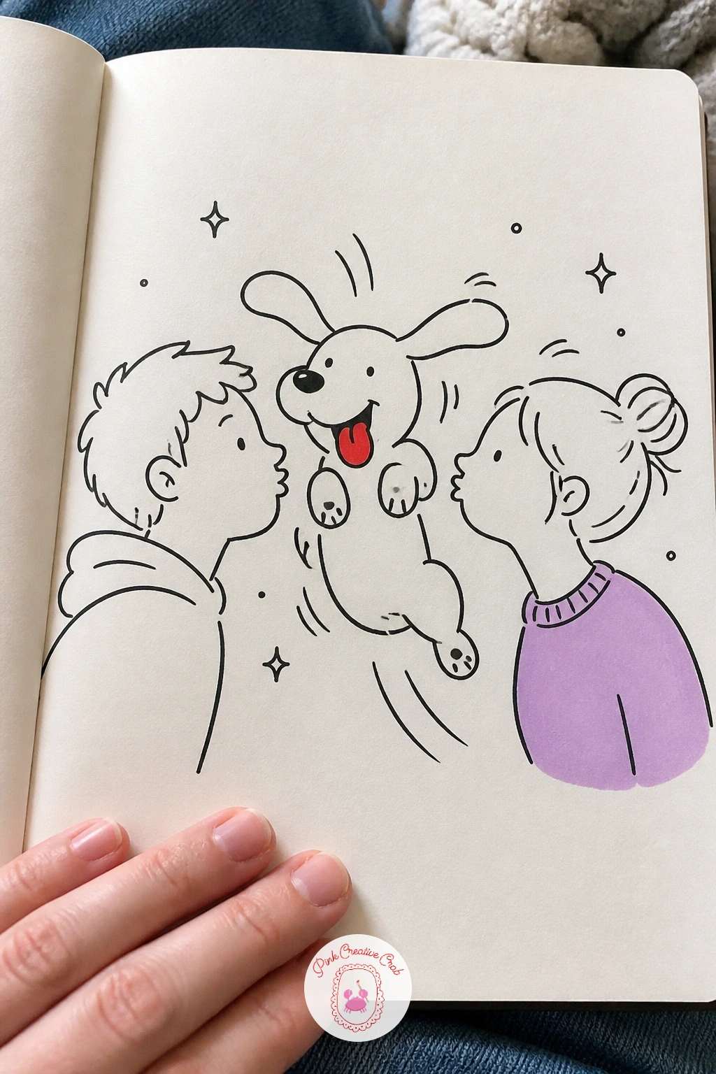
Palette: Cherry Red,Lilac,Ink Black
Whales ask you to think about perspective, since the curl of a wave sets the whole stage for where the light falls. Draw the wave first as one large curling shape, thicker at the base and tapering as it curls over at the top, with the open side facing you like a tunnel.
Inside that curl, draw two whale heads rising to meet each other, rounded foreheads and small curved mouths touching at the center. Since the light source sits above the wave’s open mouth, add a lighter untouched strip along the top curl and let the underside stay denser with short curved lines, that contrast is what makes the water feel like it is lit from one side rather than flat.
Whales often end up looking like fish if the head is too pointed, keep the forehead broad and blunt and the mouth line long and gentle. Color the wave in lilac with a few cherry red hearts tucked into the whitewater foam at its crest.
If a full curling wave feels like too much, a simple horizon line with two whale heads poking up works as an easier stand in.
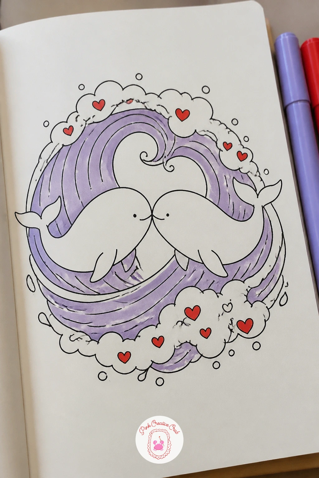
Palette: Lilac,Cherry Red,Ink Black
Cherries are about as simple a shape as a kiss doodle gets, which makes this the spot to slow down and focus on texture instead of structure. Draw two round cherry bodies touching at one edge, joined above by a single curved stem that splits into two just before each cherry, so they clearly share one line back to the branch.
Ink a small highlight shape on each cherry, a tiny teardrop left white or very lightly marked near the top, and that single highlight is the trick that makes a flat red circle read as glossy fruit rather than a sticker. Press your cherry red marker a touch harder near the bottom of each cherry and lighter near the highlight to build a soft gradient by hand.
The stem is where most people lose the kiss feeling, since a straight V shaped stem looks stiff, curve both halves gently so they look like two arms reaching toward each other before the cherries meet. Add two tiny lilac leaves at the top of the stem for the second accent color.
Keep the highlight shape small and slightly off center on each cherry, a centered highlight looks painted on rather than natural.
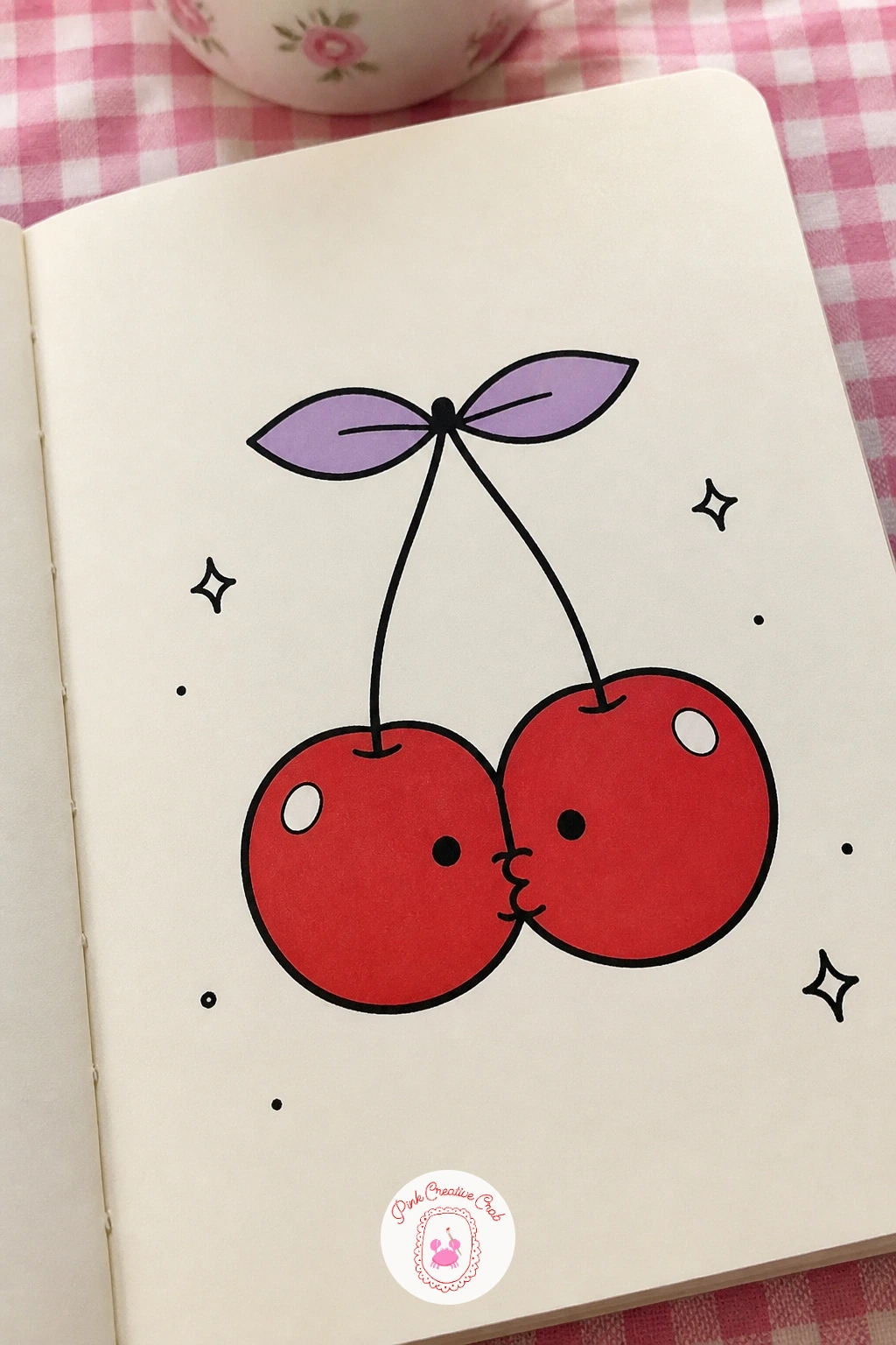
Palette: Cherry Red,Lilac,Ink Black
This idea leans entirely on line quality, since a coffee cup is only a few straight edges and the whole charm comes from the steam. Draw two simple mugs facing each other, rims almost touching, each with a single curved handle on its outer side so the handles point away from each other like open arms.
From the top of each mug, draw one wavy steam line rising up, and curl the two lines toward each other so they meet and loop into a heart shape in the air between the cups. Getting that heart to look intentional rather than accidental is the hard part, so sketch the loop lightly in pencil first and only ink it once both curls meet cleanly at a point at the bottom of the heart.
If your mugs look too plain, add a thin ring near the rim or a small saucer underneath each one for a bit of detail. Color one mug lilac and one left white, and leave the steam heart as a clean cherry red outline rather than filling it solid, so it stays airy.
For more about cozy coffee scenes and foam details, the coffee drawing lessons are worth a look.
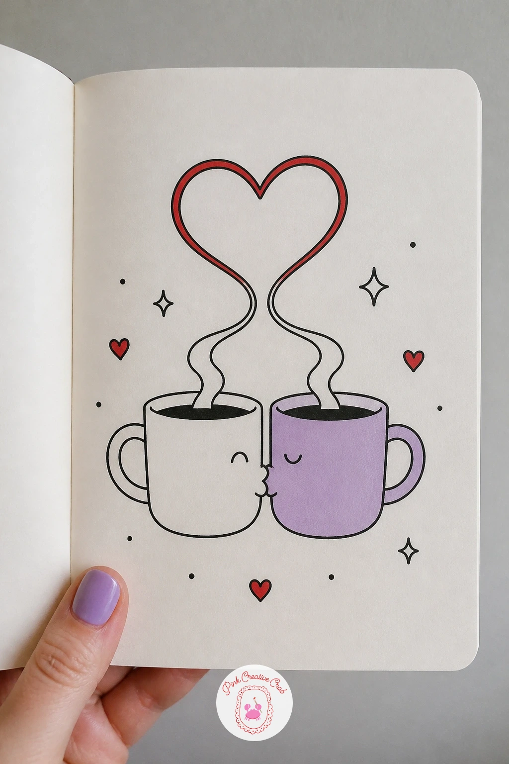
Palette: Cherry Red,Lilac,Ink Black
A hand kiss is a pose worth measuring before you ink it, since the bent figure has to actually reach the raised hand without looking broken in half. Stand the lady first, one arm extended out and slightly down, hand relaxed with fingers gently curved.
Block the gentleman’s pose next: bent forward at the waist with one leg stepped back for balance, and check that his lowered head lines up exactly with the height of her offered hand before you commit to ink, a quick pencil line between the two points keeps the whole pose honest. Draw his lips just grazing the back of her fingers rather than overlapping them.
Stiff looking bows usually come from a straight back, so curve his spine slightly and bend the front knee a touch more than the back one. Give the lady a lilac dress or glove and let one small cherry red heart float near their joined hands.
If a full standing figure feels like too much for one sitting, crop the drawing at the waist and focus just on the bowed head and the offered hand.
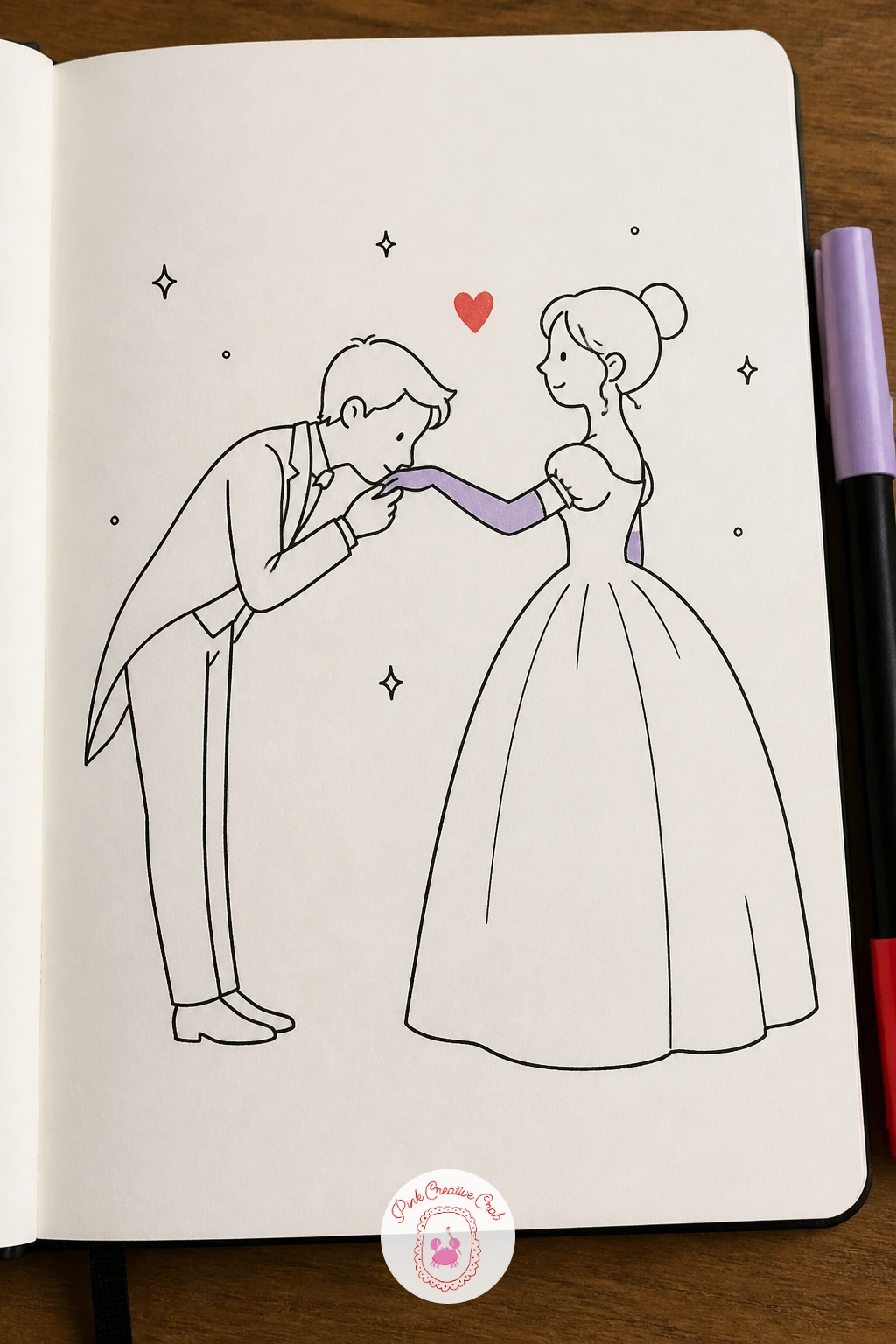
Palette: Lilac,Cherry Red,Ink Black
Strawberries sit squarely in food territory and are a good chance to practice the dry brush trick with a marker, which works just as well as it does with paint. Draw two strawberry shapes, wide at the top and tapering to a point, tilted toward each other so the tips nearly meet, with a small green cap and short stem on each.
Once the outline is inked, drag your cherry red marker lightly over the surface in short strokes rather than filling it in solid, leaving thin streaks of white paper showing through, that broken texture reads as the bumpy strawberry skin far better than a flat fill. Add tiny black seed dots scattered over the dry brushed red once it is dry to the touch.
A plain white plate underneath, drawn as one simple oval with a thin rim line, is enough setting to ground the pair without extra detail. If your marker tip is too wide for the dry streak effect, a chisel tip colored pencil dragged on its side gives a similar broken texture.
Keep the seed dots slightly irregular in spacing rather than a perfect grid, real strawberry seeds scatter unevenly across the surface.
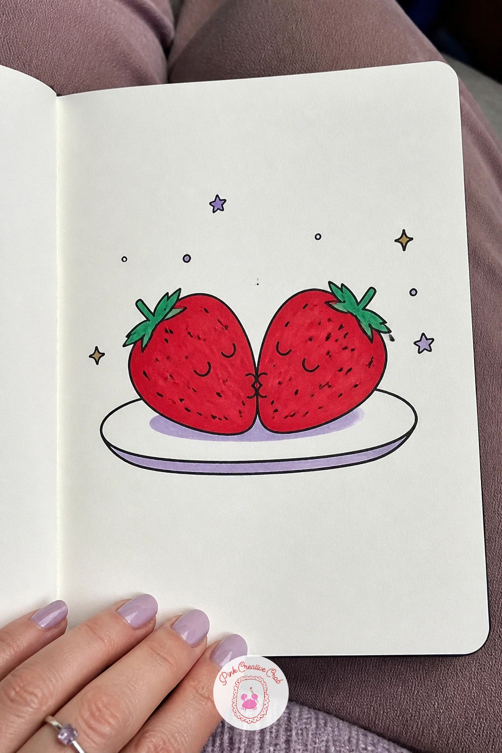
Palette: Cherry Red,Lilac,Ink Black
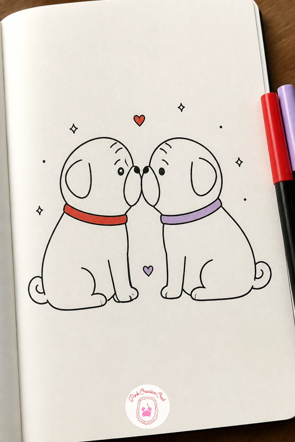
A pug’s whole character lives in the wrinkles, so this idea is really about where to put a handful of short curved lines rather than drawing a detailed face. Start with two round pug heads facing each other, flat snouts almost touching, large round eyes and small folded ears on top.
Ink two or three short curved wrinkle lines across the top of each snout and between the eyes, and keep them loose and slightly uneven since symmetrical wrinkles look pasted on rather than natural. The snout itself stays mostly flat and smooth, which is the contrast that makes the wrinkled forehead above it read clearly.
Too many wrinkle lines is the easy mistake here, three or four per face is plenty, more than that turns the drawing muddy. Color one pug’s collar cherry red and the other’s lilac, and leave the bodies as simple rounded shapes without extra detail so the faces stay the focus.
If you want more wrinkly animal faces to practice on, the animal doodle painting ideas page has a good range to try next.
Palette: Cherry Red,Lilac,Ink Black
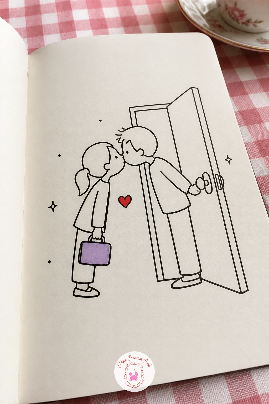
Give this one a quick version first if time is short: two heads leaning together at a doorway, one hand holding up a small lunchbox, done in ten minutes with no background at all. The forty minute version adds the door frame around them, a welcome mat underneath, and a coat half on over one figure’s shoulder, small details that turn a pose into a proper little scene.
Either way, start with the two heads meeting at the lips in a quick peck, keep this kiss brief and light rather than lingering, so tilt the heads only slightly and keep the contact short. Draw the lunchbox as a simple rounded rectangle with a thin handle, held low in one hand.
If the doorway version feels cramped, simplify it to just a vertical line for the door edge and a horizontal strip for the mat, that is enough to say front door without drawing a full house. Color the lunchbox lilac and add one small cherry red heart drifting up between their heads.
Add a single shoe half out the door in the forty minute version, it is a small touch that sells the rush of actually leaving.
Palette: Lilac,Cherry Red,Ink Black
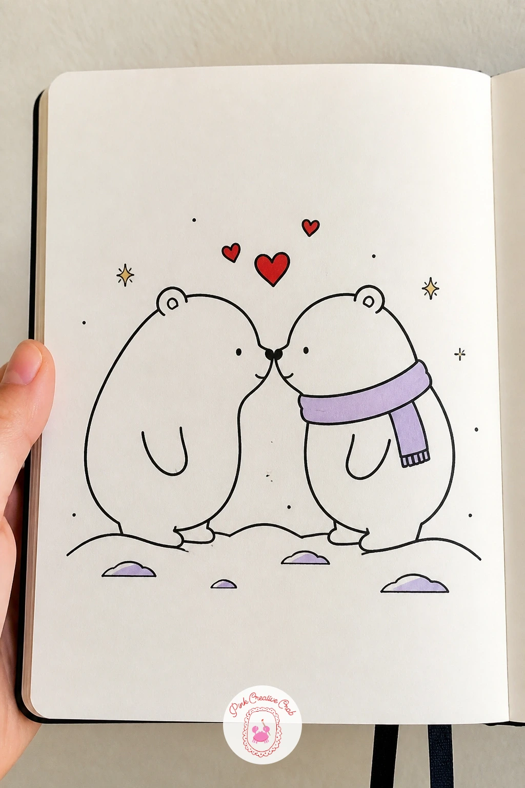
Bears are a good subject for practicing a kneaded eraser, which lifts graphite cleanly if you pencil your snowy ground first. Draw two bear heads facing each other, round muzzles and small rounded ears, noses nearly touching in the middle, then build soft rounded bodies below.
For the snow, pencil in a loose grey shaded ground first, then press a kneaded eraser into it and lift small patches to create soft snowy highlights scattered across the surface, which looks far more convincing than drawing snow as plain white dots. Ink the bears last once the pencil snow texture is set, keeping their outlines simple and the fur mostly flat.
A common slip is making the snow texture too even across the whole ground, lift more eraser marks near an imagined light source and fewer in the shadowed corners for a bit of depth. Give one bear a lilac scarf and let a few tiny cherry red hearts float above their touching noses.
No kneaded eraser on hand, a white gel pen dotted over plain pencil shading gives a similar scattered snow effect.
You Will Need
- kneaded eraser
- white gel pen (optional)
Palette: Cherry Red,Lilac,Ink Black
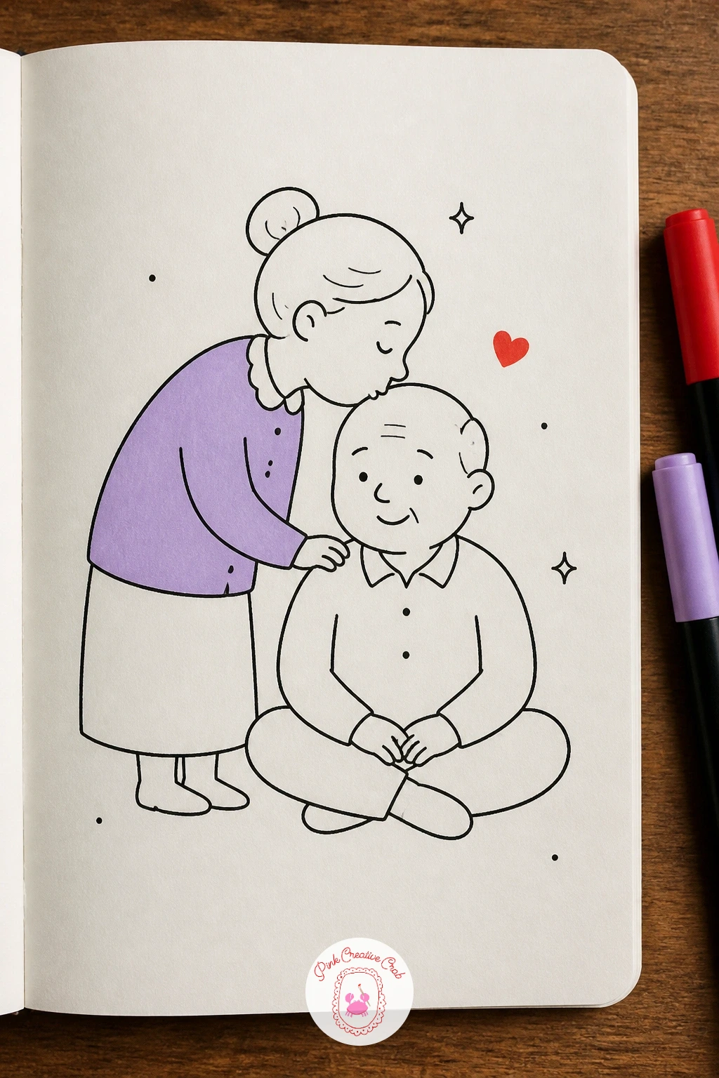
This scene works because of the height difference and the shine on that bald head, so start by seating grandpa in a simple chair, his head tilted slightly forward and down. Stand grandma just behind and beside him, bent at the waist so her lips meet the very top of his head.
Draw his bald scalp as a smooth dome with one small curved highlight line near the top to suggest a bit of shine, and keep his remaining hair to a thin fringe around the sides rather than none at all, which reads more naturally than a completely bare head. Her glasses, drawn as two simple ovals linked by a short bridge line, add a nice bit of character to her face.
If the bend in her back looks awkward, round her shoulders forward and let one hand rest on the chair back for support, that small prop fixes the balance of the pose instantly. Color her cardigan lilac and add one small cherry red heart resting right where her lips touch his head.
Keep his highlight on the dome small and curved rather than a straight streak, a curved shine reads as rounded scalp instead of a flat sticker.
Palette: Lilac,Cherry Red,Ink Black
This pairs nicely with the earlier plate of strawberries but plays a different angle entirely, since here the fruit floats free in the air with hearts scattering outward rather than sitting still on a plate. Draw the two strawberries tilted together as before, tips meeting, but this time add small simple leaf caps that flip outward as if caught mid bounce.
Scatter three or four small cherry red hearts around them at different sizes and angles, some tilted, some upright, which gives the whole drawing a sense of movement the plated version does not have. Keep the hearts varied in size rather than identical, uniform hearts look stamped rather than scattered.
If the floating look falls flat, add two or three short curved motion lines trailing behind the strawberries on one side, as if they just bounced into frame. Color the leaf caps lilac instead of the usual green to keep the palette consistent, and leave the strawberry bodies in solid cherry red rather than the dry brush texture used earlier, for a cleaner graphic look.
Vary where the biggest heart sits each time you redraw this, moving it closer or further from the fruit changes the whole energy of the piece.
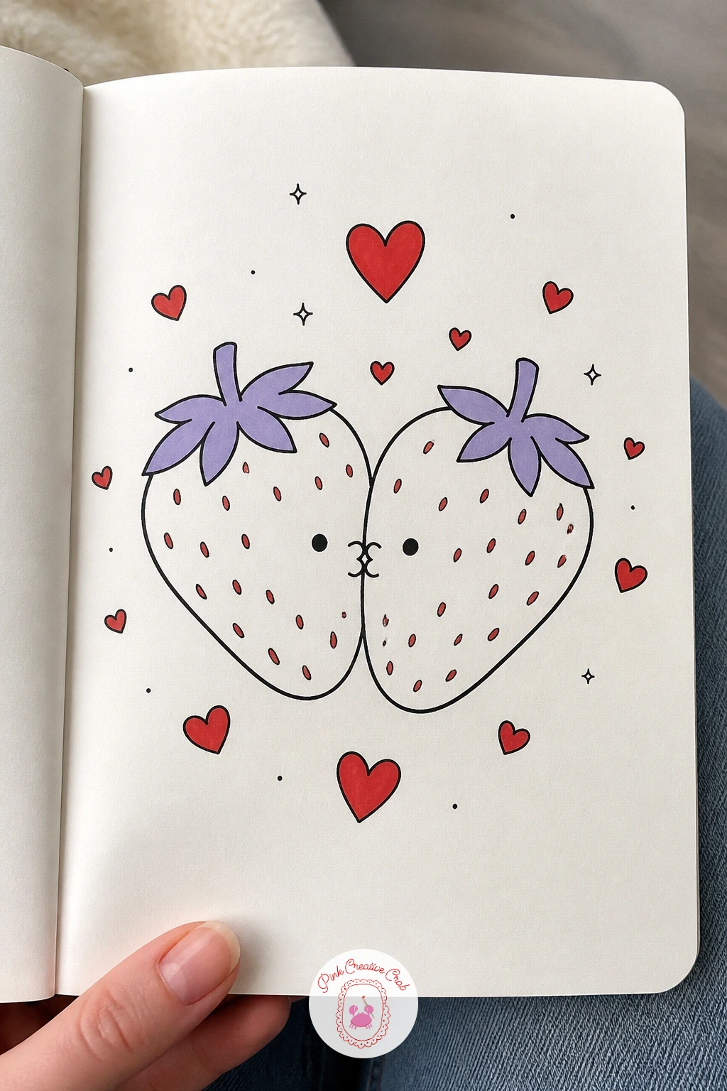
Palette: Cherry Red,Lilac,Ink Black
Figuring out proportion matters here more than it looks, since the sender needs to read clearly even though most of the attention goes to the little heart traveling away from them. Draw the figure first, one hand raised near the lips, fingers lightly pressed together as if just releasing a kiss, and measure the hand against the head, a hand is roughly the size of the face from chin to hairline, which keeps it from looking oversized.
From the fingertips, draw a dotted or dashed curved line arcing across the page, ending in one small cherry red heart drawn slightly larger than the hearts you have used elsewhere, since this one is the whole subject of the piece. Taper the dashes smaller as they near the hand to suggest the heart just left it.
If the arc looks stiff, curve it more generously, a blown kiss travels in a lazy loop rather than a straight shot. Give the figure a lilac top and leave the background empty so the eye follows the dashed trail straight to the heart.
Add a tiny sparkle mark or two near the heart’s landing point for a last bit of sparkle without crowding the page.
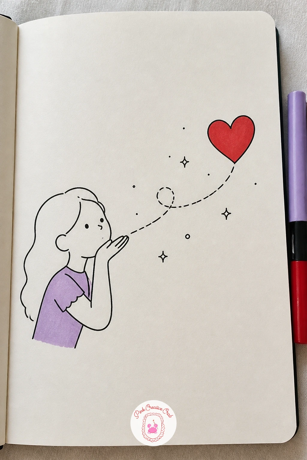
Palette: Cherry Red,Lilac,Ink Black
Giraffes test your sense of proportion more than almost anything else on this list, since the whole charm depends on the necks curving into a believable heart shape. Draw the two heads first at the top, tilted toward each other with lips meeting, then let the necks flow downward and outward in matching curves before meeting again at the shoulders, forming the two lobes and the bottom point of a heart between them.
Sketch this in pencil before you ink anything, since getting both neck curves symmetrical takes a bit of adjusting, measure the width of the gap at the top against the gap near the bottom point to keep the heart shape balanced rather than lopsided.
The small patches on a giraffe’s coat are easy to overdo, scatter six or eight irregular rounded shapes rather than covering the whole neck, leaving plenty of plain space between them. Color those patches lilac instead of the usual brown for a softer look, and tuck one small cherry red heart in the gap where the necks cross.
Keep the patch shapes rounded with slightly uneven edges rather than sharp polygons, soft edges read as giraffe print far more convincingly.
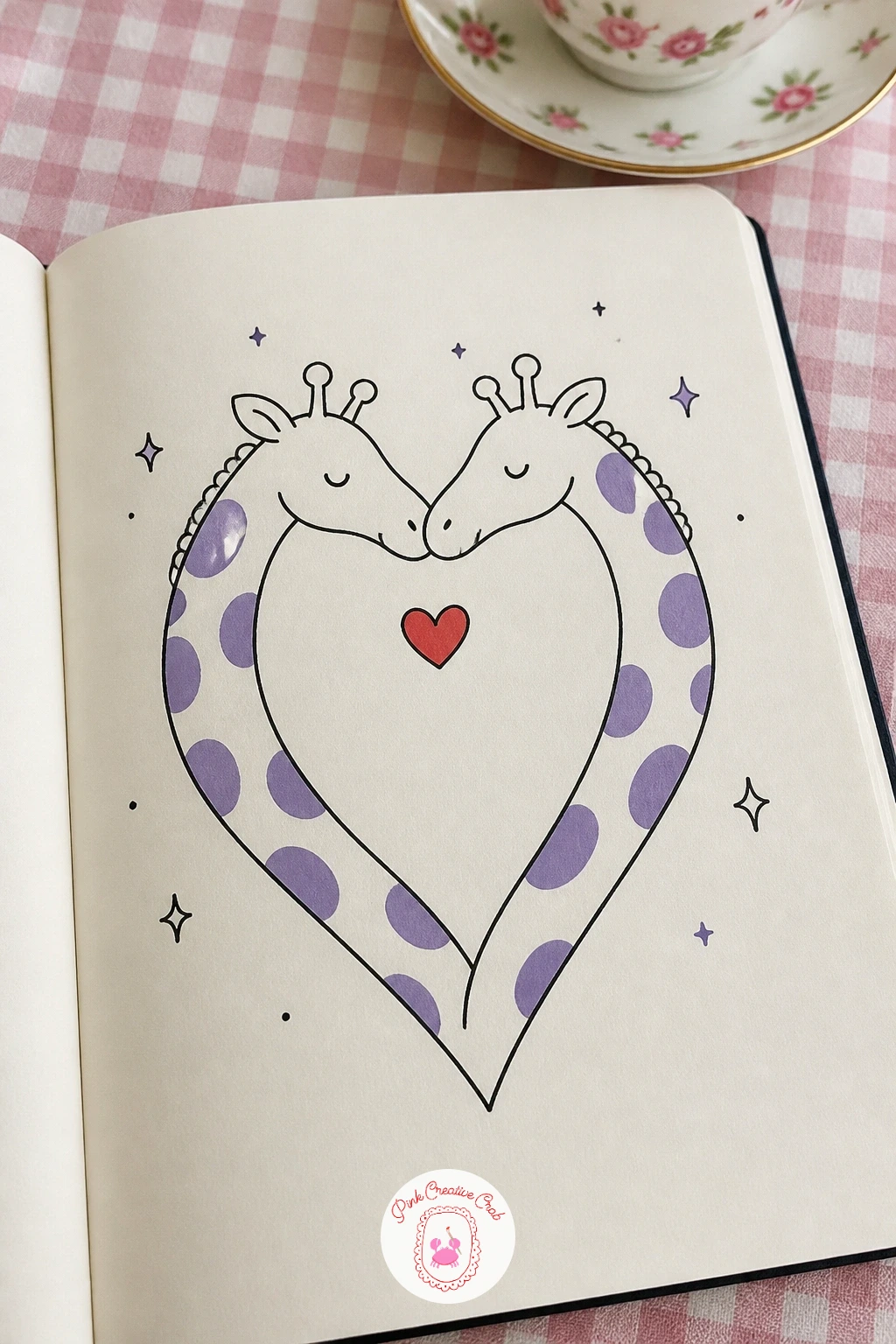
Palette: Lilac,Cherry Red,Ink Black
For more animal pairs and wildlife proportion practice, the wild watercolor animals page covers bigger creatures in a similar spirit.
Settle these two on a branch and the light source becomes the thing to decide first, since a single direction keeps the small round bodies from looking flat. Draw a curved branch across the page, then perch two small plump birds on it facing each other, tails pointed down and away, beaks touching at the center.
Pick one side for the light to come from and add a thin pale streak along the top curve of each bird’s back and head on that side, leaving the opposite side a touch denser with short feather strokes, that single choice is what gives the round bodies some form instead of sitting flat on the page. Add a few blossom clusters along the branch, simple five petal shapes repeated three or four times, never crowding the whole branch.
Overworking the feathers is the usual trap, two or three short curved strokes near the wing edge is enough, the rest of the body can stay a clean outline. Color the blossoms lilac and give one bird’s chest a wash of cherry red for contrast against its partner.
Keep the blossom clusters small and spaced apart along the branch rather than clumped at one end, which balances the page better.
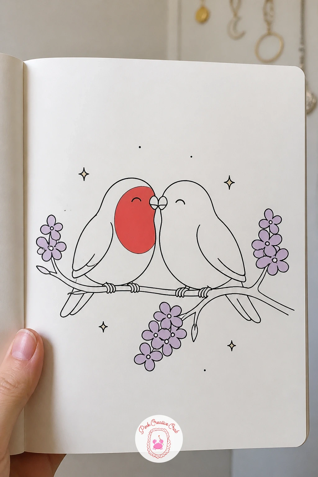
Palette: Lilac,Cherry Red,Ink Black
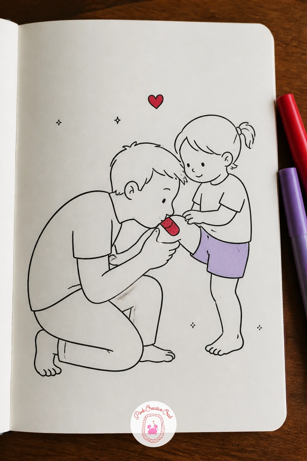
This is one of the gentler story moments on the list and it works best kept simple rather than busy. Draw a small seated child first, one leg extended with a round scraped knee drawn as a small patch of short scribbled lines rather than anything graphic, just enough to say scrape without it looking sore.
Kneel the dad figure in front, bent low so his lips reach the knee, one hand resting gently on the child’s shin for support. Keep his back rounded and his head tilted well down, a stiff straight back makes the kneeling pose look uncomfortable rather than tender.
If the scrape mark reads as too harsh, soften it with a small cherry red cross-shaped bandage drawn right over it instead, which keeps the tone light and sweet. Color the child’s shorts or dress lilac and add one tiny heart floating just above dad’s bowed head.
Keep the scribbled scrape mark small and contained to one patch of knee, a scattered mark across the whole leg reads as more alarming than intended.
Palette: Cherry Red,Lilac,Ink Black
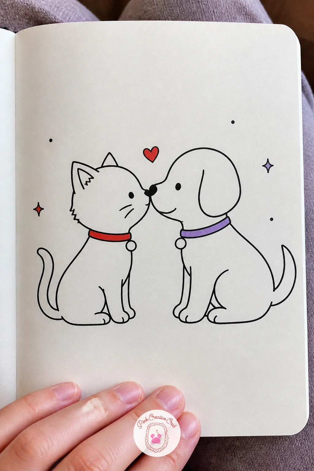
Pairing two different animal shapes in one drawing means thinking about scale before anything else, so decide which one is slightly larger and stick to it, a puppy’s head usually reads a touch bigger and rounder than a kitten’s narrower face. Draw the puppy first with floppy ears and a soft round muzzle, then add the kitten facing it with pointed ears and a smaller, more pointed nose, noses just touching.
Ink the puppy’s nose as a small rounded oval and the kitten’s as a tiny triangle, that contrast in nose shape is a quick way to tell the species apart even in a simple outline. Keep both faces calm, eyes drawn as soft closed curves rather than wide open circles, which suits the gentleness of the moment.
If the two heads end up looking too similar in size and shape, exaggerate the ear difference further, flop the puppy’s ears down low and keep the kitten’s standing sharp and upright. Color the puppy’s collar cherry red and the kitten’s collar lilac, with one small heart floating where their noses meet.
Keep the kitten’s triangular nose small and neat, a nose drawn too large tips the whole face toward looking like a different animal entirely.
Palette: Cherry Red,Lilac,Ink Black
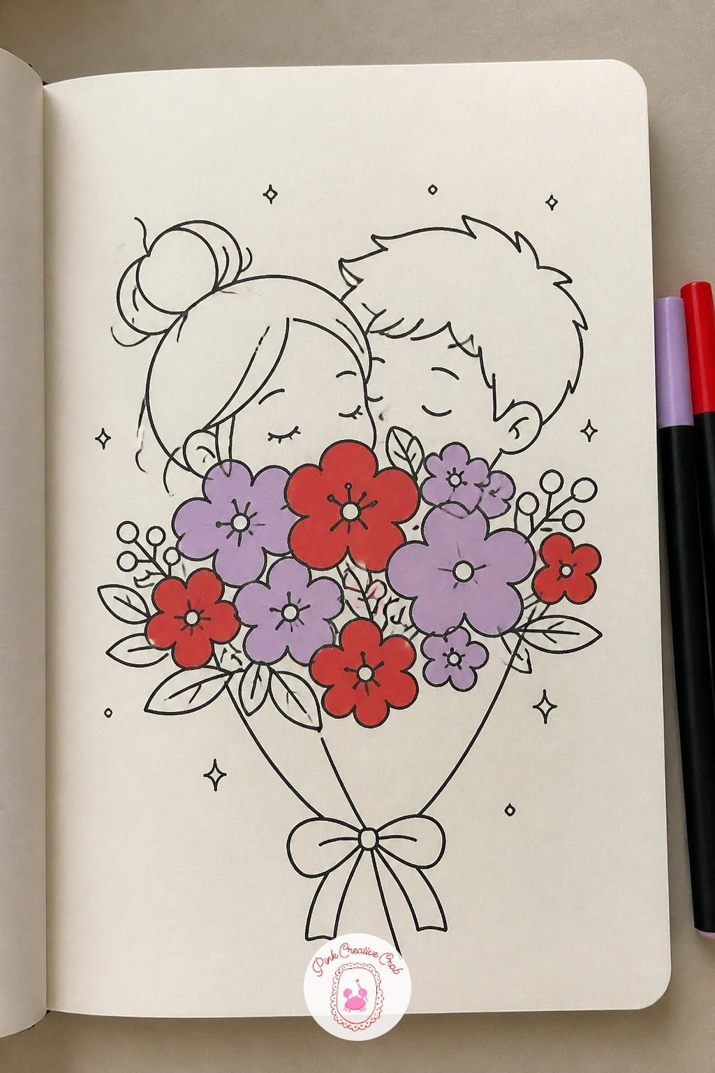
Hiding the actual kiss behind the bouquet solves a proportion problem neatly, since you only need to draw two sets of eyes peeking over the top of the flowers rather than two full faces meeting. Start with the bouquet itself, five or six rounded blossoms of varying sizes clustered together with a few longer leaves reaching outward, wrapped at the base with a simple paper cone shape.
Behind that bouquet, sketch two heads angled toward each other, visible only from the eyes up, both sets of eyes closed in that soft, happy kissing shape. Let the top of the bouquet overlap the lower half of each face completely, that full overlap is what sells the idea that the kiss is happening out of view.
If the bouquet looks too stiff, vary the blossom sizes more, two larger flowers near the center and smaller ones toward the edges reads far more naturally than a neat row. Color a few blossoms cherry red and a few lilac, alternating so neither color dominates, and leave the leaves a plain outline.
Keep the visible foreheads close together at the very top edge, the nearer those peeking eyes sit to each other, the stronger the stolen kiss feeling comes through.
Palette: Cherry Red,Lilac,Ink Black
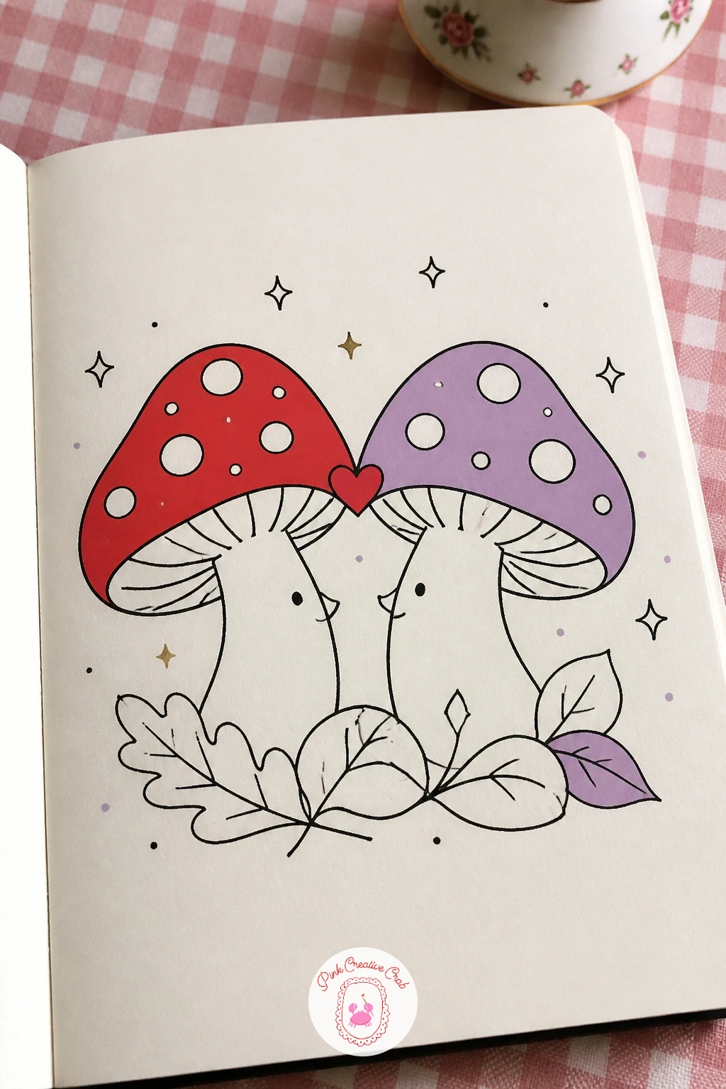
Mushrooms let you practice drawing a confident curved cap without worrying about a face underneath, since the personality here comes entirely from how the two caps lean toward each other. Draw two simple mushroom shapes, a rounded cap over a short thick stem, tilting both caps inward until their edges just meet at the top, like two little domes touching brims.
Scatter a handful of small white spots across each cap, five or six dots per mushroom is plenty, since too many spots turns a clean cap into clutter. Build the forest floor underneath with a few overlapping curved leaf shapes and one or two small pebbles, keeping the ground sparse rather than filling the whole base of the page.
If the caps look too symmetrical and stiff, make one mushroom slightly shorter and tilt it a touch more than the other, mismatched pairs read as more charming than a mirror image. Color one cap cherry red and one lilac, and tuck a tiny heart in the gap just where the two cap edges touch.
Keep the spot pattern loosely scattered rather than evenly spaced, real mushroom caps never have a perfectly regular dot grid.
Palette: Cherry Red,Lilac,Ink Black
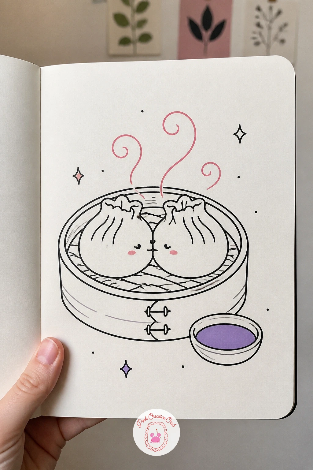
This is the most involved idea on the list, so it earns the full forty minutes if you want every detail: the quick ten minute version is just two dumplings touching with a few pleats and a couple of steam lines, while the longer version adds the full steamer basket, scattered steam clouds and a small dipping sauce dish on the side.
Draw the bamboo steamer first as a wide shallow ring with a textured woven rim, short diagonal lines repeated around the edge to suggest the weave, then nestle two plump dumpling shapes inside it, pleated tops leaning toward each other until the pleats nearly touch.
Pleat lines on dumplings are easy to overdo, five or six short curved folds along the top seam of each dumpling is enough, more than that turns the shape busy rather than appetizing. If the steamer’s woven rim feels fussy, simplify it to one plain thick ring instead and let the dumplings carry the detail.
Color the steam curling up from the gap between the dumplings in a pale cherry red tint, and add one small lilac dish of dipping sauce beside the steamer with two or three tiny droplet marks for texture.
Palette: Cherry Red,Lilac,Ink Black
For more food themed doodles with bold outlines and simple shapes, the food pop art ideas are worth a browse after this one.
What to Do Next
Pick one idea that matches the mood you are after today, maybe the frogs on their lily pad for something quick and silly, or the hand kiss for something a little more classic, and sketch it loosely in pencil first on plain or dot grid paper before you commit it to fineliner. Keep the cherry red and lilac markers capped nearby and add them only once the ink is fully dry.
Frequently Asked Questions
What pens work best for a kiss doodle?
A fine point black fineliner for the outline is the main tool, paired with two dual tip alcohol markers in cherry red and lilac for accents. Keep the fineliner between 0.3 and 0.5mm for clean, confident lines at this small scale.
How do you draw two faces kissing without it looking odd?
Keep both faces simple, with closed eyes drawn as soft curved lines rather than detailed open eyes. Overlap the nearer face slightly over the far one’s shoulder or hair, which puts both heads clearly in the same space instead of floating apart.
Do I need to draw full bodies for a kiss doodle?
No, many of the strongest kiss doodles crop at the shoulders or even just the heads. Full bodies suit scenes with props or action, like a jumping dog or a bowing gentleman, but faces alone work fine for most ideas here.
How small should the hearts be in these doodles?
Keep hearts small and few, one to three per drawing is usually enough. Vary their sizes slightly rather than repeating one identical heart shape, which keeps the accent color feeling light rather than cluttered.
What if I only have a red pen and no lilac marker?
Cherry red alone still carries the whole kiss doodle, since it is doing the heavier lifting of the two accents. Use a light pencil tone or simply leave the lilac areas as plain outline until a second marker is on hand.
Have any thoughts?
Share your reaction or leave a quick response — we’d love to hear what you think!
-
 0
-
0
-
0
-
0
-
0
-
0


