

A gouache sketchbook rewards you fast. The paint goes down opaque and matte, it dries in minutes, and a page of small studies gives you something finished before the evening is over, even if the kettle is still warm when you close the book.
Below are 31 pages built for exactly that: a page of cloud studies, a lemon on a blue plate, a cat curled on a cushion, a window of rain. Work through them in order if you like, from the simplest shapes to the busier little scenes, or just flip down to whatever your paint box is already mixed for tonight.
Using these images: free for personal projects such as printing, coloring, cards, journals and gifts. Handmade items that include them may be sold up to 30 pieces per design. More than that is commercial use and is not permitted, and neither is selling or sharing the images themselves or passing them off as your own. Please ask before any other use.
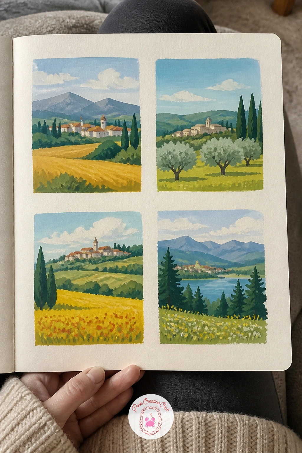
Start the sketchbook habit with a page of four tiny landscapes in little boxes. Pencil four small rectangles with a ruler, leaving even white gutters between them, then paint each box as its own quick scene: a hill, a row of trees, a field, a distant town.
Work largest shapes first in each box (sky, then ground) and let those dry before you add a tree line or a roof shape on top. Keep every box to three or four color notes so the page reads as a set rather than four separate fights.
If one box goes muddy, let it dry completely and paint a thin opaque layer over it rather than scrubbing back in. If you do not own a ruler, trace around a straight book edge or a wallet for your box lines.
Pick a single time of day, like early morning, and repeat its sky color faintly in all four boxes so the page feels like one afternoon.
You Will Need
- ruler or straight edge
Palette: Cerulean Blue,Sap Green,Raw Sienna,Titanium White
After the landscape grid, slow down with one single object: a lemon study on a blue plate. Draw a light pencil oval for the lemon and a wider circle for the plate rim, then paint the blue plate first in one flat wash so the lemon can sit on top of it while it is still slightly damp.
Drop the lemon in as solid cadmium yellow, then while it is wet touch a little orange into one side for roundness and let the colors mingle on their own. Add the plate’s shadow last, in a cool grey-blue, so the lemon reads as sitting on the surface rather than floating above it.
If the yellow goes flat and papery, a touch of white mixed into the shadow mix usually brings the roundness back. No blue plate in the house tonight: paint a plain white saucer instead and let its cast shadow do the work.
Measure the lemon against the plate’s width with your brush handle before you paint, so it does not end up too large for its dish.
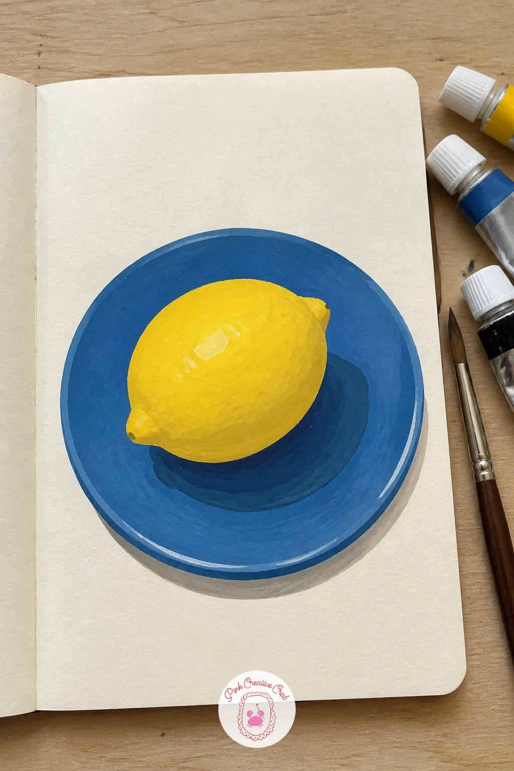
Palette: Cadmium Yellow,Cerulean Blue,Orange,Payne’s Grey
Give yourself more air to work with on the next page: a window view over rooftops. Paint the sky first in one broad flat wash across the top two-thirds of the space, then work the roofline from back to front, each rooftop a slightly darker flat shape overlapping the one behind it.
Picture the eye level as a straight line roughly a third of the way up the page. Roofs above that line show more of their sloped top, roofs below it show more of their front wall, and that one shift is what makes the rooftops read as a view down over a town rather than a flat strip of triangles.
If the roofs start blending into one brown smear, paint them in two or three distinct values and let each dry before the next touches it. No window to reference: any photo of a town skyline on your phone gives you the same overlapping roofline to copy.
Keep one chimney or TV aerial as a thin dark line to anchor the whole view.
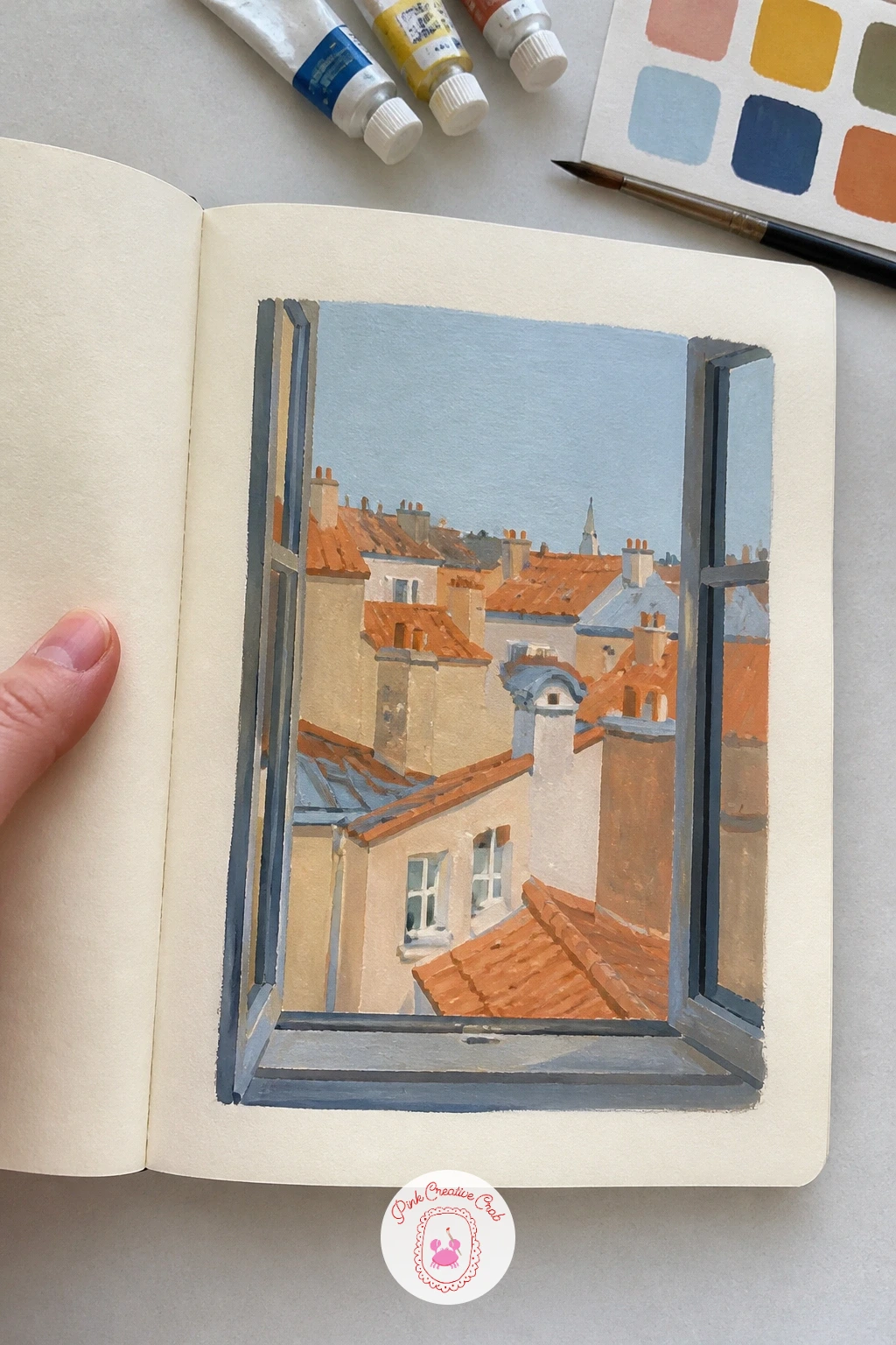
Palette: Cerulean Blue,Burnt Sienna,Payne’s Grey,Naples Yellow
Try the same view twice on one page, once at midday and once at dusk, to see how little the shapes change and how much the color does.
Turn the page toward something living: a page of houseplants, three or four small pots lined up like specimens. Paint each pot first as a simple flat shape, then build the leaves on top with a smaller brush, working from the center stem outward for each plant.
Vary the leaf shapes on purpose, broad and rounded for one, long and pointed for the next, so the page does not turn into four identical green blobs. This is also where a dry brush trick helps: load the brush, wipe most of the paint off on a tissue, then drag it lightly over a leaf edge for a slightly ragged, textured look instead of a flat cutout edge.
If the greens all merge into sameness, mix one pot’s green with a touch of yellow and another’s with a touch of blue before you start. Swap a full plant collection for a single houseplant drawn larger if an evening page feels tight.
Label each pot in pencil underneath, the way a plant catalogue would, to tie the page together.
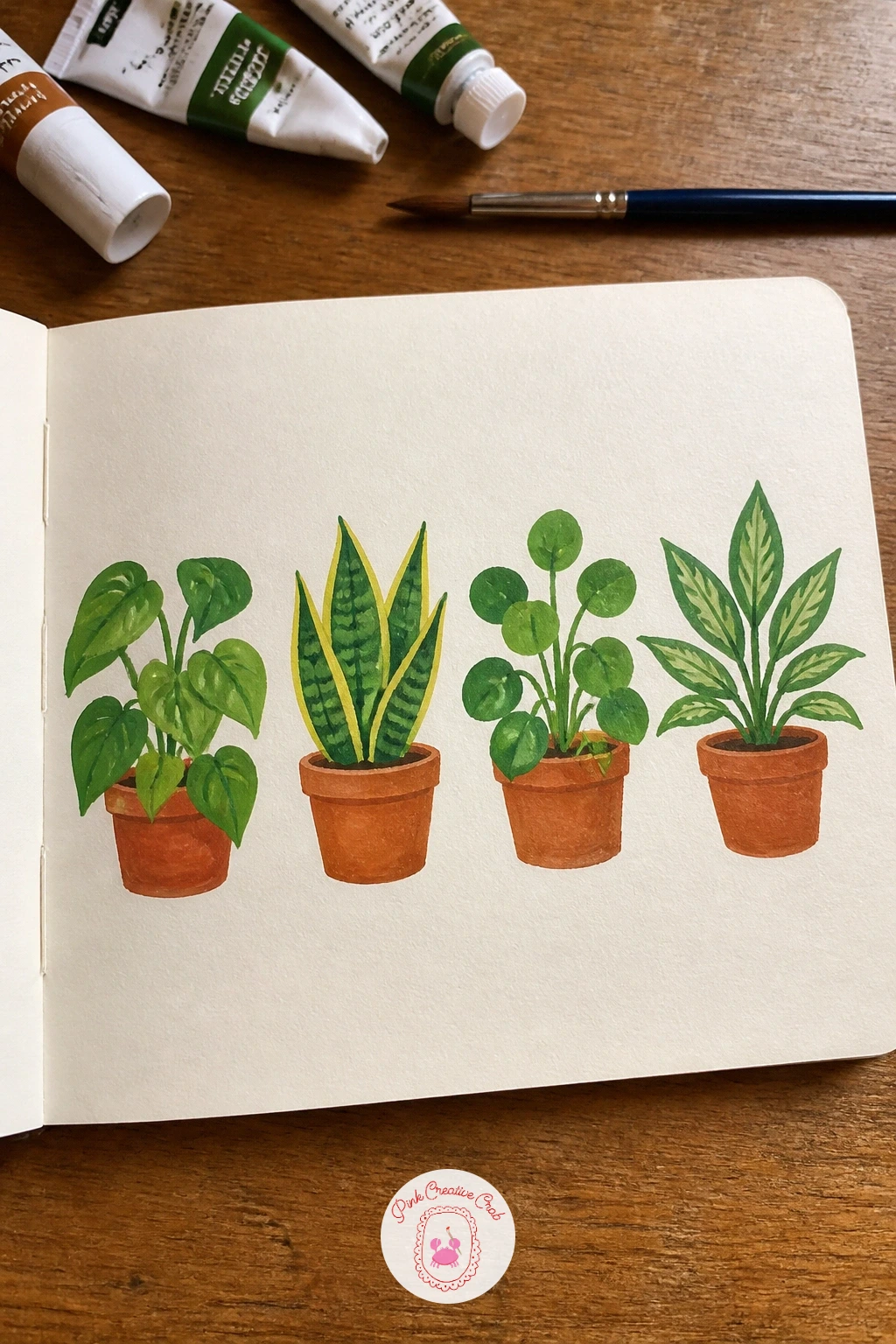
Palette: Sap Green,Terracotta,Olive Green,Titanium White
Move from pots to open air with a seaside cliff and a winding path. Block in the sea as a flat band first, then the cliff face above it in one warm earthy shape, and save the path for last as a thin pale ribbon that zigzags down the cliff toward the water.
Picture the light coming from one side, say the upper left, and keep every shadow on the cliff face falling to the same lower right side. That single rule is what makes the cliff look like it has real form rather than a flat cutout shape with some darker patches.
If the cliff edge looks too hard and graphic, soften one or two spots with a damp brush while the paint is still wet, lifting a little color back off. No coastal reference handy: any hill with a dirt track photographed from a distance gives you the same winding path shape to borrow.
Keep the path narrower at the top of the cliff and a touch wider near the bottom to push the distance.
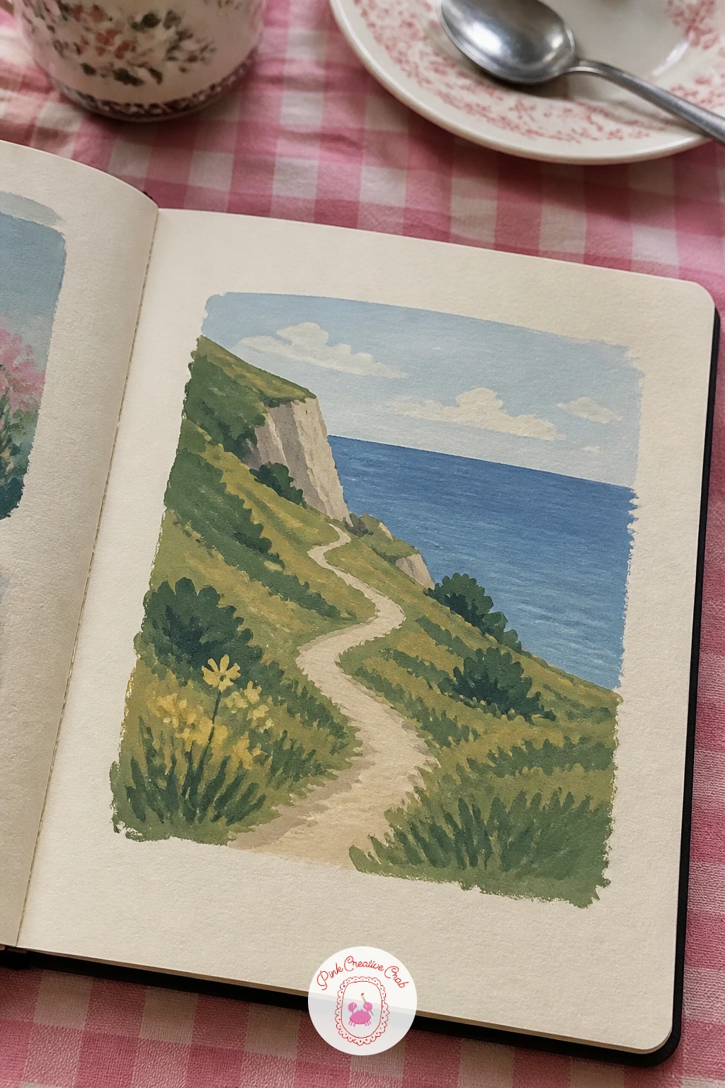
Palette: Prussian Blue,Raw Umber,Naples Yellow,Titanium White
Bring the page back indoors with a cup of coffee and a croissant, a classic little still life that always fits one sitting. Paint the cup and saucer first as simple flat shapes, leaving a crescent of white paper for the steam curl, then add the croissant beside it in warm golden strokes that follow its curve.
Work the croissant’s ridges with short diagonal brushstrokes rather than one smooth shape, since that broken stroke is what reads as flaky pastry instead of a plain brown roll. Paint the coffee itself as the darkest value on the page so the cup’s rim catches the eye first.
If the croissant looks too smooth and solid, go back in with a slightly darker gold and drag a few short strokes into the shadow side only. No croissant on hand tonight: a slice of toast on a plate works the same way, flat shape first, texture strokes second.
Leave the steam as untouched white paper rather than painting it in, it reads better that way.
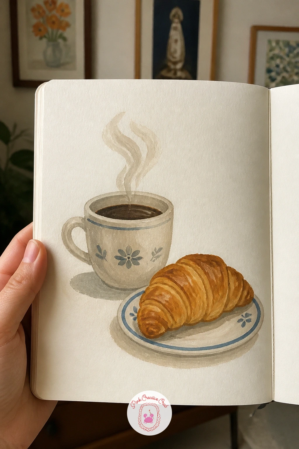
Palette: Burnt Sienna,Naples Yellow,Payne’s Grey,Titanium White
Keep tonight’s page practical: a strip of color swatches beside a painted plum, part reference chart, part tiny still life. Paint six or eight small squares down one side of the page, each a slightly different mix you might use for fruit skin, labelling each one lightly in pencil once dry.
Then paint the plum itself to one side as a single rounded shape, picking its final color only after you see which swatch matches best. This swap of order, chart before subject, is the ten minute version; the forty minute version adds a second plum half, cut open, so you can swatch the inside flesh too.
If the swatches dry patchy, that is normal gouache behavior and not a mistake, a slightly uneven square still reads fine as a reference chip. No fresh plum in the fruit bowl: a photo of one on your phone gives you the same violet-to-blue color range to test.
Keep the plum’s highlight as a tiny unpainted dot of paper for shine.
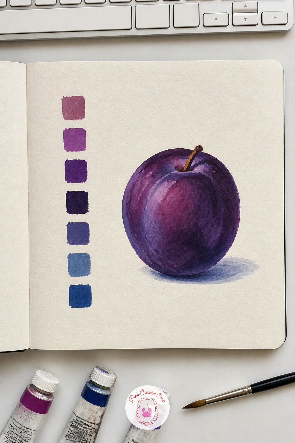
Palette: Dioxazine Violet,Prussian Blue,Alizarin Crimson,Titanium White
Stretch the brush sideways for a strip of lavender field, a long low band of purple rows under a pale sky. Paint the sky first across the top in one flat wash, then lay the field in as a single mid-tone purple-green shape before you add any rows.
Once that base is dry, drag short angled strokes across the field in a slightly brighter purple to suggest the lavender rows receding toward the horizon, making each row a touch shorter and closer together as it goes back. That change in spacing is what pushes the field into the distance without any extra detail.
If the rows look too even and stiff, vary the pressure on your brush so some strokes are thicker than others, the way real rows never line up perfectly. No lavender reference to hand: any photo of ploughed furrows gives you the same receding row pattern.
Keep the strip low and wide on the page, more horizon than sky, to really sell the open field feeling.
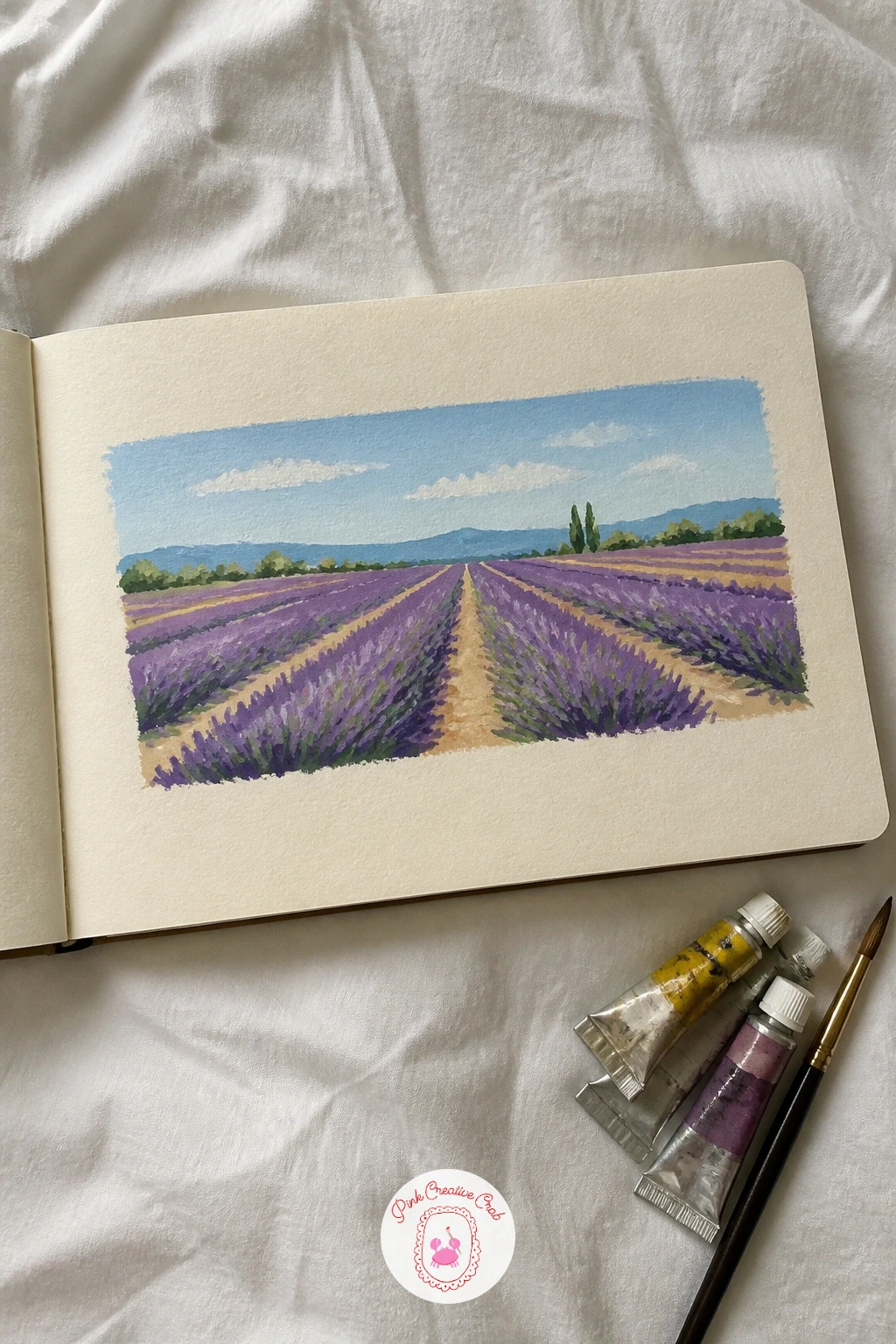
Palette: Dioxazine Violet,Sap Green,Naples Yellow,Cerulean Blue
Try this same strip format again later for a wheat field or a row of vines, the same receding-stroke trick works for any planted field.
Give yourself the widest page yet: a long panorama of a sunset over hills, stretched flat across two facing pages if your sketchbook opens that way. Paint the sky first in horizontal bands, warmest near the horizon and cooling as it rises, blending each band into the next while the paint stays wet.
Let that sky dry fully before you paint the hills as flat, nearly black silhouettes along the bottom, since any hill shape works once it sits dark against that glowing band of color. The silhouette trick forgives almost any wobble in your hill line, which makes this one of the most relaxing pages in the whole book.
If the sky bands go muddy where they meet, work faster next time and tip the page slightly so gravity helps the colors blend before they dry. No wide sketchbook spread available: paint the same panorama shape on a single wide strip of paper instead.
Keep one small dark bird shape crossing the sky for scale and a bit of life.
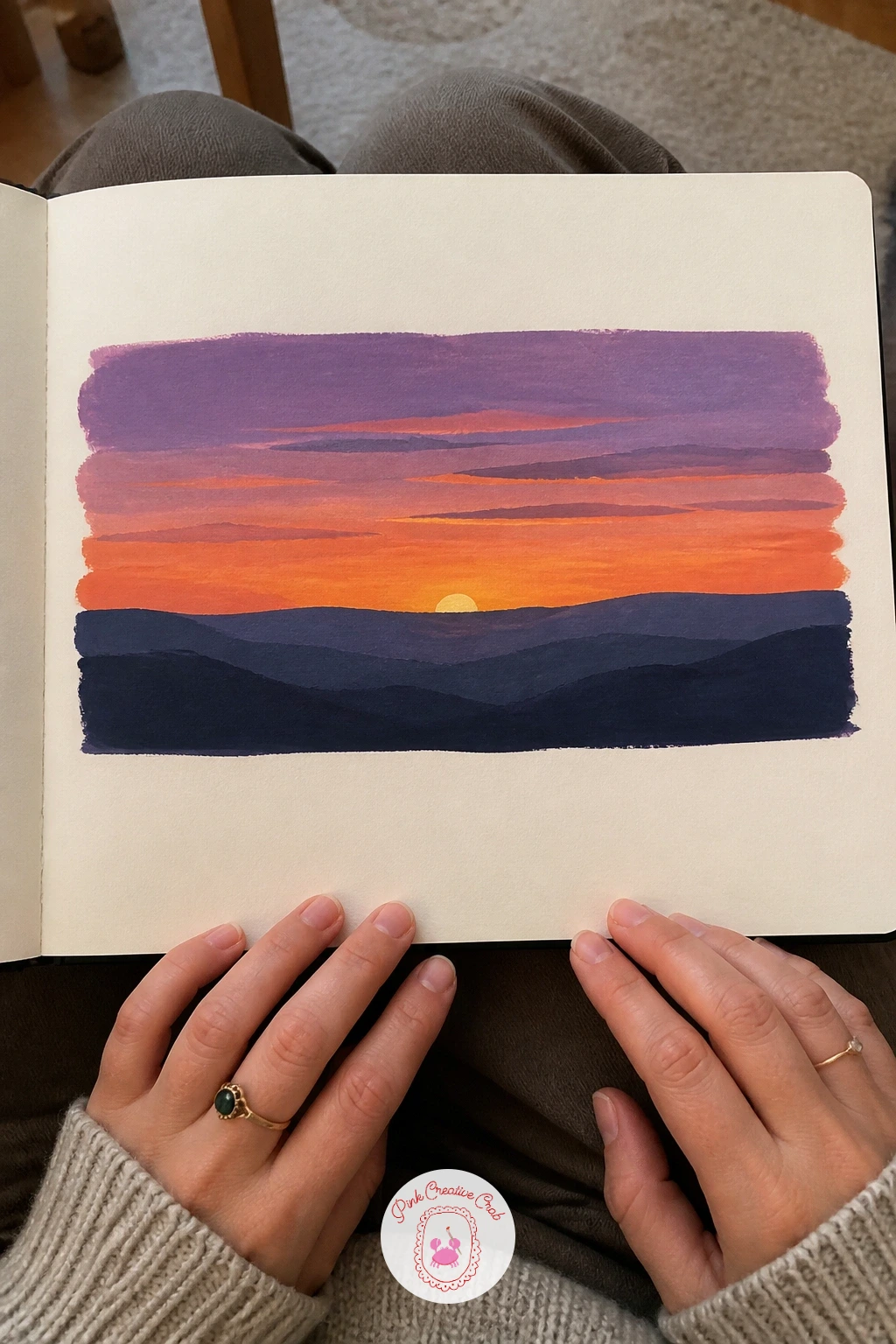
Palette: Cadmium Orange,Alizarin Crimson,Dioxazine Violet,Payne’s Grey
After a sunset this big, zoom right back in with a page of six cloud studies, small rectangles each holding one sky moment. Paint the blue of the sky first in each box, leaving the cloud shapes as untouched white paper, then come back once dry and add shadow underneath each cloud in a soft grey-blue.
This is the one page in the whole sketchbook where less brushwork wins: the fewer marks you make inside each cloud, the softer and more convincing it looks, since real clouds read as shape and shadow rather than outline. If a cloud edge comes out too hard, soften it immediately with a clean damp brush before the paint sets.
If you find yourself outlining every cloud in pencil first, rub that out, clouds drawn from memory look more natural than ones traced too carefully. No six-box page planned in advance: four larger cloud studies work just as well if your page is smaller.
Keep one box stormy and grey among the fair-weather ones for contrast across the page.
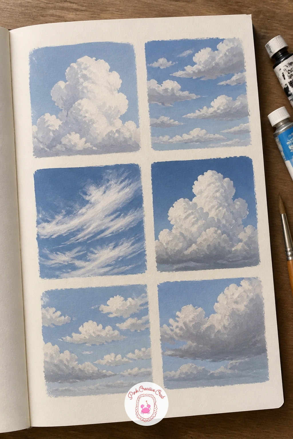
Palette: Cerulean Blue,Payne’s Grey,Titanium White,Ultramarine Blue
Bring some red onto the page with a bowl of cherries, a quick, cheerful still life that rewards a loaded brush. Paint the bowl first as one simple pale shape, then drop the cherries in on top as small round dots of red, letting a few overlap the bowl’s rim for depth.
Measure before you paint: hold your brush up against the bowl’s width and check that no single cherry comes out wider than about a sixth of that measurement, or the fruit will look oversized for its dish. Keep each cherry as two tones, a darker red on one side and a touch of white highlight dabbed in while still wet, rather than one flat dot.
If the cherries start blurring into a red smudge, let each one dry fully before the next touches it. No bowl handy as reference: a mug works just as well, the cherries just pile a little higher.
Add two thin curved stems in dark green for a last touch of life on the page.
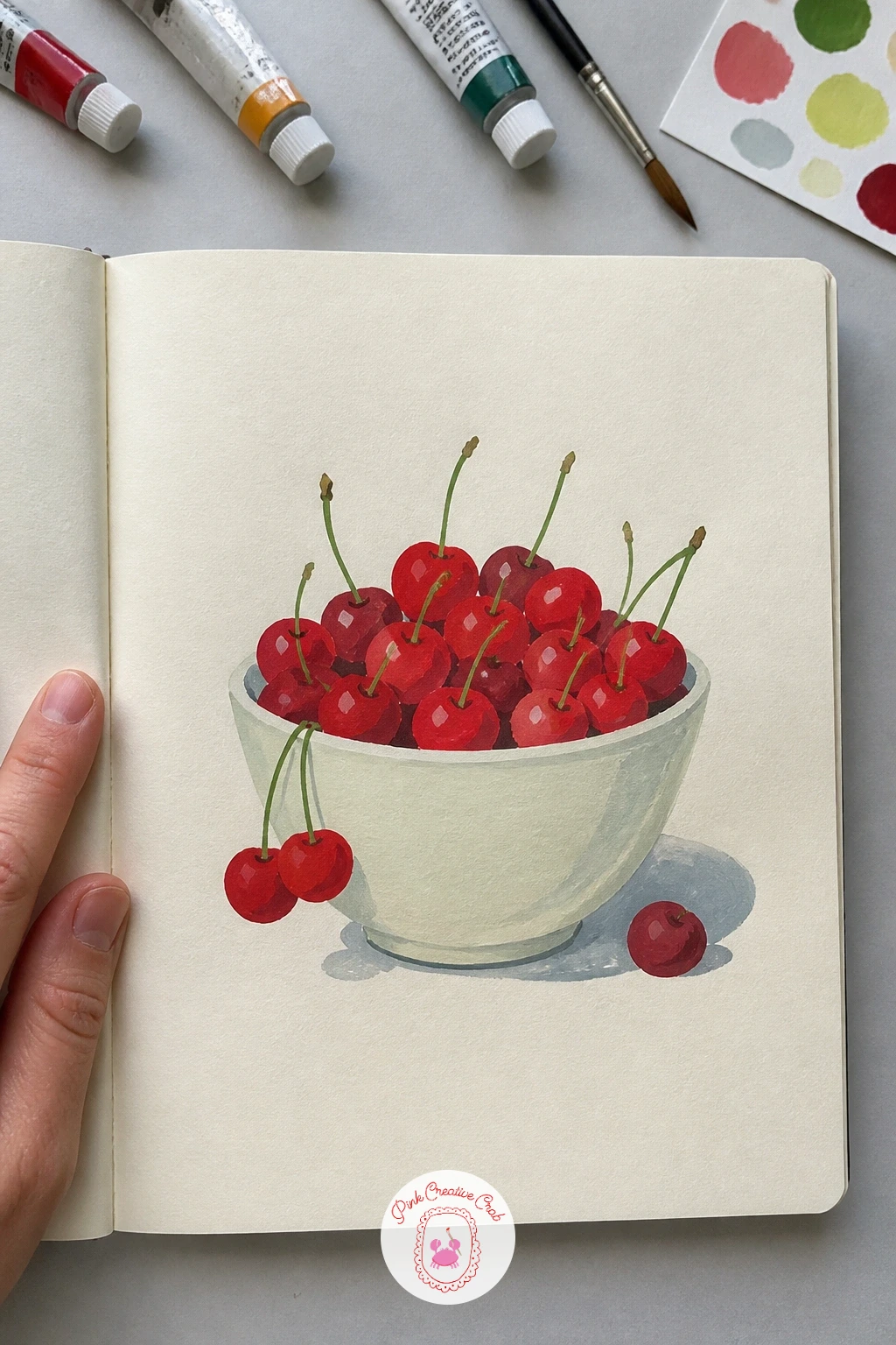
Palette: Alizarin Crimson,Cadmium Red,Sap Green,Titanium White
Step outside again for something busier: a city street corner with a cafe, awning and all. Block in the building first as one flat wall shape, then paint the awning as a bold stripe of color over the doorway before any smaller details go in.
Place the eye level low, around a third up the page, so the building feels tall and the street in front feels close, and let that same low eye level decide where every window and the cafe sign sit along the wall. Add a scatter of small dark marks for cafe chairs and a figure or two last, since these tiny details read best once the big flat shapes are already settled.
If the whole corner feels flat, add one strong cast shadow falling from the awning across the pavement, that alone gives the scene depth. For more cafe scenes done this same quick way, a page of European cafe studies is worth a look.
Keep the awning stripes simple, three or four bands rather than many thin ones.
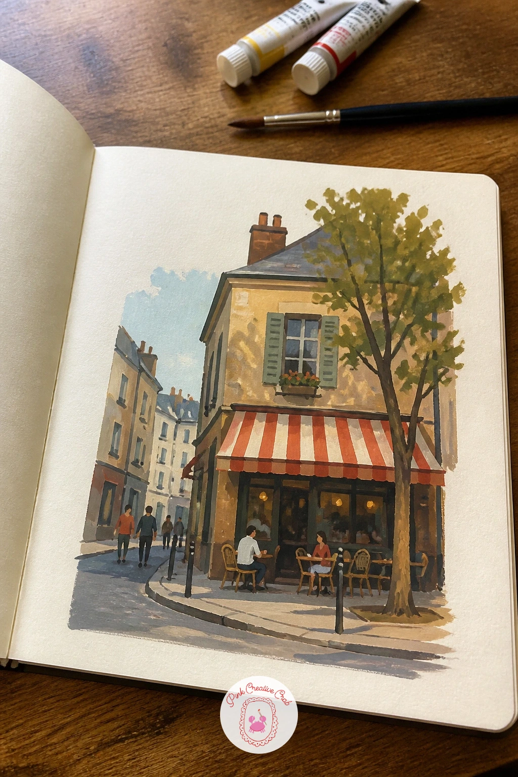
Palette: Burnt Sienna,Cadmium Red,Payne’s Grey,Naples Yellow
Let the last few pages’ street corner lead into a page of colorful doors from a trip, four or five doorways lined up like postcards. Draw each door as a simple flat rectangle with a small arch or frame around it, then give every door its own single bold color so the page reads like a little collection.
Paint the surrounding wall in a pale neutral first so each colored door pops against it, then add one small detail to each, a knocker, a number, a pot of flowers by the step, to keep the doors from looking identical. This is a page you can genuinely keep adding to over several sittings, a door or two each evening until the row is full.
If the colors start competing too much, limit the palette to warm doors on one half of the page and cool doors on the other. No travel photos to copy: search any town’s doors online for a quick reference set.
Keep the wall color consistent across all the doors so the page still reads as one street.
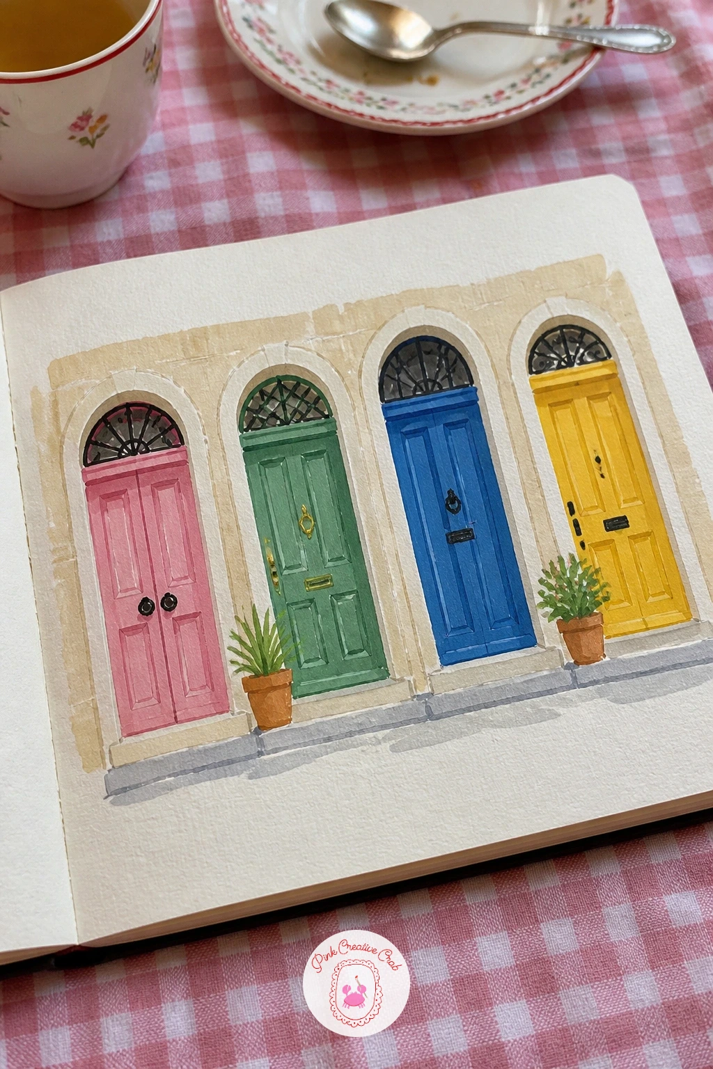
Palette: Cadmium Red,Cerulean Blue,Naples Yellow,Titanium White
Slow right down for a tiny portrait of a cat on a cushion, one of the gentlest pages in the book. Paint the cushion first as a soft rounded shape in one flat color, then build the cat on top starting with its overall curled silhouette before any stripes or markings go in.
Compare the cat’s body against the cushion as you go: the curled body should take up roughly two-thirds of the cushion’s width, with its head tucked near one edge, so it reads as settled in rather than perched on top. Keep the face simple, two small dark almond shapes for closed or half-closed eyes and a tiny triangle nose, since too much detail on a face this small turns fussy fast.
If the markings start looking too busy, step back and simplify them to two or three patches rather than many stripes. No cat of your own to study: any photo of a sleeping cat online gives you the same curled silhouette. For more small cat studies done this way, there is a whole cat sketchbook collection worth a browse.
Leave a thin rim of cushion color showing all around the cat so it reads as resting on it, not merged into it.
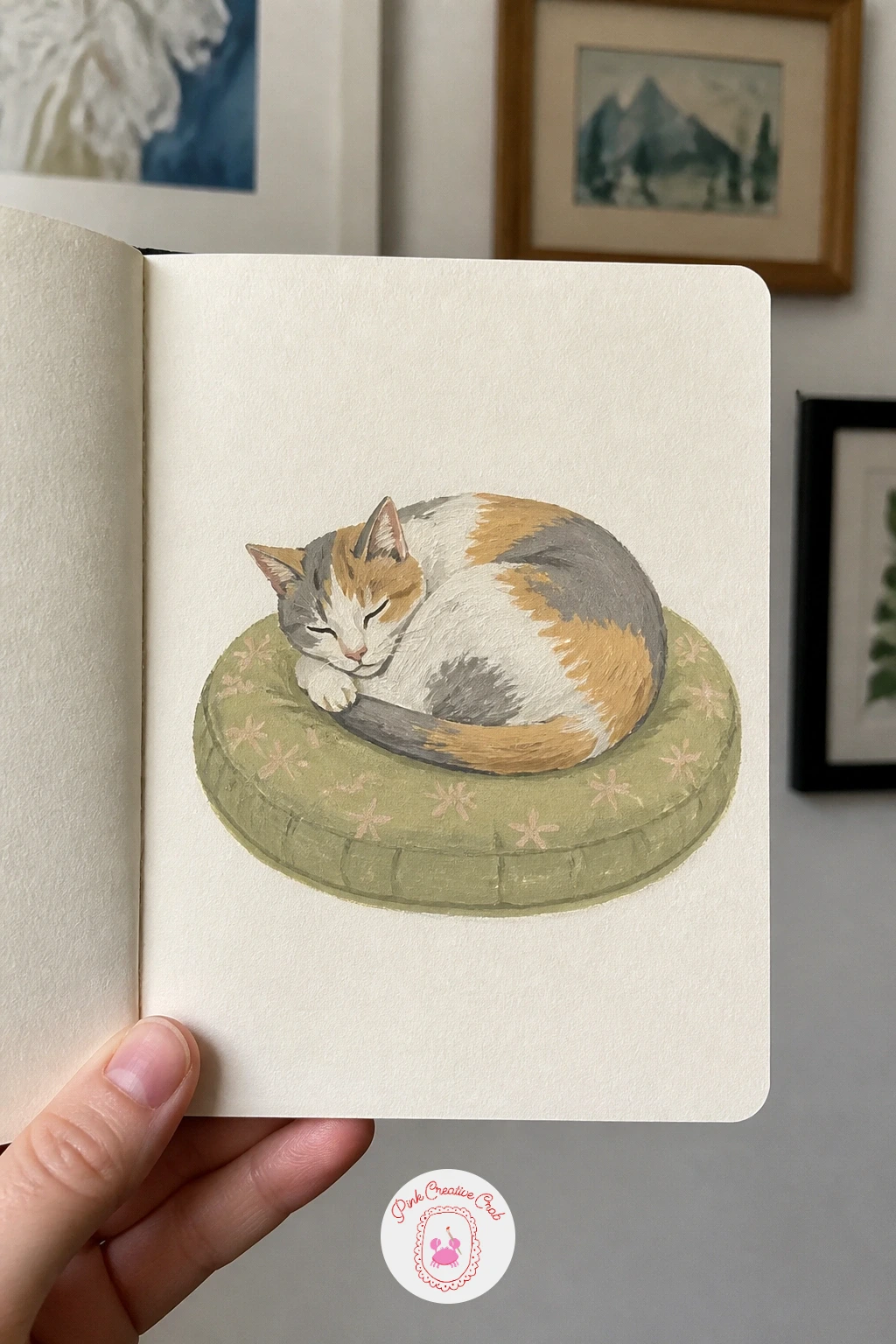
Palette: Raw Sienna,Payne’s Grey,Titanium White,Cadmium Orange
Build a proper little still life next: a vase and a stack of books, the kind of page that teaches you to look at shapes rather than objects. Paint the books first as flat overlapping rectangles, darkest spine color at the bottom of the stack, then add the vase on top as a simple rounded shape with one or two flowers poking out.
Picture the light source sitting to one side and keep every shadow, the one under the vase and the ones between book spines, falling the same direction. That single consistent shadow direction is what holds a still life with several objects together as one scene instead of separate floating shapes.
If the books look flat and card-like, add a thin darker line where each page edge meets the next book, just a few, not along every page. No real still life to set up: a photo of any tabletop arrangement works, or simplify to a mug and one book if the evening is short.
Keep the vase’s flowers loose, three or four quick dabs of color are enough.
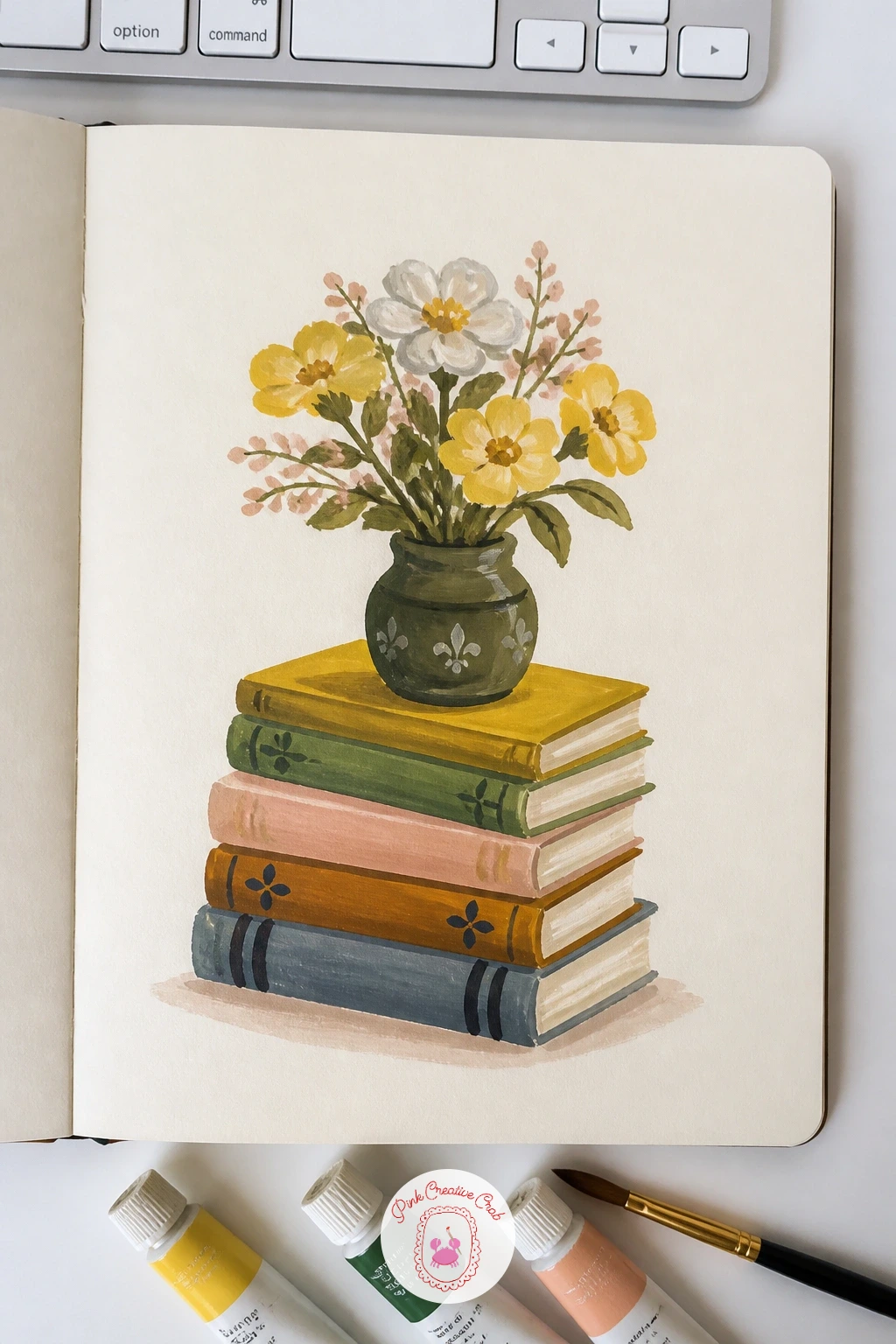
Palette: Burnt Sienna,Sap Green,Alizarin Crimson,Payne’s Grey
Carry that same careful light logic into a snowy mountain hut, small and solitary against white slopes. Paint the sky and distant mountains first in cool pale tones, then the hut itself as a dark warm silhouette, its roof catching one bright stripe of snow along the top edge.
Keep the light coming from behind the hut, low and golden, so its front wall sits in shadow while the chimney smoke catches a little warm color against the cool sky. That backlit setup, dark warm hut against pale cool snow, is what gives this tiny scene its mood without needing any extra detail.
If the snow looks too plain and empty, drag a dry brush loaded with a very pale blue lightly across it for soft shadow texture, rather than painting hard shadow shapes. No mountain reference on hand: any snowy rooftop photo gives you the same dark-shape-against-pale-snow relationship.
Keep the smoke as one soft curl, not a thick plume, to keep the scene quiet.
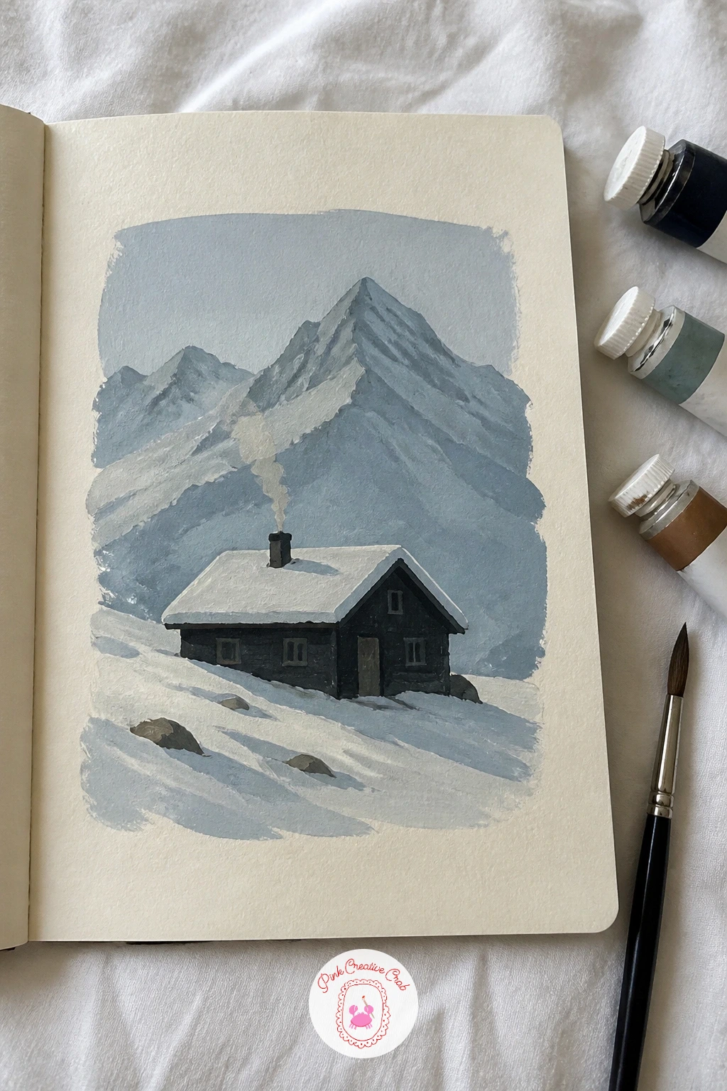
Palette: Payne’s Grey,Cerulean Blue,Burnt Sienna,Titanium White
Warm the page back up with a page of pastries, four or five little bakery treats lined up like a display case. Paint each pastry’s base shape first in its main color, then go back with a smaller brush for the glaze drips, nut pieces or sugar dusting once the base is dry.
This is a good page for the quick version: ten minutes gets you four simple flat shapes in bakery colors, while forty minutes lets you add the dry-brush texture on a croissant’s ridges, a shiny glaze highlight on a danish, and small shadow lines under each pastry to seat it on the page. Both versions work, the longer one just reads richer.
If a pastry’s glaze looks flat and dull, a tiny stroke of pure white gouache along its highest point brings back the shine instantly. No bakery photo to hand: a biscuit tin or any baking book gives you plenty of shapes to borrow.
Keep the pastries close together on the page, almost touching, the way they sit in a real display case.
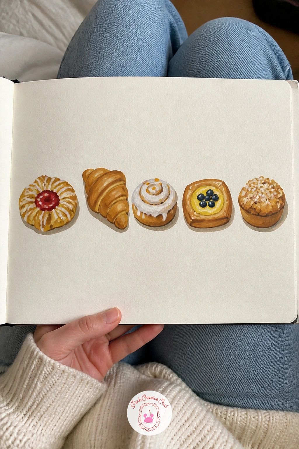
Palette: Naples Yellow,Burnt Sienna,Alizarin Crimson,Titanium White
Take the page out to the vegetable patch with a garden bed of cabbages and marigolds, a cheerful clash of blue-green and orange. Paint the soil as a flat dark band first, then build the cabbages as rounded overlapping leaf shapes above it, each one a slightly different shade of green-blue.
Compare sizes as you go: a cabbage head should sit roughly twice the width of a single marigold bloom, which keeps the bed looking properly planted rather than like two unrelated flower patches pushed together. Tuck the marigolds in between and in front of the cabbages, their bright orange heads the smallest, boldest shapes on the page.
If the greens and oranges fight for attention, let the greens stay slightly muted and keep the marigold orange as the one punch of pure, bright color. No vegetable garden to study: any seed catalogue photo of a cabbage patch gives you the same leaf and bloom shapes.
Keep a couple of marigold heads only half visible behind a cabbage leaf for a more natural, grown-in look.
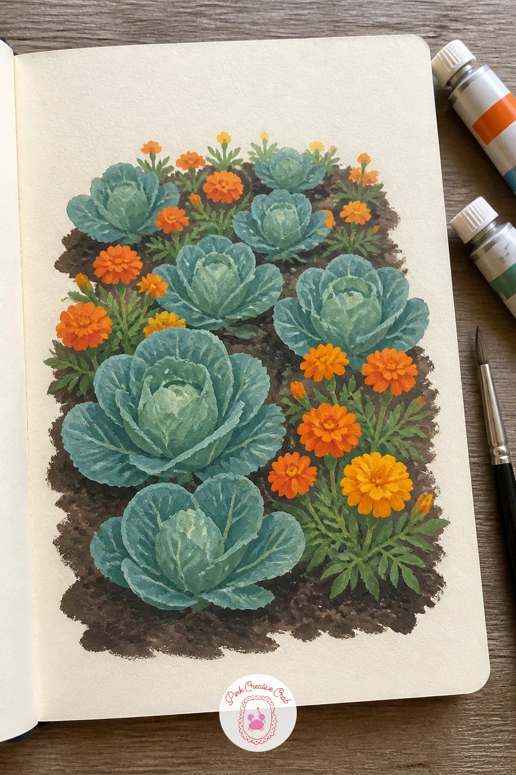
Palette: Sap Green,Cadmium Orange,Raw Umber,Olive Green
Shift the whole view for a beach with umbrellas seen from above, looking straight down the way a drone photo would. Paint the sand as one warm flat shape first, then the water’s edge as a curved band of blue along one side, before any umbrellas go in.
With the eye level essentially overhead, every umbrella becomes a simple flat circle rather than a dome shape, and every person becomes a small oval shadow with tiny limbs, which makes this one of the easiest crowded scenes in the whole book to paint convincingly. Scatter the umbrella circles in loose, uneven rows rather than a tidy grid, the way real beach umbrellas actually sit.
If the umbrellas look too flat and sticker-like, add one small curved shadow crescent under each circle to lift it slightly off the sand. No overhead beach photo available: any satellite map view of a coastline gives you the same flattened perspective to study.
Keep three or four umbrella colors repeating across the page rather than making every single one different.
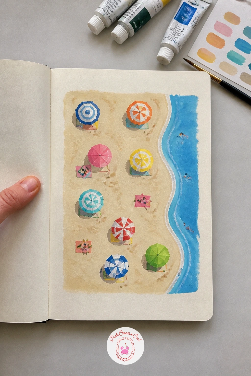
Palette: Naples Yellow,Cerulean Blue,Cadmium Red,Titanium White
Bring back some clutter and color with a fruit stall at a market, crates stacked with produce under a striped awning. Paint the stall’s frame and awning first as simple flat shapes, then fill each crate with loose dabs of fruit color, oranges as orange dots, grapes as a cluster of small purple marks, without outlining individual pieces.
This loose dabbing approach, color and shape over careful outline, is the fastest way to suggest a lot of produce without painting fifty individual pieces of fruit, and it also forgives a wobbly hand better than tight detail would. Keep the darkest shadow tucked under the awning where the stall meets the crates, since that dark band is what makes the produce colors pop forward.
If the fruit piles look like scribbles rather than fruit, go back in once dry and drop one small highlight dot onto a few pieces in each crate. No market photo to copy: a greengrocer’s shelf or even your own fruit bowl split across several “crates” works just as well.
Keep the awning stripes loose and slightly uneven, a hand-painted sign look suits this scene.
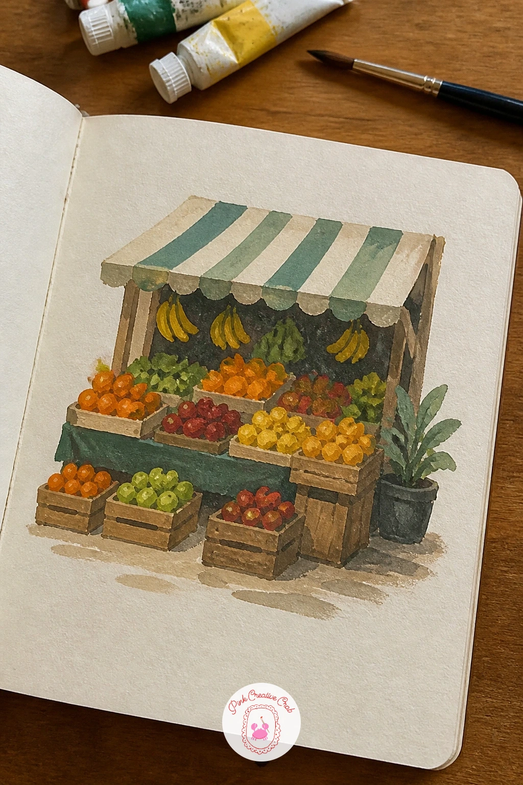
Palette: Cadmium Orange,Dioxazine Violet,Sap Green,Payne’s Grey
Return to the sky for a more ambitious version of the cloud page: a page of small skies at different times of day, maybe four or five boxes running from dawn to night. Paint each box’s base sky color first, in one smooth graded wash from the top of the box to the bottom, before adding a single cloud, sun or moon shape to each.
This page is really a study in value as much as color: the dawn box stays pale and soft, the midday box bright and high-contrast, the dusk box warm and deep, and the night box nearly all dark with one small pale shape for a moon. Keep every box the same simple composition, just sky and maybe a thin horizon line, so the time-of-day shift is the only thing changing.
If the graded washes come out streaky, load the brush generously and work quickly in one direction rather than scrubbing back and forth. No set routine to reference: just picture the same patch of sky outside your own window at four different hours.
Keep a single thin dark horizon line across all boxes to tie the page together as one place, seen through the day.
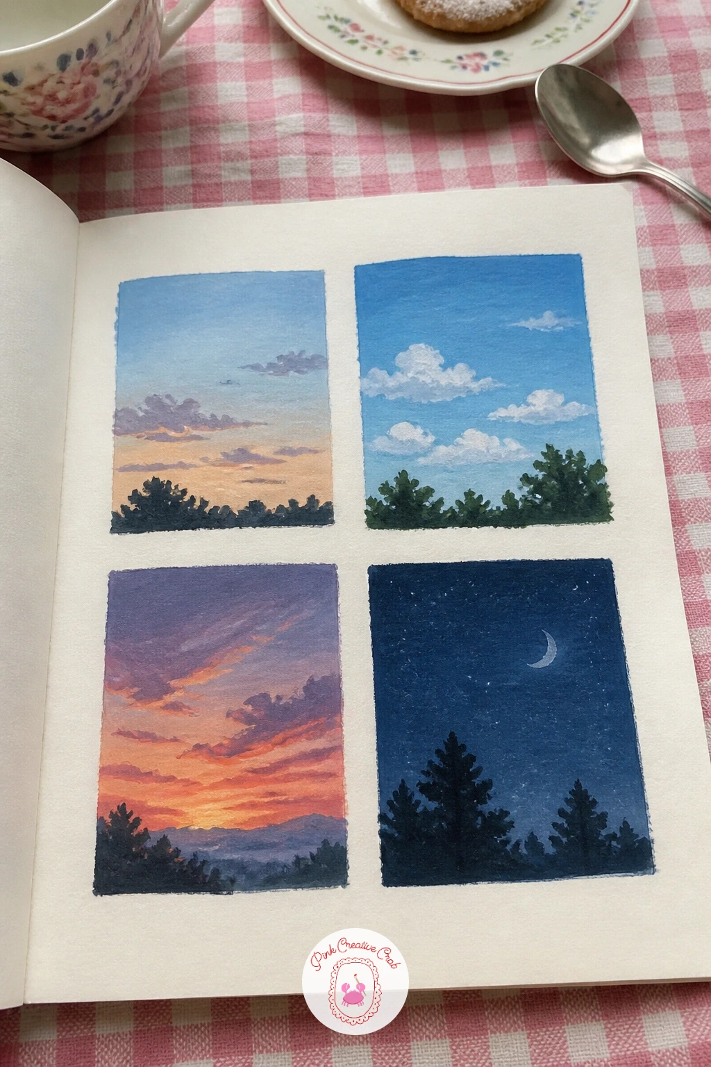
Palette: Naples Yellow,Cerulean Blue,Dioxazine Violet,Payne’s Grey
Settle into a quieter scene after that busy sky page: a canal with moored boats, their reflections doubling the color on the page. Paint the water first as one flat band, then the boats on top in solid color, and only once both are dry drag a slightly broken, wavy version of each boat’s color straight down into the water for its reflection.
Keep the reflections a touch darker and softer-edged than the boats themselves, never as crisp, since a too-sharp reflection is the easiest way to make calm water look like a mirror instead of a canal. Leave a few thin horizontal strokes of untouched paper running through the reflections to suggest the water’s gentle movement.
If the reflections look too neat and symmetrical, nudge them slightly off-center under their boats, real reflections rarely sit perfectly straight. No canal scene at hand: any row of parked cars reflected in a wet street works the same way. A wider look at boats across many settings sits in this boat painting collection.
Keep the boats’ colors bold, since the muted reflections will do the quieter work.
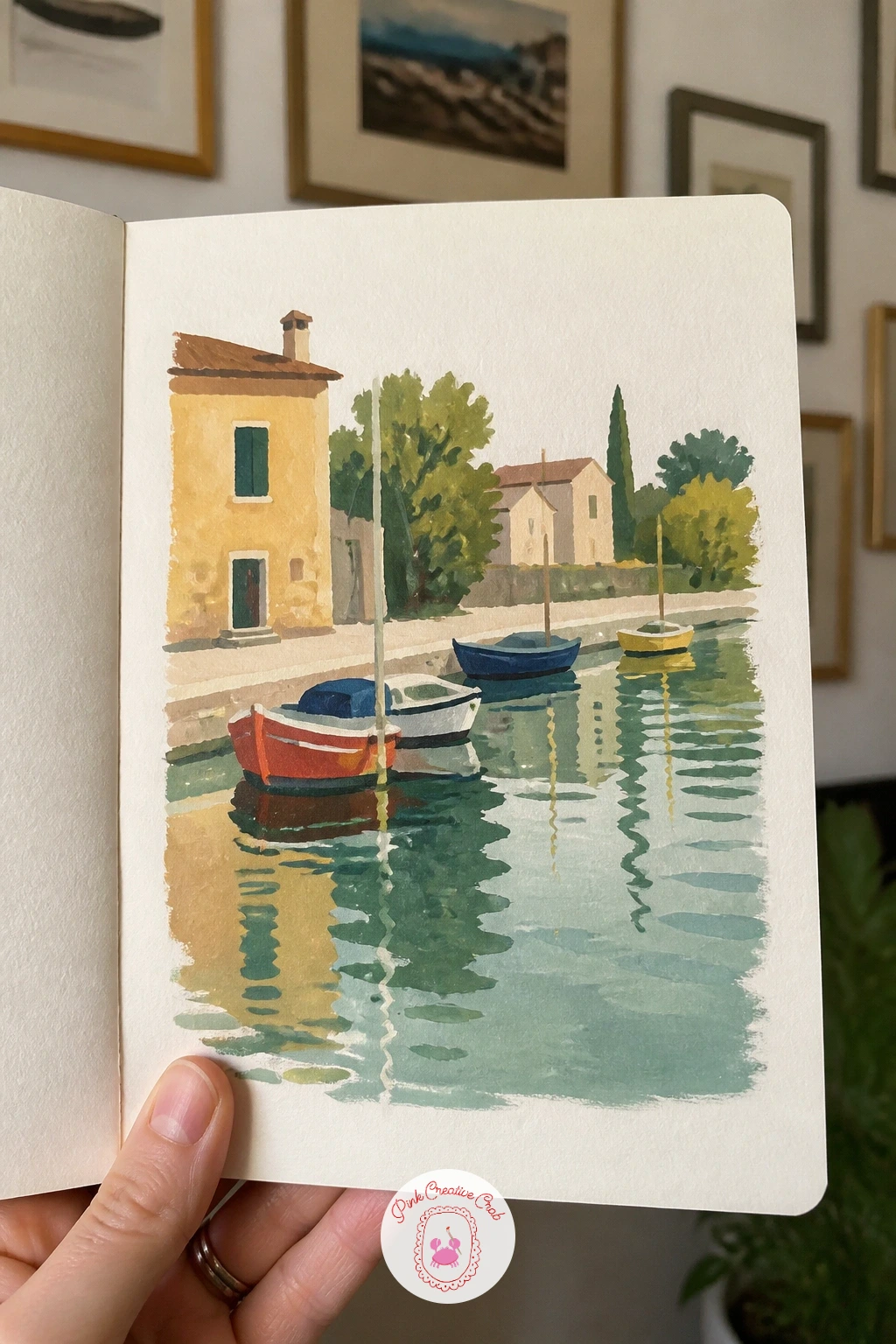
Palette: Cerulean Blue,Cadmium Red,Naples Yellow,Payne’s Grey
Carry the water’s calm into a drier scene: a vineyard in autumn, rows of vines running back toward low hills. Paint the sky and distant hills first in soft, hazy tones, then lay the vine rows in as a repeating pattern of warm gold, rust and green marks, each row a touch shorter as it recedes.
This page is a good one to vary once it works: try the same vineyard layout again in spring with fresh green rows instead of autumn gold, or in winter with bare brown vines and no leaf color at all, same bones, completely different mood each time. Keep a single dirt path cutting between two rows to lead the eye straight back into the scene.
If the rows blur into a solid colored mass, let each row dry before painting the next one over it, even slightly. No vineyard reference close by: any orchard or planted row crop photographed from a slight distance gives you the same receding-row structure to copy.
Keep the warmest oranges and reds in the front rows only, cooling the colors as the rows go back.
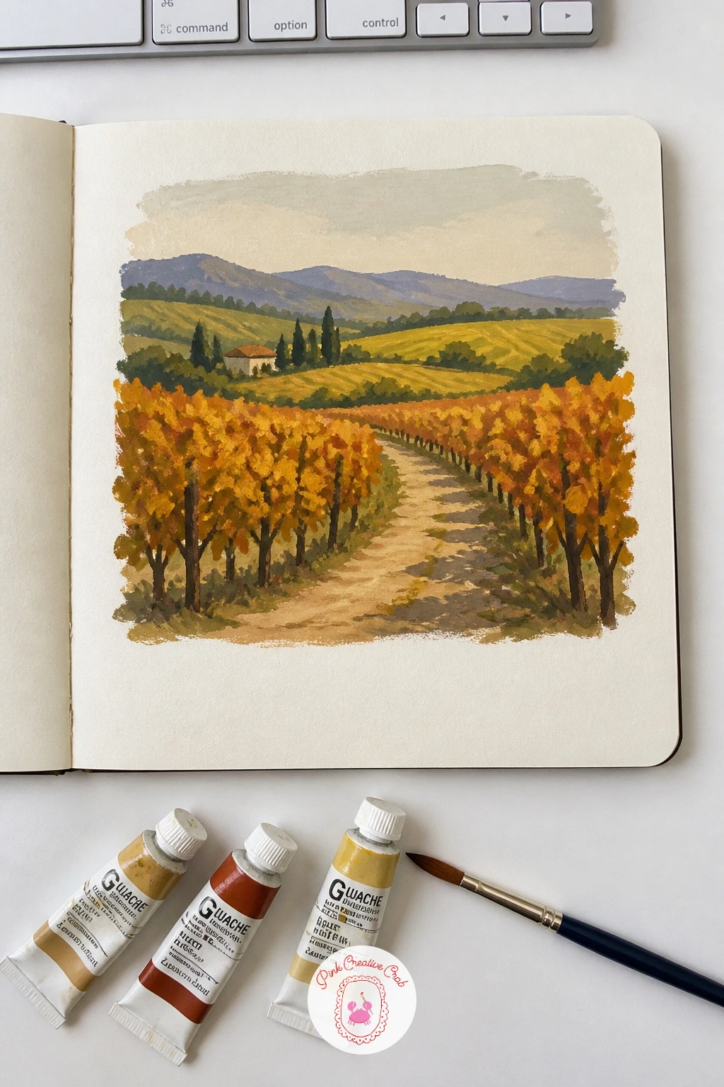
Palette: Burnt Sienna,Cadmium Orange,Olive Green,Naples Yellow
Give the brush a rest from scenery with a page of folk patterns copied from a scarf, small repeating motifs borrowed from any printed textile you own. Pick three or four simple shapes from the scarf, a flower, a diamond, a little leaf, and paint each one as its own small repeated row across the page.
Keep every motif flat and graphic, solid color with a clean outline rather than any shading, since that flatness is exactly what makes folk patterns read as pattern rather than illustration. Work one color across the whole page first, say all the red motifs, before switching brushes or rinsing for the next color, it keeps the page cleaner and faster to finish.
If a repeated motif starts drifting in size across the row, lightly pencil a few guide dots at even spacing before you paint. No scarf to copy from: a patterned tea towel, tile or even wrapping paper gives you the same kind of repeating folk motif. For more pattern-based pages like this, the pattern painting ideas collection has plenty more to try.
Keep the background plain cream paper, letting the motifs do all the work.
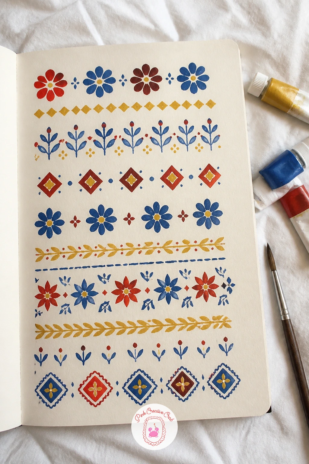
Palette: Cadmium Red,Cerulean Blue,Naples Yellow,Sap Green
Step into a quieter interior with a cozy bedroom corner, a bed edge, a lamp and maybe a stack of books on a nightstand. Paint the wall color first as one flat background, then the bed and furniture shapes on top, largest to smallest, finishing with the lamp’s glow as the last and brightest mark on the page.
Picture the lamp as the only light source in the room and let every other color sit slightly warmer and brighter the closer it is to that glow, cooling as it moves toward the corners of the page. That single warm-to-cool gradient around one light source is what makes a plain furniture arrangement feel properly cozy rather than just flat and listed out.
If the lamp glow looks too solid and flat, soften its edge with a damp brush while wet so the light seems to spread rather than stop in a hard circle. No bedroom to study directly: any interior photo online with a single lit lamp gives you the same warm-glow setup to copy.
Keep the rest of the room’s colors muted so the lamp stays the clear focal point.
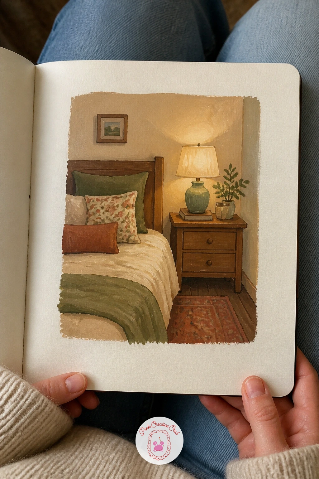
Palette: Burnt Sienna,Naples Yellow,Payne’s Grey,Dioxazine Violet
Carry that warm glow outdoors for a snowy village at pastel dusk, little houses with lit windows against a softening sky. Paint the sky first in a smooth graded wash, pale pink near the horizon shifting to soft lavender higher up, then let it dry completely before adding the dark house silhouettes along the bottom.
Leave each house’s windows as tiny unpainted squares until the very end, then fill them in with warm gold last of all, since that late pop of warm light against the cool dusk sky is what carries the whole mood of the piece. Keep the snow on the ground as the same pale pink as the sky’s lowest band, tying the whole page together in one light.
If the dusk sky looks too pastel and washed out, deepen just the top corner with a touch more violet while the wash is still workable. No village reference to hand: any small town photographed around golden hour gives you the same silhouette-against-glow structure.
Keep smoke curling from one or two chimneys, soft and pale against the sky.
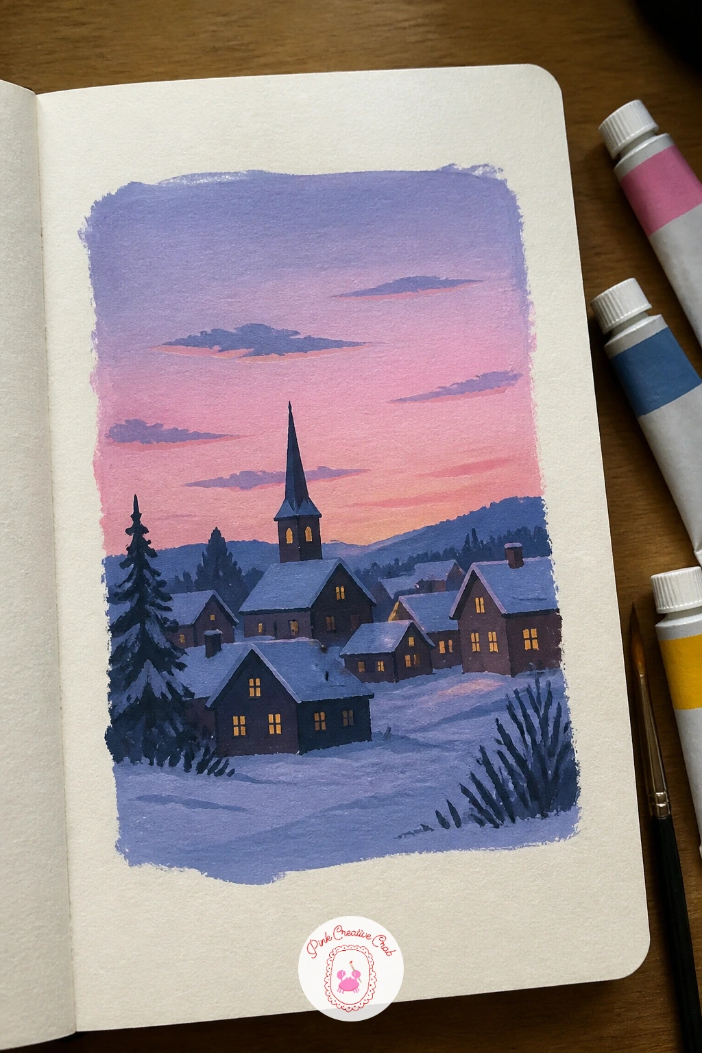
Palette: Dioxazine Violet,Naples Yellow,Payne’s Grey,Titanium White
Try something more atmospheric with raindrops on a window, a blurred garden or street seen through glass. Paint the background scene first, loose and soft, deliberately out of focus with few hard edges, since everything behind the glass should read as vague shapes and color rather than detail.
Once that background is fully dry, add the raindrops on top using a small round brush loaded with white gouache mixed to a thin, slightly transparent consistency, dabbing in rounded drop shapes with a tiny tail where gravity has started pulling them down the glass. This order, blurry world first, crisp drops on top last, is what separates the drop from the background convincingly.
If the drops look too solid and opaque, thin the white mix further with water until it goes on with a little transparency. No glass or rain to observe tonight: any photo of a rainy car window gives you plenty of drop shapes to study and copy.
Keep the drops varying in size, with more small ones than large, the way rain actually gathers.
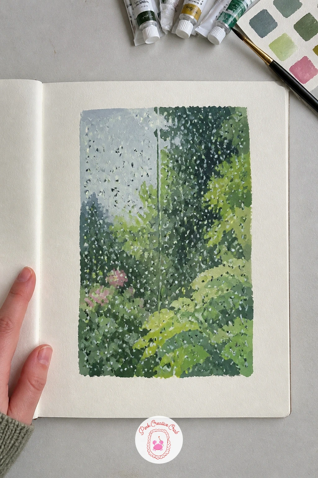
You Will Need
- white gouache for the drops
Palette: Payne’s Grey,Sap Green,Titanium White,Cerulean Blue
Go back to the overhead view for a picnic spread from above, a blanket scattered with food the way a phone photo from the ground would show it. Paint the blanket first as one patterned flat shape, then add the food items on top as simple circles and ovals, a plate here, a thermos there, a scatter of fruit.
With the eye level directly overhead again, every plate becomes a flat circle, every sandwich a simple rectangle, which keeps this busy-looking scene genuinely quick to paint once you let go of trying to show any side views at all. Group the items with some gaps and some clusters rather than spacing everything evenly, the way a real picnic actually gets laid out.
If the blanket pattern competes too much with the food on top, simplify it to plain stripes or a single check rather than a busy print. No picnic to arrange and photograph: any flat lay food photo online gives you the same overhead shapes to borrow.
Keep one item, a jar of jam or a small flower, slightly tipped over for a lived-in feel.
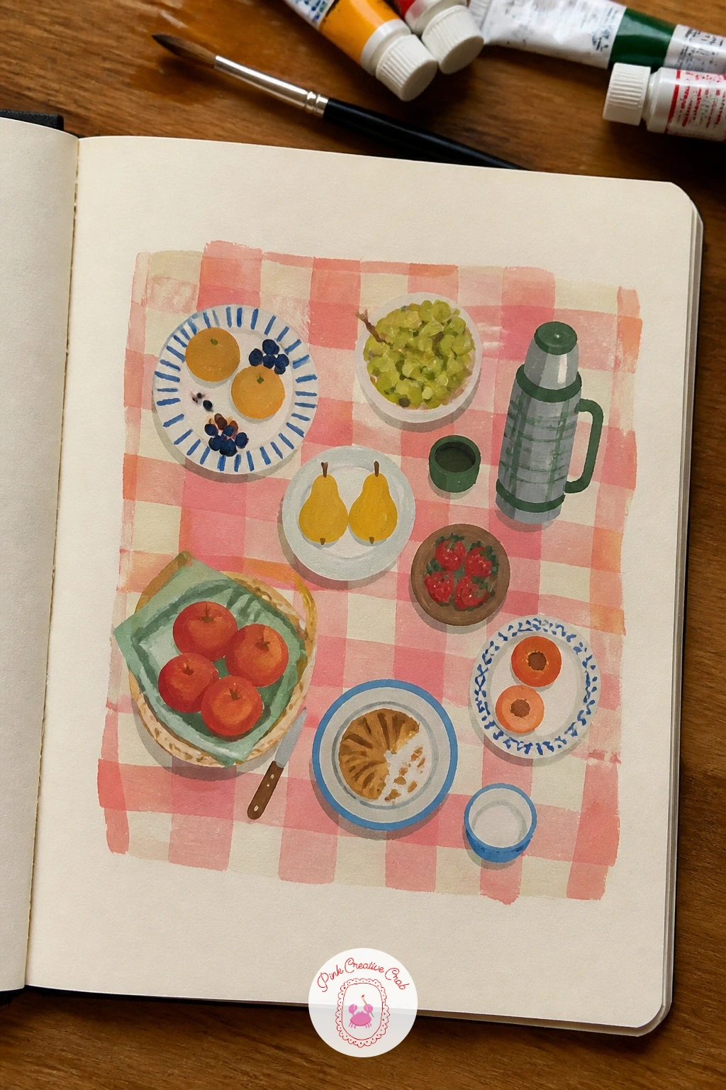
Palette: Cadmium Red,Naples Yellow,Sap Green,Titanium White
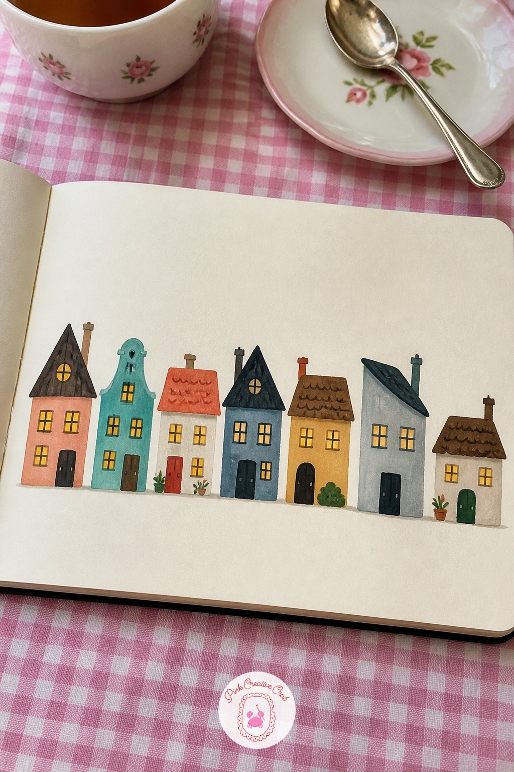
Bring the page back to something steady and repeatable: a page of tiny houses in a row, each one a different color and roofline. Paint each house as a simple box with a triangle roof, finishing one completely, door and window included, before starting the next, so the row builds up house by house rather than wall by wall.
Vary just one thing per house, roof angle, wall color or window shape, so the row reads as a real street rather than the same house copied five times. Keep the houses sitting on one shared ground line across the whole page so the row stays level and believable despite the color changes.
If the row starts looking too uniform despite the color changes, make one house noticeably taller or narrower than its neighbors. No street to copy from: any children’s picture book illustration of a town gives you a good range of simple house shapes to borrow freely.
Keep window colors warm and lit, even in daylight, it gives the row instant charm.
Palette: Cadmium Red,Cerulean Blue,Naples Yellow,Sap Green
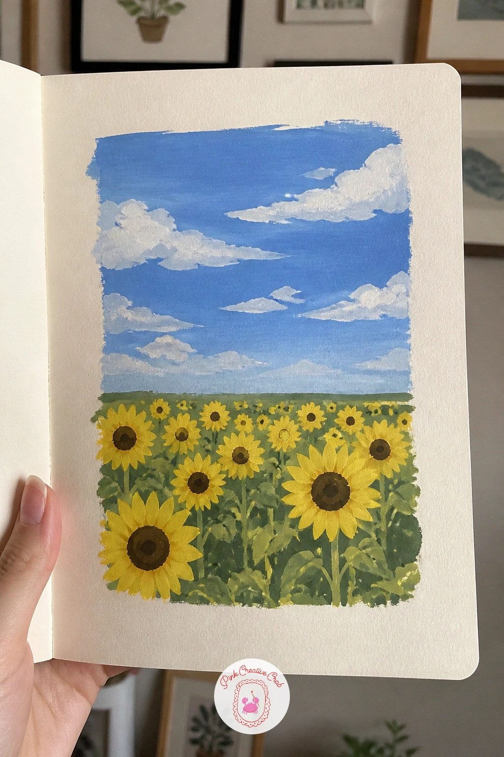
Close out the floral side of the sketchbook with a field of sunflowers under a blue sky, big simple shapes that paint up fast. Paint the sky first as one flat bright blue, then the field below it in green, and only once both are dry start dropping in sunflower heads as yellow circles with a dark brown center.
Keep the sunflowers facing slightly toward one side rather than straight out at the viewer, since real sunflowers in a field rarely face the camera directly and that small tilt instantly makes the field feel more natural. Vary the heights of the flowers across the page too, some taller stems toward the front, shorter ones fading toward the back.
If the petals look stiff and mechanical, paint them as short loose strokes radiating out from the center rather than careful individual shapes. No sunflower field nearby: a single sunflower from a flower shop, painted a few times at different sizes, builds the same field effect. More flower-focused pages like this sit in the gouache flower painting ideas.
Keep a thin strip of distant green hill between the field and the sky for depth.
Palette: Cadmium Yellow,Burnt Umber,Cerulean Blue,Sap Green
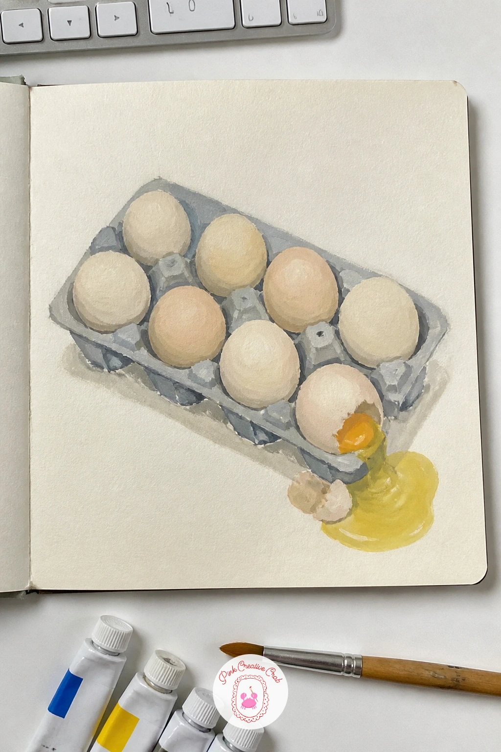
Finish the sketchbook with a page of eggs in a carton, one cracked, a small still life that teaches shape and shadow in one go. Paint the carton first as a simple flat grid of cells, then the whole eggs as soft rounded ovals sitting in their cells, each with a touch of warm reflected color from the carton beneath.
Save the cracked egg for last: paint its shell in two broken pieces instead of one oval, with a small pool of yellow yolk and white spilling just outside the carton’s cell, the one deliberately broken shape on an otherwise tidy page. Keep every egg’s shadow falling the same direction inside its cell so the whole carton reads as one light source, one scene.
If the eggs look flat, add one small curved highlight near the top of each, left as near-white or very pale cream. No egg carton on the counter tonight: any muffin tin or small drawer organiser gives you the same grid-of-cells structure to paint.
Keep the cracked egg near a corner of the carton, not centered, so the eye finds it last.
Palette: Naples Yellow,Cadmium Yellow,Payne’s Grey,Titanium White
What to Do Next
Pick whichever page matches tonight’s mood, a single lemon if time is short, a whole panorama if the evening is open, and start with a light pencil sketch on cream paper before the gouache goes down. The sketchbook fills up faster than you expect once one page becomes two.
Frequently Asked Questions
What paper works best for a gouache sketchbook?
A heavier, slightly toothy paper around 150gsm or more handles gouache best, since thin paper buckles once it gets a few wet layers. Cream or toned paper also makes the opaque colors pop more than stark white does.
Do I need lots of gouache colors to start a sketchbook?
No, six to eight tube colors plus white covers nearly every idea here. A basic set with a warm and cool red, yellow, blue, an earth tone and white mixes almost any color a small study needs.
How do I stop gouache looking streaky on small studies?
Streaking usually comes from reworking a wash after it starts drying, so load the brush generously and lay color down in one or two confident passes. Letting each layer dry fully before adding another also keeps edges clean.
How long should one sketchbook page take?
Most of these pages take twenty to forty minutes once you know the steps, which fits easily into one evening. Simpler pages like a single piece of fruit or a cloud study can be done in ten minutes.
Can gouache sketchbook pages be reworked once dry?
Yes, that is one of gouache’s best features: it reactivates with a damp brush even once fully dry, so you can soften an edge or lift color days later. A thin opaque layer painted over a dry mistake also covers it completely.
Have any thoughts?
Share your reaction or leave a quick response — we’d love to hear what you think!
-
 0
-
0
-
0
-
0
-
0
-
0


