

A moth drawing earns its spot on your table the moment you let it sit with something cozy: a lamp, a teacup, a bloom just opening at dusk. These night fliers get overlooked next to butterflies, but their soft fur, feathery antennae and quiet colors make them a genuinely lovely subject for loose watercolor and fine ink.
Below you’ll find twenty seven of them, each a different moth paired with its own little scene, arranged from the simplest wing shapes up to the ones with more pattern and detail. Pick whichever one catches your eye first and keep your paper small so you can see it through to the end today.
Using these images: free for personal projects such as printing, coloring, cards, journals and gifts. Handmade items that include them may be sold up to 30 pieces per design. More than that is commercial use and is not permitted, and neither is selling or sharing the images themselves or passing them off as your own. Please ask before any other use.
Start with the luna moth because its wings are almost pure shape: two long upper wings and two long trailing tails below, all in one soft mint green. Pencil the body first as a simple oval, then build the wings out from it with light, curved lines, keeping the tails loose rather than stiff.
Wet the wing shapes with clean water before you drop in a pale green wash, so the color spreads softly and dries without hard edges. Once dry, add a faint eyespot on each wing with a thin gray ring, and let the moonflower open just behind one wing in white petals with the palest yellow center.
The mistake here is painting the wings too saturated: luna moths read as pale and almost glowing, so go lighter than feels right the first time. If your green comes out too strong, lift some color while it is still damp with a dry brush or a tissue.
Finish with a fine ink pen for the thin wing veins and the moonflower’s petal lines once everything is bone dry.
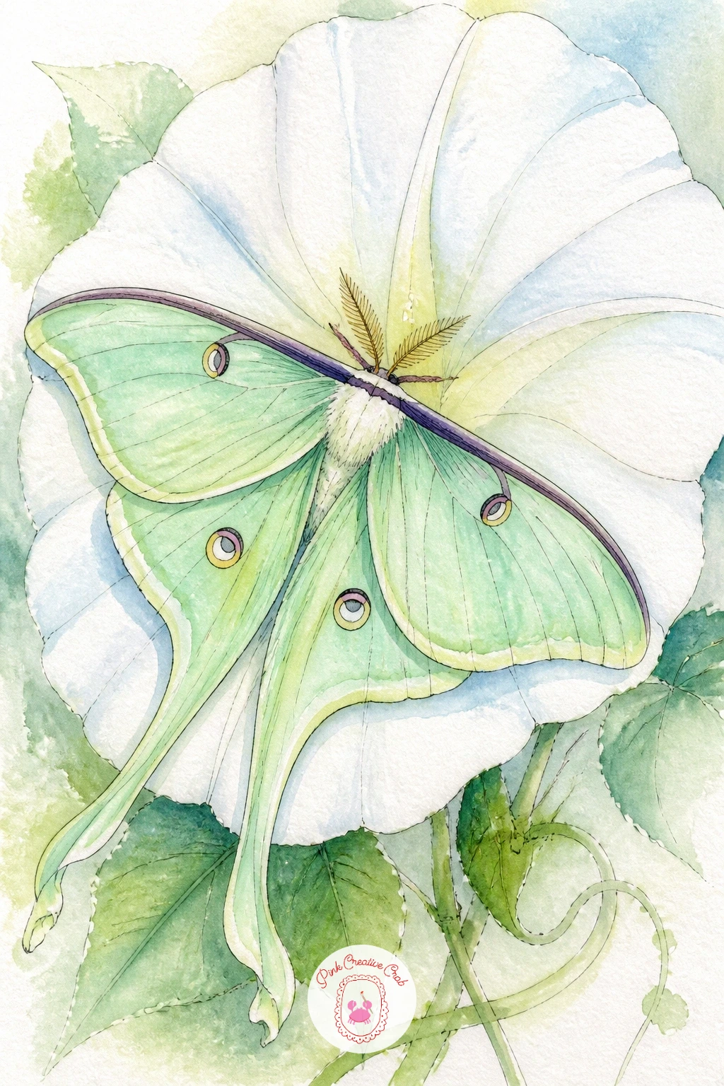
Palette: Sap Green,Titanium White,Payne’s Grey,Naples Yellow
Move next to the rosy maple moth, which is really just two triangle wing shapes and a round fuzzy body, but the colors do all the work. Sketch the wings as soft triangles first, wider at the body and tapering out, then keep the body short and round.
Wet the paper and drop warm yellow into the center of each wing, then touch pure pink along the outer edges while everything is still damp, so the two colors melt together without a hard line between them. This wet into wet blend is the whole trick: if you paint the colors dry and side by side, you lose the softness that makes this moth so pretty.
If the blend gets muddy, stop fussing with it and let it dry; moths look better slightly uneven than overworked. No pink and yellow on hand together, try coral and lemon instead, which blend just as sweetly.
Add the furry pink legs and antennae in ink last, with short flicked lines rather than one solid shape.
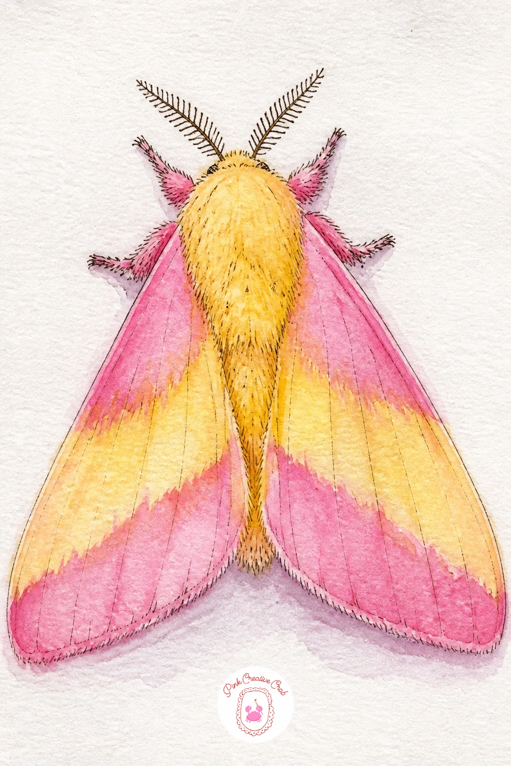
Palette: Opera Pink,Naples Yellow,Titanium White
Look at a few photo references before you start since real rosy maple moths vary a lot from deep pink to almost all yellow, so you can pick the balance you like best.
Give the feathery antennae their turn as the main character here, since most moth drawings treat them as an afterthought. Choose a simple round bodied moth in soft gray or tan, keep the wings plain and folded close to the body, and spend your attention on the two antennae instead.
Paint the body and wings first in one flat wash so they read as a quiet background shape. Once dry, use your ink pen to draw each antenna as a central stem with dozens of tiny angled lines branching off both sides, like a miniature feather or fern frond.
This is where most people rush and end up with a solid triangle instead of something airy. Slow down, work from the base of the antenna outward, and leave visible paper between the little branches so light can pass through them.
If your pen feels too thick for this, switch to the finest nib you own, even a 0.1, just for the antennae.
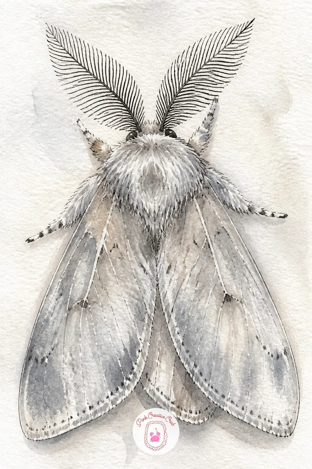
Palette: Raw Umber,Payne’s Grey,Titanium White
Bring in a cozy object now with a moth resting on a glowing paper lantern. Sketch the lantern first as a simple round or oval shape with a few vertical rib lines, then perch your moth on its curved side with wings held slightly open.
Paint the lantern in warm orange and yellow, pooling the color more toward the center to suggest the candle glow inside, and leave the very middle almost white. Let the moth’s wings stay pale gray or cream so they read as lit from behind by the lantern’s warmth, with just a hint of orange reflected along the lower wing edge.
The glow is easy to lose if you paint the lantern too evenly, so keep the center lighter than the edges on purpose. A warm yellow glaze over a dry first wash deepens it nicely if the first layer feels flat.
Finish the rib lines and moth details in ink, keeping lines curved to follow the lantern’s round shape.
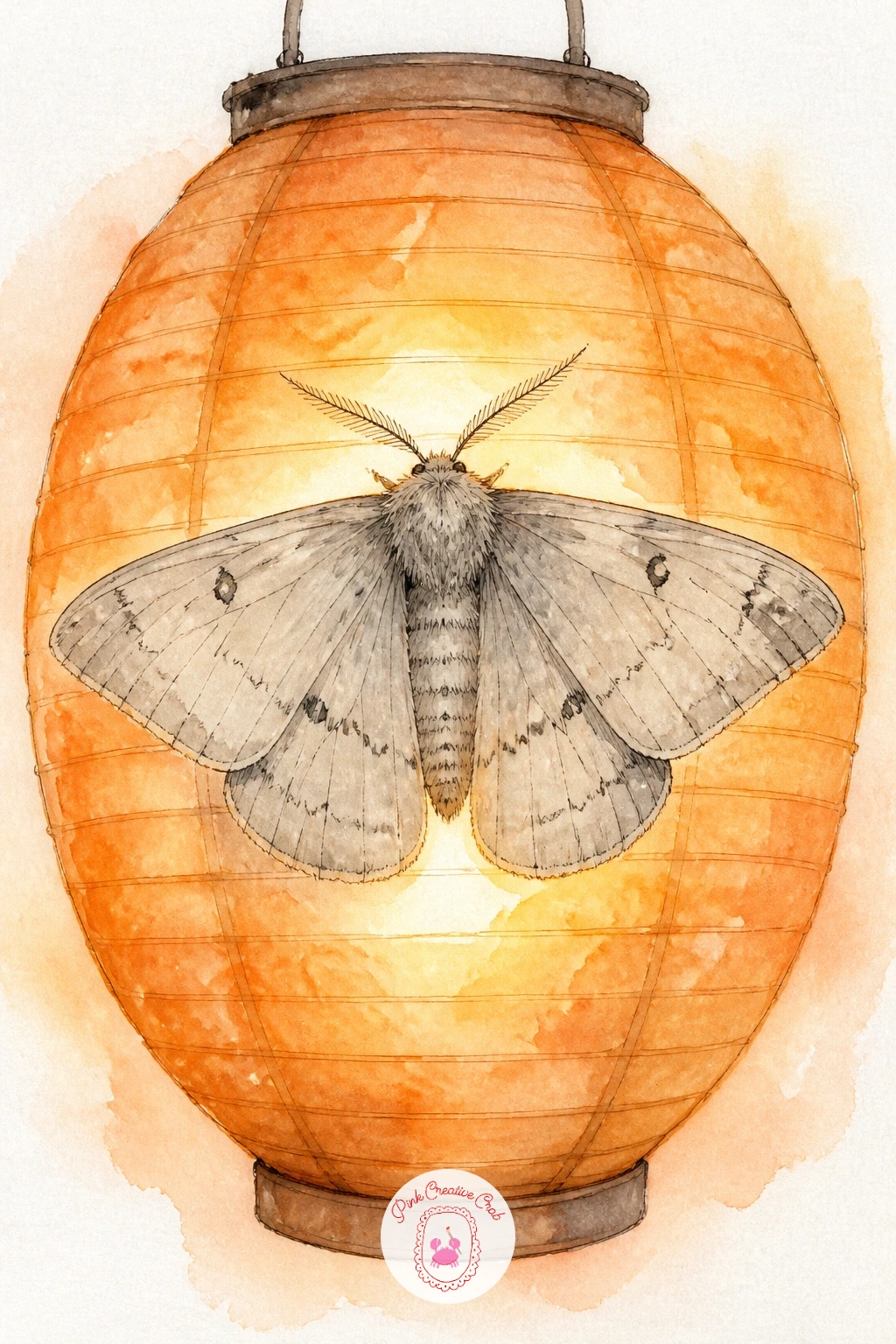
Palette: Cadmium Orange,Naples Yellow,Titanium White,Raw Umber
Honeysuckle brings in a hovering hawk moth, so think about how this one differs from the resting moths before it: its wings are narrow and swept back, and its long tongue reaches into the flower rather than the moth sitting still on top of it. Draw the body first as a thick, torpedo shaped oval, since hawk moths are stockier than most.
Sketch the wings swept diagonally back from the body in a blur, almost like a quick V shape, then paint them in a soft wash of brown and gray with the edges left loose and unfinished to suggest motion. The honeysuckle trumpets go in beside it in cream and soft pink, with the moth’s long curled tongue reaching into one bloom in a thin ink line.
Beginners often stiffen the wings into a solid, static shape here, which kills the hovering feel. Keep your brush loose and your wing edges broken rather than outlined all the way round, and let a little white paper show through near the tips.
A damp flick of the brush at each wingtip keeps that sense of movement.
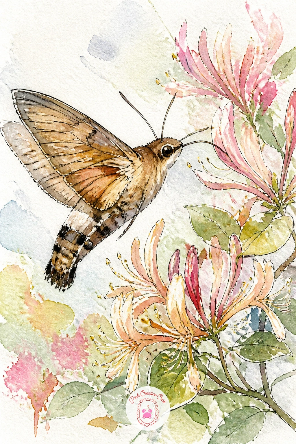
Palette: Raw Umber,Payne’s Grey,Opera Pink,Titanium White
Set the next moth somewhere unexpectedly domestic: perched right on the rim of a teacup. Draw the teacup first since it anchors the whole piece, using a simple curved ellipse for the rim and a narrower one for the base, with a small loop handle on one side.
Paint the cup in a very pale wash, maybe the faintest blue or cream, and add a thin painted stripe or small floral motif near the rim if you’d like a touch of pattern. The moth itself sits small in comparison, wings held flat and painted in muted brown or dusty pink, with its legs gripping the curved edge of the cup.
Getting the moth’s perspective right is the trick here: it should sit on the curve of the rim, not float above it, so draw a short curved guideline along the rim first and rest the moth’s feet directly on that line. If your cup ellipse looks lopsided, a small plate or jar lid traced lightly in pencil fixes it instantly.
Finish with fine ink details on the cup’s pattern and the moth’s wing veins.
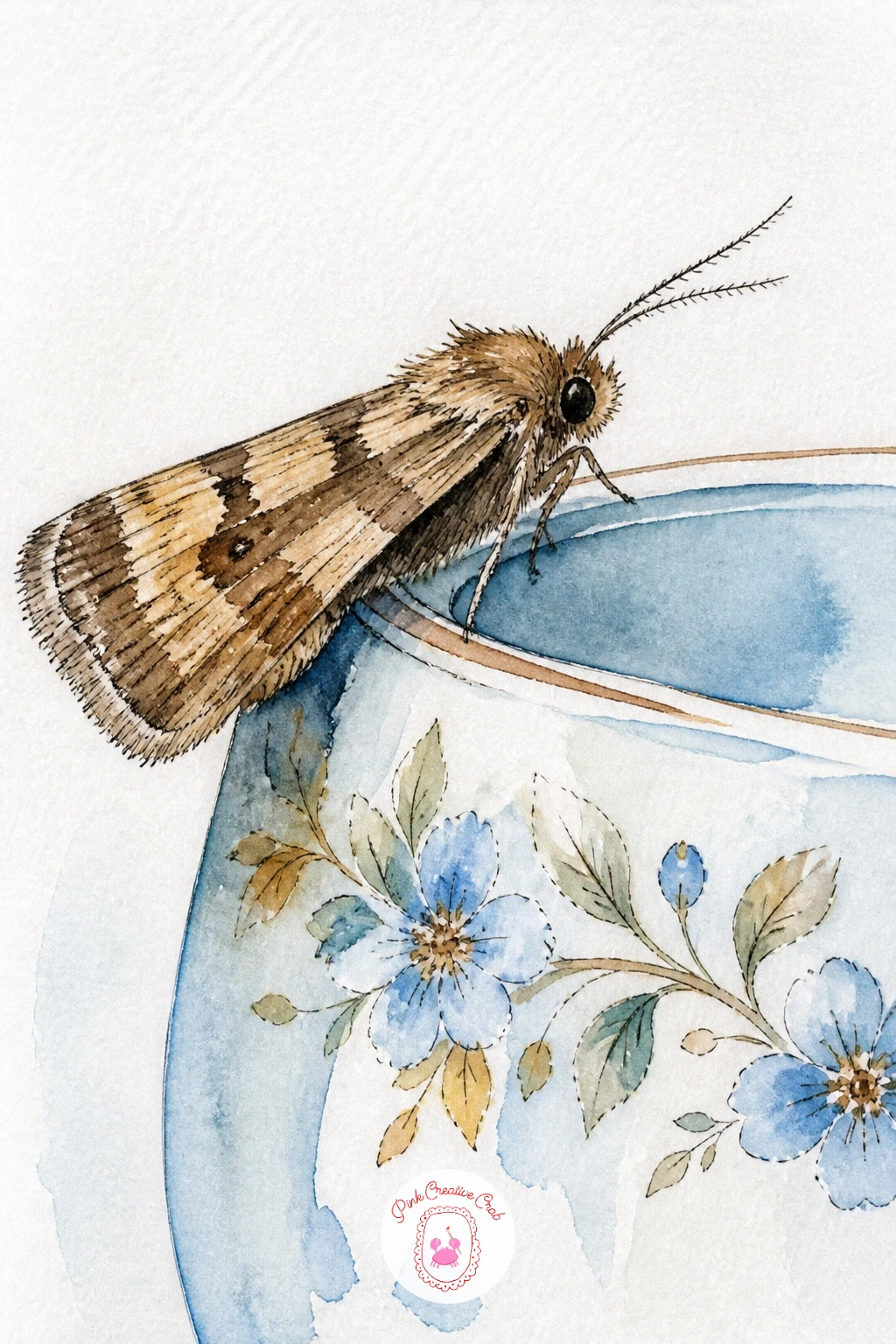
Palette: Cerulean Blue,Raw Umber,Opera Pink,Titanium White
Carry that cozy indoor feeling further with a moth resting on an old fashioned lamp, the kind with a curved brass base and a fabric shade. Pencil the lamp shape first, keeping the shade as a simple trapezoid and the base as a slim curved stand, before adding the moth somewhere along the shade’s edge.
Paint the shade in a warm cream or soft gold, letting the wash pool slightly darker near the bottom edge where shadow naturally falls, and keep the brass base in a muted ochre with a thin highlight left unpainted down one side to suggest shine. The moth on top stays pale and simple so it does not compete with the lamp’s warm tones.
Where this one usually goes wrong is giving the lamp too many fussy details before the moth is even placed. Block in the lamp loosely first, let it dry, then decide exactly where the moth sits best along the curve.
A dry brush skimmed lightly over the base suggests brass shine without any extra fuss.
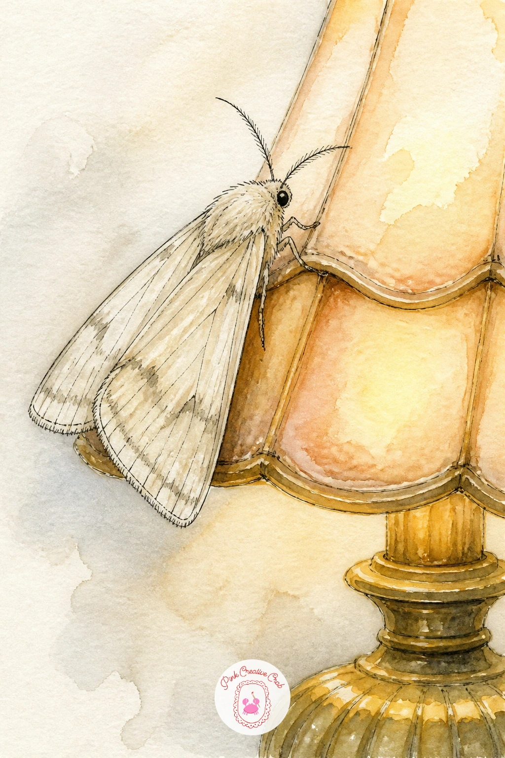
Palette: Yellow Ochre,Naples Yellow,Raw Umber,Titanium White
The atlas moth earns a whole page to itself, since its wings are enormous and patterned like stained glass, with triangular clear windows near the tips. Begin with a light pencil sketch of the full wingspan symmetrically spread, measuring from the body outward so both sides match before you add a single drop of paint.
Paint in sections, working wet in wet within each wing panel so the rust, cream and deep brown bands blend softly at their borders rather than sitting in hard stripes. Leave the small triangular wing windows as bare white paper, since that translucent patch is the atlas moth’s signature feature.
Symmetry is the whole challenge here: fold your paper in half first if you’re nervous, lightly trace through to mirror the wing outline, then unfold before painting. If one wing comes out larger than the other, simply extend the smaller one’s outer edge in pencil until the proportions settle, no one will measure it against the first.
Finish the fine scalloped wing edges and vein lines in ink once every wash is completely dry.
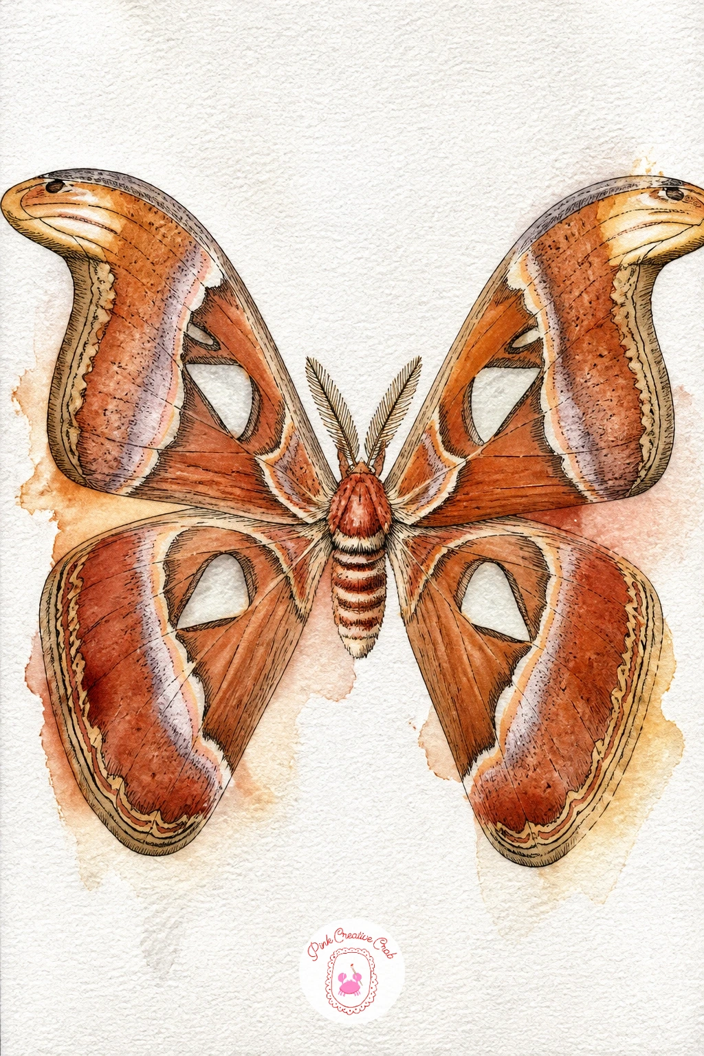
Palette: Burnt Sienna,Raw Umber,Naples Yellow,Titanium White
Look at a real reference photo for the wing window shapes since they vary moth to moth, and getting their triangular outline right is what makes this one instantly recognizable.
Give the cecropia moth a small branch to grip, since its red and white banded body and crescent wing markings look best shown resting rather than floating free. Sketch a short diagonal branch first with two or three simple leaves, then build the moth’s wings around a central body perched on top.
This is a good moth for thinking about light source: decide whether your light comes from the upper left or right, then keep that side of each wing paler and let the opposite edge sink into a slightly deeper reddish brown. That one decision gives the wings real form instead of looking flat.
Paint the body’s red and white bands first since they’re small and need a steady hand, then move out to the larger wing washes while the detail work is still fresh in your mind. If the bands bleed into each other, let the first color dry fully before adding the next; patience here saves the whole piece.
Finish the pale crescent moon markings on each wing with a careful ring of ink, leaving the center as bare paper.
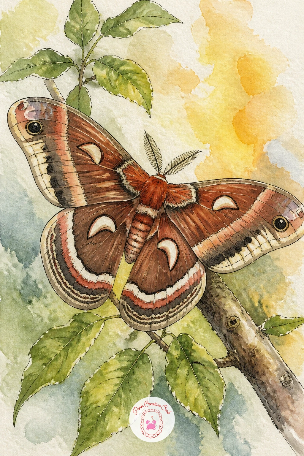
Palette: Burnt Sienna,Raw Umber,Titanium White,Sap Green
Pair a moth with the night sky itself here, letting a simple crescent moon share the page instead of a flower or object. Paint the moon first as a soft curved shape in the palest gray blue, with a faint glow washed around it using very dilated paint so it blends into the white paper without a hard circle outline.
Let the moth fly or rest just below or beside the moon, wings in dusty lavender or soft charcoal to pick up the night mood without going fully dark, since the background itself should stay light and airy rather than a true night sky. Keep the composition simple: one moon, one moth, plenty of open white space between them.
Overworking the glow around the moon is the easy mistake, since too many layers turn it gray and muddy instead of luminous. One soft wash, left alone to dry, almost always reads better than three fussy ones.
A tiny scatter of dry brushed dots nearby suggests distant stars without cluttering the scene.
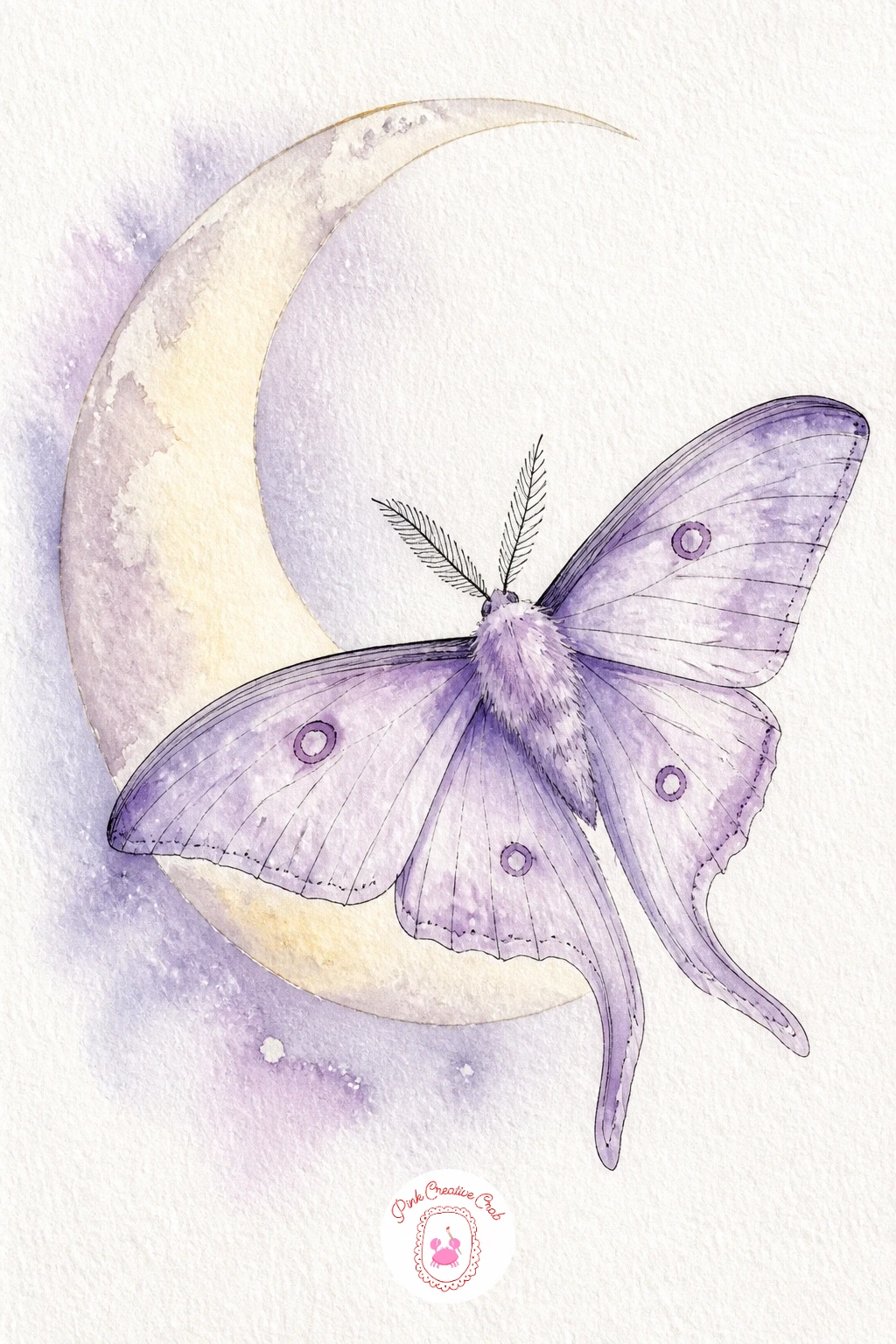
Palette: Payne’s Grey,Naples Yellow,Titanium White
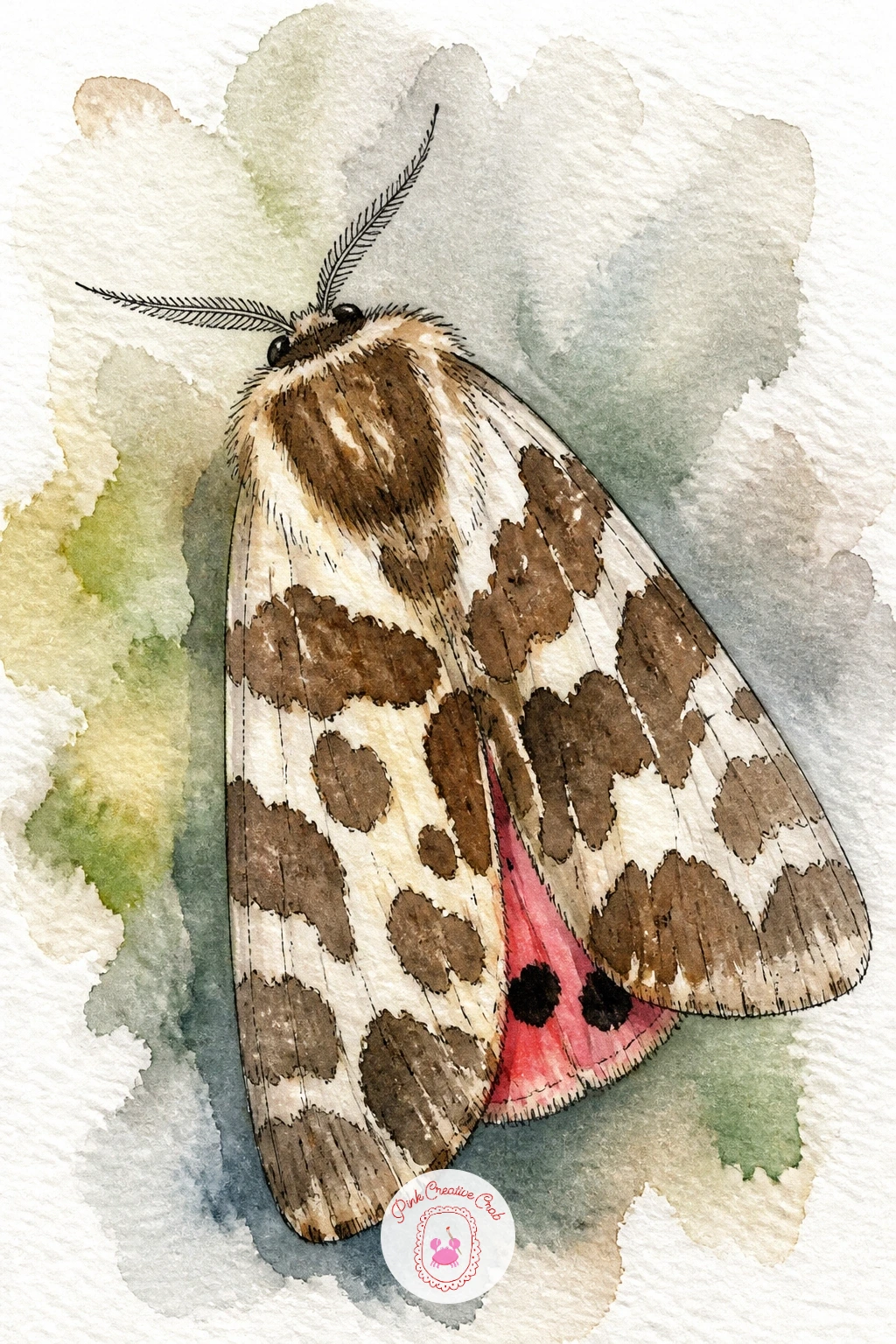
The garden tiger moth brings bold pattern back into the mix, with chocolate brown and cream marbled forewings that flash pink and black spotted hindwings underneath. Draw the forewings first in their folded resting position, since that’s how most reference photos show this moth, with the patterned brown and cream visible on top.
Block in the cream background wash first across the whole wing, let it dry, then paint the brown marbled patches on top in irregular blotchy shapes rather than neat stripes. This layering order matters: painting dark over light gives you control, while trying to paint light cream patches into wet brown just smears everything together.
If you want the pink hindwing to peek out from underneath one folded wing, tuck a small triangle of bright pink with a few black dots just at the wing’s edge, which hints at the hidden color without painting the whole hindwing.
A bit of masking fluid over the cream patches before the brown wash goes down keeps those shapes crisp if your hand is unsteady with a brush alone.
You Will Need
- masking fluid
Palette: Raw Umber,Naples Yellow,Opera Pink,Titanium White
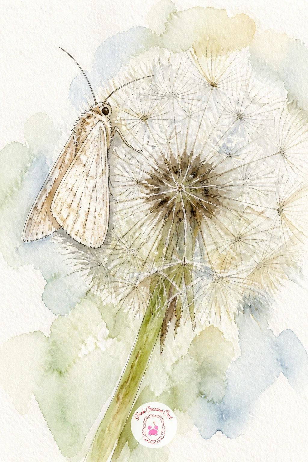
Rest a small pale moth on a dandelion gone to seed, since the contrast between the moth’s solid wings and the dandelion’s airy fluff makes for a satisfying drawing. Start with the dandelion clock itself: a round pencil guide circle, then dozens of short fine lines radiating out from the center, each ending in a tiny fork for the seed head.
Paint the dandelion stem first in soft green, then leave the seed head almost entirely as ink line work over bare white paper, since any watercolor wash here would clump the delicate seeds together. The moth sits lightly on top or beside the seed head, small and pale, painted after the dandelion so you can judge exactly how much space it needs.
Patience is the real skill in this one: rushing the radiating lines makes the dandelion look spiky rather than soft. Pull your pen lightly from center outward in one smooth stroke per line, lifting slightly at the end rather than pressing hard.
Thin, dry colored pencil lines work as a gentler substitute for ink if you’d rather keep the whole piece softer.
Palette: Sap Green,Titanium White,Raw Umber
Bring in the hummingbird hawk moth next, caught mid hover at a spray of lavender, its wings a soft blur rather than a sharp outline. Draw the lavender stems first in a loose diagonal cluster, since the moth will hover in front of or beside them rather than landing.
Paint the lavender in small dabbed strokes of violet and blue violet working up each stem, keeping the dabs varied in size so it reads as loose florets rather than a solid shape. For the moth’s wings, wet the paper first and touch in gray with soft, quick strokes, letting the edges stay undefined to suggest the blur of rapid wingbeats, very different from the crisp resting wings used earlier in this list.
Overthinking the wing blur usually ruins it, since careful, controlled brushwork reads as a solid wing rather than a moving one. Work fast and a little messy here on purpose, and if it goes too far, a damp brush can soften any hard edge back into a blur.
Its long thin tongue, drawn in one confident ink line reaching into a lavender floret, finishes the sense of motion.
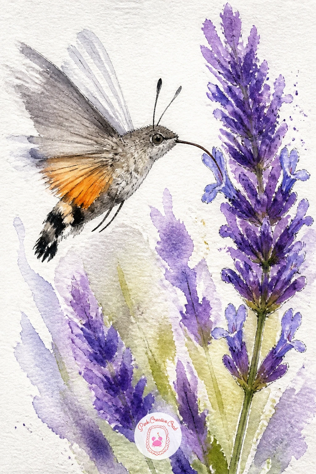
Palette: Violet,Payne’s Grey,Sap Green,Titanium White
Evening primrose opens its pale yellow blooms right as moths become active, which makes it a natural next pairing. Draw the flower first as four soft, slightly cupped petals around a small central cluster of stamens, keeping the petal edges gently rounded rather than pointed.
Wash the petals in the palest lemon yellow, leaving the very center almost white where the stamens will go, then let a soft gray or cream moth rest on one petal with its wings slightly open to show its underside pattern. Since evening primrose blooms at dusk, you can lean into a slightly warmer, dimmer light here: a faint wash of soft peach behind the flower suggests the fading light without turning the whole background dark.
The petals can look stiff if you paint each one as a flat, separate shape, so work them wet in wet in one go so the color flows naturally from petal to petal with soft veining left to the ink pen afterward.
A single dry brushed stamen line in the center adds just enough texture without overworking it.
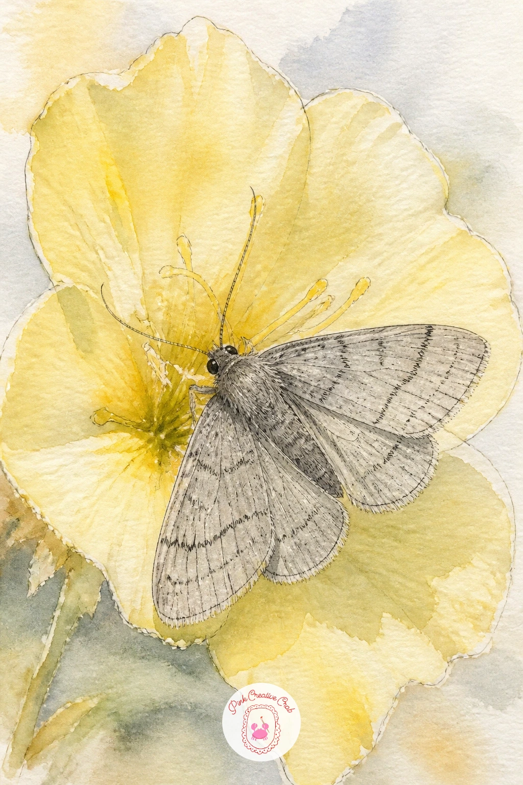
Palette: Naples Yellow,Titanium White,Raw Umber
The poodle moth, with its impossibly round, fluffy white body and tiny folded wings, makes a playful change of pace after so many patterned species. Draw the body first as a simple soft circle, almost like a cotton ball, with two small black dot eyes and short stubby legs tucked underneath.
Keep the wings small and mostly hidden beneath the fluff, just a hint of pale shape peeking out at the sides, since the whole appeal of this moth is its round, cloud like body rather than wing pattern. Paint the body in the lightest gray wash, then once dry, use a dry, barely loaded brush to stipple texture all over the surface in small dabbing motions, building up that fuzzy look gradually.
Overloading the brush here flattens all that lovely texture into a solid gray blob, so keep your brush nearly dry for the stippling stage and build it slowly in a few light passes rather than one heavy one.
A few short flicked ink lines around the edge finish the fluffy outline without boxing it in.
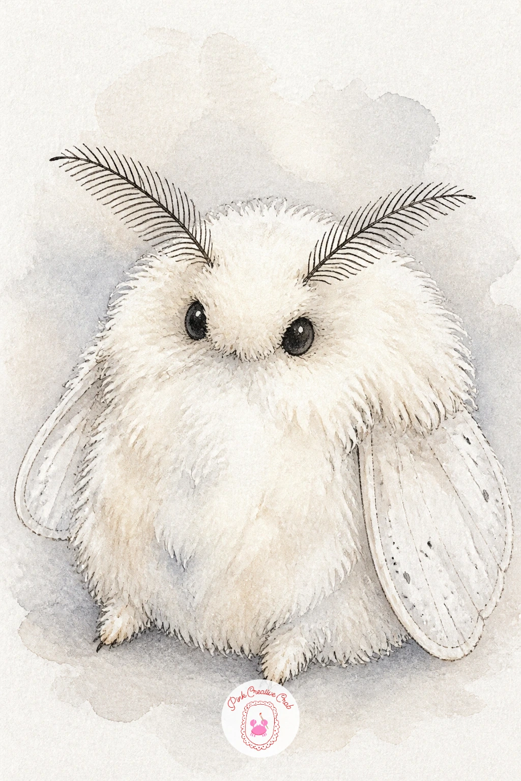
Palette: Payne’s Grey,Titanium White
This one is a sweet, low pressure pick if you want something quick and a little whimsical between the more detailed moths on this list.
Rest a moth across the pages of an open book for a quiet, bookish composition. Sketch the book first: two gently curved page shapes meeting at a center spine, with a few loose wavy lines suggesting text so you don’t have to draw actual words.
Paint the pages in the barest cream wash, leaving most of the paper white, then let the moth sit right across the gutter where the two pages meet, wings spread flat as if it had simply landed there mid read. In about ten minutes you can leave it at that: a simple cream book, a plain moth, done.
Given forty minutes, add a pressed flower tucked between the pages beside the moth, a few more detailed text lines in ink, and a soft shadow cast by the book’s curved pages onto the surface beneath it, which grounds the whole scene.
Either way, keep the “text” lines loose and wavy rather than trying to write real words, since real text instantly draws the eye away from the moth.
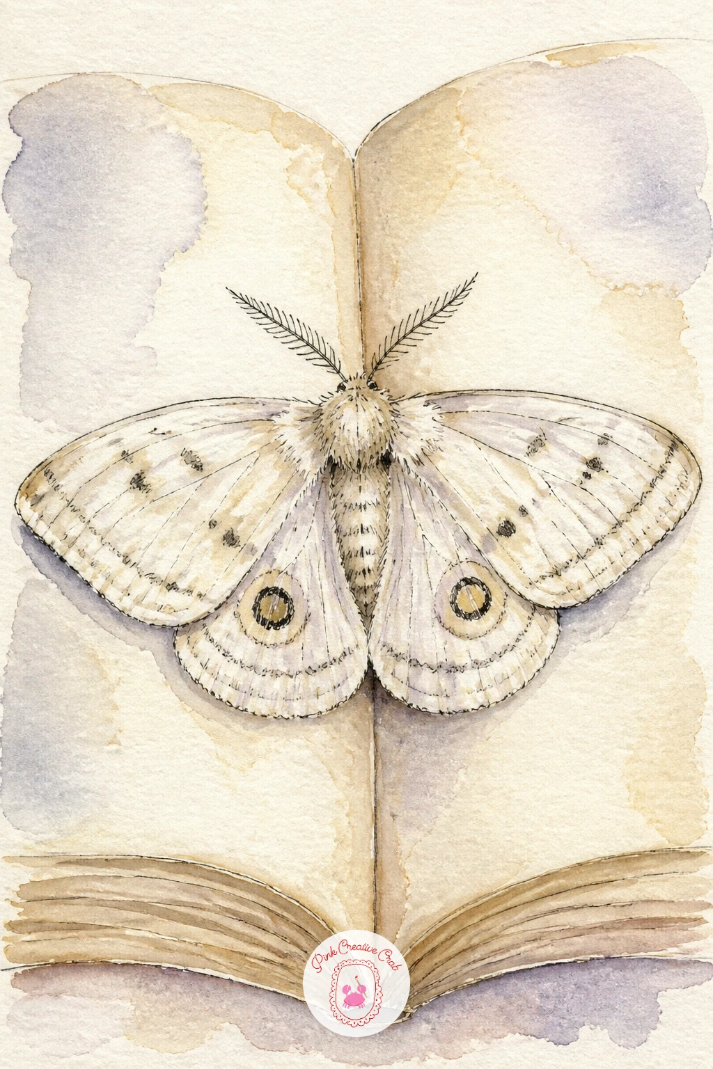
Palette: Naples Yellow,Raw Umber,Titanium White
A small glass jar of wildflowers with a moth perched on its rim makes a lovely cottagecore style subject. Draw the jar first as a simple cylinder, slightly narrower at the top, with a couple of faint curved lines to suggest the glass catching light, then add a loose bundle of wildflower stems poking out the top.
Paint the jar in the palest gray blue, leaving two or three vertical streaks of bare white paper to read as glass highlights, since painting glass solidly flat kills the sparkle immediately. The wildflowers above can be a mix of small daisies, a few loose blue blooms and simple green stems, painted quickly and loosely rather than tightly rendered, with the moth perched on the jar’s rim or on one flower.
If the jar looks too solid and opaque, lift a little color out while it’s still damp with a clean, barely damp brush to open those highlight streaks back up.
A dry brush worked lightly along the jar’s base suggests a hint of soft shadow without heaviness.
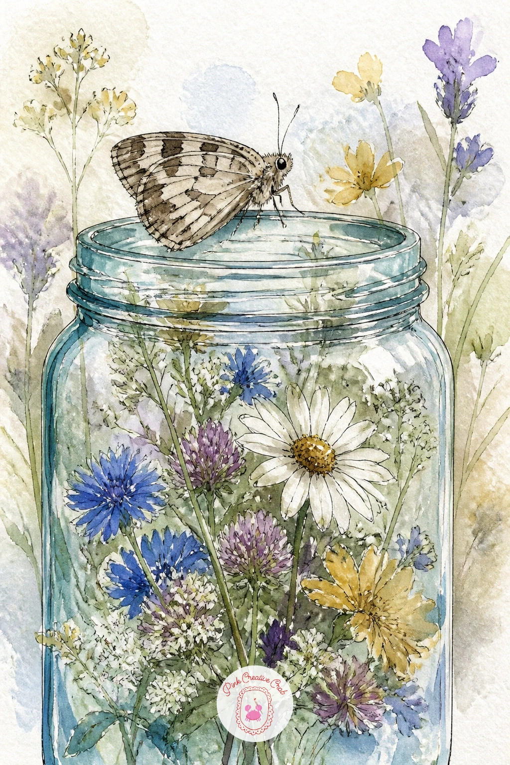
Palette: Cerulean Blue,Sap Green,Titanium White,Opera Pink
The emperor moth’s four bold eyespots, one on each wing, give you a great excuse to practice a bit of symmetry and pattern work. Draw the wings in their resting spread position first, then lightly mark the center point of each wing where an eyespot will sit before you touch any paint to the page.
Measure the eyespots against each other as you go: hold your brush handle up to compare the size of the first spot you paint against the next one, so all four stay roughly consistent rather than drifting larger or smaller across the wings. Paint the surrounding wing color first in soft gray brown, let it dry, then build each eyespot from the center out, a small black dot, a ring of blue, and an outer ring of rust.
Rushing the rings before the layer beneath is dry smears the colors into a muddy blur instead of crisp bands, so let each ring dry before adding the next.
A fine ink outline around each finished eyespot sharpens them up if the watercolor edges came out soft.
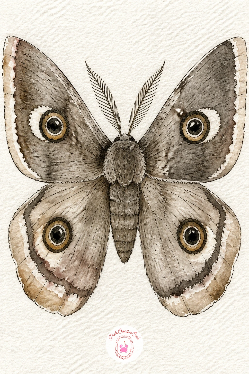
Palette: Raw Umber,Payne’s Grey,Cerulean Blue,Burnt Sienna
A pale moth against the full, layered petals of a white peony is one of the prettiest pairings on this whole list, and a good one for practicing edges. Draw the peony first as a loose cluster of overlapping rounded petals, more petals toward the center and a few larger outer ones framing the bloom.
Since the flower is white, most of its form comes from shadow rather than color: mix a very pale gray violet and drop it only into the creases between overlapping petals while the paper is still slightly damp, letting it feather softly rather than sitting as a hard line. Keep the outer petal edges almost entirely white paper with no outline at all, which is what makes a white flower actually look white rather than gray.
If you outline every petal in ink, the whole peony reads as pale gray instead of fresh white, so save your pen only for the moth and a few petal creases, not the outer silhouette.
Let the moth rest right in the center where the shadow is deepest, so it has something to stand out against.
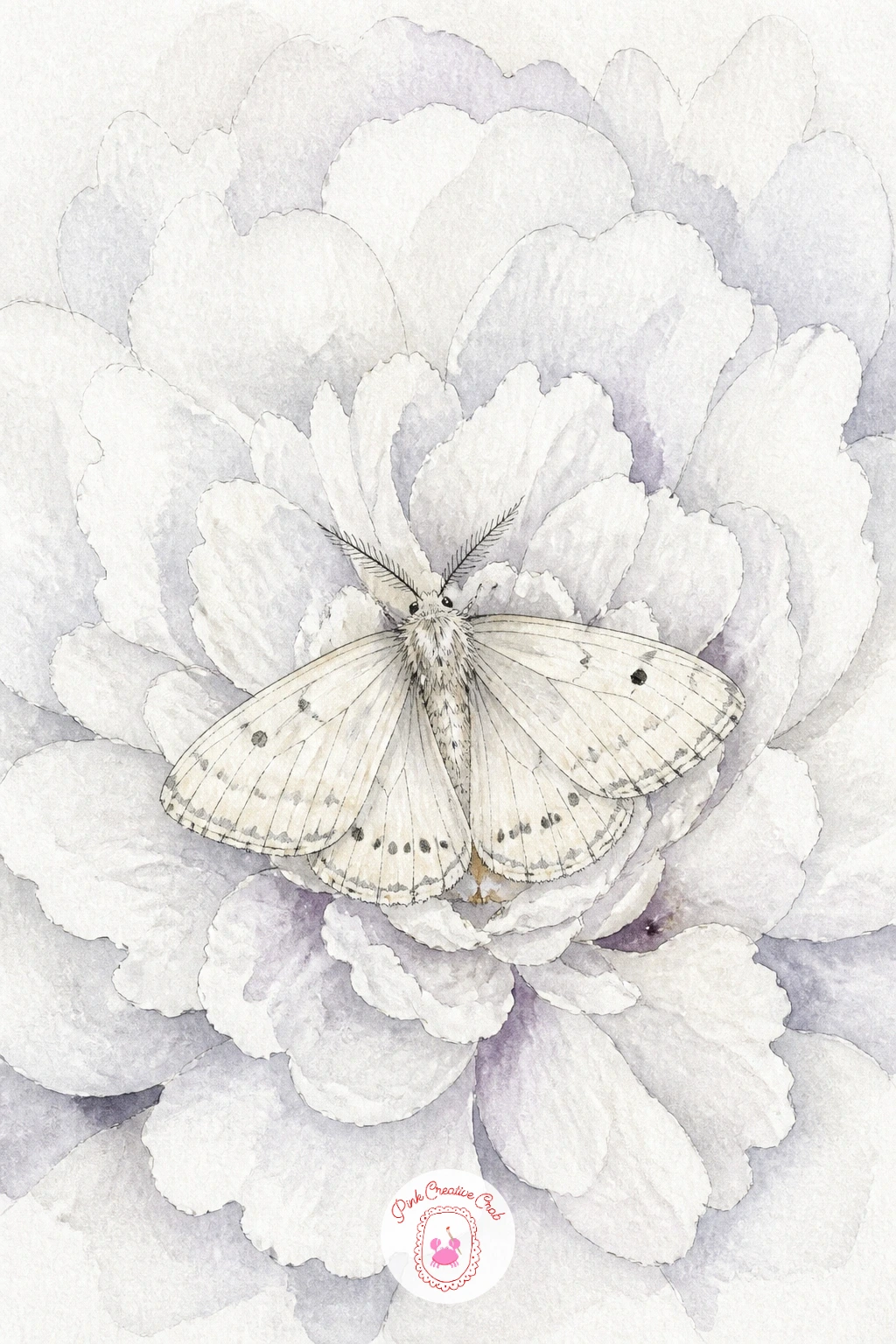
Palette: Titanium White,Payne’s Grey,Sap Green
Try this technique again on any white flower once it works, a white rose or a white dahlia both use exactly the same shadow only approach.
Two moths circling a single lit candle makes a warmer, more atmospheric scene than any single moth alone. Place the candle first, just off center, as a simple cylinder with a small flame shape above it, then sketch the two moths at different points around it, one closer and larger, one further and smaller, to suggest they’re circling rather than just sitting side by side.
The candlelight is your light source for the whole piece, so keep it simple: paint a soft warm glow radiating out from the flame in pale yellow and peach, and let that same warm tone touch the undersides of both moths’ wings facing the candle, while the far side of each wing stays cooler and paler.
Crowding too much detail around the flame is the easy trap, since a candle flame reads best as just two or three shapes, a deep orange core and a pale yellow halo, nothing fussier.
If you want this to feel even quieter, drop one of the moths and let a single one circle instead, which works just as well as a composition.
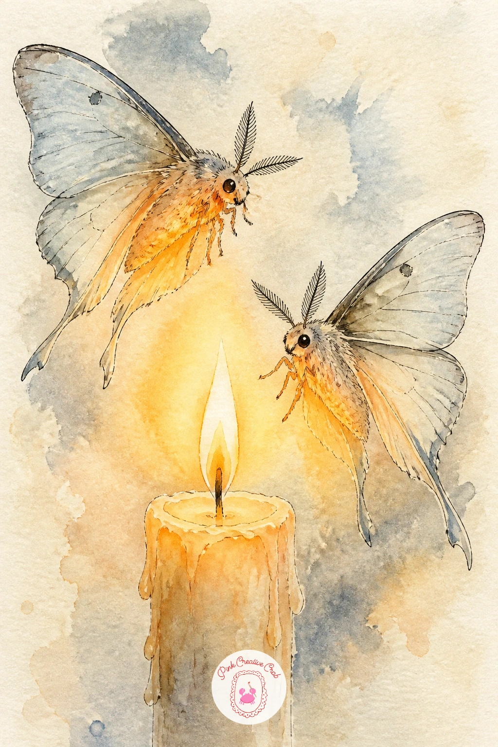
Palette: Cadmium Orange,Naples Yellow,Raw Umber,Titanium White
The elephant hawk moth is unusual for being genuinely bright pink and olive green rather than the muted browns of most moths on this list, so let that contrast carry the piece. Draw the body first as a long, slightly tapered oval, since this species has a distinctly elongated shape compared with the rounder moths you’ve drawn so far.
Paint the body and wing bases in soft olive green, then bring in a strong pink along the wing edges and down the body’s sides while the green is still slightly damp, letting the two colors meet in a soft blended line rather than a hard edge. This is the same wet in wet blending trick from the rosy maple moth earlier, just with a bolder, more saturated pair of colors this time.
Going too pastel is the main risk here, since this particular moth is genuinely vivid and loses its identity if softened too much. Mix your pink stronger than feels comfortable and trust that it reads as this specific, boldly colored species rather than a generic pale moth.
Finish with ink only on the wing veins, since heavy outlining would flatten all that rich color.
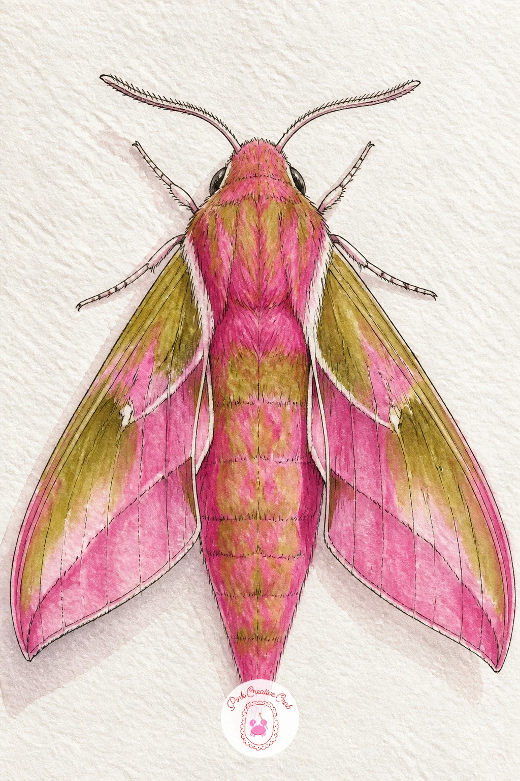
Palette: Opera Pink,Sap Green,Titanium White
After the bold colors of the last idea, cool back down with a simple pale moth resting on a classic white daisy. Draw the daisy first with its ring of slim white petals around a bright, slightly domed yellow center, keeping the petals loose and slightly uneven since real daisy petals rarely match perfectly.
Give the yellow center a little texture by stippling tiny dots of deeper gold and orange into it while the base yellow wash is still damp, which suggests the bumpy cluster of disc florets without having to paint each one. The petals themselves stay mostly bare white paper, with just the faintest gray shadow where one petal overlaps another.
This is a nicely quick one if you’re short on time: ten minutes gets you the daisy and a simple resting moth done loosely, while forty minutes lets you add a second daisy slightly behind the first, softly blurred, to suggest a small patch rather than a single flower.
If this is your first time stippling, practice the dot texture on scrap paper first so you get a feel for how loaded your brush needs to be.
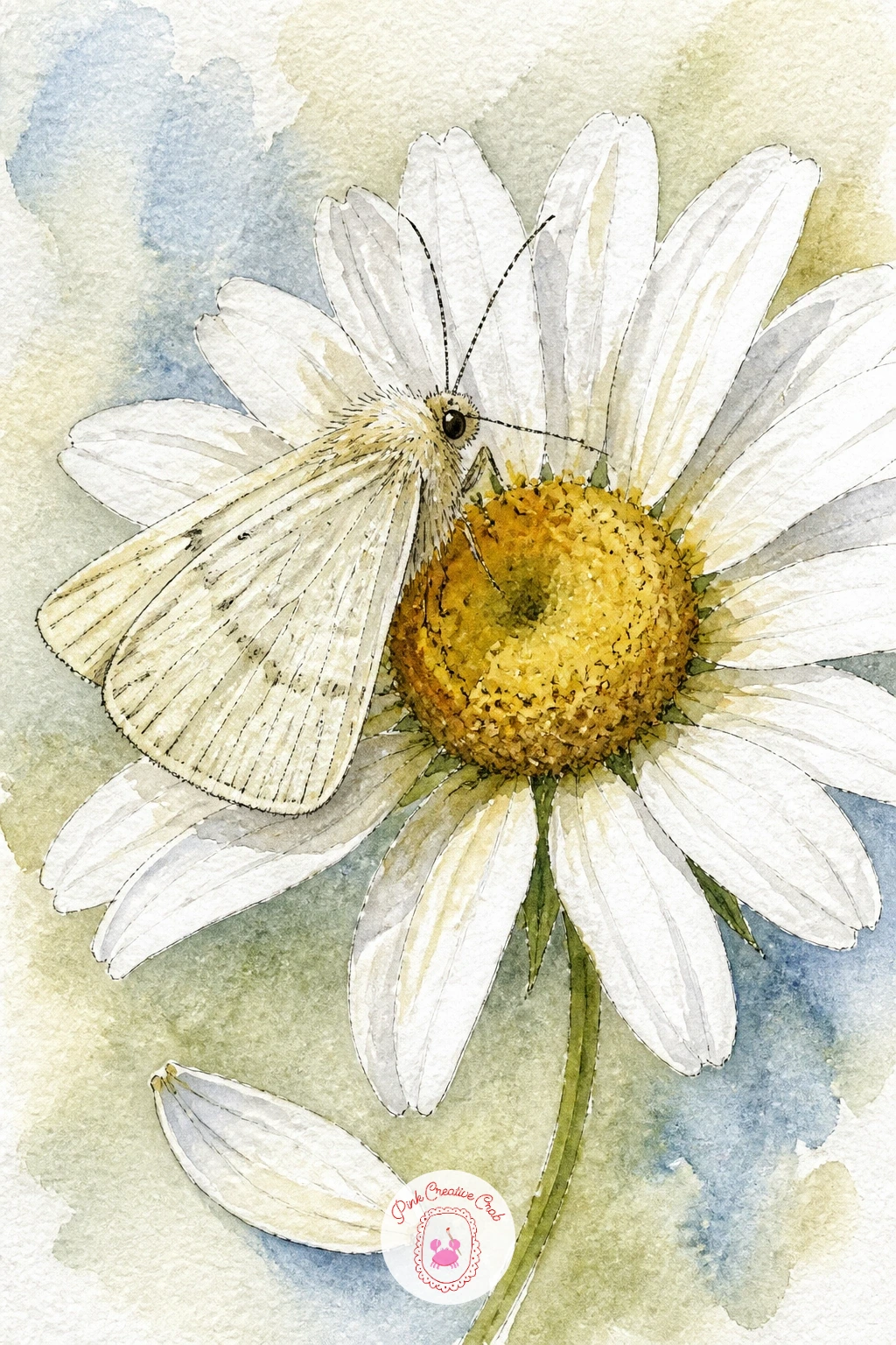
Palette: Titanium White,Naples Yellow,Cadmium Orange
Clearwing moths are the trickiest technical challenge on this list, since large parts of their wings are genuinely transparent, showing whatever is behind them straight through. Draw the wing outlines clearly in pencil first, then decide which panels of each wing will stay as bare, untouched white paper to read as clear glass like sections.
Paint only the wing veins and the narrow dark border around each wing, leaving the transparent panels completely free of paint, then add the moth’s body and legs in solid color so there’s a clear contrast between the opaque body and the see through wings. A very faint gray wash, so pale it’s barely there, can go into the clear panels if you want a slight hint of substance, but keep it extremely dilute.
Covering too much of the wing in paint is the single biggest risk here, since even a light wash across the whole wing kills the clearwing effect entirely. If you’ve already overpainted a panel, a slightly damp brush can sometimes lift enough pigment back out to recover some transparency.
Finish the thin wing veins last in ink, using a steady, unbroken line.
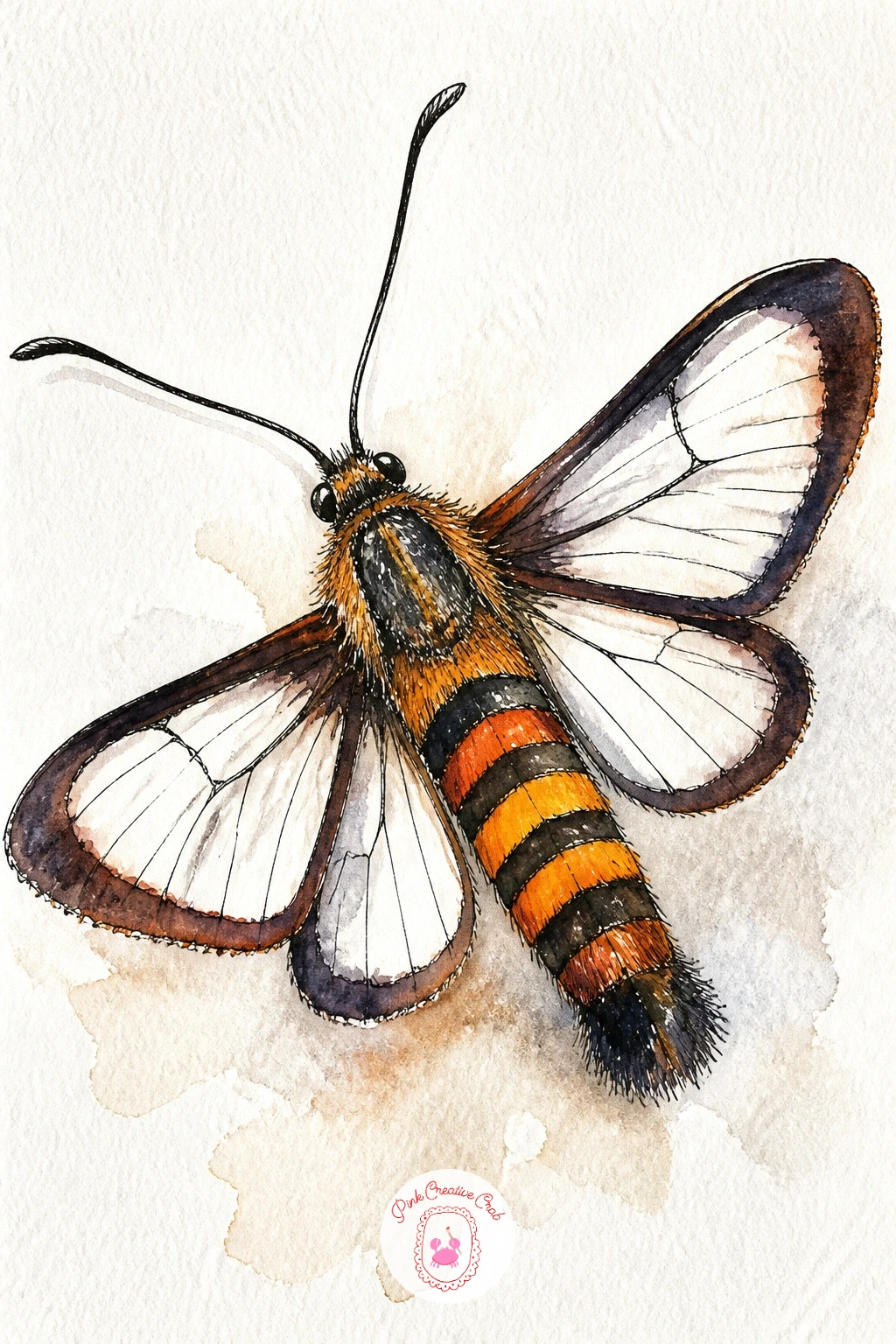
Palette: Payne’s Grey,Cadmium Orange,Titanium White
A moth drawn to a porch light with jasmine twining nearby brings together two cozy elements at once. Sketch the porch light first as a simple glass globe shape on a small fixture, then let a jasmine vine curl up from one side, its small white star shaped flowers scattered along the stem.
Paint the globe in the softest warm yellow, slightly stronger at its core to suggest the bulb glowing inside, and let that warm light wash gently outward onto the nearby jasmine leaves and petals too, so the whole scene feels lit from that one source rather than evenly bright all over. The moth rests on or near the globe, its wings catching the same warm tone on the side facing the light.
Jasmine’s small star flowers are easy to overdo, so paint them as simple five petaled white stars with the barest dab of yellow center, repeated loosely rather than perfectly even along the vine.
One tip for today: paint the light’s glow before anything else nearby, so every other color you mix can be judged against it.
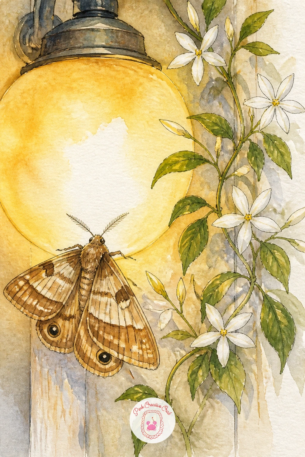
Palette: Naples Yellow,Titanium White,Sap Green
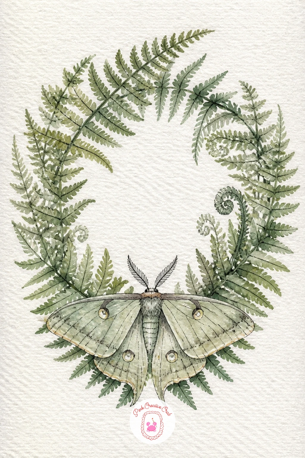
Arrange fern fronds into a simple wreath shape with a moth resting at its base for a change from the single flower pairings earlier in this list. Sketch a light pencil circle first as your guide, then build the wreath by layering individual fern fronds around it, each frond a central stem with small leaflets branching off in pairs.
Paint the ferns in two or three closely related greens, varying which fronds are lighter or darker so the wreath has some depth rather than reading as one flat ring. Keep gaps of bare white paper between fronds rather than packing them in edge to edge, since that openness is what keeps a wreath looking fresh instead of heavy.
If your circle guide shows through too obviously once the ferns are in, a light eraser pass after the pencil lines are no longer needed tidies it up, or simply let a few fronds cross over the guideline naturally to break it up.
Rest the moth at the base of the wreath where two fronds meet, painted last in a muted tone so it doesn’t compete with all that green.
Palette: Sap Green,Sap Green,Raw Umber,Titanium White
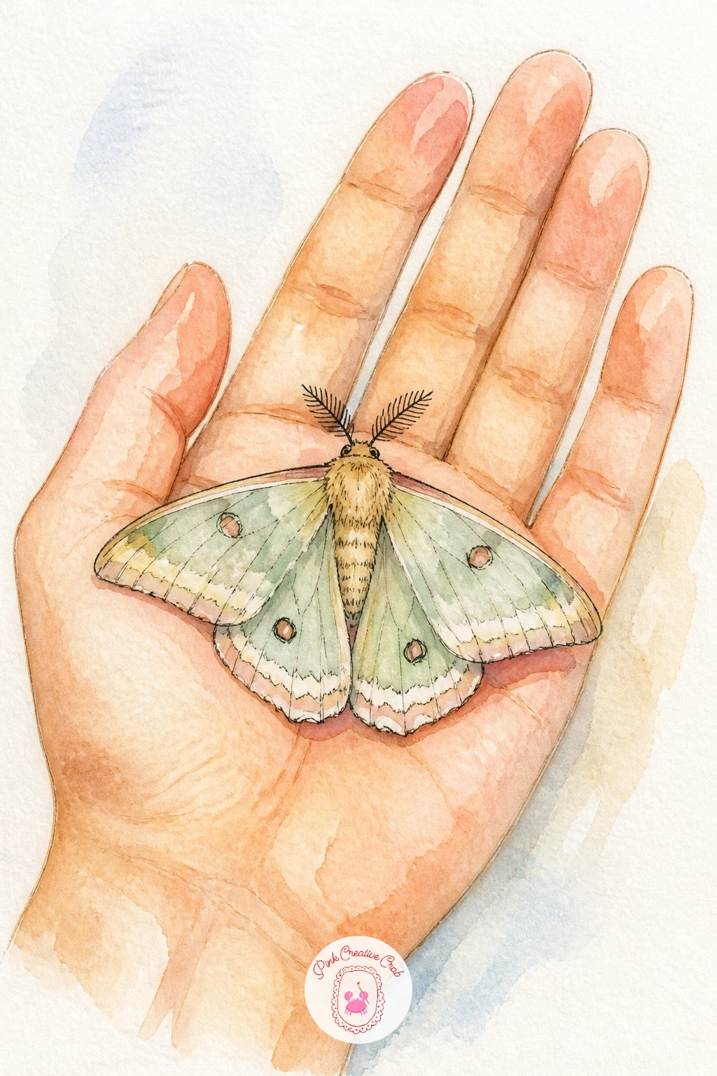
Bring a human touch into the piece by drawing a moth resting gently on an open palm, which also gives you useful scale to play with. Draw the hand first, kept simple and a little loose, palm facing up with fingers relaxed rather than stiff, since an overly detailed hand will pull focus from the moth anyway.
Compare sizes before you paint: hold your pencil up against your own hand or a reference photo to check that the moth’s wingspan looks proportionate, roughly the width of two or three fingers rather than something oddly tiny or giant. Paint the skin tone in one soft, even wash first, adding the faintest warm shadow where the fingers curl, then let the moth sit right in the center of the palm, its own colors kept gentle so they sit comfortably against the skin tone rather than clashing.
If the hand looks stiff, loosen your pencil sketch with a few extra practice lines first on scrap paper. If you would rather skip the figure entirely, the same composition works resting the moth on a smooth stone instead.
Palette: Burnt Sienna,Raw Umber,Titanium White
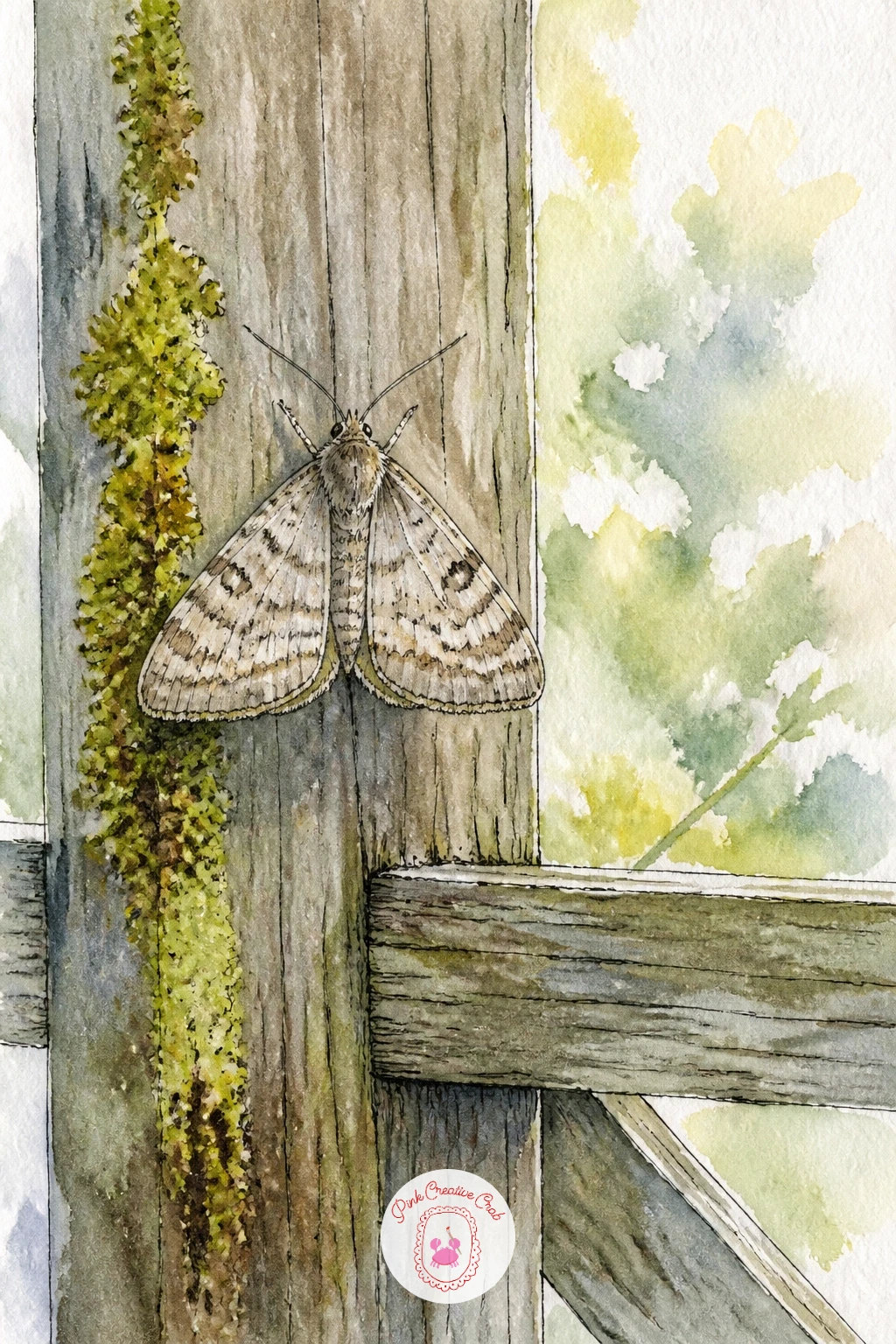
Close out the list with a moth perched on an old wooden garden gate, a nice quiet scene to finish on. Draw the gate first as a simple crosshatched structure, a few horizontal and diagonal slats within a rectangular frame, and keep the linework a little uneven since real weathered wood is never perfectly straight.
Paint the wood in a warm grayish brown, varying the tone slightly slat to slat so it doesn’t read as one flat plank, then let a touch of green moss or a few small climbing leaves creep up one side of the frame for a softer, more lived in feel. The moth rests on one of the horizontal slats, painted in muted tones that echo the gate’s weathered color so the whole scene feels unified.
Straight ruled lines make the gate look too new and stiff, so sketch the slats freehand rather than with a ruler, and let a few lines wobble slightly.
Once this one works, try it again with a different structure altogether, a window frame or a fence post both borrow the same approach nicely.
Palette: Raw Umber,Payne’s Grey,Sap Green,Titanium White
If you enjoyed pairing moths with flowers throughout this list, the same loose watercolor approach works beautifully for the blooms alone in hydrangea painting ideas or these watercolor pencil botanical drawings.
What to Do Next
Pick whichever moth caught your eye first, cut a small sheet of cold press paper to size, and work through it from first wash to final ink line in one sitting. If nature pairings like these appeal to you, the same light, fresh approach carries over nicely into butterfly drawing ideas or bird pencil drawing ideas whenever you’re ready for the next page.
Frequently Asked Questions
What is the easiest way to start a moth drawing for beginners?
Start with a simple round bodied moth like the rosy maple or poodle moth, since their wings are basic shapes with no fine pattern work needed before you build confidence.
Do I need special paint for the glowing effects like lanterns or candles?
No special paint is needed, just build warm yellow and orange washes with the center left paler or white, since the glow comes from contrast rather than any particular pigment.
How do I keep moth wings from looking too stiff or flat?
Work wet into wet for soft blended color and avoid outlining the entire wing edge in ink, since a hard black outline around every wing tends to flatten the shape.
What if I don’t have the exact watercolor colors listed for a moth?
Mix the closest colors you own; a warm brown and gray combination covers most moths, and a simple pink and yellow blend substitutes for any rosy or coral tone.
How can I make an atlas moth or emperor moth look symmetrical?
Fold the paper in half first, lightly trace through to mirror your pencil sketch of one wing onto the other side, then unfold before adding any paint.
Have any thoughts?
Share your reaction or leave a quick response — we’d love to hear what you think!
-
 0
-
0
-
0
-
0
-
0
-
0


