

A watercolor city scene gives you everything a quiet landscape cannot: people under umbrellas, wet pavement throwing back neon, a tram bell about to ring. Every page below sends you to a different corner of the world, but each one leans on the same loose, forgiving washes that make a beginner’s painting look like it belongs in a travel journal already.
Work through these in any order you like. Pick the one that matches the mood you are in today, whether that is a grey rainy afternoon or a city lit up at night, and you will have a finished piece before the kettle boils twice.
Using these images: free for personal projects such as printing, coloring, cards, journals and gifts. Handmade items that include them may be sold up to 30 pieces per design. More than that is commercial use and is not permitted, and neither is selling or sharing the images themselves or passing them off as your own. Please ask before any other use.
Start the whole series with a rainy Paris street, because wet pavement is the most forgiving subject watercolor has. Wet your paper first with clean water over the lower half, then drop in grey, taupe and a touch of Payne’s grey so the puddle reflections bleed softly with no hard edges to fight.
Once that wash is damp but not shiny-wet, paint the buildings behind with a flat wash in warm grey, keeping windows as small unpainted or pale yellow squares. Add two or three umbrellas last, in red and mustard, as simple curved triangles with a thin dark stem, standing on the dry upper layer.
The common mistake is painting the umbrellas too early, before the street wash dries, so they bloom into fuzzy blobs. Wait until the paper is bone dry, even using a hairdryer, before adding those crisp shapes. No mustard on hand, swap in ochre or a warm orange instead.
Finish with a few dark vertical drips under each umbrella for rain, pulled down with a damp brush.
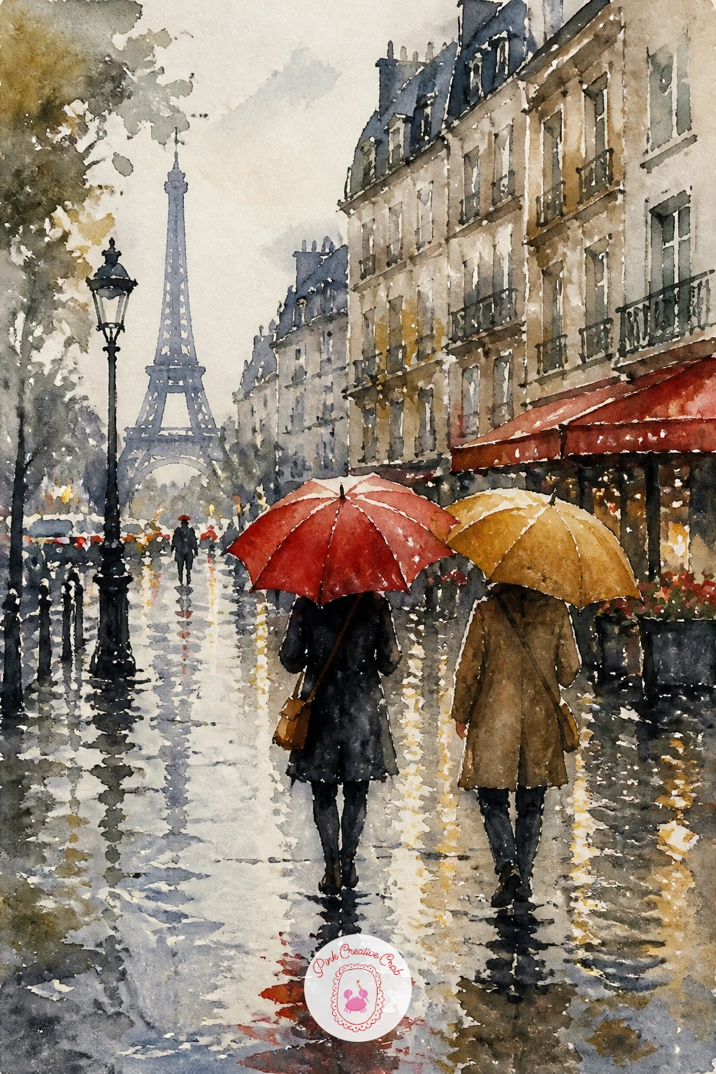
Palette: Payne’s Grey,Cadmium Red,Yellow Ochre,Raw Umber
Lay a strip of masking tape along the bottom edge before you start, so the pavement stays crisp and the reflections look deliberate rather than accidental once you peel it off.
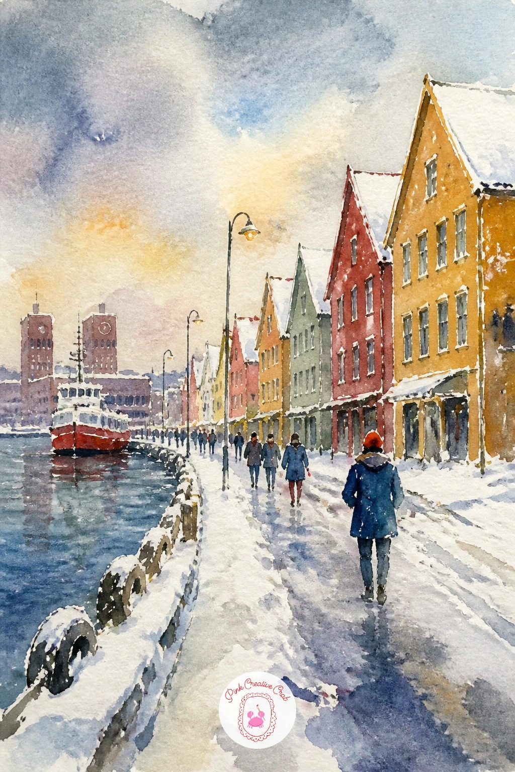
Move from rain to snow with an Oslo harbor street, where the trick is painting white without touching white paint. Sketch the harbor buildings lightly in pencil, then paint the sky and water in soft blue-grey, leaving the rooftops and ground as bare paper for snow.
Work the colorful harbor houses next in muted red, mustard and dusty blue, keeping each wall as one flat shape so the snow caps read clearly against them. Add tiny dark figures in coats last, just a few vertical strokes with a round brush, walking along the quay.
If the houses start to look too bright or toy-like, mute them by mixing a touch of grey into each color before it goes on, since Nordic light softens everything. No blue-grey mix ready, a wash of diluted Payne’s grey does the same quiet job.
Finish with a dry brush loaded with white gouache, flicked lightly over the sky for falling snow.
You Will Need
- white gouache or white gel pen for snow flecks
Palette: Payne’s Grey,Venetian Red,Dusty Blue,Yellow Ochre
Keep the rainy mood going but raise the energy with a London red bus cutting through a wet street. Lay a loose grey-blue wash over the whole lower street first, wet into wet, so the eventual reflections have somewhere soft to sit.
Paint the bus once that base is dry, as one bold rectangle of cadmium red with black windows and wheels added in a few confident strokes, no fussing over small details. Drop a streak of the same red straight down into the still-damp pavement below it to suggest the reflection, letting it bleed on its own.
Eye level matters here: keep the bus and the buildings behind it on the same low horizon line, roughly a third up the page, so the street feels like it stretches away from you rather than sitting flat. If the red bleeds too far into the street, lift the excess gently with a dry paper towel while it is still wet.
Finish with a black fineliner for lamp posts and a crossing sign once everything is fully dry.
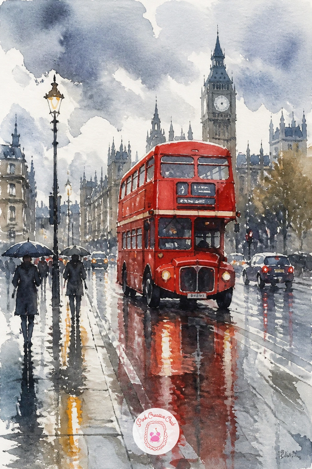
Palette: Cadmium Red,Payne’s Grey,Ivory Black,Cool Grey
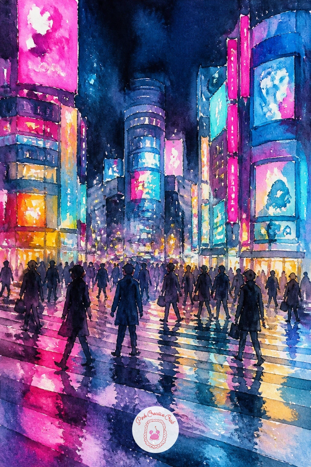
Jump into night with a Tokyo crossing, where the whole painting is really about contrast between dark streets and glowing signs. Cover the paper in a dark wash first, mixing Payne’s grey with a little purple, and let it dry completely before anything else happens.
Once dry, paint the neon signs as small rectangles and vertical strips in hot pink, cyan and acid yellow, layering them over the dark background so they pop forward immediately. Add the crossing itself with a few pale diagonal stripes and a crowd of simple dark figure silhouettes crossing in different directions.
The usual trap is making every sign the same brightness, which flattens the scene, so pick one or two as the hero colors and keep the rest smaller and dimmer. If you do not have a true cyan, mix a little white gouache into turquoise for the same electric lift against the dark base.
Finish with a white gel pen for the tiniest sparkle dots scattered through the signs.
You Will Need
- white gel pen for highlights
Palette: Payne’s Grey,Magenta,Turquoise,Acid Yellow
Settle into daylight again with an Amsterdam canal, a subject built almost entirely from reflections and repetition. Paint the water first as one long horizontal wash in green-grey, then immediately drop in vertical streaks of the house colors above while it is still wet, so they blur downward naturally.
Once the water dries, paint the narrow canal houses above it as a row of thin rectangles in mustard, brick red and sage green, each one a slightly different height for that leaning, crowded look. Add a few bicycles leaning against the railing last, simple dark ovals for wheels and a thin line frame, no need for spokes or pedals.
If the houses end up too uniform, nudge one or two windows darker or add a flower box in a bright dot of color to break the rhythm. No sage green on the palette, mix a little yellow into a cool green instead.
Finish by pulling a damp brush horizontally through the reflection to soften any hard streaks.
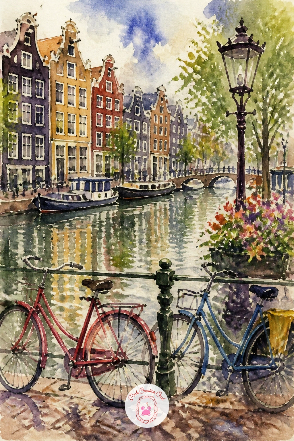
Palette: Sage Green,Brick Red,Yellow Ochre,Green Grey
If you want more practice with this kind of water and light, the easy watercolor ocean scenes work the same wet-into-wet reflection trick.
Add some slope to the series with a Lisbon tram working its way uphill, a composition that lives or dies on the angle of the street. Pencil in the hill as a diagonal line running from one bottom corner toward the upper third of the page, and keep every building and the tram itself sitting at that same tilt.
Paint the pale cream and terracotta buildings first in flat washes, then the yellow tram as a simple boxy shape with dark window strips, placed right on your diagonal line. A few tiny figures walking the steep pavement beside it finish the human scale.
If the hill reads as flat instead of steep, steepen the angle more than feels natural, since watercolor tends to flatten perspective and needs exaggeration to read correctly. No cadmium yellow handy, any warm golden yellow carries the tram just as well.
Finish with a fine dark line along roof edges to sharpen the old-town silhouette against the sky.
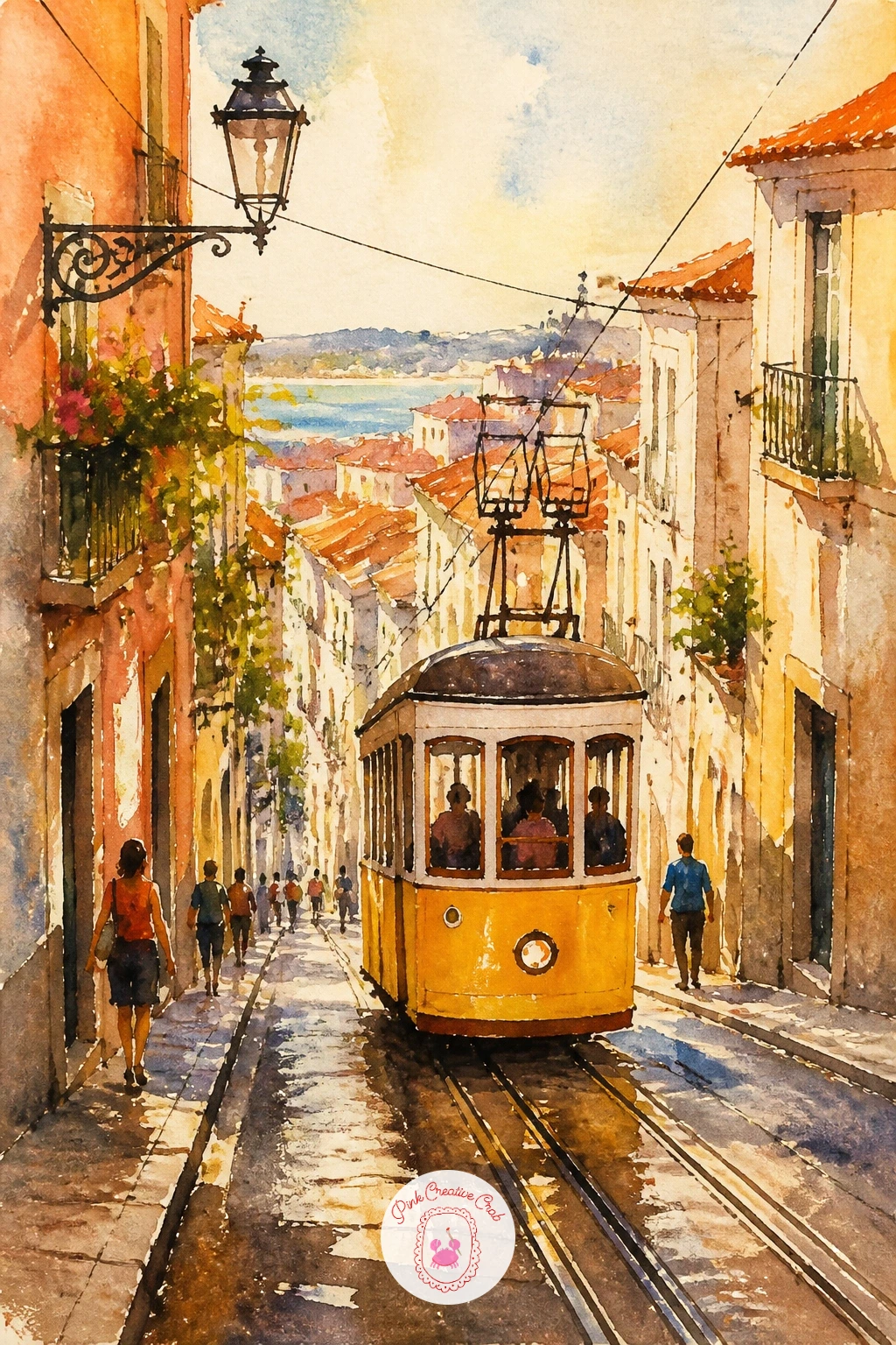
Palette: Cadmium Yellow,Terracotta,Raw Sienna,Cool Grey
Return to the water for a Copenhagen harbor, famous for its row of candy-colored facades along the canal. Mass in the water as a calm horizontal wash first, then paint the houses above in a cheerful run of red, ochre, blue and cream, each building kept as one flat block of color so the row reads clearly.
Drop the same colors straight down into the still-wet water beneath each house for instant soft reflections, letting them merge slightly rather than staying as neat copies. Add masts and small boats moored along the front last, thin dark lines with tiny triangle flags.
The scene flattens if every house gets equal attention, so pick one with a bright awning or a flower box to be your focal point and keep its neighbors a touch quieter. If your palette runs short on a true Danish red, mix cadmium red with a hint of orange.
Finish with a ruling pen or the brush handle scratched through wet paint for thin rigging lines on the boats.
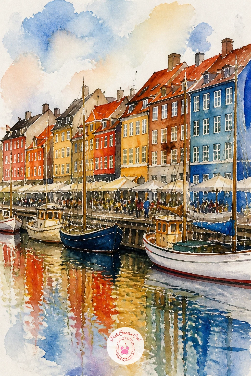
Palette: Cadmium Red,Yellow Ochre,Cerulean Blue,Cream
Zoom in close for a Barcelona balcony, a nice change of pace after all those wide streets. Paint the wrought iron railing first as a loose dark grid of curling lines, working quickly so it stays airy rather than stiff and architectural.
Behind it, wash in a warm terracotta or ochre wall, and let geraniums spill over the railing in loose dabs of hot pink and red, dropped in wet so the petals blur a little at the edges. A half-open shutter in teal to one side adds the classic Mediterranean contrast.
If the ironwork looks too heavy once it is dry, lift a few lines with a damp brush and tissue to let light back through the grid. No teal available, a mixed blue-green from cerulean and a touch of yellow works just as well for the shutter.
Finish with tiny dark dots for leaves tucked between the flowers, added once everything else is dry.
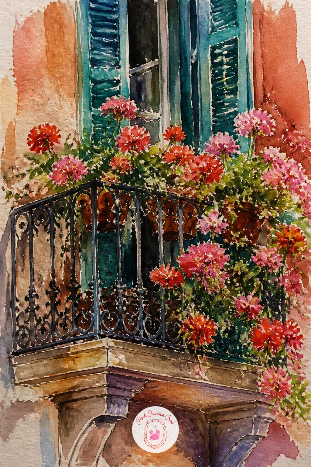
Palette: Terracotta,Hot Pink,Teal,Ivory Black
Bring some motion into the series with a Rome street and a Vespa parked or rolling along worn cobblestones. Lay down a warm ochre and sienna wash for the sun-baked buildings first, keeping the top of the page looser and the street level a bit more defined.
Paint the Vespa as a simple rounded shape in a bright color like mint or coral, with two dark circles for wheels, placed slightly off-center so the street has room to breathe around it. A string of laundry or a cafe awning strung across the upper buildings adds a nice horizontal anchor.
If the Vespa looks stiff, round every edge a little more than you think you should, since curves read as friendlier and more Italian than straight lines. No mint available, a soft coral or butter yellow works just as well for the scooter body.
Finish with a few quick dashes of dry brush grey across the cobbles for texture and shadow.
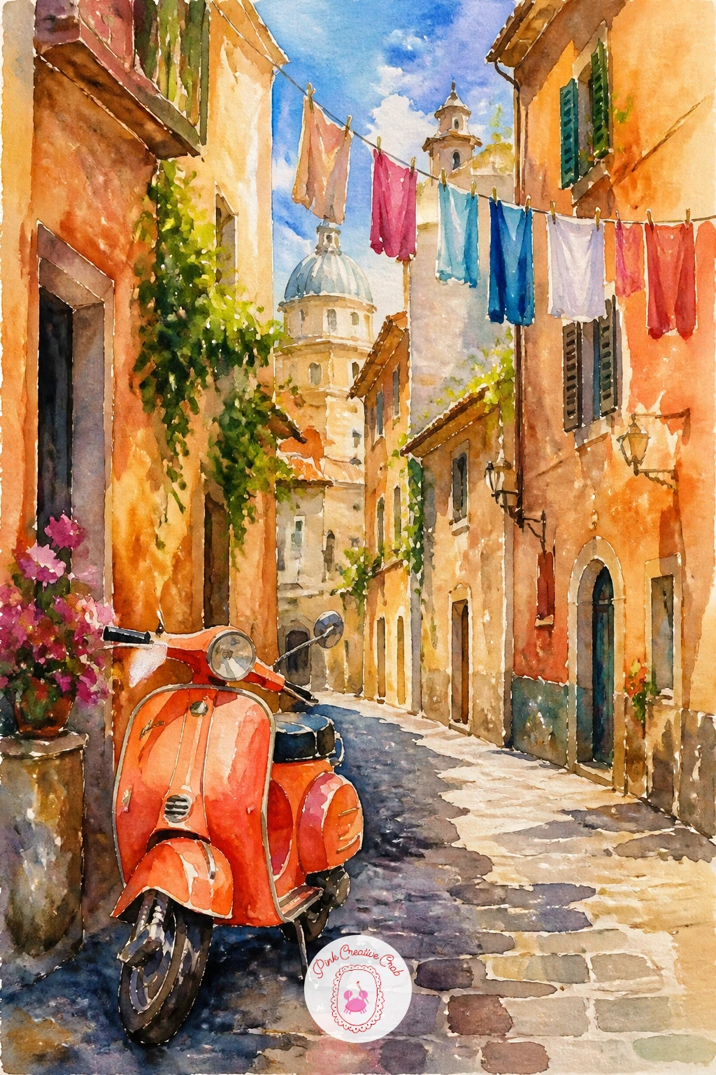
Palette: Raw Sienna,Yellow Ochre,Coral,Warm Grey
Climb another steep street for a San Francisco cable car, a subject that pairs well with the Lisbon tram if you want to compare hilly cities side by side. Sketch the street running diagonally up the page again, this time with Victorian houses in soft pastel rows along the top.
Paint the cable car itself in warm brown and cream, boxy and upright, with small dark windows and a simple pole on top for the cable line. Add a figure or two hanging off the running boards for that classic postcard energy.
The hill can look unconvincing if the street lines stay parallel, so angle the curb and sidewalk lines slightly toward each other as they recede, which tricks the eye into reading real slope. No burnt umber on hand, mix raw sienna with a touch of black for the same warm wood tone.
Finish with a thin dark line for the overhead cable, pulled straight with a ruler if your hand is not steady.
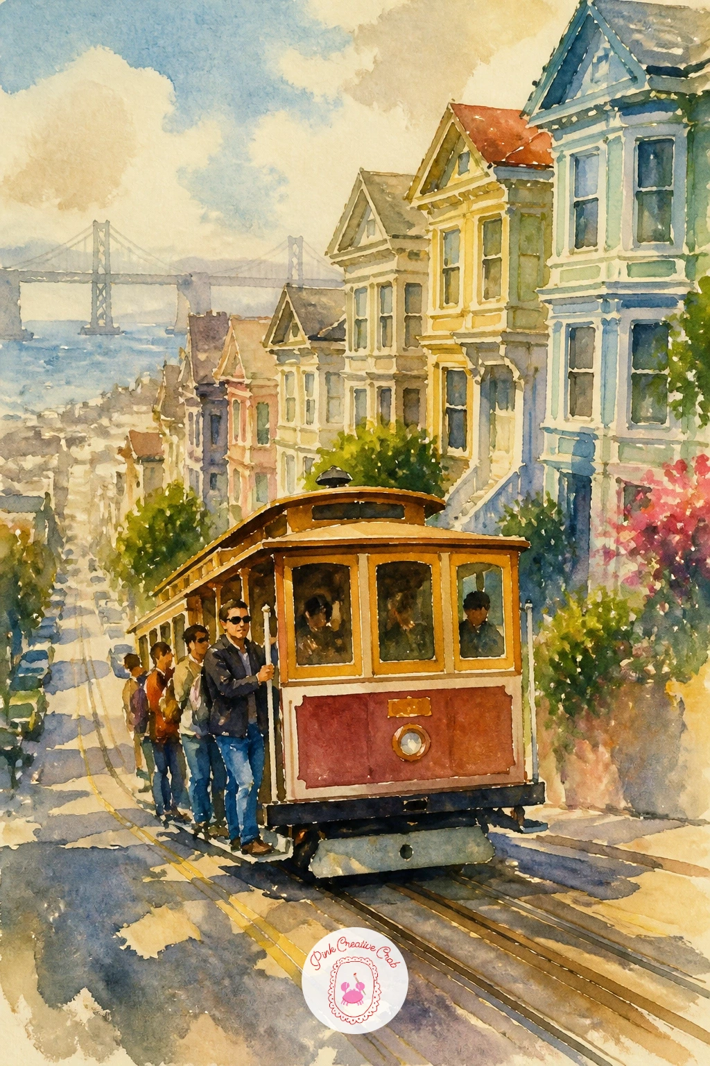
Palette: Burnt Umber,Cream,Dusty Pink,Soft Blue
Return to night painting with a Seoul cafe street, softer and warmer than the Tokyo crossing but still built on dark and light contrast. Wash the whole background in deep blue-violet first and let it dry fully before adding any buildings.
Paint rows of narrow cafe fronts in warm lamp colors, cream, soft orange and dusty pink, each window glowing against the dark street. Hanging string lights along the top, just a line of tiny bright dots, pull the whole row together and suggest a cozy evening out.
Windows can look muddy if painted too early over a damp background, so wait for full dryness and use fairly opaque mixes for each glowing shopfront. No dusty pink ready, a touch of white gouache mixed into cadmium red gets you there quickly.
Finish with a white gel pen for the string lights and a few sparkle dots in cafe windows.
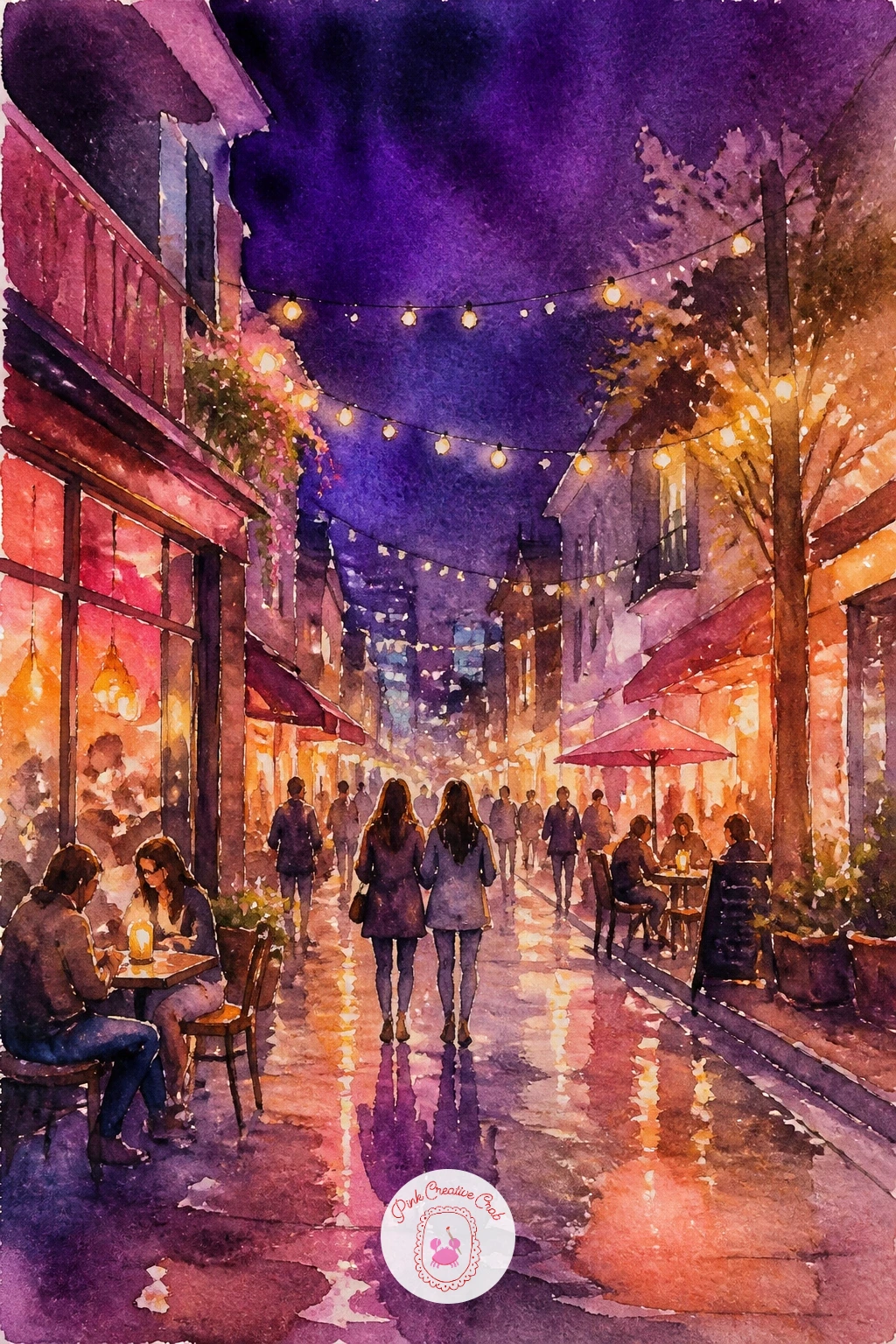
You Will Need
- white gel pen for string lights
Palette: Deep Violet,Warm Orange,Dusty Pink,Cream
Widen out for a Prague old town square, a scene with enough Gothic spires and pastel facades to feel grand without needing fine detail. Block in the sky first in soft grey-blue, then paint the row of buildings along the square in a mix of pink, mustard and cream, each with a slightly pointed roofline.
Add the dark spires of a church rising above the roofline last, keeping them thin and a little wobbly rather than ruler-straight, which actually suits the old, uneven architecture better. Scatter a few tiny figures across the open square to give a sense of its size.
If the buildings start competing for attention, let one, maybe the spire, stay the darkest value in the whole painting so the eye has somewhere to land first. No mustard in the set, ochre mixed with a touch of orange gets the same warm Prague tone.
Finish with a fine pen for clock faces or tiny window details once the paint is fully dry.
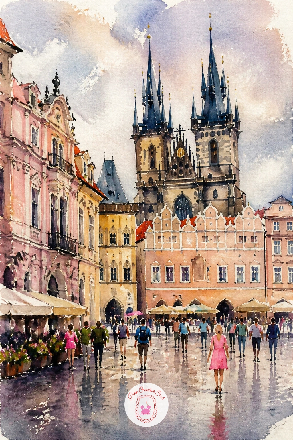
Palette: Dusty Pink,Yellow Ochre,Payne’s Grey,Cream
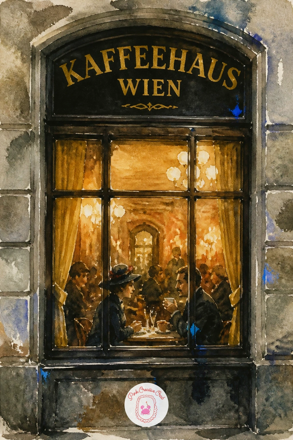
Bring the view in close again with a Vienna coffee house window, looking from the street toward the warm glow inside. Paint the exterior wall first in a cool stone grey, leaving the window shape as untouched paper until the wall is dry.
Fill the window with a warm wash of amber and brown, suggesting chandeliers and marble tables with a few loose, soft-edged shapes rather than anything drawn in detail. A gold-lettered sign above the door, just a few quick pen strokes, instantly signals old-world Vienna.
If the interior looks flat, drop a slightly darker warm tone into one corner while the wash is still damp, which reads as depth without any real detail work. No amber paint on hand, mix yellow ochre with a touch of red for the same cozy interior glow.
Finish with gold or cream gel pen lettering for the cafe name once everything is dry.
You Will Need
- gold or cream gel pen for lettering
Palette: Stone Grey,Amber,Burnt Sienna,Cream
For more cafe window scenes with that same warm glow, the watercolor European cafe scenes are worth a look.
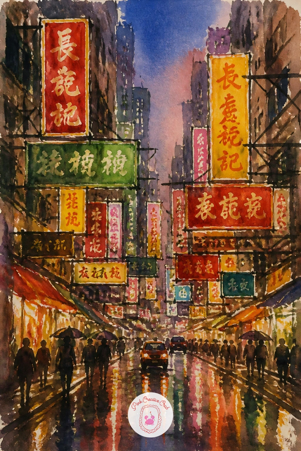
Raise the density with a Hong Kong street, where tall overlapping neon signs are the whole point of the painting. Start with a tall narrow format if you can, and wash in the buildings as a soft vertical gradient from grey to warm dusk pink near the top.
Paint the signs next, in a stack of bright rectangles and strips, red, yellow, green, slightly overlapping and tilted at different angles to suggest the crowded jumble of real shopfronts. Keep the street level dark and simple so all the visual noise stays up where it belongs.
If the signs blur into mush, go back in with a fine black pen once everything dries to sharpen just the edges of your two or three favorite ones. No tall paper on hand, crop the composition into a vertical rectangle on a standard sheet instead.
Finish with a dark wash of reflected color on the street below to tie the whole thing together.
Palette: Cadmium Red,Acid Yellow,Emerald Green,Dusty Pink
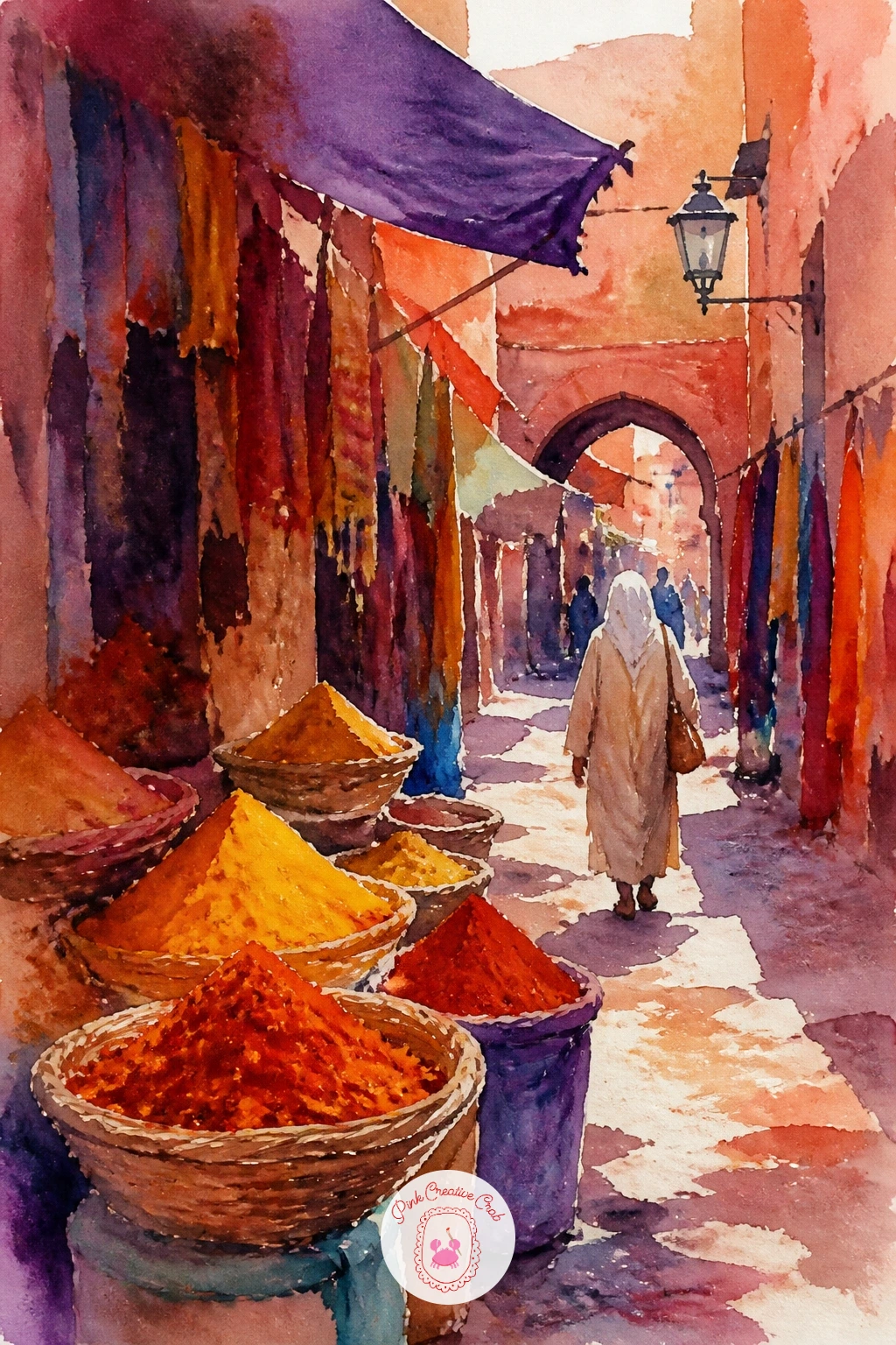
Switch to warm daylight for a Marrakech market lane, full of spice baskets, lanterns and dappled shade. Begin with a warm terracotta wash across the walls and ground, then drop patches of deep shadow in purple-grey where the lane narrows and the sun cannot reach.
Paint stacked spice piles and lanterns along one side in hot colors, saffron, paprika red and deep orange, as loose rounded shapes rather than careful mounds. A figure in a long robe walking through the lane, just a simple dark silhouette, gives the scene scale and life.
If the warm colors all blend into one orange mass, cool one section down deliberately with a little blue-grey shadow to give the eye somewhere to rest. No saffron yellow in the kit, a mix of yellow ochre and cadmium yellow gets close enough.
Finish with a few dry-brush dabs of dark red for hanging lanterns catching the light.
Palette: Terracotta,Saffron,Paprika Red,Purple Grey
Add some shine to the page with a Havana street lined in candy-colored buildings and a vintage car parked out front. Wash in the facade first in a bright color like turquoise or coral, leaving the car shape as bare paper until the wall dries.
Paint the vintage car next in a bold contrasting color, pink against a blue wall or mint against a yellow one, with its classic rounded fins kept simple and smooth. A couple of figures chatting on a nearby step add warmth without needing any facial detail at all.
If the car looks too flat, add one strong shadow underneath it in a single confident stroke, which does more for the three-dimensional feel than any amount of extra shading. No turquoise on hand, a mix of cerulean blue and a touch of green gets the same tropical wall color.
Finish with chrome highlights on the car using a white gel pen once the paint is dry.

You Will Need
- white gel pen for chrome highlights
Palette: Turquoise,Hot Pink,Mint Green,Yellow Ochre
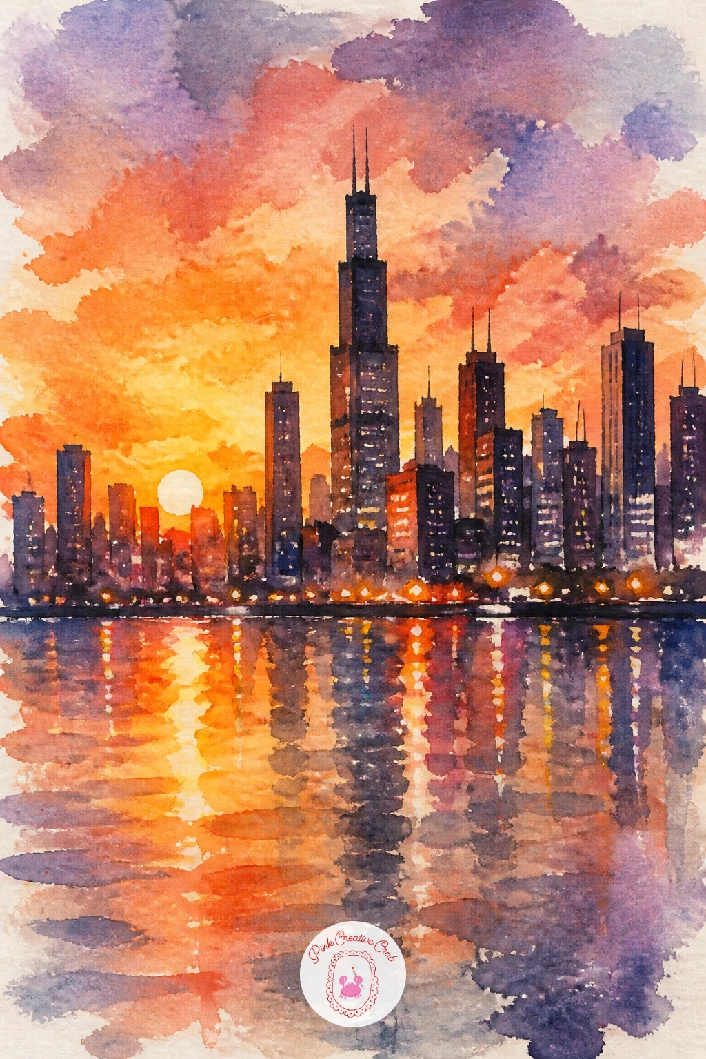
Pull back for a wide Chicago skyline at sunset, a chance to let color do most of the work. Wet the whole sky area first and drop in warm orange, pink and a little violet, letting them blend freely into a soft gradient before anything else is painted.
Once the sky dries, paint the skyline as a row of dark silhouette buildings of varying heights, kept as one flat value so they read as a strong graphic shape against the glowing sky. A thin strip of water below, with a few vertical light reflections, finishes the scene.
If the buildings look too even in height, exaggerate the tallest one or two more than feels natural, since a single standout tower reads as more convincingly like a real skyline. No violet in the palette, mix a little blue into your pink for the same dusky edge.
Finish with a few tiny warm window lights dotted across the dark buildings using a fine brush.
Palette: Warm Orange,Dusty Pink,Deep Violet,Ivory Black
If skies like this one are your favorite part, the easy watercolor skies, sunset and clouds ideas go deeper into that gradient technique.
Slow down for a Venice bridge, a composition built on the gentle arch shape and the water beneath it. Sketch the bridge’s curve lightly in pencil first, then paint the canal water below in soft green-grey, letting it pool a little for texture.
Paint the bridge and the buildings behind it in warm ochre and dusty rose, keeping the arch as the clear center of the composition. Add a small cluster of tourists crossing it, simple dark and colorful dabs for figures, no bigger than a fingernail each.
If the arch looks lopsided, check it against the straight edge of your paper before committing to ink or dark paint, since a wobbly bridge is the one thing that will catch the eye immediately. No dusty rose ready, mix a touch of red into your ochre for a similar warm glow.
Finish with a soft reflection of the bridge pulled down into the still-wet water below it.
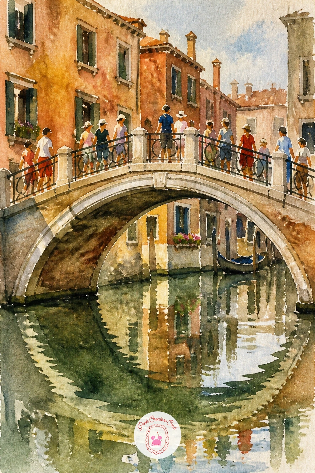
Palette: Yellow Ochre,Dusty Rose,Green Grey,Burnt Sienna
Bring quiet elegance into the mix with a Kyoto street and a geisha walking along it in a patterned kimono. Paint the wooden buildings first in soft warm browns, keeping the lines simple and the roofline low and traditional.
The geisha herself goes in next as the clear focal point, her kimono in one strong color, perhaps deep red or soft pink, painted as a single elegant silhouette with a small pale shape for her face and a dark one for her hair, no facial features needed.
If she looks stiff, soften her pose by angling her slightly rather than painting her perfectly upright, which gives a sense of gentle movement down the street. No deep red on hand, a rich maroon mixed from red and a touch of brown works just as well for the kimono.
Finish with a single paper lantern hanging nearby, painted in warm orange with a dark pen outline.
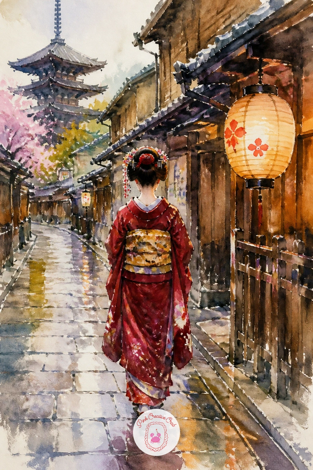
Palette: Maroon,Soft Pink,Warm Brown,Warm Orange
Match the Venice bridge with its night-time cousin, a Budapest bridge lit up over the Danube. Wash the sky and water in deep navy first, then let them dry fully so the bridge lights can sit crisply on top without bleeding into mush.
Paint the bridge’s chain or arch structure in dark grey-black, then add a string of small warm gold dots along its length for the lights, repeating the same gold in a wavering vertical reflection in the water below. The castle or parliament silhouette in the distance anchors the whole scene.
If the gold lights disappear into the dark bridge, go back over them with a slightly thicker, more opaque mix or a dab of gold gel pen so they truly glow. No gold paint in the kit, a warm yellow mixed with a touch of white gouache does the job.
Finish with a soft smudge of the same gold reflected and stretched down into the water.
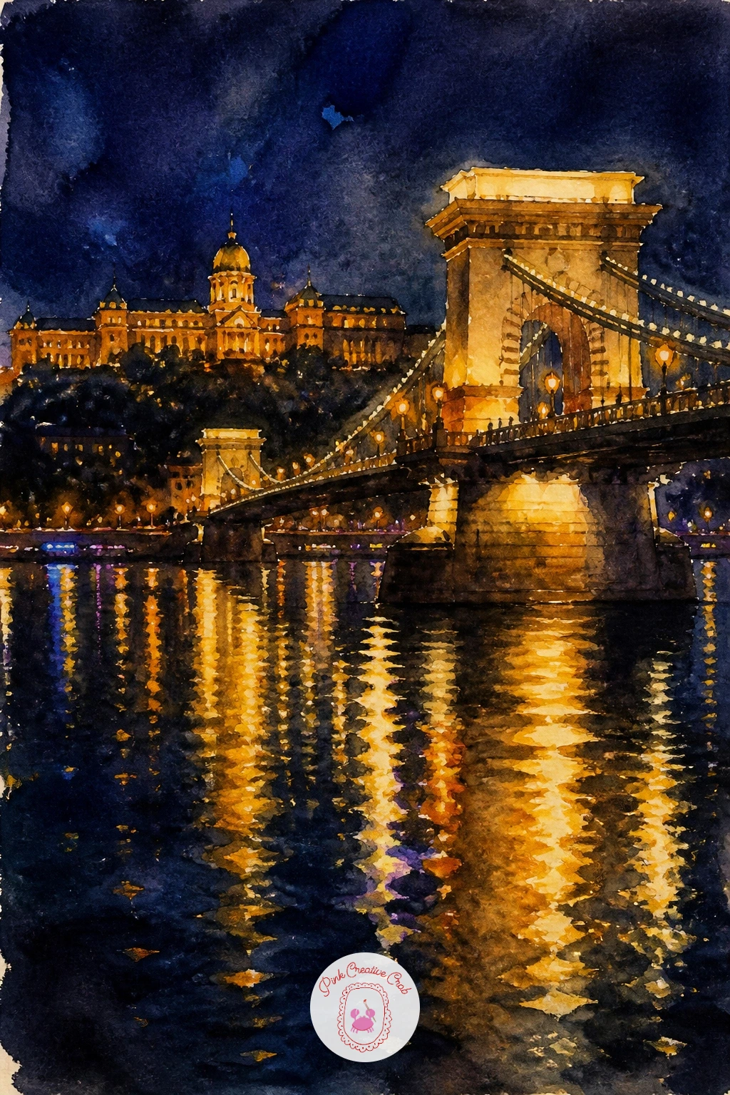
You Will Need
- gold gel pen optional for extra sparkle
Palette: Deep Navy,Ivory Black,Warm Gold,Cool Grey
Narrow the view for a Stockholm old town alley, all tall leaning buildings in warm Swedish ochre and rust. Paint the two facing walls first, each a flat wash in a different warm tone, leaving a thin strip of pale sky visible at the very top where the buildings nearly meet.
Add windows as small dark or shuttered rectangles marching up each wall, slightly irregular in spacing to suggest centuries of uneven building. A single lamp post glowing at the end of the alley, painted last in warm yellow, pulls the eye straight down the length of the street.
If the alley feels too wide and open, narrow the gap between the two buildings and raise them taller than feels natural, since a true old-town alley is almost claustrophobic in real life. No rust color mixed, burnt sienna with a touch of ochre gets you there.
Finish with a fine dark pen line reinforcing just the doorframes and lamp post for crispness.
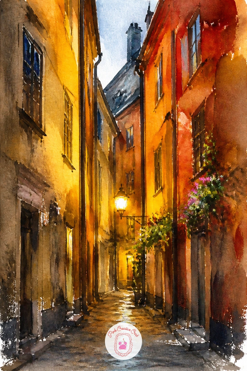
Palette: Rust,Yellow Ochre,Warm Grey,Pale Sky Blue
Bring back bold color with a Mexico City street built around one unmistakable hot pink building. Paint that building first and biggest, filling a good third of the page in saturated pink, then work outward with quieter neutral buildings on either side so the pink keeps its punch.
Add simple black wrought iron balconies and a scattering of potted plants along the street level, kept loose and quick rather than botanically accurate. A street vendor’s cart or a parked bicycle near the curb adds a small human detail without demanding much skill.
If the pink looks too flat or poster-like, let a little purple or red bleed into it while still wet for subtle variation across the wall. No true magenta pink in the kit, mix a warm red with a touch of white gouache or simply more water for a paler, equally striking version.
Finish with a cobalt blue door as the single cool accent against all that warmth.
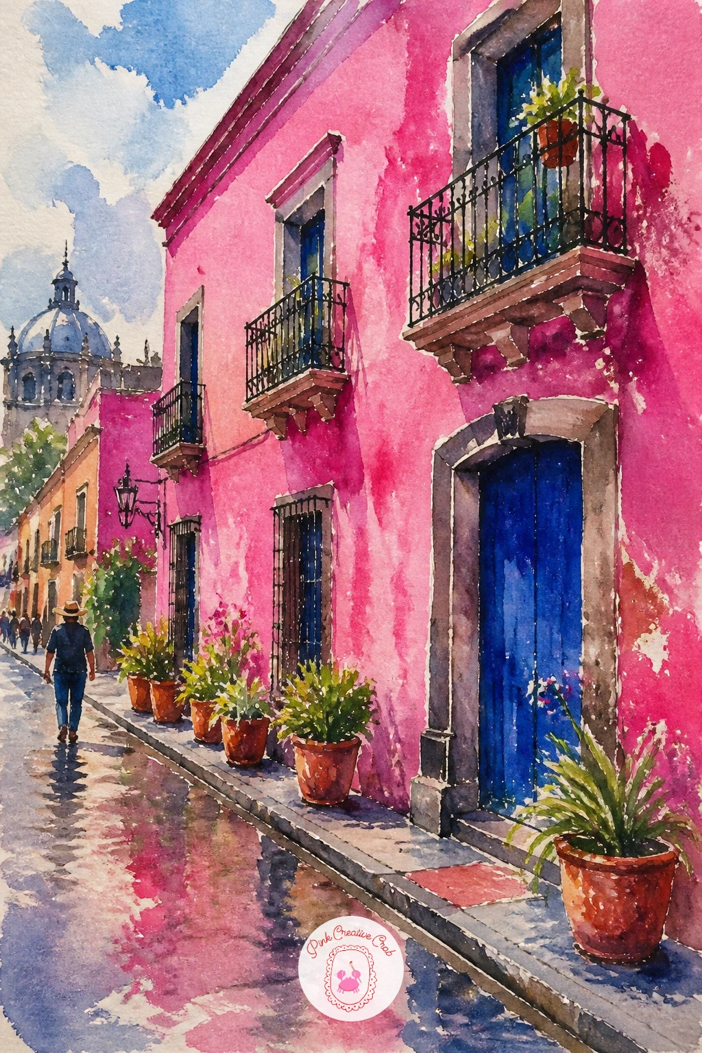
Palette: Magenta,Cobalt Blue,Ivory Black,Sap Green
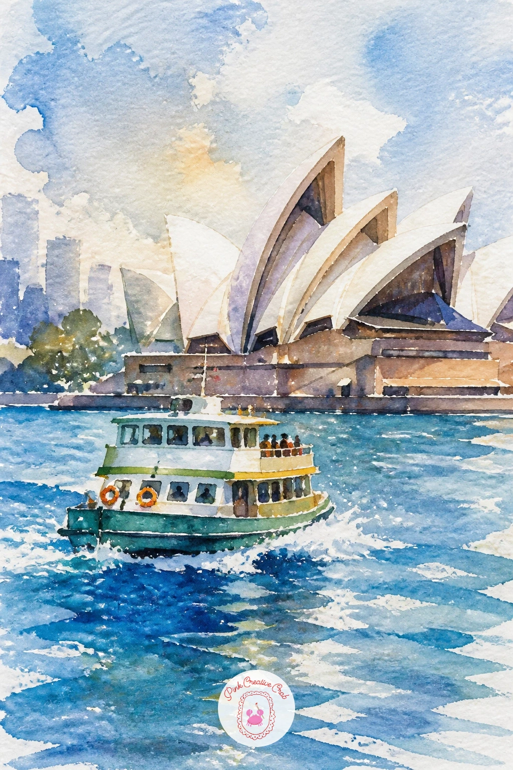
Open up the water again for a Sydney ferry crossing the harbor with the Opera House behind it. Paint the harbor water first in bright blue, leaving a few streaks of white paper for sunlight glinting on the waves.
Add the Opera House in the middle distance as a cluster of simple curved white shapes, defined mostly by their shadow side rather than any outline, since the famous sails read instantly even in silhouette. The ferry comes last in the foreground, a small white and blue boat with a dark line of windows, trailing a soft wake behind it.
If the sails look flat, shade just one side of each curved shape in pale grey-blue to suggest the sun hitting them from one direction. No bright harbor blue mixed, cerulean with a touch of white gouache gets a similar sparkling tone.
Finish with a few quick white gouache flicks across the water for sunlit sparkle.
You Will Need
- white gouache for water sparkle
Palette: Cerulean Blue,Pale Grey Blue,Ivory Black,White
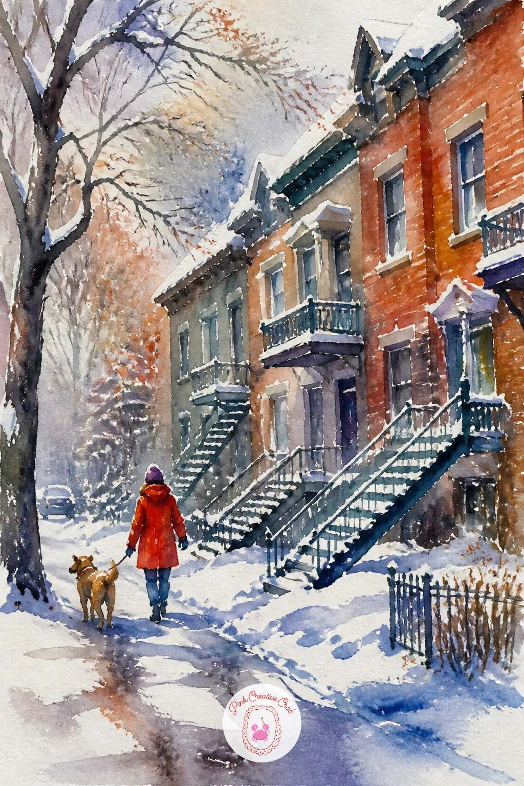
Return to snow with a Montreal winter street, cozier and more intimate than the Oslo harbor earlier in the list. Paint the row houses first in muted brick and grey tones, leaving rooftops and the street itself as bare paper for fresh snow.
Add exterior staircases, a signature Montreal feature, as simple zigzagging dark lines running up the front of each house, with a string of small warm lights along one railing for a festive touch. A figure in a bright coat walking a dog adds movement and scale to the quiet street.
If the snow looks grey rather than bright white, check that you have left truly untouched paper rather than a pale wash, since even a faint tint reads as dirty snow once it is surrounded by color. No brick red ready, mix burnt sienna with a touch of black for the same muted tone.
Finish with a dry brush loaded lightly with white gouache, flicked across the sky for falling snow.
You Will Need
- white gouache for falling snow
Palette: Brick Red,Cool Grey,Warm Yellow,White
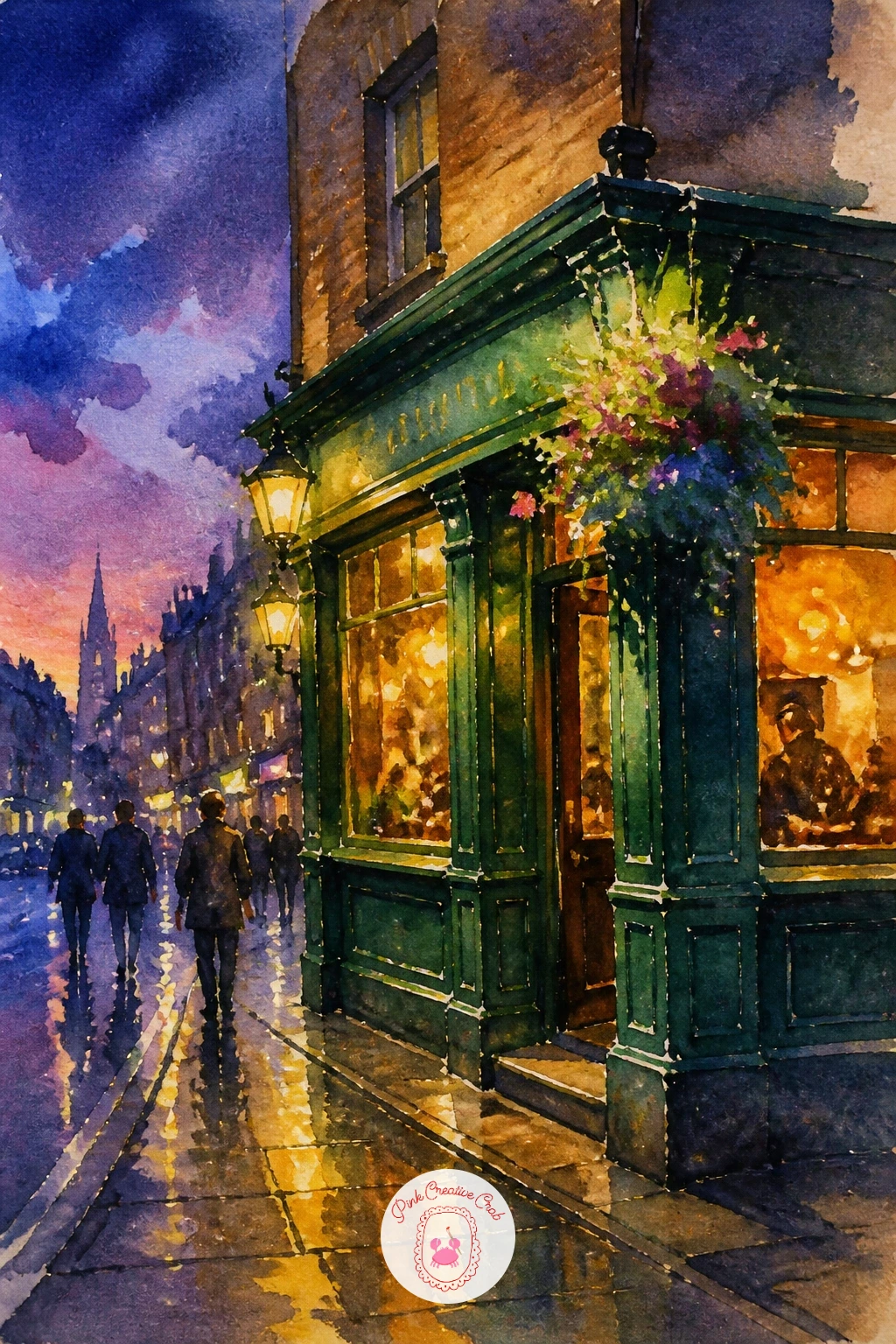
Warm things back up with a Dublin pub glowing at dusk, a scene that leans on one strong light source against a cooling sky. Wash the sky first in deep blue fading to violet, then let it dry before painting the pub facade in a bold color, classic green or deep red, with gold lettering above the door.
Light the windows from inside with a warm amber wash, dropped in while the facade paint is still slightly damp so the glow softens naturally at the edges. A hanging flower basket by the door and one or two figures heading in add the final sense of a lively evening.
If the glowing windows look too separate from the warm interior feel, carry a touch of that amber into the pavement just below the window as a soft reflection. No deep green on hand, mix a dark blue into yellow for a similarly rich pub-front shade.
Finish with gold gel pen lettering for the pub sign once everything is dry.
You Will Need
- gold gel pen for sign lettering
Palette: Deep Green,Amber,Deep Violet,Warm Gold
Add another tram to the collection, this time an Istanbul tram running past a row of historic facades. Paint the buildings behind first in warm stone and faded red, then let the street itself stay a cooler grey to help the bright red tram stand out when it arrives.
Paint the tram as a long simple rectangle in bold red with cream trim, its overhead cable line running off the top of the page in a single thin dark stroke. A scattering of pigeons and a street vendor’s cart along the curb finish the everyday bustle.
If the tram looks too short and stubby, stretch its length a little more than feels accurate, since trams read better as long low shapes than compact boxy ones. No faded red mixed, a dusty terracotta works just as well for the older buildings behind it.
Finish with a fine pen for the overhead cable wires and tram windows once dry.
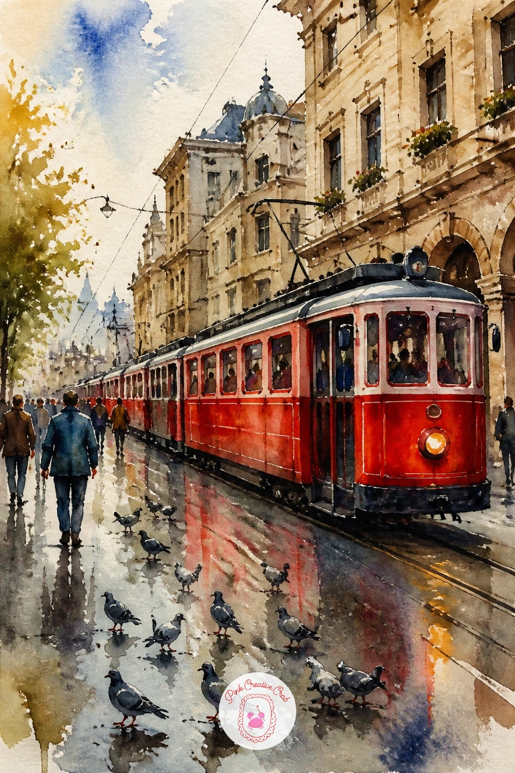
Palette: Cadmium Red,Stone Grey,Dusty Terracotta,Cream
Slow the pace with a Berlin cafe, its rows of little outdoor chairs and tables the real subject here. Paint the cafe facade first in a muted color like charcoal or deep teal, then leave the pavement area mostly pale so the furniture reads clearly against it.
Add a loose row of small bentwood chairs and round tables along the front, each one just a handful of quick curved lines rather than carefully drawn furniture, repeated with small variations in angle. A chalkboard menu sign and a hanging plant by the door round out the cozy feel.
If the chairs start looking identical and stiff, vary the angle of each one slightly, as if people had just pushed back from the table, which brings instant life to the row. No charcoal grey mixed, Payne’s grey alone works just as well for the facade.
Finish with a fine pen outlining just a couple of the chairs for crispness against the looser wash behind them.
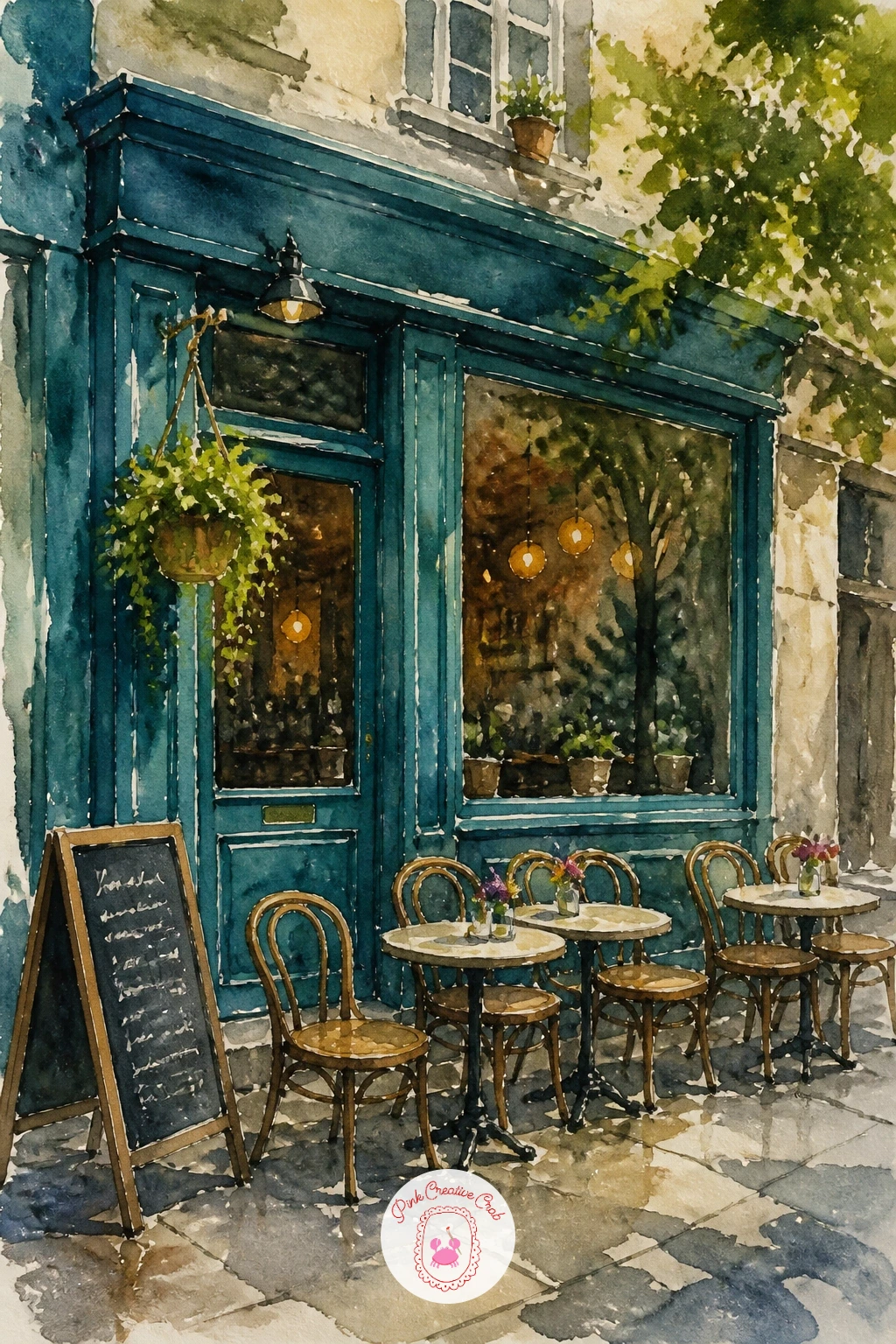
Palette: Charcoal,Teal,Warm Brown,Cream
For more cafe-focused subjects like this one, the watercolor and ink tutorial lessons cover little cafes and market stalls in the same relaxed style.
Climb a hillside for Rio, where stacked colorful houses tumble down a steep slope toward the sea. Paint the hill shape first as a rough triangular mass, then fill it with a patchwork of small flat color blocks, pink, blue, yellow and green, packed close together with barely any gap between them.
A sliver of bright turquoise sea at the very bottom of the page, and a hint of green hillside at the top, frames the houses and grounds the whole steep composition. Keep windows and doors as the tiniest dark dashes, since from this distance detail disappears entirely.
If the patchwork looks chaotic, group two or three houses of the same color together here and there rather than placing every color randomly, which calms the eye without losing the lively mix. No turquoise ready, cerulean with a touch of green gets you there.
Finish with a scatter of dark dots for windows across the hillside once the colors are dry.
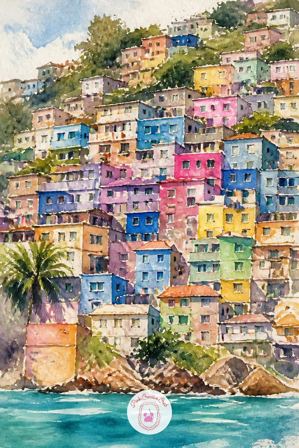
Palette: Hot Pink,Cerulean Blue,Warm Yellow,Sap Green
Keep the color patchwork going with a Singapore shophouse row, this time in a neat horizontal line rather than a tumbling hill. Paint each shophouse as a tall narrow rectangle in its own pastel shade, mint, coral, lemon and lilac, painted wet on dry so the colors stay crisp and separate rather than bleeding together.
Add decorative shutters and small balconies above the ground floor shops in a slightly darker tone of each building’s own color, then a simple awning or sign across the ground level in a contrasting accent. A scooter or bicycle parked along the row adds a lived-in touch.
If the row looks too flat, add a cast shadow beneath the overhanging upper floor on each building, a single dark stripe that instantly suggests depth. No lilac in the set, mix a little blue into your pink for a soft equivalent.
Finish with a fine dark pen for shutter slats and shop signage once everything is dry.
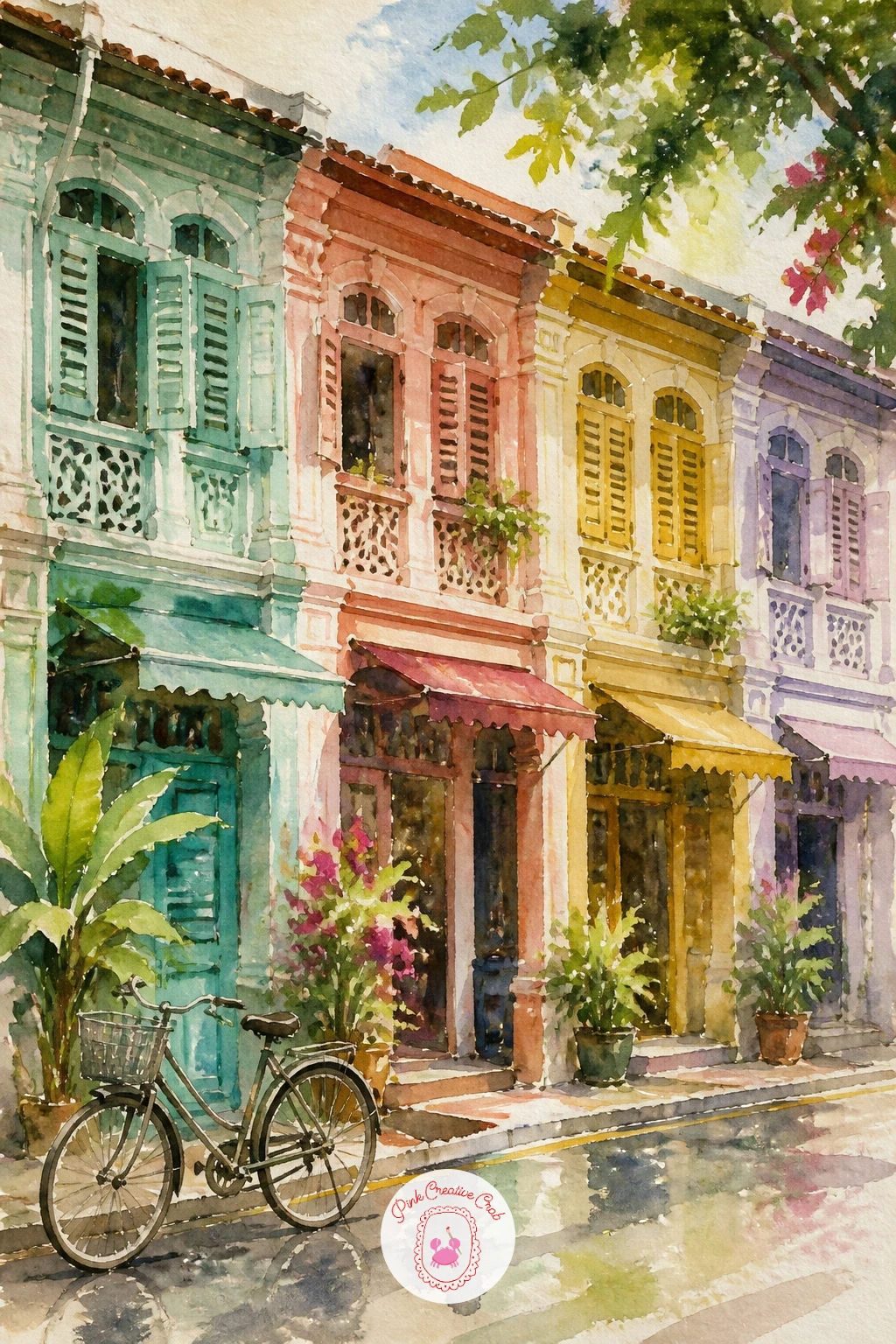
Palette: Mint Green,Coral,Lemon,Lilac
Bring back some motion with a Bangkok tuk-tuk weaving down a busy street. Paint the background buildings and signage loosely first in warm, slightly hazy tones, since the heat and bustle of Bangkok streets suit a softer, less defined backdrop.
The tuk-tuk itself takes center stage, painted in a bold color like bright yellow or hot pink, its rounded canopy and three wheels kept simple and slightly tilted as if caught mid-turn. A blur of motion lines behind it, just a few quick dry-brush streaks, sells the sense of speed.
If the tuk-tuk looks static, angle it diagonally across the page rather than painting it straight on, which does more for the feeling of movement than any added detail. No hot pink mixed, a bright orange works just as well for a bold tuk-tuk color.
Finish with a scatter of warm dry-brush texture across the street for heat and dust in the air.
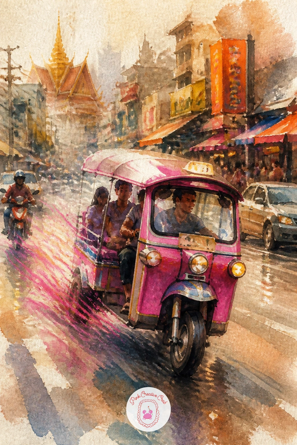
Palette: Hot Pink,Warm Orange,Dusty Yellow,Warm Grey
Soften everything for an Edinburgh close wrapped in fog, a good subject for practicing atmospheric perspective. Wet the whole paper first and drop in pale grey and blue-grey, letting the far end of the close fade almost completely into the damp wash while the near buildings stay a touch more defined.
Once that wash dries, paint the closest stone buildings in slightly stronger grey and warm stone tones, keeping edges soft rather than crisp so the fog feels continuous rather than painted on top. A single lamp post glowing faintly in the mid-distance gives the eye something to focus on.
If the fog effect disappears once everything dries, mist the paper lightly with clean water and lift a little color from the farthest buildings with a tissue to push them back further. No blue-grey mixed ready, diluted Payne’s grey alone creates the same soft atmosphere.
Finish with one small warm light in the lamp post to contrast the cool fog around it.
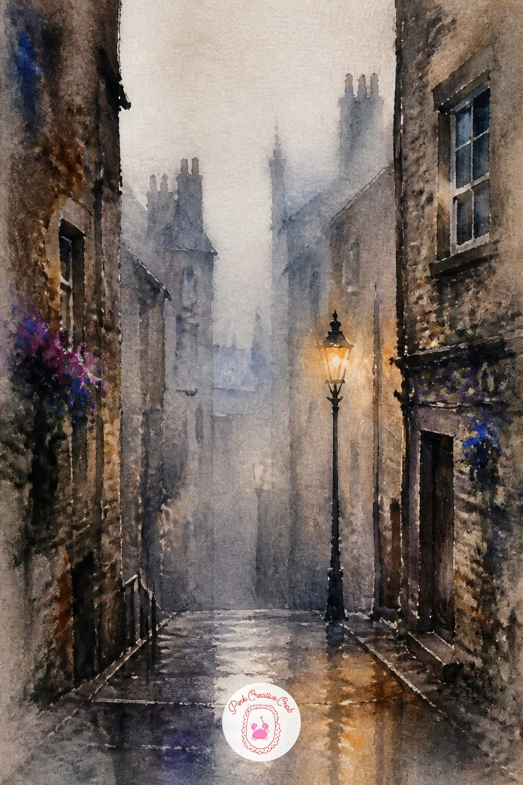
Palette: Payne’s Grey,Stone Grey,Warm Yellow,Cool Blue Grey
Open the view wide for a Cape Town street with Table Mountain rising behind the rooftops. Paint the mountain first as a flat, slightly hazy blue-grey shape with its famous flat top, keeping it soft so it reads as distant background.
Once dry, paint the colorful street of houses in front in cheerful blues, pinks and yellows, each one a simple flat block with a dark doorway, the contrast between the muted mountain and bright houses doing most of the visual work. A figure walking a dog or chatting on a stoop adds a small moment of life.
If the mountain competes too much with the street below, keep its edges and color noticeably cooler and quieter than anything in the foreground, since atmospheric distance relies on that contrast. No blue-grey mixed for the mountain, diluted ultramarine with a touch of grey works just as well.
Finish with a fine pen for door and window details on the brightest houses only.
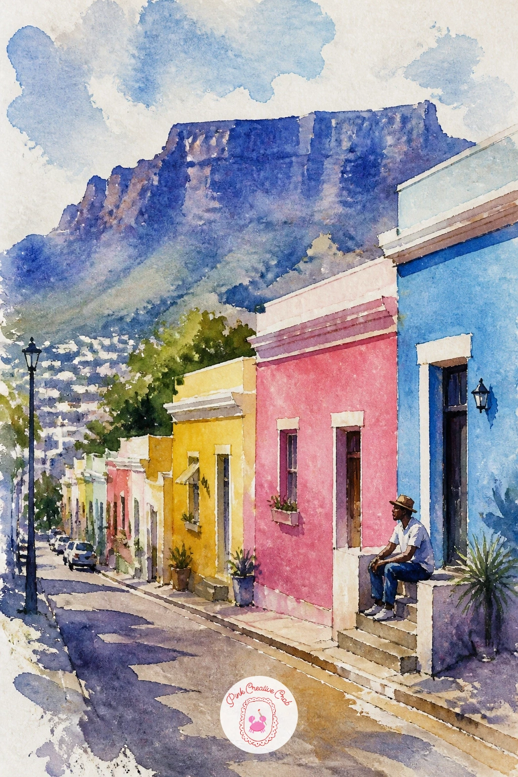
Palette: Ultramarine Blue,Hot Pink,Warm Yellow,Cool Grey
Echo the earlier Barcelona balcony with a Valletta street, this time defined by its rows of enclosed wooden balconies rather than open ironwork. Paint the warm limestone buildings first in a flat golden wash, then add the boxy wooden balconies in bold color, traditional green, blue or red, projecting out from the wall.
Keep each balcony as a simple geometric shape with a few small window divisions, repeated down the street in slightly different colors for rhythm. A narrow strip of pale sky between the buildings at the top of the page completes the classic Maltese street view.
If the balconies look too flat against the wall, add a thin dark shadow line along their underside where they meet the building, which instantly suggests they project outward in three dimensions. No traditional green on hand, any deep forest green works just as well.
Finish with a fine pen for window panes on just the closest balcony.
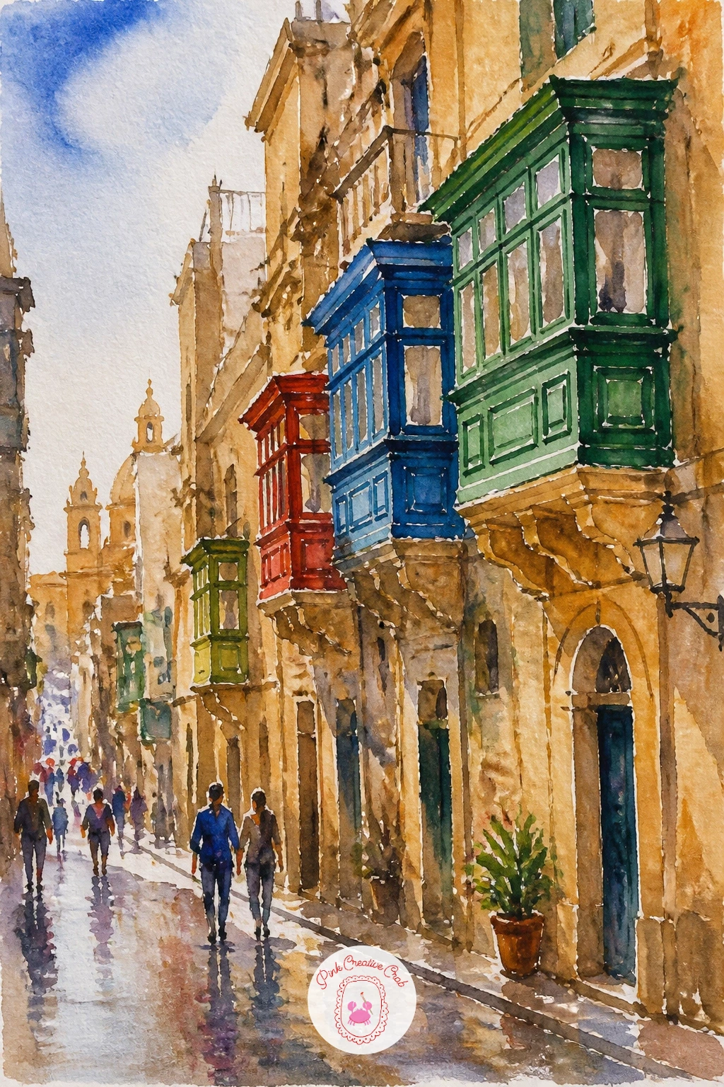
Palette: Golden Limestone,Forest Green,Cobalt Blue,Brick Red
Close the series with a Melbourne laneway covered in street art, a fitting final subject since it lets you use every bright color left on the palette. Paint the narrow brick walls on either side first in a muted warm grey or brick tone, leaving plenty of space for the mural work to come.
Add loose abstract shapes of street art directly onto the walls in bold clashing colors, hot pink, electric blue, orange, treating them more like quick gestural marks than any specific recognizable image. A string of fairy lights strung overhead and a small cafe table at the laneway’s end finish the scene with a lived-in, creative feel.
If the street art looks timid, push the colors bolder and the shapes looser than feels comfortable, since this is one subject where mess and energy work entirely in your favor. No electric blue mixed, a strong phthalo blue straight from the tube gets the same jolt of color.
Finish with a scatter of white gel pen dots for the fairy lights strung above the lane.
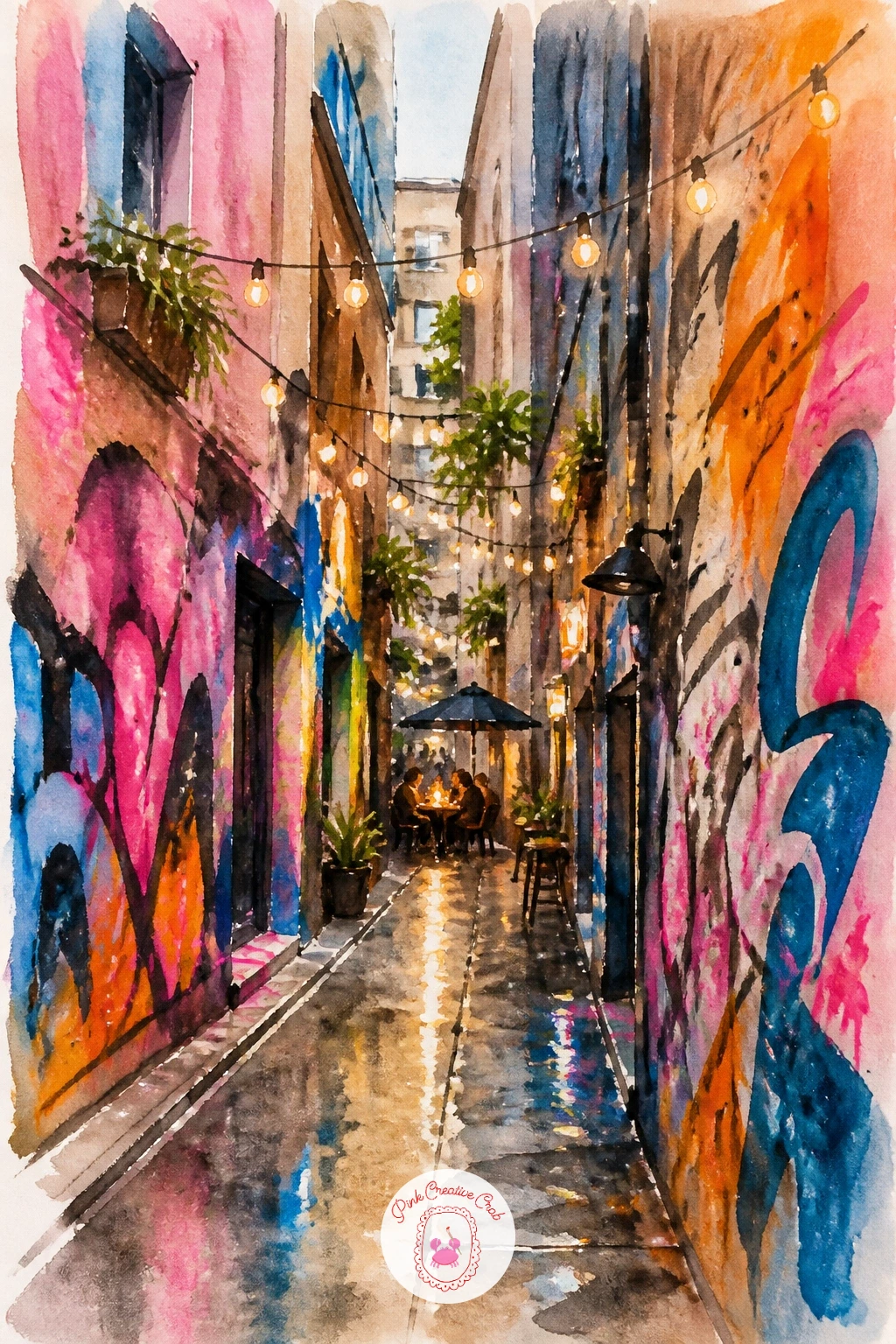
You Will Need
- white gel pen for fairy lights
Palette: Hot Pink,Phthalo Blue,Warm Orange,Brick Grey
If loose abstract color like this appeals to you, the easy watercolor abstract ideas make a fun companion piece with no subject at all.
What to Do Next
Pick one city that matches your mood today, tape down a small sheet of cold press paper, and work through the wash first, details last. Once one of these feels comfortable, try the same approach on a street from your own travels, since every trick here, wet reflections, soft fog, glowing night windows, works on any city you have actually stood in.
Frequently Asked Questions
What is the best paper for a watercolor city scene?
Cold press watercolor paper around 140 pound weight works best. Its texture holds the wet washes these scenes depend on, and it is sturdy enough to handle lifting, dry brush and layering without buckling or tearing.
How do you paint reflections in a watercolor city street?
Paint reflections while the street or water below is still damp, dropping the same colors straight down from the building or object above. The wetness blurs the edges naturally, giving a soft, believable reflection with no extra blending needed.
How do you keep watercolor city buildings from looking flat?
Vary the value of neighboring buildings so one stays clearly darker or lighter than its neighbor. Adding one strong cast shadow under a roofline, balcony or awning also does far more for depth than extra detail.
What colors work best for a rainy or night city scene?
Cool greys, blues and violets make the best base for rain and night skies, since they let warmer accent colors like a red bus, neon sign or glowing window punch through and become the clear focal point.
How do you add people to a watercolor city scene without overworking them?
Keep figures as a few confident strokes, a dark vertical shape for the body and a small dot for the head, added once the background is dry. Any more detail at this distance tends to look fussy rather than lifelike.
Have any thoughts?
Share your reaction or leave a quick response — we’d love to hear what you think!
-
 0
-
0
-
0
-
0
-
0
-
0


