

A watercolor map turns a page into a tiny world you get to invent, streets curling around little ink cafes, a compass rose in the corner, water tinted the softest blue. There is something deeply satisfying about combining loose, forgiving washes with the precision of a fine liner pen, and a watercolor map lets you do both at once without ever needing a ruler or a steady architect’s hand.
Below are 37 maps to fill your travel journal or hang on the wall, each one built the same easy way: pencil the shapes first, ink the lines, then let the color pool and dry on its own. Pick the one that matches the place you love most today, and you will have a finished page before the evening is over.
Using these images: free for personal projects such as printing, coloring, cards, journals and gifts. Handmade items that include them may be sold up to 30 pieces per design. More than that is commercial use and is not permitted, and neither is selling or sharing the images themselves or passing them off as your own. Please ask before any other use.
Start the whole collection with a map of Paris, because its river gives you an easy backbone to build around. Pencil a wide curve for the Seine first, then dot in simple landmark shapes along its banks: a triangle for the Eiffel Tower, two square towers for Notre Dame, a glass pyramid outline for the Louvre.
Ink those little icons with a fine liner once the pencil feels right, keeping the lines loose rather than architectural. Paint the river in two thin layers of cerulean so it stays pale and glassy, then wash the land in warm cream and let a few rooftops dry as soft terracotta patches.
If the ink smudges into wet paint, let it dry completely and simply redraw the line once the page is flat again. If you do not have cerulean, any cool blue works, even a touch of ultramarine thinned right down.
Compare the tower, the cathedral and the arch side by side before inking: Notre Dame should sit noticeably wider than the Eiffel Tower is tall, and keeping that size relationship honest is what makes a sketchy map read as Paris at a glance. If you love this kind of scene, the watercolor Parisian building paintings guide has more rooftop ideas worth stealing.
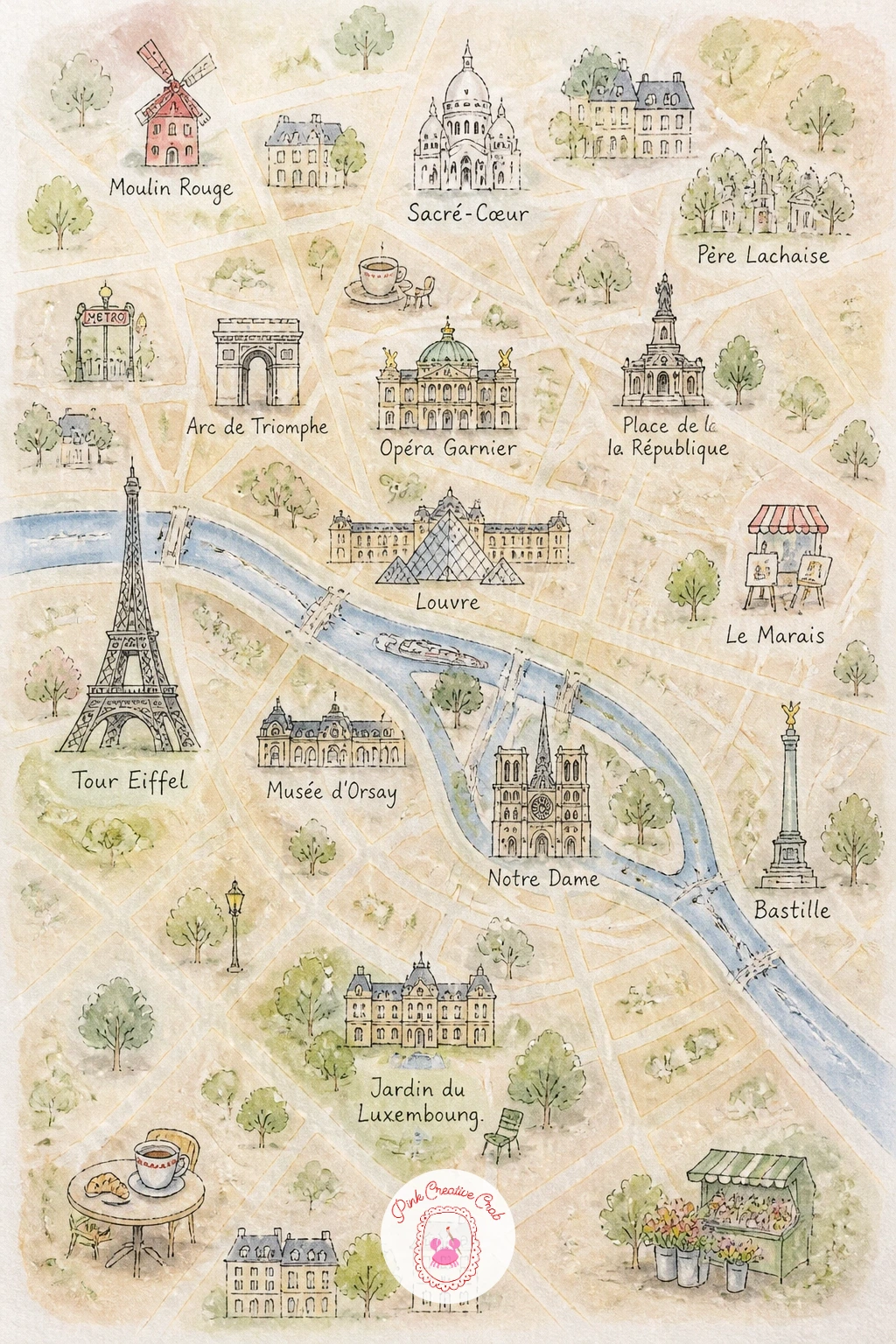
Palette: Cerulean Blue,Raw Umber,Naples Yellow,Terracotta
Move from a city to something smaller and slower: a garden map laid out like a page from an old seed catalog. Pencil a simple grid of rectangular beds first, a winding path between them, maybe a little potting shed in one corner.
Ink the bed outlines and shed in a fine steady line, then fill each bed with a different flower color, dabbing rather than painting solid blocks so each bed reads as dozens of tiny blooms. Leave the path paper white or the palest sand wash so it reads clearly against the greenery.
Working light to dark saves this one: lay the pale greens and yellows first, then drop in deeper pinks and purples while the page is still slightly damp so the colors bloom softly into each other without turning muddy. No green on hand is fine, since yellow and blue mixed fresh on the palette gives you a livelier green anyway.
For more ways to handle flower beds and borders, the watercolor garden paintings for summer post pairs nicely with this map. Try a wet-on-wet dab of two flower colors together for one bed, and let them merge into a soft blur that still reads as blossoms from a little distance.
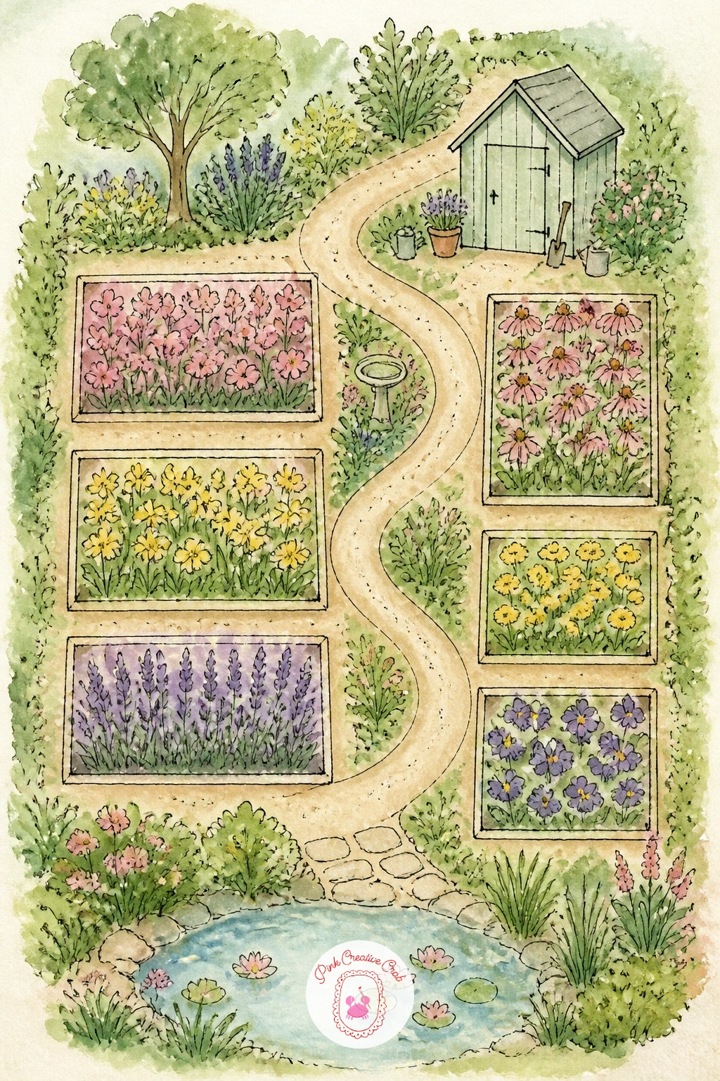
Palette: Sap Green,Permanent Rose,Cadmium Yellow,Violet
Give the next page a personal twist with a map of a dream road trip, the kind you would actually plan if the whole week were free. Sketch a loose coastline or a stretch of inland road in pencil, then mark five or six stops with small dots along a dashed route line.
Ink the road as a hand drawn dashed line rather than a ruled one, and add a tiny car, cactus, mountain or diner icon at each stop. Paint the land in warm desert tones if it is a western route, or soft greens if it winds through hills, keeping the washes loose and letting them dry unevenly for a sun bleached look.
This one works as a quick ten minute sketch with just the route and three icons, or as a slower forty minute piece where you add tiny labels for each stop, a sun in the corner and a little luggage icon by the start. Either way, keep the dashed line consistent in spacing so the eye can trace it easily.
If your pens run dry mid dash, a sharp pencil line works just as well stylistically, since road trip maps always look a little hand scrawled. Swap the dashes for solid color later if you plan an actual trip and want the final route to stand out.
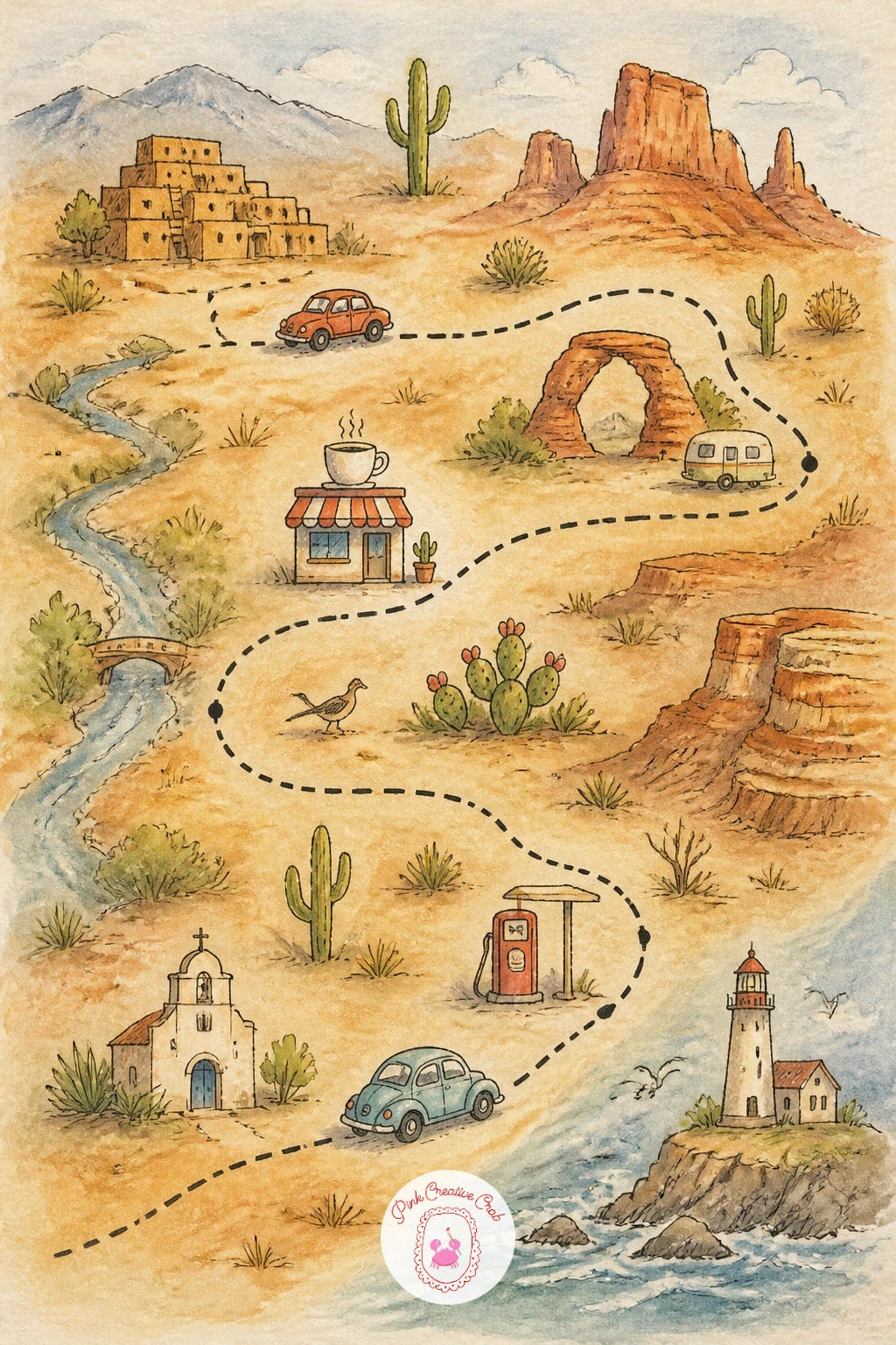
Palette: Burnt Sienna,Payne’s Grey,Ochre,Dusty Blue
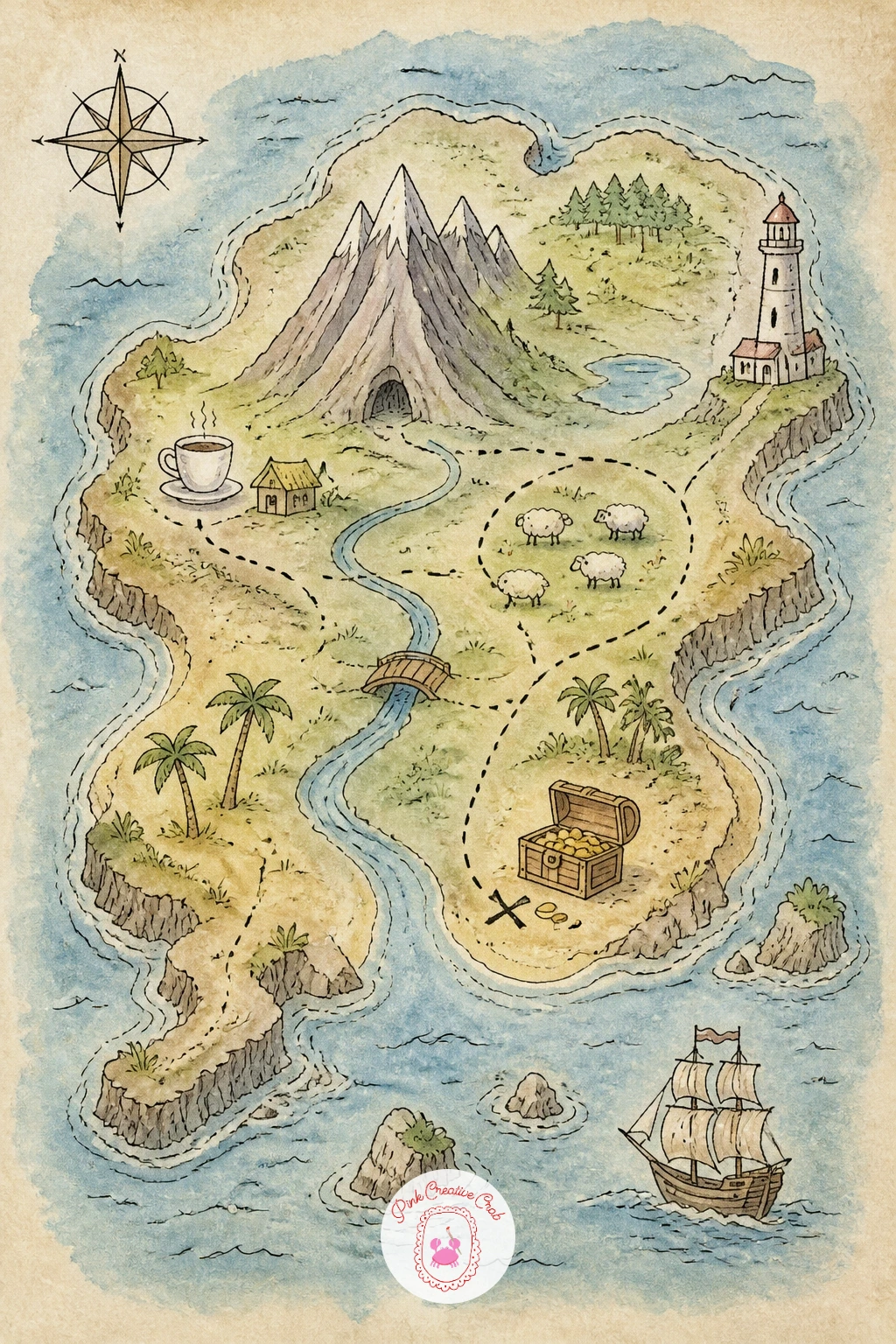
Treasure maps are the most forgiving island shapes you will ever draw, because no coastline is wrong. Pencil a rough, slightly lumpy island outline, add a palm tree or two, a small X near one coast and a dashed line leading to it from a compass rose.
Ink the coastline in a slightly shaky, deliberate line, since a perfectly smooth edge actually looks less convincing here. Paint the water in rings of blue that get darker toward the edges of the page, then wash the island itself in sandy yellow with a patch of green where the palms sit.
Aging the paper with a weak wash of diluted coffee or a mix of burnt umber and water before you start, dabbed on unevenly and dried flat, pushes the whole thing toward that worn parchment look treasure maps need. If you do not want to risk real coffee on good paper, a thin burnt sienna wash does the same job safely.
Keep the X bold and slightly off center rather than dead in the middle, since that single detail sells the whole idea of buried treasure more than any other element on the page.
You Will Need
- weak coffee wash or diluted burnt sienna for aging the paper
Palette: Burnt Umber,Sandy Ochre,Deep Teal,Black Ink
Try crumpling the dry paper very gently before you paint, then flattening it back out, so the washes settle into faint creases that read as old folds.
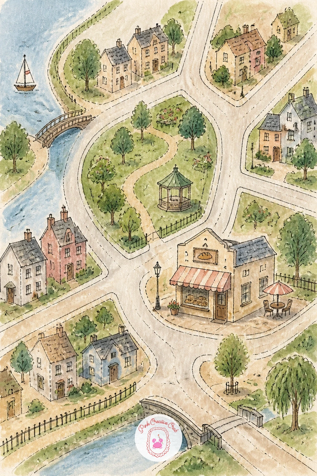
Bring the scale back down to a map of your own neighborhood, real or imagined, anchored by a bakery and a park. Pencil a few intersecting streets first, then block in the park as a soft green rectangle and the bakery as a small building with an awning.
Ink the street grid loosely, since perfectly straight lines actually look stiffer than slightly wobbly ones in this style. Paint the park in two greens, a lighter wash for open grass and a deeper dabbed green for trees, then give the bakery a warm cream wall and a striped awning in a color that pops against it.
The streets are where this goes wrong most often, turning into a flat gray grid with no life. Save it by adding tiny details along the curbs instead: a bench, a lamppost, a dog on a leash, which pull the eye away from the lines themselves.
If awning stripes feel fiddly with a brush, pencil them first and ink each stripe individually rather than trying to paint them freehand, which keeps them even without needing a ruler.
Palette: Sap Green,Cream,Coral,Warm Grey
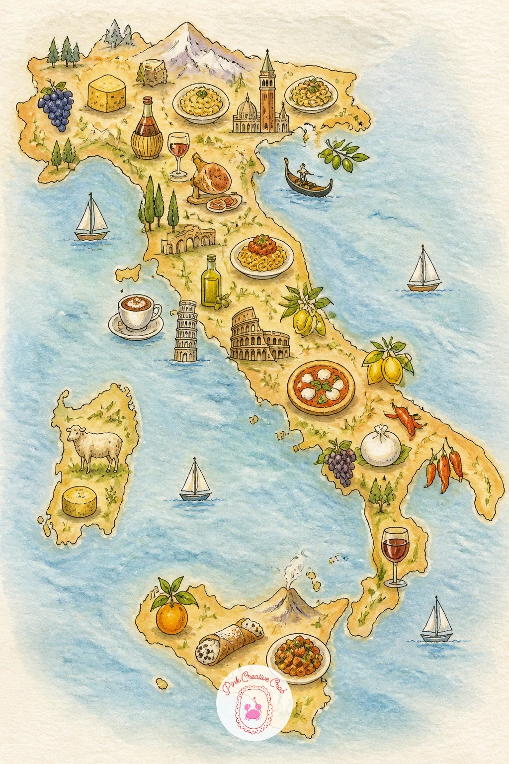
After a neighborhood scale, stretch back out to a whole country with a map of Italy told entirely through food. Pencil the familiar boot shape first, loosely, since even a rough silhouette reads instantly as Italy once the icons go in.
Place tiny food icons by region as you ink: a wheel of cheese or a bowl of risotto in the north, a slice of pizza near Naples, a basket of lemons at the southern tip, a cluster of grapes somewhere in the middle for wine country. Paint the land in a warm, even wash of pale gold, then paint each food icon in its own bright, true color so they pop against the quieter background.
It is easy to crowd the boot with too many icons until the shape disappears under clutter. Keep it to five or six well spaced icons maximum, leaving open cream colored land between them so the map still breathes.
No gold or ochre paint on hand works fine with a very thin wash of yellow ochre mixed from whatever warm yellow and brown you already own.
Palette: Yellow Ochre,Tomato Red,Olive Green,Lemon Yellow
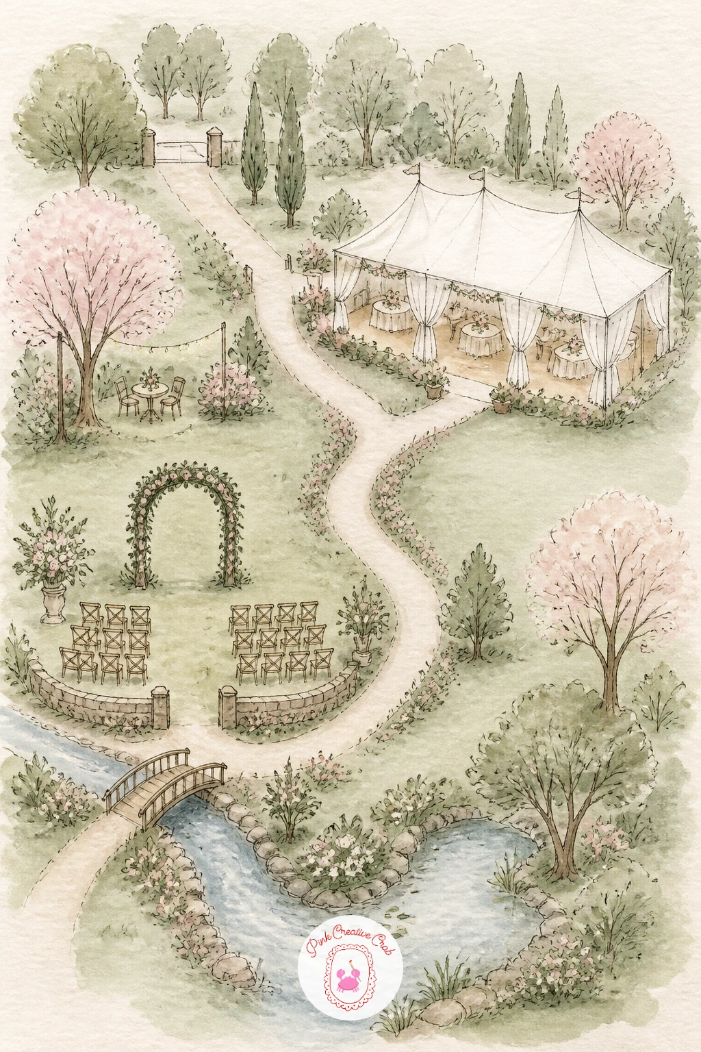
Keep the personal theme going with a map of a wedding venue, real or dreamed up, the kind a guest might find tucked in an invitation. Pencil the main building first, then the ceremony spot under a tree or arch, the reception tent, and a path connecting them.
Ink each structure simply, a tent as a triangle shape, an arch as two curved lines meeting at the top, then paint the lawn in a soft sage wash that covers most of the page. Keep the buildings themselves pale, almost white, so the ink details stand out clearly against the green.
Eye level matters here more than in a flat city map, since a venue map usually imagines looking slightly down from above, almost like a bird’s eye view. That means tents and trees get drawn as simple roof shapes and canopy shapes rather than full side views, which keeps every element consistent.
If you are making this for an actual wedding, letter the couple’s names and the date along the bottom border once the paint is fully dry, using a fine liner so the ink does not bleed into the washes.
Palette: Sage Green,Blush Pink,Cream,Gold Ochre
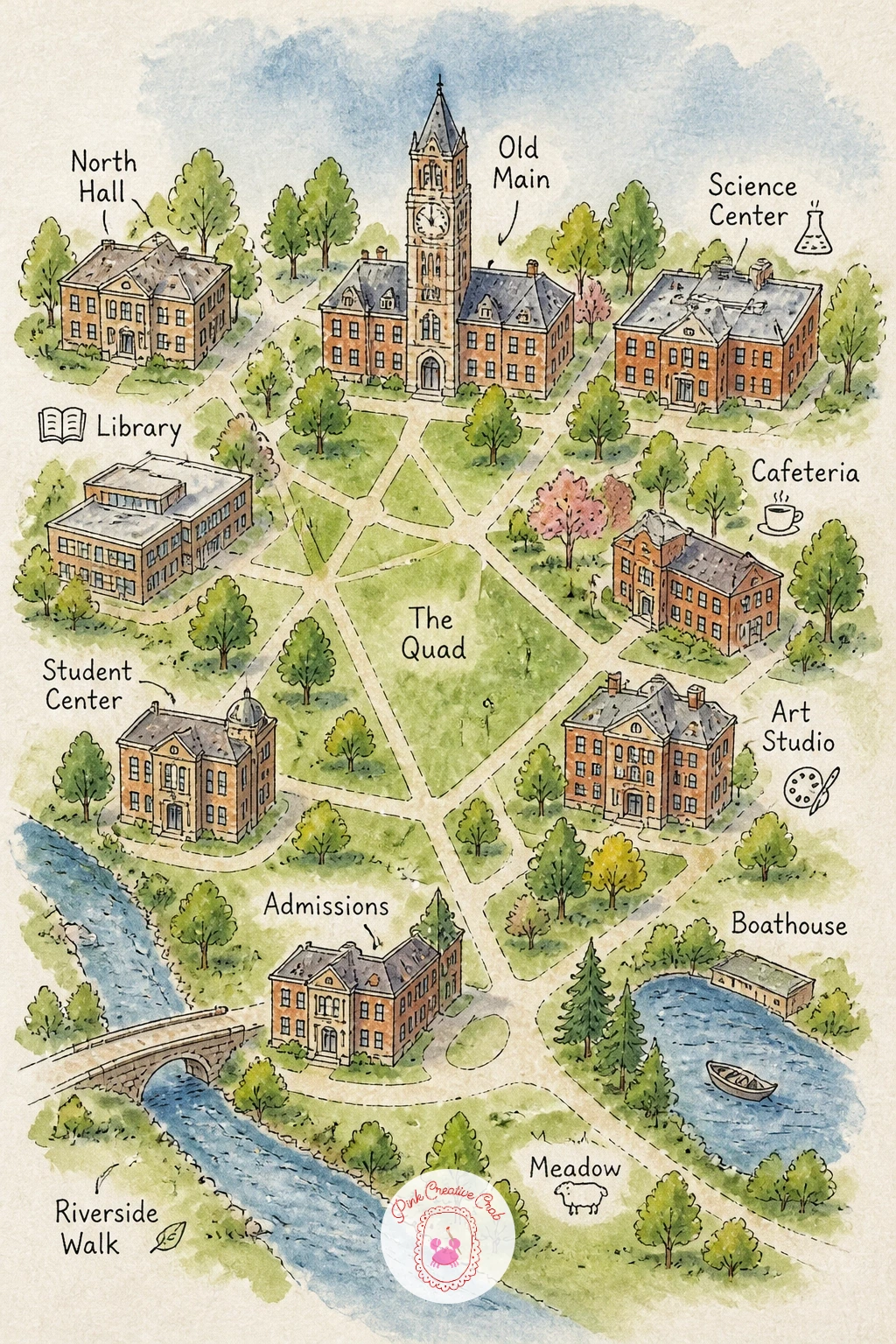
A campus map works almost like the neighborhood one but denser, so it rewards a slightly more confident hand. Pencil a central quad first, then ring it with simple building blocks: a library with a clock tower, a dining hall, a dorm or two, each just a labeled rectangle at this stage.
Ink the quad’s paths in a crossing X or star pattern, the way most real campuses lay out their lawns, then paint the grass a fresh green and each building a slightly different warm neutral so they stay easy to tell apart. A tiny flag or clock face on the main building adds character without much extra work.
Too many identical gray boxes is the usual trap, making the whole map flat and hard to read. Save it by giving each building its own small roofline shape, flat, peaked or domed, so the silhouette alone tells them apart even before you add labels.
If you want to vary this idea later, try it as a single beloved building’s floor plan instead of the whole campus, treating one classroom or library the way this version treats the quad.
Palette: Grass Green,Brick Red,Stone Grey,Sky Blue
Trade green quads for white slopes with a ski resort map, built around a mountain rather than streets. Pencil a central peak first, then sketch trails branching down from the summit like veins, marking a lodge near the base and a chairlift line running up one side.
Ink the trail lines and lodge before painting, then use a dry brush loaded with very little water to drag pale grey-blue shadow across the slopes, which gives the snow texture without flattening the white paper beneath it. Leave the brightest peaks and open snowfields untouched white paper, since that contrast is what makes snow look like snow.
Overworking the white snow with too much blue wash is the easy mistake, leaving the mountain looking grey and flat rather than bright and crisp. If that happens, lift color back out with a clean damp brush or a tissue while the wash is still wet, dabbing rather than wiping.
No proper dry brush technique yet works fine with a nearly dry round brush instead, just load it very lightly and test the stroke on scrap paper first.
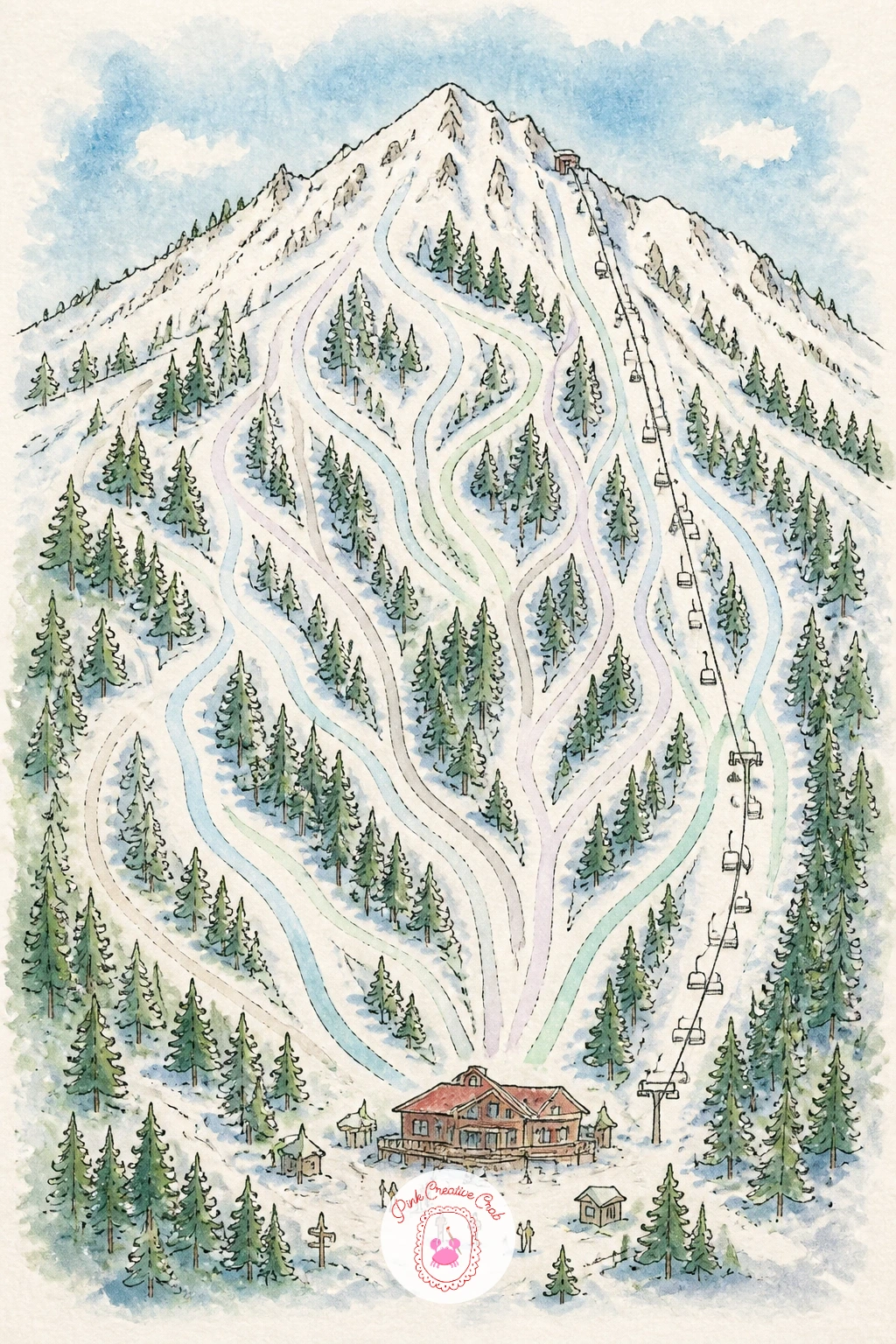
Palette: Pale Blue Grey,Pine Green,Brick Red,Charcoal
Warm things back up with a beach town map, laid out along a stretch of coastline rather than a grid. Pencil the shoreline first as a loose curving line, then place a pier, a cluster of beach umbrellas, and a row of pastel shopfronts along the main street just inland.
Ink the pier as a simple line of posts leading out over the water, then paint the ocean in two or three blues layered wet into wet so it shifts naturally from pale turquoise near shore to deeper blue further out. Give the shopfronts a candy colored wash, one building pink, the next mint, the next butter yellow, so the main street reads as cheerful and sun worn.
The sand strip between street and sea often ends up either too white and empty or too heavily colored and muddy. A single thin wash of pale ochre, left to dry with its edges a little uneven, reads as sun warmed sand far better than a flat even color does.
If turquoise is not in your palette, mix it fresh from blue and a touch of yellow or green rather than skipping the color shift altogether, since that gradient is what makes the water feel tropical.
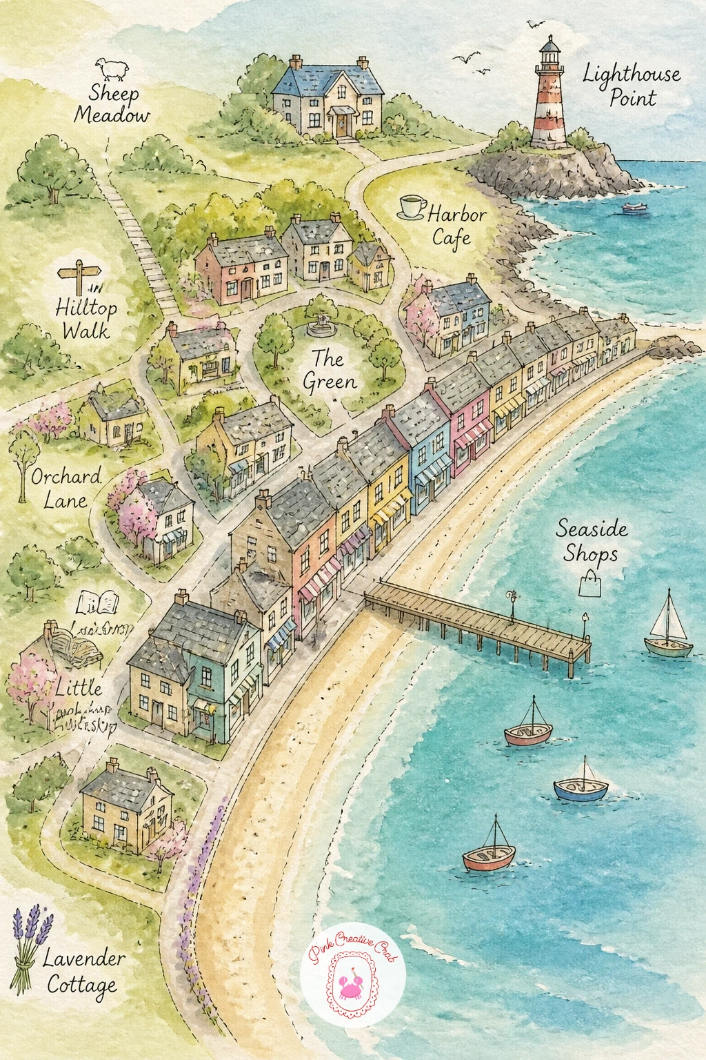
Palette: Turquoise,Pale Ochre,Candy Pink,Butter Yellow
Move inland to rolling hills with a map of a vineyard, where the real subject is the pattern of the vine rows rather than any single building. Pencil gentle sloping hills first, then draw rows of vines as repeating curved lines following the slope, with a small farmhouse and a cluster of oak trees tucked at one edge.
Ink the vine rows with a light touch, since too much pressure makes them look like a fence rather than a crop. Paint the hills in warm green-gold, then once dry, use a fine liner or a very small brush dipped in deep green to dot in individual vines along each row, which reads as texture from a normal viewing distance without needing to paint every leaf.
Lay the hill color before a single vine line goes on top, so you are always working light background first, texture and detail second, down to the smallest dot of green on the furthest row.
If the rows start to look mechanical, vary their spacing slightly and let a couple trail off the edge of the page rather than lining every row up with ruler precision.
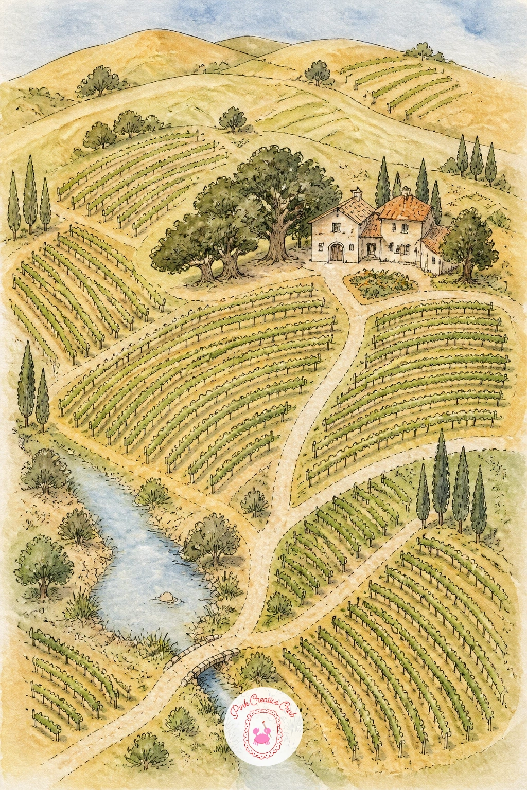
Palette: Olive Green,Golden Ochre,Deep Green,Terracotta
Trade the gentle vineyard slopes for something steeper with a hiking trail map, built around contour lines rather than straight roads. Pencil a rough mountain or ridge shape first, then add a dashed trail winding up toward a small summit marker, with a waterfall or lookout point along the way.
Ink a few simple contour lines around the peak, nested loosely like rings, to suggest elevation without needing real topographic precision. Paint the lower slopes in forest green, letting the color thin out and go pale grey-green toward the summit, since that lightening with height is what makes a mountain read as tall.
If this is your first time drawing contour lines, do not worry about spacing them evenly. Real trail maps have irregular contours too, and slightly uneven rings actually look more convincing than perfectly concentric ones.
Start with the ten minute version using just the ridge, trail and one lookout icon. The forty minute version adds the contour rings, a tiny waterfall with a few white-paper highlight lines left unpainted, and small distance markers along the dashed trail.
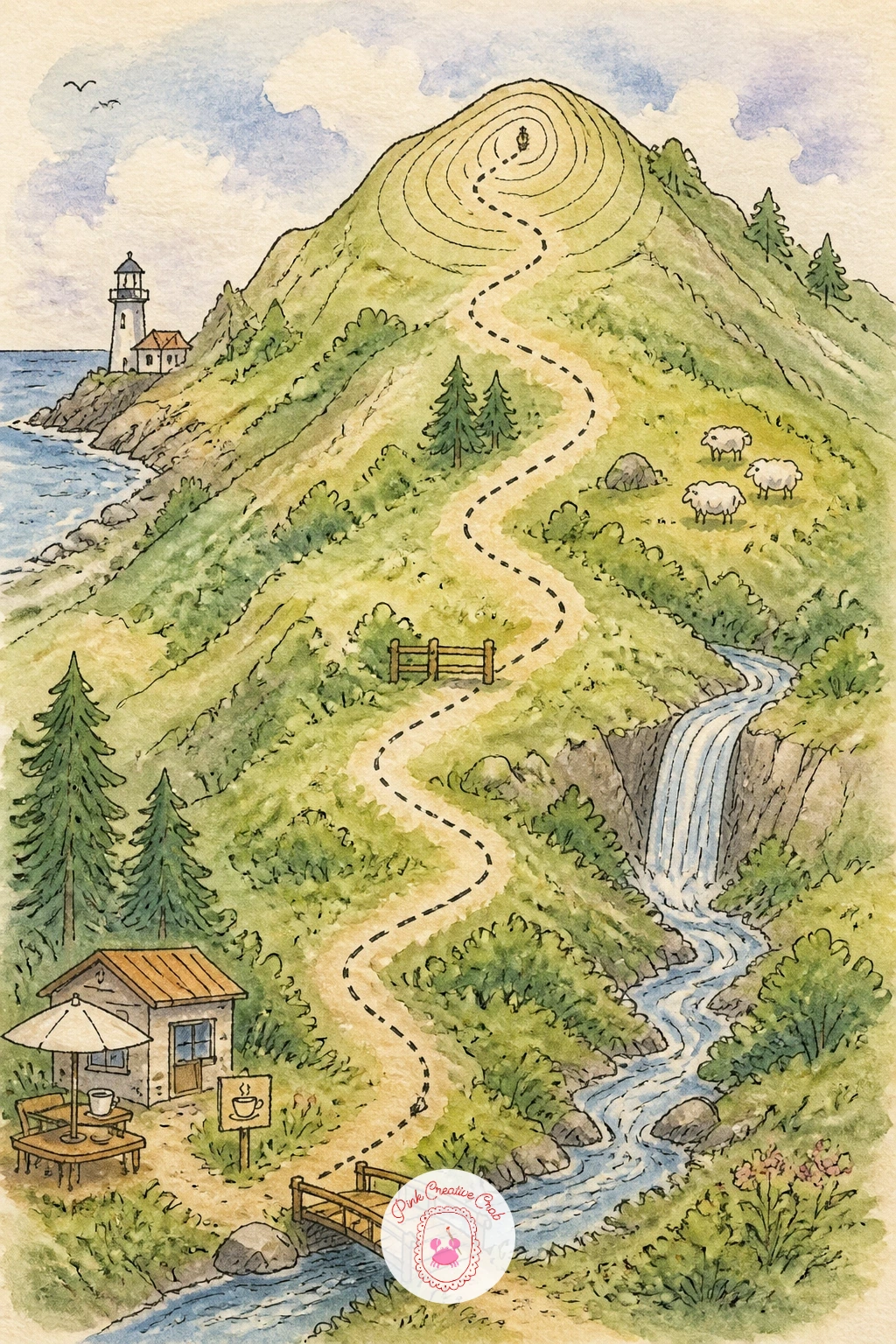
Palette: Forest Green,Grey Green,Slate Blue,White Highlight
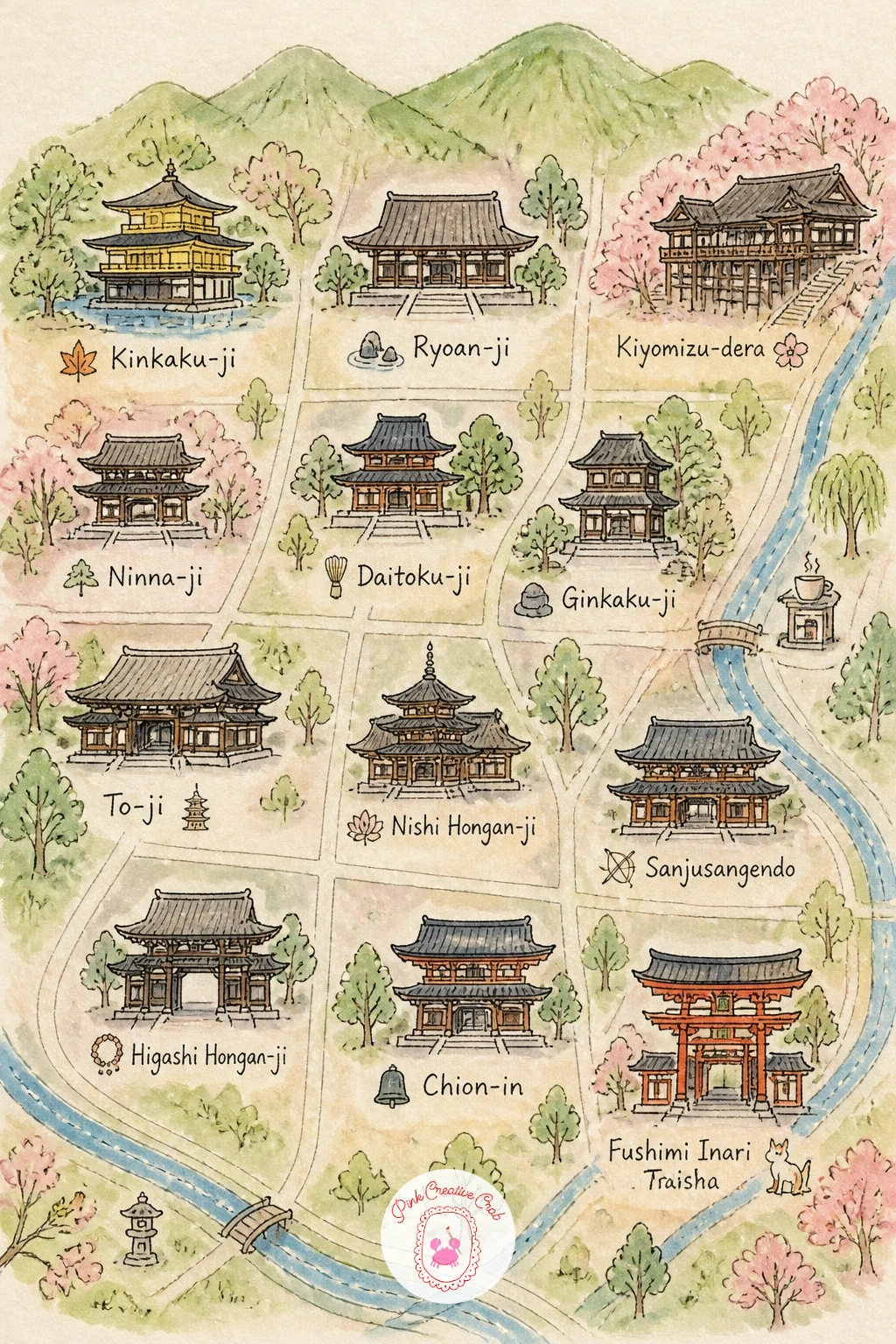
Carry that quieter, layered feeling into a map of Kyoto’s temples, where empty space does as much work as the ink. Pencil two or three temple complexes spaced generously across the page, each a simple pagoda roofline with a small gate in front, connected by a winding path rather than a grid.
Ink the pagoda rooflines with confident upward curves at the corners, the detail that reads as Japanese architecture even in a very loose sketch. Paint the temple grounds in soft moss green, add a single red-orange torii gate for contrast, and leave generous white space around each complex rather than filling the whole page edge to edge.
Western map habits push toward filling every inch, but this map actually improves the emptier it stays, since that openness is part of what reads as a Japanese garden aesthetic. Resist adding extra buildings just to fill gaps.
A few loose pink dabs near one path suggest cherry blossoms without needing individual petals, and give the whole page a seasonal anchor at almost no extra effort.
Palette: Moss Green,Vermillion,Soft Pink,Charcoal Ink
Look at reference photos of pagoda rooflines before inking, since the upward curl at each corner is the single detail that makes this read as Kyoto rather than any generic temple.
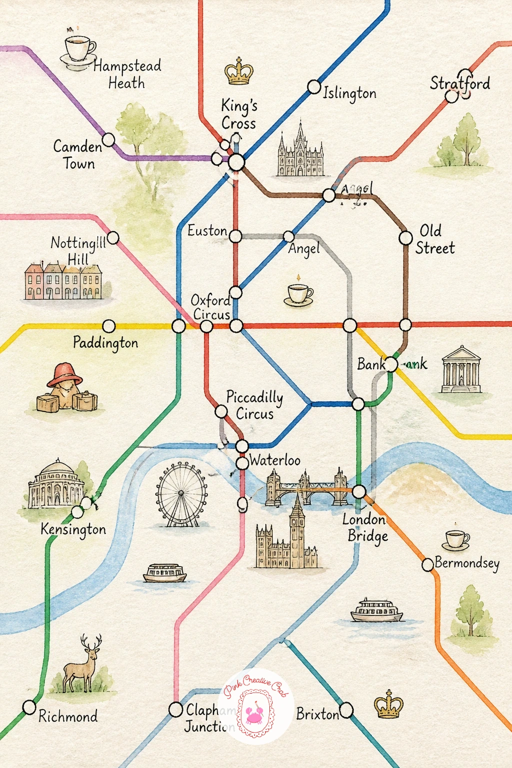
Switch gears completely with a London tube style map, the one subject on this list built from straight lines and sharp angles rather than loose curves. Pencil horizontal, vertical and diagonal lines only, at the classic 45 and 90 degree angles, connecting a handful of named stations with small circles.
Ink each line in a different solid color the way the real tube map does, then add a tiny icon beside a few stations instead of just a name, a teacup, a crown, a red phone box, so the map tells a small story rather than just plotting a route. Keep the background plain white or the palest cream so the colored lines stay the star of the page.
A ruler is the one tool worth using here instead of freehand, since wobbly lines undercut the entire graphic style this map is imitating. If you do not own one, the edge of a notebook or a stiff card works as a straightedge in a pinch.
Once this version works, try it again for a different city’s transit system next time, which only needs new line colors and new station icons to feel completely fresh.
You Will Need
- ruler or straightedge
Palette: Tube Red,Tube Blue,Tube Green,Tube Yellow
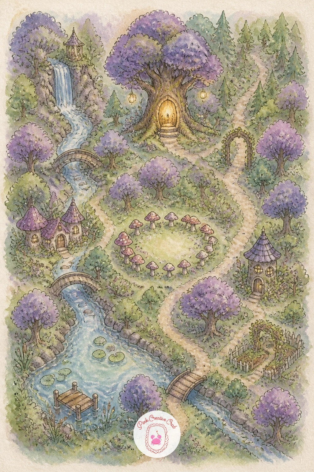
Let the lines go soft and strange again with a map of a fairy forest, somewhere between a real wood and a storybook. Pencil clusters of rounded tree canopies first, then tuck in tiny details as you go: a mushroom ring, a glowing hollow tree, a bridge over a narrow stream, a winding path that disappears into the trees rather than ending cleanly.
Ink the tree trunks with slightly curling, uneven lines rather than straight ones, since a little wobble suits a magical forest far better than precision does. Paint the canopies in a mix of deep green and dusty purple, letting the colors bleed into each other wet on wet, then add tiny dots of warm yellow glow around the hollow tree and the mushroom ring once everything else is dry.
Vary this one by changing the season: try it again with the same layout in autumn oranges, or under a twilight blue wash with a crescent moon, and the whole mood shifts without redrawing a single tree.
If the canopy colors turn muddy from overmixing, keep purple and green separate on the palette and let them meet only on the paper, where a little blending reads as magic rather than mud.
Palette: Deep Forest Green,Dusty Purple,Warm Glow Yellow,Stream Blue
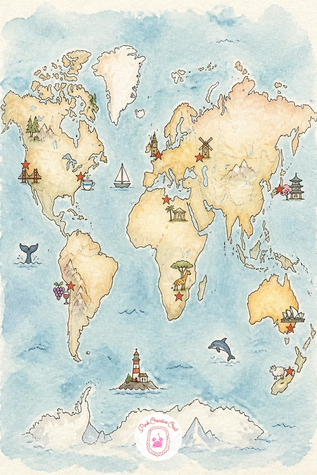
After a storybook forest, ground the page again with a world map marked with your own favorite trips. Pencil simplified continent shapes first, not aiming for geographic accuracy, just recognizable blobs for each landmass, then mark five or six places you have visited with a small pin or star.
Ink the coastlines in a single confident pass rather than many short correcting strokes, which keeps the continents looking intentional even when they are not perfectly shaped. Paint the land in warm sandy tones and the ocean in a pale wash of blue, then add a tiny icon at each marked trip, a palm tree, a mountain, a teacup, whatever that place means to you.
Simplified continents are far more forgiving than they look, since the eye fills in the rest once a few recognizable outlines are there, so do not chase perfect accuracy on something this small.
Draw a thin dashed line connecting the trips in the order you visited them for a version that doubles as a travel timeline, which makes a lovely keepsake page for a travel journal.
Palette: Sandy Ochre,Pale Ocean Blue,Forest Green,Red Pin
Narrow the focus right down to a single cozy village, the kind with one main street and a church spire you can see from everywhere in town. Pencil a cluster of small buildings along a curving street first, then a church or town hall as the tallest shape, with a little market square in the middle.
Ink each building’s roofline differently, peaked, stepped, or gently curved, so the row reads as a real village rather than a repeated template. Paint the walls in a soft mix of cream, dusty rose and pale blue, one per building, then let the roofs dry as warm terracotta or slate grey.
If this is your first time painting a row of buildings, work one at a time rather than washing the whole street in one color, since keeping each building separate while wet is what lets the walls stay distinct instead of bleeding into one flat band.
A short string of bunting or a few tiny flower boxes under the windows, added last in ink, give the whole village a lived in warmth with very little extra effort.
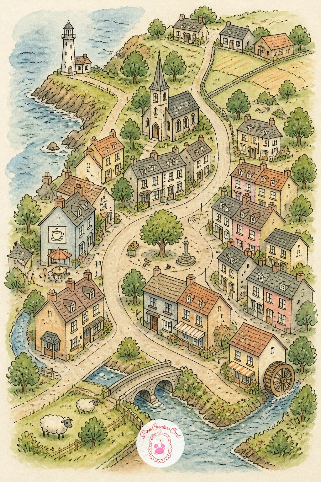
Palette: Dusty Rose,Cream,Slate Grey,Terracotta
Bring in some life with a farm map built around a barnyard full of animals rather than buildings alone. Pencil the main barn first, then a fenced paddock, a pond, and a vegetable patch, leaving open space between them for the animals themselves.
Ink the barn’s classic peaked roof and the fence posts, then scatter tiny animal icons across the open spaces, a sheep near the paddock, a few chickens by the coop, a cow grazing near the pond. Paint the barn in a warm faded red, the fields in two shades of green, and keep each animal small and simple, just a rounded body shape and a couple of ink marks for legs and face.
Overly detailed animals are the usual trap on a map this small, each one pulling too much attention from the overall layout. Keep every animal under an inch tall and let the ink do the character work with just two or three confident strokes.
For more ideas on painting the animals themselves before you shrink them down for a map, the easy farm animal watercolor painting ideas post is a good companion piece.
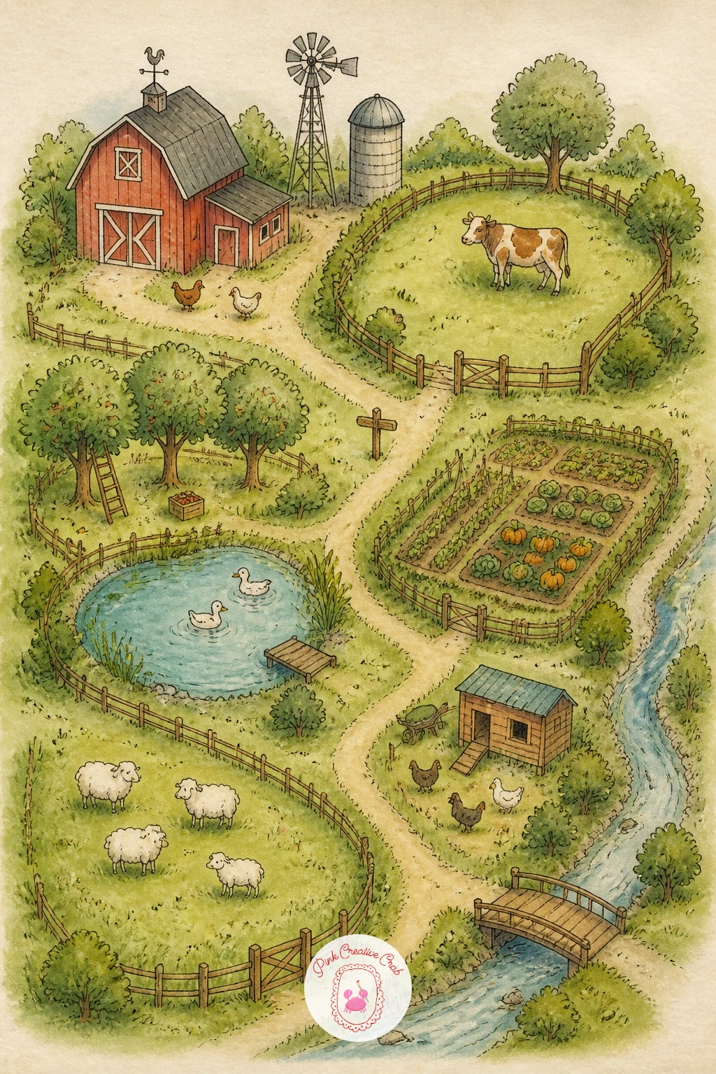
Palette: Barn Red,Meadow Green,Straw Yellow,Soft White
Jump to a dense, confident city with a map of New York’s five boroughs, best handled as simplified shapes rather than exact geography. Pencil Manhattan as a long narrow island first, then the surrounding boroughs as rounder shapes around it, with the rivers as pale blue gaps between them.
Ink one landmark per borough to anchor it: a simple skyline for Manhattan, a bridge tower for Brooklyn, a stadium outline for Queens or the Bronx, so each shape reads as somewhere specific rather than an unnamed blob. Paint each borough its own soft color, keeping the palette muted so the tiny black ink landmarks stand out clearly against it.
The eye naturally wants to view this map from directly above, flattening every building into a simple footprint shape, and keeping that consistent bird’s eye logic across all five boroughs is what stops the page from looking jumbled.
If you want a denser version next time, add subway line colors crossing between boroughs the way the tube style map does, turning this into a hybrid of the two ideas.
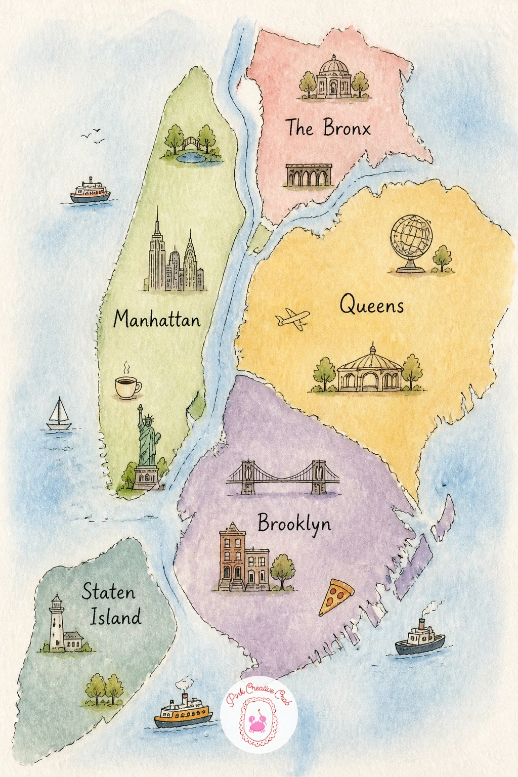
Palette: Muted Blue,Dusty Rose,Warm Grey,Ink Black
Return to something more fantastical with a castle grounds map, laid out the way an old estate plan might be. Pencil the castle itself first as a simple block with two or three round towers, then the surrounding grounds: a moat, a formal garden, an orchard, a stable block tucked to one side.
Ink the towers with small flag shapes on top and simple arched windows, then paint the moat in a ring of blue-green around the stone grey walls. Lay the formal garden out in neat little squares of green with a dot or two of color for flowers, which contrasts nicely against the looser orchard trees nearby.
Light matters more on a castle than on most maps here, since a single side of each tower should read slightly darker to suggest it faces away from the sun. A quick grey wash down one side of every tower, added once the stone color is dry, does this with almost no extra effort.
If stone grey feels flat, warm it slightly with a touch of ochre mixed in, which keeps old castle walls from reading as concrete.
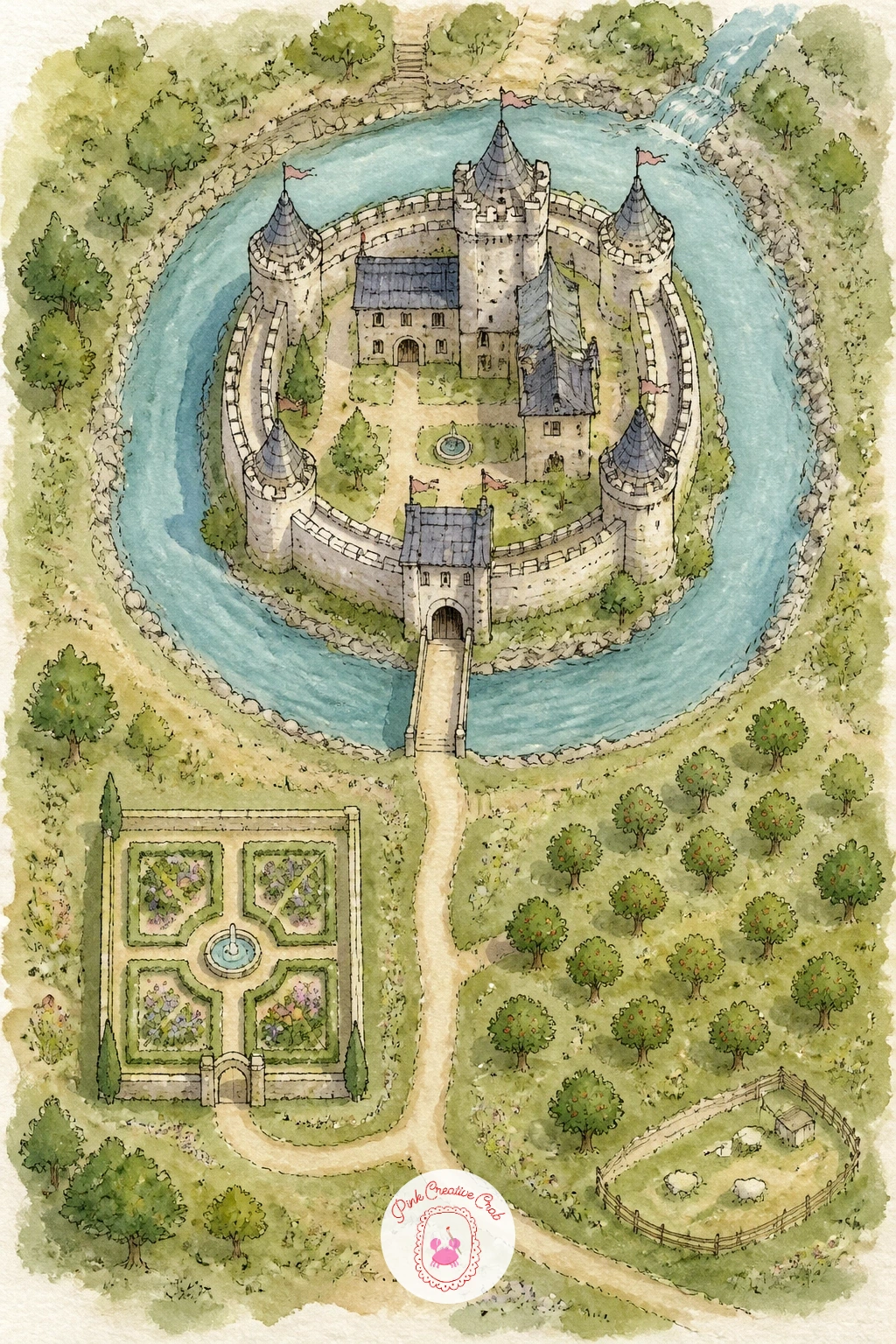
Palette: Stone Grey,Moat Teal,Garden Green,Flag Red
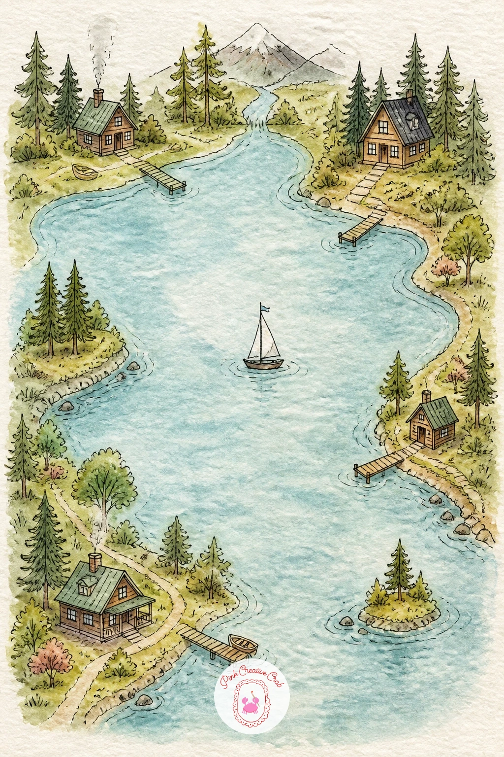
Slow the pace down with a lake map ringed by small cabins, built almost entirely around a single body of water. Pencil the lake shape first as a wide, slightly irregular oval, then ring its edge with a handful of tiny cabin icons, a dock here and there, a small sailboat out on the water.
Ink the cabins simply, a peaked roof and a little chimney is enough, then paint the lake in a smooth gradient from pale blue at the shallow edges to a deeper blue-green toward the center. Let the surrounding land dry as forest green with a few individual pine tree shapes along the shoreline.
A flat, lifeless lake surface is the easy pitfall. Rescue it by lifting a few thin streaks of color back out with a clean damp brush once the wash is still slightly wet, which reads as sunlight catching ripples on the water.
If lifting color feels tricky to control, a thin highlight of masking fluid applied before painting and peeled off once dry gives the same streaky sparkle with a bit more certainty.
You Will Need
- masking fluid (optional)
Palette: Pale Lake Blue,Deep Teal,Pine Green,Cabin Brown
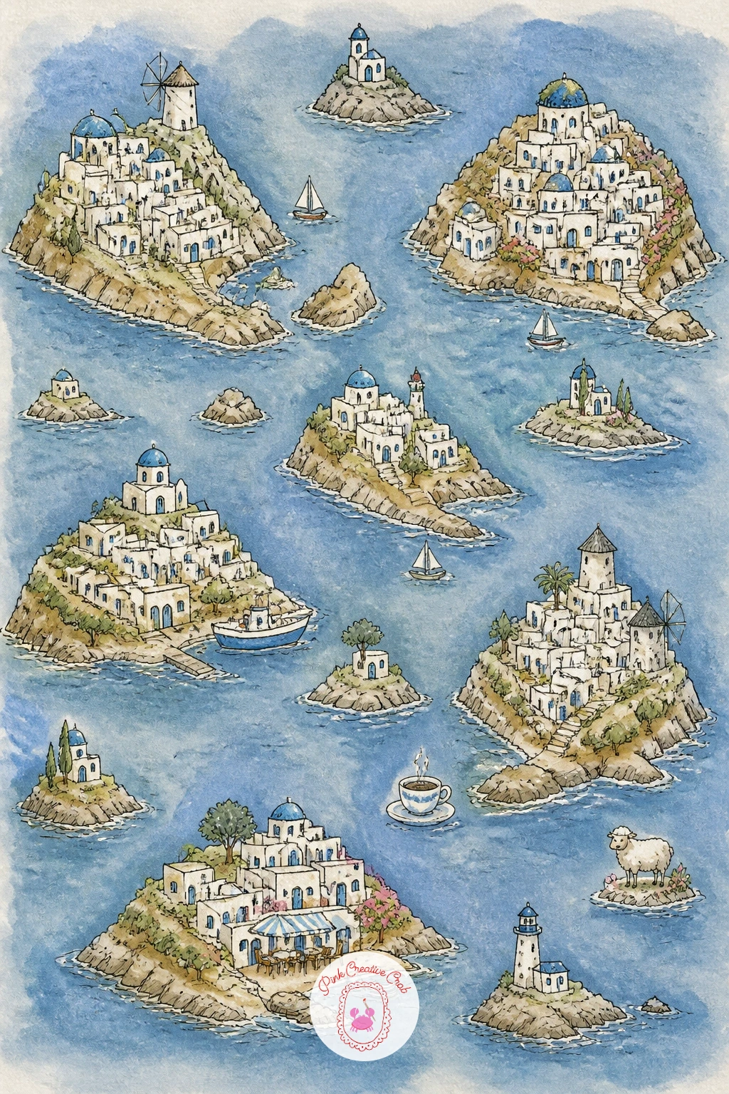
Scatter a handful of islands across a sea of blue with a map of the Greek islands, where white and blue do most of the storytelling. Pencil three or four small island shapes spread across the page, then cluster tiny white cube buildings with blue roofs on each one, climbing up from the shoreline.
Ink the little cube houses in simple stacked rectangles, then leave the walls as untouched white paper rather than painting them, since that bright white against the blue sea is the whole character of this map. Paint only the roofs, a few shutters, and the sea itself, keeping everything else crisp white.
Resisting the urge to paint the buildings is the hardest part and also the one hands-on trick that makes this map work: white paper reads far brighter and cleaner than any white paint ever will, so trust the blank page to do the job.
If you want more white space practice before trying this, the loose, airy layouts in easy watercolor landscapes cover similar restraint with sky and sea.
Palette: Aegean Blue,Sea Teal,Whitewash,Terracotta Roof
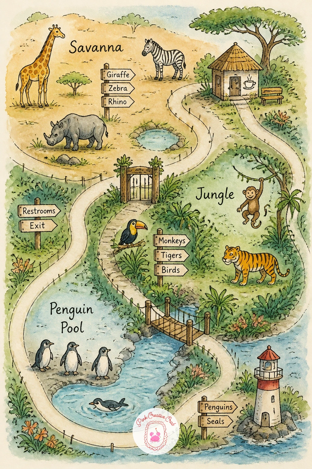
Fill a page with the easy energy of a zoo map, organized the way a real park map is, by habitat zone rather than by street. Pencil a looping main path first, then branch off small zones along it: a savanna patch, a jungle house, a penguin pool, each marked with a simple fenced or walled boundary.
Ink the path and the zone boundaries, then drop one or two animal icons into each zone, a giraffe shape in the savanna, a simple penguin by the pool, a monkey in the jungle trees. Paint each zone a slightly different green or tan so the zones stay visually distinct even before the icons are added.
Quick version: a path, three zones and three animal icons, done well inside ten minutes. The forty minute version adds signage icons, a tiny food stand, a bench, and a second smaller animal tucked into each zone for a busier, more lived in park.
If giraffe proportions feel tricky, remember the neck is roughly as long as the whole body below it, which keeps even a loose shape from looking like a strange dog.
Palette: Savanna Tan,Jungle Green,Pool Blue,Animal Brown
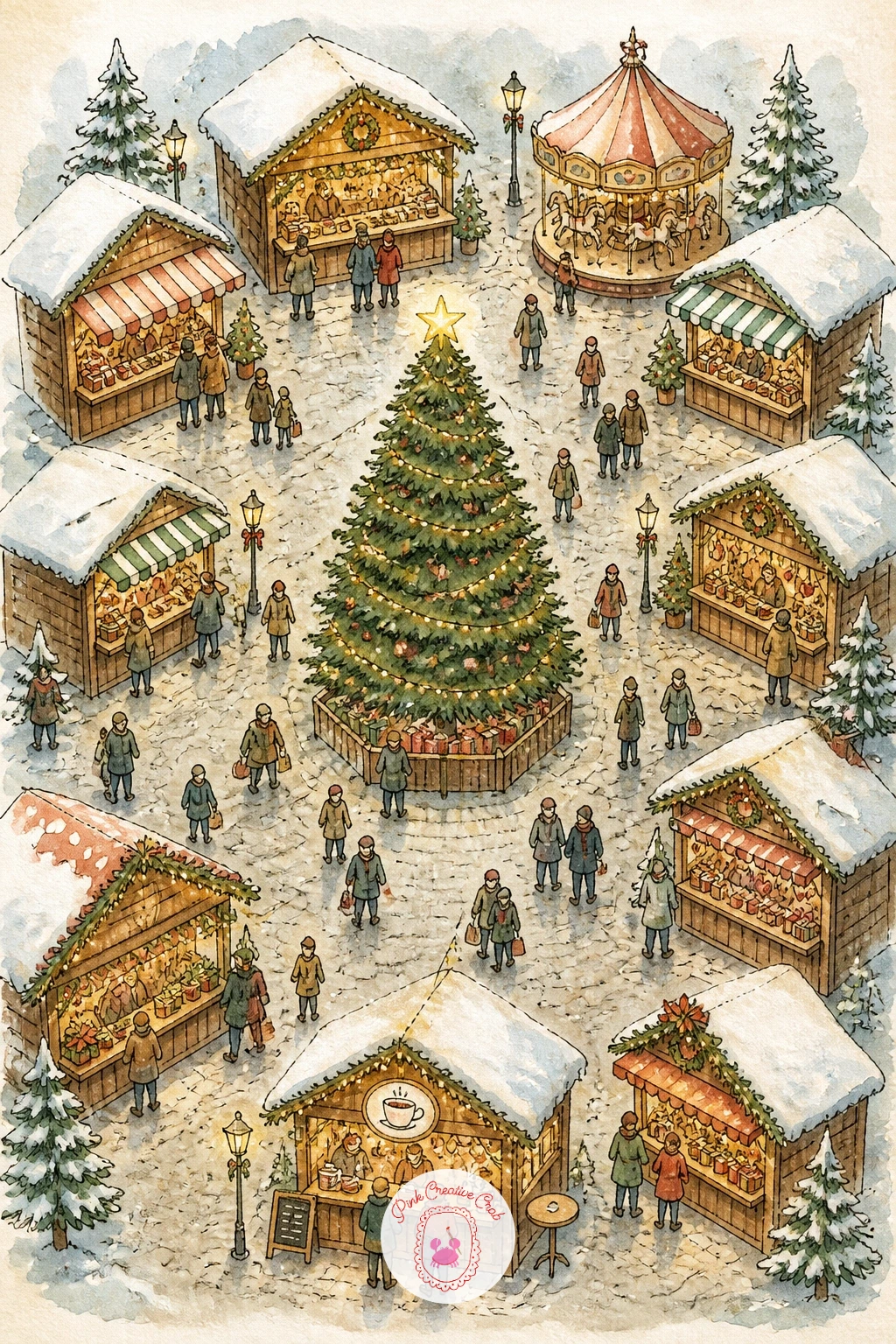
Warm the page up with string lights and mulled wine for a Christmas market map, built around a single cozy square rather than a sprawling layout. Pencil a central plaza first, then ring it with small wooden stall shapes, each with a pointed roof, and a large tree in the center strung with tiny lights.
Ink the stalls and the tree, keeping the roofs simple triangles, then paint the stalls in warm reds and greens with a dusting of white left as paper for snow on each roof. A soft grey-blue wash across the ground reads as cobblestones dusted with frost once it dries slightly uneven.
Tiny dots of white gel pen added once everything is fully dry make convincing string lights strung between the stalls and up the tree, a detail that is much harder to get right with a wet brush.
If you do not have a white gel pen, scratching a thin line back to the white paper with a craft knife once the paint is bone dry gives a similar sparkle in a pinch.
You Will Need
- white gel pen
Palette: Holly Red,Pine Green,Frost Grey,Warm Wood Brown
Return to green with a botanical garden map, more structured than the earlier flower bed garden and built around named sections instead. Pencil a central glasshouse first, then paths branching out to a rose garden, a fern grove, and a pond with lily pads, each clearly separated.
Ink the glasshouse with simple arched glass panels, a detail that instantly reads as a conservatory, then paint each garden section in its own tone: deep green for the ferns, soft pink for the roses, pale green-blue for the pond. Keep the paths themselves a warm neutral sand color so they read clearly between the sections.
If this is your first time painting a glasshouse, leave several of the glass panels as bare white paper rather than filling every pane with blue, since that mix of painted and unpainted panels reads as reflected light far better than an even wash does.
For more ideas on the plants themselves to scatter through each section, flower sketchbook ideas for beginners is full of small botanical studies worth borrowing from.
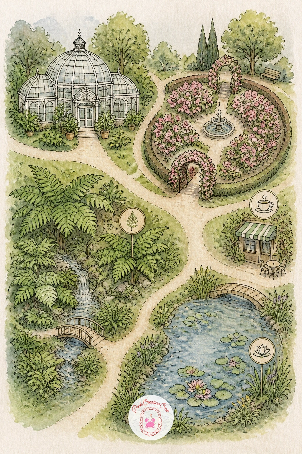
Palette: Fern Green,Rose Pink,Pond Blue Green,Sand Path
Make a map just for the coffee lovers with a coffee shop crawl, tracing a short walking route between a handful of favorite cafes. Pencil a simple street layout first, then mark four or five cafes along it, each one a tiny building with its own cup icon out front.
Ink a dotted walking route connecting the cafes in order, then paint each building a different warm tone, mustard, rust, dusty green, so they stay easy to tell apart at a glance. Keep the streets themselves a pale neutral so the colorful cafes stand out clearly against them.
Giving every cafe the same generic cup icon is the easy trap, making them blur together despite the different colors. Vary the cup shape slightly, a mug here, a to-go cup there, a saucer and spoon at one, so each stop feels like its own place.
If you enjoy painting the food and drink side of this more than the map itself, easy watercolor food ideas has plenty of cup and pastry studies to practice on first.
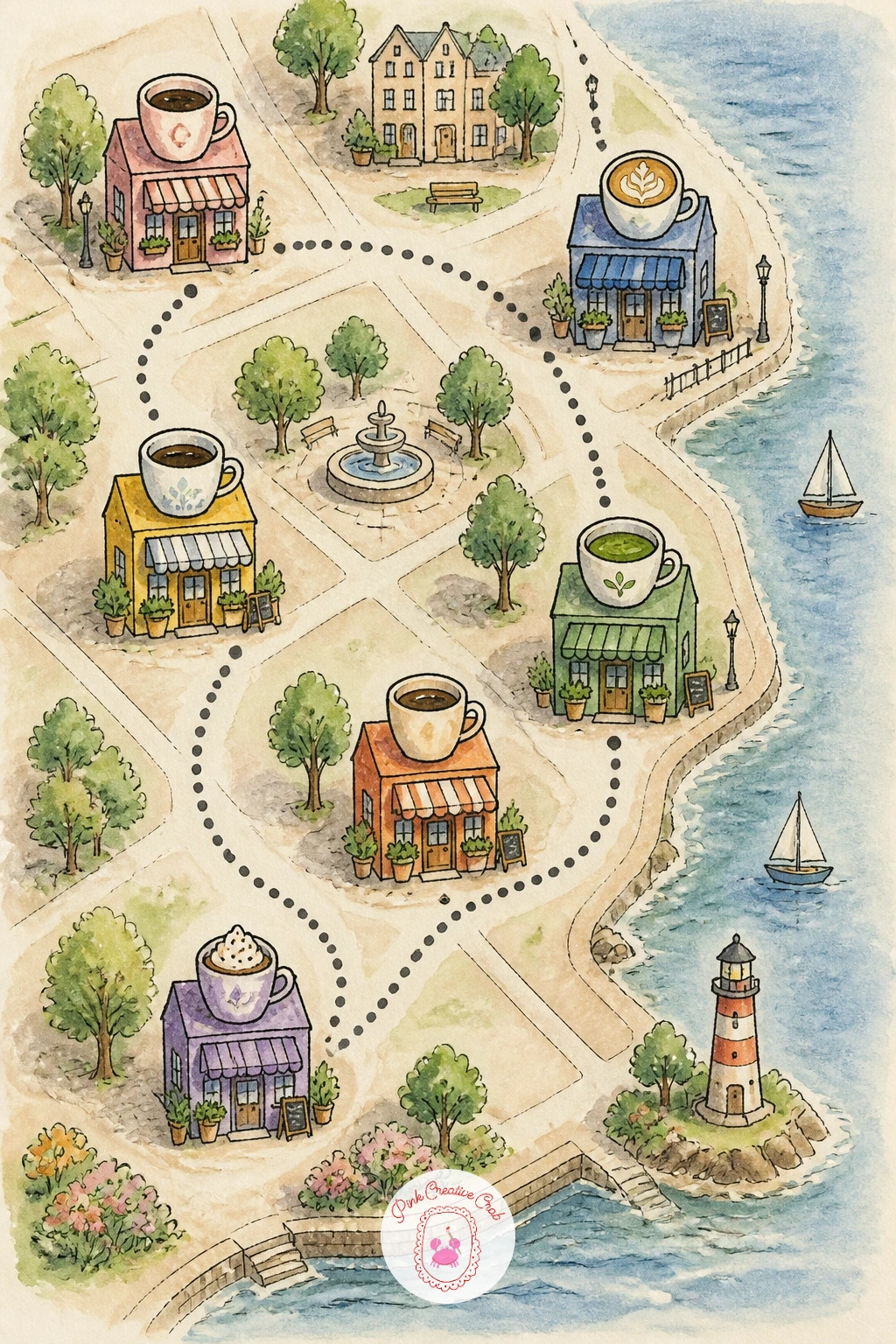
Palette: Mustard Yellow,Rust Red,Dusty Green,Warm Cream
Leave the earth entirely for a map of the moon, where craters replace streets and the whole palette shrinks down to greys and blues. Pencil the moon’s circular outline first, filling nearly the whole page, then scatter craters of different sizes across its surface along with a labeled mare or two, the dark flat plains real moon maps mark by name.
Ink the crater rims as simple circles with a slightly thicker line on one side, then paint the surface in layered greys, letting some areas dry paler and others darker so the moon does not read as one flat tone. Leave tiny white paper highlights inside a few craters to suggest sunlight catching their rims.
Where the real light source sits changes everything on a sphere like this: pick one direction, upper left is the easiest, and keep every crater’s shadow falling on the same side, which is what makes a flat circle read as a round, lit surface.
If grey feels flat straight from the tube, mix a little blue and brown together instead of using pure black, which gives the lunar surface far more life than a plain grey wash.
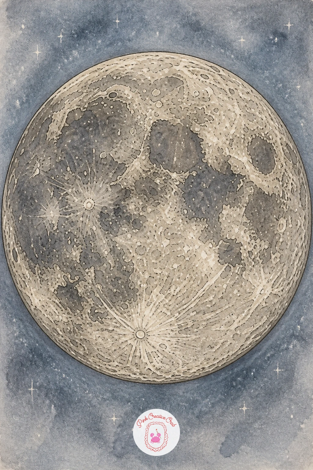
Palette: Lunar Grey,Pale Blue Grey,Charcoal Shadow,Warm Highlight
Bring the energy back up with a theme park map, busy, colorful and full of small attractions packed close together. Pencil a central roller coaster or ferris wheel first as the anchor, then ring it with smaller rides, a carousel, a food stand, a entrance gate, connected by winding paths.
Ink every attraction as a simple, slightly playful shape, a ferris wheel as a circle with spokes, a coaster as a looping line, then paint the whole thing in bright primary and candy colors rather than the muted tones used elsewhere on this list, since a theme park map earns a bolder palette.
Quick version: the ferris wheel, one coaster and a food stand, inked and painted loosely inside ten minutes. The forty minute version adds a parade route dotted around the park, small flag bunting along the main path, and a cluster of tiny visitor figures near the entrance.
If colors bleed together on a busy page like this, let each attraction dry fully before painting its immediate neighbor, working across the page in patches rather than all at once.
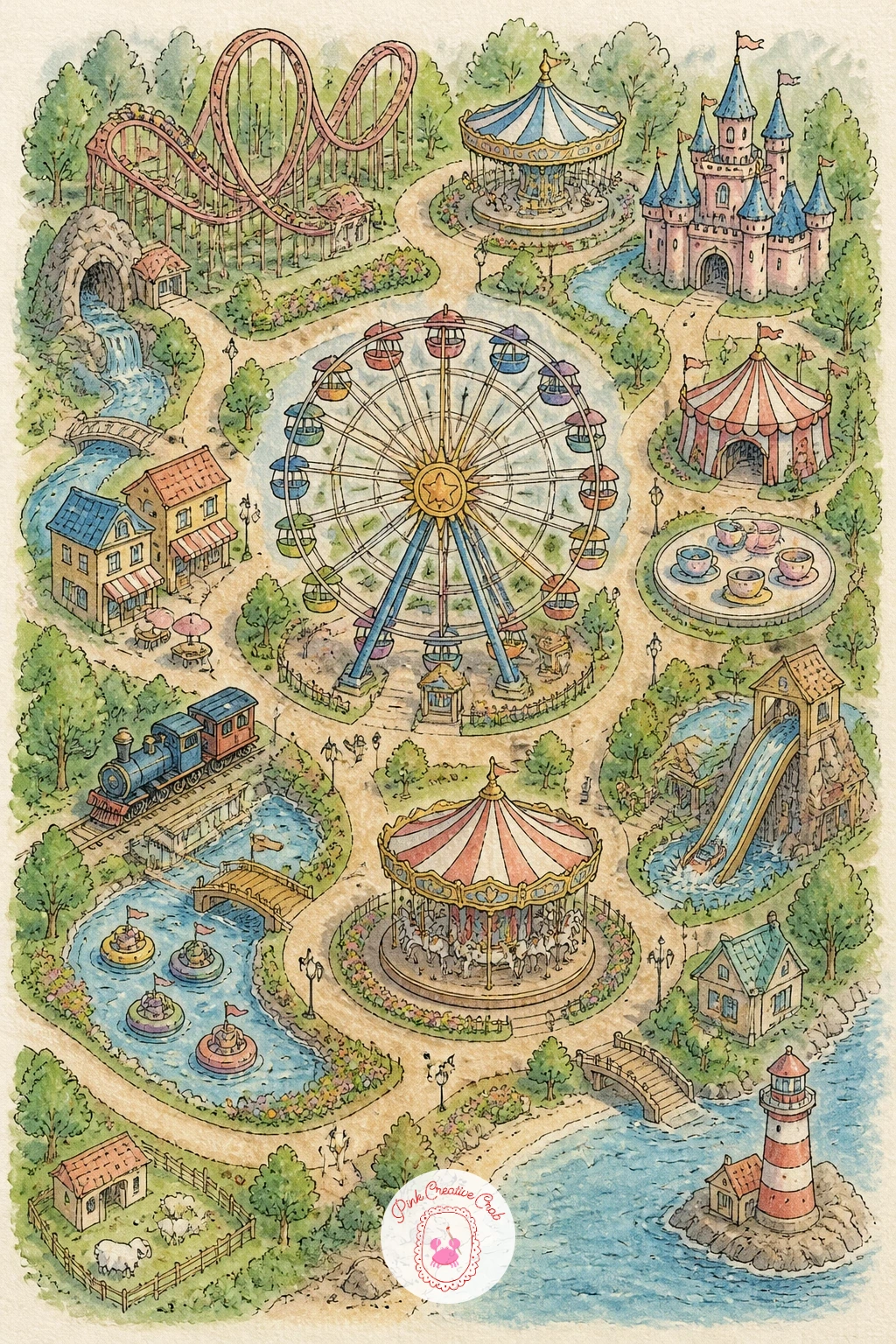
Palette: Candy Red,Bright Yellow,Sky Blue,Grass Green
Slow the mood right down again with a map of Provence, carried almost entirely by rows of lavender rather than any buildings. Pencil gentle hills first, then draw long curving rows across them the way the vineyard map did earlier, but set a small stone farmhouse and a line of cypress trees at one edge instead of vines.
Ink the farmhouse and the cypress trees with simple tall narrow shapes, then paint the lavender rows in layered purples, lighter near the top of each row and deeper toward the base, which gives the fields real depth from a distance. Let the sky above take up generous space, washed in the palest warm yellow to suggest late afternoon light.
Flat, uniform purple is the easy misstep, making the fields look like a solid block rather than individual rows. Rescue it by dragging a dry brush loaded with a slightly deeper purple along the top edge of each row once the base wash is dry, which separates them with almost no extra time spent.
If purple paint tends toward grey when it dries, warm it slightly with a touch of red mixed in before it goes anywhere near the page.
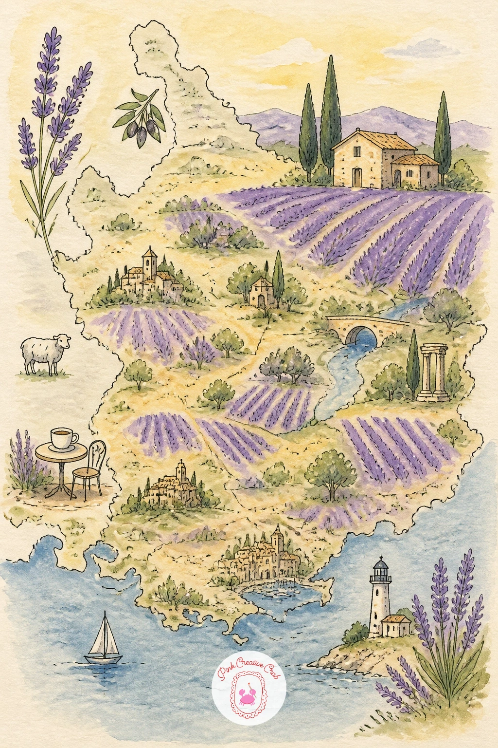
Palette: Lavender Purple,Deep Violet,Warm Sky Yellow,Cypress Green
Turn the idea inward with a map of a home, treating each room the way the earlier maps treated a whole neighborhood. Pencil a simple floor plan outline first, rooms as rectangles of different sizes, then sketch one small icon per room, a bed, a sofa, a stove, a bathtub, just enough to identify the space without full furniture detail.
Ink the walls as clean straight lines this time, since a floor plan benefits from the same steadier hand the tube map used. Paint each room a different soft color, keeping the palette gentle and cohesive rather than clashing, so the whole page reads as one calm home rather than a patchwork.
Comparing room sizes before you commit to ink saves this one: a bedroom should read noticeably larger than a bathroom on the page, and eyeballing that relationship against the real room, or simply against common sense, keeps the plan believable even without measuring anything.
If you want to vary this later, draw the same idea for a childhood home from memory instead of a current one, which turns a simple floor plan into a small keepsake.
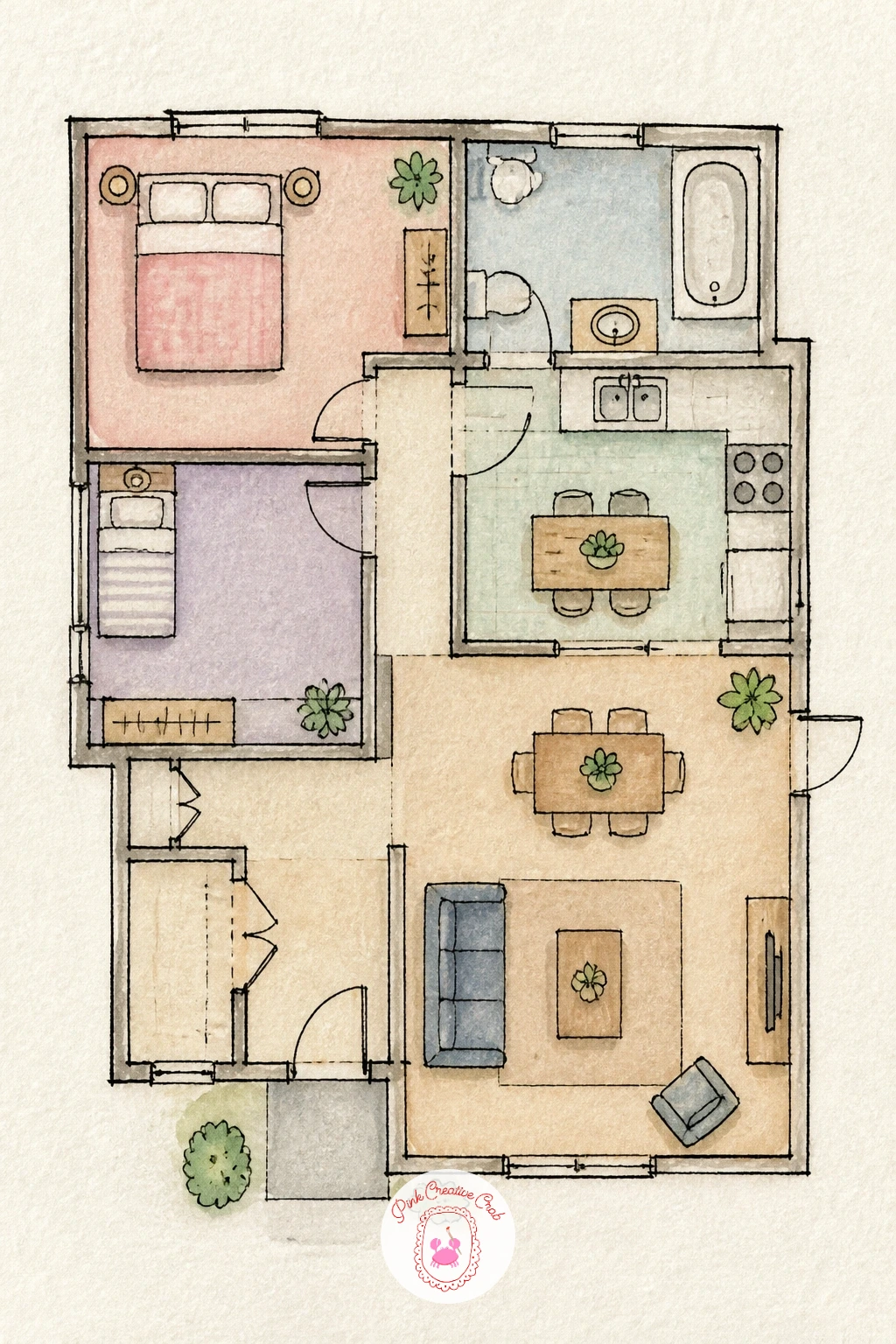
Palette: Soft Blue,Blush Pink,Sage Green,Warm Cream
Head back to open water with a coastline map strung with lighthouses rather than towns. Pencil a long, irregular coastline first, with a few small headlands and inlets, then place two or three lighthouses along it, each a simple striped tower on a rocky point.
Ink the lighthouses with confident vertical stripes, then paint the sea in restless streaks of blue and grey-green rather than one flat wash, since a coastline benefits from water that looks a little more active than a calm lake does. Leave the lighthouse beam as untouched white paper, radiating out in a thin triangle from the top of each tower.
Dry brush work earns its keep on the rocky points beneath each lighthouse: drag a nearly dry brush loaded with dark grey across the rock shapes so the texture comes through broken and uneven rather than smooth, which reads instantly as weathered stone.
If stripes on the lighthouse wobble, pencil guide lines first and ink slowly rather than trying to paint them freehand with a loaded brush.
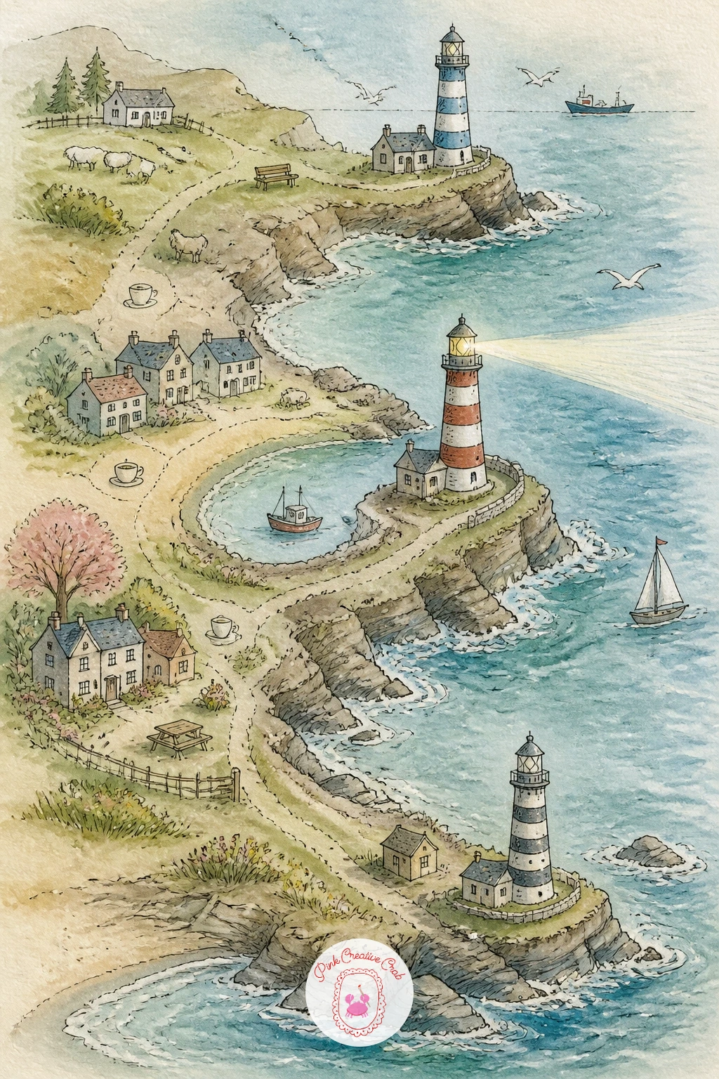
Palette: Lighthouse Red,Rock Grey,Sea Blue Green,White Beam
Bring the scale down to something intimate with a bookshop map, essentially a single cozy building mapped room by room. Pencil the shop’s outer walls first, then divide the interior into sections, fiction, children’s corner, a reading nook with an armchair, a till by the front window.
Ink shelving as simple repeated vertical lines rather than individual books, which keeps the drawing quick while still reading clearly as rows of shelves. Paint the walls in warm wood tones, the reading nook rug in a cozy pattern of dabs, and leave the window as a pale wash with a hint of the street beyond.
The shelves are the part most likely to turn into a solid brown blob if you rush them. Slow down just slightly here, keeping individual vertical lines visible rather than blending them into one mass, and the whole room reads far more convincingly.
If wood tones feel tricky to mix, a simple burnt sienna thinned with water gets you most of the way to a warm, inviting shelf color.
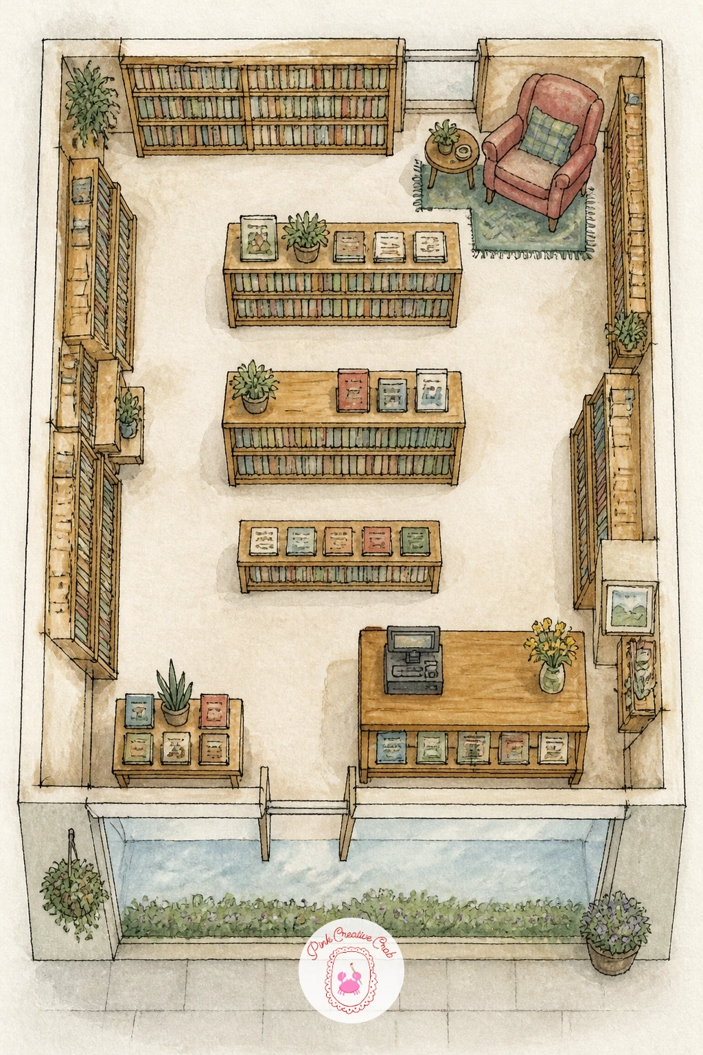
Palette: Warm Wood Brown,Burnt Sienna,Soft Green,Cream Wall
Pick up the pace with a city cycling route map, tracing a loop through a few landmarks the way a weekend ride might. Pencil a simple river or main road as the backbone first, then plot a looping bike route around it, passing a park, a bridge, and a cafe stop along the way.
Ink the route as a bold solid line this time rather than a dashed one, since a cycling route reads more clearly as something continuous and confident. Paint the surrounding city blocks in muted neutral tones so the bright route line stays the clear star of the page, with small icons marking the park, bridge and cafe stop.
Ten minutes gets you the route line and three stop icons sketched loosely. Forty minutes adds a small elevation profile along the bottom edge, distance markers along the route, and a tiny cyclist icon somewhere on the page for scale and personality.
If the route line and the streets beneath it start to compete for attention, go back and lighten the street wash slightly, since the route should always sit visually above everything else on the page.
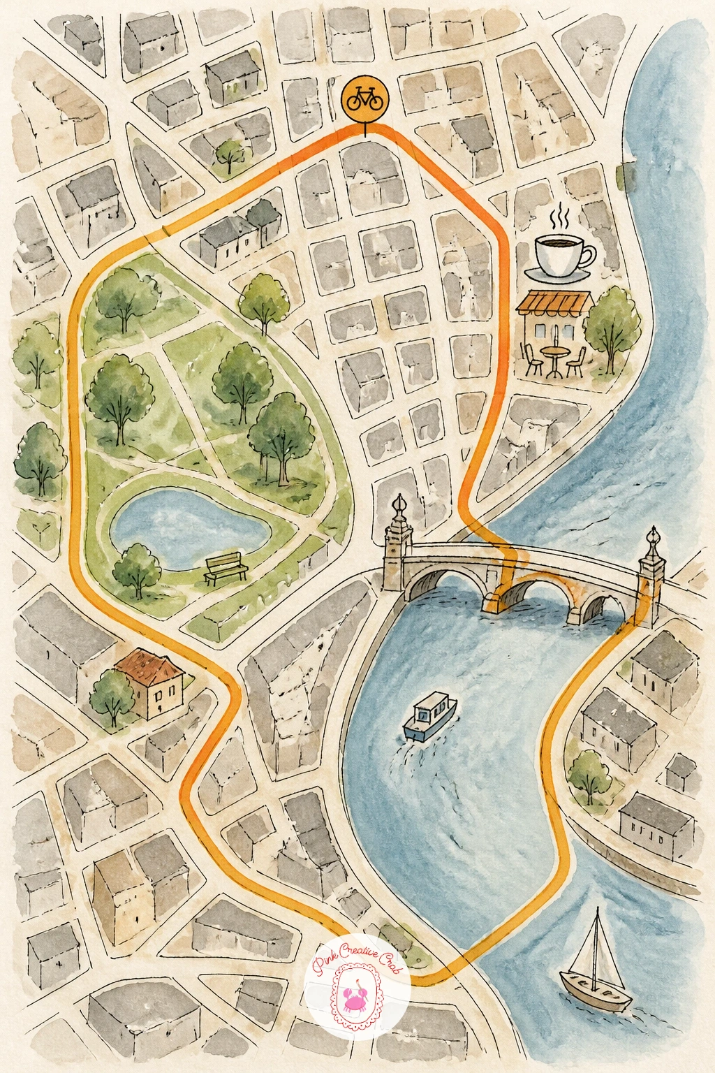
Palette: Route Orange,Muted Grey,River Blue,Park Green
Return to stillness with a map of a Japanese garden, smaller and quieter than the Kyoto temple map earlier and focused on one enclosed space. Pencil a winding gravel path first, then a small pond with a curved wooden bridge, a stone lantern, and a few carefully placed trees rather than a dense forest.
Ink the bridge’s gentle arch and the lantern’s simple stacked shape, then paint the pond in still, pale blue-green with a few koi suggested as tiny orange dashes beneath the surface. Keep the overall palette restrained, moss green, soft grey stone, a touch of red at the bridge, rather than the busier colors used on livelier maps earlier in this list.
If this is your first time leaving deliberate empty space on a page, this garden is the idea to practice it on: resist filling every corner, since the calm, uncluttered feel of a Japanese garden depends on the gaps as much as the elements you do draw.
A single raked line pattern in the gravel path, just a few parallel ink lines, adds quiet detail without crowding the composition.
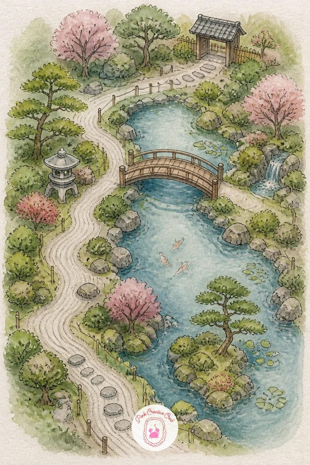
Palette: Moss Green,Stone Grey,Pond Blue Green,Bridge Red
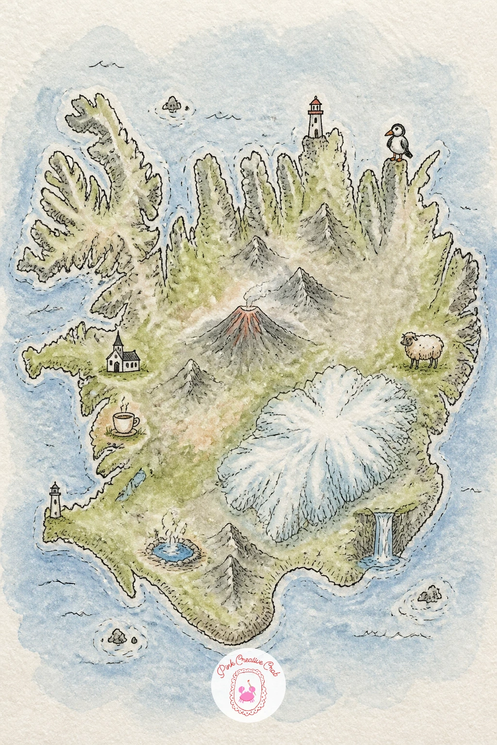
Head somewhere rugged and dramatic with a map of Iceland, where the terrain itself is the main character rather than any city. Pencil the island’s irregular outline first, then mark a few features inland and along the coast: a volcano, a glacier, a waterfall, a hot spring, each with its own small icon.
Ink the coastline with a slightly jagged, fjord-cut edge rather than a smooth curve, since Iceland’s coastline is famously uneven and that irregularity is part of what makes the shape recognizable. Paint the interior in cool greys and mossy greens, then let the glacier sit as pale icy blue-white and the volcano’s peak carry a touch of warm red at its tip.
Swap any blue you are missing for whatever cool color sits closest to it in your set, since the overall cool, moody palette matters more here than any single exact hue.
A fine spatter of white gouache or a flicked, loaded toothbrush across the glacier area once the blue wash is dry suggests snow texture quickly, without painting individual flakes by hand.
You Will Need
- old toothbrush for spatter (optional)
Palette: Moss Green,Glacier Blue,Cool Grey,Volcano Red
Bring the focus back to something sweet with a map of a city’s best bakeries, close cousin to the earlier coffee crawl but built entirely around pastries instead. Pencil a simple street layout first, then mark four or five bakeries, each a small shopfront with its own signature treat drawn out front, a croissant, a cake slice, a loaf of bread.
Ink each shopfront with its own small awning shape, then paint the buildings in a warm, appetizing palette, buttery yellow, soft pink, warm brown, so the whole map feels like a page from a well loved guidebook. Give each pastry icon its own bright true color so they stand out clearly even at a small size.
Every awning turning out the same shade of red is the easy habit to fall into, flattening the individuality of each stop. Vary the awning colors and stripe patterns deliberately, bakery to bakery, so the map reads as several distinct places rather than one repeated building.
If pastries are more fun to paint than storefronts, the easy watercolor food ideas list has plenty of small treats worth practicing before you shrink them down for this map.
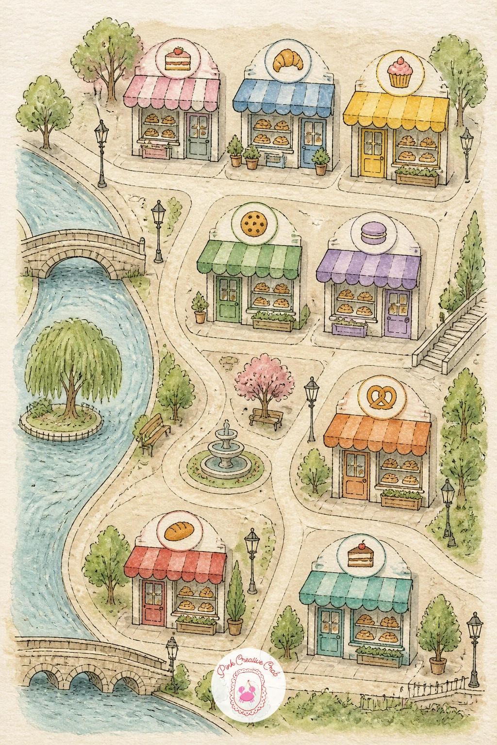
Palette: Buttery Yellow,Soft Pink,Warm Brown,Cherry Red
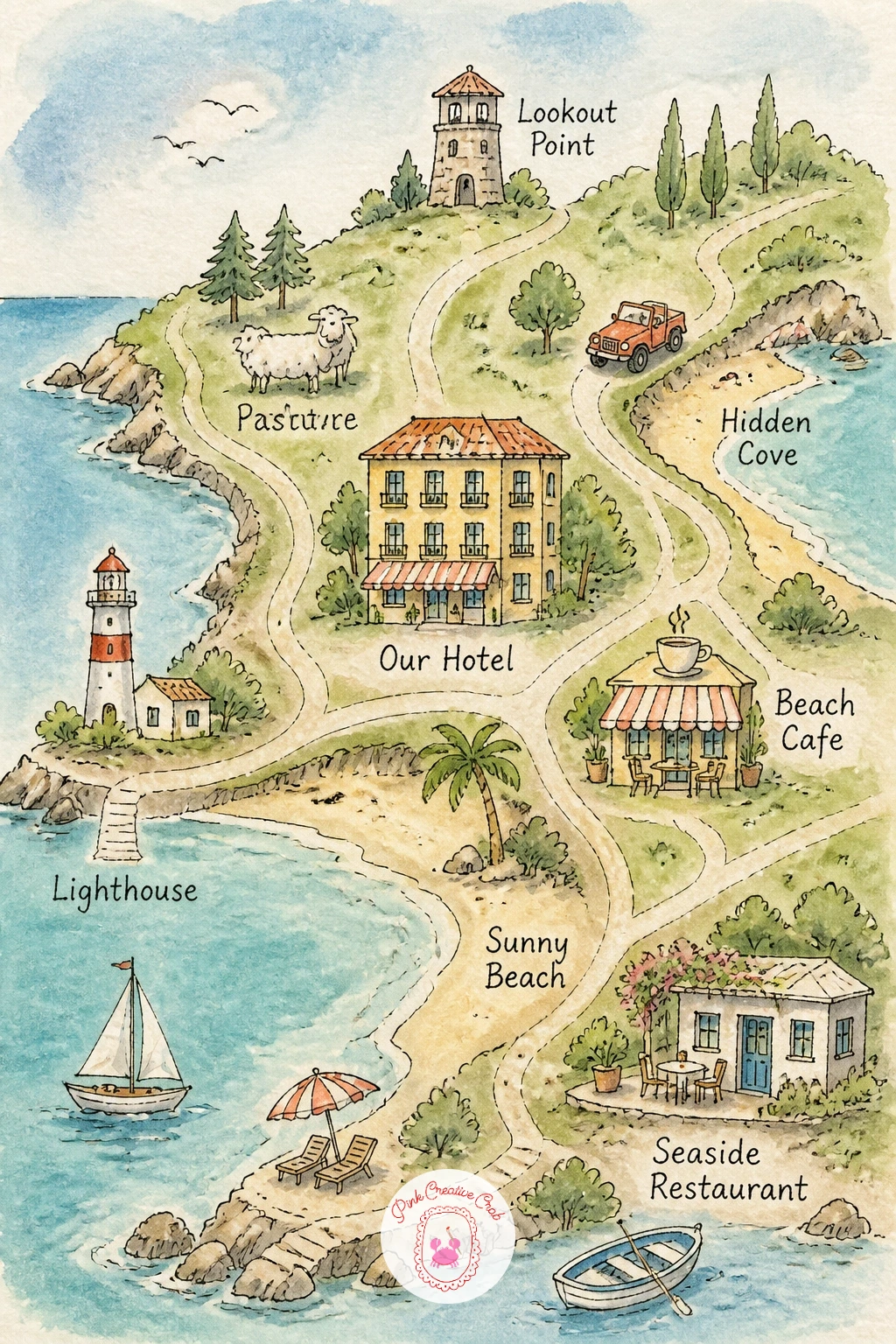
Close the collection with a map of a single family vacation, the most personal piece on the whole list and a natural keepsake. Pencil the destination’s rough shape first, coastline, town or countryside depending on where the trip happened, then mark the actual places visited, the hotel, a favorite restaurant, a beach or park, each with a small dated label.
Ink each stop as a tiny labeled icon, then paint the overall landscape in whatever palette suits the real place, leaning on the techniques from earlier ideas on this list, warm sand for a beach trip, green hills for the countryside, dense colorful blocks for a city break.
Vary this one every time you travel again, since the whole appeal of a vacation map is that it never repeats: next time, try marking the route with little footprints or a dotted line showing each day’s loop rather than just floating pins.
One concrete finishing touch pulls the whole piece together: letter the trip dates and a single word for each day along the bottom border once the paint is fully dry, turning the map into a quiet, finished record of the whole trip.
Palette: Warm Sand,Soft Blue,Meadow Green,Sunset Orange
What to Do Next
Choose one map that matches a place you already love, pencil the main shapes loosely on a page of cold press paper, and let the rest follow one small icon at a time. Keep the first attempt simple, since a finished, slightly imperfect map will always teach you more than a perfect one left half done.
Frequently Asked Questions
What paper works best for a watercolor map?
Cold press watercolor paper around 140 pounds works best for a watercolor map. It takes repeated washes without buckling too much and still holds fine ink lines cleanly for small landmark icons and lettering.
Should you draw the map in pencil before inking it?
Yes, always pencil the whole layout first before any ink touches the page. Light pencil guides let you fix proportions, move a building or widen a road before committing to permanent lines.
What pen keeps ink from bleeding into watercolor paint?
A waterproof fine liner or pigment pen keeps ink crisp under watercolor. Test a scrap first, since some inks still smear slightly under very wet washes even when labeled waterproof.
How do you keep a watercolor map from looking too busy?
Leave deliberate empty space between icons and limit each map to five or six focal details. Too many small drawings packed together make the layout hard to read, even when each one is nicely painted.
Can you make a watercolor map without any drawing experience?
Yes, simplified shapes and tiny icons are forgiving even for a first attempt. Loose, slightly wobbly lines actually suit the vintage map style, so there is no need for architectural precision anywhere on the page.
Have any thoughts?
Share your reaction or leave a quick response — we’d love to hear what you think!
-
 0
-
0
-
0
-
0
-
0
-
0


