Winter art is at its best on a small page, where a mug of tea or a pair of wool socks by the stove can hold a whole afternoon of light and warmth. This list works through indoor corners, window views and short outdoor scenes, so your sketchbook fills up with the small, true moments of the season instead of one big ambitious painting you never finish.
Every idea below is sized for one sitting: a page of fineliner line work with gouache and colored pencil layered on top, cream paper doing a lot of the quiet work in the background. Work through them in any order, but the early ones are the most forgiving if you want a gentle way back into the sketchbook.
Using these images: free for personal projects such as printing, coloring, cards, journals and gifts. Handmade items that include them may be sold up to 30 pieces per design. More than that is commercial use and is not permitted, and neither is selling or sharing the images themselves or passing them off as your own. Please ask before any other use.
Start with hands knitting, since hands are the one subject in this whole sketchbook worth a few extra minutes of looking before you commit any ink. Pencil the basic blocks first: a rounded hand shape top and bottom, knitting needles as two long parallel lines crossing at an angle, and the moss green sweater piece as a soft rectangle with a wavy knit edge. Go in with fineliner only once the gesture feels right, then lay gouache in two or three green values so the knit has some roundness to it.
Compare the length of the needles to the width of the hand, that one ratio keeps the whole thing from drifting into giant fingers or toy-sized needles. If the proportions still look off after inking, a light wash of gouache over the whole hand can push it back and let you redraw the outline on top.
Keep the window behind loose: a few vertical panes and a soft gray-white smudge of colored pencil for falling snow is enough, it should read as background, not compete with the hands.
Today’s tip: draw the hands first in pencil only, check the needle-to-hand ratio, and only pick up the fineliner once that measurement feels right.
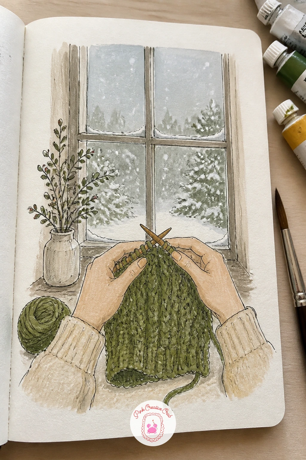
Palette: Moss Green, Payne’s Grey, Warm White, Raw Sienna
Feet propped up in wool socks make a relaxed subject to follow the knitting page with, since you are still drawing a limb but this time there is no need for careful finger detail. Block the legs in pencil at a slight diagonal, feet crossed or side by side, then ink the sock outline with a wavy ribbed top edge rather than a straight hem, that wavy line is what sells “wool” over “drawing of a sock.”
Work the wood stove in behind as a dark rectangle with a small glowing slot of orange gouache, and let that warm color be the brightest thing on the page. If the feet end up looking flat, switch to colored pencil over the gouache base and add a few diagonal hatch lines for the ribbing texture, pressing harder at the heel and toe where the wool pulls tight.
No wood stove at hand to look at: a radiator or a space heater glowing orange in the corner works exactly the same way.
Today’s tip: draw the ribbed top edge of each sock as a wavy line, never straight, it is the one mark that makes wool look like wool.
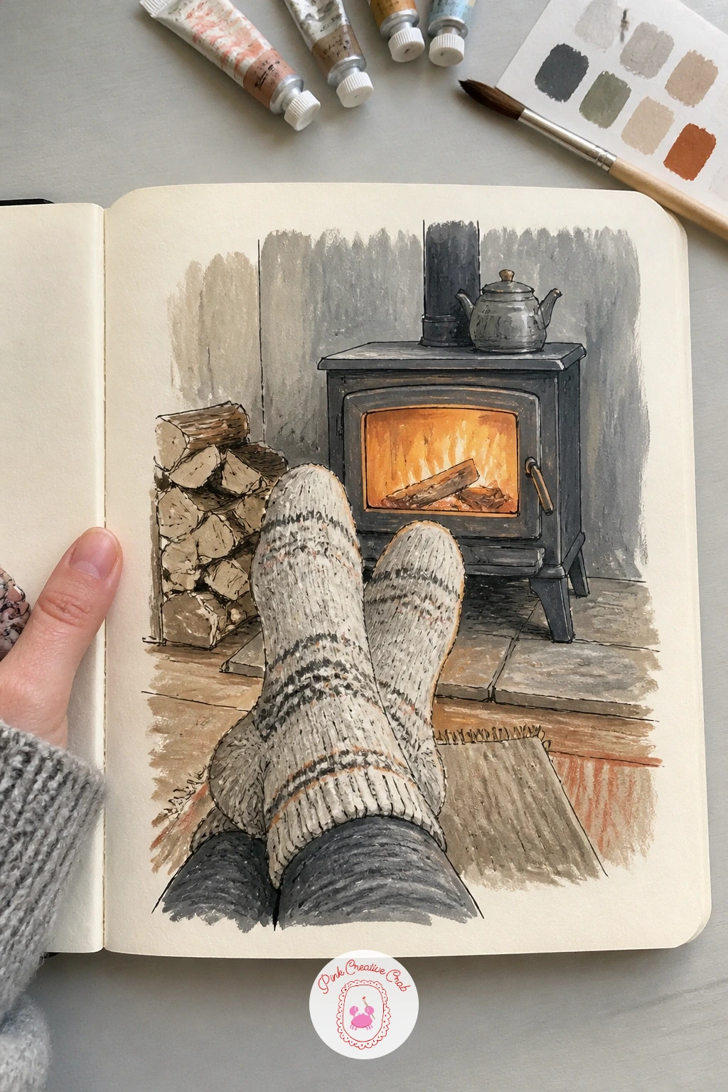
Palette: Oatmeal, Burnt Orange, Charcoal Grey, Cream White
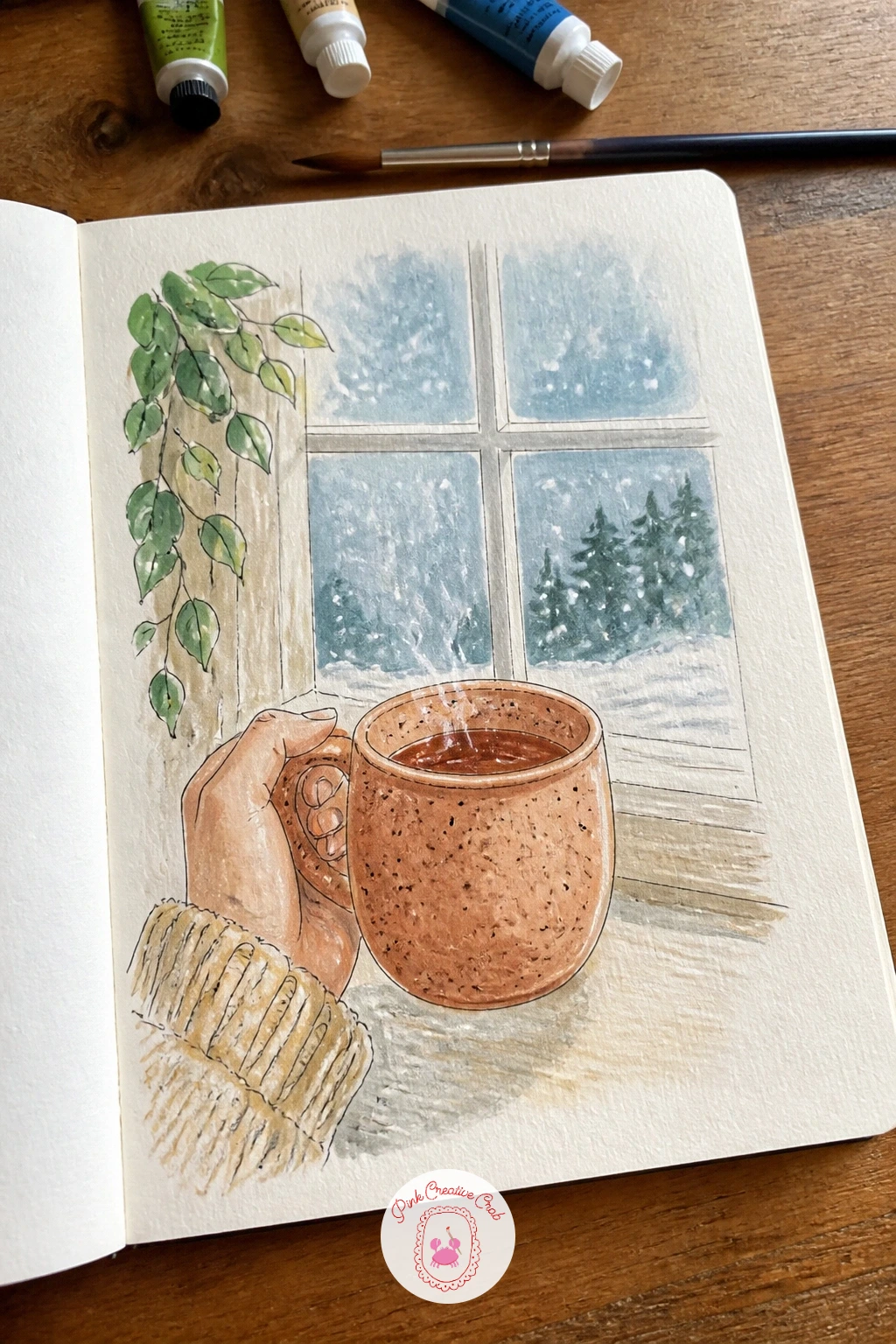
A speckled mug held in one hand is a small still life wearing a hand, so draw the mug’s shape first and let the fingers wrap around it after. Start the mug as a simple cylinder in pencil, ink the handle and rim, then use the tip of a round brush loaded with gouache to dot the speckles rather than drawing each one with the fineliner, which quickly looks too neat for stoneware.
The hand holding it is where beginners tense up, so keep the fingers as soft rounded shapes that curl around the curve of the mug rather than separate sausage shapes laid beside it. Steam rising above the mug can be one pale wavy line of colored pencil, nothing more elaborate is needed.
For the snow outside the window, flick a loaded toothbrush lightly over a piece of scrap paper first to check the spatter before you try it on the page itself.
Today’s tip: dot the mug’s speckles with a brush rather than a pen, it reads as fired clay instead of a printed pattern.
You Will Need
- old toothbrush for snow spatter
Palette: Terracotta, Cream, Soft Grey, Pale Blue
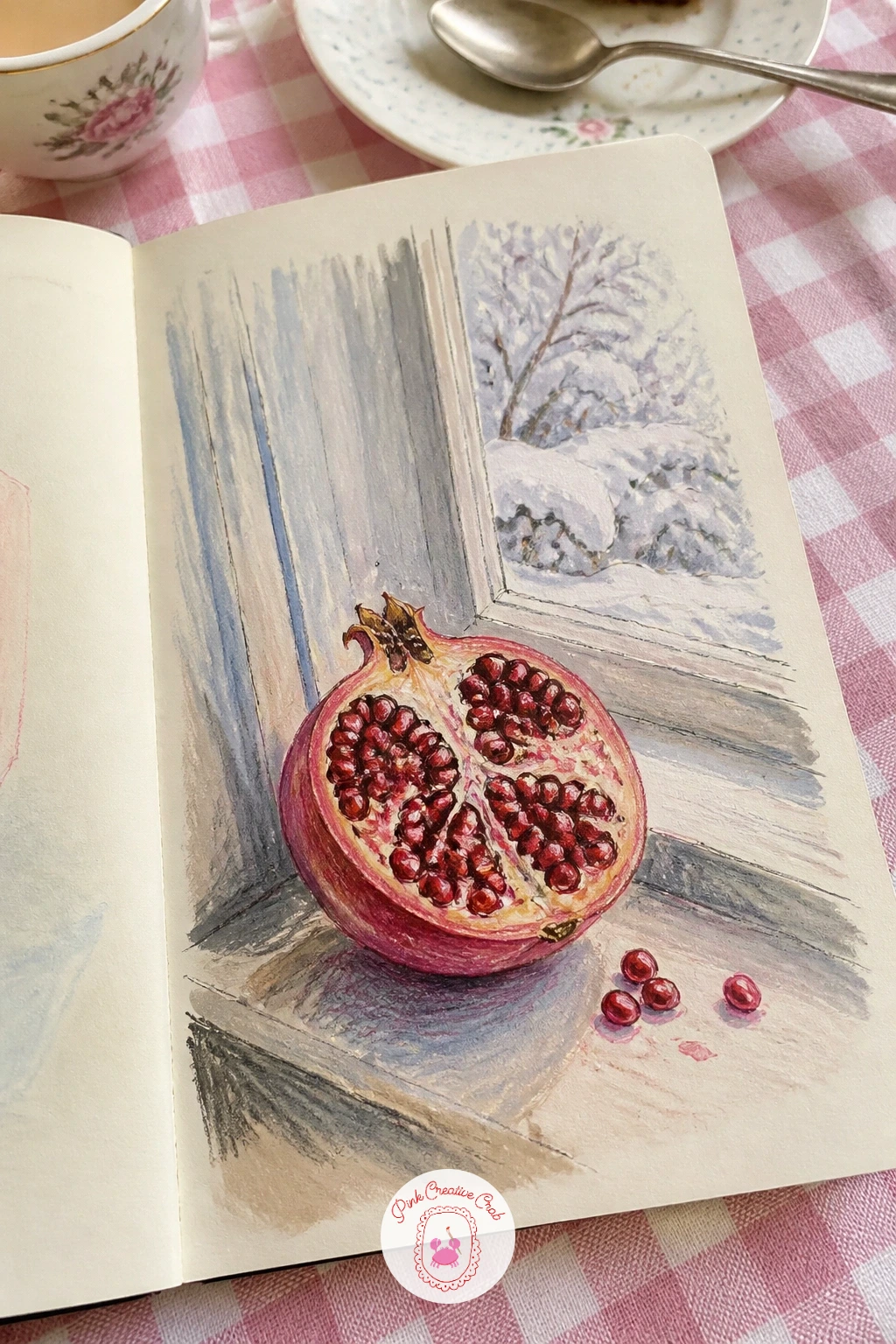
Move from hands to a quiet still life with a pomegranate cut open on a snowy windowsill, the kind of page that rewards slow color work more than careful drawing. Pencil the whole fruit as two overlapping circles, the cut half and the whole half, then ink only the outer skin edges and a few seed clusters, leaving most of the interior for paint.
Gouache goes down first in flat deep red for the seeds, then colored pencil on top picks out the tiny faceted highlights seed by seed once the paint is dry, that layering is what gives pomegranate seeds their glassy look rather than a flat red blob. The pale skin takes a warm pink-grey with a few darker lines following the fruit’s curve.
If the seeds start looking like a solid mass, leave small slivers of the cream paper showing between clusters, that bare paper reads as light catching the surface.
Today’s tip: paint the seeds flat first, then add colored pencil highlights seed by seed once dry, never try to get the sparkle in one pass.
Palette: Alizarin Crimson, Dusty Pink, Pale Blue Grey, Cream
Try this with a blood orange instead if pomegranate seeds feel fiddly, the sections give you bold flat color with far less detail work.
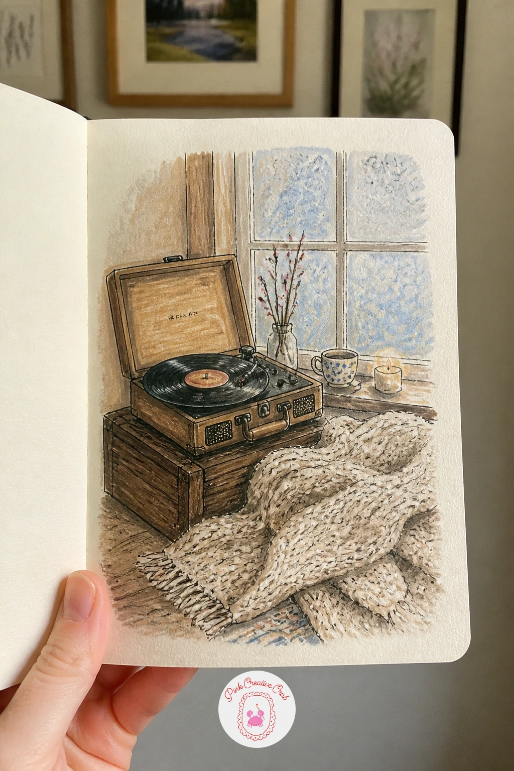
A record player spinning by a frosty window brings a bit of machinery into the sketchbook, which means straight lines and a true circle matter more here than on any page so far. Trace the turntable platter with a coin or a bottle cap rather than freehanding it, a wobbly circle is the first thing anyone notices on this subject.
Build the player’s body as a simple low rectangle in pencil, ink the tonearm as one clean diagonal line resting near the edge of the record, then add the record’s grooves as a handful of very fine concentric lines, not dozens, a few is enough to suggest motion.
Let the blanket on the floor spill into the lower third of the page in soft colored pencil texture, horizontal strokes for a knit throw, to balance the hard geometry of the turntable above it.
Today’s tip: trace the record itself with any round object you have on your desk, a true circle sells the whole machine far better than a careful freehand attempt.
You Will Need
- small round object to trace the record
Palette: Walnut Brown, Charcoal Grey, Dusty Rose, Pale Blue
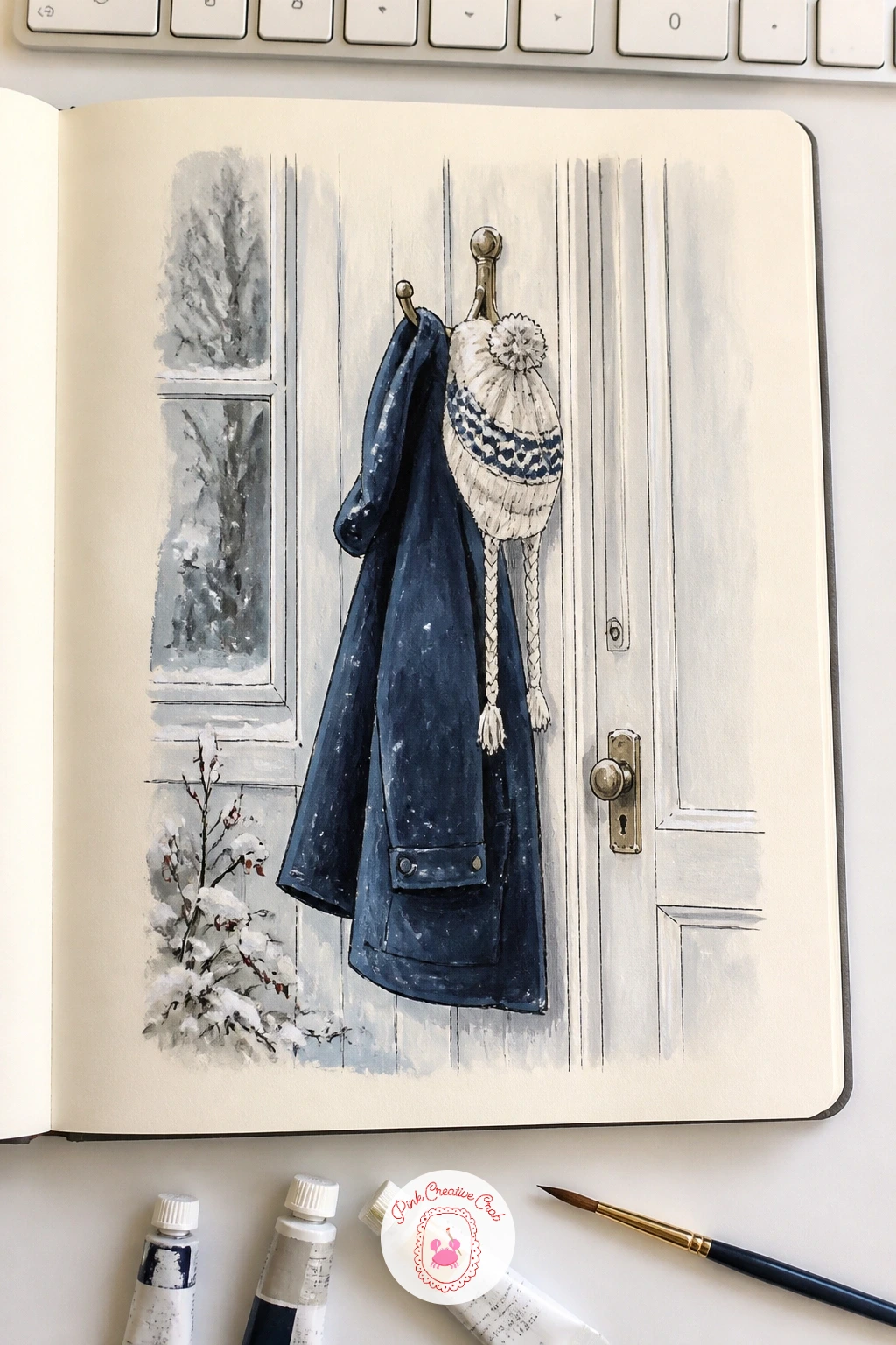
A girl’s winter coat and hat hanging on a hook by the door is really a study in hanging fabric, so look at how a coat drapes before you draw it rather than drawing a coat shape from memory. Pencil the hook first, then let the coat hang from it with the shoulders sagging slightly forward, the hem swinging a little to one side, that asymmetry is what makes it look hung rather than laid flat.
Ink the outline loosely, then use colored pencil to build a few deep folds where the fabric bunches near the hook and under the collar, pressing harder in the folds and lighter on the parts catching window light. The hat can sit on a second hook or rest on top of the coat’s collar, whichever balances the page better.
A glimpse of snowy door behind, just a vertical panel and a cold sliver of light underneath, is enough setting, it does not need a full hallway.
Today’s tip: let the hem hang unevenly and add two or three deep folds near the hook, a coat drawn perfectly symmetrical always looks stiff.
Palette: Navy Blue, Mustard Yellow, Soft White, Slate Grey
Sit this one on a step, literally, since a snowy backyard seen from the back steps is your first small landscape and the eye level of someone sitting low changes everything about where the shadows fall. Looking out from a low seated position, the snow in the foreground rises up close to fill the bottom third of the page before the yard opens out behind it, so block that horizon line low rather than centering it.
Snow is never white on paper, it is blue-grey in shadow and warm cream where sun hits it, so mix a cool blue-grey gouache for the shaded drifts near fences and tree trunks and save pure white or cream paper for the lit patches. Ink only the structural lines, a fence post, a tree trunk, a garden edge, and let color do the rest of the work describing the snow’s surface.
If the whole page starts looking flat and white, push the blue shadows a shade darker than feels natural, snow always needs more contrast than it seems to have in person.
Today’s tip: mix one cool blue-grey for every shadow on the snow, then keep pure white or bare paper only for the sunlit patches, that contrast is what makes snow look cold.
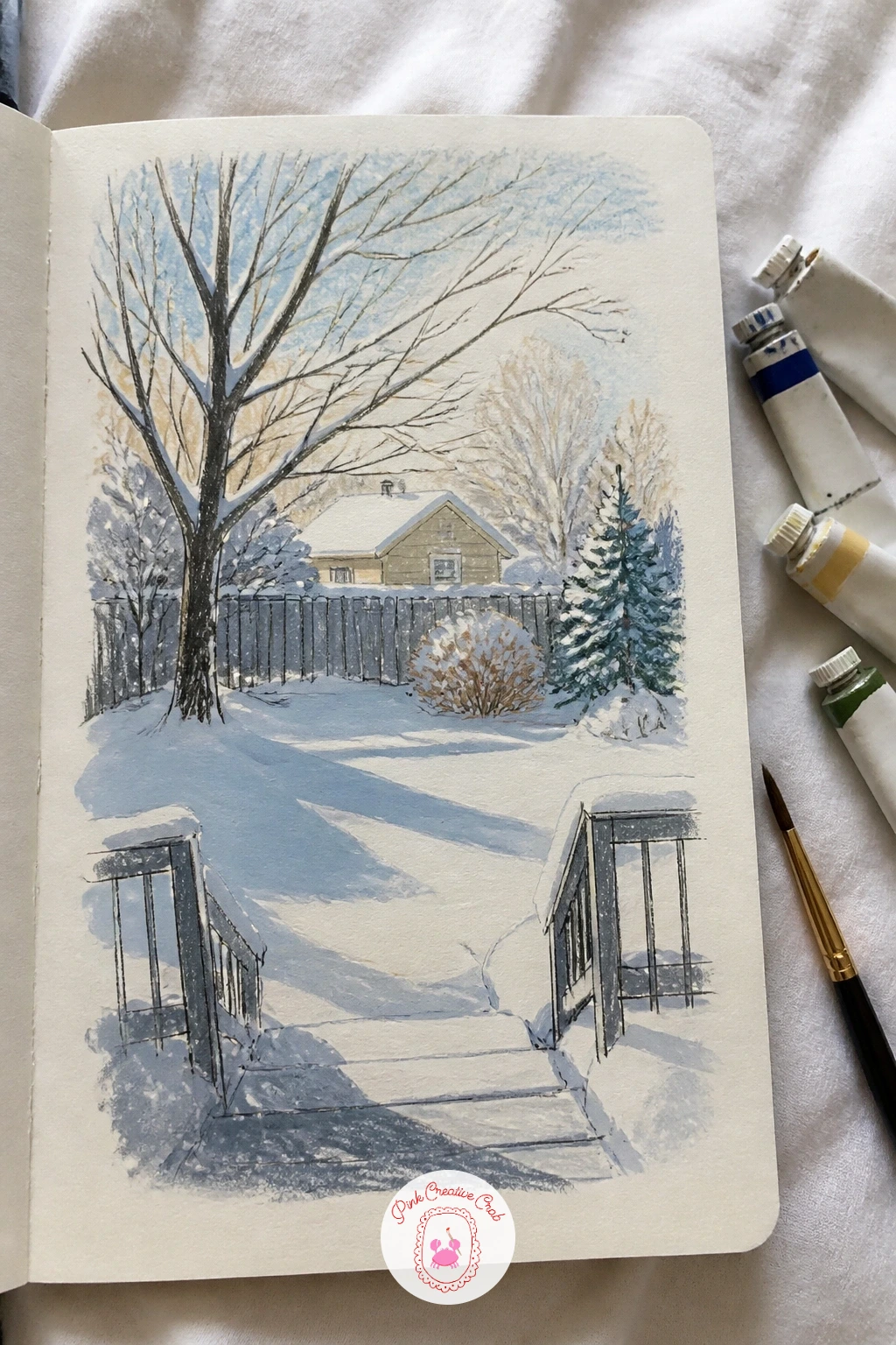
Palette: Payne’s Grey, Cerulean Blue, Cream White, Dark Umber
Ice skates hanging by their laces from a hallway nail give you a small hanging still life, continuing nicely from the coat on its hook a few pages back. Pencil the nail first as a tiny mark, then let the laces drape down from it in two loose curves before the boots hang below, skates always hang slightly uneven, one boot a touch lower than the other.
Ink the boot shapes and the blade beneath each one, keeping the blade as one clean curved line rather than trying to draw its full thickness, a single confident stroke reads as sharpened steel far better than a careful outline. Leather boots take warm brown gouache with a darker wash in the creases near the ankle, while the blades stay cool silver-grey with one bright white highlight each.
If the laces look stiff, loosen your wrist and redraw them as a single continuous wavy line rather than several short straight segments.
Today’s tip: draw each blade as one confident curved stroke rather than outlining its full width, that single line is what makes it look sharp.
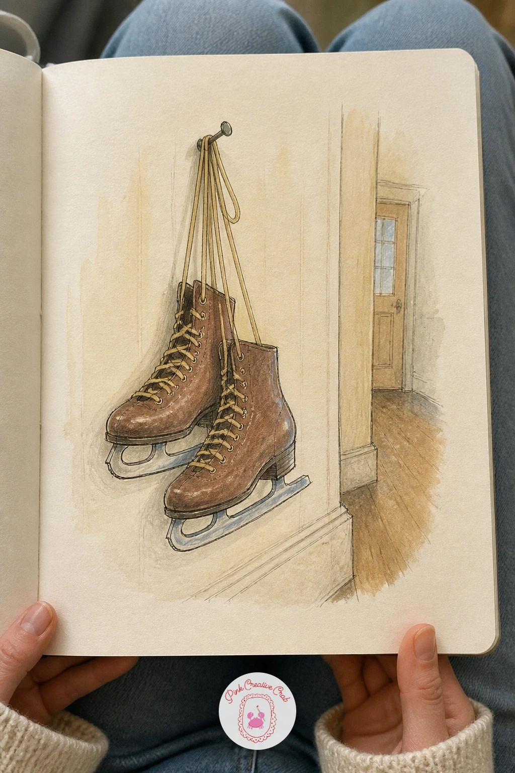
Palette: Dark Umber, Silver Grey, Cream, Charcoal
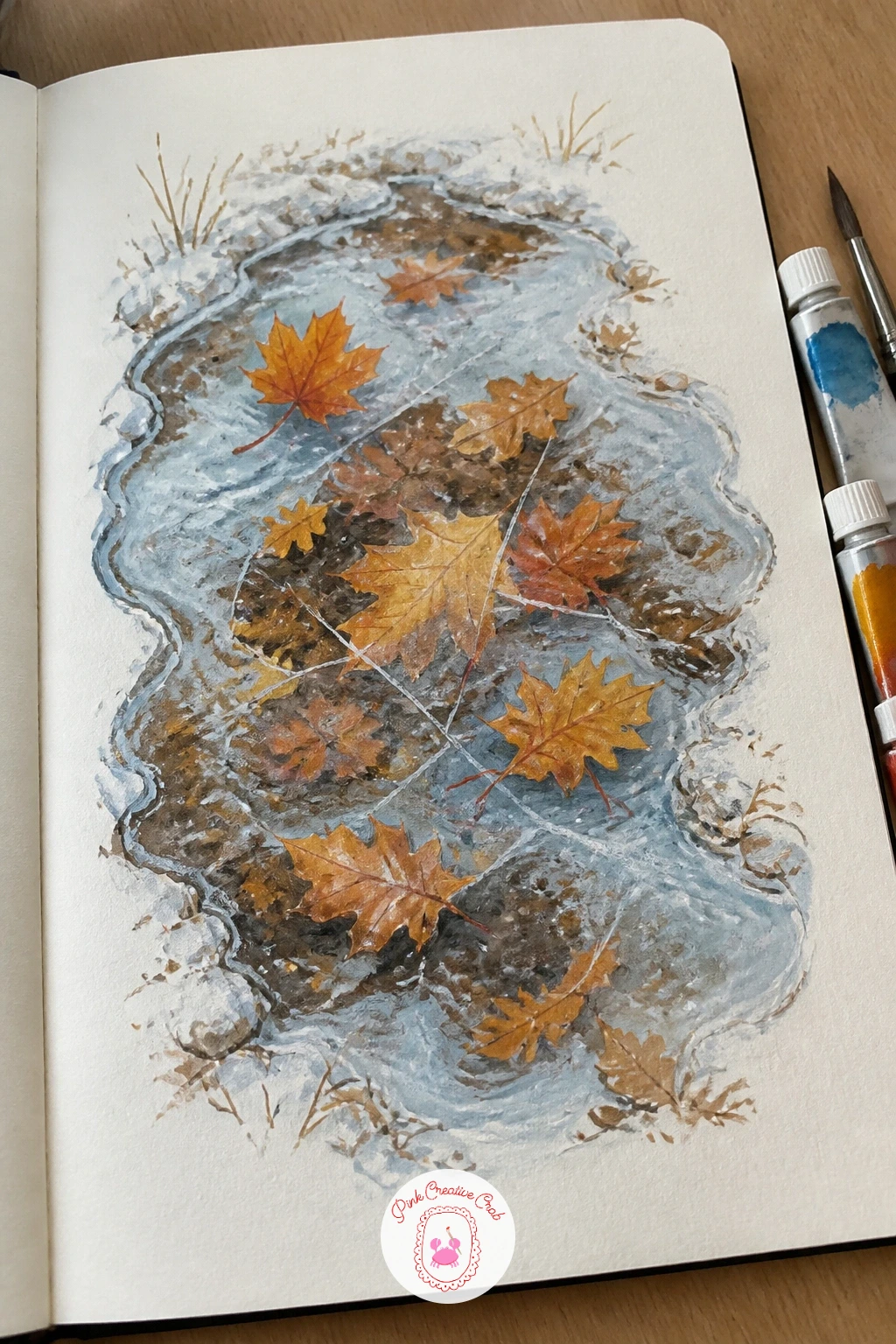
Frozen puddles with autumn leaves trapped underneath are one of the most satisfying small studies in this whole list, since the ice does the drawing for you once you understand how light moves across it. Pencil the puddle’s outline as an irregular oval, then place three or four leaf shapes inside it at different sizes and angles before any ink touches the page, scattered, never lined up.
Ink the leaves first in full color and detail, as if the ice were not there at all, then go back over the entire puddle with a very pale blue-white gouache wash thinned almost to transparency, that thin wash is what pushes the leaves back under a surface instead of sitting on top of it.
Add the ice’s own texture last with a white gel pen for a few sharp crack lines radiating out from one edge, that is the detail that convinces the eye it is frozen rather than wet.
Today’s tip: paint the leaves in full detail before adding the ice wash on top, drawing them through the ice from the start never looks convincing.
You Will Need
- white gel pen for crack lines
Palette: Burnt Sienna, Golden Ochre, Pale Ice Blue, Payne’s Grey
A houseplant shelf in pale winter light gives you a whole row of different leaf shapes to practice, and the cat climbing it adds a little mischief to keep the page from feeling like a plant catalogue. Pencil the shelf as one simple horizontal line first, then build three or four pots along it at varied heights, that variation in height is what keeps a row of plants from looking like soldiers.
Ink each plant’s leaf shapes distinctly, a trailing pothos as long thin loops, a snake plant as tall straight blades, so the silhouettes read differently even before color goes on. The cat climbing partway up a shelf edge or batting at a trailing vine should be drawn as a few simple curved shapes, no need for fur detail, just the gesture of a paw reaching.
If the shelf feels crowded, remove one pot entirely rather than shrinking all of them to fit, fewer plants drawn with confidence beats several drawn small and timid.
Today’s tip: give each plant a distinctly different leaf shape, that variety does more for the page than careful detail on any single leaf.
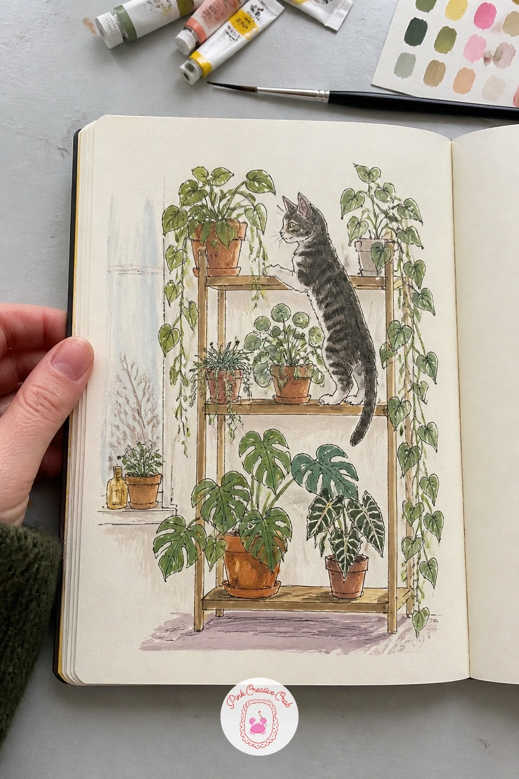
Palette: Sap Green, Terracotta, Pale Grey, Charcoal
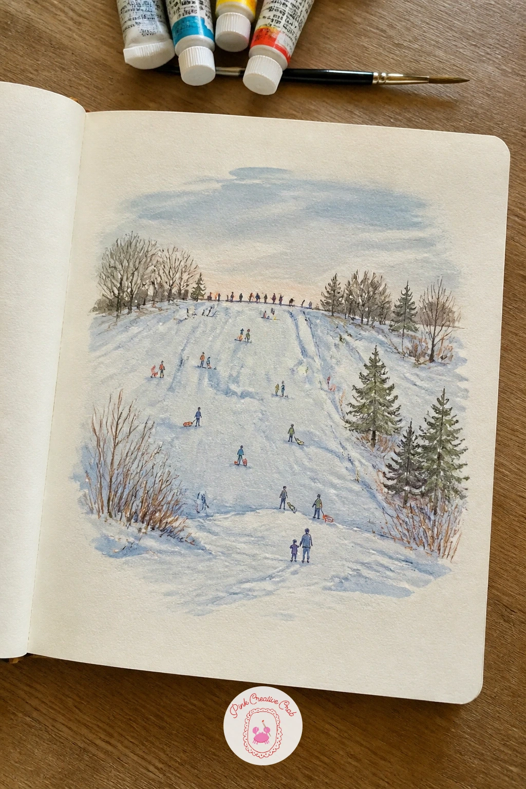
Here the eye moves out to a sledding hill seen from a distance, and the whole trick of this page is in how small you keep the figures on it. Block the hill first as one sweeping curved line from top corner to bottom edge, then place three or four tiny colored dots and dashes for sledders, each no taller than a fingernail, scattered at different points along the slope rather than lined up in a row.
Because they sit so far off, each figure needs only a scarf-colored dash of gouache and a tiny dark dot for a head, any more detail and they stop reading as distant. The hill itself carries the real work of the page: shade it in soft blue-grey where the slope turns away from the light, leave the crest nearly bare paper where sun catches it directly.
If the figures end up looking like blobs instead of people, add one tiny line beneath each for a sled, that single mark is often all it takes to clarify the scene.
Today’s tip: keep every sledder under a fingernail’s height and add one small line for a sled beneath each, scale is the whole subject here.
Palette: Pale Blue Grey, Cream White, Berry Red, Forest Green
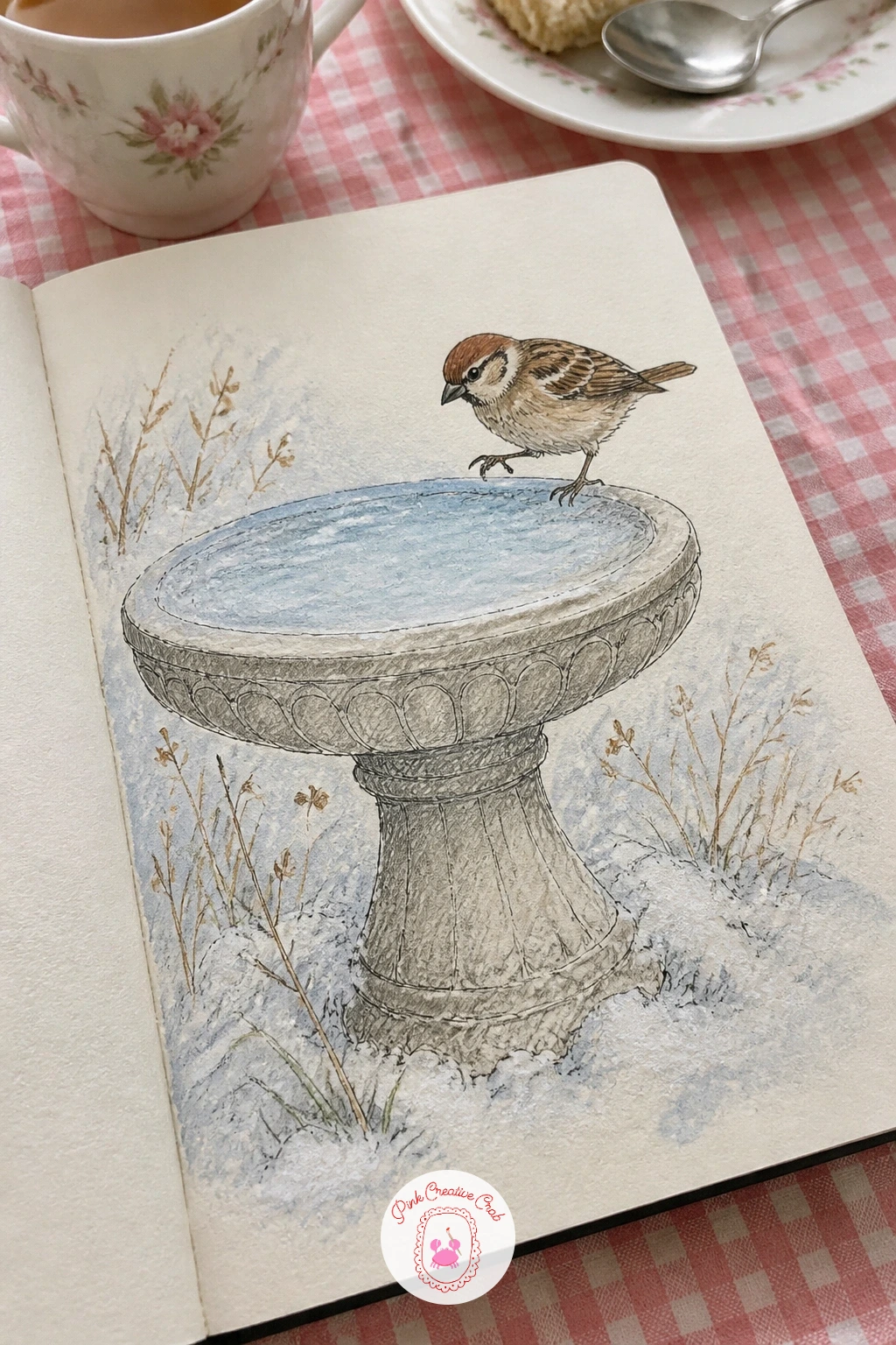
A sparrow testing the ice in a snowy bird bath moves the focus to a small bit of animal observation, and the bird’s weight on its feet is what will sell the whole gesture. Pencil the bird bath first as a simple pedestal and shallow bowl shape, then place the sparrow at the bowl’s icy edge with one foot slightly lifted, as if testing before committing its weight.
Ink the sparrow in a few confident strokes, round body, short tail angled up, rather than careful feather-by-feather detail, sparrows read as fluffed round shapes from any distance. Colored pencil then builds the soft mottled brown of its back with short overlapping strokes, while the ice in the bowl stays a flat pale blue-white with one or two fine white cracks.
If the sparrow looks too stiff, round the belly out a little further than feels right, a slightly overfed silhouette is closer to how sparrows actually look in winter.
Today’s tip: lift one of the sparrow’s feet slightly off the ice rather than planting both flat, that small gesture is what tells the story of testing the surface.
Palette: Burnt Umber, Warm Grey, Pale Ice Blue, Cream
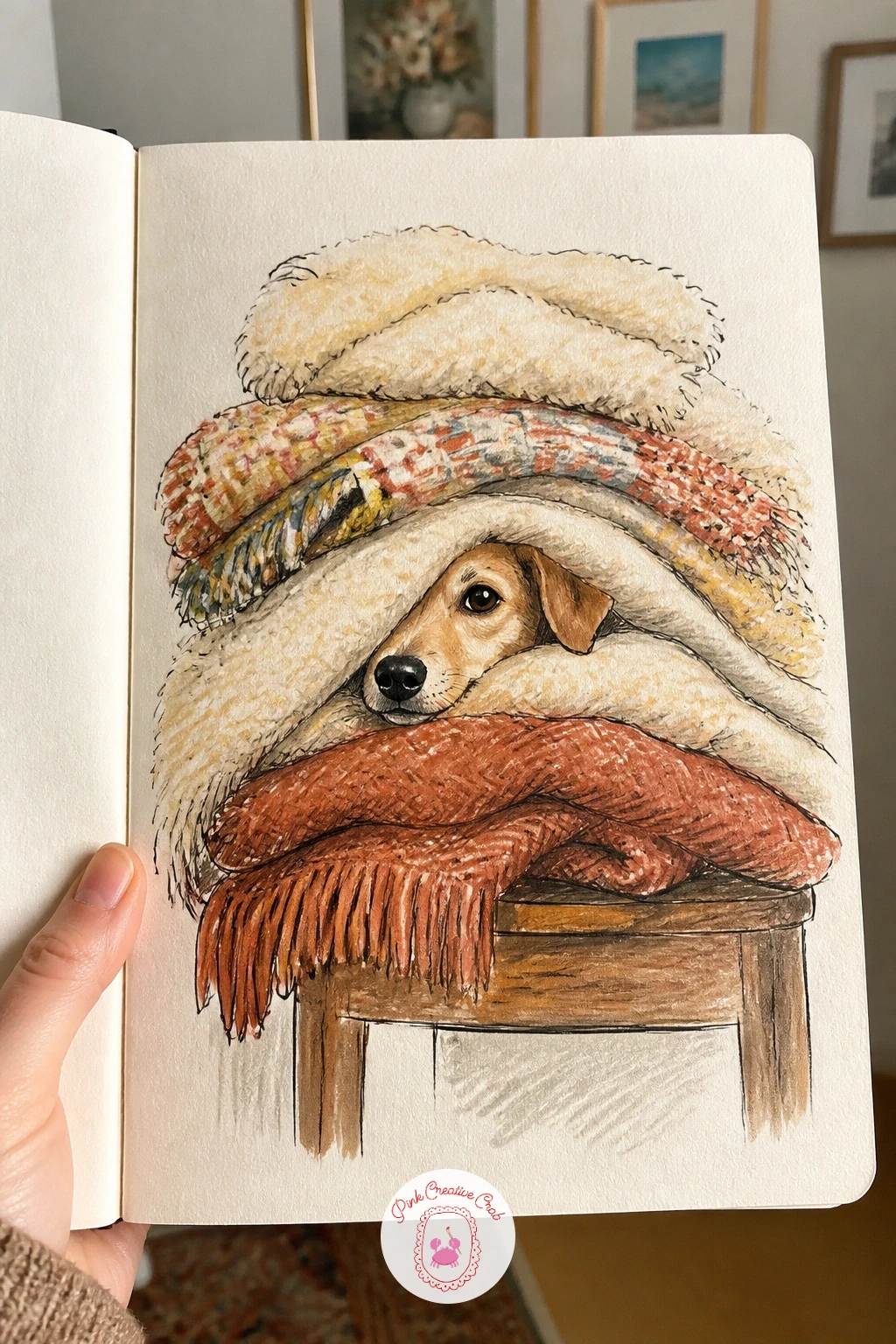
A dog nosing under a pile of wool blankets on a chair is mostly a drawing of fabric with just a nose and one ear peeking out, which makes it a surprisingly relaxed page after the sparrow’s careful detail. Pencil the chair and the blanket pile as one soft rounded mound first, then tuck a small triangular ear shape and a dark nose into one corner of the mound before anything else goes in.
Ink the blanket folds with long curving lines that all sweep toward the spot where the dog is pushing through, that direction is what makes the fabric look disturbed by something underneath rather than just rumpled on its own. Colored pencil adds plaid or stripe texture to one or two blanket layers, a quick scatter of crossed lines is enough, no need to render a full tartan pattern.
If the dog’s presence is not reading, darken the small gap right around the nose and ear, that pocket of shadow is what convinces the eye something warm is hiding in there.
Today’s tip: sweep every fold line toward the spot where the dog pushes through, that single direction is what makes a blanket pile look alive.
Palette: Oatmeal, Rust Red, Charcoal, Cream
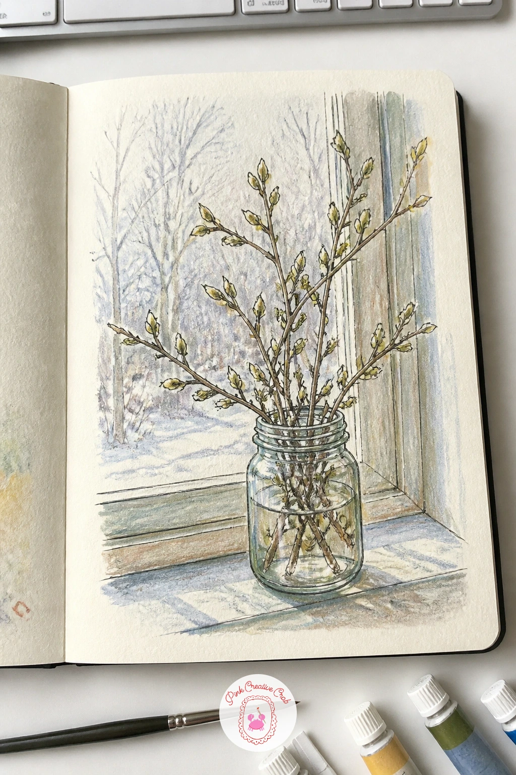
A jar of budding branches on a February windowsill is the kind of page that rewards patience with negative space, since the branches themselves are mostly thin lines and the life is in what happens around them. Pencil the jar as a simple cylinder, then let two or three branches rise up and out of it at different angles, never parallel, with small swollen buds marked as tiny ovals along their length.
Ink the branches with a slightly varying line weight, thicker near the jar and tapering thinner toward each tip, that taper alone makes a stick look like it is actually growing rather than lying flat on the page. A pale wash of warm yellow-green gouache dabbed only at the bud tips suggests new growth without needing to paint full leaves.
If the composition feels empty, add a second smaller jar or a single fallen bud beside it on the sill rather than adding more branches to the same jar.
Today’s tip: taper every branch line from thick near the jar to thin at the tip, that single change in line weight does most of the work of suggesting growth.
Palette: Olive Green, Soft Yellow, Pale Blue Grey, Umber
Pussy willow or forsythia branches both work well for this if you can find them, their buds are large enough to paint with real confidence at this scale.
A winter walk with a dog down a long snowy path turns the sketchbook outward again, this time with real depth to manage rather than a single close subject. Set the eye level at standing height looking straight down the path, and let that path narrow sharply as it recedes, with the dog and its lead drawn noticeably larger in the foreground than the trees lining the distance.
Ink the path’s edges first since they establish the whole perspective, then place the dog just off center rather than dead center, walking slightly ahead or trailing a half step behind for a more natural gesture. Trees along either side shrink in both height and detail as they go back, full branch structure up close, just a simple dark smudge of a shape far off.
If the path looks flat instead of receding, check that the gap between its two edges actually narrows as it moves up the page, a path with parallel edges all the way up will never read as distance.
Today’s tip: let the path’s edges visibly narrow as they go up the page and shrink your trees along with it, that single perspective move creates most of the depth.
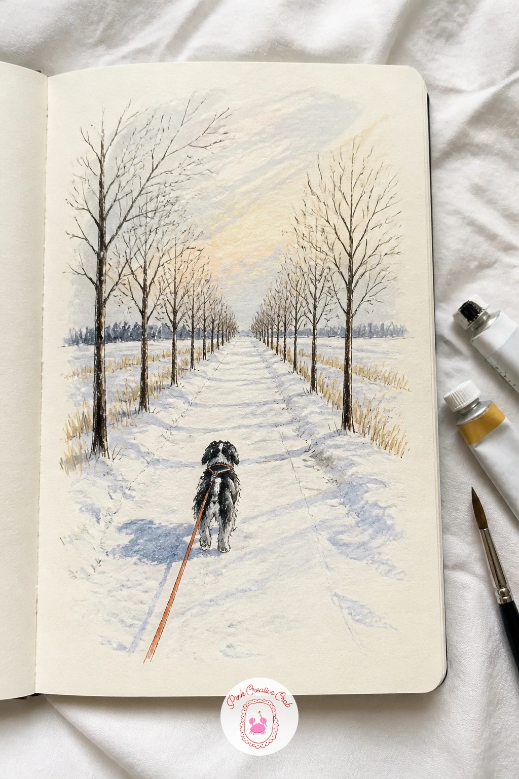
Palette: Pale Blue Grey, Dark Umber, Cream White, Forest Green
A skating pond seen from a bench with a thermos beside you combines the distant figures from the sledding hill with a bit of foreground still life, so this page asks you to manage two very different scales at once. Draw the thermos large and close in one corner first, since it anchors the whole page, then build the pond further back with a much lighter hand, smaller skaters as simple curved dashes of color gliding across the ice.
Ink the thermos with full detail, a cap, a handle, maybe a small dent, while the skaters get almost no linework at all, just a dot of color for a coat and a quick curved line for the motion of a leg. That contrast in detail between near and far is what actually creates the distance, more than anything you do with size alone.
If the pond’s surface looks too busy, simplify it to one flat wash of pale grey-blue gouache with just a few scratched highlight lines for ice texture.
Today’s tip: give the thermos full detail and the distant skaters almost none, that contrast in how much you draw is what pushes the pond back into the distance.
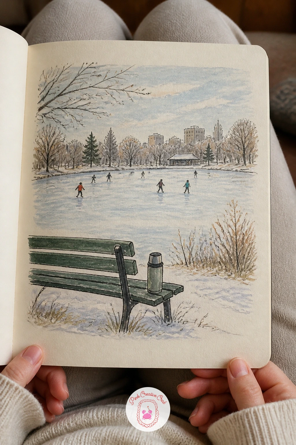
Palette: Steel Blue, Cream, Rust Orange, Charcoal
A friend wrapped in a giant scarf with only her eyes showing is a small portrait study that lets you skip almost the entire lower face, which makes it a kinder subject than it first looks. Pencil the head as a simple oval, then build the scarf up from the chin in loose overlapping loops that cover everything below the nose, leaving only the eyes and the top of the head with the hat visible.
Ink the eyes with real care since they now carry the whole expression of the page, a slight upward curve at the outer corner reads as a small smile even with the rest of the face hidden. The scarf’s knit texture comes from colored pencil in short diagonal strokes all running the same direction across each loop, which keeps the pattern from turning into static noise.
If the face feels lost in all that scarf, lighten the scarf’s color right around the eyes specifically, a paler halo there draws focus back to where it belongs.
Today’s tip: curve the outer corner of each eye slightly upward, that tiny detail carries the whole expression when the rest of the face is wrapped away.
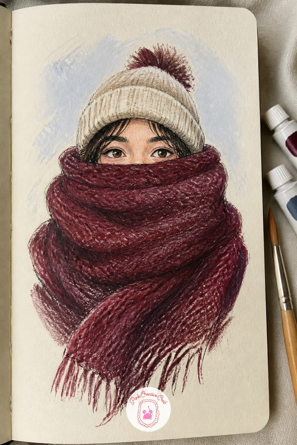
Palette: Burgundy, Cream, Charcoal Brown, Soft Pink
Turn the mirror around for a self portrait in a bobble hat with fogged-up glasses, which sounds tricky but the fog actually does most of the hard work for you by hiding the exact detail of the eyes. Pencil the head and hat shape first, oversized bobble sitting slightly off to one side for character, then draw the glasses as simple rounded rectangles sitting on the nose before adding any fog at all.
Ink everything except the lenses themselves, then leave those lens areas as near-blank pale grey-white gouache with just the faintest hint of eye shape ghosting through, that restraint is the entire trick of a convincing fogged lens. Rosy cheeks in colored pencil, applied with small circular strokes just under the glasses, add the warmth that makes it read as cold outside, warm inside.
If drawing your own face from a mirror feels daunting, work from a quick phone photo instead and simplify what you see rather than copying every detail.
Today’s tip: leave the glasses lenses almost blank, just a ghost of the eyes showing through pale grey, that restraint is what makes fog actually look like fog.
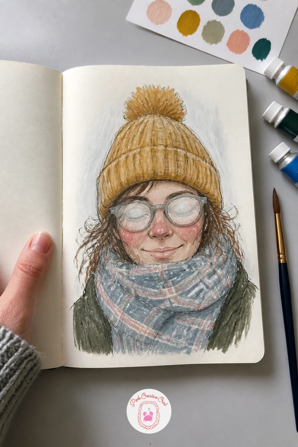
Palette: Mustard Yellow, Soft Pink, Pale Grey, Charcoal Brown
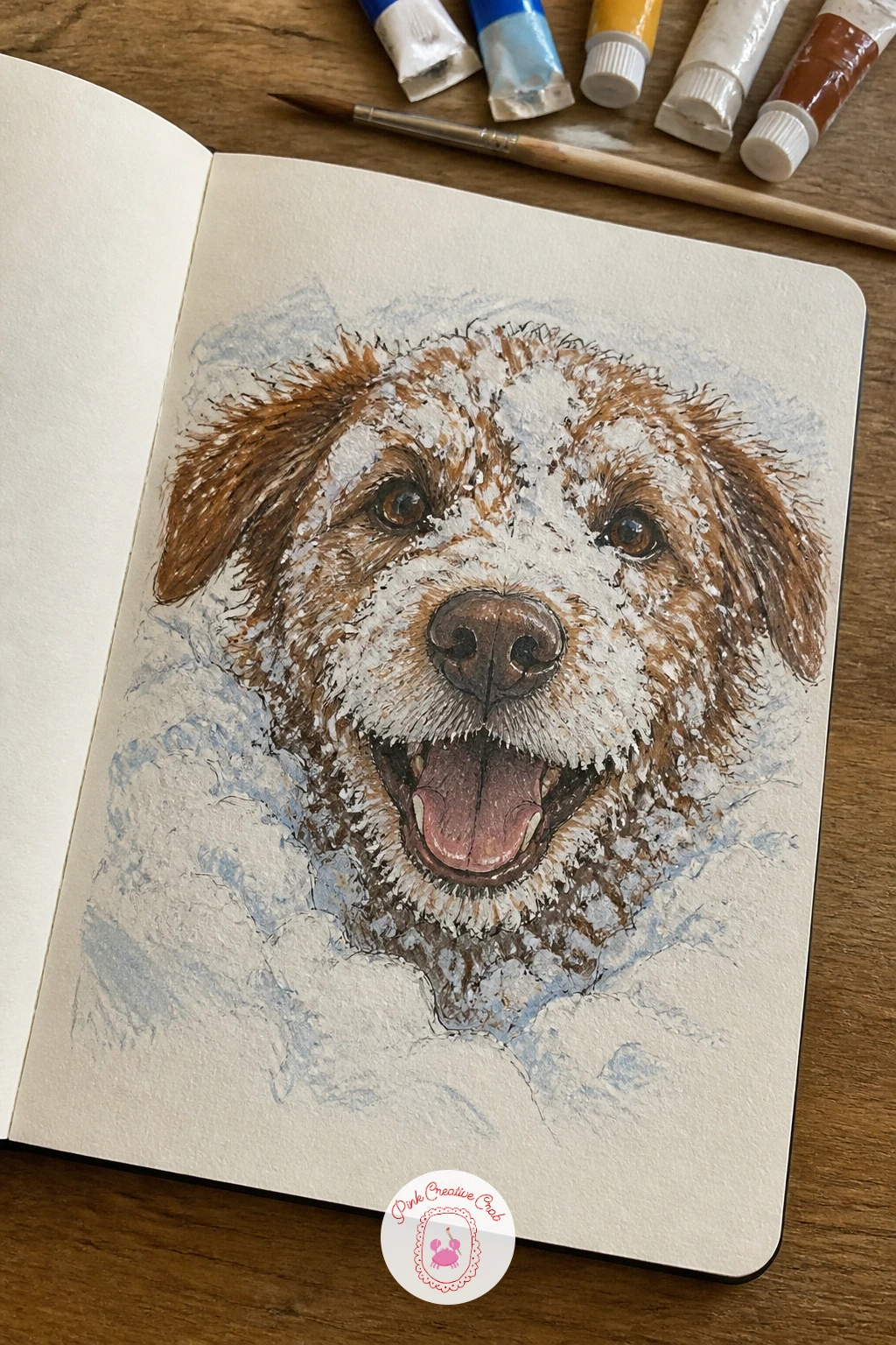
A dog’s snowy face fresh from digging in a drift is a quick, cheerful subject, and the texture trick here does more work than the drawing itself. Pencil the dog’s face close up, filling most of the page, with snow already clumped on the muzzle and around the eyes before any ink goes down, so the structure of the fur is already interrupted by the snow rather than snow added as an afterthought.
Ink the eyes and nose first since they anchor the expression, then use a dry brush loaded with just a little white gouache dragged lightly across the muzzle fur to pick up random clumps of snow texture, dry brush catches only the raised tooth of the paper and leaves broken, irregular marks that look exactly like clumped snow.
If the white gouache goes on too smooth and solid, blot the brush on scrap paper first to remove more paint than feels necessary, a drier brush always gives a more broken, snow-like mark.
Today’s tip: blot your brush nearly dry before dragging white gouache across the fur, a fully loaded brush gives a smooth stripe instead of believable clumped snow.
You Will Need
- dry brush for snow texture
Palette: Warm Brown, Cream White, Charcoal, Pale Blue
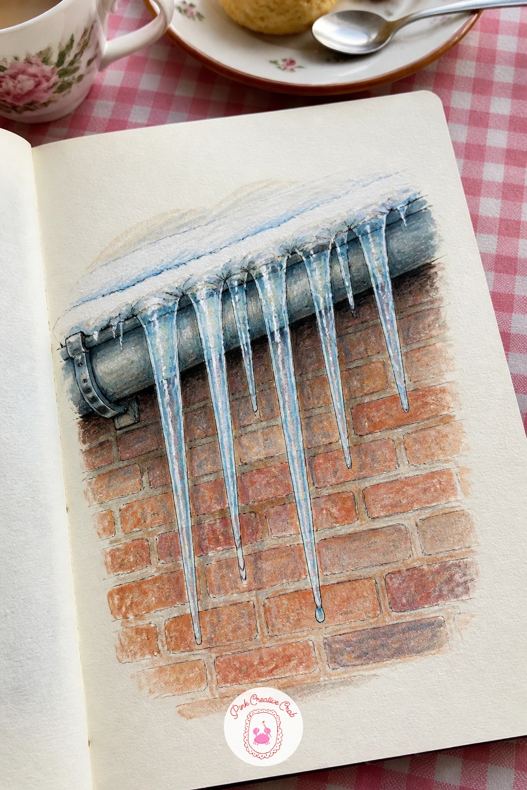
Icicles hanging from a gutter with one drop about to fall are a nice compact subject after the dog’s busy fur, pure clean line work with almost no fussy detail required. Pencil the gutter as one straight horizontal first, then drop a row of icicles from it at varying lengths, never evenly spaced, some long and thin, others short and stubby, that variation is what keeps a row of icicles from looking like a picket fence.
Ink each icicle with one confident tapering line down each side rather than trying to render faceted ice surfaces, and leave the single longest icicle with one tiny highlighted drop of water caught at its tip, drawn as a small bright dot of white gouache or even just bare paper.
Behind the icicles, a strip of pale blue sky or the soft blur of a brick wall keeps the page from feeling like icicles floating on nothing.
Today’s tip: vary the length and thickness of every icicle in the row, perfectly even icicles are the single fastest way to make this subject look stiff.
Palette: Pale Ice Blue, Brick Red, White, Charcoal
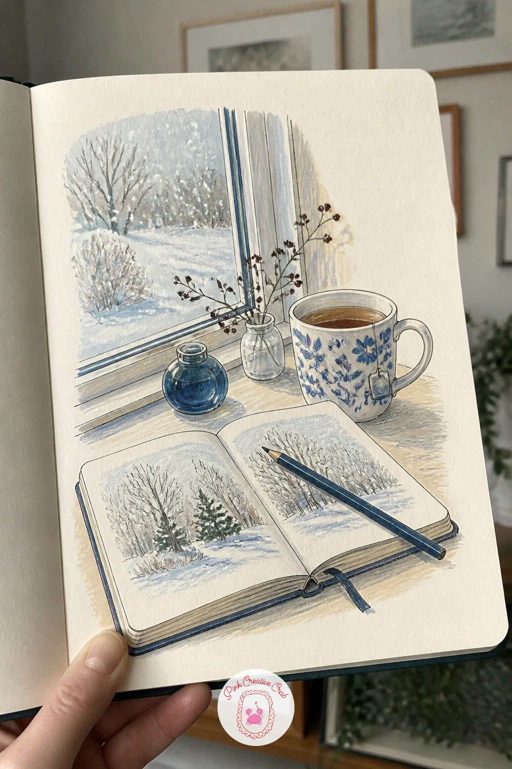
An open sketchbook and a cooling cup of tea on a desk by the window is a page about your own page, a small still life you can set up right in front of you without hunting for reference. Pencil the sketchbook first, open at an angle with one visible page edge catching the light, then add the mug slightly behind or beside it, its handle turned toward you for an easy, natural angle to draw.
Ink the sketchbook’s spine and page edges with care since straight confident lines matter more here than almost anywhere else in this list, a wobbly book edge is more noticeable than a wobbly leaf. A faint curl of colored pencil steam above the mug, and a soft blue wash for the window light falling across the desk, finish the mood without adding real detail.
If you want this done in ten minutes, keep it to just the mug and one open page with a pencil resting across it. Given forty minutes, add the window behind with its own soft snow-light and maybe a second mug or a stack of books beside the sketchbook.
Today’s tip: turn the mug handle toward you in the drawing, that small choice makes the whole still life feel like it was set up for your own hand to pick up.
Palette: Terracotta, Cream, Pale Blue, Charcoal
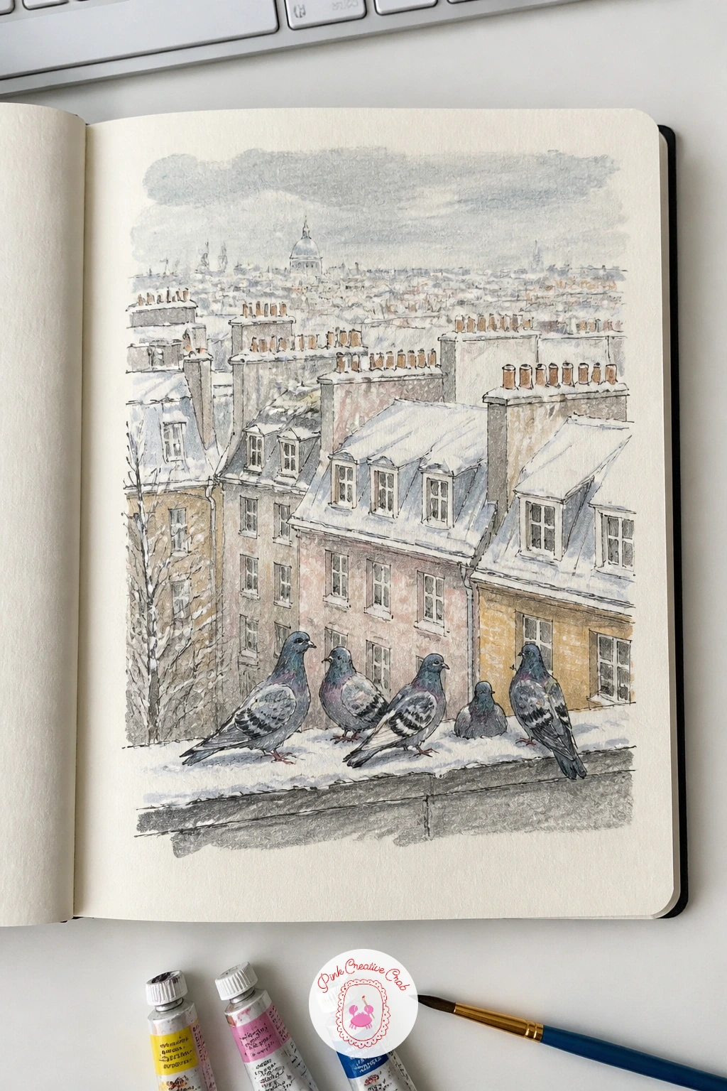
Climbing up to a snowy rooftop view from a top floor flat gives the sketchbook its widest scene so far, rows of rooftops receding into pale winter haze with a few pigeons perched close in the foreground for scale. Pencil the nearest roofline large and detailed across the lower half of the page, then let every roof behind it get progressively smaller, flatter and paler, fading almost into the sky by the top of the page.
Ink the near rooftop’s chimney pots and tile lines with full detail, then simplify dramatically as you move back, distant roofs becoming just a few flat shapes with barely any linework at all. Pigeons perched on the closest ledge, two or three round shapes with a simple head bob, give the eye something warm-toned and alive against all that cool grey and white.
If the rooftops start to feel like a flat pattern, push the nearest roof’s shadows noticeably darker than anything behind it, that contrast alone creates most of the sense of height and distance.
Today’s tip: darken the shadows on the nearest rooftop well beyond what feels natural, that contrast against the paler distant roofs is what makes the whole view feel high up.
Palette: Slate Grey, Brick Red, Pale Blue, Warm Grey
For more ideas on handling rooftops, chimneys and small winter cityscapes, the winter sketchbook ideas collection has several related city-view pages.
Dried hydrangeas in a jug beside a frosted pane bring a soft, papery texture into the sketchbook, a nice change of pace after the hard edges of the rooftop page. Pencil the jug first as a simple rounded vessel, then build the hydrangea head as one large cloud-like cluster rather than individual petals, breaking its outer edge with small bumps and dips so it reads as made of many small florets without drawing every single one.
Ink only the jug and the cluster’s outer silhouette, then switch entirely to colored pencil for the hydrangea’s papery texture, working in small short strokes in several dusty tones, faded pink, soft green, warm beige, layered loosely over each other rather than blended smooth. Dried flowers have lost their crispness, so let the strokes stay a little loose and uneven.
The frosted glass behind needs almost no detail, just a pale blue-white haze of gouache with the faintest hint of a windowpane line through it.
Today’s tip: build the hydrangea head’s edge with small bumps and dips rather than one smooth curve, that broken edge is what reads as a cluster of tiny dried florets.
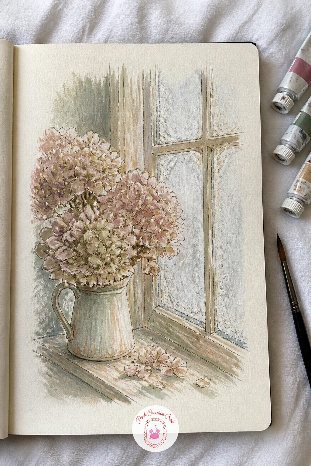
Palette: Dusty Pink, Sage Green, Warm Beige, Pale Blue
Two pairs of hands warming over an outdoor fire pit bring back the hand study from the start of this list, now lit from below for a completely different challenge. With a fire as the light source sitting low and close, shadows on the hands fall upward rather than down, fingers cast warm orange light onto the undersides of the palms above them while the backs of the hands away from the fire stay in cooler shadow.
Pencil the two pairs of hands first, reaching toward the center from opposite sides, fingers slightly spread and relaxed rather than pressed tightly together. Ink the hand outlines, then build the firelight with warm orange and yellow gouache concentrated on the lower edges of each finger and palm, while the upper, outer edges of the hands stay in a cooler violet-grey shadow.
If the lighting is not reading, exaggerate the warm-to-cool shift more than feels natural, a fire’s glow is far stronger and more orange than most people expect when they first try to paint it.
Today’s tip: light every hand from below with warm orange and shadow the upper edges with cool violet-grey, that reversed lighting is what makes firelight believable.
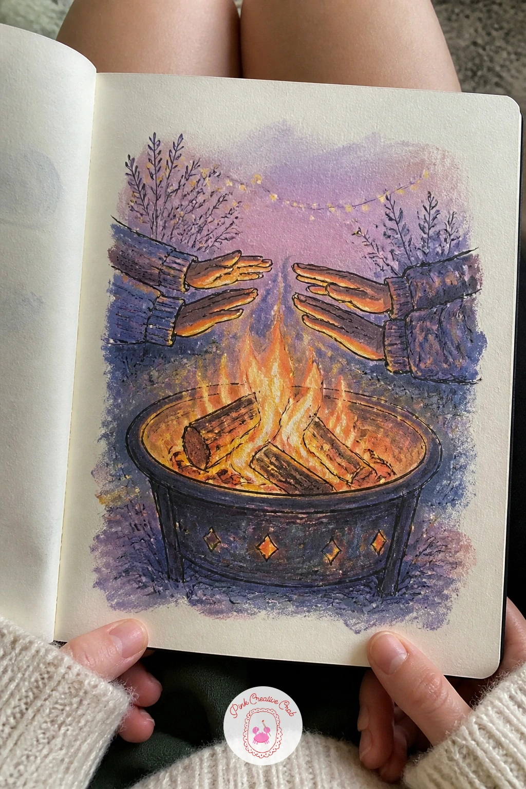
Palette: Burnt Orange, Violet Grey, Warm Yellow, Charcoal
A crow perched on a snowy chimney pot is a small, bold silhouette study, and the whole trick is resisting the urge to add any detail to that silhouette at all. Pencil the chimney pot as a simple cylinder with a snow cap balanced unevenly on top, then perch the crow at an angle on its rim, body facing slightly away from the viewer for a more natural, watchful pose.
Ink the crow as one solid black shape with barely any interior linework, just the suggestion of a beak and a single sharp eye catching the light, crows read as pure black silhouettes from any distance and adding feather detail usually only muddies the shape. The snow cap on the chimney gets a cool blue-grey shadow on the side away from the light, with the lit side left as bare cream paper.
If the crow’s shape feels lumpy, simplify it down to two overlapping ovals, body and head, before refining anything further.
Today’s tip: keep the crow as one solid black silhouette with only a beak and one eye picked out, resisting feather detail is what makes it look confidently drawn.
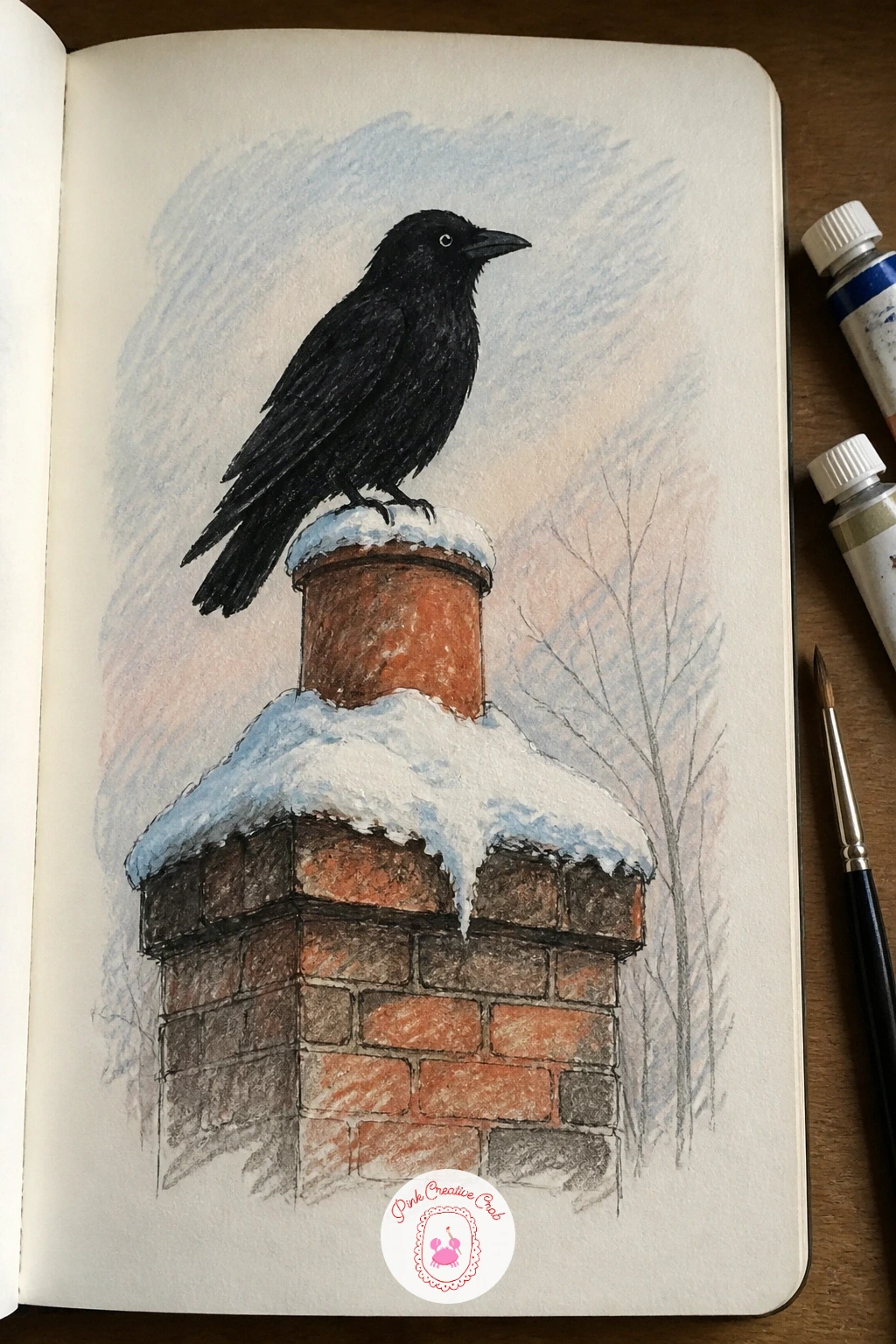
Palette: Jet Black, Pale Blue Grey, Cream, Brick Red
A moss green velvet armchair with a quilt draped over it and a snowy window behind sits comfortably at the end of a long day of sketchbook pages, since it borrows the velvet texture trick that rewards patience rather than speed. Pencil the chair’s rounded silhouette first, generous and overstuffed rather than boxy, then drape the quilt over one arm in a few long loose folds before adding any texture.
Ink the chair’s outline loosely, then build the velvet’s texture with colored pencil in short overlapping strokes all following the direction the fabric would naturally fall, darker green pressed into the seams and the undersides of the rolled arms, lighter strokes where the light catches the nap of the fabric directly. That directional stroke work is what makes velvet read as velvet rather than flat green paint.
The quilt’s pattern can stay simple, a few bold stripes or a soft plaid in colored pencil, with the snowy window behind kept pale and quiet so the chair stays the clear center of the page.
Today’s tip: layer the velvet’s colored pencil strokes in the direction the fabric falls, with darker pressure in every seam, that single habit is what sells velvet over flat color.
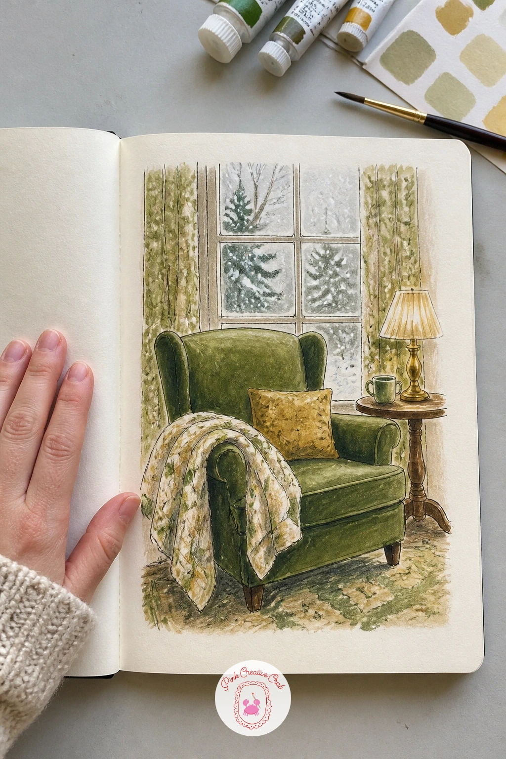
Palette: Moss Green, Mustard Yellow, Cream White, Charcoal
For more cozy indoor corners like this one, the winter oil painting ideas list has a similar armchair-and-window mood if you want to try it in paint.
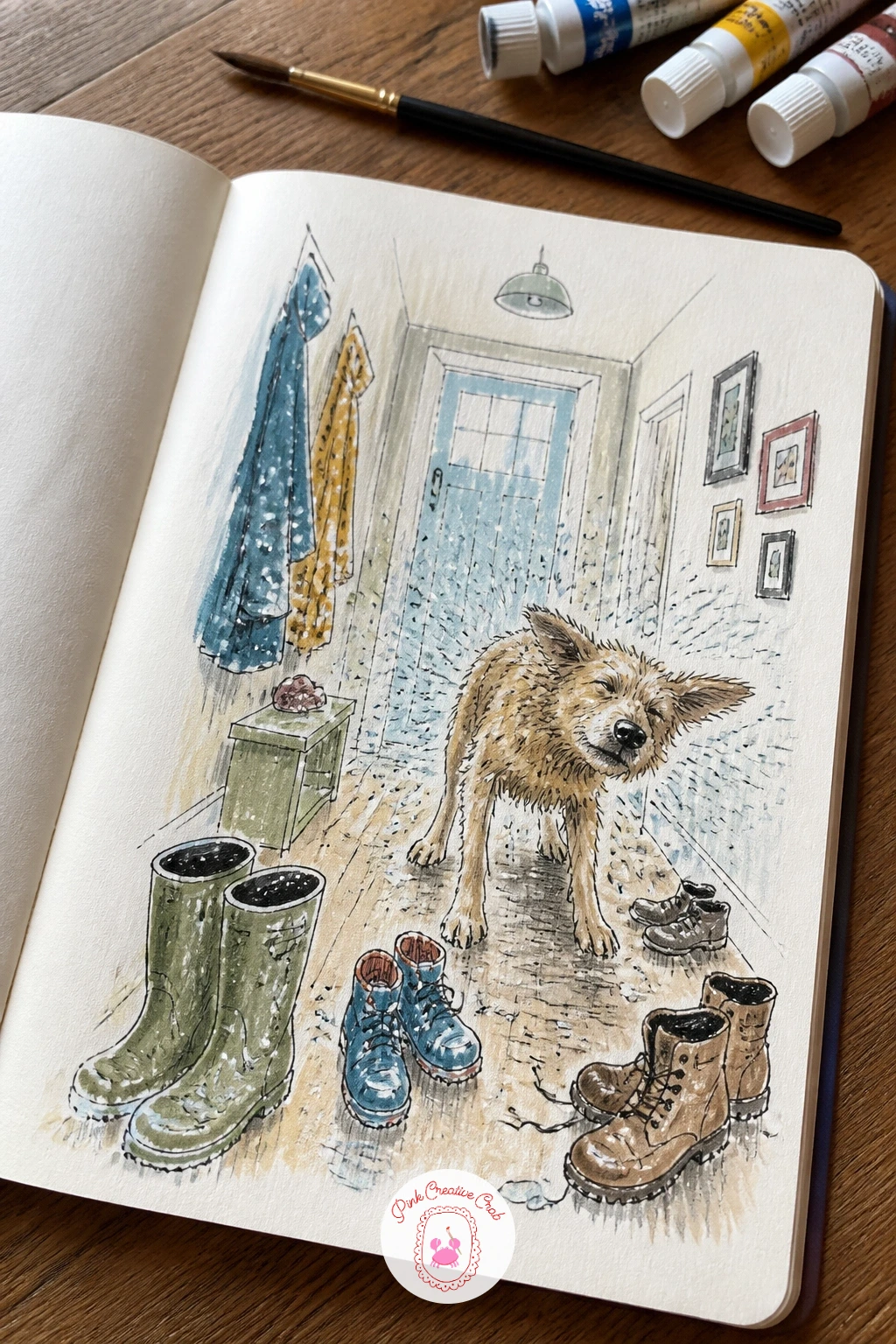
A hallway full of wet boots with a dog shaking off snow is the busiest, most energetic page in this whole list, so let the composition stay loose and slightly chaotic on purpose rather than tidying it up. Pencil a scatter of three or four boots first, kicked off at different angles rather than lined up neatly, then place the dog mid-shake in the middle of the hallway, body drawn as a soft blur of curved motion lines radiating outward from its fur.
Ink the boots with full solid detail since they stay still and hold the composition together, then switch to a much looser, quicker line for the dog itself, several overlapping curved strokes rather than one clean outline, that looseness is what reads as motion rather than a dog simply standing there wet.
A scatter of small white gouache dots flicked outward from the dog’s body, using the same dry toothbrush trick from the frozen puddle page, finishes the spray of shaking water convincingly.
Today’s tip: draw the dog with several loose overlapping lines instead of one clean outline, that deliberate looseness is the one thing that makes it read as mid-motion.
You Will Need
- old toothbrush for water spray
Palette: Dark Umber, Charcoal Grey, Cream, Steel Blue
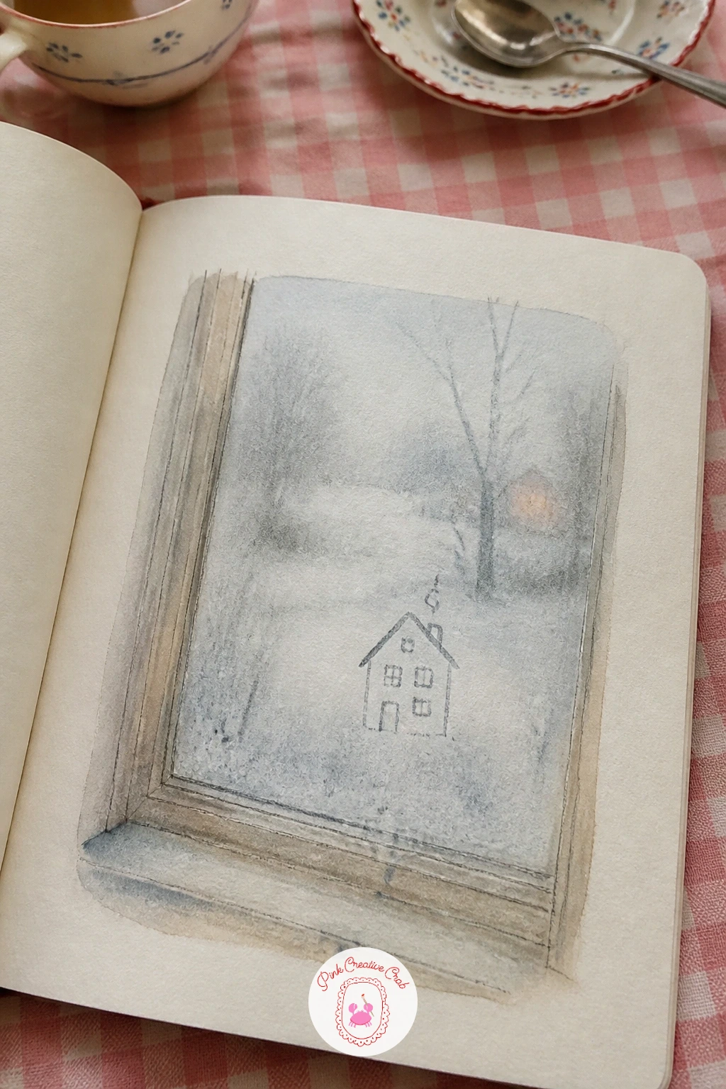
A fogged window with a tiny house traced into the steam is a small, quiet idea that plays with the idea of a drawing inside a drawing, and it works well right after the busy energy of the hallway page. Pencil the window frame first, then fill most of the pane with a soft pale grey-white gouache wash to stand in for condensation, leaving the very edges of the glass a touch darker where the fog has not quite reached.
Draw the tiny house into that fogged area last, as a few simple lines scratched through the wet gouache with the end of a paintbrush handle or a fingertip, a triangle roof, a square body, one small window, the kind of shape a finger draws into steam without thinking.
Keep everything beyond the glass, any hint of a real view outside, deliberately vague and soft, the whole point of this page is the fog, not what lies behind it.
Today’s tip: scratch the tiny house into the wet gouache with a brush handle rather than drawing it with a pen, that scratched line is what makes it look drawn into real steam.
Palette: Pale Grey, Soft White, Cool Blue, Charcoal
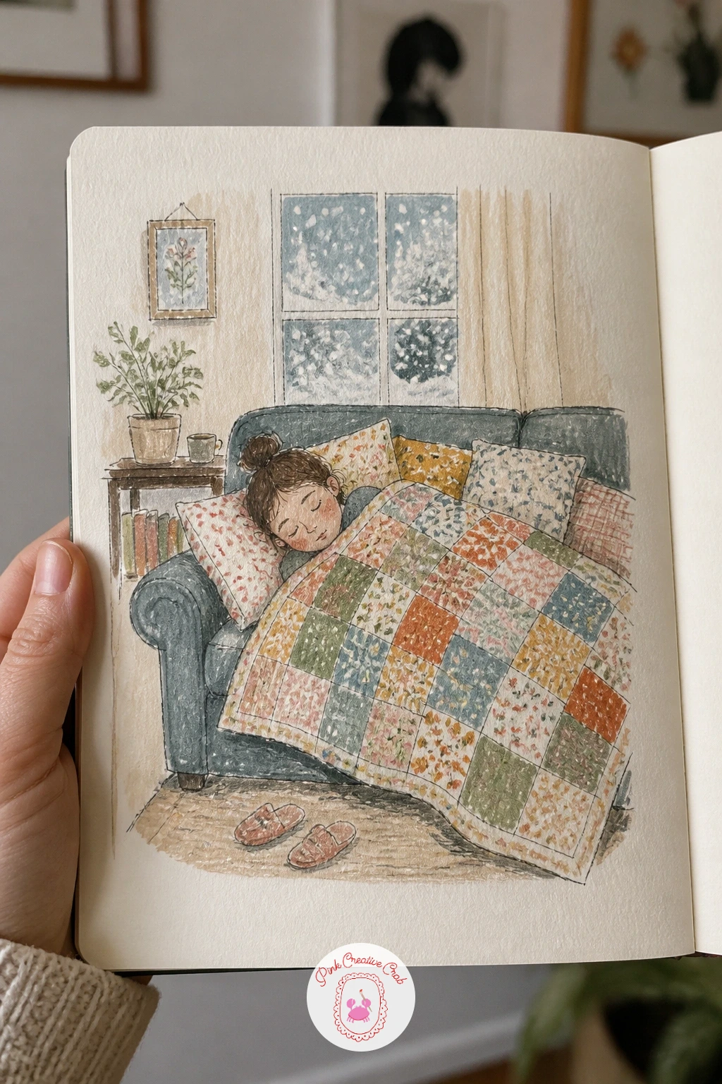
Someone napping under a quilt on the sofa while snow falls outside is a gentle, low-energy page to slow the sketchbook back down, mostly soft rounded shapes and very little hard linework. Pencil the body as one simple curved mound under the quilt, feet poking out at one end if there is room, face mostly hidden or turned toward the cushion, this is a page about comfort rather than a careful portrait.
Ink the quilt’s outer silhouette only, then build its pattern loosely in colored pencil, a soft patchwork of rectangles in two or three colors is enough, no need for complex quilting lines. Snow falling past the window behind can be suggested with a handful of small white gouache dots at different sizes, more toward the top of the pane and thinning out lower down.
If the sleeping figure looks stiff, round every edge of the quilt mound a little further than feels right, comfort reads through soft, slightly exaggerated curves rather than careful straight lines.
Today’s tip: round the quilt’s silhouette further than feels natural and keep the face mostly hidden, that softness is what makes a nap look restful rather than posed.
Palette: Soft Blue, Mustard Yellow, Cream, Dusty Rose
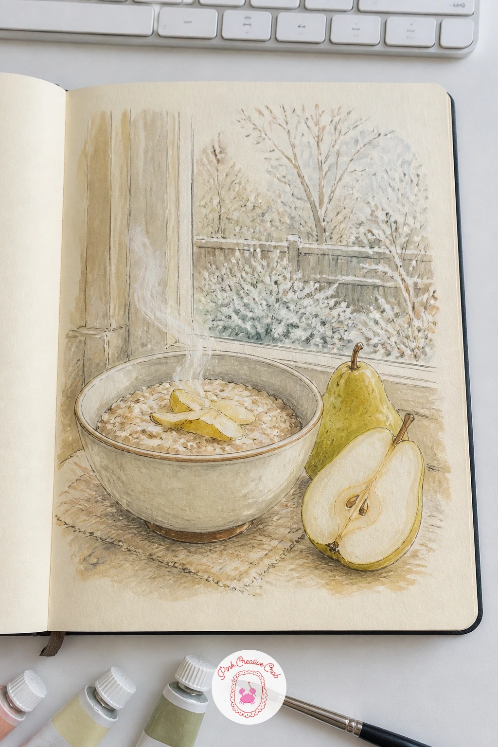
A bowl of steaming porridge with pears by a frosty garden window is a warm little breakfast still life, and the pears give you a chance to practice a shape most sketchbooks skip in favor of apples. Pencil the bowl first as a wide shallow oval, then slice one pear in half beside it so its distinctive curved silhouette, narrow at the stem and rounding out fully at the base, sits clearly next to the whole one.
Ink the bowl’s rim and the pears’ outlines, then build the porridge’s texture with small dabs of warm cream and pale brown gouache rather than one flat wash, porridge has a slightly lumpy, matte surface that a single smooth color never quite captures. Steam rising from the bowl stays as two or three soft wavy lines of pale grey colored pencil drifting upward.
If you do not have a pear on hand, an apple sliced in half works just as well here, the slicing and the steam are really the point of the page.
Today’s tip: dab the porridge’s surface in small uneven patches of color rather than one flat wash, that broken texture is what makes it look like something you could actually eat.
Palette: Warm Cream, Golden Ochre, Sage Green, Soft Grey
An icy garden chair with a forgotten mug still sitting on its seat is a quiet little story told entirely through objects left behind, no figure needed at all. Pencil the chair first, a simple folding or café-style frame works well, then leave the mug balanced on the seat or arm exactly where someone set it down, a thin crust of ice or frost visible along the chair’s metal edges and across the mug’s rim.
Ink the chair’s structure with clean straight lines since metal reads best when its edges stay crisp, then add the frost with small scratchy white gouache marks along every cold surface, heavier along the top edges where frost actually settles, thinner on the vertical parts.
A dusting of snow caught in the seat’s weave or slats, left as small patches of bare cream paper against the darker metal, finishes the feeling of a chair nobody has sat in for a while.
Today’s tip: scratch the white gouache frost on in small rough marks concentrated along top edges only, an even coat of white reads as paint, not frost.
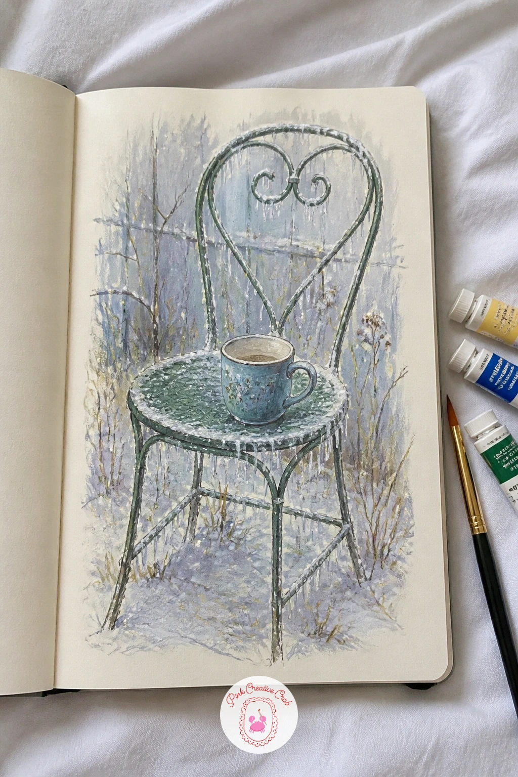
Palette: Charcoal Grey, Terracotta, Pale Blue White, Cream
A girl curled in bed with a knit-covered hot water bottle brings the sketchbook in for one of its coziest close studies, built around the contrast between soft bedding and the one small rigid shape tucked inside her arms. Pencil the curled body first as one simple comma-shaped mound under the covers, then nestle the hot water bottle’s knit cover, a small lumpy rectangle, into the curve where her arms would naturally fold.
Ink the bedding loosely with soft rounded folds, then build the hot water bottle’s knit texture in tight small strokes of colored pencil, a denser, tighter pattern than the looser blanket weave elsewhere on the page, that contrast in stroke density is what tells the two fabrics apart without needing different colors.
Keep the face mostly turned into the pillow or simplified to a closed-eye profile, this page works best as a mood rather than a detailed portrait.
Today’s tip: knit the hot water bottle’s cover in noticeably tighter, denser strokes than the surrounding bedding, that density difference reads as two separate textures at a glance.
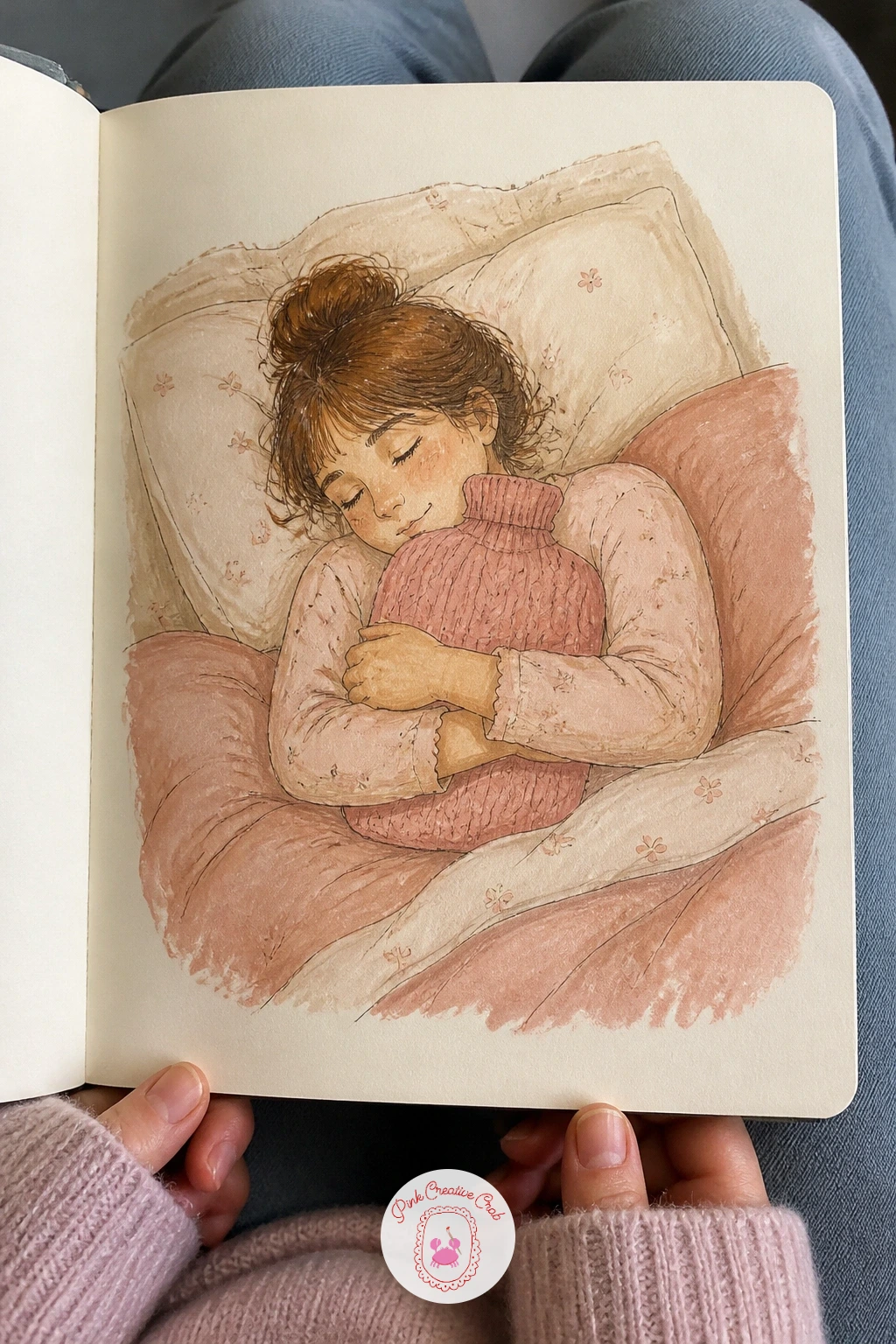
Palette: Dusty Pink, Soft Blue, Cream, Mustard Yellow
Finish the sketchbook with a neighbor’s lit kitchen window seen across a snowy yard at dusk, a small composition that leans entirely on contrast between warm interior light and cold blue evening outside. Pencil the house as a simple dark shape first, mostly silhouette, with just one glowing rectangle marking the kitchen window, then let the snowy yard in between take up most of the foreground.
Paint the sky and snow first in cool blue-violet gouache, pushed fairly dark since this is dusk rather than full daylight, then add the window last so that single warm yellow-orange rectangle becomes the brightest, most saturated color on the entire page by contrast. A silhouette hint of a figure moving past the window, just a dark vertical shape, adds life without needing any real detail.
If the window is not glowing enough, darken the sky and house around it even further rather than brightening the window itself, a light only reads as warm against real darkness.
Today’s tip: paint the whole scene dark and cool first, then drop in the one warm lit window last, that order is what makes the light actually look like it is glowing.
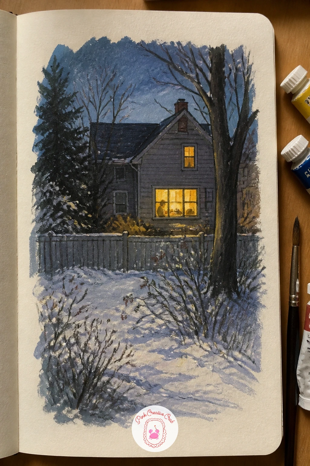
Palette: Indigo Blue, Warm Amber, Charcoal, Pale Blue
If this one goes well, the art sketchbook drawing ideas list has more small evening and window scenes to keep the mood going into other seasons.
What to Do Next
Pick whichever page matches your mood tonight, a close still life like the speckled mug if you want something quick, or the long snowy path if you have more time to spend on perspective. Start a fresh page in cream sketchbook paper, block the main shapes loosely in pencil first, and let the fineliner and gouache follow once the proportions feel right.
Frequently Asked Questions
What paper works best for a winter art sketchbook mixing fineliner, gouache and colored pencil?
A medium-weight, slightly textured cream or ivory paper around 150 gsm works well. It takes fineliner cleanly, holds a thin gouache wash without heavy buckling, and gives colored pencil enough tooth to grip onto.
How do you stop gouache from lifting the fineliner ink underneath it?
Let the ink dry fully before painting over it, and use a soft brush with light pressure on the first pass. Waterproof fineliner helps, and building color in thin layers rather than one heavy wet coat keeps the lines crisp.
How do you make snow look white without just leaving the paper blank everywhere?
Leave bare cream paper only for the lit, sunlit patches, and paint every shadow area in a cool blue-grey gouache mix. That contrast between warm bare paper and cool shadow is what reads as snow, not flat white color alone.
How long should each winter sketchbook page take to finish?
Most of these pages finish in twenty to forty minutes once the pencil layout is settled. Simpler still life subjects like a mug or icicles can finish closer to ten minutes if you skip the second layer of colored pencil detail.
What is the easiest way to start a winter sketchbook if drawing feels intimidating?
Start with a small still life you can see right in front of you, like a mug of tea or a pair of wool socks. Working from direct observation rather than imagination makes proportions and shading far easier to get right.
Have any thoughts?
Share your reaction or leave a quick response — we’d love to hear what you think!
-
 0
-
0
-
0
-
0
-
0
-
0


