

A textiles sketchbook works differently from a landscape one: every page starts with something you can actually touch, an old scarf, a teacup, a gingham tea towel, and ends with a drawn version you could hand to a printer or a fabric mill. That is what makes these pages so satisfying to fill. You are not inventing from nothing, you are translating a pattern you already love into fineliner, gouache and a few strokes of colored pencil.
Below are 27 sketchbook pages built around real sources: a walk through wildflowers, a market stall of lemons, a drawer of buttons and ribbon. Work through them in order if you like building skill gradually, or pick whichever fabric is sitting on your desk today and start there.
Using these images: free for personal projects such as printing, coloring, cards, journals and gifts. Handmade items that include them may be sold up to 30 pieces per design. More than that is commercial use and is not permitted, and neither is selling or sharing the images themselves or passing them off as your own. Please ask before any other use.
Start a textiles sketchbook with something you can pick up on any walk: a small bunch of wildflowers you can embroider later. Sketch three or four stems loosely in pencil first, overlapping them slightly so the motif reads as one cluster rather than separate flowers, then go over the lines you want to keep in fineliner once you are happy with the shapes.
Fill the petals with flat gouache in two or three colors, leaving the paper white in a few spots to suggest the thread catching light, then add vein lines and shading with colored pencil once the paint is dry. This is where most people overwork the piece: stop as soon as the flowers read clearly, since an embroidery motif only needs enough detail to guide a needle, not a full illustration.
If you did not pick real flowers, work from a photo on your phone instead and simplify what you see into clean, embroiderable shapes. Keep one bloom fully open, one in profile and one as a bud so the stitched version has natural variety.
Write the thread colors you would use next to each petal before you close the page.
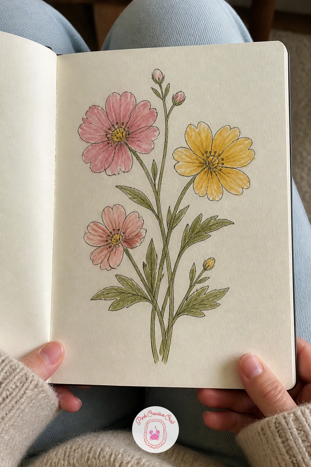
Palette: Sap Green,Cadmium Yellow Pale,Permanent Rose
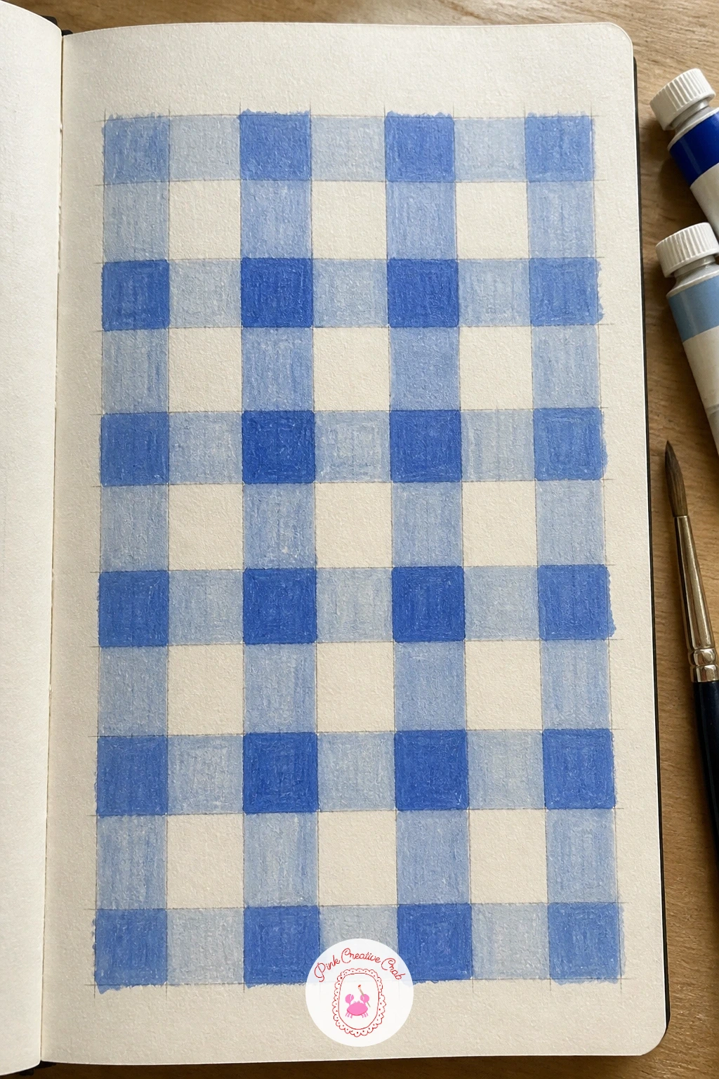
Gingham looks simple but the woven overlap is what makes it convincing, so this page is really a lesson in layering transparent color. Rule out a grid of evenly spaced squares in pencil first, then ink the grid lines lightly so they stay visible once you paint over them.
Pick three shades of one gouache color, light, medium and dark, and paint the lightest squares first across the whole grid. Leave every other row of squares white, then go back with the medium tone over half the remaining squares and the darkest tone where two colored lines would cross in real woven fabric, which is the detail that sells the illusion.
If your gouache dries patchy, thin it slightly more with water so each layer stays even and semi-transparent. Colored pencil can stand in for gouache here too, built up in light layers for the same woven effect.
Keep the squares a consistent size with a ruler so the whole study reads as one continuous weave.
You Will Need
- ruler
Palette: Prussian Blue,Cerulean Blue Light,Titanium White
After a woven pattern, try a printed one: a lemon repeat you could imagine stitched into a sundress. Draw one lemon slice and one whole lemon in pencil, rounding the whole fruit slightly and keeping the slice simple with just a few wedge lines, then repeat both shapes in a loose, staggered grid across the page.
Ink the outlines once the placement feels balanced, then fill with gouache: yellow for the lemons, a brighter leaf green for a few small leaves tucked between them to break up the repeat. Work light to dark, base yellow first, then a deeper yellow-orange shading on one side of each fruit to suggest a single light source.
Repeats often go wrong when every motif sits in a perfectly even line, which flattens the design, so stagger the rows and vary the angle of a few lemons. If gouache feels too opaque for the fine wedge lines, switch to colored pencil for that part only.
A repeat only needs four or five motifs drawn well to suggest the whole pattern continuing off the page.
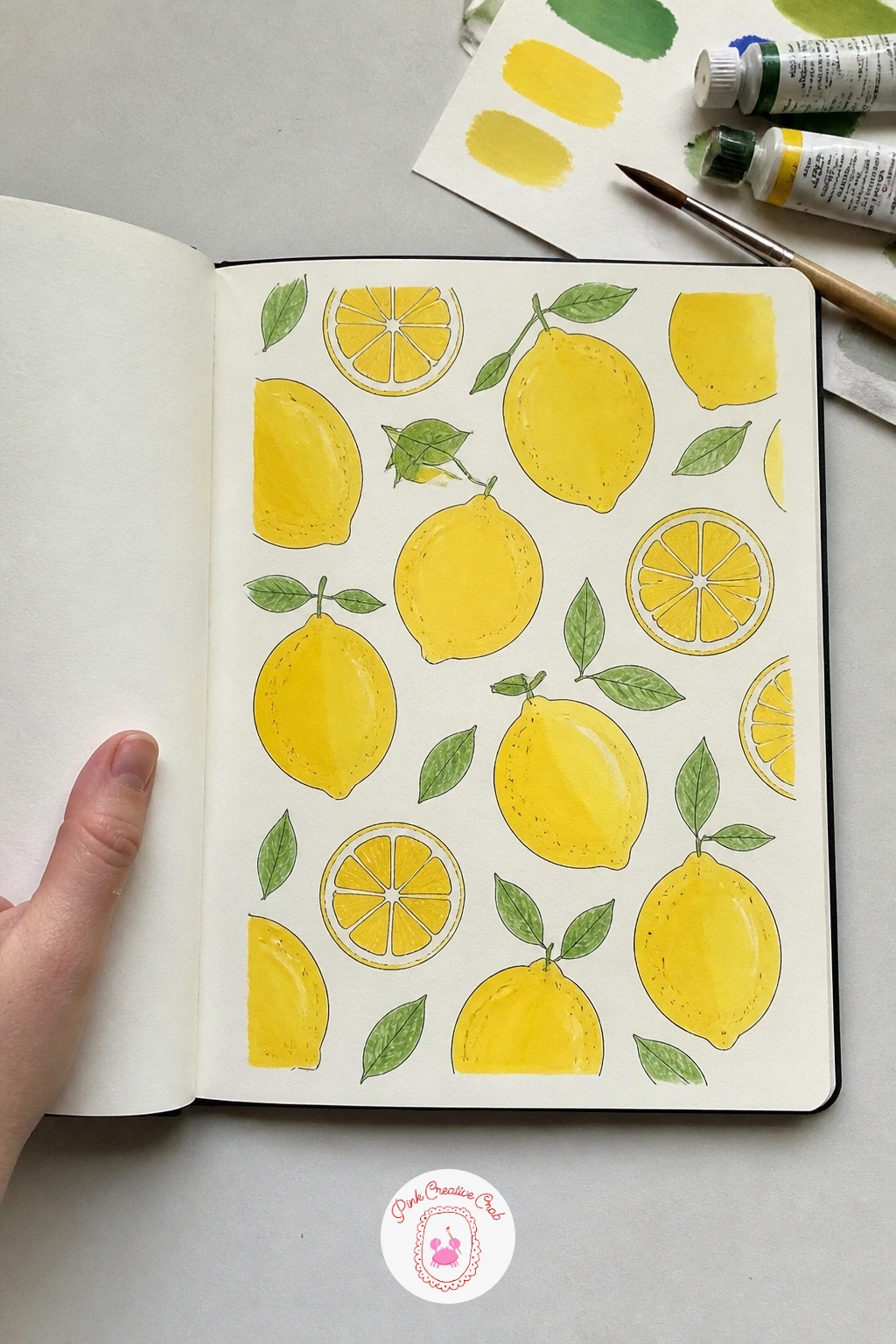
Palette: Cadmium Yellow,Permanent Yellow Deep,Sap Green
Pin a few lemon print fabrics or packaging labels nearby for reference, since real commercial repeats show how designers space fruit unevenly on purpose.
Dig out an old floral scarf, the kind with a folk art feel, and use it as the whole source for this page rather than inventing flowers from memory. Pick out three or four of its most distinct motifs and draw each one separately in pencil, simplifying the busiest ones down to their basic petal and leaf shapes.
Ink each motif once the proportions match the scarf reasonably well, then color with gouache using the scarf’s own palette rather than your usual colors, since folk florals often lean on unexpected combinations like rust orange against teal. Add small dot and dash details in colored pencil last, the kind of marks that suggest embroidery stitches without drawing every stitch.
The easiest version copies the scarf’s flowers fairly literally; a more confident version redraws them slightly larger and squarer, the way folk textile designs often sit within a diamond or square frame. Either way, group the motifs loosely rather than lining them up, since that scattered feel is part of the style.
Compare your drawing to the scarf once more before you call the page finished, and nudge any color that has drifted too far from the original.
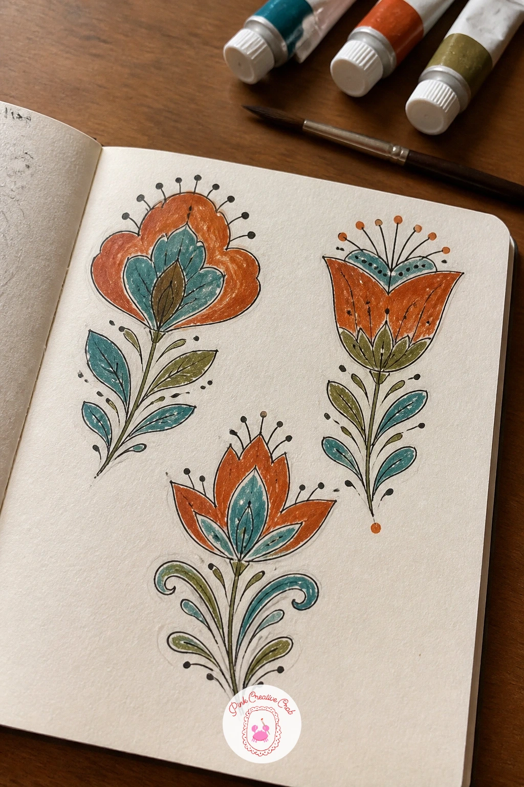
Palette: Burnt Sienna,Teal,Naples Yellow
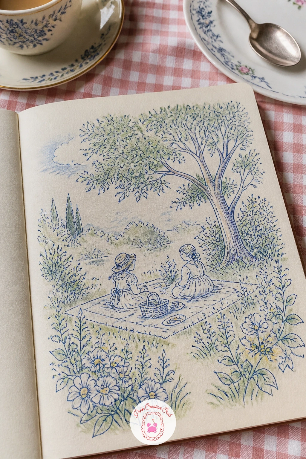
Toile fabric tells a whole scene in one repeating color, so sketch a garden picnic the way a toile designer would: a blanket, a basket, two figures under a tree, all drawn as fine, even linework rather than filled shapes. Lay out the scene loosely in pencil first, keeping every figure small and simple since toile characters rarely have detailed faces.
Ink the whole scene in a single color of fineliner, which is the real trick of toile, then skip gouache almost entirely and let the linework carry the design. A light wash of one gouache color over the whole scene, blue or terracotta are classic toile shades, adds just enough tone without breaking the single-color illusion.
This goes wrong when the scene gets too busy, so if this is your first toile attempt, limit yourself to one tree, one blanket and two figures rather than a full garden party. For a quicker ten-minute version, draw just the picnic basket and blanket as a small vignette; the forty-minute version adds the full scene with a fence or hedge in the background.
Keep every line the same weight throughout, since varying line thickness is what breaks the toile look fastest.
Palette: Prussian Blue,Titanium White
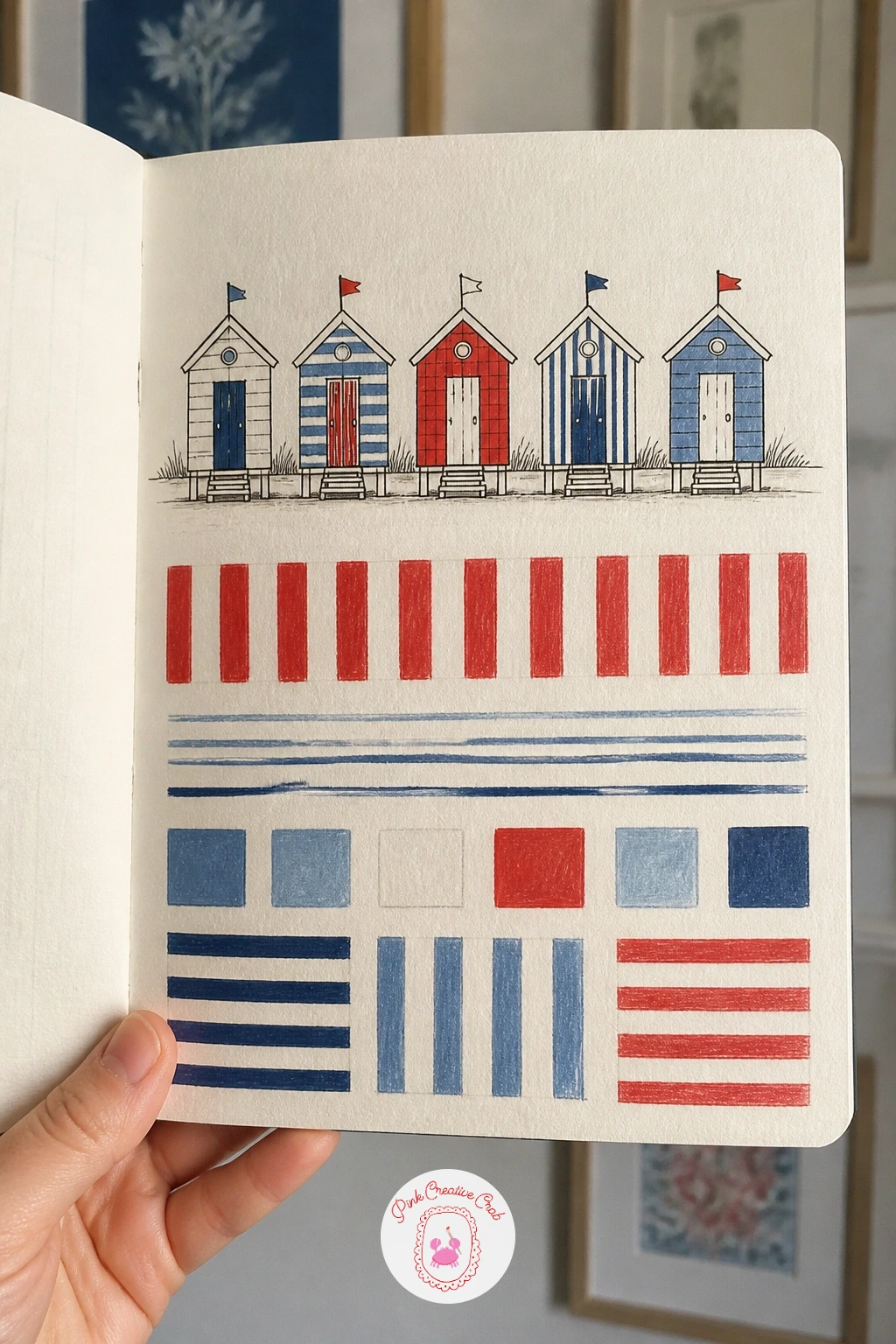
Beach huts give stripes a reason to feel cheerful rather than stiff, so draw a small row of them first in pencil, simple rectangles with pointed or flat roofs, then use each hut’s painted boards as an excuse to try a different stripe width and spacing. This is really a perspective exercise: keep the huts sitting on one eye-level horizon line so they read as standing in a row rather than floating at different heights.
Ink the hut outlines, then paint the stripes with gouache, varying the width from hut to hut, wide and even on one, narrow and tight on another, so the page doubles as a reference sheet of stripe options. Candy stripes next to each hut, drawn as a small swatch rather than on the hut itself, make the page more useful later.
Uneven stripe spacing is the main thing to watch, so pencil in faint guide lines with a ruler before inking if your hand drifts. Colored pencil works well for the swatches if you want a softer, less flat finish than gouache.
Note the stripe width in millimeters next to each swatch so you can recreate it exactly in fabric later.
You Will Need
- ruler
Palette: Cadmium Red,Cerulean Blue Light,Titanium White
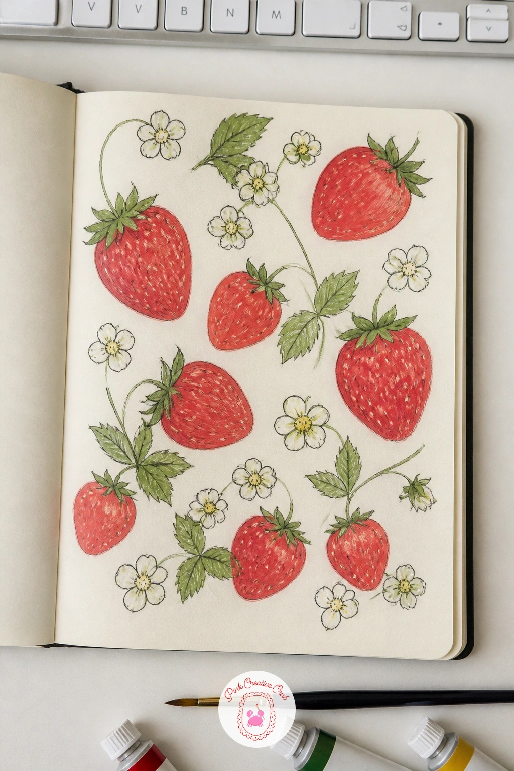
Move from the beach to the kitchen with a strawberry print you could imagine on a tea towel. Draw one strawberry shape carefully in pencil first, rounder at the top and tapering to a point, and get this one right since every other berry on the page repeats it.
Once the shape feels natural, repeat it four or five times at different angles, add a few star-shaped leaf caps and a scattering of small blossom flowers to fill gaps between the fruit. Ink the outlines, then paint the strawberries in gouache working from a mid red base, add a deeper red shading on the lower curve of each berry for a sense of roundness, and finish with tiny cream or yellow dots for the seeds using colored pencil or a fine brush.
The seeds are where this print usually collapses into a mess, so dot them in a loose spiral pattern rather than a tight grid, and stop well short of covering the whole berry. If gouache dots feel unsteady, switch to a white gel pen for the seed highlights instead.
Leave a little white paper showing on each strawberry’s shoulder for a believable highlight.
You Will Need
- white gel pen (optional)
Palette: Cadmium Red,Permanent Rose,Sap Green
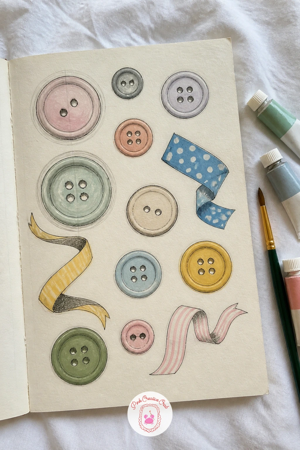
Empty a sewing box onto the table for this one, since a page of button and ribbon studies works best drawn directly from real objects rather than imagination. Arrange six or eight buttons and a couple of ribbon offcuts loosely across your sketchbook spread, leaving breathing room between each so the page does not feel cramped.
Draw each button as a simple circle first, then add the holes and any rim detail in fineliner once the proportions look right, working from the largest button to the smallest so your eye calibrates size as you go. Paint each one a flat gouache color, then add a single curved highlight in white colored pencil to suggest the shine of plastic or shell.
Ribbons are easier to get wrong than buttons because a flat ribbon needs a subtle curve to look like fabric rather than a stiff bar, so let each ribbon dip and twist slightly rather than drawing it perfectly straight. A plain pencil study without any paint still makes a useful page if you are short on time.
Label a couple of the buttons with their size in the margin, since this kind of swatch page works best as a true reference you can return to.
Palette: Payne’s Grey,Dusty Rose,Naples Yellow
Paisley rewards patience more than skill, so build this one in stages rather than trying to draw the whole teardrop shape in one go. Start with a simple curved teardrop outline in pencil, then add a smaller nested curve inside it, then a third smaller still, like a shape curling in on itself.
Once the three nested curves sit comfortably, ink the outer shape first and let that dry before adding the inner lines, which keeps the ink from smudging across the curves. Fill each nested layer with a different gouache color, working from the outside in, then add fine vein-like details radiating from the center with colored pencil once the paint has dried completely.
Paisley usually goes wrong when the inner curls get too fussy too fast, so if this is your first attempt, stop after three nested layers rather than pushing for five. For a bolder, more confident version, add small dots or a thin border of tiny teardrops around the main motif.
Draw the motif large on the page, at least the size of your palm, since paisley detail gets lost at a small scale.
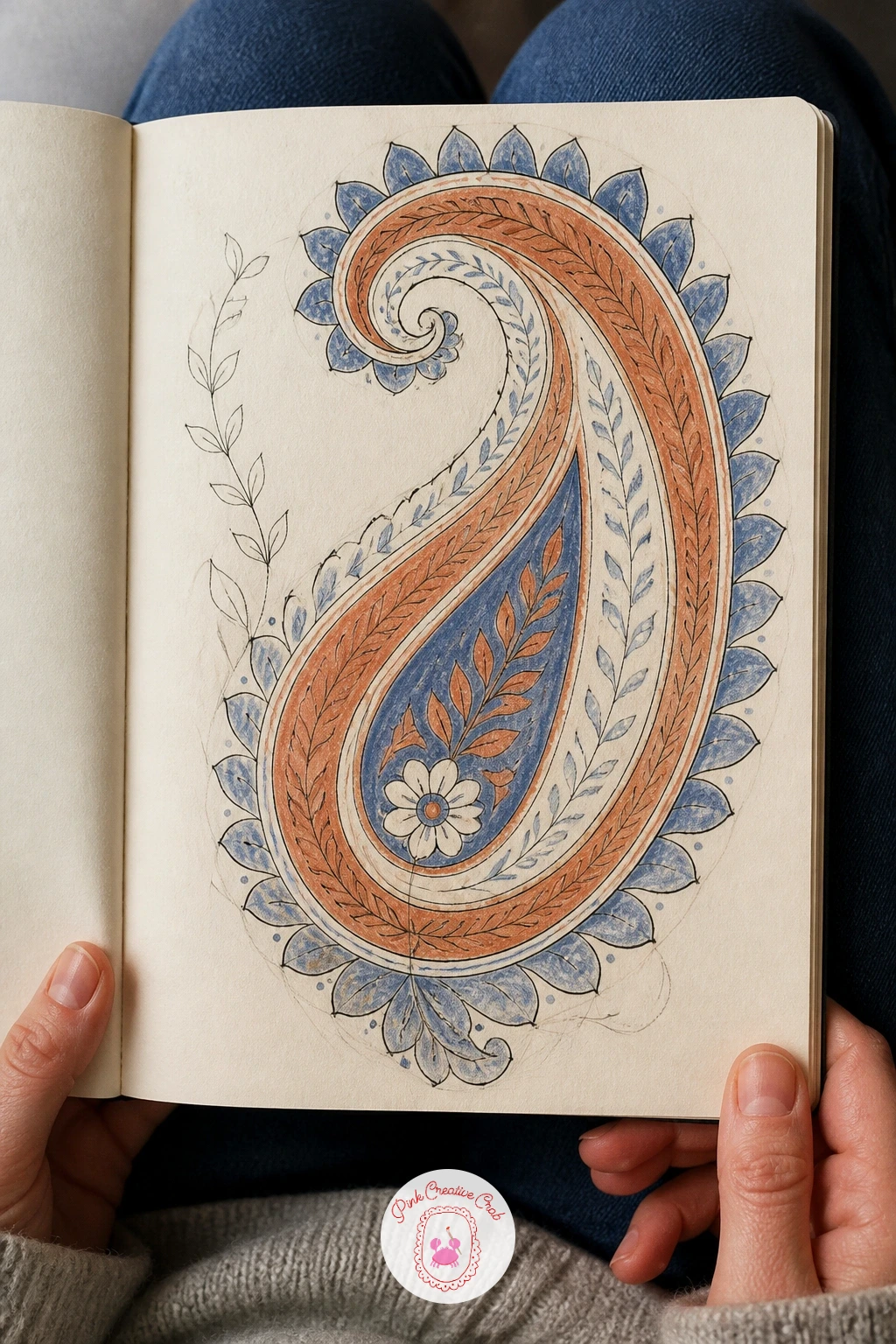
Palette: Burnt Sienna,Prussian Blue,Naples Yellow
Borrow a teacup from your own cupboard for this page, since drawing from the real object makes the proportions far easier than guessing. Sketch the cup and saucer in pencil first using an ellipse for the rim and another narrower ellipse for the base, which is the part most people flatten out by accident.
Once the cup shape sits correctly, add a simple pattern to its surface, a few small flowers or stripes, then ink the whole thing and repeat it twice more at slightly different sizes to suggest a tablecloth repeat. Paint the cup itself in a soft gouache wash, keeping the inside of the cup a touch lighter than the outside for a sense of the light source coming from above.
The ellipses are the part to check twice: hold the real cup at eye level and notice how flat or round the rim ellipse actually looks before you commit to ink. A faint cast shadow under each cup, added last in grey colored pencil, grounds the whole repeat convincingly.
If you do not have a teacup handy, a photo from any angle works, just pick one angle and keep every cup in the repeat consistent with it.
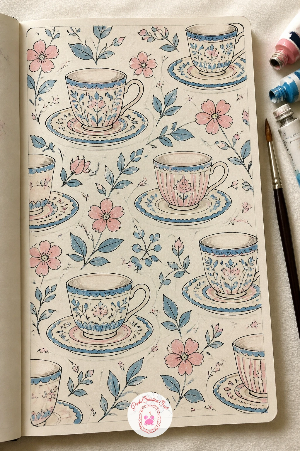
Palette: Cerulean Blue Light,Permanent Rose,Payne’s Grey
Cross-stitch motifs are built from a grid, so rule out small even squares in pencil before you draw anything else, the same discipline as the gingham page earlier but used here to build pictures rather than a weave. Plan a heart in one corner and a small flower motif in another, mapping each shape onto the grid square by square the way a real cross-stitch pattern works.
Ink each filled square as a small X rather than a solid block, which is what gives cross-stitch its texture, then color the X shapes with colored pencil rather than gouache since pencil sits better into such small marks. Leave plenty of grid squares empty around each motif, since sampler pages are mostly background with small bursts of pattern.
Counting squares wrong is the easiest mistake here, so count twice before inking any row, and keep a finished cross-stitch pattern nearby to check your X shapes look authentic. A quicker version draws the heart alone at a larger scale; the fuller version adds a flower, a small border and a line of simple lettering-style dashes beneath.
Keep the grid faint in the final page so the stitched motifs stay the clear focus.
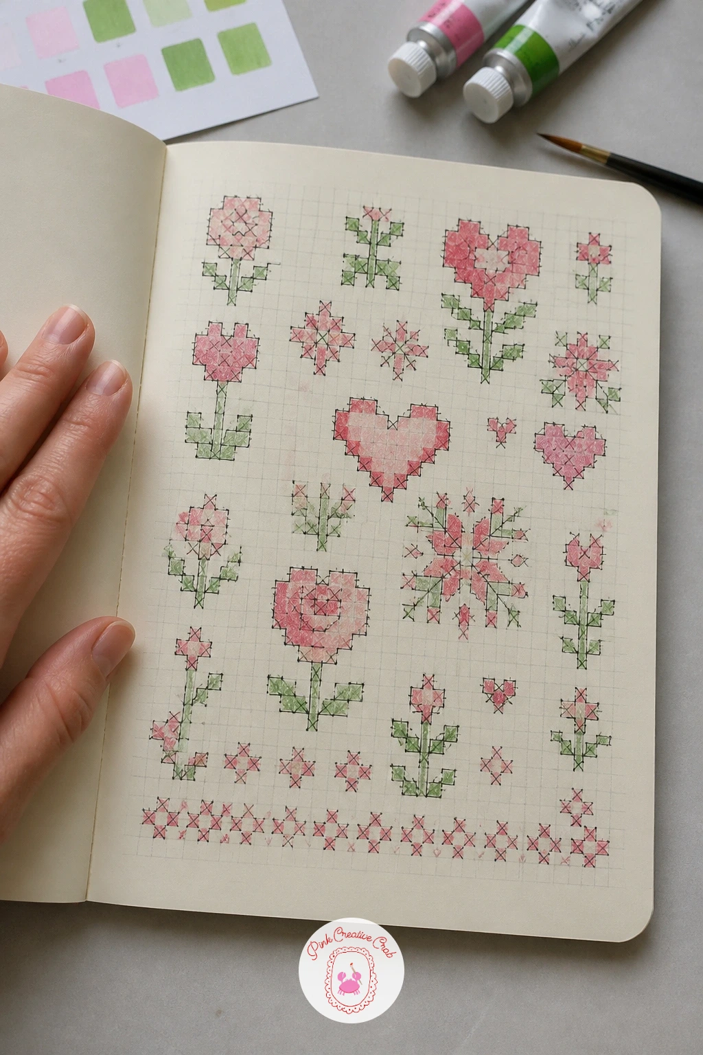
You Will Need
- ruler
Palette: Dusty Rose,Sap Green,Payne’s Grey
Liberty prints work on tiny, densely packed flowers, so this page needs a looser hand than the bolder florals earlier in the book. Scatter small pencil dots across the page first to plan where each flower head will sit, spacing them close but never touching, then build a simple five-petal flower over each dot.
Ink the flowers at this small scale with your finest fineliner, since a thick line will overwhelm such delicate shapes, then color with diluted gouache or colored pencil in two or three soft shades so no single flower dominates the page. Add tiny leaves and stems only where they fit naturally between flowers rather than forcing every gap to be filled.
The density is what makes or breaks a Liberty-style repeat, so if the page starts looking sparse, add more small flowers rather than making the existing ones bigger. If your fineliner is too thick for this scale, a fine gel pen gives a cleaner result.
Work in one small section at a time rather than planning the whole page at once, which keeps the spacing even as you go.
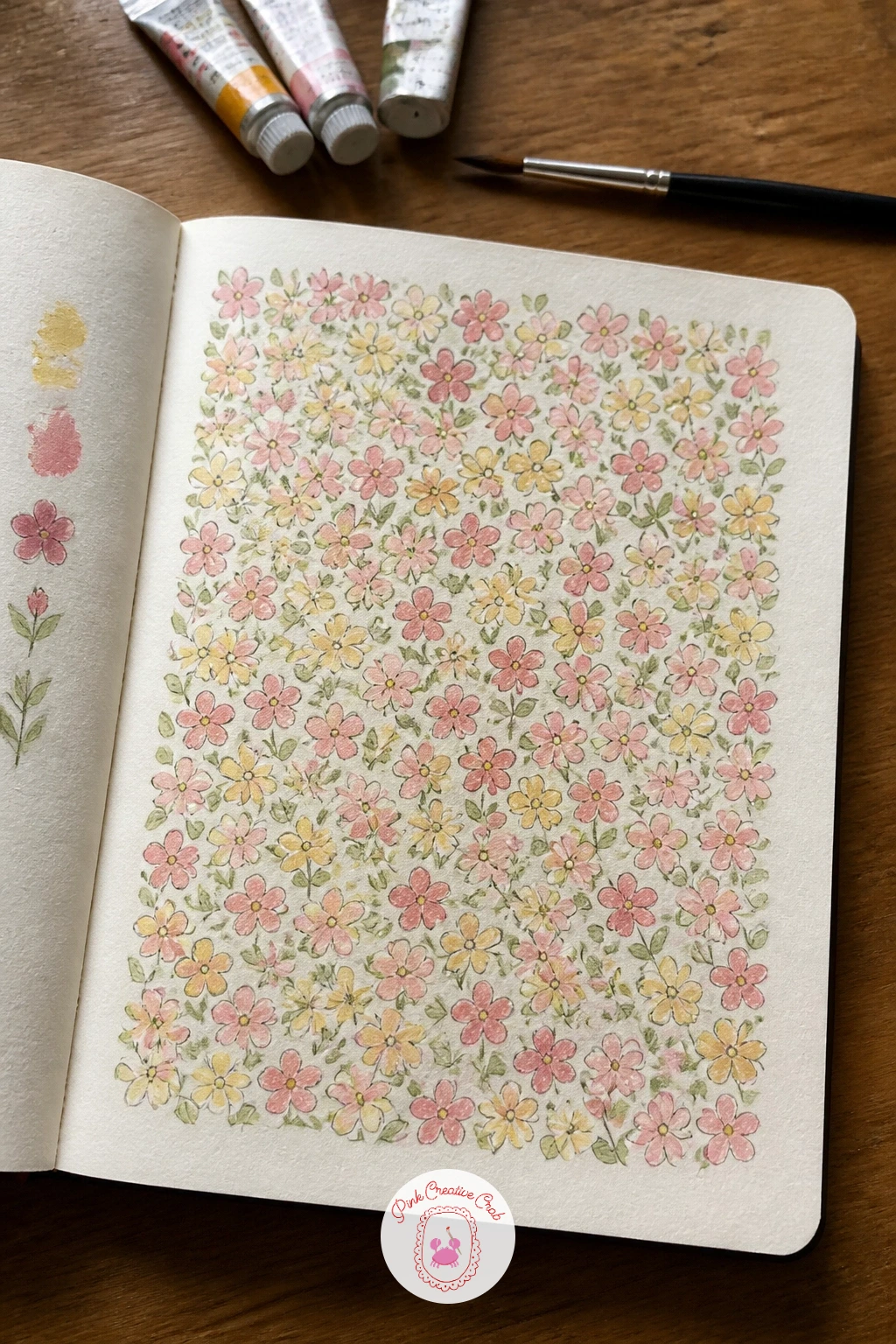
Palette: Dusty Rose,Cadmium Yellow Pale,Sap Green
This page works as a reference sheet rather than a single picture, so divide it into three or four rectangular swatches in pencil and give each one a different knit stitch to study: stockinette’s smooth V shapes, garter’s horizontal ridges, a simple cable twist. Draw the V shapes of stockinette first since they are the easiest to get consistent, stacking them in neat offset rows.
Ink each swatch’s stitch pattern with care, since the repeated small marks are what sell the texture, then shade with colored pencil rather than gouache, using a grey or warm neutral and letting the pencil strokes follow the direction of each stitch. The cable twist is the one most likely to go wrong, so simplify it to two strands crossing over rather than attempting a fully accurate cable pattern.
For a yarn color swap, work the whole page in a single wool-toned color family rather than multiple colors, which actually reads as more convincing knitwear. Leave a small gap between swatches so each stitch type stays easy to compare at a glance.
Label each swatch with its stitch name underneath for a page you will actually use again.
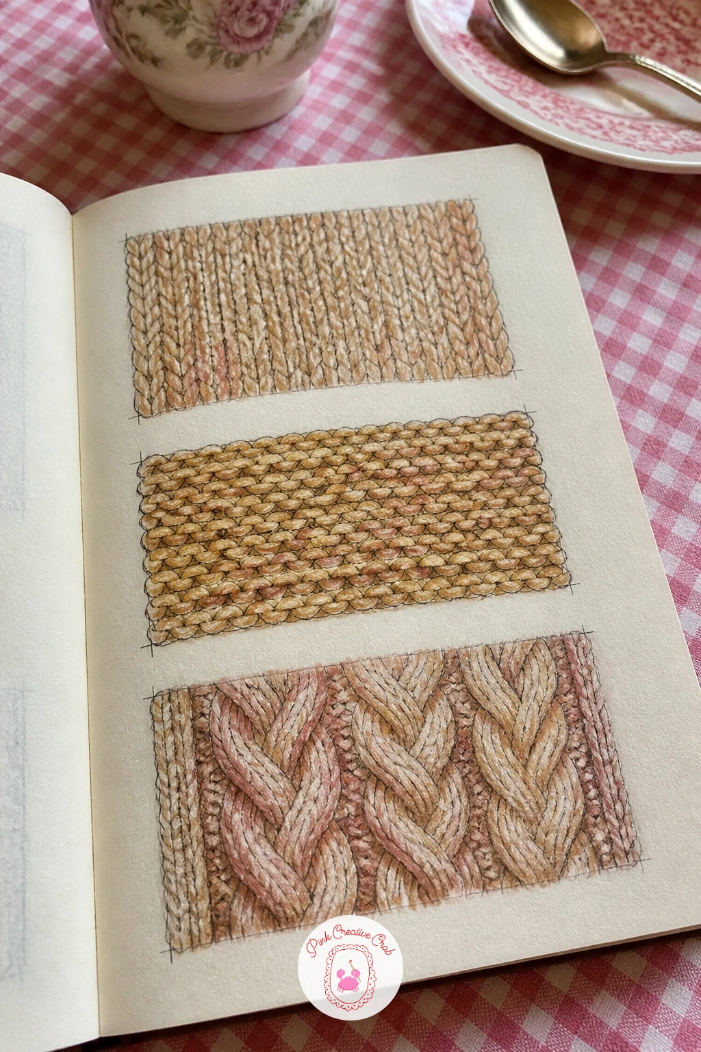
Palette: Burnt Umber,Naples Yellow,Payne’s Grey
Quilt blocks are built on a grid the same way gingham and cross-stitch were, so this page rewards the measuring skills from earlier. Rule out a square divided into a simple traditional block, a pinwheel or nine-patch works well, using a ruler to keep every triangle and square accurate since quilt blocks lose their charm fast when the pieces are uneven.
Ink the block’s seam lines once the geometry is settled, then fill each section with a different pastel gouache color, planning the palette before you paint so opposite corners echo each other the way real quilts often do. Keep the colors light and slightly chalky rather than saturated, which is what gives a pastel quilt its soft look.
Measuring is the trick here: compare each triangle to its neighbor with your ruler before inking rather than trusting your eye, since quilt geometry shows up any inconsistency immediately. If you do not have pastel gouache, mix a touch of white into any gouache color to lighten it to the right chalky tone.
Draw a second, smaller block in the corner of the page using the same palette in a different arrangement, which makes the page useful for planning a whole quilt layout later.
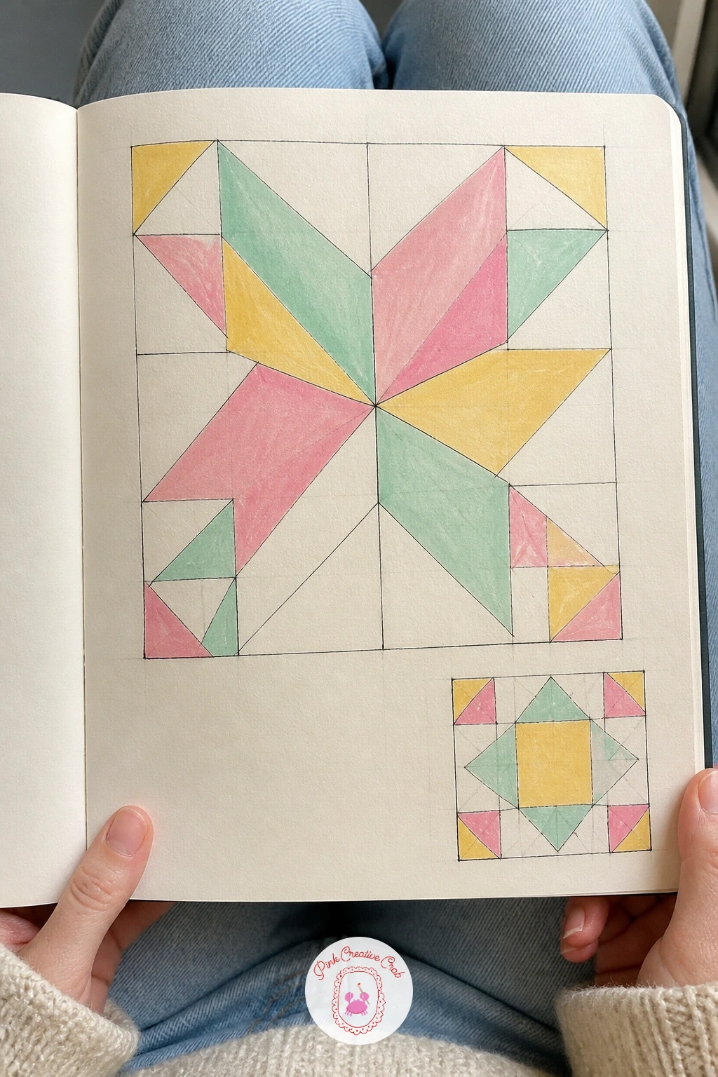
You Will Need
- ruler
Palette: Pale Pink,Pale Mint,Pale Yellow
Shift the mood toward autumn with a print built from mushrooms and ferns, a pairing that reads as woodland without needing a whole forest scene. Draw two or three mushroom shapes first in pencil, a simple dome on a straight stem, varying the size so the page has some rhythm, then add a few curling fern fronds tucked between them.
Ink the mushroom outlines and the fern’s main stem first, then add the smaller fern leaflets working outward from that stem in both directions, which keeps them evenly spaced. Paint the mushrooms in warm gouache tones, a deeper color on the cap and a paler stem, and use a cooler green for the ferns so the two elements stay visually distinct from each other.
Fern leaflets are easy to overcrowd, so if the frond starts looking like a solid green blob, stop adding leaflets and let some of the stem show through. Colored pencil dry brushed lightly over the mushroom caps adds a soft, speckled texture if you want more detail than flat gouache gives.
Scatter one or two fallen leaves between the mushrooms to tie the print to the season.
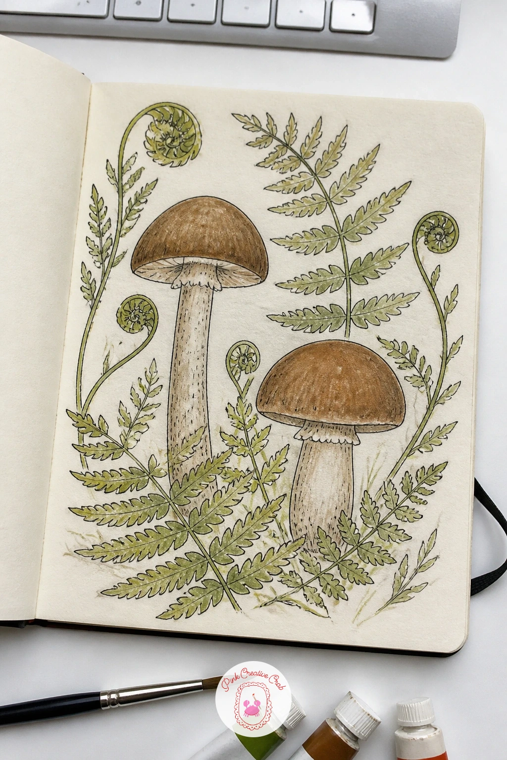
Palette: Burnt Sienna,Raw Umber,Hooker’s Green
If this autumn mood appeals, the autumn sketchbook ideas page has more seasonal pages that pair well with this one.
Lace is mostly about the edge rather than the whole piece, so this page studies three or four different lace borders rather than one full doily. Draw a straight baseline in pencil for each border, then build a repeating scalloped or pointed edge along it, keeping the repeat unit small and consistent.
Ink the lace pattern in your finest fineliner, since lace relies on delicate linework to read correctly, and resist the urge to fill it with solid color: leave it mostly white or add only the faintest grey wash with colored pencil to suggest shadow between the threads. Work one scallop or point at a time rather than trying to draw the whole border in one continuous line.
Overworking the detail is the main risk here, so if a border starts looking muddy, stop adding lines and trust the white paper to do the work, since real lace is as much about the holes as the thread. A white gel pen over a light grey background gives a different, slightly bolder lace effect if you want to try a variation.
Keep each border the same length so the page reads as a tidy reference strip.
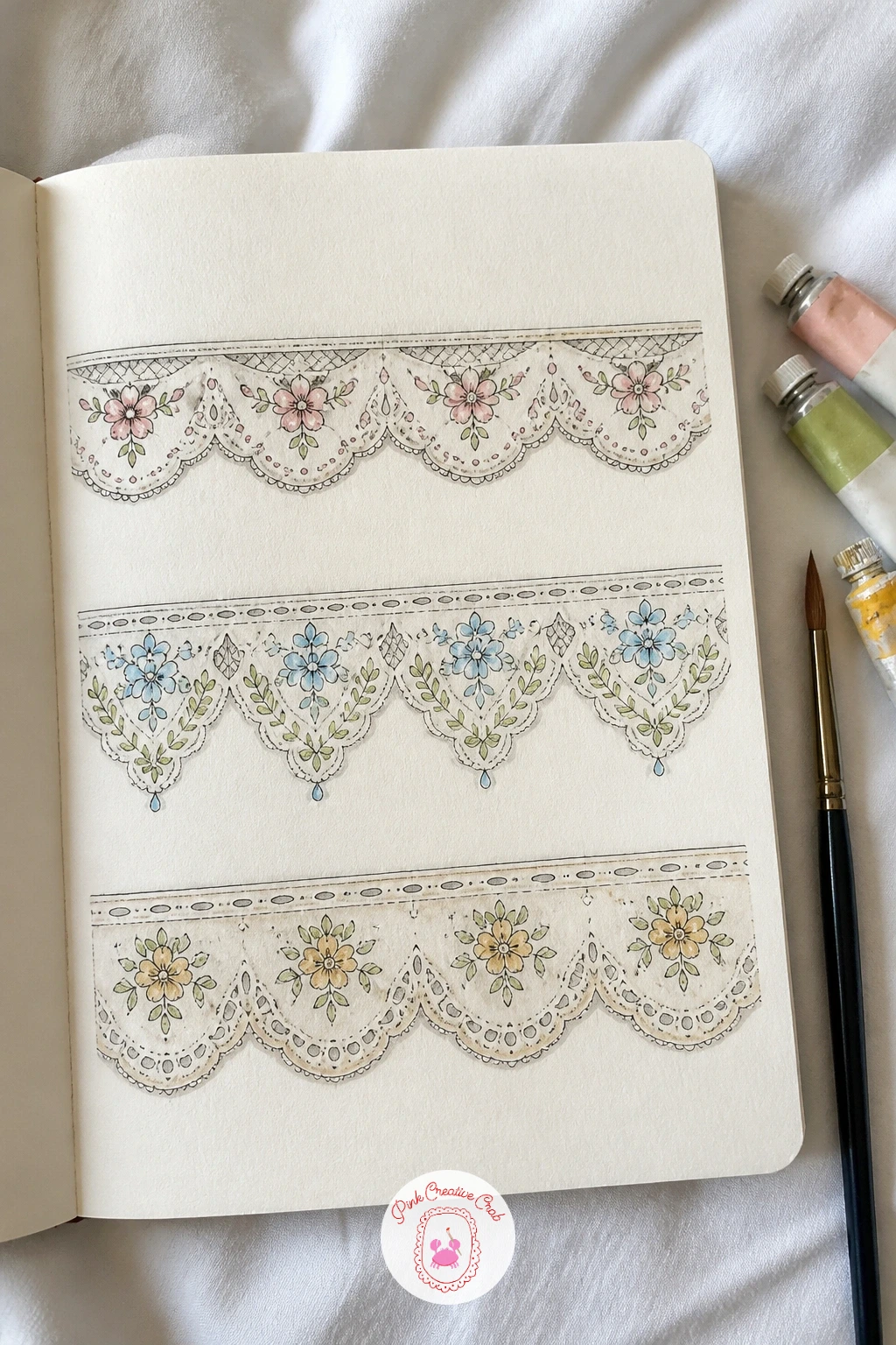
You Will Need
- white gel pen (optional)
Palette: Payne’s Grey,Titanium White
Scandinavian folk birds are built from simple, almost geometric shapes, which makes this one of the friendlier motifs in the whole book. Draw a plump oval body in pencil, a small round head, a simple triangular tail and a stylized wing made of two or three curved feather shapes, keeping every line clean and uncluttered.
Ink the bird once the proportions feel right, then paint it in a flat gouache color, traditionally a warm red or a soft blue, and add a contrasting pattern of dots, small leaves or a tulip motif along the wing and tail rather than any shading. This style relies on flat color and bold pattern rather than realistic form, so resist adding gradients or soft blending.
Symmetry is the thing to watch: fold a strip of tracing paper over the bird’s centerline if the two sides do not match, or simply measure the head and tail positions from a centerline drawn faintly in pencil first. For a bolder version, perch the bird on a simple tulip branch; the plain version stands alone.
Finish with a single contrasting dot for the eye, placed slightly forward in the head for a bit of character.
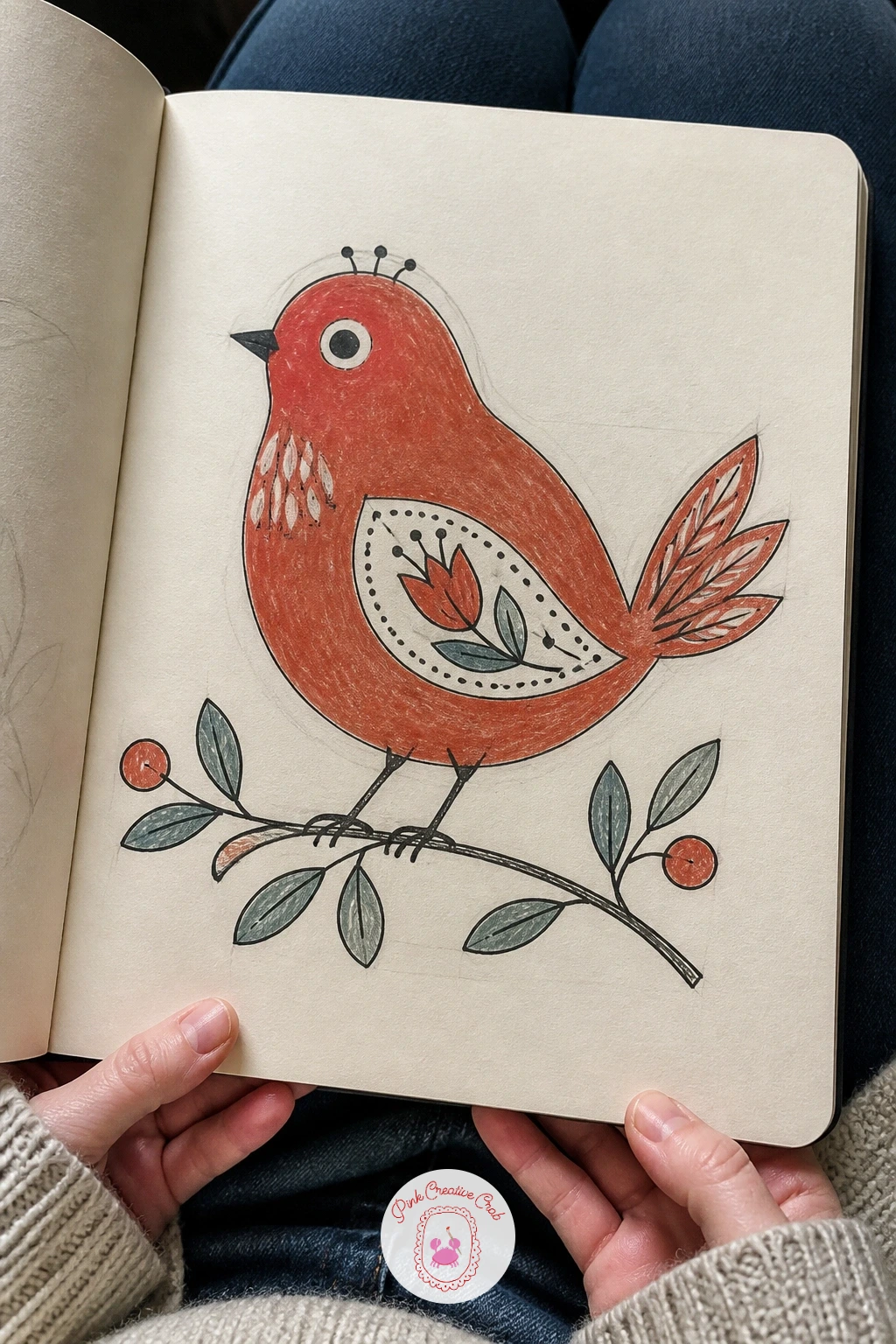
Palette: Cadmium Red,Cerulean Blue Light,Naples Yellow
Plaid builds on the gingham grid but adds a second, uneven layer of lines, so treat this as the next step up in difficulty. Rule out a base grid in pencil as before, then plan two or three line weights, thick, medium, thin, rather than one uniform grid, deciding where the thick lines will fall before you touch ink.
Paint the base color across the whole swatch first and let it dry completely, then ink the thick lines in one darker gouache color, followed by the medium lines in a second color, finishing with the thinnest lines in colored pencil for the crispest detail. Working light to heavy and thin to thick in this order keeps the layers from muddying into each other.
Plaid falls apart fastest when the line spacing looks random rather than rhythmic, so even if the pattern feels irregular, repeat the same sequence of gaps at least twice across the swatch. If gouache lines bleed at this fine scale, let each layer dry fully before adding the next, or finish the thinnest lines in fineliner instead.
Paint a small corner of the swatch folded over, as if turning back a hem, to suggest real fabric rather than a flat print.
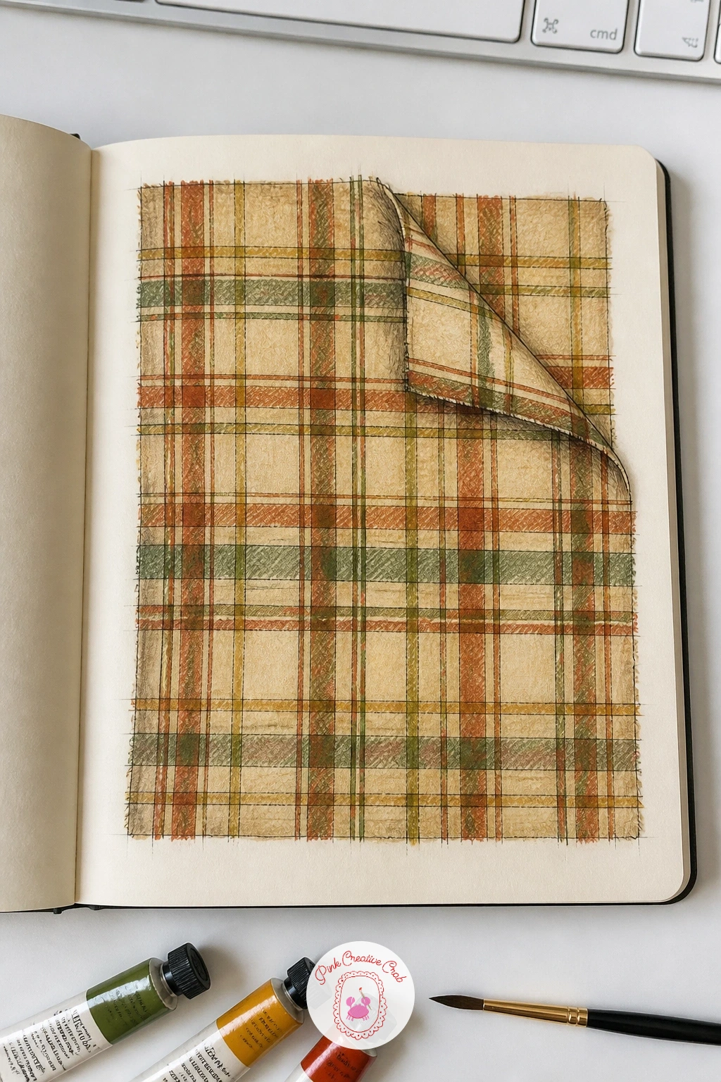
You Will Need
- ruler
Palette: Burnt Sienna,Hooker’s Green,Naples Yellow
Cherries make an easy, cheerful repeat once you settle on one reliable pair shape. Draw two round cherries joined by a single curved stem in pencil, then repeat that pair four or five times across the page at different angles, tucking a simple pointed leaf between some of the pairs.
Ink the outlines, then paint the cherries in gouache, a mid red base with a touch of deeper red on one side of each fruit for roundness, and finish the stems in a warm brown. A single small white highlight dot on each cherry, added last with a fine brush or white gel pen, gives the whole print a glossy, fresh look.
The stems are the fiddly part: keep the curve gentle rather than a sharp zigzag, and if your hand is shaky at this scale, pencil the stem curve first and trace over it slowly in ink rather than drawing it freehand in one go. Colored pencil can replace the highlight dot if gel pen is not to hand, using a light scratch of white or cream.
Vary the angle of each cherry pair so the print does not look stamped from a single template.
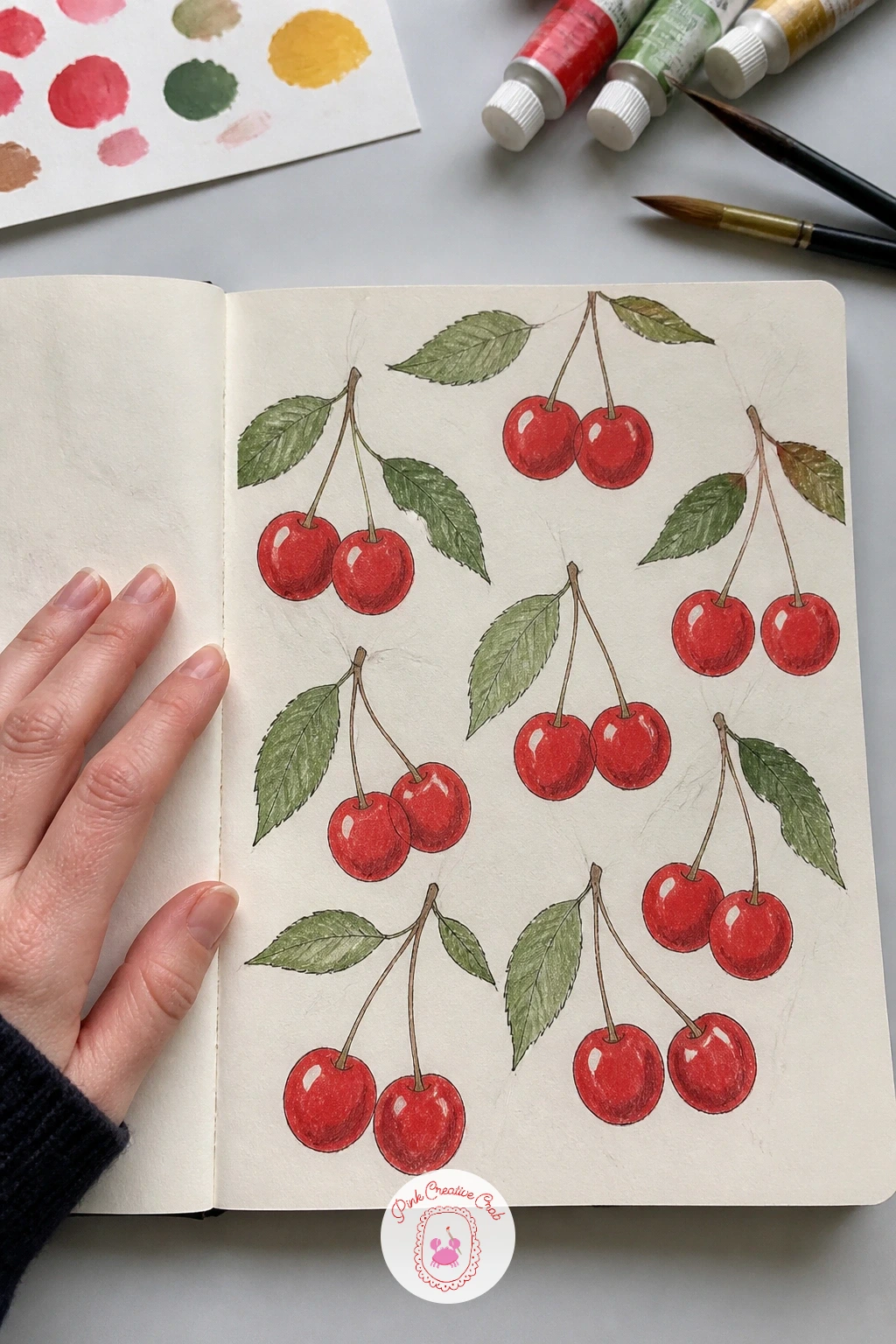
You Will Need
- white gel pen (optional)
Palette: Cadmium Red,Alizarin Crimson,Hooker’s Green
A handful of real or photographed seashells makes this page far easier than inventing shell shapes from nothing, so gather two or three different kinds before you start. Draw each shell separately in pencil, a simple spiral for a whelk, a fan shape with ridged lines for a scallop, keeping the ridge lines evenly spaced with light guide marks first.
Ink each shell once the proportions match your reference, then paint with gouache in soft sandy and coral tones, shading one side of each shell slightly darker to suggest the light coming from above, the same logic as the teacup page earlier in the book. Scatter the shells loosely across the page rather than lining them up, with a little open sand-colored space between them the way shells actually sit on a beach.
Ridge lines on a scallop shell are the easiest detail to get wrong, so count them in your reference first and keep the same number rather than adding extra for effect. A scrap of real sand or a dry-brush gouache texture in the background corner adds atmosphere if you want to push the page further.
Finish with a thin white gouache line along the top edge of each shell, which reads instantly as a shine.
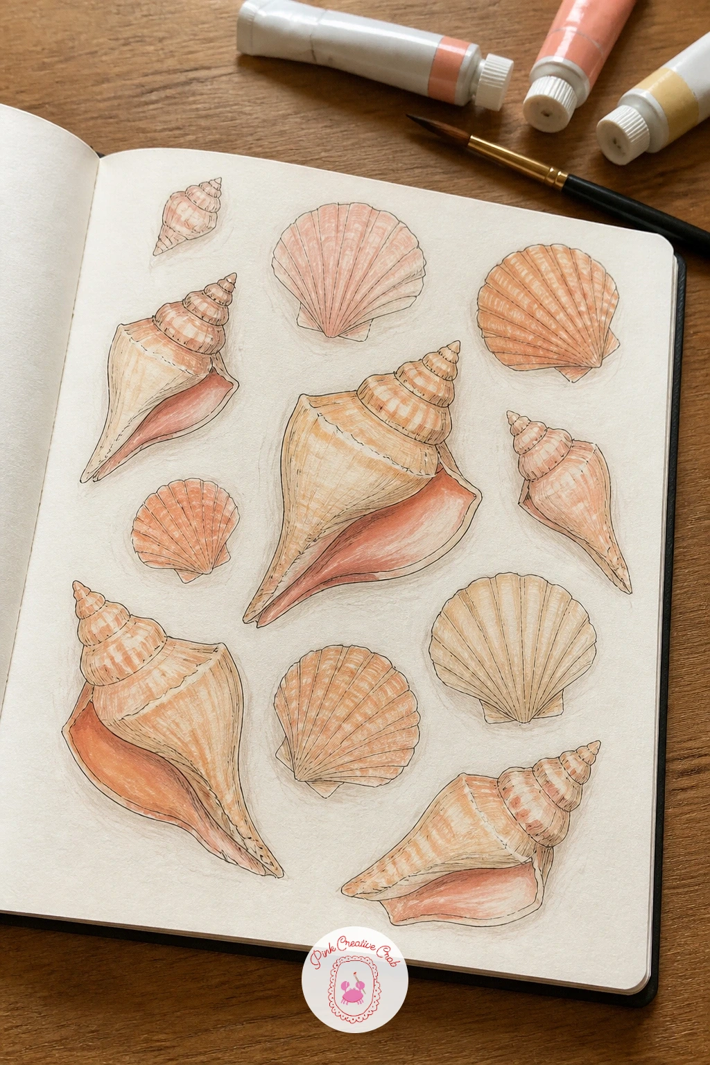
Palette: Naples Yellow,Permanent Rose,Titanium White
The sketchbook background ideas page has a few sandy wash techniques that work well behind a shell study like this one.
Sashiko stitching relies on a repeating geometric grid, often a simple cross or hemp-leaf shape, worked in white thread on indigo cloth, so this page studies that contrast directly. Rule out a faint grid in pencil, then build one small repeating motif, a simple cross or diamond, across a section of it rather than filling the whole page edge to edge.
Paint the background in a deep indigo gouache wash first and let it dry fully, then add the stitch pattern on top using a white gel pen or opaque white gouache, working in short straight dashes rather than continuous lines, since real sashiko stitches are small and evenly spaced. Keep every dash the same length for a convincing hand-stitched rhythm.
Indigo gouache can look patchy if applied too thin, so build it in two layers rather than one heavy coat, and let each dry before adding the white stitches on top. If white gouache feels too thick to control, a white gel pen gives cleaner, more even dashes.
Leave one corner of the indigo background unstitched, as if the pattern is still in progress, which looks more natural than a fully completed grid.
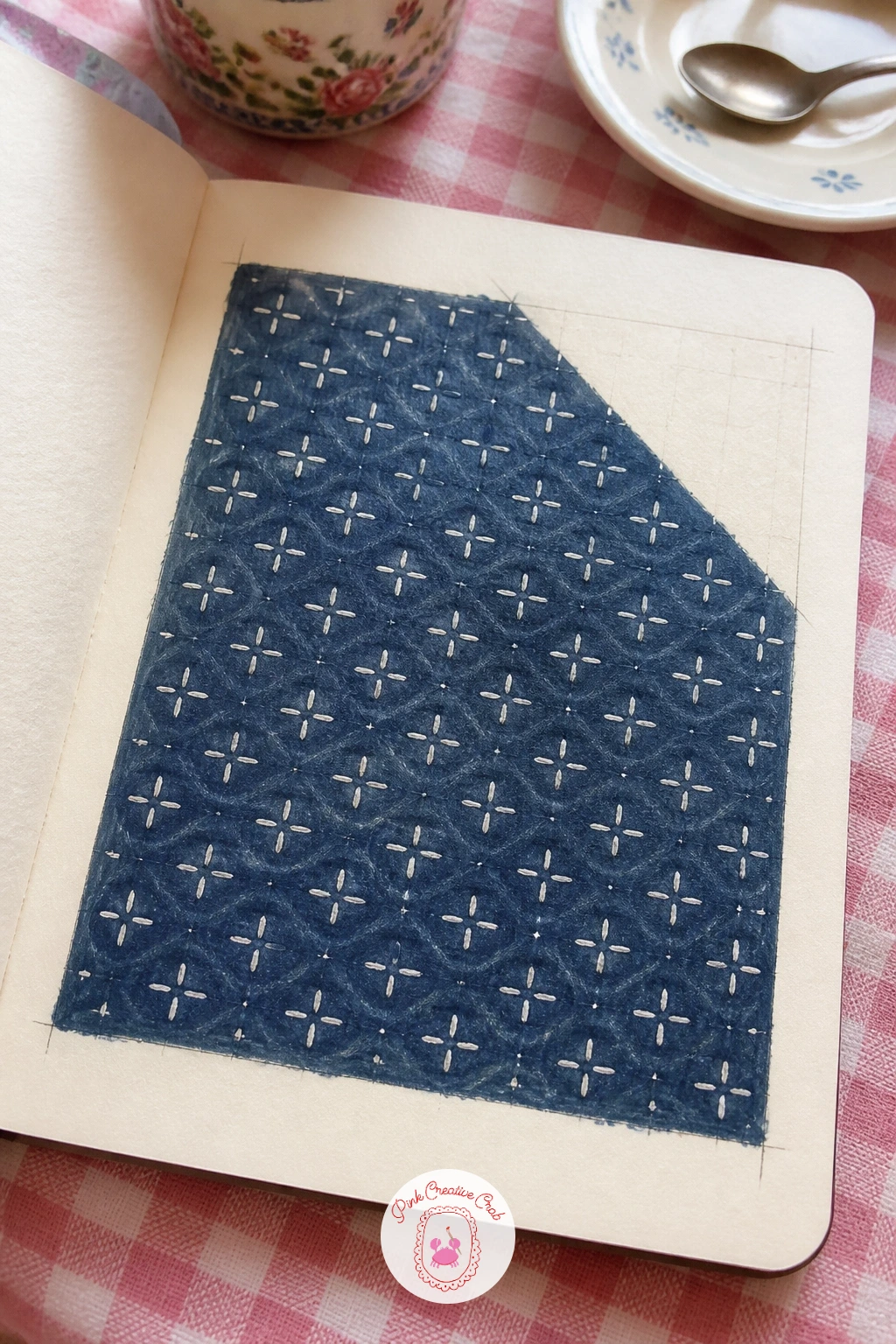
You Will Need
- white gel pen
Palette: Indigo,Titanium White
Monograms give you a structure to lean on, since the letterform does most of the design work before you even pick up color. Choose two or three initials and draw each one large and simple in pencil, a classic serif or a rounded script, avoiding anything too thin to translate into stitch width.
Ink the outline of each letter, then fill it with a pattern rather than flat color: a row of small chain-stitch marks along the stem, a scatter of tiny flowers inside a rounder letter, something that suggests the letter is embroidered rather than printed. Add a thin decorative border, a simple vine or dot line, around each monogram once the letter itself feels finished.
Letterforms are unforgiving about proportion, so if a letter looks lopsided, measure its height and width against a faint pencil box drawn first rather than trusting your eye alone. Colored pencil suits the fine inner texture better than gouache, which tends to flood small letter details.
Group the three monograms with even spacing so the page could double as a reference sheet for a future embroidery project.
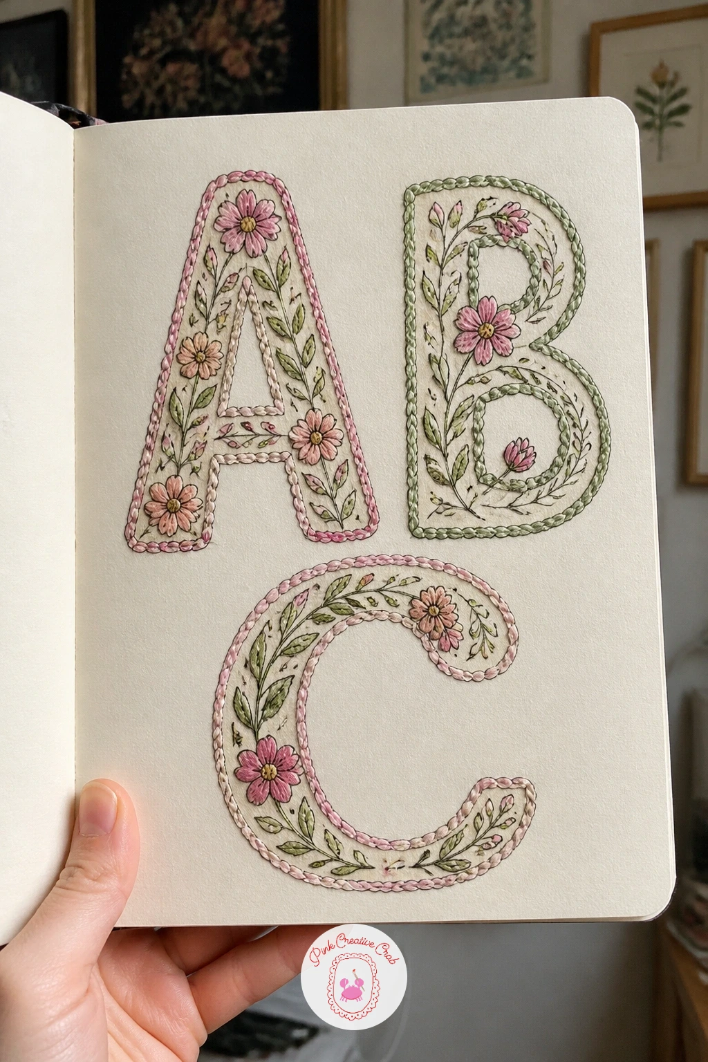
Palette: Dusty Rose,Sap Green,Payne’s Grey
Moroccan zellige tiles are built from a repeating geometric unit, usually an eight-pointed star interlocking with smaller shapes, so start this page by drawing one star carefully with a ruler and a light pencil grid to keep the points even. Once that single unit looks right, trace it twice more around the first to show how the shapes interlock, since the repeat is really the whole point of the pattern.
Ink the geometry once the interlocking shapes sit correctly, then paint each section a different jewel-toned gouache color, keeping the colors saturated rather than pastel since Moroccan tilework leans bold. Imagining this as fabric rather than ceramic, add a slightly looser, hand-painted edge to a couple of the shapes rather than perfectly crisp lines, which suggests cloth rather than glazed tile.
The star points are the part to measure twice: a slightly uneven point reads immediately as a mistake in such a symmetrical pattern, so use a ruler and light pencil guides rather than drawing the star freehand. If jewel-toned gouache is not in your kit, saturated colored pencil layered heavily gets close.
Leave thin white gaps between each colored section, the way grout lines separate real tiles.
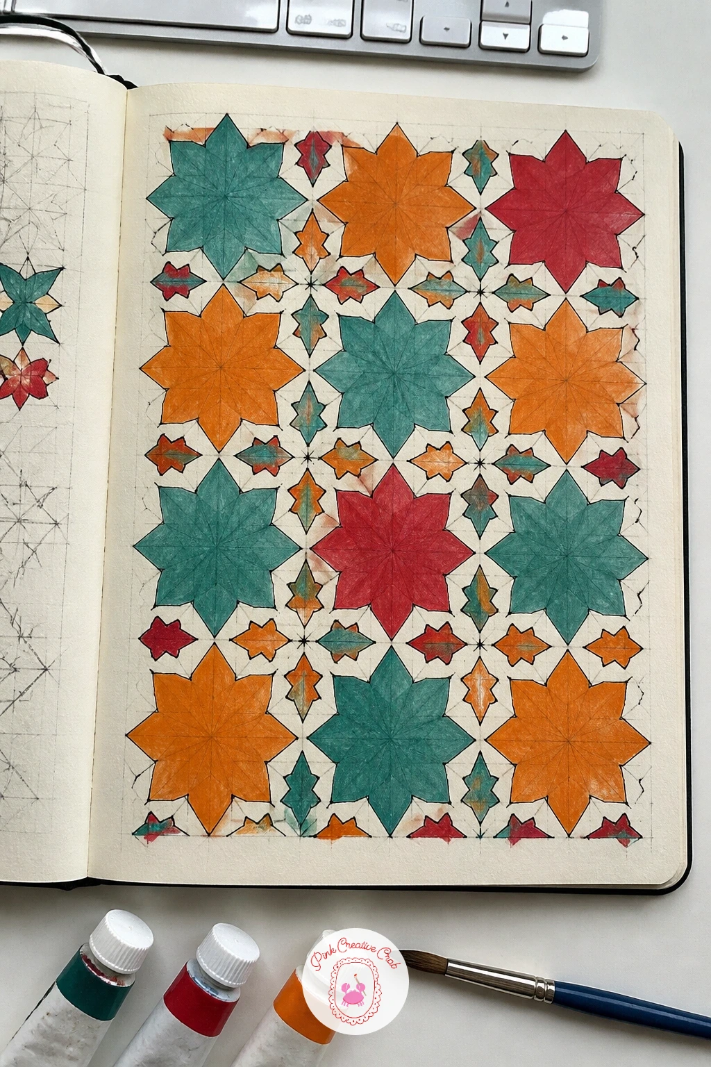
You Will Need
- ruler
Palette: Cobalt Teal,Cadmium Orange,Alizarin Crimson
If geometric pattern work interests you beyond this page, the architecture sketchbook ideas cover tile and building detail in a similar hand.
Trellis wallpaper pairs a rigid structure with a soft flower, so start this page with the structure: rule out diagonal crossing lines in pencil to form a diamond lattice across the page, using a ruler so every diamond stays the same size. Once the lattice sits evenly, draw a single rose at each crossing point, simplified to a loose spiral of petals rather than a fully botanical bloom.
Ink the lattice lines first in a single color, then ink and paint the roses on top, letting a few roses overlap the lattice lines slightly for a more natural, less rigid feel. A small leaf or two at each rose finishes the repeat and helps the eye move between the geometric and organic parts of the design.
This print loses its charm fastest when the lattice feels stiffer than the roses are soft, so loosen your ink line slightly on the rose shapes even while keeping the lattice crisp and ruled. If a full lattice feels like too much, a simpler version repeats just the roses in a diagonal row without any ruled lines at all.
Shade one side of each rose a touch darker with colored pencil to give the repeat some depth rather than flat color throughout.
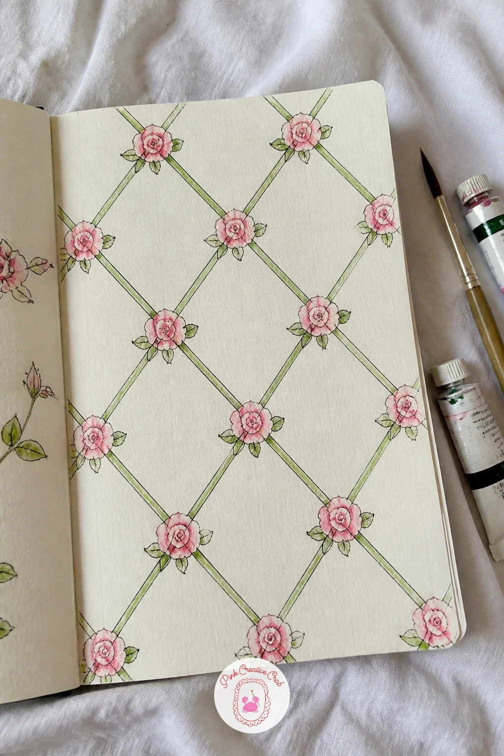
You Will Need
- ruler
Palette: Hooker’s Green,Permanent Rose,Dusty Rose
For more floral repeat practice at a gentler pace, the flower sketchbook ideas for beginners page is worth a look.
Gather a handful of actual fabric scraps, even tiny ones from a sewing basket, and lay them loosely over each other on the page before drawing anything, which gives you a real composition to copy rather than inventing an overlap from scratch. Pencil in the outline of each scrap exactly where it falls, including the curved folds where one piece overlaps another.
Ink the outlines once the layout is settled, then paint each scrap a different pattern or flat color, keeping every scrap visually distinct so the eye can tell where one ends and the next begins. Shade the overlapping edges slightly darker with colored pencil, since that small shadow is what makes the pile read as layered fabric rather than a flat patchwork grid.
Flattening the pile is the main risk, so keep checking that the scraps in front cover the ones behind completely rather than letting lines show through. If you have no scraps handy, cut a few small paper shapes and arrange those instead, the principle is the same.
Vary the pattern on each scrap, a stripe, a small floral, a plain color, so the page reads as a true stash rather than repeats of one fabric.
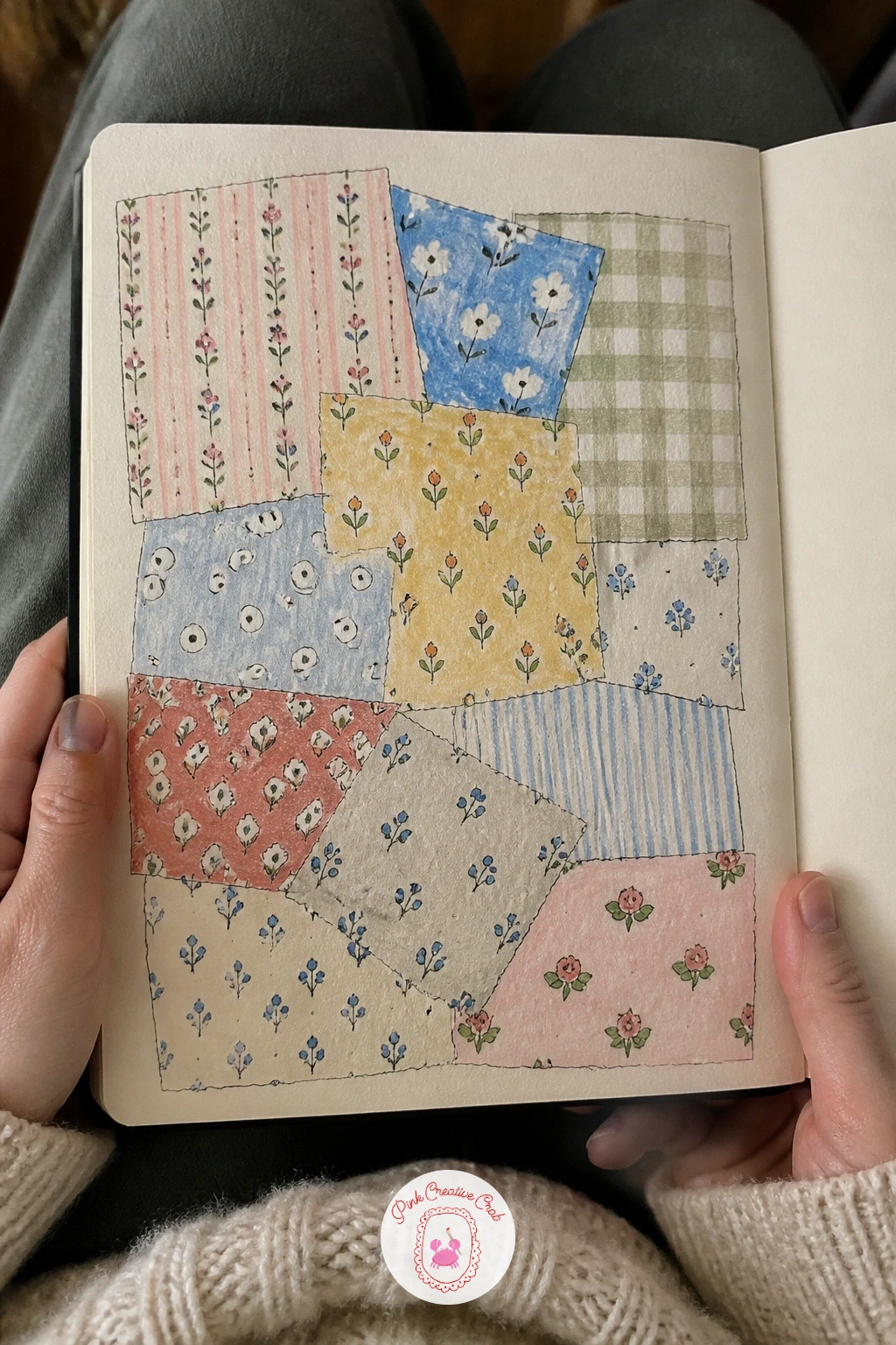
Palette: Dusty Rose,Cerulean Blue Light,Naples Yellow
Kantha work builds its texture from rows of simple running stitch, so this page is more about rhythm than any single motif. Draw a small background shape first, a leaf or a simple bird borrowed loosely from the Scandinavian page earlier, then fill it not with flat color but with rows of short running stitches drawn as tiny dashes following the shape’s contour.
Ink the outer shape lightly, then work the running stitch rows in colored pencil rather than gouache, since the fine repeated dashes read more clearly in pencil, keeping each row an even distance from the last so the lines ripple outward like a contour map. A second color worked in alternating rows adds the slightly uneven, hand-stitched charm kantha is known for.
Even spacing is the whole challenge here, so if the rows start drifting apart or crowding together, pencil in faint guide dots along the shape’s edge before committing to ink or pencil dashes. A quicker version fills a small motif this way in ten minutes; a fuller version repeats the technique across two or three shapes on the same page.
Let a few stitch rows run slightly outside the main shape’s edge, since that gentle imperfection is part of what makes kantha look handmade.
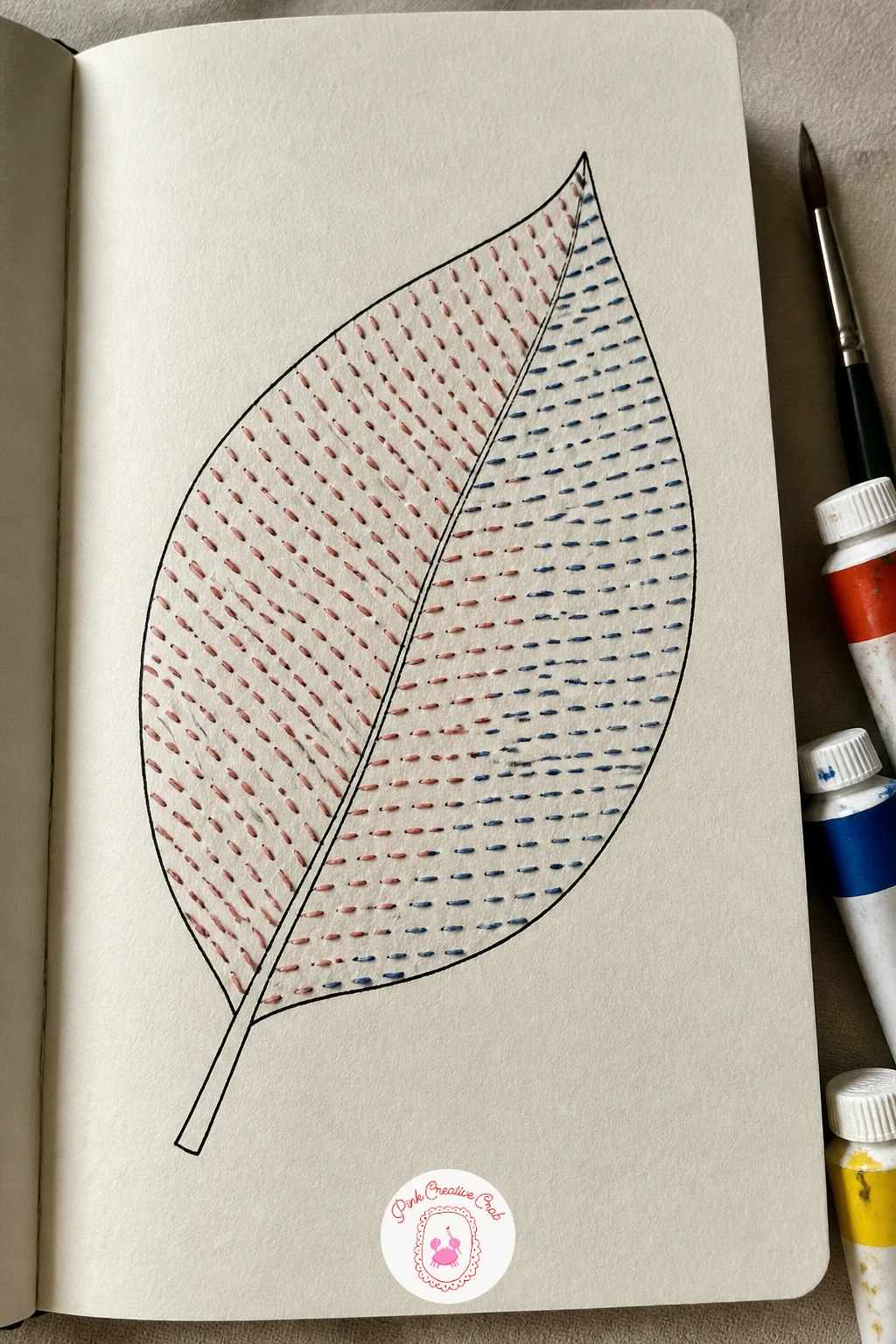
Palette: Alizarin Crimson,Indigo,Naples Yellow
Close the sketchbook on a bright note with a citrus repeat that leans into just two colors, coral and yellow, for a cheerful, cohesive palette rather than the fuller citrus rainbow. Draw a single orange slice in pencil first, a circle divided into even wedges with a thin rind border, then a second, smaller grapefruit-style slice in a slightly different wedge pattern for variety.
Ink both slice types, then repeat them in a loose scatter across the page, overlapping a few slices slightly the way real citrus repeats often do for a denser, more lively pattern. Paint the segments in alternating shades of coral and yellow gouache, leaving a thin white line between each wedge to keep the segments crisp and readable.
Wedge lines that do not quite meet in the center is the most common slip here, so lightly mark the center point of each slice in pencil before drawing the wedges radiating out from it. For a varied version next time, swap the citrus for slices of a different fruit, kiwi or watermelon work with the same wedge technique.
Finish with a scatter of small dots inside a few wedges for citrus texture, using the tip of a fine brush or a colored pencil point.
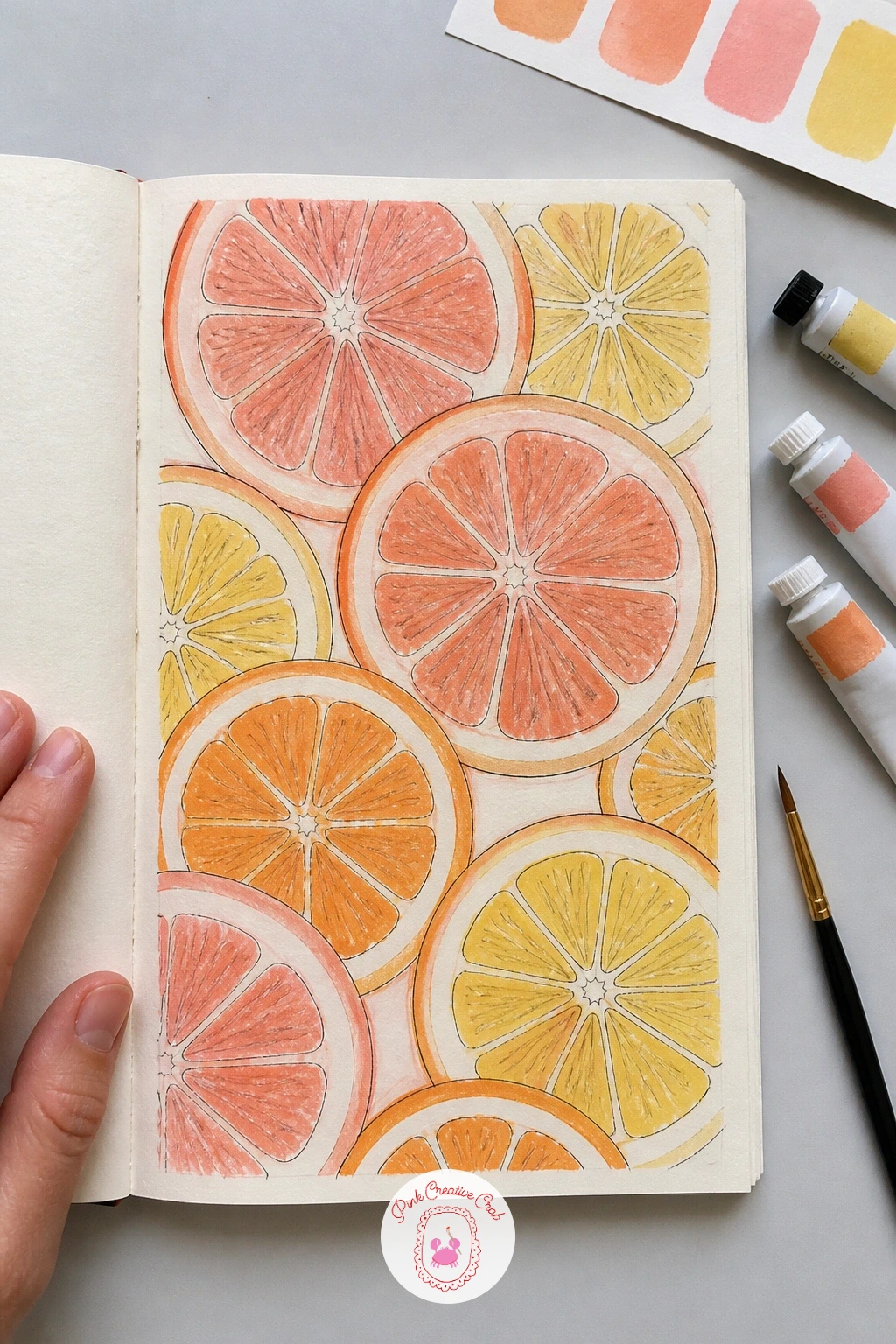
Palette: Coral,Cadmium Yellow,Titanium White
For more sketchbook pages built around a tight two or three color palette like this one, the colorful sketchbook ideas page is worth browsing next.
What to Do Next
Pick whichever source fabric or object is closest to hand right now, a scarf, a teacup, a handful of buttons, and start with the matching page above on a fresh sheet of cream sketchbook paper. One finished page today is enough to make the rest of this list feel worth coming back to.
Frequently Asked Questions
What paper works best for a textiles sketchbook?
A cream or ivory toned mixed media paper works best, since it holds up to gouache and pencil without buckling and gives colors a warm, fabric-like base rather than stark white.
Do I need real fabric or objects to draw from?
Real objects help enormously but are not essential. A scarf, teacup or sewing box gives far more accurate proportions than memory, though a clear photo works as a reliable substitute.
How do I keep a print repeat looking even without a computer?
Pencil in a faint grid or a scatter of guide dots before inking any motif, since this gives you consistent spacing without needing to measure every single repeat by eye.
What is the easiest idea on this list to start with?
The wildflower embroidery motif and the three-color gingham study are the gentlest starting points, since both rely on a small number of shapes and a simple, forgiving palette.
Can I use colored pencil instead of gouache throughout?
Yes, colored pencil can replace gouache for every idea here, giving a softer, more textured finish; just expect to build color in several light layers rather than one flat wash.
Have any thoughts?
Share your reaction or leave a quick response — we’d love to hear what you think!
-
 0
-
0
-
0
-
0
-
0
-
0


