

Tea cup drawing is one of those small pleasures that rewards you fast: a cup, a saucer, a curl of steam, and suddenly you have a whole mood on paper. Every idea below sets that cup into a little winter moment at home or out in the cold, so you get both the satisfaction of painting porcelain and the warmth of a tiny story.
Work through these in order if you like, from the simplest still cup to scenes with friends, pets and snowy views, or just pick whichever one matches your afternoon. Each one is sized to finish in a single sitting, so pour your own cup and keep it close for reference.
Using these images: free for personal projects such as printing, coloring, cards, journals and gifts. Handmade items that include them may be sold up to 30 pieces per design. More than that is commercial use and is not permitted, and neither is selling or sharing the images themselves or passing them off as your own. Please ask before any other use.
Start with the floral teacup, since it teaches you the whole cup and saucer shape before anything else gets added. Pencil a wide oval for the saucer, a narrower oval above it for the cup rim, and a soft curve down to the base: keep the ellipses open at first, they tighten up once you paint over them.
Paint the cup in thin washes of porcelain white left mostly as bare paper, then drop tiny dabs of cherry red and sage for the floral pattern once the base is dry. Add the windowsill and a blurred wash of icy blue for the snow outside, keeping the background loose so the cup stays the hero.
The most common slip here is a lopsided ellipse that makes the cup look tipped over, so turn your paper upside down partway through to check the curve reads evenly from both sides. If you do not have a fine liner yet, a sharp pencil works for the rim and handle lines.
Finish today by adding one wisp of steam in pale grey ink, curling just once rather than in several loops.
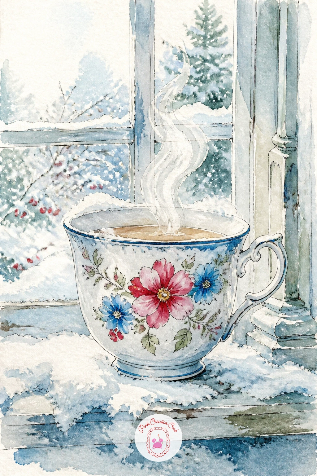
Palette: Porcelain White,Icy Blue,Sage Green,Cherry Red
Move from the windowsill to the fireside with a teacup balanced on the rolled arm of an armchair. Sketch the chair arm first as a simple curved wedge, then set the cup and saucer on top at a slight tilt, since a cup sitting dead level can look stiff and glued down.
Paint the chair in a warm sage or deeper green wash, letting the brush go dry toward the edges so the fabric looks soft rather than flat. Keep the cup itself pale porcelain white with just a thin ink line for the rim and a cherry red stripe near the base for contrast.
Where this one usually goes wrong is the cup looking like it floats above the arm rather than resting on it, so paint a small soft shadow directly under the saucer before you touch anything else. No fireplace glow in your paint box: a warm diluted yellow ochre wash in the background does the same job.
Tip for today: paint the shadow first, then the cup, and the whole thing will read as solid.
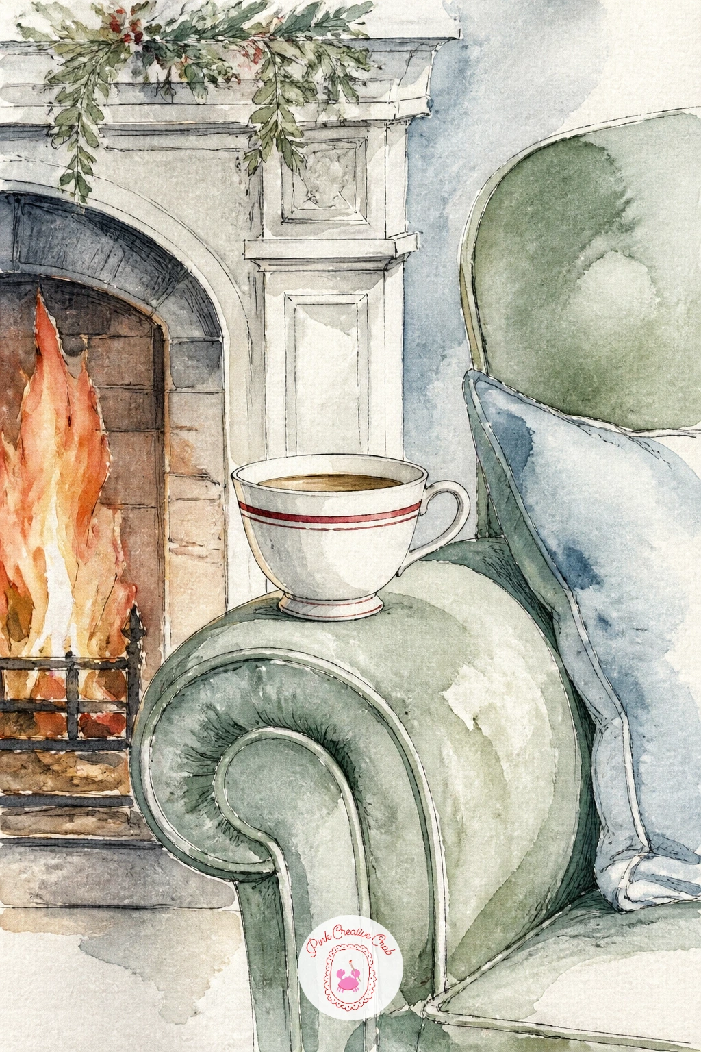
Palette: Sage Green,Porcelain White,Cherry Red,Yellow Ochre
Set the teacup down on an open novel next, with a pressed leaf tucked between the pages as a bookmark. Draw the book first as two gentle curved rectangles meeting at a spine, since book pages rarely sit perfectly flat, then place the cup near the top corner so the pages stay the visual base.
Paint the pages in the thinnest wash of warm white, almost untouched paper, and save the darkest ink lines for the tiny suggestion of text, a few wavy pencil-thin strokes rather than real words. Bring in the leaf in sage and a touch of cherry red at its edge, then paint the cup last so it sits confidently on top of everything.
The pressed leaf is the detail readers will study, so look at an actual leaf for its vein pattern rather than inventing one: one central line and a few branching ones is plenty. Missing a real leaf nearby, a photo on your phone works just as well for reference.
Finish with one small ink line where the book cover meets the table, to ground the whole page.
If you enjoy pairing books with cozy objects, the book stack drawing ideas make a good next stop.
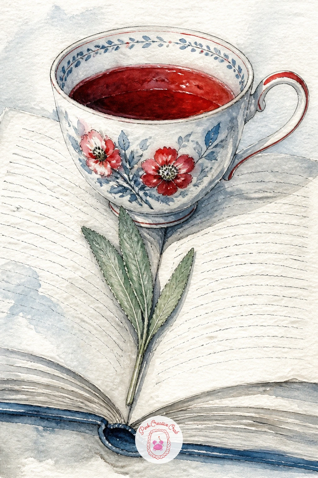
Palette: Porcelain White,Sage Green,Cherry Red,Warm Grey
Mismatched teacups on a tray bring in a second cup, so this is the moment to practice keeping two similar shapes from looking identical. Pencil the tray as a simple flattened oval, then place both cups on it at slightly different angles, one taller and narrower, one rounder, so your eye can tell them apart right away.
Paint one cup in icy blue with a thin cherry red rim, the other in plain porcelain white with a sage pattern, and vary the saucer sizes slightly too. Work wet-in-wet for the tray itself so it stays soft and recedes behind the two cups.
Comparing the two cups side by side is the trick here: hold your pencil up against the first cup’s height, then check the second against that same measurement before you commit to its size, since mismatched should still mean believable. Short on two teacup references, any two mugs from your own kitchen will do.
Tip for today: give the cups different handle directions, one left, one right, so the tray reads as a real table setting rather than a mirrored pair.
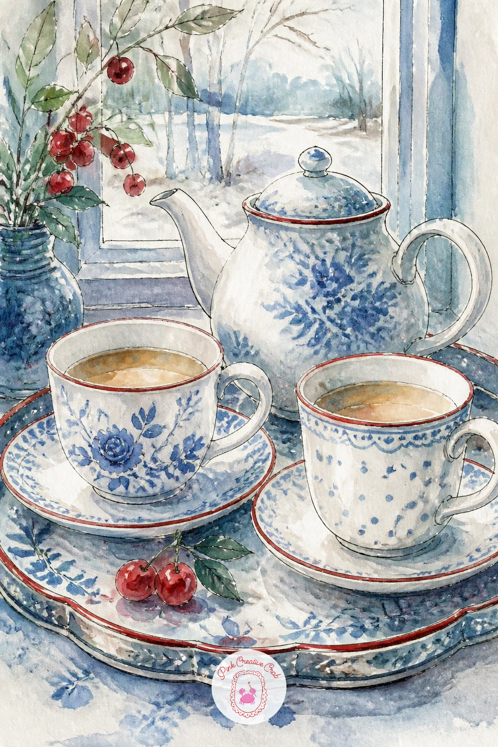
Palette: Icy Blue,Porcelain White,Cherry Red,Sage Green
Bring in the first animal with a cat leaning in to sniff a teacup set on a knitted blanket. Draw the cat as a simple loaf shape with the head tilted toward the cup, since the tilt is what sells the curiosity, then add the cup slightly smaller in scale so it clearly belongs to a person, not the cat.
Paint the blanket in rows of short dry-brush strokes to suggest the knit texture, letting the bristles separate rather than loading the brush too wet, and keep the cat in a warm grey or soft orange wash with ink whiskers added last. The teacup itself stays the simplest shape on the page, pale porcelain white with one cherry red stripe.
Fur edges are the tricky part: once the base cat color is dry, use a dry brush loaded with very little paint to flick a few longer strokes outward along the back and tail, which breaks up the flat silhouette into something softer. No real knitted blanket on hand, a folded sweater photographed on your sofa gives the same texture cues.
Close with a few ink whisker lines, kept fine and slightly curved, never ruler straight.
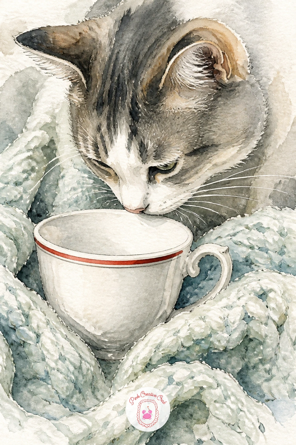
Palette: Warm Grey,Porcelain White,Cherry Red,Sage Green
A photo of a cat with ears forward and whiskers spread works better than a sleeping cat for this pose, since the alertness is what makes the sniffing moment convincing.
A blue and white teacup with lemon slices on a frosty morning is a good one for practicing a light source, since the lemon and the frost both depend on where the light comes from. Decide the light is coming from one side of the window, then pencil the cup, saucer and two or three lemon slices arranged loosely beside it, never in a perfect row.
Paint the cup’s blue pattern first in icy blue, leaving white gaps for the porcelain to show through, then add the lemon slices in a thin yellow wash with the pith painted as untouched white rings. Shade the side of the cup away from your chosen light with a slightly deeper icy blue, and let the lemon’s shadow fall the same direction as the cup’s.
Frost on the window behind is the forgiving part: flick a dry, nearly empty brush loaded with white gouache or a white gel pen across a cool blue wash once it is fully dry, and the texture appears almost by itself. No gouache or gel pen in the house, scratching gently into wet paint with the end of a brush handle leaves a similar pale mark.
Tip for today: keep every shadow in the scene falling the same direction, it is the fastest way to make a still life feel lit rather than flat.
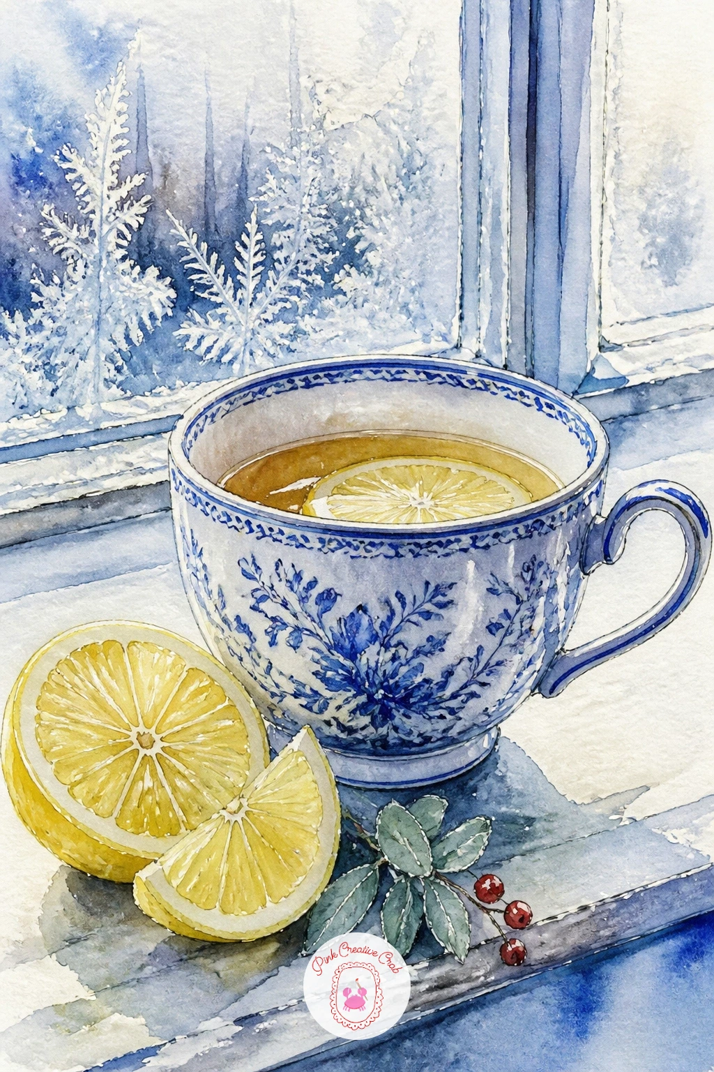
You Will Need
- white gouache or white gel pen for frost
Palette: Icy Blue,Porcelain White,Lemon Yellow,Cherry Red
Shortbread and a just-opened letter turn the teacup into the quiet center of a little still life, so start by deciding which of the three shapes sits closest to you: the cup, the plate of shortbread, or the unfolded letter. Pencil that one slightly larger and in front, with the other two overlapping it rather than lining up in a neat row.
Paint the shortbread in a warm pale ochre with a few short ink dashes for the fork-pricked texture on top, then wash the letter paper in the faintest warm white, leaving the folds as soft pencil-grey lines rather than hard creases. The cup stays porcelain white with a cherry red rim to tie the three elements together.
Overlap is what keeps a three-object grouping from looking like three separate stickers, so let the plate’s edge disappear slightly behind the cup and the letter slide half under the saucer. Missing shortbread as a reference, a stack of any pale cookies photographed on a plate gives the same crumbly edge.
Finish with one or two ink words suggested as loose scribbled lines on the letter, never full legible text.
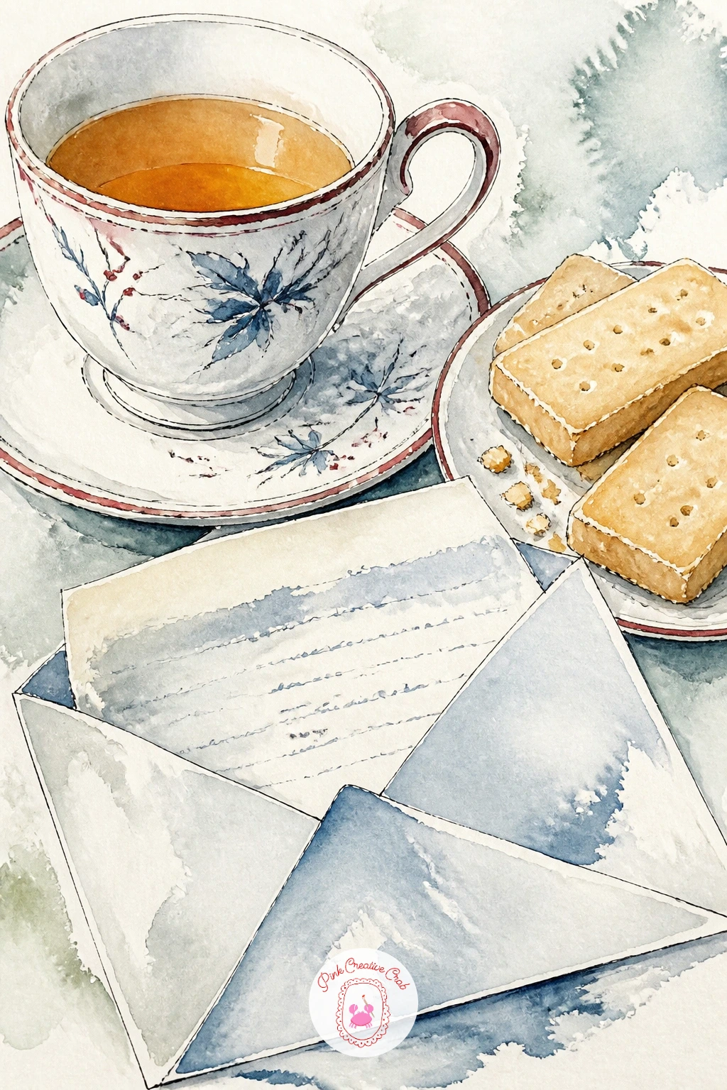
Palette: Porcelain White,Warm Ochre,Cherry Red,Warm Grey
Hands holding a teacup are easier than they look once you simplify them into soft mitten shapes rather than fingers, so draw this one as two rounded mitten forms wrapped around the cup, thumbs tucked to one side. Keep the cup itself small and mostly hidden between the mittens, since the hands are doing the storytelling here.
Paint the mittens in a knitted texture of short choppy brushstrokes in icy blue or cherry red, and leave the cup peeking through in plain porcelain white with a thin curl of ink steam rising above. A snowy porch rail behind, painted as a loose grey-white wash, is enough background to place the scene.
The ten minute version stops right there: mittens, cup, one steam curl, done. Given forty minutes, add a few individual knit ridges along each mitten in ink, a soft snow-covered rail post beside the hands, and a hint of a scarf collar at the very bottom edge of the page.
Tip for today: paint the steam last, in the thinnest wash of grey ink, and let it fade out rather than stopping abruptly.
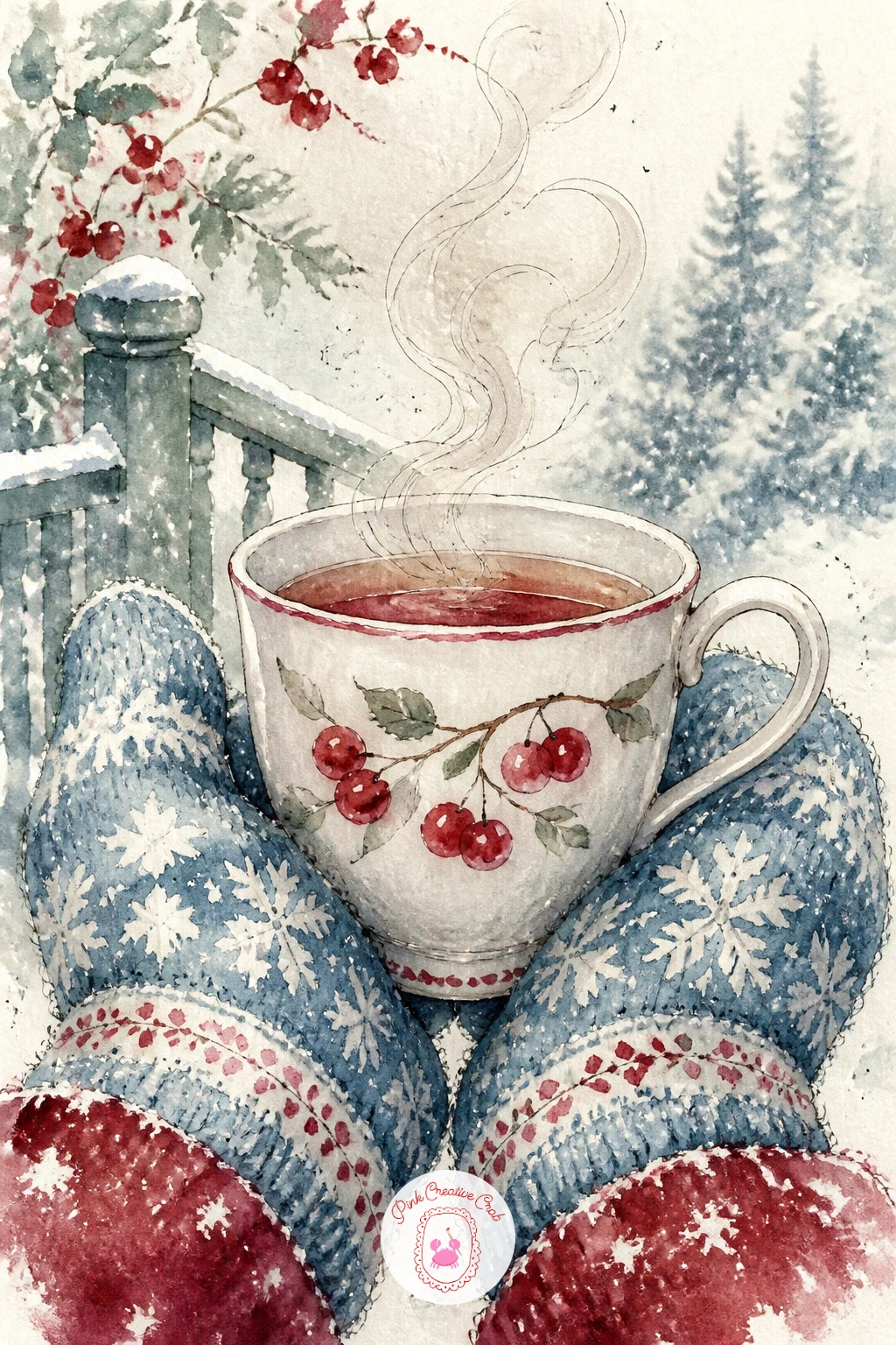
Palette: Cherry Red,Icy Blue,Porcelain White,Warm Grey
Three vintage teacups stacked on a kitchen shelf asks you to repeat a shape with small variations, which is good practice once the single-cup ideas feel easy. Pencil the largest cup at the base, then a slightly smaller one nested inside or beside it, and the smallest tucked near the top, letting them overlap rather than lining up like soldiers.
Give each cup a different pattern using the same palette: one in icy blue stripes, one with a small sage floral, one plain porcelain white with a cherry red rim, so the set reads as collected over time rather than bought together. Paint the shelf behind as a flat warm wash, with winter light suggested by leaving one edge of each cup paler than the rest.
Repetition is the trap here: if all three cups end up the same size and shape, the stack looks like one drawing traced three times, so measure each cup’s height against your pencil before painting and make sure none matches exactly. No three real teacups at hand, nesting bowls or mugs of different sizes give the same stacking logic.
Finish with a single ink shadow line under the whole stack to ground it on the shelf.
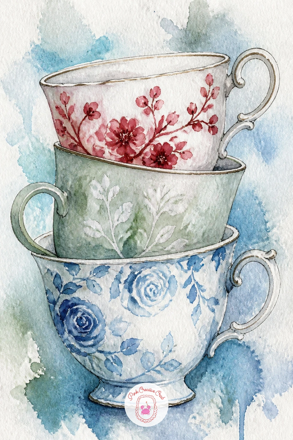
Palette: Icy Blue,Sage Green,Porcelain White,Cherry Red
Hibiscus tea gives you an excuse to paint a deep cherry red liquid glowing inside a pale cup, so start with the cup and saucer as usual, then leave the inside rim unpainted until last. Add a jar of tulips beside it, sketched as simple cupped petal shapes on straight stems, a handful rather than a crowded bunch.
Paint the tea itself in a strong wet wash of cherry red dropped into the center of the cup while the cup’s outer rim stays porcelain white, so the color looks contained rather than smeared everywhere. Keep the tulips in the same cherry red family with sage green stems, so the whole page feels tied together by that one warm note against the cool window light.
Getting the tea to glow rather than look muddy depends on painting it in one confident wash rather than going back over it repeatedly, so mix your red strong on the palette first and commit. No hibiscus tea in the cupboard to look at, any dark red juice in a glass gives you the same saturated color to study.
Tip for today: leave a tiny white highlight unpainted on the rim where the light catches the porcelain, it does more to sell the shine than any added white paint later.
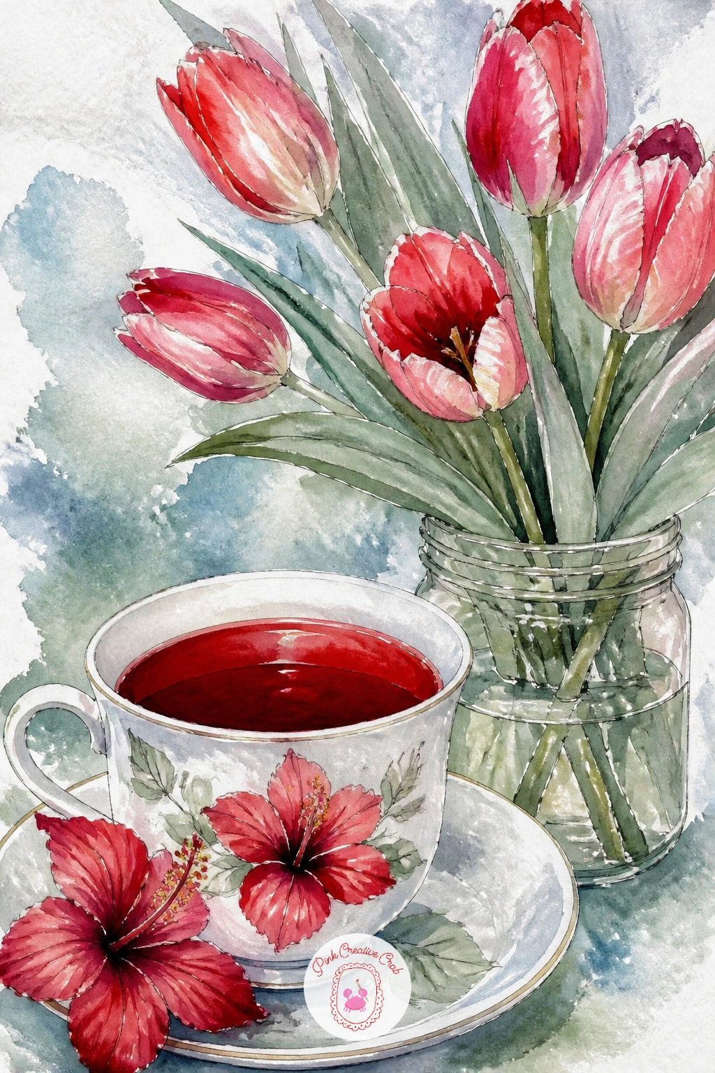
Palette: Cherry Red,Porcelain White,Sage Green,Icy Blue
A sleeping cat beside a teacup on a bedside table slows the whole mood down, so draw the cat first as a simple curled loaf with the tail wrapped around, since a sleeping cat is really just one soft continuous curve. Set the cup a little behind and to one side, smaller in scale so the cat clearly takes the foreground.
Paint the cat in a warm grey or soft tabby wash with the curled shape kept loose and rounded, no sharp edges anywhere since sleep softens everything. The teacup stays simple, porcelain white with a thin sage line, and a small lamp glow suggested behind it in warm ochre ties the whole scene to nighttime.
Once the cat’s base color is dry, lift a few soft highlights along its back and head with a clean damp brush dabbed onto paper towel, which gives the fur a gentle sheen without adding any new paint. Missing a lamp for the glow, a single candle photo works just as well for that warm radius of light.
Finish with one or two short ink lines for closed eyes, kept curved and relaxed rather than straight.
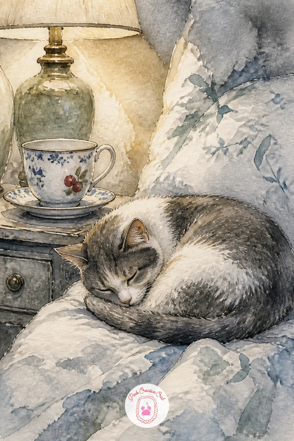
Palette: Warm Grey,Porcelain White,Sage Green,Warm Ochre
A chipped heirloom teacup filled with snowdrops lets you paint damage on purpose, which feels strange at first but adds real character once you see it finished. Pencil the cup as usual, then mark one small notch along the rim before you paint, so the chip reads as part of the design rather than a mistake fixed over.
Paint the cup in a soft aged porcelain white with the faintest warm grey wash in the chipped area, then fill it with a handful of snowdrops, simple white bell shapes on thin sage stems, no more than four or five so they stay readable. Keep the background a plain wash of icy blue to suggest a cold sill without any extra detail competing with the flowers.
The chip only convinces if you commit to it early: painting a clean rim first and trying to carve a chip into it afterward usually looks pasted on, so plan the notch at the pencil stage. No real heirloom cup around, any older mug with a small nick gives you the reference you need.
Tip for today: leave the snowdrop bells as bare white paper with just a thin ink outline, resisting the urge to paint them fully white, which keeps them glowing against the blue.
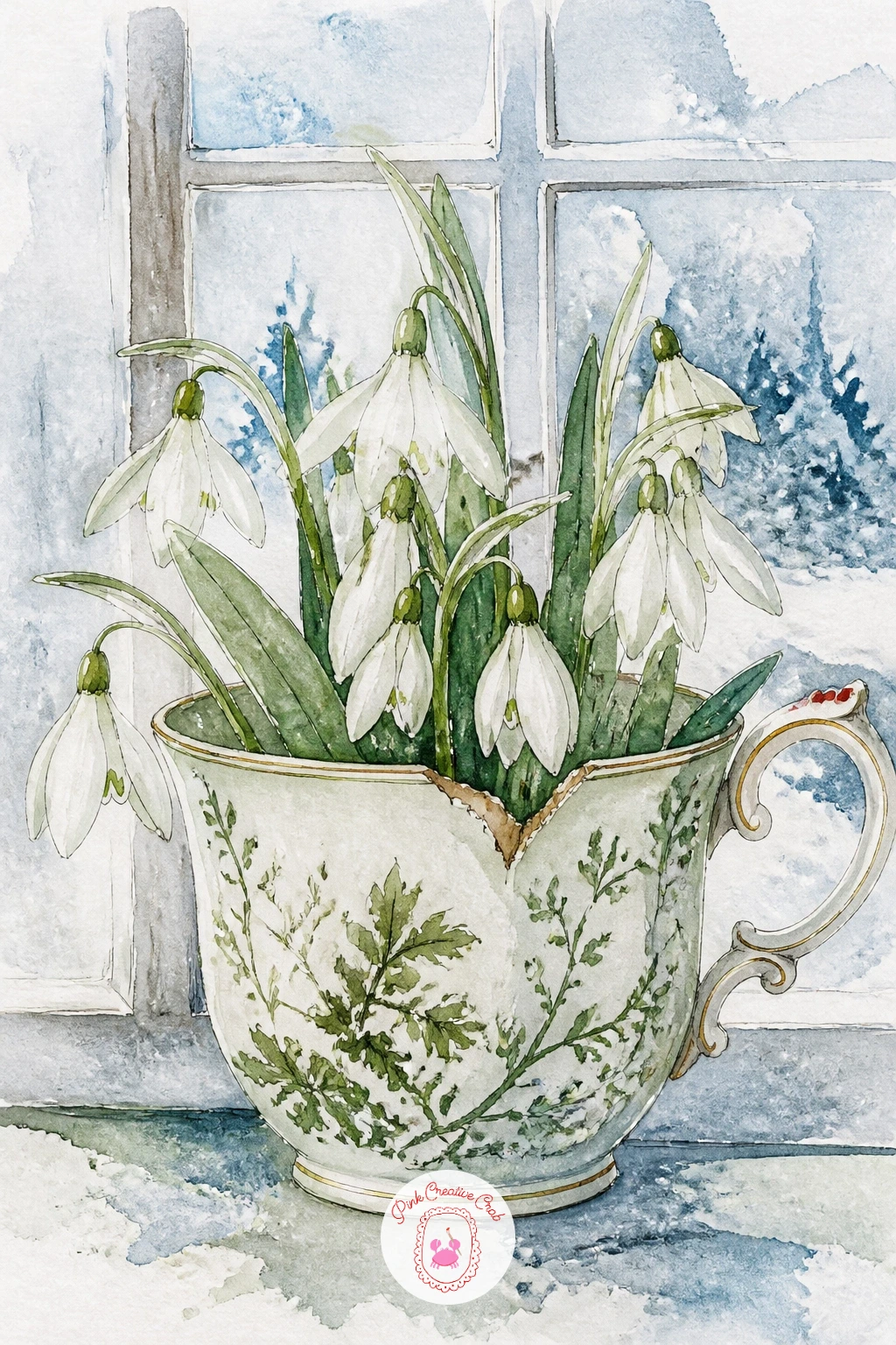
Palette: Porcelain White,Warm Grey,Sage Green,Icy Blue
Setting a teacup and teapot out on a sled in the garden snow is really two porcelain shapes and one wooden one, so block in the sled first as a simple flat rectangle with curved runners, then place the rounder teapot and the smaller cup on top of it. Keep the teapot’s spout and handle as the most detailed part, since that silhouette is what makes it read as a teapot rather than just another cup.
Paint the sled in warm brown wood tones with a dry brush dragged lengthwise for grain texture, then bring in the white porcelain pieces with icy blue shading on their shadowed sides. A simple wash of untouched white paper around the sled stands in for snow, with just a soft grey shadow beneath the runners to ground it.
From here you can vary this one easily: next time, swap the sled for a wheelbarrow, or paint the same teapot and cup set on a stack of firewood instead, keeping the same porcelain shapes but changing what they rest on. No sled nearby to reference, a toboggan or even a tray photographed outdoors gives the same simple base shape.
Tip for today: paint the shadow under the sled before the snow around it dries, so the two blend softly rather than leaving a hard white ring.
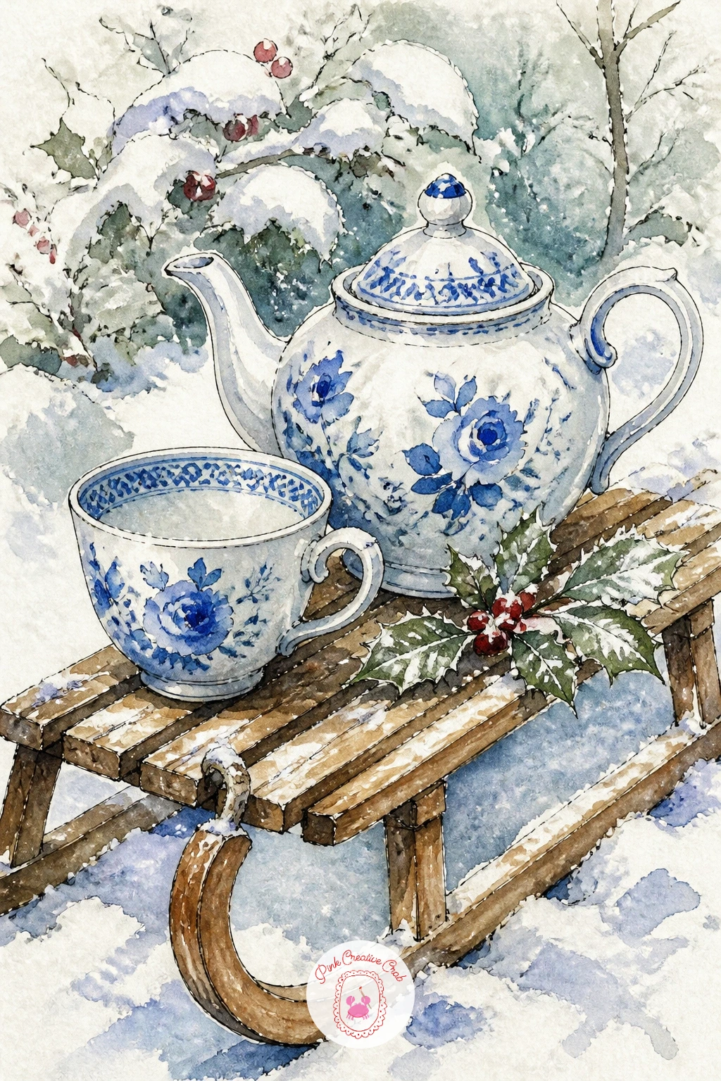
Palette: Porcelain White,Icy Blue,Warm Brown,Warm Grey
A teacup on a piano lid beside open sheet music mixes a curved porcelain shape with straight architectural lines, so start with the piano’s lid edge as one long confident ruled line before anything else, since a wobbly straight edge is harder to fix later than a wobbly cup. Set the cup near one end and let the sheet music fan out loosely toward the other.
Paint the piano in a deep warm black-brown wash, keeping the surface glossy by leaving a thin unpainted highlight stripe along the lid’s edge where light would catch polished wood. The sheet music stays mostly white paper with a few loose ink squiggles standing in for notes, never legible notation, and the cup sits in porcelain white with a cherry red rim for contrast against the dark wood.
The glossy reflection is the detail that sells the piano: once the black wash is dry, add one soft pale grey reflection of the cup’s shape just below it on the lid, slightly blurred and shorter than the cup itself. No piano at home to reference, any polished dark tabletop gives you the same reflective surface to study.
Finish with a thin ink line tracing the piano’s far edge to separate it clearly from the background.
If quiet reading and music corners appeal to you, the book doodles collection leans into the same gentle indoor mood.
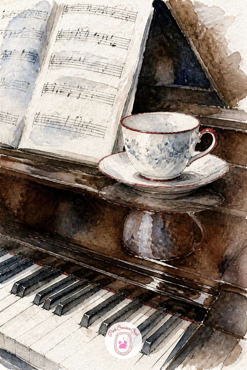
Palette: Deep Brown,Porcelain White,Cherry Red,Warm Grey
Taking the teacup outside to a bench in a snowy park means painting it small against a wider view, so this is the one to practice scale on. Pencil the bench first as a simple horizontal plank shape, then place the cup on one end at a size that looks genuinely small compared to the bench, not matched to it the way it would sit in a close still life.
Paint the park background in loose, pale washes of icy blue and warm grey for distant snow-covered trees, keeping everything behind the bench soft and undefined so the eye goes straight to the cup. The bench itself stays a warm brown, with the cup in porcelain white and one curl of ink steam rising to show it is still warm in the cold air.
If the cup ends up too large, the whole park setting disappears and it just looks like a close-up still life with some blue paint behind it, so sketch the bench and cup together before adding any background at all, checking the proportion twice. No park bench nearby to look at, any outdoor bench or porch step photo works for the reference.
Tip for today: keep the background trees as simple soft shapes with no hard edges, saving all your crisp ink lines for the bench and the cup alone.
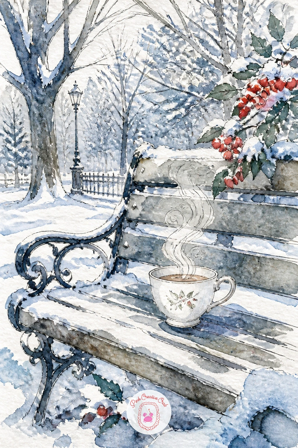
Palette: Icy Blue,Warm Grey,Warm Brown,Porcelain White
Chai with a cinnamon stick resting against the cup brings in a warm spiced color and one extra little prop to balance, so paint the tea itself in a rich warm brown-orange wash, left slightly textured by letting the pigment granulate on the paper rather than blending it perfectly smooth. Lean the cinnamon stick against the saucer rather than inside the cup, where it reads more clearly.
Draw the wool rug underneath in a few loose textured strokes of sage and warm grey, using a drier brush than you used for the tea so the two textures contrast, smooth liquid against rough wool. Keep the cup itself simple, porcelain white with a thin cherry red rim, so it does not compete with the richer brown of the chai.
Granulating pigments like a natural sienna or raw umber do this spiced, speckled texture almost on their own if you let the wash sit undisturbed rather than brushing it smooth. No granulating paint in your set, a dry brush stippled lightly over a still-damp wash gives a similar broken texture.
Tip for today: paint the cinnamon stick last, in two or three confident ink lines rather than trying to shade it fully, since its texture reads better suggested than overworked.
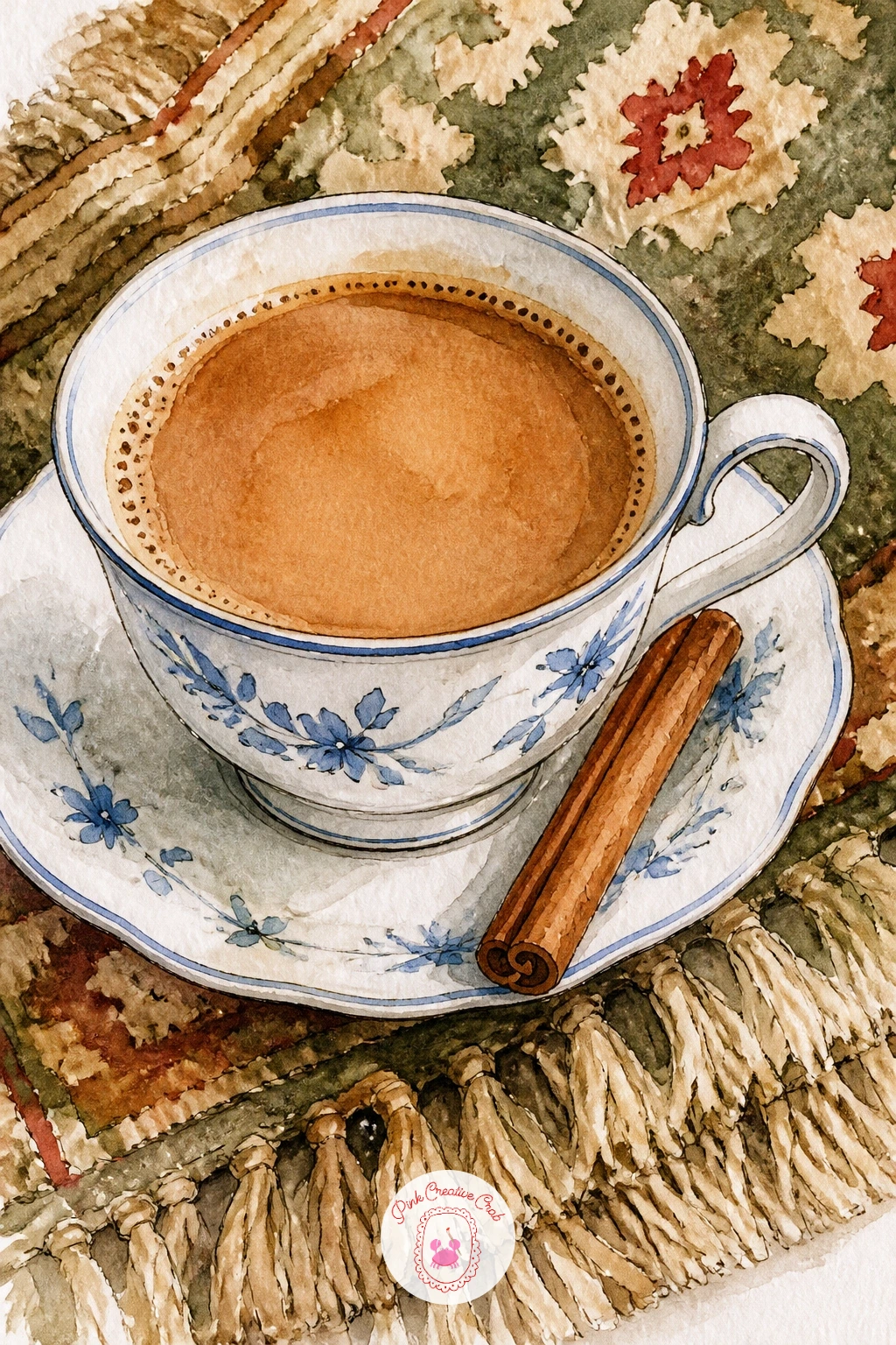
Palette: Warm Brown,Porcelain White,Cherry Red,Sage Green
A writing desk scene with a half-written letter and a pen beside the cup is a nice one for practicing where your eye lands first. Sketch the letter paper slightly larger and closer to the front of the page than the cup, since the unfinished writing is really the emotional center here, with the cup playing a supporting role just behind it.
Paint the paper in the thinnest warm white wash with a few loose ink lines suggesting handwriting, trailing off unevenly rather than filling the whole page, since a half-written letter should look genuinely interrupted. Add the pen as a single confident diagonal ink line with a tiny nib detail, and keep the teacup in porcelain white with a sage pattern, set slightly out of focus with softer edges than the letter.
Edges are the tool here: paint the letter and pen with crisp, fully dry ink lines, but let the teacup’s outline stay a touch softer and slightly blurred at the base, which pushes it back in space behind the writing. No real cursive to copy, loosely scribbled wavy lines read as handwriting from a short distance just as well.
Finish with one small ink blot near the pen tip, a tiny storytelling detail that takes seconds to add.
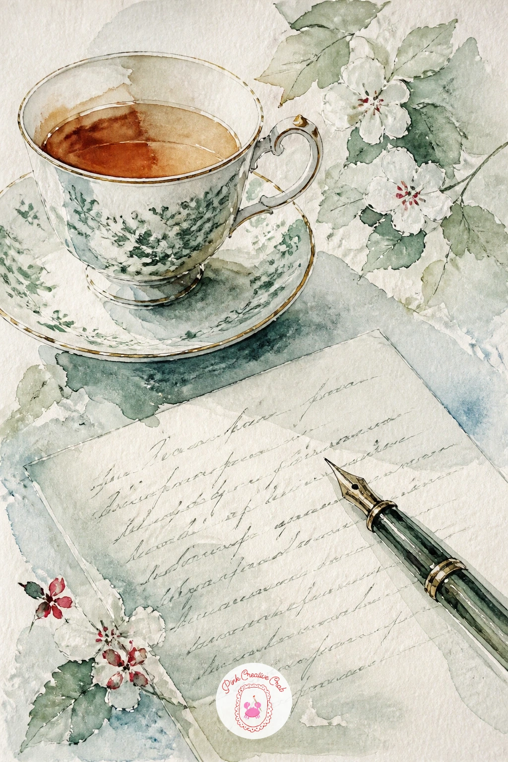
Palette: Porcelain White,Sage Green,Warm Grey,Cherry Red
A honey dipper resting across the cup at dawn gives you a chance to paint warm early light alongside the usual porcelain shapes. Decide the light source is low and golden, coming from one side of the kitchen table, then pencil the cup, saucer and dipper with that in mind, leaving the side nearest the light paler than the rest.
Paint the honey itself as a few thick golden drips caught mid-fall from the dipper, using a strong wash of warm ochre with tiny untouched white paper gaps to suggest shine. Wash the whole scene in a faint warm glow by laying one very pale yellow wash over the background before adding the cup in porcelain white with a cherry red rim.
Early light like this works best if you paint that pale background glow first and let it dry completely before adding any other color on top, otherwise the golden wash muddies into everything else. No honey dipper handy, a spoon with a thin drizzle does the same visual job.
Tip for today: leave two or three tiny white highlight dots unpainted on the honey drips themselves, which is what makes them look wet and sticky rather than flat and painted.
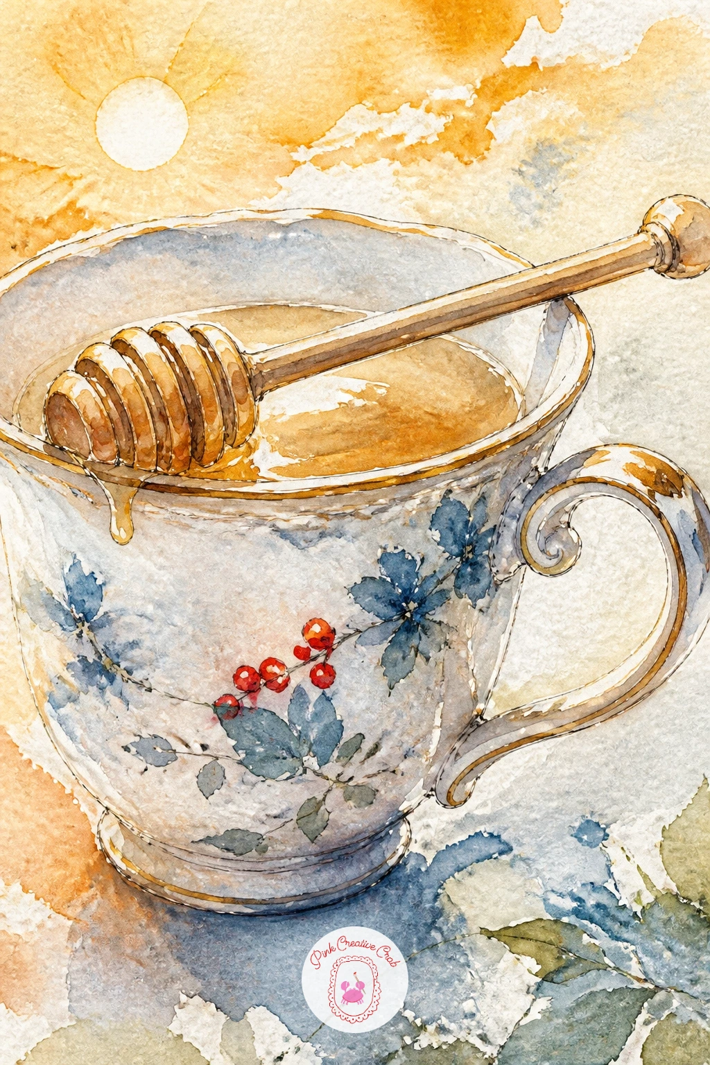
Palette: Warm Ochre,Porcelain White,Cherry Red,Pale Yellow
A slice of lemon drizzle cake on a cake stand beside the teacup brings height into the composition, since the stand itself lifts the cake above the table level. Pencil the stand as a simple stemmed plate shape first, then set the cake slice on top at an angle that shows its layered side, with the teacup placed lower and to one side.
Paint the cake in warm pale yellow with a thin drizzle of white icing left as untouched paper, dragging a few short vertical ink lines down the side to suggest the crumb texture once the base wash is dry. Keep the cake stand itself in a cool porcelain white to echo the teacup, so the two feel like part of one tea set even though they are different objects.
If you have less time today, paint just the cake slice and cup together on a flat plate and skip the stemmed stand entirely, which saves the trickiest perspective problem of the whole scene. With more time, add the stand’s stem and base properly, checking that the stem lines up with the center of the plate above it.
Tip for today: paint the icing drizzle as a single loose wavy ink line rather than several, it reads more naturally as poured rather than drawn.
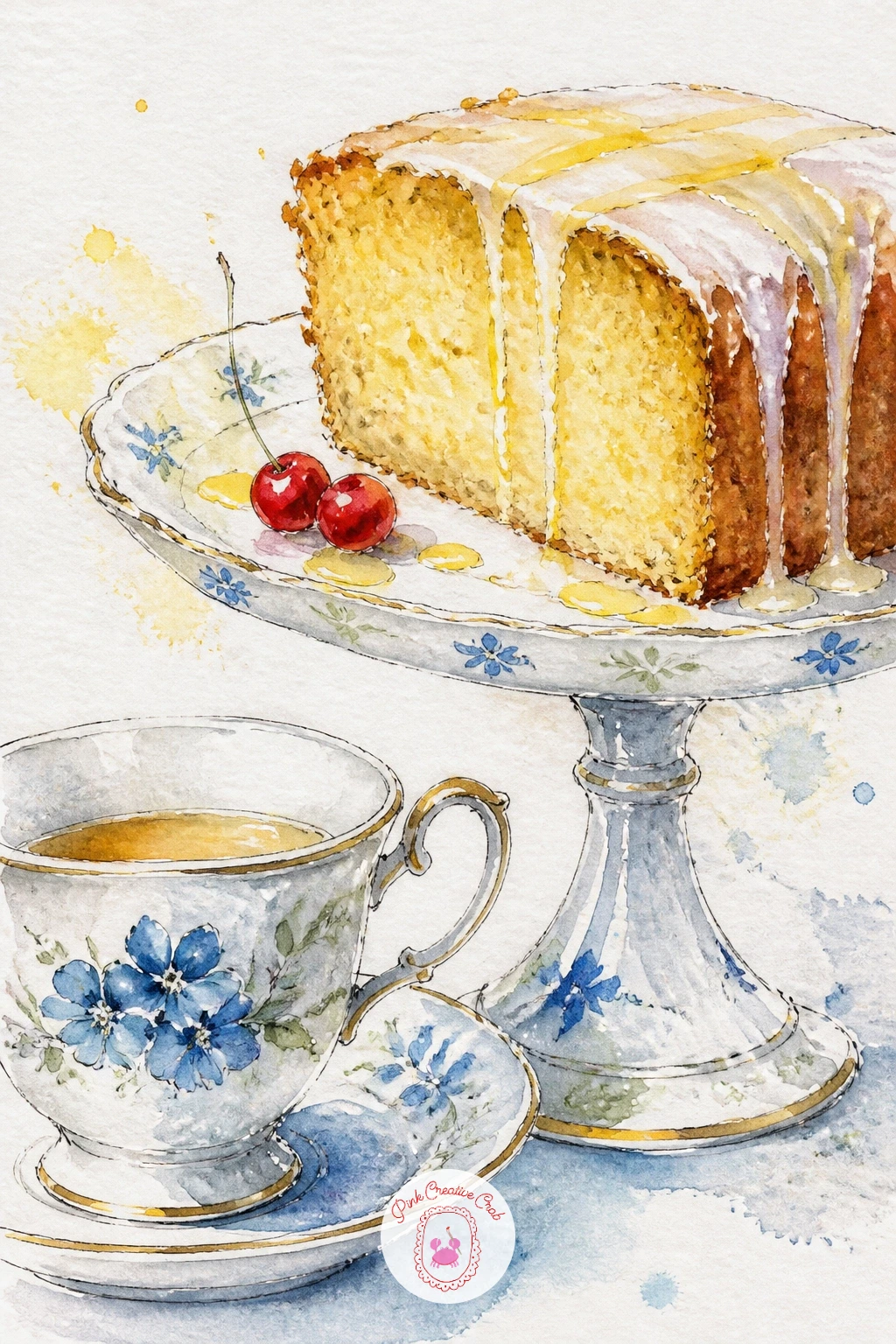
Palette: Pale Yellow,Porcelain White,Warm Ochre,Cherry Red
A girl wrapped in a plaid blanket holding her teacup brings a person into the scene, so keep her simplified: an oval face turned slightly to one side, shoulders rounded under the blanket’s weight, hands just two soft shapes around the cup rather than detailed fingers. Sketch the blanket first as the largest shape on the page, since it should read as the cozy wrapping everything else sits inside.
Paint the plaid pattern in loose overlapping stripes of cherry red and sage over a porcelain white base, letting some stripes bleed into each other slightly rather than ruling them perfectly straight, which keeps the fabric looking soft rather than printed. Leave the face mostly suggested, a warm pale wash with two small ink dots for eyes and no more detail than that.
Faces are where beginners often lose confidence and overwork the page, so if this is your first time painting a person, keep the features to the barest minimum and trust that a simple warm oval with soft dots reads as a face from a normal viewing distance. No plaid reference handy, any checked scarf or shirt in your closet gives you the same stripe-over-stripe pattern.
Tip for today: paint the hands around the cup before the blanket details, so you can build the stripes outward from that anchor point rather than fitting the cup in afterward.
For more ways to draw a simple figure like this, the girl pencil drawing ideas are worth a look.
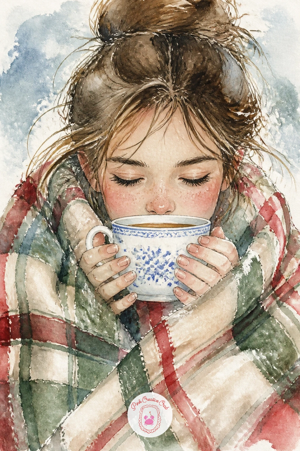
Palette: Cherry Red,Sage Green,Porcelain White,Warm Grey
Moving the teacup to a camping table beside a frozen lake pushes the winter mood further out into the cold. Sketch the small folding table first as a simple flat rectangle on thin legs, then set the cup near its center, with the frozen lake stretching out flat and pale behind it toward a low horizon line.
Paint the ice in long horizontal strokes of icy blue and pale grey, leaving streaks of untouched white paper for the shine along the surface, then keep the table in a plain warm brown so it stands out clearly against the cool ice. The cup stays porcelain white with a cherry red rim and one curl of steam, the single warm note in an otherwise cold scene.
The horizon line is the detail to get right here: keep it perfectly level and fairly low on the page, since a tilted or too-high horizon makes a frozen lake read as a hill instead of flat ice. No frozen lake to reference, any wide calm body of water photographed in winter light gives you the same flat horizontal plane.
Tip for today: rule a faint pencil horizon line across the page before sketching anything else, then erase it once the ice washes are dry.
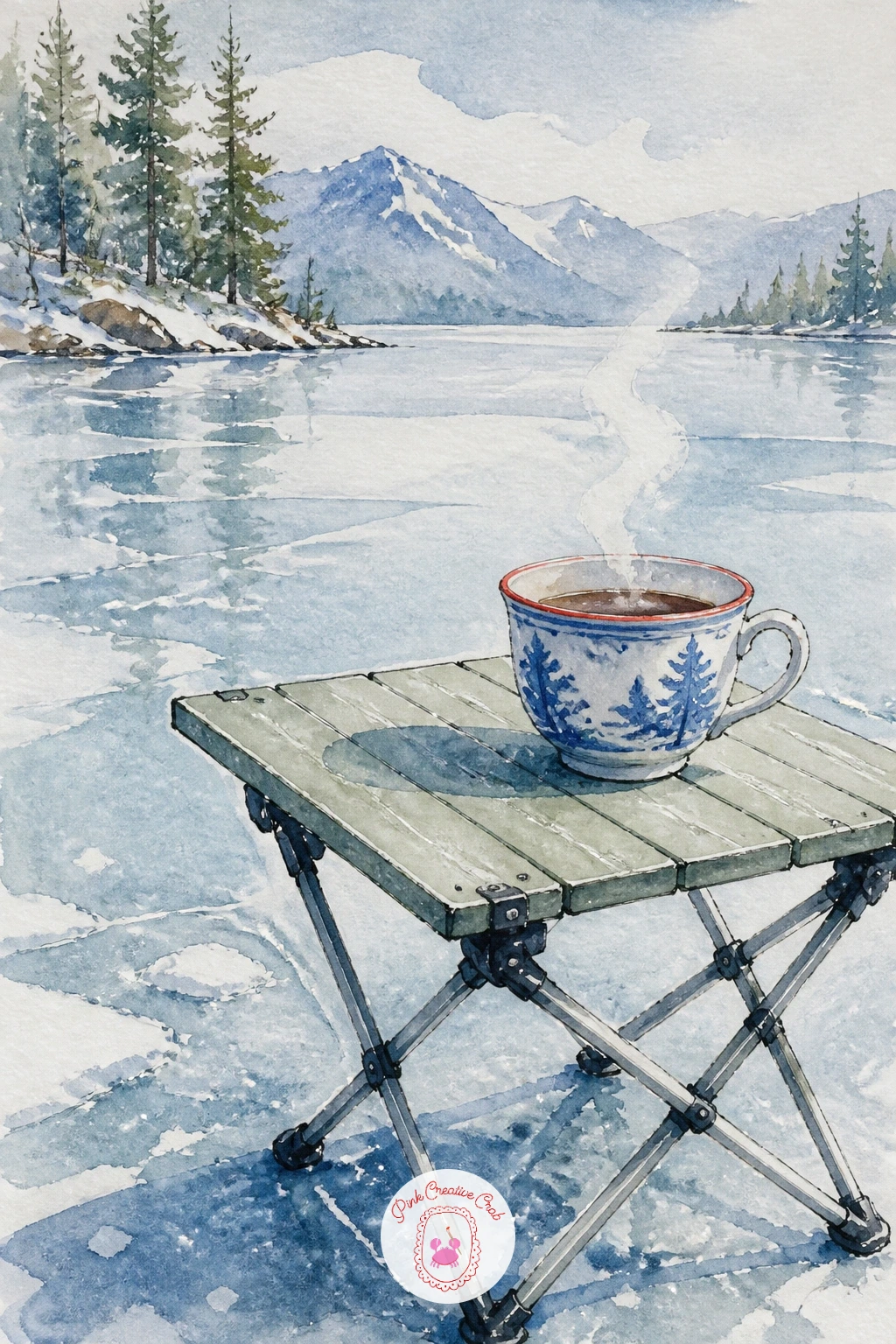
Palette: Icy Blue,Porcelain White,Warm Brown,Cherry Red
Pink tea with rose petals floating on top asks for a soft blush color inside the cup rather than the deeper cherry red used elsewhere, so mix a pale pink wash and let it pool gently in the center of the cup before the petals go in. Keep the cup shape itself identical to earlier ideas, since by now that ellipse-and-curve should feel familiar.
Paint two or three rose petals floating on the tea’s surface as simple curved almond shapes in a slightly deeper pink than the tea itself, leaving thin white gaps of unpainted paper between them and the liquid so each petal reads as separate and floating rather than merged into one pink blur. A single real rose photographed from above, or any pink flower, gives you the petal shape to study.
Once this version works well, vary it next time by swapping the petals for a few loose dried hibiscus flowers, or by floating a single thin lemon curl instead of petals, keeping the same pale pink base tea.
Tip for today: paint the petals while the tea wash beneath is still slightly damp so their edges blur just slightly into the liquid, which looks far more convincing than crisp dry petal shapes sitting on top.
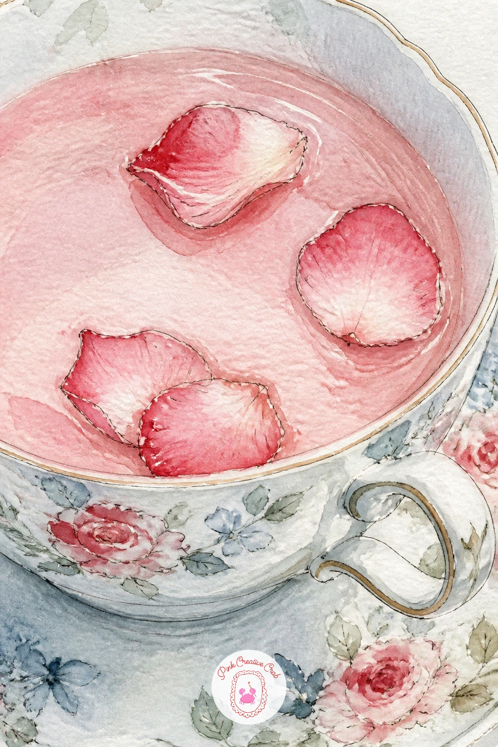
Palette: Pale Pink,Cherry Red,Porcelain White,Sage Green
Setting the teacup between a pair of knitting needles and a ball of sage yarn means drawing two long thin diagonal shapes that have to feel balanced rather than crossed at random. Pencil the needles first as two confident straight lines meeting at a slight angle, then place the yarn ball and the cup on either side of that angle so the whole arrangement feels anchored rather than scattered.
Paint the yarn ball in a textured sage wash, scribbling loose overlapping ink lines on top once it is dry to suggest individual strands without trying to draw every one. Keep the needles themselves a simple warm metallic grey, just two clean lines each with a small rounded tip, and the cup in its usual porcelain white with a cherry red rim nearby for warmth.
Straight lines like knitting needles are harder freehand than curved ones, so if this is your first time drawing something this rigid, rest the side of your hand on the paper and pull the pen in one smooth motion rather than sketching it in short hesitant strokes. No yarn ball handy, any wound ball of string or rope gives the same coiled texture.
Tip for today: let a few single loose yarn strands trail out from the ball across the table, which does more to suggest knitting in progress than the ball alone.
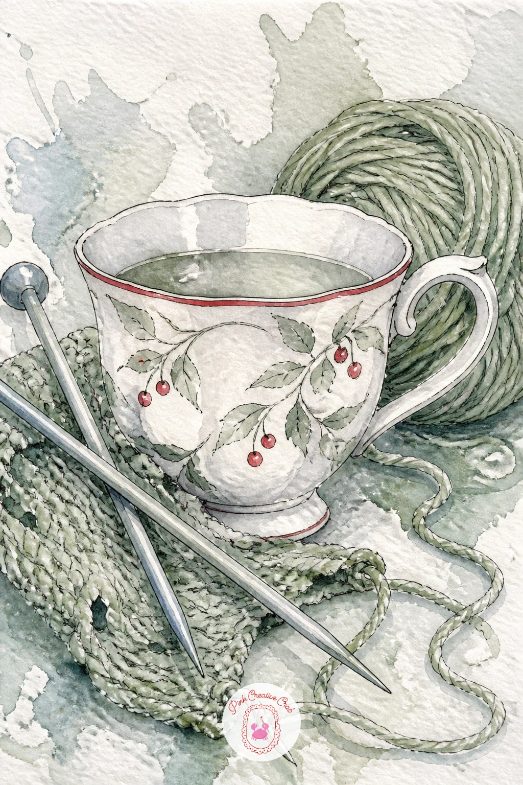
Palette: Sage Green,Warm Grey,Porcelain White,Cherry Red
A teacup on a train table with snowy hills passing outside the window brings perspective into play through the window frame itself. Draw the window as a simple rectangle set at an angle if the table is seen from a slight side view, then place the cup in sharp focus close to you while the hills outside stay soft and pale in the distance beyond the glass.
Paint the near elements, the table and cup, with your crispest ink lines and strongest colors, then switch to much thinner, cooler washes for the hills outside, since distant things lose both detail and color intensity compared to what sits right in front of you. A thin horizontal smear of pale grey-blue across the window glass suggests motion blur without needing any extra linework.
Keeping that contrast between sharp and soft is really a lesson in perspective and distance: anything closer to your eye gets darker, warmer and more detailed, anything farther gets paler, cooler and simpler, and a train window is a perfect frame for seeing both at once. No train window to reference, any car window on a snowy drive shows the same near-sharp, far-soft relationship.
Tip for today: blur the hills with a single horizontal brushstroke dragged sideways while the wash is still wet, suggesting the train’s motion in one gesture.
The same near-and-far thinking carries over well into the watercolor city ideas if you want to try it on a bigger scene.
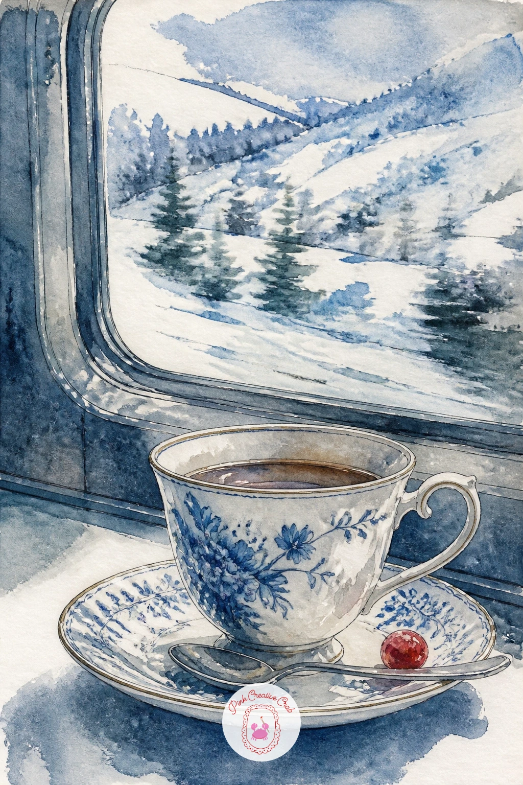
Palette: Icy Blue,Porcelain White,Warm Grey,Cherry Red
Earl Grey beside a vase of white ranunculus is a quieter, more monochrome idea than some of the others, so lean into that by keeping almost everything in soft warm greys and whites, with only the cup’s rim or the vase’s edge picking up a touch of cherry red. Sketch the vase and flowers first as a cluster of overlapping rounded petal shapes, since ranunculus heads are made of many layered petals rather than a few large ones.
Paint the tea itself in a thin amber-grey wash, letting a faint bergamot-yellow tint show at the edges, then build the ranunculus petals in the palest warm white with just the shadowed undersides touched in grey, working from the center of each flower outward. Keep the cup simple and secondary here, since the flowers are doing most of the visual work in this one.
Painting so many overlapping petals without it turning into a blur means working one flower head at a time to completion before starting the next, rather than laying in all the petal shapes loosely across the whole bunch at once. No ranunculus on hand, any rose or peony gives you a similarly layered petal structure to study.
Tip for today: leave the cup’s handle as the one area with a crisp hard ink edge, which anchors the softer floral washes around it.
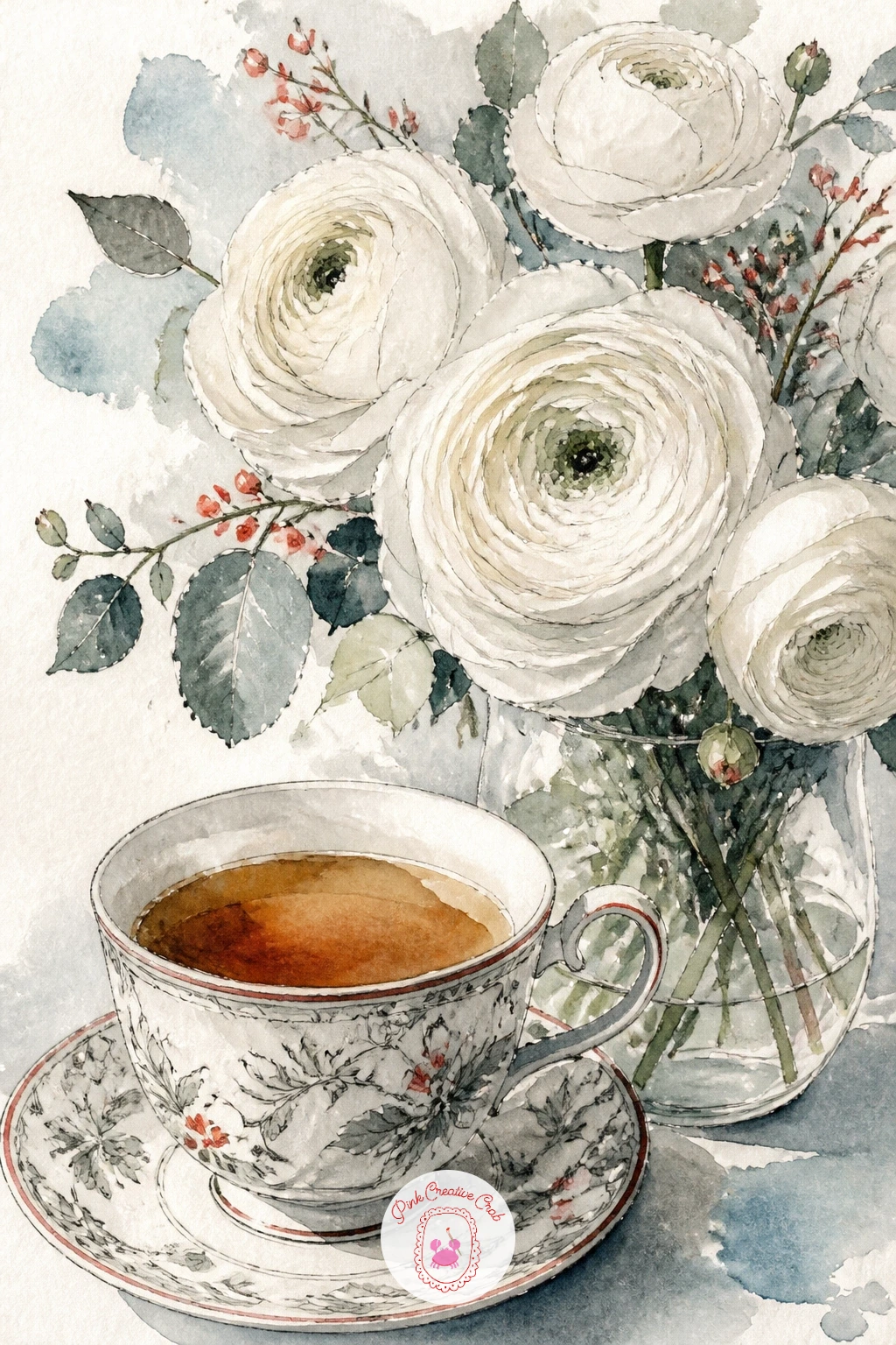
Palette: Warm Grey,Porcelain White,Pale Yellow,Cherry Red
A sprouting seedling beside the teacup on a February windowsill is a small sign of the season turning, so keep the seedling itself tiny and simple: one thin stem, two small rounded leaves, sitting in a plain terracotta-colored pot no larger than the cup beside it. This is a good one to slow down on, since the quiet scale is the whole point.
Paint the pot in a warm terracotta wash with the soil’s surface left slightly textured by a dry brush dabbed unevenly across the top. Bring the seedling in with the thinnest sage green for the stem and leaves, keeping the whole plant pale and young-looking rather than full and leafy, and let the cup beside it stay in its usual porcelain white with a cherry red rim.
This idea can go very quick or quite slow depending on how much windowsill detail you add: ten minutes covers just the pot, seedling and cup, while forty minutes lets you add a blurred wash of melting snow outside the glass and a thin strip of condensation along the bottom of the window.
Tip for today: keep the seedling’s two leaves slightly uneven in size, since a perfectly symmetrical sprout looks less like a real young plant and more like a drawn symbol of one.
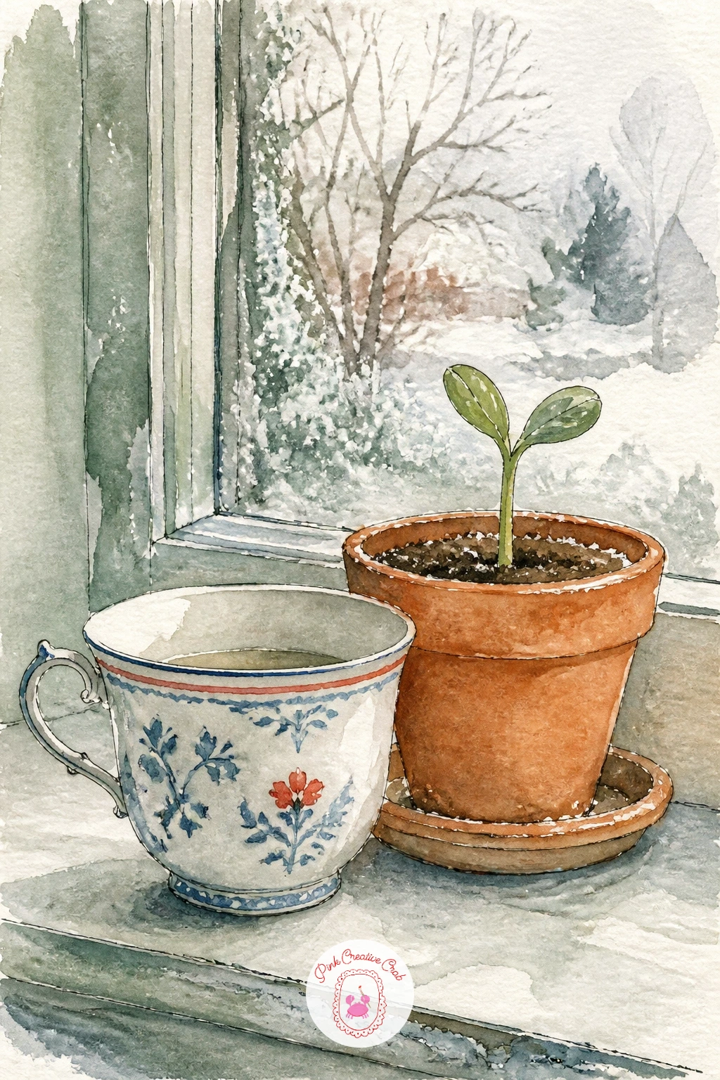
Palette: Sage Green,Warm Terracotta,Porcelain White,Cherry Red
A chickadee landing on the rim of a teacup left out on a snowy table is the smallest bird on this list and a good one for practicing light, quick marks. Draw the chickadee’s body as one rounded shape with the head slightly overlapping it, no visible neck, then its small feet gripping the cup’s rim with just two or three thin lines each.
Paint the bird’s cap and bib in a soft black-grey wash, leaving the cheeks and belly as warm porcelain white, and add its wing in a slightly darker grey once the base dries. The teacup underneath stays simple, porcelain white with a thin cherry red stripe, with a light dusting of snow suggested across the table by flicking a nearly dry white-loaded brush.
Small birds lose their charm fast if the proportions drift, so compare the chickadee’s whole body length against the width of the cup’s rim before you paint: the bird should look genuinely light and small perched there, not heavy enough to tip the cup. No chickadee reference nearby, any small round garden bird gives you a similar rounded body and short tail to copy.
Finish with two tiny black ink dots for the eyes, placed close together near the top of the head.
For more small winter birds like this one, the cardinal drawing ideas cover a cousin subject in the same snowy mood.
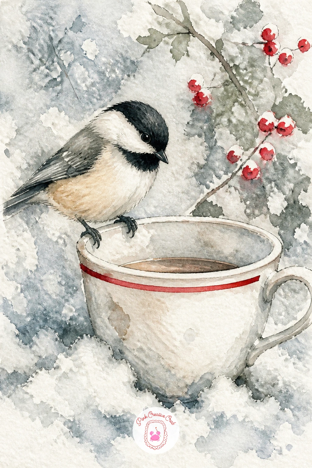
Palette: Warm Grey,Porcelain White,Cherry Red,Icy Blue
Two friends clinking teacups across a table by a frosty window brings a second figure into the scene along with a moment of motion, the small tilt and touch of two cups meeting. Sketch both figures very simply, rounded shoulders and tilted heads facing each other, with the two cups meeting at an angle right in the middle of the composition where your eye should land first.
Paint the cups touching at their rims in slightly different patterns, one in icy blue stripes, one plain porcelain white with a cherry red edge, so the clink reads as two distinct people’s cups rather than a mirrored pair. Keep both figures loosely washed in warm neutral tones, with faces reduced to the simplest suggestion of features, and the frosty window behind them painted as a soft pale blue wash with a few white gouache or gel pen flicks for frost.
If this is your first time painting two figures together, work out the clinking cups first as the clear focal point, then build each figure outward from that point rather than drawing two complete people and trying to fit the cups between them afterward. No two friends to pose for reference, any two people photographed mid-toast at a table gives you the same gesture to study.
Tip for today: tilt both cups very slightly toward each other rather than painting them upright, which is what makes the clink look like it is actually happening.
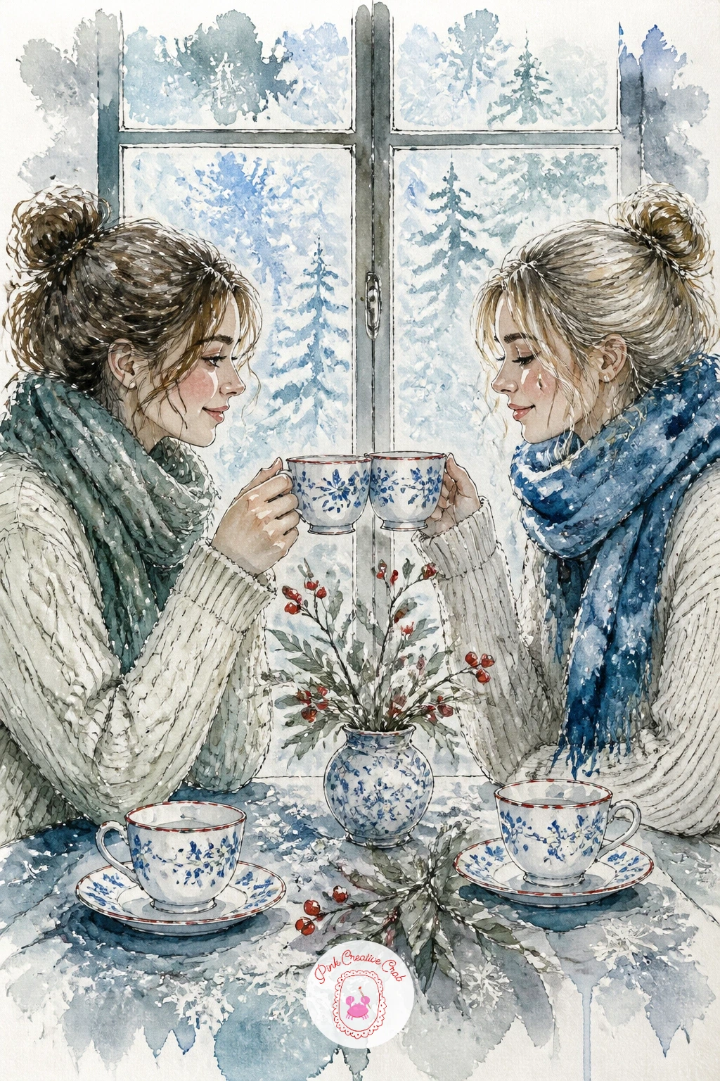
You Will Need
- white gouache or white gel pen for frost
Palette: Icy Blue,Porcelain White,Cherry Red,Warm Grey
A dachshund curled in its dog bed beside a steaming teacup is a good late subject for this list, since by now you have painted a cat twice and this long low body shape is a nice contrast to practice. Draw the dachshund as one long smooth curve from nose to tail, tucked into a rounded bed shape, with the teacup set just outside the bed’s edge so it is clearly a separate, smaller object.
Paint the dog in a warm reddish-brown wash, keeping the body’s long curve as one continuous stroke rather than several shorter ones, which is what makes a dachshund’s silhouette read correctly rather than looking like a lumpy sausage. The bed itself can pick up sage green, and the teacup stays porcelain white with a cherry red rim and a single curl of steam to show the warmth in the room.
Long low bodies like this one go wrong when the curve gets interrupted partway through, so sketch the whole spine line in one pass before adding legs, ears or any other detail. No dachshund to reference, any long low dog breed photographed curled up gives you the same smooth body curve to study.
Tip for today: keep the ears as two simple soft drooping shapes added last, since overworking the ear detail early tends to throw off the rest of the proportions.
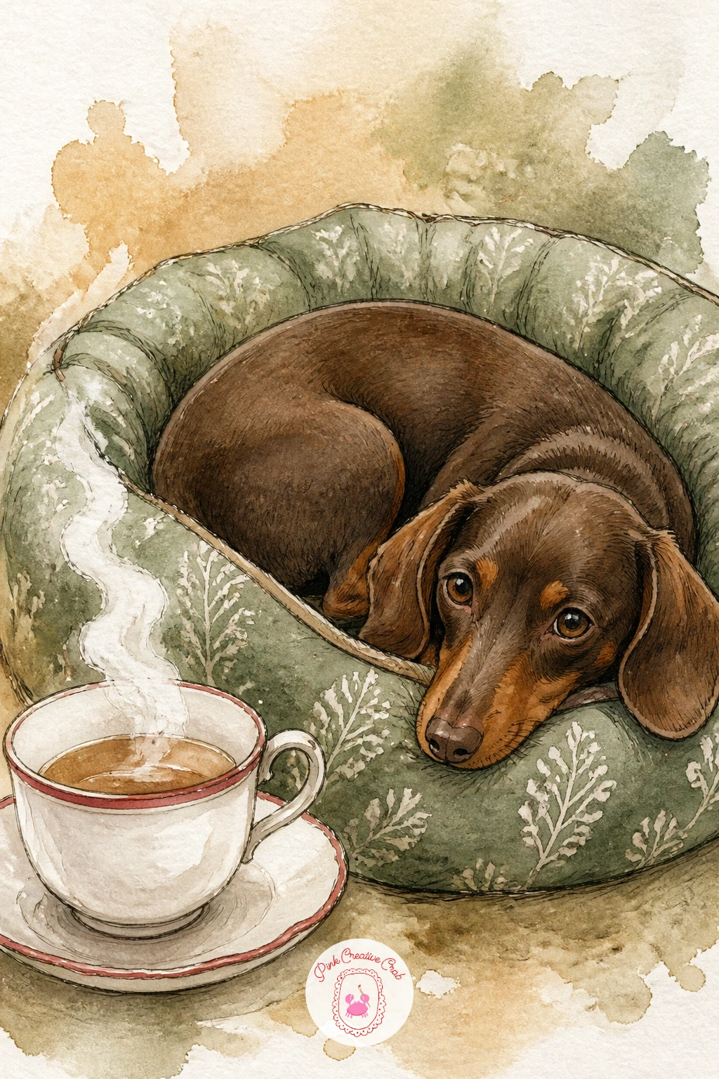
Palette: Warm Brown,Sage Green,Porcelain White,Cherry Red
Mint tea on a moss green velvet armchair returns to the fireside mood from earlier but with a richer fabric texture to practice. Sketch the armchair’s rolled arm and back as big soft curved shapes first, then set the cup down on the arm itself, tilted slightly as it was in the very first idea on this list, since that small lesson carries forward nicely here.
Paint the velvet in a deep moss green base wash, then while it is still slightly damp, lift a few soft streaks of color out with a clean damp brush to suggest the way velvet catches light unevenly across its folds. The mint tea inside the cup gets a pale green-yellow wash with a sprig of mint leaves resting across the rim, painted as two or three simple pointed leaf shapes in a brighter sage than the chair.
Lifting color like this is the texture trick worth learning here: paint the velvet fully first, let it sit for only a few seconds, then dab a damp brush in a few curved strokes to lift pigment back out before it sets completely, which leaves soft pale streaks that read as sheen. No velvet chair available, any plush fabric like a corduroy cushion gives you a similar play of light and texture to study.
Tip for today: lift the highlight streaks while the wash is still damp, not after it dries, or the lifting will not work nearly as well.
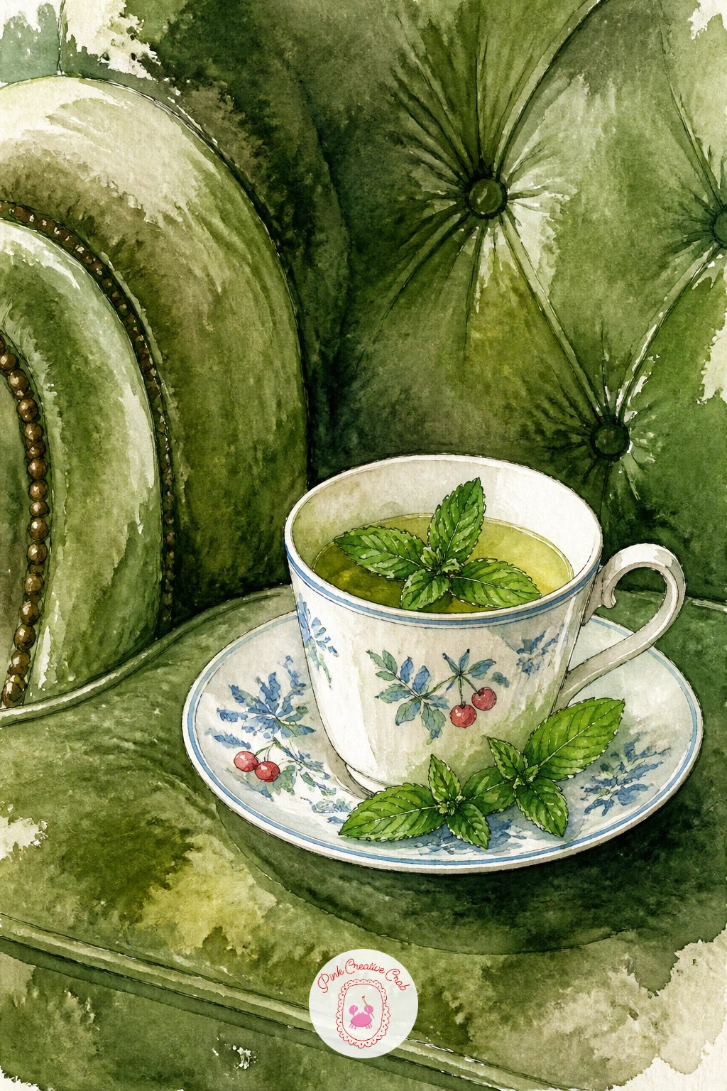
Palette: Moss Green,Sage Green,Porcelain White,Pale Yellow
Close this list with a teacup on a tray being carried upstairs on a snow day morning, which lets you paint a hand, a tray and a hint of a staircase all in one small scene. Sketch the tray at a slight tilt as if held mid-step, with the cup and a small plate on it, then suggest the staircase behind with just two or three simple diagonal lines rather than full architectural detail.
Paint the tray and hand in warm neutral tones, keeping the hand reduced to a simple rounded shape gripping the tray’s edge rather than detailed fingers, and bring the cup in last in its familiar porcelain white with a cherry red rim. A soft blurred wash of icy blue through a window at the top of the stairs suggests the snow day outside without needing any extra detail.
Carrying a tray at a tilt is really the same proportion check from the very first idea on this list, now applied in motion: compare the cup’s height against the tray’s width before committing to the angle, so the whole arrangement looks balanced rather than about to slide off.
Tip for today: tilt the tray only slightly, a steep angle reads as the tea about to spill rather than simply being carried upstairs.
If you enjoyed building a whole quiet scene around one small object, the christmas scene drawing ideas apply the same thinking at a larger scale.
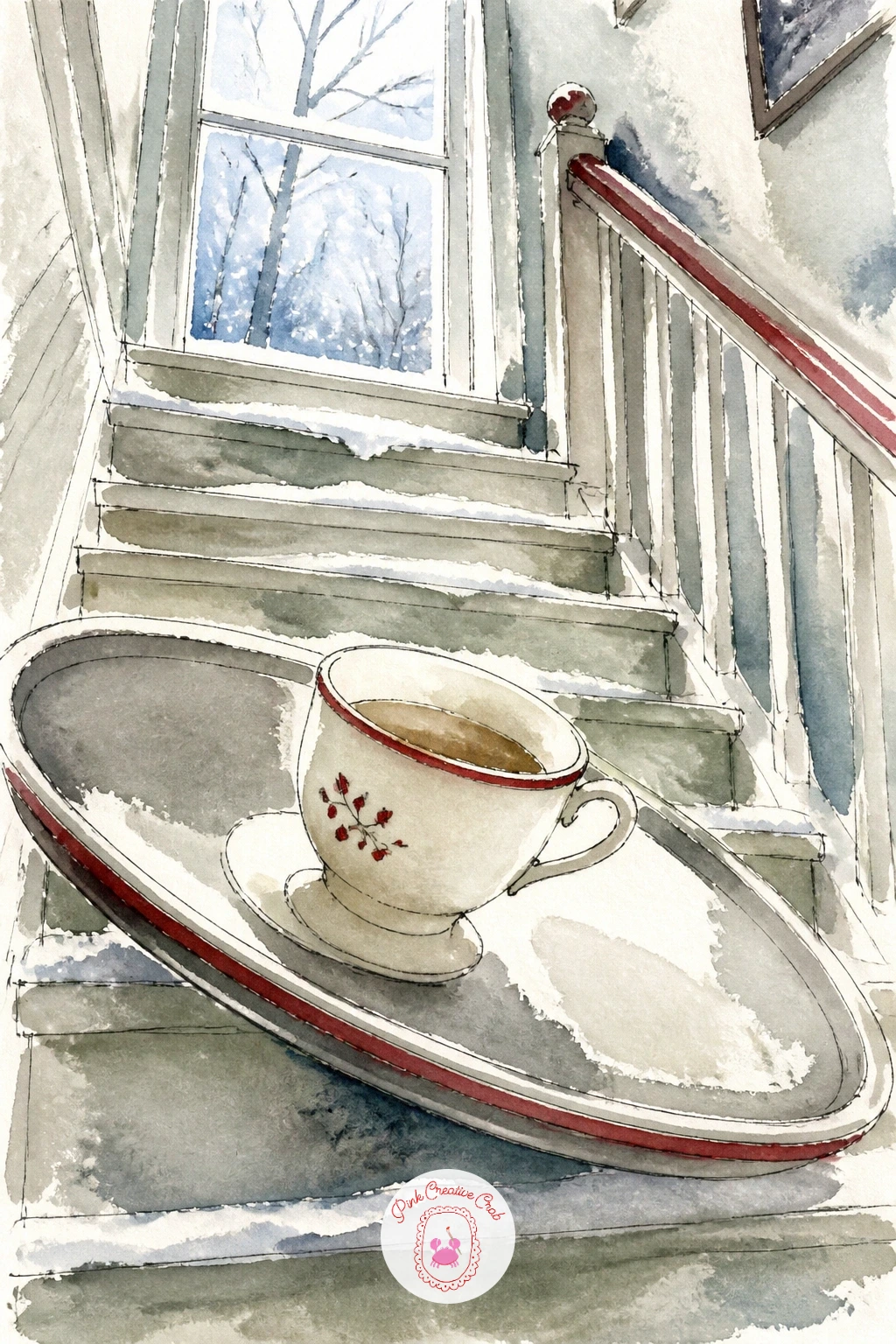
Palette: Porcelain White,Cherry Red,Warm Grey,Icy Blue
What to Do Next
Pick whichever teacup moment matches your mood today, pencil the cup and saucer first in loose open ellipses, and let the rest of the scene build outward from there on a sheet of cold press watercolor paper.
Frequently Asked Questions
What is the easiest way to start a tea cup drawing without it looking lopsided?
Sketch the cup and saucer as two simple open ellipses before adding any detail, then turn the paper upside down to check both curves look even from either side.
Do I need special watercolor paper for tea cup drawing scenes like these?
Cold press watercolor paper in a medium weight handles washes and ink accents well. Thinner paper from a regular sketchbook tends to buckle once wet washes go down.
How do I paint steam rising from a teacup without it looking like a scribble?
Use the thinnest wash of grey ink or diluted paint and draw just one or two gentle curls rather than several loops, letting the line fade out rather than stopping abruptly.
What if I only have a few paint colors, can I still follow this cozy palette?
Yes, a basic set with a blue, a green, a red and a warm brown mixes every color used across this list. Porcelain white mostly comes from the bare paper itself.
How do I keep a teacup looking like porcelain rather than flat and plastic?
Leave a small unpainted highlight on the rim where light would catch the glaze, and shade only one side slightly darker, since that single contrast does most of the work.
Have any thoughts?
Share your reaction or leave a quick response — we’d love to hear what you think!
-
 0
-
 0
-
 0
-
 0
-
 0
-
 0
