

Christmas card ideas handmade in marker have a particular charm: a thin fineliner outline, smooth alcohol marker color, a scrap of tartan and a touch of gold, and suddenly a plain card front looks like something kept in a drawer for years. None of these need lettering or fine detail work. They lean on bold, flat shapes, a pale background and one confident subject sitting proud in the middle of the card.
Below you will find thirty one of them, from a single tartan tree on a snowy hill through to tiny paper-cut villages and vintage gold lanterns. Work through them in any order, pick the ones that suit the people on your list, and keep the leftover cards for next year, because this style never really goes out of fashion.
Using these images: free for personal projects such as printing, coloring, cards, journals and gifts. Handmade items that include them may be sold up to 30 pieces per design. More than that is commercial use and is not permitted, and neither is selling or sharing the images themselves or passing them off as your own. Please ask before any other use.
Start with the simplest subject on the list: one red tartan Christmas tree standing alone on a snowy hill. Pencil a tall triangle with a short trunk, then draw a low curved hill line beneath it so the tree sits slightly above the card center. Ink both shapes with fineliner before any color goes down, since marker over a dry, settled line never smudges the way it can over wet ink.
Fill the triangle with red marker first, then once it is dry, rule in a few crossing green and cream lines by hand to suggest tartan rather than a tight woven grid. Keep the lines a little uneven, that is what makes it read as hand drawn rather than printed. The hill stays plain cream or pale blue-grey, with a scatter of tiny white gouache or gel pen dots for falling snow once everything else is dry.
If the tartan lines wander off the triangle edges, do not panic and do not erase marker, just let the color run slightly past the ink and trim the idea of a crisp edge altogether, it still reads as a tree. Swap the tartan for plain red if the crossing lines feel fiddly on a first attempt, the triangle alone against snow still carries the whole card.
Finish with one small gold star or gold dot at the very top of the tree, added last with a gold gel pen once every other layer is fully dry.

Palette: Tartan Red,Forest Green,Cream,Vintage Gold
Move from one tree to a whole little village, drawn to look like layers of cut paper stacked on top of each other. Sketch three or four simple house shapes of different widths along the bottom of the card, each with a triangle roof, slightly overlapping so the back ones peek out behind the front ones. Ink each house separately with its own outline so the layers read clearly once color goes in.
Work from back to front: fill the furthest houses in a pale grey-blue, the middle row in soft cream, and the front row in tartan red, so the overlap creates real depth without any actual shading. Add a plain white strip of snow along every roofline last, painted or markered on top once the house colors are dry, and a flat gold circle moon sitting high in the cream sky.
The eye level here sits low, as if you are standing in the snowy street looking slightly up at the rooftops and the moon above them, which is what makes the gold moon feel important rather than decorative. If the houses start looking cluttered, drop to three shapes instead of four and spread them wider.
Keep one square window lit in gold on just one house for a single warm focal point.
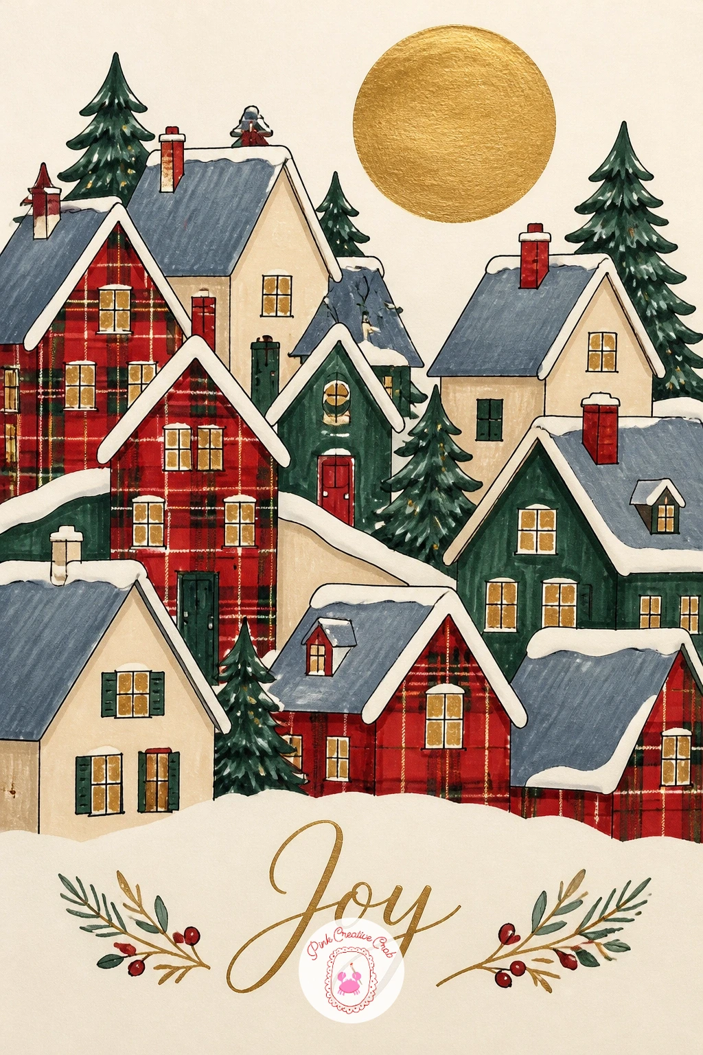
Palette: Pale Grey-Blue,Cream,Tartan Red,Vintage Gold
Try this layout again later as a full panoramic village strip across a wider card, it is an easy design to stretch once the layering trick feels familiar.
After a village scene, bring the focus right back down to one small character: a plump robin wrapped in a plaid scarf, perched inside a gold-rimmed teacup. Draw the teacup first as a simple rounded cup shape with a thin gold ellipse for the rim, then build the robin sitting inside it as two overlapping ovals, a round head over a rounder body, with the scarf drawn as a loose loop around the neck before you ink any of it.
Color the robin’s breast in warm orange-red and its back in soft brown, then give the scarf a plaid pattern of small red and green squares, simplified to just a few crossing lines so it does not fight with the bird for attention. The cup stays cream with just the thin gold rim marker-free until last.
Robins go wrong most often when the head and body sit too far apart, so keep the two ovals touching or slightly overlapping, never floating apart with a gap. If a true gold marker runs dry mid rim, a gold gel pen finishes the line just as well with a touch more texture.
Add one tiny black dot eye close to the beak, that single dot is what makes the whole bird feel alive.

Palette: Robin Orange,Warm Brown,Tartan Red,Vintage Gold
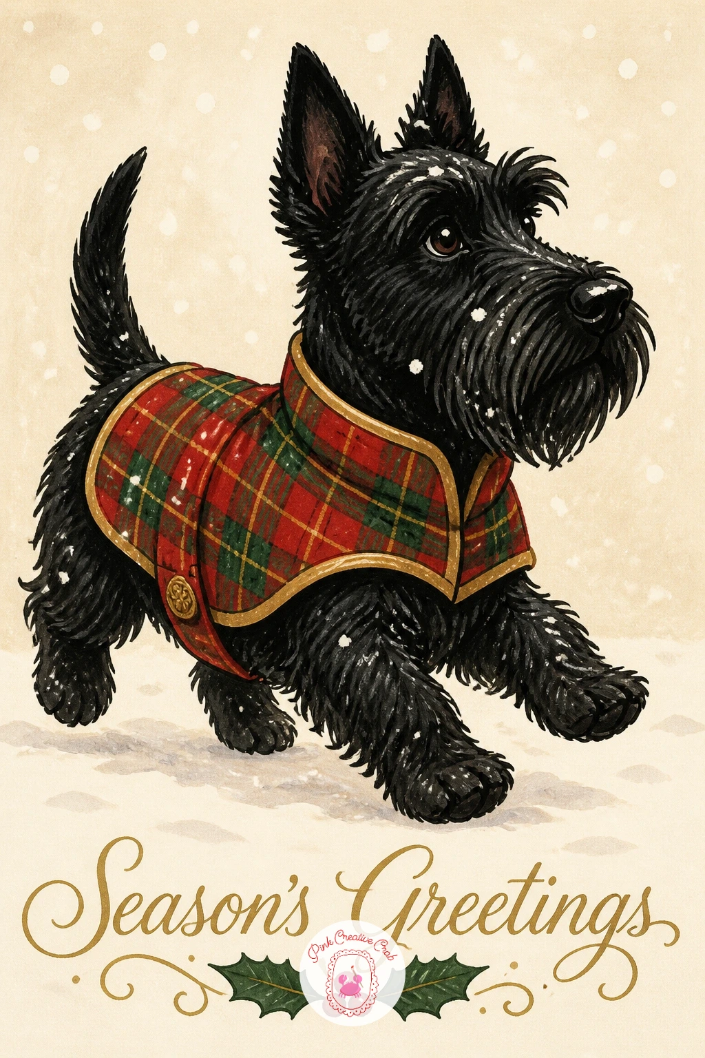
Give the card a sense of movement next with a small black Scottie dog trotting through the snow in a tartan coat. Draw the dog’s body low and long, legs mid-stride, with pointed ears and a short tail held up, all in one confident fineliner pass before any marker touches the paper. The coat is a simple rectangle wrapped over the back, buckled at the chest, drawn slightly separate from the body outline so the pattern has its own clean edge.
Fill the dog’s body solid black or deep charcoal with marker, leaving the coat area blank until the body color is fully dry. Then color the coat in tartan red with a few crossing green and gold lines, and finish the ground with a light dusting of white gouache flicked on with an old toothbrush for scattered snow.
To keep the trotting pose believable, check that the two front legs are not both reaching the same way, one forward and one back reads as walking, both forward reads as jumping. Swap the toothbrush for a dry stiff watercolor brush tapped against your finger if a toothbrush is not to hand.
One tip worth keeping: draw the tail curved slightly forward over the back, it gives even a simple Scottie shape real personality.
You Will Need
- old toothbrush for snow splatter
Palette: Charcoal Black,Tartan Red,Forest Green,Vintage Gold
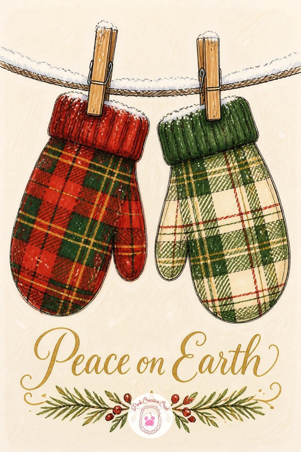
Keep the energy playful with a pair of tartan mittens pegged on a snowy washing line strung across the card. Draw the line first as one long gentle curve from edge to edge, then two mitten shapes hanging from it, each a simple rounded hand shape with a thumb, slightly tilted so they look like they are swaying rather than stiff.
Ink the mittens and the small wooden pegs holding them before adding color, then fill each mitten in a different plaid, perhaps one red-dominant and one green-dominant, so the pair reads as a set without being identical. A thin line of white gouache or gel pen along the top edge of each mitten and along the line itself suggests fresh snow sitting on everything.
This is a quick one to finish start to finish in well under ten minutes once the shapes are drawn, since there is no background scene to paint, just the line and the mittens on plain cream. Given forty minutes instead, add a small snow-dusted branch crossing behind one end of the line and a few falling snowflakes scattered through the empty space.
If the pegs look fiddly, a simple grey rectangle straddling the line does the job just as well.
Palette: Tartan Red,Forest Green,Cream,Soft Grey
Build on that sense of a held object with a fuller, richer scene: a vintage gold sleigh piled high with plaid-wrapped gifts. Sketch the sleigh body first as a long curved shape with a scrolled front runner, kept simple rather than ornate, then stack three or four gift box shapes of different sizes inside it before inking the whole group as one connected cluster.
Color the sleigh entirely in gold marker, built up in two light layers so it catches a believable metallic warmth rather than flat yellow, and let each gift box carry its own small plaid pattern in red, green or cream so the pile reads as varied rather than repeated. A thin cream ribbon line and a tiny bow finish each parcel last.
Light the whole scene as if a low winter sun sits to the upper left, so every gold edge picks up a slightly brighter gold stroke on that side and a touch of warm brown shadow on the right, which is what gives the sleigh its curved, dimensional feel rather than looking like a flat gold cutout.
Keep the snow ground beneath it completely plain so the gold and plaid stay the clear stars of the card.

Palette: Vintage Gold,Tartan Red,Forest Green,Cream
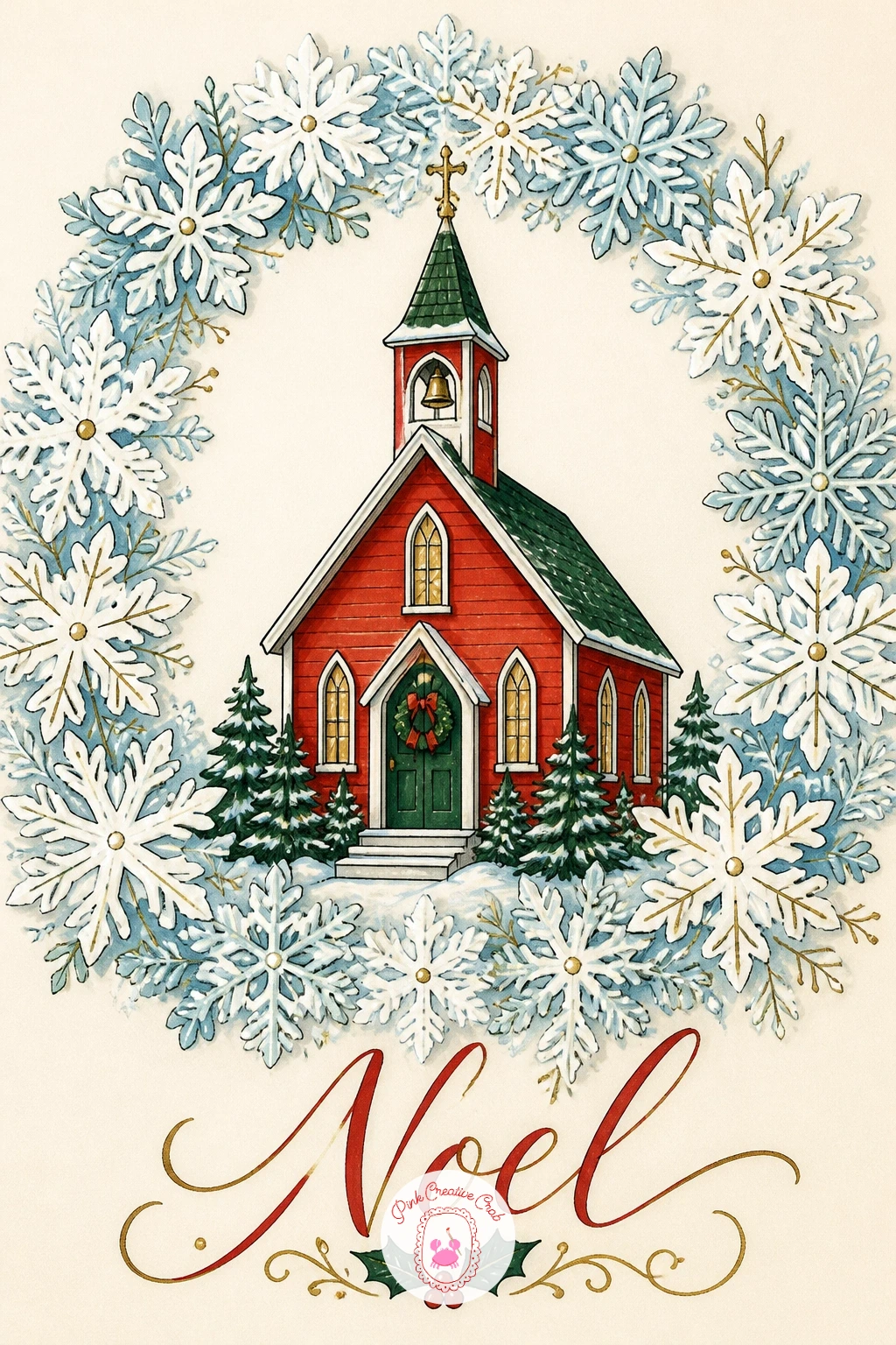
After the sleigh, settle the eye on something more centered and calm: a little red church sitting inside a ring of layered paper-cut snowflakes. Draw the church first in the middle of the card, a simple rectangle body with a steep triangle roof and one small arched door, kept plain and symmetrical since it is the quiet anchor of the design.
Once the church is inked and colored in soft tartan red with a cream steeple trim, draw the snowflakes around it as a loose ring of six-pointed shapes of slightly different sizes, each one a simple cross of lines with small branching ticks rather than a complicated lace pattern. Layer two tones of pale blue-white across the ring so some snowflakes sit visibly in front of others, giving the paper-cut depth the idea calls for.
Spacing the snowflakes evenly around a circle can wobble on a first try, so lightly pencil a faint circle guide first and place each snowflake point touching it, then erase the guide once everything is inked. Short on patience for six snowflakes, four spaced at the main compass points still reads as a full ring.
Finish with one gold dot at the church’s roof peak, like a tiny star catching the last of the daylight.
Palette: Tartan Red,Cream,Pale Blue,Vintage Gold
Shift gears into something with a clear sense of travel: a red buffalo plaid truck trundling down a snowy lane with a fir tree tied in the back. Block in the truck’s body as a simple boxy cab and flatbed, wheels as two plain circles, then add the tree lying across the bed at a gentle diagonal, roped on with one or two curved lines.
Paint the cab and fenders in the classic large-square buffalo check, red and black blocks rather than thin tartan lines, which reads instantly as that pattern even in a small space. The tree stays simple forest green with a few short line branches, and the lane beneath the wheels gets just a hint of tire track curves in grey to suggest motion without drawing a full road.
Trucks commonly go wrong when the wheels sit too small for the body, so check the wheel circles against the cab height before inking, they should look like they could genuinely carry that weight. No black marker handy for the plaid squares, a very dark green or navy reads just as well against the red.
Angle the fir tree slightly off the truck bed’s edge, that small overhang sells the idea it only just fits.

Palette: Tartan Red,Charcoal Black,Forest Green,Soft Grey
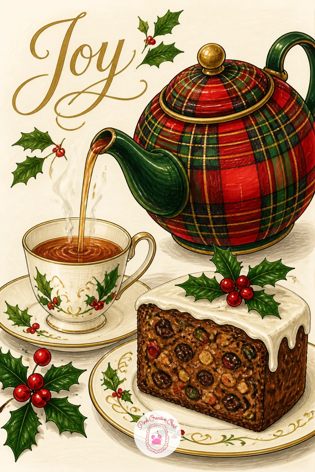
Bring the scene indoors for something cozier: a tartan teapot caught mid pour beside a slice of dense Christmas cake. Draw the teapot first as a round body with a curved spout and a small lid knob, then the stream of tea as one thin curved line falling from the spout, and finally the cake slice as a simple wedge with a flat iced top set just to one side.
Color the teapot body in tartan, keeping the pattern lines small so they curve naturally with the round shape rather than fighting it, and leave the spout and lid in plain cream to break up the pattern. The cake gets a warm deep brown body with a flat white icing cap and two or three tiny dried fruit dots pressed into the top with a fine marker tip.
Working quickly, the whole pairing is doable in about ten minutes with flat color only, while a longer sitting lets you add a thin line of steam rising from the pour and a soft cream shadow beneath both objects to ground them on the table.
Keep the teacup waiting beside the cake plain gold-rimmed and empty, it reads as an invitation rather than clutter.
Palette: Tartan Red,Cream,Deep Brown,Vintage Gold
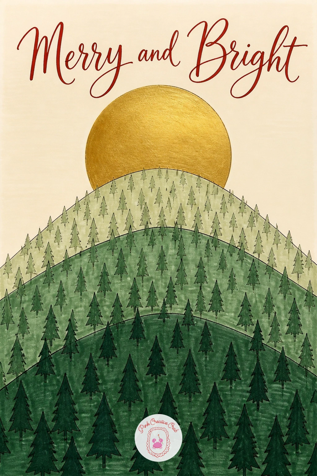
Step back out into a wider winter view with three stacked hills of pine trees rising toward a layered paper-cut moon. Draw the hills first as three gentle curved bands stacked from bottom to top of the card, each one slightly smaller and further back, then scatter simple triangle pine shapes along each ridge, smaller and fewer on the furthest hill.
Color each hill band a slightly different value of green, darkest at the front and lightest toward the back, which does the perspective work on its own even though every tree is the same flat triangle shape. The moon sits large and round in the cream sky above the furthest hill, filled solid gold with one thin cream crescent left unmarked along one edge to suggest its curve.
Because the eye naturally reads the lightest, smallest shapes as furthest away, this value shift front to back is the one thing that keeps three stacked hills from looking like one flat stripy pattern. If three distinct greens feels like too many markers to manage, two will still carry the depth as long as the front hill is clearly the darkest.
Leave a narrow band of pale cream between each hill layer, that sliver of light is what separates them.
Palette: Dark Pine,Mid Green,Pale Green,Vintage Gold
Narrow right back in after that wide view, to one gold bauble hanging from a single pine bough wrapped in tartan ribbon. Draw the bough first as one curved line with short needle clusters branching off it, then the bauble as a simple circle hanging from a loop at the bough’s lowest point, with the ribbon drawn as two trailing tails wound once around the branch.
Fill the bauble in solid gold with one curved cream highlight left unmarked near the top to suggest its shine, and let the pine needles stay a deep flat green with no individual needle detail, just the cluster shapes. The ribbon carries the tartan pattern in miniature, small enough that only three or four crossing lines are needed to read as plaid at that size.
Dry brushing a little extra gold marker lightly over the bauble’s lower curve, where the marker nib is nearly spent, gives a soft textured sheen that a single flat fill cannot, closer to how old glass ornaments actually catch light. No gold marker in the kit, a yellow ochre pencil over cream card gets remarkably close.
Keep the whole arrangement small and centered, generous white space around it is what makes this one feel like a proper vintage ornament tag.

Palette: Vintage Gold,Forest Green,Tartan Red,Cream
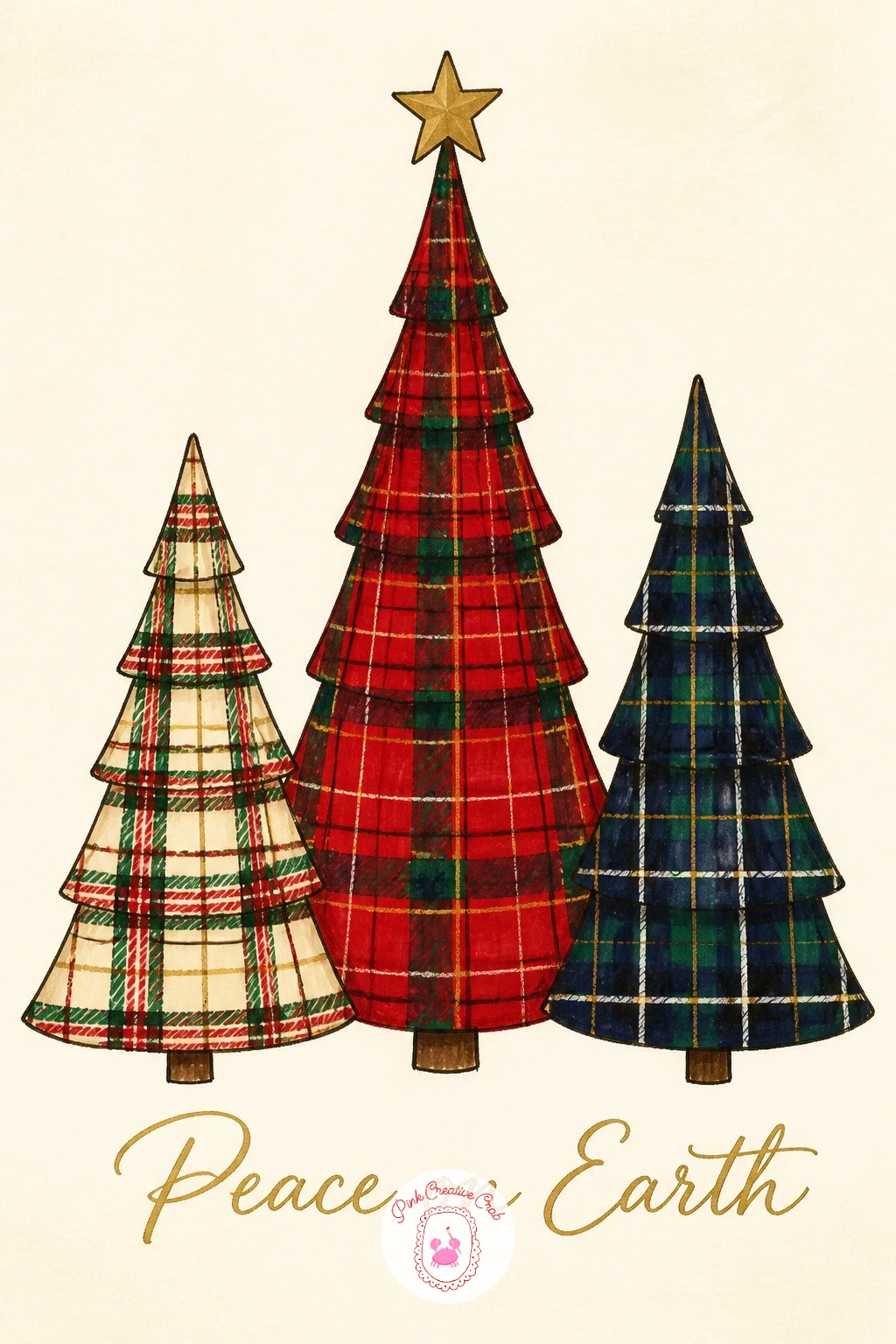
Return to trees once more, this time as a trio standing together in a row, each in a different plaid. Sketch three simple triangle trees of slightly varied heights side by side across the card, short trunks beneath each, spaced with small gaps so none of the outlines touch.
Give the tallest tree a bold red and green tartan, the middle one a softer cream and green check, and the shortest a deep navy and gold plaid, so the group reads as a considered set rather than three copies of the same tree recolored. Ink each one fully before moving to the next so no wet marker bleeds across into a neighboring tree.
Varying this idea again later just means swapping the plaid combinations and the tree heights, the row format itself works for any three patterns you like, which makes it a useful one to come back to for different recipients. One navy marker short, substitute a deep forest green for that third tree’s base tone and keep the gold lines the same.
Finish with one small gold star above just the tallest tree, not all three, so the eye has a single clear point to land on.
Palette: Tartan Red,Cream,Deep Navy,Vintage Gold
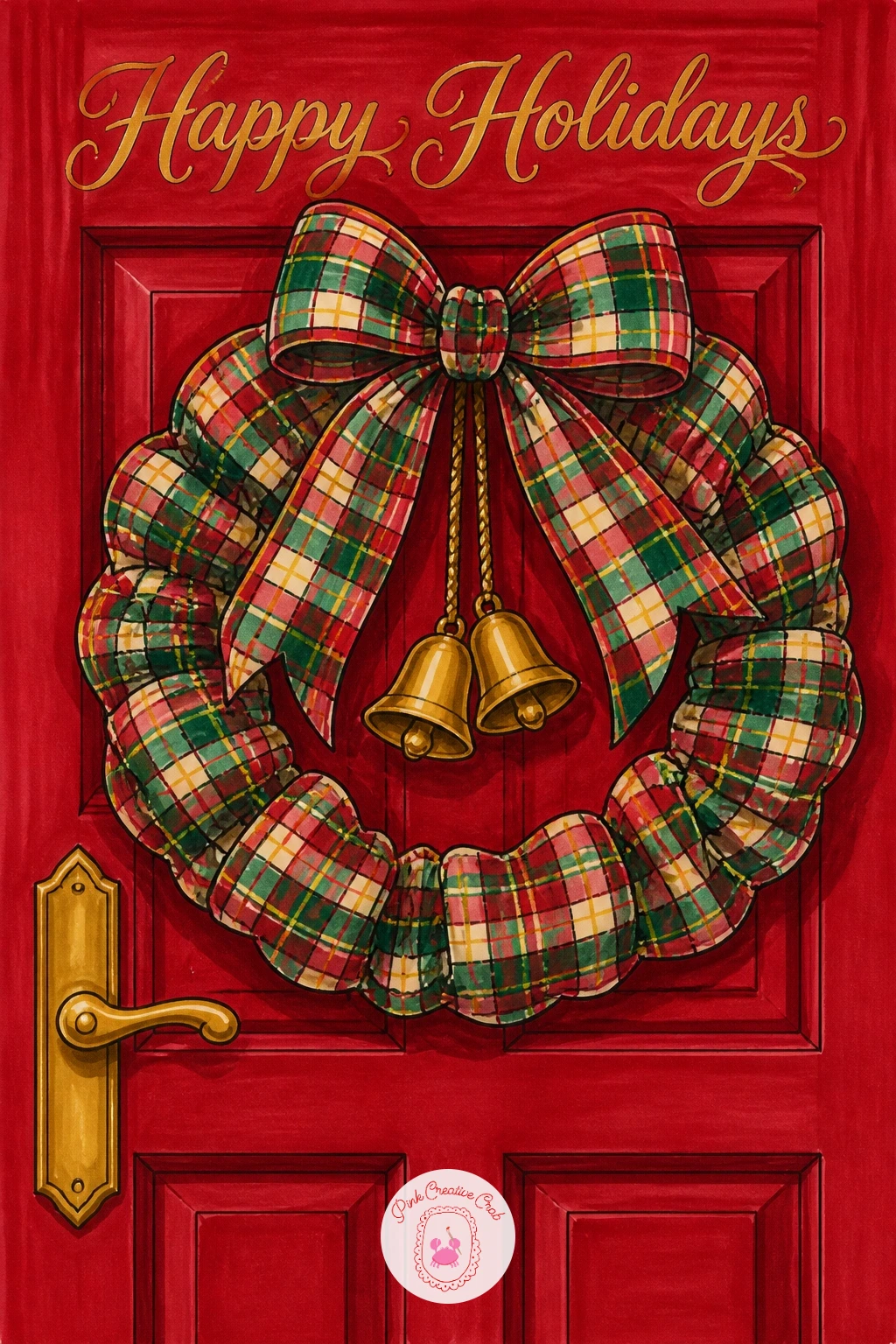
Frame the next scene with a plaid wreath hung with gold bells on a red cottage door. Draw the door first as a simple arched rectangle filling most of the card, then the wreath as a ring shape centered on it, built from short overlapping curved marks rather than a smooth circle so it reads as greenery.
Color the door a deep tartan red with one plain cream panel line down the middle for the recessed wood detail, then fill the wreath ring in forest green with a plaid ribbon bow at the bottom and two or three small gold bell shapes dangling from it. A tiny brass-look door handle in gold finishes the door itself.
Getting the wreath ring even can be tricky freehand, so lightly pencil a circle guide using a small coin or cap before inking the greenery marks around it, then erase the guide once the ink is dry. If gold bell charms feel too fiddly to draw small, two simple gold ovals read as bells just as well at this size.
Keep the door panel detail minimal, the wreath and bells should be the only busy element on the card front.
You Will Need
- small coin or cap to trace the wreath circle
Palette: Tartan Red,Forest Green,Vintage Gold,Cream
Carry that cozy indoor mood further with a single tartan stocking hanging from a gold hook against a brick fireplace. Draw the stocking shape first, a long curved sock with a folded cream cuff at the top, then the gold hook it hangs from, and finally a few rows of simple brick outlines filling the space behind it.
Fill the stocking body in tartan, keeping the pattern lines running slightly diagonal down the leg since that is how plaid naturally falls on a hanging soft shape, and leave the folded cuff plain cream with a thin gold trim line. The brick wall behind stays a muted warm red-brown, with just a few bricks left slightly paler to suggest old uneven mortar rather than a perfect grid.
Checking proportion here matters more than it looks: measure the stocking’s folded cuff against its own toe width before inking, a cuff that is too narrow makes the whole stocking look pinched rather than plump and ready for gifts. Short on a brown marker for brick, a soft terracotta pencil over the ink lines works just as well.
One small gold bauble tucked into the stocking’s open top adds a nice finishing detail without any extra drawing complexity.

Palette: Tartan Red,Cream,Brick Brown,Vintage Gold
Light the next card with a single vintage gold lantern standing on a snowy cobbled street at dusk. Draw the lantern post first as a tall thin shape with a glass-paned box at the top, then a simple row of rounded cobblestone shapes along the ground beneath it, smaller toward the back of the card to suggest the street curving away.
Color the lantern frame solid gold, leaving the glass panes a warm pale yellow to suggest a candle glowing inside, and let the cobbles sit in muted blue-grey with a thin white gouache dusting of snow caught along their top edges. The sky behind stays deep dusky blue, which is what makes the gold lantern glow feel believable by contrast.
Light here is coming from inside the lantern itself rather than from any sun, so the strongest warm gold and yellow sits right at the glass panes and fades slightly as it reaches the post below, with a soft pale halo marker-blended around the top of the lantern against the dark sky. No deep blue marker on hand, a dark grey-purple reads just as well as dusk.
Keep the cobbled street narrow and let it lead the eye straight up to the glowing lantern at the top of the card.

Palette: Vintage Gold,Pale Yellow,Dusky Blue,Soft Grey
Try this scene again at full daylight with a pale blue sky instead of dusk, it turns the same simple shapes into a completely different season of card.
Settle into something quieter with a round paper-cut style owl peering from a hollow tree, snow resting on the branches above. Draw the tree trunk first as a simple curved shape with a dark oval hollow cut into the middle, then the owl sitting inside that hollow as two stacked circles, a smaller head over a rounder body, with two simple triangle ear tufts.
Layer the owl’s feathers as a few overlapping scalloped shapes rather than individual lines, each scallop a slightly different soft brown or cream so the layered paper-cut look comes through in the body itself, not just the background. The trunk stays deep warm brown, with a few short branch lines reaching up and a flat white snow cap resting on top of each one.
Owls read oddly if the two eyes sit at different heights, so draw one faint horizontal guideline across the face before placing the eye circles, then erase it once both are level and inked. If scalloped feather layers feel slow to draw, three simple overlapping ovals down the chest give almost the same effect in far less time.
Finish with one small white gouache snowflake drifting past the hollow, it gives the whole quiet scene a sense of the air moving.
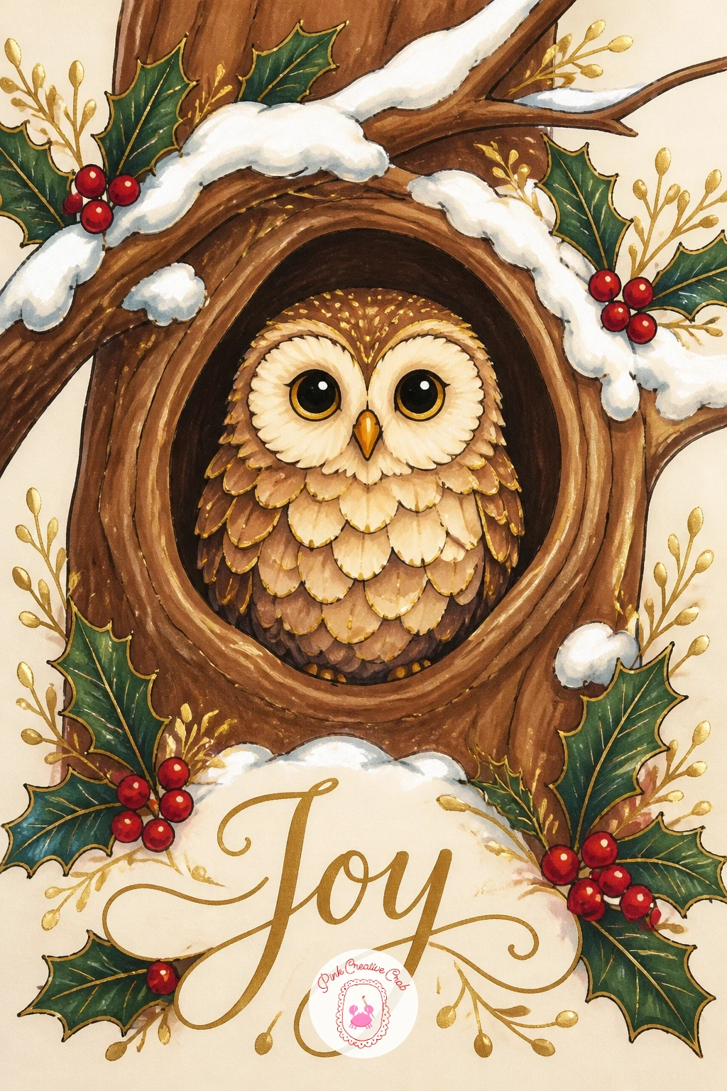
Palette: Warm Brown,Soft Cream,Deep Brown,White
Bring some warmth and a little humor in with a gingerbread man dressed in a tartan waistcoat, laid out on a plain baking tray. Draw the gingerbread figure first in the classic flat pose, rounded head, simple limbs, then the tray as a shallow rectangle with slightly raised edges beneath him, before adding the waistcoat as two small curved panels over the chest.
Color the gingerbread body a warm deep amber brown with simple cream icing dot buttons down the front, then fill the waistcoat panels in tartan, small enough that only a few crossing lines are needed to read as plaid against the brown body beneath. The tray itself stays plain pale grey or steel tone, kept flat and undecorated so it does not compete with the figure.
Icing details are where this one most often goes wrong, with too many dots making the face or buttons look spotty rather than neat, so keep to two eyes, a simple curved smile and three buttons at most. No tartan marker fine enough for the small waistcoat, a single solid red panel with a thin gold trim reads nearly as well at this size.
Add one tiny gold star pressed into the icing at the chest, a nice echo of the gold used elsewhere in the set.
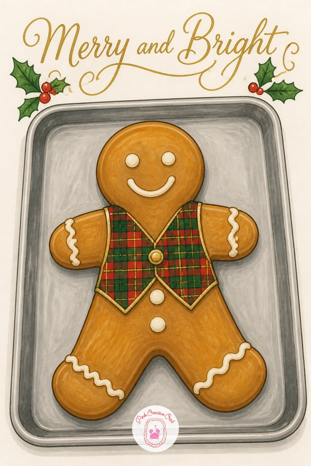
Palette: Amber Brown,Tartan Red,Cream,Steel Grey
Build a tree in an entirely different way now, as a patchwork of plaid fabric triangles stitched together rather than one solid shape. Draw the overall tree outline first as a guide, then divide its interior into eight or ten smaller triangle and wedge shapes, like a rough quilt pattern, before inking every internal seam line as clearly as the outer edge.
Fill each small patch with its own plaid, varying the dominant color between red, green and cream from patch to patch so the whole tree reads as a genuine assortment rather than one pattern repeated. A thin gold dashed line traced along two or three of the seams last, drawn as small evenly spaced ticks, suggests visible stitching holding the patches together.
With ten small plaid patches to fill this is naturally a longer sitting than most ideas here, so if time is short, six larger patches covering the same tree shape still carries the patchwork idea convincingly and halves the marker time needed. Keep every patch’s plaid lines small in scale, oversized checks on a small patch stop reading as fabric and start looking like a different object entirely.
Finish the trunk in plain warm brown, left free of any pattern so the eye has one place to rest.
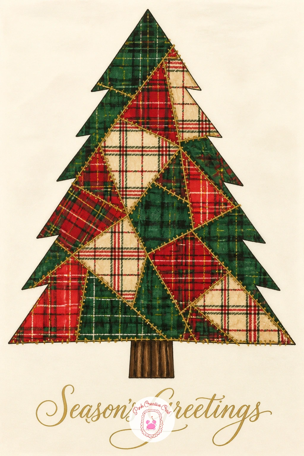
Palette: Tartan Red,Forest Green,Cream,Vintage Gold
After a busy patchwork tree, let the next card breathe with one large layered paper-cut star shining above a sleeping village of rooftops. Draw the star first as a simple five or six pointed shape sitting high in the card, built from two slightly offset overlapping star outlines so the paper-cut layering shows at its points. Beneath it, a low simple row of triangle and rectangle rooftops runs along the bottom edge.
Fill the back star layer in pale gold and the front layer in a brighter, warmer gold, so the offset between them reads clearly as depth rather than as a mistake. The sleeping village below stays in hushed dark blue-grey silhouette, with just one or two tiny gold window squares lit, everything else left quiet and dark beneath the glow above.
Offsetting two star shapes evenly by eye can look lopsided, so rotate the back star by roughly the width of one point before inking the front one over it, rather than guessing a random angle. If a second gold tone is not available, a single gold star with a thin cream outline around it still reads as glowing against the dark village.
Keep the village shapes totally flat and simple, their job is only to be the hushed stage beneath the star.
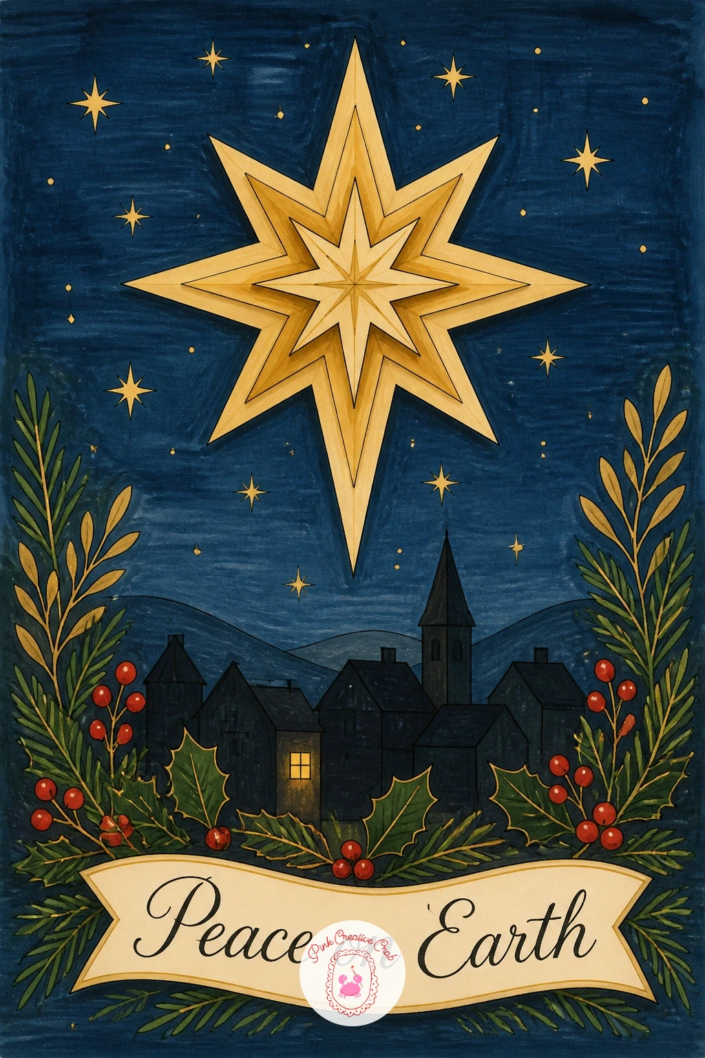
Palette: Pale Gold,Warm Gold,Dusky Blue-Grey,Cream
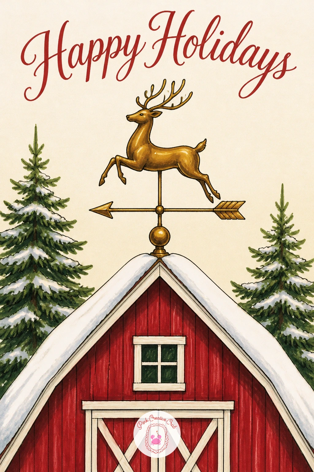
Climb back up to a rooftop for something with a different kind of charm: a vintage gold reindeer weathervane fixed to a snowy barn roof. Draw the barn as a simple steep-roofed triangle over a rectangle body first, kept plain, then the reindeer weathervane shape perched at the roof’s peak, drawn as a flat side-on silhouette with antlers and a slim arrow beneath its feet, the way real weathervanes are built.
Fill the reindeer and arrow fully in solid gold, leaving a thin cream line down the center of the body unmarked to suggest a metallic seam catching the light, while the barn itself stays a deep muted red with a plain white-dusted roof. Keep the weathervane noticeably smaller and finer in line than the barn beneath it, that scale difference is what makes it read correctly as a rooftop fitting rather than a second large animal in the scene.
If the thin arrow beneath the reindeer feels too delicate to ink cleanly, a slightly thicker short arrow still reads clearly at card size and is far easier to keep straight. Snow sits lightly along the roof ridge and barn eaves only, left otherwise clear so the gold silhouette stays the clear focal point.
One small compass letter shape beside the arrow is optional and best skipped if lettering of any kind feels fiddly at this size.
Palette: Vintage Gold,Barn Red,Cream,White
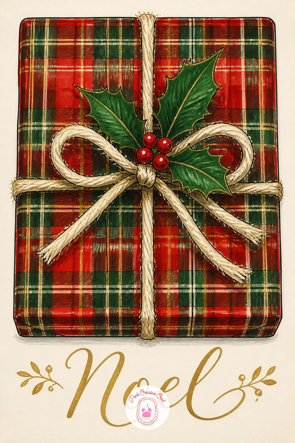
Bring the focus back to one still object after the barn scene: a single tartan-wrapped present tied with rough twine and a small sprig of holly. Draw the box first as a simple cube shape seen slightly from above, then the twine as two crossing bands wrapped around it, knotted in a plain bow at the top, with two holly leaves and three berries tucked under the knot.
Fill the box fully in tartan, letting the pattern wrap convincingly around the visible top and front faces by shifting the plaid lines slightly at the corner edge the way real wrapped fabric would fold. The twine stays a warm undyed cream-brown, textured with short broken pencil lines rather than one smooth marker stroke, and the holly leaves sit deep glossy green with three small bright red berries beneath the bow.
Wrapping paper patterns commonly look flat if the plaid lines run identically across every face of the box, so shift the angle or spacing of the lines slightly where the top meets the front, a small visual cue that reads as a fold even without actual shading. No real twine texture pencil to hand, a fine brown fineliner hatched lightly over the cream achieves much the same rough fiber look.
Keep the holly sprig small and tucked close to the knot, it should read as a finishing touch, not a second focal point.
Palette: Tartan Red,Forest Green,Cream-Brown,Berry Red
Return to a small building for a layered paper-cut gingerbread house with one gold door as its single rich detail. Draw the house as a simple square body under a steep triangle roof, then divide the roof into two or three overlapping scalloped icing layers along its lower edge, the way dripping icing is usually drawn but kept as clean flat shapes rather than fussy drips.
Fill the walls in warm gingerbread brown and the icing layers in plain white or pale cream, each layer slightly overlapping the one below it so the paper-cut stacking shows clearly at the roofline. The door sits centered on the front wall, filled solid gold with a tiny gold circle for a handle, the single bright note against all that warm brown and cream.
Scalloped icing edges tend to look uneven if drawn freehand in one pass, so mark a row of evenly spaced dots along the roofline first as a guide, then connect them with small curves, erasing the dots once inked. Running low on white marker for the icing layers, leave that area as the bare cream card and just outline each scallop in fine black for the same light, snowy effect.
Keep every window on the house small and plain, the gold door alone should carry all the sparkle.

Palette: Gingerbread Brown,Cream,Vintage Gold,White
Add a character with a bit of story to it: a round teddy bear in a small tartan kilt, carrying a tiny fir tree over one shoulder. Draw the bear’s body first as simple rounded shapes, a big head, round ears, a chunky body and short limbs, then the kilt as a simple pleated skirt shape wrapped around the lower half, and finally the small fir tree resting diagonally across one shoulder, held by one paw.
Color the bear a warm honey brown all over, keeping the fur flat and smooth rather than textured, then fill the kilt in tartan with pleats suggested by a few short vertical fold lines rather than many. The tiny carried tree stays simple forest green, deliberately smaller in scale than the bear’s own head so it reads clearly as something held rather than a second full-size tree in the scene.
Bears most often look stiff if both arms hang the same way, so let the paw holding the tree sit higher and bent while the free paw hangs loosely at the side, which immediately suggests effort and motion. If kilt pleats feel fussy to ink small, a single plain tartan skirt shape without fold lines still reads perfectly well at this size.
Finish with one tiny red stitch cross on the bear’s paw pad, a small nod to a well loved toy.

Palette: Honey Brown,Tartan Red,Forest Green,Cream
Place a classic figure in a fresh setting next: a simple snowman wrapped in a red plaid scarf, standing beside a small vintage gold gate. Draw the snowman first as three stacked circles of decreasing size, then the gate as a few straight gold lines forming a low decorative fence panel just to one side, overlapping the snowman’s base slightly so the two feel placed together rather than floating separately.
Keep the snowman’s body pure white or very pale cream with only thin grey shadow lines along one side of each circle to suggest roundness, then let the scarf carry nearly all the color in the scene, wrapped loosely around the neck in a bold red and green plaid with two trailing tails. The gate stays entirely gold, kept thin and linear so it reads as ironwork rather than as a solid shape competing with the snowman.
Stacking three circles evenly is the trick that makes or breaks a snowman, so pencil a light vertical center line down through all three before placing them, keeping each one centered on that line rather than drifting left or right as you go up. No grey marker for the shadow side, a very pale blue pencil does the same gentle rounding job.
Two small coal-black dot eyes and three buttons down the front are all the extra detail this one needs.

Palette: White,Tartan Red,Forest Green,Vintage Gold
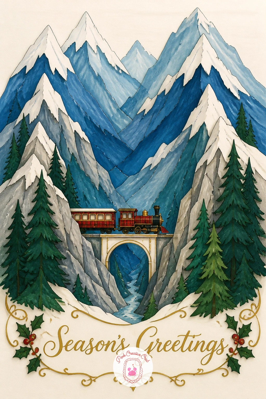
Open the view right out for a layered paper-cut mountain range with a tiny train crossing a bridge far below. Draw three or four jagged mountain peaks stacked across the card first, each layer slightly smaller and set further back, then a small simple bridge arching across a low gap between two of the front peaks, with a tiny train made of two or three boxy carriages crossing it.
Color the mountains in cooling shades from front to back, the nearest peak in deepest blue-green, the furthest in the palest icy blue, snow caps left as plain white triangles at each summit. The train stays small and warm in contrast, a tartan red engine with gold trim details, deliberately bright so the eye finds it quickly against all that cool mountain color.
Keeping the train genuinely tiny against the mountains is what sells the sense of scale here, so draw the whole train no wider than about a tenth of the card’s width, resisting any urge to make it easier to detail by enlarging it. If a bridge feels tricky to draw convincingly, a short straight stretch of track laid directly across a narrow gap between two peaks does the same job with far less construction.
Finish with a thin trail of pale grey smoke drifting back from the engine, it is a small detail that makes the train feel like it is genuinely moving.
Palette: Deep Blue-Green,Pale Icy Blue,Tartan Red,Vintage Gold
Bring the scene back down to a small, friendly still life: a plaid thermos standing beside two mugs, all resting together on a wooden sled in the snow. Draw the sled first as a simple flat plank shape on two curved runners, then the thermos as a tall cylinder with a small cap, and finally two mugs of slightly different heights tucked beside it, all grouped close together so they read as one set rather than scattered objects.
Color the thermos body in tartan, the pattern curving gently to follow the cylinder’s roundness rather than sitting flat, while the two mugs stay plain, one in cream and one in soft forest green, each with a thin curl of steam rising from the top in pale grey. The sled itself is warm honey wood tone with simple gold-painted detail lines along its edges.
Grouping three separate objects convincingly comes down to overlap, so let the thermos partly hide behind one mug and let that mug’s base slightly cross over the sled plank’s edge, rather than lining all three up in a neat untouching row. Two curls of steam at once can look busy, so if that happens, keep steam rising from just one mug and leave the other simply warm and full.
Finish with a short dusting of snow sitting along the top edge of the sled plank only.

Palette: Tartan Red,Cream,Forest Green,Honey Wood
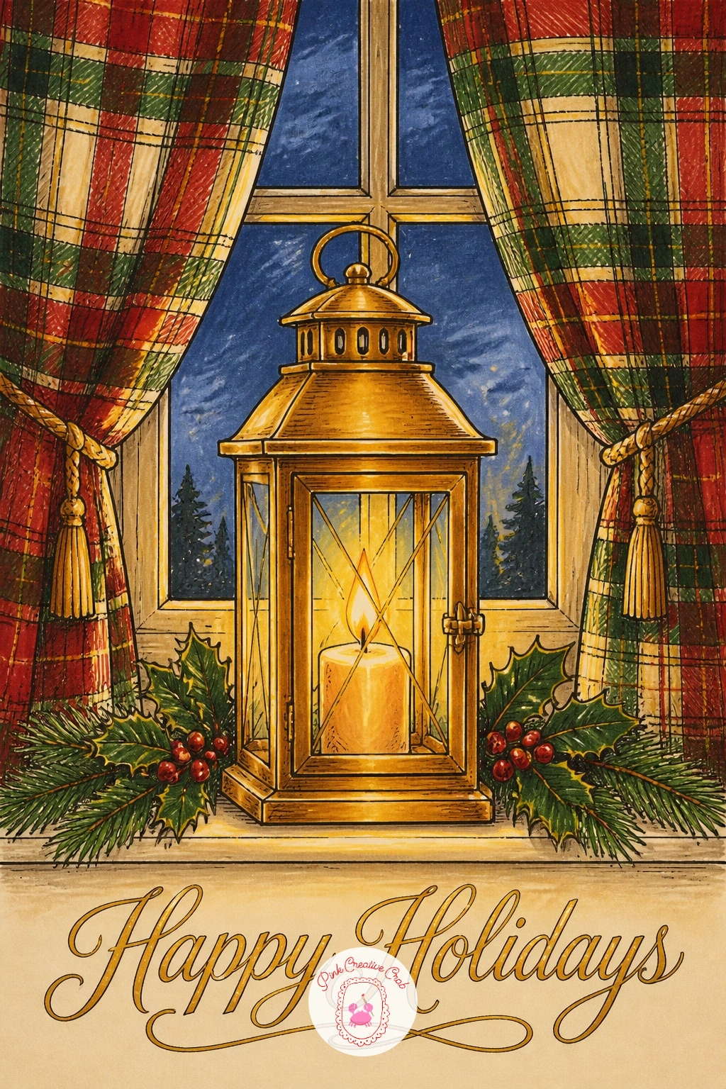
Frame a window scene next with a vintage gold candle lantern standing on a sill between two drawn-back plaid curtains. Draw the window frame first as a simple arched or square opening filling most of the card, the lantern sitting centered on the sill inside it, then the two curtains pulled to either side in soft draping folds, drawn with just a few long curved lines each rather than many small ones.
Fill the lantern frame in gold with a warm pale yellow glow inside its glass panes, then let each curtain carry its own plaid pattern in red and green, kept a little looser and curved to follow the folds rather than drawn as straight crossing lines. The visible sky glimpsed through the window behind the lantern stays a quiet dusky blue, a small calm patch amid all that pattern.
Curtain folds often go flat if every fold line is drawn the same length and spacing, so vary them, a couple of long sweeping folds near the top and shorter gathered ones lower down, which reads far more like real hanging fabric. No pale yellow marker for the glow, leave that small area as bare cream card and let the gold frame around it do the warming work.
Keep the window glass glimpse small and simple, this scene belongs entirely to the lantern and the curtains around it.
Palette: Vintage Gold,Pale Yellow,Tartan Red,Dusky Blue
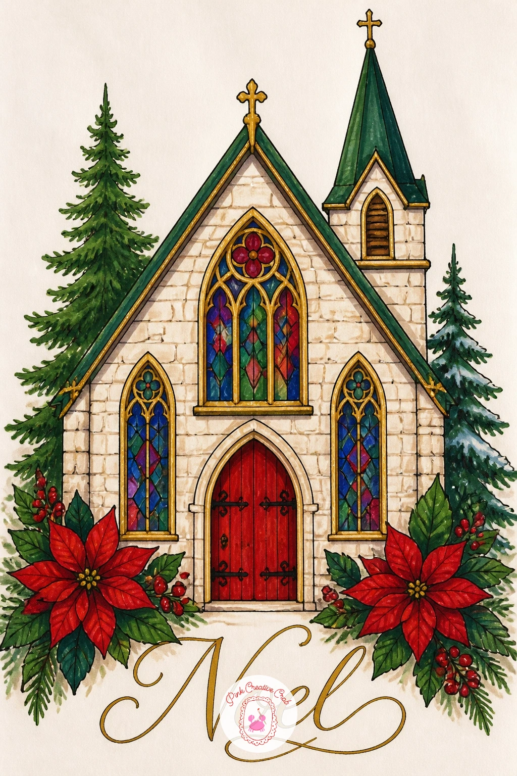
Give the next card a touch of color richness with a small paper-cut style chapel, its windows glowing in jewel tones. Draw the chapel body first as a simple rectangle with a steep roof and a small bell tower at one end, then mark out two or three tall narrow arched window shapes along the front wall before inking any of it, kept plain and evenly spaced.
Fill the chapel walls in soft cream or pale stone grey, then let the windows carry all the color interest, each one filled with two or three small jewel tone shapes, deep ruby, sapphire blue, emerald green, blocked in flat rather than blended, the way real stained glass reads from a distance. The roof and tower stay quiet dark grey so the glowing windows read as the clear focal point.
Jewel tones can turn muddy fast if blended together wet, so let each small color shape inside a window dry fully before adding its neighbor, keeping every patch of color a clean flat block rather than letting them run into each other. Missing a true jewel-tone marker range, three strong primary colors used flat and bold achieve a near identical stained glass effect.
One thin gold edge line traced around each window frame last ties the whole chapel back to the set’s vintage gold thread.
Palette: Stone Cream,Ruby Red,Sapphire Blue,Emerald Green
Bring a simple sound-filled detail to the card with a bunch of sleigh bells on a tartan strap, hung from a gold door knob. Draw the door knob first as a small round gold shape set near one edge of the card, then the leather-look strap looping down from it, and finally four or five small round bells clustered along the strap’s lower length, each with a tiny slit drawn across it.
Color the strap in tartan, the pattern small enough to still read clearly on such a narrow band, and fill every bell in solid gold with one small cream highlight dot left unmarked on each to suggest roundness and shine. The door knob itself stays plain gold, slightly larger and simpler than the bells so the eye understands its different role at a glance.
Four or five bells clustered unevenly, some overlapping slightly, reads far more naturally than a neat evenly spaced row, so let two or three of them touch or overlap rather than lining them up with gaps. If cream highlight dots feel too fussy on such small shapes, a short white gel pen flick across each bell does the same shine job faster.
Keep the background around the whole hanging cluster completely plain, this is a small, quiet detail card and needs nothing else competing with it.

You Will Need
- white gel pen for bell highlights
Palette: Vintage Gold,Tartan Red,Cream,Forest Green
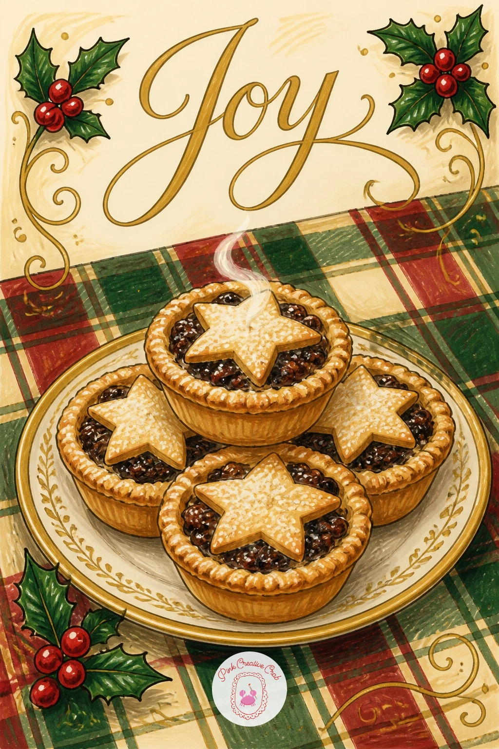
Return to the table for one last cozy still life: a gold-rimmed plate stacked with mince pies, set on a green plaid tablecloth. Draw the plate first as a simple ellipse with a thin gold rim line, then three or four small round mince pies arranged on top, each with a tiny pastry star or lattice shape pressed into its top before any color goes down.
Fill the pies in warm golden pastry brown with a slightly darker brown shading along the base of each to suggest they are sitting on the plate rather than floating above it, and leave the little pastry stars plain cream to stand out clearly against the darker crust. The tablecloth beneath carries a generous green and cream plaid, drawn with slightly thicker crossing lines than the smaller patterns elsewhere in this set, since a tablecloth naturally reads as a bigger weave.
Overlapping the pies slightly, so the front one partly covers the one behind it, is what keeps a stack of three or four same-shaped circles from looking like a flat row of coins, check that overlap before inking the group. Out of brown markers for the pastry, a warm orange-brown pencil layered twice over cream card gives a very similar baked look.
Finish with one thin steam curl rising from the front pie only, suggesting it has only just come out of the oven.
Palette: Vintage Gold,Pastry Brown,Forest Green,Cream
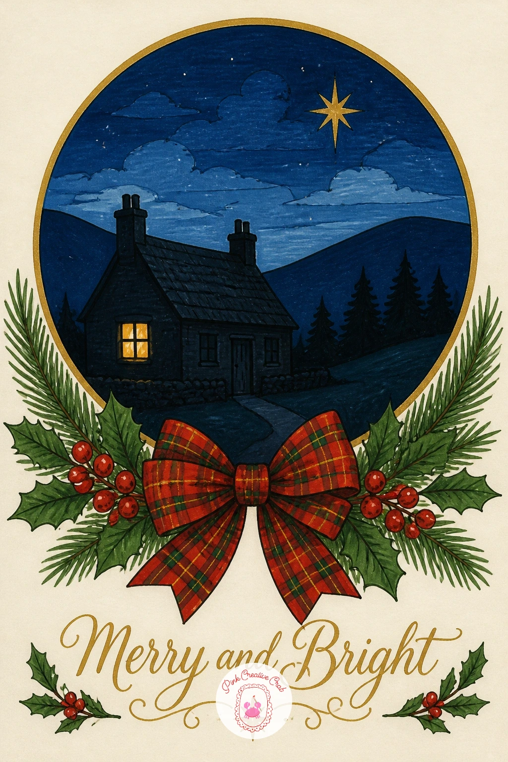
Close the set with the most layered scene of all: a small paper-cut style cottage at night, held inside a round vignette like a framed keepsake. Draw a light pencil circle first as the vignette border, then build the cottage within it, a simple house shape with a steep roof, one lit window and a short curl of smoke from the chimney, scaled to leave a clear band of plain cream between the house and the circle’s edge.
Layer the scene from back to front as the paper-cut idea asks: a pale dusky sky fills the circle first, then a low dark hill silhouette sits in front of that, then the cottage itself sits forward of the hill, each layer slightly overlapping the one behind it. The one lit window glows warm gold against the cottage’s otherwise dark silhouette, the single brightest point in the whole composition.
Ink the circle border last of all, once every layer inside it is dry, using a steady hand or a plate traced lightly in pencil first for a clean round edge rather than attempting it freehand from the start. If a perfectly round vignette feels daunting, a soft oval reads just as charmingly and is a little more forgiving to keep even.
Let that one gold window be the only strong color note in an otherwise quiet, dusky scene, it will be what the eye remembers.
You Will Need
- plate or round object to trace the vignette circle
Palette: Dusky Blue,Charcoal Silhouette,Vintage Gold,Cream
What to Do Next
Pick one idea that matches the mood of the person receiving it, sketch the main shapes lightly in pencil first, then ink and color on a smooth blank card or good cardstock cut to size. Keep a few spare cards on hand, because once the tartan and gold rhythm of these cards clicks, it is hard to stop at just one.
Frequently Asked Questions
What markers work best for handmade Christmas card fronts?
Alcohol-based art markers work best, since they blend smoothly without streaking and dry fast enough to layer a gold accent on top within minutes, unlike water-based markers which can reactivate and smear under a second color pass.
How do you draw tartan without it looking messy?
Keep tartan to just a few crossing lines in two or three colors rather than a tight woven grid, and let the lines run slightly uneven by hand, since a loose plaid reads as charming while an overly precise grid can look stiff and printed.
What paper is best for alcohol marker Christmas cards?
Smooth, slightly thick cardstock or blank cards made for marker work hold color best, since very textured watercolor paper can cause streaking and cheap thin paper lets marker bleed through to the back of the card.
How do you add gold details without a special pen?
A gold gel pen or fine gold paint marker applied last, once every other color is fully dry, gives the cleanest metallic line, and a yellow ochre pencil layered twice over cream card is a decent stand in if no gold pen is available.
Can these card ideas be finished in one evening?
Yes, most of these ideas finish within twenty to forty minutes once the shapes are sketched, since they rely on flat bold color and simple plaid rather than detailed shading, making them realistic to complete start to finish in one sitting.
Have any thoughts?
Share your reaction or leave a quick response — we’d love to hear what you think!
-
 0
-
0
-
0
-
0
-
0
-
0


