

Table of Contents
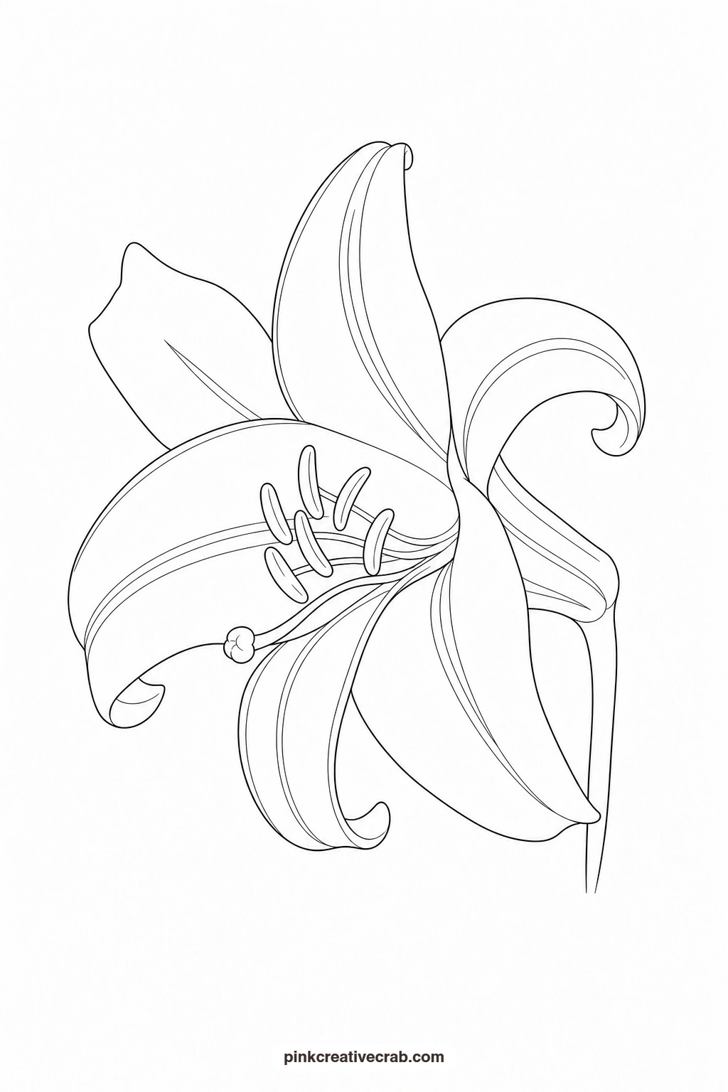
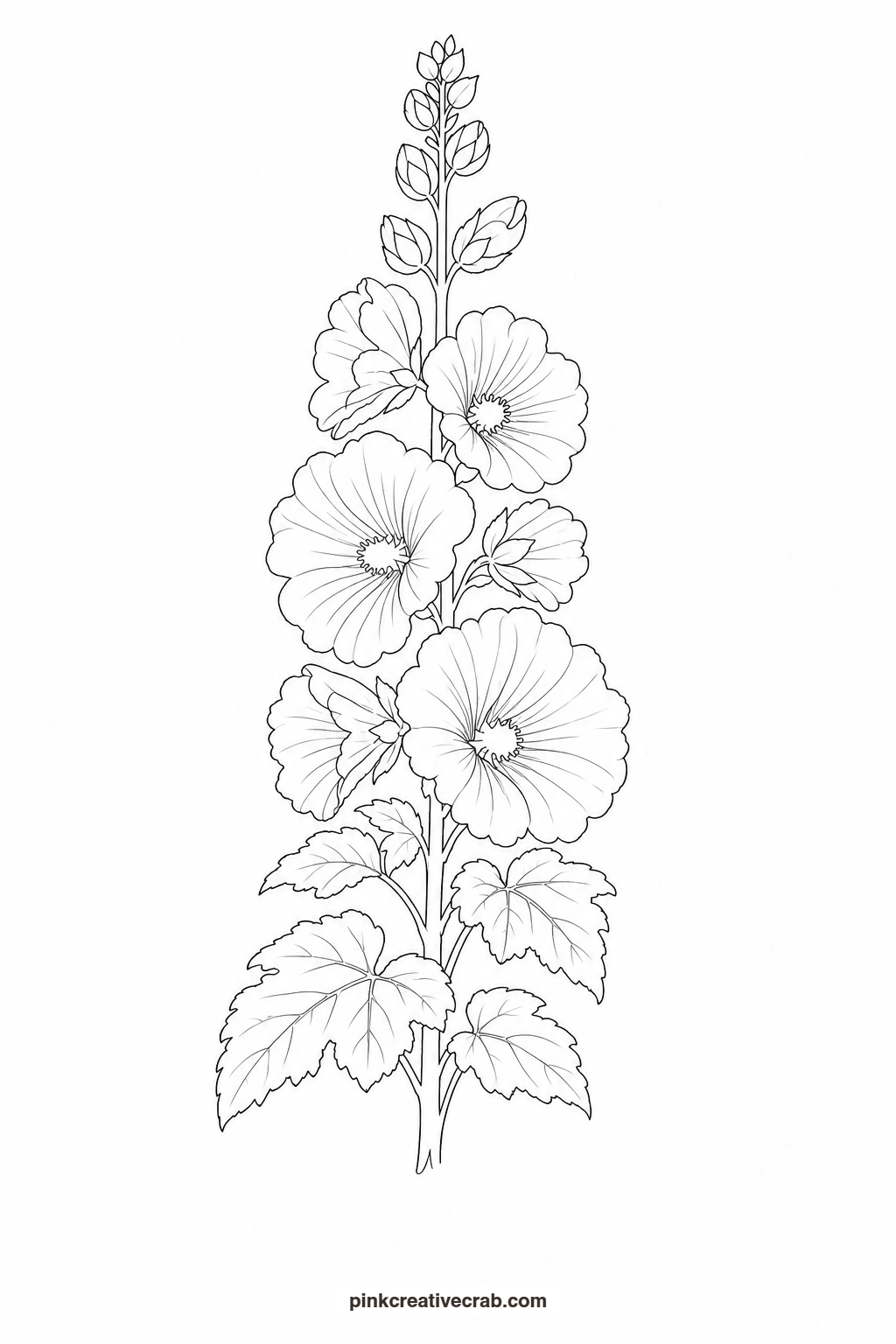
This set of watercolor garden paintings gives you twelve flowers, one subject per template, each built from a few big closed shapes so there is nothing fiddly to draw first. Print the outline, hold it against a sunny window or lay it on a light pad, trace it onto your watercolor paper, then paint it with the finished example propped up beside you as your guide.
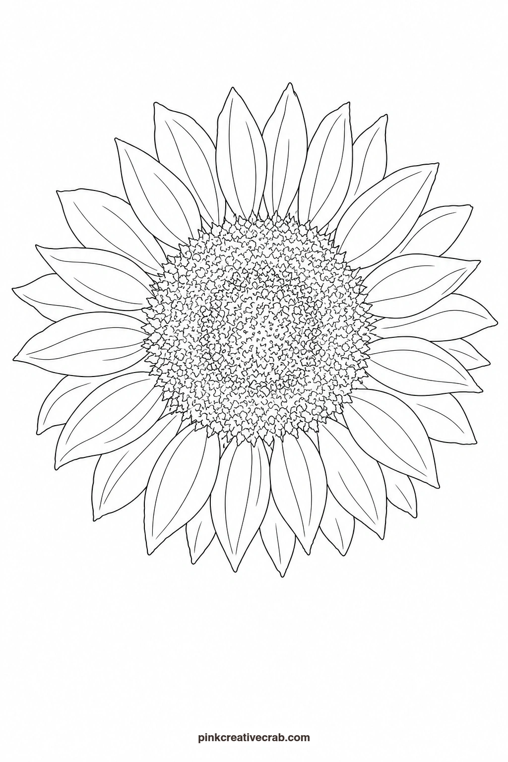
Every outline here uses thin black lines only, no shading and no tiny overlapping parts, so the tracing stays quick and the painting stays relaxed. Work through them in any order you like: start with the simplest petal shapes if you are new to watercolor, and save the more layered blooms for once your washes feel steadier.
Using these images: free for personal projects such as printing, coloring, cards, journals and gifts. Handmade items that include them may be sold up to 30 pieces per design. More than that is commercial use and is not permitted, and neither is selling or sharing the images themselves or passing them off as your own. Please ask before any other use.
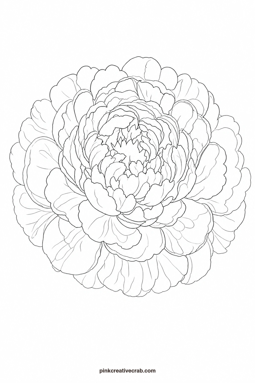
Pink Peony
Start with the lightest pink wash over the whole flower and let it dry a little before adding a second, slightly stronger pink into the center petals so the color naturally deepens inward. While that second layer is still damp, drop in a touch of warm coral at the very middle to suggest the folded core, letting it bloom softly into the pink. A thin stroke of sap green at the base reads as the sepals and gives the peony a finished, grounded look.
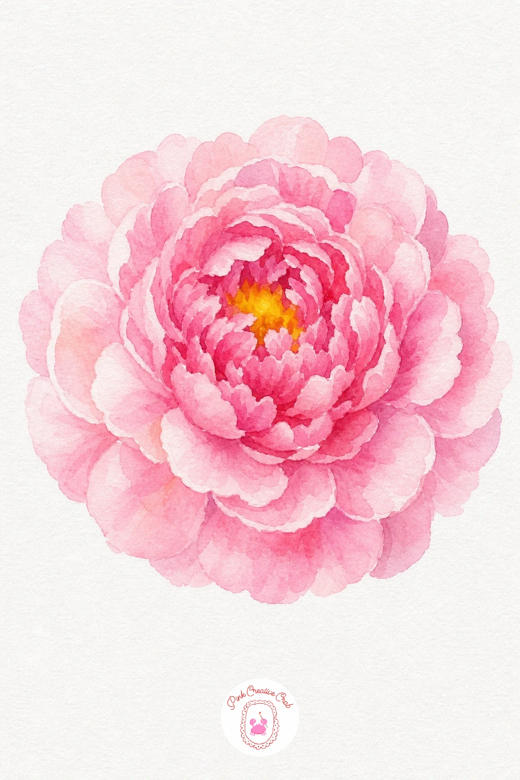
Palette: Opera Pink,Permanent Rose,Cadmium Orange,Sap Green
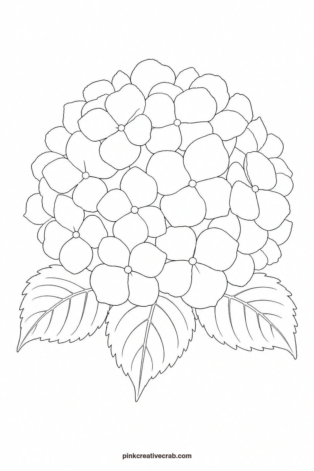
Blue Hydrangea Head
Paint each small floret with a quick flat wash, varying the mix from pale cerulean to a deeper ultramarine so the cluster does not look flat or repeated. Work floret by floret rather than wash over the whole head at once, leaving thin slivers of white paper between some petals so each one stays readable. Finish with a loose sap green wash on the leaf shapes below, and let one or two florets lean toward violet for interest.
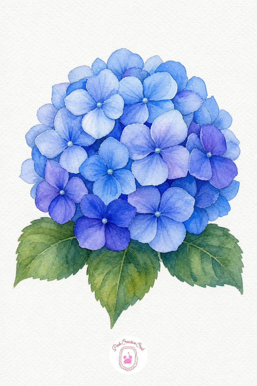
Palette: Cerulean Blue,Ultramarine Blue,Dioxazine Violet,Sap Green
Red Tulip
Lay a flat red wash over the whole cup shape first, then while it is still wet touch a stronger red-violet mix into the base of the petals so it settles downward and gives the cup some depth. Keep the stem and leaves a single confident green stroke each, pulled from base to tip in one movement so the edges stay clean. A tiny highlight left unpainted along one petal edge is the one touch that makes the tulip look lit rather than flat.
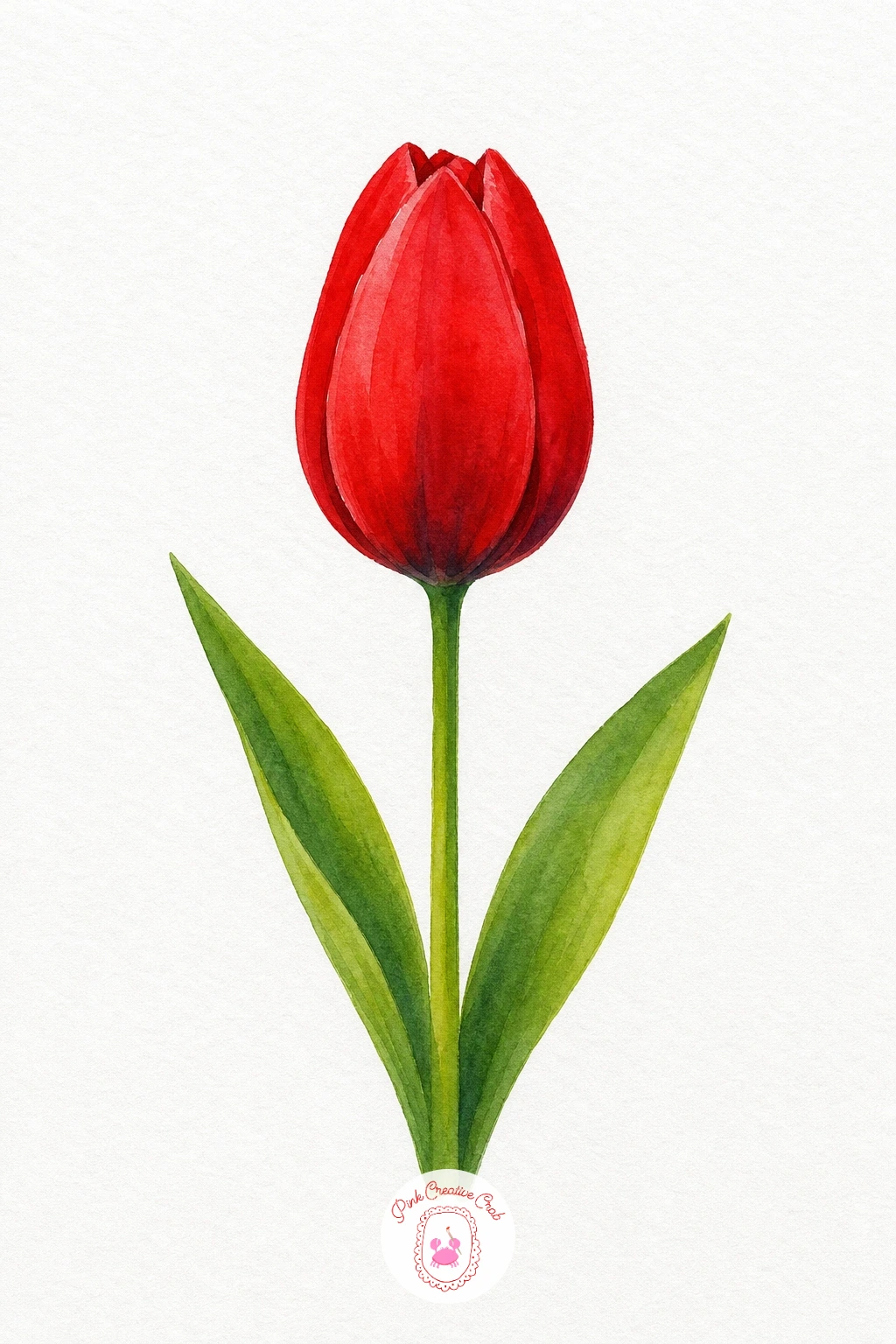
Palette: Cadmium Red,Alizarin Crimson,Sap Green
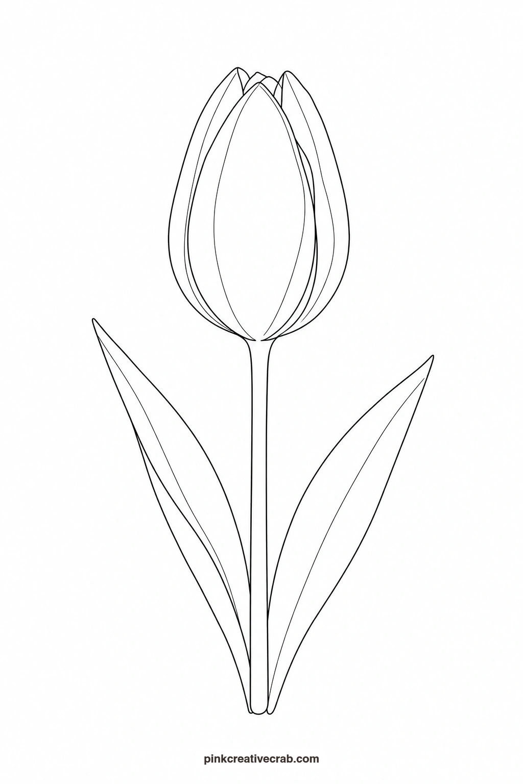
Garden Rose
Paint the outer petals first with the palest wash and work inward, adding a stronger coral-rose mix to each ring of petals as you go so the center naturally reads as the deepest and most tucked-in part. Keep brushstrokes curved to follow the spiral of the petals rather than straight lines. Once dry, a few short dry-brush strokes in deeper rose along the inner folds give the rose the one touch of structure that separates it from a flat pink circle.
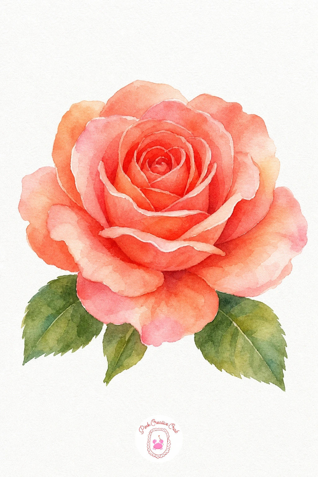
Palette: Quinacridone Coral,Permanent Rose,Sap Green
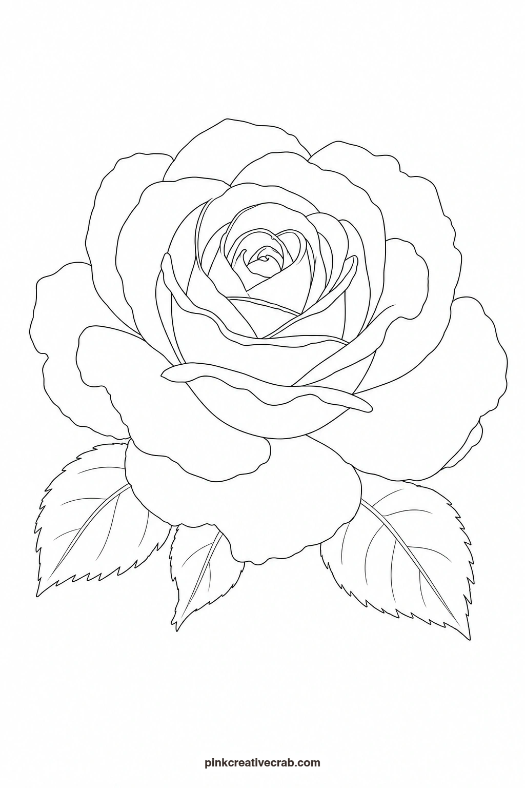
Sunflower
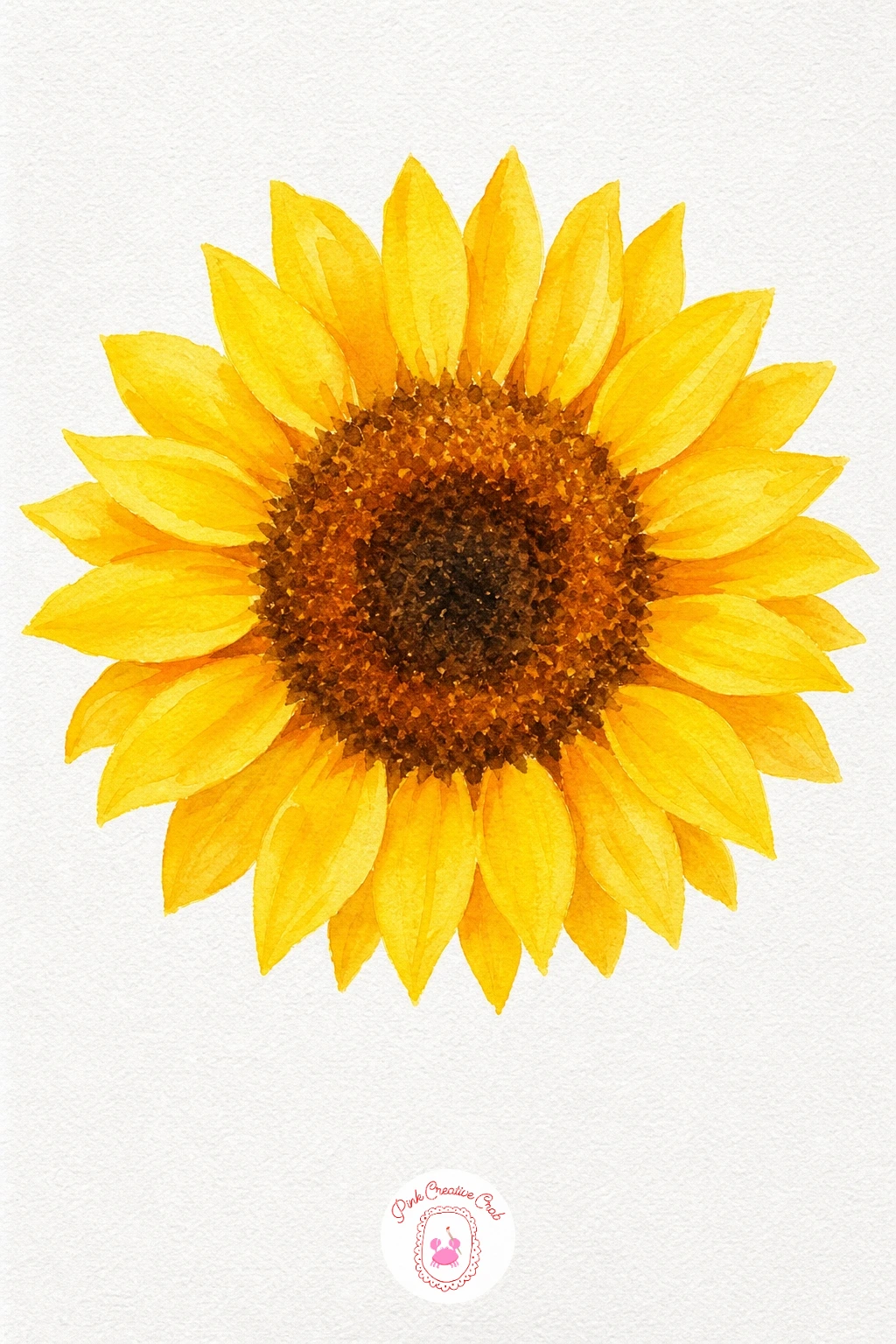
Wash each petal with yellow first, then touch a little orange into the base of each one while still damp so the color pools naturally toward the center. For the round center, lay a flat brown wash and once it has dried fully, flick a loaded brush gently over it to splatter tiny dark dots across the surface for texture. That splatter is the one detail that makes the sunflower’s center look believably seedy rather than a plain brown disc.
You Will Need
- old toothbrush or stiff brush for splatter
Palette: Hansa Yellow,Cadmium Orange,Burnt Umber,Sap Green
Cover the surrounding paper with scrap paper before splattering the center, a single stray fleck is hard to lift once it dries on a clean background.
Purple Iris
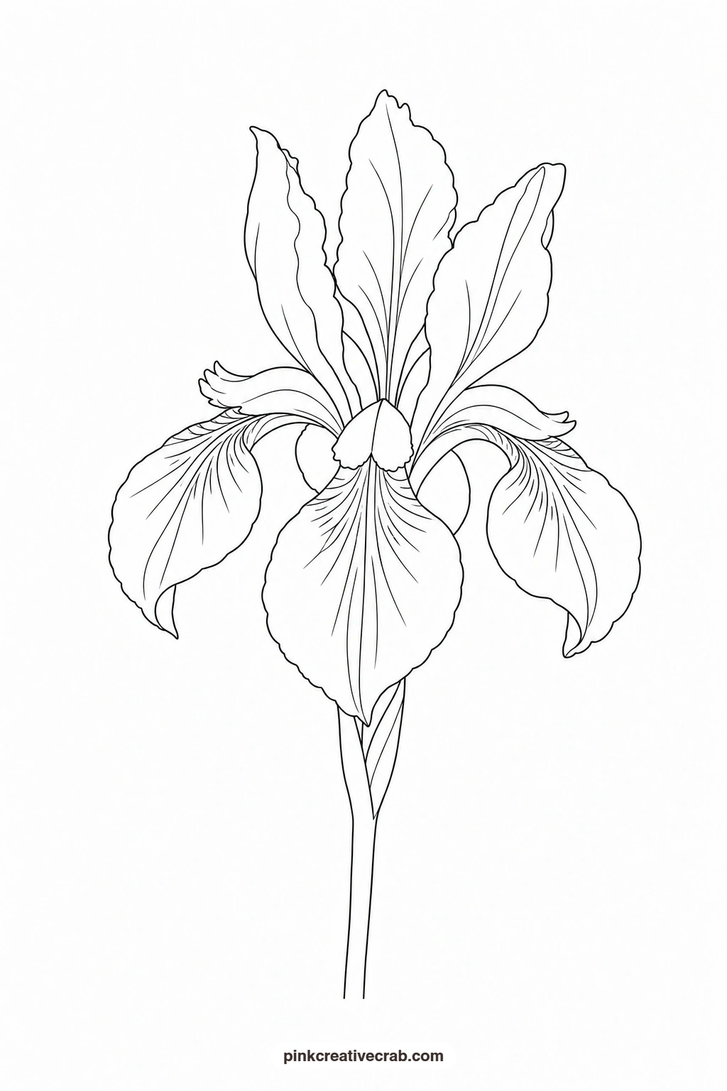
Paint the upright petals with a cooler violet-blue and the drooping lower petals with a warmer red-violet, so the two petal groups read as distinct even without any outline between them. Drop a small stroke of yellow at the throat of the flower while the purple around it is still damp, letting the colors feather together softly. Keep the stem a single clean green line, since the iris is one subject where a steady, unhesitating stroke matters more than careful shading.
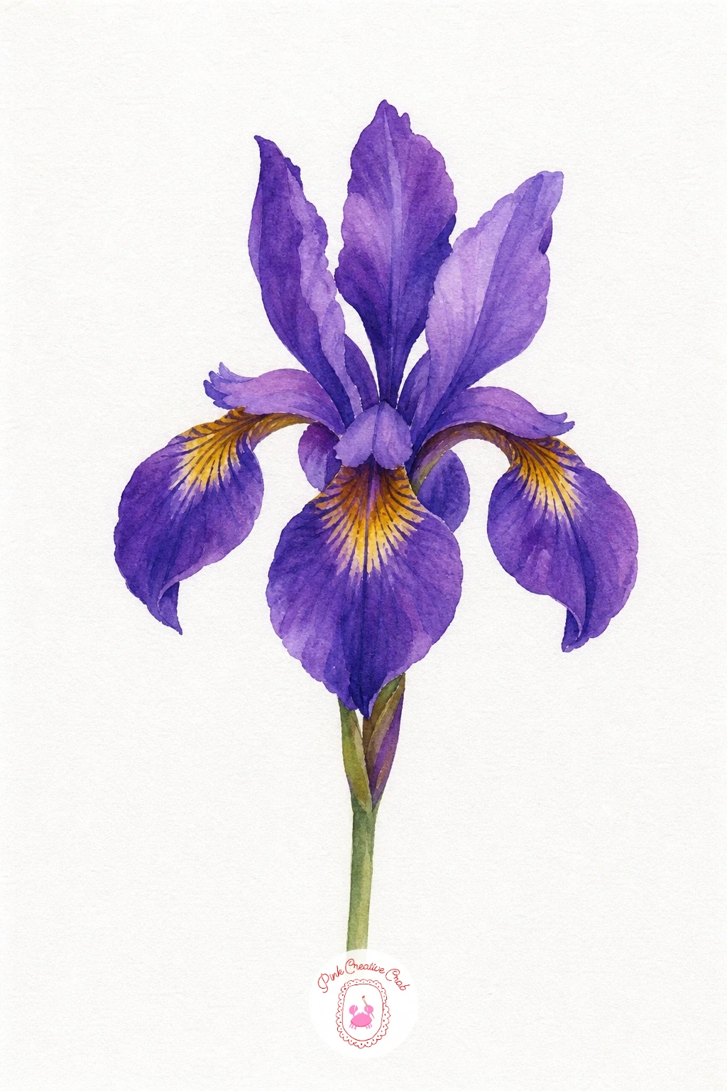
Palette: Dioxazine Violet,Ultramarine Blue,Hansa Yellow,Sap Green
Dahlia
Work in rings from the outer petals inward, starting each ring with a lighter orange wash and moving to a deeper red-orange as you near the center so the color gradient does the work of showing depth. Because the petals are narrow and repeat many times, paint a few at a time rather than racing around the whole flower, keeping each stroke short and pointed to match the petal shape. The deepest red dot left at the very center is the one touch that pulls the whole radiating pattern together.
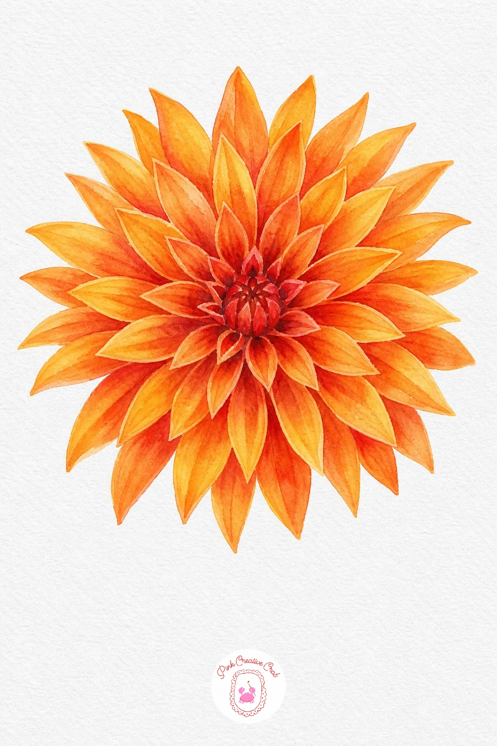
Palette: Cadmium Orange,Cadmium Red,Alizarin Crimson
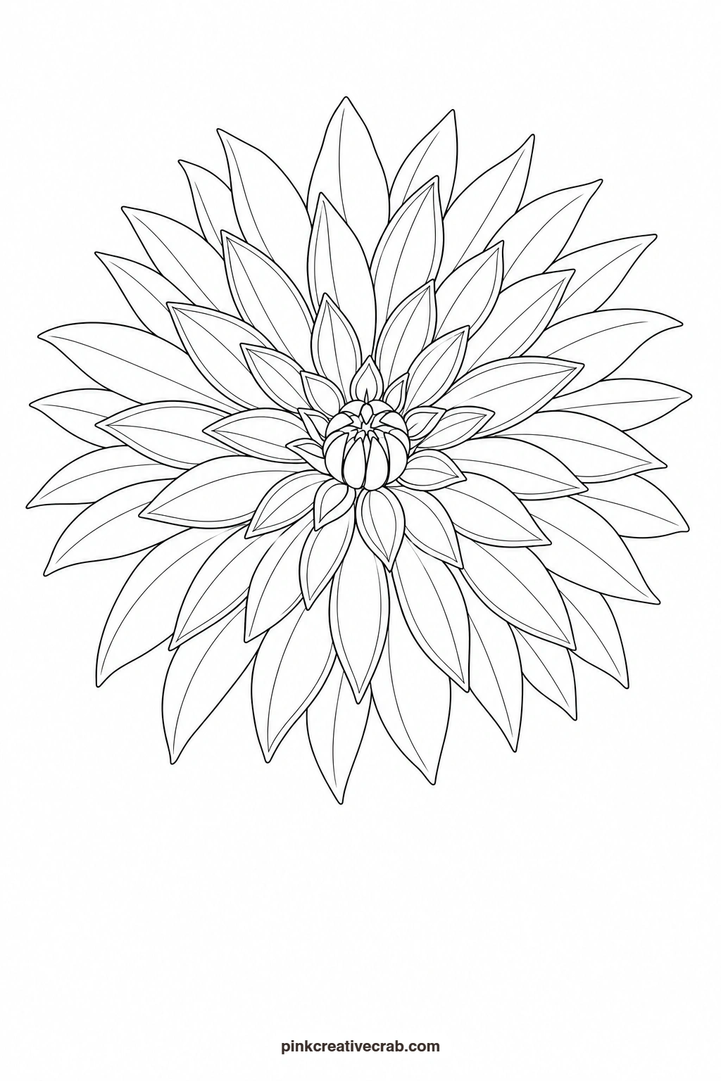
Sweet Pea Stem
Paint each ruffled blossom with a very pale lavender wash first, then while damp add a touch of pink into the base of the petal so the two colors blend softly without a hard line. The stem and curling tendrils need a steady, light hand since they are thin, so transfer them carefully and paint them last with a fine round brush loaded with just enough paint to stay in one continuous line. Leaving tiny flecks of white paper unpainted on the ruffled edges keeps the blossoms looking delicate rather than heavy.
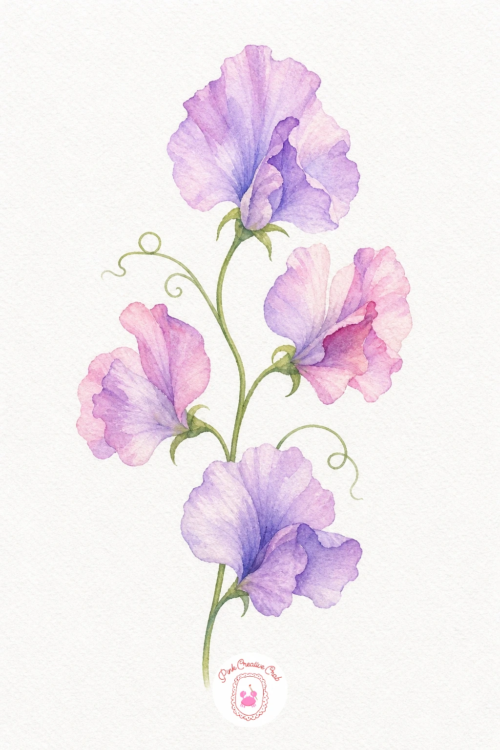
Palette: Dioxazine Violet,Opera Pink,Sap Green
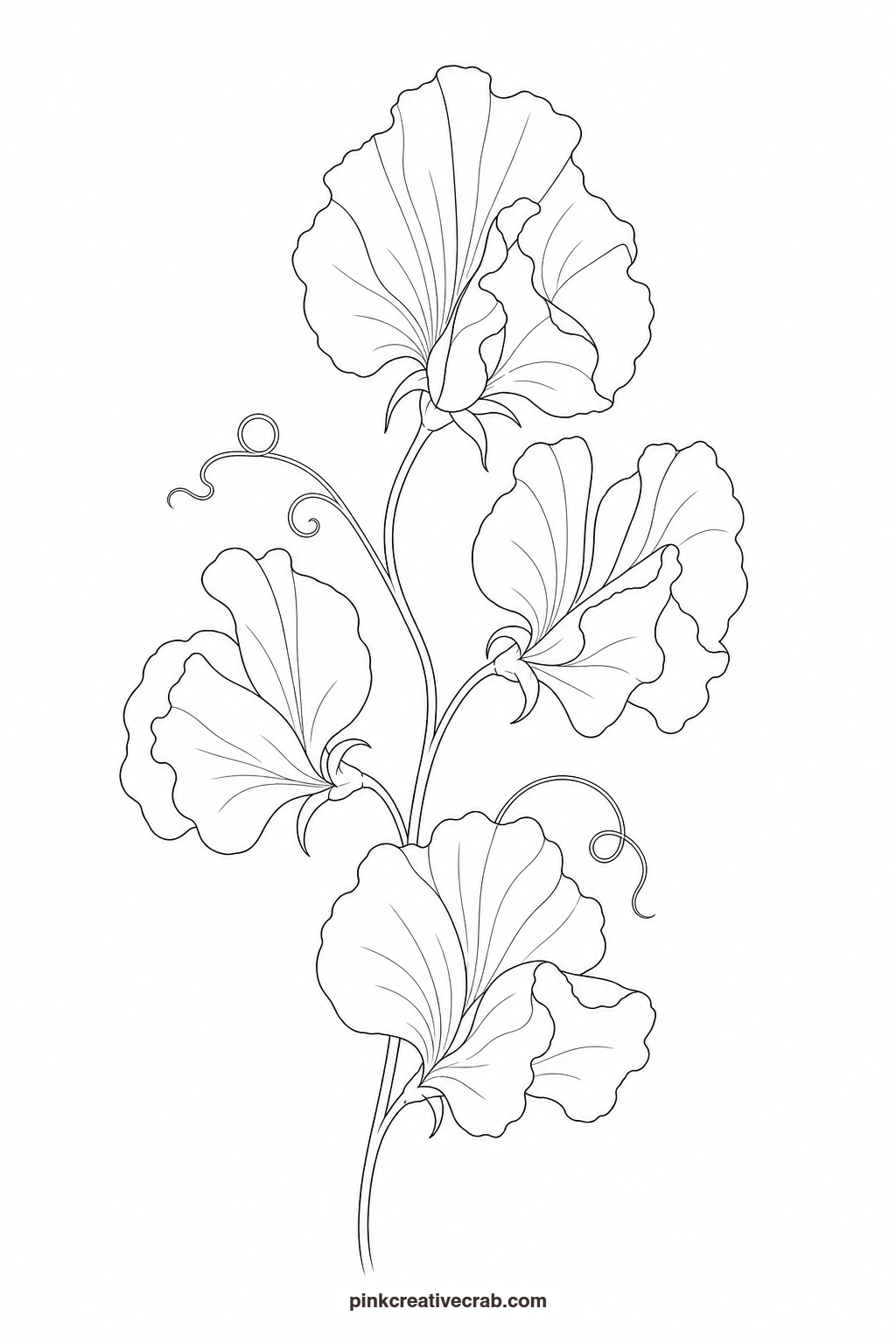
White Lily
Leave most of the petal surface as bare white paper and paint only the shadowed folds where petals curve or overlap, using a thin grey-green mix so the shadows stay cool rather than muddy. Add the stamens last with a fine brush loaded with a warm brown-orange, dotting the tip of each one heavier than the thin stalk beneath it. Because the lily depends on bare paper for its color, work slowly and keep the brush fairly dry wherever you want the white to stay untouched.
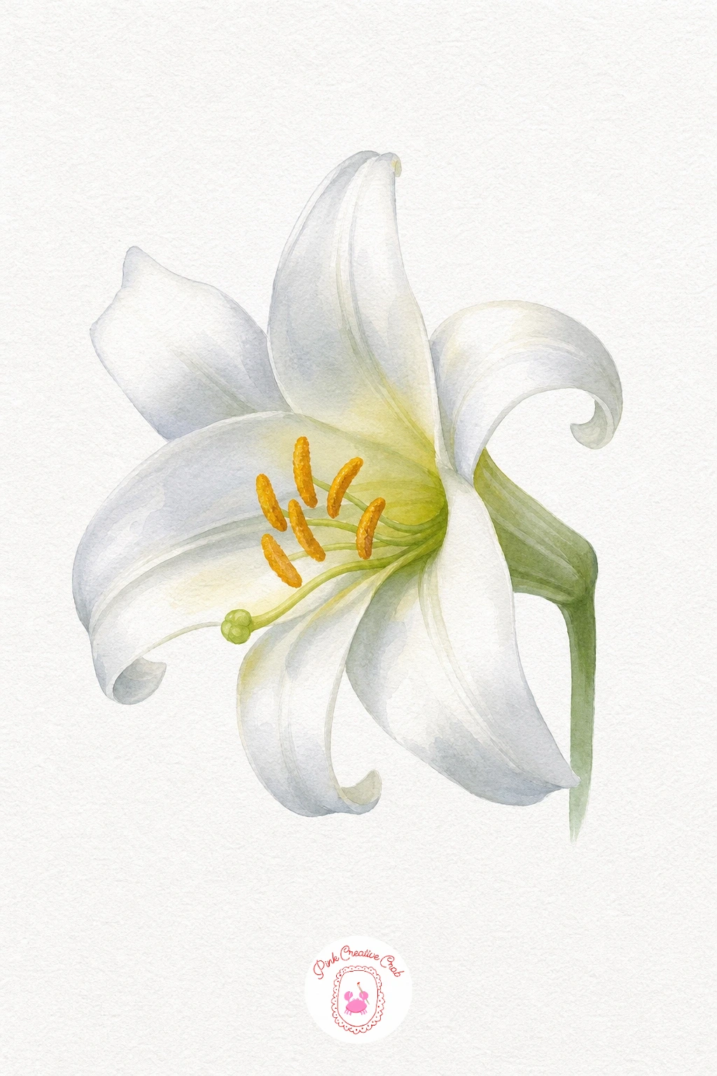
Palette: Payne’s Grey,Sap Green,Burnt Sienna
Hollyhock Stem
Paint each saucer-shaped blossom along the stem in a slightly different strength of pink, so the flowers near the bottom can read a touch deeper than the ones near the top, giving the stem a natural sense of distance. A small darker pink dot at the center of each blossom marks where the stamens sit without needing to paint them individually. Keep the stem itself a single unbroken green line pulled from base to tip, which is the one element that has to look confident rather than shaky.
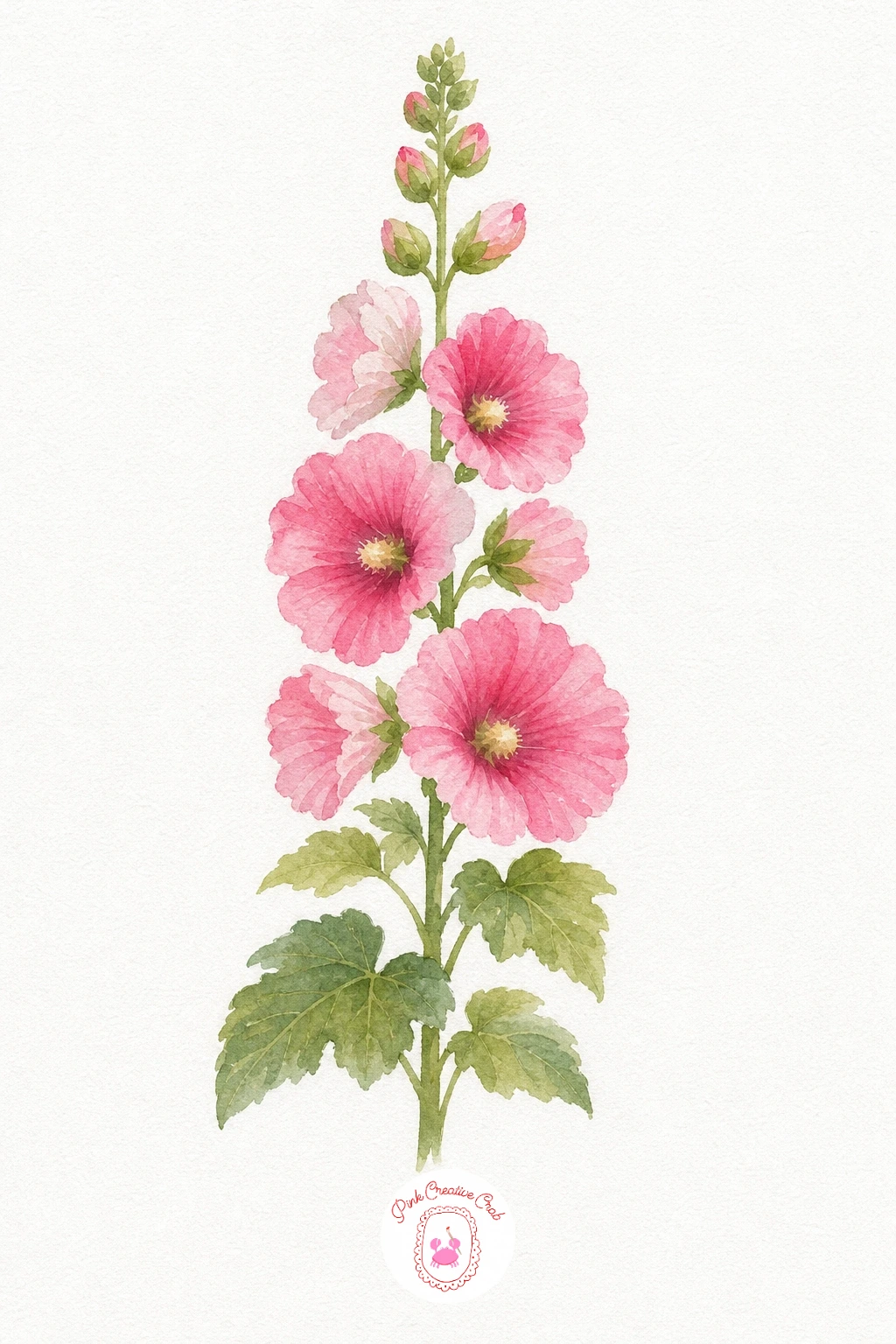
Palette: Opera Pink,Permanent Rose,Sap Green
This stem pairs nicely with a cheerful cutting-garden set, see more flower subjects in watercolor garden paintings for summer if you want to keep going.
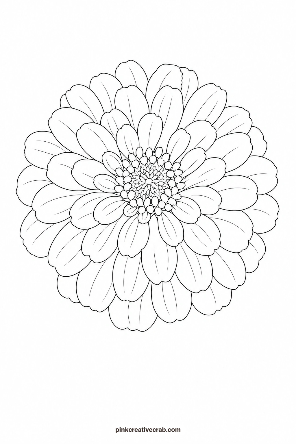
Zinnia
Wash the outer row of petals in hot pink and the inner rows in a warmer orange-pink, working row by row toward the center so the layering stays visible once dry. Paint the small domed center in mustard yellow, then once it has dried completely, add a scatter of tiny dark dots across it with the very tip of a fine brush. That textured center is the one touch that makes the zinnia look like a real flower rather than a flat pinwheel of petals.
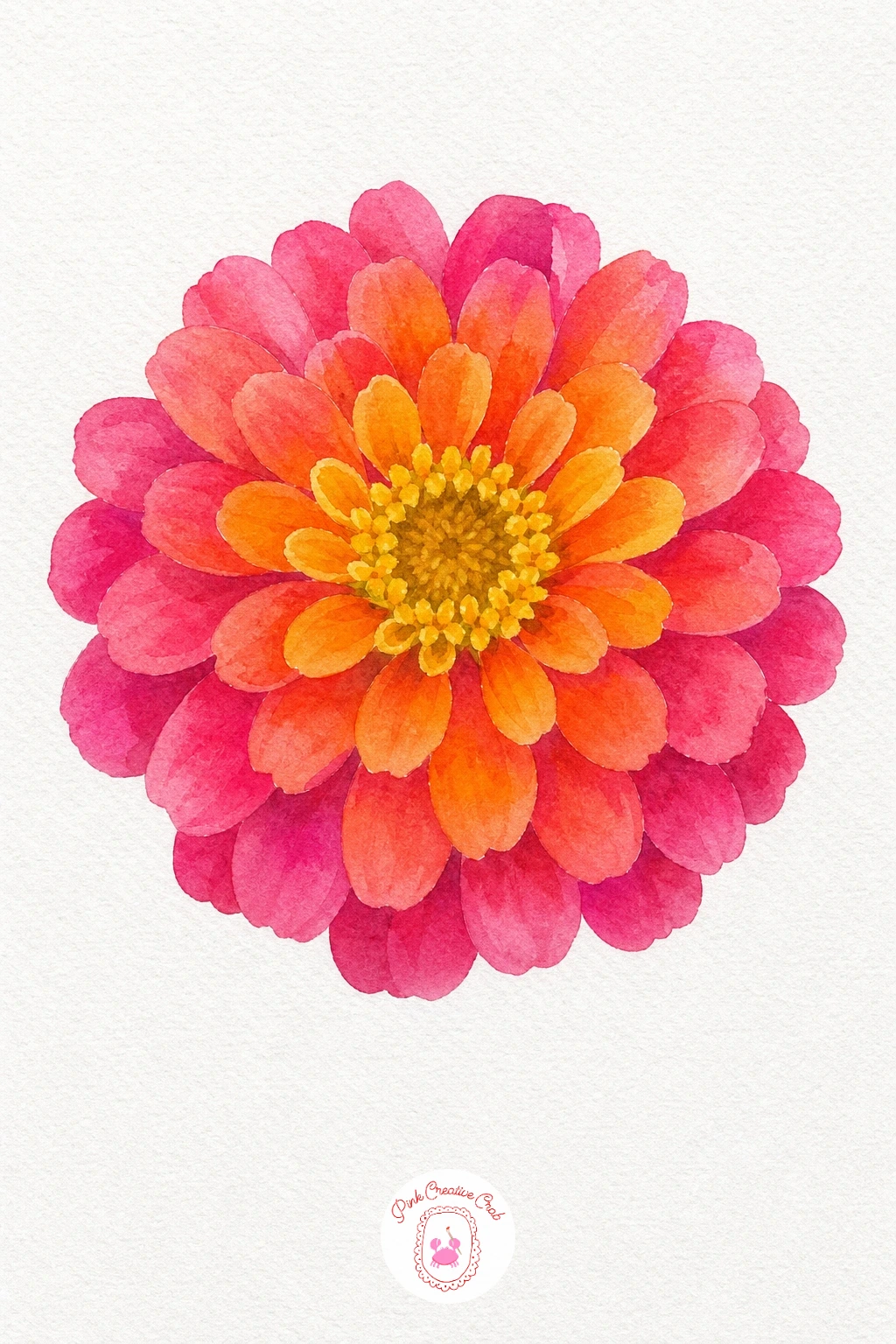
Palette: Quinacridone Magenta,Cadmium Orange,Yellow Ochre
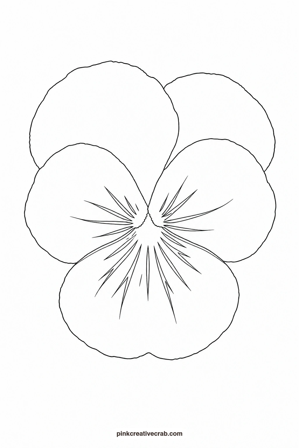
Pansy Face
Paint the two upper petals in deep violet and the three lower petals in a warm yellow, letting the colors meet and blend slightly where the petals overlap near the center. Once the base washes are dry, add the dark radiating lines from the center outward with a fine brush and a strong violet-black mix, keeping each line short and slightly curved to follow the petal shape. These lines are the one detail that gives the pansy its familiar velvety face, so save them for last and keep your hand light.
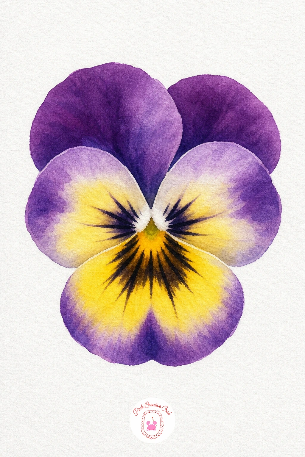
Palette: Dioxazine Violet,Hansa Yellow,Payne’s Grey
What to Do Next
Pick one flower, print its outline, and trace it onto your watercolor paper this afternoon with the finished example propped up nearby for reference. Once you have painted a few, try mixing two or three stems together on one page for a fuller little garden study.
Frequently Asked Questions
What size should I print the outline templates?
Print them at standard letter or A4 size to match most watercolor pads. If your paper is larger, enlarge the printout at a copy shop so the flower still fills the page with comfortable margin.
What paper works best for these watercolor garden paintings?
Cold press watercolor paper at 140lb or heavier handles washes and blending without buckling. Smoother hot press paper works too if you prefer crisper, more controlled edges on the petals.
How do I transfer the outline without a light pad?
Tape the printed outline to a sunny window with your watercolor paper over it and trace the lines through with a pencil. Graphite transfer paper works just as well and does not need daylight at all.
Can I use colored pencils or markers instead of watercolor?
Yes, every outline works for colored pencil or marker too. Build color in light layers with pencils for the same soft blending effect, or use markers for flatter, bolder color on each petal.
Do I need to paint the templates in the exact colors shown?
No, the palettes are only a starting point. Swap in your own favorite pinks, blues or purples, since the simple shapes hold up well under almost any cheerful color combination.
Have any thoughts?
Share your reaction or leave a quick response — we’d love to hear what you think!
-
 0
-
0
-
0
-
0
-
0
-
0


