

Table of Contents
This set of autumn watercolor landscapes gives you twelve different scenes to paint without sketching a single line first. Each one is built from a few large, closed shapes, so the outline traces cleanly onto your watercolor paper and leaves you free to focus on color.
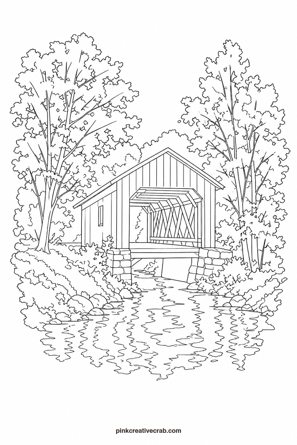
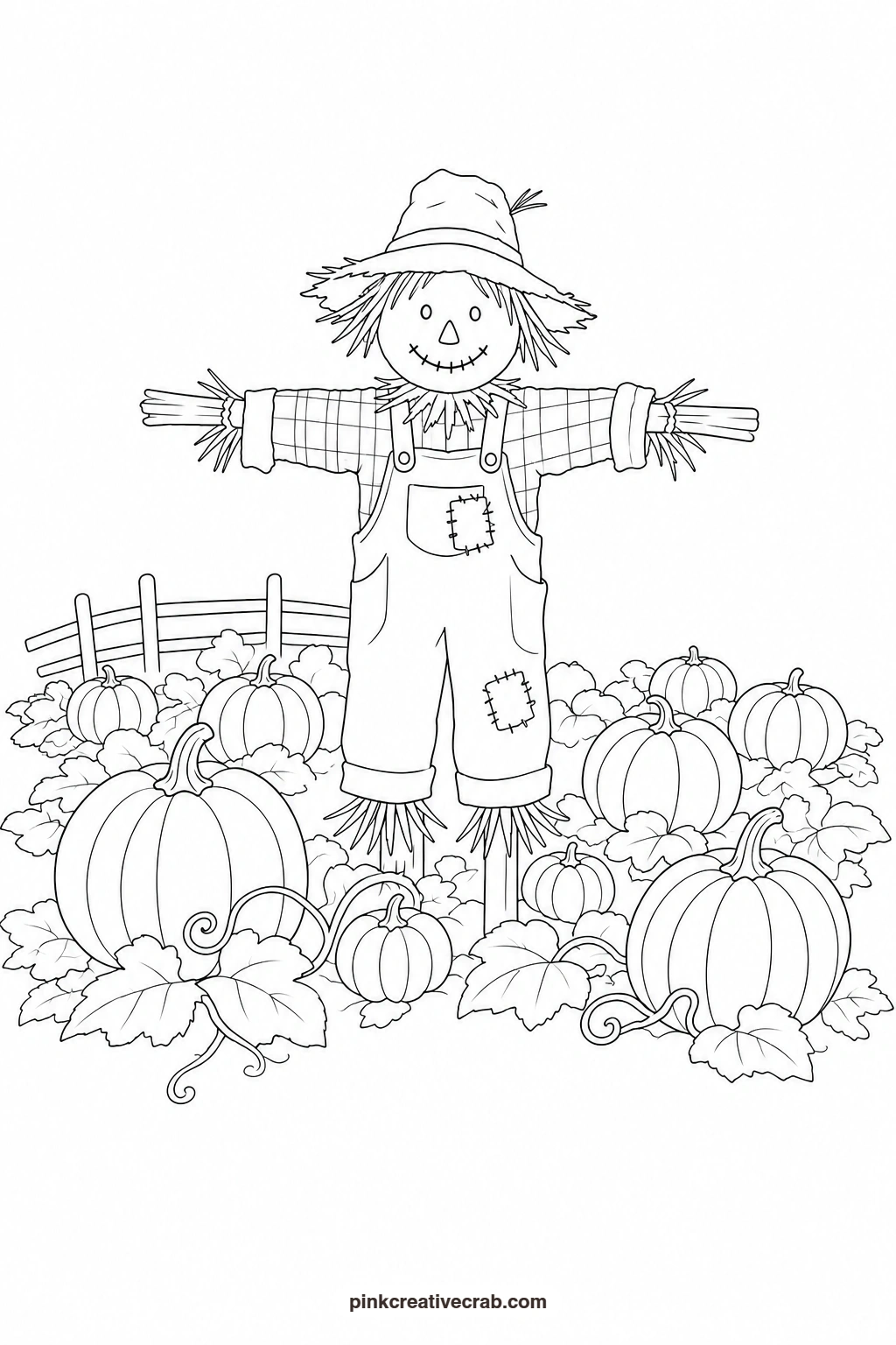
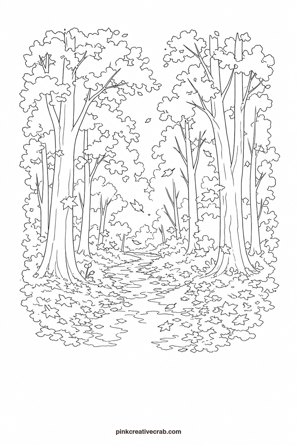
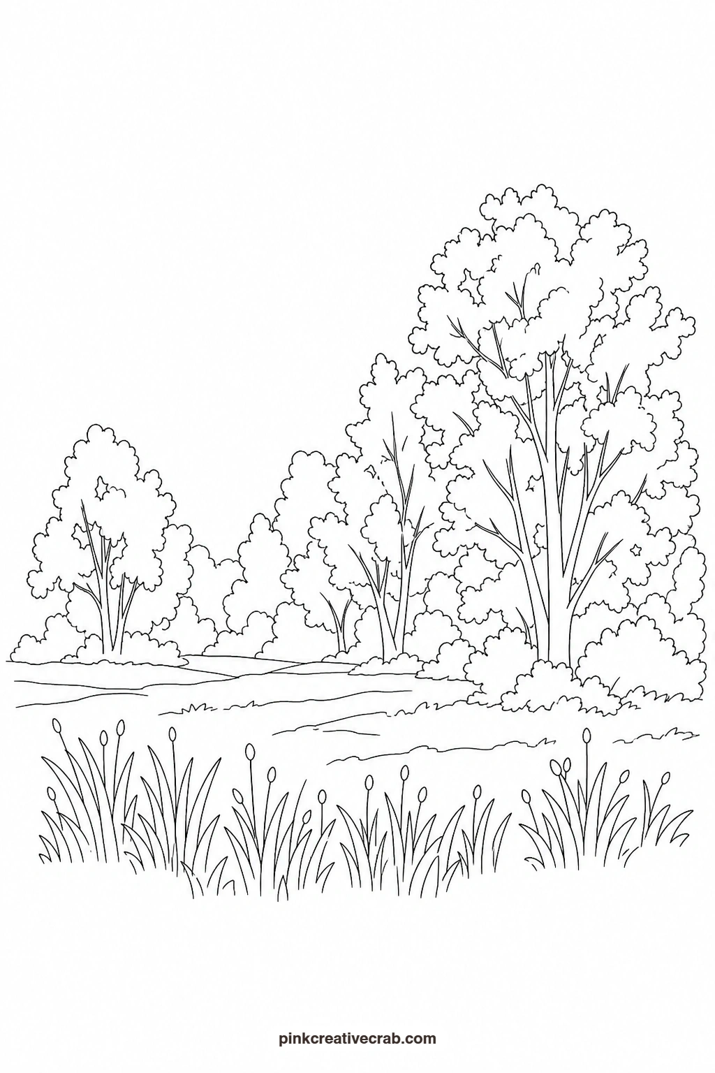
Print the outline at the size you want, then transfer it onto good cold press paper by taping both sheets to a sunny window or a light pad, or by sliding a sheet of graphite transfer paper between them and tracing the lines. Once the shapes are on your paper, prop the finished painting beside you and follow it wash by wash.
Using these images: free for personal projects such as printing, coloring, cards, journals and gifts. Handmade items that include them may be sold up to 30 pieces per design. More than that is commercial use and is not permitted, and neither is selling or sharing the images themselves or passing them off as your own. Please ask before any other use.
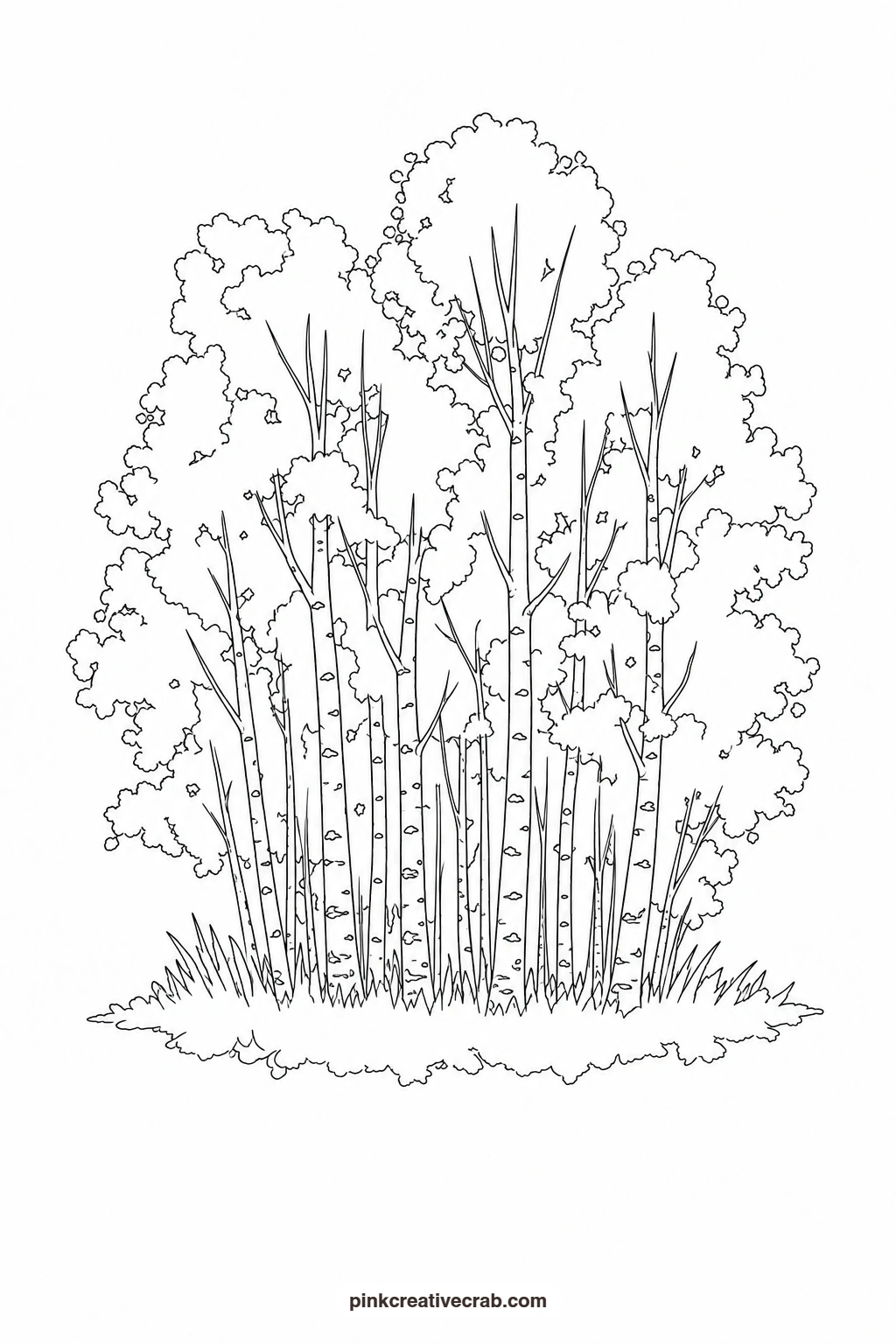
Autumn Aspen Grove
Paint the sky first with a thin wash of pale blue, then let it dry while you mix a puddle of golden yellow and burnt orange. Drop both colors into the canopy shapes wet-on-wet so they blend softly at the edges, then add a few deeper orange dabs once dry for depth. Leave the trunks white and add only a handful of short grey-black marks for bark texture. A narrow strip of soft green at the bottom grounds the whole grove.
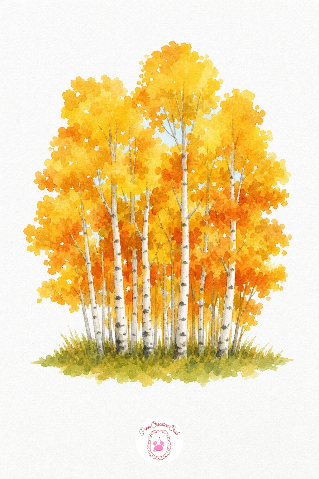
Palette: Cadmium Yellow,Burnt Orange,Payne’s Grey,Sap Green
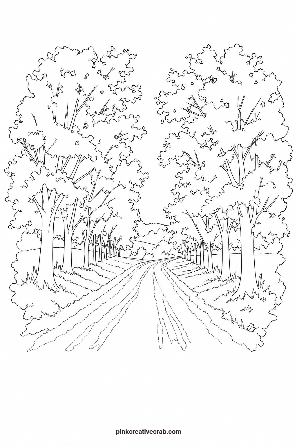
Country Road Under Maples
Start with a pale warm wash across the sky and let it dry fully before the trees go in. Paint the maple canopies in overlapping washes of red, orange and a touch of yellow, keeping each cluster simple and rounded rather than leafy and detailed. Once dry, lay a flat tan wash down the road shape and add a thin grey line down the center for a path worn by wheels. Darken the tree line closest to the viewer slightly so the road reads as receding into the distance.
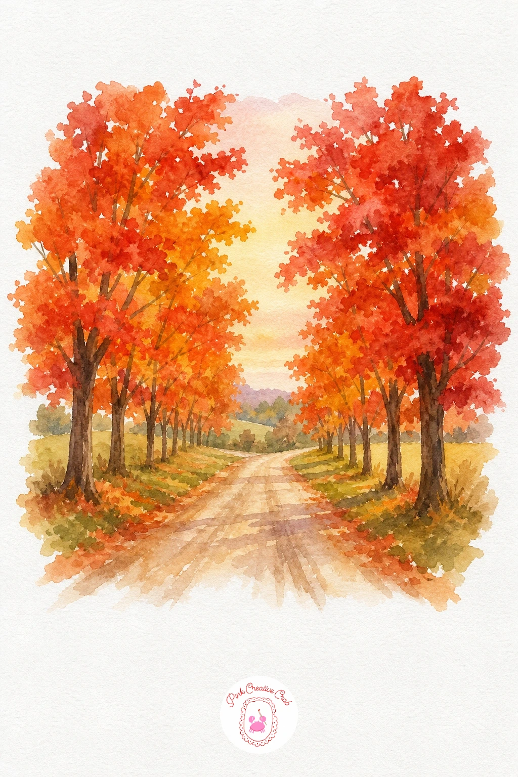
Palette: Alizarin Crimson,Cadmium Orange,Raw Sienna,Naples Yellow
Barn With Pumpkins
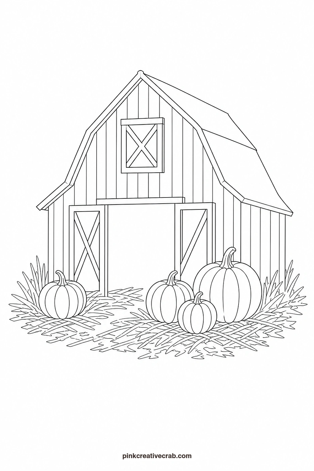
Wash the sky pale blue and the ground a soft straw yellow, keeping both flat and letting them dry before touching the barn. Paint the barn in a confident red, leaving the roof and door shapes untouched, then fill the roof with a warm grey and the door opening with a dark warm brown. The pumpkins go in next, each a round orange wash with a thin green stem, placed in a loose cluster at the barn’s base. A few short dark lines along the barn boards give the one finishing touch that makes the whole building feel solid.
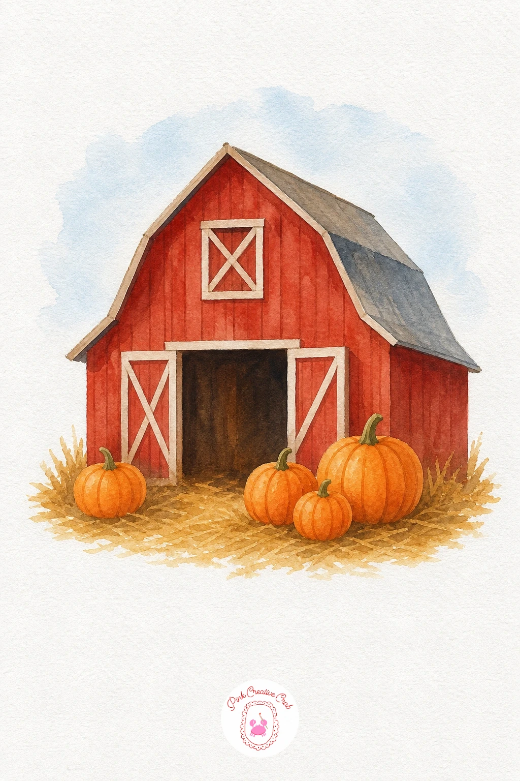
Palette: Cadmium Red,Burnt Orange,Warm Grey,Sap Green
Lake With Autumn Trees
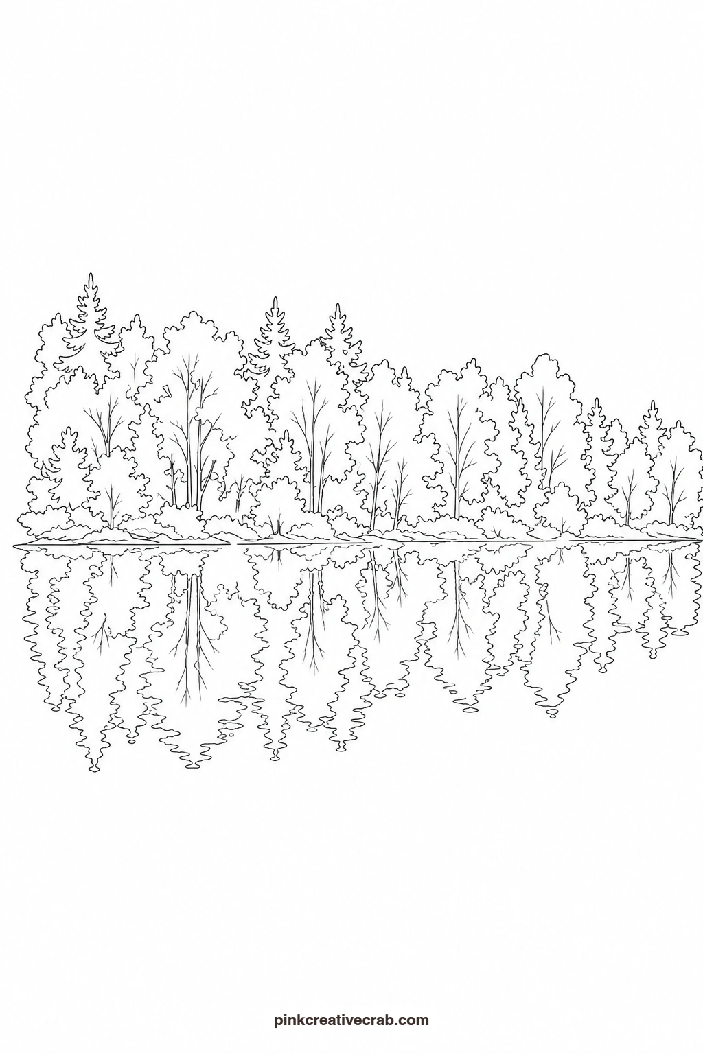
Paint the sky and the top band of trees first, using the same oranges and golds you want repeated below. While that layer dries, mix a slightly diluted version of each tree color for the reflection, then brush it on in loose horizontal strokes across the lower half so the colors blur softly into the water. Keep a thin pale strip untouched where the shoreline meets the water for contrast. A few short horizontal grey lines across the reflection suggest gentle ripples without adding clutter.
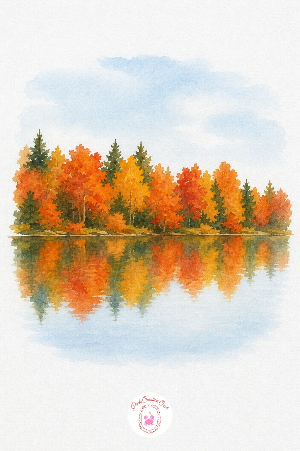
Palette: Burnt Sienna,Cadmium Orange,Cerulean Blue,Payne’s Grey
Try this scene again with just pencils if you want a softer, more layered reflection; building it up slowly in colored pencil lets you control exactly how much the water blurs.
Covered Bridge in Fall
Block in the bridge’s red walls and dark roof first, keeping the shapes flat and simple, then let that dry completely before working the trees around it. Paint the surrounding canopies in warm yellow and orange, overlapping them slightly behind the bridge roofline so it sits nestled rather than floating. The creek underneath gets a pale blue-grey wash with a few darker strokes near the bridge’s shadow. Keep the water calm and unbroken so the bridge stays the clear center of the piece.
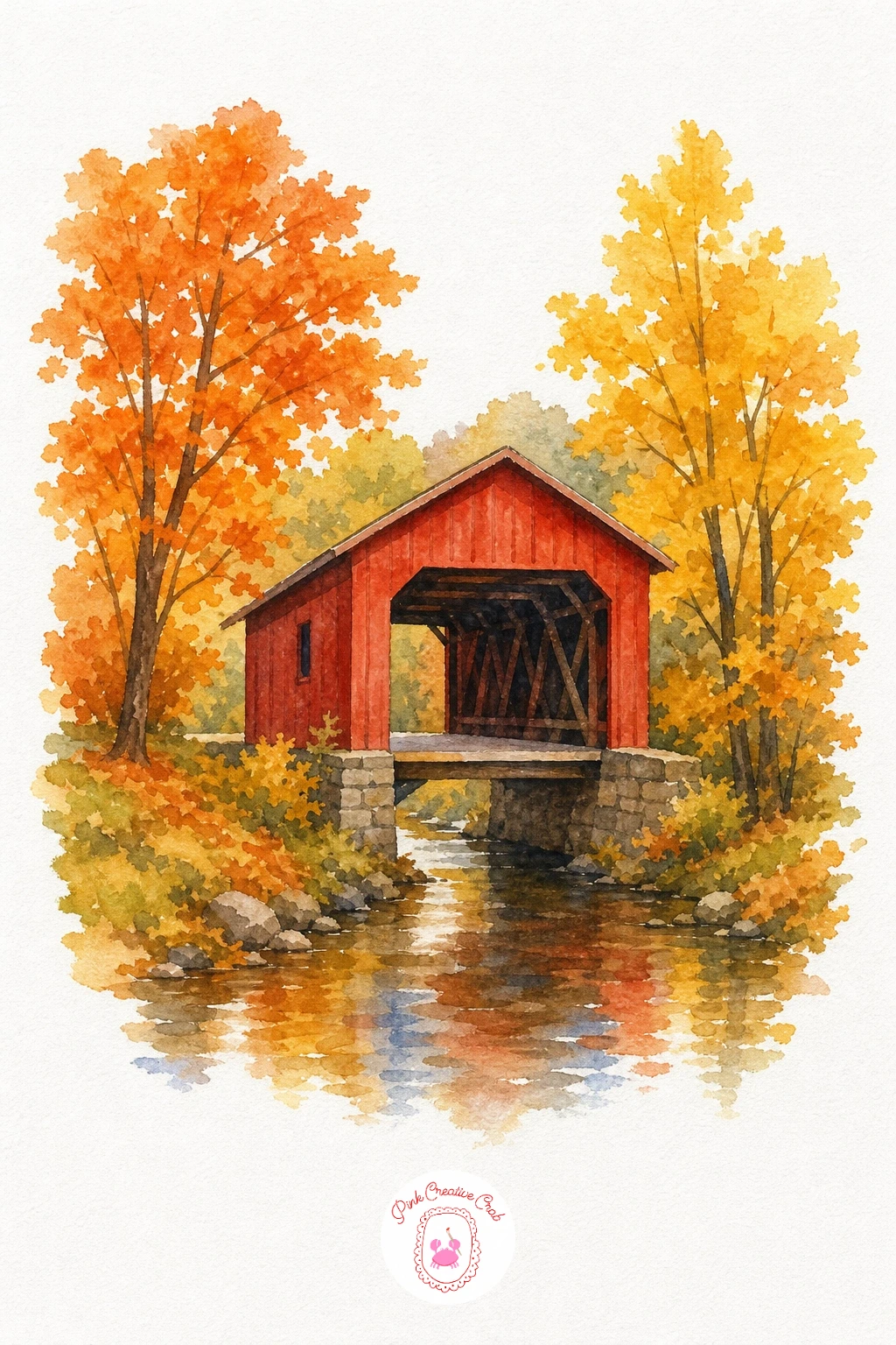
Palette: Cadmium Red,Payne’s Grey,Cadmium Yellow,Cerulean Blue
Pumpkin Patch With Scarecrow
Lay a pale gold wash over the whole field first and let it dry before the pumpkins go in, each one a separate round orange shape with a small green stem. Paint the scarecrow’s shirt and trousers in muted blue and brown, keeping the figure plain and blocky rather than detailed, then add the straw hat and a few loose yellow strokes at the wrists and collar for stuffing. A scattering of short dark green leaf shapes near the pumpkin stems is the one touch that finishes the patch convincingly.
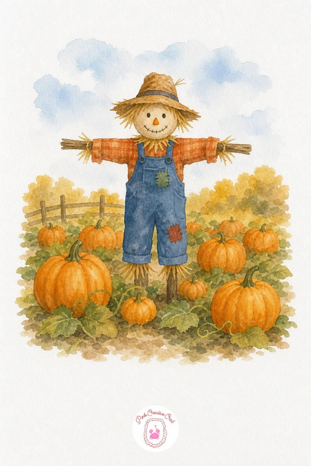
Palette: Cadmium Orange,Raw Sienna,Indigo,Sap Green
Forest Path With Falling Leaves
Wash the canopy areas above the path in overlapping gold, orange and a little red, letting the colors mix slightly where they meet for a natural blend. Once dry, paint the trunks as simple dark vertical shapes and the path itself in a warm tan that lightens toward the center where the light falls. The falling leaves are the detail to take slowly: paint each one as a tiny separate wash of color, a few in the air and a few settled on the path, so none of them touch or overlap.
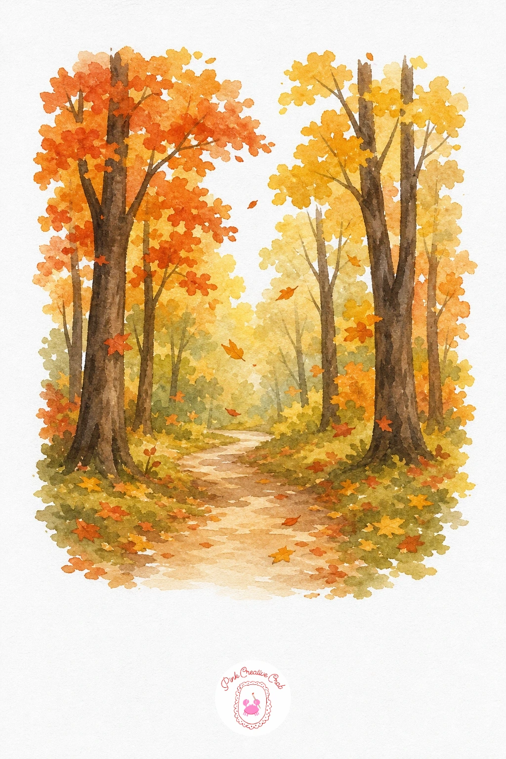
Palette: Cadmium Yellow,Burnt Orange,Alizarin Crimson,Van Dyke Brown
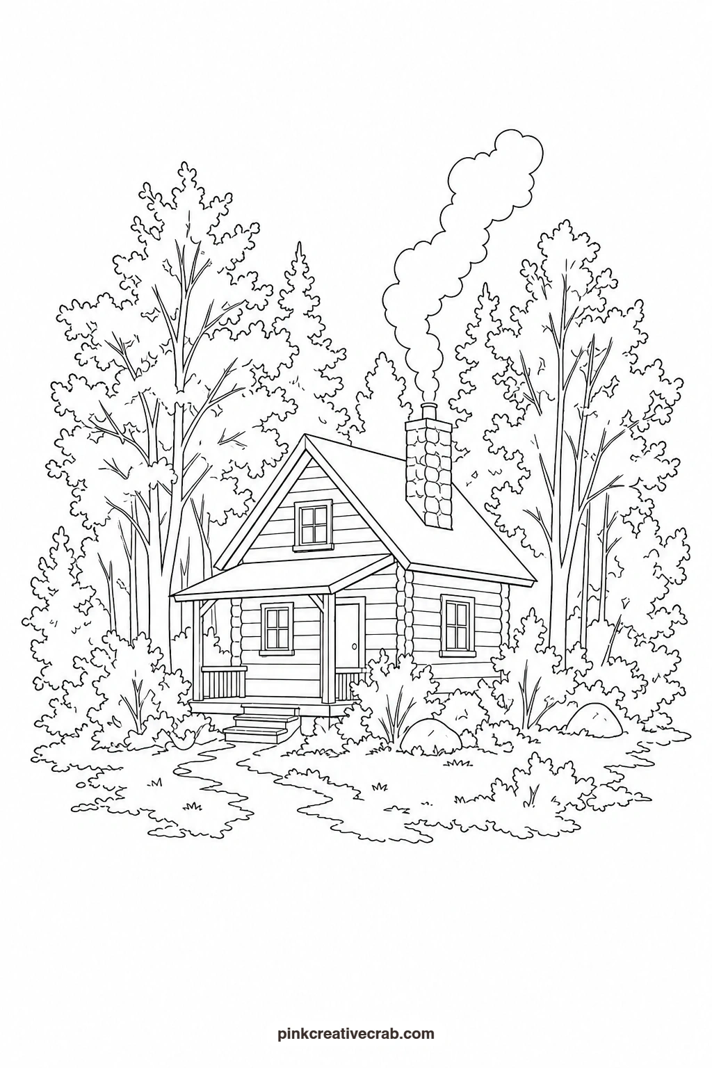
Cabin in Autumn Woods
Paint the cabin walls in warm brown first, leaving the window and door shapes white, then fill the roof with a flat grey and the chimney with a mix of warm grey stones. Surround the cabin with simple rounded canopies in gold and burnt orange, keeping the trees a little taller than the roofline so the cabin feels tucked in among them. A thin, soft grey curl rising from the chimney is the detail that makes the whole scene feel lived in and warm.
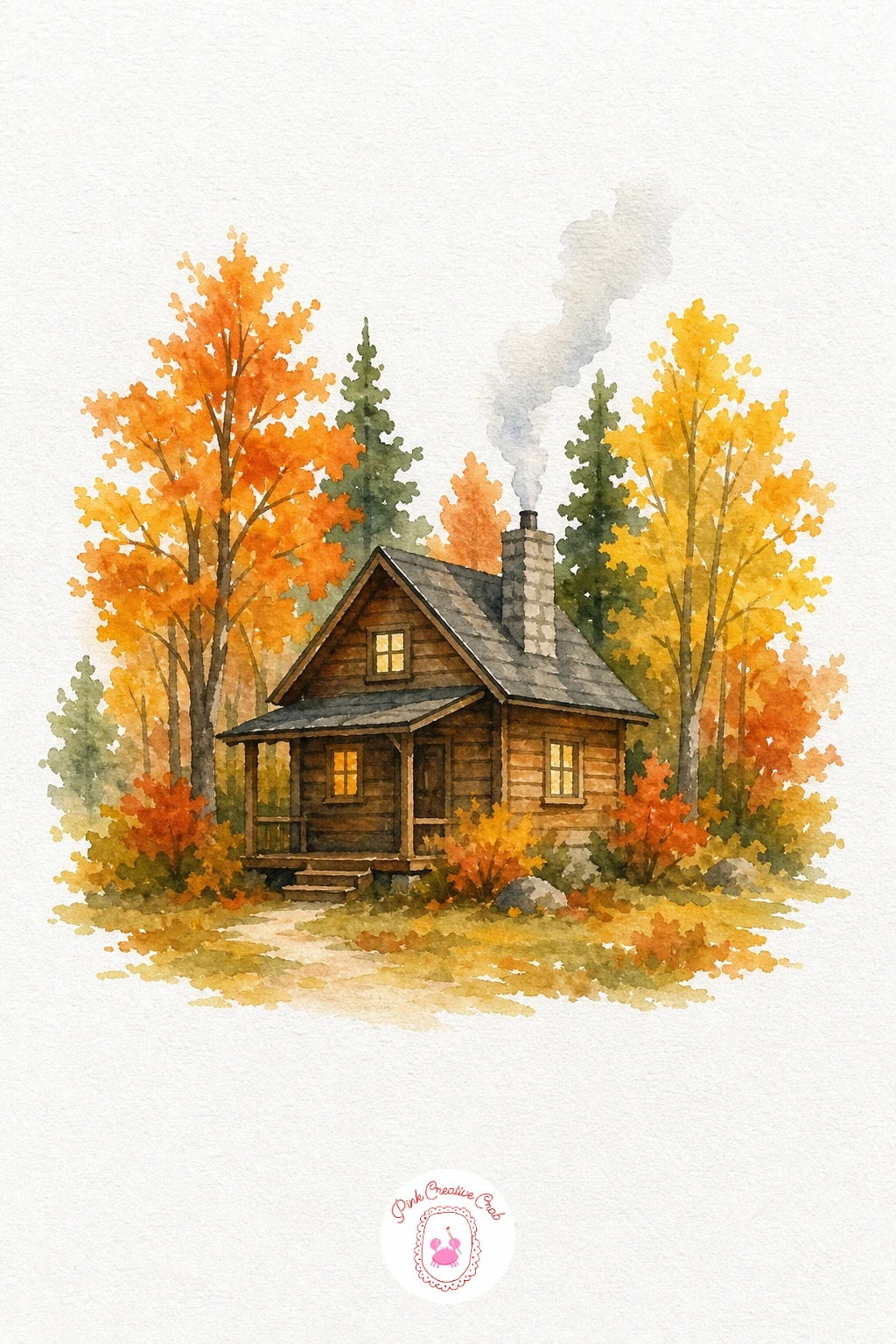
Palette: Van Dyke Brown,Warm Grey,Cadmium Orange,Cadmium Yellow
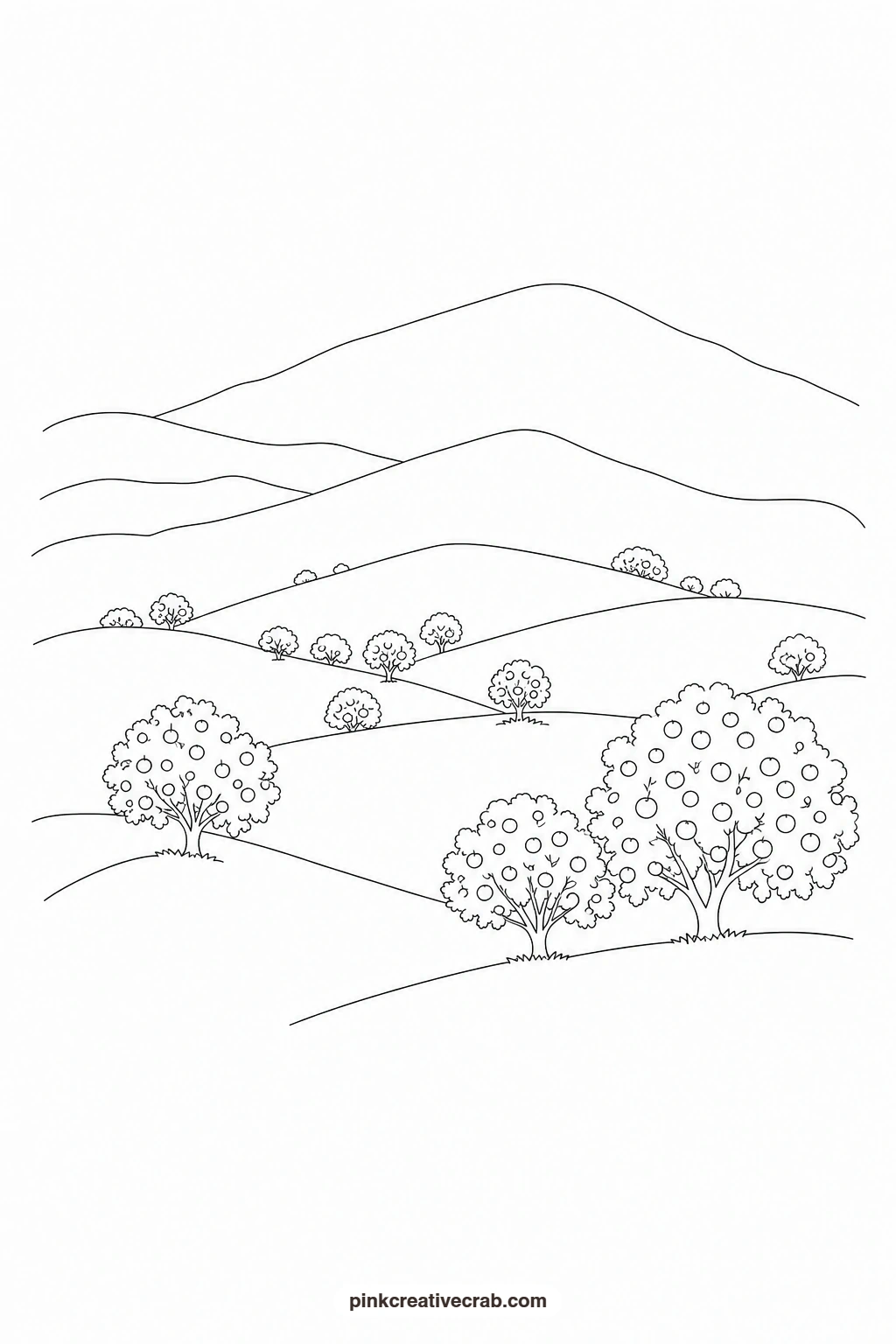
Hills With Orange Trees
Build the hills first with flat washes in soft green and muted gold, layering the furthest hill lightest and the nearest one slightly deeper in tone to give the painting depth. Once dry, dot the rounded tree shapes across the slopes in warm orange, varying the size a little so some sit closer and some further back. Keep the sky a simple pale wash with no clouds so the rolling line of the hills stays the clear focus of the piece.
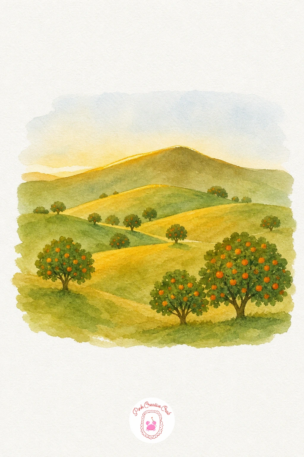
Palette: Sap Green,Raw Sienna,Cadmium Orange,Naples Yellow
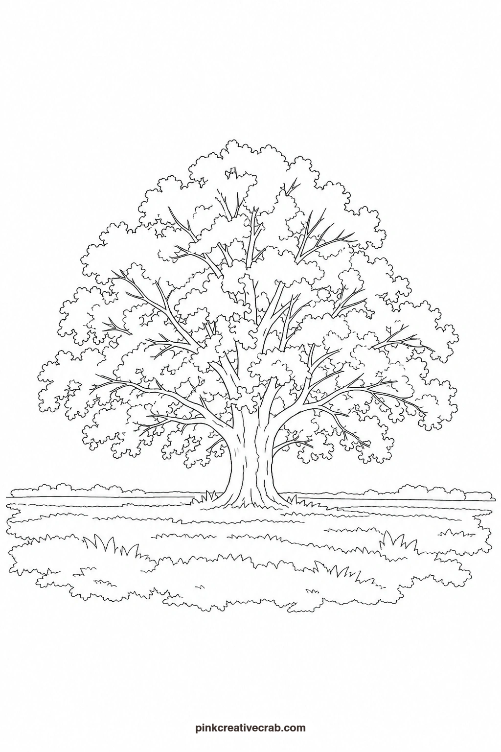
Single Oak in a Field
Wash the sky pale and the field a soft warm green first, letting both dry completely since the tree sits right in the middle of them. Paint the canopy in overlapping patches of orange, brown and a touch of yellow, working wet-on-wet so the colors drift into each other without hard edges. The trunk and a few branches go in last as simple dark brown shapes, thicker at the base and tapering upward. A short shadow beneath the trunk is the one addition that anchors the tree firmly to the ground.
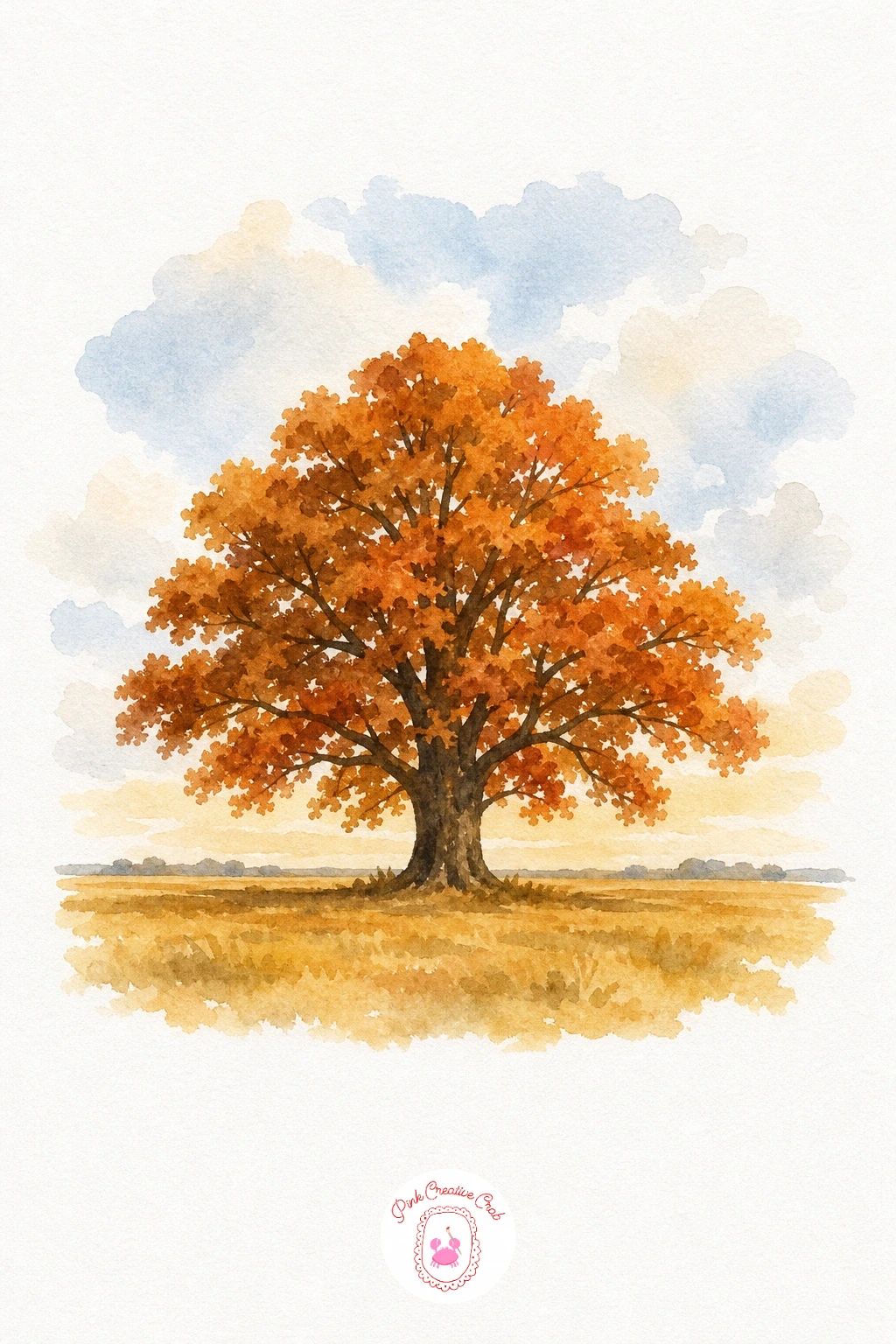
Palette: Burnt Umber,Cadmium Orange,Sap Green,Raw Sienna
For more single-subject practice before tackling a full scene, the easy watercolor landscapes collection is a gentle place to warm up your washes.
Misty Autumn Meadow
This one relies on soft, diluted washes rather than sharp shapes, so keep your brush wet and your paint thin throughout. Lay a pale grey-lavender wash across the upper half for the mist, then drop in faint orange and yellow tree shapes while that wash is still damp so their edges blur and soften. The foreground grass stays a flat, slightly stronger green to contrast with the hazy distance behind it. Resist adding any hard lines; the softness itself is the finished look here.
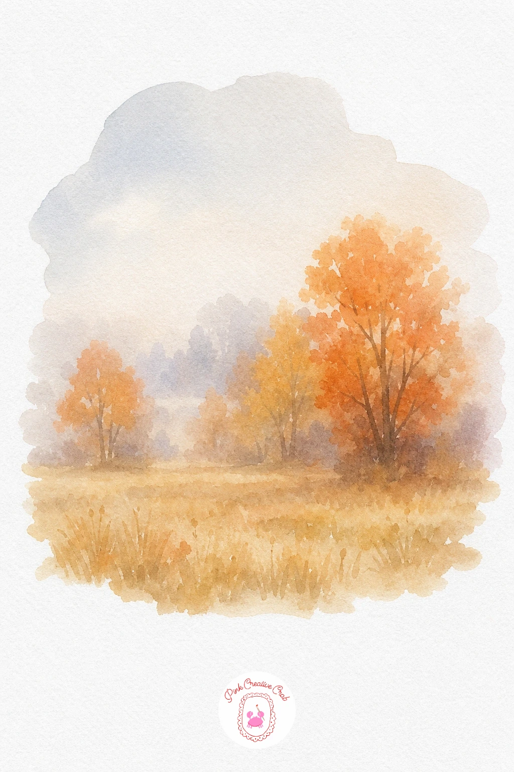
Palette: Payne’s Grey,Naples Yellow,Cadmium Orange,Sap Green
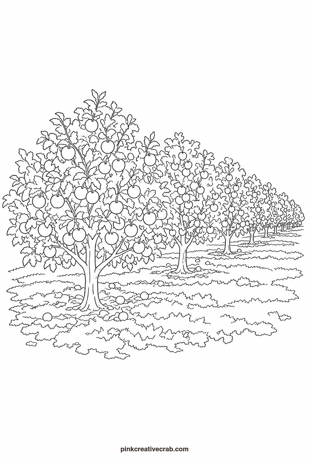
Apple Orchard Row
Paint the sky and grass in flat, pale washes first, then work on the trees once both layers are completely dry. Each canopy is a simple rounded green shape dotted afterward with small red marks for apples, kept loose so the dots read as fruit rather than individual circles. Make the trees furthest down the row slightly smaller and paler to push them back into the distance. A thin brown trunk under each canopy is enough detail to finish the row without crowding it.
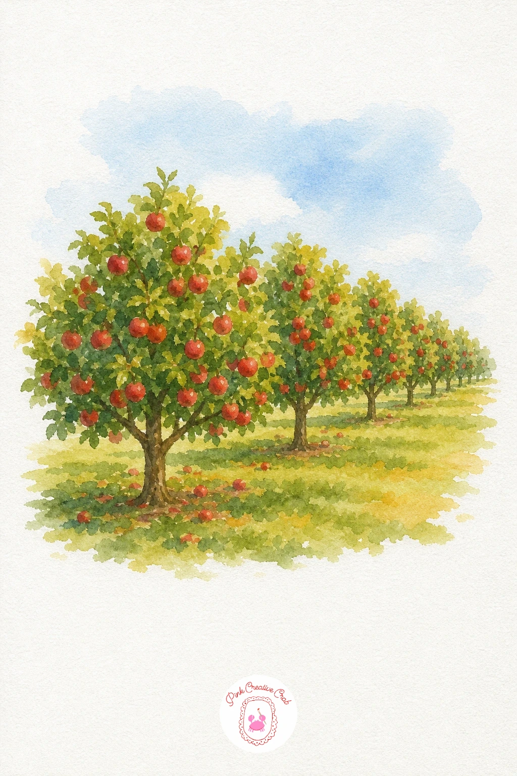
Palette: Sap Green,Cadmium Red,Van Dyke Brown,Naples Yellow
If fruit and produce subjects appeal to you, the watercolor fruit tutorial collection has more harvest ideas to paint next.
What to Do Next
Pick whichever scene matches the mood you are after, print the outline, and transfer it onto your watercolor paper before you mix a single wash. Work through the color notes one step at a time with the finished example nearby, and let each layer dry before the next.
Frequently Asked Questions
What size should I print the outlines?
Print at standard letter or A4 size for most templates, which fits a quarter sheet of watercolor paper comfortably. Enlarge at a copy shop if you want a bigger painting to hang.
What paper works best for these washes?
Cold press watercolor paper at 140lb or heavier handles the wet-on-wet blending in these scenes without buckling. Hot press paper works too but gives softer, less textured edges.
How do I transfer the outline without a light pad?
Tape the printed outline to a sunny window with your watercolor paper over it, then trace the lines with a pencil. Graphite transfer paper slid between the two sheets works just as well on a tabletop.
Can I color these with pencils or markers instead of paint?
Yes, every outline works just as well with colored pencils or markers. Build color in light layers with pencils to mimic the soft blending shown in the painted example.
Why are the outlines so simple compared to the painting?
The outline only marks the big shapes so you have room to add the soft blending and color choices yourself. Keeping it simple also makes tracing faster and far less frustrating for a beginner.
Have any thoughts?
Share your reaction or leave a quick response — we’d love to hear what you think!
-
 0
-
0
-
0
-
0
-
0
-
0


