A vintage oil painting starts with a mood more than a subject: that soft, sun faded look of a canvas pulled from the back of a flea market stall, where the colors have gone gentle and the edges have gone soft. You do not need a complicated palette or a fancy easel to get there. A few muted tans, teals and dusty roses, a loose hand with the brush, and almost any object from a secondhand shop turns into something that looks decades old before the paint is even dry.
Below are 29 small scenes and objects built for exactly that feeling: gramophones, steamer trunks, soda fountains, a pocket watch on crumpled velvet. Each one fits a small canvas and a single sitting, with notes on where the painting usually goes wrong and how to pull it back if it does.
Using these images: free for personal projects such as printing, coloring, cards, journals and gifts. Handmade items that include them may be sold up to 30 pieces per design. More than that is commercial use and is not permitted, and neither is selling or sharing the images themselves or passing them off as your own. Please ask before any other use.
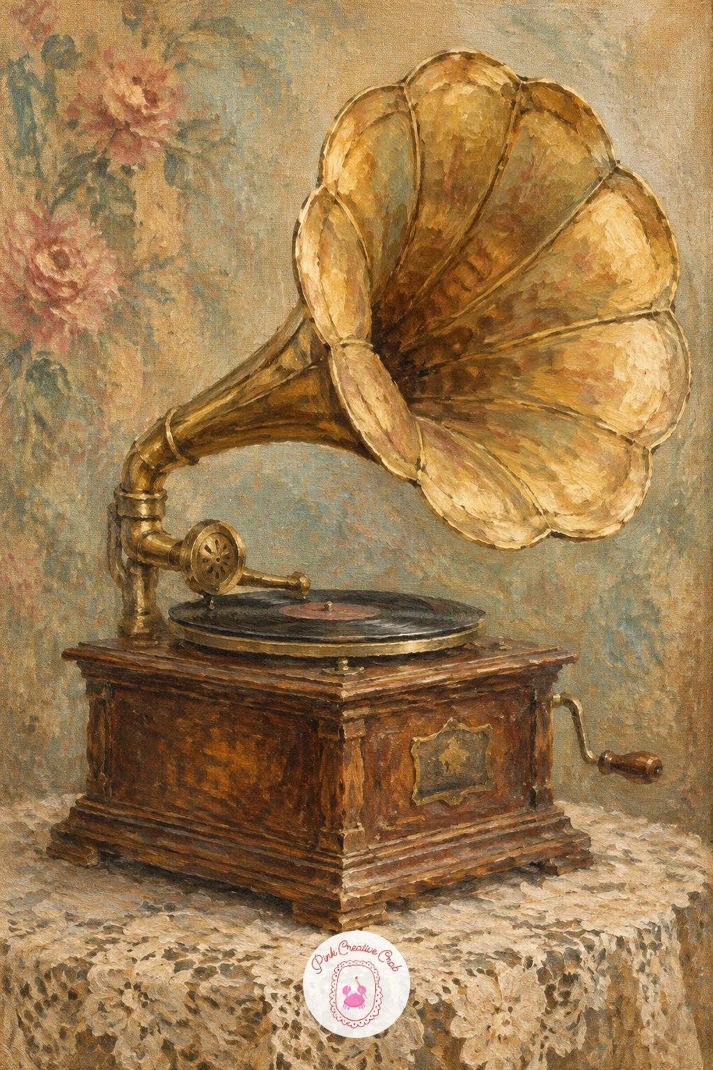
Start the whole set with a brass gramophone, since its curved horn gives you a gentle warm up for painting metal without any hard edges to fight. Block in the lace tablecloth first in aged ivory with a thin wash, then add the horn as a simple cone shape in mustard and burnt sienna before the lace detail goes on top.
Work the gramophone from dark to light: a sepia brown undercoat for the body, then dry highlights of warm ochre dragged along the curve of the horn to suggest tarnished brass. If the lace pattern starts to look too busy, step back and only suggest a few scalloped edges with the tip of a small brush rather than painting every hole.
No lace cloth on hand to reference? A plain cream napkin works just as well, since the folds matter more than the pattern. Keep your brush loose on the tablecloth so it reads as fabric, not as carved stone.
Finish with one soft highlight along the rim of the horn to catch the light and sell the metal.
Palette: Raw Sienna,Burnt Umber,Ivory,Payne’s Grey
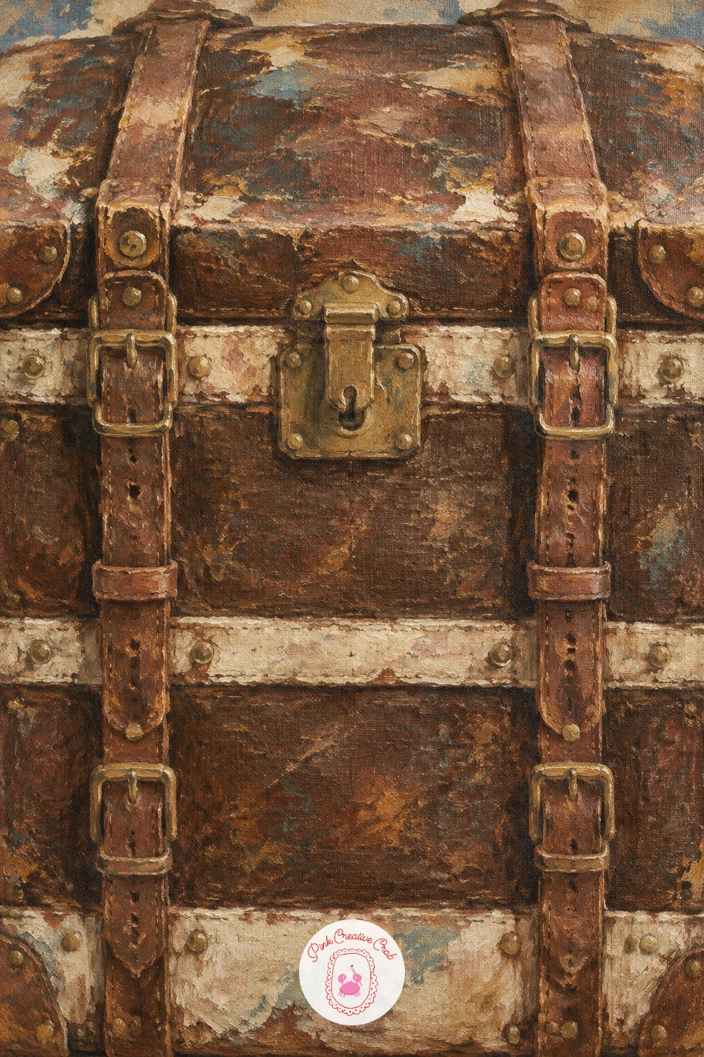
Move from brass to leather with a steamer trunk covered in old travel straps, a subject that rewards a confident, simple shape before any detail goes on. Sketch the trunk as a plain rectangle on the canvas first, checking that its height sits at roughly two thirds of its width so it does not look squashed or too tall.
Paint the leather body in a dark sepia brown, then let it dry slightly before dragging a dry brush loaded with lighter umber across the corners to suggest worn, scuffed edges. The straps and buckles come last, in a slightly warmer brown with small dashes of near black at the buckle holes.
This idea goes wrong when every strap gets the same width and spacing, which flattens the whole trunk. Vary the strap widths slightly and let one hang a little looser than the rest for a lived in feel. No real trunk to study? An old suitcase or even a leather belt photo gives you the same buckle shapes.
Keep a rag nearby to lift paint off the corners for instant wear.
You Will Need
- kneaded eraser or rag for lifting paint
Palette: Burnt Umber,Raw Umber,Ivory,Mars Black
Widen out into a small scene with a seaside café, its striped umbrellas doing most of the storytelling. Lay a pale sky and sea wash first, keeping the horizon line low so the umbrellas have room to dominate the upper half of the canvas.
Paint each umbrella as a simple cone shape in two alternating faded colors, dusty rose and faded teal work well together, then add the café tables and chairs as loose dark shapes underneath without much detail. Keep the eye level low, close to where someone sitting at a table would be looking, since this makes the umbrellas feel tall and the scene feel close and inviting.
If the stripes come out too neat and modern looking, soften them with a dry brush once they are tacky to blur the lines slightly, which reads as sun faded canvas. No striped reference handy? Picture a classic beach umbrella and alternate just two colors evenly around the cone.
Let the sky stay the lightest part of the painting to keep the whole scene airy.
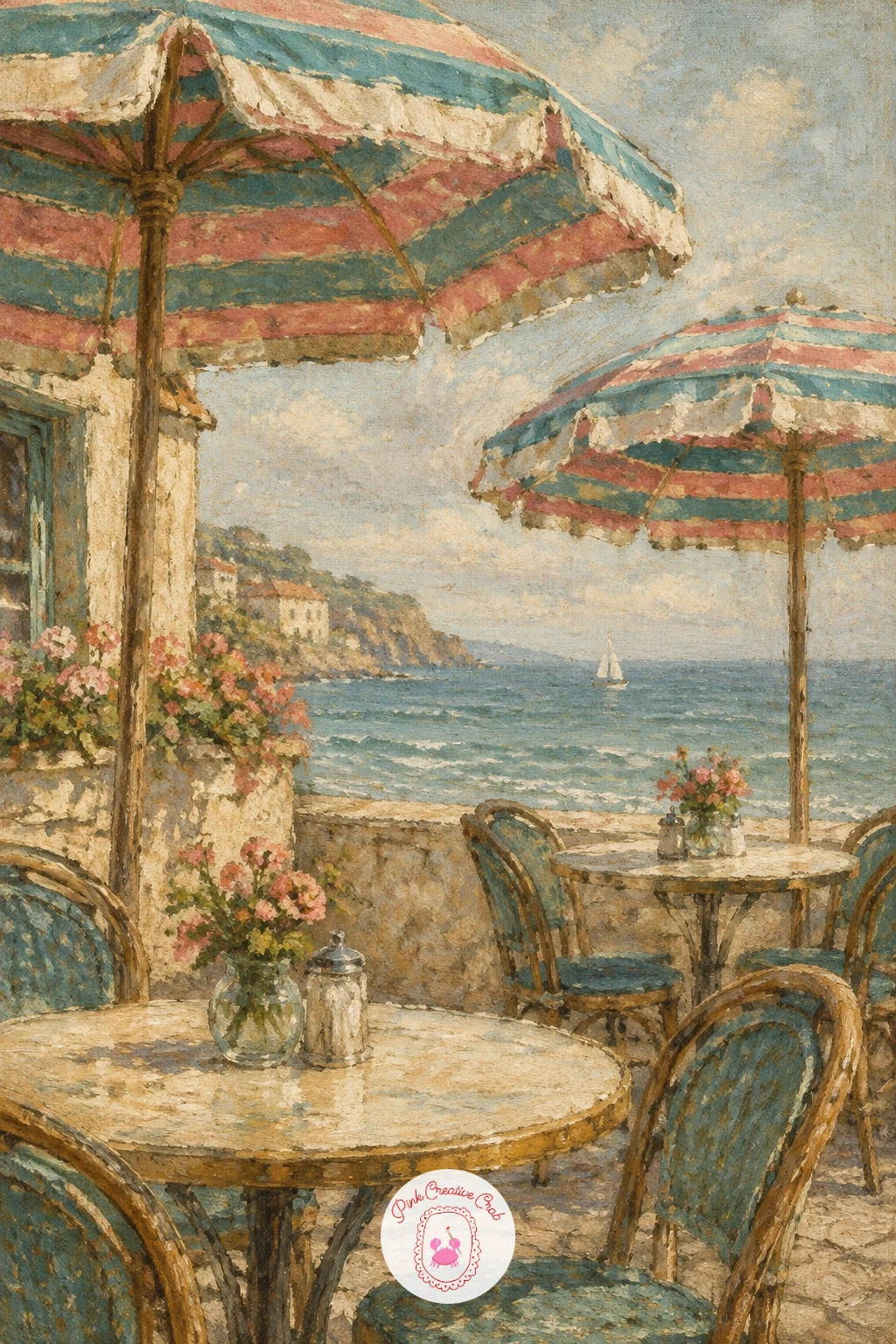
Palette: Faded Teal,Dusty Rose,Ivory,Payne’s Grey
Bring in a figure next with a woman in a cloche hat waiting at a train station, a good subject for practicing proportion without worrying about a detailed face. Measure her head height first and use it as your unit: the standing figure should run about seven to eight head heights tall, which keeps her from looking too short or stretched.
Block in her coat and hat as simple dark shapes against a lighter, hazy platform background, then suggest the station behind her with just a few soft vertical lines for pillars and a pale wash for distant light. Save the face for last and keep it simple, a few soft strokes for the eyes and mouth rather than tight detail.
This idea often goes wrong when the figure ends up too small against a busy background. Keep the background loose and let her fill most of the canvas height. No vintage photo to work from? Picture a simple A line coat and a rounded hat and build the shape from there, as covered in this oil painting woman guide.
Finish with one patch of warm light near her face to draw the eye there first.
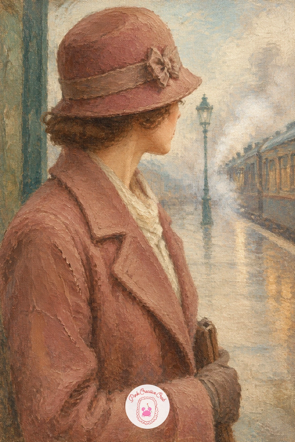
Palette: Payne’s Grey,Dusty Rose,Ivory,Burnt Umber
Settle into something smaller and quieter with an old typewriter beside a stack of letters, a tabletop still life that sits well on any size canvas. Block the typewriter in as a simple boxy shape first in sepia and warm black, keeping the keys suggested with small dabs rather than drawn one by one.
Work from the typewriter outward: once its basic form is dry enough to touch, add the paper stack beside it in a warmer ivory than the background, with a few loose diagonal strokes to suggest the edges of individual letters. A thin dark line under the stack grounds it on the table.
The keys are where this one usually falls apart, since painting each one individually makes the whole machine look stiff. Use a small flat brush and just tap in a loose grid of light dots over the dark keyboard shape instead. No typewriter to reference? A small radio or an old clock works as a stand in for the boxy machine shape.
Keep the letters slightly rumpled rather than perfectly stacked for a lived in feel.
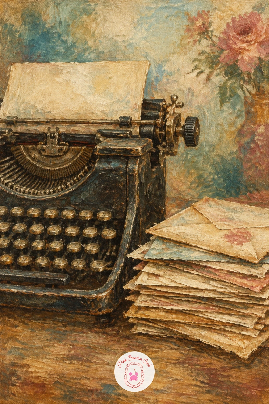
Palette: Mars Black,Raw Sienna,Ivory,Burnt Umber
Step back outdoors with a mint green vintage car parked by a country fence, a good chance to think about where the light is coming from before you touch the canvas. Decide on a single light source, late afternoon sun from one side works nicely, and keep every shadow on the car and fence falling the same direction.
Paint the car body first in a soft faded mint, leaving the chrome trim and headlights as simple pale shapes to add once the base color is dry. The fence behind it can be loose diagonal and horizontal strokes in grayed brown, nothing precise, since it only needs to read as a boundary line across the field.
Chrome trim is the trap here: too much white paint and it looks like a sticker rather than metal. Use just a thin broken line of pale gray with one tiny spot of pure white for the sun’s reflection. No specific car model in mind? A rounded 1950s silhouette with a gentle curve reads as vintage immediately, and more ideas live in this vintage car painting guide.
Let the grass in front stay a soft blur so the car stays the sharpest shape on the canvas.
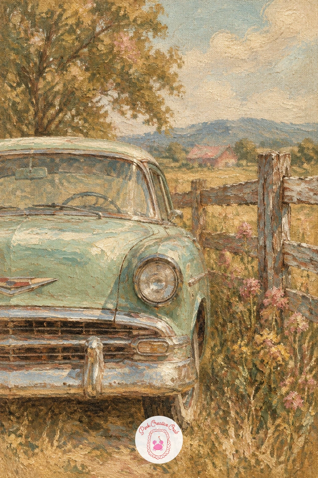
Palette: Faded Teal,Raw Umber,Ivory,Payne’s Grey
Bring movement into the series with a lady in a 1940s tea dress walking a poodle, since the two figures together need to balance each other in size and placement. Block in the woman first as a simple vertical shape, then place the poodle at roughly knee height beside her, small enough that it clearly belongs to her rather than competing for attention.
Paint her dress in dusty rose with a few soft folds suggested by darker strokes at the waist and hem, and keep the poodle as a simple rounded puff shape in warm ivory, with just a touch of dark brown for the eyes and a few short strokes for the curled fur texture.
The leash is the easiest place to lose the whole painting if it comes out too stiff and straight. Let it curve very slightly and keep the line thin and a little broken, almost disappearing in places, which feels more natural than a ruler straight line. No poodle reference at hand? A simple rounded body with pom pom shapes at the ankles and tail reads clearly enough.
Try the quick version in about ten minutes with just the two main shapes and the leash; given forty minutes, add a soft background of a tree lined street behind them.
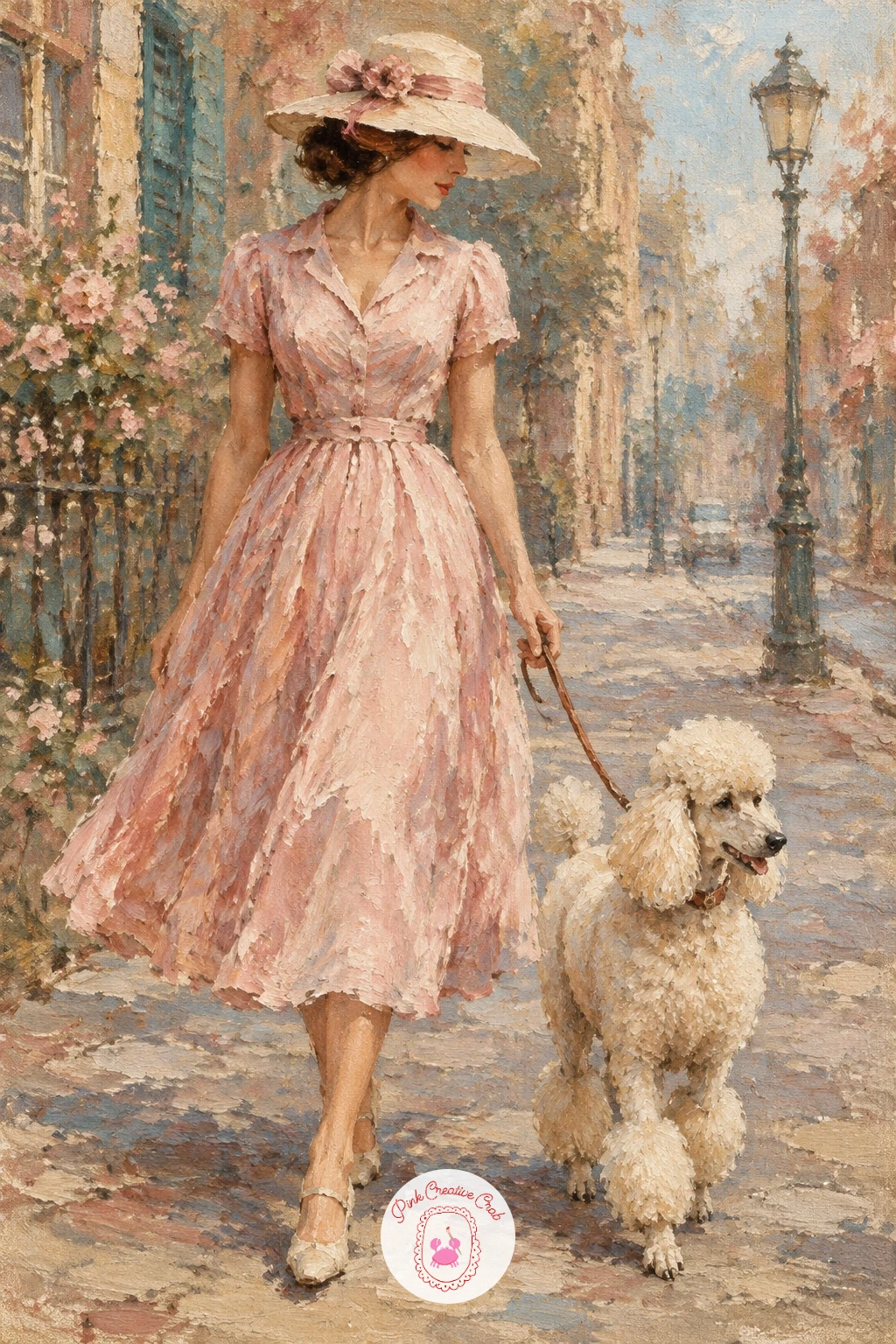
Palette: Dusty Rose,Ivory,Burnt Umber,Payne’s Grey
Return to a quiet tabletop subject with a rotary telephone resting on a crocheted doily, a nice contrast of a hard rounded object against soft lace. Block the telephone body in first as a simple rounded form in sepia or faded black, keeping the receiver and base as two connected shapes rather than many small parts.
Once the telephone shape is dry, add the dial as a simple circle with a few loose radiating lines rather than painting every number hole individually, and let the doily underneath stay mostly suggested with small dabbed highlights around the telephone’s base.
Overworking the doily pattern is the easy mistake here, since too much detail competes with the telephone for attention. Keep the lace as texture, not illustration, dabbing a few light dots and curves and leaving the rest to the viewer’s eye. No doily to copy? A folded cloth napkin with a scalloped edge gives a similar soft base.
One tip for today: paint the telephone cord as a single loose curved line last, since it ties the whole composition together.
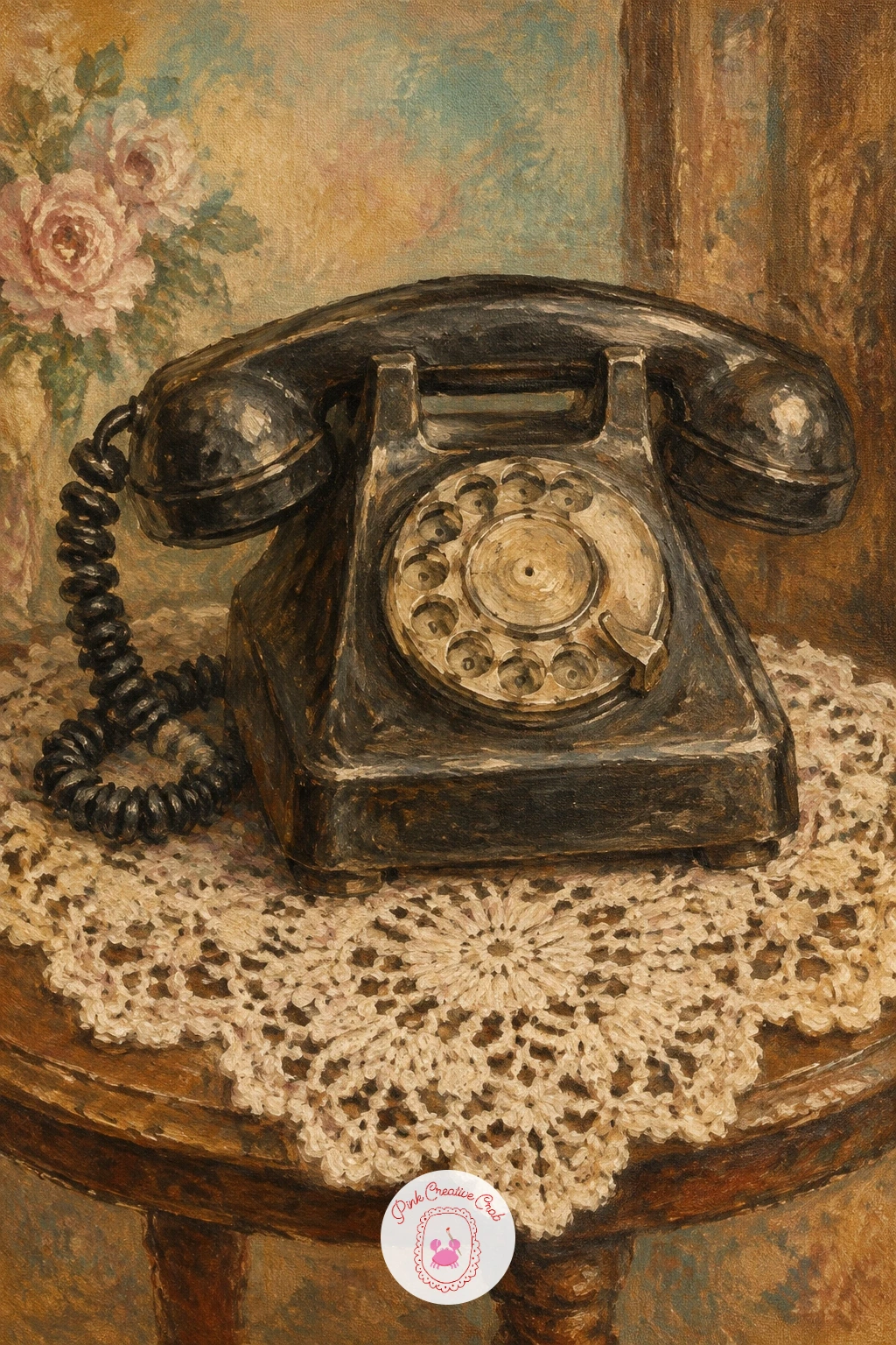
Palette: Mars Black,Ivory,Raw Sienna,Dusty Rose
Open up the scene again with an old barber shop, its leather chairs and striped pole giving you strong simple shapes to work with. Paint the striped pole first as a tall narrow cylinder, using a dry brush to drag the stripe colors slightly into each other so they look worn rather than freshly painted.
Build the leather chairs next in deep burnt umber, keeping their rounded backs simple and using a few lighter dry brush strokes along the curved edges to suggest the sheen of old leather. The shop interior behind can stay a soft hazy wash of mustard and sepia, with no need for sharp detail.
Too many objects crowded into the scene is the usual problem with an interior like this. Pick the pole and one chair as your main focus and let everything else, mirrors, shelves, stay as vague soft shapes in the background. No barber shop photo to reference? A tall striped post and a single armchair silhouette carries the whole idea.
Keep the pole’s stripes spiraling gently rather than running straight for a more believable curve.
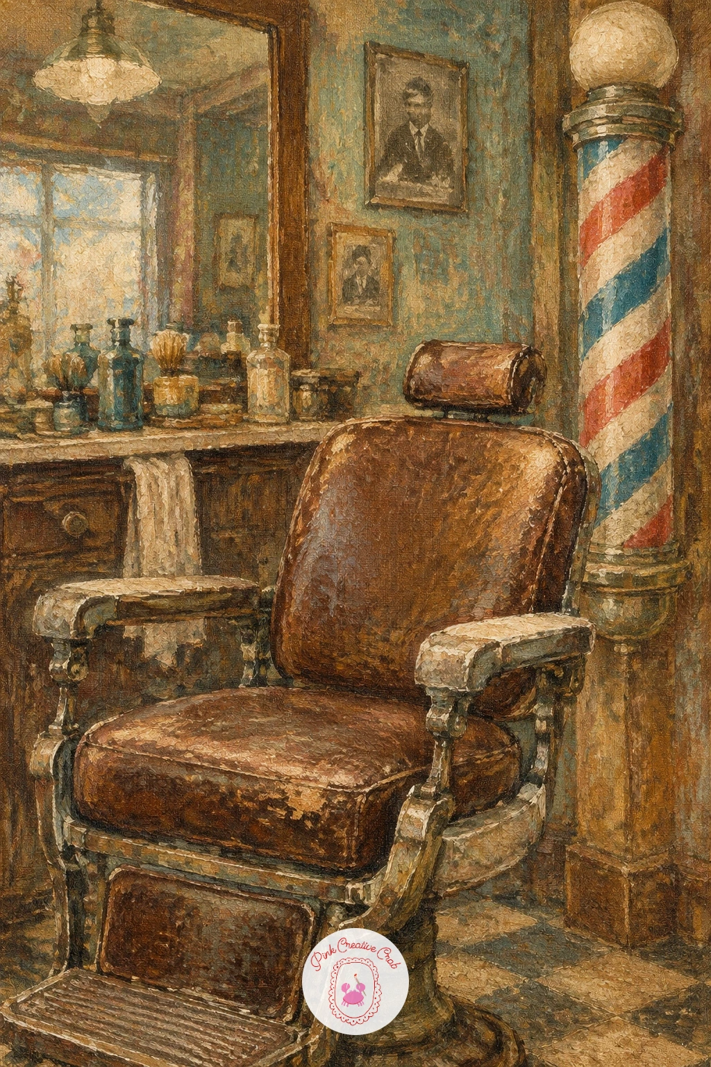
Palette: Burnt Umber,Raw Sienna,Payne’s Grey,Ivory
Give the texture tricks a real workout with a carousel horse, its peeling gilt paint asking for a dry brush more than any other idea on this list. Block in the horse’s body first in warm cream with a sepia undercoat in the shadowed areas, then let it dry fully before touching the gilt detail.
Once dry, load a dry, mostly empty brush with a small amount of mustard gold and drag it lightly over the raised areas of the saddle and mane, skipping and catching the canvas texture so the paint looks chipped and old rather than solid. A few scratches of bare canvas or pale ivory peeking through the gold sell the aged look instantly.
The mistake here is loading the brush too full, which paints a solid gold shape instead of a worn one. Wipe most of the paint off the brush onto a rag before each pass over the gilt areas. No gold paint on hand? A warm yellow ochre mixed with a touch of white gets close enough.
Finish with one crack of dark umber line through the gilt to deepen the aged feeling.
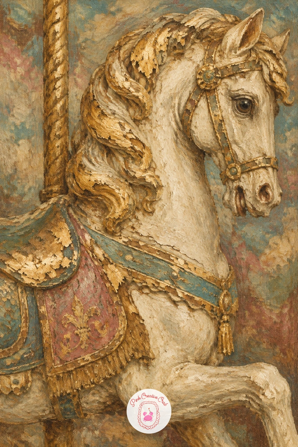
You Will Need
- dry brush for lifting and texture
Palette: Ivory,Raw Sienna,Burnt Umber,Mars Black
For more horse painting practice beyond this one scene, the ideas in this horse oil painting guide build proportion and pose confidence at a similar beginner level.
Keep the still life mood going with a vintage camera resting on a pile of old photographs, a subject built on simple overlapping rectangles. Paint the camera body first as a dark boxy shape with a protruding round lens, keeping the lens as a simple circle with one pale highlight rather than detailed glass reflections.
Once the camera is blocked in, add the photographs underneath as a loose fan of pale rectangles, slightly askew rather than perfectly stacked, with just a hint of darker edges to separate each one. A thin dark line under the whole pile grounds it on the surface below.
If the photographs end up looking like plain white squares, the painting loses its age entirely. Tint each one a slightly different warm sepia or faded gray rather than pure white, since real old photographs never match each other exactly. No real vintage camera to study? A simple box with a round lens front reads clearly enough even without a specific model in mind.
Add one scratch of white paint across a photograph corner to suggest a worn, handled edge.
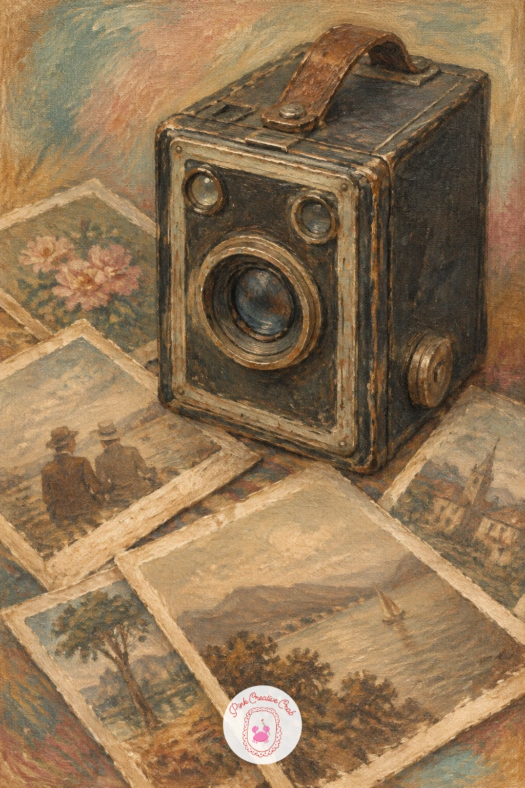
Palette: Mars Black,Raw Umber,Ivory,Dusty Rose
Bring back a sense of place with a soda fountain counter and its row of chrome stools, a good subject for practicing a simple one point perspective. Decide where the counter’s vanishing point sits, usually just above center on the canvas, and let the counter edge and stool tops angle gently toward that point to give the scene real depth.
Paint the counter surface first in a warm faded cream, then add the stools as simple rounded tops on thin chrome legs, using a light dry touch of pale gray to suggest the shine without overworking any single stool. Keep the background behind the counter soft and hazy, just a suggestion of shelves and bottles rather than clear detail.
Stools that all line up in a perfectly even row tend to look stiff and flat. Vary the spacing slightly and let one stool turn a touch more toward the viewer than the others. No diner reference handy? A simple curved counter and three round stool shapes carries the whole feeling.
Keep the chrome highlights small and sparing, since one bright dash per stool reads better than several.
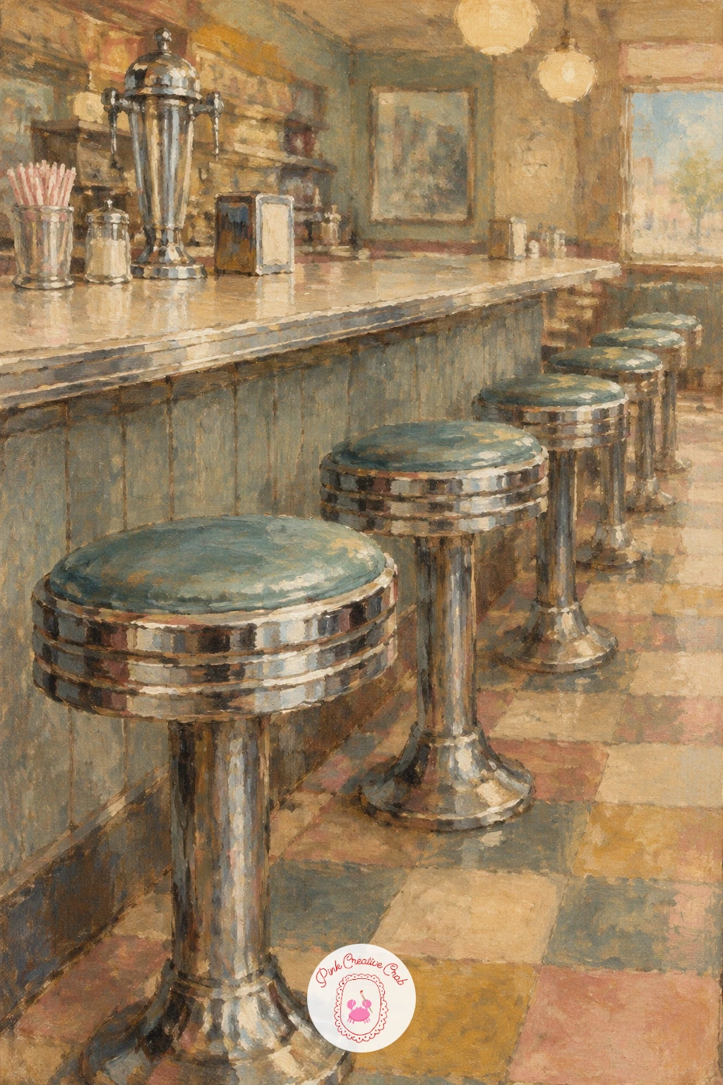
Palette: Ivory,Payne’s Grey,Raw Sienna,Dusty Rose
Head to the shoreline with a woman in a polka dot swimsuit stretched out on a striped beach towel, a relaxed reclining pose that works well with a low midday light. Block her figure in first as a simple reclining shape, keeping the proportions loose, then add the swimsuit pattern last with small dabbed dots rather than painting the body in exact detail first.
Paint the beach towel beneath her in alternating faded stripes, letting the stripes bend slightly where the fabric would naturally fold under her weight. The sand around her can stay a simple warm wash with a few darker strokes for shadow near her body to ground her on the towel.
Too many polka dots evenly spaced tends to flatten the swimsuit into a pattern rather than fabric. Vary the dot spacing slightly and let a few dots curve with the folds of the suit. No reference pose in mind? A simple reclining figure with one arm bent behind the head reads as relaxed immediately.
Keep the shadow under her body the coolest color on the canvas to anchor the warm sand around it.
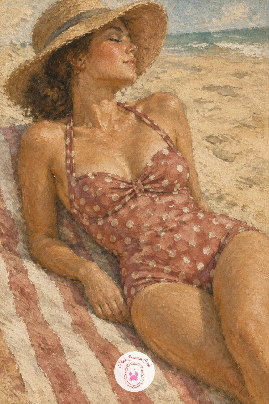
Palette: Ivory,Payne’s Grey,Dusty Rose,Raw Sienna
Bring color into the palette with an old sewing machine surrounded by spools of colored thread, since the thread gives you a natural spot to use slightly brighter tones against the faded background. Paint the sewing machine body first as a simple curved black shape, letting a few pale highlights suggest the painted gold scrollwork often found on old machines.
Once the machine is blocked in, add the thread spools as small cylinders in muted versions of red, blue and green, keeping each one simple with just a line or two to suggest the wound thread rather than careful shading. Group three or four spools loosely rather than lining them up in a row.
If the thread colors come out too bright, they will fight the rest of the faded palette. Mix a touch of raw umber or gray into each color before applying it so the thread looks aged along with everything else. No sewing machine to reference? A simple black curved base with one wheel on the side carries the shape.
Try the ten minute version with just the machine body and one spool, then add the full group of spools and the loose thread ends if you have more time.
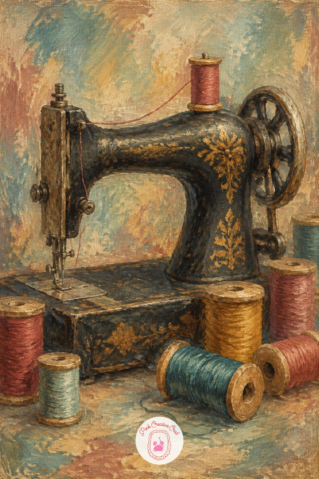
Palette: Mars Black,Raw Sienna,Faded Teal,Dusty Rose
Open the canvas up to a full landscape with a steam train crossing a stone viaduct, a subject where getting the scale of the train against the bridge right matters more than any fine detail. Measure the viaduct’s arches first and use one arch width as your unit, making the train roughly two arch widths long so it reads as appropriately small against the stone structure beneath it.
Paint the viaduct first in soft grayed stone tones, keeping the arches simple curved shapes rather than carefully measured stonework, then add the train on top as a dark simple silhouette with a trail of soft gray smoke drifting behind it. The valley below can stay a loose wash of muted greens and browns.
A train that looks too large or sits awkwardly on the bridge is the common trouble spot. Keep it small and let the viaduct dominate the canvas, since the scene is really about the structure more than the train itself. No viaduct photo to study? A simple series of three or four stone arches in a gentle curve reads clearly.
Let the smoke trail fade into the sky with a dry brush for a soft, drifting feel.
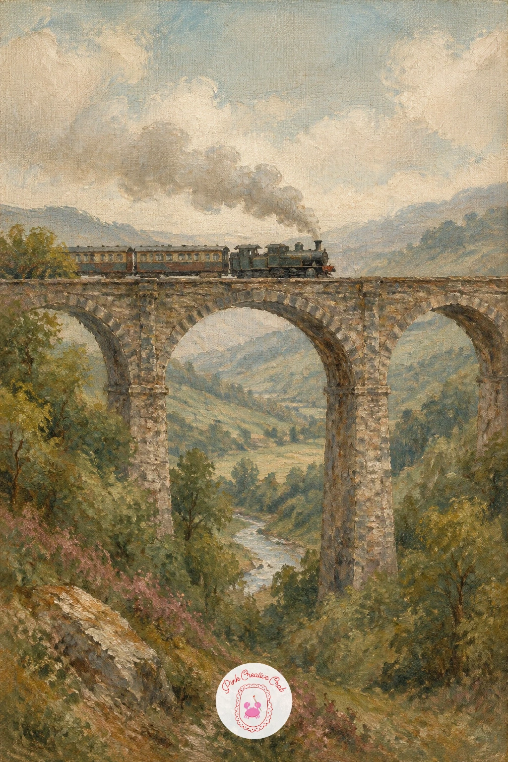
Palette: Payne’s Grey,Raw Umber,Ivory,Faded Teal
Bring two figures together with a 1920s couple dancing in a mirrored ballroom, a composition where the light source really shapes the whole mood. Decide the ballroom’s chandelier light sits above and slightly behind the couple, which lets you paint warm highlights along their shoulders and the tops of their heads while keeping the floor and lower bodies in softer shadow.
Block the two dancers in as one connected shape first, since dancing figures read better as a single silhouette with two heads than as two separate bodies painted apart. Add the mirrored wall behind them with soft vertical streaks of pale gold and ivory, suggesting reflected light rather than painting any clear reflection.
Separating the dancers too far apart on the canvas is the easiest way to lose the sense of movement. Keep them close, overlapping slightly at the arms, and let the woman’s dress trail slightly to one side to suggest motion. No ballroom dance pose in mind? A simple close embrace with both figures leaning slightly the same direction reads as dancing immediately, and more figure composition ideas live in this oil painting woman guide.
Keep the mirrored background softer and paler than the dancers so they stay the clear focus.
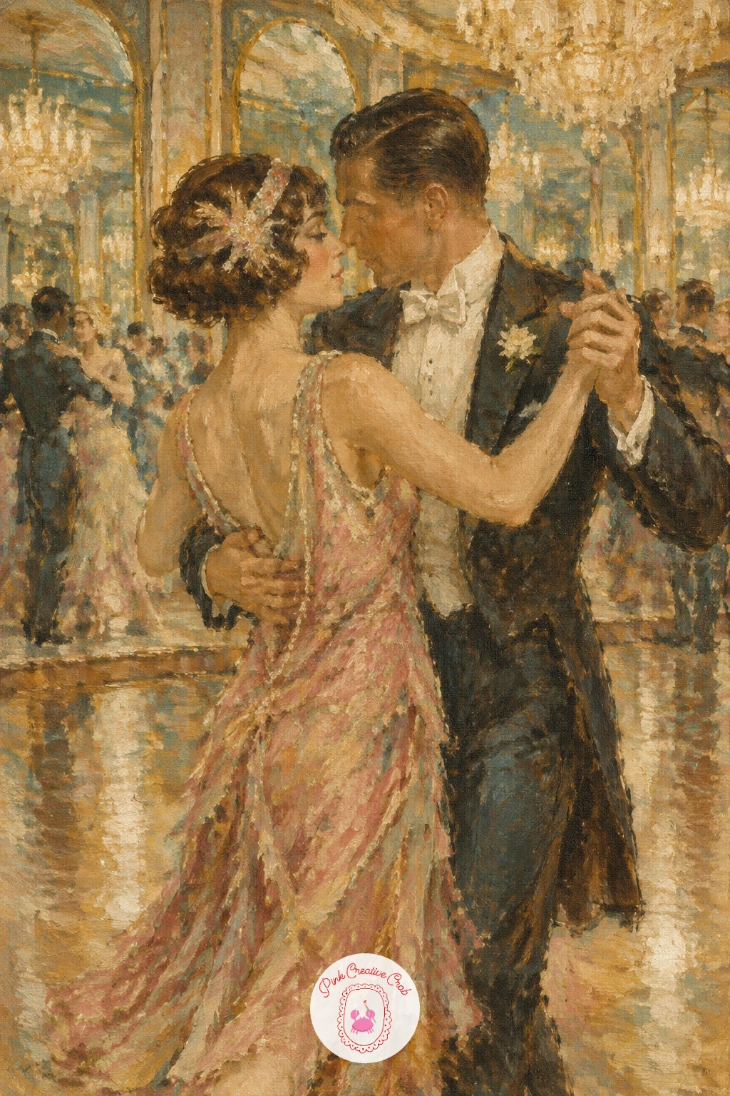
Palette: Raw Sienna,Payne’s Grey,Ivory,Dusty Rose
Return to a quiet single object with an antique birdcage holding a small yellow canary, the one bright spot of color the whole set allows itself. Paint the cage first as a simple domed shape built from loose vertical lines rather than carefully ruled bars, letting the lines go slightly uneven and broken where they overlap each other.
Add the canary inside last, once the cage is dry enough to touch, as a simple rounded body with a small pointed beak and tail, using a muted mustard yellow rather than a bright pure yellow to keep it in step with the faded palette. A single dark dot for the eye finishes the bird.
Painting every single bar of the cage perfectly straight and even makes the whole thing feel stiff and mechanical. Let a few bars overlap the bird slightly and others fade out toward the top of the dome where the light would catch it. No birdcage reference handy? A simple dome shape on a thin stand with a handful of vertical lines captures it well enough.
Keep the background behind the cage soft and plain so the bars read clearly against it.
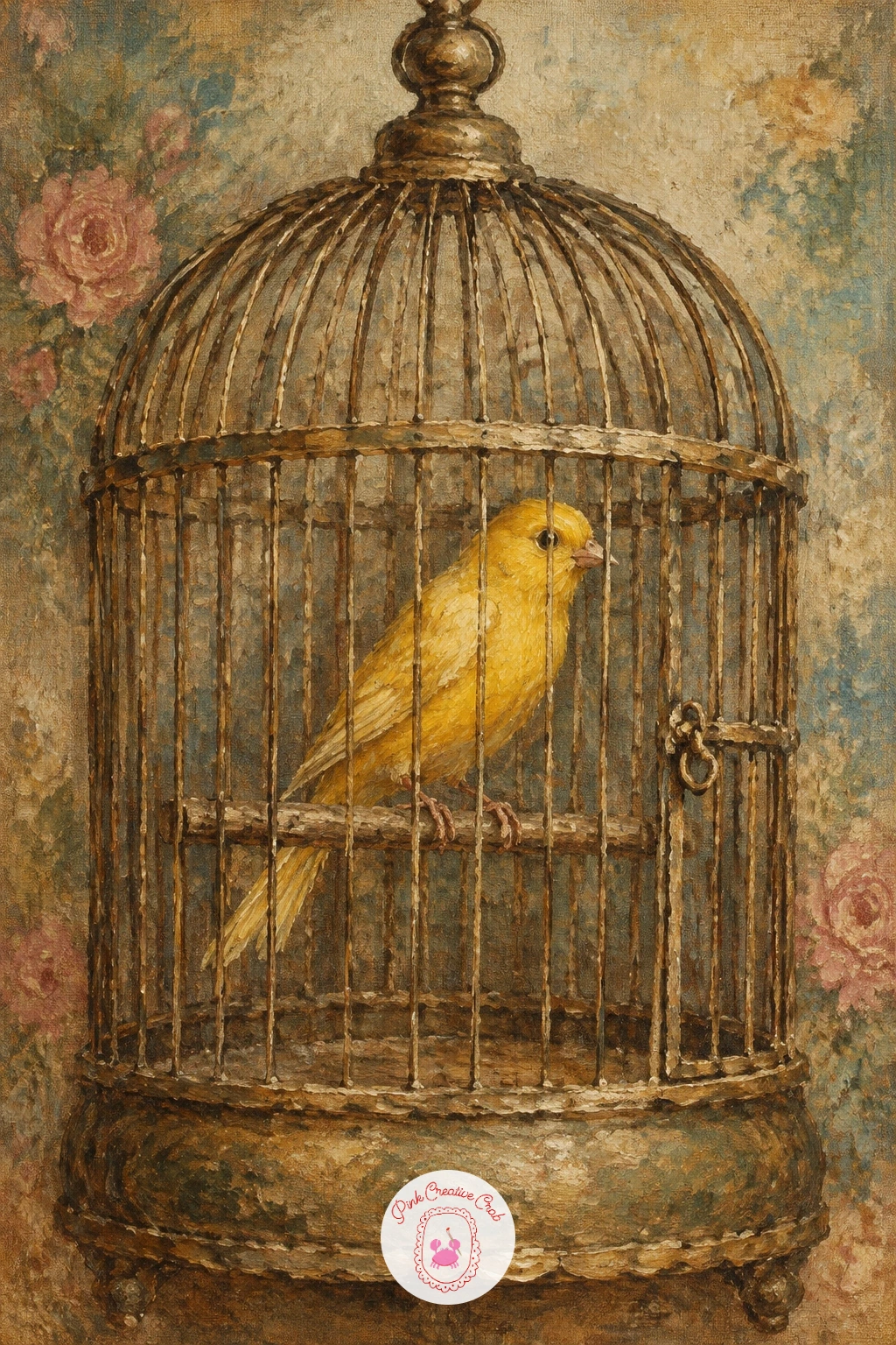
Palette: Raw Sienna,Mars Black,Ivory,Burnt Umber
Set the scene outdoors again with a vintage pram resting on a cobblestone street, a good chance to practice suggesting texture without painting every single stone. Block the pram in first as a simple rounded body on large thin wheels, keeping the hood as one smooth curved shape rather than many small folds.
For the cobblestones beneath it, load a stiff, fairly dry brush and dab small irregular patches of grayed browns and dusty roses close together rather than drawing individual stone outlines, letting the colors blend slightly at the edges where they touch. This reads as uneven stone from a normal viewing distance.
Painting a perfectly even grid of identical stones is the common trap here, since real cobblestones are never that regular. Vary the size and color of each dabbed patch and let some edges disappear into shadow near the pram’s wheels. No cobblestone photo to study? Picture a loosely packed row of rounded pebbles and dab in that rhythm instead.
Keep the pram itself smoother and more defined than the ground so it stays the clear subject of the painting.
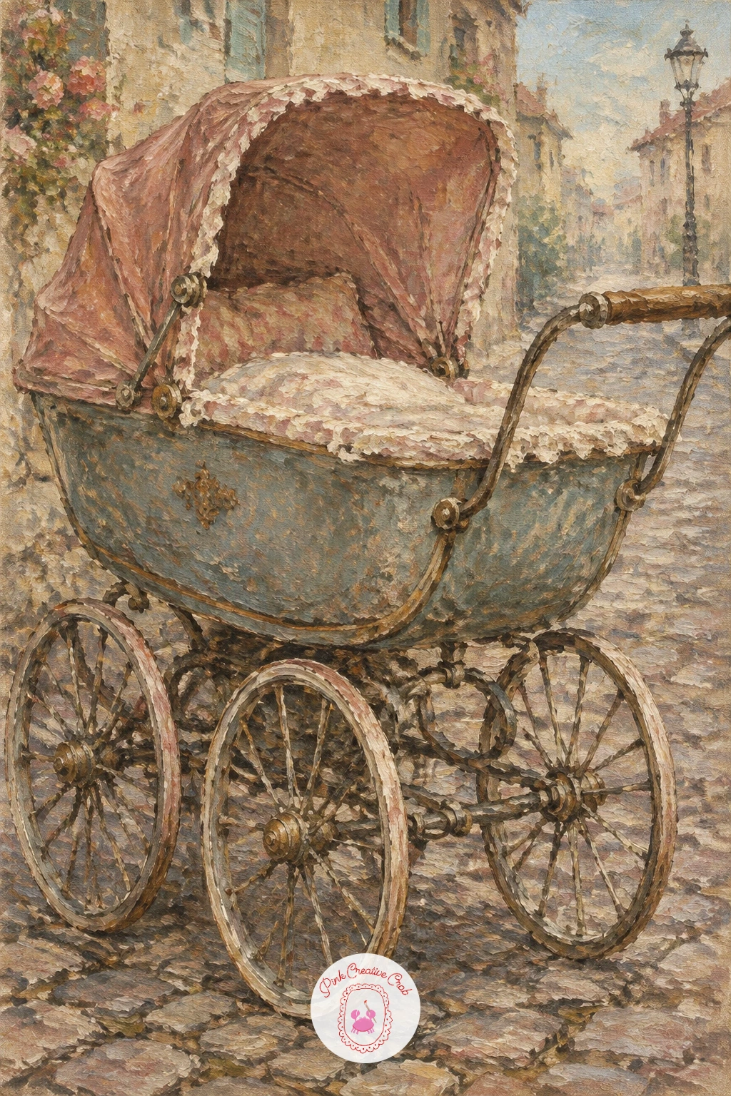
Palette: Payne’s Grey,Dusty Rose,Raw Umber,Ivory
Settle back into a small tabletop subject with a wooden radio resting on a kitchen shelf, a simple boxy shape that is forgiving for anyone still building confidence with still life. Paint the radio body first as a rounded rectangle in warm sepia brown, leaving the dial and speaker grille as slightly lighter shapes to define once the base coat has dried a little.
Add the dial as a small pale circle with one or two thin dark lines for the tuning needle, and suggest the speaker grille with a loose scatter of small dark dots rather than a precise grid pattern. The shelf behind can stay a simple flat plane in a slightly cooler tone to separate it from the warm radio.
Carving every line of wood grain into the radio’s casing is an easy way to overwork this piece. A few soft diagonal strokes in a slightly darker brown suggest wood grain well enough without turning it into a technical drawing. No wooden radio to reference? Any rounded box shape with a small dial reads as vintage radio immediately.
Keep one warm highlight along the top edge where kitchen light would naturally catch it.
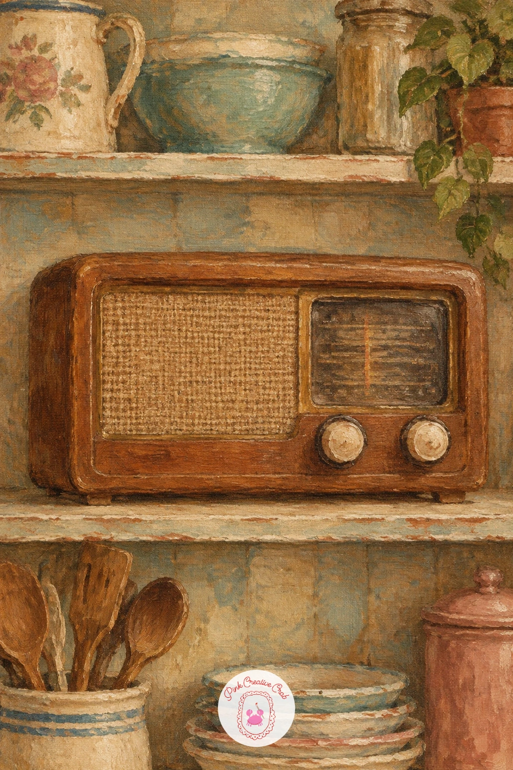
Palette: Burnt Umber,Raw Sienna,Ivory,Payne’s Grey
Add a little motion with a girl riding a vintage bicycle, its wicker basket giving the scene a nice focal point up front. Block the bicycle frame in first as two simple connected circles for the wheels with thin lines for the frame, then place the girl’s figure sitting slightly forward over the handlebars, leaning into the motion rather than sitting perfectly upright.
Paint the wicker basket as a simple woven texture using short crisscrossing dry brush strokes in warm tan, then tuck in a loose suggestion of flowers or fruit spilling slightly over the edge without painting each one in detail. The road beneath her can stay a soft blurred wash to suggest forward movement.
Wheels that come out as perfect, static circles tend to flatten any sense of motion. Add a few soft radiating lines through the wheel to suggest it spinning, and let the background blur slightly more than the bicycle itself. No bicycle reference on hand? A simple diamond shaped frame between two circles carries the whole idea clearly enough.
Lean the whole bicycle very slightly off vertical, since a perfectly upright bike often looks stiff and parked rather than moving.
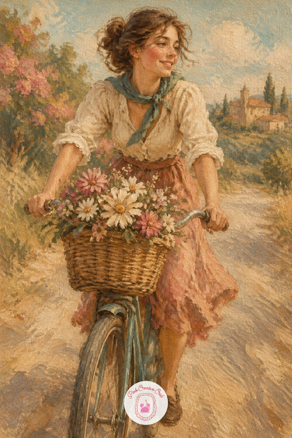
Palette: Raw Sienna,Dusty Rose,Ivory,Faded Teal
Slow the pace down with a gentleman in a bowler hat seated on a park bench, a quiet composition built on simple seated proportions. Measure his seated height using his head as the unit again, roughly four to five head heights from the top of the hat to the seat of the bench, which keeps a seated figure from looking stretched or cramped.
Block in his coat and hat as one connected dark shape first, then add the bench beneath him in simple horizontal wood plank strokes, letting the slats show slightly through where his coat does not cover them. A loose suggestion of trees or a path behind keeps the background from competing with him.
A bowler hat painted too round and bowl shaped can end up looking more like a helmet than a hat. Keep the brim narrow and flat, curving only slightly at the edges, and add one small dark shadow line where the brim meets his forehead. No bench reference to study? A simple row of three horizontal planks on two support legs reads clearly as a park bench.
Keep his hands resting simply in his lap, suggested with just a few soft strokes rather than detailed fingers.
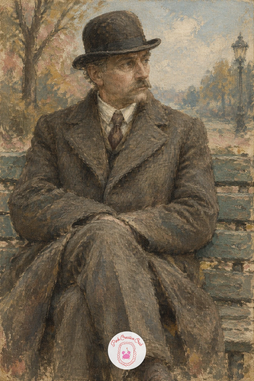
Palette: Payne’s Grey,Burnt Umber,Ivory,Faded Teal
Return to the quiet detail work of a dressing table scattered with cut glass perfume bottles, a subject that leans on a kneaded eraser style lifting trick more than careful painting. Block in the bottles first as simple overlapping rounded and faceted shapes in pale, slightly tinted glass colors, keeping them loose rather than painting each facet separately.
Once the base shapes have had a little time to set, use the tip of a dry brush or even the wooden end of a brush to scrape thin lines back through the wet paint, pulling up tiny streaks of the lighter color underneath to suggest the glint of cut glass catching the light. Do this sparingly, just a few lines per bottle.
Too many scraped highlights turns the glass into a scribble rather than a sparkle. Pick two or three key spots per bottle, usually where the light source would hit a facet edge, and leave the rest of the glass simpler. No real perfume bottles to study? A few simple rounded and square glass shapes grouped together reads as a dressing table collection immediately.
Keep the mirror or table surface behind them soft and reflective with just a pale smear of color, nothing detailed.
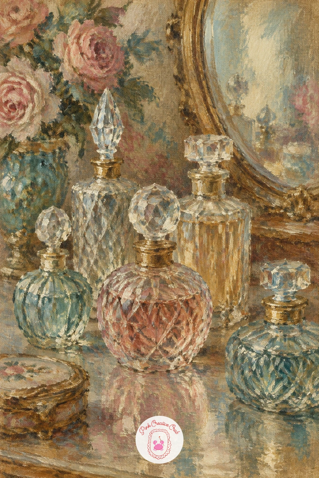
You Will Need
- kneaded eraser or palette knife for lifting highlights
Palette: Faded Teal,Dusty Rose,Ivory,Payne’s Grey
Bring in a stronger light source with a glowing jukebox standing in a dim roadside diner, where getting the contrast right matters more than any fine detail on the machine itself. Decide the jukebox is the only true light source in the whole scene, and keep everything around it, the diner floor, the booths, several shades darker than the glowing panel at its center.
Paint the surrounding diner first in deep muted browns and grays, almost silhouette dark, then add the jukebox as a simple rounded shape with a softly glowing center panel in warm faded gold and dusty rose, blending the glow gently outward into the dark so it looks like real light rather than a flat colored sticker.
A jukebox that glows evenly all over loses the sense of a single light source. Keep the brightest point at its center and let the edges fade quickly into the dark room around it. No diner interior to reference? A simple dark room with one glowing rounded shape at its center carries the whole mood.
Try the ten minute version with just the glow and a dark background, then add a hint of a booth or counter if you have more time to spend.
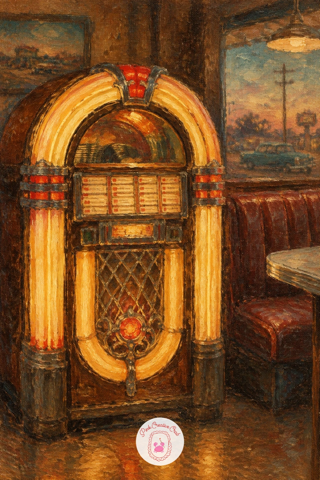
Palette: Mars Black,Raw Sienna,Dusty Rose,Payne’s Grey
Open the canvas wide again with an ocean liner leaving a harbor, paper streamers trailing down from its deck toward the crowd below. Block the ship in first as a simple long shape with a dark hull and a pale upper deck, keeping the smokestacks as two or three simple vertical rectangles rather than detailed structures.
Once the ship is in place, add the streamers as thin curving lines in faded pastel colors falling from the deck, letting a few of them trail loosely in the direction of the wind rather than hanging perfectly straight down. A soft wash of harbor water and distant dock below grounds the whole scene.
Streamers painted as straight, stiff lines flatten the whole sense of departure and movement. Curve each one slightly differently and let a few disappear behind the hull to suggest depth. No harbor scene reference handy? A simple long ship shape with a few curved lines trailing from its side reads as departure immediately, and similar large scene composition ideas appear in this ocean oil painting guide.
Keep the sky soft and pale behind the ship so its dark hull reads clearly against it.
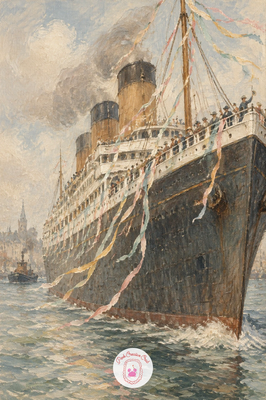
Palette: Payne’s Grey,Ivory,Dusty Rose,Faded Teal
Bring the pace back down with a little vintage caravan parked beside a quiet lake, a compact landscape subject that fits nicely on a small canvas. Block the caravan in first as a simple rounded box shape, almost egg like in its curves, then add the lake behind it as a soft horizontal wash reflecting the sky’s pale color.
Paint the caravan’s curved roofline carefully, since its rounded shape is really what reads as vintage rather than modern, then add one small round window and a thin stripe of color along its side for character. The lake surface can stay nearly flat, with just a few soft horizontal strokes to suggest gentle reflection.
A caravan painted with sharp, boxy corners loses its vintage charm immediately. Keep every edge softly rounded, especially the roofline and the corners near the door, and let the paint blend slightly rather than staying crisp. No vintage caravan to reference? A simple rounded loaf shape on two small wheels captures the idea clearly.
Add one soft reflection of the caravan’s color in the lake just below it to tie the whole scene together.
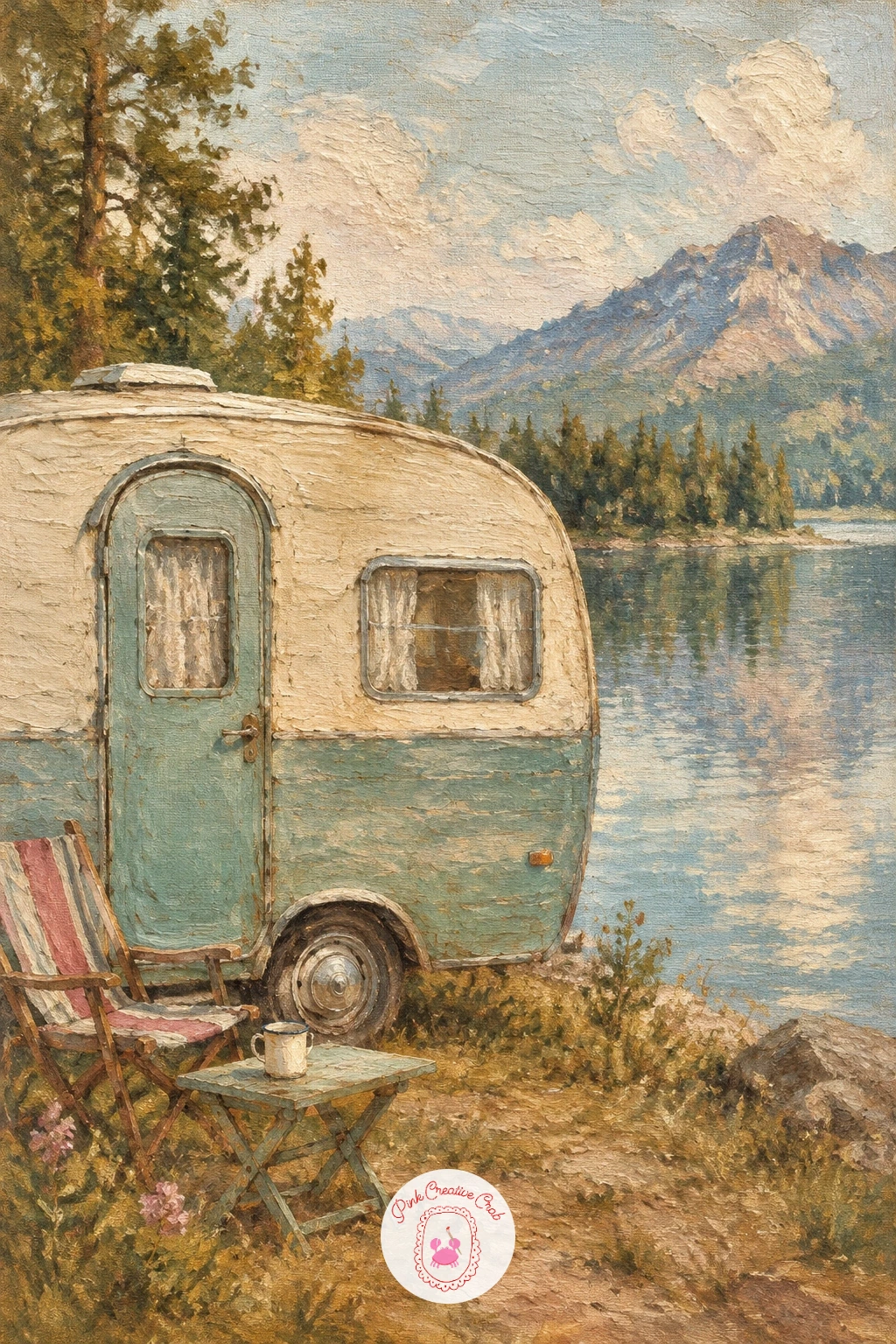
Palette: Faded Teal,Ivory,Dusty Rose,Raw Umber
Pick the pace back up with a woman in a headscarf and sunglasses riding in a convertible, a composition that leans on simple shapes moving together at speed. Block the car body in first as a long low shape in a faded color of your choosing, then place her figure sitting upright behind the wheel, her head and shoulders the clear focal point against the open car.
Paint her headscarf as a simple triangular shape wrapped close to her head, with the sunglasses as two dark rounded shapes that need very little detail beyond their basic outline. Let a few loose strands of fabric from the scarf trail slightly behind her to suggest the wind and motion of the open car.
Sunglasses painted too large or too detailed can overwhelm the whole face. Keep them simple, two connected dark ovals, and trust that the shape alone reads clearly enough at this scale. No convertible reference on hand? A simple low bodied car shape with the roof removed carries the idea immediately.
Blur the road and background slightly more than the car itself to suggest real speed.
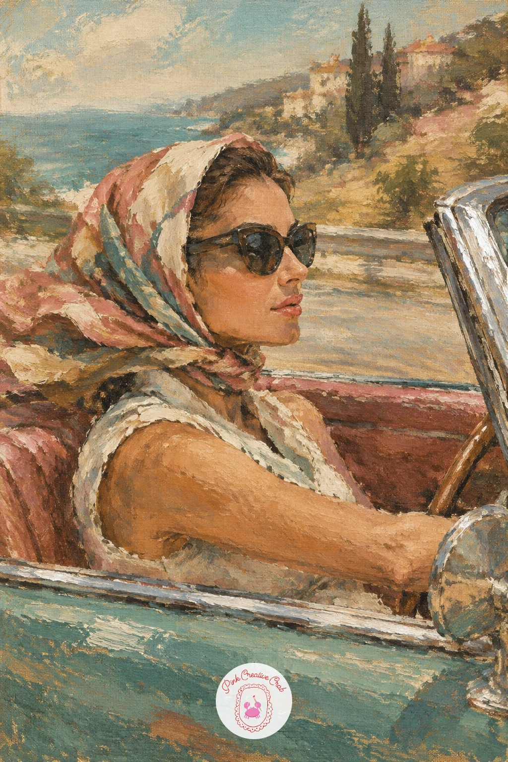
Palette: Faded Teal,Dusty Rose,Mars Black,Ivory
Bring the whole set back down to one small quiet object with a pocket watch resting on crumpled velvet cloth, a subject built almost entirely on soft folds and a single glint of metal. Paint the velvet first, laying in the main folds as loose diagonal strokes in deep dusty rose or plum, keeping the darkest shadows in the valleys of the fabric and the lightest touches along the raised ridges.
Once the velvet base is down, add the pocket watch as a simple rounded metal shape, keeping its face mostly plain with just a hint of two hands and a thin rim. A single small highlight of near white along the top curve of the watch case suggests the metal catching light.
Velvet painted too smooth loses its soft, plush character entirely. Keep the brushstrokes loose and varied in direction across the fabric, since real velvet never has a uniform texture, and let a few folds overlap the watch slightly for a more natural resting pose. No velvet cloth to reference? Any softly draped fabric with a few deep folds gives the same effect.
Keep the watch chain as one simple curved line trailing off the edge of the cloth to finish the composition.
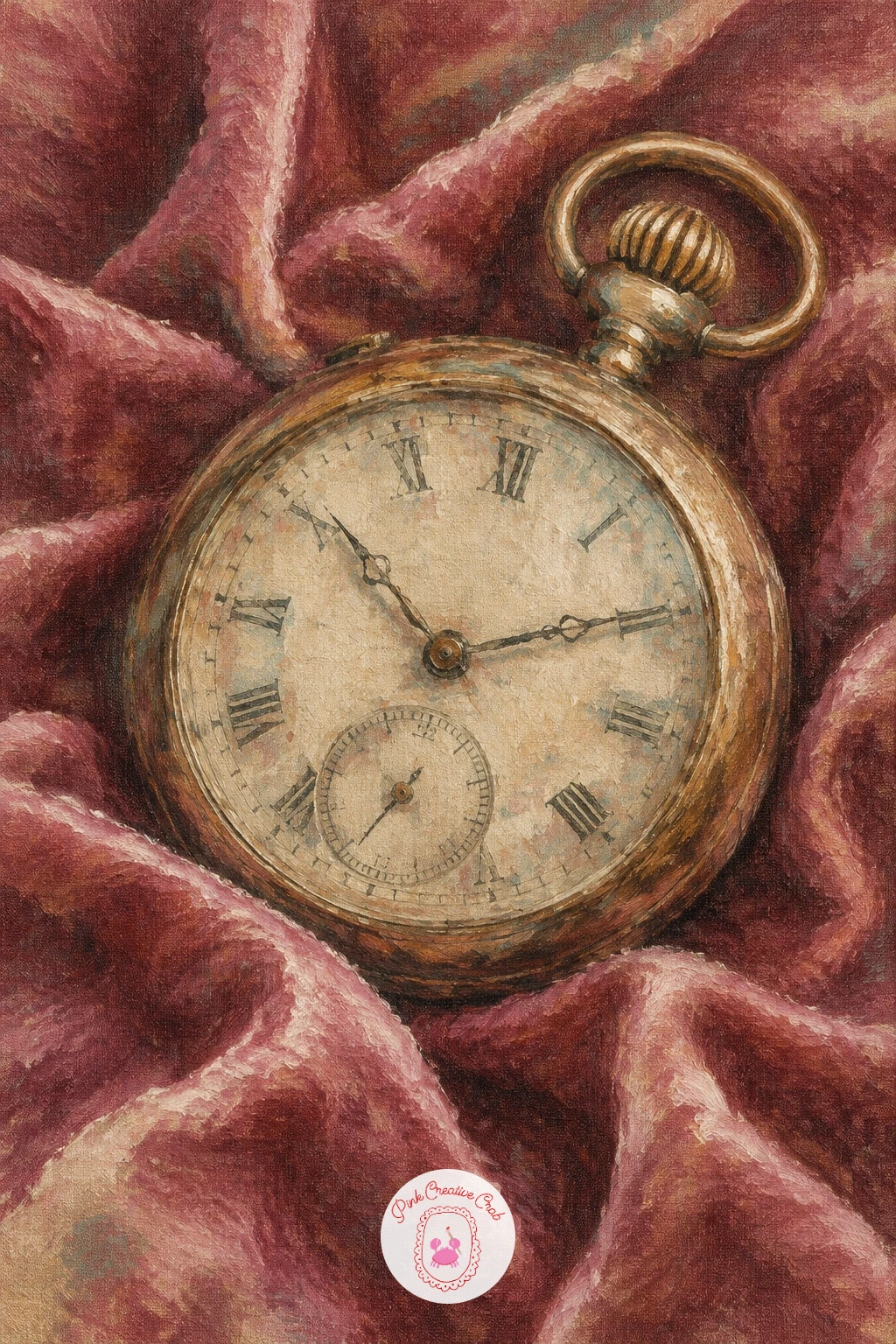
Palette: Dusty Rose,Mars Black,Ivory,Burnt Umber
Build toward a larger interior with a grand hotel lobby, its potted palms and brass elevator asking for a careful balance between warm and cool tones. Block the lobby space in first with a simple one point perspective, letting the floor tiles and the elevator doors angle gently toward a central vanishing point to give the room real depth.
Paint the brass elevator doors as a simple rectangular shape in warm mustard gold, keeping the detail minimal, just a few vertical lines to suggest paneling, then add the potted palms nearby as loose clusters of long curved leaf strokes in muted sage green rather than individual sharp fronds.
An interior this large can quickly feel empty or flat if every surface gets equal attention. Keep the elevator doors and one palm as the clear focal points, letting the floor and distant walls stay soft and loosely suggested. No grand lobby to reference? A simple tall rectangular door shape flanked by one leafy plant carries the whole feeling of grandeur.
Keep the floor tiles suggested rather than drawn, with just a few soft diagonal lines fading toward the vanishing point.
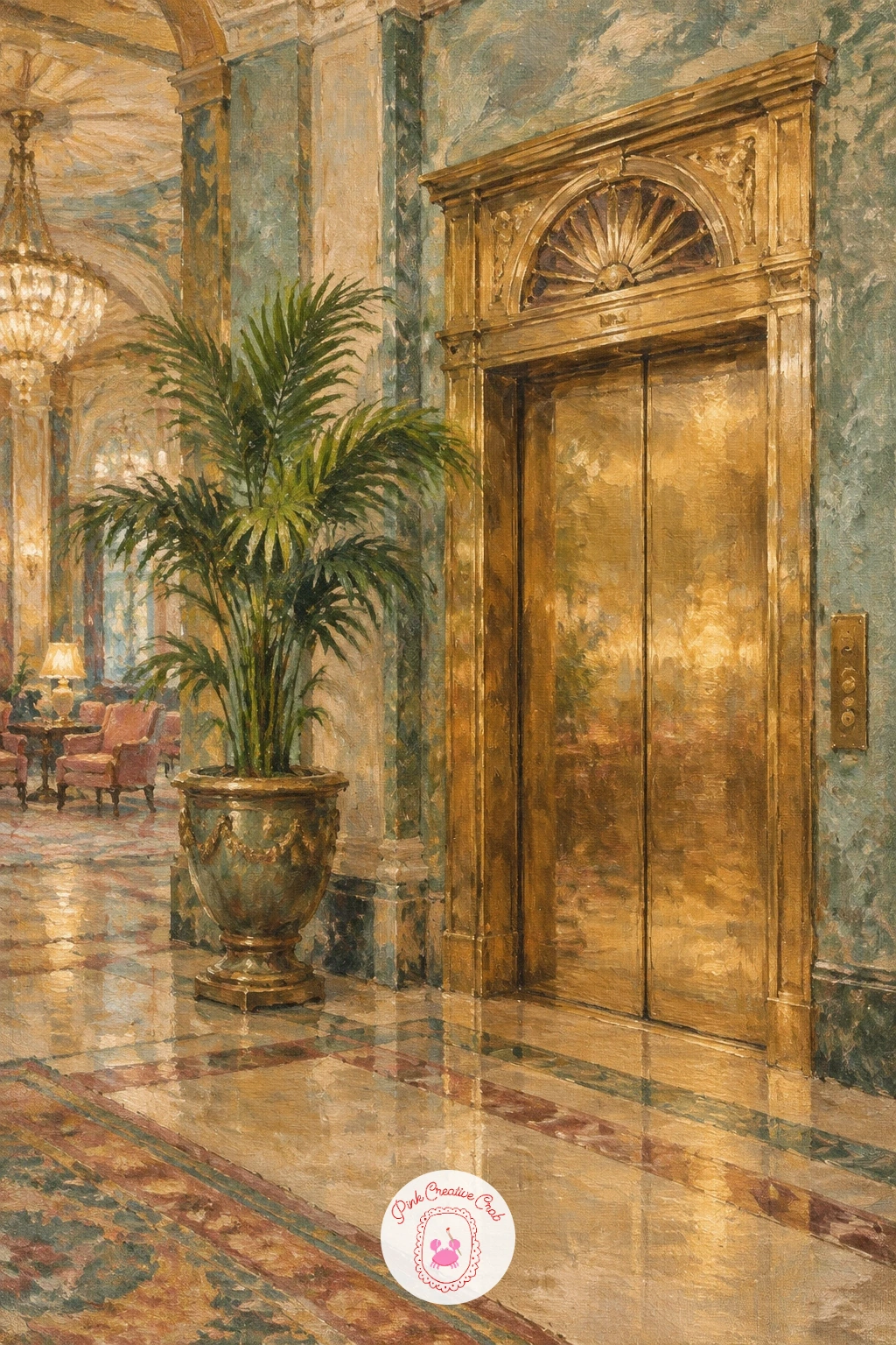
Palette: Raw Sienna,Faded Teal,Ivory,Burnt Umber
Close the whole set gently with a little girl in a smocked dress holding a porcelain doll, a quiet, tender subject to finish on. Block her figure in first as a simple standing shape, proportioning her at roughly five to six head heights tall since a child’s proportions sit differently from an adult’s, with a larger head relative to the body.
Paint her smocked dress in soft dusty rose or faded ivory, suggesting the smocking detail at the chest with just a few small gathered stitches rather than painting every stitch, then add the doll she holds as a simple smaller version of a figure, its porcelain face a touch paler and smoother than her own.
Making the doll too detailed next to the simpler child figure throws the whole balance off. Keep the doll’s face even softer and plainer than the girl’s, since it should read clearly as an object she holds rather than a second character competing for attention. No specific child pose in mind? A simple standing figure with both arms wrapped around the doll at chest height reads warmly and clearly, with more figure practice available in this oil painting woman guide.
Keep her expression soft and calm, just a few gentle strokes for the eyes and mouth, to close the whole series on a quiet note.
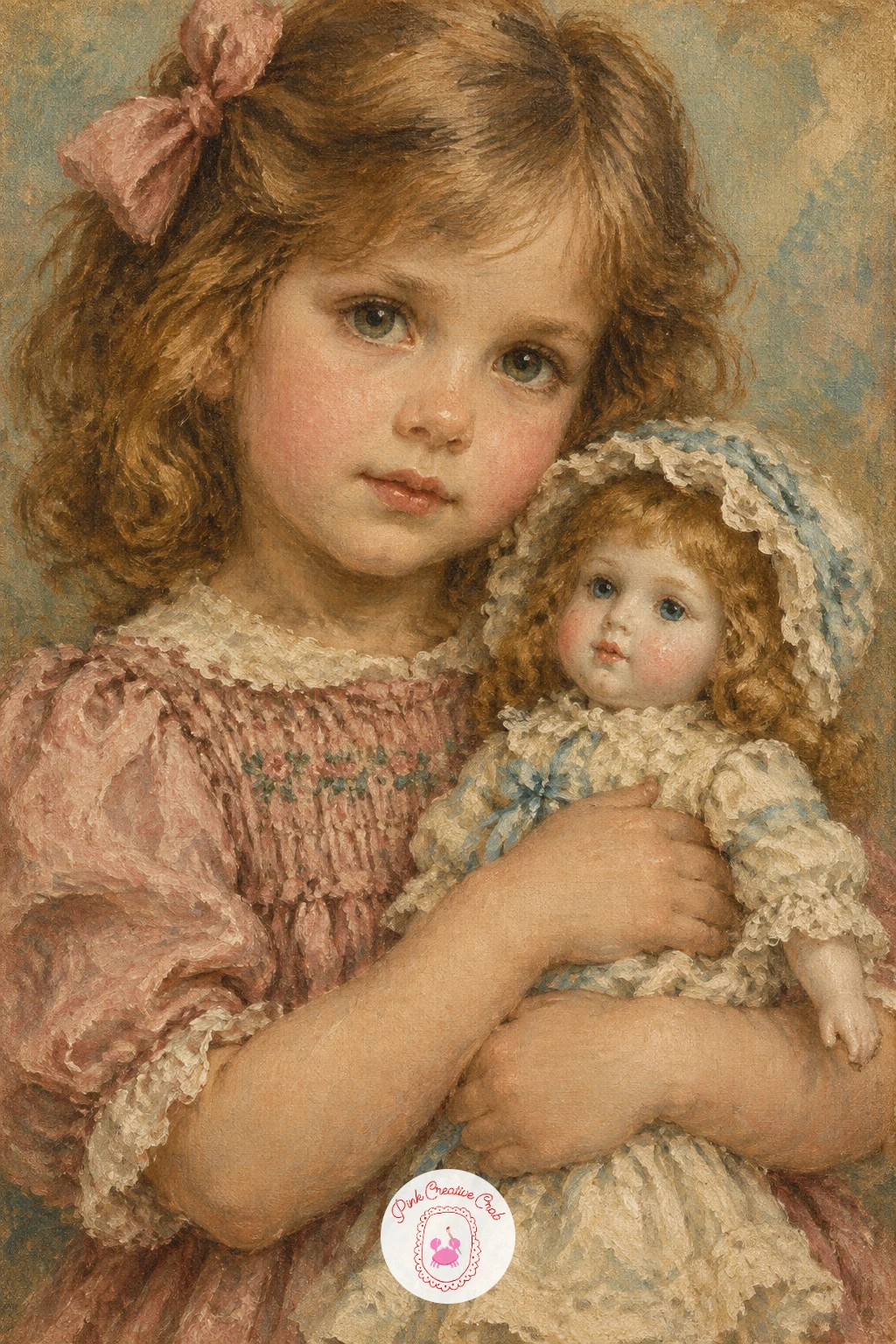
Palette: Dusty Rose,Ivory,Raw Sienna,Payne’s Grey
What to Do Next
Pick whichever subject is already calling to you, set up a small canvas, and block in the biggest shape first before any detail. The gramophone and the pocket watch are the gentlest places to start if this feels new, and the rest of the list is waiting whenever you want another quiet afternoon with the brushes.
Frequently Asked Questions
What colors give an oil painting that vintage, faded look?
Muted earth tones like raw sienna, burnt umber and dusty rose, mixed with a touch of gray or ivory into every color, create that soft, sun faded flea market look rather than bright, saturated modern colors.
Do I need a big canvas for a vintage oil painting?
No, a small canvas or canvas board works well for these scenes and finishes faster, since the subject fills most of the frame and the background stays loose and simple rather than highly detailed.
How do I make oil paint look aged and worn on purpose?
Use a dry brush with very little paint dragged lightly over raised edges and corners, which breaks up the color and mimics worn, chipped surfaces like old leather, gilt paint or weathered wood.
What if I do not have the exact earth tone paints listed?
Mix your own by adding a small amount of raw umber or gray into any bright color, which dulls and ages it, or simply substitute a similar warm brown, rose or muted green already in your palette.
How long does a vintage oil painting like this take to finish?
Most of these small scenes finish in one sitting, roughly ten to forty minutes depending on detail, since the loose brushwork and simple shapes are designed to be quick rather than tightly rendered.
Have any thoughts?
Share your reaction or leave a quick response — we’d love to hear what you think!
-
 0
-
0
-
0
-
0
-
0
-
0


