

A watercolor pond is one of the most soothing things you can put on paper: still water, soft reflections, and that quiet hush that comes with a garden corner nobody is rushing through. These 36 ideas stay away from the usual animal-pond clichés and keep the focus on place, light and the small human moments that happen near water, a rowboat tied to a jetty, a girl painting at her easel, lanterns drifting after dark.
Work through them in any order you like, from a simple wash of lily pads to a fuller scene with a bridge or a boathouse. Each one is sized to finish in a single sitting, so pick whichever pond is calling to you today and let the water do most of the talking.
Using these images: free for personal projects such as printing, coloring, cards, journals and gifts. Handmade items that include them may be sold up to 30 pieces per design. More than that is commercial use and is not permitted, and neither is selling or sharing the images themselves or passing them off as your own. Please ask before any other use.
Start the whole list with a wooden jetty with a rowboat, a subject forgiving enough to warm up your wrist and your washes at the same time. Pencil in the horizon low, then the jetty running diagonally into the pond with the rowboat tied at its end, planks suggested with a few parallel lines rather than drawn one by one.
Paint the sky and water first as one soft wet-into-wet wash, letting a pale blue-grey bleed top to bottom so the water already looks wet before you add a single reflection. Once that layer is dry, drop in the jetty posts and boat with a flat brush, keeping the brown warm with a touch of burnt sienna so it does not read as grey.
Measure the jetty’s reflection as the same length as the jetty itself, just softened and slightly rippled with a dry brush dragged horizontally. If the water looks flat, that one trick fixes it instantly.
If you do not have a rigger brush for the thin tie-rope, the tip of a cocktail stick dipped in paint works just as well.
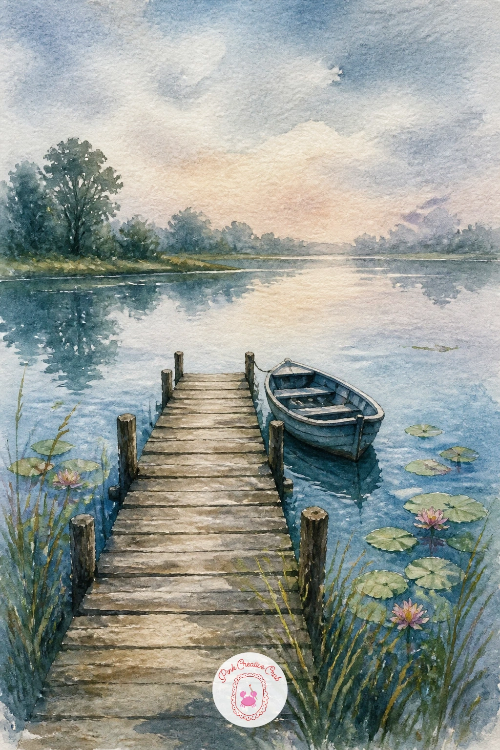
Palette: Cerulean Blue,Burnt Sienna,Payne’s Grey,Sap Green
Moving from a plain jetty to something more architectural, a Japanese bridge over a lily pond gives you a strong red-orange arc against all that green and blue. Sketch the bridge’s curve lightly first, a single confident arch rather than a straight ramp, since the curve is what makes it unmistakably Japanese.
Paint the pond and sky wash first, then mask or simply paint around the bridge shape so its vermilion stays clean and bright against the softer water below. Add lily pads as flat ovals of green once the water wash is dry, scattered rather than evenly spaced.
Here is where perspective matters: keep your eye level low, near the water’s surface, so the bridge arcs gently above you rather than looking flat like a map. That low viewpoint is what gives the scene its calm, inviting depth.
No cadmium red on hand? Mix alizarin crimson with a touch of orange for a close vermilion substitute.
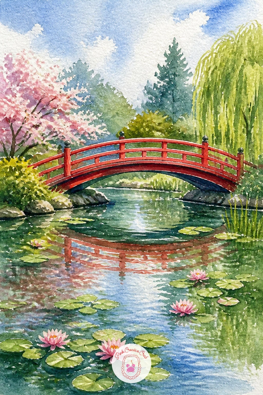
Palette: Vermilion,Sap Green,Cerulean Blue,Titanium White
From a bridge to something softer, a willow over a pond with a bench brings in trailing foliage and a place to sit and look at the water. Paint the willow’s canopy first as a loose, drooping mass using a dry brush dragged downward so the branches feel like they are actually falling rather than just hanging there.
Let that green dry before adding the trunk and the bench tucked beneath it, kept small and simple since the tree is the real subject. The pond beneath gets a quick wash with a few trailing green reflections pulled straight down from the willow’s edge.
The place this goes wrong is overworking the branches into stiff lines. Save it by flicking a nearly dry brush outward from the canopy instead of drawing each strand, which reads as far more natural.
If your paper buckles under the wet canopy wash, a hairdryer on low between layers keeps everything flat.
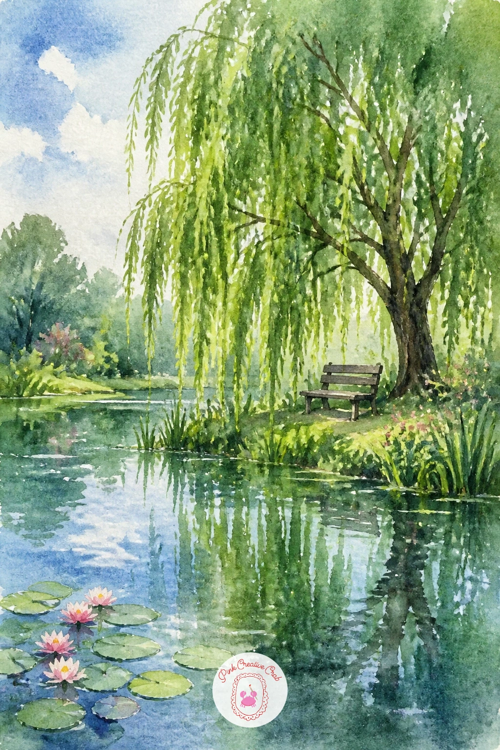
Palette: Sap Green,Hooker’s Green,Burnt Umber,Cerulean Blue
Bring a person into the scene now with a girl dipping her feet from a jetty, a quiet, personal moment that instantly warms up a pond painting. Keep her figure simple: a seated silhouette with her legs bent toward the water, sundress suggested with two or three loose brushstrokes rather than folds and seams.
Paint the water and jetty first, then drop the figure in once that layer is dry so her edges stay crisp against the softer background. Her feet just below the surface get a slightly distorted, paler wash to suggest the light bending through water.
If this is your first time painting a figure, work her proportions against the jetty plank widths: her seated height should roughly equal three or four planks, which keeps her from looking too large or doll-like.
No model or reference handy? A quick phone photo of your own bent knee works as a stand-in for the pose.
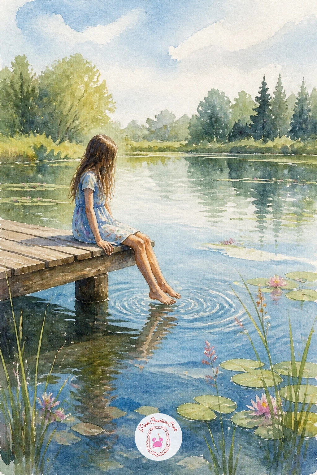
Palette: Cerulean Blue,Naples Yellow,Burnt Sienna,Payne’s Grey
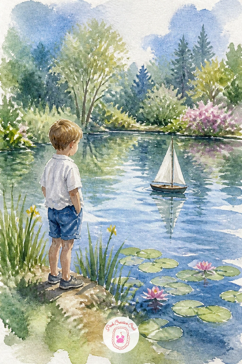
Keep the human warmth going with a child sailing a toy boat, a small scene that leans on gesture more than detail. Block in the pond as one flat wash first, then add the child as a simple standing shape at the water’s edge, knees slightly bent as if leaning forward to watch the boat.
The toy boat itself needs only a white triangle sail left as untouched paper and a thin mast drawn in with a fine brush once everything else is dry. A tiny ripple fan spreading from its hull sells the motion instantly.
Painting this in ten minutes means keeping the child as a flat silhouette and the boat as two shapes. Given forty minutes, add a reflection of the child in the water and a second ripple ring further out to suggest the boat has been sailing a while.
Save the white sail with masking fluid before you wash in the pond if you are worried about keeping it clean.
You Will Need
- masking fluid
Palette: Cerulean Blue,Titanium White,Payne’s Grey,Burnt Sienna
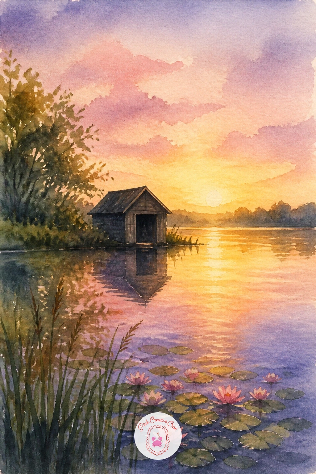
Shift the mood with a boathouse at dawn, where the real subject is the light rather than the building itself. Decide where the sun sits before you paint a single stroke: low on the horizon, just behind or beside the boathouse, so its silhouette reads dark against a pale glowing sky.
Paint the sky first with warm pinks and yellows bleeding into pale blue, then let that dry completely before dropping in the boathouse as a near-black silhouette with a flat brush. The water beneath mirrors the sky’s warm colors with a few horizontal strokes pulled through them to suggest gentle movement.
Because the light source sits so low, keep every shadow long and horizontal rather than pooling under the building. That single choice makes the dawn feel believable.
If pink and yellow turn muddy together, keep a clean brush of water ready to lift and soften the boundary before it dries.
Palette: Rose Madder,Naples Yellow,Payne’s Grey,Cerulean Blue
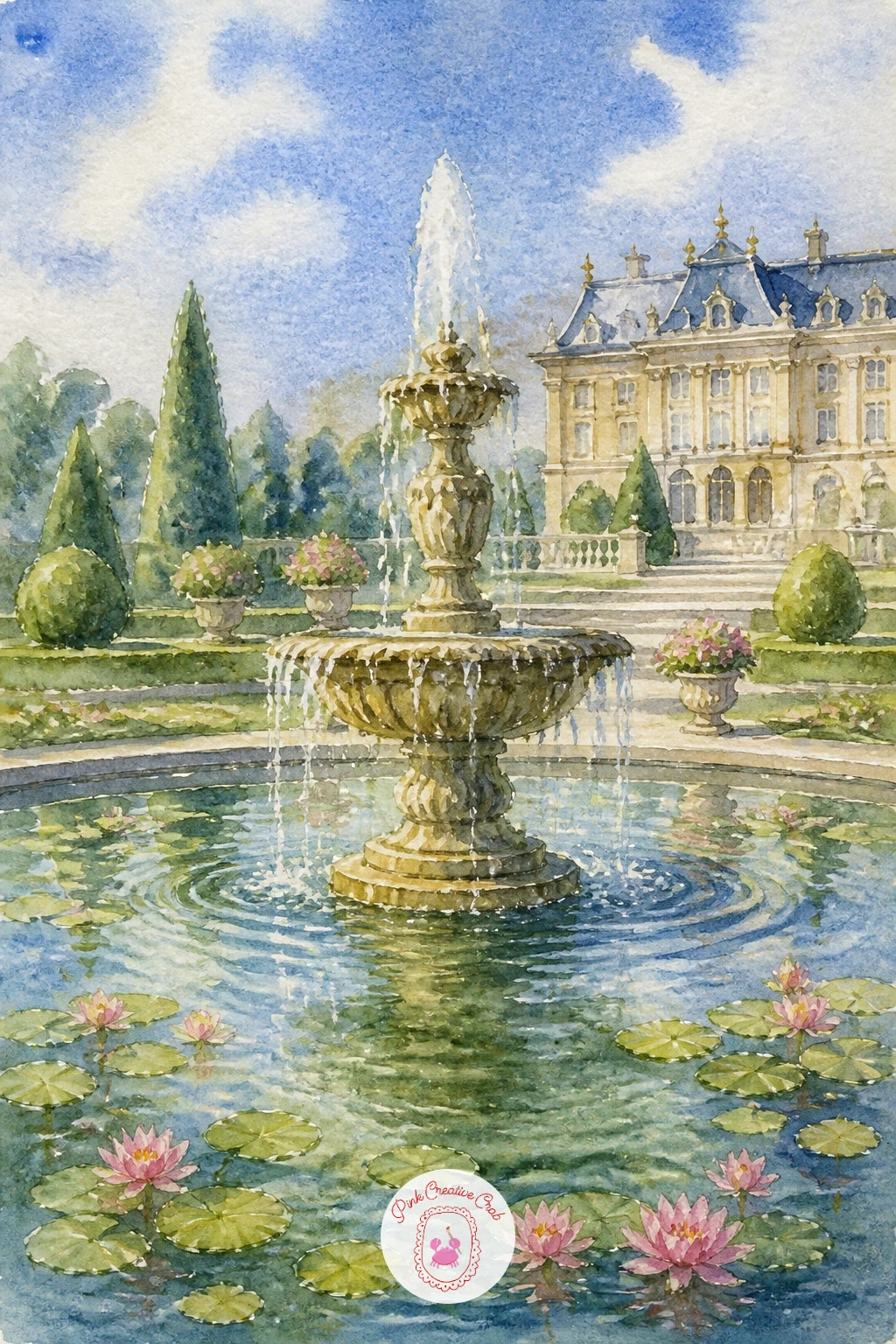
Add some grandeur next with a pond with a fountain in a palace garden, a chance to practice vertical water against a formal, symmetrical setting. Sketch the fountain’s basin as a simple ellipse first, since a convincing ellipse is what sells the whole structure as round rather than lopsided.
Paint the surrounding garden and pond in soft greens and blues, then add the fountain in warm stone tones once that base layer is dry. The spray itself is left as untouched white paper, flicked upward with a nearly dry brush or a loaded toothbrush for fine droplets.
Compare the fountain’s width to the pond’s width as roughly one to four, which keeps it feeling grand without swallowing the whole scene. That ratio is the proportion trick worth remembering for any formal garden pond.
A toothbrush loaded with white gouache flicked from a few inches away gives a convincing spray if you do not want to rely on paper alone.
You Will Need
- white gel pen or white gouache
- toothbrush for splatter
Palette: Raw Sienna,Sap Green,Cerulean Blue,Titanium White
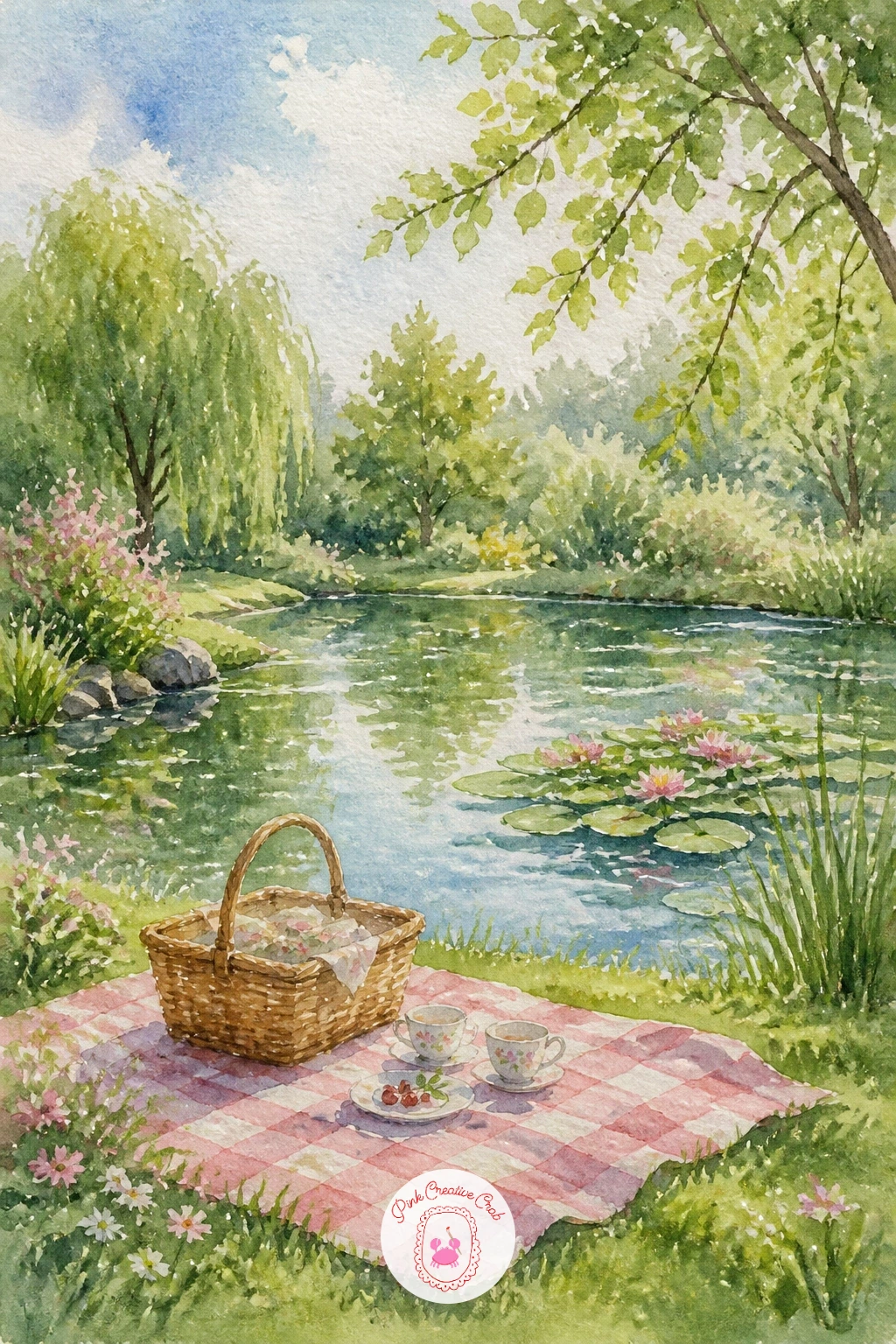
Bring the scene back down to ground level with a picnic beside a pond, a subject that rewards a loose, relaxed hand more than careful drawing. Start with the blanket as a simple patterned rectangle on the bank, then scatter a few small shapes for a basket, cups and fruit rather than painting every item in detail.
Paint the pond and grass first as two broad washes, then let the blanket and props sit on top once everything is dry so their edges stay crisp. A single figure reclining or sitting nearby anchors the whole scene without needing much detail at all.
If this is your first time including props, keep them to three or four small shapes; more than that and the picnic starts competing with the pond for attention.
No checked pattern brush? A fine liner pen drawn in a loose grid over a dry wash gives the same effect quickly.
Palette: Sap Green,Cerulean Blue,Rose Madder,Naples Yellow
You can browse watercolor garden paintings for summer for more ideas on painting relaxed outdoor scenes with soft afternoon light.
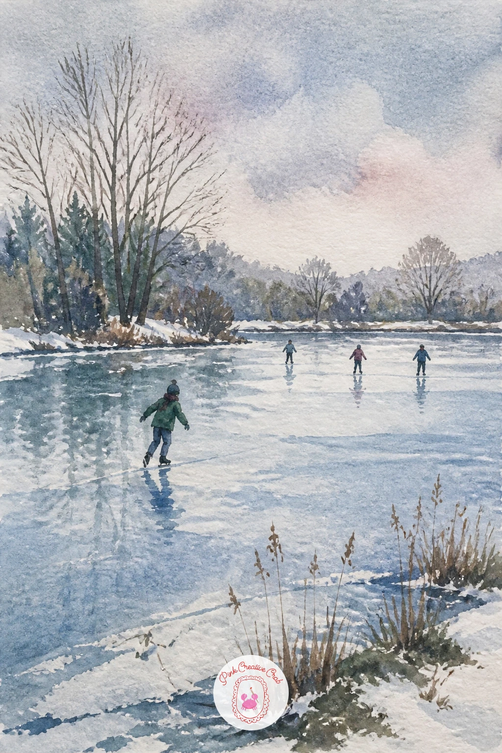
Change the season entirely with a pond frozen with skaters, trading soft reflections for a hard, pale surface and small moving figures. Paint the ice first as a flat, cool grey-blue wash with a few jagged white lines left untouched for cracks, since ice reads far more convincingly with a little irregularity than a perfectly smooth sheet.
Once dry, add two or three skater figures as simple leaning silhouettes, bodies angled forward to suggest motion and gliding rather than standing still. Bare trees along the bank, painted with a dry, splayed brush, finish the wintry mood.
The place this goes wrong is making the ice too blue and flat, which reads as water rather than ice. Save it with a few dry, scratchy white highlights dragged across the surface with a craft knife or the edge of a credit card once the paint is fully dry.
No craft knife handy? A white gel pen scratched lightly over dry paint gives a similar icy glint.
You Will Need
- white gel pen
Palette: Payne’s Grey,Cerulean Blue,Titanium White,Burnt Umber
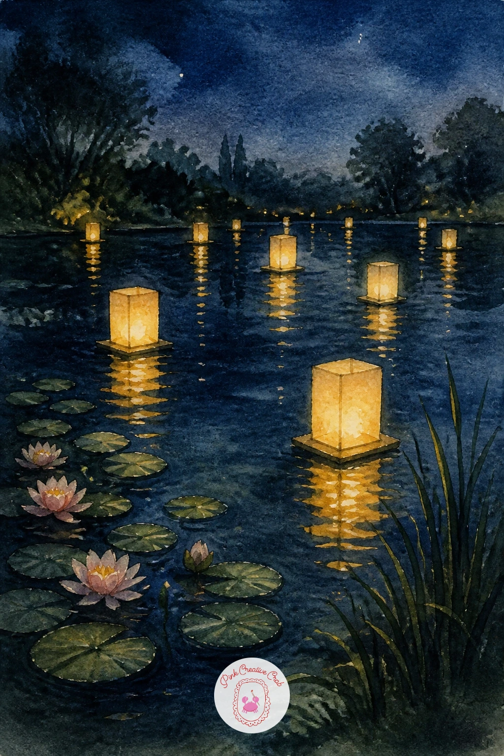
Carry the quiet into evening with a pond at night with lanterns on the water, a subject built almost entirely around small points of warm light against dark washes. Paint the whole background first as a deep blue-black wash covering sky, trees and water together, since a unified dark base is what makes the lantern light glow later.
Once that layer is bone dry, dot in several small lantern shapes along the water’s edge and scattered across its surface, each one a warm yellow-orange circle with a thin vertical reflection pulled straight down beneath it. Keep the reflections slightly wavy rather than perfectly straight.
Because the light source here is scattered and low, every reflection should stay short and close to its lantern rather than stretching across the whole pond. That single rule keeps the night feeling calm rather than chaotic.
A white gel pen adds a tiny spark at the center of each lantern once the paint is completely dry, which lifts the whole scene.
You Will Need
- white gel pen
Palette: Payne’s Grey,Indigo,Naples Yellow,Burnt Sienna
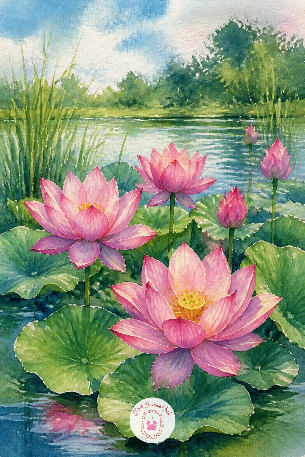
Zoom in close now for lotus flowers in bloom, a subject that works beautifully as a tighter, more botanical study after all those wider scenes. Paint each petal with a graded wash, pink at the tip fading to white at the base, working wet-into-wet so the color blends softly without hard edges.
Let the flowers dry fully before adding the broad round lotus leaves behind them in two tones of green, since overlapping leaves need that contrast to read as separate shapes. A few dark veins drawn into the leaves with a fine brush once dry finish the texture.
If this is your first time painting lotus petals, work from the center outward on each one rather than edge to edge; it keeps the graded color looking natural rather than streaky.
No rose or pink pigment on hand? A touch of red mixed heavily with white gouache gives a close soft pink.
Palette: Opera Pink,Titanium White,Sap Green,Hooker’s Green
For more flower-focused techniques like graded petal washes, easy watercolor flower for beginners walks through the basics step by step.
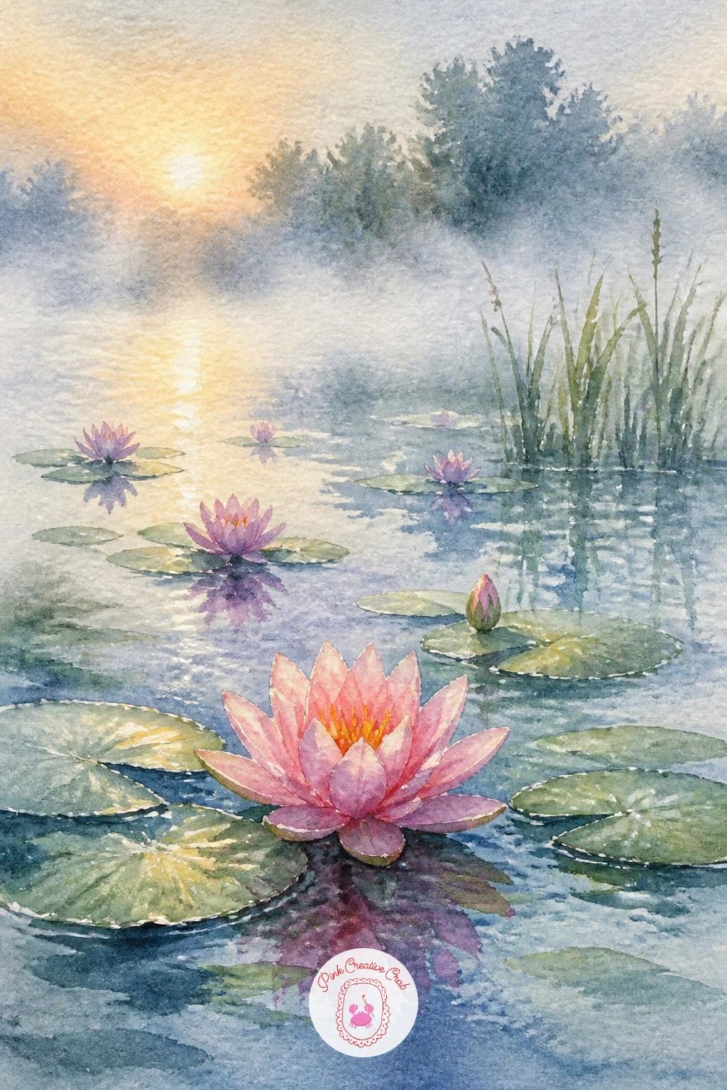
Soften the mood further with water lilies in morning mist, where atmosphere matters more than any single flower. Paint the background first as a very pale, loose wash of grey-blue and white, letting the colors blur together so the whole scene already looks hazy before anything else goes on.
While that wash is still slightly damp, drop in a few soft green shapes for distant lily pads, letting their edges bleed gently into the mist rather than staying crisp. Only the closest lilies and pads, painted once the paper is dry, get sharper edges and a touch more detail.
That contrast between soft, blurred background and one or two crisp foreground lilies is what reads as mist rather than just a pale painting. Keep that contrast deliberate rather than painting everything at the same softness.
If the mist wash dries too patchy, a clean damp brush can lift and even it out within the first minute or two.
Palette: Payne’s Grey,Titanium White,Sap Green,Opera Pink
Bring in some strong vertical shapes with irises along the pond edge, a nice contrast to all the rounded lily pads elsewhere on this list. Paint each iris bloom with quick, confident strokes, purple deepening toward the base of the petals, and leave the tall slender leaves for after the flowers have dried so their green does not bleed into the purple.
The leaves themselves go in with a single loaded stroke per blade, dragged upward and tapering to a point rather than drawn with two parallel lines. That one stroke keeps them looking fresh rather than stiff.
Compare the height of the irises to the pond’s width behind them; keeping the tallest blooms no more than a third of the total frame height stops them from overwhelming the quiet water beyond. That balance is what keeps the eye moving through the whole scene.
No purple in your palette? Mix ultramarine blue with a touch of alizarin crimson for a rich, close substitute.
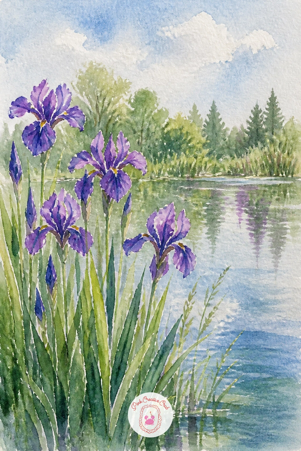
Palette: Ultramarine Blue,Alizarin Crimson,Sap Green,Naples Yellow
Add a touch of structure with a stone lantern by a koi pond, where a simple solid shape anchors a scene that could otherwise feel too loose. Draw the lantern’s basic form first, a short pillar topped with a small peaked roof, since getting that proportion right before you paint is easier than correcting it after.
Paint the pond as a soft wash first, then add the lantern in warm grey stone tones once dry, keeping its shadow side a touch cooler and darker to suggest form. A hint of moss, dabbed on with a small sponge in muted green, softens its edges and ties it into the garden.
Decide where the light falls before painting the shadow: if it comes from the upper right, the lantern’s shadow falls to the lower left across the water, stretched and slightly rippled. Getting that one detail consistent makes the whole scene feel lit rather than flat.
No sponge for the moss texture? A dry, stippled brush tap works just as well.
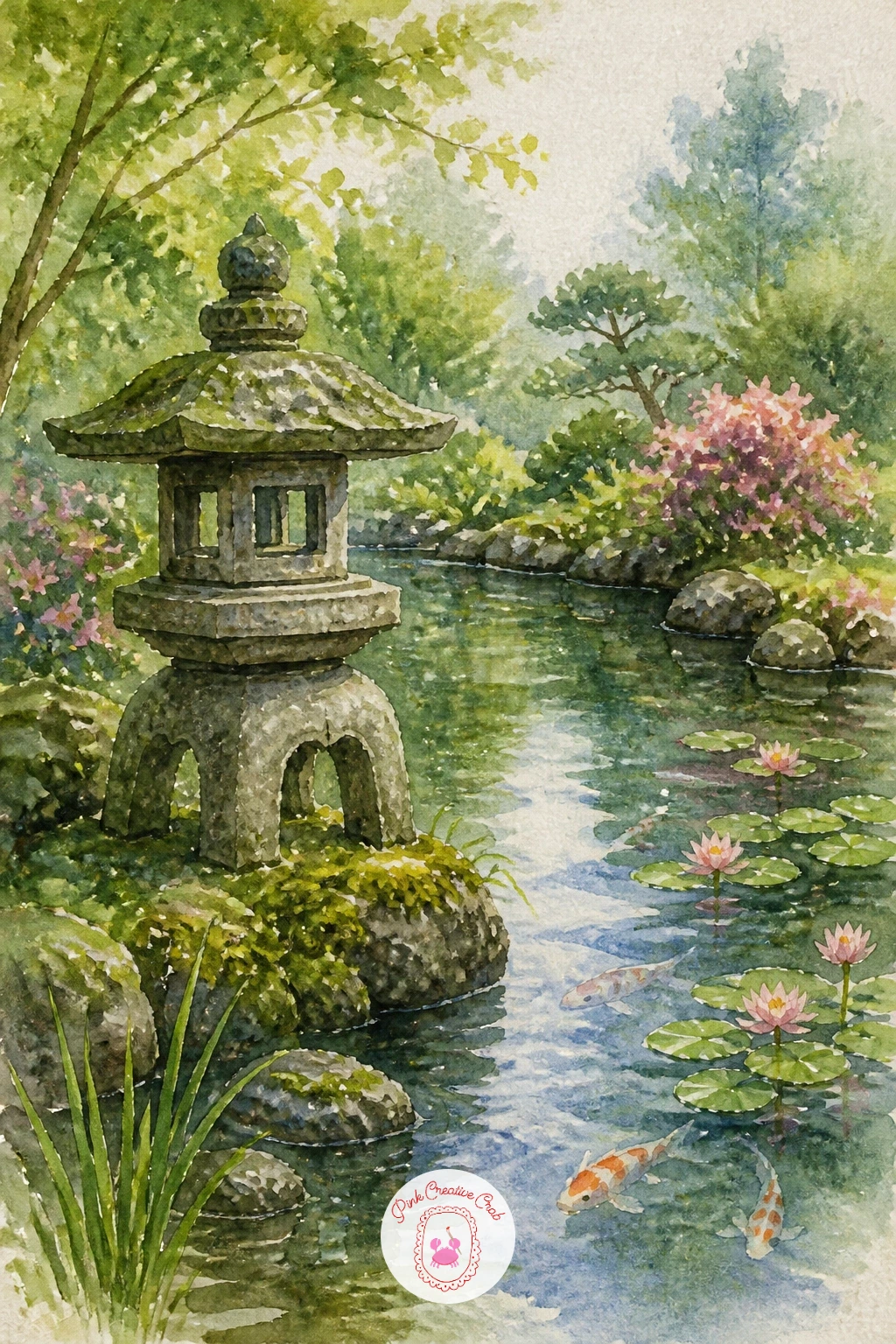
Palette: Payne’s Grey,Raw Umber,Sap Green,Cerulean Blue
Challenge yourself with rain falling on a pond, a subject that lives entirely in texture rather than drawing. Paint the whole surface first as a flat, mid-tone grey-blue wash, then while it is still wet, drop in clean water from a nearly dry brush at scattered points to push the pigment outward into soft rings.
Once that layer dries, add a few finer, straighter rain streaks with a fine brush loaded lightly with grey, angled slightly rather than perfectly vertical so they feel like they are actually falling. Keep the background trees and sky muted and soft to match the overcast mood.
The place this goes wrong is adding too many ripple rings, which starts to look busy rather than rainy. Save it by keeping no more than six or seven rings scattered loosely rather than evenly spaced.
No clean water dropper handy? The tip of a dry brush touched gently to the wet wash works the same magic.
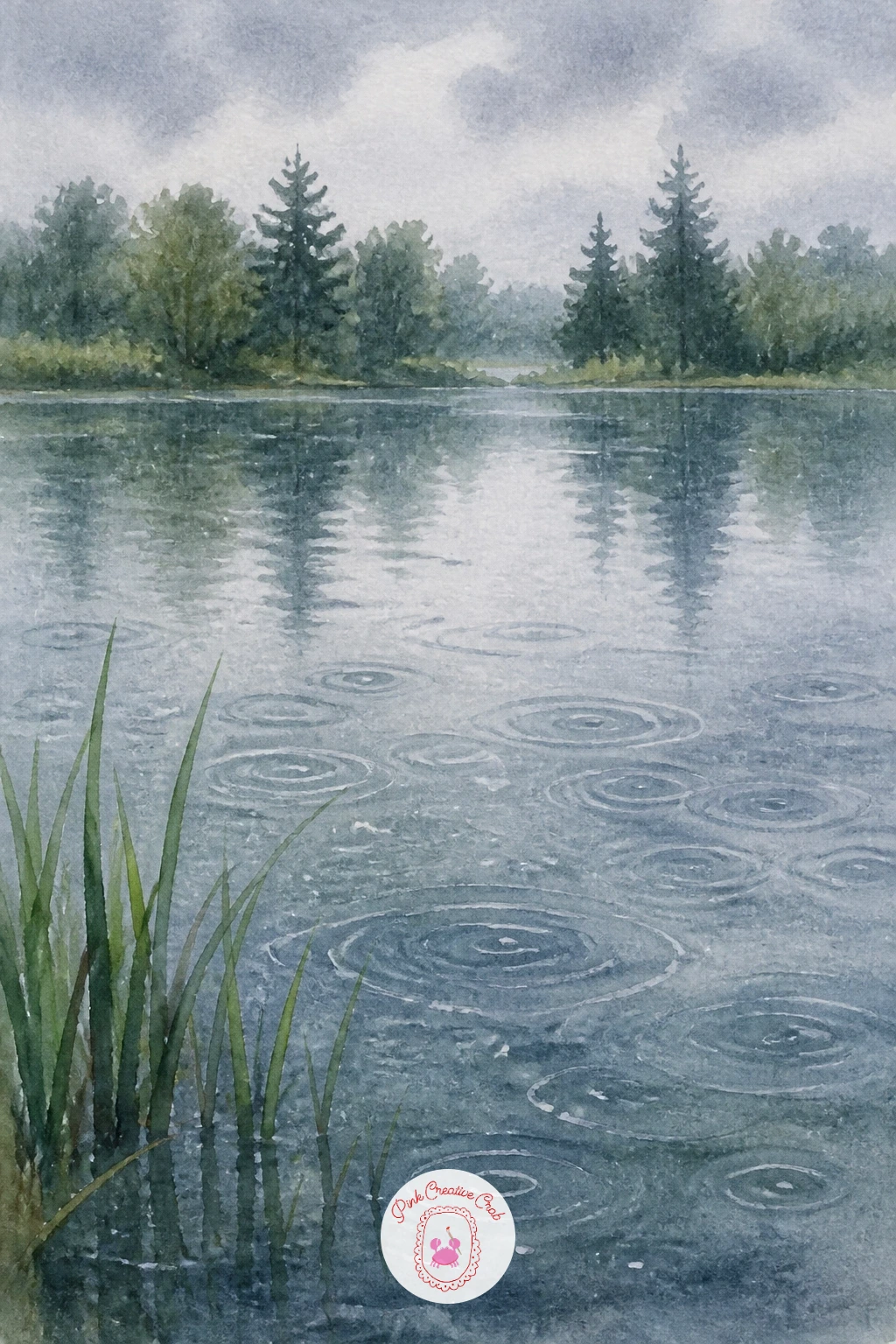
Palette: Payne’s Grey,Cerulean Blue,Titanium White,Sap Green
Turn the whole composition into one about sky with a pond reflecting clouds, where the water becomes almost a mirror image of what is above it. Paint the sky first with loose, soft clouds in a wet-into-wet wash, then flip your reference mentally and repaint nearly the same shapes, slightly muted and stretched vertically, for the water below.
Keep a thin strip of bank or reeds between sky and water so the eye understands where one ends and the other begins; without that divider the whole painting can read as one confusing wash. A few darker, grounding shapes like reeds or a distant tree line help anchor the reflection.
If this is your first time painting a mirrored sky, work the water reflection slightly duller and cooler than the sky itself; real reflections are never quite as bright as what casts them, and that small dulling makes the illusion convincing.
No second reference needed here, just paint the sky twice with a calmer hand the second time.
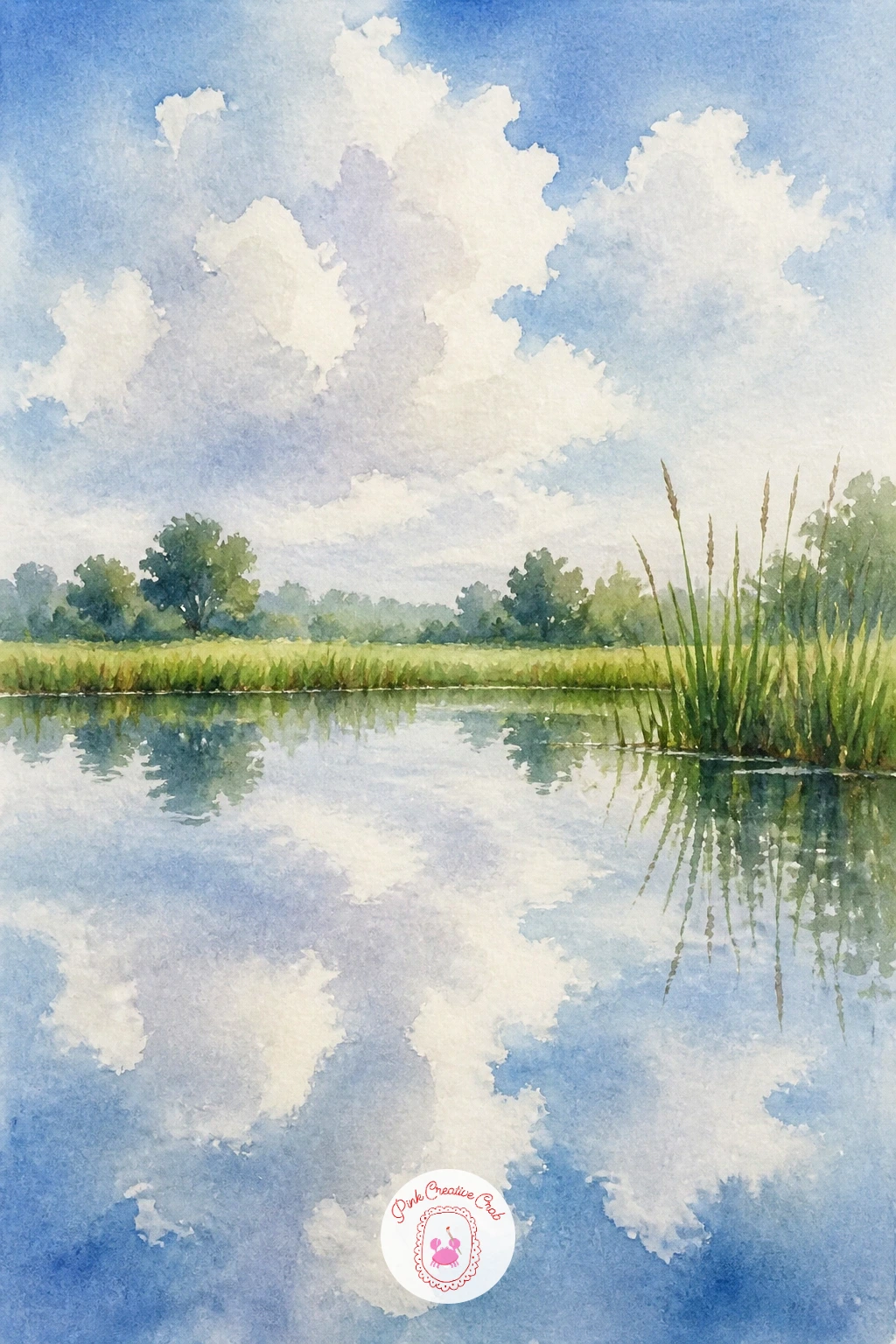
Palette: Cerulean Blue,Titanium White,Payne’s Grey,Sap Green
If you enjoy painting sky and water together, easy watercolor skies, sunset and clouds ideas has more ways to handle soft cloud washes.
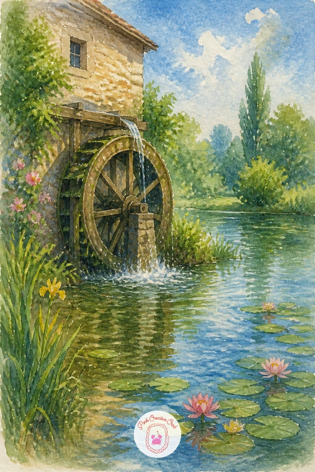
Add some mechanical interest with a pond with a mill wheel, where the wheel’s circular structure gives you a strong focal shape against soft water. Sketch the wheel as a simple circle divided by evenly spaced spokes, since getting those spokes roughly even is what makes the whole wheel read correctly rather than lopsided.
Paint the mill building and pond first in warm stone and soft blue tones, then add the wheel once that base is dry, keeping its lower half slightly darker and wetter-looking where it meets the water. A few white highlights left as untouched paper along its upper edge suggest wet wood catching the light.
Splashing water at the base of the wheel is the fun part: flick a loaded brush gently from below to scatter a few droplet marks, or use a toothbrush for a finer spray.
No toothbrush on hand? Tap a loaded round brush against your finger over the area instead.
You Will Need
- toothbrush for splatter
Palette: Burnt Umber,Raw Sienna,Cerulean Blue,Titanium White
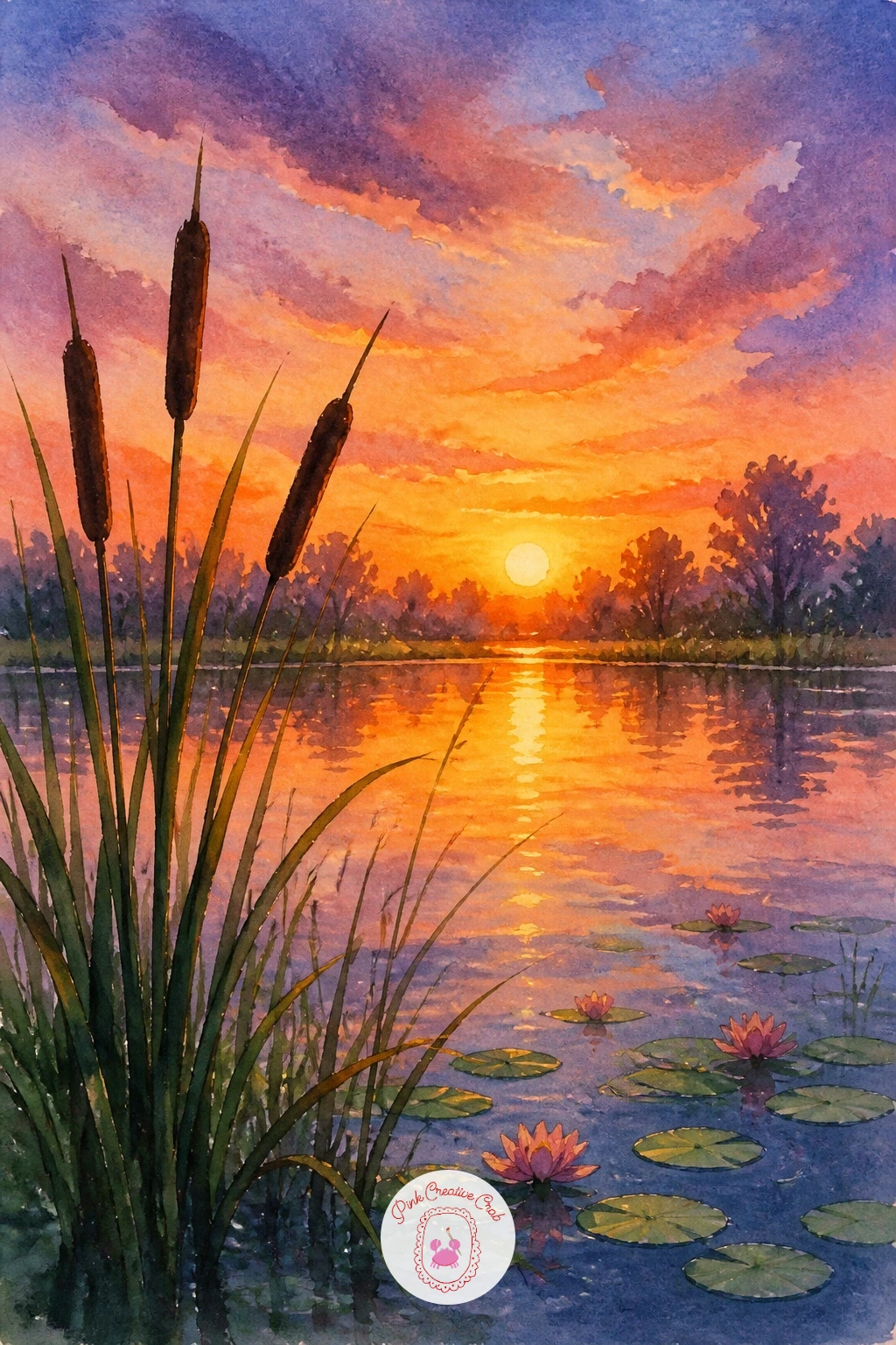
Warm the whole palette up with a pond with cattails at sunset, where the sky does most of the emotional work. Paint the sky first with a graded wash moving from deep orange near the horizon up into soft purple-blue higher up, working quickly while the paper is still wet so the colors blend without hard lines.
Once the sky is dry, add the pond beneath it with the same colors reflected and slightly muted, then silhouette a cluster of cattails in near-black along one side, their stems thin and slightly curved rather than ramrod straight. Their brown seed heads go in last as small, dabbed ovals.
Decide where the sun sits before painting a single cattail: with it low and behind them, every stem should read as a dark silhouette rather than a lit, detailed shape. That consistency is what sells the sunset.
No deep orange in your set? Mix cadmium red with a touch of yellow for a close warm substitute.
Palette: Cadmium Orange,Violet,Payne’s Grey,Burnt Umber
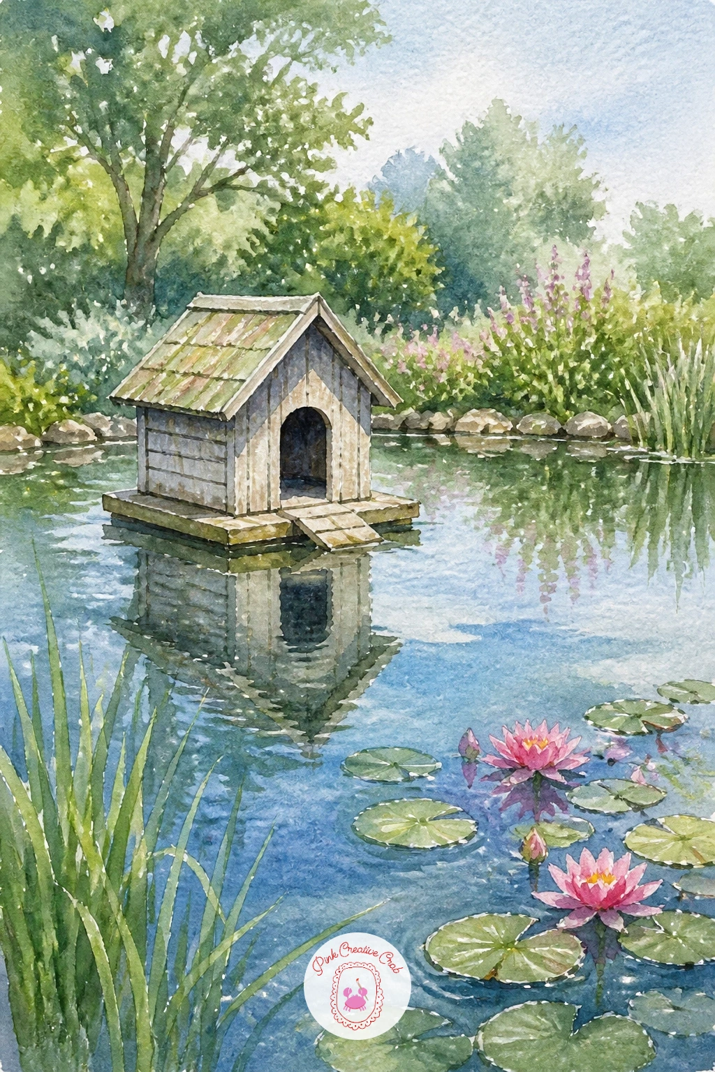
Keep things simple and homey with a pond with a wooden duck house, a small cheerful structure floating on calm water. Draw its basic box shape first with a small peaked roof, since a slightly tilted perspective, two sides visible rather than one, is what makes it look three-dimensional and floating rather than flat.
Paint the pond first as a soft blue wash, then add the duck house once dry in warm weathered wood tones, with its reflection pulled straight down and slightly softened. A small ramp leading up to its door, painted with just two quick lines, adds a nice detail without much extra work.
If this is your first time drawing a small structure in perspective, keep the roofline’s two slopes meeting at slightly different points than you would expect; that subtle asymmetry is often what reading-level perspective looks like at this scale.
No weathered wood tone in your set? Mix burnt umber with a touch of grey for an aged look.
Palette: Burnt Umber,Payne’s Grey,Cerulean Blue,Sap Green
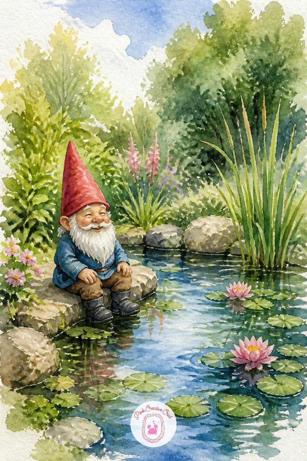
Add a touch of whimsy with a garden pond with a gnome, a small character that brings personality without needing a human figure. Keep his shape simple: a rounded body, pointed hat and a tiny visible nose are enough detail, no need to paint a full expressive face at this scale.
Paint the pond and surrounding greenery first, then add the gnome once dry, placing him at the water’s edge rather than in the center so he feels like a quiet garden resident rather than the whole point of the painting. His hat, painted in a bright red, gives the whole piece a cheerful focal point.
If this is your first time painting a small character, work from simple rounded shapes rather than outlines; a soft circle for the body and a triangle for the hat read as a gnome far more easily than a carefully drawn figure.
No bright red on hand? Mix a touch of orange into cadmium red for a warmer, cheerful tone.
Palette: Cadmium Red,Sap Green,Cerulean Blue,Naples Yellow
Bring some city life in with paddle boats in a city park pond, a livelier scene with a bit of architecture in the background. Block in the pond and a loose skyline of trees and buildings first, kept pale and soft so it stays secondary to the water.
Once dry, add two or three small paddle boats scattered across the surface, each one just a simple curved hull shape with a tiny seat and a thin paddle wheel suggested rather than detailed. Their reflections, pulled straight down and softened, ground them on the water.
Compare the boats’ size to the width of the pond; keeping each one small, no more than a tenth of the pond’s width, keeps the scene feeling like an open public space rather than a cramped little puddle.
No fine brush for the paddle wheels? The tip of a toothpick dipped in paint makes a clean small mark.
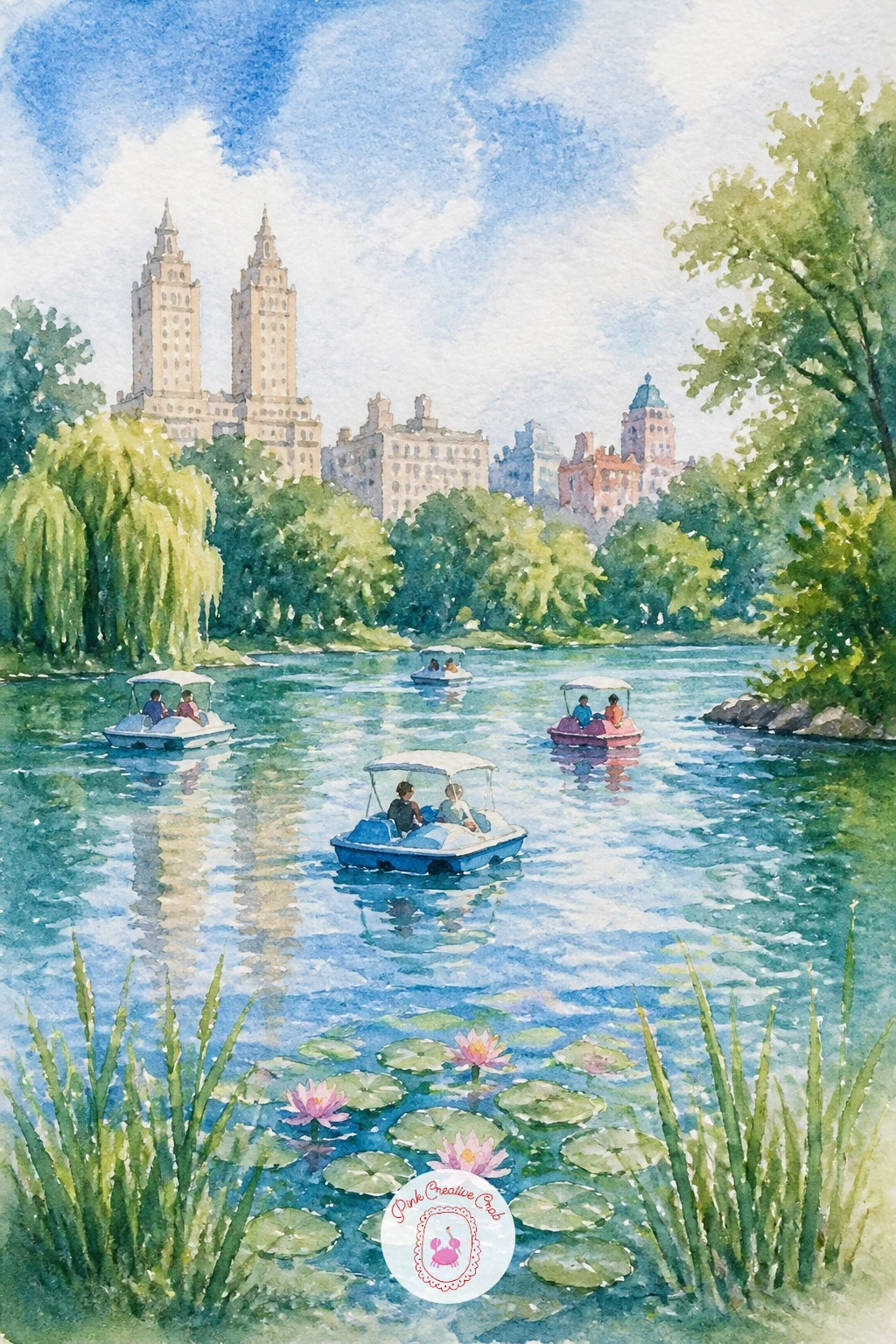
Palette: Cerulean Blue,Sap Green,Naples Yellow,Payne’s Grey
Shift the season again with a pond in autumn with floating leaves, a subject built almost entirely around warm color scattered over cool water. Paint the pond first as a soft blue-grey wash, then while it is still slightly damp, drop in small dabs of orange, red and yellow across the surface to suggest floating leaves blending softly into the water.
Once that layer dries, add a few sharper leaf shapes on top with a fine brush for the ones closest to the viewer, giving them clear edges while the others stay soft and blurred further back. A loose line of bare or half-bare autumn trees along the bank finishes the mood.
If this is your first time blending floating colors into water, work quickly before the base wash dries; the soft bleeding is what makes the leaves look like they are resting on the surface rather than painted on top of it.
No red-orange mix ready? A touch of cadmium red into raw sienna gives a warm autumn leaf tone fast.
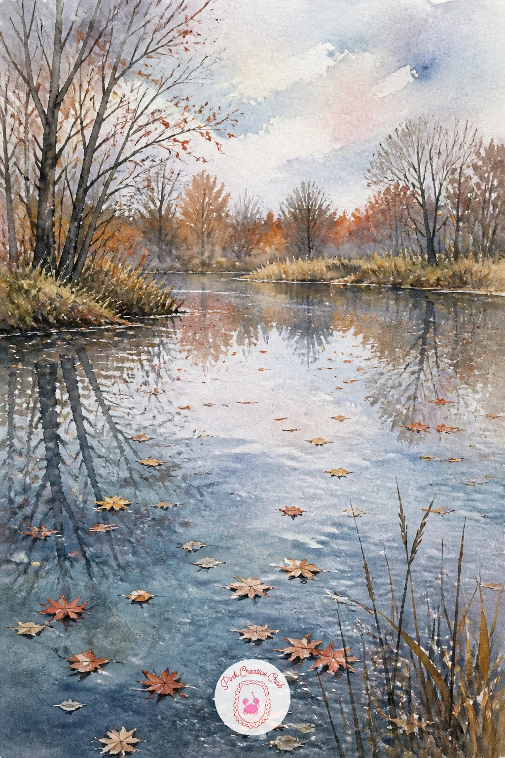
Palette: Cadmium Orange,Alizarin Crimson,Raw Sienna,Payne’s Grey
Turn the lens on the artist herself with a girl painting at an easel by a pond, a scene within a scene that adds warmth and a little humor. Keep her figure simple and seen from behind or the side, since a face is not needed here and avoiding one keeps the focus on the quiet activity rather than an expression.
Paint the pond and surrounding garden first, then add her easel and figure once that background is dry so her edges stay crisp. Her small canvas on the easel can be left almost blank, just a hint of blue and green, which lets the viewer imagine she is painting the very pond in front of her.
If this is your first time painting a figure from behind, keep the shoulders slightly rounded forward and one arm raised toward the easel; that small gesture reads instantly as someone absorbed in painting.
No easel reference handy? A simple tripod shape with three thin lines works perfectly well.
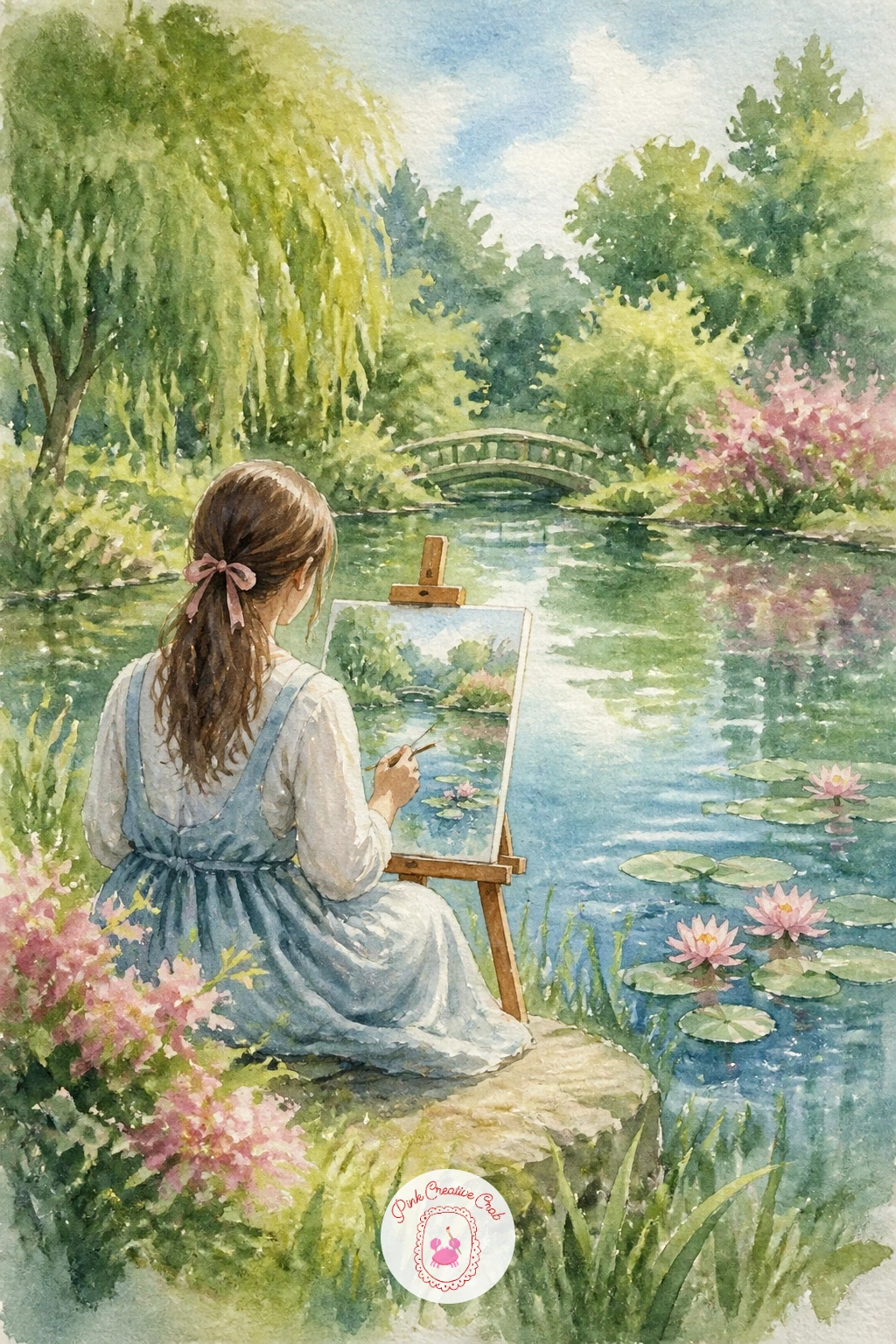
Palette: Sap Green,Cerulean Blue,Naples Yellow,Payne’s Grey
Add some romance with a couple in a rowboat with a parasol, a gentle scene that works well as a small, intimate piece. Keep both figures as simple seated silhouettes, one holding the parasol tilted to shade them both, since detail in the faces or clothing is not needed at this scale.
Paint the pond first with a soft wash, then add the boat and figures once dry, keeping the parasol as a bold flat color, a dusty pink works beautifully, so it becomes the clear focal point against all that green and blue. The boat’s reflection, pulled straight down and softened, finishes the quiet mood.
Compare the parasol’s width to the boat’s length; keeping it roughly a third of that length stops it from overwhelming the small scene while still reading clearly as the focal shape.
No dusty pink mix ready? A touch of white gouache into alizarin crimson softens it instantly.
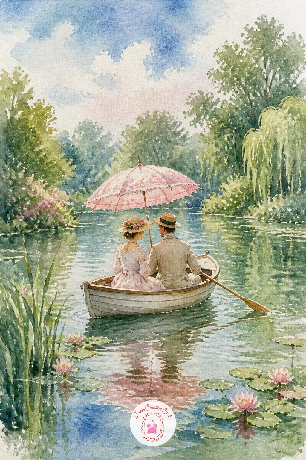
Palette: Rose Madder,Cerulean Blue,Payne’s Grey,Sap Green
Bring some rhythm into the composition with stepping stones across a pond, a subject that relies on repetition and careful spacing more than anything else. Sketch the stones first as a loosely curving line leading from one bank toward the other, each stone slightly smaller as it moves into the distance.
Paint the pond as a soft wash first, then add the stones once dry in warm grey tones, keeping their tops lighter where they catch the light and their undersides, meeting the water, slightly darker and softened. Each stone gets a small, quiet reflection directly beneath it.
Decreasing size as the stones recede is the proportion trick that makes this path feel like it travels into the distance rather than sitting flat across the pond. Keep that shrinking gradual rather than abrupt.
No warm grey mixed already? Combine burnt umber with a touch of Payne’s grey for a soft stone tone.
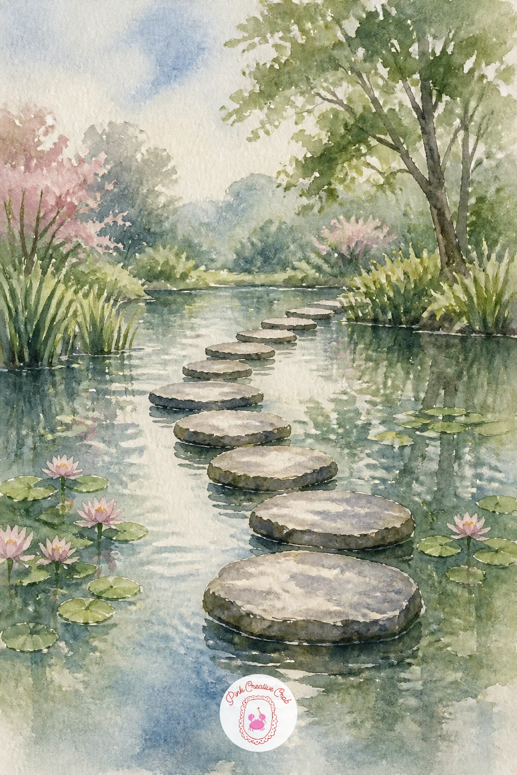
Palette: Payne’s Grey,Burnt Umber,Cerulean Blue,Sap Green
Add some structure and color with a pond in a walled garden with roses, a layered scene combining architecture and flowers. Paint the wall first as a soft, textured wash in warm brick or stone tones, keeping the texture loose with a dry brush dabbed lightly rather than painted in careful detail.
Once dry, add climbing roses along the wall as small clusters of pink dabbed on with the tip of a round brush, then paint the pond in front, reflecting a hint of both the wall and the roses above it. Keep the reflection softer and more muted than the roses themselves.
If this is your first time painting climbing roses, cluster them in uneven groups of three or five rather than spacing them evenly; odd, irregular groupings read as far more natural than a tidy row.
No pink round brush dabs working well? A cotton swab dipped lightly in paint gives similarly soft rose clusters.
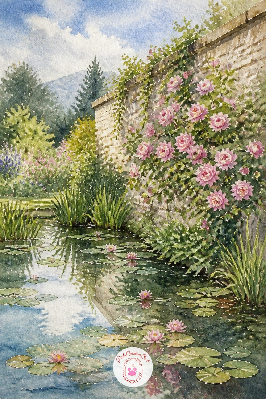
Palette: Opera Pink,Raw Sienna,Sap Green,Cerulean Blue
For more ways to paint flowers like these roses, simple watercolor flowers ideas covers plenty of small bloom techniques.
Challenge your sense of structure with a greenhouse reflected in a pond, where glass panels and their reflections both need to feel transparent. Draw the greenhouse’s frame first as a simple grid of straight lines, keeping the panes slightly uneven rather than perfectly ruled since real glasshouses rarely look machine-made.
Paint the greenhouse with pale washes left mostly as white paper for the glass, just a hint of blue-green in the corners of each pane, then paint its reflection in the pond beneath, stretched vertically and noticeably softer and more muted. That contrast between crisp structure and soft reflection is the key relationship here.
Where this often goes wrong is making the reflection as sharp as the building itself, which flattens the whole illusion of water. Save it by dragging a slightly damp brush horizontally through the still-wet reflection to blur it gently.
No ruler for the frame lines? A straight edge of folded paper works just as well for a steady line.
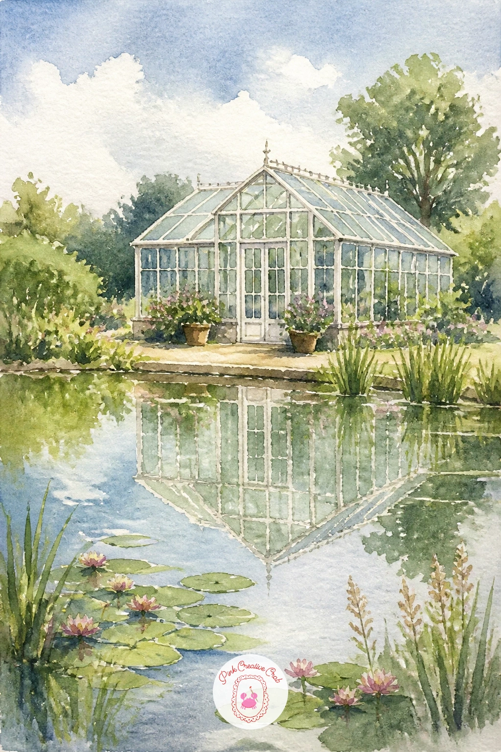
Palette: Cerulean Blue,Titanium White,Sap Green,Payne’s Grey
If structures and reflections interest you, architecture sketchbook ideas has more practice with buildings and perspective.
Build a small focal point with a pond with a little island and a tree, a composition that gives the eye a clear center to rest on. Paint the pond first as a wide, calm wash, then add the island as a small landmass with a single tree growing from it, kept modest in scale so it reads as a true island rather than the main shore.
Once the pond is dry, add the island’s reflection stretched directly beneath it, softened with a dry brush dragged horizontally so the water still reads as calm rather than choppy. A few reeds or grasses at the island’s edge finish the small scene.
Compare the island’s size to the whole pond; keeping it under a fifth of the total water area is what makes it feel like a modest island resting in open water rather than crowding the composition.
No second green for the tree’s shadow side? Add a touch of Payne’s grey to your sap green for an instant darker variant.
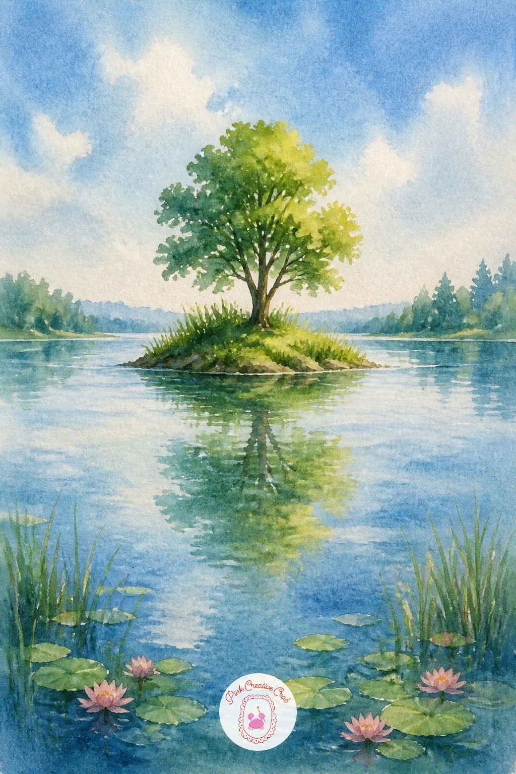
Palette: Sap Green,Payne’s Grey,Cerulean Blue,Burnt Umber
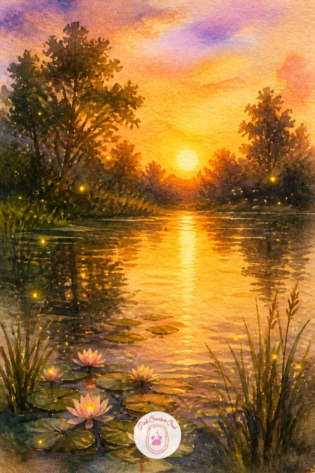
Return to warm evening light with a pond at golden hour with fireflies, where small glowing points finish a scene built mostly from a rich sunset wash. Paint the sky and pond together first in deep gold and amber tones, graded softly toward a cooler blue near the top of the frame, working wet-into-wet so the colors merge without hard edges.
Once that base layer is completely dry, add dark silhouetted trees or reeds along the water’s edge, then finish with small dots of white gel pen scattered through the darker areas to suggest fireflies catching the last light. A tiny yellow halo painted around a few of them with a fine brush adds a soft glow.
Decide where the sun sits low behind the trees before adding any silhouette; everything in front of that glow should stay dark and flat rather than detailed, which is what makes the small firefly lights stand out so clearly.
No gel pen on hand? A fine brush loaded with white gouache dotted lightly works just as well.
You Will Need
- white gel pen
Palette: Cadmium Orange,Raw Sienna,Payne’s Grey,Naples Yellow
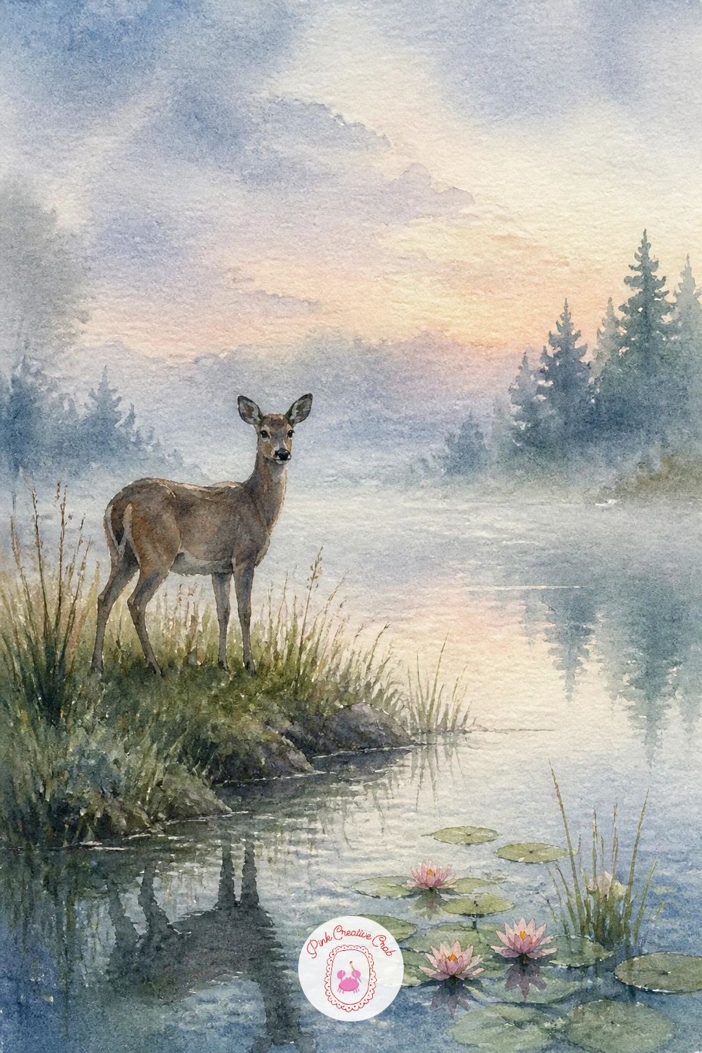
Bring a single quiet visitor into the scene with a misty dawn pond with a deer, a gentle moment that works best when the deer stays small and secondary to the atmosphere. Paint the whole background first as a soft, pale wash, blurring trees and water together while everything is still damp so the mist feels built in rather than added later.
Once that layer is dry, add the deer as a simple standing silhouette near the water’s edge, legs slim and a slightly lowered head as if drinking or pausing to look up. Keep it small against the wide pond so the quiet stillness of the scene stays the real subject.
If this is your first time painting an animal silhouette, work from a simple teardrop body shape and four thin legs rather than careful anatomy; at this scale and softness, the suggestion of a deer matters more than precision.
No reference for the deer’s pose? A simple side view with one front leg slightly forward reads clearly even at a distance.
Palette: Payne’s Grey,Burnt Umber,Titanium White,Sap Green
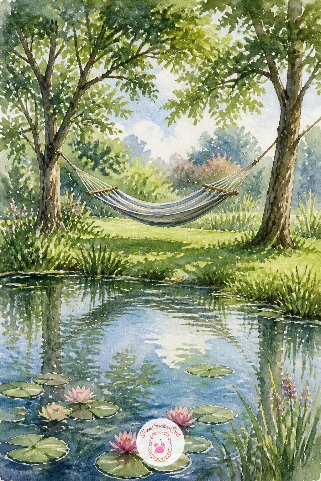
Slow things right down with a pond with a hammock nearby, a scene built for relaxation on paper as much as in subject. Paint the pond and surrounding grass first as two calm washes, then add the hammock strung between two simple trees, its fabric sagging in a gentle curve rather than a straight line.
Once the hammock shape is dry, add soft shadow beneath it with a slightly darker wash of the same green used for the grass, which grounds it in the scene instead of leaving it floating. A faint figure resting in it, just a loose curved shape, is optional but adds warmth.
If this is your first time drawing a hammock, draw the sag curve first and build the fabric folds from that single line; trying to draw straight ropes first usually ends up looking stiff and awkward.
No second tree for the second hammock post? A nearby fence post or pergola beam works just as well as an anchor point.
Palette: Sap Green,Naples Yellow,Cerulean Blue,Rose Madder
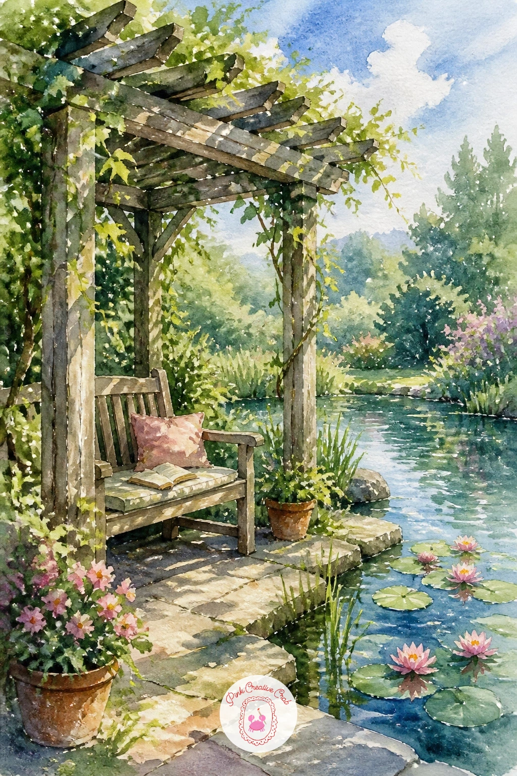
Add a little more shelter and shade with a reading bench under a pergola by a pond, a scene with strong overhead structure casting light below. Draw the pergola’s beams first as a simple open grid, since getting the beams evenly spaced is what makes the structure feel solid rather than collapsing in on itself.
Paint the pond and surrounding garden first, then add the pergola in warm wood tones, leaving gaps of white paper between the beams where sky shows through. The bench beneath, kept simple and partly shaded, sits in a slightly cooler, darker wash to suggest it is sheltered from direct light.
Deciding where the light comes from before painting the pergola’s shadow pattern matters here: dappled light falling through the beams should scatter as small irregular patches on the bench and ground below, never as neat regular stripes.
No fine brush for the dappled shadows? A small natural sponge dabbed lightly creates a similarly broken pattern.
Palette: Burnt Umber,Sap Green,Cerulean Blue,Payne’s Grey
Zoom all the way in with a pond with a pink water lily close-up, treating the flower almost like a portrait rather than a small part of a wider scene. Paint each petal individually with a graded wash, deep pink at the base softening to near white at the tip, working while each petal is still damp so the color shift stays smooth.
Once the petals are dry, add the lily’s yellow center with small, tightly packed dabs rather than one flat shape, since that texture is what makes the center read as stamens rather than a plain yellow dot. A single large pad behind it, slightly out of focus with softer edges, keeps the flower as the clear star of the piece.
If this is your first time painting a close-up flower, work larger than feels natural; filling most of the frame with the bloom is what gives this idea its quiet, intimate impact.
No yellow ochre for the center? Mix a touch of orange into Naples yellow for a warm close substitute.
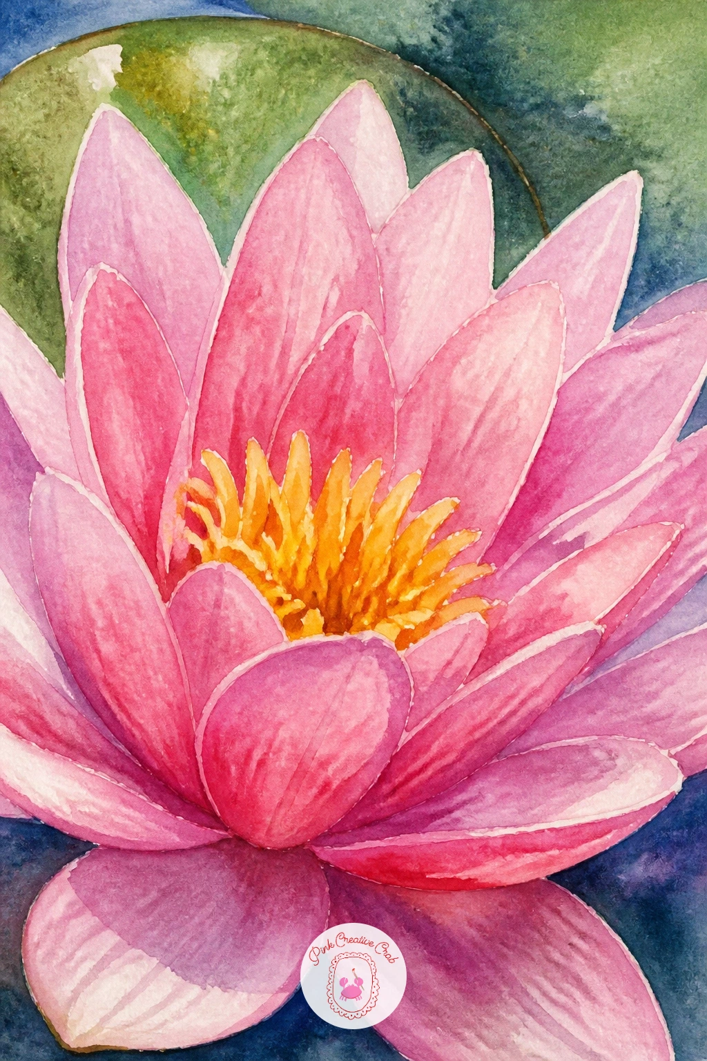
Palette: Opera Pink,Titanium White,Yellow Ochre,Sap Green
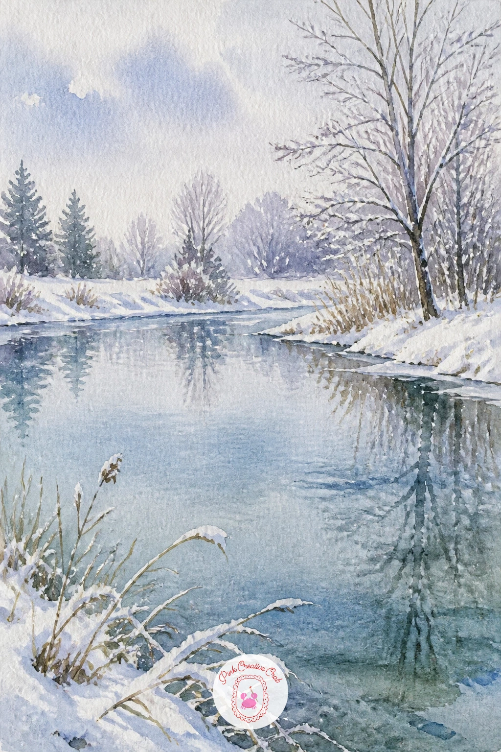
Close out the colder scenes with a winter pond with snow on the banks, where the unpainted white paper becomes just as important as any pigment. Paint the pond first with a pale, cool blue-grey wash, leaving the surrounding banks completely untouched white paper for the snow, since that contrast is what sells the whole scene instantly.
Once the pond is dry, add a few bare trees along the edges with a dry brush dragged upward for thin branches, and a scattering of small blue-grey shadows across the snowy banks to suggest gentle undulations in the ground. Keep those shadows cool rather than warm, since warm shadows read as sunlit sand rather than snow.
If this is your first time leaving large white areas untouched, plan them before you wet any other part of the paper; it is much easier to protect clean white space in advance than to lift color back out later.
No masking fluid for tricky edges near the trees? A wax candle rubbed lightly over the paper beforehand resists paint in the same way.
You Will Need
- masking fluid
Palette: Cerulean Blue,Payne’s Grey,Titanium White,Burnt Umber
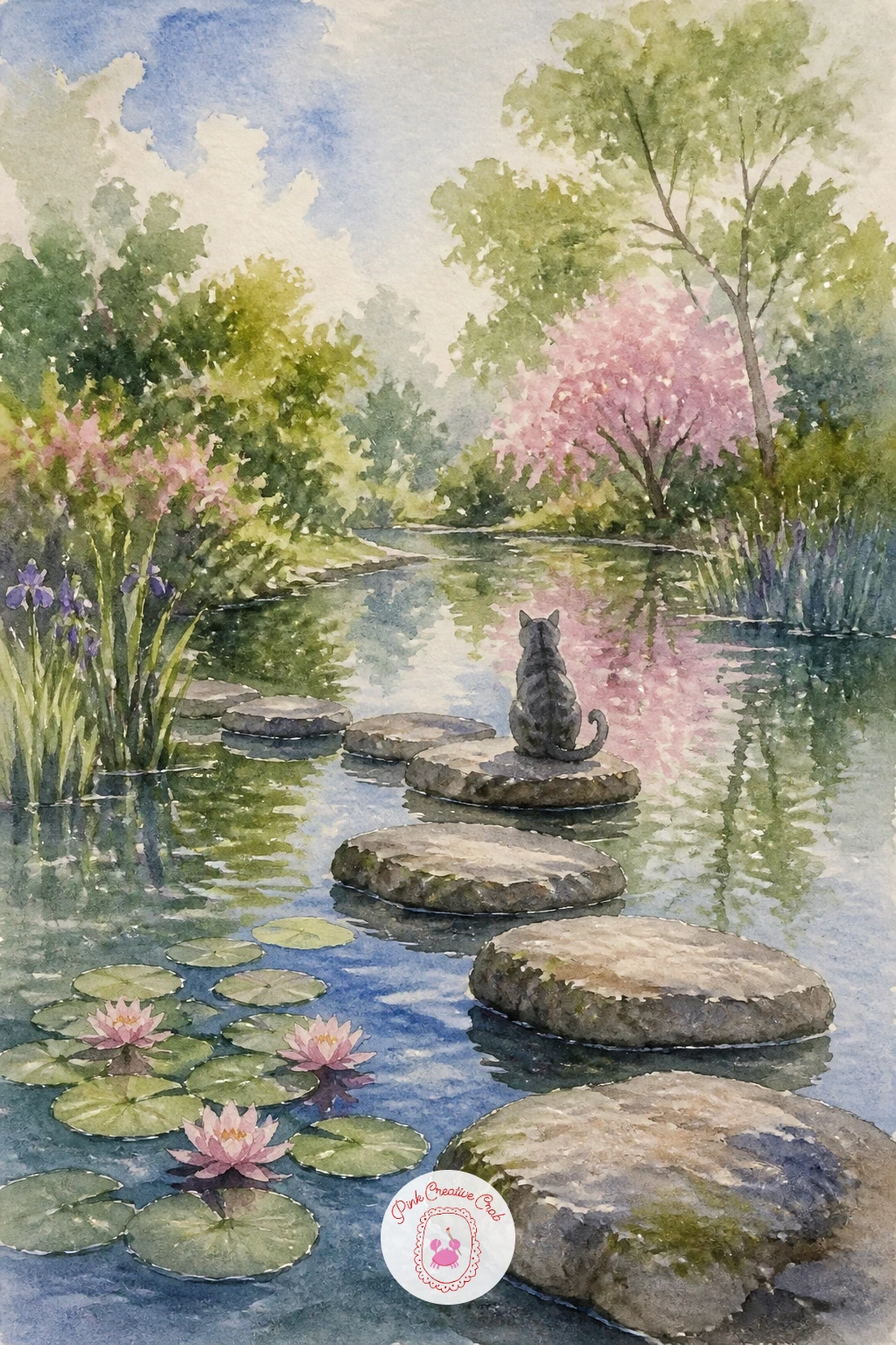
Bring a small companion back in with a pond with stepping stones and a cat, picking up the stepping stone path from earlier and giving it a quiet visitor. Paint the pond and stones first exactly as before, keeping the stones slightly smaller as they recede into the distance, then let that whole layer dry completely.
Add the cat perched on the nearest, largest stone, its body a simple rounded shape with a long curved tail wrapped around its paws, kept small enough that the pond still feels like the main subject. A faint reflection of the cat on the stone’s wet surface ties it into the scene.
If this is your first time painting a cat at this scale, work from an oval body and a smaller circle head rather than outlining fur or features; a confident simple shape reads as a cat far more easily than a detailed but stiff drawing.
No fine brush for the whiskers? A sharpened wooden skewer dipped lightly in paint makes clean, thin lines.
Palette: Burnt Umber,Payne’s Grey,Cerulean Blue,Titanium White
If painting small animals like this cat appeals to you, cat watercolor ideas has more gentle ways to capture them.
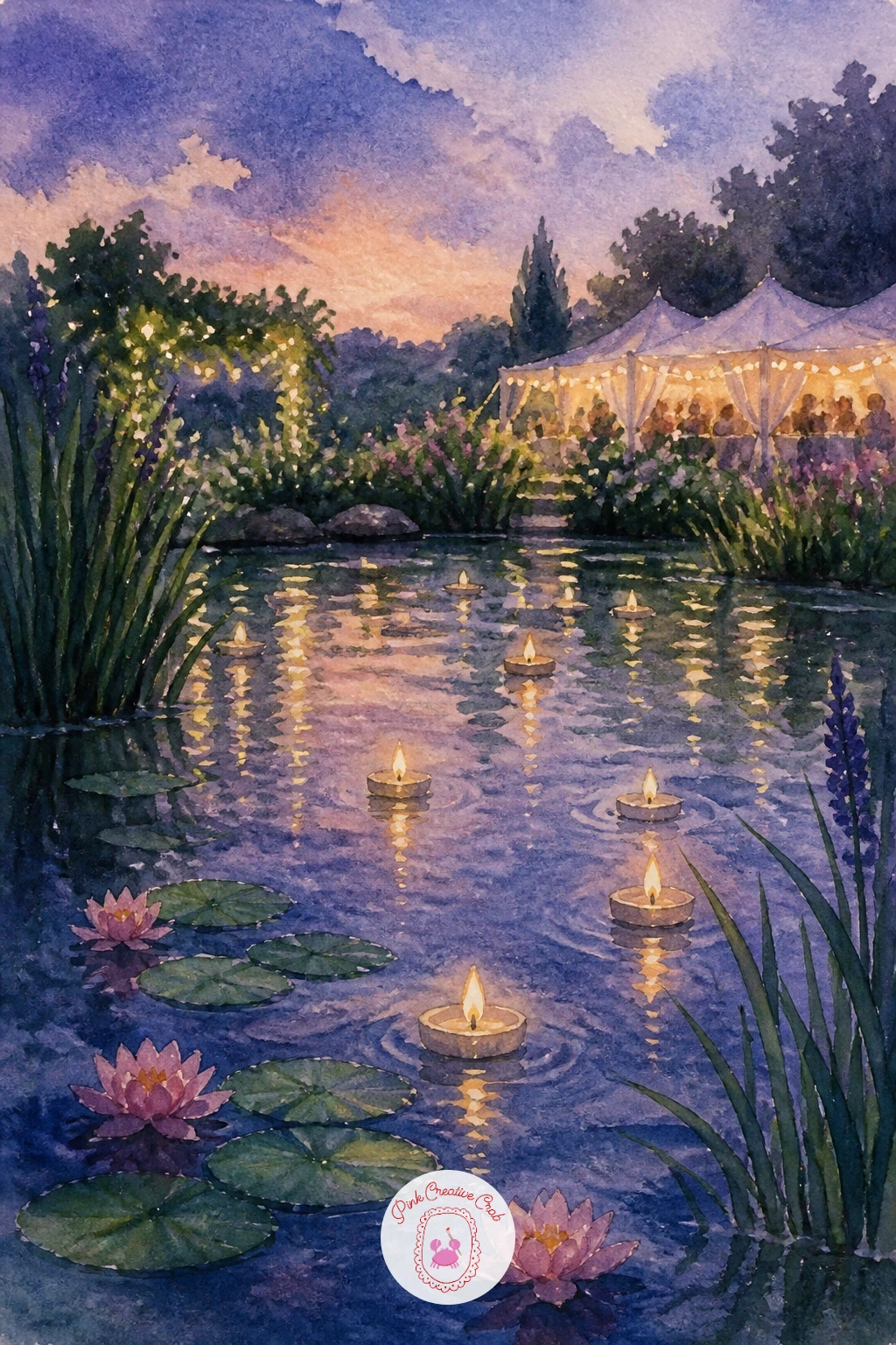
Finish the list on something celebratory with a pond with floating candles at a wedding, combining the lantern-light technique from earlier with a softer, romantic palette. Paint the background pond first as a gentle wash in dusky blue and lavender tones, since an evening color base is what makes the small candle flames glow convincingly once they are added.
Once that layer is completely dry, dot in several small floating candles across the surface, each a tiny white or cream circle with a soft warm halo painted around it in pale yellow. A few blurred shapes in the distance, suggesting guests or decorated chairs, can be added loosely without much detail.
The place this often goes wrong is making every candle glow the same strength, which looks repetitive. Save it by varying the halo size slightly on each one, since real candlelight never burns with perfect uniformity.
No pale yellow for the halos? A touch of Naples yellow softened with white gouache works just as well.
You Will Need
- white gel pen
Palette: Naples Yellow,Violet,Cerulean Blue,Titanium White
What to Do Next
Pick whichever pond is calling to you most today, print or tape down a sheet of cold press paper, and let the first wash set the mood before you add a single detail. Start simple if this is new to you, a few lily pads or a quiet jetty, and save the busier scenes like the palace fountain or the wedding candles for once your confidence with reflections grows.
Frequently Asked Questions
What is the best watercolor paper for a watercolor pond scene?
Cold press paper at 140 pounds works best because it handles the wet-into-wet washes a pond needs without buckling too much. Hot press feels too slippery for soft reflections, while rough paper can break up fine details like reeds or lily veins.
How do you paint realistic water reflections in a watercolor pond?
Paint the object first, then pull its color straight down into the water area while it is still slightly damp, softening the edge with a dry brush. Reflections should be duller and slightly stretched compared to the object casting them.
What colors make a good watercolor pond palette?
A calm palette mixes cerulean or ultramarine blue, sap or hooker’s green, and a soft Payne’s grey for shadows, with warm accents like burnt sienna or opera pink for flowers. Keep most mixes cool so the greens and blues stay fresh rather than muddy.
How do you keep white highlights clean on a watercolor pond?
Plan white areas like lily petals or candle glow before you wet the paper, and use masking fluid over anything small or fiddly you want to protect. Removing the mask once the surrounding washes are fully dry keeps the edges crisp.
Can beginners paint a convincing watercolor pond in one sitting?
Yes, most of these scenes rely on two or three broad washes plus a few confident details rather than complex layering. Starting with a simpler idea like floating leaves or stepping stones builds confidence before tackling a busier scene like a bridge or boathouse.
Have any thoughts?
Share your reaction or leave a quick response — we’d love to hear what you think!
-
 0
-
0
-
0
-
0
-
0
-
0


