Table of Contents
Drawing techniques form the vocabulary of visual art. Just as writers combine words to create meaning, artists combine techniques to create images. This comprehensive encyclopedia covers 50+ essential drawing methods, from fundamental approaches every beginner should master to advanced techniques that create sophisticated effects.
Whether you’re working in graphite, charcoal, colored pencil, or ink, these techniques provide the building blocks for creating any image you can imagine. Furthermore, understanding when and how to apply each method separates amateur sketches from professional artwork.
This guide organizes techniques by category, making it easy to find exactly what you need. Each technique includes clear explanations, practical applications, and tips for mastering the method. Moreover, you’ll discover which techniques work best for specific subjects and effects.
According to art educators at institutions like The Art Students League of New York, systematic study of techniques builds a versatile skill set faster than random experimentation. Therefore, working through this encyclopedia methodically will accelerate your artistic development.
Use this as both a learning guide and a reference resource. Start with fundamental line and shading techniques if you’re a beginner. However, if you’re more advanced, jump to specific techniques that solve current challenges in your work.
Line-Based Techniques
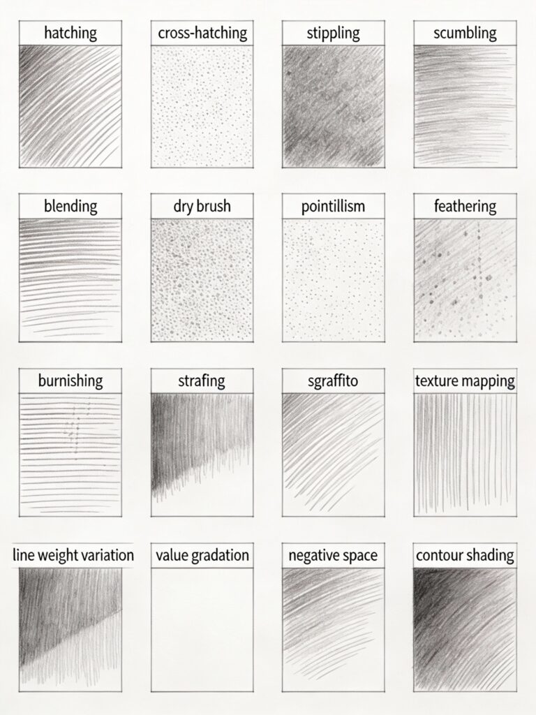
Line techniques form the foundation of drawing. Moreover, mastering these methods gives you precise control over value, texture, and visual interest.
Hatching
Description: Parallel lines create value and texture. Lines can run vertically, horizontally, diagonally, or follow form contours.
How to execute: Draw sets of parallel lines with consistent spacing. Closer lines create darker values, while spaced lines create lighter values. Additionally, varying line weight adds visual interest.
Best for:
- Creating middle values
- Adding texture to surfaces
- Quick sketching
- Suggesting direction and form
Tips: Keep your hand loose and draw from the shoulder rather than the wrist. This creates smoother, more consistent lines. Furthermore, practice maintaining even spacing without using a ruler.
Cross-Hatching
Description: Layered hatching in different directions builds darker values. Each layer crosses previous layers at different angles.
How to execute: Start with one direction of hatching. Then, add a second layer at approximately 45-90 degrees. Continue adding layers as needed for darker values. However, avoid more than 4-5 layers, which can look muddy.
Best for:
- Creating dark values
- Building form and volume
- Adding complexity to shadows
- Suggesting rough textures
Tips: Vary the angle between layers (don’t always use 90 degrees). Moreover, you can vary line spacing between layers for more organic effects.
Variations:
- Contour cross-hatching: Lines follow the form’s surface direction
- Random cross-hatching: Lines cross at varied, irregular angles
- Weighted cross-hatching: Vary line thickness between layers
Contour Hatching
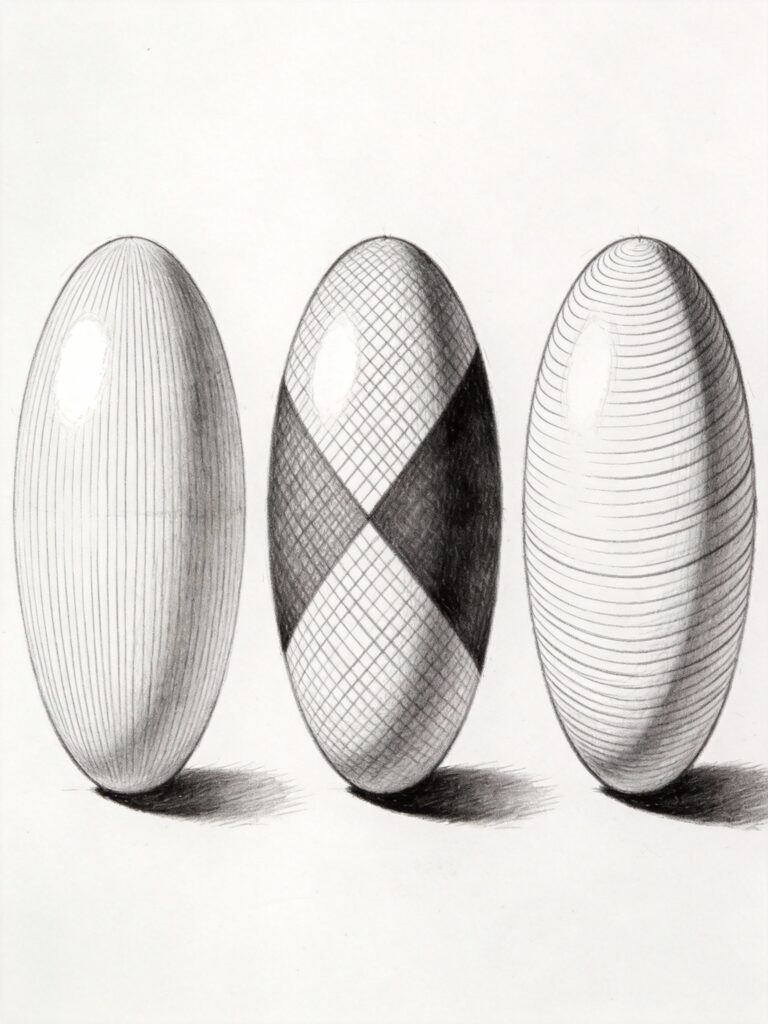
Description: Lines follow the contours and curves of the form, describing surface direction and creating dimensional shading simultaneously.
How to execute: Observe how the surface curves. Draw lines that follow these curves, wrapping around the form. Therefore, on a sphere, your lines would curve. On a cylinder, they’d run parallel to the axis.
Best for:
- Describing three-dimensional form
- Creating dimensional shading
- Suggesting rounded surfaces
- Adding life to organic subjects
Tips: This technique requires understanding the form you’re drawing. Study the subject carefully before applying marks. Furthermore, varying line density creates value while maintaining form description.
Stippling
Description: Dots create value and texture. More concentrated dots create darker values, while sparse dots create lighter areas.
How to execute: Use the pencil tip to create small dots. Build density gradually, adding more dots to darken areas. Moreover, vary dot size slightly for more organic effects.
Best for:
- Creating smooth gradations
- Suggesting fine textures (sand, skin pores, rough stone)
- Detailed, precise work
- Creating atmospheric effects
Tips: This technique requires patience—it’s time-consuming. However, the results can be incredibly detailed and precise. Start with light pressure and build gradually. Furthermore, rotating your paper helps prevent hand fatigue.
Scribbling/Scumbling
Description: Random, loose, circular or multidirectional marks create texture and value. Lines overlap organically without strict patterns.
How to execute: Make loose, random marks with a circular or back-and-forth motion. Don’t overthink it—let your hand move naturally. Build density for darker areas.
Best for:
- Creating organic textures (foliage, clouds, rough surfaces)
- Quick sketching
- Suggesting chaos or energy
- Backgrounds and non-focal areas
Tips: This technique benefits from looseness. Therefore, hold your pencil with an overhand grip and work from your shoulder. Don’t try to control every mark precisely.
Parallel Line Shading
Description: Consistent parallel lines, typically diagonal, create clean, even value areas. Unlike hatching, these lines are usually longer and create broader tonal areas.
How to execute: Draw long, smooth parallel lines at a consistent angle (often 45 degrees). Maintain even spacing and length. Layer additional sets in the same direction for darker values.
Best for:
- Clean, graphic effects
- Technical and architectural drawing
- Creating even, controlled tones
- Modern, minimalist styles
Tips: Use a straightedge if you need perfectly straight lines for technical work. However, for artistic work, hand-drawn lines add character. Furthermore, consistent angle and spacing throughout your drawing creates visual coherence.
Shading and Tonal Techniques
Shading techniques create the illusion of form, depth, and three-dimensional space. Moreover, these methods are essential for realistic rendering.
Smooth Blending
Description: Creating gradual, seamless transitions between values with no visible marks or texture.
How to execute: Apply graphite lightly with the pencil’s side. Use overlapping strokes. Then, blend with a paper stump, moving in circular or directional motions. Build gradually through multiple layers.
Best for:
- Realistic rendering
- Smooth surfaces (skin, glass, polished metal)
- Soft atmospheric effects
- Creating subtle form
Tools needed: Paper stumps or tortillons, soft pencils (2B-6B), smooth paper
Tips: Work light to dark gradually. Furthermore, blend after each layer before adding more graphite. Pressing too hard creates grooves that can’t be smoothed. Learn more in our shading techniques guide.
Burnishing
Description: Polishing graphite into paper tooth using heavy pressure, typically with a hard pencil, creating smooth, dark, almost glossy areas.
How to execute: Build up layers of graphite with soft pencils (4B-6B). Then, use a hard pencil (2H-H) with firm pressure to burnish, pressing the graphite into the paper’s texture.
Best for:
- Creating very dark, smooth areas
- Realistic rendering of smooth surfaces
- Finishing touches on detailed work
- Creating contrast against textured areas
Tips: Only burnish as a final step—you can’t easily erase or lighten burnished areas. Moreover, this technique works best on smooth paper. Textured paper resists full burnishing.
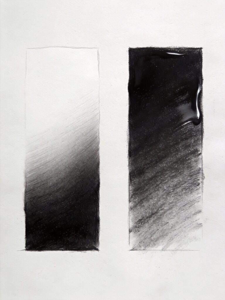
Gradation (Graduated Tone)
Description: Smooth transition from light to dark (or vice versa) creating dimensional effects and atmospheric depth.
How to execute: Start at one end with either full pressure (dark end) or light pressure (light end). Gradually adjust pressure as you work toward the opposite end. Blend if needed for extra smoothness.
Best for:
- Creating form on rounded objects
- Sky gradations
- Suggesting depth and atmosphere
- Background effects
Tips: Practice creating smooth gradients as an exercise. Furthermore, this fundamental skill appears in nearly every realistic drawing. Master it early in your learning journey.
Layering
Description: Building value through multiple transparent or semi-transparent layers rather than applying dark values in single applications.
How to execute: Apply light layers with varied pencil grades. Start with harder pencils (H-HB) for light layers. Progress to softer pencils (2B-6B) for subsequent darker layers. Let each layer establish before adding the next.
Best for:
- Building rich, complex darks
- Creating depth in shadows
- Achieving maximum value range
- Professional-quality rendering
Tips: Patience is essential—layering takes time. However, the results are worth it, creating richer values than single-layer application. Furthermore, varying pencil grades between layers creates more interesting surfaces.
Chiaroscuro
Description: Dramatic contrast between light and dark, creating strong three-dimensional effects and mood. The term comes from Italian words meaning “light-dark.”
How to execute: Plan your composition with distinct light and dark areas. Use your full value range, but emphasize the extremes. Therefore, push your darks very dark and preserve your lights very light. Minimize mid-tones.
Best for:
- Dramatic, moody artwork
- Creating strong focal points
- Portrait work
- Still life with strong directional lighting
Tips: Study master artists who used chiaroscuro, like Caravaggio or Rembrandt. Moreover, single light sources create the strongest chiaroscuro effects. Learn more about light and form in our art fundamentals guide.
Form Shadow vs Cast Shadow
Description: Understanding and rendering the two types of shadows differently creates convincing three-dimensional drawings.
Form shadows appear where the object itself turns away from light. Cast shadows are projected by the object onto other surfaces.
How to execute: Form shadows typically have softer edges and may show reflected light. Cast shadows are usually darker with harder edges near the object, softening with distance.
Best for:
- Realistic rendering
- Creating convincing space
- Grounding objects
- Adding depth
Tips: Form shadows connect to the object; cast shadows project away. Furthermore, cast shadows help establish lighting direction and ground objects in space.
Texturing Methods
Texture techniques replicate surface qualities, adding realism and visual interest. Moreover, combining multiple texturing methods creates complex, convincing surfaces.
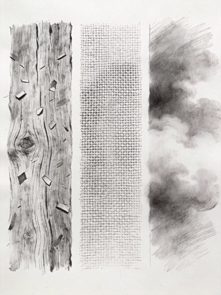
Dry Brush
Description: Using a pencil with minimal graphite and quick strokes to create broken, textured marks that catch on paper texture.
How to execute: Load your pencil lightly. Wipe excess on scrap paper if needed. Use quick, light strokes that skip across the paper surface, hitting only the raised texture.
Best for:
- Wood grain
- Rough stone
- Grass and foliage
- Weathered surfaces
- Hair and fur texture
Tips: This technique works best on textured paper. Furthermore, vary pressure and speed to create different effects. Smooth paper limits the effectiveness of dry brush technique.
Impressing
Description: Creating texture by pressing objects or tools into paper before drawing, leaving indentations that resist graphite.
How to execute: Before adding graphite, press textured objects (mesh, fabric, coins, leaves) into your paper using a hard, smooth tool or bone folder. Then shade over the area—the impressed texture remains white or lighter.
Best for:
- Creating repeated patterns
- Fabric textures
- Natural textures from actual objects
- Unique, organic effects
Tips: Experiment on scrap paper first to gauge pressure needed. Moreover, this technique is permanent—plan carefully before impressing.
Smudging
Description: Deliberately spreading and softening graphite with fingers, stumps, or cloth to create soft, atmospheric effects.
How to execute: Apply graphite, then use your finger, stump, or soft cloth to spread and soften it. Direction of smudging can suggest form or texture.
Best for:
- Soft backgrounds
- Atmospheric effects
- Quick sketching
- Creating soft transitions
Tips: Different tools create different effects. Fingers create soft, uneven smudges. Paper stumps offer more control. Furthermore, clean your tools regularly—dirty tools spread graphite unintentionally.
Sgraffito
Description: Scratching through graphite layers to reveal white paper underneath, creating fine light lines or textures.
How to execute: Build up dark graphite layers. Then use a sharp tool (craft knife, needle, or specialized sgraffito tool) to carefully scratch away graphite in fine lines or patterns.
Best for:
- Fine highlights (hair highlights, grass blades, whiskers)
- Creating texture in dark areas
- Adding detail without erasing large areas
- Final touches and refinements
Tips: Work carefully—you’re physically removing paper surface along with graphite. Therefore, you can’t redo scratched areas easily. Moreover, this works best as a final detail technique.
Frottage
Description: Rubbing over textured surfaces to transfer their pattern to your paper, creating realistic textures you couldn’t easily draw.
How to execute: Place thin paper over a textured surface (wood, fabric, leaves, coins). Rub gently with the side of your pencil. The surface texture transfers to your paper.
Best for:
- Tree bark
- Fabric weaves
- Rough stone
- Natural organic patterns
- Abstract textures
Tips: This technique works best with thin, smooth paper and soft pencils. Furthermore, you can combine frottage textures with drawn elements for mixed-media effects.
Pointillism
Description: Similar to stippling but typically refers to larger-scale work where distinct dots create images through optical mixing.
How to execute: Create images using only dots—no lines or solid shading. Vary dot density and size to create values and forms. Stand back to see the image emerge.
Best for:
- Unique artistic style
- Creating optical effects
- Patient, meditative drawing
- Modern, graphic aesthetics
Tips: This technique is extremely time-consuming. However, the results can be stunning and unique. Furthermore, consistent dot size throughout the piece creates visual coherence.
Blending and Smoothing Techniques
Blending techniques create smooth, professional finishes essential for realistic rendering. Moreover, choosing the right blending method affects both the appearance and the archival quality of your work.
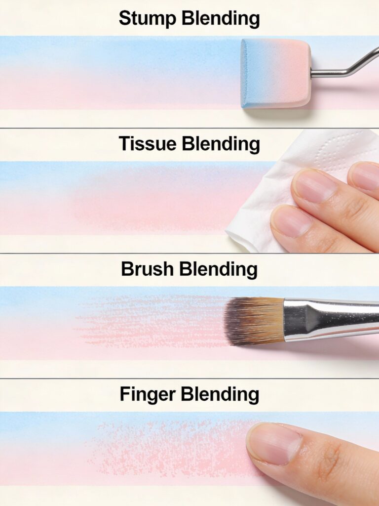
Paper Stump/Tortillon Blending
Description: Using tightly rolled paper tools to blend and smooth graphite into paper texture.
How to execute: Apply graphite with your pencil. Then use the stump in circular motions or directional strokes following the form. Build up gradually, adding more graphite and blending repeatedly.
Best for:
- Professional, smooth blending
- Detailed realistic work
- Precise control
- Archival drawings
Tools: Paper stumps (thick, pointed both ends) and tortillons (thin, hollow, pointed one end) in various sizes
Tips: Match stump size to area size—large stumps for broad areas, small for details. Furthermore, clean stumps by rubbing on sandpaper to restore tips and remove built-up graphite.
Tissue/Cloth Blending
Description: Using soft tissue or cloth to blend large areas quickly, creating soft, even tones.
How to execute: Apply graphite broadly. Then use crumpled tissue or soft cloth to blend with circular or sweeping motions. This method covers large areas quickly.
Best for:
- Large background areas
- Quick sketching
- Soft, atmospheric effects
- Non-detailed areas
Tips: Use clean tissue for each blending session. Dirty tissue spreads graphite unpredictably. Moreover, this technique offers less precision than stump blending but works faster for large areas.
Brush Blending
Description: Using soft brushes (typically makeup brushes or soft art brushes) to blend graphite smoothly without adding texture.
How to execute: Apply graphite, then use a clean, soft brush to blend with gentle strokes. The bristles spread graphite evenly across the paper surface.
Best for:
- Very soft effects
- Large, smooth areas
- Delicate blending
- Preserving paper texture
Tips: Natural hair brushes work better than synthetic for this application. Furthermore, keep brushes dedicated to graphite blending—don’t mix with wet media brushes.
Finger Blending
Description: Using your fingertip to blend graphite, creating soft, organic effects.
How to execute: Apply graphite, then rub gently with your fingertip in circular or directional motions. Your finger’s warmth and oils help spread the graphite.
Best for:
- Quick sketching
- Soft effects
- Casual drawing
- When no tools are available
Tips: Finger oils can affect paper quality over time, potentially causing yellowing or degradation. Therefore, many professional artists avoid this technique for archival work. However, it’s perfectly fine for sketches and studies.
Erasing and Subtractive Techniques
Erasing isn’t just for correcting mistakes. Moreover, strategic erasing creates highlights, textures, and atmospheric effects.
Lifting
Description: Gently removing graphite to lighten areas or create highlights without completely erasing to white.
How to execute: Use a kneaded eraser dabbed or pressed onto the area. Lift straight up rather than rubbing. This removes some graphite while leaving a toned base.
Best for:
- Subtle highlights
- Lightening over-dark areas
- Creating soft light effects
- Adjusting values
Tips: Kneaded erasers work best for lifting. Furthermore, keep the eraser clean by kneading it frequently to expose clean surfaces.
Erasing for Highlights
Description: Completely removing graphite to reveal white paper, creating bright highlights and light effects.
How to execute: Use a vinyl/plastic eraser with firm pressure to remove graphite completely. For fine highlights, use an eraser pencil or eraser shield (metal template with various shaped openings).
Best for:
- Bright highlights (light on water, metal, eyes)
- Creating light beams
- Sharp, defined light areas
- Final touches
Tips: Plan highlights before you start—preserving white paper is easier than erasing back to white later. Moreover, eraser shields help create precise highlights without affecting surrounding areas.
Negative Drawing
Description: Drawing the spaces around objects rather than the objects themselves, or erasing to reveal light forms against dark backgrounds.
How to execute: Apply dark tone over an area. Then erase to create light shapes emerging from the darkness. Alternatively, shade around light shapes, leaving them untouched.
Best for:
- Creating dramatic effects
- White objects on dark backgrounds
- Suggesting light and atmosphere
- Abstract work
Tips: This technique requires planning—know what you want to preserve before applying tone. Furthermore, it creates striking, dramatic compositions that draw viewer attention.
Eraser Drawing
Description: Using erasers as drawing tools, creating images by removing graphite from evenly toned surfaces.
How to execute: Apply even, medium-dark tone across your paper. Then “draw” by erasing, using various eraser types for different effects. Kneaded erasers create soft edges; vinyl erasers create sharp edges.
Best for:
- Unique artistic effects
- Light subjects (snow scenes, white animals, bright skies)
- Experimental work
- Exploring tone in reverse
Tips: This technique reverses normal drawing thinking—you’re removing dark to reveal light. Moreover, it creates a unique aesthetic different from traditional drawing.
Mixed Media Techniques
Combining drawing with other media expands creative possibilities. Moreover, these techniques create effects impossible with pencil alone.
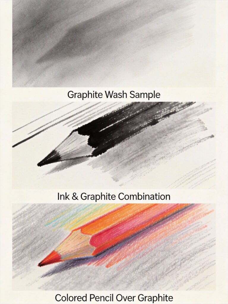
Graphite Wash
Description: Mixing graphite powder with water or blending medium to create paintable graphite that applies like watercolor.
How to execute: Scrape graphite from your pencil with sandpaper to create powder. Mix with water or acrylic medium. Apply with brush like paint. Let dry, then add drawn details over it.
Best for:
- Quick value studies
- Atmospheric backgrounds
- Combining with traditional drawing
- Experimental effects
Tips: Graphite wash can be unpredictable. Therefore, test on scrap paper first. Furthermore, seal with fixative when dry to prevent smudging.
Ink and Graphite Combination
Description: Combining ink (for darks and definition) with graphite (for mid-tones and soft effects).
How to execute: Use ink for darkest darks, defined edges, and details. Add graphite for mid-tones, soft transitions, and blending. The combination offers both precision and softness.
Best for:
- Illustration work
- Combining graphic and soft elements
- Creating rich blacks beyond graphite’s range
- Varied textures
Tips: Let ink dry completely before adding graphite over it. Moreover, graphite over ink can smudge—use fixative if needed.
Colored Pencil and Graphite
Description: Using graphite for values and form, adding color with colored pencils for selective emphasis or full color rendering.
How to execute: Establish form and values with graphite. Then add color with colored pencils, either fully covering the graphite or allowing it to show through for toned effects.
Best for:
- Adding color to graphite drawings
- Toned drawing effects
- Mixed media illustration
- Unique aesthetic combinations
Tips: Graphite can resist colored pencil application. Therefore, apply graphite lightly if you plan to cover it completely with color. Learn more in our graphite vs colored pencil comparison.
Perspective and Spatial Techniques
These techniques create convincing three-dimensional space and depth on flat paper. Moreover, mastering perspective separates amateur work from professional-looking drawings.
One-Point Perspective
Description: All parallel lines converge to a single vanishing point on the horizon, creating depth along one axis.
How to execute: Establish horizon line and vanishing point. Draw parallel lines (like edges of buildings or roads) converging toward that point. Vertical and horizontal lines remain parallel.
Best for:
- Interior spaces
- Roads or hallways
- Railway tracks
- Frontal architectural views
Tips: Use a ruler for perspective lines initially until you develop the skill. Furthermore, vanishing points often fall outside your drawing area—tape extra paper to your board if needed.
Two-Point Perspective
Description: Two sets of parallel lines converge to two different vanishing points on the horizon, creating depth along two axes.
How to execute: Establish horizon line with two vanishing points. Draw vertical edges straight up and down. Draw horizontal edges converging to one vanishing point or the other depending on which face of the object they’re on.
Best for:
- Buildings and architecture
- Boxes and rectangular objects
- Urban scenes
- Angled views
Tips: This is the most commonly used perspective system. Moreover, it creates natural-looking space for most subjects. Practice drawing simple boxes before attempting complex architecture.
Atmospheric Perspective
Description: Objects appear lighter, less detailed, and bluer/grayer as they recede into the distance, mimicking how atmosphere affects vision.
How to execute: Foreground: darkest darks, sharpest details, highest contrast. Middle ground: moderate values and detail. Background: lightest values, soft edges, minimal detail, reduced contrast.
Best for:
- Landscapes
- Creating depth
- Suggesting distance
- Atmospheric effects
Tips: This technique works with any subject containing depth. Furthermore, combining atmospheric perspective with linear perspective creates maximum spatial convincingness.
Foreshortening
Description: Objects appear compressed when viewed at an angle, with parts closer to the viewer appearing larger.
How to execute: Draw what you actually see, not what you think you should see. Measure carefully. Forms closer to you should be larger, those angled away should be compressed.
Best for:
- Figure drawing (arms reaching toward viewer, legs extended)
- Creating dramatic angles
- Dynamic compositions
- Suggesting movement toward/away from viewer
Tips: Foreshortening often looks “wrong” even when it’s correct because it contradicts our mental model. Therefore, trust your measurements and observations over your assumptions.
Creative and Experimental Methods
Experimental techniques push beyond traditional approaches. Moreover, these methods help you develop unique artistic voices and solve creative challenges.
Blind Contour Drawing
Description: Drawing the contours of a subject without looking at your paper, forcing pure observation.
How to execute: Look only at your subject, never at your paper. Move your pencil at the same speed your eye moves along the subject’s edges. Don’t lift your pencil.
Best for:
- Training observation skills
- Loosening up
- Warm-up exercises
- Breaking perfectionist habits
Tips: Results will look “wrong” and distorted. However, that’s not the point—this exercise trains your eye-hand connection and observation. Furthermore, regular practice dramatically improves your ability to see accurately.
Continuous Line Drawing
Description: Creating entire drawings without lifting your pencil from the paper, creating flowing, connected images.
How to execute: Start drawing and don’t lift your pencil until finished. Lines can backtrack, overlap, and wander, but the pencil stays on paper throughout.
Best for:
- Creating flowing, energetic drawings
- Developing confidence
- Quick sketching
- Artistic, expressive work
Tips: This technique prevents overthinking and creates spontaneous, lively results. Moreover, it’s excellent for gesture drawing and capturing movement.
Automatic Drawing
Description: Drawing without conscious planning, allowing your subconscious to guide your hand, creating organic, unexpected results.
How to execute: Start making marks without a specific goal. Let your hand move freely. Shapes and images may emerge organically. Don’t judge or plan—just draw.
Best for:
- Breaking creative blocks
- Generating abstract compositions
- Exploring subconscious ideas
- Creative warm-ups
Tips: Silence your inner critic during this exercise. Furthermore, automatic drawing often produces surprising results that become springboards for finished work.
Memory Drawing
Description: Studying a subject briefly, then drawing it from memory without reference.
How to execute: Observe your subject for 30 seconds to 2 minutes. Look away and draw what you remember. Check your reference afterward to see what you missed.
Best for:
- Training visual memory
- Improving observation
- Understanding what details matter most
- Developing artistic simplification skills
Tips: This exercise reveals what your brain prioritizes and remembers. Moreover, it trains you to observe more effectively when you do have references available.
Gesture Drawing
Description: Quick drawings (30 seconds to 5 minutes) capturing movement, energy, and essential form rather than details.
How to execute: Work quickly with loose, flowing lines. Capture the overall pose, proportions, and movement. Ignore details. Use your whole arm, not just your fingers.
Best for:
- Figure drawing
- Capturing movement
- Building confidence
- Warm-up exercises
- Understanding form quickly
Tips: Set strict time limits to prevent detail obsession. Furthermore, gesture drawing builds the foundation for longer, more detailed figure work. Practice this regularly for maximum benefit.
Sighting and Measuring
Description: Using your pencil as a measuring tool to accurately compare proportions, angles, and relationships.
How to execute: Hold your pencil at arm’s length. Close one eye. Align the pencil tip with one point on your subject, using your thumb to mark another point. This measurement can then compare to other measurements.
Best for:
- Ensuring accurate proportions
- Checking angles
- Comparative measuring
- Realistic drawing
Tips: Always measure from the same distance with arm fully extended. Moreover, compare relationships rather than trying to measure absolute sizes.
Choosing the Right Technique
Selecting appropriate techniques for your subject and goals is crucial. Moreover, combining techniques often produces the best results.
Subject-Based Technique Selection
Smooth surfaces (glass, polished metal, skin):
- Smooth blending
- Burnishing
- Minimal visible marks
- Strong highlights via erasing
Rough textures (bark, stone, fabric):
- Dry brush
- Scumbling
- Cross-hatching
- Varied mark-making
Organic subjects (foliage, clouds, water):
- Scumbling for foliage
- Smooth blending for clouds and water
- Atmospheric perspective for distance
- Negative space for complex forms
Architectural subjects:
- Linear perspective (one or two-point)
- Hatching for clean shadows
- Precise, controlled marks
- Rulers for straight edges if desired
Style-Based Technique Selection
Realistic/photorealistic:
- Smooth blending
- Layering
- Careful observation
- Full value range
- Subtle mark-making
Loose/expressive:
- Gesture drawing
- Scumbling
- Visible marks
- Less blending
- Emphasis on energy over precision
Graphic/illustrative:
- Clean hatching
- Defined edges
- Limited value range sometimes
- Ink combination possibly
- Stylized rather than realistic
Combining Techniques Effectively
Most successful drawings combine multiple techniques. For example:
- Smooth blending for skin + hatching for fabric + dry brush for hair
- Atmospheric perspective for depth + careful detail in focal area
- Gesture foundation + refined shading in selected areas
Tips for combination: Don’t use every technique you know in one drawing. Choose 3-5 complementary techniques that serve your subject. Furthermore, consistency in technique application creates visual coherence.
Conclusion & Next Steps
Drawing techniques form the essential vocabulary of visual art. Mastering these 50+ methods gives you the tools to create any image you can imagine. Moreover, understanding when and how to apply each technique separates competent drawings from exceptional artwork.
Your next steps:
- Start with fundamentals: Master basic hatching, cross-hatching, and smooth blending before attempting advanced techniques.
- Practice systematically: Choose 2-3 techniques weekly to focus on. Create dedicated practice sheets exploring each method.
- Study applications: Our pencil drawing guide shows these techniques applied to complete drawings.
- Explore shading deeply: Visit our shading techniques guide for comprehensive coverage of value creation.
- Experiment boldly: Try creative techniques like automatic drawing and continuous line to expand your artistic range.
- Combine thoughtfully: Learn which techniques work well together and which clash.
Remember that technique serves vision—don’t let technical showmanship overwhelm your artistic intent. Furthermore, the best drawings often combine simple techniques applied masterfully rather than complex techniques applied poorly.
Keep this encyclopedia as a reference. Return to it when facing specific challenges or wanting to try new approaches. Moreover, regular exploration of new techniques prevents artistic stagnation and keeps your work fresh.
Start practicing today. Pick one technique from this guide and create a dedicated study. Then, gradually build your technical vocabulary through consistent, focused practice. Your artistic voice emerges from confident technical mastery combined with personal vision.
FAQ
Q: How many drawing techniques should I master as a beginner?
A: Start with 5-7 fundamental techniques: basic hatching, cross-hatching, smooth blending, gradation, and simple mark-making. Master these thoroughly before expanding your repertoire. Furthermore, solid fundamentals serve you better than superficial knowledge of many techniques. Once comfortable with basics (typically 3-6 months of practice), gradually add more specialized techniques as your work requires them.
Q: What’s the difference between hatching and cross-hatching?
A: Hatching uses parallel lines in one direction to create value and texture. Cross-hatching layers multiple sets of hatching at different angles, creating darker values through overlapping. Therefore, hatching works well for light to medium values, while cross-hatching allows you to build much darker tones. Both techniques can create texture while establishing value.
Q: Which blending technique creates the smoothest results?
A: Paper stumps (tortillons) with proper technique create the smoothest, most professional blending. Apply light graphite layers, blend with circular motions, add more graphite, and blend again repeatedly. However, this requires patience—smooth blending develops through multiple thin layers rather than heavy single applications. Burnishing with a hard pencil afterward creates even smoother results.
Q: How do I know which technique to use for different subjects?
A: Match technique to surface quality and drawing style. Smooth subjects (skin, glass, metal) need smooth blending techniques. Rough textures (bark, stone) work well with dry brush, scumbling, or varied hatching. Furthermore, your artistic style matters—realistic work requires smooth, subtle techniques while expressive work benefits from visible, energetic marks. Study how other artists handle similar subjects for guidance.
Q: Can I combine multiple drawing techniques in one artwork?
A: Absolutely! Most successful drawings combine several techniques. For example, use smooth blending for skin, cross-hatching for fabric shadows, and dry brush for hair texture. However, limit yourself to 3-5 complementary techniques per drawing to maintain visual coherence. Moreover, technique choices should serve your subject rather than showcasing technical variety for its own sake.
Q: What’s the best way to practice new drawing techniques?
A: Create dedicated technique practice sheets. Choose one technique and fill a page with samples, varying pressure, density, and application. Then apply that technique to simple subjects (spheres, cubes, cylinders) before using it in complete drawings. Furthermore, set aside regular “technique study” time separate from finished artwork creation. This deliberate practice builds skills faster than random application.
Q: How long does it take to master a drawing technique?
A: Basic competence with simple techniques like hatching develops within days or weeks of focused practice. However, true mastery of techniques like smooth blending or photorealistic rendering takes months or years. Moreover, “mastery” is relative—you’ll continue refining techniques throughout your artistic career. Focus on steady improvement rather than arbitrary mastery timelines.
Q: Should I use the same techniques for graphite, charcoal, and colored pencil?
A: Many techniques translate across media, but each medium has unique properties affecting application. Charcoal blends more easily than graphite, creating softer effects. Colored pencils layer differently and can’t be erased as easily. Therefore, while core concepts transfer, you’ll need to adapt techniques for each medium’s characteristics.
Q: What’s the difference between stippling and pointillism?
A: Both use dots to create images, but stippling typically refers to smaller-scale detail work where dots create texture and value in specific areas. Pointillism usually describes larger compositions created entirely from dots with no lines or solid tones. Furthermore, pointillism often implies optical color mixing (associated with painting), while stippling in drawing creates value and texture through dot density.
Q: How do I prevent my drawings from looking flat?
A: Flatness comes from inadequate value range and poor understanding of form. Use the full value scale from white to black—most beginner drawings stay in mid-tones. Study how light creates form through highlight, light, mid-tone, core shadow, reflected light, and cast shadow. Moreover, apply atmospheric perspective in any drawing with depth. Learn more in our art fundamentals guide.
Related Resources
Complete Guides:
- Watercolor Painting: Complete Beginner to Advanced Guide
- Pencil Drawing: Complete Guide
- Color Mixing: Everything You Need to Know
- Junk Journaling: Complete Handbook
- Art Fundamentals Guide
- Art Supplies Glossary: 200+ Terms Every Artist Should Know
Comparison Guides:
Technique Deep-Dives:
Have any thoughts?
Share your reaction or leave a quick response — we’d love to hear what you think!
-
 0
0 -
0
-
0
-
0
-
0
-
0


