Table of Contents
As an Amazon Associate I earn from qualifying purchases
Color mixing transforms a few tubes of paint into infinite possibilities. Understanding how colors interact, why some mixtures create vibrant hues while others turn muddy, and how to achieve exactly the color you envision separates competent painters from masterful ones.
This comprehensive guide covers everything from fundamental color theory to advanced mixing techniques. You’ll learn why warm red plus warm yellow creates different oranges than cool red plus cool yellow, how to mix rich darks without black paint, and practical strategies for building a versatile, efficient palette.
Whether you’re working in watercolor, acrylic, oil, or gouache, color mixing principles remain consistent. However, each medium has unique characteristics affecting how colors blend and appear. Therefore, we’ll cover both universal principles and medium-specific considerations.
According to color scientists and art educators at institutions like The Munsell Color System, understanding color relationships through systematic study dramatically accelerates artistic development. Moreover, this knowledge applies beyond painting—to digital art, design, photography, and any visual medium.
Strong color mixing skills give you creative freedom. Instead of buying dozens of pre-mixed colors, you’ll mix exactly what you need from a compact palette. Furthermore, you’ll understand why certain color combinations work harmoniously while others clash, enabling more sophisticated artistic decisions.
Understanding the Color Wheel
The color wheel organizes colors based on their relationships, providing a roadmap for mixing. Think of it as a visual tool showing how colors connect and interact.
The Basic Structure
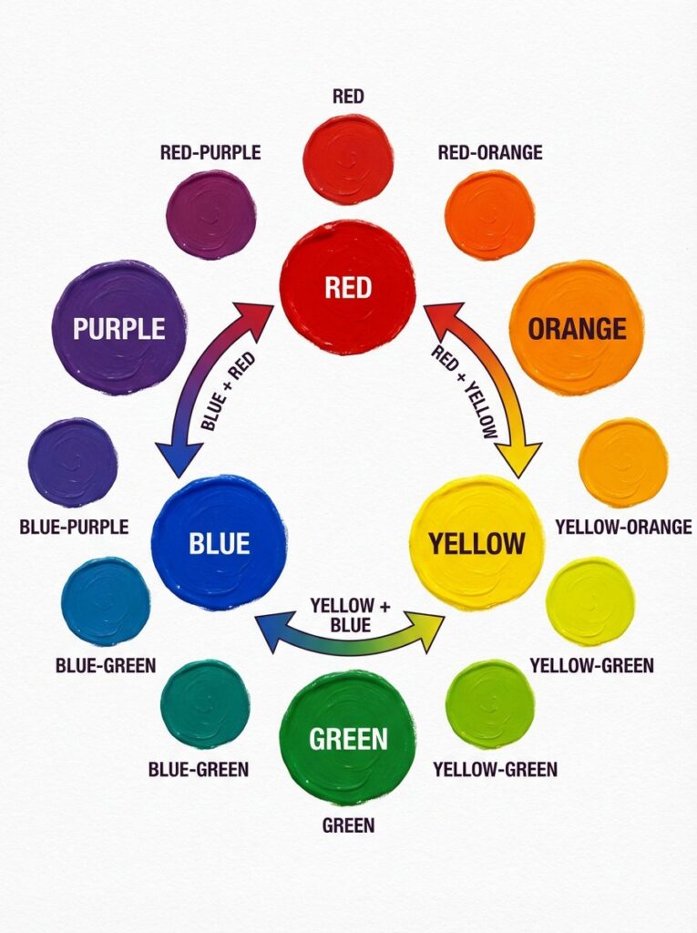
A traditional color wheel contains 12 colors arranged in a circle:
- 3 Primary colors: Red, yellow, blue
- 3 Secondary colors: Orange, green, purple (mixed from primaries)
- 6 Tertiary colors: Red-orange, yellow-orange, yellow-green, blue-green, blue-purple, red-purple (mixed from primary + adjacent secondary)
Colors positioned opposite each other are complementary colors. Colors next to each other are analogous colors. These relationships become essential for mixing and creating color harmony.
Why the Color Wheel Matters for Mixing
Understanding the wheel’s structure reveals mixing logic:
Adjacent colors mix cleanly. Yellow and orange sit next to each other, so mixing them creates clear yellow-orange. The closer two colors sit on the wheel, the more predictable their mixture.
Opposite colors neutralize each other. Blue and orange are complementary—mixing them creates brownish neutrals. This principle helps you mix grays, browns, and muted tones.
Distance predicts mixing results. Colors far apart on the wheel create duller mixtures than nearby colors. Mixing red and blue (separated by purple) creates clearer purple than mixing red and green (opposite sides), which creates mud.
Two Types of Color Wheels
Traditional RYB (Red-Yellow-Blue): Used by painters for centuries. Red, yellow, and blue are primaries.
Modern CMY (Cyan-Magenta-Yellow): Used in printing and reflects light physics more accurately. Cyan, magenta, and yellow are primaries.
For painting, the RYB wheel works perfectly well and matches traditional paint nomenclature. However, understanding that “true primaries” are actually cyan (cool blue), magenta (cool red), and yellow explains why some reds and blues mix better than others—a concept we’ll explore in color temperature.
According to research from the International Colour Association, both systems serve different purposes effectively, and understanding their differences helps artists make informed pigment choices.
Primary, Secondary, and Tertiary Colors
These color categories form the foundation of mixing. Understanding them reveals how all colors relate to each other.
Primary Colors: The Starting Point
Red, yellow, and blue cannot be created by mixing other colors. Every other color comes from combining primaries in various proportions. Therefore, primaries form the essential core of any palette.
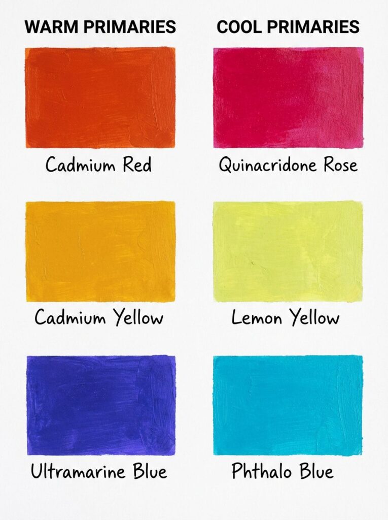
However, here’s the complexity: multiple versions of each primary exist. You have warm reds (cadmium red) and cool reds (alizarin crimson). Warm yellows (cadmium yellow) and cool yellows (lemon yellow). Warm blues (ultramarine) and cool blues (cerulean). This temperature variation dramatically affects mixing results—we’ll explore this thoroughly in the color temperature section.
Secondary Colors: First-Level Mixtures
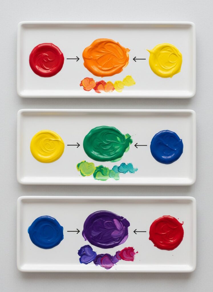
Orange, green, and purple result from mixing two primary colors:
Red + Yellow = Orange The proportions determine whether you get red-orange or yellow-orange. More red creates reddish orange; more yellow creates yellowish orange.
Yellow + Blue = Green Again, proportions matter. Equal parts create balanced green. More yellow creates yellow-green; more blue creates blue-green.
Blue + Red = Purple This mixture often disappoints beginners because it frequently turns muddy. Why? The temperature of your red and blue matters enormously—warm red plus warm blue creates brownish purple, while cool red plus cool blue creates vibrant purple. We’ll address this challenge specifically.
Tertiary Colors: Refined Mixtures
Six tertiary colors fill the spaces between primaries and secondaries:
- Red-orange (vermillion)
- Yellow-orange (amber)
- Yellow-green (chartreuse)
- Blue-green (teal)
- Blue-purple (violet)
- Red-purple (magenta)
You create tertiaries by mixing a primary with its adjacent secondary. For example, yellow + green (which is yellow + blue) = yellow-green.
Understanding this hierarchy reveals mixing logic. Want a specific color? Identify its position on the wheel, then determine which primaries or mixtures will create it.
Warm and Cool Colors
Color temperature is perhaps the most important concept for successful mixing. Every color has a temperature bias—it leans either toward the warm side (red/yellow) or cool side (blue) of the wheel.
Defining Warm and Cool
Warm colors contain more red or yellow:
- Reds, oranges, yellows
- Warm blues (ultramarine – has slight red bias)
- Warm greens (yellow-green, olive)
Cool colors contain more blue:
- Blues, blue-greens, blue-purples
- Cool reds (alizarin crimson, quinacridone rose – have blue/purple bias)
- Cool yellows (lemon yellow – has slight green/blue bias)
This seems straightforward until you realize: every primary color comes in warm and cool versions. This is the key that unlocks clean color mixing.
Why Temperature Matters for Mixing
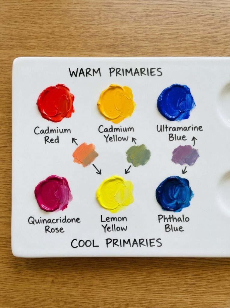
Here’s the principle: Mixing warm with warm or cool with cool creates cleaner, more vibrant colors. Mixing warm with cool creates duller, more neutral colors.
Example 1: Mixing Orange
- Warm red (cadmium red) + Warm yellow (cadmium yellow) = Bright, vibrant orange
- Cool red (alizarin crimson) + Cool yellow (lemon yellow) = Duller, more muted orange
- Warm red + Cool yellow = Even duller orange with brownish cast
Why? When you mix warm red (which leans orange already) with warm yellow (which also leans orange), you’re reinforcing orange. But mixing warm red with cool yellow introduces blue bias (cool yellow contains slight blue), and blue is orange’s complement, creating neutralization.
Example 2: Mixing Green
- Warm yellow (cadmium yellow) + Warm blue (ultramarine) = Muddy, olive-ish green
- Cool yellow (lemon yellow) + Cool blue (cerulean or phthalo blue) = Bright, clear green
Warm blue (ultramarine) contains red bias. Warm yellow contains orange bias. Combined, you’re essentially mixing yellow + blue + red, giving you all three primaries—which creates neutral browns and olives. Cool versions eliminate the opposing temperature bias, creating cleaner mixtures.
Example 3: The Purple Problem
- Warm red (cadmium red) + Warm blue (ultramarine) = Muddy brownish-purple
- Cool red (quinacridone rose/alizarin) + Cool blue (phthalo blue) = Bright, clear purple
Beginners often struggle with purple because they use warm versions of both primaries. Warm red leans orange, warm blue leans slightly red. Together they create relatively clean purple, but the orange bias from the red muddies it. Cool versions create the vibrant purple you expect.
Identifying Temperature in Your Paints
Look at your paint names and compare them:
- Cadmium Red = warm (orange-ish)
- Alizarin Crimson / Quinacridone Rose = cool (purple-ish)
- Cadmium Yellow = warm (orange-ish)
- Lemon Yellow / Hansa Yellow = cool (green-ish)
- Ultramarine Blue = warm (purple-ish)
- Cerulean / Phthalo Blue = cool (pure blue or slightly green)
Create a chart testing your specific paints’ temperatures. This knowledge becomes your mixing superpower.
Mixing Clean, Vibrant Colors
Achieving bright, saturated colors requires understanding which pigments work together and which create mud.
The Two-Color Rule
Use only two colors (or three maximum) to mix any hue. More colors = muddier results. Each additional pigment introduces more complexity and potential for neutralization.
Want bright orange? Red + yellow. That’s it. Want purple? Blue + red, done. The moment you add a third color, you’re moving toward neutrals.
Choosing Compatible Pigments
Match color temperatures when mixing secondaries:
For bright orange: Warm red + warm yellow For bright green: Cool yellow + cool blue
For bright purple: Cool red + cool blue
For muted/natural colors: Mix warm with cool intentionally. This gives you olive greens, burnt oranges, and complex purples useful in landscapes and realistic painting.
The Complement Test
Before mixing, ask: “Am I accidentally introducing complementary colors?”
If you want green but use warm yellow (orange-biased) and warm blue (red-biased), you’re introducing orange and red—both move toward green’s complement, dulling the mixture.
Mixing Proportions
Small amounts of one color dramatically change mixtures. When mixing:
Start with the lighter color and add small amounts of the darker color. It’s easier to darken than lighten. For orange, start with yellow, add red gradually.
Add intense colors cautiously. Colors like phthalo blue and alizarin crimson are extremely powerful—a tiny amount goes far.
Test before committing. Mix on your palette, test on scrap surface, adjust, then use in your painting.
Maintaining Color Cleanliness
Clean your brush between colors. Dirty brushes contaminate mixtures. Keep two water containers (if using water media)—one for initial rinse, one for final clean.
Use fresh paint. Contaminated paint from your palette introduces unwanted colors.
Maintain clean mixing areas on palette. Don’t mix new colors in areas where other colors have been. Contamination is invisible but affects results.
Creating Neutrals and Earth Tones
Grays, browns, and muted colors appear constantly in nature and realistic painting. Moreover, mixing your own neutrals creates more sophisticated, harmonious colors than pre-mixed tubes labeled “brown” or “gray.”
Mixing Neutrals with Complementary Colors
Complementary pairs mixed in approximately equal proportions create neutral grays and browns. The exact color depends on the specific pigments and proportions:
Orange + Blue = Brown This is your workhorse brown mixture. Vary proportions:
- More orange = warm brown
- More blue = cool, grayish brown
- Equal parts = neutral brown
Red + Green = Brownish gray Useful for muted colors. Add white for rose-grays or earth tones.
Purple + Yellow = Olive/brown Creates earthy, muted yellows and brown-grays.
The Three-Primary Method
Mix all three primaries (red, yellow, blue) to create complex neutrals. Proportions determine the result:
- More blue = cool gray
- More red = warm gray/brown
- More yellow = olive/khaki
- Equal parts = neutral gray
This method creates rich, complex neutrals impossible to achieve with tube grays. Furthermore, adjusting proportions lets you shift temperature without starting over.
Mixing Blacks and Very Dark Neutrals
Never use black paint straight from the tube—it deadens colors and lacks depth. Instead, mix rich darks:
Ultramarine Blue + Burnt Umber = Rich, warm black The most popular painter’s black. Warm and deep.
Phthalo Blue + Burnt Sienna = Cool black Slightly cooler than ultramarine + burnt umber.
Alizarin Crimson + Phthalo Green = Very dark, nearly black Two intense complements create deep, rich darks.
Three primaries in dark values = Complex black Use dark versions (ultramarine, alizarin, dark yellow ochre). Creates the most sophisticated blacks.
These mixed blacks are actually very dark browns or grays. They contain color, creating depth and richness absent in true black. Moreover, you can shift them warm or cool by adjusting proportions.
Creating Earth Tones
Earth tones—ochres, siennas, umbers—are essentially muted oranges, yellows, and reds.
Yellow Ochre: Yellow + small amount of purple or complement Raw Sienna: Orange + small amount of blue Burnt Sienna: Deeper orange + blue (more saturated than raw sienna) Raw Umber: Yellow-brown + blue for cooling Burnt Umber: Deep red-brown + blue
However, these earth pigments are so useful and inexpensive that most artists buy them. The mixing principle remains important: earth tones are muted versions of bright colors, created by adding their complements.
Mixing Darks Without Black
Black paint from a tube creates flat, lifeless darks. Professional painters mix rich, luminous darks from other colors, creating depth and atmosphere impossible with straight black.
Why Avoid Tube Black?
Black paint deadens mixtures. When you add black to lighten a color, it often turns gray and loses vibrancy. Black + yellow, for instance, creates dull olive rather than darker yellow.
Black lacks color depth. Real-world darks contain color—dark trees are dark green, shadows have blue or purple casts, dark fabric has color temperature. Tube black provides none of this nuance.
Mixed darks are adjustable. Creating darks from colors lets you shift them warm or cool, lighter or darker, more chromatic or neutral—all by adjusting mixing ratios.
Best Dark Mixtures
For general darks:
- Ultramarine Blue + Burnt Umber: Versatile, warm-leaning dark
- Phthalo Blue + Burnt Sienna: Similar to above, slightly different character
- Alizarin Crimson + Phthalo Green: Very dark, nearly black, slightly cool
For dark greens:
- Phthalo Blue + Burnt Sienna: Creates deep forest greens
- Ultramarine + Burnt Umber: Olive-toned dark greens
- Viridian + Alizarin: Deep, rich darks with green character
For dark blues:
- Ultramarine + Burnt Umber: Deep navy
- Phthalo Blue + small amount of Burnt Sienna: Intense dark blue
For dark reds:
- Alizarin Crimson + Phthalo Green: Deep burgundy
- Cadmium Red + Ultramarine: Dark, rich red
Technique for Mixing Darks
- Start with your darker pigment (usually the blue or dark earth tone)
- Add small amounts of the second color until reaching desired darkness
- Test the mixture against your subject or reference
- Adjust temperature by shifting proportions (more blue = cooler, more earth tone = warmer)
When to Use Tube Black
Some situations justify black paint:
Mixing with white for value scales: Black + white creates neutral grays for practice Abstract or graphic work: Where flat, intense black is desired aesthetically Mixed with other colors carefully: Small amounts in mixtures (though mixed darks still work better)
According to pigment studies from Golden Artist Colors, professional artists across all mediums overwhelmingly prefer mixed darks to tube blacks for their depth and adjustability.
Color Temperature in Mixing
We’ve touched on temperature, but understanding it deeply transforms your mixing. Temperature isn’t just warm/cool—it’s a spectrum affecting every color decision.
Temperature as a Spectrum
Every color sits somewhere on a warm-to-cool spectrum:
Warmest: Red-orange (pure warm) Warm: Reds, oranges, warm yellows, warm purples Neutral: Some yellows, some greens Cool: Cool yellows, greens, cool purples, most blues Coolest: Blue-green (pure cool)
Colors can only be warm or cool relative to other colors. Ultramarine blue is warm compared to cerulean blue but cool compared to red. This relativity matters when mixing.
Split-Primary Palette
Professional painters often use a split-primary palette: warm and cool versions of each primary.
Reds:
- Warm: Cadmium Red, Vermillion
- Cool: Alizarin Crimson, Quinacridone Rose
Yellows:
- Warm: Cadmium Yellow, Yellow Ochre
- Cool: Lemon Yellow, Hansa Yellow
Blues:
- Warm: Ultramarine Blue, Cobalt Blue
- Cool: Cerulean Blue, Phthalo Blue
With six colors, you can mix nearly any color cleanly by choosing the appropriate temperature combination.
Temperature Mixing Strategy
For maximum vibrancy: Mix colors of the same temperature
- Bright orange: Warm red + warm yellow
- Bright green: Cool yellow + cool blue
- Bright purple: Cool red + cool blue
For muted/natural colors: Mix colors of opposite temperatures
- Olive green: Warm yellow + warm blue
- Burnt orange: Warm red + cool yellow
- Natural purple-brown: Warm red + warm blue
For neutrals: Intentionally mix complements or colors far apart on the wheel
Temperature and Spatial Illusion
Temperature creates depth in paintings:
Warm colors advance visually—they appear to come forward in space. Use warmer colors in foregrounds.
Cool colors recede—they appear to move backward. Use cooler colors in backgrounds and distant elements.
Atmospheric perspective relies on temperature: distant objects appear cooler and bluer because atmosphere scatters blue light. Mix cooler versions of colors for backgrounds, warmer versions for foregrounds.
Medium-Specific Mixing Tips
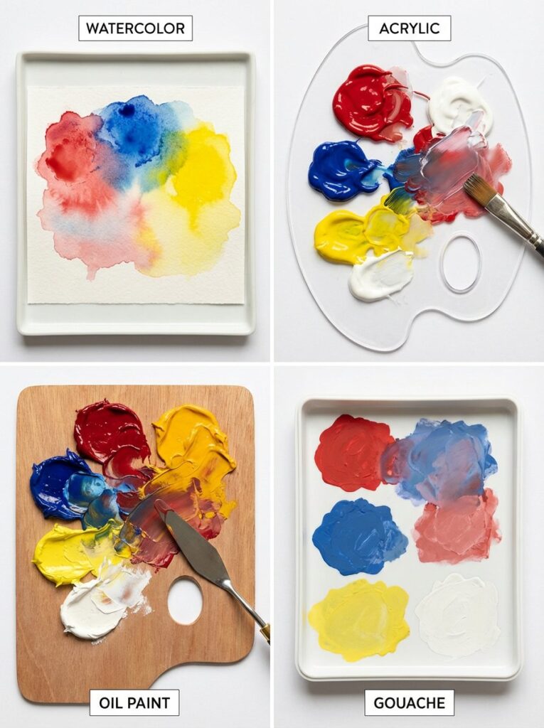
While color mixing principles remain consistent across mediums, each has unique characteristics affecting mixing techniques and results.
Watercolor Mixing
Transparency affects mixing: Watercolor layers visually mix as light passes through them. Colors mixed on your palette behave differently than colors layered on paper.
Water ratio matters enormously: More water creates paler, more transparent colors. Less water creates more intense, saturated colors. Consistency affects how colors flow and blend.
Mixing methods:
- Palette mixing: Mix colors before applying to paper for controlled, specific colors
- Wet-into-wet mixing: Apply colors to wet paper, letting them blend organically
- Glazing: Layer transparent washes, creating optical mixing
Staining vs. non-staining: Some watercolors stain paper (phthalo blue, alizarin crimson), while others lift easily (cobalt blue, ultramarine). Staining colors dominate mixtures—use them cautiously.
Start light: You can always go darker in watercolor but rarely lighter. Mix lighter than you think you need initially.
Learn more watercolor-specific techniques in our complete watercolor guide.
Acrylic Mixing
Color shift: Acrylics often dry slightly darker and less vibrant than wet. Mix colors slightly lighter/brighter than your target.
Fast drying challenges blending: Mix sufficient quantities before starting. Use palette with lid or spray bottle to keep paint workable longer.
Mixing mediums available:
- Flow improver: Increases blending time
- Retarder: Slows drying significantly
- Glazing medium: Creates transparent mixtures for layering
Opacity levels vary: Some acrylics are transparent, others opaque. Transparent colors create different mixtures than opaque ones—transparent mixes layer like watercolor, opaque mixes behave more solidly.
Clean mixing areas: Once acrylic dries on your palette, it contaminates subsequent mixtures. Use stay-wet palettes or parchment paper you can discard.
Oil Painting Mixing
Extended working time: Oil’s slow drying allows extended mixing and blending on canvas itself, not just palette. You can work wet-into-wet for days.
Fat over lean: When mixing with mediums (linseed oil, turpentine), remember “fat over lean”—each layer should have slightly more oil than the previous layer to prevent cracking.
Mixing with palette knife: Many oil painters prefer mixing with knives rather than brushes for cleaner, more complete mixing.
Impasto vs. glazing:
- Impasto: Thick, opaque mixing creates sculptural effects
- Glazing: Thin, transparent layers create optical mixing and luminous effects
Slow drying aids color matching: You can test colors on your canvas, wipe them away if incorrect, and remix without waiting for drying.
Gouache Mixing
Opacity considerations: Unlike watercolor, gouache is opaque—light colors mix over dark effectively. This changes mixing strategy.
Rewettable nature: Dried gouache reactivates with water, meaning new layers can disturb old ones. Mix colors carefully and don’t overwork areas.
Color shift significant: Gouache dries much lighter than it appears wet—sometimes dramatically so. Mix colors darker than your target and test before committing.
Works best relatively thick: While you can dilute gouache like watercolor, it performs best at medium-thick consistency where its opacity shines.
White and neutrals: Gouache contains white pigment in all colors (unlike watercolor), affecting how colors mix. Mixtures tend toward chalky, pastel qualities more than other mediums.
Building a Versatile Palette
Rather than buying dozens of pre-mixed colors, build an efficient palette where a few well-chosen colors mix to create everything you need.
The Minimal Palette Approach
Three-primary palette (3 colors):
- One red (warm or cool)
- One yellow (warm or cool)
- One blue (warm or cool)
This creates all colors theoretically. However, limitations exist—some mixtures will be muddy because you can’t match temperatures perfectly.
Split-primary palette (6 colors):
- Warm red (cadmium red) + Cool red (quinacridone rose)
- Warm yellow (cadmium yellow) + Cool yellow (lemon yellow)
- Warm blue (ultramarine) + Cool blue (phthalo blue)
This is the “sweet spot”—maximum versatility with minimal colors. You can mix nearly any color cleanly by choosing appropriate temperature combinations.
Extended palette (10-12 colors): Add convenience colors that save mixing time:
- The 6 split primaries
- 2-3 earth tones (yellow ochre, burnt sienna, burnt umber)
- 1-2 convenience greens (especially for landscape painters)
- White (for any medium except traditional watercolor)
Recommended Starter Palettes by Medium
Watercolor (8 colors):
- Cadmium Red or Scarlet Lake
- Alizarin Crimson or Quinacridone Rose
- Cadmium Yellow or Hansa Yellow Medium
- Lemon Yellow
- Ultramarine Blue
- Phthalo Blue or Cerulean
- Burnt Sienna
- Burnt Umber
Acrylic (10 colors):
- Cadmium Red Medium
- Quinacridone Magenta
- Cadmium Yellow Medium
- Lemon Yellow or Hansa Yellow Light
- Ultramarine Blue
- Phthalo Blue
- Yellow Ochre
- Burnt Sienna
- Titanium White
- (Optional: Ivory Black for mixing grays)
Oil (12 colors):
- Cadmium Red
- Alizarin Crimson or Quinacridone Rose
- Cadmium Yellow
- Lemon Yellow
- Ultramarine Blue
- Cerulean Blue or Phthalo Blue
- Viridian or Phthalo Green
- Yellow Ochre
- Burnt Sienna
- Burnt Umber
- Titanium White
- (Optional: Ivory Black)
Colors to Avoid Buying
Pre-mixed oranges, greens, purples: You’ll mix better versions yourself. Moreover, you’ll learn color relationships better by mixing.
“Convenience” grays and browns: Mixed neutrals are more sophisticated and harmonious with your palette.
Excessive pigment variations: Don’t buy ten reds. Master mixing with 2-3 well-chosen reds first.
Adding Colors Strategically
As you develop, add colors based on your actual painting needs:
Landscape painters often add: Sap green, viridian, yellow ochre, raw umber Portrait painters often add: Naples yellow, terre verte, additional reds for skin tones Still life painters often add: Various earth tones, convenience purples
Add colors that save significant mixing time or achieve effects difficult to mix. However, continue practicing with your core palette—this builds mixing mastery.
According to professional artist surveys from Artists & Illustrators Magazine, most working artists use 10-15 colors regularly, with 6-8 forming their true working core.
Common Color Mixing Problems
Even experienced painters encounter these challenges. Understanding causes helps you troubleshoot effectively.
Problem 1: Colors Turn Muddy
Cause: Mixing complements unintentionally, mixing too many colors, or using wrong temperatures together.
Solution:
- Limit mixtures to 2-3 colors maximum
- Match color temperatures (warm + warm or cool + cool)
- Clean brushes between colors
- Use fresh, uncontaminated paint
- Check if your pigments have hidden biases toward complements
Example: Trying to mix bright green with warm yellow and warm blue? The warm blue contains red bias—red is green’s complement, creating mud. Switch to cool blue.
Problem 2: Can’t Achieve Bright Purple
Cause: Using warm red (orange-biased) and/or warm blue (slightly red-biased).
Solution:
- Use cool red (quinacridone rose, alizarin crimson)
- Use cool blue (phthalo blue, intense ultramarine)
- Both pigments should lean toward purple, not away from it
- Use more blue than red in your mixture—red pigments are typically more powerful
Test: If purple remains disappointing, buy dioxazine purple or ultramarine violet as convenience colors.
Problem 3: Mixed Colors Look Different When Dry
Cause: Different mediums exhibit different color shifts:
- Acrylics dry darker
- Gouache dries much lighter
- Watercolor dries slightly lighter
- Oil remains consistent
Solution:
- For acrylic: Mix slightly lighter than target
- For gouache: Mix significantly darker than target; test and adjust
- For watercolor: Test on scrap paper and let dry before committing
- Create value/color test sheets for your specific paints
Problem 4: Colors Change in Different Lighting
Cause: Metamerism—colors appear different under different light sources (daylight vs. incandescent vs. fluorescent).
Solution:
- Paint under consistent lighting
- Use full-spectrum daylight bulbs in your studio
- View work-in-progress under intended display lighting periodically
- Understand this is unavoidable to some degree; consistent lighting minimizes it
Problem 5: Can’t Match a Specific Color
Cause: Not systematically analyzing the target color’s characteristics.
Solution:
- Identify the hue: Is it orange, red-orange, yellow-orange? Where on the color wheel?
- Assess value: Is it light, medium, or dark? Squint to see value clearly
- Determine saturation: Is it bright and intense or muted and grayish?
- Note temperature: Does it lean warm or cool?
- Start with closest hue from your palette
- Adjust value (lighten with white or dilution, darken with complementary darks)
- Adjust saturation (add complement to mute, add more pure color to intensify)
- Fine-tune temperature (add warm or cool bias as needed)
Problem 6: Paint Contamination
Cause: Dirty brushes, contaminated palette areas, or mixing in dirty wells.
Solution:
- Keep brushes scrupulously clean between colors
- Use dedicated mixing areas on palette; don’t mix new colors where old colors remain
- Replace palette paper or clean palette regularly
- Use separate brushes for dramatically different colors
- Maintain two water containers (if water-based): dirty rinse, clean rinse
Practical Mixing Exercises
Deliberate practice builds mixing confidence faster than random experimentation. These exercises systematically develop color knowledge.
Exercise 1: Color Wheel from Three Primaries (1 hour)
Goal: Understand how all colors derive from primaries.
Process:
- Use only red, yellow, and blue (choose one version of each)
- Mix secondary colors: orange, green, purple
- Mix tertiary colors: six colors between primaries and secondaries
- Create a 12-color wheel from just three starting colors
- Notice which mixtures work beautifully and which turn muddy
Reflection: Which mixtures disappointed you? This reveals temperature mismatches—you’re using wrong primary temperatures for certain mixtures.
Exercise 2: Temperature Comparison (45 minutes)
Goal: Understand temperature’s dramatic effect on mixing.
Process:
- Mix orange using warm red + warm yellow
- Mix orange using cool red + cool yellow
- Mix orange using warm red + cool yellow
- Mix orange using cool red + warm yellow
- Repeat for green (yellow + blue variations)
- Repeat for purple (red + blue variations)
Compare results: Notice which combinations create bright, clean colors versus muddy, dull ones.
Exercise 3: Value Scales (30 minutes per color)
Goal: Develop control over lightening and darkening colors.
Process:
- Choose one color
- Create 7-9 steps from pure color to white (or maximum dilution)
- Create 7-9 steps from pure color to black (use mixed darks, not tube black)
- Try to make each step an equal visual distance from the next
- Repeat with different colors, especially your primaries
This builds: Precise value control and understanding of how colors behave when lightened or darkened.
Exercise 4: Mixing Neutrals (45 minutes)
Goal: Master creating grays and browns without black or pre-mixed colors.
Process:
- Mix brown using orange + blue (vary proportions)
- Mix gray using red + green (vary proportions)
- Mix neutral using purple + yellow (vary proportions)
- Mix gray/brown using all three primaries (vary proportions)
- Create 10 different neutrals, each distinct from the others
Challenge: Can you mix warm gray, cool gray, warm brown, cool brown, olive, taupe?
Exercise 5: Matching Colors (ongoing practice)
Goal: Develop ability to mix any color you see.
Process:
- Choose a color from a photo, magazine, or real object
- Analyze: What’s the hue? Value? Saturation? Temperature?
- Mix your best match
- Place mixed color next to target
- Identify differences: too light/dark? Too bright/dull? Wrong temperature?
- Adjust mixture to get closer
- Repeat until match is very close
Do this regularly: This is the most practical exercise for painting from life or reference.
Exercise 6: Limited Palette Painting (2-3 hours)
Goal: Master mixing full-color paintings from minimal colors.
Process:
- Choose 3-4 colors (try different combinations):
- Three primaries
- Three analogous colors
- Two complements + white
- Paint a complete small painting using only these colors
- Notice what colors you can and cannot mix effectively
- Appreciate the color harmony that limited palettes create automatically
Insight: Limited palettes force mixing mastery and create naturally harmonious color schemes.
Conclusion & Next Steps
Color mixing mastery transforms your painting from copying what you see to creating what you envision. Understanding primary relationships, temperature effects, and systematic mixing approaches gives you complete control over your palette.
Your next steps:
- Create a color wheel from your actual paints. Document which colors mix well together and which create mud.
- Identify your paints’ temperatures. Test warm versus cool versions of primaries and note their biases.
- Practice the exercises systematically. Start with Exercise 1 (color wheel from three primaries), then progress through others.
- Build your split-primary palette. If you don’t have warm and cool versions of each primary, add them strategically.
- Apply knowledge to actual paintings. Start with limited palettes (4-6 colors) before expanding.
- Study color in depth through our related guides:
- Watercolor Painting: Complete Guide for water-based color mixing
- Art Fundamentals Guide for color theory in broader context
Remember that color mixing is both science and art. The principles are systematic and learnable, but developing intuitive mastery requires practice. Furthermore, every medium behaves slightly differently—knowledge transfers, but techniques require adaptation.
The most successful approach combines systematic study with playful experimentation. Work through exercises deliberately to build foundational knowledge, then experiment freely to discover personal color preferences and mixing strategies.
Color mixing never stops being fascinating. Even experienced painters discover new combinations and relationships. Therefore, maintain curiosity and continue exploring throughout your artistic journey.
FAQ
Q: How many colors do I really need to start painting?
A: You can create nearly any color from just three primaries (red, yellow, blue) plus white (for opaque media). However, six colors—warm and cool versions of each primary—provide much better results with cleaner mixtures. Add 2-3 earth tones (yellow ochre, burnt sienna, burnt umber) for convenience, and you have a complete, versatile palette of 8-10 colors. This modest investment creates thousands of possible mixtures while teaching you mixing fundamentals better than buying dozens of pre-mixed colors.
Q: Why can’t I mix bright purple no matter what I try?
A: This is the most common mixing frustration! The problem is almost always temperature. Most beginners use warm red (cadmium red, which leans orange) and/or warm blue (ultramarine, which has slight red bias). Together, they create muddy purple because the orange bias introduces purple’s complement. Solution: Use cool red (quinacridone rose, alizarin crimson) and cool blue (phthalo blue). Both lean toward purple naturally, creating the vibrant purple you expect. If this still disappoints, consider buying dioxazine purple or ultramarine violet as convenience colors.
Q: Should I buy black paint or mix my own darks?
A: Mix your own darks. Tube black creates flat, lifeless darks that deaden other colors when mixed. Professional painters mix rich darks from combinations like ultramarine blue + burnt umber, phthalo blue + burnt sienna, or alizarin crimson + phthalo green. These mixed darks have color depth, can be shifted warm or cool, and integrate harmoniously with your palette. The only time tube black makes sense is for value scale exercises (black + white = neutral gray) or specific graphic/abstract work requiring flat intense black.
Q: What’s the difference between warm and cool colors in mixing?
A: Every color has temperature bias—it leans toward either the warm side (red/yellow) or cool side (blue) of the color wheel. Crucially, every primary comes in warm and cool versions. Cadmium red is warm (leans orange), while alizarin crimson is cool (leans purple). This matters enormously: mixing colors of the same temperature creates clean, vibrant mixtures. Mixing warm with cool creates duller, more neutral colors because you’re introducing complementary colors unintentionally. Master this concept and your mixing transforms instantly.
Q: How do I match a specific color I see in a reference photo?
A: Use systematic analysis rather than guessing. First, identify the hue (where on the color wheel?). Second, assess the value (squint to see how light or dark it is). Third, determine saturation (bright and intense, or muted and grayish?). Fourth, note temperature (warm or cool bias?). Then mix: start with the closest hue from your palette, adjust value by lightening or darkening, adjust saturation by adding complement to mute or pure color to intensify, and fine-tune temperature by adding warm or cool bias. Test, compare, adjust, repeat. This systematic approach works better than randomly adding colors hoping to stumble on the right mixture.
Q: Why do my mixed colors look different when they dry?
A: Different mediums exhibit different color shifts. Acrylics dry slightly darker and less vibrant than wet. Gouache dries much lighter—sometimes dramatically so. Watercolor dries slightly lighter. Oil remains consistent from wet to dry. Solution: learn your specific medium’s behavior and compensate. For acrylic, mix slightly lighter than target. For gouache, mix significantly darker. For watercolor, test on scrap paper and let dry before committing to your painting. Create test sheets documenting how your specific paints behave when drying.
Q: What does “fat over lean” mean in oil painting?
A: “Fat over lean” is a fundamental oil painting principle preventing cracking. “Fat” means more oil content (linseed oil, painting medium). “Lean” means less oil (more turpentine, straight paint). Each successive layer should be slightly “fatter” (more oil) than the previous layer. This ensures proper drying—lean layers dry faster, establishing a stable base for subsequent fatter layers. If you violate this (fat layer under lean layer), the top layer dries first and cracks when the underneath layer finally dries and contracts. For mixing, this means: don’t add lots of medium to early layers, gradually increase medium in subsequent layers.
Q: Can I use the same mixing techniques for watercolor, acrylic, and oil?
A: Color theory principles remain consistent—complementary colors still neutralize each other, warm + warm still creates cleaner mixtures than warm + cool. However, mixing techniques differ significantly. Watercolor allows wet-into-wet mixing on paper and optical mixing through transparent layers. Acrylic’s fast drying requires mixing sufficient quantities beforehand. Oil’s slow drying allows extended mixing and blending directly on canvas. Furthermore, each medium has unique characteristics: watercolor is transparent, acrylic can be transparent or opaque, oil is typically opaque. Learn the universal principles, then adapt techniques to your specific medium’s properties.
Q: How do I avoid muddy colors when mixing?
A: Mud comes from mixing too many colors or unintentionally introducing complements. Follow these rules: (1) Limit mixtures to 2-3 colors maximum—each additional color increases mud risk. (2) Match color temperatures—warm + warm or cool + cool creates cleaner mixtures than warm + cool. (3) Clean brushes thoroughly between colors to prevent contamination. (4) Use fresh, uncontaminated paint from your palette. (5) Understand your pigments’ temperature biases—warm red contains orange bias, so mixing it toward purple risks mud. (6) Mix complementary colors only when you want neutrals. Master temperature matching and the two-color rule, and muddy colors become rare mistakes rather than constant frustrations.
Q: Is it worth buying pre-mixed colors like greens and purples?
A: Generally no, especially when learning. Pre-mixed convenience colors prevent you from understanding color relationships and developing mixing skills. Moreover, you’ll mix better, more varied versions yourself. For example, buying “green” gives you one green. Mixing your own creates infinite greens—yellow-greens, blue-greens, warm greens, cool greens, muted olive greens, bright spring greens. Exception: after mastering mixing, adding one or two convenience colors that save significant time makes sense. Many landscape painters add viridian or sap green because they use so much green. But master mixing first—convenience colors enhance efficiency, not replace mixing knowledge.
Have any thoughts?
Share your reaction or leave a quick response — we’d love to hear what you think!
-
 0
0
-
0
-
0
-
0
-
0
-
0


