You know that dreamy, whisper-soft look in spring watercolors—the ones where colors barely kiss the paper? Yeah, I used to think those were impossible until I realized the SECRET: it’s all about your water-to-pigment ratio! More water than you’d ever think necessary. (Seriously, I mean puddles.) But here’s the thing—pastel watercolors aren’t just about going light. There’s actually a specific technique that makes those ethereal spring scenes work, and once you understand it…
What Do You Need for Pastel Watercolor Spring Painting?
Before you plunge into creating dreamy pastel watercolors, let’s talk supplies—because trust me, I’ve learned the hard way that not all materials are created equal.
For your pastel watercolor spring painting, you’ll need:
- Quality watercolor paints (student-grade works fine—don’t break the bank!)
- Cold-pressed watercolor paper (at least 140lb weight so it won’t buckle)
- Round brushes in various sizes (small for details, big for washes)
- A palette for mixing your watercolor pastel color palette
- Clean water jars (two is better—one for rinsing, one for mixing)
And here’s the GAME-CHANGER: pastel shades require more water. So much water! Easy pastel watercolor for beginners means mastering that dilution ratio. Start light—you can always add pigment. But removing it? Nearly impossible.
Idea #1: Easy Pastel Watercolor for Beginners – Soft Gradient Background in Blush, Mint, and Lemon Yellow with No Subject at All
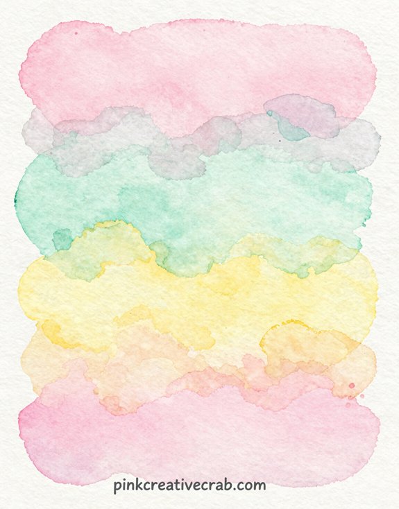
So here’s the thing: literally just paint pretty colors on paper. No rules, no stress, no complicated subject matter. This is hands-down the BEST starting point for pastel watercolor ideas!
You’ll wet your paper (not soaking—just damp), then drop in blush pink at the top. Let it spread naturally. Add mint green in the middle section. Watch the colors kiss and blend! Then lemon yellow at the bottom.
The magic happens in those soft watercolor spring shifts. And guess what? You can’t mess this up. I’ve tried! Every “mistake” still looks dreamy.
These pastel spring watercolor ideas teach you water control without the pressure of painting actual objects. Frame it, gift it, or use it as stationery backing. Done!
Idea #2: Pastel Easter Eggs Nested in Shredded Crêpe Paper in Pale Pink, Blue, and Cream

Once you’ve mastered those dreamy gradients, Easter eggs are your next-level move—and trust me, they’re WAY easier than you think. Start with pale blue ovals (yep, just ovals). Layer on delicate stripes or dots in blush and cream while the paint’s still damp. The colors BLEED together—that’s the magic!
Now here’s where your spring pastel watercolor painting gets FUN: add shredded crêpe paper underneath. Paint loose, messy strokes in coordinating colors to mimic texture. Don’t overthink it! I used to obsess over perfect lines until I realized—soft edges look MORE realistic.
Pro tip? Leave white highlights on each egg. It makes them pop off the page like they’re actually three-dimensional. So satisfying!
Idea #3: Pastel Spring Watercolor Painting – Baby Bunny in Soft Warm White with Barely-There Shadows on a Cream Background
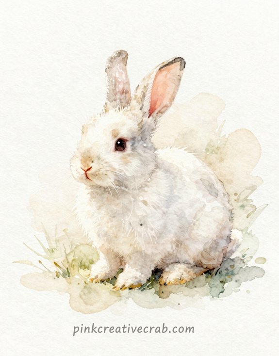
Here’s the tricky part about painting pastels—you CAN’T just water down your colors and call it a day (trust me, I tried this with my first bunny and it looked like a blob of sadness). The secret is building up THIN layers of already-pale pigments, not diluting dark ones until they’re ghost-like.
Mixing Pastel Watercolor Tones Without Accidentally Making Everything Look Washed Out
Here’s the secret: anchor points. You need ONE spot—just one!—where you go slightly darker. For your bunny, that’s the shadow under its chin or behind the ears. Not gray-dark. Just less-diluted pink or blue.
And here’s what I learned after ruining three bunnies: test your “white” paint on scrap paper first. What looks brilliant wet often disappears when dry (cue my frustrated sighs).
The magic ratio? Five parts water to one part pigment for your lightest areas. Then reduce water gradually for shadows. Boom—dimension without sacrificing softness!
Idea #4: Dainty Wreath of Soft Pink Blossoms, Lavender Florets, and Cream Roses on Ivory
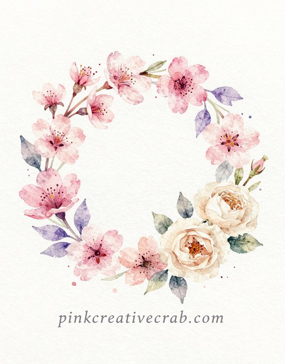
When you want to create something that whispers rather than shouts, a dainty wreath design hits differently. Start with your ivory background—not white! (I learned this the hard way when my “delicate” wreath looked like a neon sign.) Layer thin washes of pink first, building those blossoms petal by petal. And here’s the trick: let each layer DRY completely before adding the next.
Your lavender florets? Mix ultramarine with a whisper of rose. Seriously, just a whisper. The cream roses need the least pigment—think “barely there.” But they’re what makes the whole composition feel LUMINOUS. Space your florals unevenly around the wreath. Perfect symmetry kills that organic, garden-fresh vibe you’re after!
Idea #5: Easy Pastel Landscape Watercolor for Beginners – Rolling Pastel Hills in Pale Lilac and Sage With a Single Cherry Tree
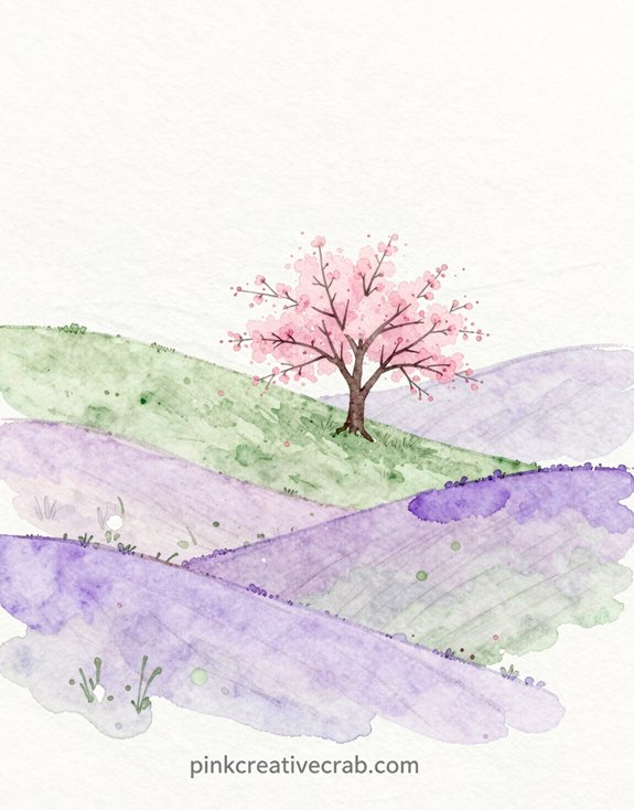
Floral wreaths are gorgeous, but let’s be honest—sometimes you want to paint something that doesn’t require drawing forty tiny petals. Enter the easiest landscape you’ll ever create! You’re basically painting LAYERS of wavy hills—that’s it. Start with pale lilac in the background. Let it dry (patience, friend).
Add sage green hills in front. Done? Almost. Now here’s where it gets fun: that single cherry tree becomes your focal point. Just a simple trunk with loose pink blooms dotted around it. No perfectionism allowed! I once stressed over making symmetrical branches and it looked awful. Loose and confident wins every time.
This painting takes maybe twenty minutes and looks WAY more impressive than the effort required. Perfect for beginners craving those Instagram-worthy results!
Idea #6: Pastel Arrangement of Ceramic Vases Holding Spring Flowers in Faded Botanical-Print Tones
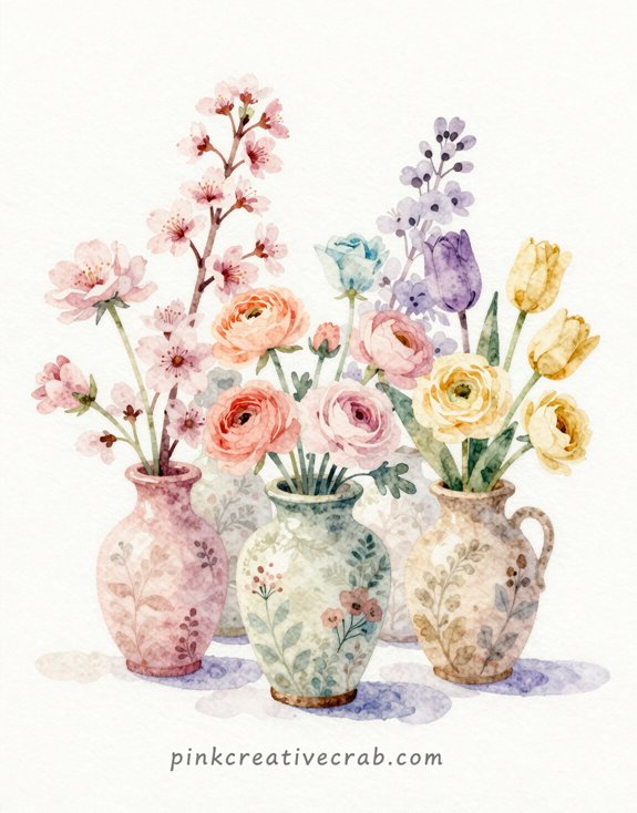
Here’s something I learned after posting dozens of flower paintings online—pastel spring paintings get WAY more saves and shares than those bright, saturated blooms I used to paint! And guess what? Soft, faded tones photograph like a DREAM under natural light (no weird color shifts or glare issues).
But the real magic happens when shoppers scroll through their phones—those gentle lilacs, dusty pinks, and pale sage greens stop thumbs mid-scroll because they feel calming and sophisticated instead of screaming for attention.
Why Pastel Spring Paintings Photograph Better Than Vivid Ones and Sell Better Online
Because soft pastels translate flawlessly to screens while bold colors often look garish or oversaturated, your online sales depend more on photography than you think. I learned this the hard way after uploading twenty vibrant paintings that looked AMAZING in person but completely blown out online—zero sales that month!
Pastels photograph with natural balance. They don’t require endless editing adjustments. And honestly? Buyers scroll past neon overload but STOP for gentle, soothing tones. Your phone camera already handles pastels beautifully (no fancy equipment needed). So snap that photo in natural light, post it, and watch the engagement soar. The muted spring palette sells itself because it looks exactly the same on every device. Pure marketing gold!
##
When you’re working with pastel watercolors, understanding the color table is like having a secret weapon in your artistic arsenal. It’ll transform your spring paintings from “meh” to MAGNIFICENT!
Here’s a quick reference guide (trust me, I used to wing it and regretted every muddy mess):
| Pastel Color | Water Ratio |
|---|---|
| Soft Pink | 3:1 |
| Mint Green | 4:1 |
| Lavender | 3:1 |
| Butter Yellow | 5:1 |
See those ratios? Game-changers! More water equals lighter tints. And honestly? I wish someone had told me this years ago. But here’s the thing—you don’t need to be EXACT. Test swatches first. Adjust based on your paper’s absorbency. Make it YOUR formula!
Idea #7: Easy Powder Blue Butterfly Watercolor Pastel – Pale Blue Butterfly on a Blushing Rose Blossom with Almost No Contrast
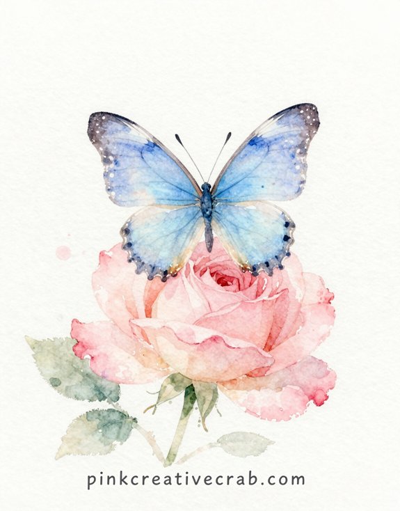
Although most artists think butterfly paintings need bold, dramatic shadows, this delicate powder blue butterfly will prove them totally wrong.
Here’s the thing—I used to OVERWORK every butterfly painting until it looked muddy. Not anymore!
This ethereal combo works because the pale blue wings almost melt into the soft pink petals. Zero harsh lines. The secret? Keep everything at the SAME value (that’s just how light or dark something appears).
So paint your butterfly first using diluted cerulean blue. Then—and this is pivotal—use barely-there rose madder for those blushing petals. Want them to feel connected? Let the colors kiss while they’re still wet!
The result? Pure magic. A whisper of a butterfly that captures spring’s softest moment.
Idea #8: Soft Pink Peonies Against a Barely-There Watercolor Wash — All About the Gentle Color
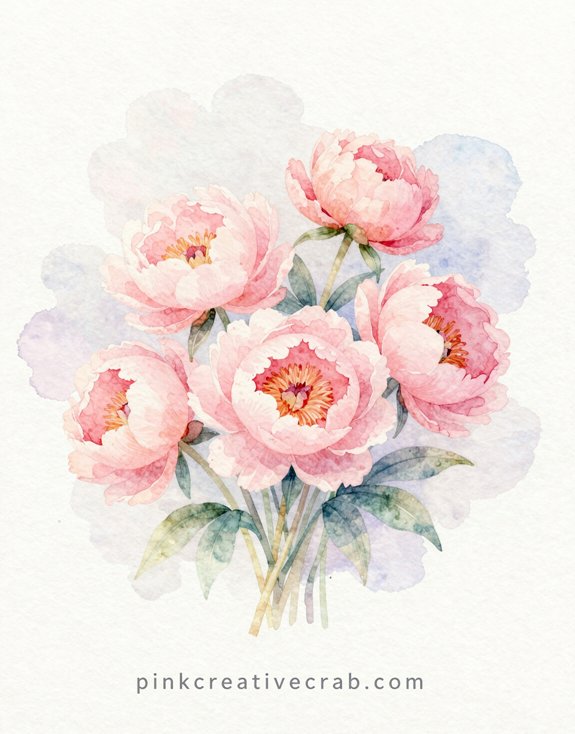
Peonies are basically nature’s tissue paper flowers—so delicate you’d think they’d fall apart if you breathed on them. Perfect for pastel watercolors!
Start with the PALEST pink you can mix. I’m talking almost white. Then add just a whisper of background wash—maybe lavender or cream. The magic here? Restraint. (I know, boring word, but trust me.)
Layer your petals slowly. Let each one dry before adding the next. And don’t freak out about perfect edges—peonies are naturally messy! That’s their charm.
Here’s the trick: use more water than pigment. Way more. Your brush should feel like it’s barely carrying color. But that barely-there approach creates something STUNNING. Soft. Dreamy. Absolutely spring.
Idea #9: Pastel Brunch Flatlay — Coffee, Croissant, Flowers, and a Morning Journal on a Marble Surface
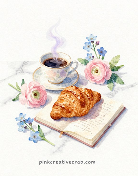
So you’ve mastered soft florals—now let’s paint something you can practically TASTE. A brunch flatlay combines lavender coffee mugs, buttery croissants, and blush-toned flowers against cool marble. The magic? Layering transparent washes to build depth without muddying your pastels.
Start with the marble—light gray swirls over wet paper (I once painted this bone-dry and it looked like concrete). Then add your props using negative space—that’s the unpainted white areas that define shapes. Your croissant gets golden ochre mixed with peach. Coffee? Warm brown with a hint of violet for richness.
But here’s the GAME-CHANGER: lift color with a damp brush for highlights on your ceramic mug. It creates that glossy finish.
And those scattered flowers? Keep them loose and unfocused—they’re supporting characters, not the star.
Idea #10: Pastel Spring Watercolor Painting – Dreamy Blush Sky at Sunrise with Pastel Cloud Wisps Floating in Soft Morning Light

Want to create something REALLY special with this dreamy sunrise scene? Paint FIVE variations of pastel spring skies and group them together as a gallery wall collection—seriously, it’ll look like you hired a professional designer (I stumbled into this idea after making three “practice” paintings that were too pretty to toss).
You can shift the color palette slightly in each piece—maybe one leans peachy-pink, another goes lavender-blue, and the third stays soft coral—so they feel connected but not matchy-matchy boring. And the best part? You’re already familiar with the technique from painting this first one, so the other four will come together WAY faster than you think!
Building a Five-Painting Pastel Spring Collection for a Gallery Wall
When you’re creating a cohesive gallery wall, the final piece needs to tie everything together—and that’s where a dreamy blush sky comes in. This sunrise painting acts as your ANCHOR—pulling all those spring pastels into one harmonious display.
Here’s the strategy: paint your sky with diluted rose madder and a whisper of cadmium yellow. Let it bleed naturally. Those cloud wisps? Just lifted pigment with a damp brush (I used to scrub too hard—don’t!).
Hang this piece center or top-right depending on your layout. It’ll balance florals, landscapes, and abstract pieces beautifully. The soft morning light theme connects EVERYTHING without screaming “matchy-matchy.”
And honestly? Gallery walls fail when there’s no visual rest. This gentle sky provides exactly that.
Idea #11: Soft Watercolor Spring Scene – Misty Spring Morning Meadow Where Colors Barely Exist, All Is Pale and Gentle
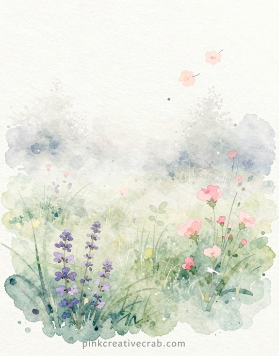
Because spring mornings wrapped in mist feel like nature’s own watercolor painting, this scene practically BEGS to be recreated with the palest pastels you can mix.
Here’s your secret weapon—barely touch your brush to the pigment. Like, BARELY. (I once went too heavy and my “misty meadow” looked like a muddy swamp. Not the vibe.)
And honestly? Let the white paper do most of the work. It’s the mist itself!
Try this: Drop ultra-diluted lavender for distant trees. Add whisper-soft peach where the sunrise hits. Maybe—just MAYBE—hint at yellow-green grass below.
The magic happens when you can’t quite tell where colors end and white begins. That’s when you’ve nailed it! This painting should feel like a dream you’re already forgetting.
Do you naturally gravitate toward soft pastel palettes, or is this the style you secretly envy in other people’s work but haven’t tried yourself yet?
Here’s the thing about pastel watercolors—some artists seem BORN with this gentle touch, while the rest of us (hi, it’s me) spend years accidentally creating paintings that look like they’re shouting instead of whispering.
So which camp are you in?
Maybe you’re naturally drawn to soft colors. Lucky you! Or maybe you’ve been scrolling through Instagram, heart-eyes emoji-ing everyone else’s dreamy pastel work while your own paintings look like they drank five espressos.
Either way, this IS your moment.
Here’s what I’ve learned: pastels aren’t about being timid. They’re about CONTROL. Adding more water. Lifting pigment. Stopping before you think you should.
And yes—it feels weird at first. You’ll want to add “just a bit more.” Don’t! That restraint? That’s the magic ingredient you’ve been missing.
Frequently Asked Questions
How Do I Fix Mistakes in Pastel Watercolor Paintings?
You’ll lift mistakes with a damp brush or sponge while the paint’s wet. Once dry, you can layer fresh pigment over errors, embracing imperfections as creative opportunities that’ll transform your work unexpectedly.
Can I Use Pastel Watercolors on Different Paper Types?
You’ll get different effects on various papers, but watercolor paper works best for pastel watercolors. Experiment with cold-pressed, hot-pressed, or textured surfaces to discover innovative techniques that’ll transform your spring-inspired artwork into something uniquely yours.
How Long Does Pastel Watercolor Take to Dry Completely?
You’ll find pastel watercolors dry in 5-15 minutes, depending on your paper’s thickness and pigment saturation. Experiment with layering techniques and heat tools to speed up drying time, revealing fresh creative possibilities for your spring-inspired artwork.
What’s the Best Way to Store Finished Pastel Watercolor Paintings?
Ironically, you’ve created delicate spring pastels that’ll outlast most digital art—if you’ll protect them properly. Store your finished pieces flat in acid-free portfolios with glassine interleaving sheets, away from direct sunlight and humidity.
How Do I Prevent Pastel Watercolors From Looking Muddy or Dull?
You’ll keep pastels vibrant by limiting color mixing, using clean water between washes, and letting layers dry completely. Don’t overwork areas—embrace white space strategically to maintain that fresh, luminous quality pastels demand.
Have any thoughts?
Share your reaction or leave a quick response — we’d love to hear what you think!
-
 0
0
-
0
-
0
-
0
-
0
-
0


