You’ve painted dozens of watercolor florals before, but Cinco de Mayo cards? That’s a whole different kind of party on paper. And honestly — it’s way more fun than your standard birthday card routine. The secret is knowing when to go BOLD with those marigold oranges and chili-pepper reds, and when to dial it back with earthy folk-art tones. (Trust me, I’ve made muddy messes trying to figure this out.) So what actually makes these fifteen designs work?
What Do You Need for Cinco de Mayo Watercolor Card Painting?
Before you plunge into creating festive Cinco de Mayo cards, let’s talk supplies—because trust me, I’ve learned the hard way that grabbing random art stuff from your junk drawer doesn’t always work out. Your easy cinco de mayo watercolor projects deserve better!
Here’s what you ACTUALLY need:
- Watercolor paints (student-grade works fine—no need to break the bank)
- Thick cardstock (regular printer paper will buckle and warp—yikes)
- Round brushes in various sizes (for those perfect cactus details)
- Water containers (two is ideal for keeping colors vibrant)
- Paper towels (for happy accidents and quick fixes)
Idea #1: Easy Cinco de Mayo Watercolor for Beginners – Bright Paper Marigolds Spilling Over a Painted Arch
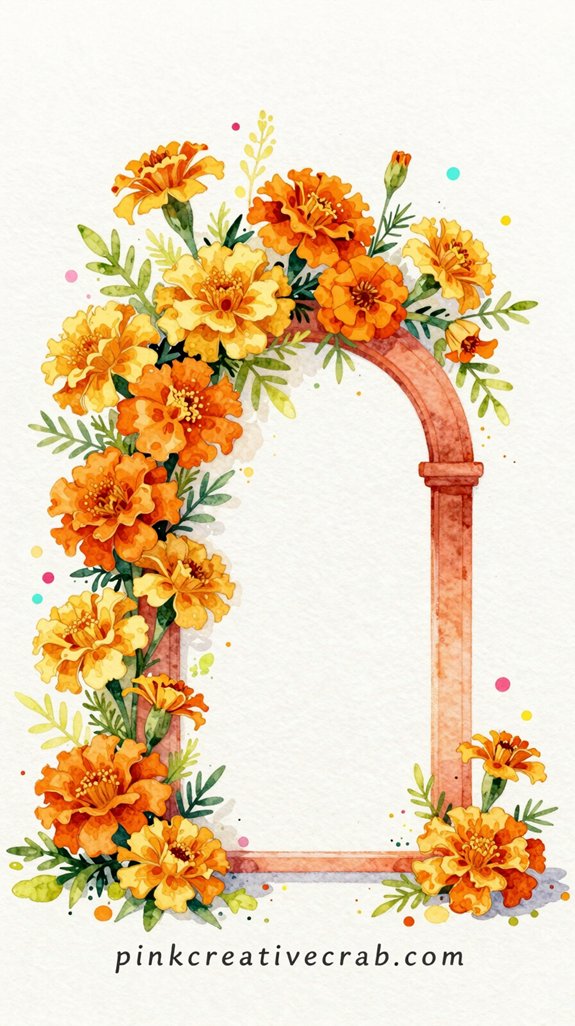
While traditional Cinco de Mayo watercolors can feel intimidating (all those intricate papel picado patterns—yikes), this bright marigold design is genuinely foolproof. You’ll paint a simple arch in vibrant orange or pink—literally just a curved rainbow shape. Done!
Then comes the fun part: glue pre-cut tissue paper marigolds cascading over the top. This cinco de mayo watercolor for beginners trick lets you skip painting actual flowers (which I’ve botched approximately seventeen times). The combo creates a stunning fiesta watercolor card that looks WAY more complicated than it actually is.
And here’s the secret—the watercolor arch doesn’t need to be perfect! Uneven edges? That’s called “artistic charm.” Your mexican watercolor card will pop with dimension and color without requiring a single steady hand. Promise!
Idea #2: Painted Clay Pots Overflowing with Hot-Pink Bougainvillea Under a Turquoise Sky
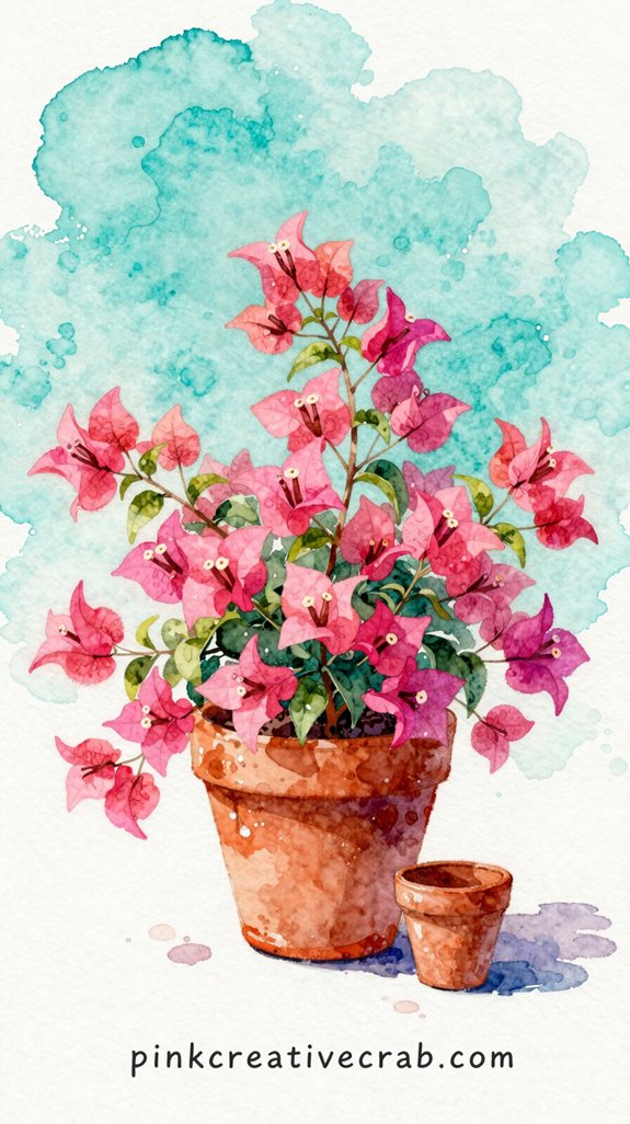
Since terra cotta pots practically scream “Mexico!” to everyone, this design gives you instant fiesta vibes with minimal effort. You’ll start with those iconic clay pots—super forgiving if your lines wobble (mine ALWAYS do). Paint them in warm oranges and browns, then splash hot-pink bougainvillea blooms everywhere. And I mean everywhere! Don’t be shy.
The magic happens when you add that brilliant turquoise sky behind everything. It makes the pinks absolutely POP. Trust me on this—I once painted it pale blue and the whole fiesta watercolor painting looked sad and washed out.
Idea #3: Cinco de Mayo Watercolor Painting – Colorful Papel Picado Banners Strung Across a Sunny Courtyard
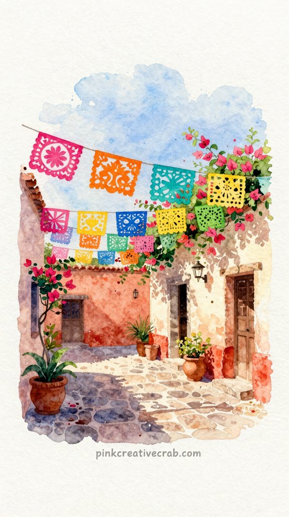
You’ll want those papel picado banners to POP with electric pinks, sunny yellows, and vibrant greens—but here’s the tricky part.
If you’re not careful (and trust me, I’ve made muddy brown messes more times than I’d like to admit), those gorgeous jewel tones can turn into murky puddles faster than you can say “fiesta.”
How to Get Vibrant Jewel-Tone Colors Without Muddying Your Watercolors
Papel picado banners are THE perfect subject for practicing vibrant jewel tones—and I learned this the hard way after turning my first attempt into a muddy mess that looked more like soggy tissue paper than festive decorations.
Here’s what WORKS: let each color dry completely before adding the next. Seriously. I know you’re excited, but wet-on-wet is your enemy here!
Want electric purples and blazing magentas? Use less water than you think. (Your instinct will betray you.) Mix colors on your paper, not your palette—that’s where muddiness happens. And stick to two colors maximum per banner section.
The secret? Layer transparent washes instead of mixing everything together. Your papel picado will practically glow!
Idea #4: Mexican Sugar Skull Decorated with Marigolds and Geometric Patterns in Fiesta Colors
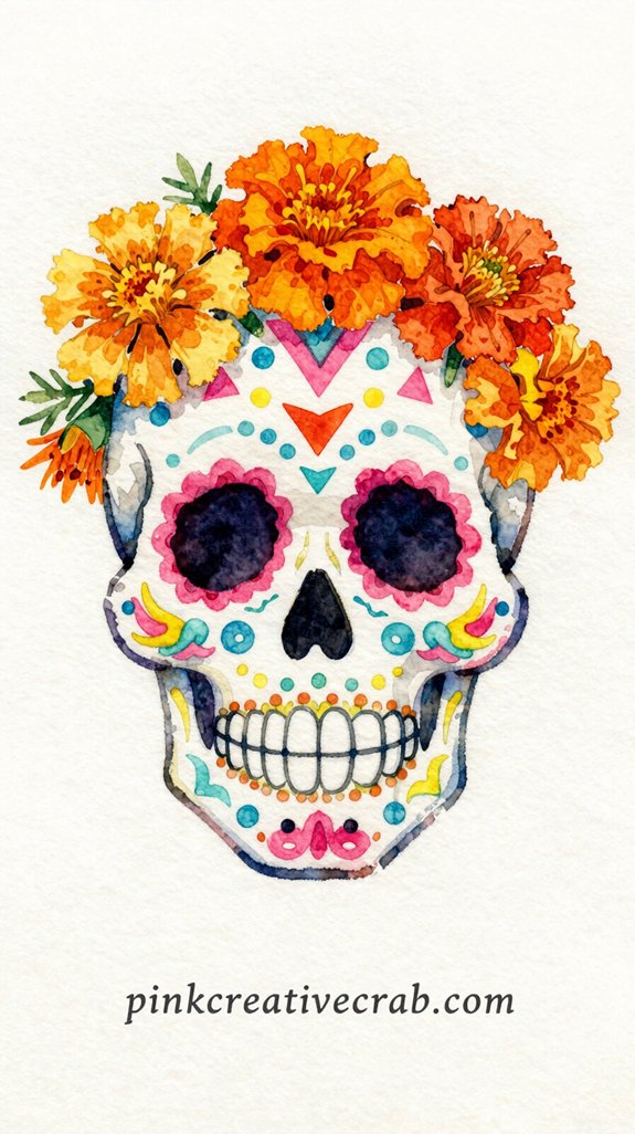
While sugar skulls might seem intimidating at first, they’re actually one of the most forgiving watercolor subjects you can tackle. Trust me—I’ve painted wonky ones that STILL looked amazing. Why? Because asymmetry is your friend here!
Start with a simple pencil skull outline. Then layer on those gorgeous marigold petals in burnt orange and golden yellow. (Marigolds are traditional Day of the Dead flowers, BTW.) Add geometric patterns around the eyes and forehead—dots, hearts, swirls, whatever speaks to you.
The magic happens when you embrace imperfection. Wobbly lines? Character. Colors bleeding together? Texture!
Idea #5: Fiesta Watercolor Card for Beginners – Striped Piñata Bursting with Confetti Stars
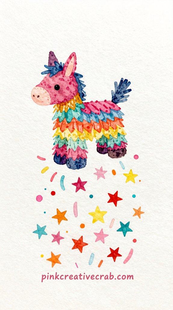
If you’ve never painted a piñata before, THIS is your moment. Start with simple vertical stripes—alternating pink, yellow, and turquoise. Don’t stress about perfect lines (mine always wobble). The beauty is in that handmade charm!
Here’s the fun part: Load your brush with bright colors and FLICK confetti stars bursting outward. Splatter technique works too—just tap your brush against your finger. Controlled chaos at its finest.
Add a simple ribbon loop at the top using curved brushstrokes. And those streamers? Quick downward strokes in rainbow colors. Done.
This card practically screams FIESTA without requiring advanced skills. Perfect for beginners who want maximum impact with minimal stress. Plus, if your stars look wonky, just call them “festive” and move on!
Idea #6: Margarita Glass Rimmed with Salt, a Lime Wedge, and a Tiny Umbrella on a Warm Orange Wash
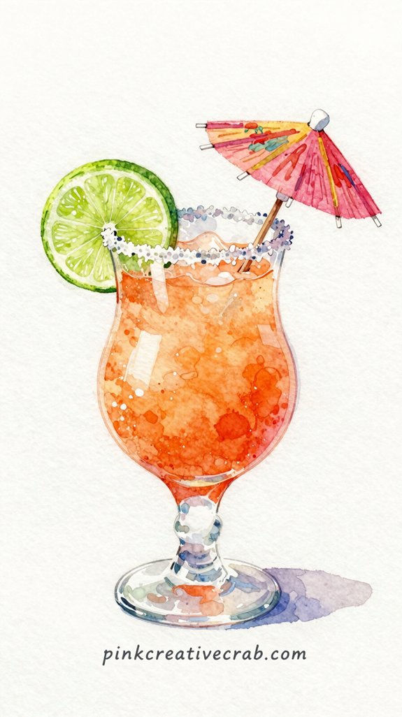
You’d think painting patterns on that margarita glass would turn your loose, breezy card into a stiff disaster—but here’s the secret: Let the watercolor do the wobbling FOR you! Instead of trying to paint perfect geometric designs (been there, frozen up completely), embrace the bleed and let those folk-art swirls stay playful and organic.
The key is keeping your brush moving—no hesitation, no fussing—because confidence READS as festive energy, even when your triangles look more like weird blobs.
Painting Folk-Art Patterns on Ceramics Without Getting Stiff or Precious
Because margarita glasses have such a distinctive silhouette, they’re actually EASIER to paint loosely than to fuss over—which makes this the perfect subject for letting go of perfectionism. Start with the V-shape bowl in one confident stroke. Done! The stem? Just a quick vertical line—wonky is CHARMING here.
Now for the fun part: that salt rim. Don’t paint individual crystals (I tried once and wanted to cry). Instead, dab white paint irregularly along the edge. Texture over precision! Add your lime wedge as a simple green triangle. Pop in that tiny umbrella with primary colors—red, yellow, blue strokes radiating from a dot.
The orange wash underneath? Pure mood-setter. Let it bleed and bloom. That’s not a mistake—that’s ATMOSPHERE!
Idea #7: Easy Cactus Watercolor Card – Saguaro Cactus in Full Bloom Against a Vivid Desert Sunset
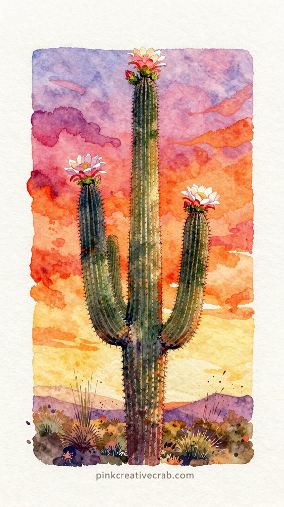
When the desert sun dips low and paints the sky in streaks of orange, pink, and purple, there’s nothing more iconic than a saguaro cactus standing tall against that dramatic backdrop. And guess what? You can capture that MAGIC on a simple watercolor card!
Start with wet-on-wet for your sunset—seriously, just water down your paper first. Then drop in those sunset colors and watch them BLEND. (I used to wait for things to dry perfectly. Total mistake!)
While it’s still damp, paint your cactus silhouette in dark green or black.
But here’s the fun part—add tiny white blooms on top! Those saguaro flowers look like little crowns. So festive! Quick dabs of white gouache work perfectly.
Idea #8: Mariachi Sombrero Piled with Marigolds and Colorful Streamers
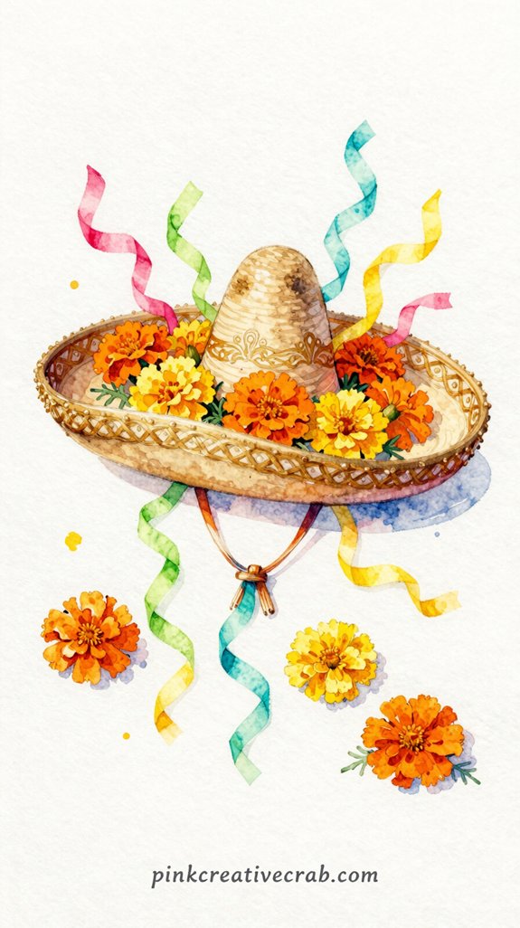
Start by sketching a wide-brimmed sombrero tilted at an angle. Make it DRAMATIC—this isn’t your everyday hat!
Now pile on those marigolds. And I mean pile them high! These golden-orange blooms are traditionally used for Día de los Muertos, but they’re perfect for Cinco de Mayo too. Sketch them overflowing from the crown—messy and abundant.
Here’s where it gets fun. Add streaming ribbons cascading down in pink, turquoise, and yellow. Don’t make them too straight (mine always looked stiff at first). Let them CURL and twist!
For watercolor? Start light. Layer your colors gradually—especially on those marigold petals. Use wet-on-wet technique for the ribbons so colors blend beautifully.
But the sombrero? Keep it simple with warm browns and decorative trim. This card practically screams FIESTA!
Idea #9: Traditional Mexican Embroidery-Inspired Border Filled with Vivid Florals
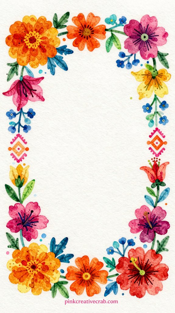
Mexican embroidery patterns have this INCREDIBLE geometric beauty that translates perfectly to watercolor cards. Those zigzags, flowers, and diamonds you see on traditional huipils? They’re basically MADE for watercolor borders!
Start with a simple pencil frame around your card’s edge—maybe an inch thick. Then fill it with repeating floral motifs. Roses, dahlias, and those characteristic Mexican folk art leaves work perfectly. And here’s the trick: keep your pattern loose! I used to obsess over perfect symmetry (spoiler: it looked stiff and boring).
But slightly wonky patterns? They actually feel more AUTHENTIC and handmade.
Use bright magentas, oranges, yellows, and teals. Let the colors blend where they touch. So beautiful! The center stays blank for your message.
Idea #10: Cinco de Mayo Painting – Talavera Pottery Pattern in Cobalt Blue, Terracotta, and Gold
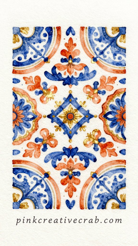
You know those gorgeous ceramic tiles with intricate patterns you’ve seen in Mexican restaurants? Those are Talavera pottery designs—and you can recreate that hand-painted look with TWO simple watercolor tricks!
Salt and wet-on-wet technique will give your cobalt blue, terracotta, and gold patterns that authentic, slightly-imperfect texture that makes real pottery so beautiful. And honestly, the “mistakes” (like paint bleeding where you didn’t plan) actually make your card look MORE handcrafted—not less!
Using Salt and Wet-on-Wet to Mimic Handcrafted Textile Textures
While Talavera pottery gets all the glory for its intricate geometric designs, you can totally steal that same handcrafted vibe for your Cinco de Mayo cards—and here’s the secret: salt technique plus wet-on-wet watercolor creates those gorgeous, unpredictable textures that look WAY more impressive than the actual effort required.
Wet your paper first, drop in cobalt blue and terracotta, then sprinkle regular table salt while everything’s still glistening. The salt absorbs pigment and creates these amazing crystalline patterns that mimic woven textiles perfectly! (I once dumped too much salt and it looked like a snowstorm—oops.) Let it dry completely before brushing off the salt grains.
Add gold accents with a metallic pen afterward. That’s literally it. Handcrafted texture WITHOUT the hand cramps!
##
Your watercolor creations become conversation starters when you display them creatively. Here’s the breakdown:
| Card Type | Table Use |
|---|---|
| Mini papel picado designs | Napkin rings or menu holders |
| Cactus motifs | Place cards with guest names |
| Watercolor cacti | Food labels for your taco bar |
| Abstract geometric patterns | Drink markers—genius! |
Idea #11: Bright Chili Peppers Hanging on a Rustic String with a Hacienda Wall Behind Them
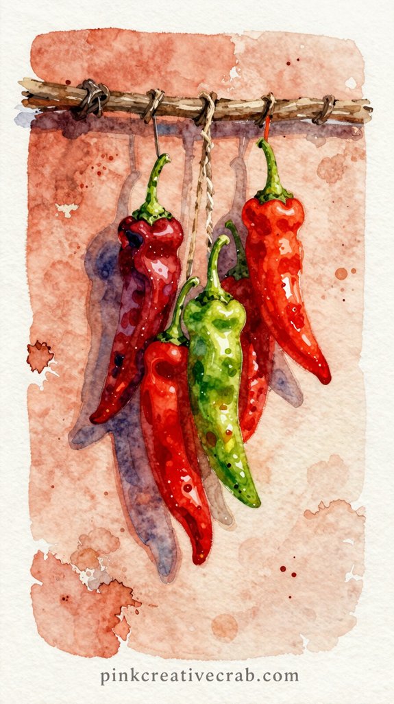
Since watercolor peppers practically PAINT themselves with just three colors, this card design gives you maximum impact with minimal fuss. You’ll use red, orange, and a touch of yellow-green for the stems—that’s IT.
Here’s the trick: let those colors bleed into each other while they’re still wet (called wet-on-wet technique). The peppers will look three-dimensional without any shading skills required. Trust me, I once tried to “control” the bleeding and ended up with sad, flat peppers that looked like deflated balloons.
For the rustic string? Just a brown line—nothing fancy.
And that hacienda wall behind them? Paint loose terracotta rectangles. Super forgiving! The imperfections actually make it look MORE authentic.
Idea #12: Easy Avocado Watercolor Card – Sliced Avocado with Lime, Cilantro, and a Dash of Red Pepper
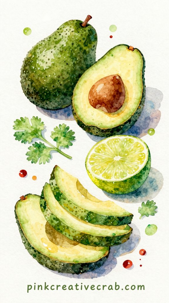
This avocado card is basically FOOLPROOF because you’re working with just two main colors—green and yellow-green for the creamy flesh, plus a rich brown for the pit. And honestly? It’s impossible to mess up that gradient where the colors blend together.
Start with the pit—just a simple brown circle. Then paint around it with yellow-green, leaving that wet edge. Now drop in darker green while it’s still damp. BOOM. Instant dimension.
Add half a lime beside it (yellow circle, green rind—done). Scatter some cilantro leaves using quick brush strokes. Flick tiny red pepper dots on top.
The whole thing screams “guacamole vibes” without requiring perfect technique. I’ve painted this one-handed while holding coffee!
Idea #13: Folk-Art Rooster Painted in Vivid Oaxacan Colors on a Deep Indigo Background
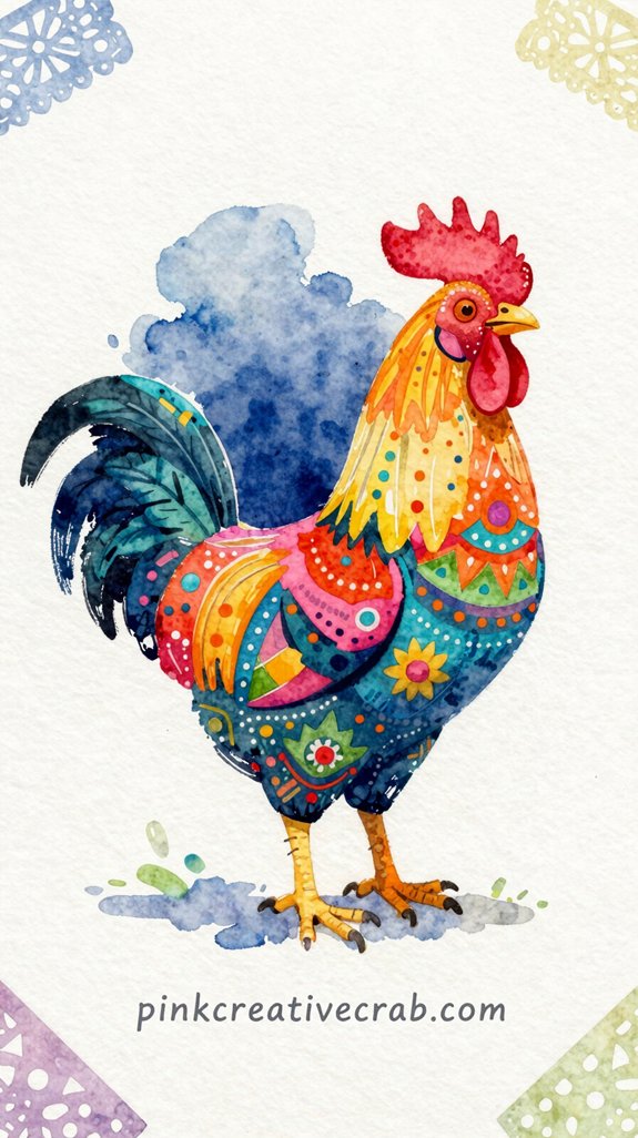
You’ll want to finish off your gorgeous rooster with lettering that matches all that folk-art energy—and “Feliz Cinco de Mayo” looks AMAZING when you paint it with loose, brushy strokes instead of trying to make it perfect (I used to spend forever trying to get perfect letters, and they looked stiff and boring).
The trick is to load your brush with paint, hold it at an angle, and let the bristles do the work—press down for thick strokes, lift up for thin ones, and don’t worry if the letters wobble a bit!
How to Letter “Feliz Cinco de Mayo” in a Loose, Brushy Style
What’s the secret to hand-lettering that looks effortlessly artistic without spending hours perfecting every stroke? Embrace the wobble. Seriously! Load your brush with watered-down paint and let it dance across the paper. Those shaky lines? They’re CHARMING—not mistakes (I learned this after wasting countless cards trying for perfection).
Use a larger round brush—size 6 or 8—and hold it loosely. And I mean loosely. Your grip shouldn’t feel like you’re wrestling the thing. Practice “Feliz Cinco de Mayo” on scrap paper first, focusing on rhythm instead of precision.
Idea #14: Fiesta Watercolor Painting – Confetti-Filled Street Scene at Dusk with Lanterns Glowing
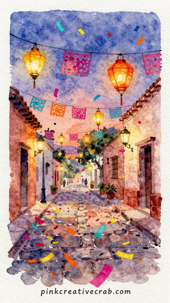
When twilight settles over a Mexican plaza and paper lanterns begin to glow, you’ve got the PERFECT setting for a dramatic Cinco de Mayo card. This scene’s all about atmosphere—those warm amber lights against a deepening purple sky create instant magic.
Start with a wet-in-wet (super wet paper) background for that moody dusk gradient. Blues bleeding into purples bleeding into warm oranges. So gorgeous!
Then let it dry COMPLETELY before adding your lanterns—little glowing circles with bright yellow centers and softer halos around them.
The confetti? Tiny flicks of color scattered everywhere. And silhouettes of buildings or distant dancers keep things mysterious without requiring perfect detail.
My first attempt looked like a muddy mess because I didn’t wait. Patience wins here!
Idea #15: Cinco de Mayo Card Painting – Sun-Drenched Bunch of Marigolds Bursting Out of a Terracotta Pot
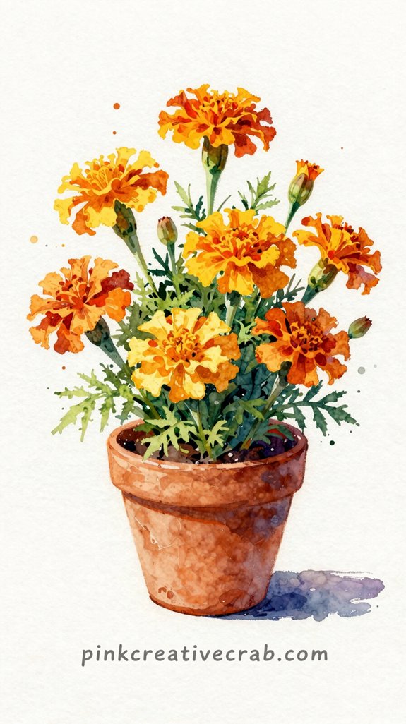
From mysterious twilight scenes we shift to BRIGHT, cheerful sunlight—because marigolds are basically sunshine in flower form!
You’ll paint these golden blooms bursting from a rustic terracotta pot. And trust me—I once made my marigolds look like soggy orange blobs (yikes), so here’s what actually works.
Start with the pot using burnt sienna. Let it dry completely! Then layer your yellows and oranges WET, letting them bleed together naturally. That’s how you get those vibrant petals that practically GLOW.
Want extra pop? Add darker orange in the flower centers while everything’s still damp.
The trick? Don’t overthink it. Marigolds are wild and cheerful—they shouldn’t look perfectly controlled. So embrace those unpredictable watercolor blooms! Your card recipients will feel instant fiesta vibes.
Are you reaching for the most vibrant, over-the-top colors you own for this one — or do you prefer a more artful folk-art approach?
total disaster). But here’s the fun part — you get to CHOOSE your vibe!
Want to go full fiesta mode? Grab those neon oranges, hot pinks, and electric yellows. Layer them thick and watch your marigolds practically vibrate off the card. I’m talking eye-searing goodness that screams celebration!
Or maybe you’re drawn to something quieter? The folk-art approach uses muted terracottas, burnt oranges, and dusty golds. Think rustic charm instead of party explosion. (Honestly, this route saved me when my “vibrant” attempt looked like a highlighter threw up.)
Frequently Asked Questions
What Is the Historical Significance of Cinco De Mayo?
You’ll find Cinco de Mayo commemorates Mexico’s unexpected victory over French forces at the Battle of Puebla in 1862. It’s evolved into a celebration of Mexican-American culture and heritage throughout the United States.
Can I Use These Card Designs for Other Celebrations?
You’ll definitely reimagine these watercolor techniques for countless celebrations. Adapt the vibrant color palettes, festive motifs, and hand-lettering styles to birthdays, weddings, graduations, or seasonal parties—they’re versatile design foundations you can customize creatively.
How Long Does Watercolor Paint Take to Dry Completely?
You’ll find watercolor paint dries to the touch in 5-15 minutes, but it’s best to wait 30-60 minutes for complete drying. Thick paint layers need longer, while experimenting with heat tools speeds things up considerably.
What Paper Weight Works Best for Mailing Watercolor Cards?
You’ll want 140lb (300gsm) cardstock minimum for mailing watercolor cards—it’s sturdy enough to survive postal handling without warping. Think of it as armor for your art: lightweight papers won’t protect your creative investment during transit.
Are These Designs Appropriate for Children to Paint?
Yes, these designs are perfect for children! You’ll find they’re simple enough for young artists to tackle while offering room for creative expression. Kids can experiment with bold colors and loose brushstrokes to create festive, fun cards.
Have any thoughts?
Share your reaction or leave a quick response — we’d love to hear what you think!
-
 0
0
-
0
-
0
-
0
-
0
-
0


